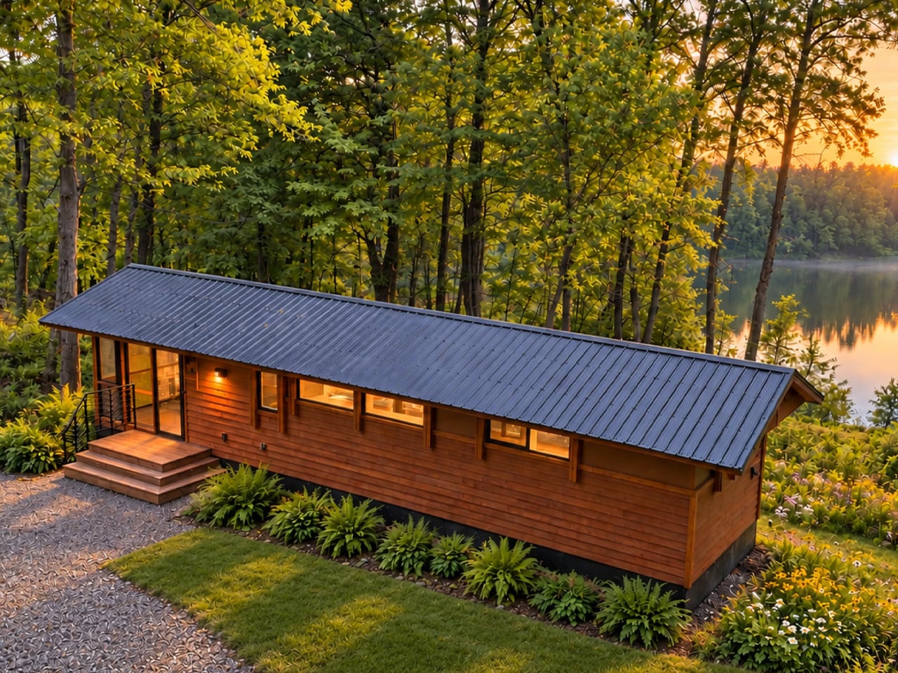
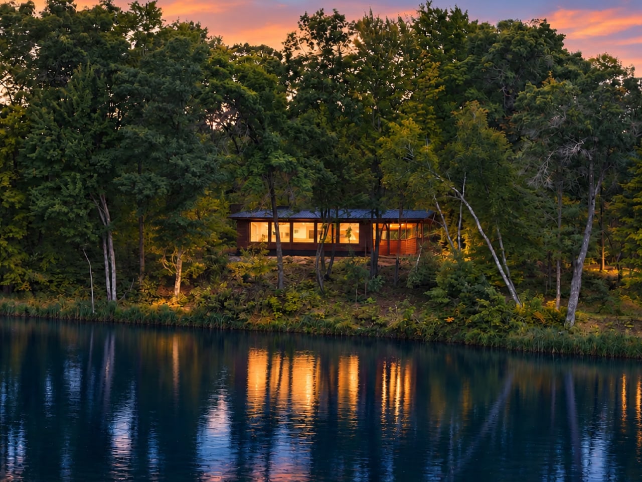
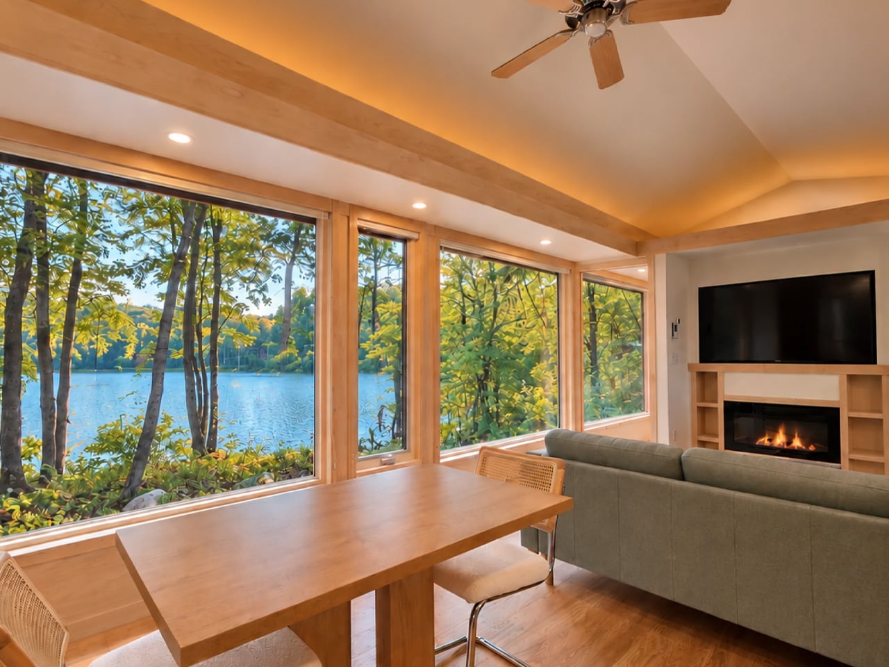
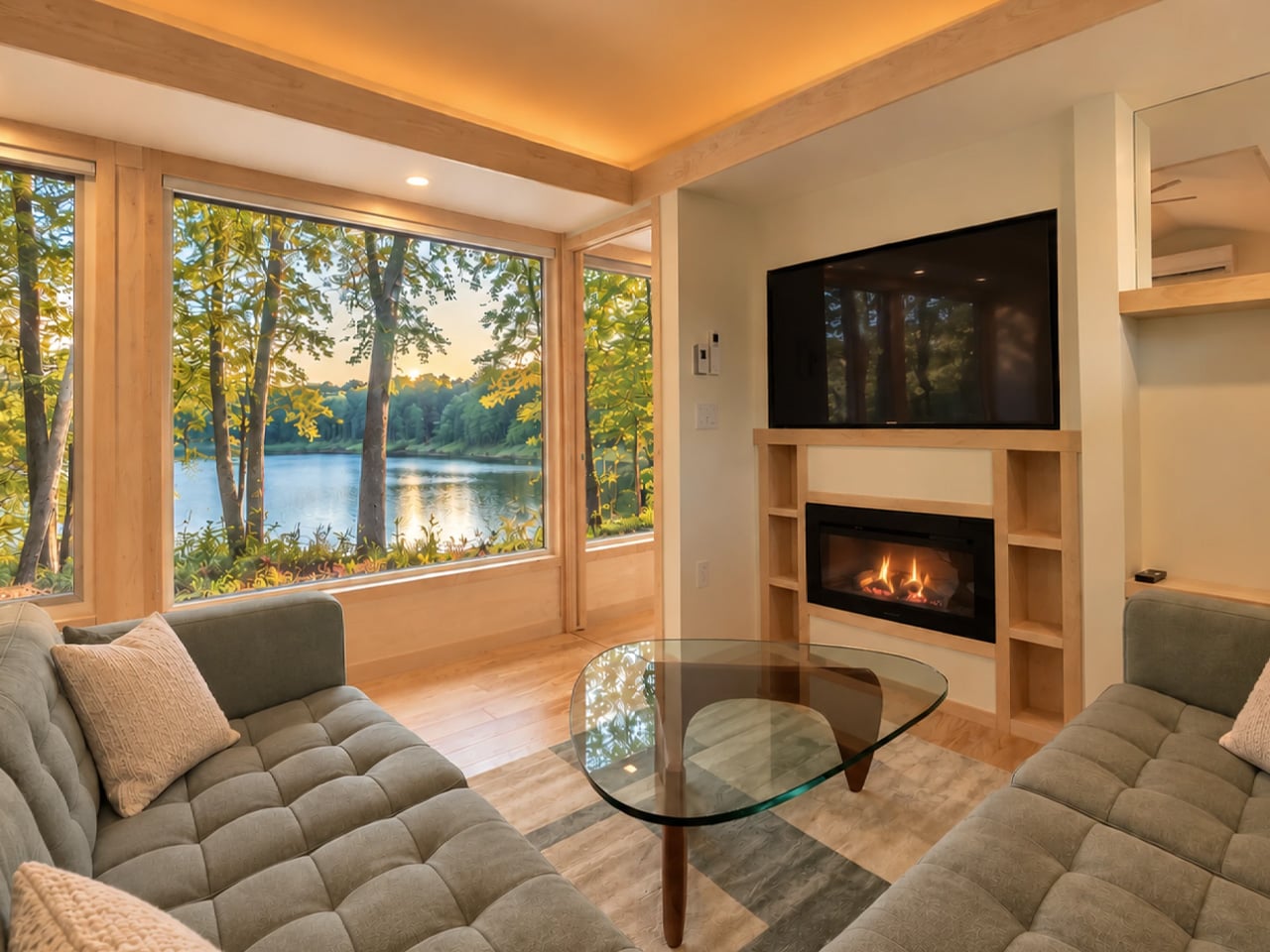
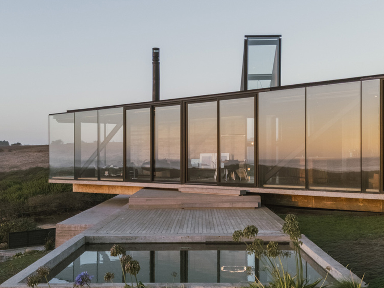
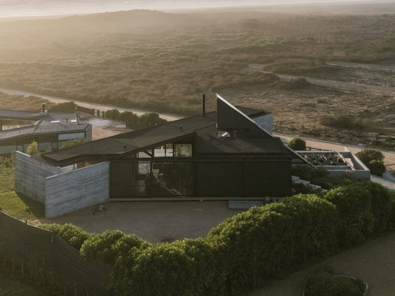
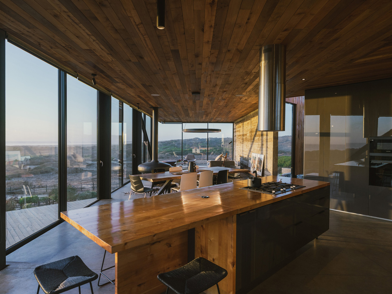
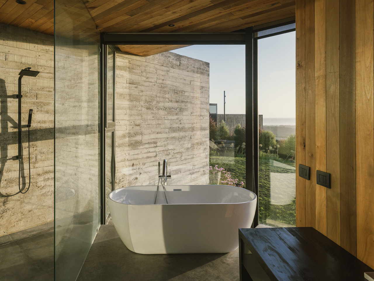
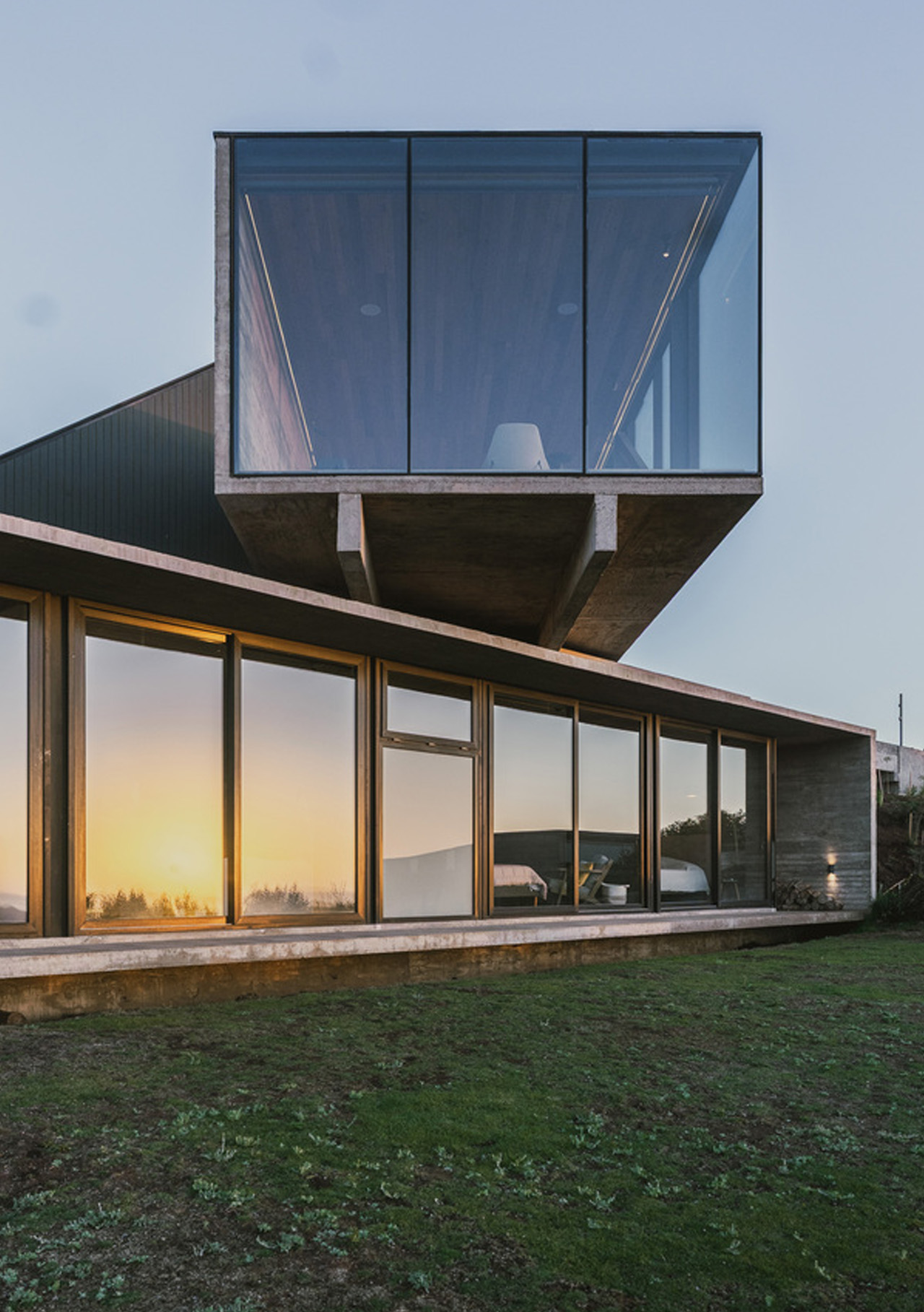
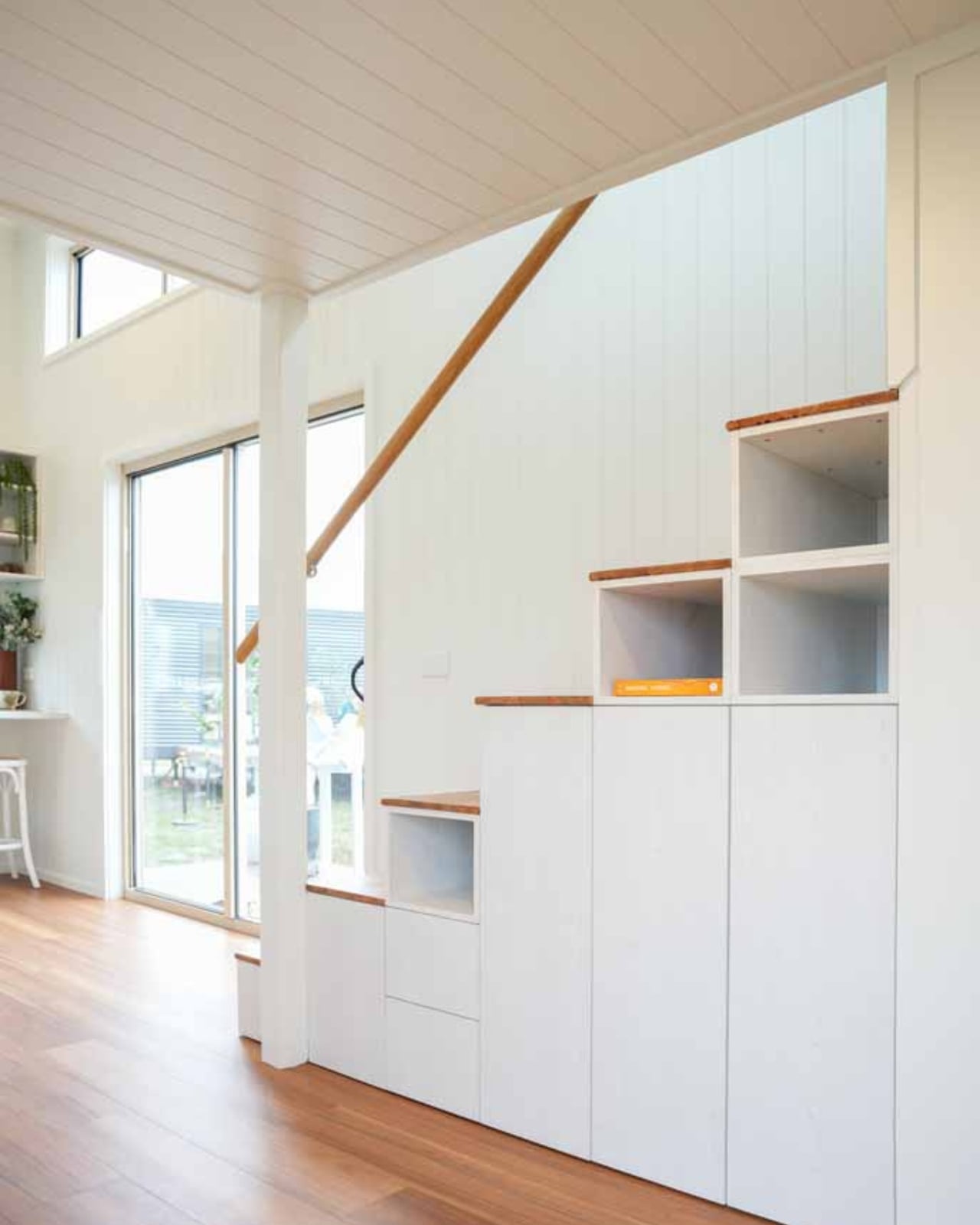
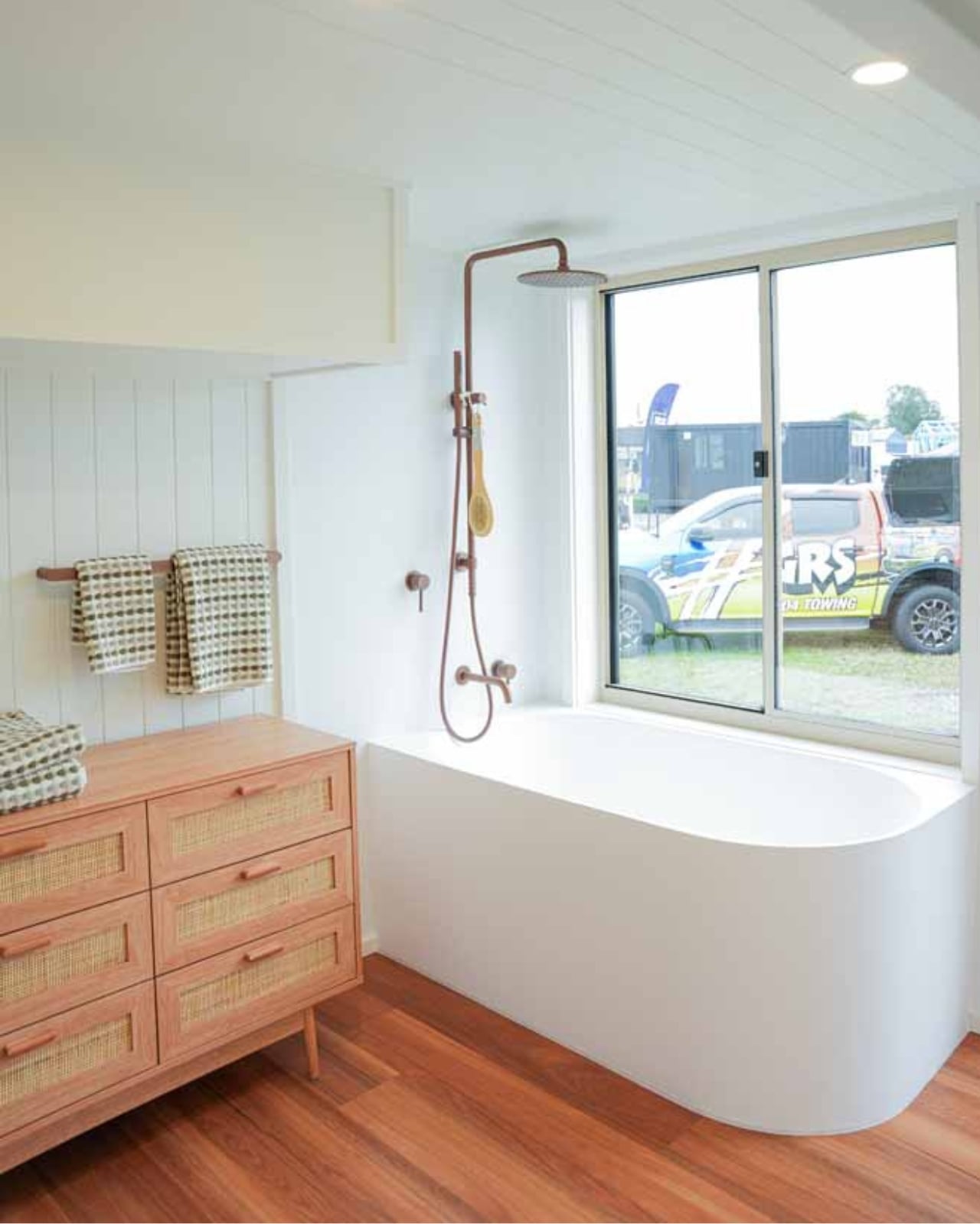
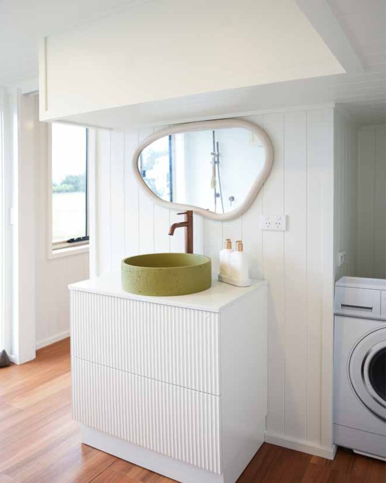
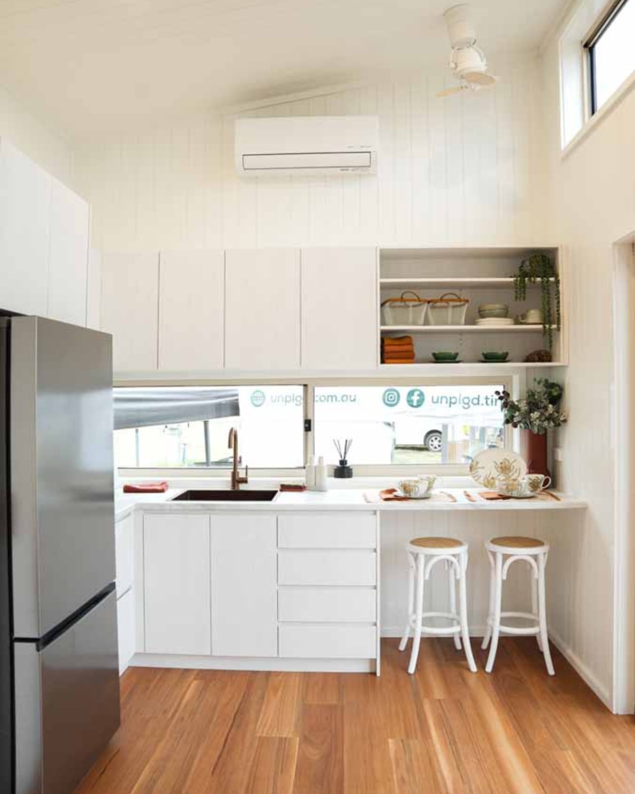
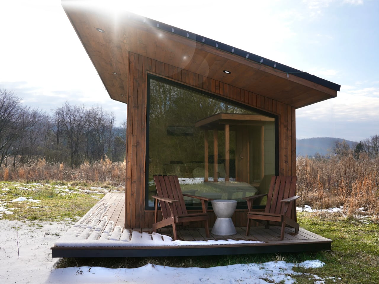
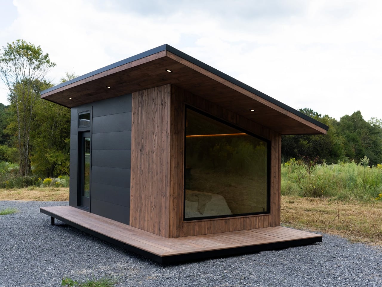
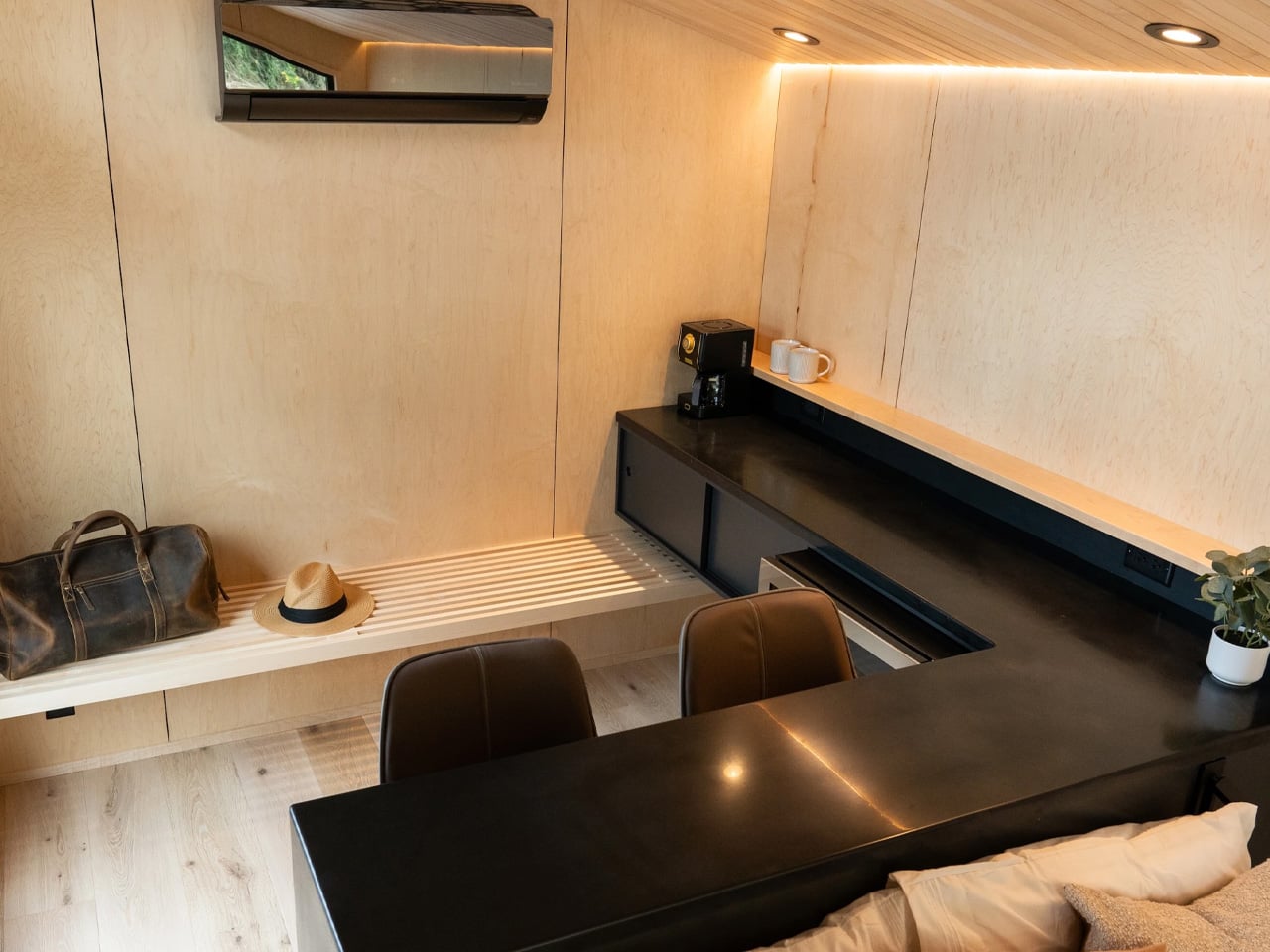
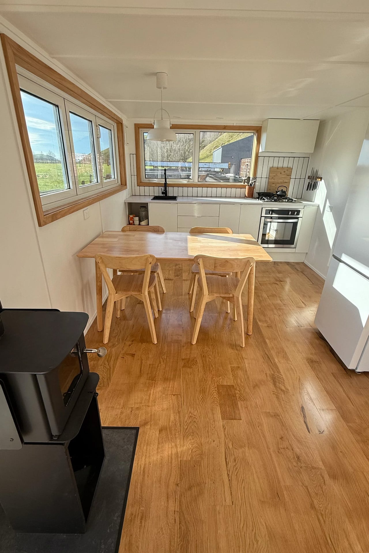
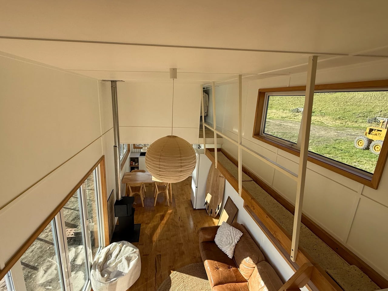
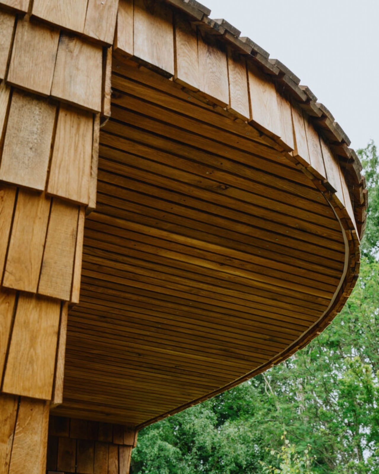
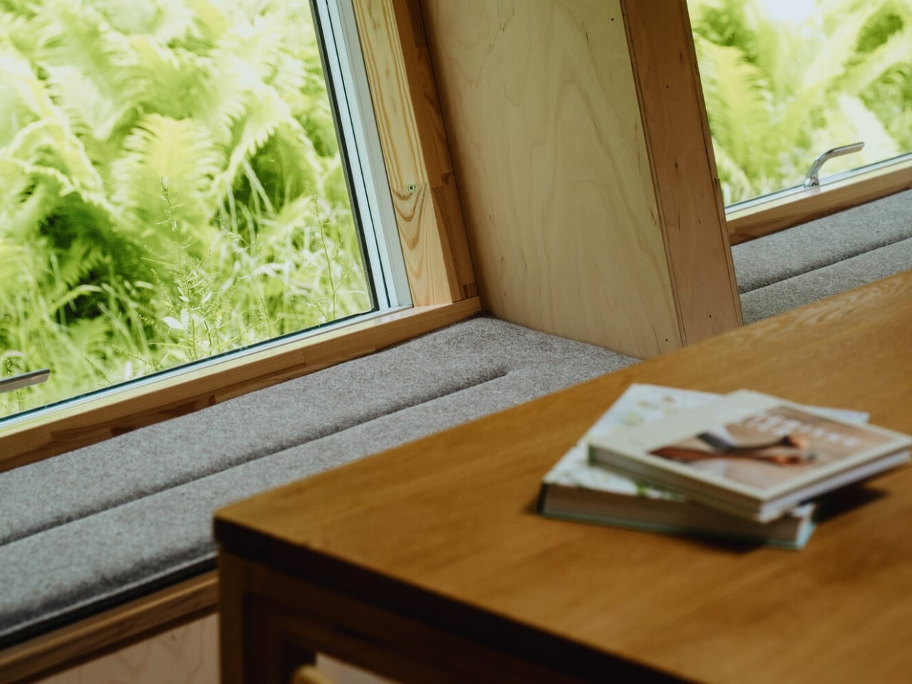
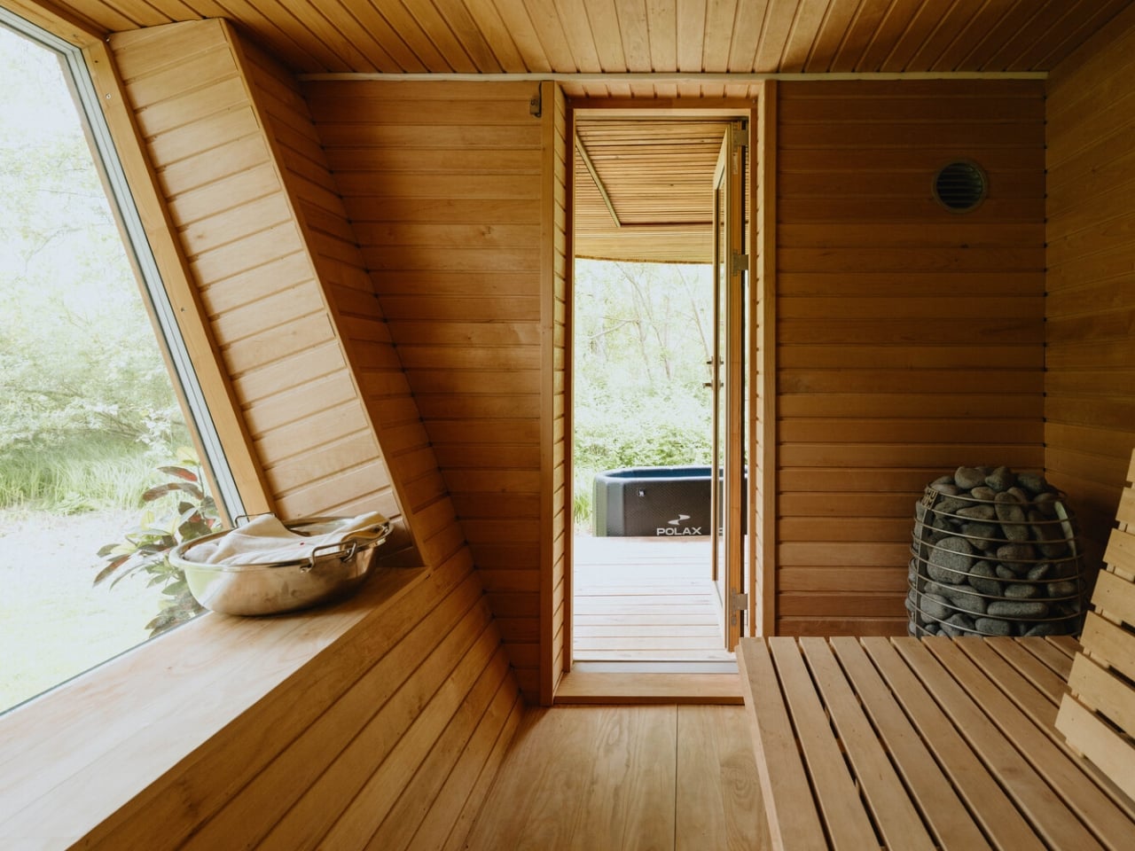
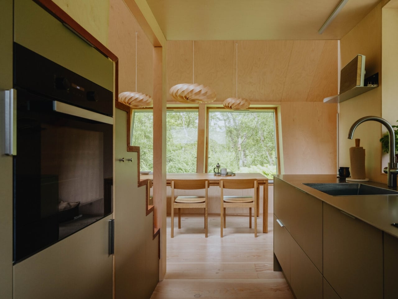
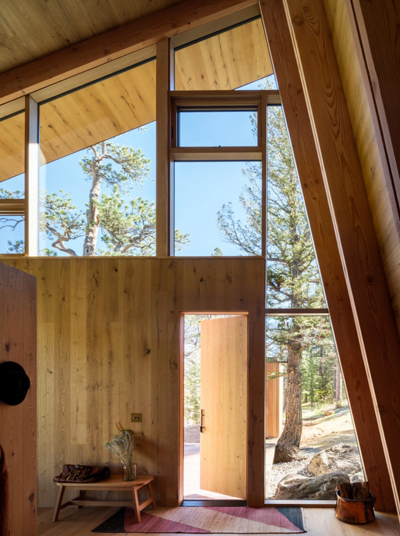
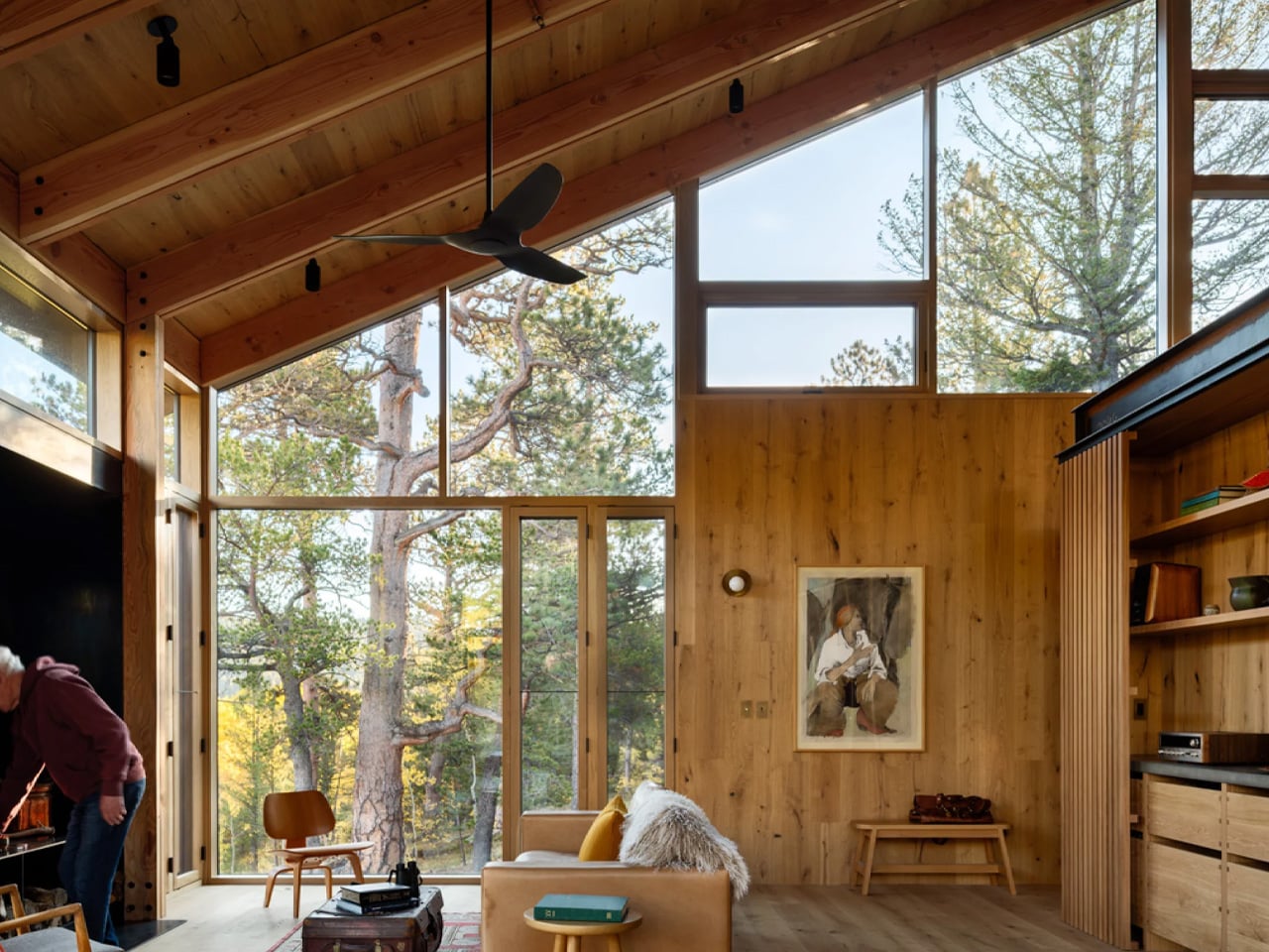
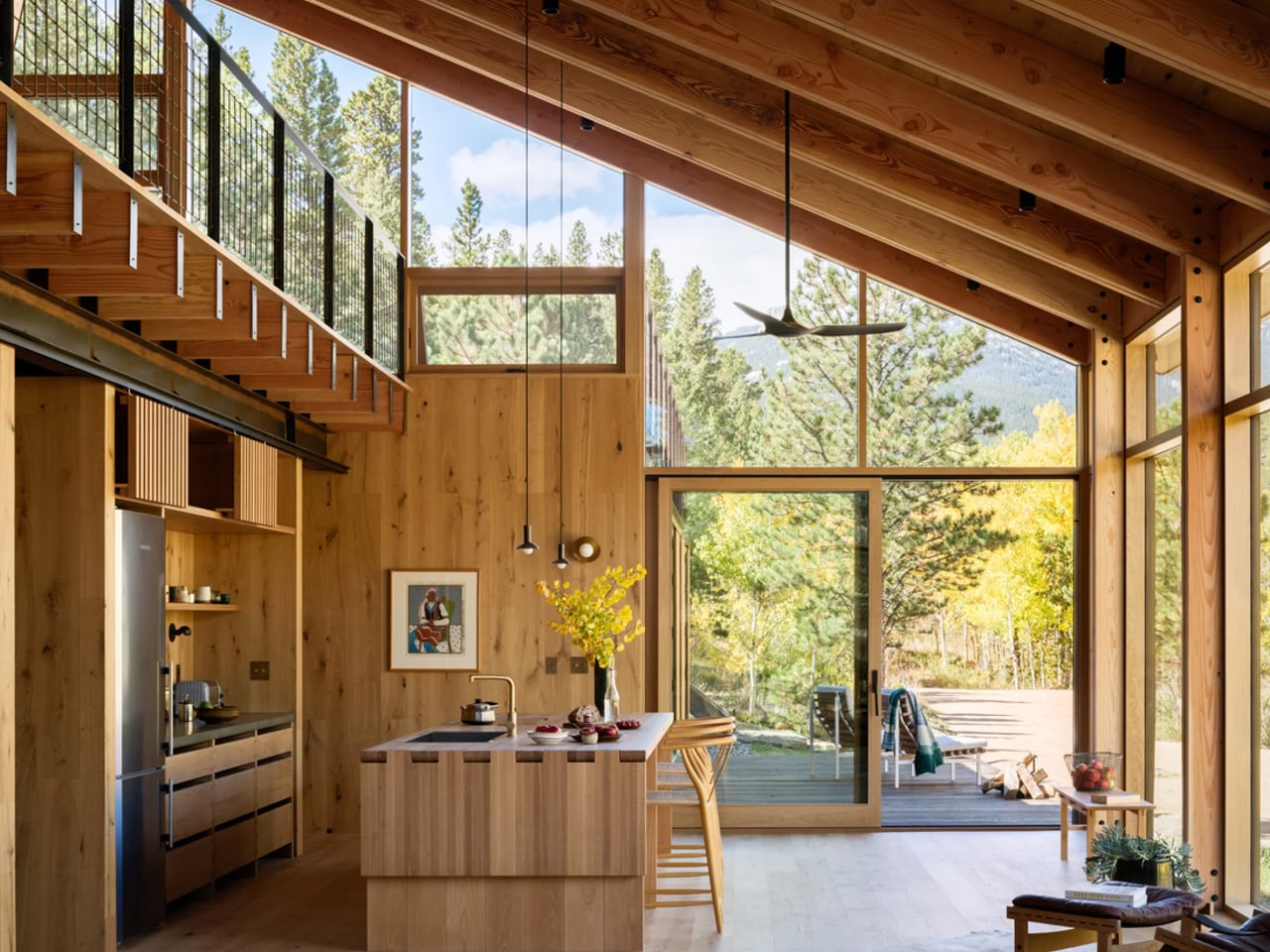
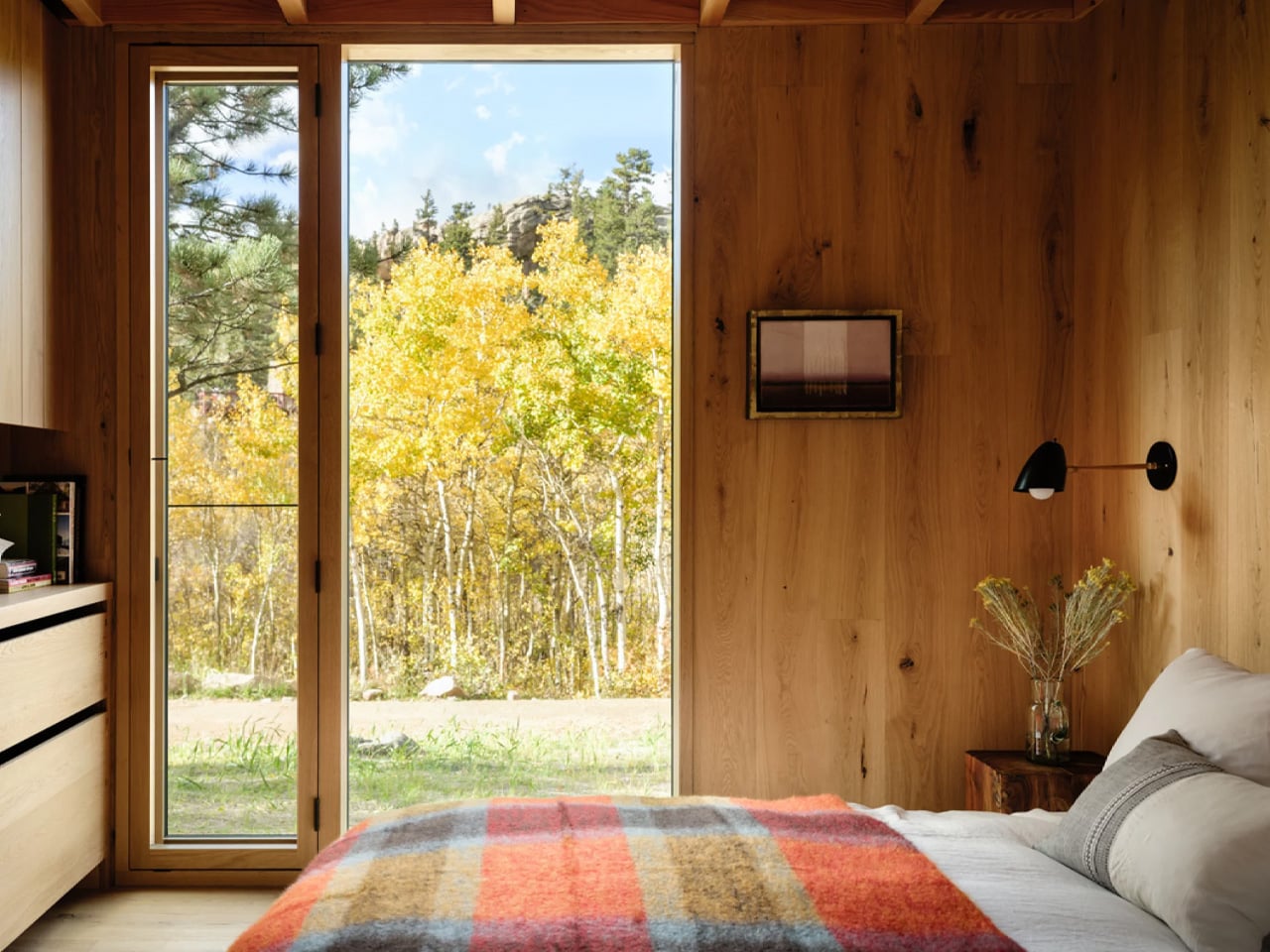
The Glass House by Escape arrives at a moment when the tiny home conversation desperately needed a reset.It’s a park model that reads less like a compact shelter and more like someone took a considered, light-soaked apartment and simply decided it didn’t need to be attached to a city block.
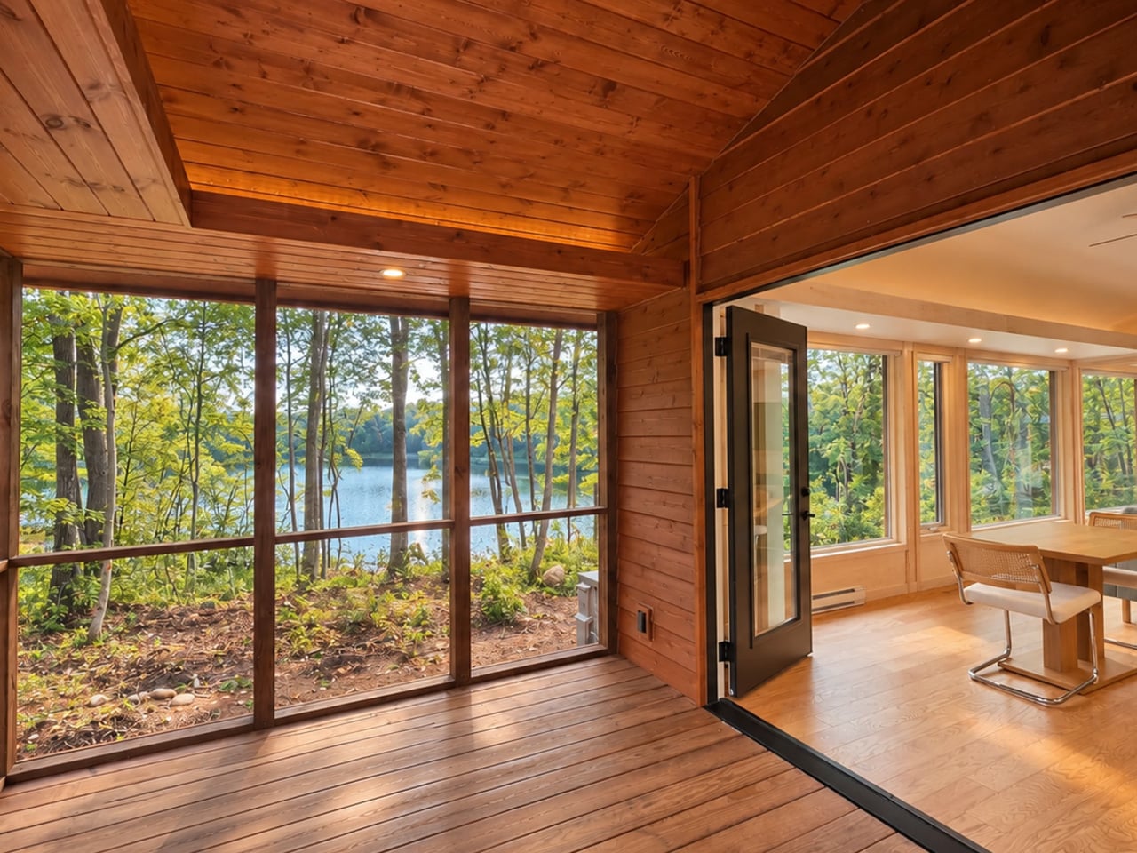
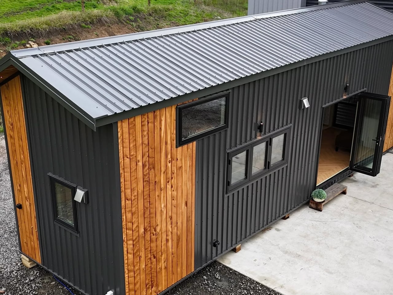
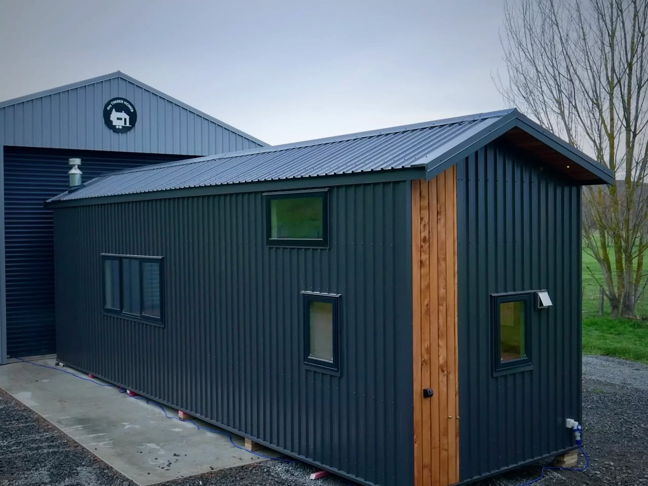
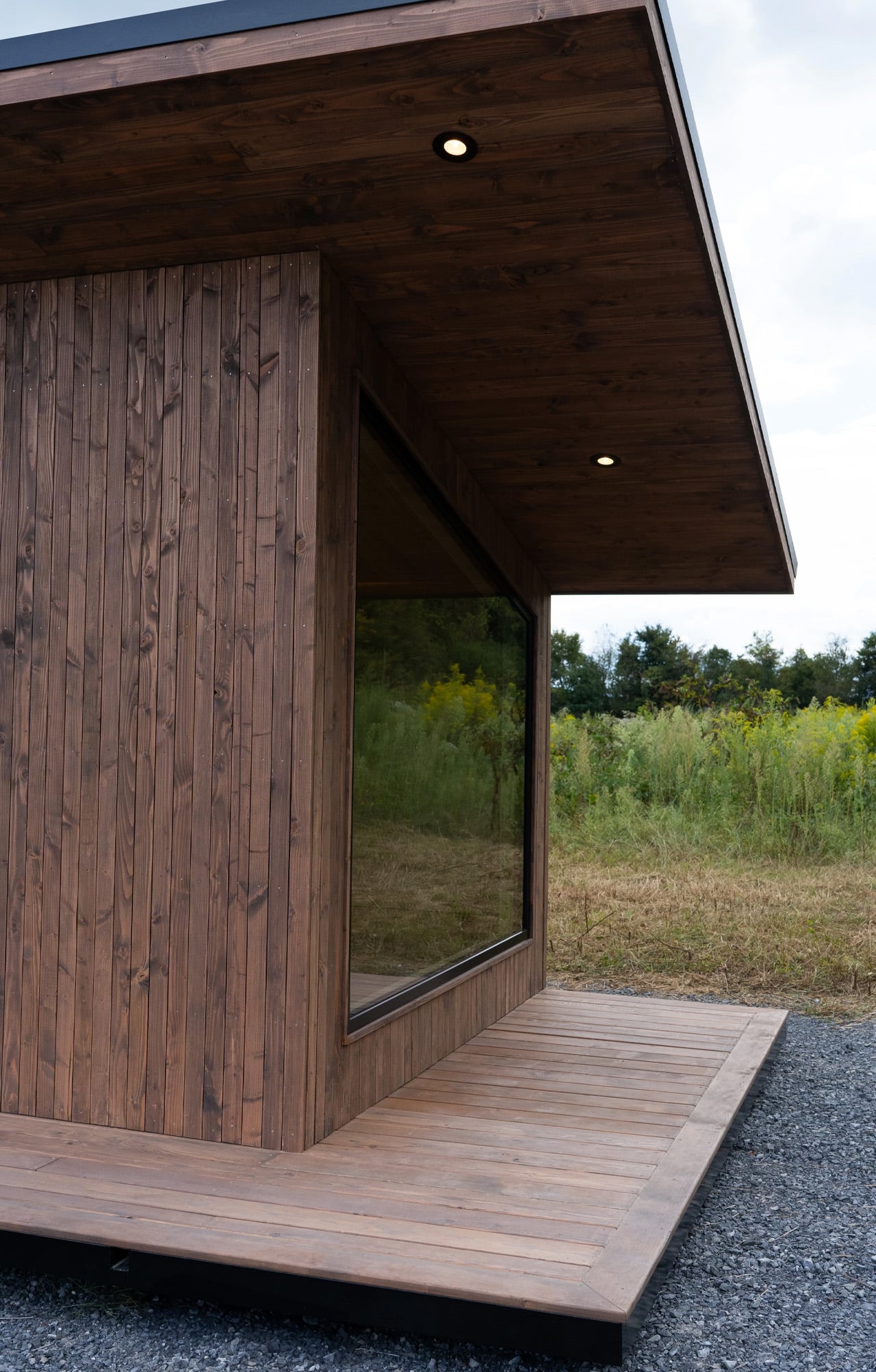
The structure stretches 47 feet long and 12 feet wide — uncommonly generous proportions for this category — finished in cedar that ages the way good materials should. But the defining move here is the glazing. One full wall runs 30 feet of continuous windows, pulling in light, landscape, and the kind of visual depth that makes a space feel genuinely expansive rather than merely tolerable. It’s a single-floor layout, which matters more than it sounds. No loft ladder, no crouched ceilings. Just clean, lateral living that prioritizes how a space feels to move through over how many square feet it can claim on paper.
Designer: Escape
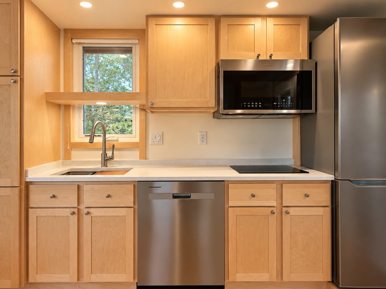
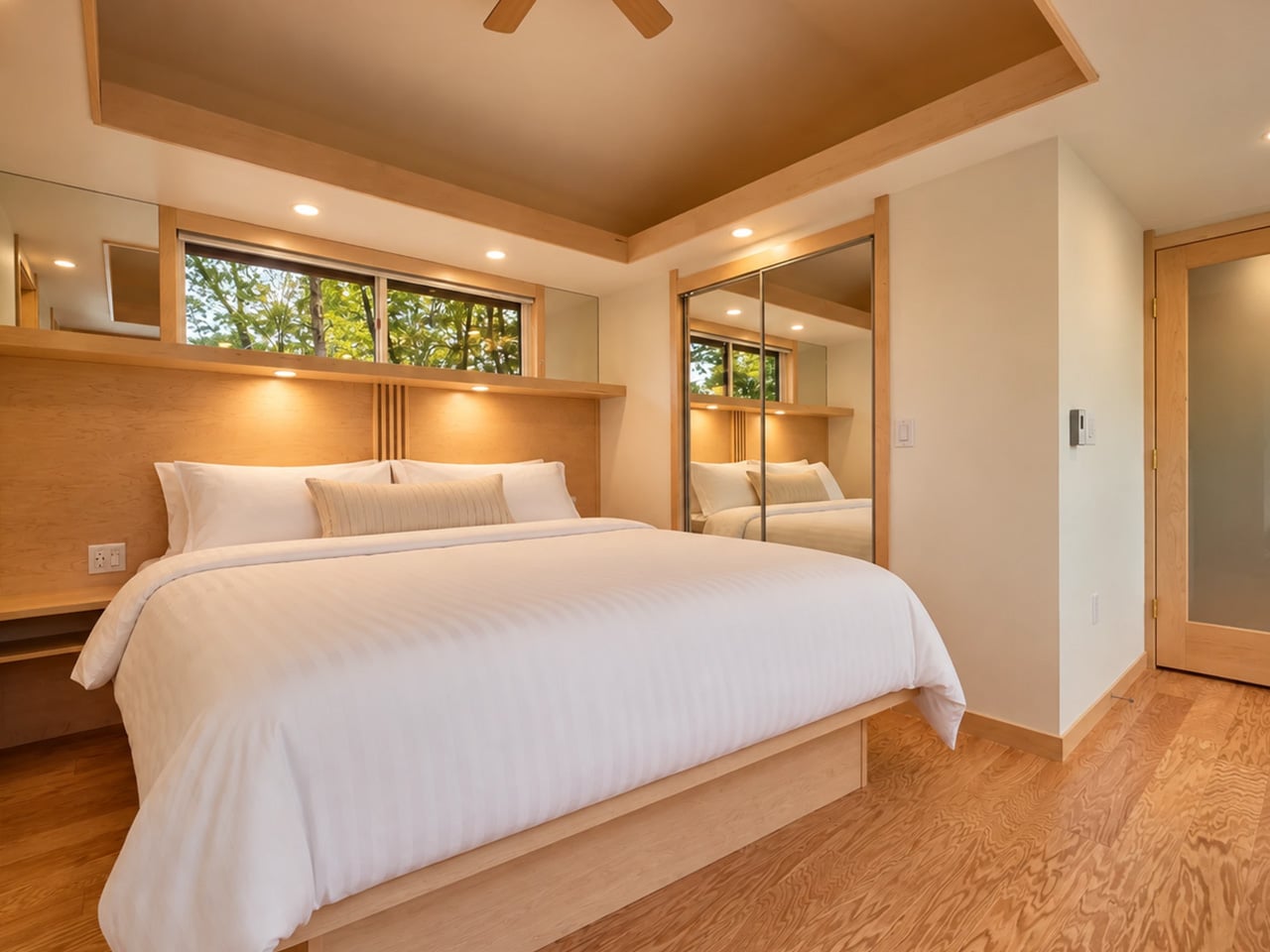
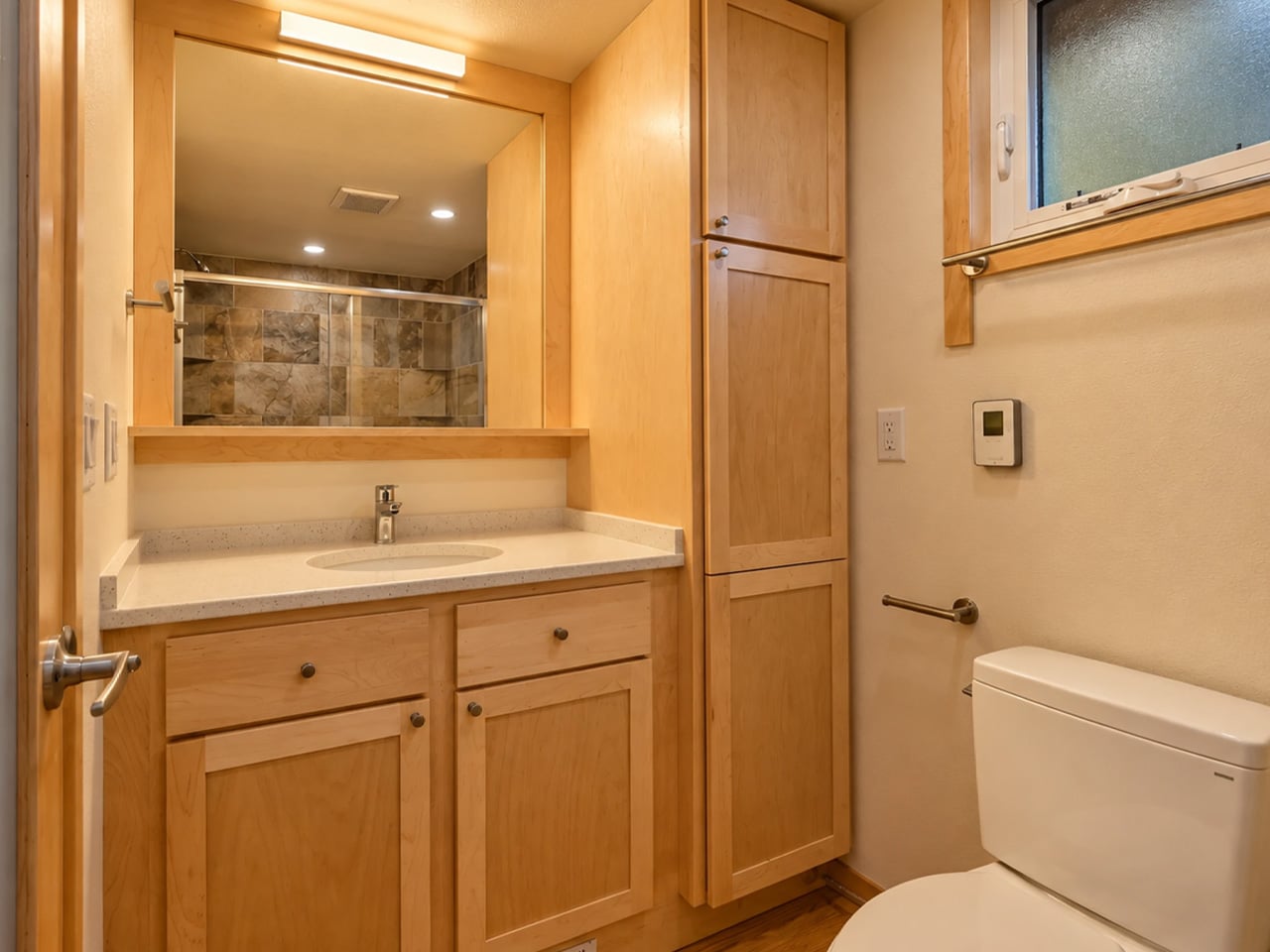
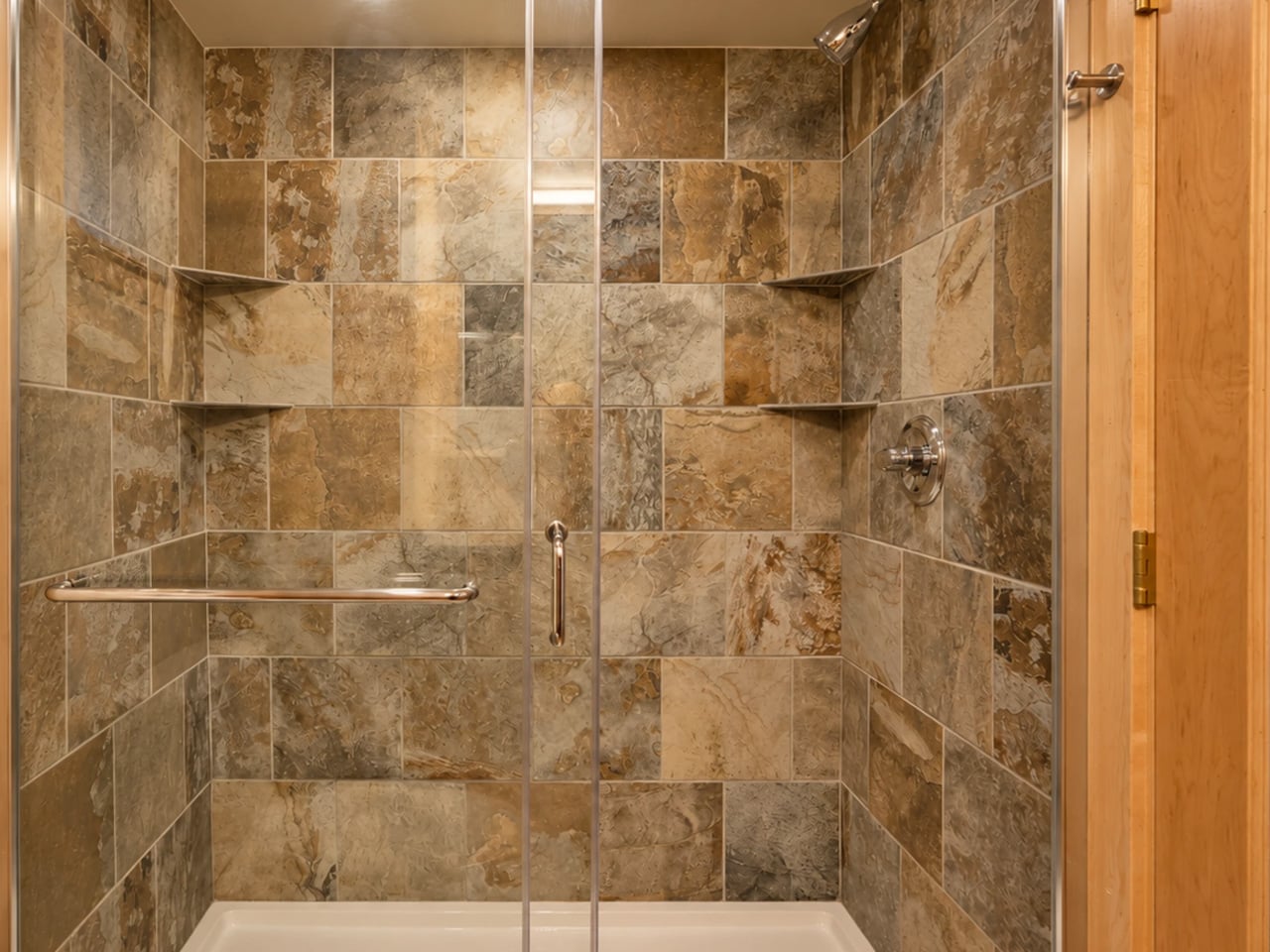
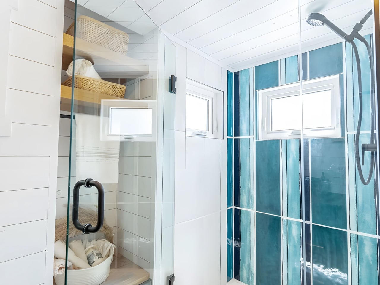
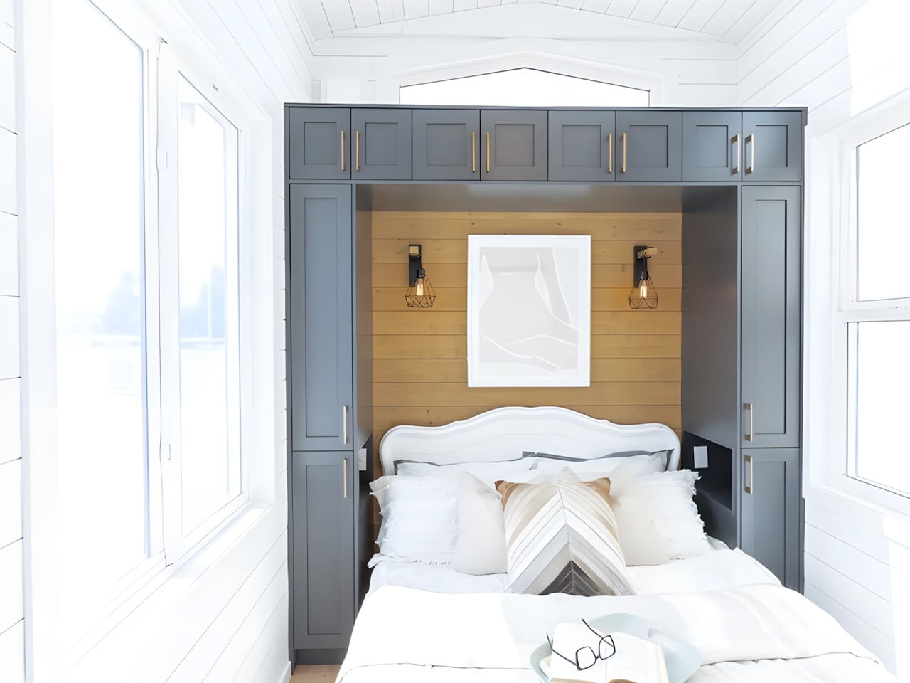
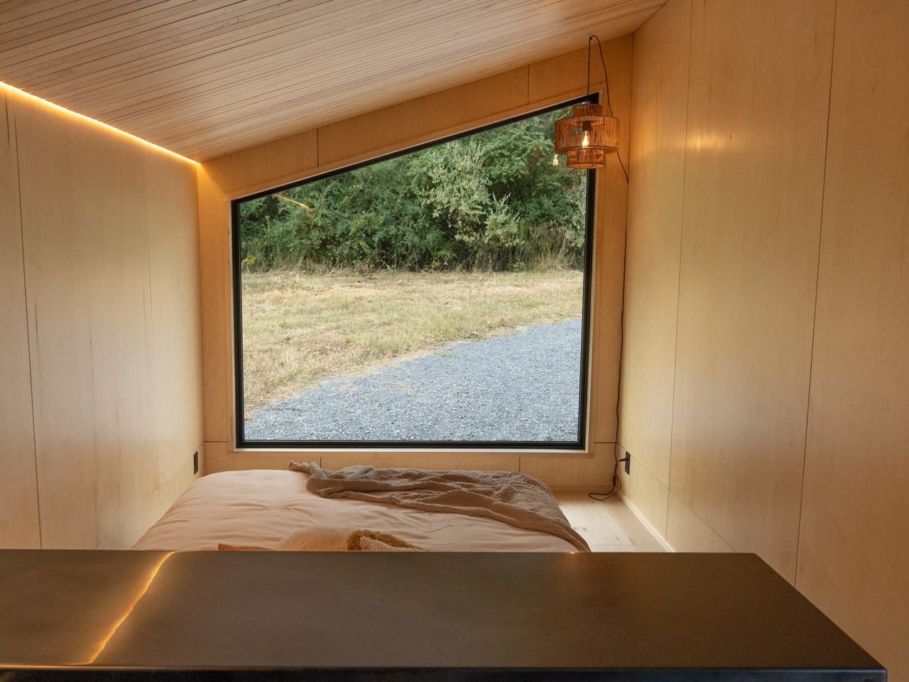
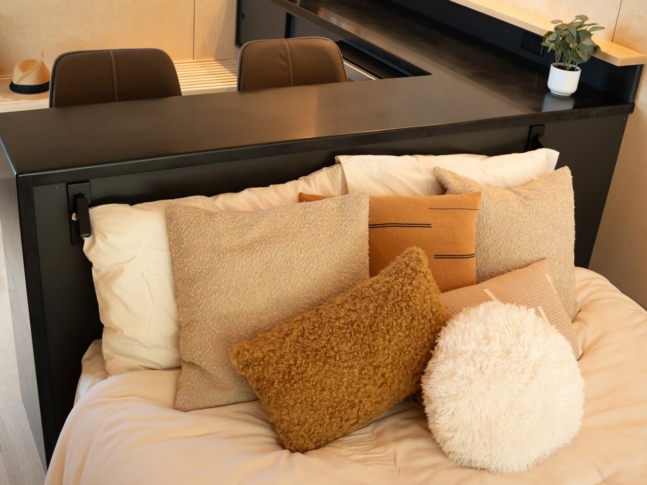
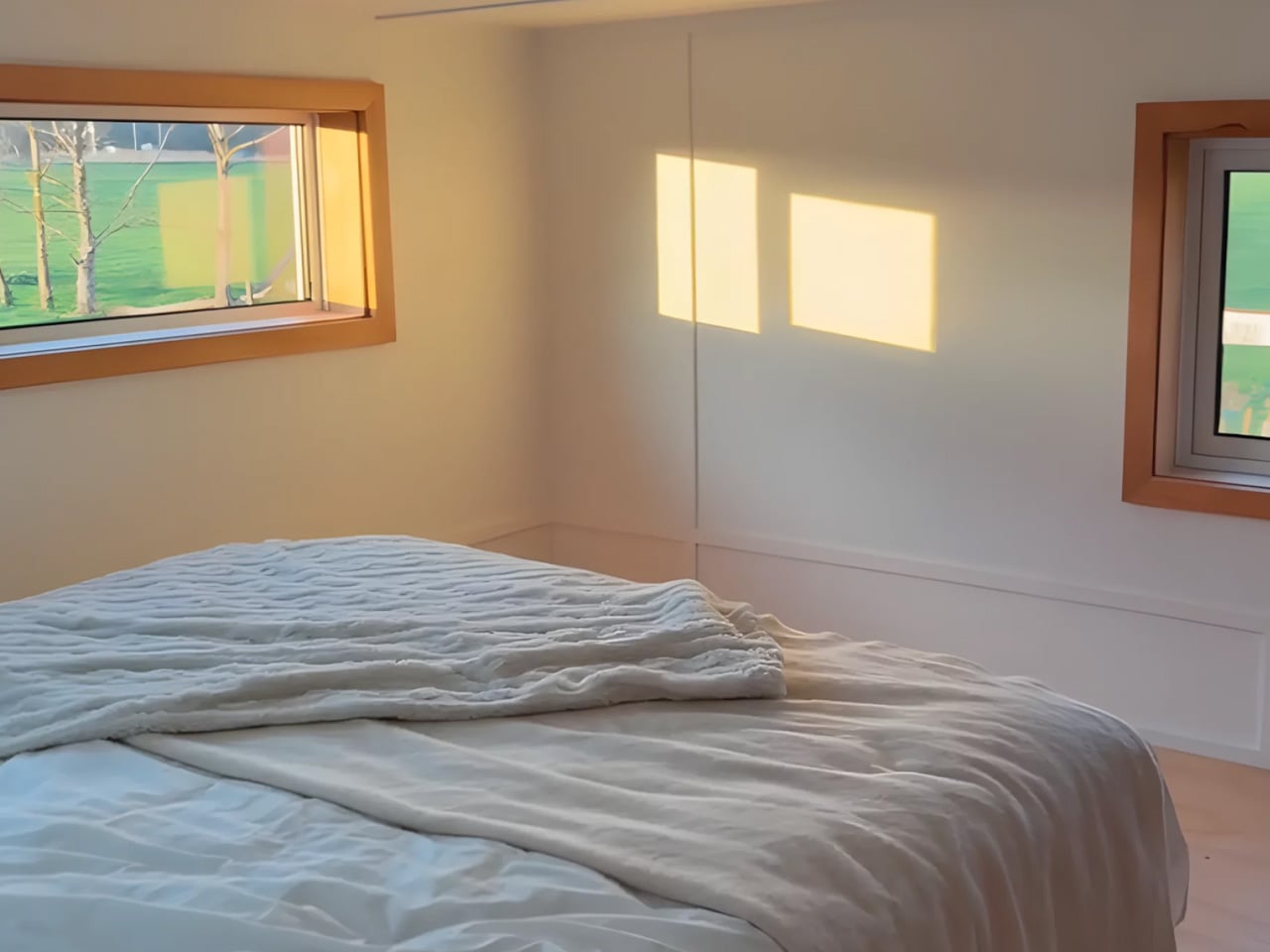
The interior holds up to its exterior promise. The kitchen is equipped with a full-size fridge/freezer, dishwasher, induction cooktop, and a combination microwave/convection oven — the kind of spec sheet that signals the designers were thinking about real use, not Pinterest renders. The bathroom features a large glass-enclosed tiled shower, a vanity sink, and a proper flushing toilet with generous storage built around it. The bedroom carries the same commitment to glazing — framing a view of the surrounding landscape rather than walling it out. An enclosed porch extends the footprint further, offering an indoor/outdoor zone that shifts with the weather and the mood.
Escape, which has been building award-winning tiny homes for over 30 years, currently has the Glass House on view at its Canoe Bay Village property in Wisconsin — which is worth noting, because it suggests the design isn’t purely aspirational. It exists in a real landscape, subject to real seasons, and it holds its own.
What makes the Glass House interesting as a design object isn’t just its size or its spec list. It’s the underlying argument it’s making: that living small doesn’t require a philosophy of sacrifice. The single-floor plan, the wall of glass, the proper kitchen — these aren’t luxury additions. They’re the baseline of what attentive design looks like when it’s applied to a form that usually settles for less. The Glass House doesn’t settle.
Modern architecture is increasingly moving beyond simply occupying a site to becoming part of it. Instead of dominating the landscape, many contemporary homes integrate the contours, colors, and materials of their surroundings, creating a visual harmony that minimizes environmental impact. Through thoughtful siting, natural materials, and restrained forms, these residences blur the boundary between the built and natural worlds.
Whether nestled into rugged mountains, hidden among dense forests, or perched along windswept coastlines, these homes show how architecture can celebrate instead of competing with nature. By responding to local climate, terrain, and ecosystems, they create immersive living experiences while leaving a lighter footprint on the landscape.
1. Mountain Homes That Become Part of the Terrain
Mountain homes often embrace steep slopes, rocky outcrops, and dramatic elevations instead of reshaping them. Architects use locally sourced stone, weathered timber, exposed concrete, and green roofs to visually anchor buildings within the landscape. Many designs are partially embedded into hillsides, allowing the surrounding topography to become an integral part of the architecture.
Large panoramic windows frame distant peaks while low-profile forms reduce visual impact. These homes appear sculpted from mountains, offering protection from harsh climates while creating a seamless relationship between architecture and the natural terrain.
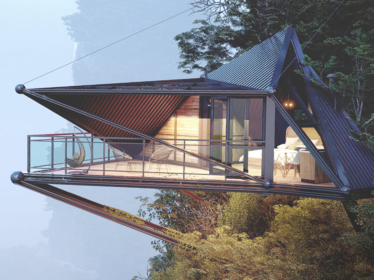
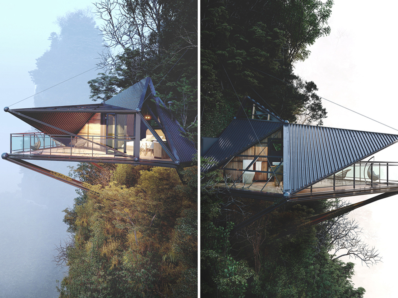
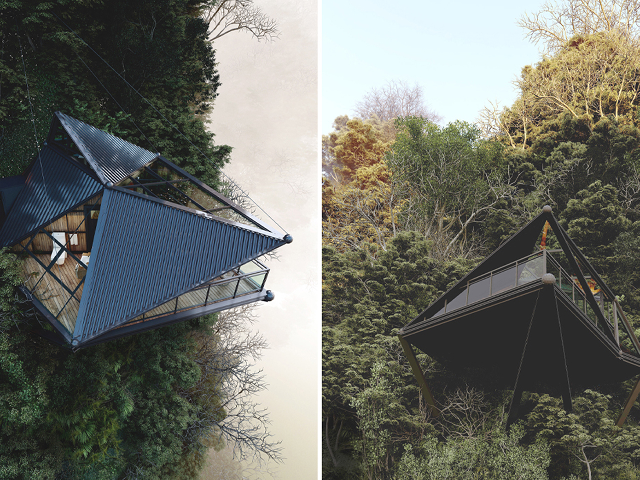
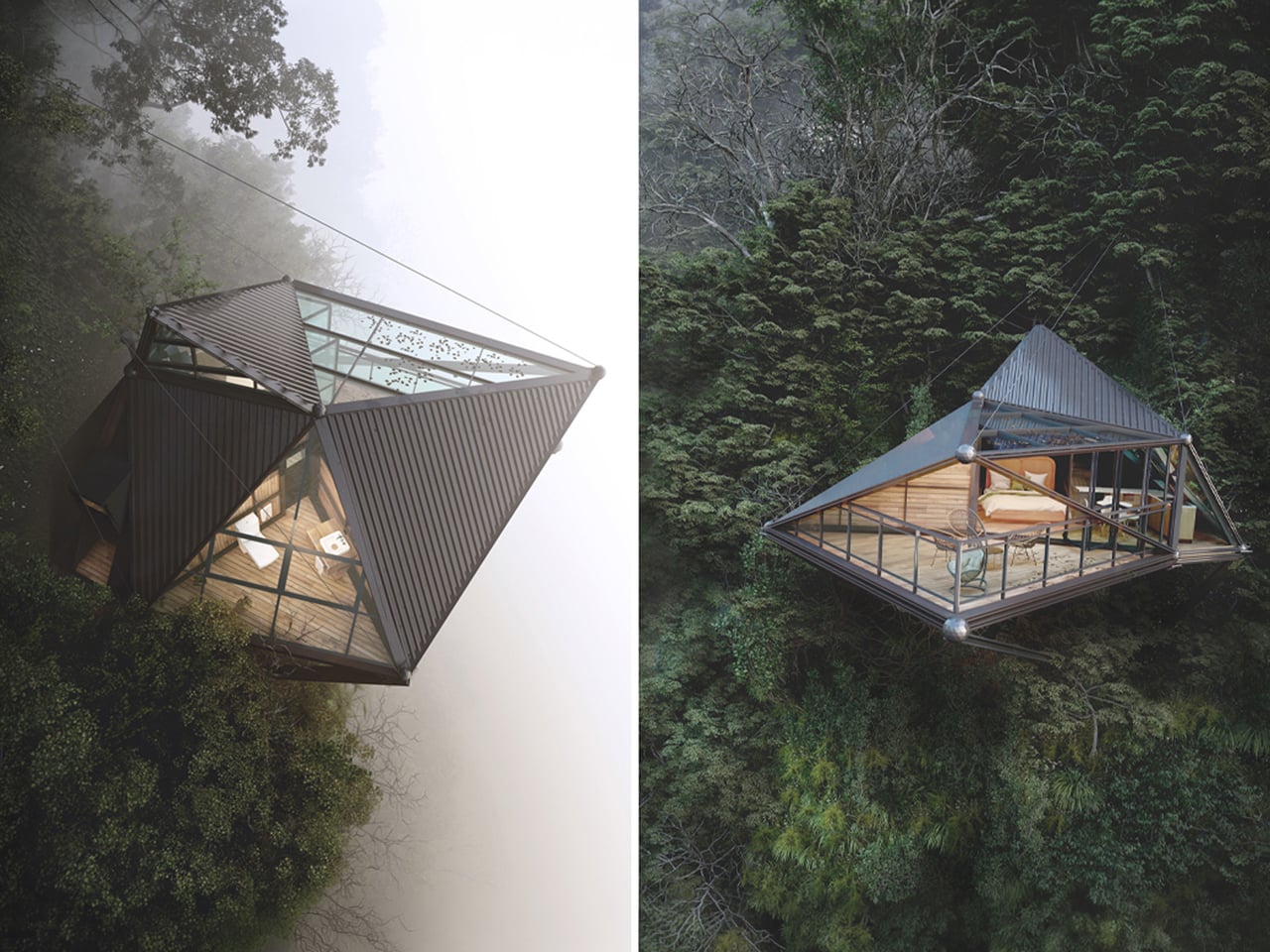
3D visualizer and architectural designer Thilina Liyanage conceptualizes mountain living through a contemporary cabin concept that engages directly with extreme terrain. Set high above a rugged slope, the design appears to float against the mountainside, framed by expansive glass façades and sleek metal cladding. Its sharp triangular form enhances the sense of lightness, while the fully glazed surfaces open uninterrupted views of the surrounding peaks, turning the landscape into a continuous visual experience from inside the home.
Structurally, the cabin is anchored into the rock using steel beams and tension cables, making the engineering part of the architecture itself. This allows the home to project outward dramatically, hovering above the cliff edge. Inside, warm timber finishes balance the exterior’s industrial expression, creating a softer, livable atmosphere. A cantilevered deck extends the space further into the void, combining wooden flooring with a protective canopy.
2. Beach Homes That Blend with Coastal Landscapes
Coastal homes are designed to respond to shifting dunes, ocean breezes, and expansive horizons. Elevated structures, light-colored materials, timber cladding, and generous glazing help buildings harmonize with sandy beaches while improving resilience against coastal conditions. Their open layouts maximize natural ventilation and uninterrupted views.
Instead of becoming dominant landmarks, these homes maintain a quiet presence within the shoreline. Reflective glass, soft material palettes, and carefully integrated landscaping allow them to merge with the surrounding environment while preserving the character and beauty of the coast.
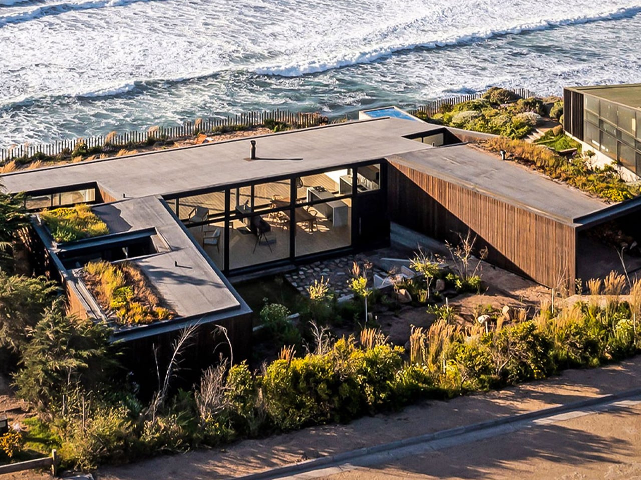
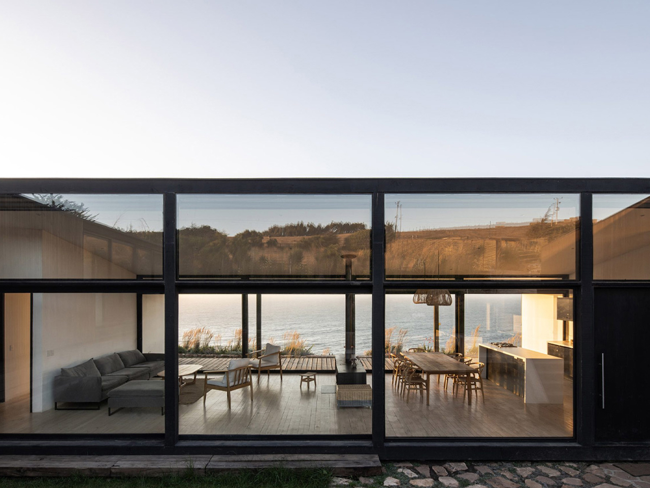
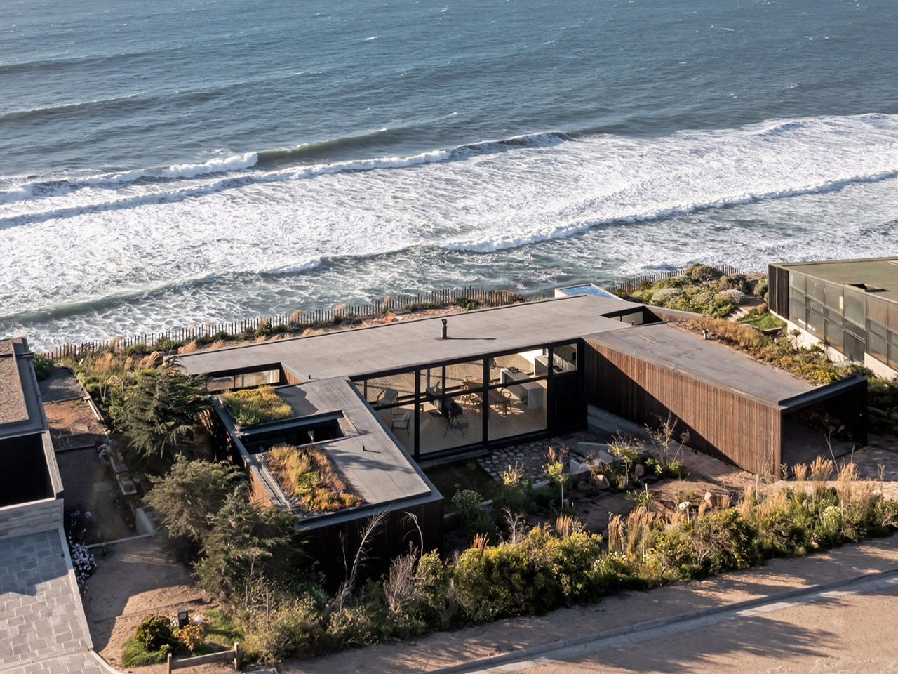
Based in Chile, ERRE Arquitectos designed Casa Ferran, a low-profile beach house in Matanzas. Set on a 240-square-meter site along the Pacific coast, the home follows a U-shaped plan that gently wraps the cliff edge, responding directly to the dramatic drop toward the ocean. The composition is carefully oriented to balance exposure and shelter, using its geometry to soften the impact of strong southwestern winds while preserving privacy along the side edges.
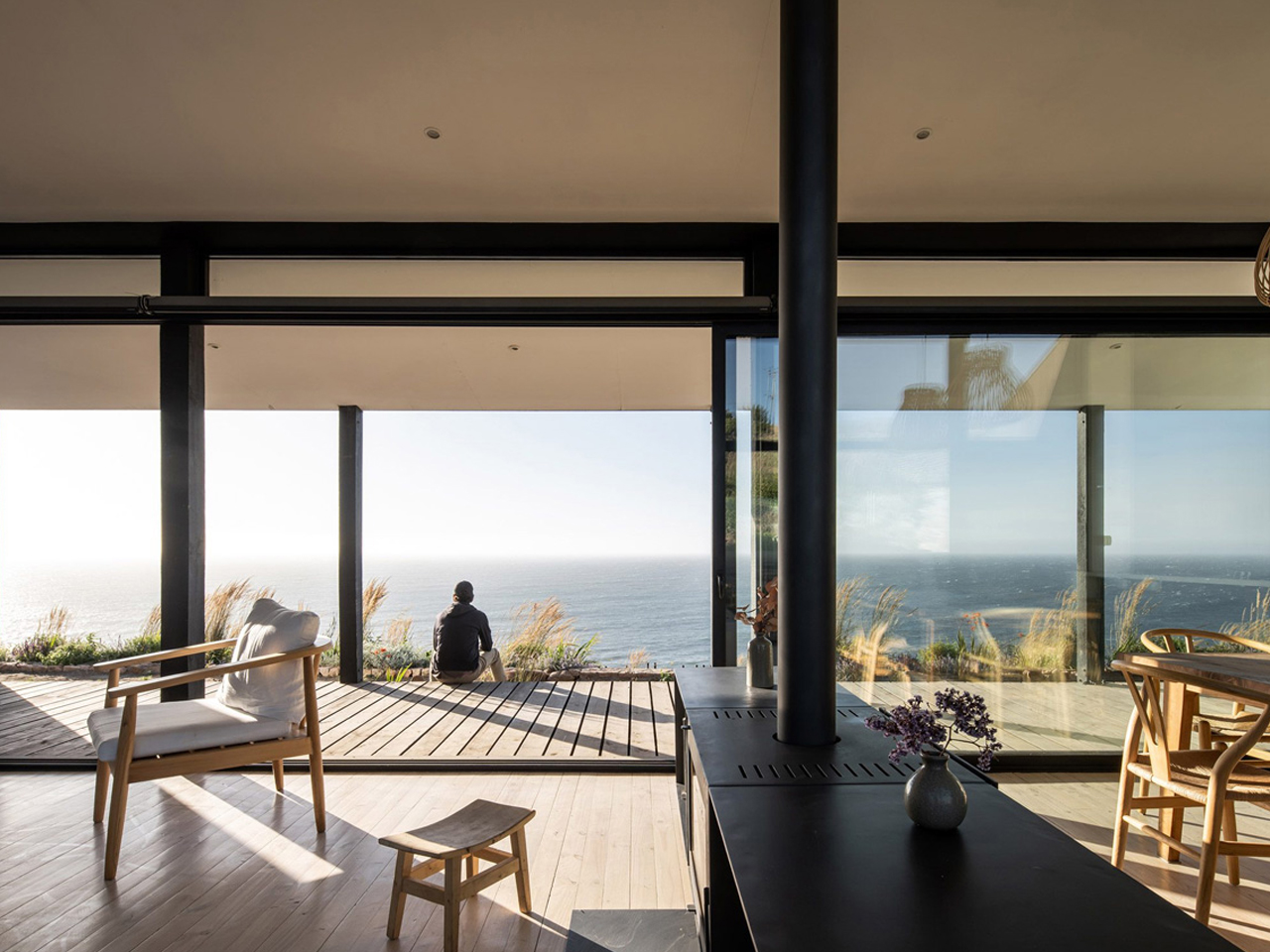
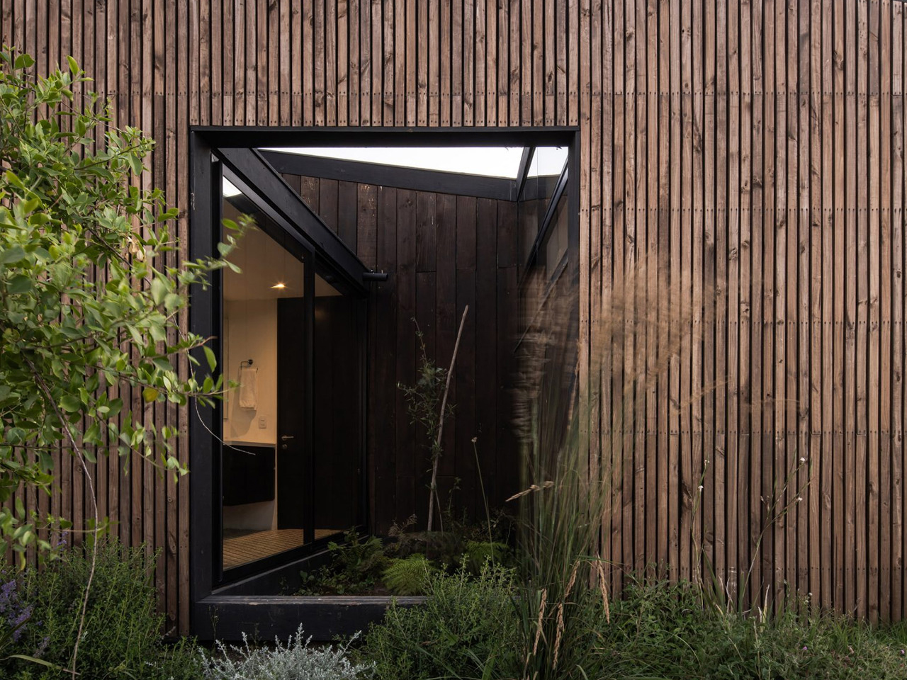
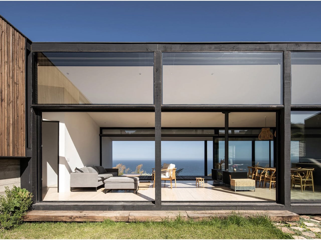
The central design strategy creates a protected courtyard that connects visually to the sea through a glazed common volume. This core space holds the kitchen, living, and dining areas, defined by full-height glass that draws in light and frames uninterrupted coastal views. Two wings extend outward: one containing bedrooms with planted atriums, and the other accommodating parking, guest rooms, and service zones. Built in black steel with pine cladding, and softened by white interiors and warm wood finishes, the home blends structure, landscape, and coastal living into one cohesive architectural gesture.
3. Forest Homes Hidden Among the Trees
Forest homes prioritize preservation by weaving architecture between existing trees rather than clearing the landscape. Dark timber, charred wood, Corten steel, and natural stone allow buildings to recede into woodland settings while respecting the surrounding ecosystem. Elevated walkways and compact footprints minimize disturbance to the forest floor.
Large windows invite natural light through the canopy, creating interiors that remain closely connected to seasonal changes. These homes dissolve into their wooded surroundings, allowing residents to experience nature without disrupting the delicate balance of the forest environment.
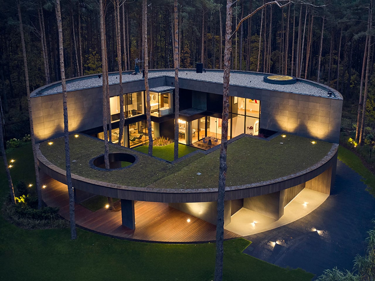
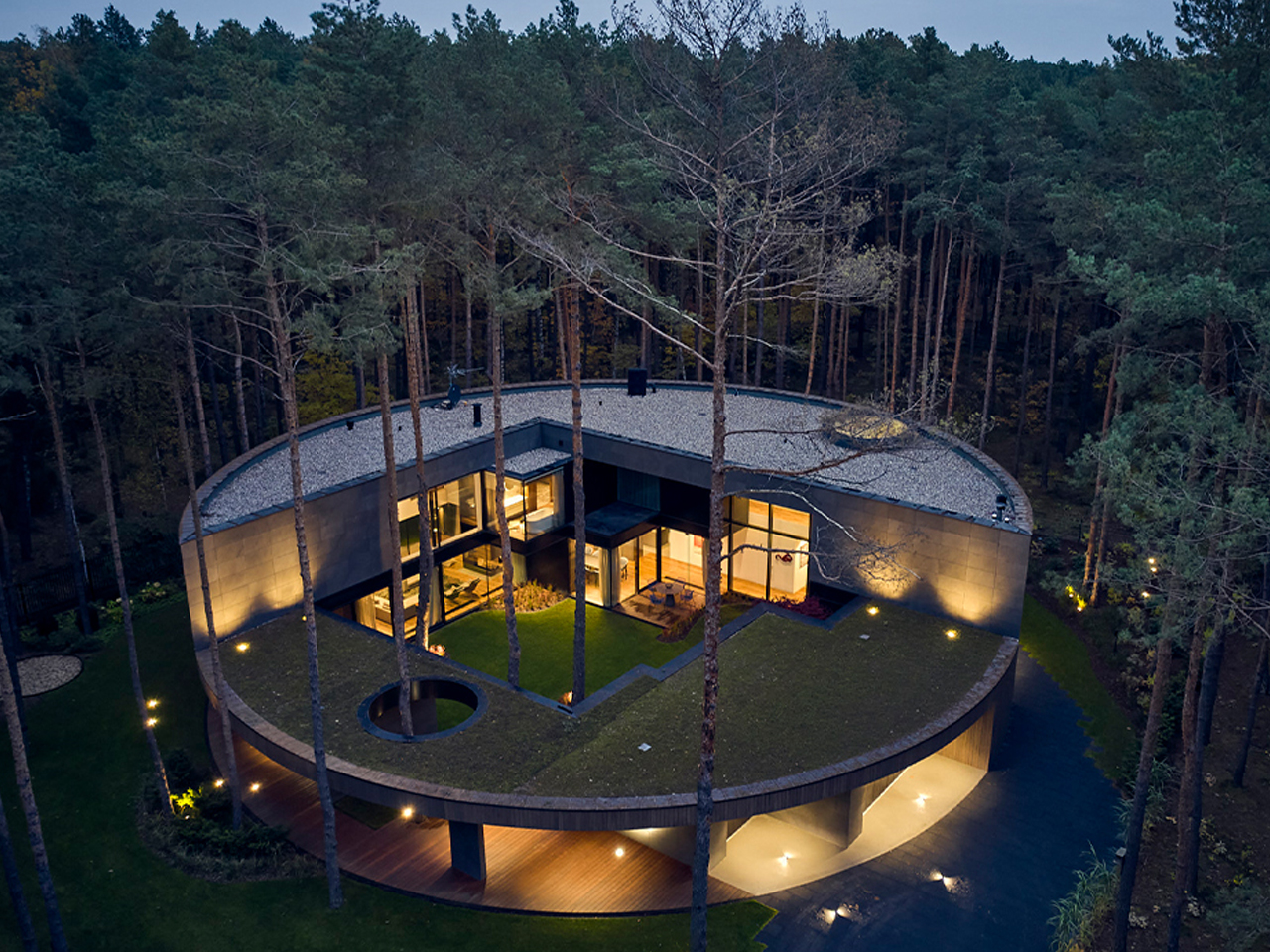
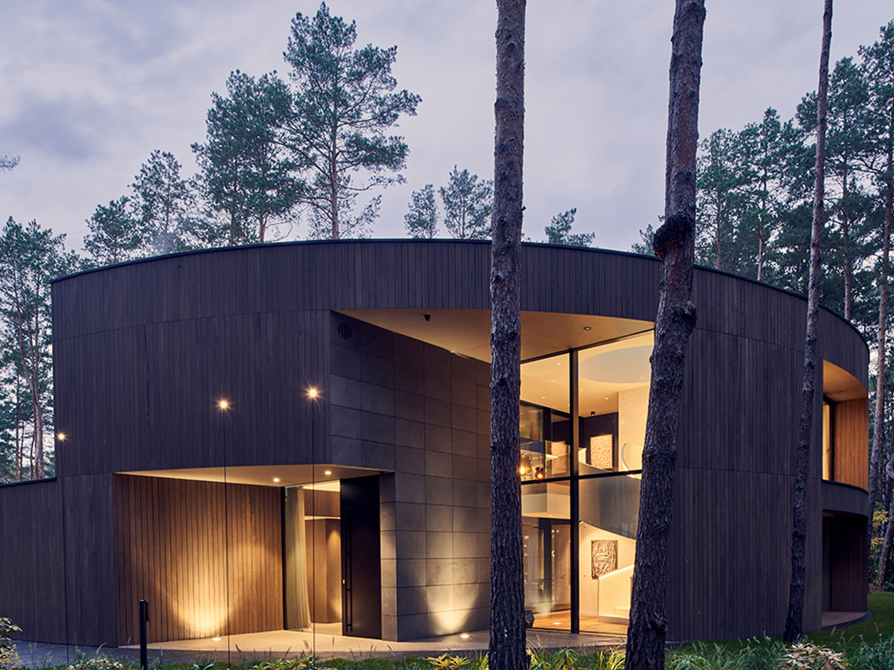
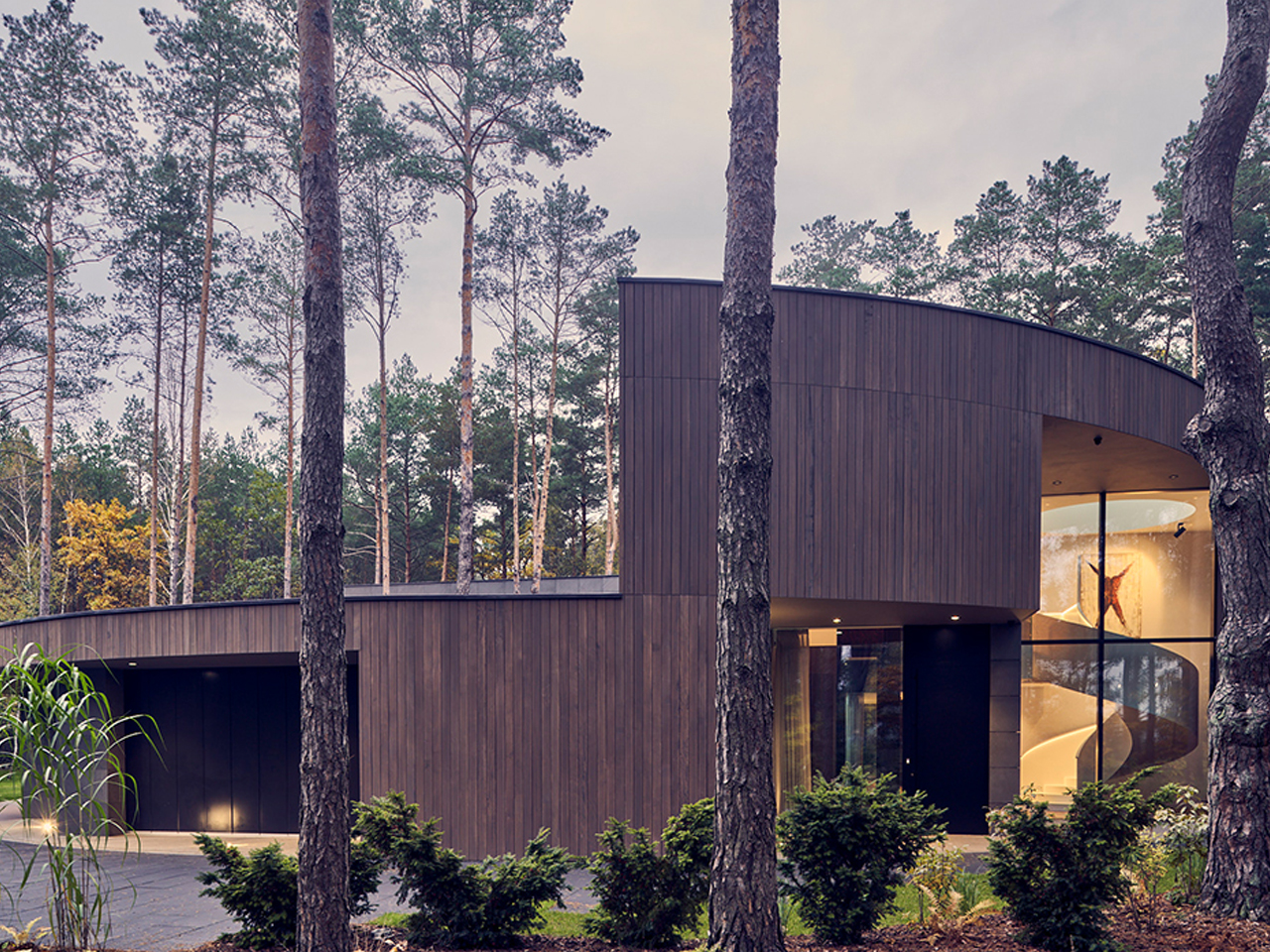
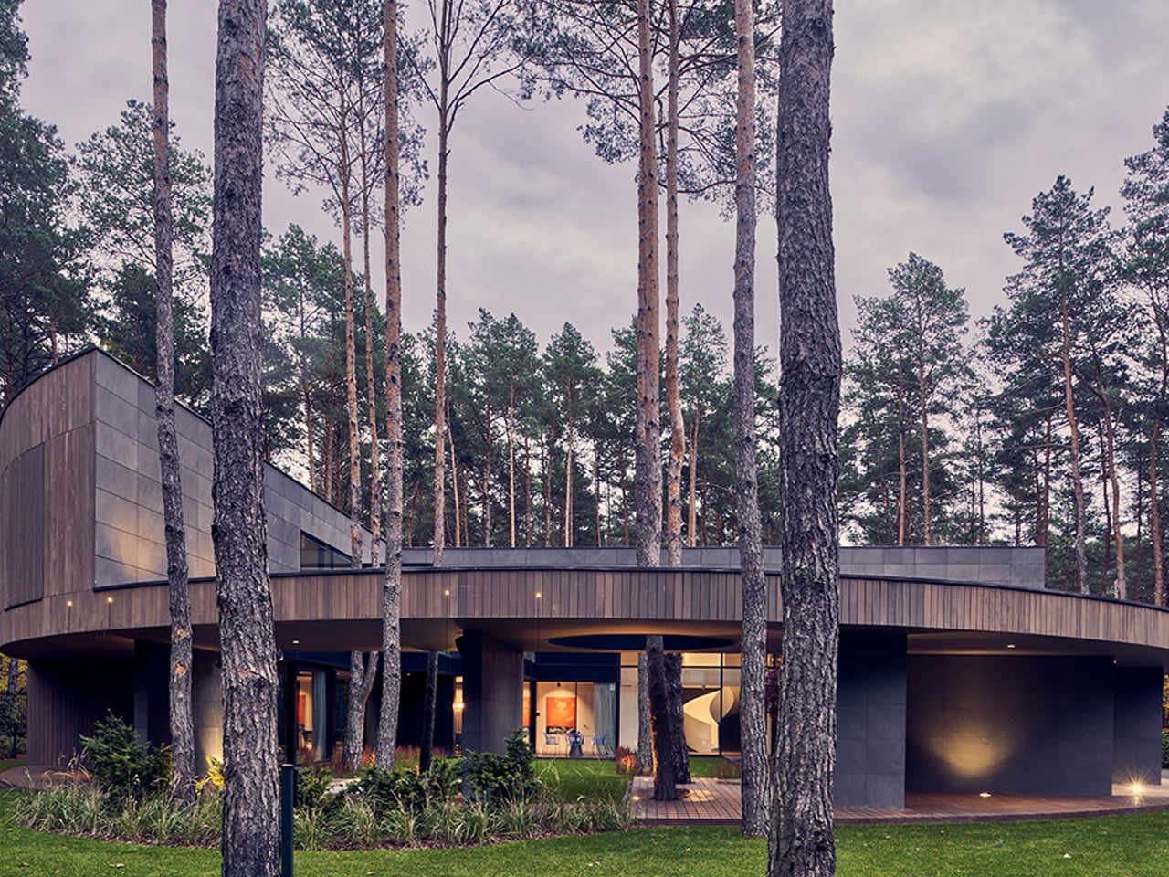
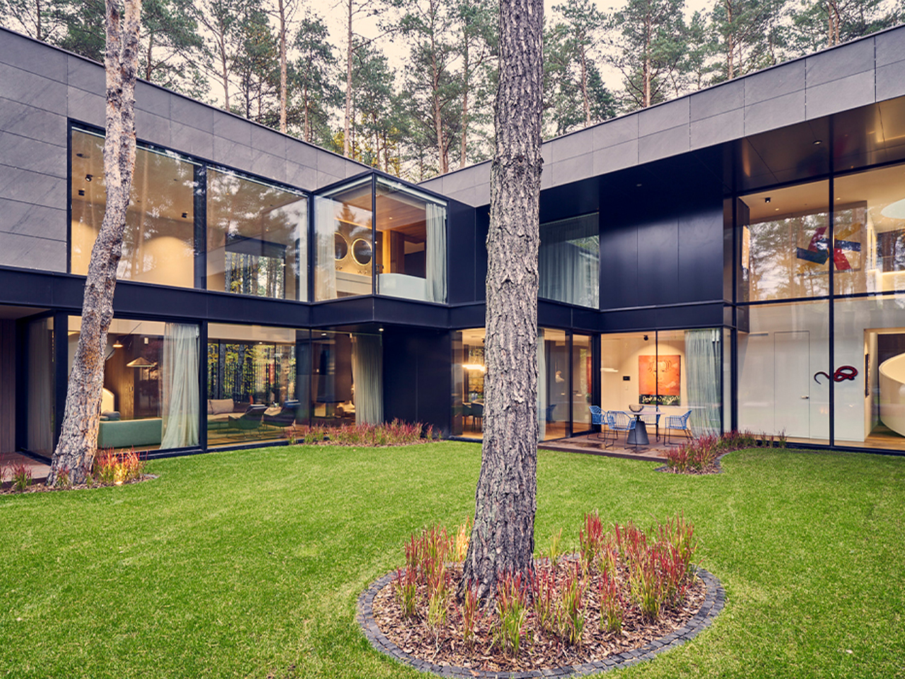
Circle Wood by Mobius Architekci redefines circular home design at a larger residential scale, set within a dense pine forest. Inspired by the form of a sliced tree trunk, the 400-square-meter house adopts a continuous circular geometry clad in okoume wood, carefully selected to help the structure merge with its natural surroundings. The smooth, knotless wooden exterior reinforces the idea of a seamless object embedded in the landscape rather than placed upon it.
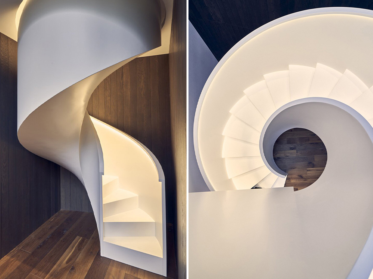
The design organizes living spaces through a fluid, looping layout where rooms feel carved into the volume like pockets within timber. An overhanging oval frame extends the architecture to include a garage and open spa, strengthening the sense of continuity between functions. Generous glazing dissolves boundaries between inside and forest, while a central atrium draws daylight deep into the home. Inside, gallery-like interiors and sculptural elements, including a sweeping white staircase, enhance the experience of movement, making the house feel like a continuous walk through nature and space.
4. Desert Homes Inspired by the Landscape
Desert architecture embraces simplicity, using forms and materials that echo the surrounding terrain. Rammed earth, textured concrete, adobe, and locally sourced stone create earthy palettes that blend naturally with sand dunes, rocky formations, and arid landscapes. Courtyards and shaded outdoor spaces further respond to the harsh climate.
Low horizontal profiles reduce visual prominence while passive cooling strategies improve comfort with minimal energy use. These homes demonstrate how architecture can adapt to extreme environments by working alongside nature instead of resisting it.
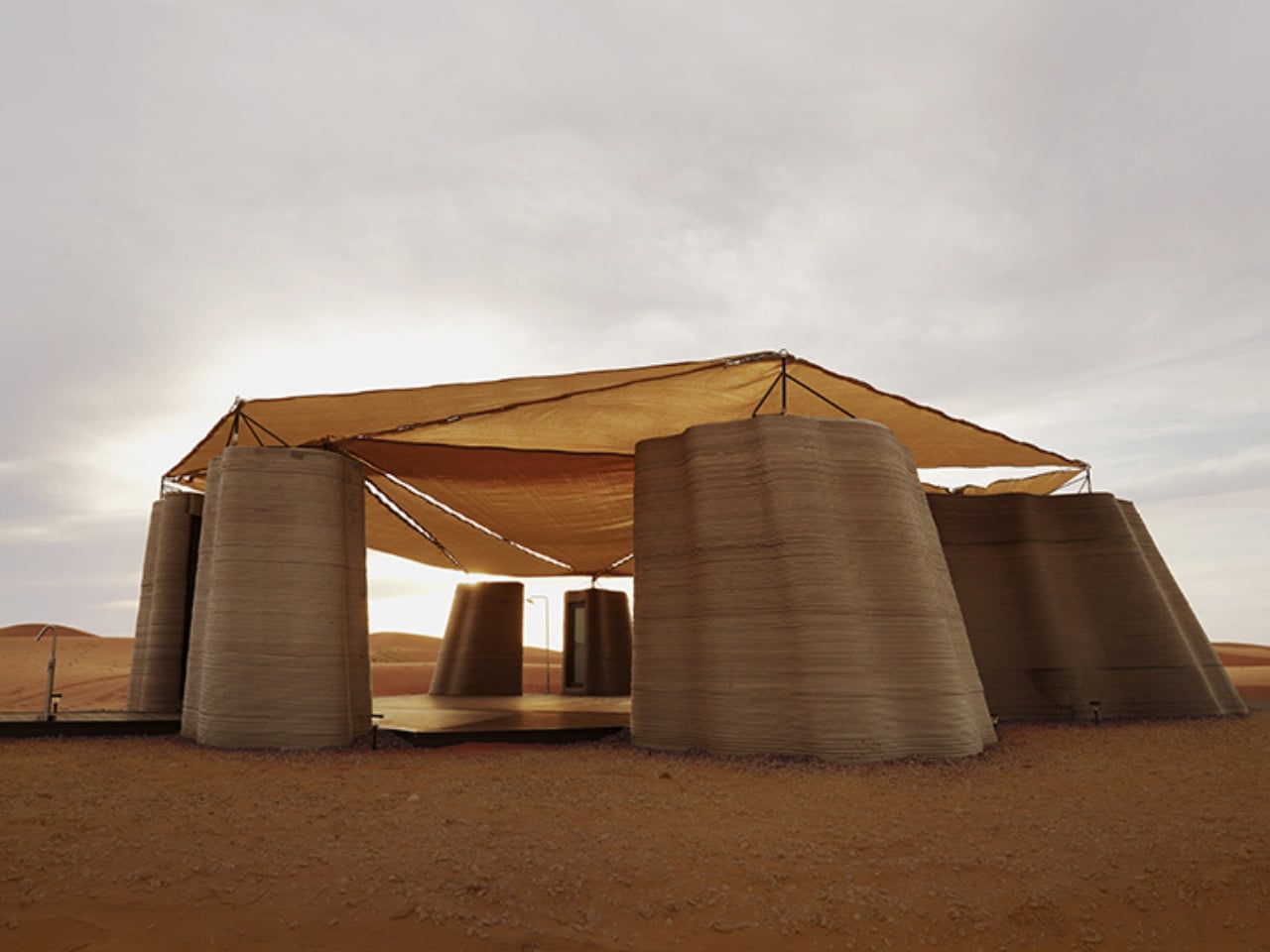
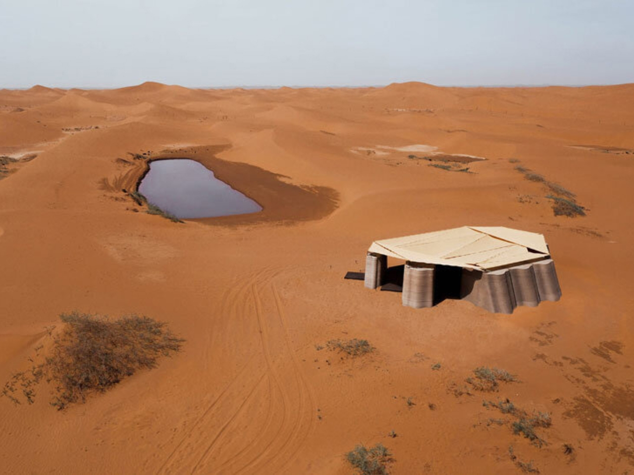
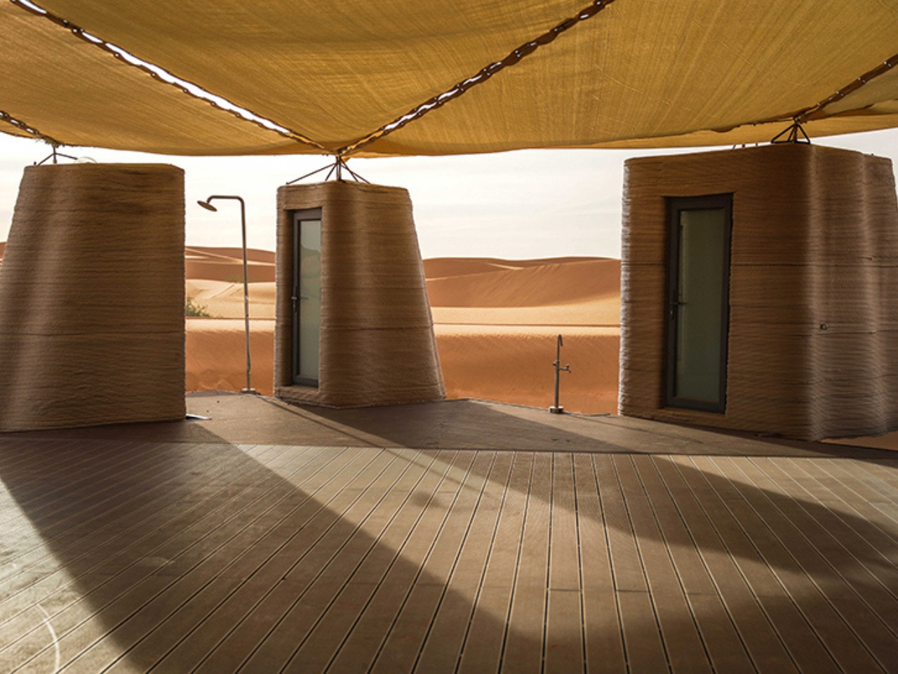
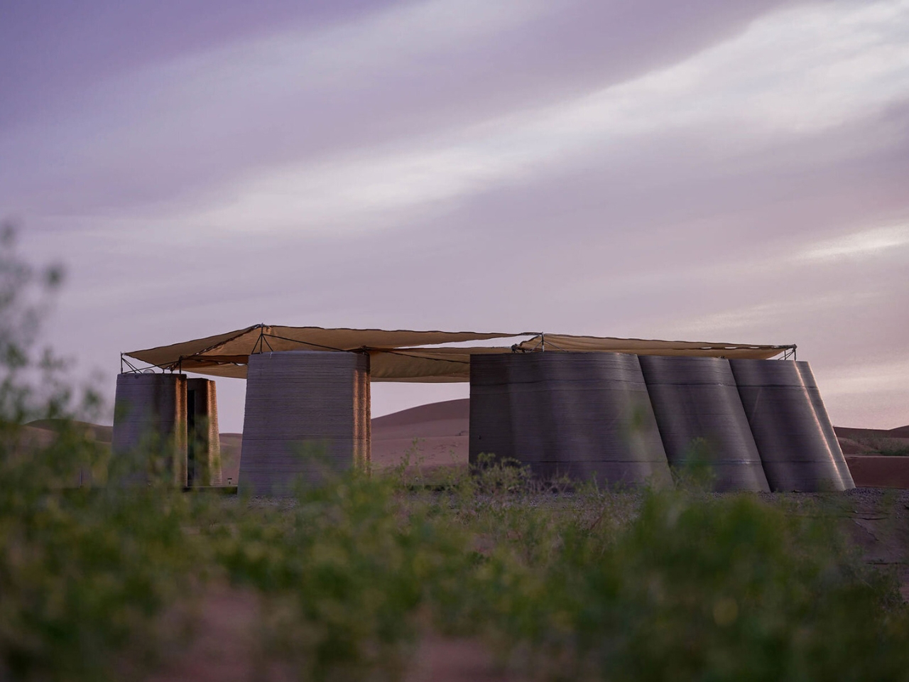
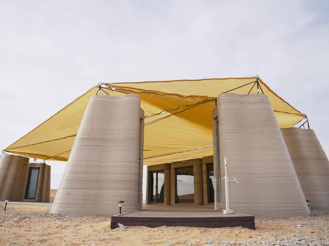
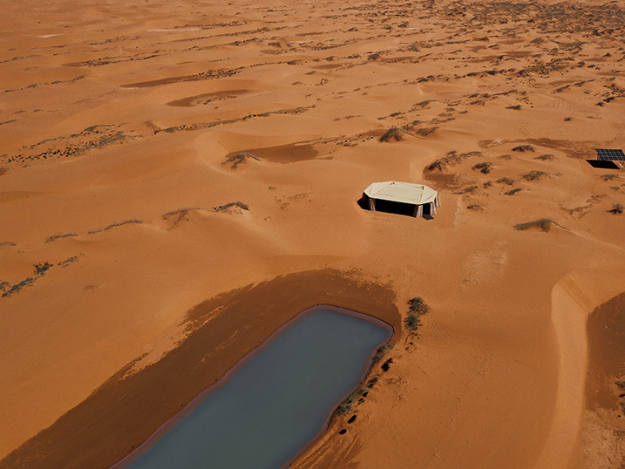
In the heart of Inner Mongolia’s Tengger Desert, designRESERVE introduces Desert Ark, a 3D-printed concrete shelter system that redefines how architecture merges with extreme desert landscapes. Designed for volunteers working on large-scale reforestation efforts, the 150-square-meter base camp responds directly to harsh conditions where temperatures swing from extreme heat to cold. Instead of resisting the desert, the architecture is shaped to coexist with it, forming a compact settlement that feels naturally embedded in the sandscape.
The modular design consists of nine units arranged in a circular layout around a shared communal core, balancing privacy with collective living. Built using robotic 3D-printing and sand-based concrete, the structures feature layered, wavy surfaces that echo wind-shaped dunes, allowing them to visually dissolve into the environment. Integrated insulation cavities regulate temperature, making the interiors more habitable in extremes. Beyond function, Desert Ark becomes part of the desert itself as an adaptive, low-impact form that blends shelter, landscape, and technology into a unified architectural response.
5. Lakeside Homes That Reflect Their Surroundings
Homes along lakes and rivers often use transparency and subtle material choices to reduce their visual presence. Glass façades reflect changing skies and water, while timber, stone, and planted roofs soften the transition between architecture and the surrounding landscape. Many designs gently follow the shoreline instead of altering it.
By emphasizing reflection, openness, and carefully framed views, these homes create a continuous dialogue between indoor and outdoor spaces. The result is architecture that appears to dissolve into the water’s edge while providing peaceful living environments immersed in nature.
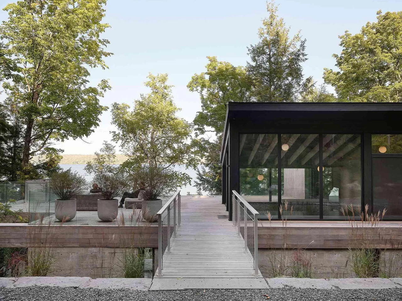
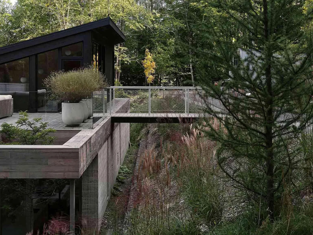
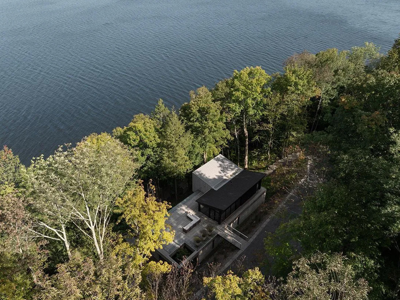
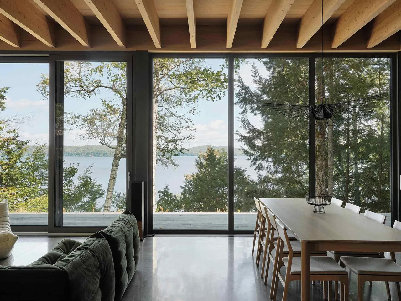
yh2 Architecture designs the Counter-Slope House as a quiet intervention within the steep terrain of Lake Memphremagog in Potton, Quebec. The 4,530-square-foot residence is embedded in a sharply sloping woodland site, where dense trees and shifting gradients shape every architectural decision. Instead of asserting presence toward the lake, the house withdraws into the land, reading more like a calibrated extension of the hillside.
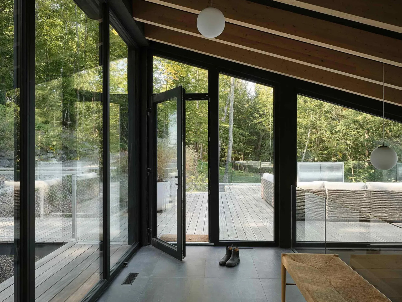
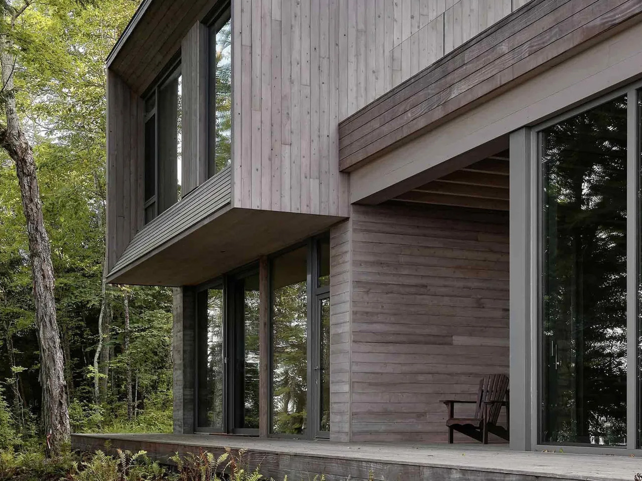
The building is composed of two interlocking volumes that step gently with the slope, each capped by a subtly shifting dual-pitched roof that reduces visual mass and echoes the surrounding topography. Weathered cedar cladding allows the exterior to dissolve into the forest, while interiors in white oak introduce warmth and structure. Openings are carefully placed to capture fragmented lake views through trees rather than direct exposure, making light, movement, and seasonality central to the lived experience.
Ultimately, homes that disappear into their natural surroundings reflect a thoughtful approach to design, where architecture complements rather than competes with the landscape. By respecting local environments and embracing contextual materials, these residences create timeless spaces that foster a deeper connection between people and nature.
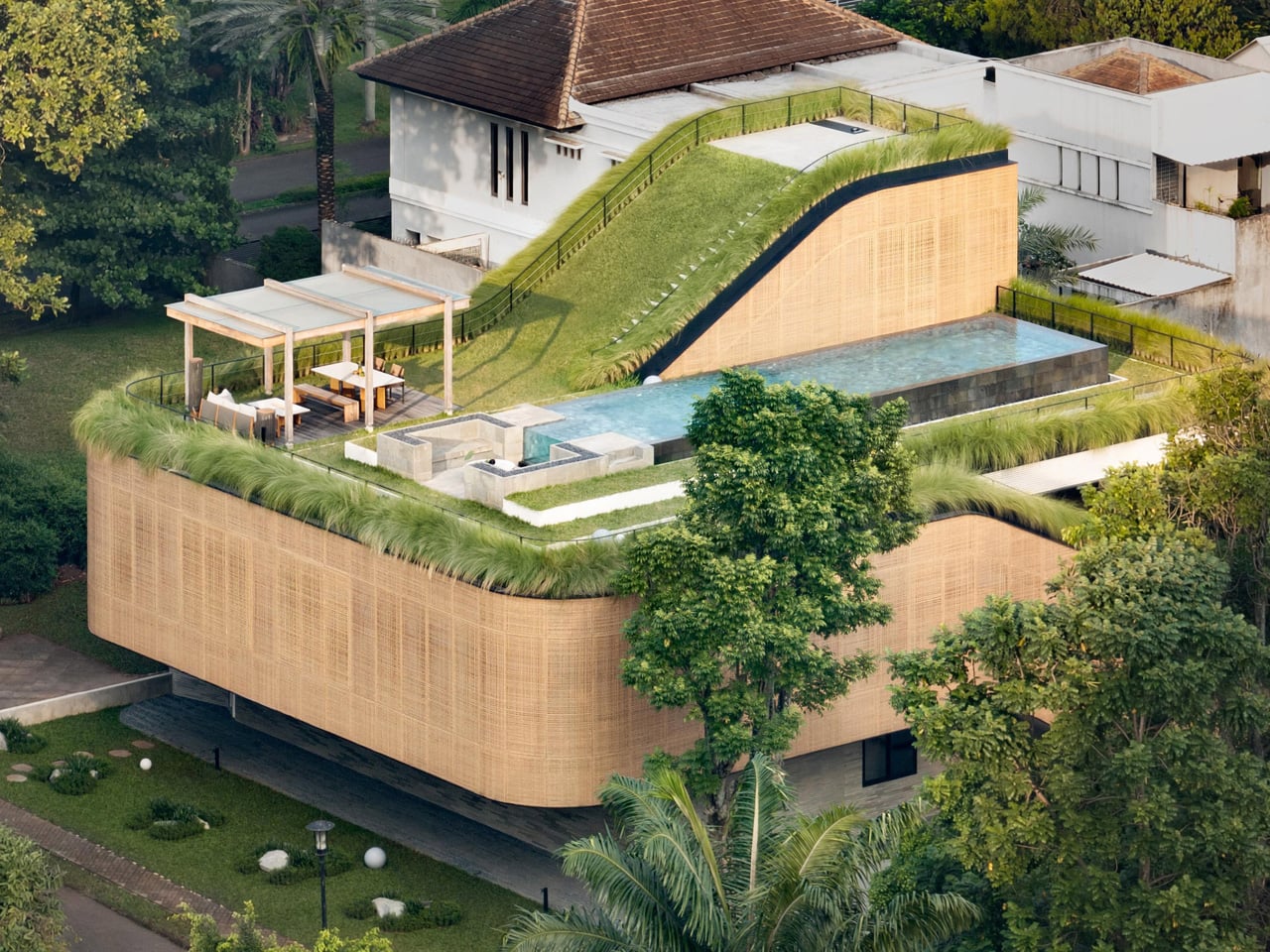
Some houses are designed to be looked at. Split Mass Residence, completed in 2026 by K-Thengono Design Studio, is designed to be moved through — a 712-square-metre home in BSD, South Tangerang, Indonesia, where every architectural decision is in service of movement, togetherness, and the slow pull of the outdoors.
Founder Kelvin Thengono built the project around a single, quietly radical idea: “The main design goal was to allow a seamless sequence of spaces that keeps the family connected, while also staying closely aligned with the surrounding landscape.” The house sits on a corner — what architects call a hook site condition — and rather than treat that exposure as a problem, the studio used it as the engine for the entire massing strategy. Volumes are split, pulled apart, and repositioned so that no single path through the house feels accidental.
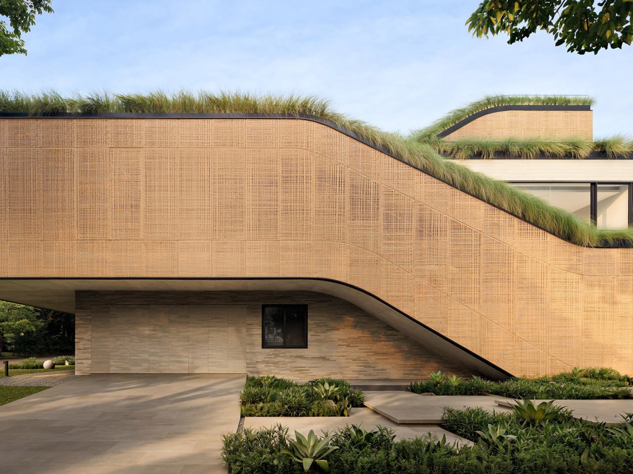
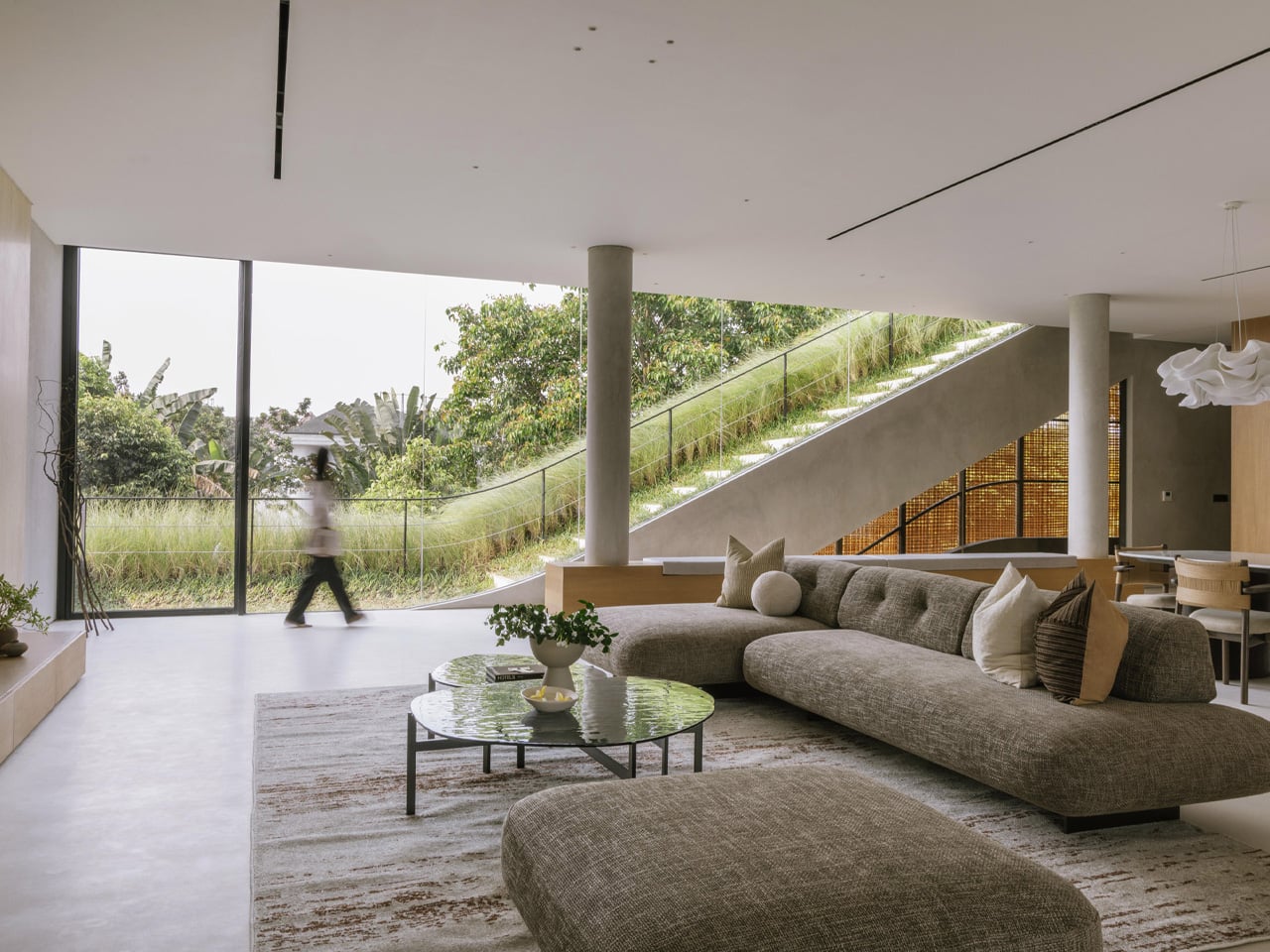
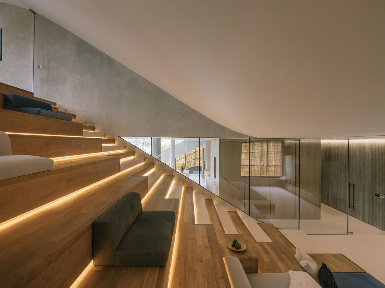
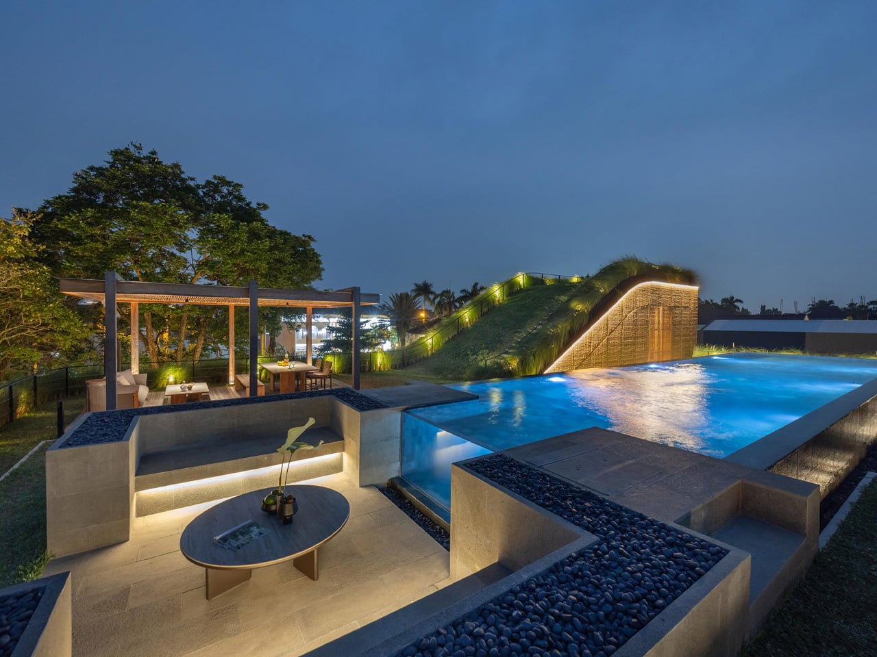
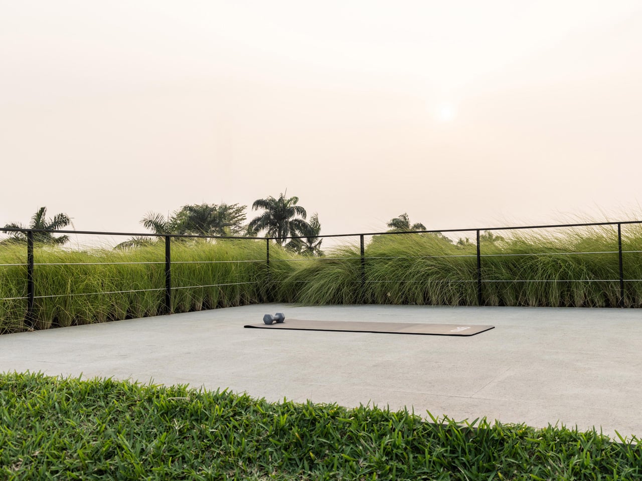
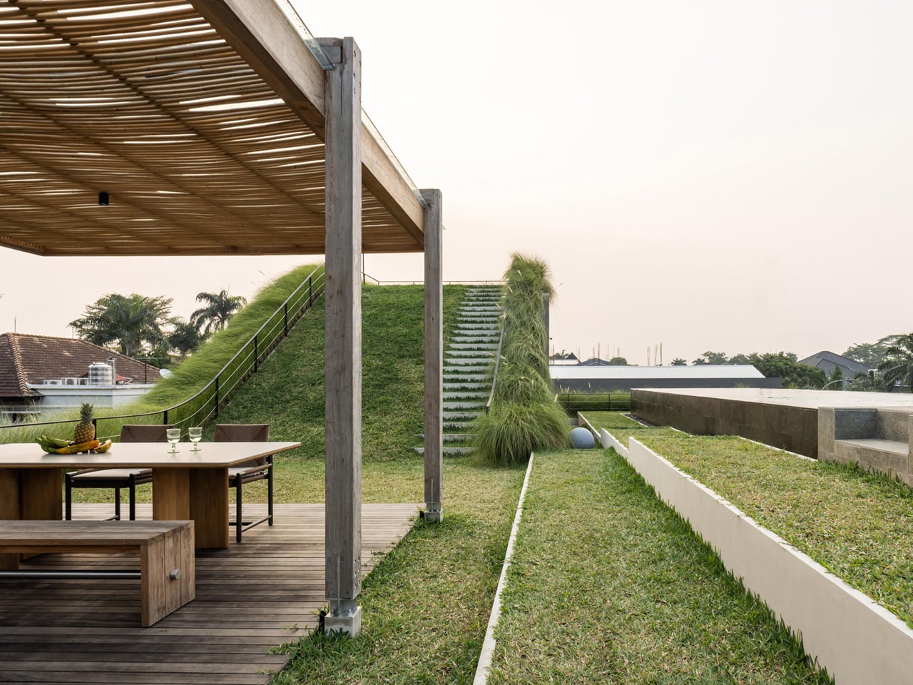
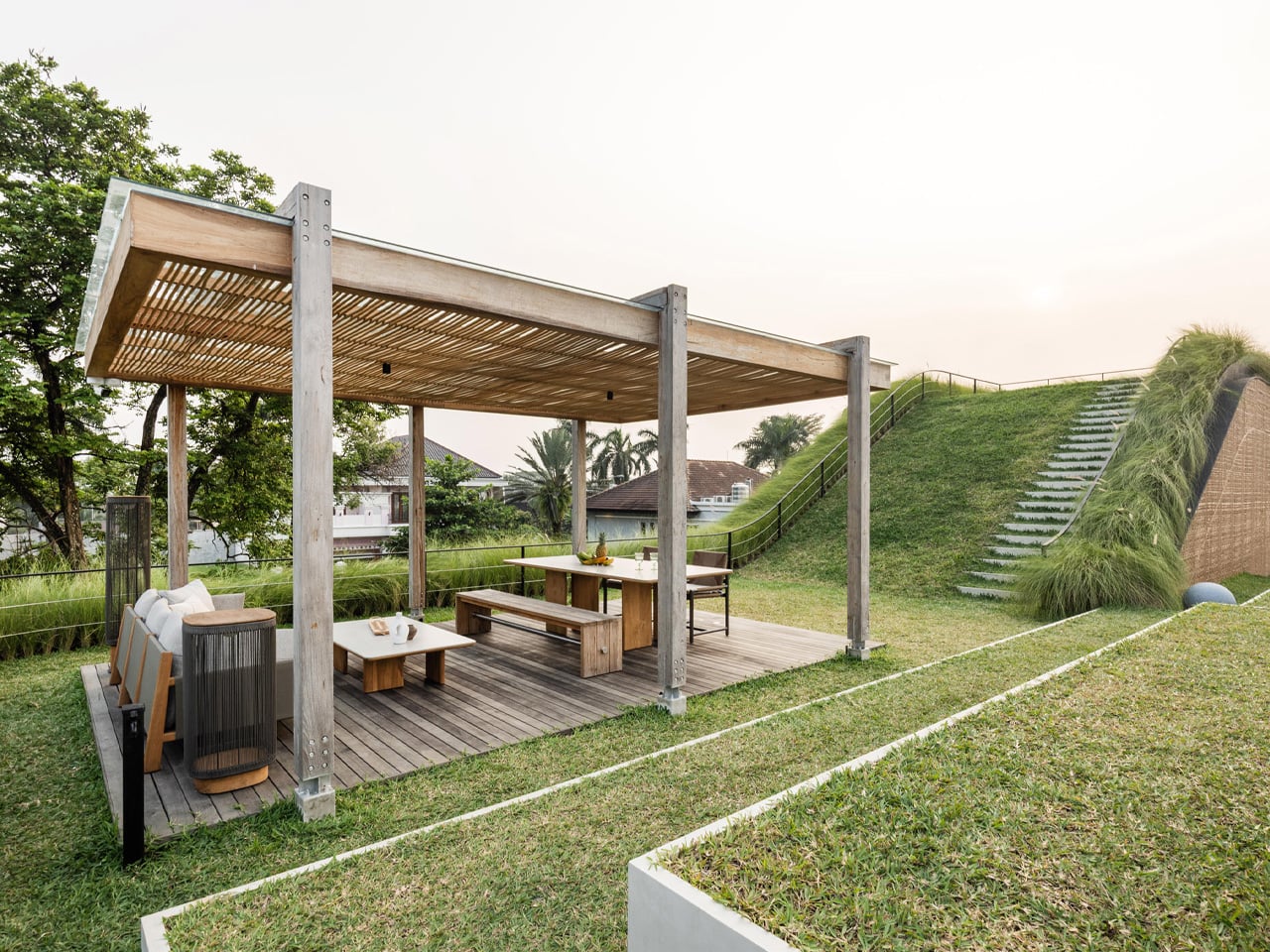
That split is where the project gets interesting. Tiered, sloping garden roofs connect indoor living spaces directly to the planted outdoor setting, blurring the line between ceiling and garden in a way that feels more organic than architectural. From the open-plan kitchen, living, and dining area on the first floor, a glass door opens straight onto a grassy rooftop slope. An outdoor staircase continues upward to a swimming pool and barbecue area — the roof isn’t just a lid; it’s the social core of the house.
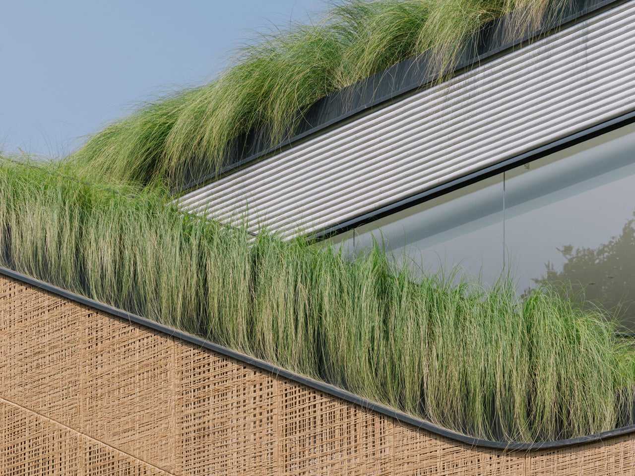
On the exterior, two materials do the heavy lifting. Concrete anchors the structure, giving it weight and presence on the streetscape. PE rattan panels wrap across the facade in woven screens that soften everything — filtering light, adding texture, and offering just enough visual privacy without closing the house off from its surroundings. The contrast is deliberate: one material says permanence, the other says warmth. Together they give the house a character that’s grounded and tactile rather than slick.
What Thengono has built here isn’t really a house in the traditional sense — it’s a system of encounters. Divided volumes, green roofs, and internal and external staircases create different scenarios for family interaction, so the architecture itself nudges people toward each other without ever forcing it. The rooftop garden crowning the whole composition reinforces that layered approach — landscape as architecture, architecture as landscape.
In a region where residential design often defaults to gated grandeur or tight minimalism, Split Mass Residence lands somewhere more considered. It’s a house that knows exactly where it wants you to be — and makes getting there feel like the whole point.
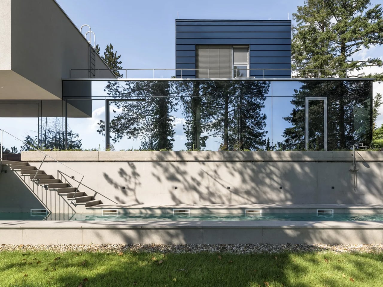
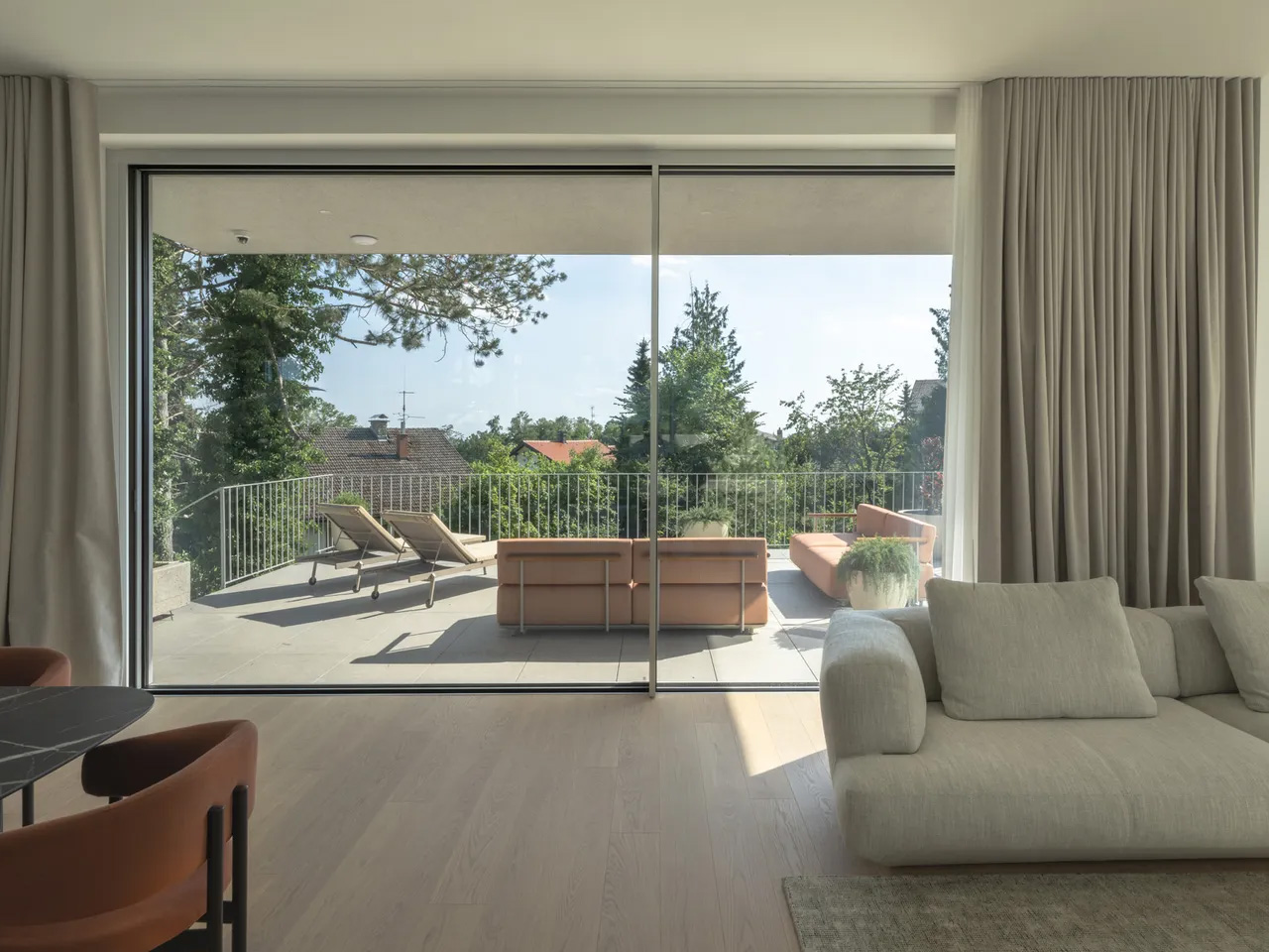
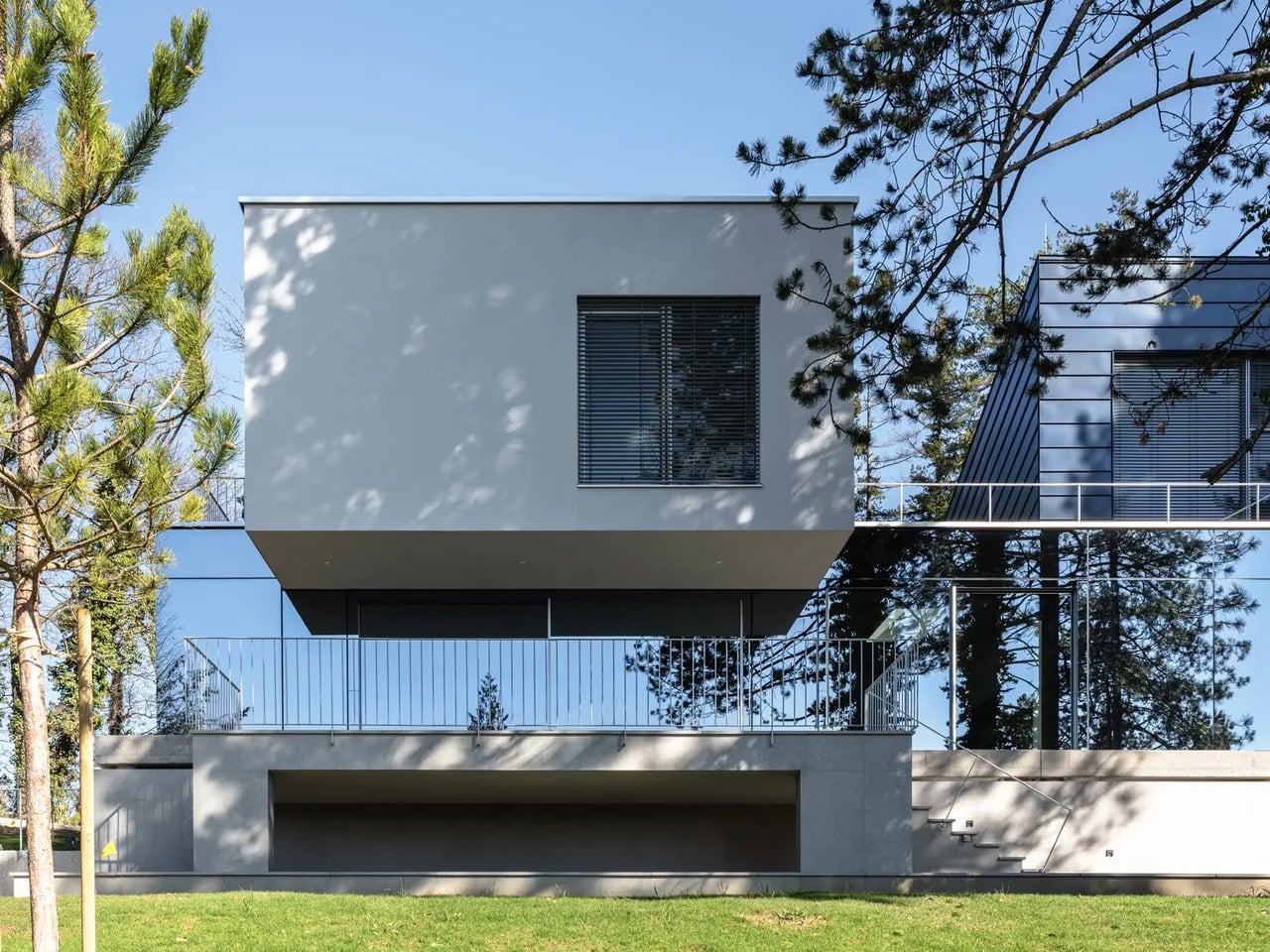
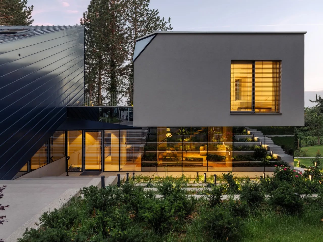
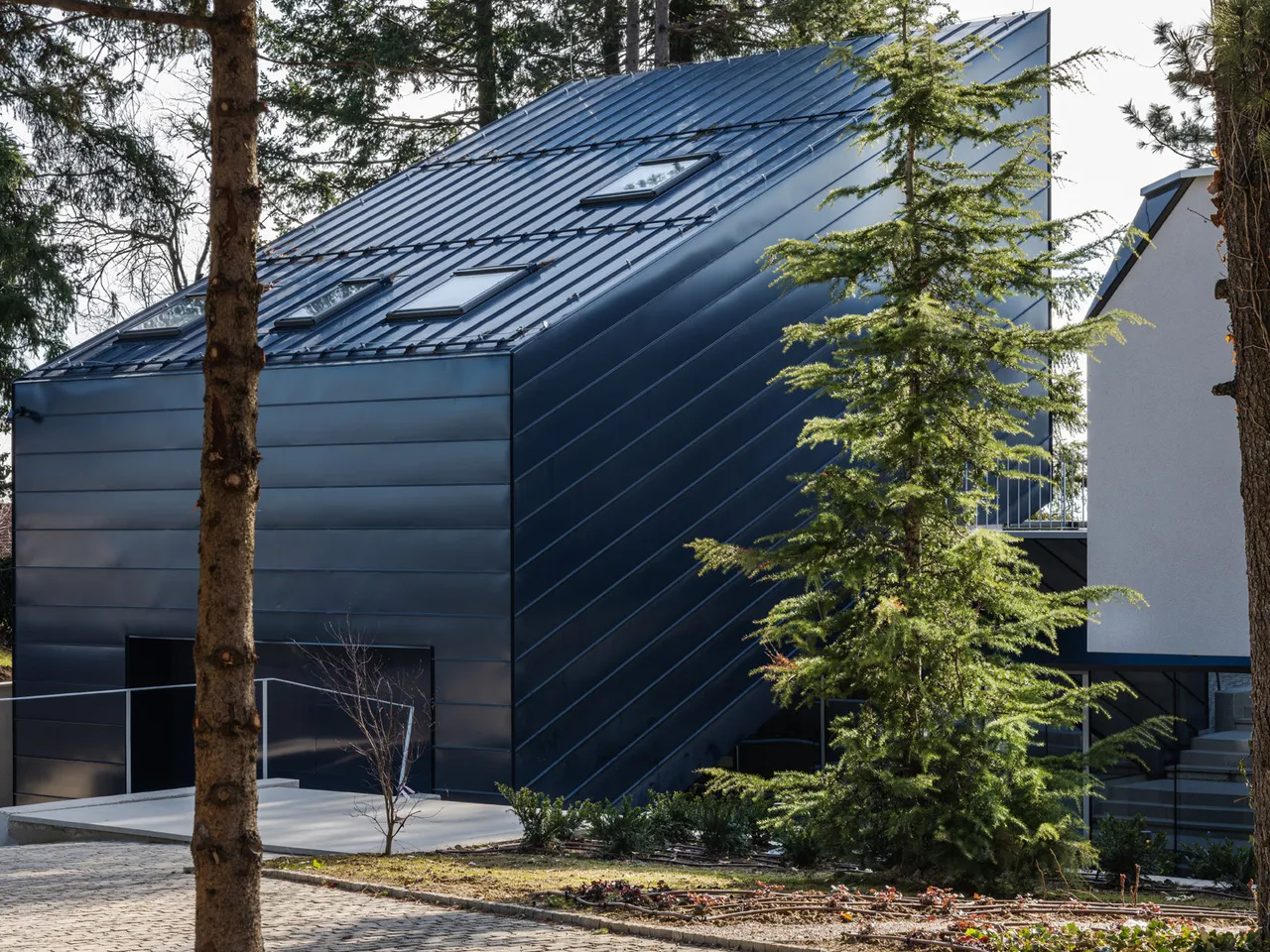
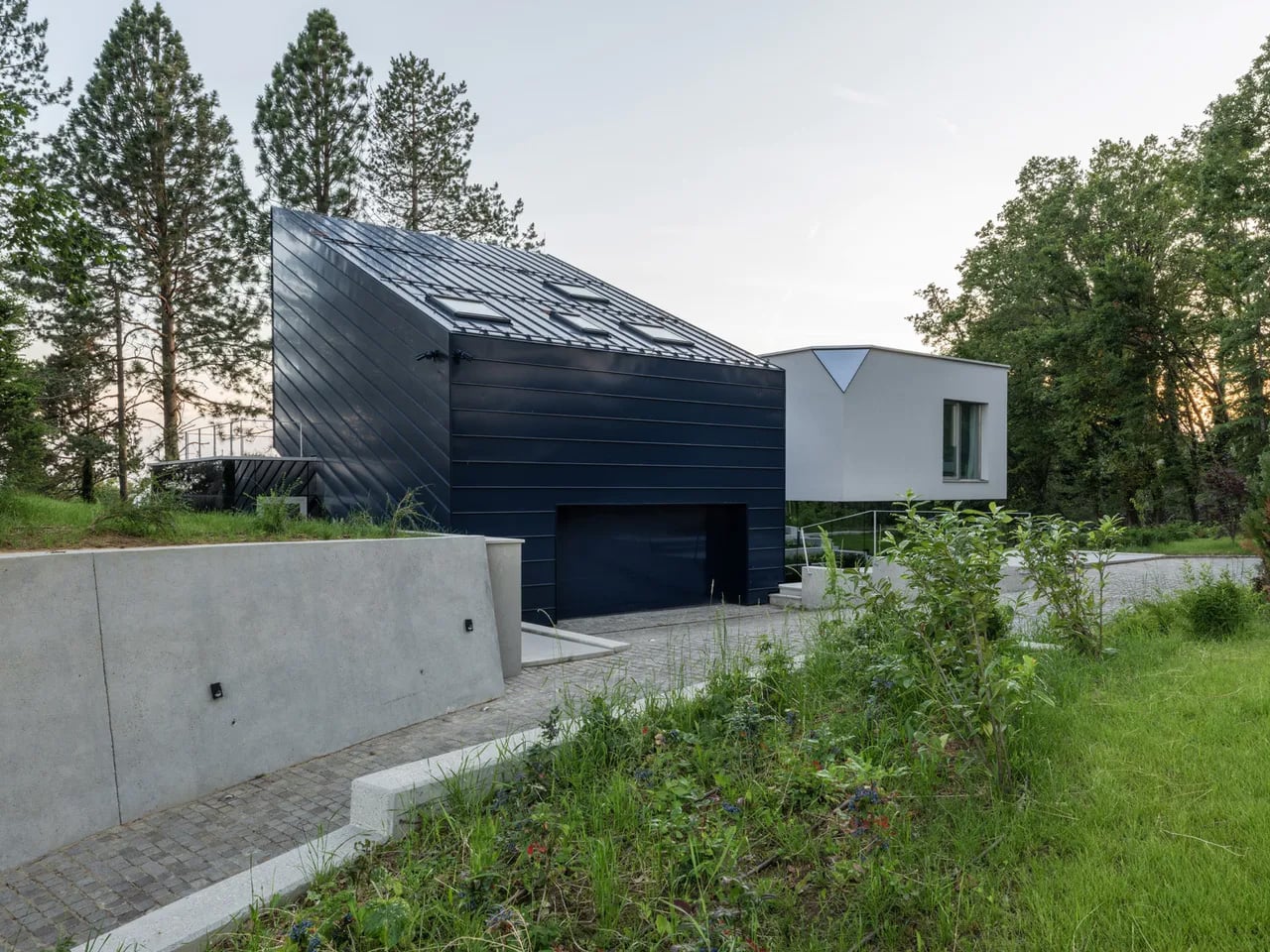
The Curious House in Zagreb doesn’t try to win you over immediately, and that’s exactly the point. Designed by Croatian studio FORVM arhitektura, it’s a family residence perched on a steep hillside, slightly pulled back from the main road and swallowed by dense urban vegetation — orchards, spruces, pines, cedars. The house doesn’t announce itself. It settles in.
Rather than drop a single mass onto the slope, FORVM broke the program into three distinct elements, each responding to a different register of the site. It’s a compositional decision that reads as both pragmatic and poetic, dissolving the usual tension between building and terrain into something more like a conversation. The topography shapes the architecture. The architecture shapes how you live inside it.
Designer: FORVM
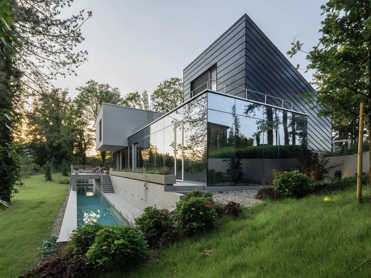
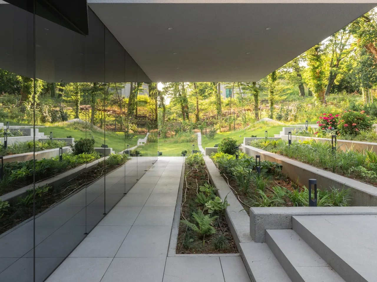
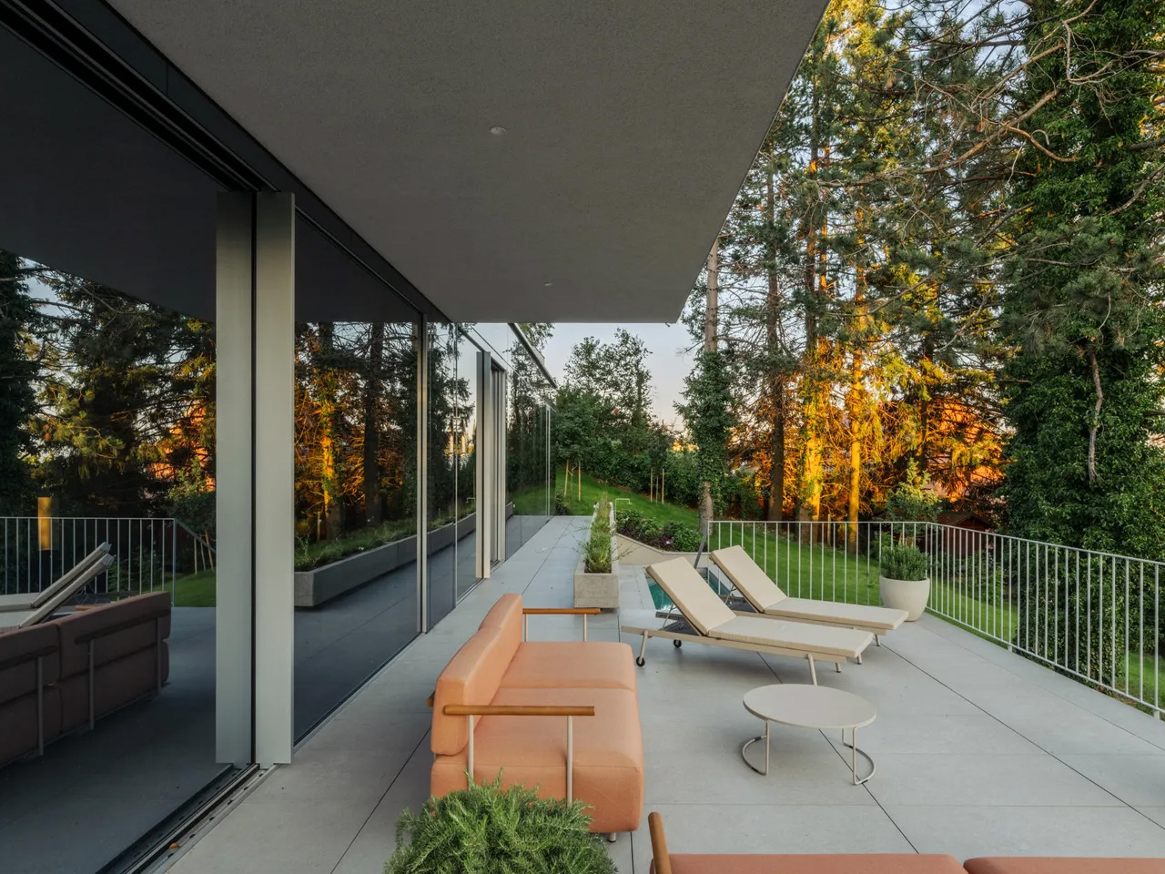
The ground floor is fully glazed — a deliberate move to keep the resident in constant dialogue with the world outside. Green cascades past the glass. The tree canopies filter sunlight and block sightlines, doing the work that walls might otherwise do. Privacy here isn’t enforced by opacity; it’s offered by nature. The forest earns its place as an active participant in the spatial experience, not just a backdrop.
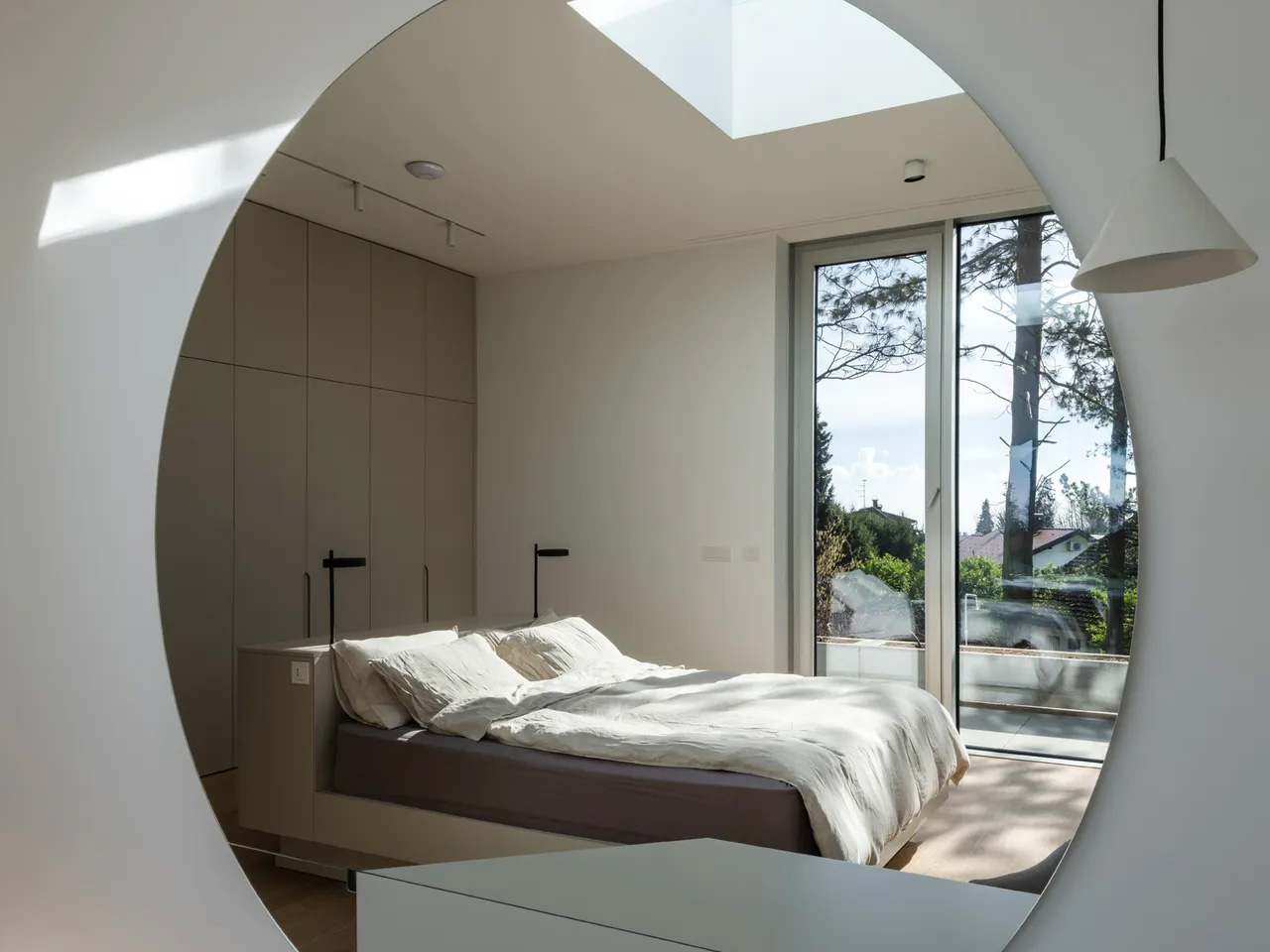
The upper floor shifts register. Where the ground level opens up, the upper volume turns more inward, more considered. Roof windows cut directly to the sky, and through them, tree silhouettes remind you again that you’re inside a forest. The building keeps finding ways to return you to the landscape — not through grand gestures, but through quiet architectural moves that accumulate into something genuinely atmospheric.
From the outside, the Curious House plays a different game. Its smooth, reflective surfaces don’t reveal the interior so much as they absorb the green world around it. You expect transparency; instead, you get a mirror. The observer looks for signs of life within the envelope and finds it harder than the glazing might suggest. It’s a house that hides in plain sight.
Designed by Dinko Uglešić, Ina Vlahović, and Marijana Rančić, and photographed by Bosnic+Dorotic, the Curious House exemplifies a strain of European residential architecture that takes landscape seriously — not as an amenity to be framed, but as a logic to be followed. FORVM, founded in 1991 by Ante Uglešić, has long worked within the specifics of Croatian terrain and climate, and that attentiveness shows here in every decision, from the fragmented massing to the calibrated relationship between glass and canopy.
Munich has some of the steepest commercial rents in Germany, and anyone who has tried to lease even a modest studio space knows the arithmetic rarely works in a small firm’s favor. Brokers, multi-year contracts, square footage priced by the centimeter. When the Munich architecture practice Opposite Office needed a new home base, founder Benedikt Hartl looked at those numbers and decided the smartest move wasn’t a smaller office or a coworking membership. It was no office at all, at least not the kind anyone pays rent on.
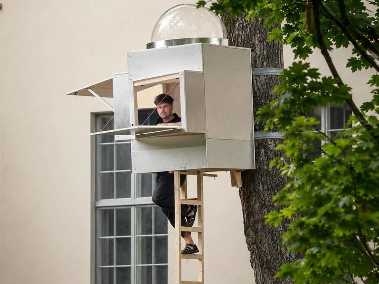
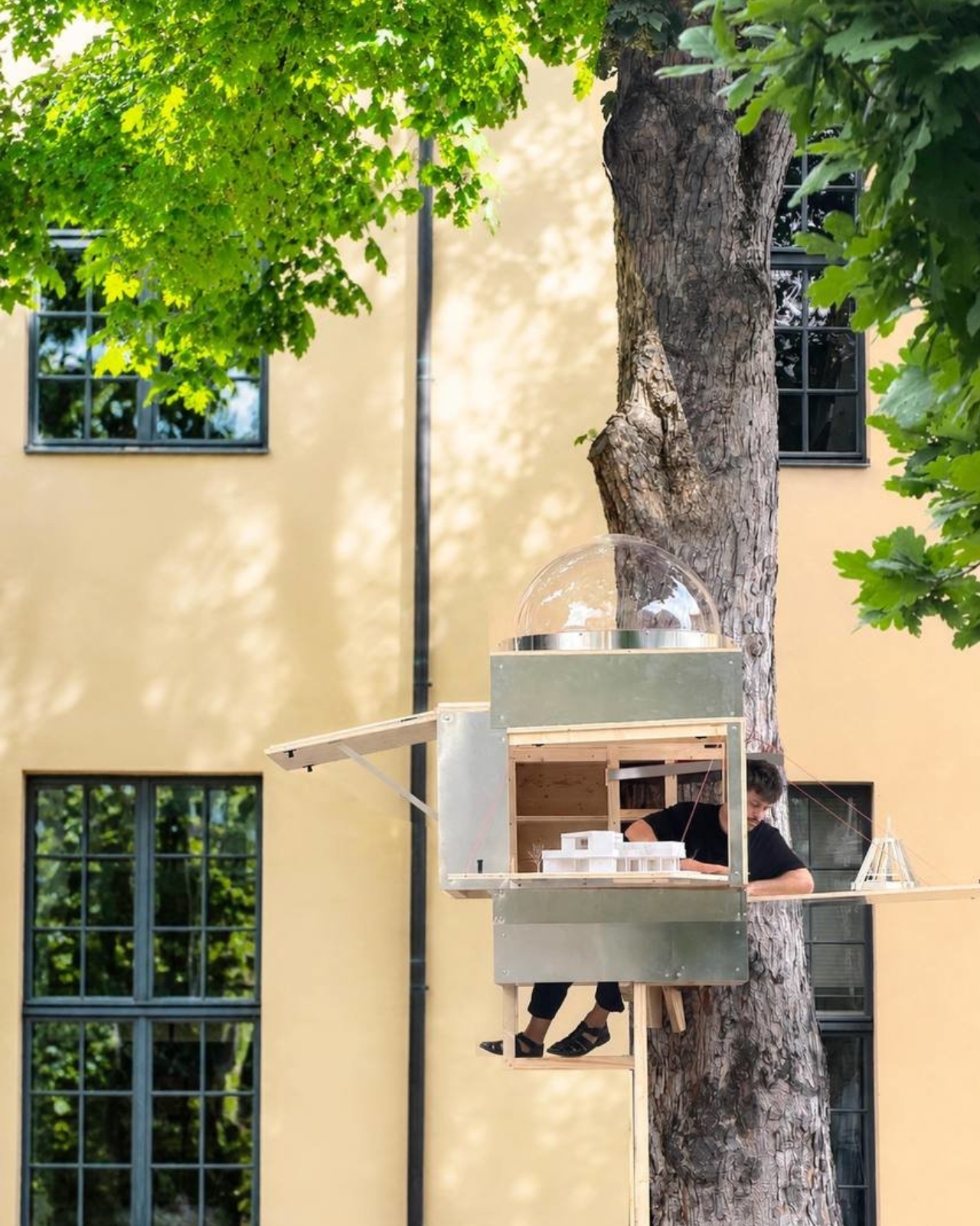
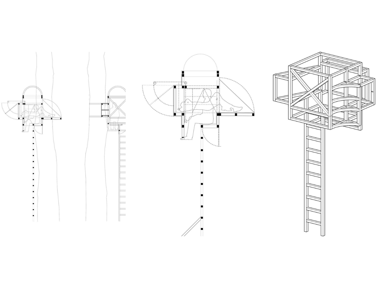
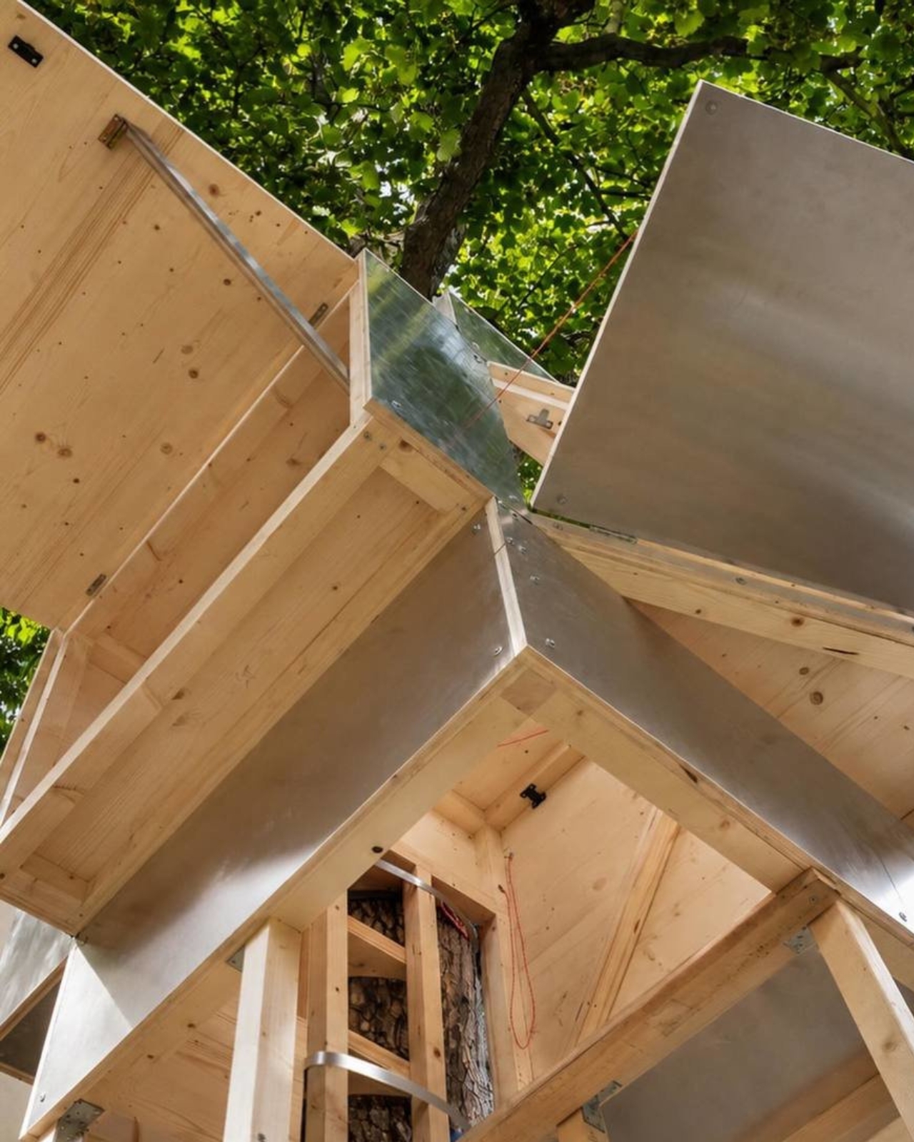
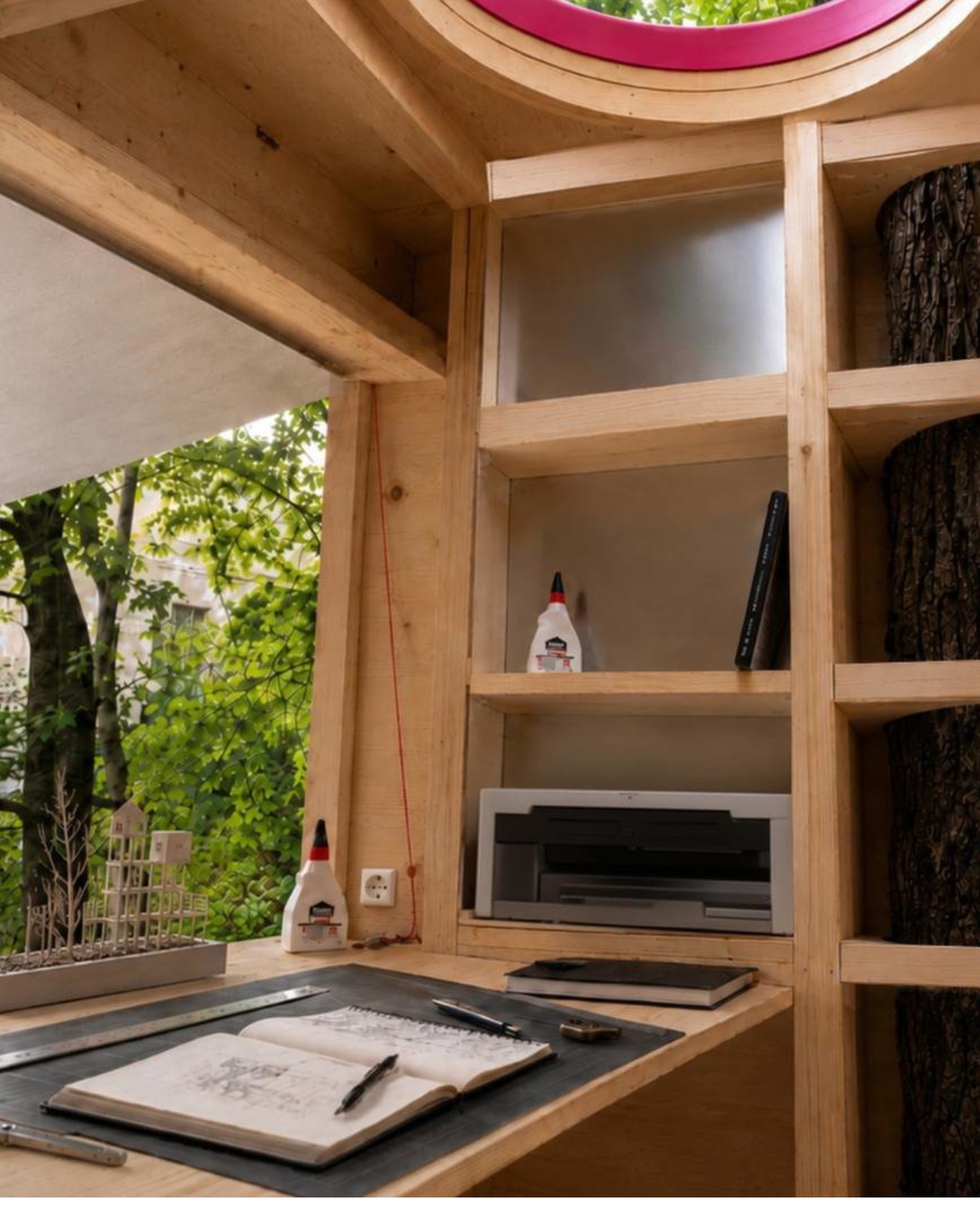
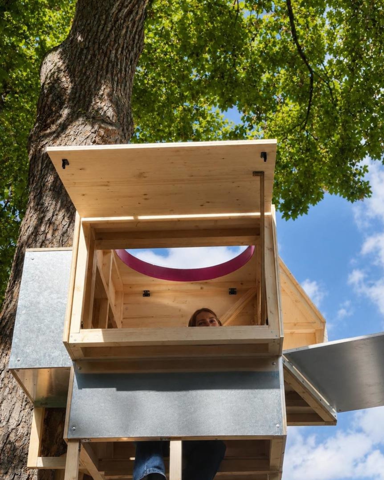
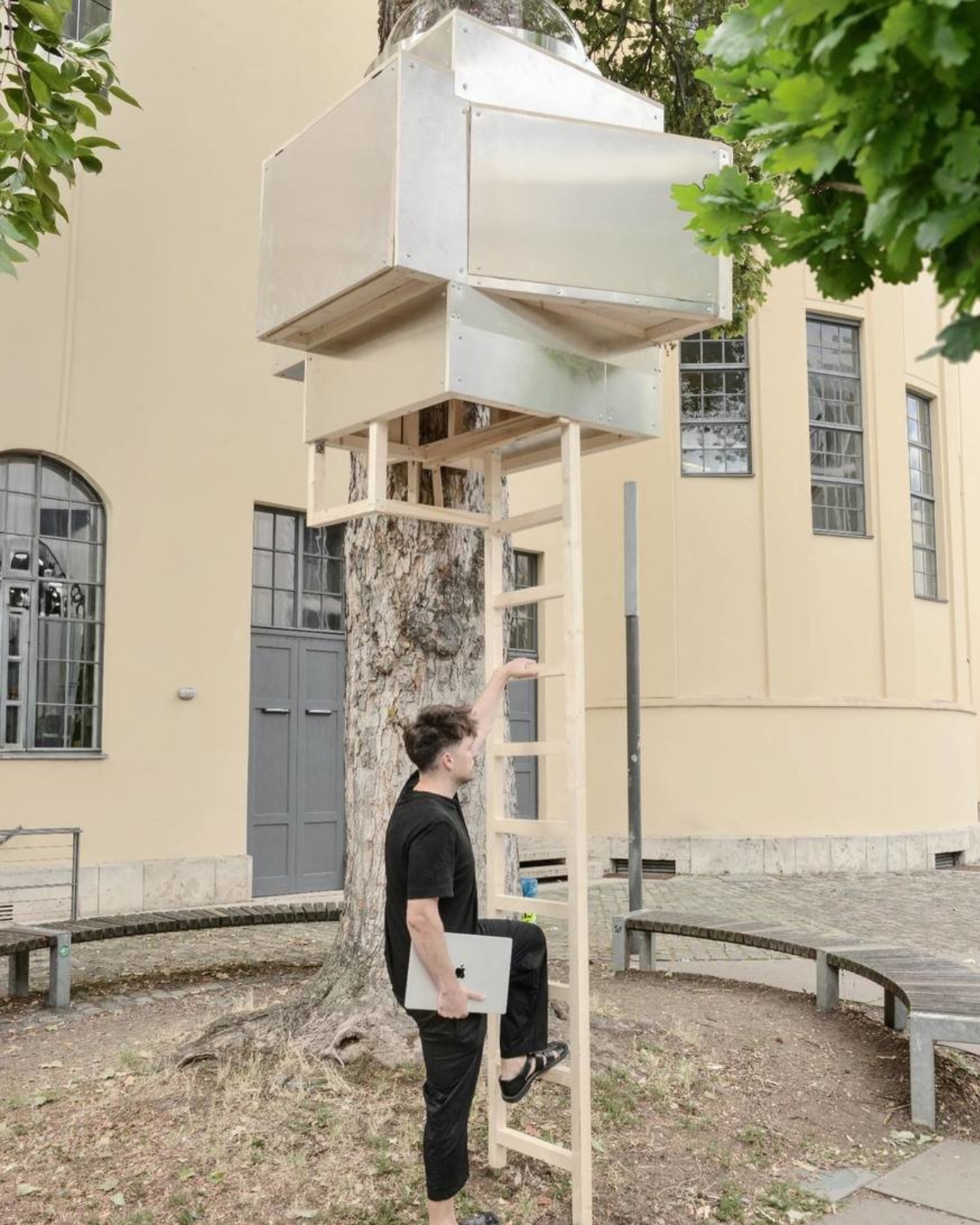
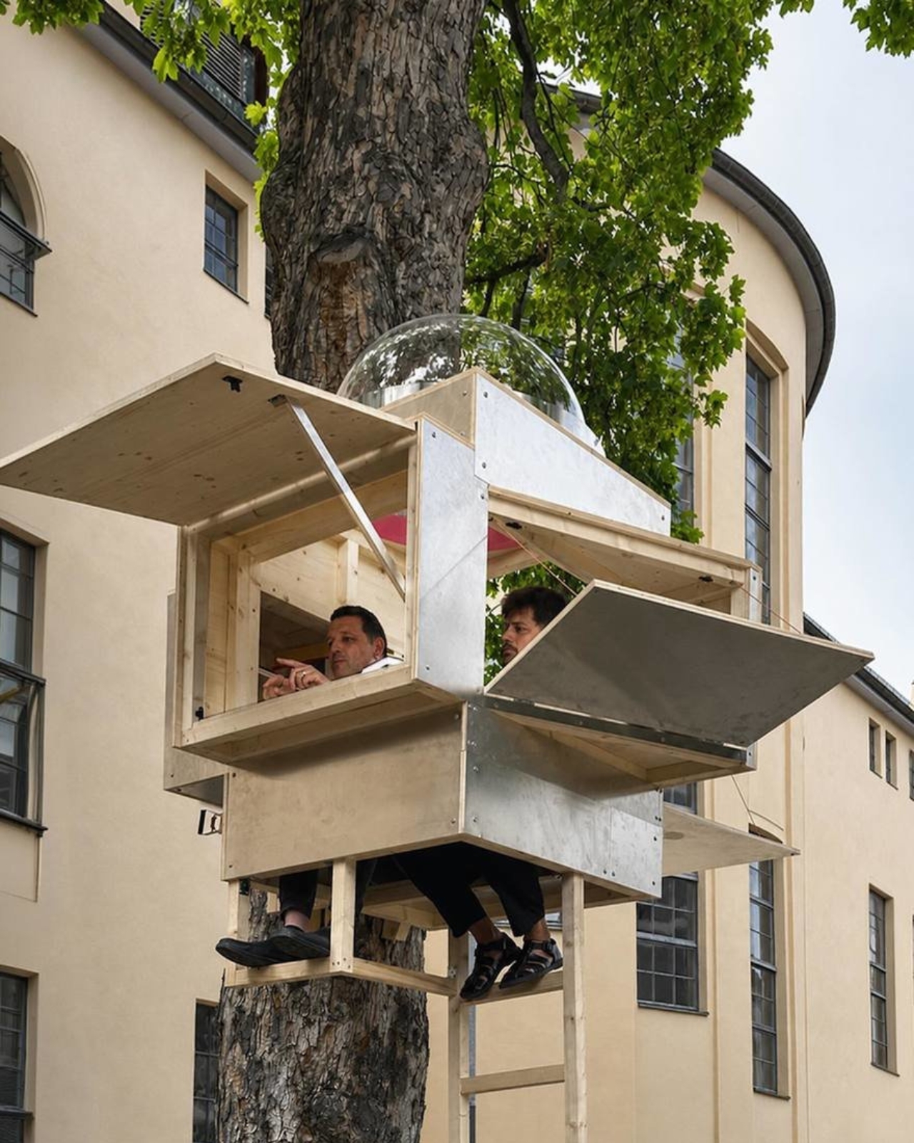
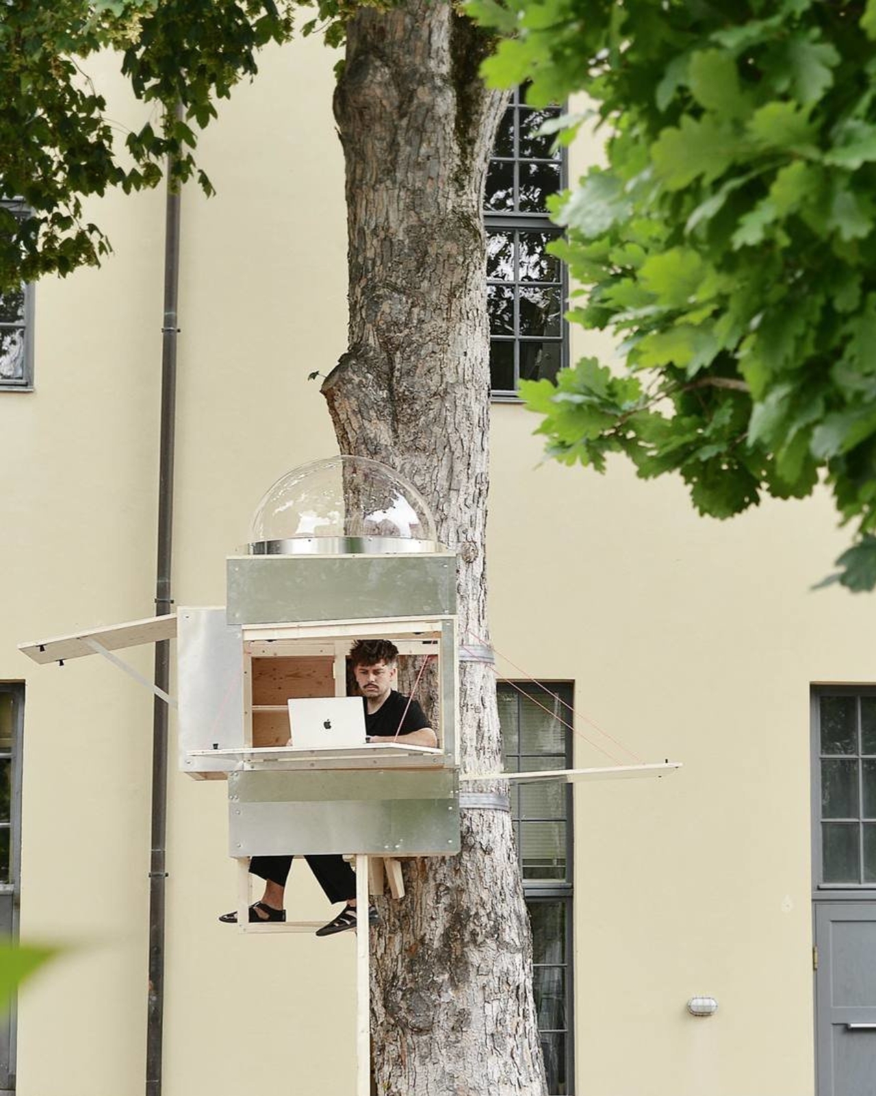
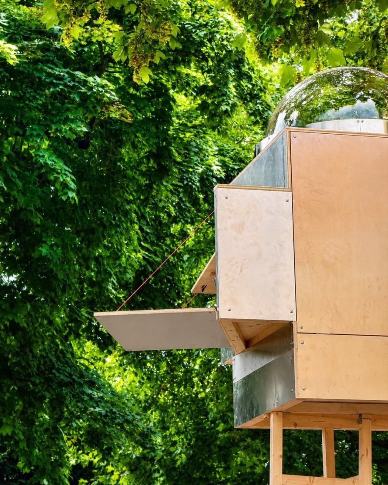
The result is Baumhaus Office, a roughly one-square-meter cube strapped to a tree on the campus of Bauhaus-Universität Weimar, built from spruce timber, plywood, and an aluminum shell that Hartl half-jokingly describes as “UFO-like.” A ladder gets you up to it. Inside, there’s shelving, a small desk, and fold-down panels that expand the workspace just enough to fit two or three people if everyone keeps their elbows in. A domed skylight sits overhead, so instead of staring at a drop ceiling, you get a view of the canopy. Two ratchet straps, cushioned with protective matting so the bark doesn’t suffer, hold the whole thing to the trunk. Hartl secured permission from the university’s president to install it there temporarily, and he’s designed it to come down just as easily and go up somewhere else.
Designer: Benedikt Hartl
His explanation for the whole exercise is refreshingly blunt. Rather than compete with Munich’s rental market, he moved the office out of it entirely and into the trees. He’s also put out an open call, only half-kidding, for anyone with a spare tree and a good view who doesn’t intend to charge him for it.
There’s an obvious punchline in a firm shrinking its footprint to one square meter, but the joke has a point buried in it. Opposite Office already works across borders on projects that rarely require a fixed headquarters, so the studio started asking why it needed a permanent lease at all. That question lands differently depending on where you’re reading this, but it lands. Downtown office towers in plenty of American cities have sat half empty for years now, landlords still pricing space as if 2019 never ended, and companies quietly deciding that a conference room and a Zoom link cover most of what used to require a floor plan. Baumhaus Office takes that same skepticism about commercial real estate and pushes it to its logical, slightly absurd conclusion. If the point of an office is a roof, a desk, and a door you can close, a tree does two of those things for free.
Opposite Office has framed the project as a nod to Cosimo, the boy in Italo Calvino’s “The Baron in the Trees” who abandons ground level entirely and never comes back down. I like that reference more than the usual sustainability talking points that get bolted onto projects like this. It’s not really about wood versus concrete. It’s about changing your vantage point on purpose, even briefly, to see whether the thing you assumed you needed was actually optional the whole time.
I’ll admit the practical side of me has questions. Winter in Thuringia is not gentle, and a plywood cube with a skylight is not insulation in any serious sense. But treating this as a permanent HQ misses the point Hartl is making. It’s a provocation with a ladder, built to prove that an architecture studio’s real asset is the people doing the thinking, not the address on the lease. Whether or not Baumhaus Office survives its first real storm, it’s already done its job: it made a very expensive problem look, for a moment, genuinely small.
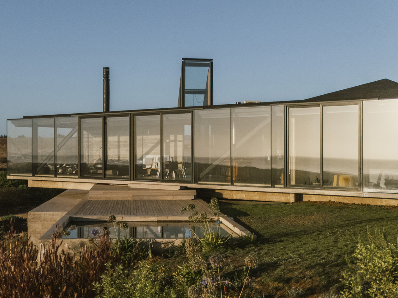
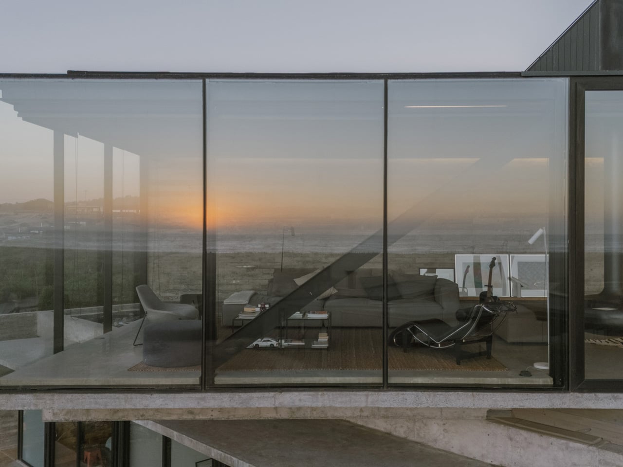
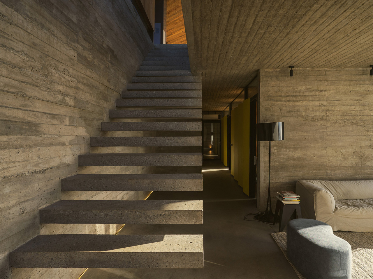
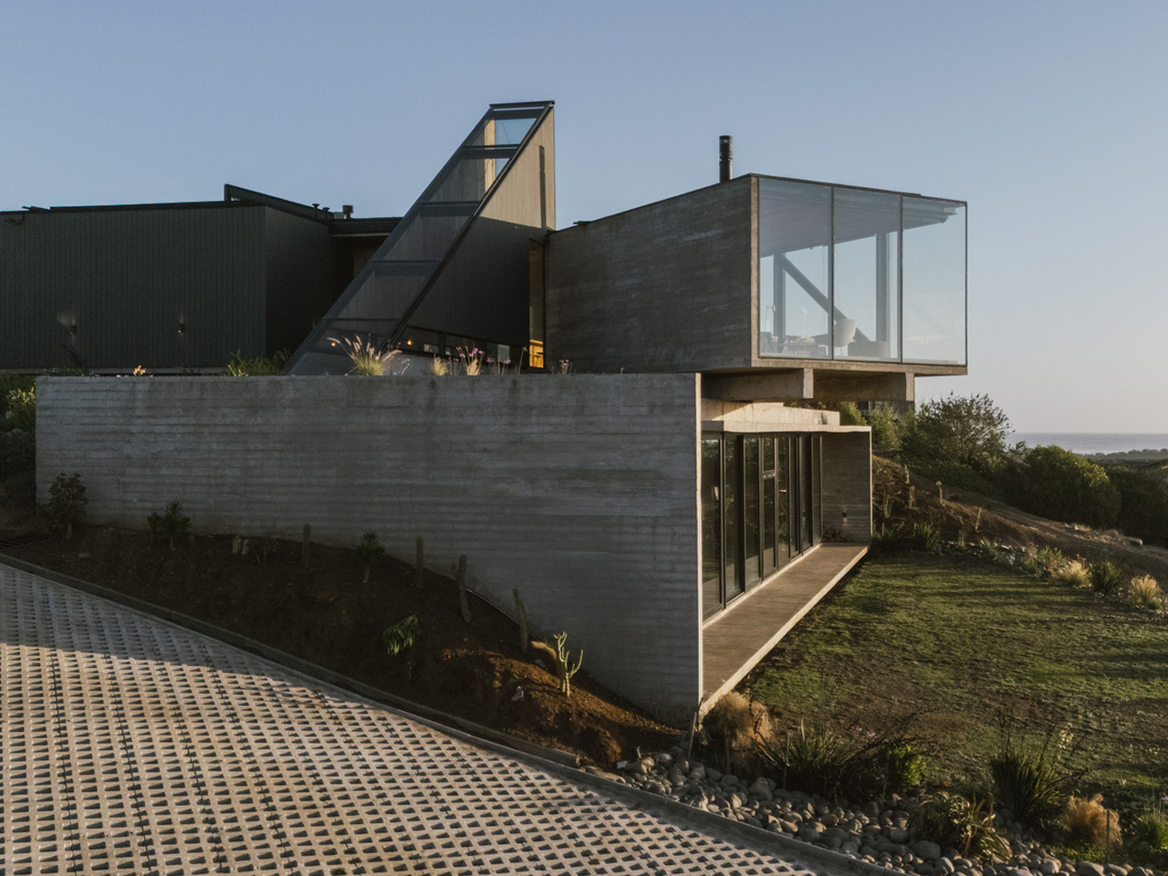
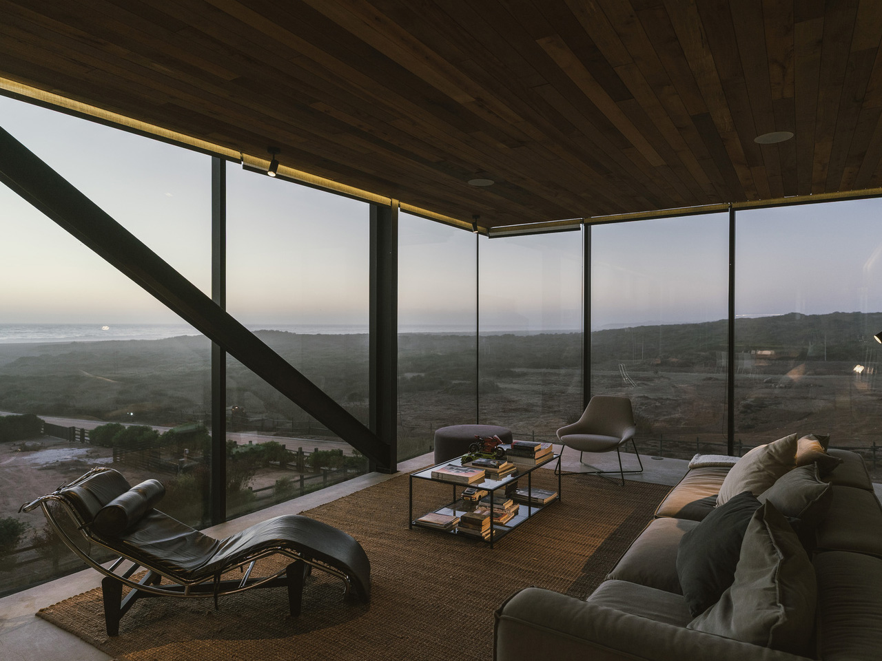
House 22, designed by Chilean studio Loft7 and completed in 2023, sits on a sloping coastal lot south of Punta de Lobos — a stretch of Chilean coastline known for dramatic surf and untouched native scrubland. The lot descends toward the northwest, and rather than resisting that gradient, the architecture follows it, letting the terrain pull the building naturally toward an uninterrupted view of the Pacific Ocean.
At 320 square meters, the residence is generous without being excessive. Loft7 structured the build using a combination of reinforced concrete and steel frames — a technical pairing that allows the house to hold its ground on a challenging slope while keeping the interior language warm and tactile. Exposed timber beams run through the living spaces, the dining area, and the kitchen, grounding each room in material honesty. There’s no attempt to disguise how the building is put together. That transparency is the design.
Designer: Loft7
What makes House 22 worth studying isn’t a single dramatic gesture — it’s restraint applied consistently. The interiors lean on wood, natural light, and sightlines that always resolve at the ocean. No surface fights for attention. The beam grid overhead becomes rhythm rather than decoration, and the open-plan social spaces feel like they’re orientated by the view rather than by a floor plan. Spaces breathe because the architecture got out of the way.
Pichilemu is famous in surfing circles, but architecturally it’s a place where the Chilean coast has quietly been producing some of the country’s most considered residential work. Loft7 fits that lineage — a studio that has built its reputation around sites where nature already has the upper hand. Their approach with Casa 22 trusts the land and the light, deploying materials that age well in a coastal climate and a massing that reads modestly from the outside while delivering on every expectation from within.
Photographed by Fabián Acuña, the project looks different at every hour of the day. Morning light hits the timber and fills the interiors with warmth; the Pacific turns silver in the afternoon. That relationship between material, orientation, and time of day is never accidental in good coastal architecture — and here it feels entirely intentional. House 22 isn’t trying to be the loudest house on the Chilean coast. It’s trying to be the most honest one. On both counts, Loft7 delivers.
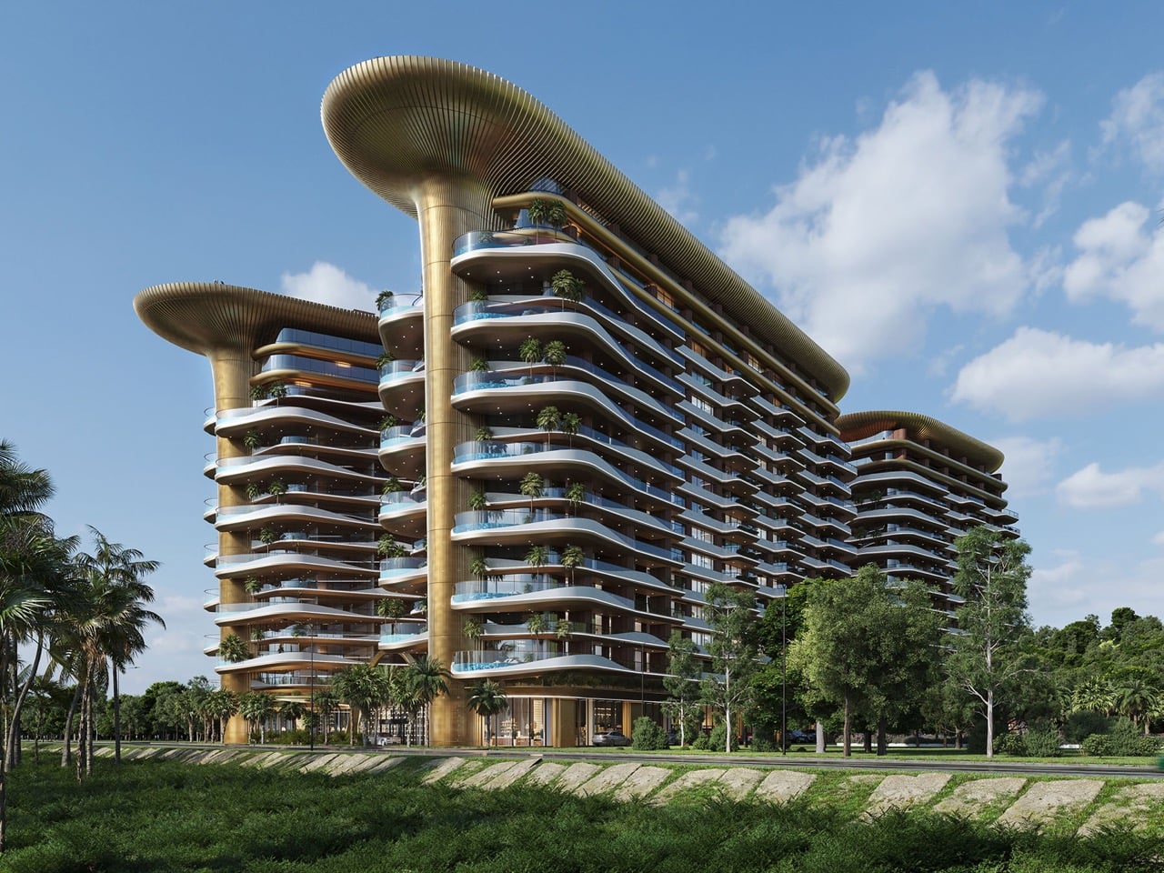
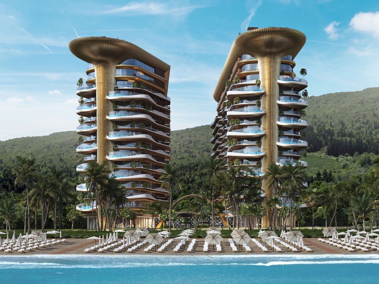
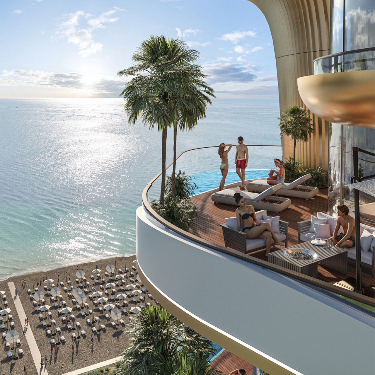
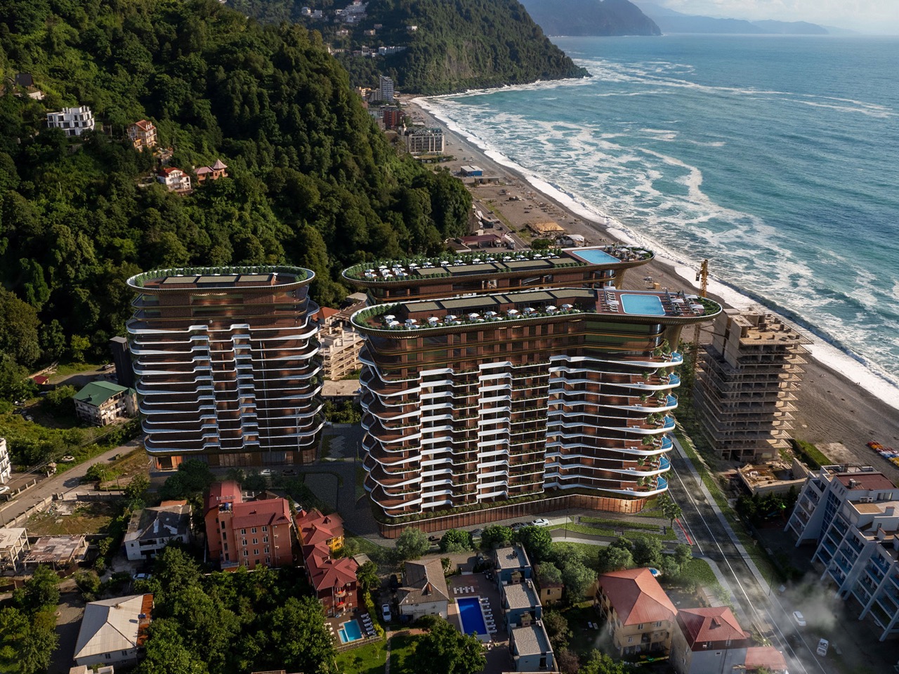
Straight lines are easy. Any architect can slap a rectangular tower on a plot and call it a day, and most beachfront developers do exactly that because straight lines are cheap, fast to build, and easy to sell off a brochure. Georgia’s Adjara coast just got a project that looked at that playbook and said absolutely not. Montemar Residential, a three tower complex rising in the seaside town of Gonio, ditches the grid entirely in favor of forms that ripple, curve, and cantilever like something dragged up from the Black Sea itself. It is the kind of building that makes you stop scrolling, then immediately want to know who signed off on it and how.
Designed by Irakli Emiridze and Irina Chkonia of Alpha Architecture, the complex sits on a 10,000 square meter plot within a UNESCO listed stretch of coastline, right where Adjara’s oddly tropical microclimate runs into the Black Sea. Each of the three 16 story towers tops out around 48 to 52 meters and wears a dramatic aluminum crown that flares out over the roofline like a mushroom cap, or if you squint, a seashell caught mid opening. Parking for 300 vehicles sits tucked below grade, keeping the ground plane free for landscaping and plazas. It is a lot of building, and it wants you to know it.
Designers: Irakli Emiridze and Irina Chkonia
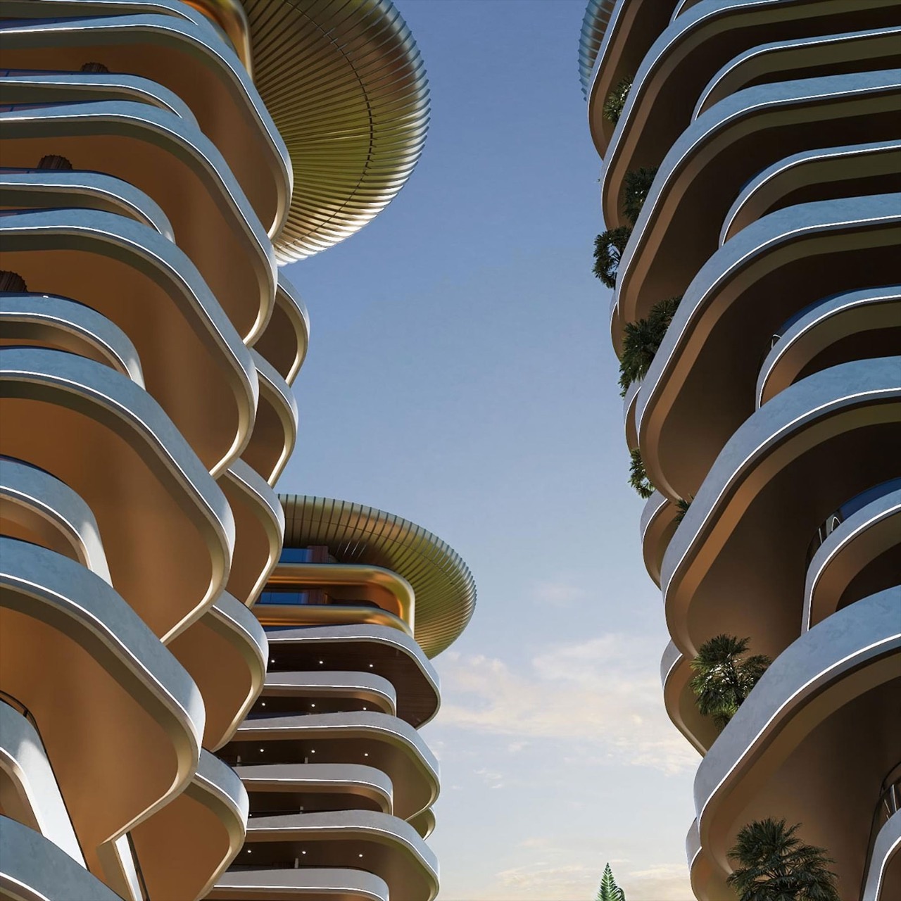
The seashell inspiration shows up in how the facade behaves. The balcony edges do not stack in the usual identical, floor by floor grid you see on every coastal high rise from Miami to Marbella. Instead they undulate, staggering in and out like sediment ridges carved by tidal movement, which gives each tower a texture closer to a geological formation than a construction product. Aluminum embossed sheet cladding wraps the crowning terraces, catching light in a way that concrete or glass simply cannot, and it is the detail that separates Montemar from the generic curved tower trend that has been creeping through Gulf and Black Sea resort markets alike.
The space between the three towers is treated as public terrain rather than leftover setback, with green plantings, plazas, and communal zones designed to pull residents out of their units and into shared space. Panoramic apartments come with private terraces and jacuzzis angled toward the water, the kind of amenity that used to be penthouse exclusive and is now standard issue on any coastal development trying to compete for buyers. Whether that democratization of the infinity view holds up once the cranes clear out is the real test, since renderings are notoriously generous with light, weather, and empty beaches.
Gonio is a strange place for this kind of architectural swing. It is a historic town, not a resort capital, and Montemar is betting that sculptural ambition can coexist with a UNESCO designation next door rather than clash with it. If the finished towers deliver even half of what the renders promise, this stretch of the Adjara coast is about to become a lot more interesting to watch than its neighbors on the Black Sea.
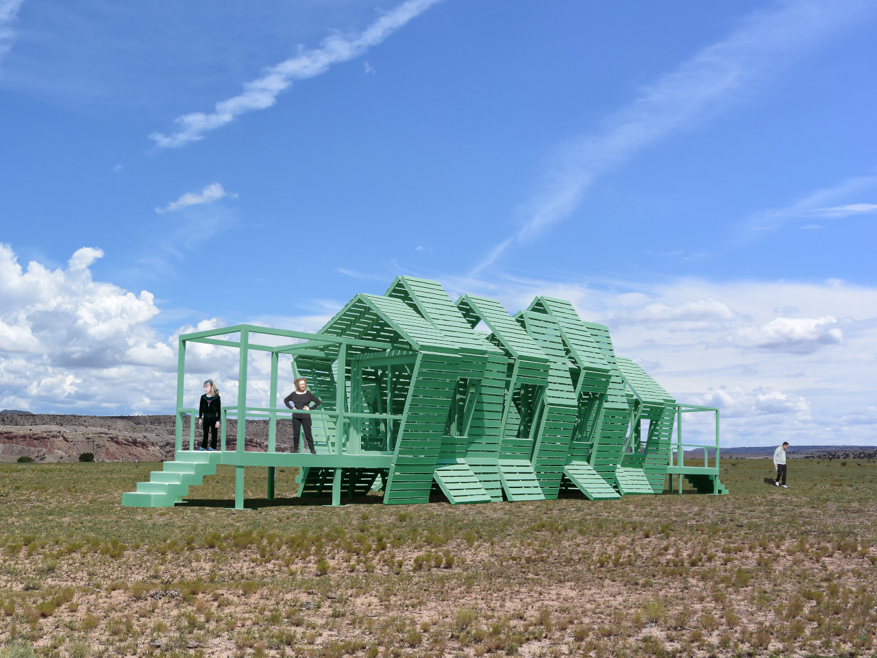
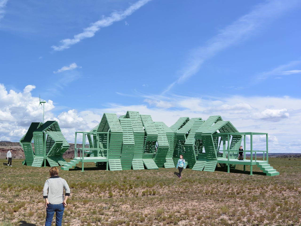
Luxury hotels have always had a location problem. The kinds of places that would make the most extraordinary backdrops, remote desert plains, rolling highland meadows, dramatic canyon edges, are almost never the places where a hotel can legally or practically be built. Extending infrastructure to those sites, from power grids to road access to permanent foundations, tends to either cost too much or damage the very landscape that made the location worth visiting.
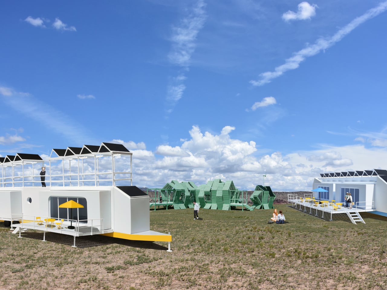
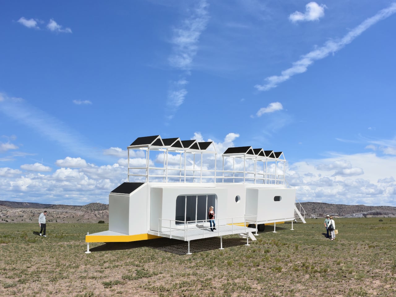
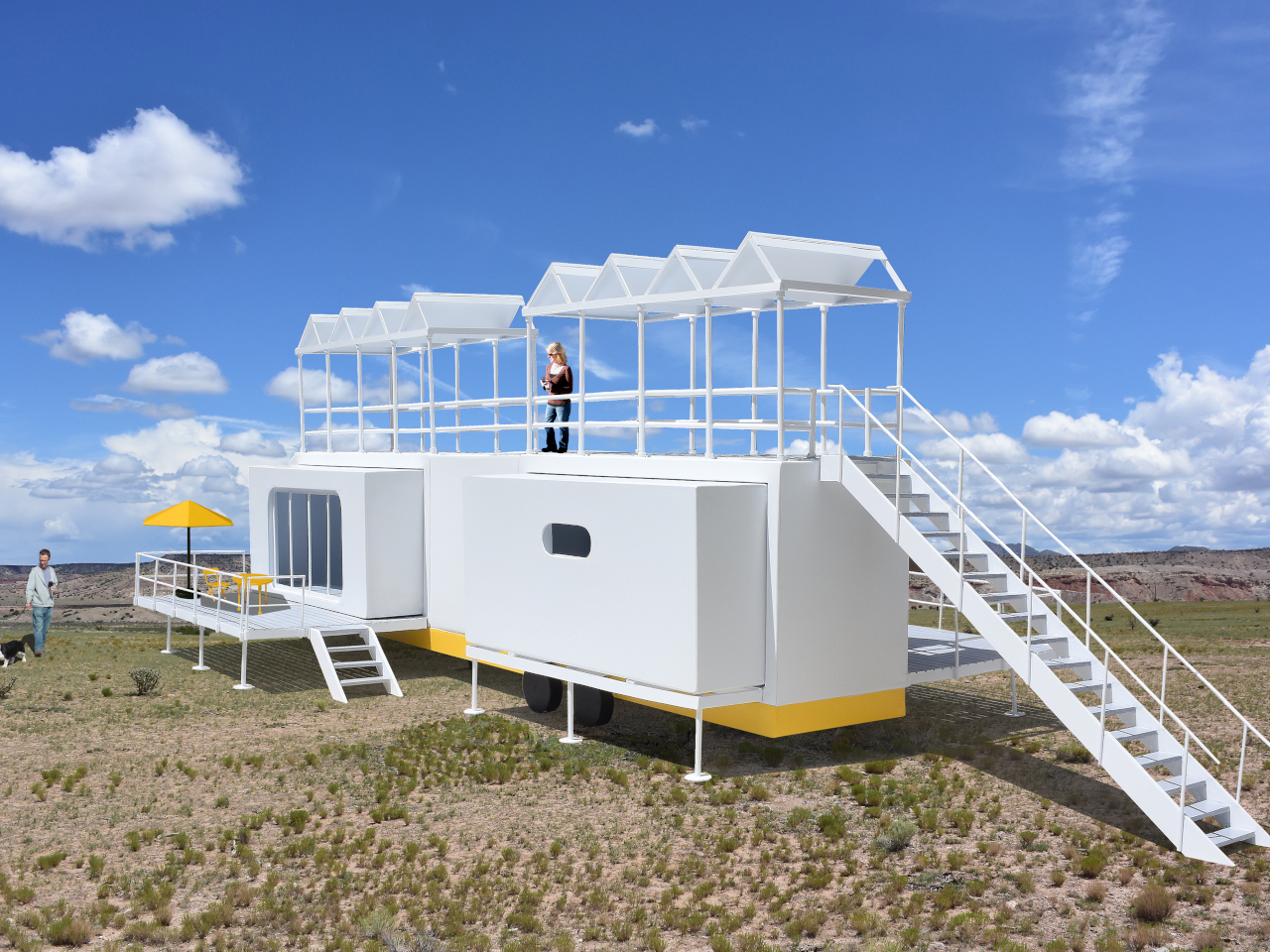
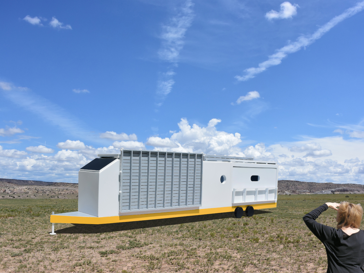
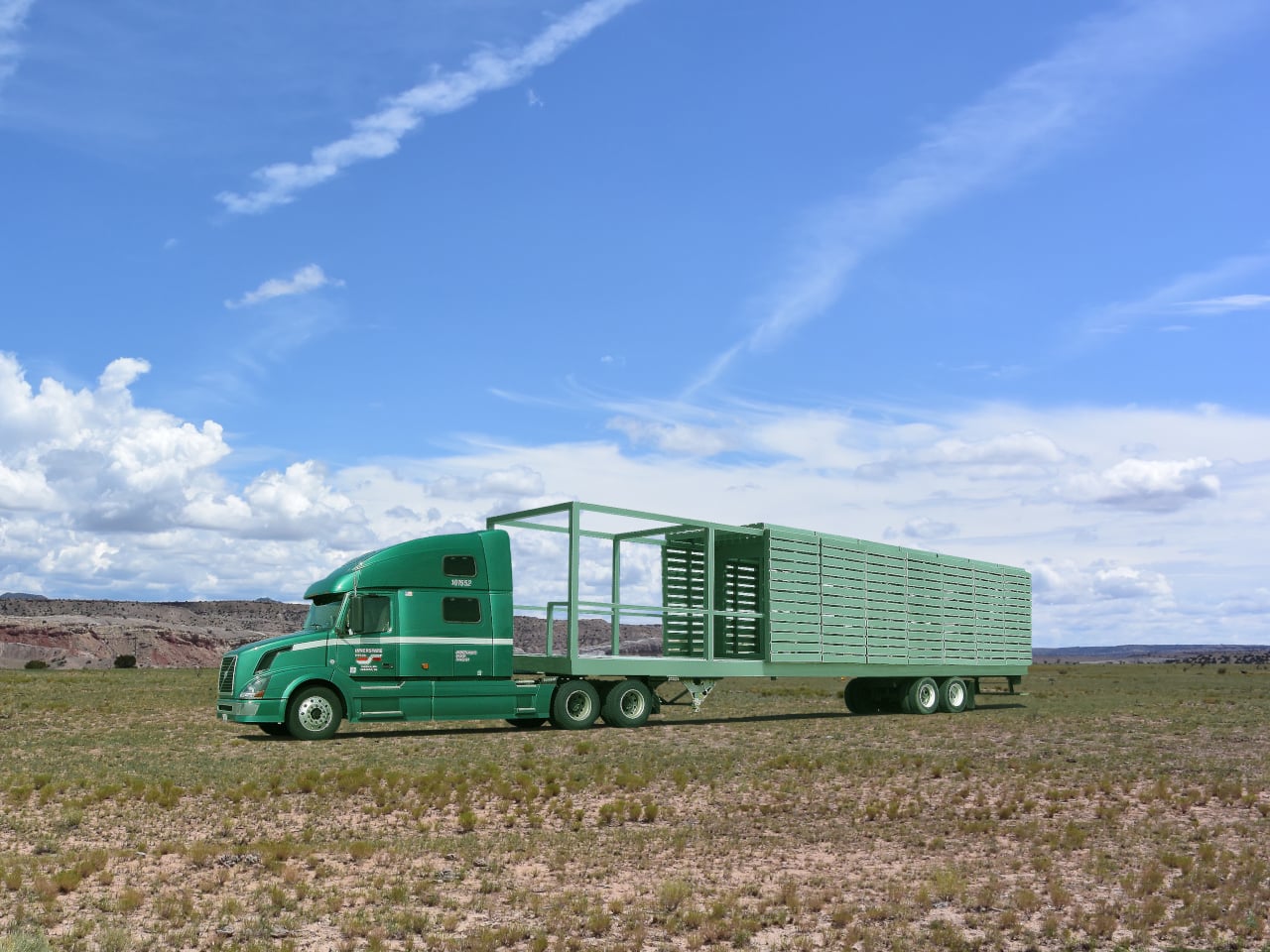
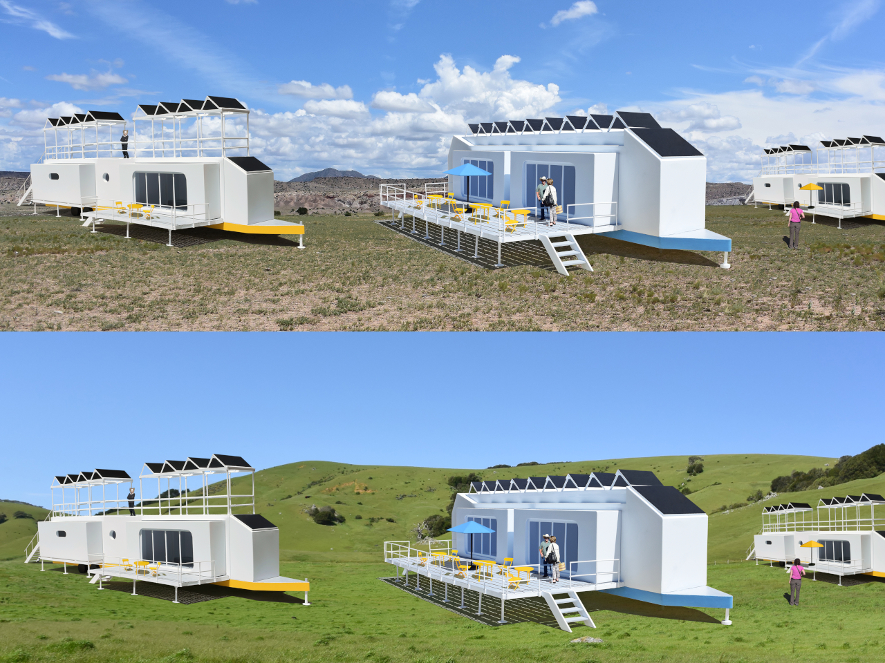
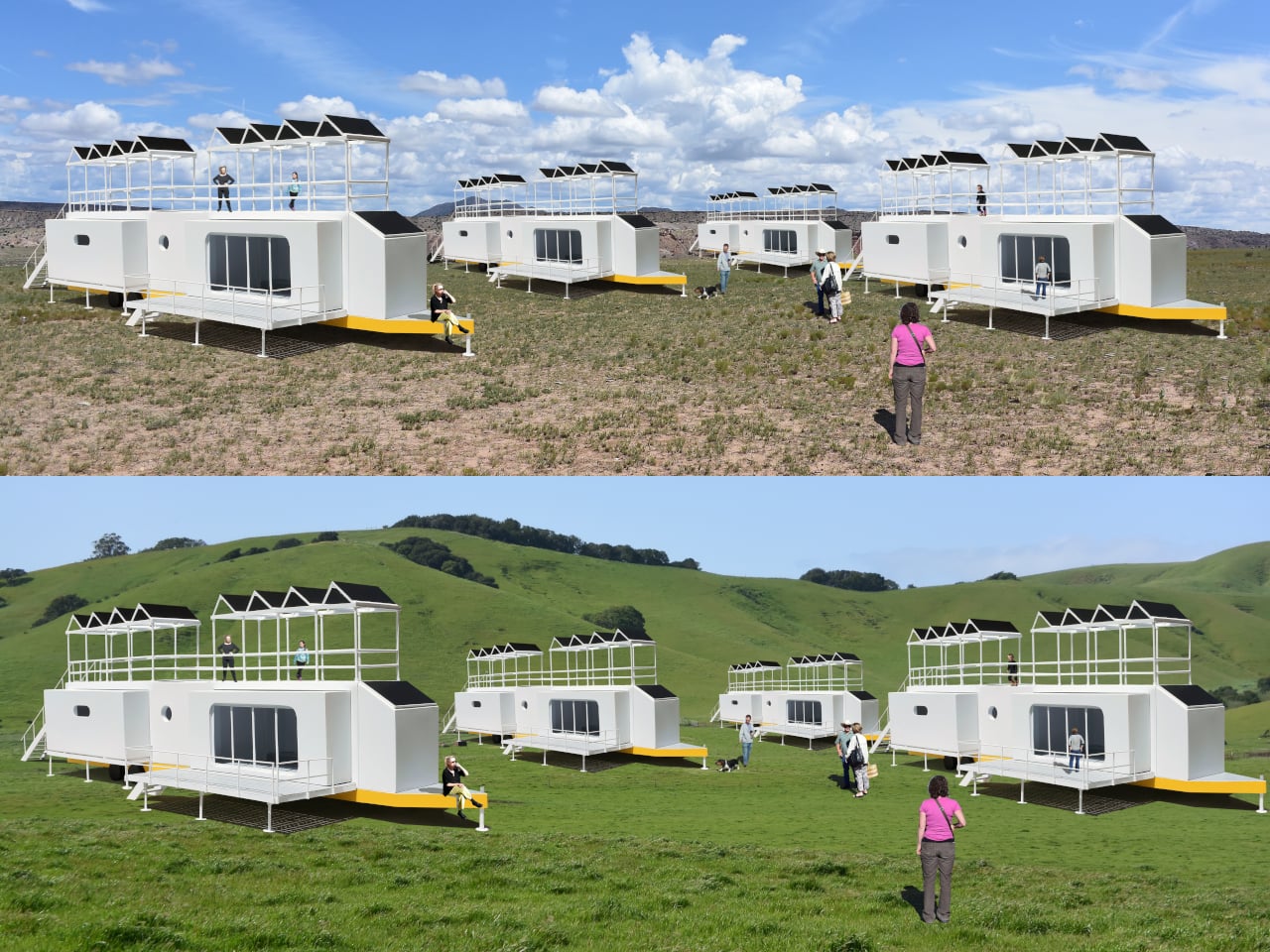
The Mobiltels concept approaches hospitality from a completely different direction. Rather than building a permanent structure and hoping the location is compelling enough, each Mobiltel unit is designed to fold into a compact, truck-towable trailer, be driven to wherever the landscape is most remarkable, and then unfold into a functioning luxury accommodation. When the stay is over, it packs up and leaves without leaving much evidence behind.
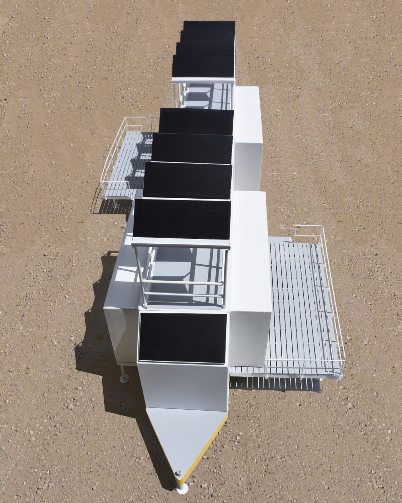
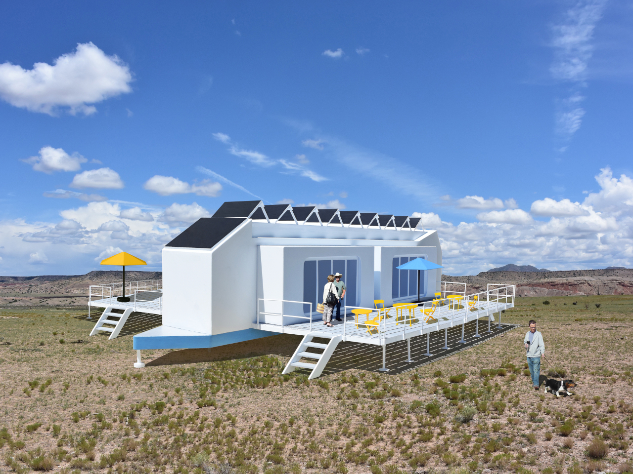
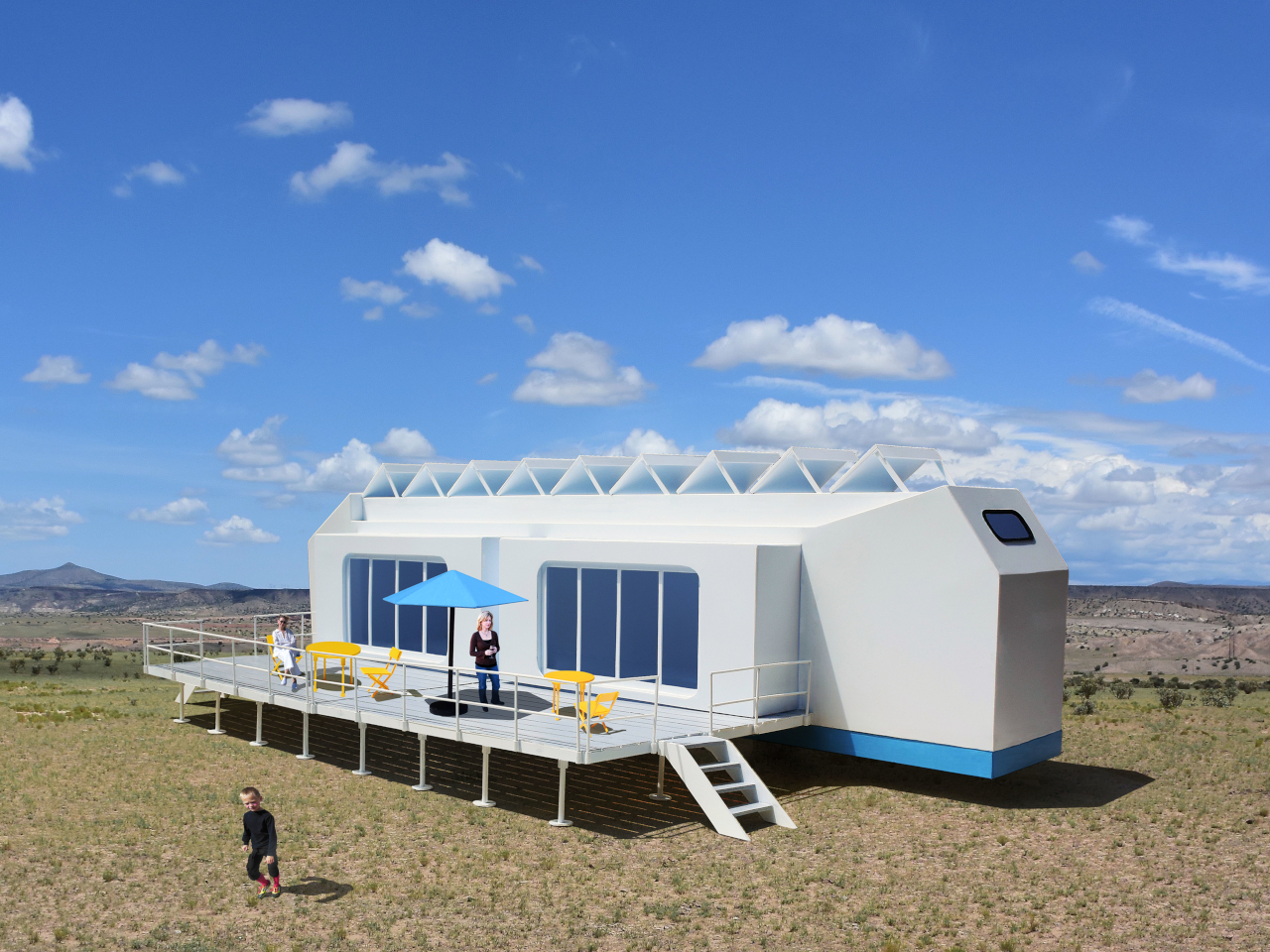
Three distinct unit types make up the proposed resort ecosystem. The first is the guest accommodation module, which deploys into two full hotel-style rooms, each with a private bath and its own private deck. The roof extends into a communal deck shaded by solar panels that generate the electricity to power the unit, while a second panel mounted on the exterior heats the water. The entire structure, decks and all, folds back into a trailer tight enough to tow down a highway.
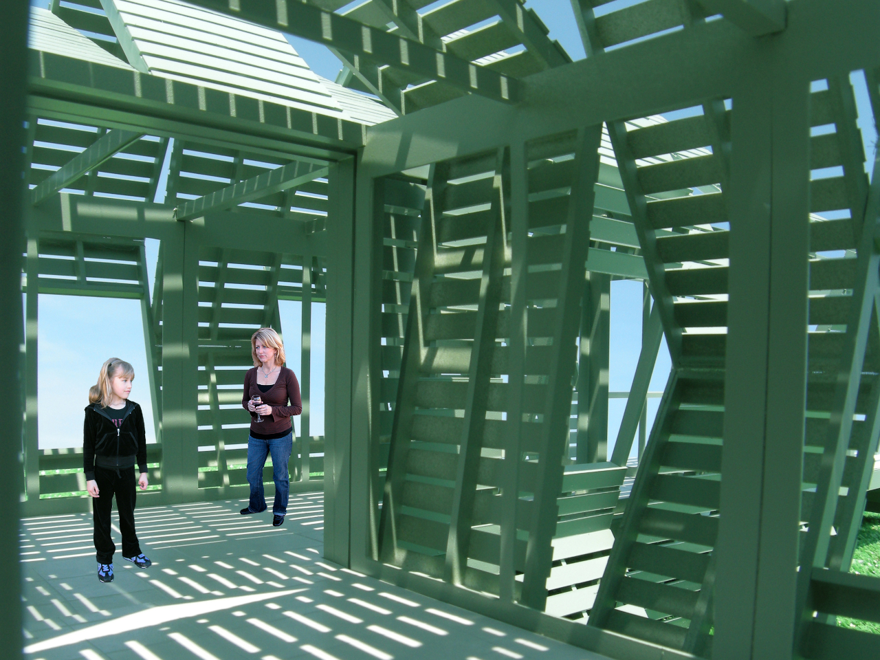
The second unit is a solar-powered café and coffee shop that unfolds to reveal four outdoor dining decks with full kitchen and restroom facilities. The third is a large shade structure intended for gatherings, private events, and communal lounging, built as a striking open lattice that collapses into a flat-load trailer for transport. Additional unit types can theoretically follow the same logic, meaning a full resort amenity list could be assembled and disassembled as needed.
The off-grid energy system is what makes the location independence real rather than theoretical. Every unit generates and manages its own power and heated water from the sun, which means no connecting to local utilities and no requiring a serviced campsite. A Mobiltel cluster can go where a road exists and terrain is flat enough to level a trailer, which is a much lower bar than conventional construction.
The environmental argument is also embedded in the temporariness. A permanent hotel in a wilderness setting modifies that setting permanently. Roads are built, foundations are poured, and the land around the structure gradually changes to accommodate the infrastructure. A Mobiltel unit lands on a site for a season, its occupants absorb the specific quality of that place, and it leaves. The landscape recovers. The next location gets the same treatment.
There’s something quietly subversive about applying a mobile home chassis to a luxury hospitality concept. Mobile homes occupy a very specific cultural position, one that doesn’t usually include rooftop communal decks and solar-heated private baths. The Mobiltels concept borrows the transport logic of one and applies it to the aesthetic ambitions of the other, with the result that a high-end resort becomes as relocatable as a food truck. The result sits somewhere between architecture and expedition equipment, which is probably exactly the right place for it.
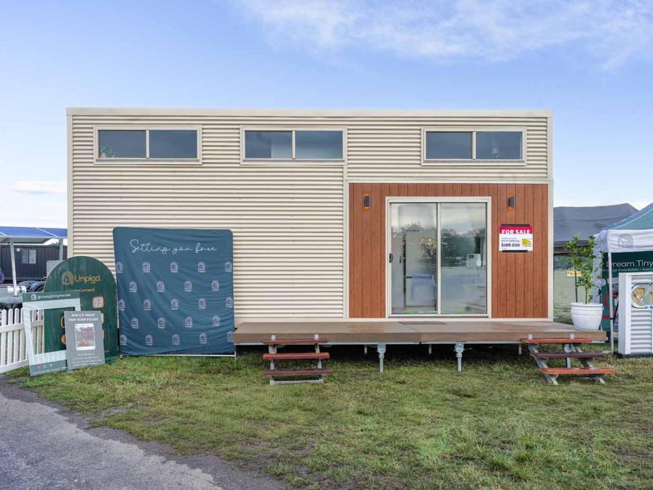
The tiny house movement has always been better at Instagram than at parenting. A couple, a dog, maybe a sourdough starter on the counter: that’s the fantasy it learned to sell. The moment a child enters the picture, the aesthetic dream quietly dissolves into a very real problem: where does anyone actually sleep, and who gets the bathroom first? Unplgd Tiny Homes, the Blue Mountains studio behind the original 26-foot Kookaburra, has spent the past year trying to answer that question seriously, and their answer is the Kookaburra 2.0.
The new model stretches to 8.5 metres long, 3 metres wide, and 4.5 metres at the gable (27.8 × 9.8 × 14.7 feet), adding just over half a metre to the original footprint but reorganising almost everything inside. Where the first Kookaburra was designed around two people working from home, the 2.0 reframes the interior around four distinct zones: cook, wash, store, and what the studio calls “reset after a big day.” That last phrase tells you exactly who this is for. Not minimalists chasing freedom, but parents chasing a moment of quiet.
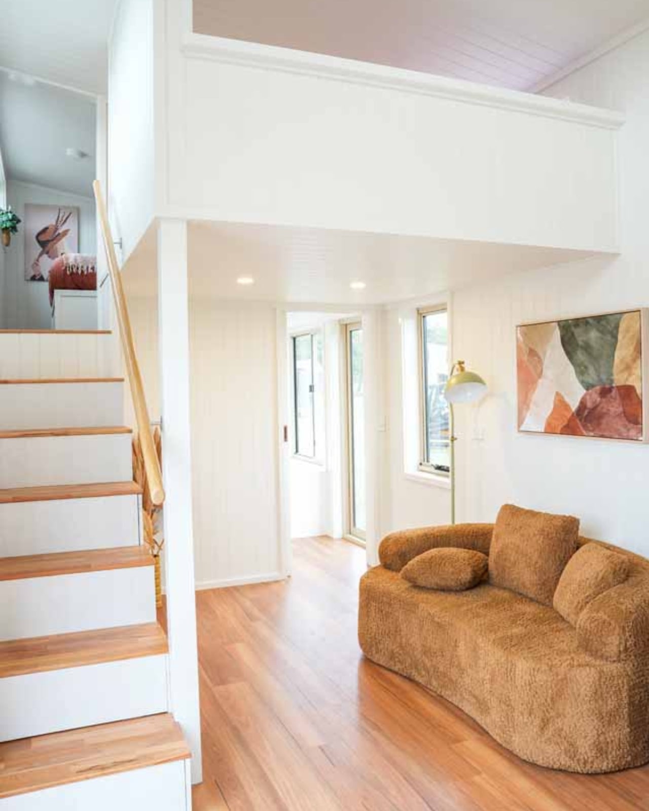
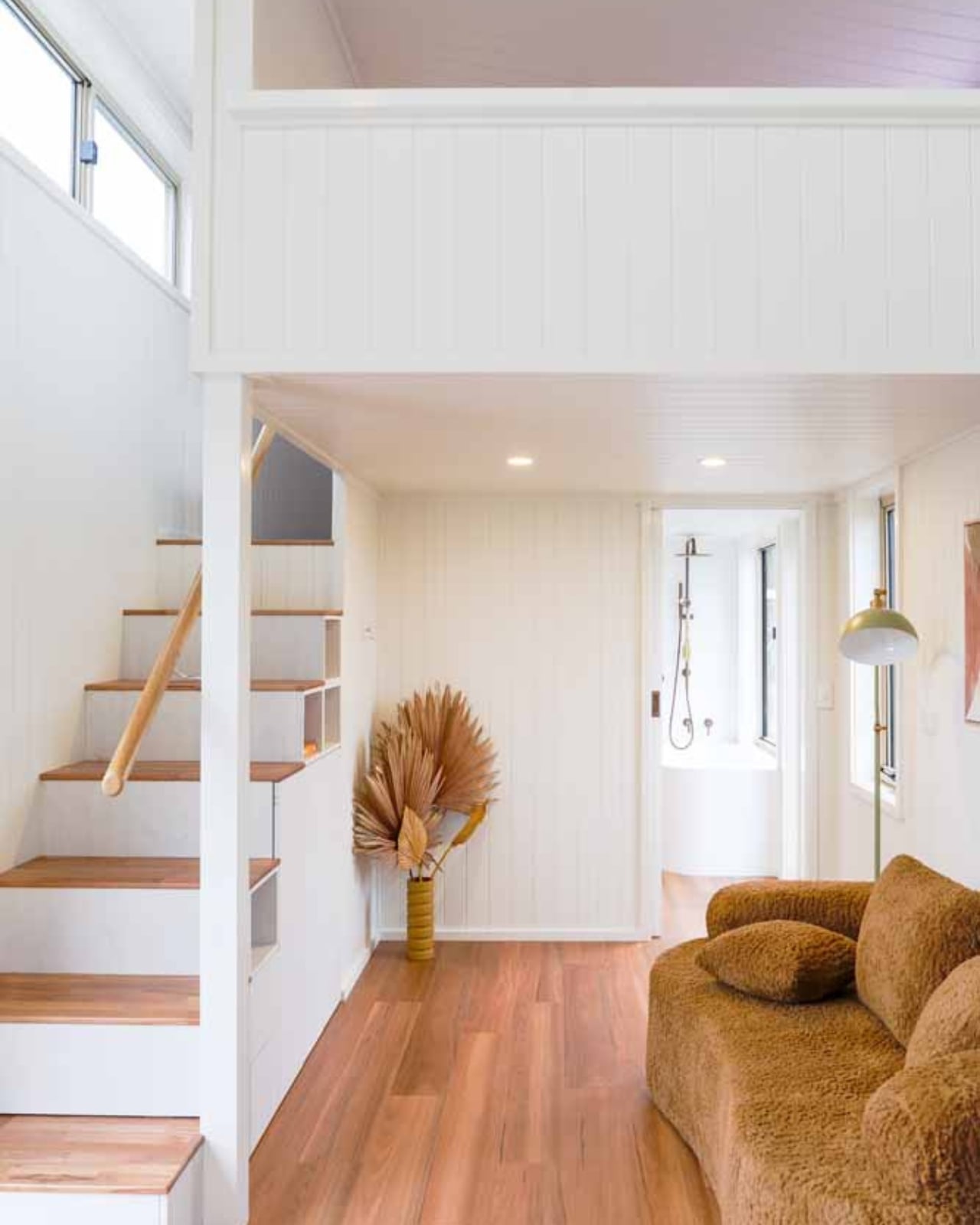
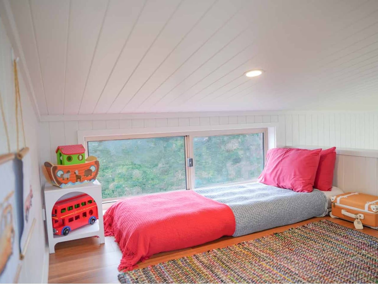
Structurally, the design’s smartest move is the dual-loft layout. A double-height void anchors the centre of the home, with the queen master loft at one end and a children’s single loft at the other, each reached by the same staircase-storage unit that doubles as the home’s main organisational spine. The queen loft offers standing headroom on three sides, which sounds like a minor detail until you’ve spent a morning in a traditional tiny house loft hunched over trying to find your socks. The kids’ loft sits separately, with its own clerestory window band that pulls in light while keeping privacy intact. On paper, the spatial hierarchy is genuinely considered.
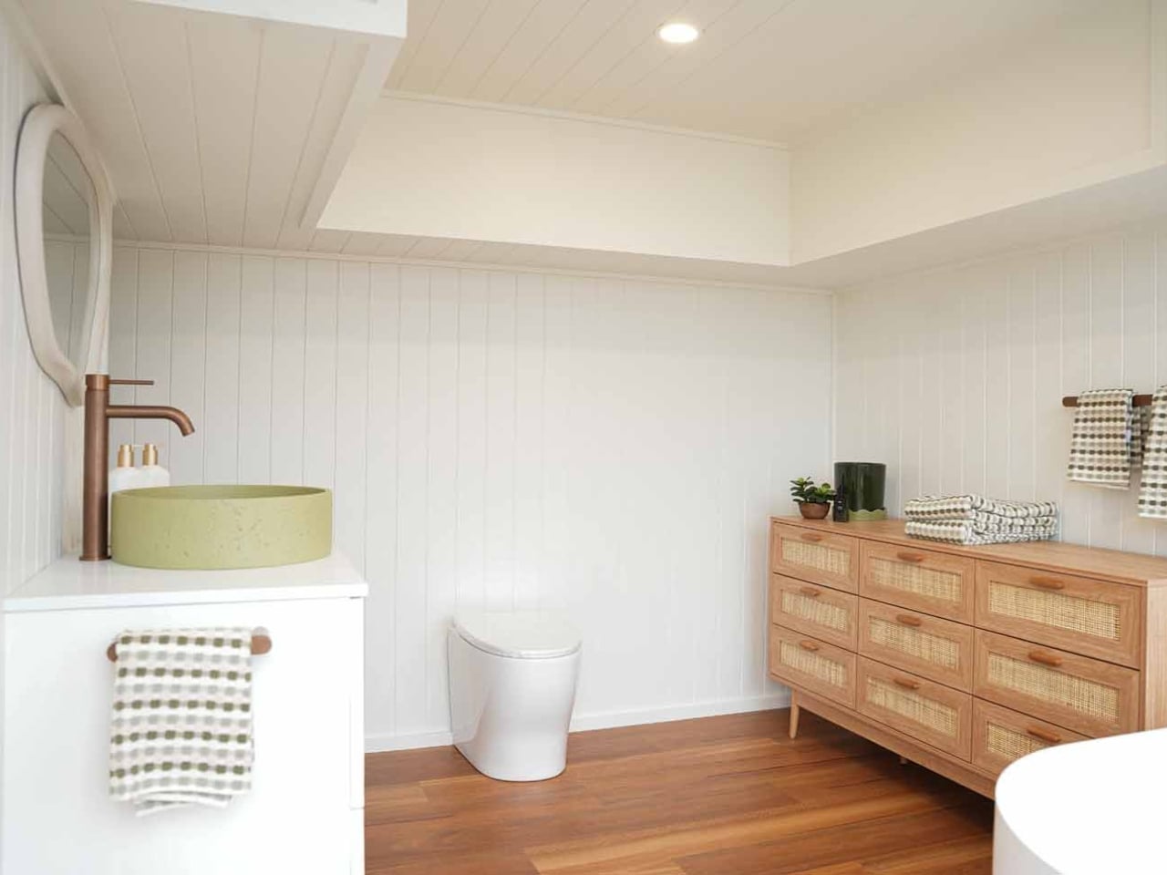
The bathroom is getting a lot of attention, and for good reason. A full-size freestanding bathtub in a home under 28 feet is a confident choice, paired with an integrated laundry nook that treats domestic routine as a design problem worth solving. The L-shaped kitchen with breakfast bar follows the same logic. Outside, VJ panelling meets cream corrugated steel, a material palette that signals a specific aesthetic position in 2026 Australian residential design: not rough-hewn bush shack, not cold minimalist box, but something closer to considered coastal warmth.
AU$195,000 is the turnkey starting price, which puts it squarely in the range where comparisons to conventional housing become unavoidable. For roughly the same budget in regional New South Wales, you could find a small permanent house with a yard, without the towing and zoning complications that come with any road-legal tiny home. The 3-metre width is legal for towing across most Australian states without a wide-load permit, but regulations shift the moment you cross certain state borders, and the logistics follow. That’s not a dealbreaker, but it’s a real calculation that the breathless expo coverage tends to skip past.
It’s also worth naming the elephant in the room: no family has actually lived in this house yet. Every piece of coverage, including this one, is written from a display unit that toured the Hawkesbury Show circuit. The questions that matter most are the ones that can’t be answered from photos: whether noise transfers between lofts, whether the staircase is negotiable at 2am with a toddler, whether two adults and one child can share a morning bathroom without losing their minds. Unplgd deserves credit for thinking the brief through more carefully than most in this space, but the gap between a stunning expo build and a liveable family home is exactly the gap that gets papered over by beautiful photography.
One last thing worth flagging: search “Kookaburra tiny home” right now and you’ll pull up at least three different brands. Unplgd, Adapt Homes, and Kookaburra Tiny Homes AU are all trading under variations of the same bird name. They are completely unrelated companies. Do your research before you request a quote. The Kookaburra 2.0 is a genuinely promising design pushing against a real limitation in the tiny house category. Whether it delivers on the promise is a question only a family who actually lives in one can answer.
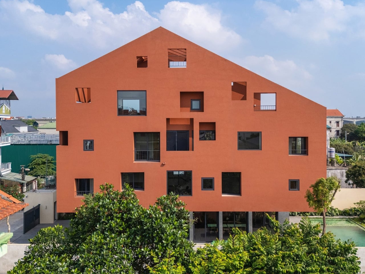
The name alone stops you. 100 Windows. Not “The Pavilion House” or “House No. 7” or something equally poetic and vague. Just a count. A blunt, almost confrontational declaration of exactly what you’re getting, and yet somehow, the moment you see it, the name feels like the most understated thing about it.
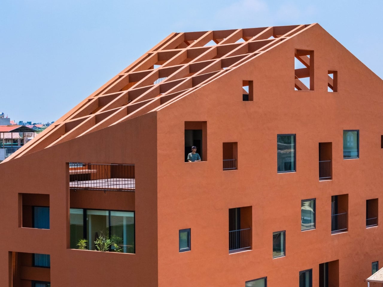
Designed by Hanoi-based architecture practice Inrestudio, this multi-generational home is wrapped in a terracotta-toned, double-layered exterior punctured by irregularly placed, mismatched openings. The windows aren’t uniform. They don’t line up in neat rows or follow a rational grid. They appear across the facade like a scatter of thoughts, some large, some small, some square, some elongated, placed with an intention that reveals itself slowly the longer you look. It’s controlled disorder, the kind that only happens when someone has thought very carefully about where chaos is allowed to go.
The project sits within one of Vietnam’s most distinctive and genuinely challenging housing typologies: the tube house. These long, narrow urban homes are a product of Hanoi’s history, born from a time when property taxes were levied on street frontage, pushing families to build deep and vertical rather than wide. The tube house is, by nature, a compromise. You work with what the city gives you. What Inrestudio does here is refuse to let that constraint become a ceiling.
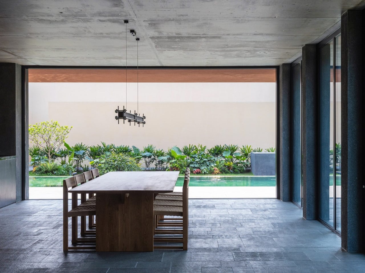
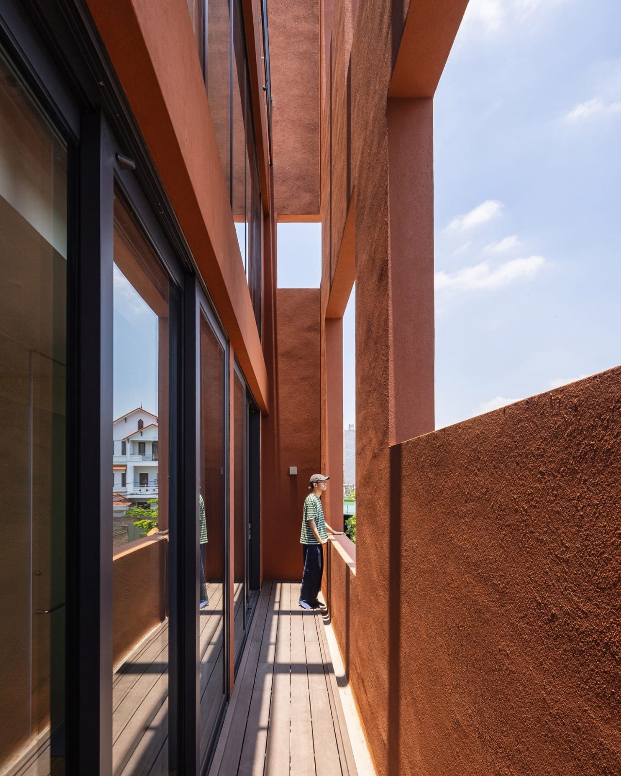
The double-layered envelope is the key move. By wrapping the home in two skins instead of one, the architects create what they call “in-between spaces,” zones that exist between the inner living areas and the outer facade. These aren’t wasted margins or dead air. They’re transitional, purposeful areas where the house breathes, where light filters and shifts through the day, where the rigid boundary between inside and outside softens into something more generous. It’s the kind of spatial thinking that doesn’t photograph easily but completely transforms the experience of actually being in a building.
This matters especially because 100 Windows was designed for multiple generations living under one roof, a reality that remains far more common in Vietnam than it does in most Western countries. Designing for multi-generational life is genuinely hard. You’re negotiating different rhythms, different needs for privacy and togetherness, different relationships to noise, light, and air. Architecture that understands this doesn’t just divide a floor plan into labeled rooms. It creates conditions where people can be near each other without being on top of each other, where the house itself does some of the social negotiating.
The terracotta tones feel right for this, too. The palette connects the building to its climate, to the warmth and humidity of Hanoi, to the earth tones of traditional Vietnamese buildings without becoming a costume or a nostalgia piece. It reads as contemporary without trying to distance itself from its own context, which is a balance a lot of architecture gets wrong in either direction.
What you take away from 100 Windows isn’t really about the windows, or at least not literally. It’s about the idea that a constraint, whether it’s a narrow plot, a shared family life, or a hundred openings that need to somehow feel cohesive, can become the source of design rather than the obstacle to it. The windows are a by-product of a layered system, not a stylistic decision made in isolation. That’s what earns it attention beyond the aesthetic.
Architecture like this tends to get filed under “interesting regional work” and not looked at as broadly as it deserves. But the conversation 100 Windows is having about density, family, and what a facade actually owes its inhabitants is one that any city grappling with urban housing should be paying attention to. It’s not proposing a universal solution. It’s doing something more useful: showing what happens when designers take the specific conditions of a place seriously enough to build something genuinely shaped by them. The result is a house that looks singular because it is.
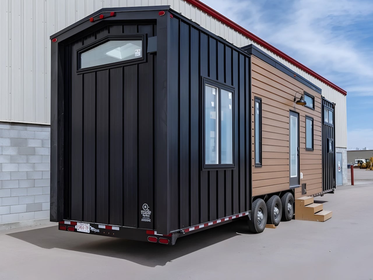
Most tiny homes are upfront about their limitations. The Florence isn’t interested in that conversation. The Florence, by Alberta-based Teacup Tiny Homes, is the argument against all of that. Sitting on a triple-axle trailer, the Florence stretches 36 feet long and 8.5 feet wide, placing it at the roomier end of the towable tiny home spectrum. Its 355 square feet of interior space is arranged with the kind of logic you’d expect from a full-size home — not an afterthought. That discipline in planning is what separates it from the crowd.
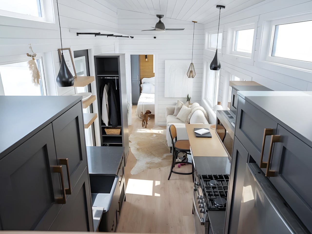
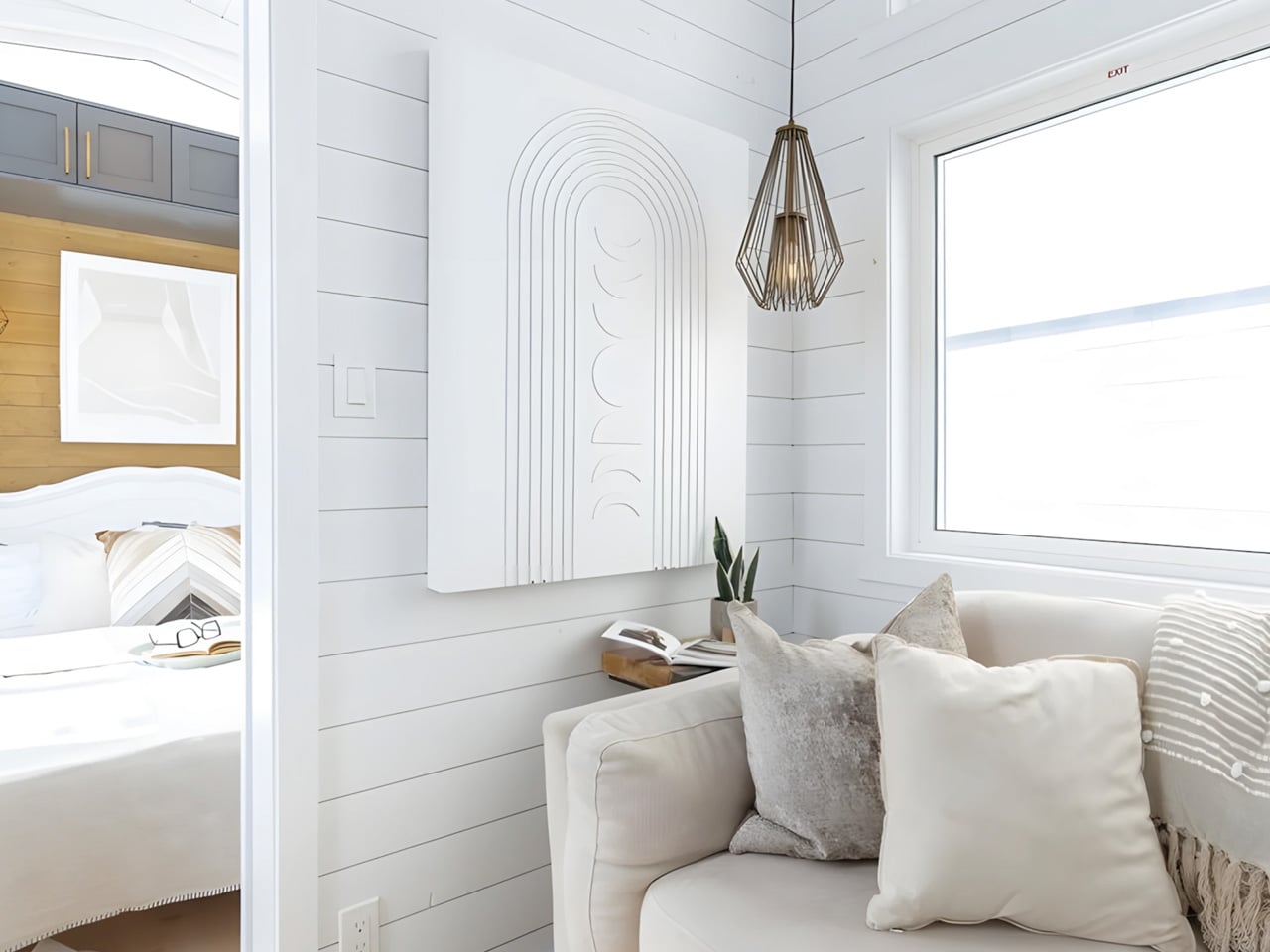
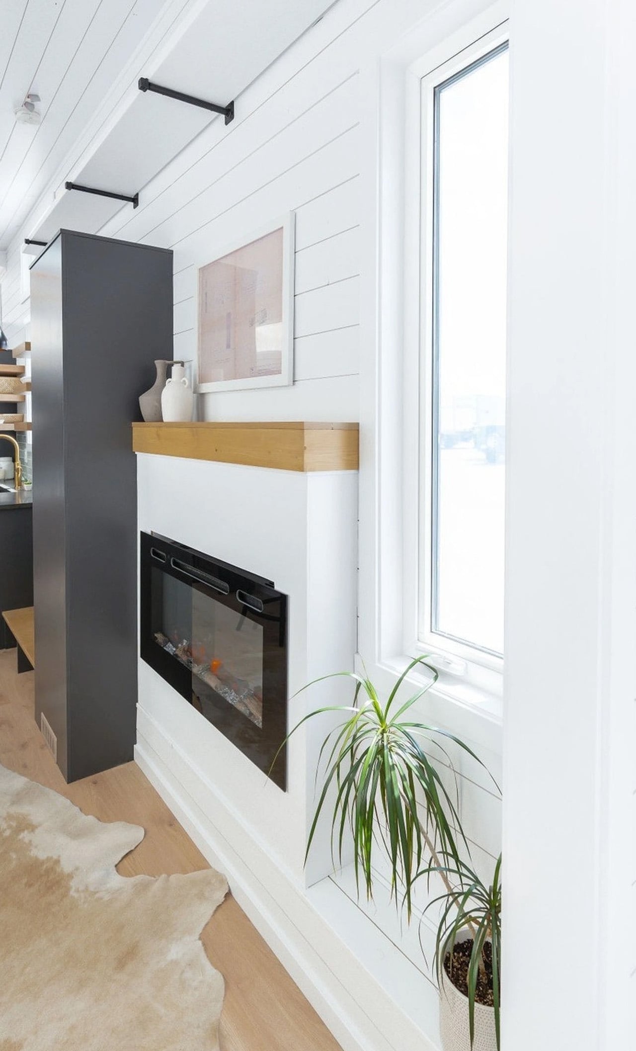
Step inside and the first thing you notice is light. White tongue-and-groove paneling wraps the walls, 11-foot vaulted ceilings push the space upward, and generous windows pull the outdoors in. The living area anchors the layout, centered around a sofa and electric fireplace, with room for a television and a large built-in storage unit near the entrance. It doesn’t read like a compromise. It reads like a considered home.
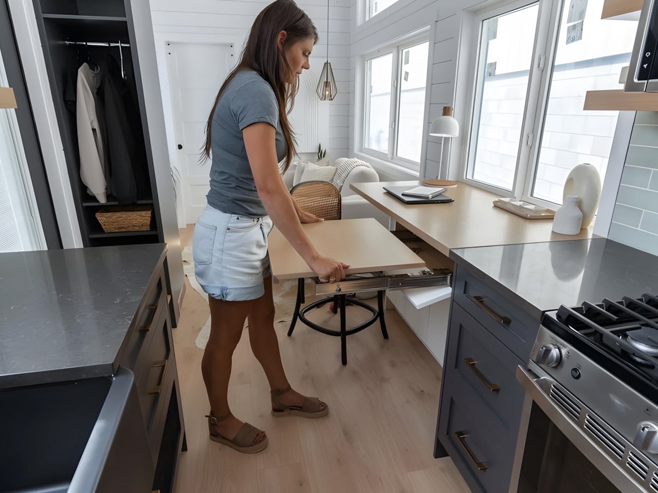
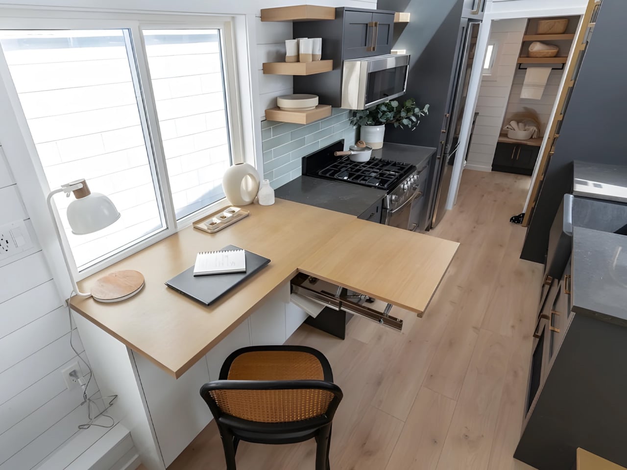
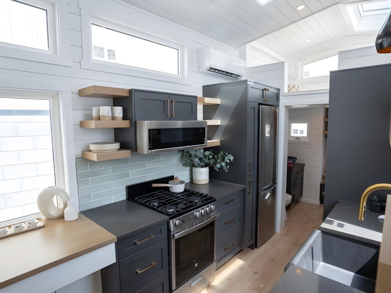
Immediately adjacent is one of Florence’s more thoughtful touches — a dining nook that doubles as a home office, complete with an extending desk and integrated storage. For remote workers or anyone who needs a dedicated workspace without sacrificing a room, this dual-function zone is quietly brilliant. The kitchen runs along the galley wall nearby, equipped with a four-burner propane stove, oven, microwave, fridge/freezer, a large sink, and storage that actually holds things.
The master bedroom is located on the main floor, which is rarer than it should be in the tiny home world. Positioned next to the living area, it fits a double bed with genuine walking clearance on both sides and enough built-in storage to feel like a real room. A secondary sleeping loft sits above the kitchen and bathroom, accessed by a removable wooden ladder, offering space for a second double bed. The bathroom, tucked between the kitchen and bedroom, features a glass-enclosed shower, flushing toilet, and vanity sink.
Teacup Tiny Homes, a 100% female-owned and operated company founded in 2016, offers the Florence with a range of customization options — a soaking tub in place of the shower, choice of materials and furnishings, and permanent foundation installation if mobility isn’t the priority. Delivery runs across both the US and Canada. The Florence starts at roughly US $122,000. For a home this size, it’s a number that’s easier to justify than it might first appear.
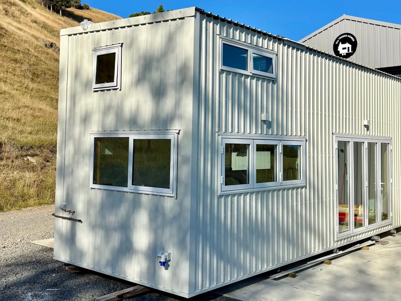
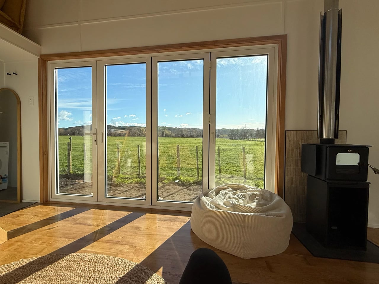
Wood has a way of telling you exactly where it’s been — and the Redwood by Tiny Timber Homes wears that history well. The Redwood leans into that quality completely — and the result is a tiny house that feels less like a compromise and more like a choice you’d make twice.
Tiny Timber Homes has built its reputation on one idea: that small spaces deserve the same craftsmanship as full-sized ones. The Redwood is perhaps the clearest expression of that philosophy. Its exterior reads immediately as intentional — warm wood cladding, clean rooflines, and a silhouette that sits confidently without trying to mimic a traditional house. It’s not cosplaying a cabin. It’s its own thing.
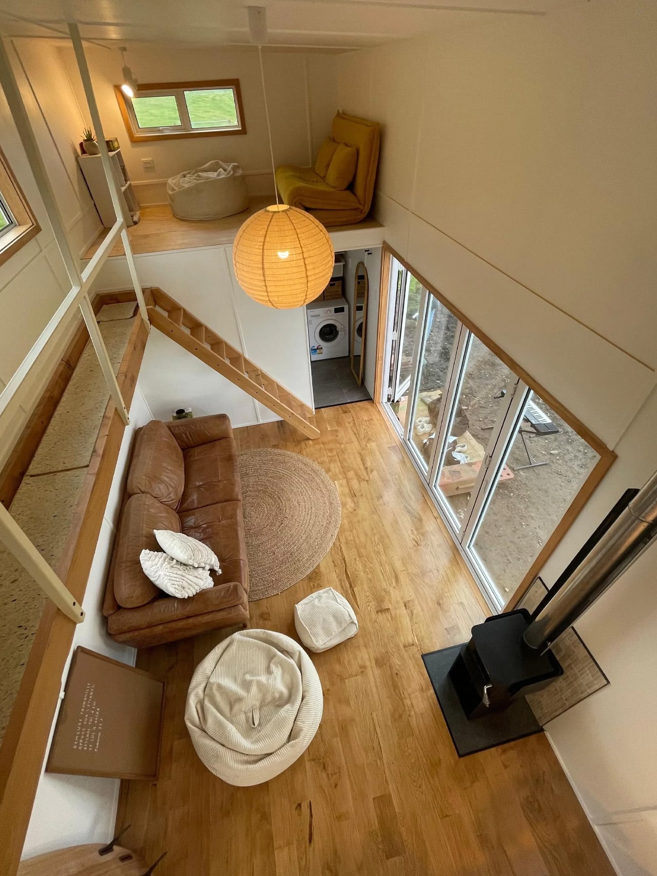
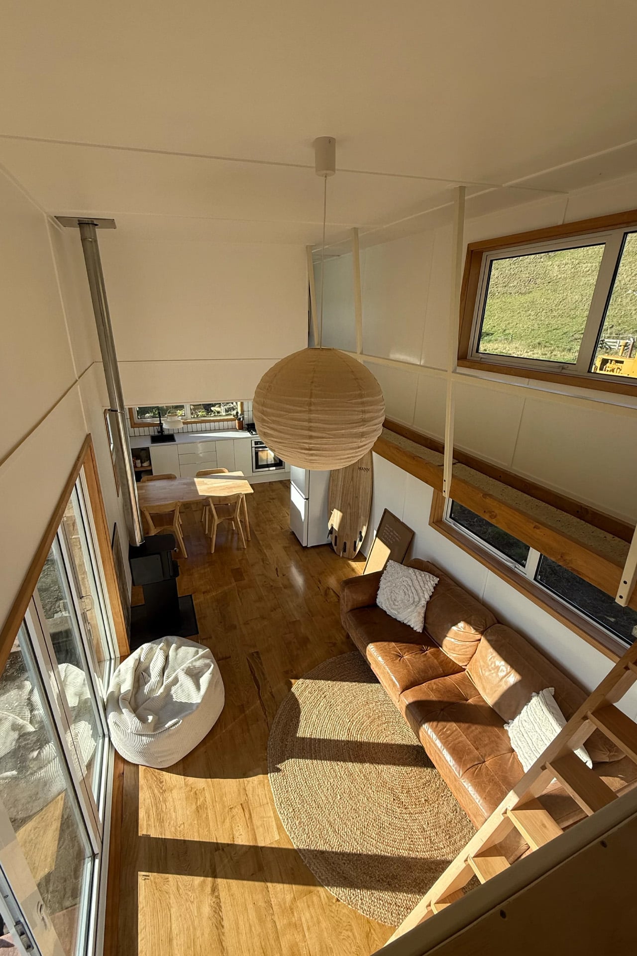
Step inside and the material language continues without interruption. Exposed timber framing lines the interior walls, giving every room a structural honesty that most tiny homes paper over with drywall and distraction. Natural light does the heavy lifting here — strategically placed windows pull the outdoors in and keep the interior from ever feeling like a box you’re trapped inside.
The kitchen is compact but considered. Counter space is used with real intention, storage is tucked where you’d actually look for it, and the layout doesn’t ask you to turn sideways to reach the sink. It’s the kind of kitchen that rewards a slower pace — coffee in the morning, dinner from scratch, no dishwasher you don’t need.
The sleeping loft sits above it all, accessible by a stair ladder that doubles as storage. From up there, the whole space reads differently. You see the structure, the grain of the wood, the way everything fits without forcing. It’s a perspective that makes you appreciate the design more, not less.
What separates the Redwood from the growing noise in the tiny home market is restraint. There’s no attempt to cram in features that don’t belong, no feature list that sacrifices livability for a spec sheet. What you get instead is a home that understands its own scale and works with it — not against it.
Tiny Timber Homes builds for people who’ve thought seriously about what they actually need from a home. The Redwood answers that question with timber, light, and a layout that respects the person living inside it. In a category full of aspirational renderings and underwhelming follow-through, that’s worth something. It looks like a home. It lives like one too.
Most tiny homes ask you to make peace with the compromise. Wind River Built’s Rogue Mini skips that conversation entirely. Built in Tennessee by one of the most respected names in the tiny home space, the Rogue Mini is a trailer-mounted dwelling that treats small square footage not as a limitation, but as a design brief.
From the outside, the Rogue Mini reads clean. Board-and-batten siding, a pitched roofline, and restrained exterior detailing give it the visual composure of something far more permanent than its wheels suggest. Wind River Built has always leaned into quality construction over novelty, and the Rogue Mini reflects that. Every edge feels considered. Nothing about the exterior screams “novelty camper” — it looks like a house someone actually wants to live in.
Step inside, and the interior continues that conversation. Wood-paneled walls and vaulted ceiling lines open the space upward, drawing the eye in a way that makes the square footage feel more generous than it is. The kitchen is compact but functional, with enough counter space to cook a real meal rather than reheat one. The sleeping loft sits above, accessible by a staircase or ladder depending on configuration, and offers a surprisingly comfortable retreat that feels separated from the main living area in the way a bedroom should.
What Wind River Built understands — and what a lot of tiny home builders get wrong — is that smallness only works when the details are right. Inadequate storage, poor natural light, and awkward transitions between zones make a small home feel punishing. The Rogue Mini sidesteps most of those pitfalls. Windows are placed deliberately, throwing light into corners that would otherwise collapse. Storage is woven into the structure rather than bolted on as an afterthought.
The Rogue Mini isn’t designed for the weekend warrior or the festival-goer chasing Instagram backdrops. It’s designed for someone who has genuinely decided to live differently — to trade square footage for mobility, and square footage for intention. That kind of design decision requires a builder who takes the task seriously, and Wind River Built clearly does.
At a time when housing feels increasingly abstract — prices climbing, spaces shrinking, and permanence fading — the Rogue Mini offers something rare. It chooses to make living small feel like an upgrade rather than a retreat. That’s not an easy thing to design. Wind River Built pulls it off.
BIG’s new headquarters for Danish material supplier Dymak turns environmental performance into architecture. Rather than treating sustainability as a technical layer hidden within the building, the studio makes it central to the project’s form, materiality and identity.
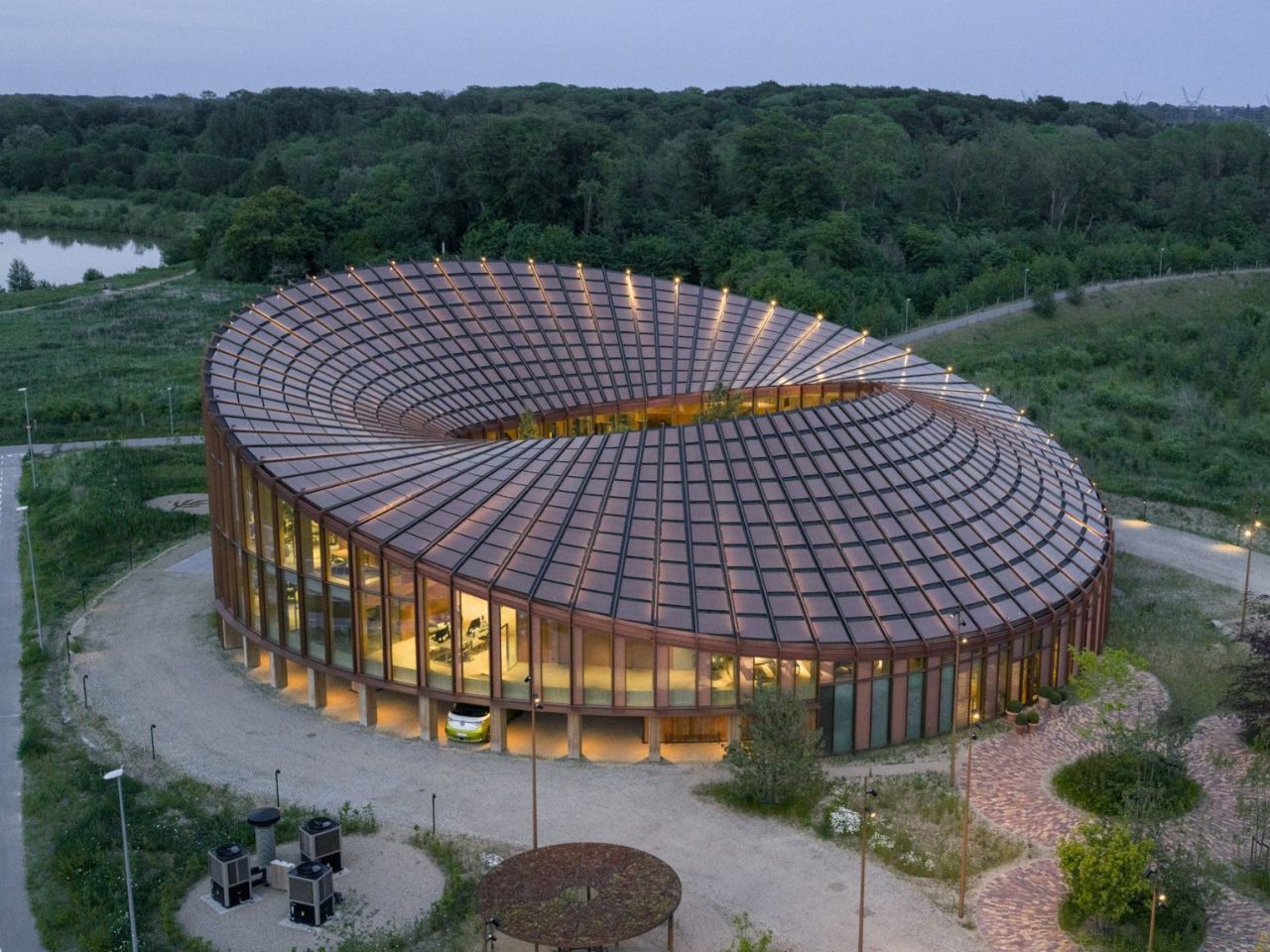
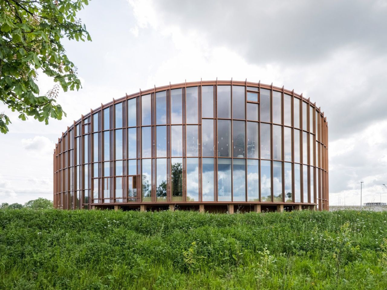
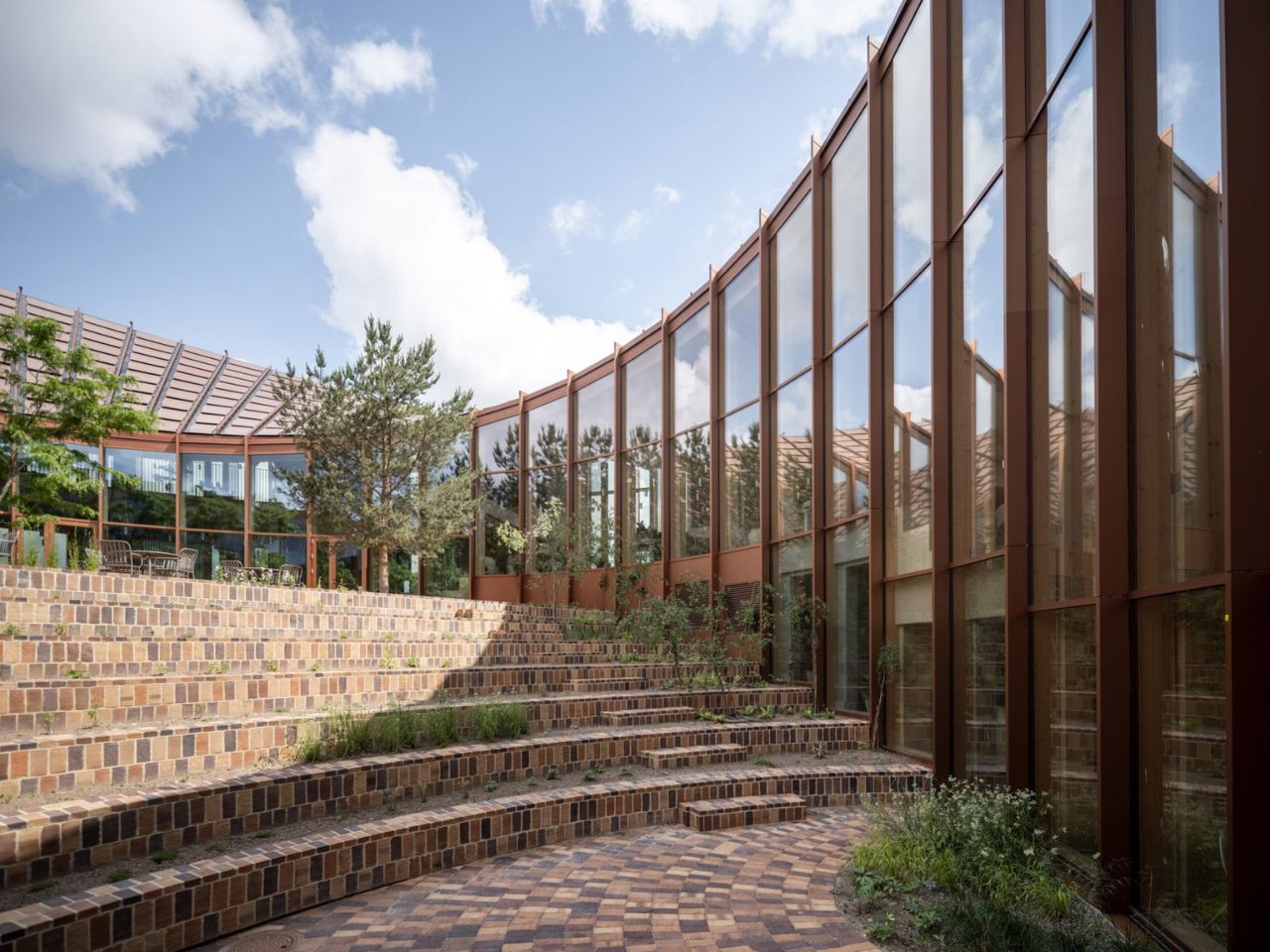
Located beside Glisholm Lake in Odense, Denmark, the 2,800-square-metre headquarters is organised as a circular mass-timber structure around an open-air courtyard. Above it, an undulating roof rises and falls across the building, creating a form that recalls a Möbius strip. The result is sculptural and highly recognisable, but it is also shaped by practical concerns.
The roof rises towards the north to open views of the lake and surrounding forest, while sloping towards the south to provide shade and reduce solar heat gain. Its surface is covered with 880 custom-shaped photovoltaic panels, turning the roof into both an energy-producing system and the building’s main visual feature.
This combination of performance and spectacle is characteristic of BIG. The studio often transforms practical constraints into clear architectural gestures, and the Dymak headquarters follows the same approach. Solar orientation, shading and landscape views are not treated as separate problems. Instead, they are brought together within one continuous form.
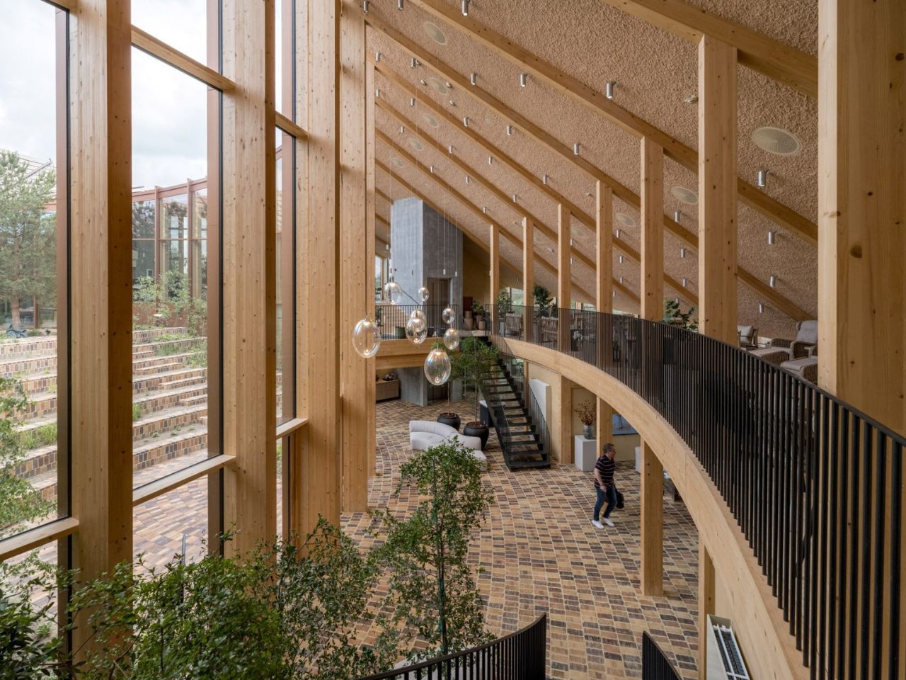
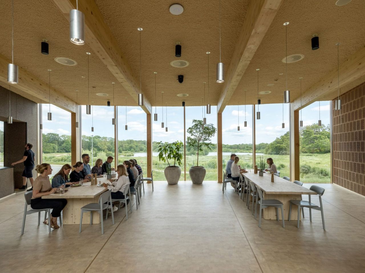
The project also functions as a full-scale showcase for Dymak’s material portfolio. Mass timber forms the primary structure, while clay, cork, eelgrass and recycled paper fibres are used throughout the building. These materials are not displayed as isolated samples. They appear across the floors, ceilings, walls and structural elements, allowing visitors to experience them through texture, sound and scale.
BIG describes the building as a “living catalogue”, and the phrase captures its dual role. It is both a workplace and a demonstration of what Dymak’s materials can achieve. The architecture becomes part of the company’s identity, communicating ideas of craftsmanship, sustainability and material innovation.
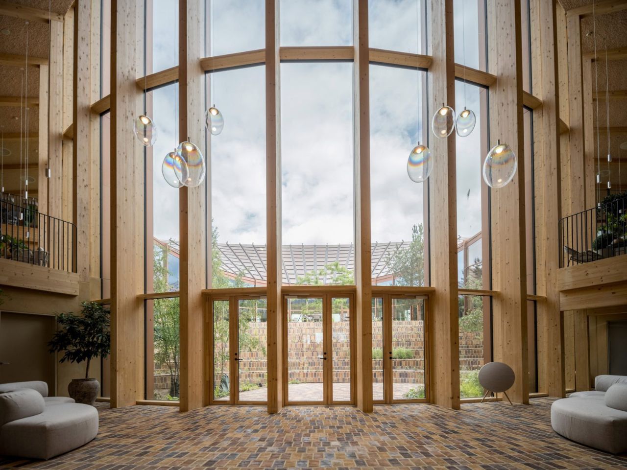
This gives the headquarters a warmer atmosphere than the polished glass-and-steel language commonly associated with corporate buildings. Timber remains visible, brick-tiled flooring extends across interior and exterior spaces, and natural fibres soften the ceilings. The materials create a sense of tactility that reinforces the company’s focus while making the workplace feel less formal.
At the same time, the building clearly operates as a branding tool. Its solar roof, natural finishes and landscaped spaces present Dymak as environmentally responsible and forward-looking. Sustainability is not simply part of the building’s performance; it becomes part of the company’s public image.
At the centre of the circular plan is a landscaped courtyard conceived as a green amphitheatre. Planted terraces and stepped seating create space for informal meetings, gatherings and moments of rest. The courtyard is surrounded by glazing, allowing daylight and vegetation to remain visible from the surrounding interiors.
Unlike the dramatic roof, the courtyard does not rely on a strong visual metaphor. Its value is more direct. It creates a protected outdoor space, brings nature into the workplace and offers an alternative to desks and enclosed meeting rooms. Brick flooring continues across the threshold, reducing the distinction between inside and outside and making the garden feel like an extension of the office.
The ground floor contains a showroom, photo studio and fitness facilities, while the upper level includes open-plan workspaces, meeting rooms and lounge areas. A mezzanine connects the two floors, and the circular layout creates a continuous route around the courtyard.
The headquarters succeeds most when its sustainable ideas are experienced rather than simply announced. The warmth of timber, the shaded interiors, the continuity of the brick flooring and the presence of landscape all influence how the building feels in everyday use.
Still, the roof is likely to dominate how the project is remembered. Its Möbius-strip form is visually striking and easy to communicate, but it risks overshadowing the building’s quieter achievements. The use of low-carbon and bio-based materials, the creation of shared social spaces and the careful relationship with the surrounding landscape may ultimately be more significant than the headline image.
The project is not a universal model for office design. Its custom roof, circular plan and carefully selected materials make it highly specific to Dymak. Yet this specificity is also what makes it persuasive. By presenting timber, clay, eelgrass and recycled fibres within a polished corporate environment, the headquarters shows that low-carbon materials can support both technical performance and architectural ambition.
BIG’s Dymak headquarters does not attempt to disappear into the Danish landscape. It performs, advertises and turns sustainability into a statement. Its strength lies in showing that environmental responsibility can shape not only how a building performs, but also how it looks, feels and represents the organisation within it.
Most tiny homes ask you to forgive something. The Amelia doesn’t. It speaks that language fluently — treating constraint as a design language rather than something to apologize for.
Stretching 26 feet long and 8.5 feet wide, the Amelia sits on a double-axle trailer and clocks in at 341 square feet of living space. It wears white board-and-batten siding with a maintenance-free steel base and a snap-lock metal roof — clean, unfussy, built to hold up wherever you put it. The kind of exterior that looks deliberate rather than compromised.
Step inside and the first thing you notice is the light. Generous dual-pane, low-E windows fill the living room with natural brightness, and the layout feels considered rather than cramped. There’s room for a full sofa — a sofa bed is available as an upgrade — alongside a large storage unit. A propane-powered underfloor heating system keeps the ground level comfortable year-round, complemented by a mini-split air conditioning unit and a Lunos heat recovery ventilator for air quality. The Amelia was built for Canadian winters, and it shows.
The kitchen sits just past the living area and does not ask you to compromise. A white apron-front farmhouse sink anchors the space, joined by a four-burner Furrion propane range, an oven, a fridge-freezer, a stainless over-the-range microwave, and a large pull-out pantry. Waterfall-edge marble-like countertops run along the perimeter, with an eating bar doubling as a workstation. Every detail, from the soft-close cabinet doors to the black Kohler pull-down faucet, feels chosen rather than settled for. It is the kind of kitchen that makes cooking feel like something worth doing.
A sliding door connects the kitchen to the bathroom — a thoughtful detail that keeps the living zone open. Inside, a 30×30 stand-up shower with easy-clean fiberglass walls, a custom vanity with a rectangular vessel sink, and an oversized round medicine cabinet handle the essentials without feeling like a compromise. There is also a laundry rough-in for those who want to add machines later.
Two loft bedrooms occupy the upper level. The main loft, positioned over the kitchen, fits a king-size bed behind a slatted privacy wall. The secondary loft, accessed by a removable wooden ladder above the living room, handles a queen or king with room to spare. A storage-integrated staircase is available as an upgrade and is worth it for full-time living.
The Amelia starts at roughly US$102,000 and is available for delivery across the United States and Canada. Teacup Tiny Homes, a 100% female-owned Alberta-based builder operating since 2016, offers significant customization across layouts, materials, and finishes. For a home this size, it carries a lot of conviction.
Cities have gotten very good at stacking people on top of each other and very bad at getting those people to actually interact. High density housing solves a real estate problem while quietly creating a social one, isolating seniors on one floor and young families on another with nothing but an elevator connecting them. Architect Yi Lu looked at this fragmentation and asked what it would take to reverse it without bulldozing the buildings already holding millions of people. Her answer, submitted to the A’ Design Award, treats an aging superblock not as a liability but as raw material for a new kind of social infrastructure. It is ambitious, a little sculptural, and grounded in something most housing renewal proposals ignore entirely.
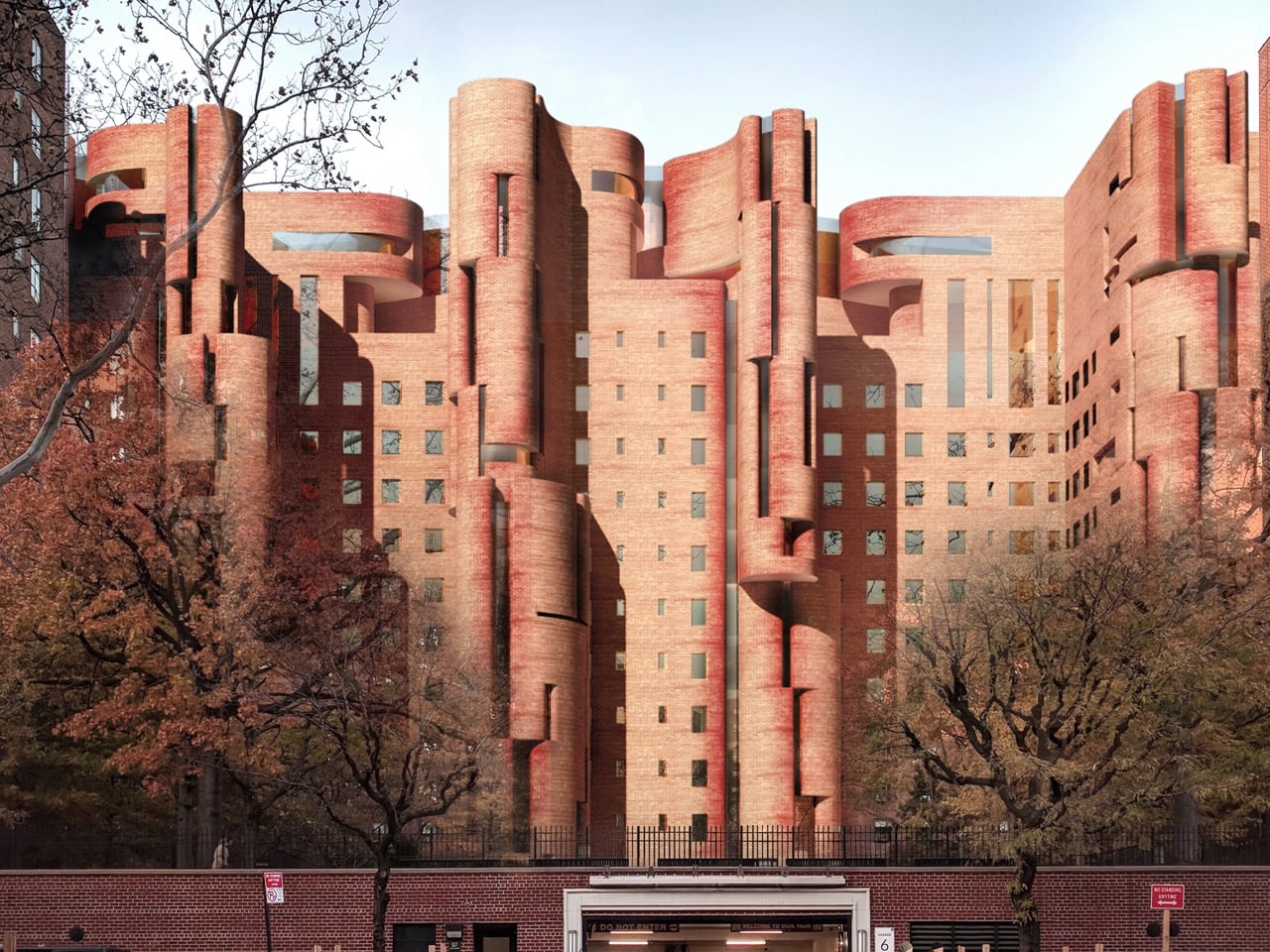
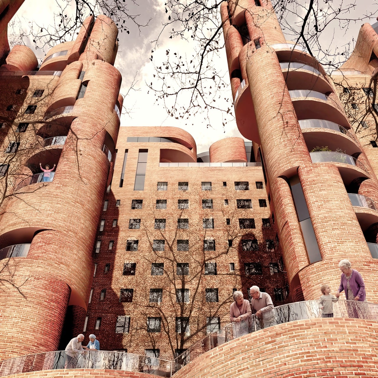
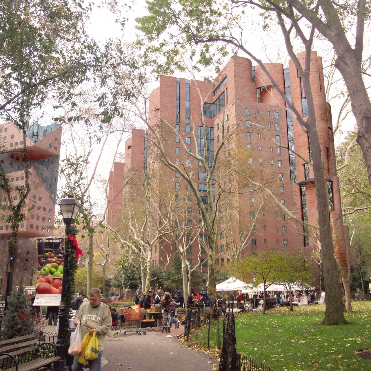
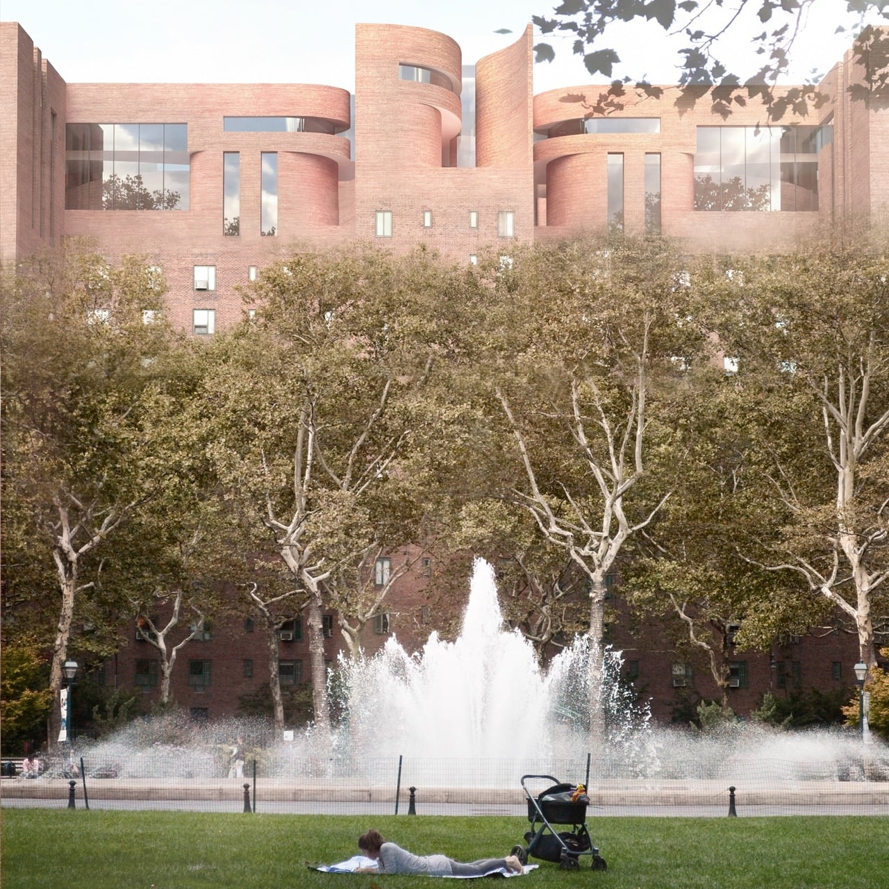
The project, titled The Intergenerational Commons, targets Stuyvesant Town, New York City’s massive postwar housing development, as its test case. Lu’s proposal keeps roughly 75 to 85 percent of the existing floor area as housing while converting the rest into a revitalized podium, rooftop kindergartens, and a network of terraces threading through the brick shell. The renderings have a strange, compelling silhouette to them, cylindrical brick towers twisting up past staggered floor plates, like Michel de Klerk got handed Frank Gehry’s sketchbook. A horizontal community spine activates street level life, while stairs, lifts, and terraces stitch the floors together into what Lu describes as a continuous social landscape. The result looks sculptural from the outside and feels intentional from within, which is a harder balance to strike than either quality on its own.
Designer: Yi Lu
Stuyvesant Town was built as postwar efficiency housing, rows of near identical brick towers designed to move people through the city’s housing shortage as fast as possible. That efficiency came at the cost of any real social texture, and decades later the superblock reads as functional but flat, a place people live rather than a place people encounter each other. Lu’s retrofit does not fight that brick language so much as bend it, pulling curved, tower-like volumes out of the existing grid and letting them collide at odd angles. Load-bearing steel reinforcement and reversible insertions allow the new geometry to sit on top of the old structure without gutting it. The brick stays, but its logic changes completely, from repetition to rupture.
A standardized kit of parts, built around 3,600 millimeter modular bays and lightweight steel framing, lets construction happen in phases without displacing current residents, a constraint that kills most ambitious renewal proposals before they leave the page. Bolt on terraces extend outward from the existing brick shell, adding outdoor space that the original superblock never had. A 1,200 square meter community hub anchors street level activity, while stacked shared terraces and a 300 millimeter green roof system carry that social infrastructure upward through the building. None of it requires the wholesale demolition that usually accompanies large scale housing renewal.
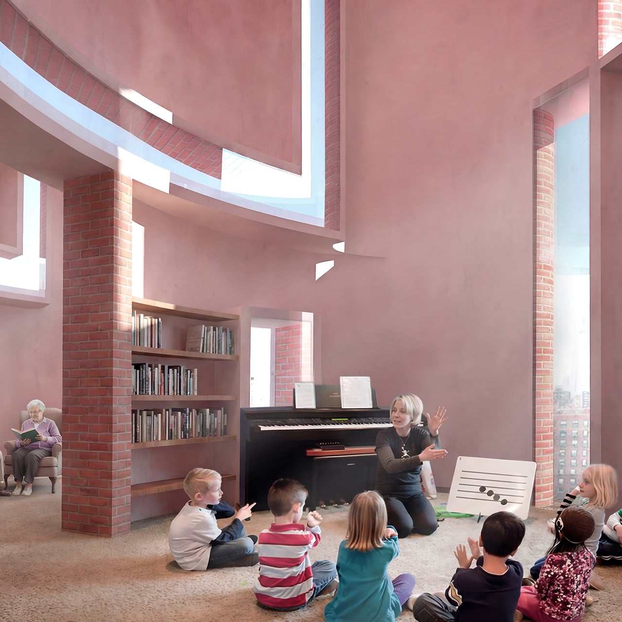
The interesting part is how Lu orchestrates ‘intergenerational’ overlapping zones, connecting seniors and children rather than the more common strategy of designating separate zones for each. Rooftop kindergartens sit close enough to senior learning spaces on the revitalized podium that informal encounters happen without anyone having to schedule them. Interaction stays optional throughout, preserving privacy for residents who want it while making mutual support available for those who do not. That flexibility separates the proposal from the well-meaning but rigid intergenerational housing models that came before it. Whether a project this structurally ambitious ever gets built at Stuyvesant Town is a separate question from whether it should, and Lu’s entry makes a genuinely compelling case for the second one.
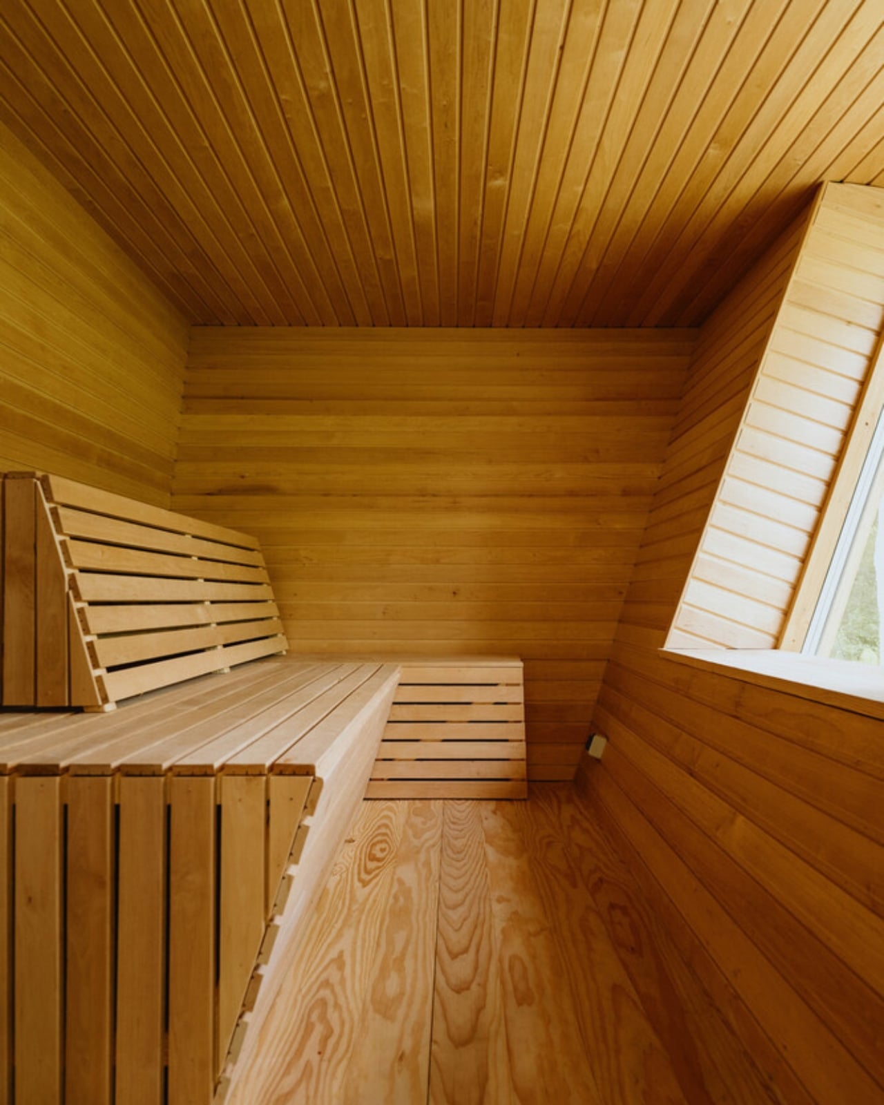
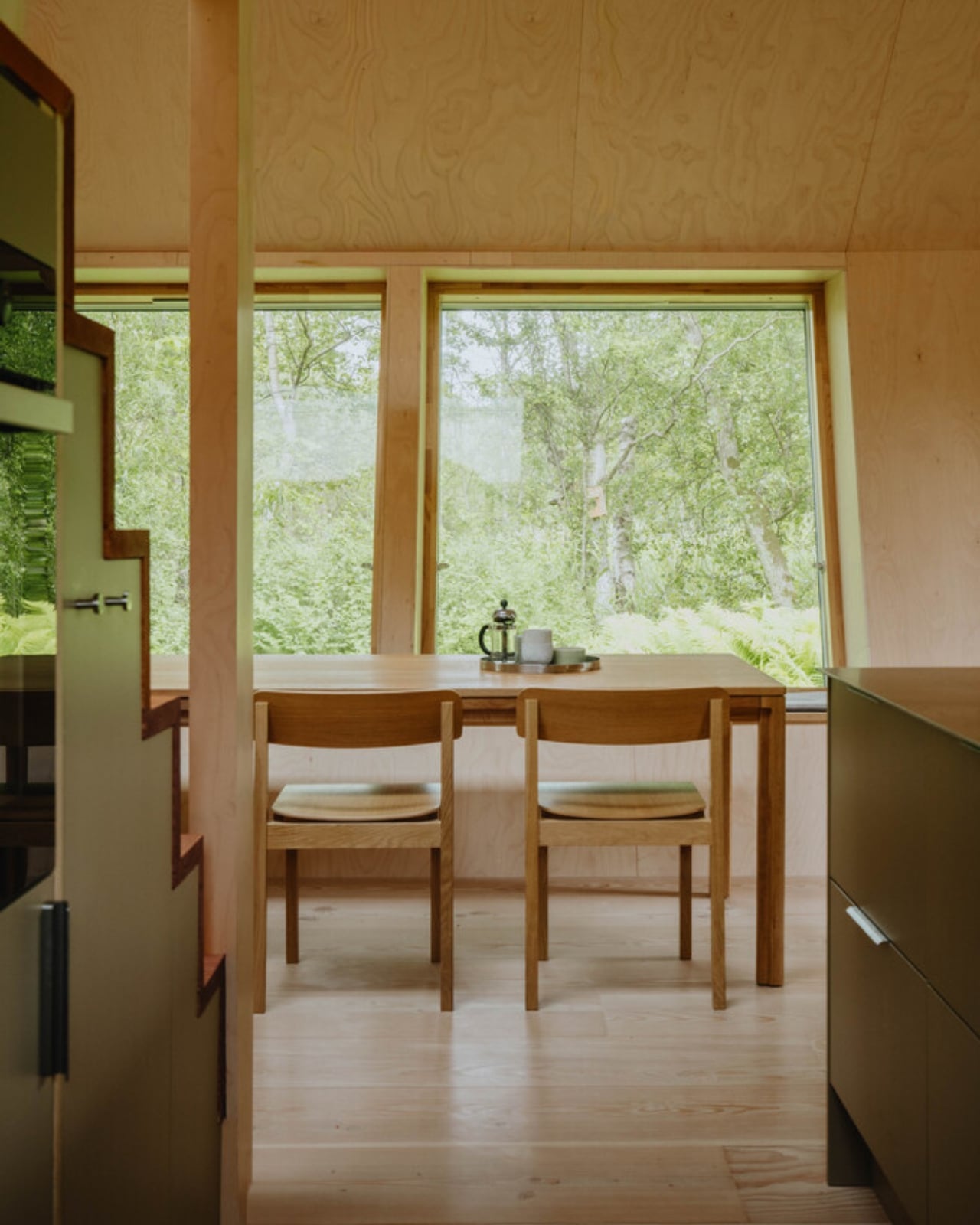
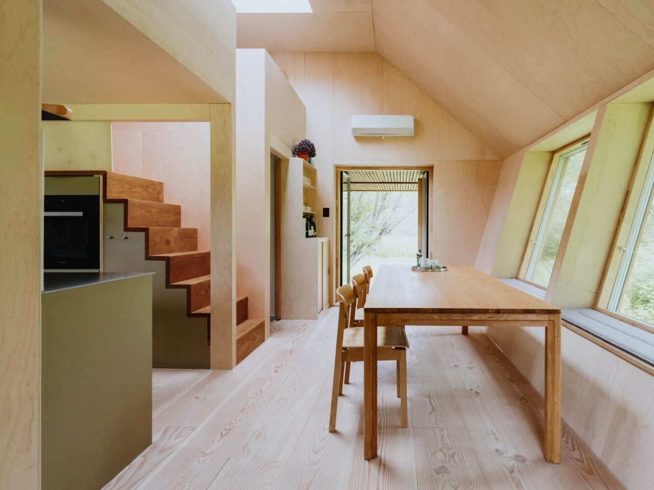
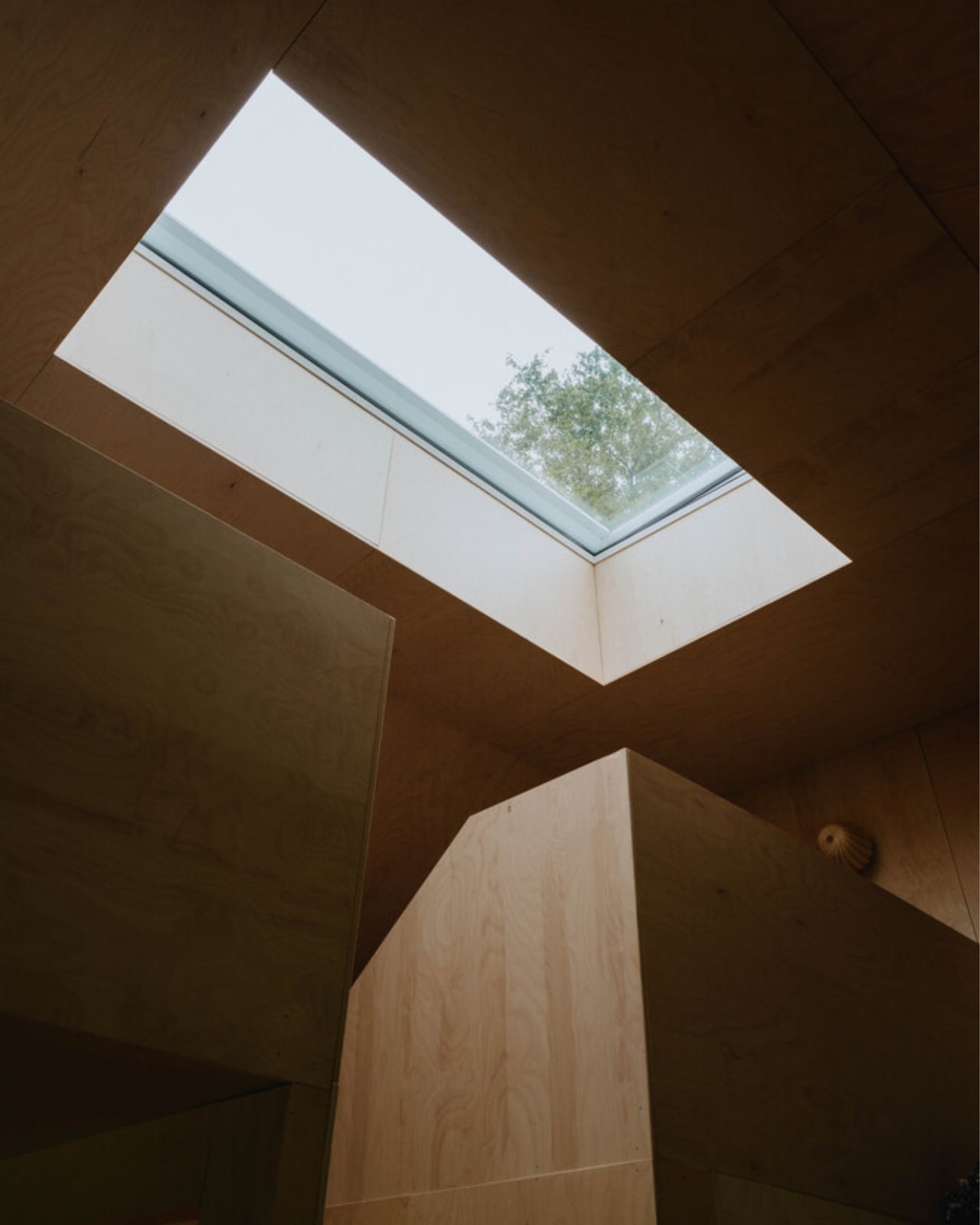
Most summerhouses don’t start as thought experiments about the moon. EcoNeo did. Designed by SAGA Space Architects and sitting quietly in Asnæs on the Danish island of Zealand, it measures just 35 square meters and sleeps a family of six. It also has an indoor sauna. The fact that all of this coexists within a space roughly the size of a large studio apartment says everything about what SAGA is doing differently. This is a house designed by people who take small spaces very, very seriously.
SAGA Space Architects was founded in 2018 by Danish architects Sebastian Aristotelis and Karl-Johan Sørensen, and their portfolio reads nothing like a traditional residential practice. These are the people behind LUNARK, a simulated lunar habitat tested during a 100-day expedition in Greenland. They also developed the Circadian Light system installed on the International Space Station and built FLEXHab, a habitat prototype for the European Space Agency. Their methodology is built around extreme-environment logic, where every centimeter, every kilogram, and every watt is a decision that matters. EcoNeo takes that same discipline and applies it to a Danish holiday home, and the result is genuinely worth paying attention to.
The studio calls its approach “Terra-Tech,” a marriage of technical precision and material awareness that keeps the design grounded in lived experience rather than spectacle. EcoNeo is built from biogenic materials, including OSB panels, wood-fiber insulation, Douglas fir, oak, birch, and plywood, all chosen for their low environmental footprint and warm sensory quality. Digital fabrication shapes the structure with the kind of accuracy you don’t typically associate with a weekend retreat. The architects estimate EcoNeo reduces annual carbon emissions by roughly 80 percent compared to an average new Danish summerhouse. That is not a rounding error. That is a structural rethinking of what holiday architecture can be.
On the inside, the floor plan is organized around a central living space that works harder than most rooms twice its size. The ground floor brings together the kitchen, bathroom, integrated storage, the sauna, and a dining table that can seat the whole family. Upstairs, sleeping space is tucked in a way that feels considered rather than compromised. Every piece of the interior is designed to serve more than one purpose, because SAGA knows from its space habitat work that generosity of experience does not require generosity of space. You feel that difference the moment you look at the photographs. The rooms have a quietness to them, a sense that everything belongs exactly where it is.
That, to me, is where EcoNeo gets genuinely interesting as a cultural object. The conversation around sustainable housing often leans into austerity, as though living with a lighter footprint requires accepting a diminished quality of life. EcoNeo makes the opposite argument without raising its voice. The house does not look like a sacrifice. It looks like a place people would actually want to spend a summer in, with its warm timber surfaces, considered proportions, and an undeniable calm that reads clearly even in photographs. Sustainability, when done right, does not ask you to give anything up. It asks you to think more carefully about what you actually need.
The collaborators list tells its own story: Velux, Dinesen, GROHE, Svane Køkkenet, Velfac, and ThermoCell, among others. These are not budget-line names. SAGA was not chasing a price point with EcoNeo. They were chasing a standard, and it shows in every decision, from the material palette to the fabrication method.
Whether EcoNeo becomes a scalable template for sustainable residential housing or remains a singular prototype is a question worth watching. The studio intends to develop it further for broader residential applications. Given their track record of designing for environments where there is genuinely no margin for error, I would take that intention seriously. EcoNeo is proof that the best ideas about how to live on Earth might just be the ones we developed while thinking about how to live somewhere else entirely.
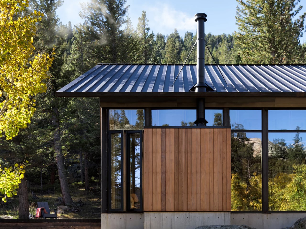
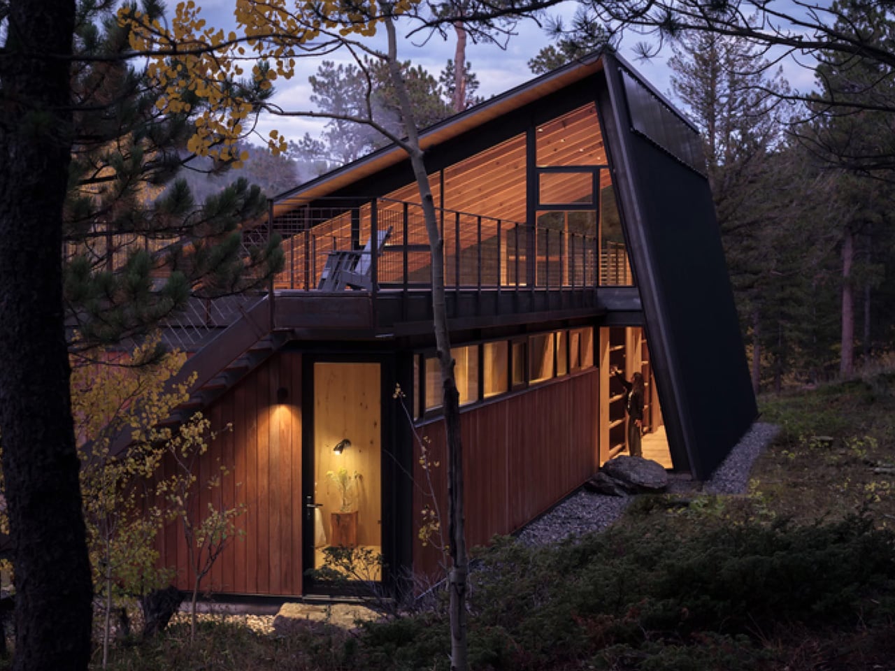
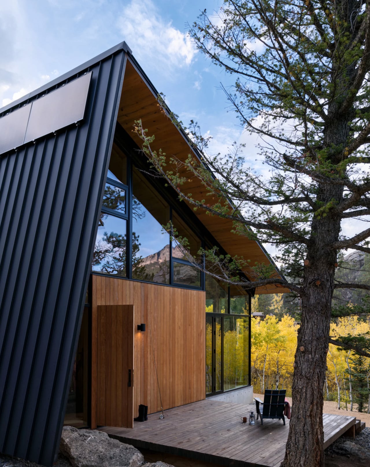
There are cabins built for weekends, and then there’s Camp Meeker. Designed by Renée del Gaudio Architecture and completed in 2026, this 2,100-square-foot retreat in Allenspark, Colorado sits at the base of Mt. Meeker — a landscape a single family has returned to for nearly a century. The cabin wasn’t designed to impress. It was designed to endure.
The brief was rooted in something rare in contemporary architecture: restraint with purpose. Rather than loading the home with the usual domestic conveniences, the architects stripped the program back entirely. No television. No dishwasher. No microwave. What remains is exactly what a mountain retreat should be — a place that places the landscape first and forces you to look at it.
Structurally, the cabin is built for the realities of its environment. A concrete base and steel frame anchor the building to the site, while ironwood siding wraps the exterior in a material chosen specifically for fire resistance — a non-negotiable in Colorado’s high-elevation terrain. The steep metal roof does double duty: it deflects winter winds and gains enough height to accommodate a sleeping loft above the main floor, designated as the children’s quarters, giving the whole structure a playful, camp-like energy that its name earns honestly.
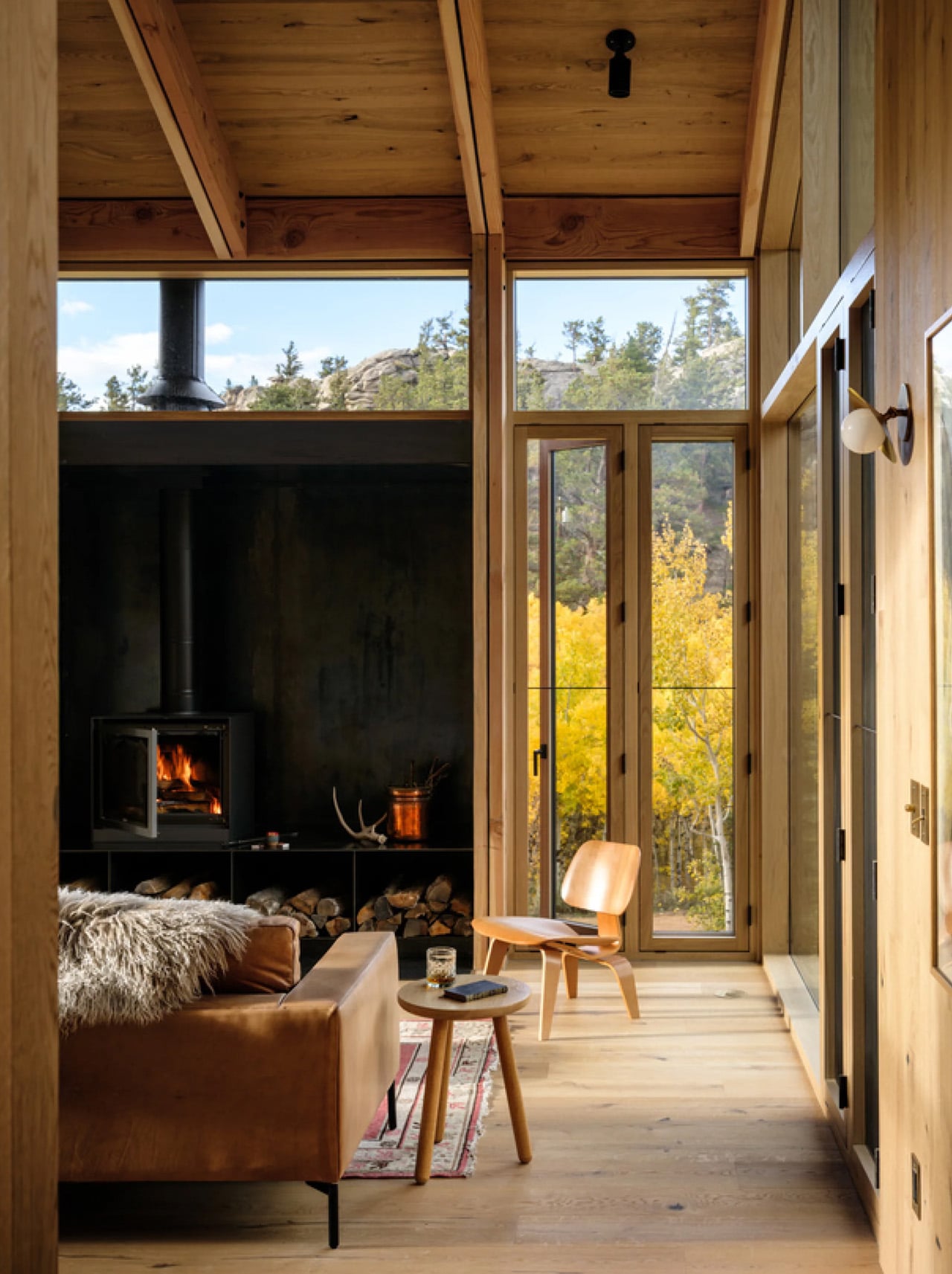
Inside, Renée del Gaudio made one decisive material call and committed to it completely. Rustic-grade oak covers the floors, walls, and ceilings in a continuous warm finish that collapses the boundary between surfaces. The main living area is organized around a central fireplace, flanked by vaulted timber ceilings and floor-to-ceiling windows that pull the surrounding alpine scenery directly into the room. Two double bedrooms and a single bedroom anchor one end of the main floor, each connected to a large outdoor terrace. Above, a rooftop deck offers unobstructed views of the mountain — built equally for afternoon sun and sleeping under open sky.
What makes Camp Meeker genuinely forward-looking is what’s hidden beneath it. A geothermal system draws on the earth’s stable temperature to heat and cool the cabin, replacing conventional fuel-based systems and bringing the home’s day-to-day operational carbon to zero. It’s sustainability framed not as a feature, but as a baseline expectation.
The architects describe it as a model for the next century of cabin design in the region. Looking at it, that doesn’t feel like overreach. Camp Meeker isn’t a trophy house dressed in rustic materials. It’s a building that understands exactly what it is, where it is, and who it’s for — and builds every decision around that clarity.
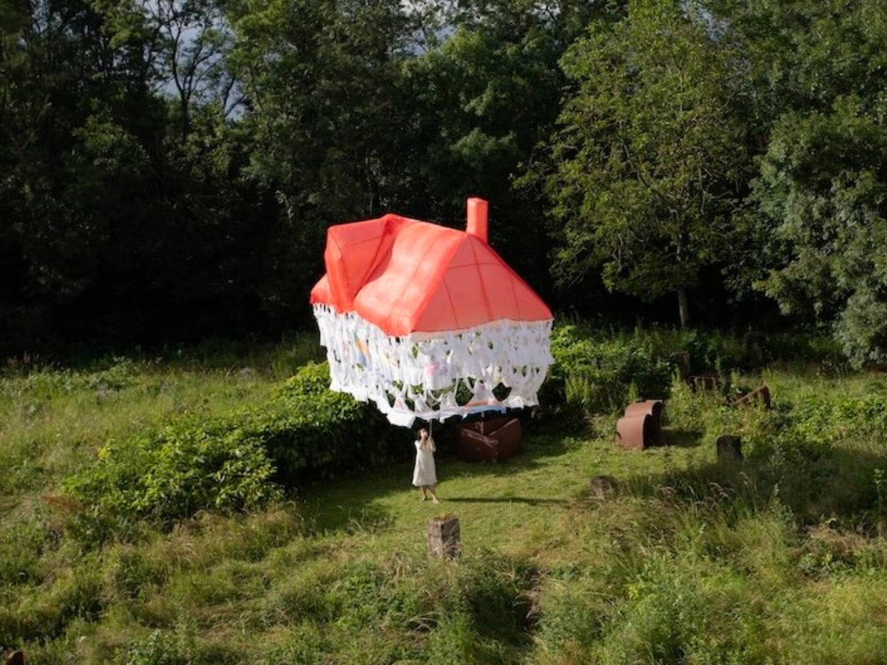
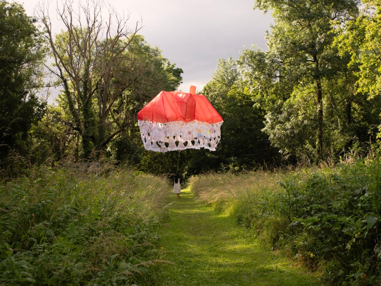
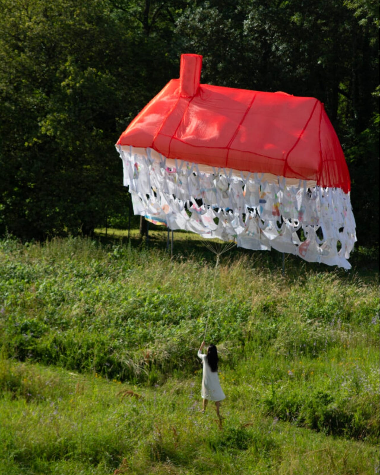
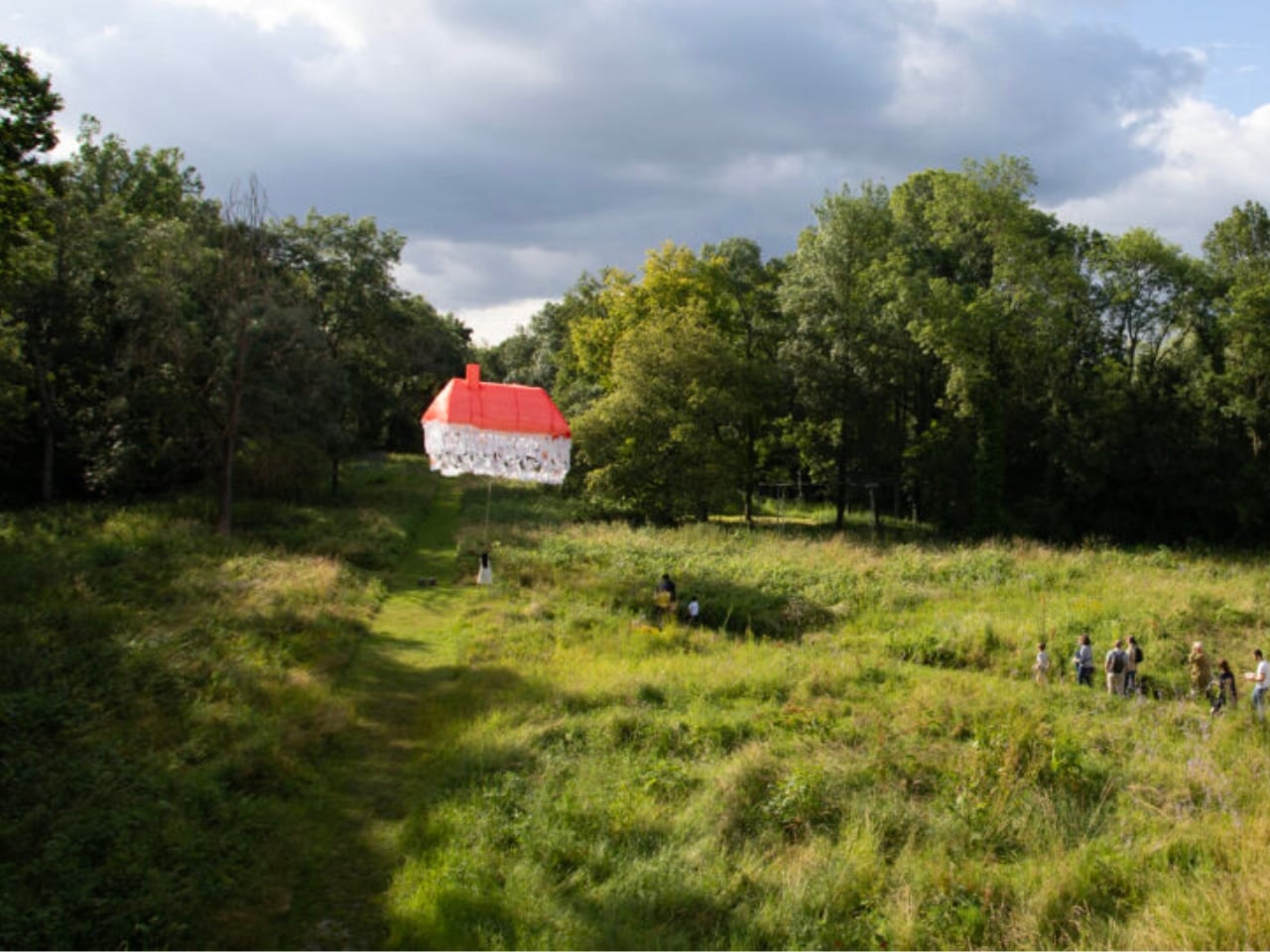
Most houses start with a blueprint. Jisoo Yoo’s Dream House started with a question: how do the dreams and desires we carry shape the landscape of the world we inhabit? The answer, it turns out, is a floating structure made of clothing.
Yoo, a Seoul-born artist who lives and works in France, has been quietly building one of the more compelling bodies of work in contemporary art, one that orbits around the domestic, the ephemeral, and the barely-visible structures that hold our lives together. Dream House, her latest installation presented at (F)ESTIVALES at Les Tanneries, Centre d’art contemporain, is exactly the kind of project that makes you stop and genuinely reconsider what a home actually is.
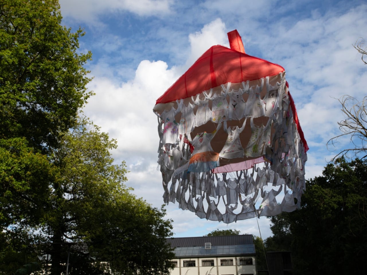
Here’s how it works. Participants are invited to contribute a garment, something personal, something worn, and mark it with handwritten texts and drawings. These pieces of clothing then become the literal building blocks of the structure, each one a personal archive, each one a load-bearing element. The result is a house that floats, literally and conceptually, held aloft not by concrete or steel, but by the private wishes of strangers.
That’s a beautiful idea, and I mean that without a trace of irony. We spend so much time thinking about homes in terms of square footage, property value, and interior aesthetics that we rarely stop to ask what a home is actually made of. Yoo forces the question. Her installation suggests that the answer has less to do with materials and more to do with desire, with the accumulated weight of what people want, need, and imagine for themselves and for each other.
Art that treats the domestic as a lens for examining social and cultural forces is nothing new. But Yoo brings something specific to it. Born in Seoul and trained in France, she operates between two very different cultural frameworks around the idea of home, and her practice reflects that quietly felt tension. Her works often feature spaces that feel familiar but refuse to stay solid. Rooms that waver. Houses that float. Structures that appear and then dissolve. It’s a recurring language across her portfolio, and with Dream House, it feels most fully realized.
Dream House is not trying to comfort you. It’s trying to make you notice something. The garments contributed by participants carry real personal weight: literal handwriting, actual drawings, the residue of real lives. And yet the house they form is temporary. It rises, exists briefly, and then it’s gone. Yoo describes the floating structure as embodying both the creative force of desire and the fleeting nature of existence. The house briefly emerges through people’s dreams, and that, apparently, is enough.
I think that’s the most honest thing any artist has said about housing in a long time. We build our ideas of home from desire, from inherited images of what shelter is supposed to look like, from what we were told to want, and from what we quietly imagine when no one is watching. And all of it is more temporary than we tend to admit. The average person moves multiple times in their life. Neighborhoods change. The house you grew up in gets renovated beyond recognition or torn down entirely. The physical structure of home has always been more fragile than we want it to be.
What Yoo does is make that fragility visible without making it tragic. The floating structure is genuinely striking to look at. The garments create a soft, almost organic texture that reads as intimate rather than architectural, which is exactly the point. You’re not looking at a building. You’re looking at a collective act of imagination, briefly held together by shared hope. Jisoo Yoo is an artist worth paying close attention to. Her work doesn’t announce itself loudly, but it asks questions that stick. Dream House is a reminder that the spaces we live in are not neutral. They are built, always, from something we wanted.
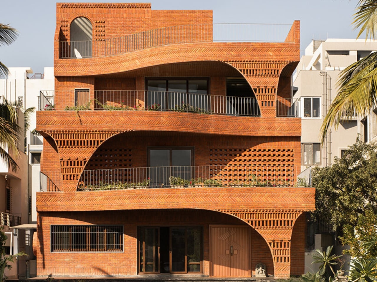
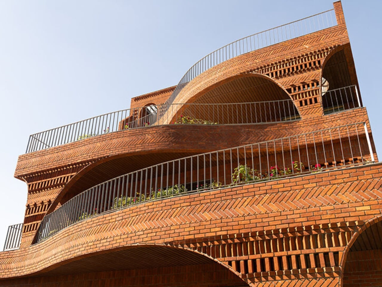
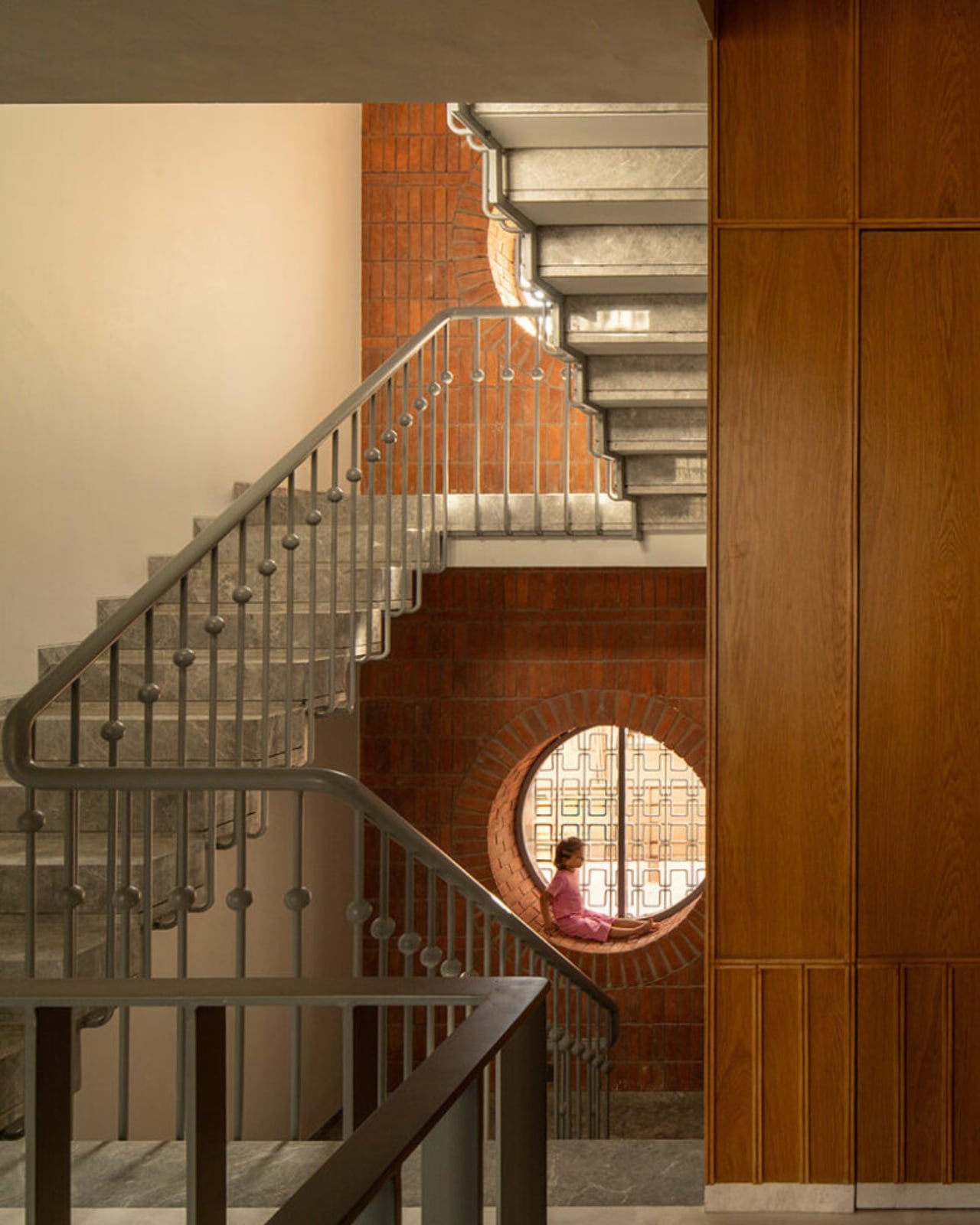
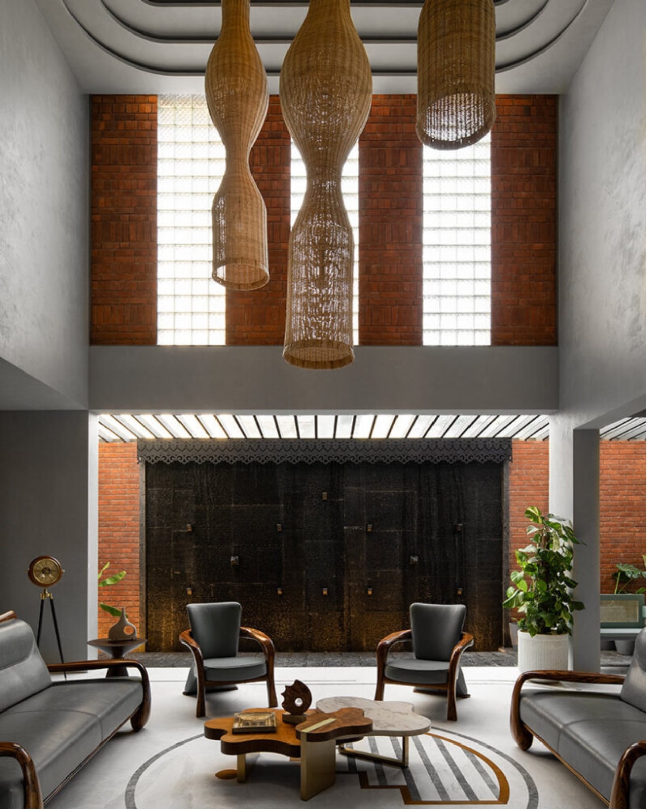
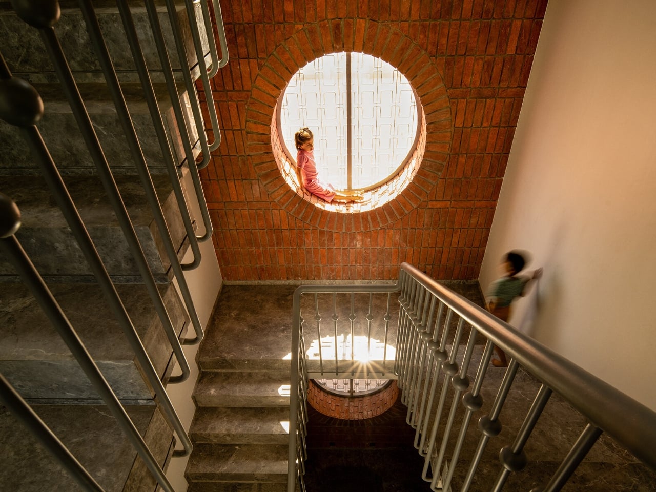
We’ve been building houses wrong. Not structurally, not legally, and not in any way that’s easy to name. But somewhere along the line, the conversation around home design shifted away from how does this building breathe toward what does this building look like on a feed. That’s why The Anthill, a new brick residence in Ahilyanagar, Maharashtra by Kaushal Tatiya Architects, feels like such a pointed correction. Not a provocation. A correction.
The premise sounds deceptively simple: a house modeled after an ant mound. Not the insect itself, but the engineering intelligence of what it builds. Ants have been solving thermal regulation, cross-ventilation, and spatial hierarchy problems for millions of years, with no blueprint, no software, and no electricity required. Kaushal Tatiya, the firm’s founder, described the anthill not as a literal form but as “an intelligent climatic organism,” one able to “regulate temperature, create ventilation through voids, and function through a network of interconnected chambers without any imposed geometry.” That single observation is what the entire project is built on, and it shows.
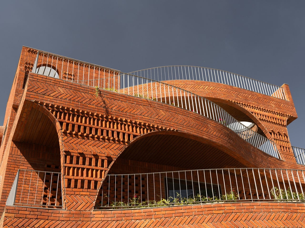
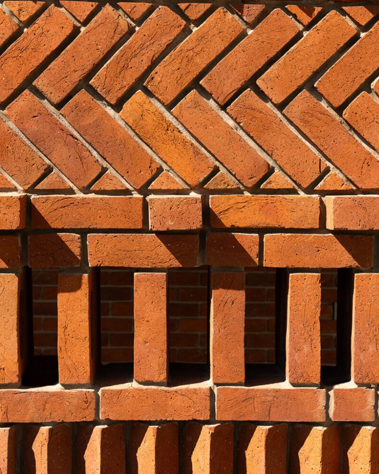
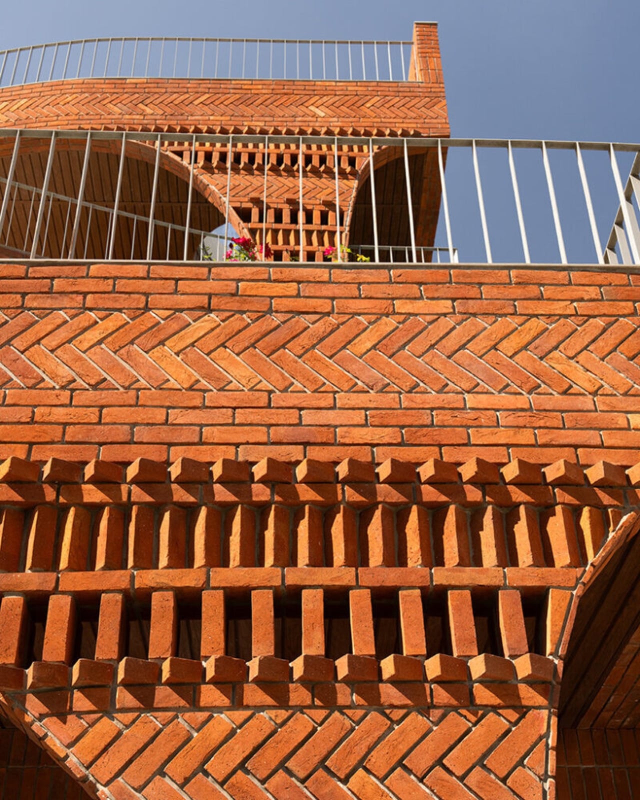
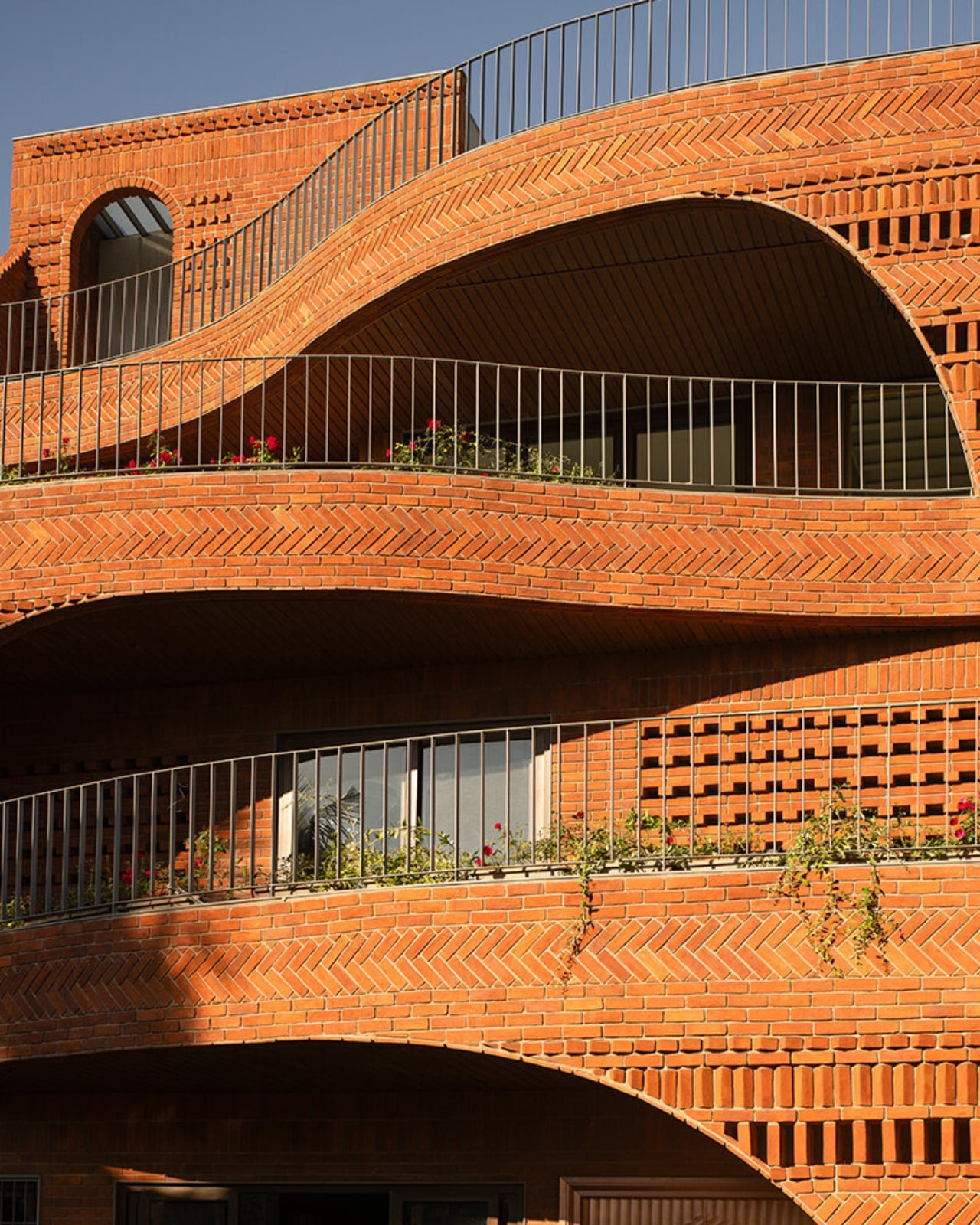
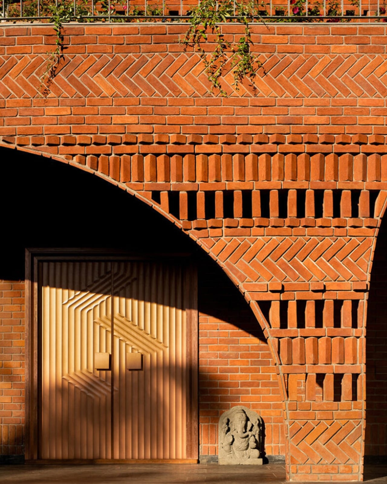
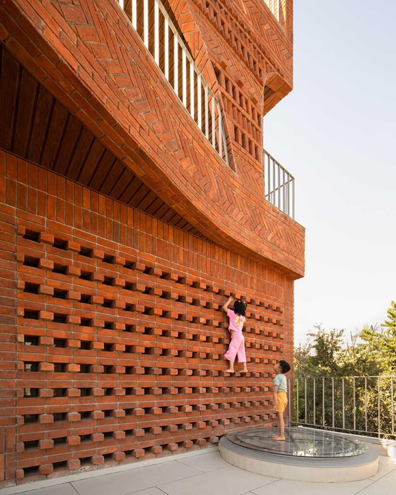
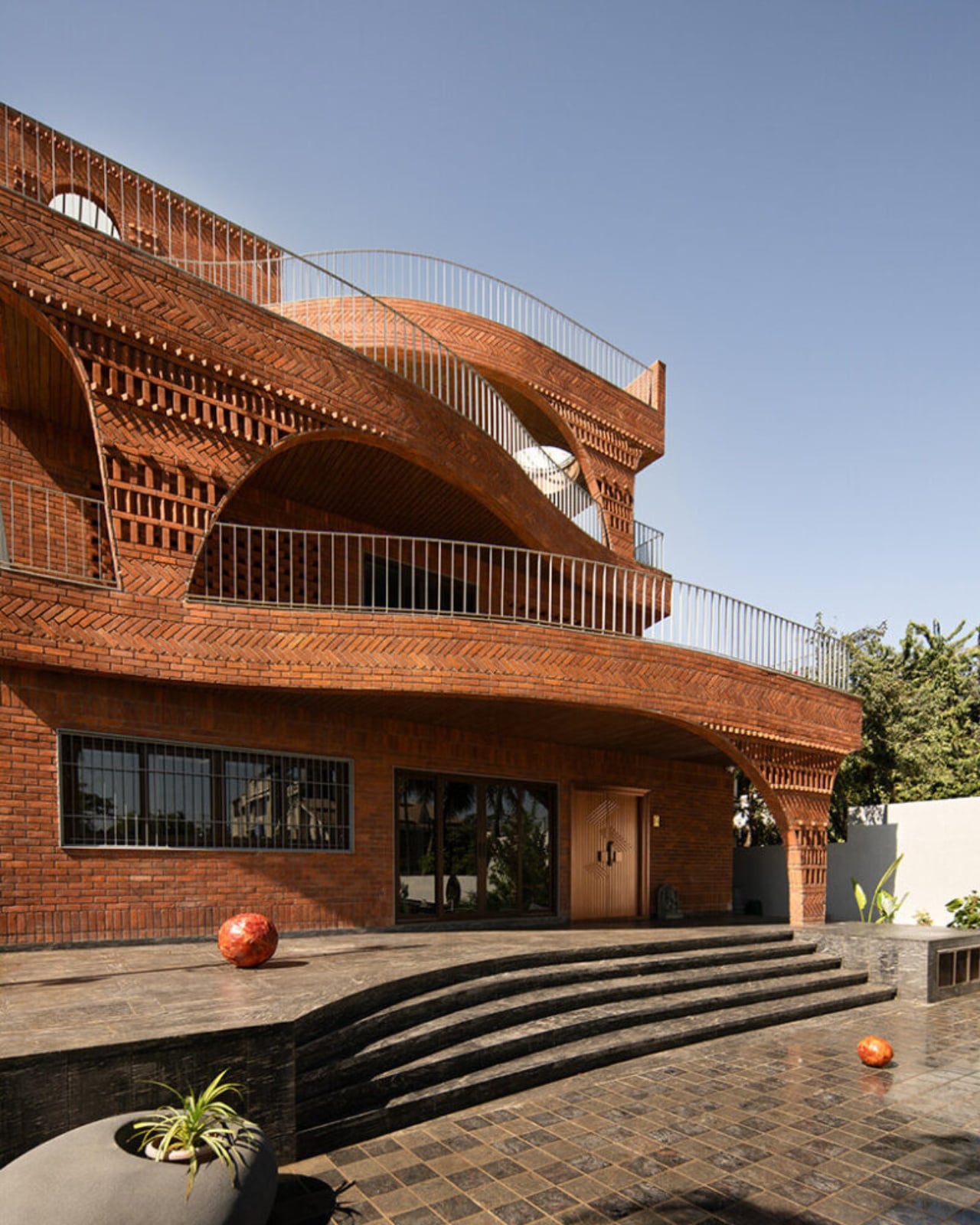
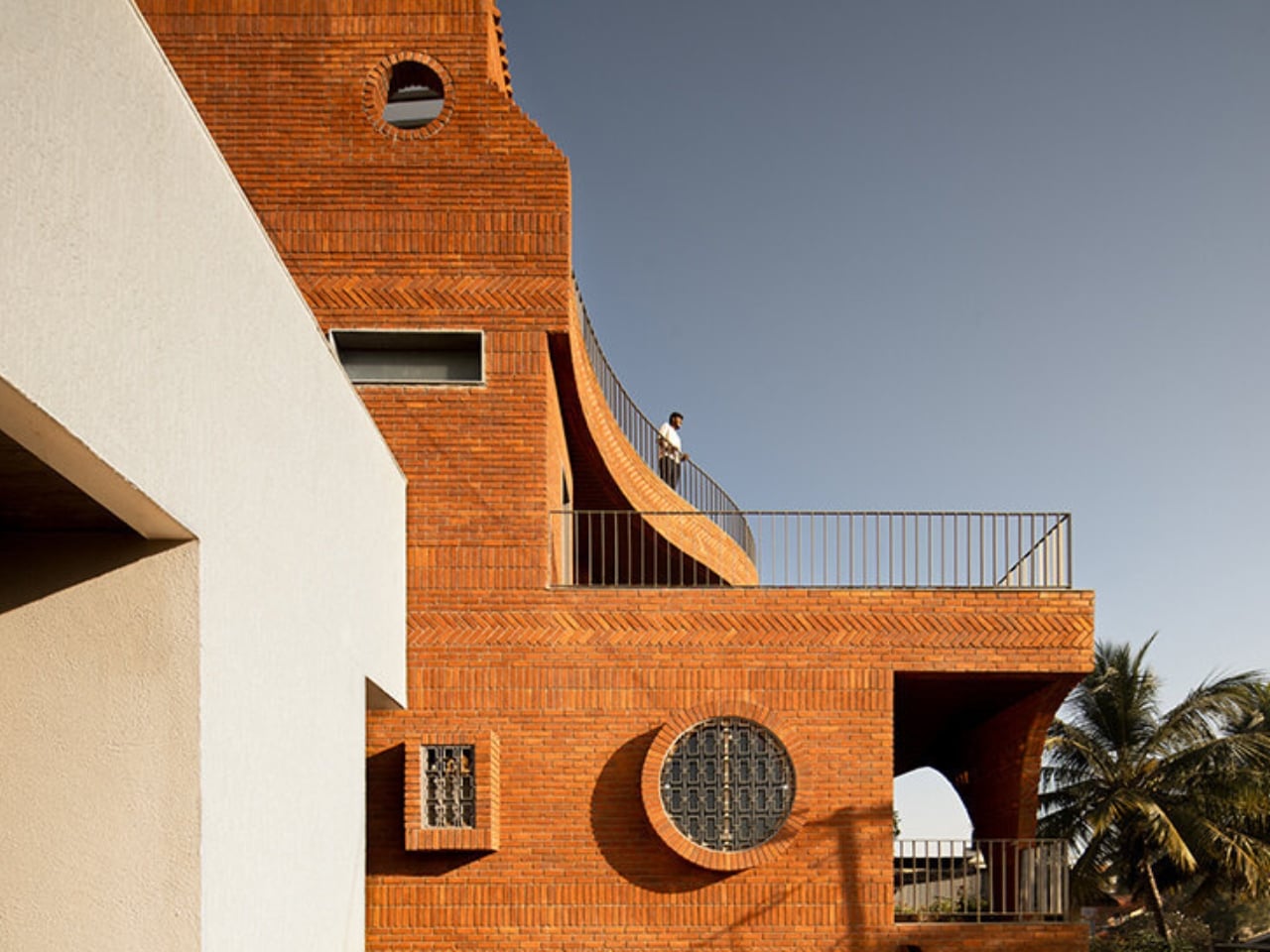
The house sits low in the landscape, almost terrain-like, its exposed brick facade functioning as much as an environmental filter as it does a structural shell. From the outside, it reads as deliberately introverted: solid walls and perforated surfaces that hold back the glare before it ever reaches the living spaces inside. The real architecture begins once you start moving through it. Rooms branch off from larger communal volumes, ceiling heights shift unexpectedly, and natural light arrives filtered and softened rather than harsh. The passage between spaces becomes the experience, not just a means of getting from one room to another.
This is a design principle modernism largely traded away in favor of open-plan everything and maximum sight lines. The Anthill doesn’t make that trade. Its stepped terraces and alternating balconies recall the traditional Indian rooftop concept of the chhat, creating layered, shaded thresholds that do the cooling work before the sun reaches the interior. A 12-foot cantilevered slab, supported through brick in compression, adds a more deliberate architectural gesture to the otherwise organic composition.
It’s worth pausing on the sustainability side of this project, because it earns more than a passing mention. The Anthill operates entirely on passive systems: cross ventilation, thermal mass, and shaded courtyards. No mechanical ventilation. In a region defined by extreme heat and intense sunlight, that isn’t a compromise. It’s a design strategy that trusts the building’s own intelligence. The idea that architecture should outlast any power grid it’s connected to feels increasingly important, and The Anthill makes that case without saying a word about it.
I think what gets undersold in conversations about sustainable design is how genuinely radical simplicity is. We’ve normalized a model where buildings are essentially sealed boxes, then mechanically conditioned to be habitable. That approach is energy-intensive, expensive, and fragile in ways we rarely acknowledge. The Anthill argues the opposite: that a building designed with enough spatial intelligence doesn’t need to fight its climate. It learns to negotiate with it instead.
The visual language of the project carries all of this without being heavy-handed. The brick is warm and earthy, the curves are organic without being theatrical, and the overall effect is of a building that looks like it belongs to the land rather than placed on top of it. Photography by Avesh Gaur shows a house that reads differently from every angle, which is always a sign that the architecture is meant to be inhabited rather than just photographed.
What The Anthill ultimately puts on the table is a question worth sitting with: what if the most intelligent design move isn’t to add more technology, but to study what natural systems already perfected? The answers, in this case, are sophisticated enough to build a house around. We talk a lot about future-proofing design. The Anthill is a case where the most forward-looking move was to look at something ancient.

 Connexion