❌

Vue lecture

Road Barriers Become Benches Without Losing Their Warning Stripes
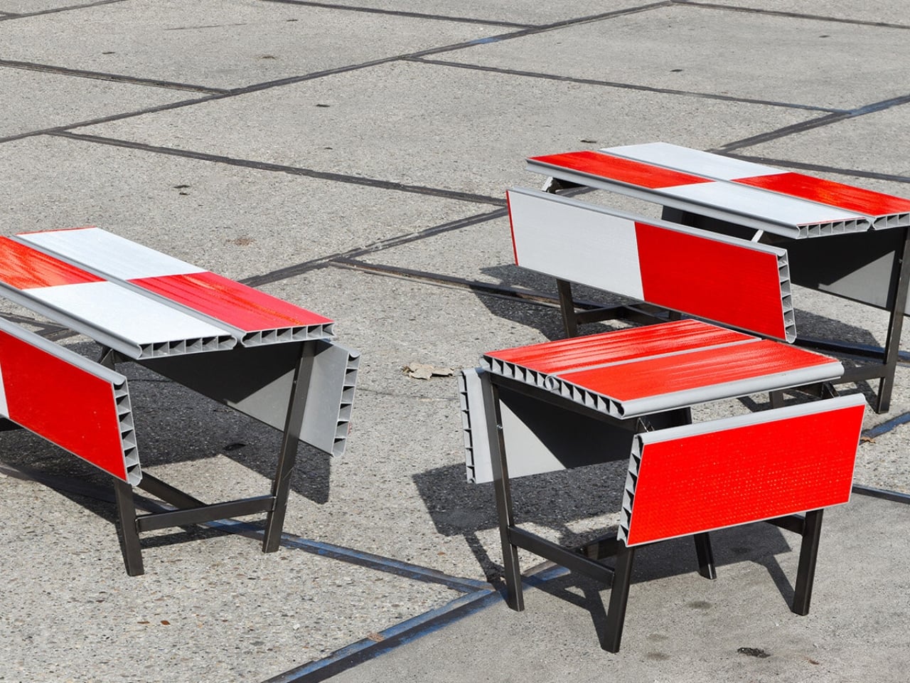
A red-and-white safety barrier isn’t an object I’d normally consider inviting. It’s supposed to interrupt your plans. That’s why the stop! collection by Studio Martins Mezulis and creative 13_0663_tsx makes such a good first impression as a design idea. The outdoor benches and stools borrow the panels of Dutch traffic barriers to make places to sit, addressing a basic need in public space: somewhere to pause.

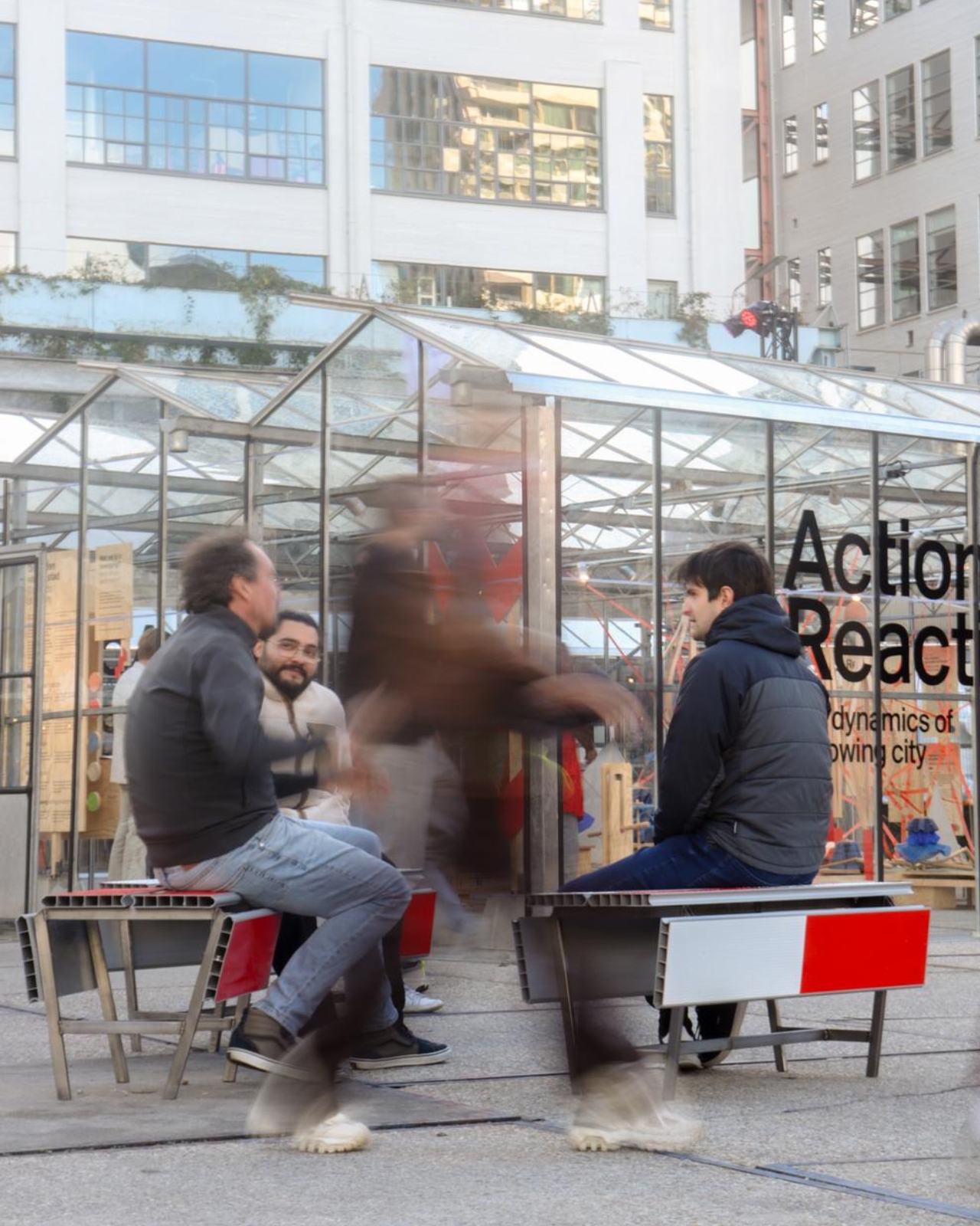
Waiting for a friend shouldn’t require buying a coffee to justify occupying a chair. I like public seating that treats waiting, resting, and doing very little as perfectly legitimate activities. That’s the practical territory stop! occupies. Presented at Dutch Design Week in Eindhoven, running October 17–25, 2026, the collection invites people to stay for a while using an object associated with sending them elsewhere.

Designers: Studio Martins Mezulis and creative 13_0663_tsx
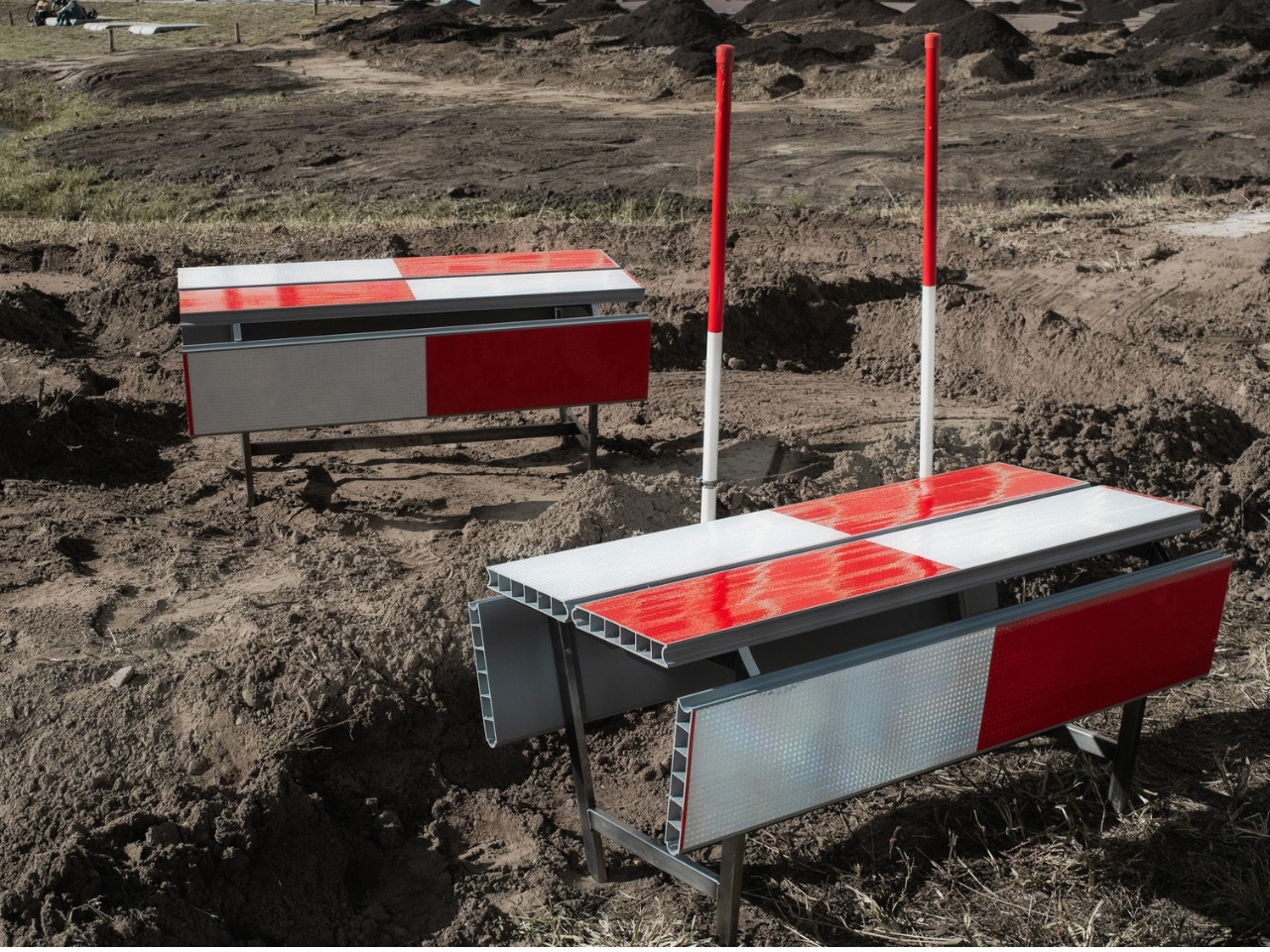
The starting point is the schrikhek, a red-and-white aluminum barrier used in the Netherlands to alert people to construction and redirect their route. You don’t need to recognize that Dutch term to understand the reference. The warning graphics do most of the explaining. Keeping them visible gives the furniture a little friction: your eyes register a restriction before your brain catches up with the seat.

It’s a fitting project for Studio Martins Mezulis, whose work spans graphic and spatial design. The stripes are doing both jobs here: defining a physical object and carrying a message that the designers are trying to change.
In the project’s render, long striped panels form the seating surfaces, with more panels running vertically along the sides. A narrow framework keeps the assembly visually open. The result looks deliberately assembled from infrastructure rather than dressed up to conceal its origins. I prefer that decision to a more polished makeover. Remove the red and white, and much of the reason to notice these benches disappears.

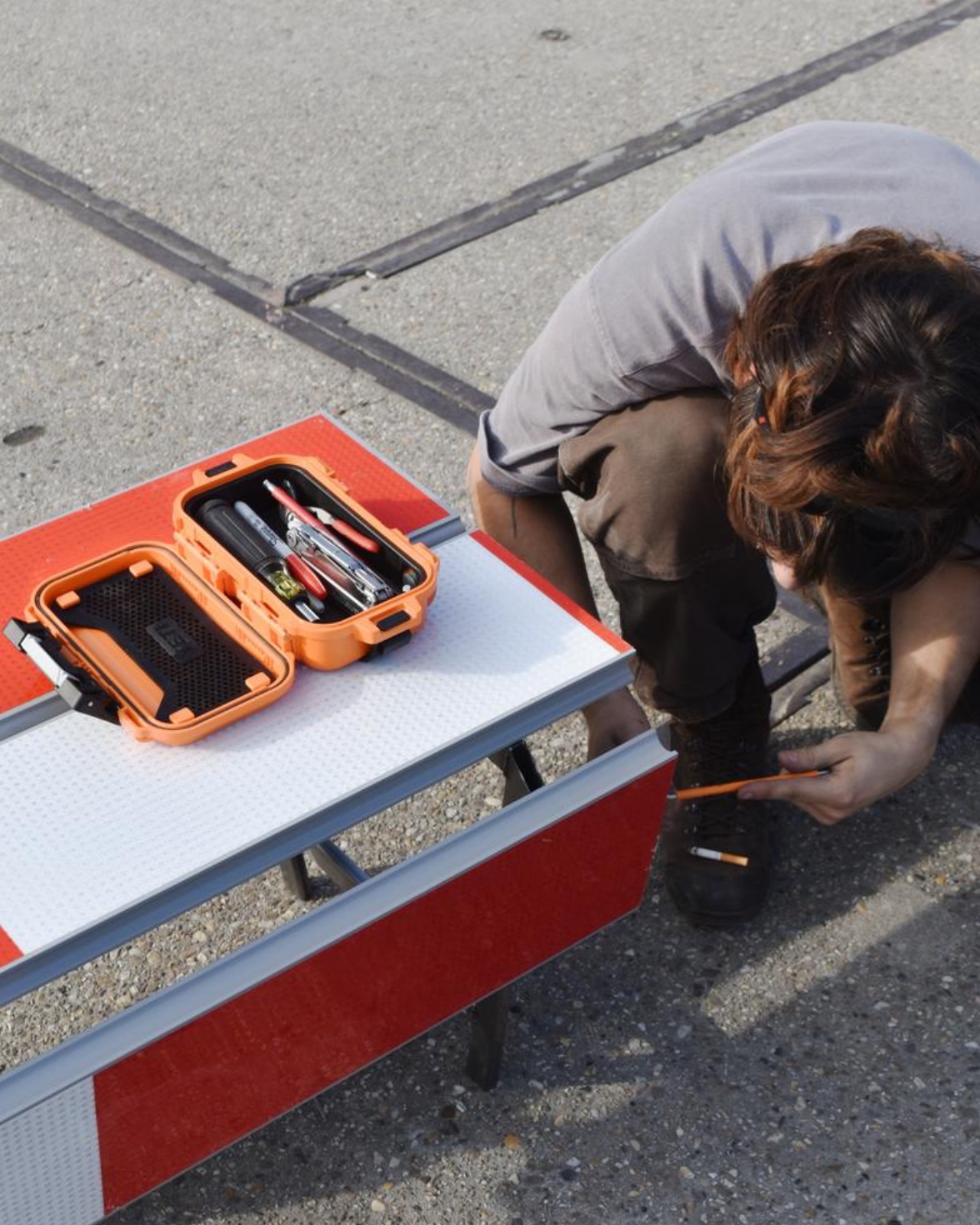
The published bench dimensions are 1,250 millimeters long, 500 millimeters wide, and 450 millimeters high, or approximately 49 by 20 by 18 inches. Road safety barriers and steel are listed as the materials. Those numbers describe a compact object rather than a sprawling park bench. Its proportions make the proposal easier to picture beside a pedestrian route or within a plaza, although placement would still need careful consideration.
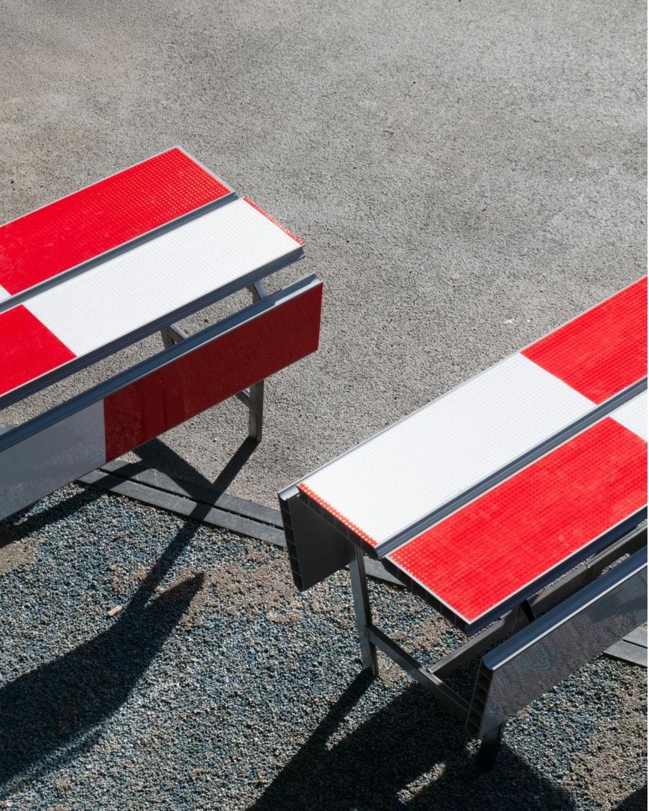
The illustrated benches are also backless and lack armrests. That keeps their form simple and leaves the seat approachable from either side, but it doesn’t offer the support some people need. I’d read them as an invitation to take a short break rather than assume they’re suited to a long afternoon. The graphic wit is persuasive; comfort and durability would need evidence beyond a render.

That distinction matters because public furniture has a job beyond looking good in a design exhibition. Someone needs to understand that they can use it. Here, the same markings that make the collection memorable could initially make a passerby hesitate. I’d be interested to see how quickly people recognize the invitation. A bench occupied by one person might explain the idea better than a nearby project label.
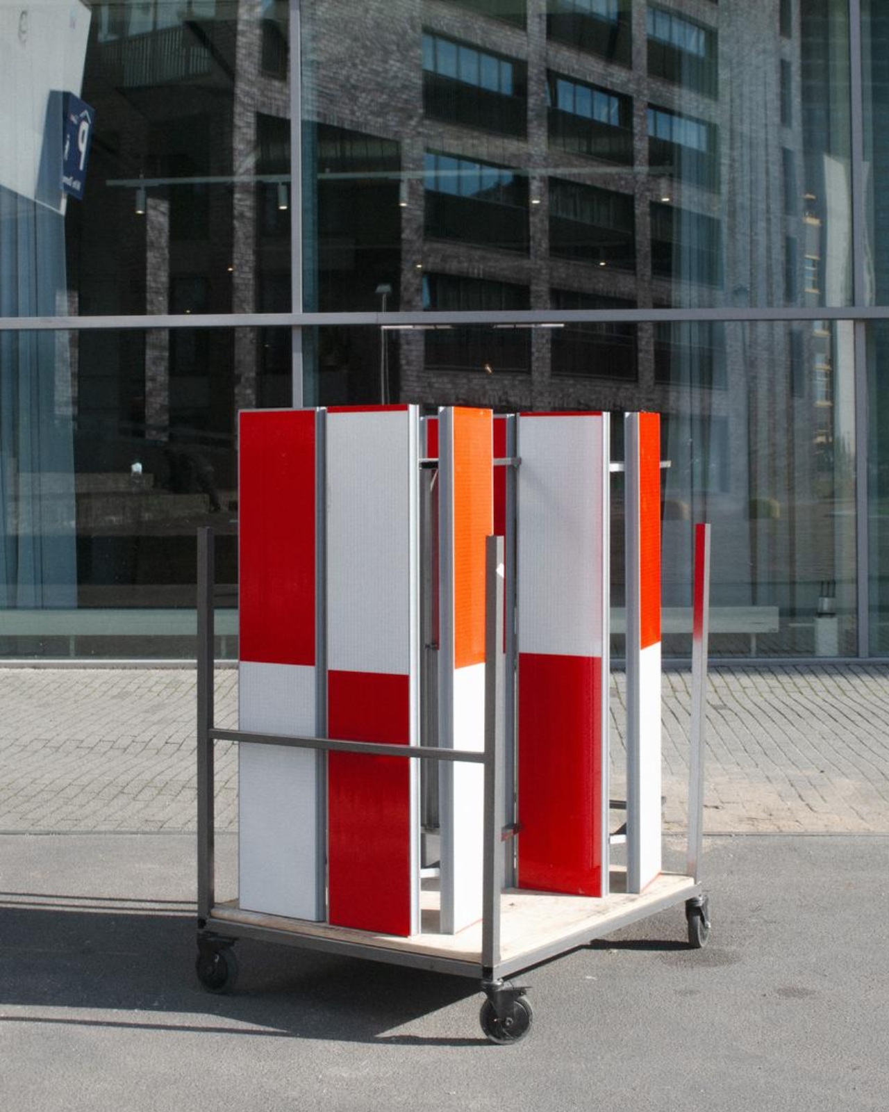
The material story deserves similar precision. According to the project’s Dutch Design Week description, the designer hopes to work with construction infrastructure providers to reclaim decommissioned or discarded panels in the future. That isn’t confirmation that every panel in the current collection has already served at a construction site. Reuse is a proposed direction for expanding the collection, and it’s worth preserving that distinction rather than automatically labeling the furniture recycled.

For me, stop! works best as a modest adjustment to how a street communicates. It gives a familiar public object another use without erasing what made it recognizable. The humor gets your attention, but the seat has to justify keeping it. If the collection develops further, I’d rather see that effort go into making it useful to more people than into adding more visual tricks. A decent place to wait is already a worthwhile design brief.
The post Road Barriers Become Benches Without Losing Their Warning Stripes first appeared on Yanko Design.
  •  

An Angled Public Bench for Hanging Out Without the Coffee Tab

A bench can give you a place to sit and still make talking surprisingly awkward. Line up two people facing the street, and conversation requires a sideways turn. Add a third, and someone starts leaning around the person in the middle. Free to Face, a public seating project by Lim Junwoo and Hayoung Kang, addresses that everyday mismatch between having somewhere to sit and having somewhere to spend time together.

The designers also frame the project around a larger concern: conversation becoming tied to consumption. Meeting over coffee is lovely, but buying a drink shouldn’t be the entry fee for sitting down with a friend. Free to Face proposes seating that gives people room to gather without a transaction attached. I like that ambition. It makes a modest, understandable request of public space: accommodate people who aren’t necessarily on their way somewhere else.

Designers: Lim Junwoo and Hayoung Kang

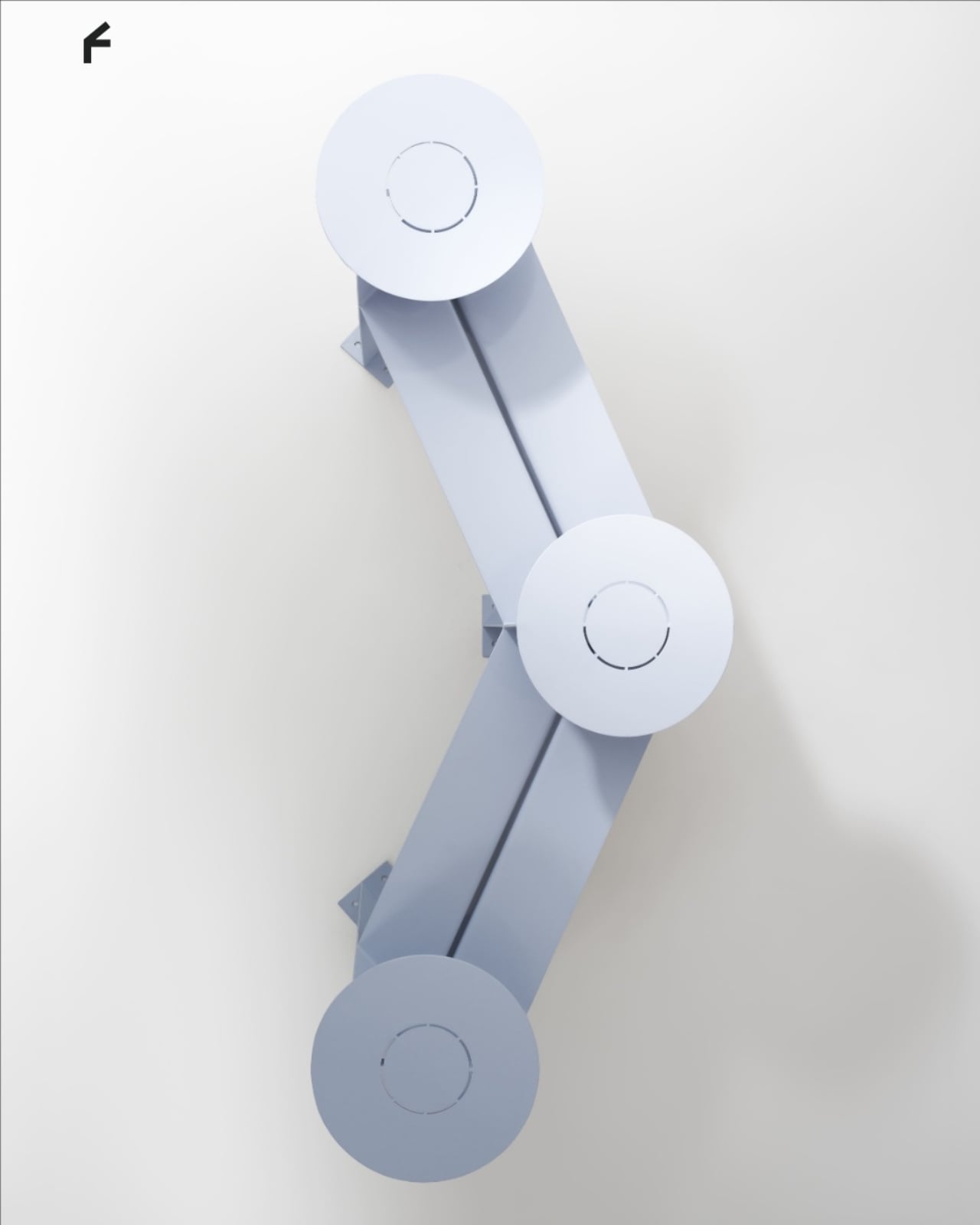
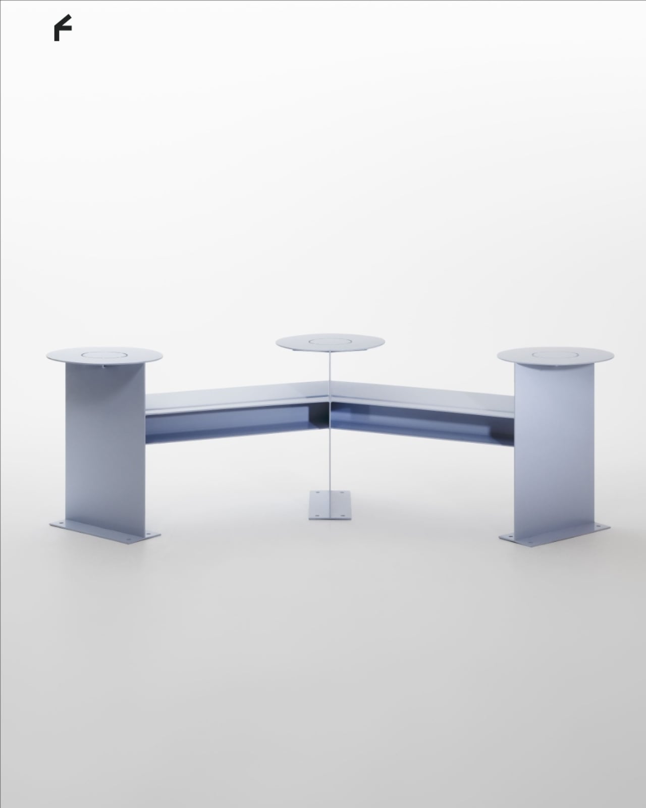
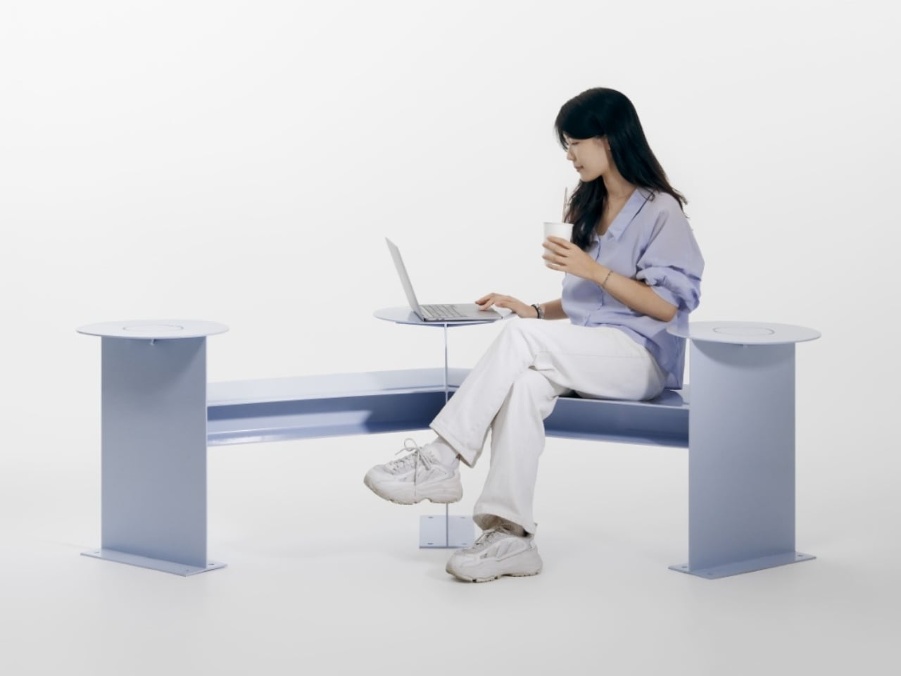
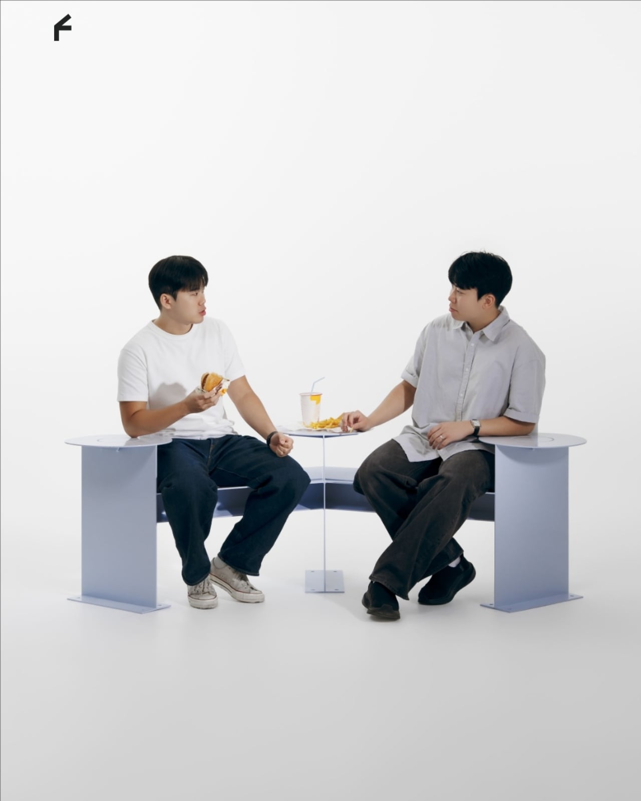
Its clearest design move is visible from above. Instead of a straight bench, the seating follows a shallow, angular bend, with round platforms punctuating the ends and middle. People sitting along the two arms can angle toward each other rather than share a single forward-facing view. The arrangement leaves an open area between them, giving conversation a physical center without enclosing the group or turning the furniture into a miniature booth.

That distinction matters to me. A seating arrangement can invite eye contact without making it compulsory. Free to Face’s photographs show people talking across the bend, but the backless layout also leaves room to choose another orientation. I’d rather have furniture that offers a social possibility than furniture that seems to assign everyone a role. A stranger sitting nearby shouldn’t automatically become your conversation partner, and a public bench shouldn’t feel like an icebreaker exercise.

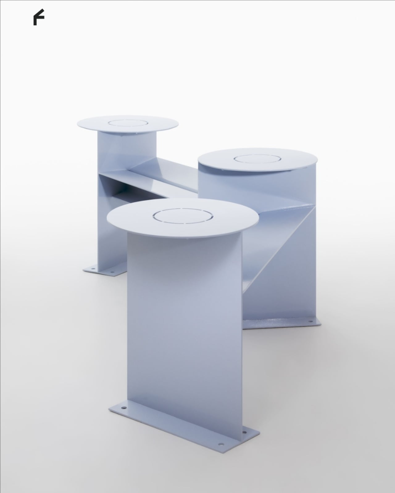
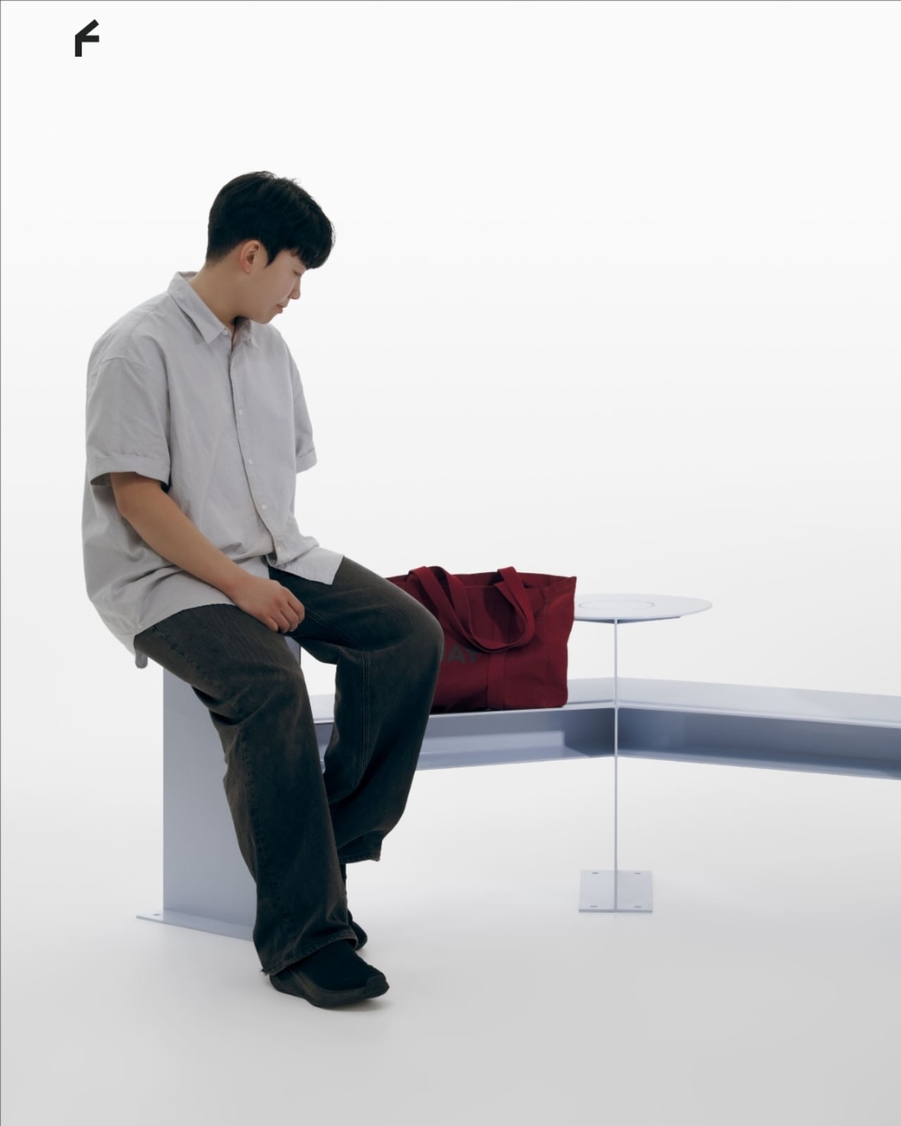
The different surface heights make the project more interesting than its footprint alone suggests. The supplied description presents those levels as options for choosing a sitting position, with unused areas doubling as places for bags or food. In the photographs, one person occupies a raised circular platform while others sit lower. Elsewhere, a tote rests beside its owner. These are fixed surfaces, not an advertised height-adjustment mechanism, so the flexibility comes from how people occupy the structure.

Those little landing spots feel especially useful. A basic bench leaves your lunch, laptop, and bag competing with your lap or the seat beside you. Here, the circular surfaces provide alternatives, and the images demonstrate a shared meal arranged around the middle platform. I’m particularly fond of that use because it makes the social premise concrete. Two people splitting fries need somewhere to put the fries. Design doesn’t always need a more elaborate explanation than that.

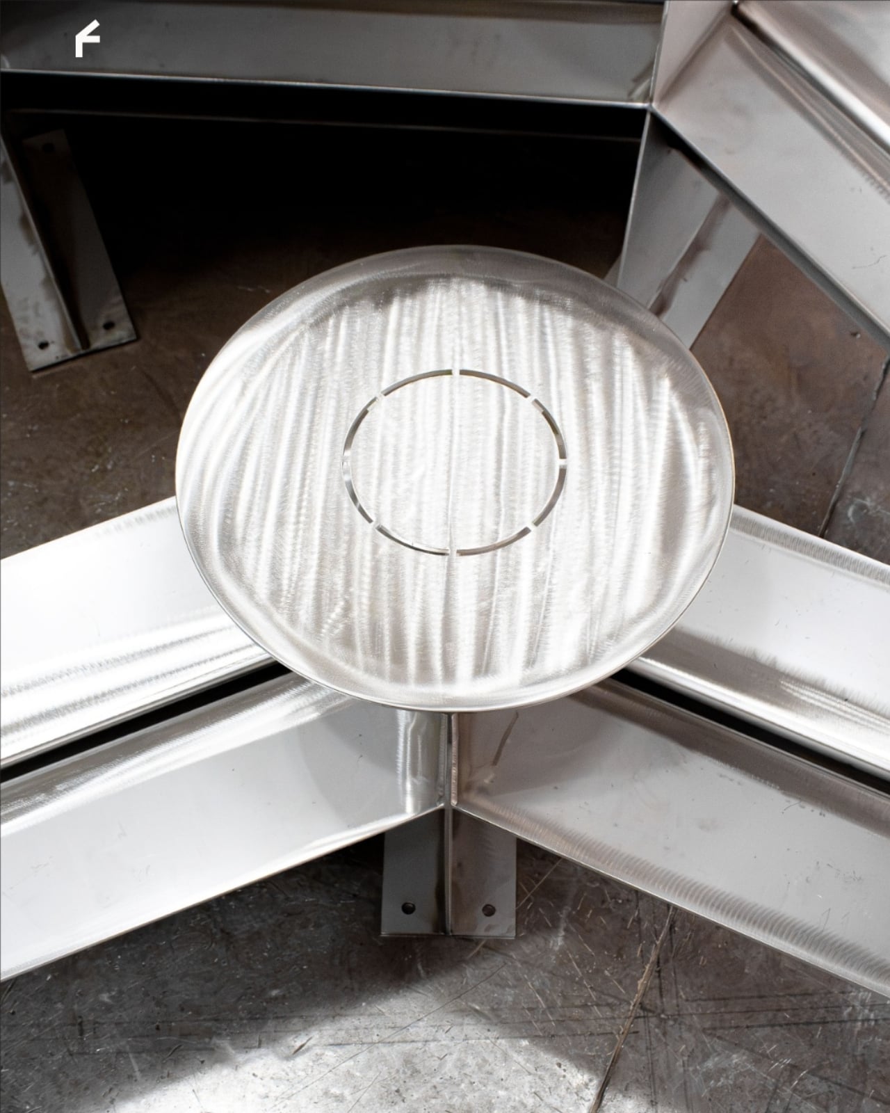
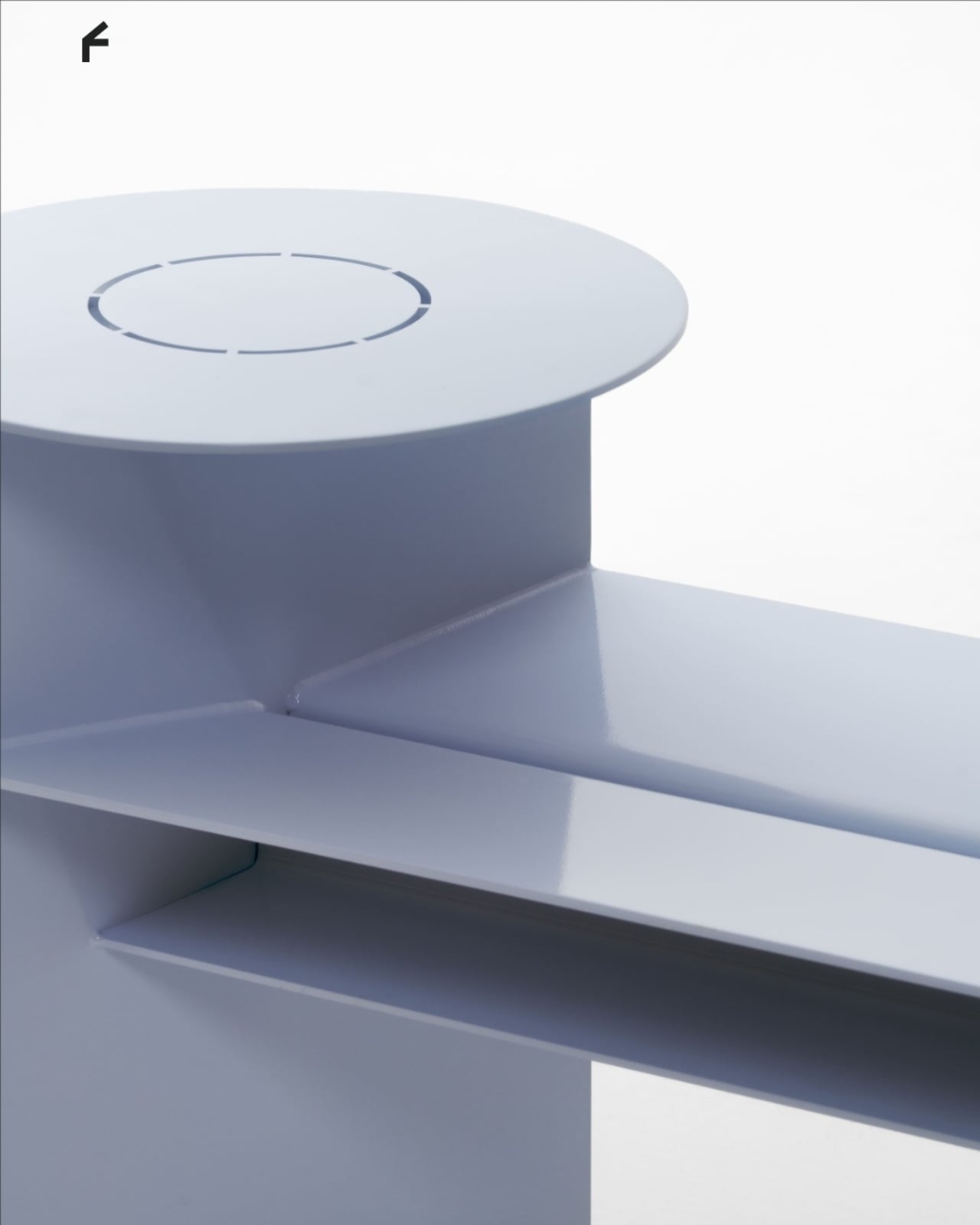
Visually, Free to Face has a pale lavender finish, broad flat supports, and exposed structural geometry. The circular tops soften an otherwise angular assembly. A fabrication photograph shows the metal structure before finishing, although the supplied material doesn’t identify its alloy or coating specification. I like that the form remains readable: you can follow the bench’s bend, identify the raised surfaces, and understand several possible uses without consulting an instruction panel.

The studio setting does leave practical questions unanswered. The photographs establish a full-size physical build, not how it performs through rain, summer heat, or years of public use. Back support, comfortable seat heights, and room for someone using a wheelchair would all deserve attention before installation. I wouldn’t dismiss the design for lacking that documentation, but I also wouldn’t treat a staged lunch as proof of comfort or accessibility. Its strongest evidence is the arrangement itself, demonstrated through several uses.

One photograph shows a woman using a laptop alone, which is a welcome detail for a project about connection. Free public space needs to accommodate solitude, too. Sitting quietly shouldn’t count as using social furniture incorrectly. Free to Face appeals to me because its extra surfaces and angled layout offer choices beyond sitting in a row. I’d be happy to see more benches make that effort, especially if they let people linger without needing to order another coffee.

The post An Angled Public Bench for Hanging Out Without the Coffee Tab first appeared on Yanko Design.
  •  

Anthropic Workbench Gets a Major Redesign with New Build Section, UI Refresh, and Claude Fable 5 Fallback Support

Anthropic has rolled out a significant update to Workbench, making it easier for developers to prototype, test, and deploy AI applications powered by Claude. The updated experience moves Workbench into a brand-new Build section, introducing a cleaner interface focused on faster development workflows. The redesign aims to simplify the process of experimenting with Claude models […]

  •  

EQ-Bench - Le benchmark de l'intelligence émotionnelle des IA

Sam Paech s'est rendu compte qu'on testait toujours les IA sur le code, les maths, et à qui battra un prochain record , mais presque jamais sur leur capacité à comprendre les émotions humaines ou à pondre un texte qui ne sente pas le slop de bot à plein nez. Et c'est pour ça qu'il a monté EQ-Bench , un benchmark qui note l**'intelligence émotionnelle des grands modèles de langage**.

Pour alimenter son benchmark, il colle tout un tas de modèles dans des jeux de rôle un peu tordus (45 scénarios dans sa dernière version) et c'est un autre modèle (Claude, en l'occurrence) qui joue l'examinateur. Il note alors chaque réponse sur huit dimensions, telles que l'empathie, la finesse sociale ou la capacité à poser une limite quand il faut, puis nous sort un classement façon Elo (le classement des échecs). Tout est open source, documenté dans un papier de recherche et Paech finance ce bazar avec ses propres deniers.

Et depuis 2023, c'est devenu une véritable collection de tests...

Y'a un test d'écriture créative, un autre qui regarde si le modèle vous cire les pompes au lieu de vous recadrer quand la conversation s'éternise, un sur l'humour, et même un où les IA jouent à Diplomacy pour voir lesquelles savent négocier et bluffer.

Mais mon préféré c'est le Slop Score, qui mesure à quel point un texte pue l'IA. Pour cela, il traque les mots sur-utilisés et le fameux tic du "pas X, mais Y". Bref, de quoi objectiver (un peu) ce qui rend la moitié du web illisible ces temps-ci.

Paech prévient quand même que son "juge" reste quelque chose de totalement subjectif et qu'il n'existe aucune vérité absolue sur l'intelligence émotionnelle. C'est donc plutôt à lire comme une boussole et pas comme un verdict gravé dans le marbre (ou le silicium ^^).

Toutefois, pour savoir si un modèle écrit comme un humain plutôt que comme un employé d'agence de branding, c'est plutôt pratique. Et je vous conseille d'aller fouiller un peu dans les classements, comme ça vous verrez que le meilleur en code n'est pas forcement le plus futé côté émotions...

Bref, vivement le retour de Fable 5 ^^

  •  
❌