Vue lecture

Il y a de nouveaux articles disponibles, cliquez pour rafraîchir la page.

Furniture Made From Wood Scraps You’d Actually Pay For

Every furniture workshop generates a particular kind of guilt. There are the offcuts, the trimmings, the odd-shaped remainders of boards that got cut to size and are now too small for anything useful, or so we assume. Most of them end up as kindling, compost, or landfill. We’ve accepted that as the cost of making things, a small fine paid for the privilege of precision. Studio Booboon is not interested in paying that fine.

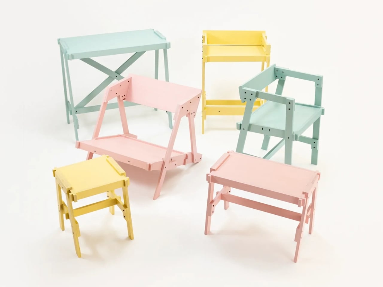
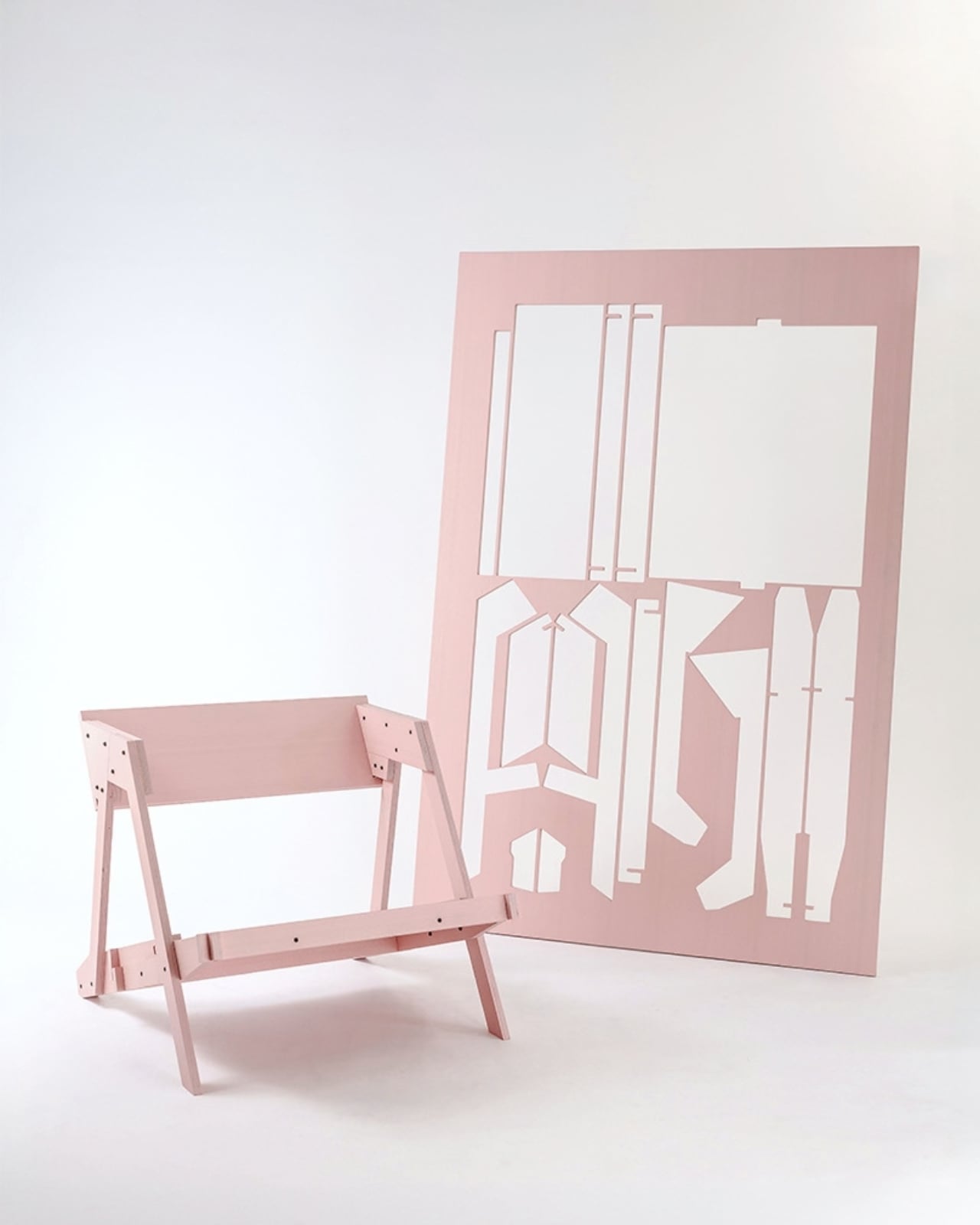
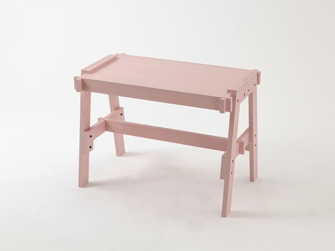
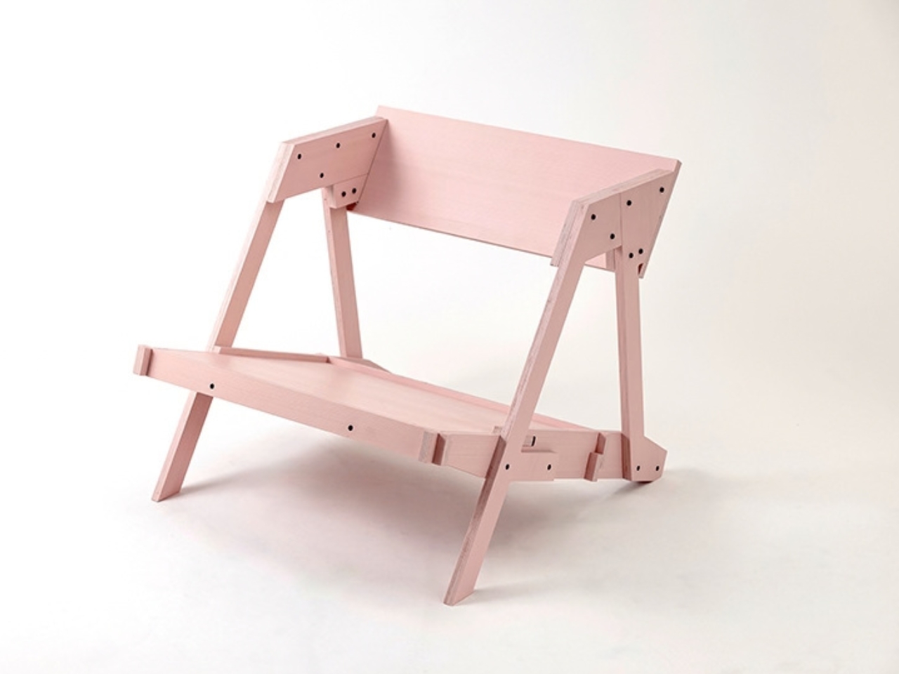
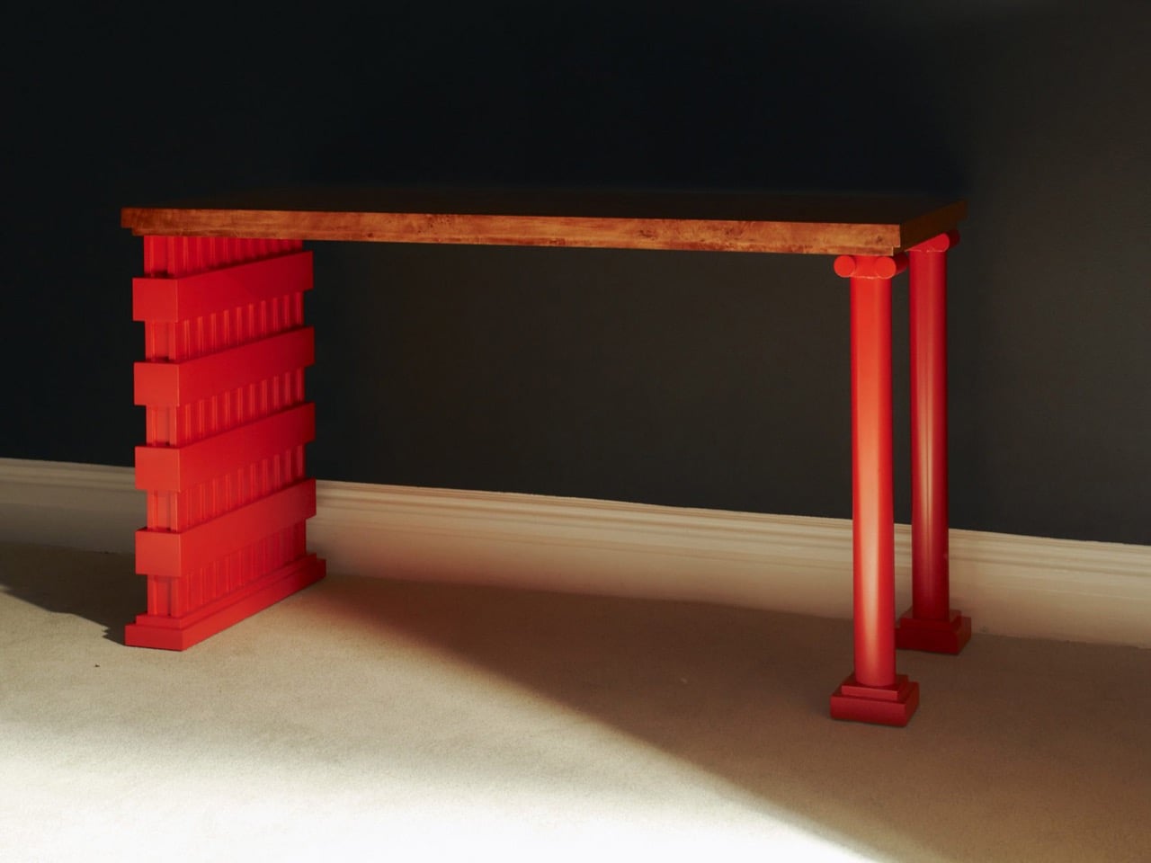
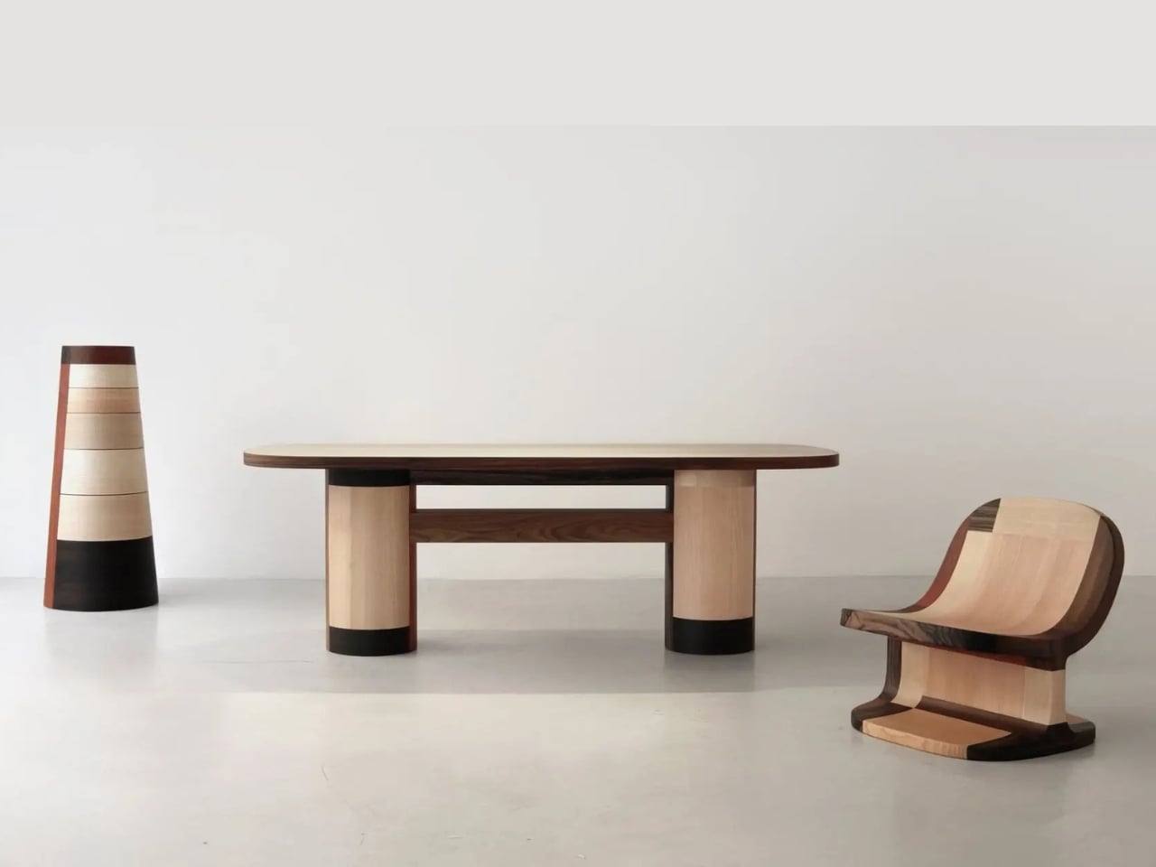
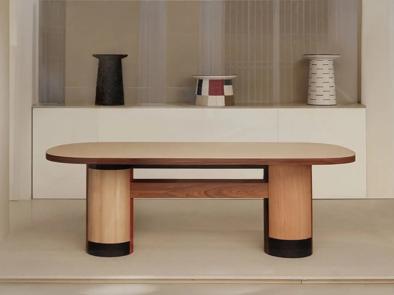
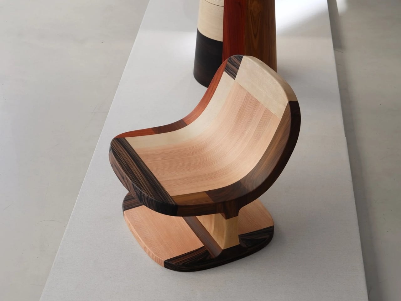
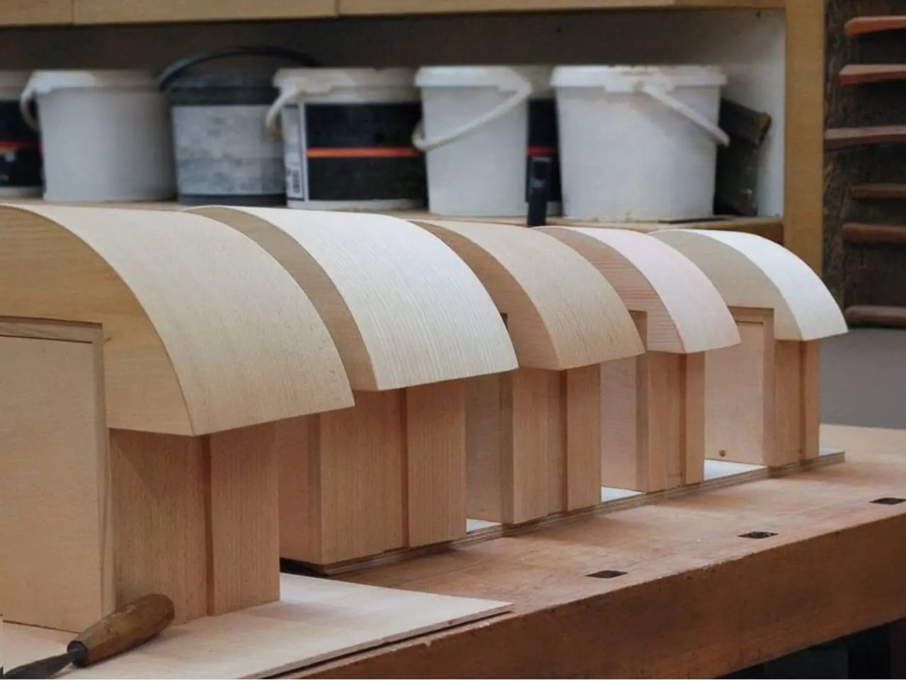
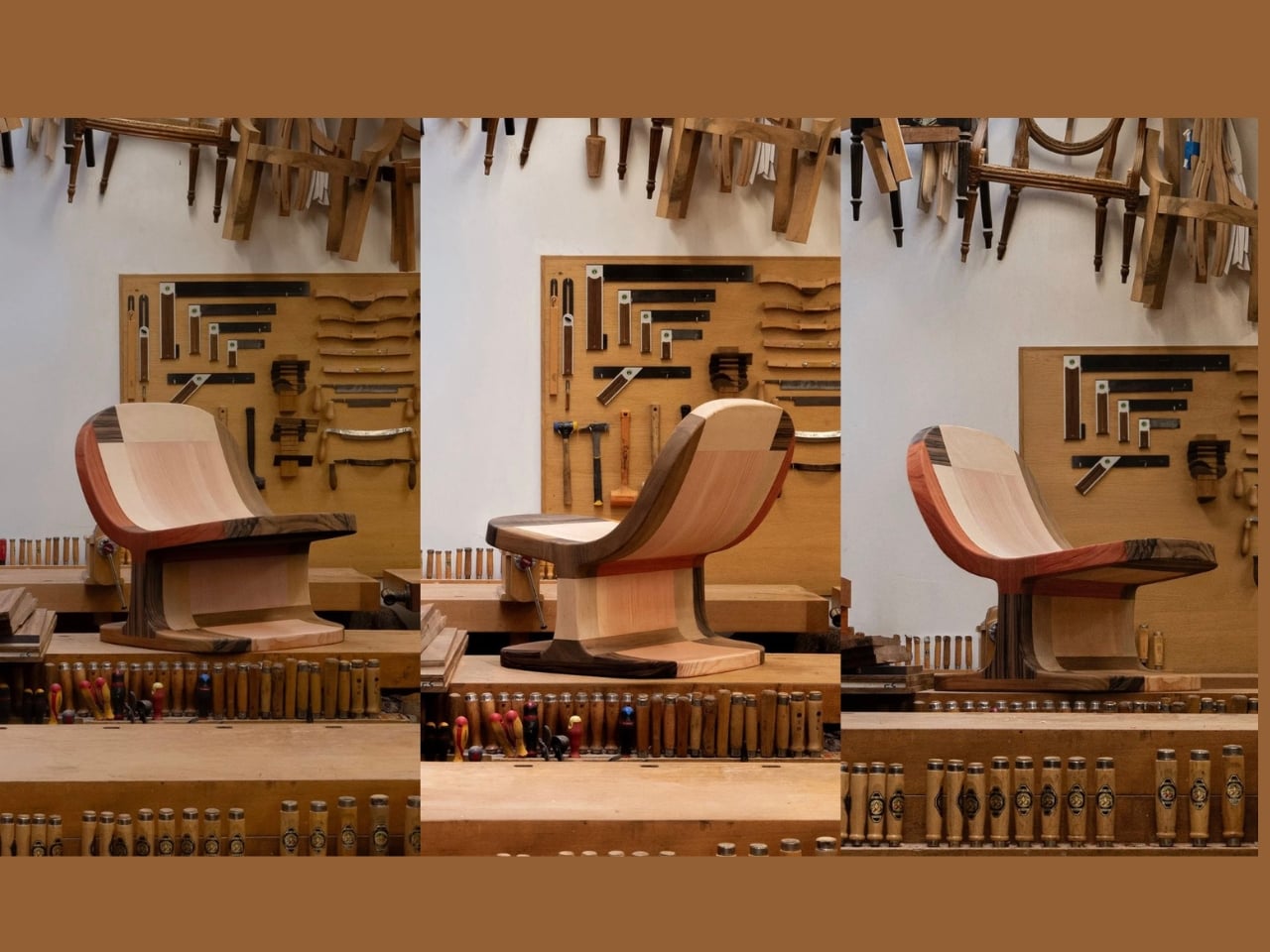
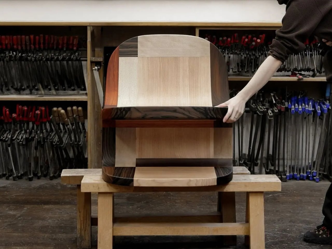
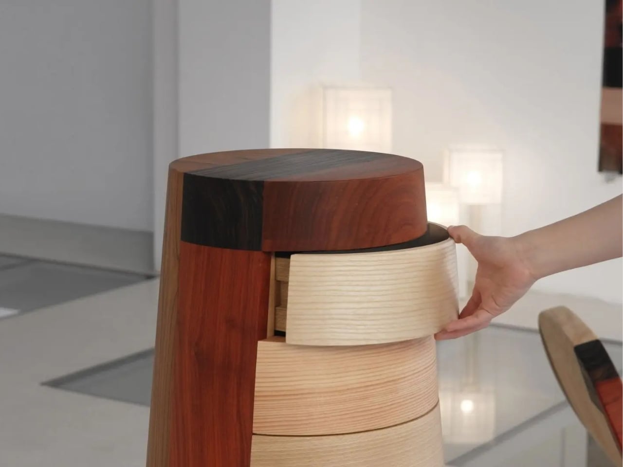
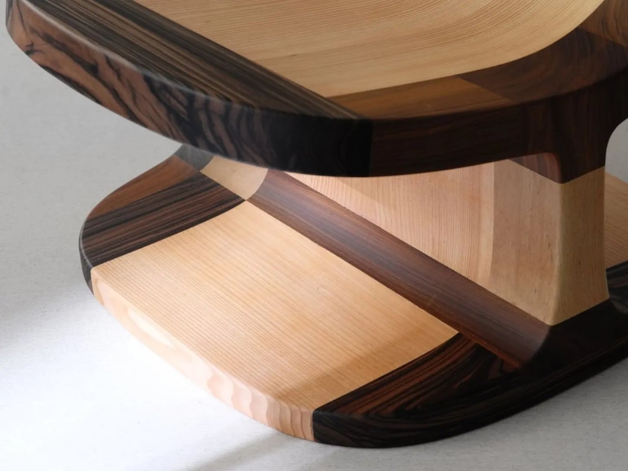
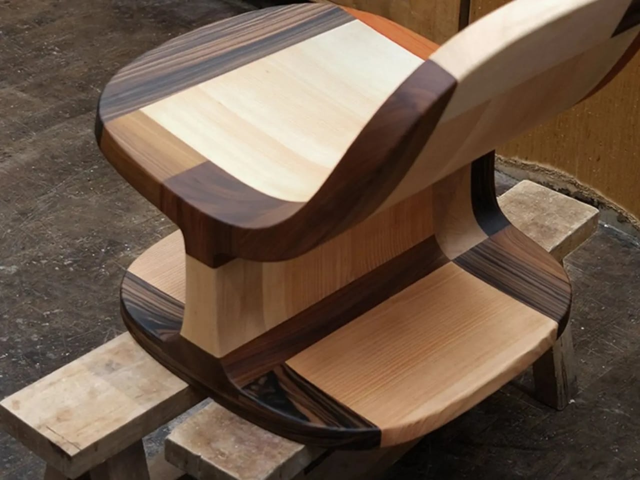
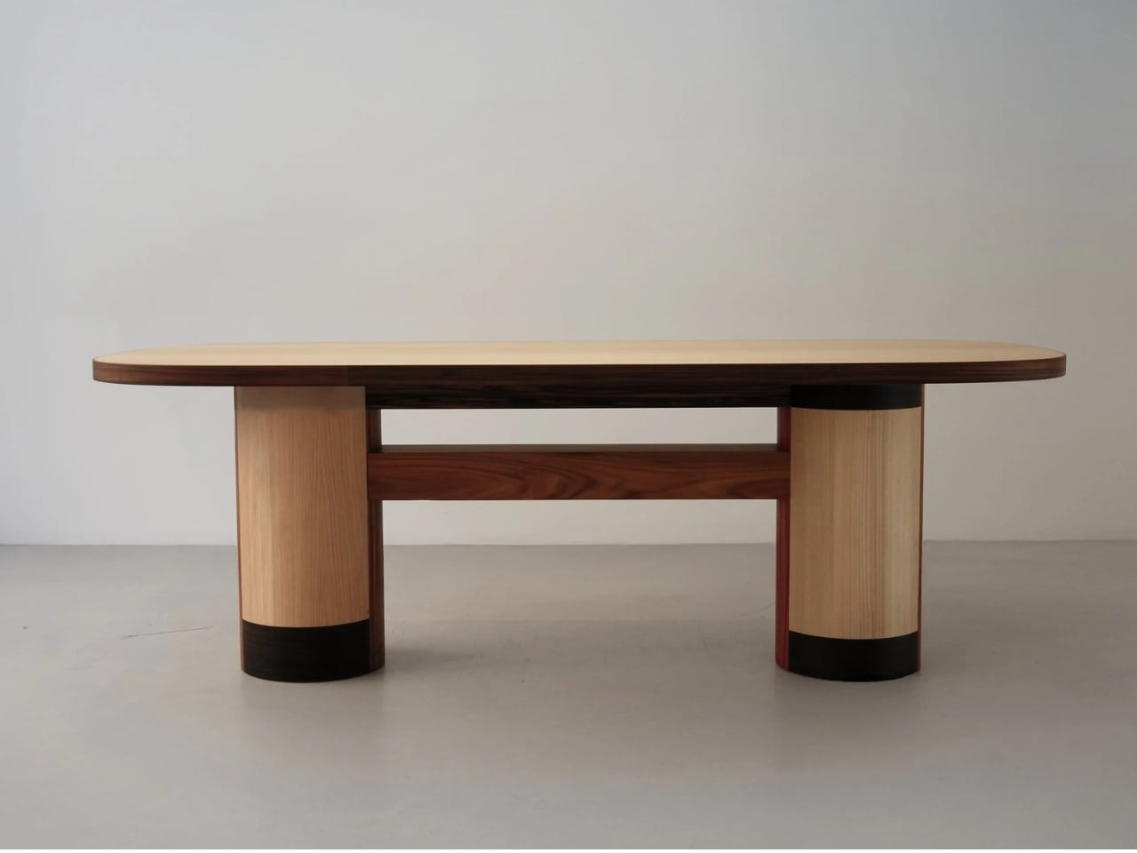
The Copenhagen-based studio, founded by Richard Bone and Jisu Yun, two designers who both trained under Japanese studio Nendo, released their latest collection, Fragments Becoming, and it’s exactly the kind of work that makes you wonder why no one thought to do it this way sooner. The collection is built entirely from timber offcuts, and before you picture something rustic or deliberately imperfect, let me be clear: these pieces are stunning. A cabinet, a dining table, and a lounge chair, each constructed from assembled fragments of discarded wood arranged with such precision and intention that the effect is closer to fine art than furniture-as-apology for sustainability.

Designer: Studio Booboon

The concept the studio uses is something they call “3D marquetry,” which sounds technical but is actually a fairly elegant idea once you sit with it. Traditional marquetry, the kind you’d see on antique furniture or decorative boxes, applies a pattern to a surface. It’s essentially decoration laid on top of structure. What Studio Booboon does instead is treat each fragment of wood as the structure itself. The pattern isn’t on the cabinet door; the door is the pattern. It runs through the object’s entire volume, which means the visual logic and the physical construction are the same thing. That’s not a subtle distinction. That’s a fundamentally different philosophy.

What I appreciate about this approach is that it removes the option to hide mistakes. The studio works with unstained wood, which means every fragment has to earn its place on its own terms, no pigment masking a poor match, no stain blurring the edges. Each piece has to work compositionally before it works functionally. That kind of constraint tends to produce either chaos or brilliance, and in this case, it’s clearly the latter.

Bone and Yun bring a cross-cultural sensibility to the work that shows up in the details. Their debut collection, Playful Reappropriation, released at Milan Design Week 2024, pulled from Korean craft traditions, and Fragments Becoming continues that thread. The materials include hanji (traditional Korean paper), canvas, silk, and Ottchil, a Korean lacquer technique that adds depth without dominating the natural tones of the wood. The combination of a British RCA education, Korean craft heritage, and a shared apprenticeship at Nendo, one of the most conceptually rigorous studios in contemporary design, explains a lot about why this work feels so considered without ever feeling cold.

The collection premiered at Milan Design Week 2026 and later showed at Other Circle 2026 during 3daysofdesign in Copenhagen. That double-billing matters. Milan tends to reward spectacle, while the Copenhagen circuit rewards ideas. The fact that Fragments Becoming landed well in both contexts suggests it’s doing something more than just looking good in photographs, which, for the record, it absolutely does.

Sustainability in design has become such an overused talking point that the word barely registers anymore. Every brand gestures toward it. But there’s a difference between sustainability as a value and sustainability as a method, and Studio Booboon’s work lives in the second category. They’re not telling you the collection is responsible and letting the aesthetics carry a different message. The responsible practice is the aesthetic. The offcut isn’t hidden. It’s the whole point.

That feels rare enough to be worth paying attention to. Design tends to celebrate the new, the seamless, the perfect. Fragments Becoming makes a quiet argument that the incomplete, the leftover, and the discarded might be where the most interesting work is still waiting to happen.

The post Furniture Made From Wood Scraps You’d Actually Pay For first appeared on Yanko Design.

The Echo Chair Makes 3D Printing Feel Refined

ZHA has collaborated with Spanish design brand Nagami to create the Echo Chair, a 3D-printed seat made from recycled plastic waste. Formerly known as Zaha Hadid Architects, the studio developed the chair through parametric design and large-scale additive manufacturing. Its form is fluid and sculptural, with an arched backrest that extends towards the floor and a seat that curves upwards at the sides.

The two parts look separate at first, but they are printed as one continuous piece. Both surfaces grow from the same structural edge and share the same underlying geometry. One becomes the seat, while the other rises to form the backrest and support.

Designer: ZHA and Nagami

This continuous construction gives the chair a clear sense of logic. The shape is doing several jobs at once: supporting the body, holding the structure together, and defining the overall visual character.

The Echo Chair was developed through an iterative research process at ZHA Lab and manufactured by Nagami, a brand known for its work in large-format 3D printing. The studios used recycled PETG sourced from industrial waste, including single-use medical plastics.

As the chair is printed layer by layer, the process leaves a ribbed texture across its surface. Those lines have been kept visible rather than hidden or polished away. That decision gives the chair much of its character. The texture follows the curves closely and makes the manufacturing process easy to read. It also gives the recycled plastic a more tactile, less generic appearance.

There is something useful in that honesty. The material is not being forced to look like timber, stone or metal. It keeps the visual qualities created by the printing process and uses them as part of the design. The surface does still reference natural materials in a subtle way. Its layered finish recalls mineral formations and carved stone, which helps the chair feel less industrial when placed in an interior.

ZHA and Nagami developed four colourways for the chair: white, black, a white-to-translucent gradient and a caramel tone made using a bio-based cork composite. The colour choices help shift the mood of the design. White makes the form feel lighter and more architectural, while black gives it a stronger, more graphic presence. The translucent version draws attention to the printing layers, and the caramel finish adds warmth to what could otherwise feel like a very technical object.

The caramel version is especially successful because it softens the synthetic quality of the plastic. It feels easier to imagine in a home, hotel lobby or lounge space, rather than only in a gallery or design exhibition. According to ZHA project design director Sebastian Andia, the goal was to turn an abundant and overlooked material into something people would genuinely want to live with. That idea matters because recycled material alone is rarely enough to make a product successful. People still need to like the object, find it comfortable and see a place for it in their environment.

The Echo Chair handles this well. Its sustainable story supports the design, rather than becoming the whole design. The seat’s raised sides create a more enclosed sitting position, while the curved backrest gives the chair a supportive and almost cocooned feel. The shape is expressive, but it still looks usable. Its scale and neutral colour options also make it easier to place than the form might suggest. It has enough presence to work as a statement piece, yet it does not depend on bright colour or decoration to stand out.

The 3D-printing process allows the chair to be produced without visible joints or separate components. This gives it a seamless appearance and keeps the connection between the digital model and final object very direct.

That connection is one of the strongest parts of the project. The manufacturing process does not sit behind the design. It shapes the design. The ribs, curves and continuous structure all come from the same production method. Each part of the chair feels related because it has been developed through the same system.

The Echo Chair continues ZHA and Nagami’s existing collaboration. Nagami launched its first collection of 3D-printed chairs in 2018, which included two designs by the architecture studio. Their latest project shows how much more refined large-scale 3D printing has become. The chair feels less like a technical experiment and more like a finished product with a clear place in contemporary interiors.

The Echo Chair is currently on display as part of London Creates at The Truman Brewery. What makes the chair interesting is the way it brings together material, form and manufacturing without overcomplicating the idea. Recycled plastic is treated as a starting point for the design, rather than something that needs to be disguised.

The post The Echo Chair Makes 3D Printing Feel Refined first appeared on Yanko Design.

The Sculptural Rocking Chair That Started as a Single Idea

Most furniture design starts with a question: How do people sit? Aleks Forystek Studio started with a completely different one. What happens when a heavy sphere presses into a structural loop? The answer, it turns out, is a chair. But not just any chair. It’s Dooal, and it might be the most conceptually satisfying piece of furniture I’ve seen this year.

The premise sounds almost too simple. A sphere meets a loop. The loop yields under the weight, compressing and curving into a form that becomes, all at once, a backrest, a seat, a leg rest, and a rocking base. One gesture, one cause-and-effect sequence, and suddenly you have a fully resolved object. The audacity of that economy is hard not to admire.

Designer: Aleks Forystek Studio

I’ll admit my first instinct when I saw the images was purely aesthetic. The black and white photography does everything right. The curves catch light in a way that makes the chair look more like a cast sculpture than a functional object, and the close-up shots reveal a fine-lined ribbed texture that layers real depth onto an already commanding silhouette. Shot in near-darkness, Dooal looks cinematic. It has the kind of presence that makes you stop mid-scroll and just sit with it for a moment.

But the longer I looked, the more the concept started doing something to me. Forystek’s Chicago-land studio describes its work as committed to “destabilizing the familiar,” and that phrase lands differently once you understand the logic behind Dooal. The chair is familiar enough, a seat you can rock in, a shape the body immediately recognizes. Yet the process that created it is almost foreign to how we typically think about furniture. No separate components engineered together. No piece-by-piece assembly of form and function. Just a single physical interaction, preserved.

That’s a philosophical statement as much as a design one. The studio’s whole methodology centers on finding the latent potential within ordinary objects, pushing past the surface of what something is to explore what it could become when a single variable changes. With Dooal, that variable is weight. Pressure. The simple, undeniable force of a sphere doing exactly what gravity asks it to do.

What makes this feel significant right now is the context we’re sitting in. We live in an era of maximal complexity, where products get layered with features, materials compete for attention, and design often signals effort rather than intelligence. Dooal does the opposite. It argues that constraint is where creativity actually lives. That stripping a design down to one decisive action can produce something richer and more resolved than a process built on a dozen competing decisions.

And it’s not just theoretical. The rocking chair is one of the oldest, most human pieces of furniture we have. It exists in farmhouse porches and modernist living rooms with equal ease. It’s comfort distilled into motion. The fact that Dooal arrives at that form through a logic of compression rather than craft tradition feels both subversive and strangely inevitable. Like the chair was always there, waiting to be discovered rather than designed.

That sphere at the base of the loop is easy to overlook in the photographs. It’s small, nestled low, nearly swallowed by shadow. But without it, none of this exists. It’s the cause the entire object is an effect of, and the fact that it remains visible in the final form is a choice that rewards people who look closely. That kind of embedded storytelling, where the origin of an object is literally written into its body, is rare in furniture design. It elevates Dooal from chair to argument.

Aleks Forystek Studio is not a household name yet. But Dooal is the kind of work that earns attention quietly. Not because it’s loud, but because it’s precise. Because it asks a stubborn, specific question and then answers it completely. Whether you care about objects for their beauty, their ideas, or the story behind them, this chair has all three. And it got there with one moment of contact.

The post The Sculptural Rocking Chair That Started as a Single Idea first appeared on Yanko Design.

Fulfilling prophecy, Razer finally built a wireless RGB gaming chair, and it's ridiculous in the best possible way

It was inevitable. Razer has successfully attached Chroma RGB to mice, keyboards, streaming keylights, mousepads, microphones, and probably a stray toaster if you leave it in their California design headquarters long enough (see their history of weird and experimental hardware). So, it was only a matter of time before they targeted the ultimate piece of battle station real estate: your backside.

Meet the Razer Soma Chroma, a wireless RGB gaming chair launching worldwide today, June 25, 2026, for $499.99 (€529.99) at Razer.com.

Do you absolutely need a glowing throne that dynamically syncs with your desktop gameplay? No, of course not. Your skill in Valorant isn't going to magically jump three tiers just because your headrest is radiating neon green. But do we desperately want it anyway? Yes, obviously. It’s Razer, and adding immersive RGB to things we didn't know needed it is exactly why we love them.

The Razer Soma Chroma is the wireless RGB gaming chair your setup did not know it needed. It blends reactive lighting with all‑day comfort and cuts cable clutter entirely thanks to an ultra‑low latency HyperSpeed wireless connection powered by a simple USB‑C power bank. The dual‑density cold‑cured foam seat and built‑in ergonomic lumbar arch keep your posture neutral and your backside relaxed through marathon sessions.View Deal

The light show: Completely wireless RGB immersion

Press images of the Razer Chroma gaming chair, in black, with RGB lighting on the headrest

(Image credit: Razer)

The marquee feature here is the fully integrated, reactive RGB lighting embedded seamlessly into the headrest's shoulder wings. Powered by the venerable Razer Chroma RGB engine, it hooks directly into the Chroma SDK to react in real-time to in-game events across more than 300 integrated titles—including heavy hitters like Fortnite, Valorant, and Cyberpunk 2077. If you aren’t actively gaming, you can cycle through 10 dynamic presets and 16.8 million colors via Razer Synapse to perfectly dictate your setup's vibe.

But here is the genuinely clever bit: it's entirely wireless. Nobody wants to roll their chair over a rigid power cord and accidentally yank a $4,000 gaming rig off their desk. Instead, the Soma Chroma transmits data wirelessly via ultra-low latency Razer HyperSpeed 2.4 GHz for your PC, alongside Bluetooth LE for mobile devices.

To juice the actual LEDs, Razer integrated a tidy storage pocket on the back designed to house a standard external power bank (they recommend a hefty 20,000 mAh or larger unit pushing 20W+ and PD 2.0+) via an included 200 mm USB-C cable. If you don't care about a clean, wire-free aesthetic, you can also just run it straight to a wall adapter. There’s even a built-in control panel directly on the edge of the seat base to let you tweak brightness, cycle effects, or switch wireless inputs on the fly without opening an app.

Comfort Check: Saving our posteriors from the Iskur V2

Razer Iskur V2

The Razer Iskur V2 from our recent review. (Image credit: Future)

When Razer dropped the original Iskur, it blew us away with an aggressive, mechanical piston-powered lumbar support system. The premium Iskur V2 doubled down on that adaptive lumbar tech, earning massive praise for back health—but it also brought a punishingly firm seat pan. Meanwhile, the mid-range Iskur V2 X ($299) offered a much softer high-density foam seat but stripped out the adjustable lumbar support completely.

The Soma Chroma chart-corrects here with a brand-new Dual-Density Cold-Cured Foam Seat Cushion. It utilizes two distinct layers working in tandem: a softer upper layer that contours snugly to your body, sitting atop a firmer base layer that maintains its structural integrity over time. The goal is to keep the seat from collapsing or hardening prematurely during marathon sessions while actually offering plush, pressure-relieving comfort.

For back health, Razer ditched the complex, dial-driven mechanical pieces of the Iskur series in favor of a Built-In Ergonomic Lumbar Arch. It's a static, contoured support curve integrated directly into the backrest. While you lose the active left-and-right swiveling of the Iskur V2, you get a reliable curve that won’t shift out of place like a loose lumbar pillow.

Where the features got trimmed

Press images of the Razer Chroma gaming chair, in black, with RGB lighting on the headrest

Where the powerbank gets stowed for a "wireless" RGB experience. (Image credit: Razer)

To hit that $499.99 sweet spot while packing custom diffusers, a wireless control module, and a built-in control panel, Razer did have to make a few expected concessions:

  • 2D Armrests: The Soma Chroma features basic 2D armrests limited strictly to height and swivel adjustments, a noticeable step down from the highly maneuverable 4D armrests on the Iskur V2 that slide and twist every which way.
  • No Built-in Haptics: If you were hoping this would natively integrate the bone-shaking directional haptics of the recently released Razer Freyja gaming cushion, you're out of luck. This is strictly a visual show, though you could easily strap a Freyja onto it if you want the ultimate rumble-and-glow cocktail (and I'll probably do that, since I have one of those).

On the mechanical side, it remains a total tank. You get a reinforced steel frame, a 5-star powder-coated steel wheelbase, a Class 4 gas lift, and premium 6 cm PU caster wheels—the latter being a massive upgrade over the friction-heavy plastic wheels that held back the Iskur V2. It reclines up to 155° with a butterfly tilt mechanism, safely supports up to 150 kg (331 lbs), and comfortably accommodates gamers up to 6'6".

Our review unit just arrived!

Press images of the Razer Chroma gaming chair, in black, with RGB lighting on the headrest

Yes, there are buttons on top of the headrest to control the RGB Chroma. (Image credit: Razer)

The shining throne literally just rolled through our doors. We'll be assembling it, unboxing our beefiest power banks, and seeing if the dual-density foam can truly save our glutes during late-night gaming sessions.

Stay tuned for our full, deep-dive review coming shortly (and you'll be able to see it on future Windows Central Podcasts).

The Razer Soma Chroma is the wireless RGB gaming chair your setup did not know it needed. It blends reactive lighting with all‑day comfort and cuts cable clutter entirely thanks to an ultra‑low latency HyperSpeed wireless connection powered by a simple USB‑C power bank. The dual‑density cold‑cured foam seat and built‑in ergonomic lumbar arch keep your posture neutral and your backside relaxed through marathon sessions.View Deal

Click to join us on r/WindowsCentral

Join us on Reddit at r/WindowsCentral to share your insights and discuss our latest news, reviews, and more.

Press images of the Razer Chroma gaming chair, in black, with RGB lighting on the headrest

Press images of the Razer Chroma gaming chair, in black, with RGB lighting on the headrest

The ZERO Chair Has No Welds, No Joints, No Apologies

Most chairs are built on compromise. You stack the legs, screw the seat, bolt the back, and somewhere in that assembly, a little bit of the original idea gets lost to the necessity of structure. Davide Bozzo’s ZERO Chair refuses to play that game entirely.

The concept is almost confrontationally simple: one single ribbon of metal, bent and curved into a complete chair. No welds holding two pieces together. No joints disguised under upholstery. No hardware quietly doing the heavy lifting behind the scenes. Just one continuous piece of material pushed into a form that includes the base, the cantilevered seat, and the backrest all at once. The name isn’t branding. It’s a philosophy.

Designer: Davide Bozzo

Looking at the photographs, the first thing I kept circling back to was the sheer audacity of the backrest. It doesn’t connect to the base through hidden brackets or clever joinery. It simply rises from the same ribbon, curving upward and backward in a motion that looks more like a wave caught mid-break than anything you’d typically call furniture. It’s graceful in a way that makes you slightly suspicious of it. How is this thing holding anyone’s weight?

The answer lies in what Bozzo describes as structural tension. Form doesn’t just follow function here. It is the function. The material itself carries the engineering logic. Every curve has a reason, and every bend is calculated to distribute load through the continuity of the form rather than through added components. It’s the same principle behind suspension bridge cables or the way a curved shell is structurally stronger than a flat panel. Applied to a chair, it feels almost radical.

I’ll be honest. My first instinct was skepticism. A single-piece metal chair sounds like one of those design school exercises that makes for great renderings but falls apart under real scrutiny. But looking at the close-up photographs, especially the one capturing the S-curve where the seat meets the backrest, you start to believe it. The brushed metal finish shows actual material depth and actual intentionality in how the surface was treated. This isn’t a concept render floating in a void. It has weight and presence.

That said, I do have questions. Comfort is conspicuously absent from the conversation. Metal, even beautifully formed metal, is hard. The cantilevered seat gives some flexibility, which should help, but a chair without cushioning asks something significant of the person sitting in it. Bozzo’s design makes a statement about material honesty and structural purity, which I respect deeply, but at some point a chair has to be sat in. That’s the tension that makes it interesting rather than just pretty.

The piece also reads as a quiet counterargument to the current era of maximalist furniture. We’ve spent years surrounded by bouclé armchairs, curved velvet sofas, and furniture dressed up in layers of texture and warmth. Bozzo’s chair strips all of that away and asks whether furniture can earn your attention through restraint and engineering alone. My honest opinion? It can. Whether it earns a place in your living room is a different question entirely.

The chair also does something that doesn’t get discussed enough in design coverage: it makes the negative space part of the design. The open rectangle formed by the base creates a void that’s almost as deliberate as the metal itself. In the lifestyle image set against a Japanese garden backdrop, that void frames the gravel and ground beyond it. The chair becomes a viewfinder. That’s not accidental. That’s a designer who understands that what you leave out is just as powerful as what you put in.

Bozzo has been building a reputation for material-forward work. His stainless steel pet bowl Dune explored similar ideas around fluid curves in a single medium, but the ZERO Chair feels like a significant step up in ambition. It’s the kind of piece that stops you mid-scroll, makes you set your phone down, and actually think. That, more than any material specification, is probably the point.

The post The ZERO Chair Has No Welds, No Joints, No Apologies first appeared on Yanko Design.

These Old Bike Frames Upcycled Into Armchairs Are The Coolest Thing You’ll See Today

Most upcycling projects ask you to forget what something used to be. Omri Piko Kahan’s bike frame chairs ask the opposite. The geometry is still unmistakably a bicycle frame, the head tube, the top tube, the triangulated rear triangle, all of it present and accounted for, just oriented sideways and asked to hold a person instead of propel one. Kahan, an industrial designer based in Israel, builds lounge chairs from pairs of retired frames, and the whole point is that the donor material remains fully readable, repurposed without being disguised.

Structurally, the approach is clean and considered. Each frame pair is positioned symmetrically, fork and chainstay ends touching the floor as legs, the top tube running horizontally as an armrest. A slung seat and backrest in leather or canvas complete the form. The result has the relaxed posture of a Barcelona chair and the material honesty of something that was clearly built, not styled.

Designer: Omri Piko Kahan

Bicycle frames are absurdly overbuilt for what Kahan is asking them to do. A modern aluminum road frame is engineered to survive repeated impact loads from a rider pushing 300 watts through rough tarmac, and it does that while weighing somewhere between 1,000 and 1,400 grams. The structural surplus in that kind of engineering is enormous, which is why two of them positioned as a chair frame and asked to support a seated adult is, from a load-bearing standpoint, almost comically within spec. The geometry does the rest. Bicycle frames already resolve forces through triangulated sections, and a lounge chair asks for exactly that kind of lateral and compressive stability.

What Kahan has figured out is the orientation problem. Flip a frame on its side and the existing tube angles don’t automatically produce a useful chair geometry. The fork legs and chainstay ends need to hit the floor at the right height relative to each other, the top tube needs to land at armrest height, and the whole thing needs to produce a seat rake that doesn’t pitch you forward or swallow you whole. The matched top tube angles across both frames in the Cube and Trek build suggest this took real iteration, because they align with a precision that reads as deliberate rather than lucky. Filed fillets at the junctions and a custom setback upper support holding the sling confirm someone was paying close attention to finish quality.

The two builds photographed so far, one pairing a blue Cube road frame with a Trek, another combining a GT Transeo 3.0 with what appears to be a Supreme-branded MTB frame, show how much the donor bikes drive the final character of each piece. The GT build in particular has a longer wheelbase geometry that gives the chair a wider, more reclined stance than the Cube version. Kahan is taking custom orders, with pricing worked out per commission, which makes sense given that no two donor frame combinations will produce the same structural or ergonomic outcome.

The post These Old Bike Frames Upcycled Into Armchairs Are The Coolest Thing You’ll See Today first appeared on Yanko Design.

A Transforming Table-Chair That Turns Tradition into Space-Saving Intelligence

At a time when living spaces are shrinking while expectations from them continue to expand, this design presents a thoughtful response that is both rooted in tradition and aligned with contemporary needs.

Emerging from the context of rising housing pressures in Taiwan, where compact homes are increasingly becoming the norm, the project addresses a fundamental question: how can furniture adapt to limited space without compromising comfort or experience? Rather than treating furniture as static, single-purpose objects, the designer reimagines them as dynamic systems capable of transformation.

Designer: Che-Chia Hsu

At the heart of this piece lies a deep engagement with traditional Chinese woodworking techniques, particularly the precision of tenon joints. These joints move beyond being structural solutions and become expressions of calculated craftsmanship, where geometry, material behavior, and human interaction converge. The result is a construction that feels both minimal and robust, relying on accuracy instead of excess.

The furniture set is designed to integrate storage and seating within a compact footprint. A chair is concealed within the table and can be pulled out, unfolded, and expanded into a functional seat. The process is intuitive: the chair is extracted, the seat and backrest are opened, and the backrest angle is adjusted using velcro. The transformation is smooth and unobtrusive, allowing the object to shift roles effortlessly.

What distinguishes this design is its reliance on the user’s own body as part of the structural system. Instead of depending entirely on rigid supports, the chair uses the tension generated by the sitter to stabilize the backrest. This introduces a subtle interaction between user and object, where the act of sitting becomes integral to how the design performs. The experience feels efficient, responsive, and quietly intelligent.

Material choices reinforce this balance between function and experience. Lightweight pine wood panels provide durability while ensuring ease of movement. Paired with gray cotton linen fabric, the design introduces a tactile softness that enhances comfort. The fabric is breathable and visually understated, complementing the natural warmth of the wood. Together, these materials create a calm, cohesive aesthetic suited to contemporary interiors.

The development of the project reflects a layered and rigorous process. The designer began by studying traditional joinery techniques through literature, followed by hands-on training under a woodcraft master. This immersion enabled a deeper understanding of the craft beyond theory. Building on this foundation, the designer explored ways to translate these techniques into a modern, functional context through research and experimentation.

What emerges is a design that treats constraint as a starting point rather than a limitation. The piece brings together traditional knowledge and contemporary living patterns, shaping an object that adapts, responds, and participates in everyday use. It reflects a way of designing where space, material, and human interaction are considered together, resulting in furniture that feels considered, purposeful, and in tune with the realities of modern living.

The post A Transforming Table-Chair That Turns Tradition into Space-Saving Intelligence first appeared on Yanko Design.
These Steel Chairs Are Too Big to Sit In: Walk Through Them Instead

Most public art earns its place on a pedestal and stays there. It asks you to look, maybe photograph it, and walk away. The relationship between viewer and work rarely extends beyond that brief transaction. That’s been the convention for a long time, but there’s a growing push for installations that don’t just occupy public space but actually do something within it.

Michael Jantzen has been exploring that tension for years. His Moving Furniture series applies a simple idea to ordinary chairs and tables: take each object’s form and repeat it in progressive intervals as if capturing it mid-movement, then connect those moments into a single piece. The result is something you can still sit in or set a drink on, even if it no longer looks quite built for that.

Designer: Michael Jantzen

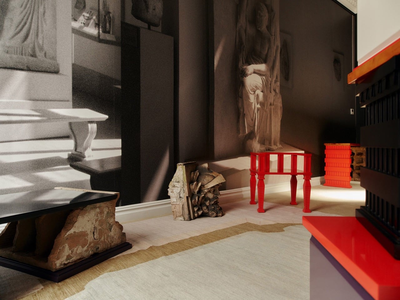
Monumental Moving Furniture takes that same concept into architectural territory. Built from painted steel, the series consists of abstracted chair and table forms, each generated by moving the original object through space and time and locking its path into a chain of connected segments. At this scale, what started as a reference to everyday objects feels closer to a building than a piece of furniture.

The method behind each piece is consistent. A chair or table is set in motion through space and time, with each interval frozen and joined to the next. Some pieces move only part of the original form; others shift the whole thing. The result is a structure that stops belonging to any single discipline and starts reading as furniture, sculpture, and architecture at once.

Despite being too large to sit in, these sculptures aren’t purely decorative. Each is large enough to walk under and through, giving it a practical function as a pavilion and shelter. That’s not something most public art can claim. Instead of asking people to observe from a polite distance, these structures pull you in, turning a passive encounter into something more physical and immediate.

The series covers both chair forms and table forms, each treated with the same sequential abstraction. Individual pieces have also been grouped into configurations that suggest more complex structures, as if each were a building block for something larger. Painted in vivid, solid colors like white, orange, and yellow, each structure commands attention from a distance and rewards a closer look once you’re standing beneath it.

Public spaces deserve more than objects to look at. They deserve things to experience. Monumental Moving Furniture earns its place on both counts, offering structures large enough to shelter visitors while giving them something genuinely puzzling to engage with. These forms don’t demand reverence. They invite curiosity, exploration, and the kind of slow, circling attention that good public space has always been designed to encourage.

The post These Steel Chairs Are Too Big to Sit In: Walk Through Them Instead first appeared on Yanko Design.
Forget Upholstery: Lærke Ryom Tailors Furniture Instead

Most upholstered furniture is essentially furniture under stress. Fabric gets stretched, stapled, pulled taut, and forced into submission over rigid frames. It is, fundamentally, a question of control. Danish designer Lærke Ryom looked at that process and decided to do the opposite. Her debut solo exhibition, Raiments, now open at Innenkreis gallery in central Copenhagen, is built entirely around that single act of refusal.

The collection includes a daybed, a chair, a bench, table lamps, a floor lamp, and wall lamps, all presented in soothing cream and chocolate-brown hues. The palette is calm and considered, which makes sense. These are pieces that ask you to slow down and look closely, because the detail is where the story actually lives.

Designer: Laerke Ryom

The daybed is probably the clearest expression of the concept. Long, low, and dressed in Kvadrat wool with visible quilting stitches running across its surface, it reads more like a made bed than a piece of showroom furniture. The fabric is not pulled over the form but rather allowed to settle onto it, the way a well-cut linen drapes over a body. The powder-coated steel frame beneath does its structural job quietly, without announcing itself.

The bench follows a similar logic. Compact and precise, it carries the same quilted wool surface and the same twill weave edge banding that appears across the collection. That edge band is a detail worth pausing on. Ryom chose it specifically because twill weave is a technique rooted in clothing and home textiles rather than furniture. “It places the upholstery pieces somewhere in between,” she has said, “adding to the feeling of a tailored piece rather than upholstery.” It is a small choice with a large effect on how the finished object feels.

The chair, built on an aluminium frame rather than steel, is the lightest piece structurally, and it shows. It sits with a kind of ease that heavier upholstered chairs rarely manage. The wool covers it without gripping it, and the stitching adds just enough surface interest to reward a second look without demanding one.

The lighting pieces are where the tailoring metaphor gets genuinely interesting. The floor lamp and table lamps, both on powder-coated steel bases, incorporate fabric shades that are constructed the same way as the seating pieces, draped and stitched rather than stretched and glued. The wall lamps, built on stainless steel bases, carry the same approach. Seeing the textile treatment applied to lighting as well as furniture makes the collection feel like a genuine system of thinking rather than a one-off experiment. Ryom is not just applying a technique to a single object type. She is testing a philosophy across an entire interior.

Underlying all of it is a material choice that matters. The Kvadrat wool she selected deliberately lacks visible weaving, which gives the stitching room to become the primary surface detail. The quilting is not decorative in a fussy sense. It is structural and honest, doing exactly what it appears to do, which is hold the fabric in place without adhesives or staples. The result is upholstery that can be disassembled, repaired, and eventually recycled. The clothes metaphor is not just aesthetic. It is practical in the most direct way possible.

Ryom, born in 1995 and working out of The Factory for Art and Design in Copenhagen’s Amager district, has been exploring alternative upholstery techniques for several years. Raiments feels like the point where that exploration becomes a fully formed position. The pieces are not minimal for the sake of it. They are restrained because restraint is what the concept requires. Every choice, from the aluminium chair frame to the stainless steel wall lamp bases to the twill edge banding, is in service of the same idea: that furniture should be dressed, not wrestled.

Whether or not that idea changes how people think about upholstery at large is probably too early to say. But Ryom has made a collection that is hard to look at and then go back to thinking about furniture the old way. That, for a debut solo show, is more than enough. Raiments is on show at Innenkreis, Herluf Trolles Gade 28, Copenhagen, through 23 May.

The post Forget Upholstery: Lærke Ryom Tailors Furniture Instead first appeared on Yanko Design.
❌