❌

Vue lecture

Neo-Brutalist Vases Look Like Tiny Towers, Even Without Flowers

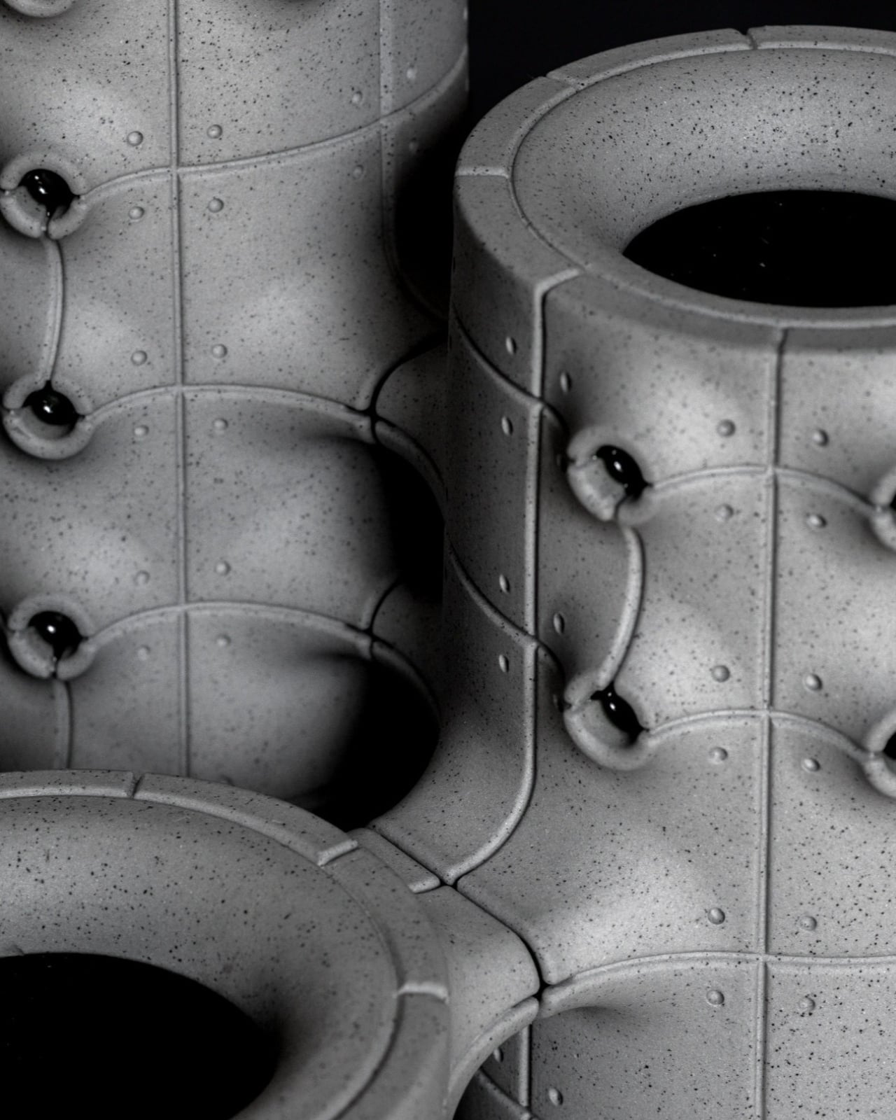
An empty vase can make a shelf look oddly unfinished, as though the flowers were supposed to do all the decorating. Aleksander Kozera’s Neo-Brutalist Vases offer a convincing way around that small domestic problem. Created under his Warsaw-based Yird Ceramics brand, these ceramic vessels have enough architectural detail to hold attention on their own. I’d be inclined to leave them empty before deciding what, if anything, belongs inside.

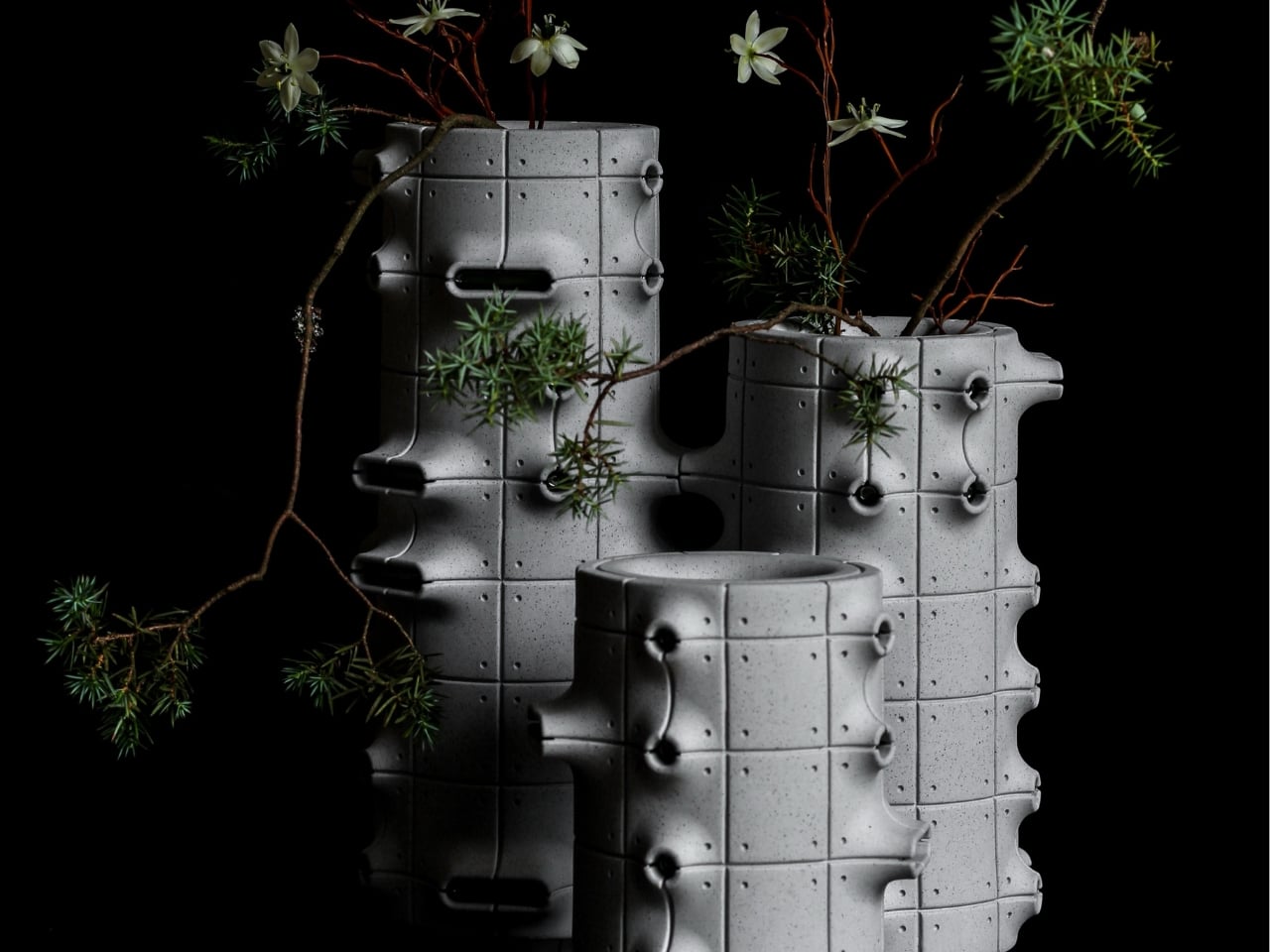
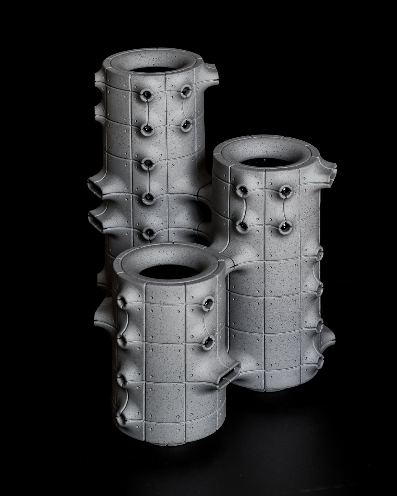
Their cylindrical bodies are divided into rectangular panels, with tiny indentations that suggest construction details on a concrete facade. Circular recesses interrupt that grid, while curved projections extend from the sides like abbreviated balconies or exposed joints. The effect lands somewhere between an architectural model and a piece of science-fiction set dressing. They look a little like infrastructure for a very small, very design-conscious civilization, which is part of their appeal.

Designer: Aleksander Kozera

The concrete resemblance comes from the ceramic body itself. According to the collection’s Łódź Design Festival description, Kozera uses porcelain casting slip with ceramic pigments and black grog to produce that raw, concrete-like finish. In the close-up photographs, dark speckles break up the gray surface. That texture matters visually: without it, the panel lines and repeated circles could read as a smooth plastic prop. Instead, the surface gives the geometry some grit.

The modular approach also makes the collection more interesting than a row of differently sized cylinders. The festival describes vessels that can be combined and arranged into larger compositions. In the photographs, neighboring forms create narrow gaps, overlapping projections, and changing silhouettes. I like the possibility of treating a shelf as a small architectural composition rather than lining up three matching accessories. The vessels share a vocabulary without looking identical from every angle.

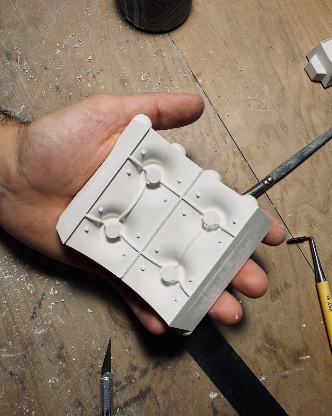
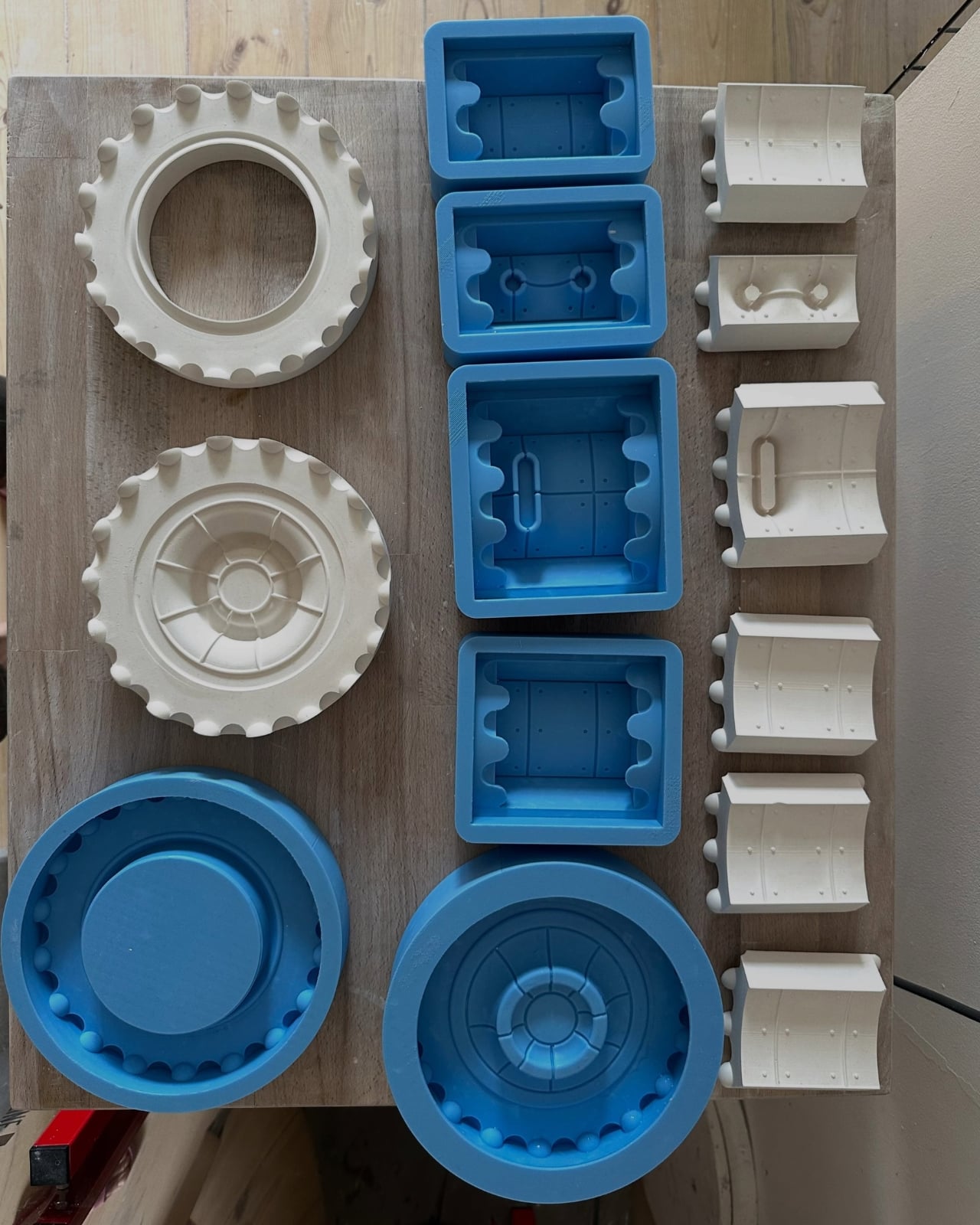
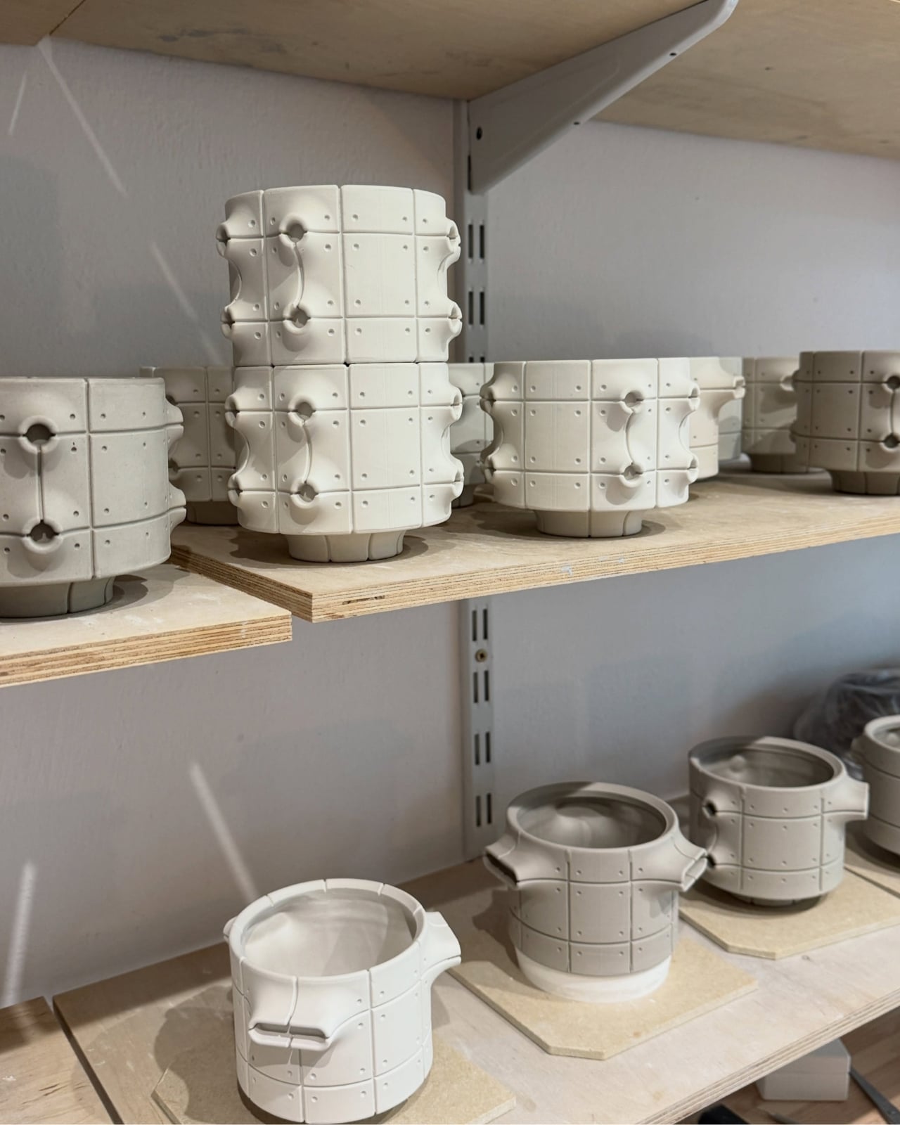
Kozera’s broader studio process helps explain that controlled repetition. He describes beginning with digital modeling, then 3D-printing master forms used to make plaster molds for slip-casting porcelain. That’s a useful distinction for anyone assuming these are printed plastic objects or directly printed ceramics. Digital tools establish the geometry, while casting translates it into ceramic. The workshop photographs make that relationship tangible, showing shaped components and molds alongside vessels at different stages of production.

The finish introduces another layer of detail. The collection description specifies a translucent green glaze, with the small exterior “windows” individually glazed by hand. The green is restrained enough that the photographed pieces still read predominantly as gray architectural objects. I prefer that decision to an all-over glossy finish. Small glazed areas give the eye somewhere to pause without obscuring the panel divisions or competing with the speckled body.

Flowers change the balance considerably. In the styled photograph, branching stems stretch above and across the vessels, disrupting all those disciplined horizontal and vertical lines. The arrangement is sparse enough that the ceramic remains visible, which seems the right approach. A dense supermarket bouquet might conceal much of the detail that makes these worth looking at. A few irregular branches would let the architecture and the plant material each have some breathing room.

My reservation is mostly about where they would live. These are visually busy objects, even with their limited palette. On a shelf already crowded with books, collectibles, and patterned ceramics, the small recesses and projecting edges could get lost. I’d give one a relatively clear stretch of console or place a group against a plain wall. That’s a styling preference, but the design rewards enough space to read its silhouette.

These are physical ceramic works rather than render-only proposals, and the collection is listed as selected for the make me! 2026 exhibition at Łódź Design Festival. That listing does not establish retail pricing or US availability, so it shouldn’t be mistaken for a confirmed shopping announcement.

For me, the strongest choice is the attention given to the sides of each vessel. Turn one, and the relationship between grid, recess, and projection changes. That gives the object a reason to stay on display after the stems are gone, without asking an empty vase to pretend it’s waiting for its next assignment.

The post Neo-Brutalist Vases Look Like Tiny Towers, Even Without Flowers first appeared on Yanko Design.

  •  

These Five 3D-Printed Lamps Shape Light With Mazes and Moving Rings

The relationship between technology and craftsmanship is evolving rapidly, and 3D-printed lighting sits at the center of this transformation. What once belonged purely to industrial manufacturing has now become a creative medium for designers, artists, and architects. Through digital modeling, parametric experimentation, and sustainable fabrication, 3D-printed lamps are redefining how ambient light interacts with interiors.

These sculptural objects are more than functional fixtures. They merge precision engineering with artistic expression, creating lighting that feels organic, customizable, and emotionally engaging. As digital craft evolves, here is how 3D-printed lamps are shaping a future where light becomes both atmosphere and architecture.

1. Parametric Light Sculptures

Traditional lighting design often begins with hand sketches and material studies, but digital craft introduces a more fluid design process. Using parametric software, designers can manipulate patterns, geometries, and textures in real time. This allows lighting forms to evolve naturally through algorithms and experimentation.

The result is a new language of illumination where every curve, perforation, and layer influences the diffusion of light. Designers can create highly detailed structures that would be difficult or impossible to produce through conventional manufacturing. Digital precision transforms lamps into immersive visual experiences.
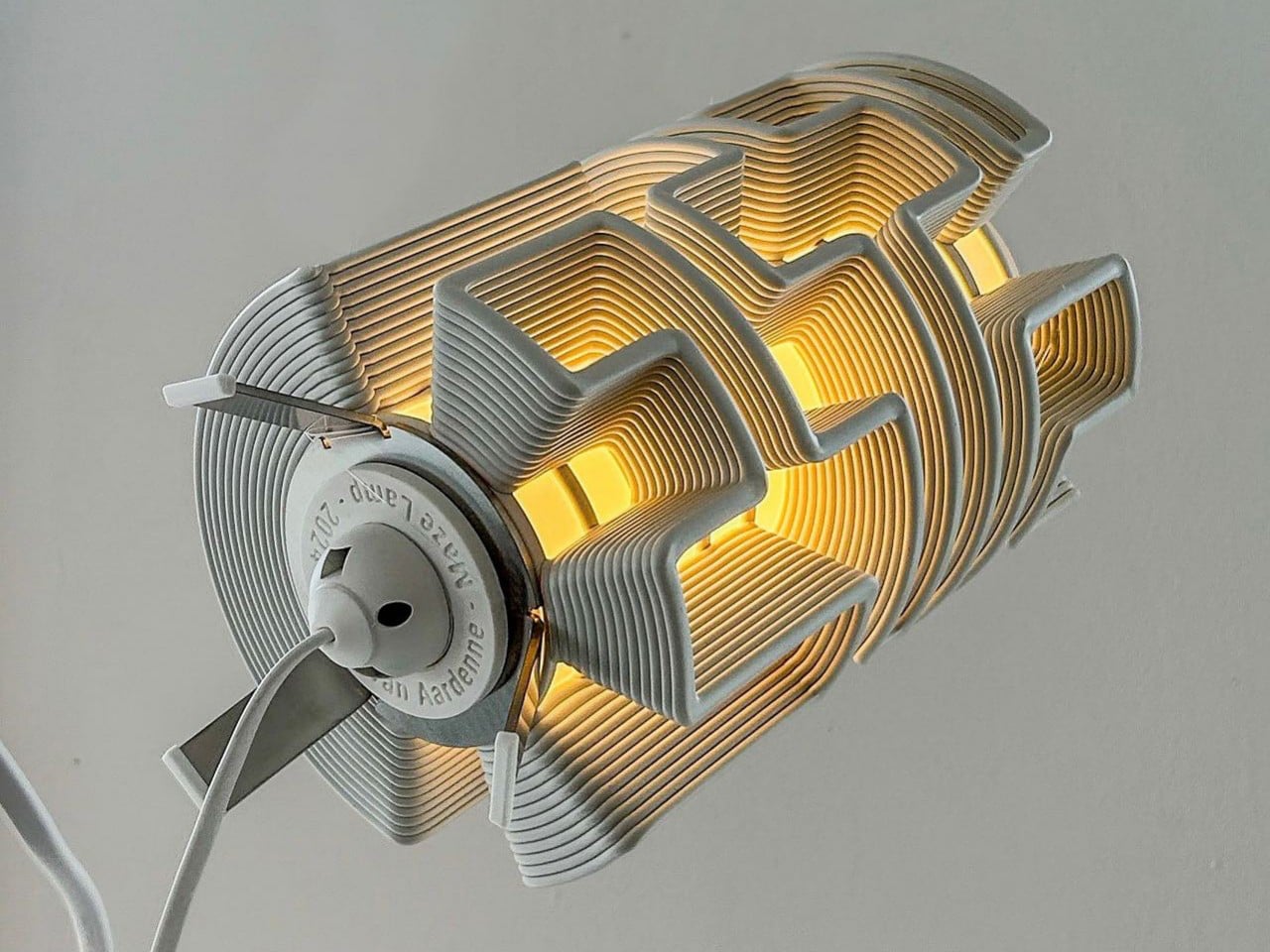
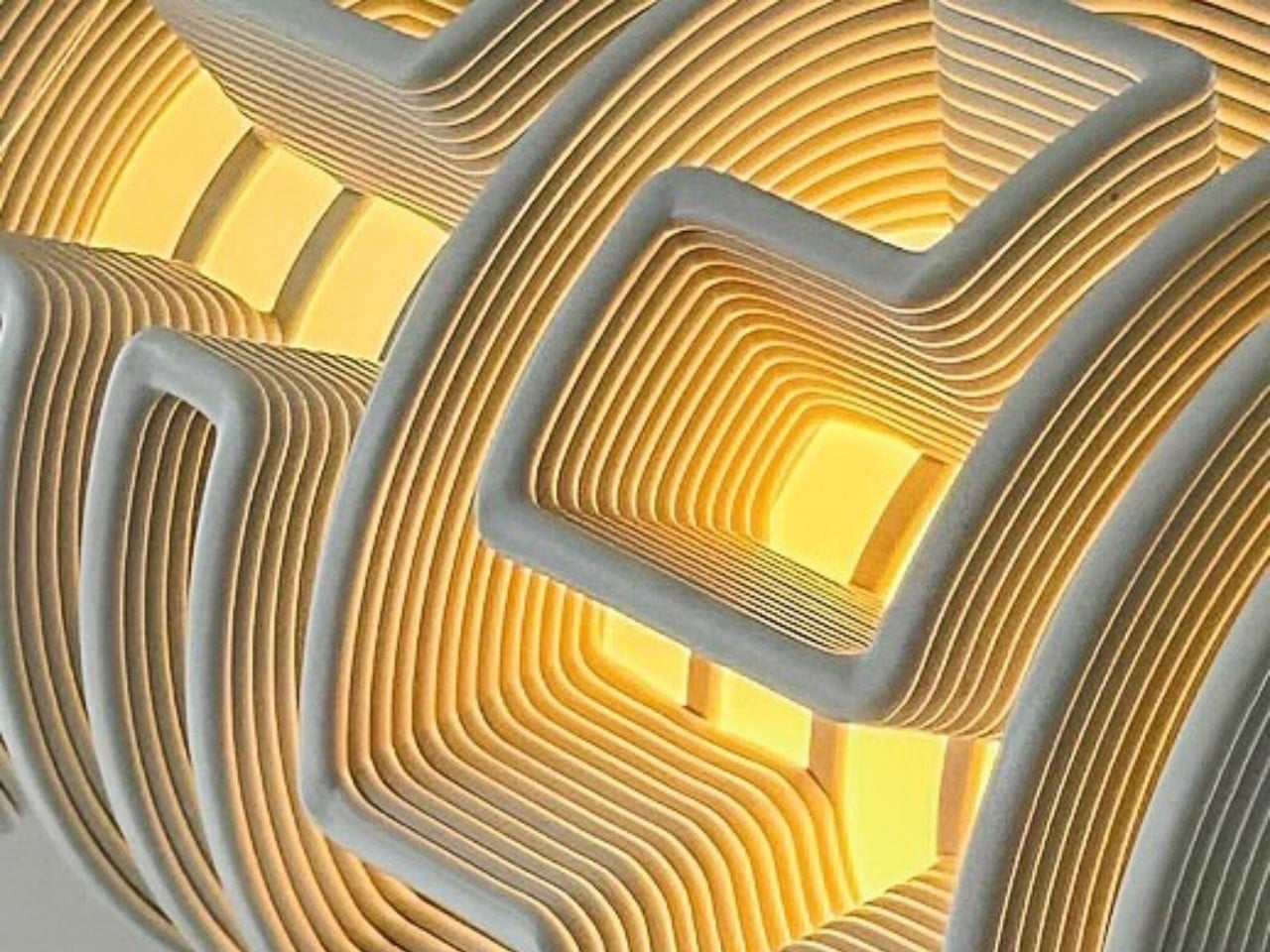
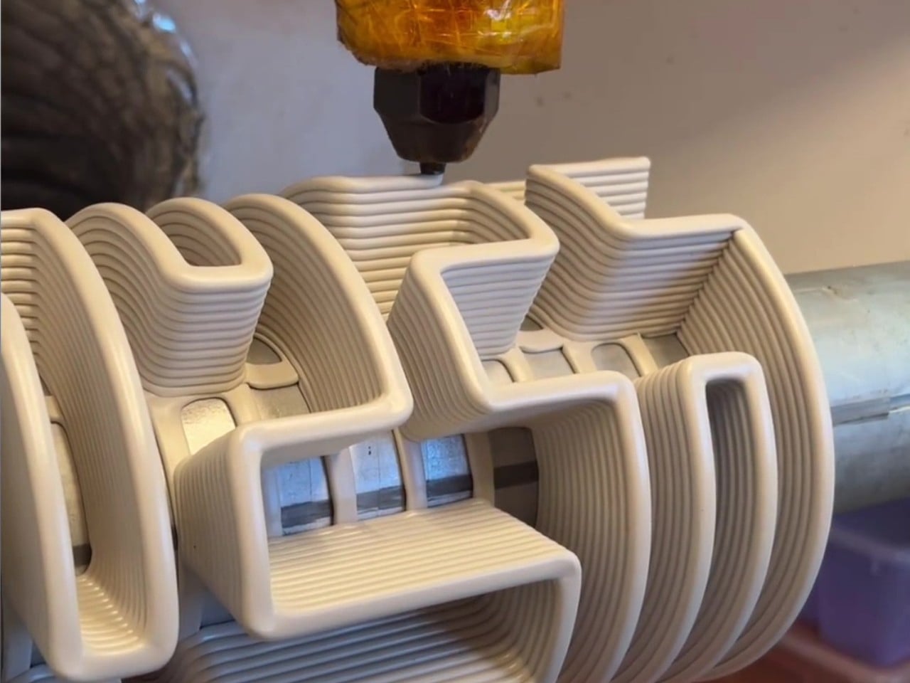
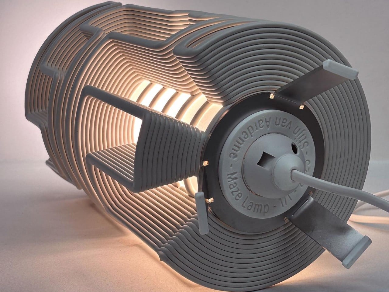
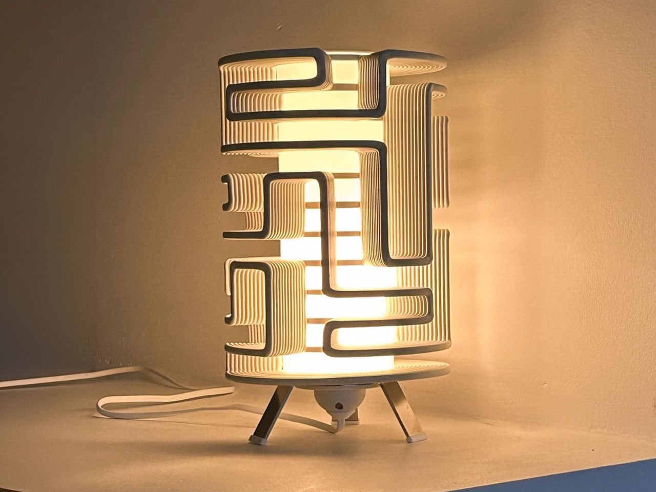
The Maze Lamp transforms experimental 3D printing into a sculptural lighting piece filled with movement, texture, and individuality. Created by designer Stijn van Aardenne, the lamp features intricate winding lines produced through an industrial 3D printing process that moves across a rotating axis. This technique creates mesmerizing maze-like patterns that wrap around the cylindrical form, casting dramatic shadows and ambient light throughout the space. Even when switched off, the lamp stands as a striking decorative object with an artistic and futuristic presence.
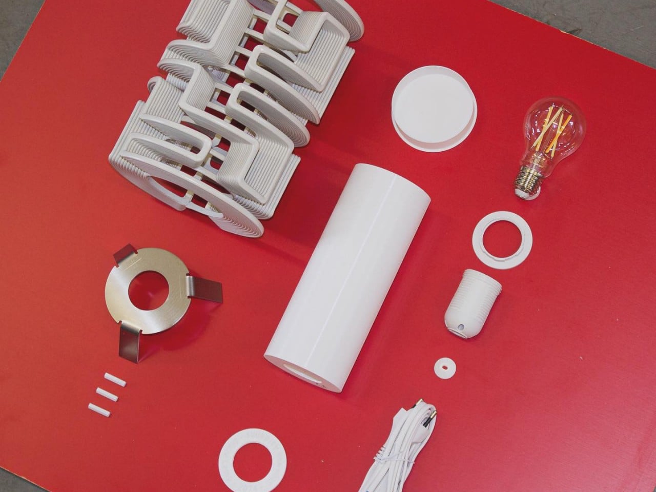
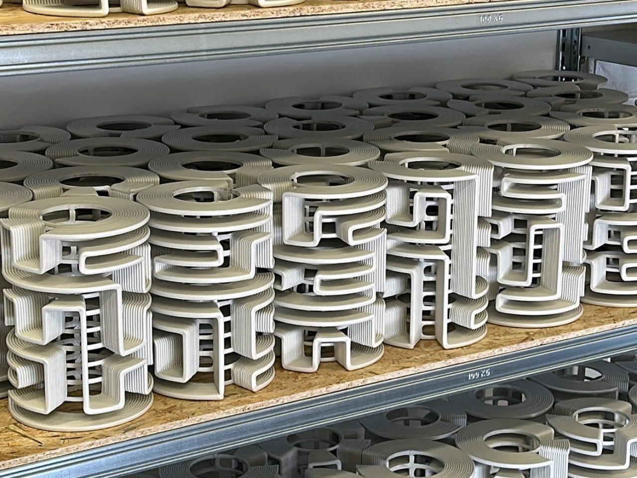
Each Maze Lamp is unique, as the flowing patterns are generated through a randomized printing process, ensuring no two pieces are ever identical. Crafted using recycled plastic sourced from discarded refrigerator doors, the design also embraces sustainability while celebrating digital craftsmanship. The layered structure creates a glowing effect that feels both mysterious and architectural, turning the lamp into a functional work of art.

2. Layered Printing Creates Soft Illumination

One of the most fascinating aspects of 3D-printed lamps is how layered fabrication affects light quality. During the printing process, thin material layers form subtle textures that interact beautifully with illumination. These ridges scatter light softly, creating a warm and ambient glow within interiors.

Instead of harsh brightness, the lamp becomes a medium for atmosphere. The printed patterns generate shadows and gradients that shift depending on viewing angles and light intensity. This blend of texture and luminosity turns ordinary lighting into a sensory and sculptural feature.
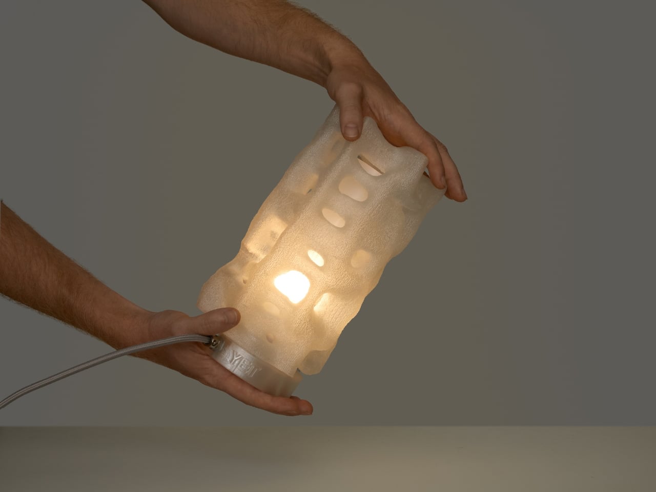
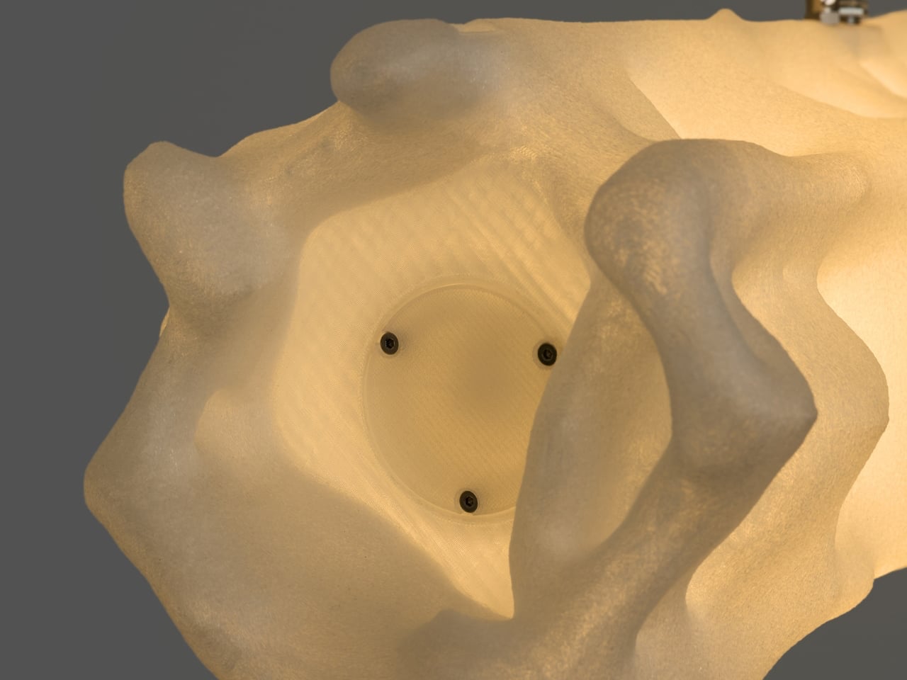
The Alherd Collection by YET FAB transforms lighting into a sculptural exploration of nature, technology, and atmosphere. Inspired by the organic growth of coral formations and the erosion of natural stone, the collection features porous, cellular structures created through advanced computational design and custom 3D printing. Founded by Ilya Kotler, Anastasiya Kotler, and Rael Kaymer, the studio blends biomimicry with digital fabrication to create lamps that glow like living forms while adding a soft ambient presence to contemporary interiors.
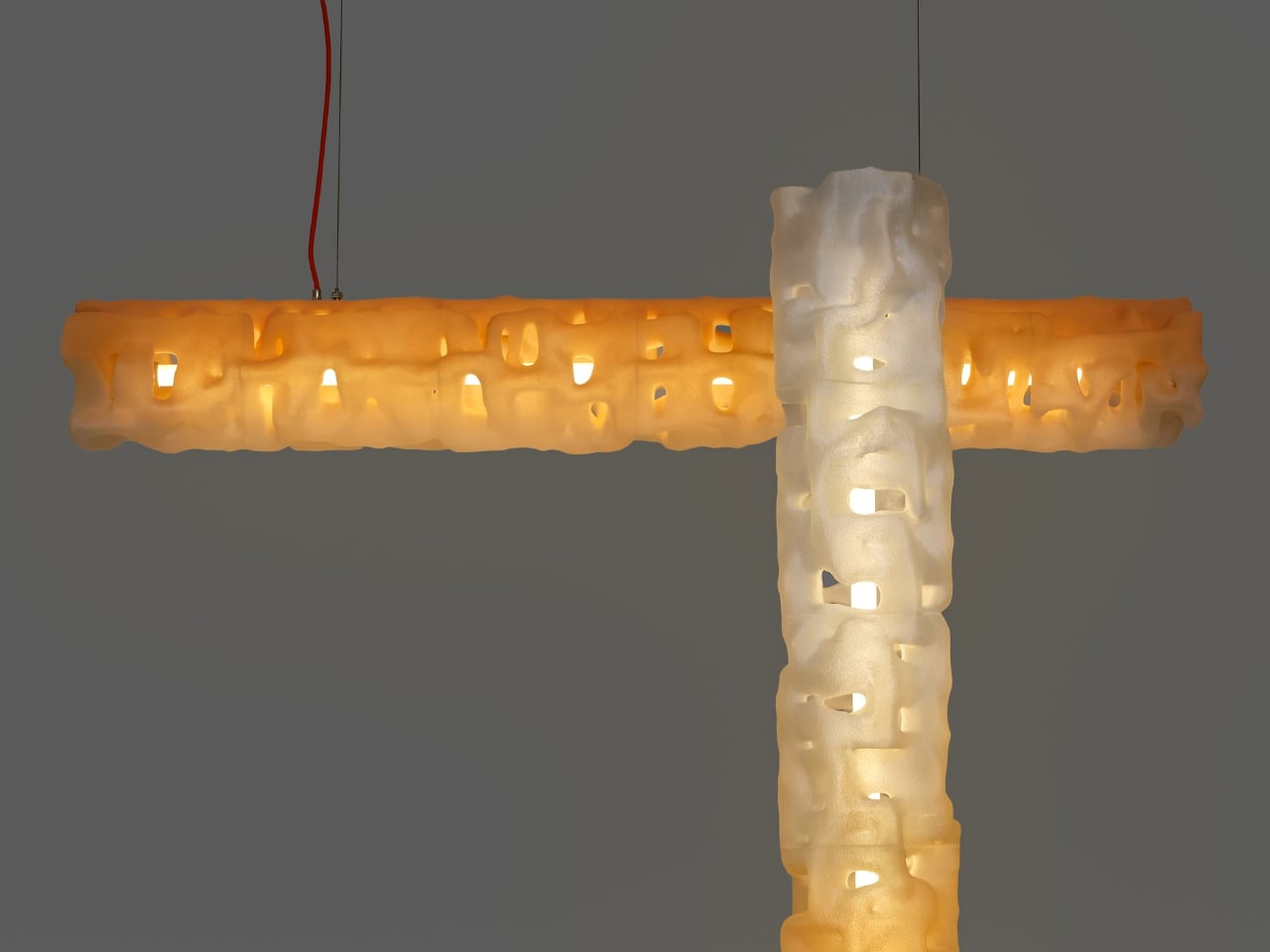
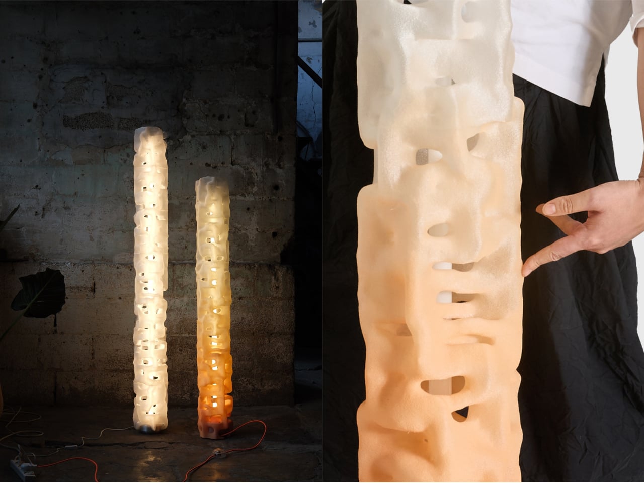
The collection includes table, floor, and pendant lamps, all sharing a unified visual language that adapts beautifully across different scales. Crafted from recyclable plastic, each lamp is made to order and can be customized in various finishes and colors. Integrated LED lighting softly illuminates the textured surfaces, producing a warm, atmospheric glow that feels both futuristic and organic.

3. Sustainable Materials Shape Modern Lighting

Sustainability has become a defining factor in contemporary product design, and 3D-printed lighting responds directly to this shift. Many designers now use biodegradable plastics, recycled polymers, and plant-based materials to produce environmentally conscious lamps. Digital fabrication also reduces material waste compared to traditional manufacturing methods.

Since objects are printed only where material is required, excess production is minimized. Designers can also manufacture locally, reducing transportation emissions and unnecessary inventory. This approach reflects a future where digital craft aligns aesthetics with responsible production practices.
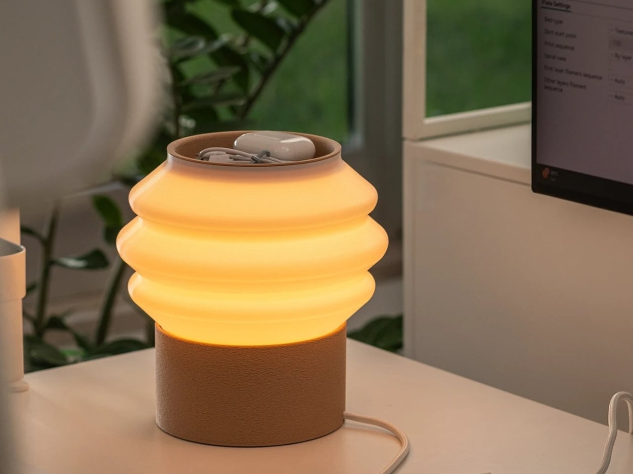
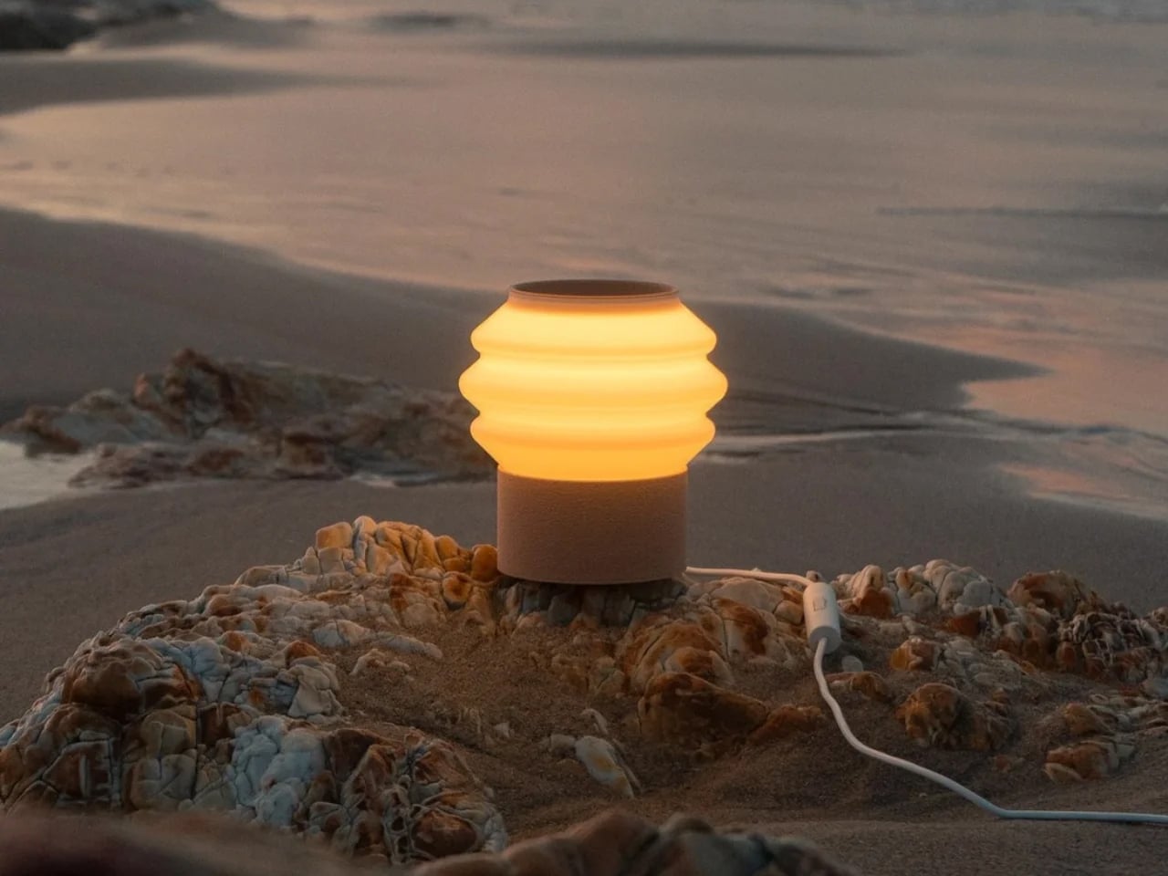
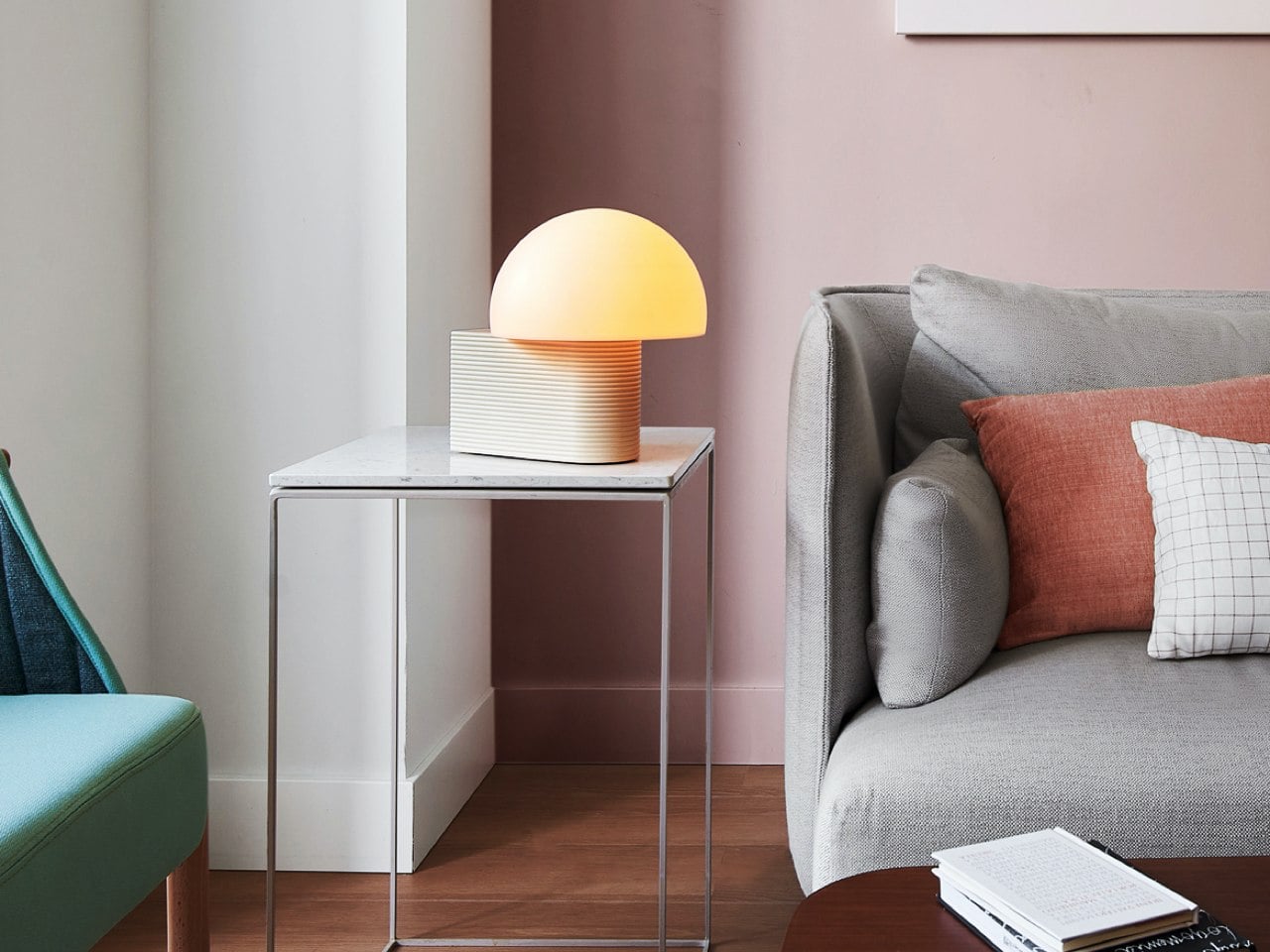
The Drop Light by Teixeira Design Studio redefines everyday desk lighting through a thoughtful blend of functionality, sustainability, and minimalist design. Created in collaboration with Oftwise Studio, the lamp is 3D printed entirely from recycled plant-based PLA and features an integrated storage tray within its sculptural base. Designed to organize essentials like charging cables, earphones, and small accessories, the lamp transforms clutter into a seamless part of the design while maintaining a clean and contemporary aesthetic suited for modern interiors and workspaces.
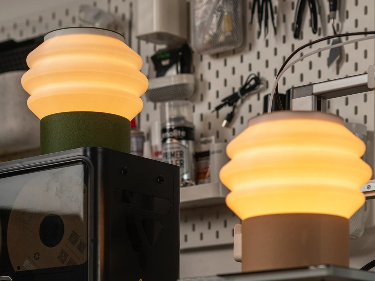
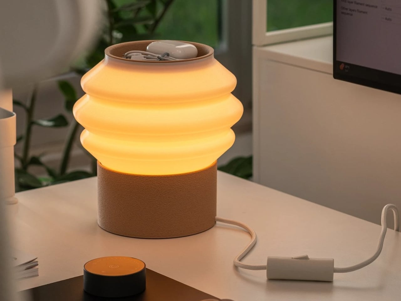
The design highlights the versatility of 3D printing through contrasting textures and finishes. Its matte, tactile base offers durability and warmth, while the smooth, semi-translucent shade softly diffuses light to create a calm, ambient glow. The layered printing details feel intentional rather than industrial, emphasizing craftsmanship and precision. Combining sustainable materials with intelligent functionality, the Drop Light stands as a refined example of modern lighting design where utility, environmental consciousness, and understated elegance exist in perfect balance.

4. Customization Redefines Personal Spaces

3D printing allows lighting design to move beyond mass production toward personalization. Lamps can now be customized in size, texture, color, and form according to the needs of individual users or specific interiors. This flexibility creates stronger emotional connections between objects and spaces.

For homeowners and designers, customization means lighting can adapt to modern lifestyles. Organic forms inspired by nature, futuristic geometric structures, or minimal sculptural silhouettes can all be produced with ease. The result is lighting that feels unique rather than standardized.
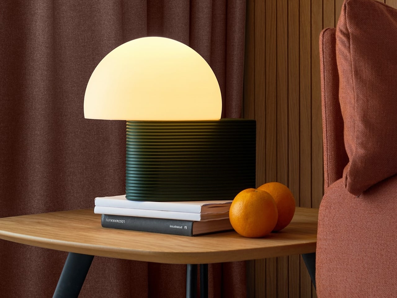
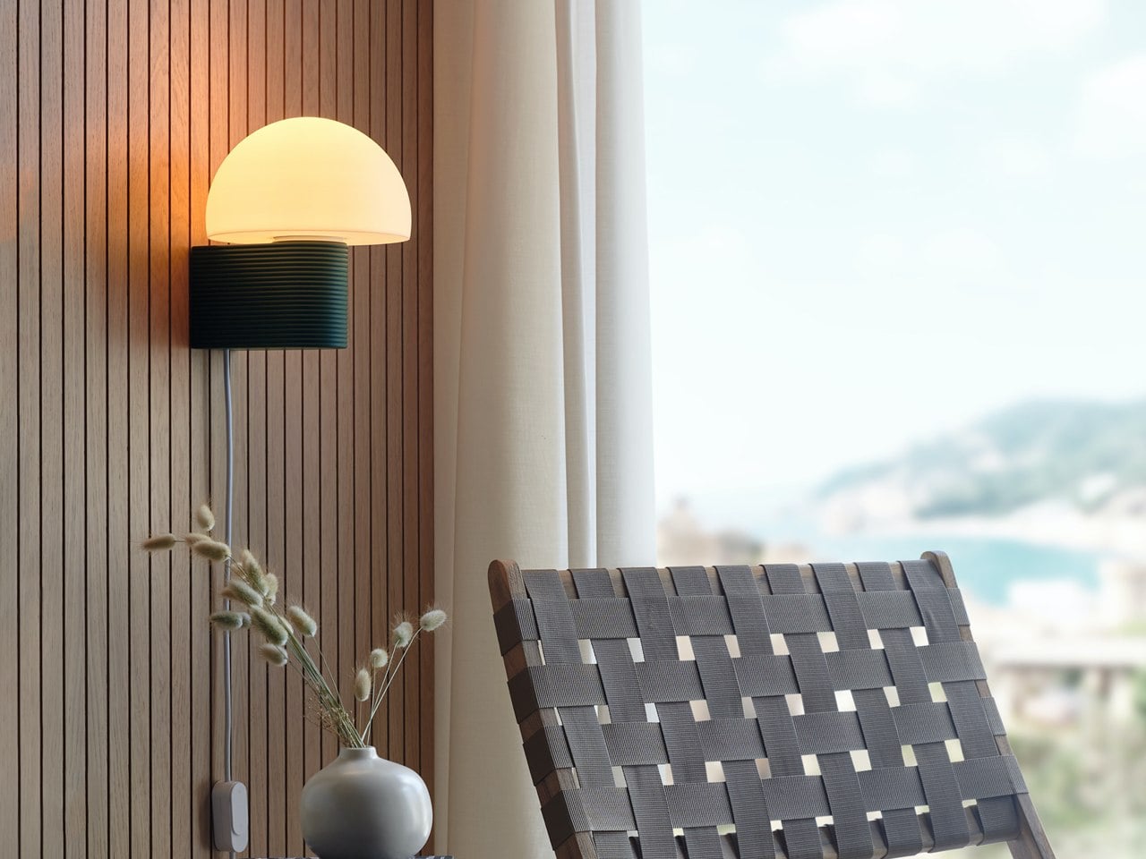
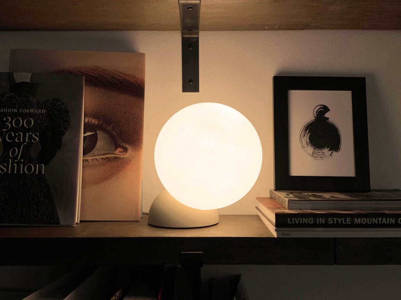
The lighting collection from Gantri focuses on sustainable, design-led lamps made using plant-based, sugar-derived PLA materials. Each product is 3D printed to achieve precise forms, soft textures, and environmentally responsible construction. The designs combine modern aesthetics with functional lighting solutions suited for compact and contemporary interiors. The material choice ensures durability while maintaining a low environmental impact, making the lamps both practical and sustainable for everyday use.
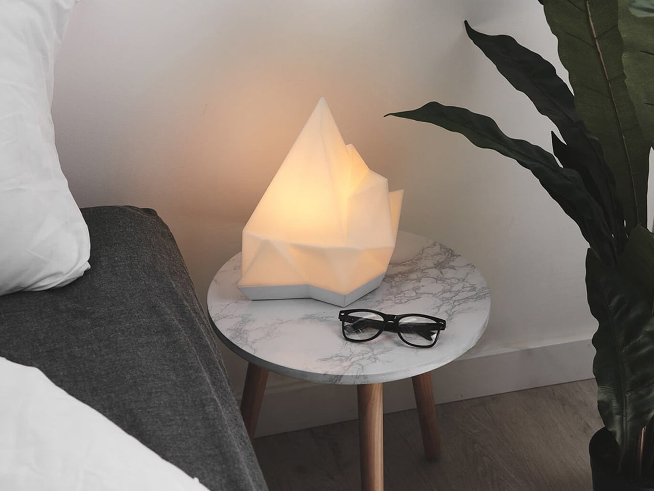
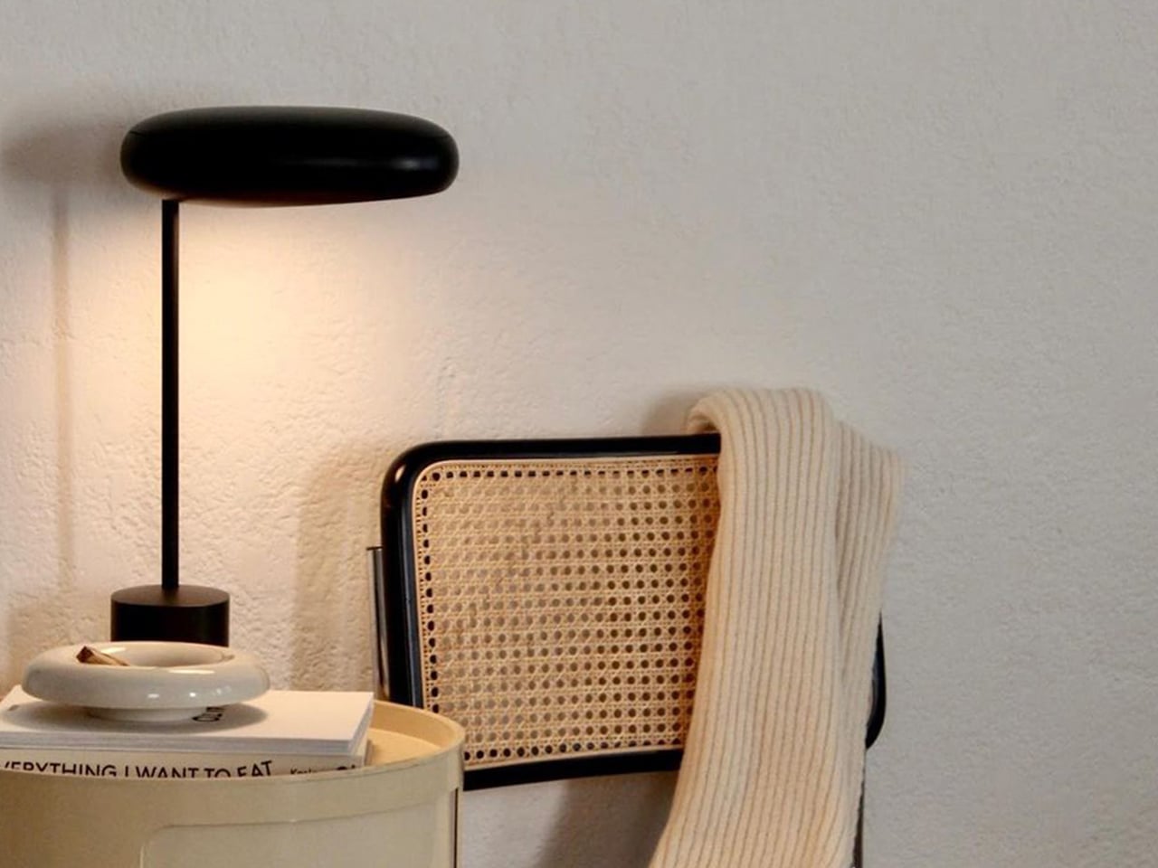
The collection includes table, desk, and ambient lighting designed to enhance workspace and home environments. Products like sculptural desk lamps, multi-functional tray lights, and ambient mood lighting solutions offer features such as diffused illumination, space-saving bases, and integrated utility functions. Many designs emphasize minimal silhouettes, warm LED lighting, and ergonomic light distribution to reduce eye strain. Across the range, the focus remains on combining functionality, clean design, and eco-conscious production through advanced 3D printing technology, resulting in versatile lighting objects that suit modern living spaces.

5. The Fusion of Art, Technology, and Atmosphere

3D-printed lamps exist at the intersection of digital innovation and artistic craft. Designers are no longer limited by traditional tools or manufacturing constraints. Instead, they can experiment freely with fluid geometries, intricate lattices, and biomorphic forms that transform illumination into art.

As these lamps glow, they create immersive environments where technology feels human-centered rather than mechanical. Ambient lighting becomes an emotional experience shaped by texture, transparency, and shadow. This fusion of craft and computation reflects the future of contemporary design culture.
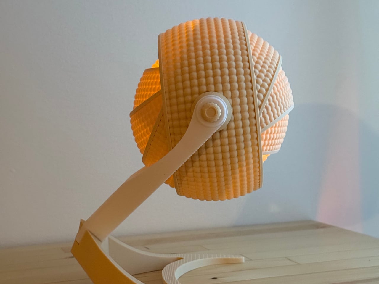
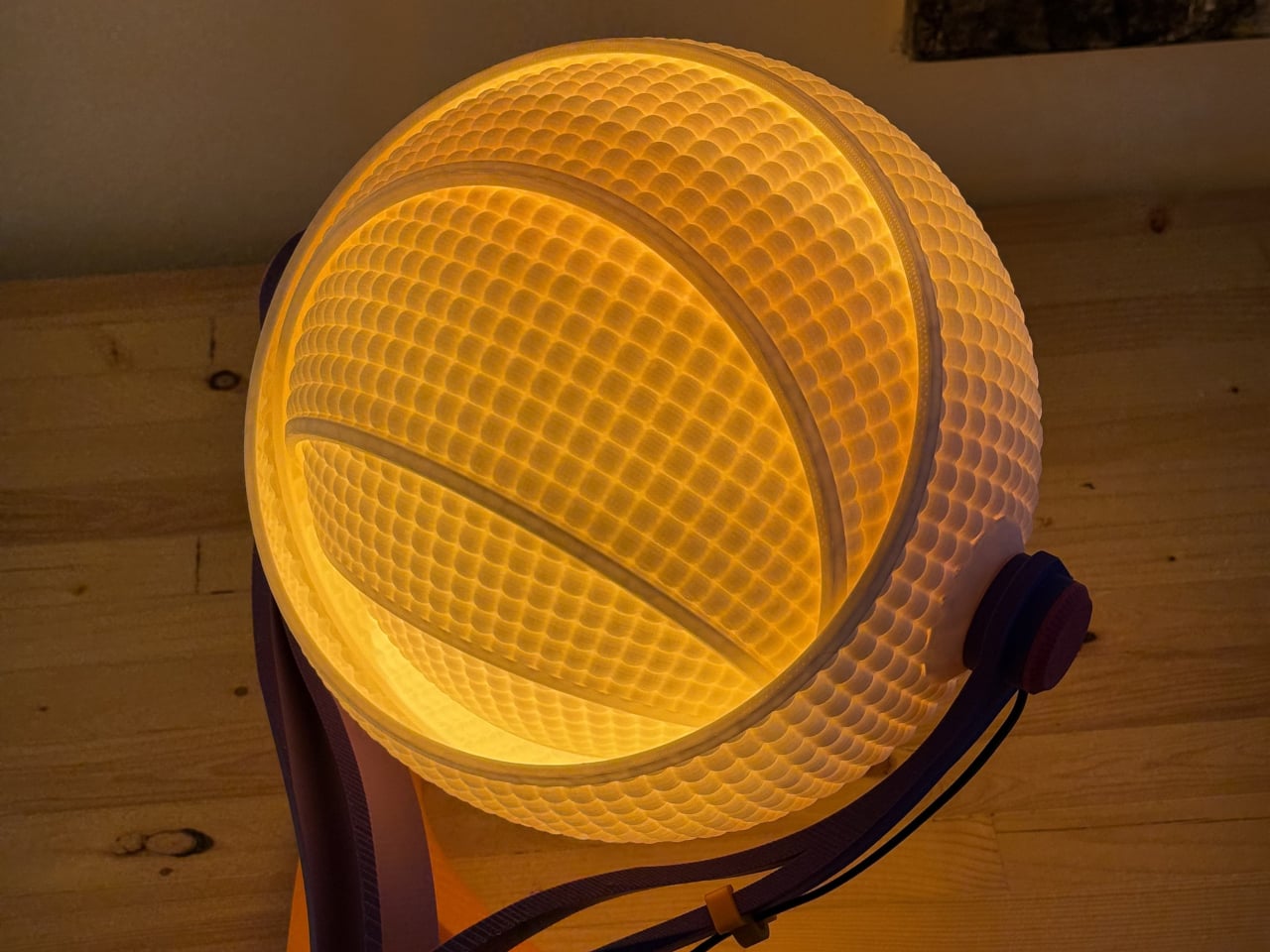
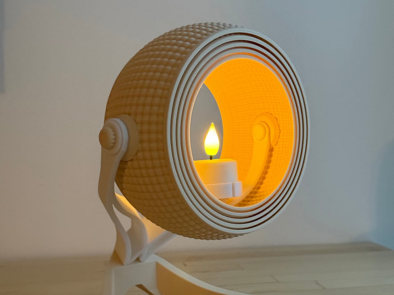
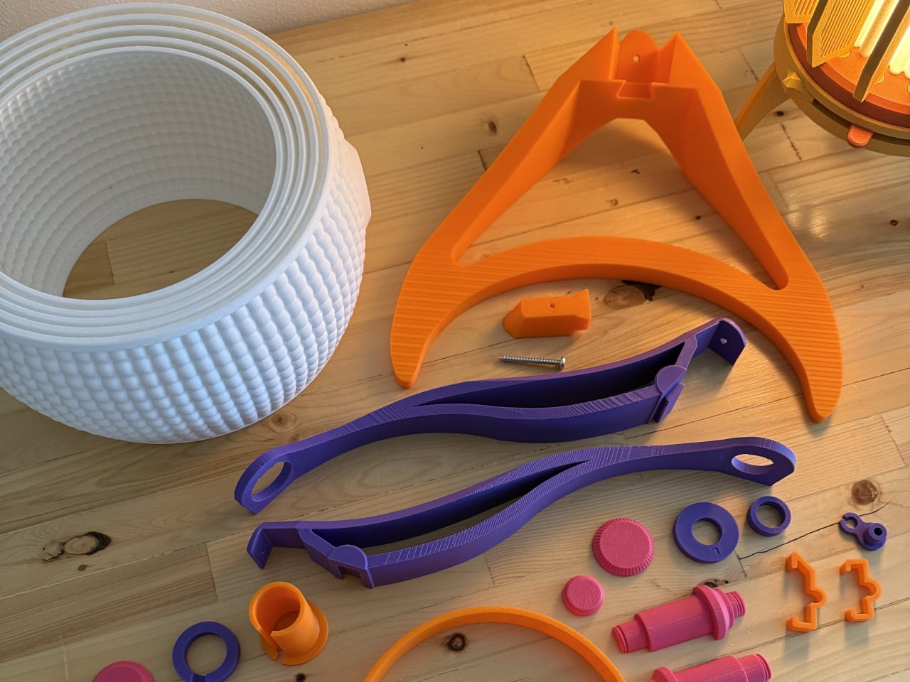
The Armadillo series by OHR Design explores how 3D printing can move beyond novelty objects into functional lighting systems. Inspired by the layered armor of the armadillo, the design transforms a simple shade into a kinetic, adjustable structure made of concentric printed rings. Originally developed from the OHRB tea light holder, the Armadillo introduces a flexible lighting concept where form directly controls illumination. The compact version stands at 240 mm and works as a bedside or accent light, while maintaining a sculptural presence even when unlit.
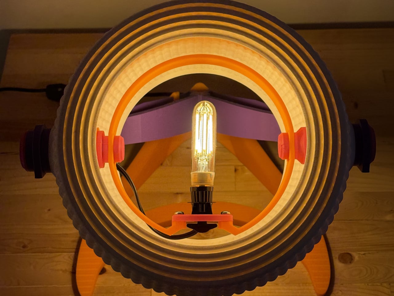
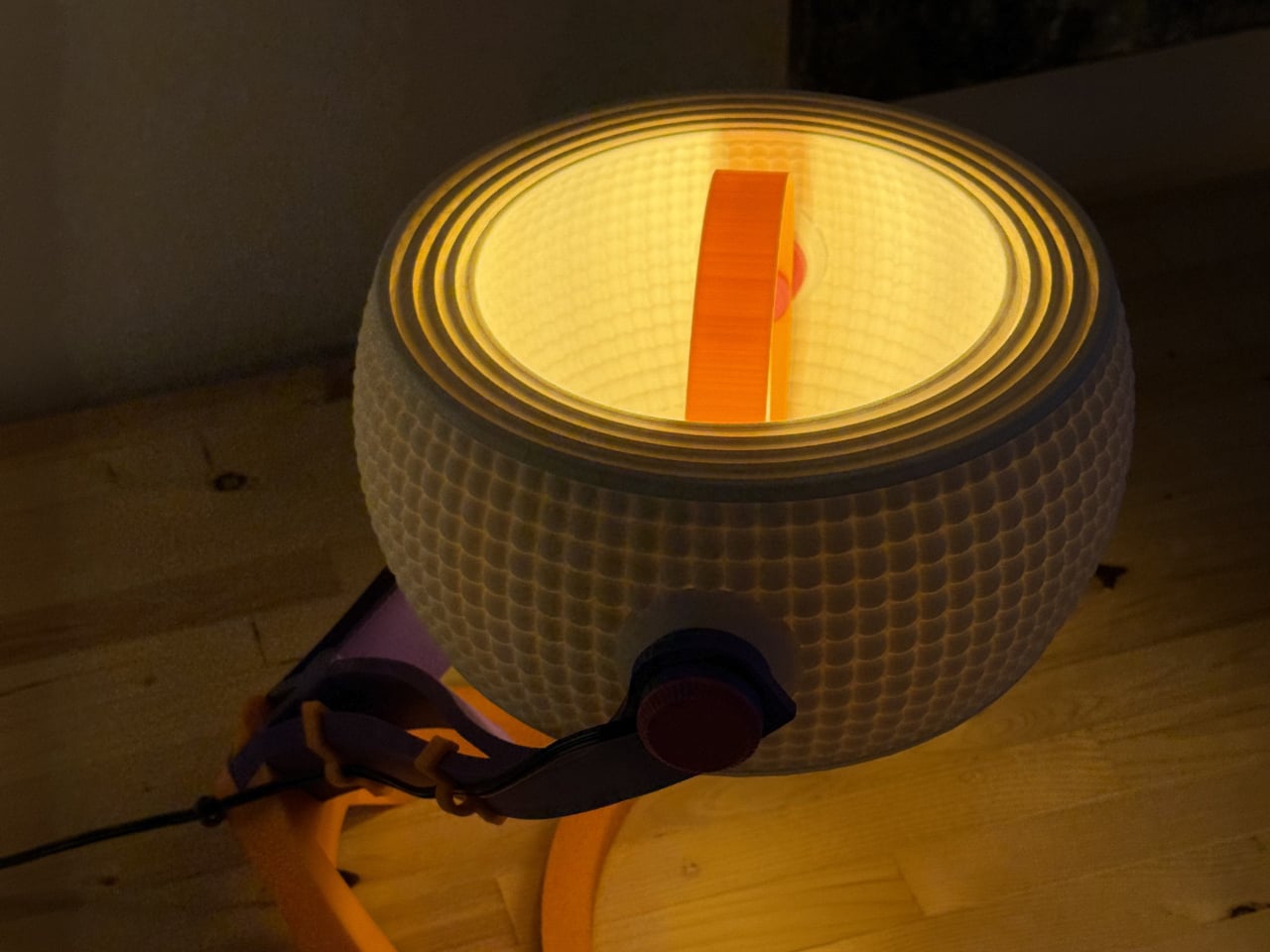
The Armadillo XL expands the concept into a full-scale desk lamp at 373.8 mm tall, designed for standard light bulbs and stronger everyday use. Its adjustable ring system allows users to open or close the shade, shifting light from a soft ambient glow to a focused beam depending on the need. Instead of being a fixed object, the lamp becomes interactive, letting the user physically shape lighting conditions.
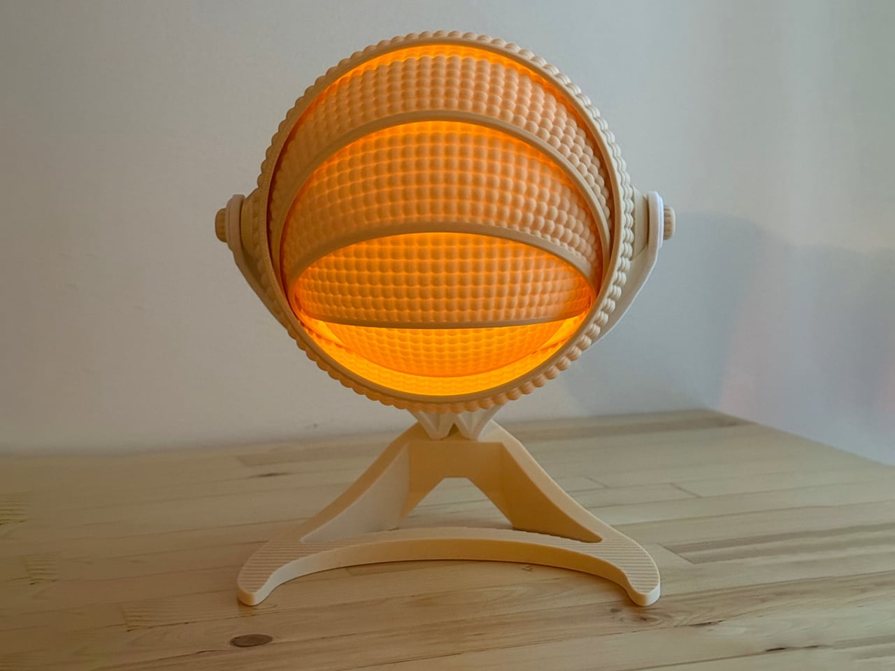
These 3D-printed lamps transform digital craft into atmospheric experiences, blending technology, sustainability, and artistry. Through innovative fabrication and customizable forms, ambient lighting evolves into a sculptural expression that reshapes modern interior design.

The post These Five 3D-Printed Lamps Shape Light With Mazes and Moving Rings first appeared on Yanko Design.

  •  

This glowing modular moss panel system might be the coolest way to fix a boring room

Moss has been on this planet for around 450 million years, which means it predates dinosaurs, continents as we know them, and the concept of a watering schedule. The plant’s actual trick is that it has no roots and absorbs everything it needs directly through its surface, which makes it one of the most low-maintenance living things you could put in a room. Interior designers figured this out around 2015 and started installing living moss walls everywhere from hotel lobbies to coworking spaces, at which point the rest of us learned that professional moss wall installation costs roughly what a decent used car costs. A consumer-friendly version of that idea has been weirdly slow to materialize. MOSSLAB designed Moss Hexa around that natural biology, using a soil-free system that reduces day-to-day care while preserving the texture and presence of real moss.

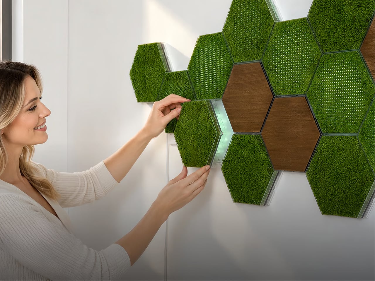
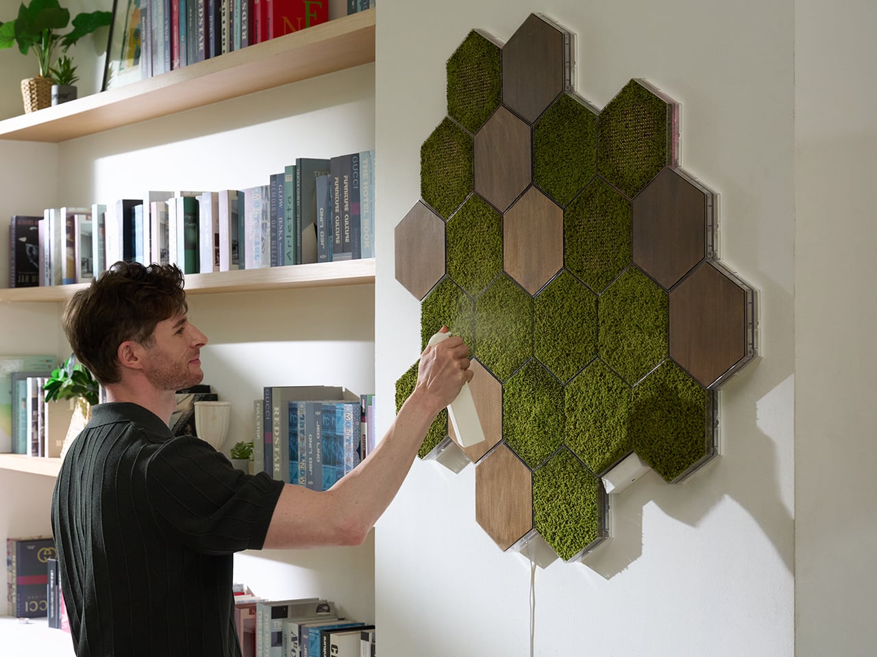
Moss Hexa is a modular moss system using 100% real moss panels in a hexagonal format, mounting via a proprietary magnetic system called HexaLock that lets you click panels into place, rearrange them, or swap them out without tools. Three panel types handle the main use cases: Basic for pure moss texture and color, Light for integrated LED ambient lighting with an auto-dimming sensor and app control, and Wood for warmth and visual rhythm as an accent. MOSSLAB, the South Korea-based studio behind the award-winning Moss Air and Moss Echo, built all three modules to share the same mounting hardware, making the whole system genuinely expandable over time without disturbing anything already on the wall. Pricing runs from a discounted $59 for the 3-panel Basic Starter Pack, with larger configurations available at campaign-exclusive pricing.

Designer: MOSSLAB

Click Here to Buy Now: $59 $90 ($31 off). Hurry, only a few left!

Hexagonal patterns appear throughout nature because they connect efficiently, repeat beautifully, and expand with minimal wasted space, from honeycomb structures to cellular geometry in biological tissue. MOSSLAB’s choice of the hexagon as Moss Hexa’s base unit is a structural decision that determines how the system scales and how freely it grows, and it pays off. Each panel measures 8.27 × 7.09 × 1.42 inches (210 × 180 × 36 mm), and because hexagons share flat, parallel edges on all sides, tiles can cluster in multiple directions without gaps or forced symmetry. The system offers preset configurations of 3, 9, and 15 panels, but the geometry means there’s nothing stopping you from building something in between. It holds up when you pull everything down six months later and try a completely different arrangement from scratch, which is the whole point.

The Basic panel features 100% real moss that is naturally drought-tolerant, requires no direct sunlight, and needs only occasional light misting to stay at its best. Its frame is made from PC and steel, with magnetic components, and the whole panel weighs just 0.75 lb (338 g). The moss retains its color and three-dimensional texture between mistings, helping preserve the natural depth and organic character that distinguish real moss from artificial alternatives. The Wood panel uses the same HexaLock mounting footprint but replaces moss with a warm wood-finish surface, designed as a compositional accent rather than a primary surface. A mostly-moss arrangement with a few Wood panels breaking the pattern is the right call; the contrast reads as intentional interior design rather than a texture experiment that got away from you.
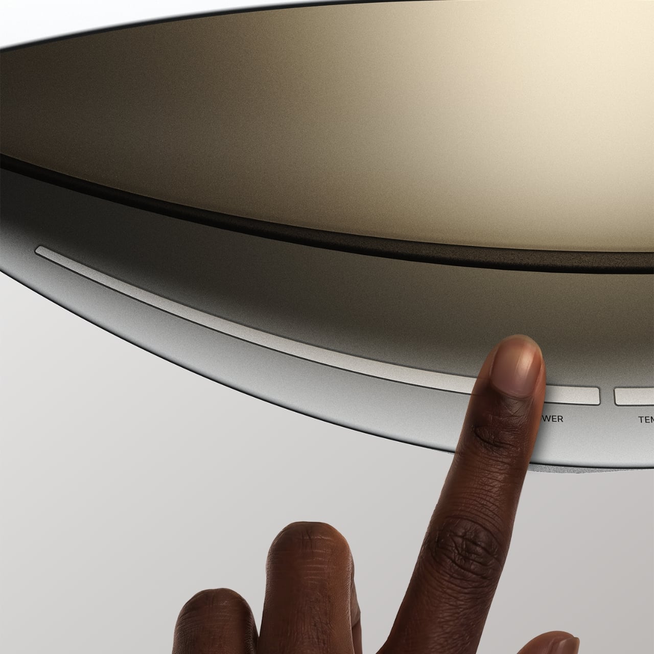
Each Light panel combines 100% real moss with built-in ambient lighting designed to bring out the moss’s natural depth, color, and texture while changing the atmosphere of the surrounding space. Brightness can be adjusted from 1–100%, with a maximum power draw of 7W per panel, while a built-in ambient light sensor automatically adapts the lighting as the environment changes. Light panels connect directly to one another through USB-C-to-USB-C connections, and one Control Hub & Power Adapter can support up to nine Light Panels. The Hexa App provides manual lighting control, lighting presets, and Natural Daily Rhythm scheduling, giving users more flexibility to shape the atmosphere throughout the day.

Sound absorption performance was independently measured by KCL, a KOLAS-accredited laboratory recognized under the international ILAC-MRA framework, using a Moss Echo installation made with the same real moss material used across MOSSLAB’s Moss product line. Covering nearly 11 m² with approximately 300 moss panels, the installation was tested in a large-scale interior setting. The test recorded sound absorption of 27% at common speech frequencies, increasing to 56% at frequencies associated with keyboard typing and up to 65% at higher frequencies associated with background chatter. Those results add a functional layer to real moss beyond its visual and tactile presence. Because the test was conducted using the same real moss material found in Moss Hexa, the takeaway is not that Hexa replaces dedicated acoustic treatment, but that the material itself brings measurable sound-absorbing properties into a system designed to change how a space feels.

Powered by the HexaLock™ magnetic mounting system, each panel snaps into place with a single click, no complicated measuring, no specialist tools, no installation experience needed. You attach the mounting guide to your chosen surface, and both screws and adhesive mounting options are included. The guide handles alignment automatically, so panels sit consistently without leveling. The key design call is that Basic, Light, and Wood panels all share the same HexaLock™ footprint, meaning you can swap any panel type for any other at any point without touching the wall hardware. You can start with 3 Basic panels, add Light panels as a seasonal upgrade, and work toward a 15-panel Signature Styling set across multiple additions, all from the same original wall installation. The dual mounting option, screws for homeowners and adhesive for renters, is a small detail MOSSLAB got right, and the kind of thing you only think to include if you’ve genuinely considered your customer’s actual living situation.

Moss Air earned a CES Innovation Award, an iF Design Award, and an IDEA Design Award, and MOSSLAB has also participated in an open innovation program with a major Korean conglomerate, and in 2025 was the only international startup chosen among five for Panasonic’s Electric Works accelerator program. These are production-level credentials, not concept-stage accolades, and they matter when evaluating a new product that ships internationally. The Basic Starter Pack (3 panels) will be available for $59 during the first 72 hours of the Kickstarter campaign launch, the Light Starter Pack (3 panels) at $99, and the 9-panel Basic and Light Standard Packs starting at $159 and $229, respectively. The 15-panel Signature Styling Pack, which combines Basic, Light, and Wood panels, starts at $339 during the same launch period. Individual add-ons are available at $25 for a Basic Panel, $40 for a Light Panel, and $24 for a Wood Panel, while an additional Control Hub & Power Adapter Set is $23. Estimated U.S. shipping starts at $25 for a 3-panel configuration, with fulfillment estimated to begin in June 2027.

Click Here to Buy Now: $59 $90 ($31 off). Hurry, only a few left!

The post This glowing modular moss panel system might be the coolest way to fix a boring room first appeared on Yanko Design.

  •  

No Switches Needed. Just Press, Pull, or Bop These Silicone Lamps: Behind The Design with YD

Here is a fun little contradiction to chew on before we get into the actual lamps. The whole point of Call It a Day, Tongqi Design’s new lighting collection, is that you barely have to try. You bop it, you tug it, you flop your hand near it, and it turns on. Zero precision required, zero thinking involved, which is exactly the pitch when you have just walked through the door after a day that emptied you out. But get this. The less effort the lamp asks of you, the more effort someone else clearly put into making that possible. That is the trade we are here to unpack.

Shanghai-based designer Tongqi Lu built the collection, a table lamp, floor lamp, and pendant, around soft silicone shades with zero switches anywhere on them. Every gesture works because the material itself is doing the sensing, not a button hunting for your finger. It sounds simple sitting in your living room. It is not simple to make, and that gap between the two is basically our whole story today.

Designer: Tongqi Lu

Click Here to Know More

The Design

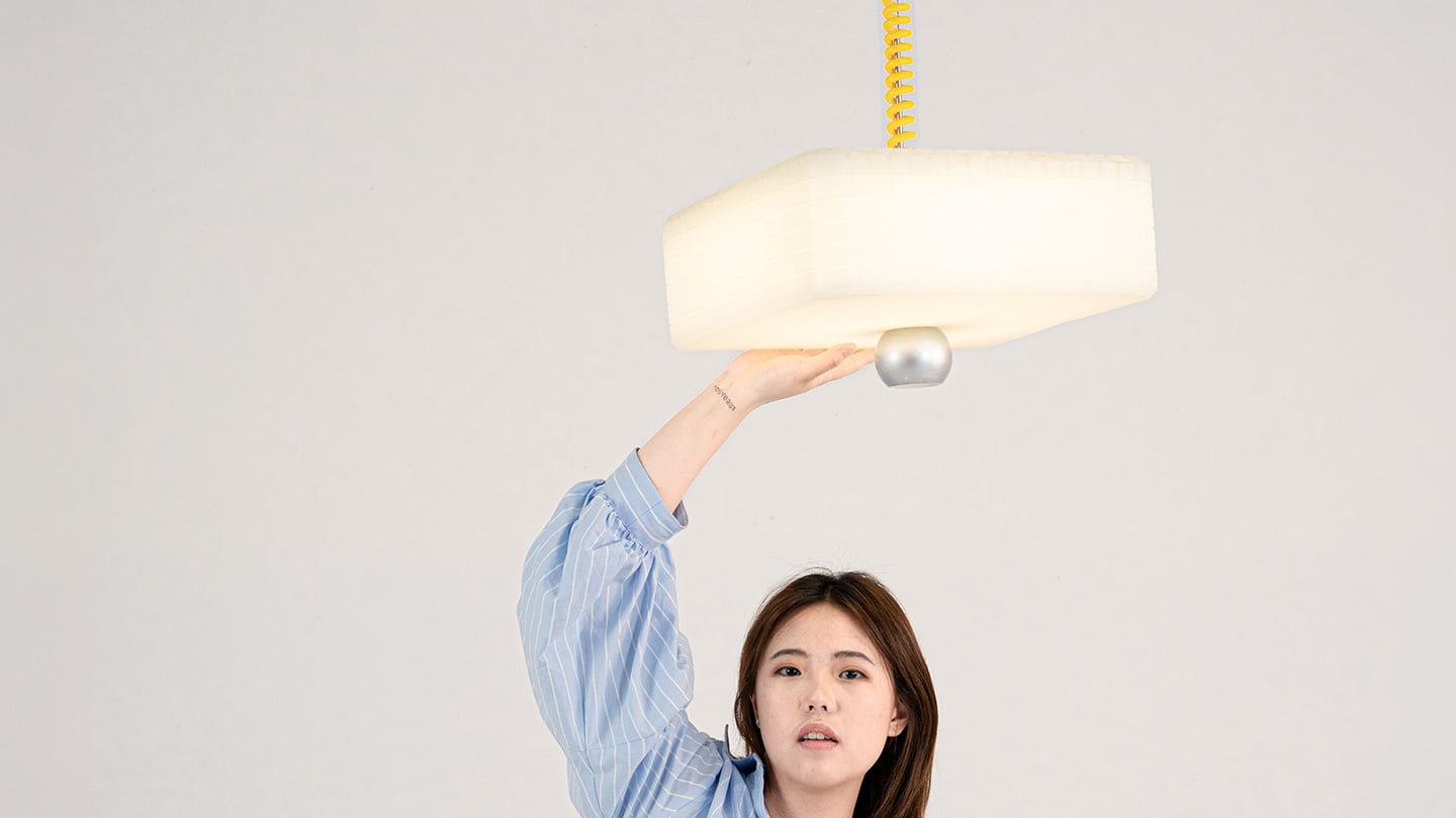
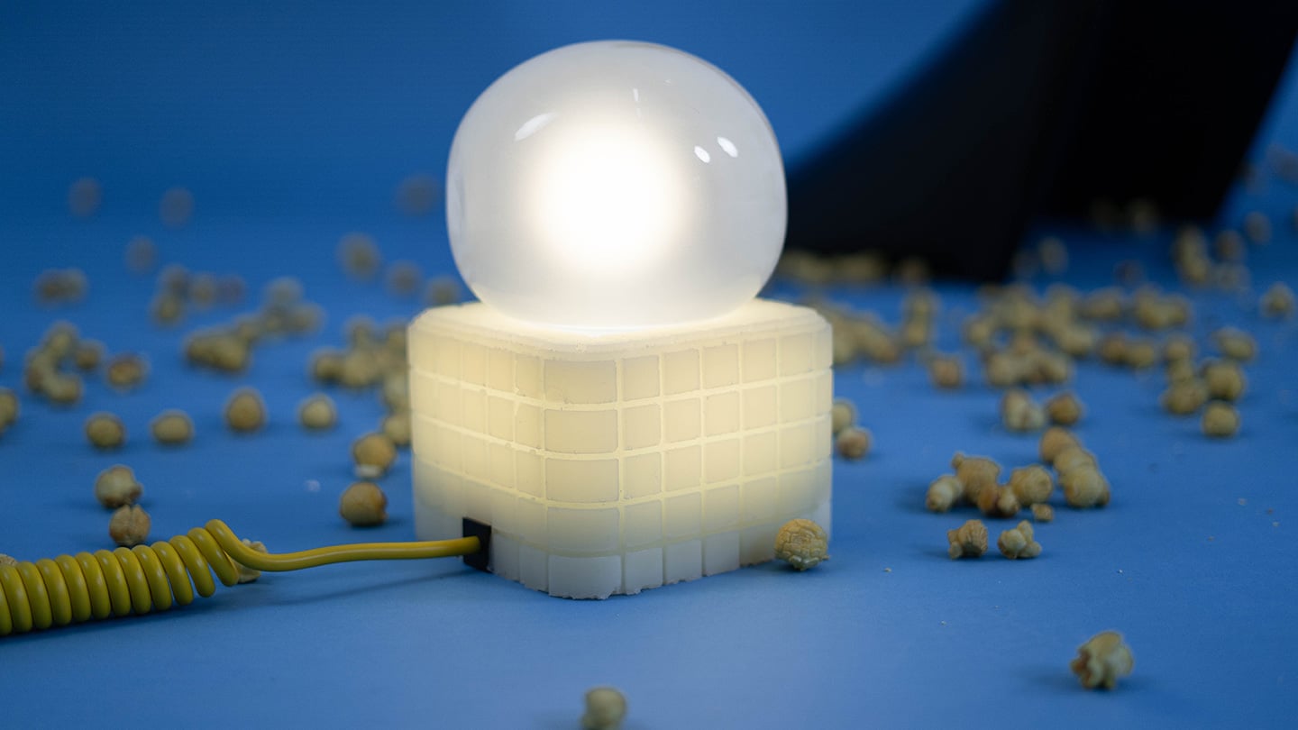
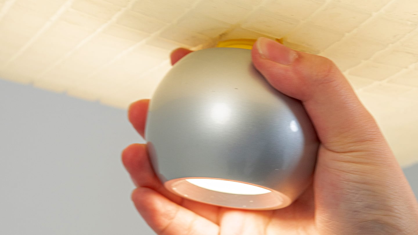
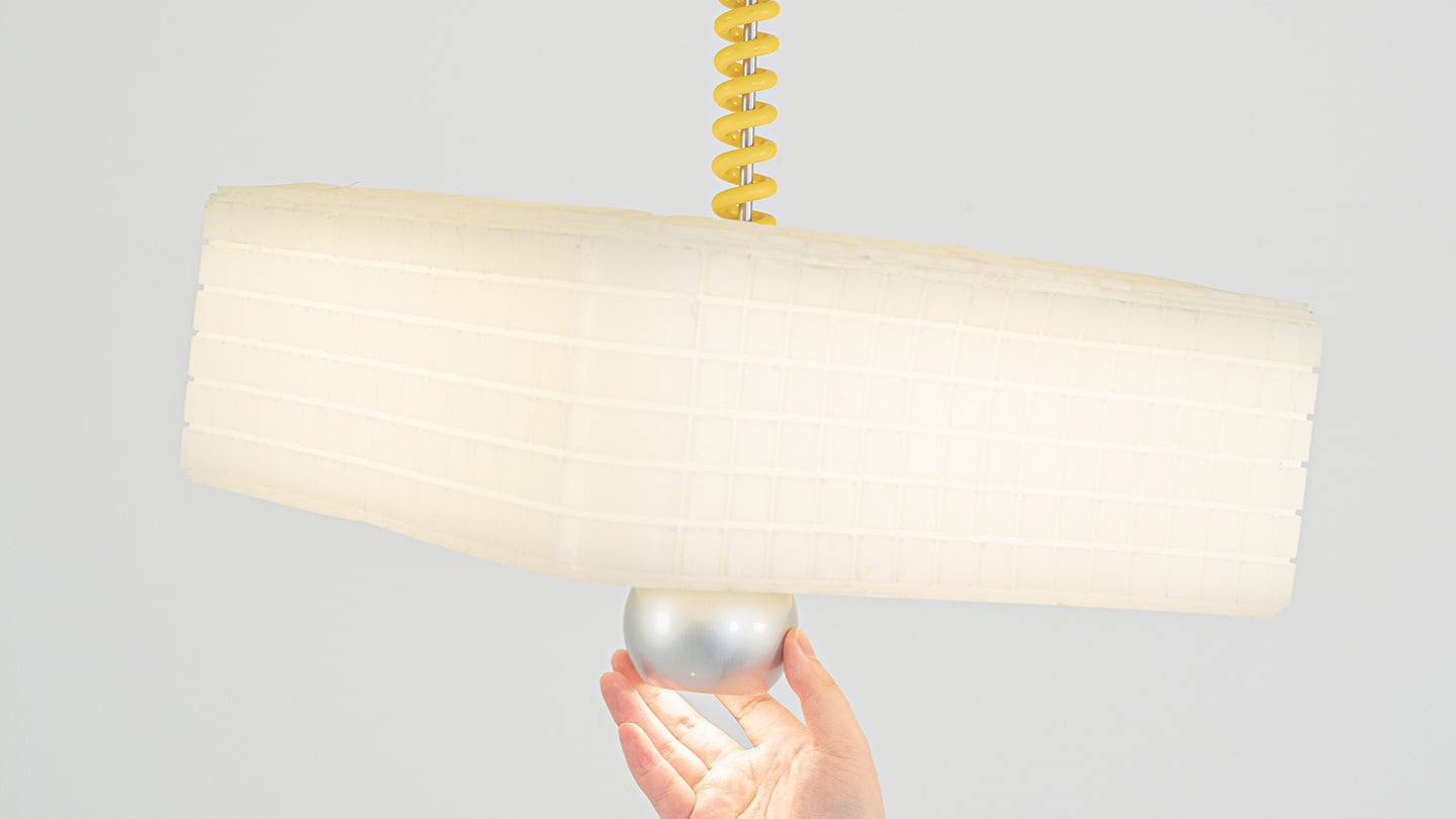
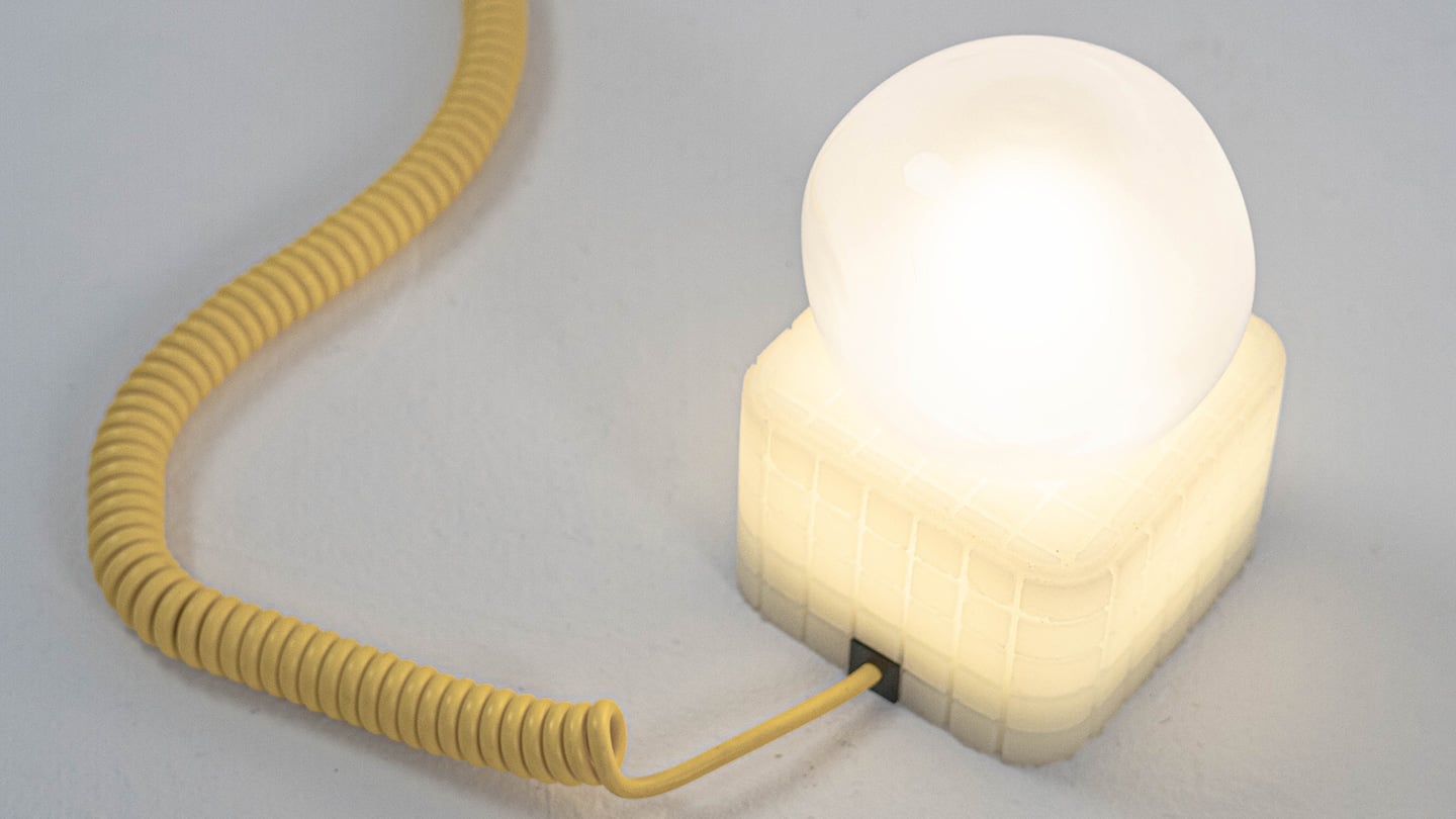
Call It a Day is a three piece lighting collection, a table lamp, a floor lamp, and a pendant, and every one of them is dressed in soft, translucent silicone instead of glass or fabric. That alone is a break from convention, since silicone shades are usually reserved for LED strip diffusers rather than the whole visible body of a lamp. But the real departure is that none of these lamps have a switch. You bop the table lamp, you tug the pendant by its cord, you press the floor lamp wherever feels natural, and the light responds. There is no correct spot to find in the dark. The entire shade is the input, which sounds like a small shift until you realize how much of lamp design has always been built around finding one tiny precise point.

Lu frames the whole thing around the moment you get home and your body checks out before your brain does. She has talked about dropping onto the sofa and reaching out to press, pull, or tap without really thinking about it, and the light turning on not because she followed a rule but because she did not. That is a genuinely sharp way to think about interaction design. Most lighting asks you to be at your most coordinated right when you are at your least. Call It a Day flips that expectation, and the coiled yellow cable running through the collection is a nice touch too, borrowing the old pull chain gesture without being precious about it.

The Process

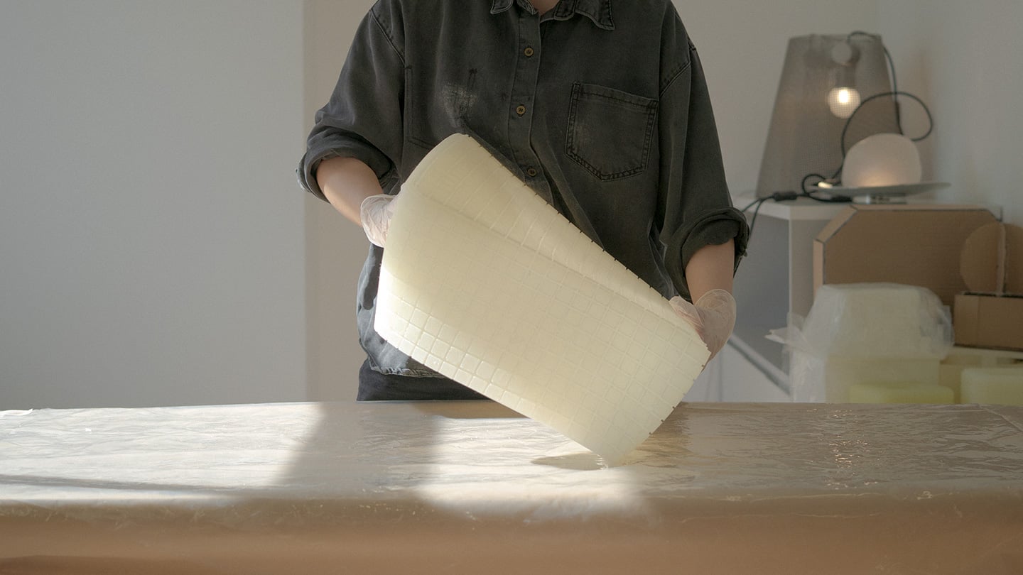
Here is where things get interesting, because the studio itself is not some slick production facility. It is an office in Shanghai with a plastic sheeted folding table, jerrycans of liquid silicone lined up against the wall, and a window looking out over the skyline. Before any of it was cast, the whole collection existed as full scale cardboard mockups, a pendant hung from a coiled cord and a table lamp balanced on a paper cone, sitting in the corner of the room like a rough draft nobody threw away. That is a genuinely useful thing to see, because it shows the gesture and the proportions were locked in long before the material was.

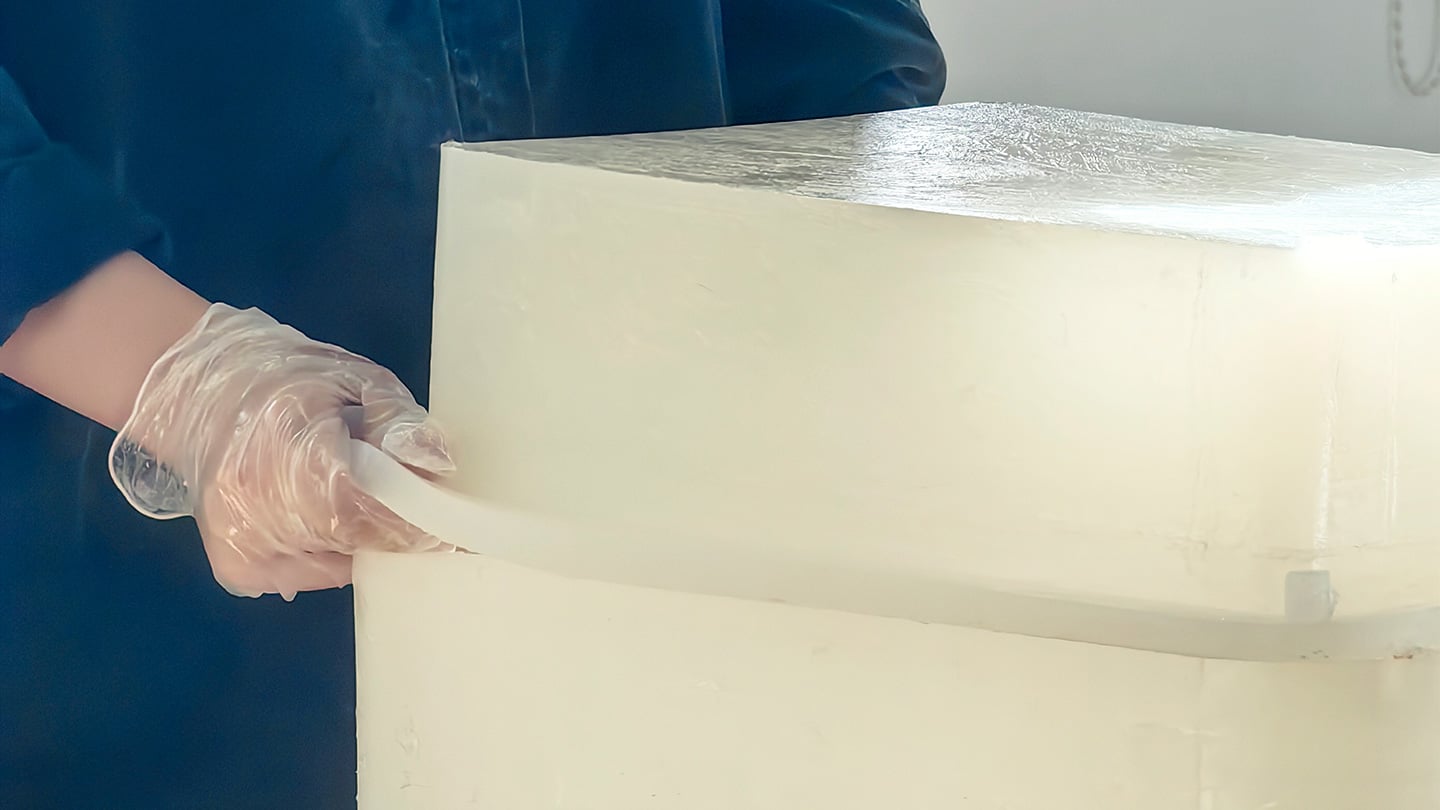
The shades themselves come out of large block molds with a fine grid texture cut into the cavity, which shows up on the finished silicone as a soft woven pattern once the lamp is lit. Getting silicone out of a mold cleanly is trickier than it sounds, since silicone tends to bond to itself, so getting a cast shade out of a cast mold without either tearing or fusing takes real care with release agents and material choice. Pouring it clean adds another layer of difficulty, since bubbles trapped in a translucent material show up as visible flaws once the light hits them. In the photos, you can see two people pouring together, one holding the bucket steady, the other running a palette knife across the lip so the silicone comes down in a thin ribbon instead of glugging out in one shot, which is a simple trick for keeping air out of the pour. It is not a factory process. It is a hand process, done carefully, on a folding table, gallon by gallon.

The Perspective

What I like most about Call It a Day is that the ease on the user’s end is clearly paid for somewhere upstream, and that upstream cost is visible if you know where to look. A switchless lamp sounds like a simple idea until you have to actually engineer a material that can be grabbed, twisted, and mistreated without breaking or losing its shape, and then cast that material cleanly at scale in a small studio. That gap between the lived experience and the labor behind it is exactly what a lot of good product design tries to hide, and here it is sitting right out in the open in the process photos.

It also helps that the whole thing traces back to something real. Lu’s early work, the lemon shaped Citron lamp, her furniture line built around trees and water lilies, all of it circles the same idea of pulling people back into their bodies after a long day in a city that does not really let them slow down. Call It a Day feels like the most literal version of that idea yet, a lamp built entirely around the ninety seconds when you have officially given up on being careful. Whether or not the gesture control holds up over years of actual use is a question only time and daily wear will answer, but as a piece of intent, this one lands.

Click Here to Know More

The post No Switches Needed. Just Press, Pull, or Bop These Silicone Lamps: Behind The Design with YD first appeared on Yanko Design.

  •  

Finally, One Tower Replaces Your Speaker, Lamp, and Wine Fridge

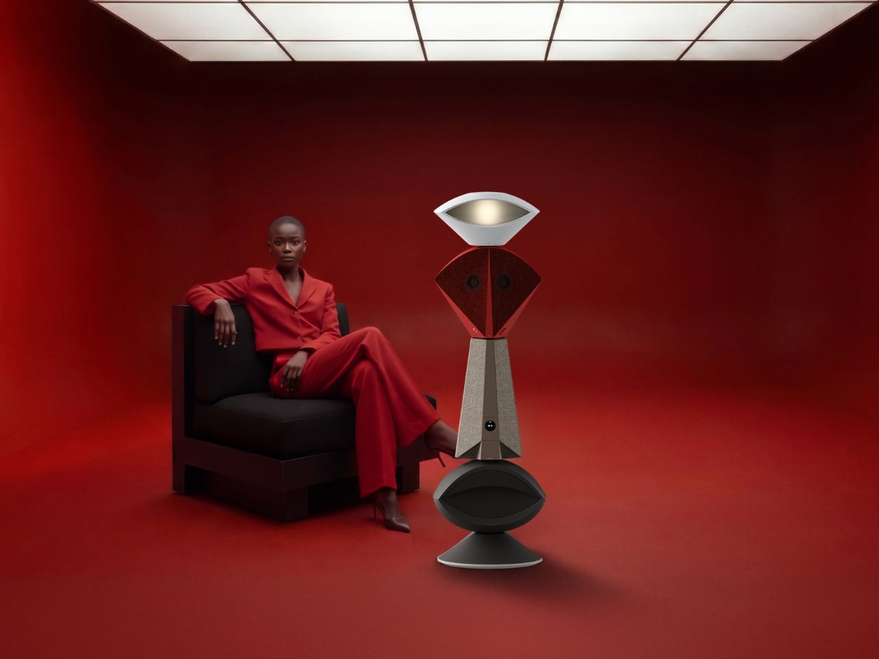
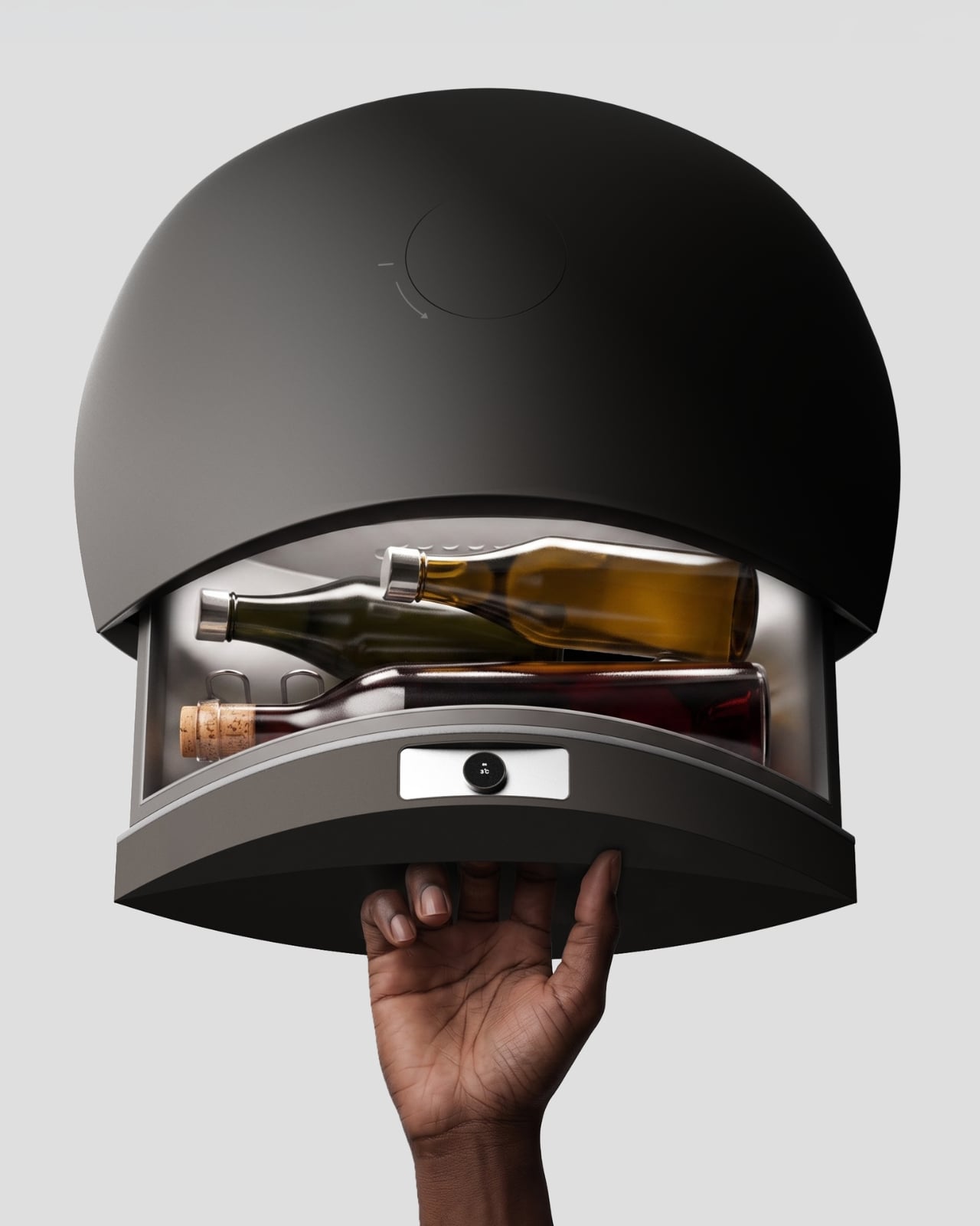
Anyone who has tried to furnish a studio apartment knows the specific defeat of running out of surfaces before you run out of gadgets. The speaker needs an outlet and a shelf. The lamp needs its own corner. The mini fridge for wine wants counter space that doesn’t exist. Each object is fine on its own, but stacked together on a single console table, they start to look like a garage sale that lost an argument with a design magazine. That is the exact problem South Korean designer Jung Hyun Kim set out to solve with Babel, a concept he built for people who live in small rooms but refuse to shrink their idea of what home should feel like.

Kim designed Babel for a very specific and very real slice of the population, twenty somethings through mid thirties starting their independent lives in modest apartments, often around 500 to 550 square feet, the kind of footprint that is common from Seoul to Brooklyn to any first apartment in a city with real rent. His answer wasn’t to make each device smaller. It was to stop thinking about furniture and electronics as separate categories entirely, and instead build a single vertical column where every function gets its own segment, stacked like a totem instead of scattered like clutter.

Designer: Jung Hyun Kim

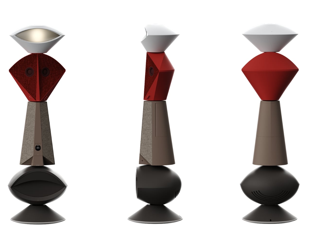
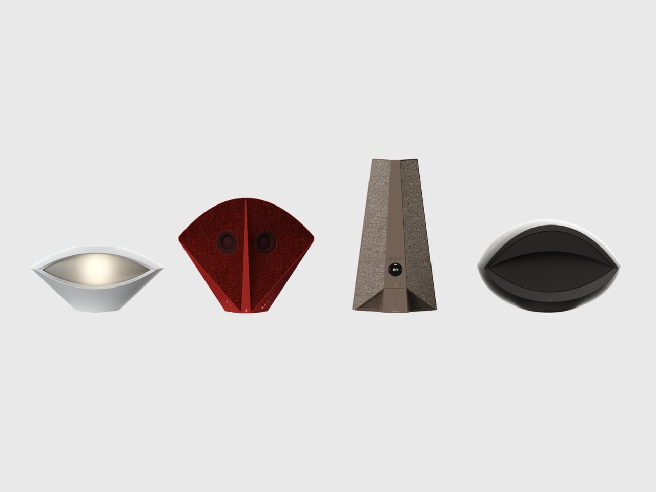
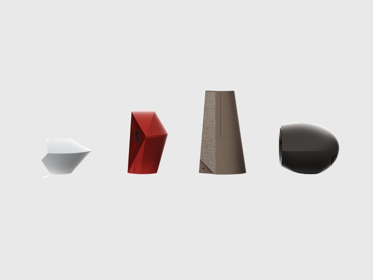
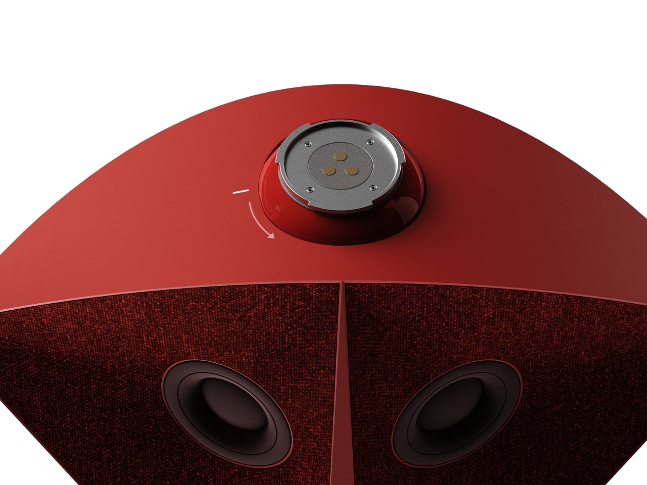
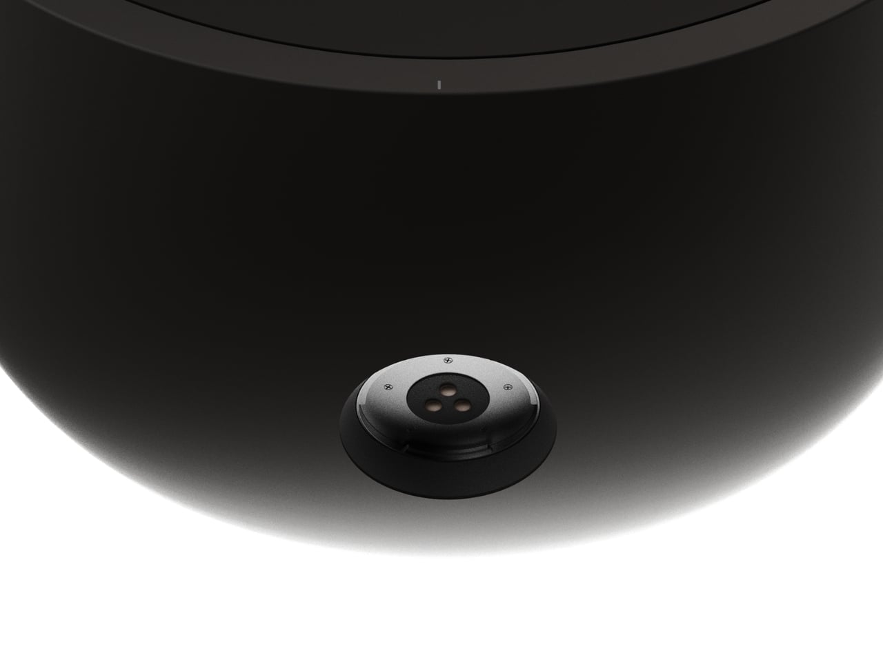
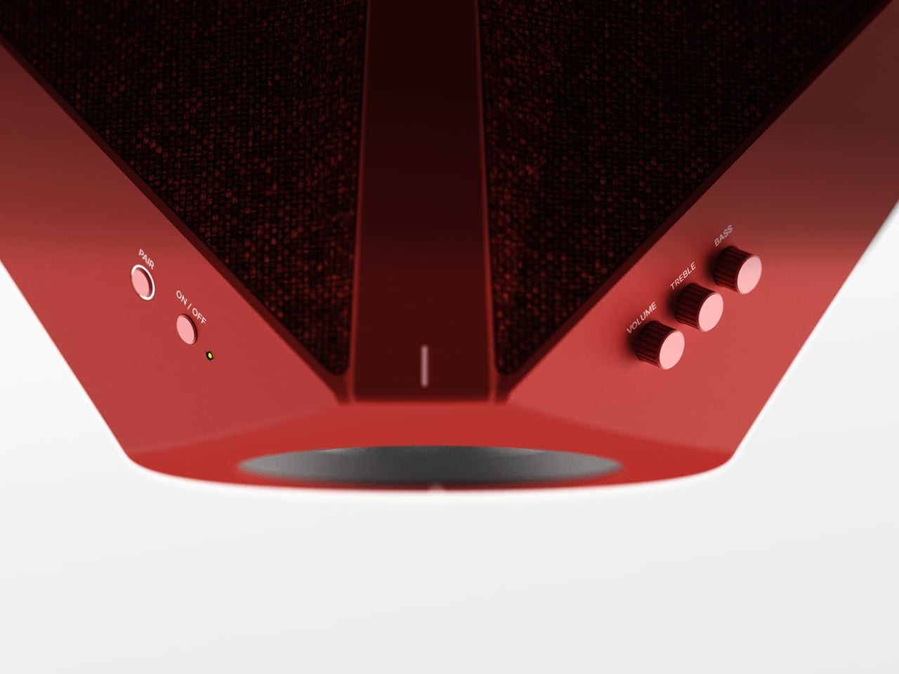
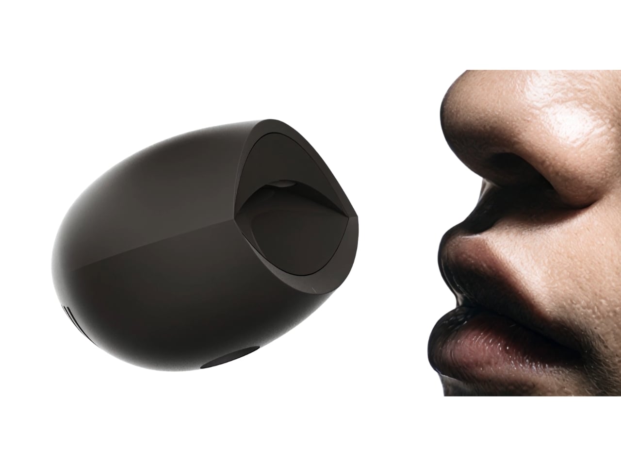
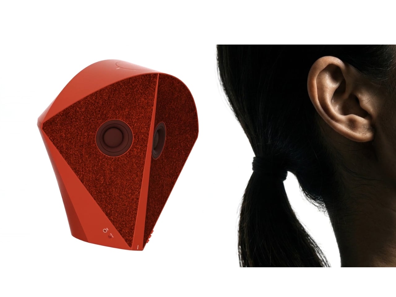
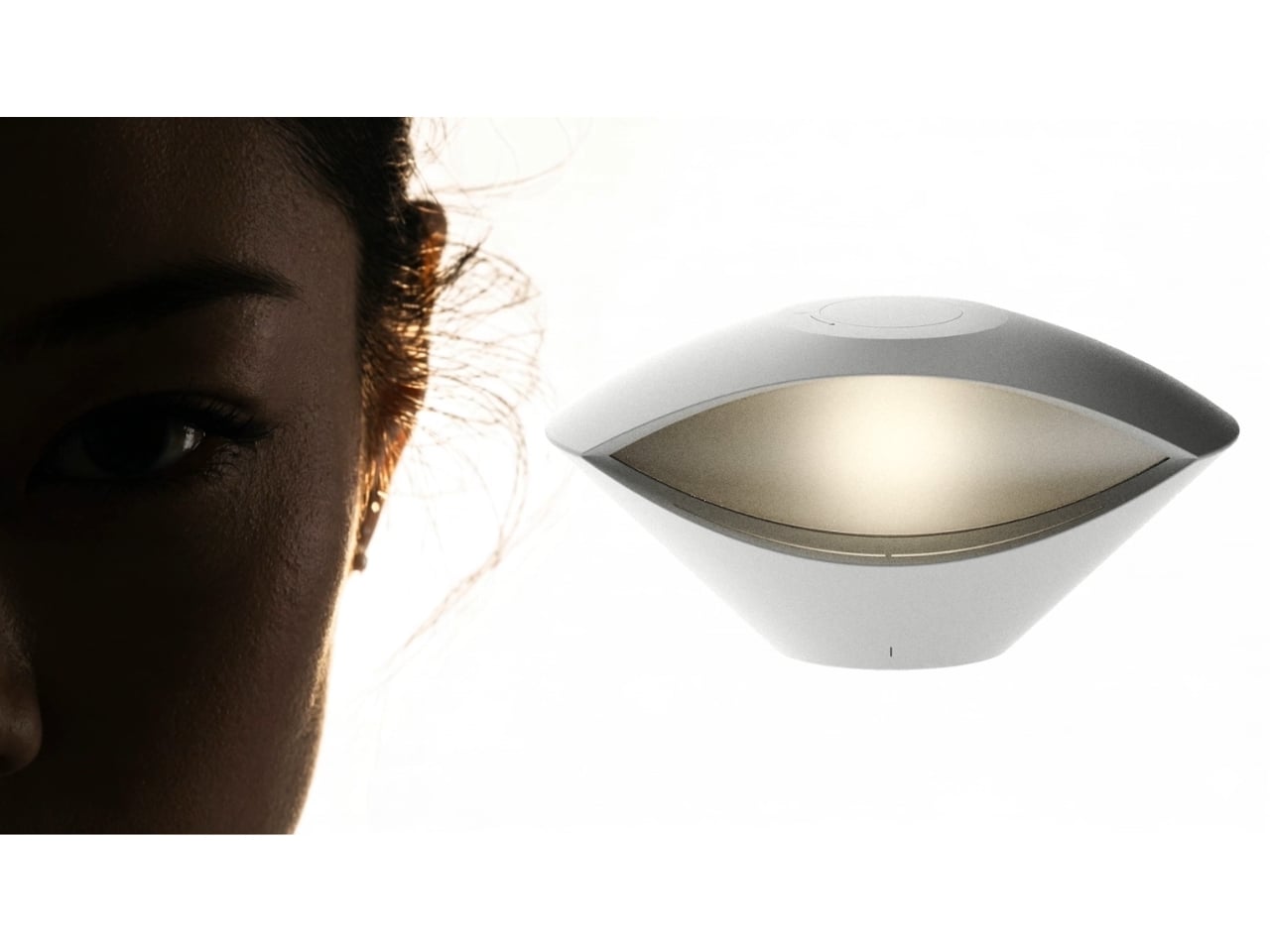
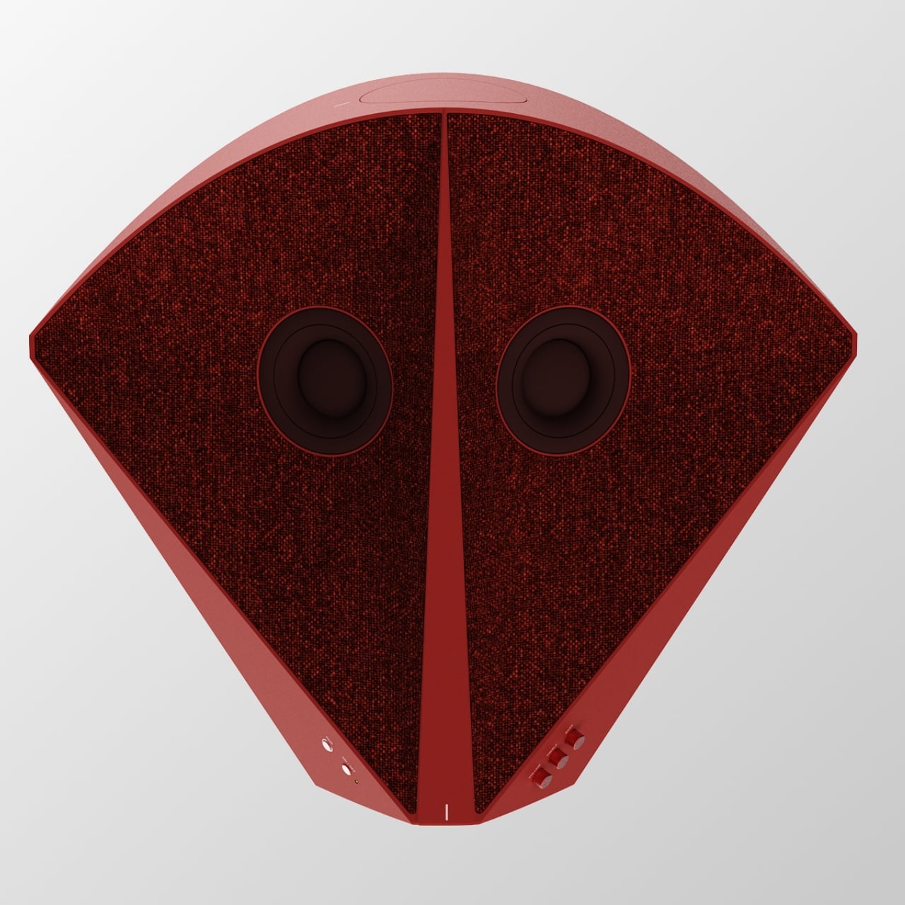
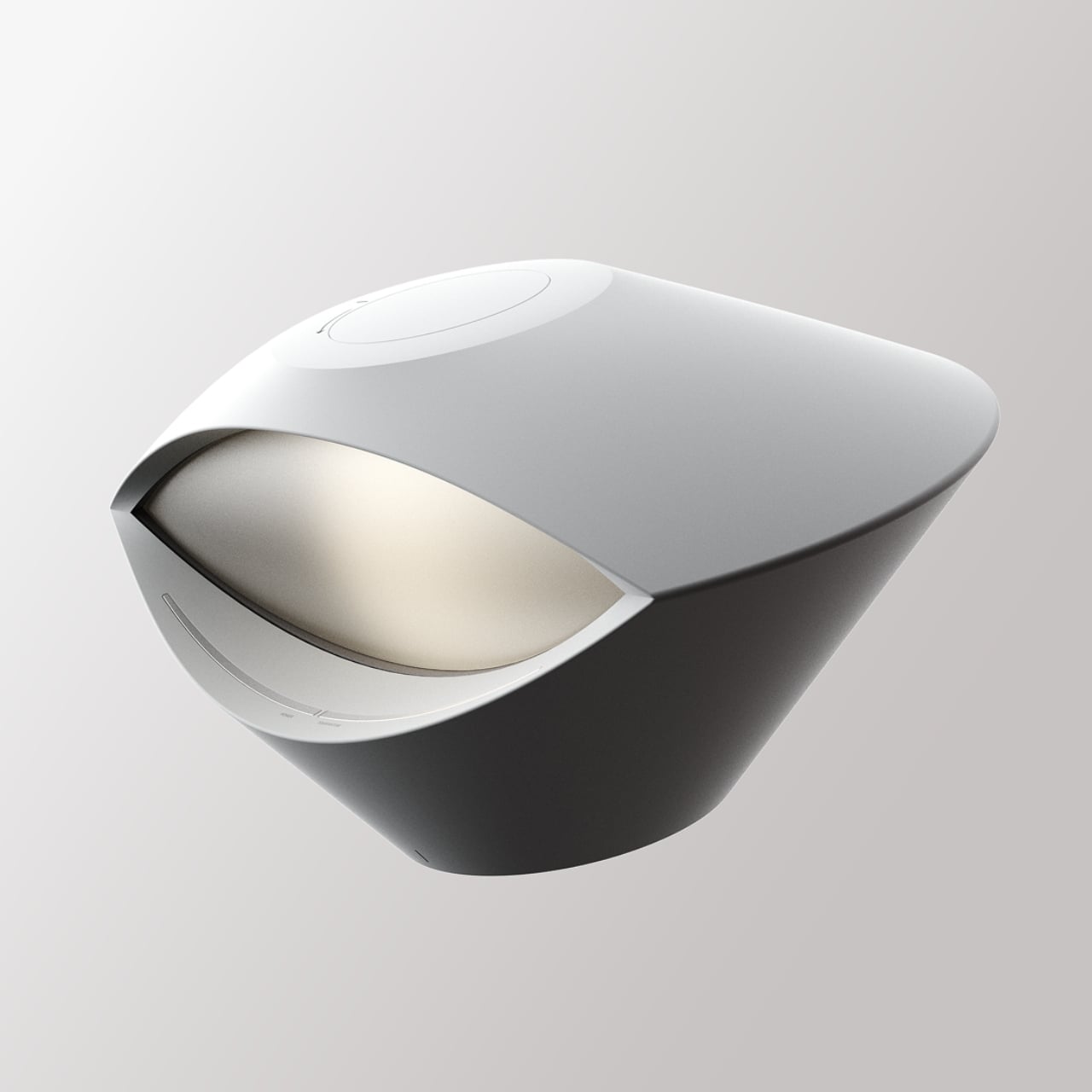
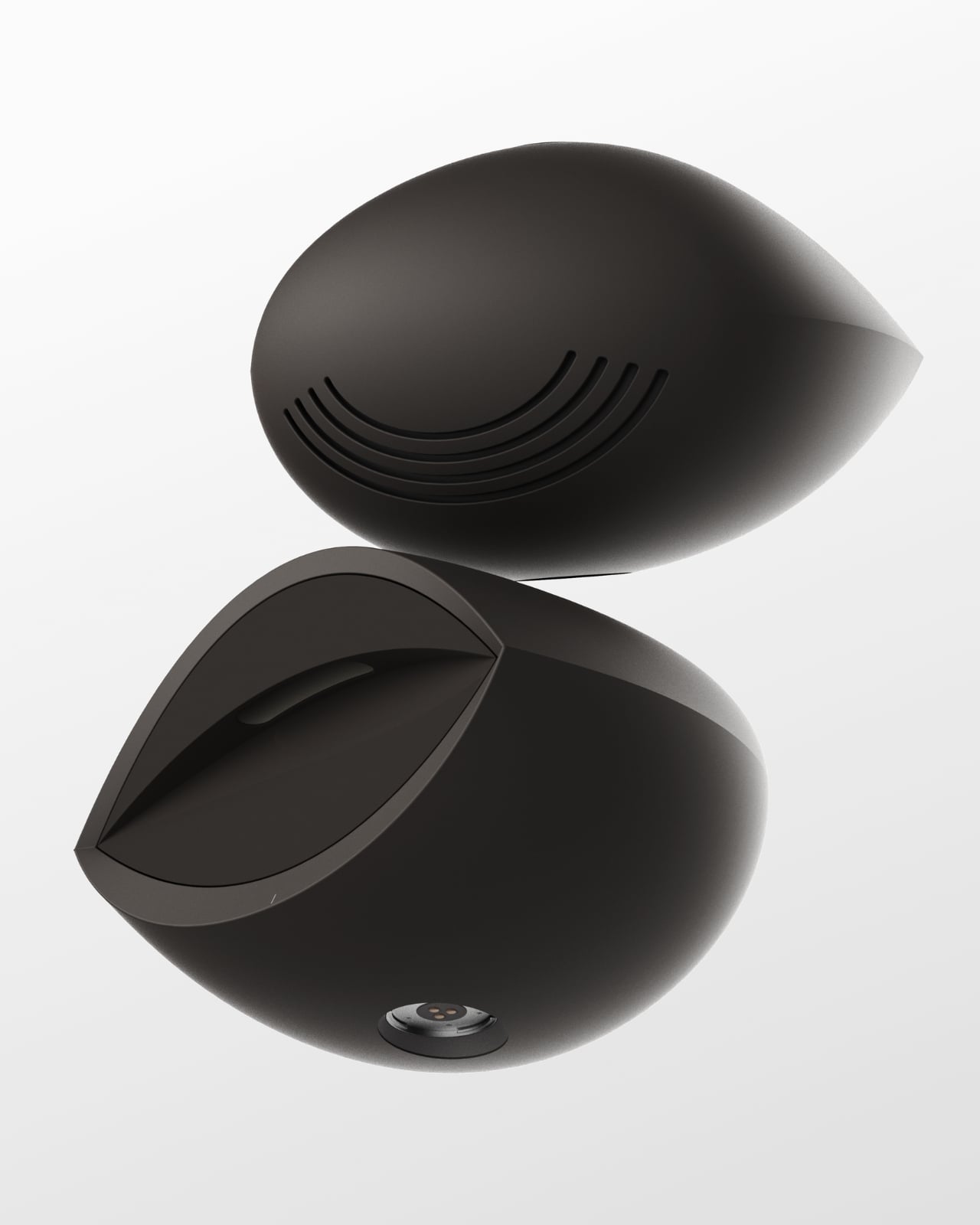
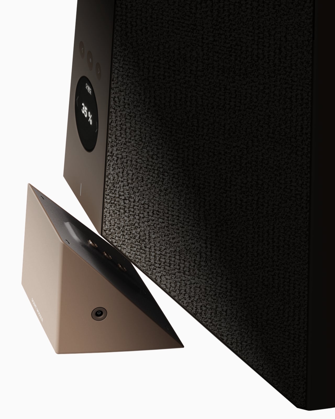
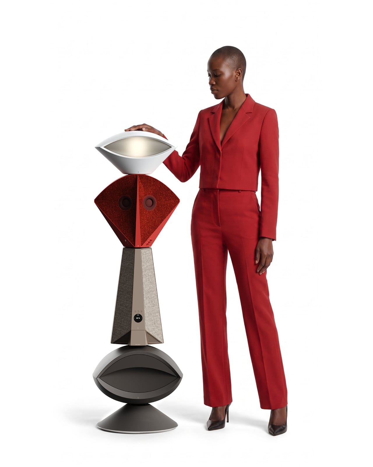
The tower reads almost like a figure standing in the room. At the top sits an eye shaped ambient lamp, its lens glowing warm and soft, the kind of light you’d want next to a couch at eleven at night. Below that, a red, fabric wrapped module houses the main speaker drivers, angled like a face with two eyes looking back at you, which is a genuinely clever piece of anthropomorphism for an object meant to live in your peripheral vision all day. The tapered midsection functions as the control hub, complete with a discreet volume display, and the whole thing terminates in a rounded black base that turns out to be a hidden drawer, a small cooling compartment for a couple of wine bottles. Four completely different jobs, one silhouette.

What makes this more than a novelty is the modularity built into the stacking logic. Nothing about Babel demands you use all four segments in one order. You can pull pieces apart, rearrange them, or run just the parts you need that week. A studio dweller might want the lamp and speaker without the bar module. Someone hosting more often might stack the drawer higher for easier reach. The design treats a small home the way a good capsule wardrobe treats a small closet, fewer pieces, each one doing more, none of them wasted.

I like that Babel doesn’t pretend the solution to small space living is owning less. It assumes you still want a good lamp, a good speaker, and a cold bottle of wine within reach, and it simply refuses to let those wants cost you three separate footprints. That feels more honest than most minimalist design advice, which tends to ask people to want less rather than design better. The name is a nice touch too, a nod to the biblical tower where many languages tried to reach the same point, which tracks neatly onto a product where lighting, sound, cooling, and control all speak different technical languages but rise from the same base.

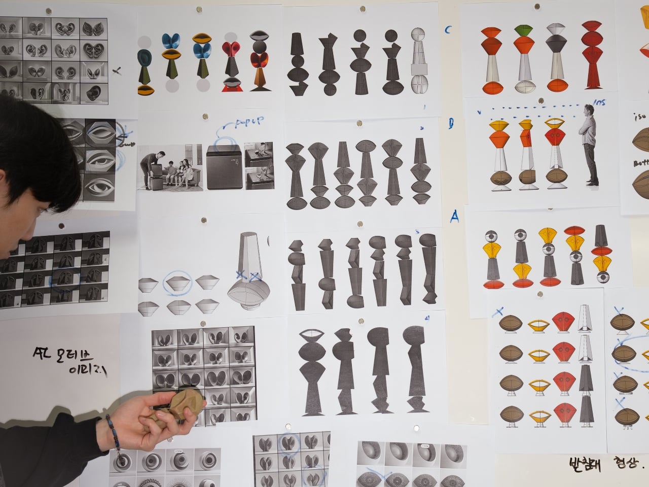
Whether Babel ever becomes a shippable product is beside the point right now. It exists as a Behance concept, a portfolio piece from a designer who clearly thinks in systems rather than single objects, and that thinking is worth paying attention to regardless of manufacturing timelines. Apartment living isn’t getting more spacious anywhere, and the appetite for objects that look intentional rather than accumulated is only growing, especially among people who grew up curating every shelf for how it photographs. A stacked, sculptural answer to gadget clutter fits that mood perfectly.

Babel won’t fit every home, and a four function tower is a commitment, not an impulse buy. But as a piece of thinking about how to live well in less square footage, it’s one of the more clear headed ideas I’ve seen come out of a design program in a while. Sometimes the fix for too many objects isn’t fewer objects. It’s better posture.

The post Finally, One Tower Replaces Your Speaker, Lamp, and Wine Fridge first appeared on Yanko Design.

  •  

IKEA’s Tiny Houses Quietly Admit Your Messy Home Is Fine

Even though I have enough space to have people over, the fact that my place is terribly messy stops me from inviting family and friends. I don’t want to spend an entire day just stuffing stuff I want to hide into my boxes and closets. That’s not a design problem. That’s a me problem and more specifically, a modern life problem, and it happens to be the exact one IKEA just built a series of dollhouses to talk about.

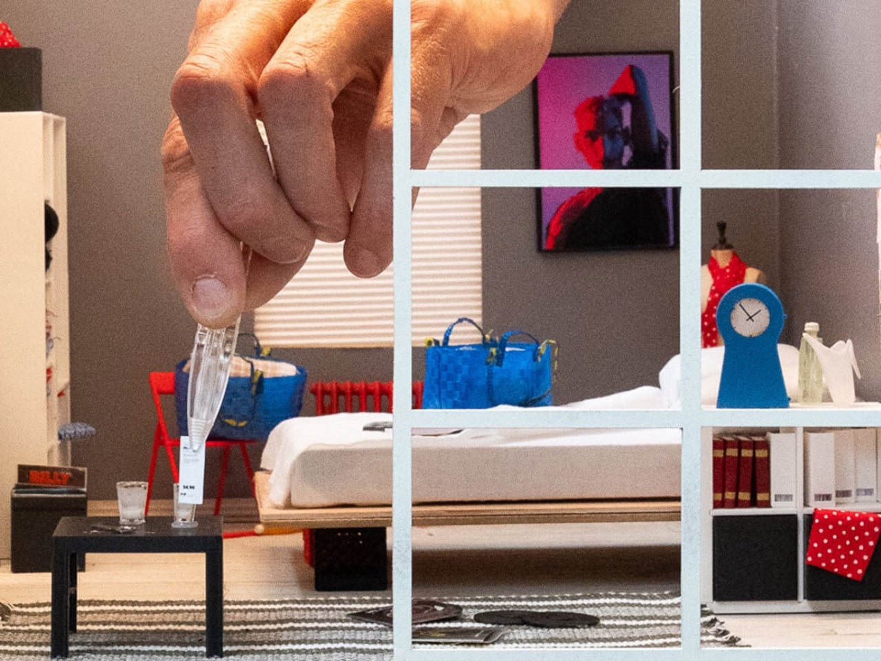
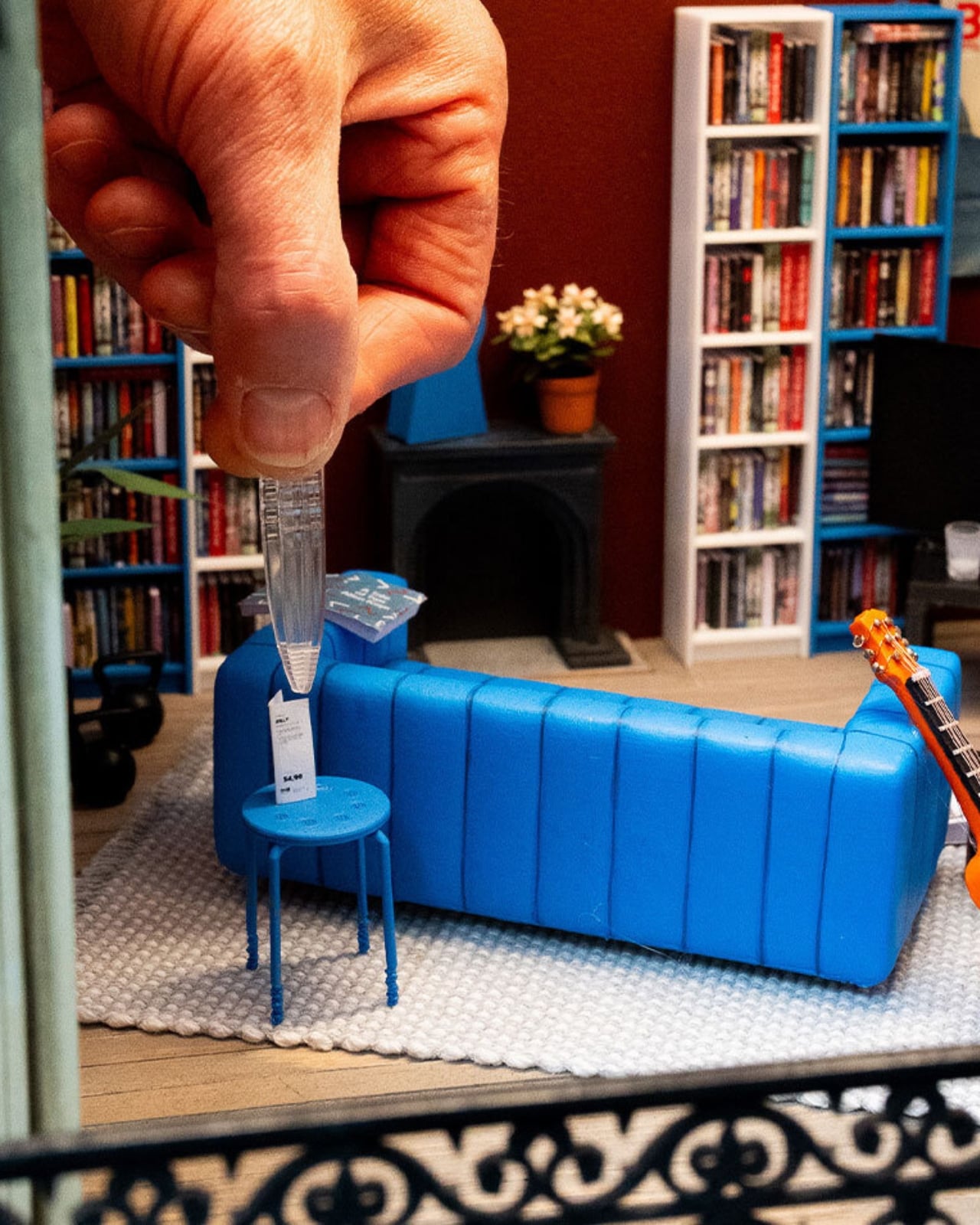
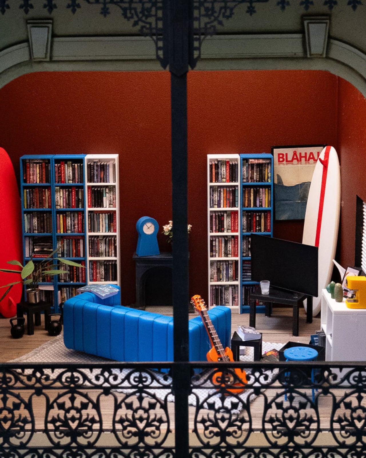
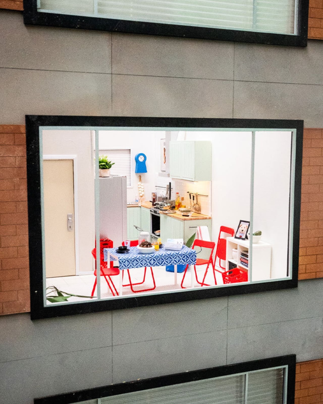
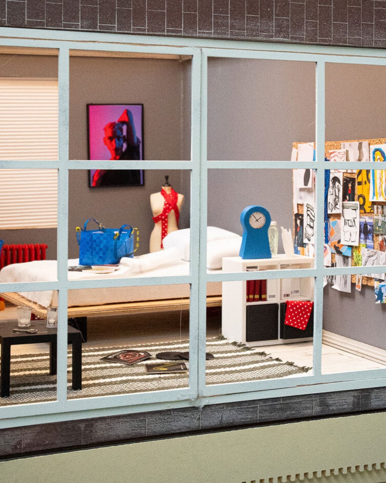
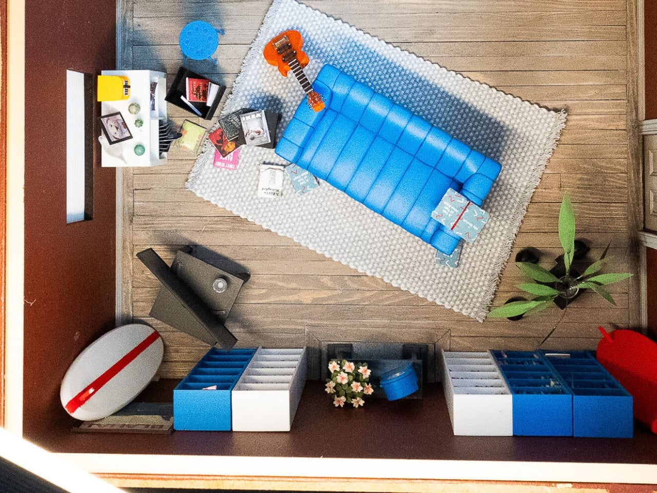
The company recently installed handcrafted miniature homes, built at a precise 1:12 scale, in public spaces across Melbourne, Chengdu, and Beijing. They’re gorgeous, obsessively detailed little things made by Stockholm-based miniature artist Christopher Robin Nordström, who goes by TokyoBuild online. But they’re not really about scale-model furniture. They’re about the fact that our homes are now expected to be office, gym, classroom, and sanctuary all at once, in the same square footage we’ve always had, while somehow still looking like a magazine spread. That expectation is exhausting, and most of us already know it.

Designer: Christopher Robin Nordström for IKEA

IKEA backed this up with a survey of more than 30,000 people across 31 countries, and the headline number is the kind of thing you want to text a friend: 59 percent said they’d rather live somewhere characterful than somewhere manicured. Not a landslide, but a real majority, and a fairly clear rejection of the sterile, everything-matches aesthetic we’ve been sold for the last decade.

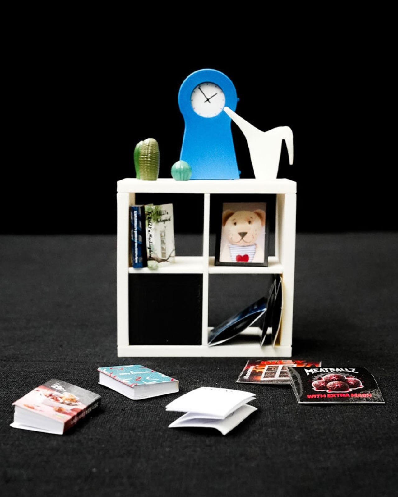
I like that the tiny houses lean into locality instead of pretending every home looks the same everywhere. The Melbourne model has a miniature BILLY bookcase stacked with tiny novels and sports memorabilia. The Chengdu and Beijing versions center on scaled-down METOD kitchens instead, because that’s where those homes actually live and breathe. It’s a small choice, but it says the quiet part out loud: nobody’s home is supposed to look like a showroom, because nobody’s life actually happens in a showroom.

Nordström said something that stuck with me more than any stat in the report. He explained that when you build in miniature, you can’t include everything, so every object has to earn its place, and you realize a home isn’t defined by how much it contains but by what people choose to make room for. That’s a graceful way to describe editing your life down to what matters, and it applies just as well at full scale as it does at one twelfth of it.

The behavioral data is where this stops feeling like a marketing campaign and starts feeling like a mirror. Nearly one in five people admit to keeping gifts they never wanted, just to avoid hurting someone’s feelings. More than a quarter hide mementos from past relationships, a habit slightly more common among men. Ten percent have actually canceled plans with friends because their place felt too messy to host, and over a third shuffle clutter from room to room right before guests arrive. Some people use their oven purely for storage, which, if I’m honest, sounds familiar to at least one junk drawer I refuse to open around visitors.

What strikes me isn’t that people are messy. It’s that so many of us are quietly performing tidiness for other people instead of actually living in our own space. IKEA’s pitch, wrapped up in tiny bookshelves and miniature kitchens, is refreshingly modest: you don’t need a renovation to fix that. You need smarter storage and permission to stop apologizing for your actual life.

The tiny houses tour wraps up soon, but IKEA Open House continues in stores through September, built around the same idea at real scale, with the kind of affordable, small-footprint fixes most of us can actually use. Whether or not you ever walk through it, the message is worth sitting with. Perfect homes are rare. Honest ones are just about everywhere, once you stop hiding them.

The post IKEA’s Tiny Houses Quietly Admit Your Messy Home Is Fine first appeared on Yanko Design.

  •  
❌