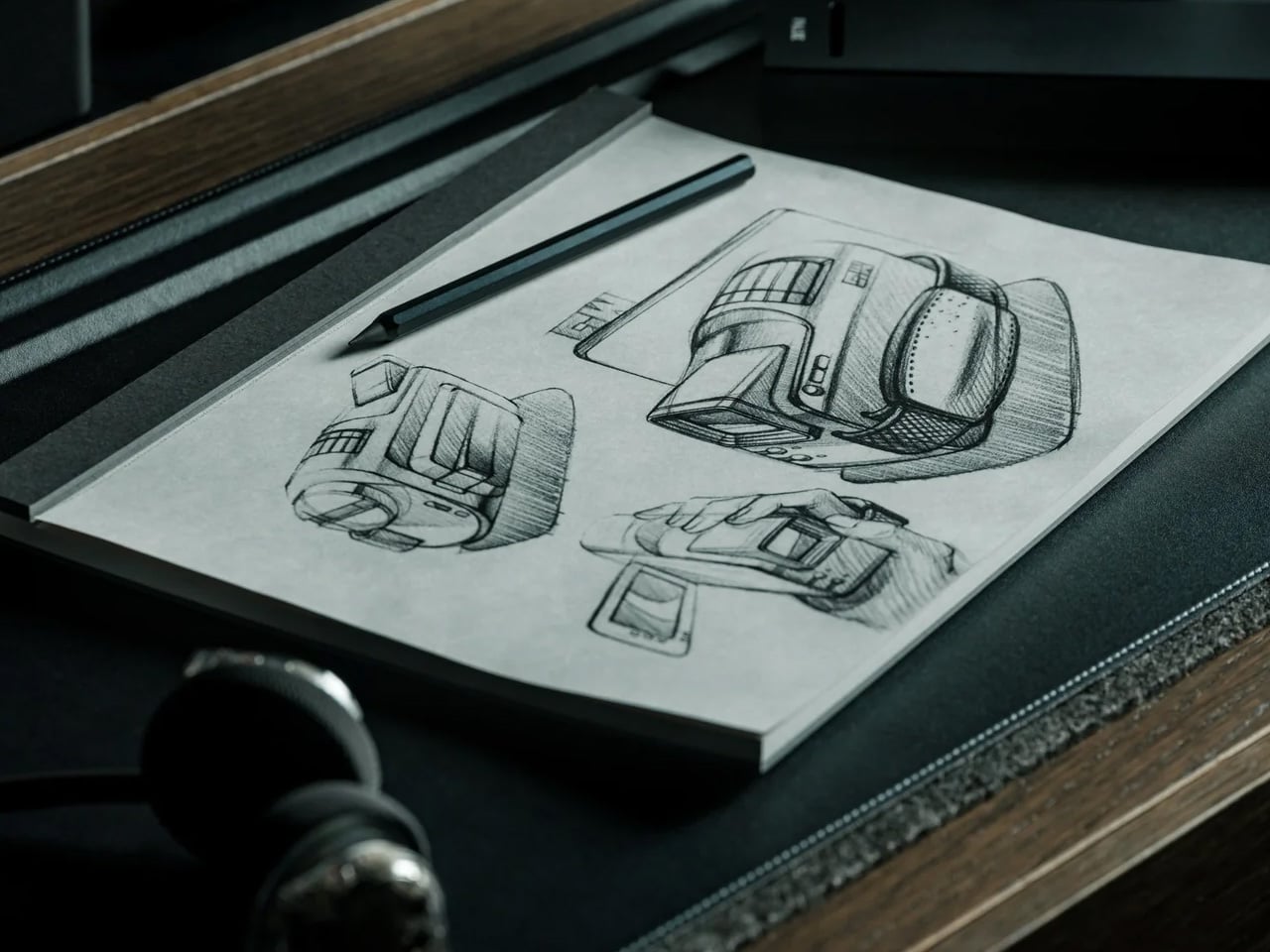
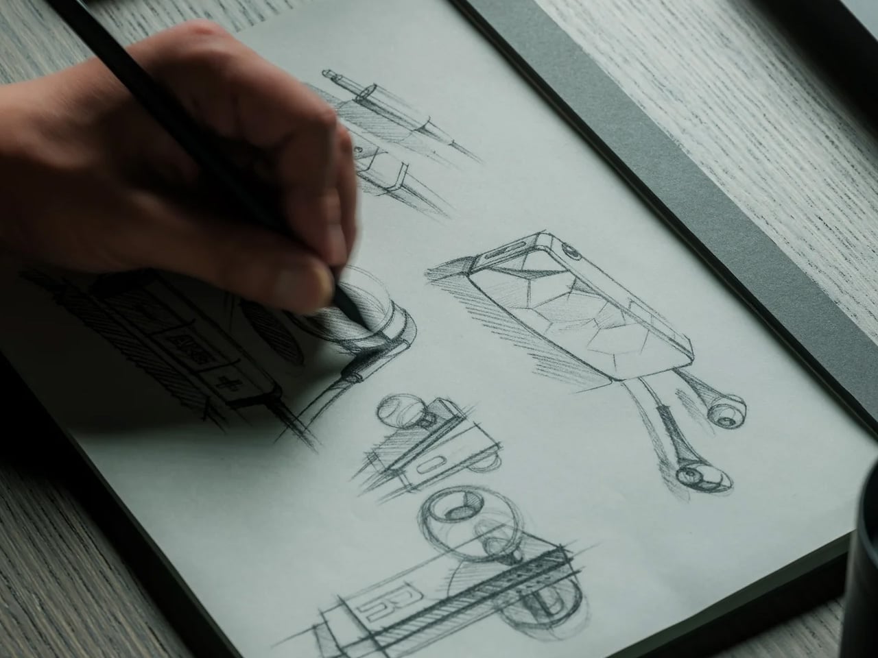
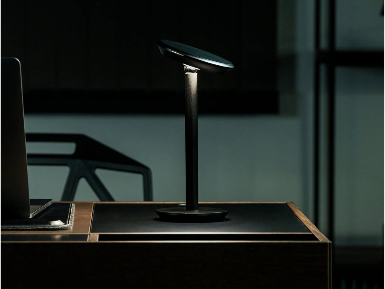
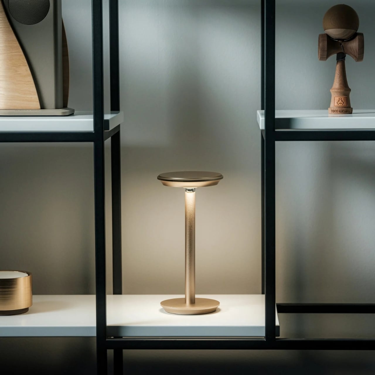
As a hoarder, I mean collector, of notebooks, I prefer ones that don’t have lines because I feel like they inhibit my creativity. Or maybe they remind me of required writing during my school days. But sometimes, when I’m writing in my journal, my handwriting goes haywire. When I try to read back what I wrote, it’s a mess. I used to wish there were a notebook that could help me keep my handwriting in check without leaving visible lines all over the page.
The iA Vanishing Line Notebook has made that wish come true. It’s a premium, handcrafted paper notebook from Information Architects, the company behind the iA Writer app. As the name implies, it has watermark lines that guide you as you write but appear to “disappear” once the page fills with words. There’s no magic or disappearing ink involved. It’s a beautifully designed notebook that lets you enjoy the best of both lined and unlined worlds.
When you crack open the notebook, you’ll see that the lines are visible on an empty page. They serve as a guide for you and your pen, helping you write straight and keep your lines evenly spaced, if that’s how you want to write. I know some people prefer a messier look, but when I’m filling a page with journal entries or other writing I plan to revisit, a little guidance can be welcome.
Once you’ve written on the page, the contrast between your writing and the paper makes the lines visually fade into the background. Hence, the notebook’s name. When you read back what you’ve written, your handwriting takes center stage instead of competing with a distracting grid. To be clear, the lines don’t physically vanish, and the effect becomes more noticeable as the page fills up. It won’t change your handwriting, but it could make what you’ve written more pleasant to read.
iA (Information Architects, in case you didn’t know) achieved this without any tricks. The watermark lines had to be faint enough to recede behind the writing but visible enough to help while the page was empty. That balance is the detail I find most interesting. The paper and binding matter, too: the notebook uses Japanese writing paper and opens flat, so you don’t have to hold down one side while trying to finish a sentence. As someone who is a connoisseur of Japanese stationery products, I can appreciate the thought that went into it.
There are other practical details worth noting. The hardcover notebook is A5-sized, with 144 sheets, or 288 pages, and its watermark lines are spaced 10 millimeters apart. Its 81 gsm Araveal White paper is designed to work with most pens and inks, including fountain pens. It’s handcrafted in Japan, and the wooden presentation box gives it the feel of something you might keep on your desk rather than toss into the bottom of a bag. Of course, that also means this is a more considered purchase than an everyday notebook you wouldn’t think twice about using up.
If you usually buy a Moleskine Classic, the difference comes down to what bothers you about an ordinary page. Moleskine offers both plain and ruled layouts, along with practical touches such as a ribbon bookmark, an elastic closure, and an inner pocket. Its ruled pages give you consistent guidance, while its plain pages leave you free to write wherever you like. The iA Vanishing Line Notebook offers a middle ground: its guidelines are there when you need them and less noticeable when you read your work later. Moleskine is the more familiar everyday choice; iA’s design is for someone who cares about that specific writing experience.
I don’t think this notebook will turn every messy journal entry into a masterpiece, and honestly, I wouldn’t want it to. Sometimes the scribbles are part of the fun. But for the days when I want my thoughts to flow freely and still be able to read them afterward, these vanishing lines sound like the compromise I’ve been looking for. It gives my pen a path without making the finished page look like homework.
Candles have stepped beyond being just decorative objects that are placed on a dining table or shelf. Today, they are becoming artistic installations, architectural statements, sensory experiences, and even functional design objects. Designers across the world are transforming the humble candle into sculptural pieces that blur the line between art, craft, and innovation.
These evolving creations reflect changing lifestyles, where everyday products are expected to combine beauty, functionality, craftsmanship, and emotional value within contemporary interiors. Here are some fascinating examples showing how contemporary design is reinventing the everyday candle.
1. Murano Glass Candles: Where Venetian Craft Meets Modern Luxury
Murano glass candles blend traditional craftsmanship with contemporary design, turning everyday candles into artistic decor objects. Known for their vibrant colors, flowing patterns, and handcrafted finishes, these candles create a warm visual experience that feels both elegant and sculptural. Their glass vessels often become statement pieces within modern interiors, adding character even when unlit.
What makes these candles especially appealing today is their lasting value beyond fragrance. Instead of being discarded after use, the handcrafted containers can be repurposed as decorative accents, small storage pieces, or collectible objects.
CADAR’s latest candle collection transforms traditional candles into sculptural objects crafted from exquisite hand-blown Murano glass. Created in collaboration with Venini, each candle is designed as a glossy glass sphere assembled from multiple rounded components that fit together seamlessly. The rich transparency, smooth finish, and substantial weight of the Murano glass give every piece a refined, collectible quality. Instead of functioning as simple candle holders, the vessels feel like contemporary art pieces that interact beautifully with light, reflection, and shadow.
The collection stands out through its dramatic use of color and the timeless craftsmanship of Murano glass. Deep cobalt blue, emerald green, ruby red, amber, smoky charcoal, and soft lavender create striking combinations with exceptional depth and luminosity. The high-gloss surfaces amplify the intensity of each shade, allowing the glass to glow almost like liquid under changing light. Together, the candles create a sophisticated visual experience where fragrance, craftsmanship, and Murano glass artistry merge into one luxurious design statement.
2. Flame to Elegance: The Candle That Becomes a Japanese Lantern
Some contemporary candle designs are moving beyond single-use functionality by transforming into decorative objects after the wax has melted away. Inspired by minimal, thoughtful design philosophies, these candles are crafted to evolve and do not simply disappear after use. This approach adds a deeper sense of purpose and emotional value to everyday objects.
The concept also reflects the growing importance of sustainability and long-lasting craftsmanship in modern design. Instead of creating waste, the candle continues to serve as a functional or decorative piece, encouraging reuse and mindful living.
Designed by James Kaoru Bury, the Chouchin Candle reinterprets the traditional Japanese lantern through a refined and contemporary candle design. Inspired by the soft glow of a classic “chouchin” lantern, the pillar-shaped candle features a dual-layer wax construction that combines functionality with atmospheric lighting. The inner core burns like a conventional candle, while the exterior is made from a patented non-melting wax that forms a translucent shell. As the flame flickers within, the outer layer gently diffuses the light, creating a warm lantern-like glow that enhances the surrounding ambiance.
Developed in collaboration with Pegasus Candle Co. Ltd in Kurashiki, Japan, the candle is designed for elegance and practicality. The non-melting exterior safely contains liquid wax, eliminating dripping and removing the need for a separate tray. With a burn time of nearly 60 hours and replaceable candle refills, the product also emphasizes longevity and sustainability while maintaining its calm, sculptural presence.
3. The Candle Disc: Tracking Time Through Melting Wax
Contemporary candle design is increasingly exploring the deeper meaning of time, transformation, and human experience through the way candles burn and evolve. Rather than remaining simple decorative objects, some candles are designed to change shape gradually as the wax melts, turning the burning process itself into a visual and emotional experience.
These ideas reflect a growing interest in mindful and experiential design. This is because modern candles are no longer valued only for fragrance or ambiance, but also for the atmosphere and reflection they inspire.
Designed by Seokoo Yeo, the Candle Go reimagines the traditional candle as a functional time-tracking object. Instead of a standard upright candle with a burning wick, the product uses a rotating disc-shaped wax candle mounted on an axis. A built-in warming element gradually melts the wax in a radial pattern, creating a visual representation of passing time. As sections of the wax disappear, gravity naturally causes the disc to rotate, turning the candle into a dynamic and interactive experience that feels both sculptural and meditative.
The product combines minimalist design with productivity-focused functionality. The changing wax pattern acts like a visual timer, allowing users to intuitively track work sessions, goals, or moments of focus. Melted wax is neatly collected in a lower chamber, keeping surfaces clean while eliminating the need for an open flame. Once the candle disc fully melts away, it reveals a hidden medal inside, transforming the product into a symbolic reward system that celebrates time spent productively and intentionally.
4. Scented Candle Cards: Compact Design for Modern Lifestyles
Scented candle cards are introducing a new and compact approach to candle design, rethinking how fragrance products can be experienced in everyday life. Unlike traditional candles housed in heavy containers, these designs are lightweight, portable, and minimal in form. Their slim structure and creative presentation make them feel modern, functional, and visually distinctive.
Beyond convenience, these candles reflect the growing interest in interactive and experience-driven products. Their compact format makes them suitable for gifting, travel, hospitality, and creative packaging concepts.
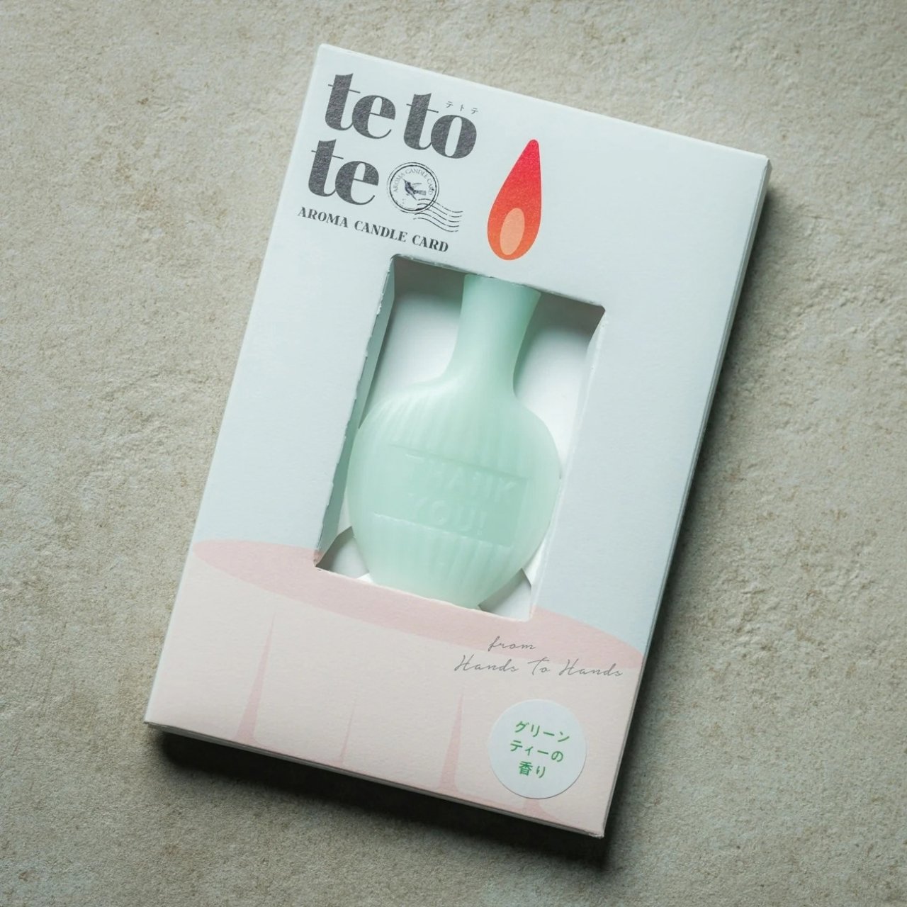
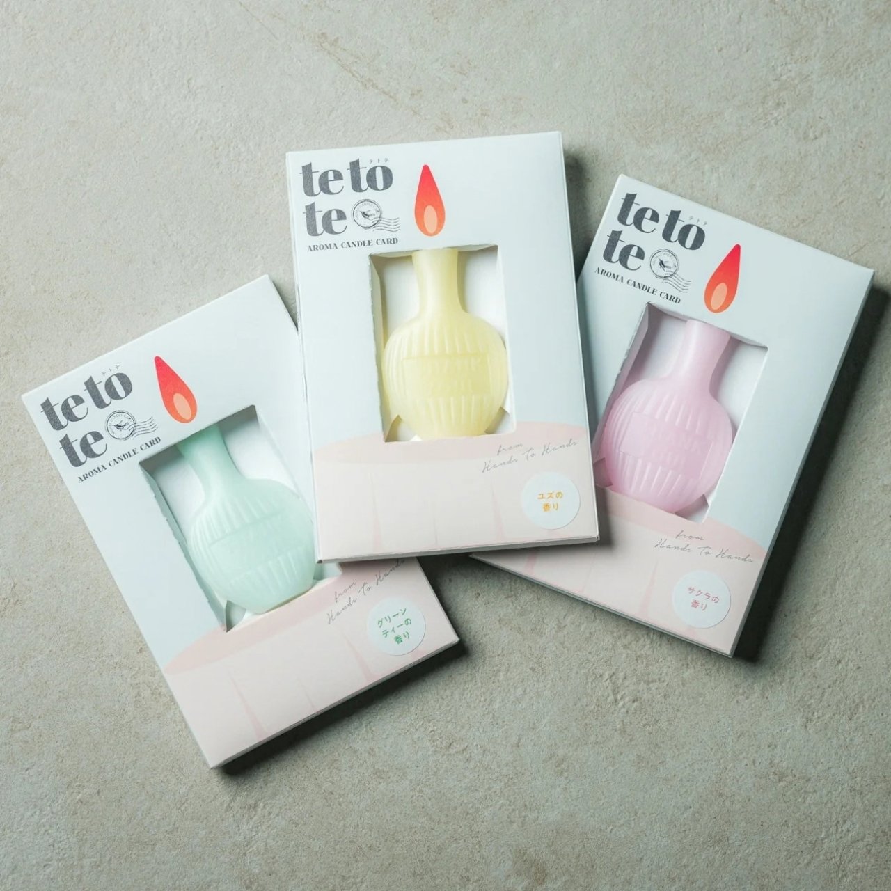
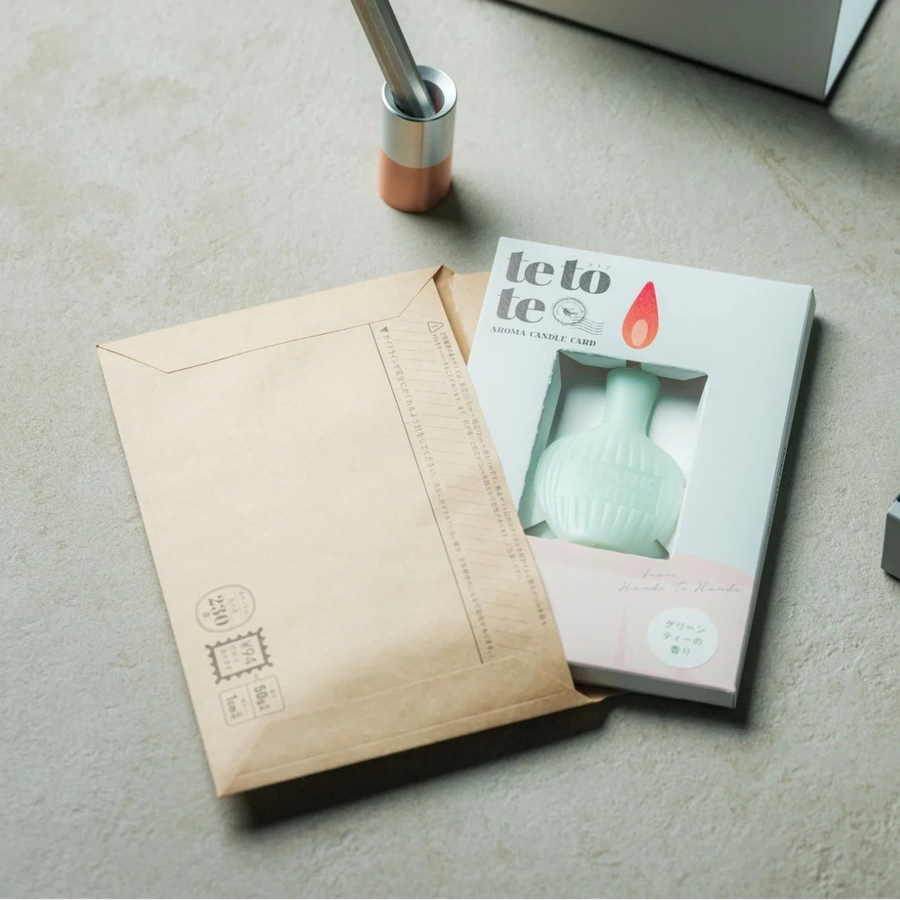
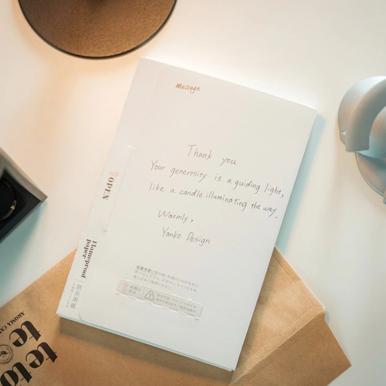
The AromaCandle Thank You Card transforms the traditional candle into a compact sensory experience that combines fragrance, design, and personal messaging. The product features an ultra-thin aromatic candle paired with a slim foldable card that functions as both packaging and a display stand. Once opened, the candle can be placed into a dedicated slot and lit, creating a warm glow and subtle fragrance while the handwritten message is read. Its minimalist construction makes the object feel delicate, elegant, and highly thoughtful.
The product stands out through its clever balance of aesthetics, functionality, and emotional design. Available in fragrances such as Sakura, Green Tea, and Yuzu, each candle is designed to evoke a distinct atmosphere through scent and color. The fire-retardant paper structure and self-extinguishing candle design add practicality and safety to the experience. Compact enough to be mailed like a standard card, the product reimagines candles as intimate objects that create memorable moments through light, fragrance, and personal connection.
5. Sfumato Candle: Inspired by Leonardo da Vinci’s Artistic Technique
Modern candle design is increasingly embracing craftsmanship, turning candles into carefully made artisanal objects rather than mass-produced decor items. In the process, starting from hand-poured wax to sculpted forms and detailed finishes, craftsmanship plays a major role in creating candles that feel unique and personal. Designers often experiment with textures, layered colors, and handcrafted techniques to give each candle its own identity and character.
This focus on craft also highlights the value of slow, thoughtful production. Many contemporary candles are created using traditional methods combined with modern design ideas, resulting in pieces that celebrate skill, creativity, and material quality. Beyond fragrance, these candles reflect the growing appreciation for handmade products that bring artistry and authenticity into everyday living.
The Sfumato Candle reimagines the everyday candle as a sculptural design object inspired by architecture and materiality. Designed by Kegan McDaniel, the candle is housed in a cast concrete vessel that gives it a bold, stone-like appearance with a refined architectural presence. Its minimalist form and textured finish make it feel more like a contemporary décor piece than a traditional scented candle. The sturdy concrete exterior adds depth and permanence, creating a calming visual experience even before the candle is lit.
The collection combines fragrance, color, and craftsmanship into a cohesive sensory design. Available in scents such as Tuscan Fields, Amalfi Citrus, and Sicilian Sage, each candle is paired with distinctive shades of green, yellow, and red inspired by Italian landscapes. The name “Sfumato,” borrowed from Leonardo da Vinci’s famous painting technique, reflects the soft, atmospheric quality the product aims to create. Together, the architectural vessel, earthy textures, and immersive fragrances transform the candle into a sophisticated object designed for relaxation and ambiance.
Modern candles are evolving beyond simple décor into immersive lifestyle objects that combine craftsmanship, innovation, sustainability, and emotional storytelling. Today’s designs focus on sculptural forms, sensory experiences, reusable materials, and atmospheric lighting, transforming candles into meaningful objects that engage the emotions and the surrounding space.
They say AI will steal our jobs. Whoever trims that stubborn strip of grass along the lawn’s edge seems to have excellent job security. We’ve got robots driving around gardens, mapping their surroundings, and keeping the grass neatly cut, yet the border still has a habit of becoming someone’s weekend assignment. Personally, that’s a job I’d be delighted to hand over.
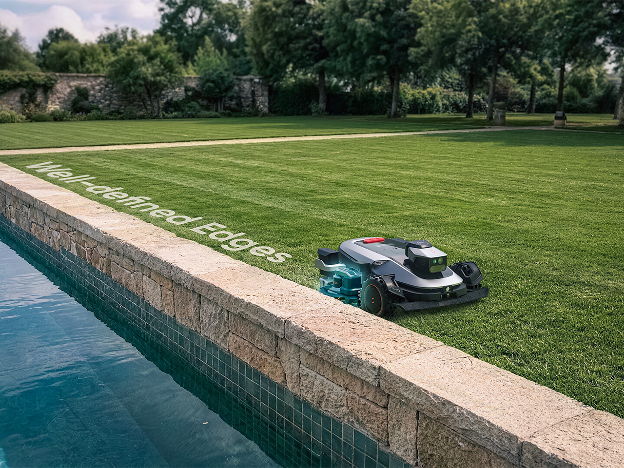
Sunseeker’s upcoming X8 Plus looks eager to apply. Its EdgeZero 2.0 trimming system targets a zero-inch edge gap, according to the company, putting that leftover strip squarely on the agenda. Set for a preview at Equip Expo 2026, the robotic mower also brings solid-state LiDAR, stereo vision, and network-assisted satellite positioning. An impressive résumé, although the edge-cutting hardware is what makes me want to schedule the interview.
A mower can follow a boundary accurately and still leave grass behind if its blades cannot reach it. Knowing where the border is and cutting right up to it are separate assignments. Sunseeker describes EdgeZero 2.0 as its answer to the second one, though the announcement leaves the mechanism’s finer details unexplained. That’s the part I’d want a closer look at: how the trimming tool reaches the border while the mower’s body stays clear. A clean pass beside a raised edge would tell a useful story.
Getting into position is its own engineering task. The X8 Plus uses nRTK, a form of satellite positioning that draws correction data from a network of reference stations. In plain English, those corrections help tighten up the machine’s estimate of where it is. Sunseeker combines that positioning with solid-state LiDAR and stereo vision, giving the mower several sources of information as it navigates. Your garden may look peaceful from the patio; the robot has quite a bit to figure out down there.
Sharing the Lawn With the Locals
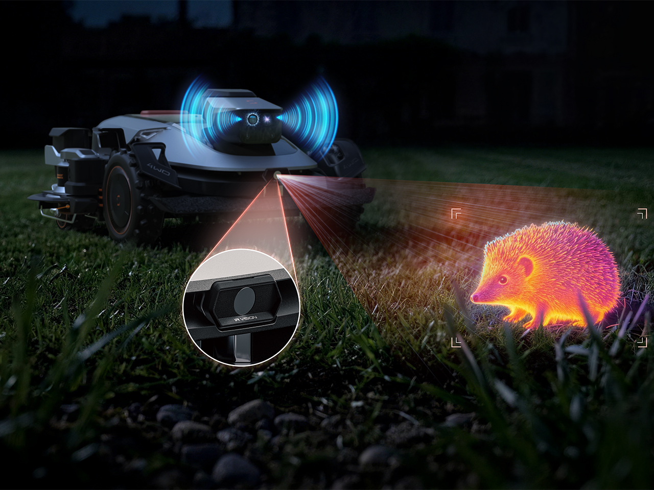
There’s an infrared camera in the mix, too, which Sunseeker says supports animal-friendly operation. That’s a worthwhile consideration for a machine sharing outdoor space with creatures that have never checked its mowing schedule. The announcement doesn’t establish exactly how the system identifies or responds to different animals, so I’d keep the promise modest for now. Still, accounting for the lawn’s other residents belongs in the design brief. The grass might stay put, but everything passing through it gets a vote in how smoothly an autonomous mower’s afternoon goes.
Sunseeker Elite already explores that relationship between sensing and physical movement in its existing X7 Gen 2 and X7 Plus Gen 2. Those models combine satellite positioning with visual mapping, while all-wheel drive and floating dual cutting discs address traction and uneven ground. That provides useful context for the X8 Plus: software has to work with wheels, blades, and the shape of the property. I like that the new preview brings attention back to the finishing work. A mower’s route can look beautifully organized on an app, but the result still gets judged from the garden chair.
A Closer Look at Equip Expo 2026
Equip Expo should provide a closer look at Sunseeker’s approach. The show runs October 20-23, 2026, at the Kentucky Exposition Center in Louisville, Kentucky, with Sunseeker at Indoor Booth #1190 and Outdoor Booth #7460D. The company plans an interactive mower-vision experience, letting visitors see imagery from a machine’s perspective, alongside outdoor slope demonstrations. Seeing what a mower perceives could make that long sensor list considerably easier to understand.
Pricing and retail availability for the X8 Plus aren’t specified in the announcement, so the zero-inch edge target remains a reason to watch its development rather than retire the trimmer immediately. For me, though, it’s a persuasive direction to pursue. Finishing the borders would remove a very specific reason for a person to follow the robot outside and pick up another tool. If Sunseeker can make that work reliably, I’m perfectly comfortable with this particular job disappearing. The person who used to do it can have Saturday morning back.
Most of the time, when you need to check a day or date, you open your phone’s default calendar app. For those of us who still use planners, we also like to flip through the calendar pages since our schedules are often written there. But maybe you rarely notice actual wall calendars displayed in offices or living rooms anymore. If there is one, it might be some random promotional gift. It can feel like we’ve stopped carefully choosing a wall or desk calendar that suits our aesthetic or that we find interesting.
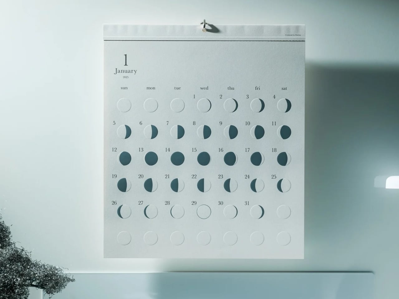
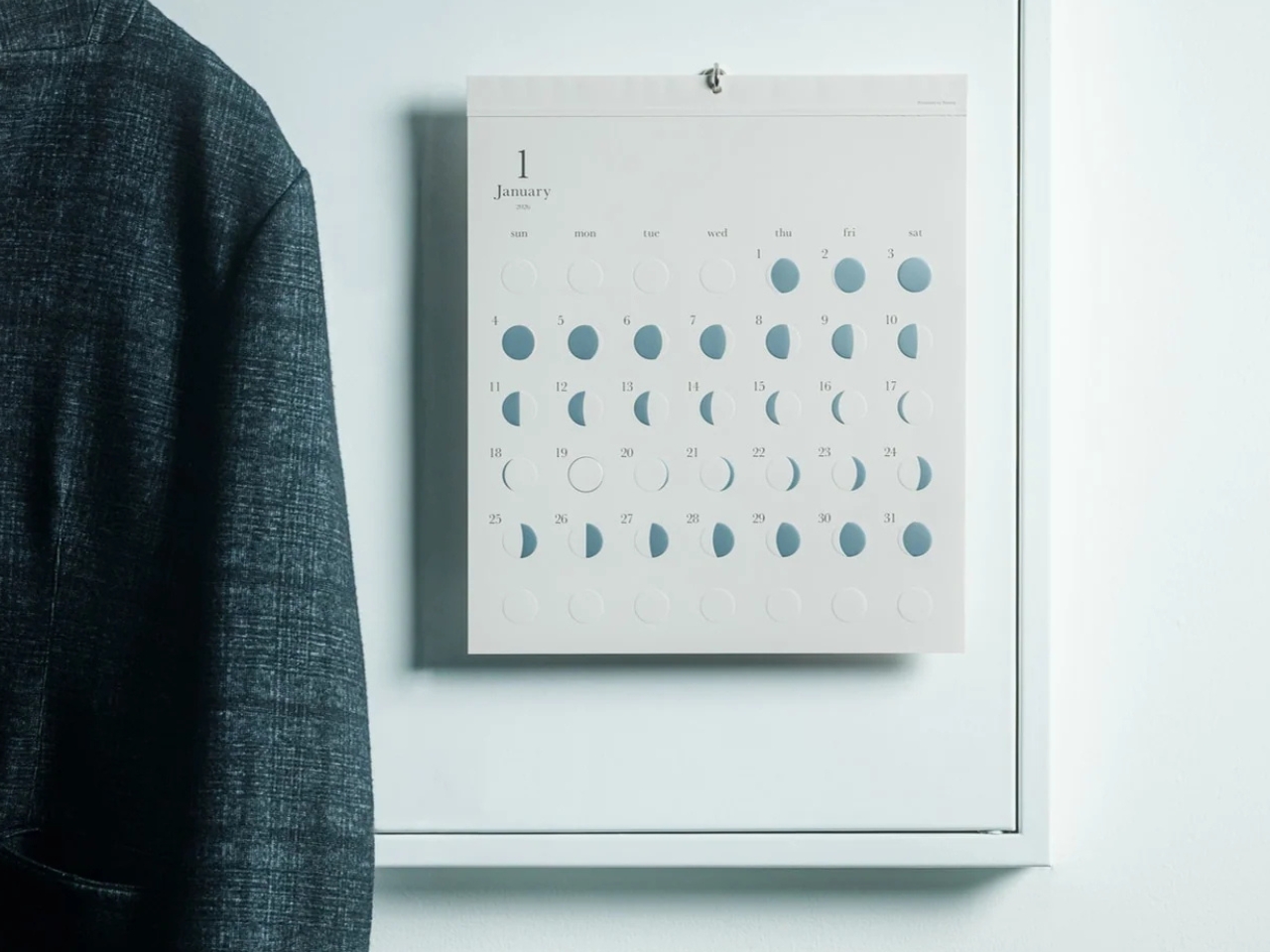
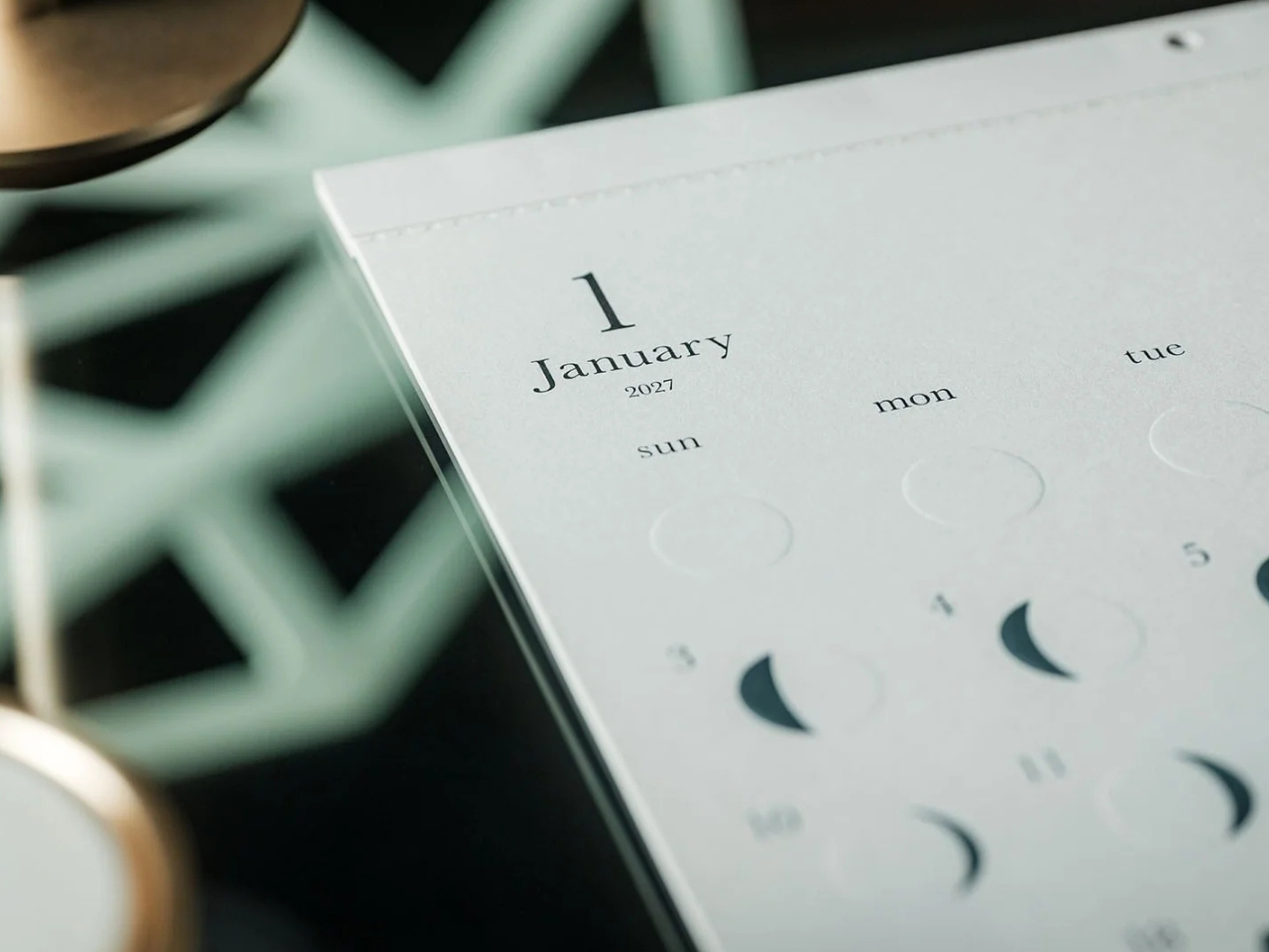
The Oboro Silver Moon Calendar quietly makes itself part of your minimalist space, especially if you love the moon. Created by Replug, it originated as a limited-edition 2025 calendar celebrating the Michiru calendar series’ 10th anniversary. Its name comes from oborozuki, a hazy moon, which inspired the design’s soft appearance. The YD Select listing describes its inspiration as having “serene and mystical qualities.” You might see that misty moon as a reminder that life is impermanent but still beautiful, although that’s a personal interpretation rather than something a calendar needs to explain.
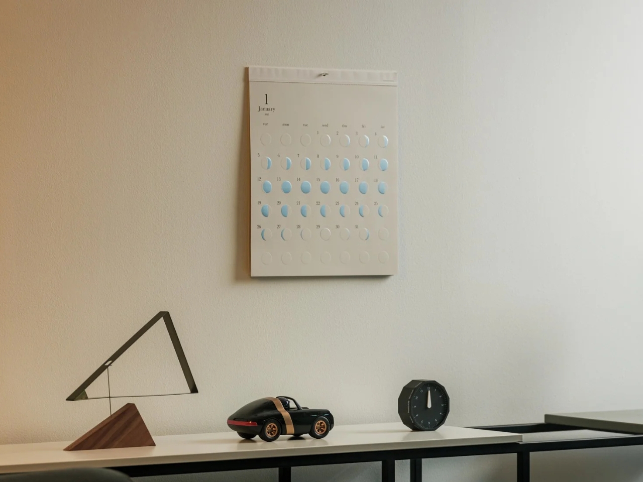
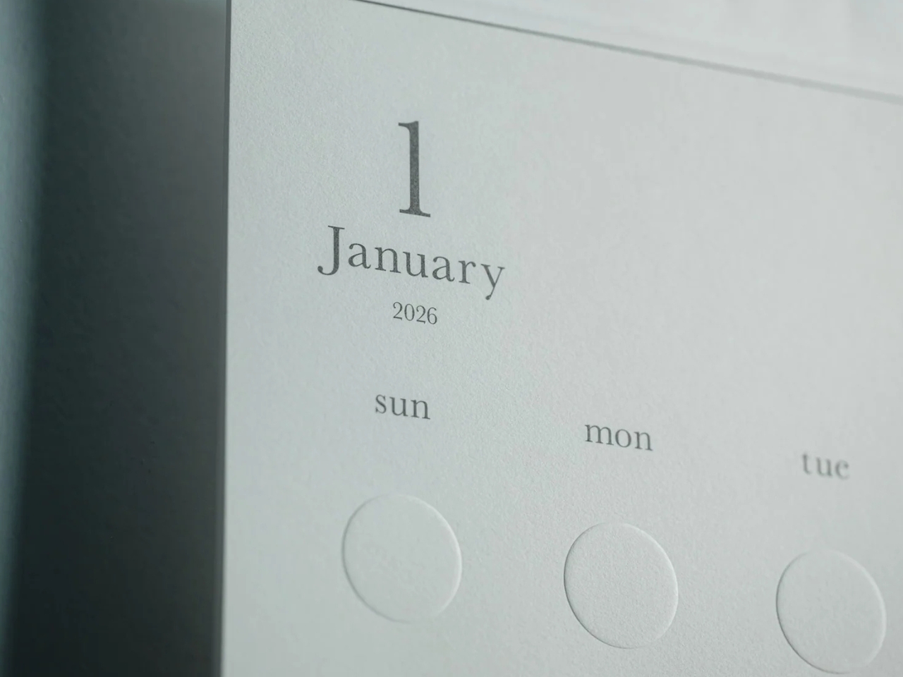
Instead of the usual white paper that many wall calendars have, this uses a soft gray-beige paper that evokes a moonlit sky. It could bring a more introspective and relaxing atmosphere to the room, especially when you stare at the calendar while contemplating your life for the rest of the month (well, if you like doing that sort of thing). The subdued background also keeps the metallic details from competing with a bright color palette.
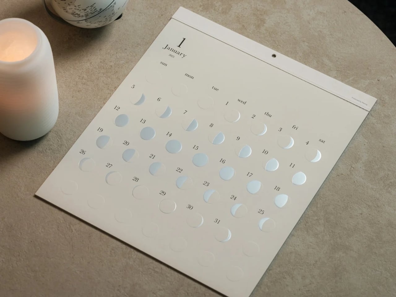
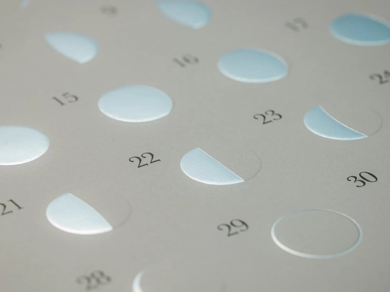
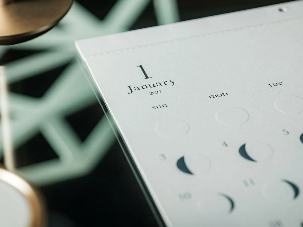
This is primarily a calendar that brings attention to the lunar cycle. It shows the moon’s phases in shimmering, reflective silver foil that catches the light falling on it. That distinction matters: it reflects light rather than producing its own illumination. Its appearance can change depending on the angle of the light, making placement part of the effect. It also has an embossed moon silhouette that adds a tactile element when you touch the calendar. For someone who enjoys small daily rituals, pausing to notice the changing lunar phases could become a grounding moment in an otherwise busy day.
The calendar is made in Japan, with 12 paper sheets measuring approximately 11.7 by 13.5 inches. That gives you a sense of the wall space it needs without making it sound like an oversized art print. The combination of embossing and silver foil is the important design choice here: one gives the paper physical relief, while the other changes how it catches light.
For comparison, MUJI’s 2027 Bagasse Paper Wall Calendar, listed on its European store, uses a Monday-start monthly layout that presents the full month at a glance. Both could appeal to someone who prefers understated stationery, but their priorities differ. MUJI emphasizes straightforward date reference, while Oboro gives lunar phases and decorative surface treatments more attention. Oboro’s appeal is less about improving your scheduling system and more about giving a useful paper object a place in your decor. The better choice depends on what you want to look at every day.
There is also something appealing about checking a calendar without reaching for your phone. If opening an app tends to lead you somewhere else entirely, a paper reference lets you glance at the date and move on. You can still keep your appointments in a digital calendar while choosing something more personal for the wall beside your desk. If you’ve stopped choosing calendars because your phone already handles the practical side, Oboro Silver Moon Calendar gives you a reason to reconsider. It can sit alongside your existing routine, offering something different to notice: the shape of the moon, the texture of the paper, or a brief flash of silver as the light changes.
The most useful thing in your bag is often the thing you forgot to pack. Scissors for a stubborn package, a light for a dark stairwell, a driver for the screw working loose on your gear. October’s EDC selection starts with Eiger’s eight-function scissors, then moves through seven other designs that give familiar tasks a more considered form, without assuming everyone needs to carry an entire miniature workshop every day.
Pocket space is limited, so every extra object needs a reason to come along. A pen that packs down, a wallet stripped to the essentials, and a charger built around one USB-C port approach that constraint differently. Some designs combine jobs; others concentrate on doing one thing well. The appeal lies in finding something that earns its place in your daily routine without giving you more than you actually need.
1. Eiger 8-in-1 Scissors
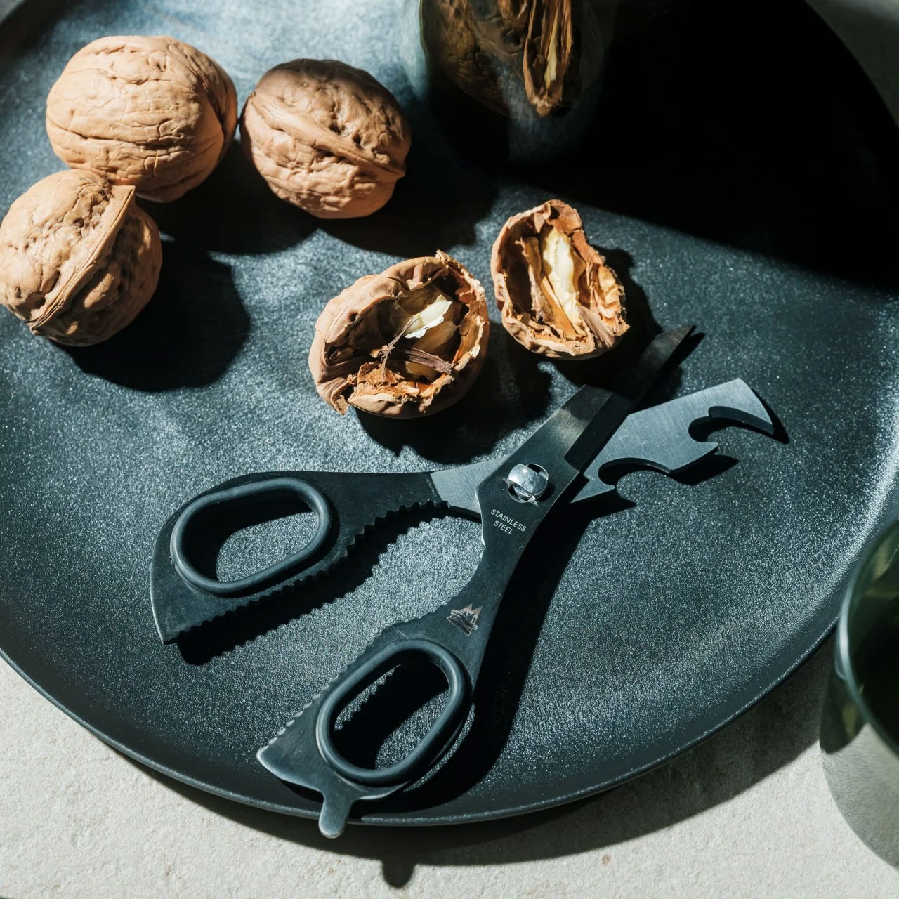
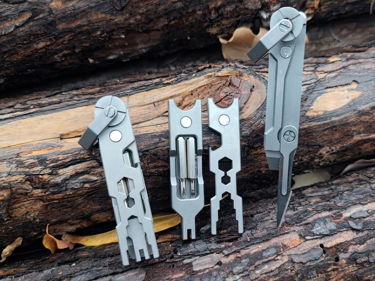
EigerTool starts with a pair of scissors and works the extra functions into their existing geometry. Made by hand in Sanjo, Niigata, the SUS420J2 stainless-steel tool combines cutting with a knife, can opener, bottle opener, screw-cap opener, shell cracker, prying tool, and gas-release function. It’s a sensible starting point for an everyday tool: the main cutting action stays accessible, rather than being a miniature attachment you have to dig out of a handle before opening a stubborn package.
At 5.1 inches long and 53 grams, Eiger is better understood as a small bag tool than a keychain accessory. An included leather case covers it between uses, while a red NITE IZE carabiner gives it a place outside the bag. The black finish comes from an oxidation coloring treatment that the maker says improves corrosion resistance. That doesn’t remove the need for care: EigerTool recommends washing and thoroughly drying the scissors before storage, particularly after messy jobs around camp.
Scissors take priority, with seven supporting functions.
The leather case and bag-attachment carabiner are included.
What we dislike
The five-inch length favors bag carry over a keychain.
The steel still needs washing and thorough drying after use.
2. RolTine 2.0 Titanium Tape Measure
COMANDI-Corres puts two ways of measuring into a titanium disc measuring 46 millimeters across and 18 millimeters thick. RolTine 2.0 contains a retractable 150-centimeter tape for conventional measurements, plus a rolling wheel for following contours. The wheel’s 150-millimeter circumference provides the reference: count complete turns, then add the remaining dial reading. It’s an appealing approach for checking rounded objects or curved edges, provided you’re willing to keep track of rotations rather than expect an electronic readout to do the arithmetic.
The Grade 5 titanium frame is skeletonized around the mechanism, giving this tape measure some of the exposed complexity associated with mechanical watches. An embedded magnet adds a way to park it on a steel toolbox between measurements. The important qualification is availability; February 2027 is the estimated shipping date. For now, its most convincing idea is giving curved measurements a place beside the straight tape without doubling pocket clutter.
Retractable tape and rolling measurement share one compact body.
The embedded magnet provides a convenient place to park it.
What we dislike
Rolling measurements require manually tracking complete rotations.
February 2027 delivery is an estimate, not confirmed availability.
3. Corkor Front-Pocket Cork Wallet
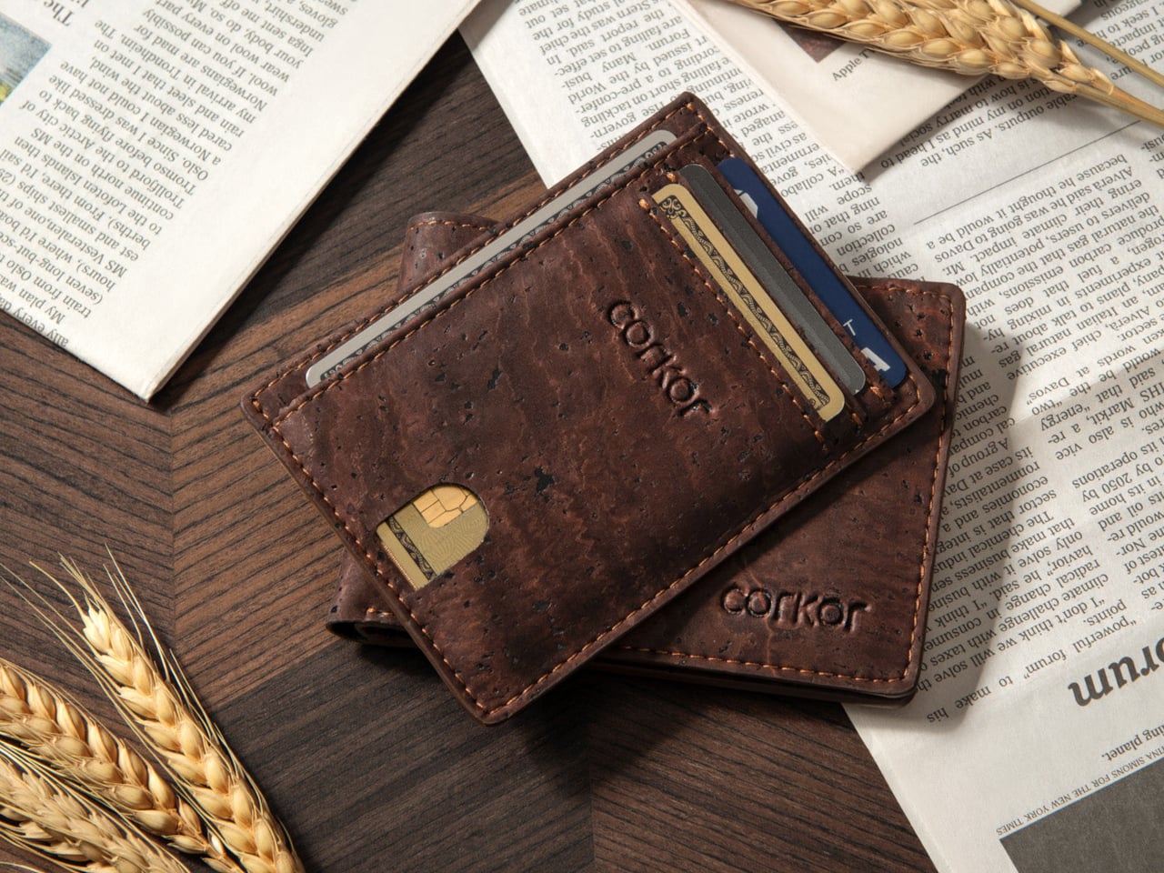
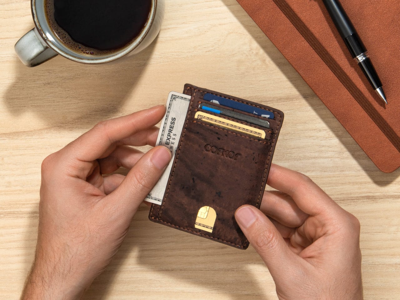
Not every EDC improvement needs another mechanism. Corkor’s Front-Pocket Cork Wallet makes its case through a familiar card-holder layout and an unusual material. The Portuguese brand uses cork for an animal-free exterior, with three card slots, an ID window, and two compartments for folded bills. At a listed 20 grams, it starts light before you add your essentials. The surface gives the collection a welcome material change, particularly if your carry already contains plenty of black plastic and brushed metal.
The dimensions are 110 by 80 by 10 millimeters, which makes restraint part of the design rather than an optional extra. Add spare cards and receipts, and you start working against the point of a slim holder. Corkor includes RFID-blocking construction, but the more tangible daily benefit is the straightforward division between cards, ID, and cash. There’s no coin pocket, and bills need folding. It suits someone ready to edit their wallet, not someone looking to relocate an overstuffed bifold.
What we like
The animal-free cork exterior offers an alternative to leather.
Dedicated card, ID, and cash compartments keep the layout straightforward.
What we dislike
There’s no compartment for loose change.
Folded bills are less convenient to sort than cash in a full-size wallet.
4. CasaBeam Everyday Flashlight
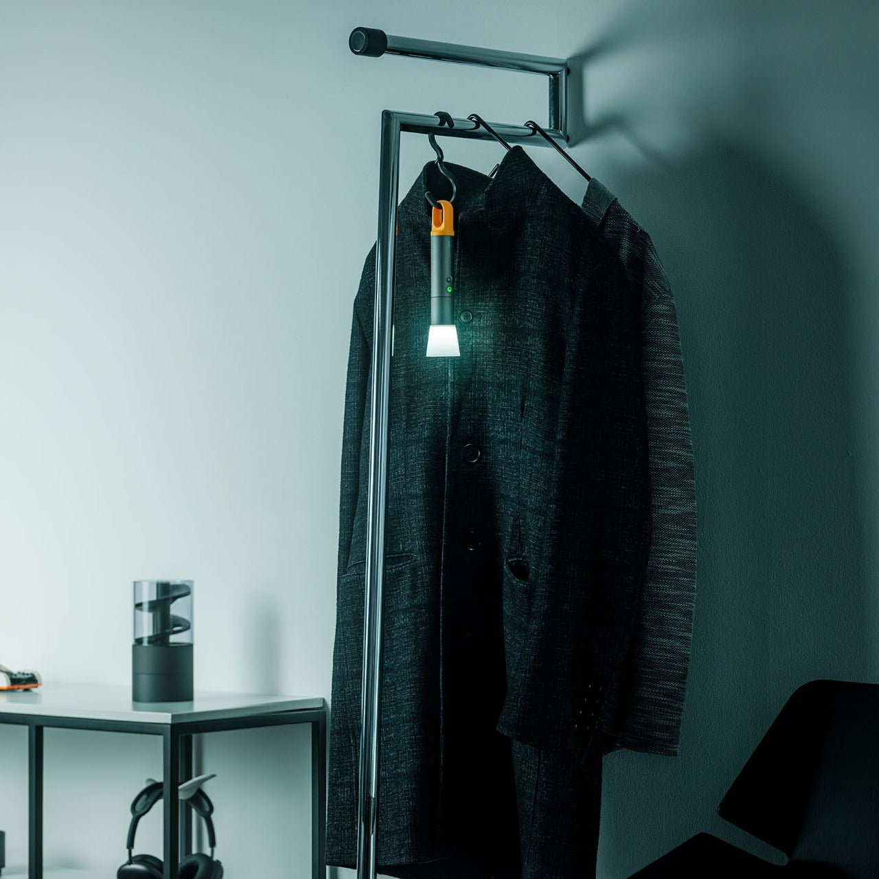
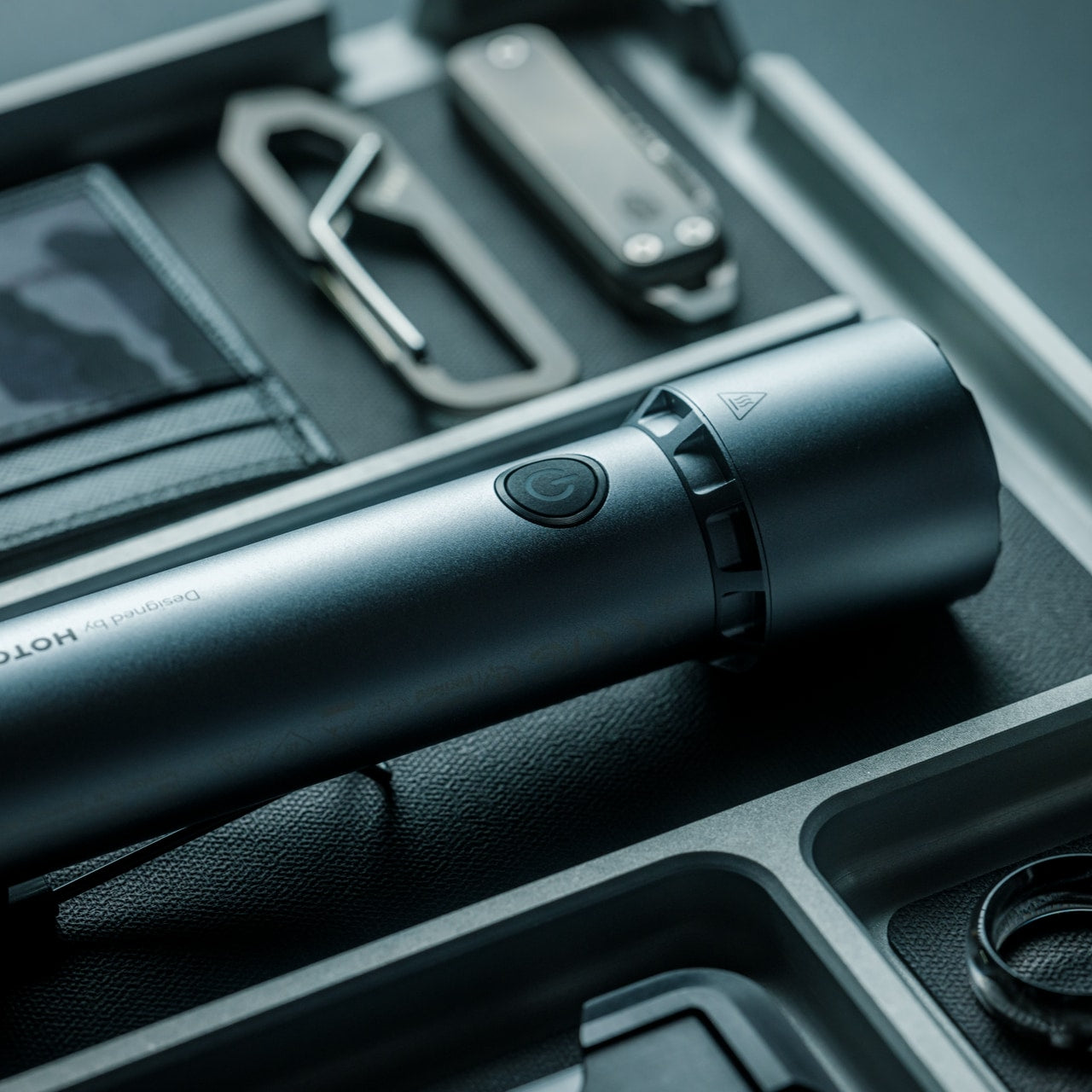
CasaBeam takes a less tactical approach to the everyday flashlight. The body combines ABS and aluminum alloy, with a hanging loop and an included diffuser cap that broaden where the light can work. Adjust the beam for a concentrated spot or wider illumination, then stand the flashlight upright for ambient use. That flexibility matters more here than aggressive styling: one light can move between a bag, a bedside table, and a shelf.
The listing specifies up to 1,000 lumens, three brightness levels, a 2,600mAh rechargeable battery, and USB-C charging. Its claimed 24-hour runtime applies at the low setting, not maximum brightness. At 6.14 inches long and 175 grams, this is a deliberate bag-carry choice rather than something that disappears beside your keys. The useful design move is keeping handheld and stationary lighting together, so you don’t need to reserve the flashlight exclusively for the next power cut or an occasional camping trip.
The included diffuser extends its role into ambient lighting.
An adjustable beam and hanging loop offer different working arrangements.
What we dislike
At 175 grams, it’s substantial for pocket carry.
The longest advertised runtime requires the lowest brightness setting.
5. MetMo Pocket Driver
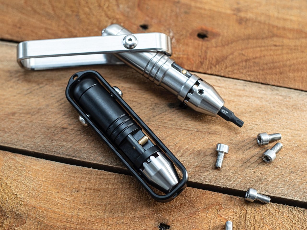
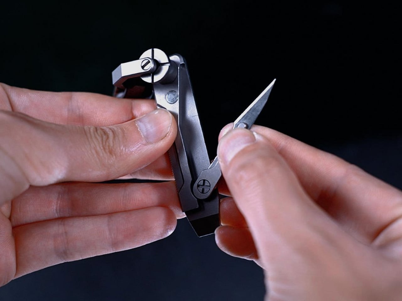
The MetMo Pocket Driver features its own dedicated tool, built around a reversible ratchet and a handle that folds outward. Keep it inline for a narrow approach, or open the handle into a T configuration when you need a different grip. Standard quarter-inch hex-bit compatibility is the important practical detail: you can choose bits around your own equipment instead of buying into a proprietary format. It’s a compact repair tool whose working parts remain visible during each turn.
MetMo lists the black aluminum version at 103 millimeters long and 109 grams, with hardened steel among its working materials. The handle stores two bits, enough to keep frequently used sizes with the driver without carrying an entire bit case. That also sets a limit: repairs needing several different heads require extra storage. It earns a place for people who tighten and adjust things throughout the week. If you rarely encounter a loose screw, it’s another handsome object to carry.
What we like
The reversible ratchet works with multiple handle positions.
Standard quarter-inch hex bits let you tailor it to your equipment.
What we dislike
Only two bits fit inside the handle.
Its 109-gram weight needs justifying if fastening jobs are rare.
6. Lumink Titanium Fountain Pen
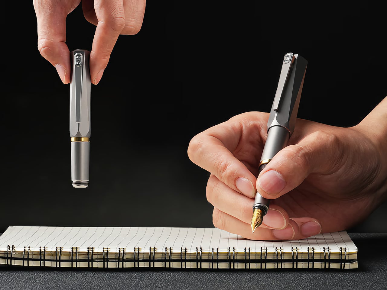
EyeQ’s Lumink addresses the awkward part of carrying a fountain pen: the length that makes it comfortable to write with can make it inconvenient to pocket. Its threaded configuration changes from approximately 96 millimeters in carry form to 140 millimeters for writing. The Grade 5 titanium body has twelve facets designed to stop it rolling away, plus a pocket clip.
The writing end uses a German nib, and the seller lists compatibility with international cartridges and converters. That gives owners a choice between convenient replacements and filling from bottled ink. Belloc describes a threaded cap and internal gasket intended to prevent drying between uses. There’s still a setup step before writing, unlike the instant deployment of a click pen. That makes Lumink better suited to someone who enjoys a writing instrument’s mechanics than someone who needs the quickest possible signature.
What we like
A short carry form becomes a full-length writing instrument.
Cartridge and converter compatibility provides different filling options.
What we dislike
Threaded setup adds a step before writing.
Fountain-pen cleaning remains part of ownership.
7. Tilta Khronos Core Limited Edition Kit
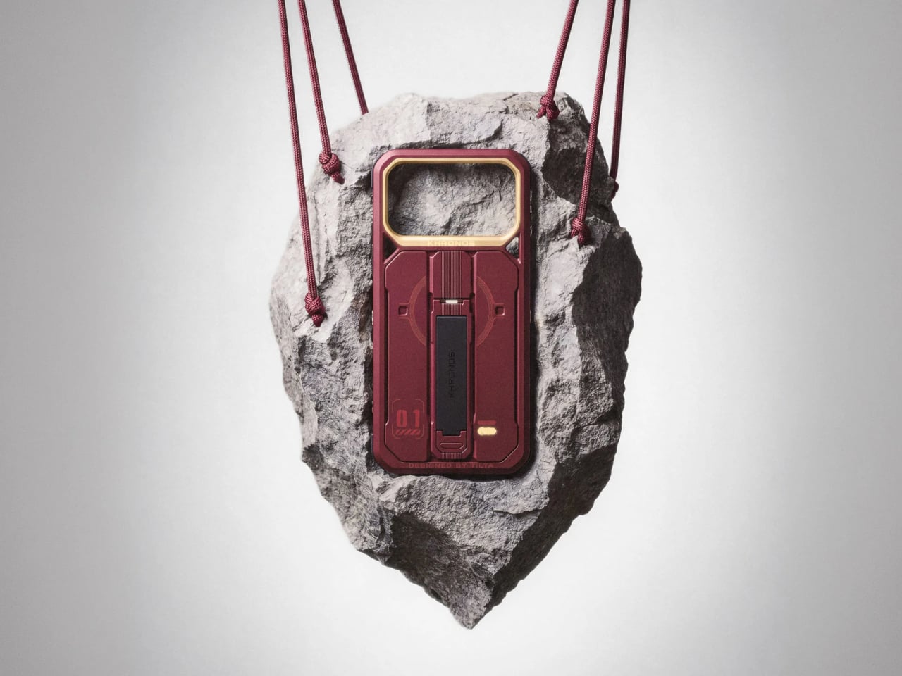
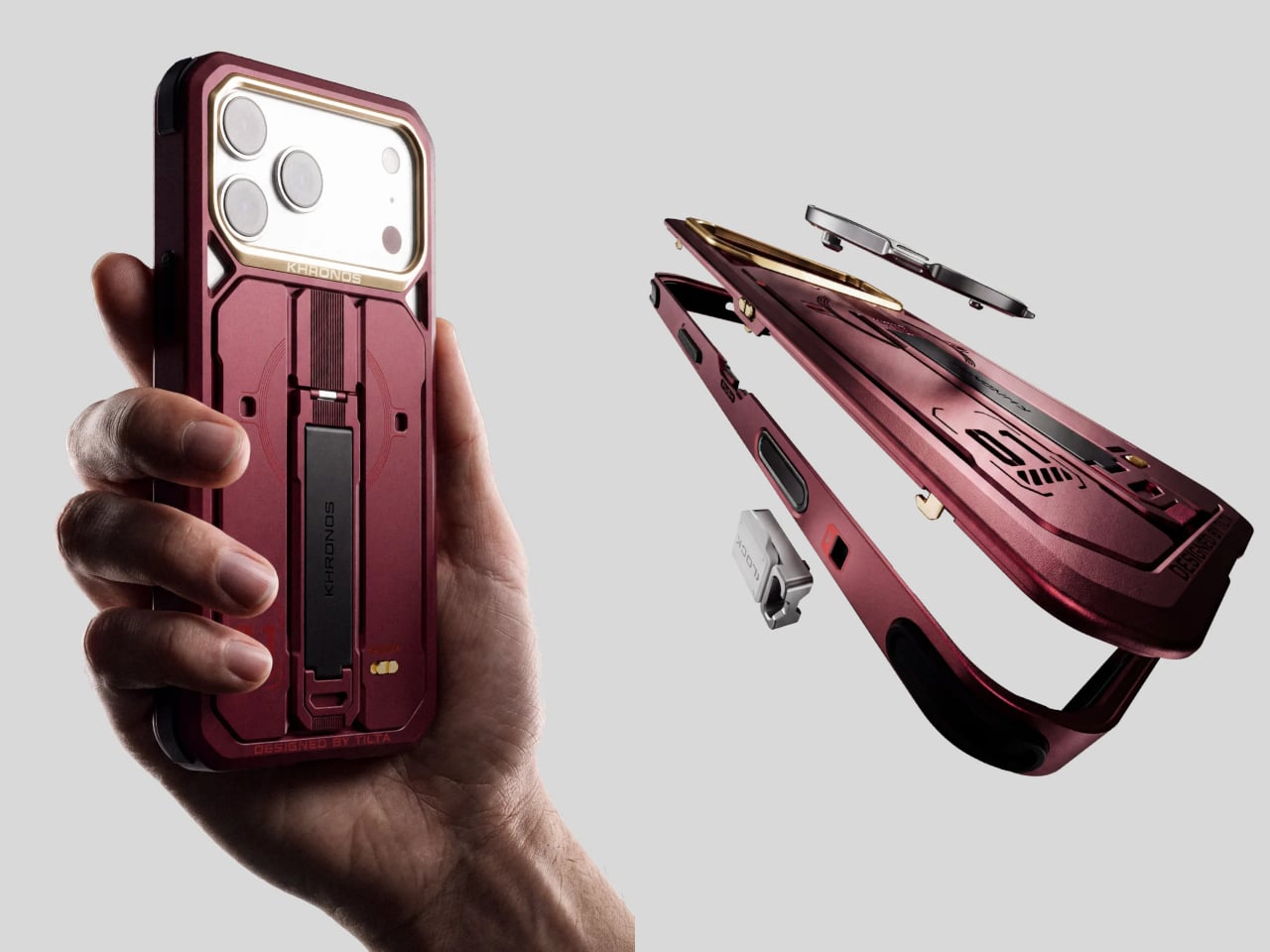
Tilta’s Khronos Core Limited Edition Kit treats a phone case as a small platform for everyday accessories. A CNC-machined aluminum frame accepts four backplates without tools: a kickstand plate, rotating ring plate, transparent keepsake compartment, or card holder. The card holder takes up to three cards behind a latched cover, while the transparent option leaves space for a photograph. Available for iPhone 18 Pro and Pro Max, it changes the function of the phone’s exterior rather than changing its color.
The kit includes short and long straps, with magnetic quick-release attachments and multiple mounting points on the frame. This supports different carrying arrangements, including wearing the phone across your body. Its strongest EDC argument is consolidation: a card plate could replace a separate wallet for a short outing. The compromise is buying several configurations when you may favor only one. Tilta’s standard case already includes the kickstand backplate, so the complete kit makes sense only if you’ll use the alternatives regularly.
What we like
Four tool-free backplates let the same frame serve different purposes.
The three-card compartment could replace a separate holder for short outings.
What we dislike
This kit is specific to iPhone 18 Pro and Pro Max.
The extra backplates add little value if you only use the kickstand.
8. Rolling Square Supertiny 100W GaN Charger
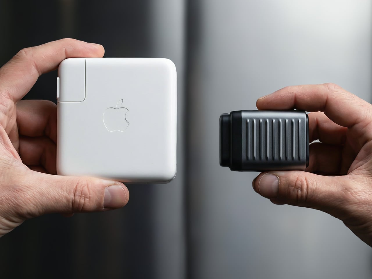
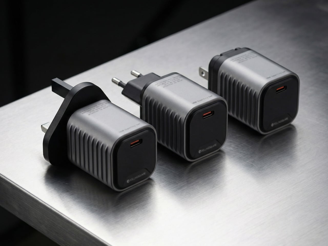
Rolling Square’s Supertiny 100W is the bag essential in this selection, rather than another object to clip onto your keys. Introduced through crowdfunding, it concentrates its advertised 100-watt output into a single USB-C port. The US version has folding prongs, a useful detail when the charger shares a pouch with cables and other equipment. EU and UK versions use different fixed plug arrangements, so the tiny footprint shouldn’t be treated as identical across every regional version or every travel setup.
The appeal is straightforward if you carry a compatible USB-C laptop and want to leave a larger adapter at home. One capable port avoids the extra sockets and bulk of a multiport charger, but also limits the standard setup to one connected device.
What we like
The single-port layout prioritizes compactness over extra connections.
Folding prongs on the US model make packing more convenient.
What we dislike
One USB-C port limits the standard setup to one device.
Current retail availability of the 100W version remains unverified.
Carry for the Jobs You Actually Do
Start with the small inconvenience that repeats. If you keep borrowing scissors, that’s a stronger reason to carry Eiger than any function count. If you regularly repair equipment, build a bit selection around the MetMo. A wallet or charging adapter might make a bigger difference than either. The useful test is what an object replaces, or what specific job it makes possible, rather than how impressive it looks laid out.
Leave room for changing your mind, too. A bag packed for commuting doesn’t need the same tools as one packed for a weekend away, and a phone case with card storage may make a separate holder unnecessary. The aim isn’t to assemble all eight into a matching collection. It’s to find the one or two objects that deserve to stay packed after the novelty has worn off and life resumes.
Kevlar has spent most of its career in serious places, like bulletproof vests, racing tires, and the occasional helmet. Chemist Stephanie Kwolek invented it at DuPont in 1965, and I doubt anyone in that lab imagined a functional fabric like Kevlar would one day be asked to look classy. Today the fiber basically has a second life as a fashion fabric. I find that delightfully absurd, like learning your bodyguard also had a career as a swimsuit model. Benks has been leaning into that split personality for a while, and its latest drop takes it somewhere sunnier.
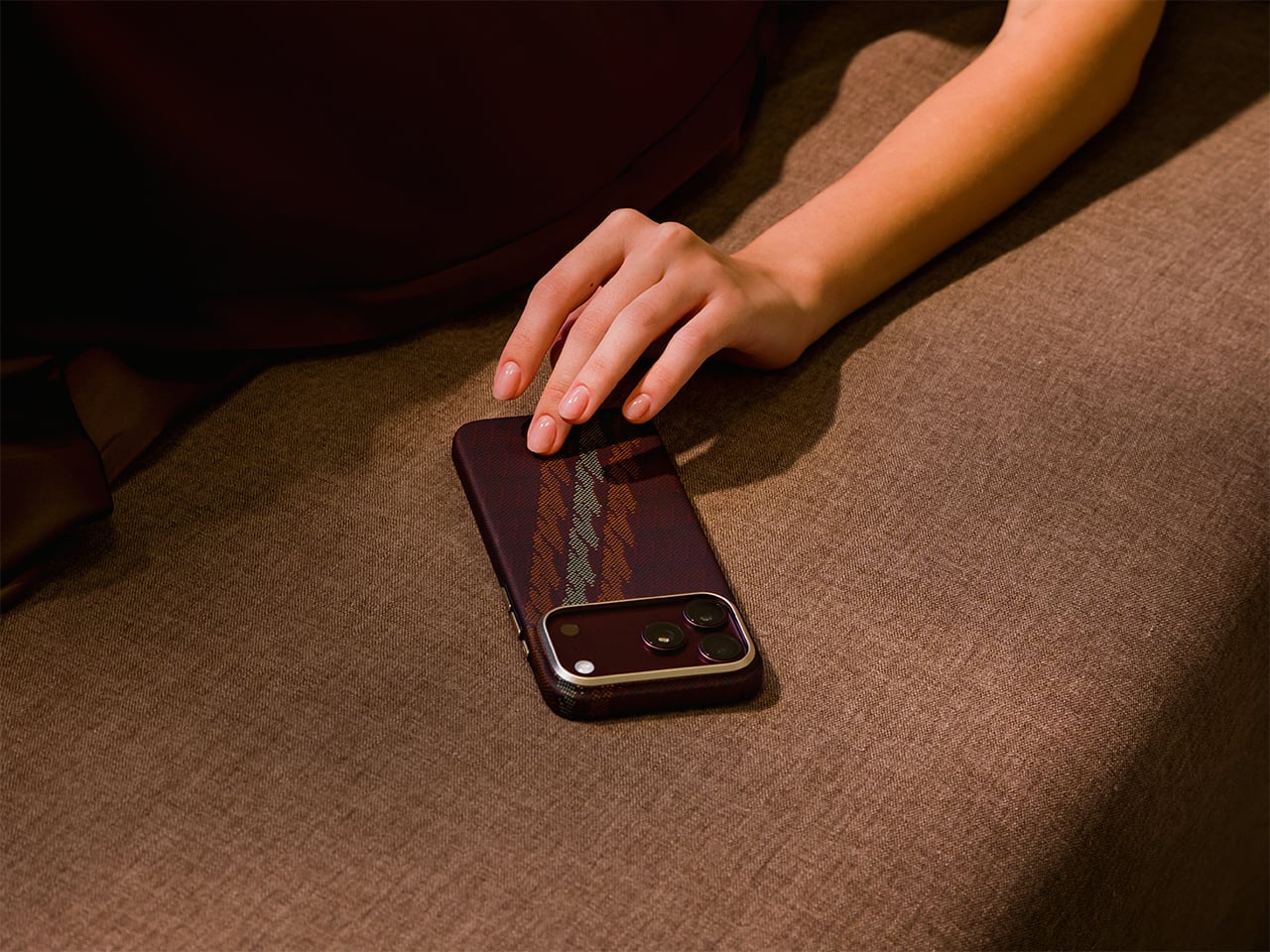
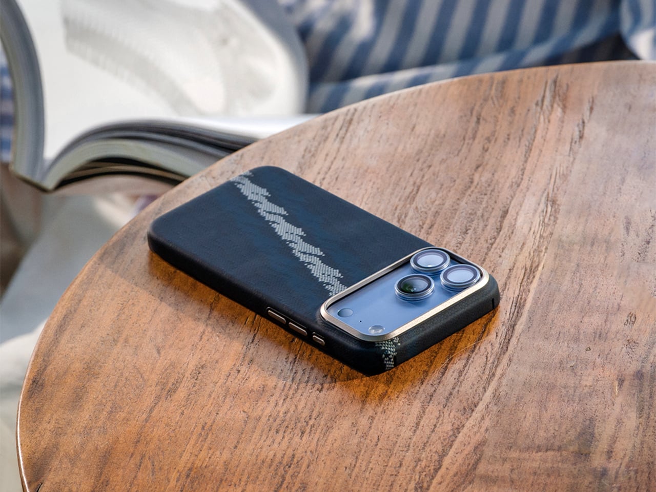
Meet Haven Azure and Haven Rouge, two Kevlar cases for the iPhone 18 Pro and Pro Max, priced at $69.99 each. Benks weaves the pattern directly into the Kevlar fiber using a 600D floating jacquard technique, rather than printing it onto the surface. That means the design is part of the weave itself, not just a layer of color that can scuff off. Azure ripples in layered blues, Rouge glows in warm reds, and both wrap the phone in a slim, full coverage shell. Building on the ArmorAir, the Haven series features a taller raised metal camera frame for enhanced lens protection, along with an upgraded ArmorKey that fully covers the Camera Control button. The result is a slim, full-coverage case that offers more comprehensive protection without compromising its refined design. Same tough stuff, just dressed for vacation.
Jacquard weaving builds a design into the cloth by lifting individual threads in a programmed order, a trick Joseph-Marie Jacquard automated with punched cards in the early 1800s. Silk mills near Lake Como, Benks’ stated inspiration, have long used the technique for ties. Benks applies the same logic to Kevlar, letting some threads float over others so colors and shapes appear in the weave. The 600D figure is a denier rating, which tells you how thick the yarn is. According to Benks, strands finer and more densely woven than the common 1500D give a smoother surface and a slimmer case. A loom from 1804 would recognize the idea instantly.
Getting color into Kevlar takes effort, and most of us picture the fiber as black and nothing else. Benks says the Haven colorways are woven into the fiber structure, with no laminated surface layer to peel, so the texture you feel is the weave itself. The brand has been heading here for a while, from the Knight ArmorAir with its champagne horse that reads like pixel art made from industrial fiber, to these flowing ripples. Benks bills the 600D Kevlar jacquard as an industry first, and the product shots show why it wants the credit. Big diagonal sweeps also suit a phone better than tiny repeating logos ever could.
Azure Cools Things Down, Rouge Warms Them Up
Azure sets a deep navy base and runs a diagonal band of lighter blues down the back, a bit like sunlight breaking up on lake water. Benks describes the pattern as gentle ripples in layered blue tones. Look closely at the product shots and the lighter threads read like tiny stitched pixels, which gives the band a cross-stitch charm. Rouge flips the mood with a burgundy base and a pale gold band, and Benks calls the shade Rouge Valley Red, with woven contour lines meant to recall warm valleys at dusk. Honestly, Azure feels like a lake breeze and Rouge feels like a glass of wine.
Benks shows both cases on all four iPhone 18 Pro colors, which are Black, Glacier, Burgundy, and Silver. Rouge on Burgundy looks like the obvious match, since phone and case speak the same dark red language. Azure beside Glacier makes sense too, though the blues also look sharp against Silver and Black. Each colorway has a matching ArmorPop grip and stand at $29.99 for anyone who wants the full set. The Haven tagline is “somewhere between here and away,” which also describes my mental state every Friday afternoon. Pick the mood first, then let your phone color follow.
Metal Frame, Enclosed Keys, Built-In Magnets
The iPhone 18 Pro is the first iPhone with a physical variable aperture, so its camera plateau deserves a proper guard. Haven wraps it in a raised metal frame that Benks says helps shield the lenses from scratches and bumps. Raised screen edges keep the display off flat surfaces without adding bulk. Enclosed ArmorKeys cover the side buttons, camera button included, and Benks promises crisp, responsive clicks. Cutouts line up with the ports, and the Kevlar texture wraps around the edges for a slip-resistant grip. A built-in magnetic core handles MagSafe accessories, so your charger, wallet, and grip stay where you put them.
Haven Azure and Haven Rouge are listed at $69.99 each on Benks’ site, with versions for the iPhone 18 Pro and the Pro Max (they’ll fit the 17 Pro series too). The cases boast a one year warranty, free shipping on orders of $39 or more, and a 30 day return window. Matching ArmorPop grips sit on the same product pages if you want to coordinate. Protection and personality have usually sat on separate shopping lists for phone cases, and weaving color straight into Kevlar is a neat way to merge them. Kevlar went from body armor to brunch, and I suspect it has a few more lives left.
Your phone can shoot video, run a demanding game, and carry an entire music library. It can also leave you holding a warm slab of glass, untangling a charging cable, or trying to photograph someone under terrible lighting. Those are the gaps worth designing for. A useful accessory should fix a specific irritation without creating three more, preferably through a mechanism you can understand before opening a thick instruction manual.
These nine selections tackle cooling, listening, cable clutter, misplaced cards, awkward camera controls, and backup power. Some attach to the phone; others give it a useful companion on your desk or in your bag. Start with the problem that actually bothers you most each day.
1. OnePlus Ice Card Mini
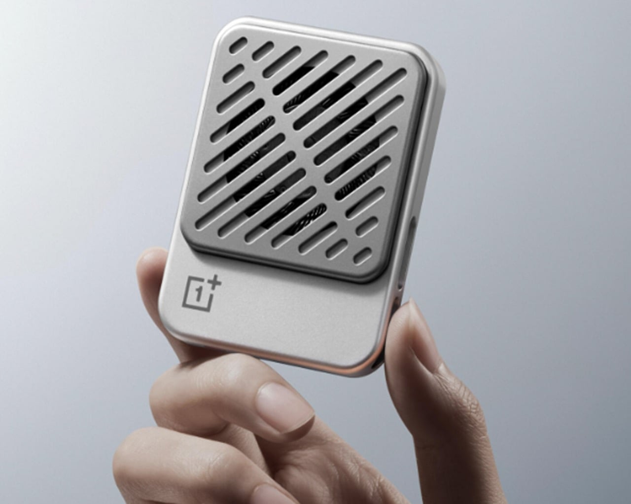
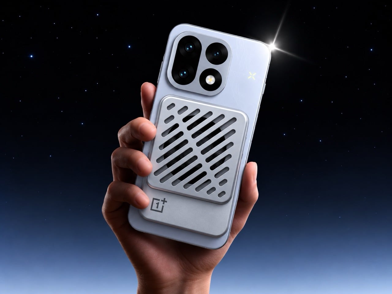
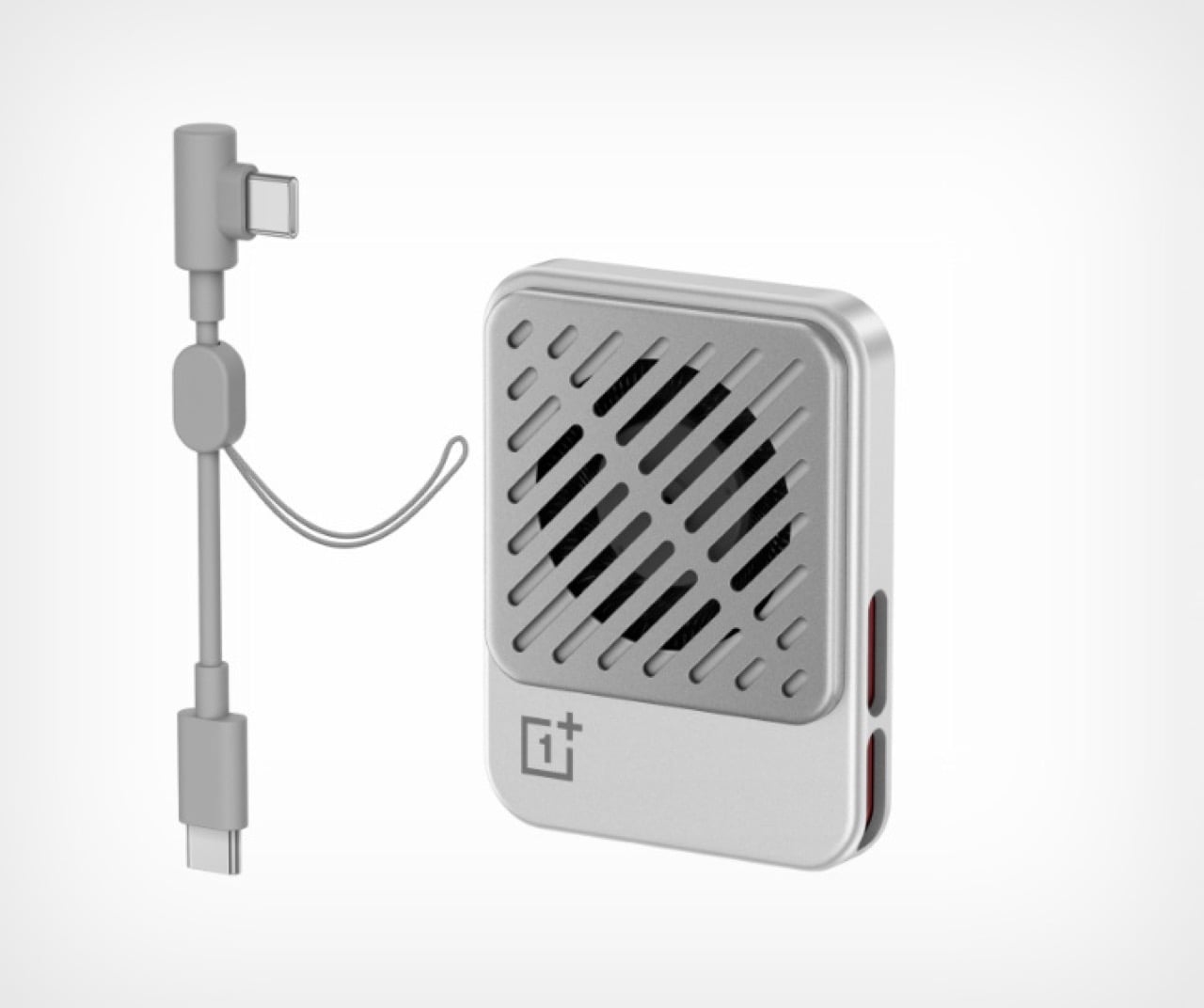
OnePlus has squeezed a phone cooler into a small card footprint rather than a bulky gaming attachment. The Ice Card Mini is listed in OPPO’s China store and described as a 50-gram body measuring 70mm by 53.4mm. Its thermoelectric chip works with an air-cooling system, while magnets hold the accessory against the phone. That compact packaging is the appeal: cooling becomes something you might carry alongside a cable, rather than reserve for a dedicated desktop gaming setup.
The practical tradeoff is power. The Mini draws up to 3.5W through USB-C and can run from a phone, power bank, or wall adapter. An included magnetic plate lets you attach it to phones without built-in magnets. It gives heat-conscious gamers a relatively discreet option, but drawing power from the phone adds another demand on its battery.
What we like
Compact, 50-gram magnetic format.
USB-C power accepts several sources.
What we dislike
Consumes power rather than supplying it.
2. StillFrame Headphones
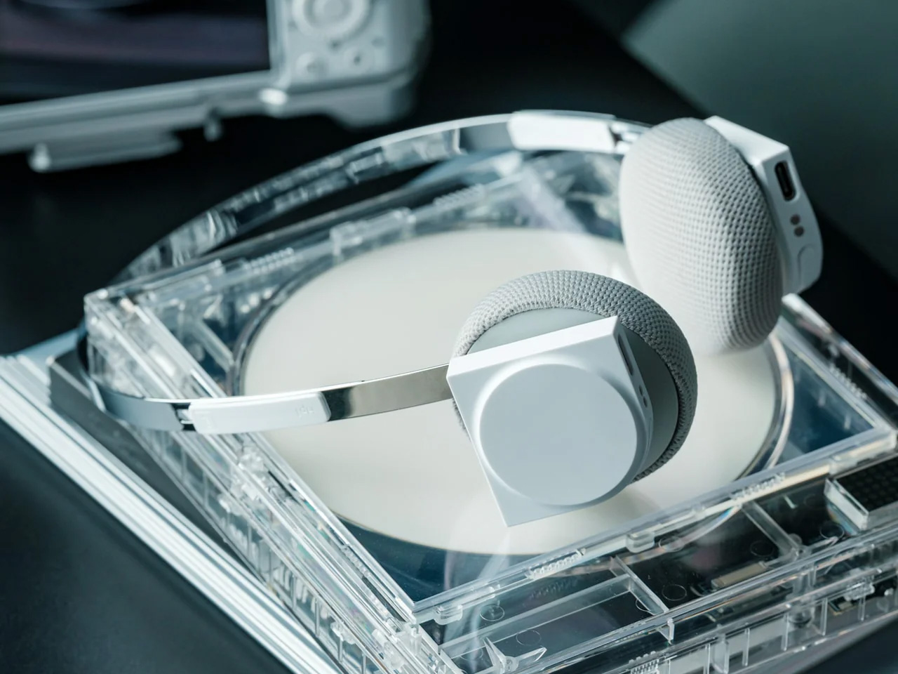
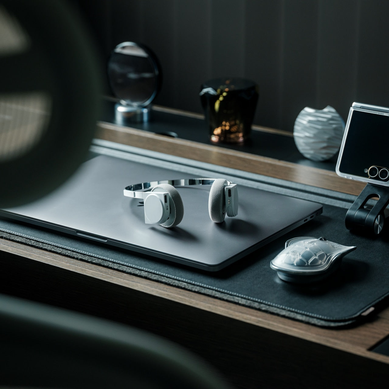
If earbuds bother your ears, a phone’s music library deserves another way out. StillFrame Headphones, designed by Tatsufumi Funayama, use an on-ear format with a stainless steel headband and magnetically attached fabric cushions. Circular and square geometry share the housings, with circuitry deliberately exposed. The retro reference has a practical point: you can choose headphones that sit against your ears without choosing the bulk of a conventional over-ear design for everyday listening.
Bluetooth 5.4 handles wireless listening, while the supplied USB-C cable supports wired playback. The headphones include 40mm drivers, noise cancellation, and a transparency mode; the maker claims up to 24 hours of playback. Those choices make StillFrame worth considering for desk listening or commuting when you prefer an alternative to in-ear buds. There’s one unusual operating detail: both sides need charging and separate button presses to power on. Light construction also doesn’t prove comfort or effective noise cancellation by itself.
Both sides require charging and separate power-on presses.
A full charge takes approximately three hours.
3. SuperCalla Magnetic Charging Cable
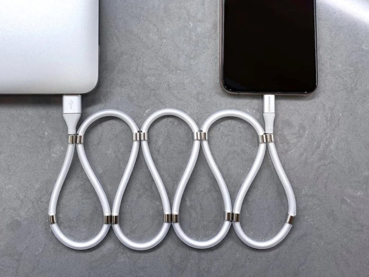
A charging cable shouldn’t need its own accessory just to stay organized. SuperCalla builds the organizer into the cable, placing magnets at intervals along its length. Line them up and the cable holds a coil or folded arrangement without a separate tie. The useful distinction is that these magnets manage the cable’s shape; they aren’t detachable charging connectors. For a bag that also carries keys, headphones, and adapters, keeping the loose length contained addresses a very ordinary frustration quite directly.
The manufacturer’s USB-C to USB-C listing separates a 60W, USB 2.0 version from a 100W, USB 3.1 Gen 2 option. That matters because neat storage says nothing about charging speed or file transfer performance. Choose the connector and electrical specification your phone actually needs, then treat the magnetic organization as the bonus.
What we like
Magnetic organization without a separate cable tie.
Multiple folding and coiling arrangements.
What we dislike
Cable variants have different data capabilities.
Dated shipping information needs clarification.
4. Battery-free Amplifying iSpeakers
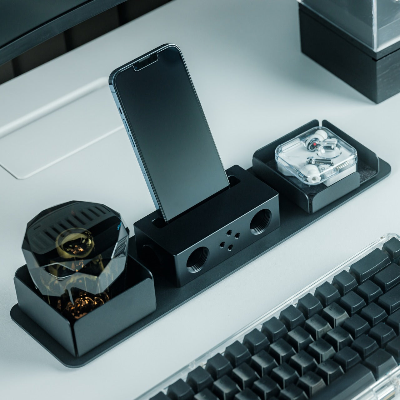
The Battery-free Amplifying iSpeakers take a pleasingly literal approach to phone audio: put the phone in a shaped metal enclosure and let the geometry do the work. Designed by Ooi Masato and made in Japan, the accessory uses duralumin rather than a powered amplifier. There’s no Bluetooth pairing, battery gauge, or charging cable involved. For someone who wants to listen aloud at a desk, it offers a dedicated place for the phone without adding another electronic device to the routine.
The attraction is simplicity, not a promise of room-filling volume. The phone remains the sound source, so this makes more sense as a casual listening accessory than a replacement for powered speakers. Check your phone and case fit before buying, along with the position of the speaker opening. Optional +Bloom and +Jet modules redirect sound and are sold separately. It’s an appealing desk object for people who value avoiding chargers and want their phone to have a permanent desktop home.
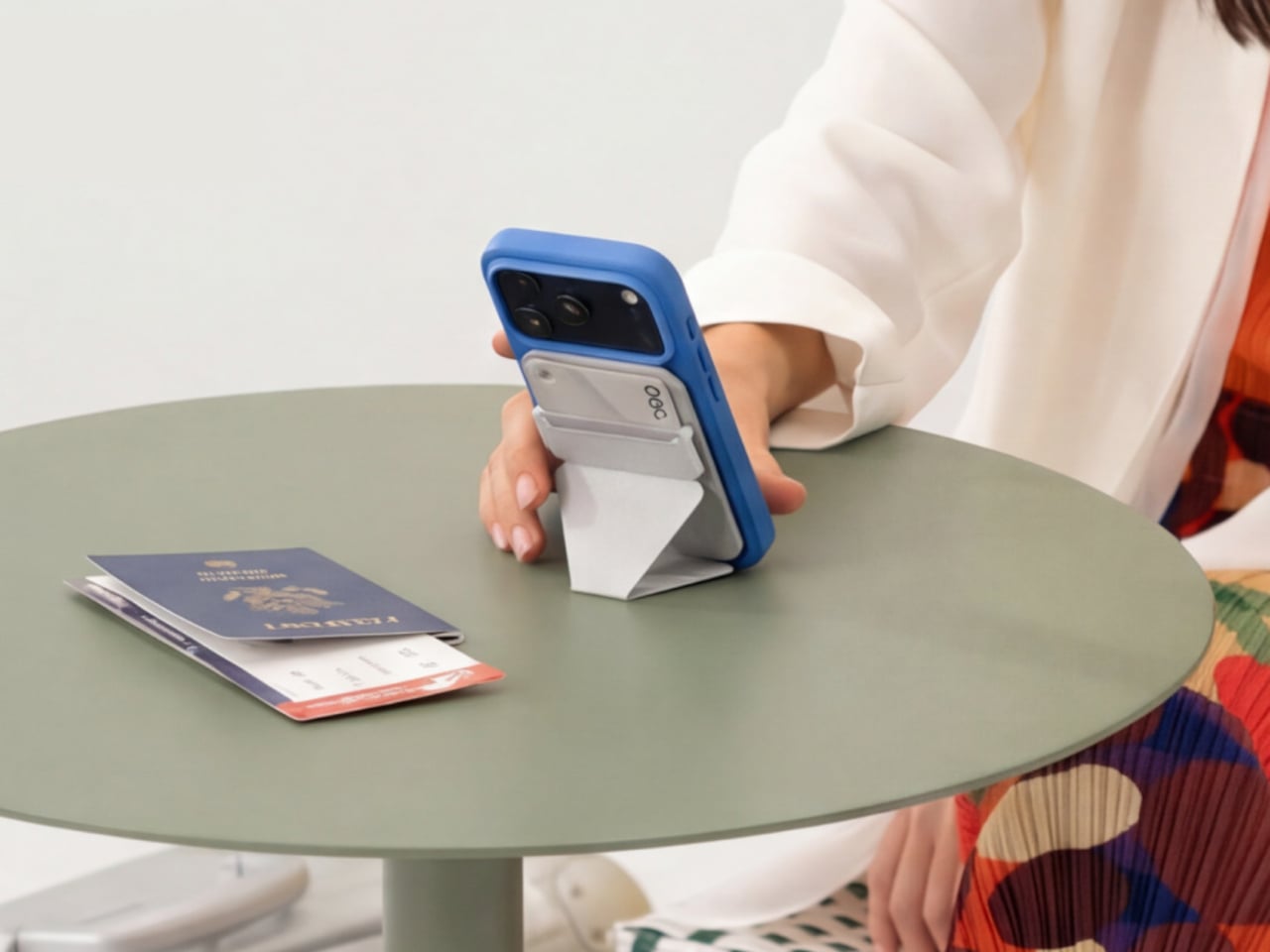
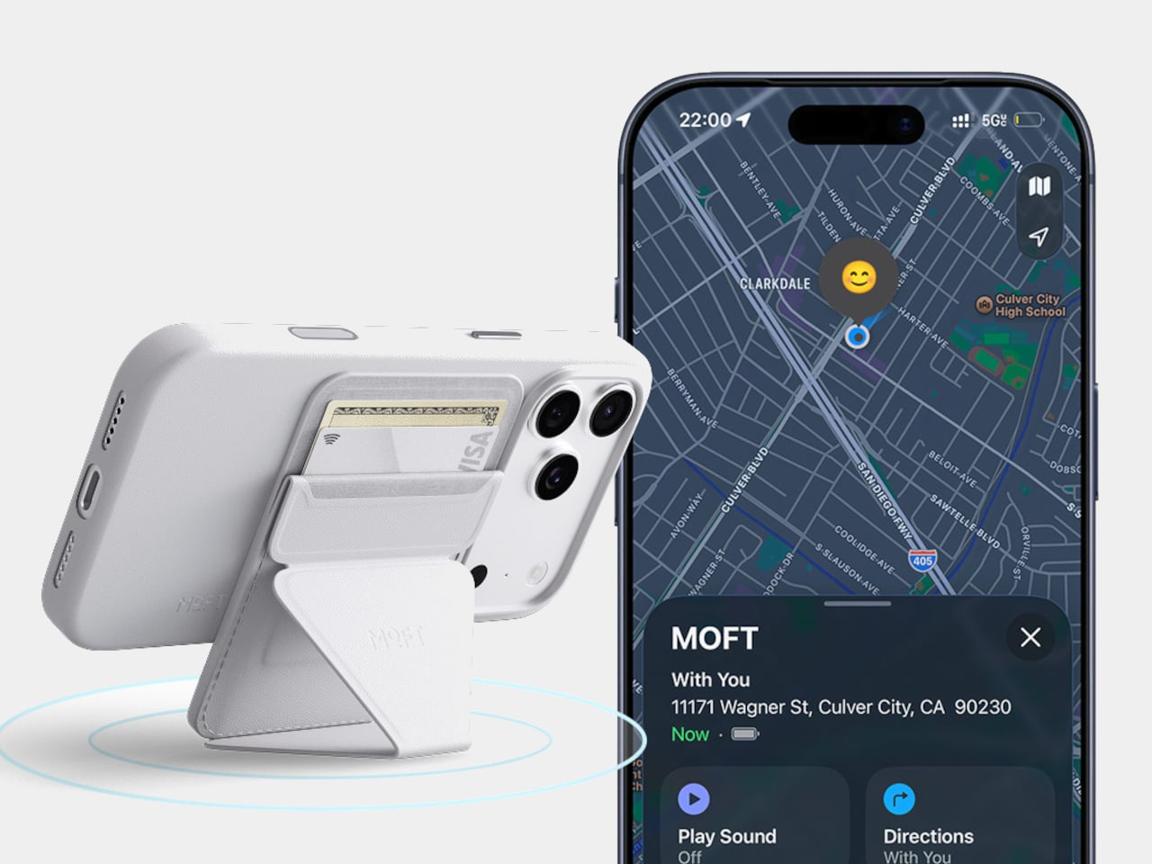
A magnetic wallet makes leaving the house with less stuff appealing, right up until you detach it and forget where it went. MOFT’s Trackable Snap-on Phone Stand & Wallet builds Apple Find My support into a folding accessory that also serves as a grip and stand. The current product listing specifies two cards and a 6mm thickness. Its usefulness comes from keeping those functions together, rather than asking you to carry a wallet, separate tracker, and stand every single day.
Find My gives the wallet a way to report its location and sound an alert, making it easier to look for when separated from your phone. MOFT claims around six months between wireless charges, and the folding construction supports portrait, landscape, and floating viewing positions. The limitation is equally clear: this is an Apple-oriented solution with room for just two cards. Its tracking battery is built in and nonreplaceable, so rechargeability is welcome but doesn’t resolve eventual battery serviceability concerns.
What we like
Find My tracking without a separate tag.
Wallet, grip, and stand share one folding structure.
What we dislike
Holds only two cards.
The tracking battery is not replaceable.
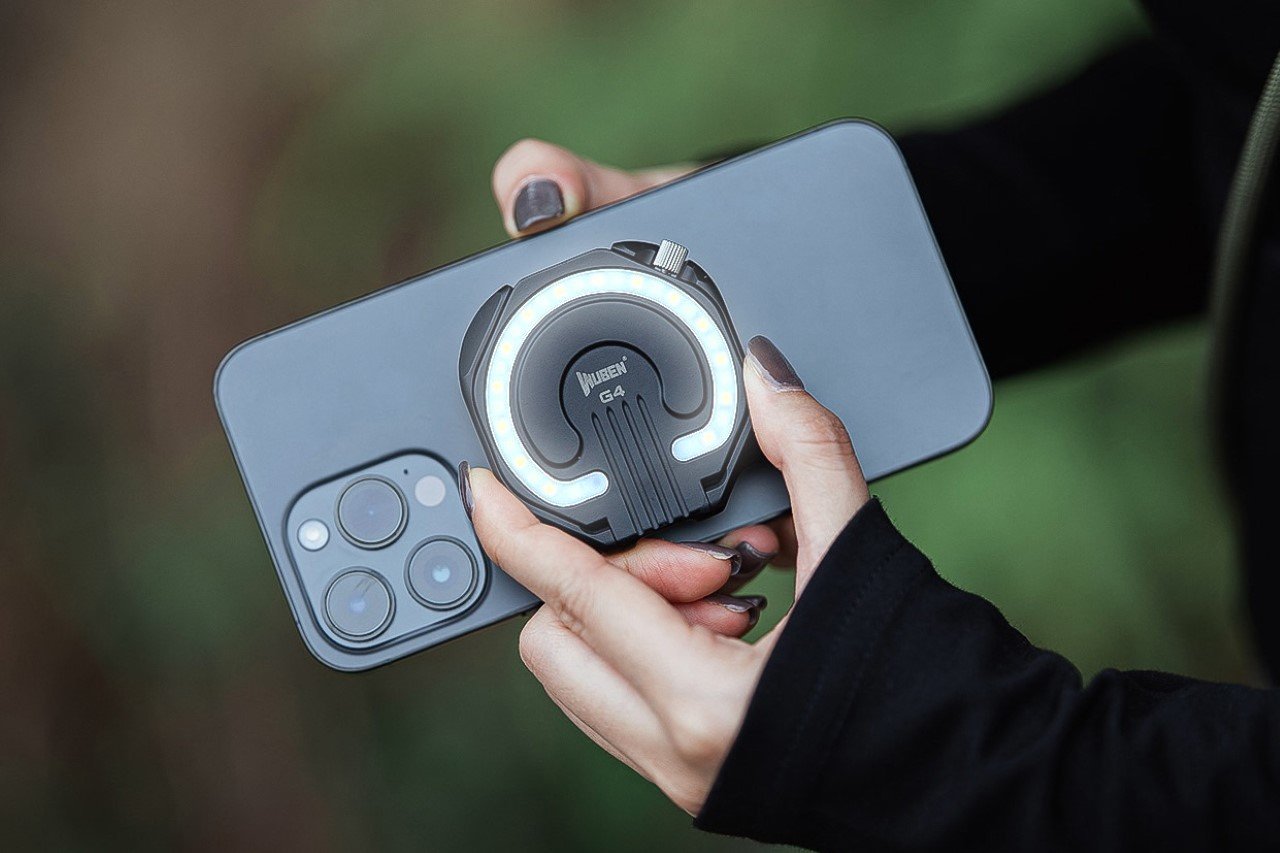
6. WUBEN E1 Magnetic Phone Light
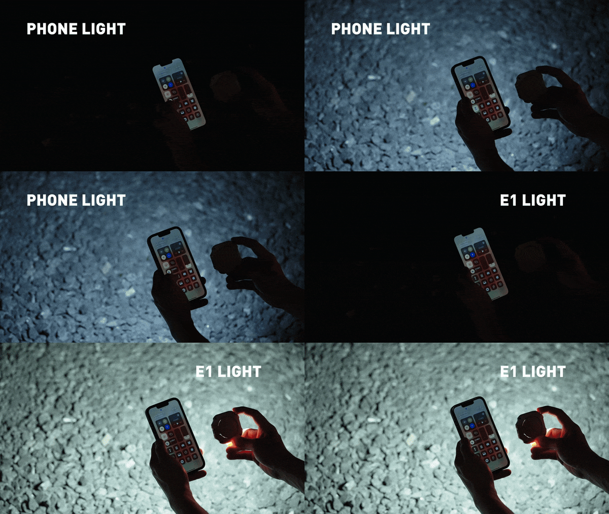
A good phone camera still depends on the light in front of it. WUBEN’s E1 gives you another source to position, combining an adjustable ring light with a magnetic phone mounting arrangement. Brightness is adjustable, and warm, neutral, and cool settings let you choose the color of the light rather than accept whatever the built-in flash provides. The hinged support lets you redirect the light and use the assembly as a stand for your phone too.
This makes the E1 interesting for video calls, close-up filming, and selfies where a small adjustable source is more useful than simply pushing exposure higher. WUBEN rates output at up to 300 lumens, but that specification alone doesn’t establish how flattering the light will look. It recharges through USB-C and needs magnetic phone compatibility or an adapter ring. Check the selected retail bundle carefully: the product page lists the bracket separately among its variants; don’t assume the mount is included.
What we like
Adjustable brightness and three color-temperature settings.
Hinged mounting adds control over light direction.
What we dislike
Adds another battery to recharge.
Bracket inclusion requires careful checking.
7. Leica LUX Grip
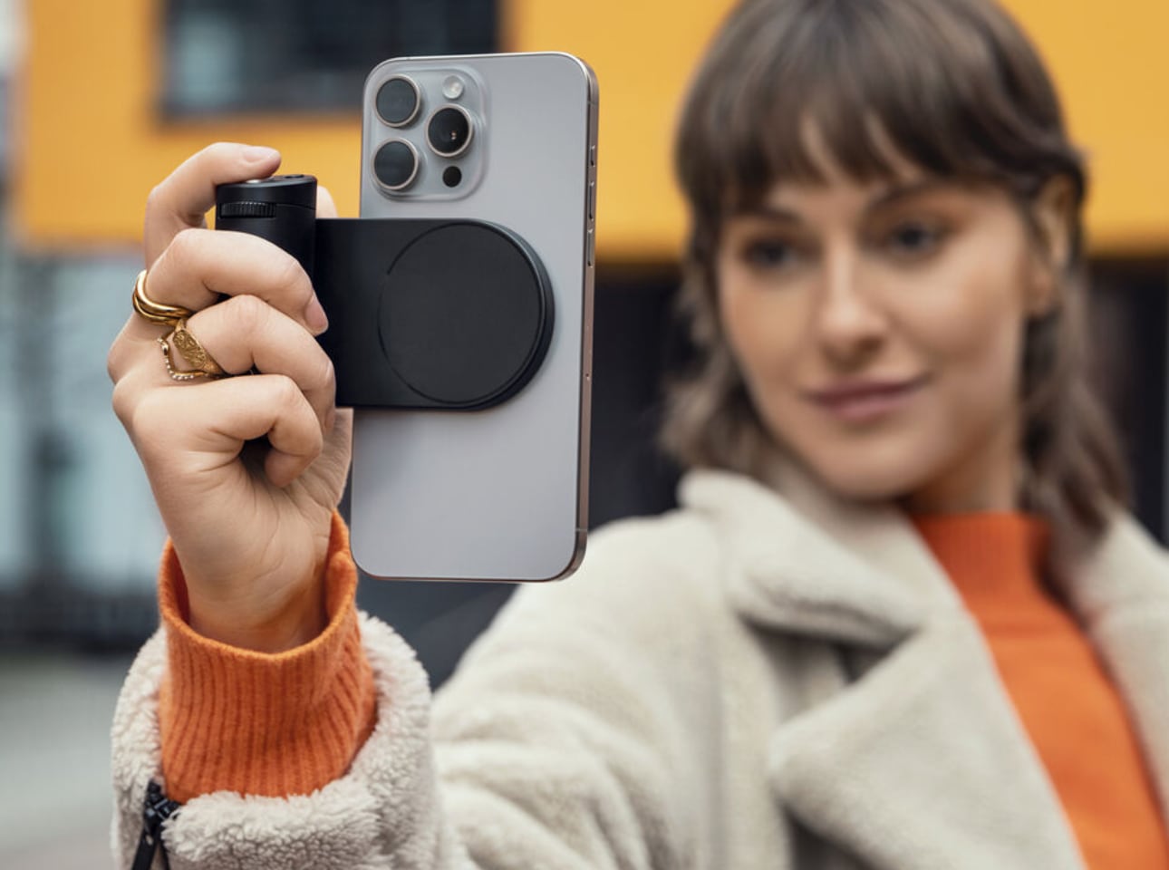
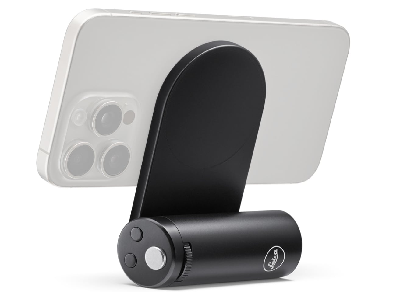
Touchscreens are wonderfully adaptable until you want a control you can find without looking. Leica’s LUX Grip attaches magnetically to a compatible iPhone and adds a two-stage shutter button, two customizable buttons, and a control dial. Half-press the shutter to focus, then press fully to take the photograph. That physical sequence is the point: it brings a recognizable camera action to a device otherwise dominated by glass, giving regular phone photographers a different way to hold and operate their camera.
The aluminum housing weighs approximately 130 grams, and Leica specifies roughly 1,000 exposures per charge. There’s an important software boundary, though: the grip works with the Leica LUX app, not Apple’s built-in Camera app. Registration includes twelve months of LUX Pro, with paid access afterward if you retain the subscription. It’s a specialized choice for someone happy to adopt Leica’s workflow. It does not change the iPhone’s sensor or optics, and it cannot double as a phone-charging power bank either.
What we like
Physical shutter and configurable controls.
Supports portrait and landscape attachment.
What we dislike
Limited to the Leica LUX app.
Pro access becomes paid after the included year.
8. KUXIU D5 Charging Station
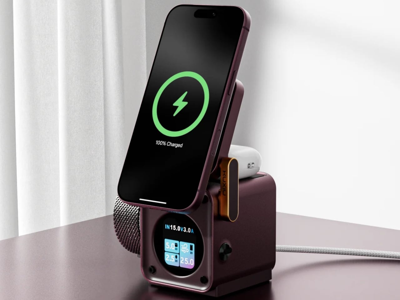
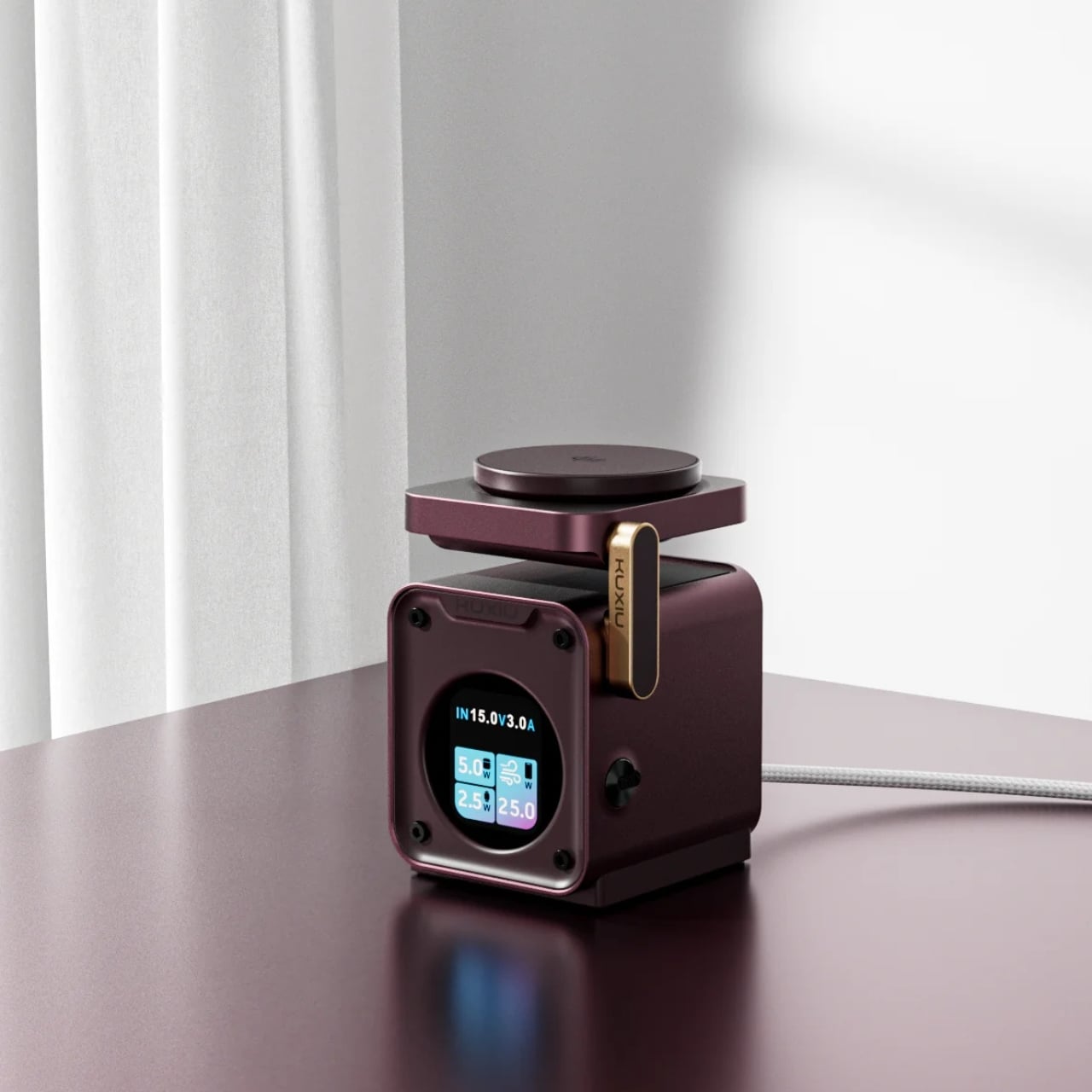
The annoyance here lives around the phone: an Apple Watch charger, an earbud cable, and adapters competing for desk space. KUXIU’s D5 gathers three compatible devices into one wireless charging station, with an adjustable phone platform and a motorized Apple Watch module that retracts into the body. The hidden watch charger is an unusually specific design decision. You only need that protrusion when a watch is charging, so the dock needn’t keep it permanently extended across your desk between sessions.
The display shows input voltage, current, and power, plus individual charging status, giving the dock more feedback than a single indicator light. KUXIU also includes an active cooling fan that can be switched off. Phone charging is advertised at up to 25W, but actual speed depends on the handset’s support. The watch module is specifically for Apple Watch, and earbuds need a wireless-charging case. For a compatible trio, the benefit is consolidation, not a guarantee that everything suddenly charges faster.
What we like
Three charging positions in one station.
Retractable watch module and informative display.
What we dislike
Watch charging is Apple Watch-specific.
Maximum phone charging speed depends on compatibility.
9. RetroWave 7-in-1 Radio
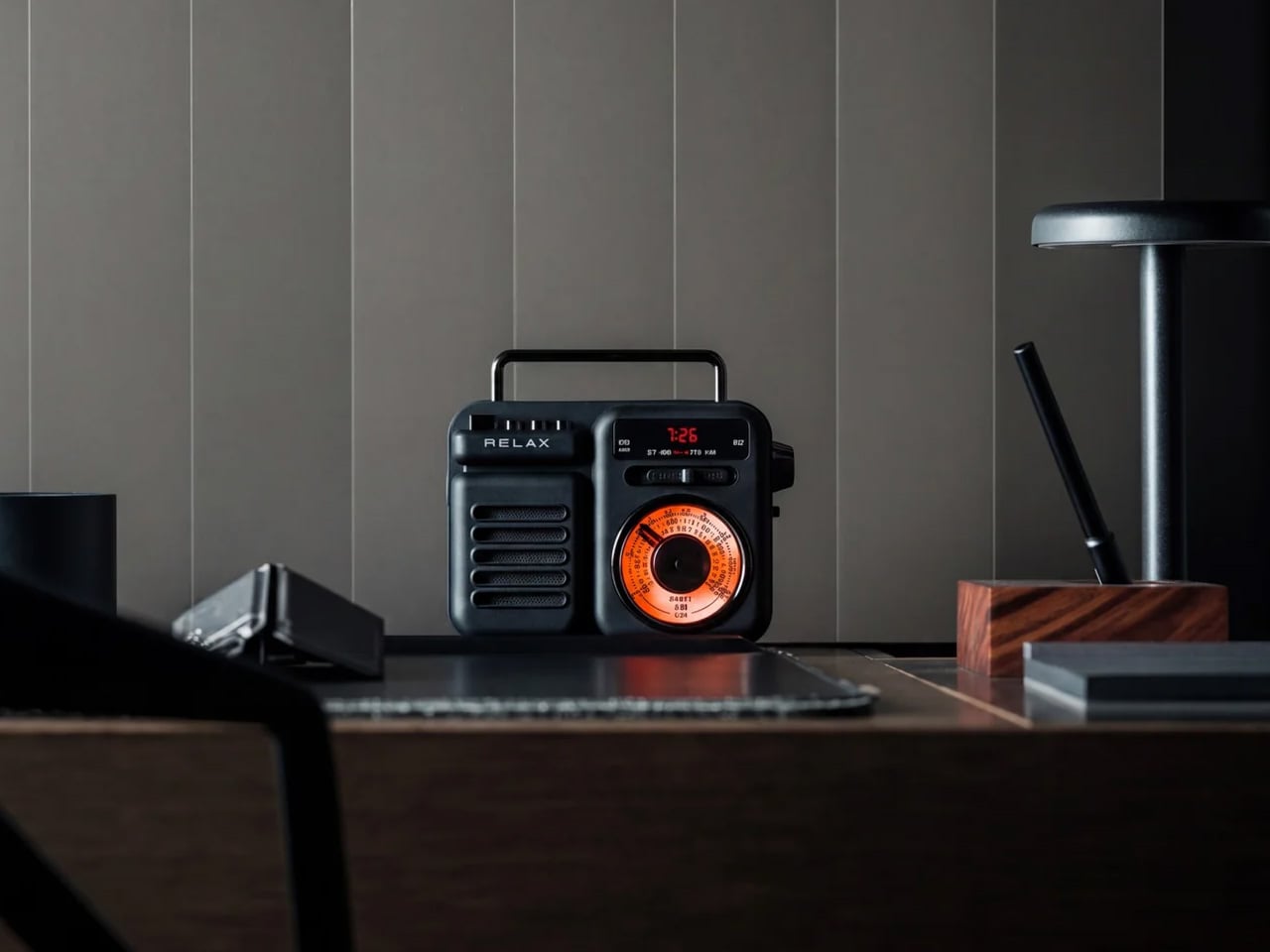
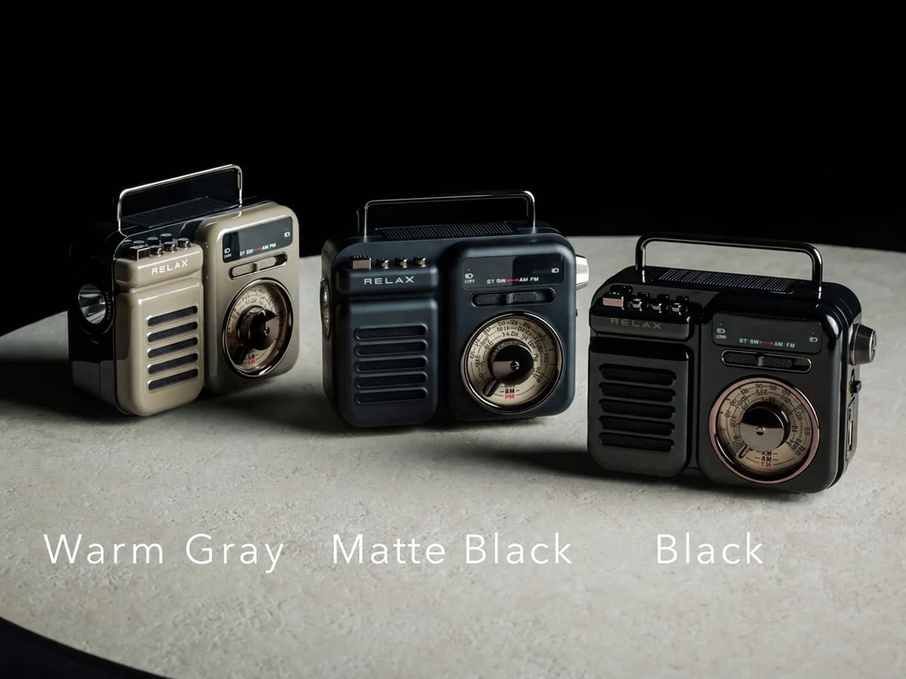
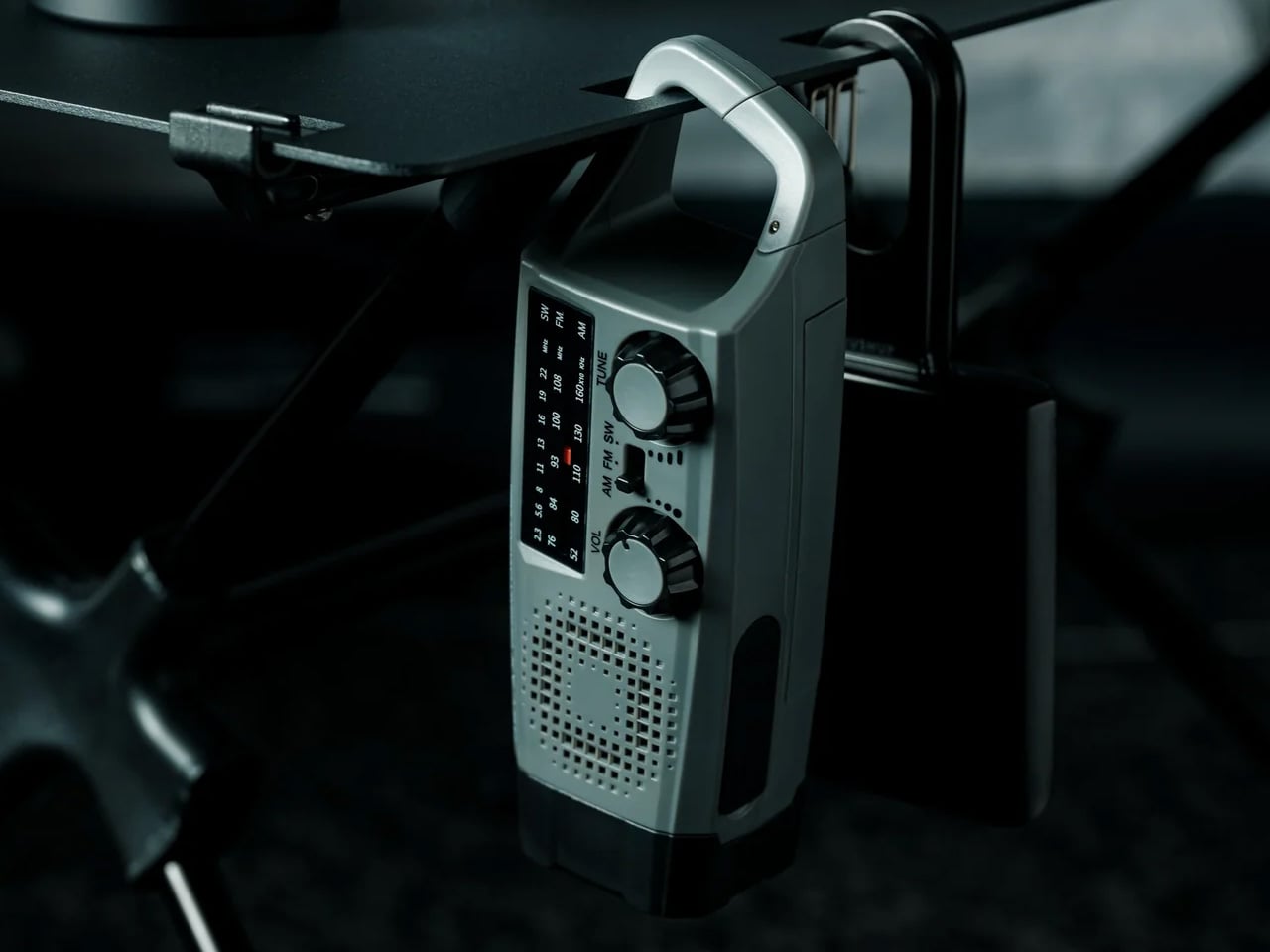
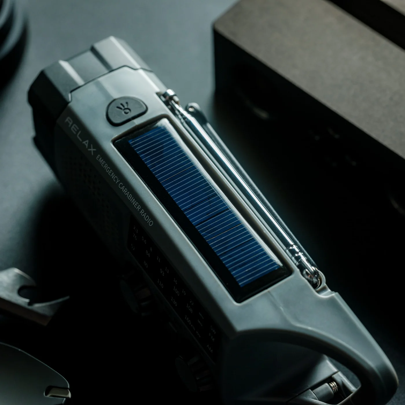
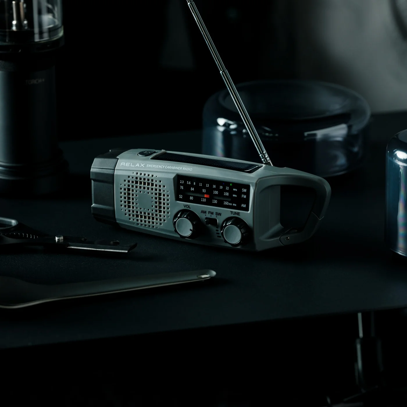
A smartphone becomes a much less useful companion when the battery runs down, and there’s no outlet nearby. The RetroWave 7-in-1 Radio brings a modest backup battery together with things a phone shouldn’t have to supply indefinitely: a flashlight, an SOS siren, and radio reception. Its 2,000mAh battery can provide a phone top-up, while AM, FM, and shortwave listening work without an internet connection. The tuning dial also provides a direct physical control instead of another screen to navigate.
Bluetooth playback gives RetroWave an everyday role as a phone speaker, while USB and microSD playback let it handle music independently. That matters for an emergency companion: it has reasons to stay accessible rather than disappear into a drawer. Be realistic about its charging options. USB is the primary method, the hand crank is intended for emergencies, and solar charging is supplementary. The small battery won’t replace a substantial power bank, but it offers a useful reserve alongside standalone functions.
Phone charging alongside independent radio and lighting.
Bluetooth and offline music playback.
What we dislike
Limited 2,000mAh backup capacity.
Solar and crank charging are secondary options.
Buy for the Problem You Actually Have
The sensible way to choose from this collection is to start with the irritation, not the accessory. If cables are your daily nuisance, a more elaborate charging station may be unnecessary. If touch controls interrupt your photography, a grip deserves more attention than another camera specification. Match the mechanism to the task, then check the phone, case, app, and charging requirements that determine whether it will actually work for you.
The less obvious question is where the accessory belongs when you’re finished using it. Something that folds, coils, docks, or stays useful independently has a better chance of fitting into a routine than something you must keep rearranging. There’s no need to buy all nine. A phone already does enough jobs; the right companion should remove one small source of friction without giving you another object to manage every day.
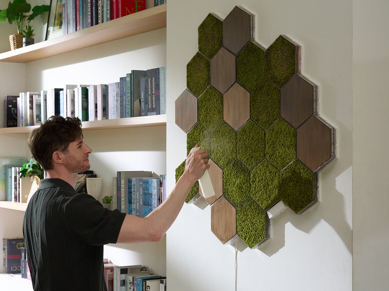
Moss has been on this planet for around 450 million years, which means it predates dinosaurs, continents as we know them, and the concept of a watering schedule. The plant’s actual trick is that it has no roots and absorbs everything it needs directly through its surface, which makes it one of the most low-maintenance living things you could put in a room. Interior designers figured this out around 2015 and started installing living moss walls everywhere from hotel lobbies to coworking spaces, at which point the rest of us learned that professional moss wall installation costs roughly what a decent used car costs. A consumer-friendly version of that idea has been weirdly slow to materialize. MOSSLAB designed Moss Hexa around that natural biology, using a soil-free system that reduces day-to-day care while preserving the texture and presence of real moss.
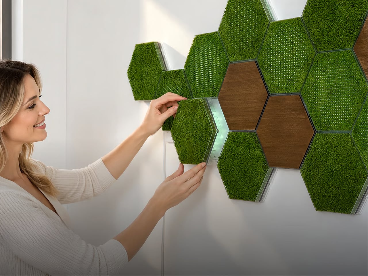
Moss Hexa is a modular moss system using 100% real moss panels in a hexagonal format, mounting via a proprietary magnetic system called HexaLock that lets you click panels into place, rearrange them, or swap them out without tools. Three panel types handle the main use cases: Basic for pure moss texture and color, Light for integrated LED ambient lighting with an auto-dimming sensor and app control, and Wood for warmth and visual rhythm as an accent. MOSSLAB, the South Korea-based studio behind the award-winning Moss Air and Moss Echo, built all three modules to share the same mounting hardware, making the whole system genuinely expandable over time without disturbing anything already on the wall. Pricing runs from a discounted $59 for the 3-panel Basic Starter Pack, with larger configurations available at campaign-exclusive pricing.
Hexagonal patterns appear throughout nature because they connect efficiently, repeat beautifully, and expand with minimal wasted space, from honeycomb structures to cellular geometry in biological tissue. MOSSLAB’s choice of the hexagon as Moss Hexa’s base unit is a structural decision that determines how the system scales and how freely it grows, and it pays off. Each panel measures 8.27 × 7.09 × 1.42 inches (210 × 180 × 36 mm), and because hexagons share flat, parallel edges on all sides, tiles can cluster in multiple directions without gaps or forced symmetry. The system offers preset configurations of 3, 9, and 15 panels, but the geometry means there’s nothing stopping you from building something in between. It holds up when you pull everything down six months later and try a completely different arrangement from scratch, which is the whole point.
The Basic panel features 100% real moss that is naturally drought-tolerant, requires no direct sunlight, and needs only occasional light misting to stay at its best. Its frame is made from PC and steel, with magnetic components, and the whole panel weighs just 0.75 lb (338 g). The moss retains its color and three-dimensional texture between mistings, helping preserve the natural depth and organic character that distinguish real moss from artificial alternatives. The Wood panel uses the same HexaLock mounting footprint but replaces moss with a warm wood-finish surface, designed as a compositional accent rather than a primary surface. A mostly-moss arrangement with a few Wood panels breaking the pattern is the right call; the contrast reads as intentional interior design rather than a texture experiment that got away from you.
Each Light panel combines 100% real moss with built-in ambient lighting designed to bring out the moss’s natural depth, color, and texture while changing the atmosphere of the surrounding space. Brightness can be adjusted from 1–100%, with a maximum power draw of 7W per panel, while a built-in ambient light sensor automatically adapts the lighting as the environment changes. Light panels connect directly to one another through USB-C-to-USB-C connections, and one Control Hub & Power Adapter can support up to nine Light Panels. The Hexa App provides manual lighting control, lighting presets, and Natural Daily Rhythm scheduling, giving users more flexibility to shape the atmosphere throughout the day.
Sound absorption performance was independently measured by KCL, a KOLAS-accredited laboratory recognized under the international ILAC-MRA framework, using a Moss Echo installation made with the same real moss material used across MOSSLAB’s Moss product line. Covering nearly 11 m² with approximately 300 moss panels, the installation was tested in a large-scale interior setting. The test recorded sound absorption of 27% at common speech frequencies, increasing to 56% at frequencies associated with keyboard typing and up to 65% at higher frequencies associated with background chatter. Those results add a functional layer to real moss beyond its visual and tactile presence. Because the test was conducted using the same real moss material found in Moss Hexa, the takeaway is not that Hexa replaces dedicated acoustic treatment, but that the material itself brings measurable sound-absorbing properties into a system designed to change how a space feels.
Powered by the HexaLock magnetic mounting system, each panel snaps into place with a single click, no complicated measuring, no specialist tools, no installation experience needed. You attach the mounting guide to your chosen surface, and both screws and adhesive mounting options are included. The guide handles alignment automatically, so panels sit consistently without leveling. The key design call is that Basic, Light, and Wood panels all share the same HexaLock footprint, meaning you can swap any panel type for any other at any point without touching the wall hardware. You can start with 3 Basic panels, add Light panels as a seasonal upgrade, and work toward a 15-panel Signature Styling set across multiple additions, all from the same original wall installation. The dual mounting option, screws for homeowners and adhesive for renters, is a small detail MOSSLAB got right, and the kind of thing you only think to include if you’ve genuinely considered your customer’s actual living situation.
Moss Air earned a CES Innovation Award, an iF Design Award, and an IDEA Design Award, and MOSSLAB has also participated in an open innovation program with a major Korean conglomerate, and in 2025 was the only international startup chosen among five for Panasonic’s Electric Works accelerator program. These are production-level credentials, not concept-stage accolades, and they matter when evaluating a new product that ships internationally. The Basic Starter Pack (3 panels) will be available for $59 during the first 72 hours of the Kickstarter campaign launch, the Light Starter Pack (3 panels) at $99, and the 9-panel Basic and Light Standard Packs starting at $159 and $229, respectively. The 15-panel Signature Styling Pack, which combines Basic, Light, and Wood panels, starts at $339 during the same launch period. Individual add-ons are available at $25 for a Basic Panel, $40 for a Light Panel, and $24 for a Wood Panel, while an additional Control Hub & Power Adapter Set is $23. Estimated U.S. shipping starts at $25 for a 3-panel configuration, with fulfillment estimated to begin in June 2027.
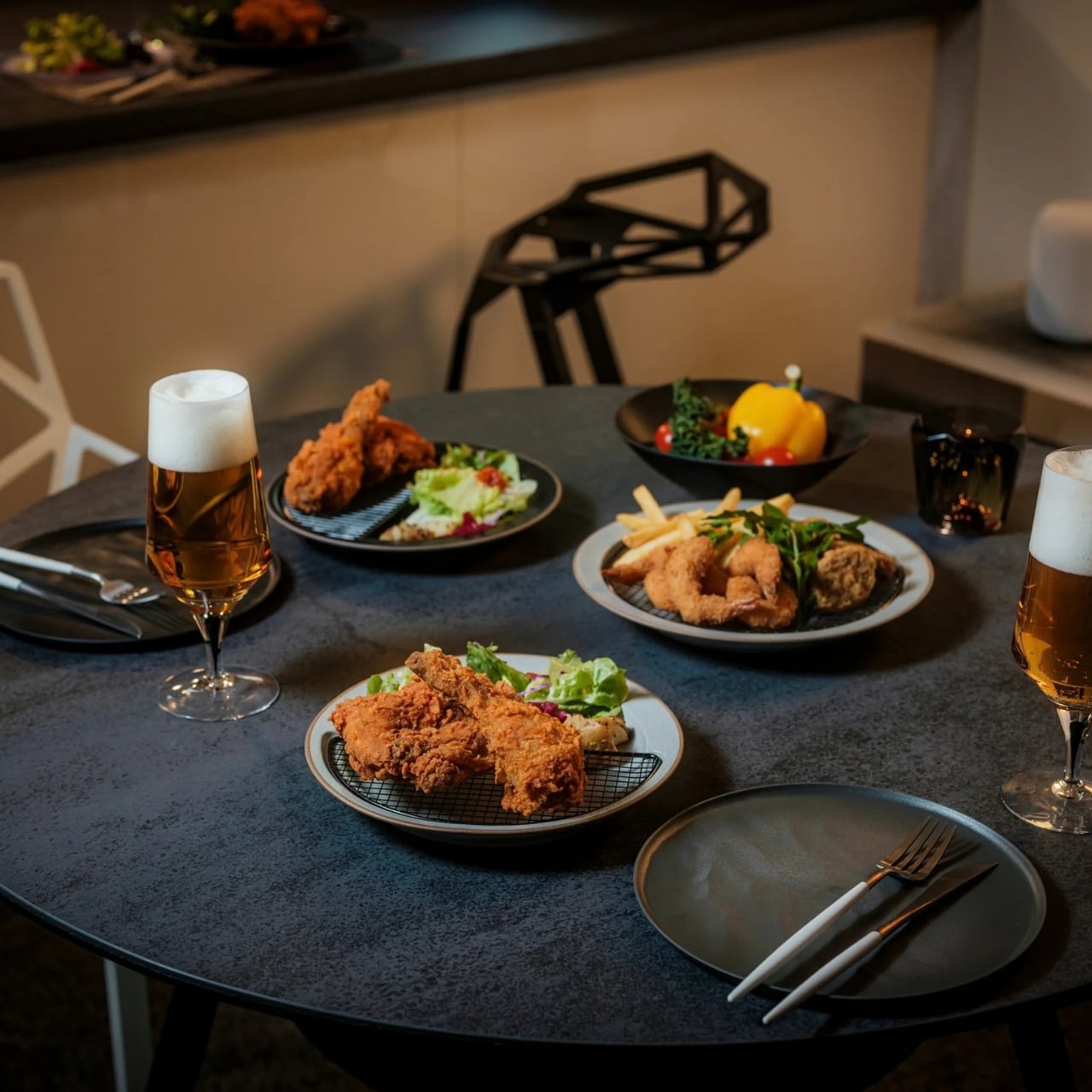
Football season turns living rooms into something closer to a clubhouse for a few hours every weekend. The right gear makes that shift effortless, pulling together sound, screen, food, and drink into one setup that actually works for a full slate of games rather than falling apart by halftime.
None of these eight picks are trying to reinvent the sport itself. They’re solving the real logistics of hosting: the can that never pours right, the cooler that goes warm by the second quarter, the speaker setup that can’t keep up with a packed room full of noise.
1. DraftPro Top Can Opener
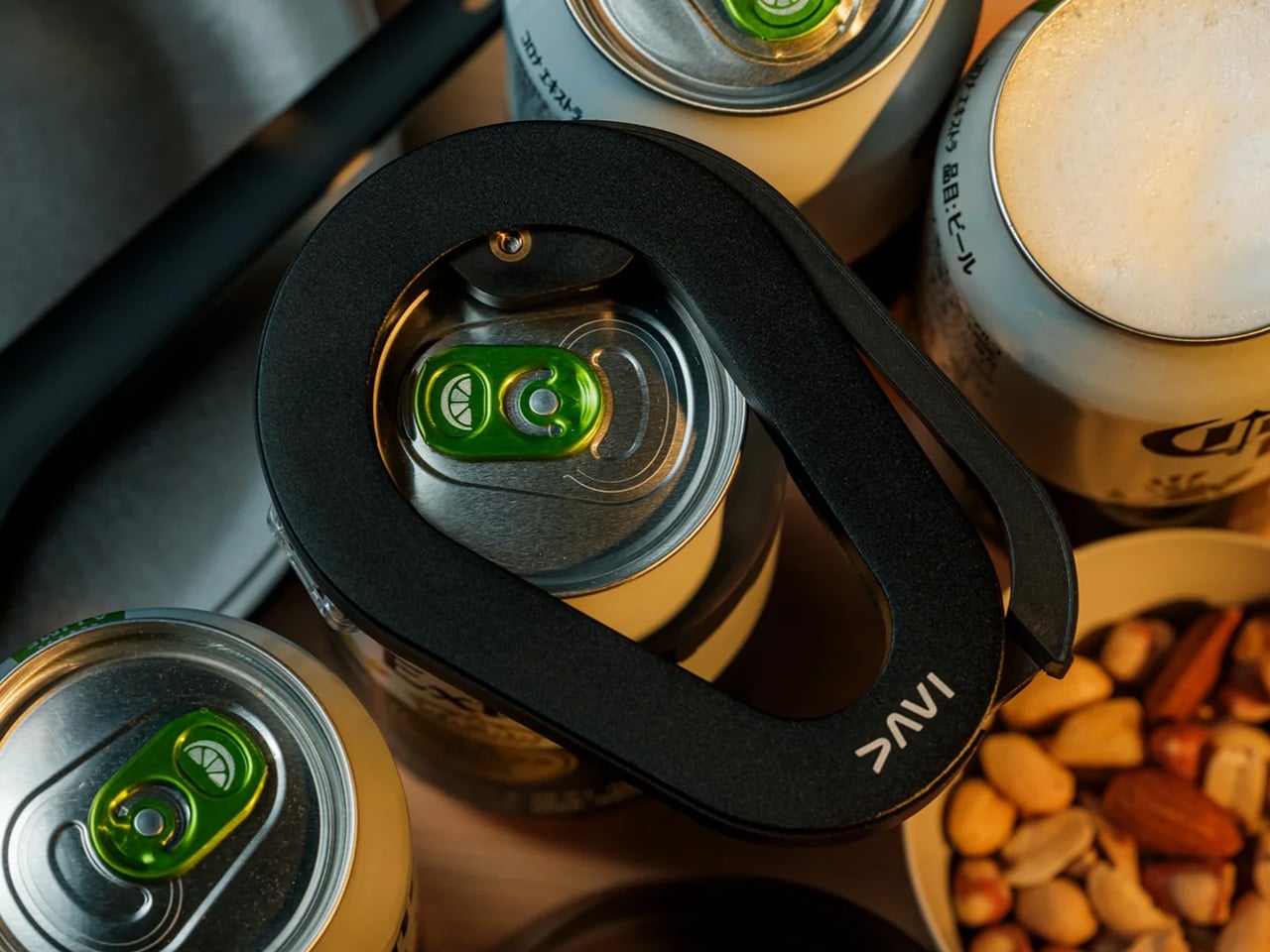
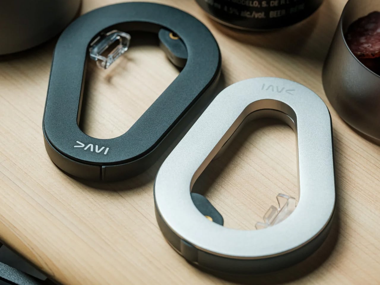
There’s a reason the first pour matters so much on game day. DraftPro removes the entire top of a can instead of just puncturing it, turning a beer or sparkling water into something closer to a glass pour, aroma included. Designed by Shu Kanno and built in Japan, the motion is smooth and controlled, with a clean edge that’s safe to drink from directly. For you, that means handing a guest a can that actually tastes like it was poured properly, without reaching for a single glass all game.
It works for more than beer too. Drop ice straight into the can for instant chilling when the cooler’s running warm, or mix a quick cocktail right inside it with zero cleanup. Compatible with domestic and international cans, it travels well between the kitchen and the couch, and the clean cut even lets you repurpose empties into planters or pen holders once the game’s over.
Removes the entire top for a smooth, glass-like drinking experience
Works as a makeshift cocktail shaker with no extra dishes to wash
What We Dislike
Only a handful of units were listed in stock at the time of writing
Limited to cans, so bottles need a separate opener nearby
2. PhaseTherma
A great drink setup falls apart the moment the ice turns to water. Freezill solves that with PhaseTherma, a phase-change cooling core that keeps ice solid for up to 150 hours without any external power source. For you, that means setting up the drink station once before kickoff and not thinking about it again until the final whistle of a doubleheader weekend, no refills, no plugging anything in.
At $149, it reads less like a cooler and more like premium travel gear that happens to double as game day equipment. The zero power draw also means it works just as well on a porch or in a garage as it does parked next to the couch, so the setup goes wherever the crowd ends up sitting.
What We Like
PhaseTherma core keeps ice solid for up to 150 hours
Needs zero external power to maintain its cooling performance
What We Dislike
$149 is a real investment for what is, at its core, a cooler
Premium design means it’s built for care, not for rough outdoor use
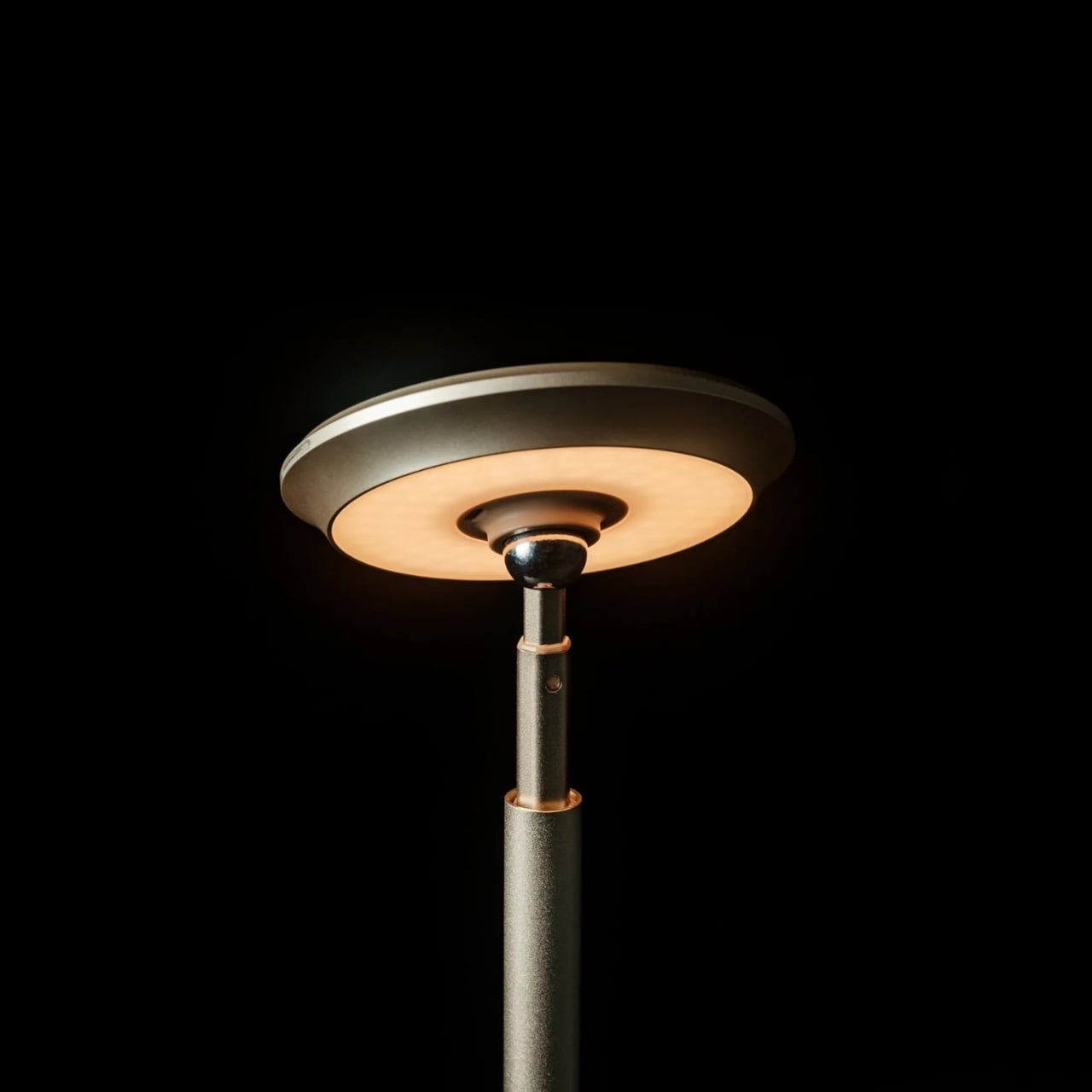
3. Battery-free Amplifying iSpeakers
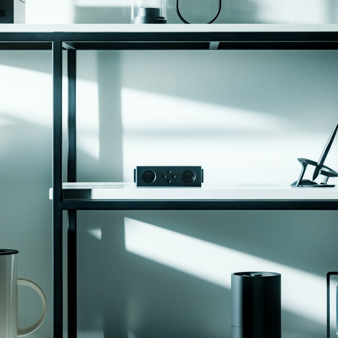
Every other speaker in the room needs something: a charge, a pairing sequence, a Wi-Fi password. This one needs nothing but your phone. Designed by Ooi Masato and machined from Duralumin, the same vibration-resistant aluminum alloy used in aircraft, it amplifies a smartphone’s built-in speaker purely through acoustic geometry. For you, that means setting it down on a side table and having sound fill the room without a single cable in sight.
The chamber’s proportions were shaped using the golden ratio, which is less a gimmick and more the reason the sound comes out as focused as it does. No app, no Bluetooth, no battery to die mid-game. Just a slot for the phone and a noticeably louder room a second later.
Golden ratio proportions make it as much a desk object as a speaker
What We Dislike
Volume ceiling is naturally lower than a powered Bluetooth speaker
Only works with a phone placed inside it, not as a standalone unit
4. Xiaomi Redmi Projector 5 Pro
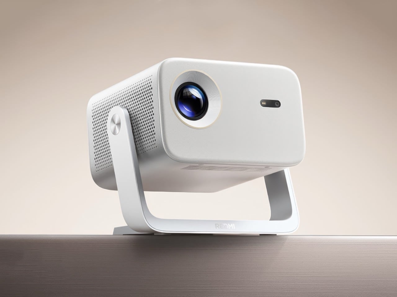
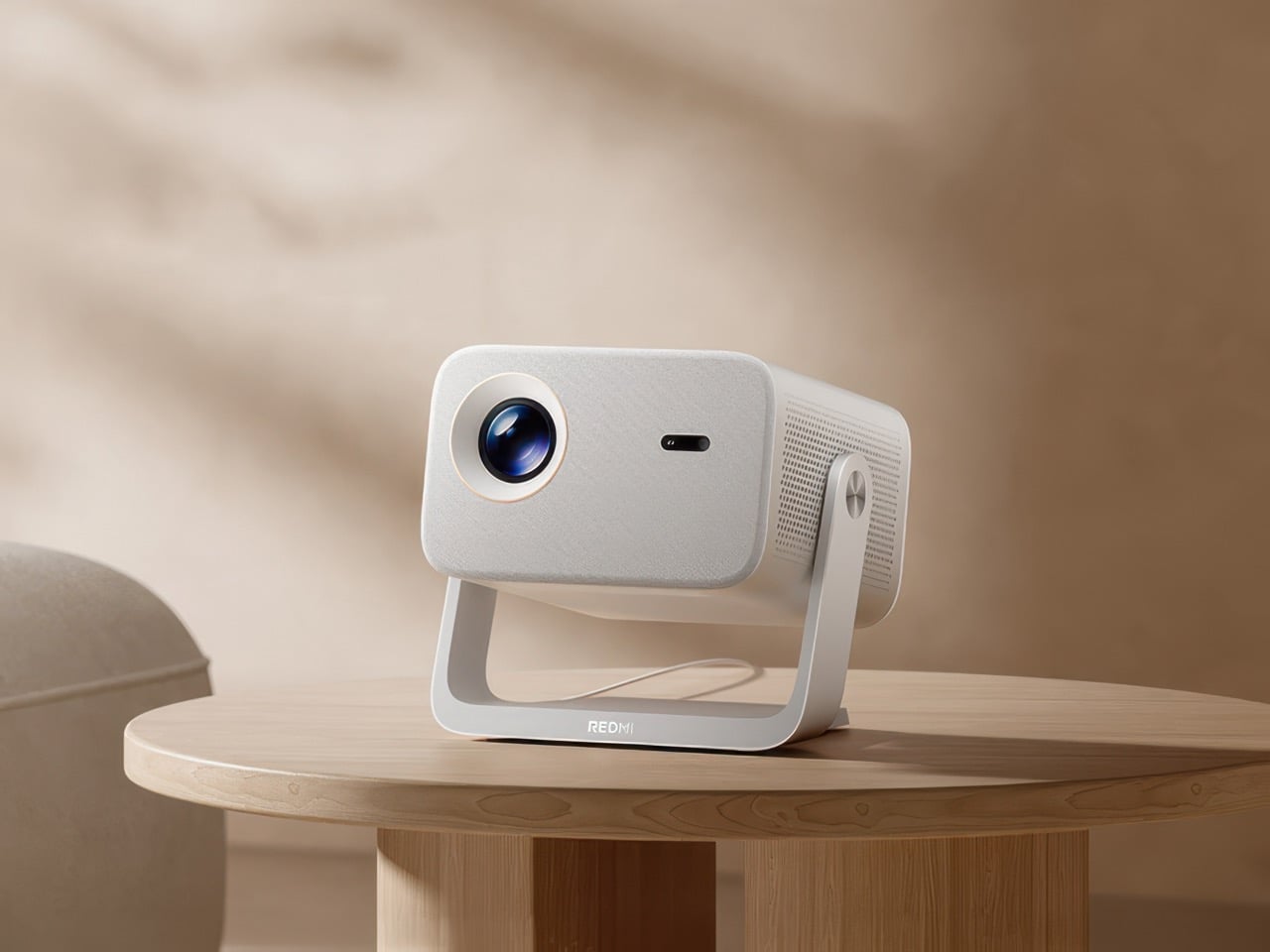
The screen is where game day actually lives, and this one makes a big one affordable. Native 1080p scales up to 120 inches, backed by 1,000 CVIA lumens, HDR10, and a 120Hz refresh rate running at just 5ms of latency. For you, that means a crisp, responsive picture that can fill an entire wall for less than the cost of a year of streaming subscriptions combined.
A metal gimbal arm swings 150 degrees, so the projector adjusts to whatever angle the room demands without needing a dedicated mount or stand. Dual HDMI and Wi-Fi 6 round out the connections, meaning a streaming box, a console, and a laptop can all stay hooked up at once without a single cable getting swapped out between games.
What We Like
120-inch scaling at $281 undercuts most home theater setups by a wide margin
Gimbal arm adjusts 150 degrees without needing a separate mount
What We Dislike
1080p native resolution means it’s not a true 4K experience
HDR10 support only goes so far without a properly darkened room
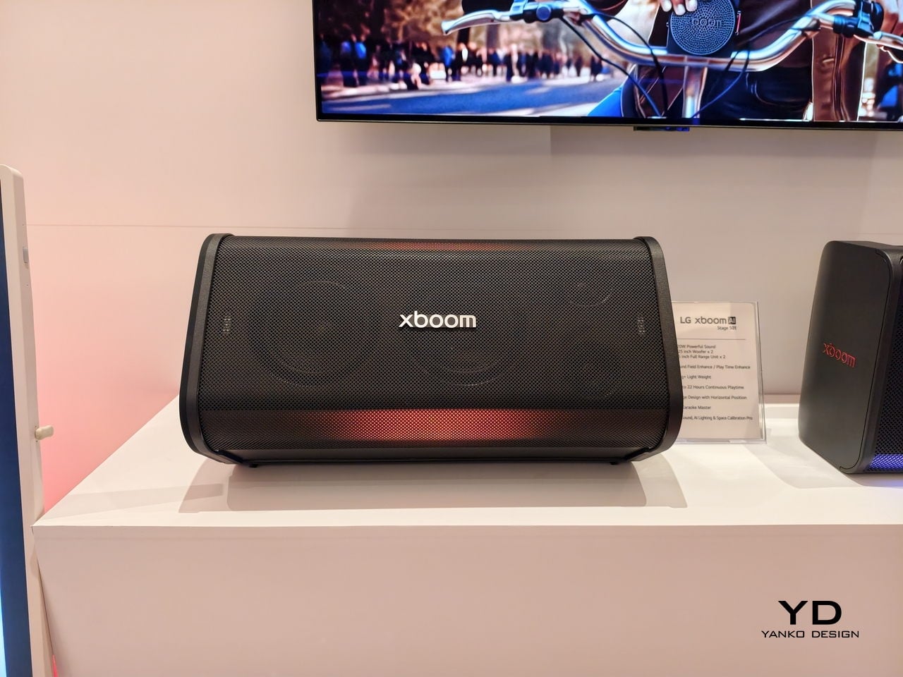
5. LG xBoom Stage 501
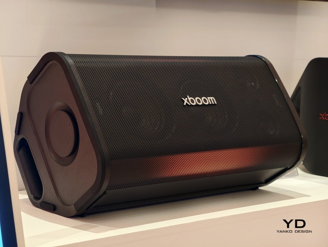
Halftime needs its own kind of energy, and this speaker is built specifically for that shift in mood. Up to 220W of output runs through dual 2.5-inch woofers and Peerless tweeters, loud enough to carry a packed room without distortion. For you, that means the moment the game pauses, the room doesn’t go quiet; it just changes gears.
The real party piece is AI Karaoke Master, which strips vocals from any song in real time using deep learning trained on more than 10,000 songs. Built around what LG calls late-night living-room chaos, it turns a halftime break into its own event, no separate karaoke machine or backing track search required.
What We Like
220W output with dedicated tweeters handles a full room without strain
AI Karaoke Master removes vocals from any song on the spot
What We Dislike
At $499.99, it’s a serious commitment for occasional halftime use
Karaoke feature works best with a crowd actually willing to sing
6. Death Star Popcorn Maker
Snacks are half of game day, and this one earns its spot by being genuinely good at the one thing it does. A hot air vortex pops corn with close to a 98 percent success rate, no oil or butter required, while the whole unit folds back into a Death Star display piece once the popping’s done. For you, that means a snack station that’s actually fun to look at sitting on the counter between rounds, not just a plastic appliance shoved in a cabinet.
It’s a lighter note in the lineup, a conversation starter as much as a kitchen tool, and a reminder that not every piece of game day gear needs to be purely functional to earn its place in the rotation.
What We Like
Close to a 98 percent popping success rate without oil or butter
Folds back into a display piece instead of looking like leftover kitchen clutter
What We Dislike
Novelty shape won’t appeal to everyone’s kitchen aesthetic
Limited to popcorn, so it’s a single-purpose appliance taking up cabinet space
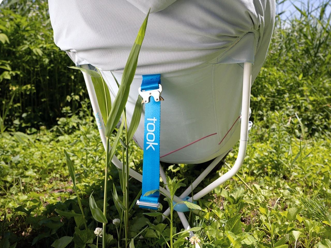
7. Took Foldable Chair
Every host eventually runs out of couch space before they run out of guests. This chair collapses into a compact case about the size of a soundbar, with a strap handle and a one-touch hinge mechanism that opens it in seconds. For you, that means extra seating that lives in a closet the rest of the week and shows up the moment the guest list grows past what the furniture can hold.
It closes the lineup on a practical note: the kind of object that doesn’t need to be clever so much as ready, there when the room fills up and out of the way the second it empties back out.
What We Like
Folds to the footprint of a soundbar for easy storage
One-touch hinge means setup takes seconds, not a wrestling match
What We Dislike
A folding chair will never match a couch for comfort over a long game
Durability of the hinge mechanism depends on how often it gets folded and unfolded
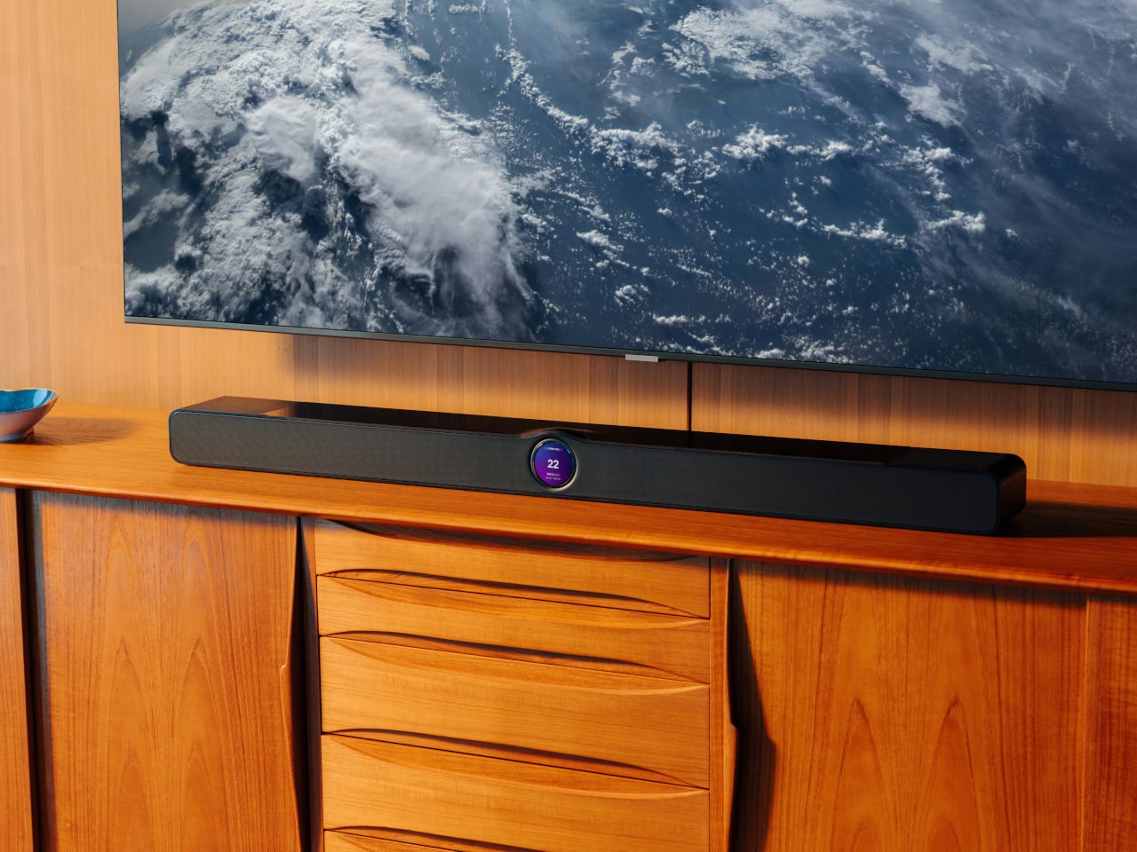
8.WiiM Bar Soundbar
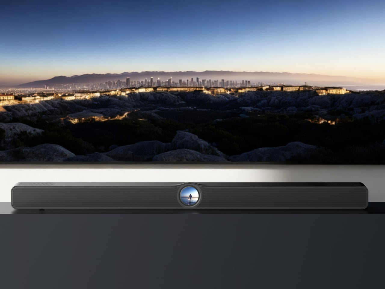
For the games that deserve real sound, not just loud sound, this soundbar fills that gap. True 3.0.2 Dolby Atmos runs through an eight-driver array, three front mid-woofers, three front tweeters, and two upward-firing full-range drivers, backed by four passive radiators for low end that doesn’t need a separate subwoofer. For you, that means commentary, crowd noise, and the snap of a tackle all land with the kind of separation a standard TV speaker can’t touch.
A 2.1-inch round touch display sits embedded in the bar’s front face, giving quick access to inputs and volume without digging for a remote between plays. It sits under the TV rather than competing for space, built for the room rather than announcing itself as the centerpiece.
What We Like
Eight-driver array delivers genuine Dolby Atmos without a subwoofer
Touch display built into the bar simplifies control mid-game
What We Dislike
A setup this capable asks for a TV and source worth the upgrade
Four passive radiators still can’t fully replace a dedicated subwoofer in a large room
The Setup That Covers the Whole Afternoon
None of these eight pieces are trying to be the loudest thing in the room. The projector and the two speaker options handle the screen and the sound, the cooler and the can opener handle the drinks, and the popcorn maker and the folding chair round out the food and seating without asking for much space in return.
What makes this lineup work isn’t novelty; it’s that each piece solves one real problem well. A host doesn’t need everything to be smart or connected. Sometimes the best upgrade is a can that pours like a glass, or a chair that disappears into a closet until the room needs it most.
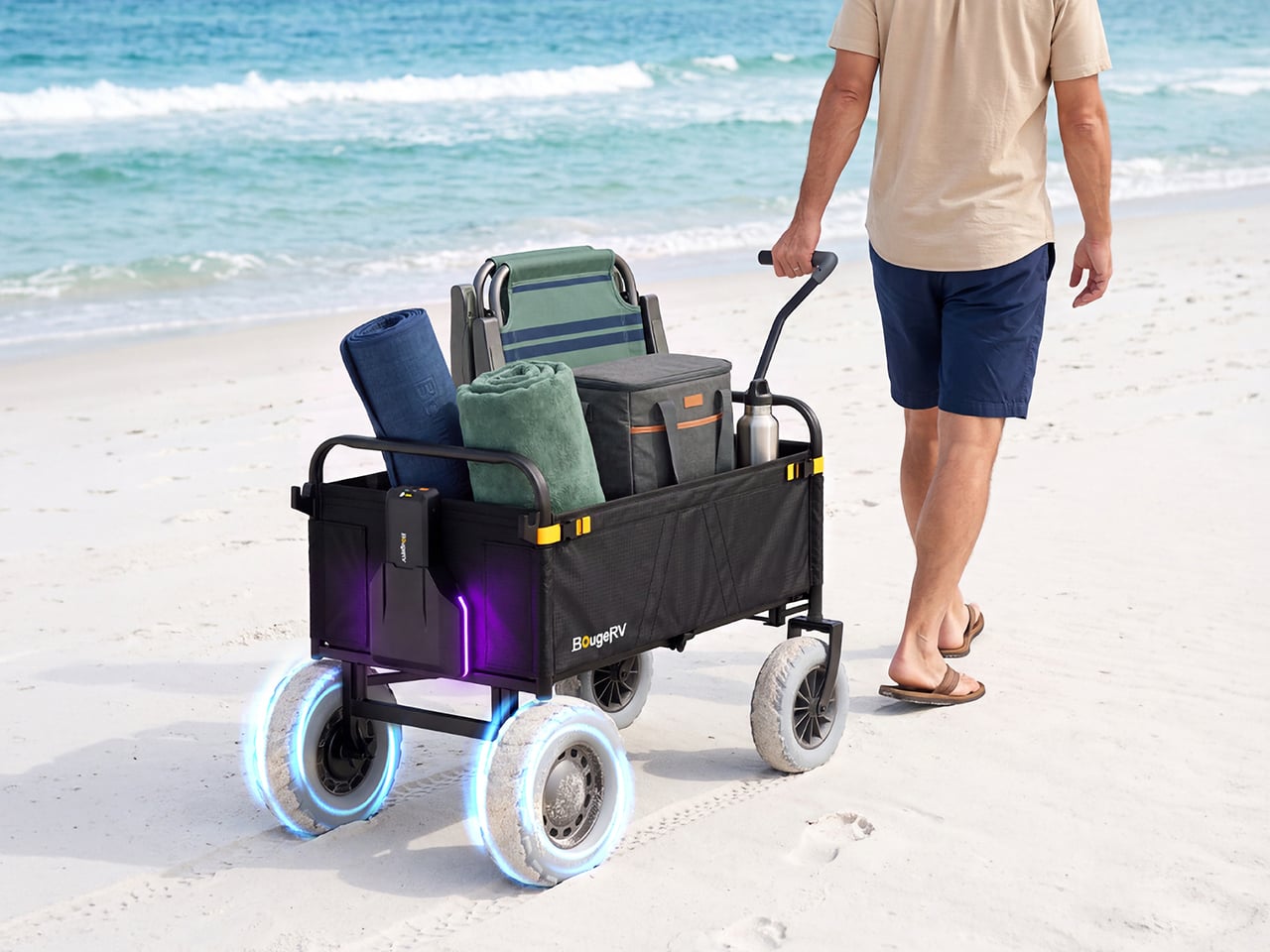
I have a theory that the beach wagon was invented by someone who never actually took one to the beach. On pavement it’s a dream, then the sand starts and you’re dragging a shopping cart through oatmeal. BougeRV’s new DuneRover is an electric wagon built around that exact misery. It folds, it hauls up to 198 pounds while moving, and it rolls on wide airless wheels with two motors doing the work. Soft sand is the whole design brief, and every part of the machine answers to it.
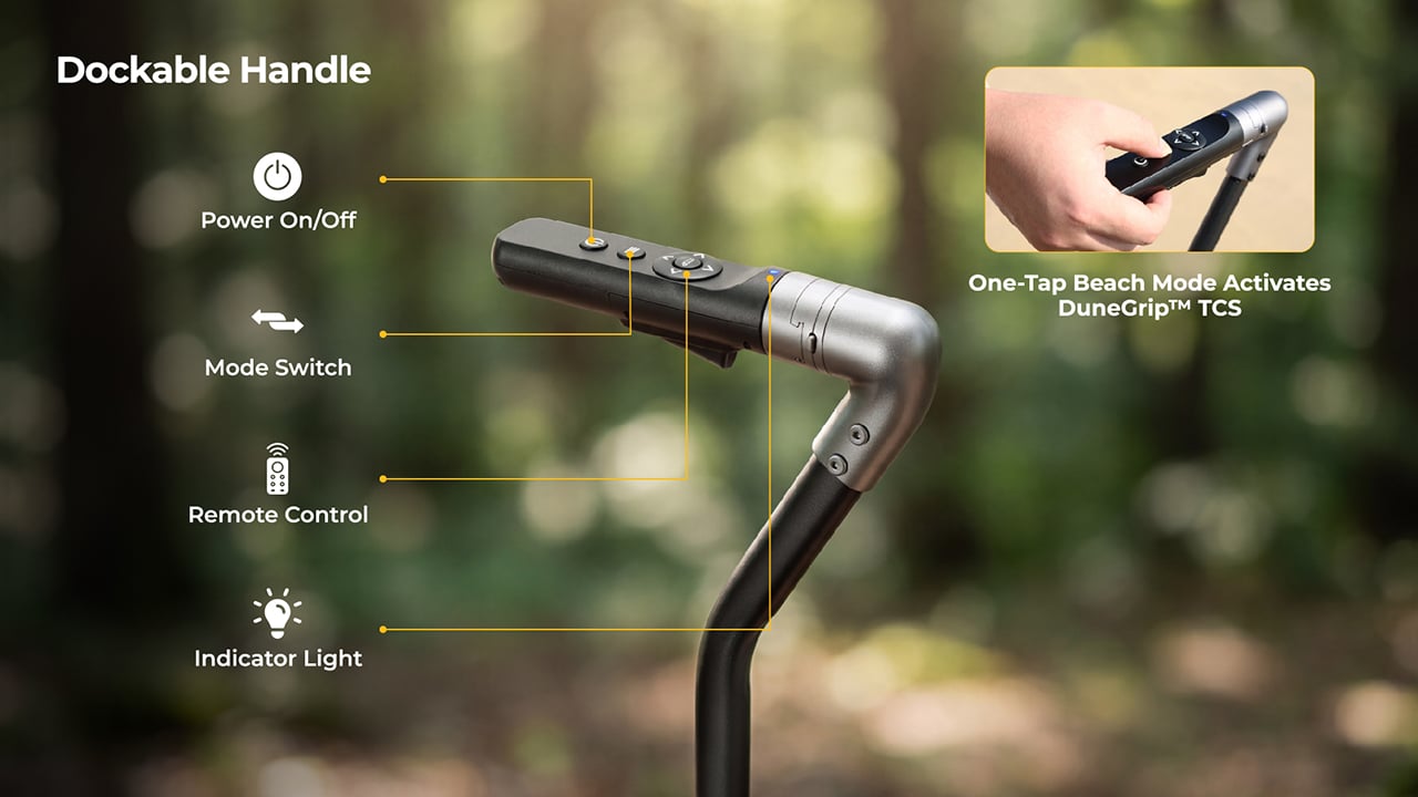
The handle is the smartest thing about it, and it responds to your walking instead of a throttle. Sensors measure how hard you pull and multiply that effort, so a gentle tug gets a gentle nudge and a brisk stride gets a brisk wagon. Head down a dune and it brakes for you, and the moment you let go, it holds its position. Detach the control unit and the wagon becomes a remote-controlled beach truck, rolling ahead from up to 328 feet away. BougeRV, the Houston outdoor brand known for portable fridges and solar panels, built the whole thing.
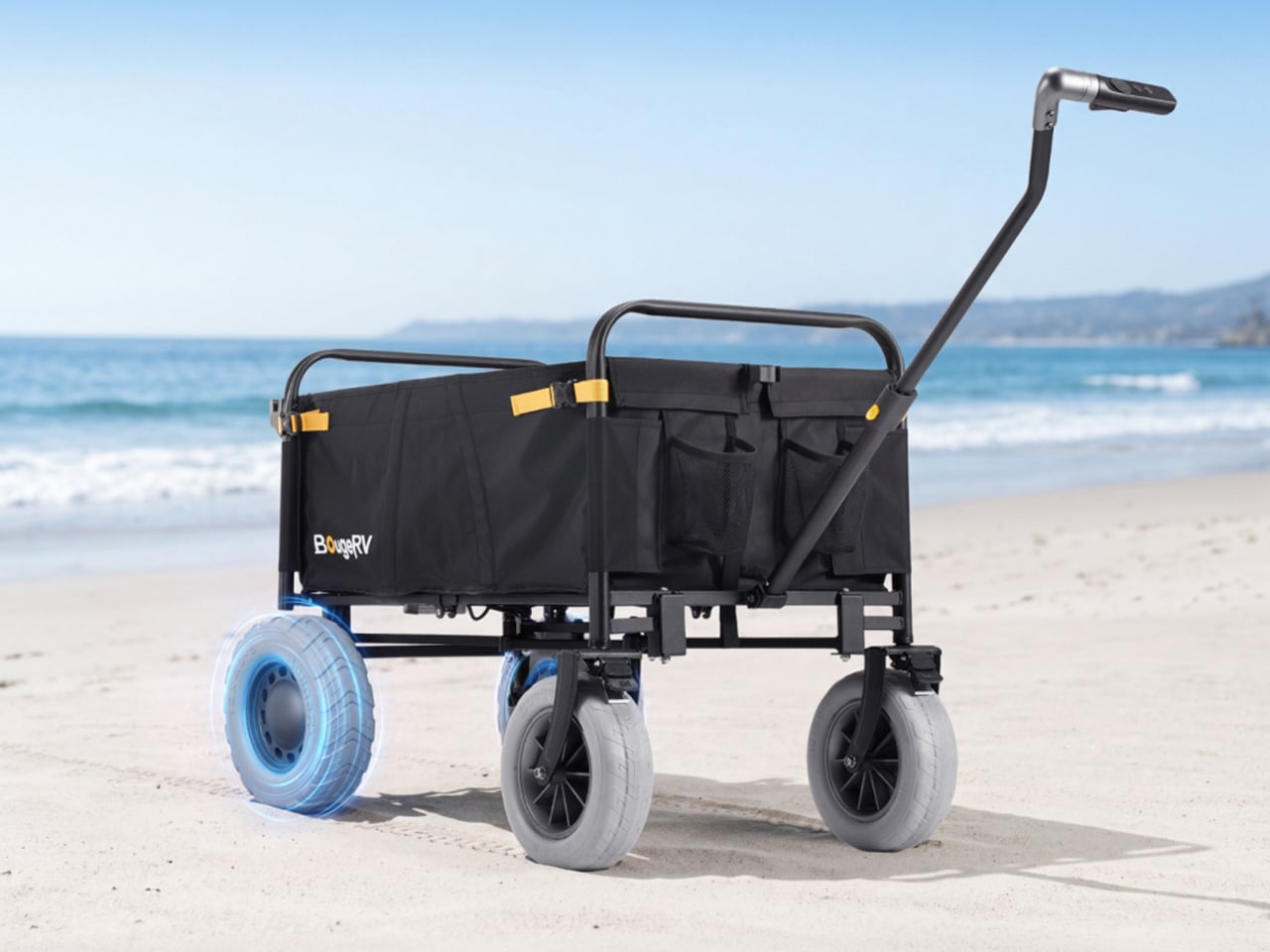
The rear drive wheels measure 12 by 4 inches and are made of low-density PU foam, with no air inside. That means no flats, no pressure checks, and no tire coming off the rim halfway across the beach. A patented tread spreads the load across a wide footprint, rolls smoothly, sheds water, and treats turf gently. The front pair are 10-inch airless wheels in the same material. Wide contact area is the old trick for staying on top of sand, and here it comes with motors attached.
Two brushless geared motors deliver 66 N·m of combined torque, fed by a battery with 880W of peak output. Raw power can be a problem on sand, because spinning wheels just dig a trench. DuneGrip TCS, the wagon’s traction control system, watches for wheel slip and trims torque within milliseconds to stop it. A one-tap beach mode on the handle switches it on. Top speed is 3.7 mph, a relaxed walking pace, and the range runs 5 miles or more with a 165-pound load.
A handle that multiplies your pull and brakes without being asked
BougeRV calls the system RoverDrive Dynamic Assist, and it runs on what the company calls a Multiplicative Assist Algorithm. The handle measures your pulling force in real time and scales the motors in proportion, which is why there is no throttle, no gear shifting, and no direction switch to think about. Accelerate and the wagon accelerates with you. The dockable handle houses a power button, a mode switch, and an indicator light. A trigger-release design lets you empty out the sand that inevitably works its way into the control unit.
Uphill, the wagon holds its speed without extra effort from you, and it is rated for 15-degree slopes (a 26.8% grade) even at full load. Downhill, it brakes on its own. Release the handle on a slope and fail-safe electronic braking engages instantly. That covers a toddler sprinting toward the surf, a dropped pair of sunglasses, and any moment you stop to snap a photo. I like that the safe state is also the default, so letting go is always the right move.
Remote steering from 328 feet and an app with underglow
Undocking the control unit takes one step, and it becomes a 2.4 GHz remote with a range of up to 328 feet. Point it where you want the wagon to go, which frees you to carry the surfboard while the wagon carries everything else. If the signal drops or the remote disconnects, the wagon brakes and holds itself in place. Docking the unit back onto the handle returns you to assisted pulling automatically. There is zero setup and zero menu toggling in either mode.
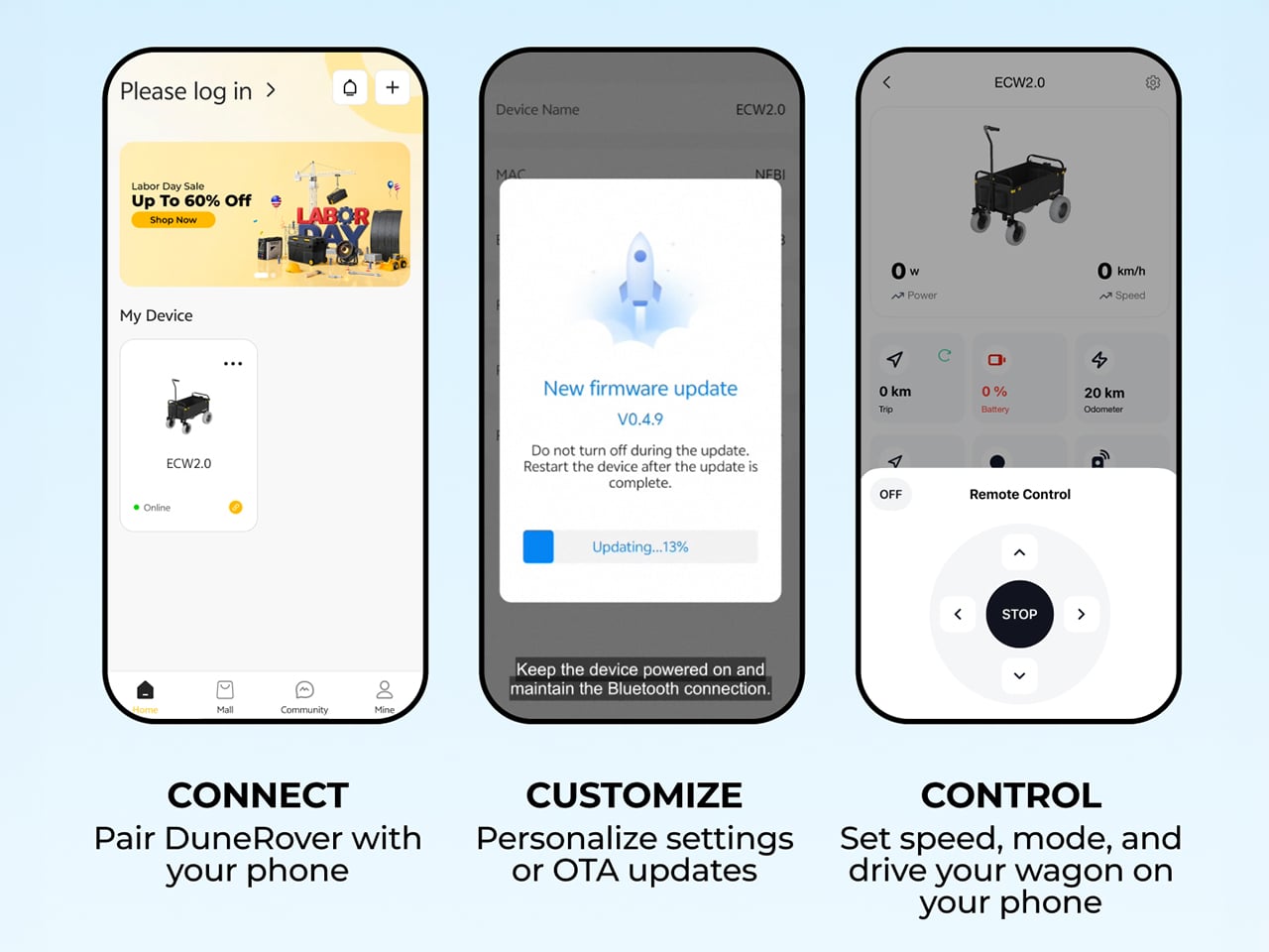
Through the BougeRV app, you get real-time wagon status, battery levels for both the wagon and the remote, a mileage tracker, and system health monitoring. Firmware updates arrive over the air, and you can pair the remote, set speed and mode, and drive the wagon from your phone. Then there is the underglow, a customizable ambient lighting setup. One tap switches between preset scene modes. A glowing wagon on the sand at sunset is a ridiculous feature, and I would still turn it on.
A 2-pound battery that also charges your phone
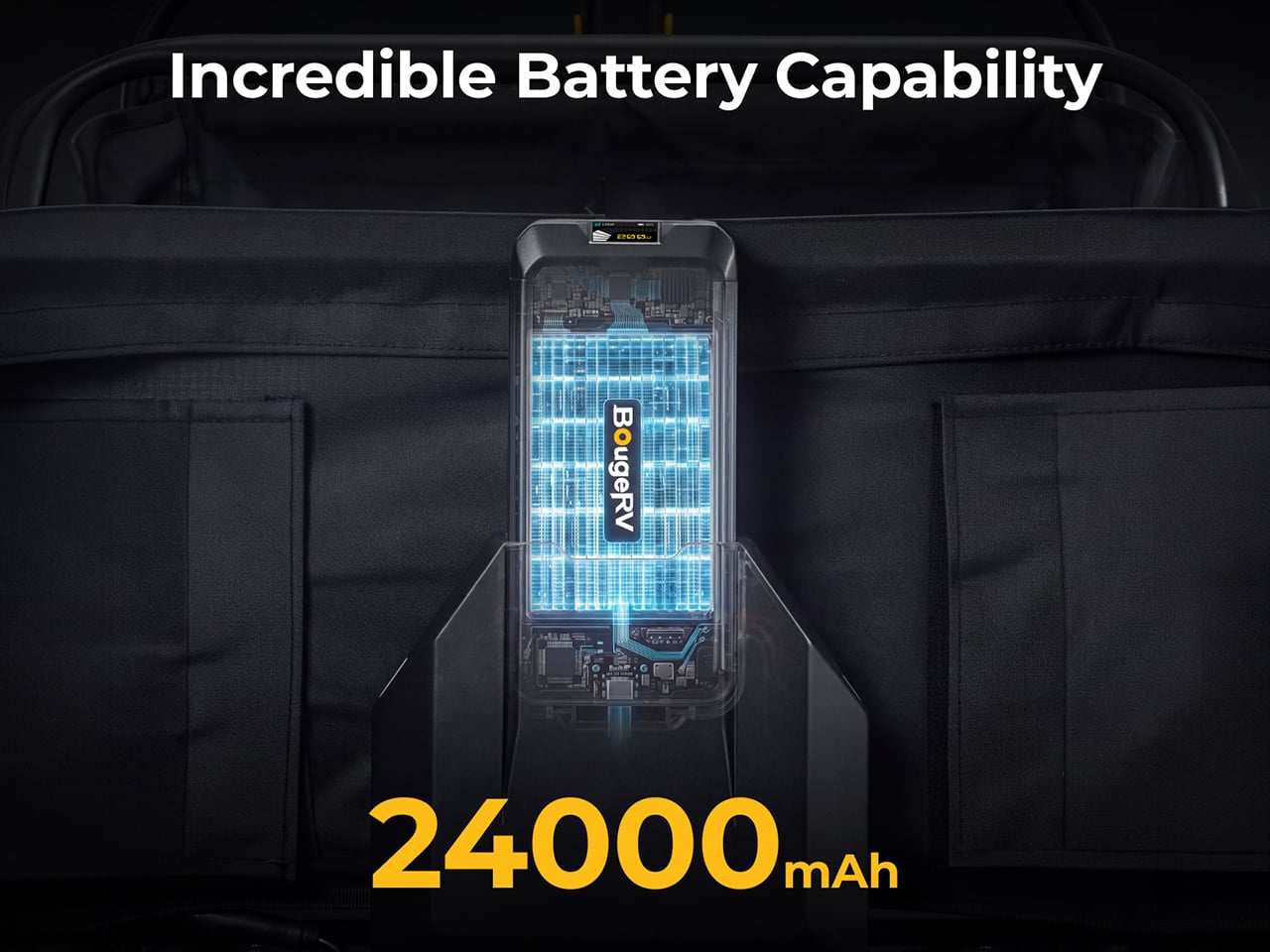
The detachable UPP-88 battery weighs 2.06 pounds and measures 7.68 by 3.58 by 1.57 inches, about the size of a large power bank. Capacity is 24,000mAh, or 88.8Wh, which keeps it under 100Wh and airline-approved, with no prior declaration needed. It can discharge at up to 10C, enough to feed the 880W peak output. Fast charging runs through USB-C or XT60 ports at up to 100W. A multi-stage vent and flame-arresting labyrinth are meant to keep a single failing cell from setting off the rest, and the pack carries an IP66 rating.
The battery doubles as a power bank. BougeRV’s figures list up to 4.2 phone charges, 3.4 gaming device charges, 2.2 tablet charges, or 1.1 laptop charges. USB-C output reaches 100W and there is a USB-A port too. A built-in MPPT solar regulator tops it up on the move through an XT60 input that accepts 11 to 28V at up to 100W. BougeRV’s flexible portable panels are compatible, but the panel is sold separately. So the same pack that hauls the cooler can keep the phones alive until sunset.
Storage, folding, and pricing
The bed holds 161.7 quarts (153 liters) inside 600D Oxford fabric, with a side frame that opens to take longer gear like surfboards, secured with an elastic cargo net. Pockets are covered too: a front pocket, inner front and back pockets, and utility hooks. The wagon weighs 50.7 pounds (23 kg) and opens to 41.5 by 23.7 by 47.5 inches. Folded, it shrinks to roughly 23.7 by 12.2 by 28.7 inches, small enough for an SUV cargo area. IPX6 protection covers the whole vehicle, motors and control hub included, so a hose-down ends the day.
BougeRV lists the DuneRover at an MSRP of $899, with launch pricing running from $396 to $539 depending on the offer. A bundle with an extra detachable battery runs $603 against a $1,097 MSRP. The box holds the wagon, battery, remote, charging cable, two wheels, and a manual. Shipping is planned for the US, EU, UK, Canada, Australia, Japan, and Hong Kong, with deliveries expected to start in February 2027. Nobody packs lighter for the beach, so a wagon that keeps your pace is the sensible fix.
Japan has a stationery obsession, and the rest of the world is finally catching on. The country treats writing tools and paper goods the way it treats everything else: with an almost unreasonable level of care, precision, and quiet restraint. What looks simple in the hand rarely is. These eight pieces are proof that back-to-school shopping has a ceiling, and most of us haven’t come anywhere close to hitting it.
Every item on this list earns its place for the same reason: it solves something. Not in a Swiss-Army-knife way, but in a quietly elegant way that makes you wonder why the version you’ve been using for years never worked this well. Stock up your stationery collection with these unique essentials, and feel the difference they make to your everyday routine.
1. MagBoard Clipboard
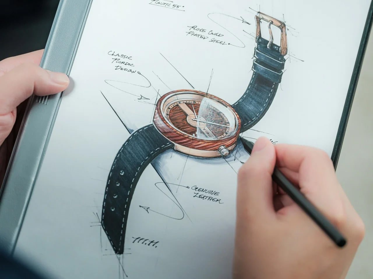
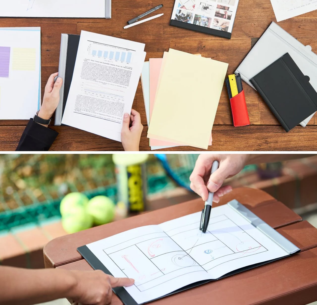
Most clipboards are an afterthought, a plastic spring hinge you buy simply because you had to. The MagBoard is different in the way that good Japanese design tends to be: the function is unchanged, but the thinking behind it is completely rebuilt. A magnet and lever mechanism holds up to 30 sheets of paper in place without the usual clip aggression, and the hardcover backing is stiff enough to write on comfortably while standing, no desk surface needed at all.
The surface is water-resistant and easy to wipe clean, which matters when it travels between meetings, job sites, or a classroom. At A5, it fits in most bags without crowding them, and the cover opens completely flat so there’s no awkward curl mid-note. For anyone who moves through their day between different spaces and needs to take legible notes rather than just keep a surface dry, this is the clipboard that actually earns a permanent spot in the bag.
The magnet-and-lever mechanism replaces spring clip tension without sacrificing hold, managing up to 30 sheets at once
Water-resistant surface makes it genuinely travel-ready, not just desk-ready
What we dislike
A5 format won’t accommodate US letter-size paper without folding, which won’t work for everyone
At $45, it’s a significant premium over what most people expect to spend on a clipboard
2. Sonic Kakusta Portable Pen Stand
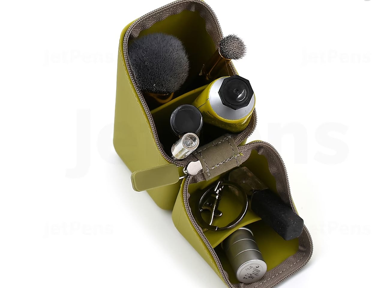
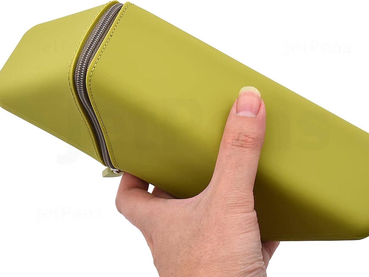
The Kakusta looks like a soft pencil case until you set it on a desk. Unzip it, fold the lid back, and the whole thing becomes a stand that props your pens at a 60-degree angle, everything visible, everything reachable in one motion. Sonic, the Japanese stationery brand behind it, didn’t add a separate stand component. The fold itself is the stand. That kind of thinking, where the packaging is the product, is what separates it from anything you’d find at Target.
The triangular cross-section when open isn’t accidental. It creates a stable base that doesn’t tip or slide even on slightly uneven surfaces, and when class or the workday ends, everything folds back into the case in seconds. For students who shift between desks, libraries, and coffee shop tables, not having to manage a separate pen holder is genuinely useful. The Kakusta doesn’t ask you to change how you work. It just eliminates one more thing to carry and set up.
What we like
Case-to-stand transformation happens in one fold, no extra components to lose
The 60-degree angle keeps every pen visible rather than buried at the bottom of a flat case
What we dislike
Capacity is on the smaller side, so larger pen collections won’t fit comfortably
The fabric exterior picks up lint faster than a hard-shell case would
3. Stalogy Editor’s Series 365 Days Notebook
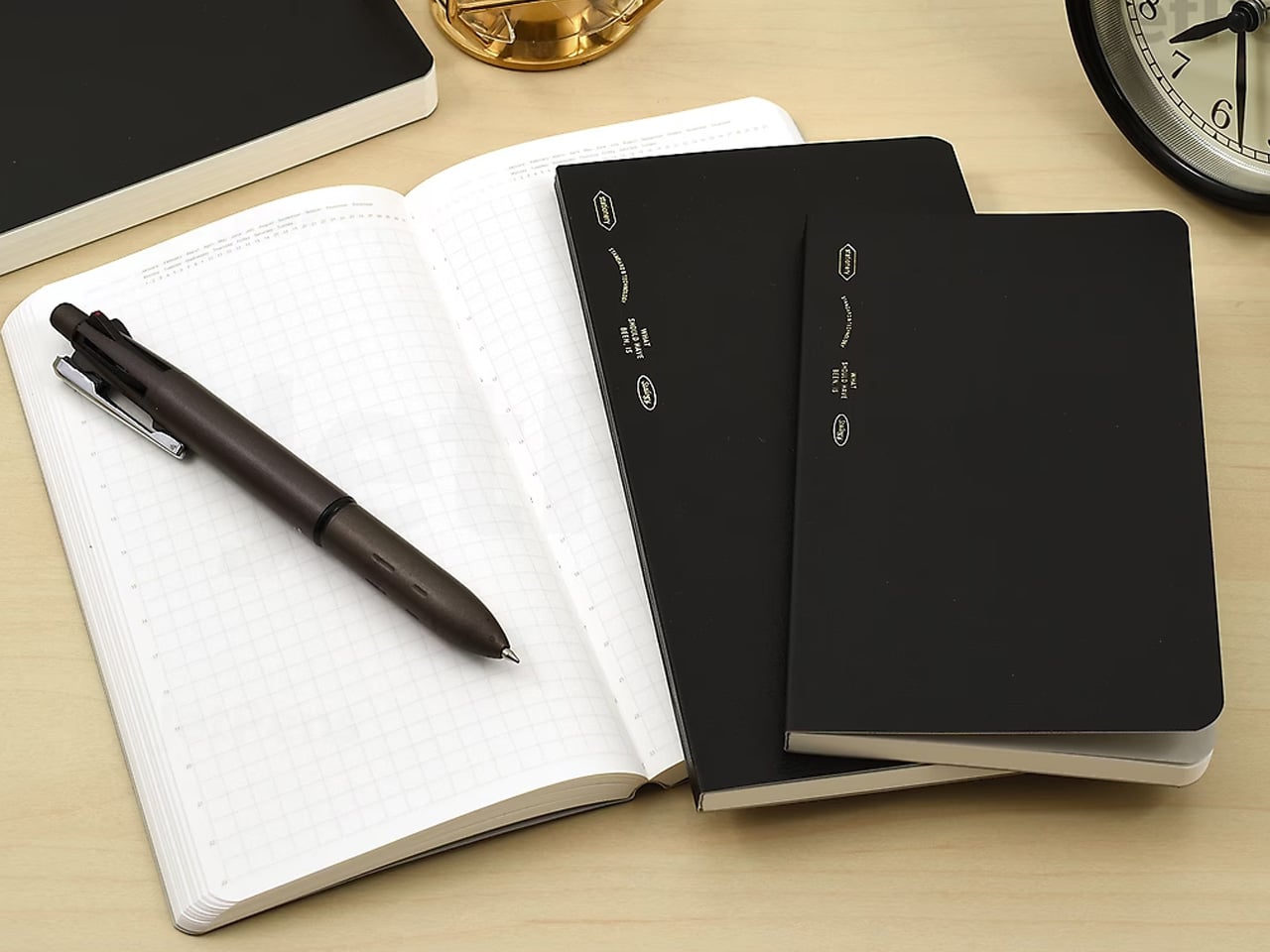
The 365 Days Notebook wasn’t designed for bullet journaling that requires stickers and color-coded spreads. It was designed for editors: people who use a notebook to capture ideas, track timelines, make lists, and sketch rough diagrams all in the same session, sometimes on the same page. The cream-toned dot grid is subtle enough that it doesn’t compete with what you’re writing, and at A6 the whole thing fits in a coat pocket without any compromise.
With 368 pages, it holds a full year of daily writing without exhausting itself by October. The binding opens completely flat without tension, which means pages stay where you put them rather than creeping closed between entries. For someone who writes in transit, between calls, or at lunch, a notebook that opens flat and stays flat is worth more than any feature list could describe. This one simply gets out of your way.
What we like
368 pages comfortably handle a full year of daily use across writing, planning, and sketching
Lays completely flat when open without needing a hand to hold the page in place
What we dislike
A6 is small for anyone who writes in long form or needs room to sketch at scale
Cream-toned paper, while easy on the eyes, shows ink colors less vividly than bright white
4. Levitating Pen
The Levitating Pen stands upright on its base without batteries, electronics, or tricks. It balances vertically through a precisely calibrated magnetic pedestal that holds the pen in a stable position, and the whole arrangement is quiet enough that it reads as a desk object rather than a gadget. Picking it up takes a half-second more than reaching for a pen lying flat on a desk, but that pause changes how you think about the act of writing. It feels deliberate in a way that cheap ballpoints never do.
Write with it, and the ballpoint performs exactly as expected: smooth, consistent, without drama. The benefit isn’t in the ink delivery. It’s in what the pen does to the space around it. A desk with a Levitating Pen on it looks considered, and that visual cue tends to set a tone for the work that follows. For someone who moves between focused writing sessions and longer thinking stretches, having a tool that signals “this is where the work happens” is worth more than most productivity hacks.
Balances upright through a magnetic pedestal with no electronics or batteries required
Functions as a smooth ballpoint and a distinctive desk object in equal measure
What we dislike
The base adds desk footprint that might not suit a minimal or already-crowded setup
The levitation effect can become a distraction in a shared or open-plan workspace
5. King Jim Visual Bar Timer (VBT10)
Most timers count up or display numerals. The King Jim VBT10 does something simpler and more useful: it shows a row of large LCD segments representing remaining time, and as the countdown progresses, segments disappear from right to left. No digits to read, no beeping at intervals, just a visual progress bar legible from across a room at a glance. It’s the kind of design decision that seems obvious once you see it, but that no Western manufacturer thought to build first.
For anyone who works in timed blocks, whether that’s the Pomodoro method, writing sessions, or class periods, having a physical timer rather than a phone or laptop notification means focus stays on the task rather than the device. The VBT10 sits on a desk without demanding attention, and the countdown is readable enough to track peripherally. For students and remote workers who need structure without constantly checking a screen, this is a more disciplined option than anything most productivity apps currently offer.
What we like
Visual bar display reads instantly from a distance without requiring you to parse numerals
Physical format keeps attention off screens during timed work or study sessions
What we dislike
Pricing and availability vary outside Japan, and shipping times can stretch considerably
LCD has limited visibility in direct sunlight or high-glare environments
6. Shachihata Consolidated Number Stamp
Shachihata makes the Consolidated Number Stamp as a set of individual pieces: 31 dates and 7 days of the week that snap together along two different axes to build any calendar configuration you need. The stamps connect cleanly, ink together evenly, and produce a compact, legible date block that a printed sticker or pre-made date stamp can’t match, because those are fixed and this one isn’t. You build the date you need, stamp it, then rearrange for the next entry.
It’s a genuinely analog solution to a problem most people solve with digital tools or pre-printed labels, and it’s more satisfying than either. For planners, journal keepers, and anyone who archives physical documents by date, having a stamp that adapts rather than repeating the same fixed format is a meaningful upgrade. The ink is self-contained in each piece, and the stamps align precisely enough that the resulting date block looks intentional rather than assembled. That precision is classic Shachihata, and it shows.
What we like
Modular design lets you configure any date on demand without a fixed preset format
Self-inking pieces snap together and align precisely, producing clean, legible date blocks every time
What we dislike
Keeping 38 individual stamp pieces organized requires more discipline than a single fixed stamp would
Not suited for high-volume stamping where speed matters more than customization
7. Lihit Lab Firm Book End
A book end that holds books upright when neighbors are present is not a remarkable product. One that lets a single book stand on its own without leaning against anything is. The Lihit Lab Firm Book End achieves this through a gravity-activated stopper that flips down when the book end is upright, supporting the book from behind. Remove the book and the stopper lifts back up, held out of the way by the book end’s own weight. Nothing to adjust manually.
The mechanism means you can remove a single book from a shelf without the rest collapsing, a small but real frustration that anyone who uses bookshelves regularly will recognize immediately. At A4 scale, it handles textbooks and binders as well as standard books, making it useful for student desks and office shelves alike. For people who work daily with physical reference materials and are tired of the toppling-book routine, this is one of those objects that solves a problem so quietly you forget it ever existed before it arrived.
What we like
Gravity-activated stopper lets a single book stand independently without any manual adjustment
Handles books, binders, and textbooks up to A4 scale across home, office, and student setups
What we dislike
Availability outside Japan is currently limited to the brand’s own site, adding shipping time and cost
The stopper mechanism can feel stiff during early use before it settles into regular operation
8. ITO BINDERY × YANKO DESIGN Drawing Pad
ITO Bindery has been making books by hand in Hachioji, Tokyo since 1938. The Drawing Pad that came out of its collaboration with Yanko Design carries that lineage in the details: binding glue applied by hand with a specialized brush, microperforations inspected sheet by sheet by experienced craftspeople, and a construction that holds through daily use without stiffening at the spine. Each size is limited to 100 individually numbered pads, available exclusively through YD Select, making it as much a document of craft as a writing surface.
Each sheet tears away cleanly along the microperforation, leaving the page intact and ready to pin up, share, or arrange alongside other work in progress. For designers, illustrators, or anyone who treats drawing as a thinking tool rather than a performance, a pad that separates cleanly and doesn’t fight the process is exactly the right kind of equipment. The paper handles pencil, pen, and light marker work without bleed-through. At this build quality and limited-edition scale, $40 is an argument for paying more attention to where your tools come from.
Hand-crafted by ITO Bindery, founded in 1938, with construction quality visible from the very first page
Microperforated sheets tear cleanly without damaging the sketch, making each page easy to display or share
What we dislike
Limited to 100 numbered pads per size means stock won’t last once the list picks up attention
Not suited for wet media or heavy-wash work; designed for dry and light-marker use only
Buy Less. Buy Better.
What makes Japanese stationery worth attention isn’t the aesthetic. It’s the reasoning. Every product here started with a specific problem and arrived at a solution that feels like it was always obvious, even when it clearly wasn’t. The attention to material, mechanism, and user behavior that goes into something as ordinary as a clipboard or pen stand reflects a standard of care that changes what you expect from your tools.
None of these require a lifestyle overhaul or a dedicated setup. They slot into how you already work and make that work feel slightly more resolved. Back-to-school season is usually about quantity: more notebooks, more pens, more highlighters. These eight argue for the opposite. One good clipboard beats five bad ones. One pad that holds together properly lasts longer than anything that falls apart by Thanksgiving. Buy less. Buy better.
A small room rarely gets to do just one thing. The table that holds your laptop during the day might host dinner a few hours later, while the chair beside it becomes your reading spot before bed. The problem is that lighting often stays fixed while everything else changes. An overhead fixture can feel harsh at dinner, and a decorative table lamp may be lovely but useless when you need to see what you’re doing.
That is a more interesting way to look at the Infinite Solas Lamp than simply calling it a cordless desk lamp. Its height, direction, brightness, and color temperature are adjustable, so the same object can play different roles as a room changes throughout the day. I like the idea of a lamp that adapts to the space you have, rather than asking you to find space for another lamp.
Picture a table on a weekday morning. You pull the Solas taller and angle its head toward a notebook or the project in front of you. Later, you lower it and soften the light for dinner. By evening, it can move beside a chair and become a reading light. None of those uses is particularly dramatic on its own. Together, they make a persuasive case for a lighting object that doesn’t belong to one corner of the home.
The mechanics behind that flexibility are pleasantly straightforward. The Solas adjusts from 8.9 to 19.7 inches tall, while a magnetic ball-joint head lets you redirect the beam without shifting the whole lamp. Its LED light can be dimmed, with color temperature adjustable from 2500K to 4000K. Those choices matter because a change in angle can be just as useful as a change in brightness. Sometimes you want to see the pages in front of you. Sometimes you want the room to feel a little softer.
I also appreciate that the design doesn’t insist on looking like equipment. Machined aluminum with an anodized finish gives it a composed, minimal shape, and it comes in black or warm champagne. Either could sit on a shelf or side table without making the room feel like an office. That matters in a smaller home, where every object tends to be visible from almost everywhere else. A lamp can be useful, but you still have to enjoy looking at it when it’s off.
Of course, movable lighting is not a new idea. IKEA has helped make portable table lamps feel familiar as everyday home accessories. The Solas asks for a more specific kind of attention: not just where you can carry a lamp, but how much you can change its height, aim, and warmth once you set it down. I wouldn’t say that makes it the right choice for everyone. If all you want is a gentle glow on a shelf, a simpler lamp may do the job beautifully. The Solas makes more sense when one surface has several jobs.
That flexibility does come at a considered-object price. The Solas is listed at $325, which is a lot to spend on a lamp if you need light in only one place. It also still needs charging: the listed runtime is six to seven hours at full brightness, or up to 70 hours at its lowest setting, with a recharge taking approximately four hours via USB-C. Those numbers are worth knowing before imagining it as a fixture you can leave on indefinitely.
For me, the appeal isn’t the promise of owning one lamp and never buying another. It’s the smaller, more believable improvement of having one good lamp that can follow the way a room is actually used. When furniture has to work harder, lighting should be allowed to change its job too. The Infinite Solas Lamp understands that a home doesn’t hold still from morning to night. Its best trick is making those transitions feel a little easier.
Now that I’m learning to cook more, I’m pretty excited to experiment with dishes I see online. The results aren’t always ready for other people to try. I still have a lot to figure out. On some days, though, I keep it simple and fry something. That brings up a familiar problem: getting rid of excess oil before the food reaches my plate. Usually, I move it from the pan to a rack or paper towel, then transfer it again when I’m ready to eat. What if I could skip one of those transfers?
The Half-Moon Plate is more than a nicer way to serve food for a photo. It pairs a ceramic plate with a half-moon-shaped rack that sits over one side. You can place fried food on the rack to let excess oil and moisture drain away while leaving the other side available for a salad, vegetables, rice, or another side dish. Instead of draining food in one place and serving it in another, the plate brings those steps together.
That arrangement matters when timing is everything. If you’ve made tempura, fried chicken, or crispy potatoes, you probably don’t want them sitting in a puddle of oil while you finish getting dinner ready. Elevating the food gives the oil somewhere to go and may help it stay crisp until you eat. You still need to give freshly fried food time to drain; the plate simply gives you a way to do it at the table or as part of your final plating.
I also like that the design doesn’t make the rack the whole story. The open half of the plate leaves room for the rest of the meal, so the fried food doesn’t have to take over. You can see everything together before you sit down, rather than juggling a cooling rack, paper towels, and a separate serving dish. For someone cooking in a small kitchen, or someone who just wants fewer things on the counter, that’s an appealing idea.
The half-moon shape gives the plate its visual identity, but it also creates a natural division between the main dish and its sides. If you’re trying to be more mindful of portions, that division may be a useful visual cue. It won’t measure a balanced meal for you, and draining surface oil doesn’t make fried food automatically healthy. What it can do is encourage you to think about what else belongs on the plate alongside your crispy favorite.
Compared with an everyday dinner plate from a big brand such as IKEA, the Half-Moon Plate asks a little more of its design. A conventional plate gives you one uninterrupted surface and works with almost any meal. This one is more specialized: the rack makes the most sense when food needs to drain or when you want to keep it elevated before eating. That makes it less of an all-purpose replacement for your existing dishes and more of an addition for meals where its distinctive layout earns its place. The plate is listed starting at $70.
Of course, a plate like this won’t eliminate every step. You’ll still need to handle hot food carefully, wait for it to drain, and wash the rack afterward. Those are worth considering if you’re looking for the quickest possible cleanup. But if you already make fried food regularly, combining a draining surface and a serving plate could make the trip from pan to table feel more organized. When you don’t need the rack, you can lift it off and use the ceramic plate on its own. That flexibility is important: a design meant for one kind of meal is easier to justify when it can still be useful on other days. I’d reach for the rack when I’m making something crisp and use the plate by itself when dinner calls for a simpler presentation.
The Half-Moon Plate won’t make me a better cook overnight. I’ll still have to get the timing, seasoning, and frying right. But it does address one small frustration I know well: watching something come out of the pan beautifully crisp, only to wonder where to put it while I finish the meal. If it helps me serve dinner with fewer transfers and a little less fuss, that’s a design choice I can appreciate.
Pickleball has officially escaped the court. At some point in the last two years, it stopped being ironic and became a lifestyle: parking lots of suburban rec centers filled up, TikTok feeds followed, then came the celebrity investors, the professional leagues, the branded paddle drops, and the kind of mainstream saturation that tells you a sport has officially graduated from niche to undeniable. Getting turned into a Wii-style digital pastime is, at this point, a rite of passage for any sport that has truly made it. Tennis got there. Golf got there. Boxing, baseball, bowling. MegaShot Pickl+ is the moment pickleball collects that particular badge, and it does so with an actual sensor-embedded pickleball racket for authentic gameplay, not some generic rectangular controller.
The smart paddle pairs with your phone, tablet, or laptop over Bluetooth and sends the game to your TV (via an included cable) for big-screen play, mimicking your real swing movements on screen and firing haptic feedback through the handle on every hit. A split-screen mode lets you play multiplayer on the same screen too, making it a great family entertainer. No court reservation, no weather to negotiate with. The Wii taught an entire generation that swinging something in your living room could feel surprisingly real. Pickl+ is betting that a generation raised on that premise is ready to do it again, this time for the sport that has genuinely taken over the world, and without an extra console to add to the mix. The Starter Edition is on Kickstarter now for $175, down from a planned retail price of $249 and the campaign has been backed 500% in just 24 hours! Pickl+ will be compatible with sports like tennis, ping pong, and badminton with more racket sports planned for the same smart-paddle platform.
Under the hood, Pickl+ is built around a 9-axis sensor that reads the angle, speed, and arc of every swing for precise motion tracking. The haptic feedback responds distinctly to different kinds of hits, making the on-screen action feel genuinely tied to what your arm is actually doing. The paddle weighs around 300 grams, carries a 2000 mAh battery rated for up to five hours of continuous play, and charges over USB-C. Bluetooth 5.2 handles the wireless pairing, while an MHL cable connects your phone to the TV when the living room demands a proper screen. The app runs on Android 14+, iOS 18+, Windows, and macOS. Setup is as minimal as it sounds: download, charge, pair, connect, play. Unlike the Wii, Switch, or the Meta Quest, no extra console or hardware needed.
Most gaming hardware asks you to adapt to the machine: learn the buttons, the gestures, the control scheme. Pickl+ goes the other direction. You know how to hold a paddle, and you know what a swing feels like. Rather than turning a conventional controller into a sports accessory, Pickl+ turns the sports object itself into the controller. The technology is essentially trying to disappear into the physical experience, which is part of what makes it a more interesting object than just a clever game controller.
Ten-plus game modes ship at launch, including Streak, Practice, Split Mode, Career, Local Multiplayer, Target, and Beach Mode, with more already in the pipeline. VIP unlocks exclusive virtual courts, daily bonus challenges, glowing paddle effects, custom ball trails, and profile cosmetics.
Before the Kickstarter campaign went live, the beta version of the paddle was showcased at New York Toy Fair, where people across different age groups, including gaming enthusiasts and industry experts, got hands-on time with the motion tracking, gameplay, etc. It gave MegaShot an early real-world read on how quickly people understood and enjoyed the experience. Motion gaming can look impressive in a controlled demo; the real test is whether someone can pick up the paddle, understand what to do, and immediately have fun. New York Toy Fair gave MegaShot that read before asking anyone to back the campaign.
MegaShot arrived at this with receipts. Before Pickl+, the company built a smart bat, which sounds hyperlocal until the numbers land: 100,000+ units sold worldwide, 2,700+ Amazon reviews, and ratings above 4.5 across Google, Amazon, the Play Store, and iOS. The Smart Bat earned the team a spot on Shark Tank India, coverage across major publications, and placement on Walmart shelves. Cricket was a demanding proving ground, the kind of sport where precision hardware lives or dies by real player feedback. That foundation gave MegaShot a validated tech stack, a battle-tested supply chain, and the track record that earns trust going into a bigger, more globally ambitious launch.
Pickleball is the entry point for something larger. The same paddle hardware is designed to eventually support tennis, badminton, table tennis, and squash, with the VIP Pass carrying across sports as they are added. That roadmap turns Pickl+ from a single-sport product into a platform for multiple racket-sport experiences, which changes the value calculation considerably. The most globally accessible racket sport of this decade is also, as it turns out, the perfect vehicle for a company that built its credibility in one market and is now ready to find out how far a smart paddle can travel.
The Starter Edition, one smart paddle and an MHL cable, is available at its $175 Kickstarter launch price, versus a planned $249 retail price. Duo packs start at $275 for two paddles with a cable, while the Starter VIP Duo Pack, which throws in a VIP Pass, runs $315.
The Signature Edition, the premium single-paddle option, comes in at $349. The Signature Duo Edition bundles two premium paddles with cables, a VIP Pass, and protective sleeves for $499. Worldwide shipping begins in early 2027, covering the US, Canada, the UK, Germany, Australia, New Zealand, UAE, and India.
Giving out thank-you cards after a wedding or another event is not automatic anymore. Plenty of people still keep the custom alive, but others send a group email, post a message on social media, or simply move on to the next thing. I, for one, like receiving thank-you notes, whether they are personalized or not. They give me something to remember the occasion by, and I might even tuck one into my journal. When a note comes with a small gift, it feels all the more thoughtful. It tells me the sender wanted to give me something I could enjoy after the event was over.
That is the idea behind the AromaCandle Thank You Card. It pairs a greeting card with a scented candle, turning a familiar gesture into something the recipient can read, display, and light. The written message delivers the thank-you, while the candle gives that message a little more time to linger. Even if someone eventually parts with the card because they do not like keeping paper around, they can still enjoy the candle. Well, until it burns out, of course.
At its heart, the design brings together two things people already give separately: a card with a personal message and a small gift. That combination is what makes it useful. You do not have to hunt for a candle that suits the occasion and then find a card to go with it. You still have room to write something specific, whether you are thanking a guest for attending your wedding or a friend for helping you move. The product is made in Japan, but its most appealing design choice is simple: it makes the card and candle feel like parts of the same gesture.
You have three options when it comes to the star, or rather, the flame of the show, which is the candle: Sakura (pink), Yuzu (yellow), and Green Tea (green). All three scents are associated with Japanese culture, even though the scents themselves were developed by artisans in Paris and New York. The smells and the colors as well can evoke the feeling of calm, freshness, and serenity once the receiver lights it up. It comes in a minimalist and elegant form and is shaped like a mini bottle with the actual words “Thank You” etched onto it directly.
For comparison, you could buy a Hallmark thank-you card and pair it with a Yankee Candle. That approach gives you more freedom to choose the exact card and candle you want, which might matter if you know your recipient’s favorite fragrance. The AromaCandle Thank You Card offers a different kind of convenience: the two elements are already designed to go together. At its $20 price tag, it is an option for someone who wants to give more than a card without shopping for a separate present. It is not a replacement for a larger candle, but it does make a small thank-you feel more complete.
That makes it especially appealing for occasions when a gift feels appropriate but a large one would feel excessive. You could give it to someone who hosted dinner, looked after your pet, or helped make an event run smoothly. It also offers an alternative to sending a quick text when you want to acknowledge someone’s effort more personally. The candle is a pleasant extra, but it does not have to carry the sentiment on its own. A few sincere, handwritten lines are what will make the gift feel like it came from you.
The AromaCandle Thank You Card solves a small but familiar problem: wanting to say more than “thanks” without making the gesture complicated. Its card gives you space to put your gratitude into words, and its candle gives the recipient something to enjoy afterward. Neither needs to be grand to be meaningful. Sometimes the most memorable part of a gift is simply knowing that someone took a moment to choose it, write a note, and hand it to you.
Something shifted. The generation that grew up with every song, show, and photo living inside a glass rectangle is now buying CD players, handheld consoles, and standalone cameras that do exactly one thing. It is not purely nostalgia driving this. It is the particular relief of owning something that does not send notifications, update itself overnight, or ask for your location. These are objects that simply work.
What connects these five is not a shared aesthetic or price point but a shared resistance. Each gives your hands something real to do, something that clicks, spins, or frames a shot without a screen mediating the exchange. Gen Z did not fall out of love with technology. They fell out of love with technology that treats their attention as the product. These five objects treat it as something worth protecting.
1. Syitren R400 Bluetooth CD Player
Portable CD players never disappeared, but they did stop trying. For years, the category was defined by bulky Sony boomboxes built around FM radio and cassette tapes as much as CDs. The R400, designed by ORGDOT for Syitren, is the first player in a long time that feels built for how people actually listen today. It is compact, Bluetooth 5.3-first, and designed to look as good on a desk or shelf as it does in your hand on a commute.
Under the shell, a custom Syitren pure CD core delivers a 70dB signal-to-noise ratio for clean, high-fidelity sound. Anti-vibration engineering keeps things skip-free while commuting or walking around. The shell is detachable and customizable, and a sunken charging compartment with a built-in wire groove keeps the cable from bending or fraying over time. Bluetooth or wired, car stereo or headphones, four-plus hours of continuous playback per charge, at a price that doesn’t make you choose between good design and good sound.
What we like
The detachable, customizable shell makes it something you can call your own, not just another piece of consumer electronics sitting on a desk.
Anti-vibration engineering means it is genuinely designed to be carried around, not just displayed.
What we dislike
Four hours of battery covers a workday comfortably but cuts short anything longer without access to a charge.
Sony has been quietly pulling back from portable CD players, meaning the R400 steps into a space with almost no competition to pressure it on price or performance.
2. Game Bub
The Game Boy Advance’s design patents expired years ago, and most of what followed has been cheap emulation boxes wearing a familiar shape. Game Bub from Crowd Supply is different. It uses FPGA technology rather than software emulation, recreating the original Game Boy, Game Boy Color, and Game Boy Advance hardware at a circuit level with accuracy that emulators cannot match. The transparent shell, available in Purple and White, makes the whole thing look exactly as it should.
The horizontal GBA form factor is a deliberate choice in a market that keeps going vertical. Button placement feels natural; the shoulder buttons are where your fingers expect them, and dual one-watt stereo speakers handle classic soundtracks properly. USB-C charging, a headphone jack, a microSD slot for firmware updates, display output for big-screen play, Bluetooth Low Energy, 2.4GHz Wi-Fi, and a 3000mAh battery round out a device that earns the word ambitious.
What we like
FPGA accuracy means your cartridge collection plays exactly as it was designed to, not approximately as software emulation allows.
The horizontal form factor respects what made the GBA comfortable for long sessions, which most of the competition has quietly abandoned.
What we dislike
Hardware-level FPGA accuracy comes at a price point that locks out buyers who would otherwise be genuinely interested.
Open-source FPGA handhelds tend to have longer firmware update timelines, which requires patience from anyone buying early.
3. Clip&Go Radio
A radio that clips to your backpack and plays FM stations does not sound like a gadget Gen Z would want. The Clip&Go reframes the premise. It is compact enough to attach directly to your gear without thinking about it, built around the idea that the best emergency tool is one already useful before anything goes wrong. A built-in flashlight, hand crank, and solar panel mean it carries more utility than the dial on top suggests.
The physical radio format fits the same logic as the CD player and the handheld. It is a single-purpose device with no algorithm, no autoplay, and no recommendations. You tune a station, clip it on, and go. In a landscape where every device competes for your attention, a radio that does not know you exist feels quietly radical. At $60, it is also the most immediately ownable thing on this list.
The built-in hand crank and solar panel mean it works when other devices cannot, giving it a utility case that goes well beyond aesthetics.
The clip attachment means it genuinely travels with you rather than waiting in a bag pocket to be pulled out.
What we dislike
FM signal quality is location-dependent, making the listening experience inconsistent wherever coverage is thin.
At $60, it competes with Bluetooth speakers that do more on paper. The case for owning it rests on the single-purpose philosophy, not the spec sheet.
4. Camera (1)
The impulse to pick up a standalone camera again is not about megapixels. It is about separating the act of taking a photograph from the act of being on your phone. Camera (1) is a concept by designer Rishikesh Puthukudy that imagines what a modern compact could feel like if built around physical controls rather than touchscreen menus. Metal body, softly rounded corners, every main control reachable without shifting your grip or glancing away from the scene you are trying to capture.
All the main controls live on one edge: a shutter, a circular mode dial with a dot-matrix glyph display showing simple icons for stills and video, and a D-pad your thumb can reach without looking down. A light strip around the lens pulses for the self-timer, confirms focus, and signals when recording is live, replacing multi-layer software navigation with immediate, readable feedback. The design language pulls from Nothing’s transparent, hardware-forward aesthetic and pushes it into something you would actually want to carry.
What we like
Every main control sits within reach of one thumb and index finger, keeping your eyes on the subject rather than hunting through a menu.
The light strip communicates camera state through peripheral vision, a smarter solution than burying status information inside a touchscreen.
What we dislike
Camera (1) is a concept with no confirmed manufacturer, production timeline, or pricing, which is a real limitation for anyone wanting to own one today.
The visual language is closely referential to Nothing’s established aesthetic, which may read as derivative to anyone already familiar with that design direction.
5. elrow miniphone
Full smartphones feel like overkill for a generation quietly walking back from maximalism. The Apple Watch on your wrist handles glances but stays awkward for anything more deliberate, and wearing both a smartwatch and an analog watch on the same arm is its own kind of compromise. The elrow miniphone is a 3D-printed case that turns an Apple Watch into a narrow, palm-sized device worn on a lanyard. The Standard fits the 46mm Series 10 and 11. The Ultra fits Apple Watch Ultra 1, 2, and 3.
Both stand around 95mm tall with textured translucent bodies and visible screws that do not attempt to hide how they were built. The back stays open so you can charge without disassembling the case. What elrow industries built is less a gadget and more a posture, a way to carry connectivity without wearing it on your wrist, freeing that space for the mechanical or analog watch you actually want to wear while keeping notifications, Apple Pay, and quick replies within reach.
What we like
The open back lets you charge without disassembly, removing the most frustrating everyday friction of any case.
Wearing connectivity on a lanyard rather than your wrist opens the door to the analog watch you have been quietly sidelining.
What we dislike
As a 3D-printed case, it depends entirely on which Apple Watch model you already own and is not a standalone device.
A lanyard-worn device requires real behavioral change to make useful day-to-day rather than just conceptually interesting.
Ownership Is the Point
What this list describes is not a generation running from technology. It is a generation learning to be selective about which technology gets to run on them. A CD player that skips the algorithm. A handheld that plays cartridges at hardware level. A camera built around a shutter click. A lanyard device that frees your wrist. A radio that does not know your name. Five objects. Five things that simply work.
The broader shift is less about any individual product and more about what owning something actually means. Streaming everything is convenient right up until nothing feels like yours. A CD on a shelf, a cartridge in a slot, a photo taken with a camera you held in your hand: these are forms of possession the subscription model quietly erased. Gen Z is taking them back, one physical object at a time.
The under-desk treadmill had its moment, arriving as the perfect sidekick for our sudden work-from-home lives (can you believe it’s been six whole years?). It was the simple, brilliant answer to hitting a step count between calls and emails, and products like the original WalkingPad and the WalkingPad S1 were among the early heroes of that era. We all got one, or knew someone who did, turning home offices into miniature gyms where productivity and light cardio could finally coexist. The problem was that a lot of those machines, true to their budget price tags, started dying after six months of use. Walking pads got a reputation for being disposable, which was a shame, because the core concept was always worth taking seriously.
The UltraWalk W60 Plus is the clearest expression of what MERACH is building toward: a walking pad engineered with permanence at its core. When we caught the brand at IFA 2026, their first major trade show appearance despite an already loyal following built through e-commerce, the walking pad lineup stood out for build quality at a price most competitors couldn’t match. The W60 Plus has 12 automatic incline levels, a third-party SGS-certified motor, and a weight capacity that would make a full-size treadmill raise an eyebrow. Mood lighting and a Bluetooth speaker come along too, which sounds ridiculous until you realize how much more likely you are to use a machine that’s genuinely fun to be around.
Designer: MERACH
Click Here to Buy Now: $288$499.99 ($211.99 off, use coupon code “MERACHW60”). Hurry, deal ends in 48-hours!
A 3.5 HP Brushless Motor, SGS-Certified Performance, and a Frame Rated for 330 Lb
The W60 Plus runs on a 3.5 HP peak / 1.25 CHP brushless motor with a 42mm diameter and a Hall sensor for precision feedback. Brushless motors are generally more efficient and longer-lasting than brushed ones, and MERACH claims a lifespan of up to 15,000 hours here, which the brand puts against the 300 to 800-hour lifespans typical of budget walking pad motors. The weight capacity sits at 330 lbs under SGS-certified testing conditions. The heavy-duty steel frame doesn’t wobble under a real walking load, which matters more than most spec sheet comparisons. That stability is what separates a machine you’ll want to use from one you’ll come to resent.
The W60 Plus passed SGS’ performance specs evaluation with flying colors. The noise testing came back at under 54 dB at medium speed with a 75 kg test load, which sits comfortably below the ambient volume of a normal conversation. At maximum speed that figure climbs to 60 dB with load, and 55 dB without, meaning the machine stays apartment-friendly even when it’s working hard. There’s also a one-touch mute function for those moments when you absolutely need silence (hello, important video calls). That noise profile lets you walk and watch TV simultaneously without either experience suffering, which is, honestly, the whole point of this category.
Twelve Auto-Incline Levels, a 16.5-Inch-Wide Deck, and a Speed Range Built for Walking
Twelve levels of automatic incline is the feature that separates the W60 Plus from the flat-and-boring competition, and for a machine in this price tier, it’s genuinely unusual. At the highest setting, it shifts from a gentle recovery walk to something that meaningfully elevates your heart rate, particularly through the posterior chain. The speed range of 0.6 to 4.0 MPH keeps things firmly in walking and light jogging territory, and that 4 MPH ceiling is worth acknowledging: this machine won’t satisfy runners. What it will do is make a 3 MPH incline walk feel like real exercise, which for most desk-workers is entirely the point. Incline transitions between levels automatically and smoothly, a detail that matters when you’re trying to maintain a rhythm.
The running deck measures 16.5 inches wide by 41.3 inches long, which MERACH puts at roughly 33% wider than the category standard. That extra width makes for a more natural gait and stride, particularly for taller users or anyone with broader hips. The non-slip surface handles uphill walking and light jogging without issue, and the length means you’re not constantly worrying about the back edge. Team USA heptathlete Annie Kunz has been using the W60 Plus for active recovery and step accumulation, describing it as a way to “jump on here and there when I feel a burst of energy.” Multi-event athletes log enormous volumes of low-intensity cross-training, and a 12-level incline walking pad fits that workflow more naturally than a flat surface ever could.
Sound-Reactive RGB Lighting, a 5W Bluetooth Speaker, and Triple-Platform App Integration
MERACH’s RGB lighting system reacts to step frequency and syncs to audio rhythm, creating a feedback loop between movement, sound, and visual stimulus that turns a walking session into something engaging. A walking pad that’s boring ends up under the sofa permanently, and MERACH clearly treats engagement as a design constraint, not an afterthought. The lighting pairs with a built-in 5W Bluetooth speaker that fills a home office without headphones, which matters when you’re walking through calls or podcasts. The whole feature cluster borrows from the cozy cardio playbook, acknowledging that for most users, habit formation is a bigger obstacle than physical capability. Make the machine enjoyable to use, and the steps take care of themselves.
Full app integration spans MERACH’s own platform, Apple Health, and Google Fit, with real-time tracking of speed, incline, calories, distance, time, and step count across all three. The MERACH app adds guided routines and custom workout programs, which pushes the W60 Plus into territory where it can coach you through a session rather than simply hosting it. An 8-button magnetic remote handles speed, incline, lighting, mute, start/stop, and program selection, and it docks magnetically to the frame when not in use. The LED display gives you a live readout of key metrics without having to pull out your phone. None of it requires a subscription, which at this price is a genuinely welcome detail.
Zero Assembly, 80 Percent Less Floor Space, and a Price That Makes Sense
The W60 Plus ships fully ready to use: unbox it, plug it into a standard 110V outlet, and step on. No assembly means no instruction booklet, no leftover mystery bolts, and no 45-minute YouTube tutorial that’s supposed to take 10 minutes. When you’re done, the vertical folding support stand lets the machine stand upright, which MERACH says cuts the floor-space footprint by up to 80%. The enlarged front transport wheels make it manageable to move even over carpet, which is where most budget transport wheel designs tend to give up. At 67.7 lbs, the W60 Plus isn’t light, so those wheels are doing real work every time you slide this thing out from under the desk.
The UltraWalk W60 Plus launched on May 26, 2026, and is available now through MERACH’s official website in a Grey finish, with the list price marked at $499.99 and the current sale price at $329.99. MERACH is also offering an extra discount code, MERACHW60, which drops the checkout price to $264.00 with free shipping, a much more aggressive number than this category usually sees for a 12-level auto-incline walking pad. The product page also offers optional accident protection from $29.99. Warranty details are not clearly surfaced in the material provided, so that part is best verified directly on MERACH’s store before publication.
Click Here to Buy Now: $288$499.99 ($211.99 off, use coupon code “MERACHW60”). Hurry, deal ends in 48-hours!
Somewhere in a closet, a perfectly good LEGO minifigure is staring through a plastic bag at the back of a cardboard box. It has a tiny printed face, a surprisingly elaborate hat, and absolutely no audience. Every serious LEGO collector knows the feeling: shelves fill up fast, display cases sell at fixed sizes, and at some point the collection starts living in labeled ziplock bags rather than anywhere it can actually be seen. LEGO has released over 775 Collectible Minifigures across 51 series since 2010, with new figures arriving three times a year, which makes the storage problem a permanent one for anyone collecting seriously. Stephen Peaple, a British-born collector now based in Perth, Australia, had thousands of them and spent four years building the solution he could not find anywhere.
Finity Frames puts a collection on the wall in a clean white grid. A single frame carries 16 spaces, but removable dividers let you make room for bigger figures or pack in a crowd. When the collection grows, connected frames share edges so the display extends as one continuous piece without visual seams or doubled-up borders. Your next minifigure gets a spot without requiring a complete wall makeover. The system is injection-molded ABS, ships flat-packed, and the connection method that makes all of it work is patented.
A Display System That Grows With Your LEGO Collection
Every Finity Frame is built around a seamless edge connection where neighboring frames share a single border, eliminating the doubled-up edge and any visual gap at the join. This is the core innovation that solves the fixed-size problem inherent in every other display case on the market. It means you can start with a single frame for one series of figures and expand outward in any direction, at any time, without having to replace your original investment. The aesthetic is clean and continuous, looking like a single, cohesive unit no matter how large it gets.
This design approach also makes the system more efficient as it grows. Peaple makes the math explicit: the first frame measures 312mm across, and each connected frame adds just 298mm, because one edge is always shared. This reduces material waste and lowers the cost per additional frame. A 2×2 Collector, for instance, cannot be broken apart into four 1×1 Starters, since it doesn’t include the extra pieces. For context, the most prominent fixed-case competitors max out around 190 minifigures. The Finity Frames Showcase holds 1,056, and two of them together can display over 2,100 figures as a single, unified piece.
Built for Customization and Creative Play
Each Finity Frame ships with three horizontal and three vertical internal slats, forming a standard 4×4 grid. This sixteen-space layout is not arbitrary; it maps exactly to one complete Collectible Minifigures series, which traditionally ships with 16 unique figures. The slats are removable in any combination, yielding 64 different internal layouts. You can pull the vertical dividers out, double-stack figures with jumper plates, and a 1×1 Starter can hold up to 88 minifigures. This flexibility lets you create custom spaces for dioramas, larger vehicles, or oversized figures like the Hulk who need a little extra room.
The system’s dimensions are precisely calibrated to the LEGO System of Play. Internal slats are exactly one brick wide, and the frame edges are exactly two bricks wide. Each compartment accepts a 6×8 LEGO plate or four 3×4 minifigure plates, the same stands that come with CMF packs. This means removing the acrylic cover turns the frame into a wall-mounted baseplate where builds can bridge continuously across spaces and frames. Peaple calls this “bridging,” a feature that turns a static display into a creative canvas. Every horizontal slat even has a built-in row of six studs for securing figures or small builds.
Designed for Collectors of All Kinds
A magnetic Perspex acrylic cover protects the collection from dust and removes in a single pull. It’s made from UV-stable material with built-in absorbers to block harmful light, preventing the slow fading that can damage valuable figures over time. The frame itself is a gallery-white, UV-treated ABS plastic, a color choice meant to disappear behind the collection rather than compete with it. Everything is designed to last, preserving the collection while keeping it easily accessible. The magnetic attachment is secure but quick, so you can get to your figures without fussing with clips or latches.
Flipping the horizontal slats 180 degrees turns the studded surfaces into flat shelves, opening the frame to almost any small-scale collectible. A single 64x64x49mm space can hold Funko Pocket POPs, Be@rbricks, Sonny Angels, or even shot glasses. Removing dividers creates double-height spaces for larger items like vintage Kenner 3¾” figures, Super7 ReAction figures, Playmobil sets, or graded collectible cards in their hard cases. It’s a true cabinet of curiosities, designed for a LEGO collection but adaptable enough for just about anything else that deserves a spot on the wall.
Five Sizes, Starting at $65 USD
The five frame sizes run from the 1×1 Starter at 12.3×12.3 inches (up to 88 minifigures) to the 4×3 Showcase at 47.4×35.7 inches (up to 1,056), with the 1×2 Duo, 2×2 Collector, and 3×2 Lifestyle filling in between. All frames run 55mm deep without the cover, 61mm with, and production units are estimated at 0.9 to 1.1kg for the 1×1 (roughly 2 lbs).
Retail pricing starts at AU$99 (roughly US$65) for the Starter and reaches AU$835 (roughly US$550) for the Showcase. Any size can be extended later through a Frame Extender on finityframes.com, where you input what you already own and order only the additional sets required. The system ships flat-packed globally, with US distribution in place through the manufacturing partner.
Hurricane season has a way of exposing which of your belongings are actually useful and which ones just take up drawer space. When the power goes out and the forecast turns ugly, the difference between a stressful night and a manageable one often comes down to a handful of well-designed objects rather than a garage full of supplies.
We pulled together five pieces that cover every real need during an outage, from staying informed to staying lit to staying organized. Each one earns its spot by solving a specific problem without asking you to sacrifice good design along the way.
1. Clip&Go Radio
The Clip&Go Radio treats emergency information as something you should never have to search for. Its clip-on form factor means it attaches directly to a bag strap, a belt loop, or a shelf edge, staying within reach the moment a storm warning appears on your phone. It removes the radio from the back of a drawer and puts it exactly where your hand already goes.
For you, this changes what the first ten minutes of an outage actually feel like. Instead of fumbling through boxes for batteries or a charger, you already know where your radio is because it has been clipped to your bag the whole time. That small shift in habit is the difference between calm preparation and last-minute panic when the sky turns dark.
The clip mechanism means it travels with you instead of sitting forgotten until an emergency reminds you it exists
Its compact form factor means carrying it never feels like an inconvenience
What we dislike:
A clip-on build limits how much space is available for larger speaker components or extended battery life
It also means less room for the kind of display or dial controls bigger radios can offer
2. JOAT Titanium Multitool
The JOAT earns its name, Jack Of All Trades, by packing six functions into a titanium body just 80mm long and weighing 1.8 ounces. Its keychain loop means it rides alongside your house keys rather than sitting in a toolbox, ready the instant a storm exposes a jammed latch, a loose screw, or a cut strap.
For you, this is the tool that handles the small mechanical failures a storm tends to create without warning. A door that swells shut in the humidity, a tarp that needs tying down, a package that needs opening in a hurry. Because it lives on your keychain, you are never without it, which matters most in the moments you did not think to plan for.
What we like:
Titanium construction resists rust and rough handling far better than standard steel builds
Its keychain-ready size means it requires zero extra thought about where to store it
What we dislike:
At 80mm, it is not built for demanding cutting tasks that a larger blade would handle more easily
Some users may miss a locking mechanism that a compact format like this does not include
3. Blackout Beam Tactical Flashlight
Light disappears first in a storm and gets missed the most. The Blackout Beam Tactical Flashlight is built specifically for that gap, a rugged beam designed to cut through total darkness rather than the soft glow of a phone screen running on its last bar of battery.
For you, this is about confidence more than convenience. Walking through a dark house to check on a leak, moving through a flooded yard, or signaling for help outside all become far less stressful with a flashlight built for exactly that job. It turns a genuinely unsettling situation into a manageable one, simply by giving you a beam you can trust.
Its tactical housing feels built for genuine outdoor and emergency conditions rather than casual bedside use
The focused beam design prioritizes distance and clarity over soft ambient light
What we dislike:
Tactical styling makes it bulkier and less discreet than a slim everyday carry flashlight
Depending on the build, rugged housings can add extra weight to a bag already carrying other gear
4. NESTOUT Solar Charger
Stored battery power only lasts as long as its charge, but the NESTOUT Solar Charger keeps working as long as the sun does. Its four-panel design folds down into a compact carry format built from rugged, tan colored fabric that feels closer to durable field gear than typical consumer electronics, unfolding into a genuine power source wherever daylight reaches.
For you, this turns a short-term fix into a sustainable one during an extended outage. Instead of watching a power bank slowly drain with no way to refill it, every sunny break in the clouds becomes a chance to top your devices back up. It is the piece that keeps your kit relevant on day three of an outage, not just day one.
What we like:
The folding four-panel design packs down small enough to disappear into a bag without adding real weight
Its fabric build and neutral tone feel purpose-made for outdoor durability rather than delicate electronics
What we dislike:
Solar charging depends entirely on weather and daylight hours, which makes it unreliable during extended cloud cover
It also charges more slowly than a wall outlet, so patience becomes part of the process
5. Rux Gear Box
None of the gear above stays useful for long if it ends up scattered across drawers instead of ready to grab. The RUX Gear Box solves that with a collapsible body made from TPU-coated nylon that resists weather and wipes clean easily, plus a separate waterproof insert built to keep wet and dry items apart.
For you, this is the piece that turns four individual objects into one coherent system. Instead of hunting for a radio in one room and a flashlight in another while a storm closes in, everything lives in a single box that compresses flat when not in use and expands the moment you need it. It is the difference between a kit and a pile.
What we like:
The collapsible design means it takes up almost no storage space until an emergency actually calls for it
Its waterproof insert keeps sensitive gear like electronics separated from anything damp
What we dislike:
A soft-sided collapsible build offers less rigid protection than a hard shell case would
Its flexible material also means it will not stack as neatly as a traditional box-style container
Good Design Doesn’t Skip a Storm
Put together, these five objects cover the four things a real outage actually demands. Information, light, utility, and the power to keep going once the first two days have passed. None of them ask you to sacrifice good design to get there, which is exactly the point.
Hurricane season will keep arriving whether we are ready for it or not, but the objects we choose to meet it with do not have to look like they came from an emergency supply closet. These five prove that being prepared and having good taste were never mutually exclusive to begin with.

 Connexion

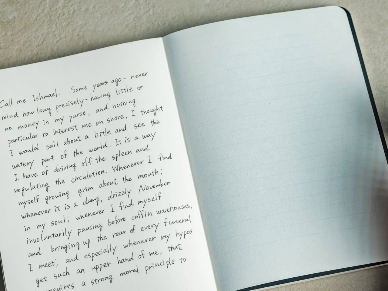



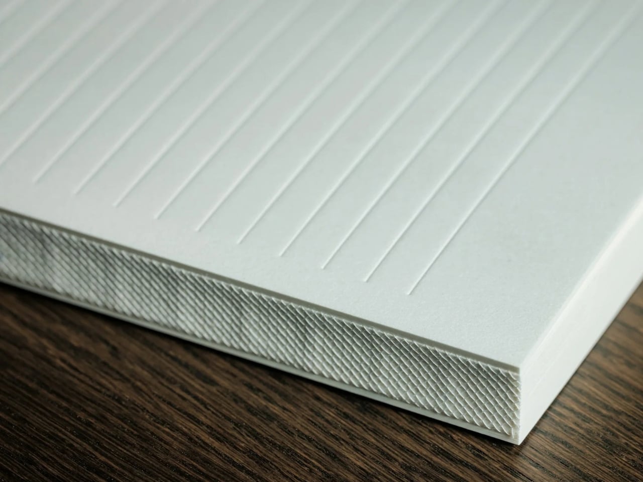
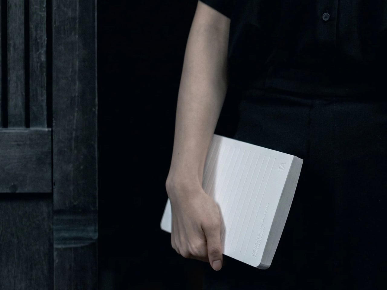
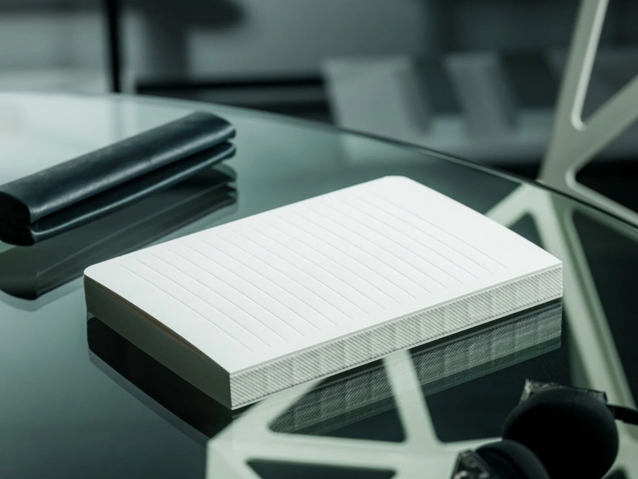


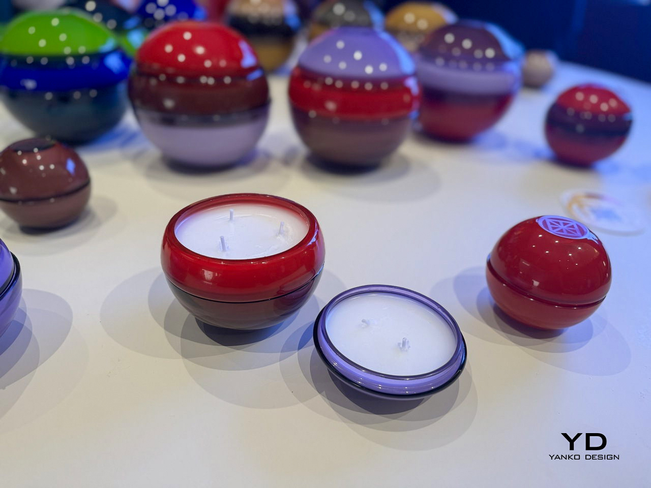
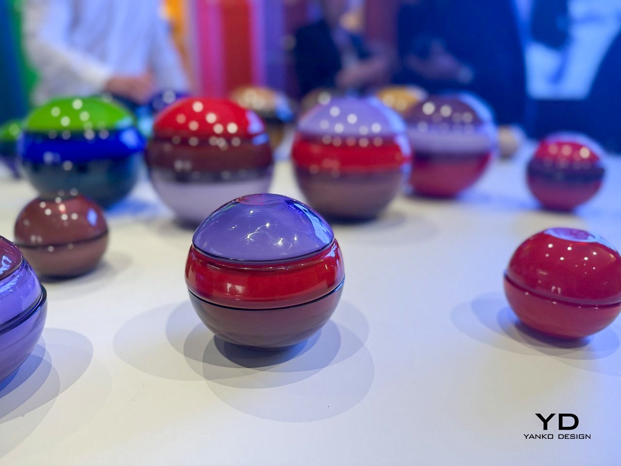
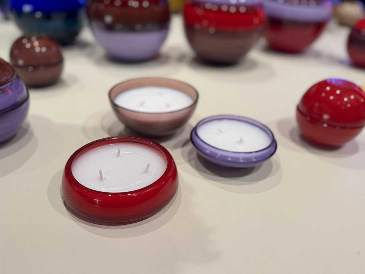
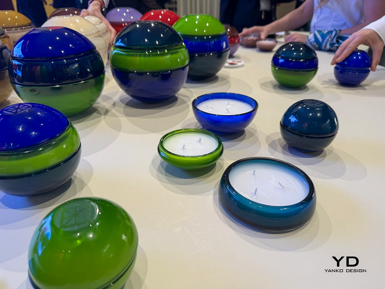
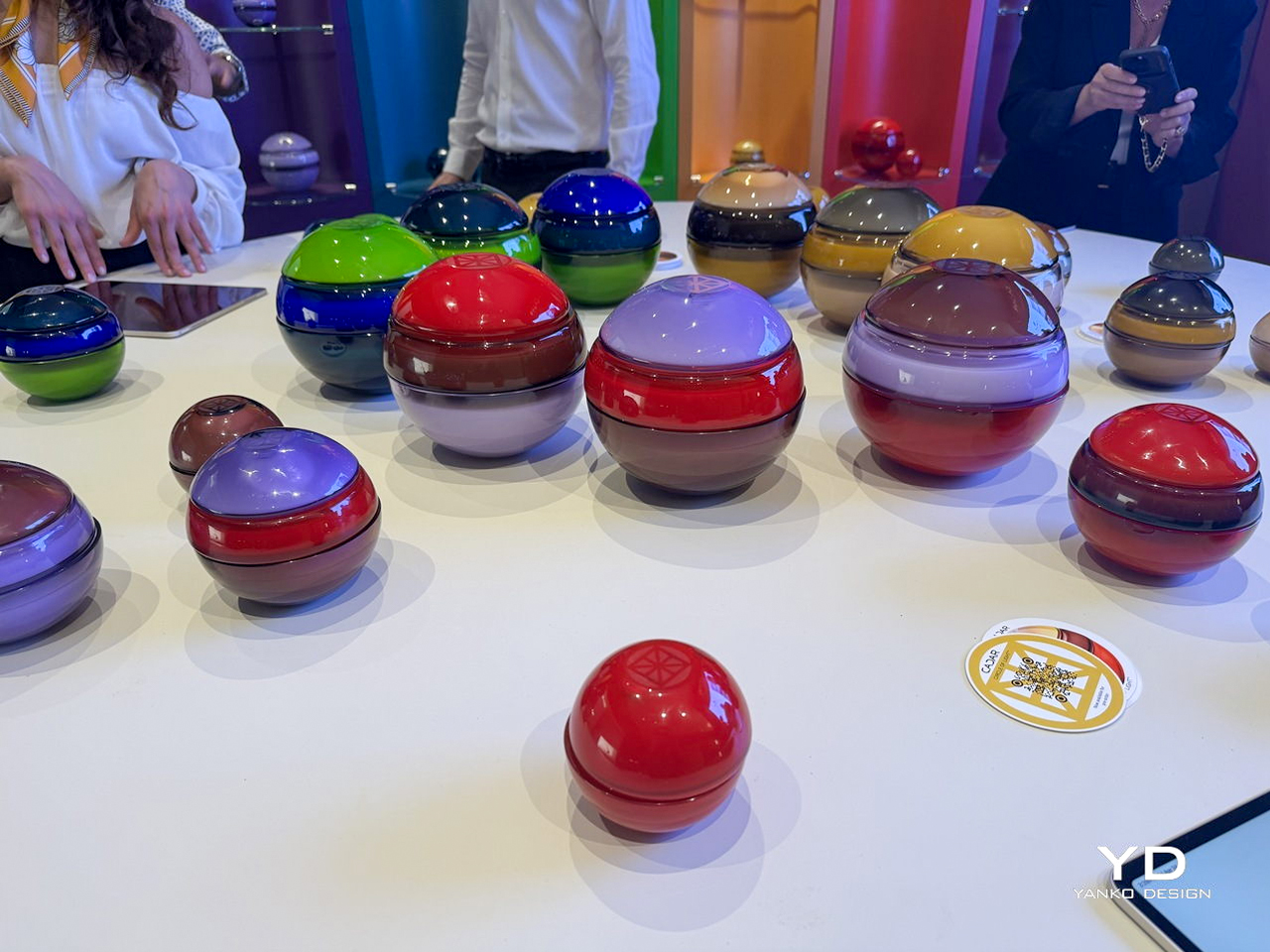
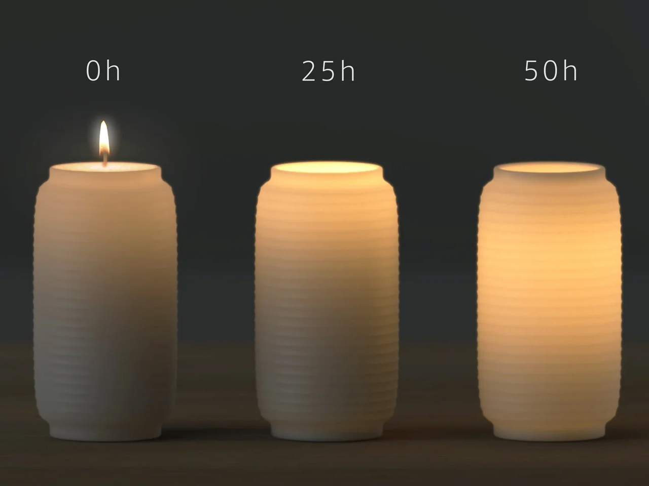

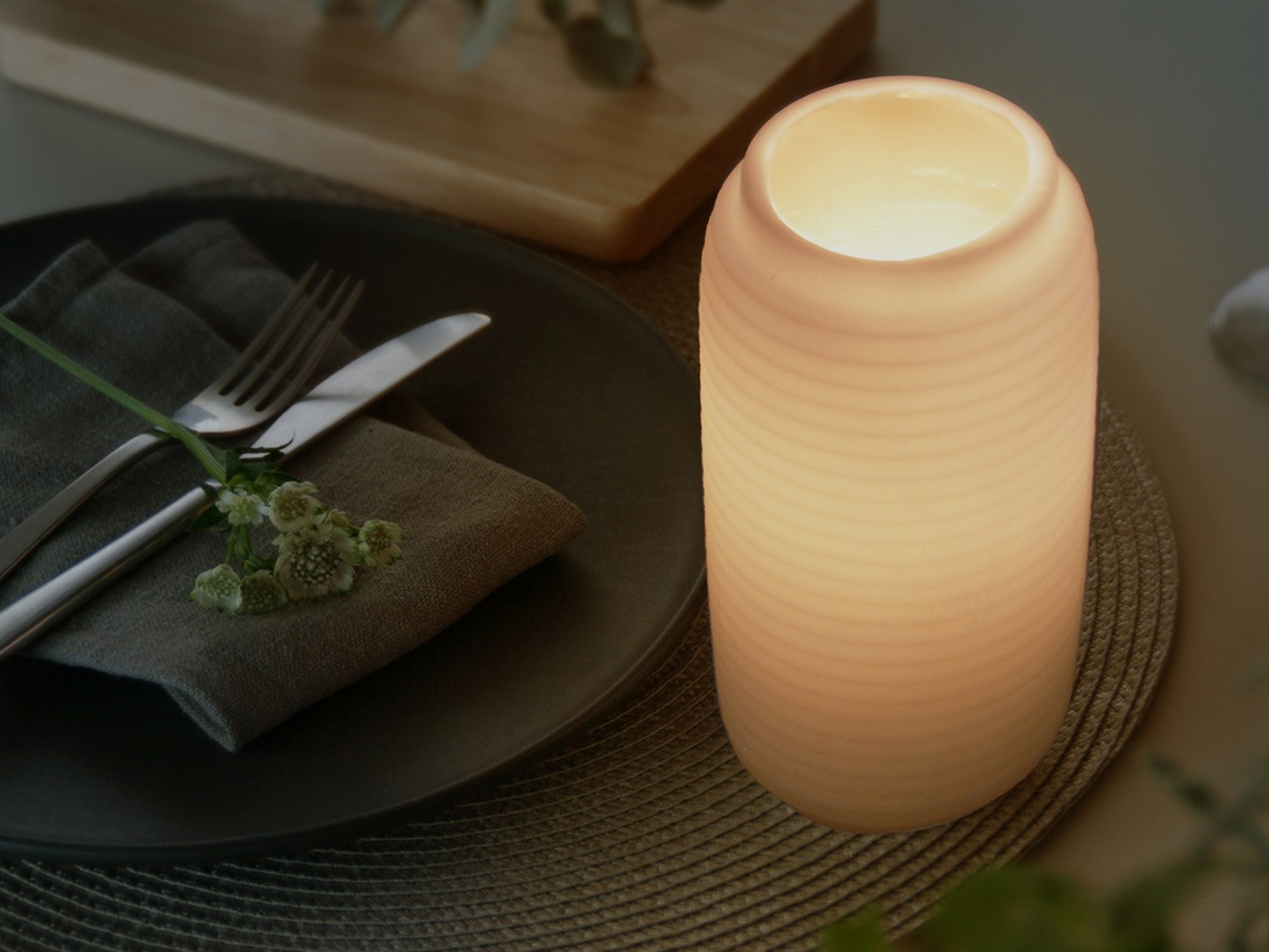

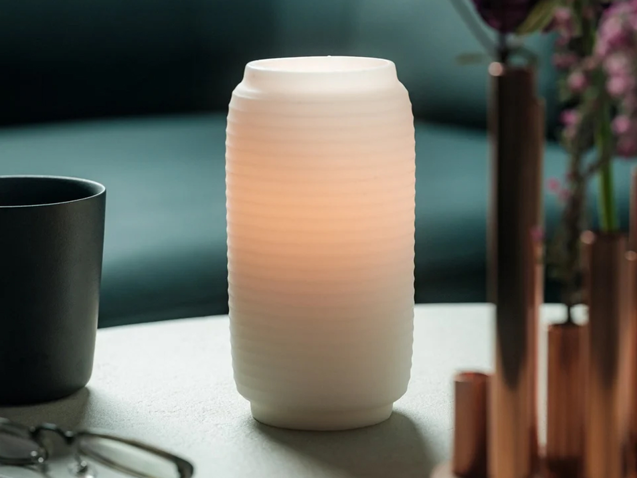
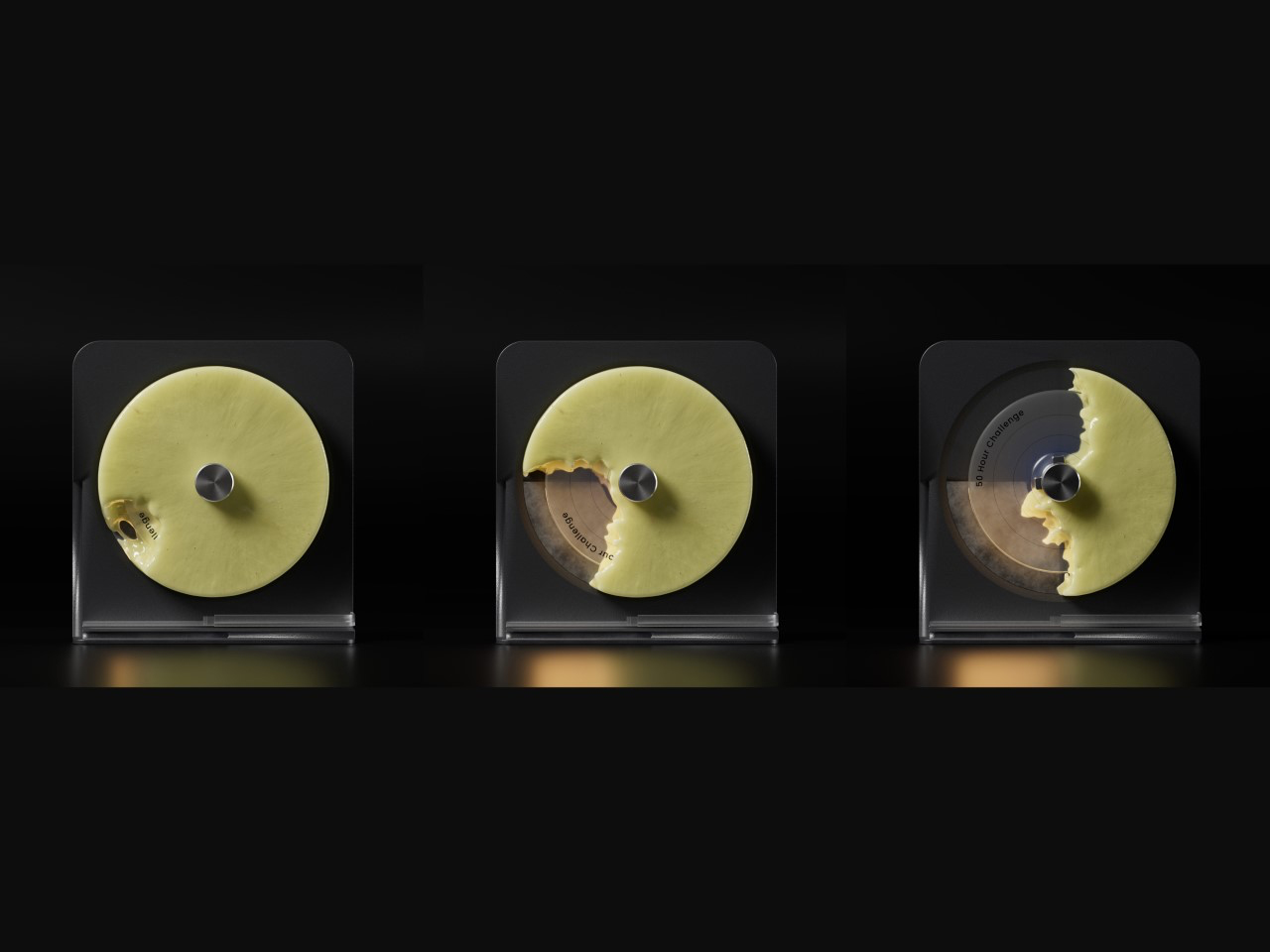
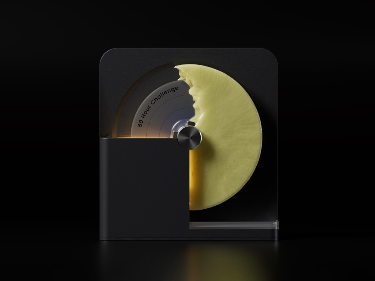
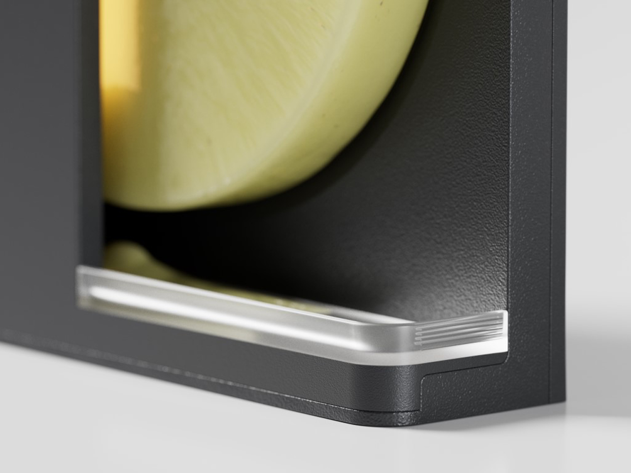

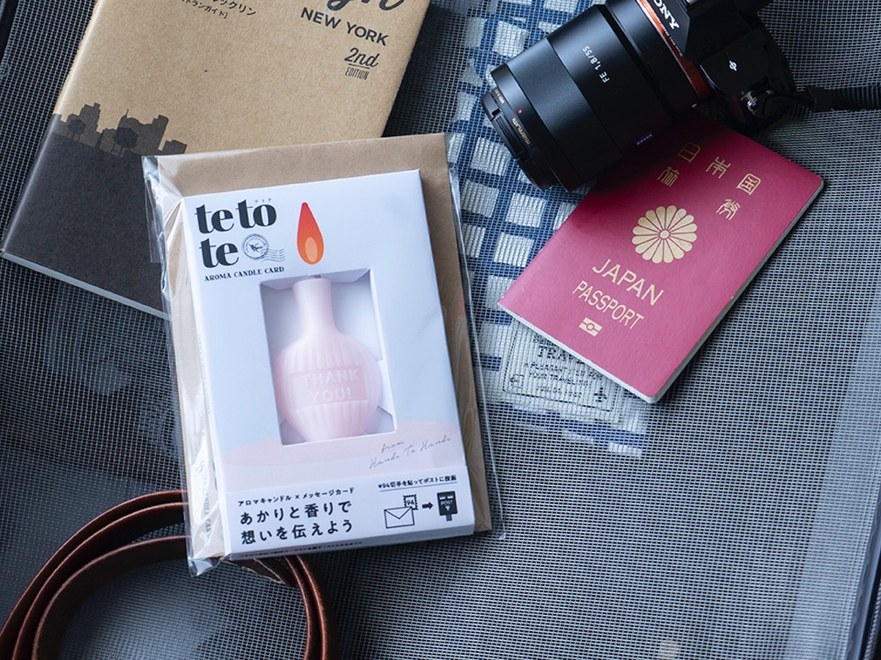
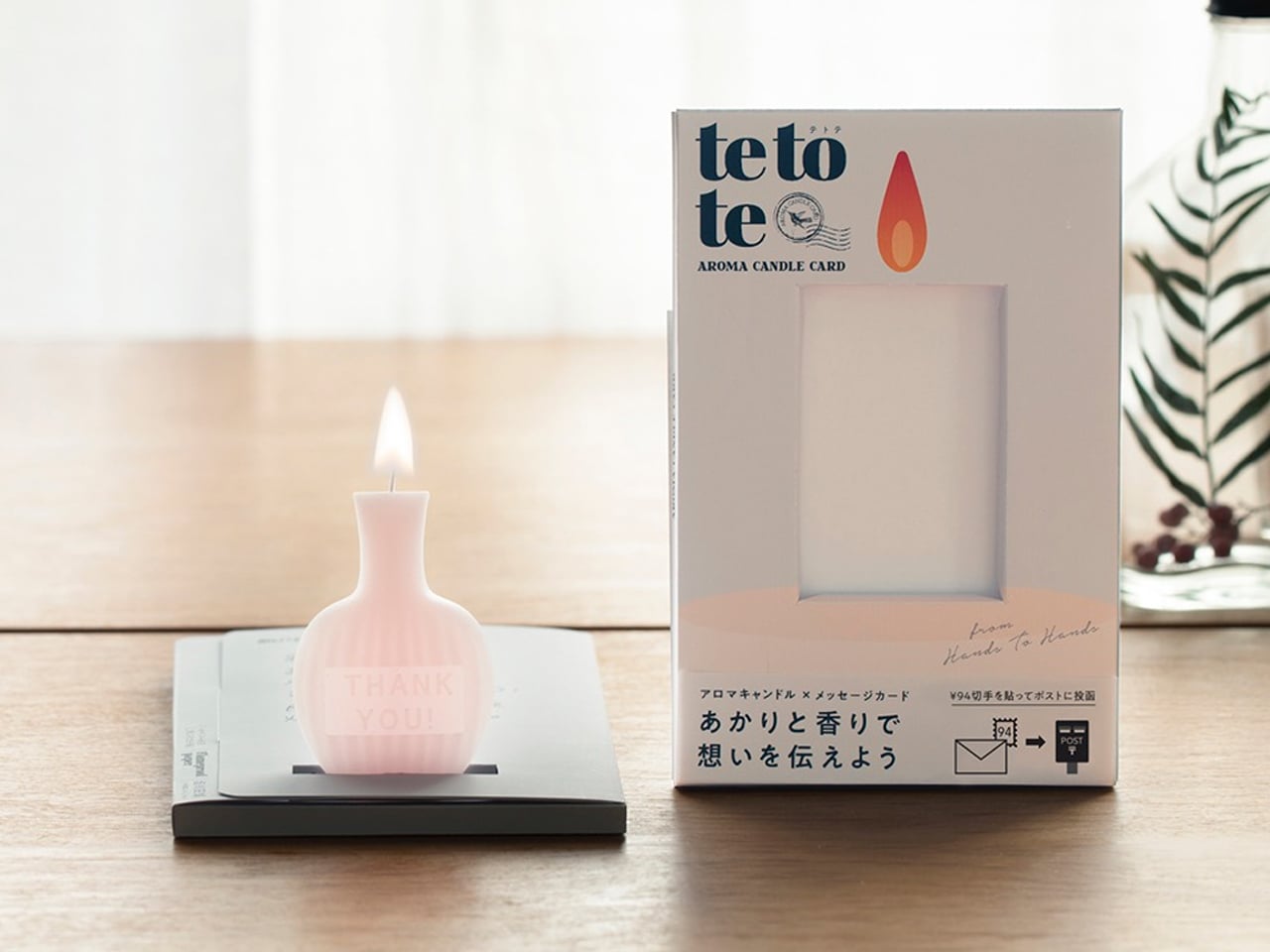
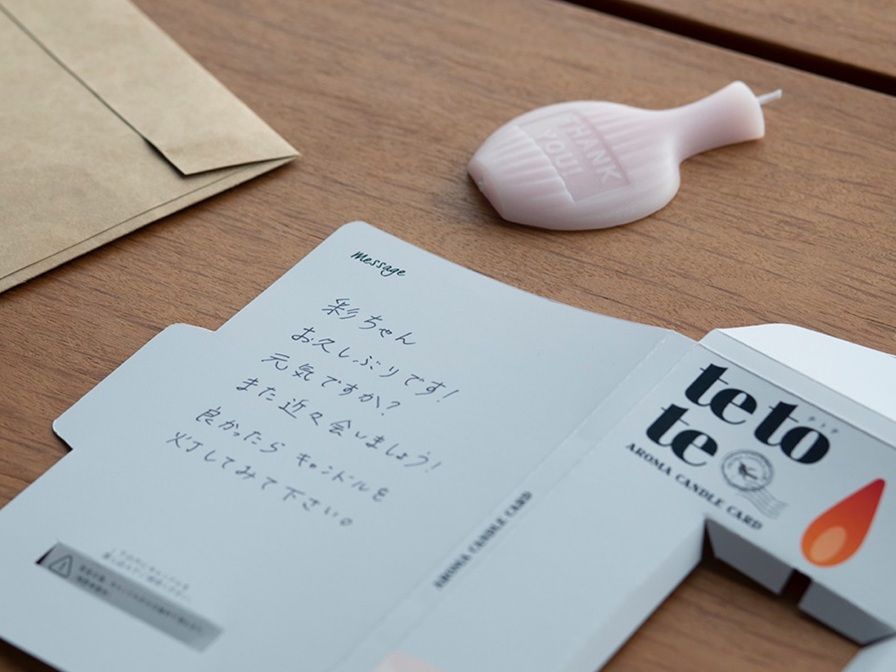


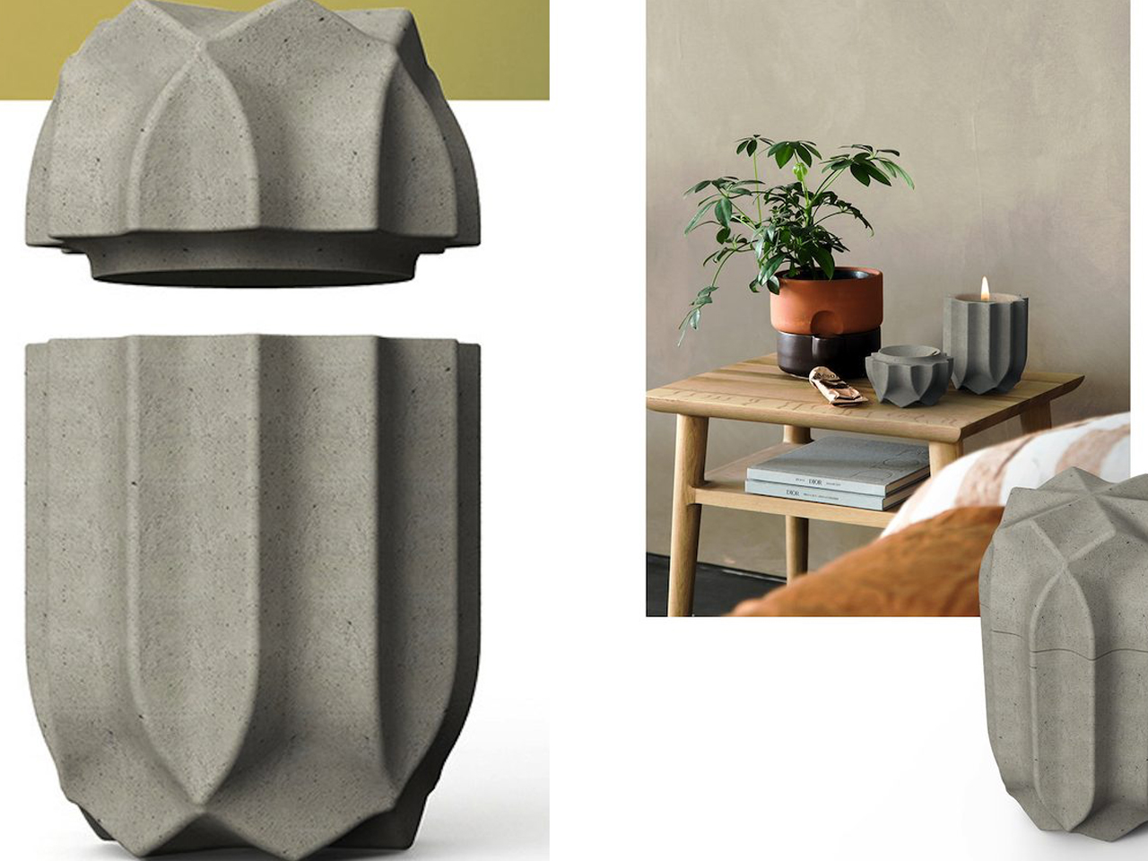


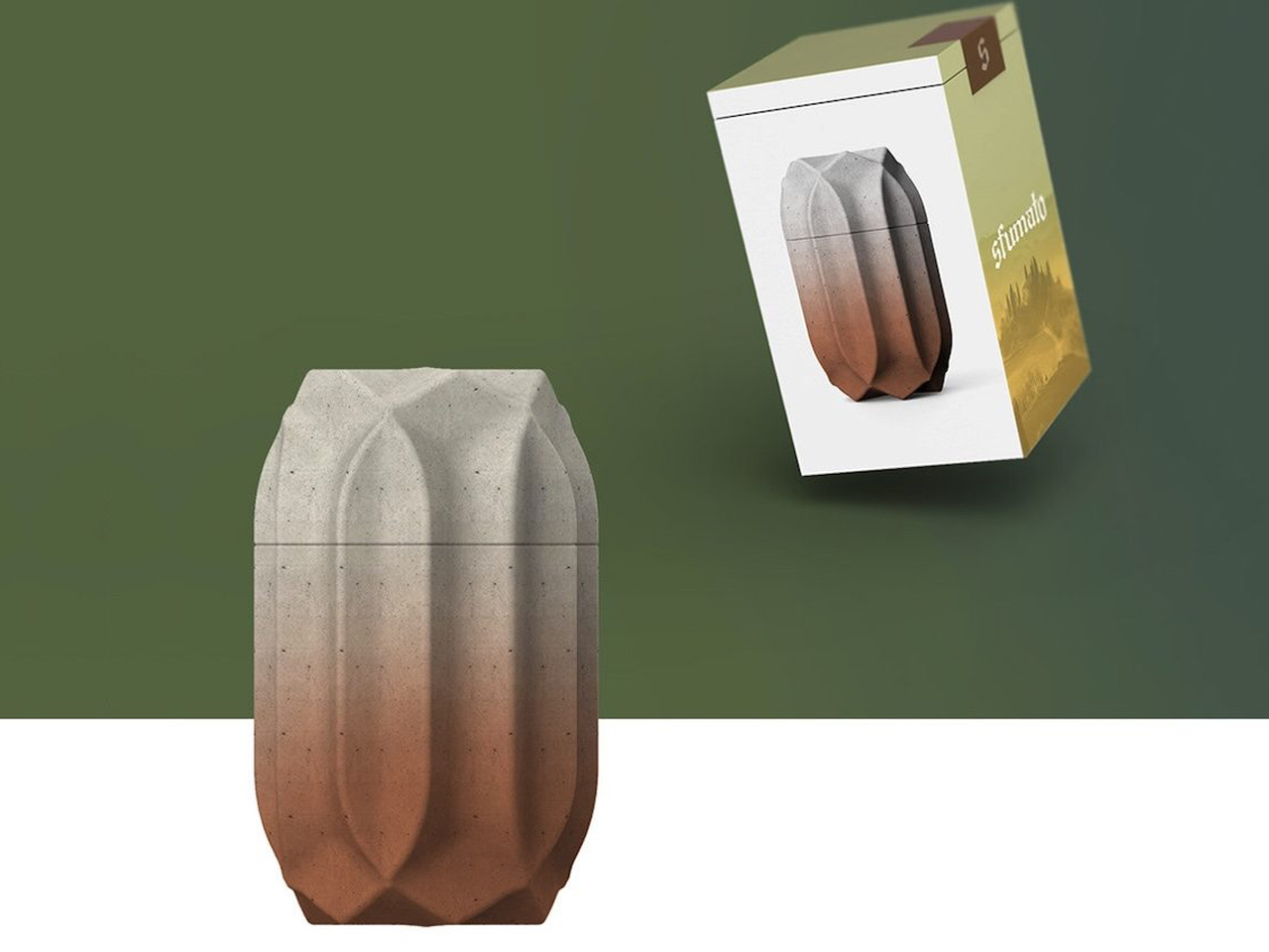

 2.0 trimming system targets a zero-inch edge gap, according to the company, putting that leftover strip squarely on the agenda. Set for a preview at Equip Expo 2026, the robotic mower also brings solid-state LiDAR, stereo vision, and network-assisted satellite positioning. An impressive résumé, although the edge-cutting hardware is what makes me want to schedule the interview.