Vue lecture

Il y a de nouveaux articles disponibles, cliquez pour rafraîchir la page.

This Quebec Home Doesn’t Fight the Forest – It Disappears Into It

Certain kinds of architecture don’t announce themselves. La Maraude, the latest project by Nathalie Thibodeau Architecte, is exactly that — a compact residential dwelling tucked into the dense woodlands of Boileau, in Quebec’s Outaouais region, that earns its presence through restraint rather than spectacle. Completed in 2024, it’s one of the more quietly compelling houses to come out of Canada in recent memory.

The name itself carries meaning. ‘Maraude’ — to roam, to forage — hints at the relationship the house cultivates with its surroundings. Rather than claiming a dominant position along the river’s edge, the architects deliberately set the home deeper within the treeline, orienting the house’s interior life entirely toward the forest. It’s a gesture that shapes everything else about the project.

Designer: Nathalie Thibodeau Architects

The design draws directly from Quebec’s vernacular architectural tradition — steeply pitched rooflines, grounded proportions, and a material palette that feels native to the region. The exterior is clad in natural cedar shingles and topped with a metal roof, two materials with deep roots in the local building culture. These aren’t nostalgic choices. They’re translated through a contemporary lens, stripped of ornament, reduced to their essential geometry. “Designed with particular attention to simplicity, functionality, and respect for traditional codes, La Maraude embodies a successful dialogue between contemporary architecture and local traditions,” says Nathalie Thibodeau Architecte.

What makes the spatial sequence genuinely interesting is the use of two courtyards as organizing devices. The plan doesn’t simply open to the outdoors — it pulls the forest in, fragmenting the landscape into a series of framed views that shift with the seasons. One courtyard faces north, more sheltered and partly enclosed by the building itself, oriented toward higher ground. The other faces south, brighter and more expansive, drawing the eye down toward the lower terrain. The result is a house that reads differently in every light condition, every month of the year.

The second volume, arranged over two levels in response to the site’s slope, plays a more introverted role. Openings here are smaller and precisely placed to frame specific moments within the tree canopy — quiet apertures rather than panoramic statements.

Photographed by Maxime Brouillet, La Maraude has the look of a project that will age well, both materially and culturally. It’s already being discussed as a potential anchor for a broader ensemble of small retreats on the site — a first building in what could become a considered, evolving conversation between architecture and landscape.

The post This Quebec Home Doesn’t Fight the Forest – It Disappears Into It first appeared on Yanko Design.

Inside the Log-and-Glass Home Olson Kundig Built for a Builder on Salt Spring Island

Salt Spring Island doesn’t need much convincing — it already has the cliffs, the meadows, and the trees. The name sounds more like a childhood storybook setting than an architectural statement — and that tension is exactly the point. Nestled amidst the trees and rugged cliffs of Salt Spring Island, BC, the Daisy Ranch is Olson Kundig’s most recent residential project, led by design principal Tom Kundig. It’s casual. It’s rugged. And it’s entirely, unapologetically itself.

The house sits at the edge of a sweeping meadow, anchored by a log structure that feels like it could have always been there. The primary move is a rugged glass box paired with a long, cantilevered roof that stretches over a generous deck — a roof that earns its keep through BC’s shifting seasons, offering shelter without closing anything off. What makes it work visually is the layering: large square-cut logs and glass soften the rust-colored patina of weathered steel cladding, giving the exterior a palette that feels earned rather than designed.

Designer: Olsun Kundig

The plan is organized along a clean linear axis, with two distinct volumes bisected by an eastern entry stairway. The front door is tucked under a generous overhang — a small but considered gesture that grounds the arrival sequence without dramatizing it. The northern volume, clad in wood and steel, handles the private program: a primary suite and additional bedrooms, with framed view corridors that offer deliberate glimpses of the landscape rather than full exposure. Privacy and connection, calibrated carefully.

Inside, the bathroom is where the project gets most personal. Widespread use of wood infuses the space with warmth, while a clawfoot tub set before corner windows underscores the home’s persistent connection to the landscape outside. It’s the kind of detail that feels borrowed from an older, more tactile way of building — which is precisely the intention.

The project was designed in close collaboration with the client, Patrick Powers, a builder and fabricator who also served as general contractor. That relationship left its mark. The house doesn’t feel like it was delivered to a site; it feels like it was made with the site, material decision by material decision.

As Kundig put it: “There’s a lineage at play in this project, a quiet innovation that comes from the shared DNA of materials and relationships.” The Daisy Ranch is the kind of project that doesn’t need to announce itself. It sits lightly on its land, opens wide to its meadow, and gets on with the business of being lived in.

The post Inside the Log-and-Glass Home Olson Kundig Built for a Builder on Salt Spring Island first appeared on Yanko Design.

UNO and Vrbo Are Renting Vacation Homes for $4 a Night

Brand collaborations are everywhere these days, but every once in a while, one lands so perfectly that you have to stop and appreciate the logic behind it. The UNO x Vrbo partnership is exactly that kind of collab. Not because it’s flashy or trying to be something it’s not, but because it genuinely makes sense.

Starting May 15, Mattel and Vrbo are opening bookings for six limited-time vacation home stays built entirely around the spirit of game night. Six properties across the U.S., two tiers of experience, and one very clever price point: $4 per night. That last part is a deliberate nod to UNO’s iconic Draw 4 card (which can make or break relationships), and it’s the kind of detail that makes you smile whether you’re a brand person or not.

Designers: UNO x Vrbo

The stays are divided into two experiences. At the top end sit the two “Wild Card” homes, located in the Hollywood Hills and Texas Hill Country. These are the full production: UNO-themed décor, organized game nights, and an in-home dining experience. They’re designed for groups of up to 10 guests who want the whole immersive package, the kind of weekend that’s more curated getaway than casual vacation. Then there are the four “Play It Your Way” stays in Winter Park, Colorado; Palm Desert, California; Panama City Beach, Florida; and Atlanta, Georgia. These are a little more relaxed, but still come with a co-branded UNO x Vrbo Welcome Kit, a game room, and either a pool or hot tub. Essentially, they’re the version for people who want the fun without the fuss. All six properties are bookable for one three-night stay, Friday to Monday, on a first-come, first-served basis. Bookings open May 15 at 1 PM ET. I’ll be honest: at $4 a night, they are going to go fast.

What makes this collaboration genuinely interesting, beyond the price tag, is the attention that went into the actual product. A custom UNO deck was commissioned for this collab, illustrated by Pietari Posti, with artwork inspired by travel destinations and vacation themes. It also comes with an exclusive rule called the “Vacation Rental Swap,” which lets players swap hands with anyone at the table. It’s a small thing, but it shows that the two brands weren’t just slapping logos on a vacation home and calling it a day. They put real creative thought into what the collaboration could actually feel like to experience.

That’s the part that tends to separate a genuinely good brand collab from a lazy one. Anyone can license a logo and stick it on merchandise. Fewer brands take the time to ask what the experience should feel like from the inside, and build something around that answer. UNO, at its core, is a game about chaos and connection. You play it with people you like and you inevitably end up yelling at them. It’s social in the most fundamental way. Vrbo, meanwhile, is about giving groups a private space to actually be together without the interruptions of a hotel. Put those two things in the same room and you get something that doesn’t need to be explained.

It also helps that this collab is part of a growing relationship between Mattel and Expedia Group, Vrbo’s parent company. Mattel already appeared in an Expedia Super Bowl commercial earlier this year through the Barbie universe. So this isn’t a one-off stunt; it reads more like two brands actively figuring out how to build something together over time. For anyone who grew up playing UNO at a kitchen table, there’s an undeniable nostalgia pull here. But the campaign doesn’t lean into nostalgia as a crutch. It uses the game’s identity as a starting point and builds forward from it, which is ultimately why it works. The best collaborations don’t just remind you of something you loved. They give you a new reason to love it again.

The post UNO and Vrbo Are Renting Vacation Homes for $4 a Night first appeared on Yanko Design.

Foshan’s Forgotten Warehouses Got a Rooftop Park Under Floating Domes

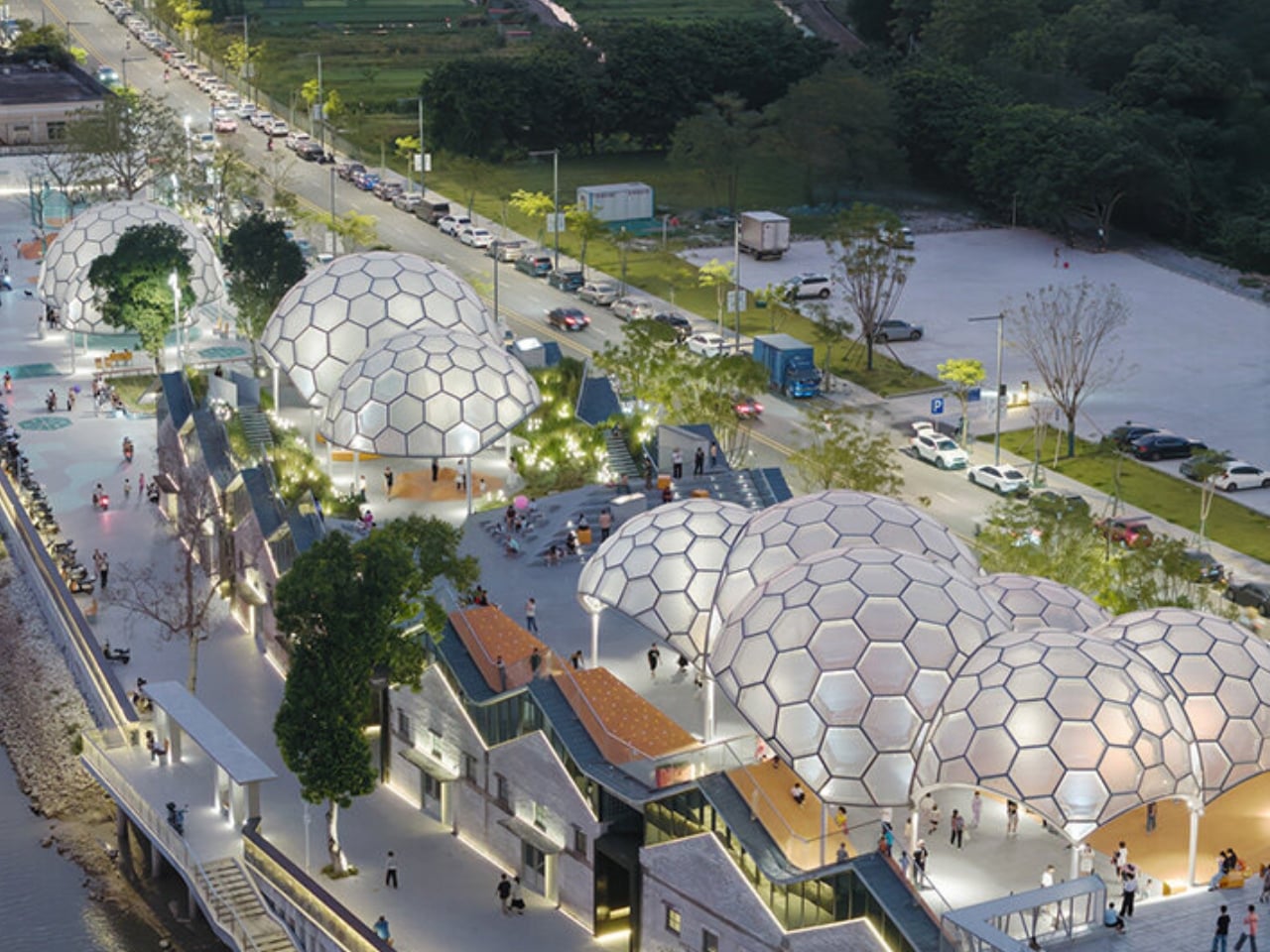
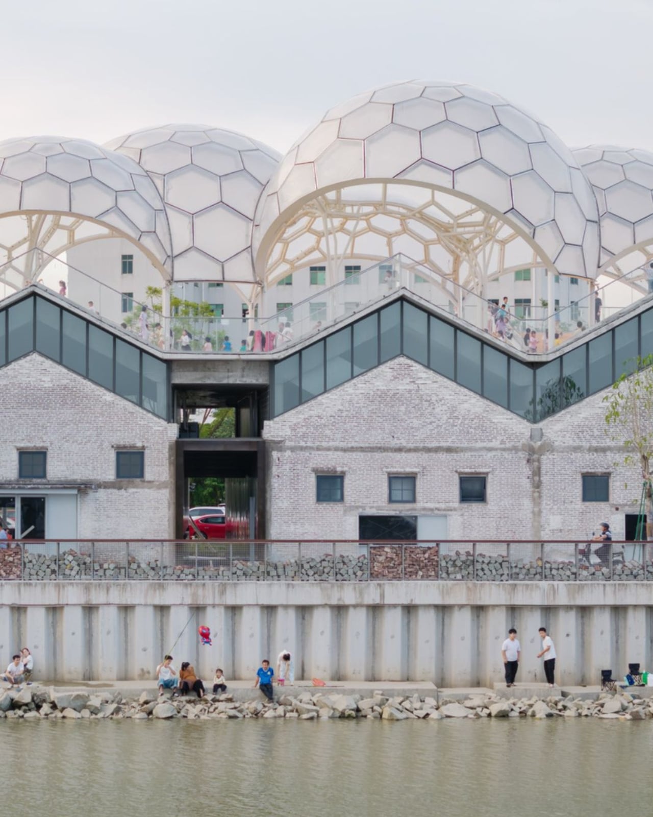
Somewhere along the Huadi River in Foshan, China, a cluster of old grain storage warehouses has been turned into one of the most quietly poetic pieces of architecture I’ve seen all year. The Yongping Warehouse Renovation, completed in 2025 by Guangzhou-based Atelier cnS, is exactly the kind of project that makes you stop scrolling and actually look.

The site sits in Dali Town, Nanhai District, a former industrial pocket of the Pearl River Delta that’s been gradually shedding its factory-town skin in favor of something more livable and publicly accessible. These particular warehouses, lined up along the riverfront, were derelict grain storage buildings with no obvious future. Not exactly glamorous source material. But Atelier cnS didn’t flinch, and the result is a project that earns its attention without asking for it loudly.

Designer: Atelier cnS

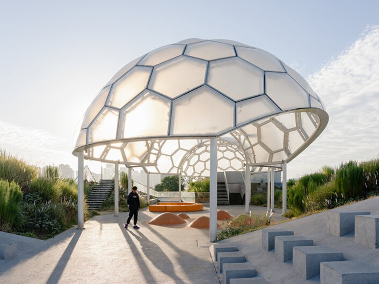
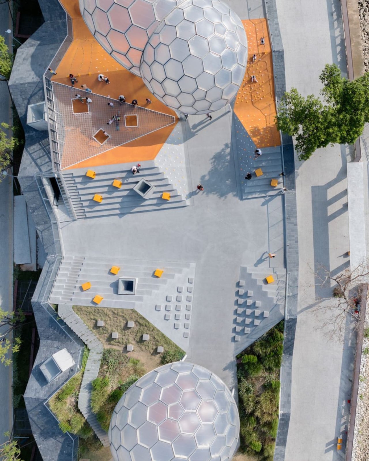
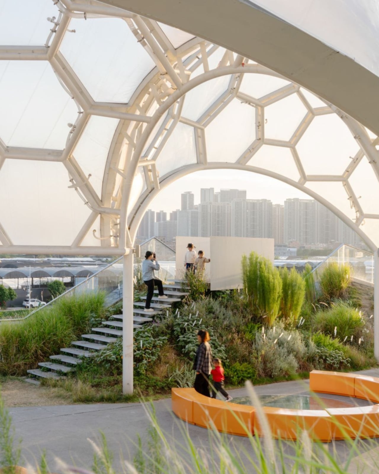
Because the site has a narrow footprint, the architects pushed the public space upward, placing a landscaped rooftop park above the commercial interiors below. Vertical programming isn’t a new idea, but what makes Yongping feel different is how thoughtfully the transition between levels was handled. The gaps between warehouse blocks weren’t sealed or filled in. Instead, they were preserved and widened into passageways, so as you move through the building, you catch glimpses of the river framed by walls before the whole view opens up at the top. It’s a slow reveal, and it’s deliberate.

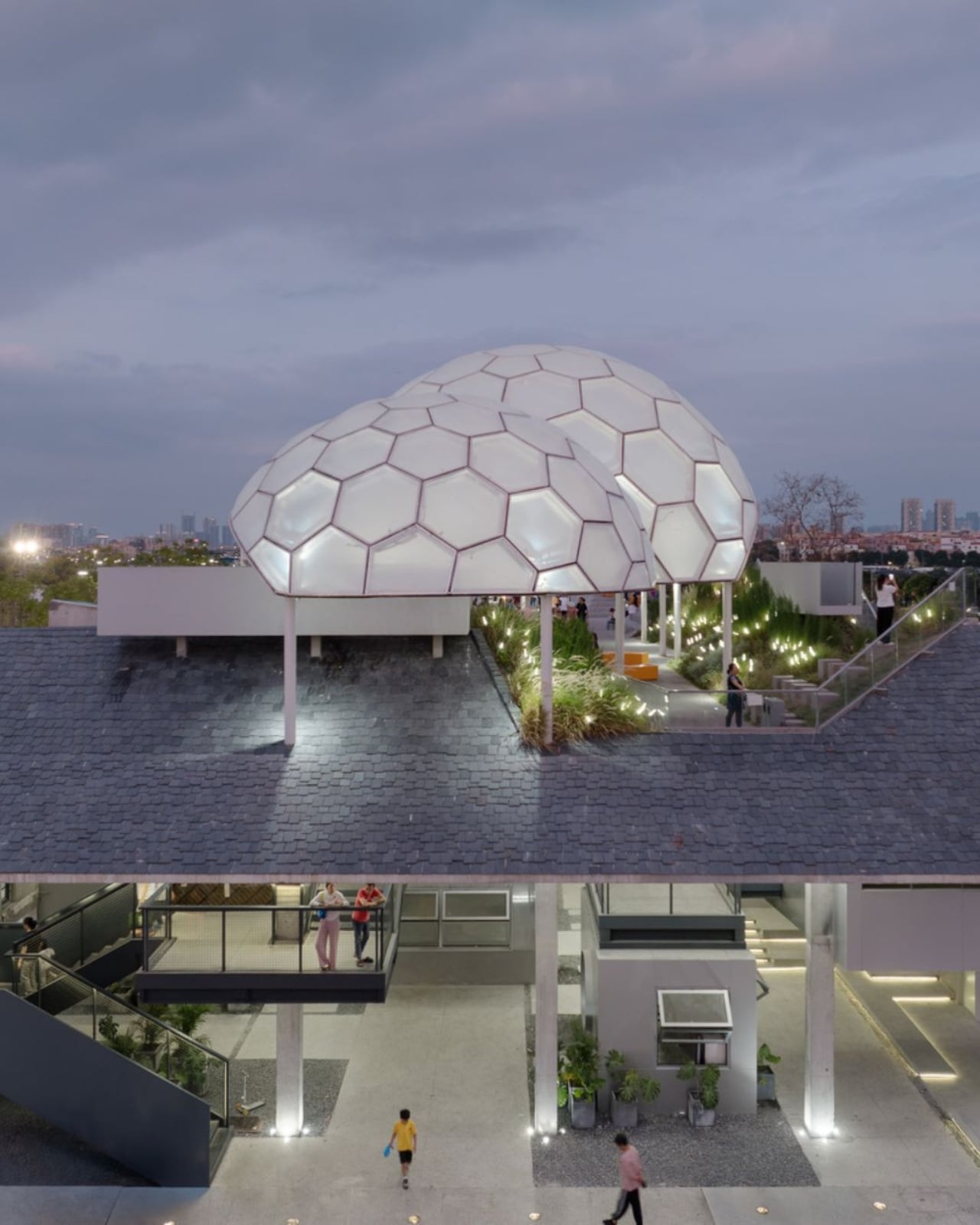
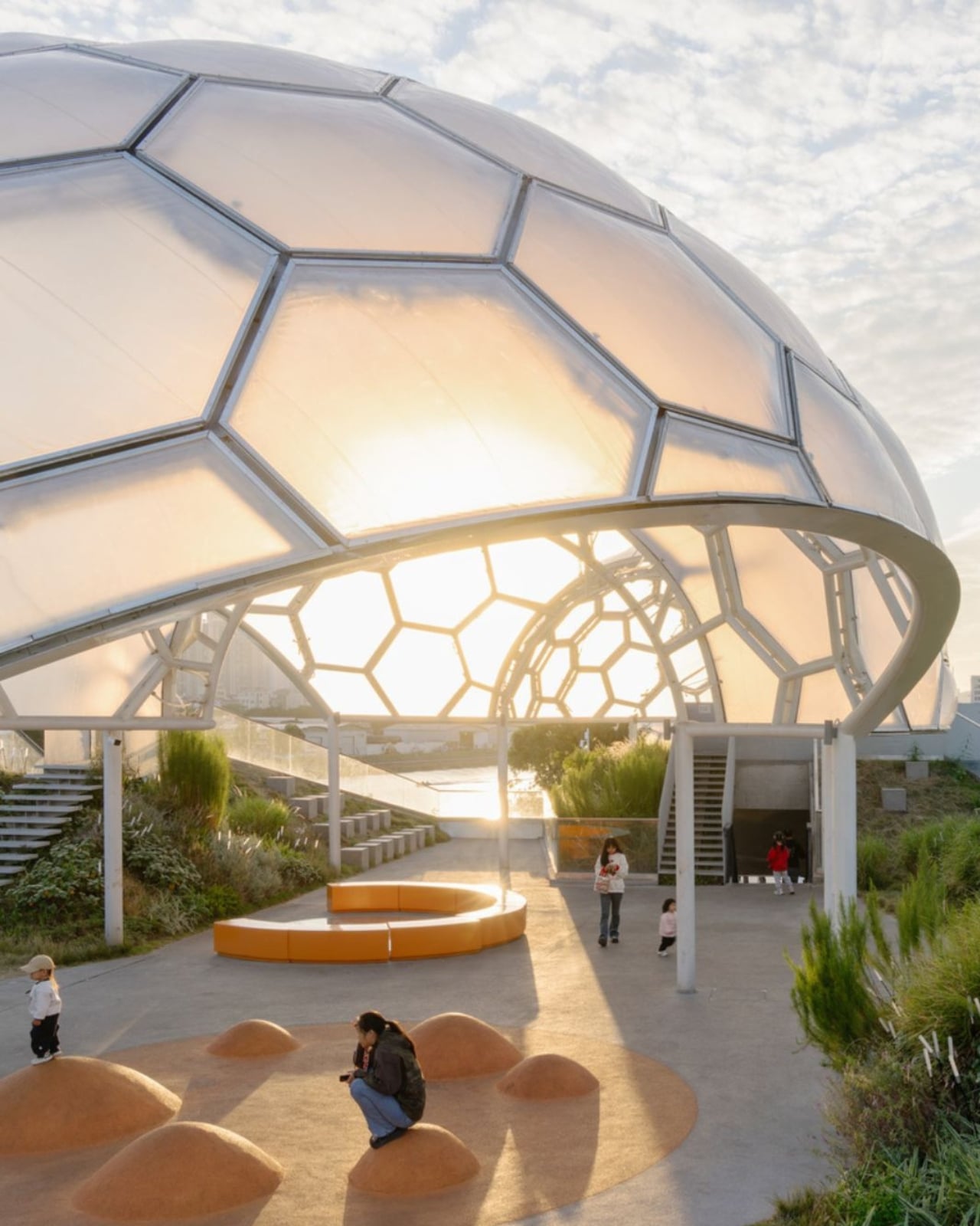
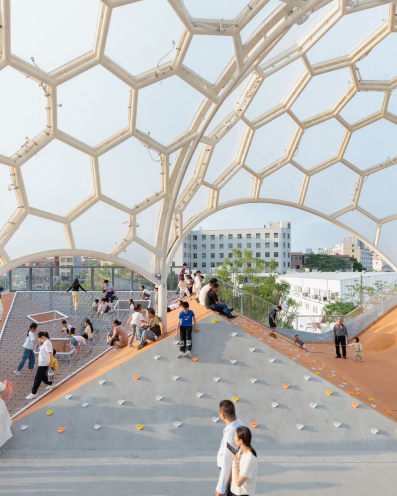
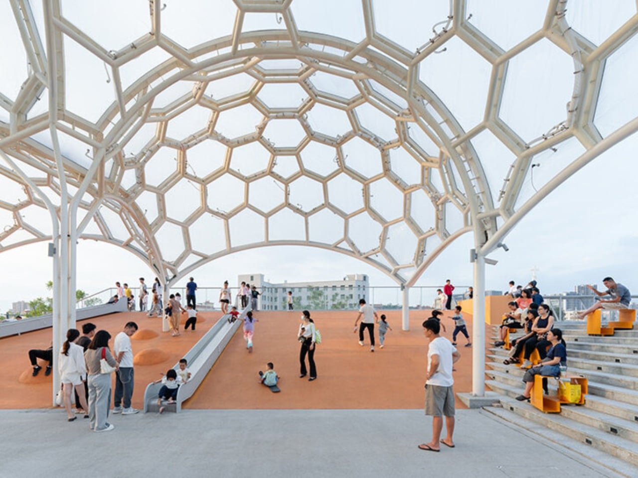
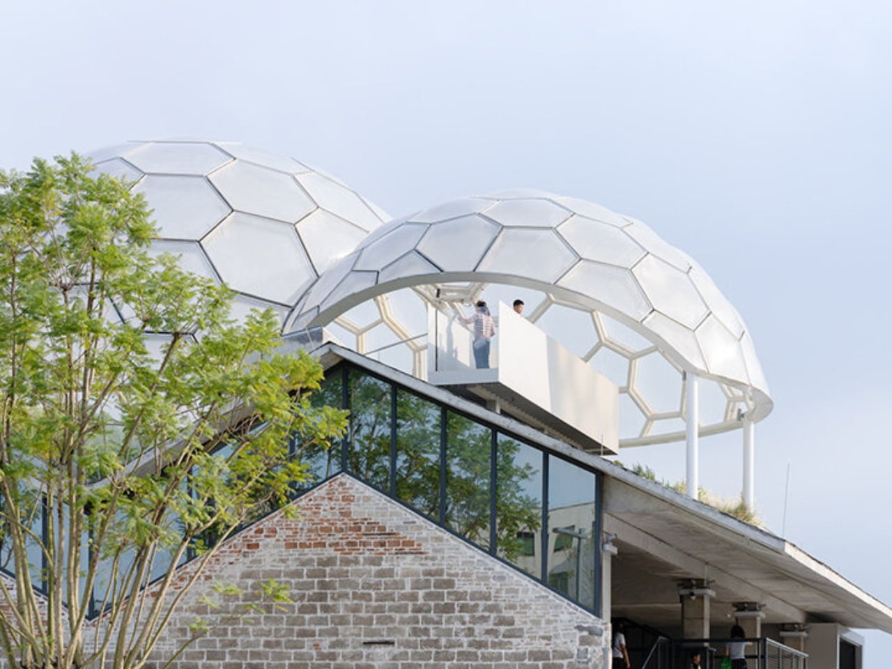
And then there are the canopies. A series of translucent, domed structures built from hexagonal frames cluster across the roofline like a quiet gathering of clouds. Atelier cnS actually named the project “A Wisp of Cloud” over Huadi River, and the photos earn that name completely. The domes are light-diffusing, casting shade without blocking river views. They create zones for sitting, moving, and play without ever feeling like they’re closing the space in. They look like they arrived gently, rather than being imposed on the building below them.

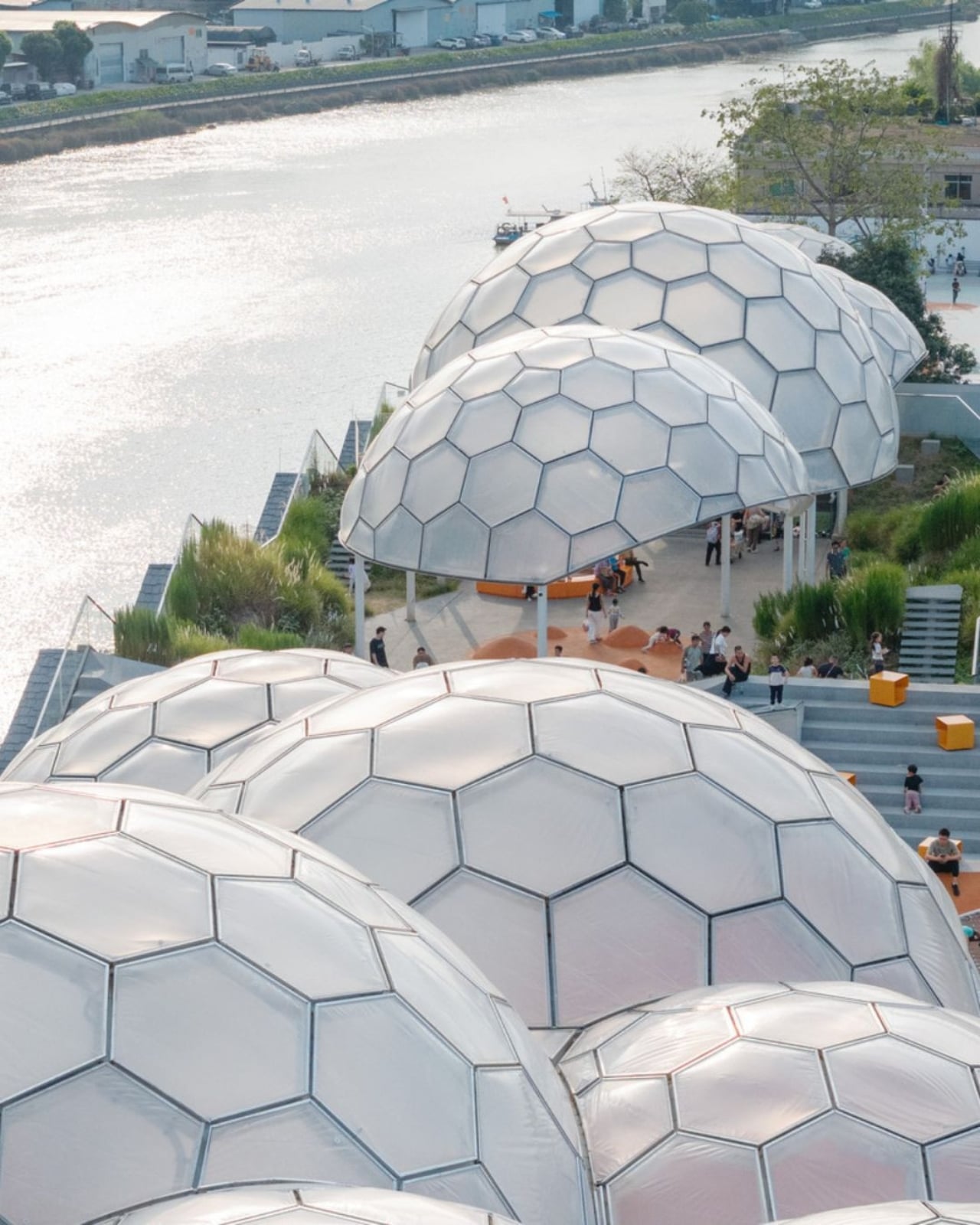
The rooftop itself is shaped into slopes, steps, and play surfaces that echo the original pitched forms of the warehouse roofs. It’s one of those details that most visitors probably won’t consciously register, but it’s exactly the kind of architectural memory that makes a renovation feel grounded rather than gratuitous. The old buildings aren’t being pretended out of existence. The new design is in active conversation with what was there before.

I’m genuinely drawn to this project because it gets the balance right in a way that many adaptive reuse projects don’t quite manage. Too often, the renovations that attract the most attention are the ones where the new design overwhelms the original structure, turning the old building into nothing more than a convenient shell. Yongping avoids that trap. The warehouses are still very much present. Their bones dictate the rhythm, the circulation, and some of the visual language of the final result. You can feel the history of the place without having to read about it first.

Atelier cnS has been developing this kind of thinking for years. The studio’s earlier work on elevated public circulation, including a “roof-hopping” design approach explored in their White House Guesthouse project, signals a long-running interest in finding new life in existing structures. Yongping feels like a maturation of that sensibility. More refined, more integrated, and more tuned in to the texture of a neighborhood mid-transition.

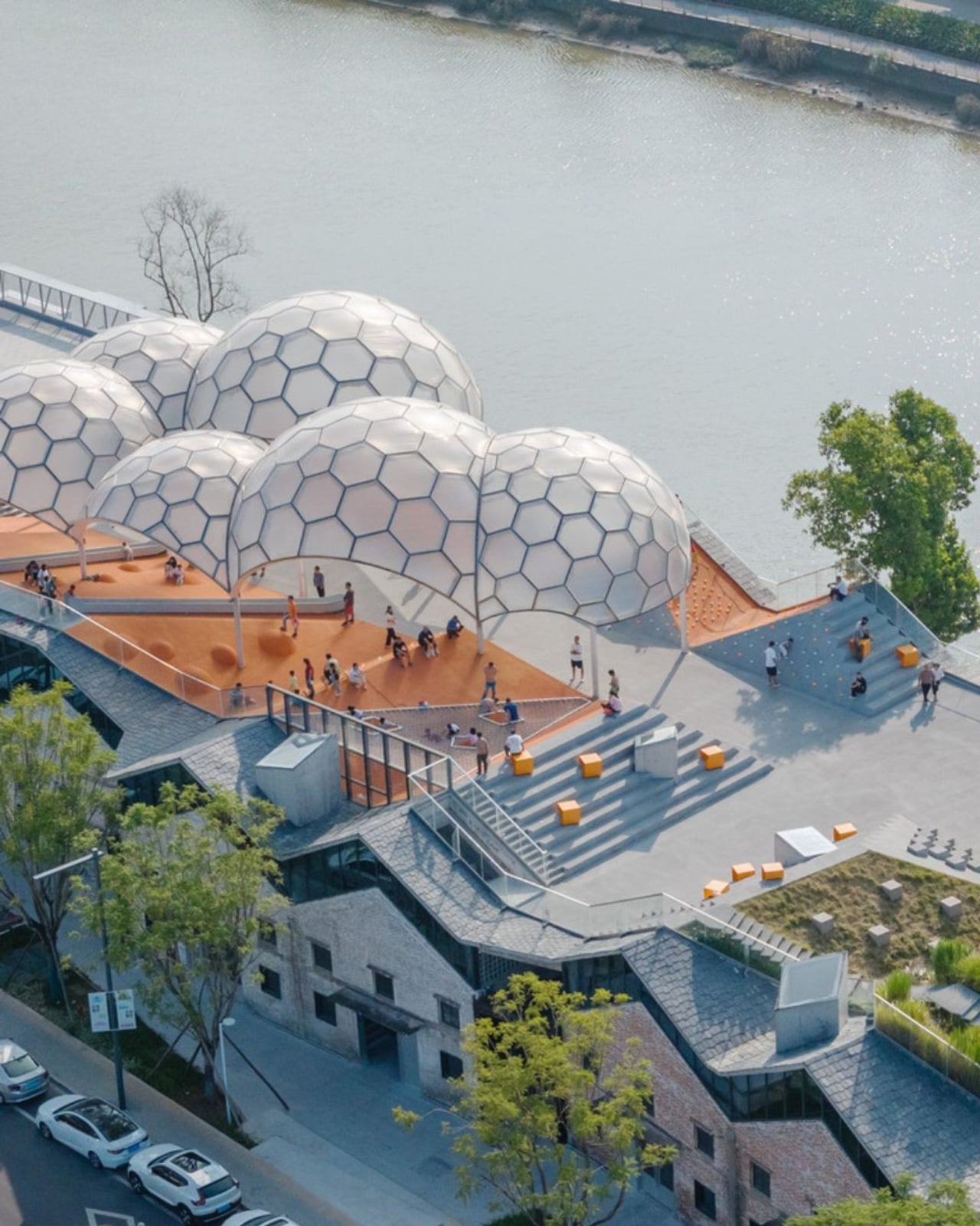
The project spans 4,311 square meters, and it’s worth noting what it does beyond the architecture itself. Turning a commercial renovation into a publicly accessible rooftop park, in a district shifting away from its industrial past, is a real act of generosity. A park on a roof could easily read as a private amenity. Here, it reads like a gift to the neighborhood, a place to walk, rest, and look out at the river without needing a reason to be there.

Architecture doesn’t always need to announce itself to be worth paying attention to. The Yongping Warehouse Renovation is understated, purposeful, and lit from above by a cluster of translucent domes that look, from a distance, exactly like a wisp of cloud over the river.

The post Foshan’s Forgotten Warehouses Got a Rooftop Park Under Floating Domes first appeared on Yanko Design.

Belgium’s Most Striking Concrete Villa Was Designed by the Dunes

If you’ve ever stood on a beach and watched the tide pull back, you know that moment right before the water retreats completely, when it leaves those delicate horizontal lines etched across wet sand. That’s what the facade of Villa Nouvelle Vague looks like. Not metaphorically. Literally. Belgian architect Magalie Munters designed the concrete surface of this seaside villa in Oostduinkerke with a horizontal grain that mirrors the striations the North Sea leaves behind at low tide. The reference isn’t decorative, it’s structural. And that distinction matters.

The villa sits on a corner plot at the edge of a protected dune reserve in Oostduinkerke, a small coastal town already known for a few wonderfully eccentric things: a ship-shaped restaurant and fishermen who harvest shrimp on horseback. Into this landscape, Munters has introduced something that manages to be arresting without being loud. The form is sculptural and unmistakably modern, but it doesn’t shout. It settles.

Designer: Magalie Munters

The name “Nouvelle Vague” borrows from the French New Wave film movement, and the reference is apt in ways that go beyond the obvious nod to style. The French New Wave was defined by breaking conventional rules while remaining deeply committed to craft. Munters is working in a similar register. For years, her Ghent-based boutique studio has been developing residential architecture with organic geometries, pushing against the idea that construction methods should set the ceiling on what architecture can achieve. “Through that ongoing research, I developed a way of building in which construction and technology no longer act as a limitation to the architecture,” she explains. Villa Nouvelle Vague is where that research cashes out.

The concrete form is completely curved across the entire volume, not just as a surface treatment but as a governing logic, carried through every detail: the absent roof edges, the curved garage opening, even the way the house integrates into the ground. The bedrooms are half-buried in the dunes, which is both a functional and a conceptual move. The house doesn’t sit on the landscape. It’s anchored into it. Above those buried rooms, the living spaces rise toward the horizon, pulling in light and opening out to views of the dunes in a way that feels earned rather than forced.

The way you move through the house is where Munters’ admiration for Le Corbusier becomes most legible. She’s spoken about his influence, specifically in “the rooftop solarium, in the way spaces expand and contract, and in the vertical shafts that structure movement through the house.” You enter through a vertical shaft that climbs toward the roof before expanding into the main living space. The compression-then-release is theatrical in the best sense. The house is working on your nervous system before you’ve even sat down.

I keep coming back to that word: deliberate. Munters uses it herself: “What might appear as a free form is in fact the result of a very deliberate construction logic.” That’s the tension the villa lives in, and frankly, it’s what makes it interesting. Nothing here is freehand improvisation. The curves look fluid because the logic behind them is airtight. The concrete looks like it grew from the dunes because the architect studied the dunes before she touched a drawing. That’s different from a building that mimics nature for aesthetic points. It’s rarer, and harder.

Belgian architecture doesn’t always get the international visibility it deserves, and Magalie Munters is one of those names worth paying attention to even if residential architecture isn’t usually your thing. Villa Nouvelle Vague is the kind of project that earns its name. It has the confidence of something that knows exactly what it is, and the intelligence not to over-explain itself. Just like the best films of the movement it references.

The post Belgium’s Most Striking Concrete Villa Was Designed by the Dunes first appeared on Yanko Design.

Studioninedots’ Light House Is a Vertical Amsterdam Home Built From Playfully Stacked Boxes

What does a home look like when you throw out the floor plan entirely? For Amsterdam-based firm Studioninedots, the answer is a tower of playfully stacked boxes, each one dedicated to a single moment in life, that rises above one of the Dutch capital’s newest neighborhoods. Completed in 2025, Light House sits on Centrumeiland, a newly developed artificial island district defined by its self-build culture and strong sustainability ambitions.

The project began with a simple brief from a couple with two children who wanted a home that would genuinely bring them together. Rather than anchoring daily life to the ground floor the way most houses do, Studioninedots dedicated each of the family’s key activities — eating, gathering, cooking, relaxing — to its own distinct volume, then arranged those volumes vertically into a single, tightly considered composition. The result is a 257-square-meter residence that feels less like a stacked building and more like a small vertical neighborhood.

Designer: Studioninedots

Movement through the home unfolds through a sequence of open passages and compressed zones, where shifts in scale produce entirely different spatial moods. Smaller, enclosed areas carve out space for focused, quieter activities, while larger voids open up visual connections across levels, dissolving any conventional sense of what is above and what is below. Hovering above the kitchen is a sheltered, secluded volume ideal for yoga or film watching, while the journey through the house culminates at the top in what the architects describe as a “holiday home” within the city. Flanked by arched ceiling-height glass openings, this 14-metre-high gathering room commands panoramic views across the IJmeer lake.

The facade does a lot of the design’s heavy lifting. A wall of square glass blocks wraps the front of the building, filtering natural light into the interior while abstracting the life inside, offering privacy without sacrificing the warmth of daylight. At night, the facade glows from within, giving the house an almost lantern-like presence on the street.

Sustainability is baked into the structure itself. Light House is built as a lightweight system using prefabricated timber components inside a steel frame, a circular and modular method that allows for flexibility, long-term adaptability, and ease of disassembly. The layout is not fixed either, as children grow and priorities shift, the home can be reconfigured to meet whatever the family needs next. Light House is a rare thing: a home that feels entirely personal yet completely considered, one where architecture quietly gets out of the way and lets life fill the space.

The post Studioninedots’ Light House Is a Vertical Amsterdam Home Built From Playfully Stacked Boxes first appeared on Yanko Design.

A $35,000 Swedish Pyramid That Goes Anywhere, Needs Nothing

The first time I saw a photo of Klumpen, I thought someone had dropped a monolith into the Arctic tundra. A matte black pyramid, impossibly sharp against the snow, with a sliver of warm amber light cutting through its entrance. It looks like a prop from a science fiction film. But it is very much real, very much functional, and it is arriving very soon.

Klumpen is the work of Himmelsfahrtskommando, a Swedish architectural duo that includes designer Hannah Mazetti, with a studio name that roughly translates to “suicide mission” in German. Whether that is a philosophical statement or a dark joke about building in the Nordic winter, I am genuinely not sure. What I do know is that the thing they have built is one of the more quietly radical design objects I have come across in years. It asks a deceptively simple question: what if you did not need permission to be somewhere?

Designer: Himmelsfahrtskommando

At just 7 square metres, Klumpen is technically a utility structure. But calling it that feels like calling the iPhone a phone. Inside this factory-built pyramid is a complete off-grid living infrastructure: a photovoltaic solar array running at 450 to 600 volts DC, a 7.5 kWh battery for storage, an air-to-water heat pump, a closed-loop greywater recycling system, satellite broadband, a shower, a lavatory, and a kitchen with two stoves, a sink, and a microwave. The pyramid shape, for the record, is not an aesthetic choice. The designers say it is simply the most efficient envelope for the specific stack of systems inside. Form follows function, very literally.

The prototype has already been tested through a real Arctic winter in northern Sweden, which tells you something important about how seriously they are taking this. It is one thing to announce a sleek off-grid concept on a design blog. It is another to actually freeze-test it in the dark of a Scandinavian January. The first production batch ships in September 2026, with a target retail price of $35,000.

That price will draw raised eyebrows, and fair enough. $35,000 is not nothing. But compare it to the cost of running utility lines to a remote plot of land, the legal labyrinth of planning permissions, the months of plumber schedules and contractor delays, and suddenly a plug-and-play pyramid starts to look like a reasonable proposition. You set it down on flat ground. You press ON. No permits. No plumbers. No waiting at the utility company. That is genuinely the promise.

I keep thinking about what that actually means for people. We have become so accustomed to depending on invisible infrastructures that we rarely stop to notice the stranglehold they have on where and how we can live. Want to build a simple structure on a piece of land you own? Prepare for months of negotiations with people who have never seen the land. Klumpen is not a protest against that system, exactly. It is something quieter. An elegant sidestep.

The designers frame this in terms of ownership and autonomy, drawing a line from ancient democracies, where property meant political voice, to a present where most people in the industrialised world either rent or carry mortgages on homes they will spend decades paying off. The argument is a little romantic, but it does not feel wrong. The degree to which we have outsourced control of our most basic needs, from electricity and water to warmth and connectivity, to external systems we cannot touch or meaningfully influence is worth taking seriously.

Is Klumpen going to solve the housing crisis? No. But the most interesting design objects rarely solve the biggest problems outright. What they do is shift the way people think about what is possible. A 7-square-metre pyramid that makes you genuinely independent of the grid, dropped in a meadow or on a hillside or beside a frozen lake in northern Sweden, does exactly that. It reframes a shed as a statement. The first batch launches in September. I would not be surprised if the waitlist fills fast.

The post A $35,000 Swedish Pyramid That Goes Anywhere, Needs Nothing first appeared on Yanko Design.

❌