Connexion

Road Barriers Become Benches Without Losing Their Warning Stripes
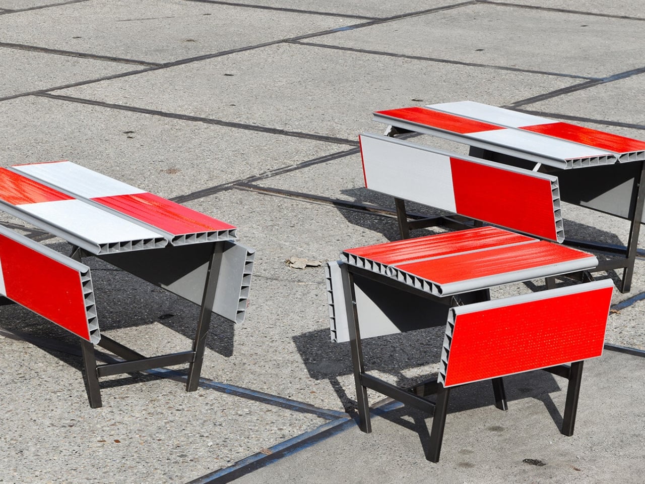
A red-and-white safety barrier isn’t an object I’d normally consider inviting. It’s supposed to interrupt your plans. That’s why the stop! collection by Studio Martins Mezulis and creative 13_0663_tsx makes such a good first impression as a design idea. The outdoor benches and stools borrow the panels of Dutch traffic barriers to make places to sit, addressing a basic need in public space: somewhere to pause.
Waiting for a friend shouldn’t require buying a coffee to justify occupying a chair. I like public seating that treats waiting, resting, and doing very little as perfectly legitimate activities. That’s the practical territory stop! occupies. Presented at Dutch Design Week in Eindhoven, running October 17–25, 2026, the collection invites people to stay for a while using an object associated with sending them elsewhere.
Designers: Studio Martins Mezulis and creative 13_0663_tsx
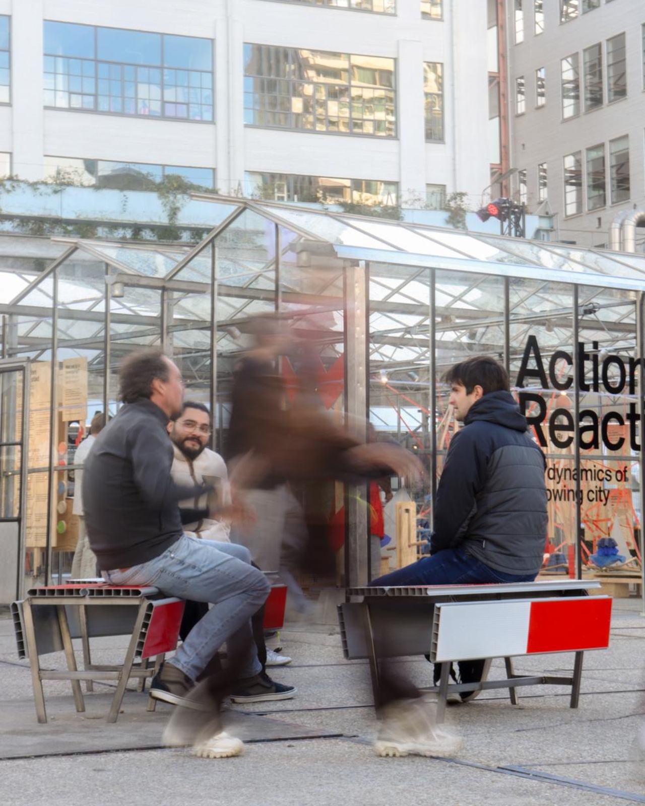
The starting point is the schrikhek, a red-and-white aluminum barrier used in the Netherlands to alert people to construction and redirect their route. You don’t need to recognize that Dutch term to understand the reference. The warning graphics do most of the explaining. Keeping them visible gives the furniture a little friction: your eyes register a restriction before your brain catches up with the seat.
It’s a fitting project for Studio Martins Mezulis, whose work spans graphic and spatial design. The stripes are doing both jobs here: defining a physical object and carrying a message that the designers are trying to change.
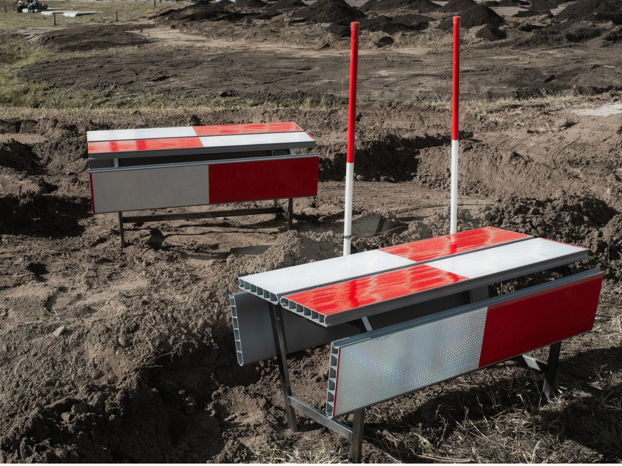
In the project’s render, long striped panels form the seating surfaces, with more panels running vertically along the sides. A narrow framework keeps the assembly visually open. The result looks deliberately assembled from infrastructure rather than dressed up to conceal its origins. I prefer that decision to a more polished makeover. Remove the red and white, and much of the reason to notice these benches disappears.
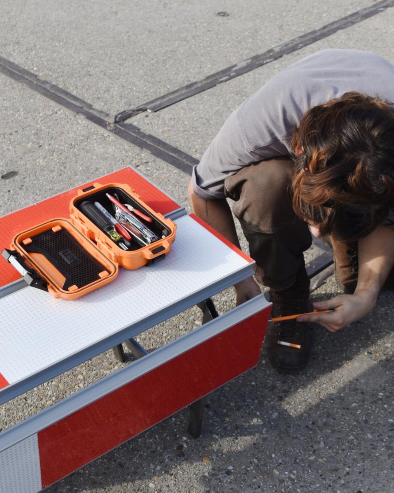
The published bench dimensions are 1,250 millimeters long, 500 millimeters wide, and 450 millimeters high, or approximately 49 by 20 by 18 inches. Road safety barriers and steel are listed as the materials. Those numbers describe a compact object rather than a sprawling park bench. Its proportions make the proposal easier to picture beside a pedestrian route or within a plaza, although placement would still need careful consideration.
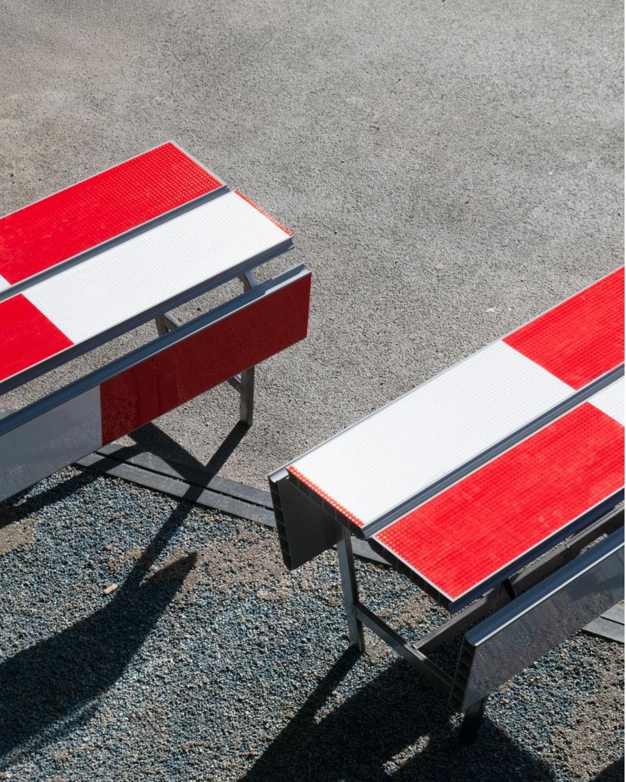
The illustrated benches are also backless and lack armrests. That keeps their form simple and leaves the seat approachable from either side, but it doesn’t offer the support some people need. I’d read them as an invitation to take a short break rather than assume they’re suited to a long afternoon. The graphic wit is persuasive; comfort and durability would need evidence beyond a render.
That distinction matters because public furniture has a job beyond looking good in a design exhibition. Someone needs to understand that they can use it. Here, the same markings that make the collection memorable could initially make a passerby hesitate. I’d be interested to see how quickly people recognize the invitation. A bench occupied by one person might explain the idea better than a nearby project label.
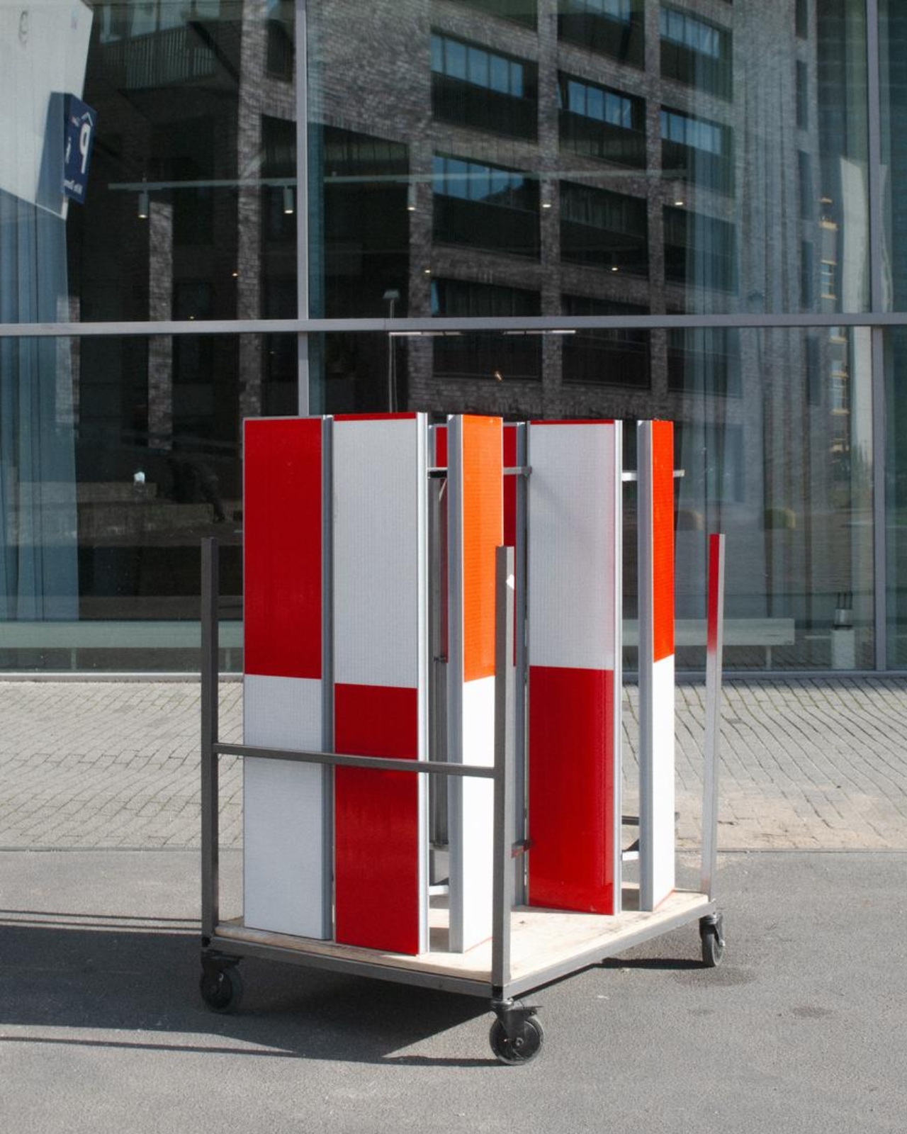
The material story deserves similar precision. According to the project’s Dutch Design Week description, the designer hopes to work with construction infrastructure providers to reclaim decommissioned or discarded panels in the future. That isn’t confirmation that every panel in the current collection has already served at a construction site. Reuse is a proposed direction for expanding the collection, and it’s worth preserving that distinction rather than automatically labeling the furniture recycled.
For me, stop! works best as a modest adjustment to how a street communicates. It gives a familiar public object another use without erasing what made it recognizable. The humor gets your attention, but the seat has to justify keeping it. If the collection develops further, I’d rather see that effort go into making it useful to more people than into adding more visual tricks. A decent place to wait is already a worthwhile design brief.
The post Road Barriers Become Benches Without Losing Their Warning Stripes first appeared on Yanko Design.