Vue lecture

Il y a de nouveaux articles disponibles, cliquez pour rafraîchir la page.

Streaming Took Something From Us. The ENSA T1 Wants It Back

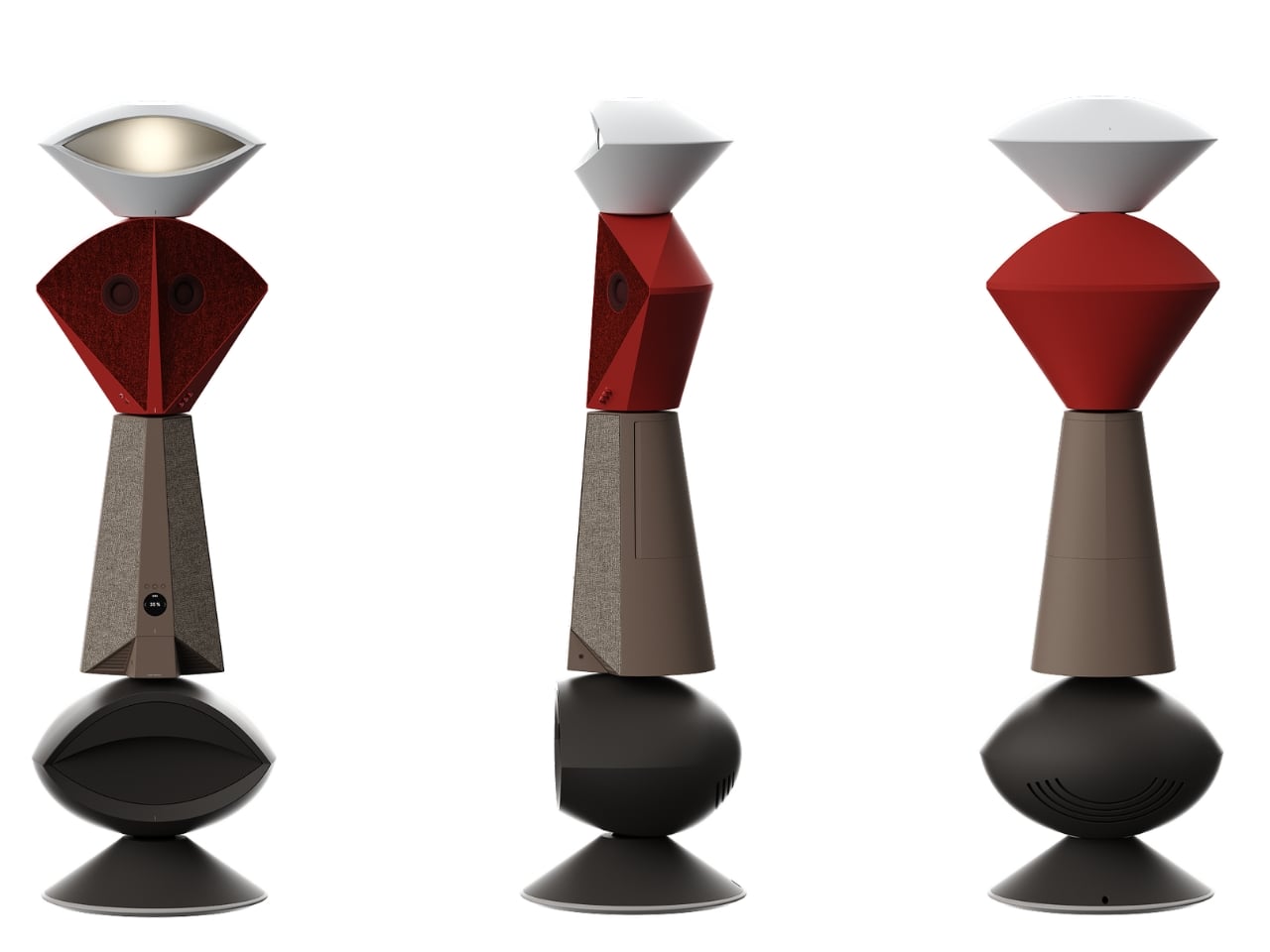
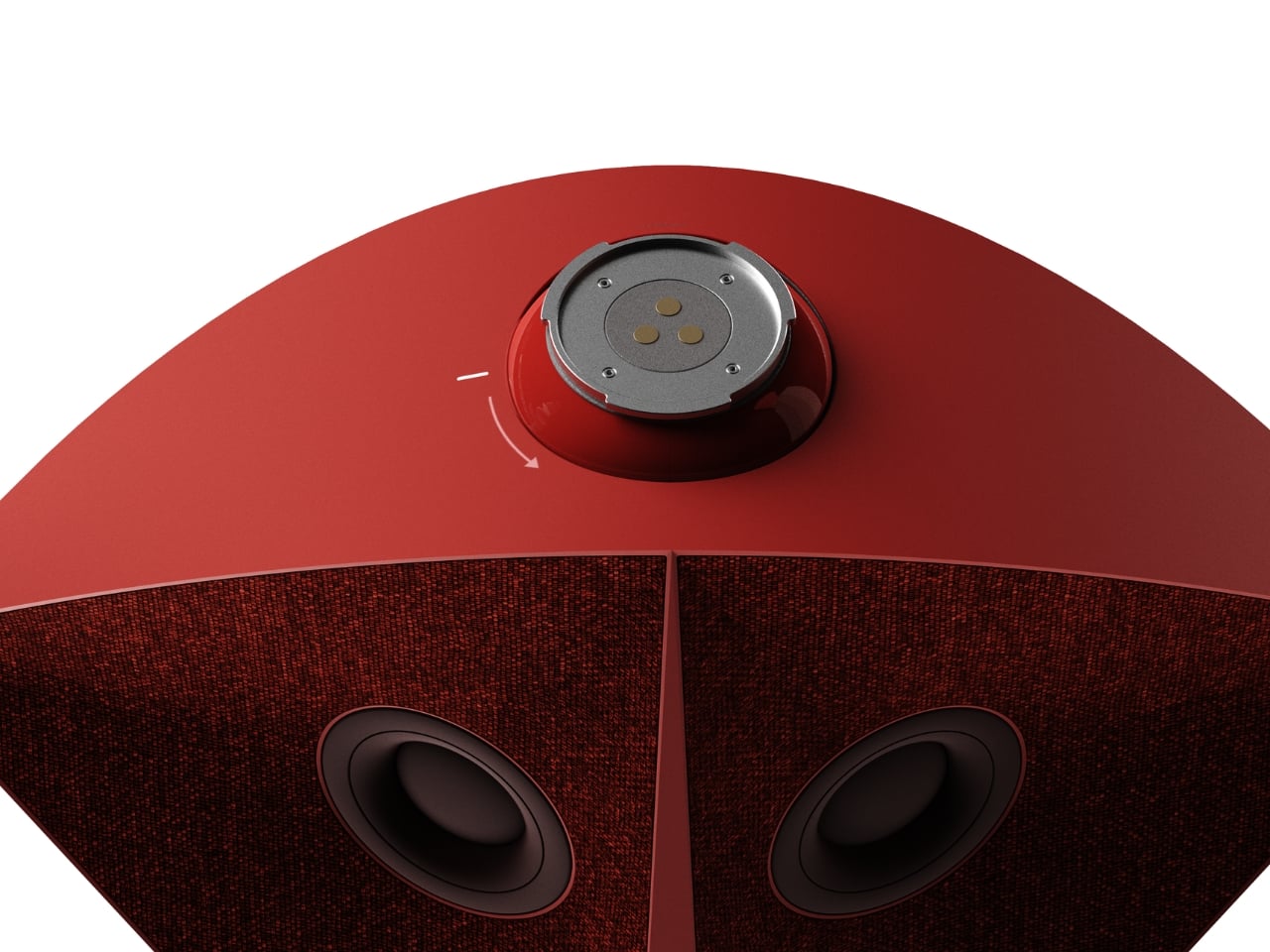
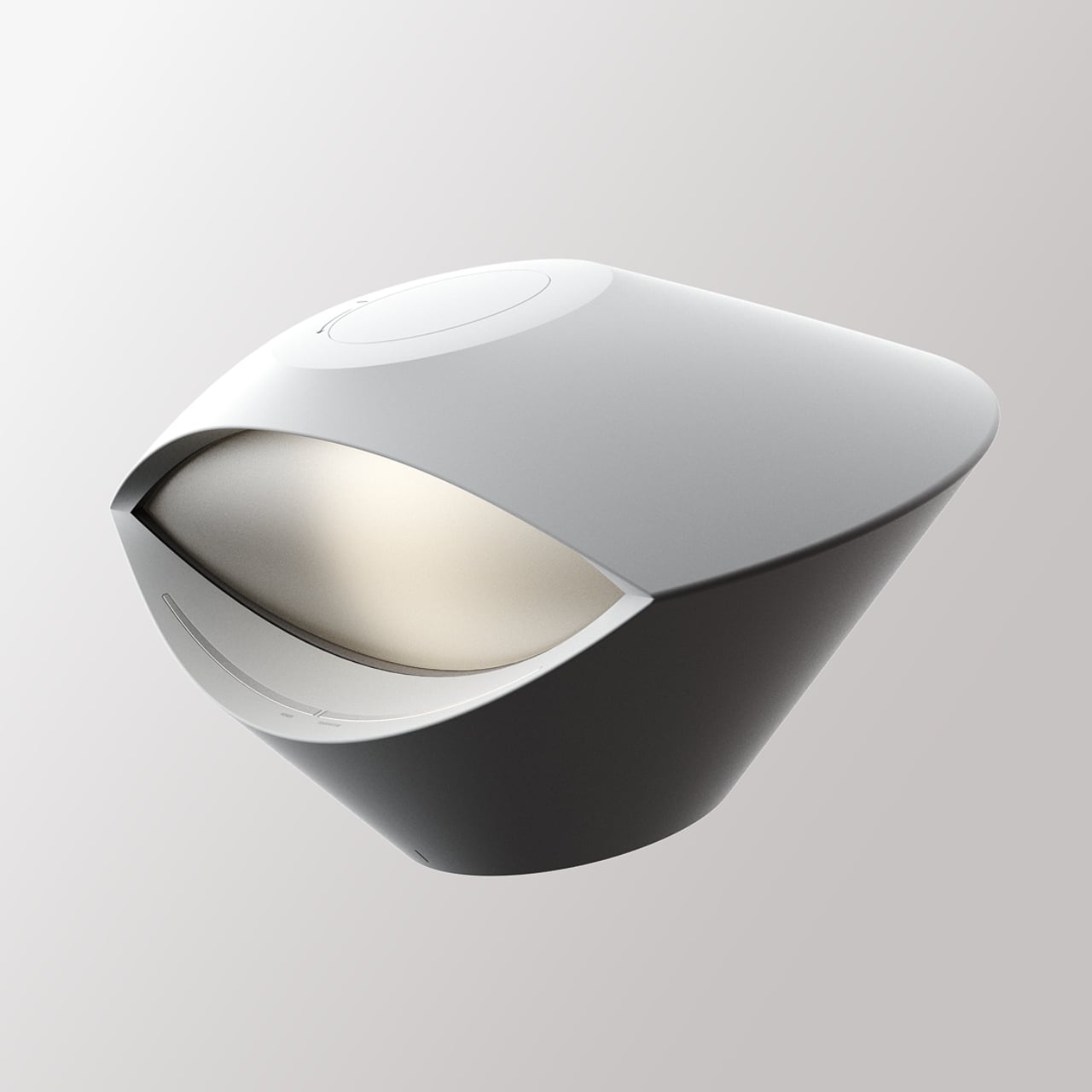
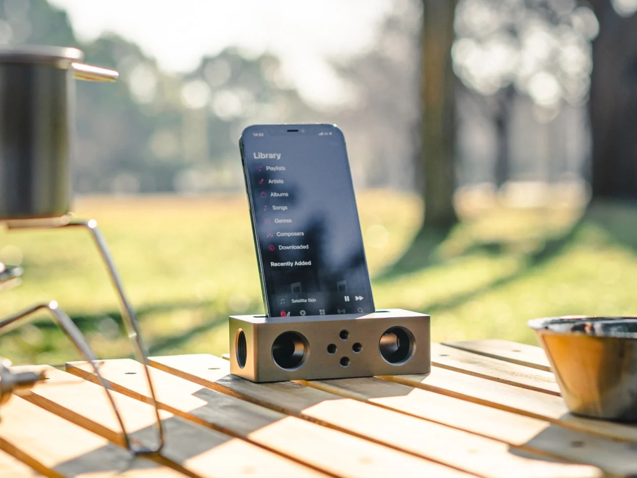
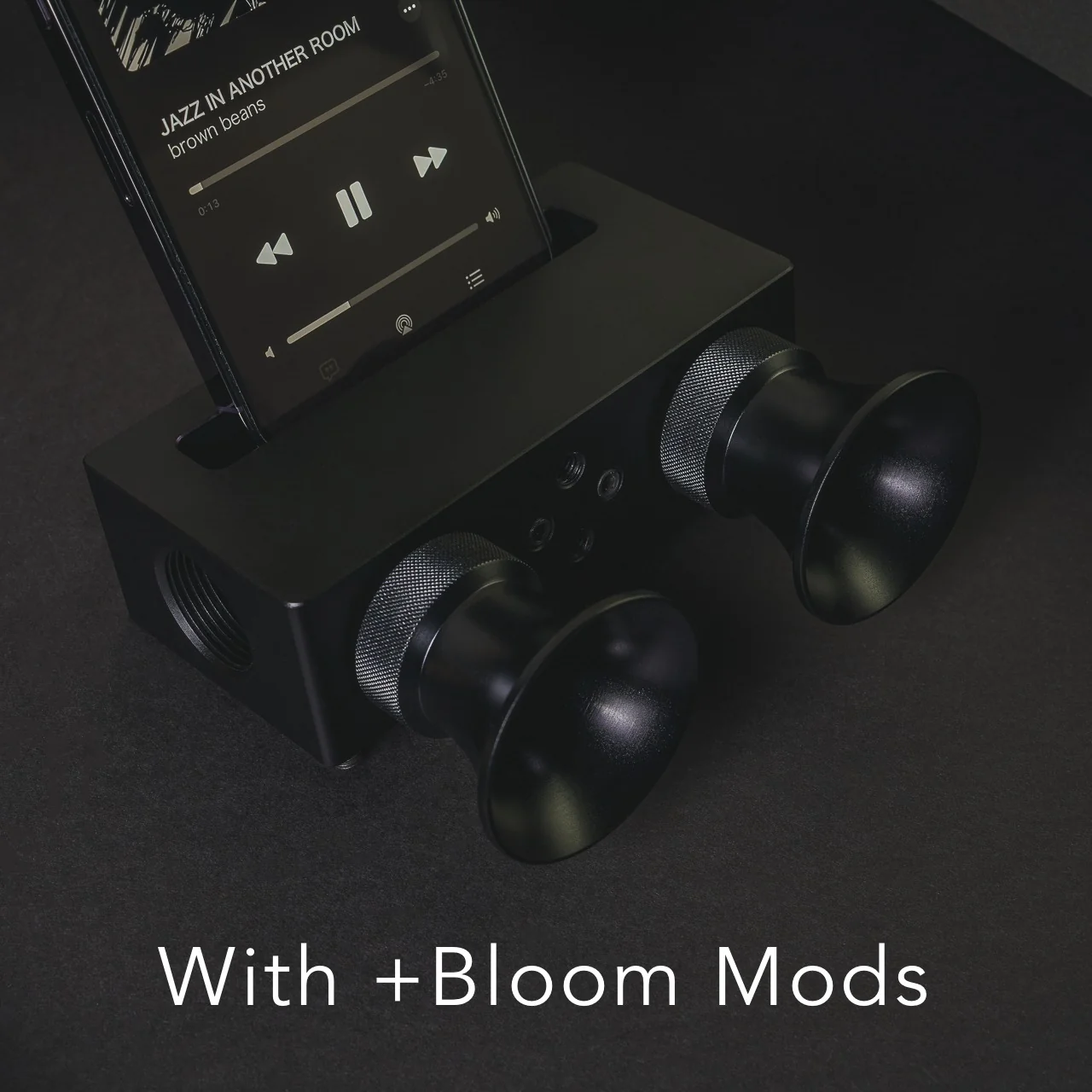
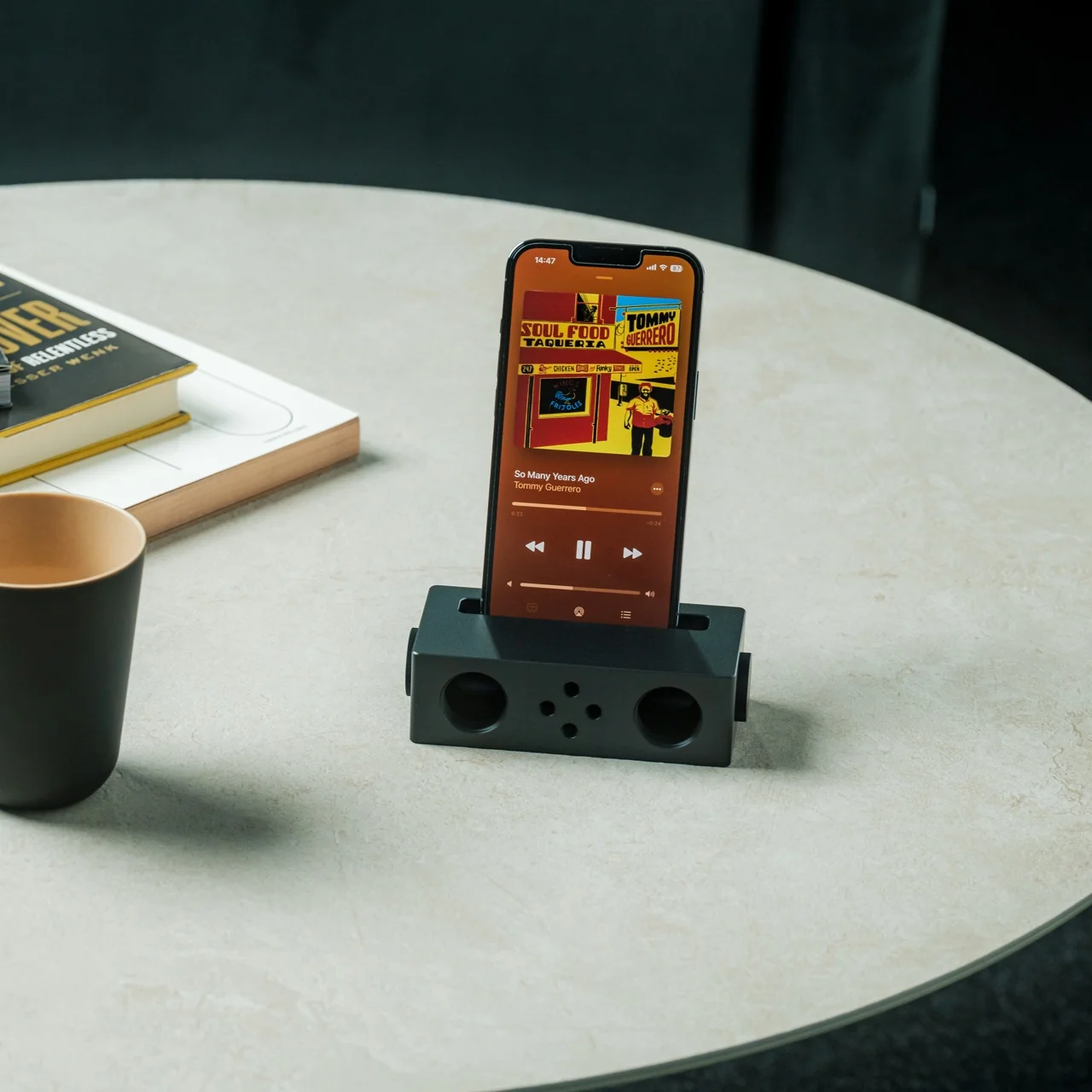
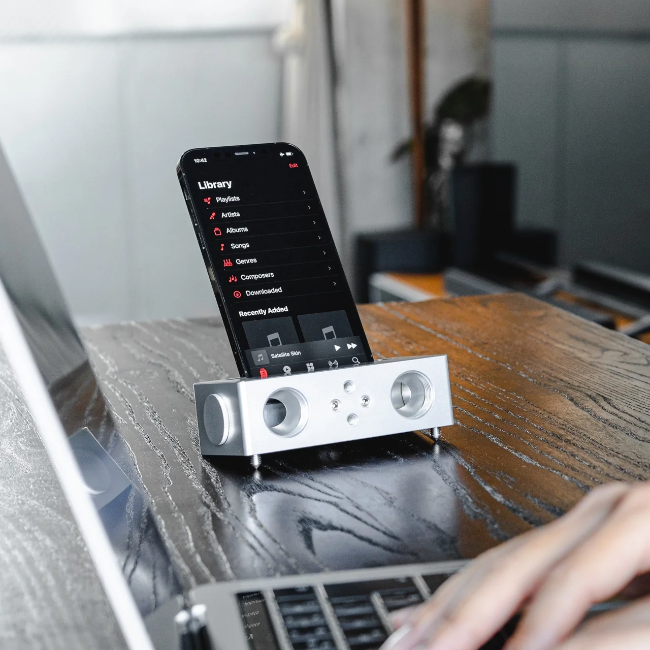
Do you remember the last time music actually demanded something of you? Not just your attention while you scrolled, but your hands. The deliberate pull of a record from its sleeve. The small, mechanical click of a CD case. The unhurried ritual that came before every song, every mood shift, every late-night session on the floor with the volume just loud enough. Vladimir Dubrovin remembers. The California-based multidisciplinary designer has been quietly building a case for returning physicality to the act of listening, and with the ENSA T1, his latest concept design, the argument gets considerably harder to dismiss.

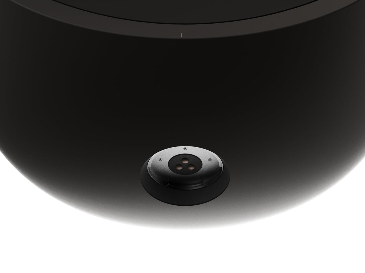
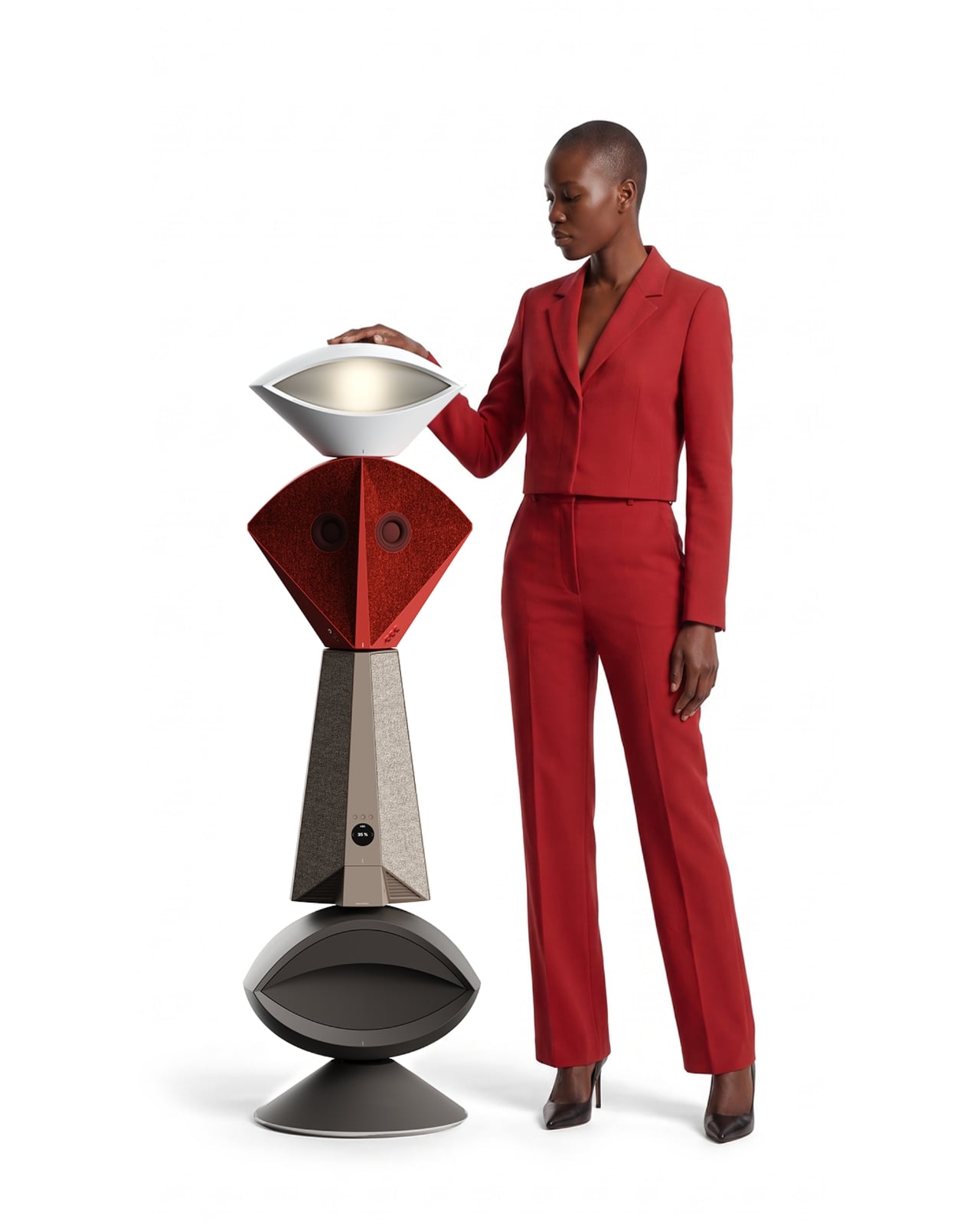
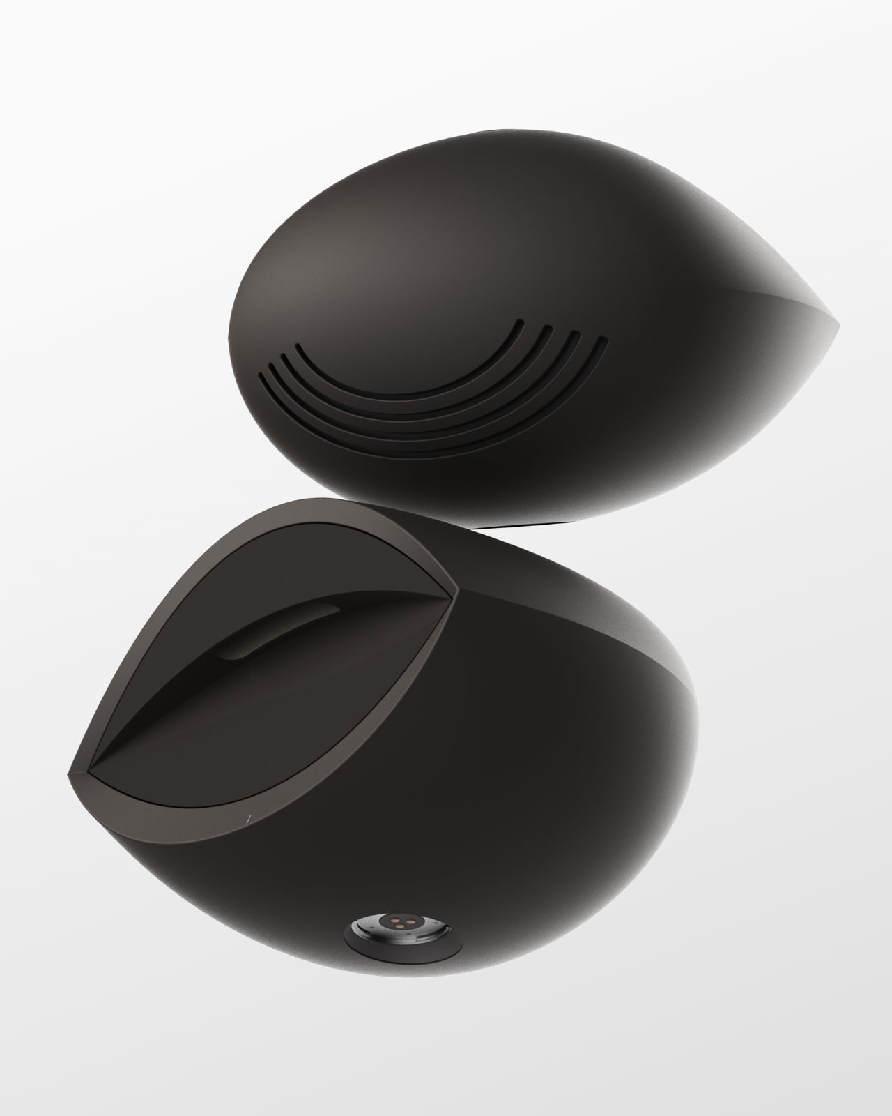
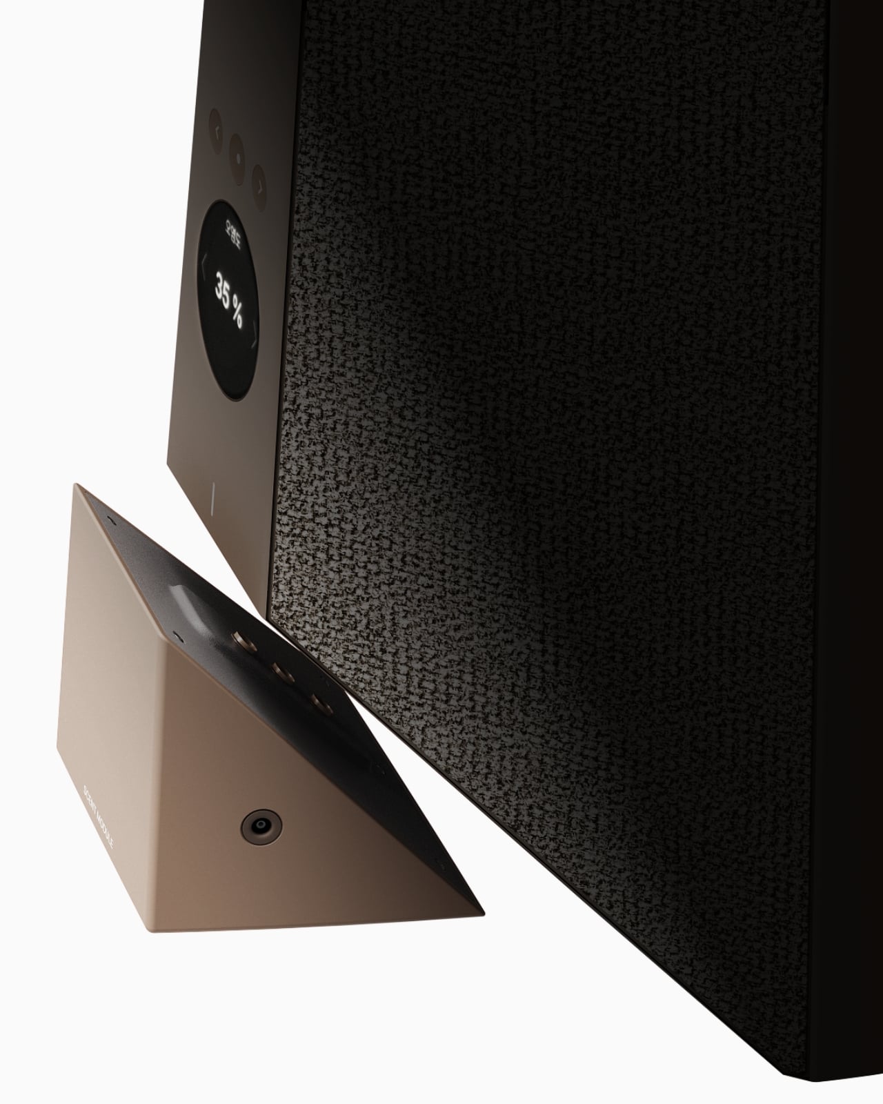
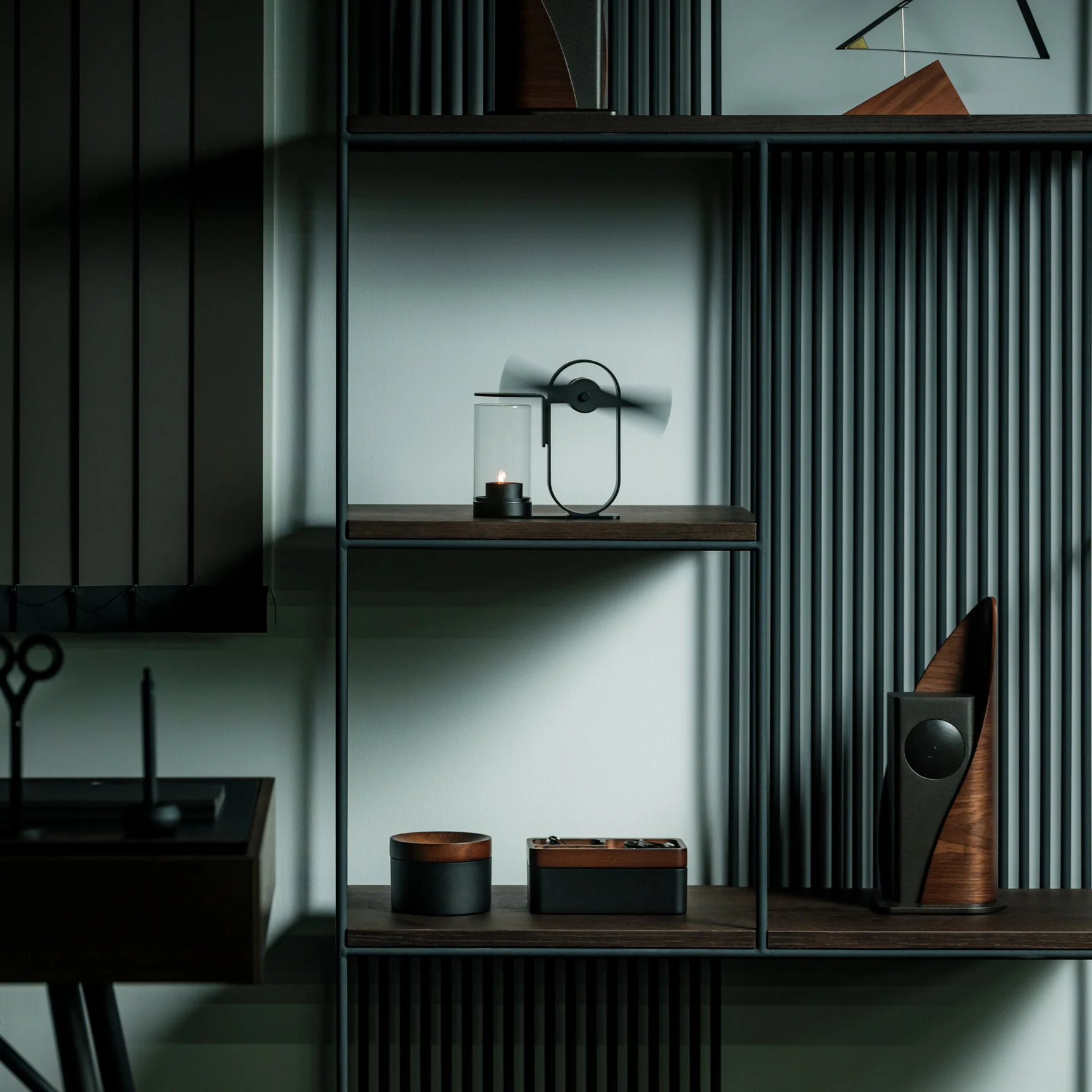
The T1 is the newest addition to Dubrovin’s ENSA line, an evolving design series that began with the ENSA P1, a portable audio player concept that reimagined what a music device could look and feel like in the post-streaming era. The P1 introduced Dubrovin’s concept of C-NAND cartridges: small, disc-shaped, solid-state storage units where each cartridge holds one complete album. There are no moving parts, no spinning mechanisms. They’re fully digital in how they handle audio, but they exist in the physical world the way vinyl does. You pick one up, turn it over, look at it, choose it. The act of choosing your music becomes deliberate again, and that matters more than it sounds.

Designer: Vladimir Dubrovin

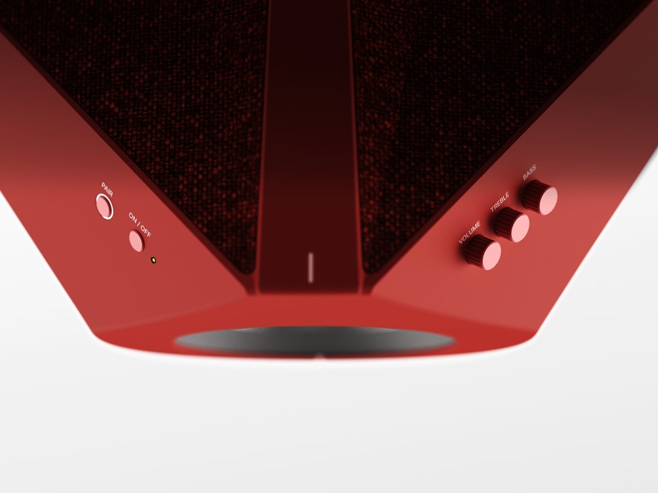
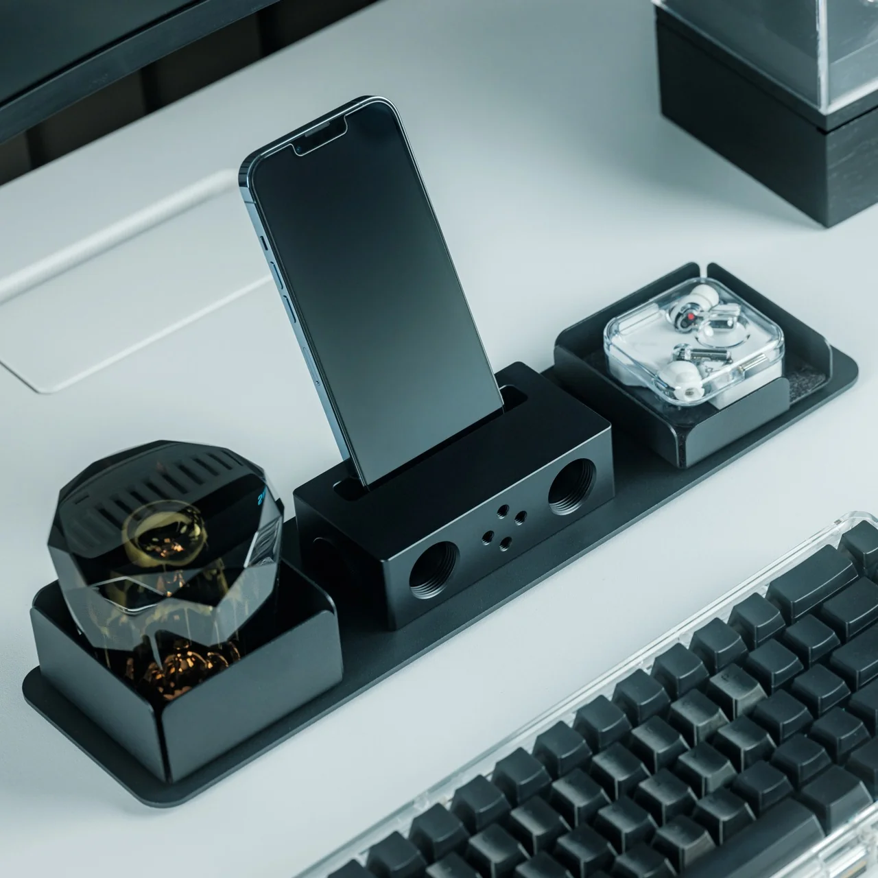
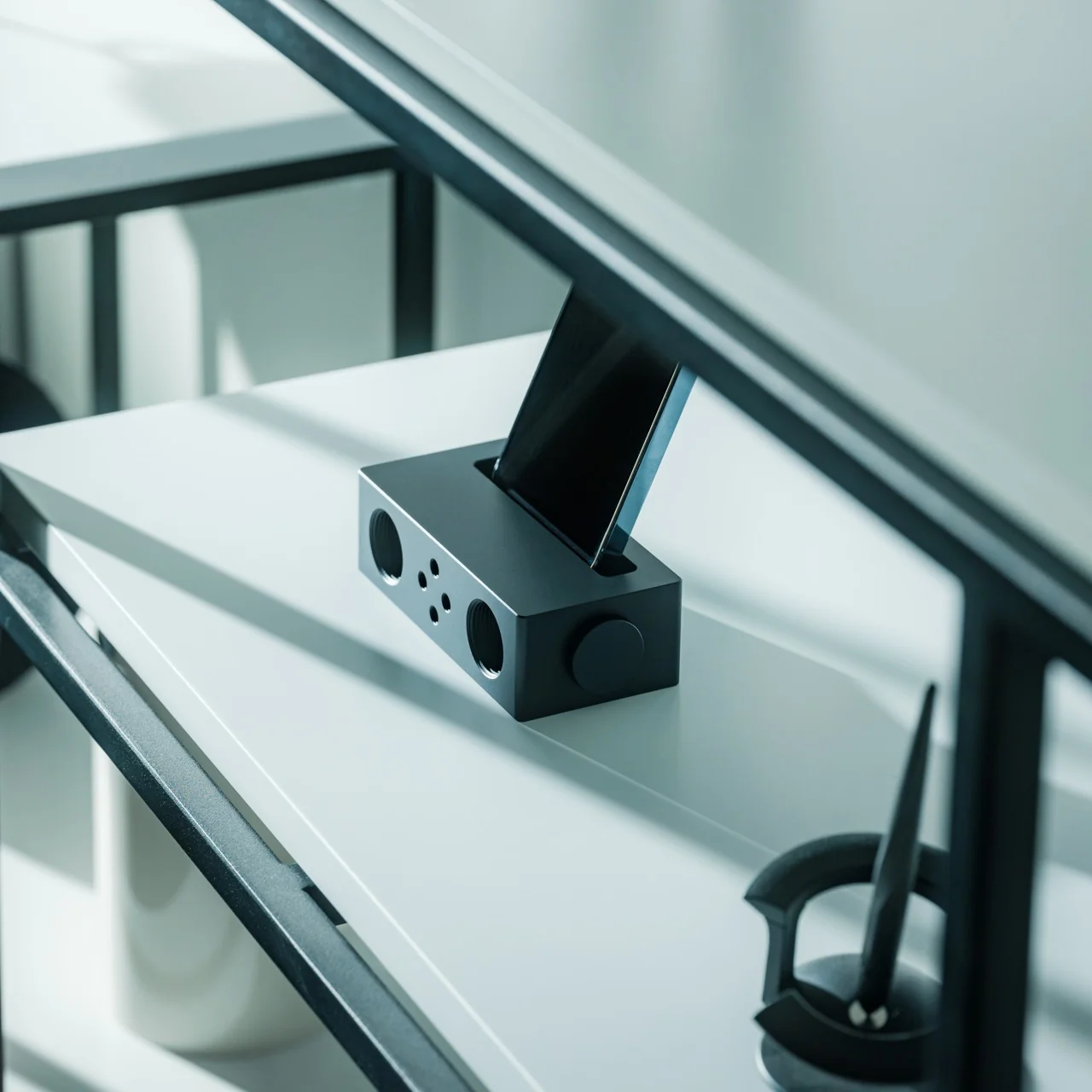
Where the P1 was built for portability and kept its design trim and pocketable, the T1 feels like the next chapter. Visually and conceptually, it carries the same DNA: clean, considered industrial design with an aluminum body and restrained detailing. But the T1 reads as something more anchored, a device you set somewhere permanent and return to, rather than slip into a bag. It’s a design that seems to understand the difference between music you consume and music you actually sit down for.

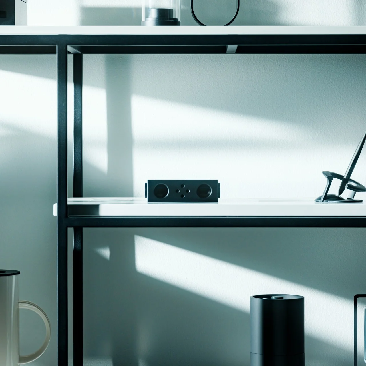
Aesthetically, Dubrovin’s approach has always felt less like tech product design and more like furniture-level thinking. The ENSA devices belong to the same visual conversation as early Braun electronics or a Dieter Rams concept sketch, where every detail either earns its place or gets removed entirely. The T1 continues that restraint. Its form doesn’t shout, which is precisely why it catches your eye. In a market saturated with speakers shaped like pebbles and smart displays with glowing rings, an audio device that looks like it was designed by someone who genuinely thought about what it means to own a piece of music is genuinely refreshing.

The broader question Dubrovin keeps posing with the ENSA project is one worth sitting with: what did we actually lose when music went weightless? Streaming solved convenience so completely that most of us never stopped to notice what the tradeoff cost. We gained access to everything and lost the kind of focus that comes from committing to a single album, from having music you could see, hold, or lend to a friend. The ENSA T1 is not trying to compete with Spotify. It’s asking whether the experience of music could mean something again, even if you have to build an entirely new format to get there.

It’s a concept project, not a product you can buy, and the realist in me knows that’s a significant caveat. Building out a new physical media format in 2026 is an uphill proposition at best. The infrastructure alone, manufacturing cartridges, convincing labels, and getting devices into homes, would require a level of industry commitment that’s difficult to imagine right now. But design concepts don’t have to ship to matter. The best ones articulate a desire most people feel but haven’t named yet, and the ENSA T1 does exactly that. The desire for music that has weight, that takes up space, that gives you something to do with your hands before the first note plays.

That’s why Dubrovin’s work keeps getting attention. The ENSA line isn’t nostalgic in the way that feels defensive or retrograde. It’s just honest about the fact that we traded something real for something convenient, and it’s asking, politely but persistently, if we’d like it back.

The post Streaming Took Something From Us. The ENSA T1 Wants It Back first appeared on Yanko Design.

Furniture Made From Wood Scraps You’d Actually Pay For

Every furniture workshop generates a particular kind of guilt. There are the offcuts, the trimmings, the odd-shaped remainders of boards that got cut to size and are now too small for anything useful, or so we assume. Most of them end up as kindling, compost, or landfill. We’ve accepted that as the cost of making things, a small fine paid for the privilege of precision. Studio Booboon is not interested in paying that fine.

The Copenhagen-based studio, founded by Richard Bone and Jisu Yun, two designers who both trained under Japanese studio Nendo, released their latest collection, Fragments Becoming, and it’s exactly the kind of work that makes you wonder why no one thought to do it this way sooner. The collection is built entirely from timber offcuts, and before you picture something rustic or deliberately imperfect, let me be clear: these pieces are stunning. A cabinet, a dining table, and a lounge chair, each constructed from assembled fragments of discarded wood arranged with such precision and intention that the effect is closer to fine art than furniture-as-apology for sustainability.

Designer: Studio Booboon

The concept the studio uses is something they call “3D marquetry,” which sounds technical but is actually a fairly elegant idea once you sit with it. Traditional marquetry, the kind you’d see on antique furniture or decorative boxes, applies a pattern to a surface. It’s essentially decoration laid on top of structure. What Studio Booboon does instead is treat each fragment of wood as the structure itself. The pattern isn’t on the cabinet door; the door is the pattern. It runs through the object’s entire volume, which means the visual logic and the physical construction are the same thing. That’s not a subtle distinction. That’s a fundamentally different philosophy.

What I appreciate about this approach is that it removes the option to hide mistakes. The studio works with unstained wood, which means every fragment has to earn its place on its own terms, no pigment masking a poor match, no stain blurring the edges. Each piece has to work compositionally before it works functionally. That kind of constraint tends to produce either chaos or brilliance, and in this case, it’s clearly the latter.

Bone and Yun bring a cross-cultural sensibility to the work that shows up in the details. Their debut collection, Playful Reappropriation, released at Milan Design Week 2024, pulled from Korean craft traditions, and Fragments Becoming continues that thread. The materials include hanji (traditional Korean paper), canvas, silk, and Ottchil, a Korean lacquer technique that adds depth without dominating the natural tones of the wood. The combination of a British RCA education, Korean craft heritage, and a shared apprenticeship at Nendo, one of the most conceptually rigorous studios in contemporary design, explains a lot about why this work feels so considered without ever feeling cold.

The collection premiered at Milan Design Week 2026 and later showed at Other Circle 2026 during 3daysofdesign in Copenhagen. That double-billing matters. Milan tends to reward spectacle, while the Copenhagen circuit rewards ideas. The fact that Fragments Becoming landed well in both contexts suggests it’s doing something more than just looking good in photographs, which, for the record, it absolutely does.

Sustainability in design has become such an overused talking point that the word barely registers anymore. Every brand gestures toward it. But there’s a difference between sustainability as a value and sustainability as a method, and Studio Booboon’s work lives in the second category. They’re not telling you the collection is responsible and letting the aesthetics carry a different message. The responsible practice is the aesthetic. The offcut isn’t hidden. It’s the whole point.

That feels rare enough to be worth paying attention to. Design tends to celebrate the new, the seamless, the perfect. Fragments Becoming makes a quiet argument that the incomplete, the leftover, and the discarded might be where the most interesting work is still waiting to happen.

The post Furniture Made From Wood Scraps You’d Actually Pay For first appeared on Yanko Design.

A Maker Spent Months Building a Pokéball That Jumps and Shoots Smoke

Pokémon has always sold us a very specific fantasy: a compact sphere you can throw into tall grass, watch shimmy three times, and hear that satisfying click. The wiggle is practically cultural shorthand at this point. So when maker Kiara’s Workshop decided to skip the wiggle entirely and build the far stranger, far older Arceus ball instead, the resulting creation landed somewhere between prop design, mechanical engineering, and sheer stubbornness. The kind of project that sounds manageable until you’re three failed prototypes deep.

For context: the Arceus ball comes from Pokémon Legends: Arceus, a game set in a much earlier era of the Pokémon world. This isn’t the sleek, mass-produced Pokéball most of us grew up clicking in handheld games. It’s a more primitive artifact, made from Apricorns and Tumblestones in the game’s lore, with an aesthetic that leans ancient and earthy rather than factory-fresh. And its in-game behavior is notably different too. Instead of the classic wiggle sequence, the Arceus ball shoots into the air during a catch and releases a burst of smoke. It’s more dramatic, more theatrical, and a far more interesting design brief.

Designer: Kiara’s Workshop

Kiara’s Workshop had already built functional Pokéballs before, putting out a V1 and V2 that earned a loyal following and a comment section full of people asking when she’d make more. The V3 of the standard Pokéball was still on her list when she decided to take a detour and come back to Pokéballs a different way. The Arceus ball seemed like the simpler bet. It doesn’t have the same intricate mechanical catch sequence as the modern version, so how hard could it be? The answer, as it turned out, was very hard. The build required research, iteration, and a willingness to start over.

Getting a physical object to jump on cue and simultaneously release smoke on command is not exactly a weekend project. The ancient aesthetic of the ball adds another layer of complexity: it can’t look like it came out of a clean resin mold. It needs texture, weight, and a certain handmade quality that actually complicates production rather than simplifying it. Every element Kiara worked through pointed back to how much thought went into the original game design, even for something that appears on screen for only a few seconds at a time.

Here’s the thing about maker culture that doesn’t get enough attention: it forces a kind of reverse-engineering that’s deeply respectful of the original design, whether that original designer was a game developer or a prop team. When you have to physically build something that only existed as a rendered animation, you start noticing all the decisions that went into it. Kiara’s build is less about having a cool collectible on a shelf (though it would absolutely win any shelf) and more about understanding how design translates, or refuses to translate, between worlds. That’s a genuinely underrated form of design criticism.

Pokémon as a franchise has always been smart about its own mythology. The progression from handcrafted Apricorn balls to industrially manufactured ones mirrors real-world design evolution, from artisanal craft to mass production. What Kiara’s Workshop did was reverse that arc entirely, going from the pixel back to the physical, from the streamlined modern version to the awkward, jumping, smoke-releasing ancient one. It’s a move that requires understanding both the fiction and the fabrication. The result is genuinely impressive, not because it’s a perfect replica, but because it functions on its own terms. It jumps. It smokes. It exists in a way it never was supposed to.

Plenty of makers are building Pokéballs right now, probably on multiple continents simultaneously. But most are going for the one everyone recognizes. Choosing the Arceus ball, with all its mechanical demands and its ancient visual language, says something about what excites Kiara’s Workshop: not the familiar, but the forgotten. And for anyone who’s ever quietly preferred the stranger corners of a franchise over its most iconic pieces, that’s a choice worth appreciating.

The post A Maker Spent Months Building a Pokéball That Jumps and Shoots Smoke first appeared on Yanko Design.

This Umbrella Is Actually a 500-Year-Old Korean Hat in Disguise

Anyone who has seen K-Pop Demon Hunters or an episode of a Korean historical drama is familiar with what a gat is. Even if you don’t know what it’s actually called, it’s pretty recognizable: the black hat with its cylindrical crown and wide, dramatic brim that sometimes hides the eyes or even the entire face. It was traditionally worn by men of high social standing during the Joseon era, serving as a marker of Confucian values, refinement, and status. It’s rarely worn now unless someone is shooting a drama or attending some sort of costume party, though the gat did have a major pop culture moment thanks to Netflix’s Kingdom, where it became instantly iconic worldwide.

The National Museum of Korea called for designers to reimagine the gat for a modern setting. Design studio TOSO created the winning entry, the Gat Umbrella, which is exactly what it sounds like. This is part of the MU (the official merchandise brand of the National Museum Foundation of Korea) competition that invites designers to reinterpret historical objects into something that can actually be used in modern times. It’s a brilliant initiative that bridges Korea’s rich cultural heritage with contemporary everyday life.

Designer: TOSO

The Gat Umbrella looks like a regular umbrella when folded, but when opened, it looks like you’re standing under a huge gat, with the added bonus of an actual canopy to keep you dry. It’s around 33 inches long and has a width of 1,050 millimeters when opened. The canopy is made from PVC with a fiberglass-reinforced frame, its tip from polypropylene, and the handle from EVA material. The deep black canopy is a direct callback to the traditional color of the gat, and the proportions of the brim have been carefully scaled to capture that wide, commanding silhouette. When held up against a grey sky, you can almost picture the Joseon-era scholar it was inspired by.

Aside from being a status symbol, the original gat was also used to protect its wearer from the sun, rain, and wind, which makes this reimagining feel even more intentional. Anyone who has watched enough K-dramas knows those dramatic scenes where characters brave storms with a gat firmly in place, rain streaming off its wide brim. So this transformation of the headwear is still a clever nod to its origins. It’s just more modern looking and has the added protection of a proper canopy, since the elements now tend to be a lot more mercurial.

What makes the Gat Umbrella especially appealing is how it straddles the line between functional product and cultural artifact. It’s not just a novelty item you display on a shelf. It’s something you actually take out on a rainy Tuesday and suddenly feel like the most stylish person on the street. There’s something deeply satisfying about a design that takes centuries of history and makes it wearable (or in this case, holdable) in the most practical way possible. And given the global reach of Korean culture right now, something tells us this won’t stay a niche item for long.

It also arrives at a moment when the global appetite for Korean culture is at an all-time high. From K-dramas to K-pop to Korean food, the world is paying attention, and the Gat Umbrella is exactly the kind of conversation starter that lets people engage with that culture in a tangible, everyday way. It’s not just merchandise; it’s a story you carry with you. The kind of thing that makes strangers stop you in the street and ask where you got it.

Whether you’re a K-culture enthusiast, a design collector, or simply someone who appreciates carrying a piece of history through a rainstorm, this is the kind of purchase that feels both indulgent and meaningful. It’s proof that heritage doesn’t have to stay locked behind glass. Sometimes, the best way to honor the past is to take it out into the rain.

The post This Umbrella Is Actually a 500-Year-Old Korean Hat in Disguise first appeared on Yanko Design.

The $195K Tiny Home That Finally Makes Sense for Families

The tiny house movement has always been better at Instagram than at parenting. A couple, a dog, maybe a sourdough starter on the counter: that’s the fantasy it learned to sell. The moment a child enters the picture, the aesthetic dream quietly dissolves into a very real problem: where does anyone actually sleep, and who gets the bathroom first? Unplgd Tiny Homes, the Blue Mountains studio behind the original 26-foot Kookaburra, has spent the past year trying to answer that question seriously, and their answer is the Kookaburra 2.0.

The new model stretches to 8.5 metres long, 3 metres wide, and 4.5 metres at the gable (27.8 × 9.8 × 14.7 feet), adding just over half a metre to the original footprint but reorganising almost everything inside. Where the first Kookaburra was designed around two people working from home, the 2.0 reframes the interior around four distinct zones: cook, wash, store, and what the studio calls “reset after a big day.” That last phrase tells you exactly who this is for. Not minimalists chasing freedom, but parents chasing a moment of quiet.

Designer: Unplgd Tiny Homes

Structurally, the design’s smartest move is the dual-loft layout. A double-height void anchors the centre of the home, with the queen master loft at one end and a children’s single loft at the other, each reached by the same staircase-storage unit that doubles as the home’s main organisational spine. The queen loft offers standing headroom on three sides, which sounds like a minor detail until you’ve spent a morning in a traditional tiny house loft hunched over trying to find your socks. The kids’ loft sits separately, with its own clerestory window band that pulls in light while keeping privacy intact. On paper, the spatial hierarchy is genuinely considered.

The bathroom is getting a lot of attention, and for good reason. A full-size freestanding bathtub in a home under 28 feet is a confident choice, paired with an integrated laundry nook that treats domestic routine as a design problem worth solving. The L-shaped kitchen with breakfast bar follows the same logic. Outside, VJ panelling meets cream corrugated steel, a material palette that signals a specific aesthetic position in 2026 Australian residential design: not rough-hewn bush shack, not cold minimalist box, but something closer to considered coastal warmth.

AU$195,000 is the turnkey starting price, which puts it squarely in the range where comparisons to conventional housing become unavoidable. For roughly the same budget in regional New South Wales, you could find a small permanent house with a yard, without the towing and zoning complications that come with any road-legal tiny home. The 3-metre width is legal for towing across most Australian states without a wide-load permit, but regulations shift the moment you cross certain state borders, and the logistics follow. That’s not a dealbreaker, but it’s a real calculation that the breathless expo coverage tends to skip past.

It’s also worth naming the elephant in the room: no family has actually lived in this house yet. Every piece of coverage, including this one, is written from a display unit that toured the Hawkesbury Show circuit. The questions that matter most are the ones that can’t be answered from photos: whether noise transfers between lofts, whether the staircase is negotiable at 2am with a toddler, whether two adults and one child can share a morning bathroom without losing their minds. Unplgd deserves credit for thinking the brief through more carefully than most in this space, but the gap between a stunning expo build and a liveable family home is exactly the gap that gets papered over by beautiful photography.

One last thing worth flagging: search “Kookaburra tiny home” right now and you’ll pull up at least three different brands. Unplgd, Adapt Homes, and Kookaburra Tiny Homes AU are all trading under variations of the same bird name. They are completely unrelated companies. Do your research before you request a quote. The Kookaburra 2.0 is a genuinely promising design pushing against a real limitation in the tiny house category. Whether it delivers on the promise is a question only a family who actually lives in one can answer.

The post The $195K Tiny Home That Finally Makes Sense for Families first appeared on Yanko Design.

The Hanoi House With 100 Windows and No Two the Same

The name alone stops you. 100 Windows. Not “The Pavilion House” or “House No. 7” or something equally poetic and vague. Just a count. A blunt, almost confrontational declaration of exactly what you’re getting, and yet somehow, the moment you see it, the name feels like the most understated thing about it.

Designed by Hanoi-based architecture practice Inrestudio, this multi-generational home is wrapped in a terracotta-toned, double-layered exterior punctured by irregularly placed, mismatched openings. The windows aren’t uniform. They don’t line up in neat rows or follow a rational grid. They appear across the facade like a scatter of thoughts, some large, some small, some square, some elongated, placed with an intention that reveals itself slowly the longer you look. It’s controlled disorder, the kind that only happens when someone has thought very carefully about where chaos is allowed to go.

Designer: Inrestudio

The project sits within one of Vietnam’s most distinctive and genuinely challenging housing typologies: the tube house. These long, narrow urban homes are a product of Hanoi’s history, born from a time when property taxes were levied on street frontage, pushing families to build deep and vertical rather than wide. The tube house is, by nature, a compromise. You work with what the city gives you. What Inrestudio does here is refuse to let that constraint become a ceiling.

The double-layered envelope is the key move. By wrapping the home in two skins instead of one, the architects create what they call “in-between spaces,” zones that exist between the inner living areas and the outer facade. These aren’t wasted margins or dead air. They’re transitional, purposeful areas where the house breathes, where light filters and shifts through the day, where the rigid boundary between inside and outside softens into something more generous. It’s the kind of spatial thinking that doesn’t photograph easily but completely transforms the experience of actually being in a building.

This matters especially because 100 Windows was designed for multiple generations living under one roof, a reality that remains far more common in Vietnam than it does in most Western countries. Designing for multi-generational life is genuinely hard. You’re negotiating different rhythms, different needs for privacy and togetherness, different relationships to noise, light, and air. Architecture that understands this doesn’t just divide a floor plan into labeled rooms. It creates conditions where people can be near each other without being on top of each other, where the house itself does some of the social negotiating.

The terracotta tones feel right for this, too. The palette connects the building to its climate, to the warmth and humidity of Hanoi, to the earth tones of traditional Vietnamese buildings without becoming a costume or a nostalgia piece. It reads as contemporary without trying to distance itself from its own context, which is a balance a lot of architecture gets wrong in either direction.

What you take away from 100 Windows isn’t really about the windows, or at least not literally. It’s about the idea that a constraint, whether it’s a narrow plot, a shared family life, or a hundred openings that need to somehow feel cohesive, can become the source of design rather than the obstacle to it. The windows are a by-product of a layered system, not a stylistic decision made in isolation. That’s what earns it attention beyond the aesthetic.

Architecture like this tends to get filed under “interesting regional work” and not looked at as broadly as it deserves. But the conversation 100 Windows is having about density, family, and what a facade actually owes its inhabitants is one that any city grappling with urban housing should be paying attention to. It’s not proposing a universal solution. It’s doing something more useful: showing what happens when designers take the specific conditions of a place seriously enough to build something genuinely shaped by them. The result is a house that looks singular because it is.

The post The Hanoi House With 100 Windows and No Two the Same first appeared on Yanko Design.

The Sculptural Rocking Chair That Started as a Single Idea

Most furniture design starts with a question: How do people sit? Aleks Forystek Studio started with a completely different one. What happens when a heavy sphere presses into a structural loop? The answer, it turns out, is a chair. But not just any chair. It’s Dooal, and it might be the most conceptually satisfying piece of furniture I’ve seen this year.

The premise sounds almost too simple. A sphere meets a loop. The loop yields under the weight, compressing and curving into a form that becomes, all at once, a backrest, a seat, a leg rest, and a rocking base. One gesture, one cause-and-effect sequence, and suddenly you have a fully resolved object. The audacity of that economy is hard not to admire.

Designer: Aleks Forystek Studio

I’ll admit my first instinct when I saw the images was purely aesthetic. The black and white photography does everything right. The curves catch light in a way that makes the chair look more like a cast sculpture than a functional object, and the close-up shots reveal a fine-lined ribbed texture that layers real depth onto an already commanding silhouette. Shot in near-darkness, Dooal looks cinematic. It has the kind of presence that makes you stop mid-scroll and just sit with it for a moment.

But the longer I looked, the more the concept started doing something to me. Forystek’s Chicago-land studio describes its work as committed to “destabilizing the familiar,” and that phrase lands differently once you understand the logic behind Dooal. The chair is familiar enough, a seat you can rock in, a shape the body immediately recognizes. Yet the process that created it is almost foreign to how we typically think about furniture. No separate components engineered together. No piece-by-piece assembly of form and function. Just a single physical interaction, preserved.

That’s a philosophical statement as much as a design one. The studio’s whole methodology centers on finding the latent potential within ordinary objects, pushing past the surface of what something is to explore what it could become when a single variable changes. With Dooal, that variable is weight. Pressure. The simple, undeniable force of a sphere doing exactly what gravity asks it to do.

What makes this feel significant right now is the context we’re sitting in. We live in an era of maximal complexity, where products get layered with features, materials compete for attention, and design often signals effort rather than intelligence. Dooal does the opposite. It argues that constraint is where creativity actually lives. That stripping a design down to one decisive action can produce something richer and more resolved than a process built on a dozen competing decisions.

And it’s not just theoretical. The rocking chair is one of the oldest, most human pieces of furniture we have. It exists in farmhouse porches and modernist living rooms with equal ease. It’s comfort distilled into motion. The fact that Dooal arrives at that form through a logic of compression rather than craft tradition feels both subversive and strangely inevitable. Like the chair was always there, waiting to be discovered rather than designed.

That sphere at the base of the loop is easy to overlook in the photographs. It’s small, nestled low, nearly swallowed by shadow. But without it, none of this exists. It’s the cause the entire object is an effect of, and the fact that it remains visible in the final form is a choice that rewards people who look closely. That kind of embedded storytelling, where the origin of an object is literally written into its body, is rare in furniture design. It elevates Dooal from chair to argument.

Aleks Forystek Studio is not a household name yet. But Dooal is the kind of work that earns attention quietly. Not because it’s loud, but because it’s precise. Because it asks a stubborn, specific question and then answers it completely. Whether you care about objects for their beauty, their ideas, or the story behind them, this chair has all three. And it got there with one moment of contact.

The post The Sculptural Rocking Chair That Started as a Single Idea first appeared on Yanko Design.

The $599 AI Guitar That Finally Makes Playing Easy

At some point in their life, almost everyone has picked up a guitar, struggled with a C chord for ten minutes, and quietly put it back down. The fingertip pain. The out-of-tune strings. The YouTube tutorial that somehow assumes you already know what a fret is. Learning guitar has always had a steep and slightly humiliating entry curve, and most of us just gave up. The TemPolor Melo-D thinks that’s a problem worth solving, and the design it came up with is genuinely hard to ignore.

Designed by inDare Design Strategy Limited, the Melo-D is billed as the world’s first generative AI guitar, and even that description barely scratches the surface of what it actually is. On the outside, it looks like a guitar that a product designer and a tech enthusiast co-parented together. The body is sleek, the finish is pearl white, and it has a foldable build that makes it compact enough to take almost anywhere. But the real story is what happens when you turn it on.

Designer: inDare Design Strategy Limited

The neck is embedded with LED lights that illuminate exactly which notes to press, removing the guesswork for beginners entirely. A built-in 2.4″ LCD flip screen on the body handles chord guidance and ambient visuals without you ever needing to prop up a phone nearby. These feel like small details, but they represent a real design philosophy: the instrument itself should carry the full experience. You shouldn’t need a separate ecosystem of apps and accessories just to get started.

What makes the Melo-D genuinely interesting is the AI engine running underneath all of it. The guitar operates in three modes: solo, sing-along, and AI creation. In AI creation mode, you can hum a melody and the guitar transcribes it into a guitar solo. You can type a text prompt and it generates a song. Upload an audio file and it converts the music into playable tabs or chord charts. It even generates personalized backing tracks using emotional tags, so the sound starts to feel like yours rather than something borrowed from a practice app.

The “AI everything” wave has made it easy to be skeptical every time a product slaps the word generative onto its marketing. But the Melo-D doesn’t read as a gimmick dressed up in smart-instrument clothing. The six-string silicone system allows for real, note-by-note playing, which means it isn’t just a toy approximating the feel of music. It’s an actual instrument with training wheels you can choose to remove. The goal isn’t to replace the skill of playing guitar. It’s to lower the barrier enough that more people actually get through the door.

inDare’s design work here deserves its own mention. The studio, known for thoughtful human-centered industrial design, brought a lot of restraint to a product that could have easily become overcrowded with features. The foldable form factor, the integrated flip screen, and the silicone strings all feel like deliberate decisions, not afterthoughts. The Melo-D has also earned recognition at the iF Design Awards, which makes sense, because from a design standpoint it reads as a product with a clear and confident point of view rather than a collection of specs looking for a shell to live in.

At $599, it’s available for pre-order now with an expected ship date in September 2026. For a piece of hardware this layered, that number asks you to take it seriously, which feels appropriate for what it’s trying to do.

Learning guitar used to mean a real commitment: years of practice, a teacher, calluses, patience, and a certain willingness to sound terrible for a while. The Melo-D isn’t trying to skip all of that, but it is offering a more honest entry point for people who actually want to try. Whether you’re a complete beginner or someone who has quietly given up on the guitar more than once, it meets you where you are. And sometimes, that’s exactly the invitation you need to actually show up.

The post The $599 AI Guitar That Finally Makes Playing Easy first appeared on Yanko Design.

Bang & Olufsen’s New Speaker Concept Is a Ritual, Not a Device

Most speakers are designed to disappear. They sit on a shelf, blend into a bookcase, or hide in a cabinet, quietly doing their job until you need them and then fading back into the background. Mårten Malmnäs, a graduate from the Umeå Institute of Design, designed something that pushes back against all of that.

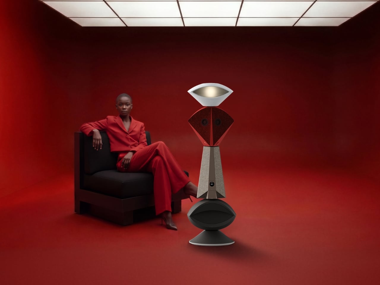
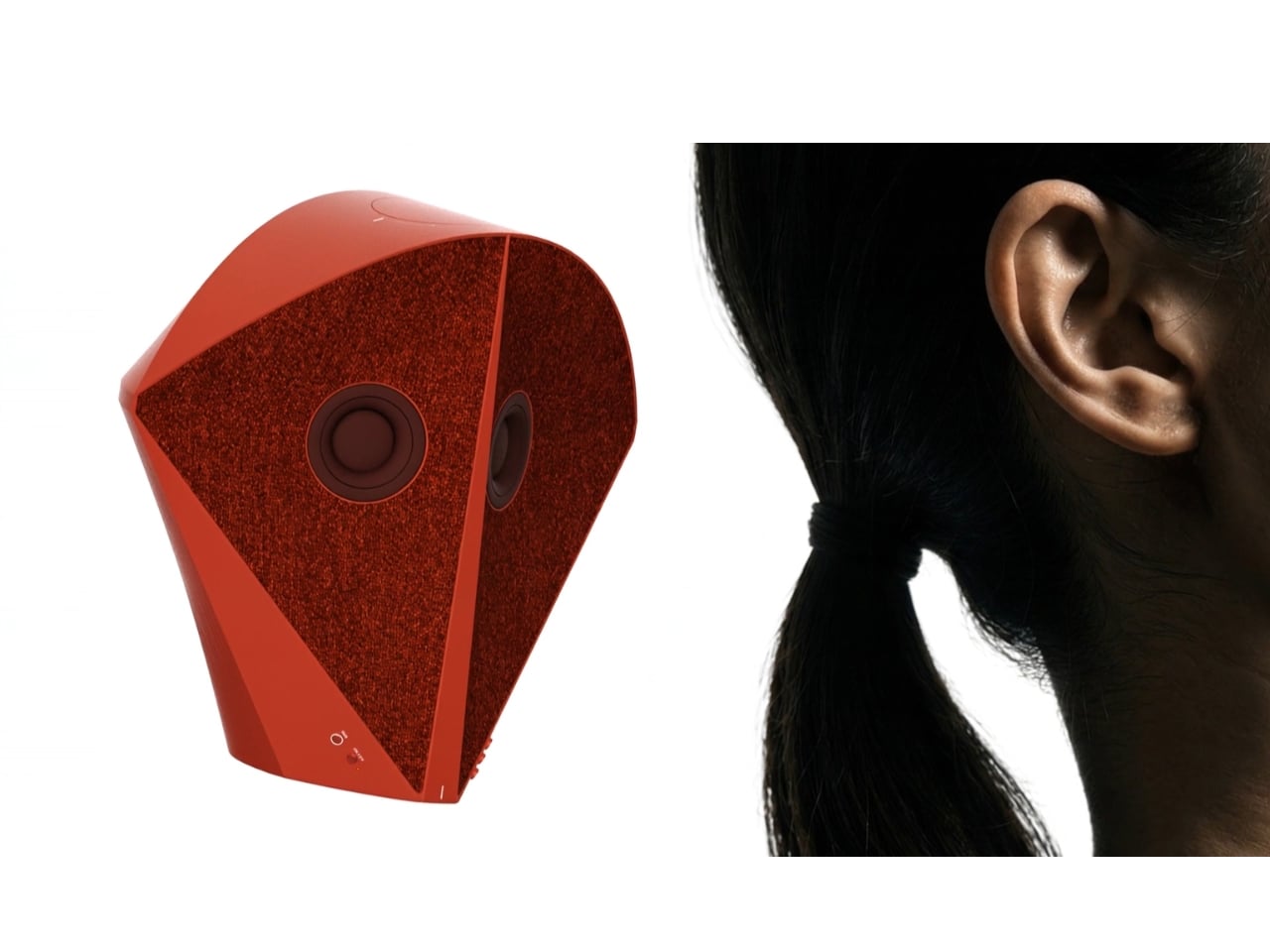
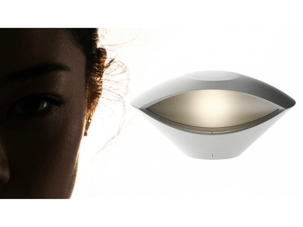
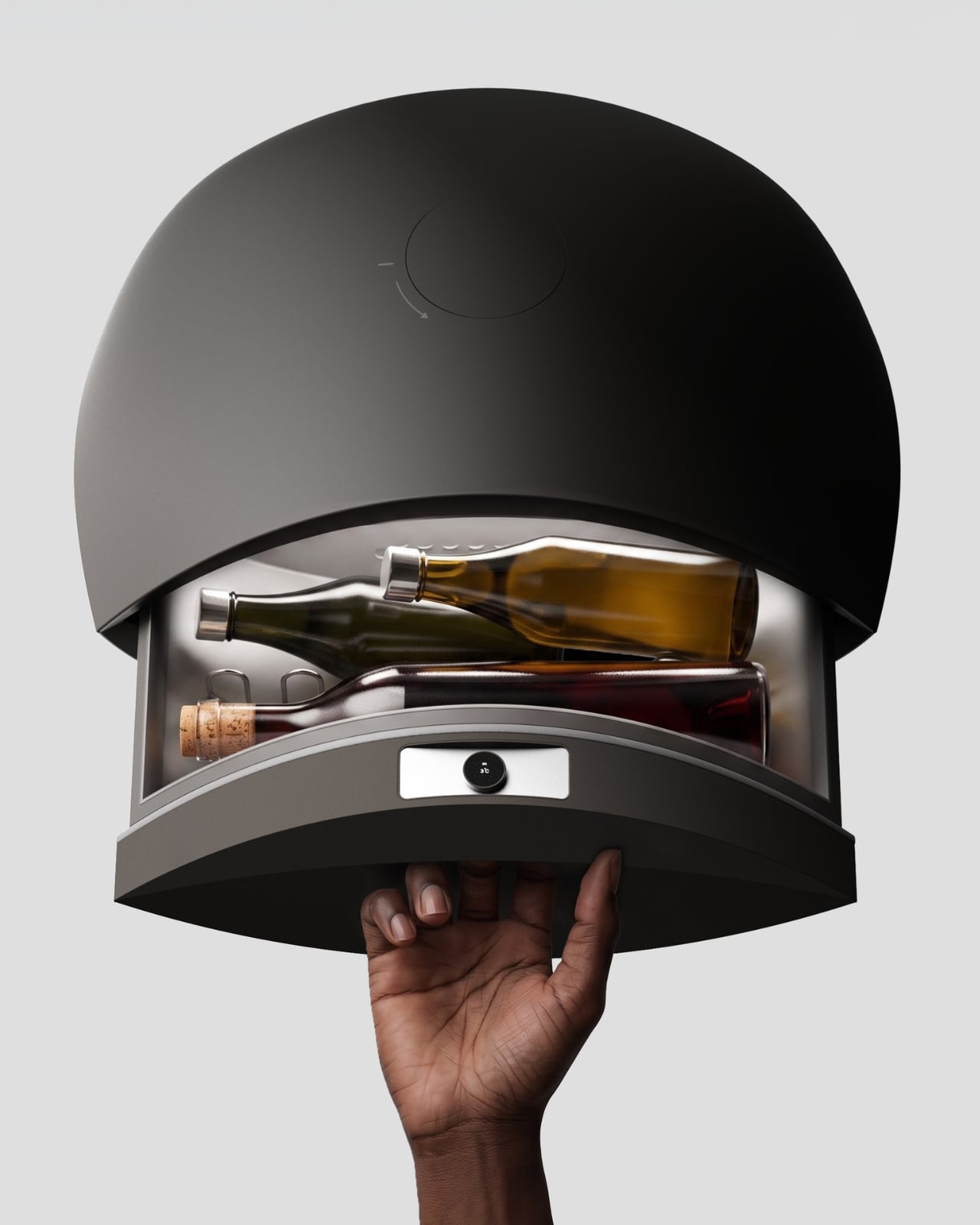
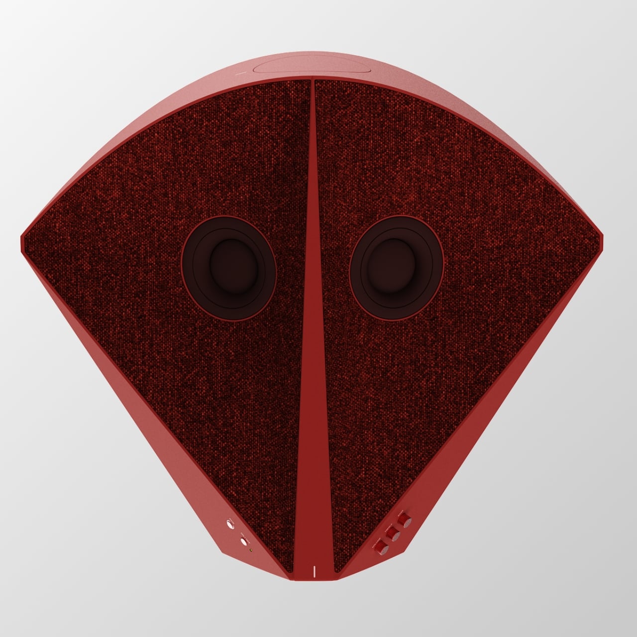
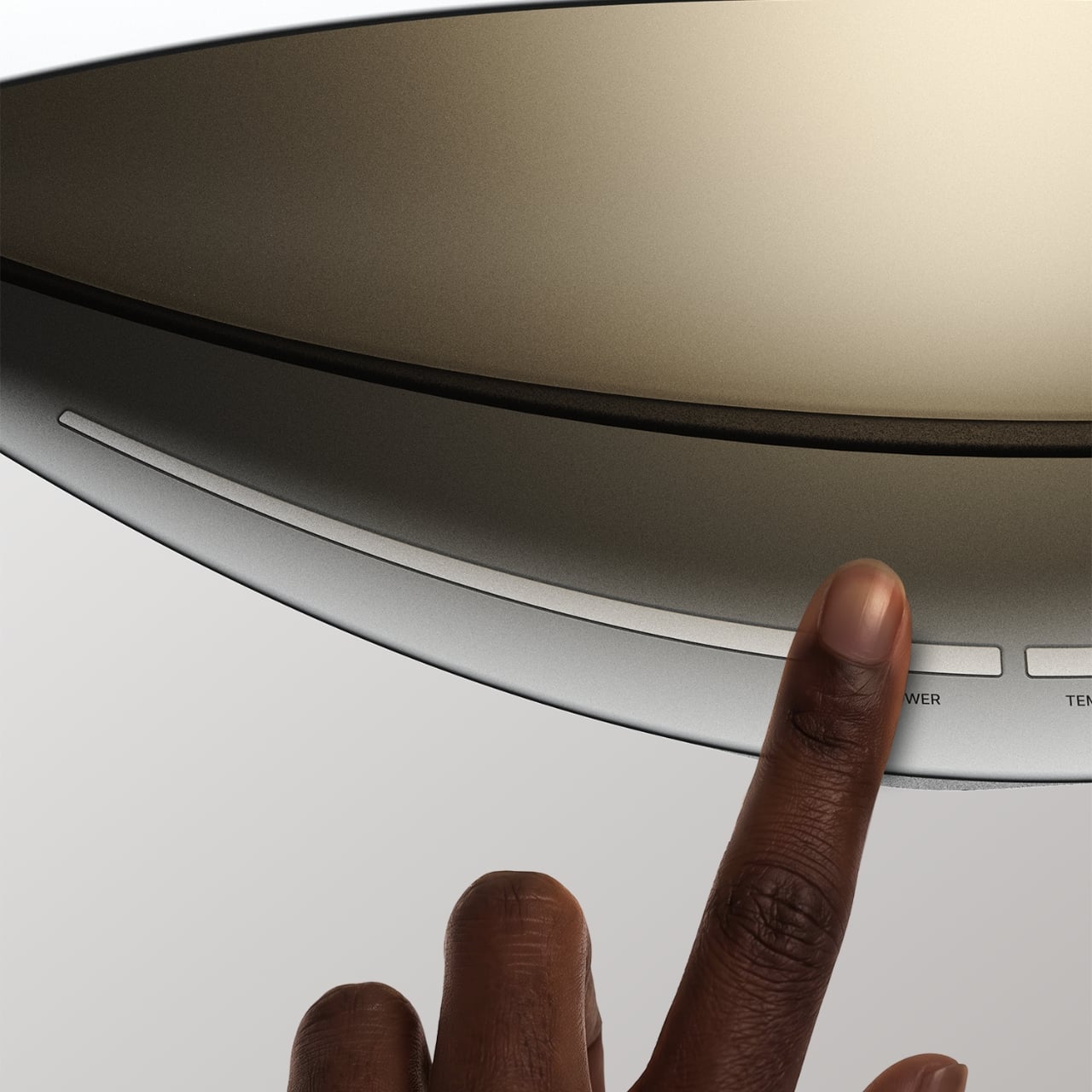
The Beosound Tableau is a wall-mounted audio object developed in collaboration with Bang & Olufsen. Malmnäs calls it “a fireplace for music,” an instrument not just for listening, but for living. The moment I read that, I had to stop. Because I’ve never heard a speaker described that way before, and suddenly, I couldn’t think of a more fitting comparison.

Designer: Mårten Malmnäs

Think about what a fireplace actually does. Yes, it produces heat, but that’s almost beside the point. A fireplace creates presence. It becomes the thing a room organizes itself around. People pull their chairs toward it, conversations happen because of it, and its absence is genuinely felt. That’s a completely different design brief than “fits on your desk” or “connects to your phone.”

Malmnäs started the project with a design probe, a research method that explores the relationships people have with their homes, and from that came a set of experiments around values and behaviors. Eight experimental directions emerged from the ideation phase, spanning different input and output formats. Three of those directions clearly answered the design responsibilities he’d set for the project, and their shared qualities pointed toward one resolved object.

Here’s where it gets interesting. The original concept for the Tableau was screen-based, but a method called Wizard of Oz testing, where a human simulates the system to observe how people actually interact with it, pushed the design somewhere more honest. The interaction model shifted from screens to navigation by sound. And the principle that came out of it became the foundation of the whole concept: the most honest interface for a music object is music itself.

That’s a provocative idea. We’ve spent years layering more and more visual UI on top of audio experiences. Every streaming service competes on the complexity of its recommendation algorithm, the visual polish of its playlist covers, the grid of album art. Malmnäs argued the opposite, that sound should speak for sound. The result is the Sonic Token, a physical object that mediates between the listener and the Tableau. Tactile, intentional, and completely different from scrolling a touchscreen.

The Tableau is positioned as a focal thing for the home. An object to gather around and tend to. That language is deliberate, and it’s also a little radical. “Tending” to an audio object implies care and attention, a relationship rather than a transaction. You don’t tend to a Bluetooth speaker. You don’t gather around an app.

Bang & Olufsen has always occupied a rare space in the audio world, where design and sound hold equal weight, and where a product can belong in a design museum and still deliver extraordinary sound. But even by B&O’s standards, the Tableau concept asks a genuinely new question: what if the speaker were the focal point of the room, rather than just a feature of it?

There are fair questions about how a concept like this survives beyond a graduate show. The hands-on, material-driven process Malmnäs used, with 1:1 mock-ups and rigorous testing of the Sonic Token’s form and function, suggests this isn’t a vague idea dressed up in renders. It was built and tested as a real object. Whether it eventually reaches production or stays as a collaborative concept between a student designer and one of the world’s most revered audio brands is another matter.

But the value of the Beosound Tableau isn’t only in whether it ships. It’s in the question it refuses to let go of: why have we settled for speakers that ask nothing of us? The alternative, a speaker that earns its place on the wall, makes music feel like a gathering, and treats sound like something worth being present for, sounds like exactly what the living room has been missing.

The post Bang & Olufsen’s New Speaker Concept Is a Ritual, Not a Device first appeared on Yanko Design.

Leatherman’s Weirdest Tool Drop Yet Is Strangely Genius

Leatherman has always been the brand you could count on to do one thing extremely well: pack an absurd number of tools into a deceptively small package. But Garage Batch #009 doesn’t follow that playbook at all, and I think that’s exactly why it’s worth talking about.

The Garage line is Leatherman’s unofficial skunkworks. It’s where the company test-markets experimental tools in limited batches, which means low quantities, no guarantees of a permanent future, and a demographic of buyers who treat a tool drop like a sneaker release. Batch #009, officially named the Adapter, is a ratcheting bit driver that looks unlike anything else in Leatherman’s catalog. Core77 put it best when they noted that if you didn’t know any better, you’d think it was someone’s industrial design school thesis project. That’s not a criticism. It’s kind of a compliment.

Designer: Leatherman

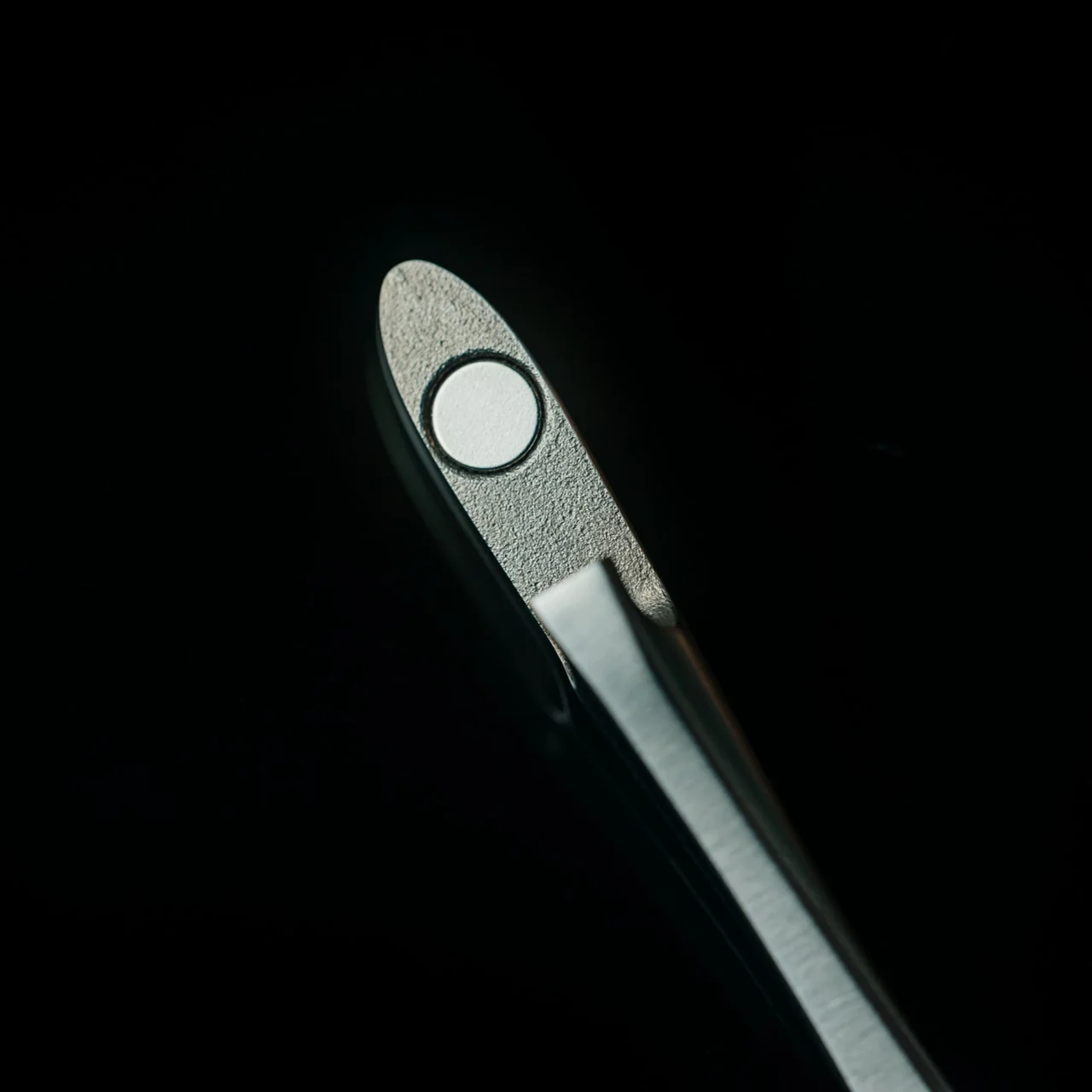
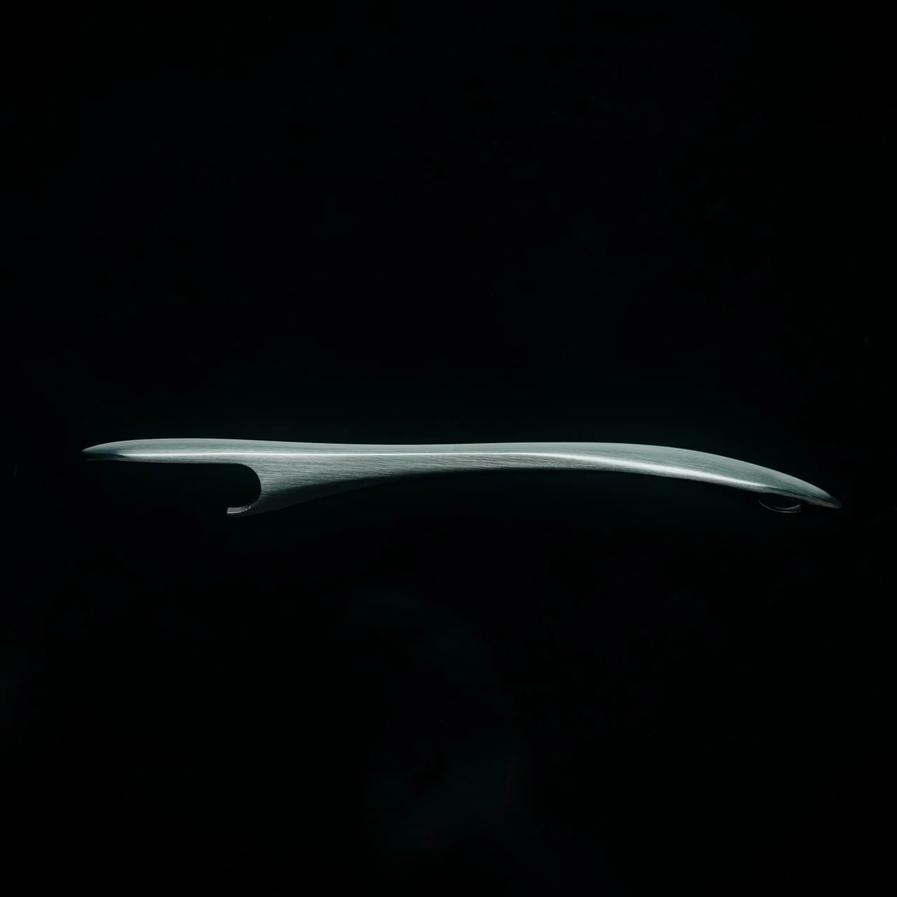
The Adapter is built from 3D printed titanium, which gives it that slightly precious, proof-of-concept feel you don’t usually associate with something you’d use to fix a cabinet hinge. It folds at a hinge joint and can be configured in three positions: fully extended for reach, bent at 90 degrees for torque leverage, and folded shut for compact carry. The ratcheting mechanism works in forward, reverse, and locked positions, so you’re not doing that annoying micro-repositioning shuffle every time you need to drive a screw. That alone is a genuinely useful upgrade over most compact bit drivers on the market.

But here’s the part that turns this from “useful niche tool” into “object I want to own”: the handle. Leatherman tucked a wood saw, a metal file, and two bits inside the handle compartment, all secured with a screw cap. They also stowed a mini ballpoint pen and an eyeglass screwdriver in there. If that sounds like the setup for a very organized person’s favorite fidget toy, you’re not wrong. The neon green accent strip on the handle doesn’t exactly scream jobsite. It says something closer to “I paid attention in design school and I have opinions about EDC.”

I want to be honest about the audience here. The Garage line isn’t really for the electrician or the contractor who needs to pull a hundred screws before lunch. It’s for the person who has a Wave on their keychain and a thing for limited-edition objects that are also actually functional. One reviewer summed it up with a note of friendly resignation: “I guess I have to accept the reality that Leatherman is like Supreme now.” That quote has been floating around the internet, and whether it’s a dig or a badge of honor probably depends on who you’re asking. I’d argue it’s both.

The drop sold out fast. High demand on a small batch is Leatherman’s way of gauging whether something deserves to graduate into a full production run, which is a smart and low-risk way to innovate. Not everything from the Garage line makes it. But the Adapter feels like a strong candidate for becoming a permanent fixture, because once you get past the art-project aesthetics, the core concept is genuinely practical.

Compact ratcheting bit drivers with smart storage have a real market. People are constantly trying to slim down their tool kits without sacrificing capability, and a folding driver that also carries your most-reached-for accessories covers a lot of ground in a small footprint. The 3D printed titanium construction keeps it light without making it feel cheap, and the three-position folding system solves an actual ergonomic problem that flat bit drivers have always had.

Whether you’re a gear collector who watches tool drops the way other people watch sneaker releases, or just someone who wants a smarter carry for weekend projects, the Adapter makes a case for itself without needing to oversell anything. Leatherman took a weird swing, and it mostly landed.

The post Leatherman’s Weirdest Tool Drop Yet Is Strangely Genius first appeared on Yanko Design.

Your Phone and Laptop Stand Could Be Made From Recycled Coffee Grounds

Every morning, millions of people brew their coffee, toss the grounds, and move on. It’s such a routine act of disposal that few of us stop to think about where all that spent coffee actually goes. MOFT apparently did think about it, and the result is one of the more genuinely interesting design stories to come out of the tech accessories space in recent memory.

The MOFT MOVAS-E Coffee Collection is a new line of accessories built from a bio-based leather crafted from recycled coffee grounds. MOFT combined spent coffee grounds with waterborne bio-based polyurethane to create what they’re calling a new generation of bio-based leather. The material replaces both conventional leather and traditional synthetic alternatives, which makes the origin story feel less like a marketing angle and more like an actual shift in how the brand approaches materials.

Designer: MOFT

MOFT has already built a strong reputation for thoughtful material choices. Their MOVAS vegan leather line has been a staple in the premium accessories space for a while now, known for that soft, slightly textured finish that feels surprisingly luxurious on a phone MagSafe stand. The MOVAS-E Coffee Collection takes that established foundation and adds a genuine layer of purpose to it, pushing the material story well beyond aesthetics and into something more intentional.

The collection includes products like a laptop Carry Sleeve, all finished in warm, coffee-toned colorways that look like they were pulled straight from a specialty café mood board. The tones are earthy and rich without veering into something overly minimal or clinical. If you’ve ever wished your tech accessories matched the aesthetic of a beautifully lit coffee shop corner, MOFT seems to have designed this one with exactly that feeling in mind. The tagline for the collection is “Brewed for Flow,” and it’s hard to argue with that framing.

The packaging is also part of the story. MOFT went with a frosted, minimalist design they describe as food-safe, durable, and fully recyclable. It’s the kind of packaging decision that often goes unnoticed by most buyers, but it signals that the sustainability angle here isn’t just surface-level. When a brand puts the same thought into the box as the product inside, that’s usually a sign the commitment runs deeper than a trend cycle.

I’ll be honest: the sustainable materials conversation in tech accessories can feel exhausting. Every other brand is slapping the word “eco” on something and calling it a revolution. MOFT’s approach feels different, not because they’ve reinvented the wheel, but because the product doesn’t sacrifice anything to get there. The MOVAS-E Coffee Bio-Leather still delivers the same premium tactile quality that made their original MOVAS line popular. It’s stain-resistant, smooth, and has that matte finish that photographs well without ever looking cheap. The material carries its origins gracefully.

The timing of this collection feels culturally right, too. Coffee has become more than a beverage. It’s an aesthetic, a lifestyle marker, a ritual that people build their mornings around. The idea that your phone stand or laptop sleeve could be a physical extension of that daily ritual is a small but clever act of brand storytelling. It doesn’t feel forced. It feels like a natural fit for the kind of person who already gravitates toward MOFT: someone who pays attention to the things they carry.

Whether or not bio-based leather made from coffee grounds becomes a broader standard for tech accessories, MOFT is asking the right questions here. What do we do with the waste streams already woven into our daily lives? How do we make sustainable choices feel desirable rather than merely dutiful? The MOVAS-E Coffee Collection doesn’t answer everything, but it’s a compelling and well-designed start.

If you’ve been looking for a reason to upgrade your tech carry, this collection offers one that goes a little deeper than color options. It’s the kind of purchase that earns a second look, and a story that’s surprisingly easy to tell when someone asks where you got your case.

The post Your Phone and Laptop Stand Could Be Made From Recycled Coffee Grounds first appeared on Yanko Design.

Gage Roads Just Turned a Surfboard Into a Beer Tap

The last debate you expected to find at the heart of a design story was a surfing one, but here we are. For years, the surf community has been at odds over something surprisingly technical: should surfboards be measured in volume, using litres? It sounds like a niche argument, but for shapers and surfers, the stakes are genuinely real. Leave it to an Australian brewery to turn that argument into one of the most interesting design objects of the year.

Gage Roads Brew Co. partnered with legendary board shaper Chris Garrett of Phantom Surfboards to create the Beerboard, a custom single-fin surfboard built with a sealed internal chamber capable of holding 10 litres of Gage Roads Summer Ale Single Fin. Yes, it actually surfs. And yes, it actually pours beer. That’s the whole glorious point.

Designer: Chris Garrett with Gage Roads Brew Co

The concept itself is brilliantly simple, but the execution was anything but. The engineering challenge of making a surfboard capable of storing pressurised beer without leaking, or worse, imploding mid-session, required serious work. Garrett’s decades of experience as a shaper came into play here in ways that go well beyond surface aesthetics. He’s been crafting boards since 1979, and Phantom Surfboards has been his life’s work since 1984. Designing the Beerboard meant rethinking the interior construction entirely, embedding a food-safe chamber that could handle pressurisation while preserving the board’s hydrodynamics. The build process reportedly came with a few explosions along the way, which is either alarming or just the most Australian development story imaginable.

The board draws inspiration from the iconic Greenough Spoon, a shape dating back to the 1960s. Choosing that reference wasn’t accidental. The Spoon was itself a radical rethink of what a surfboard could be, and the Beerboard follows directly in that spirit. It doesn’t look like a novelty item. It looks like a real board, clean and purposeful, and that restraint is exactly where the design succeeds. A gimmick slapped together for a social media moment would have felt cheap. This doesn’t feel cheap at all.

Once the board was finished, Gage Roads called in Olympic surfing medalist and part-owner Jack Robinson alongside legendary free surfer Brendan “Margo” Margieson for sea trials. The fact that professional surfers actually took it into the ocean, rode it, and then presumably poured a cold one from it afterward is a key part of why the Beerboard registers as more than a marketing stunt. It works, both as a surfboard and as a beer dispenser. That functional integrity is what elevates the whole project.

Is the Beerboard a practical product? Not remotely. You’re not about to wax this thing down and paddle out for your morning session while worrying about keeping your lager cold. But practicality is the wrong lens here entirely. The most interesting design objects rarely exist to solve a purely utilitarian problem. They exist to reframe one. The Beerboard reframes the entire surfboard volume debate by making it physical and playful, by literally filling a surfboard with the very unit of measurement causing all the fuss. It’s design as commentary, and it genuinely lands.

It also matters who made this. Chris Garrett isn’t an ad agency prop designer. He’s a craftsman with nearly 50 years in the industry, someone whose boards have been trusted by some of the world’s top surfers across decades. Bringing his expertise to a project like this gives the Beerboard a credibility it wouldn’t have had otherwise. It’s the difference between a concept and a creation.

I’ve seen plenty of branded design collaborations that felt hollow or performative, where the “design” was really just a logo slapped on a limited-edition container. The Beerboard isn’t that. It required genuine engineering, real craft expertise, and the confidence to commit fully to a ridiculous idea until it became a remarkable one. That, I think, is what good design actually looks like. Sometimes it just happens to come with a tap.

The post Gage Roads Just Turned a Surfboard Into a Beer Tap first appeared on Yanko Design.

A 35m² Summerhouse Designed Like a Space Habitat

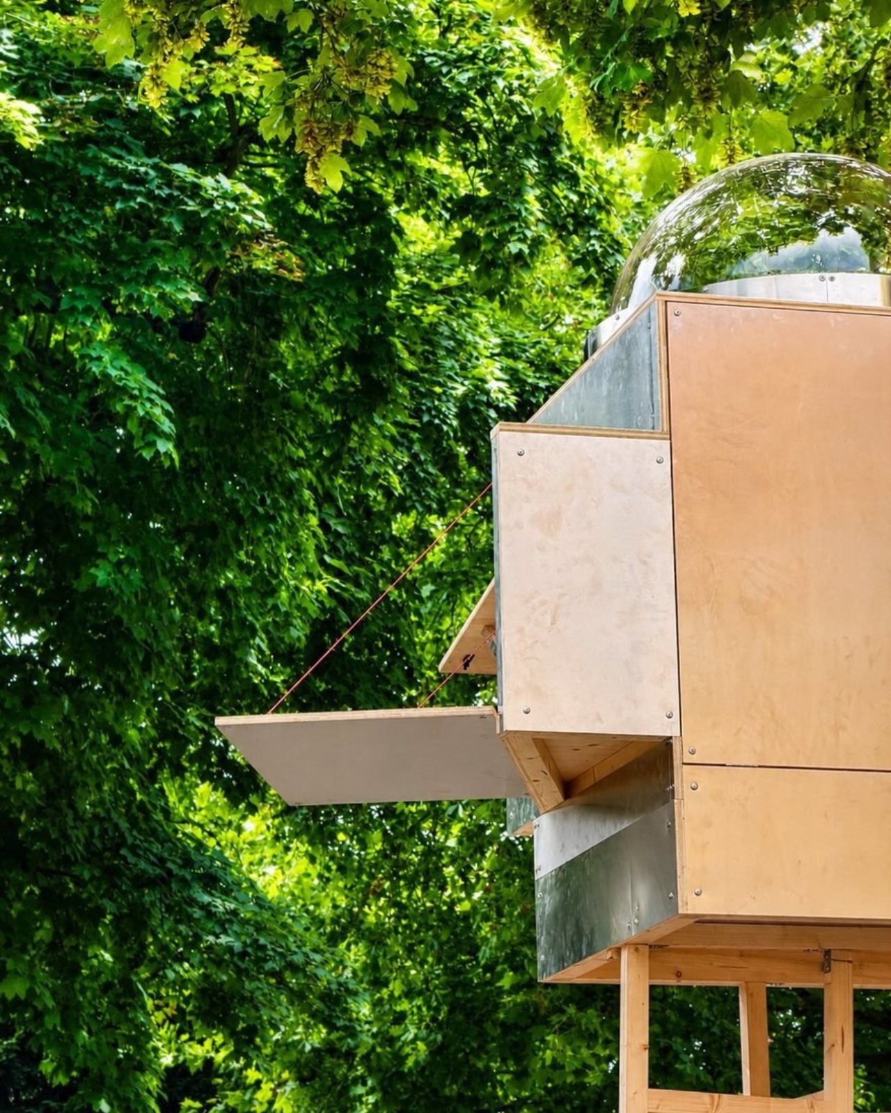
Most summerhouses don’t start as thought experiments about the moon. EcoNeo did. Designed by SAGA Space Architects and sitting quietly in Asnæs on the Danish island of Zealand, it measures just 35 square meters and sleeps a family of six. It also has an indoor sauna. The fact that all of this coexists within a space roughly the size of a large studio apartment says everything about what SAGA is doing differently. This is a house designed by people who take small spaces very, very seriously.

SAGA Space Architects was founded in 2018 by Danish architects Sebastian Aristotelis and Karl-Johan Sørensen, and their portfolio reads nothing like a traditional residential practice. These are the people behind LUNARK, a simulated lunar habitat tested during a 100-day expedition in Greenland. They also developed the Circadian Light system installed on the International Space Station and built FLEXHab, a habitat prototype for the European Space Agency. Their methodology is built around extreme-environment logic, where every centimeter, every kilogram, and every watt is a decision that matters. EcoNeo takes that same discipline and applies it to a Danish holiday home, and the result is genuinely worth paying attention to.

Designer: SAGA Space Architects

The studio calls its approach “Terra-Tech,” a marriage of technical precision and material awareness that keeps the design grounded in lived experience rather than spectacle. EcoNeo is built from biogenic materials, including OSB panels, wood-fiber insulation, Douglas fir, oak, birch, and plywood, all chosen for their low environmental footprint and warm sensory quality. Digital fabrication shapes the structure with the kind of accuracy you don’t typically associate with a weekend retreat. The architects estimate EcoNeo reduces annual carbon emissions by roughly 80 percent compared to an average new Danish summerhouse. That is not a rounding error. That is a structural rethinking of what holiday architecture can be.

On the inside, the floor plan is organized around a central living space that works harder than most rooms twice its size. The ground floor brings together the kitchen, bathroom, integrated storage, the sauna, and a dining table that can seat the whole family. Upstairs, sleeping space is tucked in a way that feels considered rather than compromised. Every piece of the interior is designed to serve more than one purpose, because SAGA knows from its space habitat work that generosity of experience does not require generosity of space. You feel that difference the moment you look at the photographs. The rooms have a quietness to them, a sense that everything belongs exactly where it is.

That, to me, is where EcoNeo gets genuinely interesting as a cultural object. The conversation around sustainable housing often leans into austerity, as though living with a lighter footprint requires accepting a diminished quality of life. EcoNeo makes the opposite argument without raising its voice. The house does not look like a sacrifice. It looks like a place people would actually want to spend a summer in, with its warm timber surfaces, considered proportions, and an undeniable calm that reads clearly even in photographs. Sustainability, when done right, does not ask you to give anything up. It asks you to think more carefully about what you actually need.

The collaborators list tells its own story: Velux, Dinesen, GROHE, Svane Køkkenet, Velfac, and ThermoCell, among others. These are not budget-line names. SAGA was not chasing a price point with EcoNeo. They were chasing a standard, and it shows in every decision, from the material palette to the fabrication method.

Whether EcoNeo becomes a scalable template for sustainable residential housing or remains a singular prototype is a question worth watching. The studio intends to develop it further for broader residential applications. Given their track record of designing for environments where there is genuinely no margin for error, I would take that intention seriously. EcoNeo is proof that the best ideas about how to live on Earth might just be the ones we developed while thinking about how to live somewhere else entirely.

The post A 35m² Summerhouse Designed Like a Space Habitat first appeared on Yanko Design.

A Duck, Some Bent Tubes, and the Most Charming Lamp of 2026

The first thing you notice is the yellow. Not a soft, hedging yellow, but a full-commitment, matte, warm yellow that coats every millimeter of the piece without apology. Then you notice the shape. A long, arching neck. Two sturdy legs. A horizontal head that doubles as the light source. Duke, the table lamp designed by Liam de la Bedoyere of Bored Eye Design, is a duck. More precisely, it’s a duck drawn by someone who decided that one continuous tube was all they needed.

That’s the central idea, and it’s worth sitting with. De la Bedoyere’s design vocabulary here is essentially a single rule: take a tube, bend it, and let the animal emerge from the bends. No additional elements, no decorative flourishes, no mixed materials. Just the tube, its curves, and the form they describe. The result is a piece that communicates immediately. You read it as an animal before you register that it’s a lamp, which is the correct order of things.

Designer: Liam de la Bedoyere

Up close, the construction rewards attention. The tubular sections connect in visible segments, and those joints give the piece a modular, almost architectural quality that tempers the playfulness with something more considered. The bends themselves are generous and smooth, with a radiused curve that keeps everything feeling soft rather than rigid. The head is a cylinder open at the end, functioning as the spotlight, and that detail is quietly clever. The light doesn’t interrupt the form. It completes it, pointing forward from the duck’s snout like the whole thing was always meant to do exactly this.

The base is a flat circular disc, minimal and low to the surface. Two legs rise from it and immediately branch into the body, giving the lamp a planted, grounded stance that stops it from reading as fragile. And then there’s the cord, a braided yellow cable that matches the body exactly, looping out near the base. Most designers treat the cord as a problem to solve or something to hide. Here it’s an afterthought that became a feature, trailing away from the lamp like a tail. It’s one of those small decisions that reveals how thoroughly this design was thought through.

The monochromatic yellow does something important for how the silhouette reads. By removing any tonal contrast within the piece itself, the animal form becomes purer and more immediate. Your eye traces the outline rather than getting pulled into detail, which is exactly what you want from a lamp that’s also functioning as sculpture. The color also travels. Looking at Duke placed against warm wood, concrete, white walls, and natural linen, it doesn’t clash with any of them. Yellow at this saturation and matte finish is warmer than it is aggressive, and it reads more like a material choice than a color choice.

The design is also genuinely versatile, which isn’t something you can say about most statement objects. Duke works in a child’s bedroom because it looks like a toy. It works on a bookshelf or a credenza in an adult living space because the construction is clean and the form is abstract enough to read as sculptural. Place it next to a magazine on a coffee table and it looks like something you’d find in a design gallery. That range of contexts isn’t accidental. It comes from the clarity of the underlying concept. When a design is resolved at the idea level, it adapts.

What makes Duke feel significant beyond its charm is that de la Bedoyere is clearly developing a language, not just making individual pieces. The Flamingo Lamp came first, and the same logic runs through both, which means the interest is in the system as much as the object. A lamp collection built entirely on the premise of one continuous tube tracing an animal is a genuinely interesting editorial position for a designer to take. It’s a constraint that produces rather than limits, and that’s the kind of thinking that tends to produce lasting work.

Duke doesn’t try to do many things. It tries to do one thing very well, and in design, that’s harder than it sounds.

The post A Duck, Some Bent Tubes, and the Most Charming Lamp of 2026 first appeared on Yanko Design.

Blackwing’s $400 Crate Is Every Writer’s Dream Gift Set

Pencils don’t usually make people emotional. But Blackwing pencils have always been a little different. The brand, which revived the legendary Blackwing 602 after its original discontinuation in 1998, has spent years building something that goes beyond the pencil itself. It’s a whole philosophy about the act of writing by hand. And with the new Blackwing Crate Gift Set, priced at $400, they’ve essentially packaged that philosophy into a matte black box and sent it out into the world.

Let’s talk about what’s inside, because it’s genuinely a lot. The Crate includes 24 Blackwing pencils housed inside a walnut gift box, a One-Step Long Point Sharpener, a desktop sharpener, replacement erasers, a handheld eraser, three point guards, a pencil extender, a notebook clip, a Medium Slate Notebook in dot-grid, and an A4 spiral notebook in blank. If you’ve ever casually shopped the Blackwing site and found yourself adding one thing after another to your cart, this is essentially that cart, but curated and given a walnut home.

Designer: Blackwing

The walnut box alone is something worth pausing on. It has a cork-lined interior and a satisfying magnetic closure. It’s the kind of object you want to leave on your desk not because it needs to be there, but because it makes the desk look like it belongs to someone who takes their work seriously.

Blackwing’s four core pencils are all represented here: the 602, the firm-graphite original that built the brand’s reputation and was beloved by creatives from John Steinbeck to Stephen Sondheim; the Matte, which shares the same soft and expressive formula as the very first Blackwing; the Pearl, with its smooth and balanced Japanese graphite; and the Natural, a stripped-back version with an uncoated cedar body for a rawer, more honest feel. Each one writes differently. That variety isn’t just a marketing point. It means the set can genuinely work for a writer, an artist, a student, or someone who just wants their notes to feel a little more intentional.

I’ll admit there’s a case to be made that $400 is a lot for what is, technically, a pencil set. But I think that argument misses the point of what Blackwing has always been doing. These aren’t pencils in the same way a yellow No. 2 is a pencil. The brand occupies the same space as a well-made fountain pen or a leather-bound notebook: objects that are ordinary in function but considered in execution. When you buy something from Blackwing, you’re buying into a certain idea of how writing should feel, and the Crate makes that idea as complete and giftable as it’s ever been.

The packaging itself shows thought. The outer box is matte black with the Blackwing name in white. Clean, confident, minimal. It doesn’t shout. It doesn’t need to. The layered reveal inside, with a pull-out drawer for the notebooks, feels like the kind of unboxing experience that design enthusiasts and stationery lovers will genuinely appreciate. Gift sets at this price point need to justify themselves beyond just the contents, and the presentation here does a lot of that work.

What makes the Crate feel special rather than just expensive is how it covers every phase of the writing process. You have your pencils, your sharpeners for both at-desk and on-the-go use, your erasers, protection for your pencil tips when they’re not in use, and actual notebooks to write in. Nothing feels like filler. Everything has a job.

If you’re shopping for someone who already loves Blackwing, this is a clear yes. If you’re introducing someone to the brand for the first time and want to do it properly, this is also the move. And if you’ve been slowly accumulating Blackwing products one purchase at a time and wondering when you’ll finally have it all, the Crate is the answer to that question in one very satisfying delivery. The Blackwing Crate Gift Set is available now at blackwing602.com for $400.

The post Blackwing’s $400 Crate Is Every Writer’s Dream Gift Set first appeared on Yanko Design.

The Floating House Built From Strangers’ Wishes

Most houses start with a blueprint. Jisoo Yoo’s Dream House started with a question: how do the dreams and desires we carry shape the landscape of the world we inhabit? The answer, it turns out, is a floating structure made of clothing.

Yoo, a Seoul-born artist who lives and works in France, has been quietly building one of the more compelling bodies of work in contemporary art, one that orbits around the domestic, the ephemeral, and the barely-visible structures that hold our lives together. Dream House, her latest installation presented at (F)ESTIVALES at Les Tanneries, Centre d’art contemporain, is exactly the kind of project that makes you stop and genuinely reconsider what a home actually is.

Designer: Jisoo Yoo

Here’s how it works. Participants are invited to contribute a garment, something personal, something worn, and mark it with handwritten texts and drawings. These pieces of clothing then become the literal building blocks of the structure, each one a personal archive, each one a load-bearing element. The result is a house that floats, literally and conceptually, held aloft not by concrete or steel, but by the private wishes of strangers.

That’s a beautiful idea, and I mean that without a trace of irony. We spend so much time thinking about homes in terms of square footage, property value, and interior aesthetics that we rarely stop to ask what a home is actually made of. Yoo forces the question. Her installation suggests that the answer has less to do with materials and more to do with desire, with the accumulated weight of what people want, need, and imagine for themselves and for each other.

Art that treats the domestic as a lens for examining social and cultural forces is nothing new. But Yoo brings something specific to it. Born in Seoul and trained in France, she operates between two very different cultural frameworks around the idea of home, and her practice reflects that quietly felt tension. Her works often feature spaces that feel familiar but refuse to stay solid. Rooms that waver. Houses that float. Structures that appear and then dissolve. It’s a recurring language across her portfolio, and with Dream House, it feels most fully realized.

Dream House is not trying to comfort you. It’s trying to make you notice something. The garments contributed by participants carry real personal weight: literal handwriting, actual drawings, the residue of real lives. And yet the house they form is temporary. It rises, exists briefly, and then it’s gone. Yoo describes the floating structure as embodying both the creative force of desire and the fleeting nature of existence. The house briefly emerges through people’s dreams, and that, apparently, is enough.

I think that’s the most honest thing any artist has said about housing in a long time. We build our ideas of home from desire, from inherited images of what shelter is supposed to look like, from what we were told to want, and from what we quietly imagine when no one is watching. And all of it is more temporary than we tend to admit. The average person moves multiple times in their life. Neighborhoods change. The house you grew up in gets renovated beyond recognition or torn down entirely. The physical structure of home has always been more fragile than we want it to be.

What Yoo does is make that fragility visible without making it tragic. The floating structure is genuinely striking to look at. The garments create a soft, almost organic texture that reads as intimate rather than architectural, which is exactly the point. You’re not looking at a building. You’re looking at a collective act of imagination, briefly held together by shared hope. Jisoo Yoo is an artist worth paying close attention to. Her work doesn’t announce itself loudly, but it asks questions that stick. Dream House is a reminder that the spaces we live in are not neutral. They are built, always, from something we wanted.

The post The Floating House Built From Strangers’ Wishes first appeared on Yanko Design.

The Soviet Union Built UFO-Shaped Circuses. Now You Can Fold One.

The Soviet Union had a complicated relationship with spectacle. Everything about Soviet ideology pointed toward collective purpose, practical function, and the rejection of excess. And then they went and built circus arenas shaped like flying saucers, out of raw concrete, in capital cities across Central Asia and Eastern Europe. If that is not a contradiction worth paying attention to, I do not know what is.

Cirk, a new book from David Navarro and Martyna Sobecka of Zupagrafika, makes that contradiction its entire subject. The Poznań-based design duo have spent over a decade documenting the brutalist and modernist architecture of the former Eastern Bloc, and Cirk is their latest, most playful entry in that ongoing project. The book surveys the permanent circus arenas built across the former USSR from the 1960s through the 1980s, buildings that, as Zupagrafika puts it, combined “socialist modernism, experimental engineering, and choreographed spectacle.” It is an architectural typology most people have never thought about, and yet once you see these buildings, you cannot stop looking.

Designers: David Navarro and Martyna Sobecka

But the part of Cirk that has people talking is not the photography, gorgeous as it is. It is the second half of the book: five press-out paper models of actual circus buildings, designed for readers to punch out and assemble with nothing but glue. The five models represent the Kyrgyz State Circus in Bishkek, the Chișinău State Circus in Moldova, the Dnipro State Circus in Ukraine, the Great Moscow State Circus, and the Tashkent State Circus in Uzbekistan. Five buildings. Five cities. Five strikingly different pieces of architecture, each one reduced to a miniature you can hold in your hands.

I have a genuine soft spot for paper models, and I think their reputation as a “children’s activity” has always undersold what they actually are. A well-designed paper model is an act of translation. Someone has to study a real building, understand its geometry from every angle, figure out how to collapse it into a flat sheet, and do it in a way that holds together when you fold it back up. That is not trivial when the buildings in question are full of curves, cantilevers, and circular geometry. The circus arenas in Cirk are not simple boxes. Many have sweeping domed roofs and wide cylindrical bases, and the kind of sculptural confidence that makes them look like props from a science fiction film. Getting that geometry to behave on paper requires real design skill, and Zupagrafika clearly has it.

The studio has been producing paper model kits alongside their books for years, so this is familiar territory. But tucking five models into the back of a hardcover book feels like a deliberate choice, not an afterthought. The models are not a gimmick. They are an argument. You can look at photographs of the Great Moscow State Circus for a long time, and it will remain something abstract and distant. When you press out those perforated shapes and fold them into a miniature version of that building, something shifts. The scale changes. The building becomes tactile and personal. You start to understand its proportions in a way that a photograph simply cannot deliver.

There is also something quietly political about the whole exercise. These arenas were built as monuments to Soviet power, intended to be overwhelming and permanent. Reducing one to a paper model is almost cheeky. It takes these grand gestures of ideological architecture and makes them domestic, approachable, collectible. The Soviet state is long gone. Someone is now folding the Great Moscow State Circus on their kitchen table. History has a strange sense of humor.

Cirk is a hardcover running 88 pages, sized generously at 30 by 24 centimeters, giving the models room to breathe on the page. The first half carries photography and historical essays, with a foreword from writer Jelena Prokopljević. It is a complete package: context, visual archive, and the hands-on satisfaction of making something. For anyone drawn to architecture, Cold War history, or just the very specific pleasure of a perforated page coming apart cleanly, Cirk is a book that earns its shelf space. The flying-saucer buildings are absolutely worth it.

The post The Soviet Union Built UFO-Shaped Circuses. Now You Can Fold One. first appeared on Yanko Design.

Fiore Is a Wall Light, a Vase, and a Fragrance All at Once

Most lighting does one thing: it illuminates. If it’s beautiful, that’s a bonus. If it fits the space, you’re winning. But every once in a while, a design comes along and quietly expands the definition of what an object is supposed to be, and Fiore by Jimmy Rojas is doing exactly that.

Fiore is a wall-mounted sconce, but to call it only that would be selling it short. At its core, it’s a multisensory piece that combines light, living flowers, and fragrance into a single wall-mounted object. The concept is elegantly simple: a built-in vase holds real blooms, and a signature scent designed to complement their natural aroma diffuses into the room. You’re not just looking at a beautiful light fixture; you’re experiencing it. You smell it. You watch the flowers change as the week goes on.

Designer: Jimmy Rojas

The design came out of Jimmy Rojas’ time at the Savannah College of Art and Design, and it’s been collecting recognition ever since. Fiore earned a Silver at the International Design Awards in the Conceptual Products category, was a People’s Choice honoree at the 2025 NYCxDESIGN Awards, and made its way to Salone Satellite in Milan, one of the most competitive stages for emerging designers in the world. These aren’t small accolades. They signal that the design community is paying attention, and for good reason.

What makes Fiore feel particularly relevant right now is the way it taps into something a lot of us are quietly craving: interiors that actually engage more than just our eyes. Biophilic design, the idea of bringing natural elements into our living spaces, has been a conversation in design circles for years. But Fiore takes that concept and makes it literal in the most delicate way possible. A real flower in your wall, radiating fragrance into the room. No screen, no app, no complicated setup. Just nature, light, and scent.

I’ll be honest, I have a slight bias here. I’ve always believed that the best design doesn’t announce itself loudly. It earns its place in a room by making life feel slightly better, slightly richer, in ways you notice over time rather than all at once. Fiore operates on that frequency. It’s the kind of object you come home to and slowly appreciate more as the days pass.

It’s also worth looking at how Fiore fits into the current interior design moment. Maximalism is back with force, from statement furniture to bold wallpapers to gallery walls stacked floor to ceiling. Within that landscape, Fiore manages to feel both bold and restrained. It’s wall-mounted, so it doesn’t compete for floor or shelf space. But it holds living flowers and diffuses scent, so it commands presence in a way that a standard sconce never could. Balancing those two qualities is genuinely difficult to pull off.

Rojas clearly understands that fragrance is one of the most underused tools in interior design. Candles and reed diffusers have long dominated the home fragrance space, and while they work well, they’re objects that sit on a surface and do their thing passively. Fiore integrates scent into the architecture of the room itself, into the wall, which feels like a genuinely new idea. The fact that the fragrance is designed to pair specifically with the real flowers in the vase adds another layer of intentionality that sets this apart from a concept piece that’s merely clever.

If Fiore moves into full production, there are real-world questions worth asking: how often do the flowers need replacing, what happens in winter when fresh blooms are harder to source, and whether the fragrance component can be made refillable and sustainable. Those aren’t dealbreakers, just the details that turn a great concept into a great product. But as a concept, Fiore is one of the more complete design ideas in recent memory. It knows what it wants to be, and it commits fully. Lighting has always been foundational to how a space feels. Fiore is simply asking whether it couldn’t also shape how a space smells, and how alive it feels. The answer, apparently, is yes.

The post Fiore Is a Wall Light, a Vase, and a Fragrance All at Once first appeared on Yanko Design.
India’s Anthill House Has No AC and Stays Cool Anyway

We’ve been building houses wrong. Not structurally, not legally, and not in any way that’s easy to name. But somewhere along the line, the conversation around home design shifted away from how does this building breathe toward what does this building look like on a feed. That’s why The Anthill, a new brick residence in Ahilyanagar, Maharashtra by Kaushal Tatiya Architects, feels like such a pointed correction. Not a provocation. A correction.

The premise sounds deceptively simple: a house modeled after an ant mound. Not the insect itself, but the engineering intelligence of what it builds. Ants have been solving thermal regulation, cross-ventilation, and spatial hierarchy problems for millions of years, with no blueprint, no software, and no electricity required. Kaushal Tatiya, the firm’s founder, described the anthill not as a literal form but as “an intelligent climatic organism,” one able to “regulate temperature, create ventilation through voids, and function through a network of interconnected chambers without any imposed geometry.” That single observation is what the entire project is built on, and it shows.

Designer: Kaushal Tatiya Architects (Photos by Avesh Gaur)

The house sits low in the landscape, almost terrain-like, its exposed brick facade functioning as much as an environmental filter as it does a structural shell. From the outside, it reads as deliberately introverted: solid walls and perforated surfaces that hold back the glare before it ever reaches the living spaces inside. The real architecture begins once you start moving through it. Rooms branch off from larger communal volumes, ceiling heights shift unexpectedly, and natural light arrives filtered and softened rather than harsh. The passage between spaces becomes the experience, not just a means of getting from one room to another.

This is a design principle modernism largely traded away in favor of open-plan everything and maximum sight lines. The Anthill doesn’t make that trade. Its stepped terraces and alternating balconies recall the traditional Indian rooftop concept of the chhat, creating layered, shaded thresholds that do the cooling work before the sun reaches the interior. A 12-foot cantilevered slab, supported through brick in compression, adds a more deliberate architectural gesture to the otherwise organic composition.

It’s worth pausing on the sustainability side of this project, because it earns more than a passing mention. The Anthill operates entirely on passive systems: cross ventilation, thermal mass, and shaded courtyards. No mechanical ventilation. In a region defined by extreme heat and intense sunlight, that isn’t a compromise. It’s a design strategy that trusts the building’s own intelligence. The idea that architecture should outlast any power grid it’s connected to feels increasingly important, and The Anthill makes that case without saying a word about it.

I think what gets undersold in conversations about sustainable design is how genuinely radical simplicity is. We’ve normalized a model where buildings are essentially sealed boxes, then mechanically conditioned to be habitable. That approach is energy-intensive, expensive, and fragile in ways we rarely acknowledge. The Anthill argues the opposite: that a building designed with enough spatial intelligence doesn’t need to fight its climate. It learns to negotiate with it instead.

The visual language of the project carries all of this without being heavy-handed. The brick is warm and earthy, the curves are organic without being theatrical, and the overall effect is of a building that looks like it belongs to the land rather than placed on top of it. Photography by Avesh Gaur shows a house that reads differently from every angle, which is always a sign that the architecture is meant to be inhabited rather than just photographed.

What The Anthill ultimately puts on the table is a question worth sitting with: what if the most intelligent design move isn’t to add more technology, but to study what natural systems already perfected? The answers, in this case, are sophisticated enough to build a house around. We talk a lot about future-proofing design. The Anthill is a case where the most forward-looking move was to look at something ancient.

The post India’s Anthill House Has No AC and Stays Cool Anyway first appeared on Yanko Design.
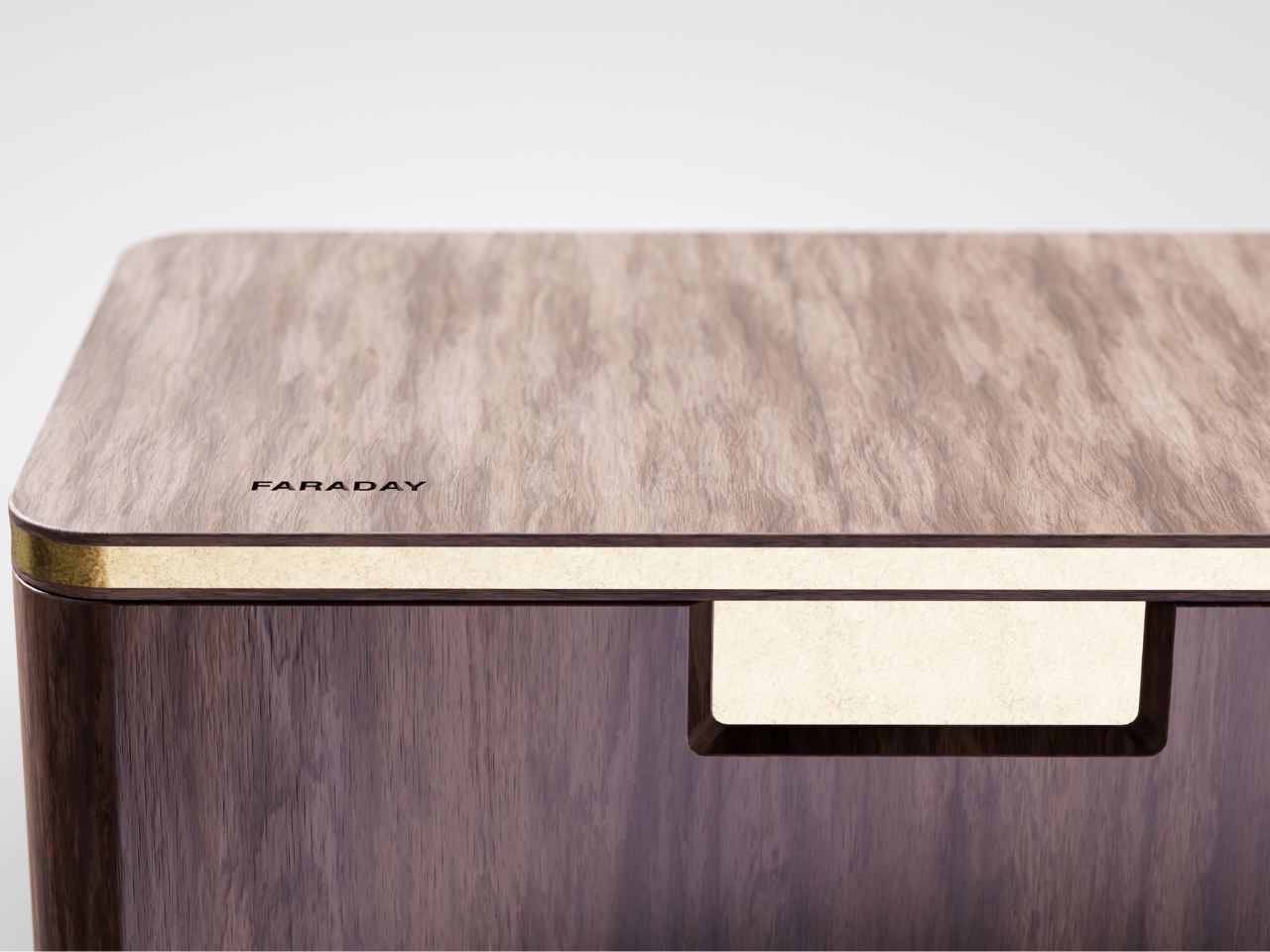
❌