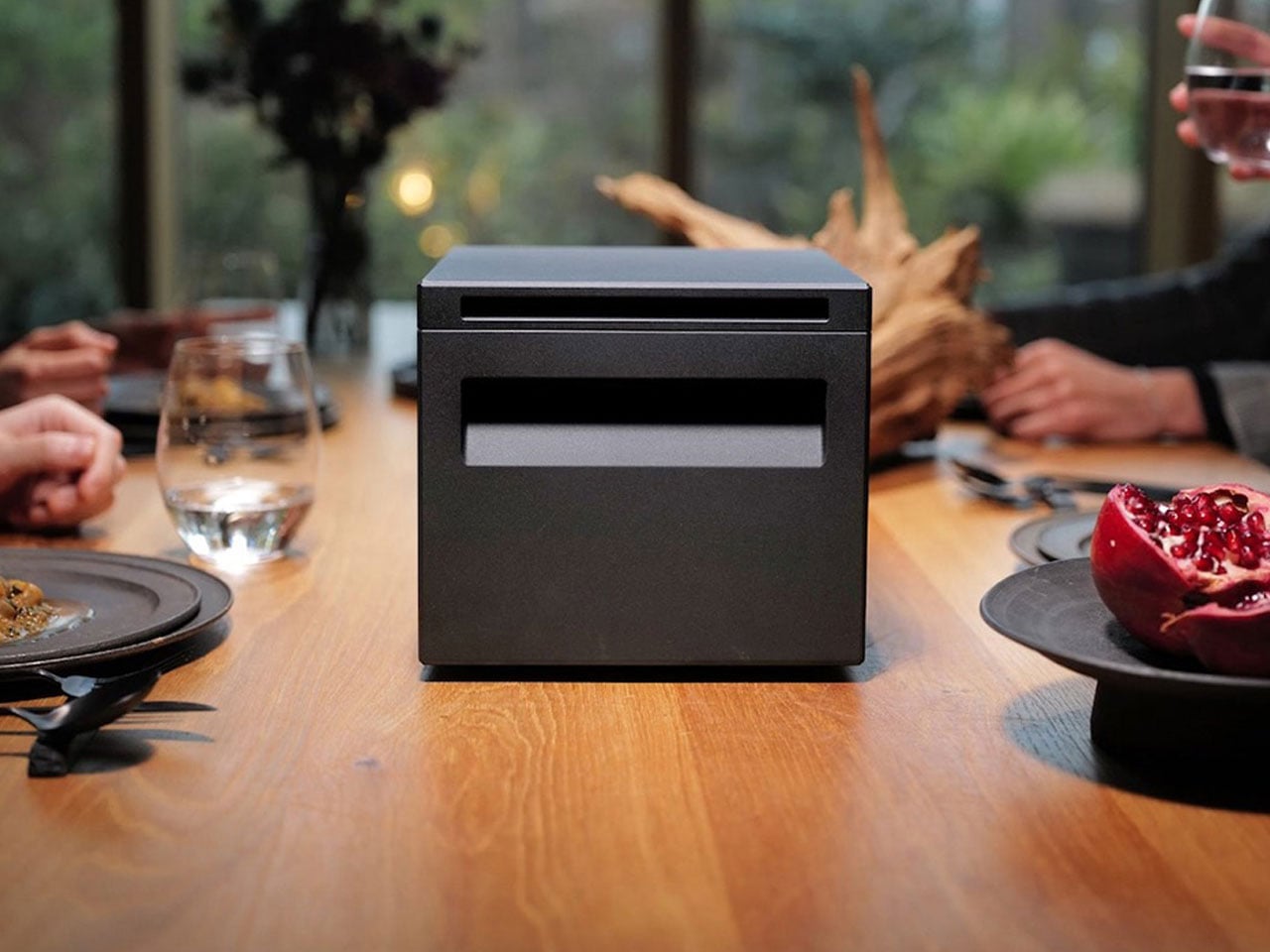
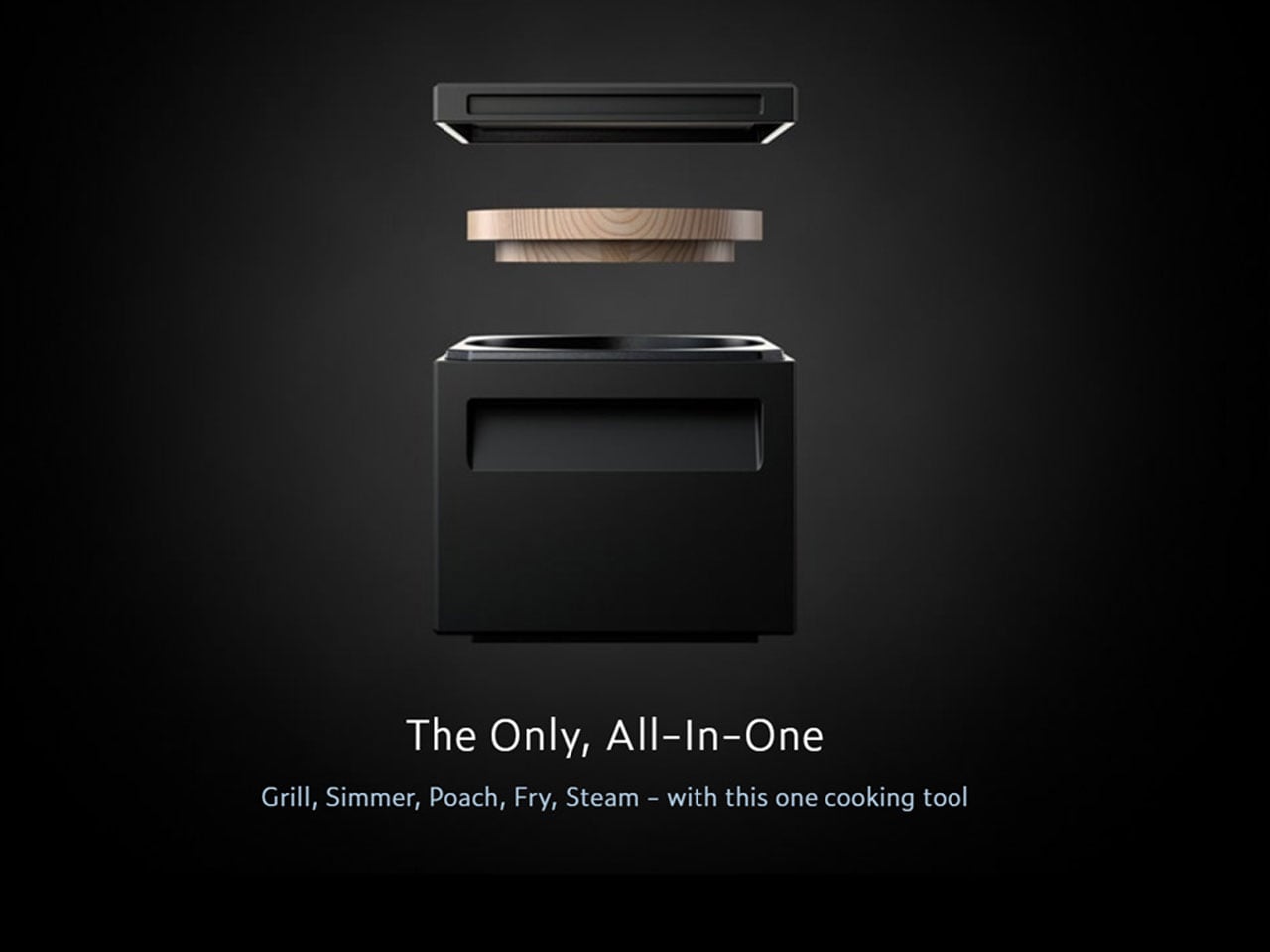
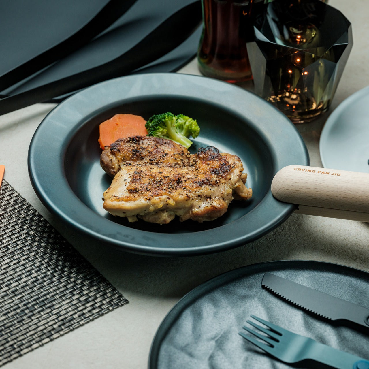
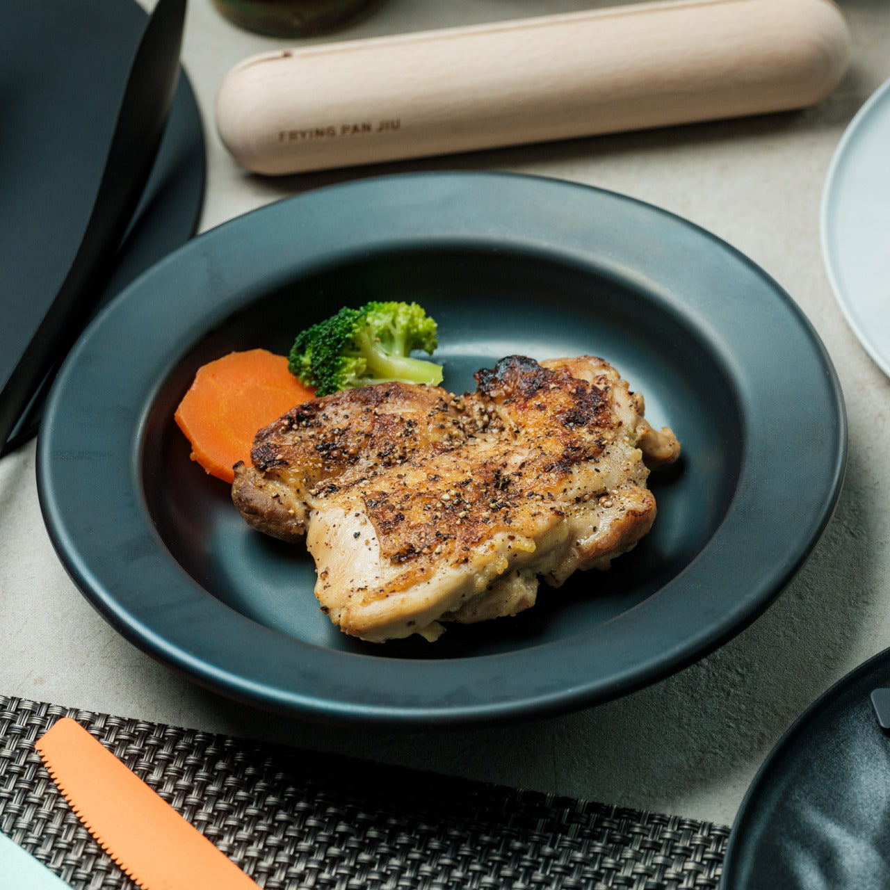
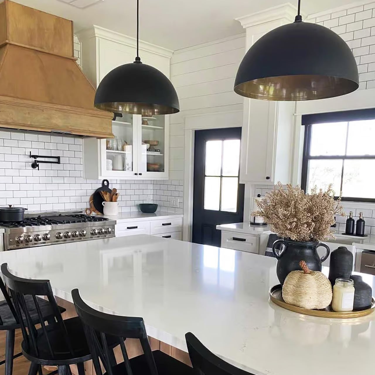
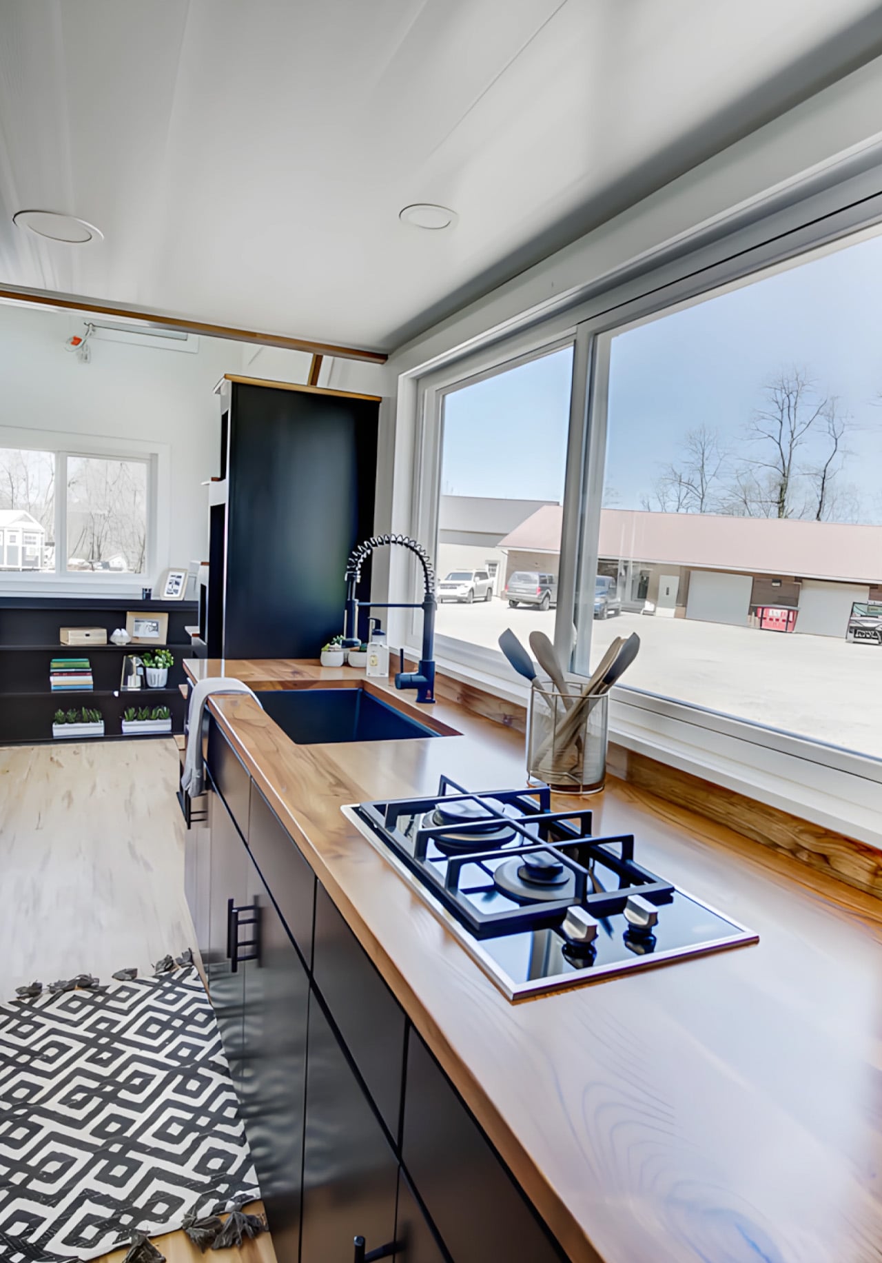
Some grill pans spend their days at the back of a cabinet, too heavy to bother with and too uneven to trust. Then there are the ones that earn a place on the stove every single time. The Compact Modular Grill Plate belongs to the second category. Built with a three-layer steel construction that spreads heat evenly across its entire surface, it closes the gap between a proper kitchen sear and a campfire meal, without making you choose between the two.
What makes it worth owning is the adaptability. Handles swap out depending on the situation. The plate runs on campfires, gas burners, and induction stoves without modification. When cooking is done, the whole setup packs flat, small enough to fit in a bag without reorganizing everything around it. That level of flexibility does not happen by accident. It is the result of a design that actually solves the problem rather than merely describing it.
The three-layer steel plate is where the performance begins. Single-layer pans burn where the flame sits and fade everywhere else, which is how a good cut of meat ends up patchy and dry in the wrong places. The layered construction here distributes heat uniformly from the edge to the center, keeping the temperature consistent across the entire cooking surface. The result is a better sear, better moisture retention, and food that actually tastes the way it should. Compatible with campfires, gas burners, and induction stoves, it performs just as well in a small apartment kitchen as it does over an open fire on uneven ground.
Modular, Compact, Actually Practical
Most portable cookware treats portability as a footnote. The Compact Modular Grill Plate starts there. The handle system swaps out depending on the setting, so the plate adjusts to whatever the cook needs rather than the other way around. Remove the handles for cleaning, and pack everything flat for travel. There is a specific kind of satisfaction in gear designed to disappear when you are done with it, and this plate earns that cleanly. It comes in a Basic set and a Special set for those who want more to work with from the start.
What We Like
Three-layer heat distribution: a properly engineered cooking surface that keeps temperature uniform for consistent sears and better moisture retention from edge to center
Multiple heat source compatibility: campfire, gas, and induction in one plate with no adapters and no compromise between settings
Swappable handle design: takes seconds to change and genuinely adapts the plate to whatever situation the cook is working in
Compact pack-down: flat storage with handles removed; the kind of practical detail that determines whether gear actually makes the trip
What We Dislike
No surface treatment specified: the product does not clarify whether the cooking surface has a non-stick finish, which matters for cooking delicate proteins and for cleanup expectations
Limited set configuration: Basic and Special cover the range well, but there is no option to add a single accessory without committing to a full set upgrade
The Cookware That Goes Where You Go
The Compact Modular Grill Plate was built for cooking that happens outside the ideal. An unpredictable campfire. A countertop induction burner in a small space. A situation where the cookware needs to adapt before you do. It handles all three without changing what it is, which is a rarer quality in portable cookware than it should be.
If what you are currently cooking with makes the meal harder than it needs to be, this is the straightforward fix. Pick upthe Basic or Special set and take the guesswork out of the next meal.
Most portable speakers resolve the outdoor brief in one of two ways. They build something tough enough to survive whatever summer throws at it, then let design take care of itself. Or they craft something that looks considered and hope it never meets moisture. These five refuse that tradeoff. Each earns its place outdoors on visual merit alone, a bar that very few speakers in this category have the confidence to clear.
The selection spans passive acoustic amplification to hard-anodized Danish aluminum, retro broadcast aesthetics to science fiction metalwork, and an outdoor warrior that floats face-up in a swimming pool. What ties them together is a conviction that a portable speaker should be worth looking at when the music stops. Whether you pack one for the long weekend or set one up on the rooftop, these speakers make the setup look considered before anyone hits play.
1. Retrowave Radio
There is a specific pleasure in a speaker that looks like it predates Bluetooth by thirty years. The Retrowave Radio brings that cabinet sensibility into a summer that runs on playlists and wireless connectivity, giving you the best of both. Its proportions and analog-styled face sit more comfortably on a picnic blanket or campsite ledge than most modern speakers manage, which tend to read as tech accessories rather than objects genuinely worth looking at.
The FM tuner adds a layer the streaming era forgot. Scanning local frequencies somewhere without a strong data signal is its own kind of discovery, the kind no algorithm delivers. Bluetooth connectivity keeps it relevant to every device you already own, so the retro shell is not a compromise so much as a philosophy about what listening outdoors should feel like. It is the speaker most likely to draw a question from whoever walks past, which is the highest compliment any piece of audio design can receive.
The retro cabinet reads as a considered aesthetic statement rather than a novelty gimmick, and holds its own in any outdoor setting
Dual functionality as a Bluetooth speaker and FM radio opens it up to genuine off-grid situations where streaming is not an option
What We Dislike
The analog-inspired styling may not suit those who prefer a contemporary minimal look in their audio gear
FM reception quality depends entirely on local signal strength, which varies considerably depending on where summer takes you
2. Anker Soundcore Boom 3i
The Soundcore Boom 3i solves a problem most outdoor speakers refuse to acknowledge. Pools, lakes, and beaches are exactly where you want music most and also the worst possible environments for most electronics. Anker’s answer is a speaker that floats and self-orients so the audio always faces upward, keeping sound clear whether it was placed there deliberately or went in during a particularly competitive game of volleyball. That kind of design honesty about actual use is rare.
Beyond the floating, it includes Buzz Clean, a feature where the speaker vibrates on command to shake sand and debris out of the grille. It is a small addition that solves a genuine frustration without tools or disassembly. Sixteen hours of battery life and LED lighting that pulses with your music make it a speaker clearly built by a team that has spent time at actual beaches, not imagined them from an office.
What We Like
The self-orienting float design solves a real outdoor audio problem rather than just marketing waterproofing that most owners never actually test
Buzz Clean is genuinely useful in sandy environments and requires no tools, disassembly, or anything beyond pressing a button
What We Dislike
The LED lighting, while effective at night, adds visual busyness that may not appeal to those who prefer their gear to sit quietly in the background
Its larger footprint makes it less suited to compact bags or minimalist packing situations where every cubic inch matters
3. Bang & Olufsen Beosound Explore
Bang & Olufsen built the Beosound Explore from hard-anodized aluminum, and that material choice explains everything else about it. Reaching for aluminum where every competitor defaults to polycarbonate communicates a specific set of values about longevity, texture, and what outdoor gear can look like when it is not trying to appear durable but simply is. At 631 grams with a rubberized base and carabiner strap, it travels without ceremony and arrives looking like it belongs wherever you set it down.
The True360 sound from dual full-range drivers means there is no bad angle at a campsite or on a rooftop, and 27 hours of battery life removes the anxiety that shadows every other portable speaker on a long weekend. IP67 water resistance covers submersion up to one meter for thirty minutes, which handles every realistic outdoor scenario. Designed in Denmark and built to outlast seasons rather than one summer, the Beosound Explore is the speaker you eventually stop having to replace.
What We Like
Hard-anodized aluminum construction gives it a material quality and cool-to-the-touch feel that no polycarbonate competitor comes close to matching
27-hour battery life is genuinely class-leading at this form factor, removing charging from the weekend equation entirely
What We Dislike
The price sits at the premium end of the portable speaker category, which may not align with every budget on this list
The compact driver configuration prioritizes audio fidelity over sheer volume ceiling, so those expecting a party speaker may find it more refined than powerful
4. Battery-Free Amplifying iSpeakers
The Battery-Free Amplifying Speaker starts from the most honest premise in portable audio: what if the speaker needed nothing from you except the sound you already had? Using passive acoustic amplification, it channels audio from your device through a shaped resonance chamber without a Bluetooth receiver, a charging cable, or a battery to manage. The result is a speaker that is always ready because there is genuinely nothing about it that can run out.
Its design logic sits closer to a musical instrument than a consumer gadget. Every curve and internal chamber proportion is there to do acoustic work, which means every formal decision has a functional one sitting behind it. For a long morning on the balcony or an afternoon at the beach where you forgot to charge everything, it removes the one variable that always causes friction. You set it down, rest your phone inside, and the sound arrives without a single button pressed.
Zero dependency on charging makes it genuinely grab-and-go in a way no battery-powered speaker on this list can claim
Passive acoustic construction makes it one of the most durable options here by virtue of having no electronics to fail
What We Dislike
Volume ceiling is naturally limited compared to powered speakers, making it less suited to larger outdoor gatherings where you are competing with ambient noise
Performance is tied directly to the speaker quality of the host device, which varies considerably from one phone to the next
5. GravaStar Mars Pro
The GravaStar Mars Pro does not attempt to blend in, and it is entirely correct not to try. Its zinc alloy body, war-damaged finish options, tripod legs, and exposed mechanical detailing sit somewhere between industrial design and a film prop, which is precisely what makes it worth owning. Most portable speakers are designed to disappear into their surroundings. The Mars Pro is designed to become the focal point of wherever it is placed, and its 20W dual speaker system backs that visual confidence with real audio substance.
A full-range driver paired with a passive bass radiator gives the Mars Pro low-end presence that its dimensions should not produce. The RGB lighting system runs through six dynamic modes, pulsing with your music and making it a natural fit for evening rooftops and outdoor gatherings. At 5.5 pounds, it is the heaviest option here, which places it at the center of a setup rather than inside a bag. That is exactly where it wants to be.
What We Like
The zinc alloy construction and sculpted mech aesthetic make it one of the most visually distinctive portable speakers available at any price point
20W dual speaker output delivers bass presence well beyond what the physical size suggests is acoustically possible
What We Dislike
At 5.5 pounds, it is not a speaker you carry around a site; it is the one you set up and gather around, which limits where it fits on a summer itinerary
The dramatic visual language is polarizing and will not appeal to anyone who wants their audio gear to sit quietly in the background
The Best Summer Speaker Is the One Worth Looking At When the Music Stops
A portable speaker is one of the few objects that has to perform twice over. It has to sound right and look right in the same moment and the same light. The five here clear that bar without any of them feeling like a compromise in either direction. Summer is short enough that whatever you bring outdoors should be worth the trip, and each of these makes that case without any difficulty.
Whether you reach for the passive simplicity of the battery-free amplifier, the engineered restraint of the Beosound Explore, or the unapologetic presence of the Mars Pro, the underlying conviction is the same. Good design does not ask you to choose between form and function. These speakers already made that decision, and it shows from the moment you set them down somewhere they have no business looking this good.
The problem with buying tech for someone who follows tech is that he’s usually already seen it. His desk is deliberate. His bag is considered. His tech doesn’t accumulate — it earns a place and stays there. Shopping for him isn’t hard because he’s difficult. It’s hard because he’s usually right, and anything that doesn’t clear his bar comes back with a polite explanation.
The ten things on this list are the ones he hasn’t gotten to yet. Some of them are brand new. A few are still taking shape as concepts or patent filings worth tracking closely. None of them are the safe, obvious choice you grab when you’re not sure. Safe choices are what you give someone you don’t actually know that well, and the guy who has everything will see right through them.
1. Google Home Speaker
Google’s first new standalone smart speaker in nearly six years arrived in June 2026, and the gap is written into everything about it. The Nest Audio it replaces launched when people were buying anything that made a room feel less empty. The Google Home Speaker is a more considered object: small and rounded, available in colors the hardware team has always gotten right — the kind that make a shelf look slightly more curated without announcing a brand — with 360-degree audio and a light ring that tells you when Gemini is listening, thinking, or ready to respond.
The Gemini integration is the actual reason this speaker exists. Every Google product with enough surface area has been rewired into the AI model since 2025, and the kitchen turned out to be the most underserved room in the portfolio. What that means in practice is a speaker that answers hands-free cooking questions, manages a calendar, controls the broader smart home, and holds a conversation more fluently than any Nest device before it. Whether Google maintains attention on the category this time around is the only question worth watching.
What We Like
Gemini integration makes ambient AI genuinely useful in a room that needed it most
Soft, rounded form and considered color options read as a design object rather than tech hardware
What We Dislike
A six-year product gap makes long-term hardware commitment harder to trust
Full Gemini functionality requires staying inside the Google ecosystem to get the most out of it
2. OrigamiSwift Folding Mouse
Most travel mice solve the portability problem by building a smaller, worse mouse. The OrigamiSwift, designed by Horace Lam, takes a different approach entirely. It folds completely flat to 0.18 inches thick, slips into a pocket, and unfolds into a full-sized ergonomic form in under half a second. The triangular structure that makes the fold work comes directly from origami geometry, which gives the collapsed state enough rigidity to survive a bag without a case, and the open position enough stability for accurate, comfortable tracking on almost any surface you set it on.
At 40 grams, you stop noticing it in your bag within the first day of carrying it, which is exactly the point. A 4,000 CPI infrared sensor handles tracking, Bluetooth 5.2 keeps the connection fast and reliable, and a single USB-C charge on the built-in lithium polymer battery lasts up to three months. The soft-click buttons are quiet enough for a shared workspace without drawing any attention. For anyone who has carried a full-sized mouse in their bag out of sheer stubbornness about ergonomics, the OrigamiSwift is the design that finally makes the case for stopping.
Opens from flat to full-sized ergonomic form in under 0.5 seconds with no mechanical fuss
Three months of battery life per USB-C charge removes recharging from the equation entirely
What We Dislike
The slim profile and 40-gram weight take adjustment for anyone used to heavier, more substantial mice
Stock is very limited — only a handful of units remain in the shop
3. Volla Plinius
The Volla Plinius is named after Pliny the Elder, which is the kind of product name that tells you something about the people who built it. It’s a Google-free Android phone with an IP68 dust and water rating, a 6.67-inch FHD+ OLED display running at up to 120Hz, a 64MP main camera with phase-detection autofocus, an 8MP ultra-wide, and a 2MP macro, with 5G and a MediaTek Dimensity 7300 processor underneath. Out of the box, it runs Volla OS, a Google-free Android build with a clean, text-based interface and a Security Mode that governs which apps communicate with the outside world.
The detail that separates the Plinius from every other privacy phone is a user-replaceable battery you can swap with a standard screwdriver, even with the IP68 waterproofing intact. The 5,300mAh cell handles a full day comfortably, with 30W fast charging and 15W wireless charging both covered. Ubuntu Touch is available as a fully Linux-based OS from the UBports Foundation that doubles as a desktop environment when connected to a monitor. The standard Plinius starts at €598, with the Plus model adding 12GB of RAM, 256GB of storage, and a Pogo PIN connector for magnetic accessories at €698.
What We Like
User-replaceable battery with a standard screwdriver is a genuinely rare feature at any price, let alone with IP68 in place
Dual OS support means you can run Volla OS or full Ubuntu Touch on the same hardware
What We Dislike
The Pogo PIN modular accessory system is still early in its development
4. piBrick Pocket-CM5
The piBrick Pocket-CM5 is an open-source handheld computer built around the Raspberry Pi Compute Module 5, a custom PCB designed for manufacturing at JLCPCB, and a 3D-printed shell. The whole parts list totals around $172, and what that buys is a device at smartphone proportions — 80mm × 145mm × 19.6mm — with a 3.92-inch AMOLED display at 1080 × 1240 pixels and 90Hz, a 5,000mAh battery, a compact QWERTY keyboard derived from the BlackBerry layout with an integrated trackpad, side rotary encoders, and five user-programmable buttons that give it a tactile depth no touchscreen-only device can replicate.
The feature that elevates the piBrick from impressive project to genuinely useful tool is USB-HID mode. Plug it into any external computer or server, and the keyboard and trackpad operate as a fully functional USB input device, independent of the Raspberry Pi running inside it. A sysadmin arriving at a server rack without a spare keyboard doesn’t need to find one. Full-size and micro-HDMI outputs allow the same device to drive an external display. NVMe SSD support in 2230 or 2242 formats adds storage beyond the SD card. The schematics, PCB files, and build instructions are open-source, making $172 the floor rather than the price.
What We Like
USB-HID mode turns it into a functioning keyboard and trackpad for any external computer or server
Full open-source hardware means the design belongs to anyone who wants to build on or modify it
What We Dislike
Requires hands-on assembly from a parts list rather than arriving as a finished, ready-to-use consumer device
The 3D-printed shell is functional but lacks the material quality of commercial hardware at this price level
5. StillFrame Headphones
The StillFrame headphones are designed by Tatsufumi Funayama and weigh 103 grams, which is light enough that you genuinely stop noticing them across a full workday. The 40mm drivers produce a wide, open soundstage tuned for music that rewards real listening rather than functioning as background wallpaper. A stainless steel headband holds the structure with the right balance of strength and flex, and the fabric ear cushions attach magnetically, making swaps between the included colorways quick and satisfying in the way that small, well-engineered interactions tend to be. The form takes its reference from the quiet geometry of CD players from the 1980s and 1990s, and the connection is immediate once you see it.
At $245, the StillFrame competes on philosophy as much as on specification. Active noise cancellation and Transparency Mode are both on board, Bluetooth 5.4 handles wireless streaming, and a USB-C cable supports high-resolution wired playback for when the signal matters more than the convenience. Battery life runs to 24 hours. The internal circuit board is deliberately exposed within the housing, treated as part of the visual experience rather than something to hide behind plastic. The White model ships with Light Gray and Turquoise cushions included — two moods for the same object, quietly expressive without trying to be.
103g and an open soundstage make these the kind of headphones you wear for hours without wanting to take them off
The exposed circuit board and magnetic cushion system give the object a physical personality that most headphones flatten out entirely
What We Dislike
Only 4 units remain in the shop, which makes these effectively a limited run at this point
The on-ear design sits between over-ear and in-ear, and the level of passive isolation won’t suit everyone
6. Oppo Bubble
The rear camera has been the better camera for over a decade. Every benchmark, every low-light comparison, every zoom test confirms it, and yet selfie culture built itself entirely around the front-facing lens because there was no practical way to see what the good camera was capturing while it was pointed away from you. The Oppo Bubble is a small circular AMOLED touchscreen that attaches magnetically to the back of a phone and mirrors the rear camera’s live feed wirelessly, up to 10 meters away. It launched in China on May 25, 2026, alongside select Oppo Reno 16 devices, and includes a built-in remote shutter trigger. Apple has had the magnetic infrastructure for something like this since 2020. Oppo just claimed the screen real estate it left empty.
The circular AMOLED display is what makes the Bubble credible rather than merely clever. A low-resolution preview would sink the concept at its most basic job, so Oppo putting a proper screen in here is the detail that earns the price. A 550mAh battery keeps it running independently, and when the camera is off, the Bubble displays custom wallpapers, live photos, videos, and animated themes. Ten meters of wireless range repositions it from selfie mirror to legitimate remote shooting monitor — the kind of tool that used to require a separate Bluetooth trigger and a lot of hoping for the best.
What We Like
Ten meters of wireless range turns it from a selfie mirror into a proper remote monitor for tripod-mounted shooting
The circular AMOLED form gives it enough design personality to work as an accessory rather than just a functional attachment
What We Dislike
Live camera preview only works with select Reno 16 series Oppo devices at launch, which is a real limitation right now
No confirmed international release outside China as of June 2026
7. Lenovo ThinkTab X11
Rugged tablets have almost always meant choosing between enterprise-grade hardware at enterprise-grade prices, or pressing a consumer device into field conditions it was never designed to handle. The Lenovo ThinkTab X11 is an attempt to close that gap at $499, bringing it into reach for the people who actually use tablets in logistics, construction, transportation, manufacturing, and energy. The 10.95-inch display runs at 90Hz, reaches 800 nits under high brightness mode, and handles gloved hands and wet fingers without issue — the Snapdragon 7s Gen 3 runs the processing, with up to 12GB of RAM and 512GB of UFS 3.1 storage configurable depending on the deployment.
The battery design is what makes this genuinely interesting. The 10,200mAh cell removes on a screwless mechanism, so a worker can swap a depleted pack for a fresh one mid-shift without stopping to find a power outlet. In vehicle or fixed workstation deployments, the ThinkTab can run directly from DC power with no battery installed at all, eliminating heat buildup from continuous charging and removing long-term degradation from the equation entirely. The included case carries MIL-STD-810H certification, the device itself carries IP68, and the whole package ships with Android 16 alongside four years of security patches and two guaranteed major OS upgrades.
What We Like
Screwless hot-swap battery means mid-shift power changes are a practical workflow option, not a maintenance event
Battery-less DC operating mode for fixed deployments removes heat and degradation entirely from continuous-use scenarios
What We Dislike
At $499, it sits above consumer tablets doing lighter work, though well below comparable enterprise-only hardware
The Snapdragon 7s Gen 3 is a capable rather than cutting-edge processor for the price bracket
8. Nothing Book
This is a concept, and it’s worth saying that plainly before anything else. The Nothing Book is a design exploration by Nikita Bukoros that takes the brand’s philosophy to its logical conclusion: a performance laptop that treats its internal architecture as the visual statement rather than hiding it. The see-through body layers the cooling system, circuit boards, and internal components into a composition that Bukoros describes as industrial art as much as consumer electronics. The see-through aesthetic Nothing built its identity around, originally inspired by the translucent polycarbonate designs of the late 1990s, reaches its most ambitious expression here.
The secondary screen mounted on the lid is the detail that makes the concept worth following. It is a slim external display that breaks the closed-laptop monotony entirely — you can push messages, symbols, emojis, or anything else in the classic Nothing font to whoever is looking at the back of your machine in a meeting or a cafe. Nikita moves beyond Nothing’s usual monochrome palette and offers the concept in hot red, cool green, subtle pink, and magnetic teal. A purpose-built charging dock triggers a cooling animation on the secondary display when the laptop is docked, which is the kind of considered detail that separates a design worth remembering from one worth scrolling past.
What We Like
The secondary lid screen is a genuinely original idea that gives the closed laptop a visual identity and purpose
See-through architecture makes the internal engineering part of the aesthetic rather than something to conceal behind a plain surface
What We Dislike
This is a concept, not a product — Nothing has confirmed a laptop is in development
The exposed internals aesthetic would face real structural and thermal engineering challenges in a shipping device
9. Canon Pocket Gimbal Camera
Canon filed a patent in April 2026 for a compact handheld camera with a fully integrated three-axis gimbal, a fixed lens, a grip with a screen, and a folding mechanism that protects the stabilizer head during storage. It is the most refined and product-ready of three gimbal-related patents Canon has filed since 2021, and the one that reads most like a brief handed to an engineering team rather than a thought experiment. The key detail is a smart shutdown sequence that uses magnetic sensors and image analysis to guide the gimbal safely into a folded position before cutting motor power, addressing a mechanical wear issue that has quietly frustrated gimbal camera owners for years.
The competitive timing is pointed. DJI’s drone business has faced regulatory scrutiny in the United States, and Canon has been tracking the pocket gimbal category across three progressive patent filings over five years — moving from cinema-level ambition in 2021, to an auto-flipping mechanism in 2025, to this fixed-lens, behavior-smart design in 2026. Canon’s color rendering, the warm, accurate output that photographers have built careers around, is a form of credibility no spec sheet can manufacture quickly. Whether this patent becomes a product remains unconfirmed, but the arc from moonshot to practical brief is the clearest signal yet that Canon intends to ship something.
What We Like
Smart shutdown using magnetic sensors and image analysis is a specific, practical engineering improvement, not a theoretical feature
Three filings over five years show a product being genuinely refined rather than filed and forgotten
What We Dislike
This is a patent, not an announcement — Canon’s 2021 interchangeable-lens gimbal concept never shipped
Fixed lens removes the ambition of the earlier patents, which some creators will register as a step back
10. Battery-Free Amplifying iSpeakers
The premise behind the Battery-Free Amplifying iSpeakers is simple enough to say in one sentence: they amplify your iPhone’s audio through acoustic design alone, with no power source, no Bluetooth pairing, and no charging cycle to manage. At $179, they sit on a counter as a sculptural object even when the phone is nowhere near them, which is the standard any speaker worth keeping should meet before it earns a permanent place in the room. The best design objects don’t ask anything of you when they’re not being used. They just sit there, doing the room a favor.
For the guy who has accumulated Bluetooth speakers, wireless earbuds, a smart speaker with a subscription, and a desk speaker that needs a firmware update, a passive amplifier is the unexpected move. There is nothing to configure, nothing to pair, nothing to update, and nothing that goes wrong. You set the phone in, the sound fills the room, and that is the complete interaction.
Requires no power, no pairing, and no maintenance — the interaction is entirely physical
Functions as a display object on the counter whether a phone is in it or not
What We Dislike
Passive amplification has natural limits on output volume compared to any powered speaker
Works best in quiet rooms rather than competing with ambient noise
The Things He Didn’t Know He Was Missing
The man who already has everything doesn’t need more things. He needs the specific thing he hasn’t encountered yet — the speaker that finally has a brain worth talking to, the mouse that folds flat without a compromise on feel, the phone that keeps its data to itself, the handheld computer that doubles as a keyboard for any machine it’s plugged into. These aren’t impulse picks. Each one is here because it does something the obvious alternatives don’t, and because the guy you’re shopping for will notice the difference within the first ten minutes.
A few of these are still taking shape — a concept waiting on a decision, a patent waiting on a factory floor. That’s worth saying plainly, but it’s not a reason to dismiss them. The guy who has everything is usually the first to know what’s coming, and the first to make up his mind about it. A list that only includes what you can buy today isn’t a list for him. It’s a list for someone else entirely.
Off the southeast coast of Africa, more than 500 kilometers into the Indian Ocean, lies Madagascar — a country defined by extraordinary biodiversity, vast natural wealth, and a deepening energy crisis that leaves the majority of its population without electricity. It is here that designer Ahmad Eghtesad has set his most ambitious concept: the Baobab Waterfall, a floating mixed-use infrastructure that proposes to generate clean energy, rehabilitate society, and eventually evolve into a thriving resort — all from the open ocean.
The concept was developed as a competition entry for the prestigious Jacques Rougerie Foundation, which challenges architects and designers to imagine the future of maritime architecture. Eghtesad, working alongside collaborators Mohammad Aghaei and Nastaran Fazeli, drew his primary inspiration from the baobab tree itself — a native Malagasy symbol of resilience, capable of storing water and sustaining life in the harshest of environments. The architectural form mirrors this logic: wide at the crown, deeply rooted in its purpose, built to outlast the conditions that necessitated it.
Designer: Ahmad Eghtesad
At its core, the Baobab Waterfall operates as a continuous deep-ocean waterfall system. Ocean water is redirected and channeled through the structure on a massive scale, generating renewable electricity in volumes comparable to natural hydrological forces. The structure also integrates transparent greenhouses into its central tower, layering agricultural function into what is otherwise an industrial power plant. This dual programming — energy production and food cultivation — reflects a design philosophy that refuses singular solutions.
What makes the Baobab Waterfall genuinely provocative, though, is its social dimension. The structure is initially conceived as a rehabilitation center — a response to Madagascar’s overcrowded correctional facilities, themselves a symptom of poverty and energy-driven economic hardship. The idea is architectural optimism taken to its logical extreme: design not just infrastructure, but the conditions for social repair. As crime rates decline and the rehabilitation program matures, the complex is designed to seamlessly transition into a multipurpose resort and green energy hub, leaving behind a prosperous legacy rather than an institution.
Rendered with cinematic precision using Autodesk 3ds Max, Rhinoceros 3D, Grasshopper, and V-Ray, the visuals alone communicate the project’s ambition — dramatic contrasts between raw ocean forces and human engineering, scale that feels both monumental and quietly inevitable.
Whether or not the Baobab Waterfall ever leaves the realm of concept, it asks a question worth sitting with: what does it look like when architecture refuses to solve just one problem? Eghtesad’s answer floats somewhere off the coast of Madagascar, shaped like a tree that never stops giving.
Somewhere between the olive groves and vine rows of Zakynthos, a deep-red timber cabin sits quietly in the Greek countryside, and it’s one of the most considered small structures to come out of Europe this year. The Root Cabin, designed by London-based studio Kasawoo, is a 20-square-metre prefabricated retreat that challenges the very idea of what a holiday home in Greece should look like.
The project is personal. Co-founder Katie Kasabalis owns the land in the village of Vanato, a site that has been in her family for decades and still holds the ruins of her grandmother’s old stone house. Together with co-founder Darius Woo, she set out to build something that felt of the place rather than imposed on it. The result sits at just 2.5 by 8 metres, slipping gently between rows of vines without disrupting the agricultural and historical fabric of the land.
Built off-site in Romania and transported to Zakynthos fully prefabricated, the cabin is road-legal and designed to be relocatable, a detail that speaks directly to its low-intervention philosophy. “Nothing is superfluous,” the architects told Dezeen. “The project’s generosity lies in what it refuses to add.” In a part of Greece where sprawling concrete villas are accelerating across the countryside, that kind of restraint is quietly radical.
The exterior is wrapped in deep-red timber planks, a shade drawn from the historic villas of Zakynthos, and topped with a gently angled roofline that echoes the island’s mountainous horizon. It’s a structure that has absorbed its context rather than competed with it. Inside, the atmosphere shifts to something warmer and more immediate. Plywood lines the walls, ceilings, and all built-in furniture, creating a near-seamless, cocoon-like interior in which a bed, compact kitchen, sofa, and bookshelves are integrated into the structure.
The layout places the bedroom and bathroom at opposite ends, with a central living space defined by large sliding glass doors that open directly onto the landscape. Red details carry through from the exterior, while the bathroom shifts to soft blue tones, a quiet nod to the Ionian Sea nearby. Objects sourced from Greek makers, including ceramics and textiles, add another layer of local grounding to a space that already feels deeply rooted.
Passive ventilation and operable openings allow the cabin to function off-grid, reinforcing what Kasawoo describes as a “different kind of luxury,” one that measures itself not by square footage or spectacle, but by the quality of what’s been left out.
Summer 2026 is a different kind of season for EDC. The carry conversation has matured past keychain gimmicks and bulk-heavy multitools into something sharper; gear that’s actually thought through, built from aerospace-grade materials, and designed with the same care as the objects that live on your desk. These five pieces represent the best of where that shift has landed: practical without being boring, minimal without being precious.
Whether you’re navigating festival crowds, weekend camping trips, or the daily urban grind, the right loadout isn’t about carrying more — it’s about carrying smarter. Each of the picks below earned its spot not through spec sheets alone, but through intentional design choices that make the experience of using them genuinely different. These are the five pieces worth making room for this summer.
1. Cubik Knife
Gravity-powered deployment sounds more cinematic than practical — until you hold the Cubik. Designed by IF and machined from aerospace-grade titanium, this pocket knife opens with a button-flick and the natural pull of gravity: no springs, no mechanisms to fail, no audible snap. At 2.6 inches long, 0.98 inches wide, and just 0.2 inches thick, it slips into a pocket and disappears. The Cubik looks more like a designer flash drive than a knife, which is exactly the point — and what makes it so easy to live with every single day.
The blade runs a standard trapezoid utility format — the same geometry used to slice linoleum, roofing materials, acrylic, and thin sheet metals. When one edge dulls, flip it; when both are spent, swap it. That interchangeable format turns a consumable item into something genuinely sustainable over time. A deep-carry titanium clip keeps it flush to the pocket edge, and a tungsten carbide glass-breaker on the rear makes it a legitimate lifesaver when it counts. At $59 with five replacement blades included, it’s one of the most sensibly priced titanium tools in the category.
What we like
Gravity-flick deployment is spring-free, meaning zero moving parts to fail over time
Swappable trapezoid blades make the Cubik cost-effective and sustainable for long-term carry
What we dislike
The utility blade format won’t appeal to collectors who prefer a dedicated knife steel
Gravity deployment requires a deliberate wrist flick that takes a brief learning curve
2. 8-in-1 EDC Scissors
Most EDC scissors ask you to accept a compromise — either you get a folding design that sacrifices cutting power, or you get a rigid tool that’s too bulky to pocket. The 8-in-1 EDC Scissors from Eiger Design, available through the Yanko Design Shop, sidesteps both problems. Made in Japan and compact enough to sit in a palm at just 13 centimeters (5.1 inches) closed, it packs scissors, a knife, a lid opener, a can opener, a cap opener, a bottle opener, a shell splitter, and a degasser into a single carry-ready object.
The scissors themselves are the real story — full-strength blades that don’t rely on a collapsible pivot to achieve their compact profile, which means they cut with conviction through materials that foldable scissors would snag or mangle. The remaining seven functions are genuine, not ornamental. For summer specifically — camping weekends, beach cookouts, farmers market errands, festival packing — this is the kind of tool that earns its weight early and keeps earning it. At $53 through the YD Shop, it’s the most versatile item on this list per dollar spent.
Eight independent tools in a 5.1-inch, palm-sized package that’s genuinely comfortable to carry daily
Made-in-Japan manufacturing brings real precision to both the scissors and every secondary tool
What we dislike
The scissors-first form factor means the secondary tools can feel secondary in actual day-to-day use
Not the right call if you’re shopping for a dedicated cutting tool rather than a multitool
3. NoxTi
NoxTi is the kind of object that makes you reassess what belongs on your keychain. Designed by Xedge and built from Grade 5 titanium, it measures just 45mm and weighs 10.7 grams. The core of the piece is a tritium vial — a sealed, self-luminous insert that glows continuously for 25 years without batteries, charging, or any external power source. Quartz glass protects the vial from impact, and the titanium housing supports interchangeable vial options alongside a glass-breaker tip at the rear, making it far more than a novelty.
In practical terms, NoxTi solves a problem most EDC setups don’t realize they have: passive orientation in the dark. When your keychain is at the bottom of a bag, buried in a jacket pocket, or left on a nightstand, the glow orients you without reaching for your phone. That always-on, zero-input utility is a design philosophy most gear claims but rarely delivers.
What we like
Tritium vial delivers 25 years of passive, battery-free illumination with no maintenance required
Grade 5 titanium housing and quartz vial protection make it exceptionally durable for keychain life
What we dislike
At 45mm, it’s compact but will add noticeable length to an already-loaded keychain setup
Tritium vials are radioactive (safely contained, but a consideration for buyers who prefer chemical-free carry)
4. HYZER
Exceed Designs doesn’t do anything conventionally, and the HYZER is the clearest proof of that. At its core, it’s a hatchet — but calling it that undersells the engineering. The handle is fully skeletonized and CNC-machined from a solid block of 6AL-4V Grade 5 titanium, available in two lengths: a full-size 9.75 inches or a compact 8.15 inches. The head runs on an infinitely modular nested system that lets you swap cutting formats without replacing the handle — a level of adaptability that no conventional hatchet even attempts.
For summer carry — backcountry hiking, basecamp setups, or serious van-life configurations — the HYZER changes the math on what a hatchet needs to be. The D2 steel axe head delivers serious chopping performance, while the titanium handle keeps the tool lighter than any steel-handled competitor in its class. The stonewashed finish gives it a visual identity that’s unmistakably premium without being precious about it.
What we like
The modular nested head system allows the HYZER to adapt to different cutting and splitting configurations
Full skeletonized Grade 5 titanium achieves meaningful weight savings without compromising structural integrity
What we dislike
The premium titanium and D2 material combination places this at a significantly higher price point than most seasonal carries
Two-handed hatchet operation demands dedicated pack space that the other four items on this list don’t require
5. BlackoutBeam Tactical Flashlight
A 2,300-lumen output in a tactical flashlight isn’t rare in 2026 — but a 2,300-lumen flashlight that looks like it belongs at a design exhibition rather than a military surplus store is still genuinely hard to find. The BlackoutBeam, available through the Yanko Design Shop at $90, pairs that blinding output with an industrial aesthetic that wears well whether it’s clipped to a backpack or sitting on a shelf. The 300-meter throw distance cuts through darkness with clinical precision, and the IP68 waterproof rating ensures it performs regardless of what summer throws at it.
Five operational modes — including strobe and pinpoint — give the BlackoutBeam tactical flexibility that goes well beyond on-off cycling. The 0.2-second instant-on response is the detail that separates tools built for designers from tools built for actual use: in a power outage, a trail emergency, or any situation where you need light immediately, that activation speed matters in a way that a spec sheet can’t fully communicate. With longer days turning into late evenings outdoors and camping season running hot, the case for a serious flashlight in your summer kit has never been more straightforward.
2,300-lumen output with a 300-meter throw distance puts it firmly in professional-grade territory
A 0.2-second instant-on response time makes it genuinely dependable when the situation demands it
What we dislike
The tactical aesthetic reads as aggressive for carry setups that lean toward minimalist or everyday styling
The Best Loadout Is the One You Actually Think About
What these five pieces share isn’t material or price point…it’s intention. Every one of them was designed by someone who cared enough to solve the actual problem rather than approximate a solution. That’s the standard worth holding EDC to in 2026, and it’s becoming a higher bar to clear as the category matures and the market fills with near-misses. The best loadout is never the one with the most gear. It’s the one with the right gear.
Summer tends to be the season when carry gets edited down; lighter layers mean fewer pockets, and heat means less patience for bulk. These five designs all pass that test. They’re compact enough to disappear when you want them to and capable enough to matter when you don’t. Whether you pick up one or all five, the upgrade from whatever you’re carrying now is real.
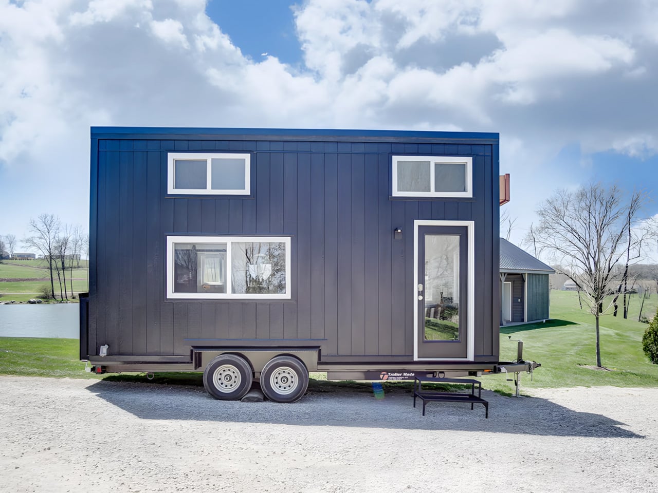
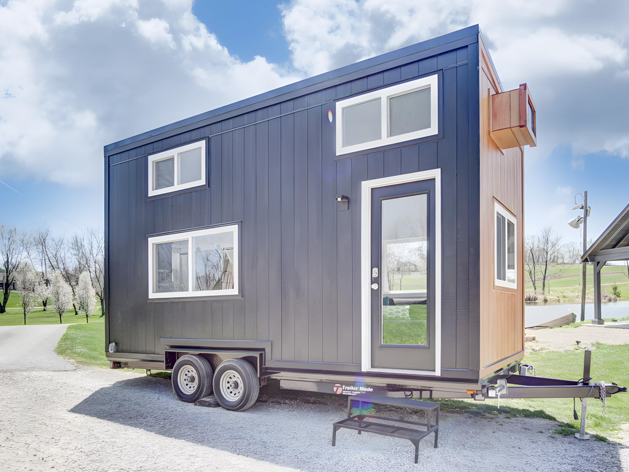
At 20 feet long and 8 feet wide, the Tulsi by Simplify Further Tiny Homes doesn’t try to be anything it isn’t. It has everything you need, and nothing you don’t. That restraint is exactly what makes it work. While the tiny home market is crowded with builds that either sacrifice livability for aesthetics or pile on features that inflate the price tag, the Tulsi threads the needle — landing at a starting price of $35,000 for a fully functional, NOAH-certified home on wheels.
The Florida-based builder behind it, Simplify Further, has built a reputation around the idea that quality and simplicity aren’t mutually exclusive. Their motto — “Simple Living, High Thinking” — runs through every design decision in the Tulsi. The build carries a BBB Accredited A+ rating, and its certification as an RV through NOAH means it meets a recognized standard for workmanship and safety.
At 161 square feet, the Tulsi packs in a kitchenette, a full bathroom with a shower stall, a flush toilet, a mini sink, a built-in seating area, a main-level queen-sized bedroom, and a loft. The loft measures 7 by 4 feet with a 36-inch height at the low side, accessible by ladder with black metal railings — tight, but functional. The height under the loft sits at 6 feet 4 inches, which means the main living area never feels like you’re ducking through a crawl space.
What sets the Tulsi apart from its contemporaries is its genuine flexibility. The main level bedroom isn’t a compromise — it’s a feature. For guests who don’t mind the loft, you could designate the loft as the main sleeping area and convert the downstairs bedroom to a living room. That kind of adaptability is rare at this price point. In the kitchen, buyers can opt for open shelving or swap seating for additional cabinet storage — a small but meaningful decision that shapes how the space actually lives day to day.
Simplify Further positions the Tulsi primarily as a guest house or mother-in-law suite — a secondary structure that gives visitors full independence without removing them from the property entirely. But the build has proven versatile enough to serve as a short-term rental, a starter home, or a full-time residence for someone drawn to the economy of small living. The Tulsi by Simplify Further seamlessly blends convenience and comfort, making it a charming addition to any property.
For a 161 square foot box on wheels, the Tulsi has quietly earned its place as one of the more thoughtfully designed entry points into tiny living — and the numbers back it up.
May 2026 is a good time to be paying attention. Gadgets aren’t just getting faster or thinner; the best ones this month are getting more intentional. There’s a shared thread running through every standout: each was built around a real constraint, a real behavior, or a real cultural moment, rather than a spec sheet searching for an audience. Five products rose above the rest, and each earns its spot for a distinctly different reason.
From a foldable phone that demolishes the category’s $800 price floor to a Nintendo Switch add-on that turns a gaming console into a live production rig, the range here is unusually wide. What connects them is the quality of thinking underneath. These aren’t renders looking for investment. They’re real objects designed to change how you work, listen, create, and move through a day. That’s the only brief that actually matters.
1. NASA Artemis Watch 2.0
NASA’s Artemis II lifted off from Kennedy Space Center on April 1, 2026, carrying four astronauts on humanity’s first crewed lunar journey in over 50 years. CircuitMess timed the NASA Artemis Watch 2.0 directly into that cultural gravity. At $129, it’s a fully assembled, ready-to-use programmable smartwatch built around a dual-core ESP32 microcontroller, with a full-color LCD screen, accelerometer, gyroscope, compass, and temperature sensor packed into a wristband designed for anyone aged nine and up who wants more than a fitness tracker strapped to their wrist.
What makes it worth your attention is the depth it offers without demanding anything upfront. Out of the box, it pairs with iOS and Android over Bluetooth for activity tracking and notifications. When curiosity takes over, the firmware is fully open-source and reprogrammable in Python, CircuitBlocks, or the Arduino IDE. Build custom watch faces, write your own apps, and modify sensor behavior as far down as you want to go. The Artemis Watch 2.0 is one of the rarer gadgets at this price: it genuinely grows with the person wearing it.
What we like
Fully open-source firmware supports Python, CircuitBlocks, and Arduino, giving both beginners and experienced coders meaningful room to explore and build
Ships fully assembled and ready to use straight out of the box, lowering the barrier to entry without removing any of the technical depth underneath
What we dislike
At $129, it asks for more commitment than most impulse purchases in the kids’ tech category allow for
Screen performance in direct sunlight hasn’t been addressed in any available documentation
2. OrigamiSwift Mouse
Every frequent traveler has made the same quiet compromise: leave the proper mouse at home or carry something too small to work with comfortably for more than an hour. OrigamiSwift was built precisely around that problem. It’s a Bluetooth mouse that folds flat when not in use, weighs just 40 grams, and opens into full working position in under half a second. The origami-inspired form isn’t a styling exercise. It’s a structural answer to the oldest tension in portable peripherals: comfort has always cost you size.
The ergonomic shaping holds up across extended work sessions, which matters more than most product pages acknowledge. Whether you’re finalizing a presentation at an airport gate or editing documents in a co-working space, OrigamiSwift stays comfortable in your hand and disappears into a bag when you’re done. The ultra-thin profile and minimal build weight mean it never adds anything meaningful to your load. For anyone who genuinely works from wherever they happen to be, this is the mouse that finally makes sense to own.
40-gram weight and flat-fold profile make it practically invisible in any bag, disappearing entirely until you actually need it
Sub-0.5-second activation means there’s no friction at all between being packed and being productive
What we dislike
Available listings don’t confirm DPI range or scroll wheel responsiveness for anyone doing precision work
Bluetooth-only connectivity may create compatibility friction with older desktop setups that lack wireless support
3. Ai+ Nova Flip
The foldable phone category has spent five years convincing itself that the flip experience carries a natural premium of $800 or more. Ai+ is testing that assumption head-on with the Nova Flip, launched in India at Rs 29,999, roughly $320, making it the most accessible foldable phone on the market. The inner display is a 6.9-inch AMOLED panel resolving at 2790 x 1188 pixels, complemented by a 3.1-inch AMOLED cover screen. MediaTek’s Dimensity 7300 handles processing, paired with 8GB of LPDDR4X RAM and 256GB of internal storage.
The spec list doesn’t read like a budget compromise. A 50-megapixel primary camera, a 32-megapixel front shooter, and a 4325mAh battery with 33W wired charging all hold credibly against devices at double the price. 5G, NFC, and an IP64 dust and splash rating close out a package that would feel serious in any category. The Nova Flip doesn’t just undercut the competition on price. It quietly forces a harder conversation about what the flip form factor has genuinely been worth at $1,000 all along.
What we like
$320 pricing opens the foldable phone experience to an entirely new audience that the category has ignored since its beginning
The 4325mAh battery is a genuinely surprising capacity for the flip form factor at any price point, let alone this one
What we dislike
The 2-megapixel depth lens reads as the weakest component in an otherwise strong and well-considered camera array
Long-term hinge durability at this price tier is unproven and worth tracking carefully over time
4. Akai MPC Switch
Alquemy’s Akai MPC Switch concept asks a question that feels obvious the moment someone finally puts it to you: if laptop-grade software can run on portable hardware, why can’t a capable gaming console handle serious music production? The MPC Switch is a pair of controller units designed to snap directly onto the sides of a Nintendo Switch, replacing the Joy-Cons with MIDI inputs, outputs, and a full DAW running on the console’s own screen. The control layout reflects real production workflows rather than a stylized render built for social media.
The appeal runs deeper than the novelty of the form. The concept treats the Switch as a legitimate interface surface: something you game on when you need to and produce or perform on when the moment calls for it. Swap the Joy-Cons for the MIDI setup, and you’re there. Whether Nintendo or Akai ever moves this into production is a separate question entirely, but Alquemy has made a persuasive case that the idea deserves a real answer. The best concepts don’t just look good. They make you wonder why nobody shipped it first.
What we like
MIDI integration and a credible DAW interface position the Switch as a serious production platform rather than a novelty peripheral
The Joy-Con snap mechanism makes the transition between gaming and music production genuinely seamless in concept
What we dislike
No confirmed production timeline means this remains aspirational, with no clear path in your hands
The Switch’s processing ceiling may be a real constraint for complex, multi-layer production sessions
5. StillFrame Headphones
Most headphone designs land at one of two poles: the over-ear build that announces itself before you even put it on, and the in-ear solution that disappears but gives nothing back in soundstage. StillFrame lands somewhere more considered than either. At 103 grams, it sits closer to weightless than wearable. The 40mm drivers are tuned for a wide, open soundstage that pulls spatial detail and melodic texture out of tracks that most headphones flatten into undifferentiated background noise.
Active noise cancellation closes you off when focus demands it. Transparency mode reconnects you to the room when the world around you matters more. Battery holds at 24 hours, covering a full workday, an overnight flight, and the morning after with no cable required. Switching between modes takes a single tap. StillFrame was designed around the premise that how you listen should adapt to where you are, not the other way around. That’s a harder brief to execute cleanly than it sounds, and the weight alone suggests it’s been taken seriously.
103 grams is a genuinely rare achievement for an over-ear headphone carrying both ANC and full-size 40mm drivers
24-hour battery life covers the kind of all-day, real-world use that most headphones in this category only claim to handle
What we dislike
No published information on codec support, like LDAC or aptX, for listeners who prioritize wireless audio fidelity
Colorway and finish options appear limited in current listings, which may be a sticking point for buyers who care about visual identity
The Only Standard That Matters Is the One You Can Feel
May 2026’s strongest gadgets share something harder to write into a spec sheet than battery life or pixel count. Each was designed around a specific friction point and resolved it with a precision that feels purposeful rather than accidental. The Artemis Watch converts a cultural moment into a learning platform. The Nova Flip resets the floor of an entire category. The OrigamiSwift solves a portability problem that dozens of mice before it never genuinely addressed.
StillFrame and the Akai MPC Switch represent opposite ends of the development spectrum, one shipping and one conceptual, but both make the same underlying argument: that considered design changes the terms of what a product is allowed to be. Whether you’re optimizing a travel bag or rethinking a music studio from a gaming console, the standard these five set is worth taking seriously. The best gadgets this month aren’t the loudest ones in the room. They’re the most resolved.
Most tiny houses ask you to make a trade-off. You get the romance of compact living, but sacrifice the one thing that makes a home feel like a home — space. Craft House, a modular builder operating across Poland, Austria, and Ireland, decided to flip that script entirely with the Samuel, a non-towable module house that prioritizes spacious full-time living over the freedom to hitch and go.
The Samuel sits at 10 meters (32 ft) long and an unusually generous 3.2 meters (10.6 ft) wide, measurements that push well beyond the European tiny home average. That extra width is deliberate. It’s what allows the interior to breathe in a way that most towable models simply can’t, opening up a layout that reads less like a cleverly compressed box and more like a well-considered apartment. The structure wears a single-pitched roof, topping out at 4.1 meters at the ridge, and is finished in engineered wood and metal, a clean pairing that reads industrial without feeling cold.
Inside, the ground floor spans 26 square meters, with a 13-square-meter mezzanine sitting above and a 4.3-square-meter bathroom rounding out the floor plan. The layout makes room for two distinct sleeping areas, and the volume created by the sloped ceiling gives the mezzanine level a loft-like quality that larger homes often fail to capture. Optional off-grid upgrades are also on the table, making the Samuel a realistic candidate for plots far beyond urban infrastructure.
What Craft House understood when designing the Samuel is that the tiny home market has two very different buyers. There’s the nomad, always ready to hitch the trailer and head somewhere new. Then there’s the person who simply wants a well-designed, right-sized home that doesn’t carry the financial weight of a conventional build. Samuel is clearly built for the latter. By dropping the wheels and leaning into a fixed footprint, Craft House was able to allocate width and volume in ways that towable structures prohibit by law and logistics.
Priced at around US$72,000, the Samuel lands in a range that makes it a genuinely viable alternative to traditional housing in several European markets. It isn’t trying to be everything. You won’t be parking it in a new location every season. What it offers instead is something arguably more valuable: a permanent, considered space that proves small doesn’t have to mean cramped, and that the best tiny homes aren’t always the ones with the biggest adventures, but the ones that make staying put feel worth it.
Certain kinds of architecture don’t announce themselves. La Maraude, the latest project by Nathalie Thibodeau Architecte, is exactly that — a compact residential dwelling tucked into the dense woodlands of Boileau, in Quebec’s Outaouais region, that earns its presence through restraint rather than spectacle. Completed in 2024, it’s one of the more quietly compelling houses to come out of Canada in recent memory.
The name itself carries meaning. ‘Maraude’ — to roam, to forage — hints at the relationship the house cultivates with its surroundings. Rather than claiming a dominant position along the river’s edge, the architects deliberately set the home deeper within the treeline, orienting the house’s interior life entirely toward the forest. It’s a gesture that shapes everything else about the project.
The design draws directly from Quebec’s vernacular architectural tradition — steeply pitched rooflines, grounded proportions, and a material palette that feels native to the region. The exterior is clad in natural cedar shingles and topped with a metal roof, two materials with deep roots in the local building culture. These aren’t nostalgic choices. They’re translated through a contemporary lens, stripped of ornament, reduced to their essential geometry. “Designed with particular attention to simplicity, functionality, and respect for traditional codes, La Maraude embodies a successful dialogue between contemporary architecture and local traditions,” says Nathalie Thibodeau Architecte.
What makes the spatial sequence genuinely interesting is the use of two courtyards as organizing devices. The plan doesn’t simply open to the outdoors — it pulls the forest in, fragmenting the landscape into a series of framed views that shift with the seasons. One courtyard faces north, more sheltered and partly enclosed by the building itself, oriented toward higher ground. The other faces south, brighter and more expansive, drawing the eye down toward the lower terrain. The result is a house that reads differently in every light condition, every month of the year.
The second volume, arranged over two levels in response to the site’s slope, plays a more introverted role. Openings here are smaller and precisely placed to frame specific moments within the tree canopy — quiet apertures rather than panoramic statements.
Photographed by Maxime Brouillet, La Maraude has the look of a project that will age well, both materially and culturally. It’s already being discussed as a potential anchor for a broader ensemble of small retreats on the site — a first building in what could become a considered, evolving conversation between architecture and landscape.
Salt Spring Island doesn’t need much convincing — it already has the cliffs, the meadows, and the trees. The name sounds more like a childhood storybook setting than an architectural statement — and that tension is exactly the point. Nestled amidst the trees and rugged cliffs of Salt Spring Island, BC, the Daisy Ranch is Olson Kundig’s most recent residential project, led by design principal Tom Kundig. It’s casual. It’s rugged. And it’s entirely, unapologetically itself.
The house sits at the edge of a sweeping meadow, anchored by a log structure that feels like it could have always been there. The primary move is a rugged glass box paired with a long, cantilevered roof that stretches over a generous deck — a roof that earns its keep through BC’s shifting seasons, offering shelter without closing anything off. What makes it work visually is the layering: large square-cut logs and glass soften the rust-colored patina of weathered steel cladding, giving the exterior a palette that feels earned rather than designed.
The plan is organized along a clean linear axis, with two distinct volumes bisected by an eastern entry stairway. The front door is tucked under a generous overhang — a small but considered gesture that grounds the arrival sequence without dramatizing it. The northern volume, clad in wood and steel, handles the private program: a primary suite and additional bedrooms, with framed view corridors that offer deliberate glimpses of the landscape rather than full exposure. Privacy and connection, calibrated carefully.
Inside, the bathroom is where the project gets most personal. Widespread use of wood infuses the space with warmth, while a clawfoot tub set before corner windows underscores the home’s persistent connection to the landscape outside. It’s the kind of detail that feels borrowed from an older, more tactile way of building — which is precisely the intention.
The project was designed in close collaboration with the client, Patrick Powers, a builder and fabricator who also served as general contractor. That relationship left its mark. The house doesn’t feel like it was delivered to a site; it feels like it was made with the site, material decision by material decision.
As Kundig put it: “There’s a lineage at play in this project, a quiet innovation that comes from the shared DNA of materials and relationships.” The Daisy Ranch is the kind of project that doesn’t need to announce itself. It sits lightly on its land, opens wide to its meadow, and gets on with the business of being lived in.
The tiny home movement has never quite figured out what to do with families. Removed Tiny Homes, a Brisbane-based builder specializing in off-grid, sustainable builds, has decided to challenge that assumption head-on. Their latest model, the SOMA, is a towable tiny house designed with families firmly in mind — three bedrooms, a generous open-plan layout, and a level of finish that earns the word “mansion” without irony.
The numbers tell a compelling story. The SOMA measures 10m x 3.4m x 4.5m, with an interior footprint of 52 square meters (560 sq ft). That 3.4-meter width is notably wider than the standard tiny house, and it shows — the interior breathes more like an apartment than a caravan. The bulk of that space is given to a large open-plan kitchen and living area, which anchors the home and keeps the social energy flowing between the kitchen island and the lounge, rather than forcing it through a narrow corridor.
Three bedrooms is the headline, and it’s a legitimate one. One sits on the ground floor, while two loft bedrooms occupy the upper level — a layout that gives adults and children a sense of separated territory without requiring a second building. The bathroom is fully tiled, and early buyers receive a Luxury Living Upgrade Pack that layers in skylights and stone kitchen benchtops, elevating the interiors well beyond what you’d expect at this price point.
Outside, the SOMA arrives with a dual-siding facade — Colorbond metal panels paired with warm-toned composite or wood cladding — alongside a split roof profile and large sliding glass doors that open the interior to the outdoors. The display unit shown on the builder’s website sits on a large wooden deck, which extends the liveable footprint considerably and makes the home feel rooted, even when it isn’t.
Pricing starts at roughly USD $145,200, with further customization available at additional cost. For a three-bedroom, road-legal home of this caliber, that figure sits in a competitive space — especially when the alternative is a conventional build on land you may not be able to afford. The SOMA isn’t trying to squeeze a family into a clever floor plan. It’s making the case that tiny living, done right, doesn’t require compromise — just a smarter conversation about what space actually means.
The headphone has become something it was never originally designed to be: a silhouette. Worn around the neck on a subway platform or draped over a chair at a coffee shop, a great pair of over-ears communicates taste in much the same way a watch or a well-chosen bag does. The best ones are now designed with that resting moment in mind, not as an afterthought, but as a deliberate part of the brief.
What separates a good headphone from a great one is increasingly less about frequency response and more about how the object behaves when it’s not in use. The five pairs on this list earn their place on both counts. Worn on the head, they deliver. Worn around the neck, they still look like they were built by people who thought carefully about that exact resting moment, collarbone and all.
1. StillFrame Headphones
Most headphones achieve lightness by sacrificing material quality somewhere along the way. StillFrame achieves it by rethinking the entire structure from scratch. At 103 grams, it sits on your head with the kind of effortless presence most pairs spend an entire product page trying to claim. The ultra-minimal design, clean lines, no exposed hardware, and no decorative flourish anywhere on the frame is the kind of restraint that reads as confidence rather than budget constraint.
Around the neck, StillFrame does what minimal design always promises and rarely delivers: it disappears into your outfit rather than competing with it. The 24-hour battery means you’ll reach for these in the early morning and still have charge well into the evening without thinking about a cable. For anyone who wants headphones that age well, that look as right in three years as they do today, this is where the search ends.
At 103 grams, this is one of the lightest over-ear headphones available without any sacrifice in build integrity, and the weightlessness is felt the moment you put them on
A 24-hour battery life means this pair genuinely runs from morning to night on a single charge, removing the low-battery anxiety that comes with most wireless headphones on the market
What We Dislike
Minimal colorway options are a direct consequence of the same design restraint that makes the StillFrame look this considered, and that trade-off is real and visible
With so little on the frame to grab visual attention, this pair asks you to commit fully to its design language, which rewards patience but does not suit every aesthetic
2. Meze Audio Strada
Romanian audio atelier Meze has spent two decades treating headphones as craft objects, and the Strada makes that philosophy fully explicit. Hand-carved walnut and ebony ear cups, each unique in grain and tone, sit alongside a magnetic ear pad system that snaps on and off cleanly, making them the first pair that genuinely anticipates its own aging. The leather headband drapes naturally against the collarbone. At $799, you’re investing in the idea that daily objects deserve this level of material care.
Worn around the neck, the Strada does something genuinely rare: it makes you look considered rather than plugged in. Those hand-carved wood cups catch light in a way that aluminum never quite manages, and the closed-back design delivers warmth and isolation without the clinical precision of most audiophile gear.
What We Like
The hand-carved wood ear cups make every unit genuinely one-of-a-kind, an unusual distinction in a product category that typically prizes consistency and uniformity above everything else
The magnetic ear pad system solves a real longevity problem that most headphone manufacturers still choose to ignore, making the Strada feel genuinely built for the long term from the start
What We Dislike
The warm, closed-back tuning leans toward intimacy over accuracy, which won’t satisfy listeners who prefer a flat, analytical sound profile for critical or reference listening sessions
No active noise cancellation at $799 is a deliberate aesthetic choice, but it will not suit everyone who regularly listens in open, noisy, or busy urban environments
3. Bang & Olufsen Beoplay H95
Bang & Olufsen has been designing objects that make a room better simply by existing in it since 1925. The Beoplay H95 carries that logic to your ears. Brushed aluminum arcs support lambskin ear cushions with the quiet authority of something that was never trying to impress anyone. Custom 40mm titanium drivers deliver an expansive, unhurried soundstage, and 38 hours of battery life with ANC active means you rarely need to think about charging. At $1,250, it reads as inevitable rather than expensive.
Around the neck, the H95 makes its strongest case. The slim profile rests cleanly against the collarbone, the aluminum catches light without glare, and the lambskin ages into something better than what you started with. Vogue Scandinavia named it the headphone that pairs best with the softest cashmere roll-neck and a cocooning wool coat, which is not exactly a mid-range endorsement. The tactile control dial and hard carrying case complete the picture of a brand that hasn’t needed to shout for a century.
What We Like
Lambskin ear cushions and brushed aluminum give the H95 a material quality that makes every other pair on this list look like it is working a little harder to impress you
38-hour ANC battery life is class-leading and genuinely difficult to match at any price point, making this the pair most likely to outlast a long-haul journey without any hesitation
What We Dislike
At $1,250, this is a significant investment for a product category where $400 already delivers very strong audio performance from multiple well-regarded and respected manufacturers
The control dial is elegant but carries a subtle learning curve that takes several days of regular use to feel completely intuitive and second-nature in the hand
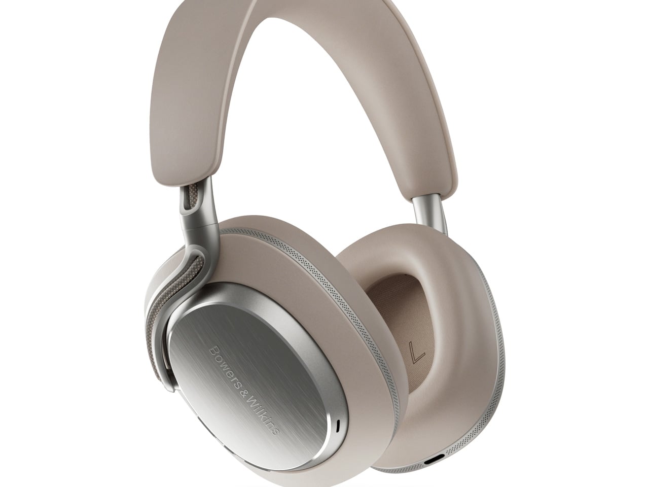
4. Bowers & Wilkins Px8 S2
The Px8 S2 looks like it was designed by someone who spent too much time around luxury automobiles and not enough time worrying about what people thought. Diamond-quilted Nappa leather ear cups sit inside angular aluminum driver housings that don’t apologize for taking up space. Bowers & Wilkins built their reputation on speaker cabinets in British living rooms, and that obsession with material quality is fully present in the Px8 S2. At $799, it’s the most visually assertive pair on this entire list.
Worn on the head, the 40mm Carbon Cone drivers deliver a focused sound that rewards careful listening. Worn around the neck, the quilted leather and aluminum geometry create a silhouette that reads closer to jewelry than consumer electronics.
What We Like
The diamond-quilted Nappa leather ear cups are a genuinely distinctive design move that no other headphone brand at this price point is executing with this level of craft and conviction
40mm Carbon Cone drivers bring the kind of focused sound detail that makes streaming audio feel like it might be holding something back, consistently rewarding attentive listeners on every session
What We Dislike
The angular form does not fold into a compact carry position, making the included case noticeably bulkier than most direct competitors when packed into a bag for daily commuting use
The firm clamping force is necessary for the acoustic seal, but it makes itself felt during extended listening sessions, which matters for anyone who wears headphones for several consecutive hours at a time
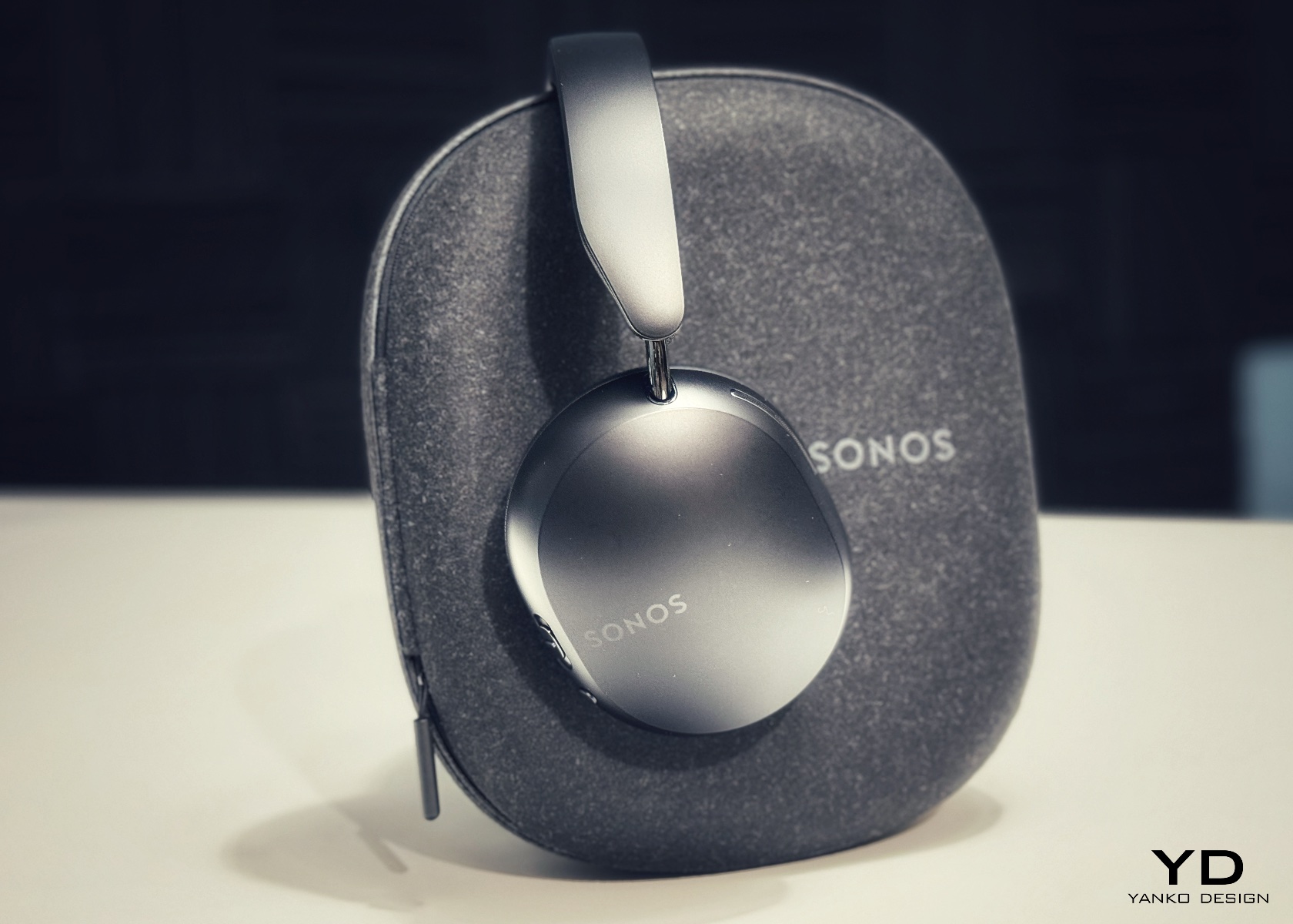
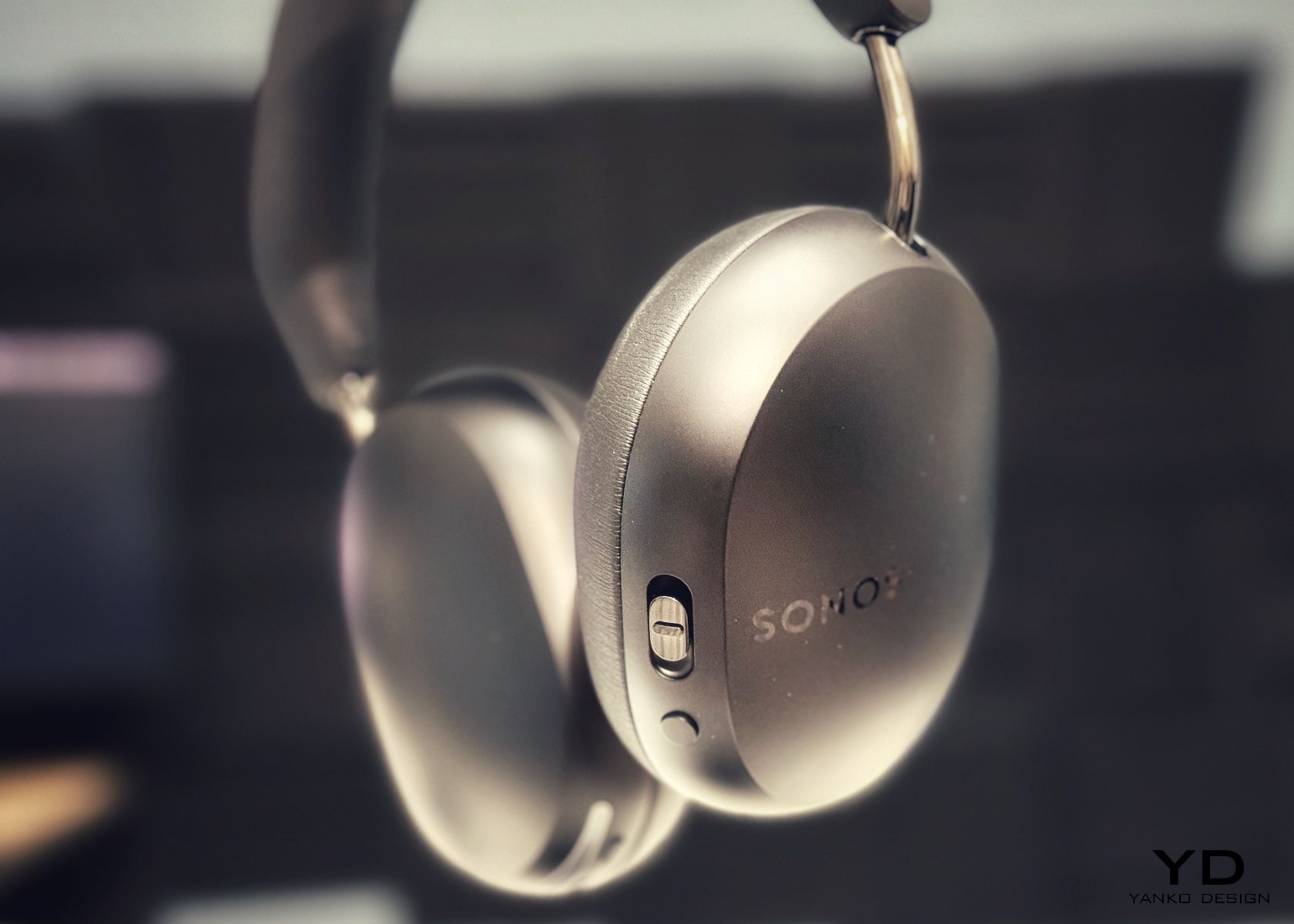
5. Sonos Ace
Sonos spent two decades being the most thoughtfully designed speaker company in the world before ever touching headphones. The Ace is what happens when a brand famous for restraint and material quality finally commits to an entirely new product category. Stainless steel arms, memory foam ear cushions, and a clean form in Midnight or White carry the same quiet authority as Sonos’s best home equipment. At $449, it sits below the B&O and B&W while fully matching them on design character and material coherence.
What makes the Ace genuinely stand out is what you don’t notice: no visible seams on the headband, no mismatched materials, no hardware that apologizes for itself. Active noise cancellation and a 30-hour battery complete a pair that wears as well around a neck as it sounds through the drivers, making it the most versatile pick on this list.
What We Like
The material cohesion across every surface, every finish, and every seam speaks one consistent and considered design language, which is an unusually disciplined achievement at the $449 price point
Active noise cancellation combined with a 30-hour battery puts the Ace ahead of most competitors on the two specifications that matter most for daily and travel listening
What We Dislike
The body is predominantly high-quality plastic rather than metal, which is a material trade-off that some buyers will feel at this price point relative to the B&O and B&W alternatives
Head-tracking spatial audio is most effective when paired with a Sonos home speaker system, limiting the feature’s full appeal for listeners who don’t already own Sonos hardware at home
The Best Headphones Are the Ones You Never Want to Take Off
What all five of these pairs share is a seriousness of intent that goes well beyond frequency response. They were built by companies that think about how objects live in the world, not just during a listening session, but on a train platform, at a desk, hanging around a neck. That’s a harder problem to solve than noise cancellation, and the brands that crack it tend to stay relevant far longer than those that don’t.
The range here runs from $449 to $1,250, but the price gaps matter less than they appear at first. What you’re really choosing between is design language: Romanian craft warmth, Scandinavian restraint, British precision, speaker-first material thinking, or clean minimalism that genuinely disappears. Any of these pairs earns the right to hang around your neck. The question is which one earns it in a way that feels made for how you actually move through the world/
Black has always carried weight in design. Authority, restraint, a quiet elegance that needs no announcement. In 2026, the all-black kitchen has shifted from a bold statement to a genuine design movement. What once felt too dramatic for the most-used room in the home now feels precisely considered. Designers and homeowners alike are gravitating toward the palette for its ability to make a space feel curated, intentional, and deeply sophisticated when executed well.
The shift runs deeper than cabinetry and countertops. It lives in the tools, the cookware, the lighting, every touchpoint that shapes how a kitchen performs and how it looks doing it. Finding pieces that commit to the aesthetic without sacrificing function is the real challenge. These eight products do exactly that, from carbon graphite cookware rooted in Japanese craft to a precision pour-over kettle engineered for serious brewing.
1. ANAORI Kakugama
Carbon graphite isn’t a material you encounter in the kitchen, which is precisely what makes the ANAORI Kakugama so compelling. Crafted from solid carbon graphite, this Japanese cooking vessel carries a physical and conceptual weight that coated pans simply can’t match. Its matte black surface distributes heat with uncommon efficiency, significantly reducing the risk of scorching while preserving the natural flavors and nutrients of whatever is being prepared. This is cookware that approaches food with genuine respect.
The kakugama’s range is quietly impressive. Designed to steam, poach, simmer, grill, and fry, it handles each technique without compromise, making it the kind of piece that earns a permanent position in the kitchen. The fragrant Japanese cypress lid adds something unexpected: as it heats, it releases a subtle, earthy aroma that transforms an ordinary cooking session into something closer to ritual. For the design-conscious cook who values craft as much as performance, this vessel is essentially irreplaceable.
What We Like
Carbon graphite construction delivers exceptional, even heat retention across every cooking method
The Japanese cypress lid adds a rare aromatic quality to cooking that no synthetic material can replicate
What We Dislike
The premium material and craftsmanship place this vessel at a significant price point above conventional cookware
Carbon graphite requires more attentive handling and care than standard kitchen materials
2. Obsidian Black Precision Chopstick Tongs
There’s a particular satisfaction in a kitchen tool that commits fully to its concept. Part of the Obsidian Black Kitchen Collection, the Precision Chopstick Tongs take their form directly from traditional Japanese chopsticks and engineer it for the demands of a modern kitchen. Made from SUS821L1 stainless steel, they’re light enough to handle delicate pieces of sushi yet durable enough for daily stovetop use. The result is a utensil that genuinely bridges the line between cooking instrument and tableware.
What sets these tongs apart from anything else in the drawer is the finish. A special metal processing technique ensures the obsidian’s black color resists scratching and peeling, maintaining its appearance through repeated use and washing. They work just as confidently plating sashimi at the table as they do flipping proteins in a pan. That dual-purpose quality is rare, and it’s exactly what earns a piece a permanent place in a kitchen where aesthetics and performance are equally weighted.
The obsidian black finish is scratch and peel-resistant, holding its appearance through sustained daily use
Designed to function as both a cooking utensil and tableware, bridging the kitchen and dining with a single tool
What We Dislike
The chopstick form may require a brief adjustment period for those accustomed to conventional tong grips
The precision-focused design is less suited to tasks requiring wide or bulky gripping
3. Samsung Bake Ultra Concept
Concept appliances rarely look this resolved. Designed by Octavio Leon Villareal, the Samsung Bake Ultra approaches the compact electric oven with a formal discipline that separates considered design from merely clever design. Its two-tone composition, a soft gray body anchored by a black glass front, achieves a visual balance that reads as both contemporary and enduring. This isn’t minimalism for its own sake. It’s a deliberate formal decision that allows the Bake Ultra to feel entirely at home in kitchens ranging from industrial-chic to warm and considered.
The rounded edges are doing significant work. By softening what could easily have read as an overly boxy silhouette, Villareal gives the Bake Ultra an approachability that most compact ovens lack entirely. It doesn’t demand attention, but it consistently earns it. In an all-black kitchen where every object contributes to the room’s visual tone, an appliance this compositionally assured is genuinely valuable. The Bake Ultra wasn’t designed just to function. It was designed to belong.
What We Like
The two-tone design with black glass front integrates cleanly into an all-black kitchen without disrupting the visual flow
Rounded edges give the compact form an approachability that’s rarely achieved in kitchen appliance design
What We Dislike
As a concept design, the Bake Ultra is not yet available for consumer purchase
The soft gray body, while elegant, slightly departs from a fully committed all-black aesthetic
4. Iron Frying Plate
The Iron Frying Plate operates on a beautifully simple premise: eliminate the plate. Made from 1.6mm-thick mill scale steel, this uncoated, rust-resistant piece of cookware is designed to go from stove to table without interruption. There’s no ceramic coating to chip, no synthetic surface to question, just raw, well-engineered steel that builds character and natural seasoning with every use. The matte black mill scale finish slots into an all-black kitchen without any deliberate effort at all.
Its detachable wooden handle is one of those small design decisions that reveal serious thought about every moment of use. Attach it for cooking, remove it for serving, one-handed, no tools required. That seamless transition from cooking vessel to serving piece is exactly the kind of dual-function thinking that earns a product permanent space in a curated kitchen. JIU doesn’t try to be more than it is. It’s a frying plate, and it’s an excellent one.
The uncoated mill scale steel surface develops natural seasoning over time, building flavor with every use
The one-handed detachable wooden handle enables a smooth transition from stovetop cooking directly to table service
What We Dislike
An uncoated steel surface requires regular seasoning and more attentive care than nonstick alternatives
The minimal form is best suited to simple preparations rather than sauce-heavy or complex dishes
5. HA1 Expert Hard Anodized Nonstick 10-Piece Set
If the all-black kitchen needs a workhorse, the All-Clad HA1 Expert set fills that role without compromise. Ten pieces of hard anodized, scratch-resistant nonstick cookware finished in a deep, uniform black that holds up to both heavy daily use and visual scrutiny. The anodized aluminum construction is reinforced with a stainless-steel base, delivering warp resistance and the kind of even, consistent heat distribution that makes routine cooking genuinely more reliable. This is a set built for people who cook seriously and care deeply about how their kitchen looks.
The range covers everything a fully functioning kitchen demands: two fry pans, two saucepans, a sauté pan, and a stockpot, each paired with a matching lid. Oven-safe to 500°F and induction-compatible, very little is left unaddressed. Double-riveted stainless steel handles hold securely through extended use, while tempered glass lids allow for monitoring without lifting. As a complete, coherent system in black, this set reads less like a collection of pots and more like an intentional design decision.
What We Like
Hard-anodized, scratch-resistant construction paired with long-lasting PTFE nonstick delivers durable, professional-grade performance
Fully induction compatible and oven safe to 500°F, covering virtually every cooking scenario without exception
What We Dislike
Glass lids are only oven safe to 350°F, considerably lower than the pans themselves
PTFE nonstick requires careful utensil choice and hand washing to preserve its surface longevity
6. Precision Chef Kitchen Scissors
Kitchen scissors rarely receive the design attention they deserve. The Precision Chef Kitchen Scissors are a deliberate exception. The oxidation-colored black finish isn’t cosmetic; it’s a durable surface treatment that resists deterioration, holding its appearance through years of regular use. The curved serrated blade is engineered specifically for cutting meat, reducing effort while improving both control and safety. In a kitchen where every object is chosen with intention, a pair of scissors is considered a meaningful detail that most kitchens quietly overlook.
The ergonomic structure goes beyond grip comfort. When laid flat, the blade is designed to avoid contact with the counter surface, a small but precise detail that speaks to the level of thought invested in this tool. Cutting through steaks, portioning pizza, or trimming vegetables, these scissors approach each task with the same quiet authority that an all-black kitchen demands. They are scissors genuinely designed to be seen as well as used, and they meet that standard on both counts.
Oxidation coloring creates a durable black finish that resists fading and surface deterioration through sustained use
The curved serrated blade is purpose-engineered for meat cutting, improving control and reducing the effort required
What We Dislike
The specialized curved blade may feel less versatile for tasks that go beyond protein and general food prep
Ergonomic scissors with complex geometry can be more difficult to sharpen at home than straight-bladed alternatives
7. Melrose Pendant Light
Lighting in an all-black kitchen isn’t merely functional; it’s structural. The Steel Lighting Co. Melrose pendant operates as both. The 18-inch industrial dome in matte black is proportioned specifically for kitchen island use, casting a wide, even wash of light across the work surface below. American-made and UL-approved for both indoor and outdoor installation, this is a pendant built to perform as well as it looks. At 300 watts, it carries the capacity to anchor a kitchen island with genuine visual authority.
What makes the Melrose particularly thoughtful is its configurable interior. Available in white, matte black, or brass, the interior color shapes both the quality of reflected light and the overall tone of the fixture without altering its profile. In a black kitchen, a brass interior introduces a warm, considered counterpoint that prevents the space from reading as flat or one-dimensional. The matte black exterior remains constant throughout: commanding, clean, and entirely at home in a kitchen built around the same commitment to the color.
What We Like
Configurable interior color options in white, matte black, or brass allow for subtle tonal customization within a consistent exterior
American-made with indoor and outdoor UL approval, signaling a meaningful commitment to build quality and longevity
What We Dislike
At 12 pounds, installation may require additional structural consideration, depending on the ceiling construction
The industrial farmhouse silhouette may not suit kitchens with a strictly contemporary or ultra-minimal design direction
8. Fellow Stagg EKG Pro Electric Pour-Over Kettle
The Fellow Stagg EKG Pro is the kind of object that reframes where coffee fits in the morning. Its signature gooseneck spout delivers precise control over flow rate and stream consistency, the kind of control that produces a measurable difference in pour-over extraction. To the degree, temperature control heats and holds water exactly as programmed, while a high-resolution color display allows complete customization of brewing schedules, altitude adjustments, and temperature units. This is a kettle engineered with the seriousness typically reserved for professional brewing equipment.
The EKG Pro’s WiFi connectivity and scheduling capabilities are where it shifts from impressive to genuinely integrated into daily life. Program brewing schedules that adapt to your routine so the kettle is ready precisely when you are, no preheating, no guesswork. The sleek industrial design holds its own on a countertop alongside thoughtfully chosen cookware and tools. The hold function maintains brewing temperature for extended periods without wasting energy. In an all-black kitchen, this kettle earns its visible place every single morning.
What We Like
To-the-degree temperature control, combined with a gooseneck spout, delivers precision that measurably improves pour-over coffee quality
WiFi connectivity and programmable scheduling mean the kettle is ready exactly when needed, without any manual preheating
What We Dislike
Advanced features like WiFi and the color display come at a price point that significantly exceeds basic kettle alternatives
The gooseneck form is optimized for pour-over brewing and is less suited to general-purpose boiling tasks
The Kitchen Finally Got the Design Treatment It Deserved
The all-black kitchen doesn’t ask for compromise. Every product here demonstrates that designing in black means choosing objects with a strong point of view, ones crafted carefully, finished deliberately, and considered at every stage. The color is what makes the curation visible. It’s a shared language between objects that have little else in common except that they were each made to last, made to perform, and made to matter in the space they occupy.
What’s striking about 2026’s black kitchen movement is how completely it spans every category. Cookware, utensils, lighting, kettles: the commitment runs through the entire room. When each element carries the same visual weight, a kitchen stops being a collection of appliances and tools and becomes a genuinely designed space. That’s the standard these eight products are held to, and without exception, it’s the standard each one meets.
There’s a version of small living that doesn’t ask you to compromise. The Espresso, built by Ohio-based Modern Tiny Living on their popular Mohican platform, makes that case in just 20 feet. Bold and daring, the Espresso is a tiny house on wheels defined by deep blacks, warm wood accents, and a design sensibility that punches well above its square footage.
At its core, the Espresso is a study in restraint done right. The main floor clocks in at 160 square feet, with a 70-square-foot queen bedroom loft above, complete with custom built-ins and shelving. It’s a tight footprint by any measure, but the way the space is organized keeps it from ever feeling like it. The living room anchors one end of the home with a pull-out bench, built-in shelving, and a drop-down dining table that doubles as a desk, making it equally suited to a quiet morning or a dinner for two.
The kitchen is where the Espresso’s aesthetic really comes into focus. An undermount black granite sink pairs with a pull-down matte black faucet, solid wood countertops, a 9.9 cubic foot refrigerator, a two-burner propane cooktop, and a microwave, all working within a palette that feels deliberate rather than default. The matte black hardware package runs throughout the home, tying each room back to the same considered thread. Across from the kitchen, an open closet leads into the bathroom, which keeps things equally functional with a fiberglass insert shower, a flush toilet, and open shelving.
On the outside, the Espresso sits on a double-axle trailer and is finished in engineered wood with a steel roof, keeping maintenance low and durability high. A small exterior storage box handles propane bottles and similar items, quietly solving the off-grid practicalities without interrupting the clean lines of the exterior. The home weighs approximately 9,000 pounds, and its closed-cell spray foam insulation — three inches in the walls and ceilings, four in the floors — means it’s built to handle varied climates without compromise.
What makes the Espresso work isn’t any single feature. It’s the way everything adds up: the convertible furniture, the considered storage, the finish quality that makes the space feel lived-in rather than merely occupied. Modern Tiny Living designed it to deliver all the comforts of modern living in a compact, move-in-ready package, and the result is a tiny home that earns its name in more ways than one. Rich, concentrated, and hard to forget.
What does a home look like when you throw out the floor plan entirely? For Amsterdam-based firm Studioninedots, the answer is a tower of playfully stacked boxes, each one dedicated to a single moment in life, that rises above one of the Dutch capital’s newest neighborhoods. Completed in 2025, Light House sits on Centrumeiland, a newly developed artificial island district defined by its self-build culture and strong sustainability ambitions.
The project began with a simple brief from a couple with two children who wanted a home that would genuinely bring them together. Rather than anchoring daily life to the ground floor the way most houses do, Studioninedots dedicated each of the family’s key activities — eating, gathering, cooking, relaxing — to its own distinct volume, then arranged those volumes vertically into a single, tightly considered composition. The result is a 257-square-meter residence that feels less like a stacked building and more like a small vertical neighborhood.
Movement through the home unfolds through a sequence of open passages and compressed zones, where shifts in scale produce entirely different spatial moods. Smaller, enclosed areas carve out space for focused, quieter activities, while larger voids open up visual connections across levels, dissolving any conventional sense of what is above and what is below. Hovering above the kitchen is a sheltered, secluded volume ideal for yoga or film watching, while the journey through the house culminates at the top in what the architects describe as a “holiday home” within the city. Flanked by arched ceiling-height glass openings, this 14-metre-high gathering room commands panoramic views across the IJmeer lake.
The facade does a lot of the design’s heavy lifting. A wall of square glass blocks wraps the front of the building, filtering natural light into the interior while abstracting the life inside, offering privacy without sacrificing the warmth of daylight. At night, the facade glows from within, giving the house an almost lantern-like presence on the street.
Sustainability is baked into the structure itself. Light House is built as a lightweight system using prefabricated timber components inside a steel frame, a circular and modular method that allows for flexibility, long-term adaptability, and ease of disassembly. The layout is not fixed either, as children grow and priorities shift, the home can be reconfigured to meet whatever the family needs next. Light House is a rare thing: a home that feels entirely personal yet completely considered, one where architecture quietly gets out of the way and lets life fill the space.
Most desk setups are inherited. The nomad’s is earned. Everything that makes it into the bag has already passed a strict and largely unconscious test — weight, versatility, the ability to make a stranger’s table feel like a place worth working from. Over months and years of moving between cities, time zones, and co-working spaces, the digital nomad ends up with a carefully curated set of tools that are small by necessity but thoughtful by design.
The interesting thing about these objects is what happens when the travel slows down. When a lease gets signed, a proper desk arrives, and the bag starts being unpacked with more intention. The tools that survived the road do not lose their relevance on a permanent surface. Many of them were built with the kind of considered design that rewards exactly this kind of scrutiny. They look better than most things bought specifically for a home office, hold up longer, and carry the kind of personal history that makes a workspace feel genuinely inhabited. This is for that moment. Eight objects that lived in the bag for a reason, and deserve a permanent home for the same one.
1. OrigamiSwift Folding Mouse
The OrigamiSwift is what happens when industrial design takes portability seriously. Weighing just 40 grams and folding flat to a profile thin enough to slip between notebook pages, it removes the usual tension between compact and comfortable. On a desk, it unfolds in under half a second, snapping into a full-sized ergonomic shape that sits naturally in the hand. For anyone who has suffered through the cramped mechanics of a standard travel mouse, this feels like a genuine upgrade.
The Bluetooth connectivity is quick, and the origami-inspired fold keeps the mechanism tactile enough that using it becomes a small ritual rather than a chore. At the desk, it earns a permanent spot not because it compensates for a lack of options, but because the transformation itself is satisfying. It is the kind of tool that makes you reconsider how you work, and then makes the work feel slightly more considered. Portable by design, permanent by choice.
Folds to near-invisible thinness at just 4.5mm, making it one of the most carry-friendly mice ever built without compromising on ergonomic full-size comfort
Activates in under half a second with a single flip, making the transition from travel bag to working mouse feel immediate and effortless
What we dislike
At 40 grams, the lightweight build may feel insubstantial for users accustomed to the heft and resistance of a traditional full-sized mouse
Bluetooth-only connectivity means no wired fallback for tasks where even minor wireless latency becomes a frustration
2. Fidget Cube
The Fidget Cube arrived at a time when open-plan offices made visible restlessness a liability and invisible anxiety a norm. Antsy Labs built something straightforward in response: a small cube with six distinct tactile surfaces, each mapped to a different kind of fidget. Click. Glide. Flip. Breathe. Roll. Spin. The vocabulary is simple, the execution is precise, and the result is a desk object that earns its keep without demanding attention from anyone but you.
For digital nomads who have spent years suppressing the impulse to tap or spin something through a long layover or tense client call, the Fidget Cube offers quiet permission. On a permanent desk, it sits within reach without asking for attention. The black and graphite colorways blend cleanly into most setups, looking less like a toy and more like a considered detail. It is not a gimmick. It is self-awareness shaped into an object.
What we like
Six distinct tactile surfaces cover a wide range of fidgeting behaviors in a single pocket-sized cube, making it genuinely versatile across different stress responses and focus modes
Discreet colorways like Midnight Black and Graphite blend seamlessly into professional setups without drawing unwanted attention in shared or client-facing workspaces
What we dislike
The clicking surfaces can produce audible sounds that may distract colleagues in quiet, open-plan, or library-style work environments
The cube format offers no digital or productivity-tracking integration for users who want data on their focus habits or stress patterns
3. Nothing Power (1) Battery Bank
Nothing built its reputation on the Glyph interface, a grid of LED lights that turned the back of a phone into a notification display and a design statement. The Power (1) carries that language into a battery bank, using transparent layers, bold light paths, and illuminated interactions to make a utilitarian object feel worth looking at. The design philosophy is direct: good design is not just about appearance, it is about how an object makes you feel when you reach for it.
For a nomad who has charged devices from airport benches and café stools, a power bank is rarely a display piece. The Nothing Power (1) challenges that. Sitting on a desk, the Glyph illumination gives charging status a visual presence that feels more like an ambient display than a simple indicator light. It treats the desk as a stage and every object on it as a conscious choice. Few battery banks have ever earned that kind of consideration.
What we like
The Glyph interface turns a charging indicator into a visual experience, making it arguably the only power bank designed to look genuinely intentional, sitting on a desk permanently
Transparent design layers reflect Nothing’s ethos of honest, open construction, giving the object a premium quality that stands apart from every other battery bank on the market
What we dislike
The Nothing Power (1) is currently a concept design and is not yet available as a finished commercial product
Exact battery capacity, output wattage, and pricing remain unconfirmed, making direct comparison with available alternatives difficult at this stage
4. HubKey Gen2
Desk clutter tends to accumulate in layers: a dock for the monitor, an adapter for the second screen, a hub for storage. Somewhere between them sits a tangle of cables that each solves a single problem in isolation. The HubKey Gen2 treats that as a design problem worth solving from the inside out. It is an 11-in-1 USB-C hub with a hardware control surface on top, offering programmable shortcut keys, a central dial, 100W power delivery, and 2.5Gbps Ethernet in a compact cube footprint.
The display support is what separates it from a standard hub. Two HDMI ports, each running a 4K display at 60Hz, mean a laptop becomes a proper dual-monitor workstation without extra adapters. For a nomad settling in, that shift from single-screen café work to a dual-screen editing setup is significant. The shortcut keys and central dial bring a physical control layer to software-heavy workflows, keeping hands on the desk rather than hunting through menus on a trackpad.
What we like
Dual 4K HDMI outputs at 60Hz eliminate the need for a separate display dock when transitioning from a travel setup to a full home workstation
The programmable shortcut keys and central knob return a satisfying physical dimension to digital workflows, reducing time spent navigating software menus
What we dislike
The compact cube form factor may feel crowded once all 11 ports are simultaneously in active use, which limits clean cable management around the unit
Fully customizing the shortcut keys requires additional software configuration, adding a setup investment before the productivity benefit becomes fully apparent
5. Rolling World Clock
Keeping track of time zones is one of the quieter friction points of nomadic life. The Rolling World Clock solves it most physically: you roll it. A 12-sided form with each face representing a major timezone city, a single hand reads the local time wherever it lands. London. Tokyo. New York. The gesture is intuitive, and the result is a genuinely useful desk object without trying to be more.
Available in black and white, this is the kind of object that earns its place through curiosity rather than scale. Guests pick it up. Colleagues ask about it. It turns a functional necessity into a small conversation. For the nomad who has lived across time zones and built relationships across continents, there is something quietly satisfying about having those cities represented not on a screen, but held in your hand.
The tactile rolling interaction makes checking international time a deliberate, physical gesture rather than a reflexive phone unlock
Covers 12 major timezone cities in a clean, minimalist form that works equally well as a functional desk piece or a shelf object
What we dislike
Limited to 12 preset cities, which may not include every timezone relevant to users with contacts in less commonly represented regions
The single analog hand offers general time orientation rather than precise minute-level accuracy, which may not suit users with tight cross-timezone scheduling needs
6. Orbitkey Desk Mat Slim
A desk mat either disappears into the background or it becomes the visual anchor of the entire setup. The Orbitkey Desk Mat Slim is built for the second outcome, designed with the restraint of the first. Made from premium vegan leather on top and 100% recycled PET felt underneath, it layers material integrity with practical function. The anti-slip backing holds the mat planted, while the magnetic cable holder keeps wires from drifting toward the edges, where they become a distraction.
Notes, receipts, and napkin sketches are the inevitable artifacts of nomadic work, and they tend to pile up without a clear home. The document hideaway is the detail that tips this mat from surface to organizer. The slim front pocket keeps loose papers horizontal, accessible, and out of sight. For someone accustomed to a shared café counter or a hotel tray table, this level of surface order feels less like a feature and more like a quiet exhale.
What we like
The document hideaway pocket reduces visible desk clutter without adding bulk, making it one of the more intelligent storage details found on any desk mat
Vegan leather and recycled PET felt construction deliver both a refined visual quality and a material responsibility that most desk accessories still lack
What we dislike
The slim format may feel too narrow for users with wide multi-monitor setups who need significant horizontal coverage across their full desk surface
The magnetic cable holder works best with a small number of cables and may become less effective in more heavily wired configurations
7. Flow Timer
The Pomodoro method has been around since the late 1980s, and most people who use it rely on a phone timer or a browser tab. Neither is ideal. The Flow Timer replaces that with something solid. Cast in metal, with dual customizable presets for focus and break intervals, it lives on the desk as a functional timer and an object of intention. The visual arc tells you where you are in the session without a notification or a screen unlock.
For nomads who have long been their own productivity managers, a physical timer brings a different quality of commitment than a screen-based one. The act of setting it is deliberate. The focus-to-break transition is automatic. Sitting in a permanent spot, it becomes a small anchor for the rhythm of the day. Available in three colorways, the Flow Timer is one of those rare accessories that improves both how you work and how the desk looks while you do it.
What we like
Automatic switching between focus and break intervals removes the friction of resetting a timer mid-session, keeping the workflow continuous and uninterrupted
Solid metal construction and three considered colorways make it an aesthetic desk object as much as a productivity tool
What we dislike
The absence of a digital display means reading the visual arc requires a brief adjustment period before the feedback becomes truly instinctive
As a dedicated single-function device, it competes for surface space against multi-purpose tools in more minimal or compact desk setups
8. Memento Business Card Log
There is a specific quality to the business cards that collect at the bottom of a travel bag. Each one marks a moment, a conversation, a person worth remembering. The Memento Business Card Log was made for exactly this. Designed by Re+g, a Japanese brand with roots in thoughtful stationery craft, it holds up to 120 cards with a dedicated handwriting space beside each one for a characteristic, a date, or a detail that brings the memory back clearly.
The two-point slit system keeps cards secure without sleeves or adhesive, and the special binding allows pages to be easily reordered as professional relationships evolve. For a nomad building a network across cities and industries, this is the kind of object that earns its desk placement not through technology but through intention. It is a record of everywhere you have been and everyone who mattered enough to keep. That is rare, and the design knows it.
The two-point slit system and reorderable binding make the organization genuinely flexible, allowing the log to grow and shift alongside a professional network over time
Handwritten note spaces beside each card transform a simple storage product into a meaningful personal archive of the conversations that shaped a career on the road
What we dislike
A maximum of 120 cards may feel limiting for high-volume networkers who accumulate contacts rapidly across multiple cities, conferences, and industries
The analog format, while entirely intentional, offers no digital sync or search capability for users who need to cross-reference contacts across devices
These Gadgets Were Never Just for the Bag
There is a moment in every nomad’s life when the bag starts feeling less like freedom and more like a deadline. When the tools that carried you through airports and co-working spaces deserve something more settled. These eight objects were always portable by design, but built with the kind of intention that reads just as well on a permanent desk. Good design does not ask where it is. It just works.
The idea here is not to stop moving. It is to stop treating permanence as a downgrade. A folding mouse, a tactile timer, a rolling clock, a mat that holds your cables and your notes — taken together, they form a desk that feels chosen rather than assembled. The nomad who gives these a home is not giving anything up. They are just finally working somewhere worthy of the tools they already carry.
On April 1st, 2026, Apple turns 50. For a company that has spent half a century rewriting the rules of consumer technology, the milestone deserves something genuinely transformative. The Macintosh redefined personal computing. The iPod gave an entire generation a new relationship with music. The original iPhone, unveiled in 2007, combined a phone, a music player, and the internet into a single glass rectangle and made every competitor look outdated overnight. The iPhone Fold is real, and it’s coming.
Leaks from early 2026 paint a detailed picture: a book-style foldable powered by the A20 Pro chip on a 2nm process, backed by a 5,500mAh battery, with a 7.8-inch creaseless OLED inner display and a 5.5-inch outer screen. Pricing is expected to start around $2,400, and while a September announcement seems likely, most analysts believe shipments may not begin until December. Designers, modders, and concept artists have spent years filling the void with their own visions of a folding iPhone, each carrying a distinct theory about what Apple should prioritize. These five concepts map the full range of that imagination and capture exactly how much is riding on the real thing.
1. iPhone iFold by Michal Dufka — The Clamshell That Makes Sense
Designer Michal Dufka’s iPhone iFold is built on restraint. Rather than reinventing the iPhone’s entire identity, it applies a clamshell fold to the form factor people already love, drawing direct inspiration from the MotoRAZR and Samsung Galaxy Z Flip. The phone closes into a compact, pocketable square and opens into a full iPhone experience with a generously large display. For anyone who has quietly missed a phone that actually fits in a jeans pocket, this concept speaks to that feeling.
What sets the iFold apart is the secondary display placed beside the camera bump. When the phone is closed, that smaller screen surfaces notifications, time, and essential stats without requiring you to open the device at all. It functions almost like an Apple Watch built into the back of the phone. With Apple’s always-on display technology mature enough for this kind of ambient use, the dual-display setup feels less like speculation and more like a logical next step.
What We Like
The secondary display mirrors Apple Watch notification behavior, making glanceable information genuinely useful without ever opening the phone
The clamshell format makes the iPhone pocket-friendly for the first time in years without sacrificing screen size when it matters
What We Dislike
The clamshell form limits overall screen real estate compared to the expanded tablet surface that a book-style foldable provides
Hinge durability over sustained daily use is entirely unexplored here, and it remains the most critical engineering question for any clamshell design
2. iPhone Fold Ultra by 4RMD — When the Specs Match the Ambition
Design studio 4RMD’s iPhone Fold Ultra is grounded in credibility. Built directly from reported leaks rather than pure creative license, the concept presents a book-style foldable with dual 48MP rear cameras, a 24MP ultra-wide front camera, and the A20 Pro chip running on a 2nm process. Three color options appear across the renders: White, Black, and Deep Purple. At an estimated $2,299, this concept sits at the very top of Apple’s lineup with total conviction.
That Deep Purple colorway deserves its own moment. It is a deliberate callback to the iPhone 14 Pro’s most celebrated finish, and it lands differently on a book-style foldable. Something about that color on a device this ambitious reads as genuinely luxurious, the kind of finish that reframes a $2,299 price tag from a shock into a statement. 4RMD clearly understands Apple’s visual grammar, and this concept shows what happens when research and aesthetics share the same design space.
What We Like
Specs pulled from verified leaks give this concept real credibility, making it feel like a preview of what is actually coming rather than pure speculation
The Deep Purple colorway is a smart, crowd-pleasing callback to one of Apple’s most recognized and beloved finishes
What We Dislike
The “Ultra” label sets an expectation that demands exceptional build quality, and no concept can fully address whether the real device will deliver on that promise
Crease visibility across the inner display remains unaddressed, which continues to be the most persistent criticism of every book-style foldable on the market
3. iPhone Fold by Svyatoslav Alexandrov — The One That Replaces Two Devices
Svyatoslav Alexandrov’s iPhone Fold concept, created for the YouTube channel ConceptsiPhone, thinks in bigger terms than anything else on this list. Starting as a standard smartphone with a 6.3-inch outer display, it unfolds into a squarish 8-inch tablet that sits clearly in iPad Mini territory. This is not a phone with a bonus screen bolted on. It is a device designed to make carrying both an iPhone and an iPad feel genuinely redundant.
Alexandrov replaces Face ID with a full-display Touch ID fingerprint sensor, keeping the front notch minimal and clean. The rear carries the iPhone 12 Pro’s complete camera array: wide, ultra-wide, telephoto lenses, a LiDAR scanner, and flash. MagSafe compatibility and 5G readiness are already confirmed in the concept, adding meaningful weight to its productivity pitch. Whether the device supports the Apple Pencil is left open, but given an 8-inch inner display, its absence would feel like a missed opportunity.
What We Like
The full-display Touch ID is a clean and creative solution that keeps the front uncluttered while solving Face ID’s known complications on foldable form factors
The iPad Mini-sized inner screen makes a practical, real-world case for consolidating two devices into one without any meaningful compromise
What We Dislike
Removing Face ID eliminates one of the iPhone’s most seamless and trusted authentication features, which most users rely on dozens of times every day
Leaving Apple Pencil support unconfirmed weakens what should naturally be this concept’s strongest argument for productivity
4. iPhone Fold by Mechanical Pixel — The Foldable That Doesn’t Actually Fold
Mechanical Pixel’s concept takes the most unconventional approach on this list, and the reasoning is worth understanding. Rather than bending the iPhone itself, the design keeps the main body completely rigid and attaches a separate foldable display to the rear panel instead. The core phone experience remains exactly as people know it, maintaining the familiar dimensions and feel that iPhone users already rely on. That additional screen only enters the picture when a larger surface is specifically needed.
That rear foldable panel sits raised on a platform above the phone’s back, unfolding outward into a larger, squarish tablet surface when required. The layered profile is clearly visible from the side, giving the device a deliberately experimental and modular quality. The camera module remains in its standard position, completely unaffected by the additional display layer. The logic is unconventional, but the core argument of preserving the primary iPhone experience from any foldable compromise is genuinely hard to dismiss.
What We Like
Keeping the main body rigid entirely sidesteps the crease and long-term hinge durability problems that define every conventional foldable on the market today
The modular approach means the everyday iPhone experience is never degraded or compromised by the mechanics of the foldable element
What We Dislike
The raised rear platform creates an unrefined, layered side profile that sits well outside anything Apple’s design language has ever produced or endorsed
The prototype-like aesthetic makes it very difficult to imagine this direction surviving Apple’s notoriously demanding and detail-oriented product design process
5. iPhone V — The One Someone Actually Built
Every concept on this list exists as a digital render. The iPhone V is different. A YouTuber modder physically dismantled an iPhone X, extracted its internal components, and rebuilt the entire device inside a Motorola Razr chassis. The result is a working, folding iPhone that runs real iOS, carries a Retina-quality display, and folds in half like a classic flip phone. As a proof of concept, it is extraordinary. As a finished product, every question comes flooding in.
What makes the iPhone V genuinely compelling is not fit, finish, or polish, because it has none in any conventional sense. It is the straightforward fact that someone cared enough to prove the idea could actually work using parts that already exist. The folding mechanism and device thickness still need serious refinement. A working clamshell iPhone running authentic iOS is, in the end, a more persuasive argument for this form factor than any polished render has managed to be.
What We Like
The iPhone V is the only entry on this list that is fully functional, running real iOS inside an actual working clamshell device
Its physical existence proves the clamshell iPhone concept is viable using genuine Apple hardware, well beyond anything a render can demonstrate
What We Dislike
The repurposed Motorola Razr chassis produces a build that falls far short of consumer-grade fit, finish, and structural refinement
Hinge mechanism quality and overall device thickness remain significant engineering challenges that the mod cannot resolve, and they are exactly what Apple needs to solve
The Concepts That Made the Wait Worthwhile
Fifty years in, Apple is still the company that makes you wait. The iPhone Fold concepts here are not just exercises in creative imagination — they are a record of what designers and makers have been asking for, year after year. Some nailed the form factor. Others got the specs exactly right. A few did both. Together, they have shaped the entire conversation around a device that already feels utterly inevitable.
When the real iPhone Fold arrives, it will be measured against each of these visions. That is the power of concept design — it sets the bar before the product ships. Apple turning 50 while holding back its most ambitious device is pure theater. The design community has been writing this script for years. The only question is whether the real thing can live up to what the imagination has already built.
The tiny house world has long wrestled with one unavoidable tension — the desire for light, openness, and space against the hard constraints of a compact footprint. Escape’s Shoreline Glass House doesn’t just address that tension; it dissolves it entirely. This recently completed park model is one of the most spatially generous and light-saturated tiny homes to come out of the category in recent memory, and it earns that distinction without resorting to multi-level gymnastics or lofted sleeping quarters.
What immediately sets the Shoreline Glass House apart is its commitment to single-floor living. It has a length of 47 ft (14.3 m) and an increased width of 12 ft (3.6 m), which makes for a much larger interior than is typical for the format, comparable in fact to a small apartment. That extra width is the key differentiator. Where most tiny homes feel like corridors with furniture squeezed in, the Shoreline opens up laterally, giving rooms a genuine sense of proportion that doesn’t demand you constantly recalibrate your spatial expectations.
The name earns its keep on the exterior, too. The Shoreline Glass House features a light-filled interior thanks to 30 ft (9 m) of glazing running along one wall, flooding every corner of the home with natural light throughout the day. It’s a design move that blurs the line between inside and out, making the home feel anchored to its surroundings rather than sealed off from them. Entry is through a large enclosed porch, a smart buffer zone that expands the functional living area while adding that coveted semi-outdoor layer that tiny home dwellers often sacrifice first.
Inside, the layout is open-plan, with the living and kitchen area flowing seamlessly from one end to the other. The bathroom includes a large glass-enclosed shower with a width of 5 ft (1.5 m), a specification that sounds modest until you realize most tiny house showers are barely wide enough to raise both arms. A walk-in closet rounds out the domestic comforts, alongside an oversized sofa that signals Escape’s intent clearly: this is a home designed for staying in, not just passing through.
As a non-towable park model, the Shoreline Glass House isn’t chasing the nomadic lifestyle that defines much of the tiny house market. It’s built for permanence, or at least long-term settlement, and the design reflects that. Every decision, from the floor-to-ceiling glazing to the full-width bathroom, prioritizes livability over portability. The result is a tiny house that finally makes the case that going small doesn’t have to mean giving anything up.
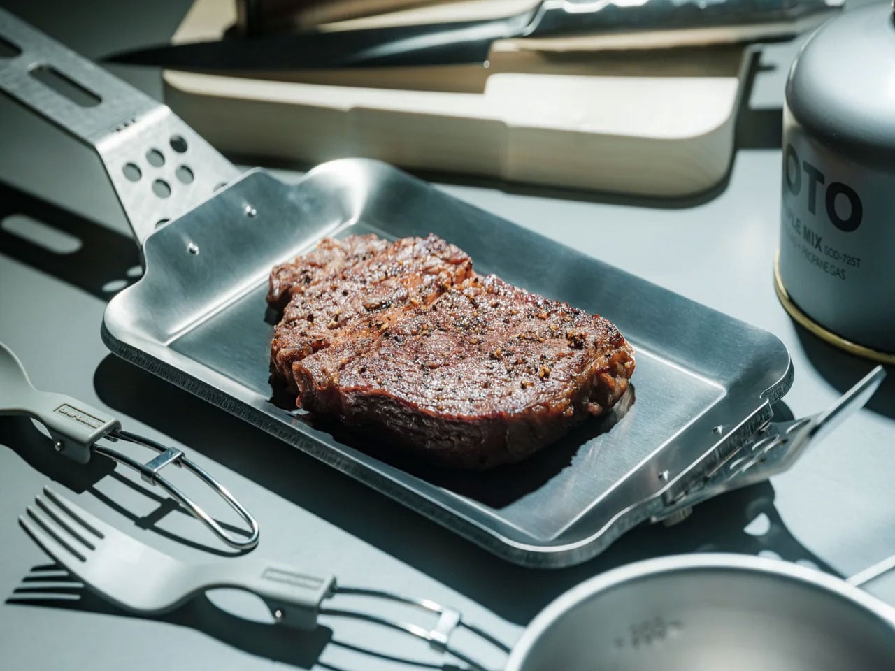
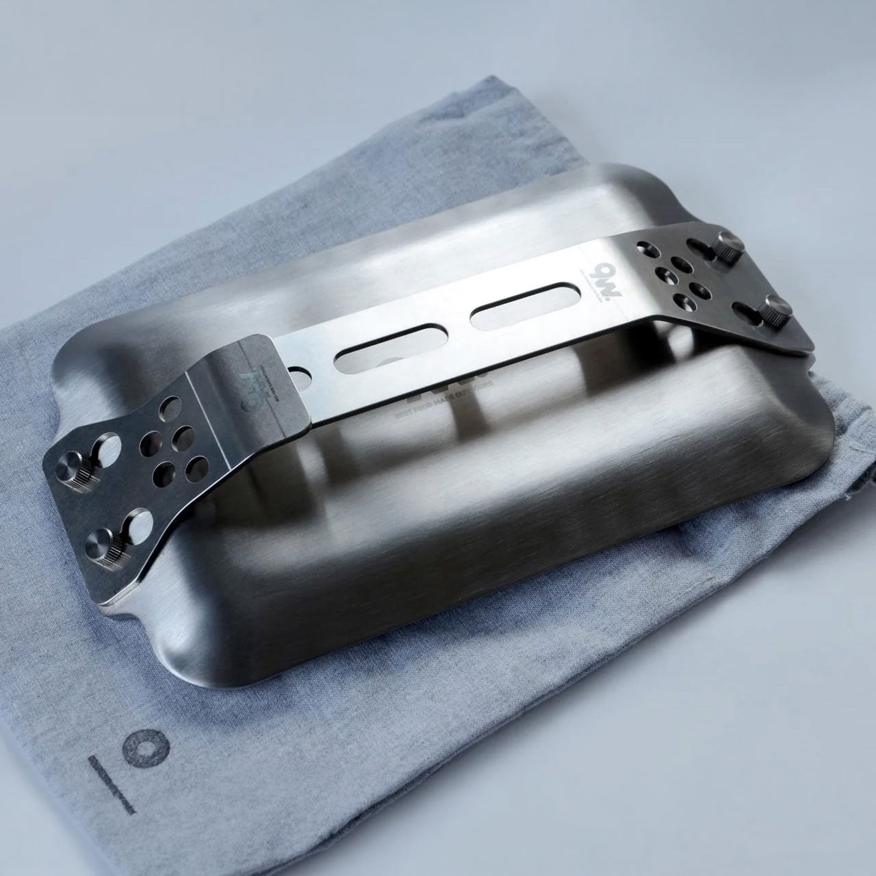
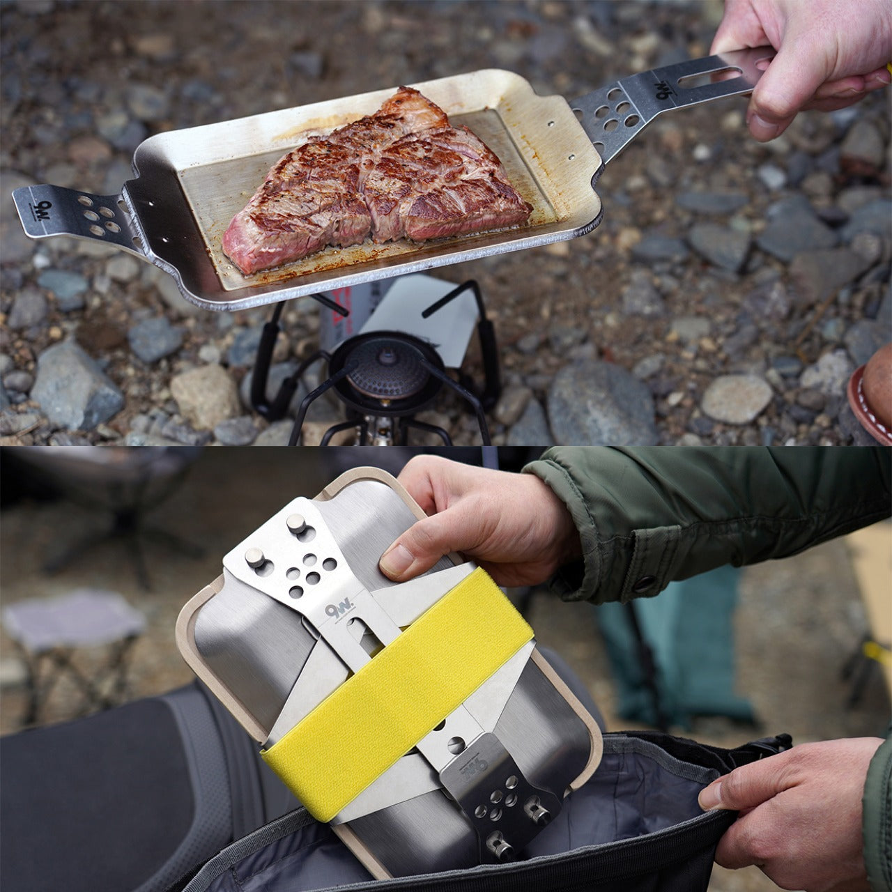
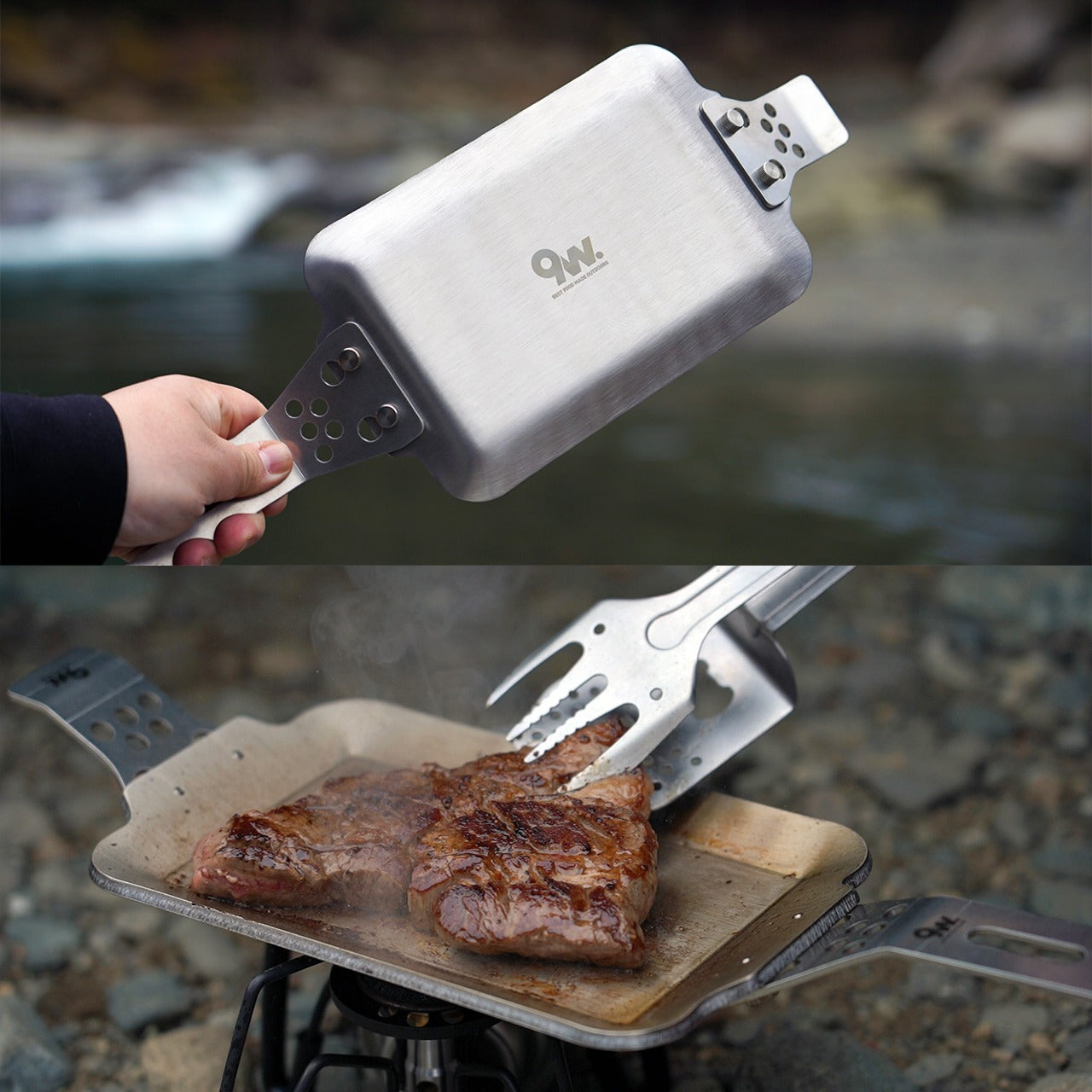
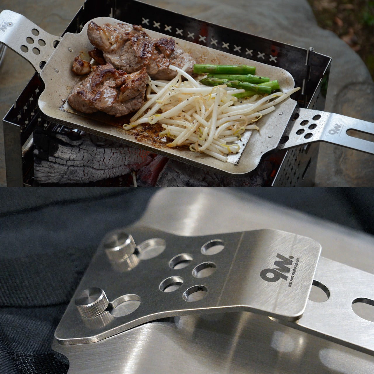
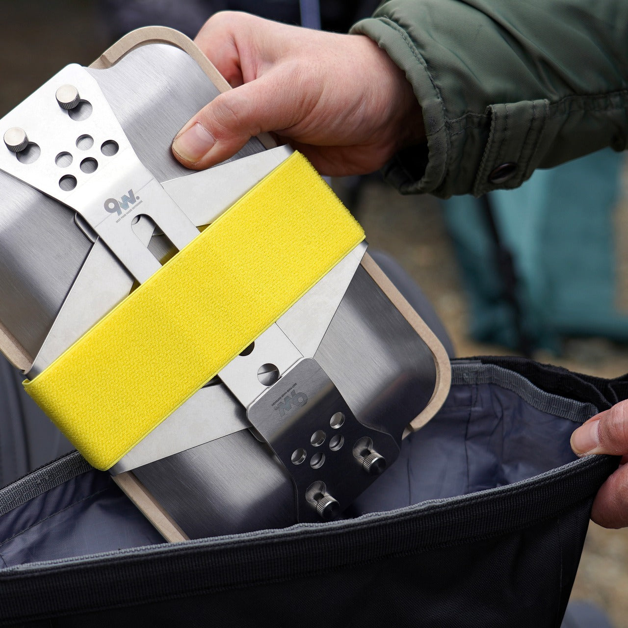
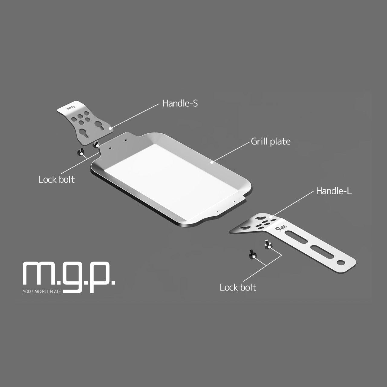
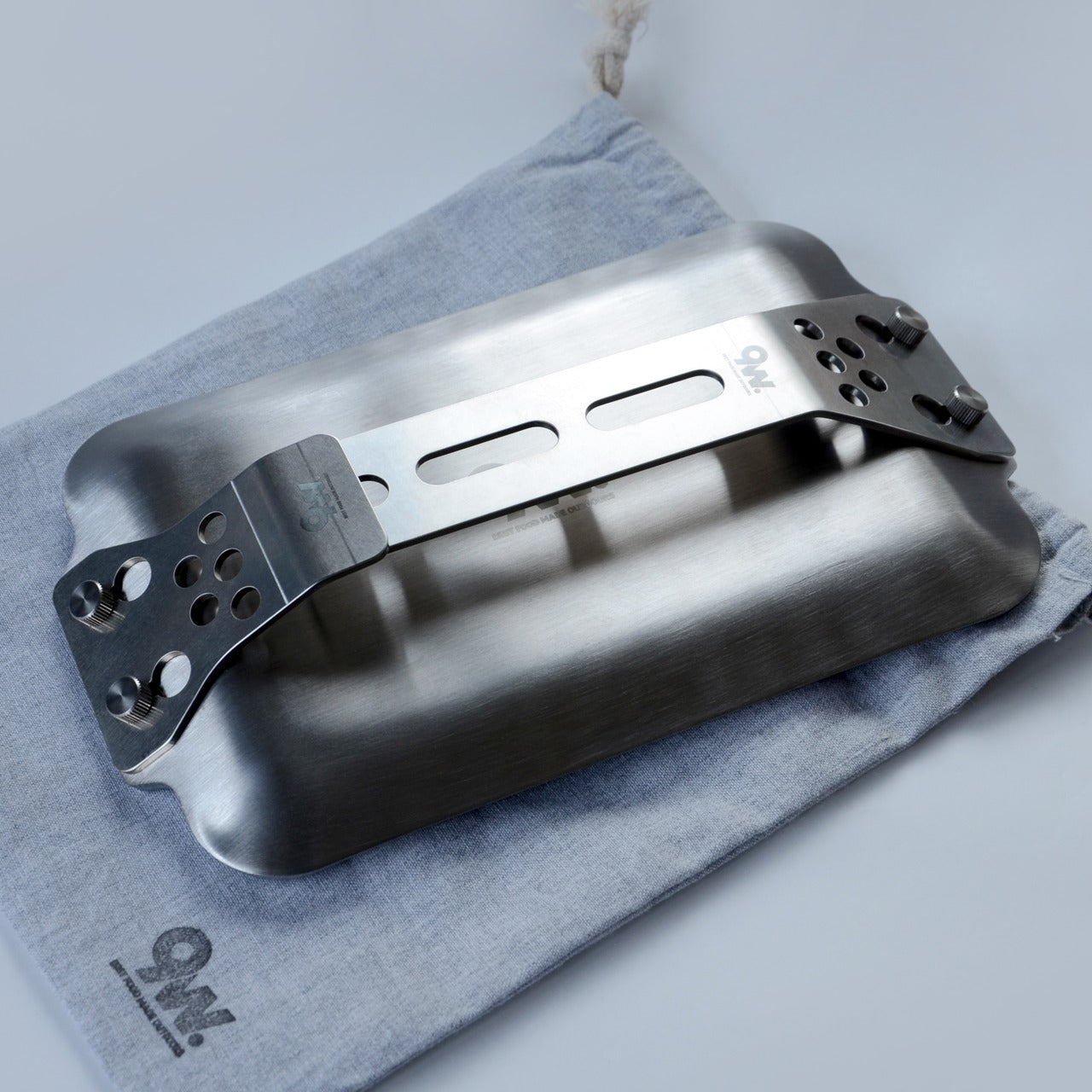
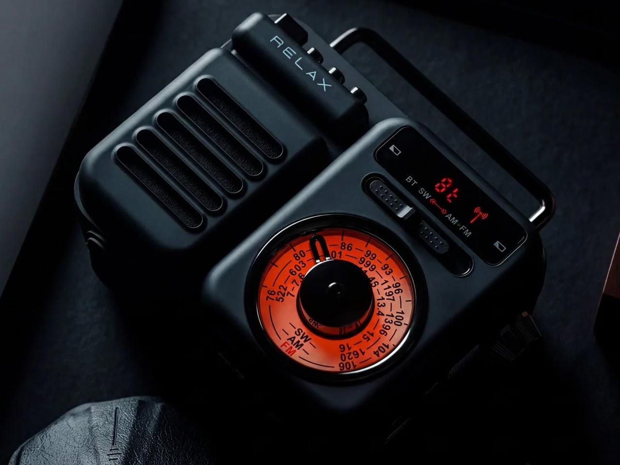
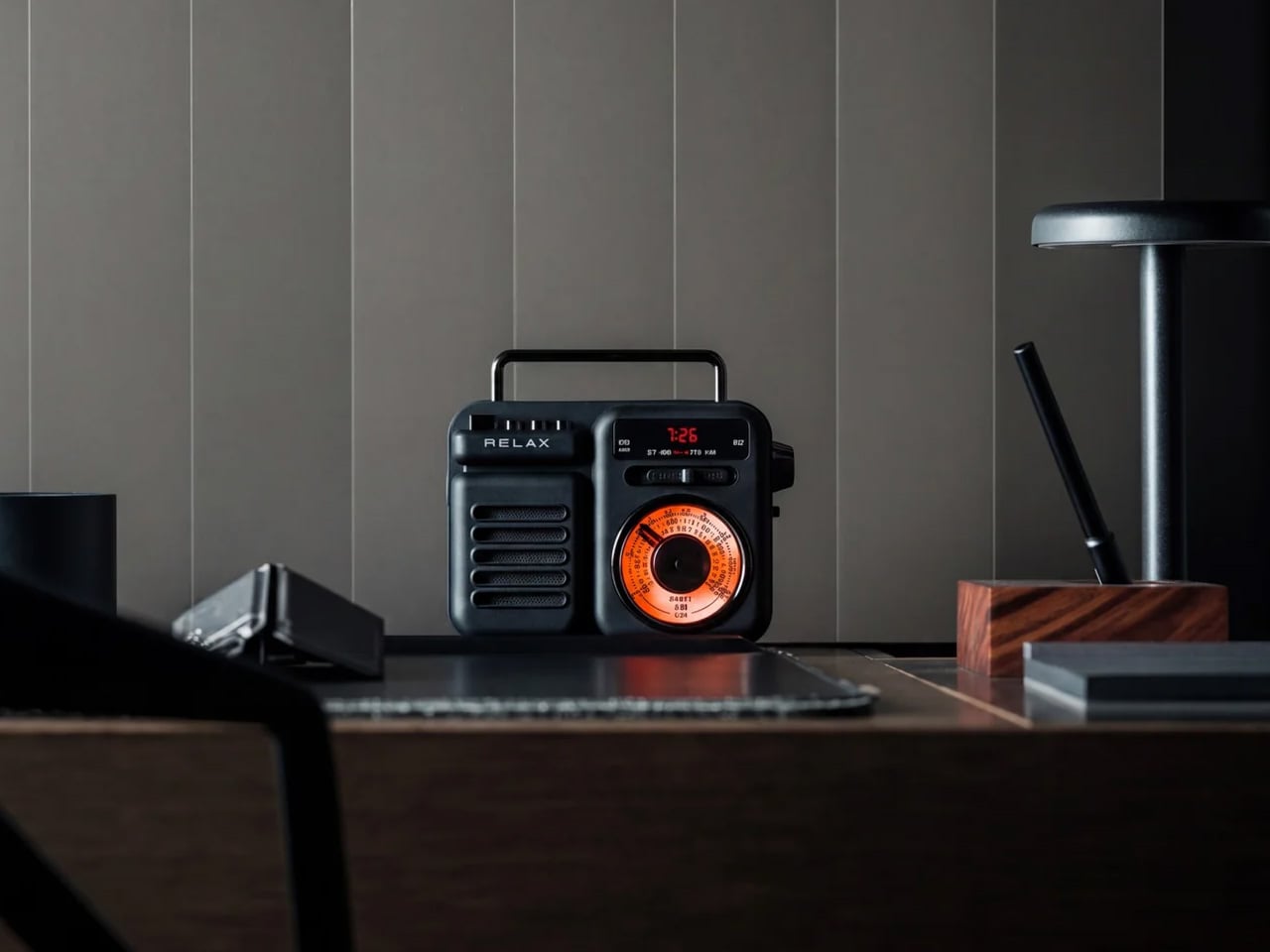
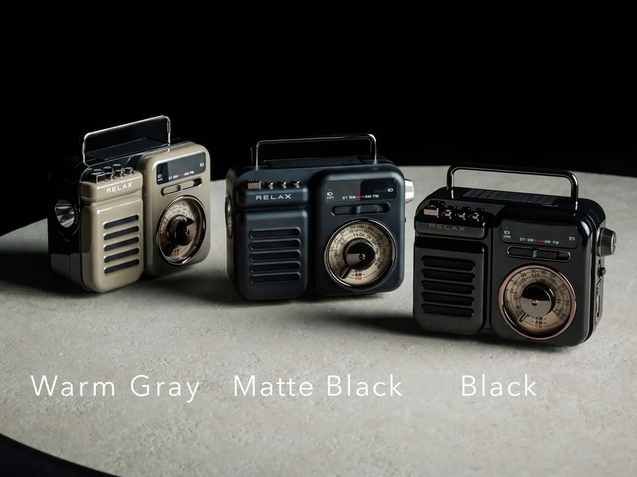

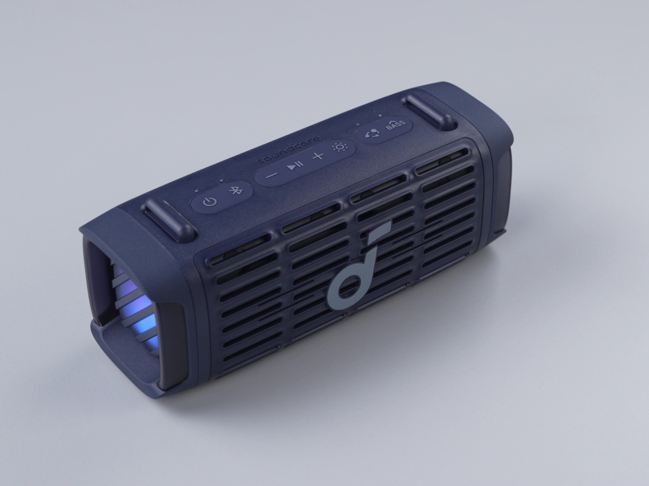

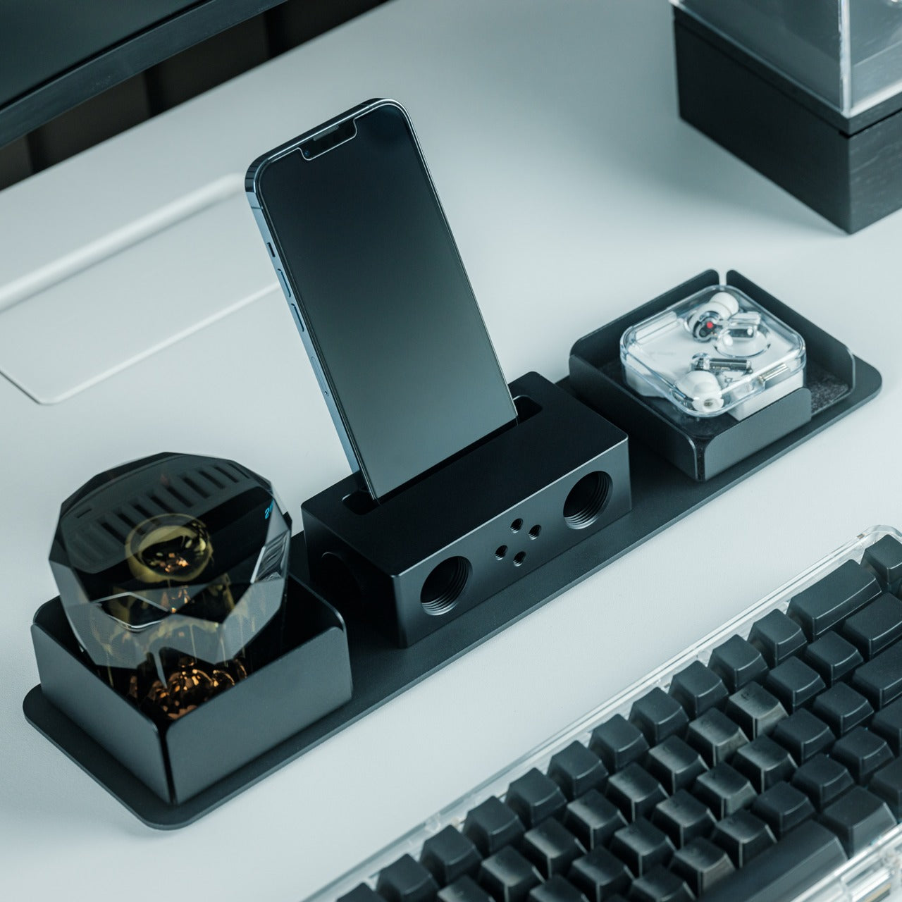

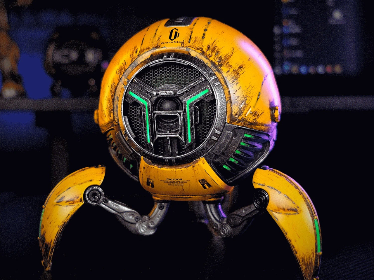

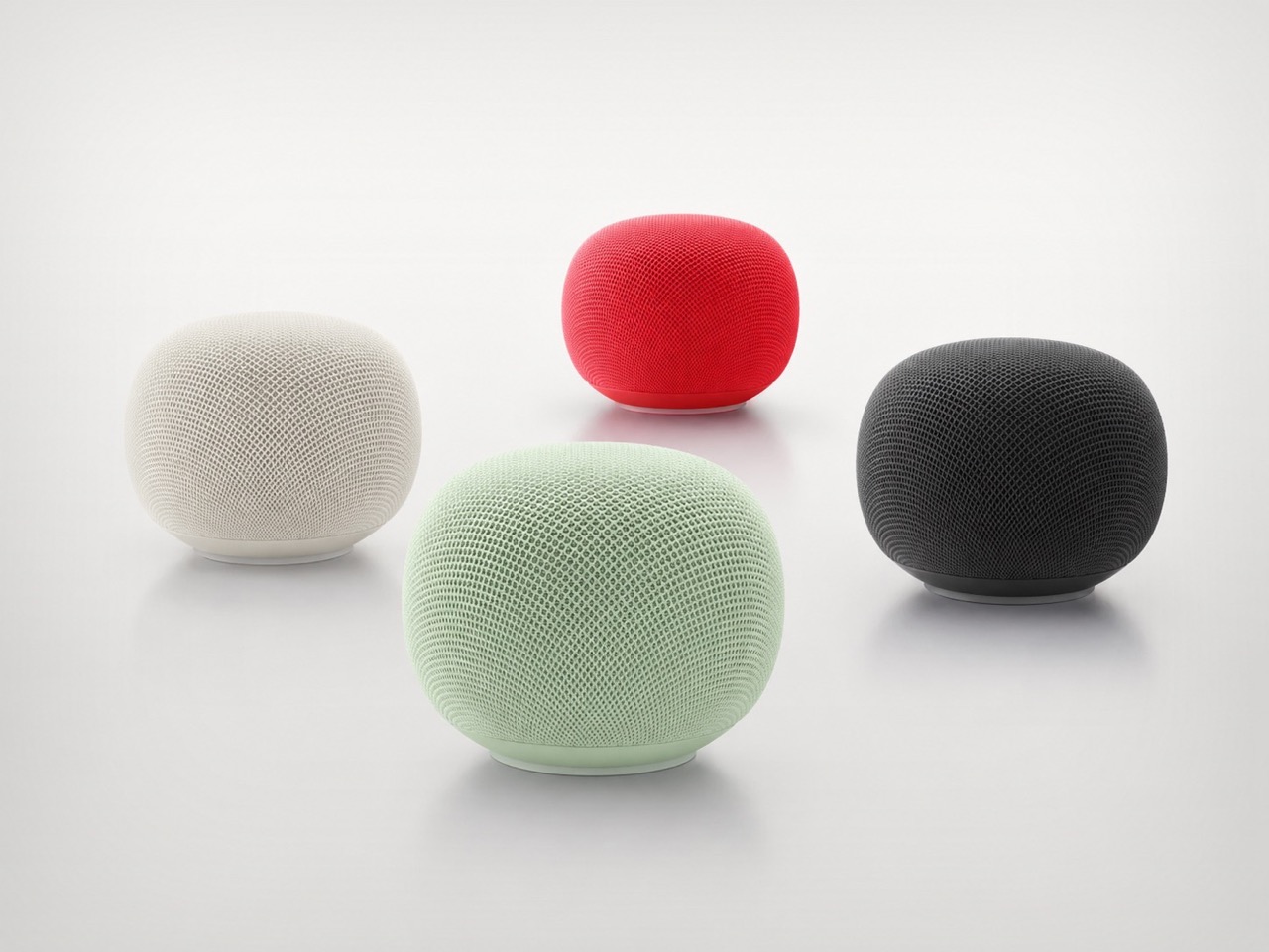


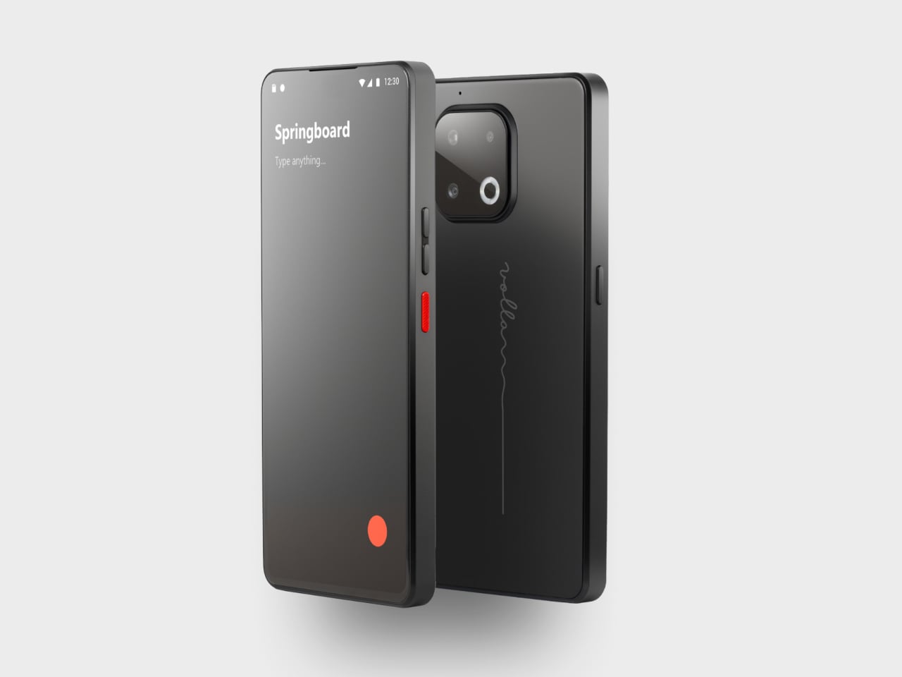
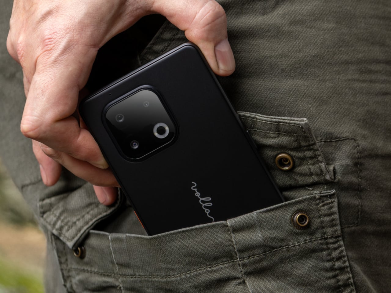

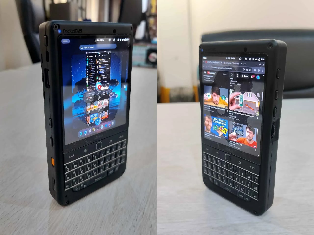
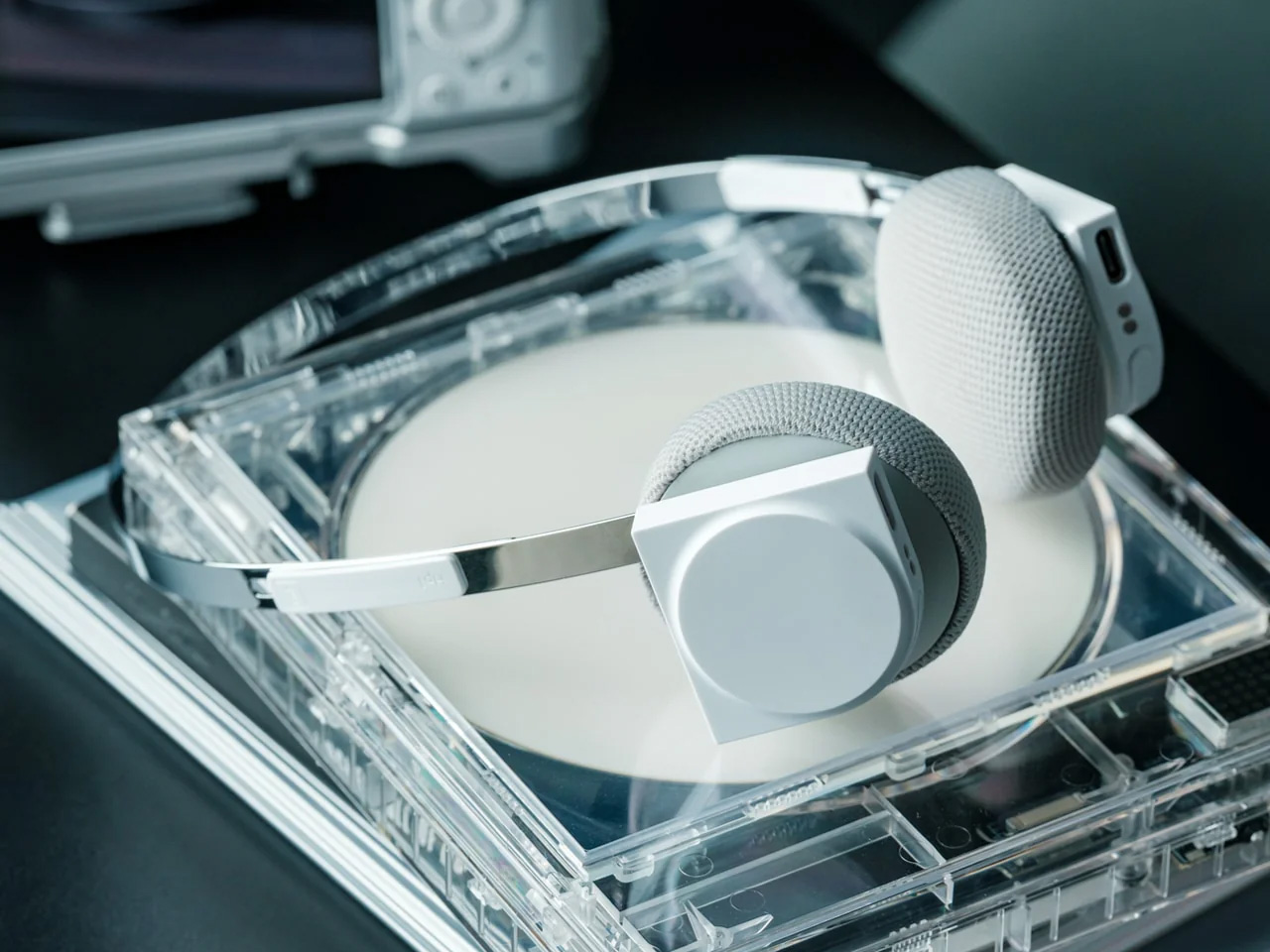
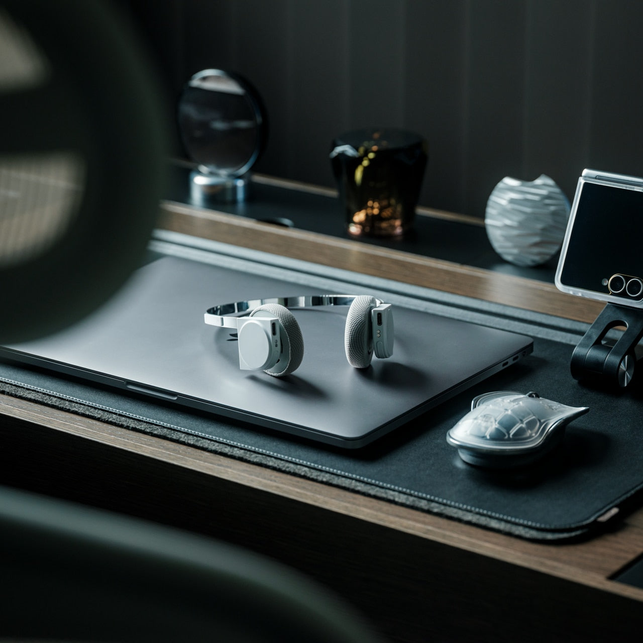


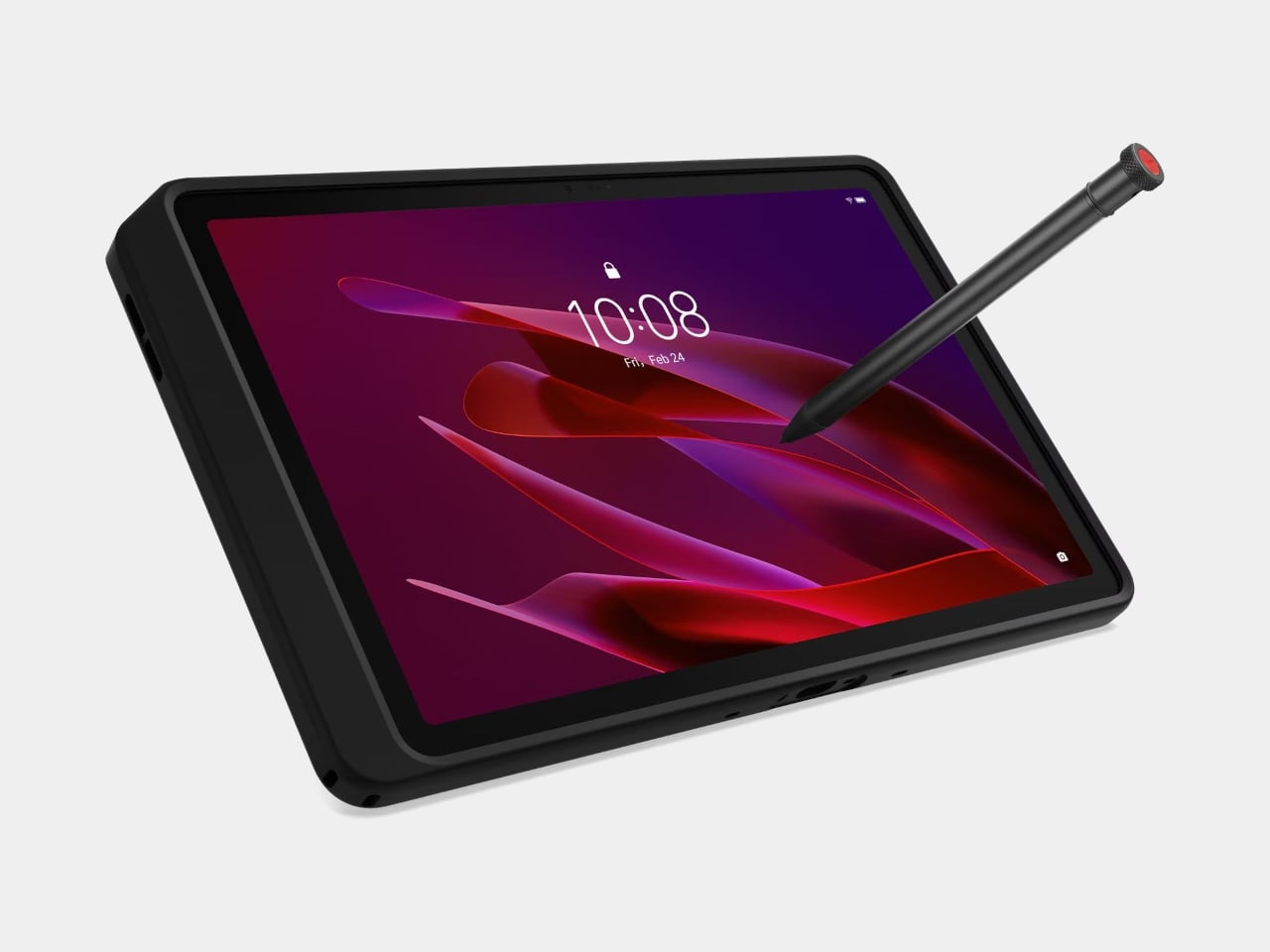

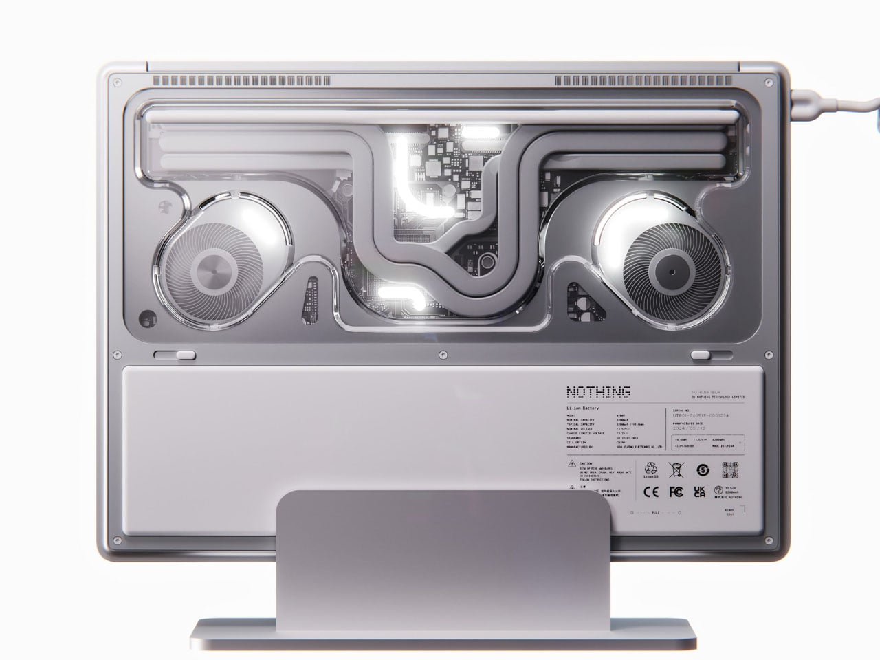
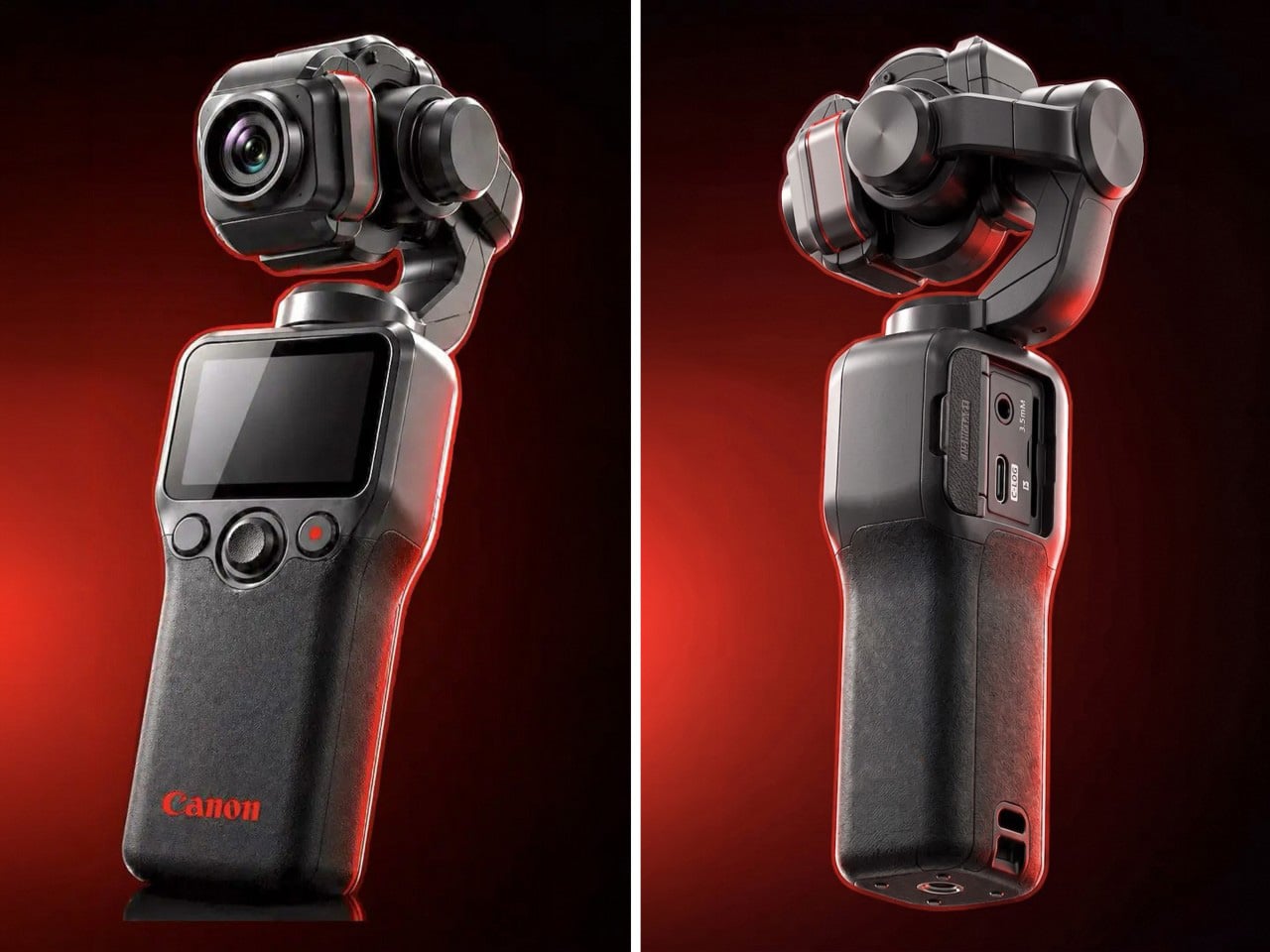
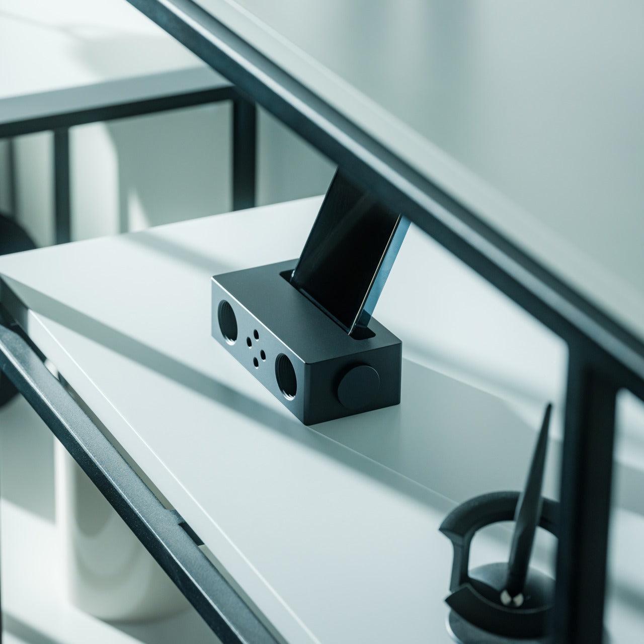


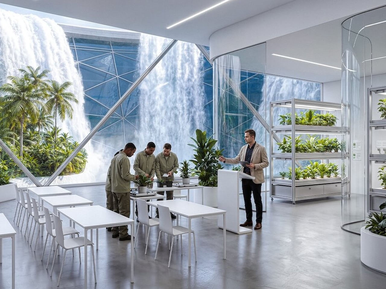

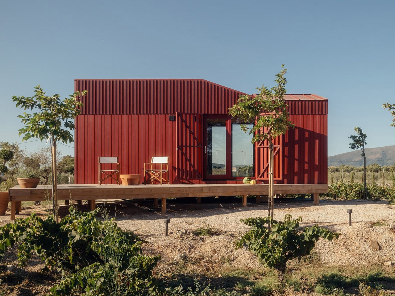
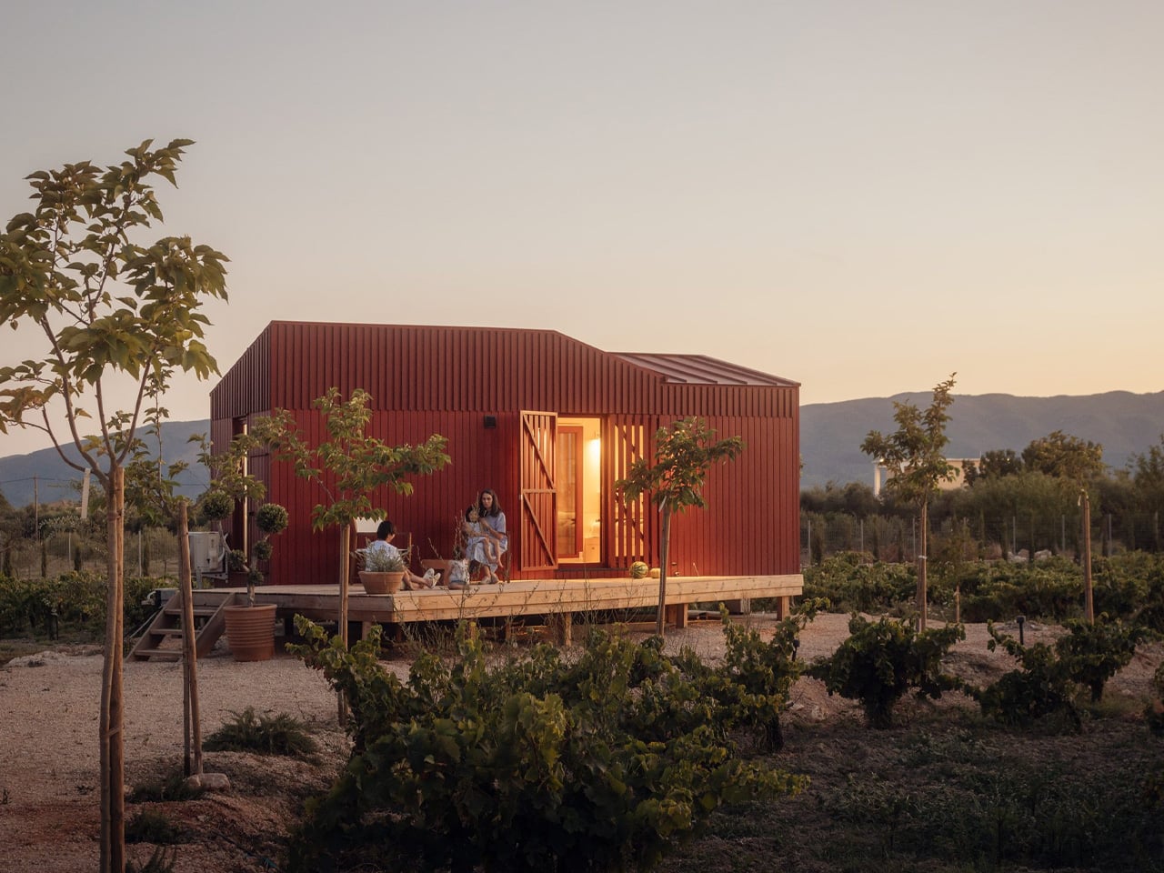


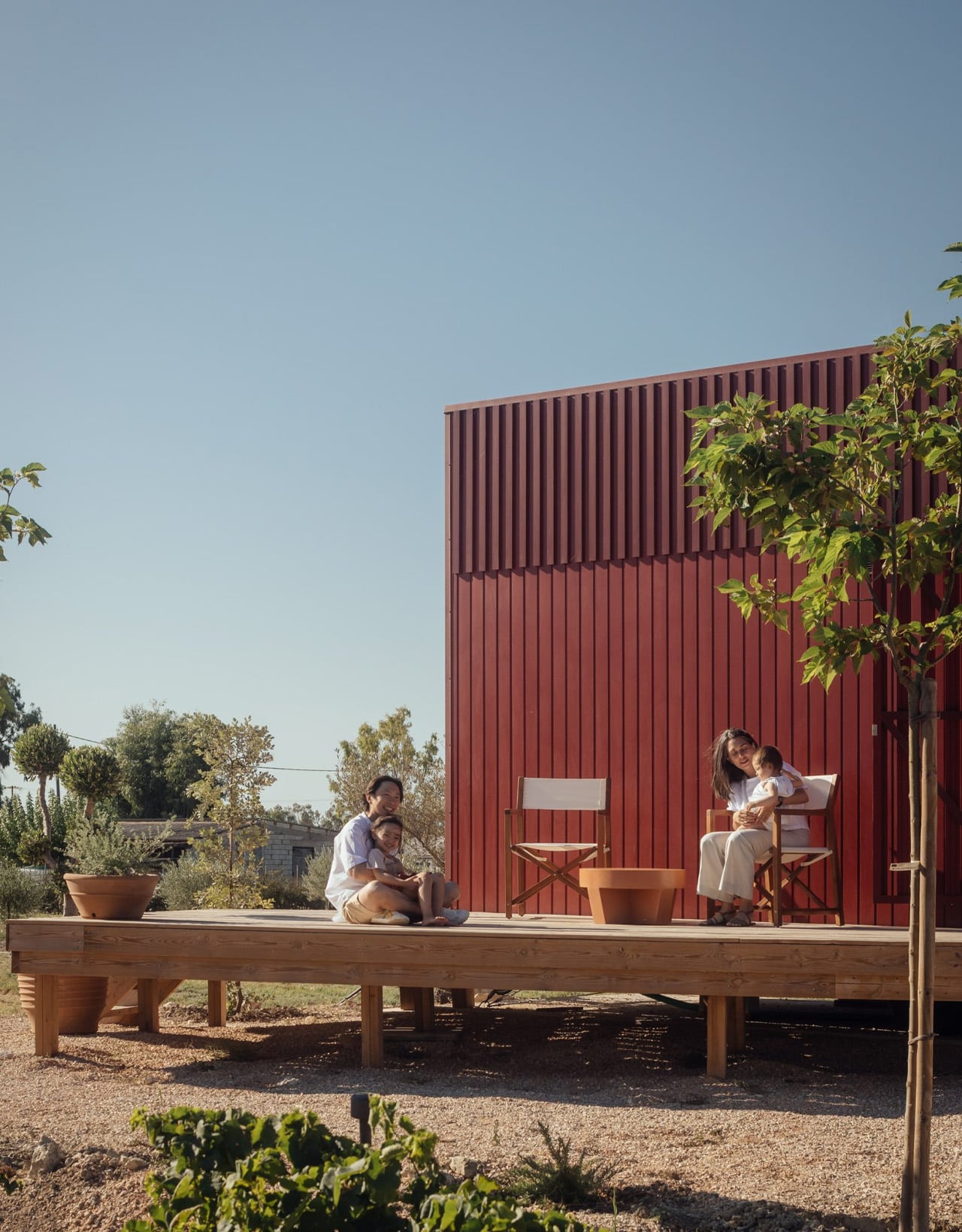
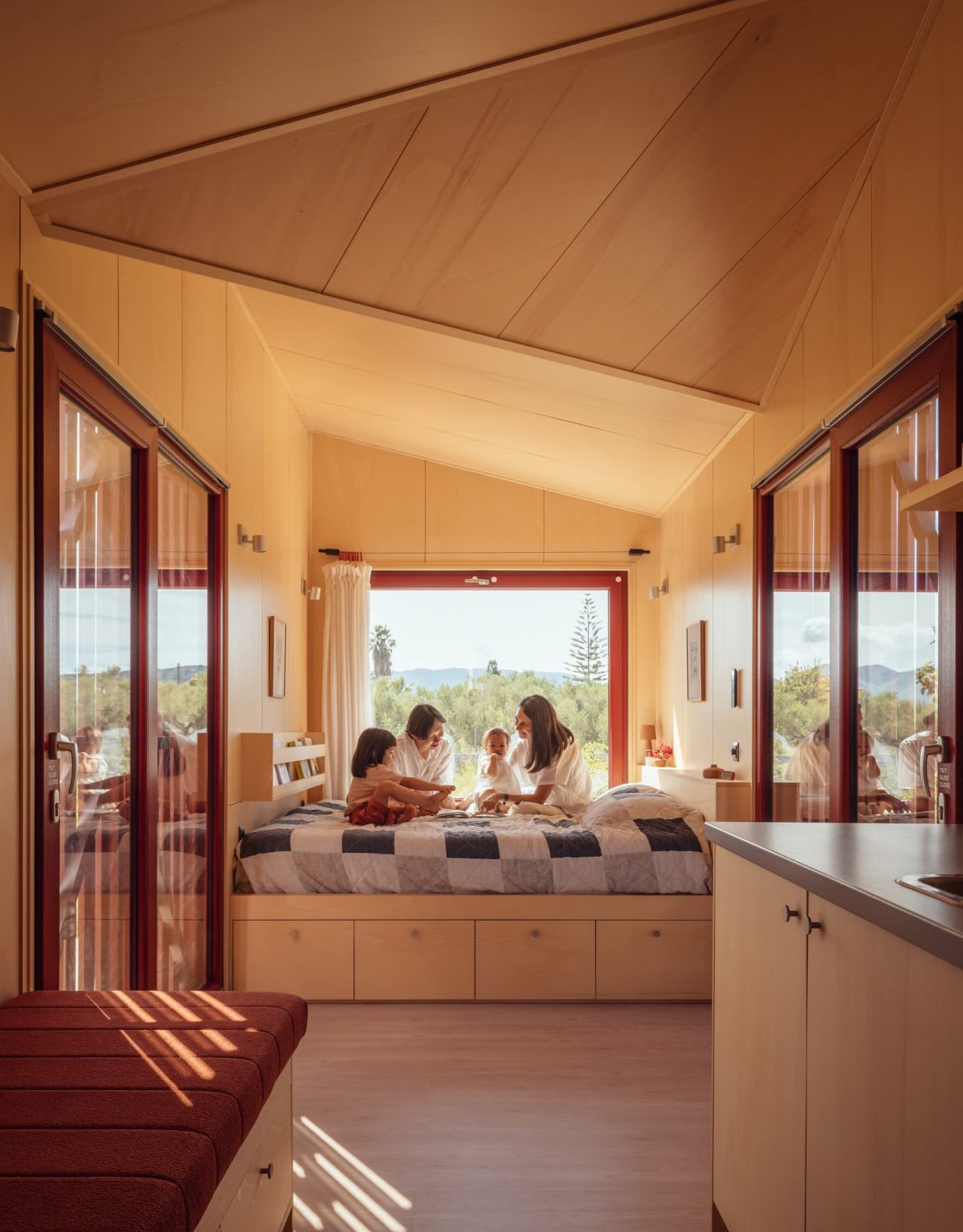
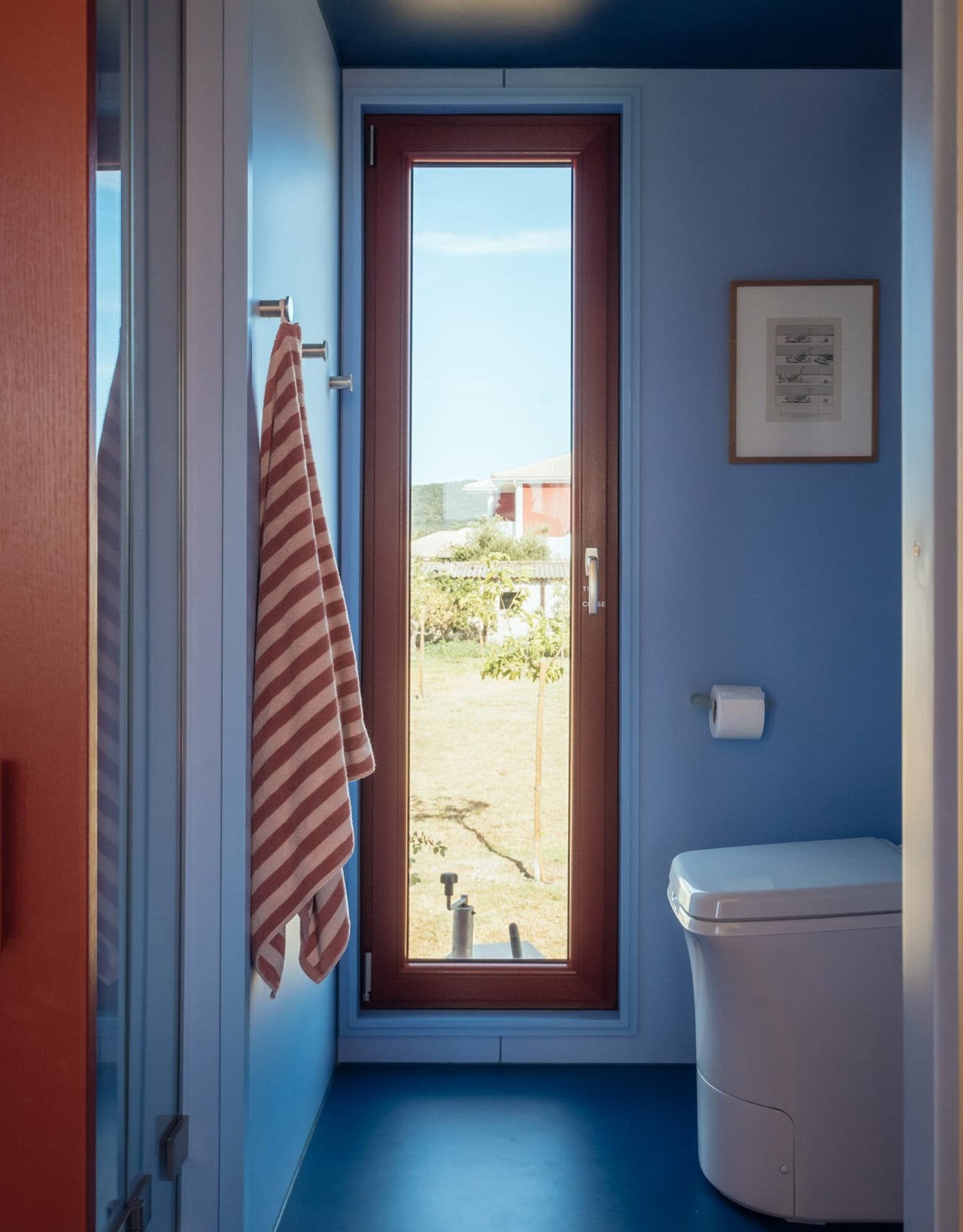

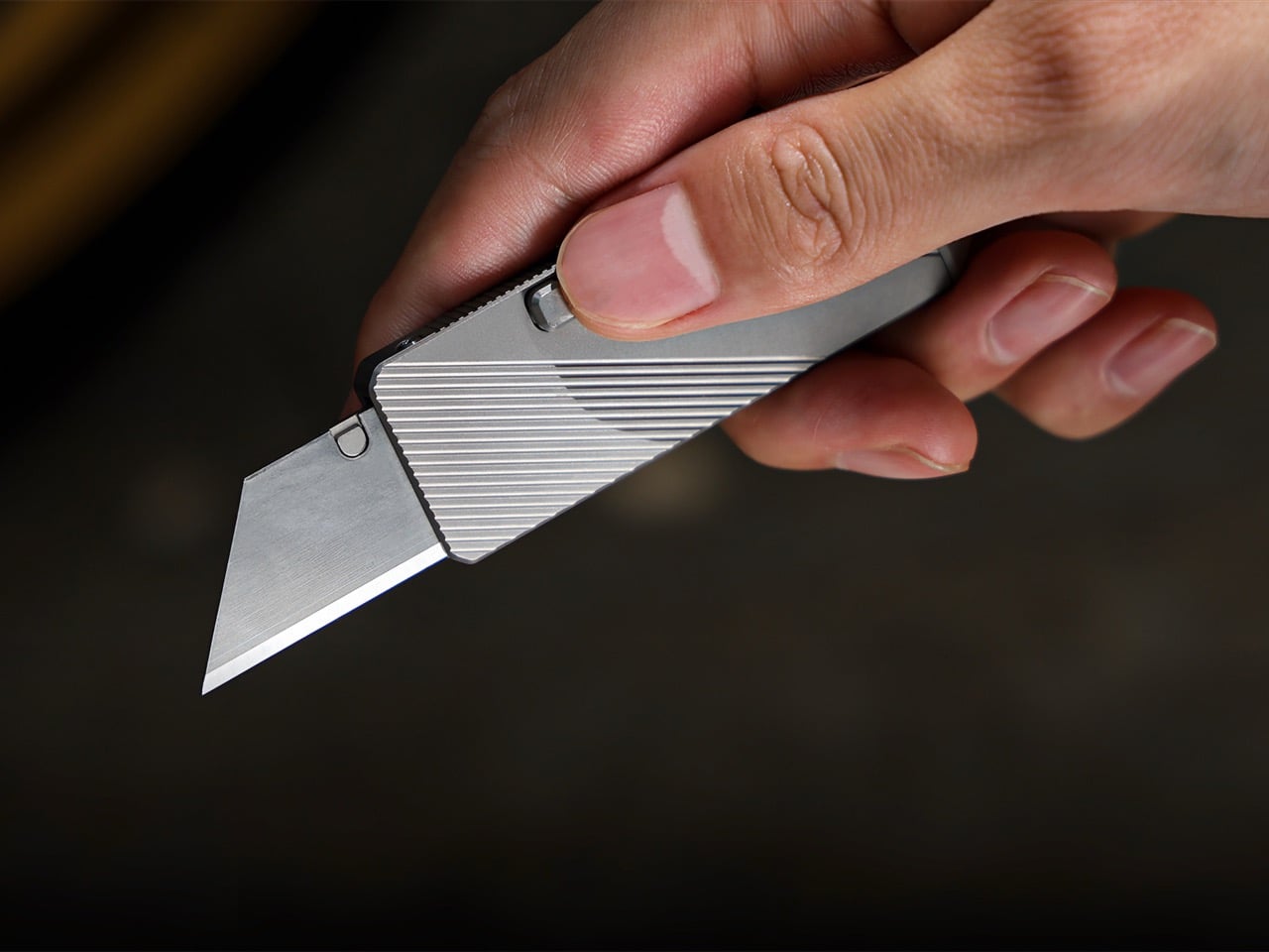
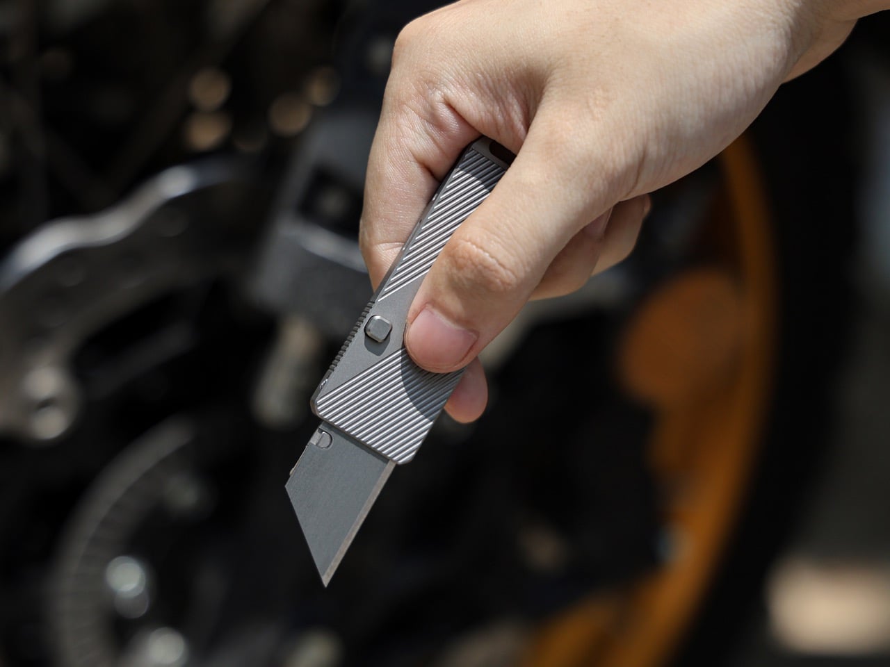
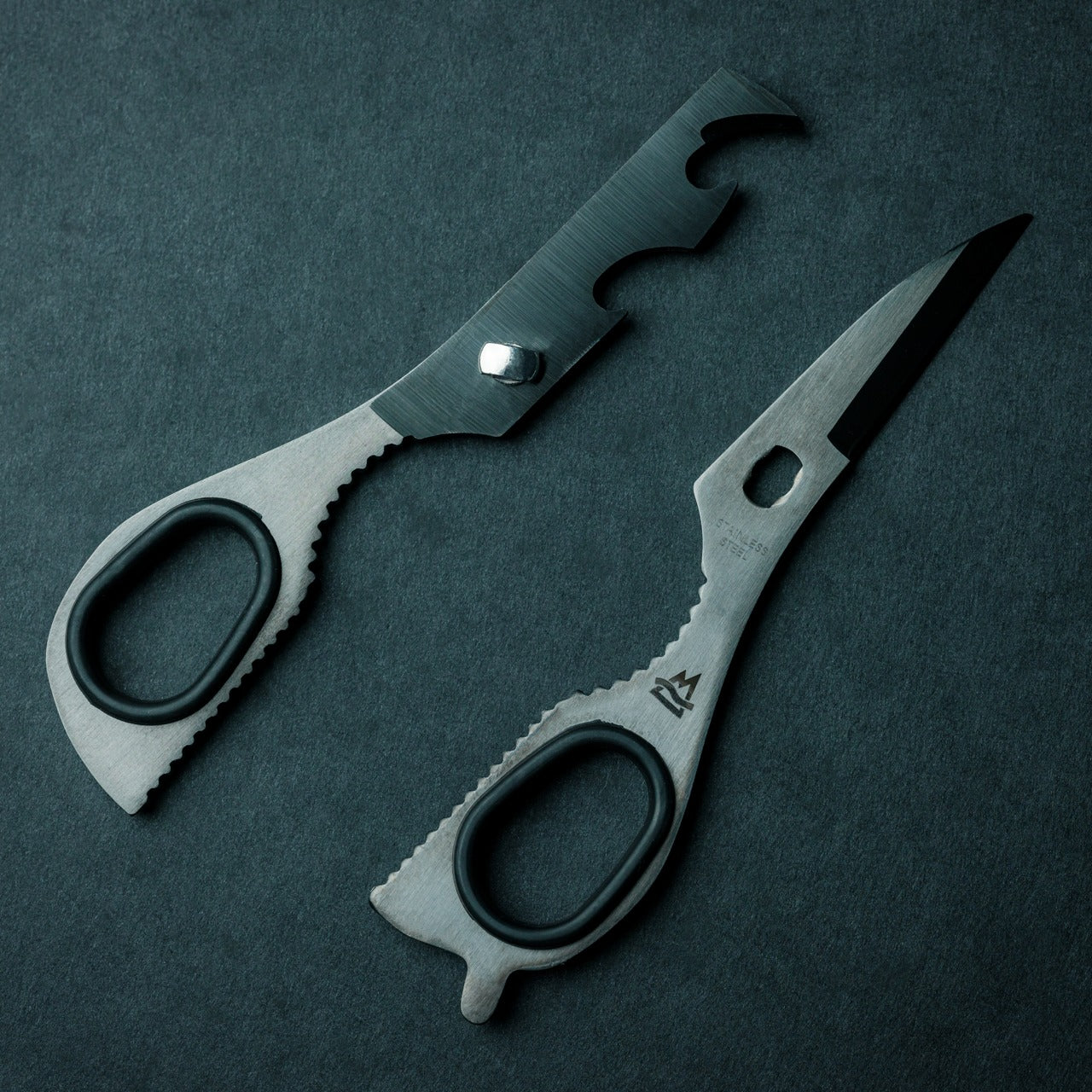

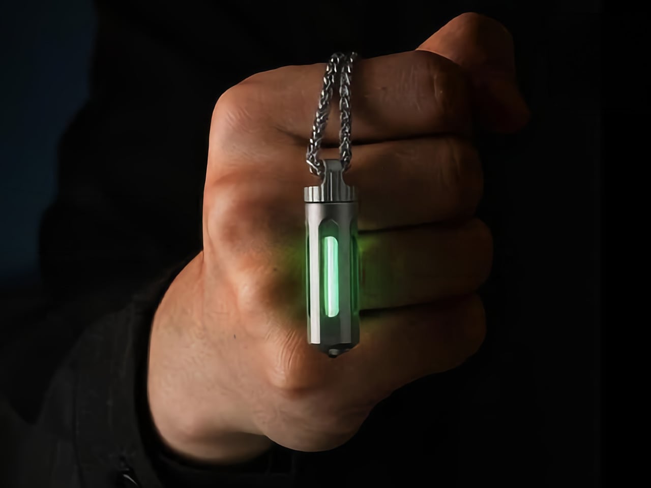

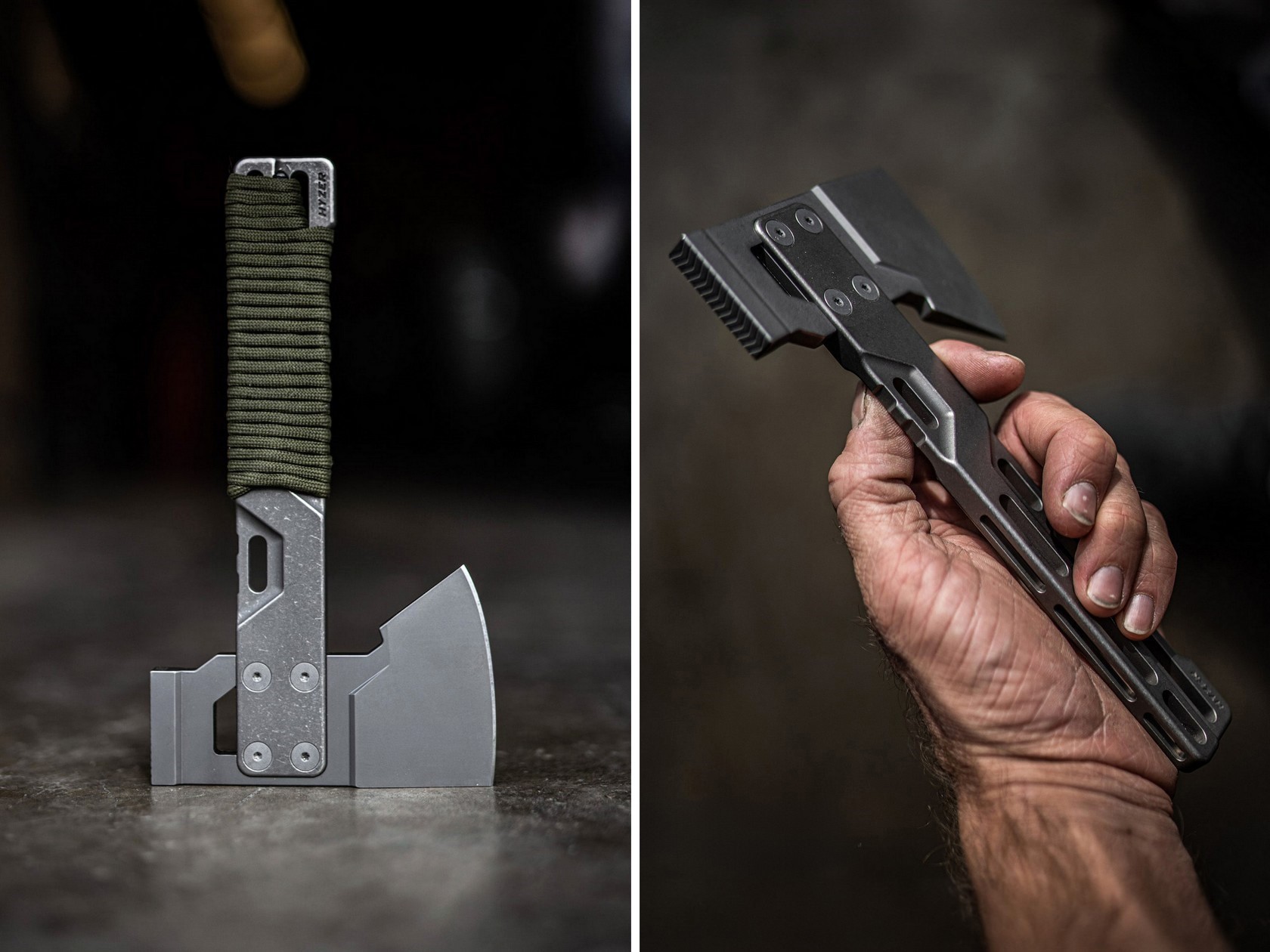
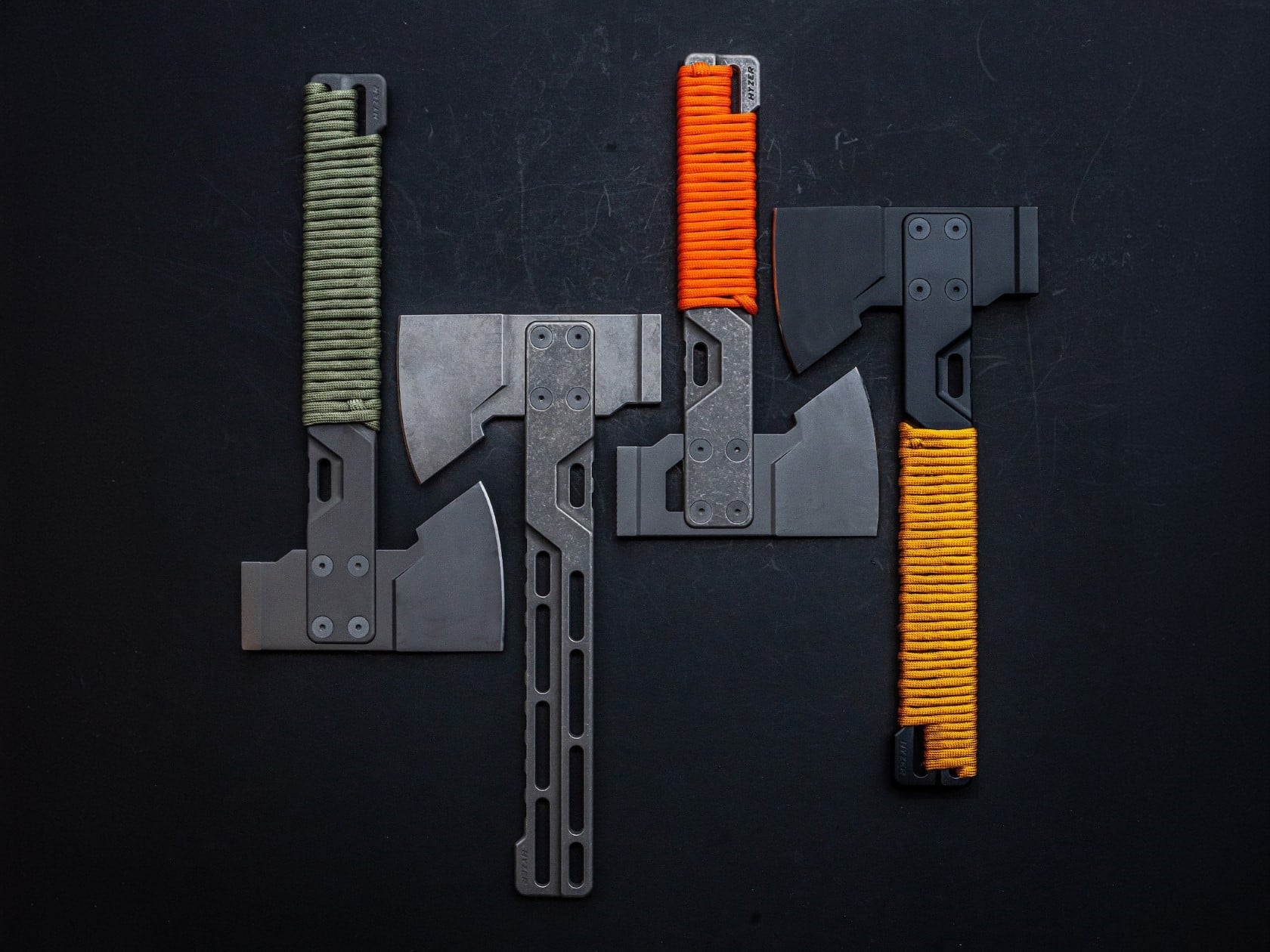
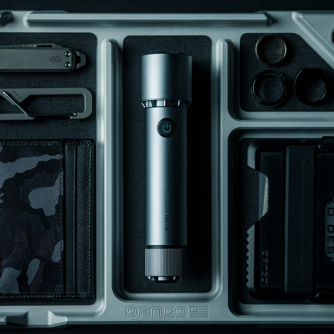
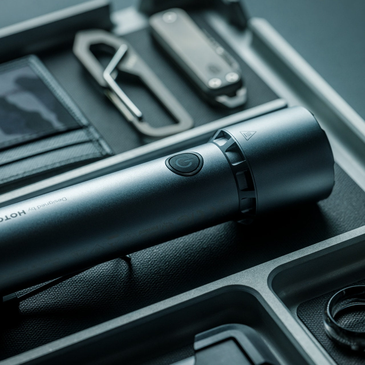

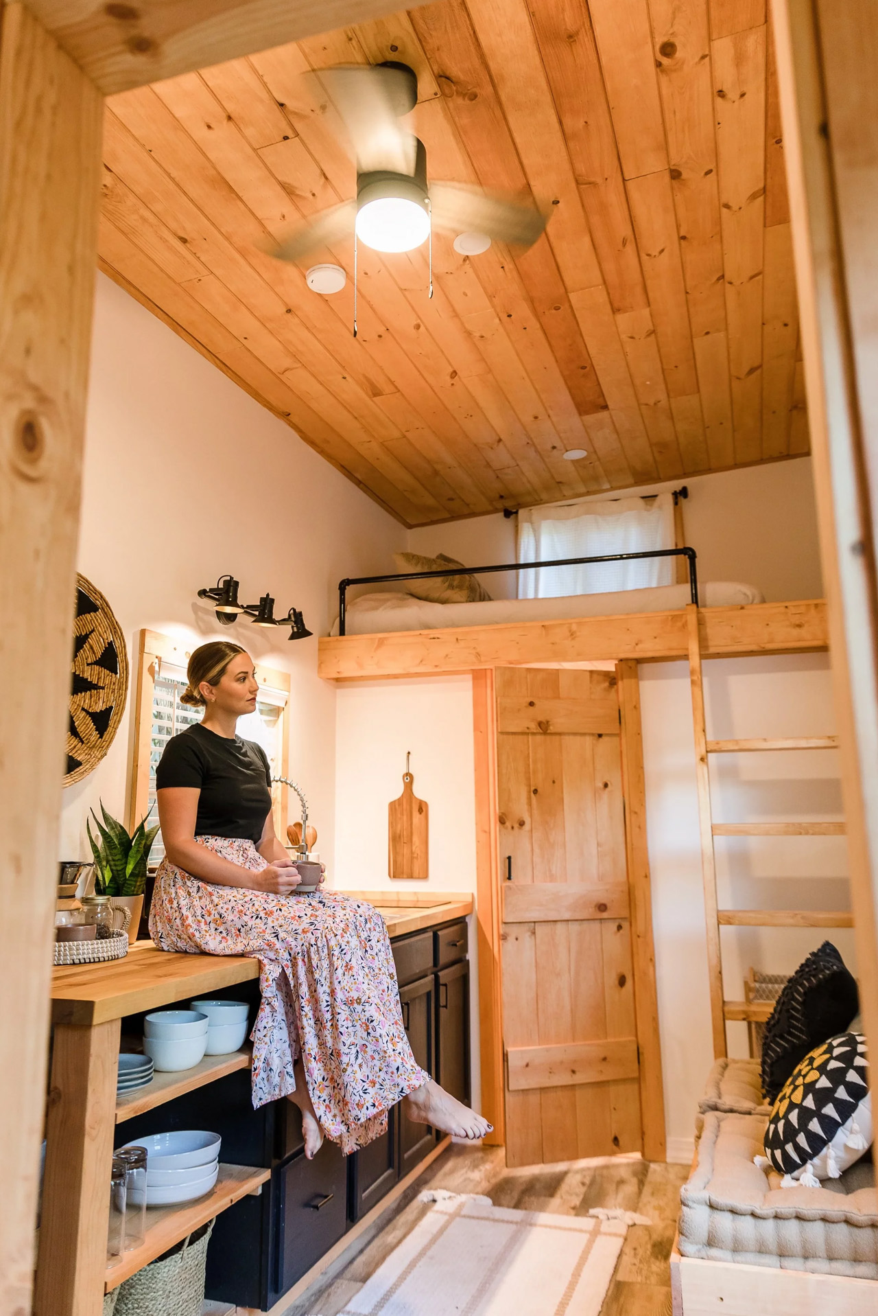

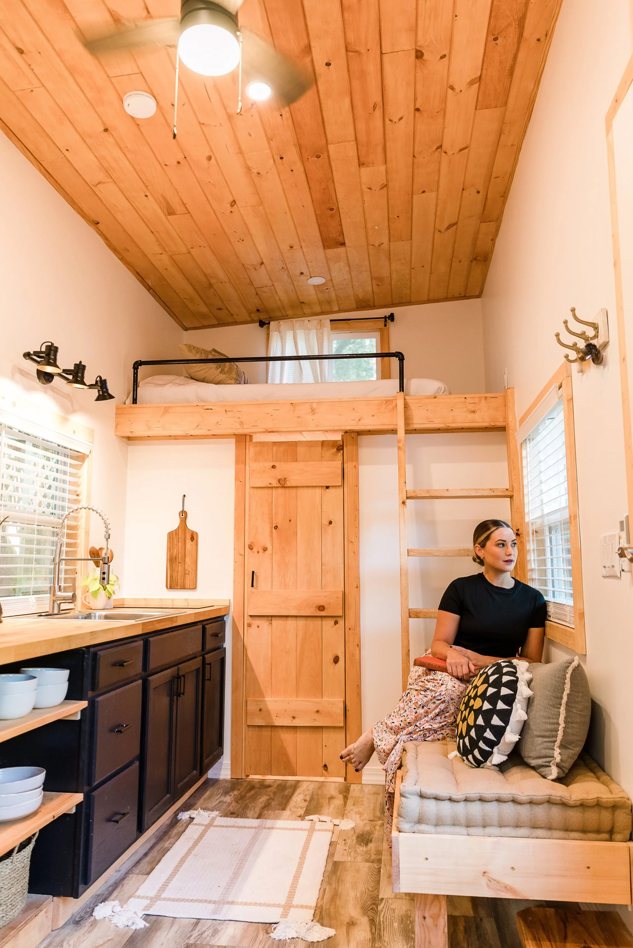


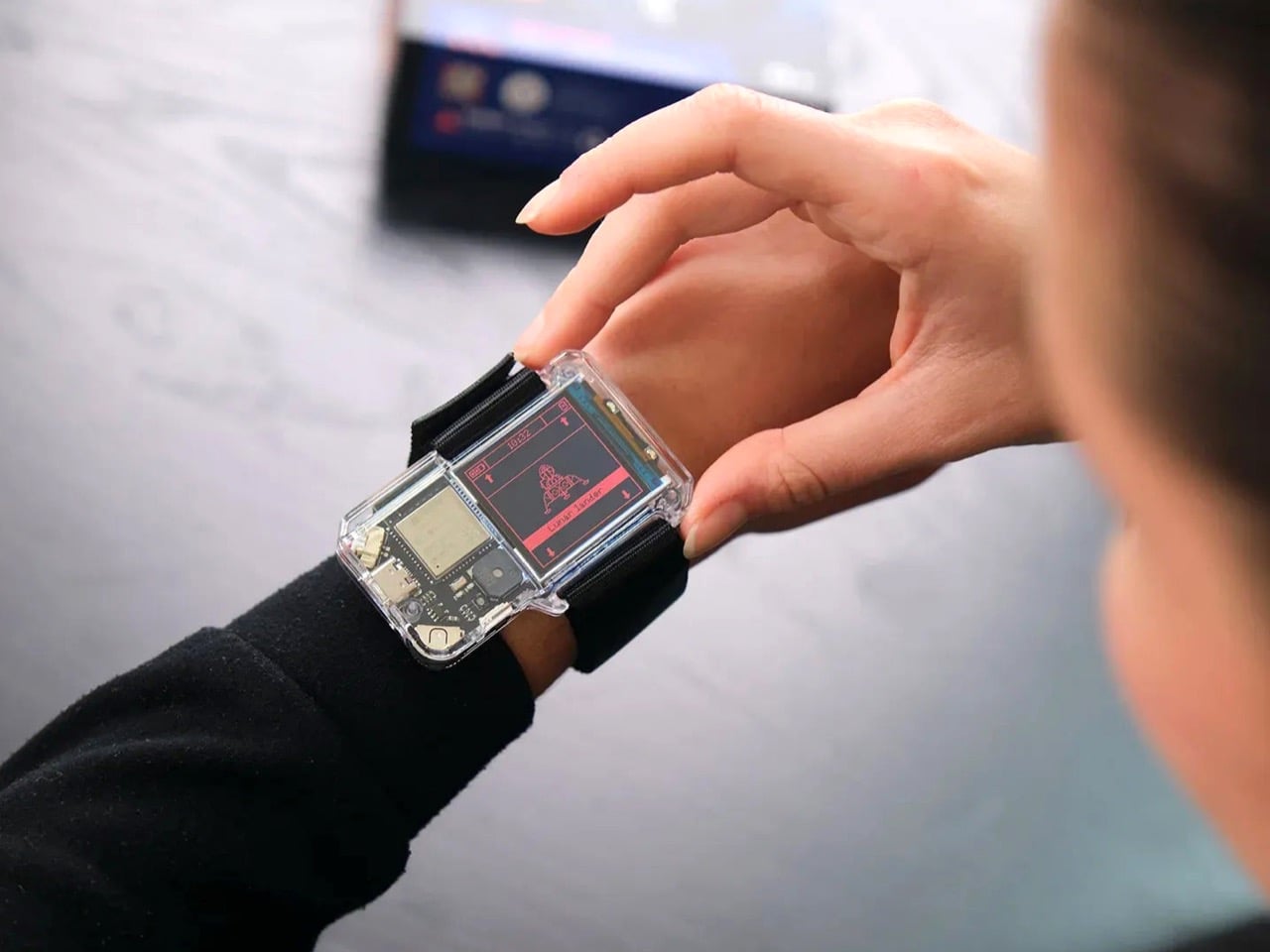
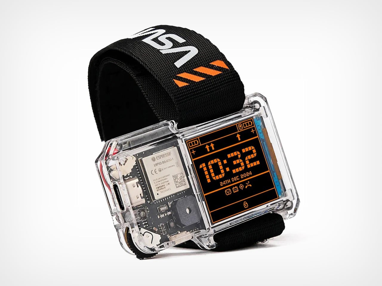
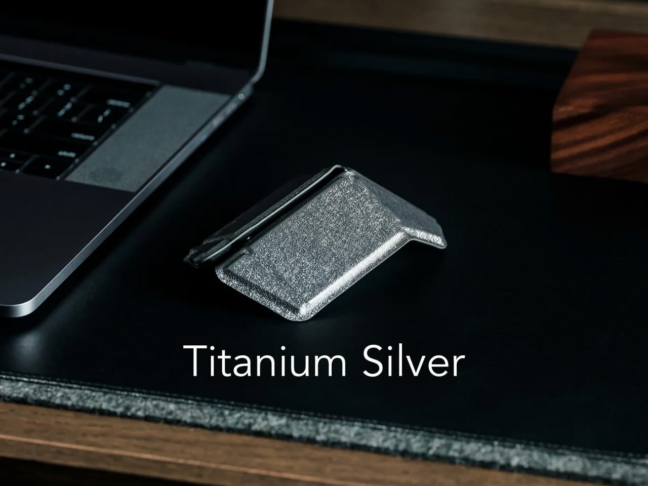


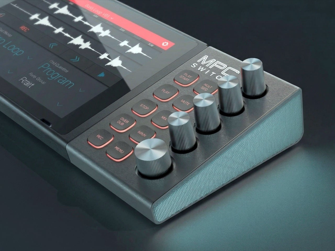
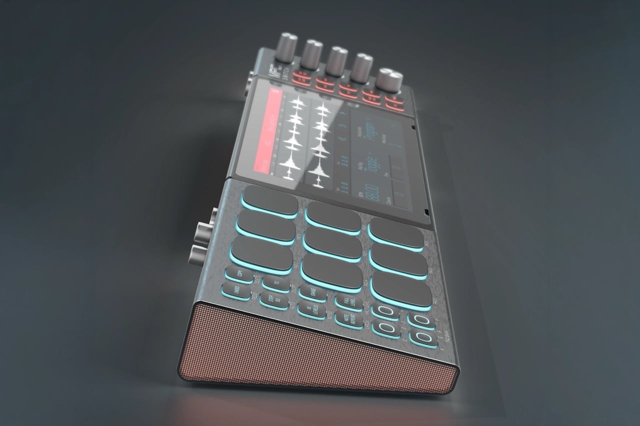
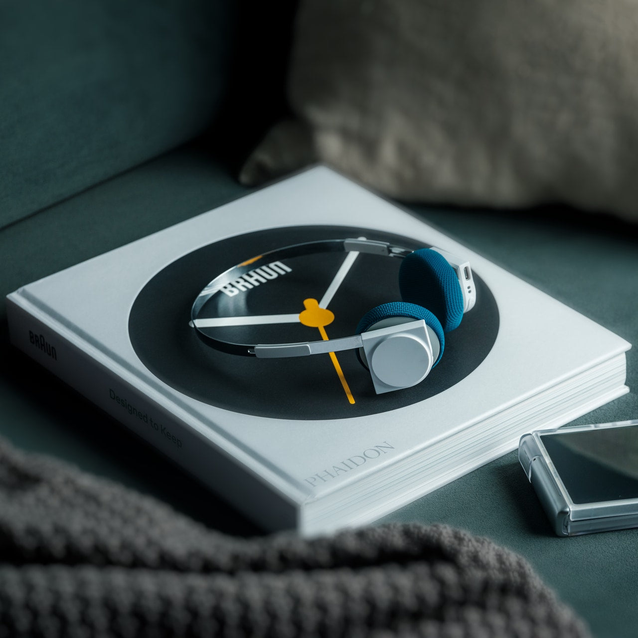
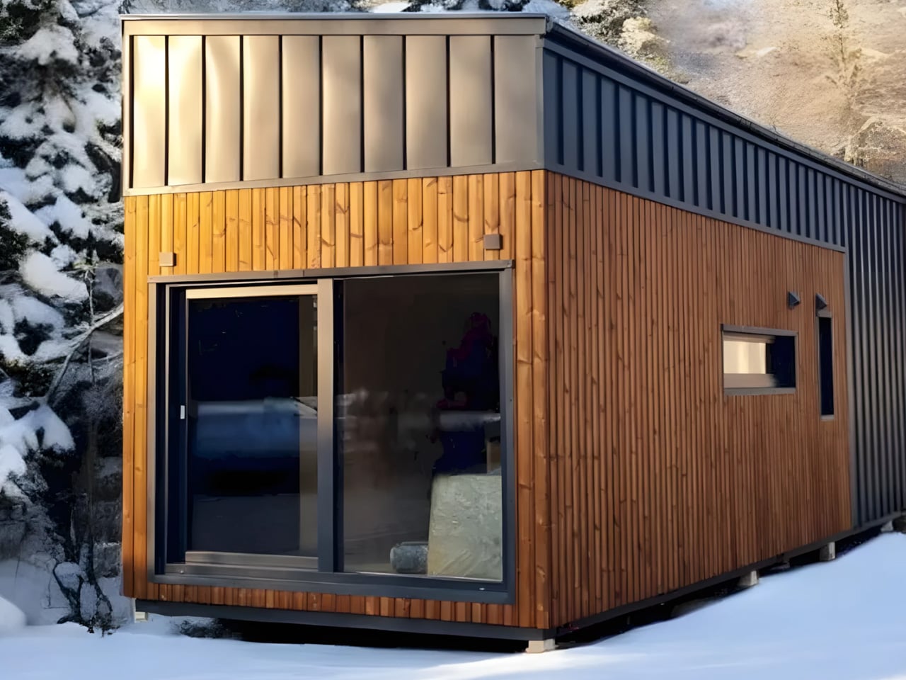
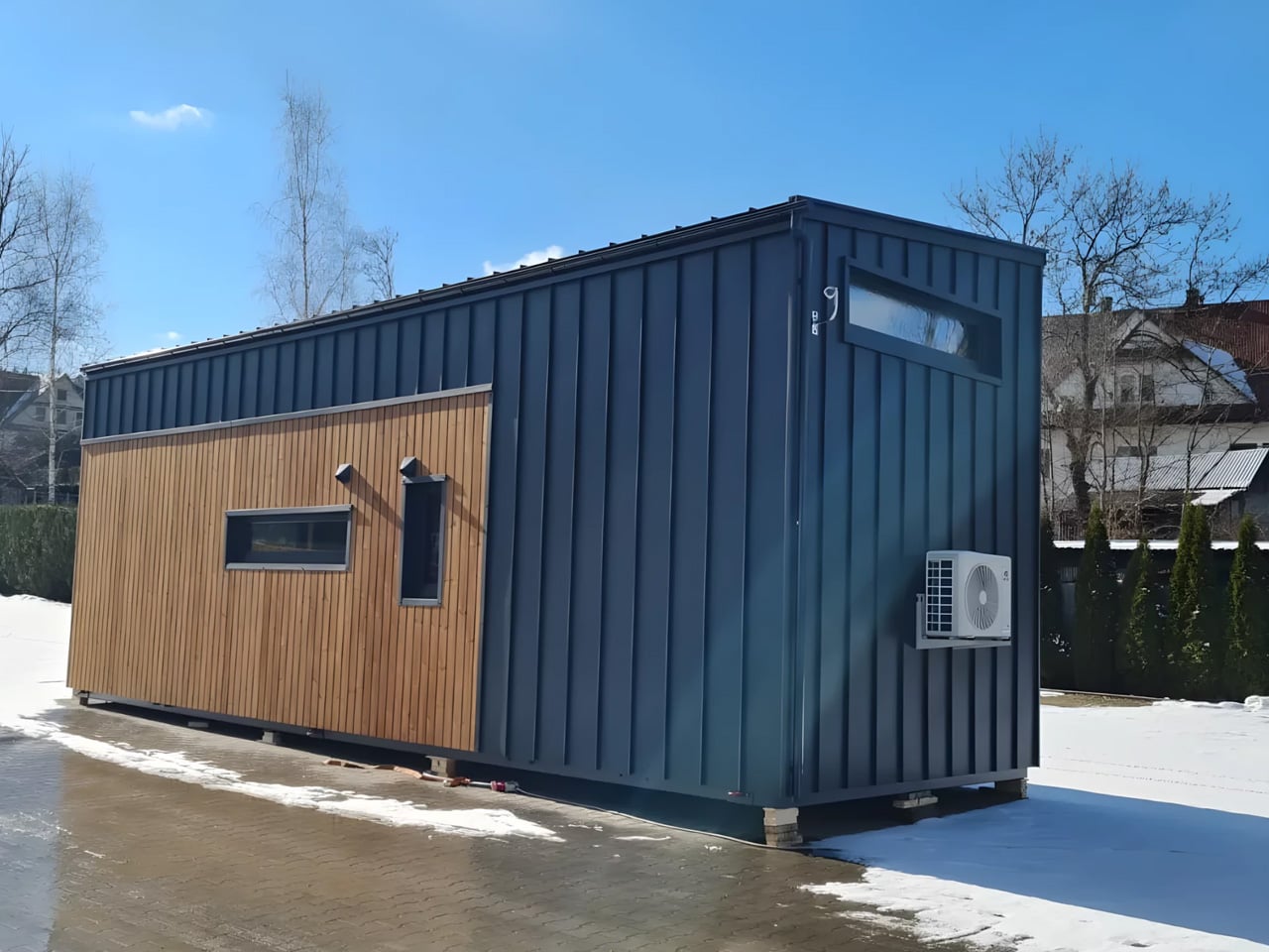
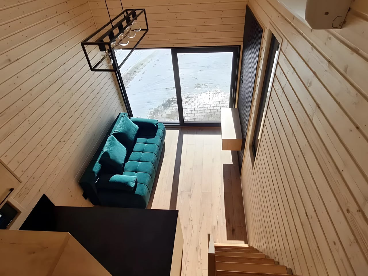
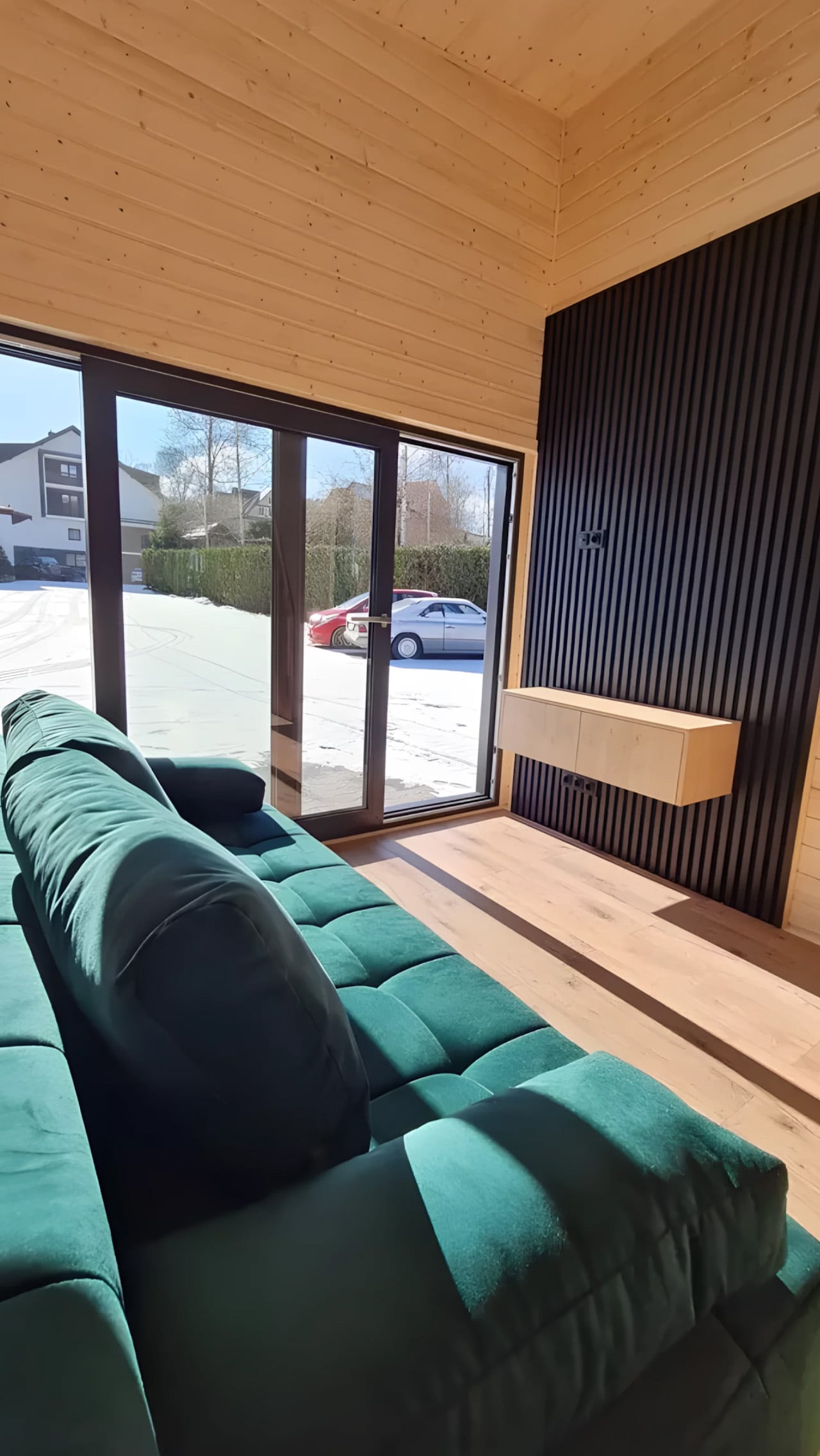
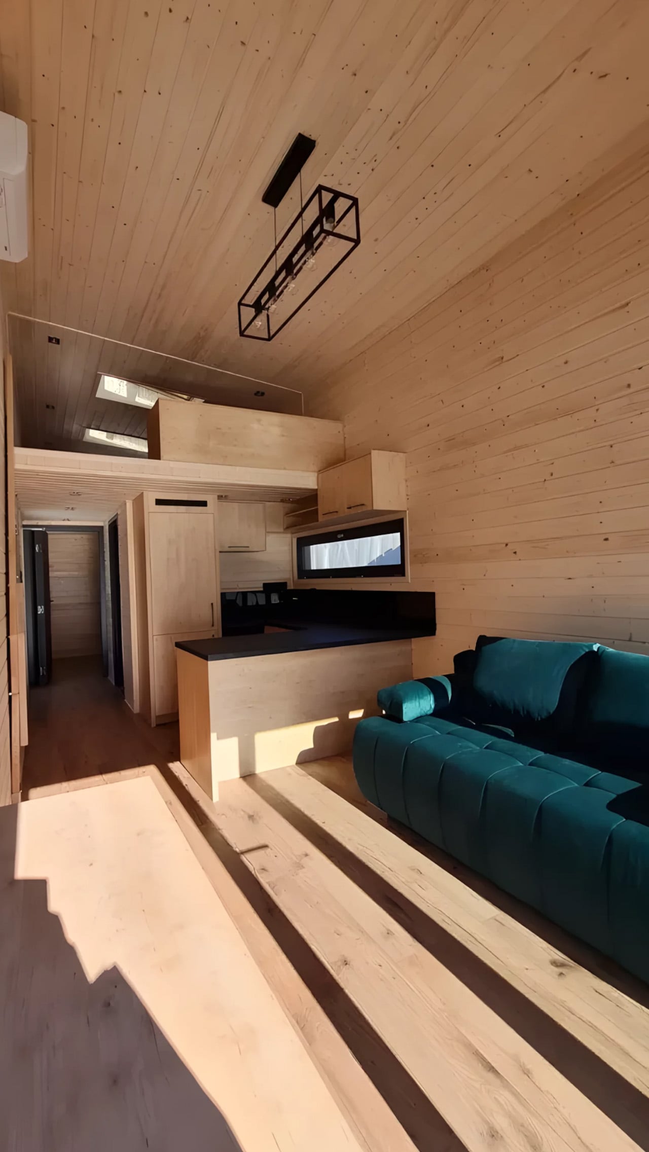
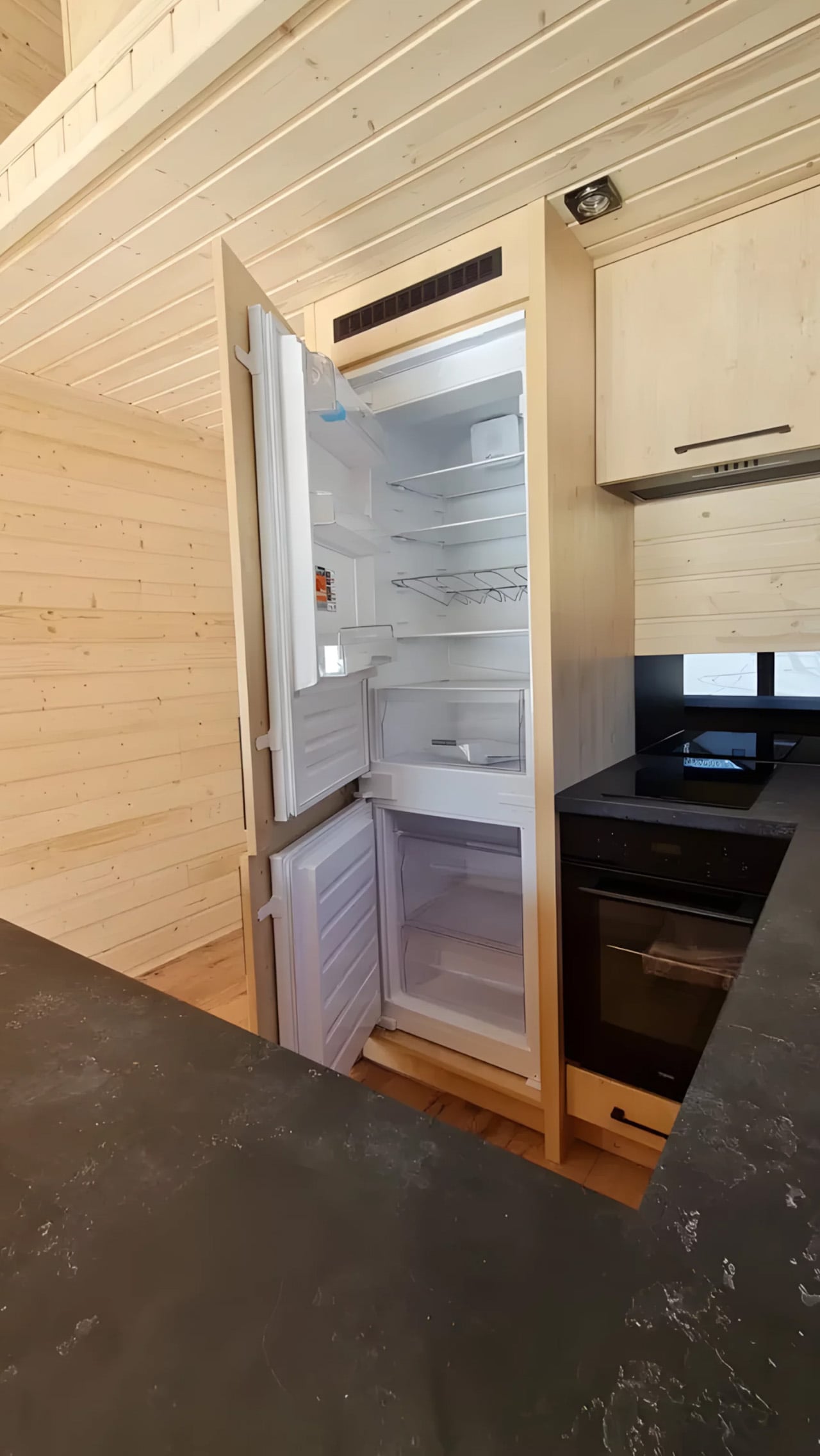
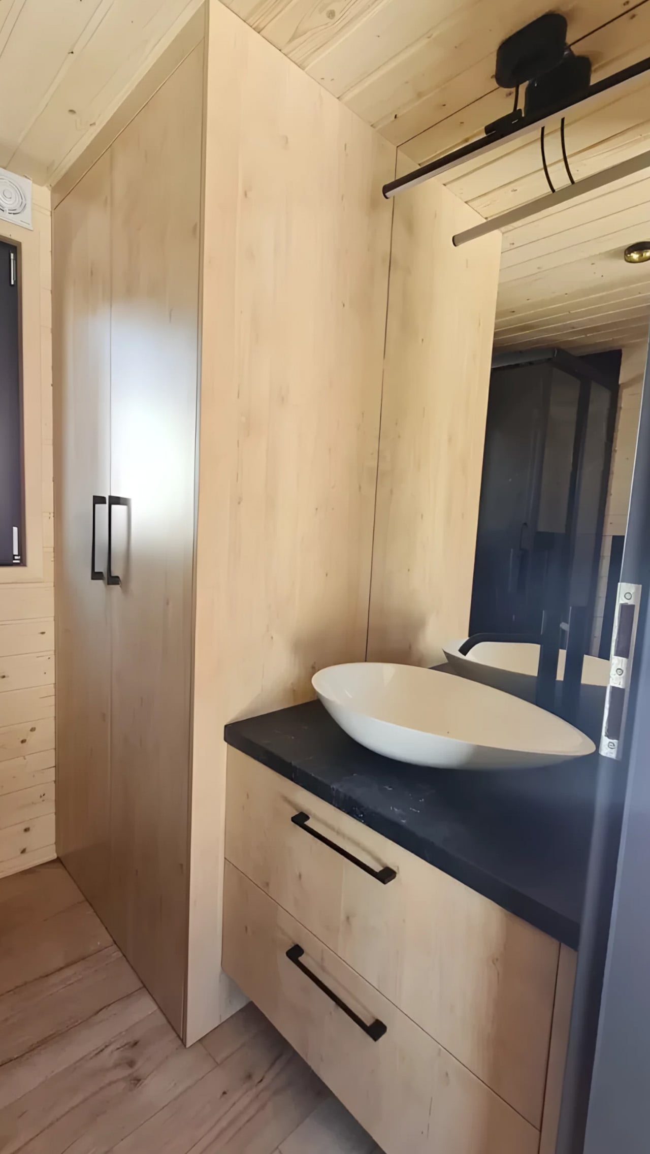
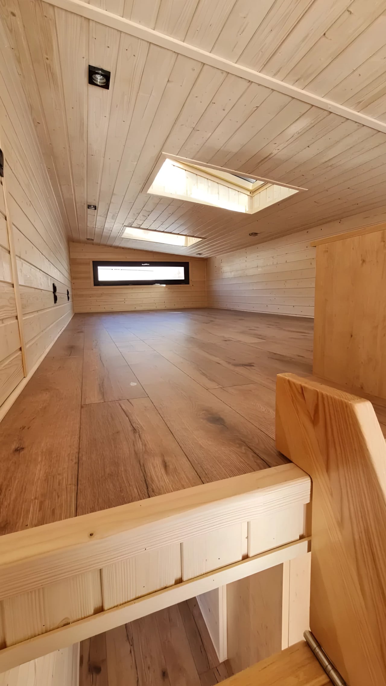


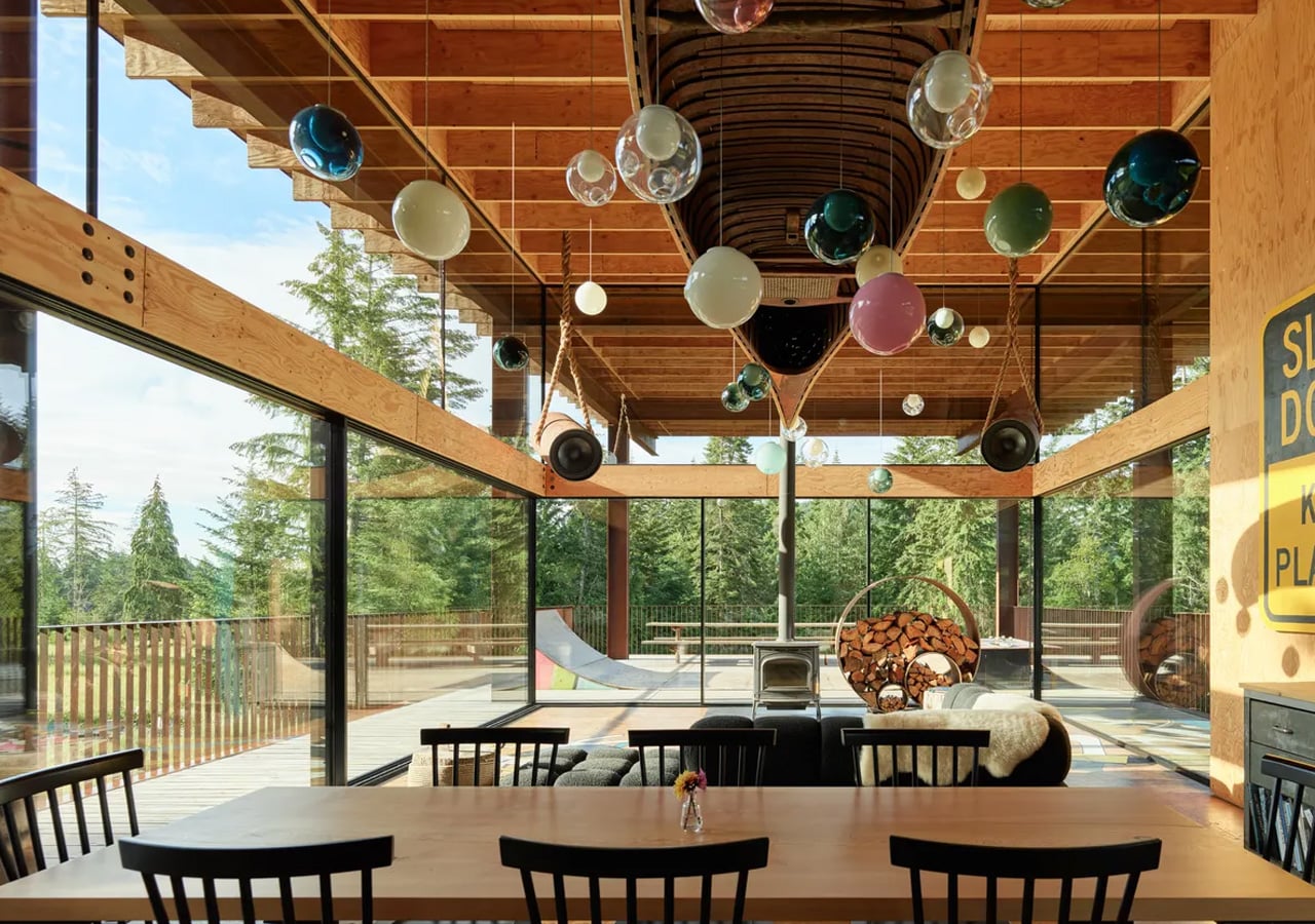


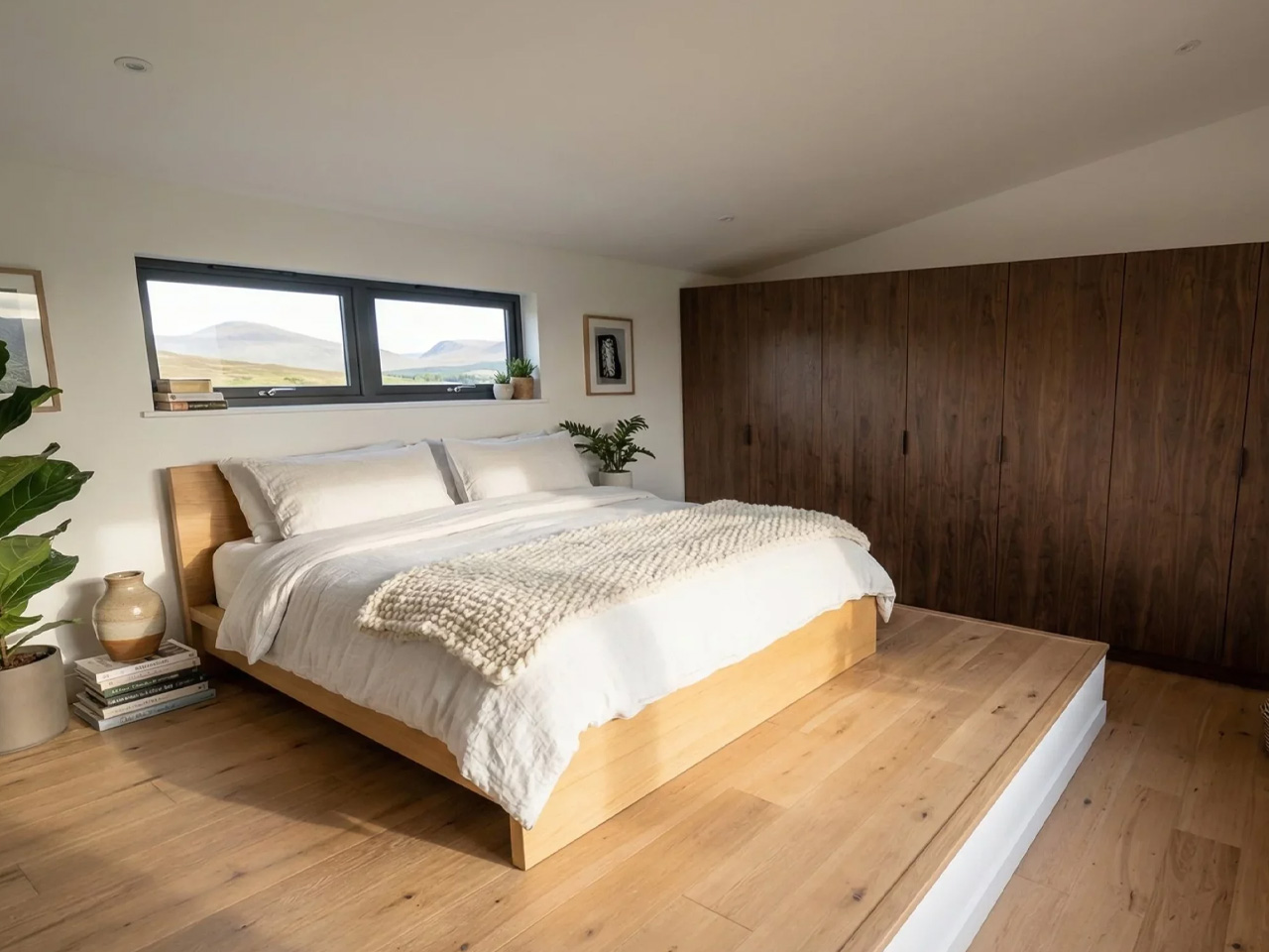
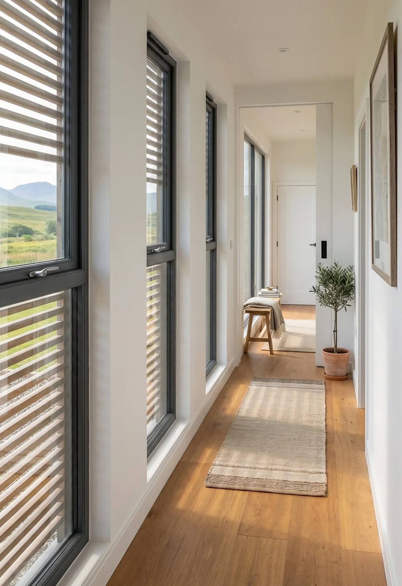
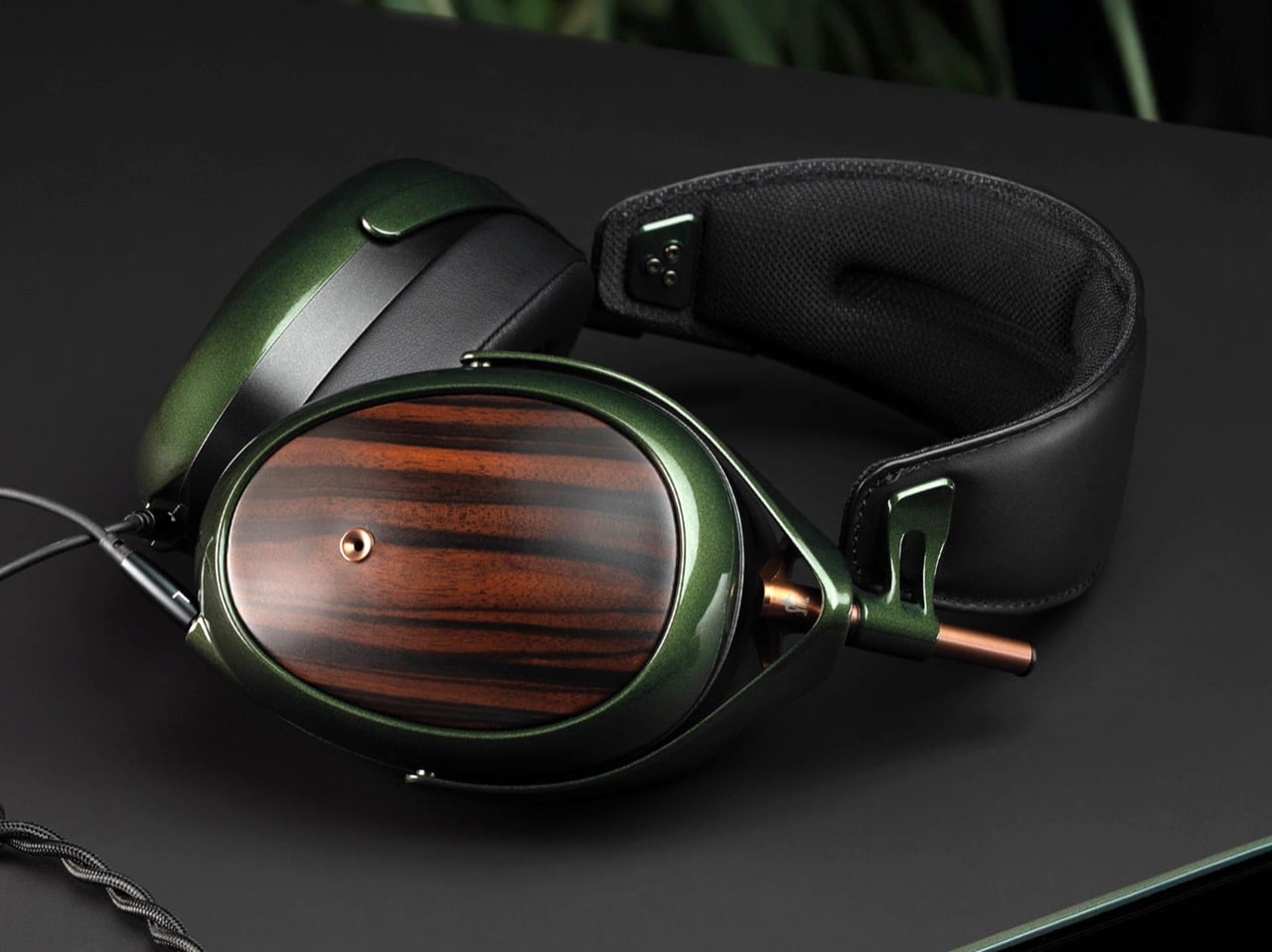

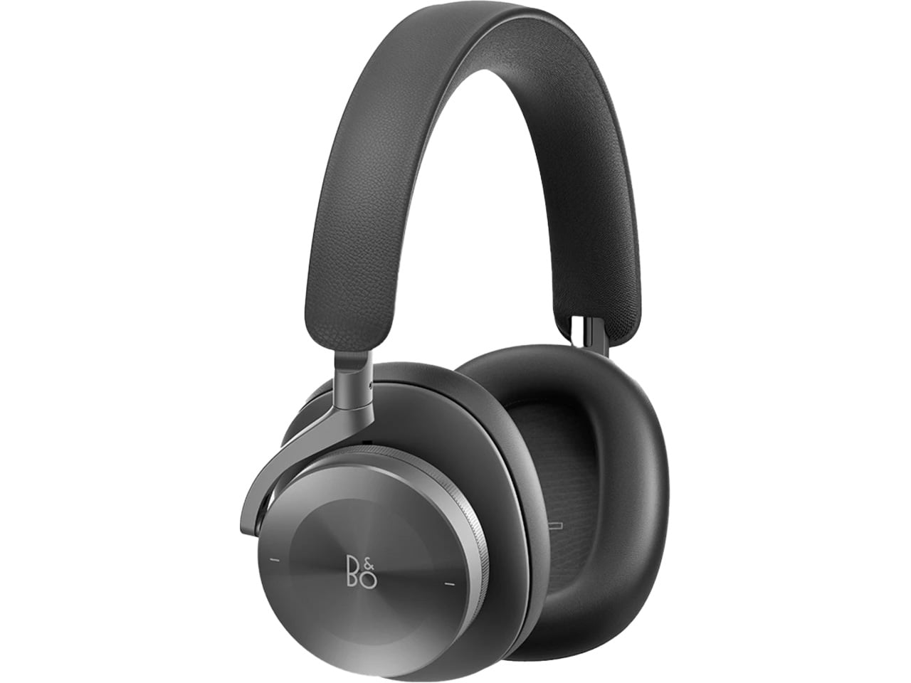
 Bang & Olufsen has been designing objects that make a room better simply by existing in it since 1925.