March brought the kind of furniture that doesn’t need to announce itself. A student chair that shifts between sitting and lounging through physics alone. A coffee table whose legs look like they’re caught mid-step toward the door. A stool that opens from flat with a single press and no tools required. An office system built to reconfigure whenever the day asks for something different. A footstool that handles posture quietly, without making it your problem to manage.
What connects these five pieces isn’t a shared material or a shared aesthetic. What connects them is the absence of excess. Each one solves something real, and each one does it without layering on complexity to get there. That kind of restraint is harder to land than it looks. Most furniture design in 2026 is reaching for the new, for the bold, for the statement piece. These five reach for the right answer instead, and find it.
1. Tilt Chair
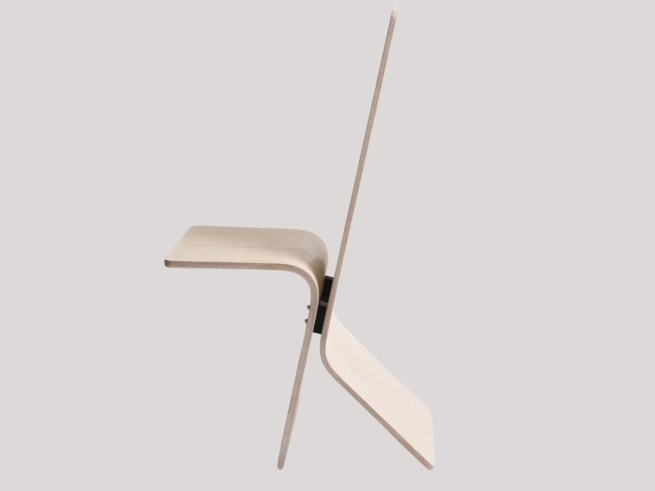
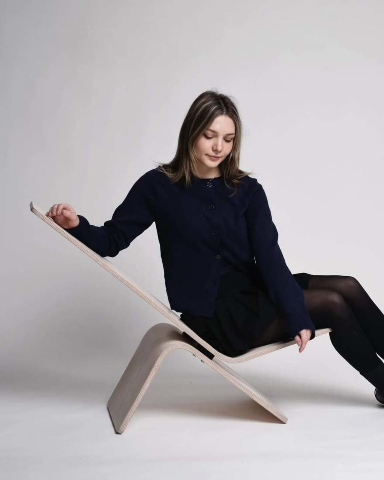
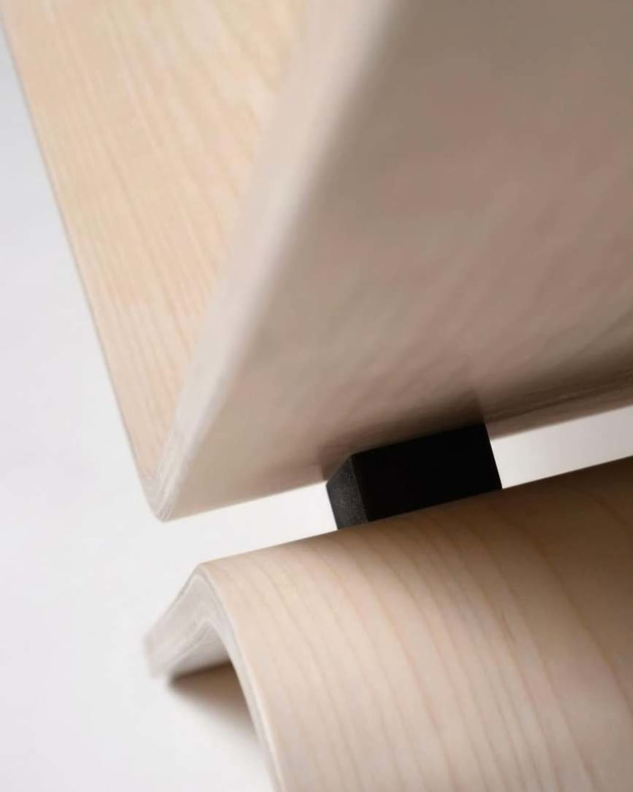
Manuela Hirschfeld is an industrial design student at Germany’s Hochschule Pforzheim, and her Tilt chair does exactly what the name suggests. Built from bent plywood, it shifts between upright and reclined with a single forward tilt. No levers, no hardware, just physics and balance. The restraint here is rare for student work. Most student designs reach for the complex or the speculative. Tilt strips everything back until the idea stands entirely on its own.
What makes it genuinely useful is how naturally it handles the shift between focused work and winding down. Most chairs make you choose one mode and stay there. Tilt lets your body make that call instead. Lean it forward, and the geometry changes. The bent plywood keeps it light and easy to move, so it works as well in a small apartment as it does in a studio or home office.
What We Like
No mechanical parts means nothing to replace or service over time
Dual function in a single lightweight form, no extra hardware needed
What We Dislike
The minimal plywood aesthetic may feel too sparse for warmer, more layered interiors
May not offer enough firm back support for users who need a fixed, stable position
2. Barefoot Collection
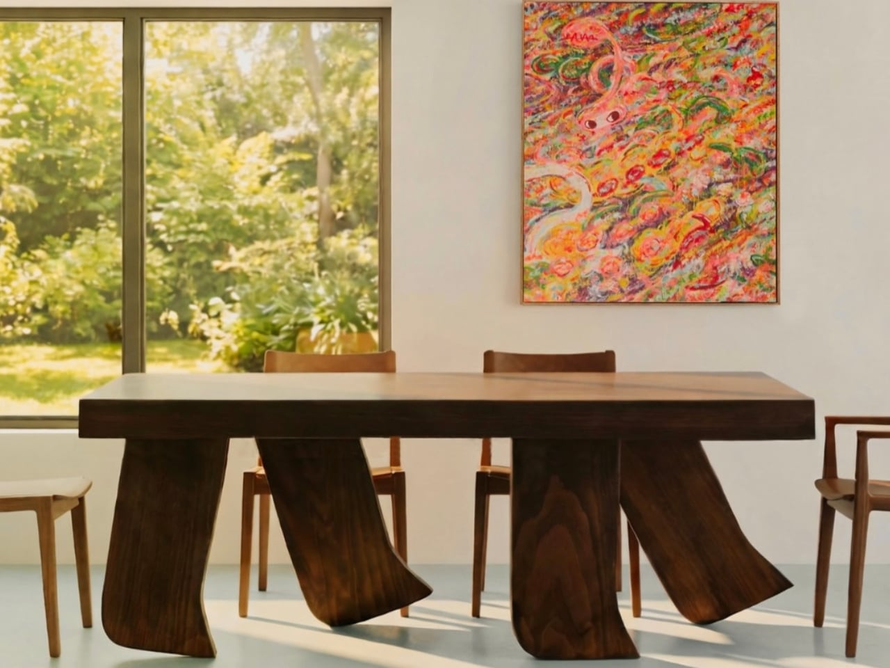
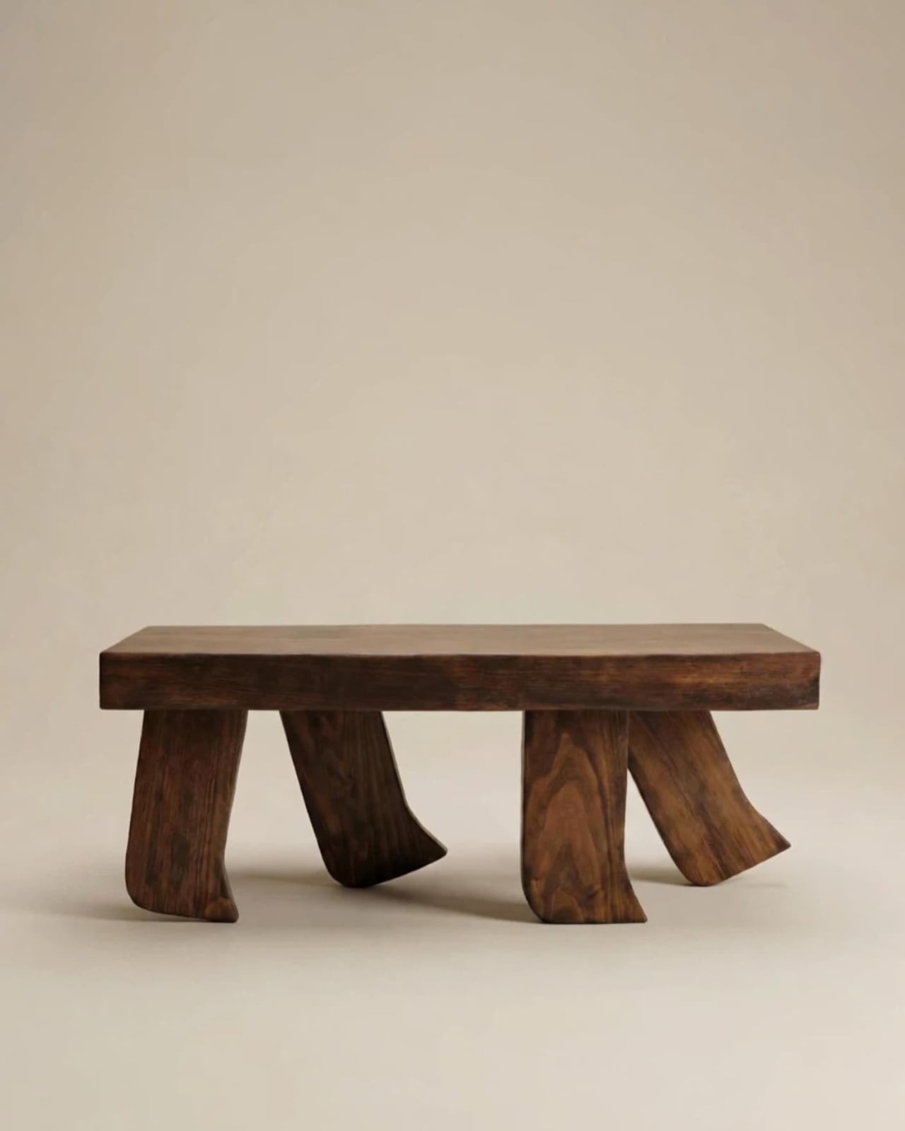
The Barefoot Collection started with a single image: a coffee table that looks like it’s walking away. The legs are carved from solid wood to simulate the arc and flex of a bare foot mid-step, while the tabletop stays completely flat and rectilinear. Stillness above, motion below. That contrast is the whole point, and it works better than it has any right to. The piece reads as coherent long before it reads as clever.
What you actually get is a coffee table that functions without apology and sparks a real conversation without ever trying to. Set a cup on it and forget the concept entirely. Then a guest walks in, does a double-take, and suddenly the room is talking. Most concept-led furniture exhausts you after a few weeks. Barefoot earns its place by being genuinely useful first and genuinely interesting second. That’s always the right order.
What We Like
Solid wood construction gives it real longevity, well beyond its visual appeal
Works as a fully functional surface while quietly holding a strong point of view
What We Dislike
The sculpted legs make it difficult to pair with more conventional, straight-lined furniture
The level of craft involved likely puts it at a higher price point
3. Press Stool
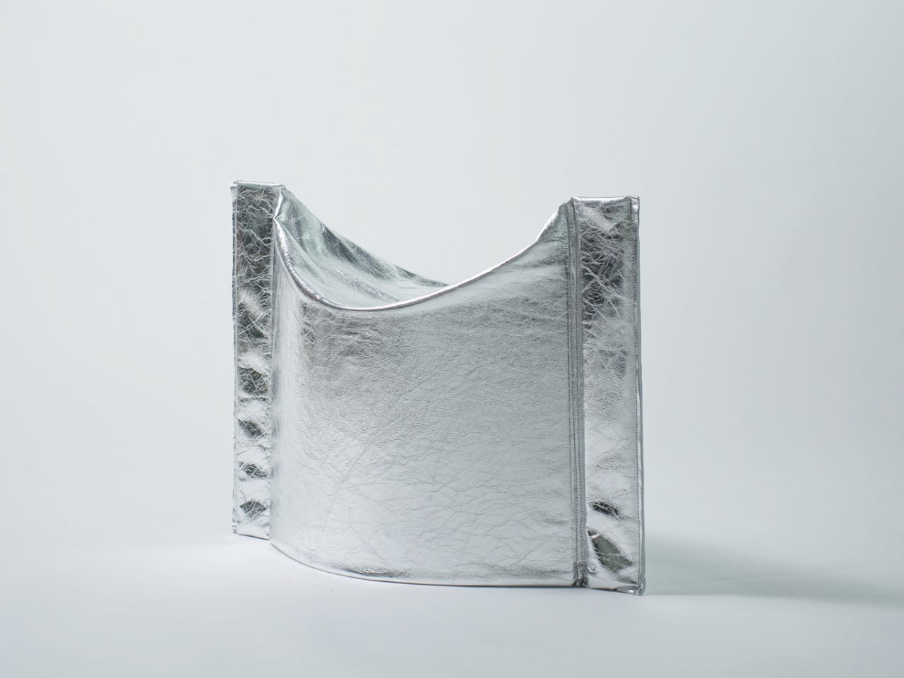
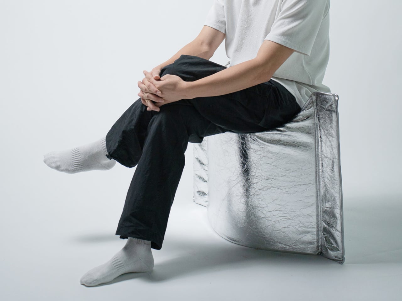
The Press Stool borrows its structural logic from folded paper. A flat sheet has no load-bearing strength, but fold it, and the forces redistribute across the geometry. Crease it further, and the form resists compression. That principle does all the work here. In its flat state, it collapses into a wide oval with a crinkled metallic silver surface that lands somewhere between industrial foil and fabric. One press and it opens. No legs, no bolts, no tools.
For anyone in a small apartment, it solves a storage problem while putting something worth looking at in the room. It ships flat, weighs little, and can slide under a bed or lean against a wall when it isn’t needed. Most fold-flat furniture looks like a compromise. The Press Stool looks intentional. The crinkled surface and gathered folded ends give it a presence that holds up even when it’s closed.
What We Like
Ships and stores completely flat, ideal for smaller homes and tight living spaces
No assembly required, the folded form does all the structural work
What We Dislike
The metallic silver finish is a strong statement that won’t suit every interior palette
Load capacity may be more limited compared to stools with conventional structural frames
4. Kylinc Modular Office System
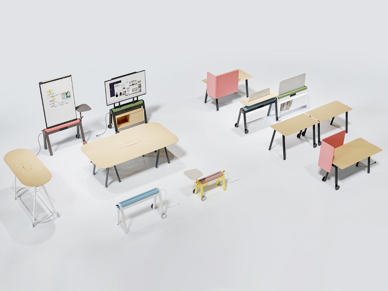
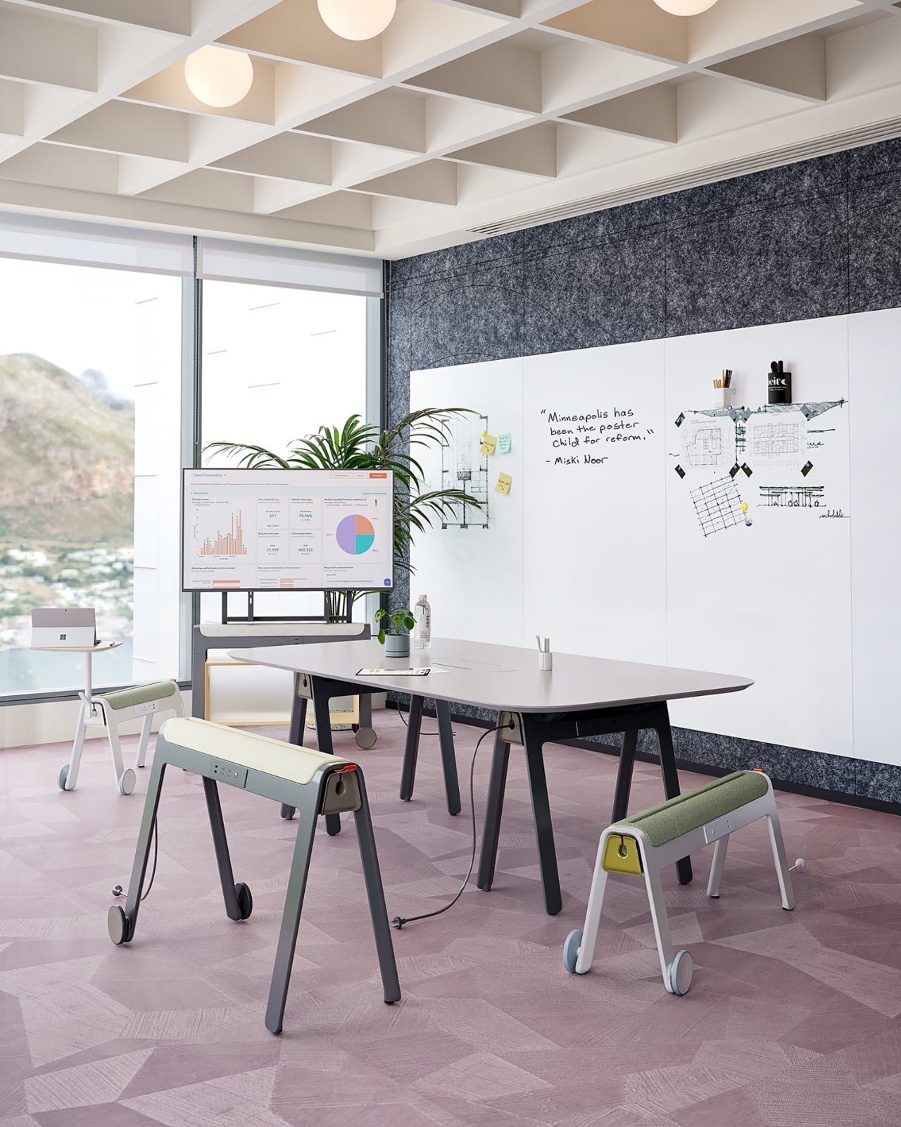
Kylinc treats the workspace like something that should change whenever the day asks it to. Each piece rolls on oversized wheels, which makes reconfiguring your office feel genuinely effortless rather than theoretically possible. Push pieces apart for a collaboration zone, pull them together for focused work. Power management is built directly into the furniture, with smart cable organization that keeps surfaces clean without any additional accessories to track down or manage.
The benefit shows up most for people working from home across a day that never asks the same thing twice. A static configuration works well some of the time and poorly the rest. Kylinc changes that without requiring much effort, which is the real difference between a system that actually gets used and one that stays fixed out of habit. The built-in cables move with the furniture. Your layout becomes something you actually control.
What We Like
Oversized wheels make real reconfiguration effortless, not just possible on paper
Integrated power and cable management keep the workspace clean without extra accessories
What We Dislike
Rolling furniture may feel less stable than fixed pieces for users who prefer an anchored setup
A full modular system likely carries a significantly higher upfront cost than standard office furniture
5. OTTO Footstool
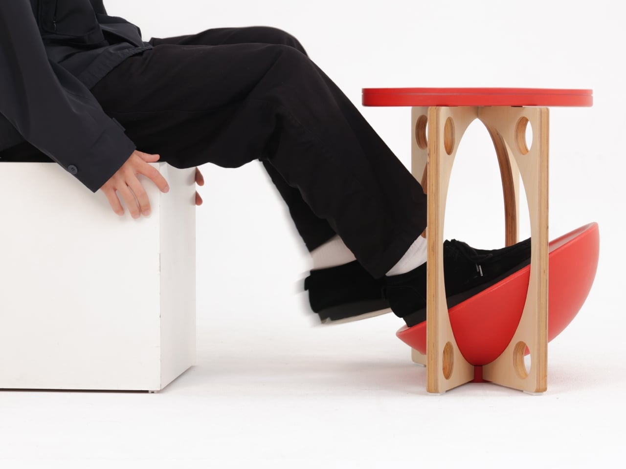
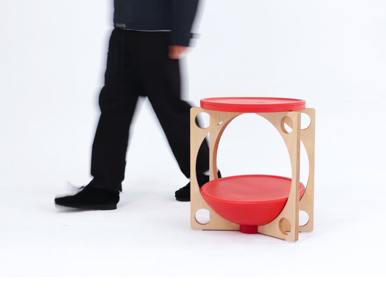
OTTO takes its name from the Korean roly-poly toy Ottogi, a round-bottomed figure that always rights itself because of its convex base. Designer Woonghee Ma applied that same logic to a footstool. The convex base means it rocks and shifts as your body moves throughout a long sitting session. No adjustment needed, no settings to configure. You shift weight, the stool moves with you, and that’s the whole mechanism.
For a home office that needs to support you without making a production of it, OTTO is exactly right. Most ergonomic products demand your attention to work. OTTO doesn’t. The passive rocking base handles posture support quietly while you stay focused on everything else. It also looks good, which matters more than it might seem for something you’ll look at every working day. Clean, compact, and entirely unpretentious about what it is.
What We Like
Passive rocking base provides ergonomic support through natural weight shifts, no settings required
Compact and well-proportioned, it works equally well in home and professional office settings
What We Dislike
The rocking motion may feel unfamiliar at first for users accustomed to fixed support
May not suit very low seating arrangements where foot elevation isn’t part of the setup
March Didn’t Make a Noise. It Made a Point.
What connects these five pieces isn’t an aesthetic or a material. It’s restraint. A chair that changes mode with one gesture. A table that earns its concept by being useful first. A stool that ships flat and opens in a second. A workspace that adapts without asking for your help. A footstool that supports you without ever drawing your attention to the fact that it’s doing so. That quiet confidence is what good design actually looks like in practice.
Most design coverage this month was busy chasing the big swing. The sculptural statement, the unexpected material, the idea that needs a paragraph of explanation before it lands. What these five pieces share is something quieter. They ask less of you. They make their case by fitting into your life rather than reshaping it around themselves. March didn’t produce the loudest furniture of the year. It produced some of the most considered. That’s always the better result.
There’s a version of a desk setup that communicates everything about how little thought went into it. A black mesh organizer from the bottom shelf of a supply closet. A mouse pad that came free with something else. A cable clip in beige. The desk functions, technically, and does so with a level of visual enthusiasm that matches a waiting room.
The accessories below were designed by people who thought about this harder. Some carry authentic 1970s Italian design heritage. Some are running AI in the background to actively shape your environment. One contains material roughly 20 million years older than the Earth it now rests on. What they share is a quality of intentionality. Each was built as an object worth keeping on a desk, not just stashing in a drawer, because it earns its surface area through how it works, how it looks, or both at once. For men who have graduated from the corporate supply closet aesthetic, these eight represent a meaningfully different set of options.
1. Lenovo AI Workmate Concept
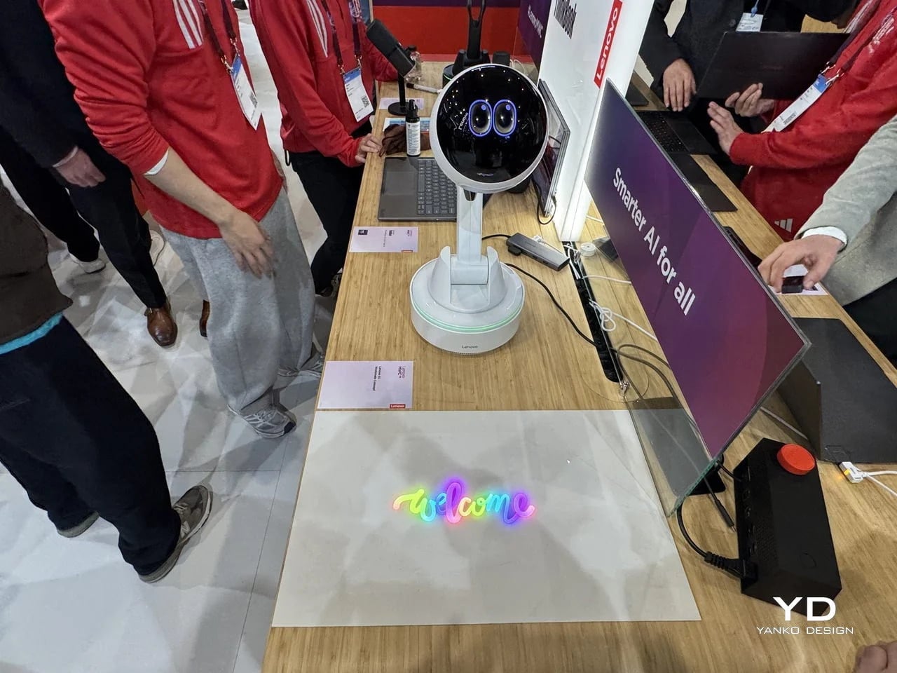
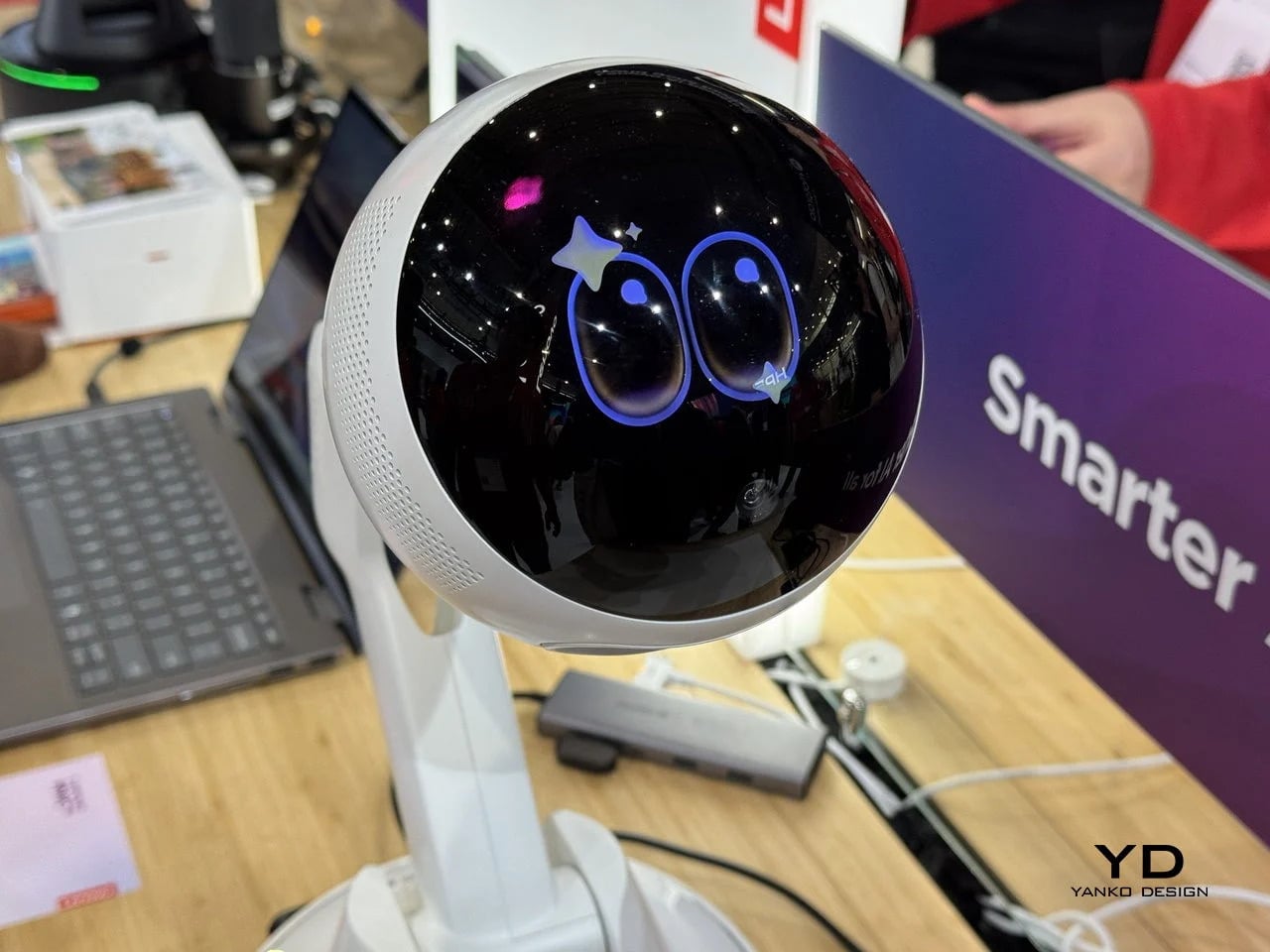
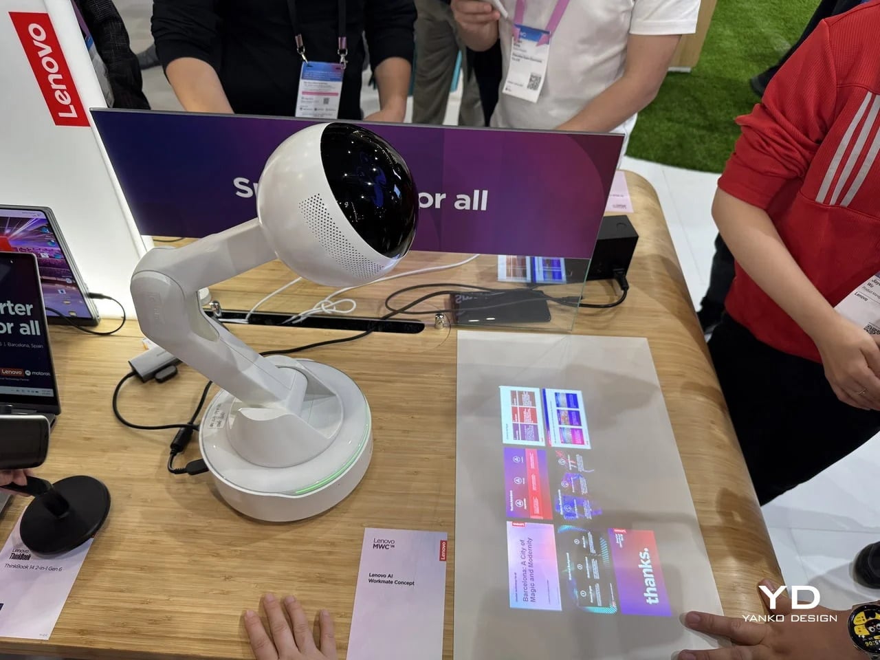
Working alone all day carries a specific kind of friction that most desk setups quietly ignore. Questions accumulate, decisions pile up, and the AI tools meant to support you sit behind a keyboard input that gives nothing back spatially or visually. Lenovo’s AI Workmate Concept, unveiled at MWC 2026, takes that problem seriously enough to build a physical object around it. The result is a desk companion in the most literal sense: a spherical head on an articulated arm mounted on a circular base, with animated eyes on its front display that shift and orient as it processes and responds. The form is compact, the presence is deliberate, and the intent is clear from the first time it moves.
The arm is the most consequential design decision here. Because it moves, the Workmate can orient itself toward whatever holds attention in front of it, a document laid flat on the desk, a person leaning back in their chair, or something happening at the periphery. That range of motion is what separates it from a smart speaker that has been given a screen and called a companion. Spatial awareness is embedded in its posture, not just its software. For men who spend long hours alone at a desk and find text-based AI interaction increasingly impersonal and context-free, the Workmate proposes something more honest about what presence and assistance can look like from an object sharing your workspace.
What We Like
Articulated arm gives the device genuine spatial awareness, orienting toward objects and people rather than remaining static
Animated eyes on the front display make AI interaction feel more present and less transactional than any screen-based interface
What We Dislike
Currently a concept unveiled at MWC 2026, with availability, pricing, and final specs still unconfirmed
The novelty of animated eyes may carry more emotional weight than the practical functionality justifies over time
2. Levitating Pen 2.0: Cosmic Meteorite Edition
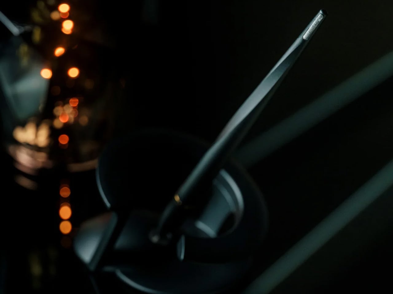
Most pens sit on a desk and do nothing interesting when they’re not being used. The Levitating Pen 2.0 Cosmic Meteorite Edition refuses that arrangement entirely. It floats at a 23.5-degree angle above its magnetic base, creating a suspension that stops people mid-sentence when they notice it. The design draws from spacecraft aesthetics, specifically the visual language of the USS Enterprise, and the tip incorporates a genuine fragment of Muonionalusta meteorite, a material approximately 20 million years older than the Earth it now rests on. It functions as a working ballpoint pen, which means it is simultaneously a collector’s object, a desk focal point, and a writing tool occupying the same physical form.
What keeps this from reading as pure novelty is how it behaves in your hands. The Levitating Pen is fidget-worthy in the best sense, the kind of object you reach for during a long call or a pause between tasks without consciously planning to. For men who collect objects with a verifiable reason behind them, the meteorite tip offers something most limited editions simply don’t: provenance with a story that doesn’t require a certificate to feel real. You’re holding material from beyond the solar system. That fact changes the weight of the object in your hand when you stop to think about it, and that shift is exactly what separates a desk accessory from a desk object worth keeping.
Genuine Muonionalusta meteorite tip connects the pen to a tangible, verifiable piece of cosmic history
Magnetic levitation display creates a desk focal point that requires no ongoing maintenance once positioned
What We Dislike
The floating display requires a flat, stable surface, limiting where it can sit effectively
Limited edition production means restocking after sellout is not guaranteed for future buyers
3. BOB Desk Organizer
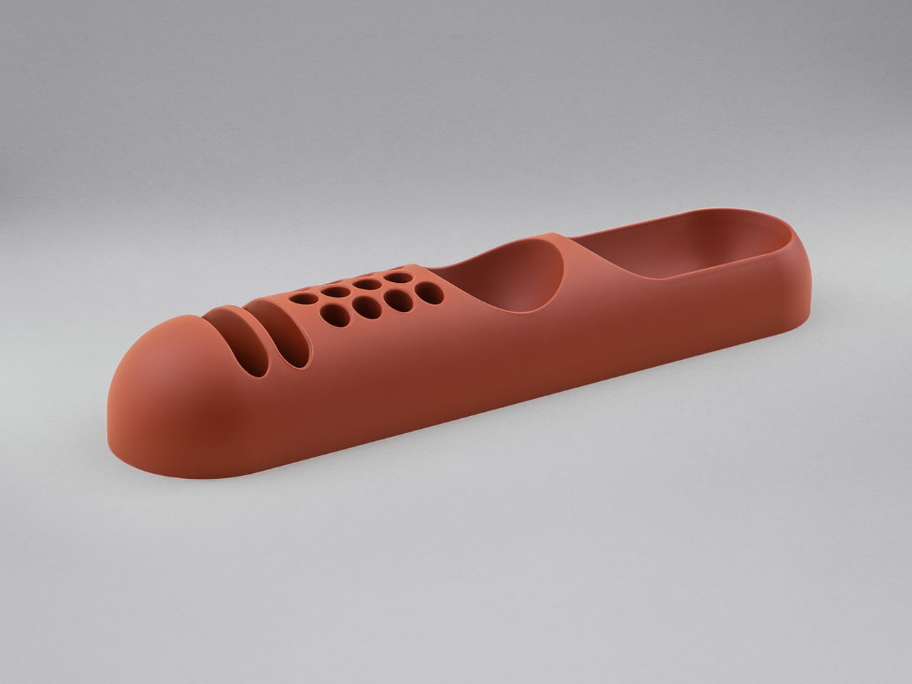
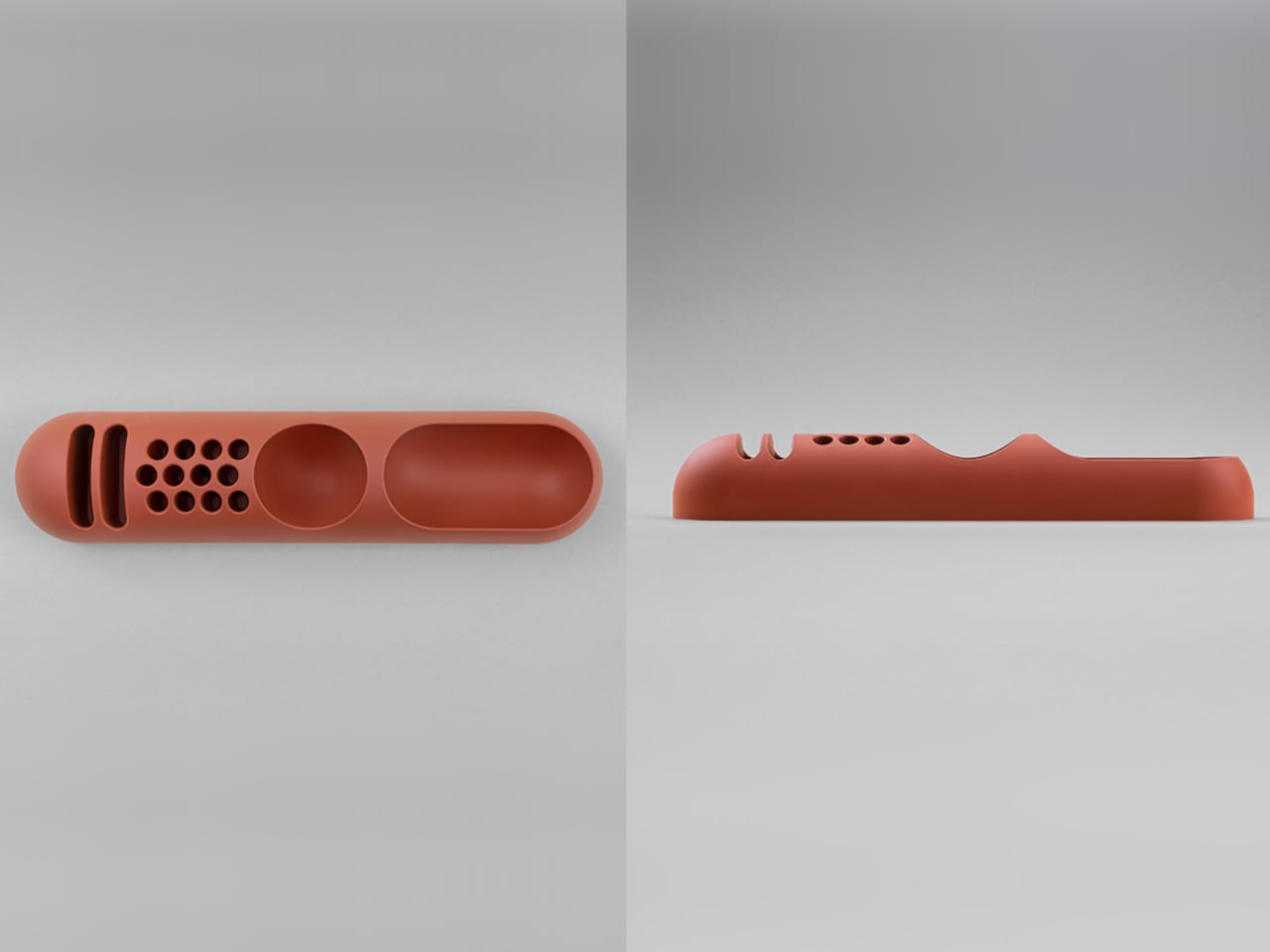
Joe Colombo designed BOB in 1970, at a time when desk organizers were either plastic trays with zero intentionality or overengineered systems that looked more complicated than the mess they were supposed to fix. He chose neither direction. BOB is a compact polyurethane gel form, elongated and low-profile, almost pill-shaped when viewed from above, with one end rising into a soft dome and the other tapering nearly flat. B-Line, an Italian label dedicated to reissuing objects from discontinued original molds, brought it back in 2023 across five colorways: terracotta, slate blue, mustard yellow, warm white, and a frosted translucent version called ice. The selection alone suggests a designer thinking about rooms rather than offices.
The top surface divides into three functional zones without any visible partition between them. The dome end opens into a large oval scoop for bulkier items. The center holds a three-by-four grid of individual circular holes, each sized precisely for a single pen or brush. The tapered tail offers two horizontal slot grooves for flat objects like rulers or small notebooks. None of this reads as a feature list in person. It reads as a single continuous gesture that happens to keep things organized along the way. For men who want a desk object with actual design history behind it rather than a branding story retrofitted over generic injection molding, BOB is nearly impossible to improve on.
What We Like
Rooted in authentic 1970s Italian design history, reissued from Joe Colombo’s original mold by B-Line
Three distinct functional zones are built into one continuous organic form with no visible hardware or dividers
What We Dislike:
Polyurethane gel construction may show surface wear or discoloration with extended daily use
The low-profile form works best for lighter objects and may not support heavier desk tools effectively
4. DEEP
DEEP operates on a premise most desk lamps don’t bother with: the working environment around you should configure itself to match what you are about to do, rather than waiting for you to adjust it manually. Switch it on with a spinning-top-inspired power button, tell it whether you’re studying, coding, reading, or doing creative work, and it adjusts both light quality and ambient sound before you’ve had to think about either. A camera positioned at eye level monitors your focus state in real time, functioning like a built-in productivity coach without requiring a separate app or a separate device taking up additional surface area.
What separates DEEP from a connected lamp with a smart home feature set is what it does across repeated sessions. The system saves your manual adjustments over time, builds a personal profile from the conditions that consistently work best for you, and begins applying them automatically without being prompted. Side buttons allow precise overrides for days when the default doesn’t fit. For men whose desks have become cluttered with single-function devices that each do one thing adequately, DEEP represents a genuine consolidation. It folds a lamp, an ambient sound environment, and a passive focus monitor into a single object that becomes more attuned to how you work the longer it stays on your desk.
What We Like
AI builds a personal focus profile across sessions and applies your optimal working conditions automatically over time
Combines lighting, ambient sound, and real-time focus monitoring without requiring any additional hardware
What We Dislike
Camera-based focus tracking may feel uncomfortable for users sensitive to passive environmental monitoring
Ambient sound adjustment effectiveness varies significantly based on an individual’s working environment and noise tolerance
5. Rolling World Clock
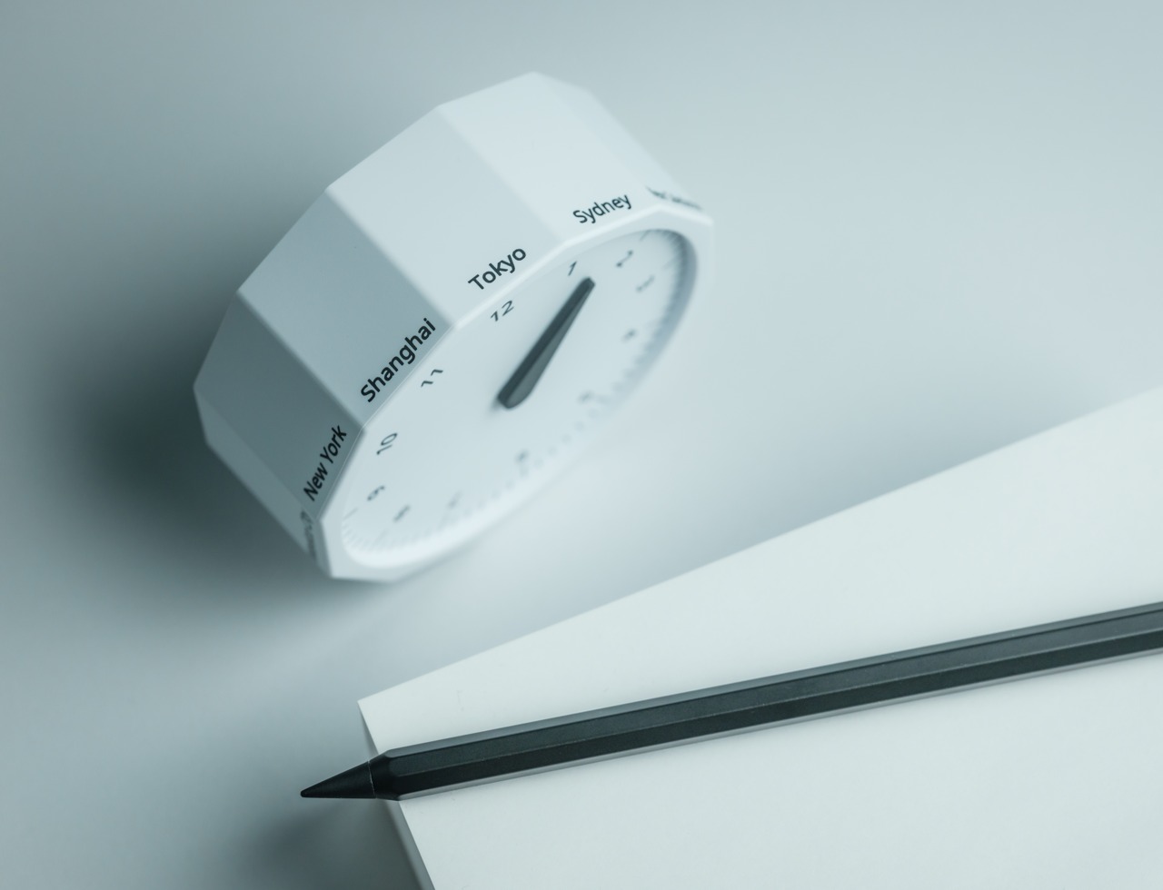
Every desk clock tells you one thing. This one tells you twelve. The Rolling World Clock is a 12-sided object with a single hand and an operation that couldn’t be more direct: set it on any face, and the hand reads the correct local time for the city printed on that side. The twelve cities span the major global time zones, including London, Paris, Cape Town, Moscow, Los Angeles, Karachi, Mexico City, New York, Shanghai, Tokyo, Sydney, and New Caledonia. For men who manage work across multiple time zones or simply have family spread across continents, the mental arithmetic of figuring out what time it is somewhere else is one of the more persistent small irritations in a working day, and this object removes it without adding a screen.
The design decision that makes this worth keeping on a desk rather than just owning is the total absence of anything unnecessary. No digital display. No charging cable. No app. Just a tactile, rollable object you turn to the city you need and set down. Available in black and white, it occupies desk or shelf space without reading as a gadget or demanding attention it hasn’t earned. There’s a quiet pleasure to the interaction that most clocks don’t provide: the act of picking it up, choosing a place in the world, and reading the time. There is a physical engagement with global time that a phone screen never manages to replicate.
Covers twelve major time zones in a single tactile object with no digital display, no app, and no charging required
Minimal form reads equally well on a desk or shelf without visually registering as a tech accessory
What We Dislike
A single clock hand requires slightly more reading attention than a digital display for precise timekeeping
The 12-city selection covers major zones well, but may not include every specific time zone a user needs regularly
6. Fidget Cube
The case for keeping a dedicated fidget object on a desk is more rational than it sounds from the outside. Restless hands during long calls, slow-loading processes, or decisions you’re turning over without fully committing to are a real and recurring part of working at a desk, and the Fidget Cube was built precisely for that condition. Six sides offer six different tactile surfaces: a cluster of clickable buttons, a gliding joystick, a row of flip switches, a smooth surface designed for the thumb’s natural breathing motion, a rolling ball set into one face, and a spinning disc. The variety means your hands will find a preferred surface quickly and return to it across the session without thinking about it.
What keeps this from reading as a toy is the restraint built into how it was designed. It doesn’t look out of place on a desk or conference table, particularly in the Midnight black colorway, which sits visually neutral among the standard dark objects that populate most professional environments. For men who have noticed that physical repetitive movement genuinely sharpens how they think through a problem, this is one of the more honest tools available at any price point. It takes a real behavioral truth seriously and gives your hands a quiet, clean way to act on it without disrupting anyone around you or drawing attention to what you’re doing.
What We Like
Six distinct tactile surfaces address a wide range of fidgeting habits within one compact, pocketable object
Discreet colorways, particularly Midnight black, keep it visually neutral in professional desk environments
What We Dislike
Some click mechanisms can produce an audible sound in quiet rooms or during video calls
Serves no secondary organizational function on a desk, occupying surface space with a purely tactile purpose
7. MOFT Z Sit-Stand Desk
Sit-stand desks have spent years being expensive, physically large, or permanently locked to a specific room. The MOFT Z takes a completely different approach, collapsing to something closer to a slim notebook in thickness while delivering a full ergonomic range through an origami-inspired Z-structure. It provides one standing mode and three seated position angles, which is enough postural variety to meaningfully shift how you feel across a long working session. For men who divide their time between home, a co-working space, a client’s office, or anywhere other than a fixed desk, the ability to carry a sit-stand setup in a bag removes an ergonomic compromise that most standing desk products are structurally incapable of solving.
The weight is what makes it a genuine solution rather than a clever concept. Ergonomic equipment that stays home because it’s too heavy or awkward to transport defeats the purpose of improving how you work across different locations. The MOFT Z doesn’t have that problem. Unfold it in seconds, set your laptop on the surface, and you’ve built the same ergonomic posture you’d have at a standing desk that costs several times more and cannot leave the floor it occupies. For anyone who has watched their posture decline steadily across a long afternoon of flat laptop work, this is a practical correction that goes where you go and requires no tools, no assembly, and no installation to use.
What We Like
Origami Z-structure provides one standing mode and three seated positions with no setup tools required
Ultra-lightweight, paper-thin folded profile makes it genuinely portable across different working locations
What We Dislike
Surface area restricts how much additional equipment can sit alongside a laptop in standing mode
Stability may be reduced under heavier setups or on surfaces that aren’t completely flat and firm
8. LEGO-Style Silicone Cable Organizer
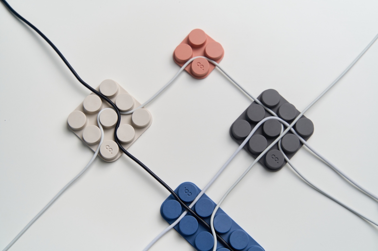
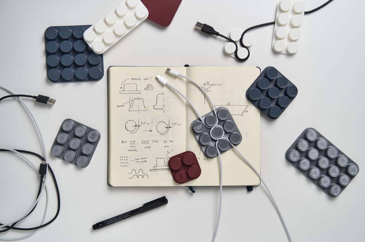
Cable management has a way of being solved temporarily and then quietly abandoned. The solution works for a week, then a new cable enters the setup, or the organizer shifts position, or it turns out the adhesive left a mark on the desk. This silicone cable organizer approaches the problem differently. Shaped after a lozenge pack, it uses peg-topped cylindrical columns to wrap and hold individual cables in separate, stable positions. Multiple units can be stacked or arranged in rows, and three sizes cover the range from a single charging cable to a full multi-device setup: a 2×2 mini, a 3×3 medium, and a 2×5 large, with the option to place two cables on top of each other within the same row.
The design was born from a specific personal frustration: cables tangling with other items inside a bag, the kind of small recurring annoyance that accumulates into a genuine grievance over time. That origin shows in how focused the solution is. There’s no overengineering, no branded clip mechanism, no custom routing system that only works with certain cable gauges. The micro suction tape base grips the desk surface firmly without permanent adhesion, meaning it moves when the setup changes and holds when it doesn’t. For men who have gone through two or three cable management products and quietly abandoned all of them, the directness here is precisely the argument for this being the last one you need.
What We Like
Three modular sizes cover setups from a single cable to a full multi-device workspace without custom parts
Micro suction tape base holds securely without permanent adhesion, leaving the desk surface undamaged
What We Dislike
Silicone material collects lint and dust more readily than hard plastic alternatives
The LEGO-inspired visual style reads as playful and may not suit every desk aesthetic preference
The Best Desk Is One You Actually Thought About
A desk says something whether you intend it to or not. It communicates how seriously you take the hours you spend there, what kind of work you believe deserves a proper environment, and whether the objects around you were chosen or simply accumulated. The eight accessories above represent a different kind of accumulation, one where every item on the surface has a reason to be there, a story worth telling, or a function that genuinely improves how the day moves.
None of them require a complete overhaul. One rolling clock, one floating pen, one lamp that learns how you work — any single object from this list shifts the energy of a desk in a direction worth going. The corporate supply closet aesthetic isn’t inevitable. It just tends to win by default when no one pays attention. These eight are the case for paying attention.

 Connexion