Vue lecture

A Mouse You Can Squeeze Like a Stress Ball While You Work
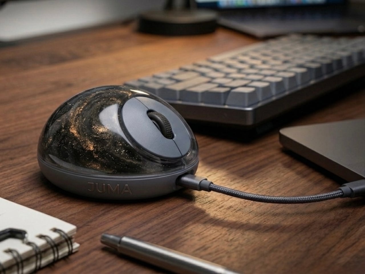
The computer mouse hasn’t changed much in decades. Still mostly hard plastic, still shaped like a bar of soap, still asking your hand to grip something that gives absolutely nothing back. The rest of the desk setup has evolved, ergonomic chairs, standing desks, wrist rests, but the one device your hand touches for eight hours straight has remained stubbornly rigid and deeply uninteresting.

The PILLIGA mouse concept makes a fairly obvious argument for why that should change. Instead of hard plastic, the entire upper chassis is a squishy, flexible membrane packed with a viscous, translucent gel. It’s the same basic impulse that makes people reach for a stress ball mid-meeting, except it’s also the thing you need to get any work done.

Designer: Guillermo Gonzalez
The thinking behind it is straightforward enough. Deadline pressure builds, calls run long, and the urge to fidget becomes almost impossible to ignore. Rather than keeping a stress ball in the desk drawer as a separate ritual, the mouse folds that habit directly into the tool that’s already in your hand. You can squeeze, press, or knead the gel without ever lifting your hand off your workflow.

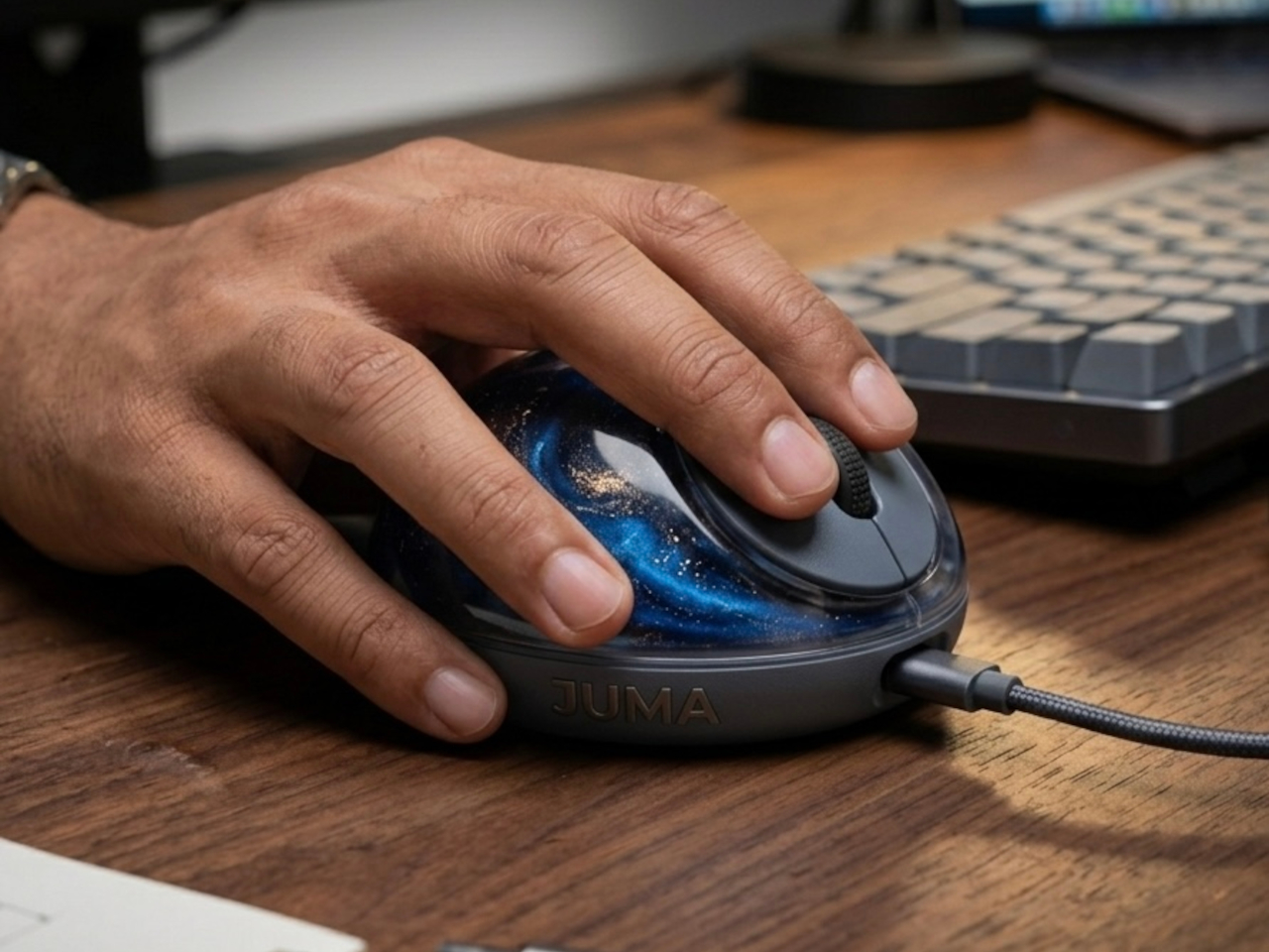
The dome shape isn’t just for show, either. It follows the natural arch of your palm rather than forcing your hand flat against a hard surface, and the gel underneath absorbs the kind of low-level muscular strain that builds up quietly over hours of clicking and scrolling. It’s the sort of ergonomic consideration that usually requires its own dedicated accessory, not just a different material.
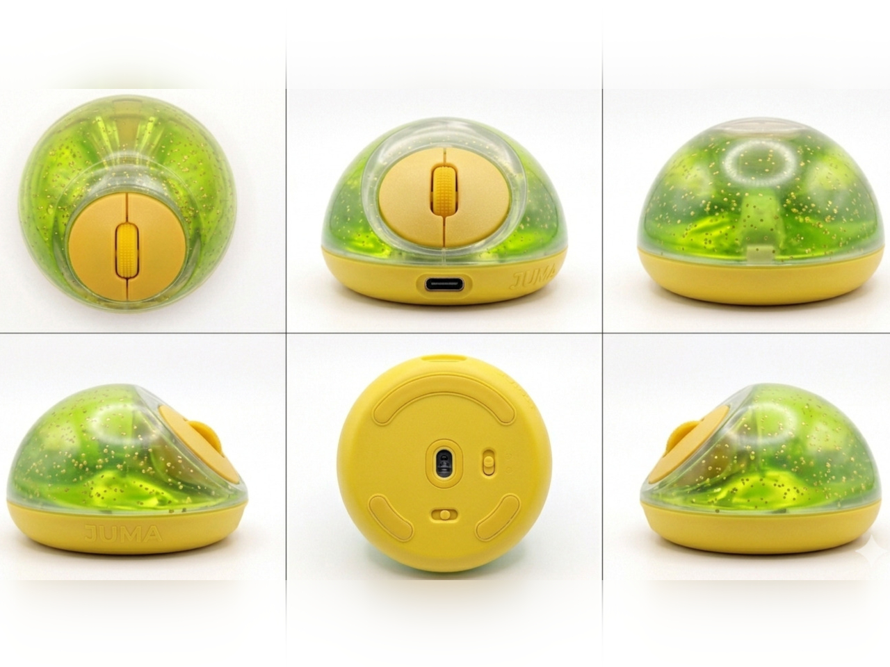
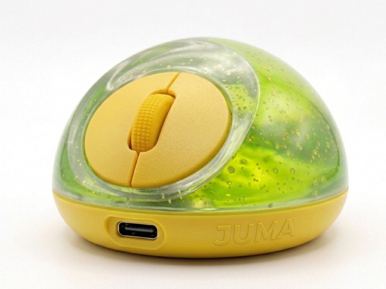
The controls themselves are sensibly laid out. A flat circular interface sits embedded in the front of the mouse, cleanly split for left and right clicks, with a textured, rubberized scroll wheel running between them. A USB-C port at the front handles charging, keeping the wireless design intact without the inconvenience of a separate charging dock. The bottom carries the optical sensor and power switch.

What makes the PILLIGA mouse concept genuinely interesting is how far it extends color as a design element. The gel comes in several variants, from vivid green with gold flecks and a blue version scattered with purple glitter, to darker, more subdued options that look considerably more at home on a professional desk. Each colorway pairs with a matching base and click interface, making the whole thing feel deliberate.
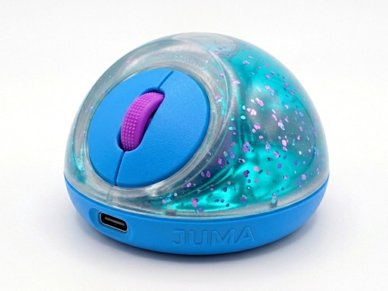
That range matters. The more reserved colorways hint that this isn’t a novelty item for a niche corner of the internet; it works just as comfortably on a professional desk as it does on a creative’s workstation. The gel doesn’t make it look cheap. It makes it look like something designed by someone who gave serious thought to what a mouse should feel like.

Concepts like the PILLIGA are more useful as provocations than promises. Computer mouse design has been coasting on the same assumptions for decades, and the idea that your primary input device could also be physically satisfying to hold hasn’t come up often enough. The gel-filled body raises the question, and that’s honestly more than most peripheral design manages to do.
The post A Mouse You Can Squeeze Like a Stress Ball While You Work first appeared on Yanko Design.

  •  

Forget Smarter AI, This Robot Thinks Presence Is the Point

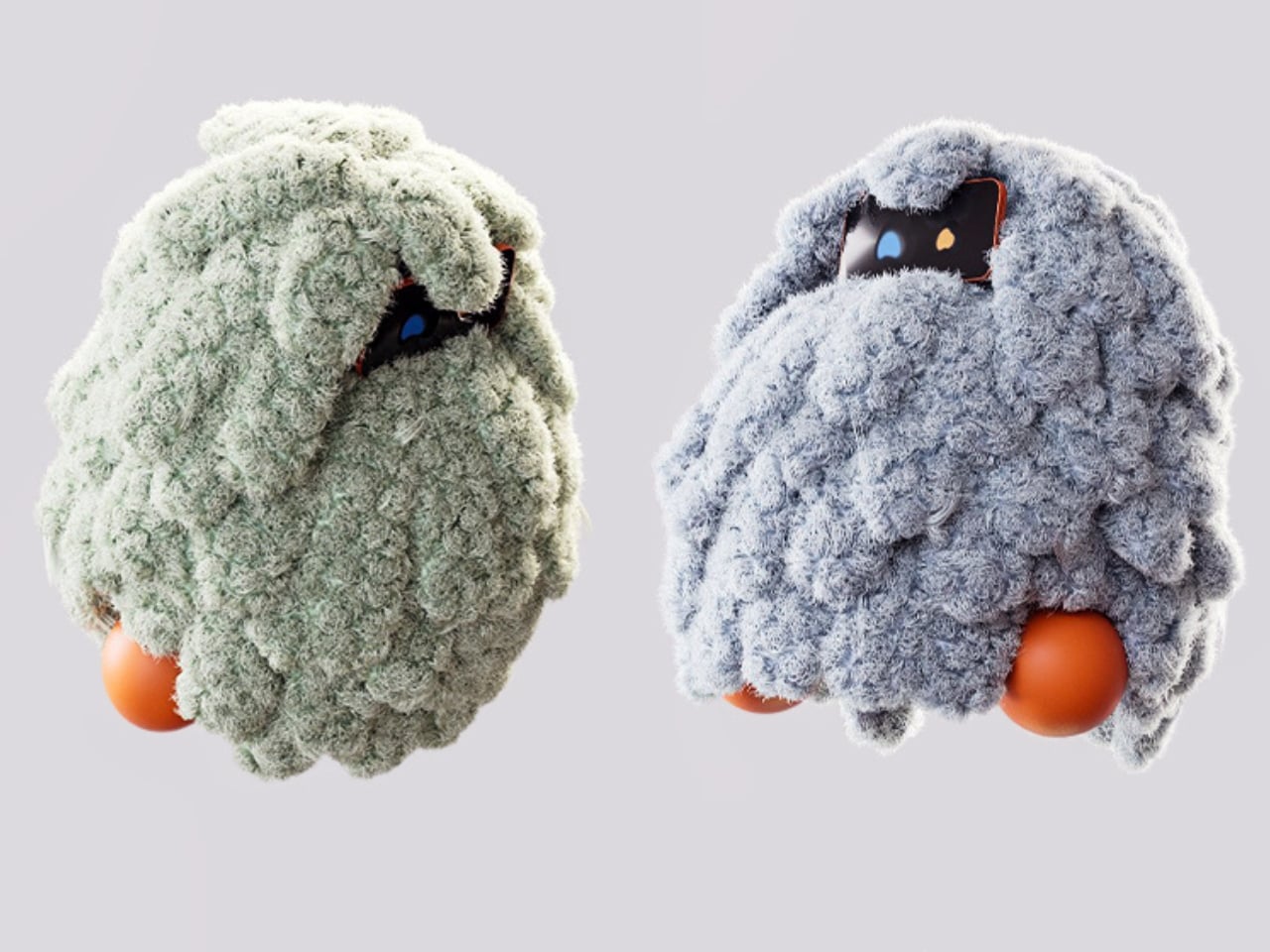
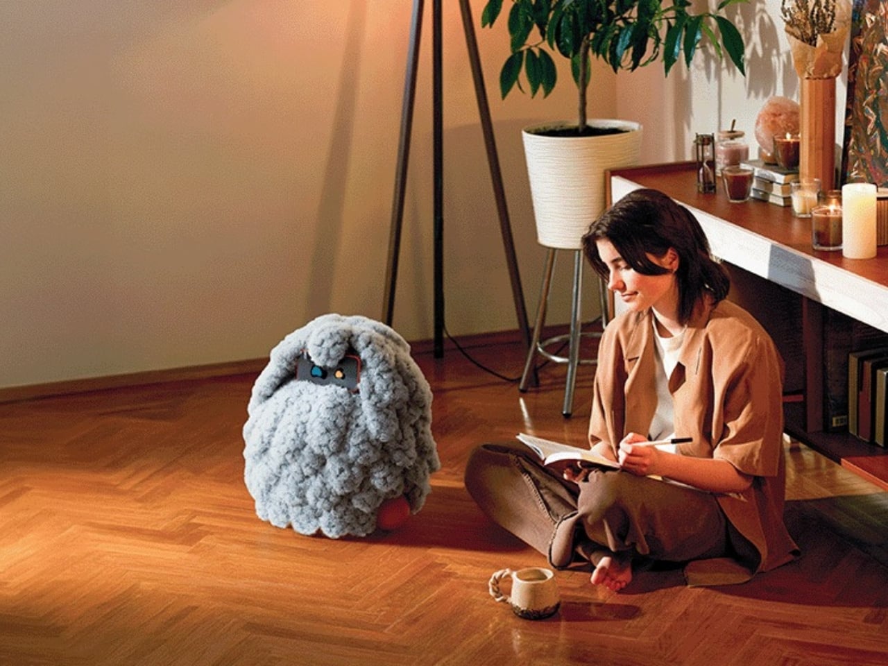
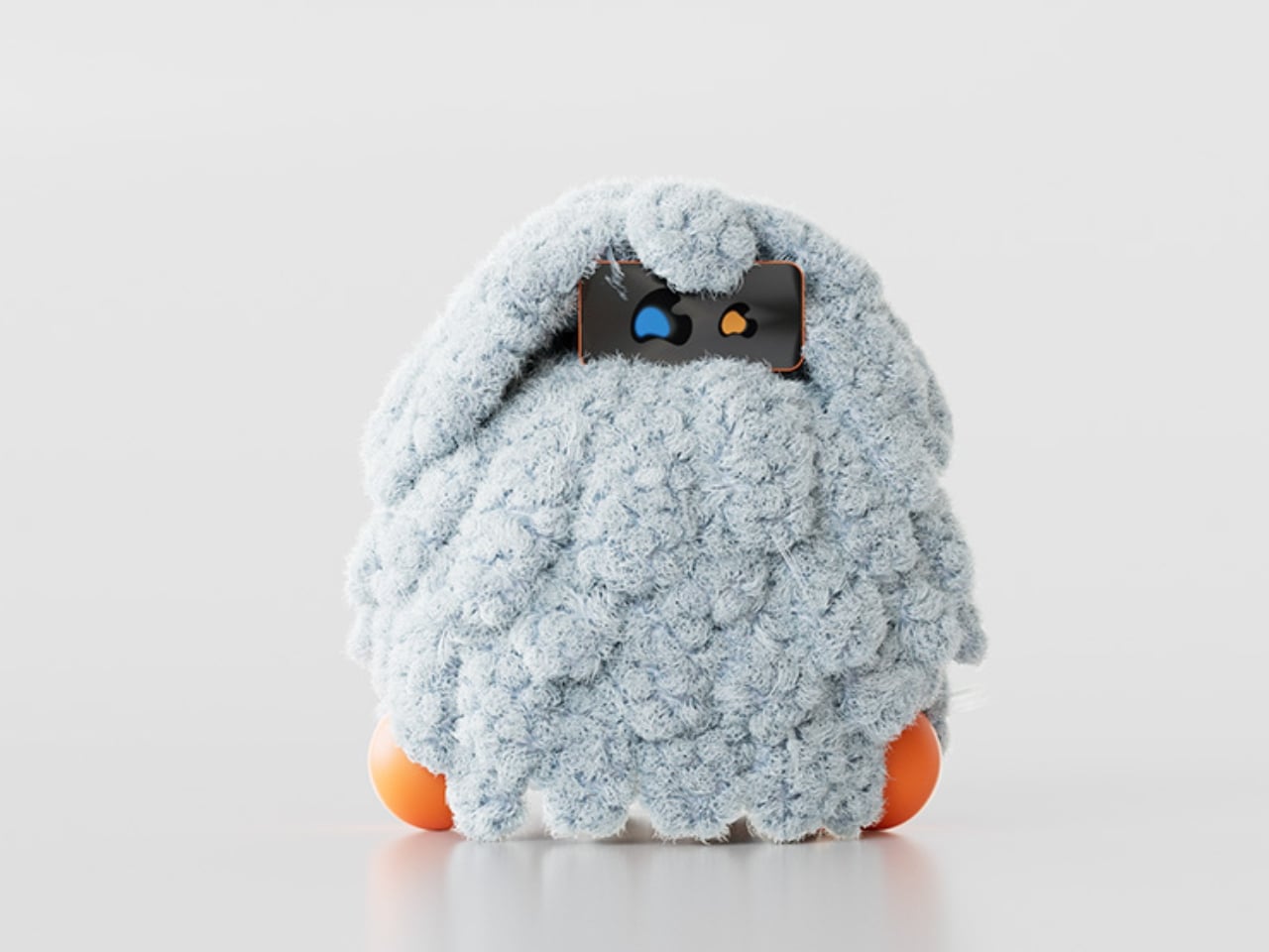
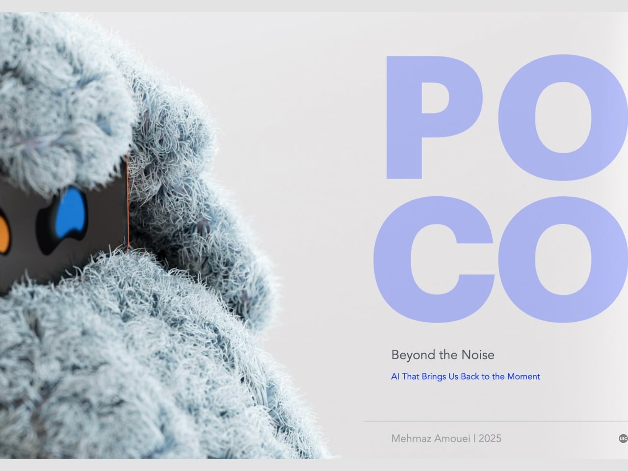
We keep building AI to do more. More answers, more speed, more certainty. Designer Mehrnaz Amouei looked at that trajectory and asked a fundamentally different question: what if we built AI to be more present instead? The result is POCO, a soft robotic companion that might be one of the most quietly radical design concepts to emerge in recent years. It doesn’t talk over you, doesn’t flood you with information, and it doesn’t pretend to know things it doesn’t know. POCO sits with you. Literally.

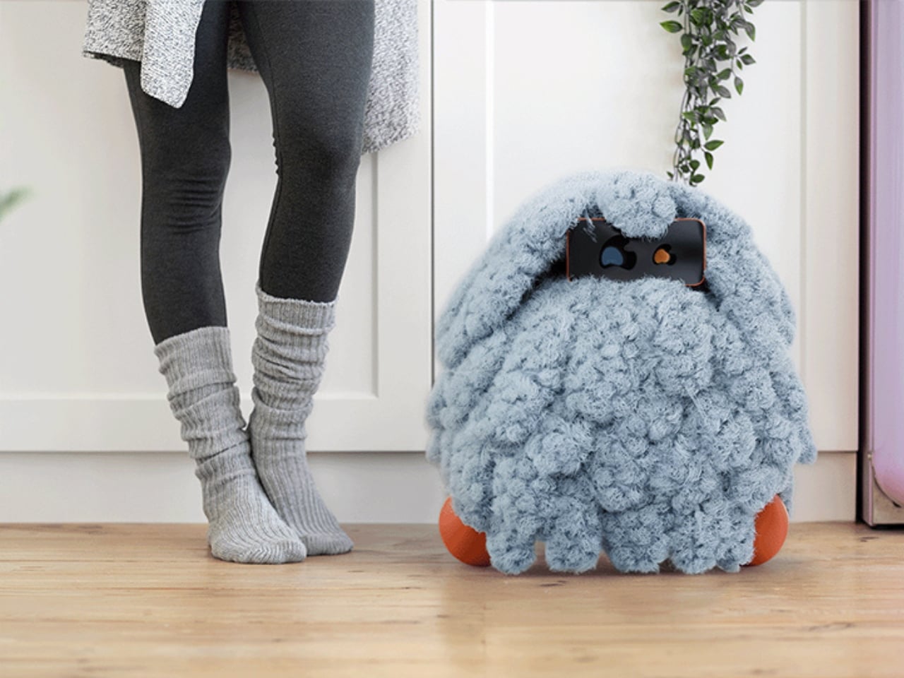
At its core, POCO is a soft, tactile object that pairs with a smartphone, which serves as its computational brain and face. A soft textile body wraps around the device, transforming rigid, glass-and-metal technology into something that moves, breathes, and gestures in response to your presence. Together, they create something that sits somewhere between object, creature, and companion, and that deliberate ambiguity is very much intentional. You’re not quite sure what to call it, and that’s entirely the point.

Designer: Mehrnaz Amouei

Amouei developed POCO through research at the University of Illinois at Chicago, grounding the project in studies on loneliness and trust. Her findings indicated that people don’t actually want AI that projects certainty or control. They want availability and responsiveness. They want something that shows up without taking over. From those findings came the concept of “constructive interdependence,” a design philosophy where POCO’s limitations aren’t bugs to be patched but features embedded directly into the interaction model itself. The robot communicates what it can and cannot do through its behavior and physical states, which is a level of honesty you don’t often get from technology that typically overpromises and underdelivers.

I think that matters more than it might initially seem. The dominant conversation around AI right now is almost entirely about expansion: more capability, more integration, more autonomy. POCO pushes back on that without being preachy about it. It reframes the question of what good AI design actually looks like, and the answer it offers isn’t “smarter,” it’s “more trustworthy.” That is a genuinely different value system, and it feels overdue.

The sustainability dimension is also worth paying attention to. Rather than introducing new hardware and generating more electronic waste, POCO repurposes a device most people already own. That decision isn’t just a nice bonus; it’s built into the concept from the start, aligning with the UN’s Sustainable Development Goals around mental well-being and responsible consumption. In product design terms, that means the project was developed with a broader cultural and environmental context in mind, not just a user persona sitting in a lab.

Physically, POCO responds to touch, movement, and environmental cues. It adapts to a user’s preferences while maintaining a consistent identity, which is a surprisingly nuanced balance to strike in any product, let alone one sitting at the intersection of soft robotics and emotional design. Because interaction happens through touch rather than voice commands or screen taps, there’s an intentional slowing down embedded in the experience. You can’t rush a tactile exchange the same way you can type faster or speak louder. That shift from speed to presence feels like a meaningful counter-proposal to how most tech is currently designed. We’ve grown so accustomed to interfaces that demand our attention that a device asking only for our company reads almost as radical.

POCO has already earned an Honorable Mention from the International Design Awards and drawn coverage from major design publications. Whether it ever moves into consumer production remains an open question. But as a design statement, it’s doing exactly what the best concept work should: prompting us to reconsider what we actually want from the technology we live with, and whether expanding capability was ever really the right goal. Maybe the most interesting AI isn’t the one that knows the most. Maybe it’s the one that knows when to just stay close.

The post Forget Smarter AI, This Robot Thinks Presence Is the Point first appeared on Yanko Design.
  •  

A Bookrack That Started as a Rectangle and Refused to Stay One

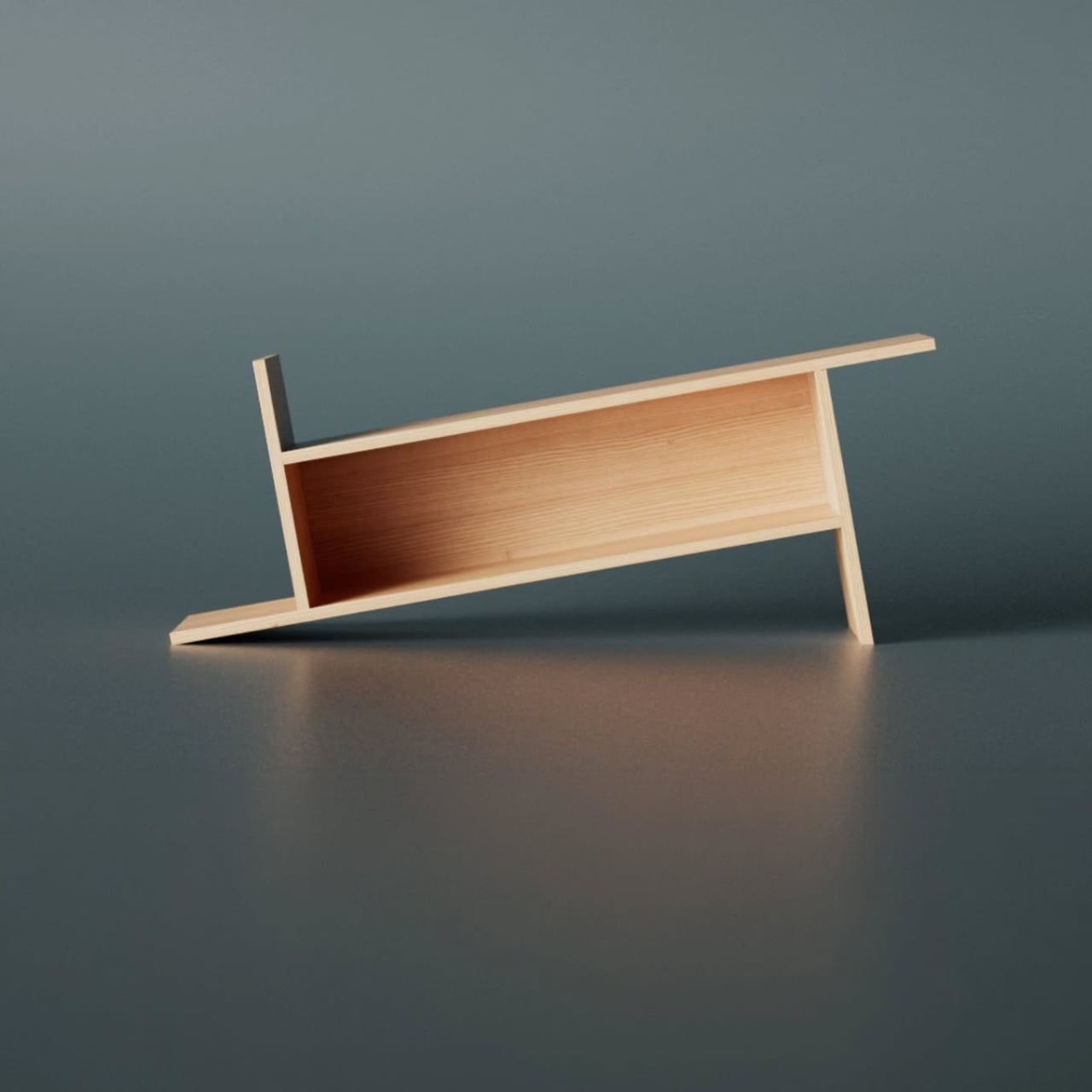
Most furniture design starts with a question about function and ends there. Deniz Aktay, the designer behind the studio @dezinobjects, apparently decided to start with geometry instead, and the result is one of the most quietly clever storage pieces I’ve come across in a while: the Barrow Bookrack.

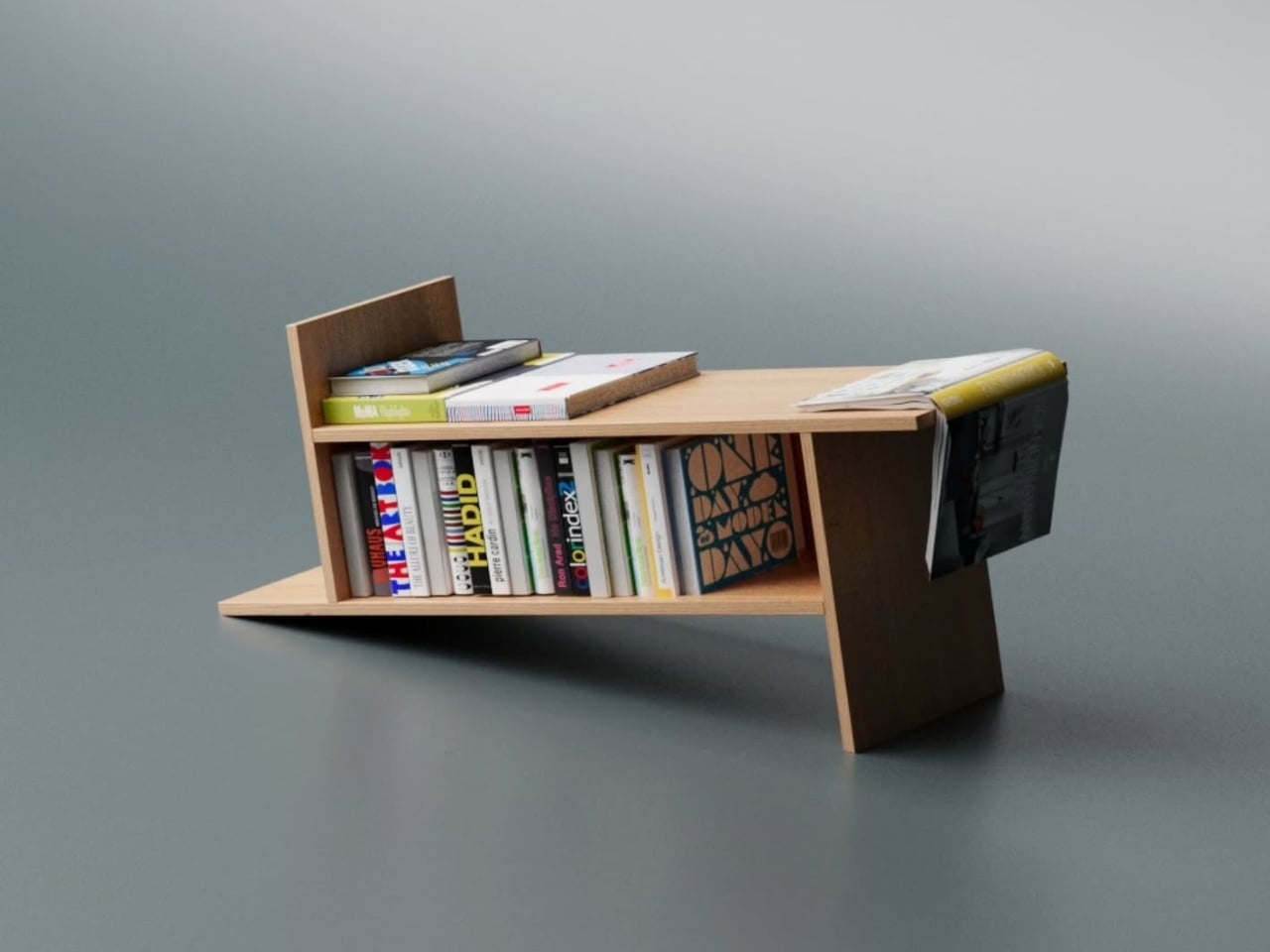
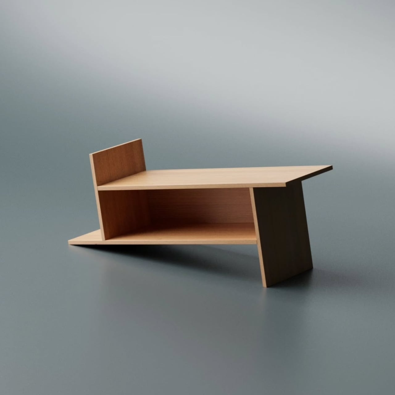
The concept is almost laughably simple to explain, which is exactly why it works. Take a rectangle. Extend each of its lines on one side only. That’s it. That’s the whole idea. And yet, what comes out the other end of that single decision is a bookrack that feels caught mid-motion, leaning into itself, its proportions oddly satisfying in a way that’s difficult to immediately place. On paper, it barely sounds like a design at all. In person, it’s all you notice.

Designer: Deniz Aktay

Looking at it from a distance, the Barrow tilts at an angle that initially reads as precarious. It looks like it could tip at any moment, like a shelf that forgot to stand up straight. But it doesn’t. The asymmetry is intentional and controlled, and that’s exactly the kind of design choice that separates a well-considered piece from something that only looks interesting in renders. The structure holds, both physically and visually. The angular feet, the jutting top ledge, the open body sitting between them: everything is doing something.

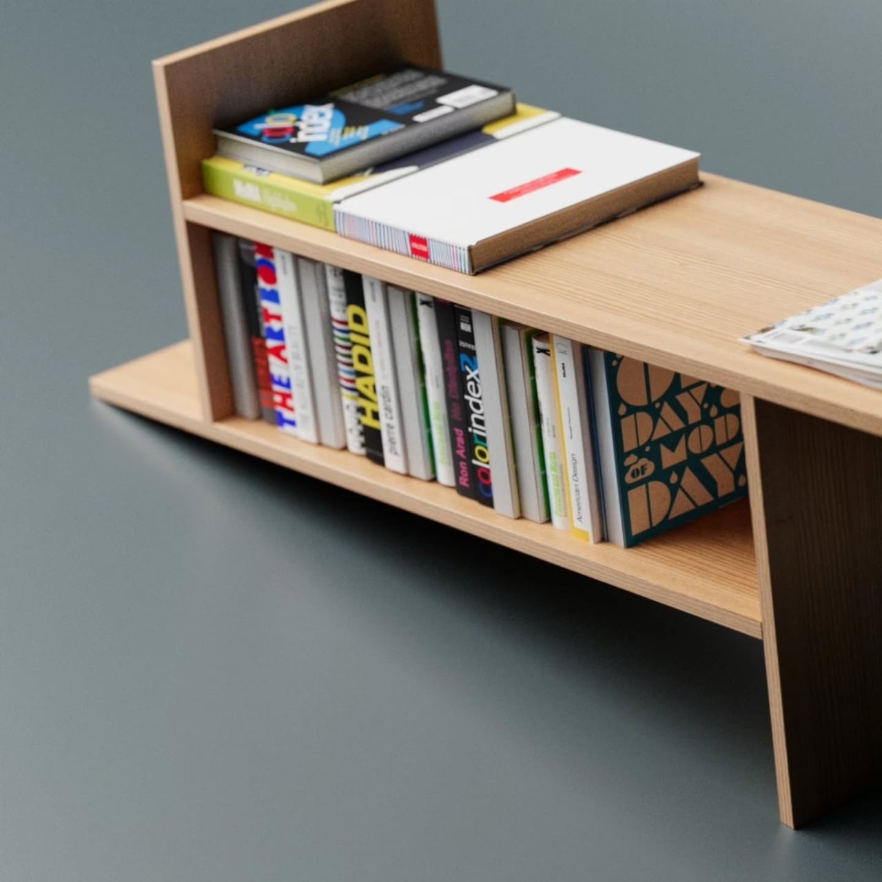
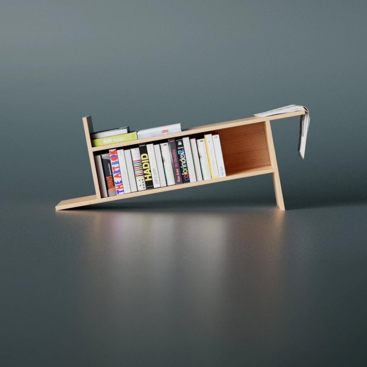
The name is worth pausing on. A barrow, the traditional kind, is a simple carrying frame stripped back to its essential parts. Nothing extra, nothing decorative, just the minimum structure required to move something from one place to another. Aktay’s Barrow carries that same philosophy. Every extended edge and protruding surface earns its place. The result is a range of storage spots, each with its own character. Books stand upright in the central cavity. Larger volumes or stacked titles settle onto the flat extended surfaces. A magazine slipped sideways into one of the outer ledges feels like it was always meant to sit there.

This is the kind of piece that rewards being actually used. A lot of beautiful storage objects suffer from what I’d call the trophy problem: they look better empty than full. Barrow is the opposite. Load it with design books, art monographs, a worn paperback or two, and it genuinely improves. The varying heights, the mix of orientations, the textures of spines pressed against pale wood, it all adds up into something that feels lived in rather than staged. The structure becomes a frame for your reading life rather than something competing with it.

Aktay has explored this kind of thinking before. His earlier Bookgroove piece was a sculptural bookrack-table hybrid that played with the idea of furniture as form. Barrow feels like a sharper, more edited version of that same instinct: fewer moves, more precision. There’s less drama in the silhouette, but the restraint makes it more liveable. A piece like this can sit in a living room, a studio, or a bedroom and feel contextually right without demanding too much visual real estate from the room around it. It has presence without insistence, which is a harder balance to strike than it sounds.

The part that keeps pulling me back to this design is how naturally it moves from a flat idea to a physical one. The Barrow is essentially a graphic concept made tangible, a line drawing that decided to become furniture. The form evolved directly from extending lines on a flat surface before anything was actually built, and seeing that logic translated so cleanly into wood makes the whole thing click. The render and the physical piece are telling the same story, which is rarer in furniture design than it ought to be.

Furniture, at its best, makes you reconsider something you assumed was already settled. You’ve seen hundreds of bookshelves. You’ve probably owned a few. The Barrow doesn’t try to be revolutionary. It just extends a line a little further than expected, and somehow that’s enough to change the whole conversation.

The post A Bookrack That Started as a Rectangle and Refused to Stay One first appeared on Yanko Design.
  •  

When Your Sideboard Swallows Your Books (On Purpose)

Most furniture does exactly what it promises. A shelf holds things. A table provides surface. A sideboard stores what you don’t want to look at. Deniz Aktay, a Stuttgart-based designer, seems to find that level of literalism a little boring.

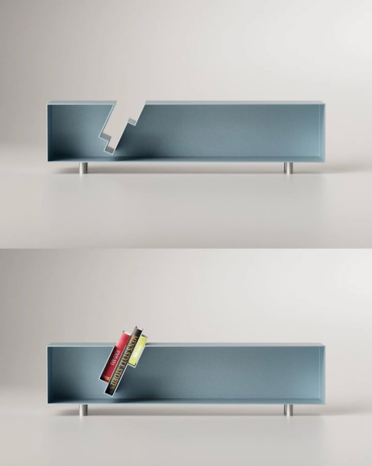
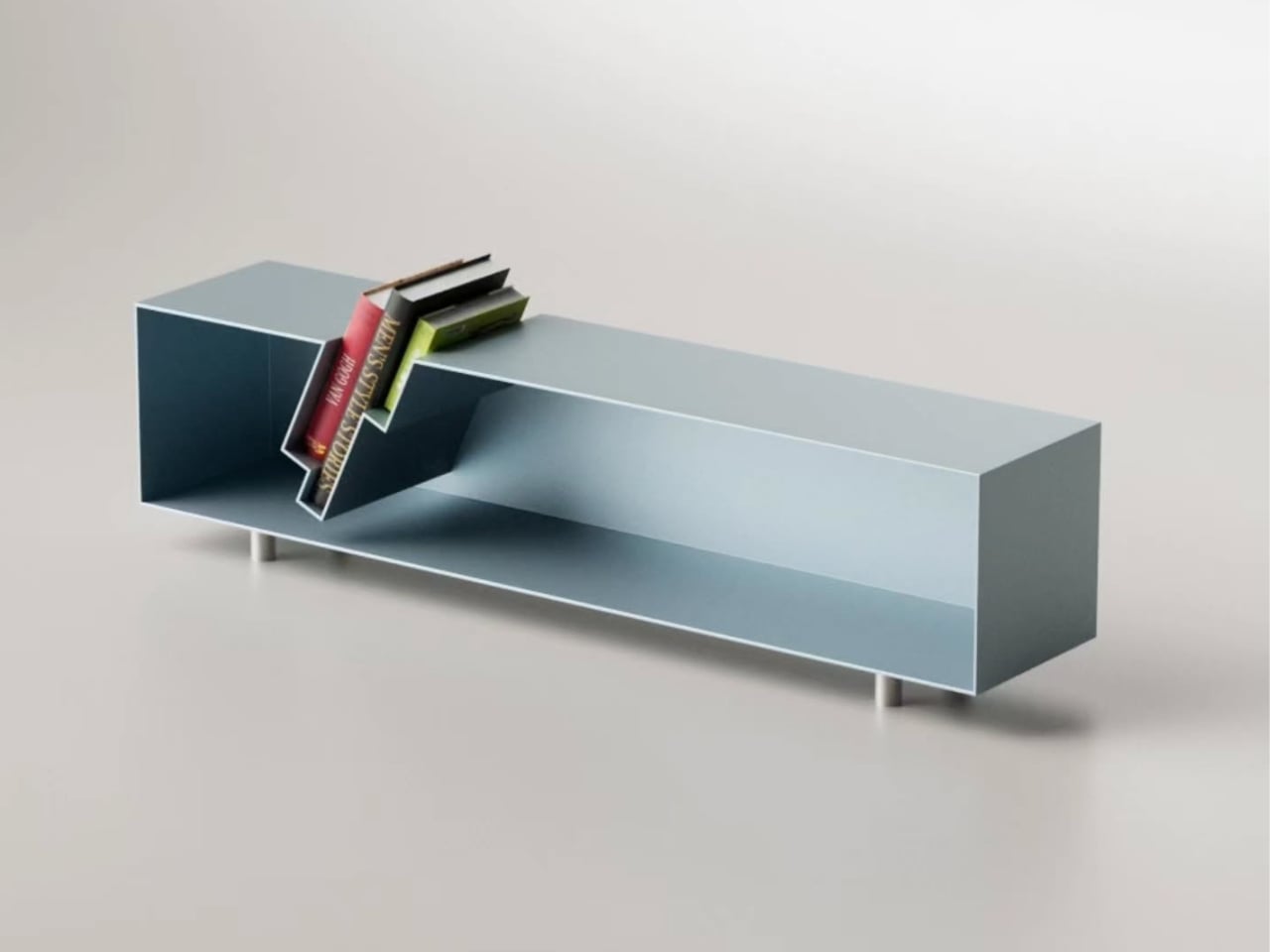
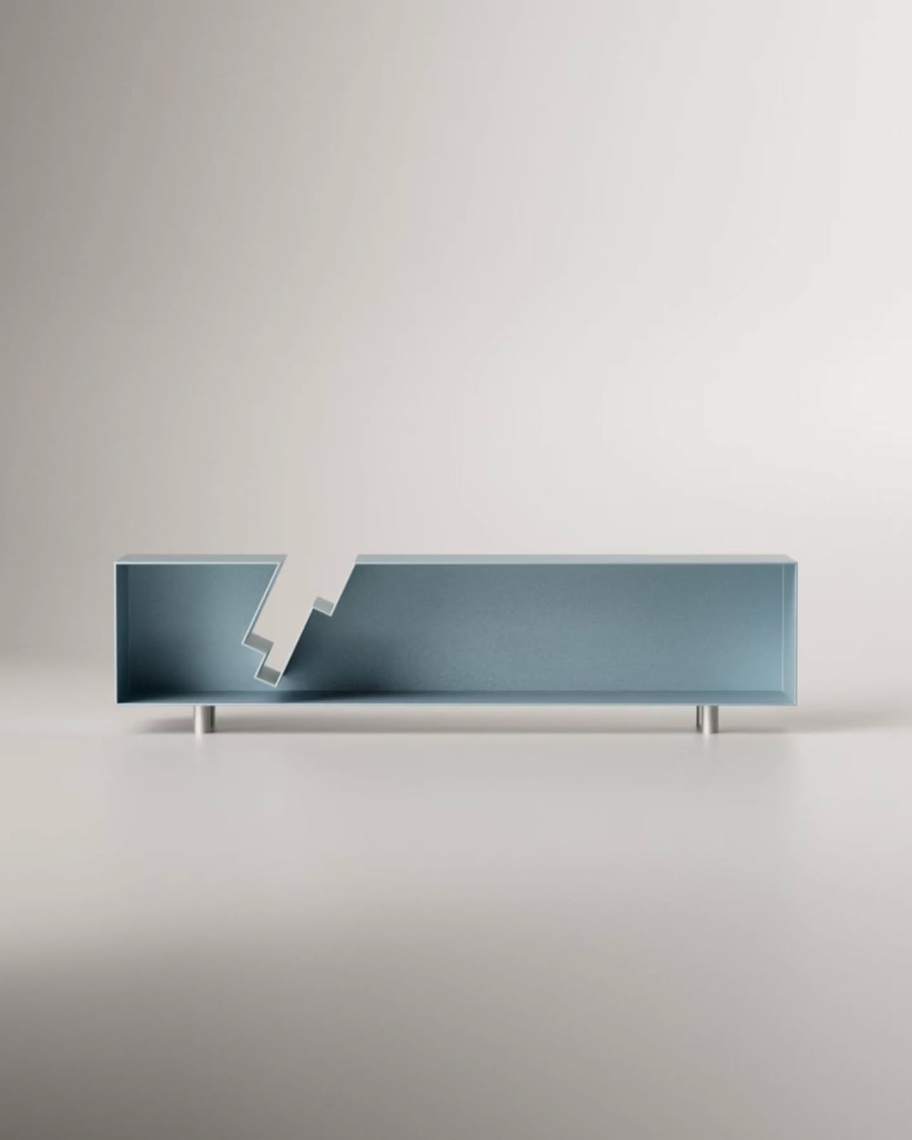
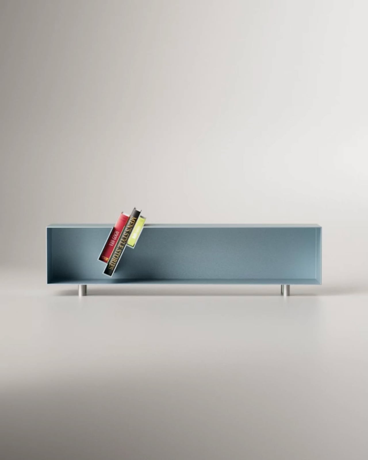
His latest piece, the “Slot” Sideboard, is a sleek metal sideboard that does something I haven’t seen before: it swallows your books whole. Or nearly whole. The top surface features book-shaped cutouts, slots sized just right to accept a few volumes that then slide partway through, hovering suspended between the top of the sideboard and the interior shelf below. Spines tilted at an angle, partially disappearing into the furniture itself, the books aren’t hidden. They’re put on stage.

Designer: Deniz Aktay

The visual effect is genuinely arresting. From straight on, it looks like the books are simply leaning through the sideboard, defying the expected logic of furniture. The steel body, finished in a dusty blue-grey, stays completely clean and minimal, which only makes the books pop harder. They become the focal point. The design knows this and leans into it.

Aktay trained as an architect at the University of Stuttgart before founding his own design studio, DEZIN, in 2020. You can feel the architectural thinking in the Slot Sideboard. The slots aren’t decoration. They are a structural decision that reorganizes how the object functions. By cutting through the plane of the top surface, Aktay collapses the boundary between storage and display. The books don’t live behind a door or on top of the piece as an afterthought. They are literally built into its architecture.

This matters more than it might seem. One of the persistent design problems with books is exactly this tension: do you store them, or do you show them? Traditional bookshelves say store, with display as a side effect. Coffee table styling says display, with access sacrificed. The Slot Sideboard says both, simultaneously, and solves the problem by making books a structural element rather than an accessory.

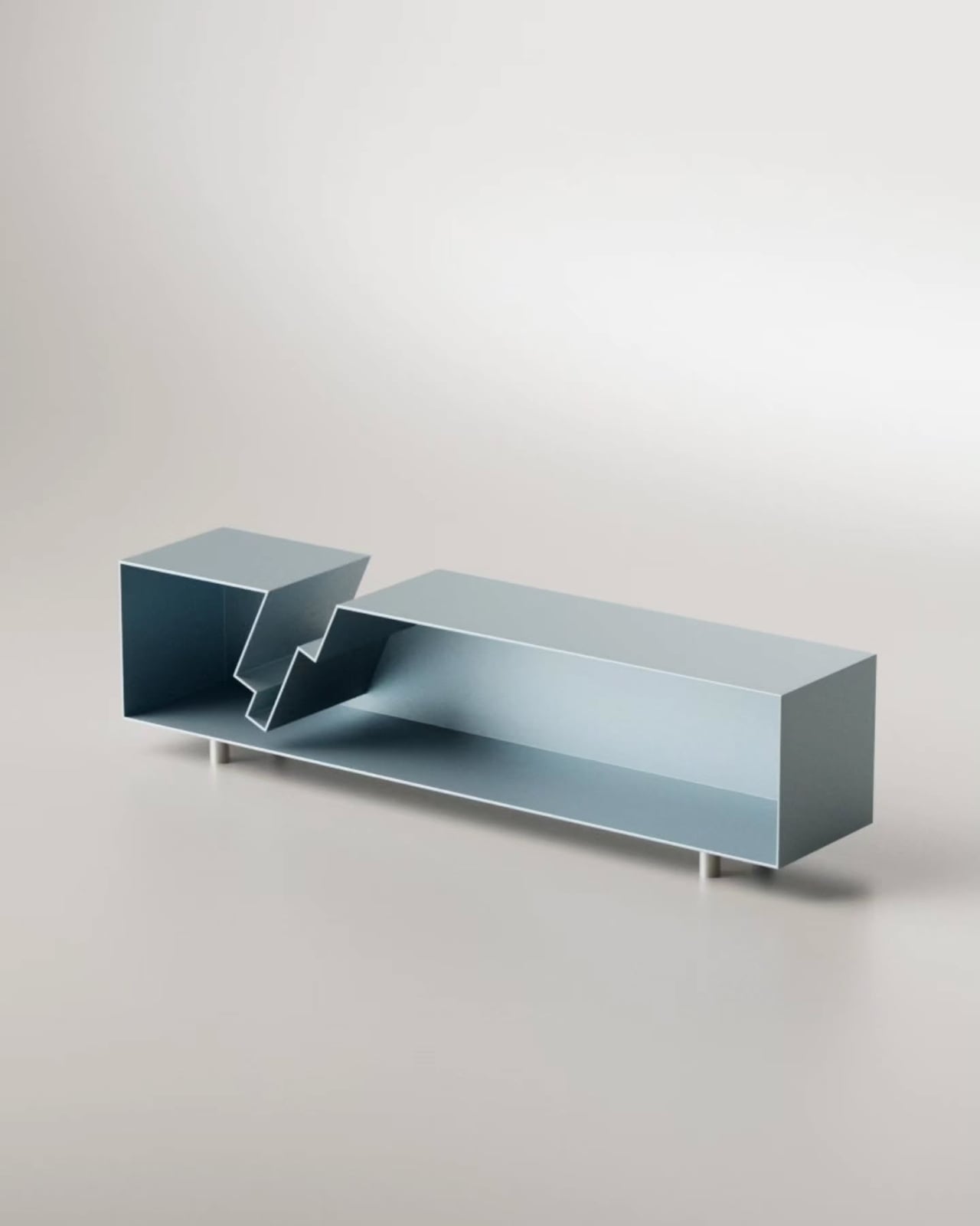
I appreciate that the piece doesn’t shout about this. It’s not a novelty object with an obvious gimmick printed on the side. At rest, without books, the sideboard is clean and almost brutally minimal, the stepped slot openings looking like an architectural section drawing. Add a few books, and the whole thing shifts register. It becomes warmer, more personal, more lived-in. That kind of dual identity in a single object is hard to pull off.

Aktay’s philosophy centers on finding the right balance between proportion, material, and functionality. The Slot Sideboard is a good example of that balance working. The proportions are long and low, giving the piece the kind of horizontal calm that makes a room feel settled. The metal construction is precise without feeling cold. And the function is genuinely expanded by the design, not just dressed up.

The one thing I keep thinking about is the practical question of how many books actually fit, and at what angle. The promotional images show a small cluster, maybe three or four volumes, tilted together in the slot. It reads beautifully. Whether it reads the same with a thicker, heavier hardback, or with books of wildly different heights, is a detail that a real-world test would answer. That’s not a criticism so much as natural curiosity. Good design always makes you want to live with it.

The broader trend here is worth noting. Furniture design has been slowly, quietly moving away from pure storage and toward what you might call narrative objects, pieces that make a room tell a story. The Slot Sideboard fits into that movement while having its own specific logic. It isn’t just pretty. It has a point of view about what books are for and where they belong. They belong where people can see them. Where they’re part of the room. Not filed away. Whether or not Aktay set out to make a statement about books and visibility, the piece makes one. And it makes it beautifully.

The post When Your Sideboard Swallows Your Books (On Purpose) first appeared on Yanko Design.
  •  

A Coat Rack With 16 Hooks That Disappear When Not in Use

Every entryway tells a story, and most of the time, it’s one you’d rather not have visitors read. A coat draped over another coat. A bag looped onto an already-occupied hook. A scarf hanging off the edge of something that was never meant to hold it. We’ve all been there, and for some reason, we keep buying the same row-of-hooks solution as if more hooks were ever really the answer.

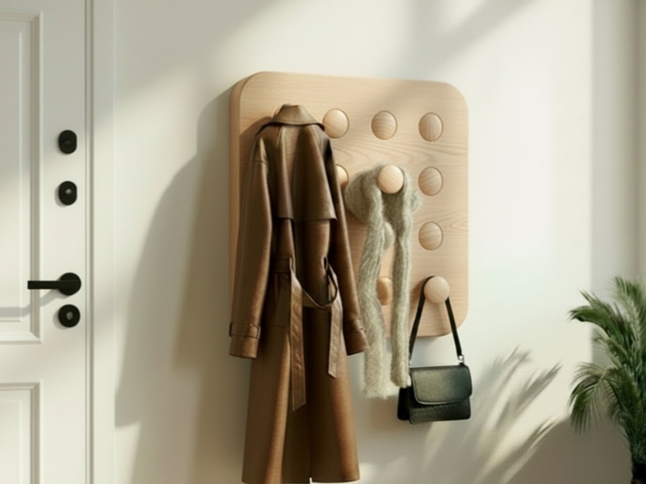
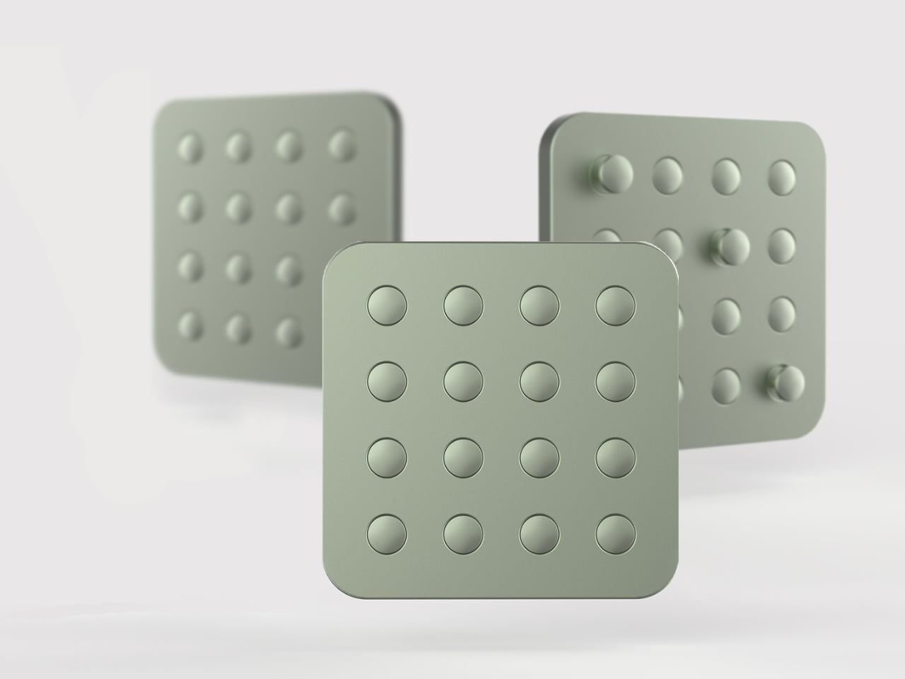
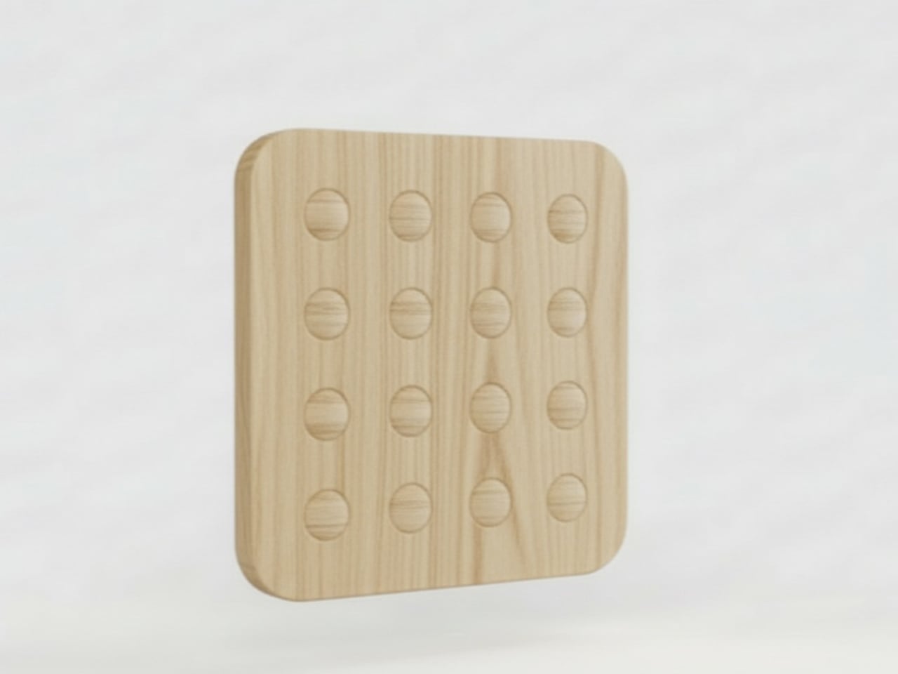
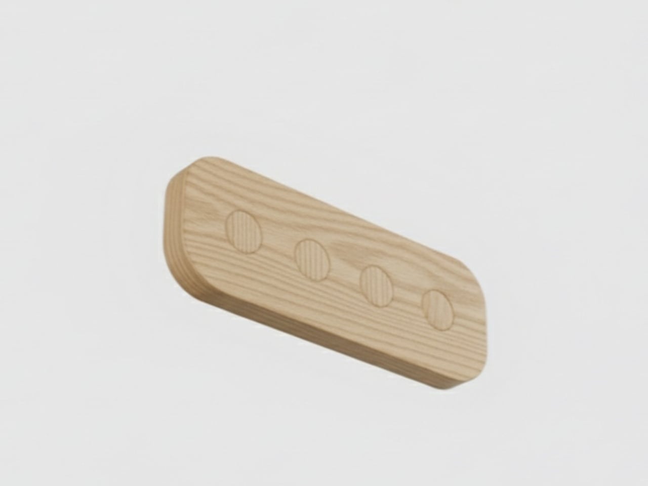
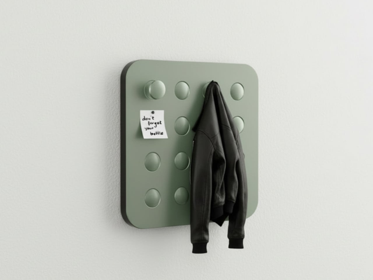
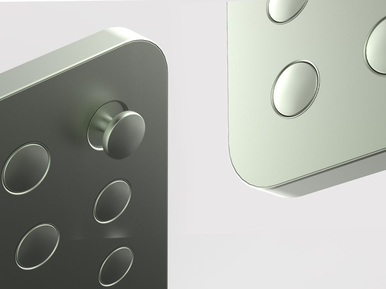
That’s what makes Elif Bulut’s coat rack concept so quietly radical. At first glance, it looks more like a piece of wall art than storage hardware. It’s a square panel with 16 circular elements arranged in a neat 4×4 grid, mounted completely flush against the wall. No hooks jutting out. No protruding arms. Just a flat, calm surface sitting there, completely unassuming, until you actually need it.

Designer: Elif Bulut

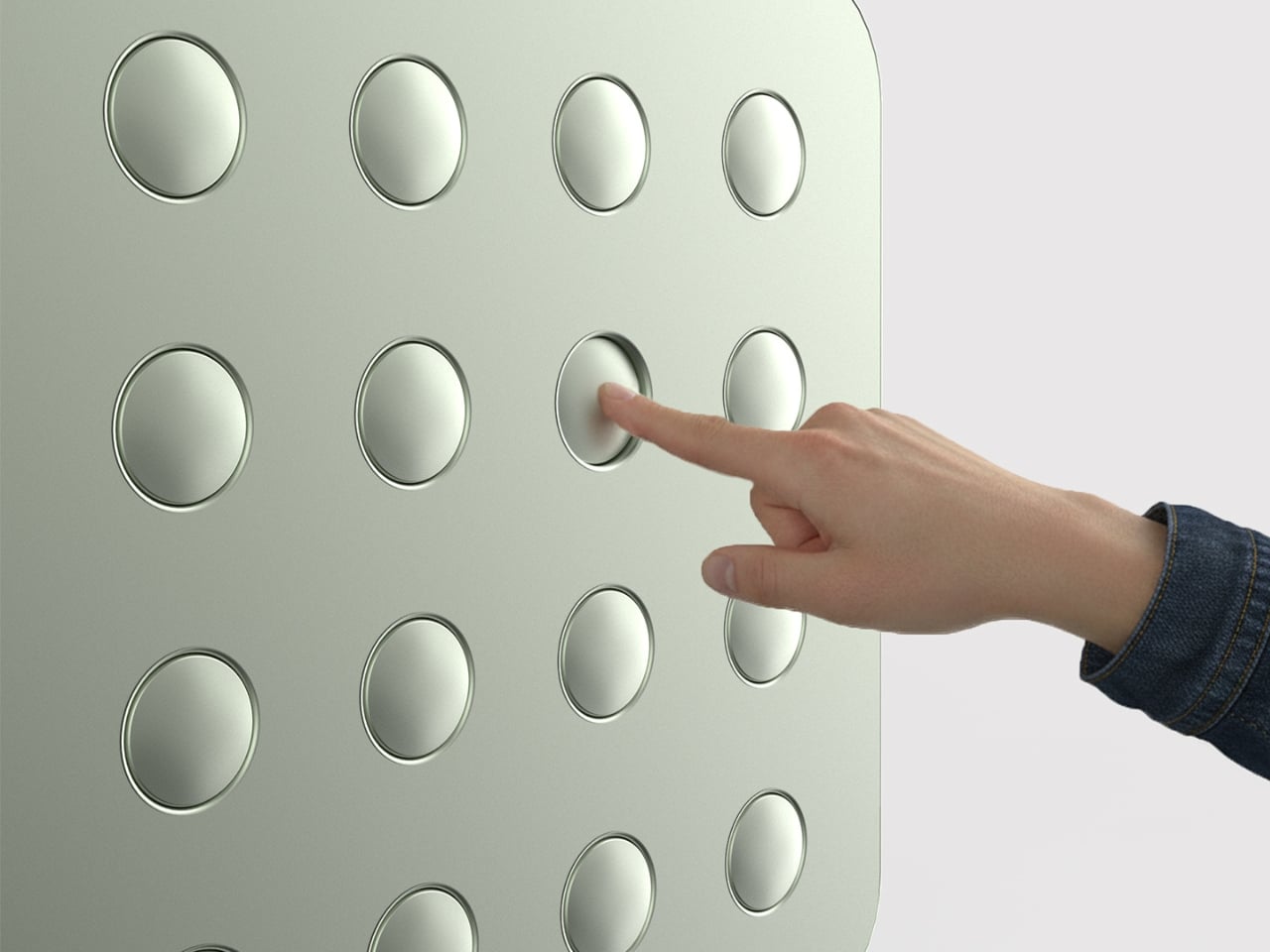
The concept is push-to-use. Press one of those circles and it extends outward into a hanging point. Press it again and it retreats back into the panel. Each circle is independently controlled, which means you decide how many hooks you want, where they go, and how many stay dormant on any given day. It’s the kind of interaction that feels satisfying in the same way clicky keyboards or popping bubble wrap does. Tactile, deliberate, and oddly fun.

1

I’ll admit that when I first saw this, my brain went straight to “pop it” fidget toys. And I don’t think that’s an accident. Bulut is working with a visual and tactile language that’s immediately familiar, maybe even nostalgic, and redirecting it toward something genuinely useful. That’s a smart design move. When a product taps into something people already instinctively want to touch, you’ve already won half the usability battle before anyone reads a word of product copy.

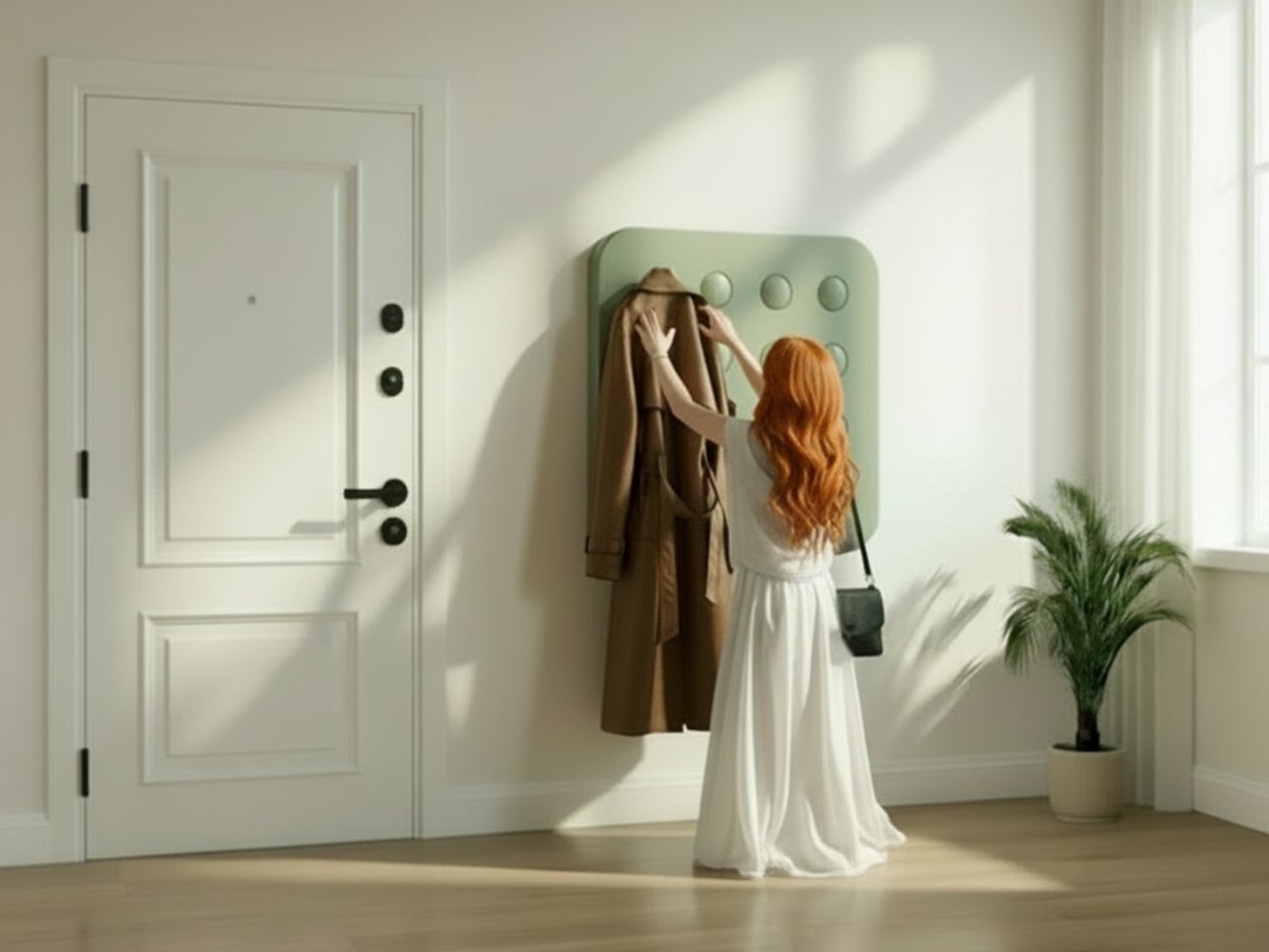
The design is grounded in a real observation: people pile coats on top of each other even when there are open hooks nearby. The problem was never really about the number of hooks. It was about how fixed, static structures force you to adapt to them instead of the other way around. A coat rack that responds to you, that only extends what’s needed and retreats the rest, changes that relationship entirely. The wall stays clean. The space stays calm. The hooks are there when you call for them, and invisible when you don’t.

The entryway has been chronically undervalued in home design for a long time. It’s the first thing you see when you come home and the last thing you interact with before you leave. Bulut is clearly thinking about that rhythm. One of the concept renderings even shows a small sticky note pinned to the panel, reading “don’t forget your bottle.” That single detail hits differently than any technical specification could. It grounds the whole concept in the messy, forgetful, real way people actually move through their mornings, and it signals that the designer is paying attention to life, not just surfaces.

What also works is the restraint. Bulut hasn’t tried to make this product do too much. It doesn’t track your habits, connect to an app, or announce itself as a smart home device. It’s just a better, quieter version of something we’ve had for decades. The intelligence is in the form, not the firmware. In a design landscape where everything is trying to become a gadget or justify itself with an AI feature, that choice is worth noticing.

Whether this moves from concept to production is a different conversation, but as a piece of industrial design thinking, it lands. It asks a question that sounds simple but clearly wasn’t: what if your coat rack only took up as much space, visually and physically, as you actually needed it to? The answer turns out to be a flat panel that waits patiently on your wall, ready to show up the moment you press it. That’s not a small idea dressed up in minimal aesthetics. That’s just good design.

The post A Coat Rack With 16 Hooks That Disappear When Not in Use first appeared on Yanko Design.
  •  

Pencil Shavings Have Never Looked This Beautiful

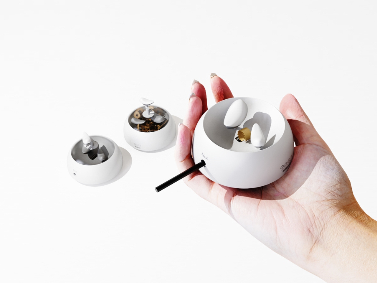
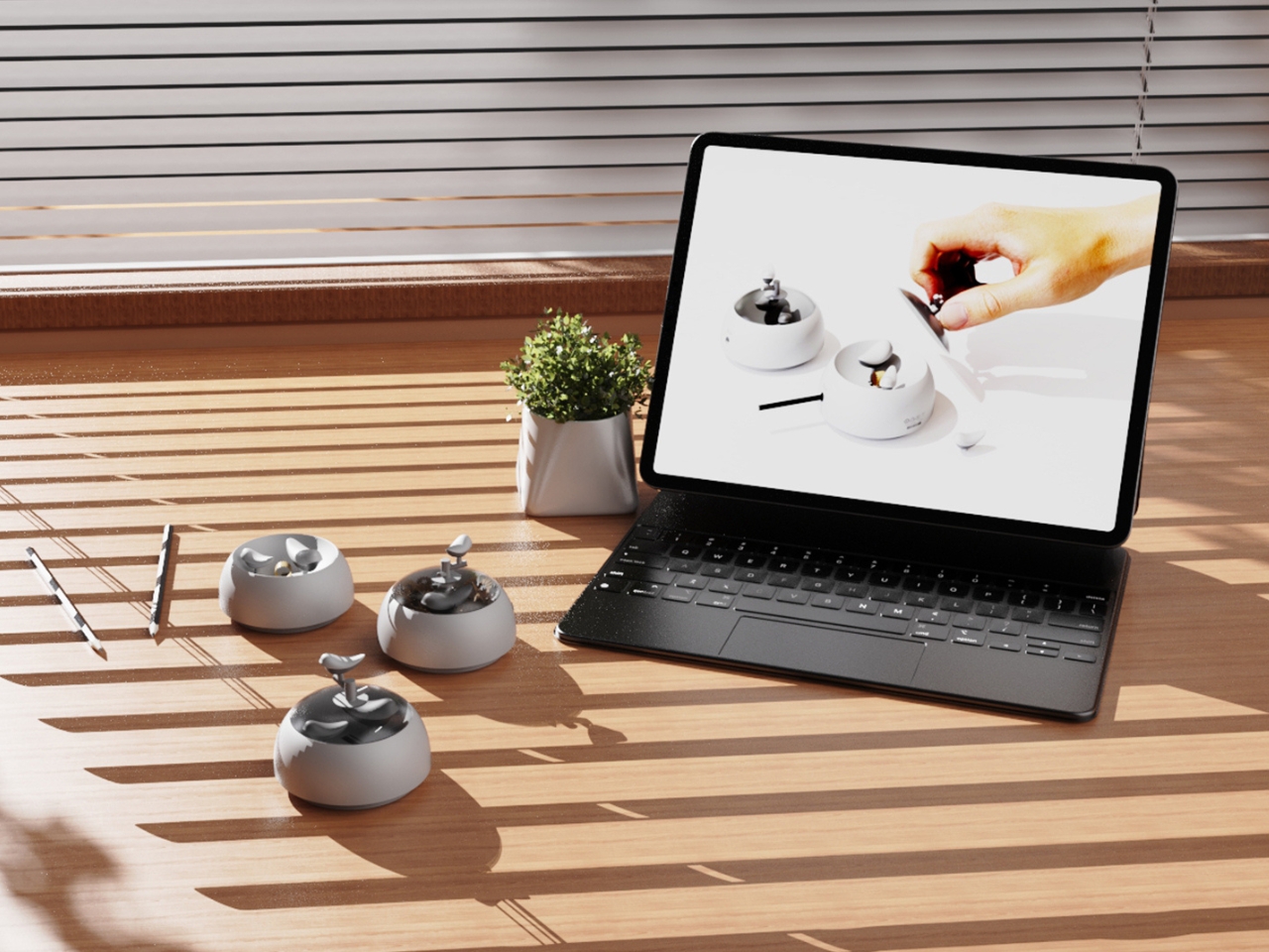
Most desk objects get ignored. They sit there doing their one job, collecting dust around the edges, and we never really think about them again. NEST, a conceptual pencil sharpener designed by a team of five students from TUST, UNNC, and CAU, is a direct challenge to that dynamic. It recently took home the winner prize at the 2025 European Product Design Award in the Conceptual Work & Office Product Design category, and the reason it won feels obvious the moment you understand what it actually does.

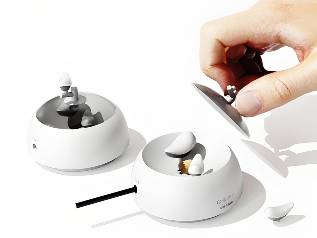
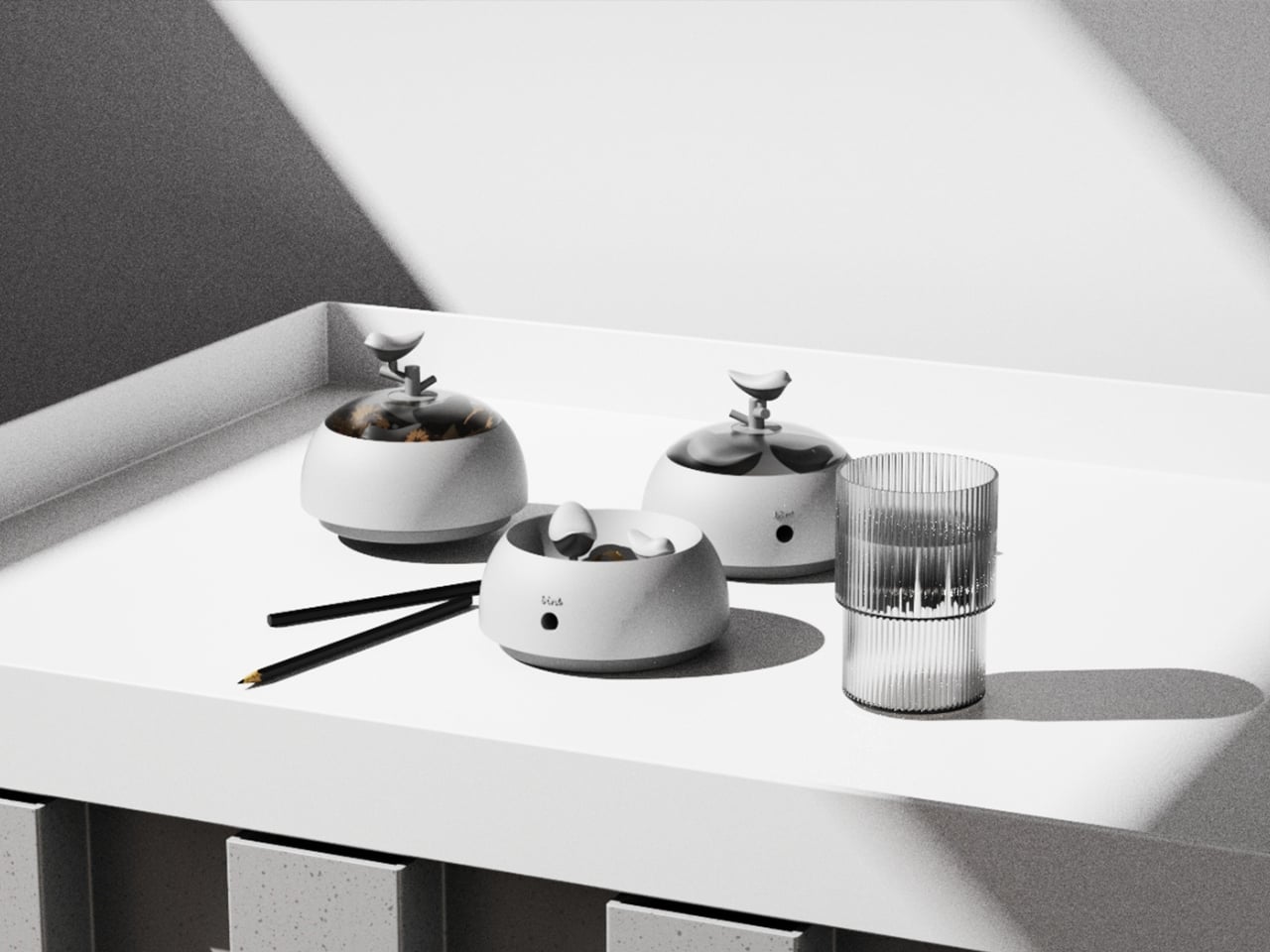
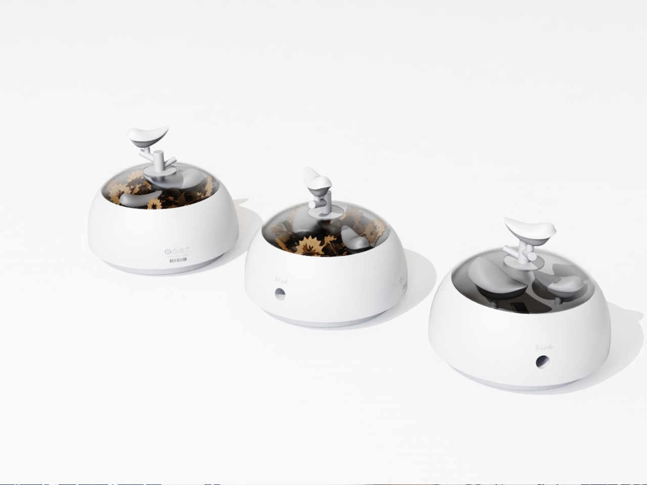
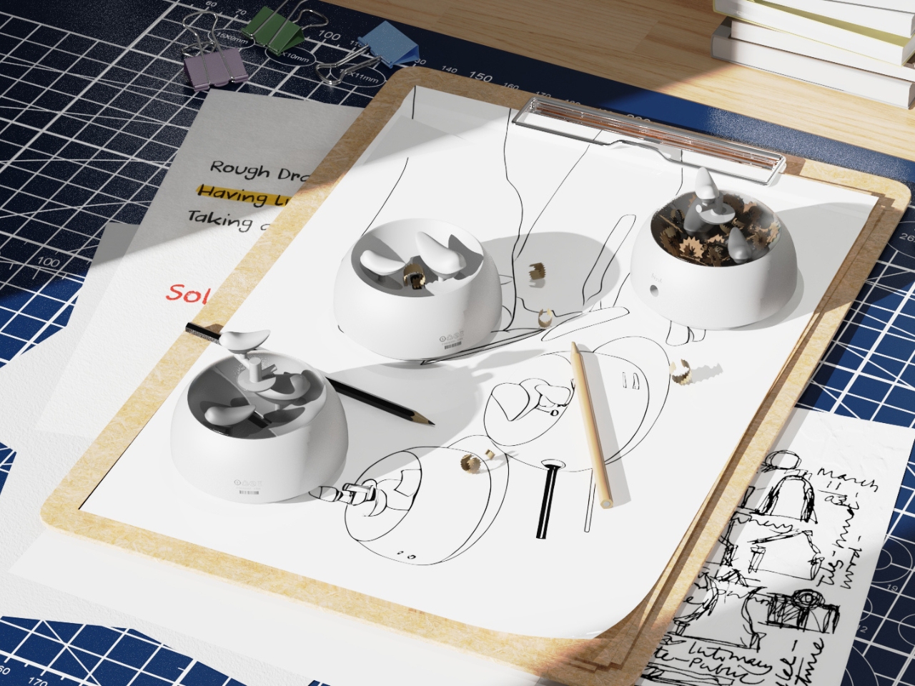
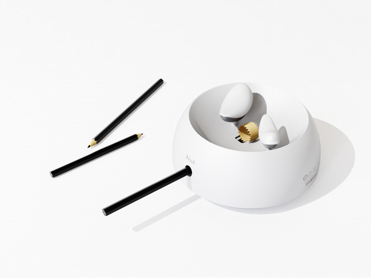
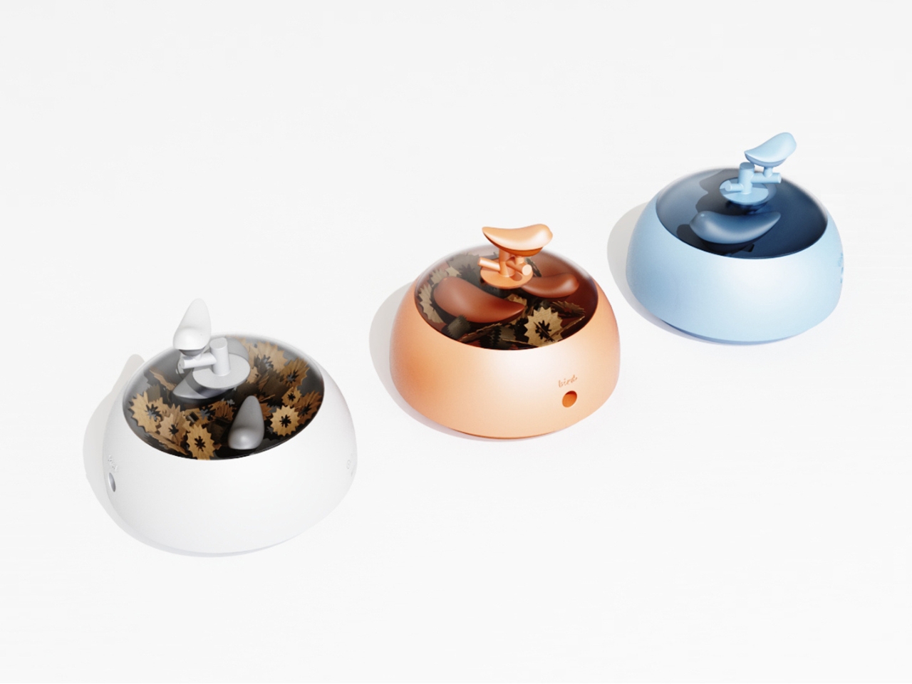
The concept is deceptively simple. A small bird figurine sits inside a rounded, bowl-shaped container. As you sharpen your pencil, the curling wood shavings collect beneath the bird, gradually building up like the gathered material of a real nest. By the time the container needs emptying, the little bird looks as if it has been nesting all along, settled into a soft, spiraling bed of wood ribbons. It is a beautifully accidental image that the design deliberately engineers into being, and once you picture it, it is very hard to unsee.

Designers: Zebin Qiao, Kaishuo Liu, Hongchen Guo, Zicheng Zhao, XiaoTongPan

The real strength of NEST is the intelligence of its metaphor. Lead designer Zebin Qiao and the team didn’t just borrow a visual from nature and paste it onto a product. They found a genuine structural parallel between the act of using the sharpener and the act of nest-building, then made sure the user experiences that parallel in real time. That is not an easy thing to pull off. Most product design that reaches for nature ends up with surface decoration or an illustrative graphic on a box. NEST earns its metaphor because the metaphor lives in the function, not on top of it.

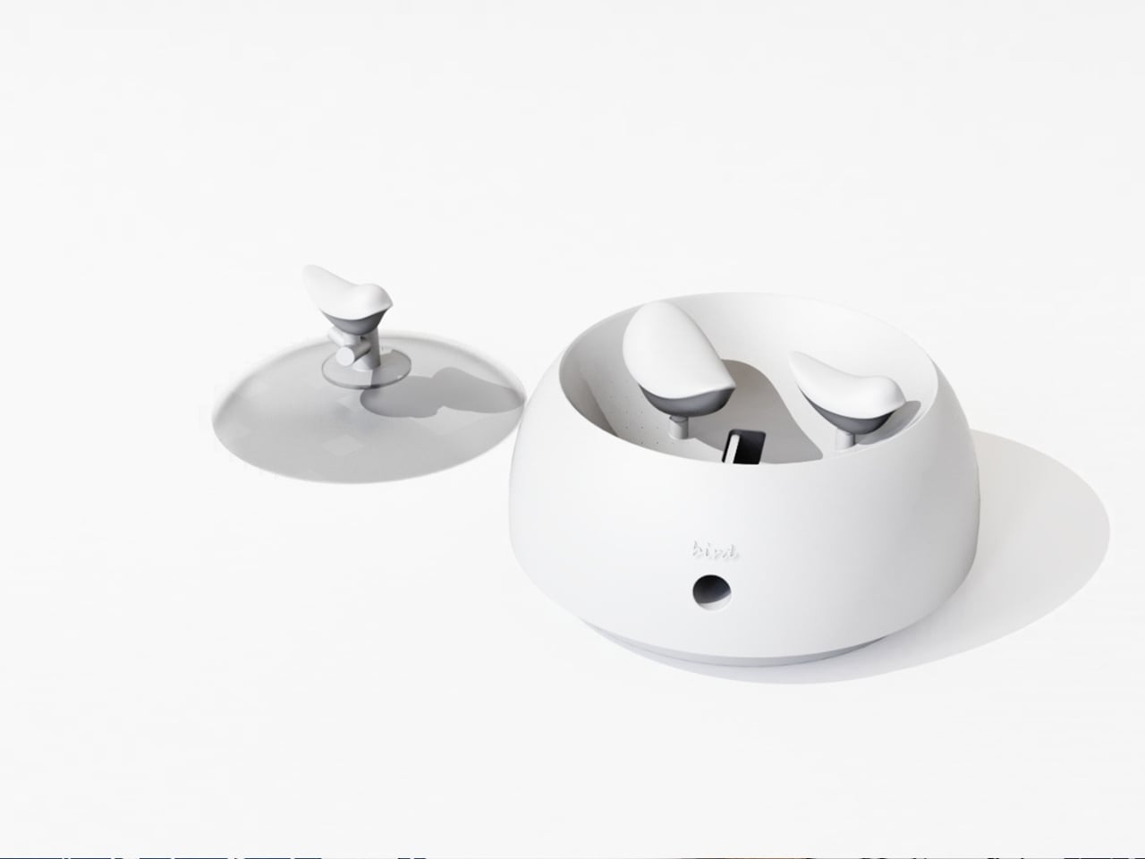
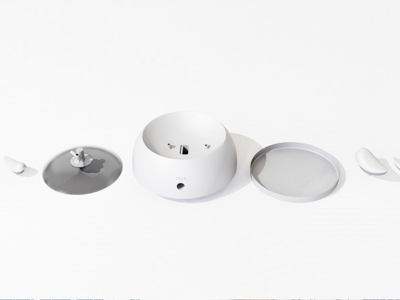
The second layer of the design is the lid. It doubles as a perch, fitted with a minimal branch element. When you are not sharpening, the tiny bird figurine can be lifted out of the interior and placed on the branch, transforming the whole object into a quiet desktop ornament. This dual-state approach means the product shifts personality depending on how you use it. It is a working tool when you need it, and a miniature sculpture the rest of the time. I genuinely appreciate designs that respect both modes of being at a desk, the productive and the contemplative.

I will admit my first instinct when I encounter “award-winning conceptual product” is mild skepticism. Conceptual work can drift toward spectacle and lose interest in whether the thing would actually function. NEST sidesteps that problem by grounding every design choice in real, physical behavior. The shavings accumulate because that is what shavings do. The bird sits because the container holds it. Nothing is forced or artificially staged. The charm is a byproduct of the function, which is exactly the right way around. It gives the design an integrity that a lot of more expensive, more elaborate objects simply do not have.

The color variants are worth noting too. The design comes in white, a warm terracotta tone, and a soft powder blue, each with a matching bird. It is a small decision that makes the object feel personal rather than clinical, and it opens the door to something close to a collecting impulse. You are not just buying a sharpener. You are picking a companion for your desk, which is a particular kind of intimacy that few office products ever manage to create.

At its core, NEST is making an argument that utility does not have to be neutral. That the objects we interact with daily can carry meaning, invite attention, and reward a small amount of patience. A student design team from three Chinese universities made that argument with a pencil sharpener, and they made it convincingly enough to win a major European award. That is not nothing. If anything, it is the kind of design thinking we need more of, the sort that finds poetry in the ordinary without making you feel like you are trying too hard to appreciate it.

The post Pencil Shavings Have Never Looked This Beautiful first appeared on Yanko Design.
  •  

The Projector Concept That’s Almost Too Beautiful to Use

Most concept designs exist to generate buzz, collect awards, and then quietly disappear. The BeoLens Horizon, a projector concept imagined by French industrial designer Baptiste Baumeister, feels different. It feels like a glimpse into a future that Bang & Olufsen should absolutely be building right now.

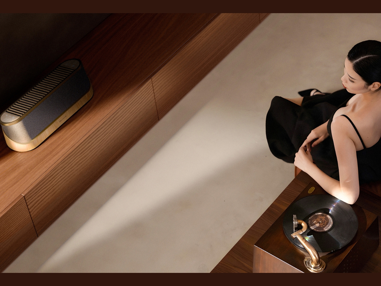
If you’re not familiar with B&O, the short version is this: the Danish audio brand has been setting the benchmark for luxury consumer electronics since 1925. Their products don’t just sound good; they’re designed to be desired as objects. The BeoSound Shape, the BeoVision Harmony, the Beosound Theatre, all of them treat your living room like a gallery wall. Baumeister clearly understands that DNA, and with BeoLens Horizon, he runs with it in a direction that feels genuinely exciting.

Designer: Baptiste Baumeister

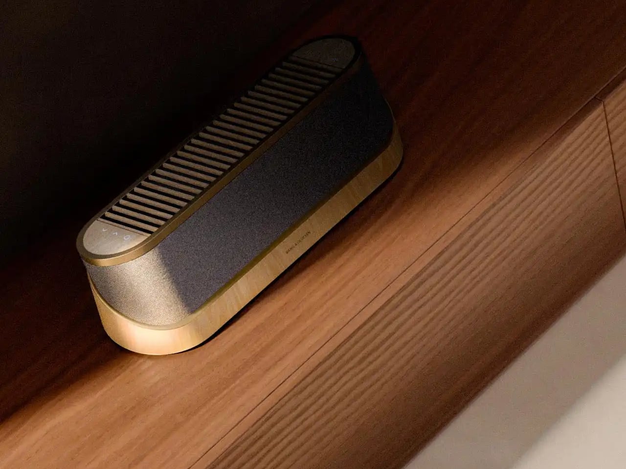
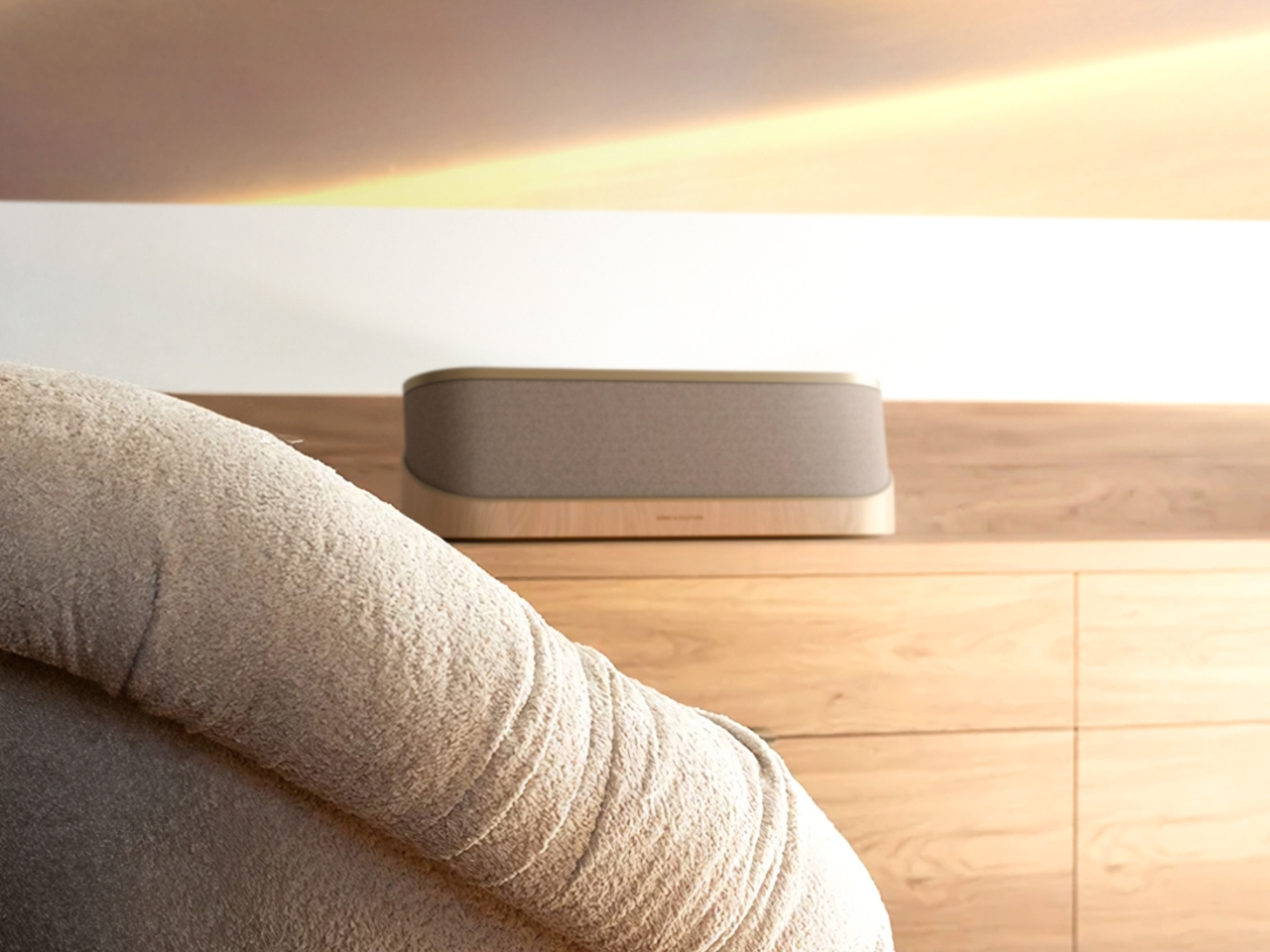
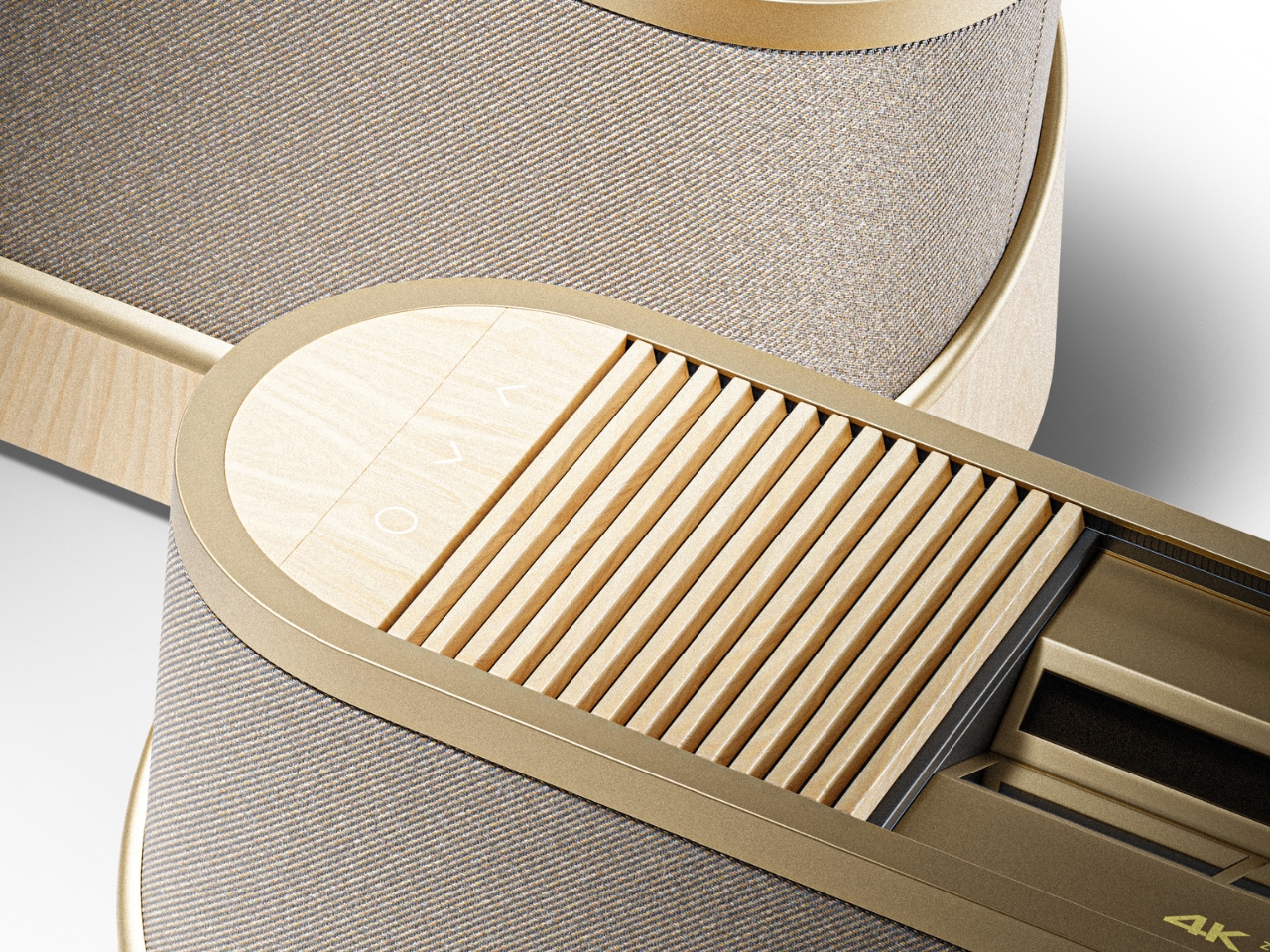
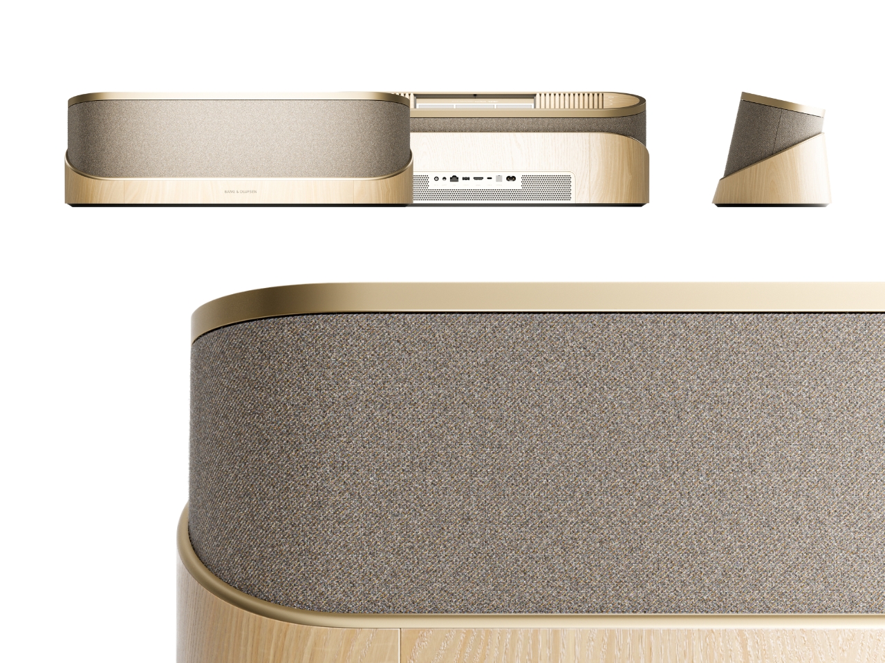
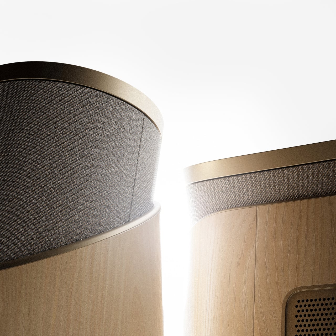
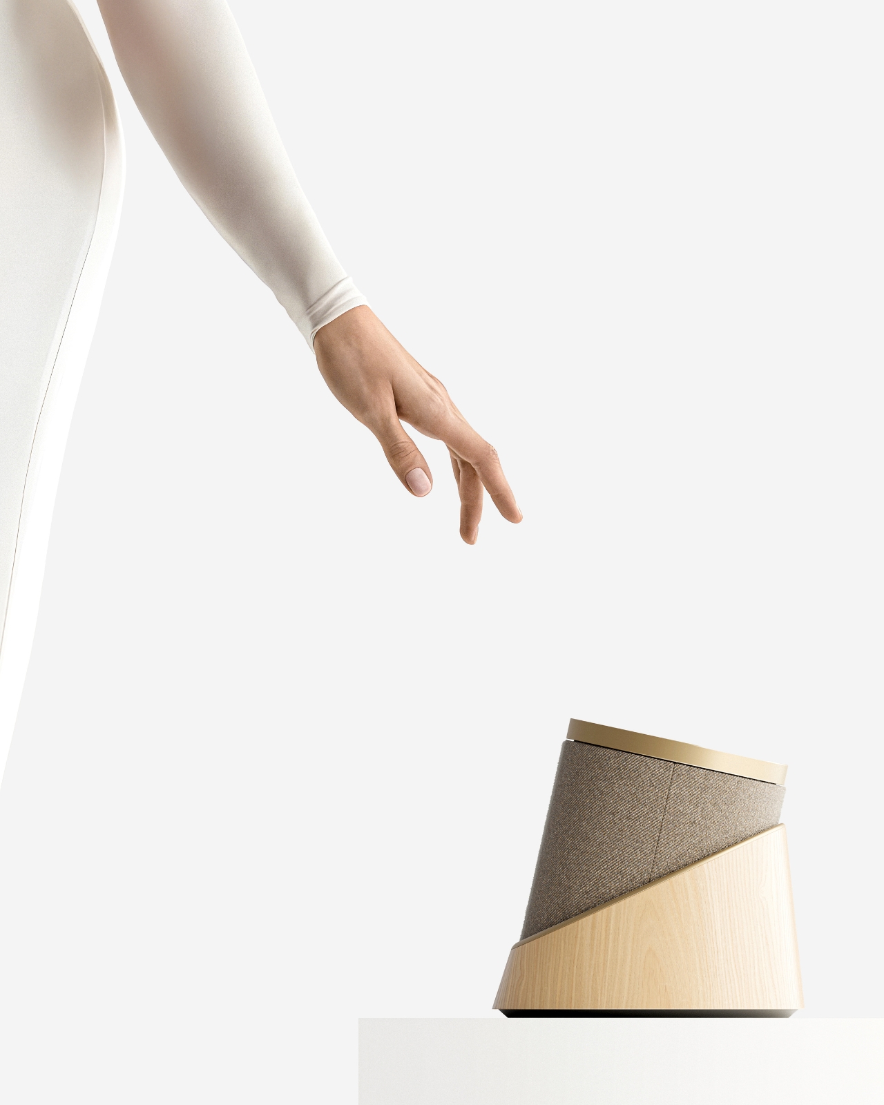
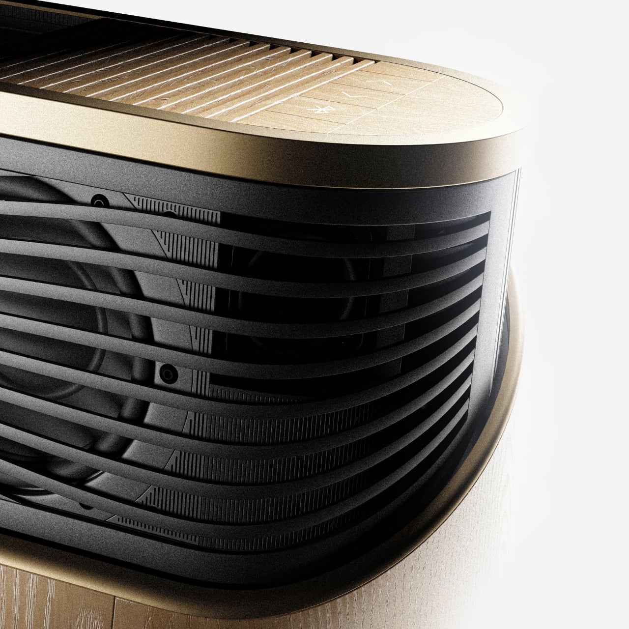
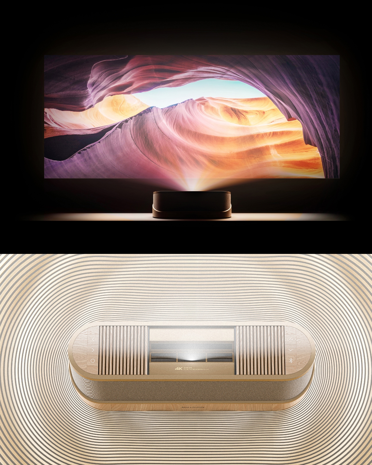
The design comes in two distinct configurations. The first is a horizontal, low-profile unit that sits flat on a surface like a refined soundbar crossed with a Scandinavian jewelry box. The second is a taller, cylindrical form that reads more like a speaker column or a sculptural object you’d place on the floor. Both share the same material vocabulary: light ash wood, brushed gold-toned aluminum, and tightly woven acoustic fabric in warm grey. It’s the kind of material combination that makes you think of an architect’s weekend house rather than a tech showroom.

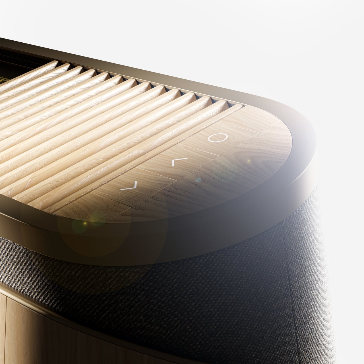
The horizontal unit is particularly interesting because of how it conceals the projector itself. A wooden slat panel sits on top, almost like a miniature version of those slatted screens you see in high-end Japanese interiors, and the lens assembly slides out from beneath it. The 4K projection capability is written right into the design, quietly labeled without fanfare. There are no aggressive vents, no branding that screams for attention, no black plastic anywhere. It’s restrained in a way that feels almost provocative in a market where most projectors try hard to look “cinematic” and end up looking aggressive instead.

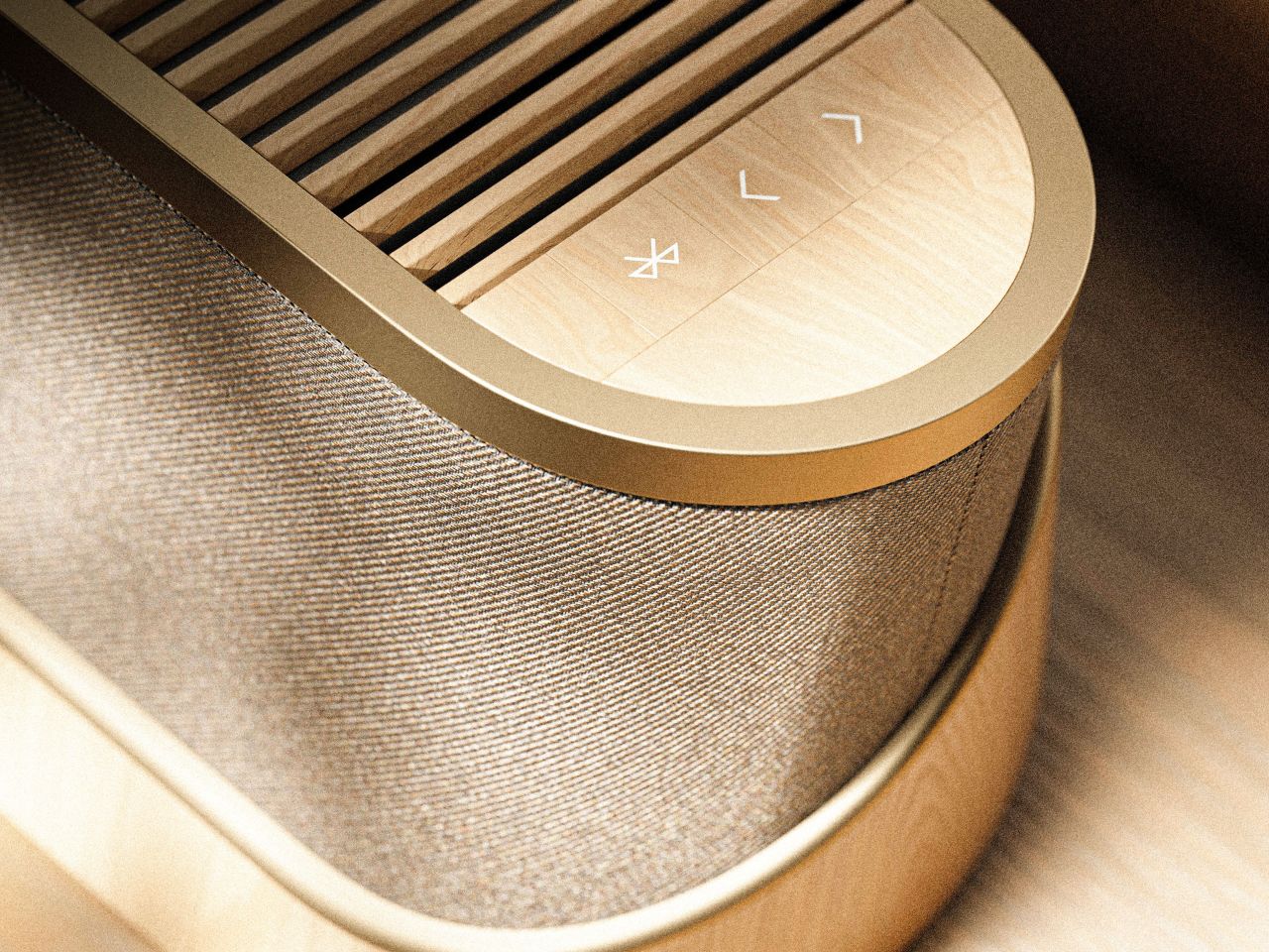
The controls are worth noting too. Rather than a touchscreen or a button cluster, Baumeister places minimal icon-etched controls directly into the wood panel. A Bluetooth symbol, a pair of directional arrows, a power circle. They’re barely visible until you know to look for them, which feels very much in keeping with how B&O has always approached interaction design, treating it as something that should feel intuitive and slightly magical rather than mechanical.

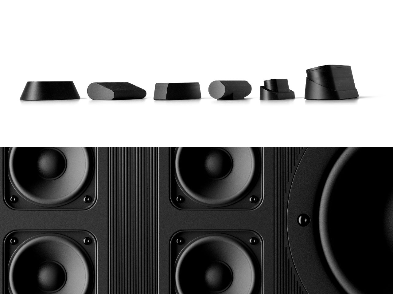
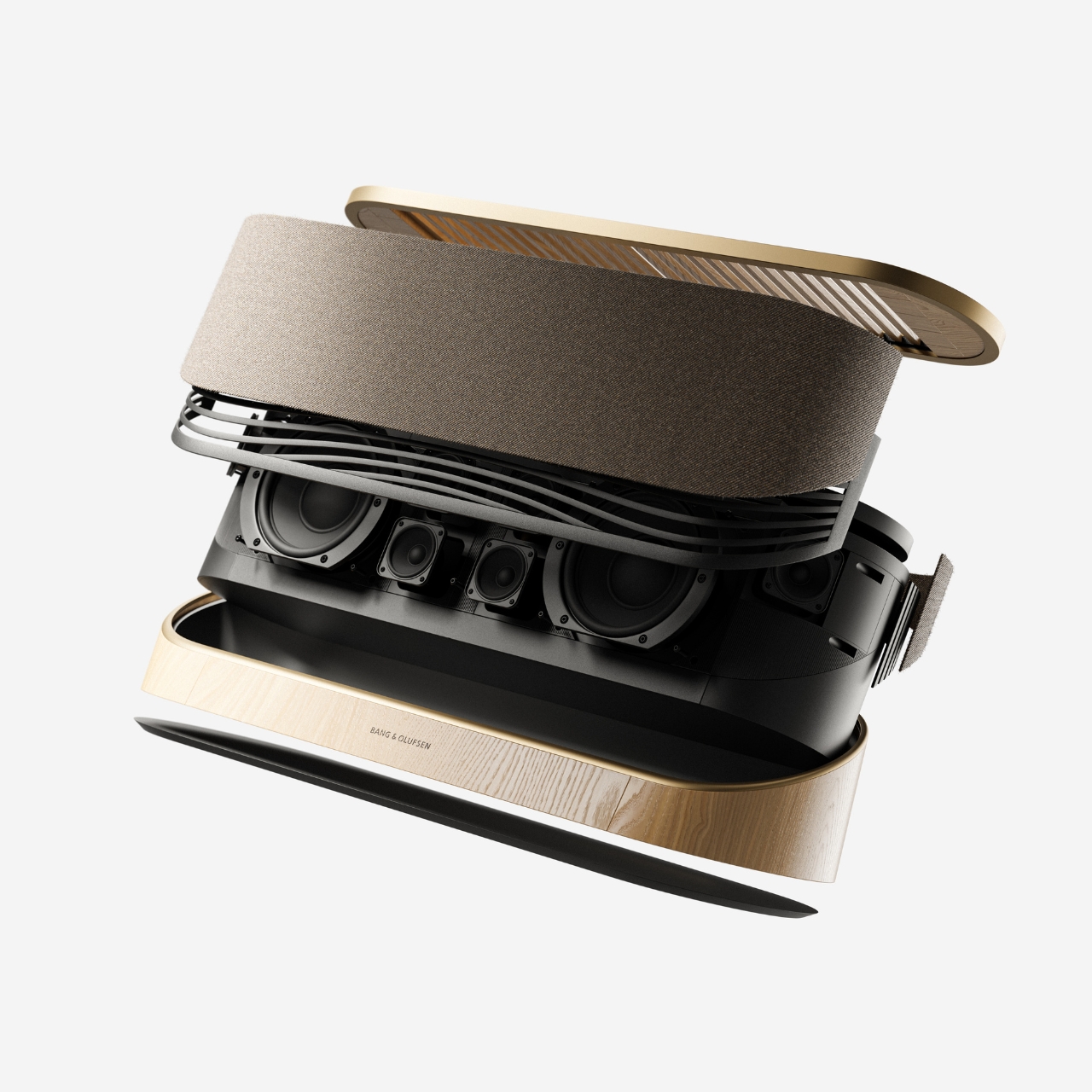
Looking at the exploded view of the horizontal model, you can see just how much thought went into the layering of components. The speaker array sits sandwiched between the wood base and the metal-framed top, with the projector mechanism occupying the central cavity. It’s genuinely elegant engineering, even if this is still a concept. Baumeister also developed a series of small-scale physical prototypes exploring the form from different angles, which you can see in a lineup of matte black study models. That process matters. It tells you this isn’t just a pretty render; it’s a design that was worked through with real hands.

Here’s my honest opinion: the TV industry has been coasting on size for years. Bigger screens, thinner bezels, more pixels. But the BeoLens Horizon asks a more interesting question. What if the device itself was worth looking at even when it was off? What if the experience of owning the hardware was part of the experience of using it? These aren’t new ideas in the B&O world, but a projector built around this philosophy feels like a genuinely fresh proposition, especially as ultra-short-throw technology continues to improve.

Baumeister is a young designer out of Strate, a design school in Lyon, and BeoLens Horizon joins a portfolio that already shows a real feel for the intersection of material craft and technology. Whether Bang & Olufsen ever picks this up or not, the concept makes a compelling case that the future of home cinema doesn’t have to look like a gadget. It can look like something you actually want to live with.

The post The Projector Concept That’s Almost Too Beautiful to Use first appeared on Yanko Design.
  •  

This E Ink Foldable Phone Concept Punishes Doomscrolling by Design

Most smartphones are designed to be impossible to put down. The screen faces up on every table, the display lights up for every notification, and the cost of checking it one more time is exactly zero. That’s not an accident. The hardware removes friction from compulsive use because removing friction is what makes these devices feel indispensable. The tinyBook Flip concept asks a different question entirely: what if the phone were designed to get out of the way?

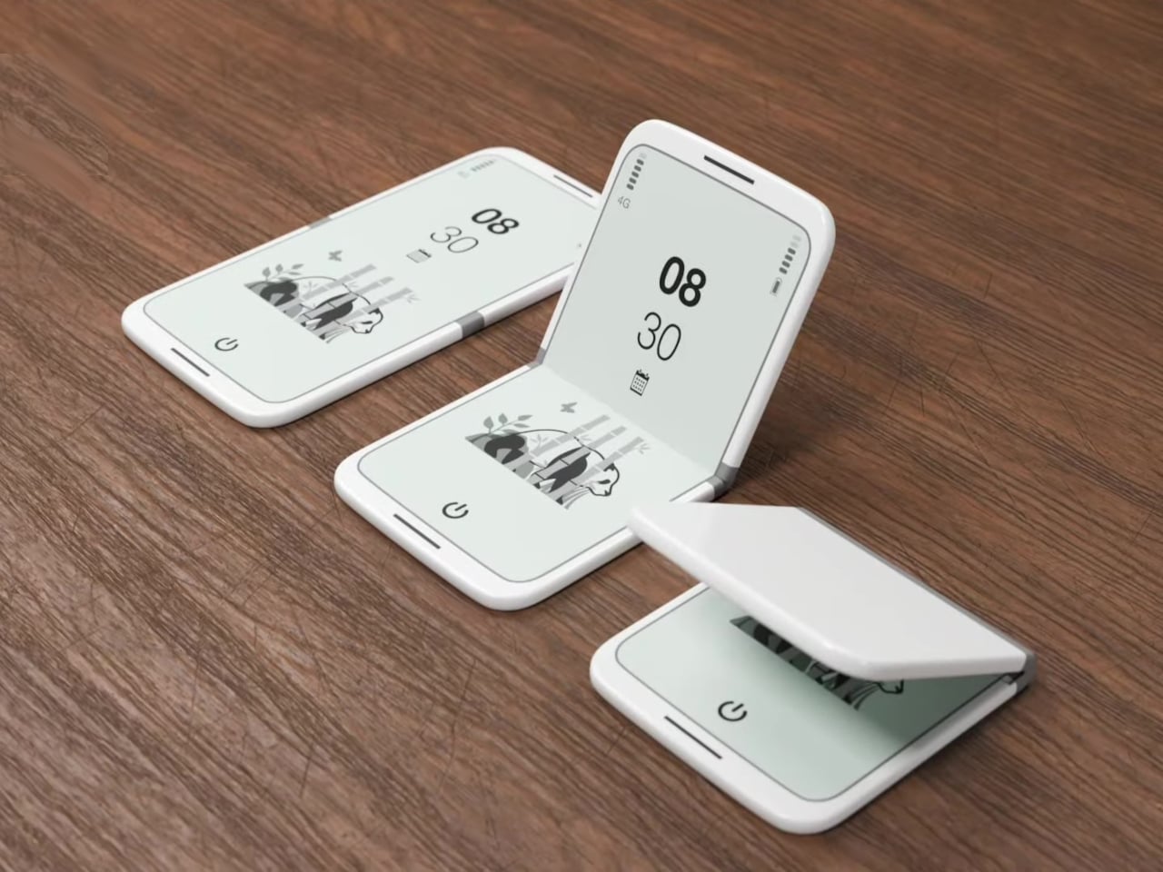
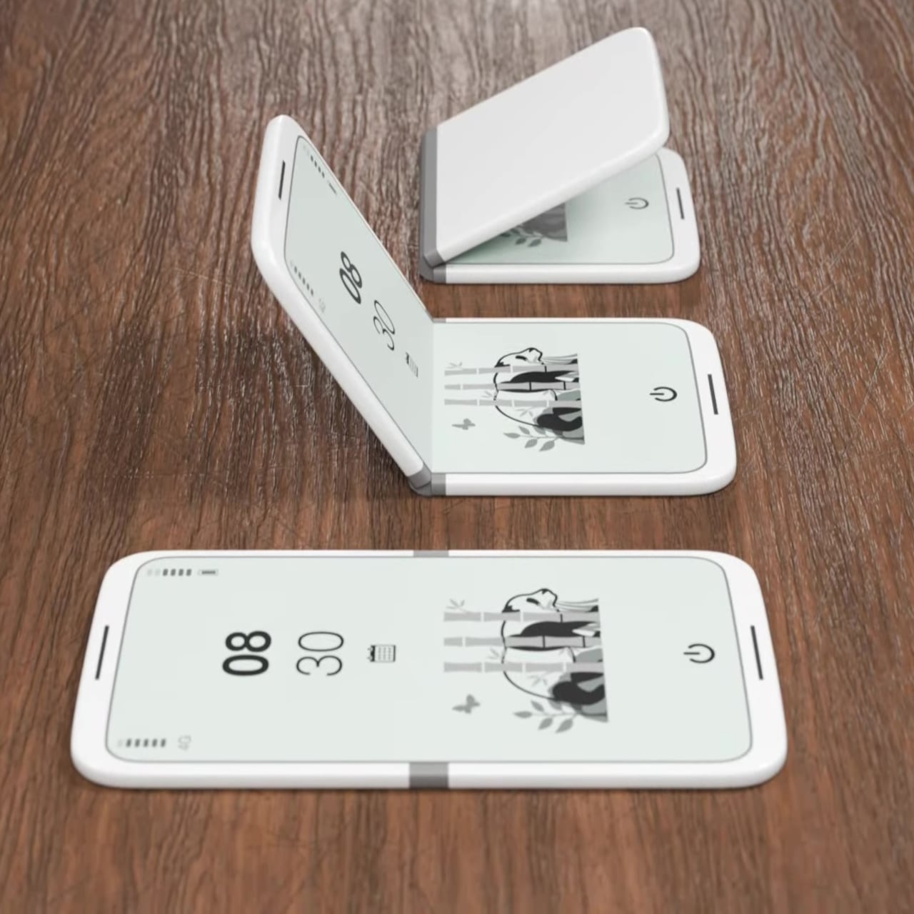
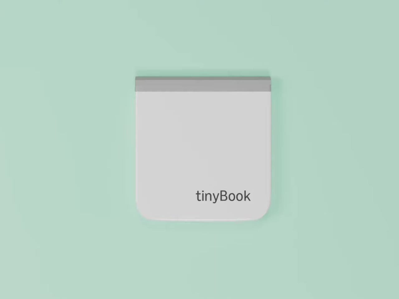
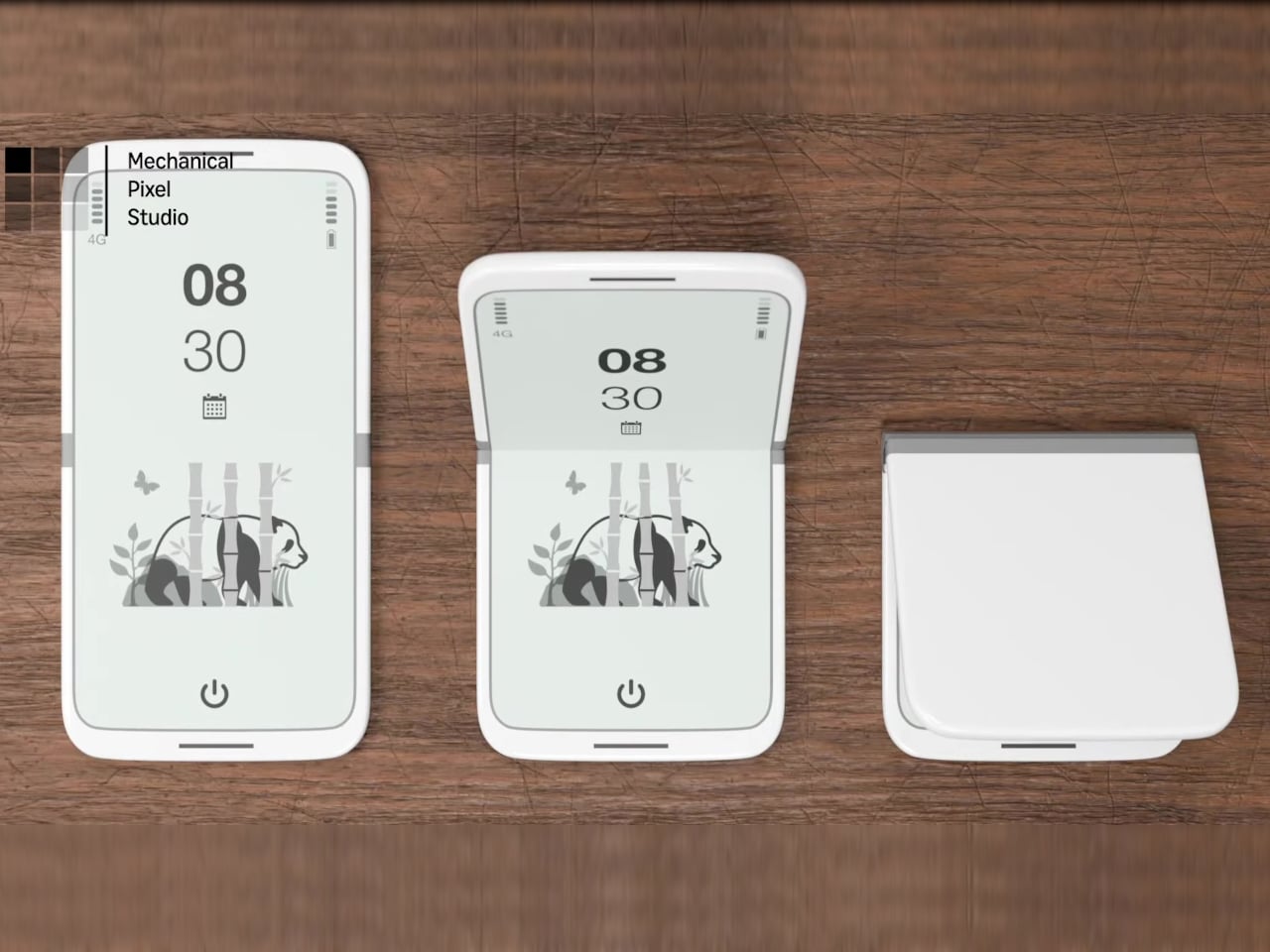
The tinyBook Flip is a vertical foldable phone concept built around a 6.1-inch E Ink display. Closed, it collapses into a compact, near-square form with rounded corners and a matte white finish, something closer in proportion to a folded notecard than a smartphone. The screen disappears entirely when the device is closed shut. No glowing rectangle sitting face-up on the desk, no ambient reminder that there are things to check. Just a small, quiet object.

Designer: Pixel Dynamics

That folded form is doing more work than it might seem. Opening the phone requires a deliberate physical action, and that small added step changes the behavioral math. A reflexive grab becomes a conscious decision. The friction is minimal in absolute terms, maybe two seconds, but two seconds of resistance is often enough to interrupt the loop. The concept treats that interruption as a design feature, which puts it in genuinely different territory from most phones.

The E Ink display adds a second layer of resistance, and this one is less subtle. E ink refreshes slowly, renders in grayscale or muted colors, and handles fast-moving content poorly. Social media feeds become tedious. Short-form video becomes unwatchable. Anything built around color, motion, and rapid visual feedback stops working the way it was designed to. This is precisely the point. The screen’s limitations aren’t engineering compromises left over from an earlier era of display technology; they’re structural properties that make certain behaviors genuinely unpleasant to sustain.

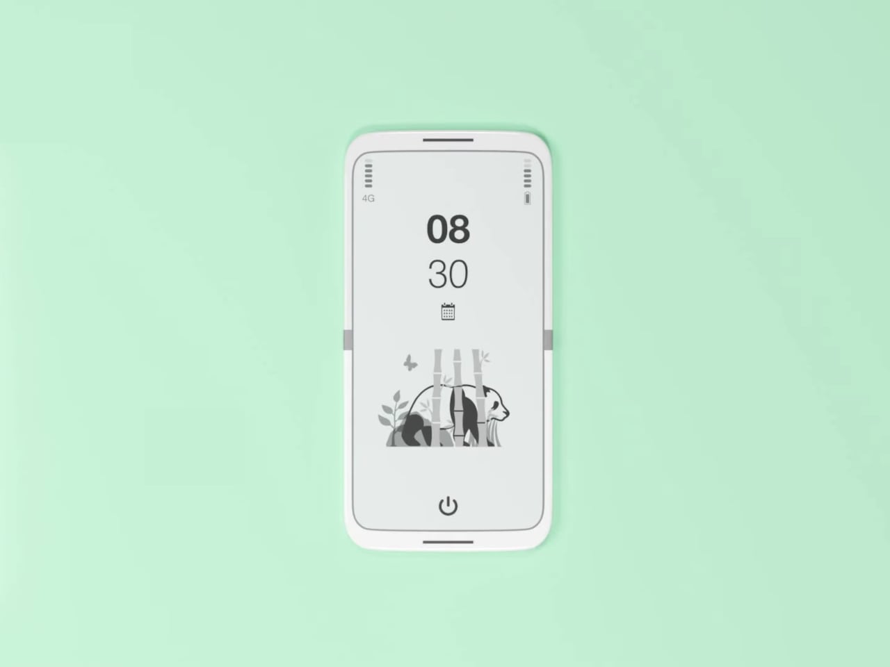
What E Ink handles well is a shorter list, but a coherent one. Text reading, messaging, calendars, and static interfaces are all comfortable at E Ink’s native pace. The renders of the tinyBook Flip show a UI built around exactly these strengths: a large clock face, a calendar widget, and a grayscale illustrated wallpaper. The interface doesn’t reach for capabilities the display can’t support. The phone isn’t trying to do everything; it’s trying to do a narrower set of things without apology.

Foldable E Ink panels aren’t a speculative technology. The hardware exists at the component level and has already appeared in experimental e-readers, though no consumer phone has shipped with one in any meaningful volume. The tinyBook Flip isn’t imagining impossible components; it’s proposing a form factor that manufacturers haven’t yet committed to producing. The distance between those two things is largely commercial, not technical.

There’s also something worth noticing about how the device reads as a physical object in social space. Closed, the tinyBook Flip looks like almost nothing. No visible screen, no status indicators, no glow. A phone that carries no visual weight when it’s not in use sends a different signal than one that’s always broadcasting its presence. Putting it down means it actually disappears from the environment, not just from your hand.

That said, the concept leaves some real friction points unaddressed, and not the intentional kind. E Ink handles camera use, live navigation, video calls, and authentication apps poorly. A foldable hinge adds mechanical complexity and thickness that clean renders tend to obscure. The tinyBook Flip looks resolved in this form, but a production version would have to make tradeoffs that these images don’t show and the concept doesn’t acknowledge.

Still, the more interesting question isn’t whether this specific device could ship. It’s whether a phone that makes itself harder to misuse is a reasonable design goal at all, or whether that’s just a way of describing a phone that most people wouldn’t actually want. The tinyBook Flip lands firmly on one side of that question. Whether the market agrees is a different problem entirely.

The post This E Ink Foldable Phone Concept Punishes Doomscrolling by Design first appeared on Yanko Design.
  •  

When Your Speaker Is Also a Puzzle, Music Hits Different

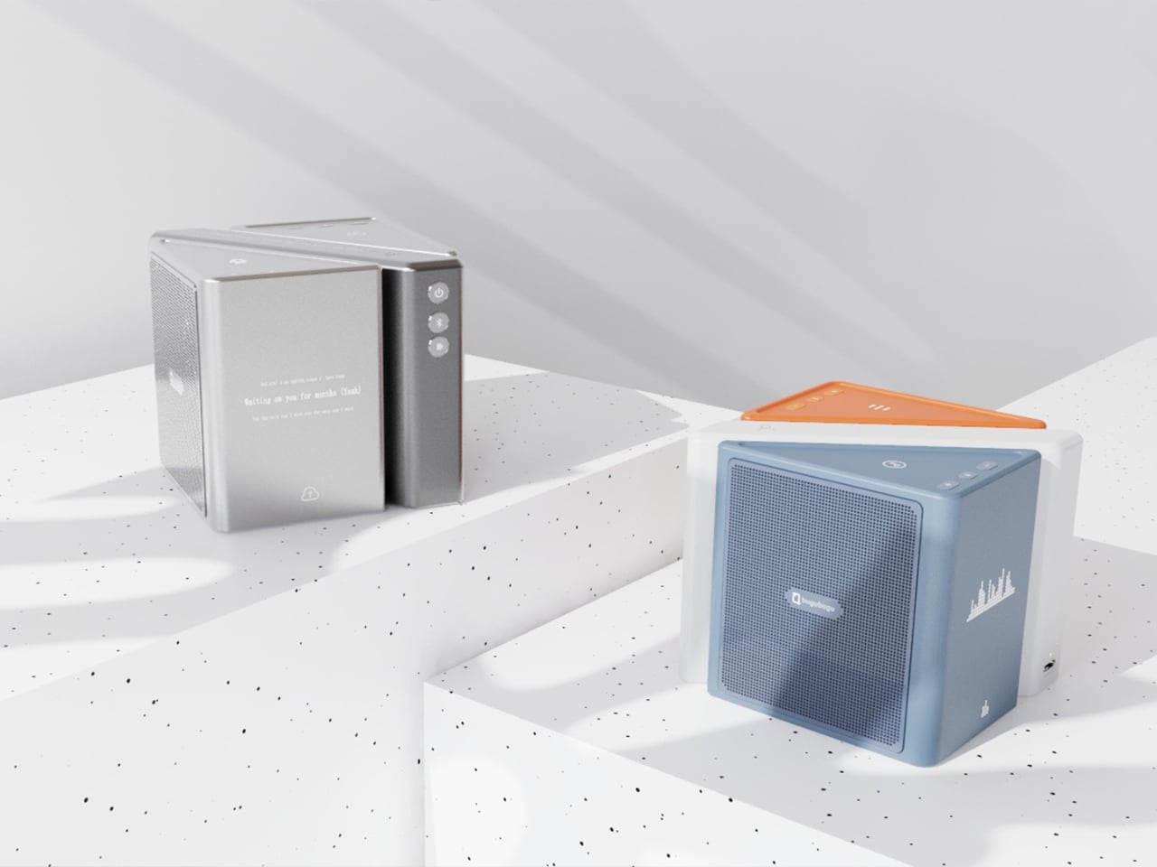
Most speaker designs ask a pretty simple question: how do we make this thing louder and smaller? Merge asks a completely different one. How do we make music something you can actually take apart?

Created by a five-person design team, Junchuan Shi, Junhao Lv, Xiangzhao Meng, Ping He, and Genghao Ma, from a cross-institutional collaboration across Sichuan Vocational and Technical College, CityU Macau, TUT, and QZUIE, Merge is a conceptual speaker system that just picked up a 2025 European Product Design Award in the Consumer Electronics category. It’s the kind of student concept that makes you wonder why no major brand has thought of it first.

Designers: Junchuan Shi, Junhao Lv, Xiangzhao Meng, Ping He, Genghao Ma

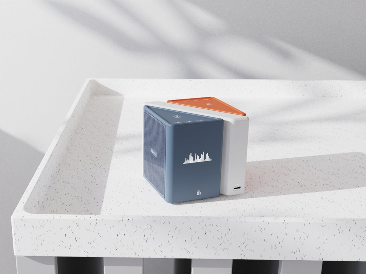
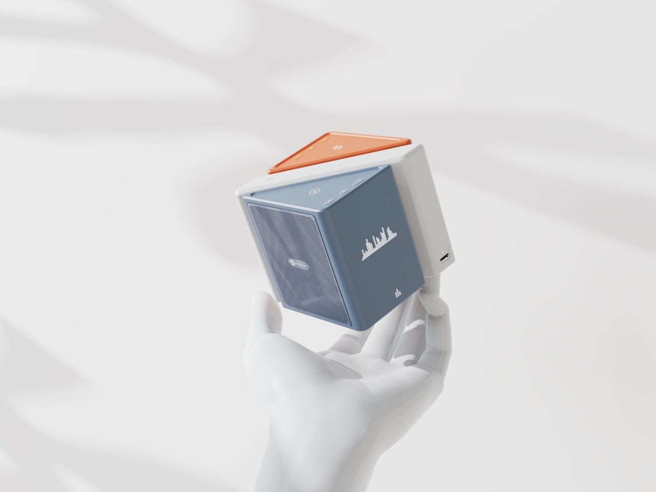
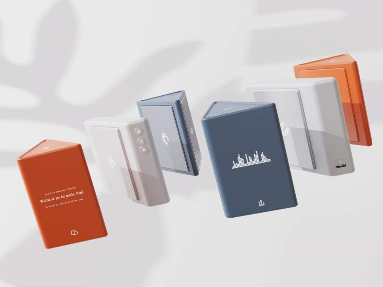
The central idea is deceptively clever. Merge physically separates music into its component layers: the accompaniment on one module, the vocals on another, and the full combined sound handled by the complete assembly. You choose what you hear depending on how the pieces are arranged. Pull the vocal module away, and you’ve got an instant karaoke track. Keep just the vocal module, and you hear a singer stripped back from all the production. Snap everything together and you get the whole song. It sounds gimmicky when you describe it that way, but it really isn’t. It’s an intuitive way to interact with music that streaming apps, for all their data and algorithms, still haven’t cracked with the same sense of physical satisfaction.

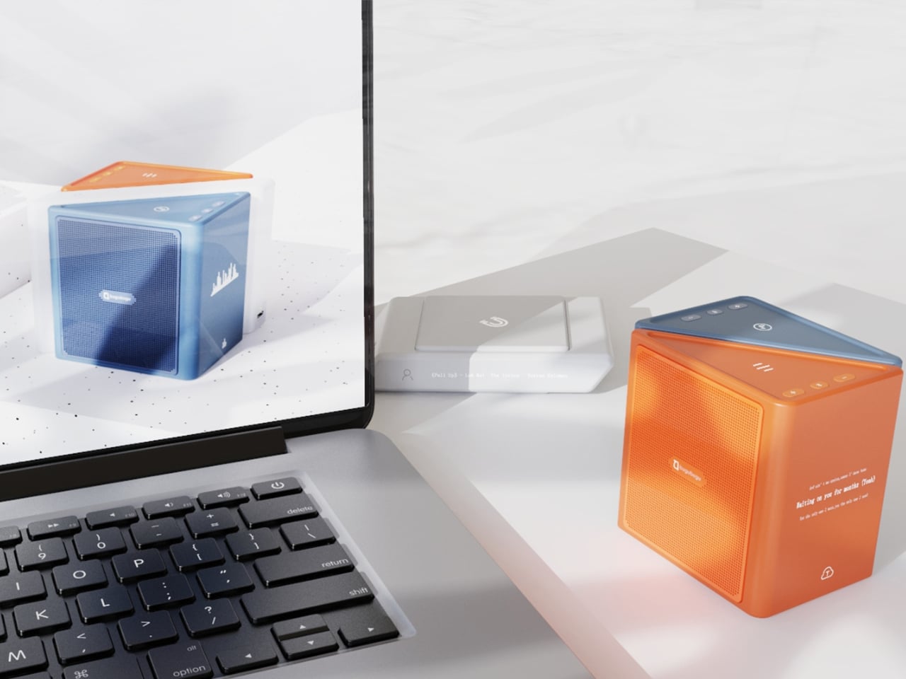
The three modules connect via electromagnetic induction, which also handles charging between units. That detail matters more than it sounds. It means the product doesn’t rely on fiddly clips or pins; the connection is seamless and the experience stays clean. When you hold all three pieces assembled, they sit together like a solid little object. When you pull them apart, you’re not wrestling with latches. You’re just… separating music.

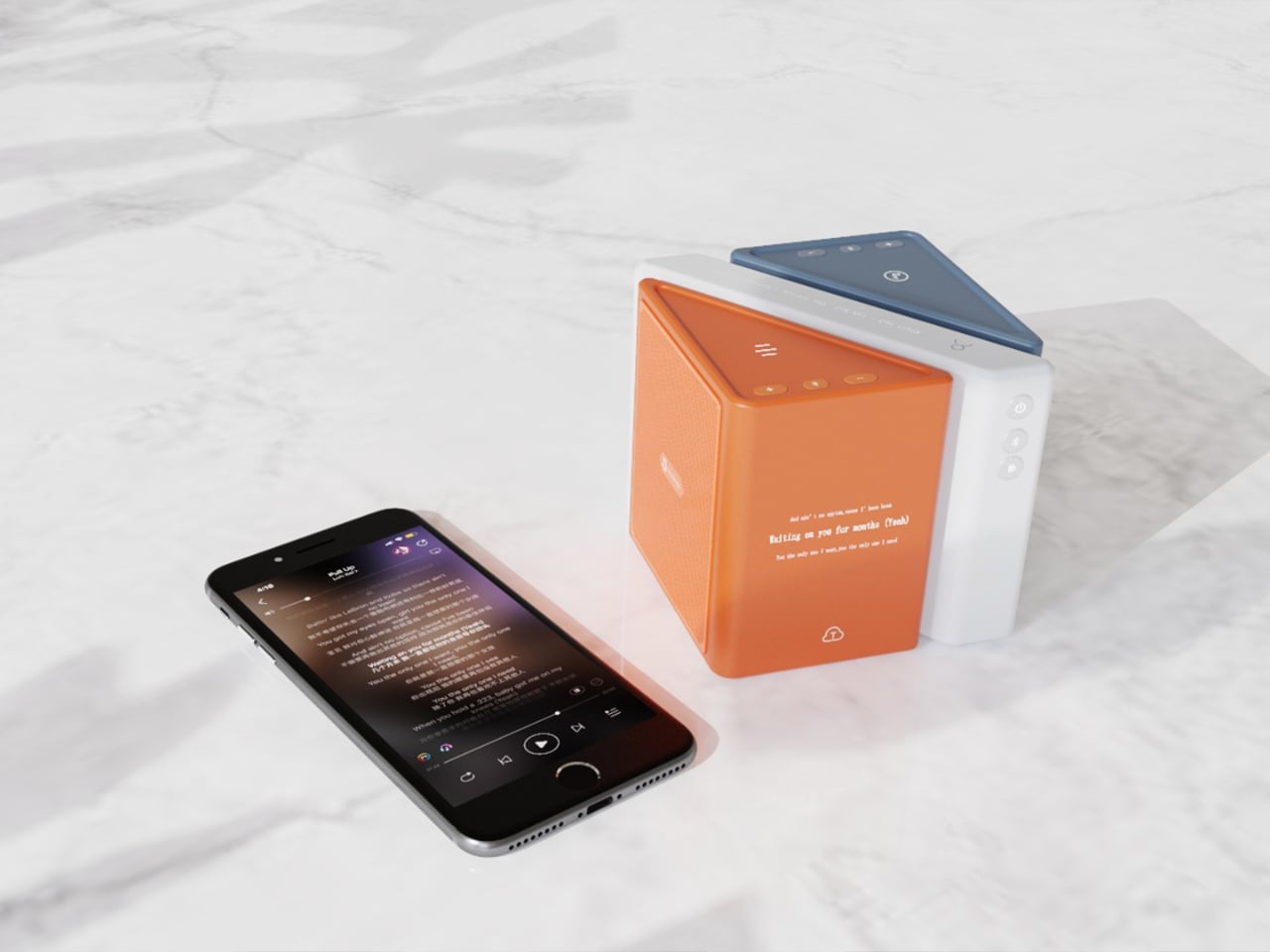
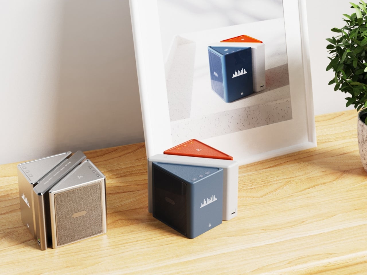
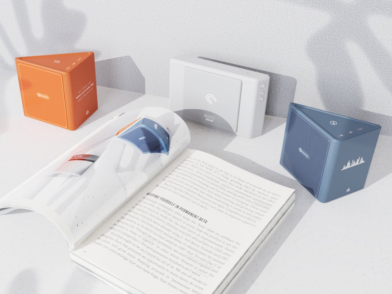
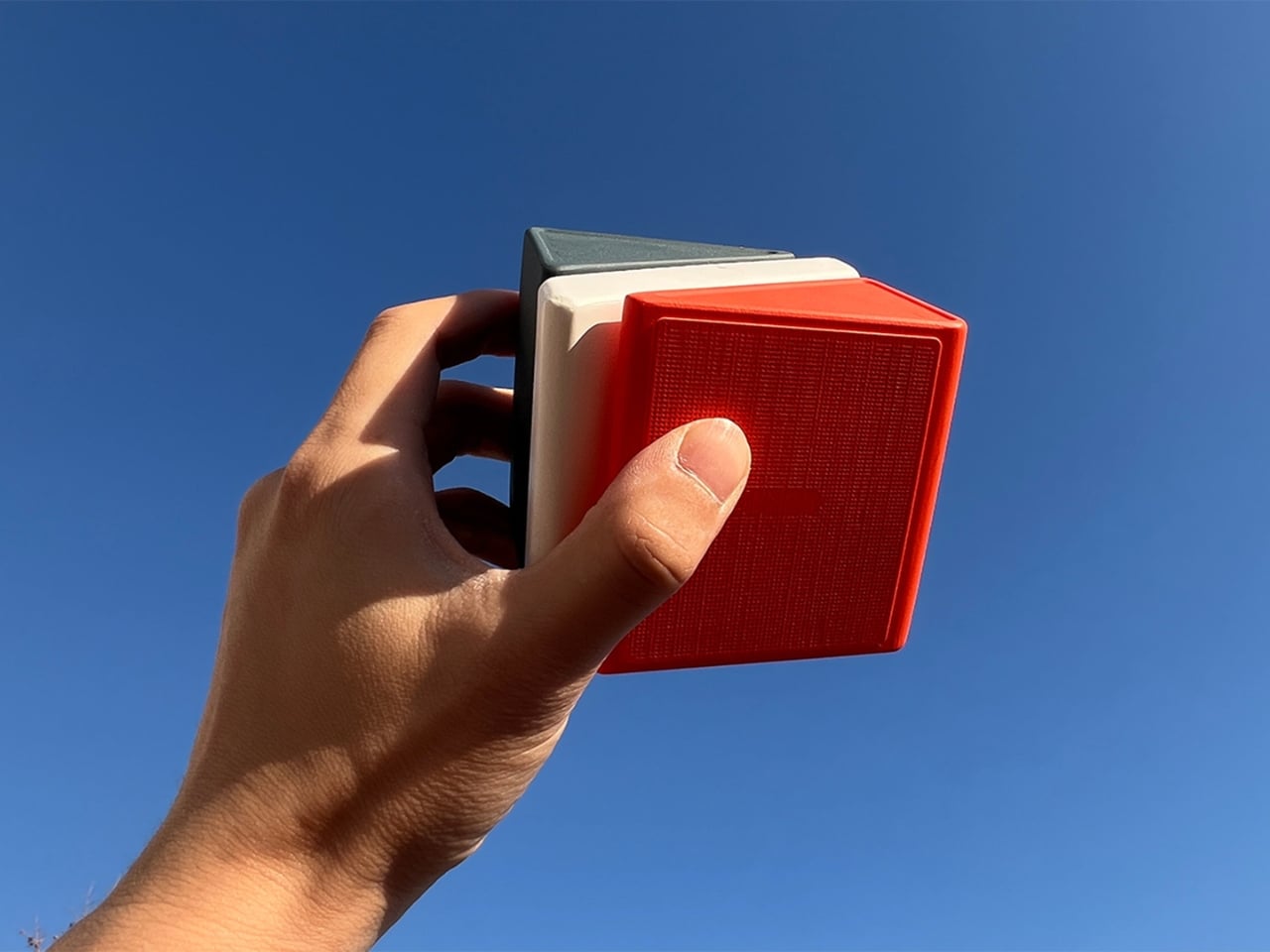
Visually, the design is confident without being loud. The modules are geometric and compact: a rectangular flat piece, a squared speaker body, and a triangular wedge that caps the top when assembled. The whole thing sits in your palm like a premium toy, which is very much the point. The team describes the tactile experience of rearranging the modules as analogous to playing with building blocks, and that framing is spot on. Listening becomes a physical act rather than a passive one. You’re not adjusting a slider on an app; you’re literally picking up a piece of the song and putting it somewhere else.

The color language is considered too. The renders show options in slate blue, orange-coral, silver metallic, and white-grey, each colorway with its own character but all sharing the same graphic vocabulary: pixel waveform icons and quiet typography showing floating lyrics directly on the module surface. It reads like something between a well-designed toy and a serious piece of consumer electronics, which is an interesting space for a speaker to occupy.

I’ll be upfront: Merge is still a concept. It won in the EPDA’s conceptual category, and it hasn’t crossed into production territory yet. That’s a long road, and the audio technology behind splitting tracks in real time at the hardware level would require serious engineering. The images are renders and physical prototypes, not retail-ready products. But the best conceptual design has always worked like that. It shows an industry where something should go, even when the technology and the business case haven’t fully caught up yet.

What makes Merge genuinely compelling is that it treats the listener as someone with curiosity rather than just convenience-seeking habits. The assumption baked into most audio product design is that people want everything done for them, simplified, smoothed over. Merge assumes the opposite: that people might actually enjoy engaging with the layers of a song, touching them, moving them around. Given how obsessed the current cultural moment is with stems, remixes, and stripped-back sessions, that assumption feels exactly right.

Whether it ever becomes a product you can buy, Merge is already doing the thing good design is supposed to do. It makes you look at something ordinary and ask why it was never done this way before.

The post When Your Speaker Is Also a Puzzle, Music Hits Different first appeared on Yanko Design.
  •  

A Wind-Powered Tumbleweed That Heals the Desert as It Rolls

I have to be upfront: I did not expect a tumbleweed to be one of the most exciting design concepts I’d encounter this year. Tumbleweeds, in the cultural imagination, belong to Westerns and dusty ghost towns. They’re the kind of thing that drifts across an empty street right before a showdown, the universal shorthand for desolation. So when I first came across the Wasteland Nomads: Bionic Tumbleweed Sower System by Yizhuo Guo, I laughed a little. But as I looked closer, I started getting impressed.

Guo is a multidisciplinary designer with a master’s degree in Material Futures from Central Saint Martins, and she has previously collaborated with Google DeepMind. Her work appeared at Milan Design Week 2024. She is, in other words, someone who operates at the intersection of cutting-edge materials science and ecological design thinking. With Wasteland Nomads, developed alongside Daheng Chu through the University of the Arts London and Imperial College London, she took the one plant most associated with barren landscapes and used it as a blueprint for restoring them. The logic is almost poetic. The tumbleweed doesn’t fight the desert. It works with it. It uses wind as its engine and travels wherever the landscape allows. Guo’s question, essentially, was: what if we could engineer something that did exactly the same thing, but deliberately seeded the ground as it went?

Designer: yizhuo guo

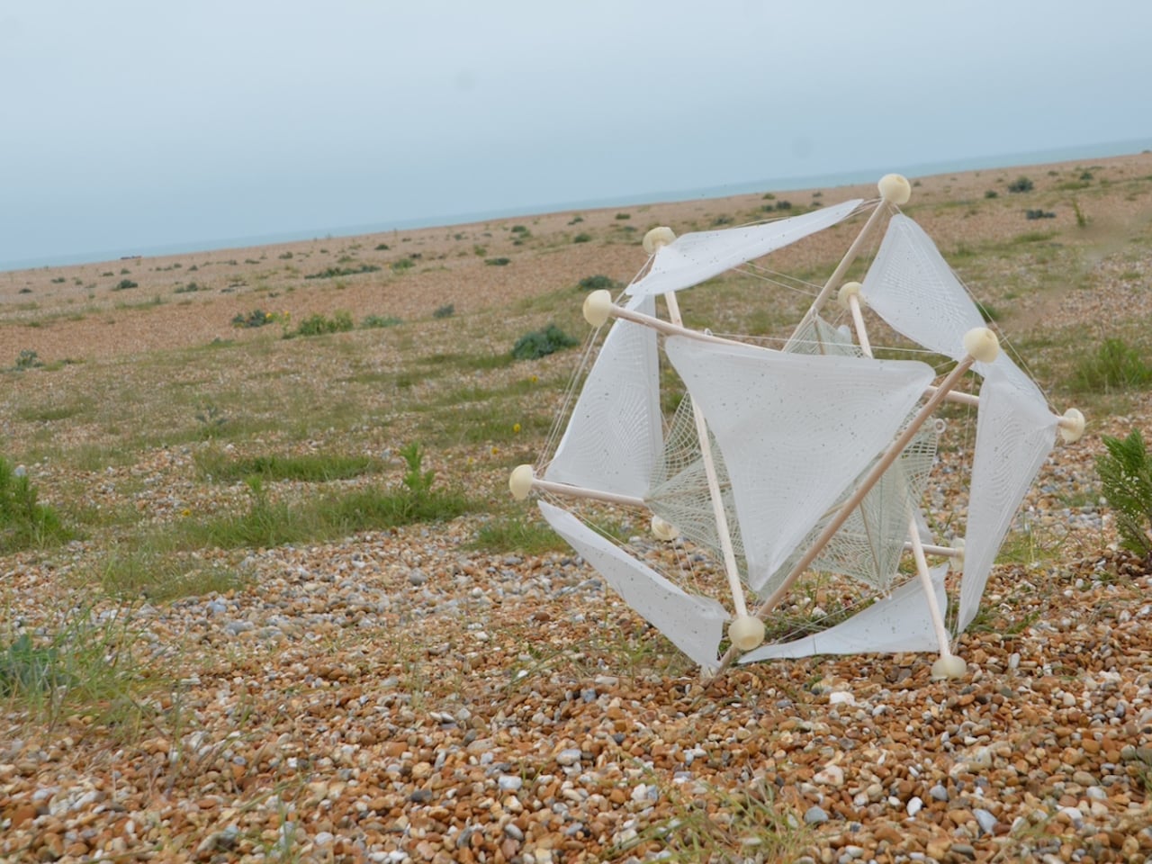
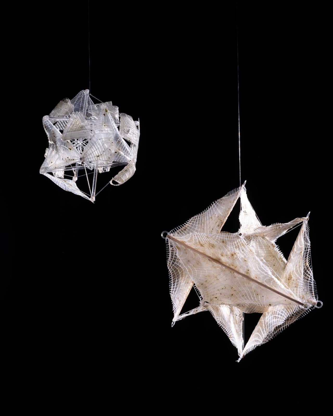
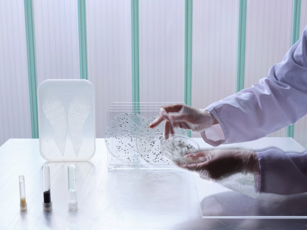
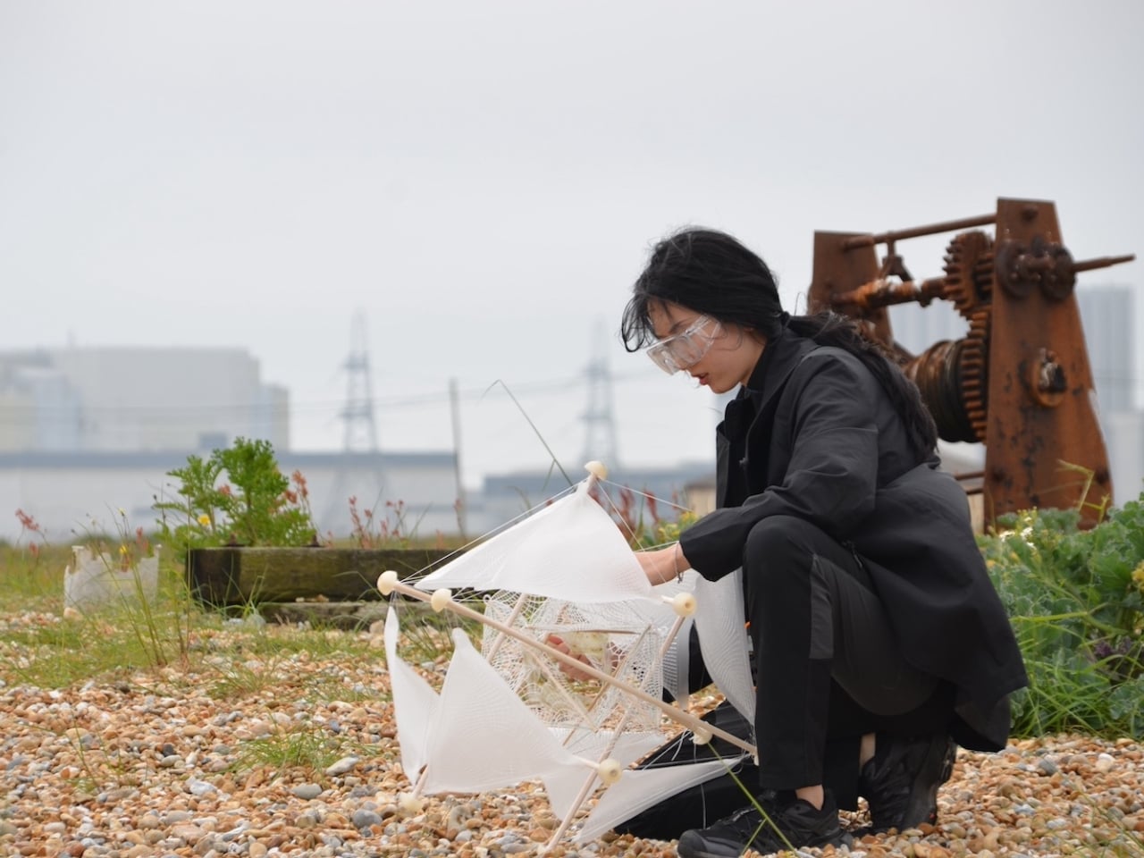
The result is a biomimetic seeding device built entirely on the principles of passive robotics. No batteries, no circuits, no external power source required. Lightweight biodegradable support rods form a tensile, hollow spherical structure that mirrors the tumbleweed’s own elastic form. The outer skin is made from a moisture-responsive biodegradable composite, and seeds are housed within it. When the device rolls into an environment where humidity conditions are right, the skin begins to break down and disperse those seeds directly into the soil. It boosts soil oxygen, contributes to carbon sequestration, and by the very end of its journey, the device has fully merged with the ground it was trying to restore. No waste. No remnants. Just land.

That last part is the detail I keep returning to. Most ecological technology, even the well-intentioned kind, still leaves something behind. A plastic housing. A metal component. A depleted battery that needs to go somewhere. This dissolves into the very ecosystem it is trying to rebuild. The design does not just mimic nature. It eventually becomes nature. That is a fundamentally different relationship between technology and environment than what we are used to seeing, and it matters more than it might initially seem.

The project took home a 2025 European Product Design Award in the Eco Design Products category, which feels well deserved, though I suspect this is only the beginning of the conversation around it. Guo has already accumulated a striking list of recognitions, including the iF Design Award in Germany and multiple honors from Chinese design institutions. She is clearly a designer who thinks at the systems level, not just asking what something looks like, but how it lives, decays, and eventually reintegrates.

Climate design can sometimes feel exhausting in its abstraction. We have all scrolled past enough speculative renderings of glowing, utopian landscapes to develop a healthy skepticism toward the genre. Wasteland Nomads doesn’t do that. It starts with a specific, urgent problem, the accelerating degradation of viable land across arid regions of the planet, and it finds the answer not in some new synthetic innovation but in a plant that has been quietly solving the same problem for millions of years. The tumbleweed has been moving seeds across hostile terrain since long before we were here to watch it. We just never thought to pay close enough attention.

That, I think, is what makes this design genuinely moving. Biomimicry at its most honest is not about clever engineering. It’s about being willing to slow down long enough to watch how the world already works, and being humble enough to follow what you find. Guo was clearly paying attention. Now let’s see where it rolls.

The post A Wind-Powered Tumbleweed That Heals the Desert as It Rolls first appeared on Yanko Design.
  •  

This Fan Made the Sony-Nintendo Handheld the Companies Never Would

The retro handheld market has a strange problem. The hardware keeps getting better, the screens get sharper, the processors get faster, and yet most of these devices land looking like prototypes someone forgot to finish. Generic shells, forgettable proportions, and LED lighting as a substitute for actual design thinking. For a category built entirely on nostalgia, very few of these devices actually look like they belong to any era at all.

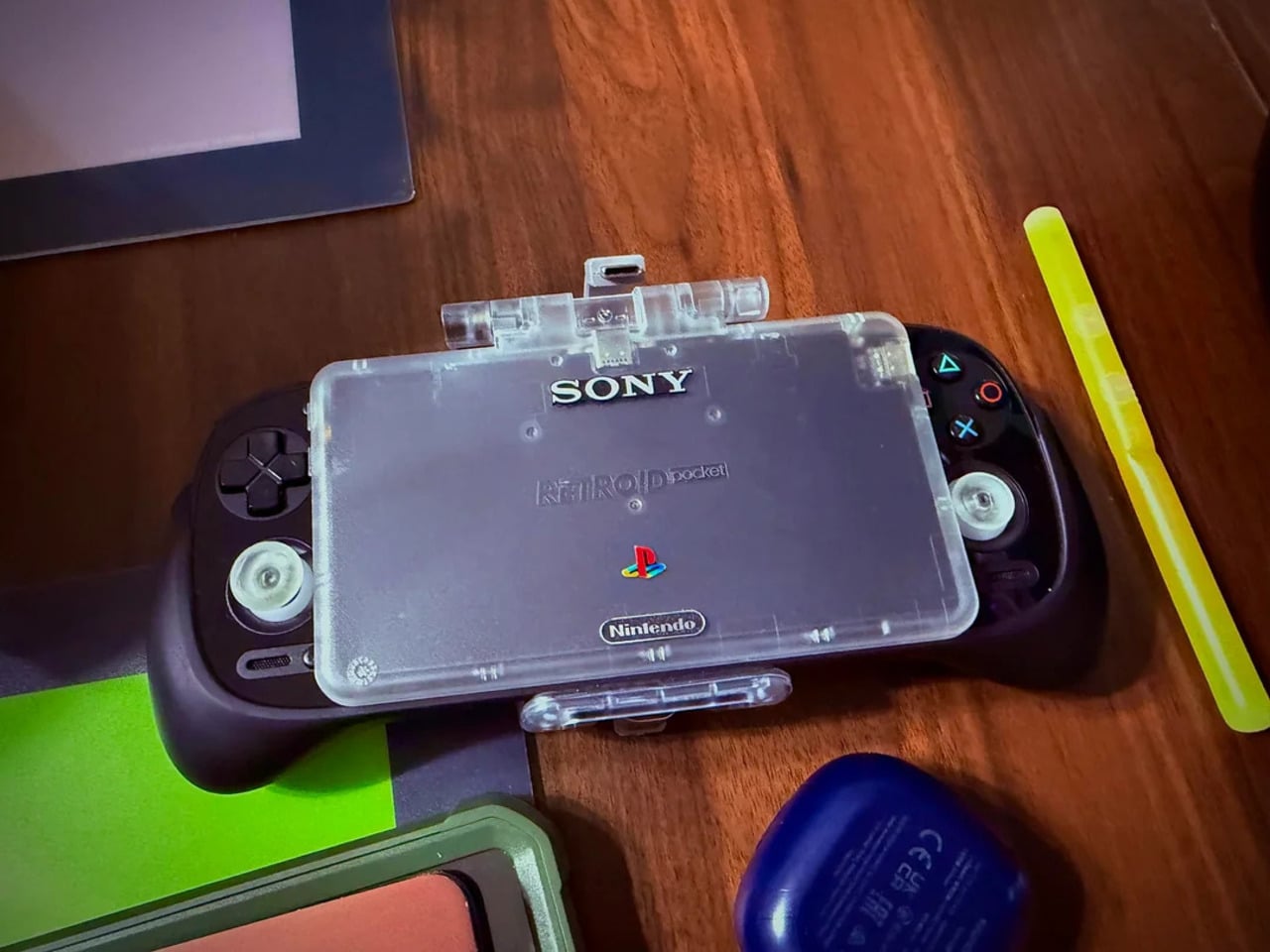
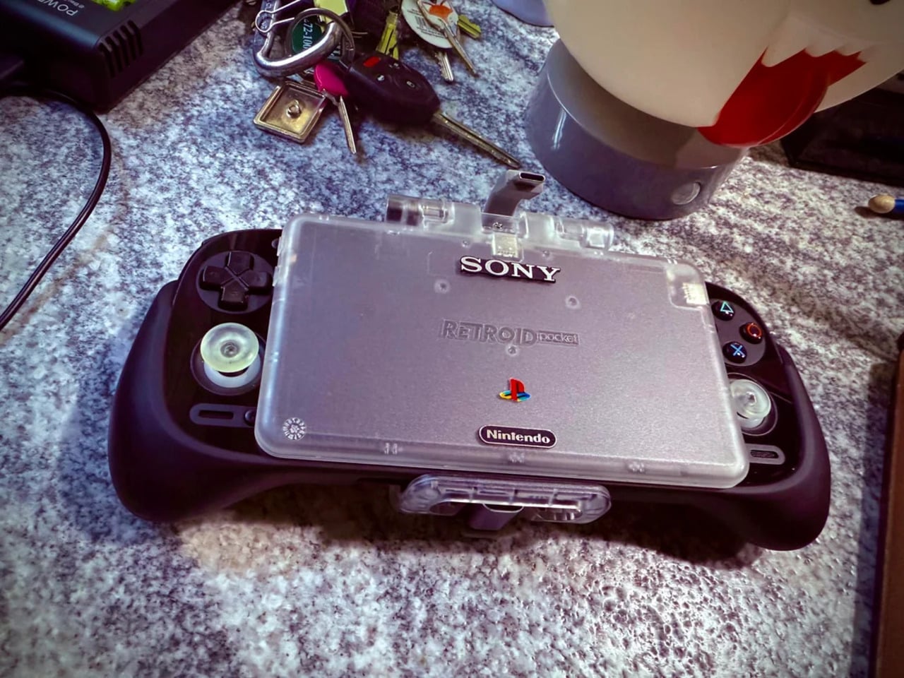
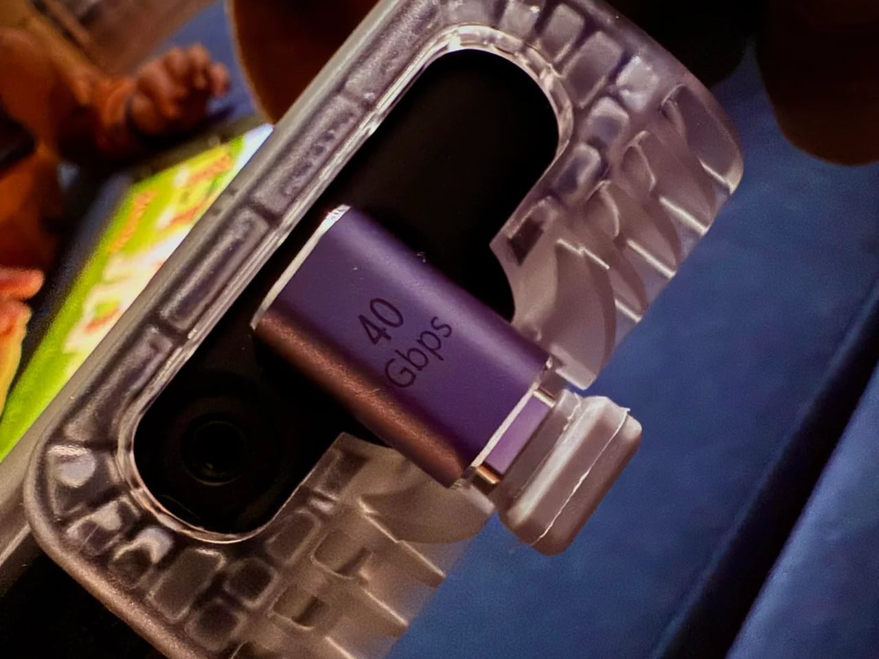
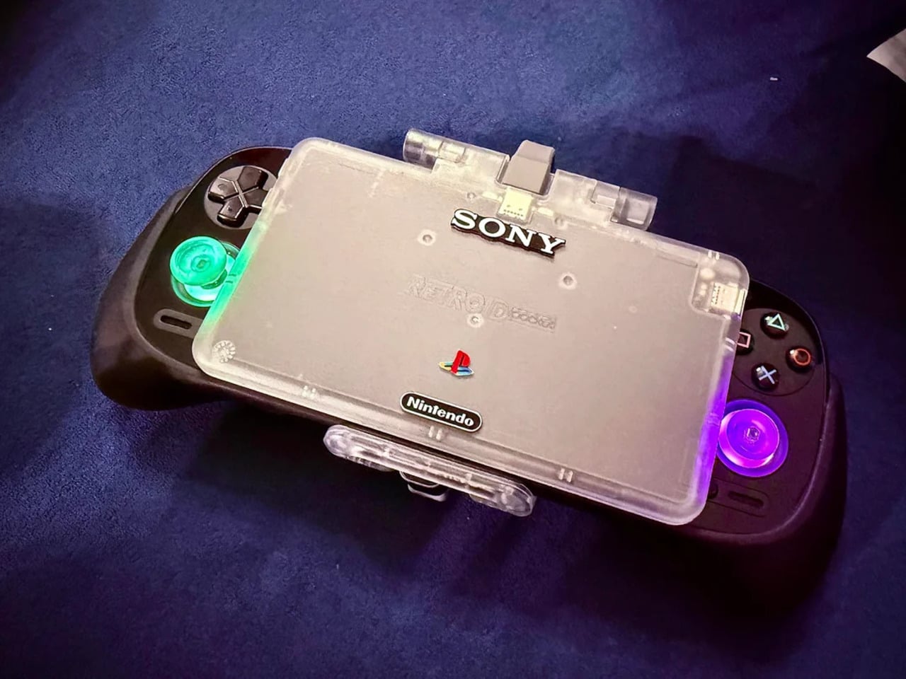
That tension is what one Reddit user decided to address. Starting with a Retroid Pocket 5, a $199 Android handheld running a Snapdragon 865 and a 5.5-inch AMOLED display, the mod layers Sony and Nintendo branding onto the same shell. Vinyl decals, translucent polycarbonate, a 3D-printed volume rocker from Etsy, and a cable replaced in PS2 color. The result looks less like a sticker job and more like a concept render from an alternate 1999.

Designer: Mitchieyan

The translucent shell is doing most of the work. It pulls from the visual language of the N64’s Funtastic series, those clear and atomic-purple controllers Nintendo released in the late 1990s, where showing the circuitry was the design choice rather than concealing it. Over a piano-black grip body with PlayStation-colored face buttons, the frosted polycarbonate shifts from grey to near-white depending on the light. It shouldn’t feel considered. It does.

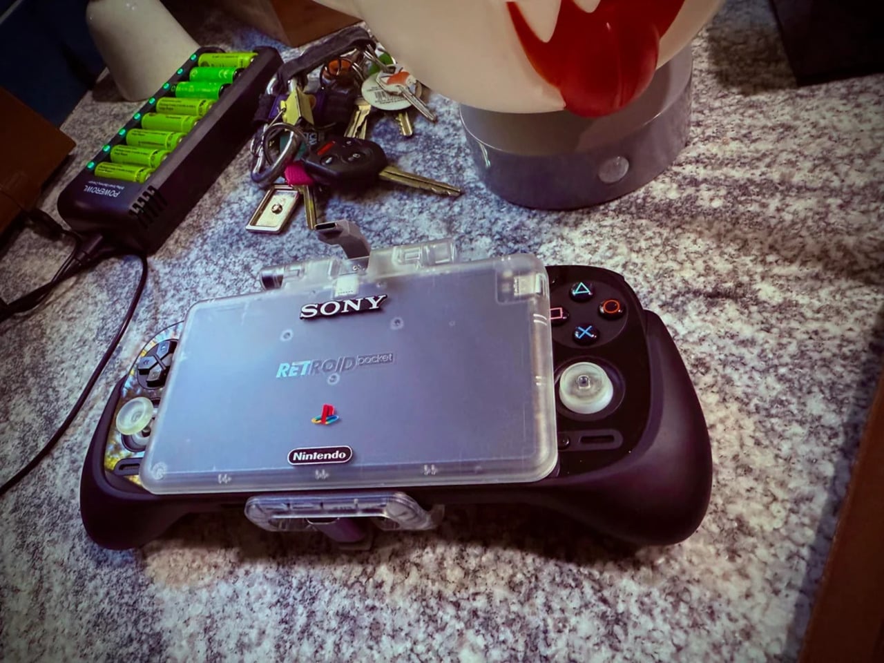
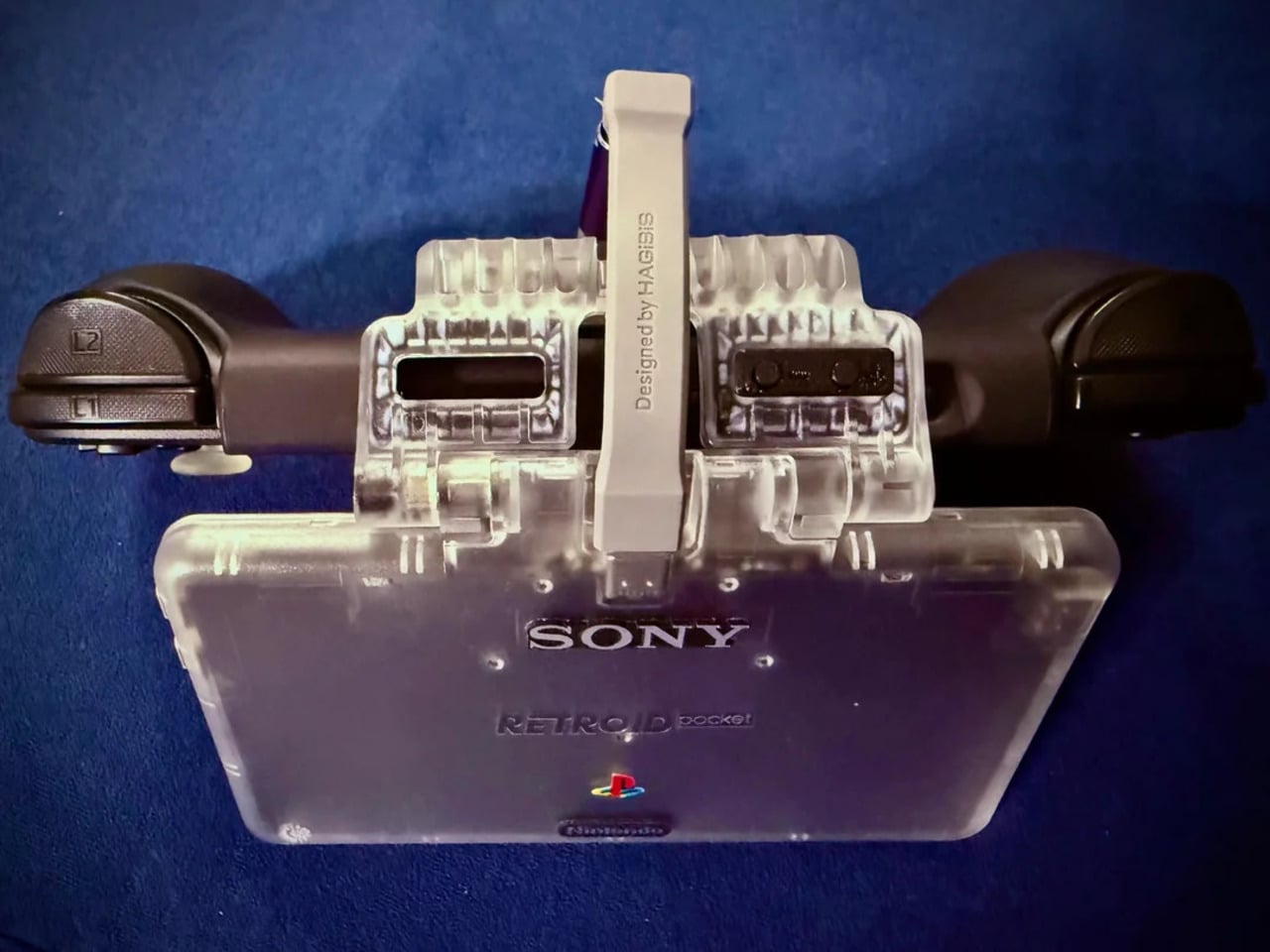
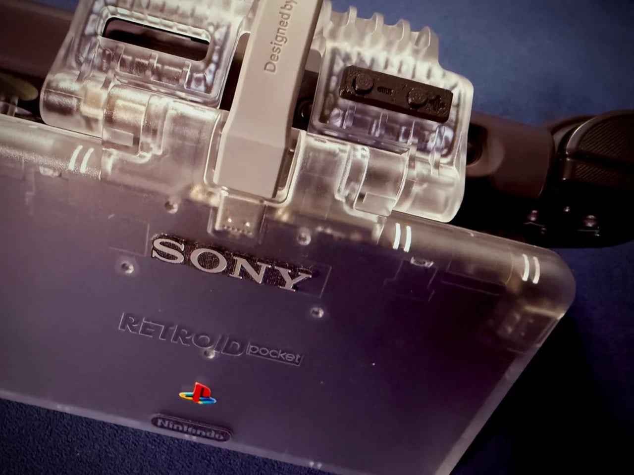
The branding placement is where intent becomes clear. The Sony wordmark sits centered on the upper face, exactly where it appeared on a PSOne. Below it, the PlayStation four-color logo. At the bottom bezel, the Nintendo badge mirrors its position on a Game Boy Advance SP. None of it is licensed, of course. These are adhesive vinyls placed by someone who grew up with both systems and wanted their coexistence on one device to feel inevitable rather than absurd.

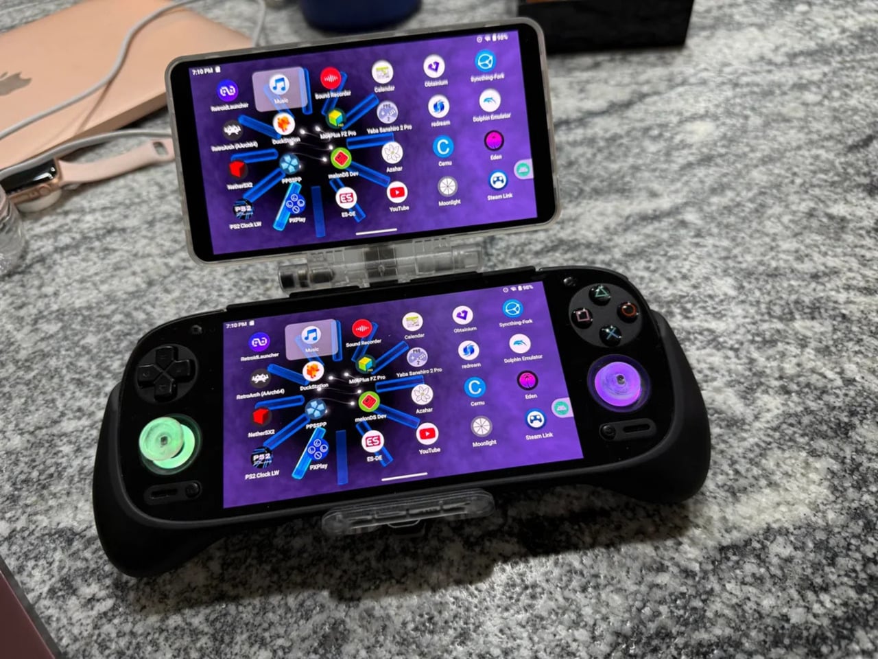
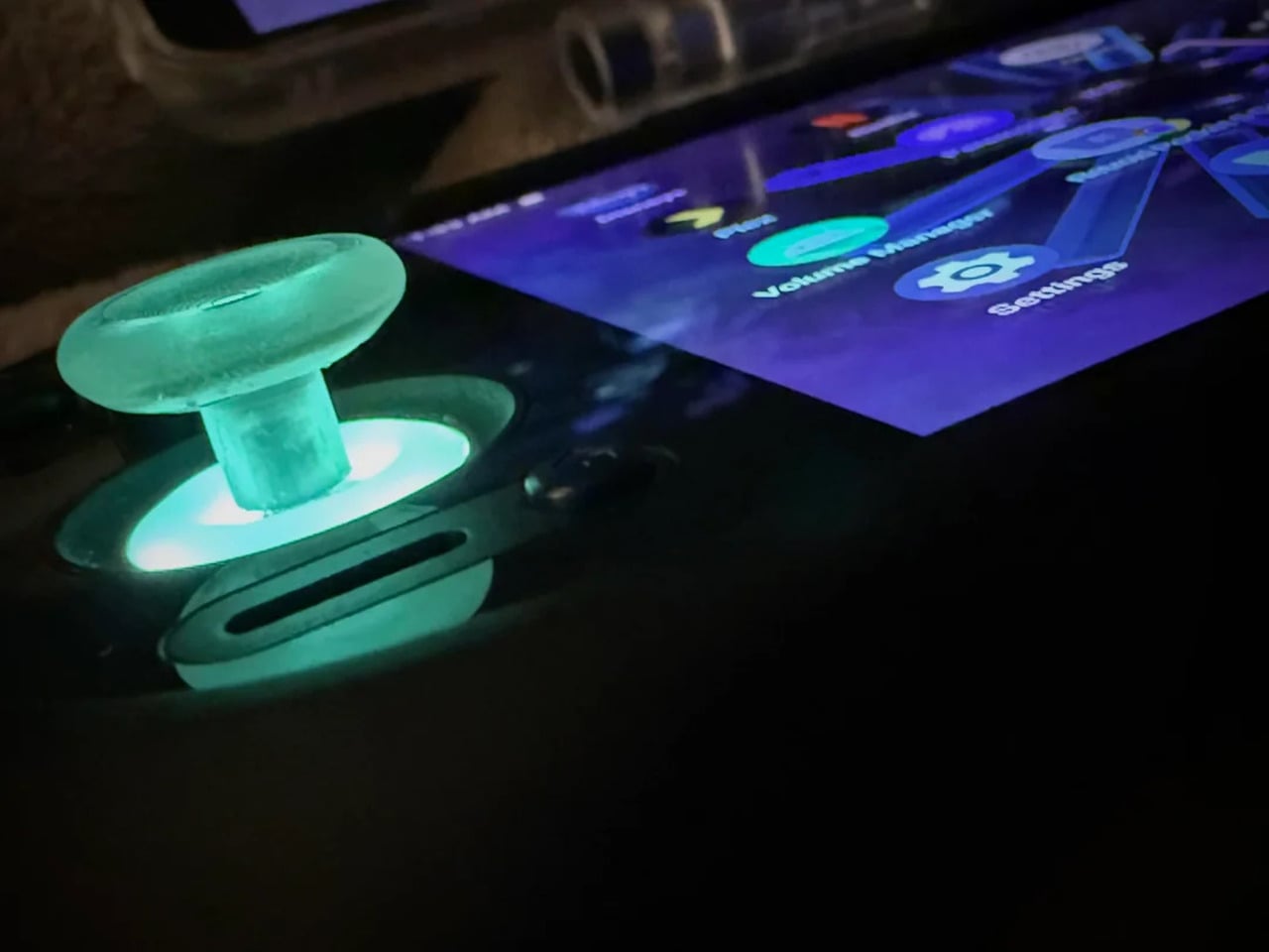
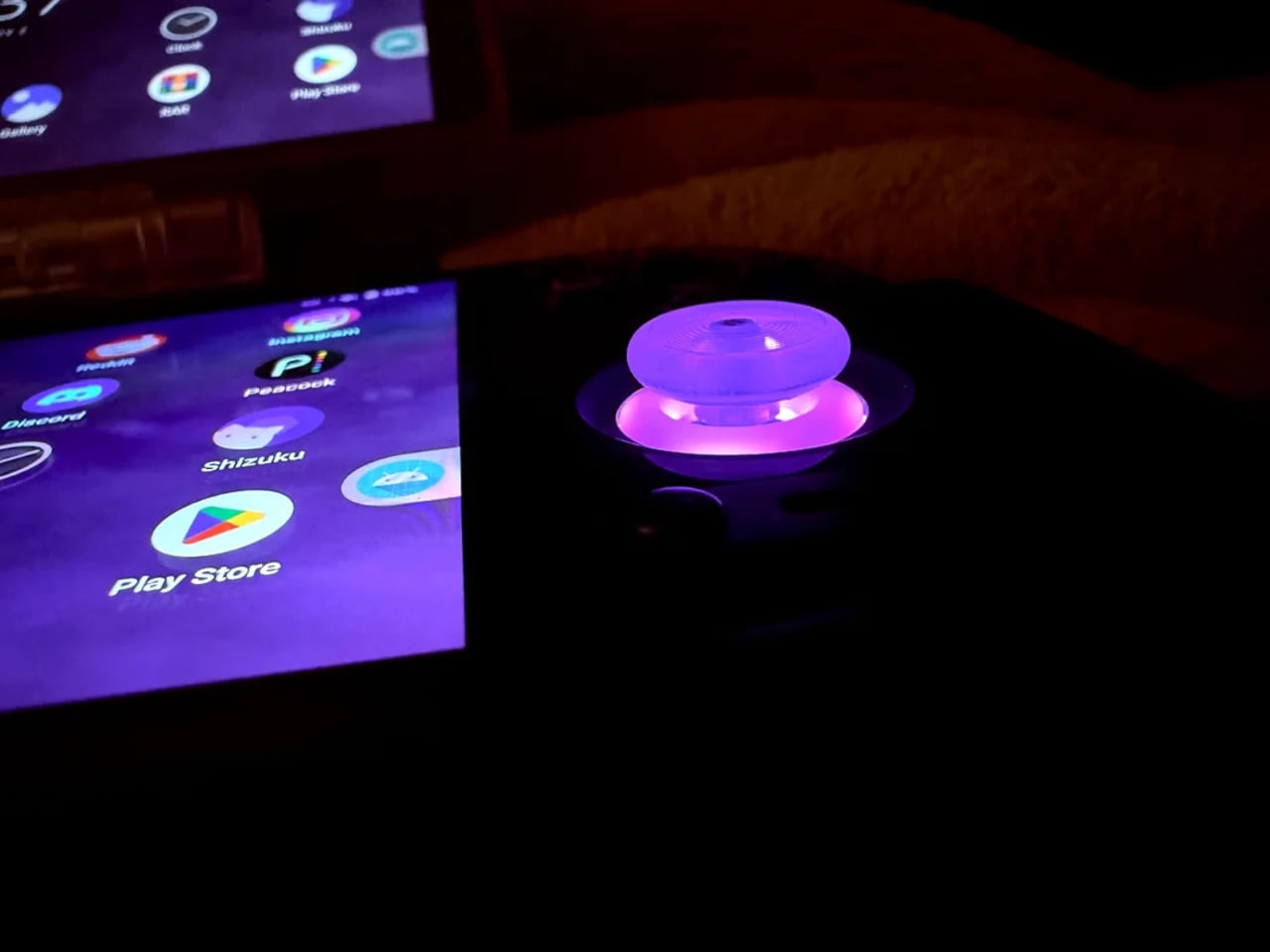
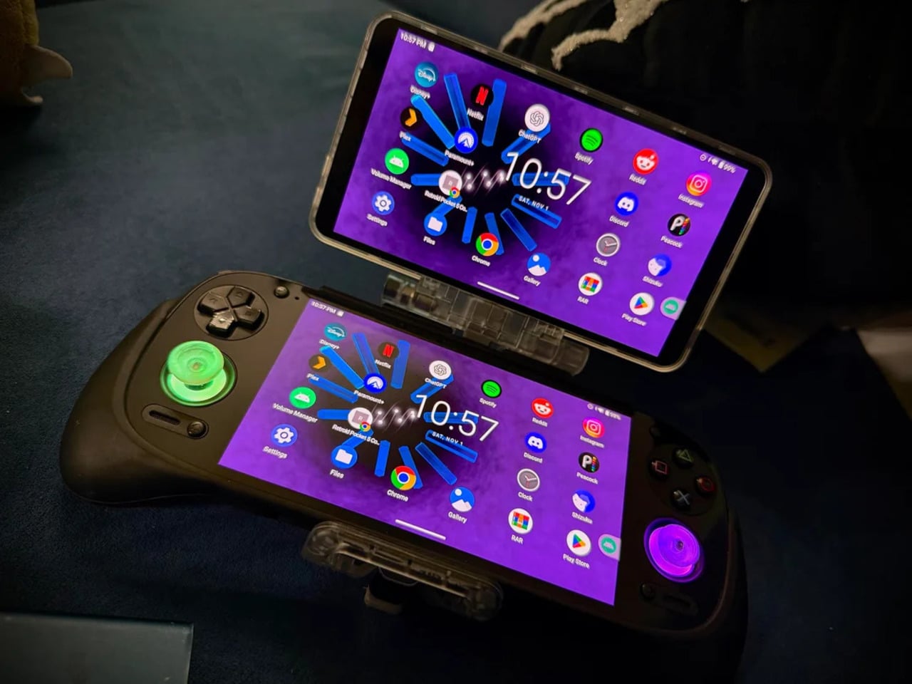
Not everything here reaches backward. The analog sticks are translucent caps over hall-effect sensors, lit teal on the left and purple on the right, owing nothing to 1999. That generation didn’t have RGB anything. The lighting reads as a concession to the present; the one feature announcing this is still an Android device in 2025, not a prototype from some alternate Sony-Nintendo licensing meeting. Whether it sits comfortably alongside the retro shell is a fair question.

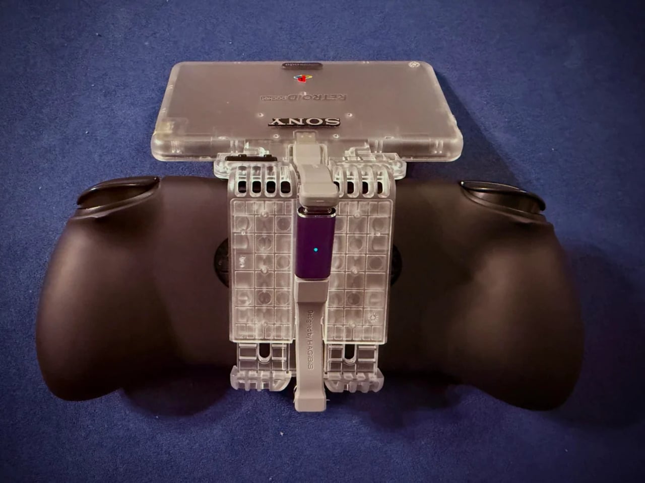
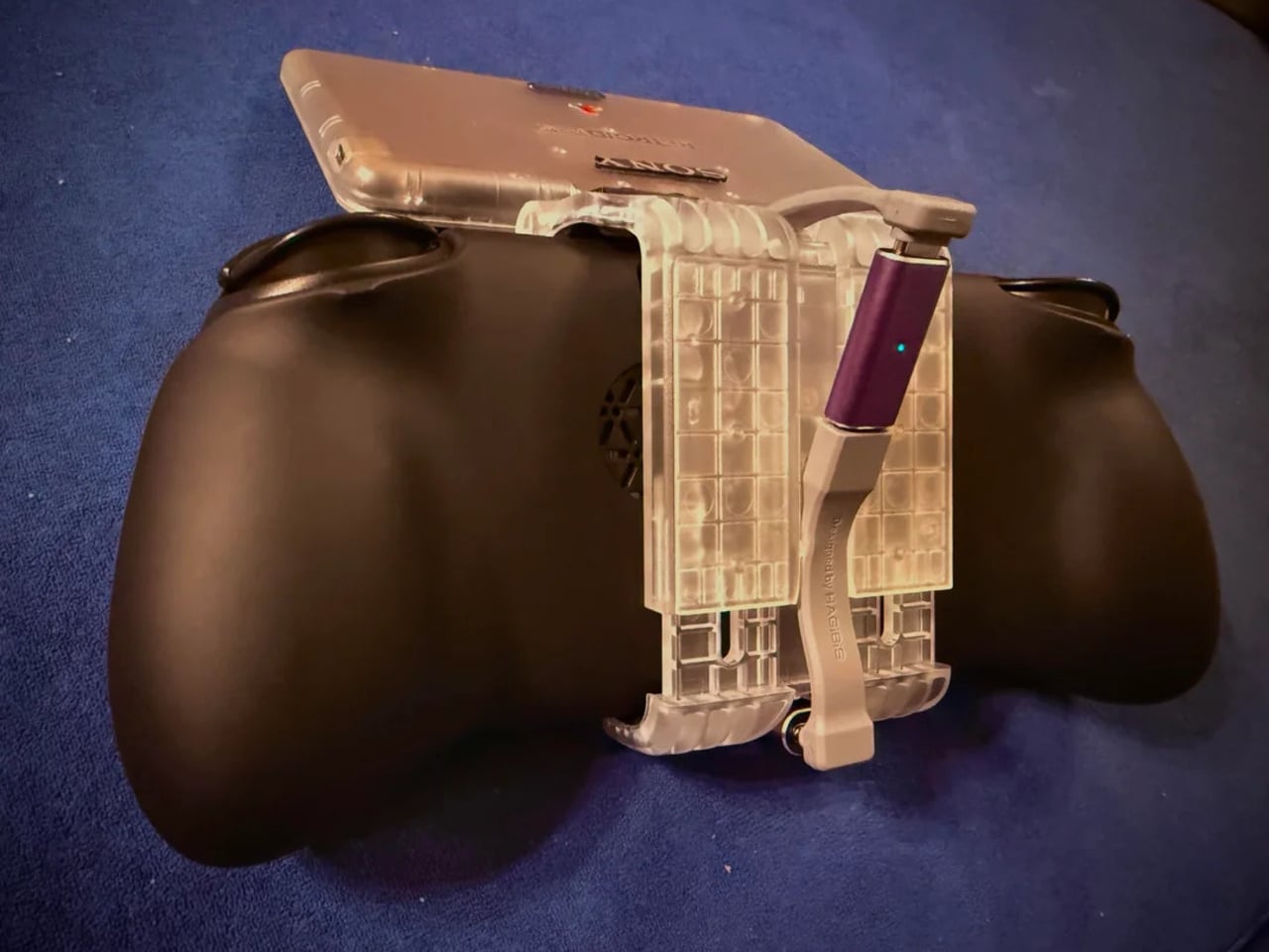
The rear view shifts the frame again. A large dual-grip body in smooth black rubber dominates the back, a clear plastic hinge connecting the screen to grip in full view, structural and unapologetic. The 3D-printed volume rocker at the top edge puts a physical control where fingers naturally land. The back half feels closer to a DualShock than a Game Boy, which is either the point or the problem, depending on what you wanted this thing to be.

Flip to the front screen, and the emulator grid makes the whole thing literal. DuckStation for PS1, Dolphin for GameCube, PPSSPP for PSP, melonDS for Nintendo DS, and a live PS2 wallpaper cycling behind all of it. This device runs both companies’ libraries simultaneously without asking permission from either. The branding on the shell, in that context, stops being a novelty and starts reading as a plain statement of what the hardware already does.

The retro handheld category is large enough now that sameness has become its default. The Retroid Pocket 6, the current flagship from the same manufacturer, drew community criticism for being indistinguishable from competitors: glass front, LED sticks, rounded edges, and no particular character. A fan mod building identity out of borrowed logos is one response to a problem the manufacturers haven’t solved. It’s also just someone enjoying a hobby and being honest about what they want.

The hardware to play PS1, PS2, GameCube, and Game Boy Advance all on one screen already exists and costs under $200. What the market hasn’t resolved is what that device should actually look like, or whose name should go on it. This mod doesn’t answer either question. It just makes the gap between what’s technically possible and what anyone has bothered to design feel a little harder to dismiss.

The post This Fan Made the Sony-Nintendo Handheld the Companies Never Would first appeared on Yanko Design.
  •  
❌