Vue lecture

Alberto Essesi Just Designed the Lamp That Celebrates Mistakes
If you’ve ever assembled furniture, built a shelf, or wired anything with your own two hands, you know the feeling. You step back, you look at your work, and then you see it. That one thing. The screw facing the wrong way. The panel installed backwards. The “how did I miss that?” moment that you either have to fix or quietly learn to live with. Alberto Essesi, an L.A.-based industrial designer, decided to immortalize exactly that feeling, and then turned it into a lamp.

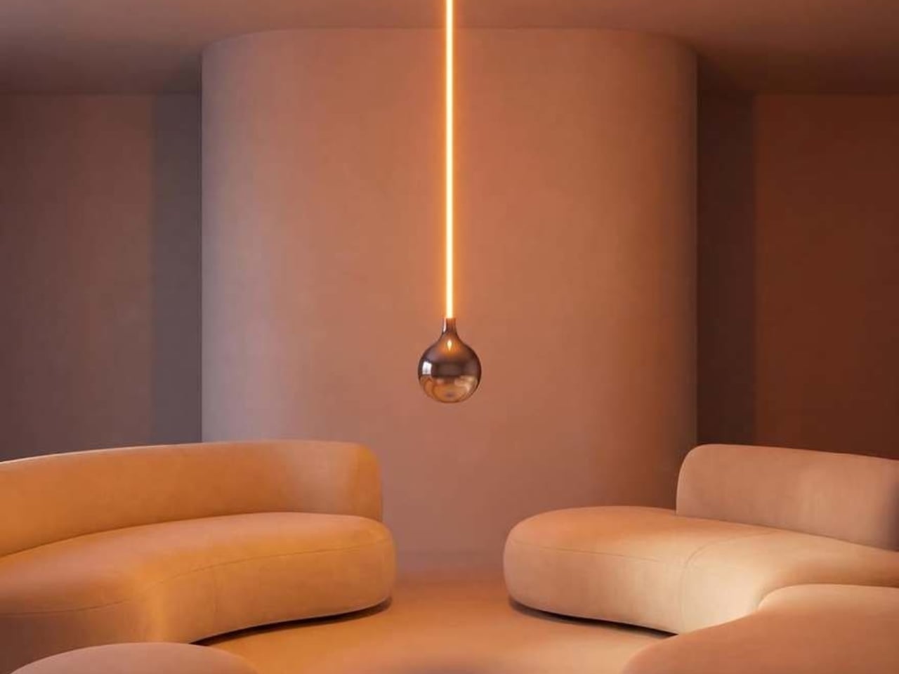
The Oops lamp is precisely what it sounds like. A hanging fixture that, at first glance, looks like something went sideways during installation. The design inverts the expected, which is Essesi’s own phrasing, and it delivers on that premise with clean, understated confidence. It doesn’t shout. It doesn’t over-explain itself. It just makes you look twice, register the joke, and then probably smile.

Designer: Alberto Essesi
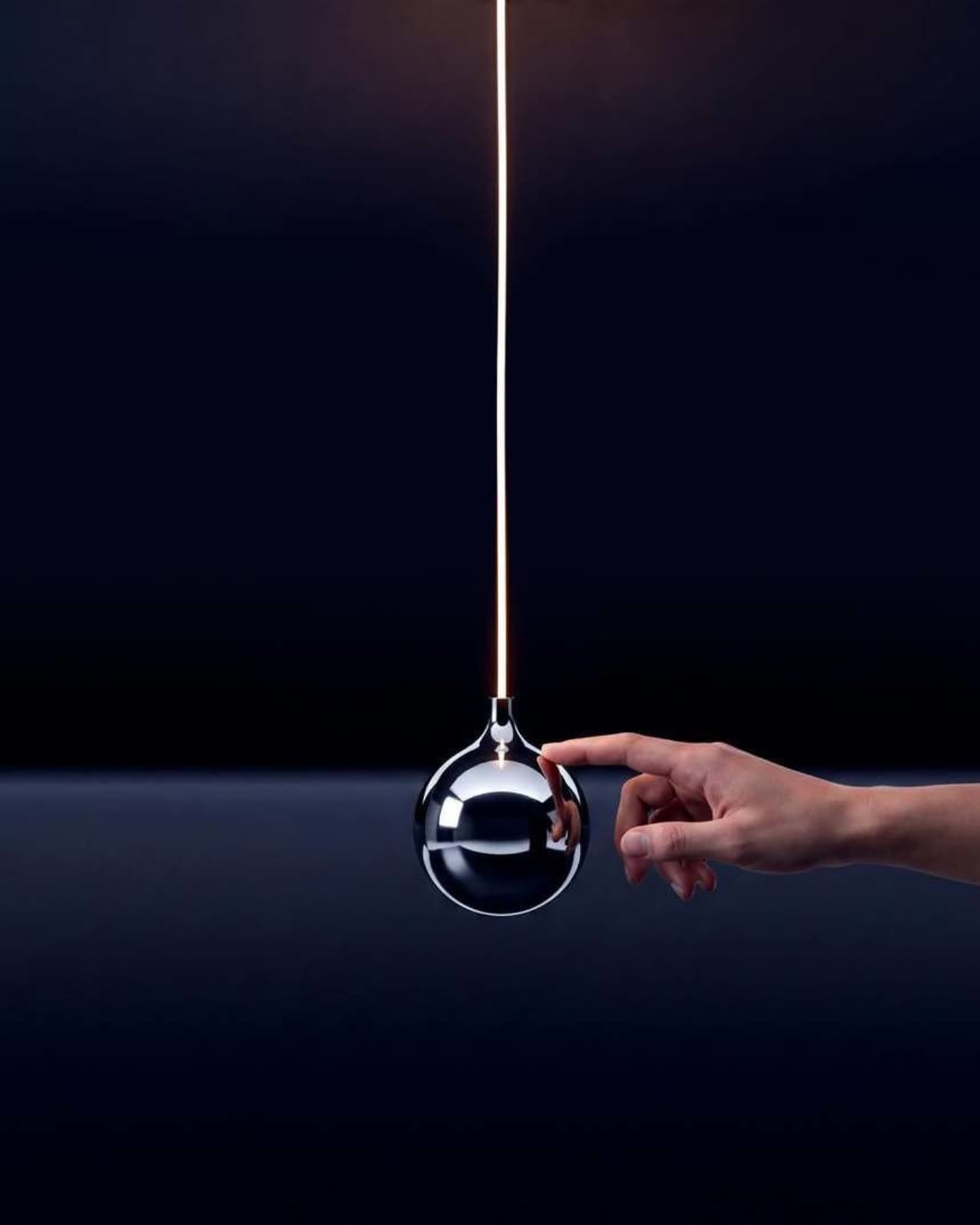
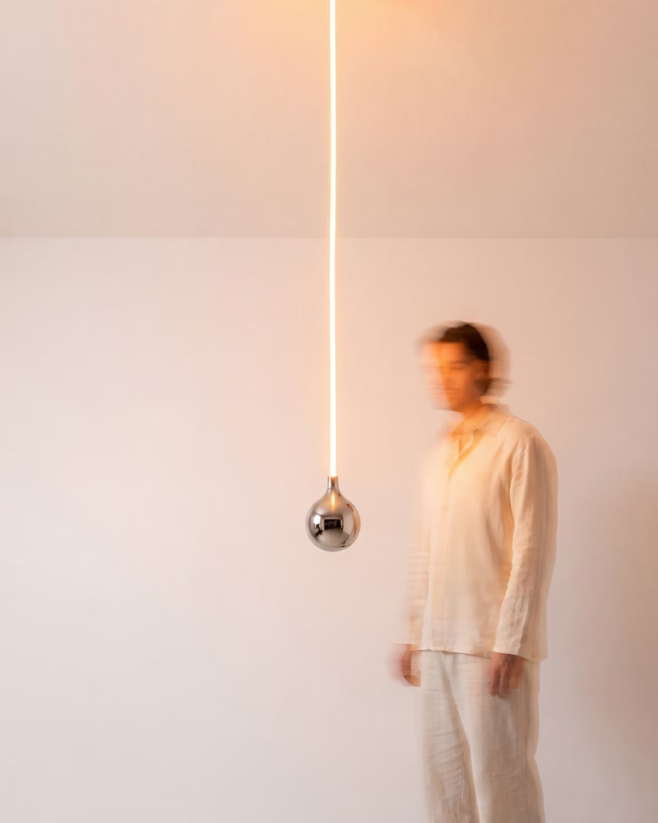
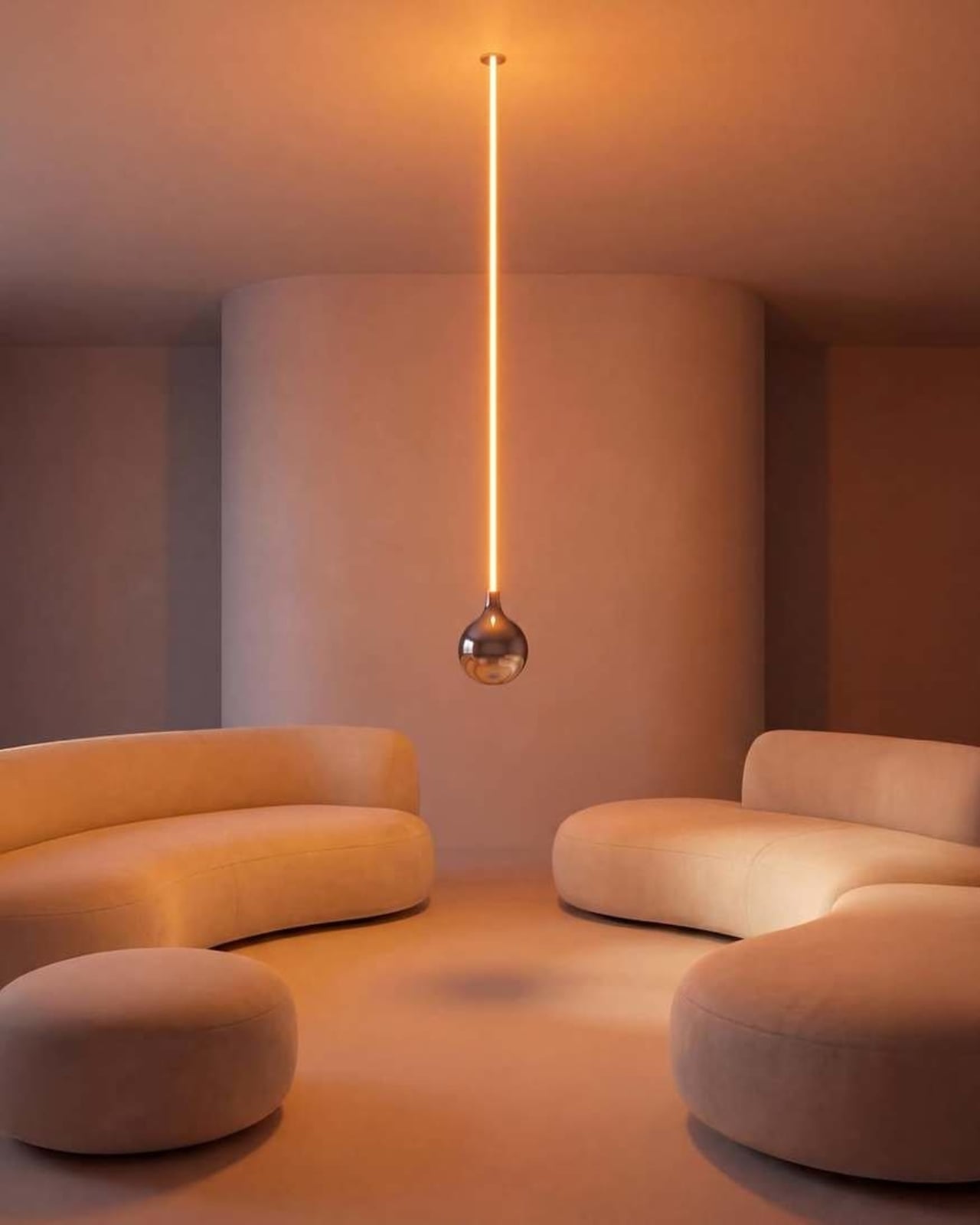
Look at it long enough and the concept becomes delightfully clear. A slender, glowing rod descends from a ceiling mount, warm light running its full length like a lit fuse. At the very bottom sits a polished chrome globe, round and reflective, the universal shape of a light bulb. Except the globe isn’t glowing. The rod is. The light is coming from exactly where you wouldn’t expect it, and the bulb, the part that’s supposed to be the whole point, is just sitting there at the bottom looking beautiful and slightly confused. That’s the joke. That’s also, somehow, the most elegant part of the entire object.

The chrome finish on the globe isn’t incidental. It picks up the amber warmth of the glowing rod above it and bounces it softly into the room, so the globe contributes light without technically being a light source. It’s a small design decision that could have easily been an afterthought, but it ends up being one of the most considered details in the whole piece. The lamp works as a room object even before you process the humor in it.
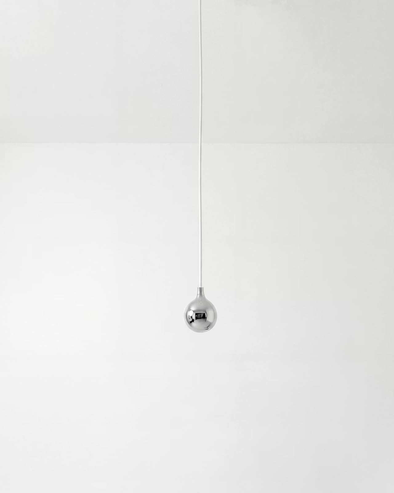
Essesi has said this idea has been rattling around in his head for years. “This has been an idea I’ve had for a few years and always laugh when I think about it,” he shared when unveiling the design. That kind of creative patience is rare, and it shows in the final execution. The Oops lamp doesn’t feel rushed or gimmicky. It feels like exactly the right amount of thought went into it, no more, no less. Sometimes a concept just needs time to ripen before it’s ready to exist in the world.

Design humor is genuinely hard to pull off. Most attempts either try too hard or land too soft. The joke gets buried under layers of irony, or it gets explained to death until any charm it originally had is long gone. The Oops lamp sidesteps all of that. The humor is baked into the form itself. You don’t need a placard or a press release to get it. You just get it. That’s the mark of a strong design concept: the idea communicates itself without any assistance.
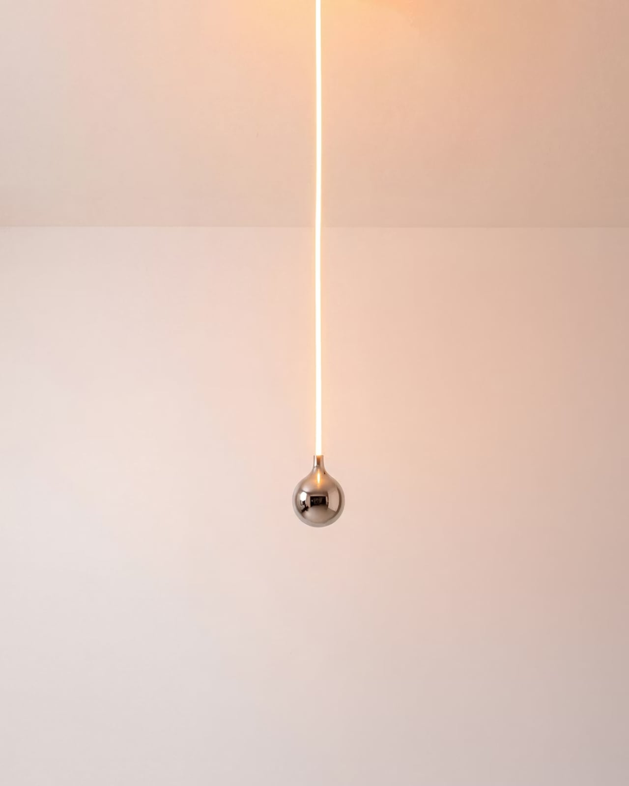
Essesi didn’t reach for something ornate or architecturally complex to subvert. He took the most ordinary object and made one small, deliberate deviation from it. That restraint is what makes the whole thing work. The joke only lands because the rest of the design plays it completely straight. The rod is precise. The globe is perfectly spherical. The ceiling mount is minimal and clean. Every element is serious, which makes the absurdity of the overall form land even harder.

A large version has also been added to the mix, which tells me Essesi is taking this seriously as a product concept and not just a portfolio piece. No production plans have been officially confirmed yet, but that feels like a matter of when rather than if. A design this instantly readable and this universally relatable has a built-in audience. People are genuinely tired of objects that require context. They want things that communicate the moment they enter a room.
That’s the real conversation the Oops lamp is opening. It’s a small but clear reminder that good design doesn’t have to be earnest all the time. It can have a point of view. It can be a little funny. A lamp named Oops, made by a designer who let the idea sit for years until it was truly ready, might be the most quietly optimistic object to come out of this year.
The post Alberto Essesi Just Designed the Lamp That Celebrates Mistakes first appeared on Yanko Design.
  •  

This 4-in-1 Hands-free Flashlight Clips To Clothes, Snaps to Your Phone, and Stands on Its Own

A Red Dot Design Award and a $210,000 Kickstarter campaign are two very different kinds of validation. One comes from a jury of design professionals evaluating form, function, and coherence. The other comes from tens of thousands of people who looked at a product and handed over money before it shipped. SparkO, the compact wearable EDC flashlight from California’s ScoutLite, earned both. That combination suggests something specific about the object: it reads clearly to designers and solves something real for everyday people. At $45.99 and 40 grams, the barrier to entry is low enough that hesitation becomes difficult to justify.

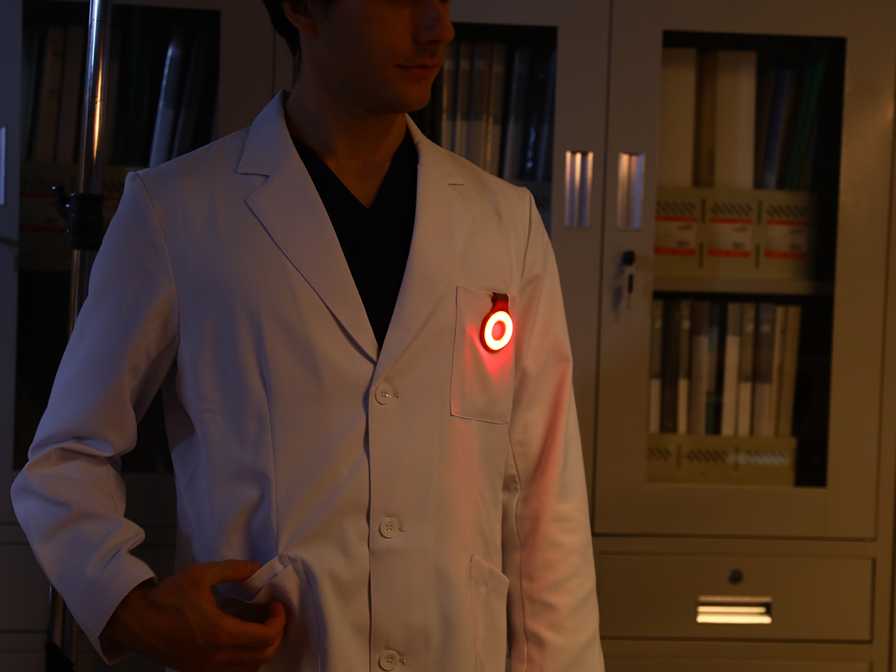
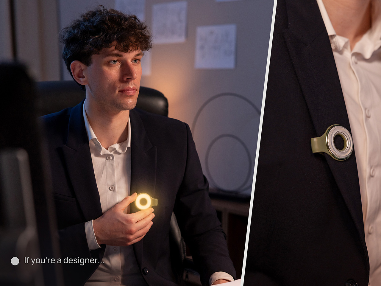
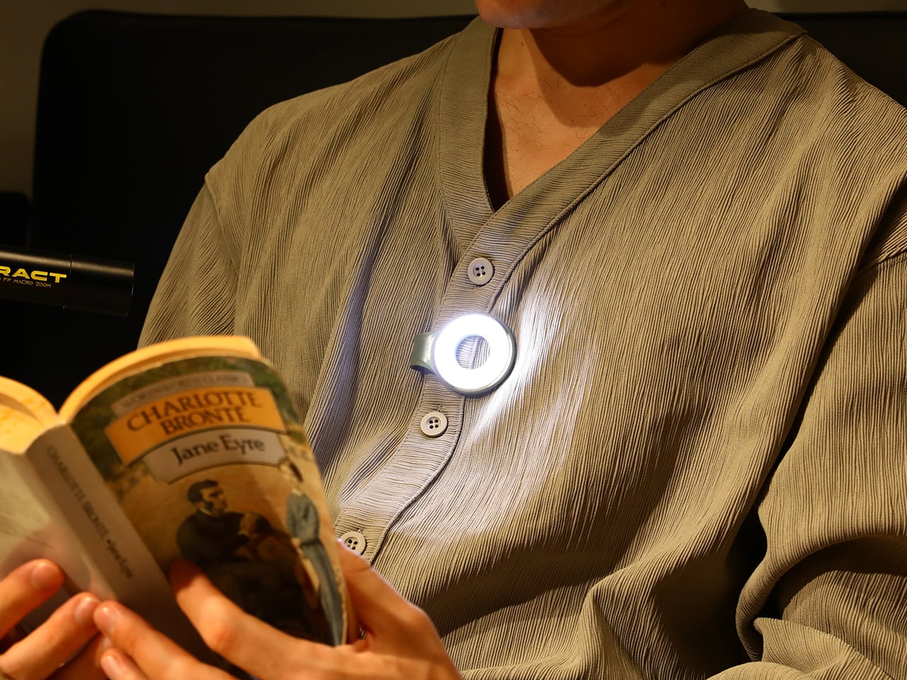
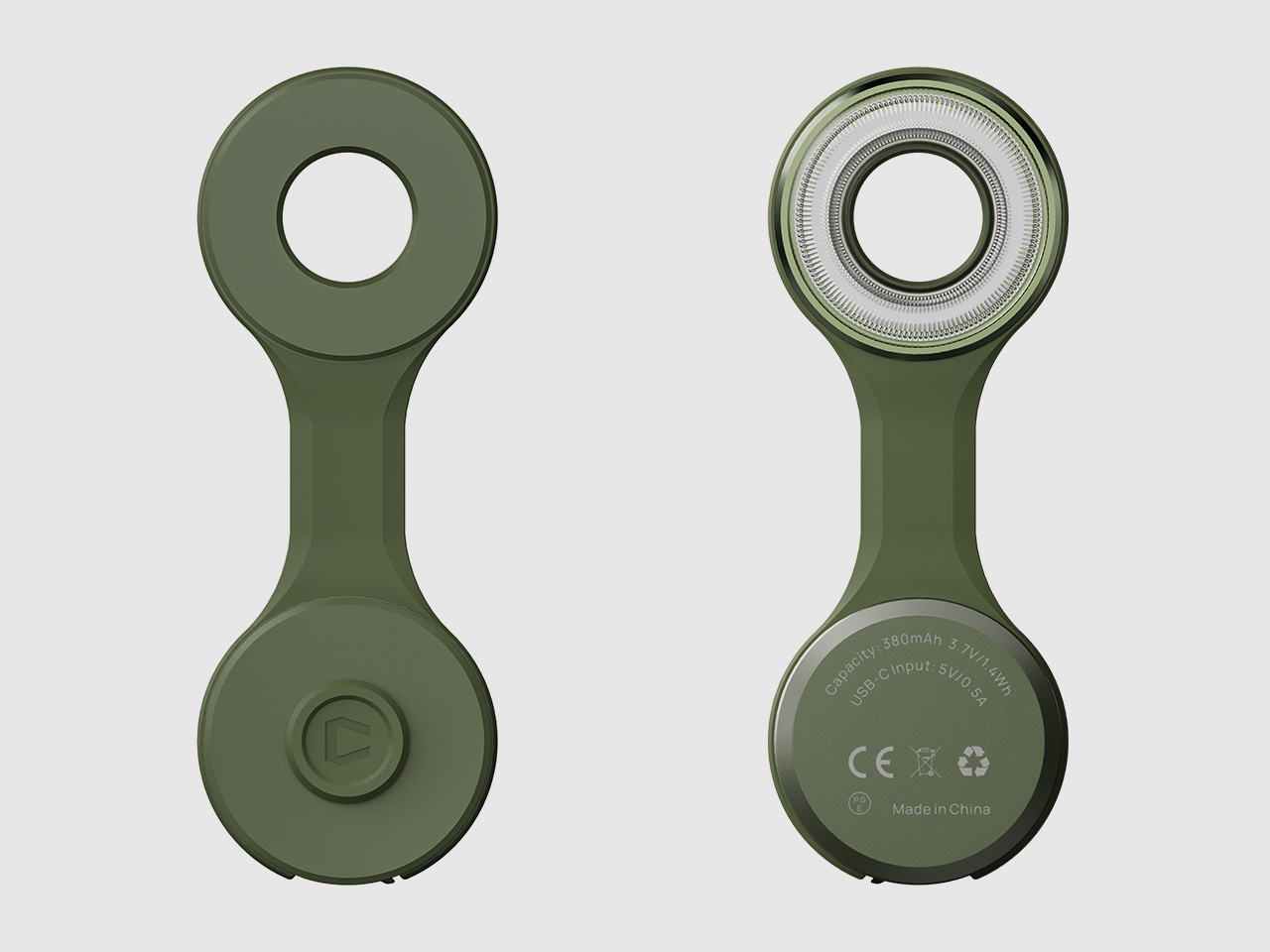
Two photos of SparkO are enough to grasp the concept: a disc-shaped body, a silicone loop that clips and doubles as a kickstand arm, and a circular LED array wrapped in a fine prismatic lens ring. The anodized metal bezel is color-matched to whichever of the four options you pick, Forest Moss, Basalt Black, Glacier Blue, or Canyon Clay. It clips to a bag strap or jacket, snaps magnetically to a MagSafe iPhone, props upright on the optional ring stand, or rides on clothing as a hands-free wearable. That range of deployment is the whole argument for SparkO, and ScoutLite backs it with 300 lumens, three color temperatures, four brightness levels, a red light mode, CRI 95+ rendering, a 14.5-hour runtime, and USB-C charging. At a campsite, a workbench, or a dim restaurant table, the light adapts to the situation rather than demanding you adapt to it.

Designer: Ten

Click Here to Buy Now: $41.40 $45.99 (10% off, use coupon code “YK10”). Hurry, deal ends in 48-hours!

The disc form is a real departure from the cylindrical tube that has defined flashlight design for over a century. A cylinder forces you to hold it; a disc invites you to wear it, clip it, or set it down facing wherever light needs to go. The silicone loop is soft enough to flex over thick fabric and structured enough to hold position once seated, its geometry doubling as the kickstand arm when the magnetic ring base enters the picture. The circular LED face is surrounded by a concentric prismatic lens ring that distributes light broadly and evenly, borrowing visual language from photography ring lights rather than from tactical torches. That framing signals the breadth of SparkO’s intended audience: the tradesperson and the camper, but equally the commuter, the hobbyist, and the photographer working in low light.

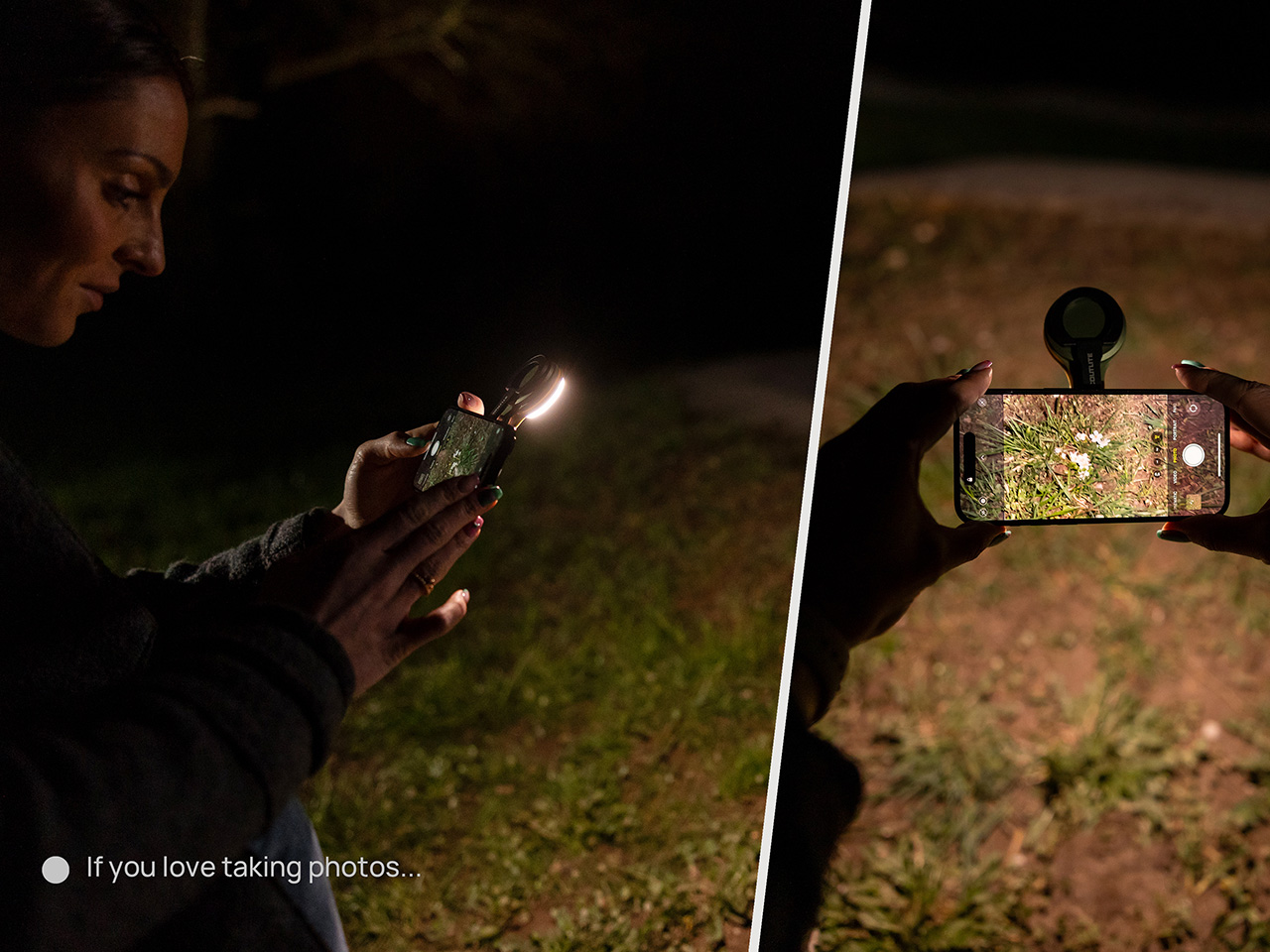
Clipped to a chest pocket or jacket collar, SparkO illuminates whatever your hands are working on without requiring you to hold anything, which is the core use case that conventional EDC lights have historically fumbled. Snapped to the back of an iPhone Pro via the magnetic base, it becomes a fill light for close-up photography, turning a phone into something resembling a professional lighting rig for the cost of a decent lunch. The ring stand converts the same unit into a bedside reading lamp or a compact task light with a footprint smaller than a drink coaster. Each scenario calls for a different mounting method, and the transitions between them take seconds rather than a setup ritual. Four modes sounds like a marketing stretch right up until you’ve run through all of them in a single day, and then it starts to feel like the accurate count.

Three hundred lumens is the right range for a light this size: capable outdoors, tolerable at close range, and not so aggressive that it becomes a problem in tight spaces. The three color temperature options matter more than the lumen figure in daily use, covering the gap between a warm amber reading mode and a cooler beam suited to detailed work. CRI 95+ color rendering is what sets SparkO apart from most of the EDC lighting field, reproducing colors accurately enough that the light reads close to natural daylight, which makes a genuine difference for craftspeople and photographers. The red mode preserves night-adapted vision on a trail or at a campsite, a small but real addition for outdoor use. Runtime at 14.5 hours and USB-C charging put SparkO on a weekly recharge cycle with a cable it shares with everything else in a modern carry kit.

ScoutLite has built a product that lands on the right side of the three virtues the EDC community consistently responds to: compact, accessibly priced, and solving a problem the existing field handles poorly. The Red Dot Award carries credibility for an audience that pays attention to such things, while the $210,000 Kickstarter result is a harder signal to argue with, because crowdfunding backers are betting on a design that communicates its own value clearly enough that waiting feels unnecessary. At $45.99, the decision practically makes itself, especially given that the clip, the magnet, the stand, and the wearable mode collectively cover more scenarios than most EDC kits manage with multiple dedicated tools. Whether ScoutLite follows this up with accessories or a higher-output variant, SparkO sets a credible benchmark for what a wearable EDC light should cost, weigh, and do. The category has needed something this considered for a while.

Click Here to Buy Now: $41.40 $45.99 (10% off, use coupon code “YK10”). Hurry, deal ends in 48-hours!

The post This 4-in-1 Hands-free Flashlight Clips To Clothes, Snaps to Your Phone, and Stands on Its Own first appeared on Yanko Design.

  •  

This AC Does 5 Jobs at Once and Looks Like Furniture on Your Wall

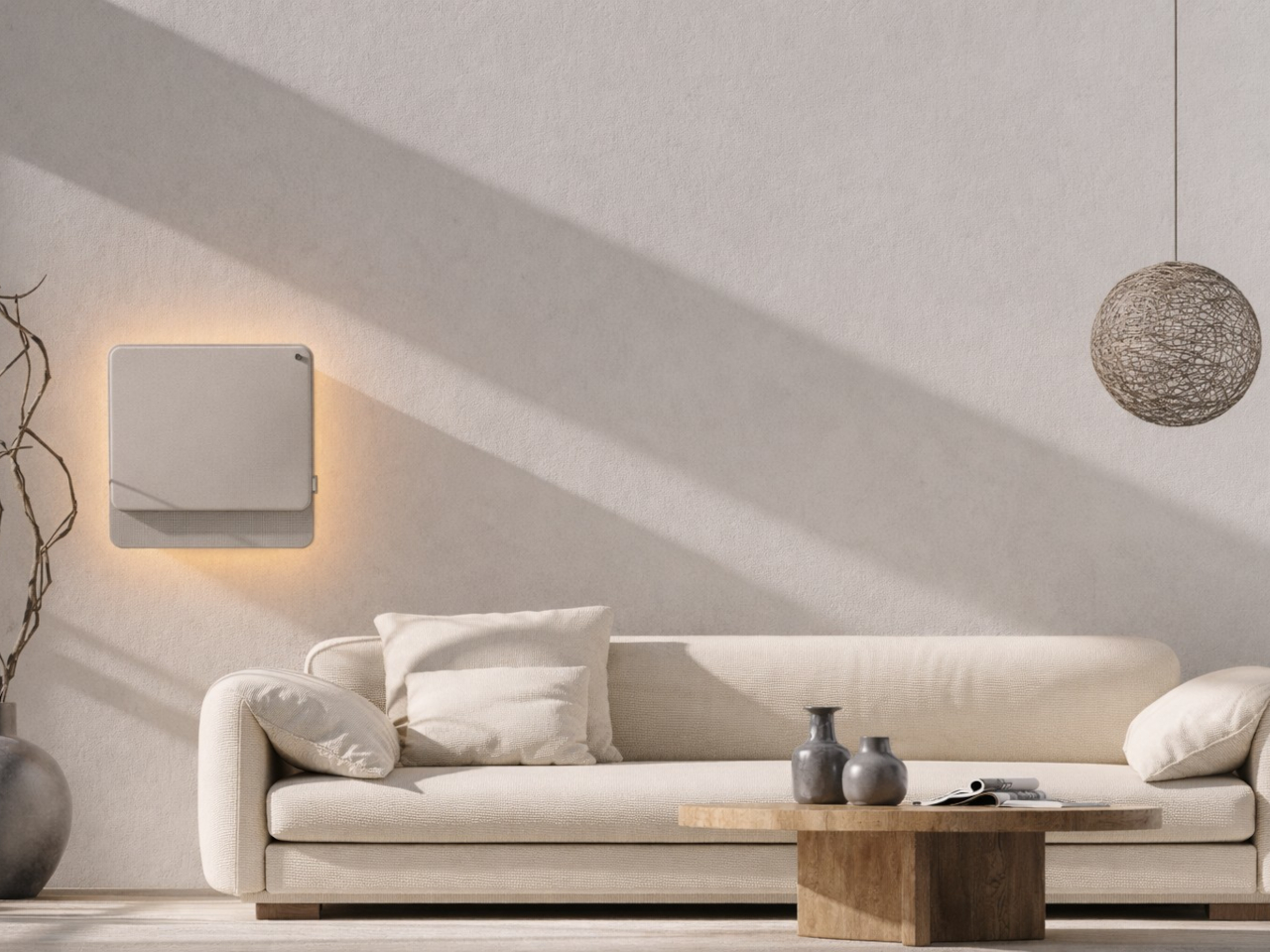
The split air conditioner is one of the least loved objects in any home, which is a strange thing to say about something most people couldn’t live without. It works, technically, but it tends to make its presence known in all the wrong ways. The air is too direct, the noise is a constant background irritant, and the plastic box on the wall rarely belongs in any thoughtfully designed interior.

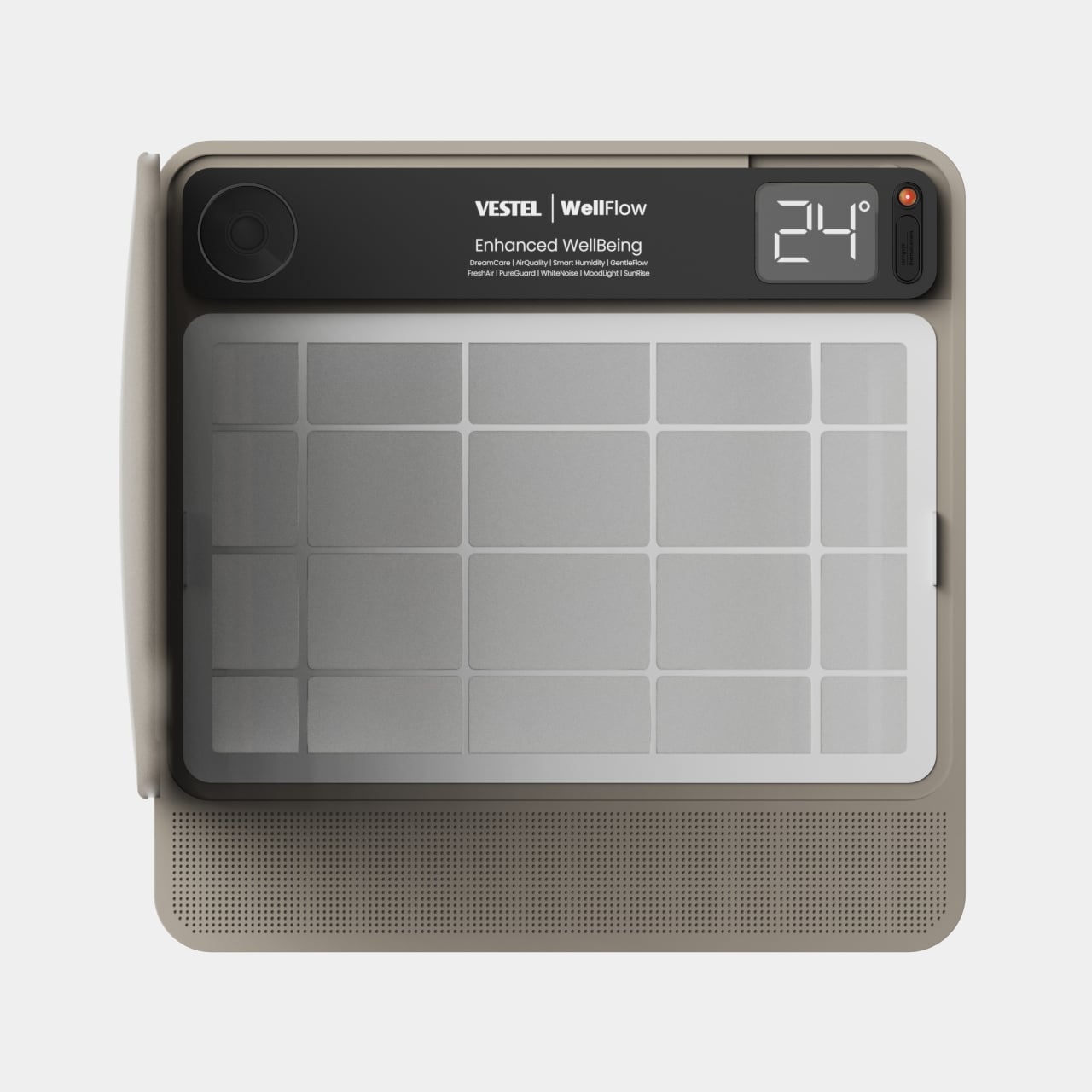
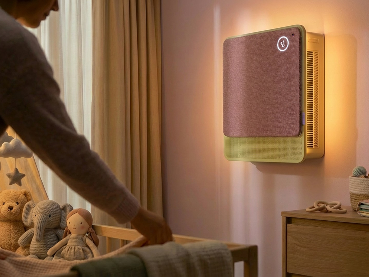
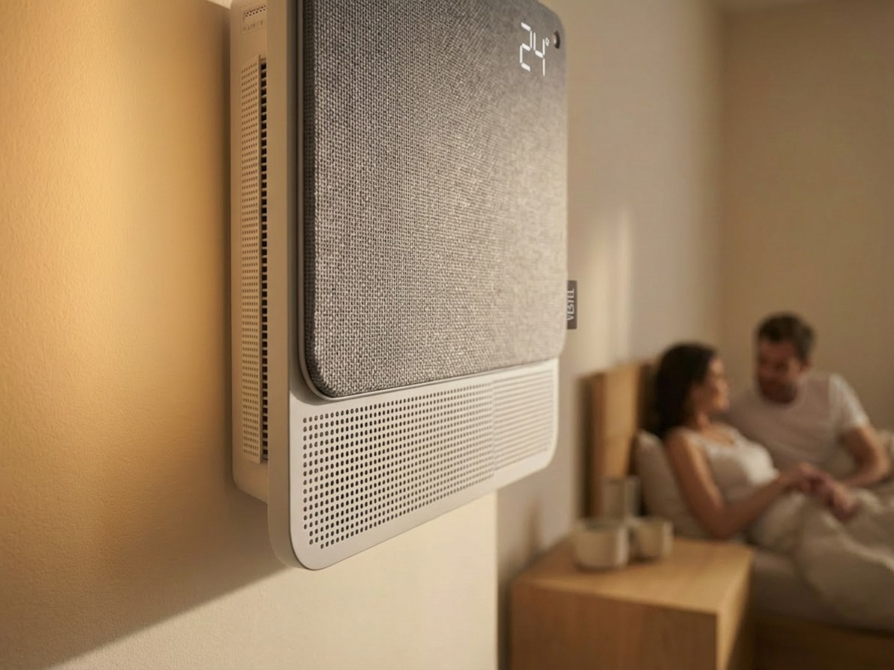
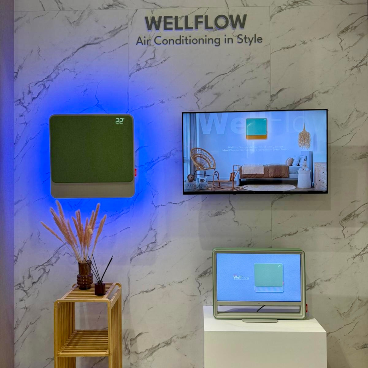
From that frustration comes WellFlow, a concept that reframes what air conditioning is supposed to do for the people living around it. Rather than engineering a better cooling box, the designers built something closer to a wellness device. It’s a concept that received validation through the iF Design Award in 2026 and was first revealed at IFA Berlin 2025.

Designer: Merve Nur Sökmen, Zehra Sarıarslan

The most immediate shift is in how air actually moves. Conventional units push output in one direction, landing directly on whoever is in the room. WellFlow uses four-way diffusion to spread conditioned air from all sides without targeting anyone in particular. Sensors also monitor occupancy and steer airflow accordingly, so the unit quietly adapts to the room rather than expecting the room to tolerate it.

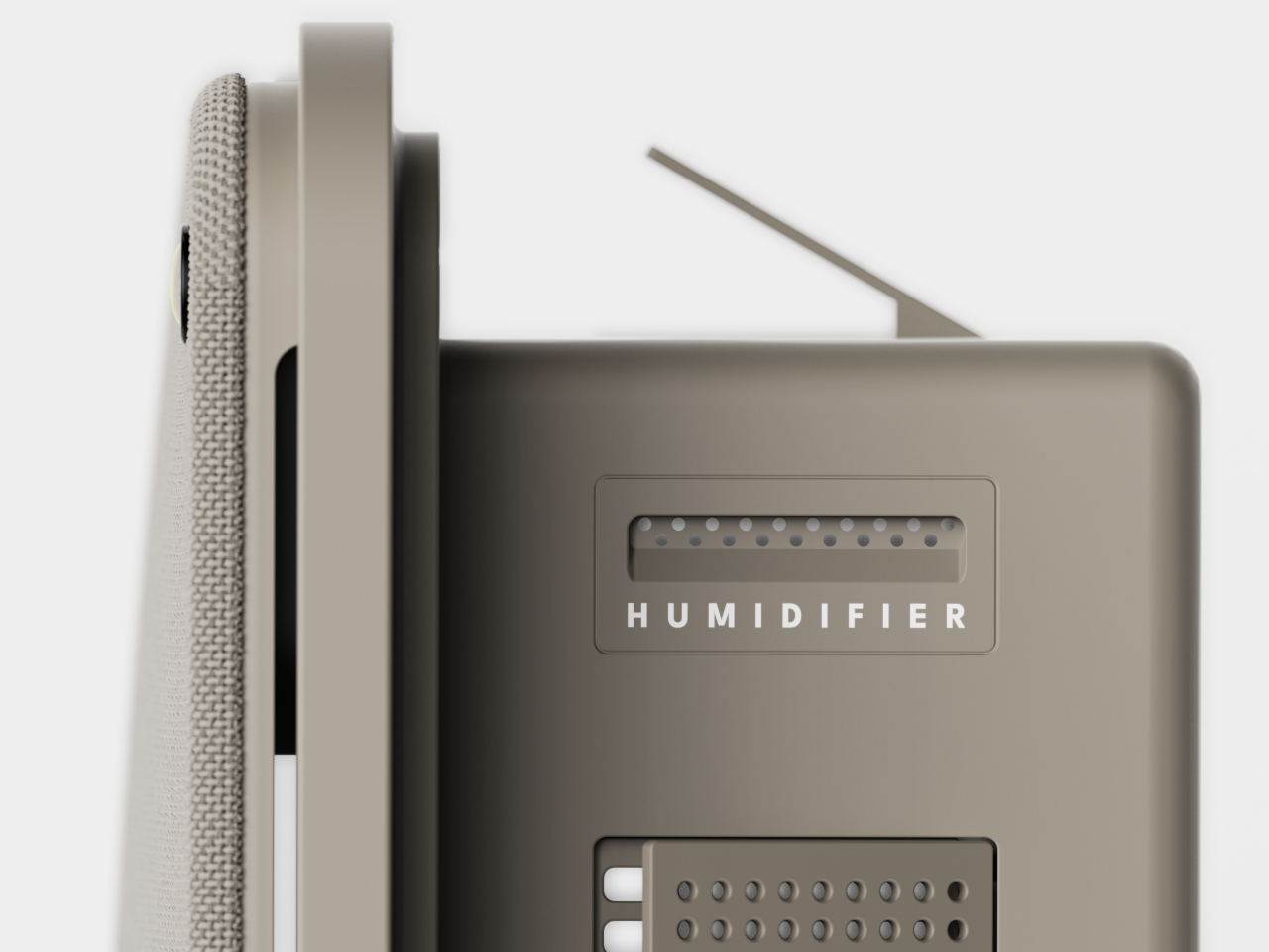
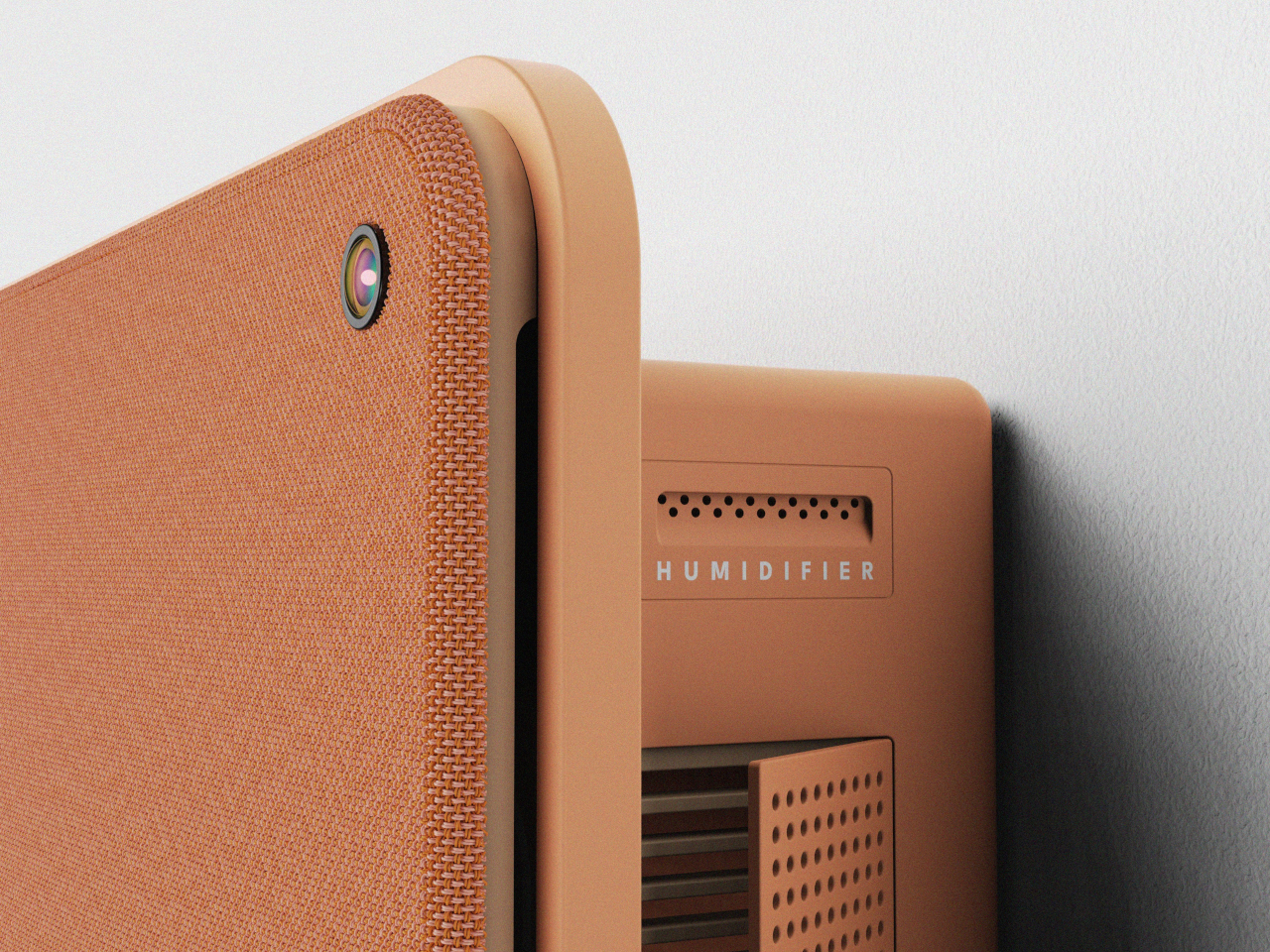
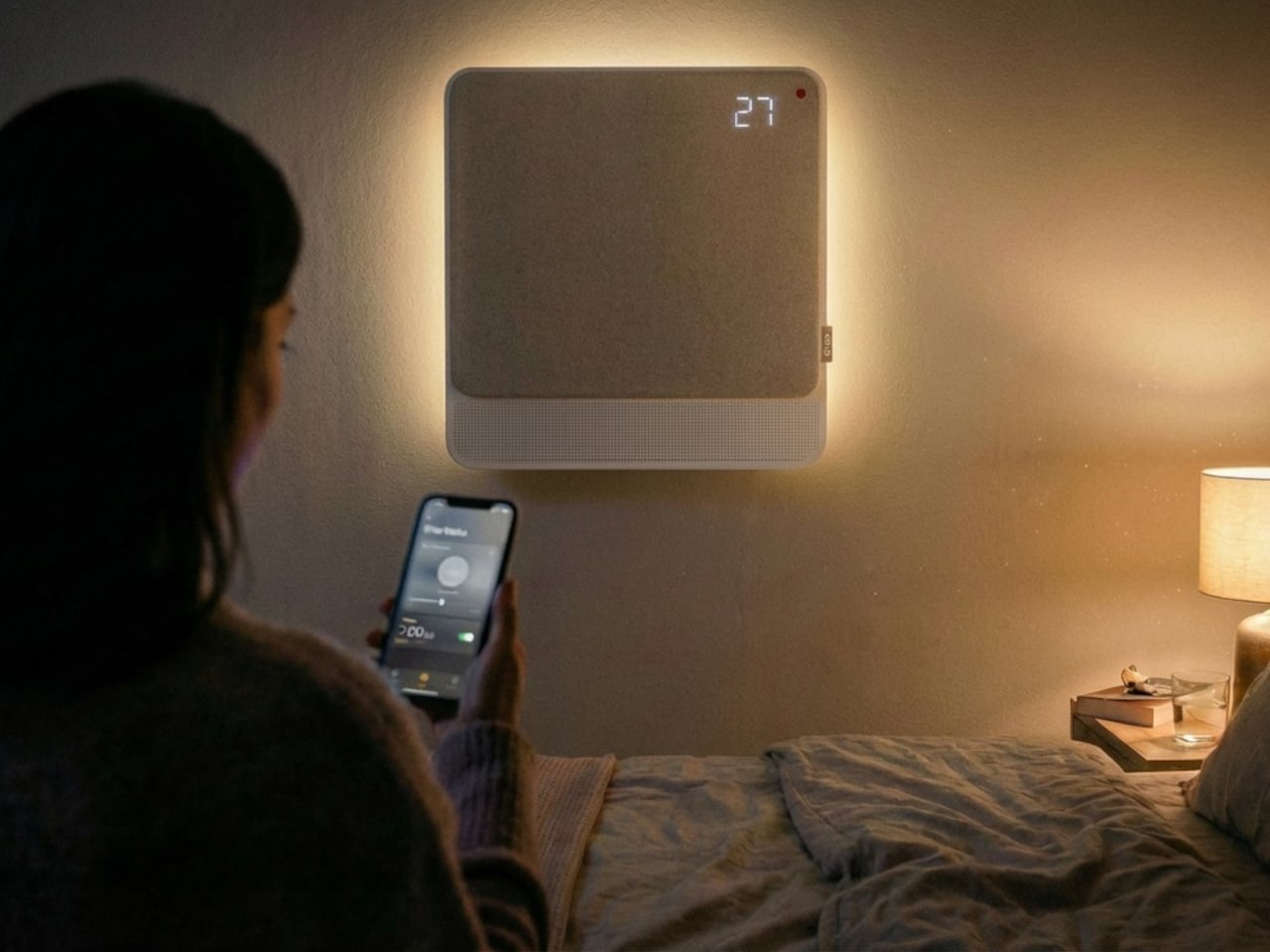
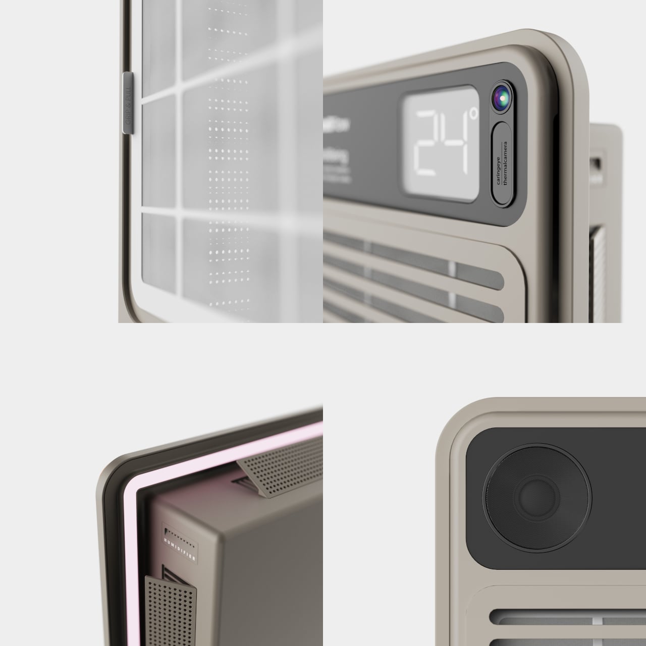
Beyond airflow, the system also handles humidity, air purity, ambient lighting, and sound. A built-in humidifier balances moisture levels rather than leaving the air artificially dry, which is one of the most common complaints about running a conventional unit through the night. Circadian lighting and integrated speakers complete the picture, creating conditions that support sleeping, concentrating, or quietly winding down, depending on what the moment calls for.

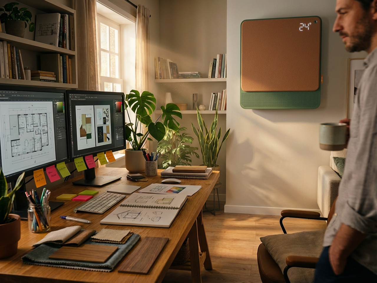
All of this adjusts automatically. The system continuously monitors temperature, humidity, and air quality, then fine-tunes its output without any manual input. A baby’s room needs different conditions than a home office or a gym corner, and WellFlow is designed to recognize those differences. Its behavior was shaped through user research spanning new parents, older adults, and people with respiratory sensitivities, groups that conventional air conditioners routinely fail to address.

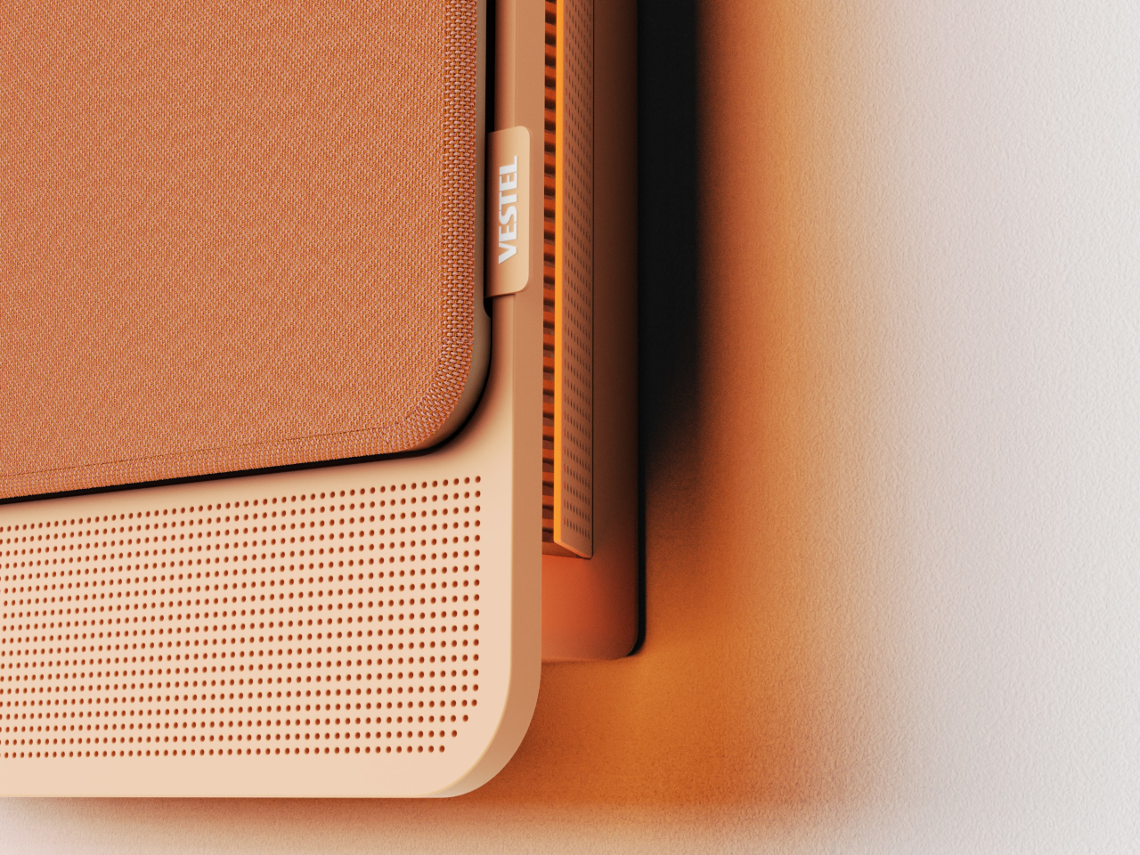
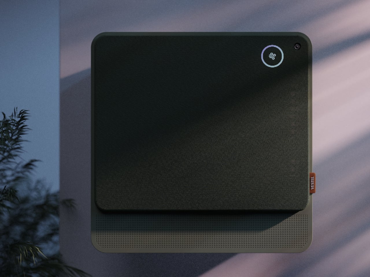
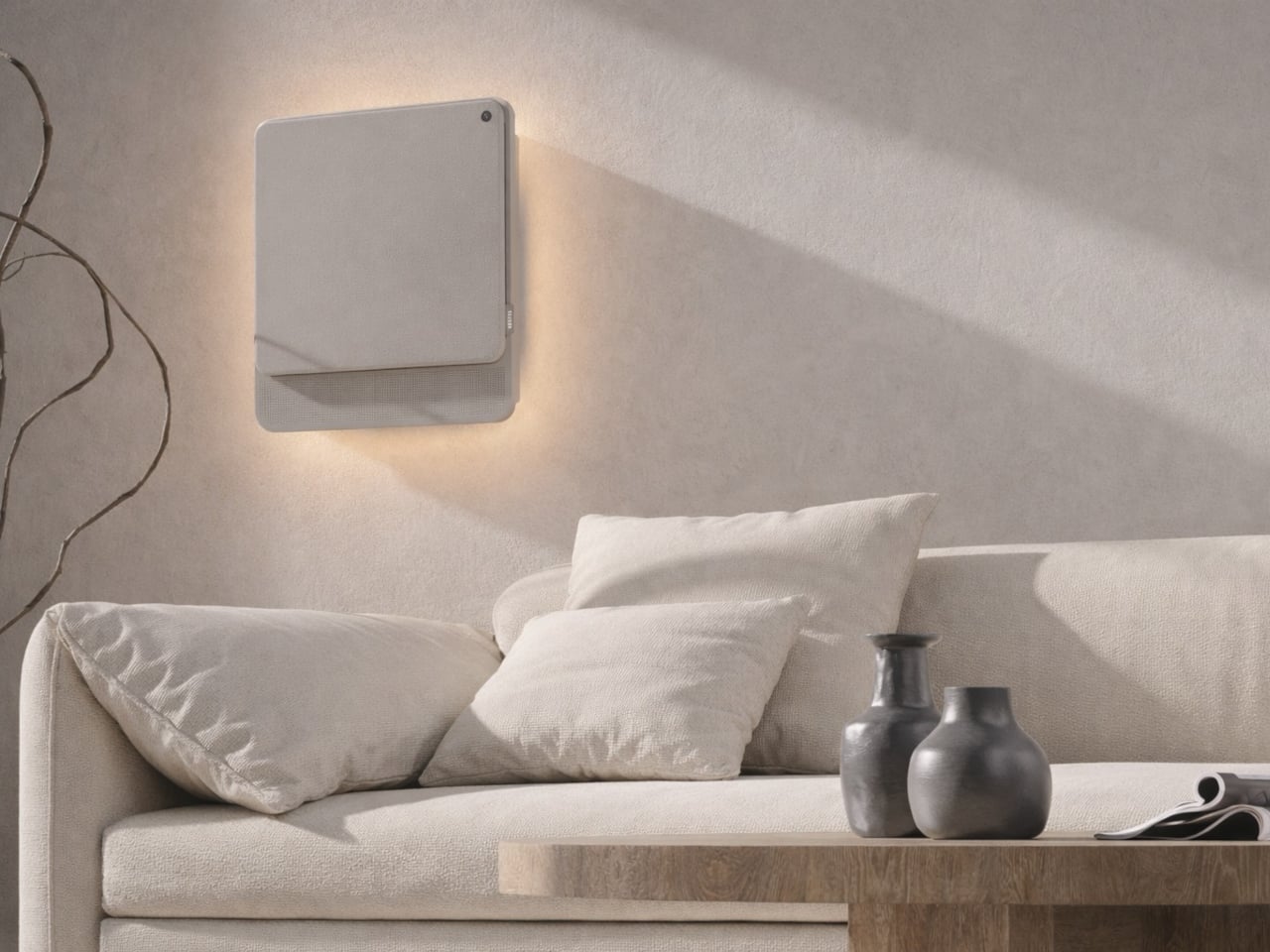
The physical form is just as deliberate as the behavior. Most air conditioners are conspicuously technical, with plastic housings that fight against any interior aesthetic. WellFlow uses a woven textile front panel with rounded corners and a matte finish, giving it a material quality far more associated with furniture than appliances. An ambient light halo behind the unit softly signals its presence on the wall without demanding any attention.

A pull-out front filter makes maintenance visible and intuitive, addressing something the design team identified as a recurring trust issue with conventional units. People often aren’t sure when or how to clean their filters, and that uncertainty quietly chips away at confidence in the device. WellFlow removes that ambiguity. For a machine designed around human comfort, even that seemingly small detail ends up mattering quite a lot.

The post This AC Does 5 Jobs at Once and Looks Like Furniture on Your Wall first appeared on Yanko Design.
  •  

This 3D-Printed Lamp Has a Shell That Opens and Closes to Shape Light

The 3D printing community has spent years trying to prove that a printer can produce more than desk trinkets and cable organizers. Lighting has always been the harder sell, where aesthetics and function have to work together in ways that cheap plastic usually undermines. The better designers in that space have been quietly closing that gap, and the results are starting to look like things you’d want to live with.

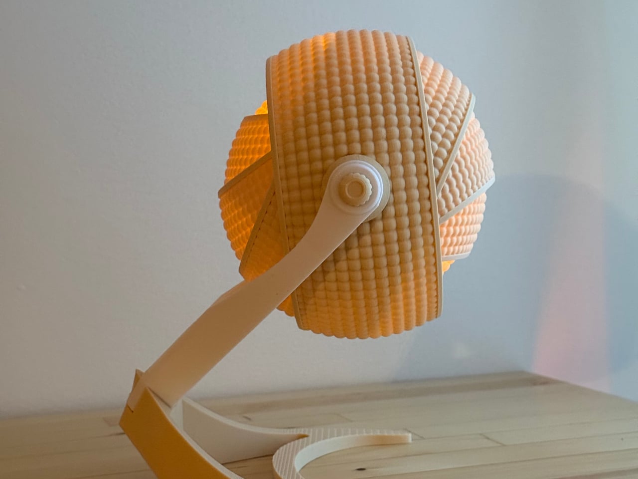
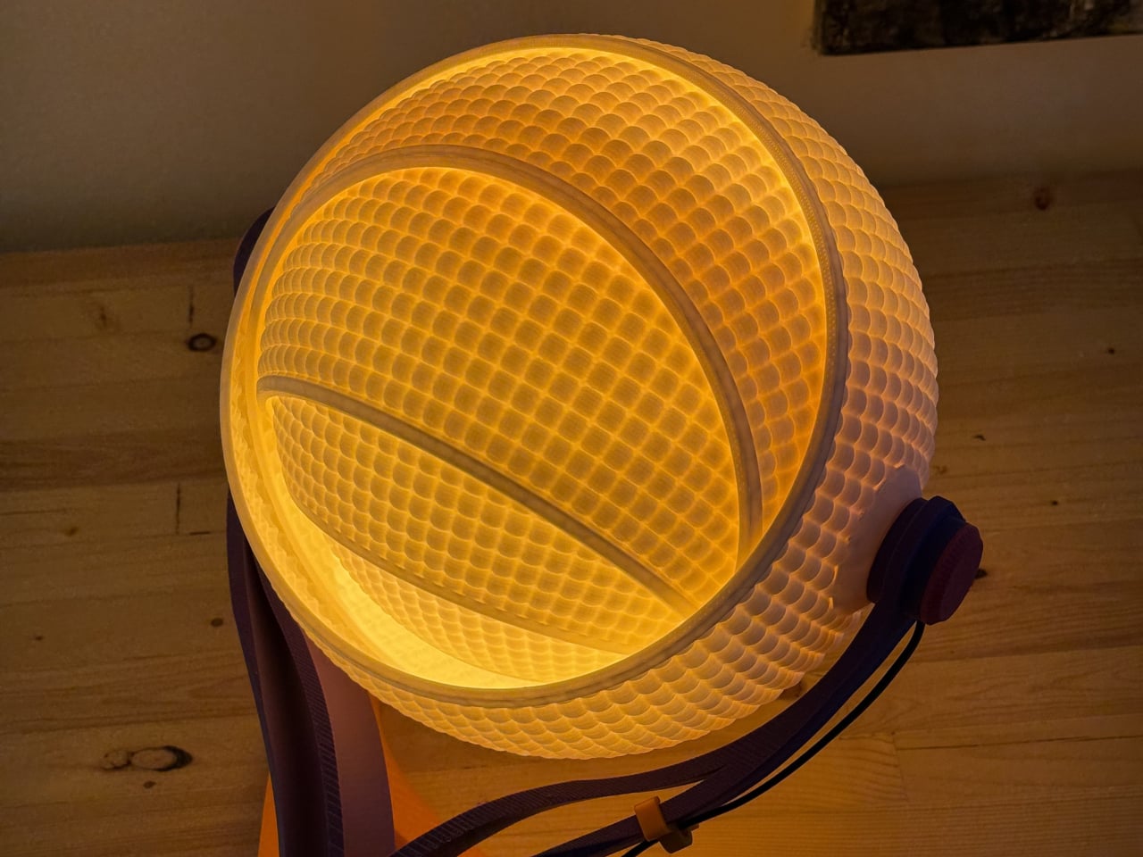
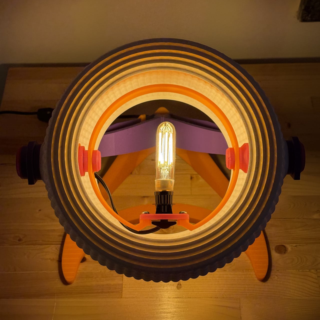
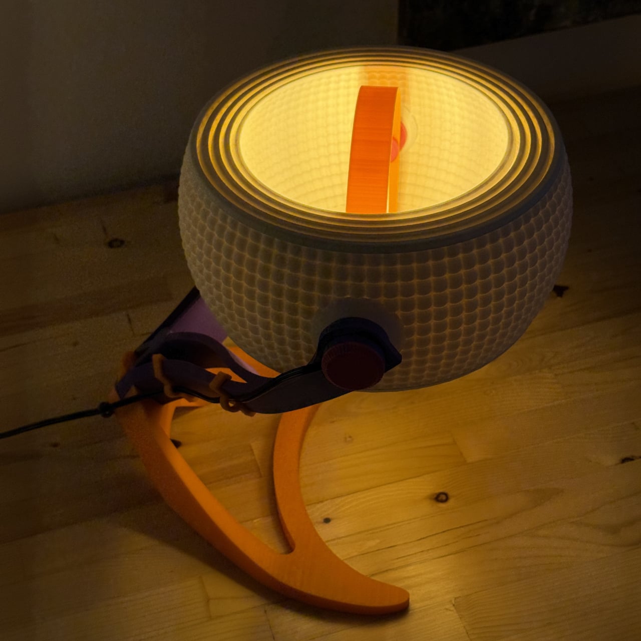
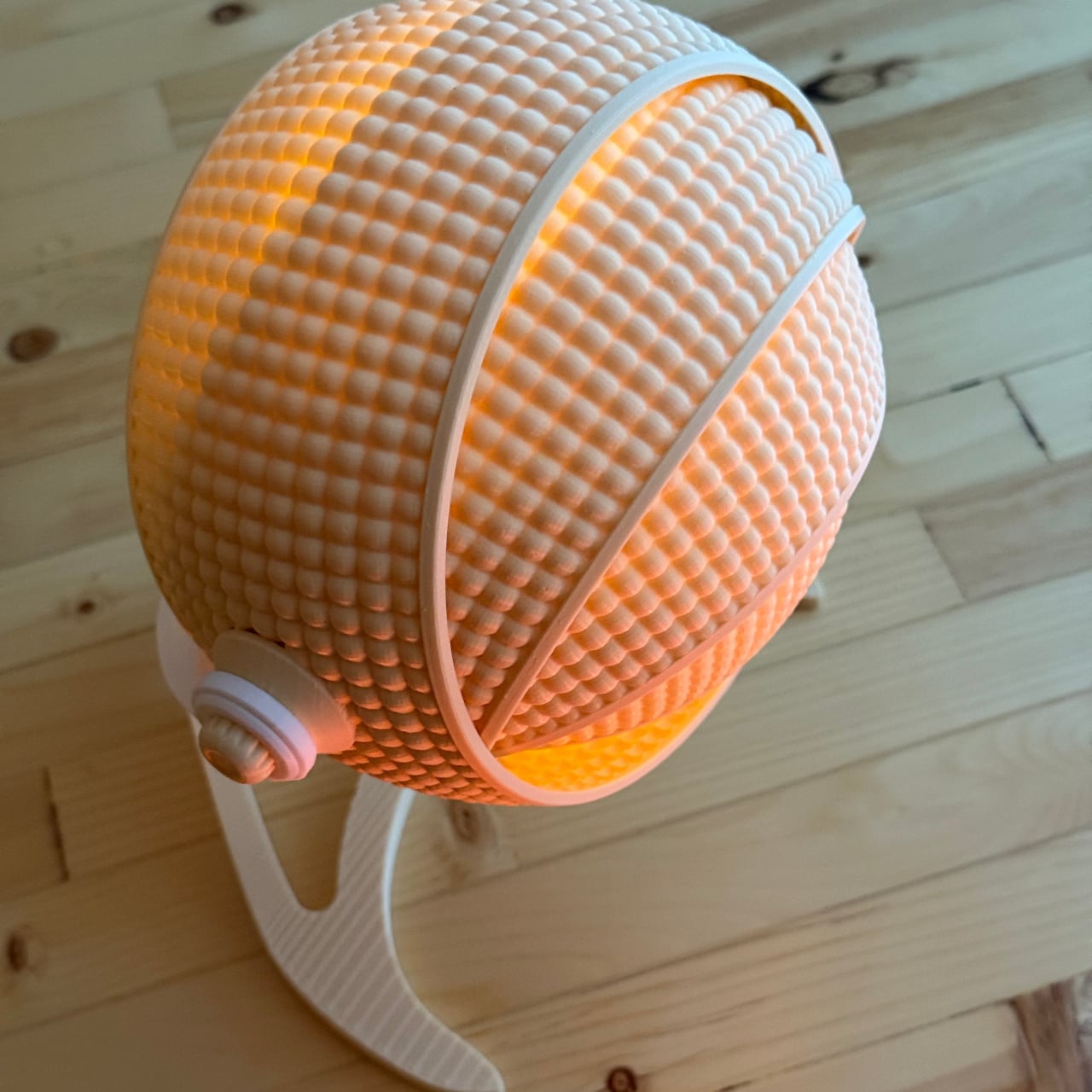
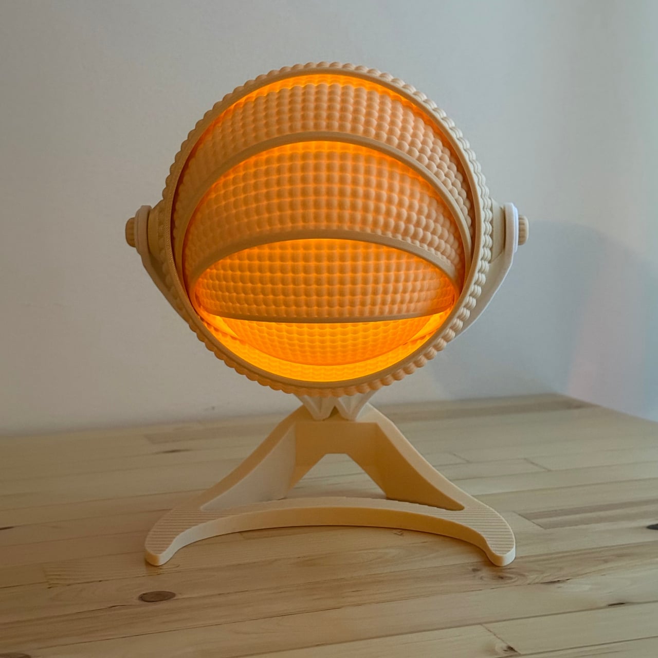
OHR Design, a Canadian 3D printing studio, is a good example of what that progress looks like. Its Armadillo series takes inspiration from one of nature’s most recognizable shapes, the segmented, overlapping bands of the armadillo shell, and turns it into a lamp shade that adjusts depending on how much, or how little, light you want in a room. And it all started from a tea light holder.

Designer: OHR Design

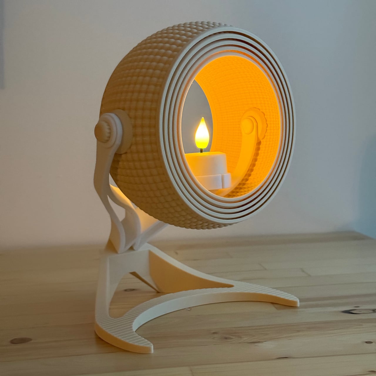
The original Armadillo grew from an earlier OHR Design called the OHRB, and it’s since inspired a whole family of spin-offs. True to its origins, the Armadillo wraps a tea light in a series of concentric rings that tilt forward to close the shade down or pull back to widen it. At 240mm tall, it’s compact enough for a bedside table or a bookshelf without demanding much real estate.

For those who want the same aesthetic energy at a bigger scale, the Armadillo XL scales the concept up into a proper desk lamp. At 373.8mm tall and 283.9mm wide, it makes a statement on a desk without being overwhelming. It accepts a real light bulb rather than a tea light, making it far more practical for anyone who actually needs their lamp to pull its weight.

What gives both versions their character is the adjustable ring system. The segmented shade isn’t just decorative; opening and closing the rings changes how the light spreads through the room, softening the glow when the rings are fully open or concentrating it when they’re pulled shut. It’s the kind of thing that turns a simple on/off appliance into something you keep reaching over to tweak.

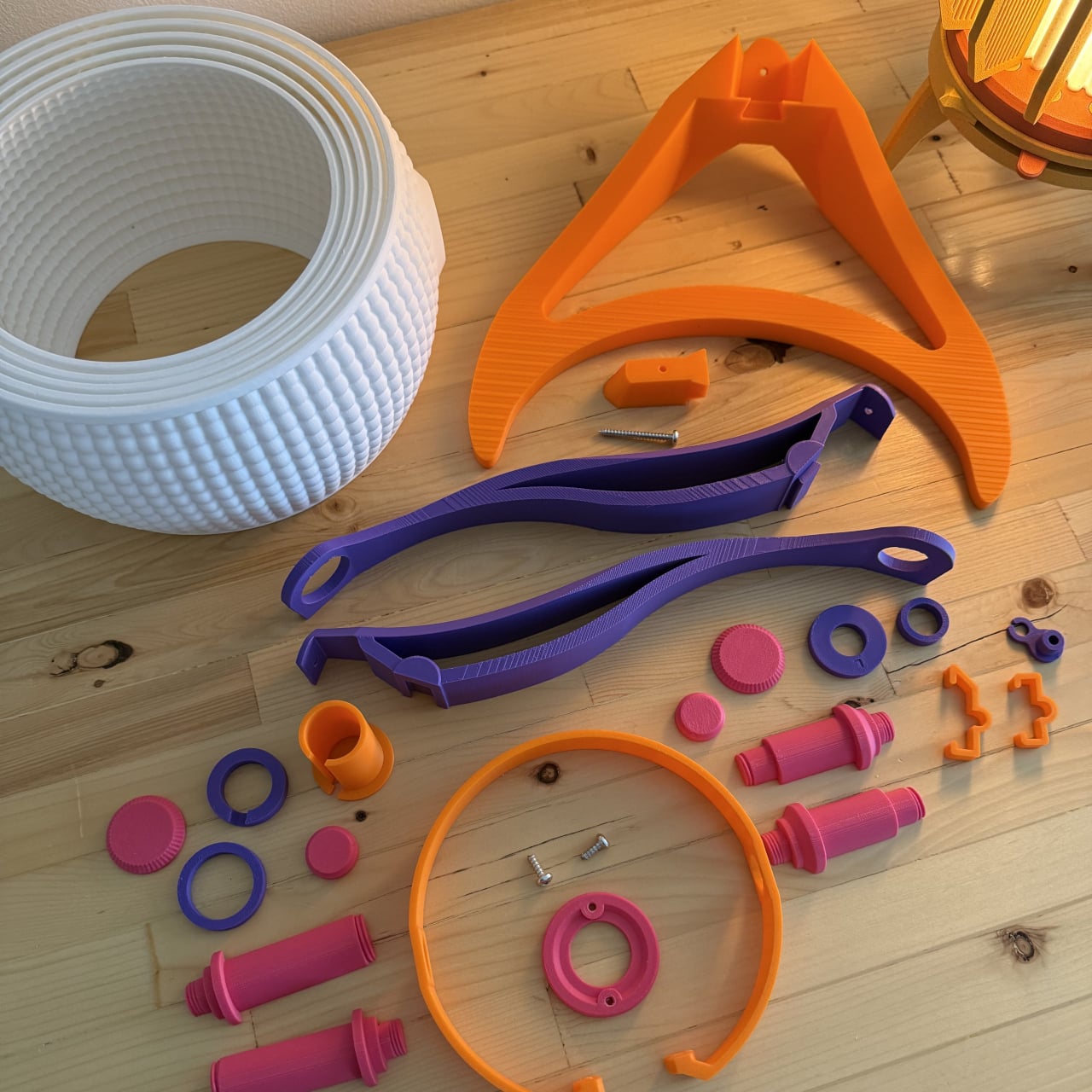
What’s equally interesting is how OHR Design sells these. You aren’t buying a finished lamp; you’re buying the STL files to print one yourself. The original Armadillo fits on a 180mm × 180mm print bed, making it accessible on smaller machines like the Prusa Mini or Bambu Lab A1 Mini. The Armadillo XL, being larger, requires a 256mm × 256mm build volume.

The filament choice is entirely yours, which means the lamp can be as neutral or as bold as you want. OHR Design has been spotted using Overture’s Super PLA+ in various colors, from muted naturals to vivid hues, all of which change how the diffused light reads. Not many lamps invite you to physically shape the light they cast, and fewer still can be reimagined entirely based on the color spool you have on hand. The Armadillo family puts creative control squarely in the hands of whoever prints it, and that’s a genuinely refreshing place to land.

The post This 3D-Printed Lamp Has a Shell That Opens and Closes to Shape Light first appeared on Yanko Design.
  •  

Preciosa To Make Light Feel Like a Living Thing at Milan 2026

Light has always been design’s most underrated material. We talk endlessly about furniture, textiles, and surfaces, but light? It usually plays the supporting role, the thing that makes everything else look good. Preciosa Lighting is quietly changing that conversation, and their latest collection, Drifting Lights, might be the most convincing argument they’ve made yet.

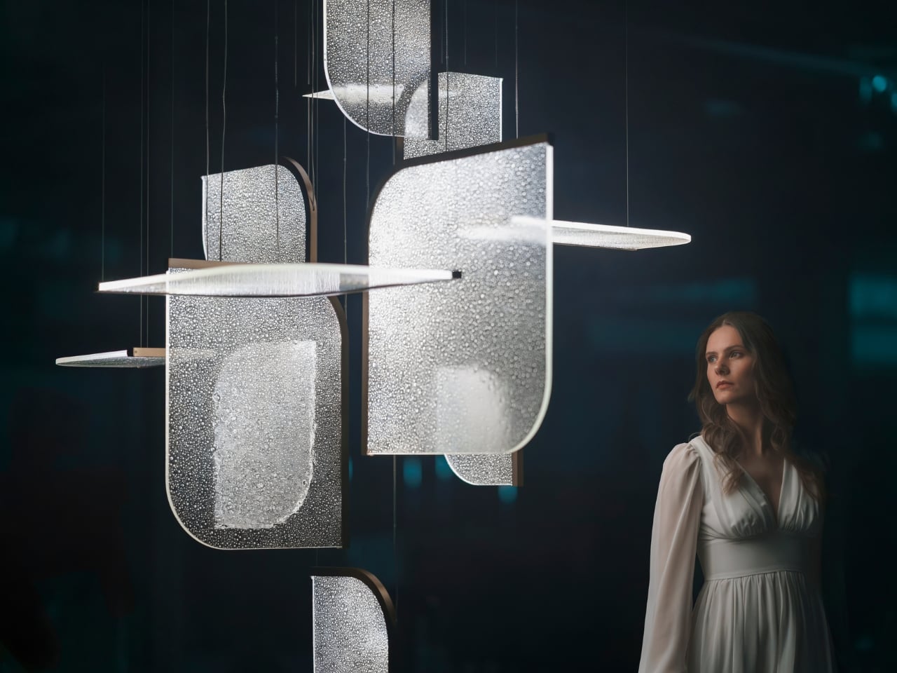
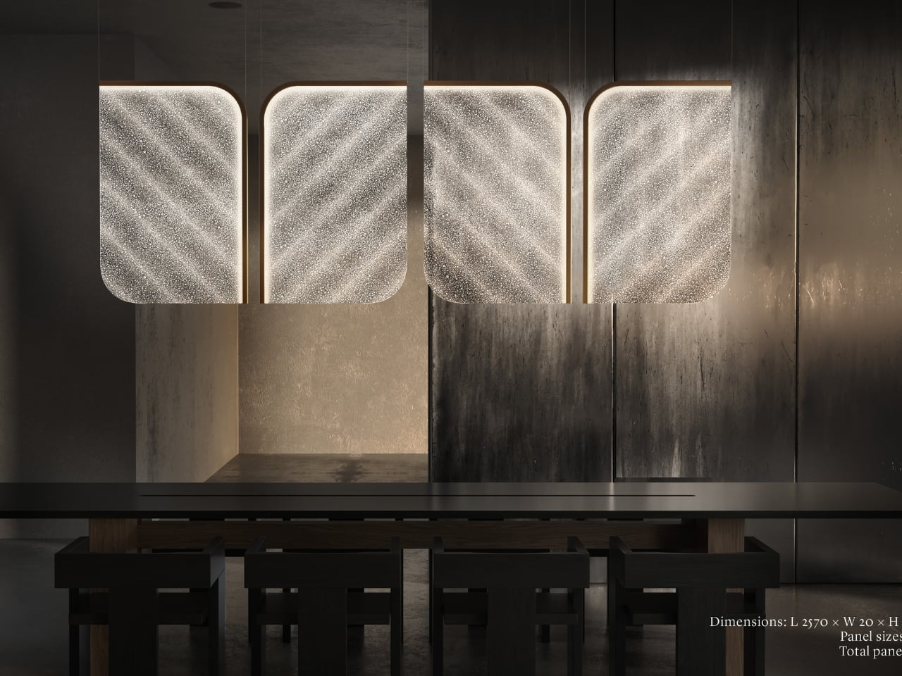
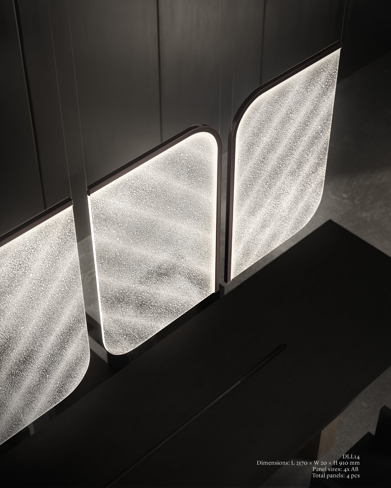
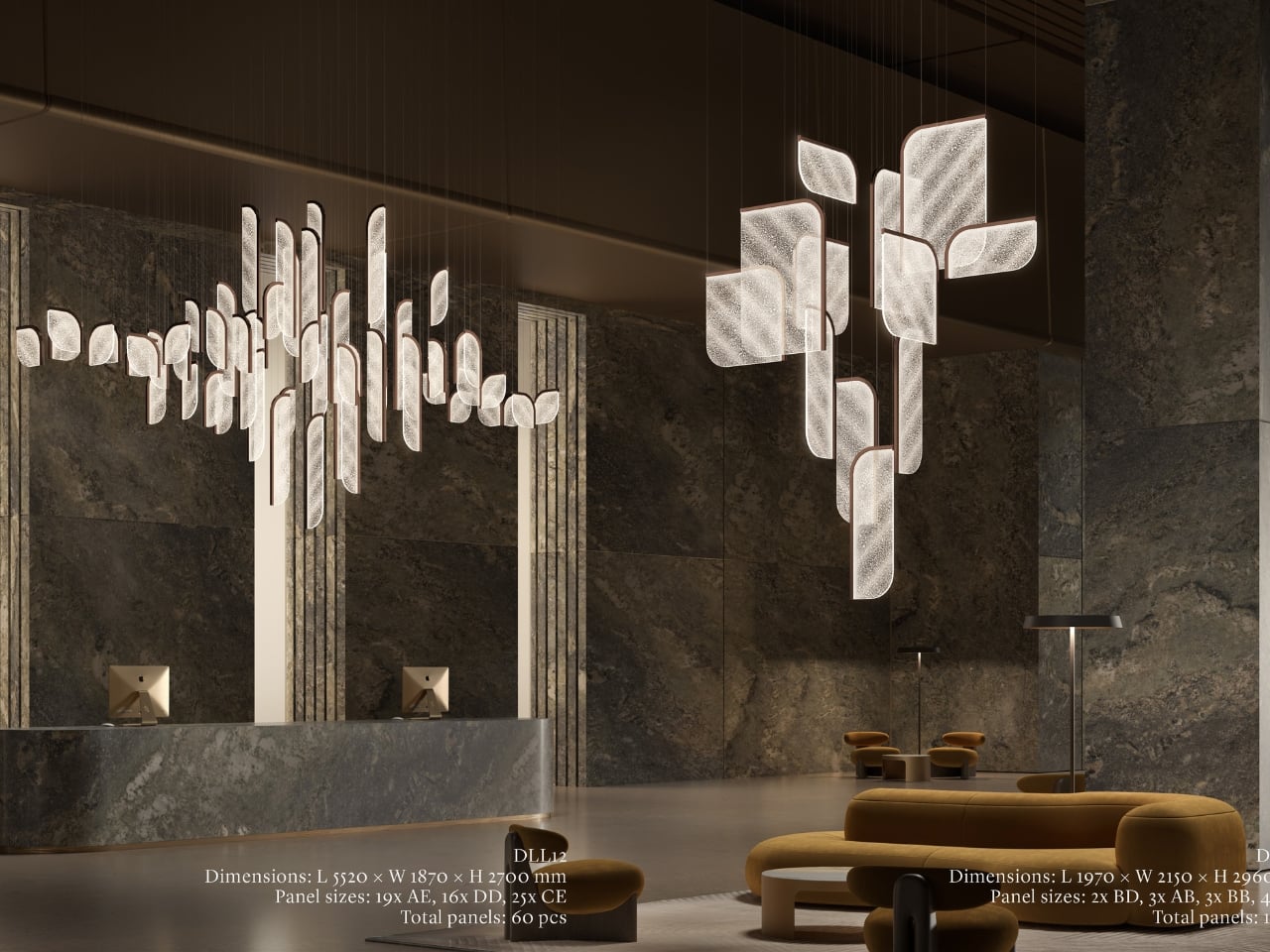
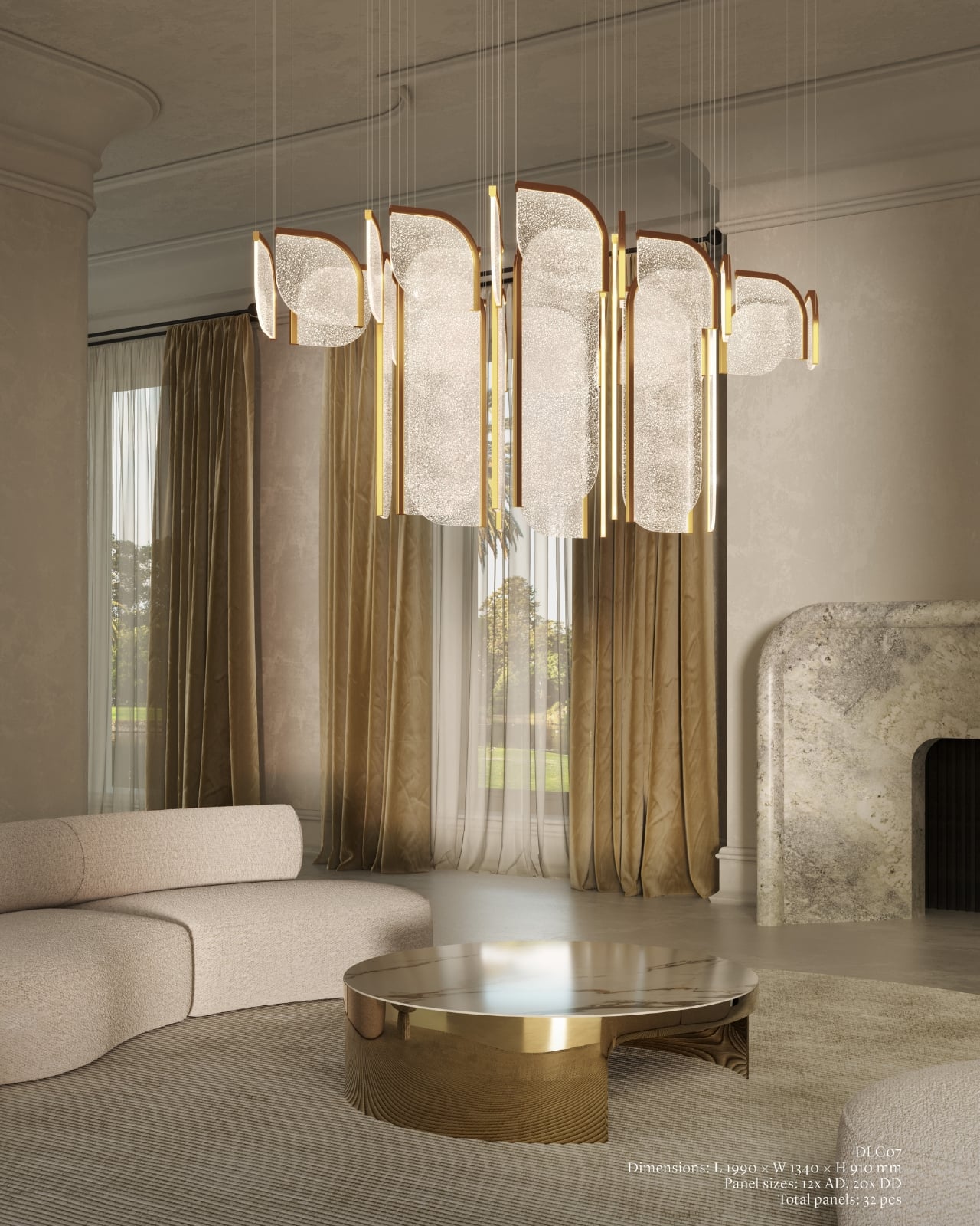
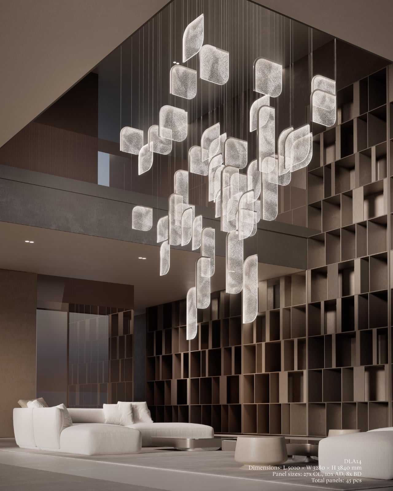
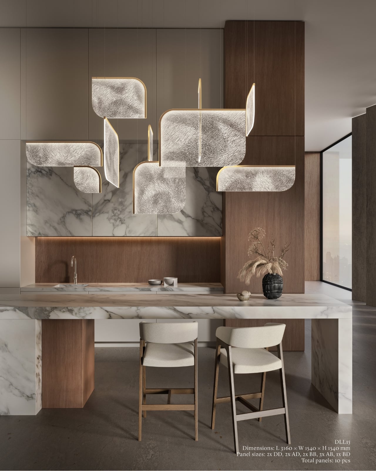
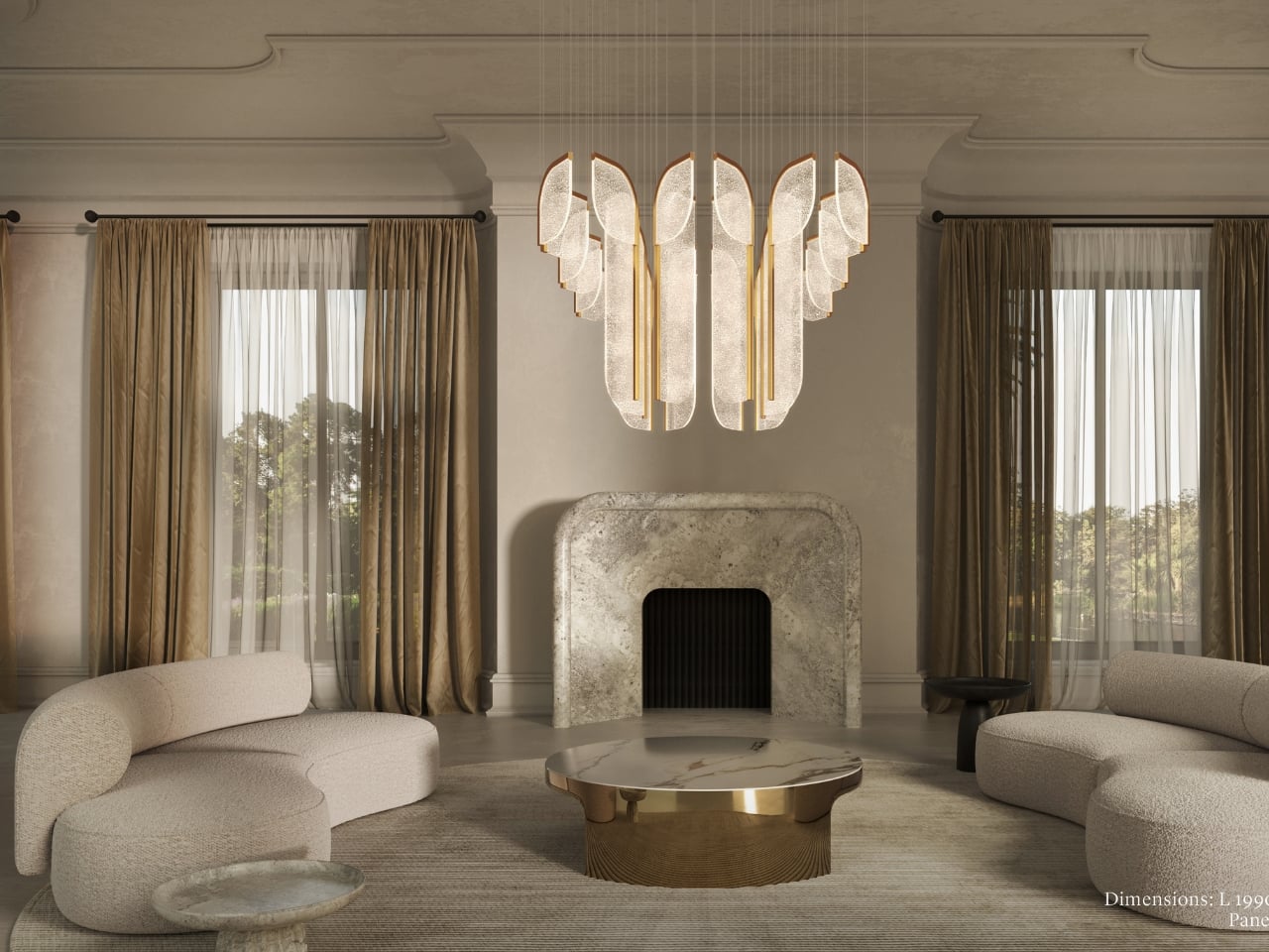
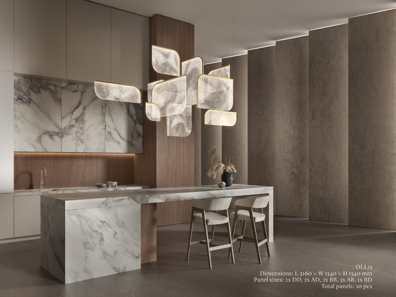
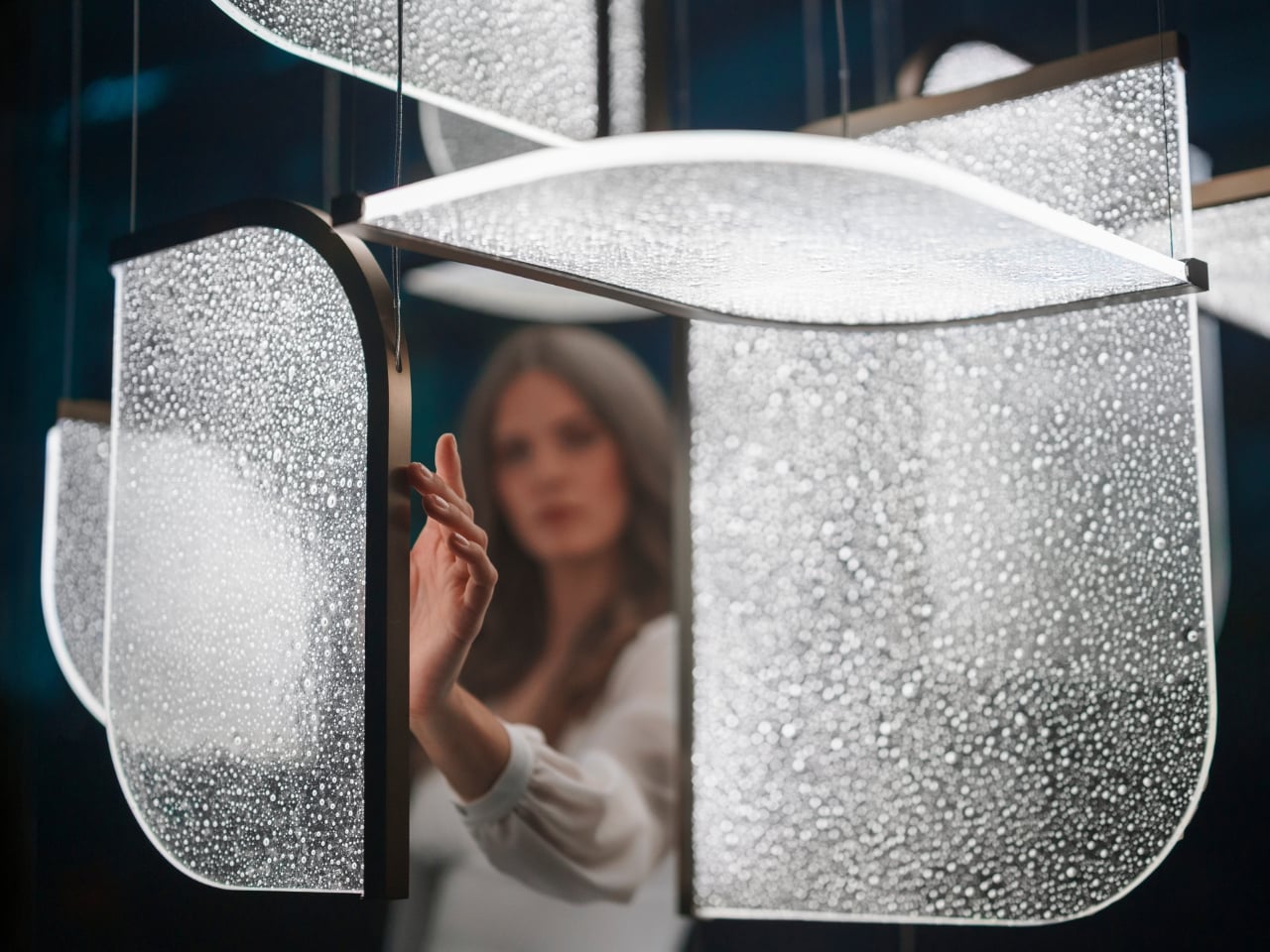
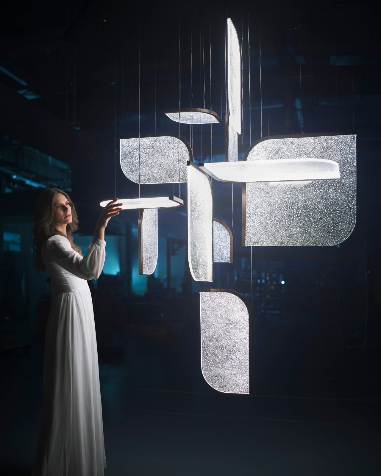
The Czech brand has been doing this long enough to know the difference between novelty and genuine craft. Their heritage is rooted in traditional glassmaking, but what they’ve built with Drifting Lights feels like a very deliberate step forward. Each piece is made up of oblong and square glass panels slotted into a stainless-steel frame that discreetly conceals an LED strip. Inside each panel, the glass has been infused with countless tiny air bubbles. When light passes through, it doesn’t just illuminate the glass. It gets lost in it, scattering through those bubbles in a way that looks less like electricity and more like light deciding where it wants to go.

Designer: Preciousa Lighting

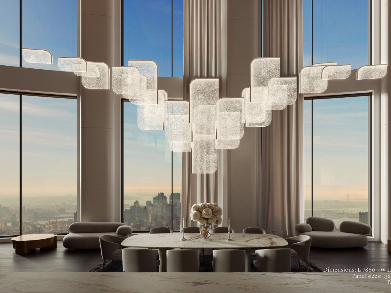
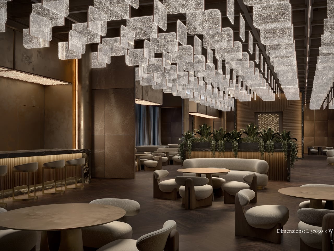
For Milan Design Week 2026, Preciosa is bringing the full Drifting Lights experience to the Tempesta Art Gallery in Brera, and the scale alone is worth paying attention to. The installation spans approximately 30 square metres and features 60 glass panels suspended vertically and horizontally, forming a structure measuring 8.7 by 3.2 by 3 metres. Set against a dark interior, the panels will be animated using 3D spatial mapping and RGBW technology, cycling through colour sequences from red to pink to green. Co-Creative Directors Michael Vasku and Andreas Klug put it plainly: the installation aims at “creating space to slow down, pause and wonder.”

I appreciate that framing, because Milan Design Week is genuinely relentless. Every brand is competing for the loudest moment, the most shareable installation, the boldest statement. There is a real temptation to optimise for the 15-second video clip rather than the actual experience of standing in a room. Preciosa is betting on the opposite, and I think that’s the smarter play. The colour sequence from red to pink to green reads like an emotional arc rather than a tech demo, referencing love, passion, and inner peace. Whether or not you buy the symbolism, you can’t argue with the atmosphere it creates.

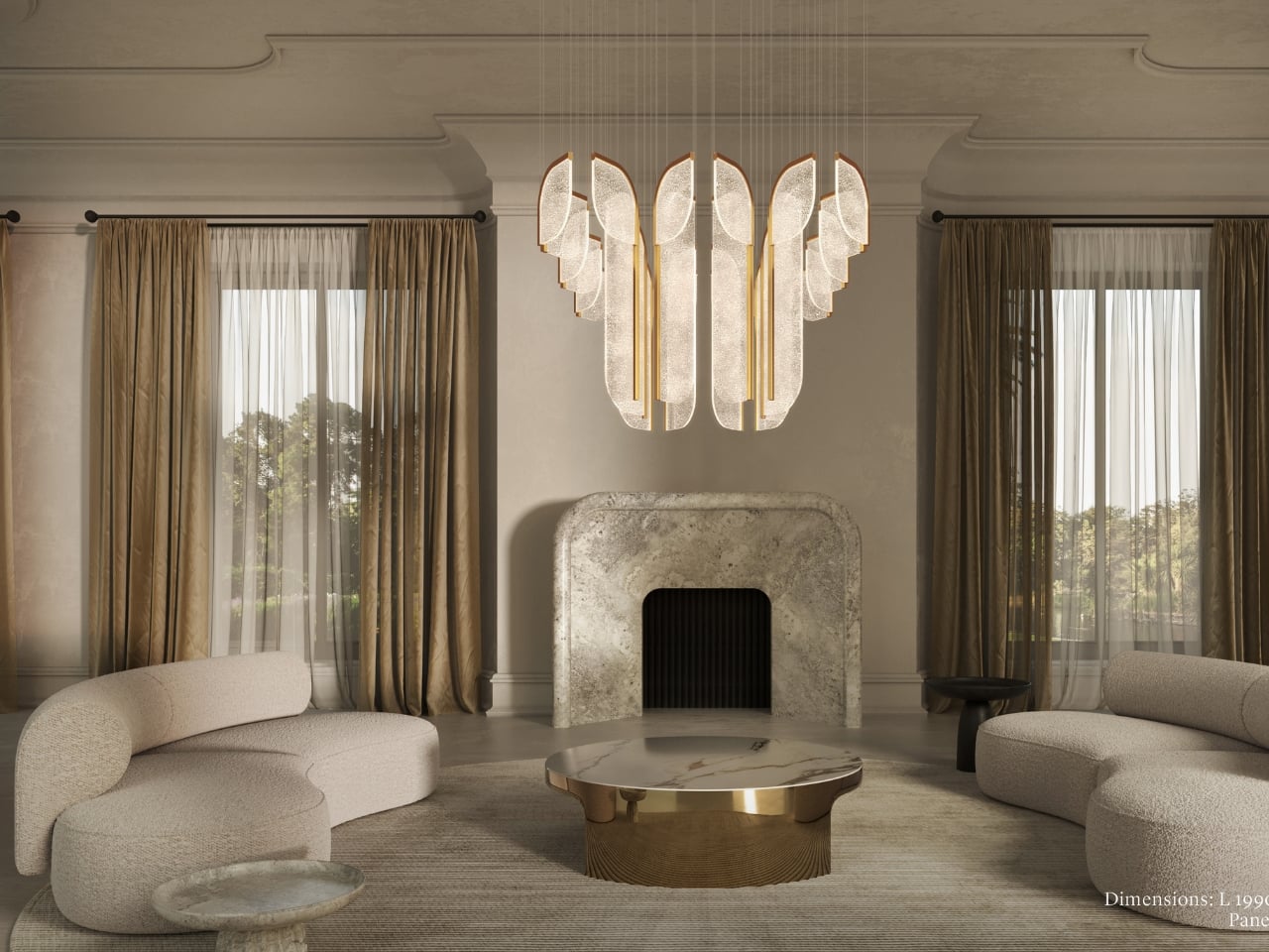
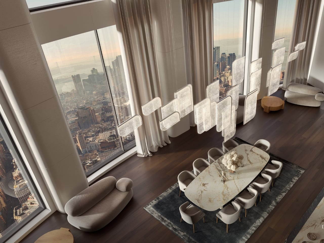
A design object earns its place when it works just as well outside a gallery as inside one, and Drifting Lights has clearly been thought through on that level. The panels come in ten sizes, with different metal frame finishes and the option to orient them vertically or horizontally. The same collection can fill a grand hotel lobby or anchor a living room without losing its character. For bespoke projects, Preciosa can apply a painting technique that introduces pigment bubbles into the glass, giving each panel a layer of quiet individuality. The bubbled glass can also be enhanced with their Fused Veil pattern, which shifts the direction of light and adds even more visual complexity.

Under static illumination, Drifting Lights is calm and composed. Switch to dynamic mode and the panels come alive, with light moving from one to the next like ink dispersing through water. The gradients bloom, soften, and recombine. It’s the kind of effect that makes you stay in a room longer than you planned, which is, ultimately, what great lighting is supposed to do.

Preciosa has had a strong run at Fuorisalone in recent years, with recognised installations at Zona Tortona and Euroluce. The move to Tempesta on Foro Buonaparte suits the work well: a contemporary art gallery setting that lets the installation breathe without competing with showroom furniture. It’s a confident choice for a collection that clearly doesn’t need much help making a room feel different. If you’re heading to Milan, the installation runs April 20 to 26 at the Tempesta Art Gallery on Foro Buonaparte, and this one is worth the detour.

The post Preciosa To Make Light Feel Like a Living Thing at Milan 2026 first appeared on Yanko Design.
  •  

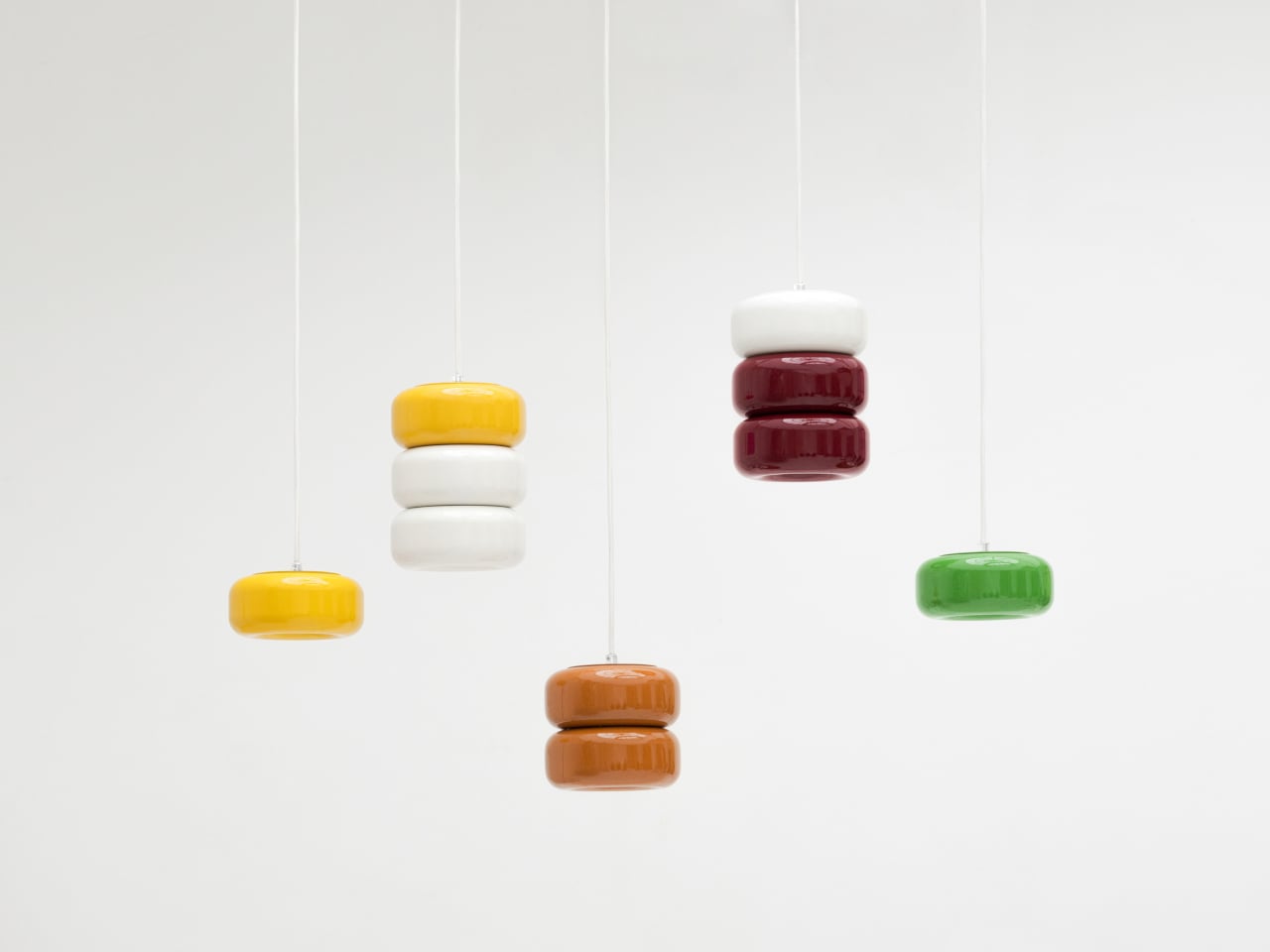
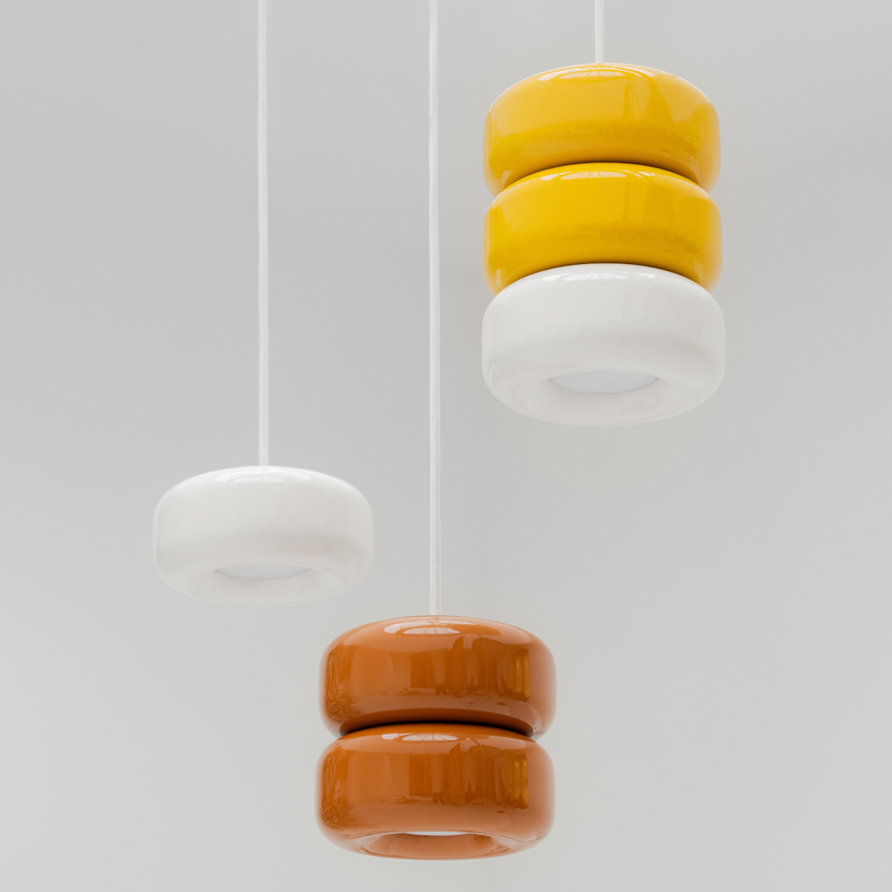
These Ceramic Lamps Look Like 90s Caramel Candy and Stack Any Way

The interiors most people aspire to these days tend to share a common trait: they’re clean, restrained, and almost aggressively neutral. Scandinavian minimalism, Japandi aesthetics, and muted palettes have dominated home design for years, and while there’s nothing wrong with a well-curated beige room, a lot of modern spaces have started to feel emotionally flat, like showrooms rather than places where people actually live.

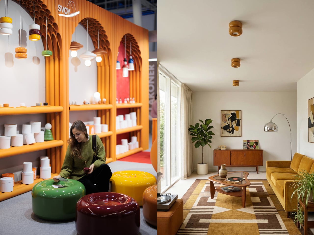
That’s where the Caramel collection comes in. Designed by Moscow-based product designer Maxim Tatarintsev in collaboration with Russian brand Svoy Design, this new series of ceramic lighting and furniture takes a very different approach to interior objects. Rather than adding another understated piece to a polished shelf, it reaches back to a simpler, sweeter time, asking whether a lamp or a side table can carry something as intangible as joy.

Designer: Maxim Tatarintsev

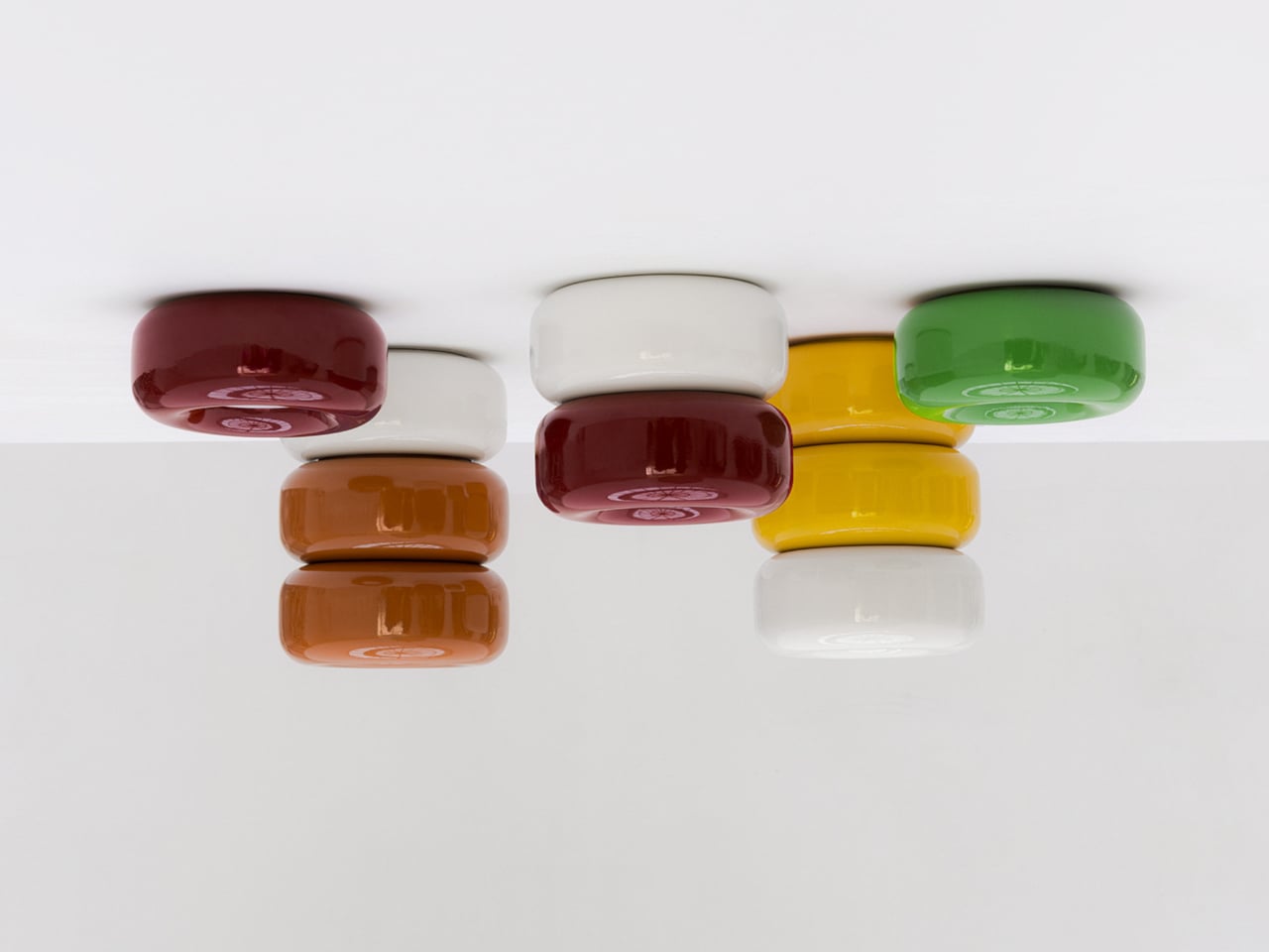
Tatarintsev’s inspiration came from a period of deep personal reflection. Amid what he describes as the noise of contemporary life, he looked inward and found his answer in childhood, specifically in the candy that practically every kid growing up in the 90s and early 2000s would recognize. That small, glossy, jewel-toned caramel sweet became both his muse and his design vocabulary, shaping everything from the forms to the color palette.

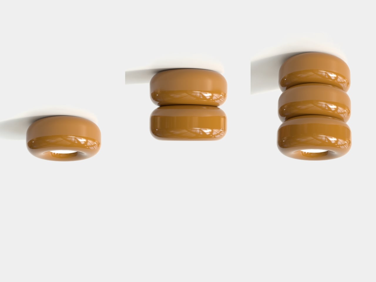
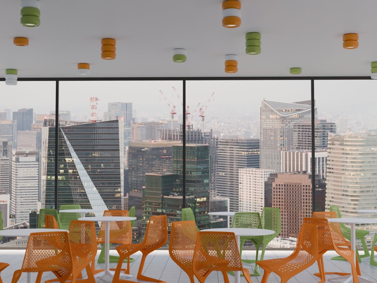
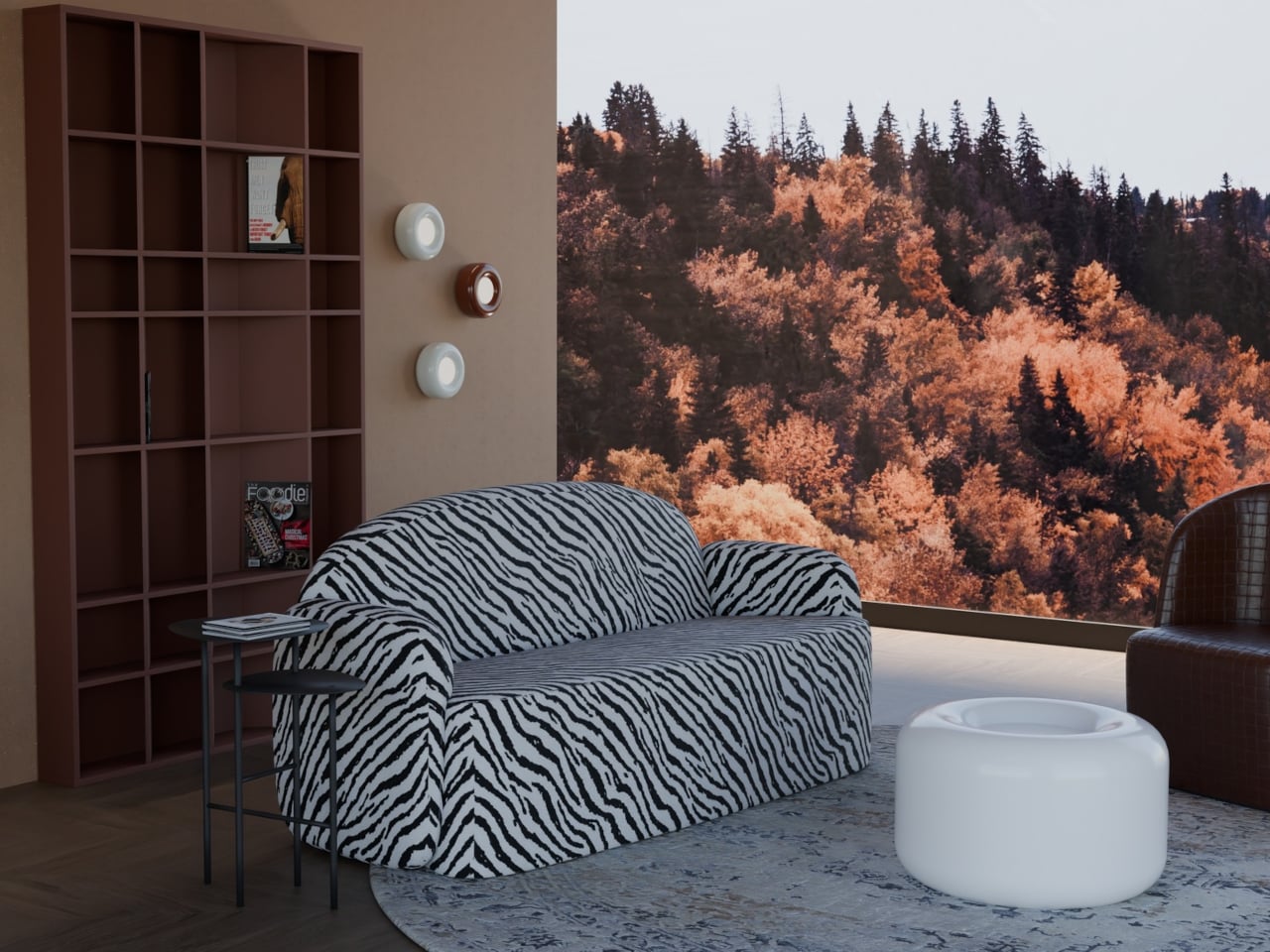
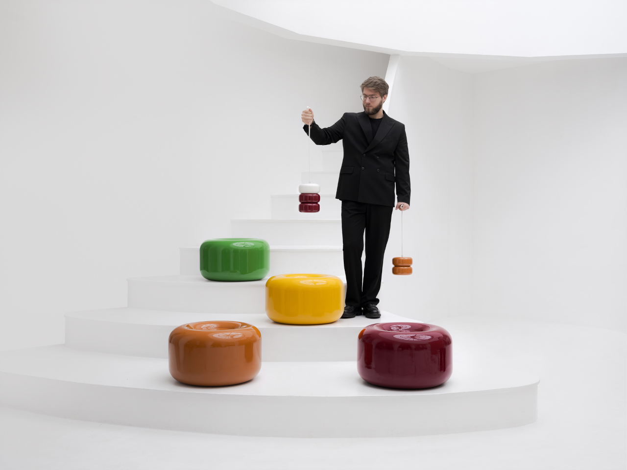
The collection spans pendant lights, ceiling fixtures, and wall-mounted lamps, all crafted from semi-porcelain, as well as a low-profile side table made from a proprietary composite material. What stands out is the modular approach: each ceramic unit can be combined and reconfigured, letting you stack or cluster them into different lighting arrangements depending on the mood or corner of the room you’re working with.

Think of it like assembling your own arrangement from a jar of sweets. One configuration might call for a single pendant above a kitchen island; another might cluster a few units along the ceiling of a reading nook. The point isn’t to follow a prescribed layout but to put that creative decision in the hands of the person actually living in the space, not just the designer who furnished it.

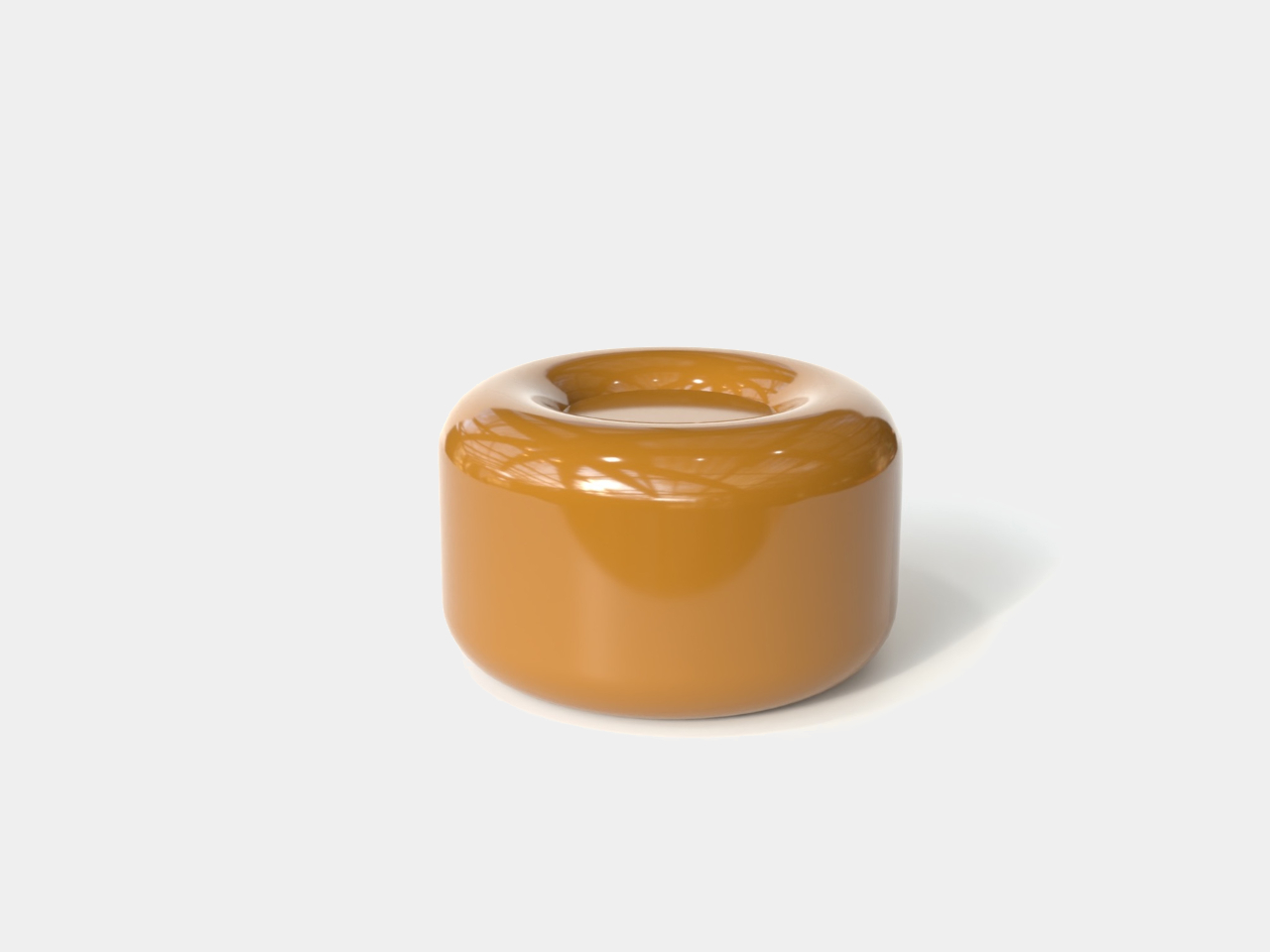
The craftsmanship behind the lighting is traditional and deliberate. Each piece starts as a slip-cast semi-porcelain form, drying for several days before being fired at 1,100°C inside a muffle furnace. A coat of glaze and paint follows, giving the finished modules their signature smooth, candy-like sheen. It’s a fairly labor-intensive process for what might look like a simple geometric shape, but that’s precisely what gives each piece its quiet depth.

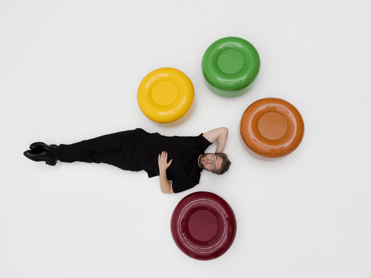
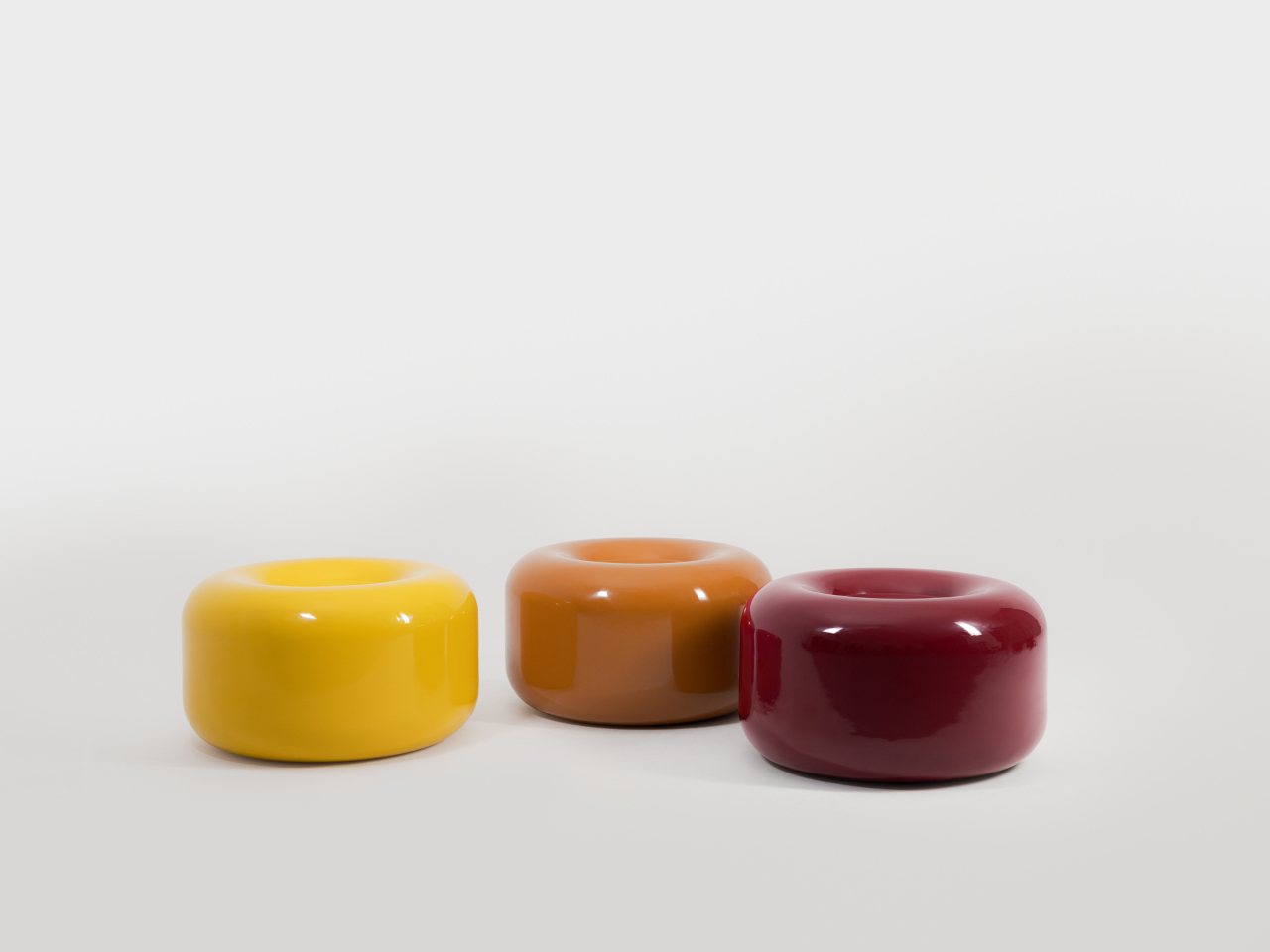
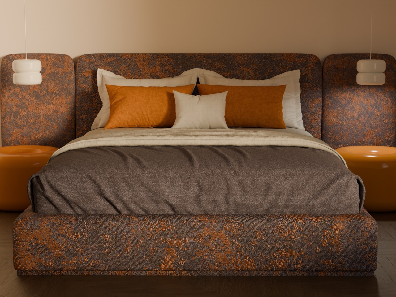
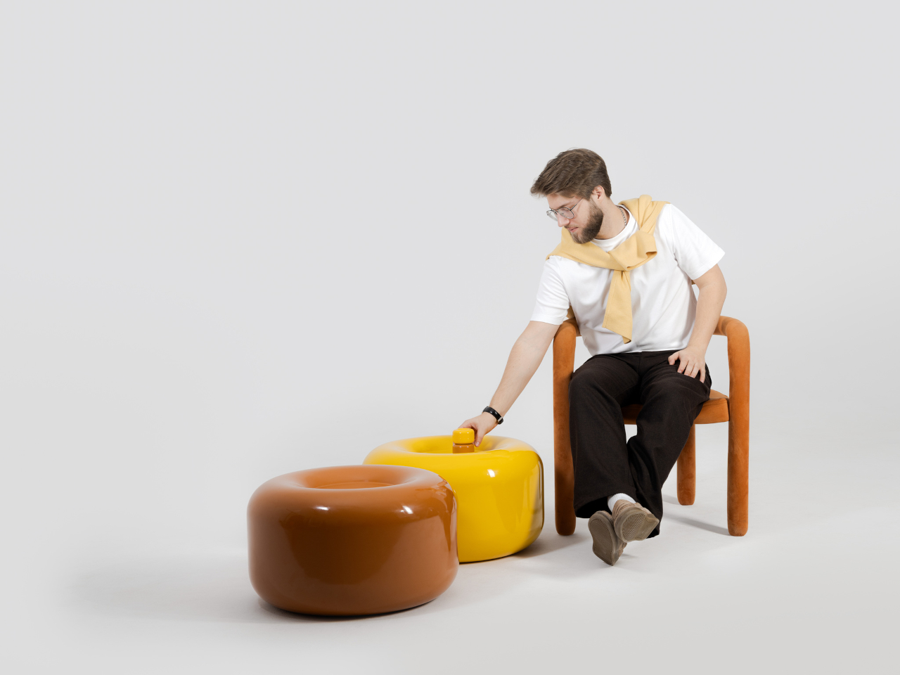
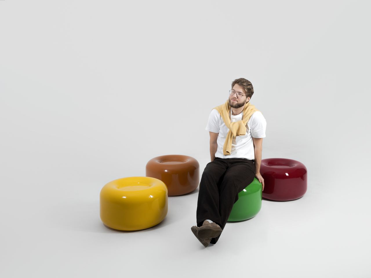
The side table takes a different manufacturing route altogether. Made from a proprietary composite rather than ceramic, it’s significantly more durable and comes in two versions, one for indoor use and one for covered outdoor settings. At first glance, it reads as a low, rounded ottoman, and people will probably be unable to resist using it as a delicious seat instead.

None of that is accidental. Tatarintsev’s stated goal wasn’t to produce pretty objects but to create what he calls “emotional anchors,” pieces capable of sparking a genuine reaction in whoever encounters them. A set of lamps you can rearrange on a whim, a table that moonlights as a seat, and a color palette borrowed from childhood treats make for a collection that gives any room a personality it actually earned.

The post These Ceramic Lamps Look Like 90s Caramel Candy and Stack Any Way first appeared on Yanko Design.
  •  
❌