❌

Vue lecture

This House Splits Into Three Pieces So It Can Stay Hidden in Its Own Forest
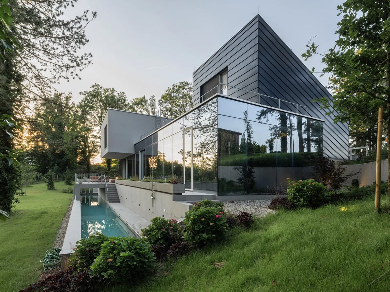
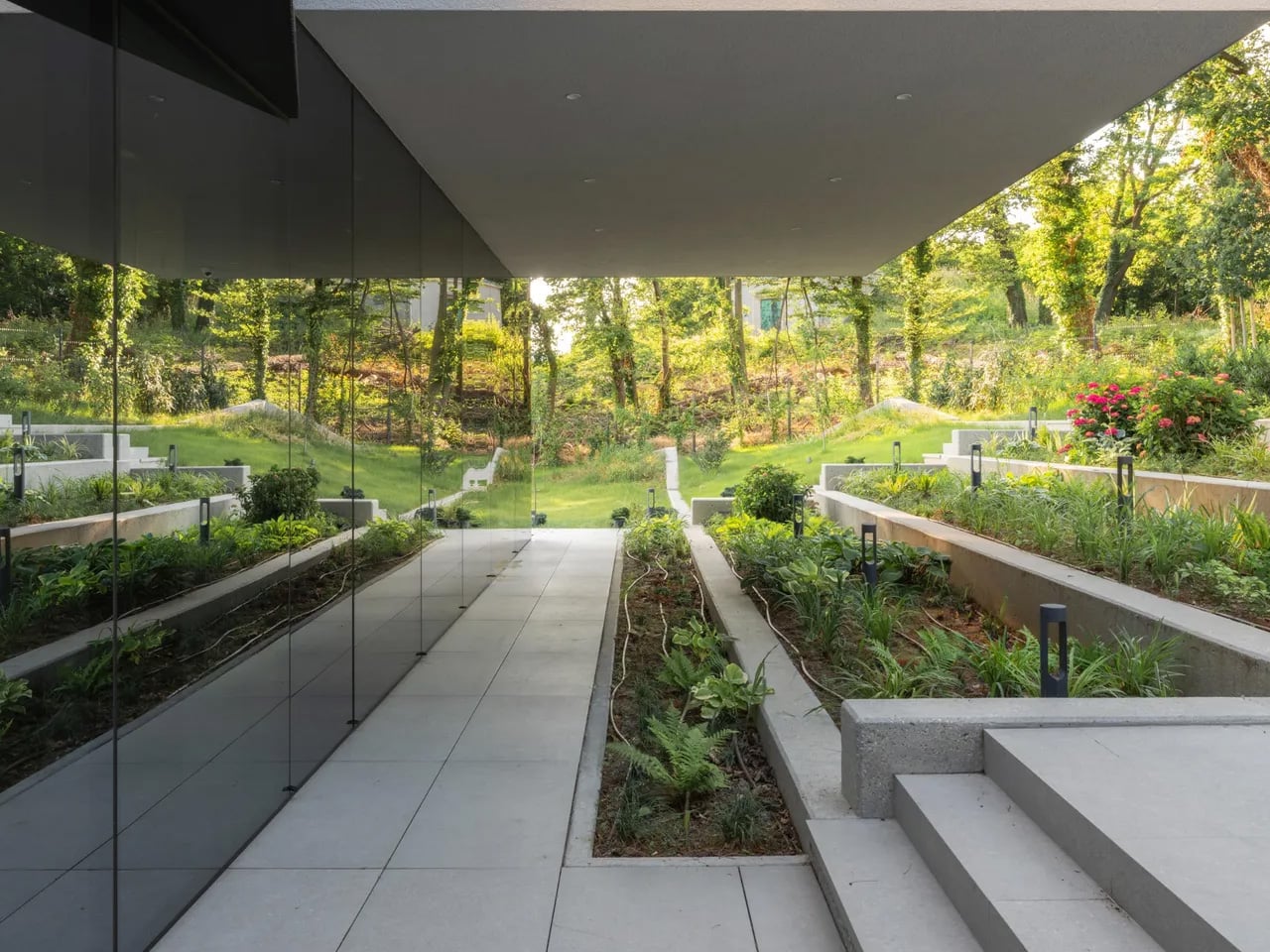
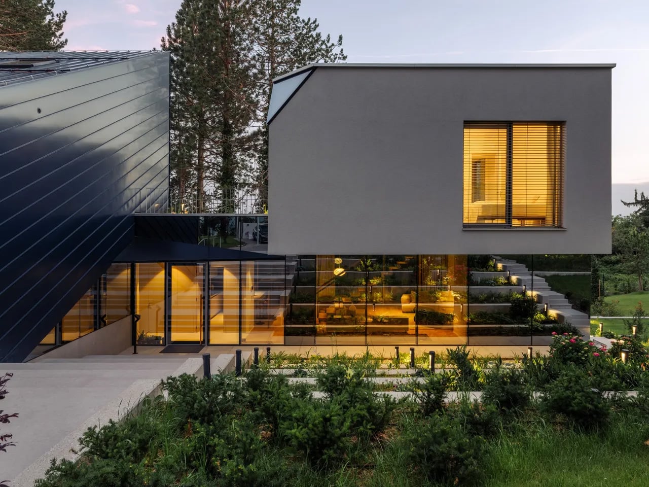
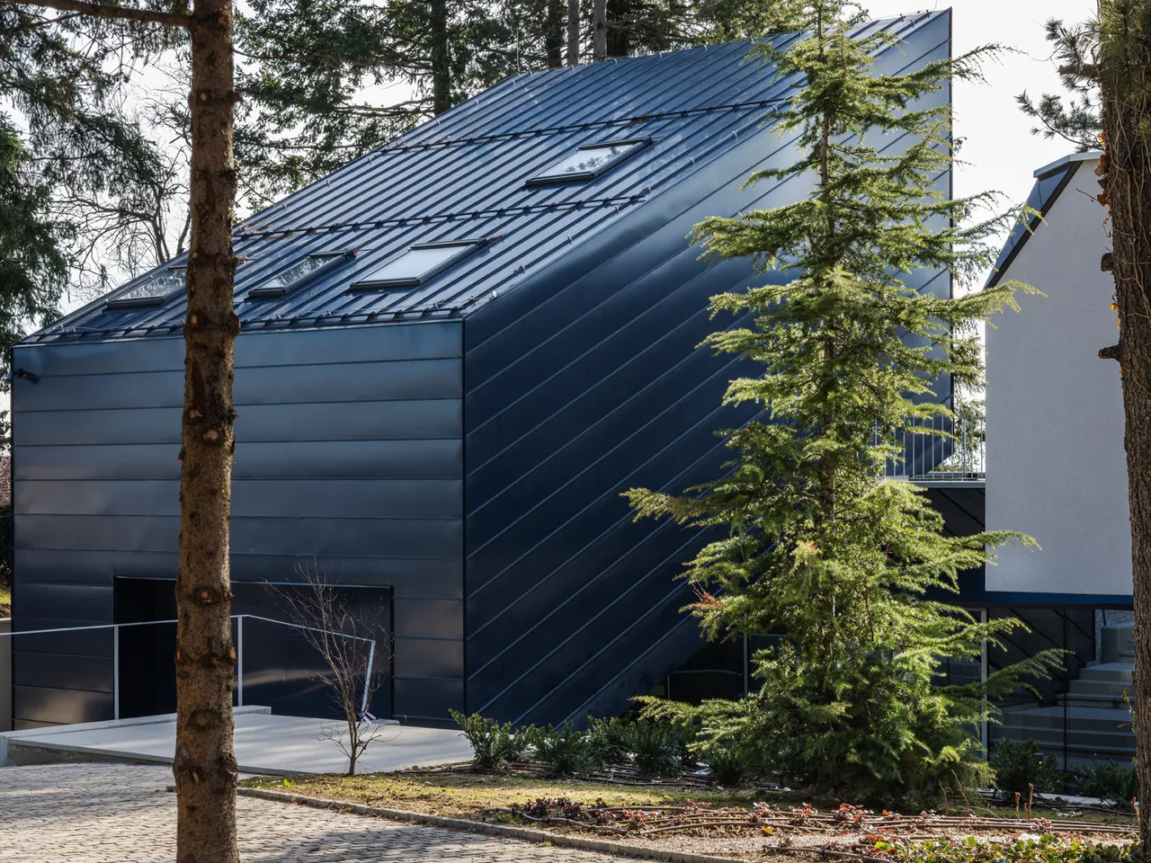
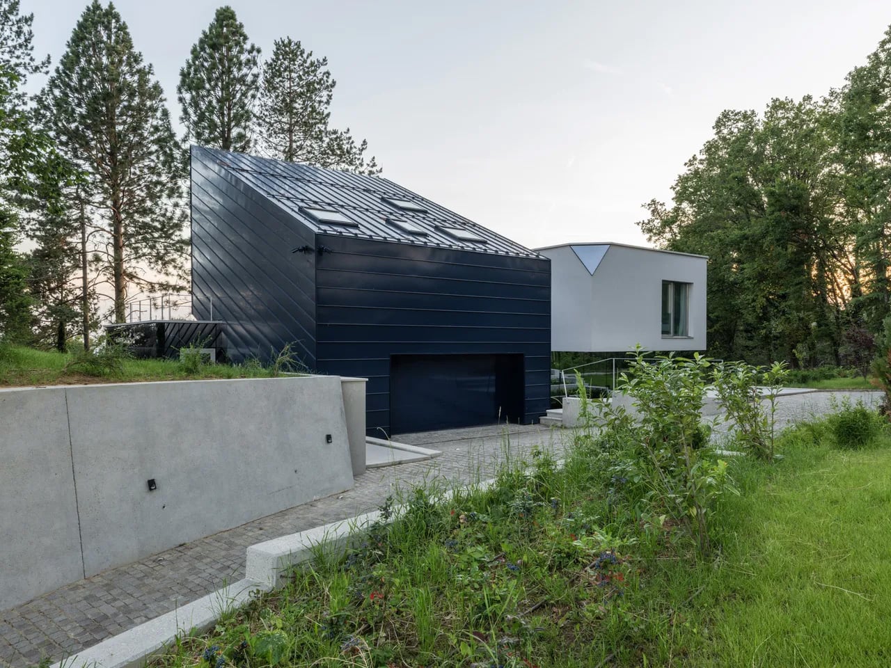
The Curious House in Zagreb doesn’t try to win you over immediately, and that’s exactly the point. Designed by Croatian studio FORVM arhitektura, it’s a family residence perched on a steep hillside, slightly pulled back from the main road and swallowed by dense urban vegetation — orchards, spruces, pines, cedars. The house doesn’t announce itself. It settles in.

Rather than drop a single mass onto the slope, FORVM broke the program into three distinct elements, each responding to a different register of the site. It’s a compositional decision that reads as both pragmatic and poetic, dissolving the usual tension between building and terrain into something more like a conversation. The topography shapes the architecture. The architecture shapes how you live inside it.

Designer: FORVM
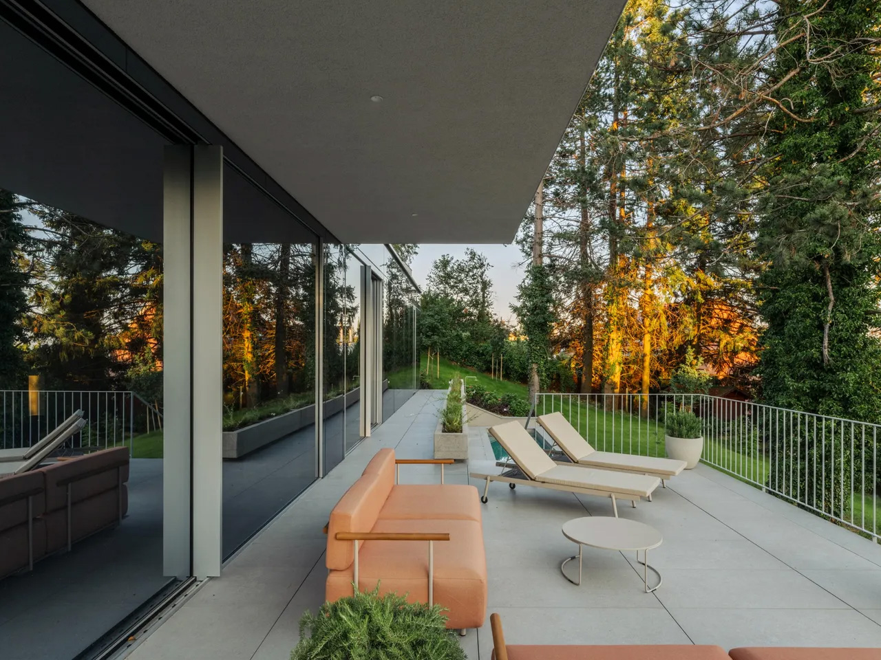
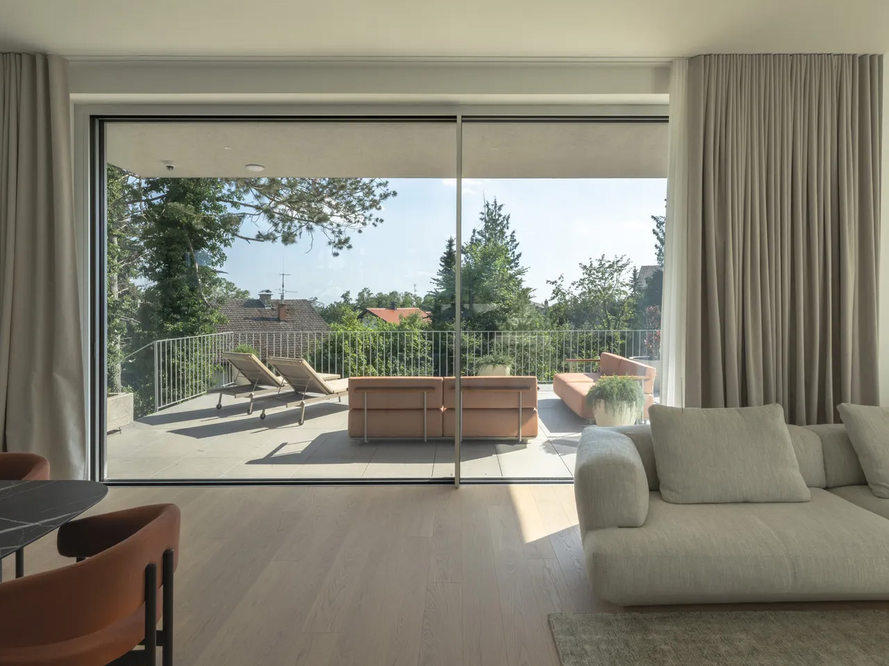
The ground floor is fully glazed — a deliberate move to keep the resident in constant dialogue with the world outside. Green cascades past the glass. The tree canopies filter sunlight and block sightlines, doing the work that walls might otherwise do. Privacy here isn’t enforced by opacity; it’s offered by nature. The forest earns its place as an active participant in the spatial experience, not just a backdrop.

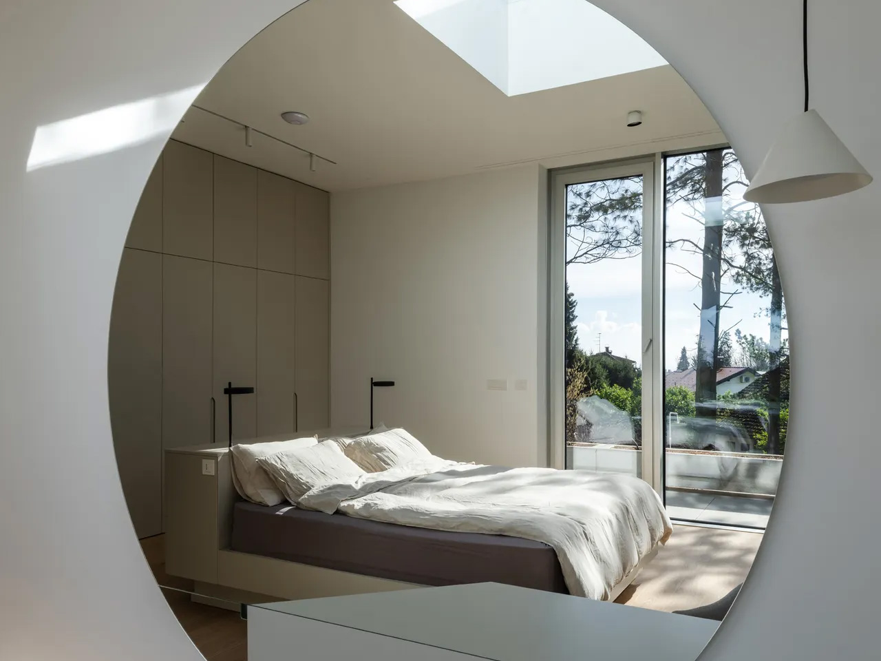
The upper floor shifts register. Where the ground level opens up, the upper volume turns more inward, more considered. Roof windows cut directly to the sky, and through them, tree silhouettes remind you again that you’re inside a forest. The building keeps finding ways to return you to the landscape — not through grand gestures, but through quiet architectural moves that accumulate into something genuinely atmospheric.
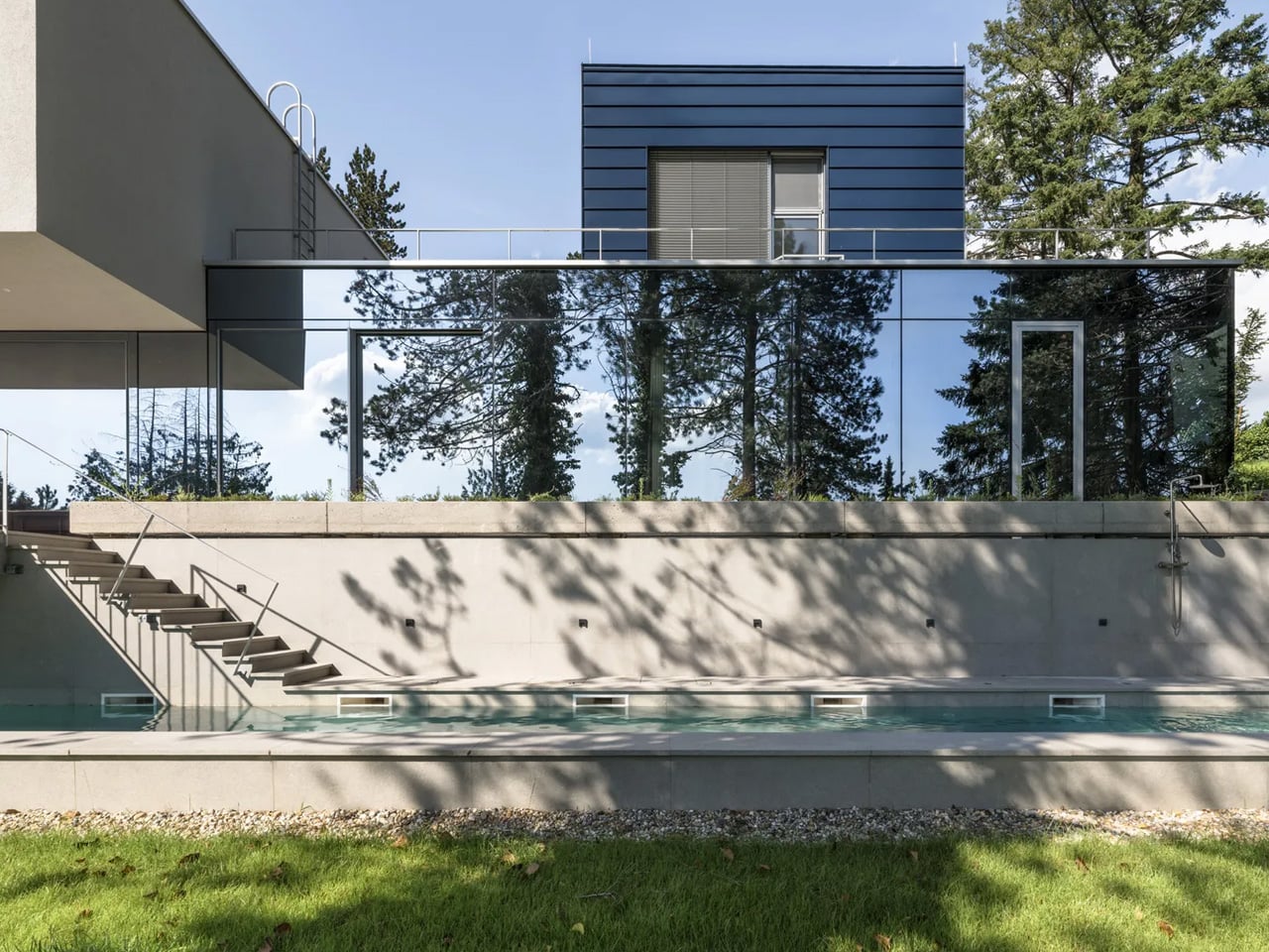
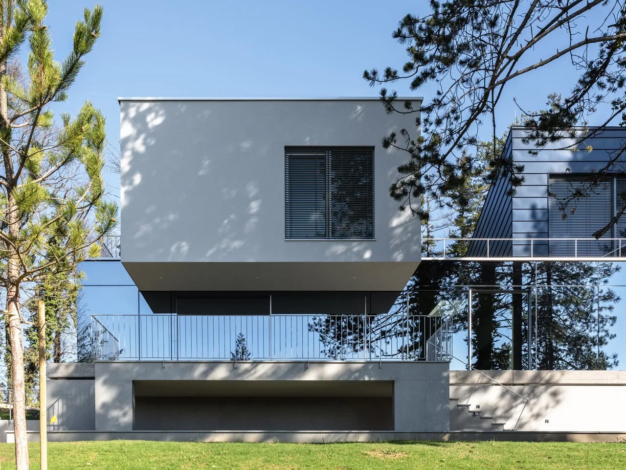
From the outside, the Curious House plays a different game. Its smooth, reflective surfaces don’t reveal the interior so much as they absorb the green world around it. You expect transparency; instead, you get a mirror. The observer looks for signs of life within the envelope and finds it harder than the glazing might suggest. It’s a house that hides in plain sight.

Designed by Dinko Uglešić, Ina Vlahović, and Marijana Rančić, and photographed by Bosnic+Dorotic, the Curious House exemplifies a strain of European residential architecture that takes landscape seriously — not as an amenity to be framed, but as a logic to be followed. FORVM, founded in 1991 by Ante Uglešić, has long worked within the specifics of Croatian terrain and climate, and that attentiveness shows here in every decision, from the fragmented massing to the calibrated relationship between glass and canopy.
The post This House Splits Into Three Pieces So It Can Stay Hidden in Its Own Forest first appeared on Yanko Design.
  •  

One Architect Quietly Ditched Rent for a 1sqm Treehouse Office

Munich has some of the steepest commercial rents in Germany, and anyone who has tried to lease even a modest studio space knows the arithmetic rarely works in a small firm’s favor. Brokers, multi-year contracts, square footage priced by the centimeter. When the Munich architecture practice Opposite Office needed a new home base, founder Benedikt Hartl looked at those numbers and decided the smartest move wasn’t a smaller office or a coworking membership. It was no office at all, at least not the kind anyone pays rent on.

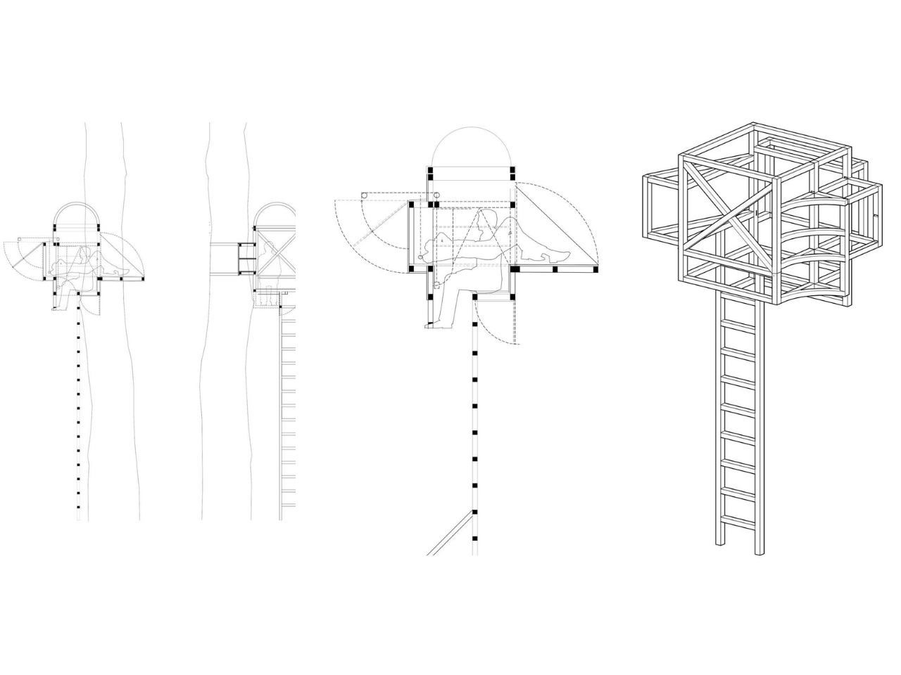
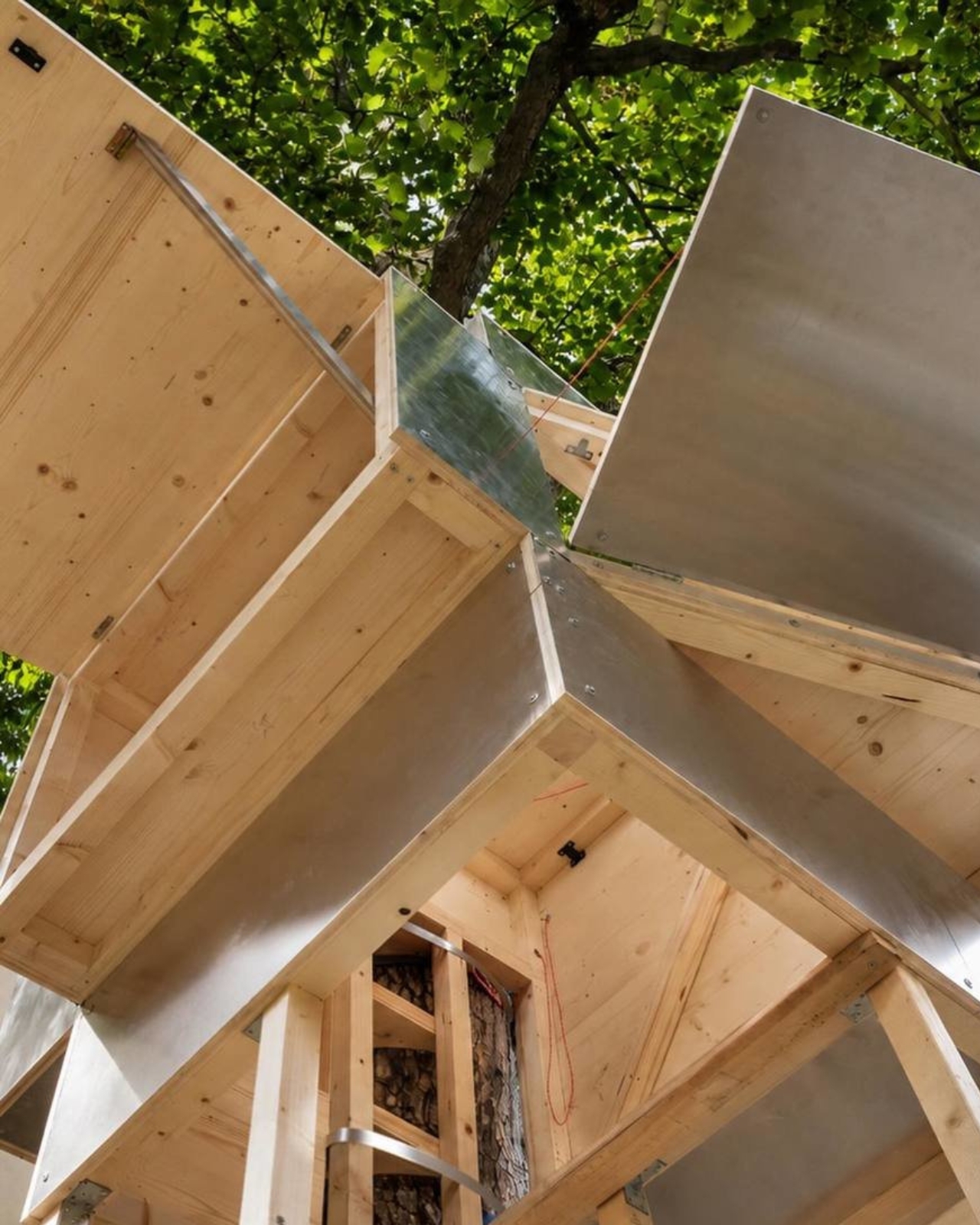
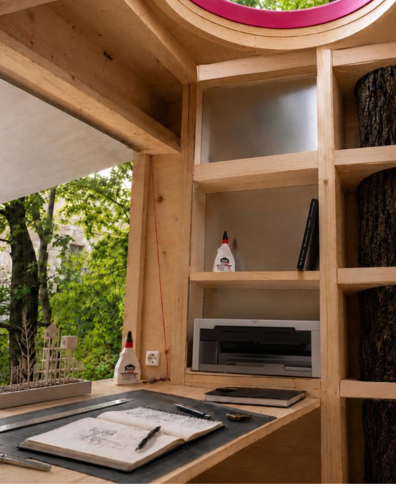
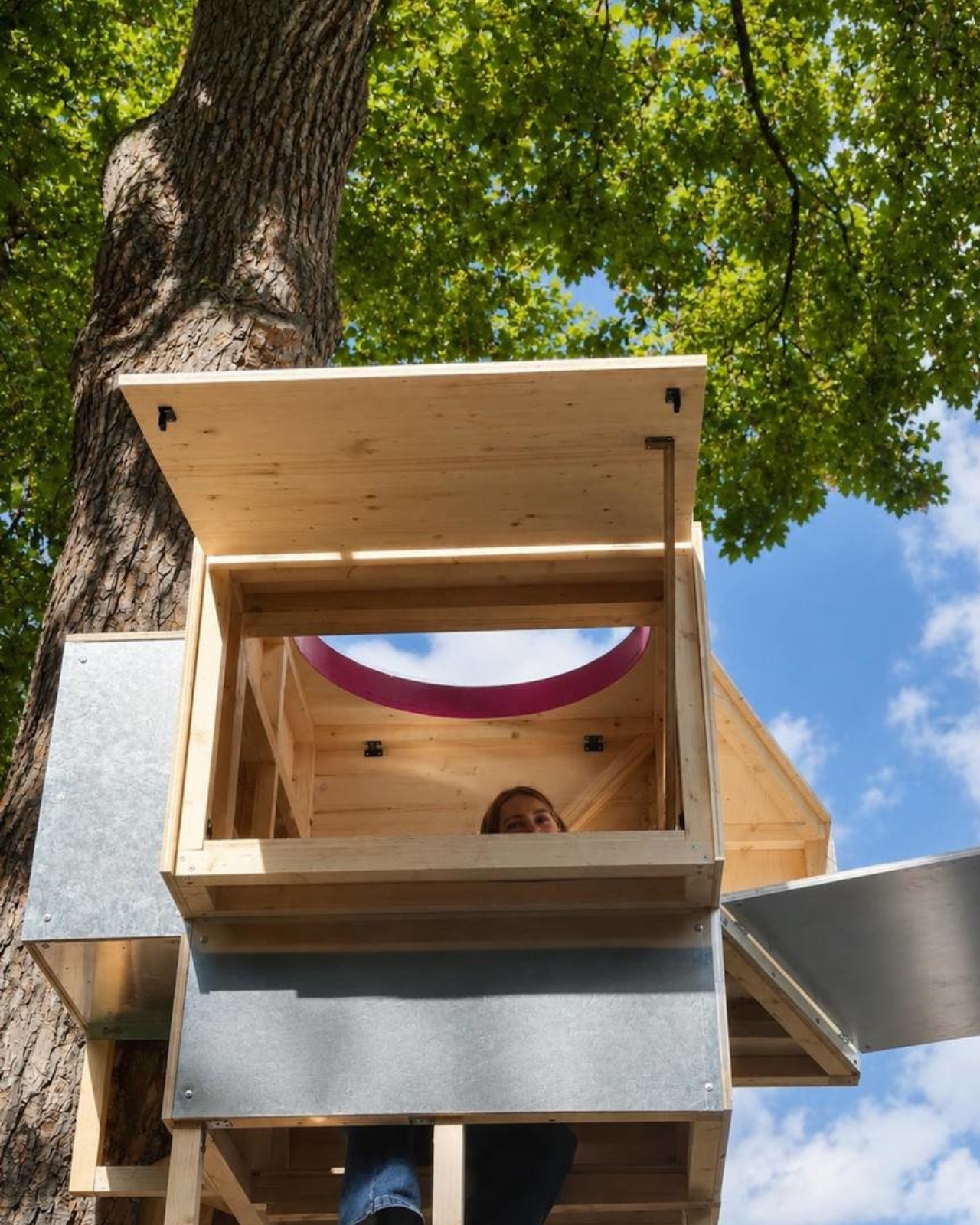
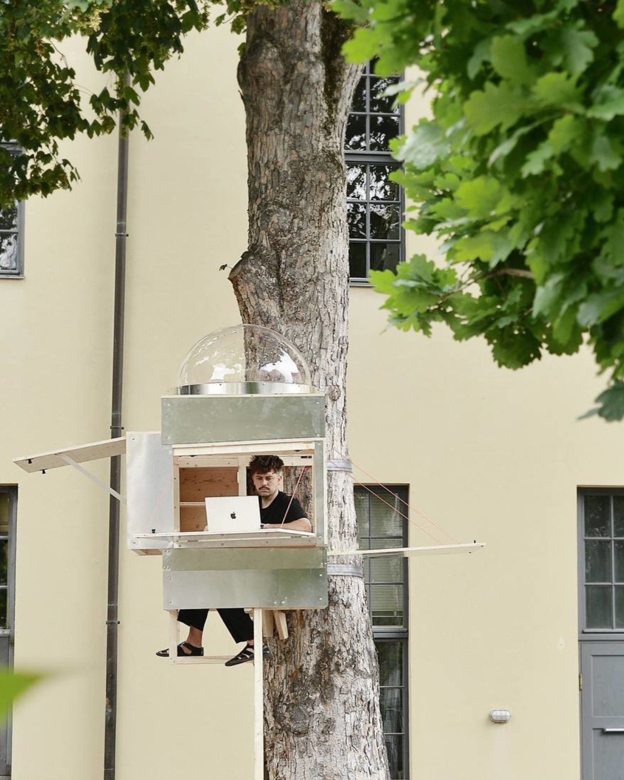
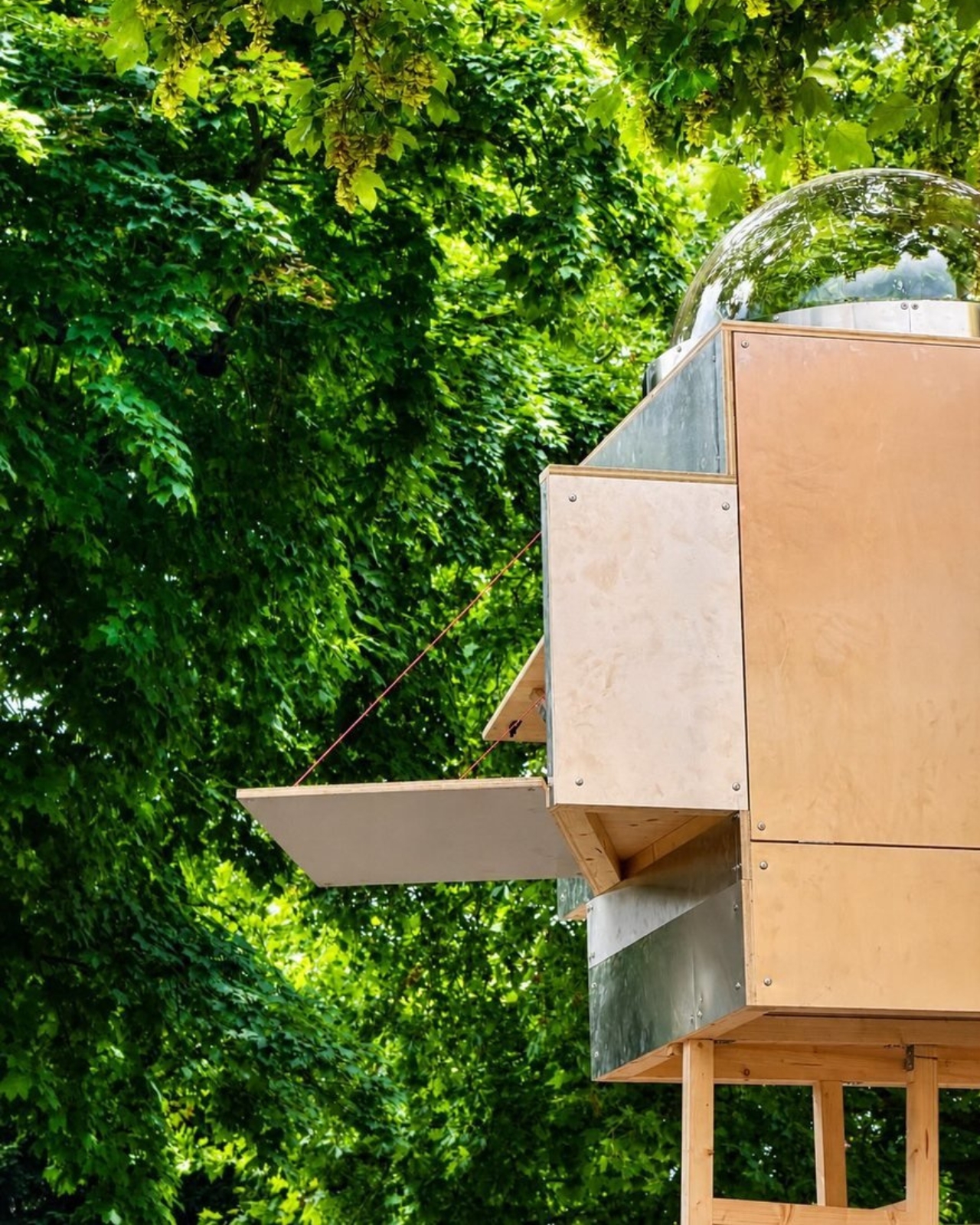
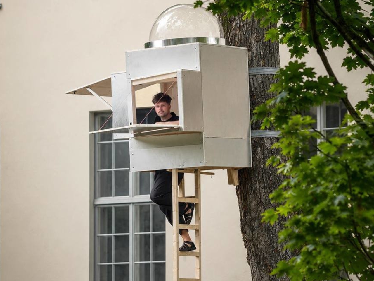
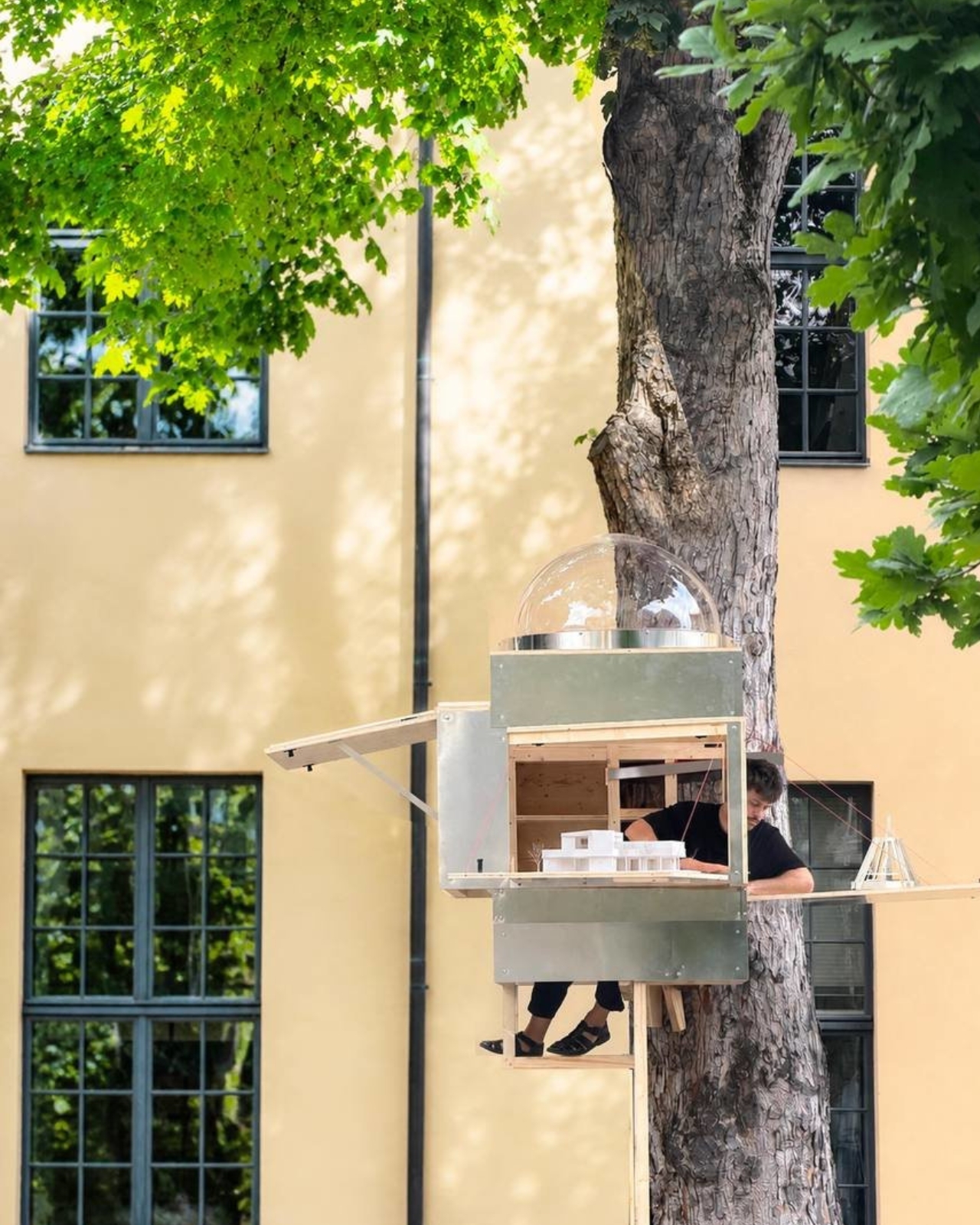
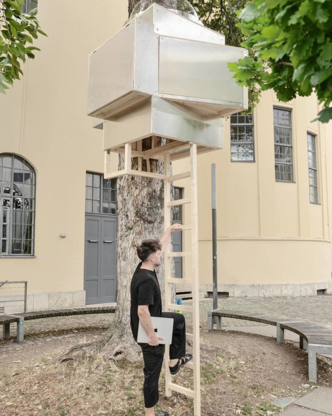
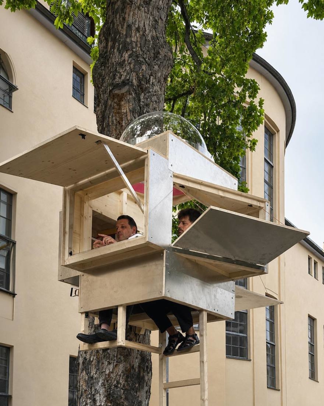
The result is Baumhaus Office, a roughly one-square-meter cube strapped to a tree on the campus of Bauhaus-Universität Weimar, built from spruce timber, plywood, and an aluminum shell that Hartl half-jokingly describes as “UFO-like.” A ladder gets you up to it. Inside, there’s shelving, a small desk, and fold-down panels that expand the workspace just enough to fit two or three people if everyone keeps their elbows in. A domed skylight sits overhead, so instead of staring at a drop ceiling, you get a view of the canopy. Two ratchet straps, cushioned with protective matting so the bark doesn’t suffer, hold the whole thing to the trunk. Hartl secured permission from the university’s president to install it there temporarily, and he’s designed it to come down just as easily and go up somewhere else.

Designer: Benedikt Hartl

His explanation for the whole exercise is refreshingly blunt. Rather than compete with Munich’s rental market, he moved the office out of it entirely and into the trees. He’s also put out an open call, only half-kidding, for anyone with a spare tree and a good view who doesn’t intend to charge him for it.

There’s an obvious punchline in a firm shrinking its footprint to one square meter, but the joke has a point buried in it. Opposite Office already works across borders on projects that rarely require a fixed headquarters, so the studio started asking why it needed a permanent lease at all. That question lands differently depending on where you’re reading this, but it lands. Downtown office towers in plenty of American cities have sat half empty for years now, landlords still pricing space as if 2019 never ended, and companies quietly deciding that a conference room and a Zoom link cover most of what used to require a floor plan. Baumhaus Office takes that same skepticism about commercial real estate and pushes it to its logical, slightly absurd conclusion. If the point of an office is a roof, a desk, and a door you can close, a tree does two of those things for free.

Opposite Office has framed the project as a nod to Cosimo, the boy in Italo Calvino’s “The Baron in the Trees” who abandons ground level entirely and never comes back down. I like that reference more than the usual sustainability talking points that get bolted onto projects like this. It’s not really about wood versus concrete. It’s about changing your vantage point on purpose, even briefly, to see whether the thing you assumed you needed was actually optional the whole time.

I’ll admit the practical side of me has questions. Winter in Thuringia is not gentle, and a plywood cube with a skylight is not insulation in any serious sense. But treating this as a permanent HQ misses the point Hartl is making. It’s a provocation with a ladder, built to prove that an architecture studio’s real asset is the people doing the thinking, not the address on the lease. Whether or not Baumhaus Office survives its first real storm, it’s already done its job: it made a very expensive problem look, for a moment, genuinely small.

The post One Architect Quietly Ditched Rent for a 1sqm Treehouse Office first appeared on Yanko Design.

  •  

A Chilean Architect Quietly Built a House That Follows the Hill Instead of Fighting It

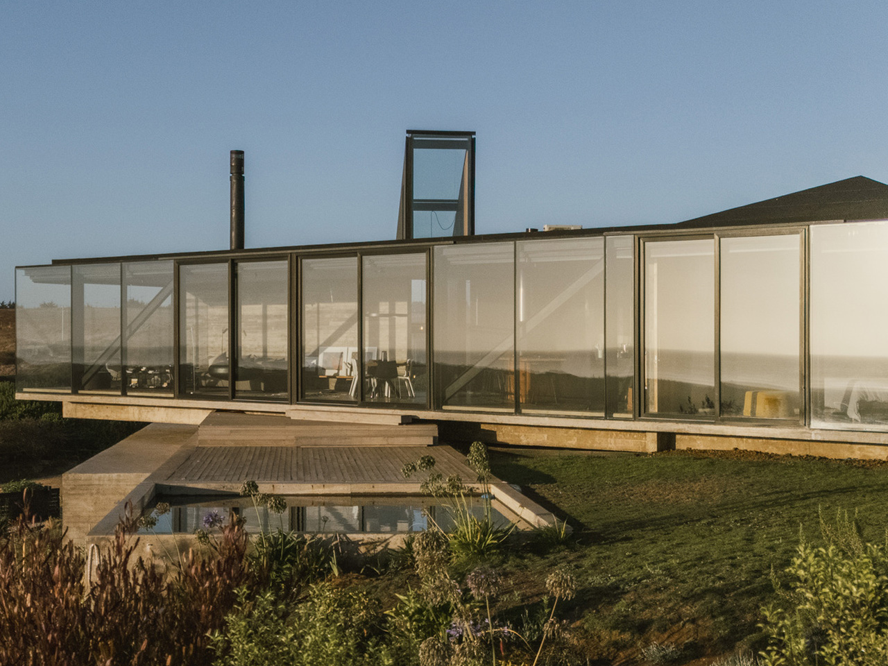
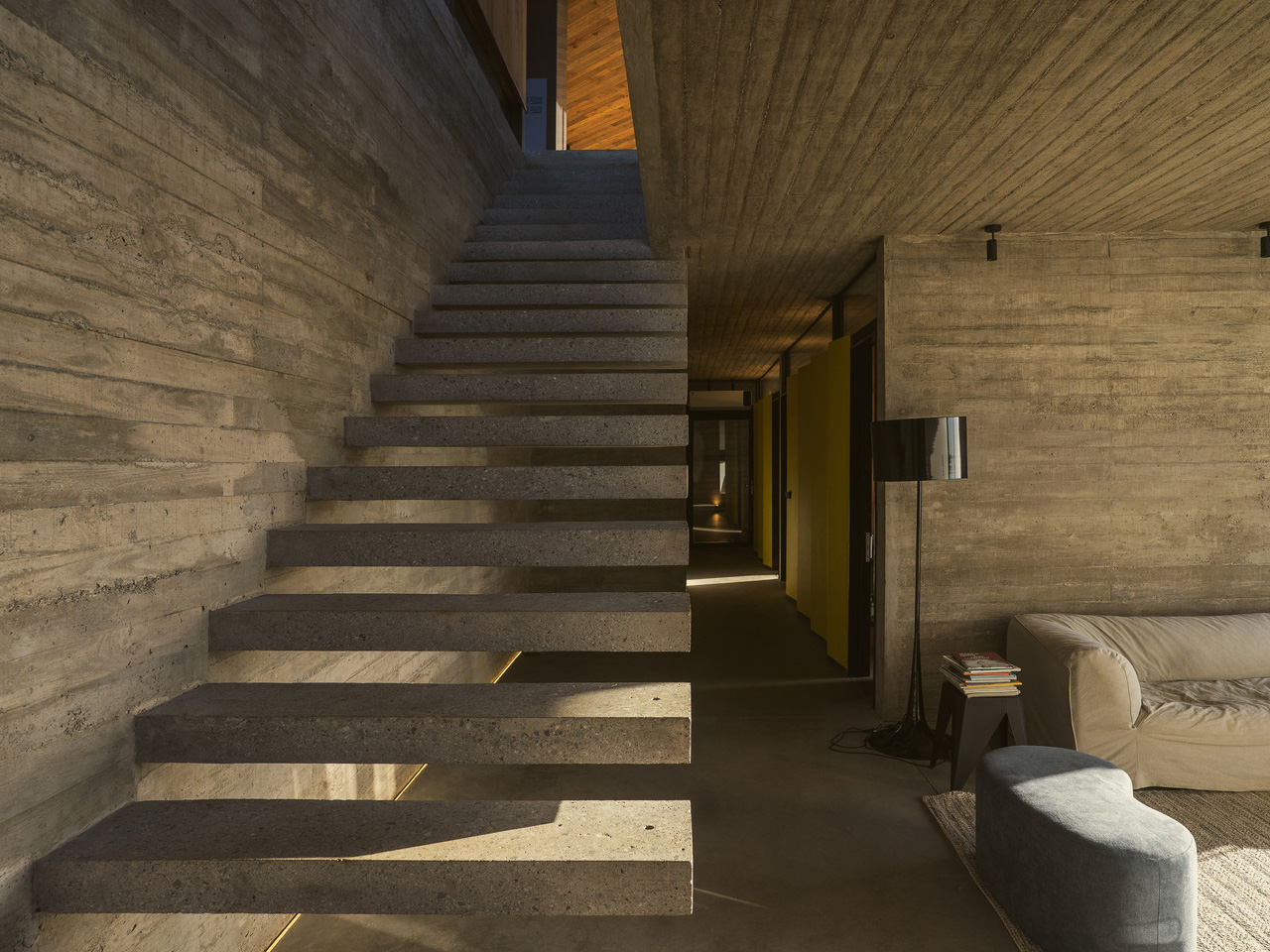
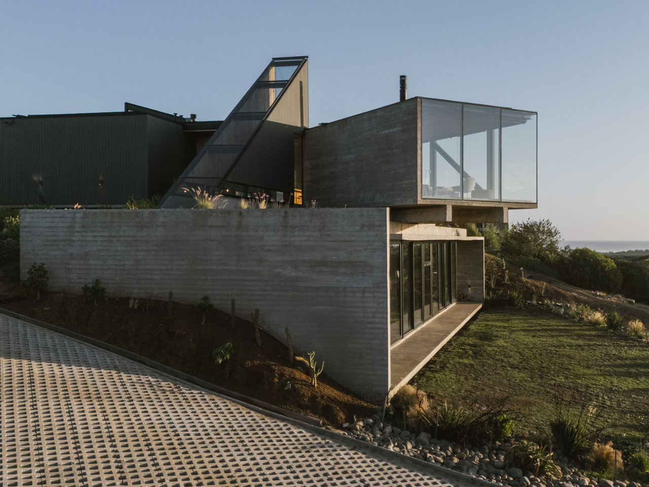
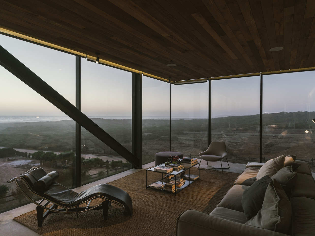
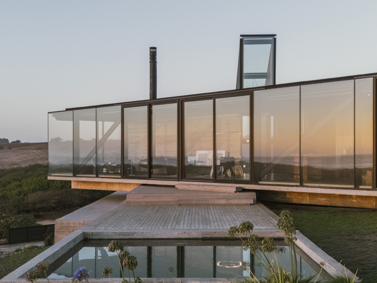
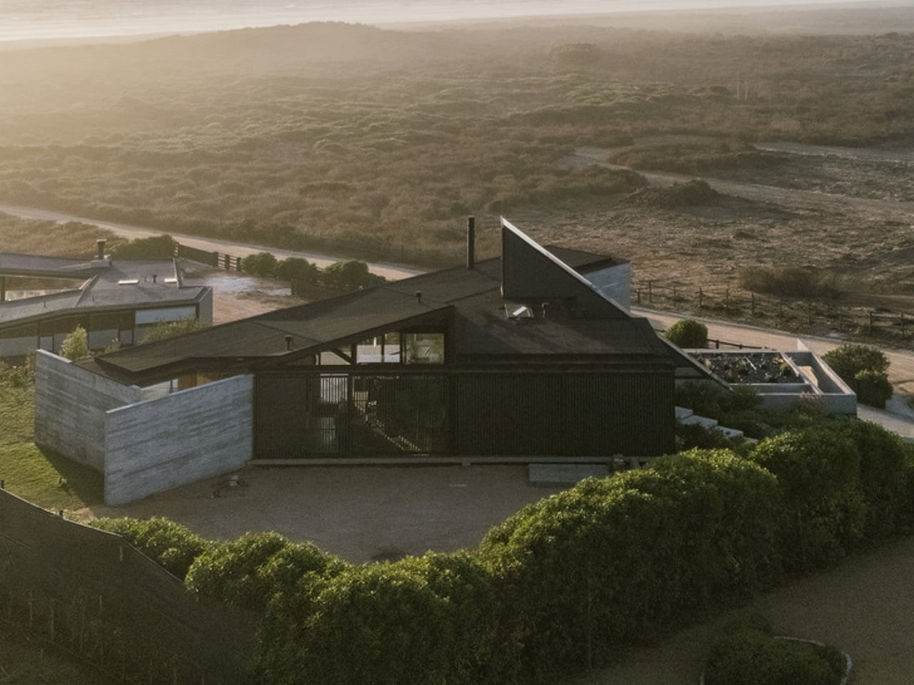
House 22, designed by Chilean studio Loft7 and completed in 2023, sits on a sloping coastal lot south of Punta de Lobos — a stretch of Chilean coastline known for dramatic surf and untouched native scrubland. The lot descends toward the northwest, and rather than resisting that gradient, the architecture follows it, letting the terrain pull the building naturally toward an uninterrupted view of the Pacific Ocean.

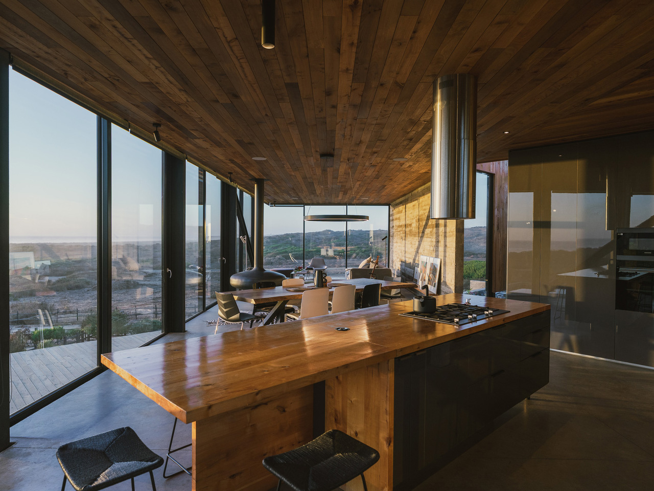
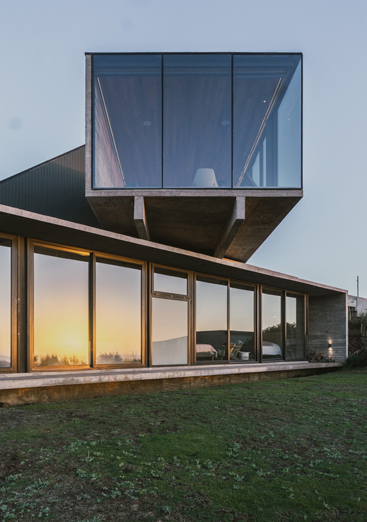
At 320 square meters, the residence is generous without being excessive. Loft7 structured the build using a combination of reinforced concrete and steel frames — a technical pairing that allows the house to hold its ground on a challenging slope while keeping the interior language warm and tactile. Exposed timber beams run through the living spaces, the dining area, and the kitchen, grounding each room in material honesty. There’s no attempt to disguise how the building is put together. That transparency is the design.

Designer: Loft7

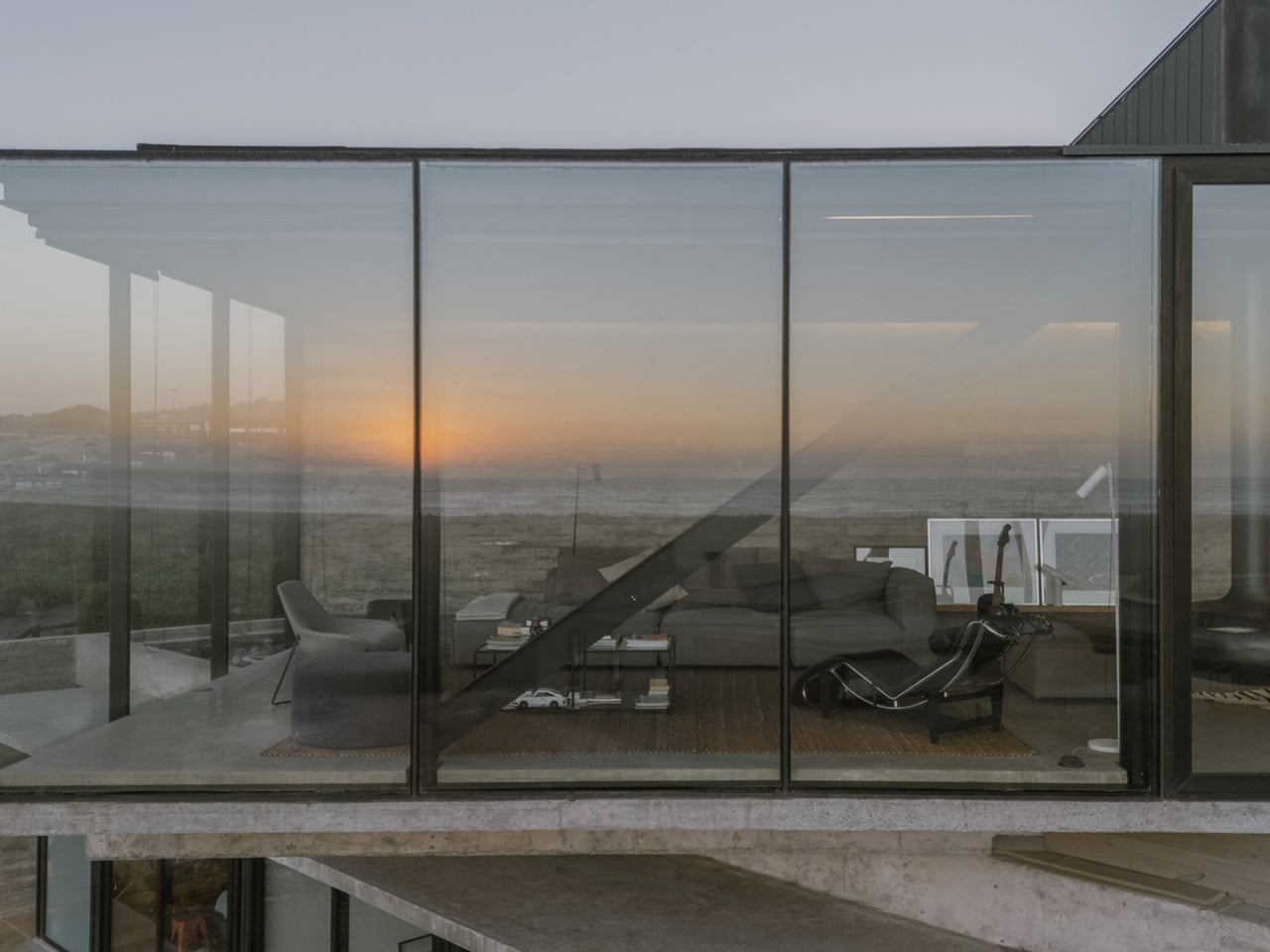
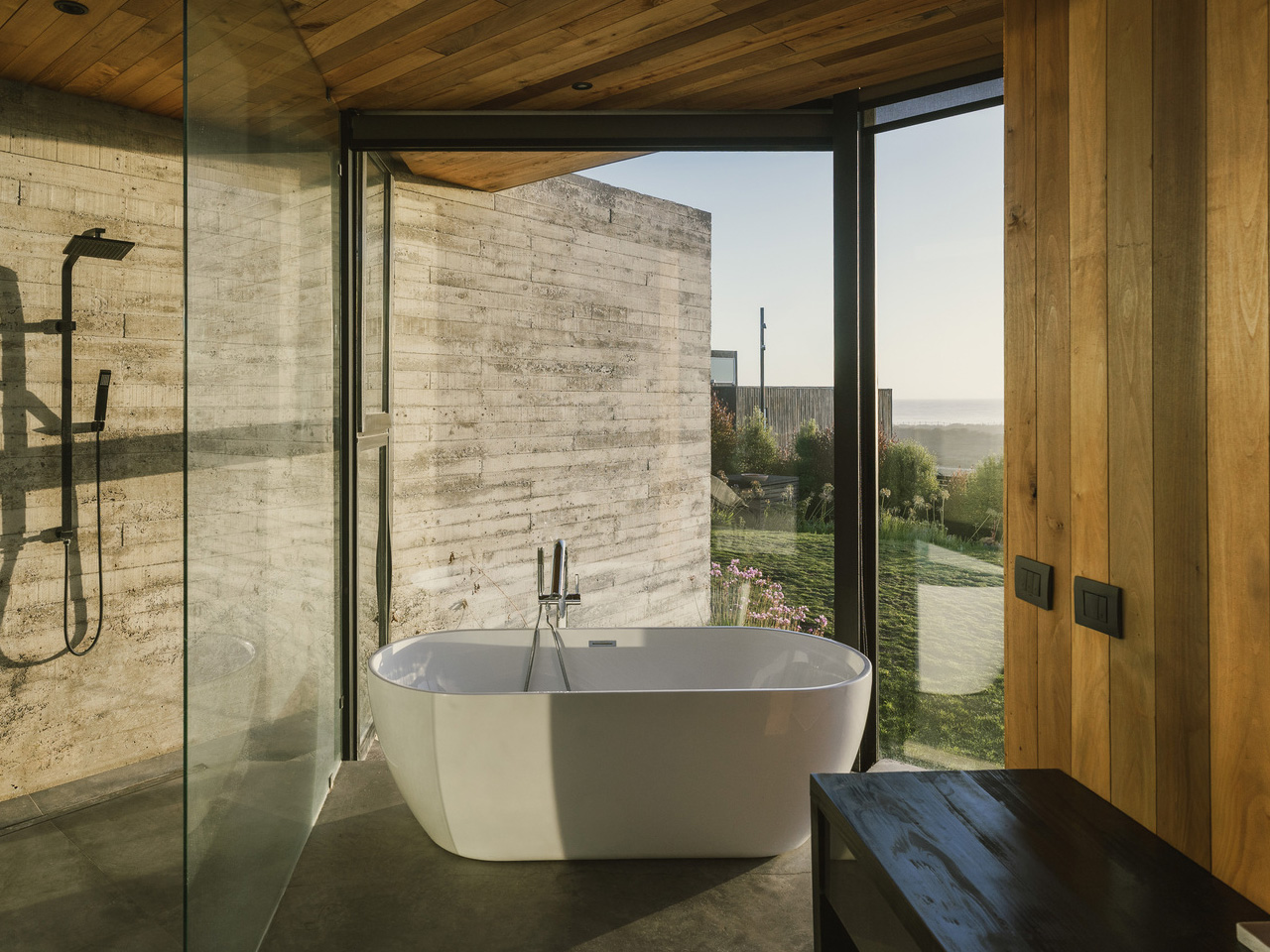
What makes House 22 worth studying isn’t a single dramatic gesture — it’s restraint applied consistently. The interiors lean on wood, natural light, and sightlines that always resolve at the ocean. No surface fights for attention. The beam grid overhead becomes rhythm rather than decoration, and the open-plan social spaces feel like they’re orientated by the view rather than by a floor plan. Spaces breathe because the architecture got out of the way.

Pichilemu is famous in surfing circles, but architecturally it’s a place where the Chilean coast has quietly been producing some of the country’s most considered residential work. Loft7 fits that lineage — a studio that has built its reputation around sites where nature already has the upper hand. Their approach with Casa 22 trusts the land and the light, deploying materials that age well in a coastal climate and a massing that reads modestly from the outside while delivering on every expectation from within.

Photographed by Fabián Acuña, the project looks different at every hour of the day. Morning light hits the timber and fills the interiors with warmth; the Pacific turns silver in the afternoon. That relationship between material, orientation, and time of day is never accidental in good coastal architecture — and here it feels entirely intentional. House 22 isn’t trying to be the loudest house on the Chilean coast. It’s trying to be the most honest one. On both counts, Loft7 delivers.

The post A Chilean Architect Quietly Built a House That Follows the Hill Instead of Fighting It first appeared on Yanko Design.
  •  

This Georgian Residential Complex Rejects Straight Lines on its Floor Plan, Mimicking The Ocean

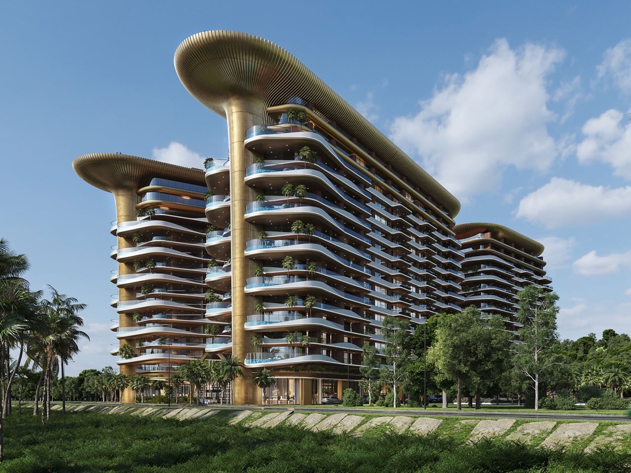
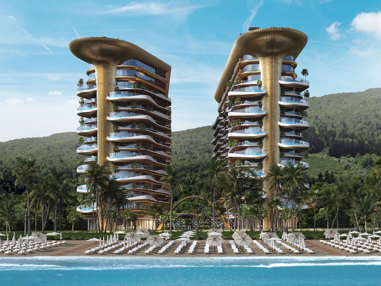
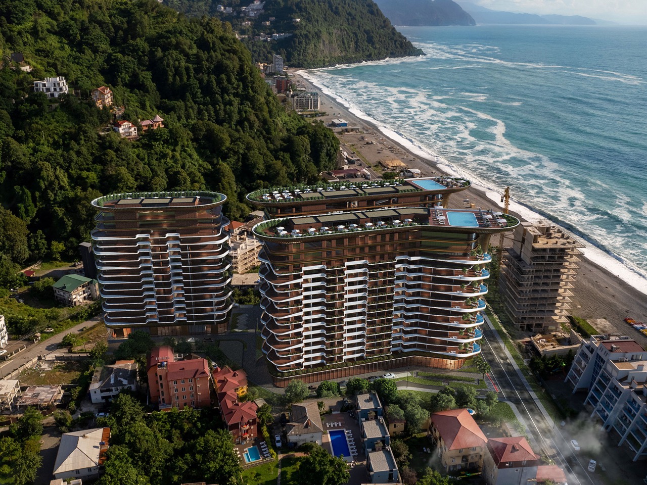
Straight lines are easy. Any architect can slap a rectangular tower on a plot and call it a day, and most beachfront developers do exactly that because straight lines are cheap, fast to build, and easy to sell off a brochure. Georgia’s Adjara coast just got a project that looked at that playbook and said absolutely not. Montemar Residential, a three tower complex rising in the seaside town of Gonio, ditches the grid entirely in favor of forms that ripple, curve, and cantilever like something dragged up from the Black Sea itself. It is the kind of building that makes you stop scrolling, then immediately want to know who signed off on it and how.

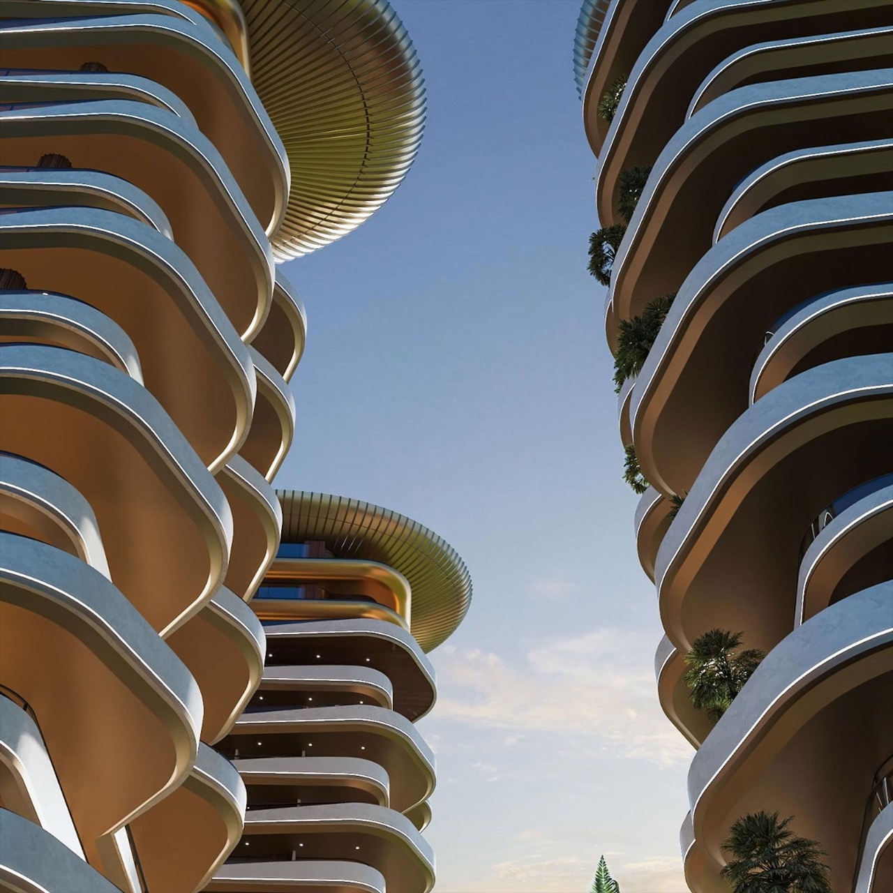
Designed by Irakli Emiridze and Irina Chkonia of Alpha Architecture, the complex sits on a 10,000 square meter plot within a UNESCO listed stretch of coastline, right where Adjara’s oddly tropical microclimate runs into the Black Sea. Each of the three 16 story towers tops out around 48 to 52 meters and wears a dramatic aluminum crown that flares out over the roofline like a mushroom cap, or if you squint, a seashell caught mid opening. Parking for 300 vehicles sits tucked below grade, keeping the ground plane free for landscaping and plazas. It is a lot of building, and it wants you to know it.

Designers: Irakli Emiridze and Irina Chkonia

The seashell inspiration shows up in how the facade behaves. The balcony edges do not stack in the usual identical, floor by floor grid you see on every coastal high rise from Miami to Marbella. Instead they undulate, staggering in and out like sediment ridges carved by tidal movement, which gives each tower a texture closer to a geological formation than a construction product. Aluminum embossed sheet cladding wraps the crowning terraces, catching light in a way that concrete or glass simply cannot, and it is the detail that separates Montemar from the generic curved tower trend that has been creeping through Gulf and Black Sea resort markets alike.

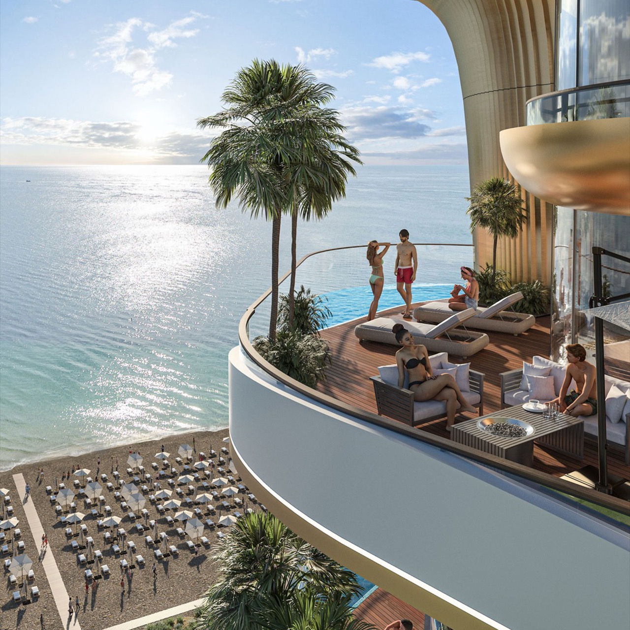
The space between the three towers is treated as public terrain rather than leftover setback, with green plantings, plazas, and communal zones designed to pull residents out of their units and into shared space. Panoramic apartments come with private terraces and jacuzzis angled toward the water, the kind of amenity that used to be penthouse exclusive and is now standard issue on any coastal development trying to compete for buyers. Whether that democratization of the infinity view holds up once the cranes clear out is the real test, since renderings are notoriously generous with light, weather, and empty beaches.

Gonio is a strange place for this kind of architectural swing. It is a historic town, not a resort capital, and Montemar is betting that sculptural ambition can coexist with a UNESCO designation next door rather than clash with it. If the finished towers deliver even half of what the renders promise, this stretch of the Adjara coast is about to become a lot more interesting to watch than its neighbors on the Black Sea.

The post This Georgian Residential Complex Rejects Straight Lines on its Floor Plan, Mimicking The Ocean first appeared on Yanko Design.
  •  
❌