❌

Vue lecture

Open-Plan Offices Killed the Private Desk, and This Pod Brings It Back
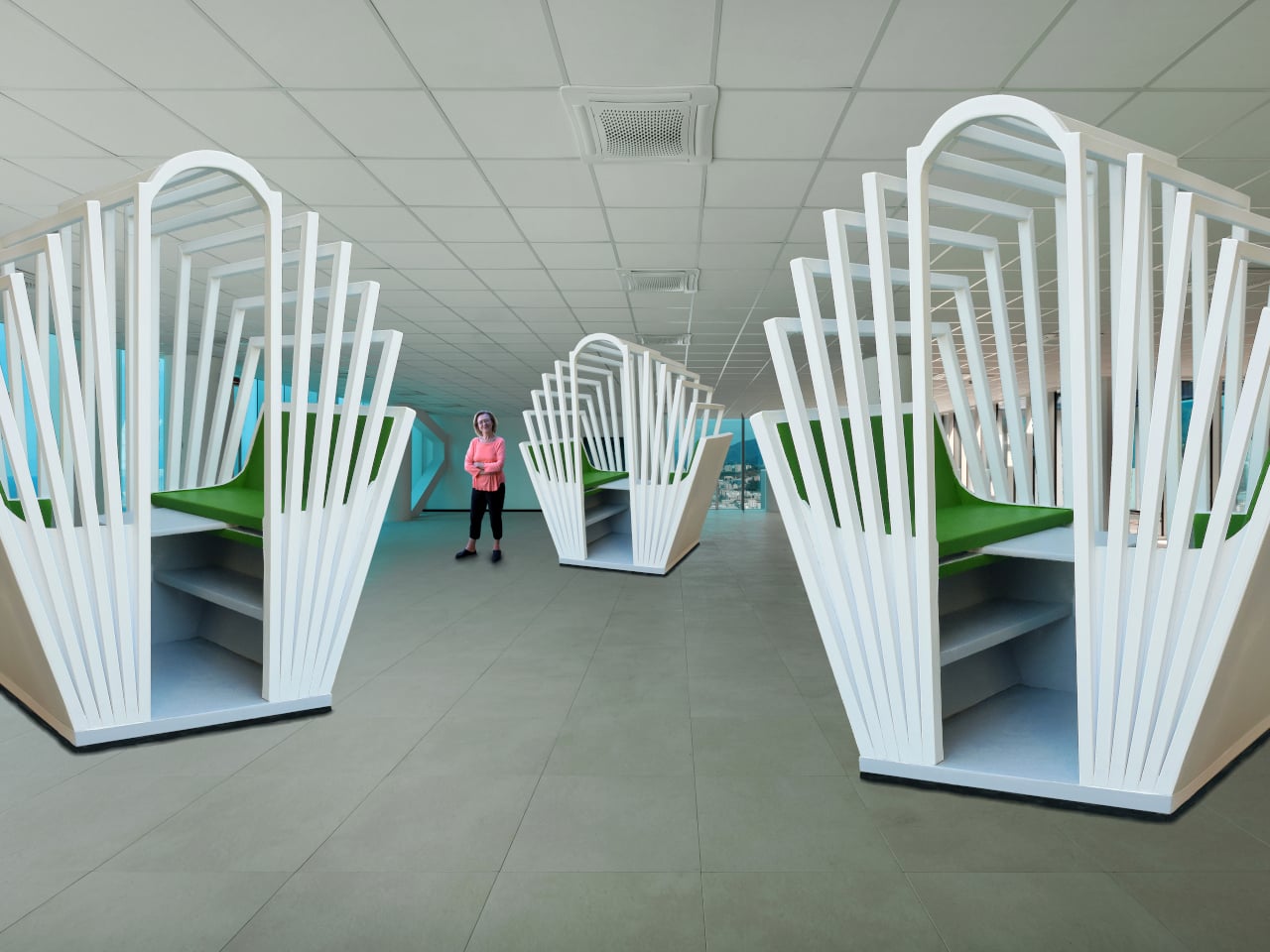
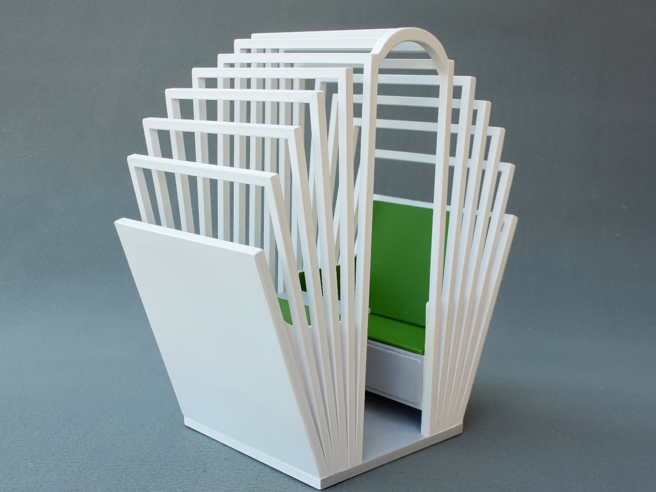
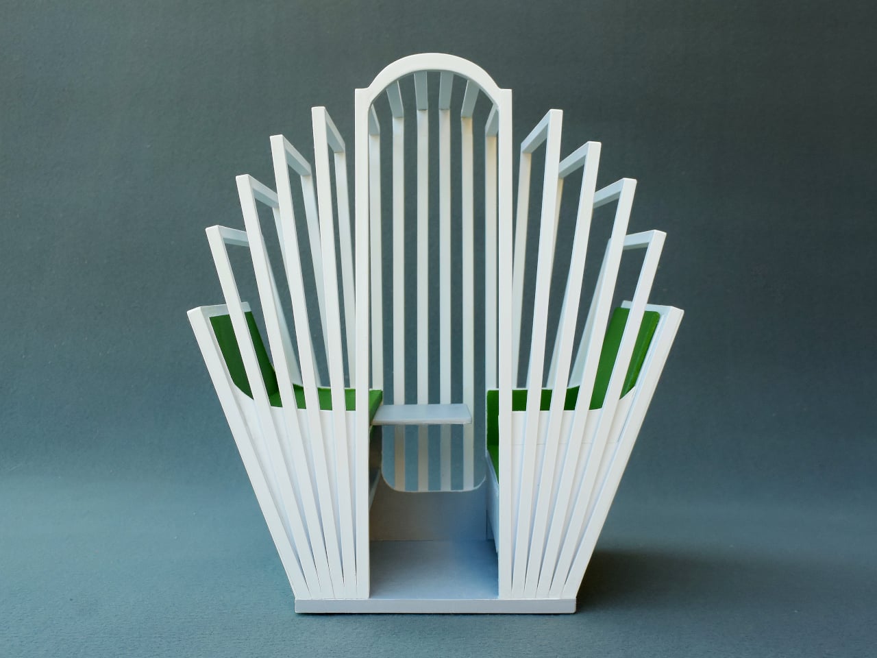
Most office furniture solves privacy by sealing someone off completely: four walls and a door that shuts out everyone else, along with any sense of connection to the room. The Seed Pod skips that tradeoff. It wraps a single desk and seat inside a radiating fan of white wooden slats, open enough to see through, dense enough to feel like a room of your own.

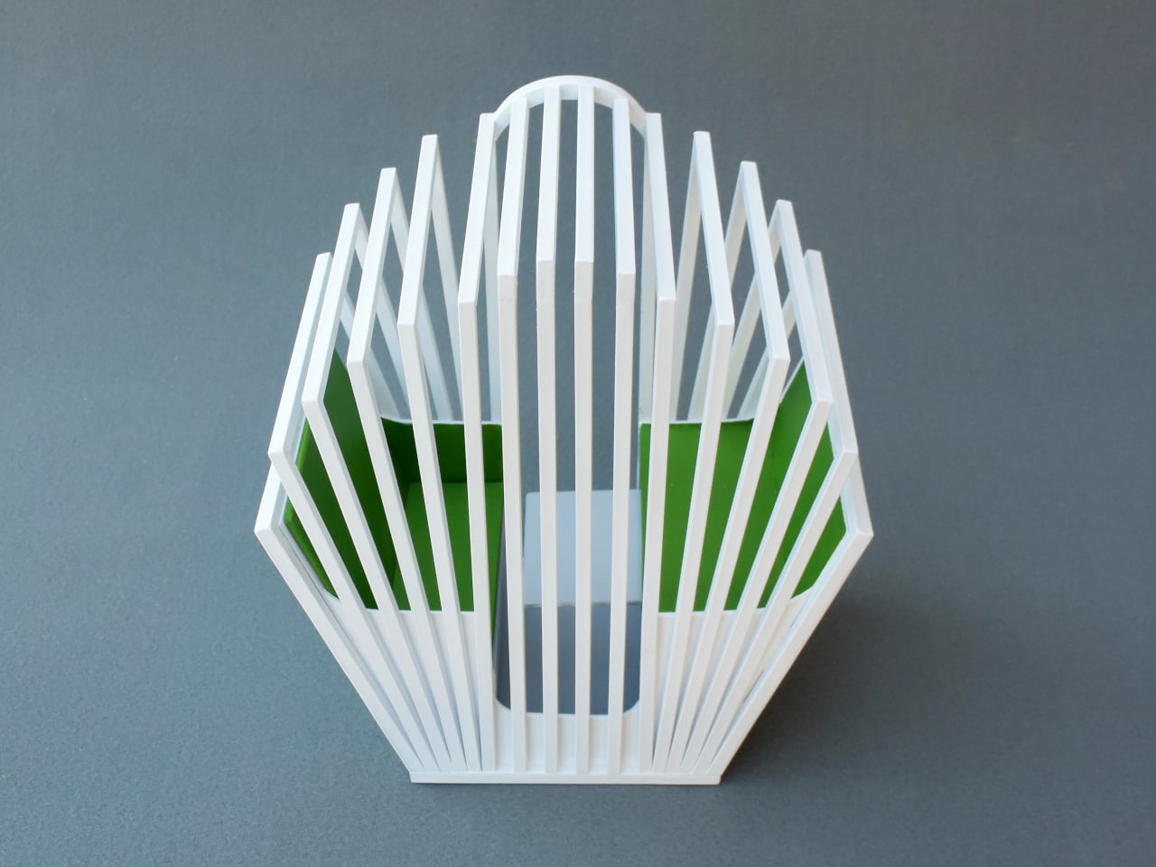
That slat pattern isn’t just decorative. Vertical wooden ribs curve outward from a tall arched spine at the back, fanning shorter toward the open front, so the whole structure reads like something caught mid-bloom rather than a static box. Gaps between each slat let light and sound pass through freely, creating enclosure without ever fully cutting the occupant off from whatever’s happening around them.

Designer: Michael Jantzen
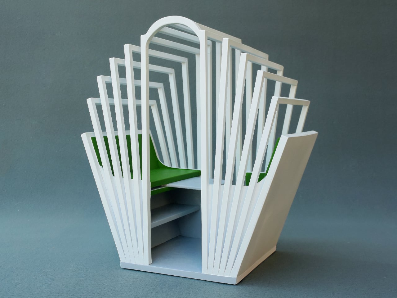
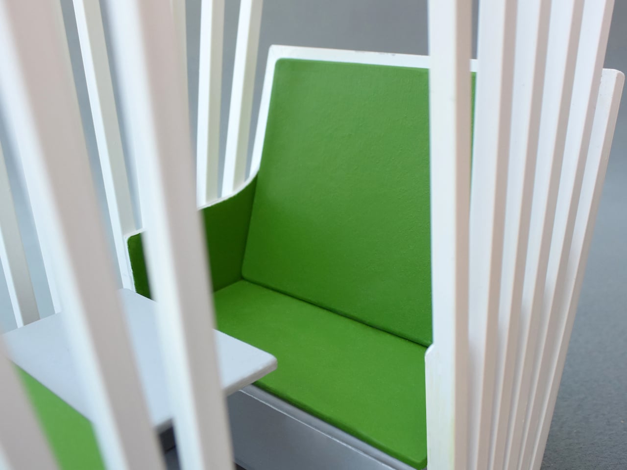
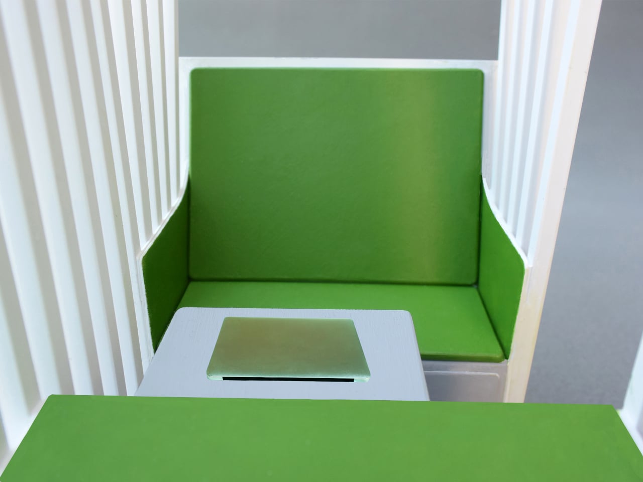
Step inside and a bright green bench seat waits at the center, paired with built-in storage tucked into the lower walls on either side. Small wedge-shaped shelves hold whatever a workday requires nearby, papers, supplies, a bag, without eating into the already compact footprint. The contrast between crisp white slats outside and that saturated green interior gives the whole thing a distinct, almost botanical identity rather than reading as generic office equipment.
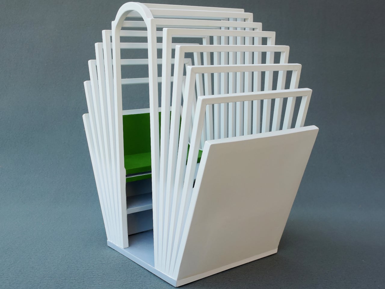
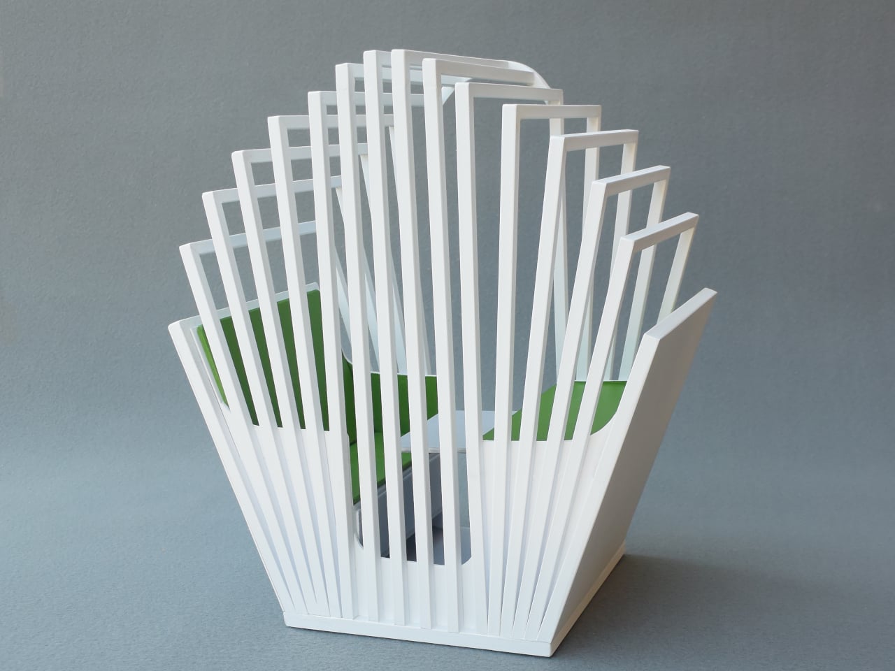
A sliding desktop surface handles the actual work. Sized specifically for a laptop, it can be repositioned to different spots under the main desk, adjusting to whatever posture or task someone needs at that moment rather than locking them into one fixed arrangement. Slide it back, and the same space clears out for someone to step in or out without maneuvering around a stationary tabletop.
Mobility matters just as much as the seating arrangement. The entire structure sits on wheels and plugs into any standard electrical outlet nearby, meaning it can roll into a corner of a shared office floor one week and relocate to a quiet spot at home the next. Nothing about setup requires special wiring or a dedicated room built around it.

Picture an open-plan office where video calls and side conversations blur together constantly, or a home where the only quiet corner left is also the one everyone walks through. Rolling a Seed Pod into either space carves out somewhere to actually concentrate, without requiring a renovation or a door that locks. Multiple units can sit side by side too, each occupant getting their own pocket of focus inside a shared room.

What makes the design work is restraint rather than enclosure. The slats do the job walls usually do, marking a boundary, without asking anyone to give up daylight, airflow, or the sense of still being present in the room they’re sitting in.
The post Open-Plan Offices Killed the Private Desk, and This Pod Brings It Back first appeared on Yanko Design.
  •  

The Coat Rack That Doubles as a Sculpture for Your Entryway

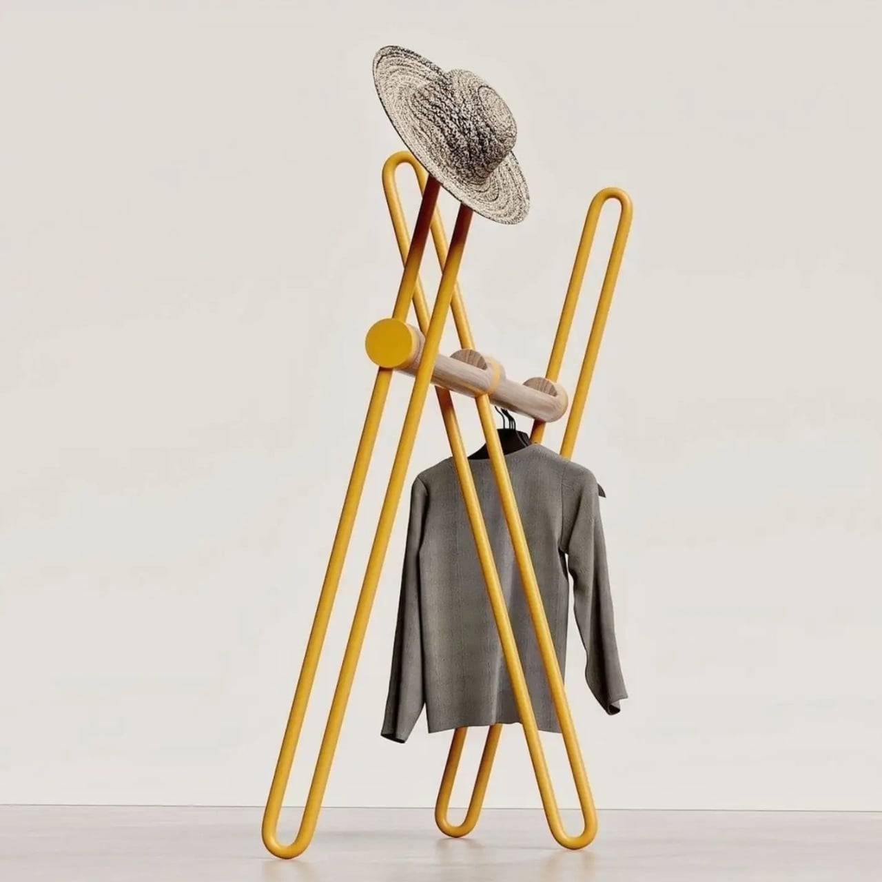
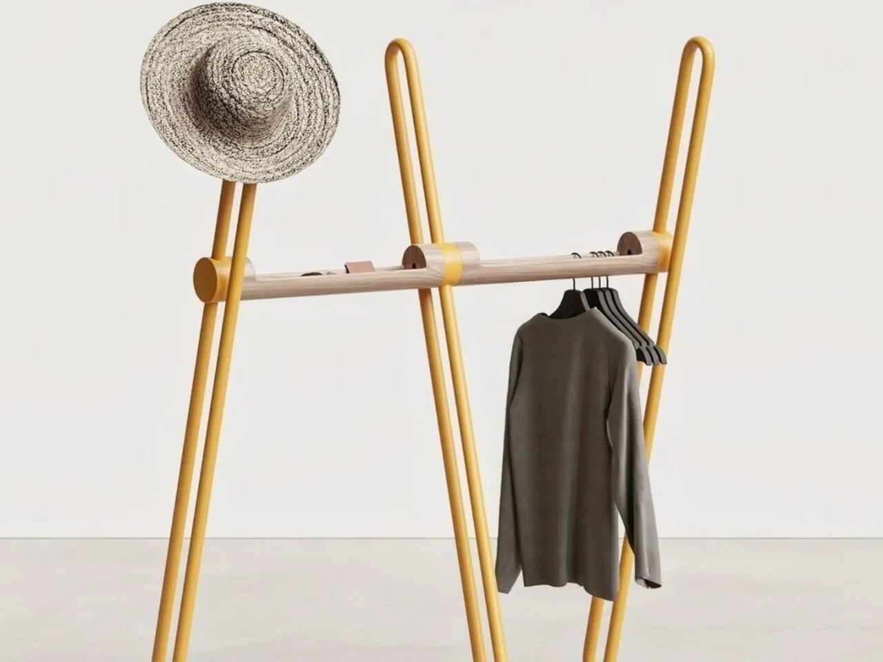
Most coat racks have one job and barely manage it. They accumulate coats, yes, but also that one bag you keep meaning to put away, the umbrella you forgot about, and eventually the kind of low-level visual clutter that makes the entryway feel like it quietly surrendered. The Acrobat, designed by João Teixeira of Teixeira Design Studio, takes the opposite approach entirely. It starts by asking what a coat rack actually needs to do, then builds something genuinely beautiful around that answer.

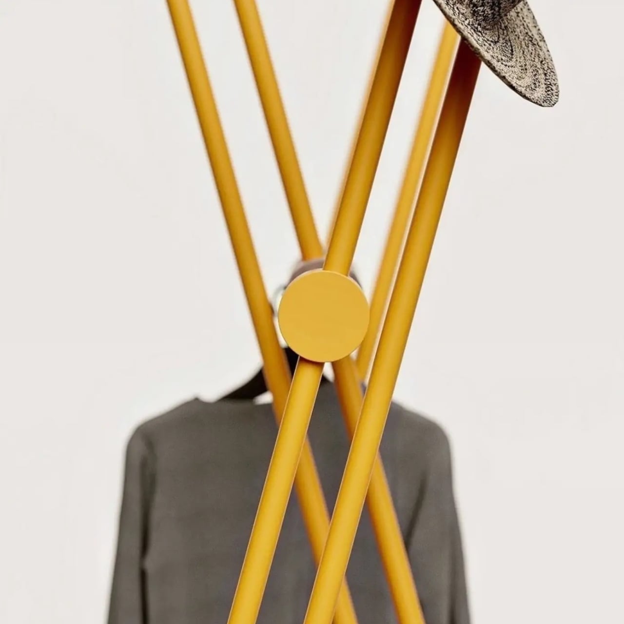
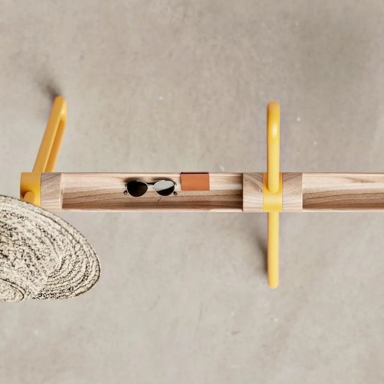
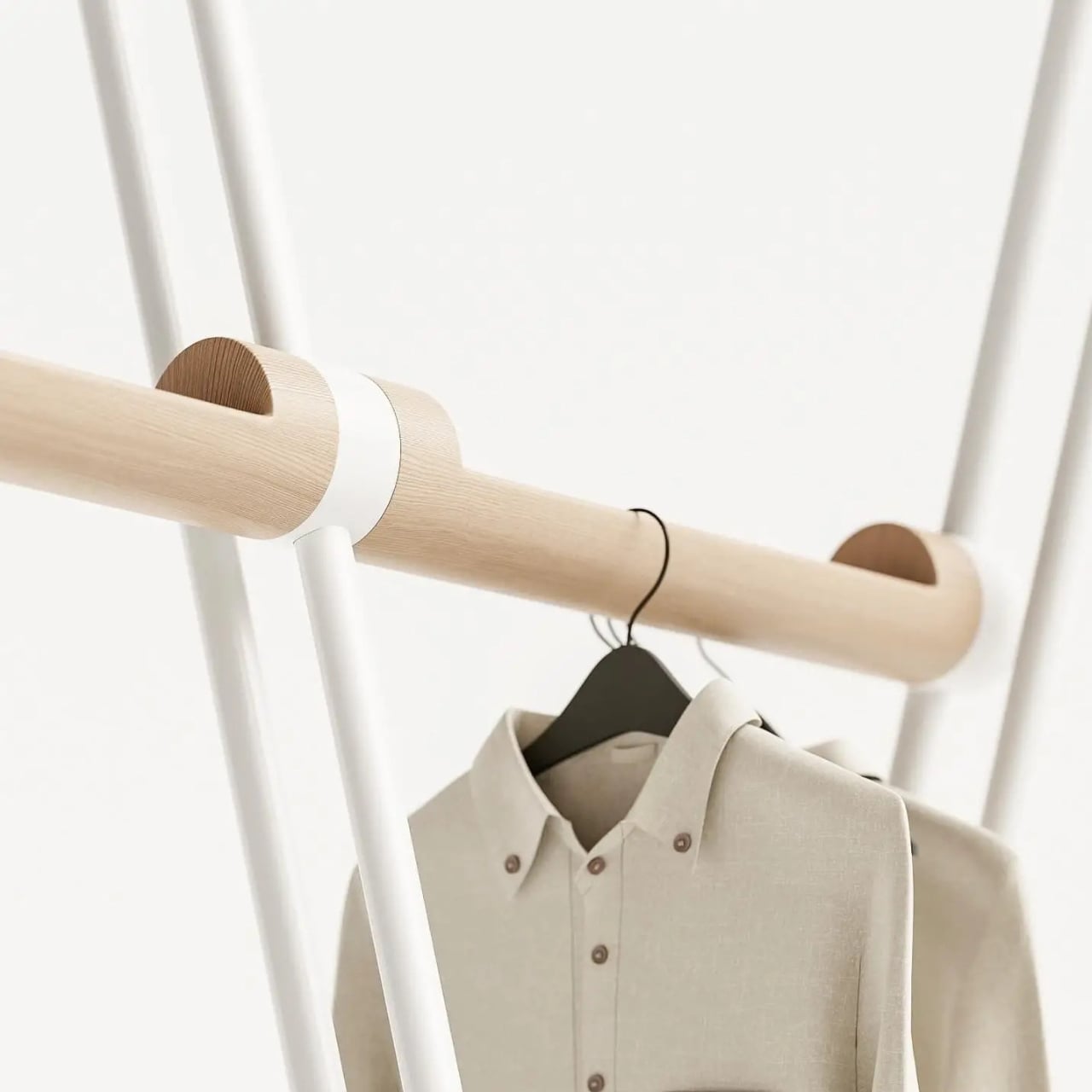
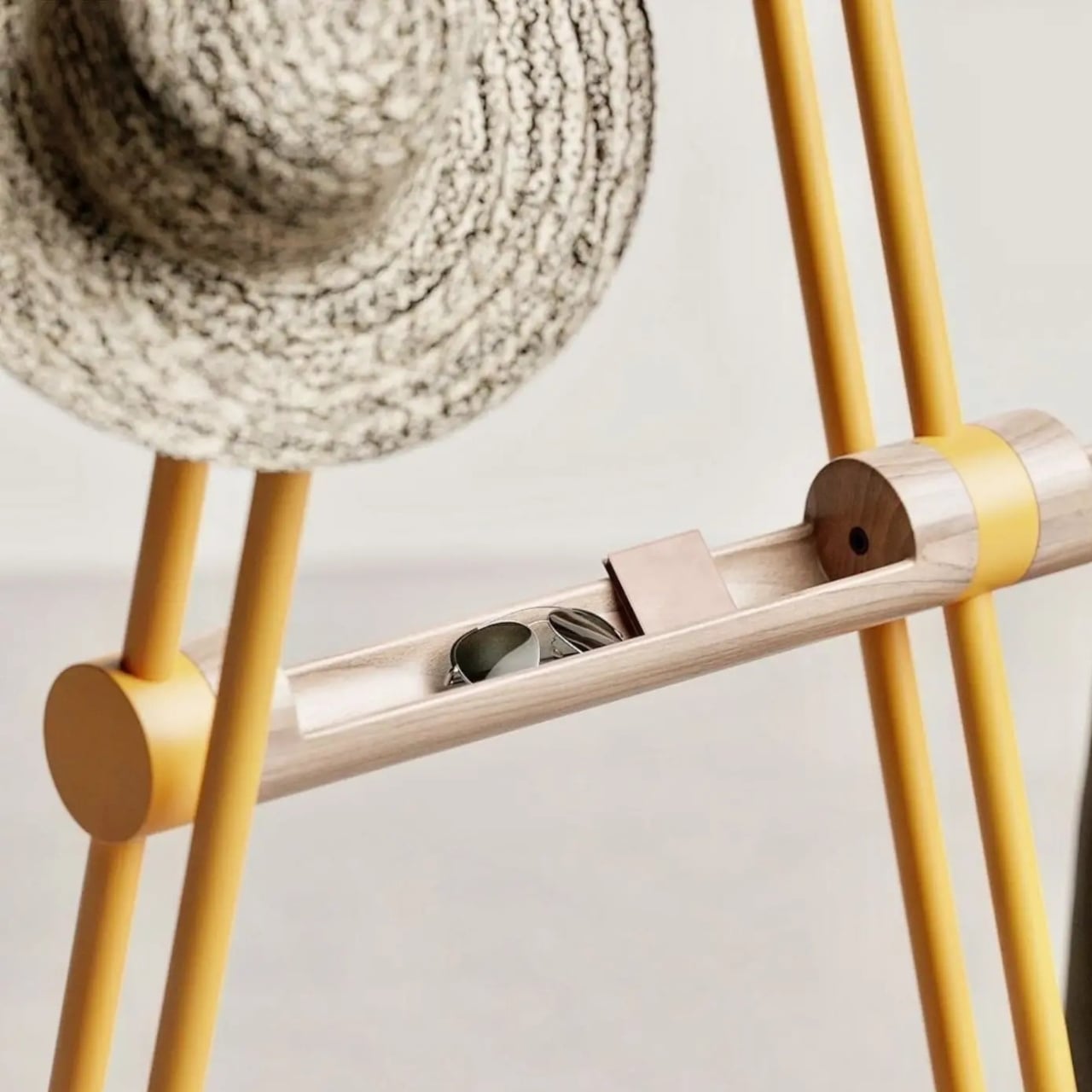
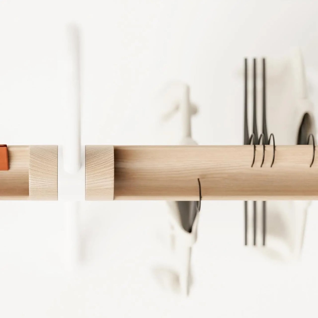
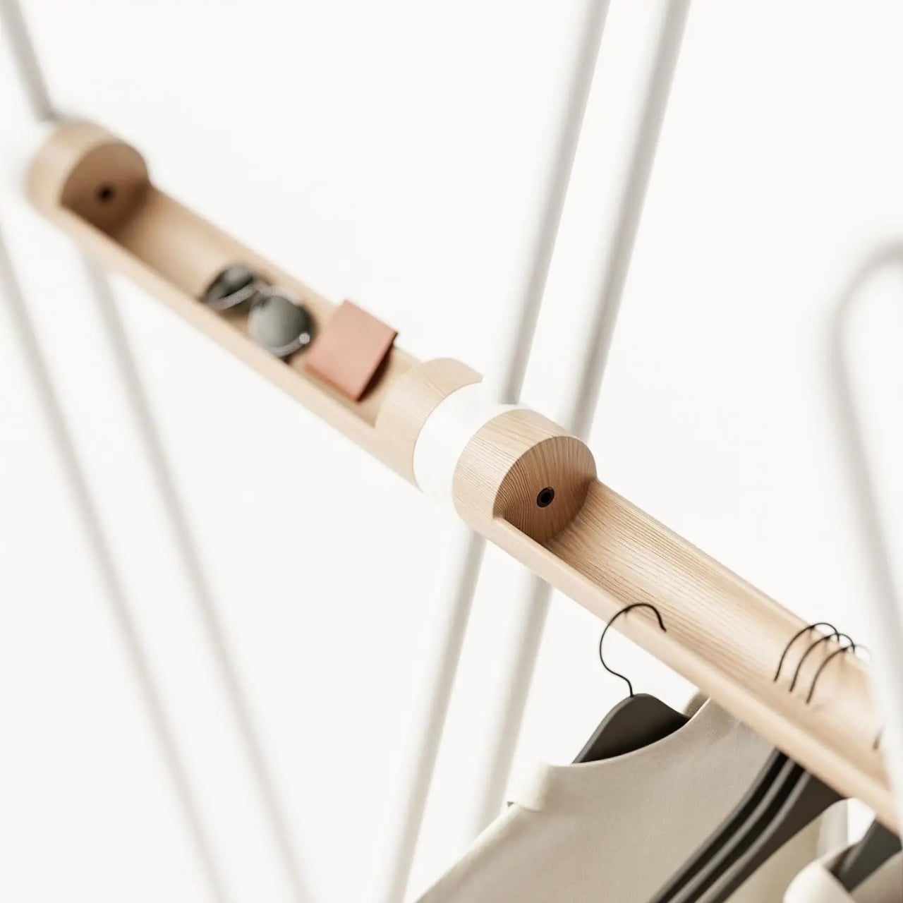
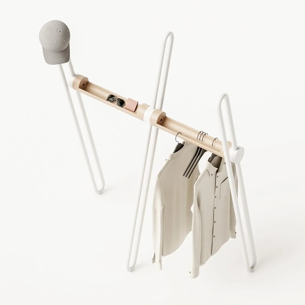
The name earns itself the moment you see the full form. A tripod base anchors the piece with quiet confidence, while a continuous bent metal tube rises and loops around it, creating a silhouette that reads as more gesture than furniture from across the room. It has the quality of something mid-motion, a figure caught mid-step that decided to stay exactly like that. Sculptural is an overused word in design writing, but it applies here without apology. The wood bar running through the center connects the metal structure while doing its own separate work: carved openings along its length are sized to hold the daily essentials that would otherwise migrate to whatever flat surface is nearest. Keys, wallet, sunglasses, the objects that technically belong somewhere but never quite find a place. Here, they do.

Designer: Teixeira Design Studio

The two-material pairing is deliberate in the best way. The metal tube handles the structural work and the hanging functions, its looped tops wide enough for coat shoulders and the brim of a hat. The wood handles texture and warmth, softening what could easily tilt too industrial for a home setting. Together they read as a genuine material conversation rather than a design decision arrived at by committee or trend-following. Each element is doing something specific, and you can read that in the form without anyone explaining it to you.

I appreciate that the Acrobat resists the pull toward the purely minimal. A lot of contemporary furniture design seems to mistake reduction for sophistication, stripping objects down until they barely register as functional at all. The Acrobat keeps everything it needs and nothing it doesn’t, but the form is generous rather than austere. The bent metal loops repeat and layer against each other depending on your viewing angle, creating a depth that a straight rail or a standard row of hooks simply wouldn’t offer. The piece looks different at 8 AM when you’re grabbing your bag on the way out than it does at night when it’s holding coats in a still room. That kind of visual behavior in an everyday object is rare.

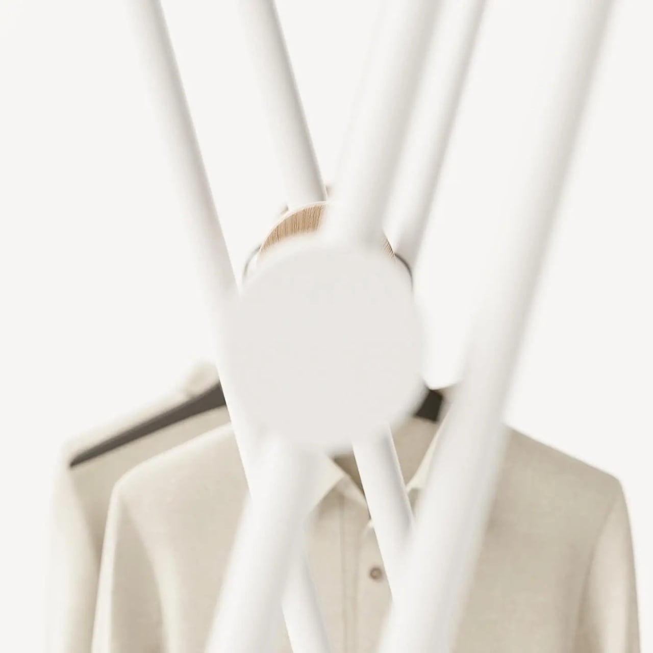
The colorways matter too, more than they might initially seem. The white version has a graphic, almost architectural quality that would hold its own in a very considered interior. The mustard yellow version is something else entirely. It pushes the Acrobat from understated into genuinely expressive territory, the kind of color decision that takes equal confidence from the designer and the person buying it. A yellow coat rack is a commitment to a room’s character, not a neutral addition to it. I think that’s the right instinct. The best designed objects have a point of view, and this one clearly does.

Entryway design gets far less attention than it deserves relative to the rest of the home. The kitchen gets renovated, the living room gets considered, but the entry is often left to whatever hooks were already on the wall. It’s an oversight that matters, because the entry sets the tone for everything beyond it. The Acrobat makes a case for treating that space with the same intention you’d bring to any other room.

Teixeira Design Studio seems to be arguing, through this piece, that functional objects don’t need to apologize for being beautiful, and beautiful objects shouldn’t have to sacrifice the practical to justify their presence. The Acrobat does both, quietly and without laboring the point. It stands in the corner, holds everything you carry in from the outside world, and looks like it belongs in a gallery while doing it. For a coat rack, that’s a remarkable thing to pull off.

The post The Coat Rack That Doubles as a Sculpture for Your Entryway first appeared on Yanko Design.
  •  

An Industrial Designer Hid the Chair’s Entire Folding Mechanism Inside the Backrest

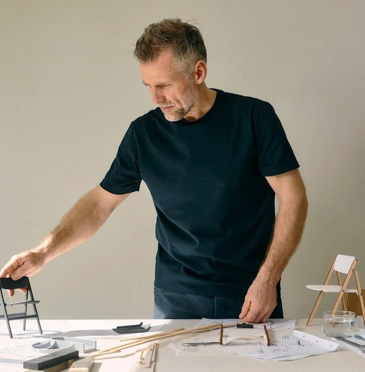
Gudmundur Ludvik had a question he couldn’t let go of. Why should a folding chair be a compromise? The answer, for decades, had been accepted without much pushback: folding chairs sacrifice comfort for storage, aesthetics for portability. The category had been quietly settled. Ludvik disagreed.

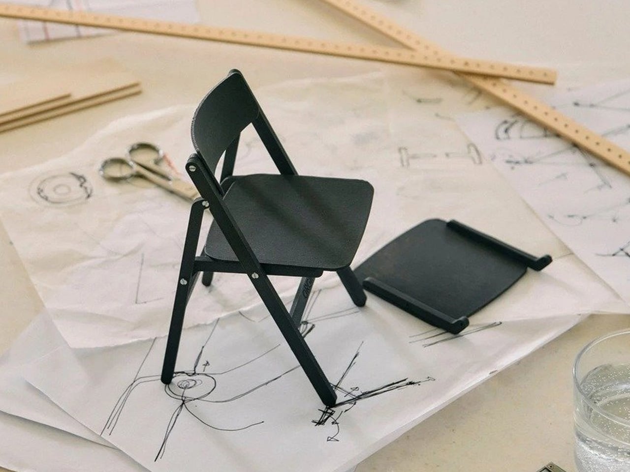
The Backflip, produced by HAY, is his rebuttal. An Icelandic designer based in Vejle, Denmark, Ludvik trained first as a carpenter and cabinetmaker before studying sculpture at the Icelandic Academy of Arts and furniture design at the Danish Design School, graduating in 2002. That layered background — craft, art, design — shows in the Backflip. The chair doesn’t announce its ingenuity. It keeps it entirely to itself.

Designer: Gudmundur Ludvik

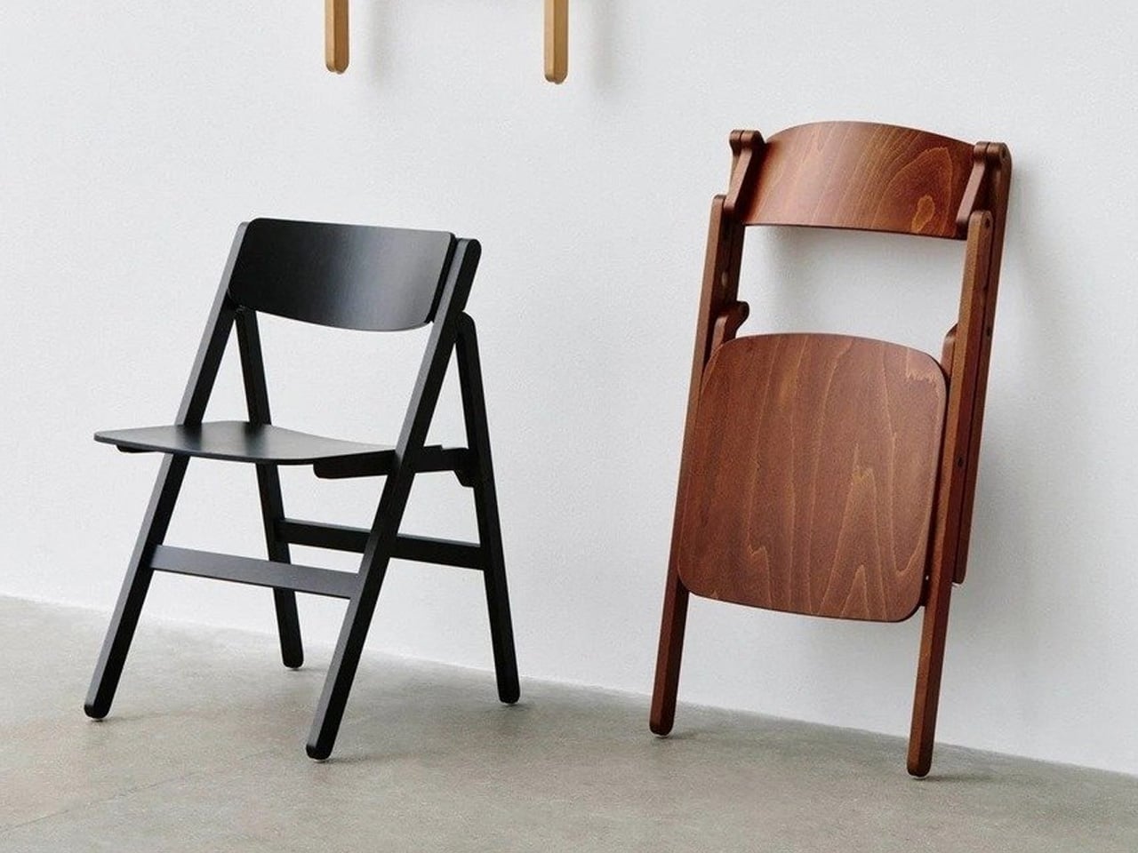
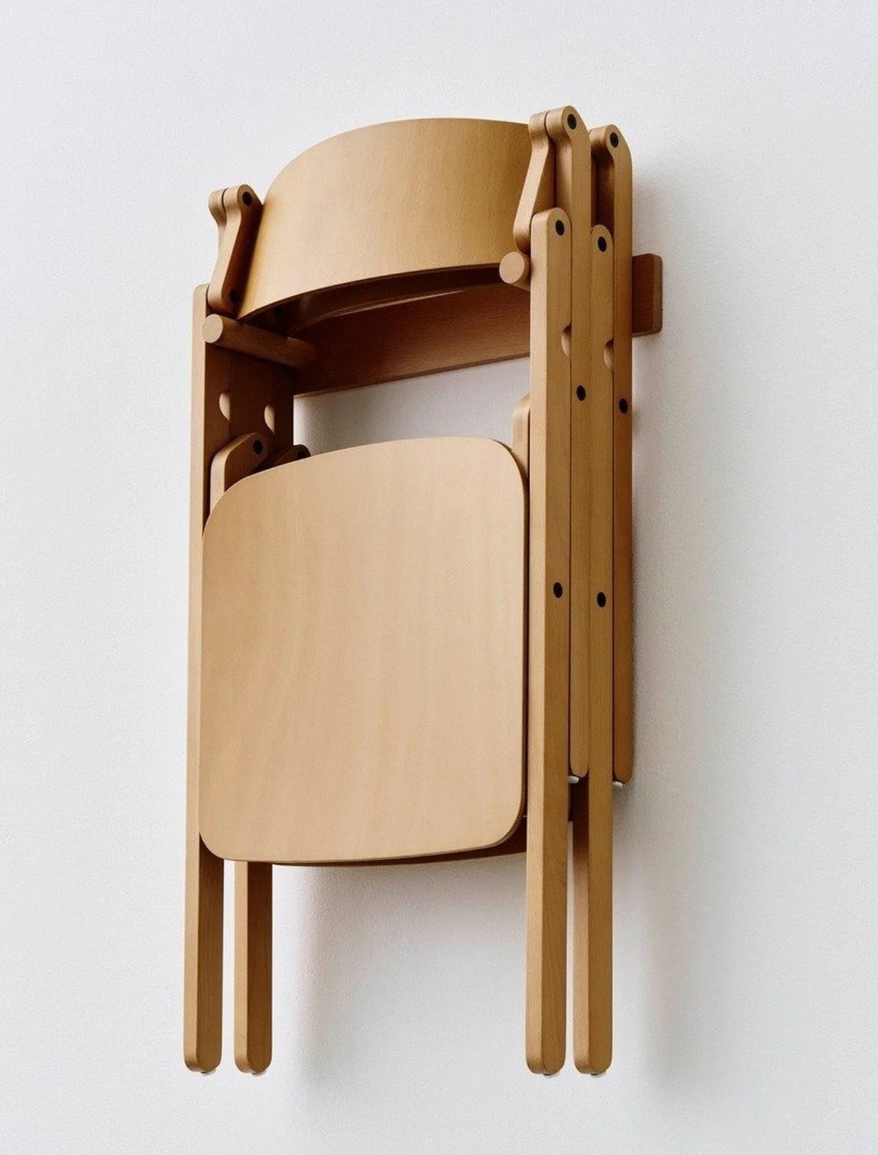
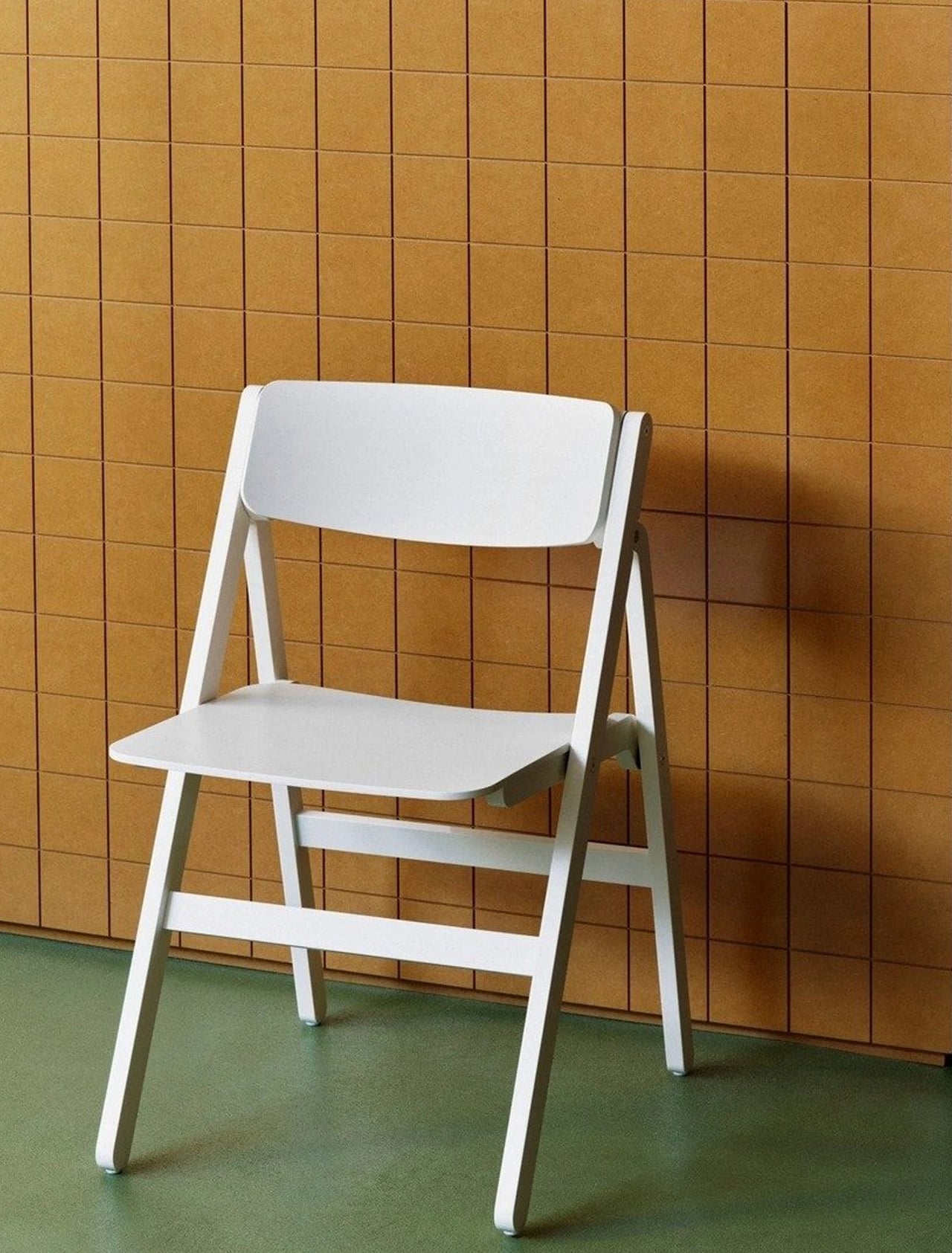
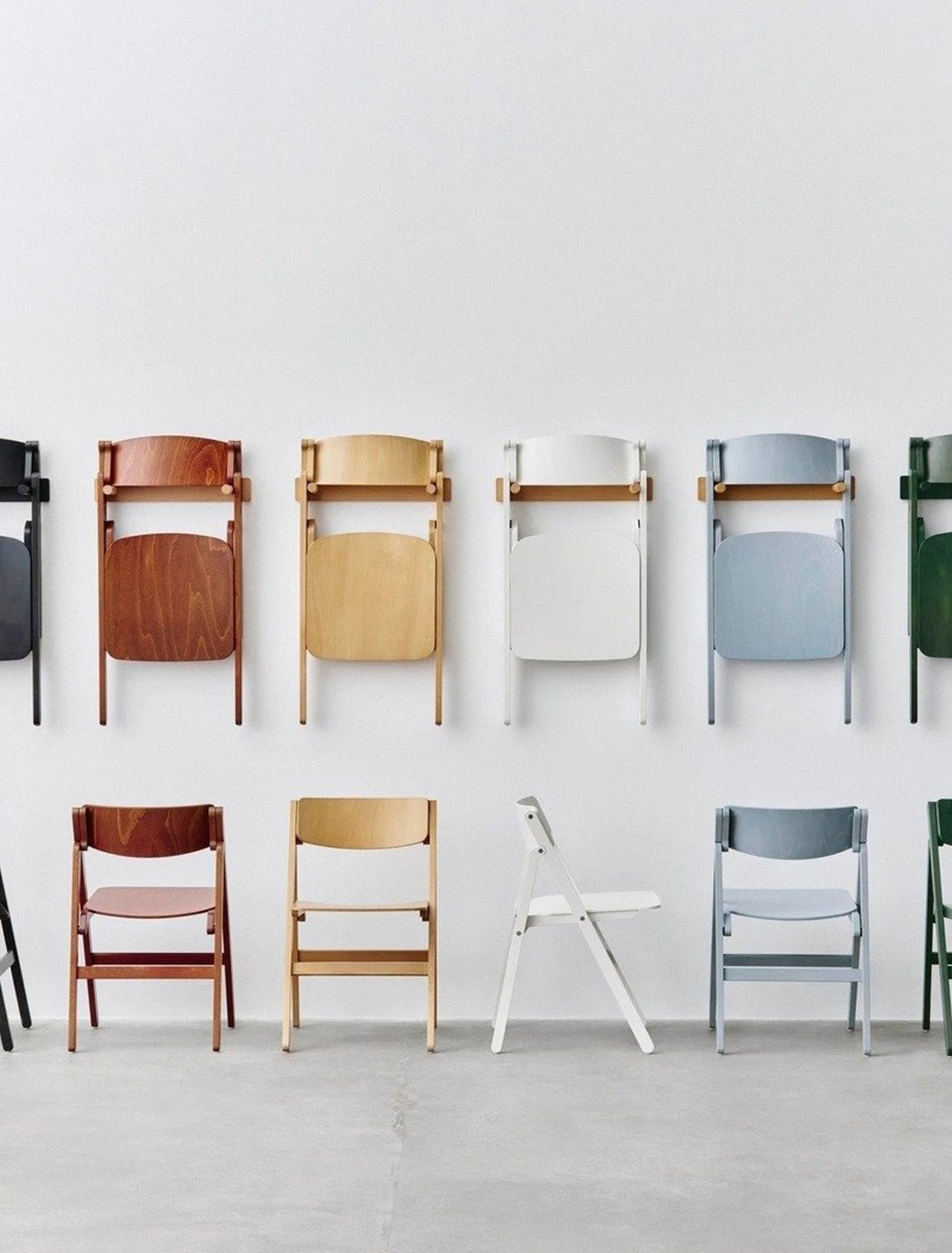
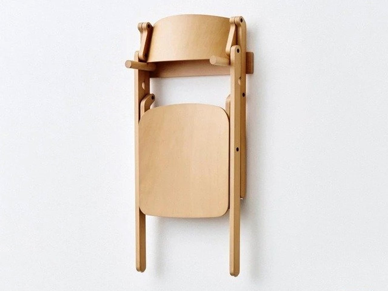
The defining feature is a folding mechanism concealed within the backrest. A single rotation collapses the chair in one continuous motion; one hand is all it takes. There are no exposed hinges, no visible hardware, no visual record of the engineering beneath. The mechanism is part of the structure rather than an addition to it, and that distinction is everything. From the front, the Backflip looks like a chair that simply sits well. Which is the point.

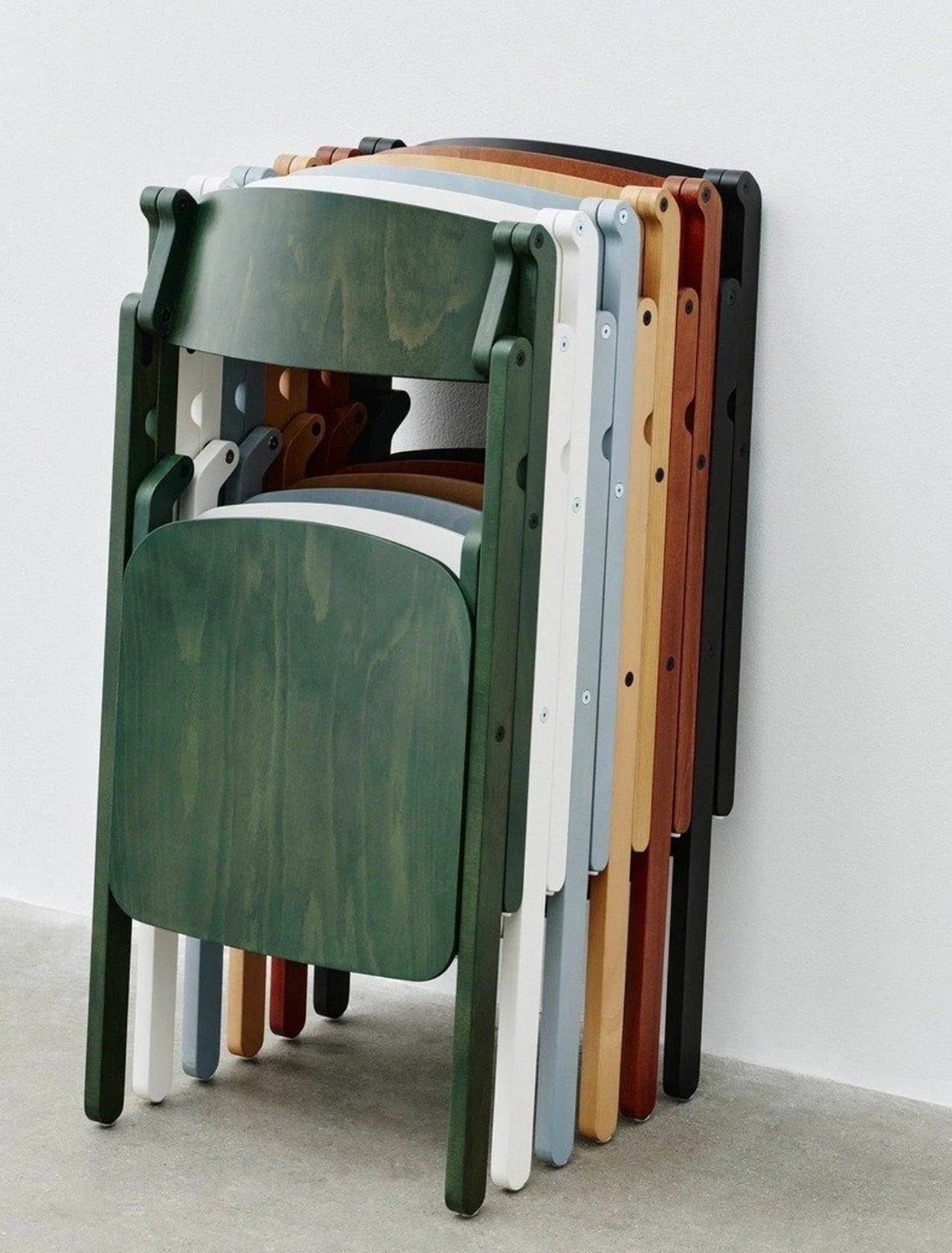
Ludvik’s stated ambition was to approach the folding chair typology from the opposite direction: create a good chair first, and a folding chair second. The frame is solid beech wood, lacquered, with a moulded plywood backrest. The profile is clean and unhurried, shaped by the logic of material and construction rather than any impulse toward decoration. Available in natural beech across a range of coloured finishes, it translates across private dining rooms and public hospitality interiors without trying too hard in either direction.

HAY also offers a matching wall bracket, designed to hold one or two folded Backflip chairs flush against any wall. It’s a satisfying extension of the concept: a chair that folds becomes genuinely space-saving only when storage itself is resolved. The bracket completes that thought without making a fuss about it.

The Backflip was previewed at 3 Days of Design in Copenhagen in 2026, where it sat alongside work from Jasper Morrison and Philippe Malouin in HAY’s exhibition at O-Overgaden, a contemporary art institution in Christianshavn. In that company, it held its own, which is a fair measure of how resolved the design feels.

What Ludvik has made is not a clever folding chair. It’s a chair that happens to fold, and the difference is considerable. That the mechanism disappears entirely into the backrest is less a magic trick than a design argument, made quietly, about where the priorities should lie.

The post An Industrial Designer Hid the Chair’s Entire Folding Mechanism Inside the Backrest first appeared on Yanko Design.
  •  

This Cork Cactus Looks Like Decor and Acts Like 3 Pieces of Furniture

Coat stands have always occupied an awkward position in a room. They’re functional enough to keep around but rarely considered anything beyond a place to pile things on the way out the door. Pin boards face a similar problem, useful at a desk but hard to integrate into a living space without making it feel like an office. Objects that try to do both tend to resolve that tension poorly.

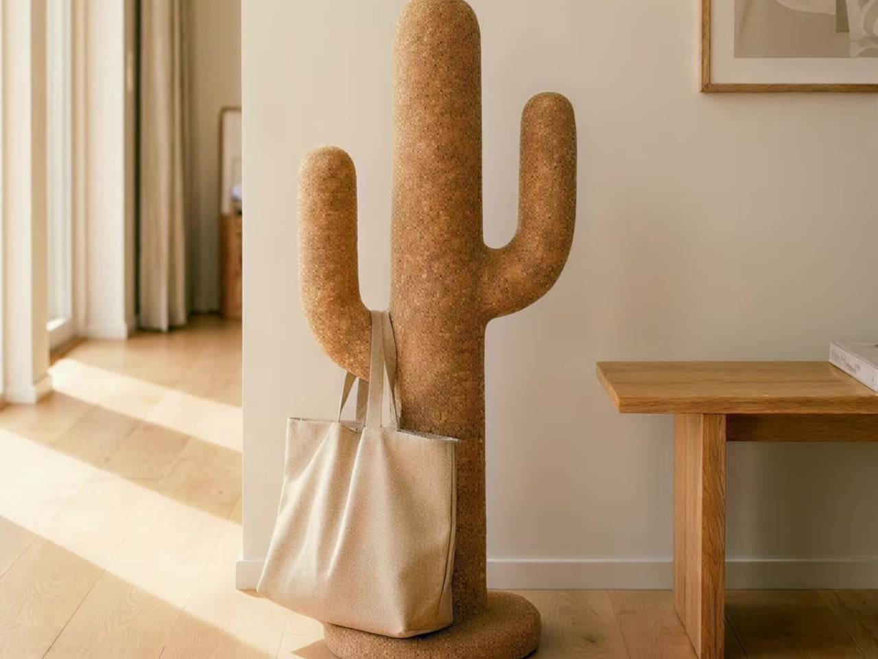
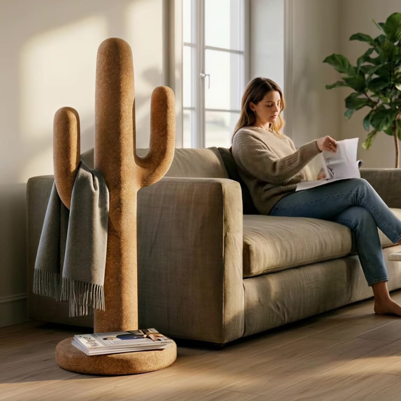
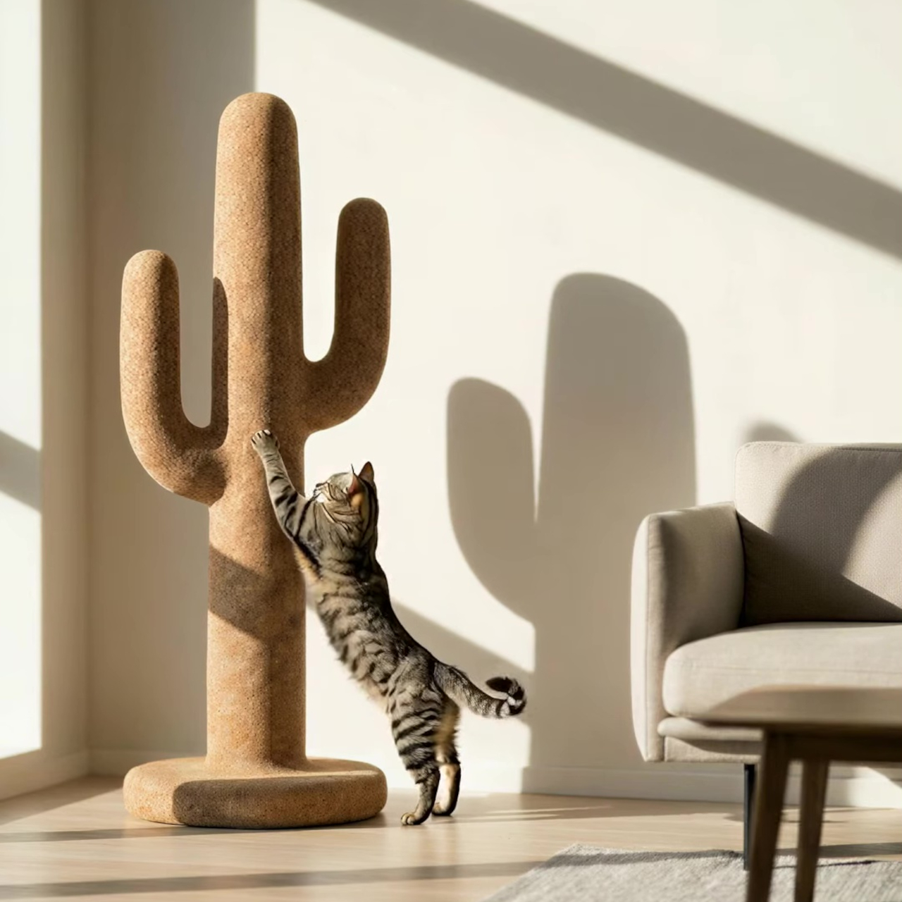
Corctus starts from a different premise. The name merges “cork” and “cactus,” which is also a fair summary of the concept: a floor-standing object shaped like a saguaro cactus, made entirely from cork, and quietly capable of handling most of what people need to keep close at hand. Rather than solving the storage problem with hooks and brackets, it solves it by making the form itself the function.

Designer: Liam de la Bedoyere (boredeye)

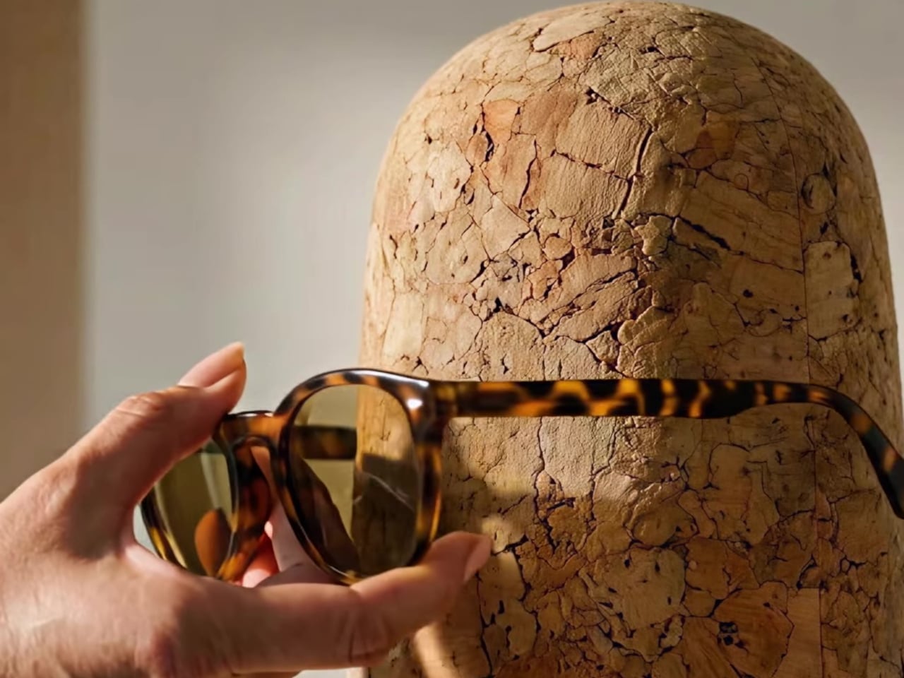
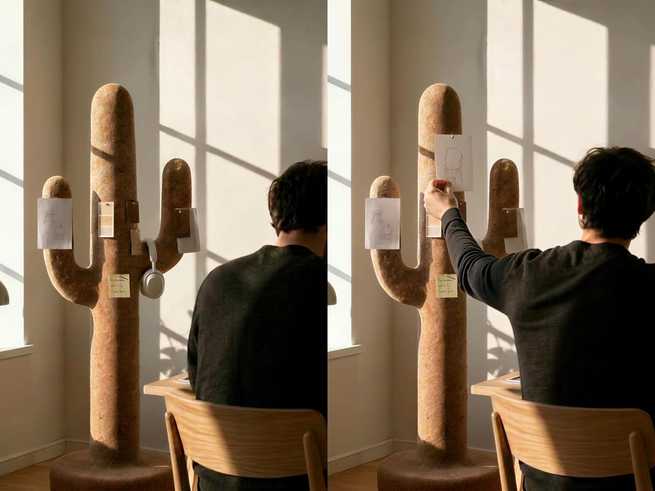
Cork is the central material here, both practically and conceptually. The surface is textured enough to grip a pair of sunglasses on the rounded top without anything extra, and receptive to pins without reinforcement or a backing board. A sketch, a sticky note, or a reference card pins straight into the body of the object wherever it’s needed, with no designated zone for it.

The cactus arms extend outward with a slight upward curve that happens to work exactly like a hook. A backpack hangs from one, a tote bag from another, a scarf draped over without sliding off. Headphones sit naturally over an arm when not in use. None of this requires any hardware, any dedicated accessories, or any particular intention. The geometry of the form handles all of it.

The disc-shaped base adds one more surface. Magazines stack on it, a few books sit within reach, and it grounds the form without demanding much floor space. The compact proportions keep the whole object from reading as a coat stand, which is deliberate. The intention was always a sculptural companion rather than a piece of utilitarian furniture, and the scale reflects that.

That distinction matters in practice. Next to a desk, the Corctus functions as an immediate, physical task board without a screen. Move it into a living room or hallway and it shifts roles without changing character. The warm texture of the cork sits alongside the kinds of materials, and its sandy color sits comfortably against most interior palettes.

Most multifunctional objects succeed at one thing and compromise on everything else. Corctus earns its place as a sculptural form first, and the utility follows naturally from the shape rather than being imposed on it. There are no brackets, no hooks, no panels, and no assembly decisions to make. It stands where it’s put, and the room tends to organize itself around it.

The post This Cork Cactus Looks Like Decor and Acts Like 3 Pieces of Furniture first appeared on Yanko Design.
  •  

Furniture Made From Wood Scraps You’d Actually Pay For

Every furniture workshop generates a particular kind of guilt. There are the offcuts, the trimmings, the odd-shaped remainders of boards that got cut to size and are now too small for anything useful, or so we assume. Most of them end up as kindling, compost, or landfill. We’ve accepted that as the cost of making things, a small fine paid for the privilege of precision. Studio Booboon is not interested in paying that fine.

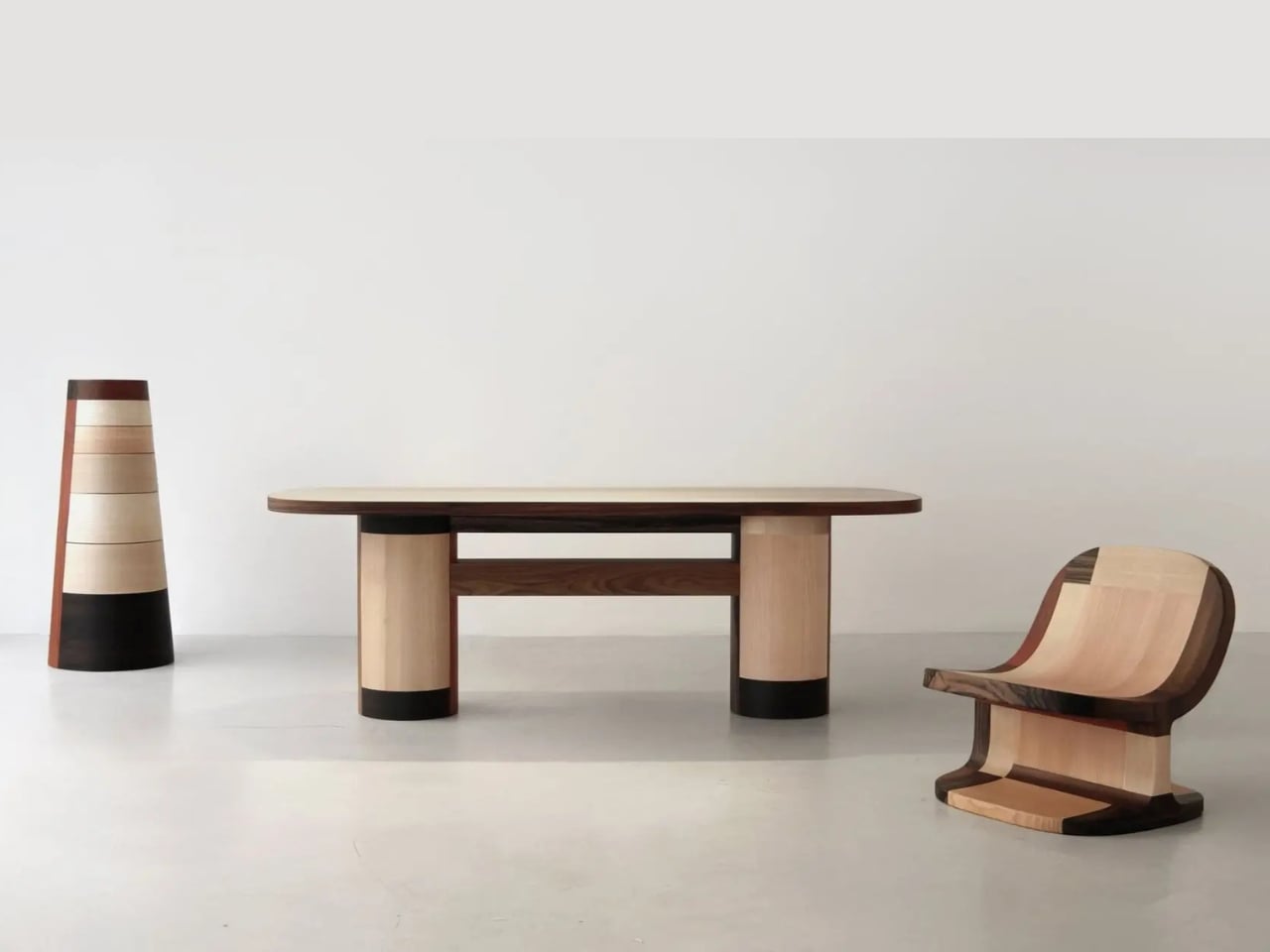
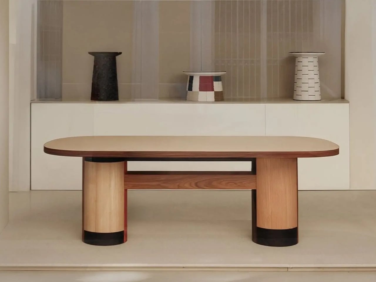
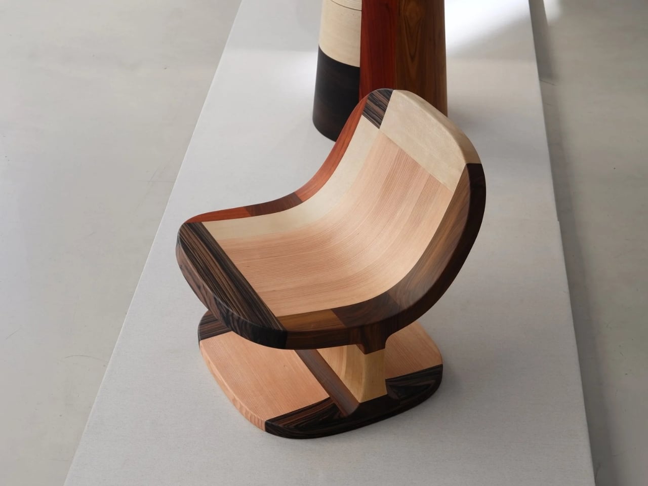
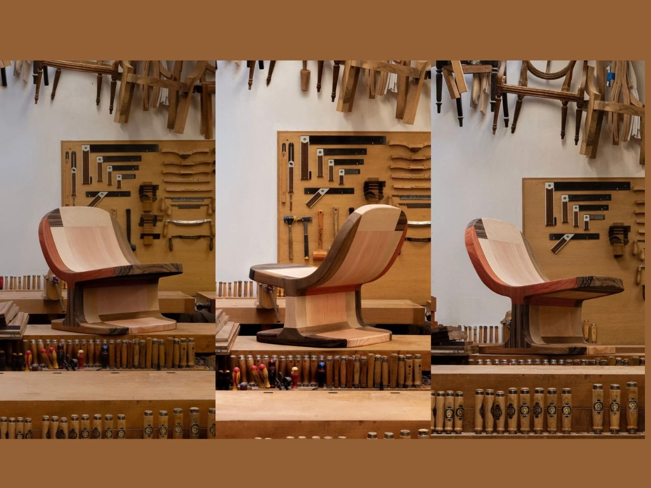
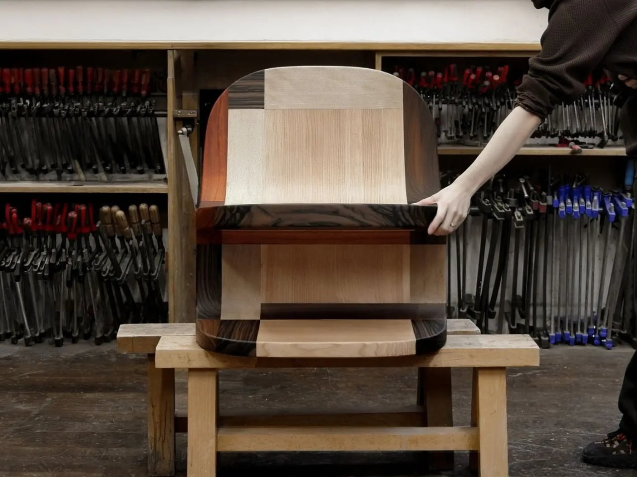
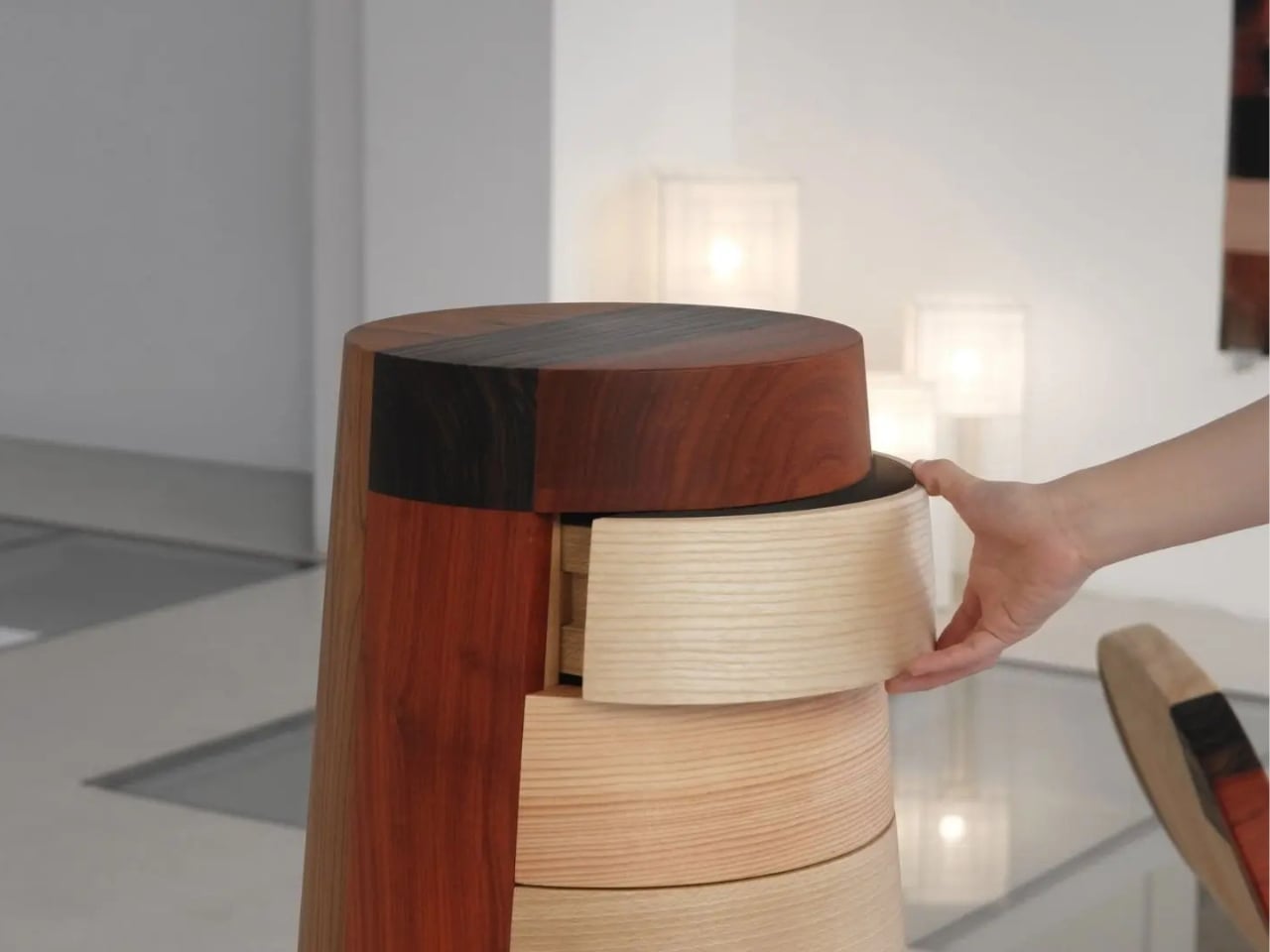
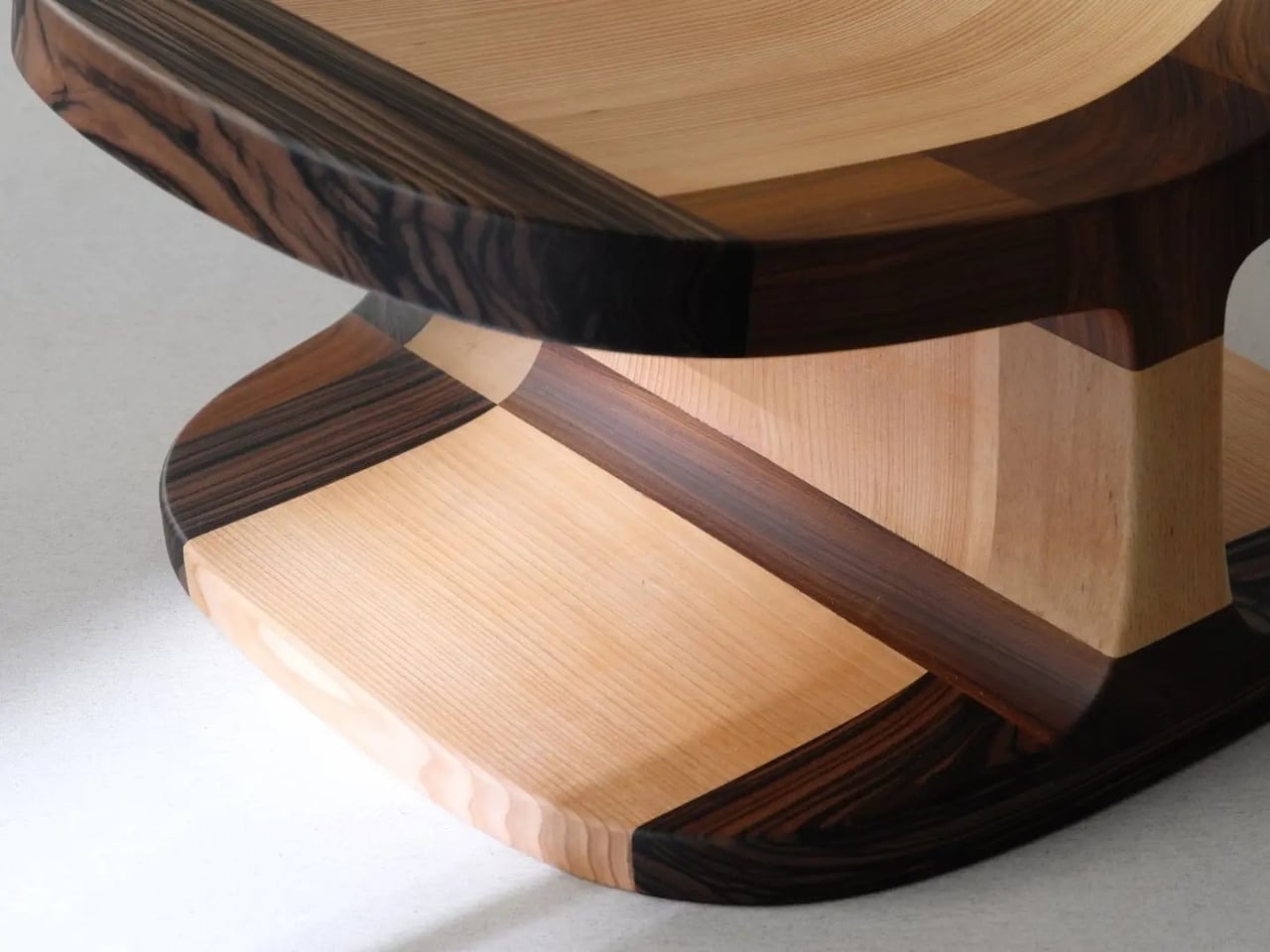
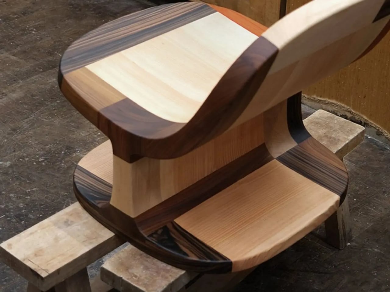
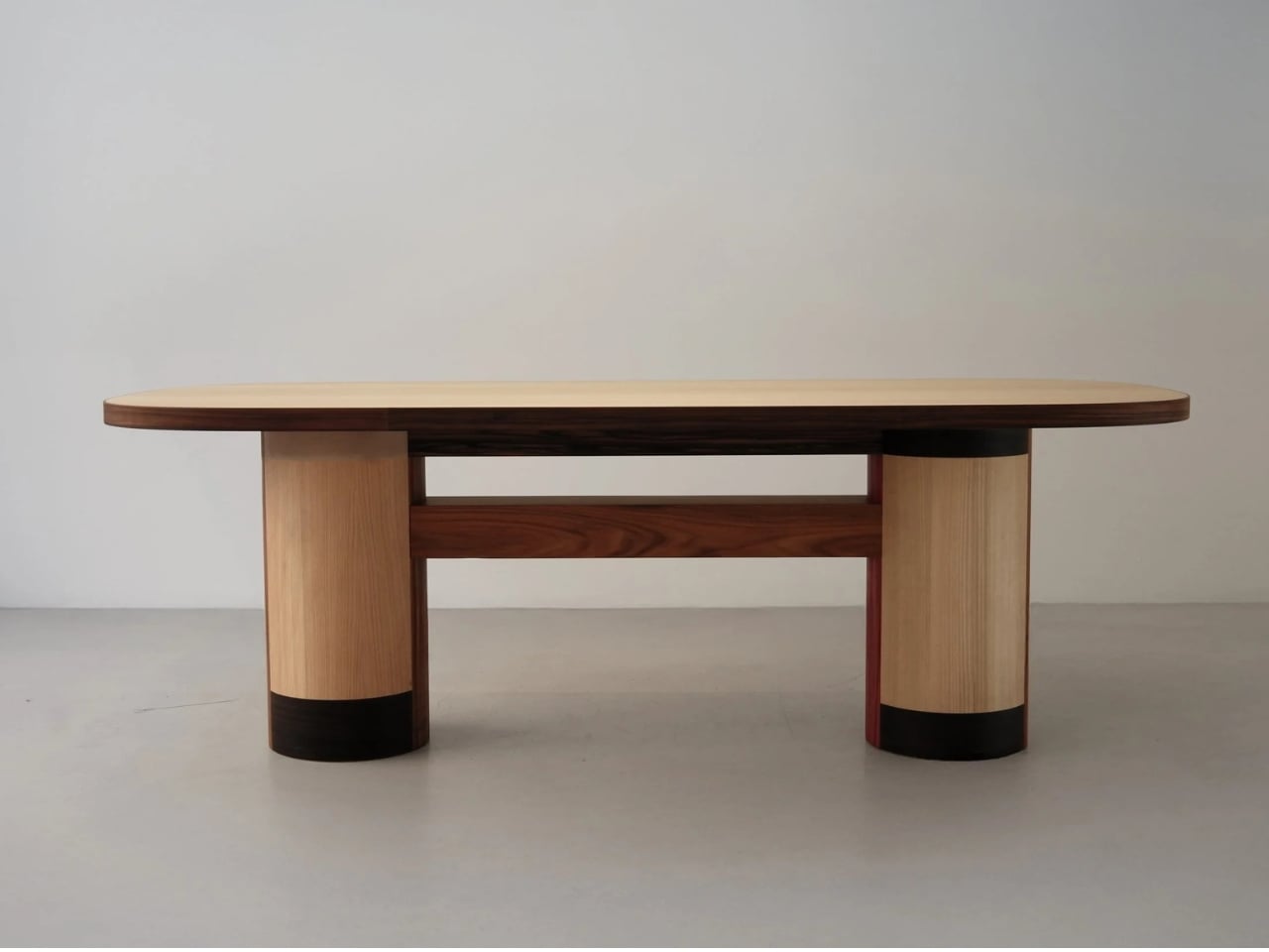
The Copenhagen-based studio, founded by Richard Bone and Jisu Yun, two designers who both trained under Japanese studio Nendo, released their latest collection, Fragments Becoming, and it’s exactly the kind of work that makes you wonder why no one thought to do it this way sooner. The collection is built entirely from timber offcuts, and before you picture something rustic or deliberately imperfect, let me be clear: these pieces are stunning. A cabinet, a dining table, and a lounge chair, each constructed from assembled fragments of discarded wood arranged with such precision and intention that the effect is closer to fine art than furniture-as-apology for sustainability.

Designer: Studio Booboon

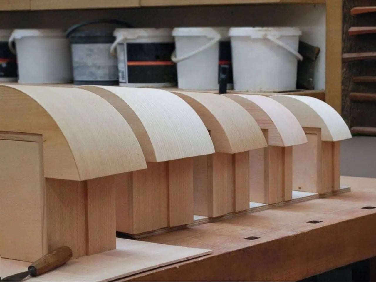
The concept the studio uses is something they call “3D marquetry,” which sounds technical but is actually a fairly elegant idea once you sit with it. Traditional marquetry, the kind you’d see on antique furniture or decorative boxes, applies a pattern to a surface. It’s essentially decoration laid on top of structure. What Studio Booboon does instead is treat each fragment of wood as the structure itself. The pattern isn’t on the cabinet door; the door is the pattern. It runs through the object’s entire volume, which means the visual logic and the physical construction are the same thing. That’s not a subtle distinction. That’s a fundamentally different philosophy.

What I appreciate about this approach is that it removes the option to hide mistakes. The studio works with unstained wood, which means every fragment has to earn its place on its own terms, no pigment masking a poor match, no stain blurring the edges. Each piece has to work compositionally before it works functionally. That kind of constraint tends to produce either chaos or brilliance, and in this case, it’s clearly the latter.

Bone and Yun bring a cross-cultural sensibility to the work that shows up in the details. Their debut collection, Playful Reappropriation, released at Milan Design Week 2024, pulled from Korean craft traditions, and Fragments Becoming continues that thread. The materials include hanji (traditional Korean paper), canvas, silk, and Ottchil, a Korean lacquer technique that adds depth without dominating the natural tones of the wood. The combination of a British RCA education, Korean craft heritage, and a shared apprenticeship at Nendo, one of the most conceptually rigorous studios in contemporary design, explains a lot about why this work feels so considered without ever feeling cold.

The collection premiered at Milan Design Week 2026 and later showed at Other Circle 2026 during 3daysofdesign in Copenhagen. That double-billing matters. Milan tends to reward spectacle, while the Copenhagen circuit rewards ideas. The fact that Fragments Becoming landed well in both contexts suggests it’s doing something more than just looking good in photographs, which, for the record, it absolutely does.

Sustainability in design has become such an overused talking point that the word barely registers anymore. Every brand gestures toward it. But there’s a difference between sustainability as a value and sustainability as a method, and Studio Booboon’s work lives in the second category. They’re not telling you the collection is responsible and letting the aesthetics carry a different message. The responsible practice is the aesthetic. The offcut isn’t hidden. It’s the whole point.

That feels rare enough to be worth paying attention to. Design tends to celebrate the new, the seamless, the perfect. Fragments Becoming makes a quiet argument that the incomplete, the leftover, and the discarded might be where the most interesting work is still waiting to happen.

The post Furniture Made From Wood Scraps You’d Actually Pay For first appeared on Yanko Design.
  •  
❌