❌

Vue lecture

MAKERphone 2.0 Assembles Like LEGO, Calls Like a Real 4G Phone

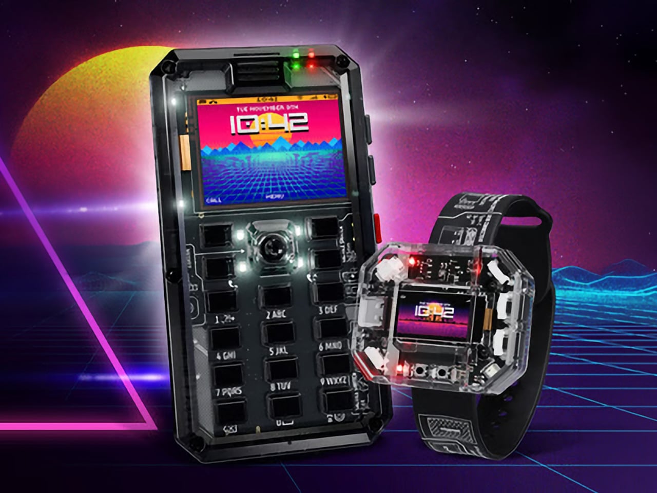
Most phones arrive finished, sealed behind glass before you open the box. MAKERphone 2.0 flips that script. It ships as loose parts that only become a phone once you build it yourself: no soldering iron, no electronics background, just a screwdriver and about two hours. Once assembled, it’s a working 4G device that makes real calls and sends texts over a live network.

The build is what really sells the design. Every piece, from the board to the display to the numpad and to the joystick, clicks or screws into place. The entire endeavor is guided by an illustrated manual that reads like a LEGO instruction booklet, with video walkthroughs for anyone who gets stuck. By the time you finish, you’ve seen the processor, the modem, and the battery close, not used them.

Designer: CircuitMess

Click Here to Buy Now: $129 $160 (24% off). Hurry, only a few left! Raised over $300,000.

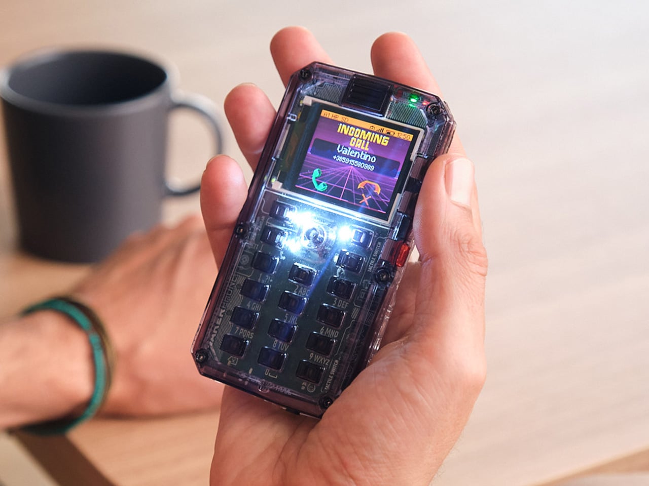
Pop in a nano-SIM and the phone comes alive on 4G networks, handling calls and texts like any device off a shelf. There’s a music player, a photo and video gallery, a calendar, notes, and a handful of retro games loaded onto that small color screen. What’s missing says as much: no app store, no social feed, nothing designed to keep anyone scrolling past bedtime.

That absence is the whole appeal for anyone shopping for a kid’s first phone. It calls and texts the people a child needs to reach, without opening the door to an internet’s worth of distraction. When a kid wants a new app or game, the answer isn’t downloading one; it’s building it. Screen time stops being something to limit and starts being something to spend making.

That building happens inside VibeBoy, the phone’s companion coding studio that runs on a computer. Describe an idea in plain English, like a taco dodging falling pickles, and the AI writes code sent to the phone with one click. The goal isn’t to let AI do all the thinking but to let VibeBoy teach users to read that code, question it, and eventually rewrite it.

That teaching happens across four stages built into the same app. Beginners describe what they want and watch it appear on-screen, before moving on to reading and tweaking the Python code the AI generates. Eventually, they write their own Python and C++ from a blank file. Nobody stays at one skill level long; the ladder is designed so most people climb it faster than expected.

Six snap-on modules turn the phone into something closer to a small hardware platform than a single-purpose device. A camera module captures pixelated stills and video, a bigger speaker adds volume, and a flashlight adds utility. An environment sensor reads temperature and humidity, an infrared module controls other devices, and a bare perforated board lets anyone solder a custom circuit and plug it in.

A companion smartwatch called MAKERband follows the same idea, arriving as a kit to assemble rather than a sealed gadget. Once built, it pairs with the phone over Bluetooth and also works with iOS and Android, running 15 watchfaces and five mini-games out of the box. It connects to VibeBoy, so a custom watchface, say, a pixel cat that naps after 9 PM, is a prompt away.

The company behind it, CircuitMess, has spent years building kits like this from a small studio in Croatia. It has shipped hundreds of thousands of units to customers across more than 100 countries, developed dozens of products, and earned coverage from outlets like Wired and The Verge. Just as important, the MAKERphone 2.0 isn’t a rendering or an early prototype: the hardware is finished and ready for production.

What sticks with you isn’t any single spec but the sequence. A pile of components turns into a working phone, and that phone turns into whatever its owner decides to code next. Somewhere between the last screw and the first successful call, the device stops feeling like something you bought and starts feeling like something you actually built, one working call at a time.

Click Here to Buy Now: $129 $160 (24% off). Hurry, only a few left! Raised over $300,000.

The post MAKERphone 2.0 Assembles Like LEGO, Calls Like a Real 4G Phone first appeared on Yanko Design.

  •  

iPod Classic emulator for the Samsung Galaxy Z Fold8 finally gets the size and aspect ratio right

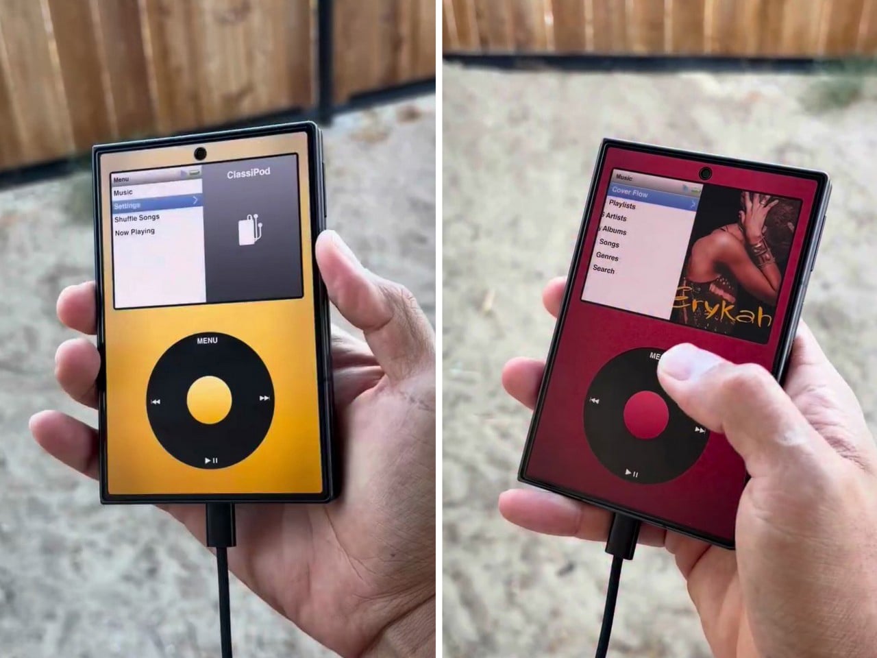
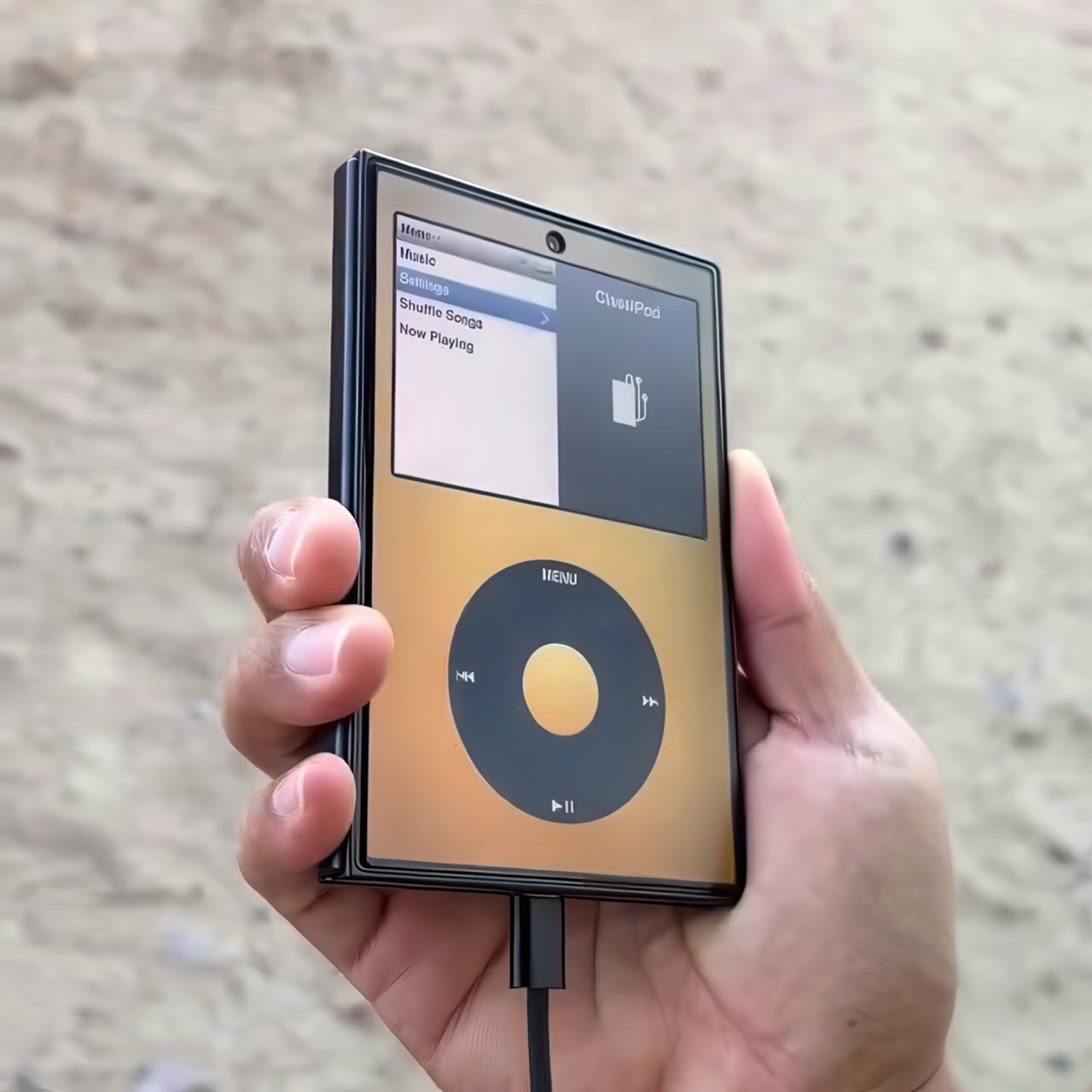
Apple has the opportunity to do something really cool here! An emulator going by the name of Classipod has been doing the rounds on the Google Play Store, letting you run an iPod Classic style interface on any Android phone of your choosing. The only problem is that Apple never really made a 9:20 iPod Classic. Every iPod Classic had a short, stout design and as it stands, there are only two Android phones that currently fit this bill, and both fold.

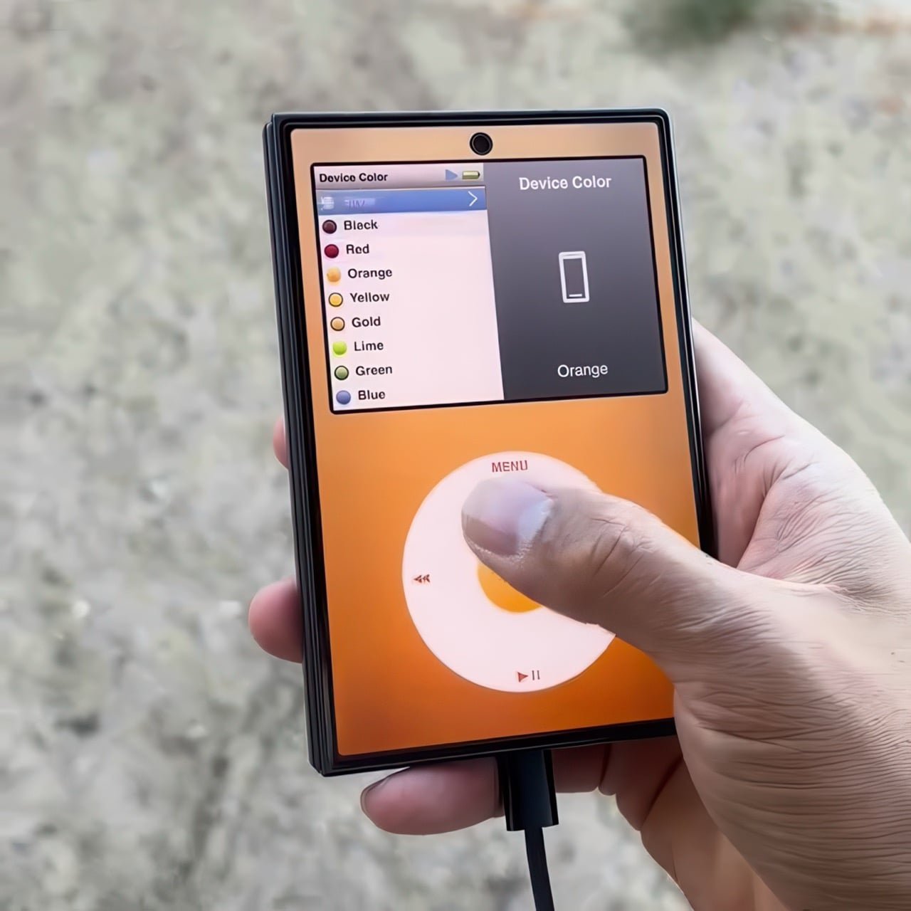
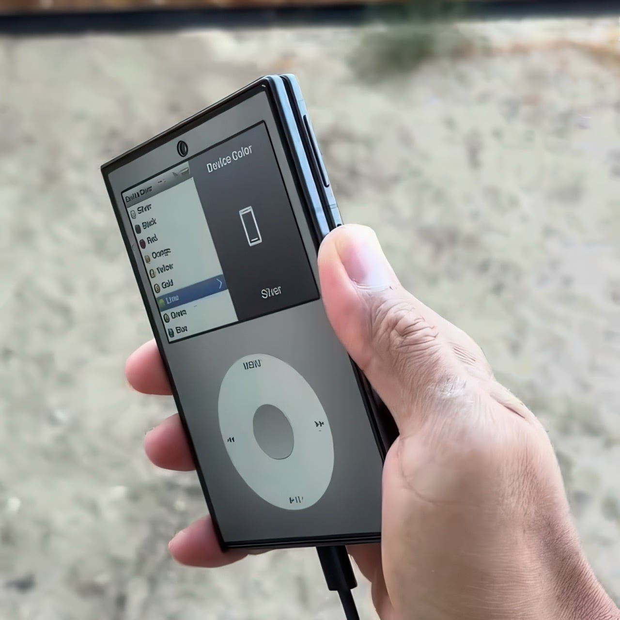
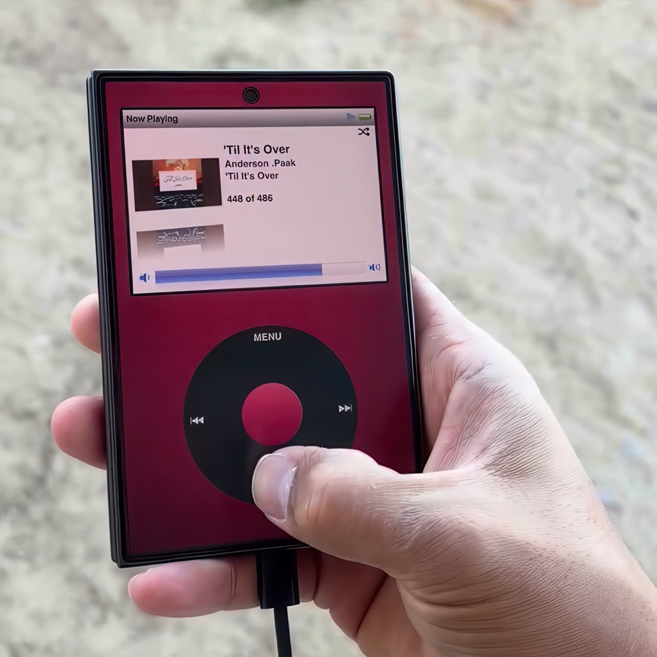
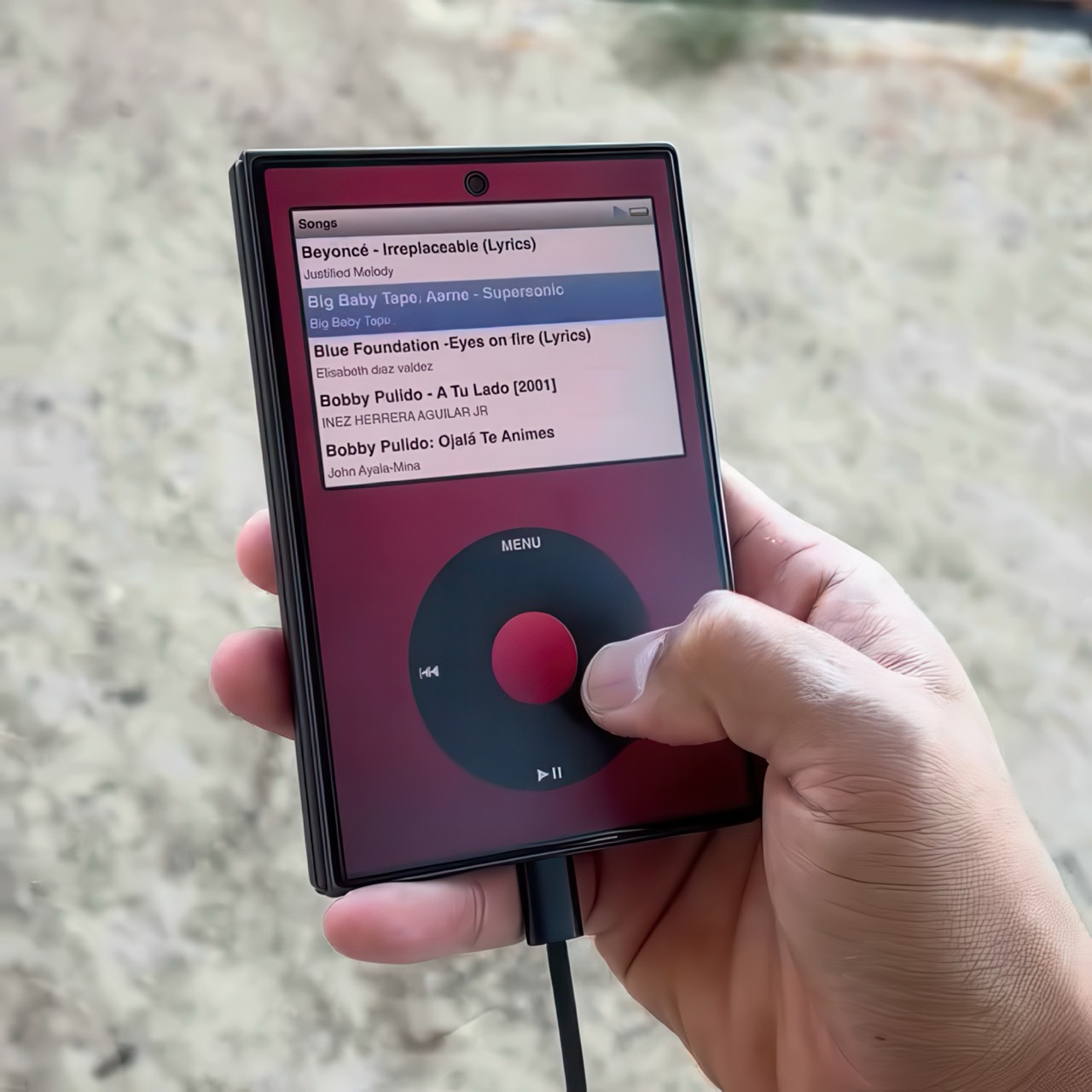
A video on Instagram showed the Classipod interface on a Galaxy Z Fold8 and I can’t help but feel like this almost exactly looks like the classic iPod. The proportions are damn near perfect, the interface still makes me nostalgic, and those color options absolutely slap! The only real problem is that, like all good things, Classipod came to Android before it did to the iPhone Duo… but if someone from Apple’s software team is reading this (hey Craig!), just go ahead and give us an Apple Music skin that brings back the iPod Classic! Pretty please??

Designer: Adeeteya

Here’s what I find so funny about running Classipod on a Z Fold8 – sure, it almost matches the iPod Classic’s form factor, but even when folded shut, it’s still thinner than the iPod! I’m talking hinge, two sets of screens, two batteries, an entire processor, cameras galore, all that packed into something that measures 9.7mm thick while the iPod Classic, which is just a tiny screen, battery, SoC, and a massive flash drive, measures 10.5mm in thickness. Then again, the iPod Classic packs an aux input too, which you’ll never see on a foldable phone.

But hold the Z Fold8 in your hand and the Classipod definitely scratches the itch of owning vintage Apple gear. The weight and heft, the analog interface, and that gorgeous jogwheel that is sure to get your muscle memory kicking in instantly. You sideload music so it plays locally (no streaming), and you can do everything, from searching for artists to making playlists. And yes, if you’re asking, the jogwheel has haptic feedback so it actually does feel like the iPod of yesteryears.

There are a few iPod emulators on the App Store, but none as good as the Classipod. I guess someone could vibecode one overnight and run it on an iPhone Duo soon, but until then, turns out the most faithful recreation of an iPod Classic exists… just on an Android device!

The post iPod Classic emulator for the Samsung Galaxy Z Fold8 finally gets the size and aspect ratio right first appeared on Yanko Design.

  •  

TECNO CAMON Slim 5G Review: Thinner than a Pencil, Tough as a Tank

PROS:


  • Unbelievably slim and lightweight design

  • Striking and stylish art-inspired finish

  • Large 6,000mAh battery despite slim profile

  • Exceptional durability with quad-IP rating, supporting underwater photography

CONS:


  • Modest hardware specs

  • No dedicated telephoto camera

RATINGS:

AESTHETICS
ERGONOMICS
PERFORMANCE
SUSTAINABILITY / REPAIRABILITY
VALUE FOR MONEY

EDITOR'S QUOTE:

Slim, art-inspired, and tougher than it looks, the TECNO CAMON Slim 5G packs a 6,000mAh battery into a body thin enough to turn heads.
award-icon

Slim phones have always come with a catch. Shave down the body and something else usually gets sacrificed: usually the battery, sometimes the durability, occasionally both. The TECNO CAMON Slim 5G doesn’t play by that old rulebook. At just 6.39mm thick, it still packs a 6,000mAh battery, 5G connectivity, and a durability rating most phones twice its thickness wouldn’t dare claim.

This review spent real time with the phone away from spec sheets, mostly to see if the design holds up once the initial wow wears off. That meant handling the Neo Mondrian finish TECNO sent for testing, carrying it through a normal week, testing the camera in situations that actually matter, and checking whether the durability claims survive contact with water and everyday clumsiness. The design conversation comes first.

Designer: TECNO

Aesthetics
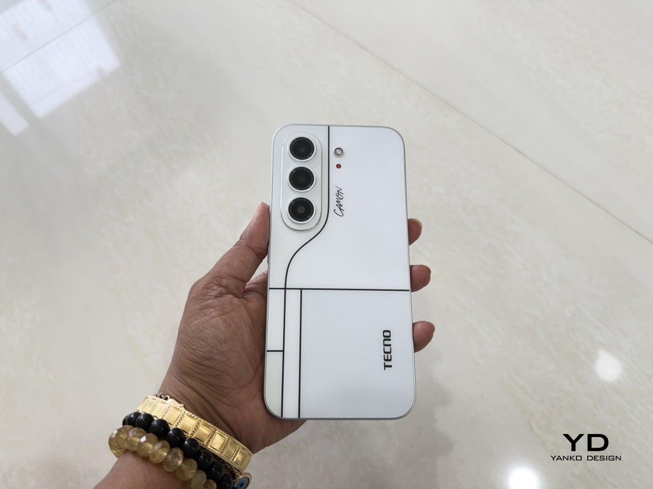
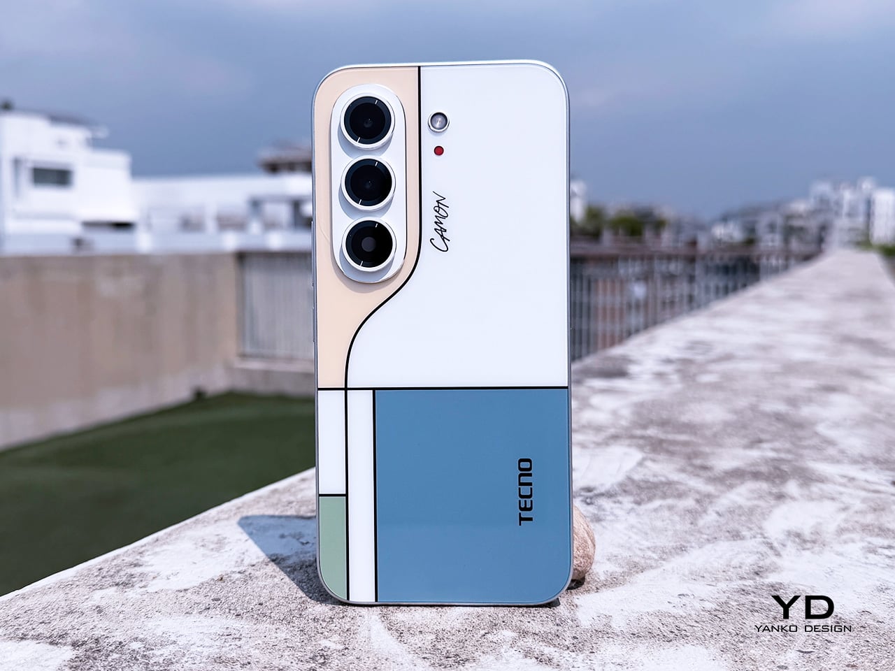
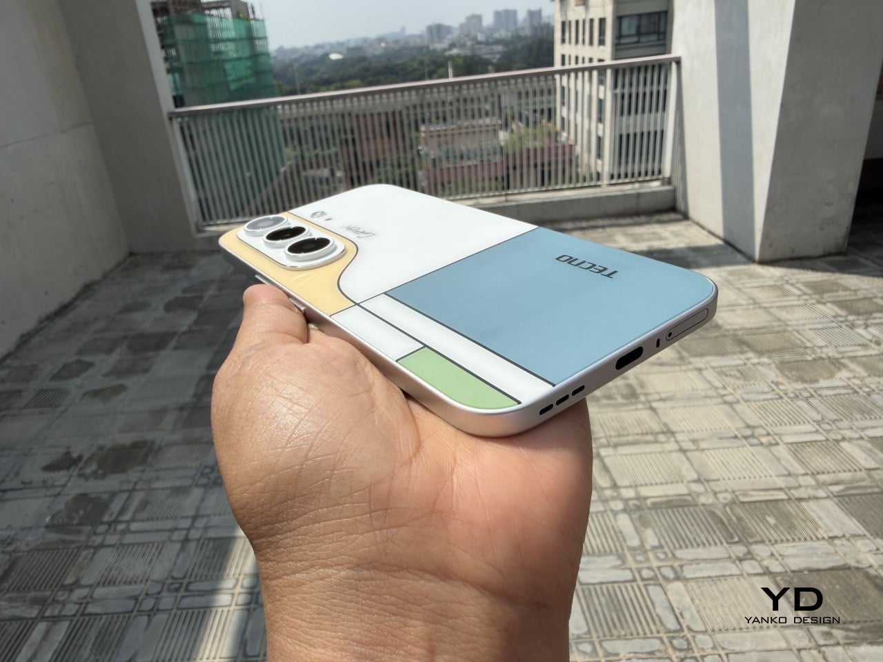
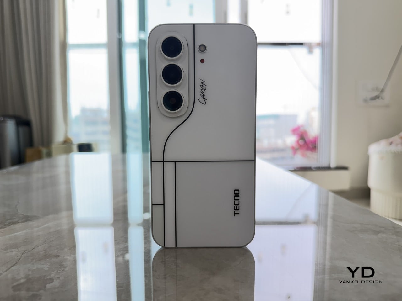
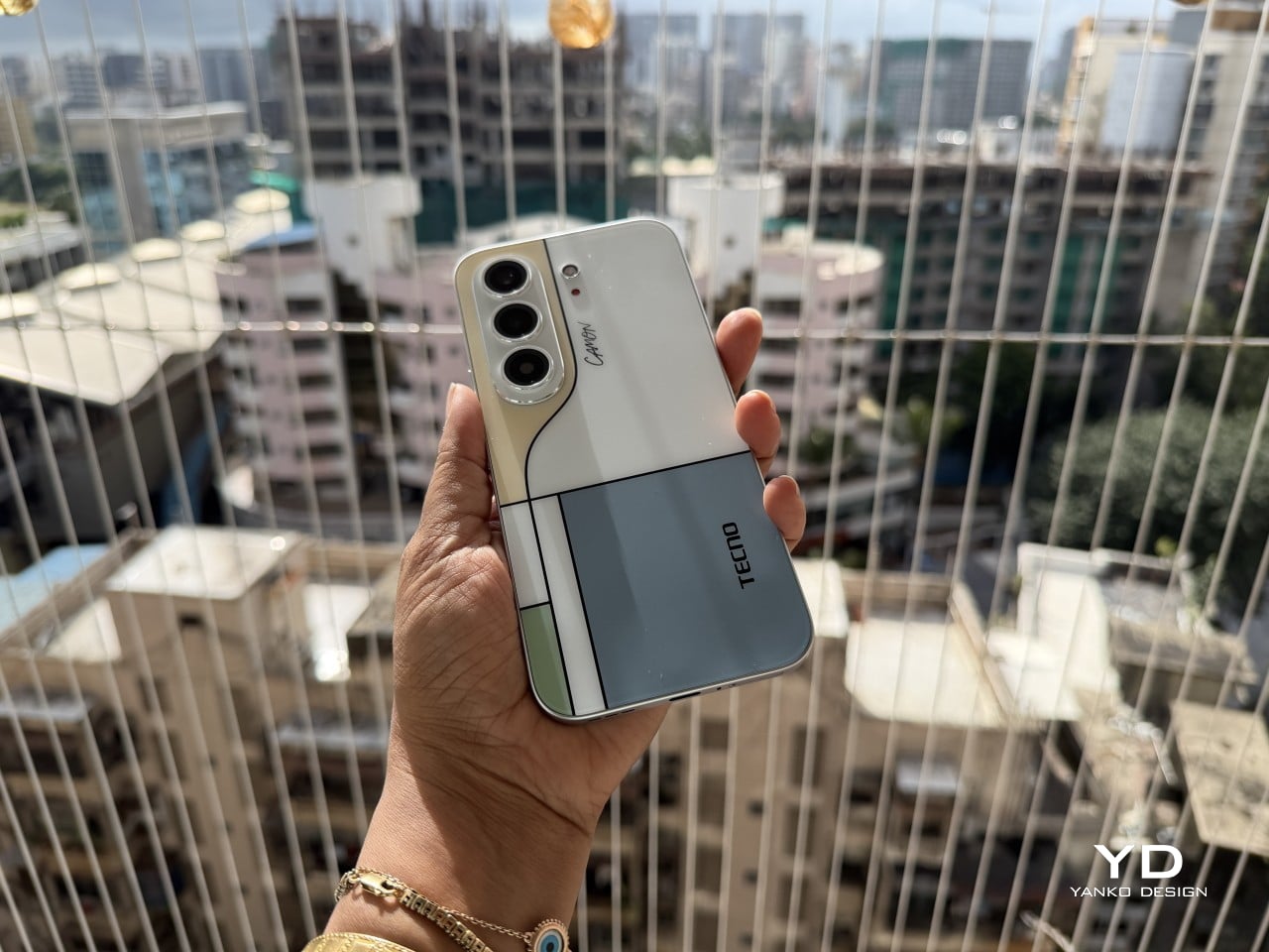
Pull the CAMON Slim 5G out in public and watch what happens. People notice a phone this thin the way they’d notice a watch too elegant for its price tag, usually with a double take and a request to hold it. TECNO carried over the swan-neck curve from the CAMON 50 series, and on a body this slender, that curve reads like a signature rather than a spec sheet footnote.
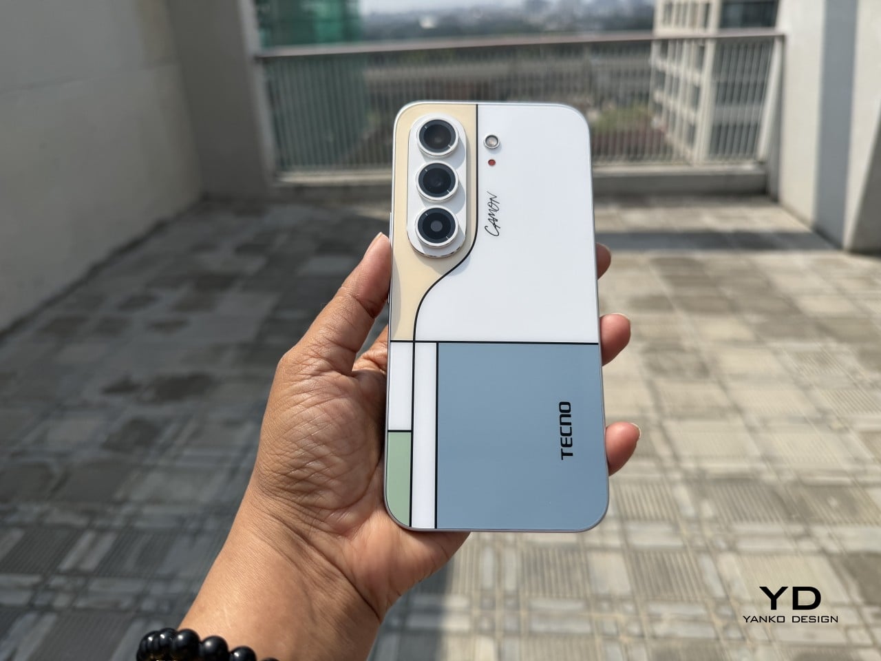
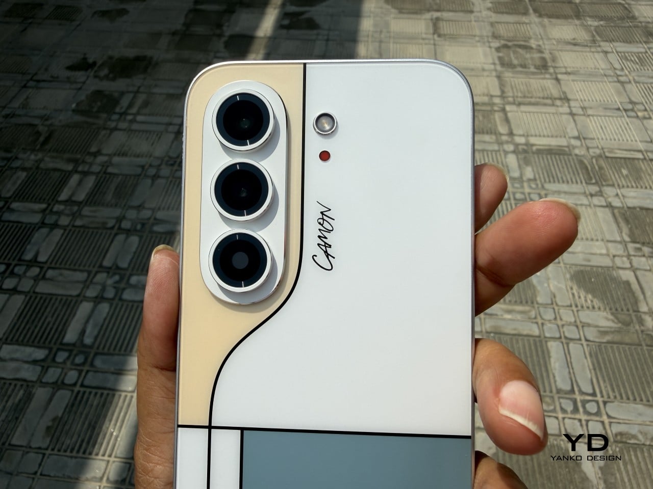
TECNO sent the Neo Mondrian colorway for this review, and it’s the strongest argument for treating a phone back as an actual canvas. Expose the panel to sunlight and yellow, green, and cyan blocks slowly bloom out of white, forming the grid Piet Mondrian made famous a century ago. It’s a photochromic trick, but watching it happen feels less like a gimmick and more like a magic show.

Neo Mondrian isn’t the only finish doing something interesting. Van Gogh Blue uses similar light-reactive techniques to make its swirling nebula pattern look like it’s actually rotating as shadows shift across it, closer to a painting than a phone back. Matisse Black leans into fluorescent green or pink color blocks that echo the artist’s cut-out work, while Burgundy Red blends fiberglass and matte texture into a warm, understated finish. Rebel Pink keeps things simpler, pairing a black body with sharp pink accents for something a little more playful.
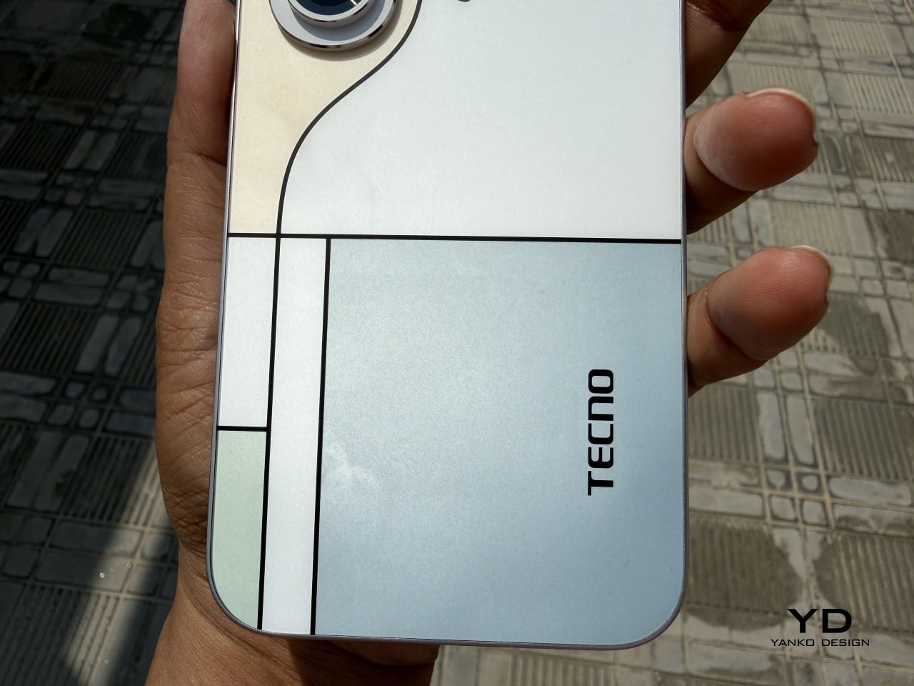
Phone backs used to be an afterthought, something to protect rather than admire, which is why so many people slapped an opaque case on day one without a second thought. That’s changing. As manufacturers invest more in finishes, textures, and light-reactive coatings, more owners are leaving their phones bare, treating the back panel the same way they’d treat a piece of art they paid good money to display.

Ergonomics

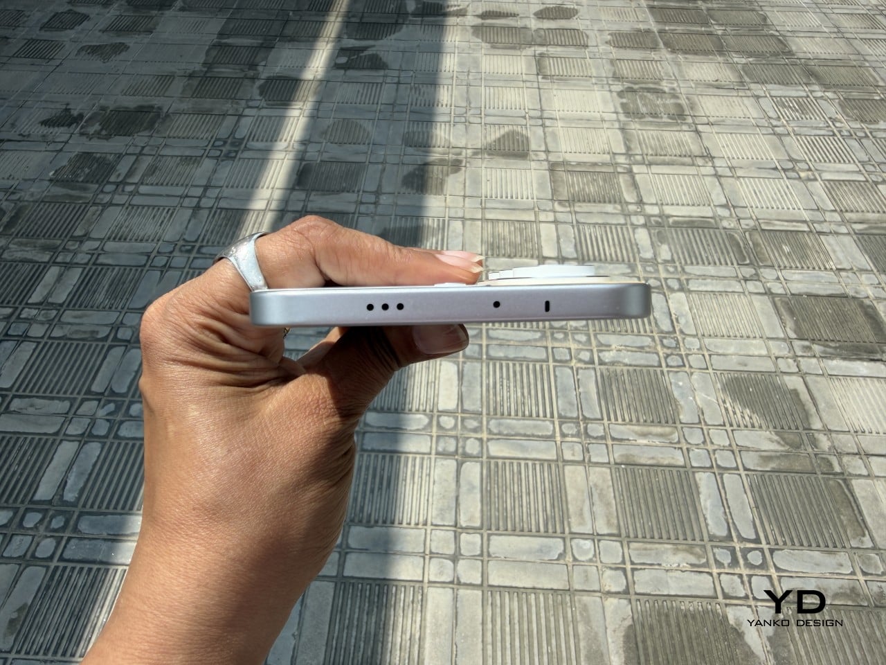
Carrying the CAMON Slim 5G is where the thin body actually pays off day to day. It slides into a front pocket without that telltale bulge, sits flat against a jacket without pulling on the fabric, and feels lighter in hand than the display size suggests. After a few days, reaching for a thicker phone almost feels like picking up a brick by comparison.
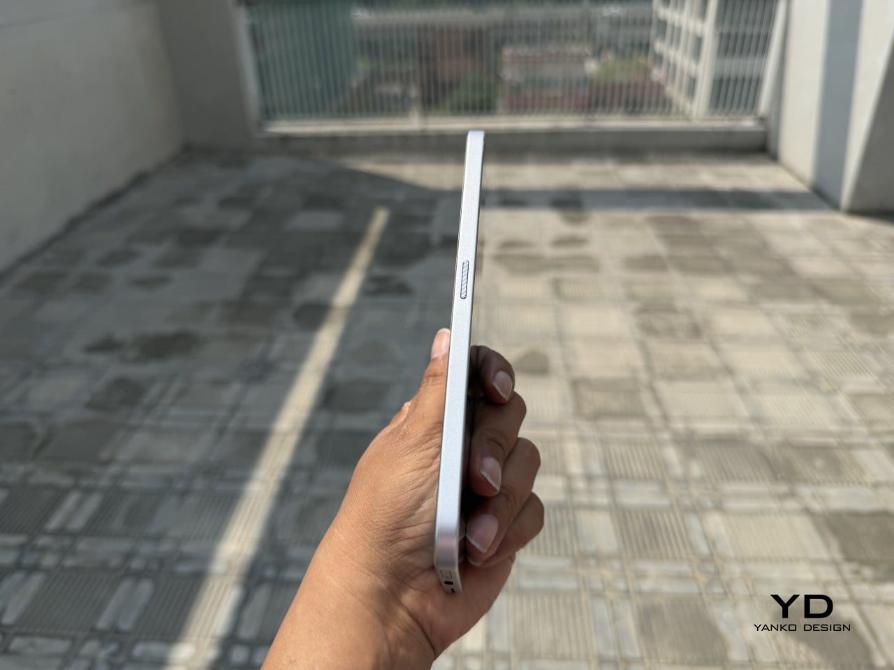
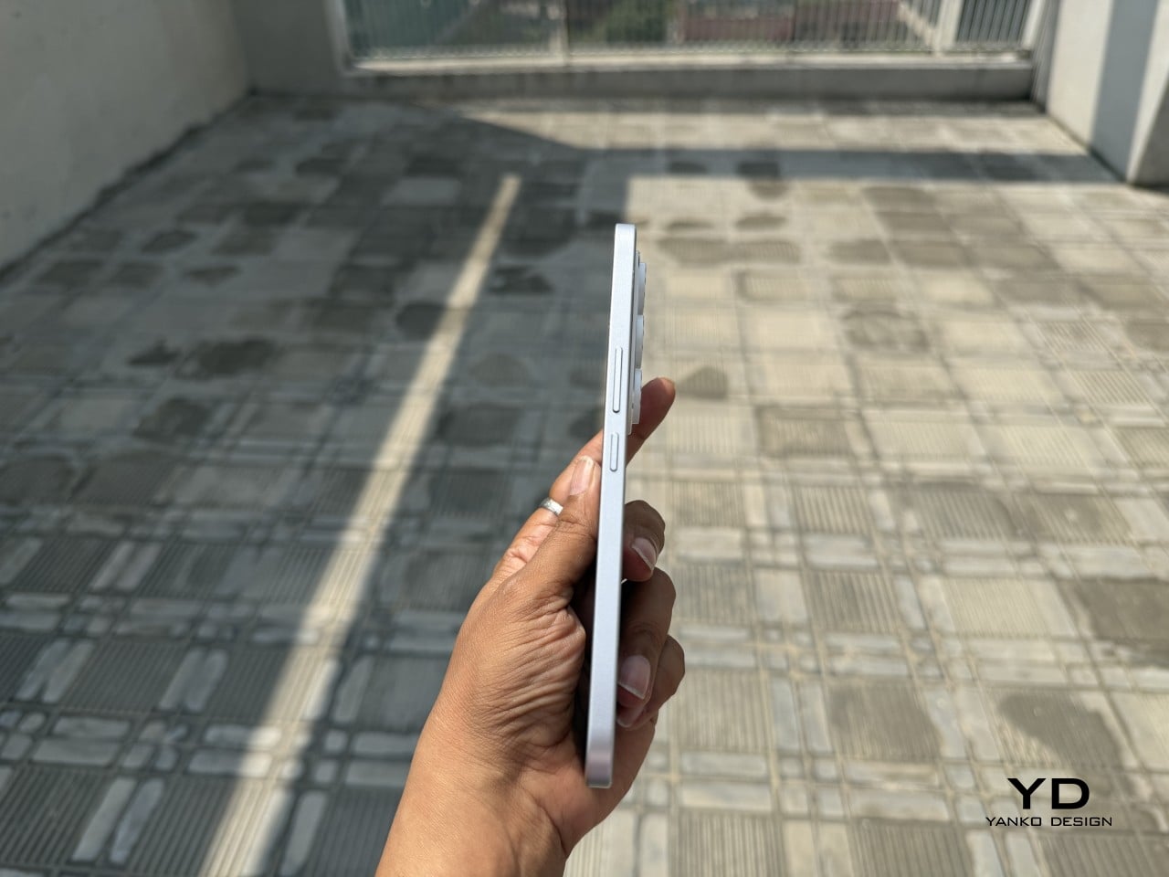
Those flat edges aren’t just a style choice borrowed from boxier design trends. They give fingers something to actually grip onto, instead of sliding off a rounded rim the way slippery slab phones tend to do. The matte texture on the Neo Mondrian panel adds even more confidence, and TECNO’s wet and oily finger recognition keeps the touchscreen responsive when hands aren’t exactly dry or clean.
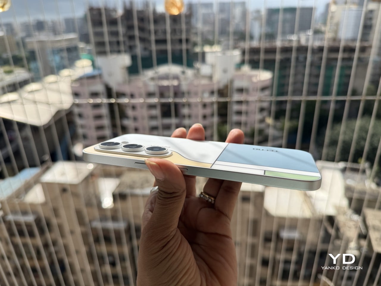
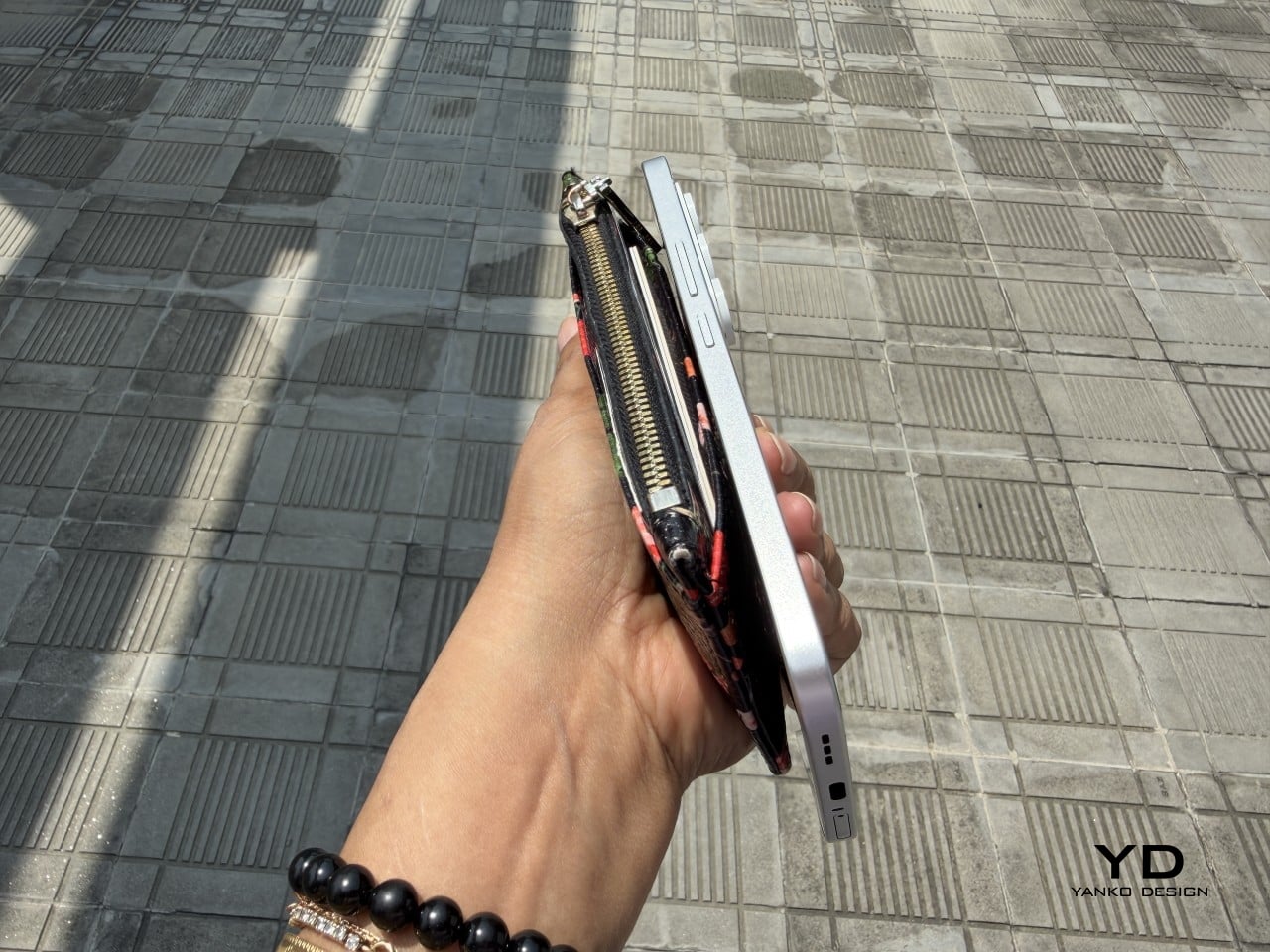
Performance

The 6.78-inch AMOLED display runs at 1.5K resolution and 144Hz, and both numbers translate into a screen that looks sharp and feels fast under a thumb. Photos pop with the kind of contrast only AMOLED delivers, video looks great for a lunch break binge, and scrolling through a feed never feels like it’s fighting the hardware. TÜV Rheinland’s low blue light certification is a nice bonus for long reading sessions.
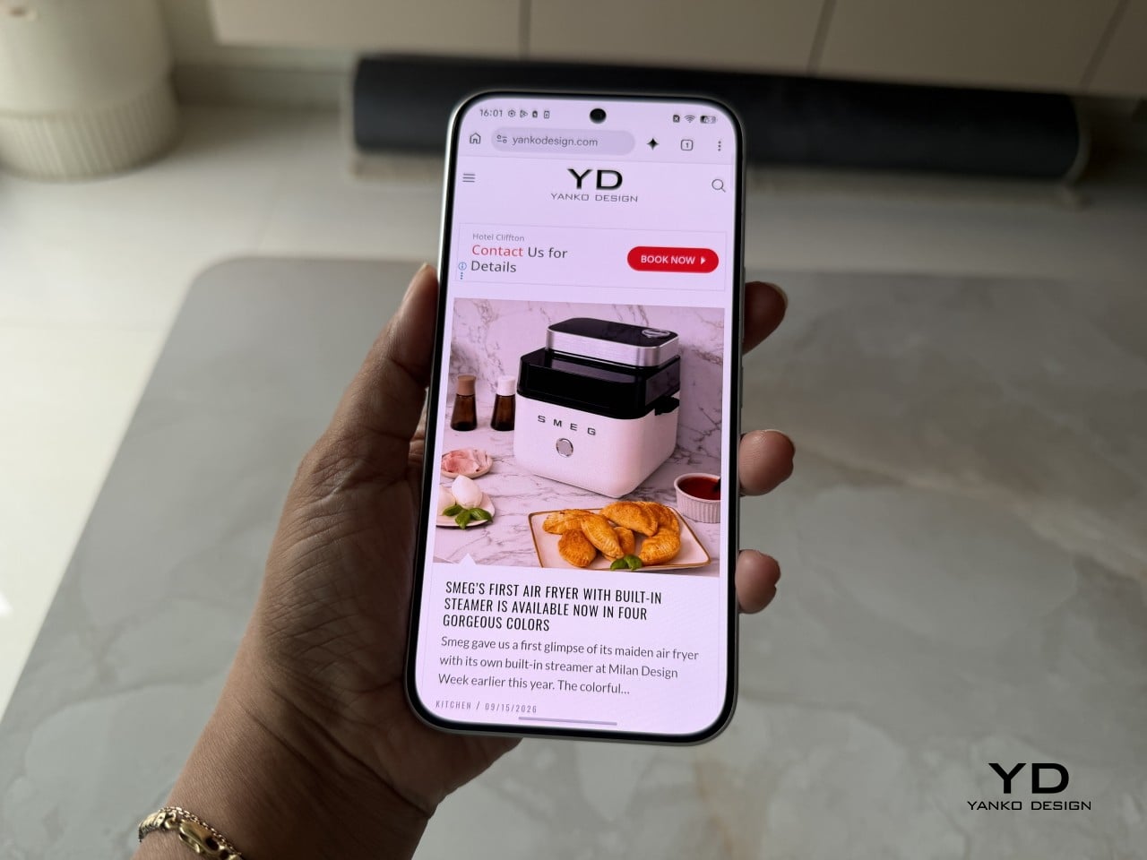
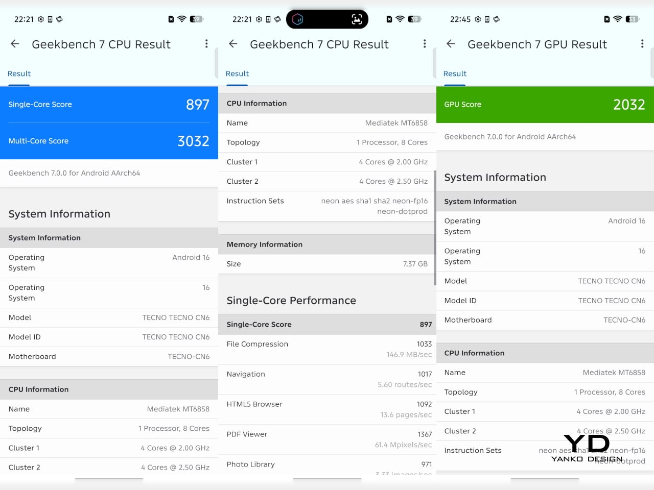
Under the hood sits a MediaTek Dimensity 7300e, a processor built for balance rather than benchmark bragging rights. It handles social apps, photo editing, and everyday multitasking without hiccups, though demanding 3D games will ask more of it than it’s built to give. The 8GB of RAM stretches to 24GB with virtual memory extension, which covers most multitasking habits without needing to close every open app.
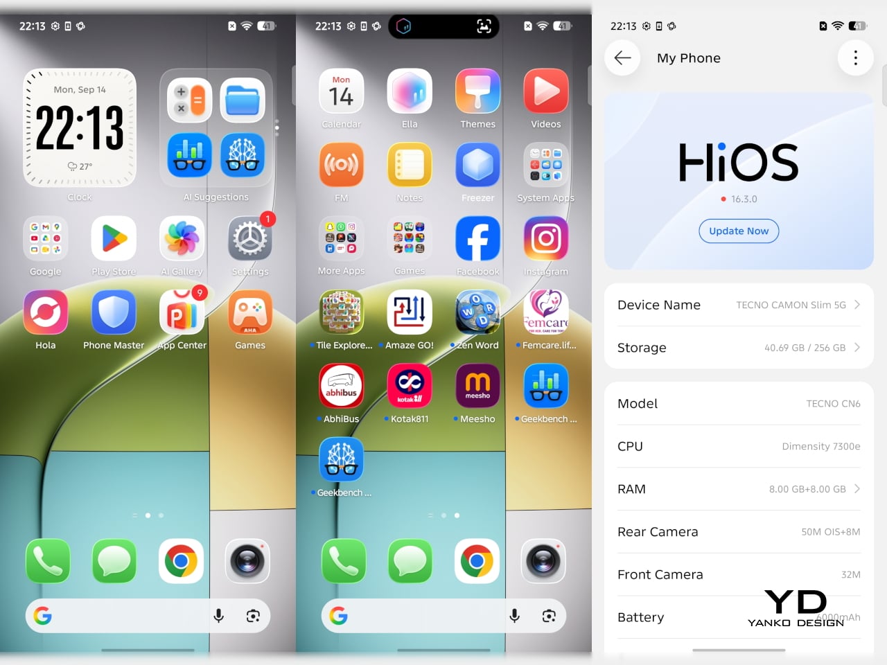
The 50MP Sony LYTIA 700C handles most of the photography workload, and it earns that responsibility. A 1/1.56-inch sensor paired with an f/1.8 lens pulls in plenty of light for evening shots, while the closed-loop ball motor keeps focus locked even when subjects won’t sit still. The 8MP ultra-wide feels more like a footnote, and there’s no telephoto here, but the main camera rarely leaves you wanting one.
The real showstopper is the 6,000mAh battery, a number that seems almost impossible once you remember this phone measures 6.39mm thick. It comfortably carries a full day of camera use, video, and scrolling without the battery anxiety that usually comes with slim designs. That same waterproofing also unlocks a dedicated underwater photography mode, one that kicks in automatically the moment the phone senses it’s gone for a swim.


Sustainability

TECNO rates the CAMON Slim 5G at IP69K, IP69, IP68, and IP66, a combination that’s rare even among phones that don’t have to worry about staying thin. That covers everything from high-pressure water jets to dust particles to full submersion, which is a lot of technical armor for a phone this delicate-looking. Finding this rating on a 6.39mm body is the kind of detail that quietly impresses.
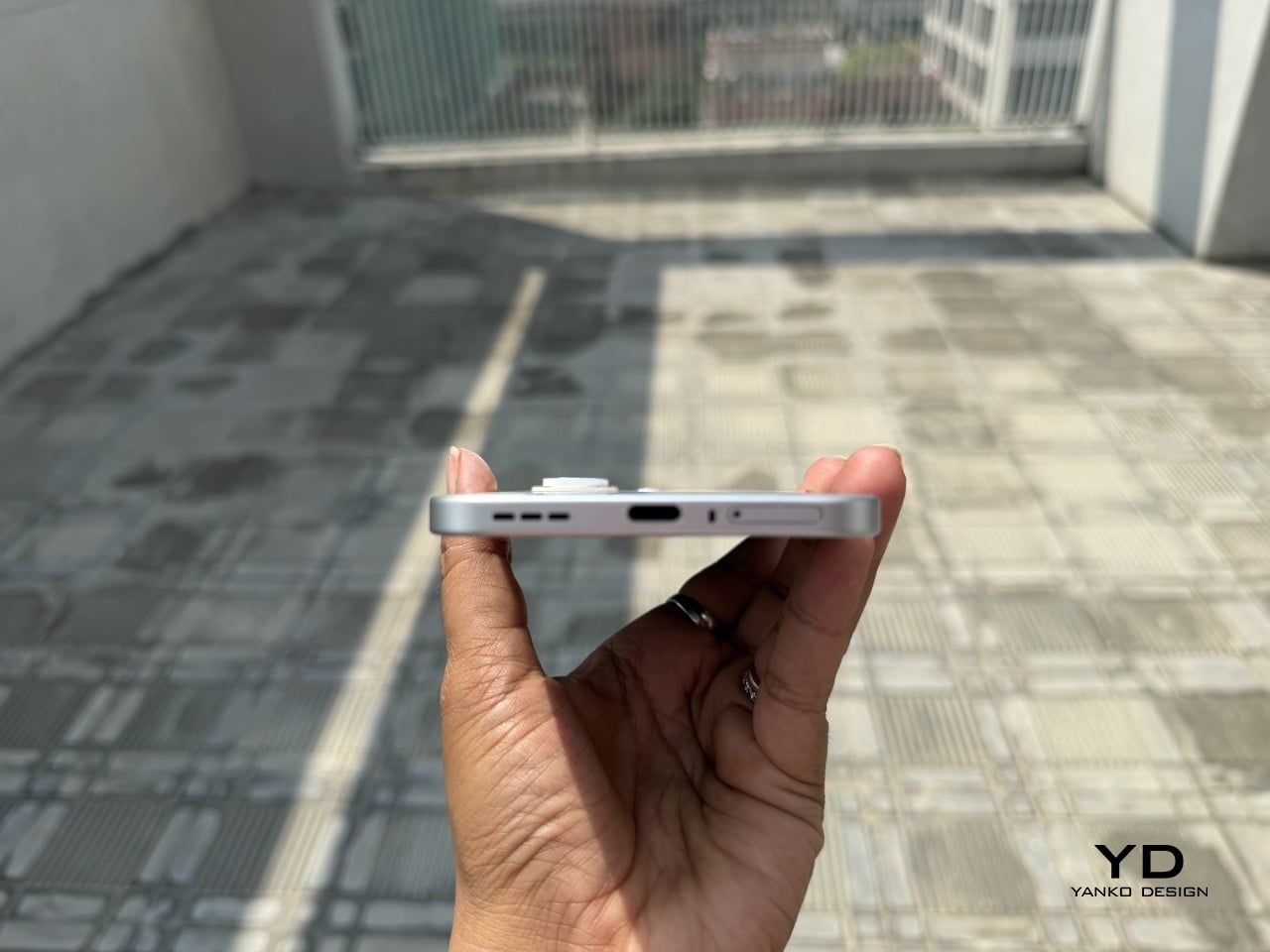
There’s also a MIL-STD-810 rating covering shock and drop resistance, which pairs nicely with features like Rain Touch and Waterproof Case Touch that keep the screen usable in a downpour or behind a case. This doesn’t read like a feature bolted on at the last minute. It feels like TECNO wanted this phone to survive actual daily chaos, not just look good sitting still on a shelf.
Longevity extends past the hardware, too. TECNO promises three major OS upgrades and five years of security patches, plus a 60-month smoothness certification from TÜV SÜD. That’s a meaningful commitment in a market where phones often get abandoned after two update cycles. A well-built object is worth keeping around, and TECNO seems to be betting that owners will want to hold onto this one for a while.

Value

TECNO hasn’t confirmed global pricing yet, but early indications point to somewhere around $400. At that number, buyers get a phone with genuine art-inspired finishes, a 6.78-inch 144Hz AMOLED screen, a Sony-backed 50MP camera with real stabilization, a 6,000mAh battery, and a durability rating that most phones twice the price don’t bother chasing. That’s a fairly generous list for a phone that costs less than most flagships.
Most phones in this price range make you pick a lane. Go thin, and the battery usually suffers, or the body skips water resistance entirely, or the software support runs out after a couple of years. TECNO’s five-year update promise and its layered durability ratings quietly add up to lower long-term cost, since a phone built and supported to last half a decade doesn’t need replacing as often.
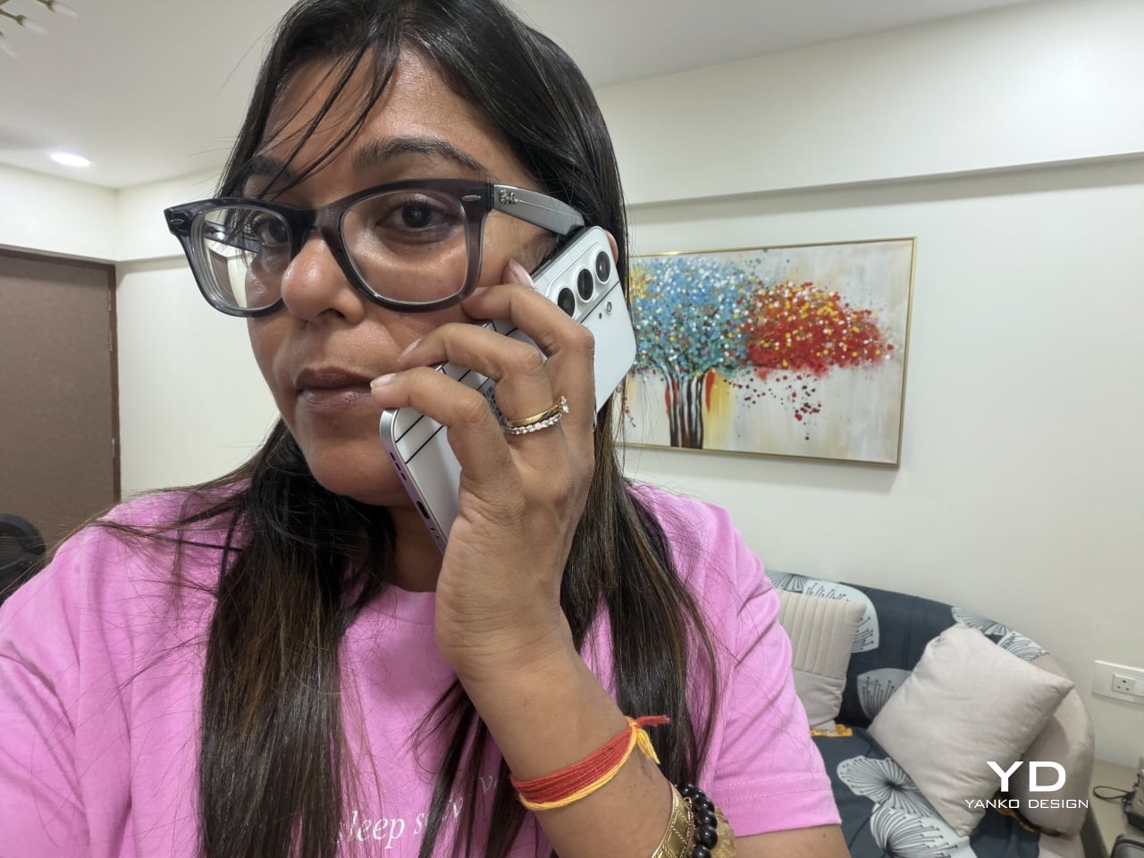
This phone makes the most sense for people who are tired of carrying an identical black slab and want something that says a little more about them. It’s not the right pick for hardcore mobile gamers chasing max frame rates, or photographers who need optical zoom on tap. For nearly everyone else, it covers daily needs while looking like it belongs on a gallery shelf.

Verdict
After a few days of actual use, the 6,000mAh battery and the quad-IP rating stop feeling like marketing footnotes and start feeling like the whole point. TECNO built a phone that looks like it belongs in a design museum and still survives a rainy commute or a splash at the sink. The Neo Mondrian panel alone gives it a personality that’s genuinely hard to find anywhere near this price.

Plenty of phones ask you to choose between something beautiful and something dependable, and most buyers have quietly accepted that trade-off as the cost of owning a nice-looking device. The CAMON Slim 5G makes a strong case that the choice was never as necessary as the industry made it seem. It’s a phone that looks good on a café table and still works fine after falling off of one.
The post TECNO CAMON Slim 5G Review: Thinner than a Pencil, Tough as a Tank first appeared on Yanko Design.

  •  

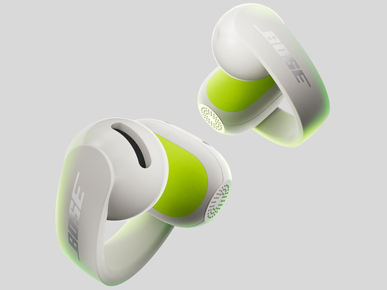
Bose Ultra Open 2nd Gen and Sport Open spice-up the clip-on earbuds options

After almost two years of a lull, Bose has finally released a new version of the Ultra Open Earbuds, along with a new pair of fitness-focused open earbuds. While I’m still a sucker for ANC earbuds that isolate me from the ambient world for deep focus moments, Bose’s new Open earbuds are tempting enough to consider for my walks and outdoor activities.
The hardware for the second-generation Open Ultra has been updated for better audio, while the all-new Sports Open Earbuds explore new territory for hardcore active individuals who trust the brand with their audio requirements. Both these open-ear audio accessories take on the competition with a strong set of specifications, features, and pricing to keep everyone interested.
Designer: Bose

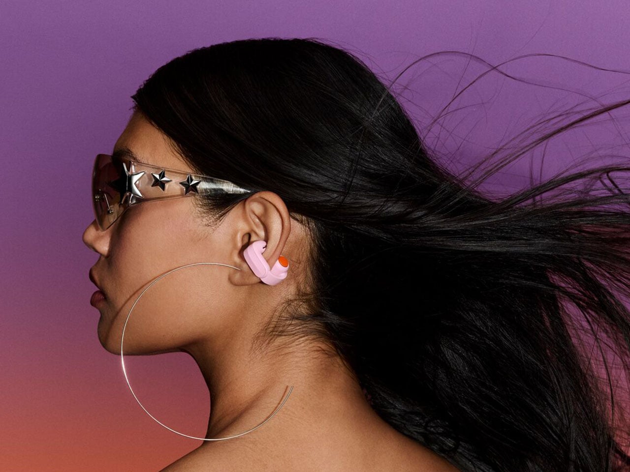
The timing of this release is perfect, as the open-ear earbuds are trending amongst individuals who need to be aware of the environment and, more importantly, suffer from occlusion triggered by ANC earbuds. Sure, those buds have transparency mode for situations where you need to hear what’s happening around, but the open-ear options are ideal for runners, cyclists, or public transport users. The two of them will support Bluetooth 5.4 multipoint connectivity for two devices and Google Fast Pair. Both these open-ear buds will be available for pre-order from 19 September, and available from October 1 in Black and White Smoke along with other respective limited edition colors.

Ultra Open Earbuds 2nd Gen

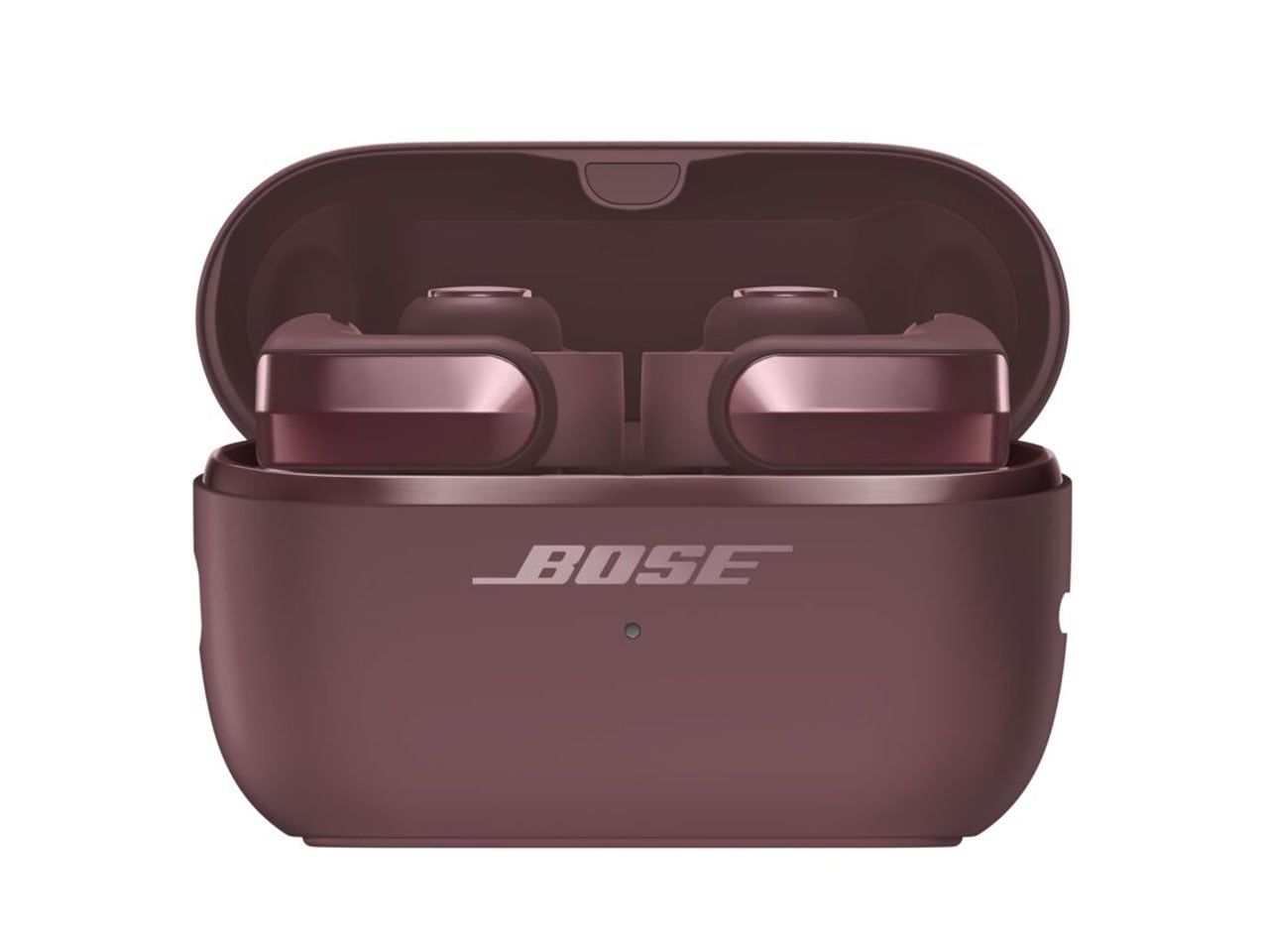
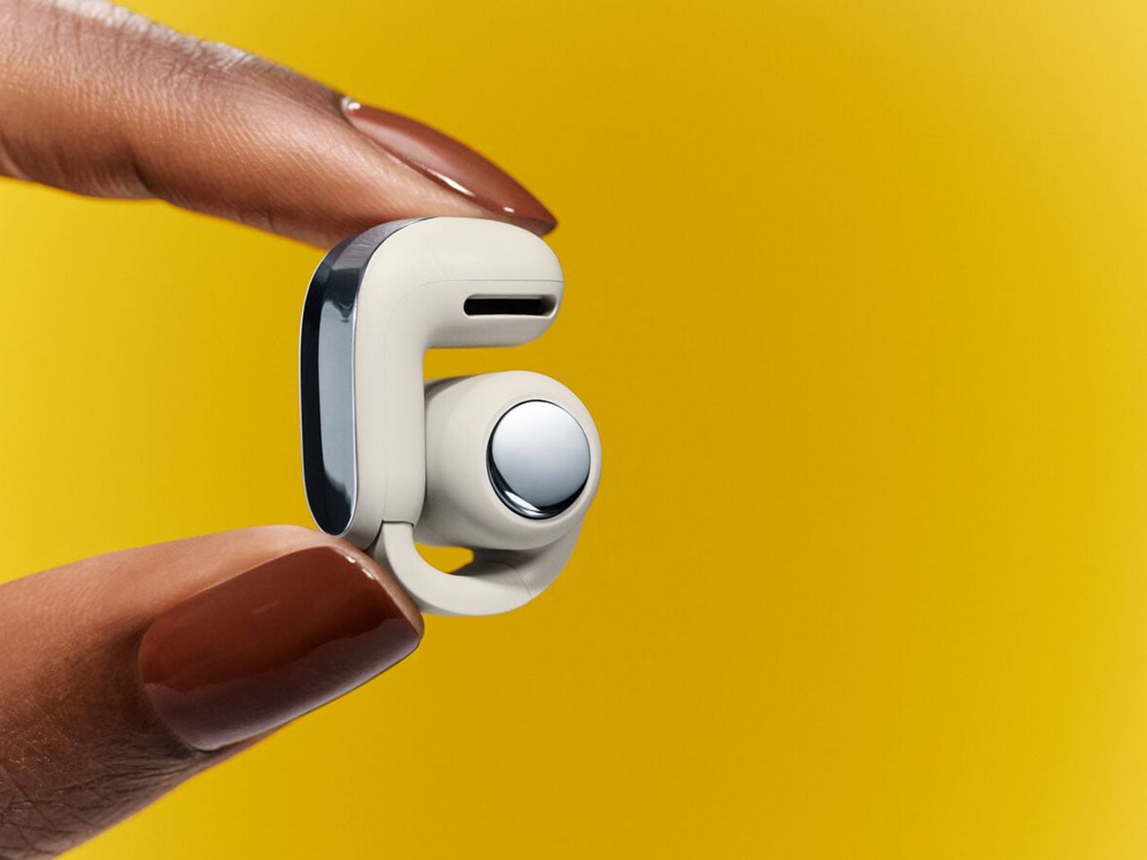
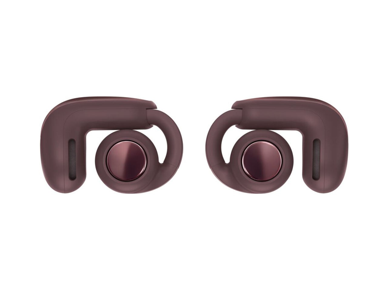
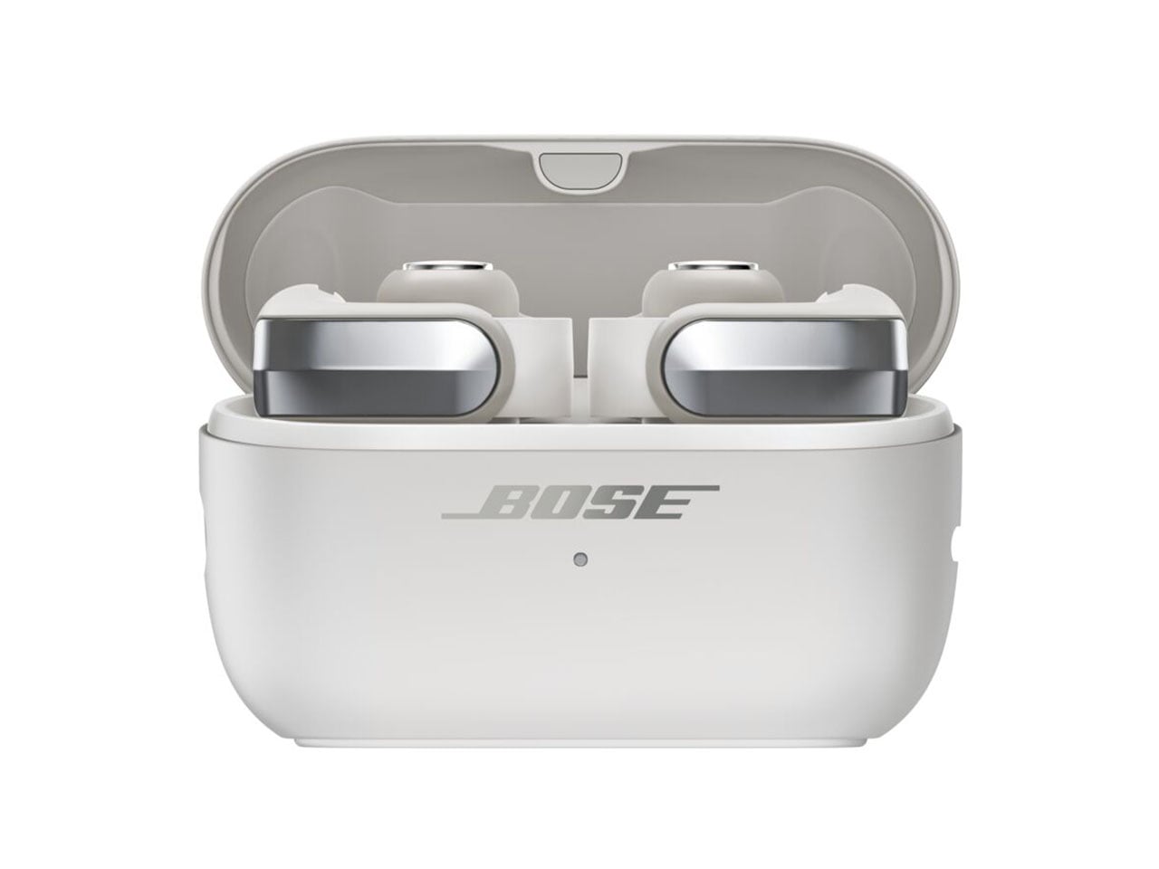
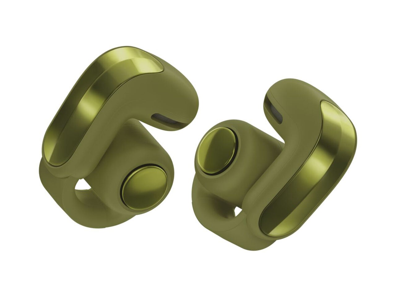
The flagship Ultra Open Earbuds arrive in the second generation to create “more listening moments across active pursuits and everyday life.” The buds are reengineered with better drivers to deliver deeper bass and a higher volume compared to the outgoing version. This has been the major complaint of existing users, and Bose has listened to the feedback and delivered the fix. The look and feel of the buds have been upgraded as they get a refined metallic cap with a beveled finish, while the case also benefits from a renewed design that makes them stand upright. As a welcome addition, the case is now wireless charging compatible. On the buds, you’ll now get 9 hours of battery life, with an additional 19.5 hours on the case. The buds support quick charge to deliver two hours of playback with just 10 minutes of quick charge.

High-quality audio is the main USP, as the open-ear buds get the aptX Adaptive codec and Snapdragon Sound support. For a better calling experience, the buds benefit from the Speech Clarity tech to adjust the listening volume automatically based on the environmental noise. Of course, this is AI-driven to smoothly transition the volume step. For those who love to watch movies and shows in surround sound, there is the Cinema mode that employs Bose’ TrueSpatial tech to envelope you in a 3D sound capsule. Ultra Open Earbuds (2nd Gen) will arrive in limited-edition Olive Green, Cherry Chocolate, and Sky Pink colors for $299.

Sport Open Earbuds

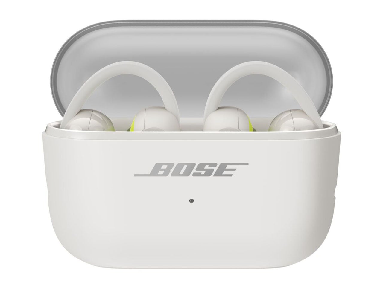
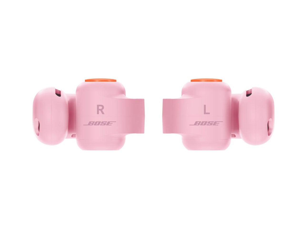
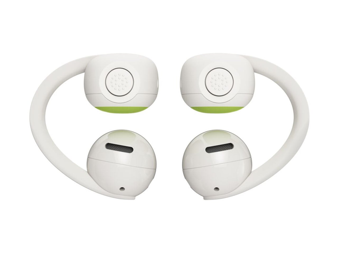
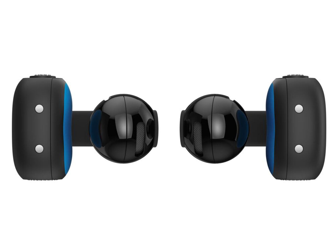
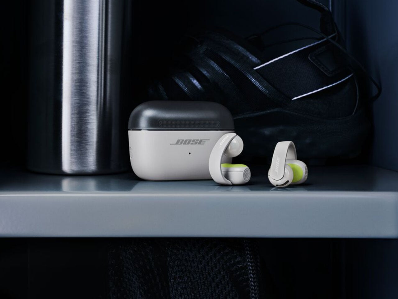
The new kid on the block is the Bose Sport Open Earbuds, which are designed for a secure fit and rated IP54 for dust and splash resistance. Compared to the big brother, these clip-on earbuds sport a more roundish hinge to stay in place even with the most rigorous activities like playing sports, running, or working out in the gym. According to Bose, the Sport Open Earbuds stay in place even with headshakes, cartwheels, and other activities.” For these open-ear wireless earbuds, Bose has opted for the tactile physical buttons since fiddling for touch controls is not practical.

For a sportier design, the earbuds get a translucent case lid that is textured for better grip. Each of the buds weighs 10 grams for all-day wearing comfort and touts 7 hours of listening time, with 29 hours total with the case. The Sport Open Earbuds will be available for $199 in limited-edition Eucalyptus Green, along with the aforementioned color options.

The post Bose Ultra Open 2nd Gen and Sport Open spice-up the clip-on earbuds options first appeared on Yanko Design.

  •  

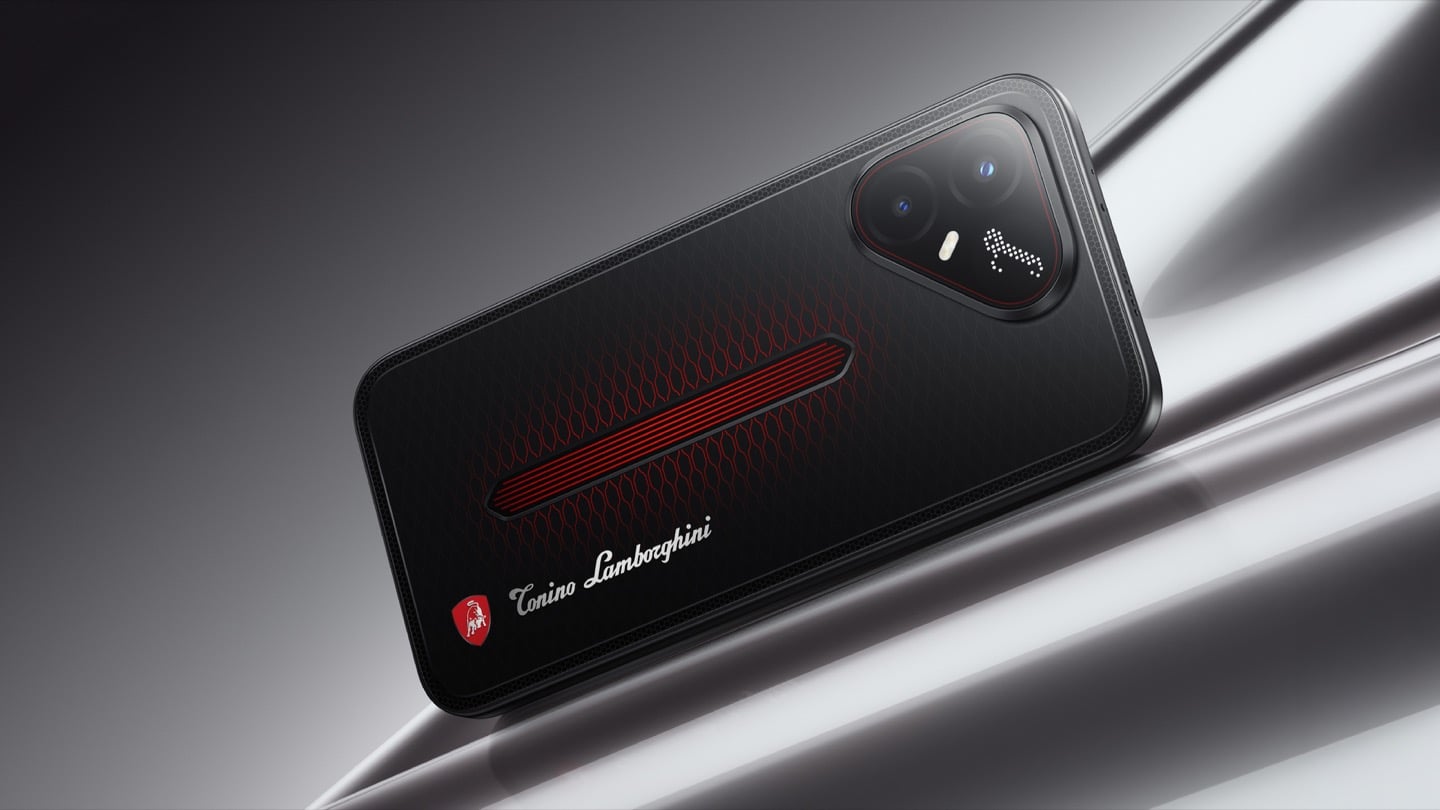
TECNO’s Lamborghini Phone Draws Its Logo in Light Using 177 Mini LEDs

TECNO POVA 8 Pro 5G Tonino Lamborghini Limited Edition

The most expensive Lamborghini phone ever made was a $6,000 slab of hand-stitched leather and gold plating called the 88 Tauri, and it ran Android KitKat on a Snapdragon 801. That was CES 2015, peak era for buying two-year-old silicon at four times the price because someone put a bull on it. Tonino Lamborghini made three of those phones between 2013 and 2017, then went away. The name has now resurfaced on the back of a TECNO POVA that costs about $490, and the badge is finally earning its position. It gets drawn in light instead of stamped in metal.

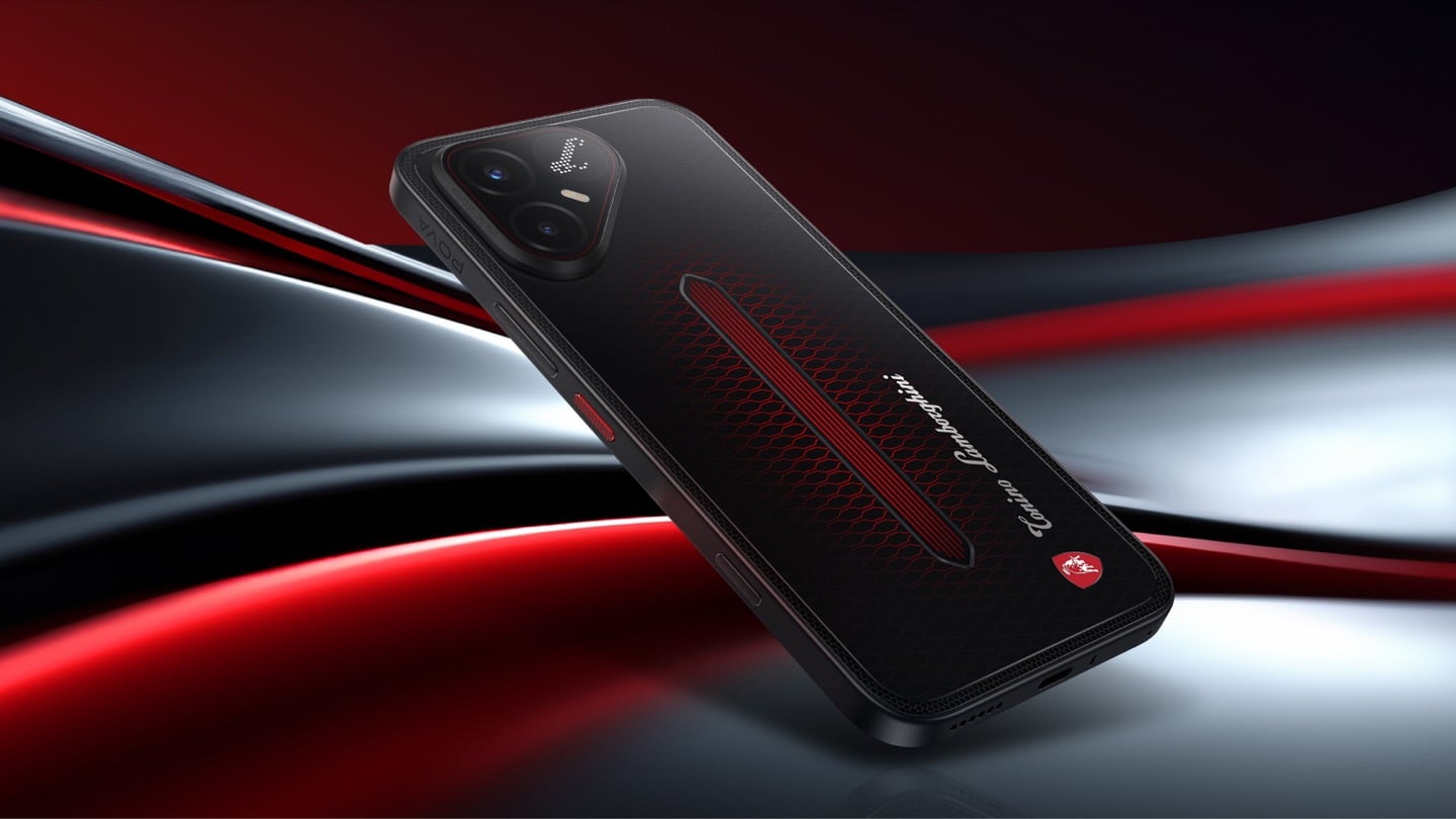
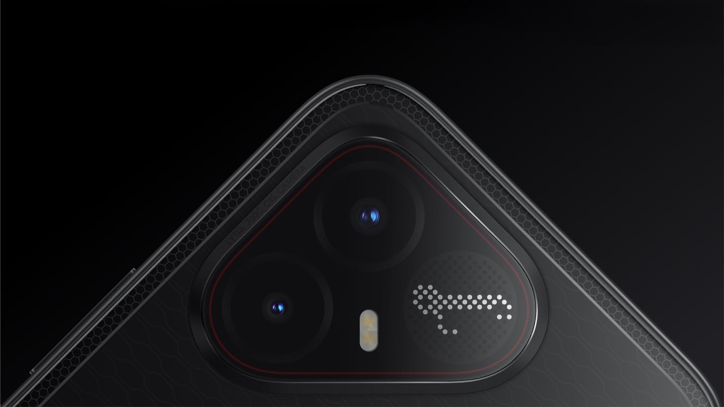
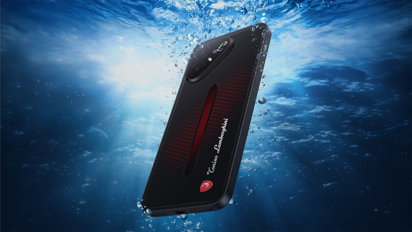
On the POVA 8 Pro 5G Tonino Lamborghini Limited Edition, the Italian brand’s “L” is rendered by 177 individually controlled mini-LEDs in TECNO’s Alive Matrix panel, and the red Pulse Line down the center of the back is a passive optical effect built from internal mirror structures sandwiched between two coating layers at different physical heights. Rotate it and the red rises out of the black, then drops back in. The phone is spec-identical to the standard POVA 8 Pro, so every difference you are paying for is a surface decision. Thai prices start at 15,999 baht for 8GB and 256GB, topping out at 19,999 baht for 12GB and 512GB. There is no US release and no US carrier certification.

Designer: TECNO Design Team, in collaboration with Tonino Lamborghini S.p.A.

Mechanical Grammar, Translated

The brief TECNO gave itself was to take a vocabulary that belongs to cars and make it belong to a slab of glass and aluminum, and the way in usually decides whether that kind of project reads as clever or as a paste job. The team started with the visual codes of mechanical design rather than the logo itself: body lines, cooling grilles, honeycomb patterns, exhaust-inspired detailing. That’s the right instinct. A shield pasted onto a black rectangle says nothing. A shield built from the same geometric logic as an engine bay at least has a reason to exist there. The result is the Signature Shield pattern ringing the Pulse Line, a hexagonal structure lifted from Tonino Lamborghini’s own emblem and mechanical detailing rather than invented fresh for the phone. It gives the back of the device an actual sense of depth and structure instead of a flat decal sitting on top of a chassis that was never designed with it in mind.

The Manufacturing Problem Nobody Sees

The interesting part isn’t the pattern, it’s how TECNO built it. Getting that Pulse Line to shift color under different lighting angles required internal mirror structures processed to redirect light the way a curved mirror does, stacked underneath a brightness-enhancing first layer that behaves closer to a lacquer finish than a printed graphic. Between the two layers sits a real, physical height difference, which is what gives the effect actual depth rather than the flat printed texture you get on most co-branded rear panels. TECNO describes this as one of the most complex rear-cover processes it has run on a POVA product, and the harder problem wasn’t making one unit look right, it was getting thousands of units to look right consistently. That’s a legitimate manufacturing achievement on a phone priced well under $500, and it’s the kind of detail that gets lost entirely once a press release compresses it down to “premium finish.”

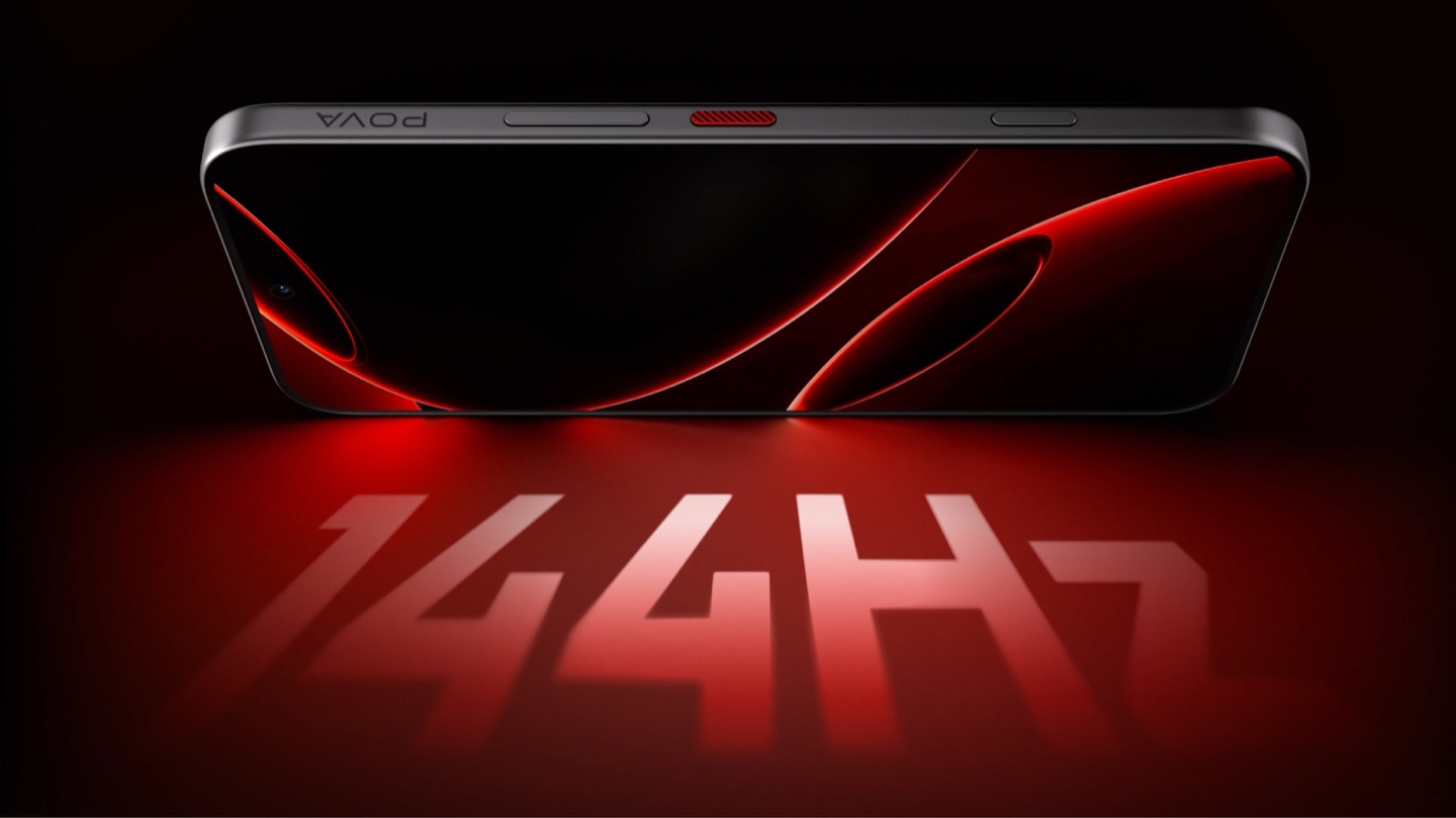
POVA 8 Pro 5G Tonino Lamborghini Limited Edition with a 144Hz Display

A Skin That Goes All the Way Through

TECNO didn’t stop at the shell, which is the part most co-branded phones treat as optional. The software carries the same black-and-red system with reworked icon outlines, nudging soft rounded shapes toward hexagon and shield silhouettes so the interface reads as an extension of the hardware rather than a wallpaper slapped over stock Android. TECNO says the software work alone took close to four months, covering the boot animation, dynamic wallpapers, ringtones, and the Alive Matrix “L” effect. The accessories continue the bit: a braided black-and-red cable, a case built from TPU and polycarbonate carved with a Kevlar-inspired carbon fiber texture. None of it is essential to how the phone functions, but all of it is the difference between a badge and a bit that someone actually thought through.

What a Tonino Lamborghini Badge Used to Cost

Worth sitting with how far this pulls the brand from its own history. This partnership started back in March at MWC, where TECNO and Tonino Lamborghini unveiled the POVA Metal Tonino Lamborghini Limited Edition alongside a water-cooled mini gaming PC concept carrying the same red-and-gunmetal language into laptops, tablets, and earphones. That first phone felt closer to the old playbook than this one does. The 88 Tauri and its 2014 sibling, the Antares, were built around leather, gold plating, and price tags that assumed the badge alone justified the markup. The 2017 Alpha One dialed the ornamentation down but kept the price near $2,100. Automobili Lamborghini’s own collaborations, including the Oppo Find X Automobili Lamborghini Edition at €1,700 against a €1,000 base phone, followed the same math: better materials, a visible badge, a premium that tracked the logo rather than the manufacturing. This is the first Lamborghini phone where the badge shows up as a production process instead of a price justification, and it happens to be the cheapest one the family has ever put its name on. For the full spec rundown on the rear panel construction, we’ve covered the hardware side of this phone in detail already.

Close-up of the TECNO POVA 8 Pro 5G Tonino Lamborghini Limited Edition phone's camera bump

Price, Availability, and the Fine Print

Thailand has this now, sold through BaNANA, IT CITY, Jaymart, and other retailers since August 21, with early buyers getting a Tonino Lamborghini backpack and a Tecno Watch 3 Active thrown in. Pricing for India and other markets hasn’t landed yet as of this writing. If you’re reading from the US, this one isn’t coming your way in any official form. TECNO has no FCC certification and no carrier partnerships stateside, so anything that turns up on a resale site is a gray-market import with no warranty support behind it. Worth knowing before anyone gets attached to a color they’ll never see in a carrier store.

The Badge, Recalibrated

TECNO didn’t need Tonino Lamborghini’s name to sell a $490 phone with a good screen and a big battery, which makes the choice to spend four months on software and reinvent the rear-cover process for a mid-ranger feel almost backward by traditional luxury-licensing logic. Usually the name does the selling and the hardware coasts. Here the hardware earns the attention and the name rides along for once. Whether that model survives past a limited run is a separate question, since Tonino Lamborghini’s own history with phones has always run in short bursts before going quiet for years. For now, the badge looks better on a light source than it ever did on leather.

The post TECNO’s Lamborghini Phone Draws Its Logo in Light Using 177 Mini LEDs first appeared on Yanko Design.

  •  

5 Things the iPhone Duo Got Right That Samsung Still Hasn’t

Samsung has had the folding phone conversation to itself for six years now, tweaking hinges, shrinking creases, and figuring out what a cover screen is even for. Apple waited, watched, and let its rival make every mistake first. That patience shows in the iPhone Duo, a first-generation foldable that skipped straight past problems Samsung’s Galaxy Z Fold8 still hasn’t fully solved.

None of that comes cheap, though. The Duo starts at $1,999 and costs more than the Fold8’s $1,899.99, weighs in at roughly nine ounces against the Fold8’s seven, and folds up thicker in your pocket, besides. Samsung still wins those arguments outright, and we’ll get back to that later. But set weight and price aside, because here are five places where Apple’s first foldable actually beat Samsung’s eighth attempt.

Designer: Apple

The Camera That Disappears

A foldable phone’s whole pitch is the screen, one continuous surface that opens up into something closer to a small tablet. Every notch or punch-hole cut into that surface breaks the illusion a little, reminding you that the software is still working around a sensor buried in the glass. Samsung’s Galaxy Z Fold8 has never quite escaped that compromise, even eight generations in.

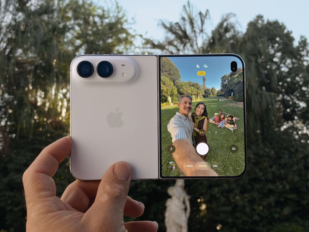
The Galaxy Z Fold8 carries a 10-megapixel camera punched into both the inner and cover displays, a hole you notice every time the screen lights up. The Duo takes a different route entirely, tucking its inner selfie camera under the panel itself so nothing interrupts the display when you’re watching a movie or scrolling through photos with both halves open. The outer screen keeps a single, smaller cutout.

A Stylus Samsung Gave Up On

Samsung built its whole Note legacy around the S Pen, then carried that stylus into the first few generations of the Galaxy Z Fold before quietly dropping it this cycle. Neither the Galaxy Z Fold8 nor the Galaxy Z Fold8 Ultra bring it back, leaving a gap for anyone who used to sketch, sign, or jot notes onto that big inner display. It’s a strange retreat for a company built on that exact feature.

Samsung Galaxy Z Fold6

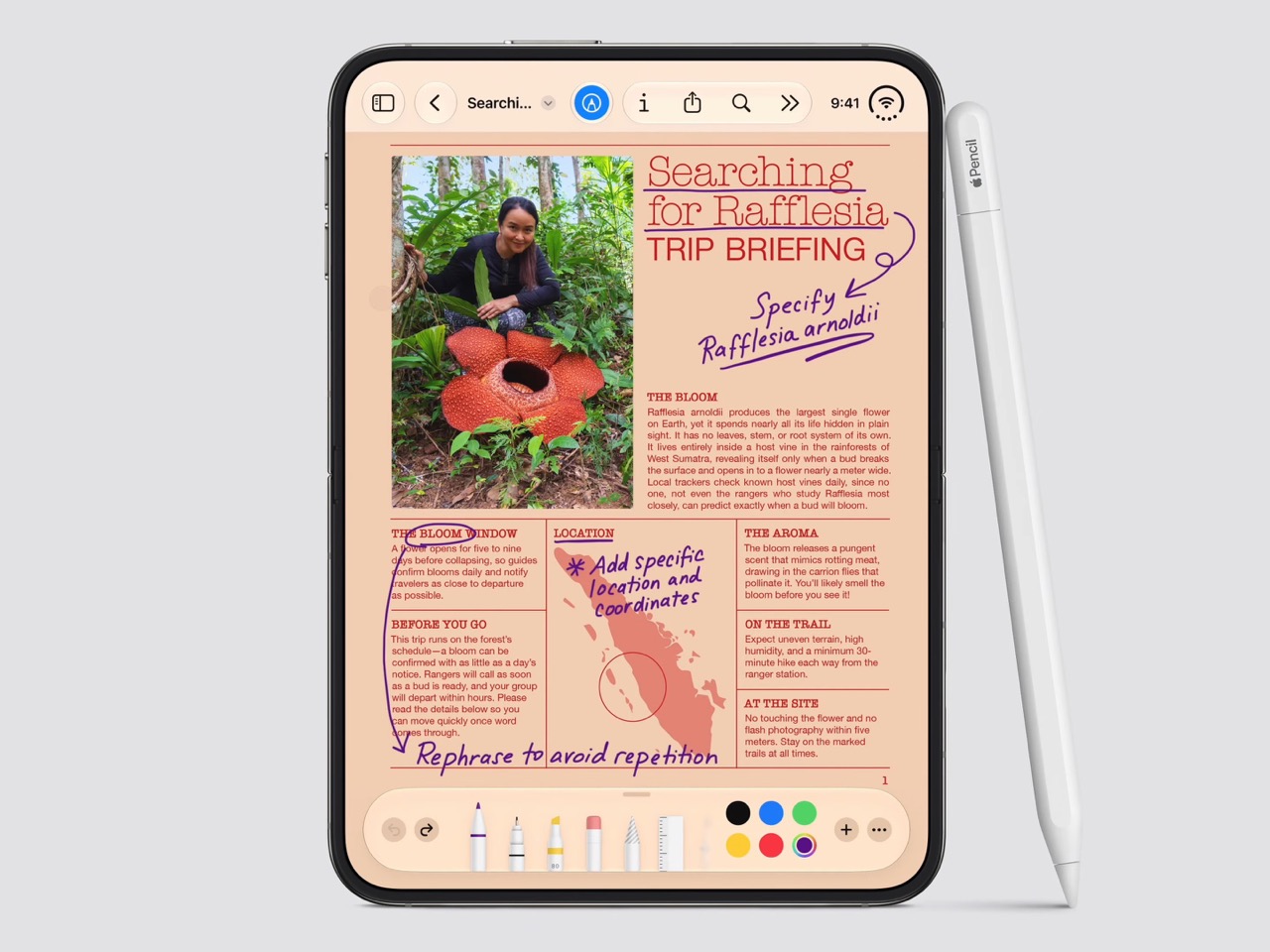
Apple Pencil support changes that, working on both the 5.4-inch cover screen and the 7.6-inch inner display, once it arrives. Dual-screen support lands through a software update later this year rather than at launch, so early buyers will have to wait a bit for the full experience. Still, it means signing a document or sketching an idea won’t require unfolding the phone first, something Samsung’s lineup can no longer offer.

Built to Survive the Mess

Dust is the part of durability testing everyone forgets about until it’s too late, and a folding hinge is the worst possible place for grit to sneak into. Water resistance ratings get all the marketing attention, but the dust half of an IP rating tells you whether sand at the beach or fine construction dust will actually make it past the seals and start scratching at the mechanism underneath.

The iPhone Duo carries an IP68 rating, meaning the seal is dust-tight; nothing gets through, full stop. The Galaxy Z Fold8 only manages IP48, which covers water fine but leaves that dust digit low enough that fine particles, sand, and powder aren’t actually kept out. For anyone who takes their foldable to a beach, a workshop, or just a dusty backpack, that gap matters more than it looks.

Room for Everything You Shoot

A foldable’s bigger inner screen practically begs you to shoot more video and drag around heavier files, whether that’s 4K footage, a stack of RAW photos, or a library of apps you’d never bother installing on a regular phone. Storage stops being an afterthought pretty quickly once you’re using the extra screen real estate the way it’s meant to be used, for actual creative work instead of just bigger icons.

Apple tops out the iPhone Duo at 2TB of storage, double what the Galaxy Z Fold8 offers at its 1TB ceiling. That’s the difference between planning around your camera roll on a long trip and simply forgetting storage exists as a problem. For anyone who treats their foldable as a mobile production tool rather than a bigger email client, that extra headroom ends up mattering more than the megapixel count.

Fighting the Fold’s Oldest Flaw

The crease down the middle of a folding screen has been the one problem no manufacturer has fully cracked, Samsung included, no matter how many generations they’ve shipped. Apple’s approach to the Duo’s hinge stacks a nano-texture matte layer over glide-adhesive glass and backs the whole assembly with a titanium plate, an engineering answer to a problem that’s mostly been treated as unavoidable elsewhere in the industry.

Early impressions from outlets with briefing access suggest the crease is still visible. Nobody’s claiming otherwise, but it doesn’t catch your finger or your attention the way it does on most rivals, the Galaxy Z Fold8 included. That’s worth flagging as an early read rather than a verified result, since neither phone has landed in reviewers’ hands yet. Outdoor glare handling gets similar praise, though the real test comes once these ship.

What Samsung Still Gets Right

None of this makes the Galaxy Z Fold8 a bad phone, and Samsung still wins the arguments that matter most to plenty of buyers. It’s $99.01 cheaper, noticeably lighter at roughly seven ounces against the Duo’s nine, and thinner whether it’s folded shut in your pocket or opened flat on a desk. Those are real, measurable advantages, not consolation prizes.

Apple iPhone Duo

Samsung Galaxy Z Fold8

What you’re really choosing between is a phone that’s been refined for eight generations and one making its very first attempt, price and weight included. A first try that already beats its rival on a camera, a stylus, a durability rating, storage, and a hinge design is a strong opening argument, whatever it costs to get there. Samsung’s turn to respond comes next year.

The post 5 Things the iPhone Duo Got Right That Samsung Still Hasn’t first appeared on Yanko Design.

  •  

The $300 Sony Headphones Everyone Wanted Are Actually Back

Anyone who has priced out a decent pair of noise-cancelling headphones this year has felt the sticker shock. Sony’s own flagship, the WH-1000XM6, launches at $449.99, and its wilder sibling, the 1000X The ColleXion, sits even higher. Bose isn’t cheaper. Sennheiser isn’t cheaper. The whole category has quietly drifted toward the idea that “premium” now means “$400 and up,” and a lot of people who just want good ANC for their commute or their next flight have been priced out of the conversation entirely.

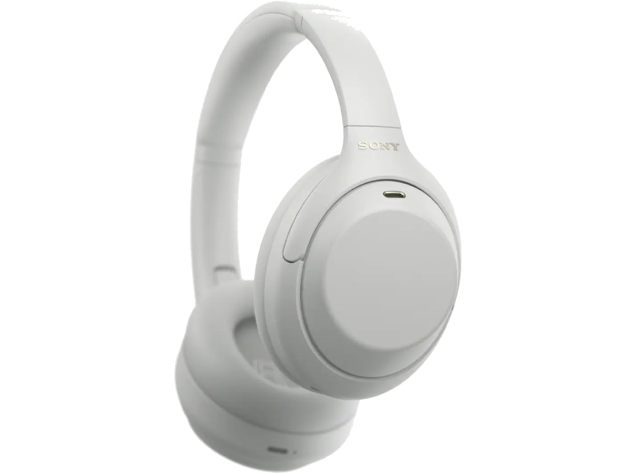
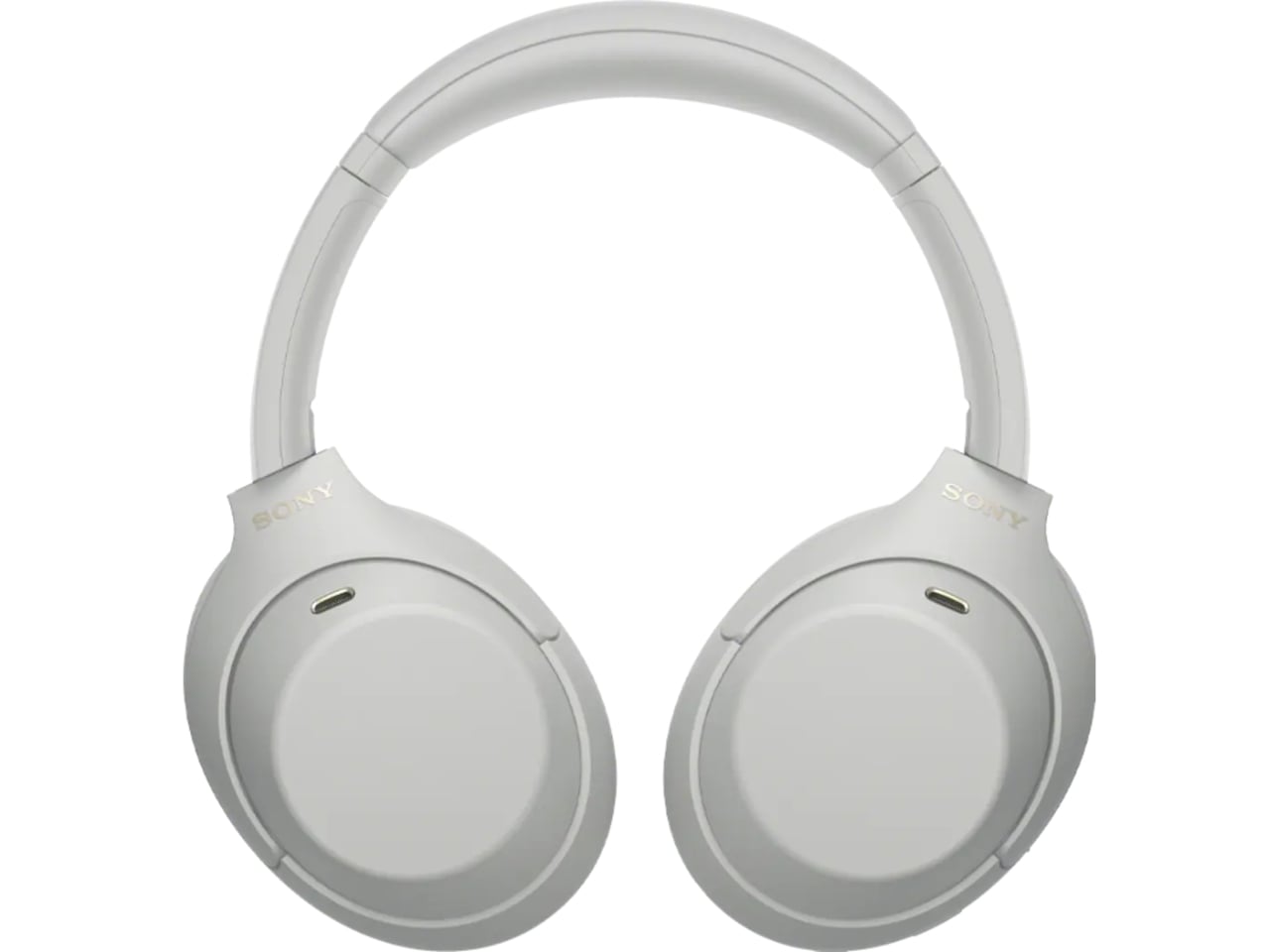
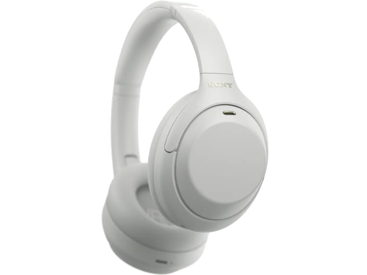
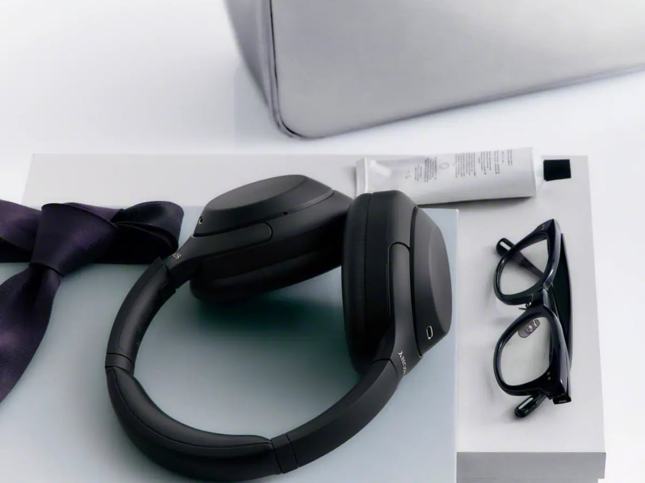
That gap is exactly what the Sony WH-1000XM4C is built to fill. Rather than chase another spec bump nobody asked for, Sony reached backward and pulled the WH-1000XM4, arguably the most decorated headphones the company has ever made, back onto shelves. It’s a strange move on paper. It’s a smart one in practice.

Designer: Sony

The original XM4 launched in 2020 at $349.99 and spent the next few years collecting best-of lists like trophies. Then Sony did what companies do: it moved on. The XM5 arrived in 2022 with a slicker profile and a bigger price tag, and the XM4 quietly slid off the roster, even as secondhand units kept trading hands and forum threads kept insisting it was still the smarter buy. That’s a telling signal. Products don’t usually get nostalgic followings this fast unless they actually solved a problem well the first time.

So here comes the WH-1000XM4C, essentially that same beloved design, tuned up and priced down to $299.99, a full fifty dollars less than what the XM4 cost at launch six years ago. Sony isn’t calling it a sequel or a flagship. It’s calling it what it is: the old favorite, finally made available again, minus the frustration of paying more for less.

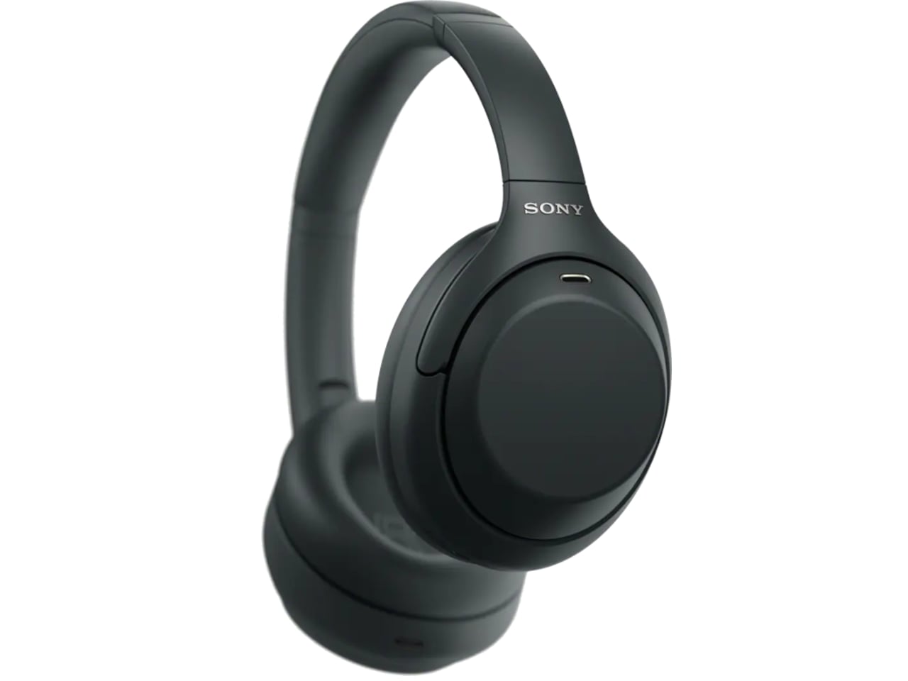
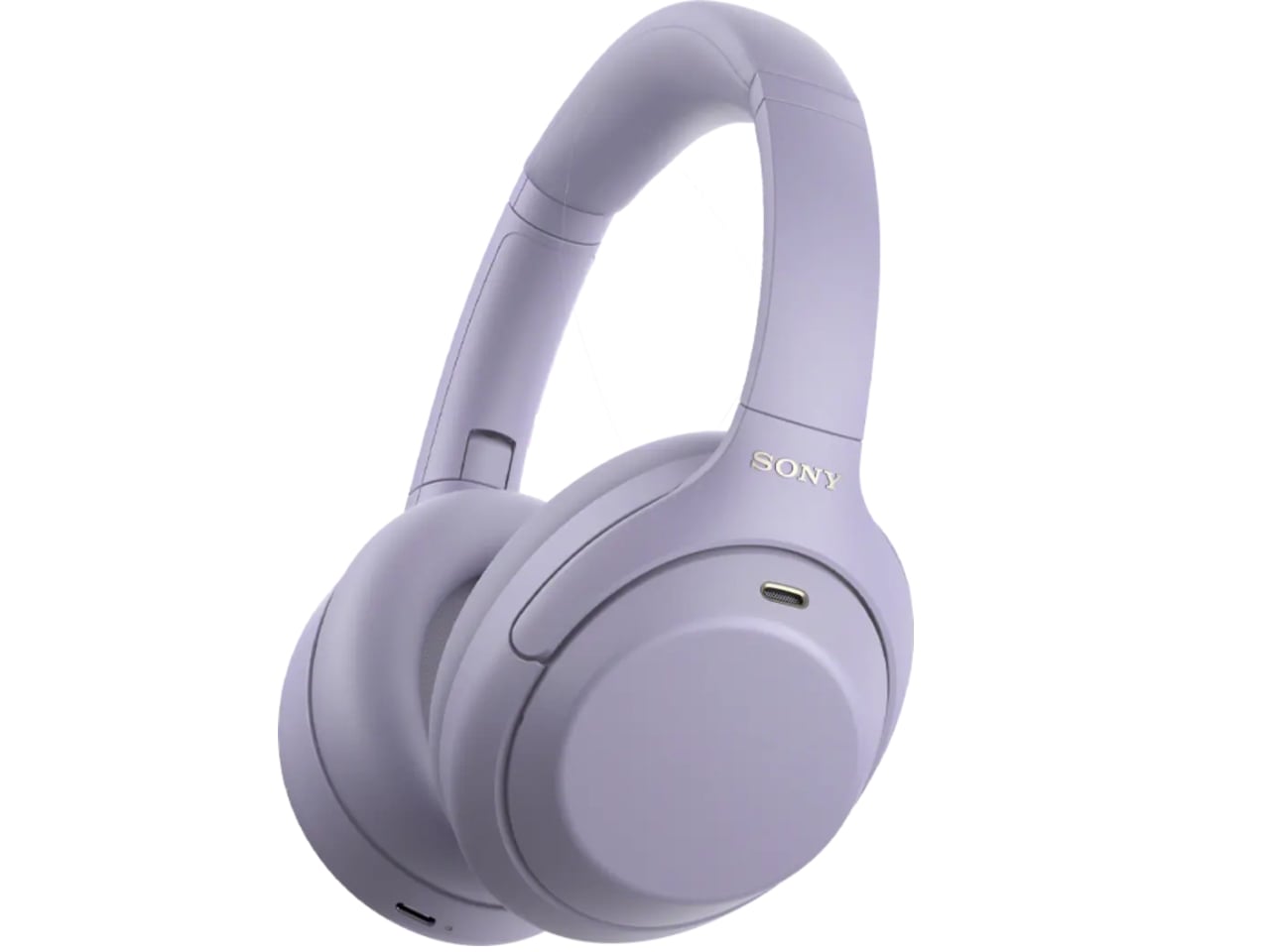
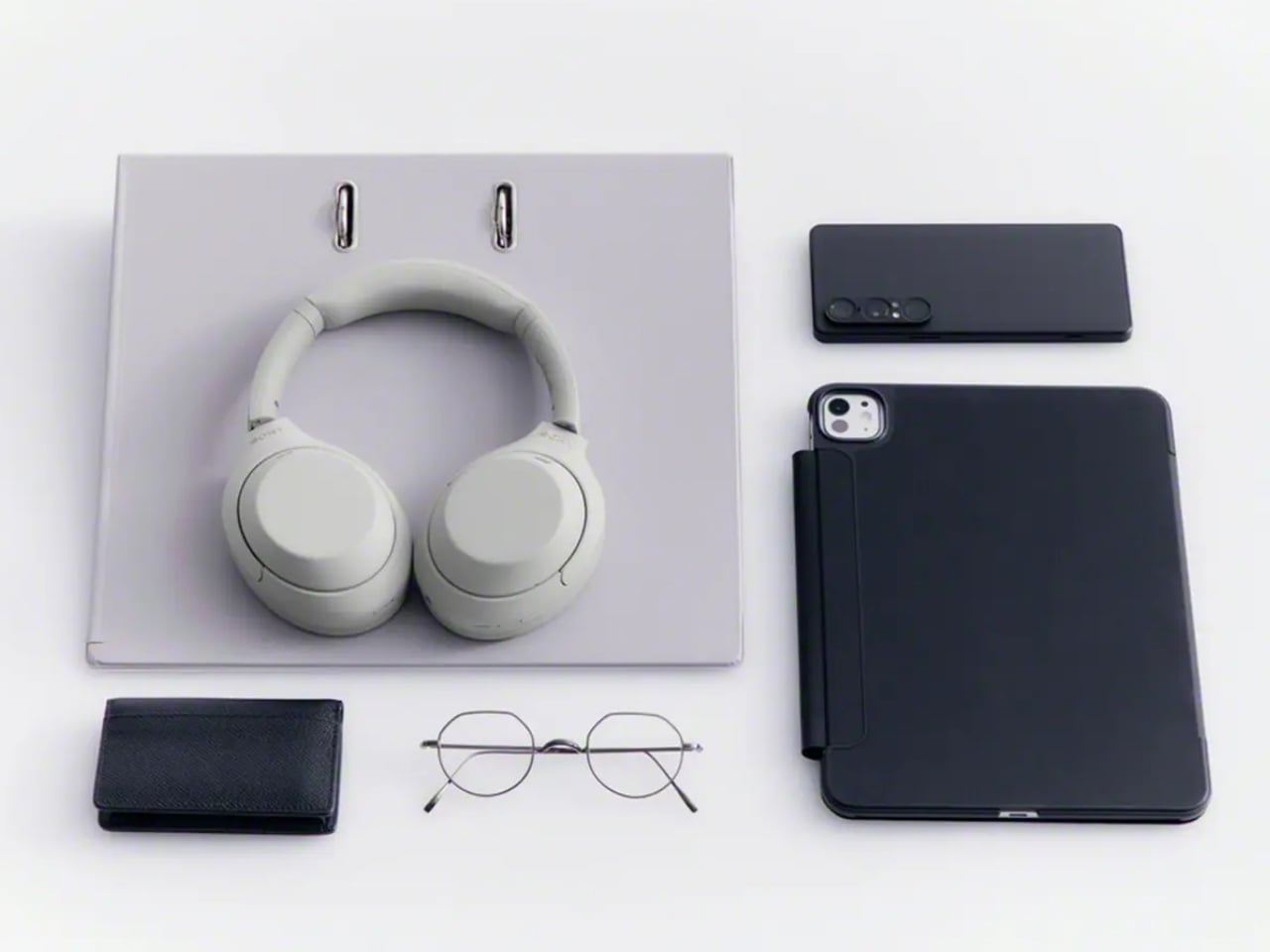
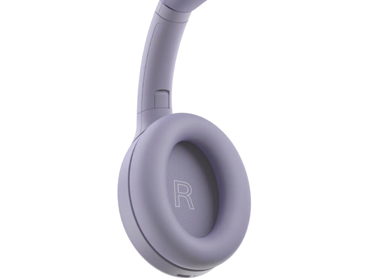
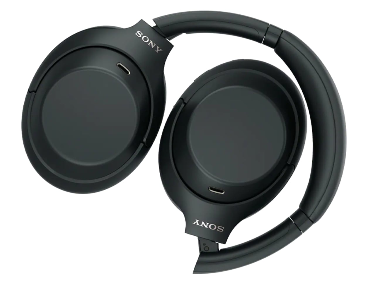
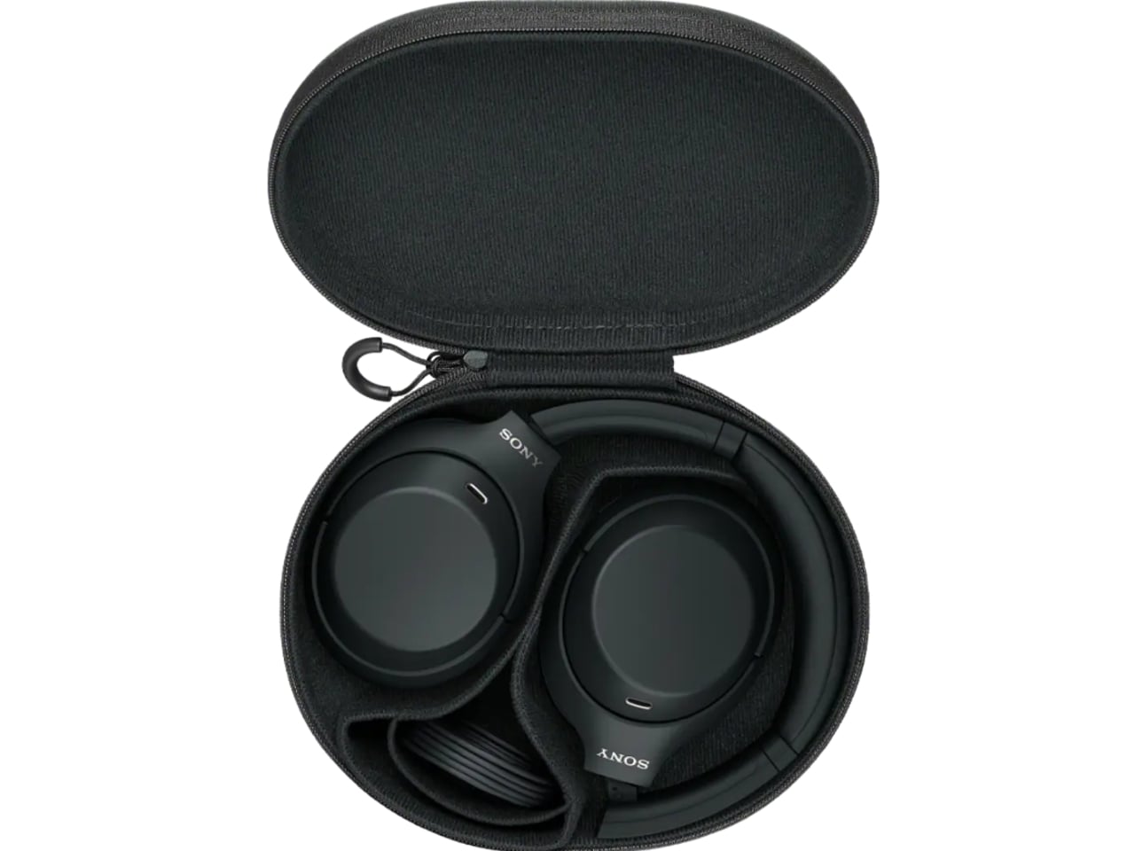
The changes are modest, and that’s sort of the point. The equalizer jumps from five bands to ten, plus a new gaming EQ, so listeners actually get more control over their sound instead of trusting Sony’s factory tuning blindly. There’s a new Lavender colorway alongside the familiar Black and Platinum Silver, a small but welcome nod to people who don’t want their headphones to look like they were designed for a boardroom. The foldable hinge and rotating ear cups are back too, which matters more than it sounds. The XM5 abandoned that folding design entirely, and the XM6 only brought it back last year. The XM4C proves that some engineering decisions age just fine.

There is one real trade-off. To meet updated battery regulations, the XM4C uses a different cell, and that shaves ANC battery life from 30 hours down to 27. Sony compensates with faster charging, three minutes on the cord for a full hour of playback, which is a fair swap for most people who top up during a commute anyway.

What I appreciate here isn’t the spec sheet. It’s the confidence behind the decision. Bringing back a six-year-old product without dressing it up as something revolutionary takes a certain honesty that most tech companies avoid. Sony isn’t pretending this is groundbreaking. It’s admitting that the formula already worked, and that not every product needs constant reinvention to stay relevant.

There’s a mild irony worth naming. Sony still sells discounted stock of the original XM4 at the same $300 price point, and by most accounts, that older pair edges out the XM4C slightly on raw sound and noise cancellation. So the company is technically competing with itself. But for shoppers, that’s not really a problem. It just means there are now two well-regarded paths into the same trusted design, instead of one shrinking window before flagship prices take over completely.

Headphones don’t usually get second chances like this. Most get replaced, discounted into clearance, and forgotten. The XM4C suggests a different approach is possible, one where a genuinely good product doesn’t have to disappear just because something newer showed up. That’s a quieter kind of innovation, but it might be the one more of the industry could stand to learn from.

The post The $300 Sony Headphones Everyone Wanted Are Actually Back first appeared on Yanko Design.

  •  

Your iPhone’s Portrait Mode Was Fake for a Decade – The iPhone 18 Pro Changes That With A Real Aperture

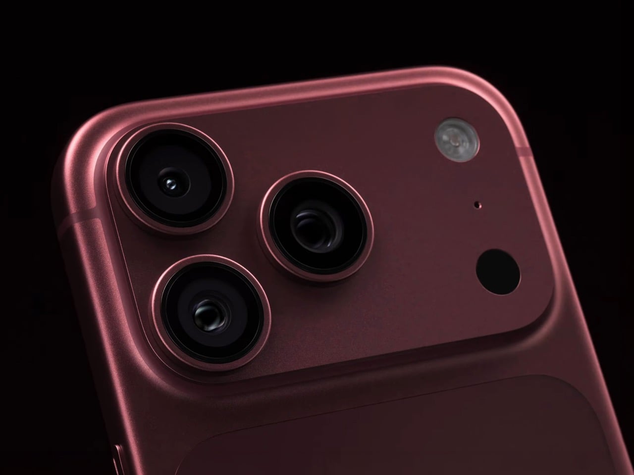
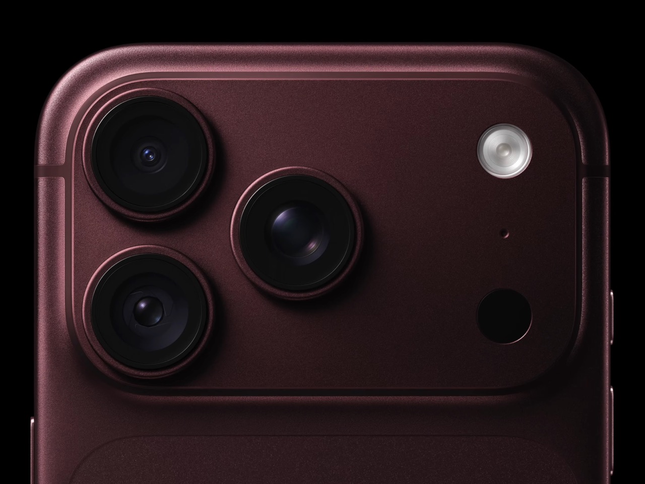
Would you be shocked to hear that the “Portrait Mode” on your iPhone all these years was ‘fake’? Well, it’s real as in the background is actually blurred, but it isn’t blurred because the camera captured it that way, it’s all been software trickery for the past decade… until now. Six laser cut blades, each thinner than a human hair, are about to change that. The iPhone 18 Pro’s new main camera can physically open and close its lens for the first time in iPhone history, and that single mechanical change rewrites how the blur behind your subject actually gets made.

Here’s the quick version of how Portrait Mode has worked since 2016. Your iPhone takes the shot, uses a second lens or depth data to figure out roughly where you end and the background begins, then runs software over the image to blur everything behind that outline. It’s a clever guess dressed up as photography, and it’s why hair strands sometimes disappear into a smudge or a stray earring gets blurred along with the wall behind it. The new aperture system skips the guessing entirely. The lens itself controls how much of the scene stays sharp, the same way it’s always worked on a real camera.

Designer: Apple

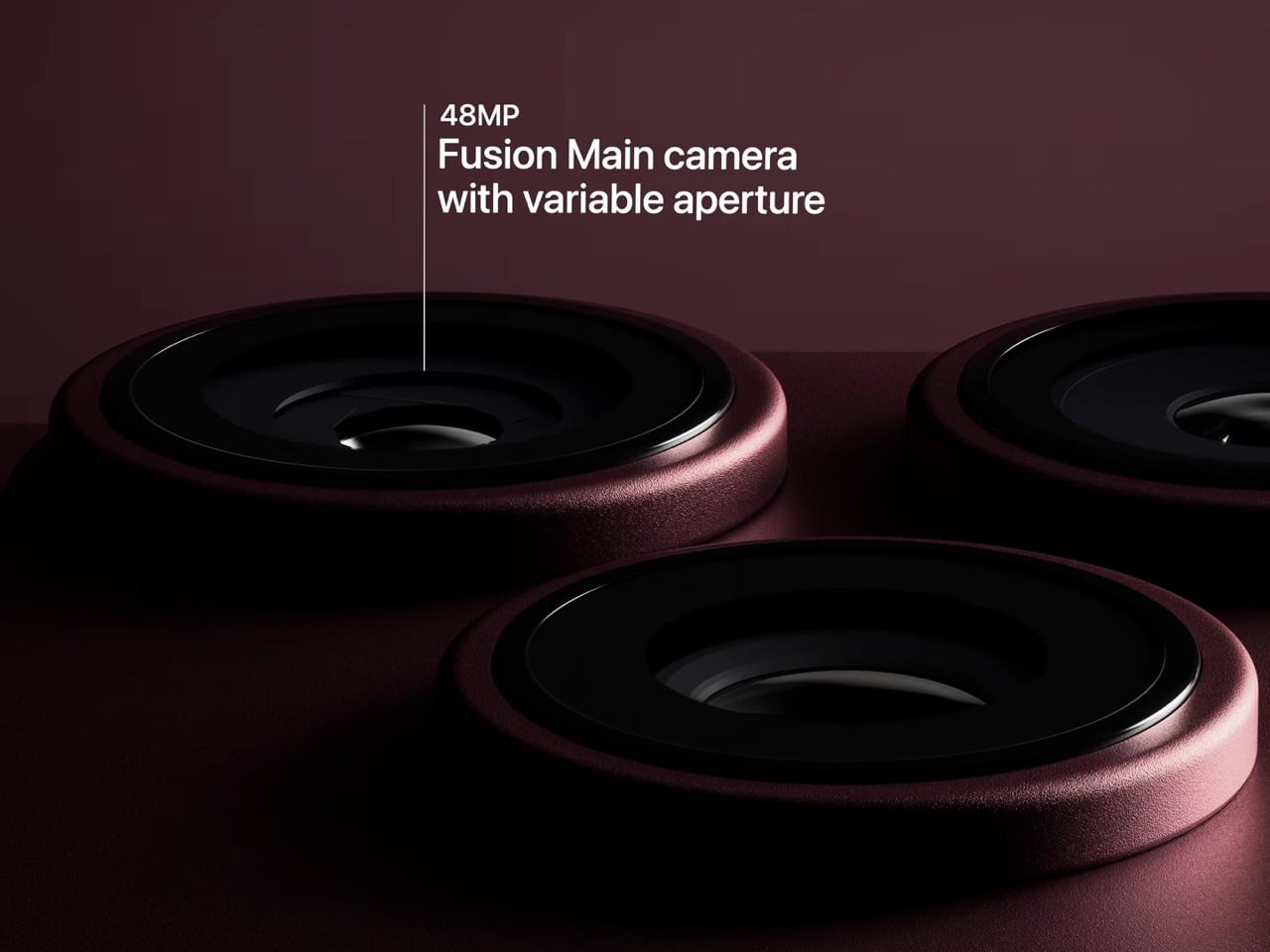
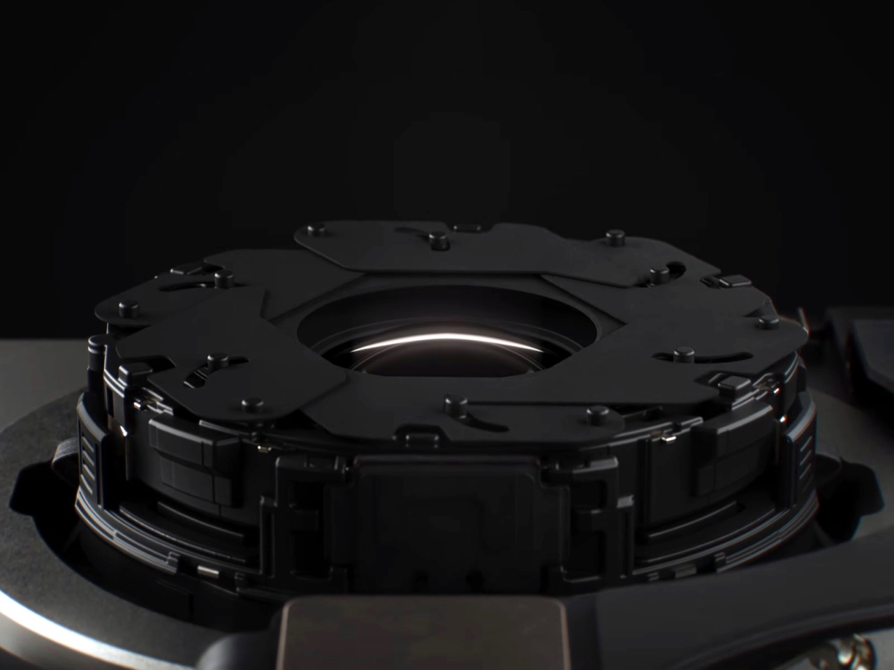
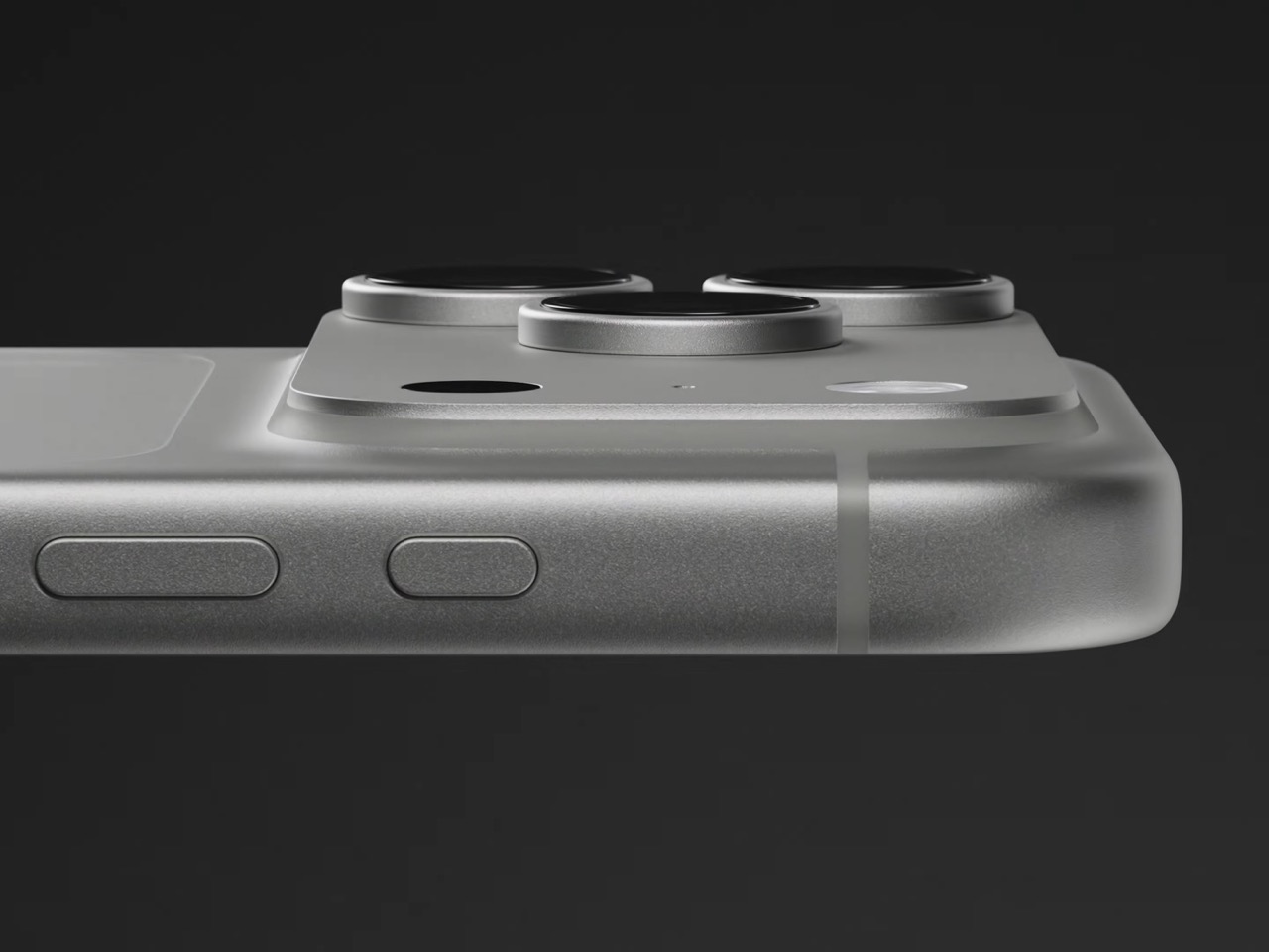
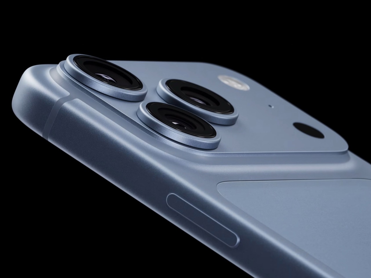
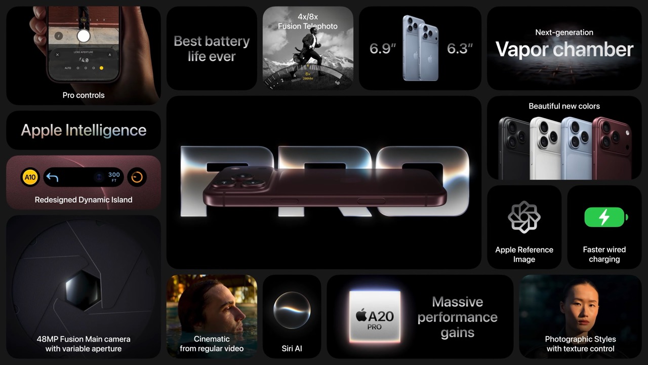
So how does a phone this thin pull off something that usually needs a chunky lens barrel? Apple built a system of six laser cut blades, each one thinner than a strand of hair, arranged around the main lens and moved by a tiny rotor mechanism. Together they shift the aperture through four stops, all the way down to f/1.48, with the camera defaulting to a f/1.8 for everyday portraits and opening or closing automatically depending on what it’s looking at. In low light it opens wider to pull in around 50 percent more light, which should mean cleaner night shots and sharper astrophotography without cranking up the ISO and adding grain.

Because this is optical now instead of computational, the depth falls off the way it would on an actual camera lens. Hair, glasses, jewelry, the fine stuff that always tripped up the old software blur, should render properly instead of getting smeared into the background by accident. Close the aperture down and you get more of the scene in focus for group shots, which is the same tradeoff photographers have been making with real cameras for a century. It’s just that now your phone gets to make that tradeoff too.

Apple didn’t stop at making the hardware smarter, it also handed a lot of that control directly to you. The redesigned camera app now includes Pro Controls, letting you manually pick one of the four aperture settings yourself, check exposure with an actual histogram, dial in white balance, and adjust shutter speed for motion blur or freeze frame shots. Third party camera apps are getting access to the same aperture system through an updated API, so this isn’t going to stay locked inside Apple’s own app for long. Photography folks who like getting hands on with their settings finally have a real reason to poke around the camera app instead of leaving everything on auto.

The upgrade carries over into video too. Cinematic mode effects can now be applied after you’ve already shot the footage, and it supports 60fps for smoother half speed slow motion. Time-lapse jumps to 4K with Dolby Vision HDR. None of that depends directly on the aperture blades, but it’s part of the same larger push this year to hand serious creative control to people who just want to point their phone and shoot something that looks intentional.

All of this sits inside a redesigned Pro body that now uses color matched aluminum and back glass, available in Black, Silver, the new Glacier, and a genuinely gorgeous Burgundy that photographs beautifully next to the camera module. The iPhone 18 Pro starts at $1,199 and the Pro Max at $1,299, both up for preorder September 12 and shipping September 18. For a feature that lives entirely inside a few hair thin blades you’ll never actually see moving, it might end up being the most noticeable camera change Apple has made in years.

The post Your iPhone’s Portrait Mode Was Fake for a Decade – The iPhone 18 Pro Changes That With A Real Aperture first appeared on Yanko Design.

  •  

The iPhone Duo just killed the Dynamic Island, the SIM tray, and the demand for an iPad Mini

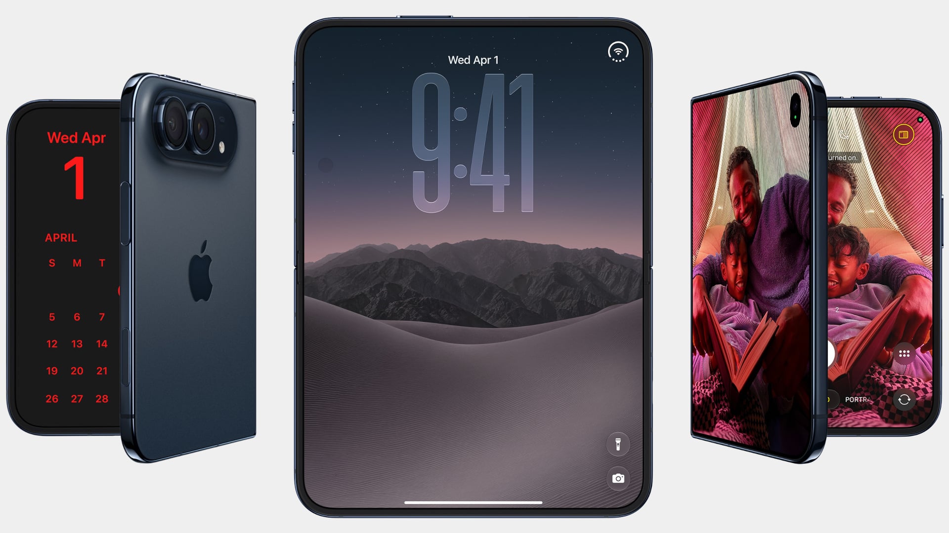
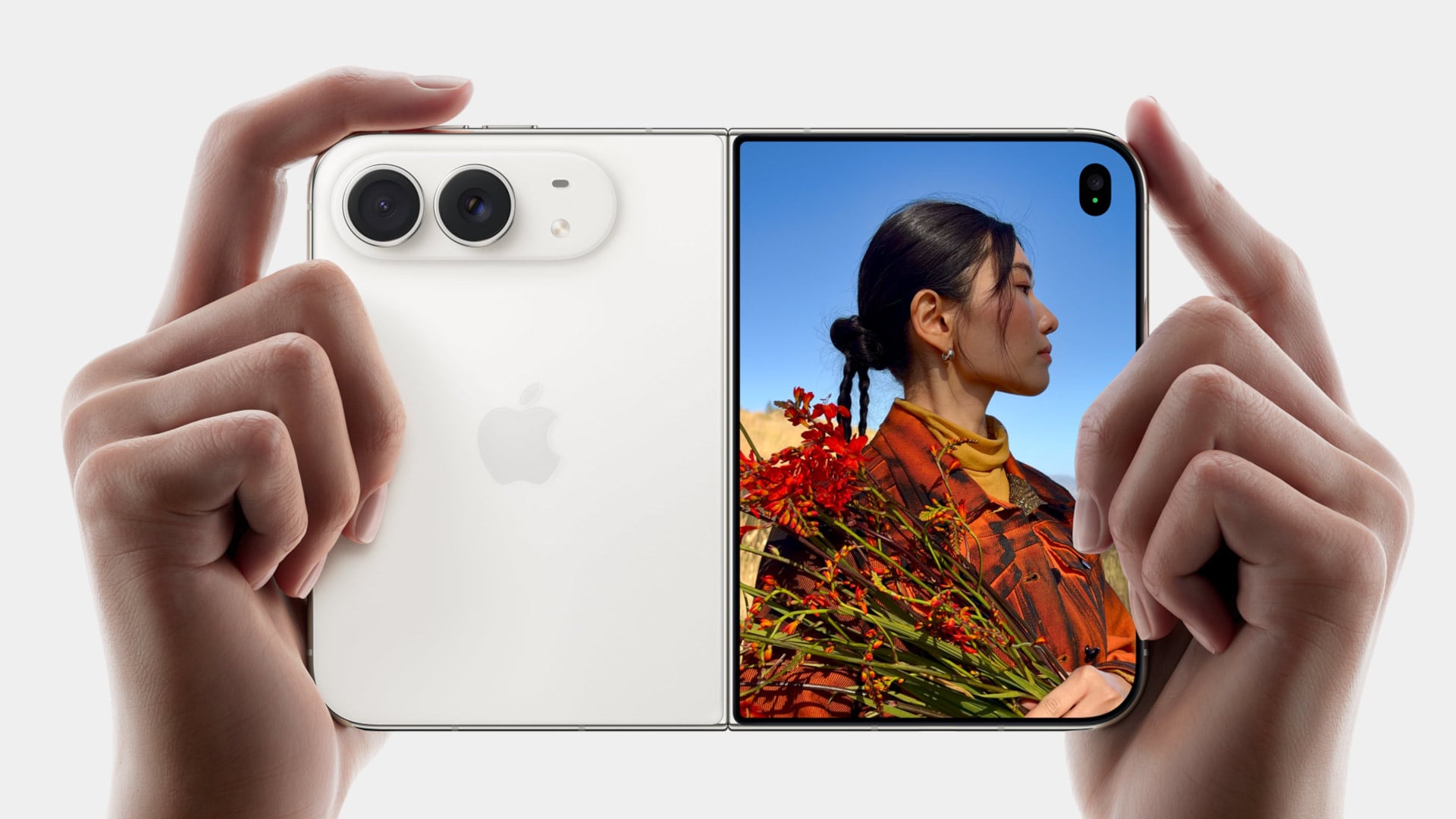
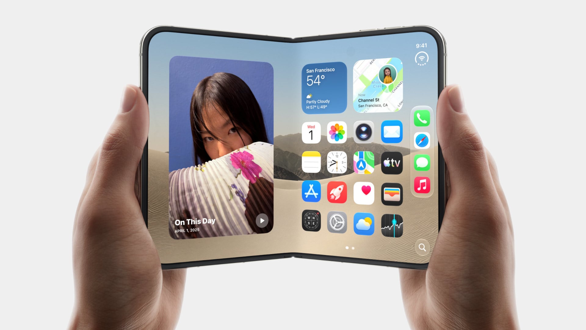
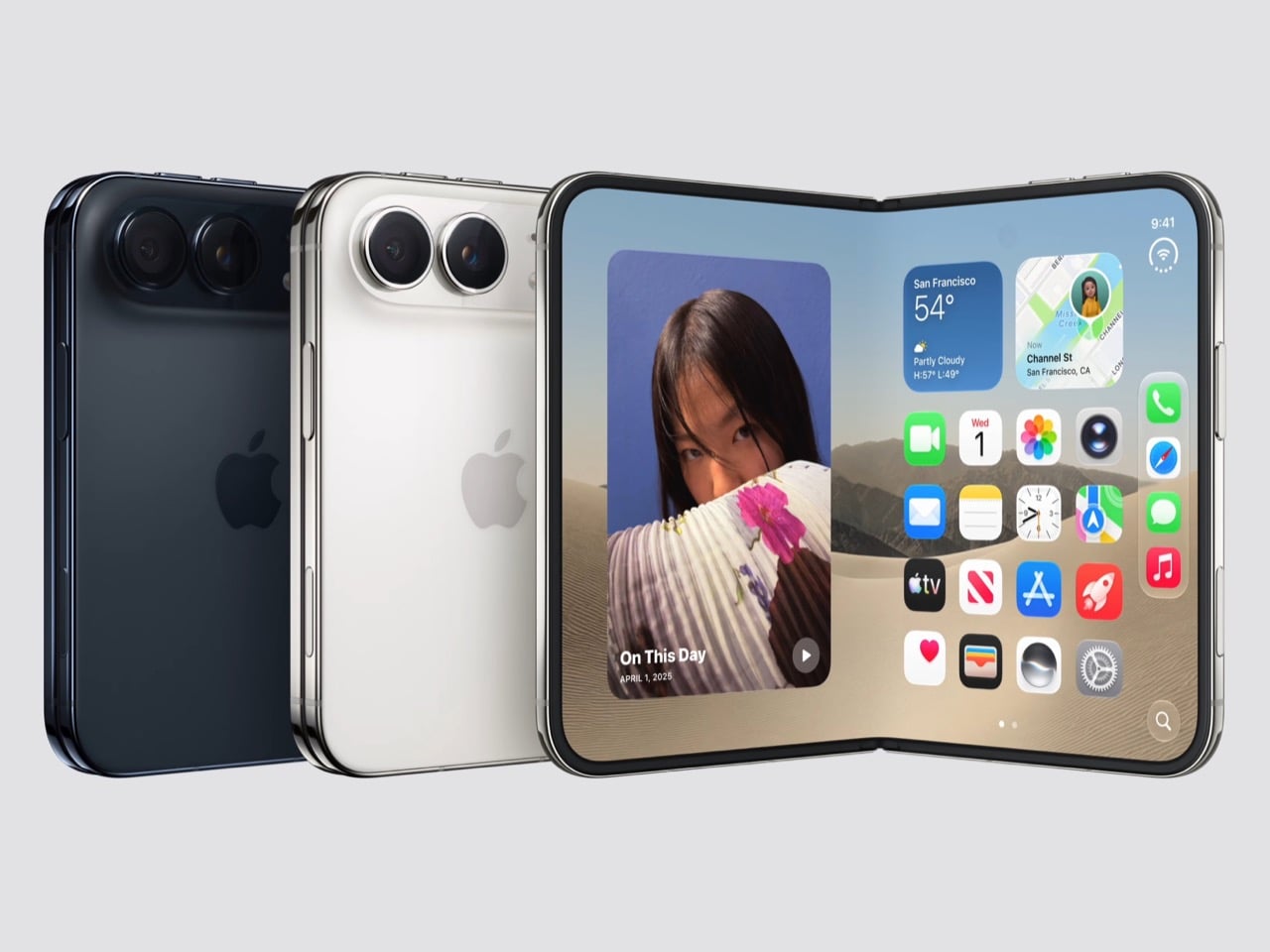
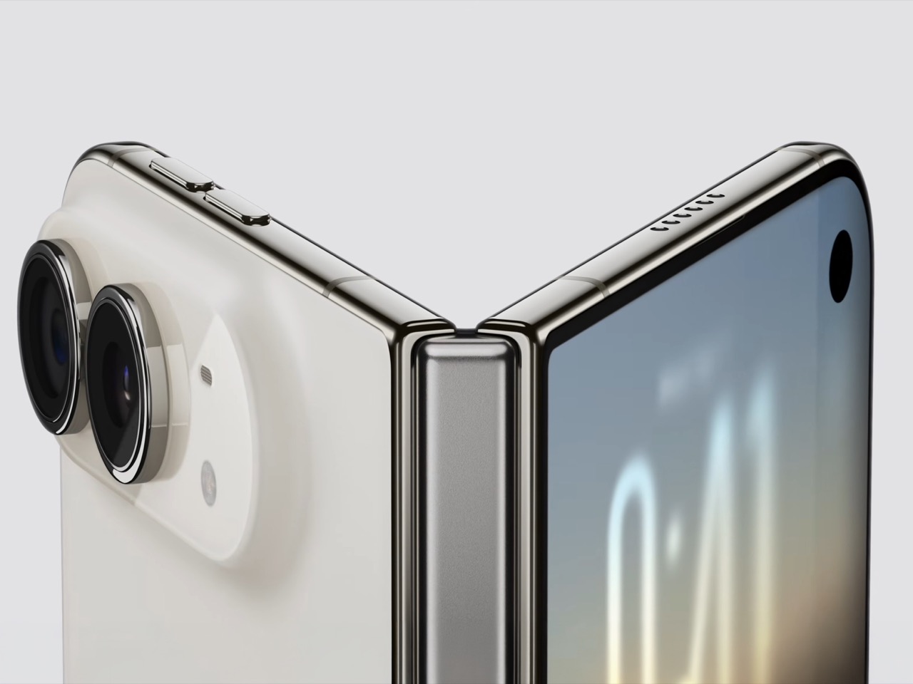
Spare a thought for the iPad Mini, which had a perfectly good career until this morning. Apple’s $1,999 iPhone Duo arrives October 23 with a 7.6-inch inner display that takes Apple Pencil with USB-C later this year and runs two apps side by side, which covers roughly everything the Mini was for, except the Mini does not fit in your jeans. It also killed the dynamic island, swapping it for a punch hole outside and a FaceTime camera tucked under the inner screen. And it killed the SIM tray worldwide, because the thinnest iPhone ever made had no room left for sentiment.

Apple never announces any of this. It ships the replacement and lets the old thing stop making sense on its own schedule. The Duo is a whole product built out of things Apple decided to stop carrying, and the interesting part is how little you miss any of them once you see what moved into the empty space. John Ternus called it the most transformational change to iPhone since the original, which I not only agree with, I think I’d take it a step further by saying – this is such a dramatic leap for the iPhone that it stops being an iPhone. It isn’t an iPad either. It’s something completely different.

Designer: Apple

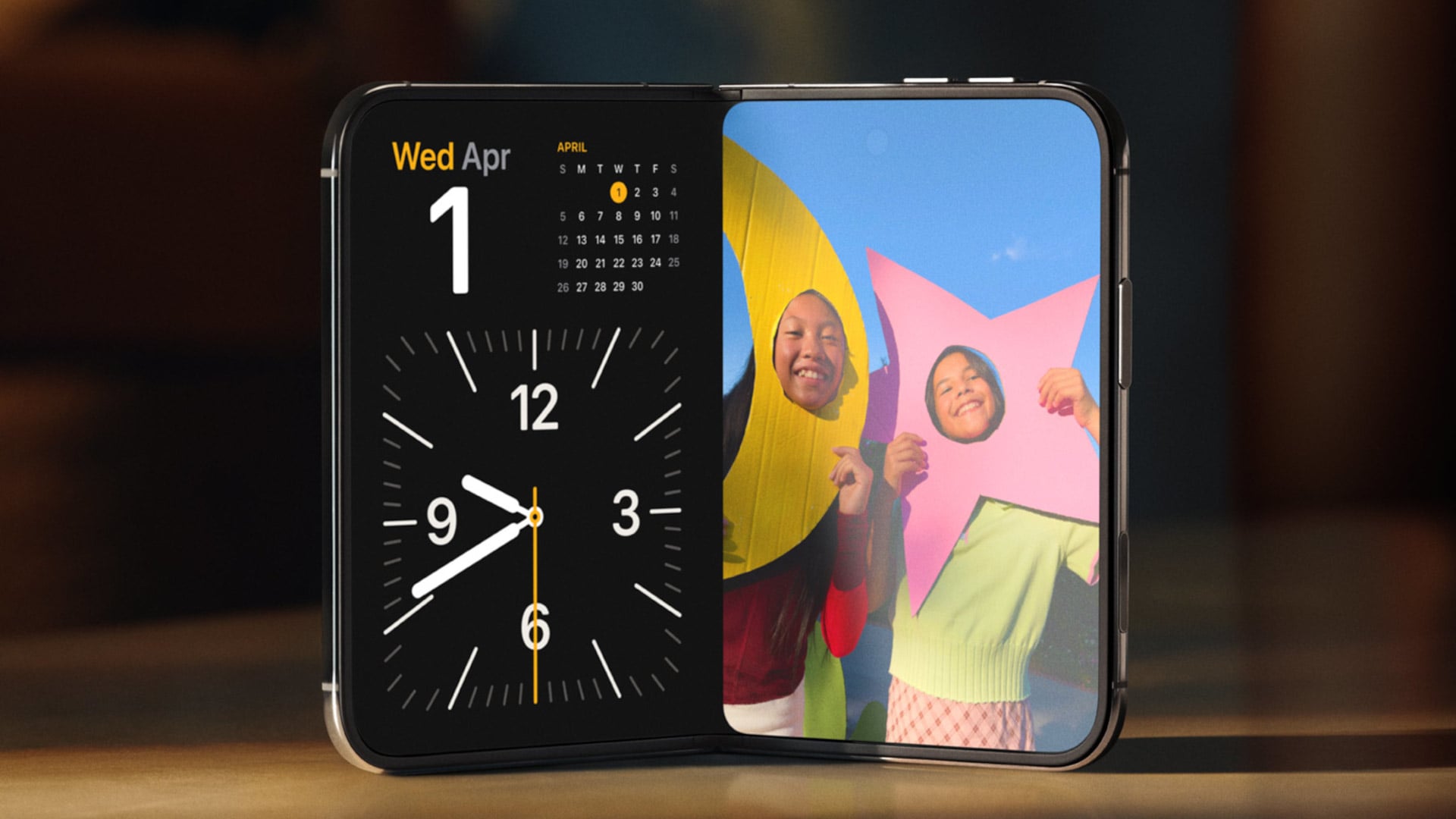
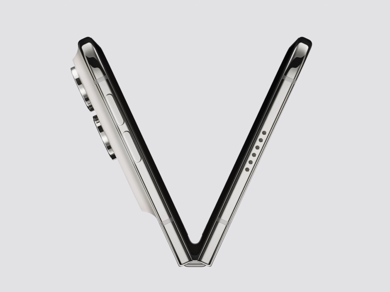
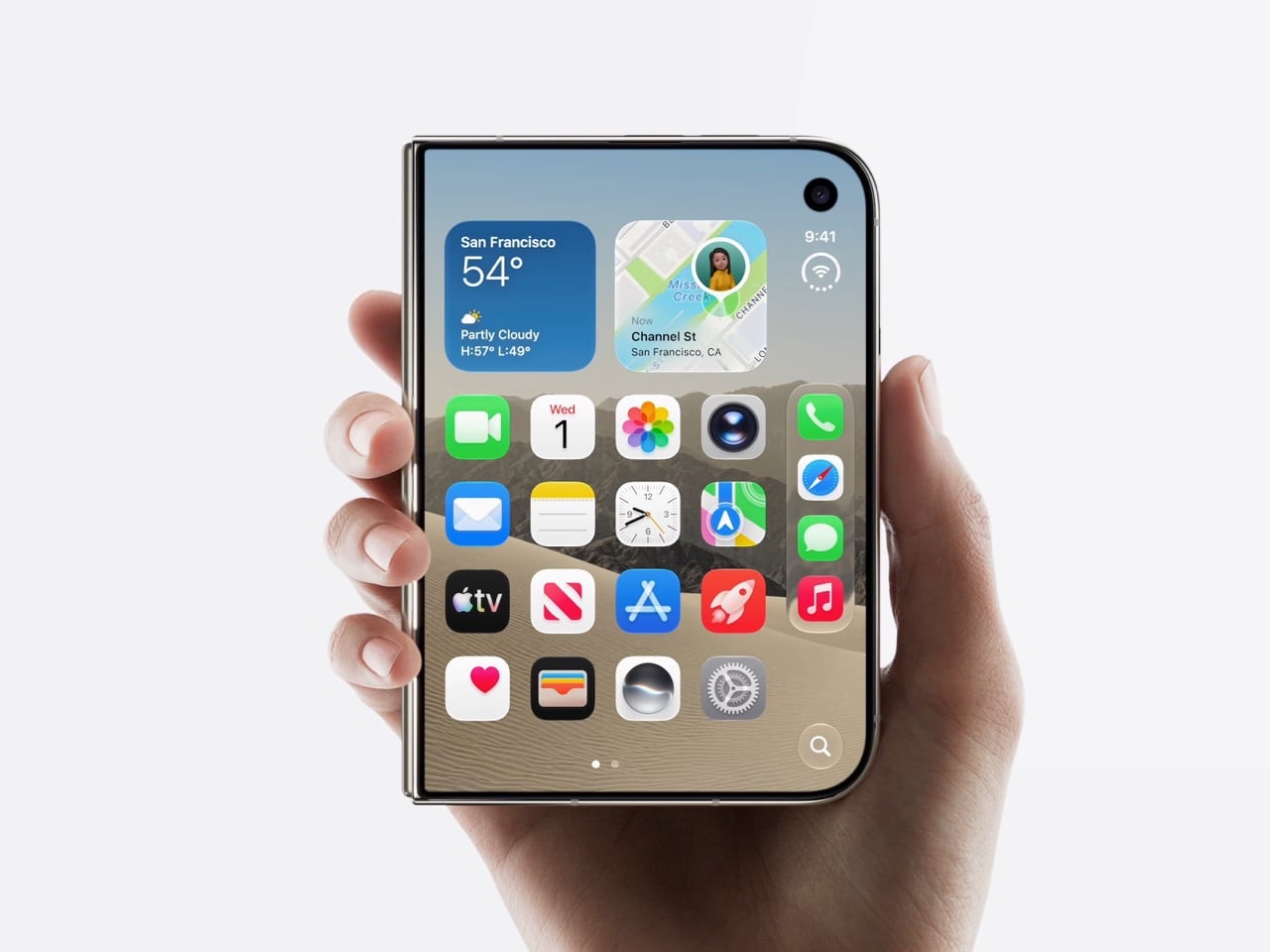
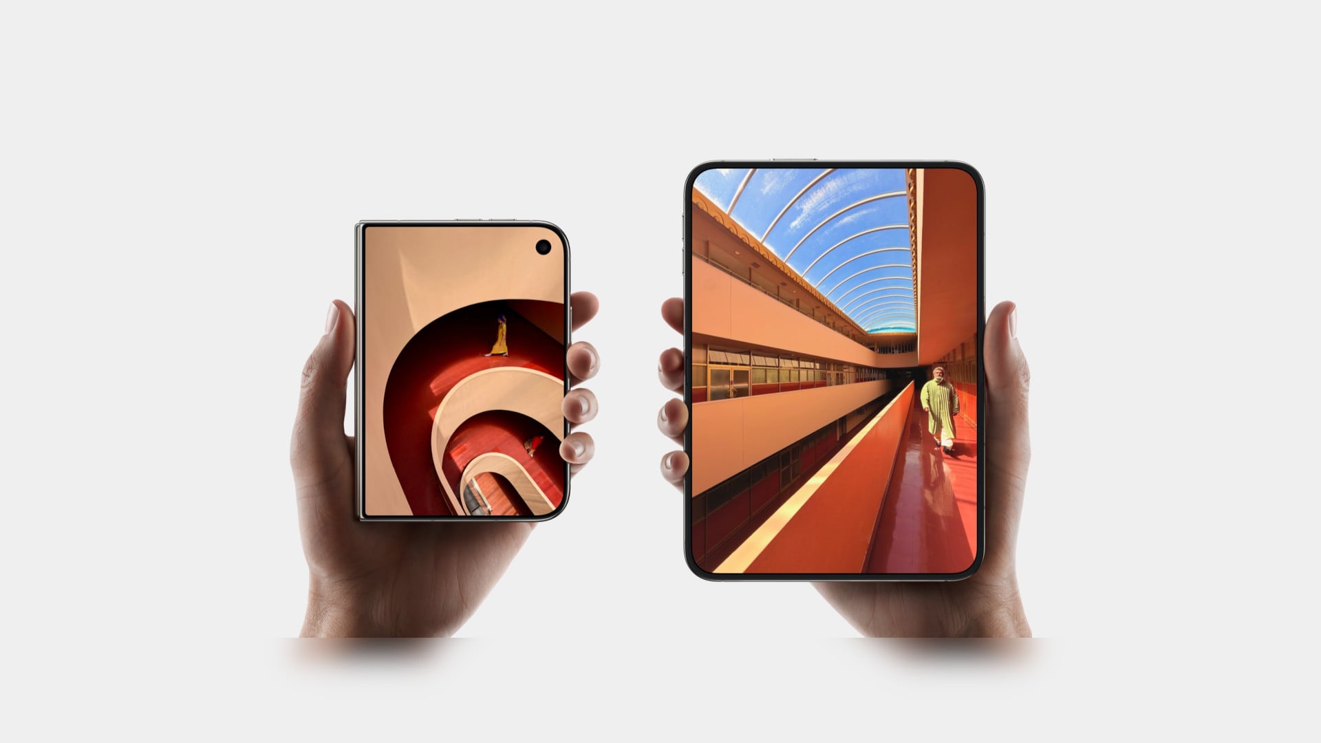
Apple refused to build a squarish slab that happens to close, and said so from the stage, calling out rivals whose square inner screens box movies into oversized black bars. The Duo lands at roughly passport size, with an asymmetric profile: two rounded corners on the right, squared geometry at the hinge. That asymmetry does something clever, because it tells your hand which edge to open before your brain gets involved. It reads like a small hardcover you want to crack open, which is a strange compliment to pay a phone. Somebody fought for that shape in a review meeting, and I am glad they won.

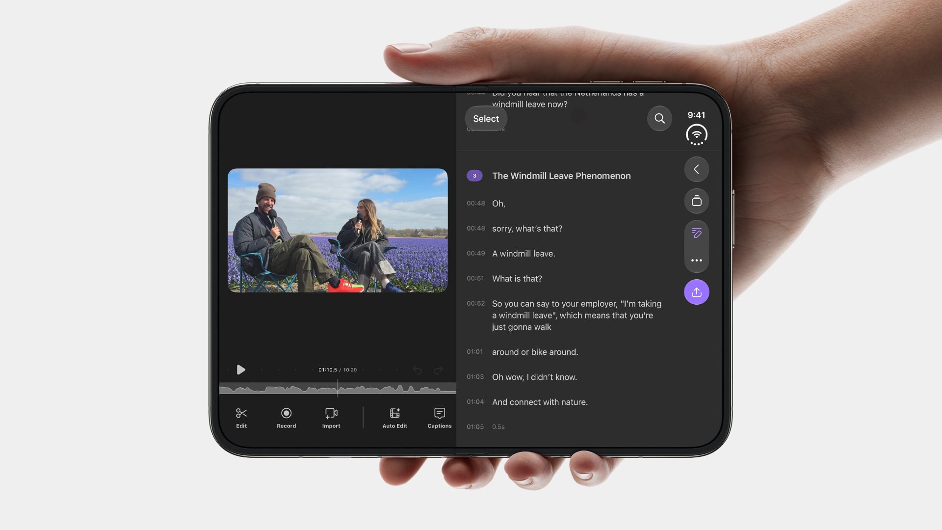
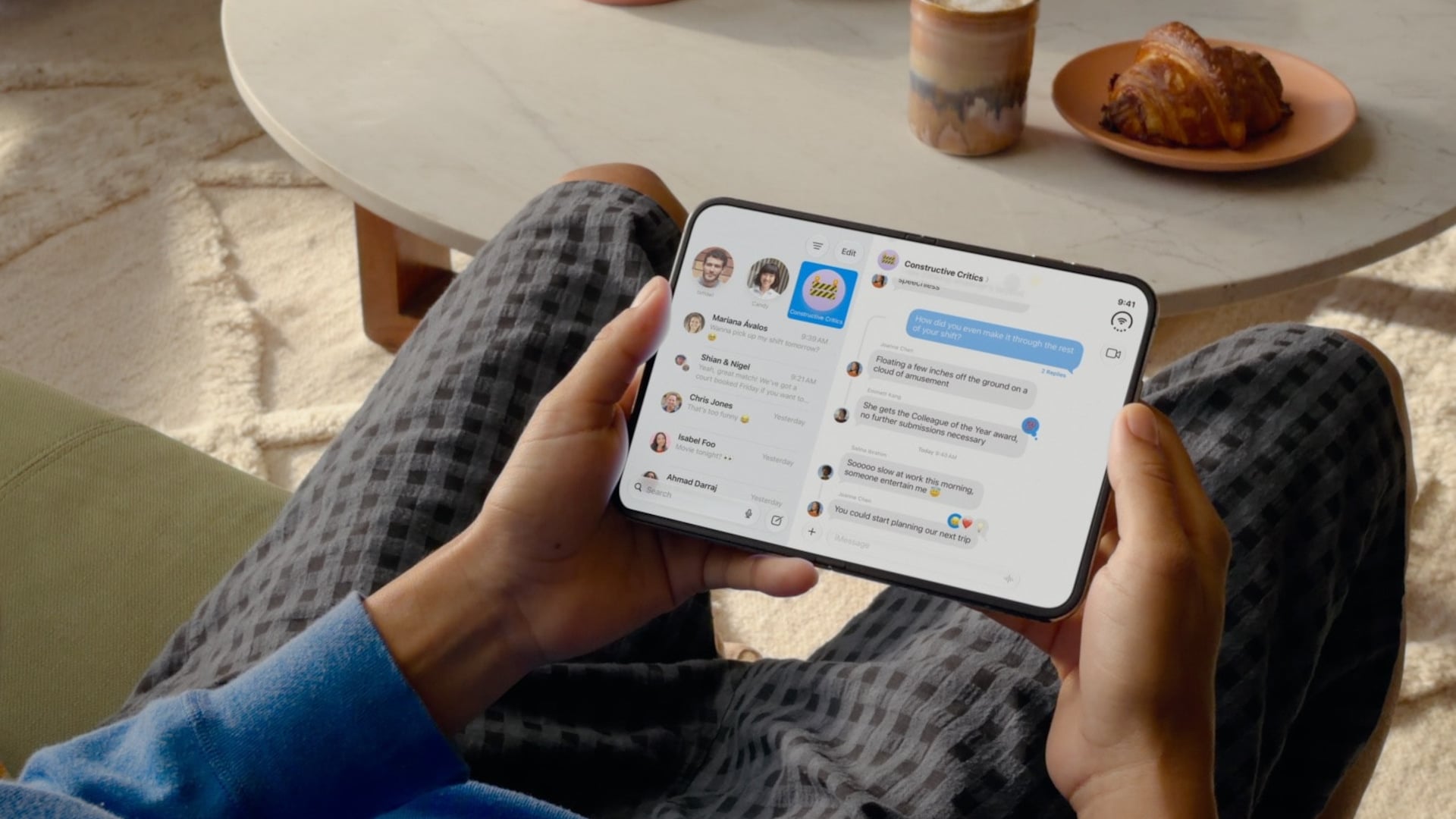
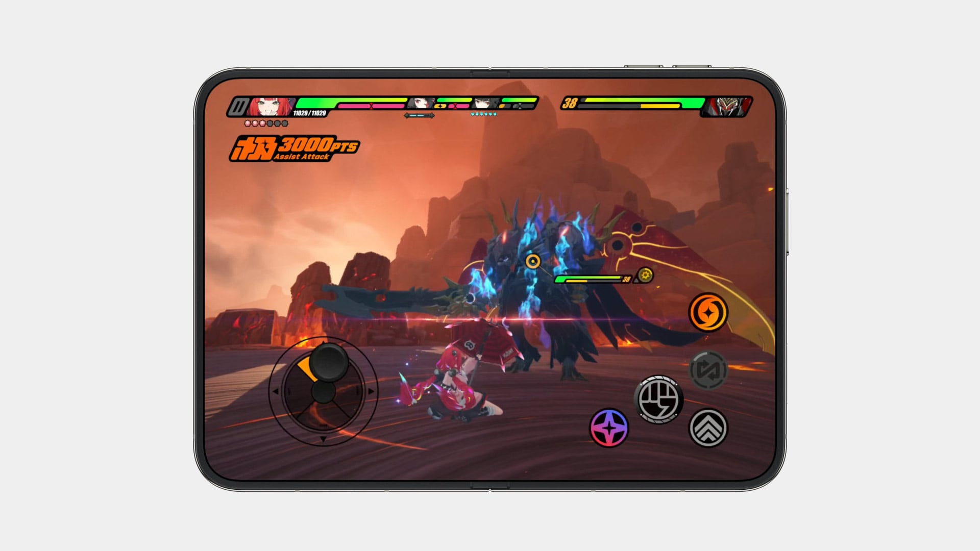
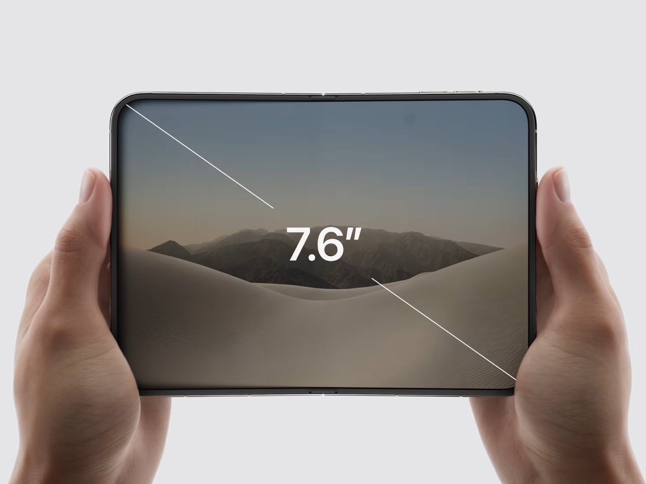
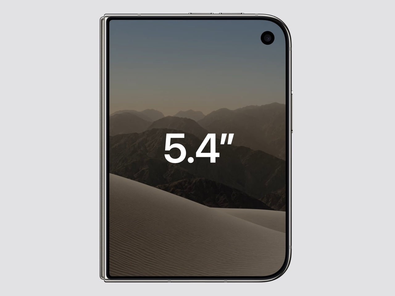
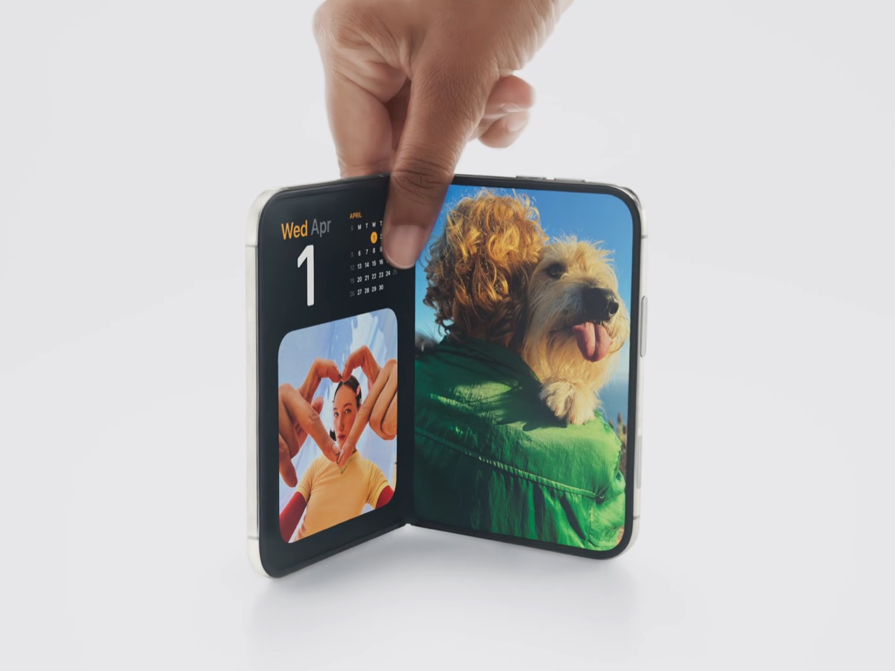
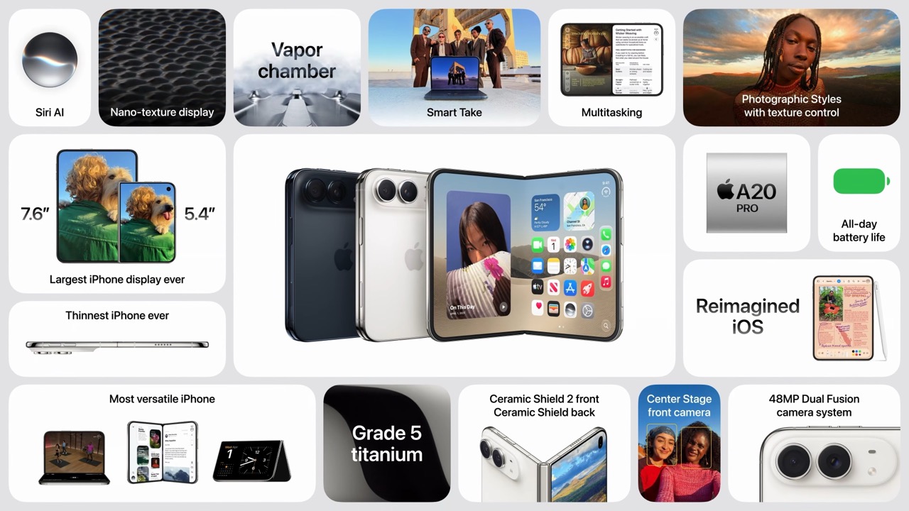
Both displays share a single aspect ratio, which is the decision the whole product rests on. Closed, the 5.4-inch outer panel delivers 90 percent of an iPhone 18 Pro’s screen area, so it works as a complete phone rather than a notification window. Open, the 7.6-inch inner canvas runs 50 percent larger than an 18 Pro Max. Because the proportions match, content scales between the two instead of reflowing awkwardly every time you fold, and the movie you started on the cover screen simply gets bigger. Every foldable before this one asked you to accept a jarring transition, and Apple designed the jarring part out.

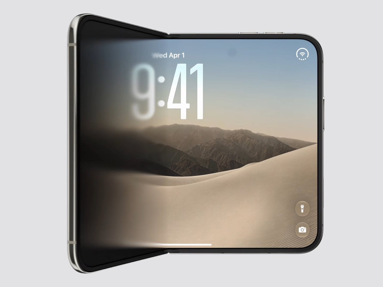
Content flows between the two displays as the phone opens, expanding out of the cover screen and settling into the larger canvas without a stutter. I would put that transition ahead of anything Samsung, Google or Oppo has shipped on a folding device, and it is the single most beautiful piece of UI in the category right now. The matched aspect ratio is what makes it possible, because there is no reflow to disguise, only a scale. Controls stay locked in place along the side while the content grows around them. Watching it happen is the closest a phone has come to feeling like sleight of hand.

The crease is the thing people notice first on a foldable, and Apple has more or less made it disappear. A matte nano-texture finish across the inner display cuts glare and flattens how the fold reads, so the eye stops finding the seam. It also solves the other foldable complaint nobody talks about, which is the cheap plastic feel of a folding panel under your fingertip. Real glass sits above and below the display, and the whole stack is built to stop the panel distorting after a few thousand folds. Nine years of waiting bought Apple a fold you have to hunt for.

Grade 5 titanium forms the frame, polished to a mirror finish and broken by a hinge cover in contrasting micro-blasted texture. That pairing is the sharpest visual detail on the object, a bright reflective body interrupted by one matte band at the spine, and it gives the closed device a piece of jewelry quality that photographs beautifully in star white. Ceramic Shield protects the back, Ceramic Shield 2 the front, and the whole thing carries an IP68 rating. Pulling that dust and water rating across a moving joint is genuinely difficult engineering. The night sky colorway, a deep navy, is the one I would actually buy.

The dock is vertical now. iOS 27 moved essential controls to the side of the screen, freeing vertical space for content and landing the buttons under your thumb, which rewrites a layout convention Apple has held since 2007. The status bar compresses into a corner and the Dynamic Island turns sideways along the edge of both displays. Every first-party app had to be relaid out to make this coherent, and the fact that it still reads unmistakably as iOS is the real achievement here. Nobody outside Apple would have been permitted to move that dock.

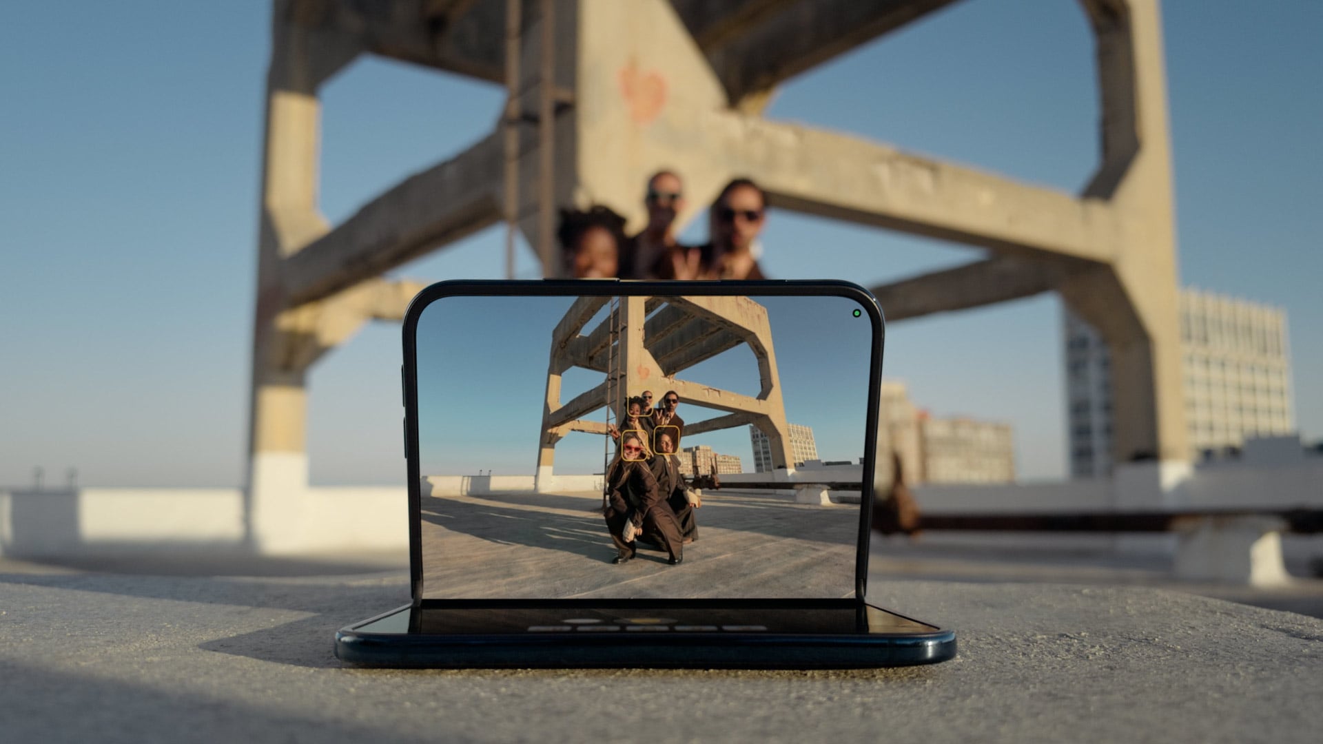
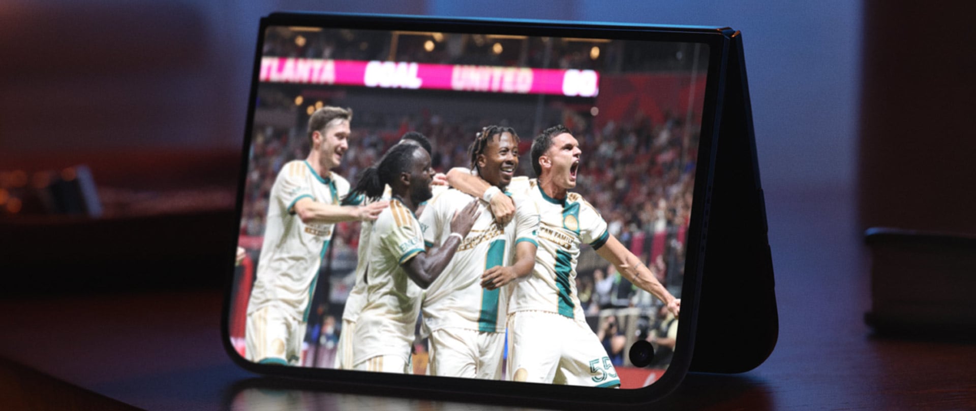
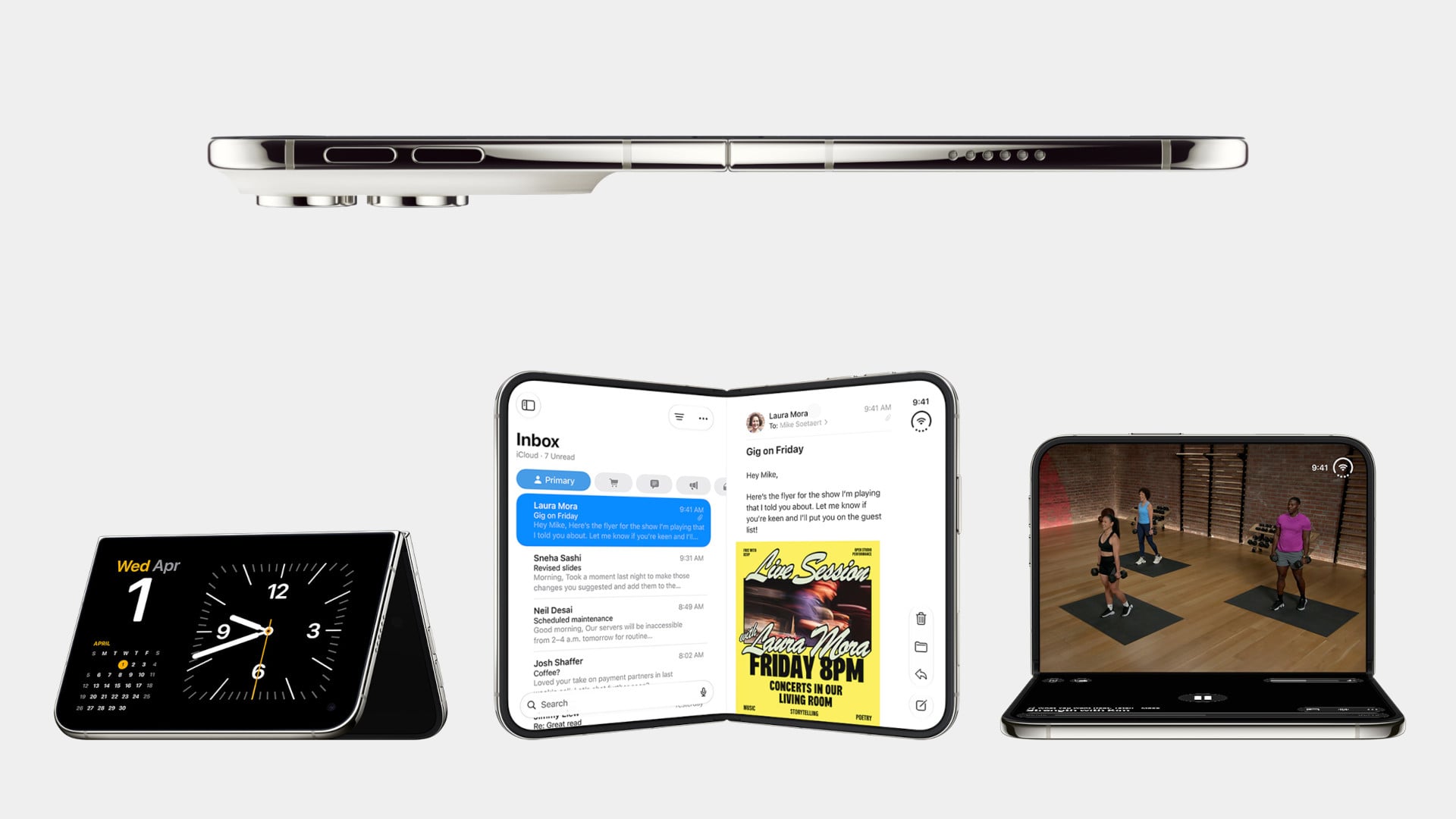
Fold it halfway and iOS slides content away from the crease, giving you a laptop-style prop for video calls, a hands-free camera rig, and a bedside alarm face that wakes you with a gentle glow. StandBy now runs even when the phone is off charge, turning it into a photo frame or widget hub the moment you set it down. The speakers retune themselves depending on how far apart the two halves are sitting. One device, half a dozen legible postures, all of them designed rather than discovered by users after launch. The alarm clock pose alone will sell a few thousand units.

The cameras take advantage of having a second screen. Duo Preview throws a live feed onto the outer display so your subject can see themselves and fix their own framing, which ends a decade of “can you take it again.” Kid Cue plays Peanuts animations to make toddlers look at the lens. Smart Take watches the scene and fires the shutter once everyone is finally posed, killing the timer scramble. A 48MP Fusion Main with a 2x telephoto handles the actual imaging, alongside the same 48MP Ultra Wide found on the iPhone 18 Pro.

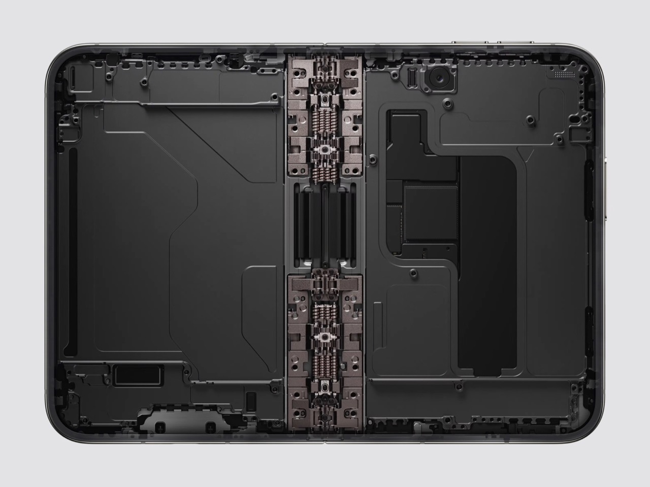
Going eSIM only across every market freed the internal volume for one battery per side, managed so the pair behaves as a single cell, delivering 31 hours of video on the inner display and 44 on the outer. I will miss the tray as a traveler, and I also suspect Apple has wanted it gone for years, because a physical port punched through the frame is a liability on a device chasing IP68 across a hinge. A20 Pro drives both panels, and fast charging reaches 50 percent in around 20 minutes. Some deletions are grief. This one is mostly relief.

Touch ID in the side button is a real step back from Face ID on a two thousand dollar phone, and it exists because a TrueDepth array had nowhere to live. Apple Pencil support arrives later this year rather than at launch, which softens the iPad Mini argument for a few months. The bezels look chunky beside a Galaxy Z Fold 8, and the folded body still reads thick in the hands-on shots. At $1,999, a hundred dollars over the Fold 8 and five hundred under what everyone predicted, Apple showed up nine years late and priced like it was early. Pre-orders open October 16.

The post The iPhone Duo just killed the Dynamic Island, the SIM tray, and the demand for an iPad Mini first appeared on Yanko Design.

  •  
❌