❌

Vue lecture

Standard TVs Filter Their Color, the Hisense UR8 Creates Its Own

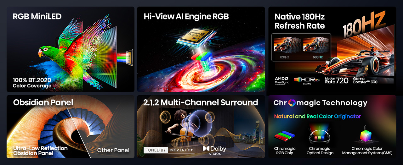
For decades, every television has made color the same way, filtering a single blue light down into red, green, and blue until something resembles a picture. The Hisense UR8 ditches that habit. Instead, it creates red, green, and blue light individually, right at the source, through what Hisense calls Chromagic display technology built on its RGB MiniLED architecture. UR8’s RGB MiniLED, powered by Chromagic display technology, builds color differently, using red, green, and blue light individually to deliver natural and real color that looks closer to life. It’s a real design shift, overdue by a few decades.

Conventional MiniLED TVs work by shining a single blue light and filtering it into color, a process that removes light rather than creating it. The brighter and richer the scene, the more that filtering process quietly throws away. It’s not exactly a flaw, just a limitation baked into how these screens have always been built. Hisense decided to rebuild that process instead of tweaking around it.

Designer: Hisense

Click Here to Buy Now: $1899.99 $2499.99 ($600 off). Hurry, deal ends in 48-hours!

The UR8 swaps that single-source filtering for up to nearly 15,000 individual RGB LEDs working independently across the panel. Instead of dimming zones guessing at brightness, each LED produces its own hue and intensity without needing a filter to correct it later. It’s a quiet redesign most viewers won’t think about, even while doing most of the work behind a different picture.

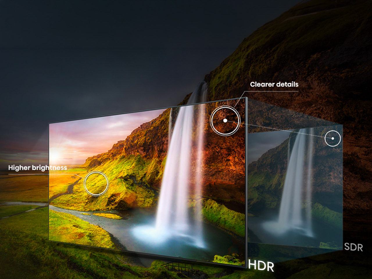
What that translates to on screen is surprisingly specific. Sunsets look warm, skin tones look natural rather than processed, and viewing feels easier on your eyes. Hisense backs this up with a claimed 100% BT.2020 color coverage and Pantone-validated accuracy, though you don’t really need the certifications to notice it.

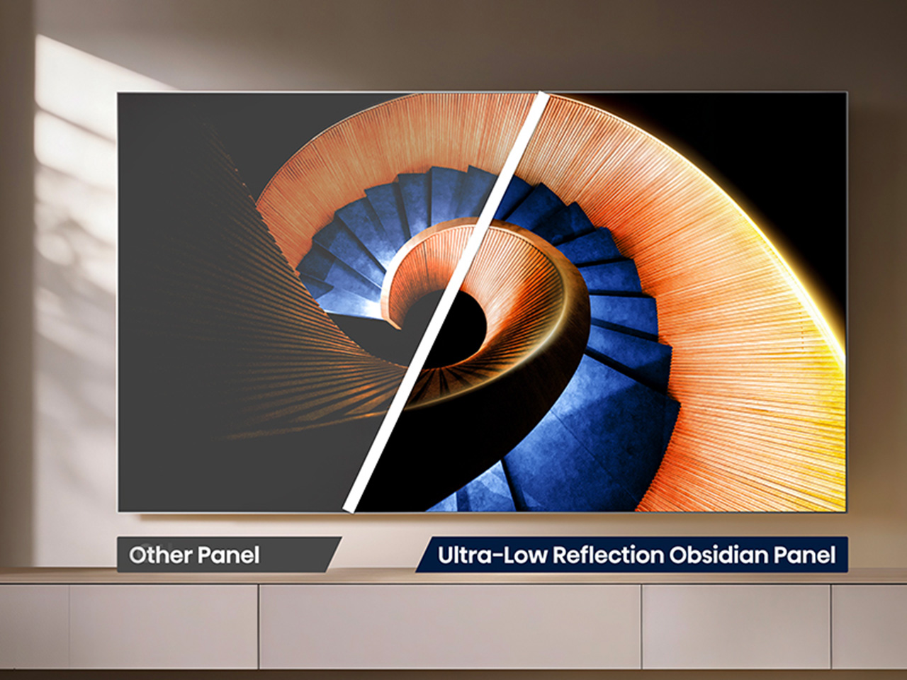
All of that is pointless if the screen turns into a mirror the second you flip on a lamp, which is where the UR8’s Obsidian panel comes in. The Ultra-Low Reflection Obsidian Panel dramatically reduces reflection so the picture stays clear in any room. Dark scenes are up to 3x darker for rich and deep blacks, never gray, never washed out. That’s a practical call for people who watch TV in living rooms, not theaters.

Gaming is where the UR8’s engineering choices show off. Native 180Hz motion processing reduces blur in fast-moving content so you can follow the action clearly, whether it’s a live game or a quick-cut sequence. Game Booster 330 with the Enhanced Game Bar supports VRR up to 330 and AMD FreeSync Premium Pro certification for smooth, tear-free gameplay. Four HDMI 2.1 ports mean a console or gaming PC doesn’t fight for bandwidth.

That same motion handling pays off during live sports, when a fast break or a corner kick doesn’t turn into a blur of jerseys. Pair that with color that looks closer to what you’d see in person, and the UR8 becomes the kind of screen that naturally holds a room’s attention. A television already sits at the center of most living spaces, planned or not.

There’s a quieter benefit in this RGB engineering. Because RGB MiniLED creates natural and real color directly rather than filtering light, it wastes less energy and uses 40% less overall. Hisense says the UR8 also delivers nearly 50% less harmful blue light than standard MiniLED displays, independently certified by TÜV Rheinland. It’s a rare case where a design choice made for better color also means an easier bill and easier eyes.

The software side keeps pace with the hardware. Google TV with Gemini lets you chat with a conversational AI assistant, discover what to watch with personalized recommendations across 10,000-plus apps, or find content by simply describing what you want. Sound comes from a built-in 2.1.2 multi-channel speaker system tuned by Devialet, with Dolby Atmos support, so the audio doesn’t feel bolted onto an otherwise impressive screen.

The UR8 lineup spans 55, 65, 75, 85, and 100 inches, with pricing starting at $1,299 and available at Best Buy, backed by a two-year warranty. That range matters because it puts a genuinely different approach to color inside apartments and larger family rooms, not just showroom displays. Good engineering ideas usually take years to trickle down to accessible prices. This one arrived a little faster than expected, and it shows.

Click Here to Buy Now: $1899.99 $2499.99 ($600 off). Hurry, deal ends in 48-hours!

The post Standard TVs Filter Their Color, the Hisense UR8 Creates Its Own first appeared on Yanko Design.

  •  

Huawei Watch GT 7 Pro Review: Refined, Not Reinvented

Verdict 3.8 out of 5 Average of 5 criteria
Aesthetics
4.0 out of 5
Ergonomics
4.0 out of 5
Performance
4.0 out of 5
Sustainability / Repairability
3.0 out of 5
Value for money
4.0 out of 5

What works

  • Distinctive octagonal design with a premium look
  • Strong battery life
  • Bright, sharp AMOLED display
  • Board health and fitness tracking

What doesn't

  • Limited third-party app support
  • Proprietary pinned strap design
The Watch GT 7 Pro 46mm shows Huawei sticking to a proven formula and sharpening it further. It is not a bold leap, but it is a confident and well-rounded one.

Huawei has spent the last few years turning wearables into one of the strongest parts of its consumer business. The company has performed especially well in China, with that momentum also carrying into overseas markets. As a result, Huawei has grown into one of the biggest names in smartwatches, offering a lineup that covers different styles, price points, and user needs.

Within Huawei’s smartwatch lineup, the GT series is the company’s sports-focused range. The new GT 7 series stays true to that identity, building on the formula that has made the lineup popular. The GT 7 Pro is not a major leap over the GT 6 Pro, but it feels like a more polished and refined take on the same core idea.

Designer: Huawei

Aesthetics

The Watch GT 7 Pro 46mm stays largely in line with the design language of its predecessor, keeping the same sporty character that defined the GT 6 Pro. Its octagonal case continues to give it a distinctive look, helping it stand out from the many conventional round smartwatches on the market. At the same time, Huawei balances that sportier shape with a polished finish, so the watch still feels premium rather than overtly rugged.
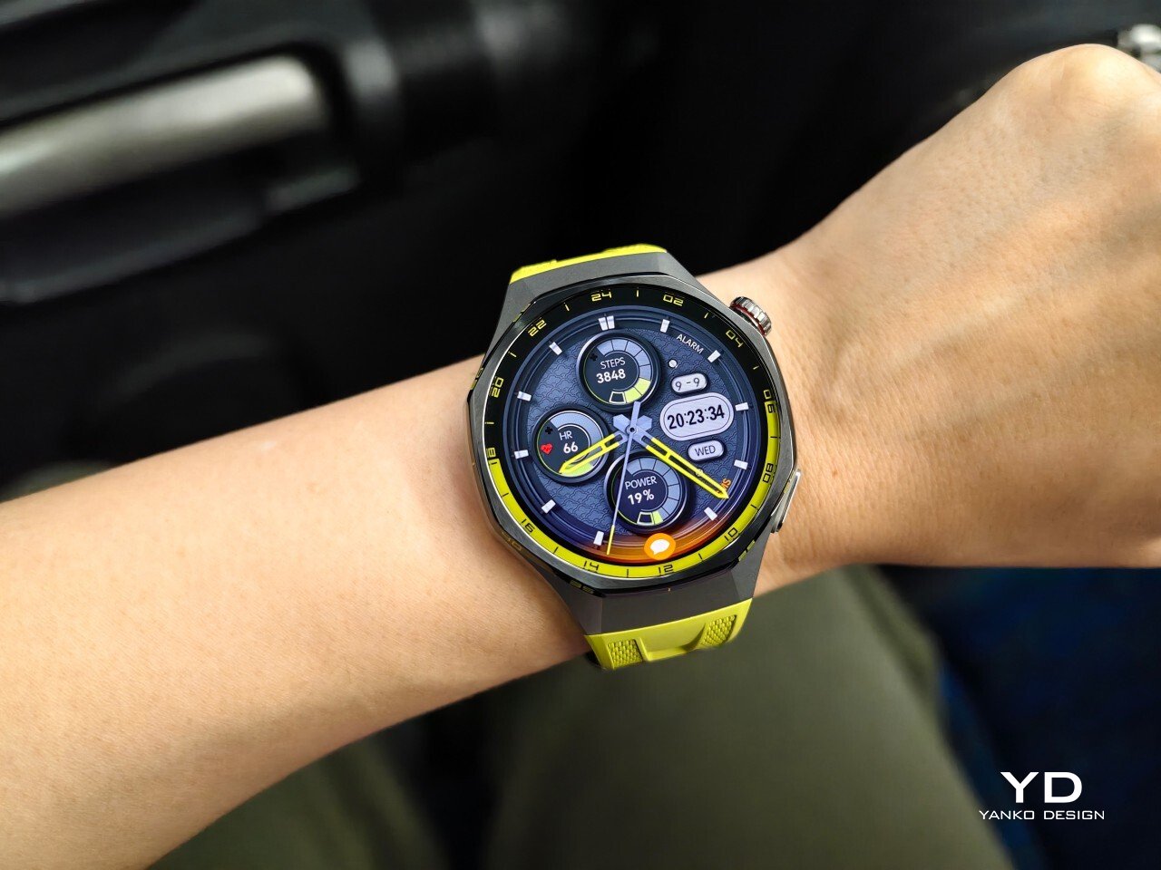
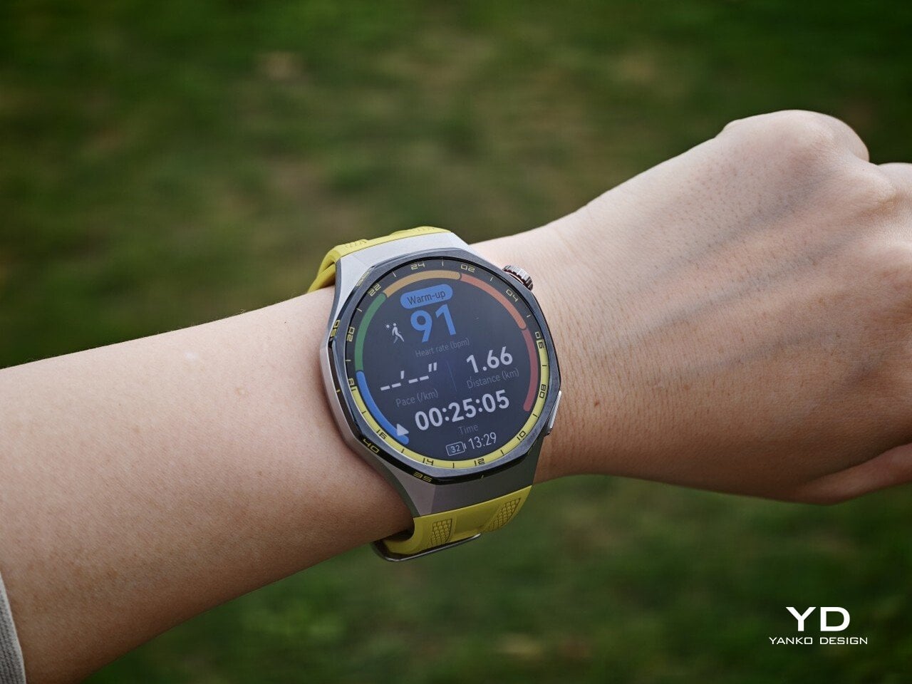
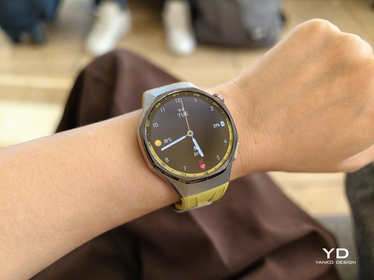
The front of the watch keeps that same balance. Its 1.47-inch AMOLED display sits beneath sapphire glass, which adds a more upscale touch while also improving durability for everyday wear. Around the display, Huawei uses 24-hour markings that strengthen the watch’s sporty identity and give the face a more instrument-like look.

Huawei is offering the GT 7 Pro 46mm in yellow, green, and black, and each one gives the watch a distinct personality. The yellow version I received is easily the boldest of the three, pairing a silver case with a black bezel and a bright lime yellow strap. Matching yellow accents around the bezel and on the watch face make it feel the most energetic and overtly sporty of the lineup.

The green version takes a more outdoorsy approach. It keeps the same overall design but swaps in a muted green strap and matching accents, giving the watch a look that feels active without being as loud as the yellow model. The black version, by contrast, is the most understated. With its darker finish and strap combination, it gives the GT 7 Pro a stealthier and more versatile appearance that should appeal to buyers who prefer something cleaner and easier to wear every day.

Ergonomics

Despite its sporty, fairly bold design, the Watch GT 7 Pro 46mm is comfortable to wear for long stretches. At 56g and 11.2mm thick, it has enough presence to feel substantial on the wrist, but it never comes across as overly bulky in daily use. Huawei has also done a good job with weight distribution, which matters more than raw dimensions when you are wearing the watch through workouts, sleep tracking, or a full day out.
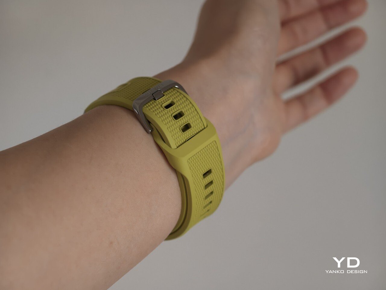
The strap has also been revised. Huawei calls it the Easy Cross Strap, and the key change is that the loose end tucks underneath instead of threading through a traditional belt loop. According to Huawei, this makes the watch easier to wear day to day while also creating a snugger fit that can help improve the consistency of health tracking. The elastomer strap feels soft enough for extended wear while still staying secure during exercise. It is detachable and uses a 22mm fitting, but because it is secured with pins, swapping it out is less straightforward than with a standard third-party strap.
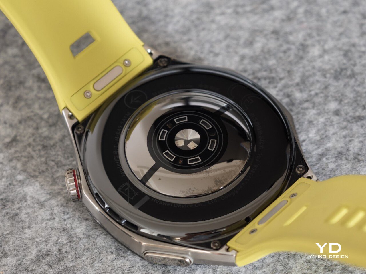
Huawei’s control layout is familiar and easy to get used to. The buttons sit within easy reach, and the rotating crown adds a more tactile way to move through menus. That makes the watch feel more natural to use when you are on the move and do not want to rely entirely on touch input. Combined with the curved case and integrated strap design, the GT 7 Pro feels built not just to look sporty, but to wear like it too.

Performance

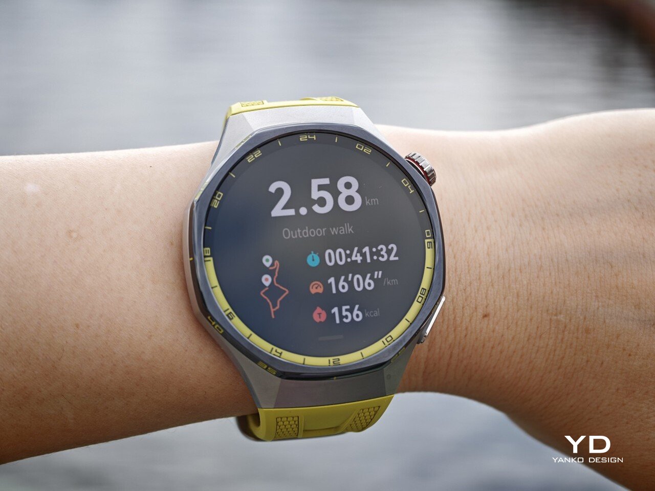
The Watch GT 7 Pro 46mm features a 1.47-inch AMOLED display, and it is one of the first things that stands out about the watch. Huawei claims a peak brightness of 3,000 nits, and in use the panel looks sharp, bright, and vibrant. Watch faces have plenty of visual punch, while menus and health data remain easy to read at a glance. Huawei has been consistently strong in this area, and that continues here with a screen that feels right at home on a watch in this class.
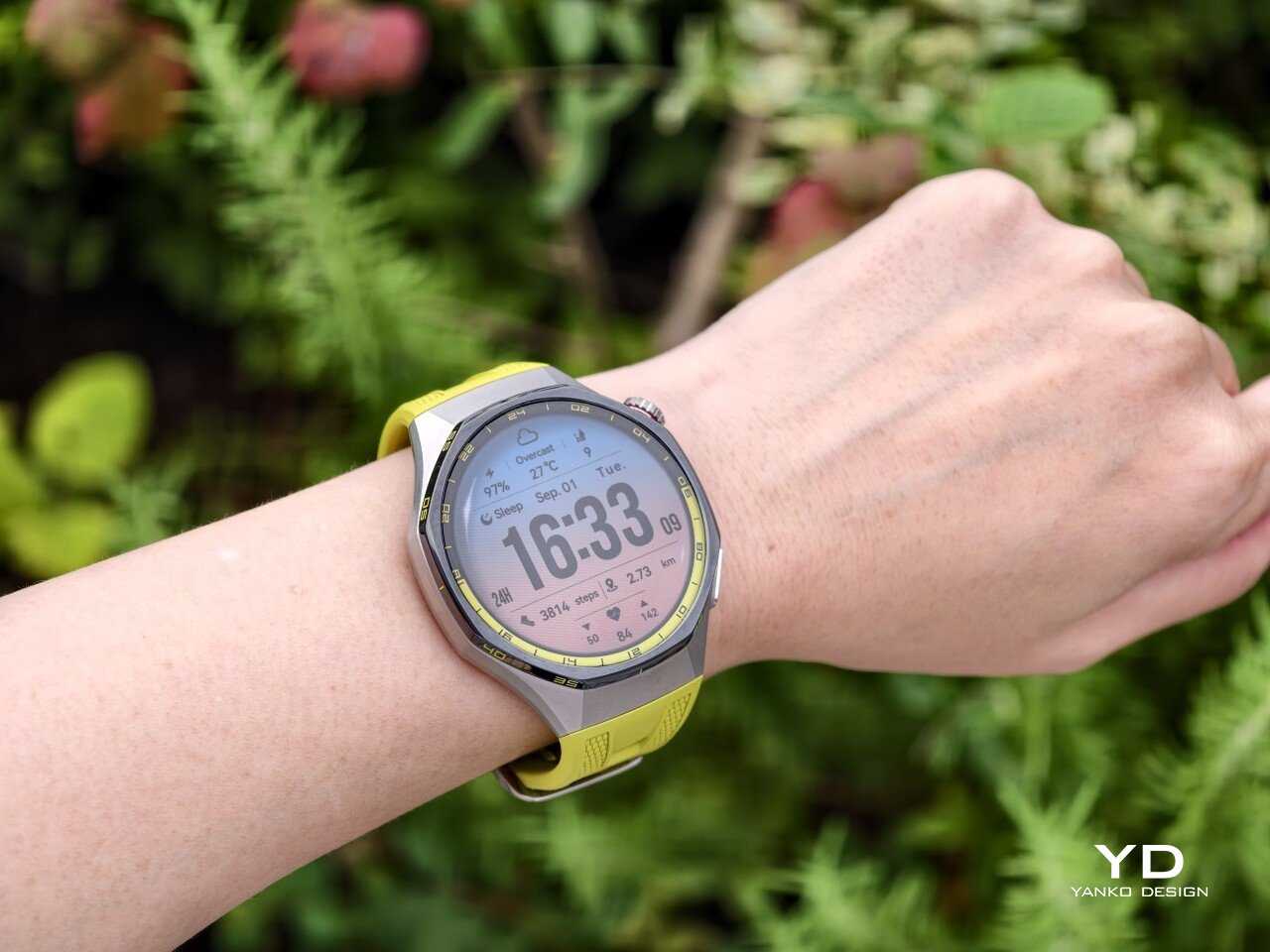
Out of the box, the GT 7 Pro runs HarmonyOS 6.1 and supports both Android and iOS devices, which immediately makes it more flexible than some ecosystem-bound alternatives. The software itself is easy to navigate, with clean menus, smooth animations, and a layout that does not take long to learn. It is not trying to overwhelm you with complexity, and that works in its favor on a smartwatch that is meant to balance fitness features with everyday usability.
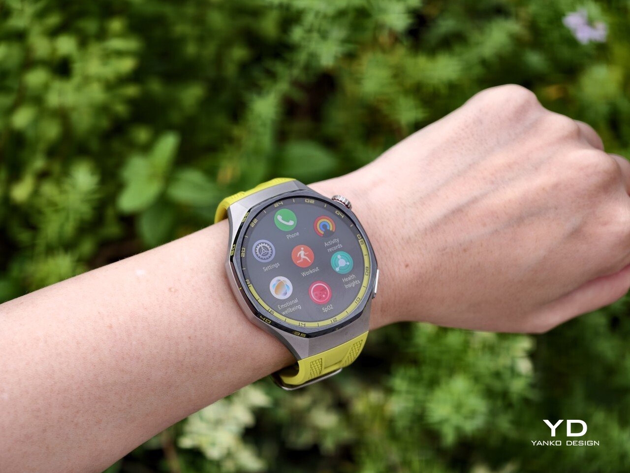
Health and fitness remain at the heart of the experience, which is exactly where the GT series has built much of its appeal. Huawei includes a broad set of tracking features here, covering the usual essentials such as heart rate, sleep, blood oxygen, stress, and workout monitoring, while also adding more unusual tools like the Diabetes Risk Study and Coronary Heart Disease Study. The latter, however, was not available on my test unit during the review period.
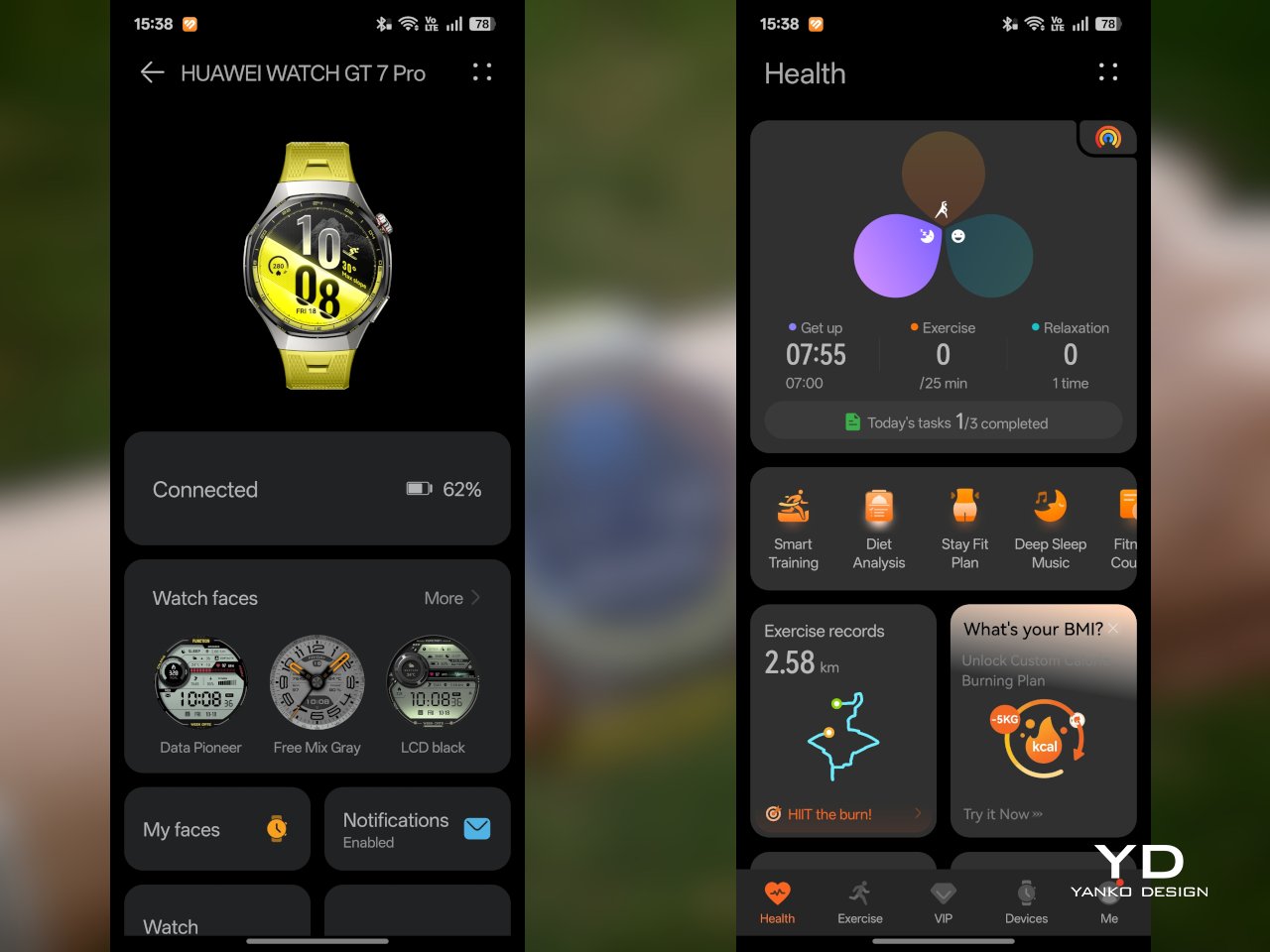
On the fitness side, the watch offers more than 100 workout modes, reinforcing its role as a serious sports-focused smartwatch. Huawei has also expanded its support for winter sports, with dedicated indoor and outdoor skiing as well as snowboarding modes. These can track data such as maximum speed, average incline, total descent, and run count, making the watch more useful for users who want something beyond basic activity logging. It also supports downloads for more than 3,000 ski resort maps worldwide, complete with details such as slope names, difficulty ratings, and lift station locations.

Since ski season is still months away where I live, I was not able to test those winter sports features properly. My hands-on time was limited to more routine activities like outdoor walks, yoga, and casual cycling. Even within that narrower scope, the watch performed well. GPS tracking was accurate in my testing, even when I passed under railway bridges and near buildings, where signals can sometimes become less stable.

Battery life is one of the GT 7 Pro’s biggest strengths. Huawei rates it for up to 21 days at the upper end, up to 12 days under typical use, up to 7 days with the always-on display (AOD) enabled, and as much as 51 hours in trail running mode. Those are ambitious figures, but in my time with the watch, its endurance was genuinely impressive.

I took it with me on a nine-day trip after charging it to 100 percent, and by the end of the trip it still had 19 percent battery remaining. During that time, I had all health tracking features on, AOD turned on, and used it for a couple of indoor and outdoor walking sessions as well. That makes the result more impressive, because the watch was not simply sitting idle for most of the trip. In day-to-day use, that kind of endurance makes a real difference, especially on a sports-focused smartwatch where frequent tracking can drain smaller batteries much more quickly.
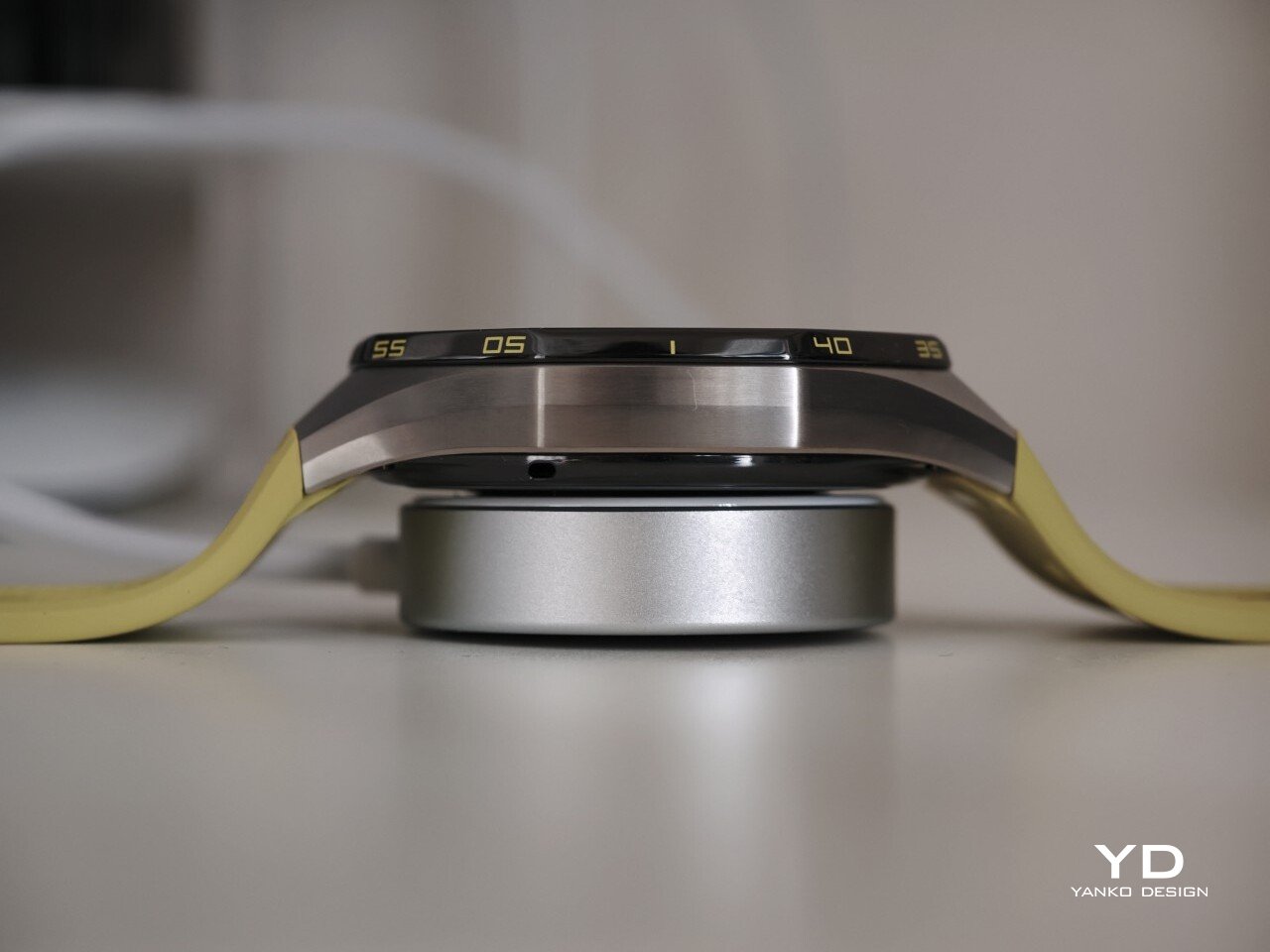
Charging is handled through a proprietary magnetic wireless charger included in the box, and it is fairly quick. Because of the watch’s shape, though, it does not sit flat on the charger, which can be a mild annoyance in everyday use. It hovers slightly, and I often found myself checking to make sure it was still charging after the initial confirmation screen disappeared. It also feels like time for Huawei to move from USB-A to USB-C, as the included cable already feels a bit dated.

Sustainability

The Watch GT 7 Pro also puts some emphasis on durability. It carries both IP69 and 5ATM ratings, giving it a solid level of protection against dust and water exposure. That makes sense for a watch positioned around sports and outdoor use, where it is more likely to be exposed to sweat, rain, splashes, and more demanding day-to-day conditions.
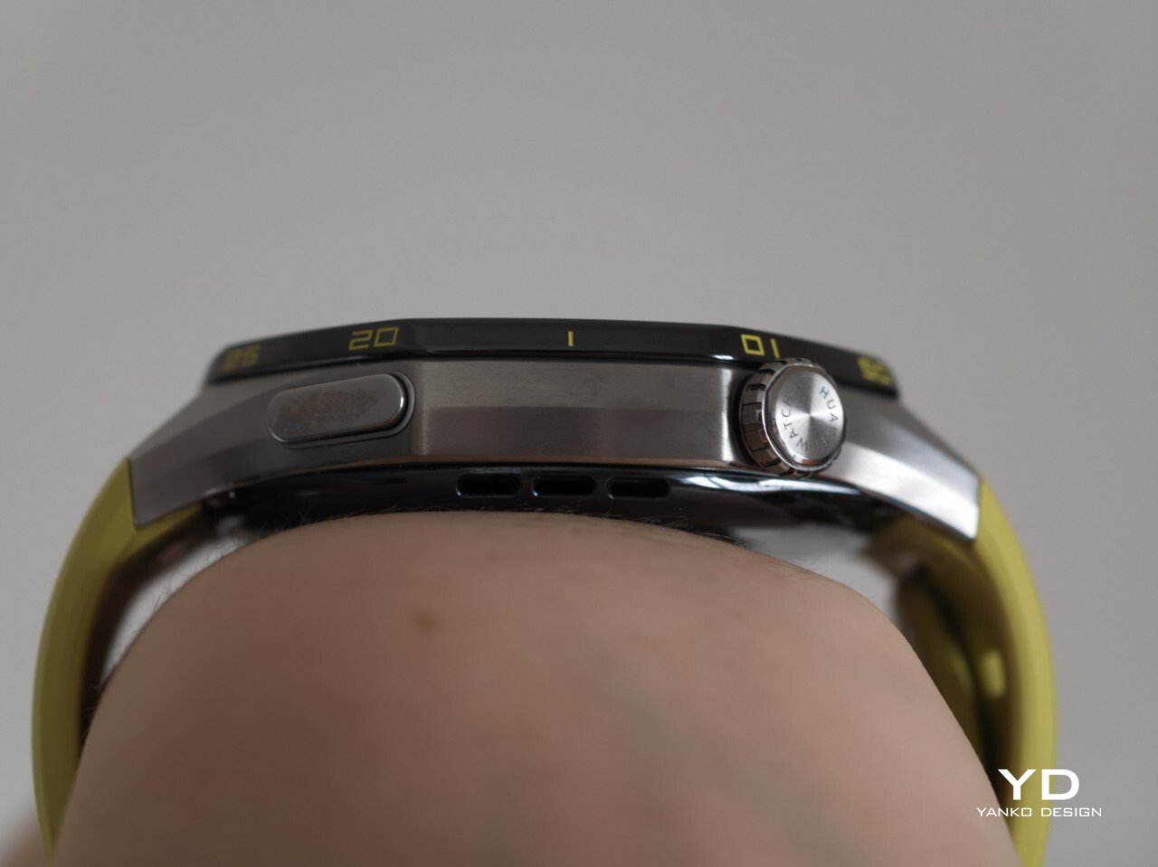
Huawei also uses sapphire glass over the display, which adds another layer of reassurance. Sapphire is known for its strong scratch resistance, and it also helps the watch feel more premium in the process. Taken together, these details give the GT 7 Pro a tougher, more dependable character without pushing it fully into rugged-watch territory. That said, sustainability is less of a focus, with no clear mention of recycled materials or other environmental measures.

Value

At £379, or roughly $510, the Watch GT 7 Pro is priced like a premium smartwatch, so it has to offer more than just a nice design. For the most part, it does. You are paying for a watch that gets the basics right, with strong battery life, a durable build, a comfortable fit, and a health and fitness feature set that feels broad enough for most users.
The value proposition really comes down to what you want from a smartwatch. If you care most about app support and deeper smart features, there are rivals that make a stronger case. But if your priorities are battery life, fitness tracking, and a watch that looks and feels good on the wrist, the GT 7 Pro makes more sense. It is not a dramatic step up from the GT 6 Pro, so current owners may not feel much pressure to upgrade. Still, for anyone coming from an older device, it feels like a well-rounded package that knows exactly what it is.

Verdict
The Watch GT 7 Pro 46mm is not the kind of upgrade that changes everything, but it does not need to be. Huawei has taken a formula that already worked and polished it further, keeping the GT series focused on the things it has consistently done best. The result is a smartwatch that looks distinctive, wears comfortably, lasts a long time on a charge, and offers more than enough health and fitness features for most users.

It is not without trade-offs. Third-party app support remains limited, and Huawei’s pinned strap design also cuts down your band options compared with a standard 22mm quick-release system. Still, if you want a premium sports-focused watch that feels dependable, lasts well beyond a few days, and fits easily into everyday use, the GT 7 Pro gets a lot right. It is not a radical step forward, but it is a solid and well-rounded one.

The post Huawei Watch GT 7 Pro Review: Refined, Not Reinvented first appeared on Yanko Design.

  •  

The Park Sculpture Nobody Expected to Double as a Basketball Hoop

Most public sculpture asks you to look and keep walking. You admire the bronze figure, read the little plaque, maybe snap a photo, and move along to wherever you were actually headed. The art stays over there, behind an invisible line, and you stay over here. That gap between viewer and object is the quiet problem a lot of city parks have never solved: they install expensive, meaningful work, and then wonder why nobody lingers.

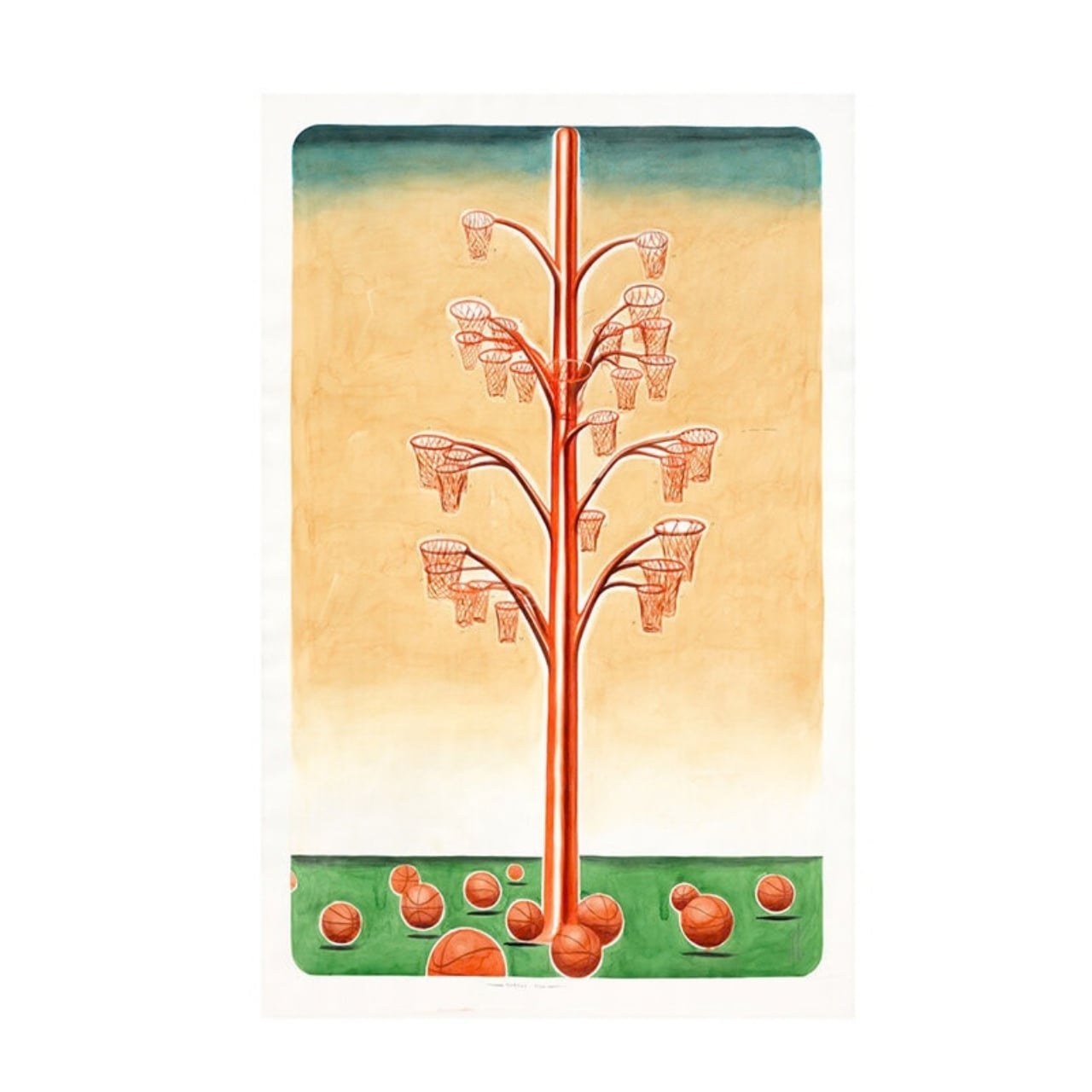
Alexandre Arrechea’s answer, installed this year at Biidaasige Park as part of Toronto’s new Lassonde Art Trail, is to remove the line entirely. Orange Functional is a twenty-foot steel tree with basketball hoops sprouting off its branches, and you’re invited to bring your own ball and start shooting. No velvet rope, no “please do not touch” energy. Just a big red tree standing at the park entrance, daring you to play.

Designer: Alexandre Arrechea

I like that the idea took over a decade to get here. Arrechea’s archive traces the concept back to 2010, when the hoop-covered tree existed purely as sculpture, something you’d circle and photograph but never actually use. It wasn’t until a 2022 commission from Art Omi in upstate New York that he reengineered the branches so real basketballs could drop through the nets. That’s a meaningful shift for an artist. Turning a static object into a functional one means giving up some control. Once people can touch the work, they also get to misuse it, argue about it, get bored of it. Arrechea made that trade anyway, and the piece is better for it.

What sells me on the design is how little it explains itself. A basketball hoop is one of the most recognizable objects in American and Canadian public life, sitting outside driveways, gyms, and rec centers everywhere. Arrechea doesn’t reinvent it so much as multiply it until it stops making sense as sport equipment and starts reading as something closer to a fruit tree. Art Omi’s own description leans into that: as people throw the ball and it falls from hoop to grass, it evokes oranges dropping from a branch. The title does double duty, too, pairing the color with the idea of something actually working the way it looks like it shouldn’t.

Placing the sculpture at a park entrance, next to newly planted real trees, feels like the smartest curatorial choice in the whole project. It’s not tucked into a sculpture garden where only people already looking for art will find it. It’s the first thing you see walking in, competing for attention with the skyline behind it. A parent walking past with a kid who has a basketball in their bag doesn’t need to understand Arrechea’s twenty-year interest in public gathering spaces to want to stop and shoot a few hoops. The concept sells itself in about four seconds.

There’s a version of this idea that could have felt gimmicky, a photo-op sculpture built mainly for Instagram. Arrechea avoids that trap by making the interaction the entire point rather than an afterthought bolted onto a finished artwork. He’s spent over two decades returning to the basketball court as a symbol, and this piece is where that research finally gets to be useful instead of just visible. You don’t need the artist statement to enjoy it. You need a ball and about ninety seconds of patience while you figure out which branch to aim for.

Public art has a reputation problem in a lot of cities: expensive, confusing, occasionally resented by the people who live near it. Orange Functional sidesteps all of that by refusing to be precious. It asks for nothing more than a basketball and a little curiosity, and it gives back an actual reason to stop walking. That’s a rarer trade in public space than it should be.

The post The Park Sculpture Nobody Expected to Double as a Basketball Hoop first appeared on Yanko Design.

  •  

5 Tailgate Speakers Built to Survive a Full Saturday Outdoors

A parking lot does not care how good your speaker sounded in the store. Too quiet for an open sky, too fragile for a cooler lid, too generic to earn a second look from anyone walking by. These five are built differently. Each earns its place in the setup before you even hit play, and holds it comfortably long after the sun disappears behind the stadium.

The best tailgate speaker is not the loudest one or the most expensive one. It is the one that handles the full arc of a Saturday outdoors without asking you to manage it. Good battery life, real weather resistance, and a design identity strong enough to start a conversation are the only criteria that matter when the truck is parked, and the grill is on. These five clear all three.

1. RetroWave 7-in-1 Radio

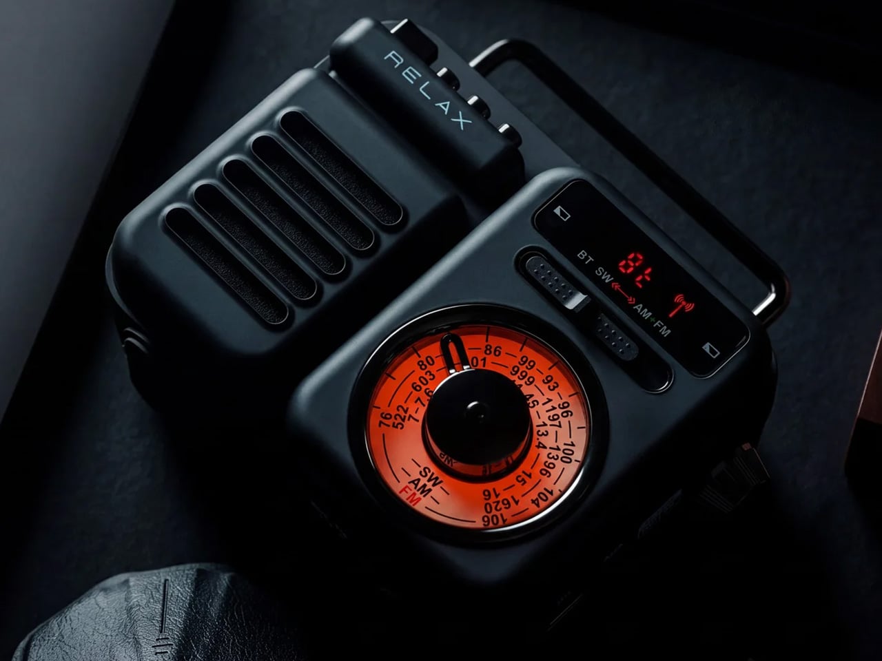
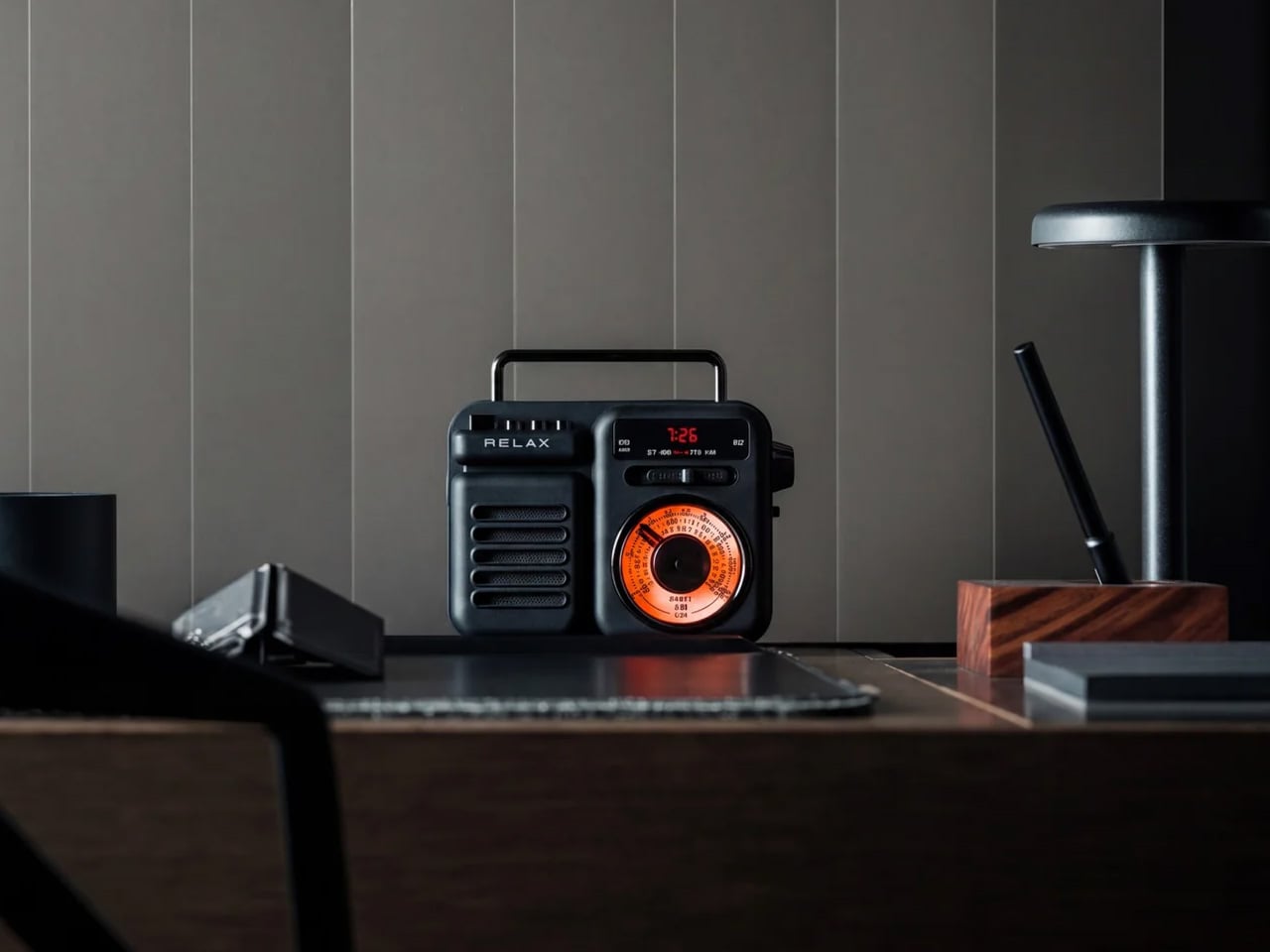
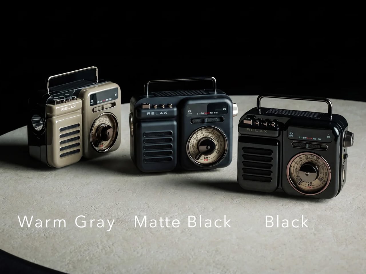
The RetroWave is not trying to look vintage. It simply does, because the people who designed it understood that warm tones and a tactile tuning dial carry a feeling that modern hardware cannot replicate on its own. For you, that distinction matters at a tailgate, where every object on the truck bed shapes the atmosphere of the whole setup whether you intended it to or not. The RetroWave earns its spot before a single note plays.

Seven functions live inside a body that reads as a single cohesive object, not a spec sheet assembled into hardware. AM/FM and shortwave radio, Bluetooth streaming, a USB charging port, and a built-in flashlight all coexist without crowding the design or complicating the interface. For you, that means one piece of gear that moves cleanly from pre-game energy to late-night wind-down without ever needing to swap anything out. It carries the whole day without announcing it.

Click Here to Buy Now: $89.00

What we like:

  • Analog character translates immediately in outdoor settings
  • Seven functions in one body removes the need to bring anything else

What we dislike:

  • The retro aesthetic will not appeal to everyone
  • Battery life under sustained outdoor use has not been independently verified at publication

2. Brane X

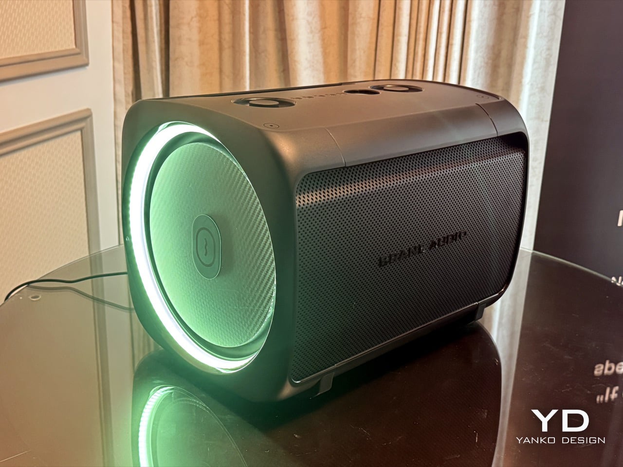
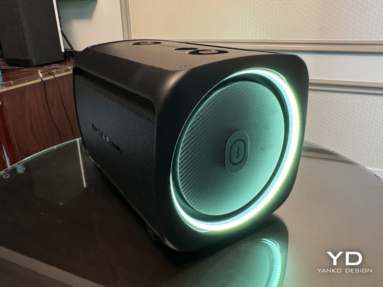
Most portable speakers fake their bass. They boost the low end digitally and call it sub-bass, and it fools you indoors but gets swallowed by open air the moment you step outside. The Brane X does not fake anything. Its proprietary Repel-Attract Driver cancels internal air pressure to deliver genuine sub-bass from a body barely nine inches wide. For you, that means a speaker that actually fills a parking lot instead of politely suggesting it could.

Five drivers and four class-D amplifiers push past 200 watts combined, backed by a 72-watt-hour battery rated for twelve hours of runtime. IP57 waterproofing handles rain and the inevitable cooler spill without breaking stride. Wi-Fi streaming and Bluetooth 5.3 cover both strong and spotty signal scenarios across a large lot. For you, the ability to group up to eight units means the sound scales with the size of your crowd rather than capping out at the wrong moment.

What we like:

  • Genuine sub-bass output from a compact enclosure
  • Twelve-hour battery life clears even the longest tailgate

What we dislike:

  • Two hundred-plus watts at full volume will cut into runtime considerably
  • Wi-Fi streaming depends on stable network access in the parking lot

3. Beosound Explore

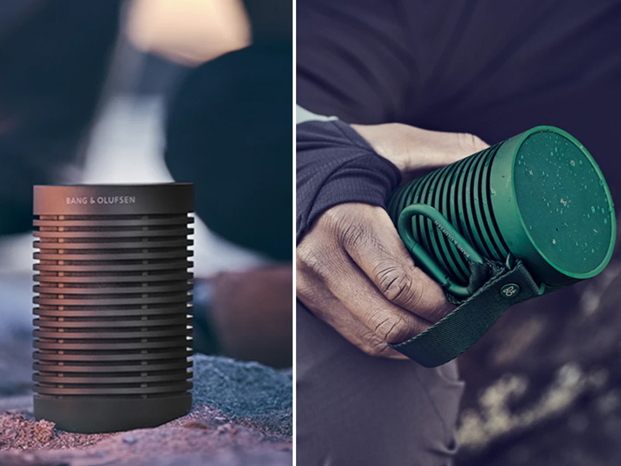
Bang & Olufsen built the Beosound Explore from hard-anodized aluminum instead of the polycarbonate most competitors default to, and that single decision changes how the speaker ages. Polycarbonate scratches and scuffs into a reading of neglect. Aluminum picks up honest wear and keeps looking considered. For you, that means a speaker that still belongs in your setup on its twentieth outing, rather than one that starts looking disposable before the season is halfway through.

Twenty-seven hours of battery life removes the anxiety that follows every other portable speaker through a long weekend outdoors. Dual full-range drivers produce True360 sound with no preferred listening axis, so there is no bad seat at your tailgate. IP67 water resistance covers submersion up to one meter for thirty minutes, handling every realistic outdoor scenario without fuss. For you, the carabiner strap means it travels without ceremony and arrives looking like it belongs wherever you set it down.

What we like:

  • Twenty-seven hours of runtime covers a full day and night without a second thought
  • Hard-anodized aluminum ages honestly with outdoor use

What we dislike:

  • The Bang & Olufsen premium is real and unavoidable
  • 360-degree output reduces directional volume control in loud open environments

4. Battery-Free Amplifying iSpeakers

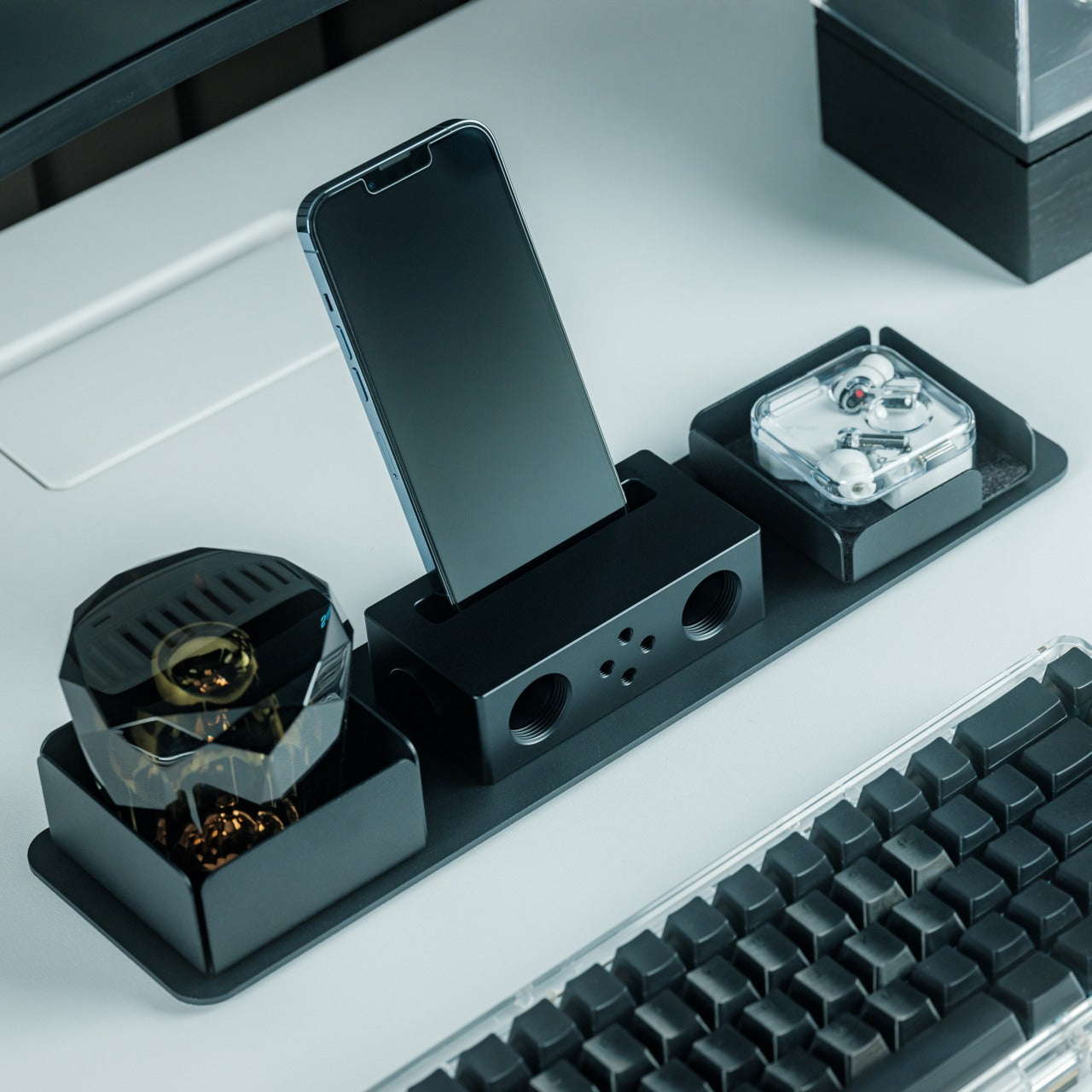
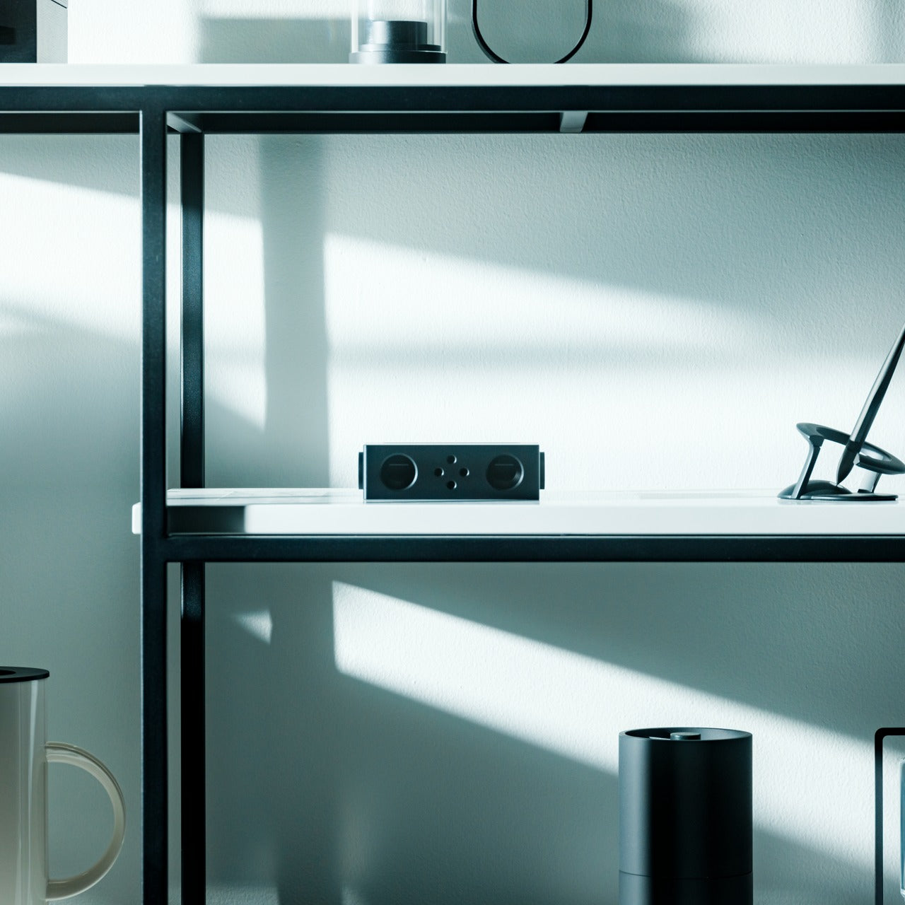
The premise sounds like a trick: a speaker that amplifies sound without drawing a single watt of power. The iSpeaker uses passive acoustic geometry instead of electronics, channeling audio through a precisely shaped horn that physically increases volume without a battery or Bluetooth chipset. For you, that means zero charging anxiety at a tailgate where outlets are not a given. It works the moment you set your phone inside it and keeps working until you leave.

The design reads as furniture as much as audio hardware, which earns it a different kind of presence at a tailgate than a traditional plastic cylinder would. It sits on the table as a deliberate object, not a forgettable gadget. For you, that matters because it communicates something about the setup before a single note plays. No cords, no app, no pairing ritual. You place it, drop your phone in, and the afternoon takes care of itself from there.

Click Here to Buy Now: $179.00

What we like:

  • Zero battery dependency removes the most common outdoor-speaker anxiety
  • Passive horn amplification produces real volume with no electronics involved

What we dislike:

  • Output ceiling is physically limited by the horn geometry
  • Works only with phones that fit the cradle dimensions

5. Muzen Wild Mini

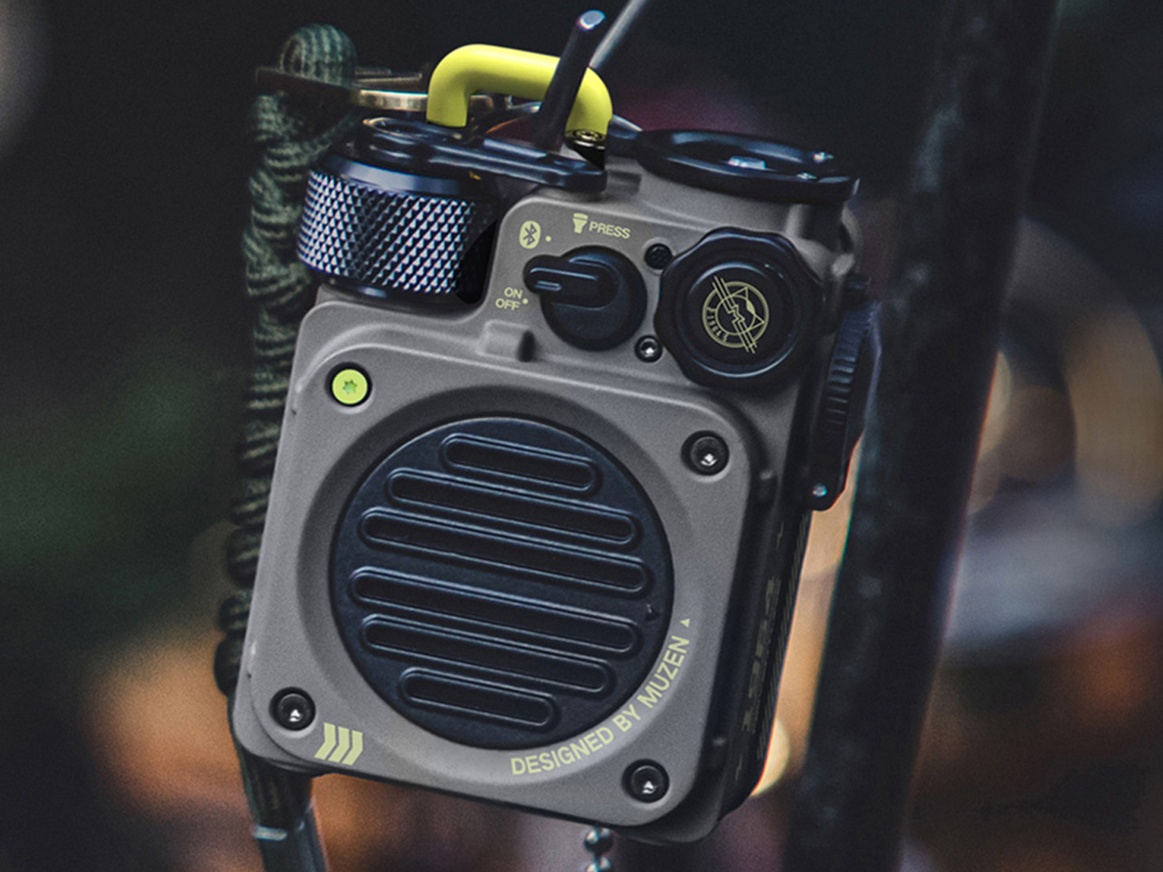
The Muzen Wild Mini looks like it was pulled from a gear locker rather than designed for a product page, and that is exactly the point. The all-metal body carries a military character that communicates durability before you ever pick it up. For you, that matters in a setting where gear gets moved, stacked, and occasionally dropped between the cooler and the truck bed. The Wild Mini does not ask to be handled carefully, which means you never have to think about it.

Bluetooth 5.0 handles the streaming, and a built-in flashlight with three lighting modes earns its place once daylight fades on the lot. A single charge delivers six hours of runtime at full volume, covering the core of a game-day schedule without needing a top-up. For you, the clip system means it attaches to a bag, a belt loop, or a tent frame with equal ease, keeping the speaker accessible without requiring a dedicated surface to set it on.

What we like:

  • All-metal build shrugs off drops and rough handling
  • The built-in flashlight adds genuine utility once the sun goes down

What we dislike:

  • Six hours is the shortest runtime in this group
  • The compact body limits total output volume compared to the larger enclosures here

The Right Speaker Makes the Saturday

None of these five ask you to compromise. The RetroWave brings analog warmth to a setting that usually defaults to generic plastic. The iSpeaker removes the charging question entirely. The Brane X delivers the bass a parking lot actually requires. The Beosound Explore brings luxury-grade materials to outdoor conditions they were genuinely built for. The Wild Mini goes anywhere without asking permission. Each pulls its weight differently, and that range is exactly the point.

A good tailgate speaker is the one you stop noticing because it never gives you a reason to worry about it. The battery holds, weather is not a factor, the sound fills the space, and the object earns a second look from whoever walks by. All five of these clear that bar. Pick the one that fits how your Saturdays actually run, and it will handle the rest without asking for much in return.

The post 5 Tailgate Speakers Built to Survive a Full Saturday Outdoors first appeared on Yanko Design.

  •  

MetMo turned a 1912 mechanism into the perfect hands-free tweezers for hobbyists and craftsmen

If the name MetMo rings a bell, that’s because this small Leeds outfit has built its reputation out of taking old mechanical ideas nobody else bothered reviving and turning them into objects people genuinely want to own. We’ve covered the MetMo Driver reworking the mid-century ratchet screwdriver, the Fractal Vise shrinking industrial clamping logic down to desktop scale, and the Pocket Grip channeling a century-old patent into nearly half a million dollars of Kickstarter support. The catalog reads like a museum of mechanisms reimagined with modern metallurgy and CNC precision. Now they’re circling back to something smaller, more delicate, and more universally frustrating than anything they’ve tackled before. Their next target is the humble tweezer.

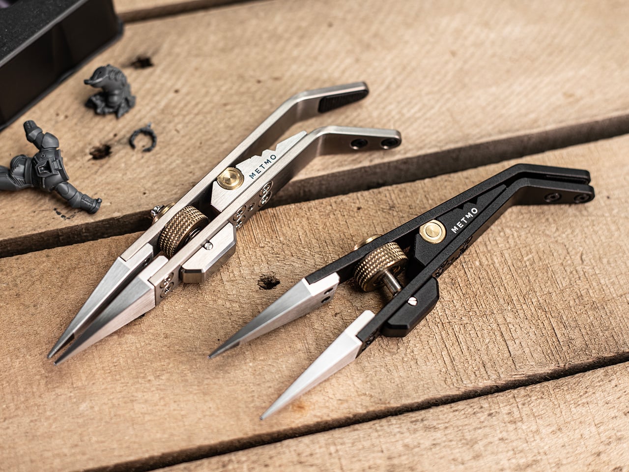
The Precision Grip is calibrated for a different job than MetMo’s earlier clamping tools, the kind of featherlight, controlled pressure needed to hold a model part without crushing it. Where the Pocket Grip chased 21kg of clamping force for daily carry tasks, this one maxes out at 5kg, by design. It runs on a miniaturized drive screw borrowed from precision machining equipment, so you set your grip force once and the jaws hold that position without assistance. That’s the core limitation tweezers can never escape: they hold via sustained finger pressure, and the moment that wavers, the part is gone. For anyone who has ever sacrificed a miniature to the carpet gods, that last sentence is the whole pitch.

Designer: Sean Sykes & James Whitfield (MetMo)

Click Here to Buy Now: $129 $143.33 (10% off). Hurry, only 19/1050 left! Raised over $579,000.

For decades, precision hobbyists have been improvising with tools from completely different disciplines. Jewelers raid surgical supply catalogs. Electronics hobbyists use soldering tongs that launch parts across the room the moment grip pressure drops. Model painters hold tiny figures between their fingers and simply hope for the best. MetMo’s position is that these people deserve something built specifically for the job, and the Precision Grip’s lightly textured jaw tips are designed to grip without marking or damaging delicate surfaces, a distinction that no repurposed dental or electrical tool reliably delivers.

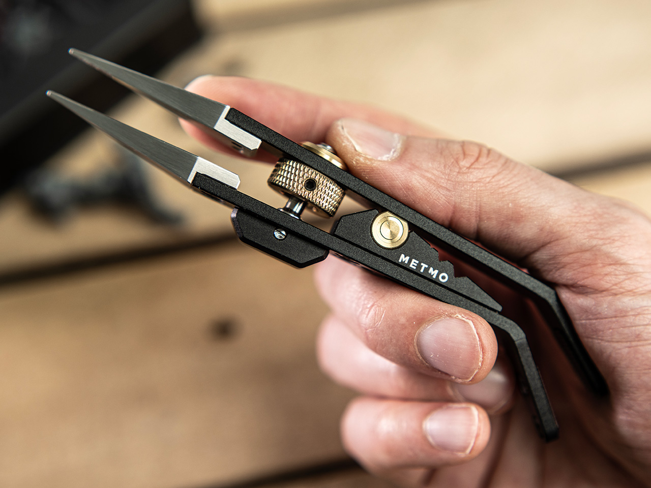
The mechanism at the center of all this is a miniaturized version of the drive screw used in high-precision machining equipment, a category of hardware that lives and dies by tolerance accuracy. A solid barrel hinge keeps both jaws in perfect alignment during clamping, preventing the sideways drift and tip-twist you’d get from a conventional pivot, and that dimensional stability is what makes the needle-nose tips usable for genuinely pinpoint work rather than approximations of it. Turn the knurled screw, the jaws close to exactly where you set them, and they hold there with up to 5kg of clamping force. The underlying mechanism traces back to 1912, which MetMo has made into a design tagline for a reason. It’s a genuinely good mechanism.

The jaw tips carry a patent-pending micro-grip texture that MetMo calls “The Gecko’s Finger,” a name that is slightly ridiculous and also completely on point. Small smooth parts get just enough extra friction at the contact surface to stay put without the jaws needing to clamp any harder, which is the right problem to solve when you’re working on something fragile. Beyond the standard needle-nose stainless steel nibs, the system accepts silicone soft inserts for delicate surfaces, round clamp heads for gripping a part’s inner cavity rather than its outer face, and even custom 3D-printed nippers for shapes no off-the-shelf tip could reach. Individual nibs swap out independently when damaged, without touching the body.

Set the jaws slightly open and a spring-loaded mechanism activates, giving you conventional tweezer behavior for quick sorting tasks without engaging the screw-drive lock every time. When you need both hands free, the Precision Grip clamps into a quick-release mount and becomes a miniature desk vice, holding your part steady while you solder, file, or paint. Three V-grooves machined into the body let you form wire or prop the tool as a makeshift stand, keeping parts right where you left them when you step away. The whole setup is fully ambidextrous, which sounds minor until you’re a lefty who has spent years buying tools that don’t think about you. All of that function lives in a body that measures 134mm (5.3 inches) long, 29mm wide, and 16mm deep.

Aerospace-grade hard-anodized aluminum (70.3g), Grade 5 titanium (83.3g), and surgical stainless steel (114.5g) are the three material variants, and each one maps to a different kind of user. The aluminum is the nimble everyday choice, the titanium balances weight savings and durability for more demanding environments, and the surgical stainless is autoclave-rated and built from high-chromium steel throughout, making it viable for medical and laboratory settings. All three are fully user-serviceable, strippable to individual components for maintenance or repair, with high-tensile screws throughout rather than whatever was cheapest to source. MetMo talks about a 200-year product goal, and the fully serviceable construction is what gives that ambition actual credibility.

Pricing for the Precision Grip runs at £89 ($118 USD) for the Aluminum version, while the Stainless Steel variant is priced at £119 or $157 USD. For serious hobbyists and EDC collectors, the Titanium Precision Grip is priced at £179 or $237 USD. The Precision Grip ships worldwide from the UK and comes with the 200-year repairability guarantee that you could possibly only expect from a company as obsessed with detail and quality as MetMo. MetMo balanced the weight distribution around fine writing instrument ergonomics, giving the body a contour that doesn’t tire your hand across long sessions. It also looks genuinely purposeful doing nothing, like an intricate ornament that earns questions from people passing your desk, which MetMo treats as part of the design brief rather than a happy byproduct.

Click Here to Buy Now: $129 $143.33 (10% off). Hurry, only 19/1050 left! Raised over $579,000.

The post MetMo turned a 1912 mechanism into the perfect hands-free tweezers for hobbyists and craftsmen first appeared on Yanko Design.

  •  

This $899 golf launch monitor tracks your swing in 3D and tells you how to fix it

A decent golf lesson can cost anywhere from $80 to $200 an hour, but the bigger issue usually kicks in after the lesson ends. You leave with a fix, spend the next two weeks practicing on your own, and somehow manage to rehearse the exact mistake you were trying to get rid of. Golf has a funny way of doing that. More practice does not always mean better practice. Launch monitors helped by giving everyday golfers access to shot data that used to live in pro fittings, but numbers alone can still feel like homework. NeoPace’s G10 Pro tries to close that gap by pairing launch monitor stats with an AI coaching layer that explains what happened and what to work on next.

NeoPace, based in Irvine, California, built the G10 Pro around a triple-camera system and a 24 GHz Doppler radar. Two cameras capture the impact zone at up to 480 frames per second, while a third records the full swing at 120fps. The setup feeds into what NeoPace calls TrainerIQ™, an AI system that traces a bad shot through a Body to Club to Ball chain, connecting ball flight to club delivery and then back to the body movement that caused it. That matters because most golfers do not need more raw data, they need help turning data into action. The G10 Pro also rebuilds each swing in 3D, so you can replay it from multiple angles instead of squinting at a flat video and pretending you know what your hips are doing.

Designer: Neopace

Click Here to Buy Now: $899 $1499.99 (40% off). Hurry, only 875/1000 left! Raised over $286,000.

The G10 Pro tracks 22 ball and club metrics, plus 27 body-related metrics covering chest rotation, pelvis movement, wrist angles, elbow flexion, knee sway, and more. That is a pretty wild amount of information for a portable unit that costs $899, especially when most devices in this range focus mainly on ball flight and club numbers. NeoPace also made setup refreshingly simple, with auto alignment and support for both face-on and down-the-line placement. So whether you’re practicing at home, on the range, in the backyard, or sneaking in some swing diagnostics before a round, the G10 Pro feels built for golfers who want coaching-grade feedback without hauling around a tour van full of gear.

Every swing gets captured and rebuilt in full 3D, replayable from any angle, at any moment, from face-on, top-down, and down-the-line, all from a single device you placed once before you started. Most launch monitors give you flat video from a single fixed angle. The stereo camera pair locks the ball at 480 frames per second while the third follows the swing at 120fps, double the impact capture rate of most competing devices. Seeing your own swing from directly above mid-follow-through is the kind of analysis angle instructors have always wanted to show students but rarely had a clean portable way to deliver. NeoPace claims the 3D Replay™ is a first in portable consumer launch monitors at any price, and from everything visible in the current market, that claim holds up.

TrainerIQ™ analyzes your swing and body movement, identifies the likely cause of a miss, and suggests a targeted drill to help you improve. It does not just flag that the face was open at impact and leave you to figure out why. The analysis goes deeper: face 2 degrees open, heel contact, smash factor 1.35, and the root cause is that the body stopped rotating so the hands stepped in to carry the load. That kind of layered breakdown is exactly what a teaching pro walks you through after watching your swing, and the G10 Pro compresses it into automated real-time output after each shot. Golfers can also directly ask TrainerIQ™ questions about their swing and receive personalized, actionable guidance on what to work on next, which makes the system feel less like a stat engine and more like an interactive training partner. TrainerIQ™ then prescribes specific drills based on the diagnosis, closing the loop between data, understanding, and actual practice.

Twenty-seven body-related metrics track how your body moves through every swing, turning posture, timing, and rotation into data you can act on. The tracked parameters span the chest and pelvis in five axes each, lead and trail knee sway and flexion, mid-hands sway and lift, head movement, X-Factor and Sway Gap, lead and trail elbow flexion, wrist angle, shaft angle, and kinetic sequencing factors: Core Gain, Shoulder Gain, Wrist Gain, and Release Factor. Any coach reading that list will recognize it as the full biomechanical picture that motion capture setups in pro training facilities chase. Inside TrainerIQ™, it becomes the evidence base connecting a ball that lands 13 yards short and right to a chest that stopped rotating halfway through the downswing. That translation from raw biomechanics to actionable coaching is where the G10 Pro genuinely earns its price.

Getting the G10 Pro into a session takes three steps: set it down, auto align, and take your shot. That might sound like marketing language, but auto-alignment is a genuine quality-of-life upgrade over monitors that require precise manual positioning every single time. The pan-and-tilt gimbal covers a 120-degree pan range and a 40-degree tilt range, so near-correct placement is close enough. The unit itself measures 217.5 × 47.25 × 44.5 mm without the tripod, compact enough to slide into a range bag without reorganizing everything else in it. The 3,300mAh/7.2V battery runs for four hours with a 1.5-hour fast charge at 15W, which covers a full morning session with room to spare. For golfers who want to practice or play indoors, the G10 Pro is compatible with GSPro and Creative Golf, with additional major simulator platforms currently in development.

NeoPace also says there is no unlock fee or subscription required for simulator connectivity itself, though third-party simulator software fees may still apply. The companion app works with iOS (14.0 and above) and Android (10.0 and above) smartphones and tablets. NeoPace also says the core feature set does not require a subscription. D Swing Analysis and TrainerIQ™ Analysis share an allowance of up to 5 AI-analyzed shots per month, while Premium AI increases the shared allowance to up to 1,000 shots per month and adds features such as Ask TrainerIQ™, Performance Insights, Personalized Drills, Practice Goals, and Cloud Storage.

At $899, the G10 Pro goes toe to toe with the Rapsodo MLM2PRO, its most direct camera-based competitor at the same price. The MLM2PRO does solid work on ball flight data and video, but offers no body tracking, no 3D reconstruction, no AI coaching chain, and face-on-only placement. Stepping further up the market, ball/club/body motion analysis at this depth typically lives in systems costing several times more, usually requiring separate wearables or dedicated motion capture rigs. Honestly, the fact that NeoPace has packed 3D reconstruction, 27 body metrics, and an AI coaching brain into a $899 portable device feels like it should be harder to pull off than it apparently is, and that is the most compelling thing about the G10 Pro.

Click Here to Buy Now: $899 $1499.99 (40% off). Hurry, only 875/1000 left! Raised over $286,000.

The post This $899 golf launch monitor tracks your swing in 3D and tells you how to fix it first appeared on Yanko Design.

  •  

5 Camping Gear Picks Built for the Last Warm Weekends of the Year

September camping arrives with a specific quality that July doesn’t have. The mornings carry an edge, the light sits lower, and every good weekend feels like one of the last ones worth using properly. What earns a spot in the car changes. It stops being about what’s most impressive and starts being about what actually works when the temperature drops and the fire needs to stay going longer than planned.

This list covers five pieces of gear built for car camping and overlanding weekends: a radio, a grill, a shelter, a power source, and a pillow. Each one was chosen for the same reason — not because it leads its category on a spec sheet, but because it solves a specific friction point that camping has quietly accepted for too long as part of the deal.

1. Camp Napper

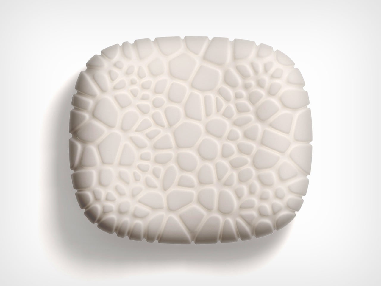
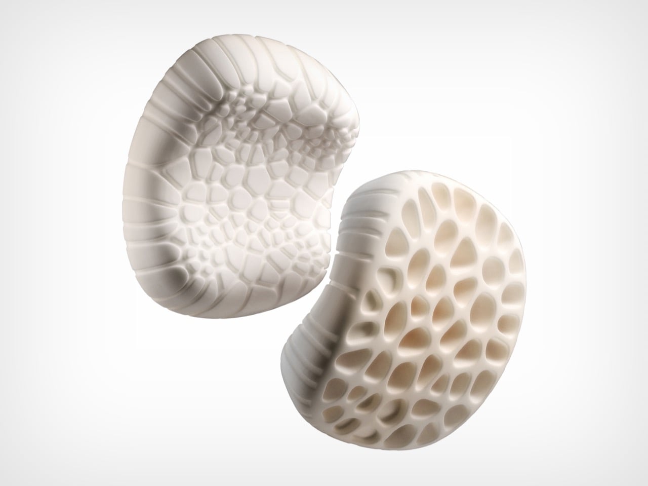
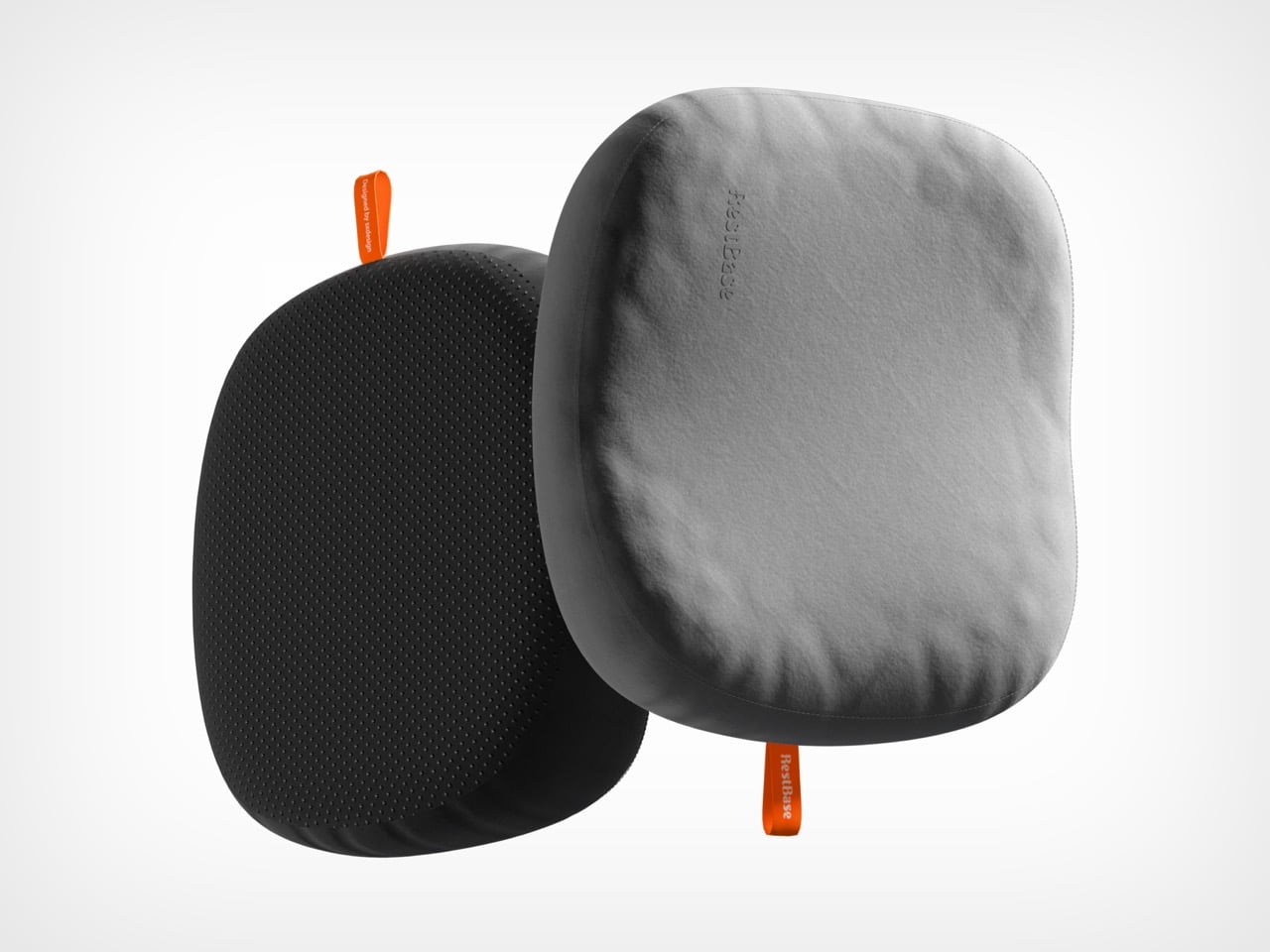
Inflatable camping pillows fail in a consistent pattern: they sound like pool floats each time you shift, lose pressure by 3 a.m., and pack into a shape that takes up more space than it deserves. Designer Chen Xu, working for RestBase, treated the camping pillow as an engineering problem instead. The Camp Napper’s surface geometry is derived from fungal spore texture, mapped through Voronoi polygon modelling across real pressure data from volunteer sleepers. Trypophobia alert: the surface is visually distinctive.

The internal structure mirrors hollow plant stem geometry, shedding mass without losing the ability to hold form under repeated compression. Total weight is 400 grams. Packed size is roughly the dimensions of a water cup. Memory foam conforms to different sleepers without nightly pressure adjustments, and anti-slip rubber particles on the base keep it in place across sleeping pads, camp chairs, and car seats equally. Note: retail price was not confirmed at time of writing — verify before purchasing.

What we like

  • Voronoi-modelled surface and bionic internal structure represent engineering at a level the camping pillow category hasn’t previously applied
  • 400 grams compressed to water-cup dimensions is genuinely packable, not just marketed as such

What we dislike

  • The cellular surface texture warrants a trypophobia alert before gifting or introducing to someone who hasn’t seen it
  • Retail price was unconfirmed at the time of writing; verify availability before purchasing

2. RetroWave 7-in-1 Radio

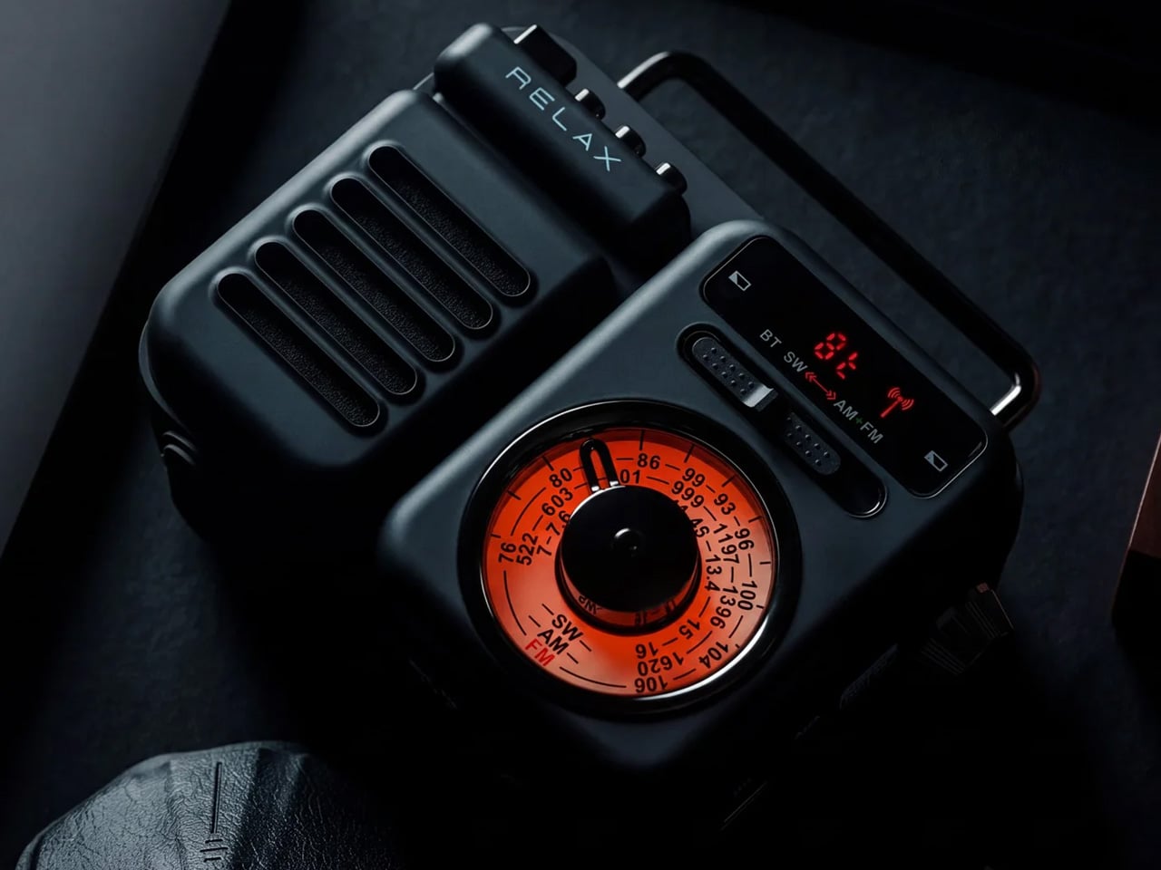
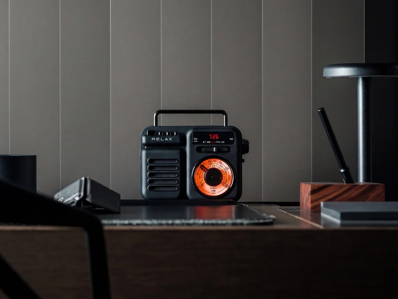
The RetroWave earns its place not through specifications but through atmosphere. It’s a 7-in-1 radio with solar charging and a hand-crank backup, both of which keep it running off-grid without a charged battery or a Bluetooth pairing screen. It simply works when it’s turned on, which is a lower bar than it sounds and one that a surprising amount of audio gear fails to clear by the second day of a trip.

The solar panel handles afternoon charging on any reasonable day. The hand crank handles everything else. Shortwave reception varies with terrain, so dense forest or mountain valleys will limit broadcast range — worth knowing before the trip rather than during it. For weather, local stations, and background sound that makes a campsite feel inhabited rather than silent, it performs without hesitation.

Click Here to Buy Now: $89.00

What we like

  • Solar and hand-crank charging eliminate any dependency on outlets or other devices’ battery reserves
  • Seven band frequencies in one object requiring no phone, no app, and no pairing sequence to operate

What we dislike

  • Shortwave reception degrades noticeably in heavily forested or mountainous terrain
  • The retro form tends to read as decorative to first-time buyers who haven’t yet used it in the field

3. Puffer Tent

The standard camping shelter setup involves a sequence of separate problems: tent, sleeping pad, sleeping bag, and then the 2 a.m. realignment when everything shifts. The Puffer tent collapses that sequence into a single bag. It’s an inflatable A-frame with the mattress built into the structure — shelter and bed arriving together, packed into 10 × 25 × 10 inches, with firmness adjustable from soft to firm to hard.

Founder Sam Peery spent five years prototyping this, which explains why the details feel intentional rather than approximate: valve placement, pressure labeling, pump connection. At 18.2 pounds, it’s a car camper and overlander’s tent, not a backpacker’s — a distinction the brand makes honestly. Priced at $649.99 with the electric pump included, the more instructive comparison is against a rooftop tent setup, not a $40 nylon shelter from a big box store.

What we like

  • Tent and mattress in a single integrated system removes the multi-piece setup sequence that opens most camping trips
  • Adjustable firmness from soft to hard gives sleepers real control over the sleeping surface

What we dislike

  • At 18.2 pounds, it’s unsuitable for backpacking trips where pack weight is a primary constraint
  • The $649.99 price requires genuine commitment from anyone who already owns a functional shelter

4. All-in-One Grill

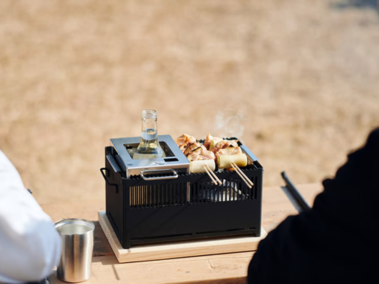
Skewers of meat and green onions grilling on a small portable charcoal grill with a metal insert holding a glass bottle.

Bar grates collect residue from the first meal and carry it into every meal that follows. Cleaning them properly requires time and water that aren’t always conveniently available between the fire and the food. The All-in-One Grill’s flat tabletop surface removes that problem entirely — no gaps, no angles, nothing for debris to settle into. On a two-day trip with multiple meals, that difference compounds into something genuinely useful by Sunday morning.

Surface area fits two people cleanly, which covers the most common camping scenario without unnecessary bulk. Cooking for four or more requires staggering meals, adding real time to every camp dinner. There’s also no heat source included — this is a cooking surface that sits above a fire or stove, not a replacement for one. Within those parameters, it does its job at $449 with the kind of simplicity that makes a camp kitchen feel considered.

Click Here to Buy Now: $449

What we like

  • Flat surface cleans in a fraction of the time a traditional bar grate requires, a gain that compounds across a multi-meal trip
  • Tabletop sizing matches the most common two-person camping scenario without adding unnecessary pack weight

What we dislike

  • Cooking for groups larger than two requires staggering meals, adding real time to every camp dinner
  • No integrated heat source means it functions as a companion to a fire or stove, not a standalone cooking solution

5. Blavor PN-W43 Power Station + Camping Lantern

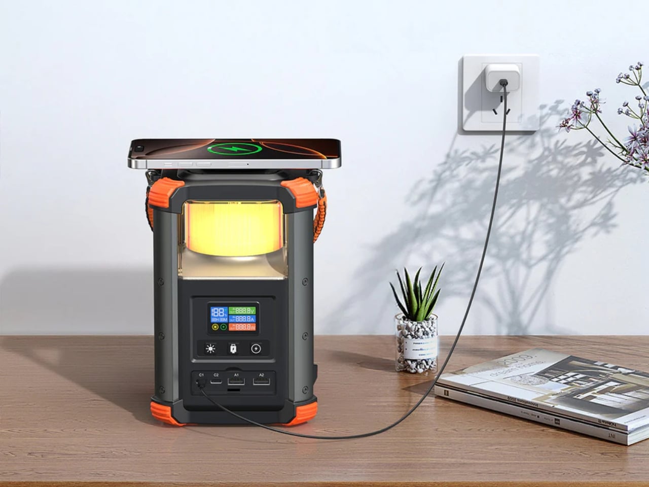
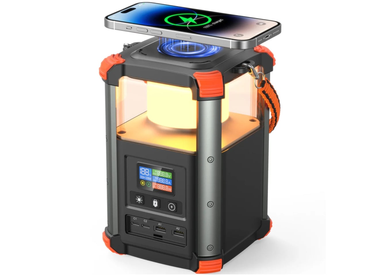
Most power stations are rectangular, featureless, and indifferent to the environment they’re meant to operate in. The Blavor PN-W43 builds a 4W LED lantern directly into the body, producing a 64,000mAh device barely larger than a tall water bottle that covers light and power from a single object. Five charging pathways — solar, AC, car adapter, USB-C, and micro USB — handle both off-grid and in-transit scenarios without adapter juggling.

At $135, it replaces two separate items, a lantern and a power bank, that together would cost more and occupy more space. It pairs naturally with the RetroWave Radio in this list: the radio’s solar charging handles daytime audio independently, while the Blavor manages device charging and nighttime light without overlap. At 236.8Wh, it’s sized for a weekend trip, not an extended off-grid expedition — which is exactly the use case this article is built around.

What we like

  • Integrated 4W lantern eliminates a separate light source without adding meaningful size or weight to the kit
  • Five charging pathways, including solar and AC, cover off-grid and in-transit scenarios without separate adapters

What we dislike

  • 236.8Wh capacity suits two to three night trips; longer off-grid expeditions will need more headroom than this provides
  • The cylindrical form sits awkwardly alongside flat gear in a structured pack and requires deliberate placement

The Trips You Actually Remember Are the Ones You Showed Up For

September has a way of making outdoor trips feel more deliberate than they do in the middle of summer. The season is moving and the weekends are numbered, which concentrates attention on what actually matters about being outdoors. The gear that earns a place in that context isn’t the most technically advanced option in its category. It’s the piece that makes the trip slightly better without making it harder to plan.

Each of these five picks does something specific. The RetroWave sets the tone without needing a phone. The All-in-One Grill removes the cleanup that makes cooking feel like a chore by day two. The Puffer Tent reduces setup to a single bag. The Blavor handles light and power as one object. The Camp Napper delivers actual sleep. None of them require the whole kit to change. Any one of them is enough of a reason to go.
The post 5 Camping Gear Picks Built for the Last Warm Weekends of the Year first appeared on Yanko Design.

  •  

MAKERphone 2.0 Assembles Like LEGO, Calls Like a Real 4G Phone

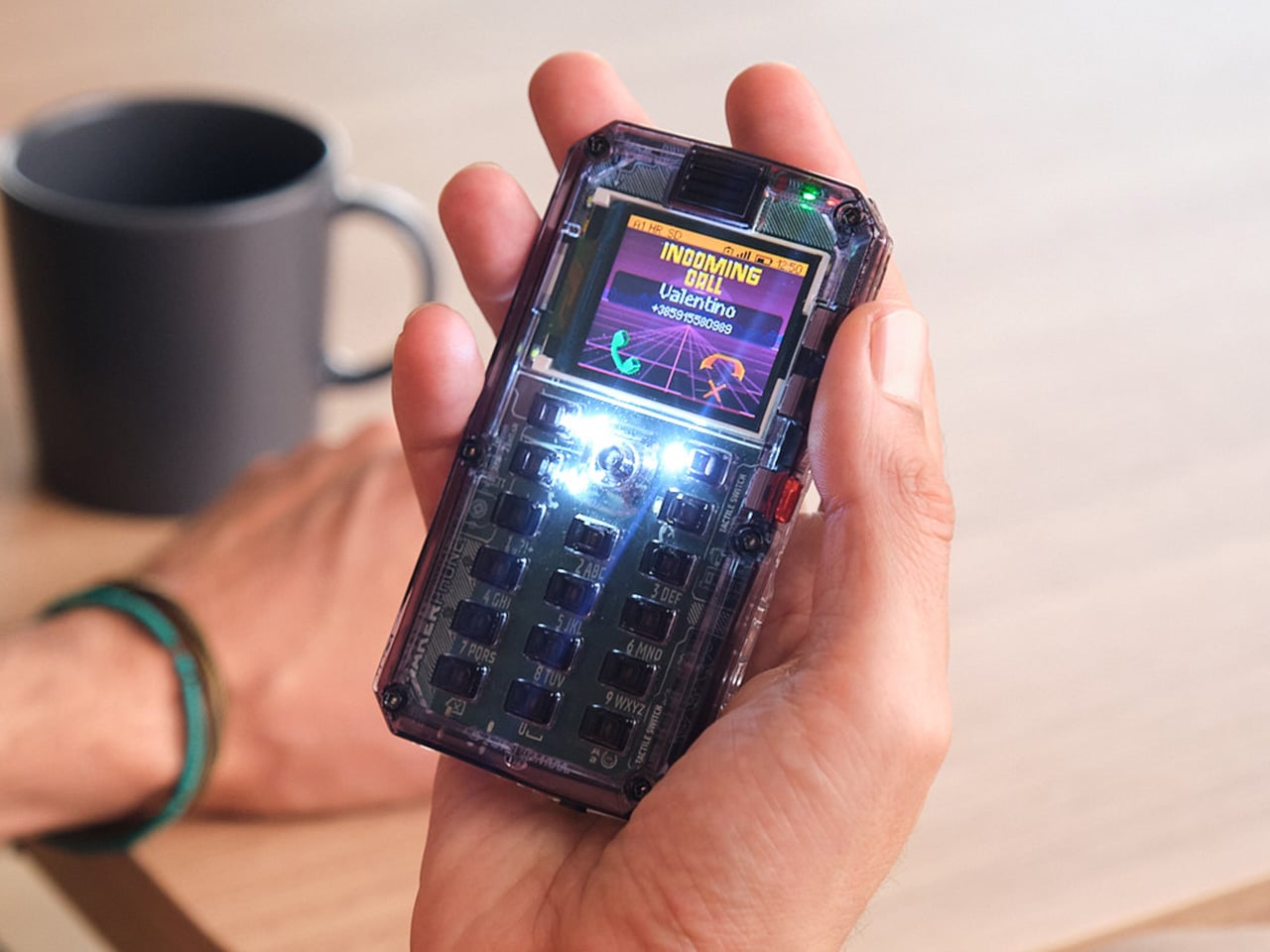
Most phones arrive finished, sealed behind glass before you open the box. MAKERphone 2.0 flips that script. It ships as loose parts that only become a phone once you build it yourself: no soldering iron, no electronics background, just a screwdriver and about two hours. Once assembled, it’s a working 4G device that makes real calls and sends texts over a live network.

The build is what really sells the design. Every piece, from the board to the display to the numpad and to the joystick, clicks or screws into place. The entire endeavor is guided by an illustrated manual that reads like a LEGO instruction booklet, with video walkthroughs for anyone who gets stuck. By the time you finish, you’ve seen the processor, the modem, and the battery close, not used them.

Designer: CircuitMess

Click Here to Buy Now: $129 $160 (24% off). Hurry, only a few left! Raised over $300,000.

Pop in a nano-SIM and the phone comes alive on 4G networks, handling calls and texts like any device off a shelf. There’s a music player, a photo and video gallery, a calendar, notes, and a handful of retro games loaded onto that small color screen. What’s missing says as much: no app store, no social feed, nothing designed to keep anyone scrolling past bedtime.

That absence is the whole appeal for anyone shopping for a kid’s first phone. It calls and texts the people a child needs to reach, without opening the door to an internet’s worth of distraction. When a kid wants a new app or game, the answer isn’t downloading one; it’s building it. Screen time stops being something to limit and starts being something to spend making.

That building happens inside VibeBoy, the phone’s companion coding studio that runs on a computer. Describe an idea in plain English, like a taco dodging falling pickles, and the AI writes code sent to the phone with one click. The goal isn’t to let AI do all the thinking but to let VibeBoy teach users to read that code, question it, and eventually rewrite it.

That teaching happens across four stages built into the same app. Beginners describe what they want and watch it appear on-screen, before moving on to reading and tweaking the Python code the AI generates. Eventually, they write their own Python and C++ from a blank file. Nobody stays at one skill level long; the ladder is designed so most people climb it faster than expected.

Six snap-on modules turn the phone into something closer to a small hardware platform than a single-purpose device. A camera module captures pixelated stills and video, a bigger speaker adds volume, and a flashlight adds utility. An environment sensor reads temperature and humidity, an infrared module controls other devices, and a bare perforated board lets anyone solder a custom circuit and plug it in.

A companion smartwatch called MAKERband follows the same idea, arriving as a kit to assemble rather than a sealed gadget. Once built, it pairs with the phone over Bluetooth and also works with iOS and Android, running 15 watchfaces and five mini-games out of the box. It connects to VibeBoy, so a custom watchface, say, a pixel cat that naps after 9 PM, is a prompt away.

The company behind it, CircuitMess, has spent years building kits like this from a small studio in Croatia. It has shipped hundreds of thousands of units to customers across more than 100 countries, developed dozens of products, and earned coverage from outlets like Wired and The Verge. Just as important, the MAKERphone 2.0 isn’t a rendering or an early prototype: the hardware is finished and ready for production.

What sticks with you isn’t any single spec but the sequence. A pile of components turns into a working phone, and that phone turns into whatever its owner decides to code next. Somewhere between the last screw and the first successful call, the device stops feeling like something you bought and starts feeling like something you actually built, one working call at a time.

Click Here to Buy Now: $129 $160 (24% off). Hurry, only a few left! Raised over $300,000.

The post MAKERphone 2.0 Assembles Like LEGO, Calls Like a Real 4G Phone first appeared on Yanko Design.

  •  

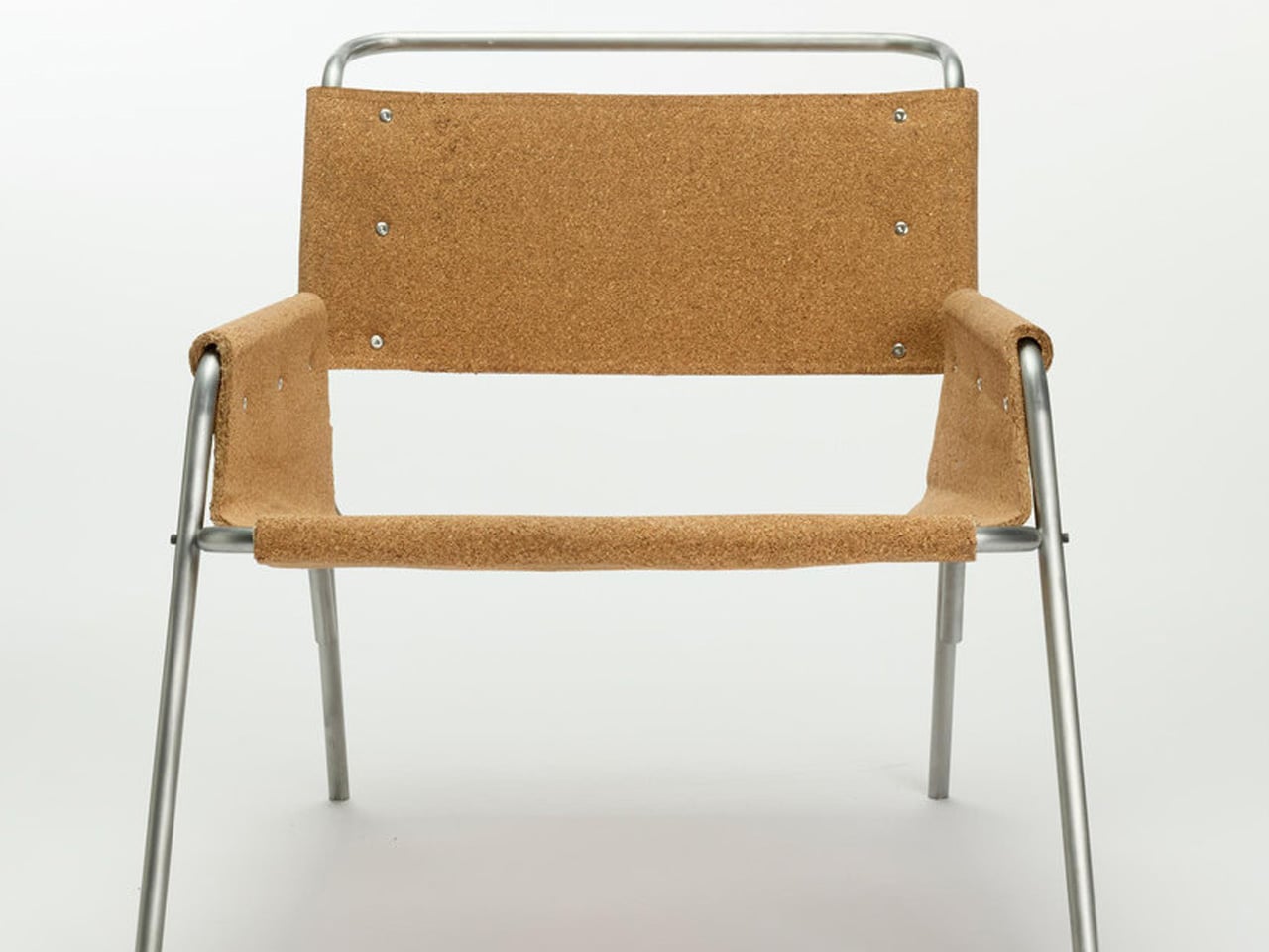
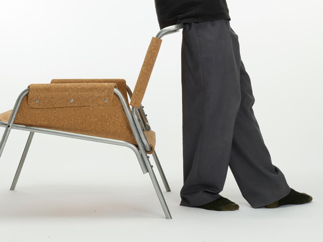
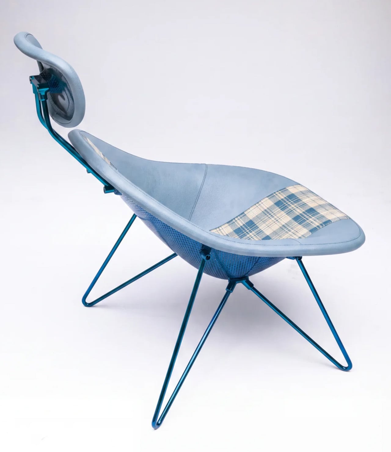
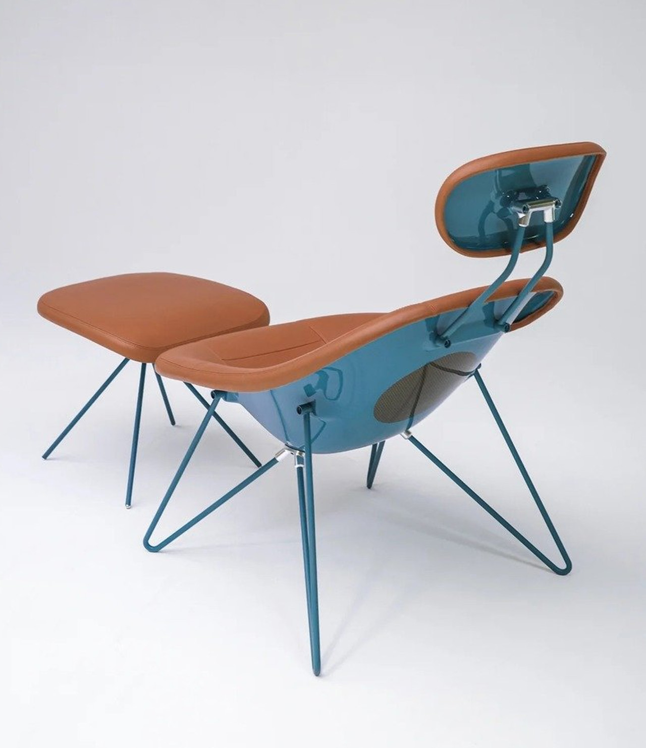
This Lounge Chair Is Built From Cork — and It’s Sturdier Than It Looks

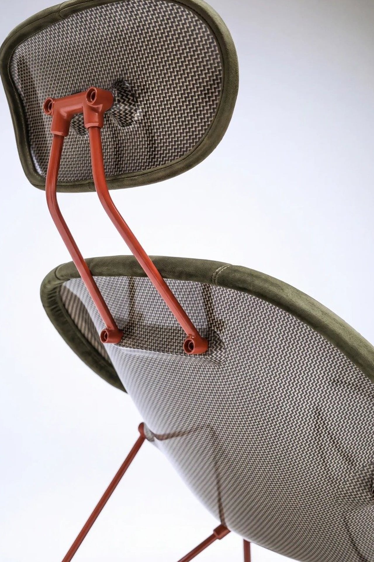
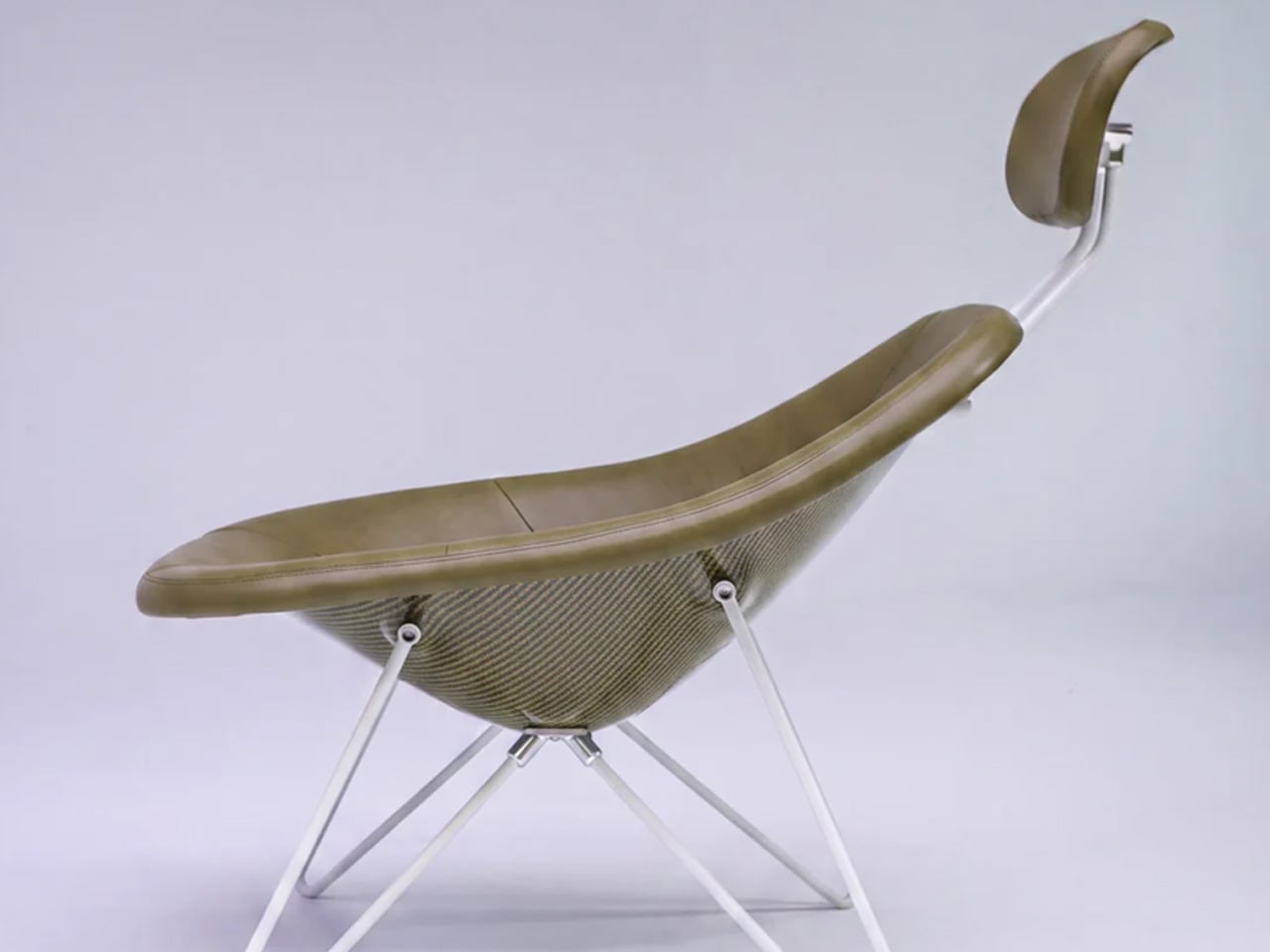
Cork is everywhere in design, and yet it’s almost always decorative. A tile floor. A pin board. A wine stopper. Copenhagen-based furniture designer Chiara Verde looked at that assumption and quietly dismantled it. Her Strata lounge chair doesn’t use cork as a finish — it uses cork as the architecture.

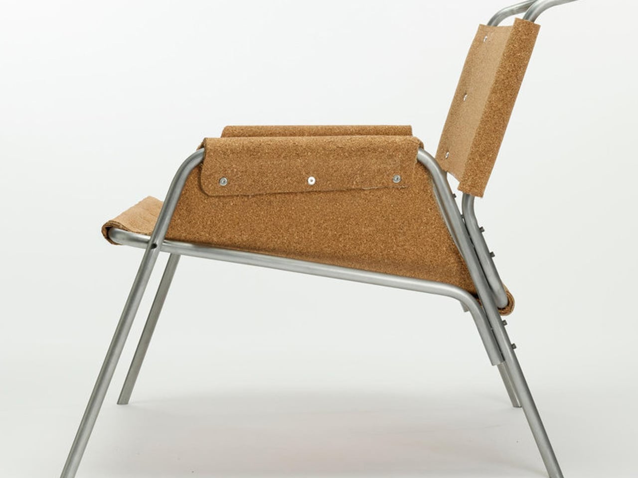
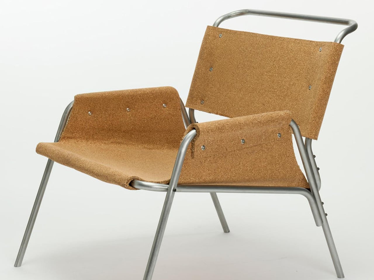
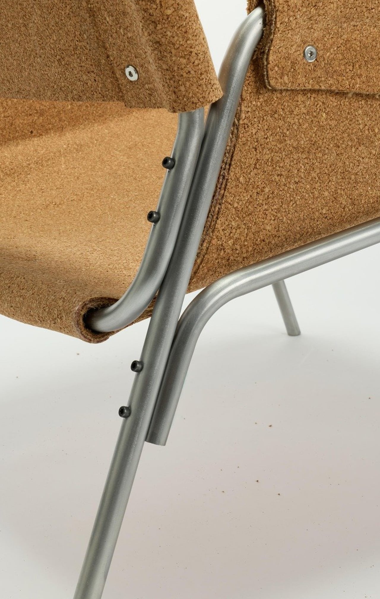
The chair is built around a layered composite system: thin cork sheets alternated with natural fibre textiles, laminated together to form load-bearing shells. The textile reinforcement isn’t there for aesthetics — it gives the cork directional stiffness and structural performance it simply doesn’t have on its own. A minimal metal frame handles only the points under concentrated load, leaving the cork shells to carry the rest. It reads, visually, like a chair slung from material intelligence rather than convention.

Designer: Chiara Verde

Verde’s background leans heavily into process. Her practice is built on material experimentation, prototyping, and structural research — work that treats the studio bench as an extension of the design itself. Strata wasn’t conceived and then executed. It emerged through months of testing, adjustment, failure, and recalibration. A cork stool came first — a full-scale testbed that validated the structural logic before Verde committed it to a larger form. The lounge chair is the result of everything that came before it.

What makes Strata worth paying attention to isn’t just the material provocation — it’s how restrained the final form is. The chair doesn’t announce itself. It holds the visual language of the natural world: organic in silhouette, warm in texture, quietly confident in its proportions. Cork has an inherent thermal quality to it, a softness underfoot and underhand that synthetic materials spend millions trying to replicate. Here, it’s simply doing its job.

The lineage of the slung chair runs deep — leather over steel tubing defined a generation of modernist seating in the early and mid-20th century. Verde is working in that same formal territory, proposing laminated cork as the next honest alternative to leather: a material that gives, breathes, and ages with use rather than against it.

Strata sits in a growing conversation around material-led design — not sustainability as branding, but sustainability as methodology. Verde isn’t marketing cork. She’s interrogating it, and the chair is the proof of concept. For a material that has spent decades on the periphery of furniture design, Strata might be the argument it needed all along.

The post This Lounge Chair Is Built From Cork — and It’s Sturdier Than It Looks first appeared on Yanko Design.

  •  

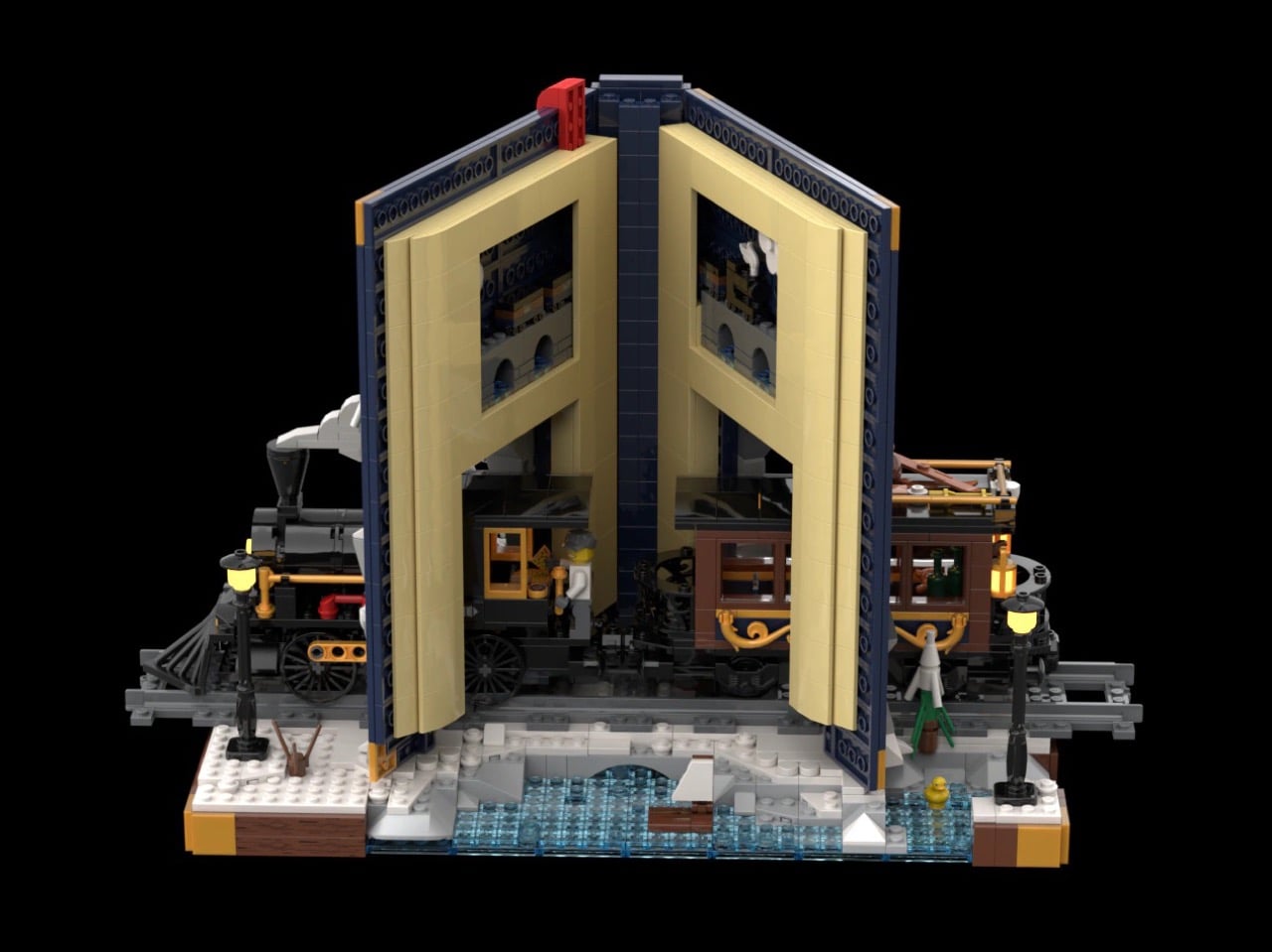
Gorgeous LEGO Book Nook Has a Steam Train Blasting Straight Through Its Snowy Pages

Every kid who grew up with Chris Van Allsburg’s The Polar Express remembers that moment where the story stops behaving like a story. A train just shows up, chugging straight out of the snow and into a kid’s actual bedroom, and suddenly bedtime reading feels a little bit dangerous in the best way. That’s the exact energy LEGO builder CrazyInventor is chasing with Winter Express, and yes, I see what you did there with that title, very smart way to dodge a certain mouse-shaped legal team while still getting the reference across loud and clear. Except here the train doesn’t stop at bursting out of the pages. It runs straight through the whole book, cover to cover, like the story just wasn’t big enough to hold it.

The result looks like someone left a hardback open on a shelf and a Victorian steam engine decided to use it as a shortcut. Gold trim, a red ribbon bookmark, snow dusted across the back cover like a sky full of stars, this thing reads more like a diorama that happens to be shaped like a book than a book that happens to have a train in it. And once you spot the tiny second train hiding inside the pages, you’ll understand why this project cracked 1,000 supporters in about three days flat.

Designer: CrazyInventor

The book itself steals the show before the train even enters the conversation. It’s a navy blue hardback with rounded gold corner guards and matching gold bands running down a curved spine, the kind of cover treatment you’d expect on a leather-bound classic rather than a pile of ABS plastic. A gold plaque on the front reads “Winter Express” in a wood-grain frame, and a red ribbon bookmark hangs off the top edge like someone set the book down mid-chapter and wandered off to make tea. Flip to the back cover and it’s scattered with pale blue round studs, doing double duty as either falling snow or a starry winter sky, depending on how you’re feeling that day.

A black and gold Victorian locomotive takes over from there, complete with a glowing headlamp, a cowcatcher up front, and Technic side rod detailing, coming straight out of a snow-capped rock tunnel carved into the front cover. A matching passenger coach trails out the other side through the spine, decked out in scrollwork trim with its own lit lanterns and a roof stacked with skis and sleds. Snowy pine trees, cobblestone tiles, and two working lampposts fill out the base, along with a frozen little pond built from trans-blue tiles.

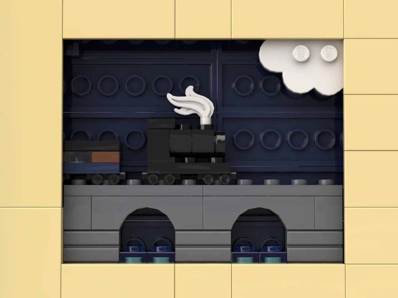
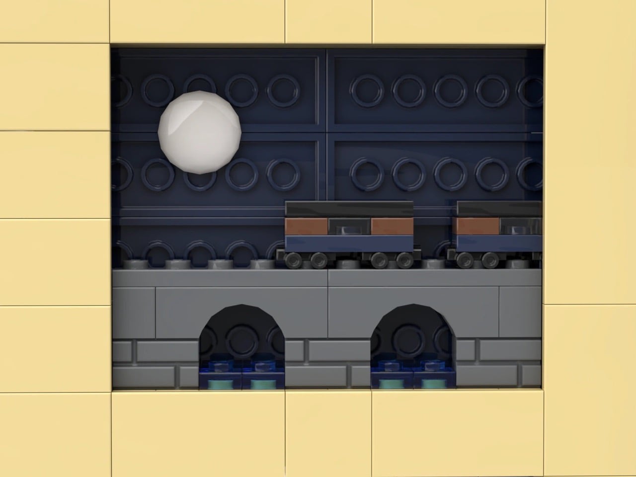
My favorite detail is buried in the pages themselves. Look closely at the tan interior spread and there are cutout windows revealing a second, micro-scale train crossing a tiny stone viaduct, a whole miniature railway hiding inside the book that the big train is currently smashing its way through. It’s a small touch, but it’s the kind of layered thinking that separates a fun MOC from a genuinely great one.

Winter Express landed on LEGO Ideas on September 15 and has already pulled in 1,291 supporters, cruising well past the first 1,000-vote milestone toward the 5,000 mark it needs next. If cozy winter dioramas with a little bit of chaos baked in are your thing, go to the LEGO Ideas page and add your support and watch this one keep climbing.

The post Gorgeous LEGO Book Nook Has a Steam Train Blasting Straight Through Its Snowy Pages first appeared on Yanko Design.

  •  

ELEGOO DAY 2026 Invites the World to Create, Share, and Grow With Nexprint

Every idea deserves somewhere to go, and for a lot of 3D printing hobbyists, that place has been missing. ELEGOO wants to change that with ELEGOO DAY 2026, launching September 10, its annual celebration built around bringing creators together on Nexprint. This year folds in a creator fund, a design contest, new model generators, and a sale, all pointing toward one goal: getting more people to create, share, and be part of a growing community.

Most of that action happens on Nexprint, ELEGOO’s open-source 3D model platform, built on the belief that creation should be open to anyone with an idea. Think of it as the hub tying everything together: models get uploaded, tools get discovered, and creators get a real reason to keep contributing. That shift is slowly turning ELEGOO from a printer maker into a community built around making.

Designer: ELEGOO

Click Here to Submit Now | Click Here To Buy Now.

The centerpiece is the new $1,000,000 Creator Fund, ELEGOO’s way of recognizing and rewarding people for sharing 3D models on Nexprint, not just paying for output but investing in the community itself. Rewards start with your very first submission, no waiting for likes or rankings to climb first. Individual models can earn up to $100, and stacking incentives push that ceiling to $300 per model.

There’s more structure built in too. Extra rewards unlock at 3, 5, 10, 20, and 50 submissions, so consistency pays off as much as any single hit model. Monthly rankings hand exclusive prizes to the top five creators, including actual ELEGOO printers, while a new bonus-card mechanism can push individual payouts even higher. It feels less like a marketing gimmick and more like a system built to grow alongside its creators.

From September 10 to October 30, ELEGOO runs the MakeItReal contest on Nexprint, and the premise couldn’t be simpler: take a flat idea, in whatever form it takes, and give it dimension, no design background required. There’s no theme to chase, just that shift from flat to physical. Winning entries will be picked and announced on November 20, each earning up to $300 in ELEGOO coupons for the trouble.

The idea behind it is almost sentimental for a hardware company, echoing ELEGOO’s belief that 3D printing works best as a creative outlet, not a manufacturing shortcut. A photo on your phone or a doodle in a notebook can end up as something you actually hold, not just imagine. Creators don’t need advanced modeling skills to compete, either. Nexprint’s upcoming Text and Image to 3D Generator lets anyone shape a contest entry straight from a photo or a written description, no CAD needed.

That generator is one of three new tools ELEGOO just added to Nexprint, alongside a Vase Generator and a Nameplate Generator, each built to make creation easier for beginners and veterans alike. All three do the same basic job: they take a drawing, a photo, or a few typed words and turn it into a printable model within minutes. None of it replaces real design skill, but it removes the blank-page problem that stops many from starting.

Put it together, and the loop makes sense. Someone sketches an idea, runs it through a generator, shares the result on Nexprint, enters it into MakeItReal, and picks up Creator Fund rewards along the way. None of those steps demand deep technical skill. This is the connected ecosystem ELEGOO keeps referencing, not a slogan, but an actual sequence anyone can walk through starting today.

All this activity lines up with the ELEGOO DAY Sale, with discounts of up to 54% on selected products, running September 8 through 29 with regional pricing, ELEGOO’s way of putting that ecosystem into more hands. The Saturn 4 Ultra 16K brings high-resolution resin printing for detailed sculptures, jewelry prototypes, and miniatures. The Centauri Carbon 2 Combo handles multicolor prints for home décor and personalized gifts. The Mars 5 Ultra offers a smaller resin option with sharp detail for tight workspaces.

What stands out about ELEGOO DAY 2026 isn’t any single feature; it’s the shape of the whole thing. A hardware company built its business on printers, then quietly built systems for sharing, competing, and earning that turn a machine into a habit. For ELEGOO, that’s what building an ecosystem means: more chances for people to create, connect, and turn ideas into something real.

Click Here to Submit Now | Click Here To Buy Now.

The post ELEGOO DAY 2026 Invites the World to Create, Share, and Grow With Nexprint first appeared on Yanko Design.

  •  

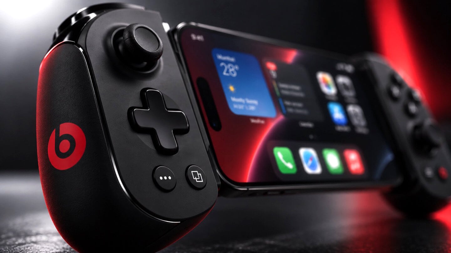
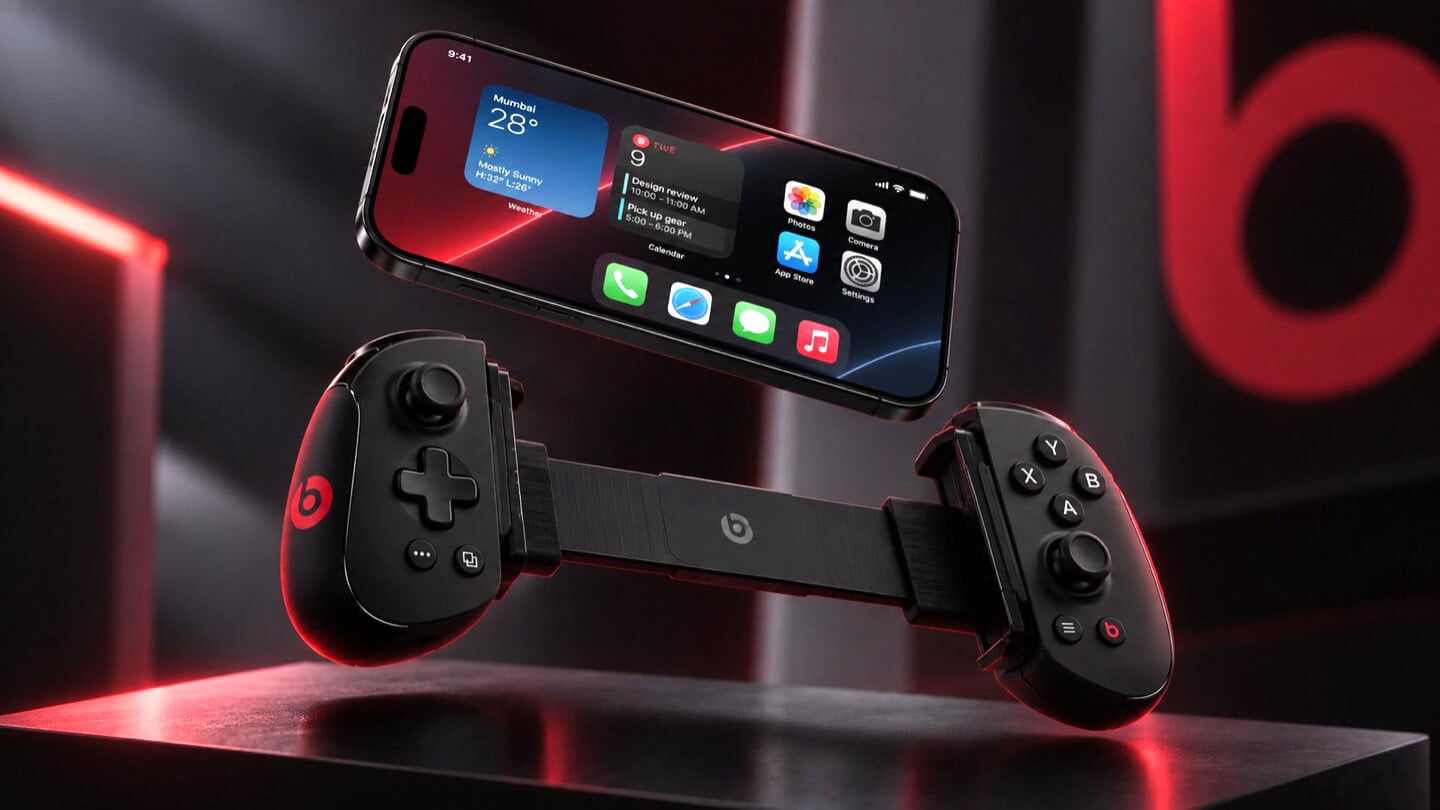
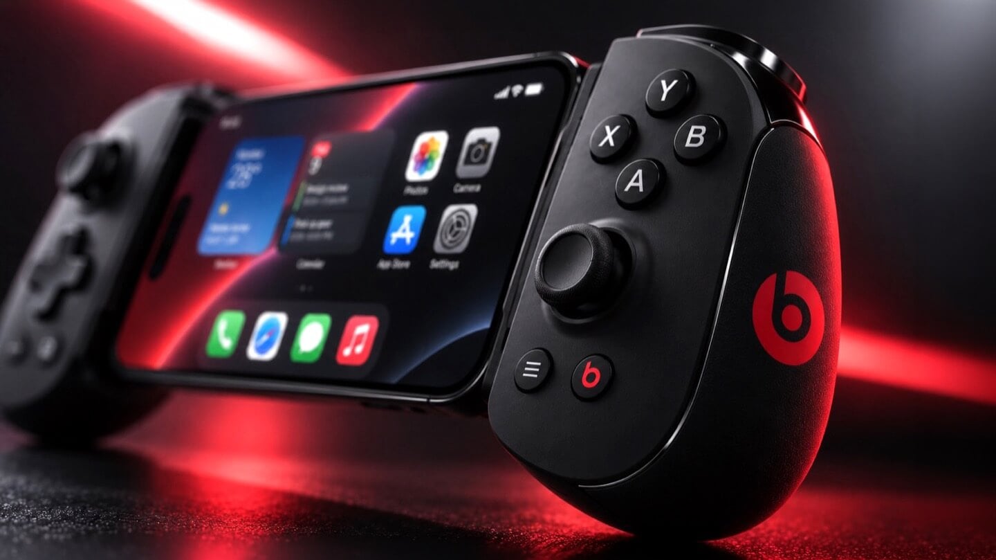
Apple is Working on Two iPhone Game Controllers Under its Beats Brand

Concept Beats branded iPhone game controller, close-up on the right grip showing X, Y, A, B face buttons, thumbstick, and red Beats logo, with the clamped iPhone home screen visible at left, lit in red.

Concept Image

Apple and the gaming crowd have always had one of those relationships where you nod at each other across a party and never actually walk over. Apple makes the chips, brags about them beating a PS5 in some benchmark slide, then goes right back to talking about spreadsheets and stargazing apps. Gamers, meanwhile, buy a Steam Deck or a Switch and never think about the iPhone in their pocket as a gaming device at all. Bloomberg’s Mark Gurman just reported that Apple wants to finally cross the room, having spent over a year quietly developing its own gaming controllers for the iPhone. The bigger twist is who gets to wear the name tag. Rather than an Apple logo, the hardware is reportedly launching under Beats, the audio label Apple has been slowly turning into its lifestyle catch-all since buying it in 2014.

Code unearthed in a leaked macOS 26.7 build gives the rumor real teeth, naming two unreleased devices, T6502 and T1057, each carrying its own dedicated controller profile instead of placeholder code. Both come with the standard gamepad vocabulary, sticks, triggers, a D-pad, face buttons, the stuff every controller on the planet already has. T6502 keeps things simple and wired. T1057 adds Bluetooth, motion sensors, and a noticeably different haptic engine, suggesting more than one idea is being tested at once. Nothing is priced, dated, or confirmed, but the code alone says this has moved well past a mood board.

Designer: Apple

Concept Beats branded iPhone game controller shown fully assembled with an iPhone clamped in the center, both grips visible with D-pad, thumbsticks, and red Beats logos, set against a dark background with a large red Beats logo behind it.

Gurman’s sourcing on the branding is the part I keep chewing on. He says Beats executives are leading both the engineering and the product concept, not just slapping a logo on something Apple’s industrial design team already finished. His reasoning is that the culture and lifestyle around gaming controllers fits Beats better than it fits Apple, and that the sub-brand gives the company room to use cheaper materials and a louder design without dragging down the premium finish people expect from anything wearing the actual Apple logo. Read between the lines and that is Apple admitting its own aesthetic has a ceiling. Titanium and glass photograph beautifully, but nobody wants to grip a cold slab for a three-hour Genshin Impact session. Beats, with its glossy plastics and its very unserious relationship with color, is a far more honest home for an object designed to be squeezed, dropped, and thrown in a backpack pocket.

Concept Beats branded iPhone game controller in two separated halves with the iPhone floating above, left grip showing D-pad and right grip showing face buttons, both with red Beats logos, resting on a dark reflective surface.

There is a decent trade-off lurking here too, and it is worth naming before anyone gets too excited. T6502, the wired one, is basic by design, which means it will likely be the cheaper, more disposable option with none of the motion sensing or richer haptics that make a controller feel alive. T1057 sounds like the one worth wanting, but Bluetooth controllers introduce pairing friction and battery anxiety that a simple USB-C plug-in never has to deal with. Apple will have to pick a lane, or price the two far enough apart that the choice makes sense, and so far there is no signal on either price or release window. History also isn’t fully on Apple’s side. The company has floated controller ideas for years without shipping one, and it once required developers to support the Siri Remote’s accelerometer as a de facto gaming input before quietly dropping that mandate. A leaked profile in a beta build is not a keynote slide.

Close-up of the left grip of a concept Beats branded iPhone game controller, showing the D-pad, thumbstick, and red Beats logo, with the clamped iPhone visible in soft focus behind it.

Where this actually matters long term is the software Apple has already built around it. iOS 26 shipped a dedicated Games app that pulls your library, your Game Center friends, and Apple Arcade into one hub across iPhone, iPad, Mac, and Apple TV, and Arcade itself has quietly grown past 250 titles for $6.99 a month. A first-party controller, even a scrappy Beats-branded one, gives all of that infrastructure something physical to plug into, which is a very different goal from just selling more hardware. It also puts Apple in the odd position of competing with its own shelf space, since the Apple Store already sells the Backbone One and the SteelSeries Nimbus, and we covered how Backbone’s own Pro model already chases full-size ALPS sticks and forty-hour battery life at a premium price. Razer’s brand new Prio takes the opposite approach entirely, folding down to credit card size for people who would rather not carry a controller-shaped commitment at all. Apple showing up now, later than everyone, wearing someone else’s logo, says less about gaming and more about how Apple treats every category it enters late. Quietly, sideways, and only once it has found a version of itself that does not feel like Apple at all.

The post Apple is Working on Two iPhone Game Controllers Under its Beats Brand first appeared on Yanko Design.

  •  

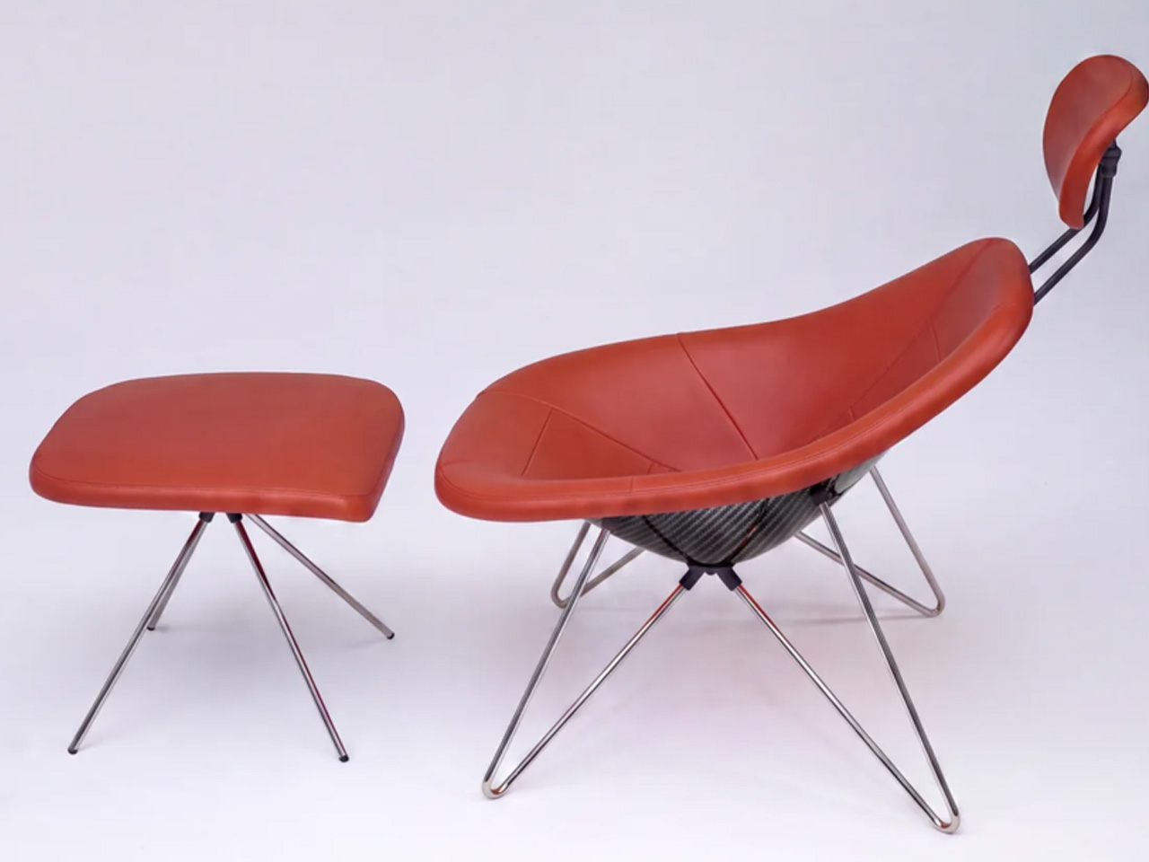
This Chair Proves a $2.3M Hypercar & Your Living Room Have More in Common Than You Think

Most furniture doesn’t have a backstory worth telling. The Maniac Chair does. It looks, from across the room, like it wandered out of a 1950s Danish design studio — until you get close enough to realize it’s built from the same bloodline as a $2.35 million hypercar.

Oilstainlab is the California-based studio founded by Ukrainian-born twins Iliya and Nikita Bridan — high school dropouts trained in Italy and California, responsible in their previous lives for 6.5 million street cars. In 2018, they started Oilstainlab with a single promise: never to be sane. The result was the HF-11, a limited-production hypercar of which only 25 will ever exist. The Maniac Chair is the furniture-world extension of that same obsession, sold through House Dé Stains, Oilstainlab’s lifestyle brand.

Designer: Oilstainlab

The chair’s shell is built on a CNC-machined aluminum frame wrapped in a hand-laid carbon fiber shell. That detail matters. Hand-laid carbon fiber isn’t a production shortcut — it’s the language of motorsport, of race seats and monocoques shaped around bodies doing 200 mph. Here, it’s shaped around a body doing nothing more than sitting. That deliberate mismatch is the whole point. The midcentury silhouette is familiar enough to read as furniture; the material is foreign enough to make you question what you’re actually looking at.

The name traces back directly to the HF-11, which Oilstainlab offered in an exclusive “Maniac” package for 11 of its 25 cars. The chair carries that identity forward — it’s not merchandise, it’s an extension of a design philosophy that treats excess and restraint as two sides of the same surface. The carbon fiber reads as raw and technical; the form reads as warm and considered. Neither cancels the other out.

What Oilstainlab has done here is something furniture designers rarely attempt, and automotive designers rarely bother with: they’ve made a chair that has genuine provenance. It isn’t inspired by cars in the way that means “we added some aggressive lines.” It shares DNA with an actual race seat.

The prep process before upholstery even echoes motorsport fabrication. For a studio built on the idea that sanity is optional, the Maniac Chair is a surprisingly coherent object. It knows exactly what it is — a piece of furniture for people who want to sit inside a design argument — and it doesn’t flinch.

The post This Chair Proves a $2.3M Hypercar & Your Living Room Have More in Common Than You Think first appeared on Yanko Design.

  •  

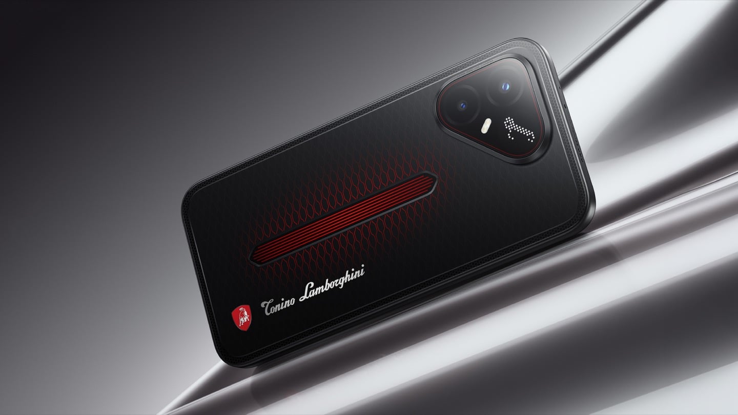
TECNO’s Lamborghini Phone Draws Its Logo in Light Using 177 Mini LEDs

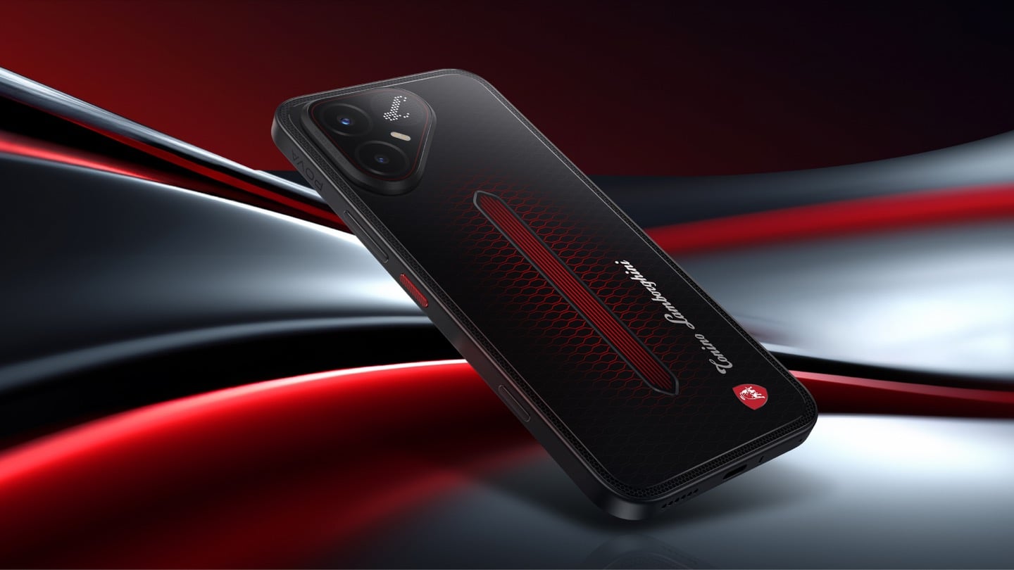
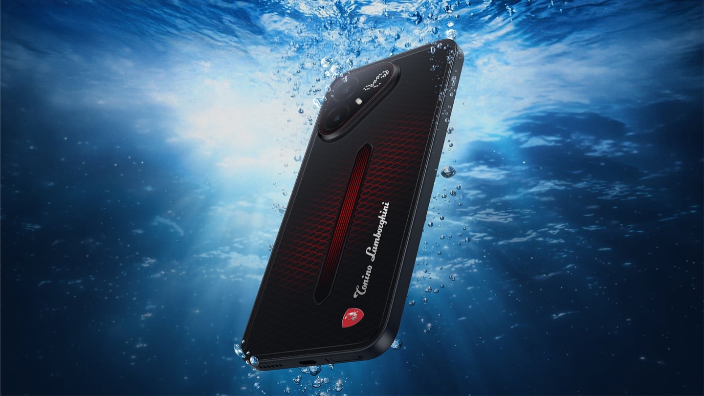
TECNO POVA 8 Pro 5G Tonino Lamborghini Limited Edition

The most expensive Lamborghini phone ever made was a $6,000 slab of hand-stitched leather and gold plating called the 88 Tauri, and it ran Android KitKat on a Snapdragon 801. That was CES 2015, peak era for buying two-year-old silicon at four times the price because someone put a bull on it. Tonino Lamborghini made three of those phones between 2013 and 2017, then went away. The name has now resurfaced on the back of a TECNO POVA that costs about $490, and the badge is finally earning its position. It gets drawn in light instead of stamped in metal.

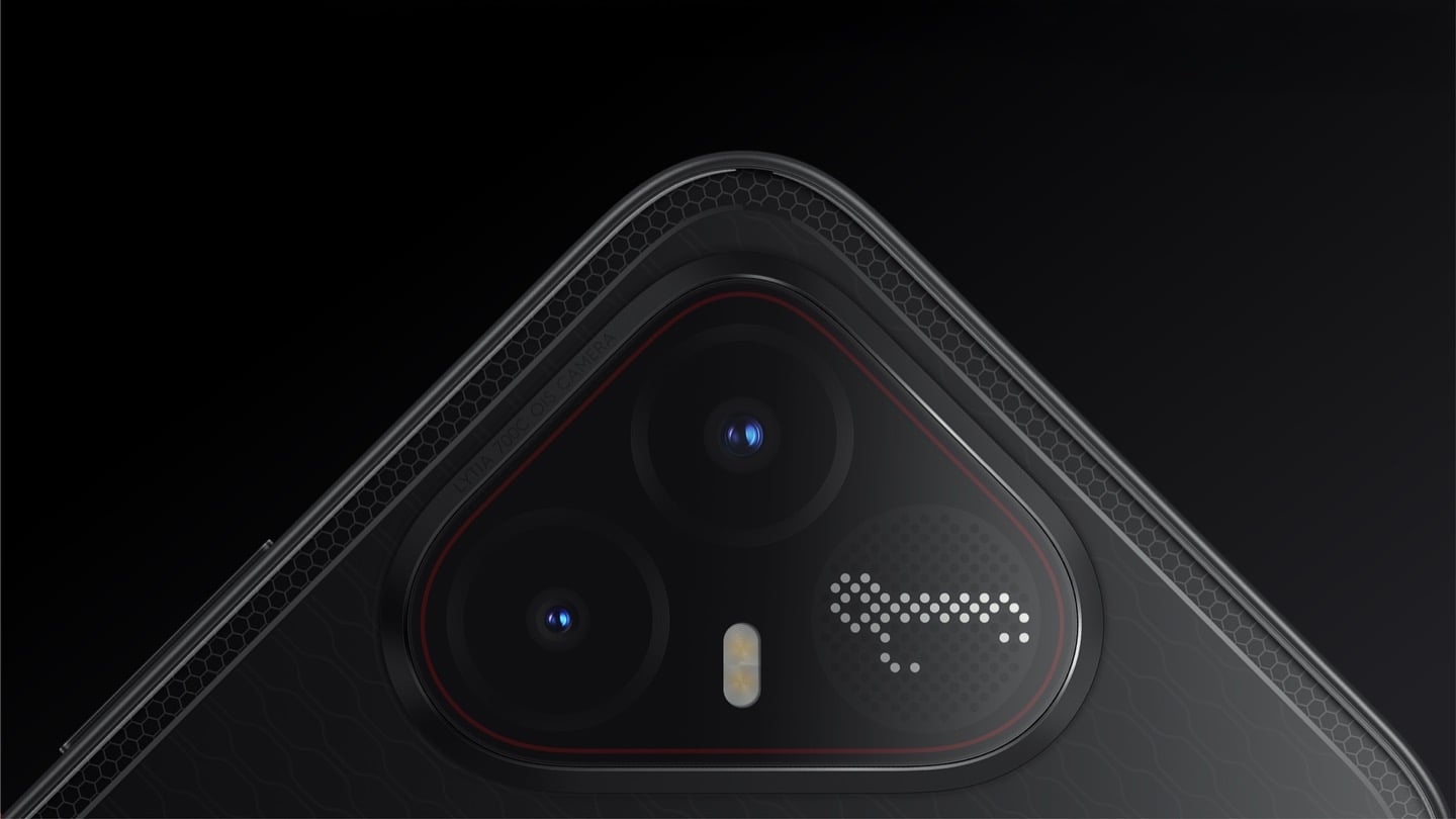
On the POVA 8 Pro 5G Tonino Lamborghini Limited Edition, the Italian brand’s “L” is rendered by 177 individually controlled mini-LEDs in TECNO’s Alive Matrix panel, and the red Pulse Line down the center of the back is a passive optical effect built from internal mirror structures sandwiched between two coating layers at different physical heights. Rotate it and the red rises out of the black, then drops back in. The phone is spec-identical to the standard POVA 8 Pro, so every difference you are paying for is a surface decision. Thai prices start at 15,999 baht for 8GB and 256GB, topping out at 19,999 baht for 12GB and 512GB. There is no US release and no US carrier certification.

Designer: TECNO Design Team, in collaboration with Tonino Lamborghini S.p.A.

Mechanical Grammar, Translated

The brief TECNO gave itself was to take a vocabulary that belongs to cars and make it belong to a slab of glass and aluminum, and the way in usually decides whether that kind of project reads as clever or as a paste job. The team started with the visual codes of mechanical design rather than the logo itself: body lines, cooling grilles, honeycomb patterns, exhaust-inspired detailing. That’s the right instinct. A shield pasted onto a black rectangle says nothing. A shield built from the same geometric logic as an engine bay at least has a reason to exist there. The result is the Signature Shield pattern ringing the Pulse Line, a hexagonal structure lifted from Tonino Lamborghini’s own emblem and mechanical detailing rather than invented fresh for the phone. It gives the back of the device an actual sense of depth and structure instead of a flat decal sitting on top of a chassis that was never designed with it in mind.

The Manufacturing Problem Nobody Sees

The interesting part isn’t the pattern, it’s how TECNO built it. Getting that Pulse Line to shift color under different lighting angles required internal mirror structures processed to redirect light the way a curved mirror does, stacked underneath a brightness-enhancing first layer that behaves closer to a lacquer finish than a printed graphic. Between the two layers sits a real, physical height difference, which is what gives the effect actual depth rather than the flat printed texture you get on most co-branded rear panels. TECNO describes this as one of the most complex rear-cover processes it has run on a POVA product, and the harder problem wasn’t making one unit look right, it was getting thousands of units to look right consistently. That’s a legitimate manufacturing achievement on a phone priced well under $500, and it’s the kind of detail that gets lost entirely once a press release compresses it down to “premium finish.”

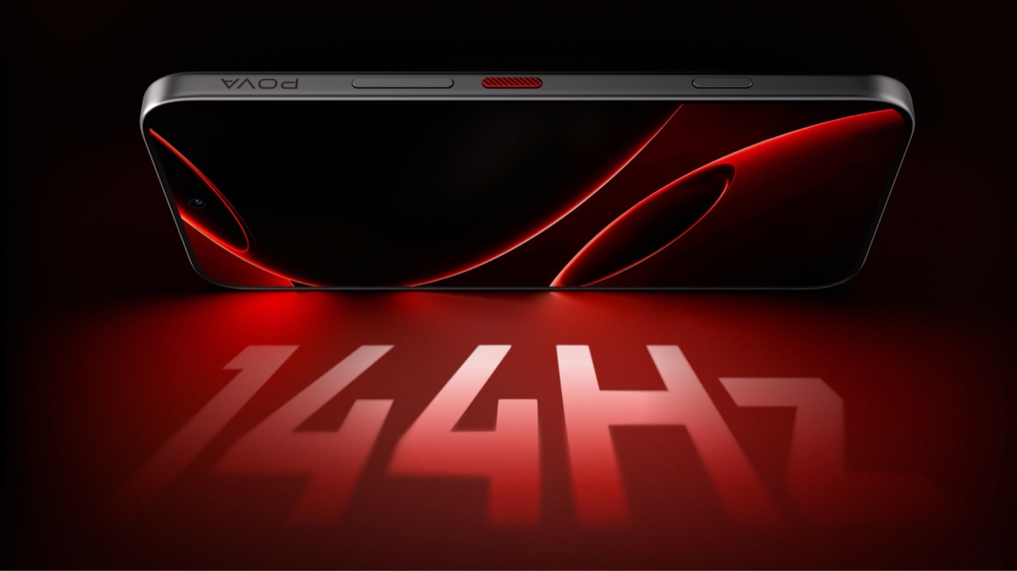
POVA 8 Pro 5G Tonino Lamborghini Limited Edition with a 144Hz Display

A Skin That Goes All the Way Through

TECNO didn’t stop at the shell, which is the part most co-branded phones treat as optional. The software carries the same black-and-red system with reworked icon outlines, nudging soft rounded shapes toward hexagon and shield silhouettes so the interface reads as an extension of the hardware rather than a wallpaper slapped over stock Android. TECNO says the software work alone took close to four months, covering the boot animation, dynamic wallpapers, ringtones, and the Alive Matrix “L” effect. The accessories continue the bit: a braided black-and-red cable, a case built from TPU and polycarbonate carved with a Kevlar-inspired carbon fiber texture. None of it is essential to how the phone functions, but all of it is the difference between a badge and a bit that someone actually thought through.

What a Tonino Lamborghini Badge Used to Cost

Worth sitting with how far this pulls the brand from its own history. This partnership started back in March at MWC, where TECNO and Tonino Lamborghini unveiled the POVA Metal Tonino Lamborghini Limited Edition alongside a water-cooled mini gaming PC concept carrying the same red-and-gunmetal language into laptops, tablets, and earphones. That first phone felt closer to the old playbook than this one does. The 88 Tauri and its 2014 sibling, the Antares, were built around leather, gold plating, and price tags that assumed the badge alone justified the markup. The 2017 Alpha One dialed the ornamentation down but kept the price near $2,100. Automobili Lamborghini’s own collaborations, including the Oppo Find X Automobili Lamborghini Edition at €1,700 against a €1,000 base phone, followed the same math: better materials, a visible badge, a premium that tracked the logo rather than the manufacturing. This is the first Lamborghini phone where the badge shows up as a production process instead of a price justification, and it happens to be the cheapest one the family has ever put its name on. For the full spec rundown on the rear panel construction, we’ve covered the hardware side of this phone in detail already.

Close-up of the TECNO POVA 8 Pro 5G Tonino Lamborghini Limited Edition phone's camera bump

Price, Availability, and the Fine Print

Thailand has this now, sold through BaNANA, IT CITY, Jaymart, and other retailers since August 21, with early buyers getting a Tonino Lamborghini backpack and a Tecno Watch 3 Active thrown in. Pricing for India and other markets hasn’t landed yet as of this writing. If you’re reading from the US, this one isn’t coming your way in any official form. TECNO has no FCC certification and no carrier partnerships stateside, so anything that turns up on a resale site is a gray-market import with no warranty support behind it. Worth knowing before anyone gets attached to a color they’ll never see in a carrier store.

The Badge, Recalibrated

TECNO didn’t need Tonino Lamborghini’s name to sell a $490 phone with a good screen and a big battery, which makes the choice to spend four months on software and reinvent the rear-cover process for a mid-ranger feel almost backward by traditional luxury-licensing logic. Usually the name does the selling and the hardware coasts. Here the hardware earns the attention and the name rides along for once. Whether that model survives past a limited run is a separate question, since Tonino Lamborghini’s own history with phones has always run in short bursts before going quiet for years. For now, the badge looks better on a light source than it ever did on leather.

The post TECNO’s Lamborghini Phone Draws Its Logo in Light Using 177 Mini LEDs first appeared on Yanko Design.

  •  

Foam Earplugs Haven’t Changed Since the 1970s — This Spiral Design Just Made Them Obsolete

The humble foam earplug has been functionally unchanged since the 1970s: roll it down, jam it in, hope it expands to a seal, and find it somewhere in the sheets by 2 AM. It’s one of the few everyday objects that design culture has genuinely never come for, maybe because the attenuation numbers technically work, or maybe because nobody with enough resources was annoyed enough to fix it. The Ears 360 Silence, a CE-certified soft silicone earplug from Paris, is a structural redesign of that whole idea. Its retractable spiral wraps into the outer ear’s helix rather than anchoring in the canal, locking the plug flat and flush against the head with 24 dB SNR measured to EN 352-2:2020 and a peak of 29.9 dB at the frequency range where snoring and human voices live. The foam never had a chance.

Youcef Abdaoui runs a studio near Paris and started prototyping the Silence in 2024 with a bent wire and a bit of putty, just to test whether a helix-anchoring spiral could hold in an ear. It did, and the dozens of iterations that followed produced a product France voted Product of the Year 2026, consumer-elected rather than jury-awarded, which tells you something about how it performs in actual ears. Ears 360 has since shipped to more than 120,000 customers through their store, 500+ pharmacies and B2B partners before going international. The Silence is not a prototype; it is certified to EN 352-2:2020, mass-produced, and more than 14,000 units are already in stock. I got to see a pair in person, and the silicone finish reads as serious product, not a health-aisle impulse buy.

Designer: Youcef Abdaoui

Click Here to Buy Now: $21 $35 (40% off). Hurry, only 57/300 left!

The ear is already a spiral. The outer rim of the pinna is anatomically called the helix, a curved ridge that traces a partial revolution around the auricle, and deeper inside, the cochlea completes that geometry: a full spiral chamber, coiled like a snail shell, that converts sound pressure into neural signal. Nature returns to the spiral for the same reason architects do: it distributes force without concentration points, the same logic behind a nautilus shell or the tight coil of a fern fiddlehead before it unfurls. The Ears 360 Silence works with that architecture: the spiral holds, not the tip. The spiral wraps laterally into the helix and locks through geometry, bearing almost no canal pressure, which is the whole reason the plug sits flush against the head rather than protrudes from it.

Loop-style reusable earplugs have made a design virtue of their visibility, with a circular protrusion sitting outside the ear canal as a deliberate aesthetic statement. That works at a concert, but it becomes a pressure point the moment you roll onto your side in bed, which is the situation most people are buying earplugs for in the first place. The Silence’s spiral body measures 18.44 mm by 15.49 mm, slim enough that there’s nothing significant pressing against a pillow. The profile looks almost deceitfully small for what it’s actually doing inside the helix. Side sleepers have been the quiet losers in every previous generation of earplug design, and this is the first form factor that treats their use case as the primary constraint rather than an afterthought.

One spiral body, two levels of silence, switchable in seconds from 24 dB to 29 dB. The standard configuration ships with four tip sizes across diameters of 9.9, 10.9, 11.9, and 12.9 mm, covering a genuinely wide range of ear canal openings, and delivers 24 dB SNR in filter mode, enough to take a busy street down to library territory without muffling conversation entirely. The Swim & Work Kit clips on triple-flange tips that push attenuation up to 29 dB, entering genuine worksite and industrial territory. User satisfaction data from Ears 360 puts concert approval at 91% and commute approval at 97%, and the founder confirmed to me directly that concert use is a genuine design intention, not a marketing add-on. The IPX7 waterproof rating keeps the spiral pool-ready alongside the kit’s triple-flange seal.

One Silence replaces hundreds of disposable foam earplugs, full stop. The body is made to last for years, the silicone tips are replaceable instead of throwing the product away, and the packaging is compact by design so every shipment travels as a slim letter, not a parcel. There’s no offset scheme or carbon language layered on top to make it sound more considered than it is. The Silence is reusable by nature: wash it, swap the tips, keep the body. Replacement tip sets extend the product’s life instead of replacing it, and the compact packaging uses a fraction of the material of a standard box.

Pricing starts at €18 (roughly $21) for a single unit with carry case and tip set, with the Silence and Swim & Work Kit bundle at €27, a Duo Pack at €39, a Duo plus Kit at €49, and the new ALL COLORS pack at €59, which includes one pair in each of the three current colorways. Black, Pink, and Green are all available now. Every unit carries the 2-year EU legal warranty of conformity, which is meaningful for a product whose longevity pitch depends on actually outlasting the disposable foam it replaces. Delivery is November 2026, and the Ears 360 Silence is also available at ears-360.com.

Click Here to Buy Now: $21 $35 (40% off). Hurry, only 57/300 left!

The post Foam Earplugs Haven’t Changed Since the 1970s — This Spiral Design Just Made Them Obsolete first appeared on Yanko Design.

  •  

No Switches Needed. Just Press, Pull, or Bop These Silicone Lamps: Behind The Design with YD

Here is a fun little contradiction to chew on before we get into the actual lamps. The whole point of Call It a Day, Tongqi Design’s new lighting collection, is that you barely have to try. You bop it, you tug it, you flop your hand near it, and it turns on. Zero precision required, zero thinking involved, which is exactly the pitch when you have just walked through the door after a day that emptied you out. But get this. The less effort the lamp asks of you, the more effort someone else clearly put into making that possible. That is the trade we are here to unpack.

Shanghai-based designer Tongqi Lu built the collection, a table lamp, floor lamp, and pendant, around soft silicone shades with zero switches anywhere on them. Every gesture works because the material itself is doing the sensing, not a button hunting for your finger. It sounds simple sitting in your living room. It is not simple to make, and that gap between the two is basically our whole story today.

Designer: Tongqi Lu

Click Here to Know More

The Design

Call It a Day is a three piece lighting collection, a table lamp, a floor lamp, and a pendant, and every one of them is dressed in soft, translucent silicone instead of glass or fabric. That alone is a break from convention, since silicone shades are usually reserved for LED strip diffusers rather than the whole visible body of a lamp. But the real departure is that none of these lamps have a switch. You bop the table lamp, you tug the pendant by its cord, you press the floor lamp wherever feels natural, and the light responds. There is no correct spot to find in the dark. The entire shade is the input, which sounds like a small shift until you realize how much of lamp design has always been built around finding one tiny precise point.

Lu frames the whole thing around the moment you get home and your body checks out before your brain does. She has talked about dropping onto the sofa and reaching out to press, pull, or tap without really thinking about it, and the light turning on not because she followed a rule but because she did not. That is a genuinely sharp way to think about interaction design. Most lighting asks you to be at your most coordinated right when you are at your least. Call It a Day flips that expectation, and the coiled yellow cable running through the collection is a nice touch too, borrowing the old pull chain gesture without being precious about it.

The Process

Here is where things get interesting, because the studio itself is not some slick production facility. It is an office in Shanghai with a plastic sheeted folding table, jerrycans of liquid silicone lined up against the wall, and a window looking out over the skyline. Before any of it was cast, the whole collection existed as full scale cardboard mockups, a pendant hung from a coiled cord and a table lamp balanced on a paper cone, sitting in the corner of the room like a rough draft nobody threw away. That is a genuinely useful thing to see, because it shows the gesture and the proportions were locked in long before the material was.

The shades themselves come out of large block molds with a fine grid texture cut into the cavity, which shows up on the finished silicone as a soft woven pattern once the lamp is lit. Getting silicone out of a mold cleanly is trickier than it sounds, since silicone tends to bond to itself, so getting a cast shade out of a cast mold without either tearing or fusing takes real care with release agents and material choice. Pouring it clean adds another layer of difficulty, since bubbles trapped in a translucent material show up as visible flaws once the light hits them. In the photos, you can see two people pouring together, one holding the bucket steady, the other running a palette knife across the lip so the silicone comes down in a thin ribbon instead of glugging out in one shot, which is a simple trick for keeping air out of the pour. It is not a factory process. It is a hand process, done carefully, on a folding table, gallon by gallon.

The Perspective

What I like most about Call It a Day is that the ease on the user’s end is clearly paid for somewhere upstream, and that upstream cost is visible if you know where to look. A switchless lamp sounds like a simple idea until you have to actually engineer a material that can be grabbed, twisted, and mistreated without breaking or losing its shape, and then cast that material cleanly at scale in a small studio. That gap between the lived experience and the labor behind it is exactly what a lot of good product design tries to hide, and here it is sitting right out in the open in the process photos.

It also helps that the whole thing traces back to something real. Lu’s early work, the lemon shaped Citron lamp, her furniture line built around trees and water lilies, all of it circles the same idea of pulling people back into their bodies after a long day in a city that does not really let them slow down. Call It a Day feels like the most literal version of that idea yet, a lamp built entirely around the ninety seconds when you have officially given up on being careful. Whether or not the gesture control holds up over years of actual use is a question only time and daily wear will answer, but as a piece of intent, this one lands.

Click Here to Know More

The post No Switches Needed. Just Press, Pull, or Bop These Silicone Lamps: Behind The Design with YD first appeared on Yanko Design.

  •  

The Lamp That Actually Looks Better With the Lights Off

Most lighting has a dirty secret: it only works half the day. Flip the switch and a pendant or sconce can look spectacular, all warm glow and dramatic shadow. Flip it off, and you’re left staring at what is often just a glorified fixture, a thing bolted to a ceiling that has nothing to say for itself once the bulb goes dark. That gap between “on” and “off” is where a lot of home lighting quietly fails us, and it’s a problem most people never think to name because they’ve simply accepted it.

Hollis+Morris, the Toronto studio behind the new Beaufort collection, clearly has thought about it. Their solution isn’t a smarter bulb or a clever dimmer app. It’s a rethinking of what a light fixture is supposed to do when it’s doing nothing at all. Beaufort is built from sculpted solid wood paired with sandblasted acrylic, and the acrylic is cut and finished so it holds a kind of frozen depth, layered, translucent, a little mysterious, whether or not there’s current running through it. Turn it on and light diffuses through those layers in soft gradients. Turn it off and you still have an object worth walking past twice.

Designer: Hollis+Morris

The origin story is the kind of thing that sounds almost too tidy, except it happens to be true. Mischa Couvrette, the studio’s founder and lead designer, was flying home from Copenhagen’s 3daysofdesign when a conversation about ice, and about climate change, turned into sketches on a cocktail napkin somewhere over the Atlantic. By the time the plane landed, the collection basically existed in his head. The name comes from the Beaufort Sea, that remote stretch of Arctic water above Alaska and Canada’s Northwest Territories, which is a fitting reference for a studio that has built its identity on restraint rather than spectacle.

I appreciate that the collection doesn’t try to literally recreate an iceberg hanging from your ceiling. Instead it borrows the logic of ice: how light moves through something dense and layered, how clarity shifts depending on where you’re standing. The studio achieves that through repetition, mirroring, and rotation of a small set of core components, which is a fancy way of saying they’ve built one coherent visual language and then let it flex across a sconce, a mirrored horizontal pendant, a lantern-like vertical pendant, and a table lamp. Nothing in the lineup feels like an afterthought tacked onto a single hero piece just to pad out a catalog.

Jonathan Mandeville of Hollis+Morris put it plainly when he said the collection sits in a lineage of Scandinavian and Canadian design that values material honesty and quiet restraint, the idea that an object should earn its keep even when it isn’t doing anything. That’s a bit of a jab, gentle as it is, at a design moment that has leaned hard into maximalism and novelty for novelty’s sake. I don’t think Beaufort is arguing that bold, loud design is wrong. Plenty of homes need a little chaos. But there’s real value in a piece that doesn’t ask for your attention so much as reward it once you’ve already given it, and that’s a harder trick to pull off than another oversized statement chandelier.

It also matters, at least to me, that these pieces are made in Canada by a B Corp certified studio that treats that fact as a working value rather than a sticker on the box. Knowing who made a light and how isn’t a small thing anymore, especially with home goods, where supply chains can be murky at best.

Beaufort isn’t cheap. The R5 horizontal pendant runs $3,800 and the M2 horizontal starts around $1,900, so this is squarely in investment-piece territory, not an impulse buy from a big box store. But for anyone who has ever bought a light fixture, loved it while it was on, and felt a little let down by it during the day, Beaufort makes a fairly convincing case that the two states shouldn’t have to be so different.

The post The Lamp That Actually Looks Better With the Lights Off first appeared on Yanko Design.

  •  

The 5 Best Apple Accessories Of September 2026 That Actually Improve How You Use Your Devices

The Apple ecosystem runs deep, but the devices themselves only go so far. The iPhone, Apple Watch, and iPad are remarkable pieces of hardware on their own, and yet a small category of accessories has figured out exactly what each one is missing. Not cases that just protect or cables that just charge, but objects that change the way a device feels, sounds, looks, or works from the moment you pick it up.

These five accessories do exactly that. They come from different corners of the Apple world, covering the watch, the phone, the iPad, and the kind of audio experience Apple never built its own hardware around. Each one earns its place not because it carries a name worth recognizing, but because it solves a specific frustration that was always there waiting to be noticed. Here are the ones worth knowing about right now.

1. NightWatch

Most Apple Watch docks are functional and forgettable, a plastic puck with a magnetic charger and no ambition beyond getting your watch off your wrist for the night. The NightWatch is not that. It is a clear glass orb, roughly the size of a generous paperweight, that you set your Apple Watch inside at night. The result transforms the watch’s nightstand charging face into a magnified, glowing clock that is genuinely easier to read from across a dark room than the device alone would ever allow.

The dock works by treating the Apple Watch display as a light source and the glass sphere as a lens, drawing the time out of a small wrist-bound rectangle and spreading it into a real visual presence on the nightstand. It also includes a built-in audio amplifier that boosts the sound of your alarm, so quiet mornings stay that way until you actually need them not to be. At $69.99, it is priced more like a considered object than a cable management solution, which is exactly the spirit it deserves to be received in.

What we like

  • The magnification effect turns the Apple Watch display into a legitimate bedside clock without additional screens, apps, or setup
  • The built-in audio amplifier addresses the one genuine weakness of relying on Apple Watch nightstand mode as a morning alarm

What we dislike

  • The orb form factor is visually dominant enough that it will not suit minimalist nightstands where a small footprint matters
  • At $69.99, it costs more than several competing dock designs that handle charging equally well without the visual statement

2. Rock Paper Pencil 4.0

The Apple Pencil is a precision instrument that has never quite figured out how to feel like one. The glass surface beneath it is smooth and frictionless, and while that works fine for certain tasks, illustrators and note-takers spending hours drawing have always wanted something closer to real paper. Astropad’s Rock Paper Pencil addresses that gap directly: a removable, reusable nano-texture screen protector paired with custom Apple Pencil tips, and version 4.0 makes the system meaningfully better than it has ever been.

The upgrade introduces a new graphite POM tip alongside the existing steel ballpoint option, and the difference is immediately legible. The graphite tip mimics the toothy drag of a 2B pencil, a sensation that makes expressive sketching and shading feel deliberate and controlled rather than slippery and approximate. Each kit now ships with four tips in total, two graphite and two ballpoint, alongside a screen cleaning kit that should have been included from the beginning. The protector attaches via NanoCling static cling rather than adhesive, meaning it lifts off without residue and goes back on without a bubble.

What we like

  • The NanoCling system is genuinely removable and reusable, giving iPad owners a paper-feel surface on demand without permanently altering the display
  • Having both graphite and ballpoint tips in a single kit covers two distinct working styles without requiring a separate accessory purchase

What we dislike

  • The graphite tip wears down noticeably faster than the ballpoint option, which will matter to anyone putting in long, intensive drawing sessions regularly
  • The friction that makes sketching feel natural also makes smooth, fast swiping across the screen feel slightly resistant during ordinary everyday use

3. Battery-Free Amplifying iSpeakers

Every speaker you own asks something of you before it makes a sound. The Bluetooth speaker needs charging, and the charging case needs its own cable. The smart speaker needs a wall outlet, a WiFi password, and a company’s servers to stay online on a random Tuesday. The Battery-Free Amplifying iSpeakers, designed by Ooi Masato of Pit-A-Pat for Shimawa and made in Japan, need none of it. They need your iPhone and the physics of a sound wave moving through precision-machined metal, and that is the complete brief.

The design is straightforward: a Duralumin metal body with a slot for the phone and golden-ratio speaker apertures that channel and amplify sound through acoustic resonance, the same principle that powered phonographs before electricity reached most homes. There is no pairing, no app, no battery level to check. You set your phone in the slot, and your music gets louder and fuller, immediately.

Click Here to Buy Now: $179.00

What we like

  • Zero setup and zero charging requirements make it the simplest speaker in any room, with no ritual standing between you and better sound
  • The precision-machined Duralumin construction means there is nothing to break, replace, update, or charge, ever

What we dislike

  • At $179, it competes on price with capable Bluetooth speakers that offer far more volume, range, and flexibility for larger spaces or outdoor use
  • The phone slot is sized for specific handsets, so case thickness and phone dimensions will determine how well it actually cradles your device

4. Nomad Leather Folio

Phone cases tend to fall into two camps: those that protect the device and those that try to say something. Nomad’s Leather Folio attempts something harder: a single object that does both without looking like it is trying to do either. Crafted from Horween leather inside and out, with MagSafe compatibility and RFID blocking built in, it folds over the front of the iPhone Duo and turns what is already an expensive device into a combination that reads less like a phone and more like something a person who still carries a leather notebook would reach for without thinking twice.

Priced at $129, it is not a cheap case, but it is not pretending to be. The leather cover closes over the screen, which is either a feature or a nuisance depending entirely on how you use your phone, though for anyone who already drops it face-down out of habit, the protection is real and the payoff is legitimate. MagSafe integration means the phone charges normally through the case, and the RFID blocking handles the handful of situations where that actually matters. The overall effect is a device that feels deliberately considered in a way most cases never manage to pull off.

What we like

  • Horween leather develops a patina with use rather than aging badly, which gives the case a genuinely long useful life most materials cannot match
  • MagSafe compatibility and RFID blocking are both included without any visible hardware bulk or added thickness to the profile

What we dislike

  • The full front flap adds a step to every screen interaction that will feel like friction until the habit settles, and that adjustment can take longer than expected
  • At $129, it sits in an awkward price band between affordable everyday cases and truly premium leather goods, which makes the value case harder to land cleanly

5. RePod C1

The click wheel was never just an interface. It was a tactile experience that gave early iPods a sense of ceremony that touchscreens have never quite replaced, a physical scroll mechanism that made navigating a playlist feel like it was worth doing slowly. Techpod’s RePod C1 is a $60 Apple Watch case that wraps the watch in an iPod-style shell and brings that wheel back, and what keeps it from being a novelty is one mechanical detail: the click wheel connects directly to the Apple Watch’s Digital Crown, so turning it actually does something real.

The case uses an open-back design that leaves all of the watch’s sensors fully accessible, meaning heart rate monitoring, ECG, and Apple Pay all continue to work normally. Antenna cutouts preserve Wi-Fi, Bluetooth, and cellular connectivity without compromise. The more interesting side effect is what it does to the device’s identity: sliding the watch into a pocket during a run or a commute and navigating with the Crown from inside the shell turns the Apple Watch into something that feels far more like a small, deliberate music player than a wrist-worn notification machine.

What we like

  • The mechanical connection between the click wheel and the Digital Crown makes the nostalgia functional rather than cosmetic, which is a meaningful distinction
  • The open-back design keeps every sensor and connectivity feature fully intact, so nothing about the watch’s capabilities changes when the case goes on

What we dislike

  • Adding any case to the Apple Watch introduces bulk to a device whose appeal partly depends on being thin and unobtrusive on the wrist
  • The iPod aesthetic lands clearly for one generation and reads as entirely opaque to anyone who came to Apple after the click wheel era ended

The Best Accessories Are the Ones Apple Didn’t Think to Make

Apple’s hardware is precise enough that the accessories worth paying attention to are the ones that noticed a gap the company chose not to fill. The NightWatch saw a dim nightstand clock. Astropad saw a frictionless drawing surface. Ooi Masato saw a speaker that required too much setup before it made a sound. Nomad saw a phone that could carry itself differently. Techpod saw a scroll mechanism nobody had brought back with anything real underneath it.

None of these are essential in the way a charging cable is essential. They are optional in the best sense, the kind of thing that makes a device feel more considered in the hands of whoever chose it. Whether your Apple device is a watch, a phone, or an iPad, something on this list has already figured out what was missing before you had the words for it.

The post The 5 Best Apple Accessories Of September 2026 That Actually Improve How You Use Your Devices first appeared on Yanko Design.

  •  

This Color E-Ink Art Frame Lets You Talk to Your Wall and Watch It Paint New Art

There’s something wonderfully strange about walking up to a framed picture on your wall and telling it what to paint next. Say “paint my dog as a Japanese ink painting,” and the frame generates and displays a new piece. No file transfers, no app navigation, no creative software required. Jitrainno’s Smart Canvas runs on this premise: a voice and text-prompted AI art frame built around an E-Ink Spectra 6 color display, the matte, paper-like panel technology that draws zero power in static mode and reads under ambient light the way a canvas does. It comes in three solid-wood sizes, 7.5, 13.3, and 31.5 inches (named the Echo-7, Echo-13, and Echo-31 respectively), all with built-in batteries and Wi-Fi.

Jitrainno is a Hong Kong-based multidisciplinary team with in-house expertise spanning hardware R&D, E-Ink engineering, AI integration, firmware, and cloud services. They developed a proprietary color rendering layer on top of the Spectra 6 panel, tuned specifically for skin tone accuracy, landscape depth, and smooth gradient transitions. That kind of layered engineering, building custom display algorithms rather than shipping a panel with factory defaults, is what separates a team that genuinely understands display science from one that simply sourced a good component. The project moved from inception and industrial design in June 2025 to a production validation run by May 2026, a fast but not reckless pace for hardware at this scale. Global fulfillment is estimated for November 2026.

Designer: Jitrainno

Click Here to Buy Now: $289 $469 (38% off). Hurry, only 157/250 left! Raised over $132,000.

E-Ink Spectra 6 is the most capable color e-paper panel currently available to consumer product makers, using six primary pigments: black, white, red, yellow, blue, and green. It achieves up to 200 pixels per inch and draws zero power in static display mode, meaning the canvas can stay on your wall for days between charges. The paper-like surface reflects ambient light rather than projecting it, eliminating the glowing-rectangle problem that has defined every LCD-based digital art frame since the Kodak EasyShare era. Jitrainno’s self-developed rendering and color optimization layer is designed to preserve the subtle details that make an image feel closer to paper art. Based on early reviews, it reads more like a framed print than a screen, which is the bar the whole product needs to clear.

Speaking a prompt aloud and watching a new image materialize on the wall is a genuinely new behavioral ritual, and I think it’s the feature that will hook most people. Users can create images from text or voice prompts, explore different visual styles, and generate variations of their ideas, with AI used as a creative tool within the artwork creation experience. The product page demos a prompt like “a cute green dinosaur in a sunny prehistoric scene, soft watercolor and colored-pencil storybook style,” which apparently renders accurately enough to land on a kid’s wall. The AI side routes through third-party commercial image generation services via official APIs, supporting text-to-image and image-based creative generation within the experience. They also confirm they do not use user content to train their own foundation models, a meaningful distinction in a market where that commitment is far from universal.

AI generation is only one of several ways to populate the canvas. The app supports content from AI-generated art, a free art gallery called Daily Drops, the phone camera, the user’s photo library, and personal collections. Daily Drops streams a rotating selection of curated artwork that users can filter by mood or scene type and push directly to the display. The phone camera connection opens the obvious use case of photographing a physical painting, a landscape, or a face and sending it to the frame instantly. That breadth of sourcing makes the Smart Canvas a capable display platform in its own right, with AI generation sitting as a feature rather than a crutch.

Gallery proportions, tactile materials, and Auto-Rotation are deliberate choices to help the Jitrainno Echo series belong in the room like framed art. From the product photography, the proportions are gallery-standard, the profile slim enough to recede into a wall, and the matte panel surface does the visual work of making it belong. A built-in sensor detects whether the frame is in portrait or landscape and automatically switches the artwork’s aspect ratio, with no manual setting required. Connectivity runs in two modes: full cloud-connected (remote upload, AI creation, gallery sync, multi-user sharing) or completely offline (no account, no internet, direct phone-to-frame transfer). The offline option is a genuine design stance in a category where “smart” has almost universally meant always routing through someone else’s server.

The Jitrainno Echo-7 at 7.5 inches (1024×600, 170x236mm) is the tabletop model. The Jitrainno Echo-13 at 13.3 inches (1200×1600, 316.3×416.3mm) works both on a desktop stand and wall-mounted, making it the most flexible of the three. The Jitrainno Echo-31 at 31.5 inches (2560×1440, 603x903mm) is wall-only, the model that reads as a proper statement artwork rather than a gadget trying to pass itself off as one. All three run on E-Ink Spectra 6 full-color panels in solid wood frames, with built-in batteries and USB-C charging. The Jitrainno Echo-13 retails at $469 and the Jitrainno Echo-31 at $1,499, both covered by a one-year manufacturer’s warranty, with global fulfillment estimated to begin November 2026.

Click Here to Buy Now: $289 $469 (38% off). Hurry, only 157/250 left! Raised over $132,000.

The post This Color E-Ink Art Frame Lets You Talk to Your Wall and Watch It Paint New Art first appeared on Yanko Design.

  •  

Nomad’s Leather Folio Turns Your iPhone Duo Into A $1999 Bifold Wallet

The folio case for smartphones remains an entirely boomer product offering. Having a case with a flap that covers your screen and needs to be folded open like a book to answer calls or use your phone is an innately ‘old-soul’ experience. The flap protects your screen but it also obscures it. Fold the flap to the back and it reveals your screen but blocks your camera. It isn’t for millennials or Gen-Z phone owners, but for anyone who wears reading glasses, this folio style case is as addictive as their generation’s Candy Crush habit. With Apple launching the iPhone Duo just yesterday, Nomad developed a similar folio style case for the Apple foldable.

Nomad’s Folio case for the Duo is a strange little thing. While most folio cases turn candybar phones into bifolds, Nomad’s case sort of turns it into a trifold, if you will… or a bifold with a partition. The case is a single-piece leather and plastic design, created to wrap your phone not just from the back but also the front. The front flap magnetically snaps to your phone’s outer display, and lets you open your phone in two ways – firstly, by just disengaging the flap to see the outer screen, but also by disengaging the flap and outer screen together to see the inner screen… and like any good folio case, the flap’s inside packs a card-holder for your payment, ID, and access cards so you don’t need a MagSafe wallet ruining your iPhone Duo’s design.

Designer: Nomad

Like all of Nomad’s leather cases, this one’s made from Horween leather, crafted from a single piece of hide that’s been tanned, bent, crimped, and buffed to absolute beauty. The leather gracefully wraps around the edges, keeping the buttons exposed and accessible, while also covering the hinge in a way that creates that bifold feeling. The leather then transitions upwards ever so slightly before cutting off to a plastic lip around the camera bump, cushioning your phone’s precious shooters from accidental drops and bumps.

On the inside, the leather’s reinforced by a microfiber layer that protects the iPhone’s glass panels from damage. Sure, Apple touts Ceramic Shield on both the front and back, but nothing breaks your heart faster than seeing a cut or a scratch running down the glass body from abrasive action caused by objects in your pocket or even your table. Meanwhile, a slot on the front stores two cards from the looks of it, so your iPhone Duo doubles as a card holder beyond what Apple Pay already lets you do.

Like all good leather cases, this one’s designed to age gracefully with time. Chances are, if you’re an iPhone Duo buyer, you will probably use this phone as your ride or die for another 2 years. In that time, Nomad says the case will patina gorgeously with time, aging uniquely based on how you use the phone. Luckily, the case isn’t too expensive. Priced at $129, you can grab the Nomad iPhone Duo Traditional Folio in one of three colors – Saddle, Rustic Brown, and Black, with global shipping starting November 14th.

The post Nomad’s Leather Folio Turns Your iPhone Duo Into A $1999 Bifold Wallet first appeared on Yanko Design.

  •  
❌