❌

Vue lecture

The Park Sculpture Nobody Expected to Double as a Basketball Hoop
Most public sculpture asks you to look and keep walking. You admire the bronze figure, read the little plaque, maybe snap a photo, and move along to wherever you were actually headed. The art stays over there, behind an invisible line, and you stay over here. That gap between viewer and object is the quiet problem a lot of city parks have never solved: they install expensive, meaningful work, and then wonder why nobody lingers.

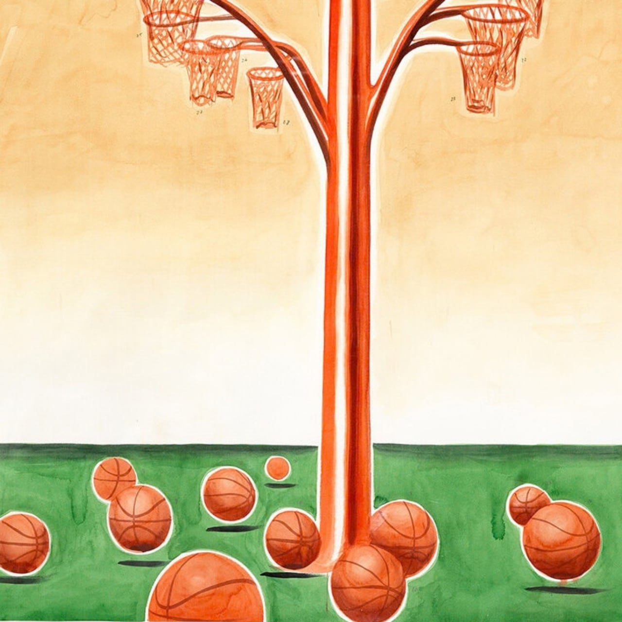
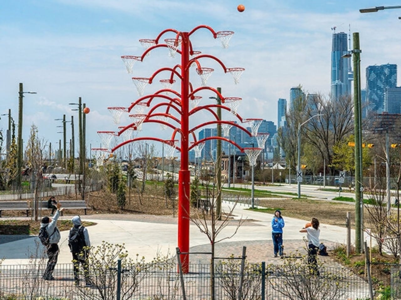
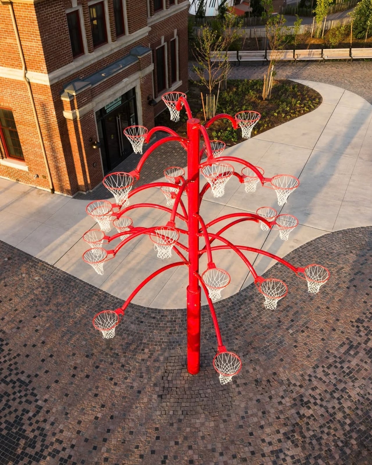
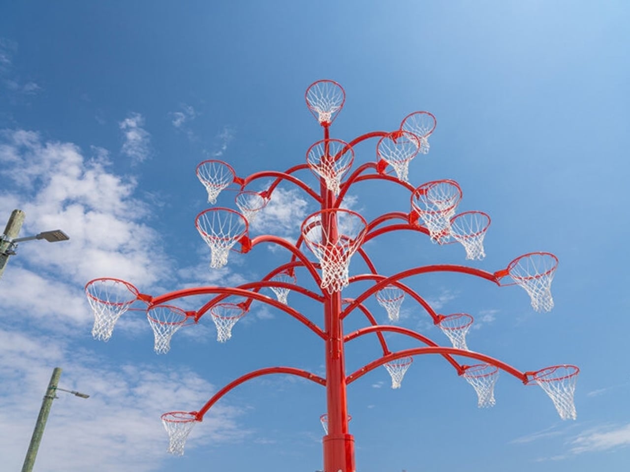
Alexandre Arrechea’s answer, installed this year at Biidaasige Park as part of Toronto’s new Lassonde Art Trail, is to remove the line entirely. Orange Functional is a twenty-foot steel tree with basketball hoops sprouting off its branches, and you’re invited to bring your own ball and start shooting. No velvet rope, no “please do not touch” energy. Just a big red tree standing at the park entrance, daring you to play.

Designer: Alexandre Arrechea
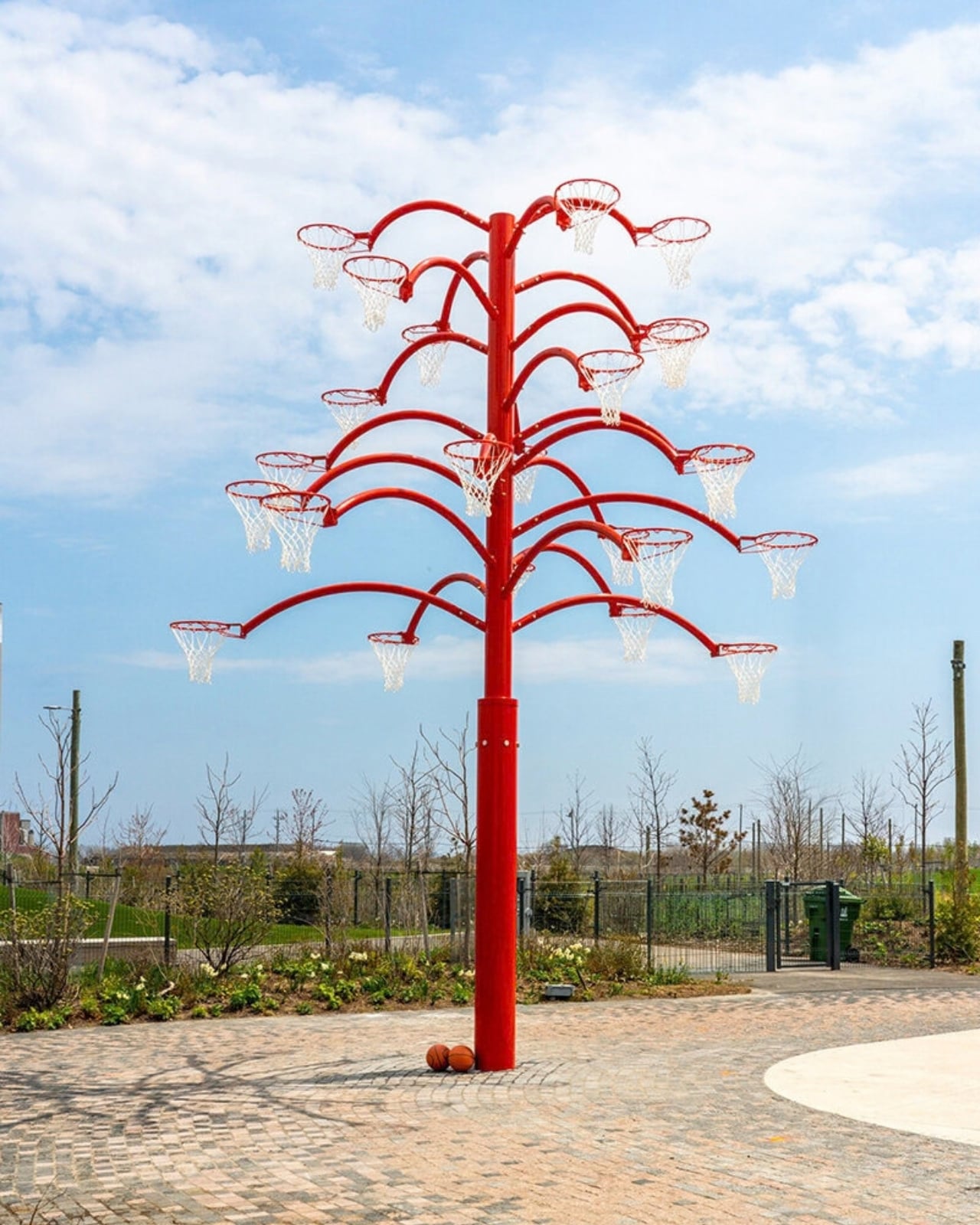
I like that the idea took over a decade to get here. Arrechea’s archive traces the concept back to 2010, when the hoop-covered tree existed purely as sculpture, something you’d circle and photograph but never actually use. It wasn’t until a 2022 commission from Art Omi in upstate New York that he reengineered the branches so real basketballs could drop through the nets. That’s a meaningful shift for an artist. Turning a static object into a functional one means giving up some control. Once people can touch the work, they also get to misuse it, argue about it, get bored of it. Arrechea made that trade anyway, and the piece is better for it.
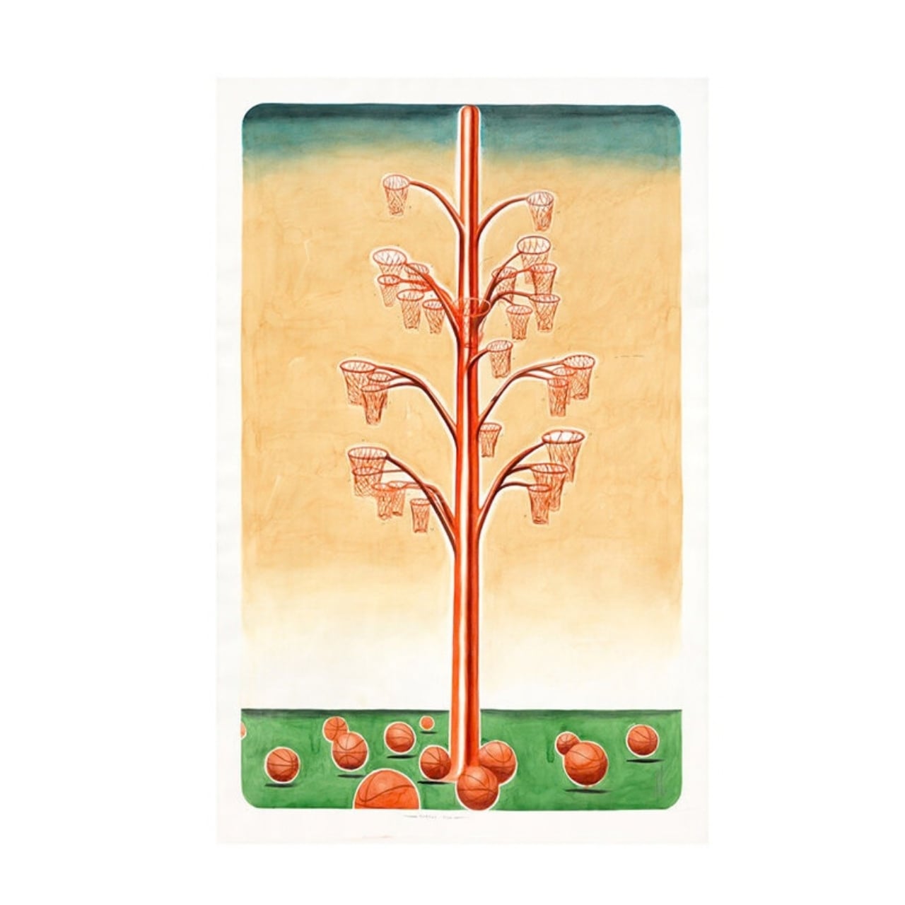
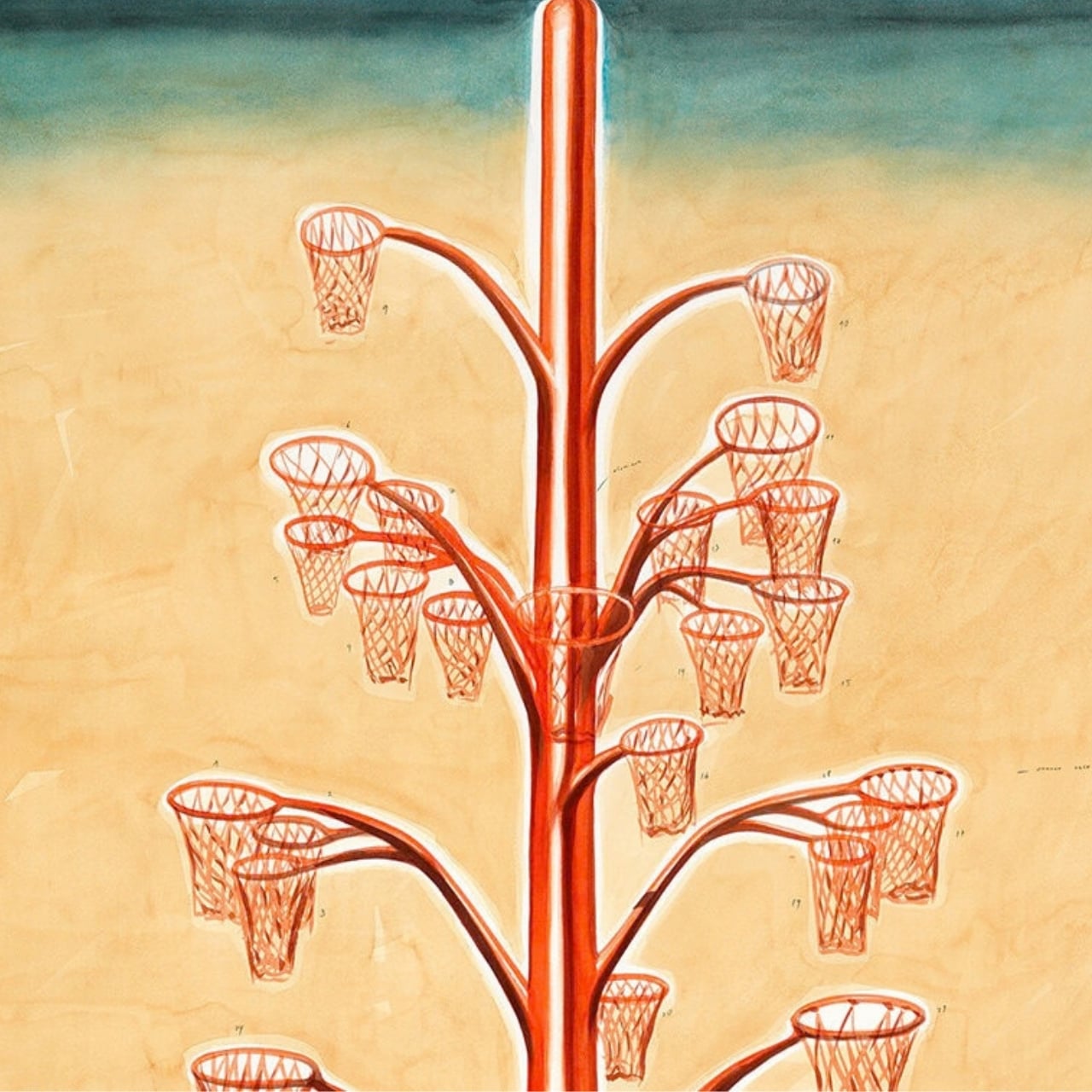
What sells me on the design is how little it explains itself. A basketball hoop is one of the most recognizable objects in American and Canadian public life, sitting outside driveways, gyms, and rec centers everywhere. Arrechea doesn’t reinvent it so much as multiply it until it stops making sense as sport equipment and starts reading as something closer to a fruit tree. Art Omi’s own description leans into that: as people throw the ball and it falls from hoop to grass, it evokes oranges dropping from a branch. The title does double duty, too, pairing the color with the idea of something actually working the way it looks like it shouldn’t.
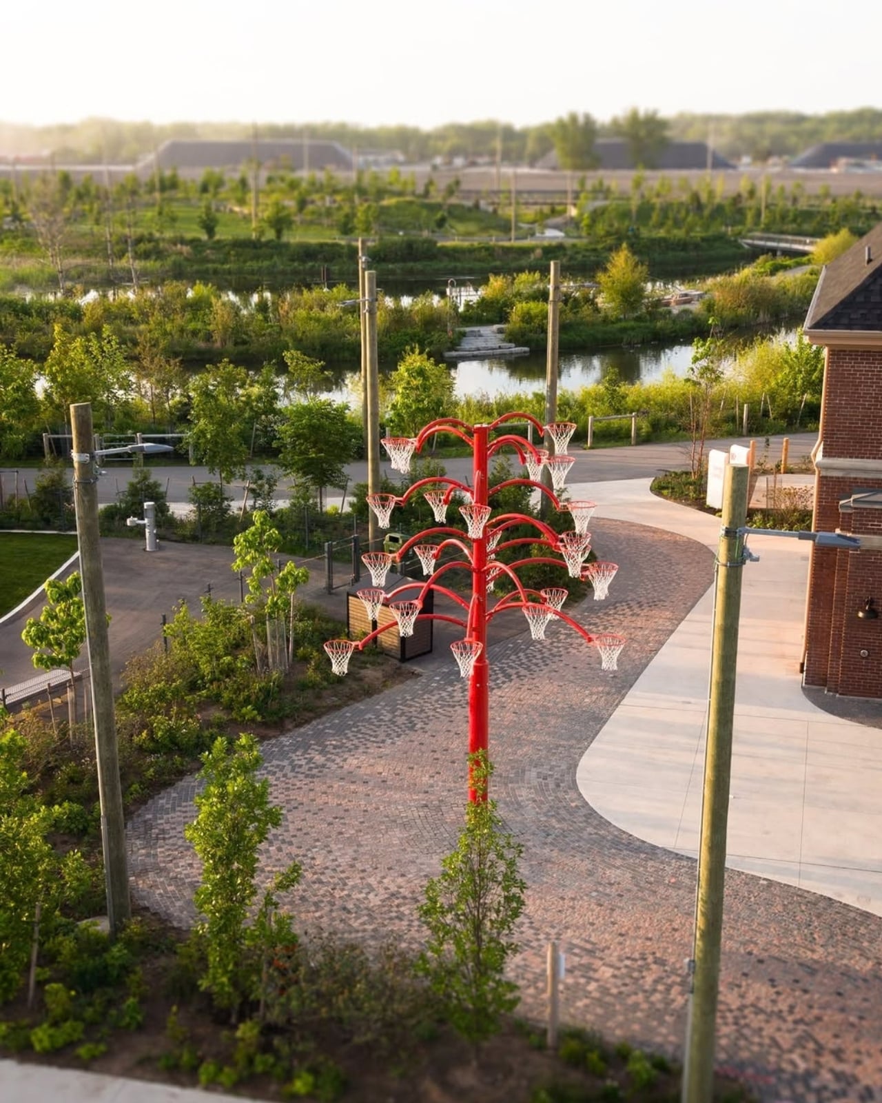
Placing the sculpture at a park entrance, next to newly planted real trees, feels like the smartest curatorial choice in the whole project. It’s not tucked into a sculpture garden where only people already looking for art will find it. It’s the first thing you see walking in, competing for attention with the skyline behind it. A parent walking past with a kid who has a basketball in their bag doesn’t need to understand Arrechea’s twenty-year interest in public gathering spaces to want to stop and shoot a few hoops. The concept sells itself in about four seconds.
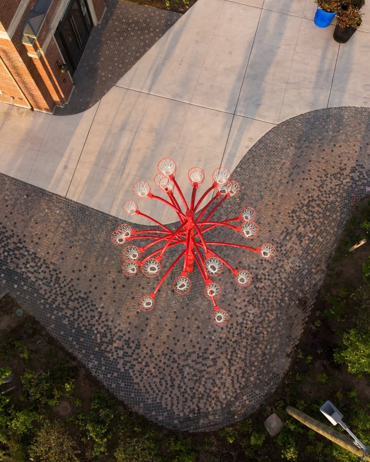
There’s a version of this idea that could have felt gimmicky, a photo-op sculpture built mainly for Instagram. Arrechea avoids that trap by making the interaction the entire point rather than an afterthought bolted onto a finished artwork. He’s spent over two decades returning to the basketball court as a symbol, and this piece is where that research finally gets to be useful instead of just visible. You don’t need the artist statement to enjoy it. You need a ball and about ninety seconds of patience while you figure out which branch to aim for.
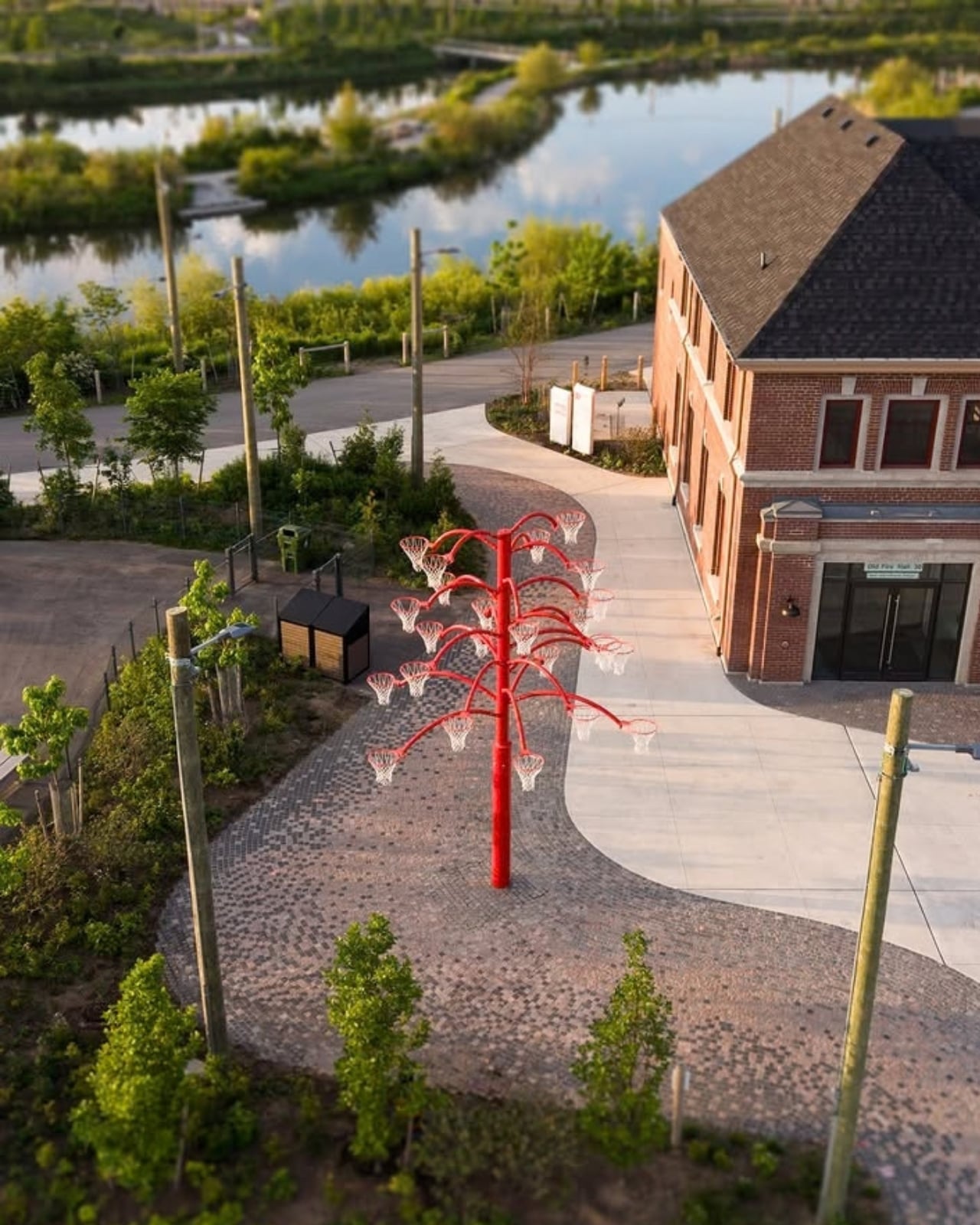
Public art has a reputation problem in a lot of cities: expensive, confusing, occasionally resented by the people who live near it. Orange Functional sidesteps all of that by refusing to be precious. It asks for nothing more than a basketball and a little curiosity, and it gives back an actual reason to stop walking. That’s a rarer trade in public space than it should be.
The post The Park Sculpture Nobody Expected to Double as a Basketball Hoop first appeared on Yanko Design.
  •  

The Bali Sculpture That Finally Makes Overshot Views Feel New

Bali has a photo problem. Not a bad one, exactly, but a familiar one: the same rice terrace, the same infinity pool angle, the same swing shot dangling over the same jungle canopy, reposted by a few million travelers who all found the identical spot through the same map pin. When a landscape gets photographed enough times, it starts to flatten out in your memory before you’ve even seen it in person. You arrive, and it feels like déjà vu instead of discovery.

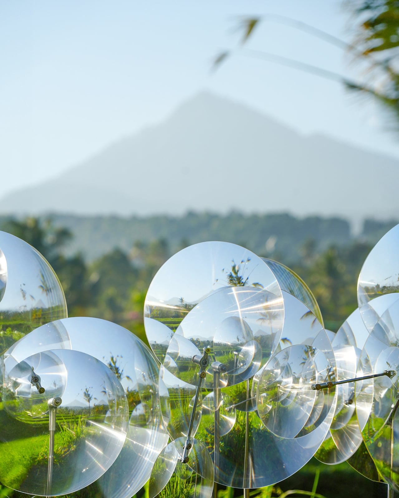
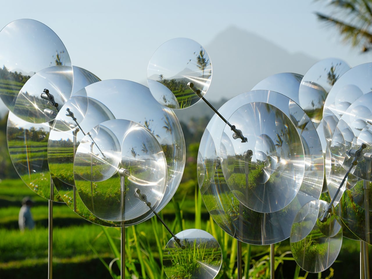
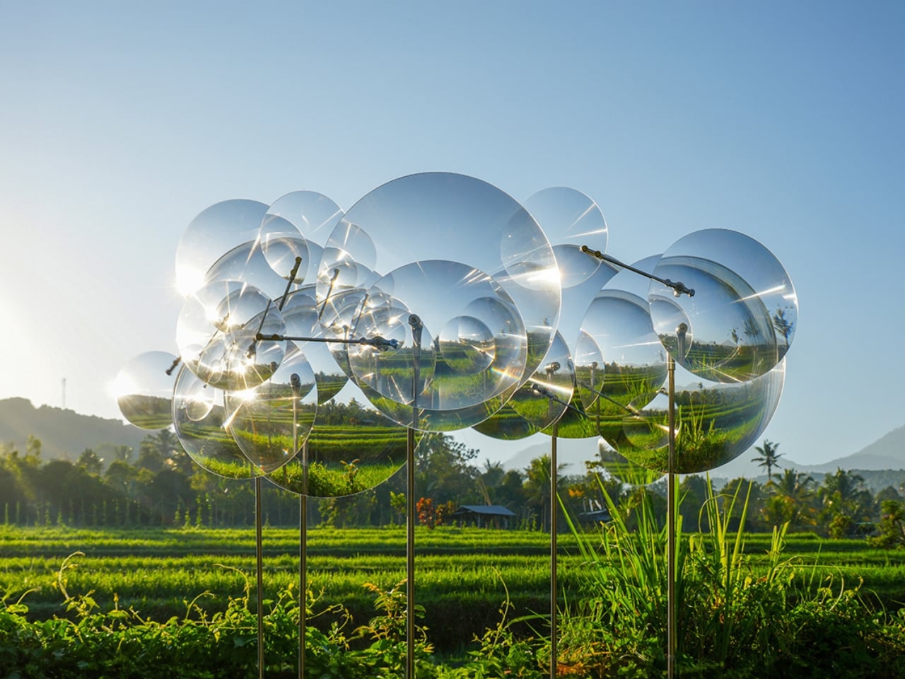
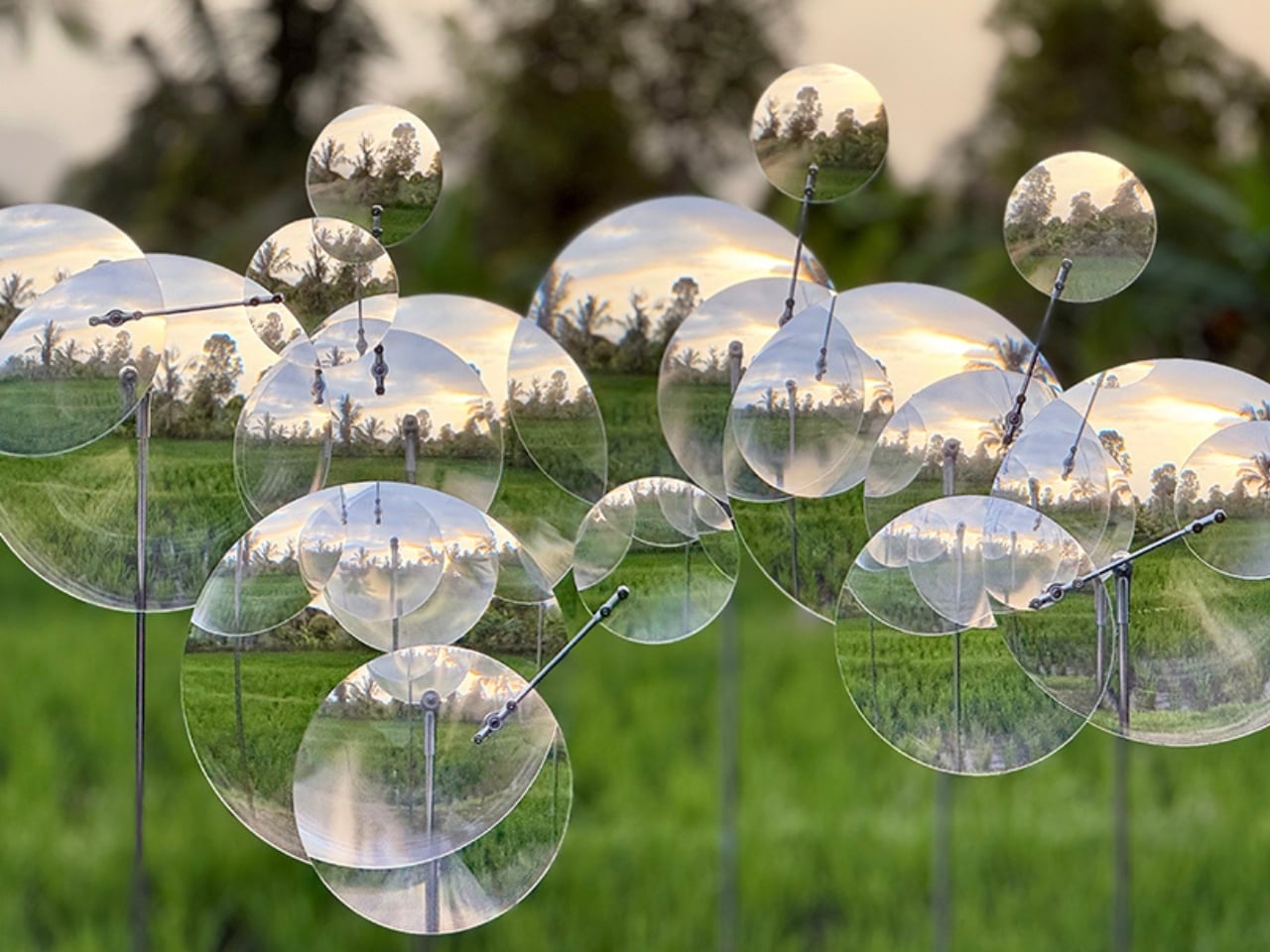
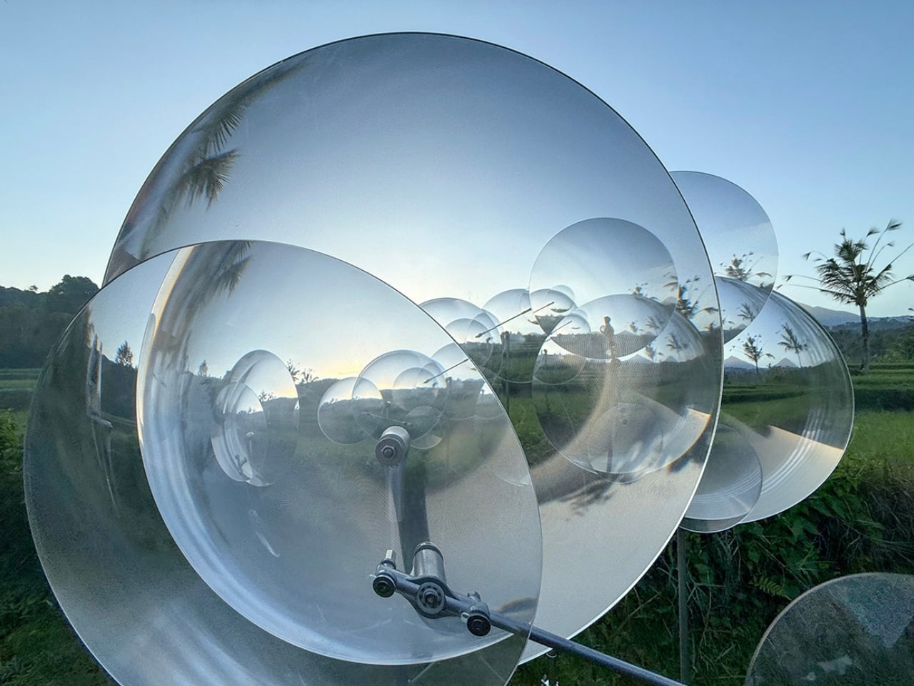
That’s the quiet problem Vincent Leroy’s new installation seems to answer, even if he’d probably never put it in those terms. Tucked into the hills of Munduk, “Eccentric Lenses” is a field of Fresnel lenses mounted on posts, catching the wind and spinning on axes that aren’t centered, so nothing ever settles into a repeatable frame. Point a camera at it in the morning and again at dusk and you won’t get the same picture twice, not because the location changed, but because the lenses never stop rearranging it for you.

Designer: Vincent Leroy

Fresnel lenses are the flat, ridged discs you’d recognize from old lighthouses or projector screens, built to bend light without the bulk of a curved glass lens. Leroy has been experimenting with them for years, but this piece feels like his most site-specific use of the idea. Instead of distorting a studio backdrop, he’s pointed the lenses at Bali’s actual terrain, its rice fields, its distant volcanic peaks, its low clouds, and let the wind do the editing. Every gust nudges a lens a few degrees, and the mountain behind it splits, doubles, or slides sideways for a second before reassembling.

What I appreciate here is the restraint. There’s no motor, no app, no LED strip pretending to be magic. It’s just optics and weather, working together in a way that feels almost stubbornly analog for 2026. We’ve spent the better part of a decade being told that wonder needs a screen attached to it, that a landscape only becomes interesting once it’s been filtered, looped, or turned into a Reel. Leroy’s installation goes the opposite direction. It takes the one thing every travel photo tries to eliminate, unpredictability, and makes it the entire point.

There’s a reason kinetic art tied to natural forces keeps resurfacing right now, from wind-driven sculptures to mirror installations chasing the sun across a field. People are a little exhausted by content that behaves exactly the way it’s supposed to. A piece that changes because the wind decided to pick up speed is refreshing precisely because nobody, including the artist, can fully predict what it’ll look like an hour from now. That unpredictability used to be considered a flaw in outdoor art. Here it’s the mechanism.

It also helps that Leroy didn’t ask Bali’s landscape to hold still for him. The lenses don’t compete with the rice terraces or try to outshine the mountains; they just keep reintroducing you to them. That’s a small but telling choice. So much of contemporary installation art wants to be the main event, the thing you drove out to see. This piece works because it insists the actual landscape was always worth a second look, it just needed a nudge to prove it.

I don’t think “Eccentric Lenses” is trying to solve tourism fatigue or fix anyone’s relationship with their camera roll. But it’s hard not to read it that way anyway, especially watching footage of a single mountain peak splintering into five overlapping versions of itself, then quietly reforming into one. For a moment, an overexposed view of Bali stops feeling used up. It just feels new again, which might be the most useful trick any piece of art can pull off right now.

The post The Bali Sculpture That Finally Makes Overshot Views Feel New first appeared on Yanko Design.
  •  

This Photographer Spent Weeks in a Suzhou Silk Studio. Here’s What He Found

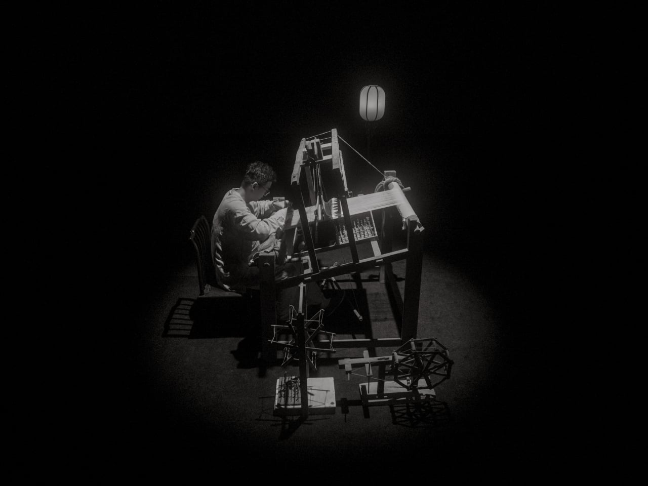
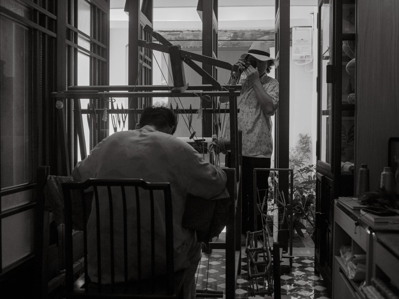
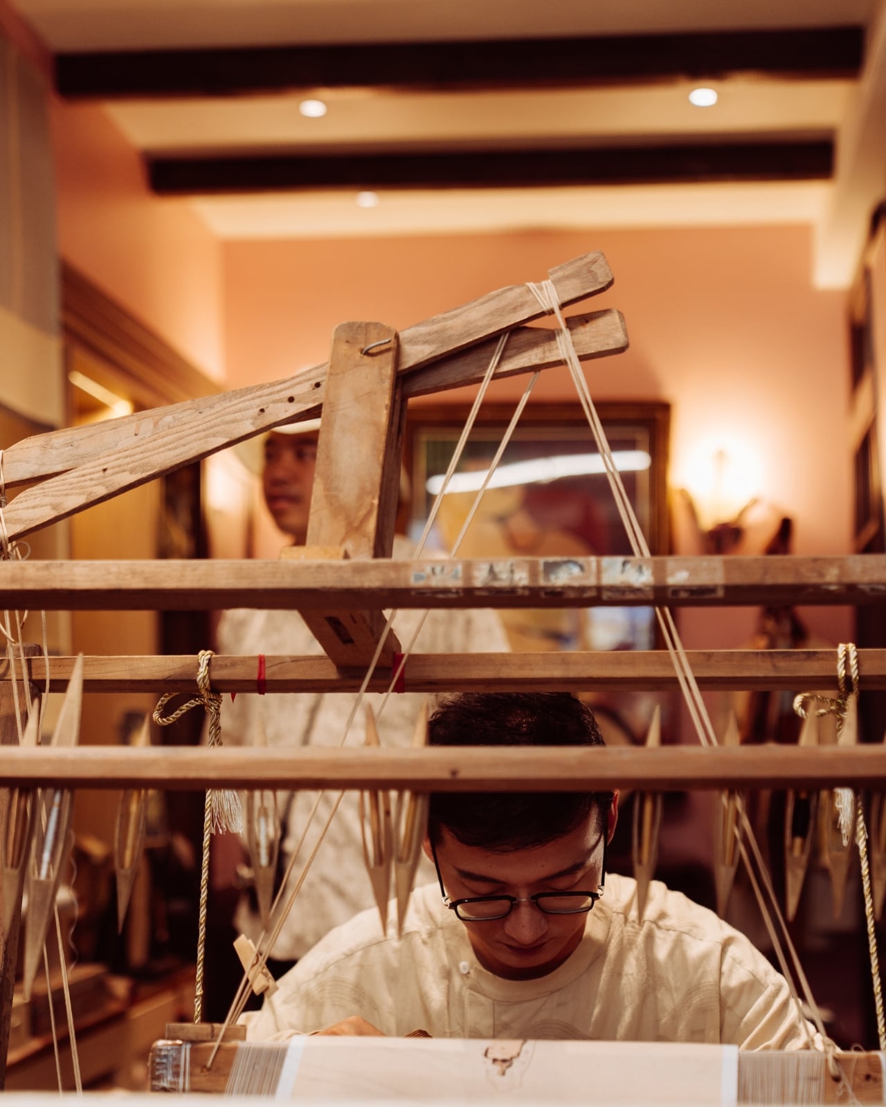
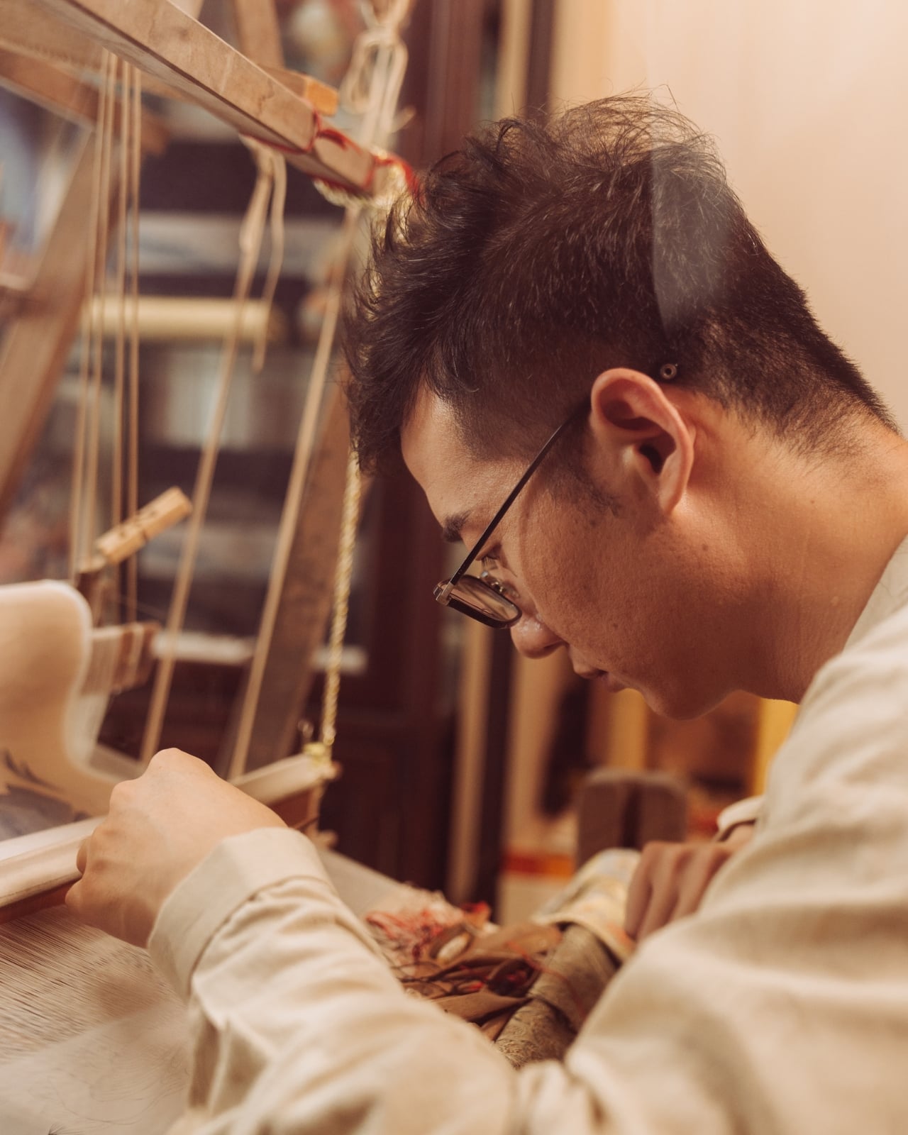
When Jing Huang walked into a kesi weaving studio in Suzhou, China, he made a decision that runs counter to almost everything happening in photography right now. He put away the instinct to explain and just started watching. For most photographers working today, that would feel like leaving something on the table. In a studio where a finished piece can take months to complete, it turned out to be the only approach that made sense.

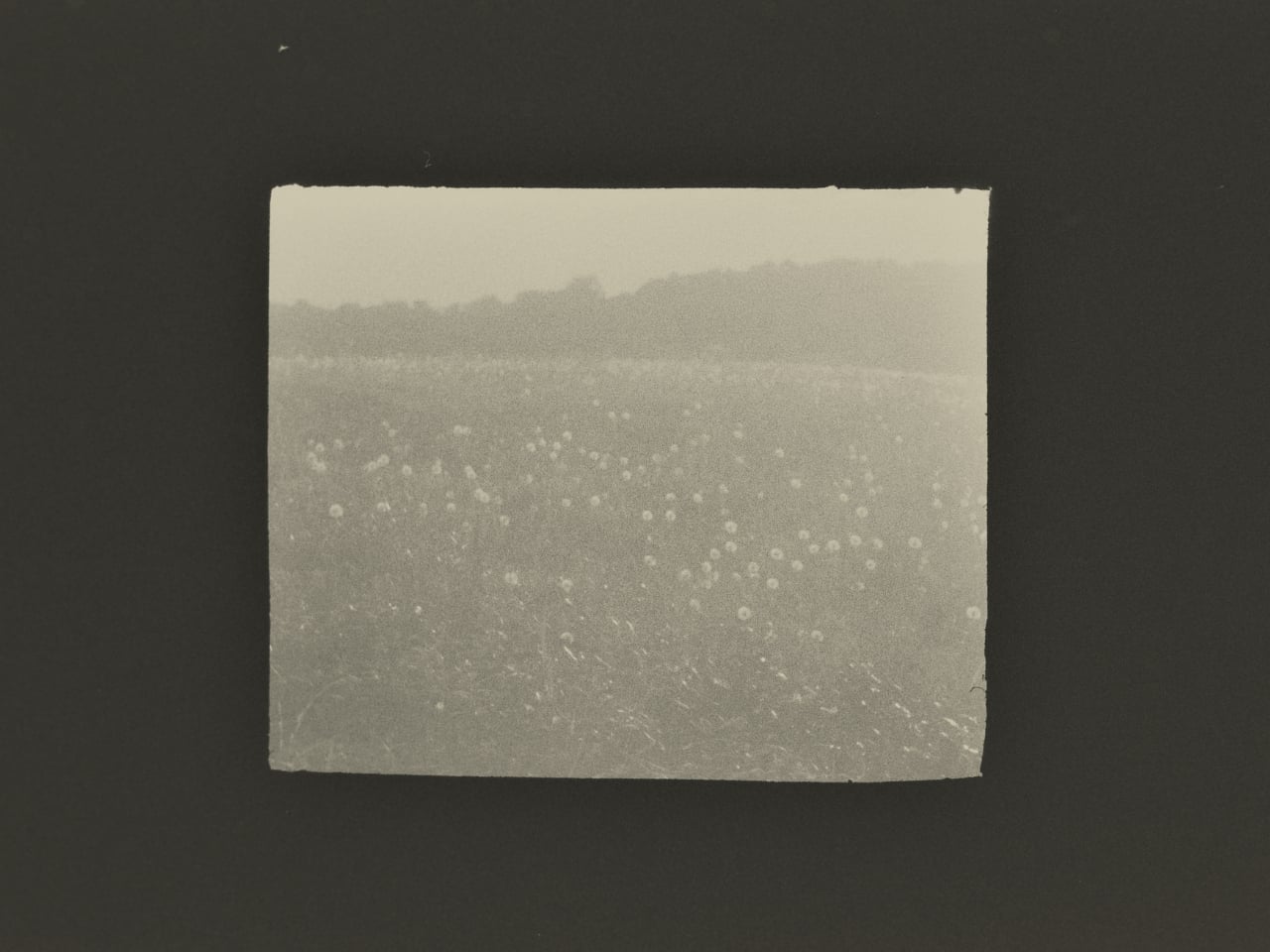
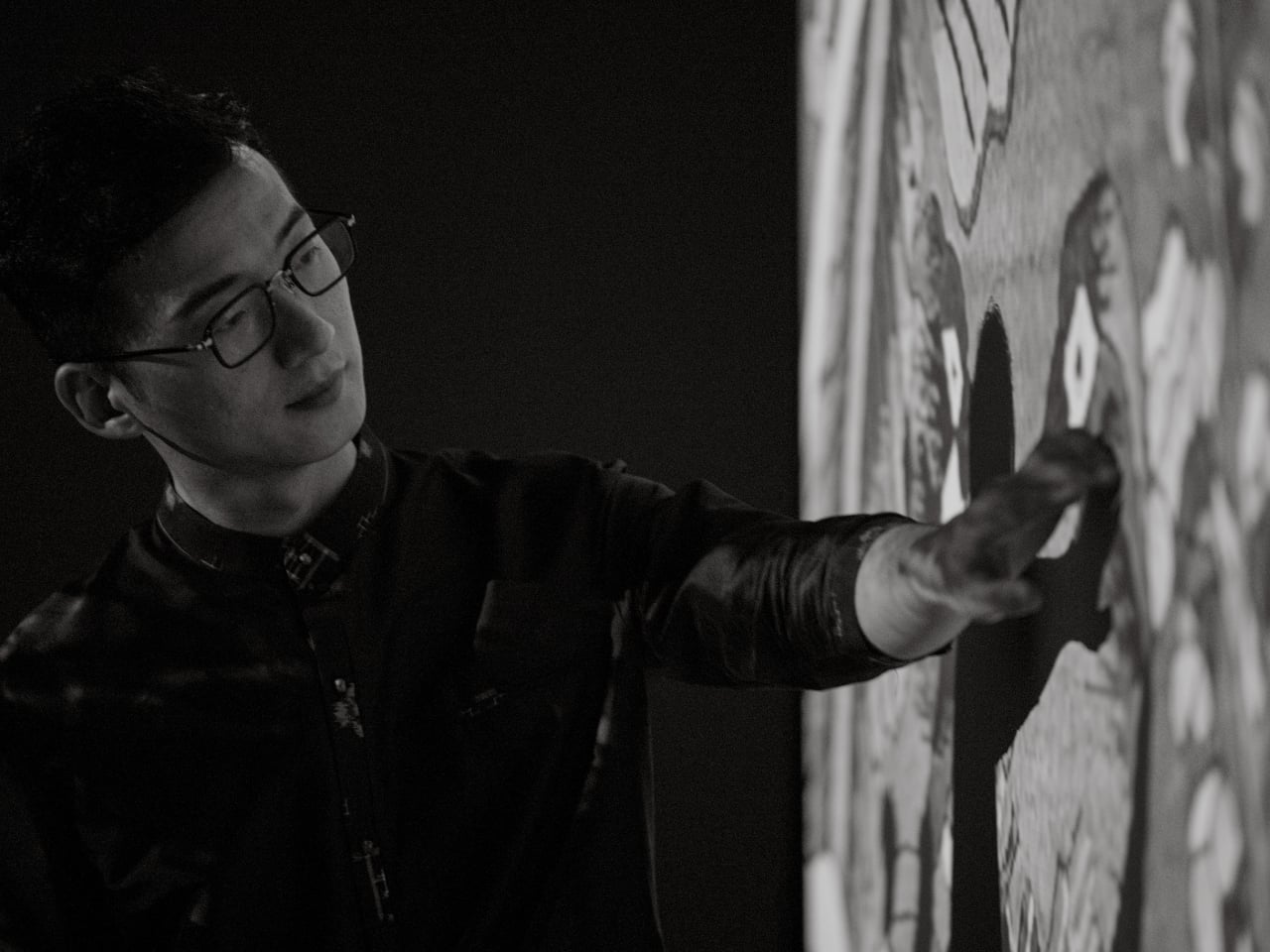
Huang is a photographer with serious credentials. He won the Leica Oskar Barnack Newcomer Award in 2011 for a series called Pure of Sight, and his visual style has always leaned toward stillness, restraint, and negative space rather than the kind of maximalist documentation that tends to flatten its subject. So when Lexar and Leica brought him to Suzhou to photograph kesi artist Hao Naiqiang, known professionally as Jingwei, the choice made sense on paper. What’s harder to predict is what happens when a photographer with that kind of discipline actually sits with a craft as slow and precise as kesi.

Artist: Hao Naiqiang (Jingwei) for Lexar and Leica

Photographer: Jing Huang

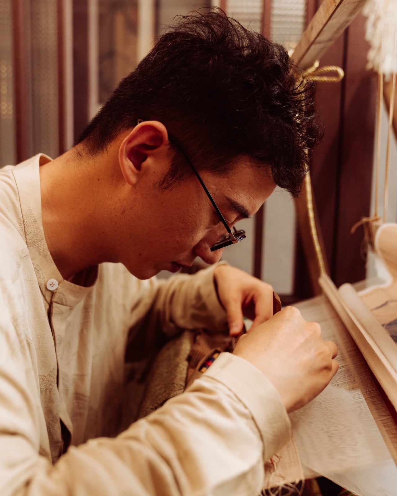
Kesi is a Chinese silk weaving technique that’s been around for centuries, and it operates on a logic completely alien to the way most things get made today. The artisan builds a piece thread by thread against a fixed warp, making constant decisions about color, contour, and rhythm with no automation, no shortcuts, and no undo button. There’s an old Chinese saying that captures it better than any technical description: an inch of kesi is worth an inch of gold. Jingwei has been practicing it for more than a decade and is formally recognized as a representative inheritor of the Suzhou tradition. Every finished piece represents a depth of time investment that genuinely earns that comparison.

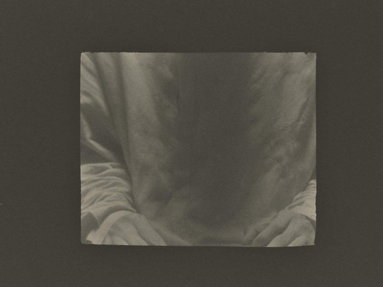
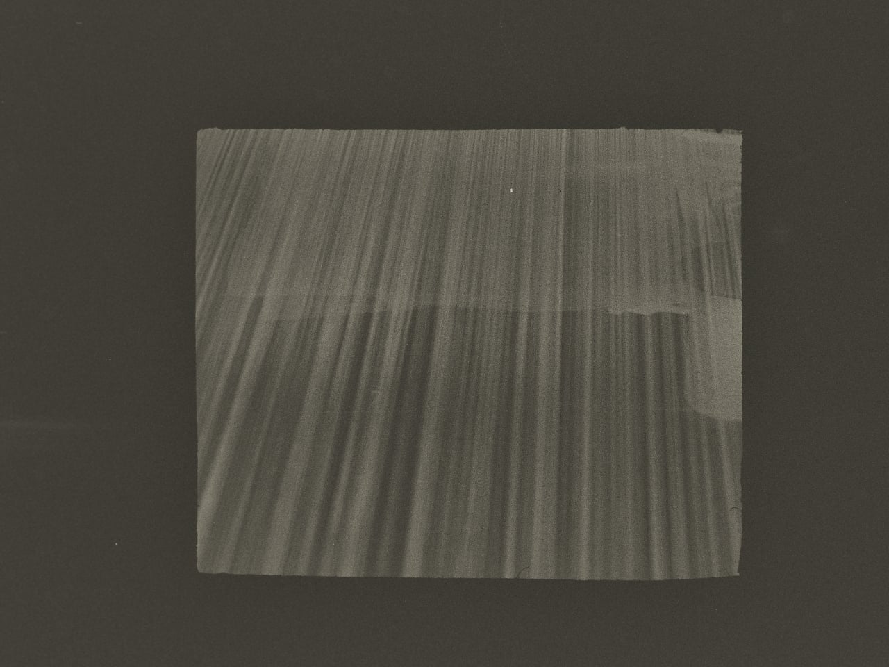
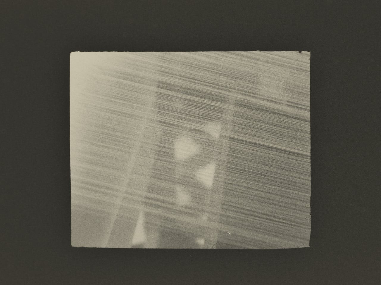
What Huang found in that studio wasn’t a process to document. It was an atmosphere to respond to. His photographs don’t walk you through kesi step by step the way a documentary would. They move between Jingwei’s hands, the threads, the studio details, and the quieter visual textures of Suzhou itself, using the same painterly restraint that shapes his broader work. He described his own approach in a way that cuts straight to the point: photography, he said, is sometimes about forgetting time rather than recording it. What stays in an image isn’t when it was taken but whether it still carries beauty once the moment is gone.

That’s a fairly specific thing to believe in 2026, when the surrounding conversation about images is almost entirely about speed and generation. Anyone can produce a technically competent photo of silk threads in soft light right now without a camera, a plane ticket, or a studio. What that won’t produce is the weeks of presence, of actually being in a room watching another person work, that shapes how Huang sees and frames a subject.

This is where Lexar’s role in the project stops being a footnote. Grace Su, who heads Lexar’s European operations, made the point directly: before any photograph becomes a print, a press image, or a cultural archive, it first exists as an original file that needs to survive. Leica captures the moment. Lexar protects the file behind it. It’s a clean division of labor that gives the brand a genuine reason to be part of this story rather than just attached to it for the optics.

The show itself, titled Threads of Time: A Journey Through Silk and Lens, is presented at Leica Gallery Amsterdam and runs September 11 to 15. Curator Linda Warmerdam framed the exhibition as a dialogue between the photographer’s eye and the artisan’s hand, and that framing holds up, because both of those things require a body in a specific place at a specific time. No model trained on existing images can reproduce that.

You don’t need to care about textile history or gallery culture for the underlying point to land. Some things take real time, happen once, and mean something precisely because they can’t be convincingly faked. Huang spent weeks in a Suzhou studio to understand what kesi actually is. The photographs are what he brought back.

The post This Photographer Spent Weeks in a Suzhou Silk Studio. Here’s What He Found first appeared on Yanko Design.
  •  

Felipe Pantone’s Tennis Court Refuses to Look the Same Twice

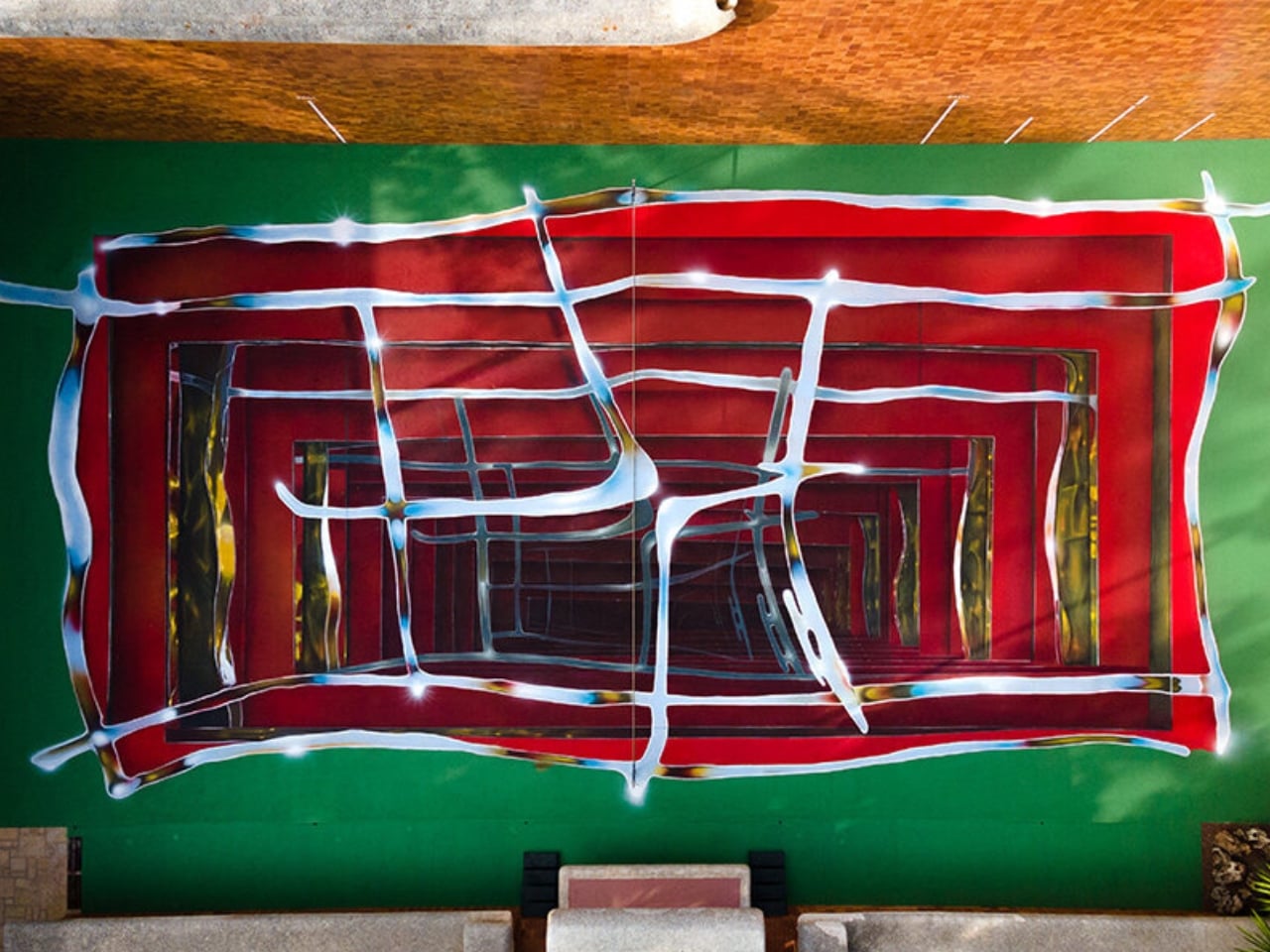
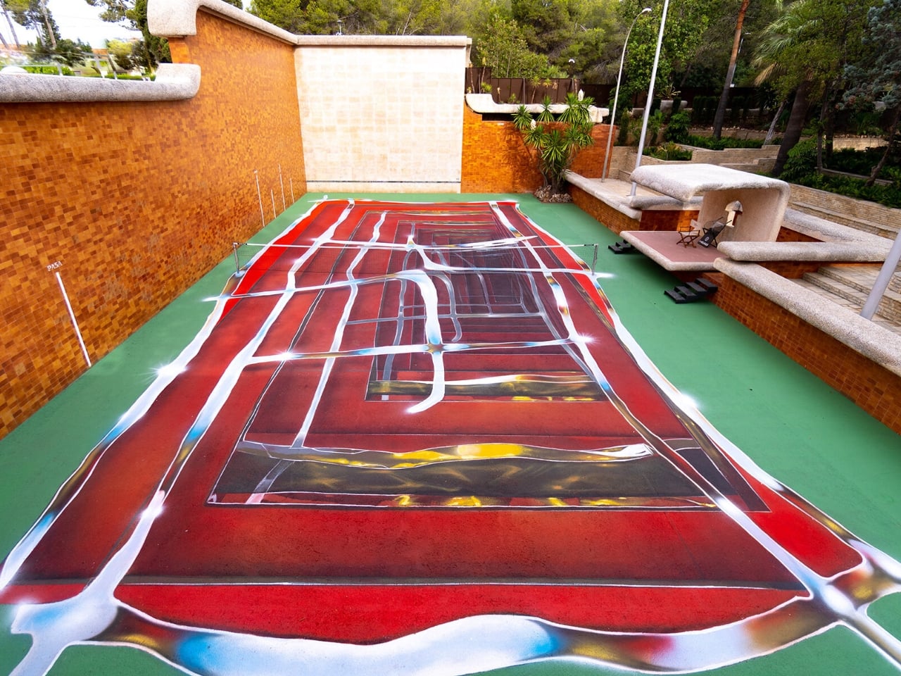
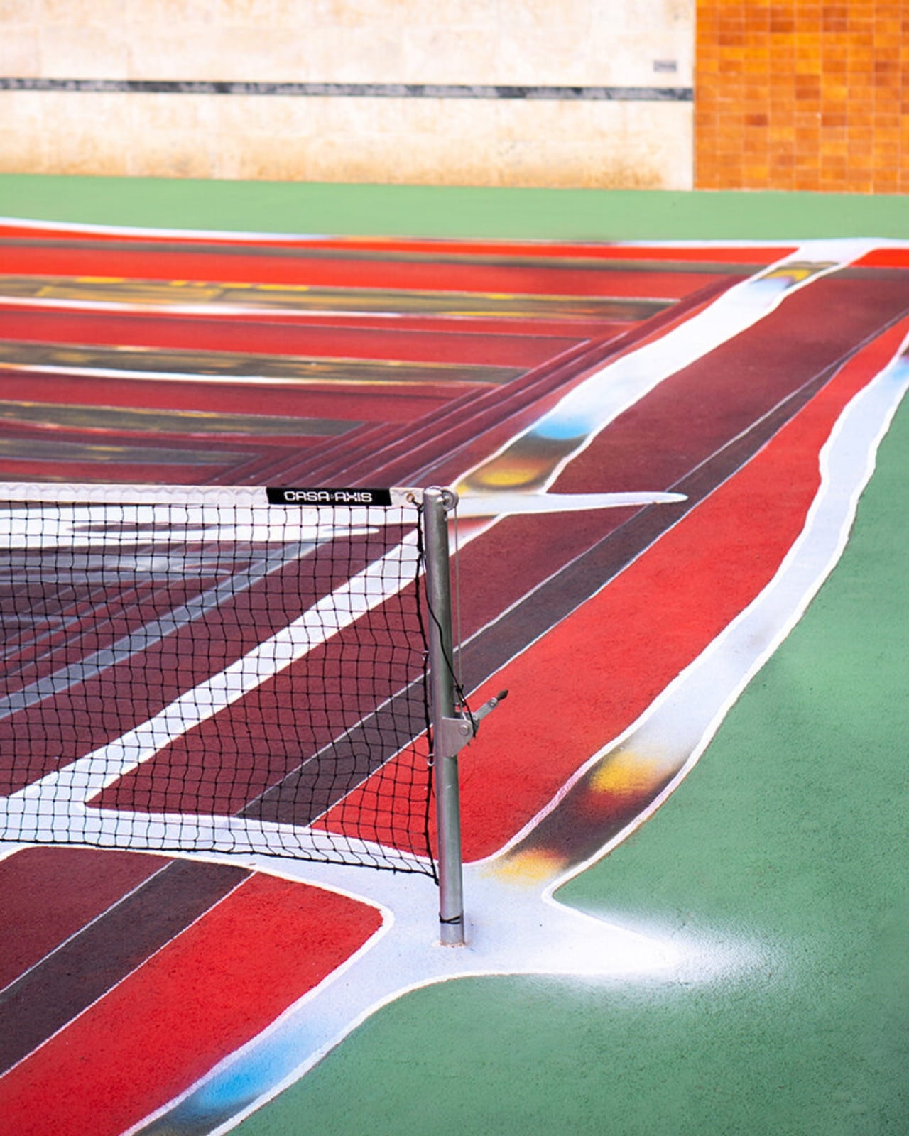
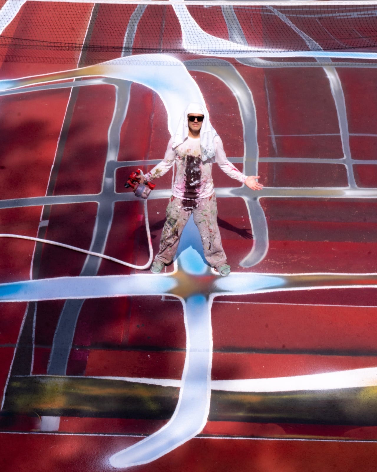
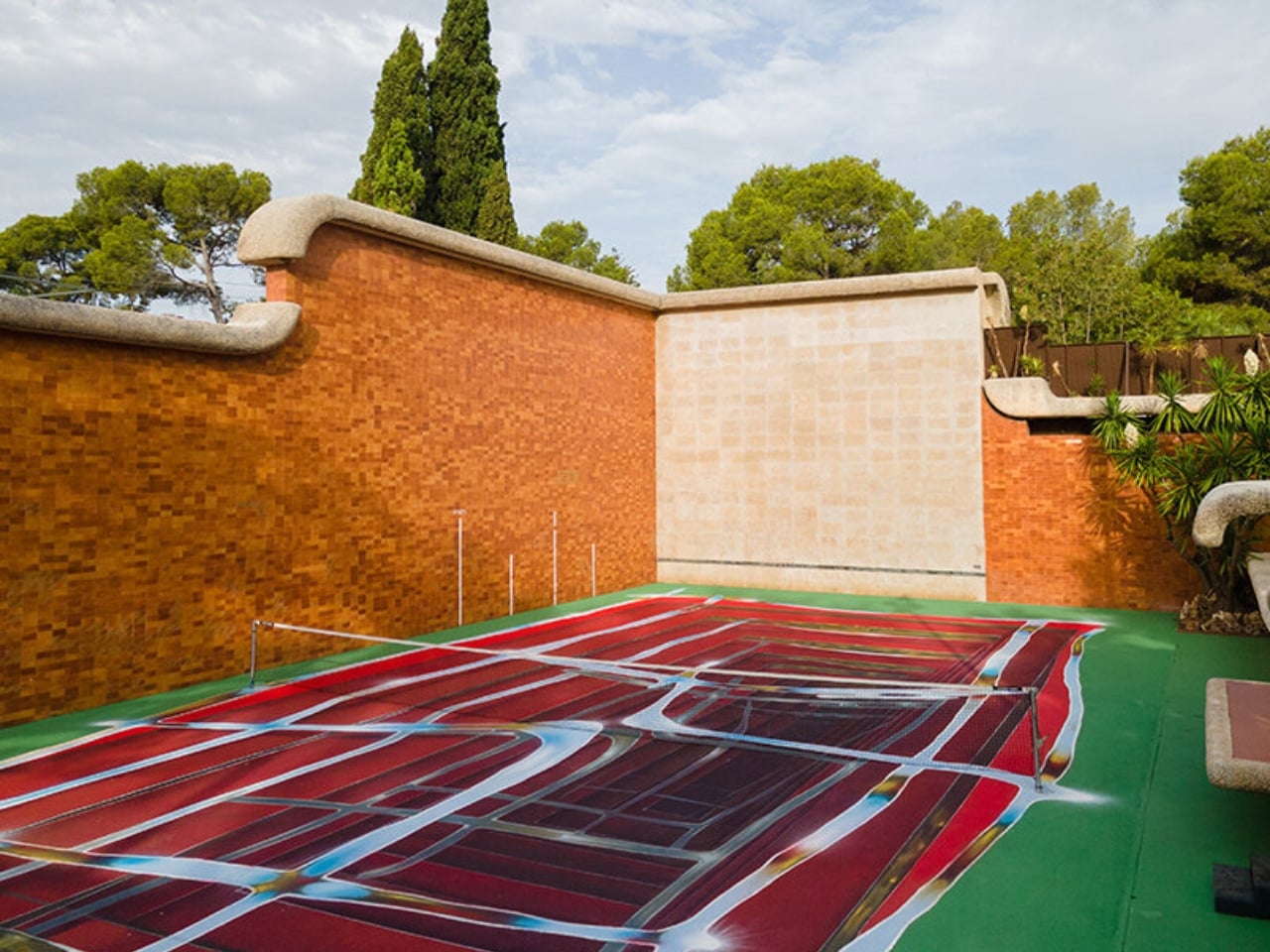
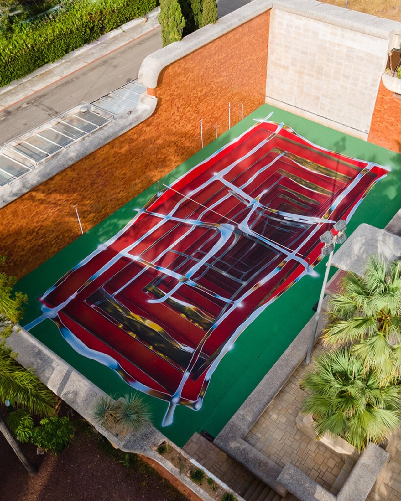
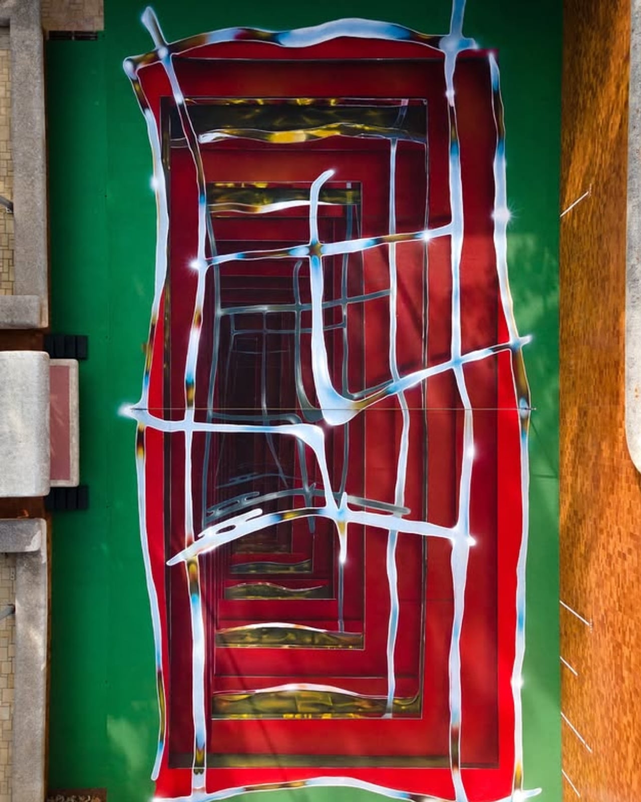
A tennis court in Valencia currently looks like it’s sinking into the ground. Walk up to the edge of the one at Casa Axis and the white lines that normally just mark boundaries start pulling inward, stacking through fake layers of chrome and burgundy until the whole surface reads like a hallway you could fall down. It’s called Hard Court 2, painted by Spanish artist Spok Brillor, and it treats a sports court like a living canvas instead of a slab of asphalt everyone stops noticing the week after the ribbon gets cut.

That’s usually the fate of most site-specific art. A muralist gets a wall, a brand throws a launch party, and within a year the piece turns into background noise nobody actually looks at anymore. Sports facilities have it worse. A court gets painted once, and it stays that exact shade of green or blue for a decade, because nobody budgets for touch-ups, let alone reinvention. Casa Axis, the art and design space Felipe Pantone runs out of a 1975 house outside Valencia, didn’t fix that with a bigger maintenance budget. It fixed it with a rule: the court has to change, every single year, by design.

Designer: Spok Brillor

The rule lives inside C.A.I.O., the Casa Axis International Open, a scrappy little tennis tournament for artists that launched in June 2026. No rankings, no categories, no portfolios required. Just instinct, apparently, and a healthy amount of frustration. The twist is what the winner actually takes home. Instead of a trophy, they get handed the responsibility of repainting the court before the next tournament. Win the match, inherit the canvas.

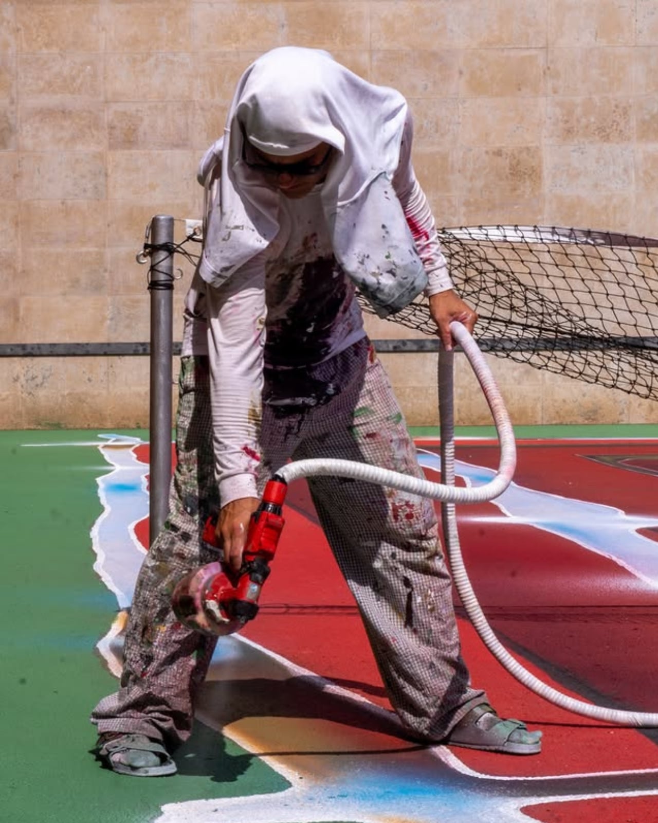
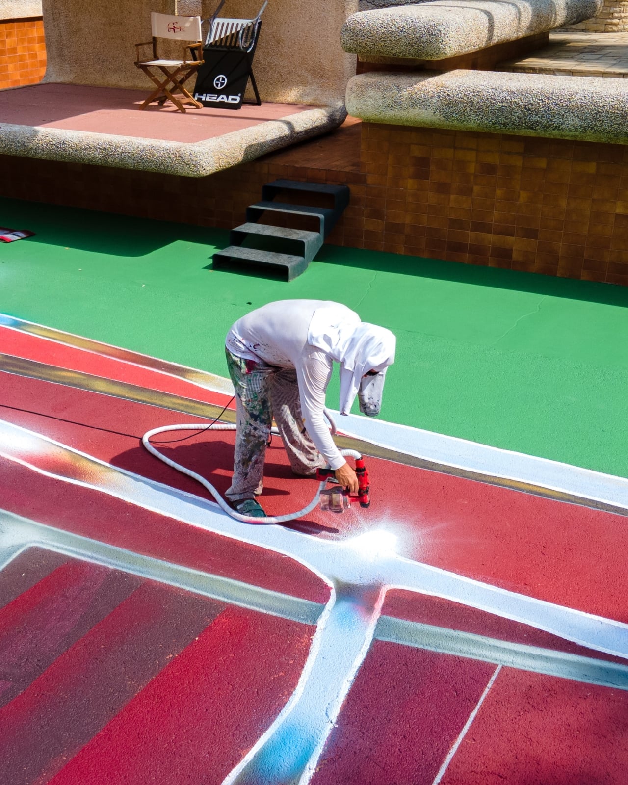
Lucas Benarroch, known as MRKA, painted the first version in 2025, loosening the court’s regulation markings into loose, hand-drawn lines that felt more like a sketch than a sports surface. He then went on to win the inaugural C.A.I.O., which technically put him back in charge of the next transformation. He passed the job to Spok Brillor instead, who had competed against him in the same tournament. That handoff is the part I find genuinely clever. The competition doesn’t just crown a winner, it forces the winner to make a choice about who gets to shape the space next, which quietly turns a tennis match into a succession plan for an ongoing art piece.

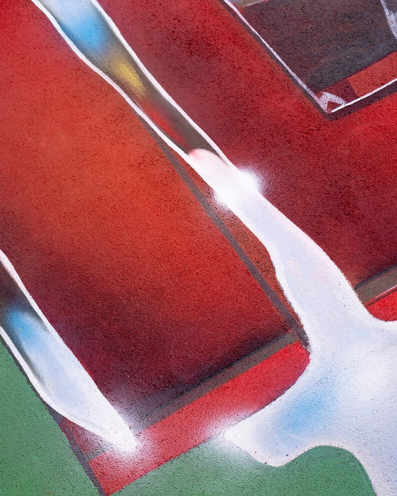
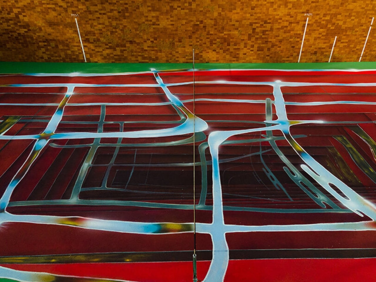
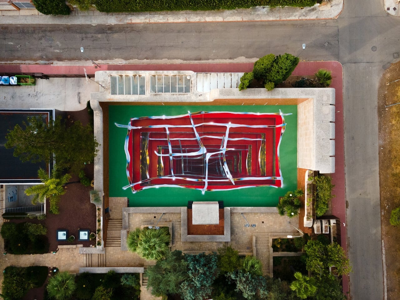
Spok took the opposite approach from MRKA. Where MRKA loosened the geometry, Spok tightened it, repeating the court’s own markings inward through metallic gradients until the actual boundaries get harder to read. Deep reds and burgundies contract through rectangular planes, pale blue and yellow lines cross the surface like reflected metal, and the whole thing sits somewhere between an architectural shaft and a painted portal. It took twelve days to finish, and it’s already scheduled to disappear under whoever wins next year.

I like that this thing is built to be temporary on purpose. Most design work chases permanence, a piece that survives, a brand that lasts forever, a finish that never fades. Hard Court 2 does the opposite. It’s designed to be beaten, literally, by the next person good enough to win a tennis match on top of it. That’s a genuinely strange model for how art gets commissioned, and it works specifically because nobody involved is trying to make something that outlives its usefulness.

There’s also something honest about tying the transformation to actual competition rather than a curator’s calendar. Nobody at Casa Axis decided in advance that the court needed a refresh this September. It changed because someone won a match and had to make good on the assignment. That’s a small distinction, but it changes how the whole project feels. It’s less a rotating gallery and more a living structure that happens to have paint on it.

Whether this idea scales beyond one backyard court in L’Eliana is a fair question, and probably a “no” for most places. But the instinct behind it, building change into the rules instead of hoping someone remembers to update things later, feels like it’s worth stealing for a lot more than tennis courts.

The post Felipe Pantone’s Tennis Court Refuses to Look the Same Twice first appeared on Yanko Design.
  •  
❌