❌

Vue lecture

The 90-Year-Old Lamp Nobody Improved On — Until Now
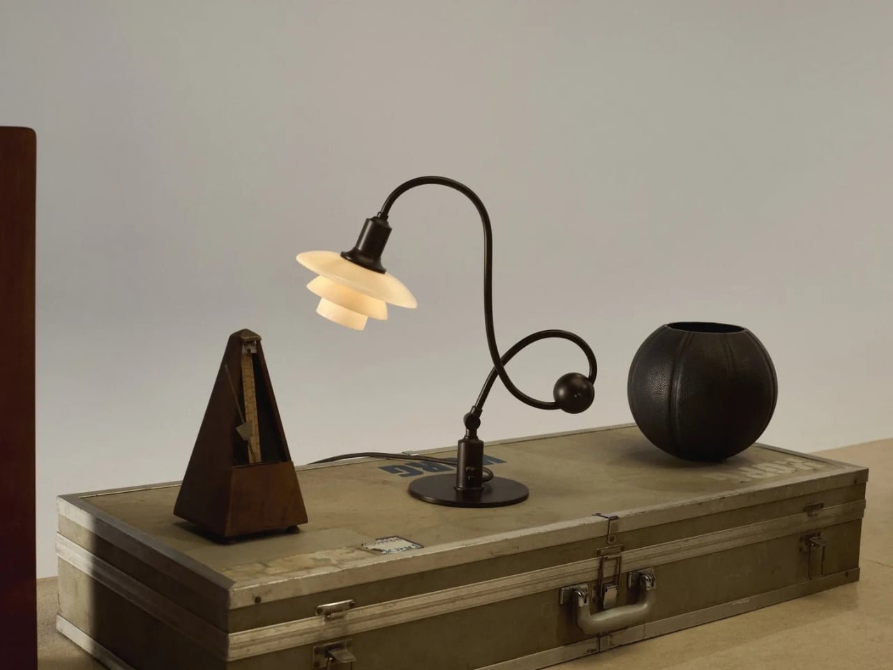
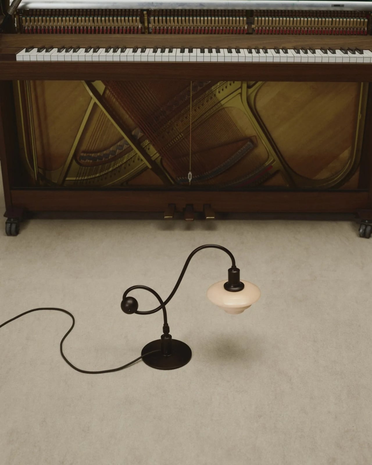
A lamp can look beautiful on a desk and still make it harder to work. The bulb catches your eye, the light lands everywhere except the page, or the fixture takes up the space you needed for a notebook. Louis Poulsen’s reissued PH Piano Lamp starts with a more useful question: How do you put light precisely where it’s needed without making the lamp itself a distraction? Poul Henningsen designed the original for pianists, who needed to see their sheet music without uncomfortable glare.

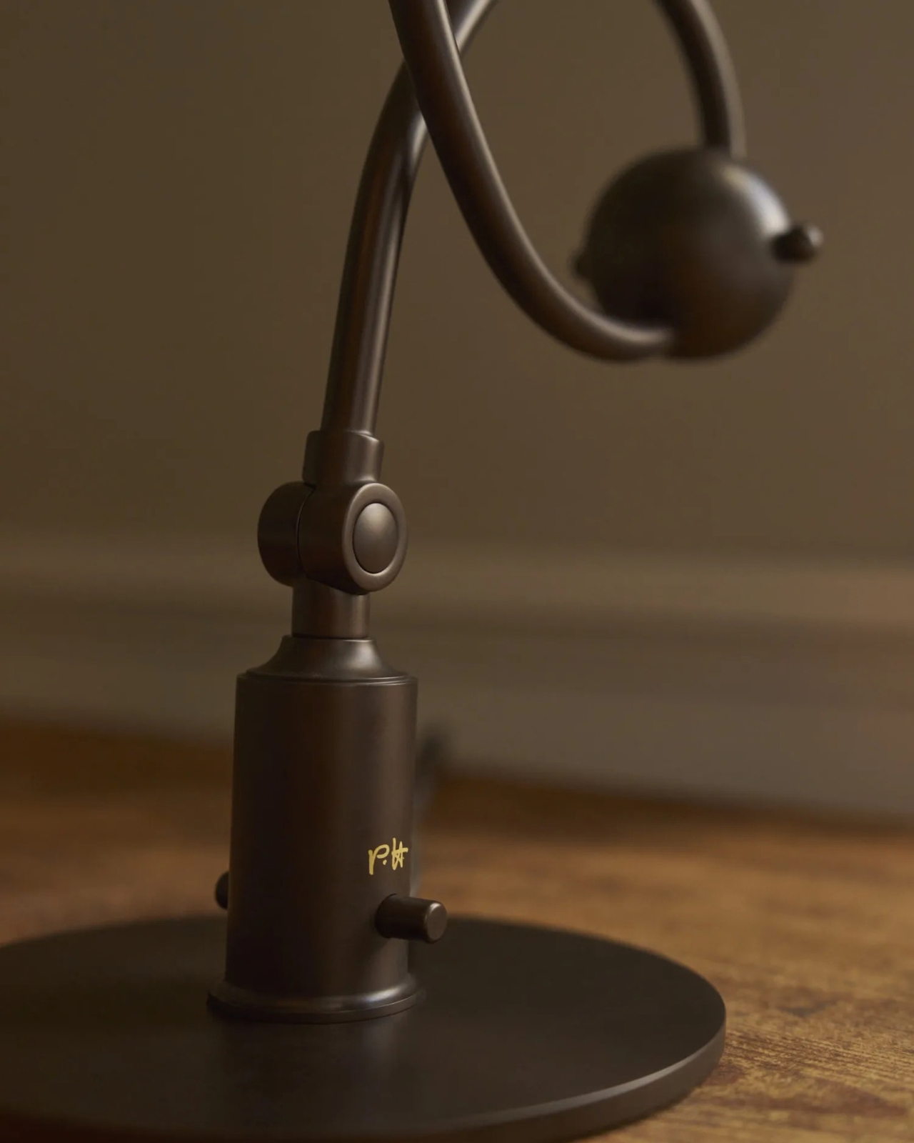
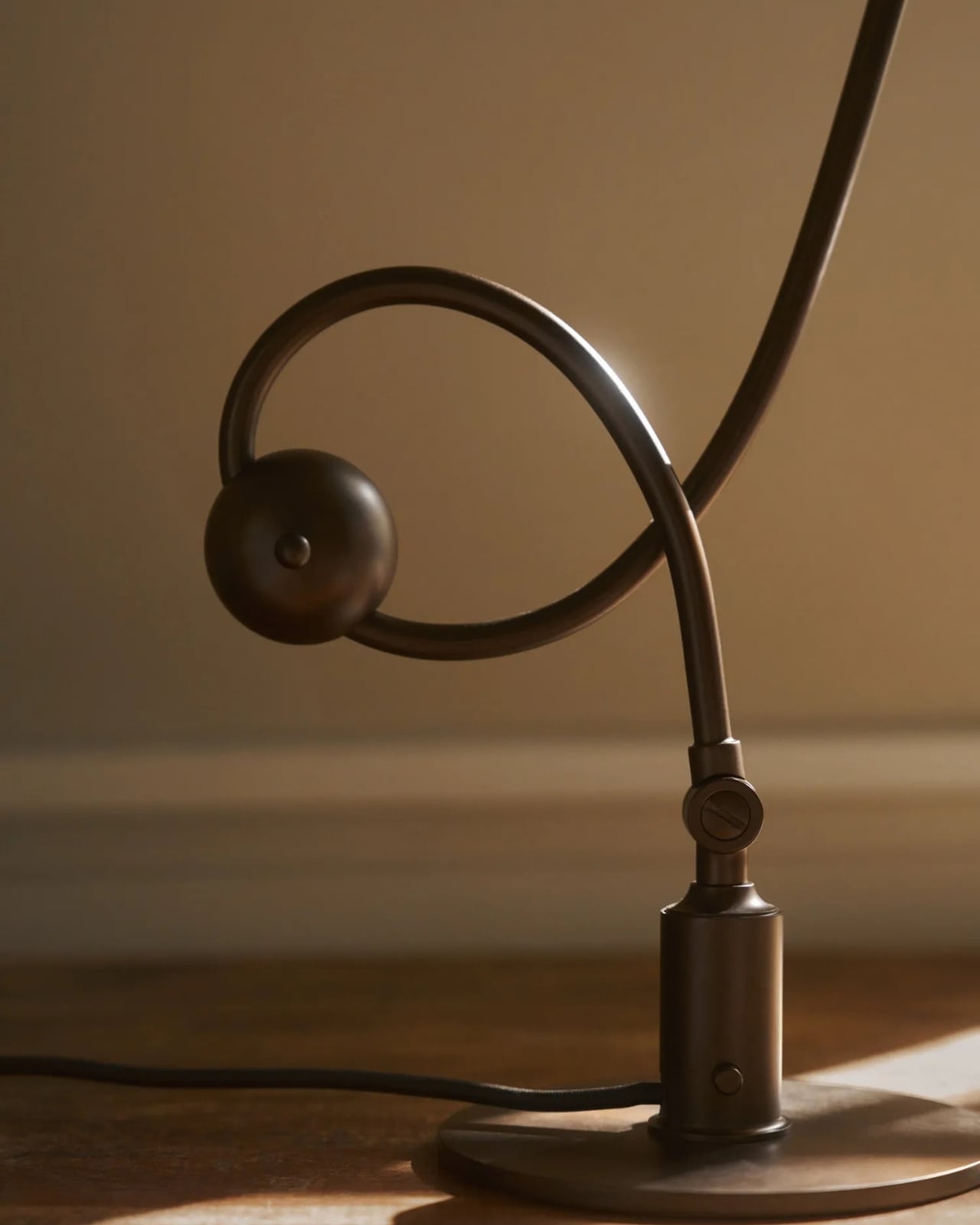
That problem reaches well beyond the piano. Anyone who has tried to read beside a bright table lamp or work under a harsh overhead light knows the difference between having enough light and having the right light. I like that this reissue hasn’t lost sight of its practical beginnings. Its curved, counterbalanced arm lets the shade move while the lamp stays stable, giving the design a sense of purpose you can read from across the room.

Designer: Poul Henningson for Louis Poulsen
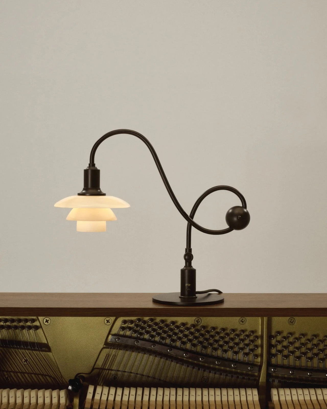
Henningsen first created the Piano Lamp in the early 1930s, building on his PH lighting system, which uses layered shades to manage how light reaches the eye. Louis Poulsen has brought it back as the PH 1/1 Piano Table Lamp Limited Edition 2026, with adjustments intended to make it useful beyond its original setting. It’s an appealing idea for a reissue: keep the reason the object existed, then give more people a reason to use it.

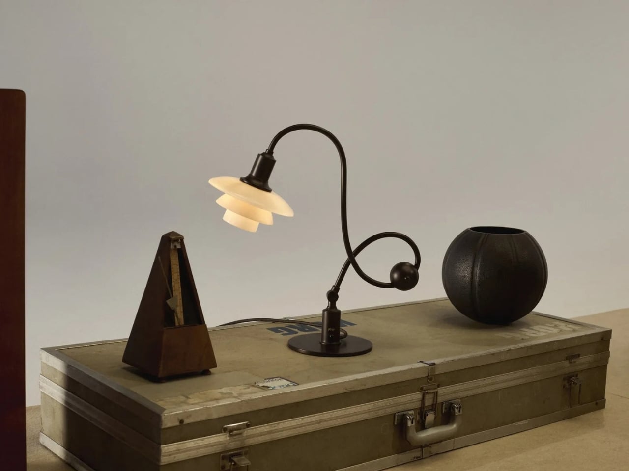
The new version pairs aged brass with glass shades in a color Louis Poulsen calls Dusty Terra Cotta. On paper, that combination sounds richly nostalgic. In practice, its appeal is more specific. The warm-toned glass gives the lamp a softer visual presence, while the long arm and compact shade keep it from feeling like a decorative lamp that has wandered onto a work surface by mistake. You could imagine it near a keyboard, but also beside a book, a sketchpad, or a late-night crossword.
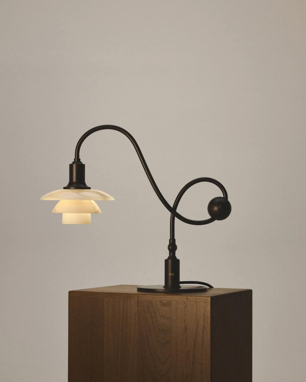
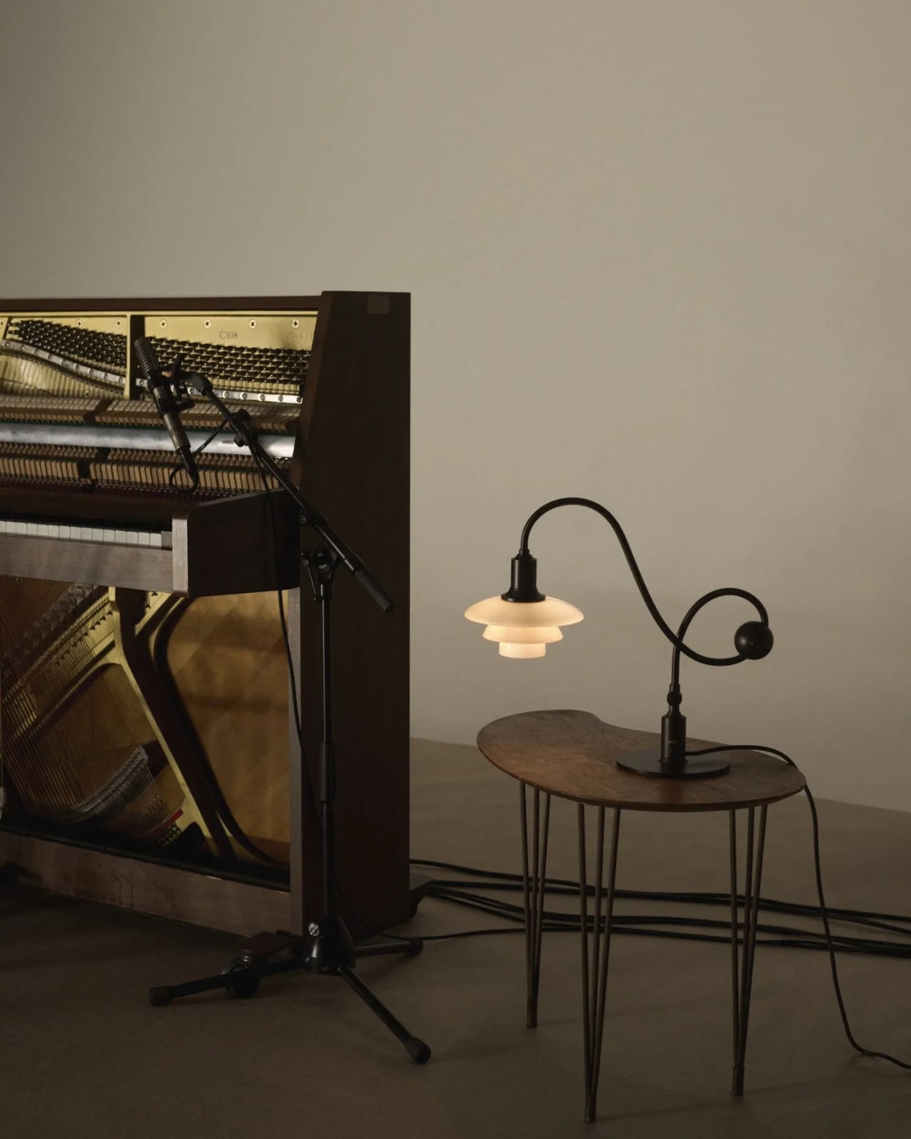
That versatility matters because our rooms rarely serve just one purpose anymore. A dining table becomes a desk. A side table has to accommodate a drink, a charger, and whatever we’re currently reading. Good lighting can make those small shifts easier without demanding that we rearrange the room. The Piano Lamp feels suited to those spaces precisely because it was designed around a task. Its shape may be memorable, but the starting point was helping someone see what they were doing.

I’m also drawn to the fact that it looks a little unusual. The arm has a gentle, almost musical curve, while the shade sits low enough to suggest a conversation between the lamp and whatever is beneath it. Many contemporary lights aim to disappear into the background. This one has a clear silhouette, yet its job is to make the thing you’re doing more comfortable. That balance is harder to achieve than a striking shape alone.
Of course, a limited-edition design lamp isn’t an automatic solution for every desk or budget. If all you need is a cheap light for a spare room, this probably isn’t the practical choice. But it does offer a useful reminder that a lamp’s value isn’t measured only by how brightly it shines. Where the light goes, how it feels, and how easily the fixture fits into daily routines all count. Those are the details you notice after the novelty of a new object wears off.

Louis Poulsen says the PH 1/1 Piano Table Lamp Limited Edition 2026 will be available from October through December 2026. The short window gives it collectible appeal, but I hope that isn’t the only reason people pay attention. Its more interesting quality is how current its original problem still feels. We have plenty of ways to brighten a room. Finding light that helps us focus, without making us squint, remains a much better goal.
The post The 90-Year-Old Lamp Nobody Improved On — Until Now first appeared on Yanko Design.
  •  

The 1969 Lamp Nobody Knew They Needed Is Back

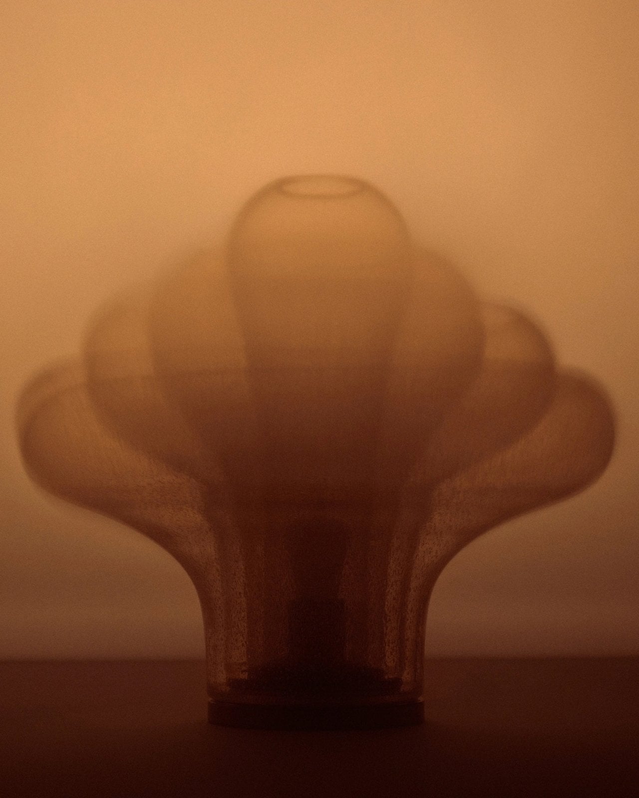
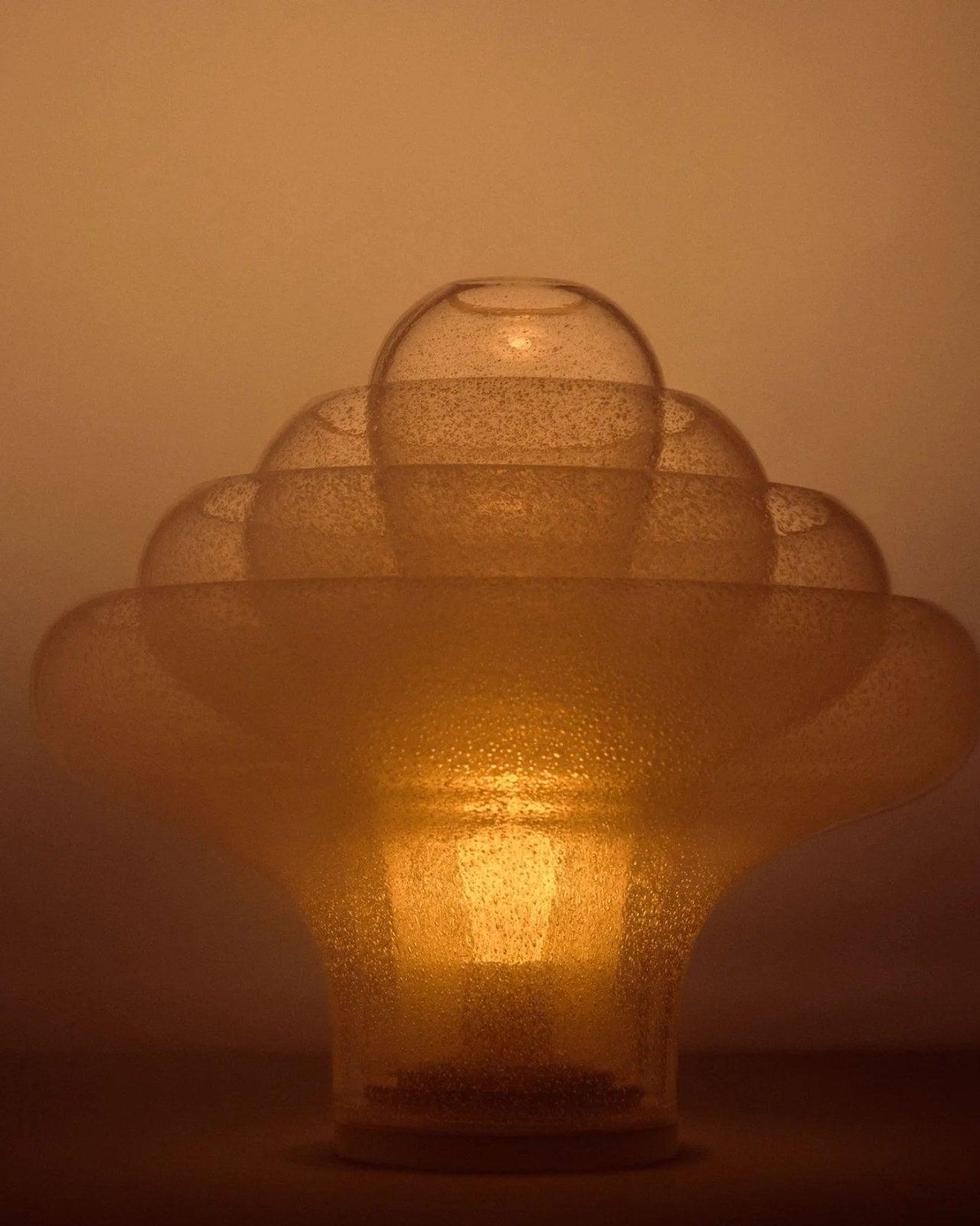
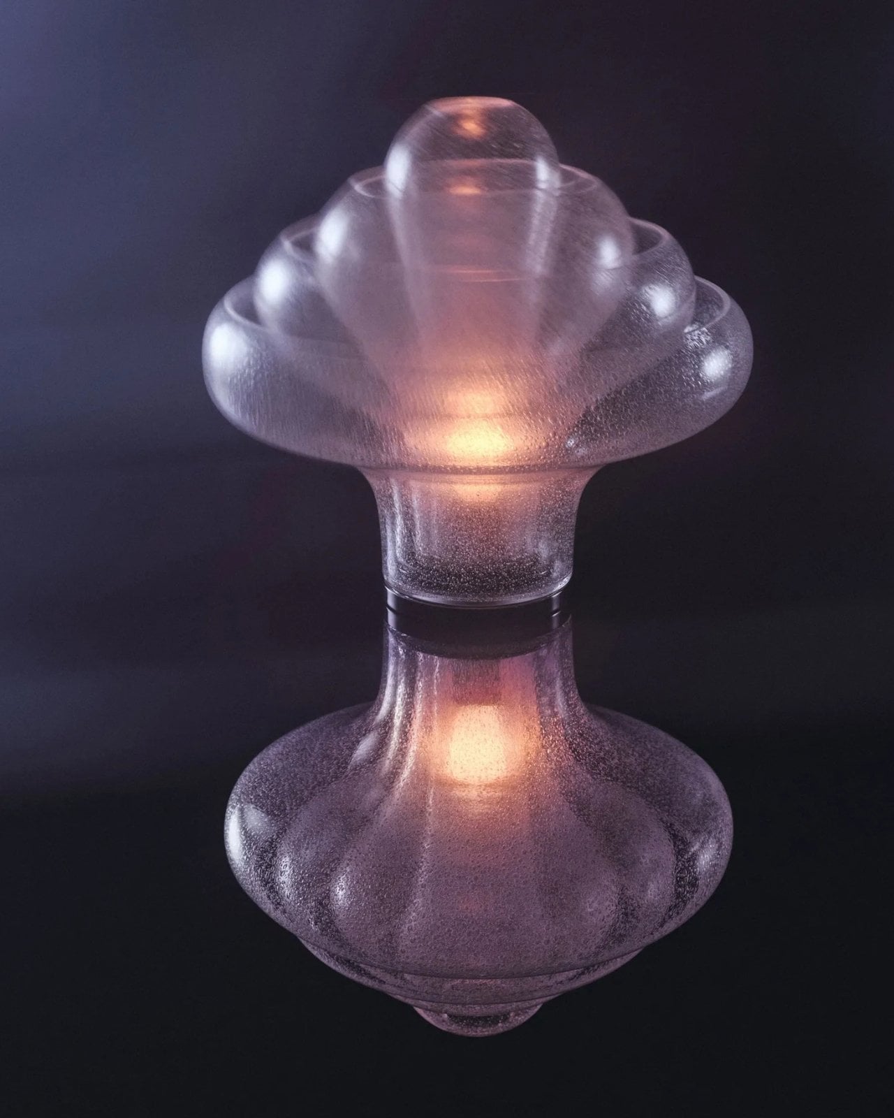
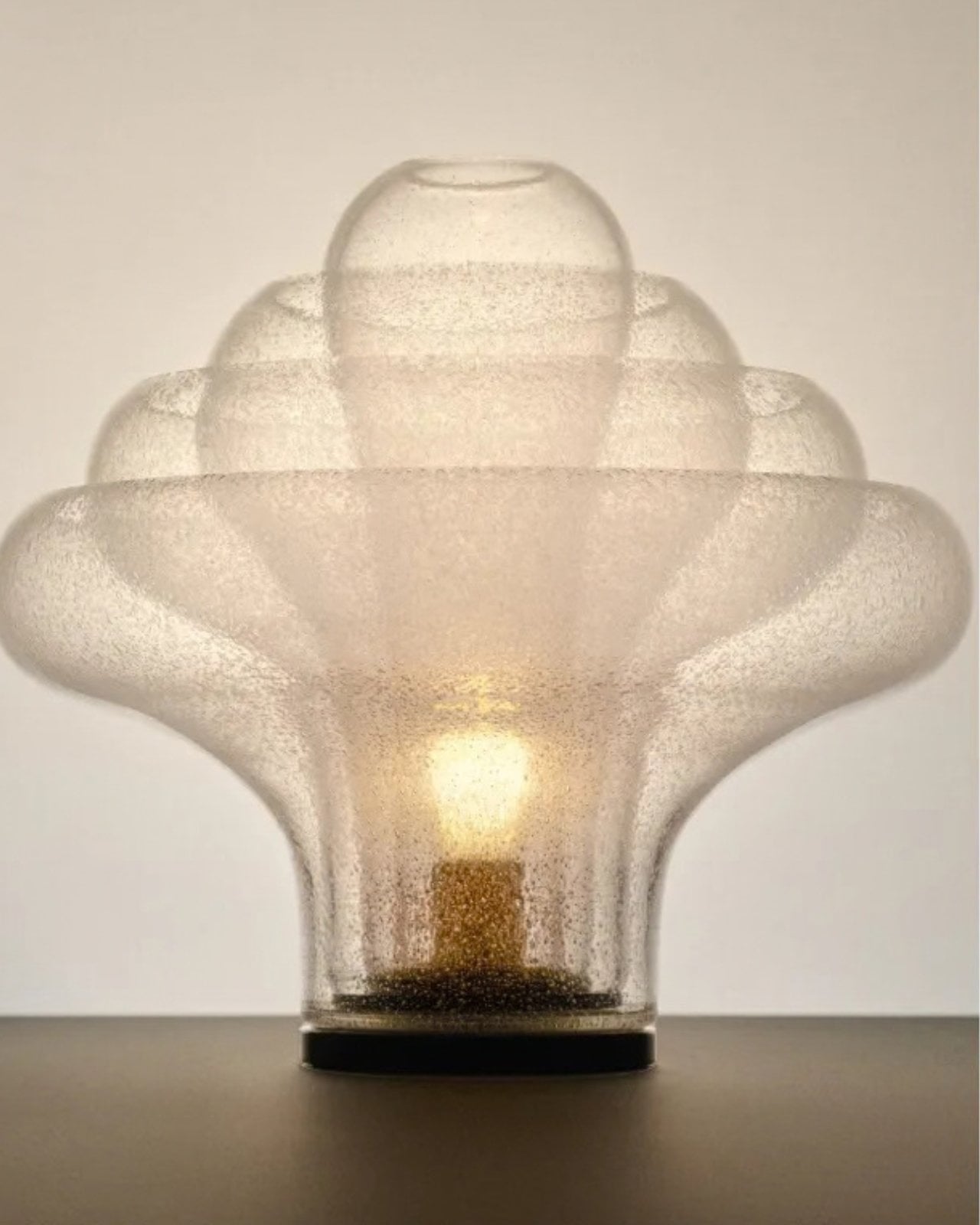
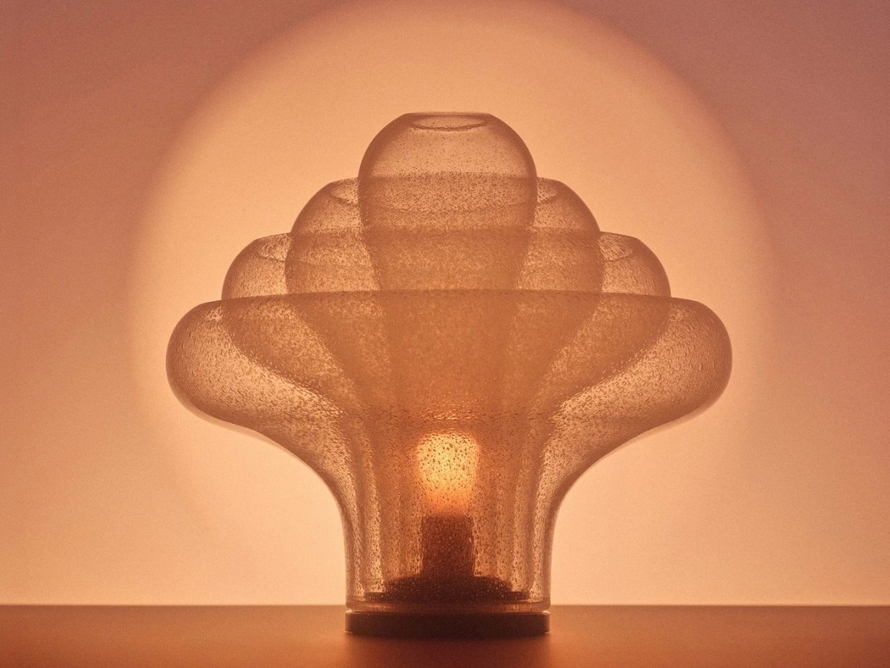
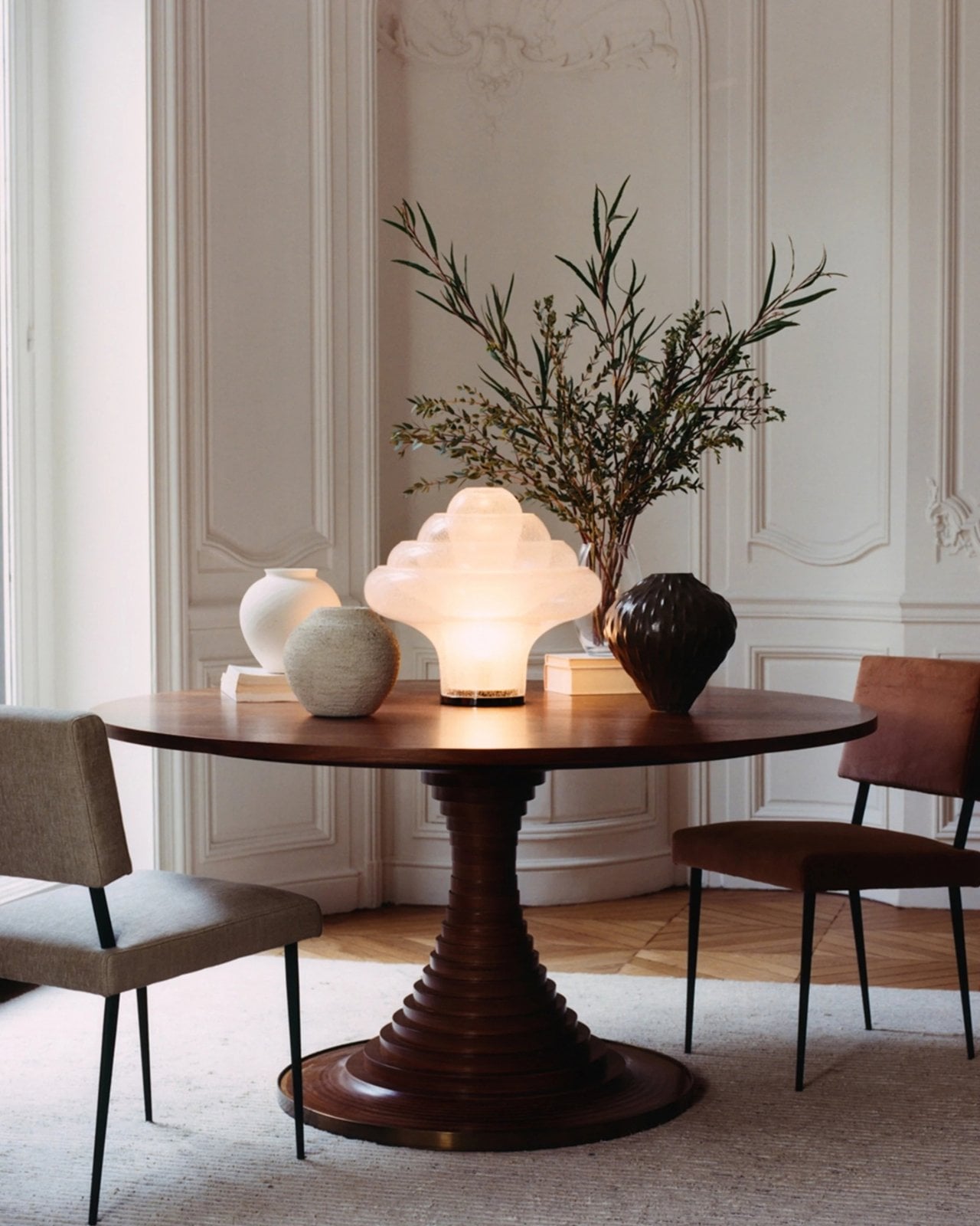
Most statement lighting presents a familiar dilemma. A lamp can give a room personality, but the more attention it demands, the harder it can be to live with everything around it. Furniture starts to feel like a supporting cast. Even the lamp’s glow can seem secondary to its silhouette. Gubi’s reissued Lotus lamp offers a more appealing proposition: a piece with enough presence to change the mood of a room, without making the room feel like a showroom.

Designed by Carlo Nason in 1969, the Lotus lamp belongs to a period when designers were willing to treat lighting as sculpture. Nason’s fluency with glass is central to its appeal, and Gubi’s reissue brings that idea back into view more than half a century later. It is easy to see why the design has returned now. Plenty of contemporary interiors look polished, yet oddly reluctant to have fun. A lamp with a little imagination can do more for them than another carefully chosen neutral.

Designer: Carlo Nason

What makes Lotus interesting to me is the difference between being distinctive and being loud. Its flower-inspired identity gives you a way into the design, but it does not require an entire room to follow the theme. You can appreciate the botanical reference without surrounding it with curved chairs, patterned wallpaper, and a vase of matching flowers. That restraint matters. The best objects leave space for the lives unfolding around them.

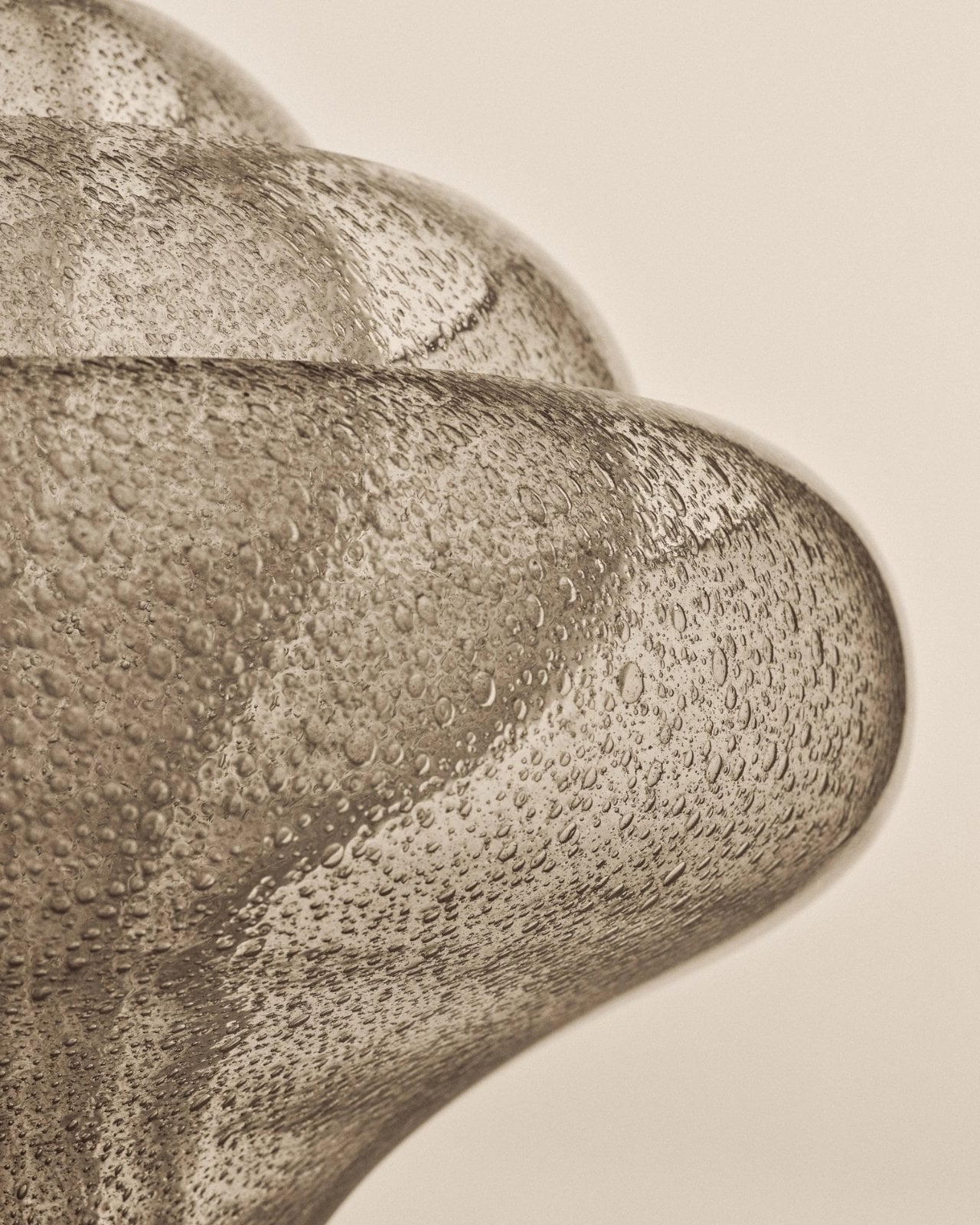
Glass also changes how we read a lamp. A metal shade tends to draw a firm outline; glass has a more elusive presence, especially when light enters the picture. It can feel substantial and delicate at once. Nason built a career around exploring what the material could do, and Lotus carries that curiosity into an everyday object. I like the idea of a lamp that rewards a second look when it is switched off, rather than disappearing until evening.

Of course, reissuing a decades-old design invites a fair question: Are we drawn to the lamp itself, or to the comforting idea of owning a piece of design history? Vintage references can become a shortcut to taste. A recognizable date and designer’s name do some of the work that the object should be doing on its own. Lotus earns more attention when you set that pedigree aside and imagine it in an actual home, beside the books you have not put away and the chair you sit in every night.

That is where its value as a design object becomes clearer. A good lamp changes a space twice: once as an object you notice during the day, and again when you turn it on. The Lotus makes a case for treating those experiences as connected rather than choosing one over the other. It asks to be seen, but the point of bringing a lamp home is still to live with its light.

There is a broader reason this reissue feels timely. So much shopping for the home now happens through images that reward instant impact. A dramatic silhouette can stop a scroll, even if it would be exhausting across the room from your couch. The more useful test is slower. Would you want to see it on a rainy Tuesday? Would it still hold your attention once you stopped photographing it? Lotus strikes me as the kind of design that could pass both tests.

It also offers an alternative to the notion that a room has to speak in one consistent style. An older Italian design can sit comfortably among newer pieces if you let it be a point of contrast rather than the start of a complete makeover. That is a more personal approach to decorating. Most homes accumulate meaning over time, through choices made for different reasons and at different moments.

Gubi did not need to invent a new kind of lamp to make lighting feel fresh. Reintroducing Nason’s 1969 design is a reminder that an object can have a strong point of view without turning the rest of your home into a backdrop. For anyone caught between the sensible lamp and the memorable one, Lotus makes a persuasive argument for wanting both.

The post The 1969 Lamp Nobody Knew They Needed Is Back first appeared on Yanko Design.
  •  

No Switches Needed. Just Press, Pull, or Bop These Silicone Lamps: Behind The Design with YD

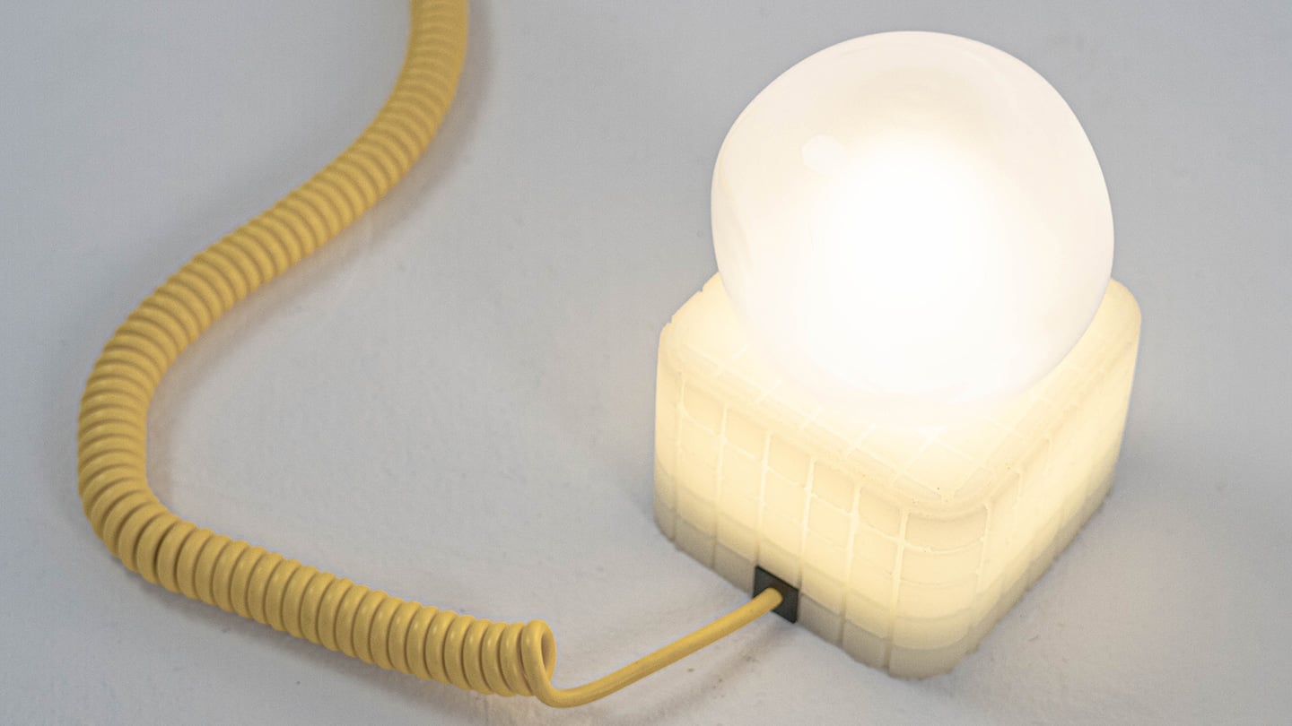
Here is a fun little contradiction to chew on before we get into the actual lamps. The whole point of Call It a Day, Tongqi Design’s new lighting collection, is that you barely have to try. You bop it, you tug it, you flop your hand near it, and it turns on. Zero precision required, zero thinking involved, which is exactly the pitch when you have just walked through the door after a day that emptied you out. But get this. The less effort the lamp asks of you, the more effort someone else clearly put into making that possible. That is the trade we are here to unpack.

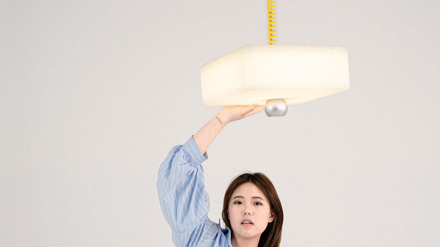
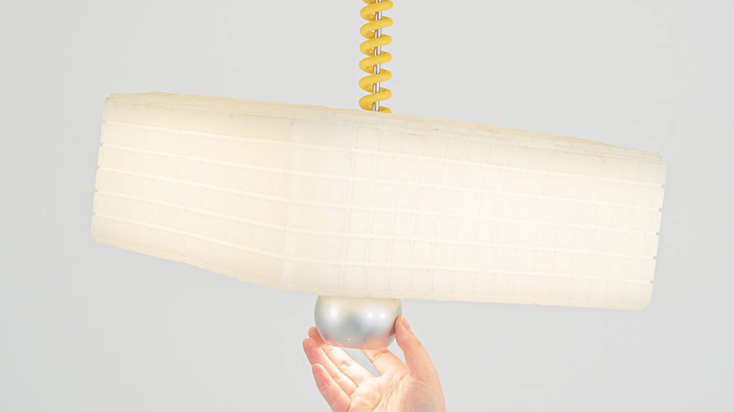
Shanghai-based designer Tongqi Lu built the collection, a table lamp, floor lamp, and pendant, around soft silicone shades with zero switches anywhere on them. Every gesture works because the material itself is doing the sensing, not a button hunting for your finger. It sounds simple sitting in your living room. It is not simple to make, and that gap between the two is basically our whole story today.

Designer: Tongqi Lu

Click Here to Know More

The Design

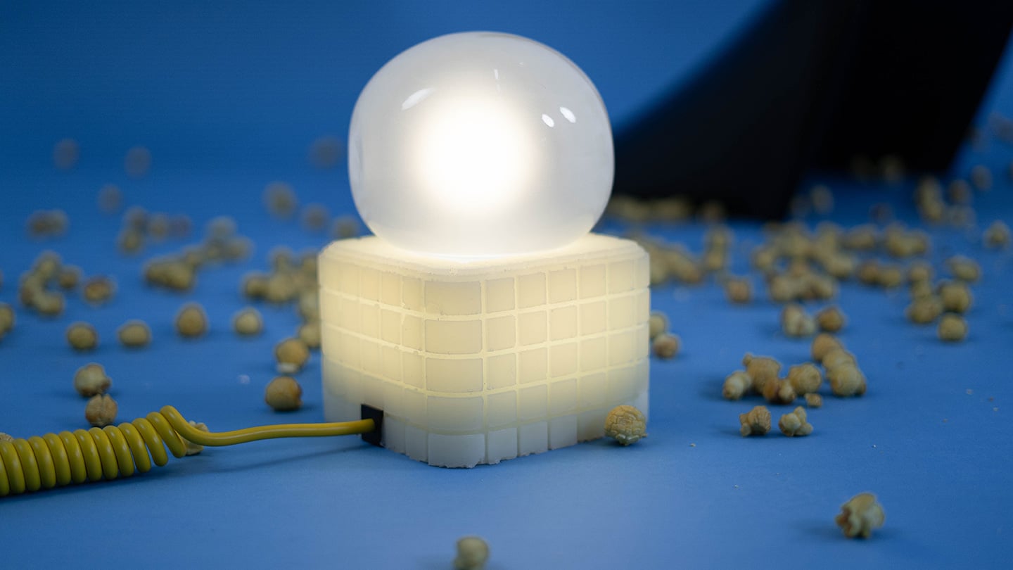
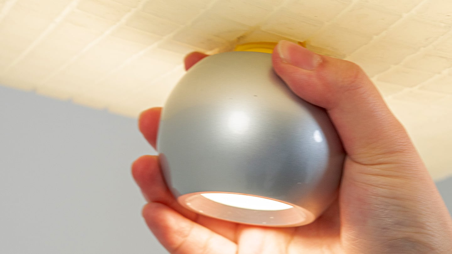
Call It a Day is a three piece lighting collection, a table lamp, a floor lamp, and a pendant, and every one of them is dressed in soft, translucent silicone instead of glass or fabric. That alone is a break from convention, since silicone shades are usually reserved for LED strip diffusers rather than the whole visible body of a lamp. But the real departure is that none of these lamps have a switch. You bop the table lamp, you tug the pendant by its cord, you press the floor lamp wherever feels natural, and the light responds. There is no correct spot to find in the dark. The entire shade is the input, which sounds like a small shift until you realize how much of lamp design has always been built around finding one tiny precise point.

Lu frames the whole thing around the moment you get home and your body checks out before your brain does. She has talked about dropping onto the sofa and reaching out to press, pull, or tap without really thinking about it, and the light turning on not because she followed a rule but because she did not. That is a genuinely sharp way to think about interaction design. Most lighting asks you to be at your most coordinated right when you are at your least. Call It a Day flips that expectation, and the coiled yellow cable running through the collection is a nice touch too, borrowing the old pull chain gesture without being precious about it.

The Process

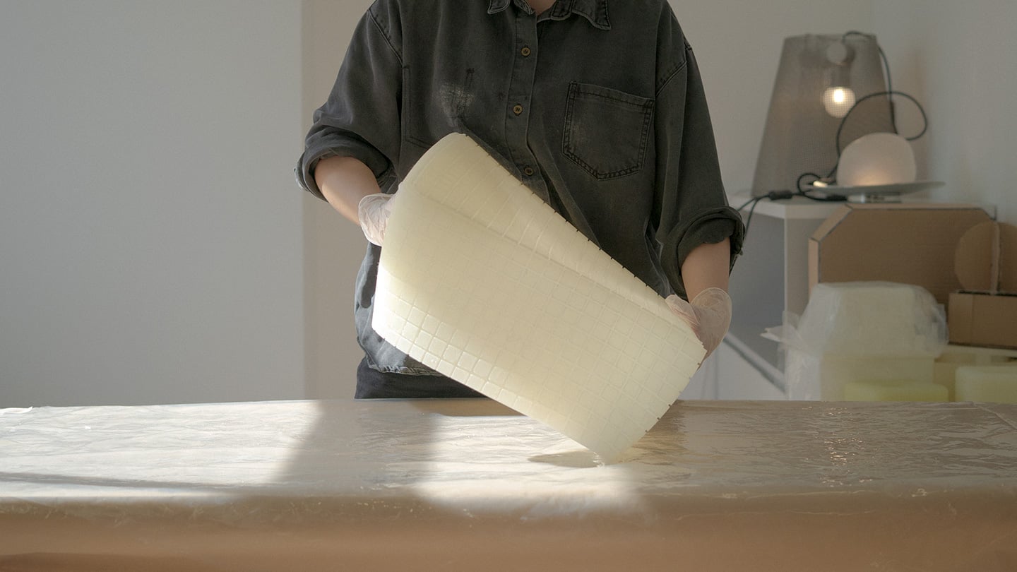
Here is where things get interesting, because the studio itself is not some slick production facility. It is an office in Shanghai with a plastic sheeted folding table, jerrycans of liquid silicone lined up against the wall, and a window looking out over the skyline. Before any of it was cast, the whole collection existed as full scale cardboard mockups, a pendant hung from a coiled cord and a table lamp balanced on a paper cone, sitting in the corner of the room like a rough draft nobody threw away. That is a genuinely useful thing to see, because it shows the gesture and the proportions were locked in long before the material was.

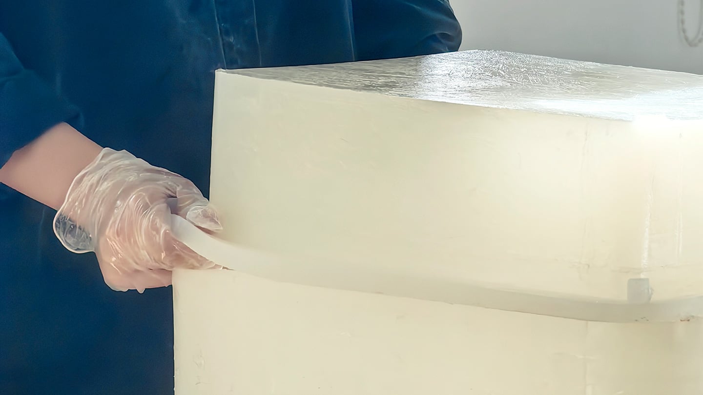
The shades themselves come out of large block molds with a fine grid texture cut into the cavity, which shows up on the finished silicone as a soft woven pattern once the lamp is lit. Getting silicone out of a mold cleanly is trickier than it sounds, since silicone tends to bond to itself, so getting a cast shade out of a cast mold without either tearing or fusing takes real care with release agents and material choice. Pouring it clean adds another layer of difficulty, since bubbles trapped in a translucent material show up as visible flaws once the light hits them. In the photos, you can see two people pouring together, one holding the bucket steady, the other running a palette knife across the lip so the silicone comes down in a thin ribbon instead of glugging out in one shot, which is a simple trick for keeping air out of the pour. It is not a factory process. It is a hand process, done carefully, on a folding table, gallon by gallon.

The Perspective

What I like most about Call It a Day is that the ease on the user’s end is clearly paid for somewhere upstream, and that upstream cost is visible if you know where to look. A switchless lamp sounds like a simple idea until you have to actually engineer a material that can be grabbed, twisted, and mistreated without breaking or losing its shape, and then cast that material cleanly at scale in a small studio. That gap between the lived experience and the labor behind it is exactly what a lot of good product design tries to hide, and here it is sitting right out in the open in the process photos.

It also helps that the whole thing traces back to something real. Lu’s early work, the lemon shaped Citron lamp, her furniture line built around trees and water lilies, all of it circles the same idea of pulling people back into their bodies after a long day in a city that does not really let them slow down. Call It a Day feels like the most literal version of that idea yet, a lamp built entirely around the ninety seconds when you have officially given up on being careful. Whether or not the gesture control holds up over years of actual use is a question only time and daily wear will answer, but as a piece of intent, this one lands.

Click Here to Know More

The post No Switches Needed. Just Press, Pull, or Bop These Silicone Lamps: Behind The Design with YD first appeared on Yanko Design.
  •  

The Lamp That Actually Looks Better With the Lights Off

Most lighting has a dirty secret: it only works half the day. Flip the switch and a pendant or sconce can look spectacular, all warm glow and dramatic shadow. Flip it off, and you’re left staring at what is often just a glorified fixture, a thing bolted to a ceiling that has nothing to say for itself once the bulb goes dark. That gap between “on” and “off” is where a lot of home lighting quietly fails us, and it’s a problem most people never think to name because they’ve simply accepted it.

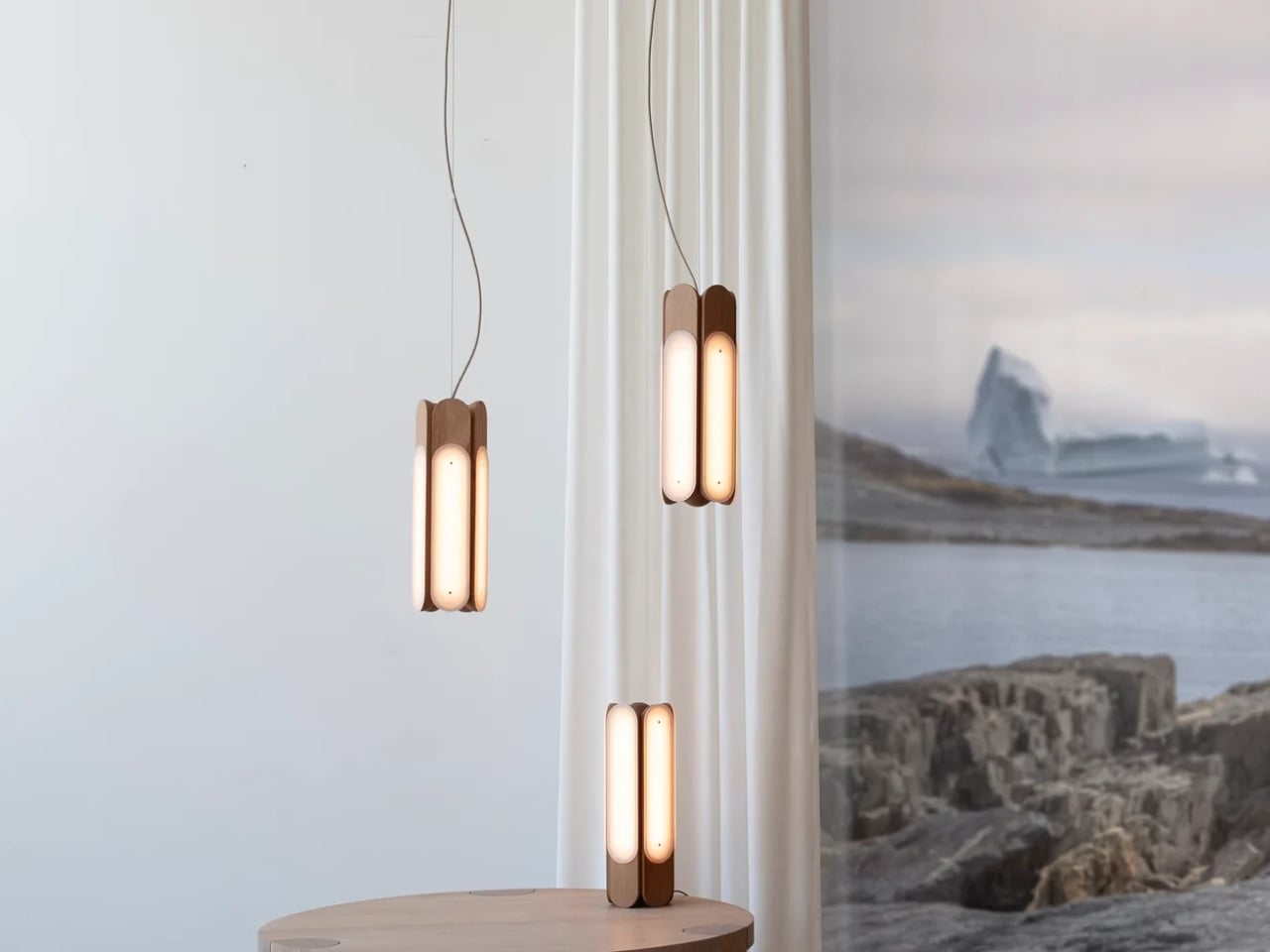
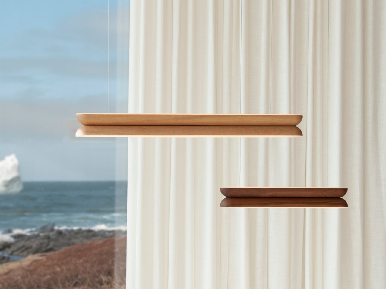
Hollis+Morris, the Toronto studio behind the new Beaufort collection, clearly has thought about it. Their solution isn’t a smarter bulb or a clever dimmer app. It’s a rethinking of what a light fixture is supposed to do when it’s doing nothing at all. Beaufort is built from sculpted solid wood paired with sandblasted acrylic, and the acrylic is cut and finished so it holds a kind of frozen depth, layered, translucent, a little mysterious, whether or not there’s current running through it. Turn it on and light diffuses through those layers in soft gradients. Turn it off and you still have an object worth walking past twice.

Designer: Hollis+Morris

The origin story is the kind of thing that sounds almost too tidy, except it happens to be true. Mischa Couvrette, the studio’s founder and lead designer, was flying home from Copenhagen’s 3daysofdesign when a conversation about ice, and about climate change, turned into sketches on a cocktail napkin somewhere over the Atlantic. By the time the plane landed, the collection basically existed in his head. The name comes from the Beaufort Sea, that remote stretch of Arctic water above Alaska and Canada’s Northwest Territories, which is a fitting reference for a studio that has built its identity on restraint rather than spectacle.

I appreciate that the collection doesn’t try to literally recreate an iceberg hanging from your ceiling. Instead it borrows the logic of ice: how light moves through something dense and layered, how clarity shifts depending on where you’re standing. The studio achieves that through repetition, mirroring, and rotation of a small set of core components, which is a fancy way of saying they’ve built one coherent visual language and then let it flex across a sconce, a mirrored horizontal pendant, a lantern-like vertical pendant, and a table lamp. Nothing in the lineup feels like an afterthought tacked onto a single hero piece just to pad out a catalog.

Jonathan Mandeville of Hollis+Morris put it plainly when he said the collection sits in a lineage of Scandinavian and Canadian design that values material honesty and quiet restraint, the idea that an object should earn its keep even when it isn’t doing anything. That’s a bit of a jab, gentle as it is, at a design moment that has leaned hard into maximalism and novelty for novelty’s sake. I don’t think Beaufort is arguing that bold, loud design is wrong. Plenty of homes need a little chaos. But there’s real value in a piece that doesn’t ask for your attention so much as reward it once you’ve already given it, and that’s a harder trick to pull off than another oversized statement chandelier.

It also matters, at least to me, that these pieces are made in Canada by a B Corp certified studio that treats that fact as a working value rather than a sticker on the box. Knowing who made a light and how isn’t a small thing anymore, especially with home goods, where supply chains can be murky at best.

Beaufort isn’t cheap. The R5 horizontal pendant runs $3,800 and the M2 horizontal starts around $1,900, so this is squarely in investment-piece territory, not an impulse buy from a big box store. But for anyone who has ever bought a light fixture, loved it while it was on, and felt a little let down by it during the day, Beaufort makes a fairly convincing case that the two states shouldn’t have to be so different.

The post The Lamp That Actually Looks Better With the Lights Off first appeared on Yanko Design.
  •  

Scosche’s GloBright Is the Lava Lamp That Also Charges Your Phone

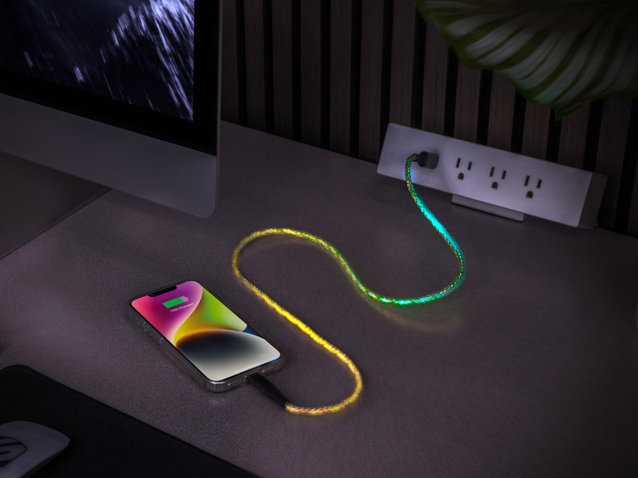
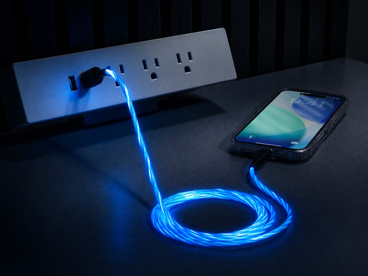
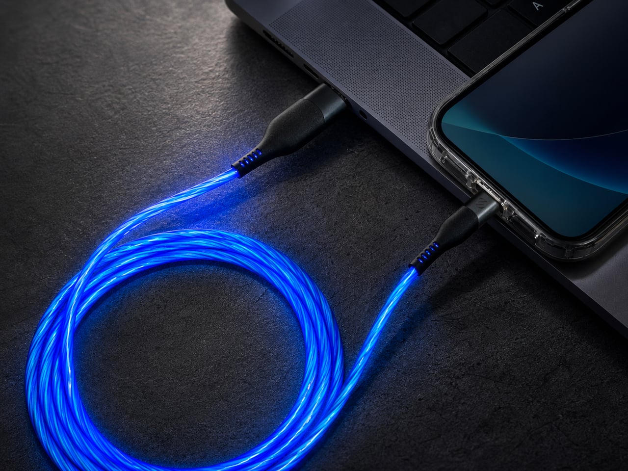
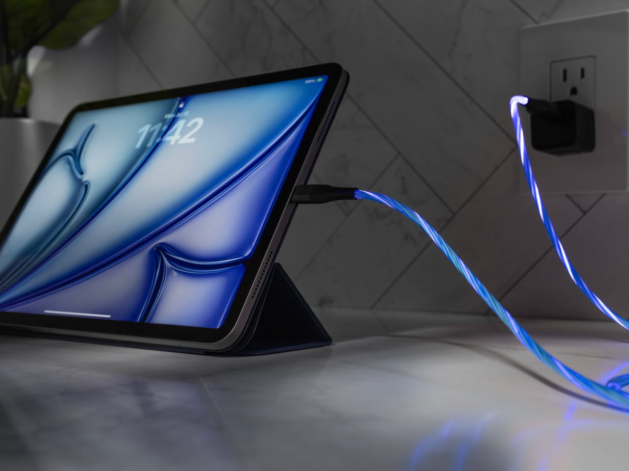
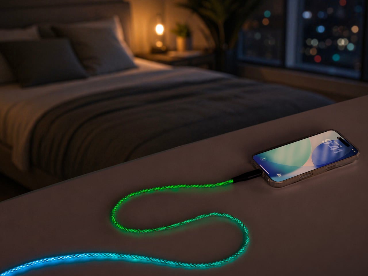
Scosche built a charging cable that refuses to hide once the lights go out. The GloBright MultiColor Glowing LED Charging Cable, developed with Statik and introduced at IFA 2026, takes the most overlooked object on any desk and turns it into something that actually draws the eye. Instead of a black cord disappearing into shadow behind a laptop, this one glows its way across the room.

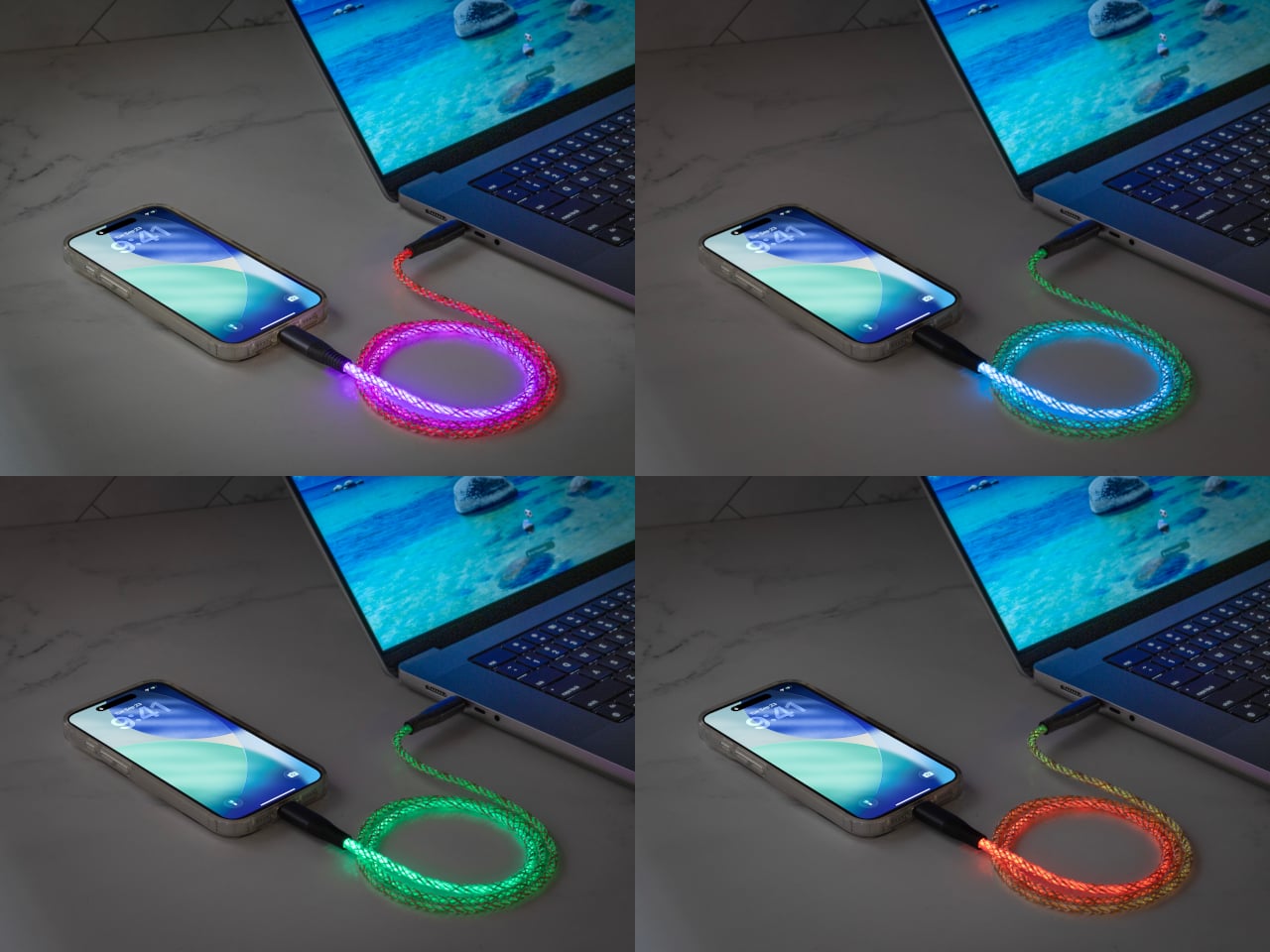
That glow runs through the cable’s full length rather than sitting confined to the connector tips, so a coiled loop on a nightstand reads more like a lit sculpture than a charging accessory. Colors shift gradually along that length too, pink bleeding into purple, blue fading toward teal, giving the cable a slow-motion animation instead of a static single hue that gets boring after the first week of ownership.

Designer: Scosche

None of that visual flair comes at the cost of actual charging performance. Scosche built the GloBright cable to support up to 60W of fast charging for USB-C devices, alongside reliable data transfer, so a phone plugged in overnight wakes up fully charged just like it would with any premium braided cable. The lighting effect runs as a bonus layer on top of specs that already hold up on their own.

Durability gets equal attention. The 3-foot cable relies on premium materials throughout its construction, aiming for a build that survives the daily abuse of getting yanked out of a bag, wound around a charger, or stepped on near a bed frame. Scosche also sells a companion Blue Glowing LED cable in a longer 4-foot option, giving anyone who prefers a single steady color an alternative to the multicolor version’s shifting palette.

Where this cable earns its keep is in the spaces most charging accessories try to disappear from. A gaming setup gets an extra strip of ambient light without needing a separate RGB kit. A bedside table gets a soft, shifting glow that also happens to be topping off a phone overnight. Even a cluttered desk benefits, since a glowing cable is far easier to locate in a tangle of cords than a plain black one ever was.

Scosche prices the GloBright MultiColor cable at $17.99, positioning it well within impulse-purchase territory for anyone shopping for a charging cable anyway. At that price, the lighting effect functions less like a premium upsell and more like a free upgrade bundled into a cable people needed regardless. Buying a charging cable rarely feels like a decision worth thinking about, and Scosche seems to be betting that a little glow is enough to change that.

The post Scosche’s GloBright Is the Lava Lamp That Also Charges Your Phone first appeared on Yanko Design.
  •  

A Ceramic Lamp That Refuses to Stay the Same

Most lamps ask you to commit. You pick a shade, a finish, a mood, and that’s what you’re stuck with until the bulb burns out or you get sick of it and drag the whole thing to a donation bin. For anyone who likes to rearrange a room the way some people rearrange their playlists, that’s a real limitation, and it’s one nobody really talks about because we’ve just accepted lighting as a fixed decision rather than a flexible one.

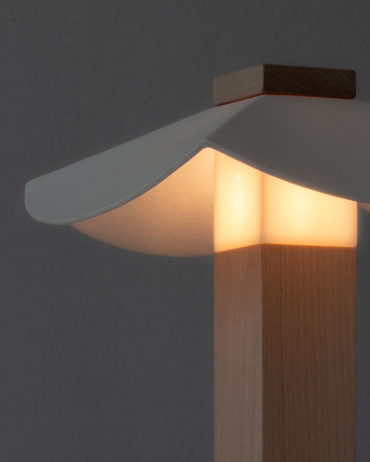
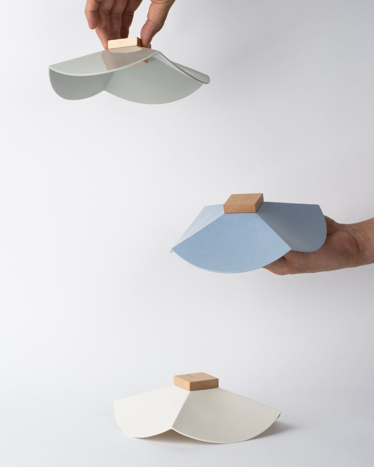
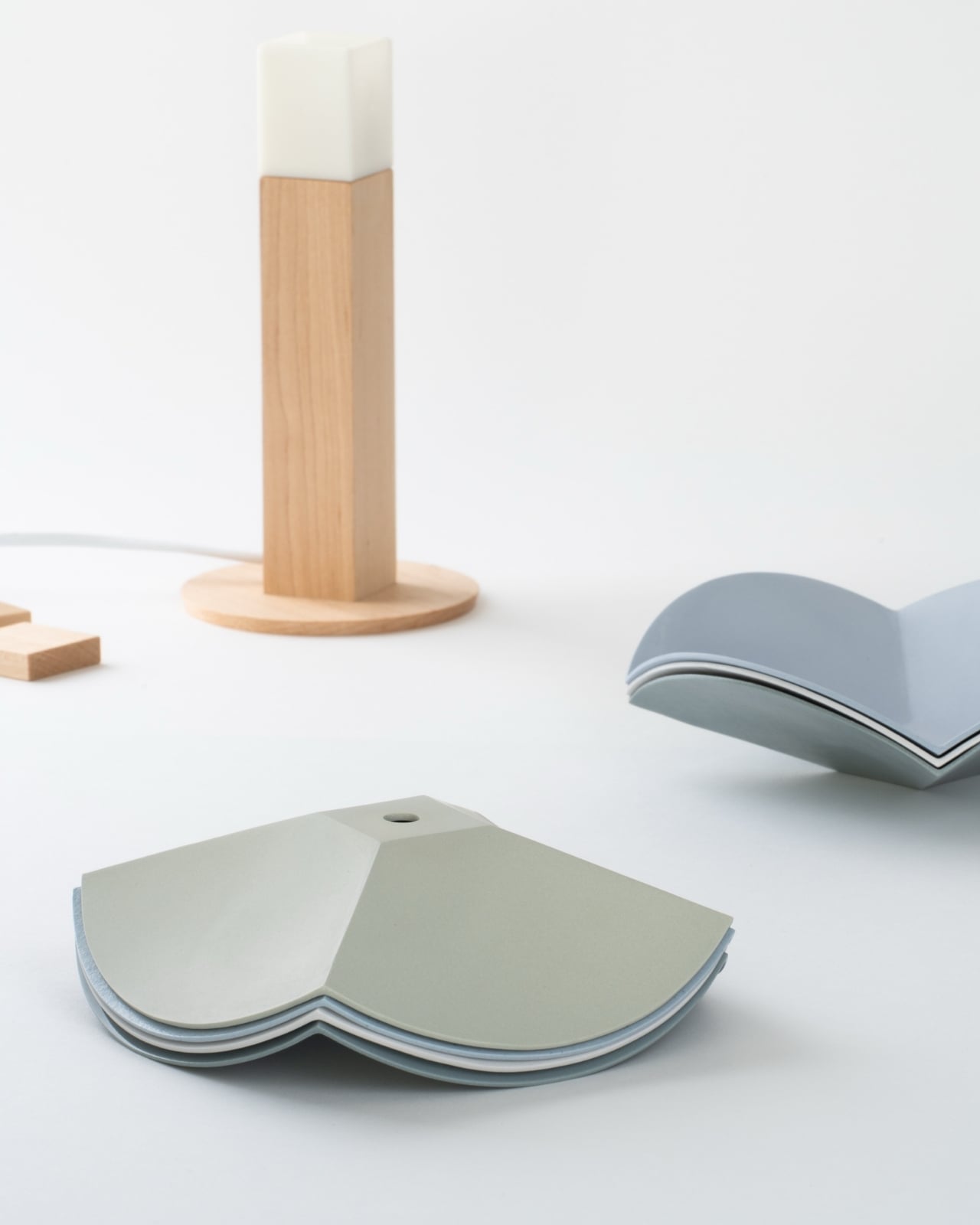
Seoul-based designer Byunggwon Na looked at that problem and did something refreshingly simple about it. His new piece, ALIT, is a lamp built from two honest materials, slip-cast ceramic and solid wood, and it’s designed so the ceramic shade can be lifted off and swapped for another one entirely. The wooden column stays put. The ceramic changes. One base, endless personalities.

Designer: Byunggwon Na

I’ll admit I’m a sucker for objects that do more with less, and ALIT is a good example of that instinct done right. It isn’t trying to be smart, connected, or app-controlled, which honestly feels like the correct move in a market saturated with lighting products chasing the “smart home” label. Instead, Na leaned into contrast: the coolness of ceramic against the warmth of wood, the matte against the grain, the handmade against the geometric. The square wooden column reads almost architectural, a quiet, upright form that could disappear into a Scandinavian-leaning living room or a mid-century one just as easily. The ceramic shade sitting on top is where the personality lives, and because it’s removable, that personality isn’t permanent.

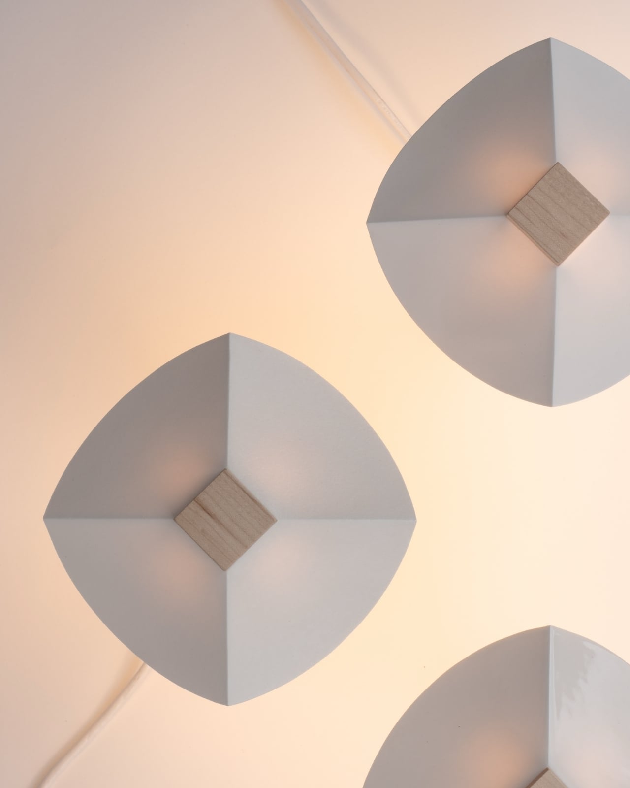
This piece treats color and light together, not separately. A pale, unglazed ceramic shade lets light spill out soft and even, almost like paper. A darker or glazed version holds the light closer, letting it glow through in patches instead of flooding the room. So the same base lamp can go from a reading-corner glow to something moodier for a dinner table, just by switching the top. That’s not a gimmick. That’s actual utility dressed up as good design, and those two things don’t always travel together.

American interiors have leaned hard into modularity over the past few years, from sectional sofas you can rearrange endlessly to shelving systems that grow with you. Lighting has lagged behind that trend, still mostly sold as one fixed object per mood. ALIT fits into where the category is quietly heading: fewer disposable purchases, more pieces designed to be lived with and adjusted rather than replaced. For a design market that talks a lot about sustainability but rarely builds it into something this tactile, that matters.

There’s also something to be said for the fact that Na didn’t overcomplicate the engineering. No magnets, no proprietary mounts, no fragile clip system to break after six months. The shade simply rests on the column, held by gravity and good proportions. It’s the kind of restraint that separates designers who understand materials from those who just decorate around them.

I don’t think ALIT is going to reinvent the lighting industry, and I don’t think it’s trying to. What it does is solve a small, specific annoyance, the fact that changing a lamp’s mood usually means buying a whole new lamp, and it solves it with a design vocabulary that feels considered rather than trend-chasing. In a category full of objects competing for attention, ALIT seems more interested in earning a long-term place in a room. That’s a rarer ambition than it should be, whether this one ends up in a Seoul studio or an apartment in Brooklyn.

The post A Ceramic Lamp That Refuses to Stay the Same first appeared on Yanko Design.
  •  

This Desk Lamp Puts a Spotlight in a Ring Light With One Knob

Desk lighting has long been a compromise between task and atmosphere. Professional lamps tend to lean one way or the other: too directional and harsh for extended use, or too diffuse to support fine detail work. A lamp that’s good for examining physical samples often isn’t comfortable over long stretches, and one that’s gentle on the eyes doesn’t always deliver when you need a hard, directed beam.

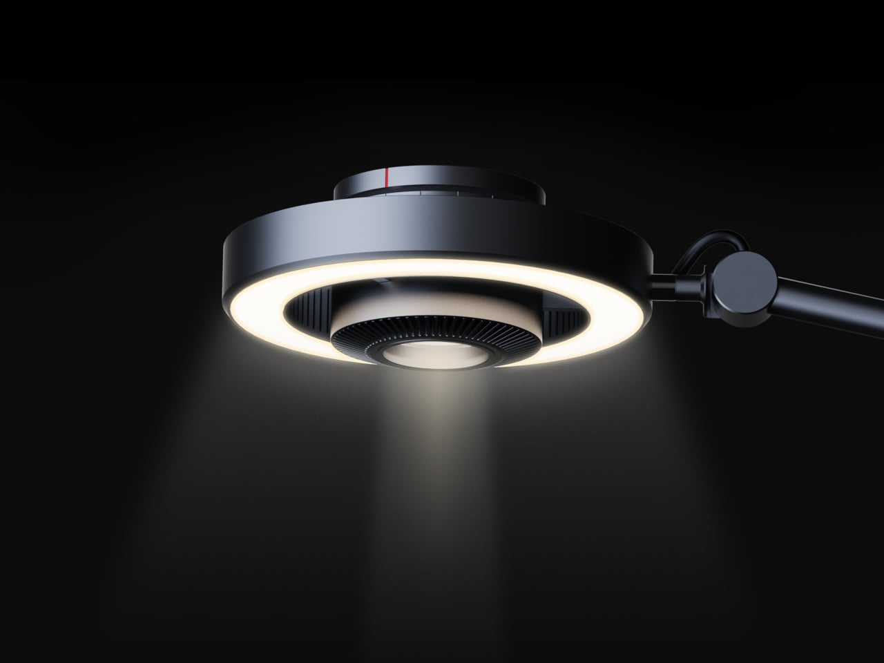
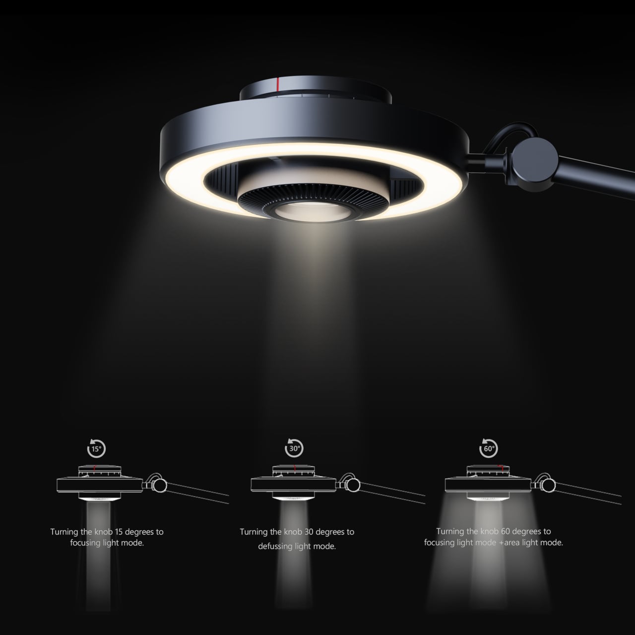
The Focus Light is a desktop lamp concept built around a different premise. Rather than committing to one kind of output, it combines two independent light sources into a single lamp head, giving the user the ability to shift between a precise, concentrated beam and a broad ambient glow, or run both at once. All of it’s controlled by a single rotary knob, and there aren’t any menus, apps, or extra switches involved.

Designers: Zhen Yang, Siting Lin

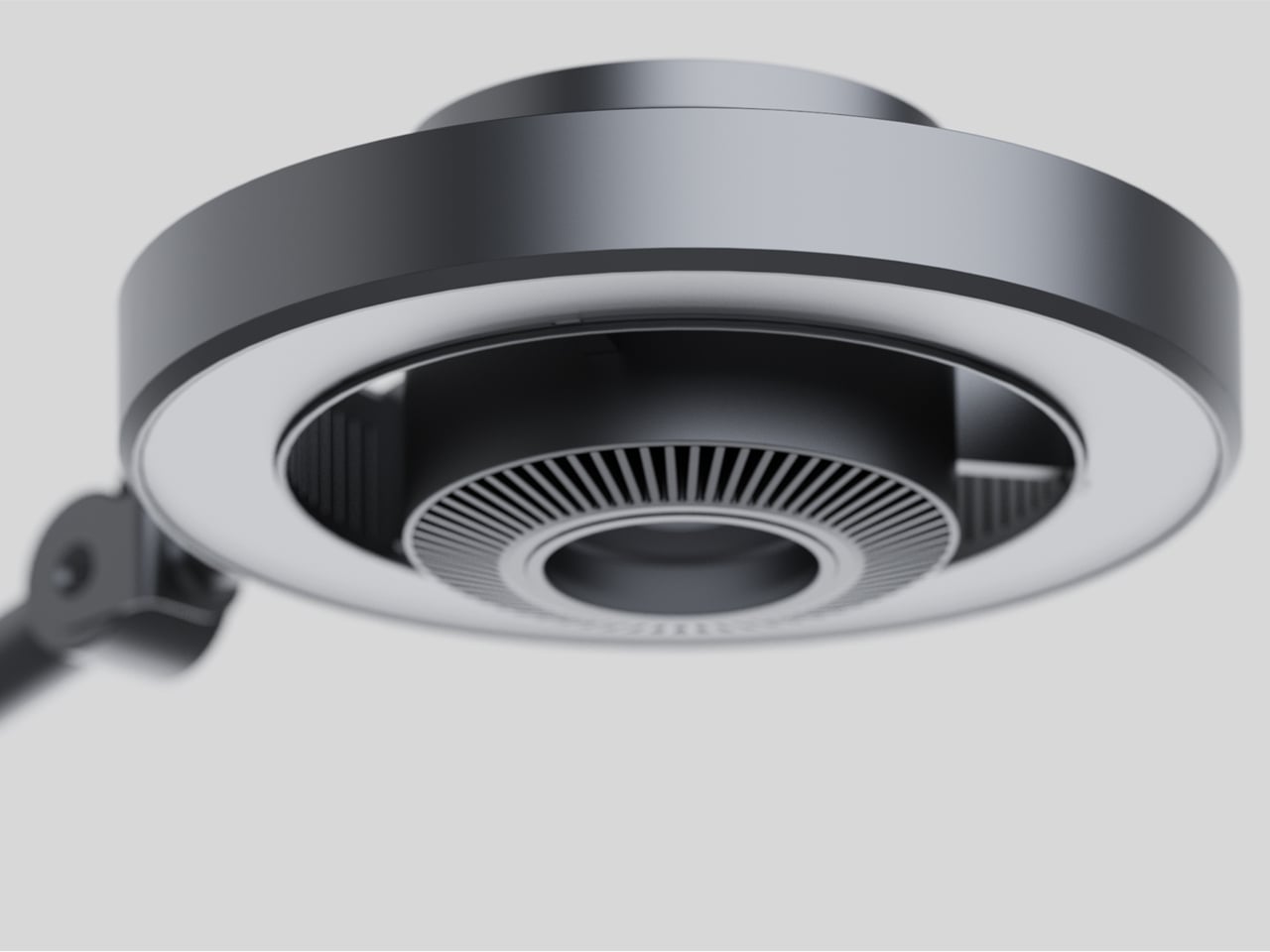
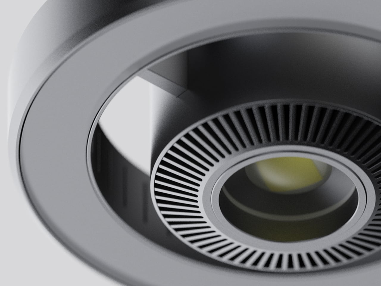
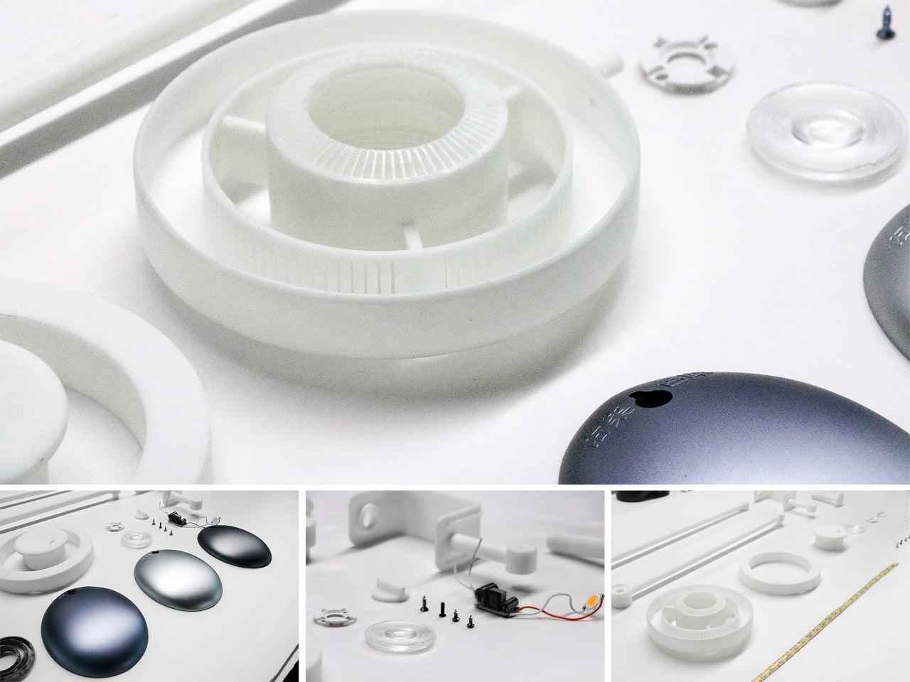
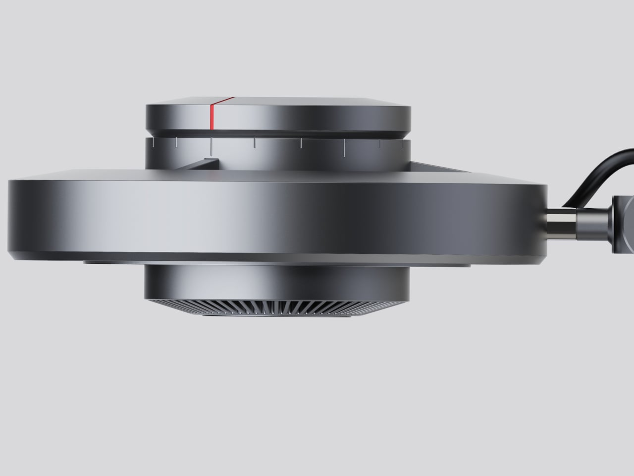
The lamp head is organized concentrically: an outer ring delivers ambient light while a central optical lens handles the focused beam. That layout has both functional and visual logic to it. Both sources sit in deliberate, concentric relation to each other, and the overall form looks as precise as it performs. The whole thing is finished in space gray metal, which lends it a professional, precision-tool character.

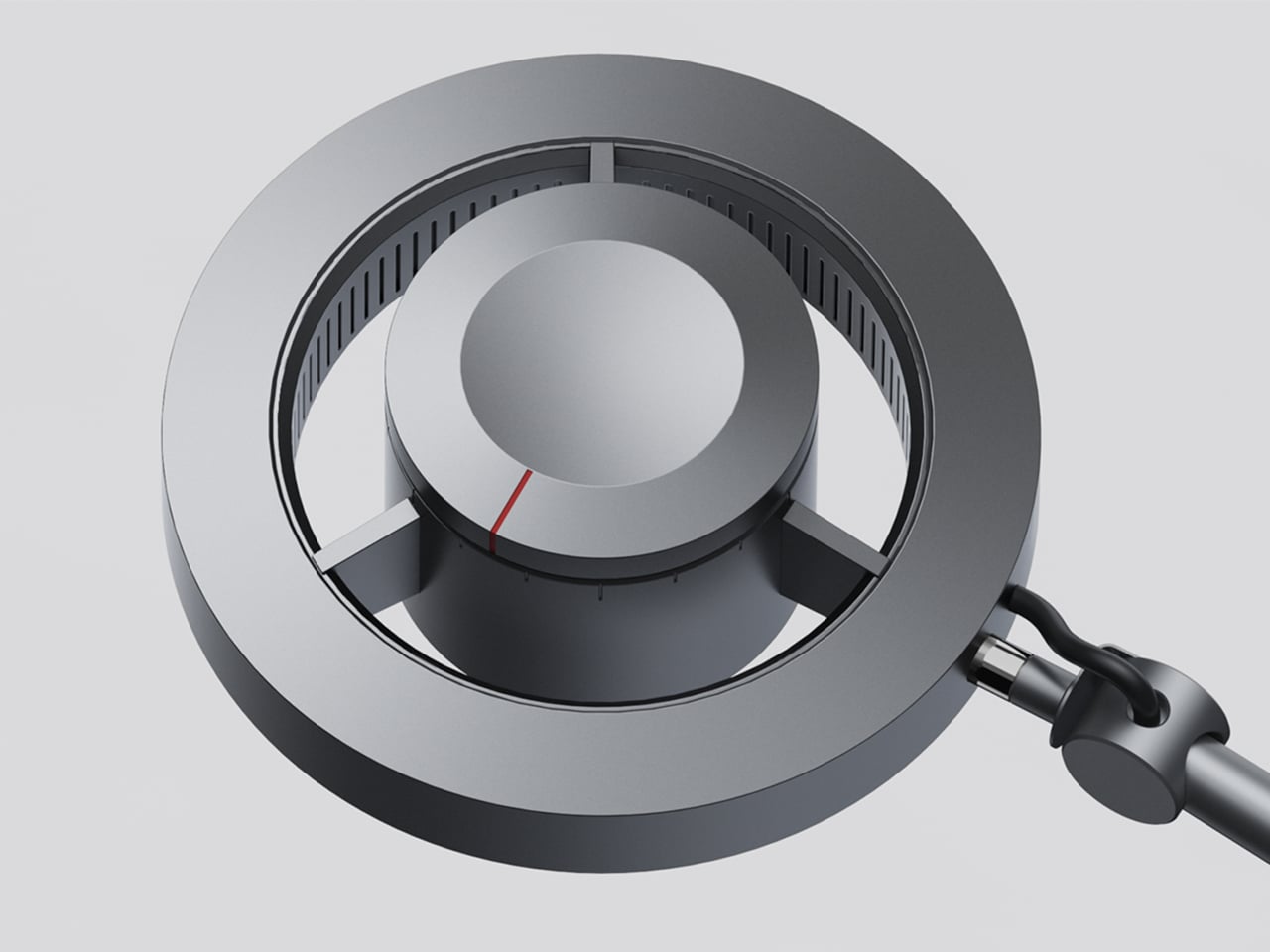
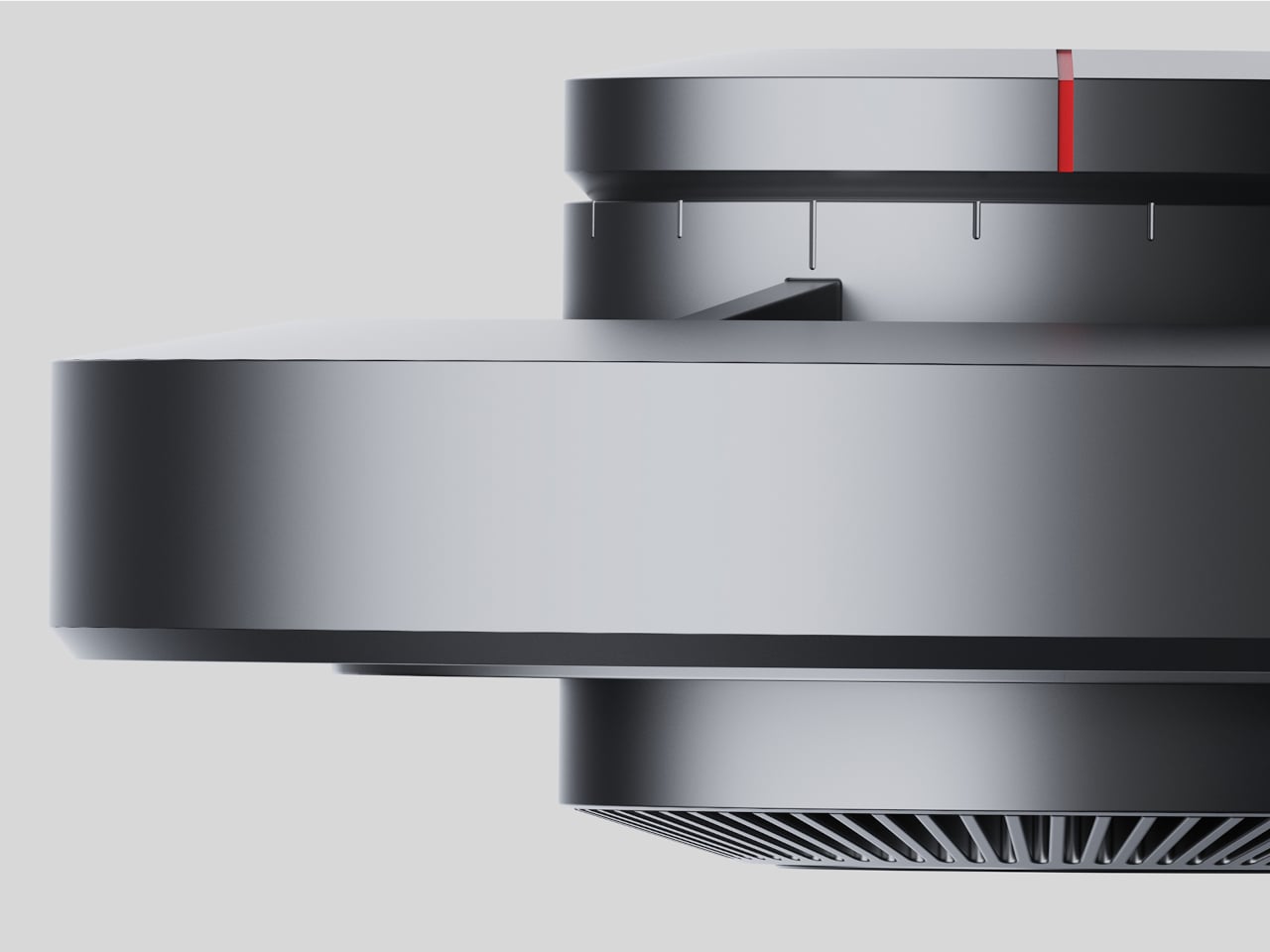
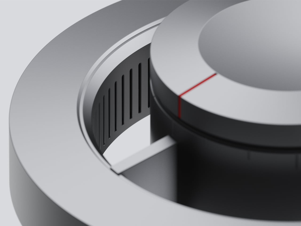
Control comes from a rotary knob on top, marked with a red indicator line. Rotating it 15 degrees activates focusing mode, sending a tight, concentrated beam straight down. At 30 degrees, the lamp shifts into diffusing mode, spreading the output into something closer to fill light. Push it to 60 degrees, and both sources run simultaneously, combining the central spot with the ambient ring for a layered workspace light.

For detailed hands-on tasks, being able to shift between modes without touching an app or dimmer panel makes a real difference. An illustrator tracing fine lines benefits from the precision of the focused beam, but that same beam creates harsh contrast against a dark surrounding surface. Bringing in the ambient ring softens that contrast, and having both running at once makes moving between close-up precision work and wider desk visibility much more seamless.

The same flexibility serves anyone who switches between different types of work at the same desk. Reading calls for something even and non-glare; marking up documents or working with small physical components benefits from a harder, more directed light. The Focus Light doesn’t ask the user to swap lamps or reposition the arm for each shift. The knob handles it, and the change is immediate.

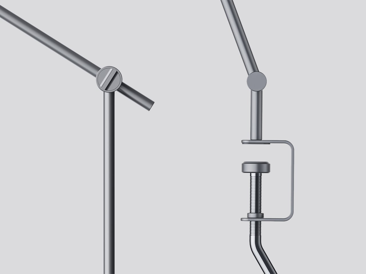
The physical form reflects the precision the lamp is meant to support. The lamp head is a clean disc with radiating heat fins arranged around the inner lens assembly, and the arm connects at a ball joint that allows repositioning without loosening a series of screws. A threaded desk clamp handles the mounting, so it doesn’t demand a grommet hole or take up surface area with a weighted base.

What stands out about the concept isn’t just the dual-source setup, but that a single physical control manages both. There’s no menu to scroll, no app to open. The red indicator on the knob tells you exactly where you are, and the three positions are distinct enough that you’d find your way back to any of them by feel after just a few days.

The post This Desk Lamp Puts a Spotlight in a Ring Light With One Knob first appeared on Yanko Design.
  •  

The Italian Lamp That Uses Toy Race Cars as Light Bulbs

Most lighting gets chosen the same way people pick curtains: functional, inoffensive, and quickly forgotten. You walk through a showroom, you point at something that won’t clash with the sofa, and that’s more or less the end of the design conversation. That’s not a criticism of how people live; it’s just an observation of how light, despite being the single most transformative element in any space, rarely gets to have fun.

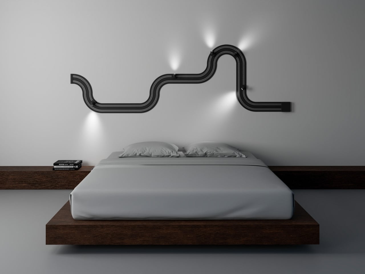
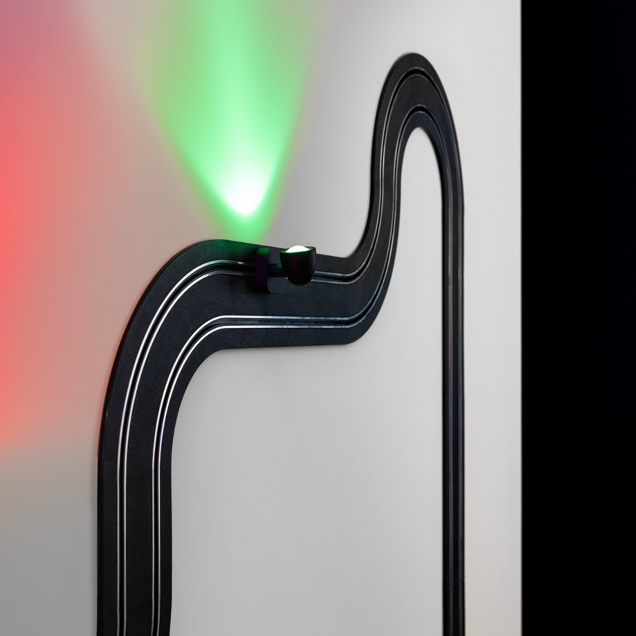
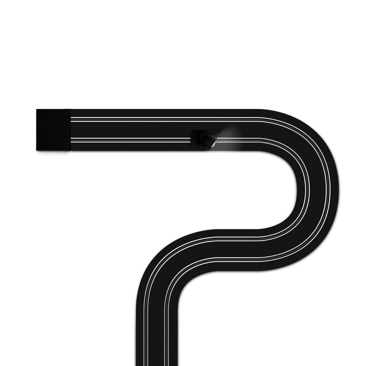
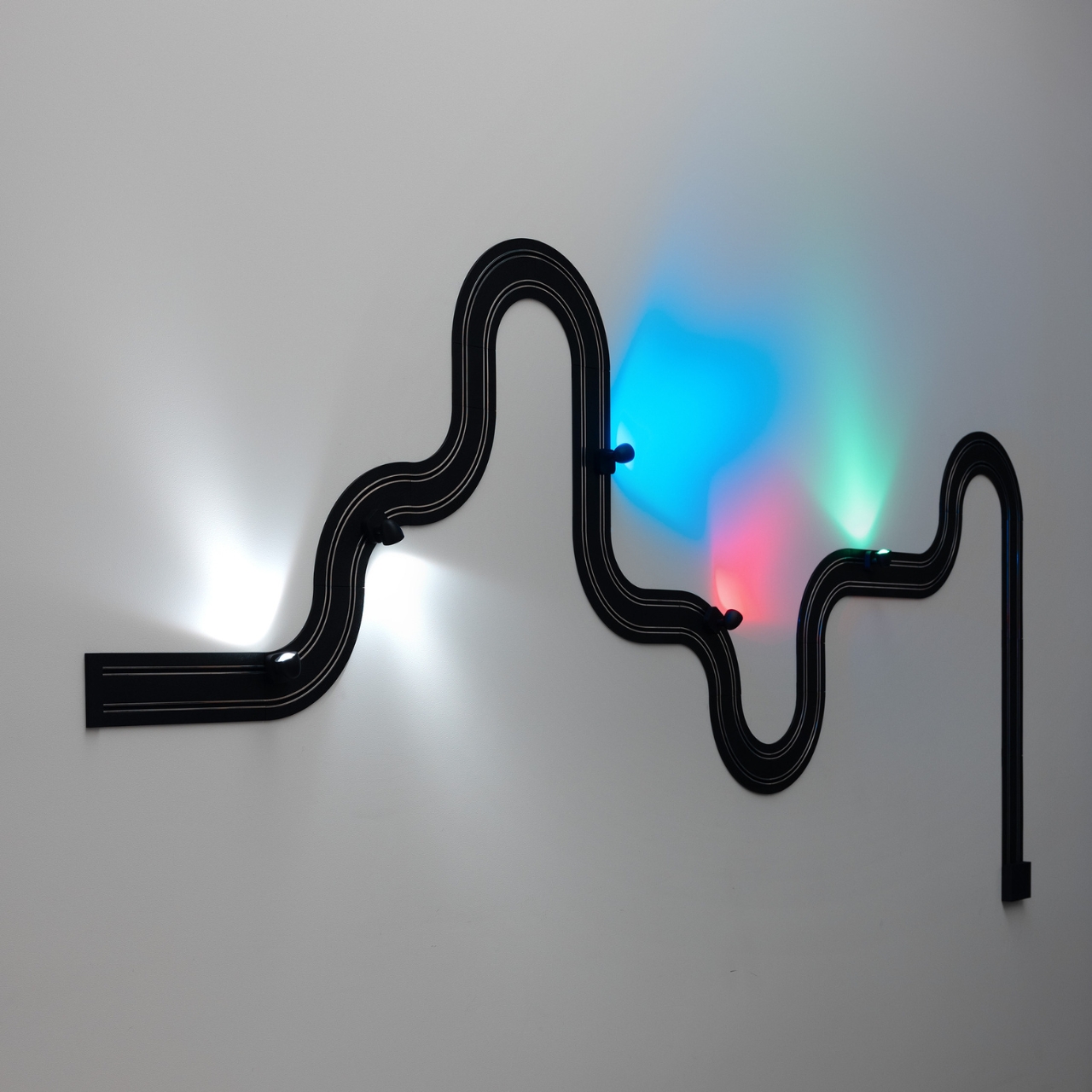
Davide Groppi’s Race of Lights is the exception to all of that. The Italian lighting brand, based in Piacenza and known for making some of the most quietly radical lamps in contemporary design, released Race of Lights in 2025. On paper, it is a modular wall lamp. In reality, it is a slot-car racing track that someone decided should also be your light source, and the whole thing somehow works beautifully.

Designer: Davide Groppi

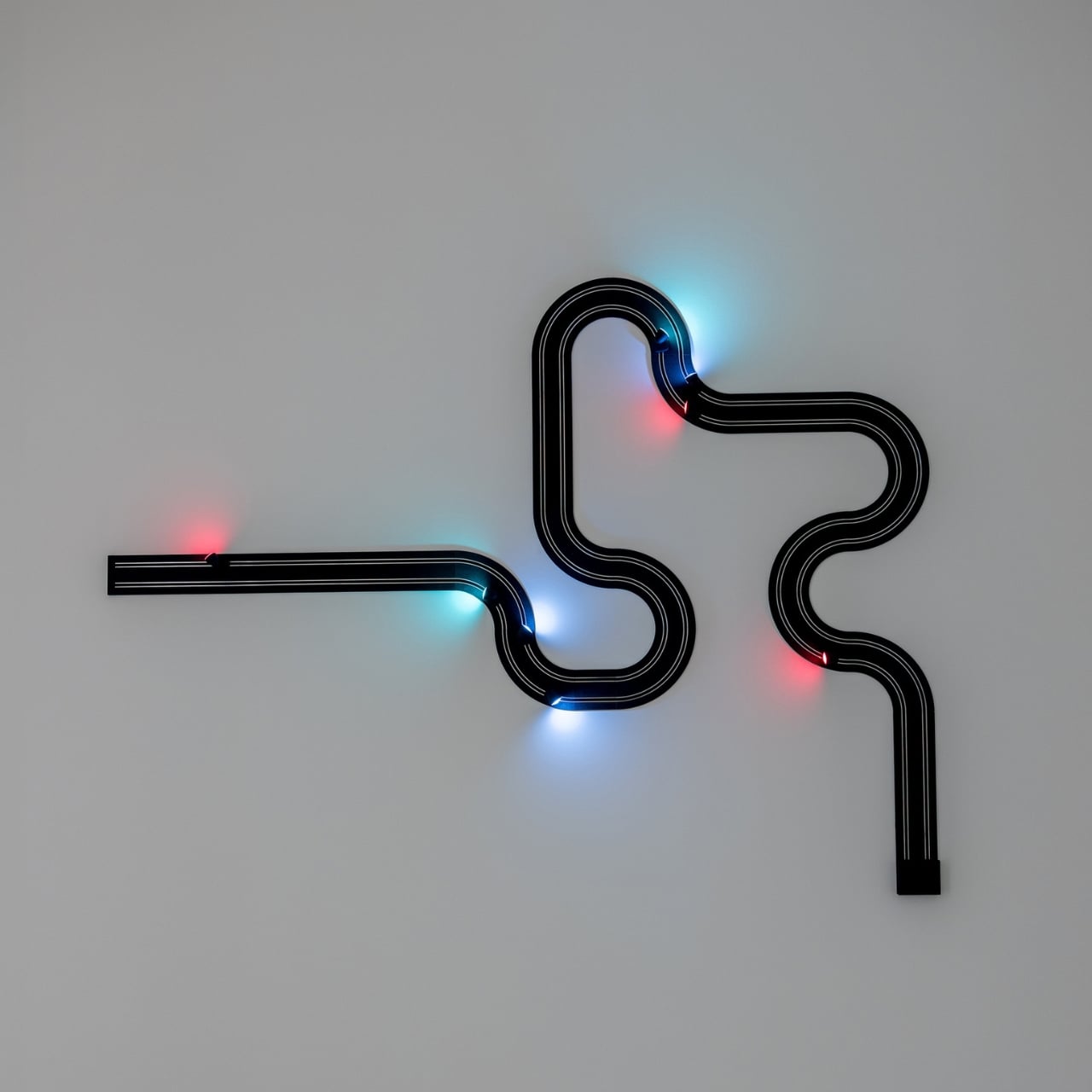
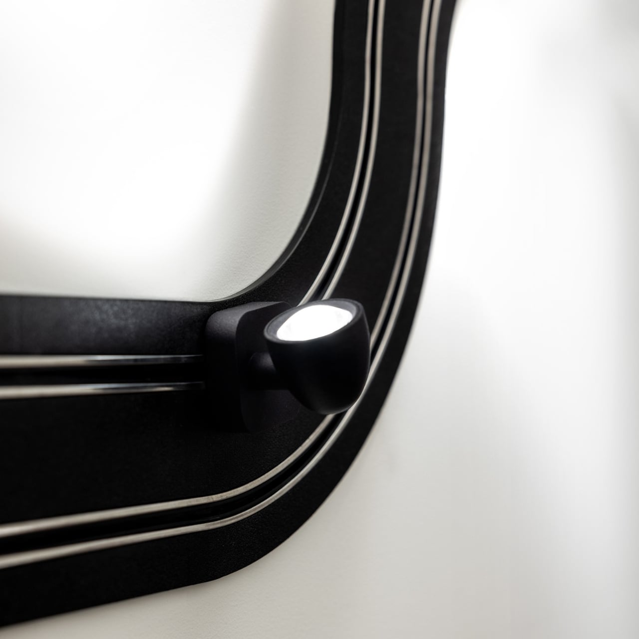
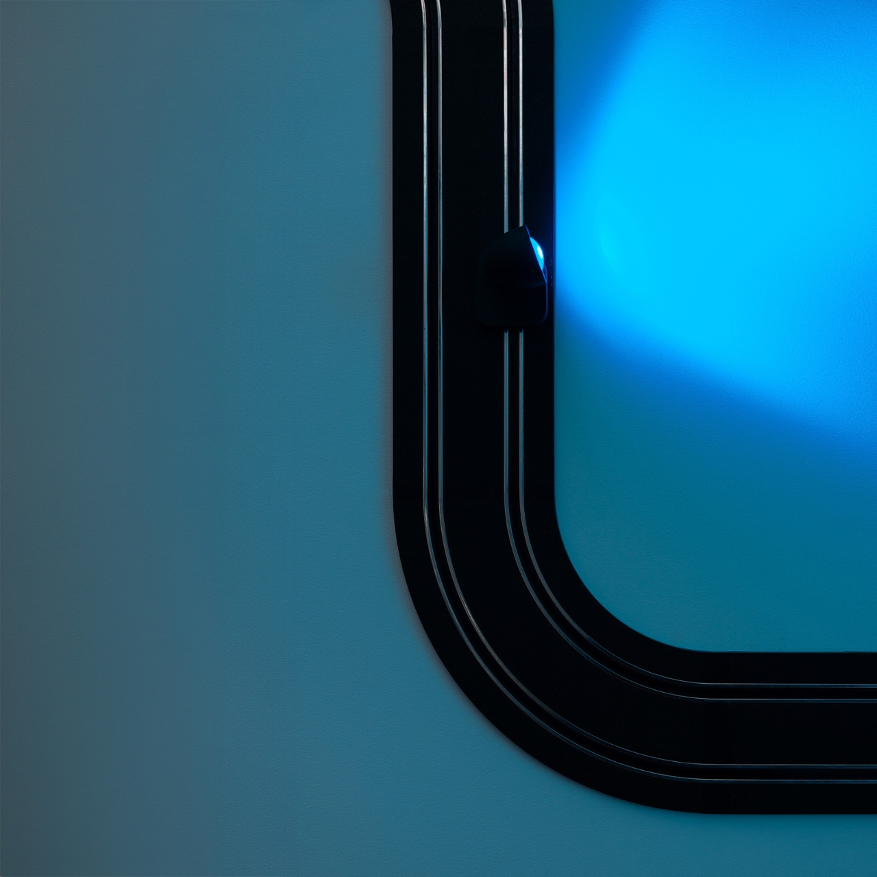
The concept is exactly what it sounds like. An electrified track, made from textured matte black polyethylene, gets mounted on the wall in whatever configuration you want. The track carries current, and the light sources are tiny car-shaped spotlights that snap into place magnetically and can be moved, repositioned, or rearranged any time the mood strikes. The basic kit includes two short straight modules, four longer sections, six curves, and four colored light-cars in green, white, blue, and red. The whole system can run up to five metres across your wall and power up to eight spotlights, each with an adjustable head so you can direct the beam exactly where you want it. This is, objectively, absurd. It is also one of the most genuinely exciting things to come out of the lighting world in years.

What makes Race of Lights so interesting to think about is how it sits within Davide Groppi’s broader body of work. This is a designer who built his reputation on doing less. His lamp Nulla, which won the Compasso d’Oro in 2014, measures just 18 millimetres in diameter and is practically invisible in a ceiling. The name literally translates to “nothing.” The philosophy has always been that the lamp should disappear so the light can remain. Race of Lights does not disappear. It sits on your wall, looped and curved, with little colored cars parked along the track. It makes a statement in the exact opposite direction of everything Groppi has been doing, and yet it makes complete sense.

Because the brand has never really been about minimalism for minimalism’s sake. The design language has always carried a sense of emotion. Groppi has spoken about light as a tool for seduction and curiosity, about design emerging from the heart as much as the mind. Race of Lights just takes that emotional dimension and makes it literal. The inspiration was childhood, specifically the memory of electric slot-car racing sets, the kind where small cars zip around a winding track spread across the living room floor. The track moves to the wall; the cars stay put and illuminate. Play becomes design, and the object retains the spirit of the original thing it was borrowing from.

The result is a piece that functions as a legitimate lighting solution and as a conversation starter and as something closer to a sculptural installation. You can compose it in a new shape whenever you want. That kind of flexibility tends to age well in a space, because you never quite exhaust the possibilities.

Cynics will say it is a gimmick. I understand the instinct, but I think that reading misses the point. Good design has always borrowed from play. The best chairs make sitting feel effortless. The best lamps make light feel intentional. Race of Lights makes light feel like something you chose with genuine enthusiasm rather than resigned practicality.

Lighting does not have to be a decision you make and then stop thinking about. Davide Groppi has spent decades proving that point in quietly different ways. Race of Lights is just the first time the argument came painted in red, white, blue, and green, with tiny cars attached.

The post The Italian Lamp That Uses Toy Race Cars as Light Bulbs first appeared on Yanko Design.
  •  
❌