❌

Vue lecture

Orbit Clock Concept Lets You Pick Up Its Hour and Minute Markers
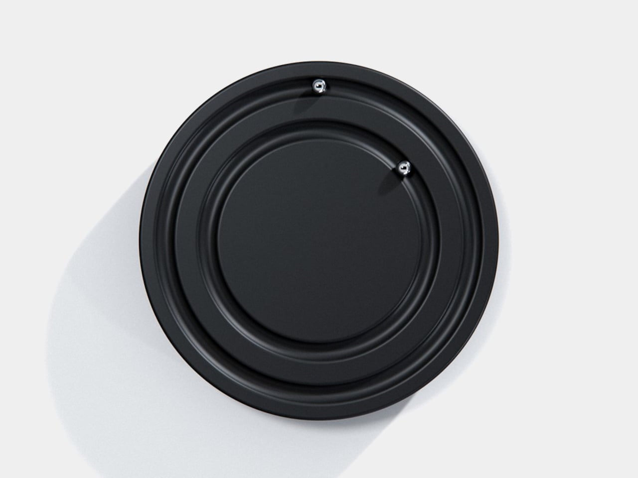
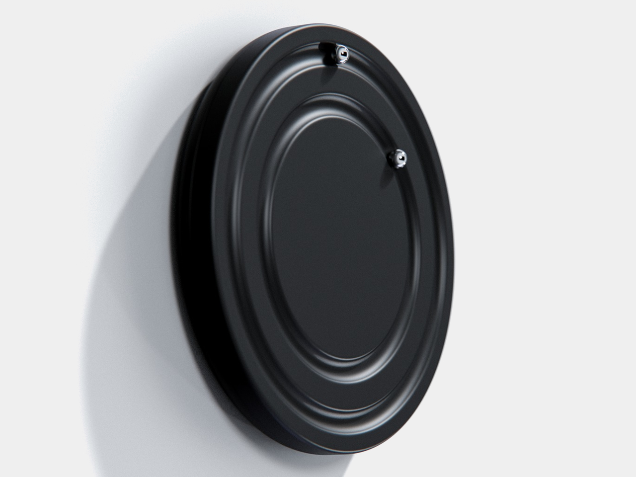
Clocks have become so familiar that we barely think about what their hands are doing. They point to positions around a circle, a habit that Orbit keeps while removing the hands themselves. This ultra-minimalist clock concept replaces them with two magnetically held metal spheres, giving time a physical presence you can reach and remove, instead of leaving it behind protective glass.

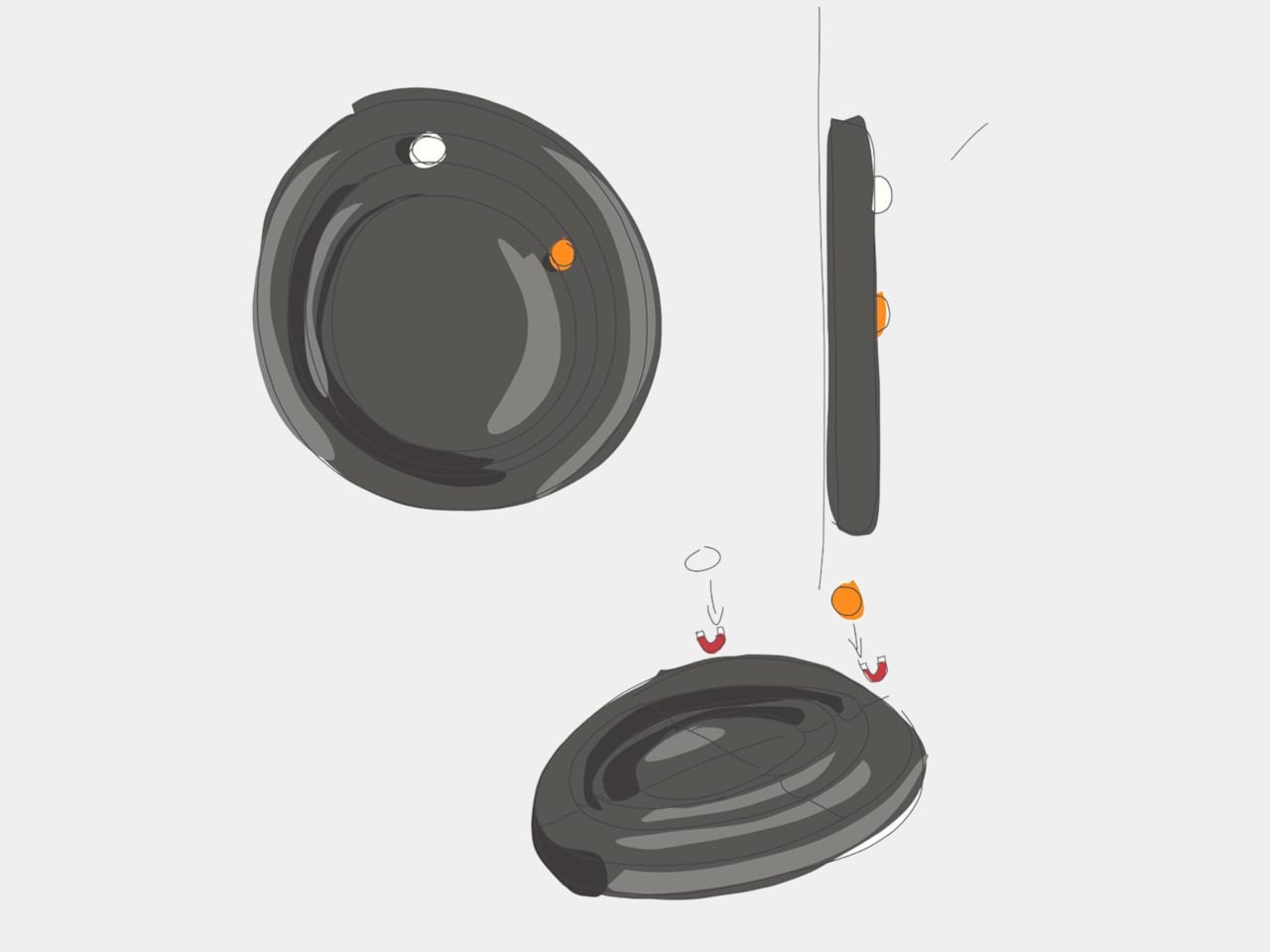
The face is a dark circular disk with two concentric recessed tracks, each carrying a polished sphere. There’s no cluster of numerals or central pin to interrupt the surface. Instead, the grooves give the small bearings separate paths, while their reflective finish contrasts with the darker background. The clock’s relief supplies the detail that printed markings would normally provide on a conventional dial.

Designer: Liam de la Bedoyere (boredeye.design)
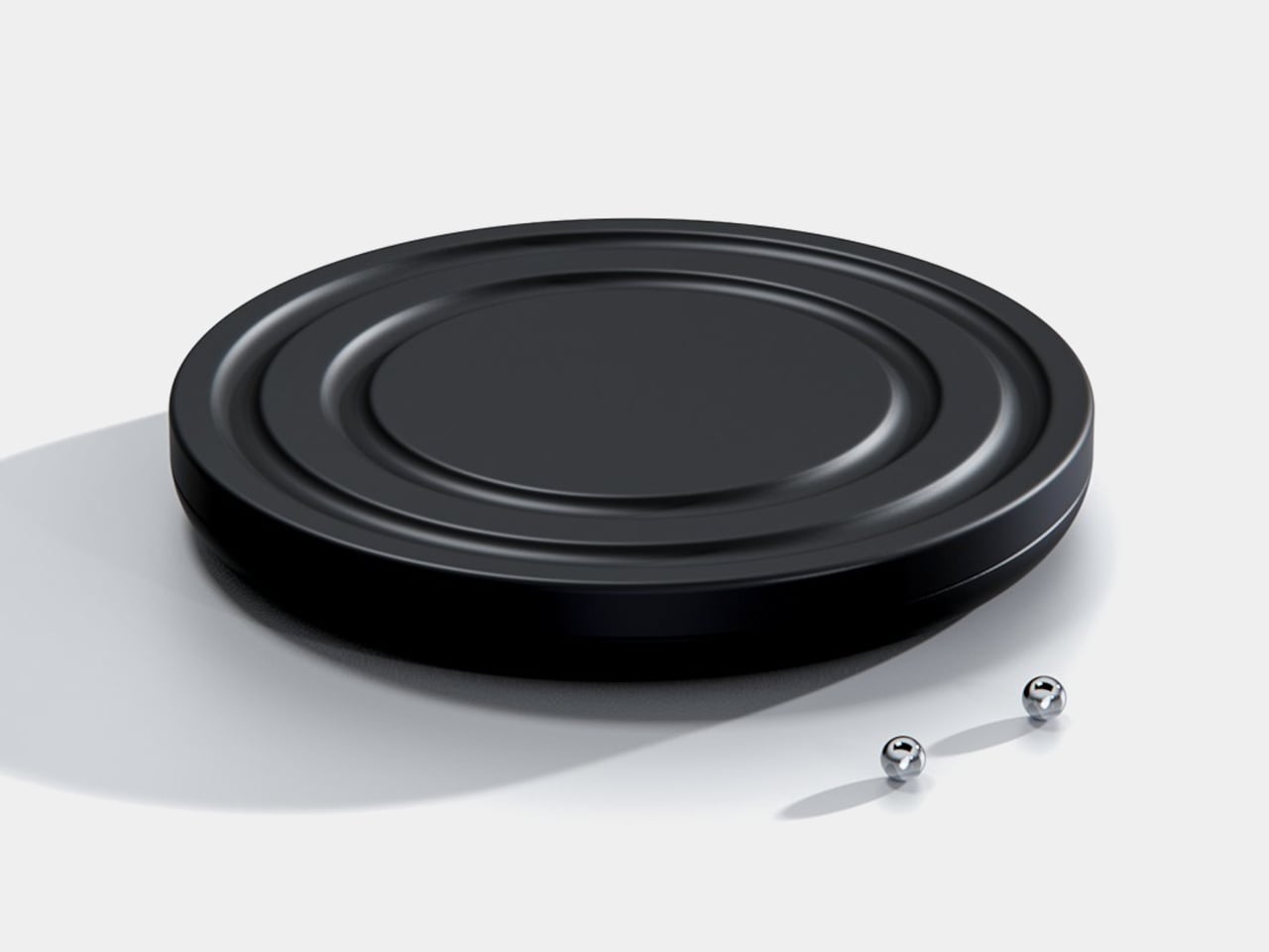
One sphere represents the hours and the other the minutes, preserving the basic logic of an analog clock. You still look for positions around the face, only without a pair of hands connecting those positions to the center. That makes the idea less unfamiliar than it initially sounds. Reading it doesn’t call for learning an entirely new code, although some adjustment seems inevitable.

Of course, removing all those markings comes with a compromise. Estimating the hour should be simpler than judging an exact minute on an unmarked circle. Orbit could suit a living room where a glance is enough to keep track of the afternoon. Checking how many minutes remain before catching a train might make you rather grateful for the numbers on your phone.
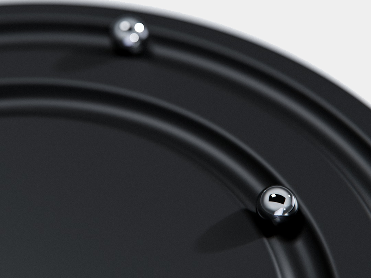
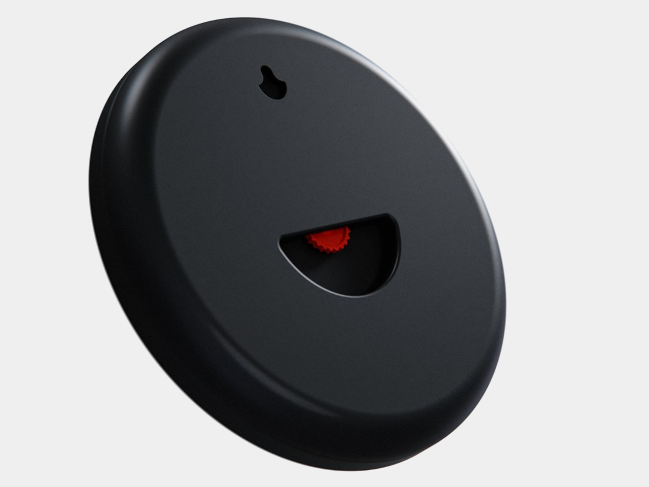
The more unusual part is that the spheres aren’t permanently trapped in their tracks. Magnetic attachment is intended to let you lift each one away and put it back, adding a tactile interaction to an object usually left alone. That’s a surprisingly playful detail for such a restrained design, especially when removing both markers would leave the clock with nothing to tell you.

There’s a sculptural quality to the body itself, with a rounded outer edge and circular channels that give the black surface depth. A rear keyhole slot provides for wall mounting, keeping that face upright without a separate stand. The name Orbit feels appropriate here, with two small spheres occupying rings around an empty center, rather than hands meeting at a shared pivot point.
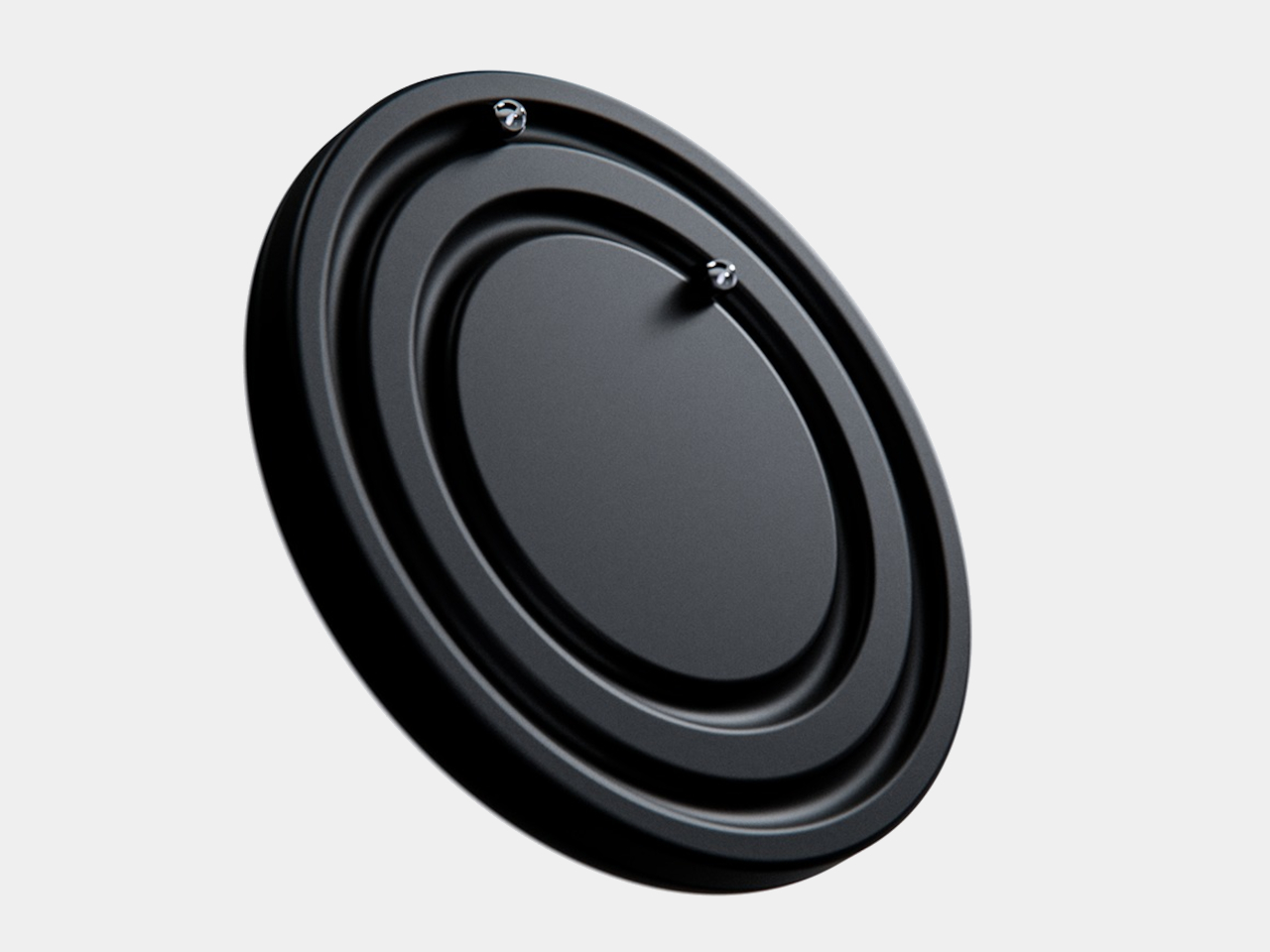
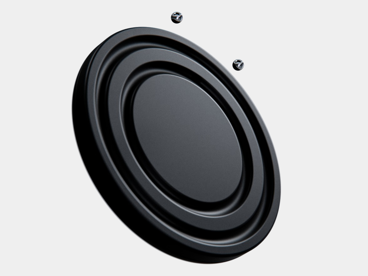
Orbit remains a concept, so there’s no established price or availability to weigh against those compromises. Its detachable markers do suggest a rather different relationship with a wall clock, though. Reach for the face and you’re handling the things that tell the time. Just make sure those little spheres don’t end up somewhere less useful, such as behind the living room sofa.

The post Orbit Clock Concept Lets You Pick Up Its Hour and Minute Markers first appeared on Yanko Design.
  •  

A Reading Light That Actually Clips to Your Hair, Not Your Book

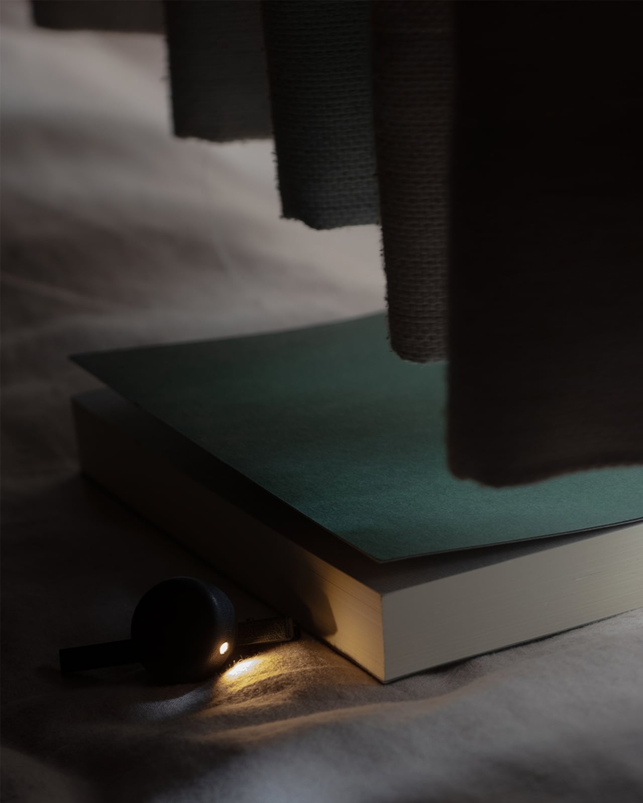
Any bookworm worth their salt has experienced reading a book under the covers with a flashlight after their parents said it was time for lights out. When we got older and no longer had to follow a bedtime, we switched to bedside lamps or clip-on reading lights. Those two options, however, come with their own set of problems. A bedside lamp isn’t always the most comfortable option, especially when you need to change positions while lying down. A clip-on light, meanwhile, adds extra weight to the book, and you may have to keep adjusting it as you read.

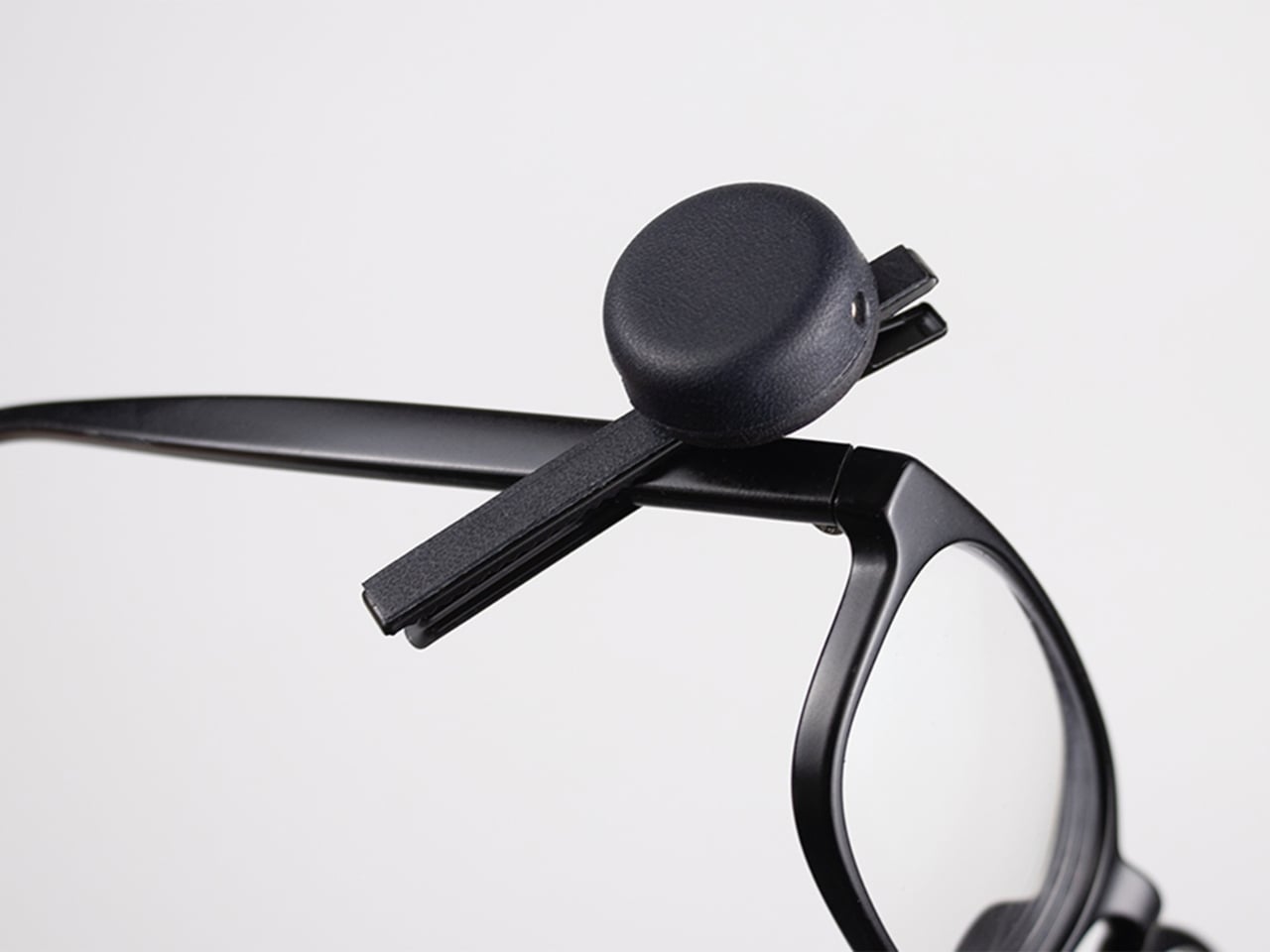
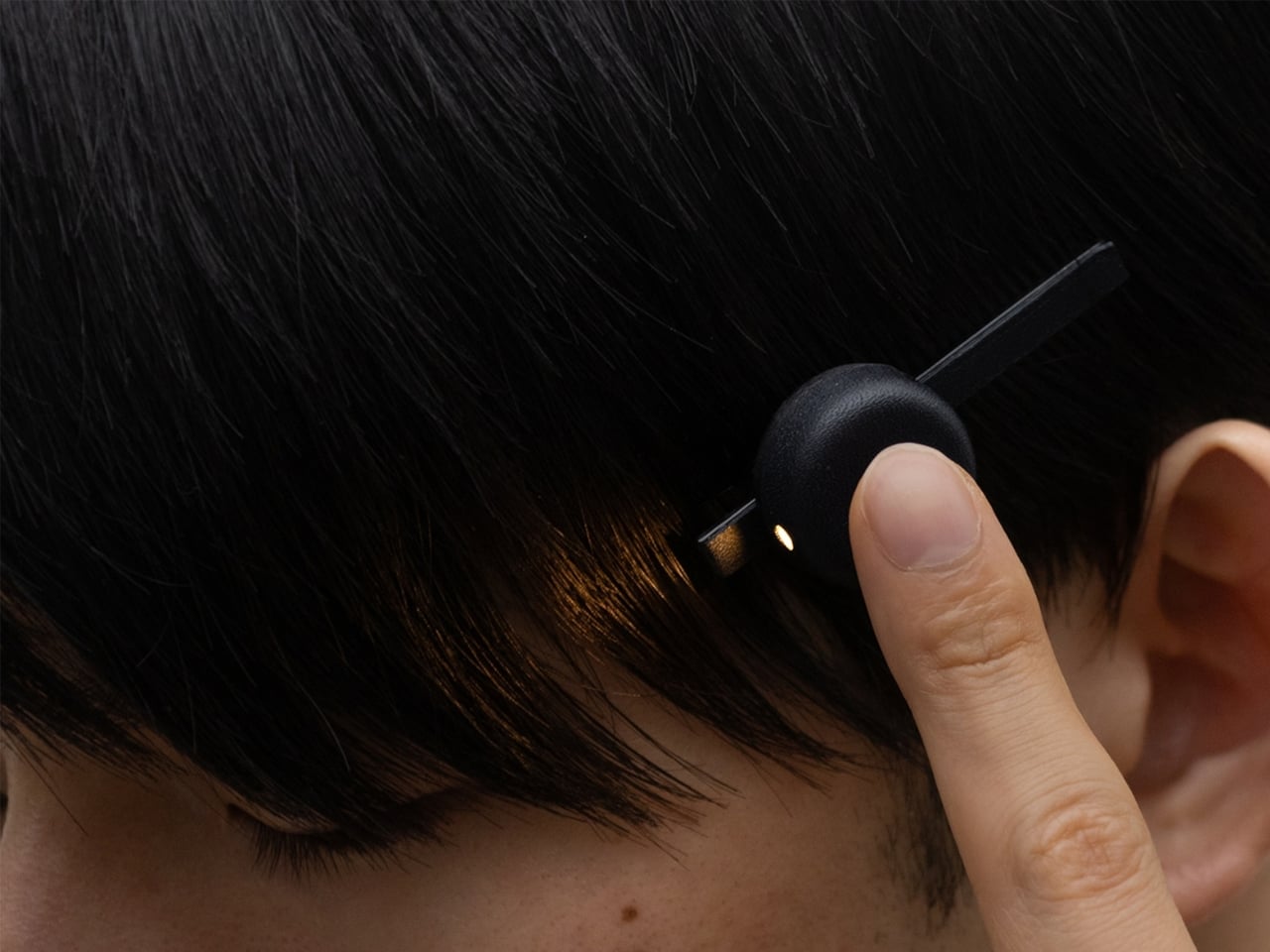
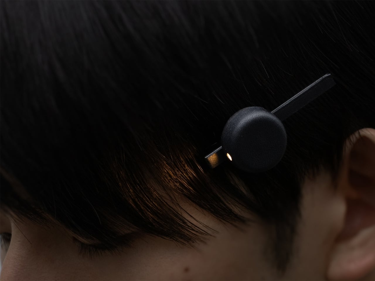
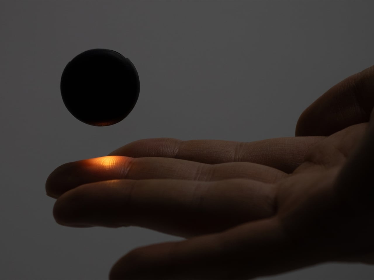
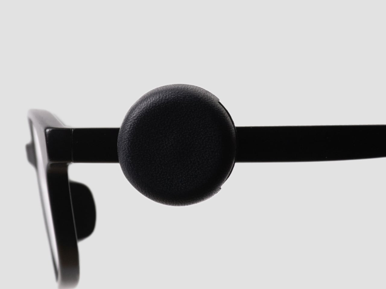
This is the problem that Ryo Matsuoka seeks to solve with the concept for the Wearable Reading Light. As the name implies, it’s a light that you actually wear, so it moves with you as you read while lying in bed. The small light attaches magnetically to a clip worn in your hair. It can also attach directly to eyeglass frames made of magnetic metal, though not to every pair of reading glasses. You can angle the light toward your book while reading with the room lights off before going to sleep.

Designer: Ryo Matsuoka

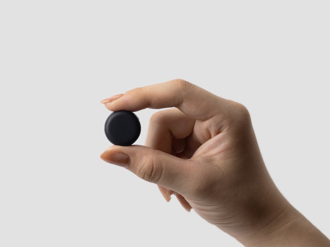
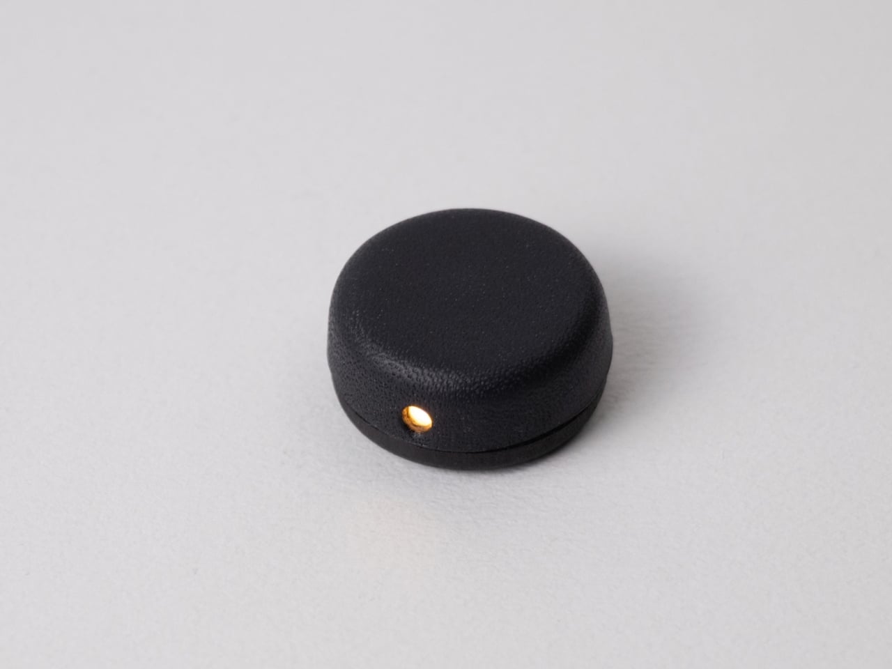
The light has a wet-formed leather exterior, with three-dimensional shaping that gives it a smooth, rounded form. It doesn’t really look like your typical reading light; it’s designed to look more like a small accessory. The light unit measures 24 × 24 × 12 mm (about 0.94 × 0.94 × 0.47 inches) and weighs only 4.5 g (about 0.16 ounces), so it adds very little weight to what you’re wearing. Its compact shape also keeps it from looking like a headlamp when it’s clipped into your hair.

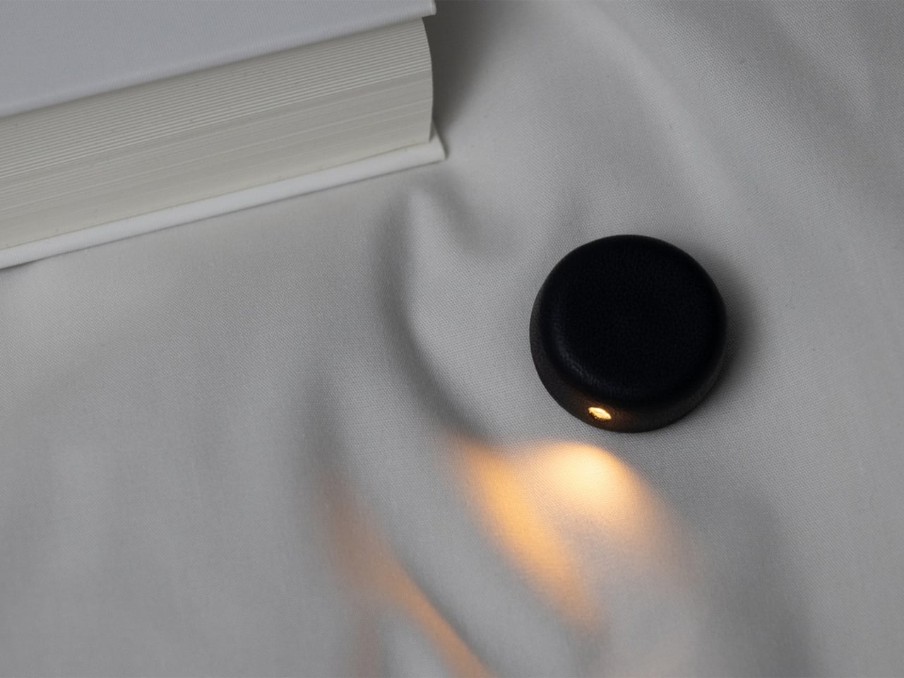
The indigo-dyed wood is another detail worth noticing. Together with the leather, it gives the device a more crafted appearance than you might expect from a small electronic gadget. Matsuoka has kept the technology out of sight beneath the leather, leaving the exterior clean and simple. In the photos, you mostly see a dark, rounded form and the small opening where the light shines through.

You can adjust the brightness across three levels, since the amount of light you want may depend on your surroundings or personal preference. There’s a hidden button to switch the light on, while a touch sensor controls the dimming. Those controls matter for something this small: you can make adjustments without adding a prominent switch to the design. The magnetic connection also lets you change the light’s angle, so you’re not stuck with one position if you shift around in bed.

It uses a replaceable coin battery, such as a CR1632, rather than a built-in rechargeable one. That means you won’t have to stop reading to charge it, provided you have a spare battery on hand. Matsuoka chose this approach with long-term use in mind: when the battery runs out, you can replace it instead of retiring the whole light because its rechargeable battery has degraded. The leather and wood were selected with that same idea in mind, as materials the designer expects to age well over time.

There’s also a dedicated storage case made from the same wet-formed leather and wood. It holds both the light and the clip, giving these tiny pieces a place to go when you’re done reading. That’s a practical touch for an object small enough to disappear among the things on a nightstand or at the bottom of a bag. It also makes the light feel like a complete design rather than just a clever attachment.

What makes the Wearable Reading Light interesting isn’t simply that it’s small. It’s that Matsuoka has moved the light away from the book altogether. You can hold a paperback without a clip tugging on its cover, and the light can stay with you when you change positions. For anyone who likes to end the day with a few pages in bed, that could make a familiar routine a little more comfortable. The concept doesn’t promise to replace every bedside lamp, but it offers an alternative for readers who have never quite found the right place to put one.

The post A Reading Light That Actually Clips to Your Hair, Not Your Book first appeared on Yanko Design.

  •  

Bloom Built a Cat Tower Around the Cat You Haven’t Got Yet

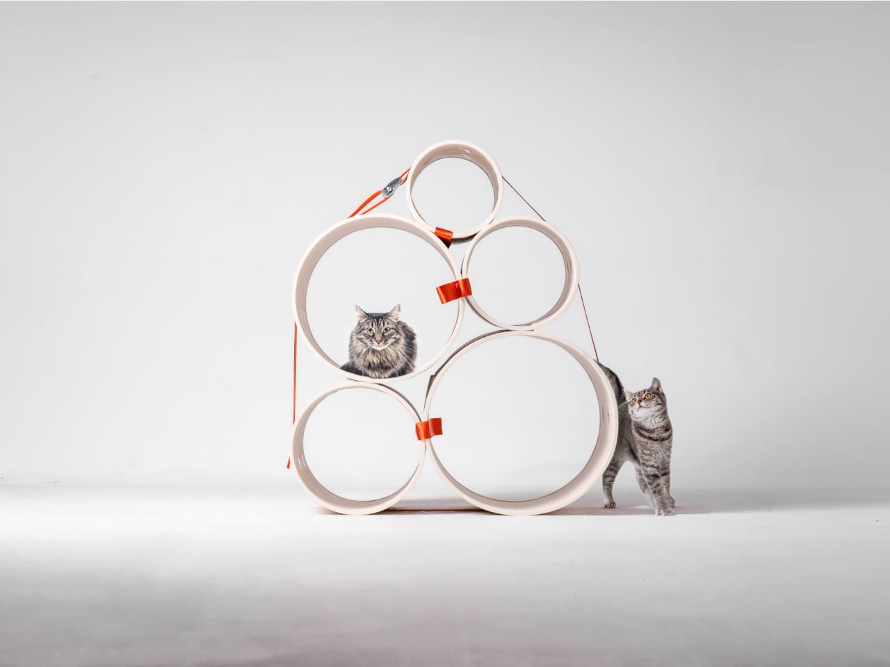
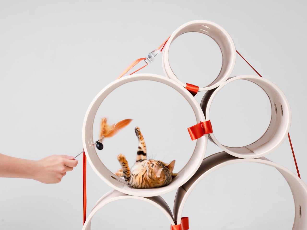
A kitten might be happy with a hideaway, but give it a few months and that same nook starts looking cramped. Add another cat, and a single perch becomes contested territory. Bloom takes that problem literally, building a cat tower from separate cylindrical modules that can be arranged as its occupants grow. It starts small instead of demanding space for a feline family.

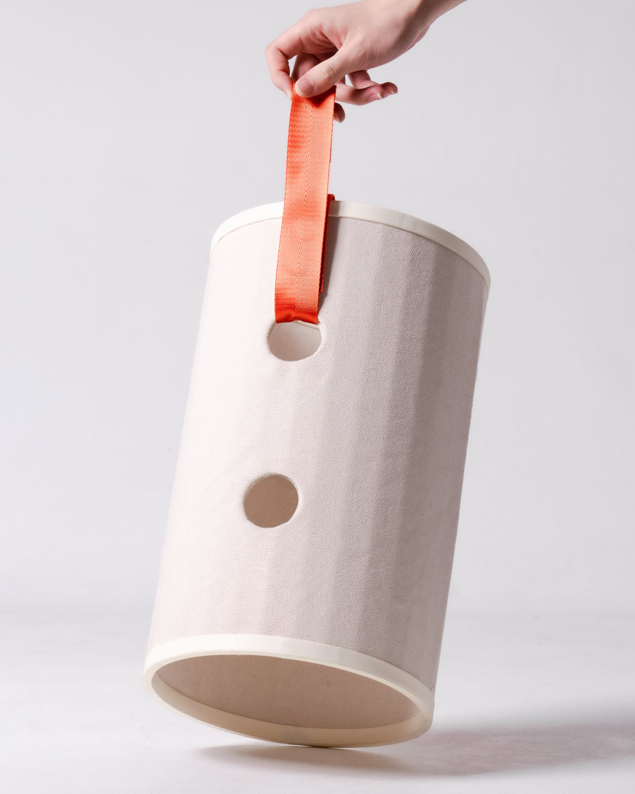
Most cat towers arrive as a collection of platforms, posts, and houses, whether your cat needs all of them or not. Their bulk can make a living room feel as if it has been furnished around the pet. Bloom swaps that predetermined silhouette for a cluster of open tubes, each one a place to curl up, climb through, or watch the room.

Designers: Joonseo Choi, Taewoon Kang

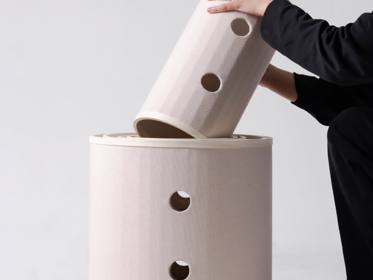
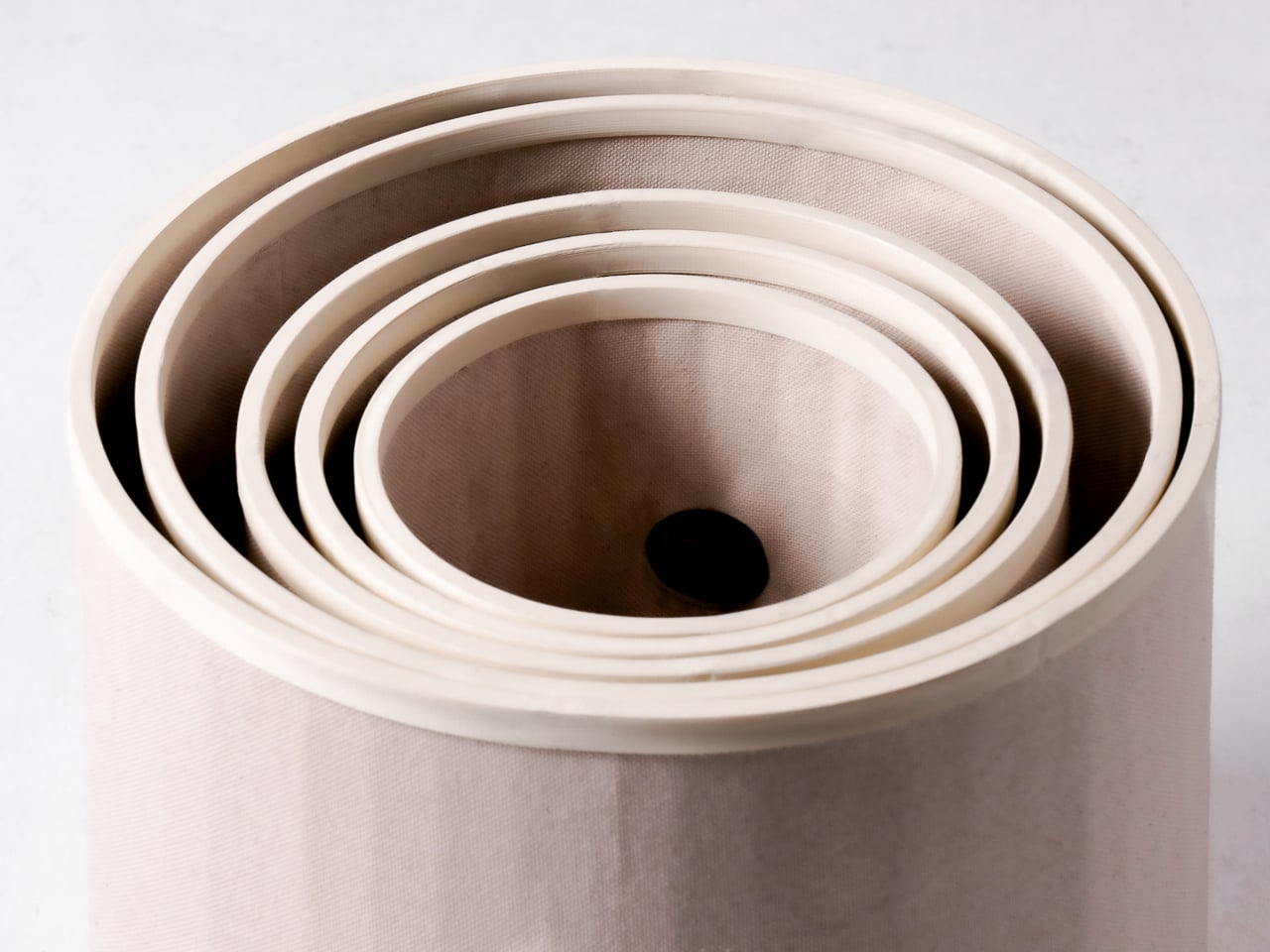
Those cylinders come in several diameters, so arranging them feels closer to stacking play objects than assembling pet furniture. A smaller cat can settle into a tighter opening, while a larger one has room to stretch out in a wider tube. The circles also give Bloom its character: soft, repeating forms that can take different shapes instead of committing your room to one tower.

Of course, loose tubes wouldn’t make much of a cat tower once the occupants started leaping about. Bloom uses orange straps to hold the modules together, with hook-and-loop fastening that makes them easier to attach and detach. The straps add a punch of color to the pale cylinders, but their important job is letting you change the arrangement without committing to a rebuild.

You might begin with two tubes near the sofa, then add another when your kitten starts climbing above everybody’s heads. If a second cat joins the household, a wider cluster could give each animal somewhere to pause without fighting over the same opening. The exact layout can follow the cats, rather than asking them to adapt to whatever configuration came in a box.

The holes along the sides serve another purpose beyond giving the straps somewhere to attach. Slide a toy toward one, and a cat tucked inside has something to investigate, while you get a way to join the game without reaching into the tube. It’s a detail, but it turns the enclosed space into somewhere for interaction rather than just another hiding place.

There are still questions a concept can’t answer. A tall arrangement would need to stay steady under a cat’s weight, especially if one launches itself at an upper opening. Bloom doesn’t specify load limits or explain how every possible configuration would be supported, so that flexibility shouldn’t be mistaken for unlimited stacking. For now, its flexibility remains an intriguing, unproven design proposition.

Still, Bloom understands something about cats that a fixed tower often misses: the creature you bring home won’t always be small, and it might not always be alone. Its tubes can be rearranged as that story changes, while its openings leave room for curiosity. The furniture doesn’t need to grow overnight; it can take shape alongside the animals that claim it.

The post Bloom Built a Cat Tower Around the Cat You Haven’t Got Yet first appeared on Yanko Design.

  •  

A Pocket Concept Built to Catch Design Ideas Before They Get Away

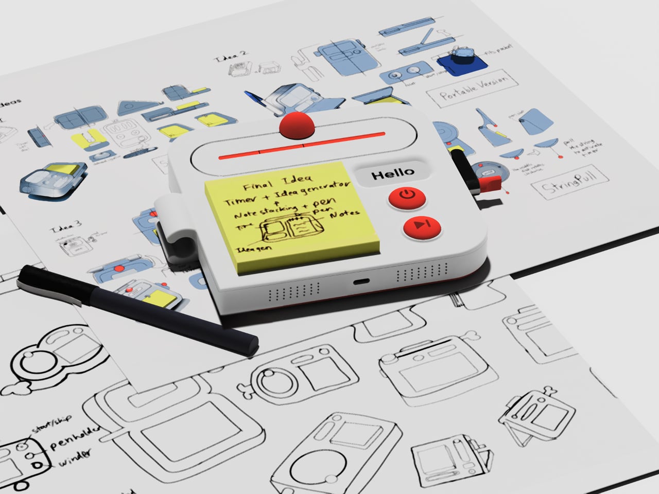
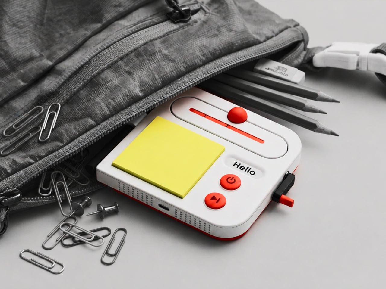
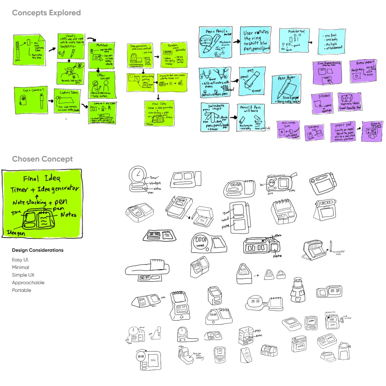
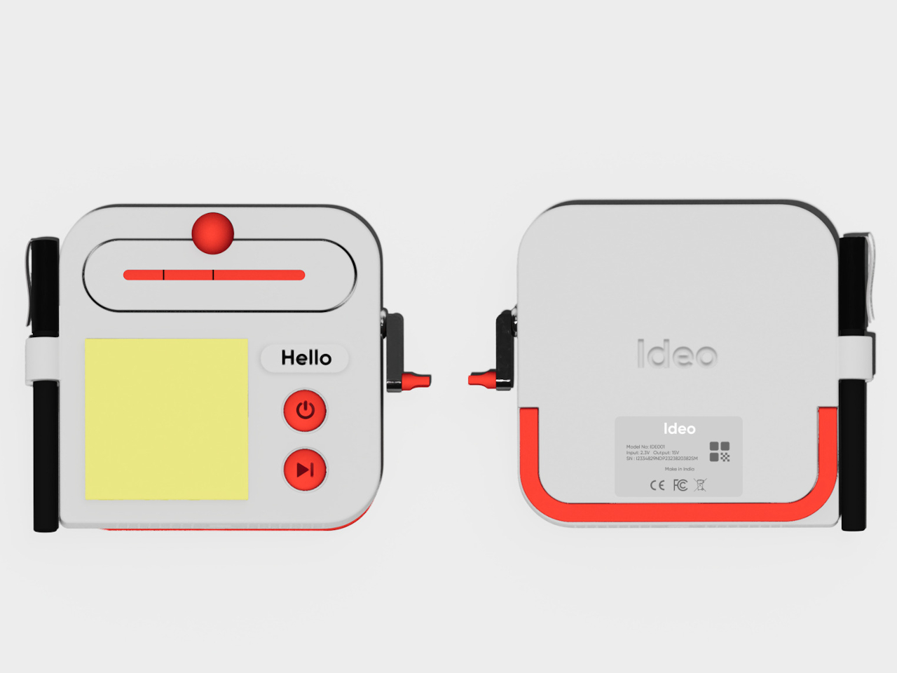
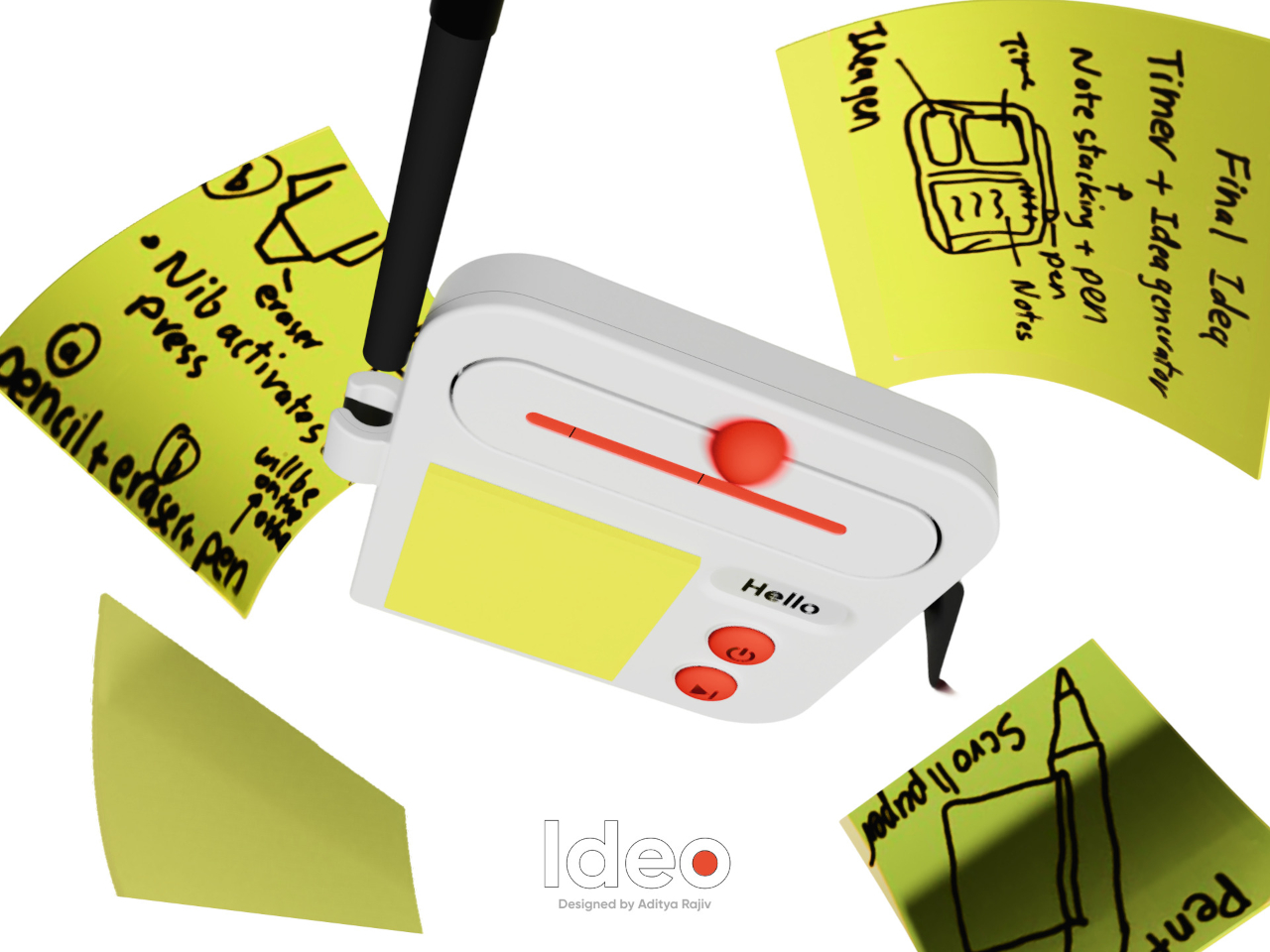
Good ideas don’t always wait until you’ve found the right pen and an empty page. For industrial designers, a quick sketch can turn into a note, then vanish while they’re looking for something to write on. Ideo is a pocket-sized concept that puts a sticky-note pad, a crank-set timer, and a random-word prompt in one place, giving those fleeting thoughts somewhere to land.

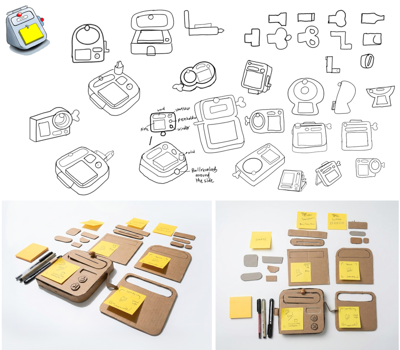
The trick isn’t to replace a sketchbook or ask a computer to finish your thinking. It’s to keep the small tools for getting started within reach. A pen clips to one side of the rounded body, while a stack of sticky notes takes up much of the front. You can jot down a shape, a measurement, or a question before it slips away.

Designer: Aditya Rajiv

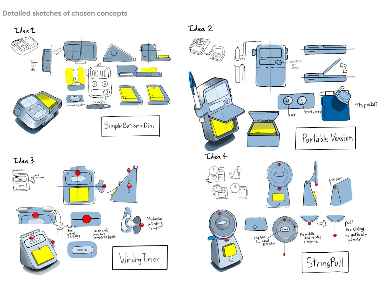
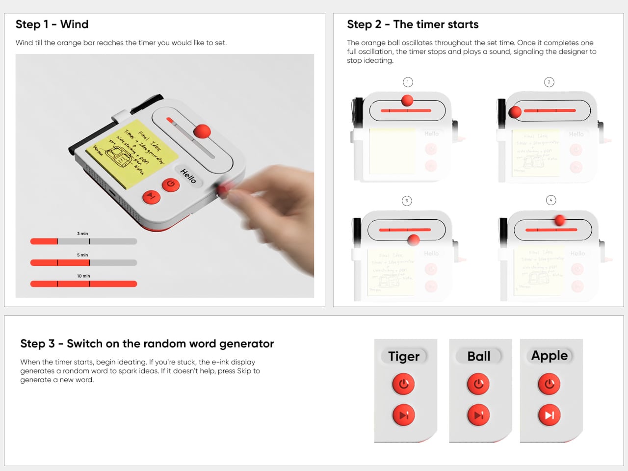
Then there’s the timer, which makes the device a little stranger than an ordinary stationery holder. Turn the crank on the side until the orange bar reaches your chosen duration, and a bright ball moves along the track as time passes. When its cycle finishes, the concept calls for a sound. That gives a short sketching session a visible beginning and end.

A blank note can be surprisingly intimidating when someone asks you for three different directions before lunch. Ideo responds with an e-ink display that presents a random word, such as “tiger” or “apple,” to nudge your thoughts somewhere unexpected. If the word doesn’t help, a physical button skips to another. This isn’t some AI that tries to take over your thinking process but, rather, a nudge to keep your pen moving.

During a workshop, you might have a few minutes to sketch a handle before the group moves on to another idea. The timer keeps that deadline obvious, while the note stays attached to the device until you’re ready to place it beside other sketches. Having the prompt nearby could help when your first drawing feels too much like the one you made yesterday.

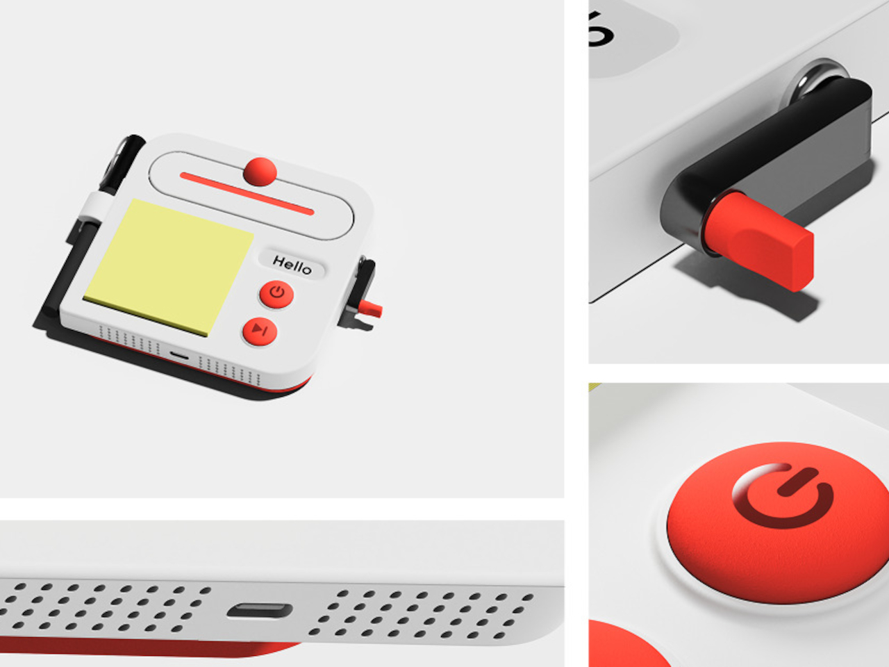
There’s a playful contrast between the quiet white housing and its red controls, with the yellow notes taking up nearly half the front. The broad knob and two large buttons look approachable rather than like the controls on a complicated drawing tablet. It almost looks like a child’s toy, which is the perfect idiom for playful and unhindered ideation.

The concept understands a small but familiar delay: the moment between having an idea and finding a place for it. A notepad and pen handle that first step, while the timer and word generator give you a reason to start drawing instead of staring at a blank sheet. Ideo is still a concept, of course, but the scramble for a pen makes its arrangement seem practical.

The post A Pocket Concept Built to Catch Design Ideas Before They Get Away first appeared on Yanko Design.

  •  

Google’s Fix for One-Handed Typing Is a Rolling Belt of Letters

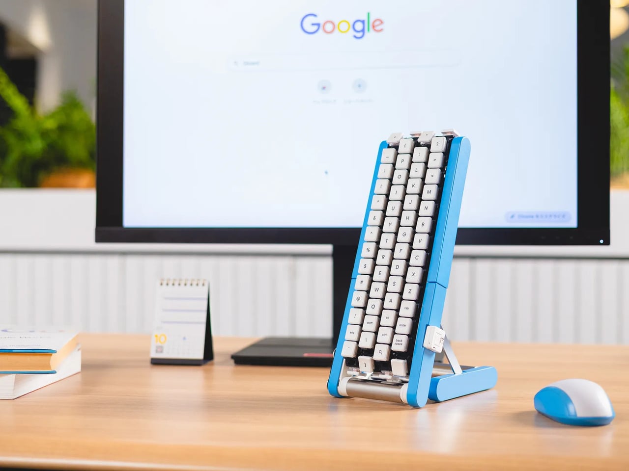
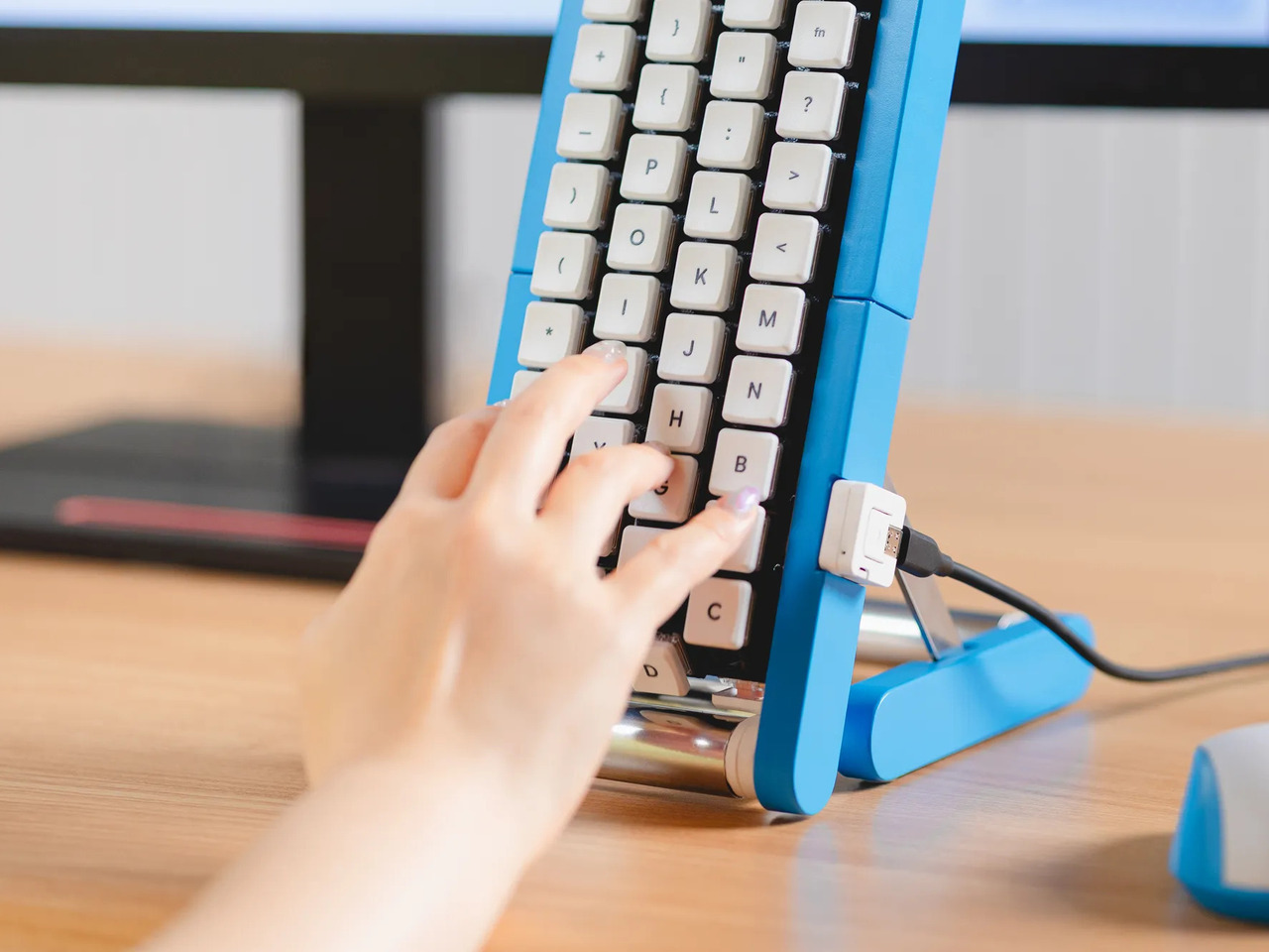
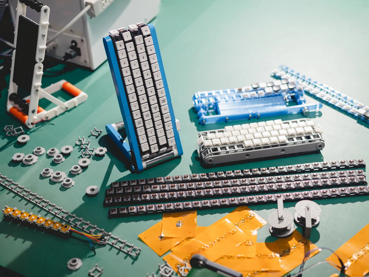
Typing with one hand usually means stretching a finger across a keyboard while the other hand holds a drink or works a mouse. Google’s Gboard team has a wonderfully impractical fix: put the keys on a conveyor belt and let them come to you. Its Rotating Keyboard stands upright on a desk, asking your finger to stay put while the letters keep moving.

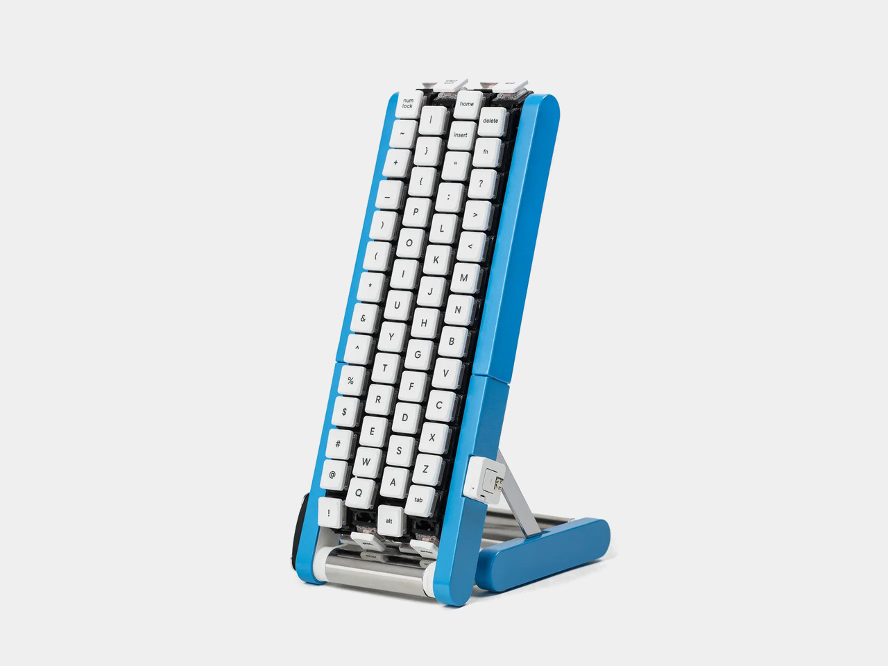
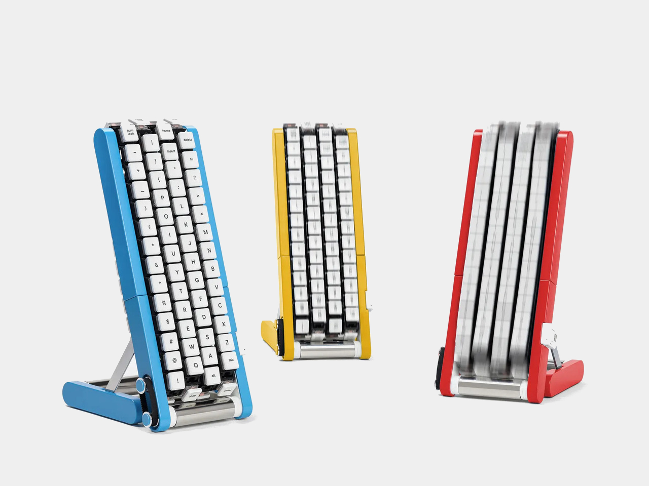
Regular keyboards assume your hands will travel between stationary keys, a reasonable arrangement that has survived decades of typing. Google reverses that relationship by mounting rows of keycaps on loops that travel around rollers. The tall blue frame and angled stand make the moving assembly feel closer to a miniature factory machine than a computer peripheral, which is probably part of the joke.

Designer: Google Japan

Instead of looking down for a letter, you watch for the right key to arrive and press it as it passes. Google says each belt carries 29 keys and can input both uppercase and lowercase letters. That might let one hand stay near the same spot, though it also turns typing into a timing exercise, especially when the next letter takes its time coming around.

Imagine answering an email with a cup of tea in your free hand. On a conventional keyboard, you’d either put the cup down or hunt for letters one finger at a time. Here, the moving keys do the traveling while you wait at the front of the machine. Google also suggests using your free hand on a mouse, which sounds suspiciously like extra work.

There’s an oddly earnest design lesson underneath the silliness. Questions about ergonomics often begin with who a familiar object was made for, and Google has taken that thought to a ridiculous extreme. The upright arrangement might use less horizontal desk space than a full keyboard, but it trades that footprint for height, moving parts, and the need to watch every passing key.

Google plays along with its own premise, floating ideas for faster movement, longer belts with more characters, shorter versions for phones, and different colors. None of those variations is a promised product. Even the keyboard itself isn’t headed for stores; the team has released open-source plans for a similar device instead. That keeps the joke open to anyone curious enough to build one.

The date is part of the gag, too. Google chose October 1 as a nod to the familiar 101-key keyboard, rather than waiting for April Fools’ Day. It’s the team’s 15th keyboard proposal, continuing a habit of treating ordinary typing as a problem that needs an absurdly elaborate solution. A conveyor belt is hardly the first thing most people would try.

You’re unlikely to write a novel by chasing letters around this contraption, and that isn’t really the point. Google has built a physical answer to a question no keyboard maker was asking: what if the keys did all the moving? It’s a ridiculous way to type an email, but an effective way to notice how much we expect our fingers to do.

The post Google’s Fix for One-Handed Typing Is a Rolling Belt of Letters first appeared on Yanko Design.
  •  

A Folding Tiny Home That Refuses to Feel Like Camping

Camping has always come with a quiet trade-off. You get the freedom of being anywhere, but you give up the comfort of being somewhere. Tents leak, campers feel cramped, and cabins can’t move with you when the season changes. Atelier Lune, a US-based design studio, just built something that refuses to make you choose.

It’s called Camping House. The idea is simple to say and genuinely hard to execute: a home that tows behind a standard SUV, unfolds like a tent within a couple of hours, and then behaves like real architecture once it’s standing. Architect Na Shen, who previously worked at Gensler and Zaha Hadid Architects before starting her own studio, designed the whole structure around that tension between mobility and permanence, and you can feel that intention in every decision she made.

Designer: Atelier Lune

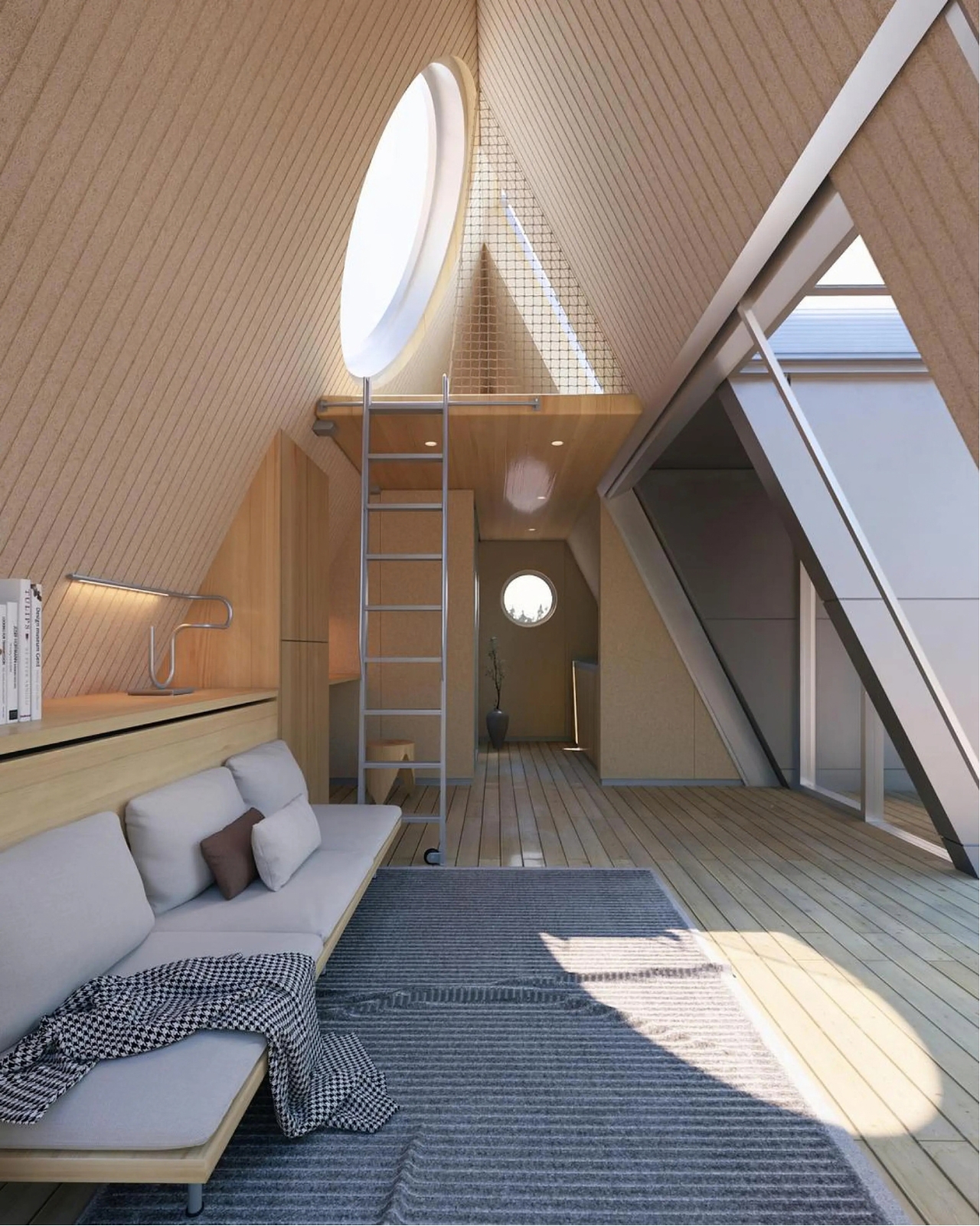
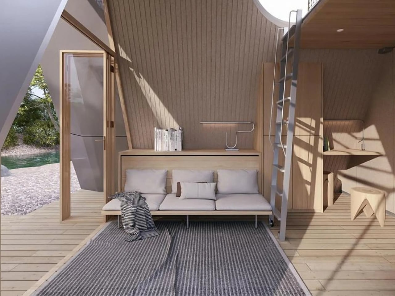
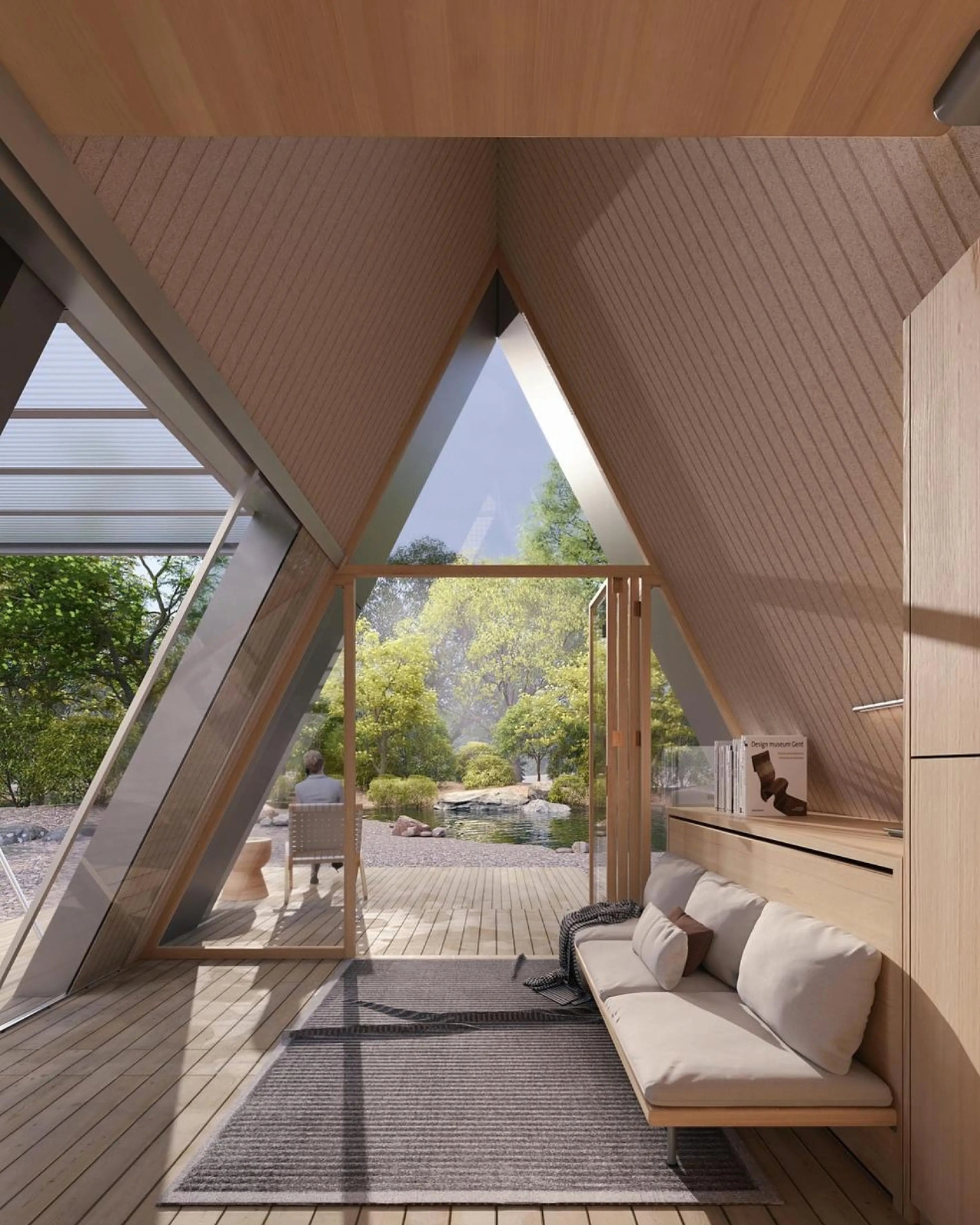
That last part is the actual innovation. Plenty of tiny homes are mobile, but most of them stay rigid once you get them there, basically a smaller box on wheels. Camping House does something different. The structure is a folding shell that fans open on-site into a steep A-frame, then locks into place with weather-sealed joints and insulated panels built to hold up through an actual winter. The A-frame isn’t just an aesthetic choice either. It’s structurally efficient, sheds rain and snow naturally, and creates a dramatic interior volume that reads much larger than the footprint suggests.

The system is built around three modules the studio calls Ports. The Residential Port handles living and sleeping, with furniture that flips from day mode to night mode in seconds. The Utility Port carries a real kitchen and a real bathroom, not a camper-van compromise version of either. The Extended Port clips on when you need a workspace, storage, or room for guests. You arrive, stabilize the base, release the hinges, and the shell swings open into a two-level interior that looks nothing like what fit on the trailer an hour earlier. The joinery and panel system that makes this possible is where most of the real design work lives, hidden in the hinges and seals rather than announced by the exterior.

What makes this feel like it’s arriving at the right moment is who it’s actually for. Remote work untethered a lot of people from a single address, and the appetite for spending real time outdoors, not just weekend camping but seasonal living, has grown alongside it. Camping House is designed with that shift in mind: off-grid solar integration, rainwater harvesting, passive cross-ventilation through a solar chimney, and no permanent foundation required. It leaves the ground beneath it essentially undisturbed, which matters if you’re setting up somewhere ecologically sensitive, or if you just don’t want to explain a poured foundation to a national forest.

There’s a practical honesty to designing for departure instead of designing for permanence. Most residential architecture asks how a building holds its ground. Camping House asks how a building lets go of it. Multiple units can even couple together into small clusters, which opens the door to uses beyond personal travel: disaster relief housing, temporary shelter during regional housing shortages, or small eco-tourism outposts that can be struck at the end of a season without leaving scars.

None of this is on the market yet. It’s a concept, and concepts have a habit of staying concepts. But two people can reportedly assemble it in under two hours, which is a modest ask for what you get in return: a structure with actual dignity, not a glorified pop-up tent with delusions of permanence.

The bigger idea Camping House is testing is whether shelter has to pick a lane between temporary and permanent. For a long time, those felt like separate categories with separate architecture. This project treats them as two settings on the same machine. Whether or not this exact version reaches driveways, the question it’s asking, why should mobility mean sacrificing comfort, feels like one more designers are going to keep chasing.

The post A Folding Tiny Home That Refuses to Feel Like Camping first appeared on Yanko Design.
  •  

A Fan Imagined Nokia’s Comeback With One Feature Worth Stealing

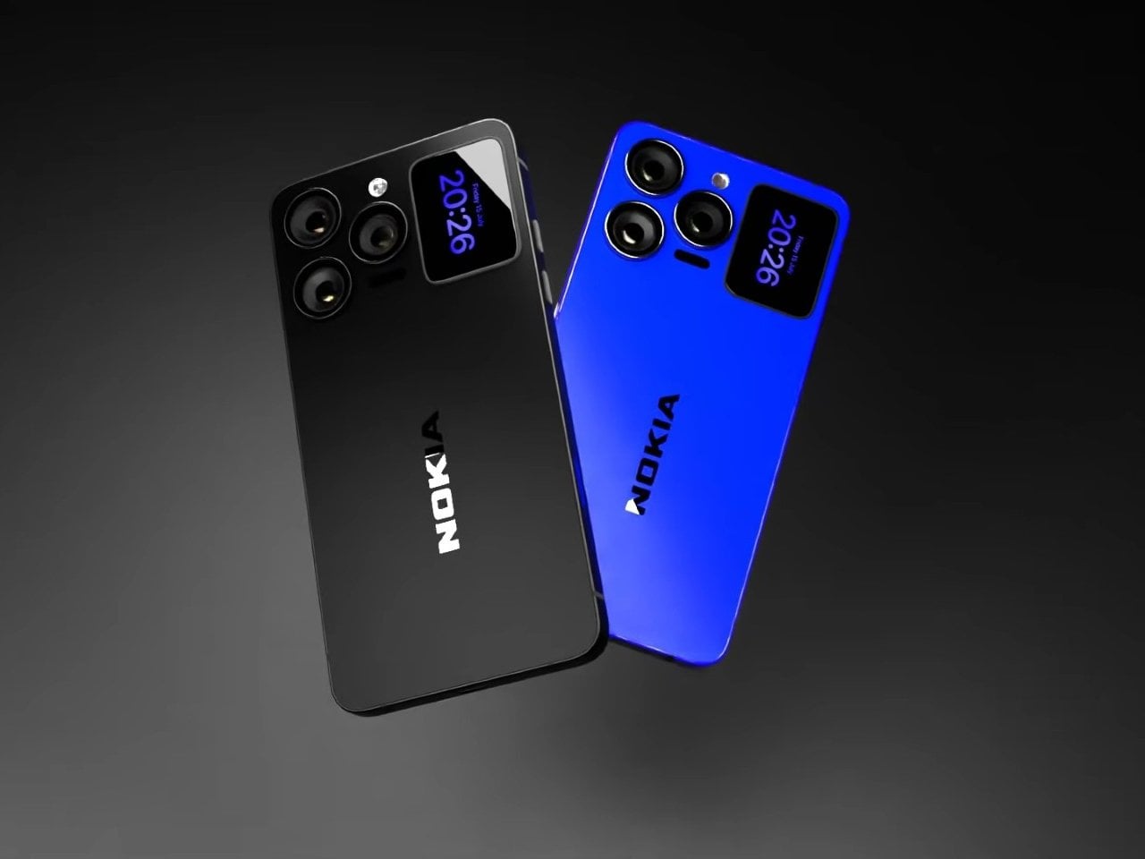
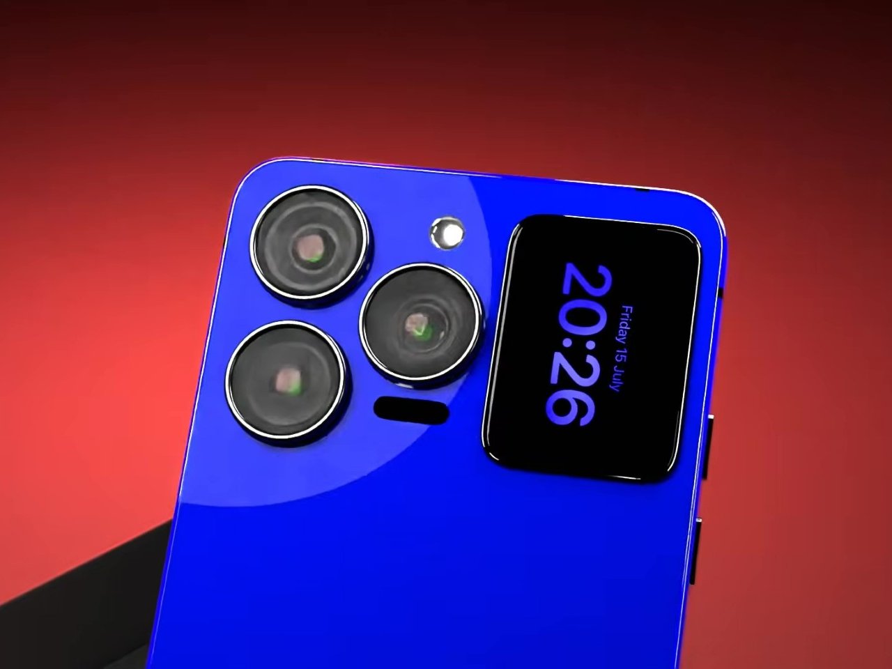
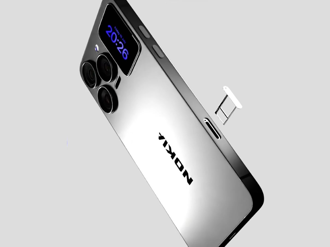
Nokia’s phone business has been fading for years, reduced mostly to budget handsets sold under license, so a concept calling itself the N90 Ultra was never going to become a real product. It’s a fan-rendered video, not a leaked roadmap, and it borrows a legendary name attached to a swivel-barrel camcorder phone from 2005. What it does get right is a smaller, more interesting idea already spreading across actual flagships: a second screen living on the back of the phone.

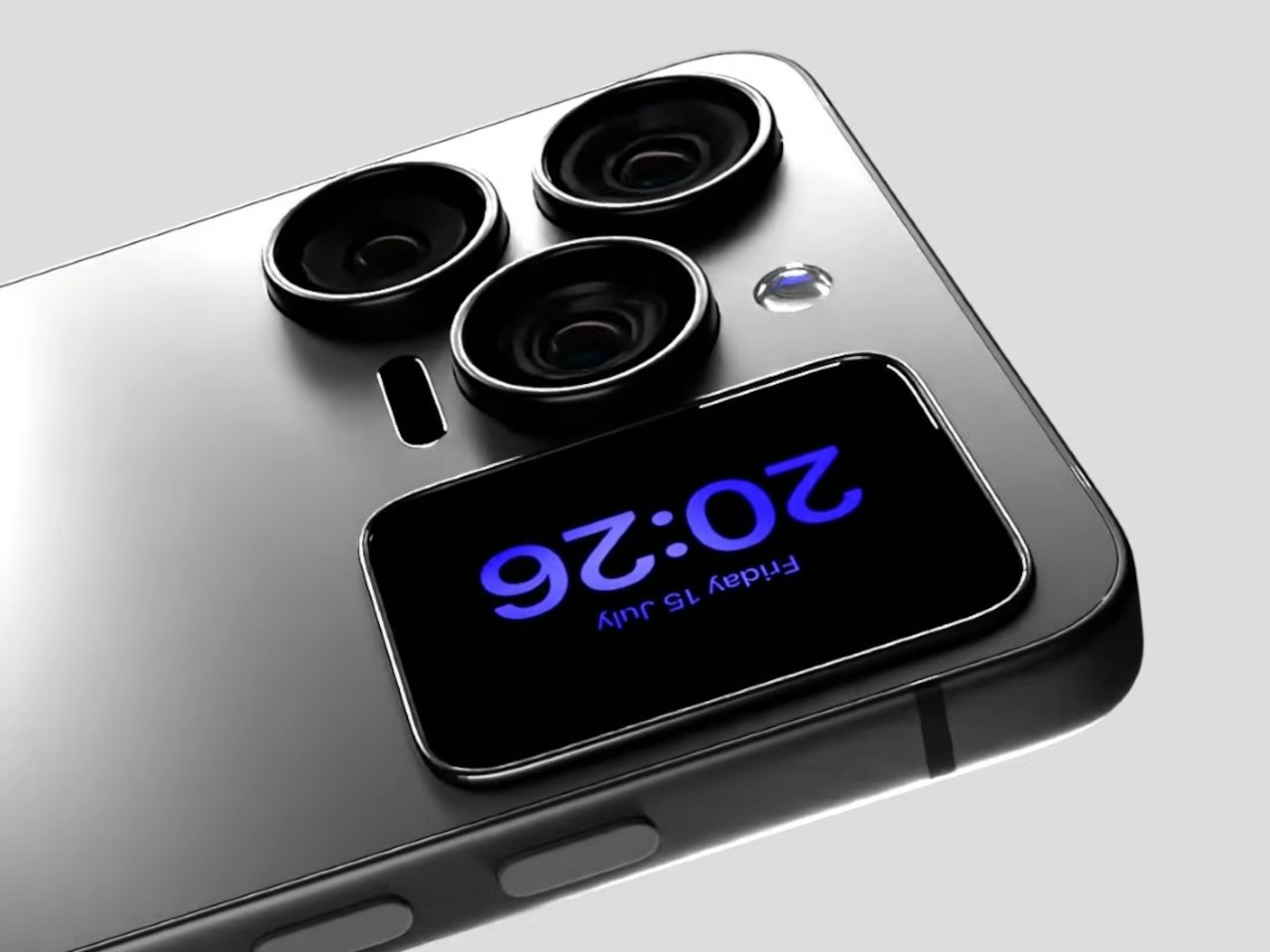
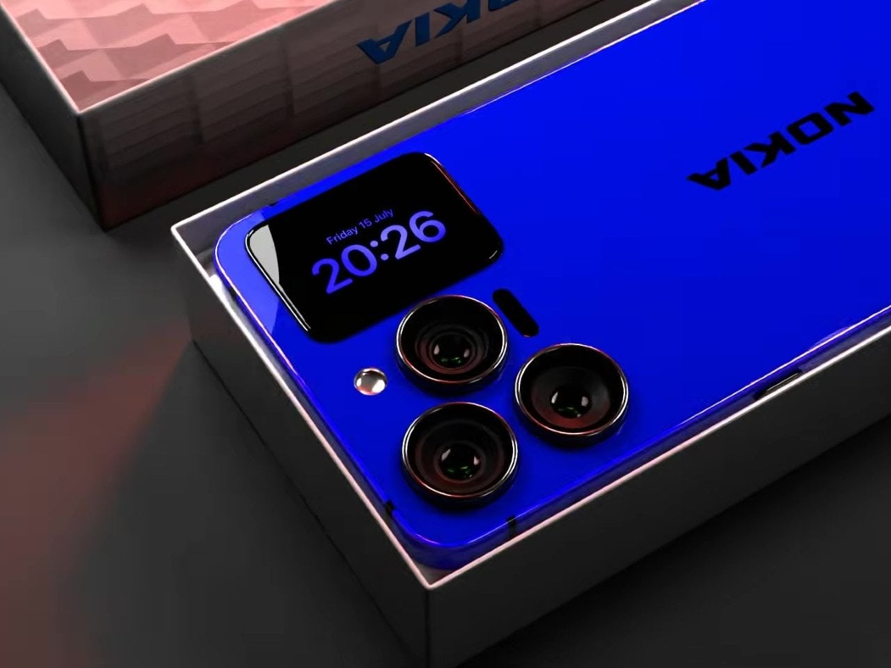
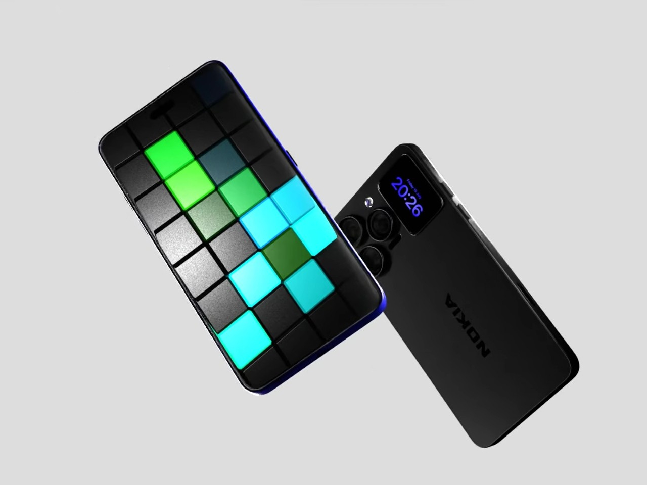
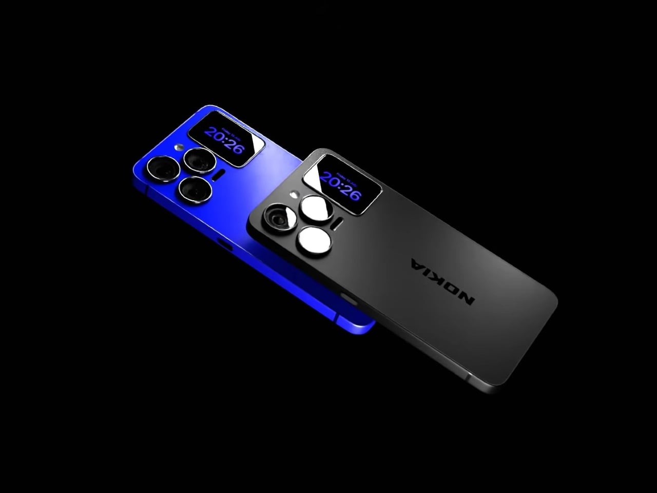
That rear panel holds a titanium alloy frame finished in a glossy cobalt blue or a graphite silver, with a raised visor housing three lens rings alongside a small rectangular display. Instead of sitting blank until a camera app opens, that mini-screen shows the time, the date, and glanceable notifications, all without waking the main display. It’s a small addition, but it changes how often a phone actually needs to come out of a pocket.

Designer: AndroidLeo (Concept)

A phone left face down on a desk during a meeting no longer has to stay silent about the time or a new message. A glance at the back shows both, then nothing more demanding follows, no bright wake screen lighting up a quiet room. That’s the appeal secondary displays have chased since Xiaomi and Meizu first tried the format years back, trimming how often the front screen needs to switch on at all.

The concept pushes its camera claims further than any current phone can back up, listing a 200 MP main sensor with 8K recording and a 200x zoom figure that would require optics no slim smartphone body can physically fit without an extending lens barrel. Two different Snapdragon chipsets get listed side by side too, a sign the spec sheet reads more like a wish list than an engineering plan. None of that undermines what’s genuinely worth noticing here.

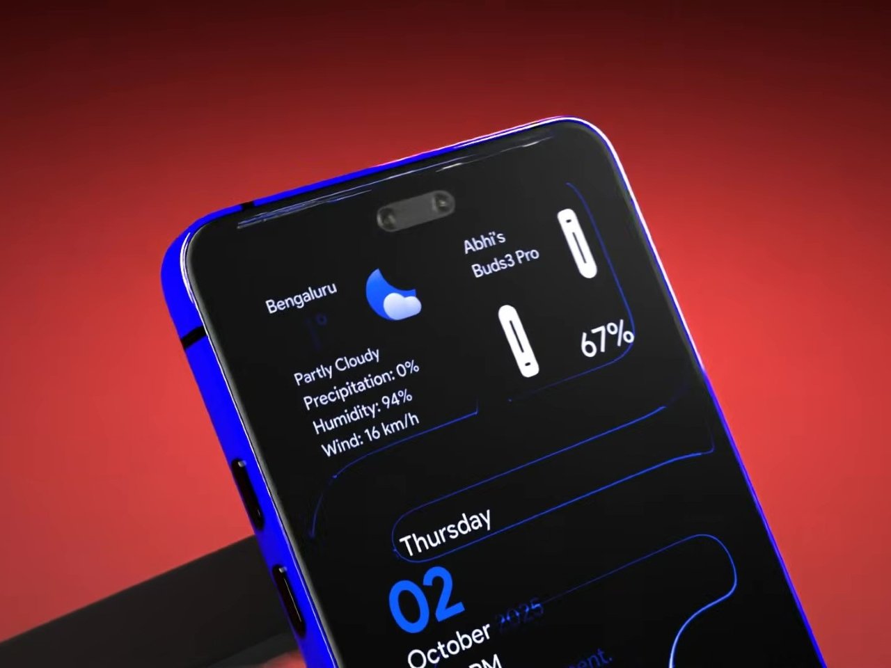
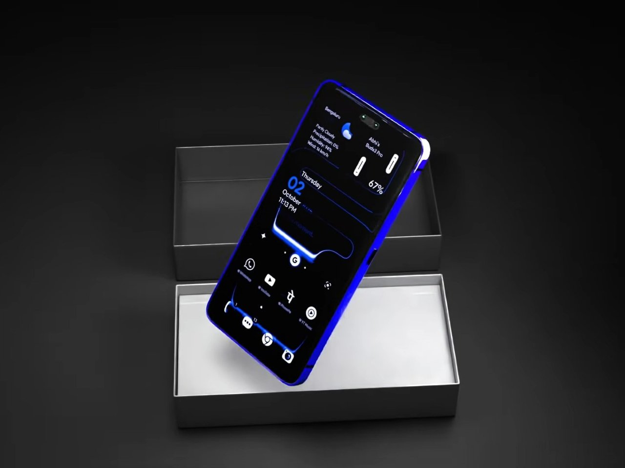
The mini-display sitting flush against the camera visor is the detail carrying real design weight, because it reflects a question phone makers keep circling back to: how much information really needs a full screen turned on. Some phones use that rear space purely for decoration, a small strip showing a logo or a battery percentage and nothing else. Others, like this concept, treat it as a working display capable of running widgets, a clock face, or quick status checks.

Nokia returning to flagship phones remains unlikely no matter how sharp a fan render looks, and the camera math here falls apart well before any of these specs reach a factory floor. What holds up is the smaller premise underneath all of it, that a phone’s back panel can carry its own useful screen instead of sitting there as blank glass. That idea keeps showing up across the industry, with or without a Nokia badge attached to it.

The post A Fan Imagined Nokia’s Comeback With One Feature Worth Stealing first appeared on Yanko Design.
  •  

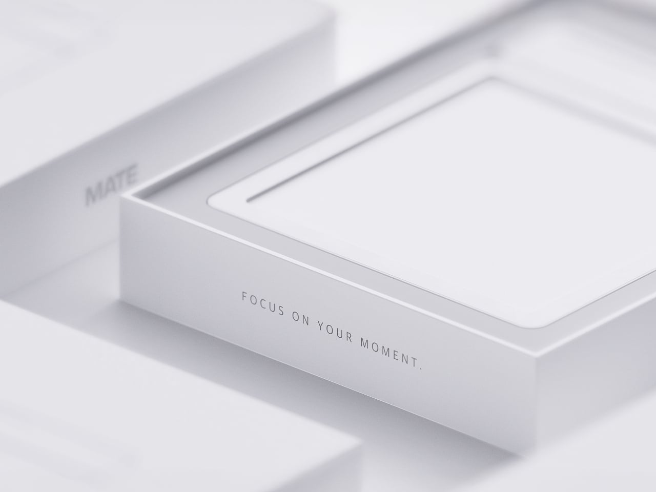
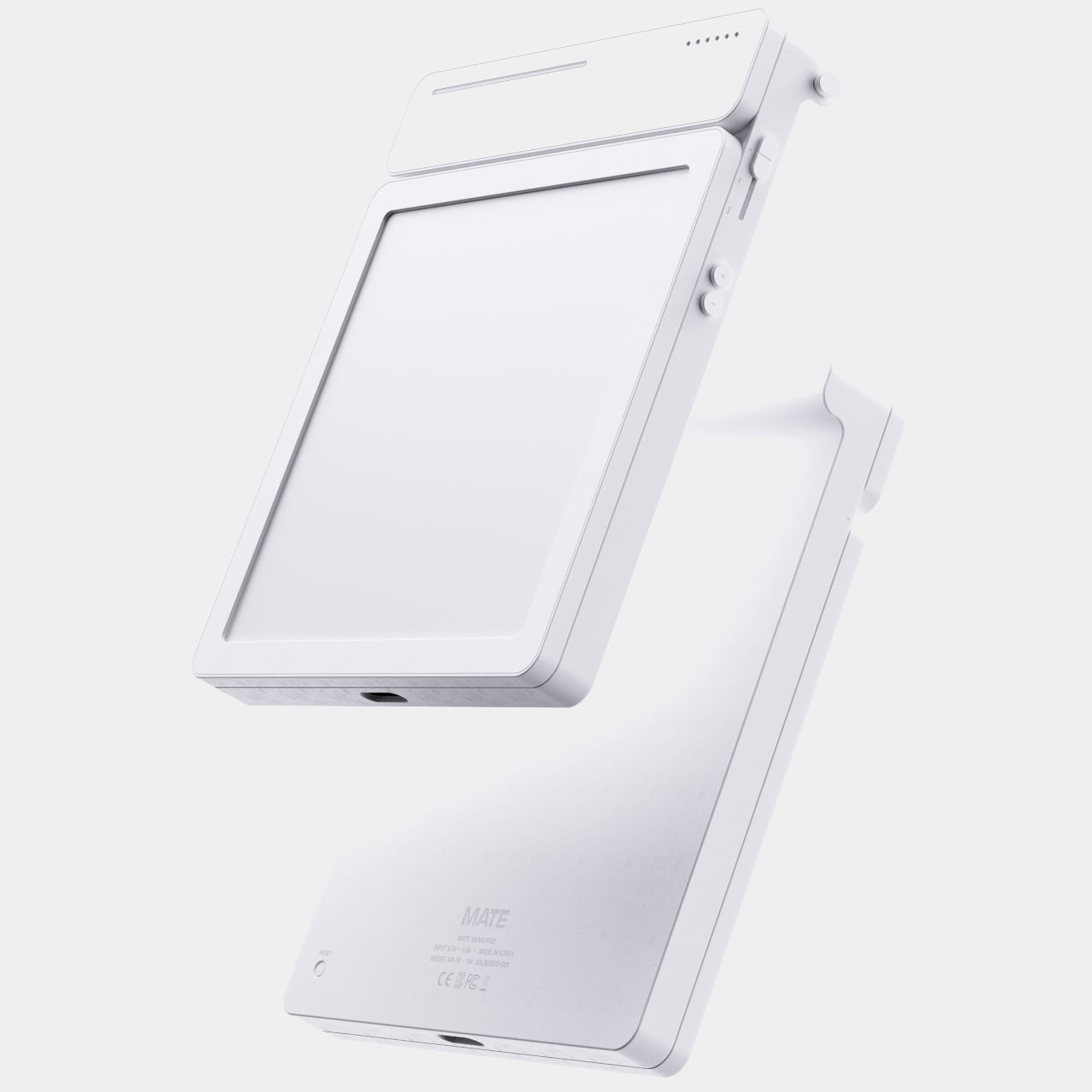
MATE Works Like a Sticky Note That Sets Its Own Alarm When You Write

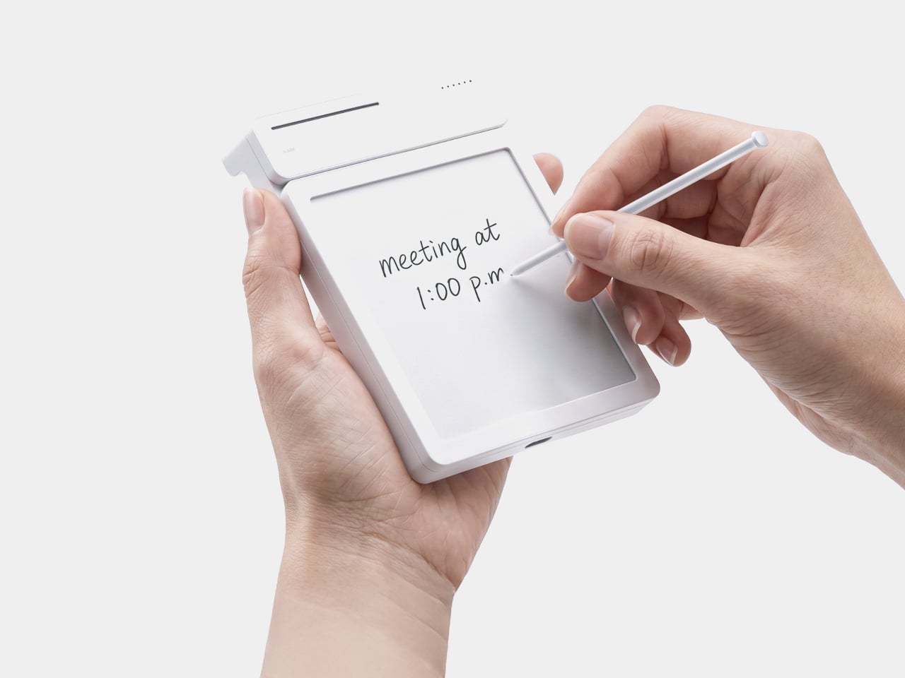
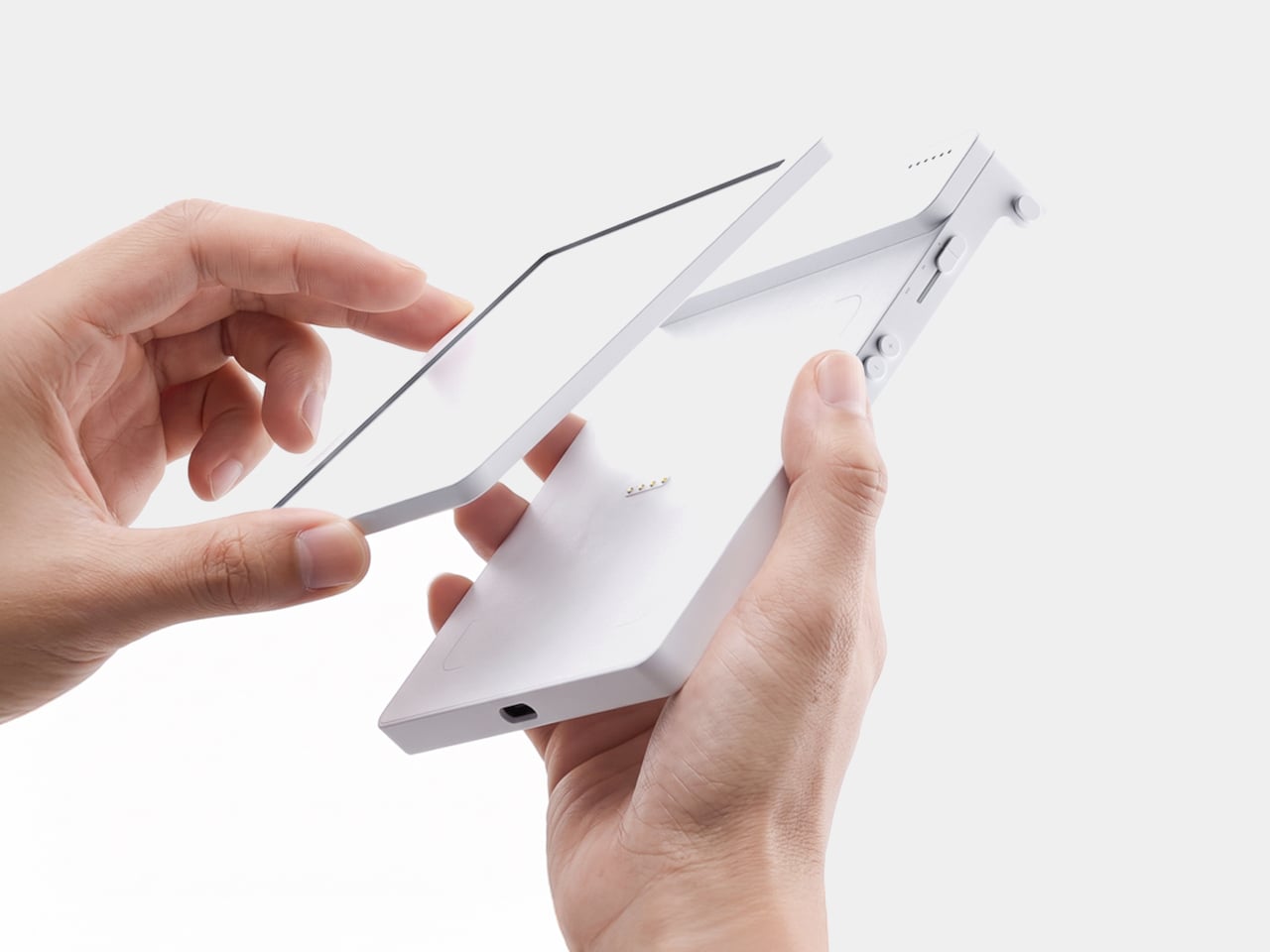
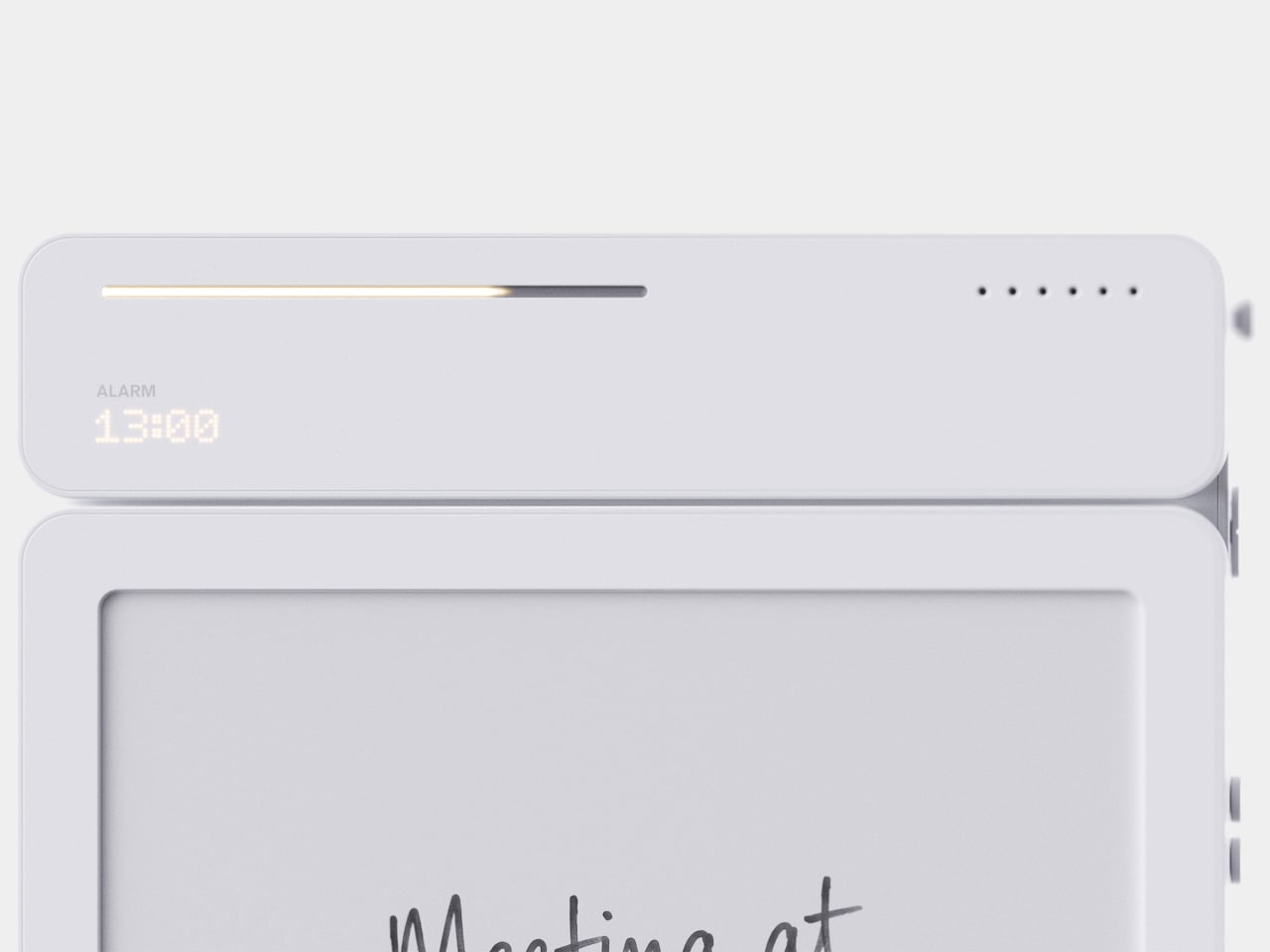
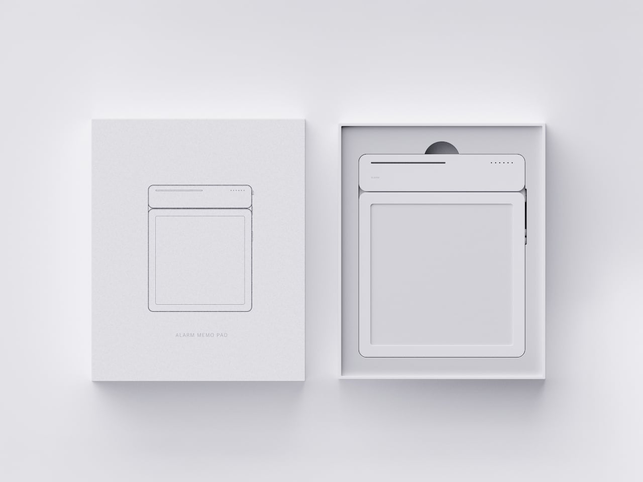
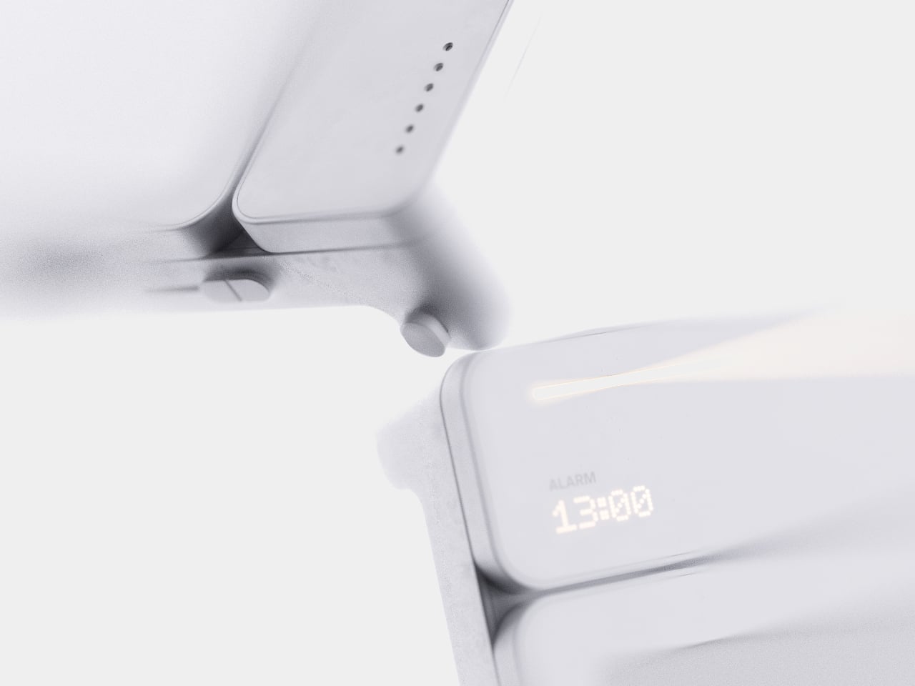
Setting a reminder on a phone means unlocking a screen, opening an app, and typing on a keyboard, three steps that break whatever train of thought led to needing the reminder in the first place. MATE skips all of that by reading your own handwriting instead. Write “meeting at 1:00 p.m.” on its E-ink panel with the built-in pen, and the device sets the alarm itself, no app, no unlocking, no menu to dig through.

That handwriting recognition is the entire premise, and it works because the device treats a note and a task as the same object rather than two separate steps. The moment it detects a time written into the text, it quietly converts that scribble into a scheduled alert running in the background. Nothing about the note’s appearance changes. It still just looks like something you jotted down on paper.

Designer: Geonwoo Kang

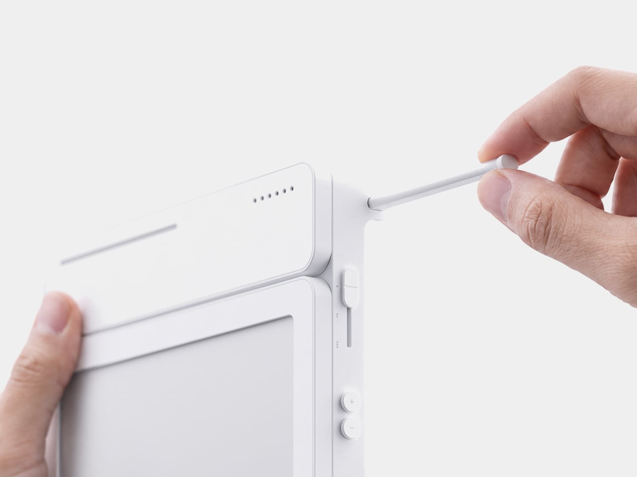
A thin LED bar along the top edge handles the countdown, giving a glance-able sense of how much time remains without requiring a full screen wake or a swipe through settings. When the set time actually arrives, the alarm sounds and stops the instant you tap the panel, keeping the entire alert cycle contained to the same physical surface where the note was written in the first place.

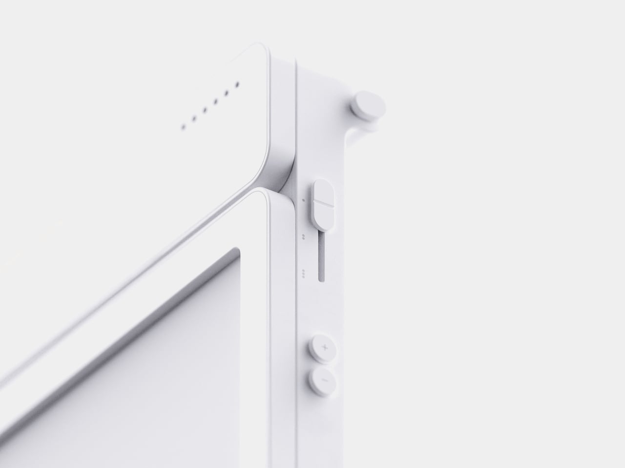
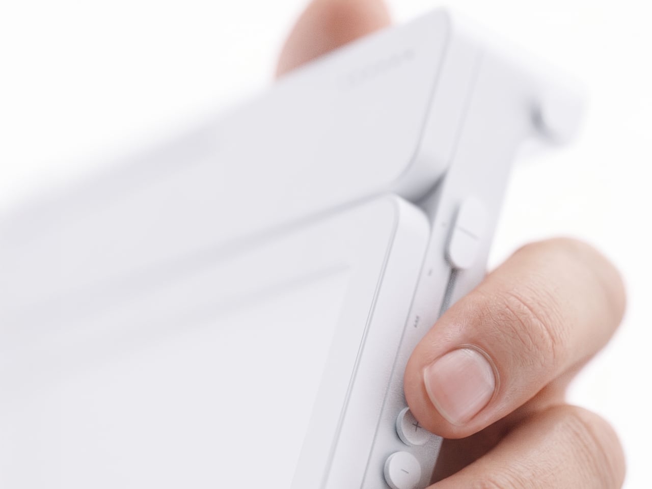
Because handwritten notes pile up fast, MATE handles multiple pages through a three-stage physical slider running down one side, letting you flip between up to three saved notes with a flick of a finger. That’s a deliberately low-tech solution to a problem most gadgets solve with a touchscreen menu, and it works specifically because a slider takes zero attention to operate correctly on the first try.

The memo pad itself doesn’t have to stay locked into the main body either. It detaches from its dock and relies on built-in magnets to stick onto a partition wall or a metal filing cabinet, turning a handheld notepad into a fixed reminder posted wherever it’s actually needed. A grocery list stuck to a fridge door works the same way a sticky note always has, just with an alarm quietly running underneath it.

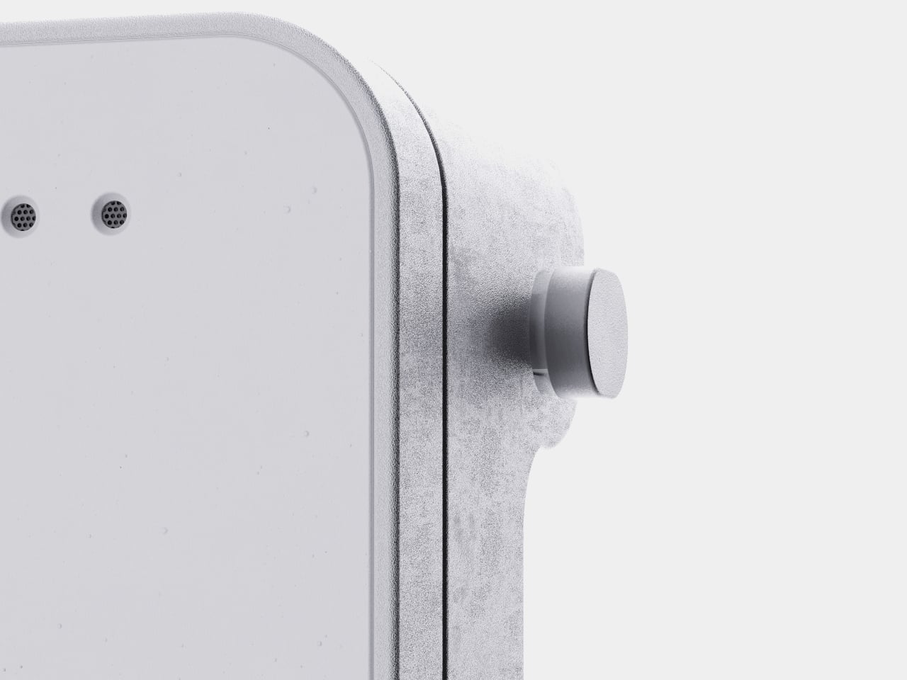
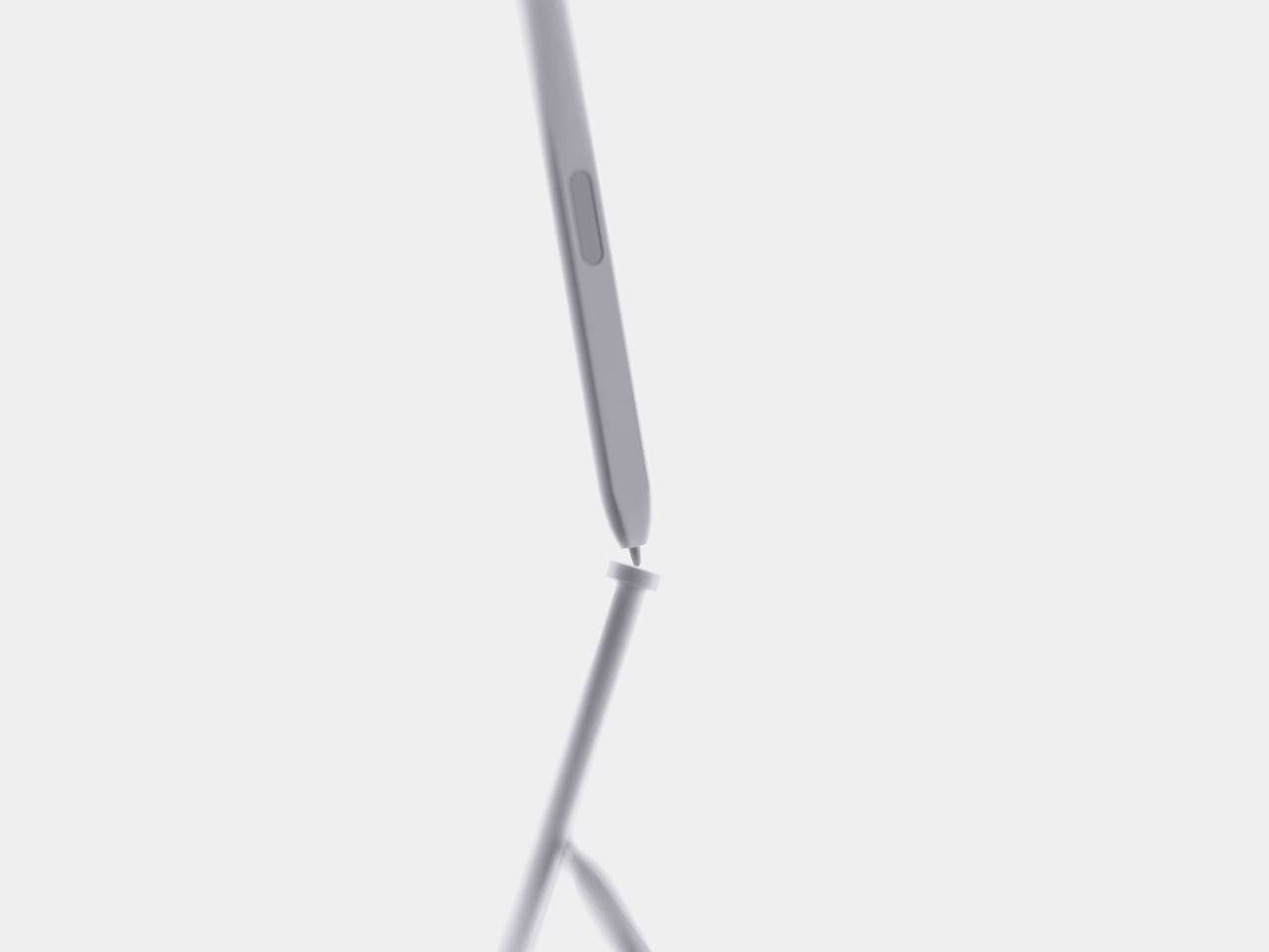
Even the pen gets a small, deliberate design decision most styluses skip. It nests into a groove at the top of the device rather than rattling around loose in a bag or a drawer, solving the single most common complaint about any stylus-based gadget: losing the one piece that makes the whole thing work. Reaching for a note and finding the pen missing defeats the entire point of a device built around spontaneous handwriting.

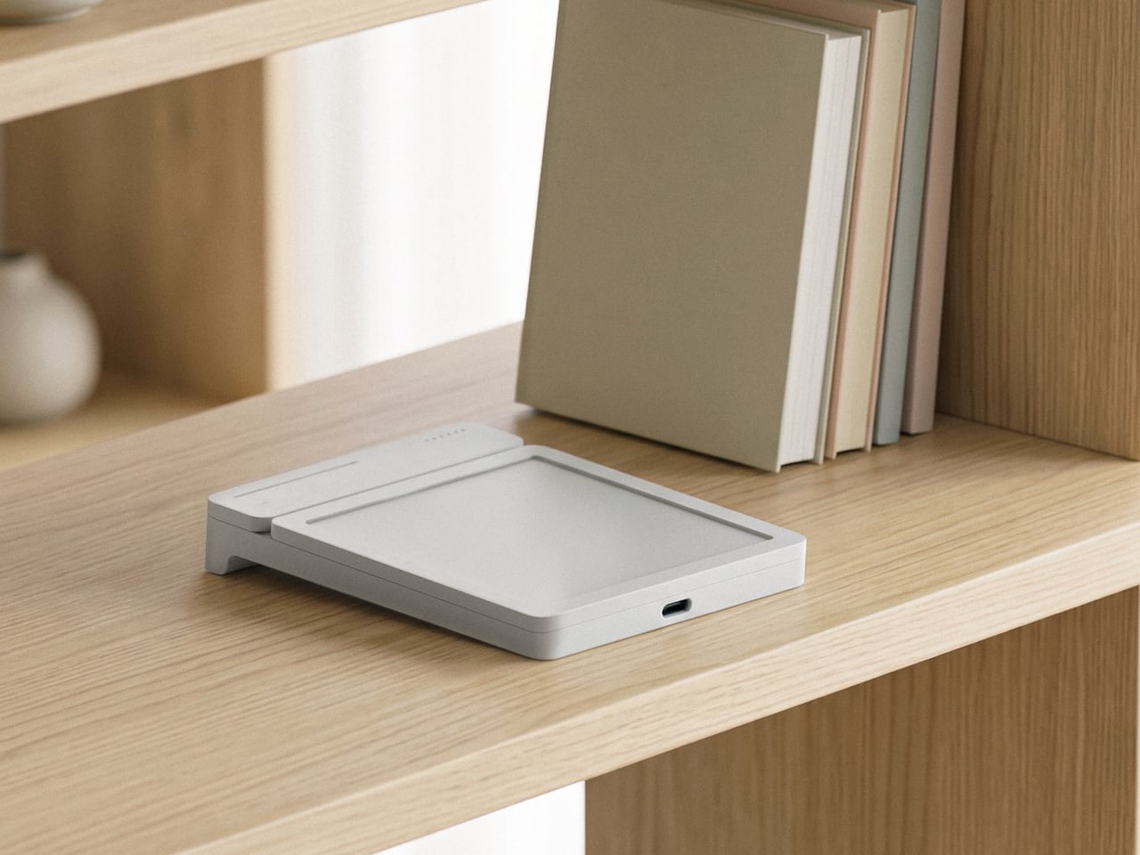
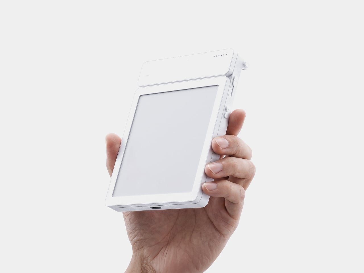
None of MATE’s individual pieces, the E-ink panel, the physical slider, the magnetic pad, would stand out much alone. Put together, they describe a specific kind of object: something meant to sit on a desk quietly doing one job well, catching a thought before it disappears and holding onto it until the moment it’s actually needed.

The post MATE Works Like a Sticky Note That Sets Its Own Alarm When You Write first appeared on Yanko Design.
  •  

The Wooden Box That Refuses to Let Your Phone Win

I’ve tried every trick to get my phone to leave me alone. Do Not Disturb. Grayscale mode. Leaving it in another room, which mostly just means I walk to the other room every twenty minutes to check on it. None of it works for long, because the problem was never the settings. The problem is that the phone is still there, still glowing, still capable of buzzing the second I let my guard down. Willpower is a terrible security system, and every app-based fix is still just asking me to trust myself, which is exactly the thing I can’t do at nine at night with a bag of chips in one hand.

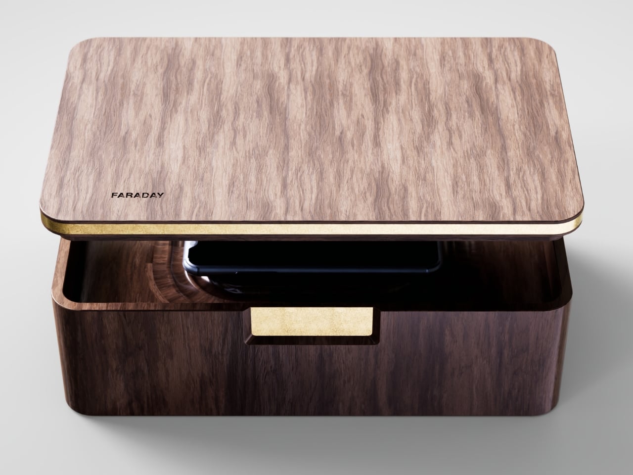
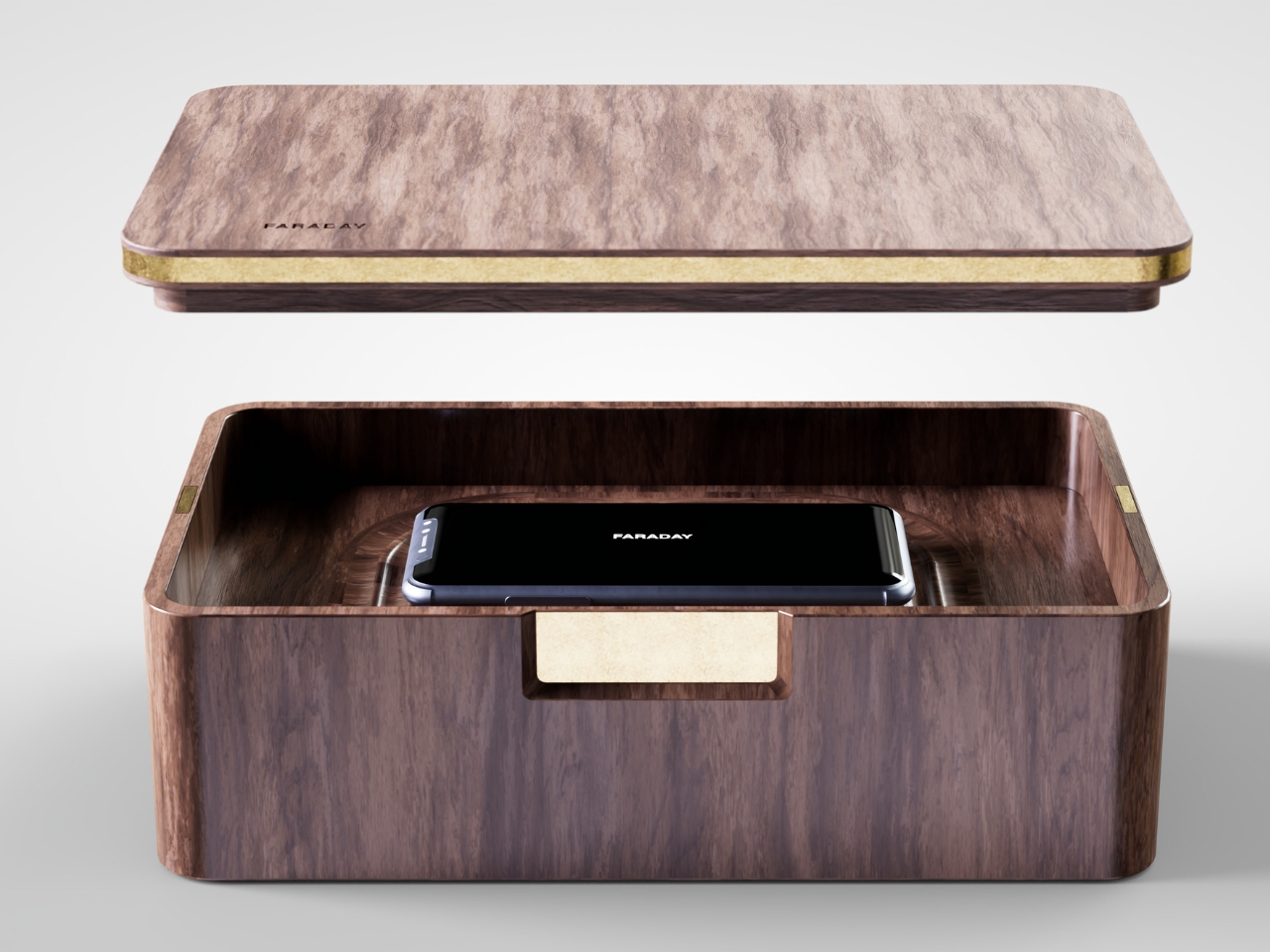
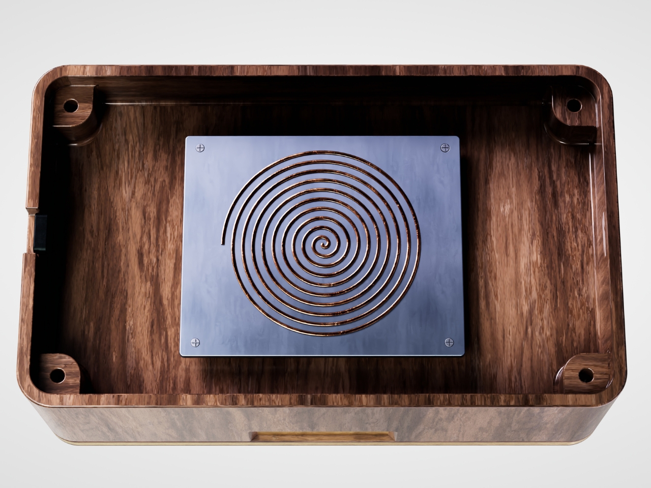
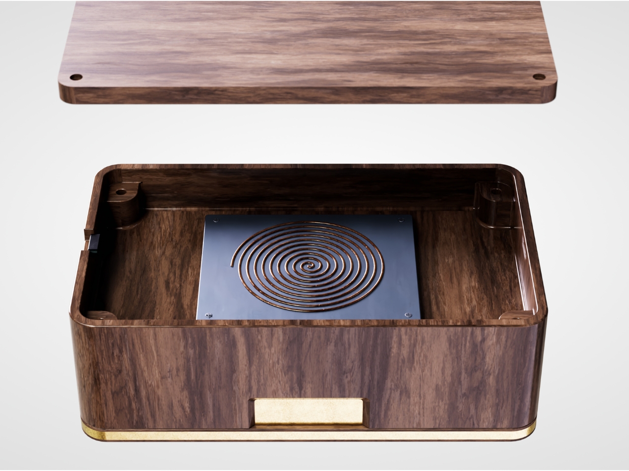
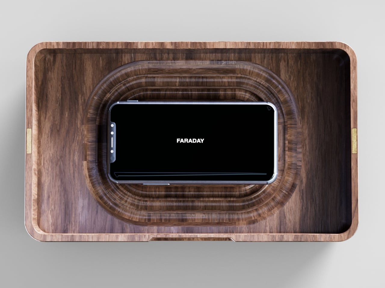
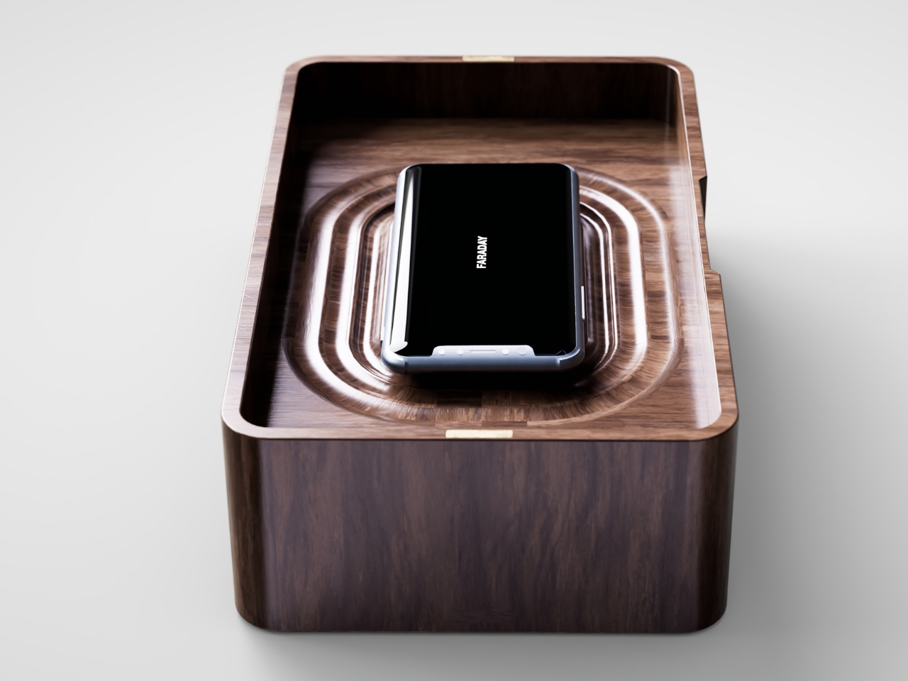
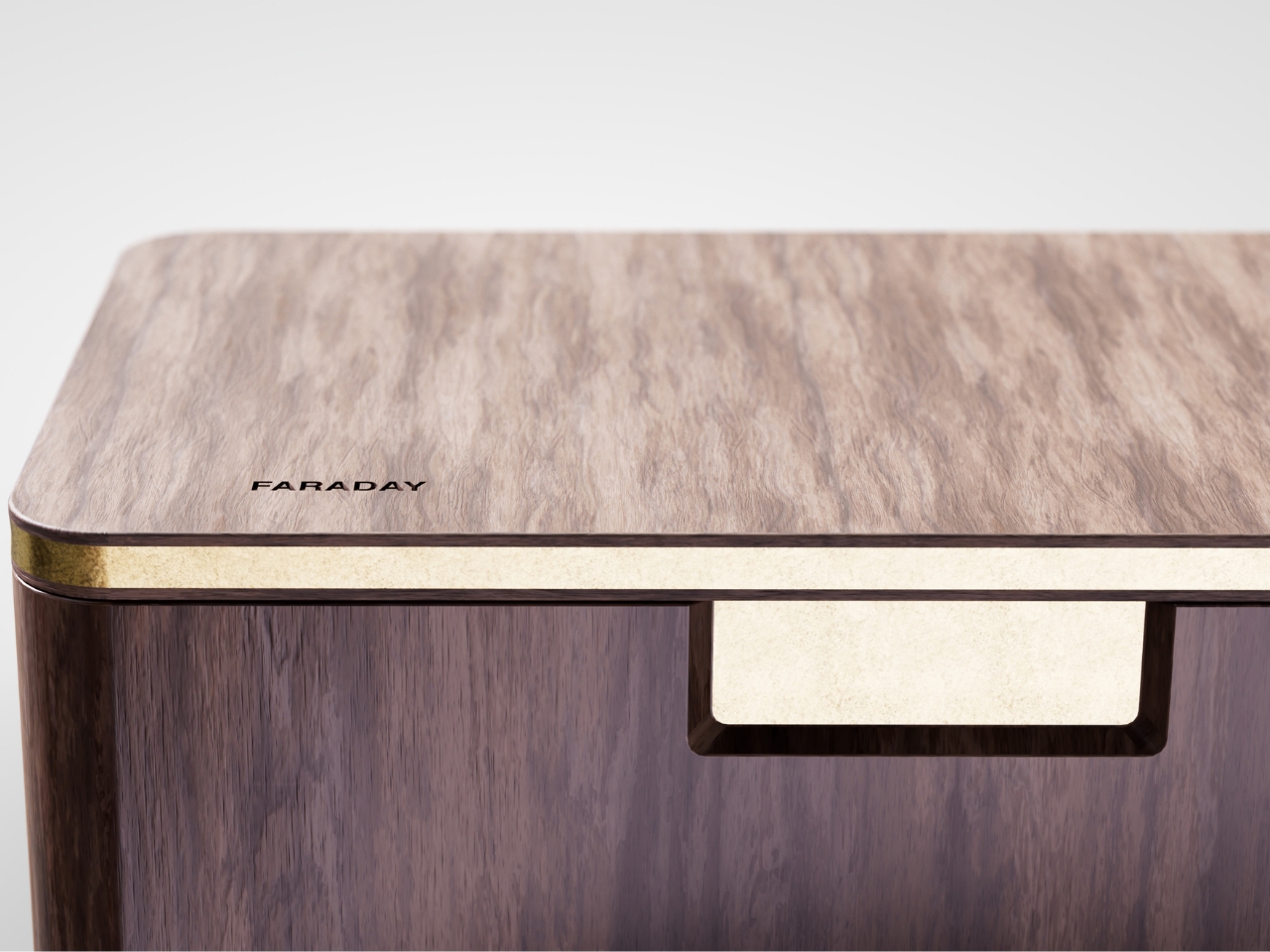
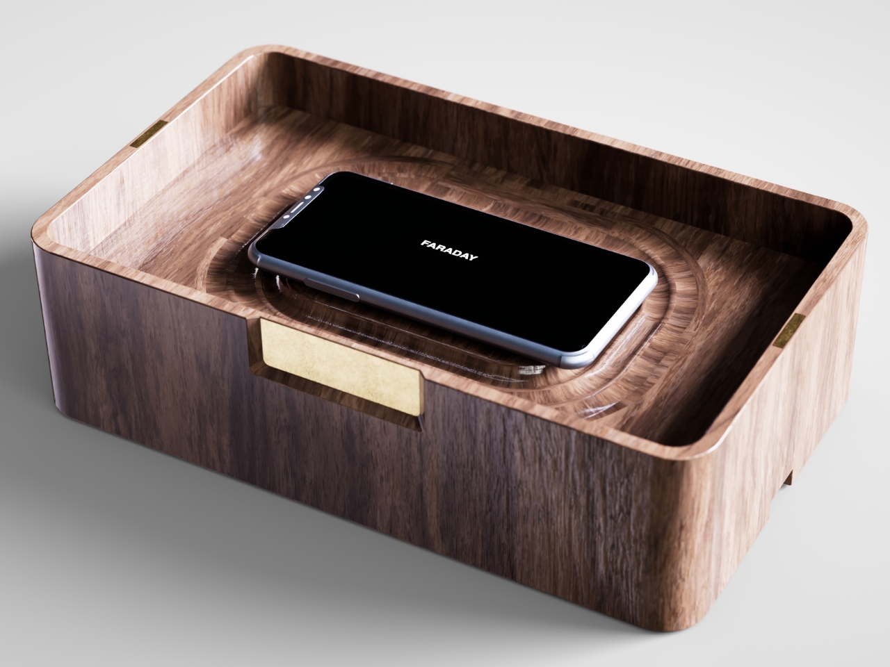
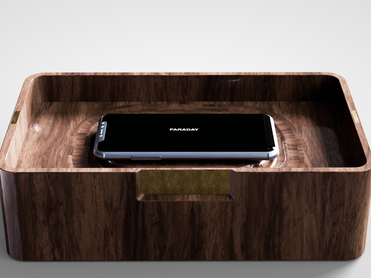
That’s the gap French industrial designer Pascal Grangier is quietly working in with FARADAY, a home object that doesn’t ask you to resist your phone. It makes resistance unnecessary. Named after the 19th-century scientist whose cage design blocks electromagnetic fields, the piece works on the same basic physics: once your phone is inside, it has no signal at all. No calls sneak through, no texts land, no app can light up your lock screen and drag your eyes back to it. You’re not disconnecting through discipline. You’re disconnecting through geometry.

Designer: Pascal Grangier

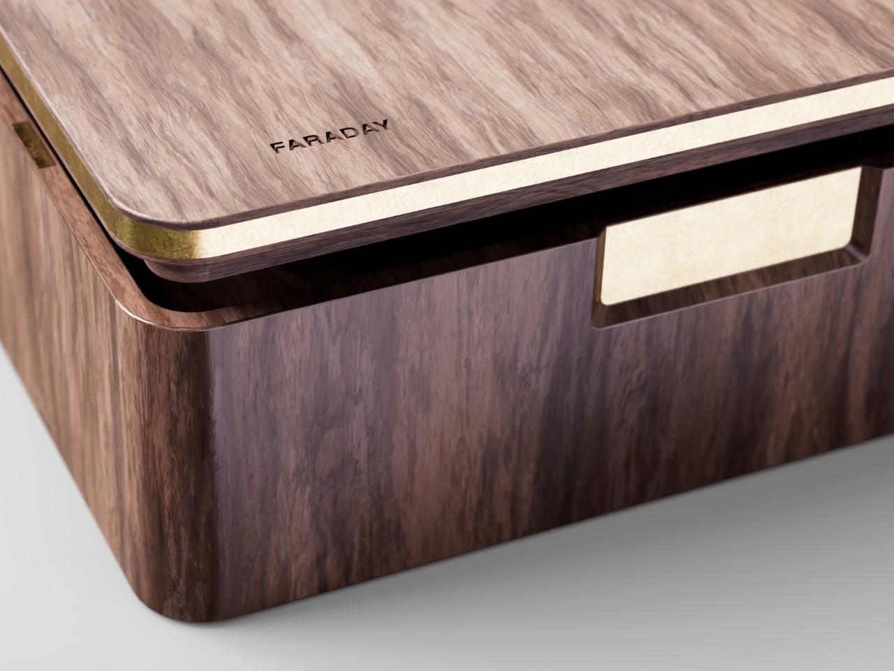
What makes this more than a novelty is the shape it comes in. Most signal-blocking products look like they were built for a hardware store, not a living room. Faraday pouches for concerts and courtrooms are floppy nylon sleeves you’d never leave out on a counter. Grangier’s version is carved from wood, with the kind of soft, rounded form you’d expect from a well-made bowl or a piece of studio furniture. It’s designed to sit on a nightstand or a kitchen counter without looking like a confession that you have a phone problem. That distinction matters more than it sounds like it should. An object you’re proud to display gets used. An object you’re embarrassed by gets shoved in a drawer and forgotten by the second week.

I think a lot about why boxes like this are showing up now, and it’s not really about phones getting worse. It’s about people finally admitting that the “just put it on silent” advice never addressed the actual craving, which is the urge to check, not the urge to hear. Silent mode still lets the dopamine loop run in the background of your brain, because you know the notifications are piling up somewhere, waiting. A Faraday enclosure removes the pile entirely. There’s nothing accumulating on the other side of that lid, so there’s nothing to be curious about later.

I don’t think objects like FARADAY are anti-technology, and I’d push back a little on anyone who frames it that way. It’s closer to how we treat food we know we’ll overeat if it’s sitting on the counter. Nobody calls it deprivation to put the cookies in a cabinet instead of banning sugar from the house. A wooden box that mutes a phone for the length of a dinner, or a weekend, or a first date, isn’t rejecting the smartphone era. It’s setting a boundary the same way a lock on a liquor cabinet does, respectfully and without lecturing anyone.

The dinner table is probably where this thing earns its keep fastest. Phone stacking, where everyone tosses their device into a pile and the first person to grab theirs pays the check, has become a real ritual at restaurants precisely because people know they need external enforcement. FARADAY takes that same instinct and gives it a permanent home, no penalty games required, no honor system to break.

Whether a hand-carved signal blocker becomes a fixture in American homes the way candles or diffusers did, I couldn’t tell you yet. But the appetite is obviously there. We keep buying productivity apps, screen time trackers, even flip phones marketed as luxury items, all chasing the same outcome Grangier reached with a block of wood and a basic law of physics. Sometimes the smartest tech solution is the one that refuses to be technology at all.

The post The Wooden Box That Refuses to Let Your Phone Win first appeared on Yanko Design.
  •  

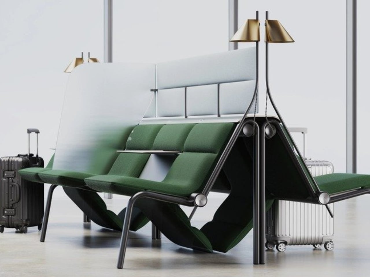
Finally, a Bench Design That Never Wastes a Seat

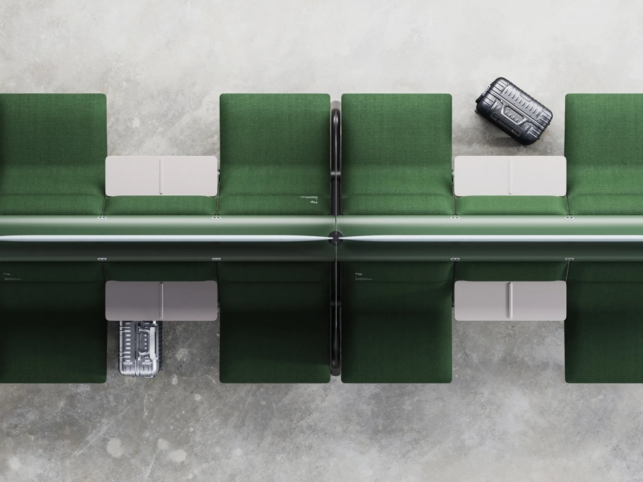
Anyone who has ever sprinted through a train station with a rolling suitcase in one hand and a coffee sloppily balanced in the other knows the particular despair of scanning a row of seats and finding every single one occupied by someone’s backpack. Not a person. A bag. Sitting there like it paid for the ticket too.

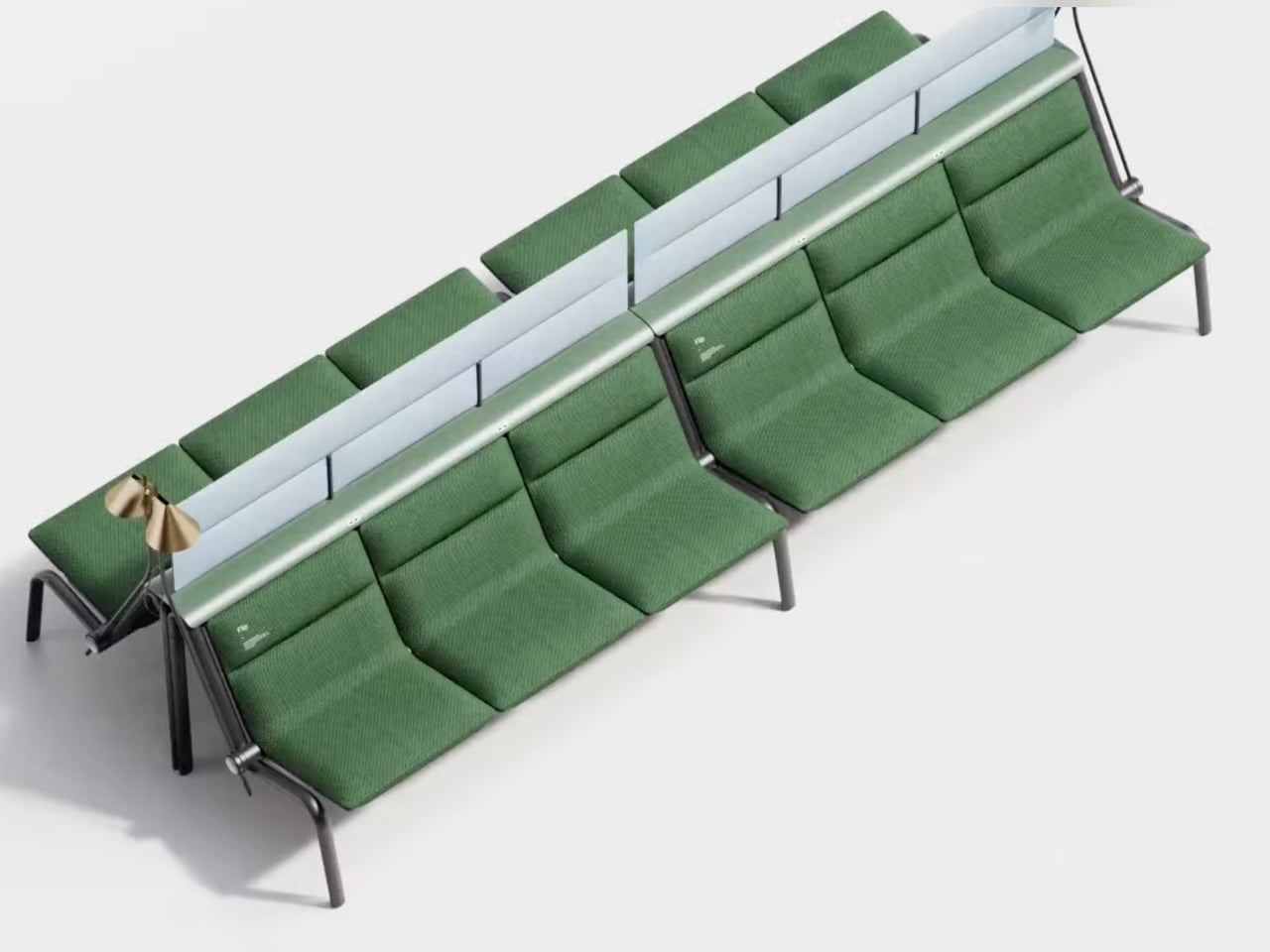
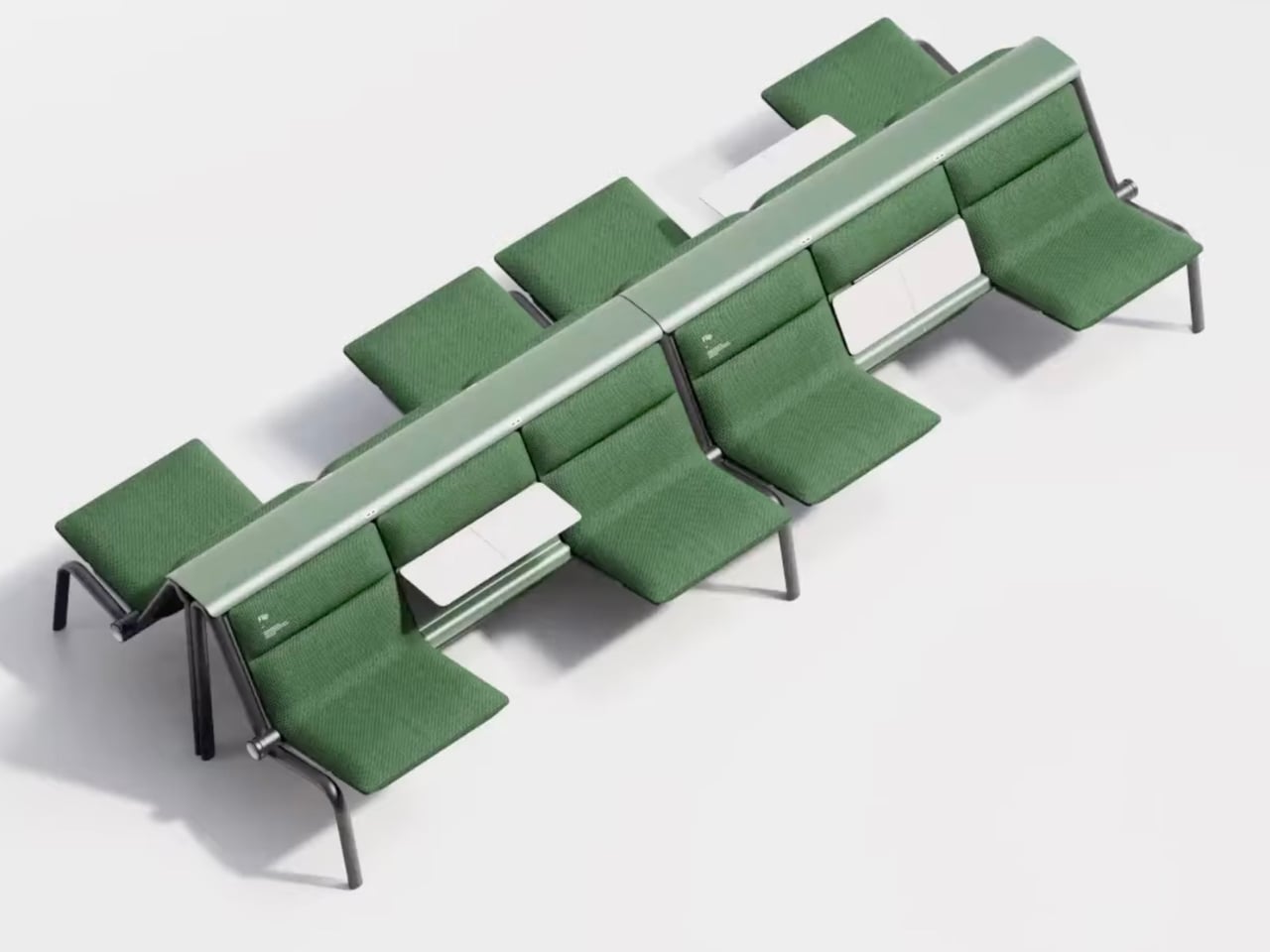
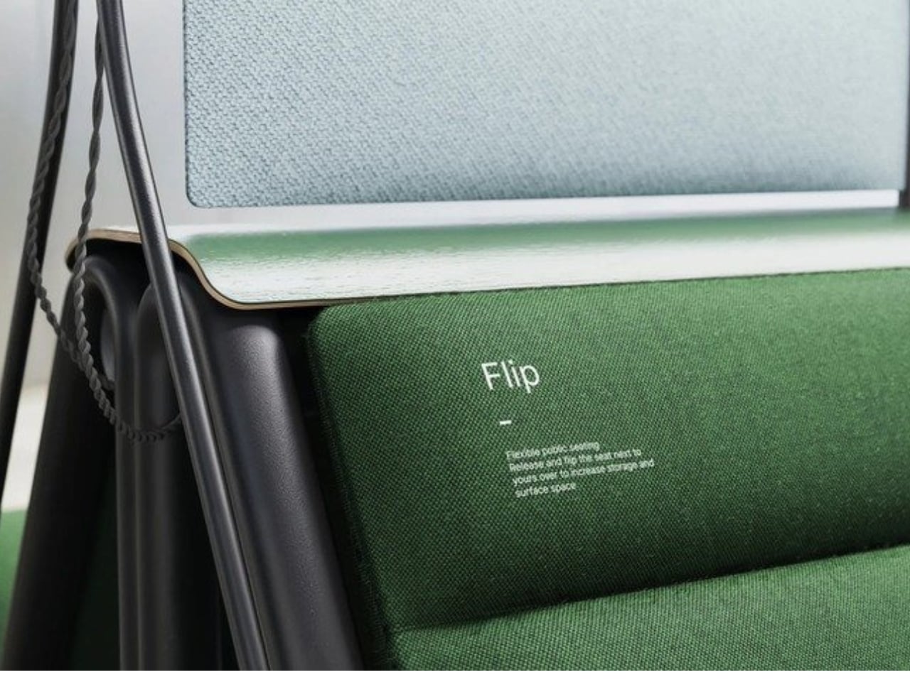
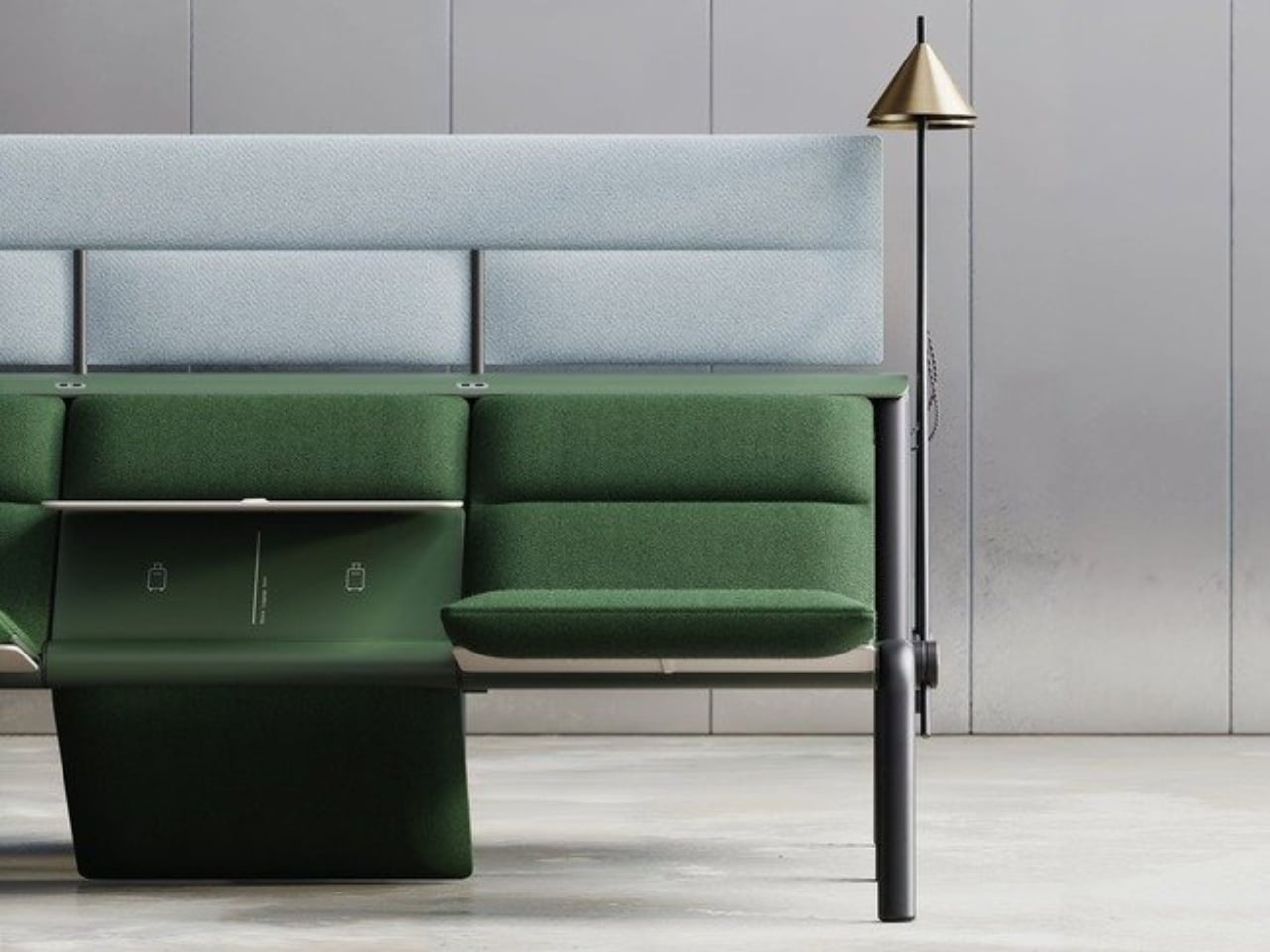
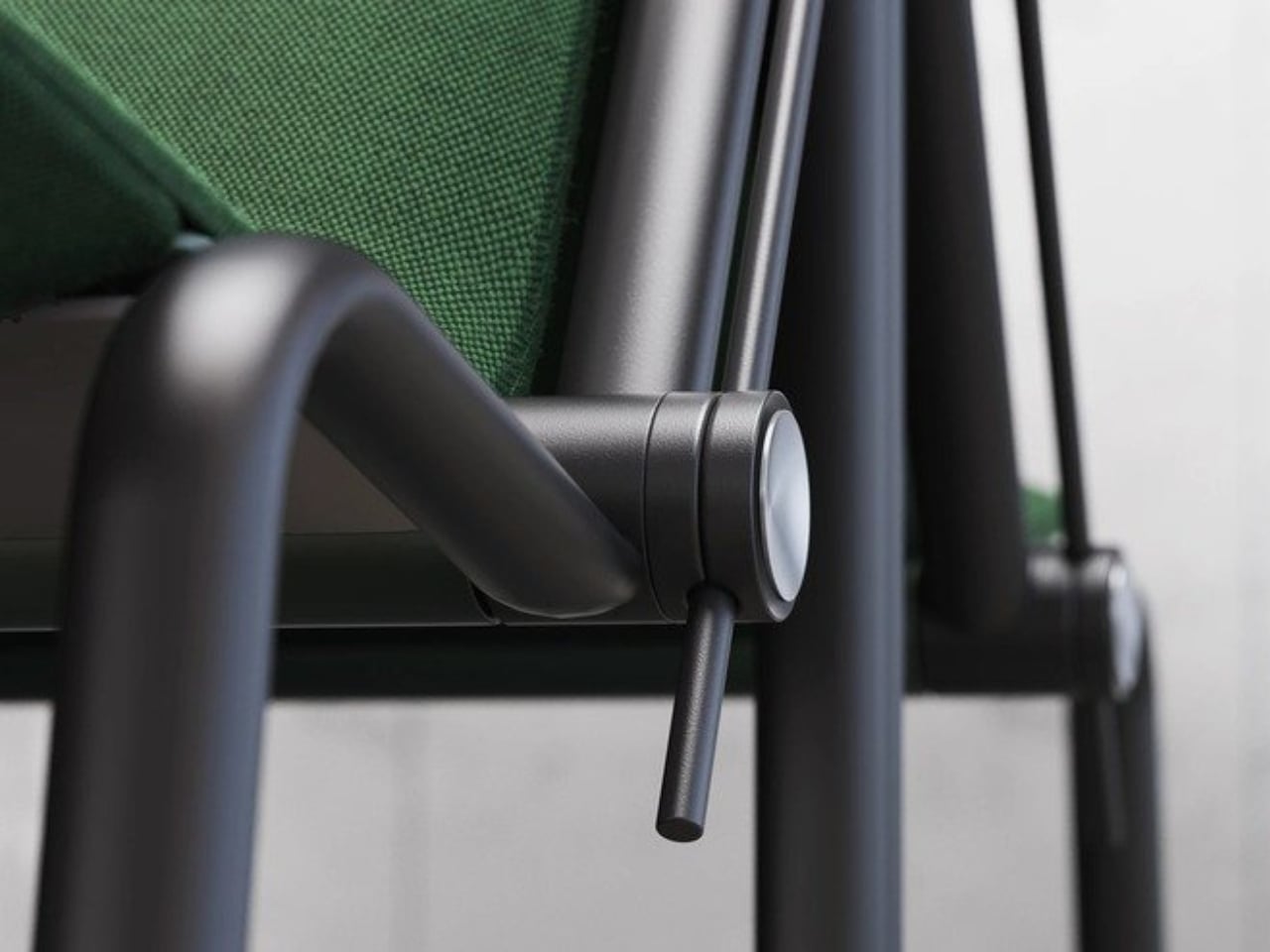
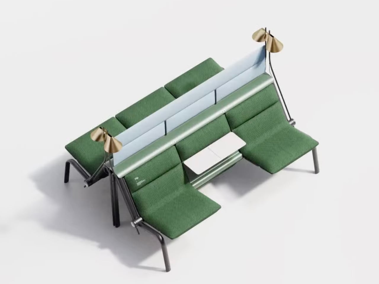
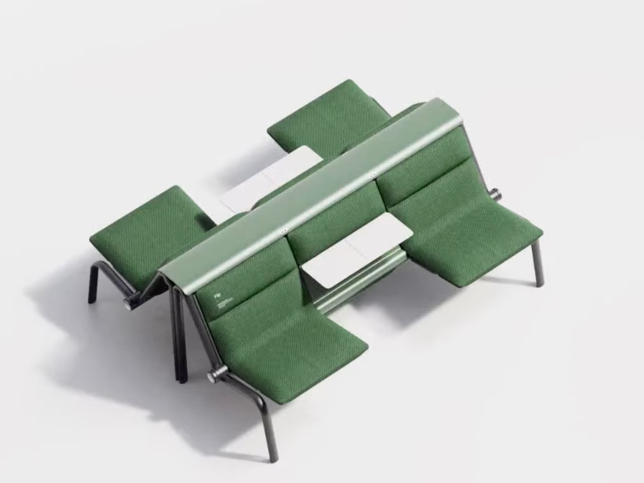
That small, maddening moment is basically the whole reason a London studio called Of My Imagination designed something called Flip, a modular public seating system where each individual seat can rotate out of the way on command. Instead of a bench being a fixed slab of “sit here or don’t,” Flip treats every seat as its own hinge point. Flip it down, it’s a chair. Flip it up and out, it becomes open space for luggage, a stroller, or just more room to breathe when a platform gets crowded. It sounds almost too simple to be clever, which is usually the sign of a genuinely good idea.

Designer: Of My Imagination

I’ve been thinking about public seating a lot lately, mostly because so much of it seems designed for an idealized version of how people move through the world rather than the messy, unpredictable reality of it. Airports, bus terminals, hospital waiting rooms. These spaces swing between dead quiet and total chaos within the same hour, and yet the furniture almost never adjusts with them. A bench built for a slow Tuesday afternoon becomes a liability during a holiday rush, when every inch of floor space suddenly matters and immovable seating just gets in the way.

Flip’s answer isn’t flashy. There’s no app, no motor, no sensor deciding when a seat should move. It’s a mechanical latch and a rotating joint, the kind of low-tech solution that feels almost old-fashioned in a moment when everything gets pitched as “smart.” I actually like that restraint. Public infrastructure breaks down constantly not because the technology is too simple, but because it’s too complicated, too fragile, too dependent on software updates and maintenance contracts nobody budgeted for. A seat that flips because a person physically flips it is a seat that still works during a power outage, a system failure, or just a Tuesday when the maintenance crew is short-staffed.

The pandemic-era spacing rules get a mention in OMI’s own description of the project, and it’s worth sitting with that for a second. Remember all those benches wrapped in caution tape or marked with awkward stickers telling you where not to sit? Most of that signage disappeared once the emergency did, but the underlying problem never really left. Public seating still needs to flex between “pack people in tightly” and “spread them out,” whether that’s for health reasons, accessibility needs, or just the reality of rush hour versus a quiet Sunday morning.

What strikes me most is how much this design respects the intelligence of the people using it. Flip doesn’t try to predict what a traveler needs. It just gives them the option and gets out of the way. That’s a surprisingly rare quality in public design, where the instinct is often to over-engineer a solution that anticipates every scenario instead of trusting a commuter to make a simple physical adjustment themselves.

Is it going to replace every bench in every transit hub across the country? Probably not right away, and cost, durability testing, and vandalism resistance are the unglamorous hurdles any concept like this has to clear before it shows up somewhere you’d actually sit down. But as a proof of concept, it’s a refreshing reminder that flexibility doesn’t require a screen or a subscription. Sometimes it just requires a hinge and a little humility about how unpredictable public spaces actually are.

The next time I’m standing in a crowded terminal, silently negotiating personal space with a stranger’s overstuffed duffel bag, I’ll probably think about Flip. Not because it solves everything, but because it solves the one thing that’s been sitting there, unaddressed, for as long as public benches have existed.

The post Finally, a Bench Design That Never Wastes a Seat first appeared on Yanko Design.
  •  

Finally, One Tower Replaces Your Speaker, Lamp, and Wine Fridge

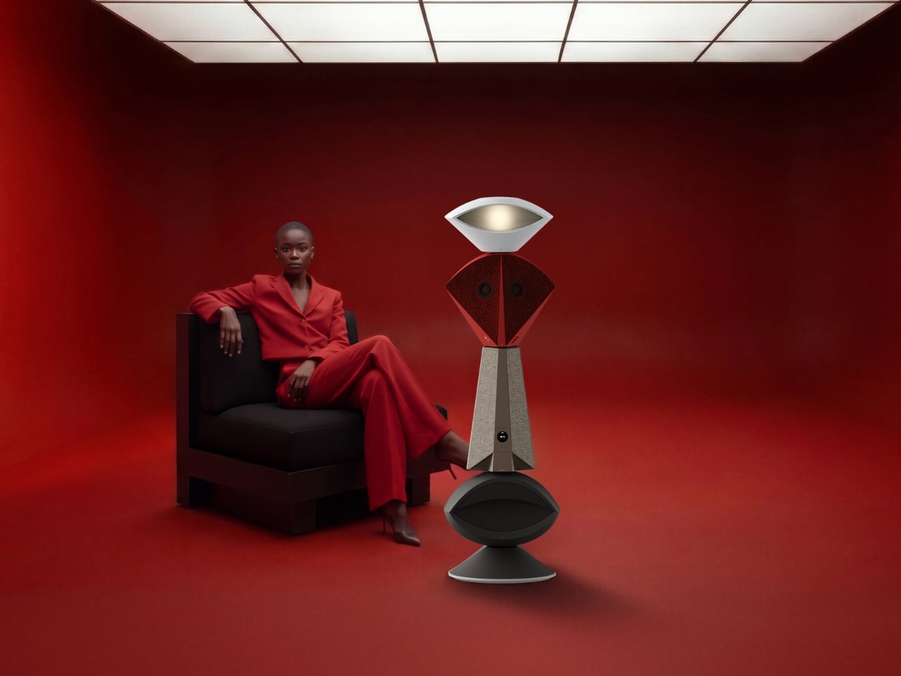
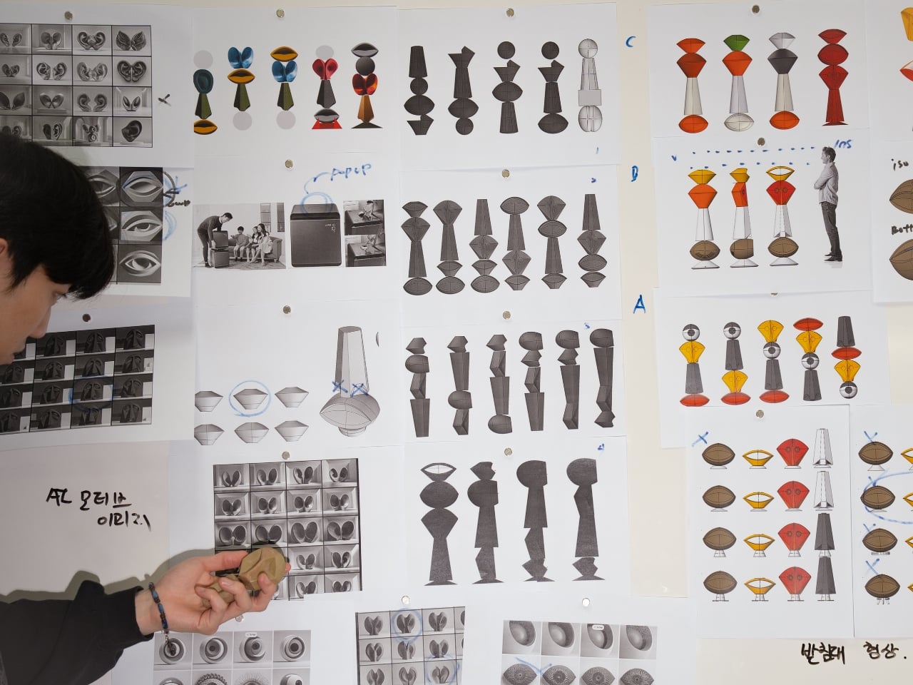
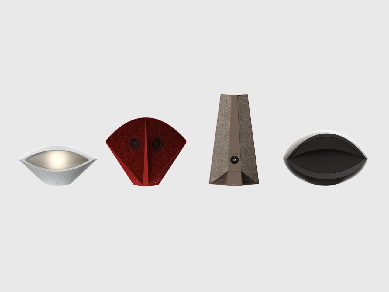
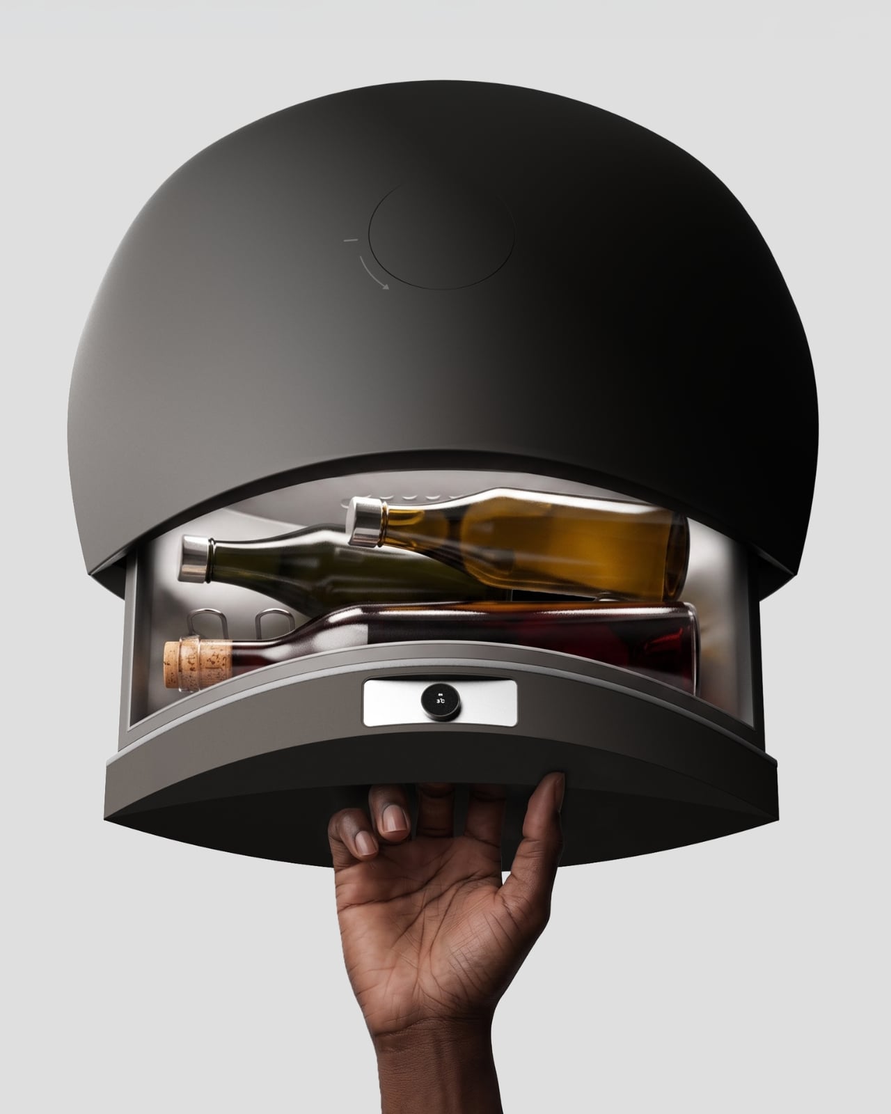
Anyone who has tried to furnish a studio apartment knows the specific defeat of running out of surfaces before you run out of gadgets. The speaker needs an outlet and a shelf. The lamp needs its own corner. The mini fridge for wine wants counter space that doesn’t exist. Each object is fine on its own, but stacked together on a single console table, they start to look like a garage sale that lost an argument with a design magazine. That is the exact problem South Korean designer Jung Hyun Kim set out to solve with Babel, a concept he built for people who live in small rooms but refuse to shrink their idea of what home should feel like.

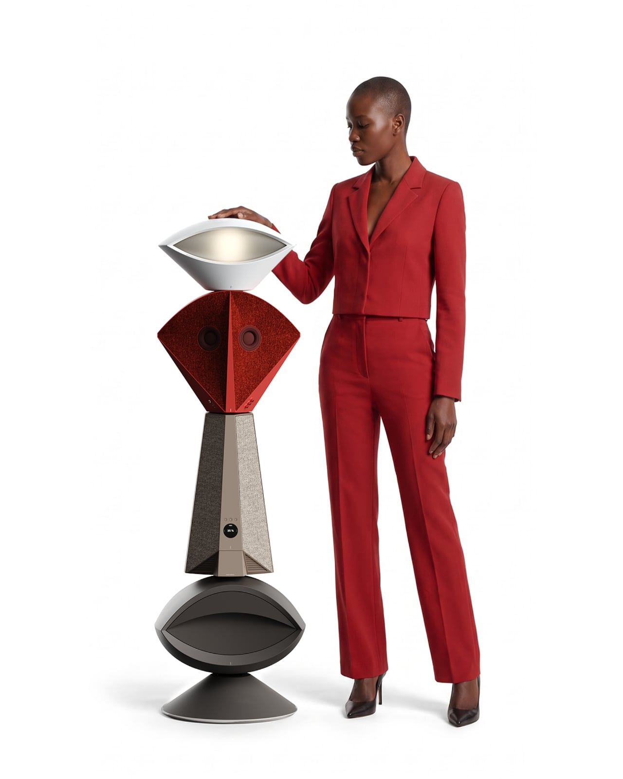
Kim designed Babel for a very specific and very real slice of the population, twenty somethings through mid thirties starting their independent lives in modest apartments, often around 500 to 550 square feet, the kind of footprint that is common from Seoul to Brooklyn to any first apartment in a city with real rent. His answer wasn’t to make each device smaller. It was to stop thinking about furniture and electronics as separate categories entirely, and instead build a single vertical column where every function gets its own segment, stacked like a totem instead of scattered like clutter.

Designer: Jung Hyun Kim

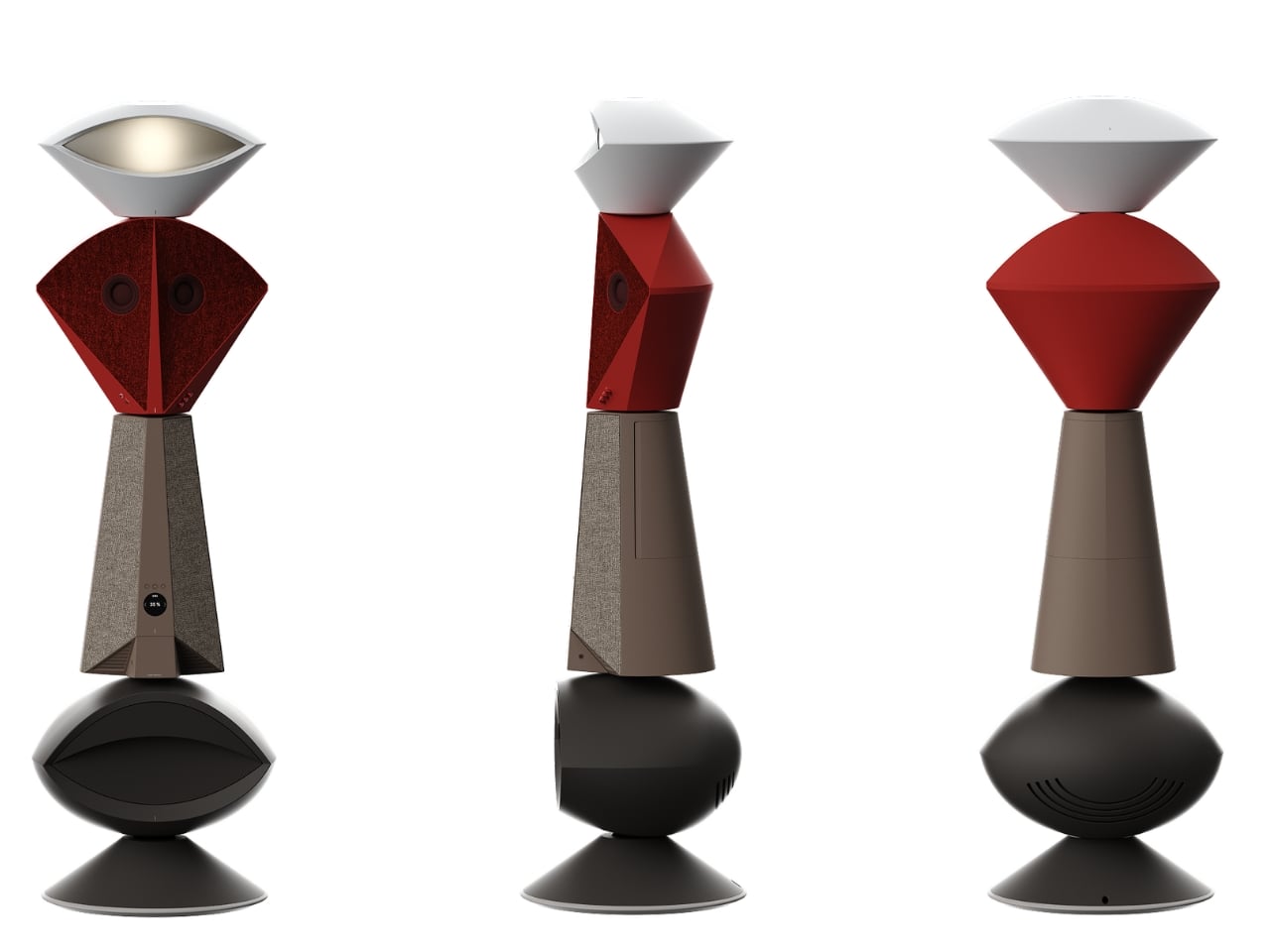
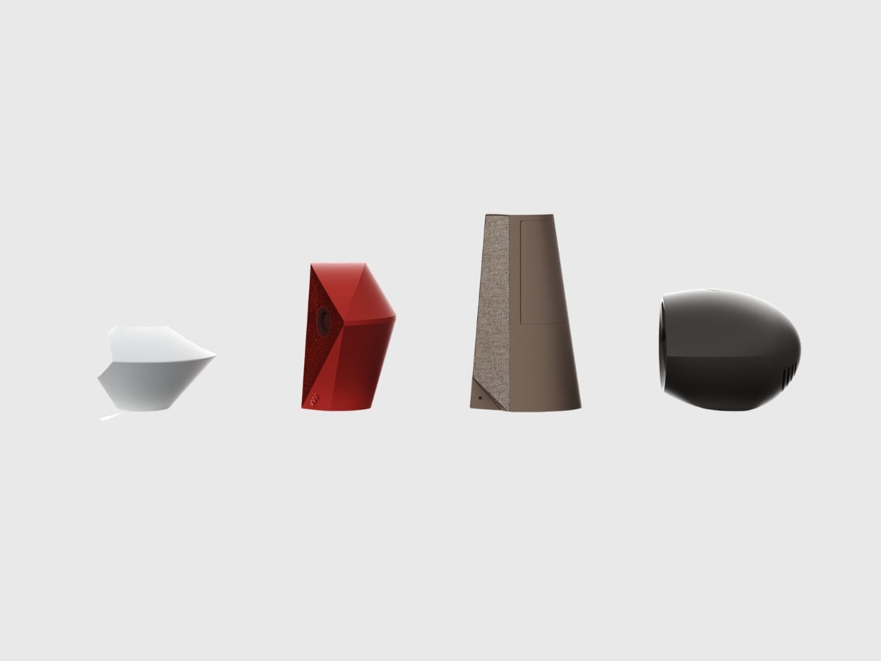
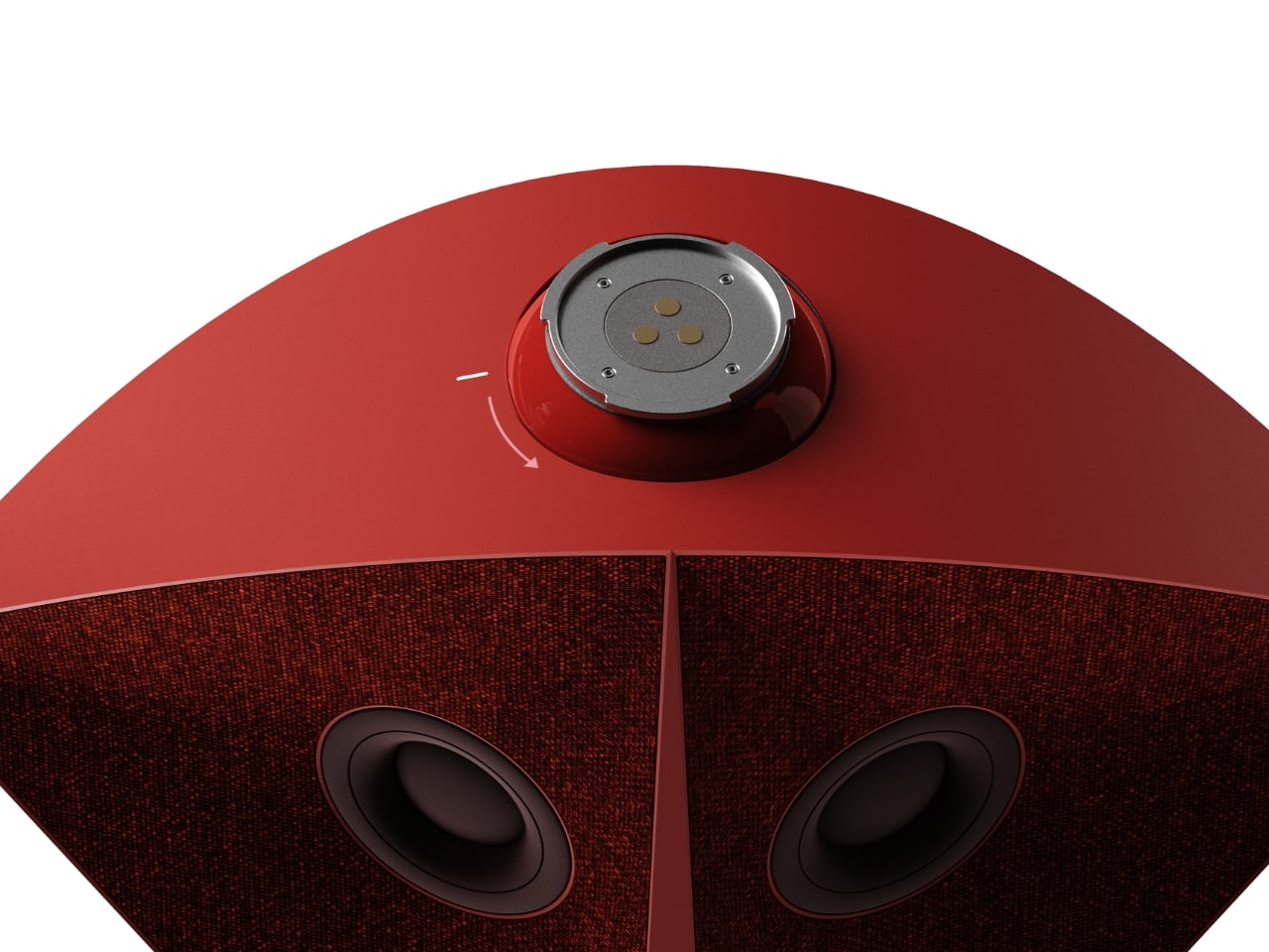
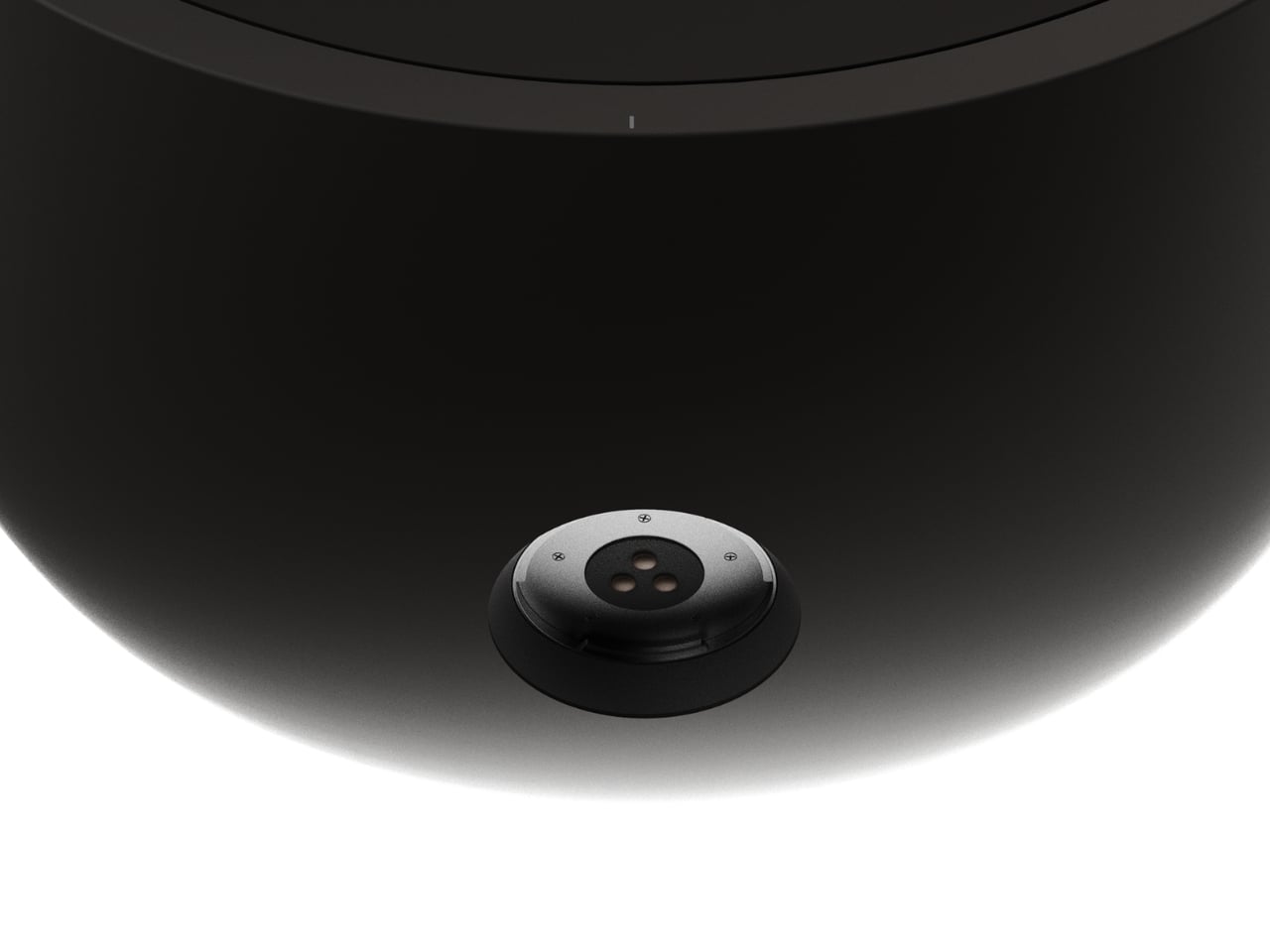
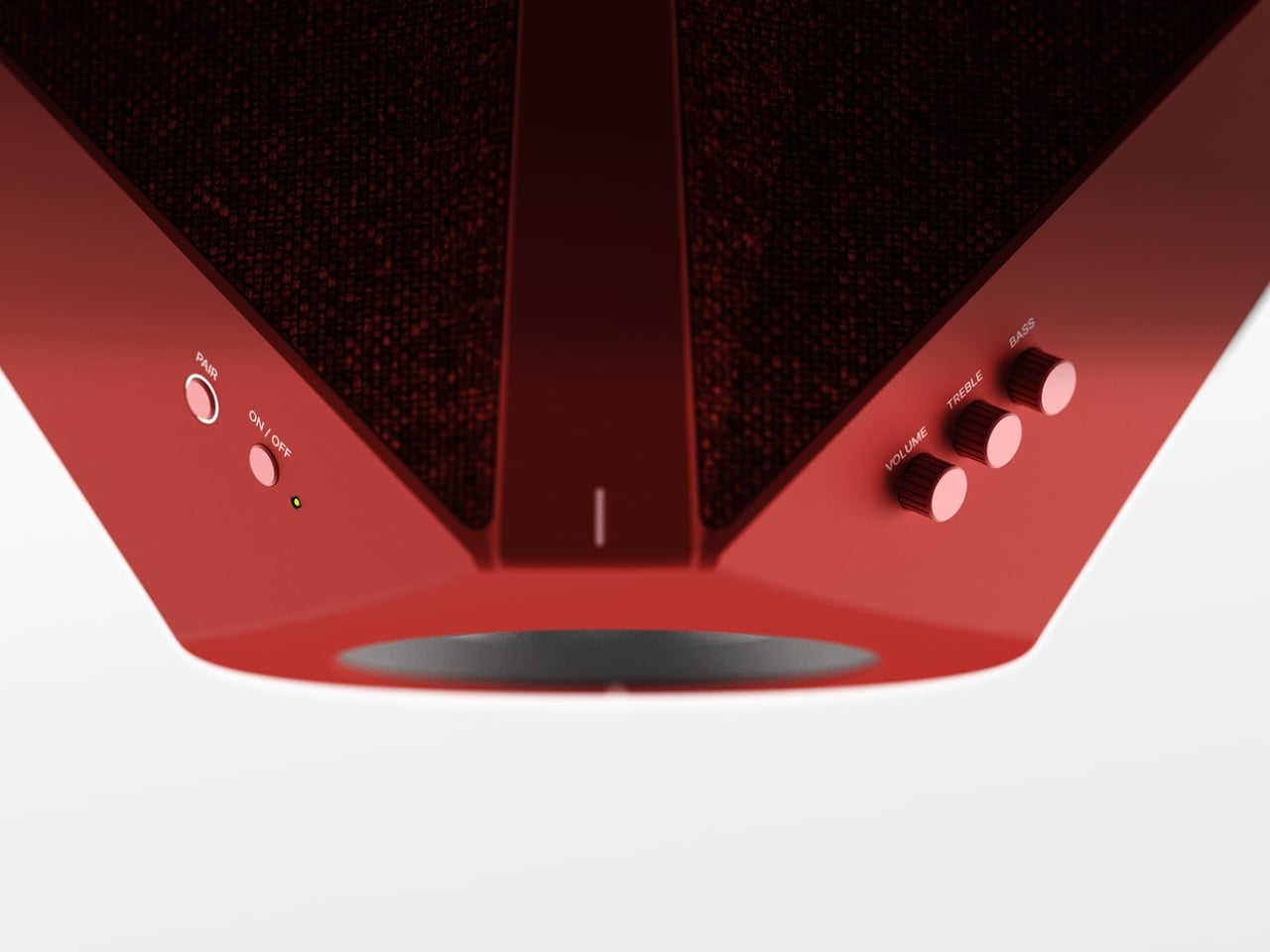
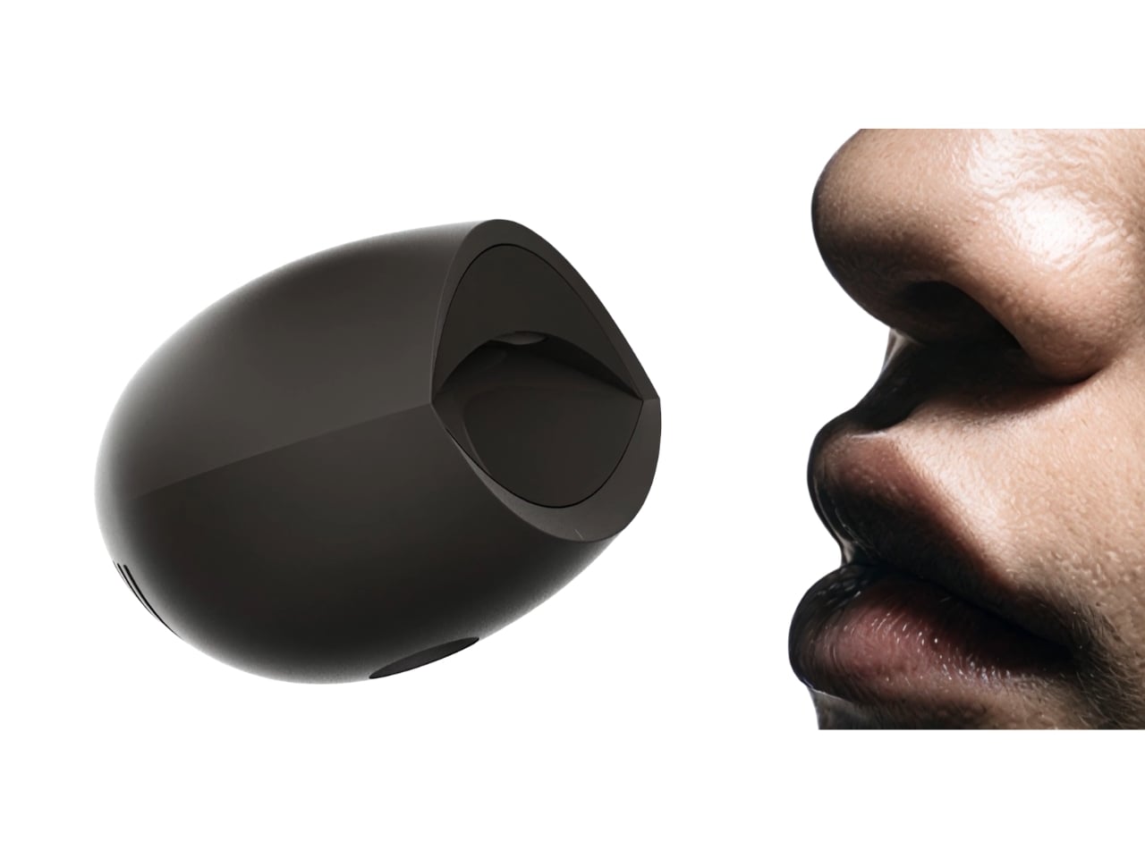
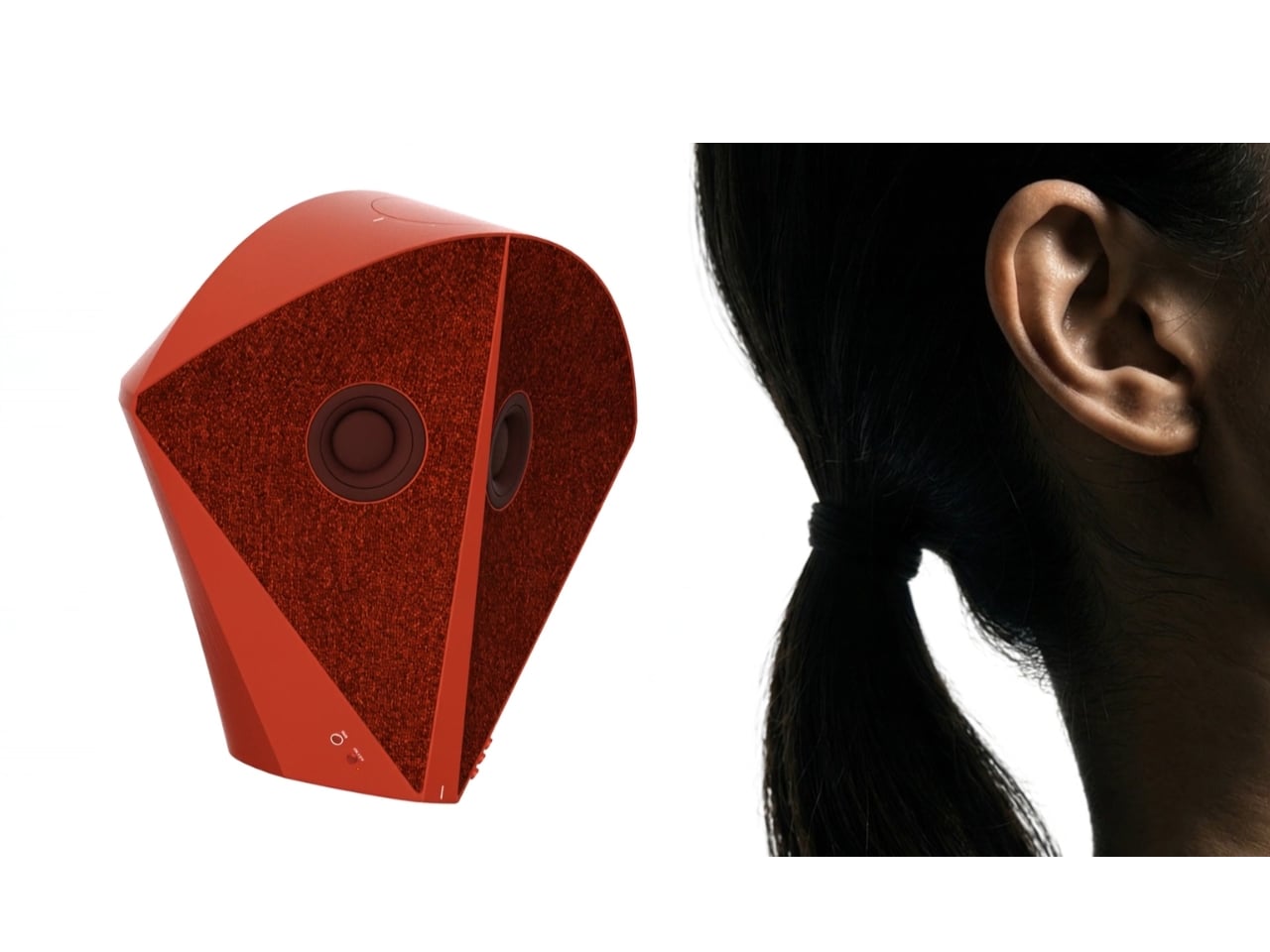
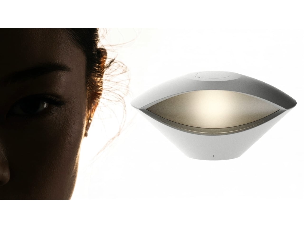
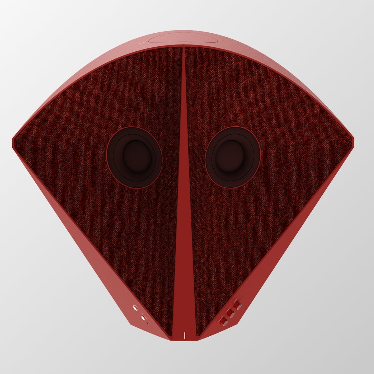
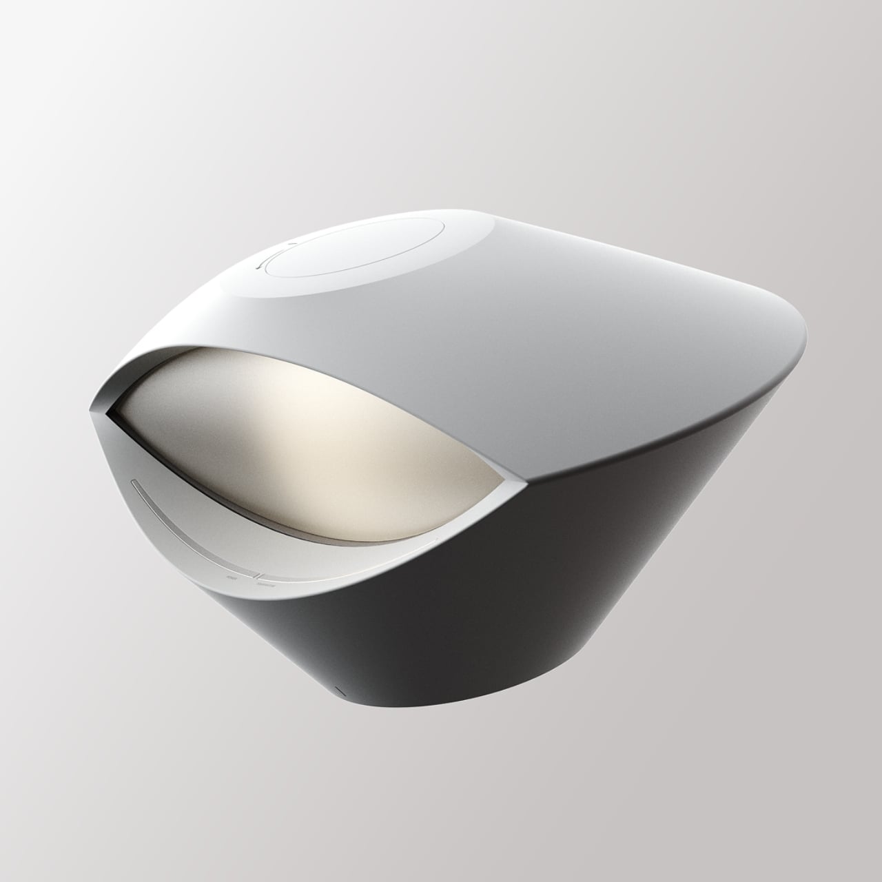
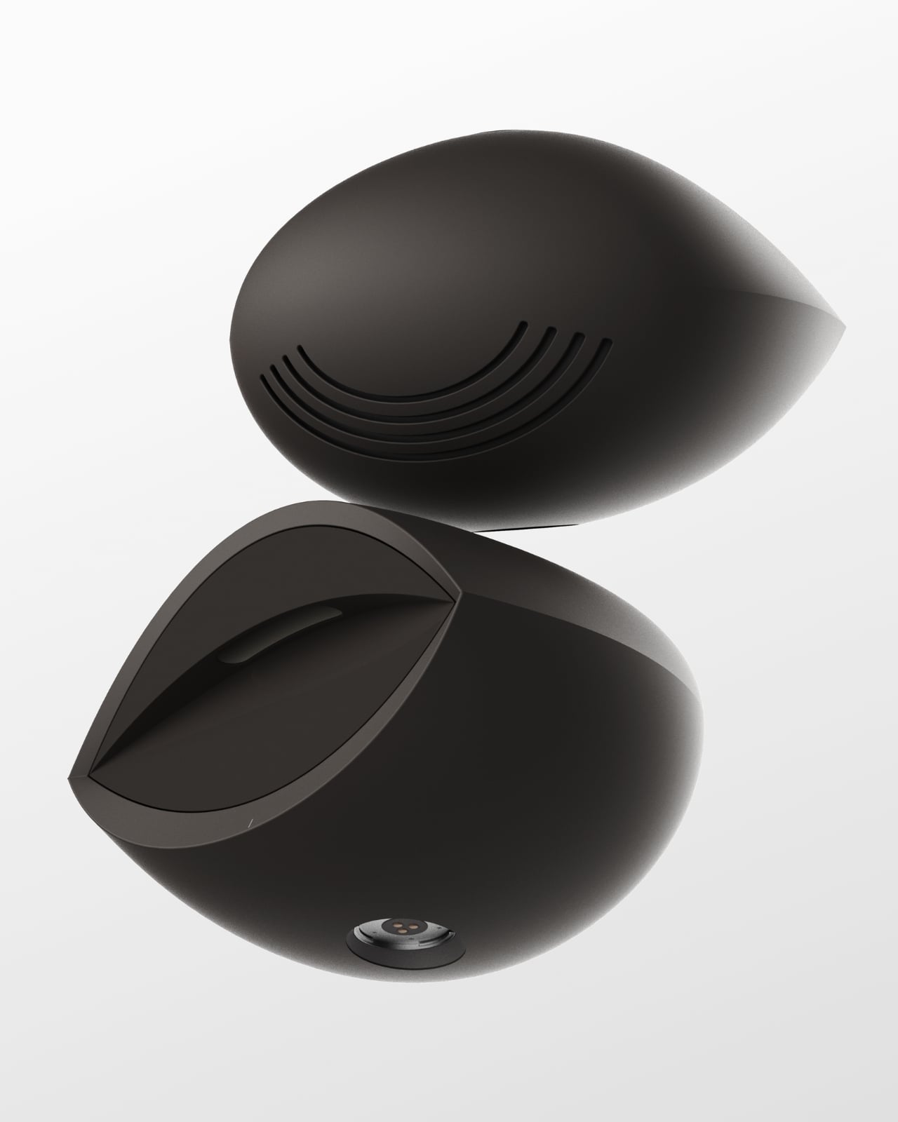
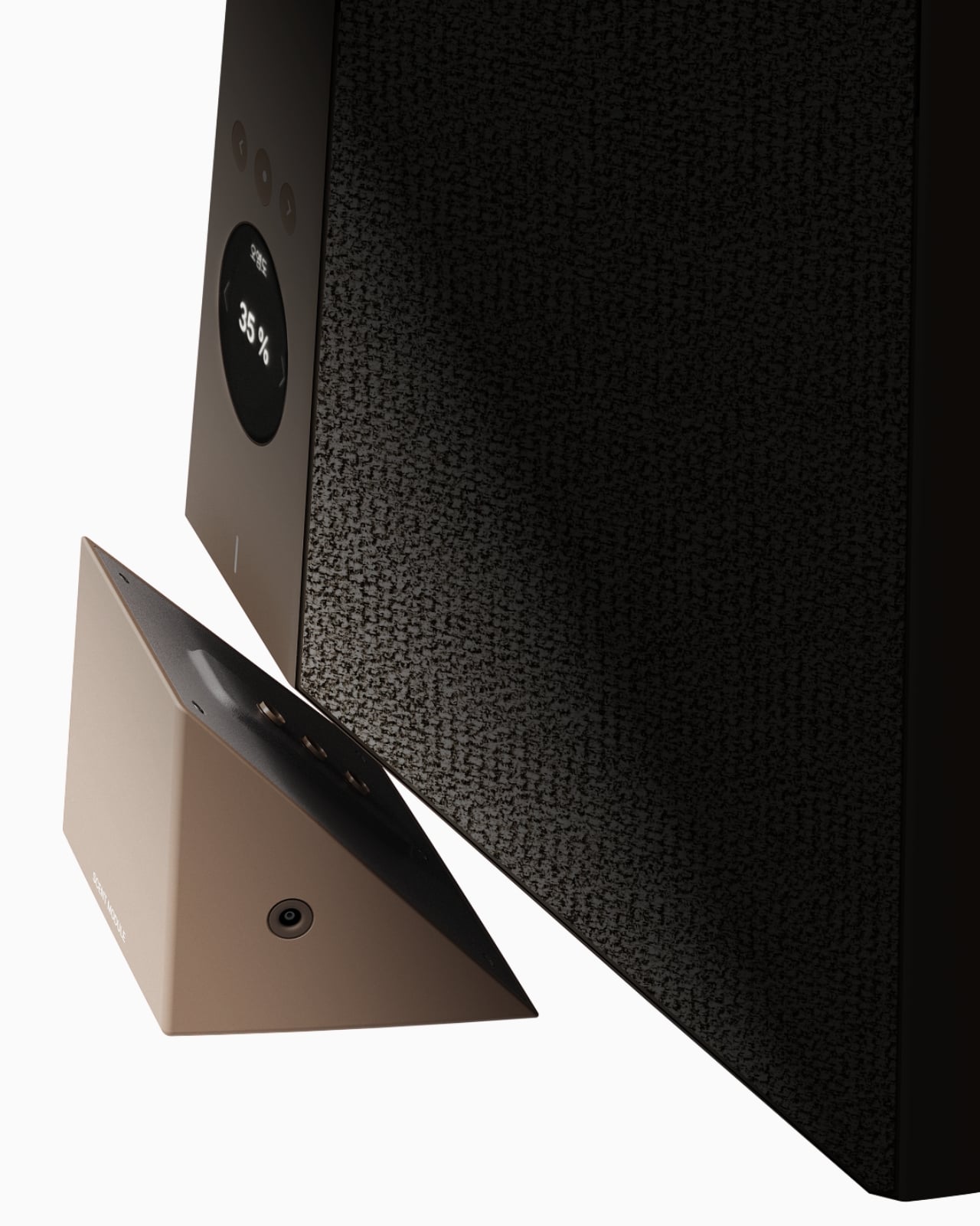
The tower reads almost like a figure standing in the room. At the top sits an eye shaped ambient lamp, its lens glowing warm and soft, the kind of light you’d want next to a couch at eleven at night. Below that, a red, fabric wrapped module houses the main speaker drivers, angled like a face with two eyes looking back at you, which is a genuinely clever piece of anthropomorphism for an object meant to live in your peripheral vision all day. The tapered midsection functions as the control hub, complete with a discreet volume display, and the whole thing terminates in a rounded black base that turns out to be a hidden drawer, a small cooling compartment for a couple of wine bottles. Four completely different jobs, one silhouette.

What makes this more than a novelty is the modularity built into the stacking logic. Nothing about Babel demands you use all four segments in one order. You can pull pieces apart, rearrange them, or run just the parts you need that week. A studio dweller might want the lamp and speaker without the bar module. Someone hosting more often might stack the drawer higher for easier reach. The design treats a small home the way a good capsule wardrobe treats a small closet, fewer pieces, each one doing more, none of them wasted.

I like that Babel doesn’t pretend the solution to small space living is owning less. It assumes you still want a good lamp, a good speaker, and a cold bottle of wine within reach, and it simply refuses to let those wants cost you three separate footprints. That feels more honest than most minimalist design advice, which tends to ask people to want less rather than design better. The name is a nice touch too, a nod to the biblical tower where many languages tried to reach the same point, which tracks neatly onto a product where lighting, sound, cooling, and control all speak different technical languages but rise from the same base.

Whether Babel ever becomes a shippable product is beside the point right now. It exists as a Behance concept, a portfolio piece from a designer who clearly thinks in systems rather than single objects, and that thinking is worth paying attention to regardless of manufacturing timelines. Apartment living isn’t getting more spacious anywhere, and the appetite for objects that look intentional rather than accumulated is only growing, especially among people who grew up curating every shelf for how it photographs. A stacked, sculptural answer to gadget clutter fits that mood perfectly.

Babel won’t fit every home, and a four function tower is a commitment, not an impulse buy. But as a piece of thinking about how to live well in less square footage, it’s one of the more clear headed ideas I’ve seen come out of a design program in a while. Sometimes the fix for too many objects isn’t fewer objects. It’s better posture.

The post Finally, One Tower Replaces Your Speaker, Lamp, and Wine Fridge first appeared on Yanko Design.
  •  

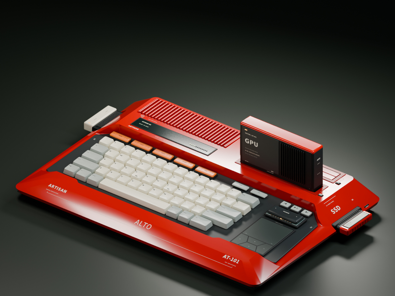
Laptops Sealed Computers Shut, ARTISAN ALTO Snaps Them Back Open

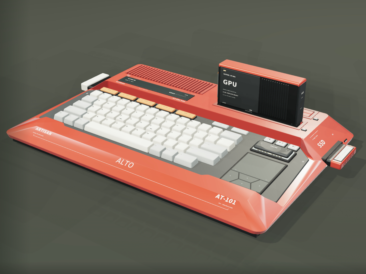
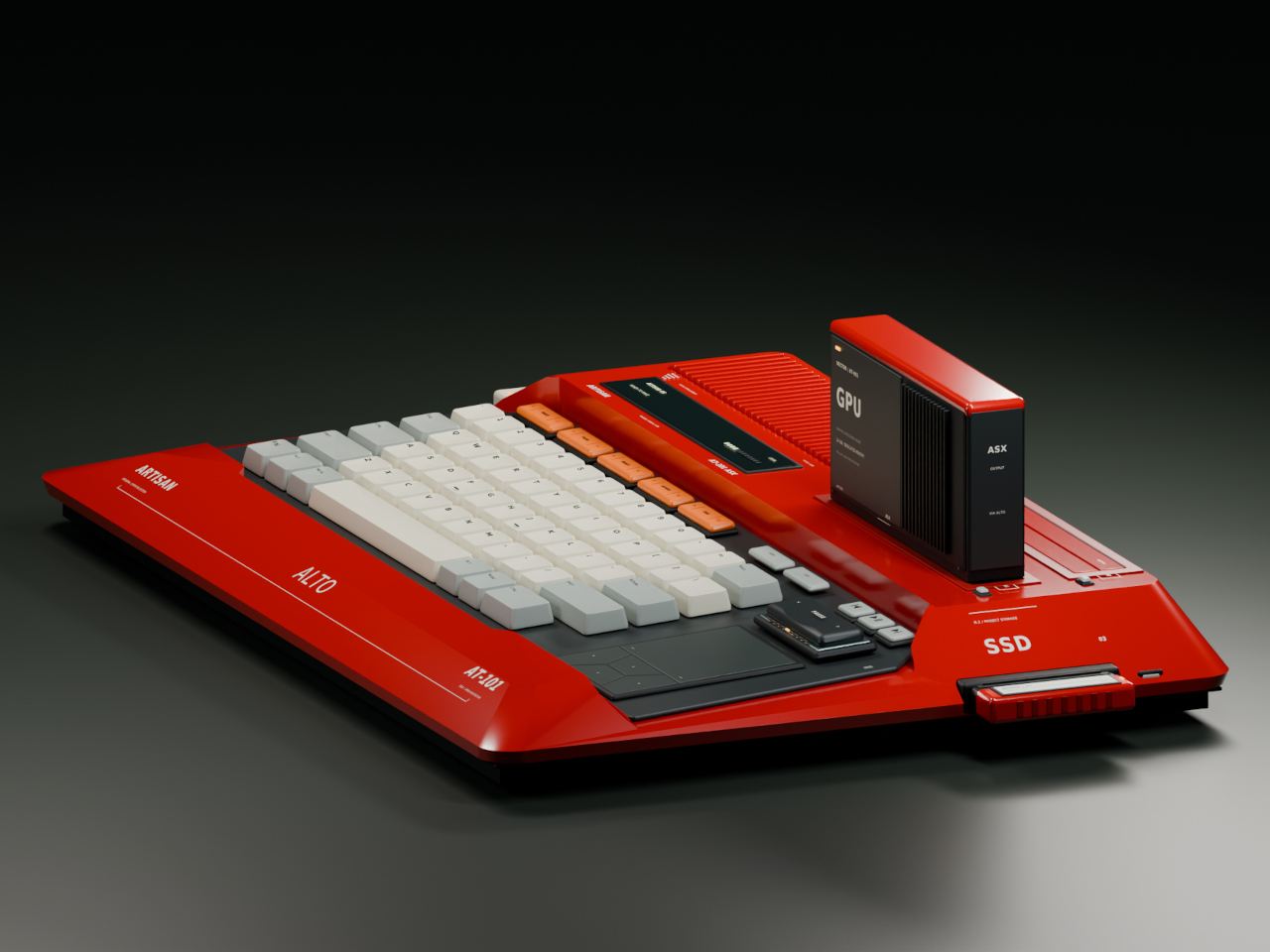
Home computers used to snap open like toolboxes, cartridges sliding in for a new game or a new skill. That idea mostly disappeared once sealed laptops took over, but the ARTISAN ALTO AT-101 brings it back with a vermilion shell that looks like it walked straight out of 1984 and a system built for how people actually tinker today. It’s a machine designed to grow alongside whatever you’re currently obsessed with.

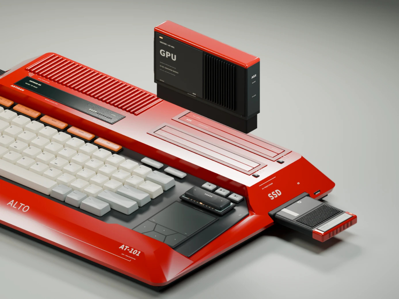
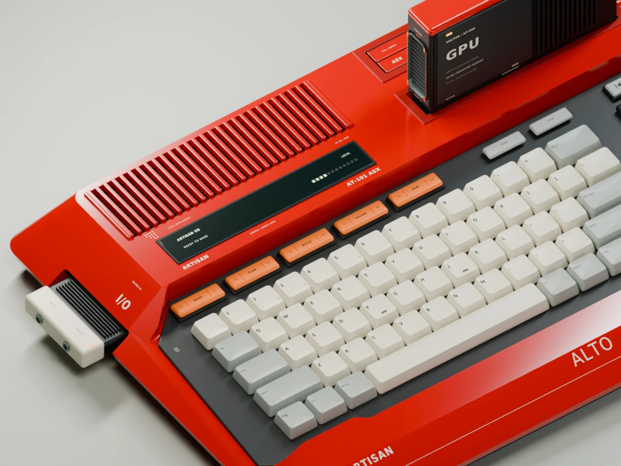
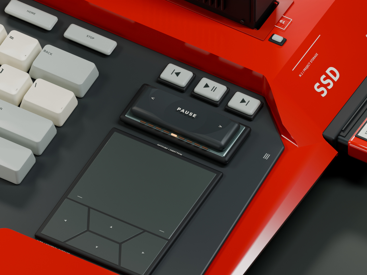
The trapezoidal red housing wastes no time signaling its intentions. Sculpted, concave ivory keycaps sit beside red cooling louvres, and a keyboard opening cuts diagonally through the sloping side, turning what could’ve been a flat slab into something with genuine presence on a desk. This is a machine built to be looked at, not tucked behind a monitor.

Designer: Leo Botinelly

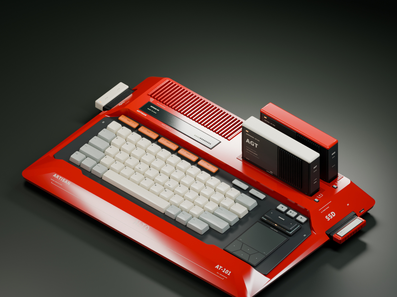
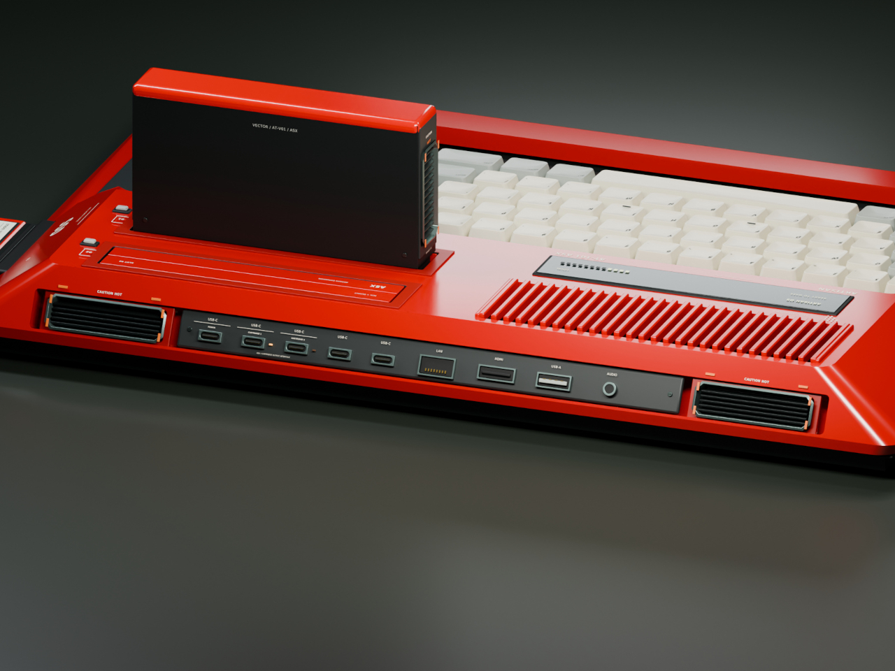
That vintage-inspired shell hides a distinctly modern expansion idea. Upright cartridges slot into place to add graphics power, sound capability, retrocomputing modes, or an AI companion, while smaller side modules handle specialist interfaces and individual projects. Recording a demo, building out a more ambitious scene, or reviving an old favorite game all become a matter of swapping in the right module rather than replacing the whole machine.

The standout pairing puts VECTOR, a compute cartridge, alongside COMPANION, an AI agent module with its own ivory-crowned housing. Together they form what the concept calls a personal cyberdeck, one where your context and your processing power both live in the same two bays. Everything from your conversation history to your working files stays local, an intentional counterpoint to how most AI tools currently function.

Five multifunction keys handle creative shortcuts without forcing a trip through a menu, while a dedicated PAUSE rocker lets you freeze, rewind, or speed through whatever’s running, treating time itself as something you can grab and adjust mid-task. A touchpad and four flush cursor keys merge into a single continuous surface on the right side, keeping navigation under the same hand that’s already resting there.

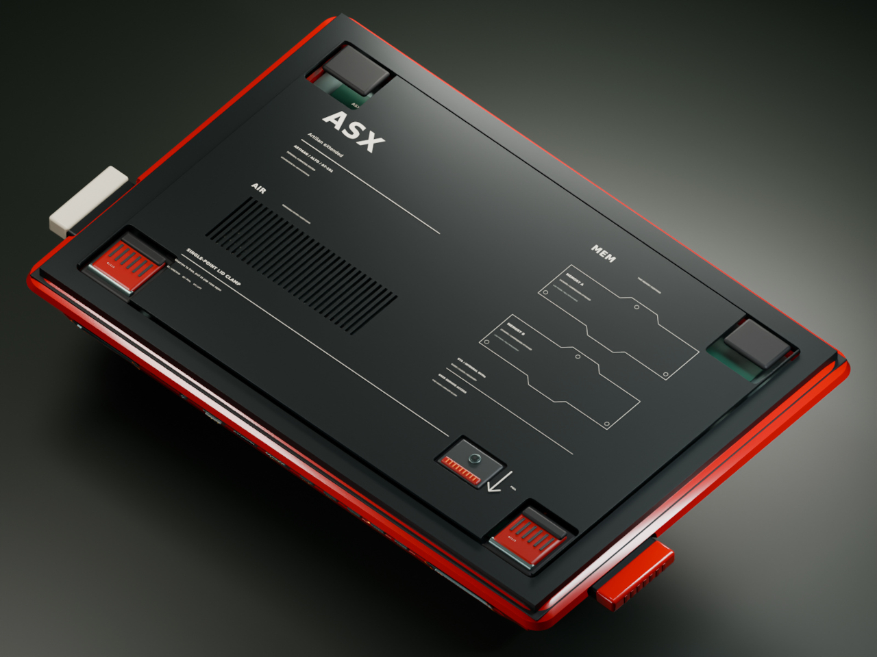
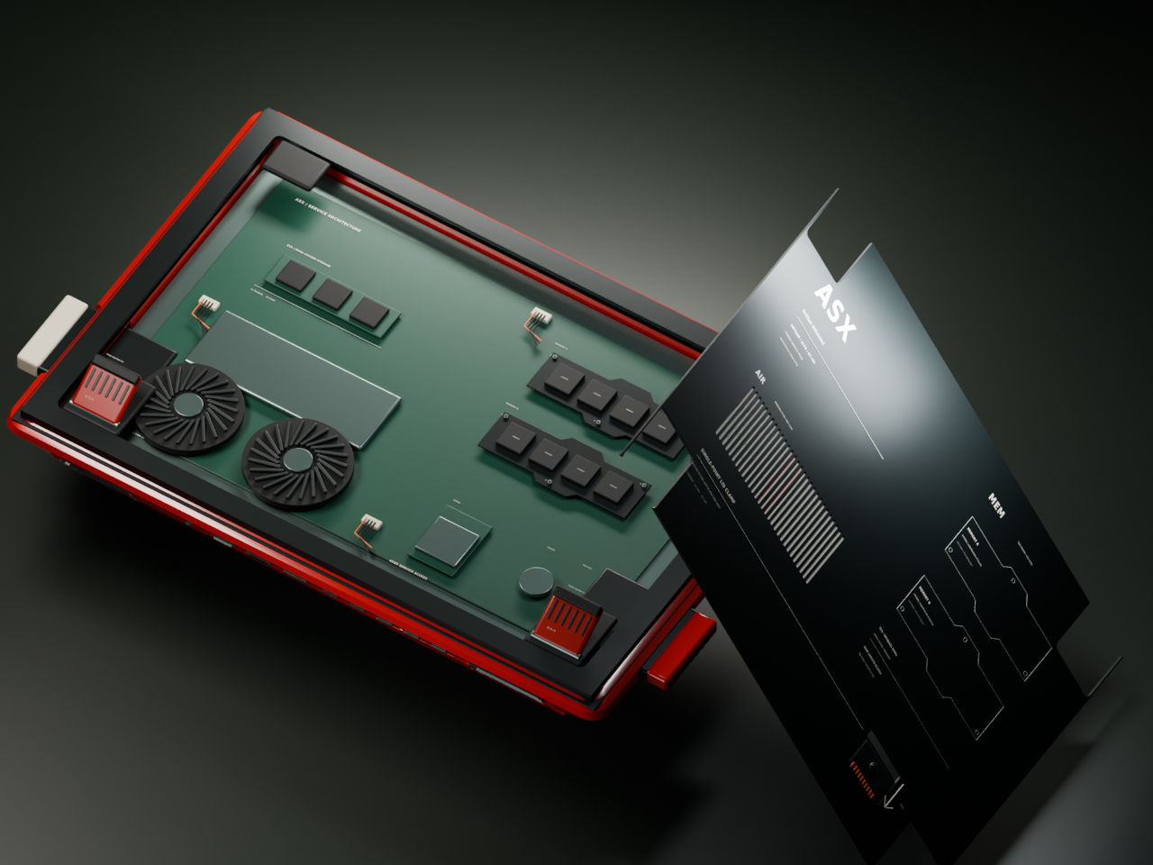
Flip the machine over and the same philosophy continues. Memory access sits in the open rather than buried under layers of casing, rear supports adjust to match your desk setup, and a single screw releases the service clamp entirely. Every one of these choices treats a computer’s insides as something worth respecting, not hiding behind warranty stickers and proprietary screws.

Around back, a compact connector panel handles the practical side of daily use. USB-C power sits alongside labeled ports for two cartridges, additional USB-C connections, LAN, HDMI, USB-A, and audio, all routed cleanly to keep cables from tangling across the front of a desk. Even the exhaust vents get a considered shape, flanking the connector panel like a pair of small turbines venting heat from all that cartridge-driven ambition.

The post Laptops Sealed Computers Shut, ARTISAN ALTO Snaps Them Back Open first appeared on Yanko Design.
  •  

This Desk Lamp Puts a Spotlight in a Ring Light With One Knob

Desk lighting has long been a compromise between task and atmosphere. Professional lamps tend to lean one way or the other: too directional and harsh for extended use, or too diffuse to support fine detail work. A lamp that’s good for examining physical samples often isn’t comfortable over long stretches, and one that’s gentle on the eyes doesn’t always deliver when you need a hard, directed beam.

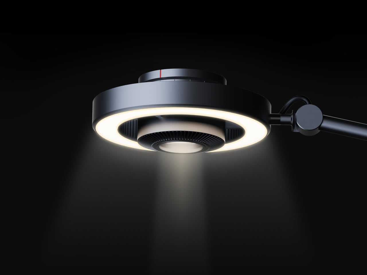
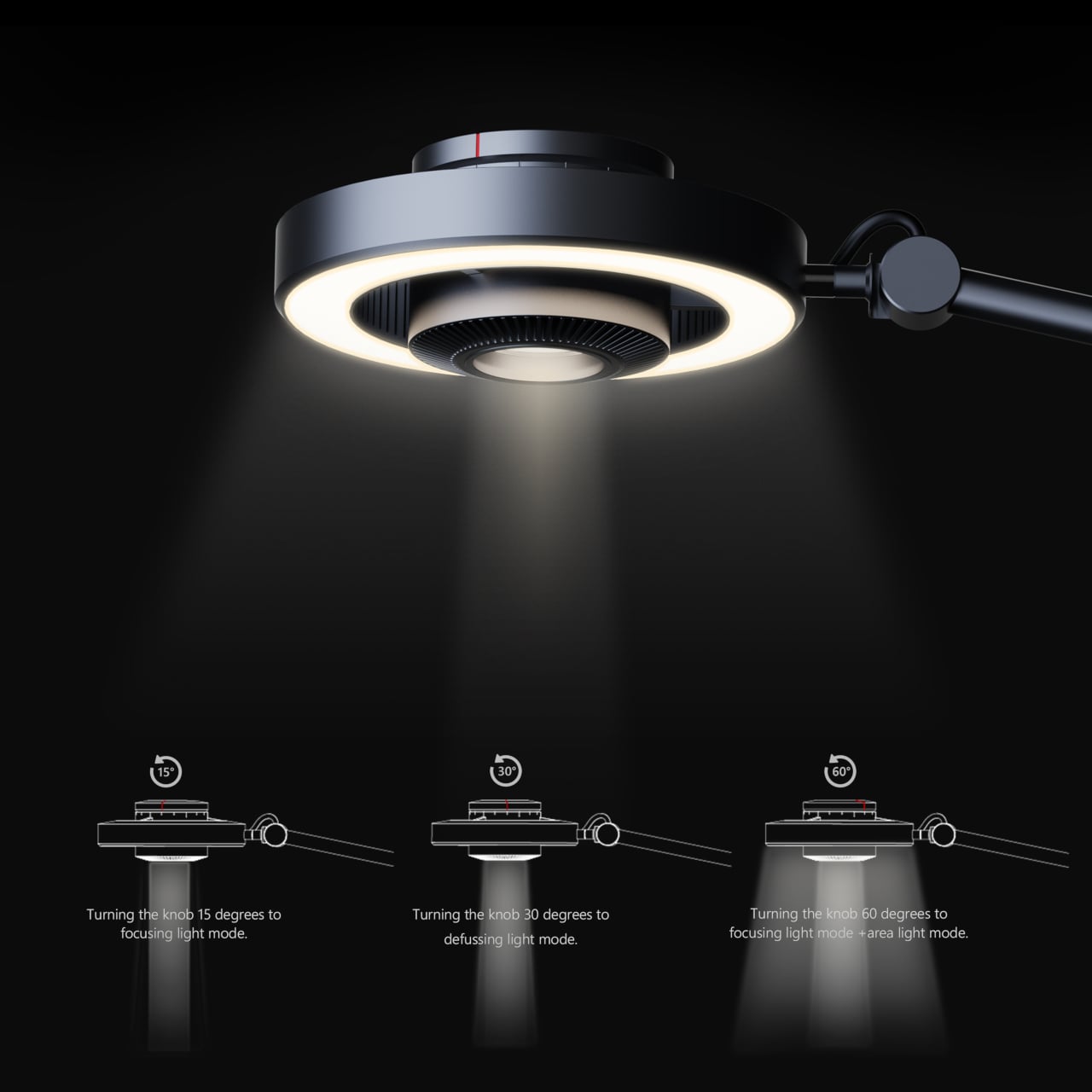
The Focus Light is a desktop lamp concept built around a different premise. Rather than committing to one kind of output, it combines two independent light sources into a single lamp head, giving the user the ability to shift between a precise, concentrated beam and a broad ambient glow, or run both at once. All of it’s controlled by a single rotary knob, and there aren’t any menus, apps, or extra switches involved.

Designers: Zhen Yang, Siting Lin

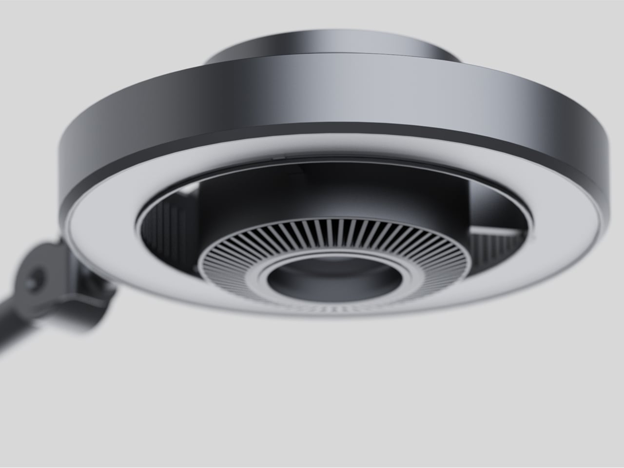
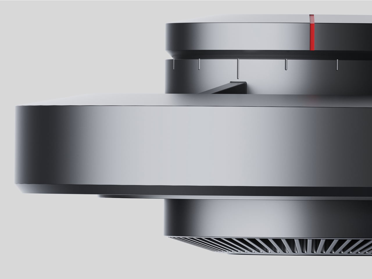
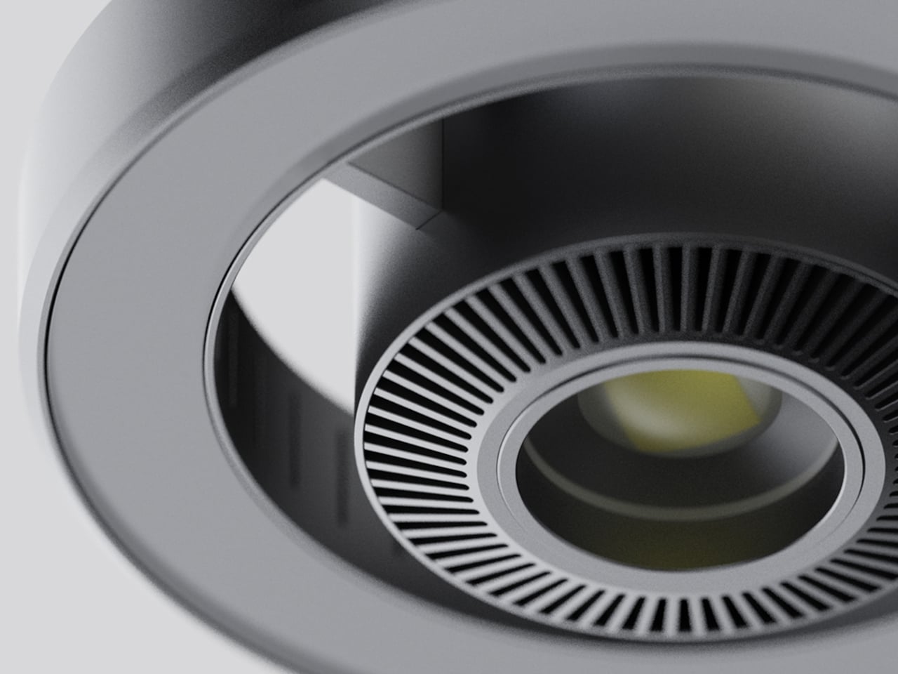
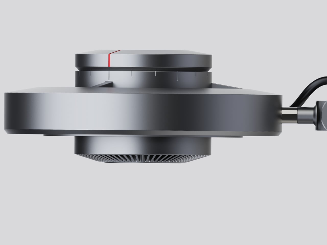
The lamp head is organized concentrically: an outer ring delivers ambient light while a central optical lens handles the focused beam. That layout has both functional and visual logic to it. Both sources sit in deliberate, concentric relation to each other, and the overall form looks as precise as it performs. The whole thing is finished in space gray metal, which lends it a professional, precision-tool character.

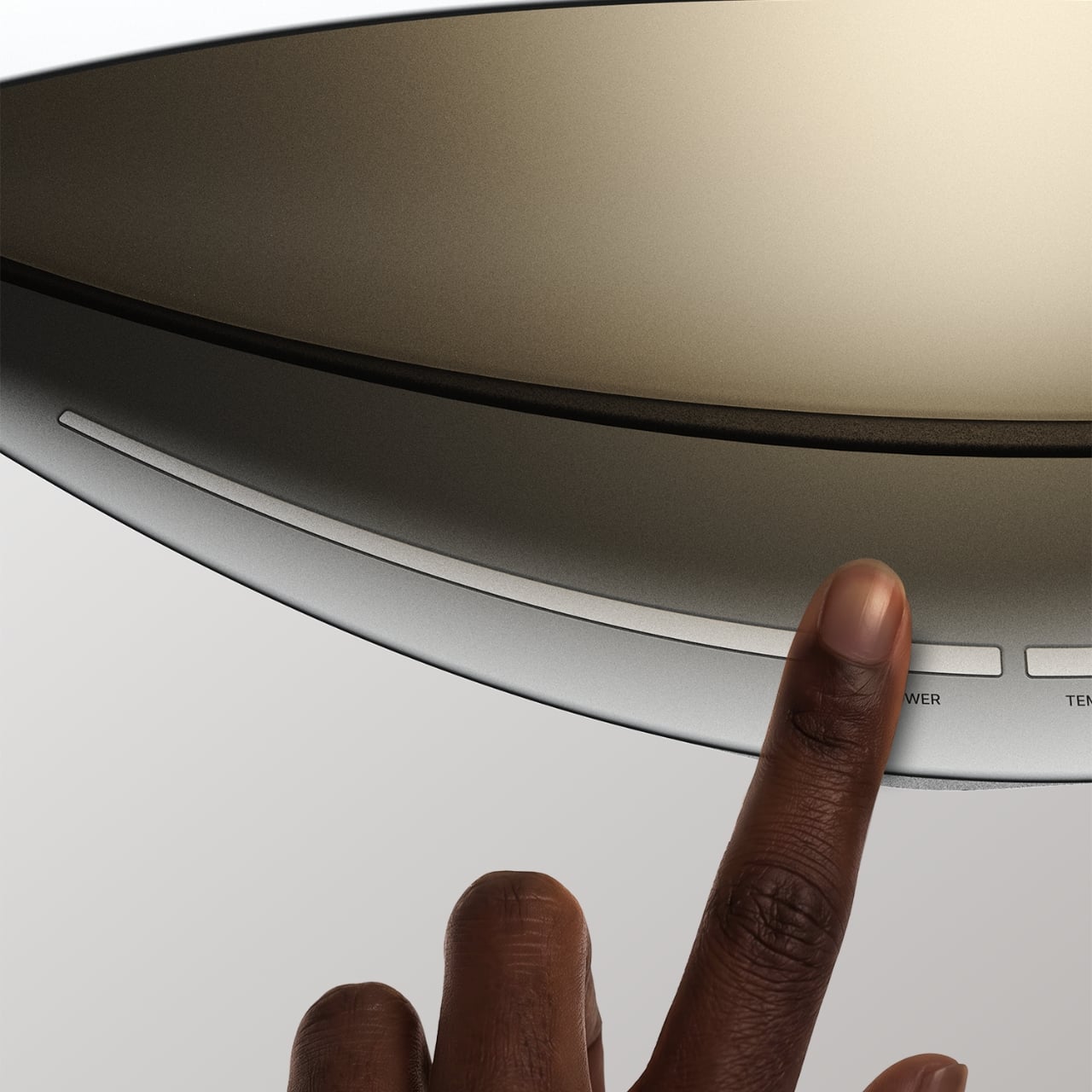
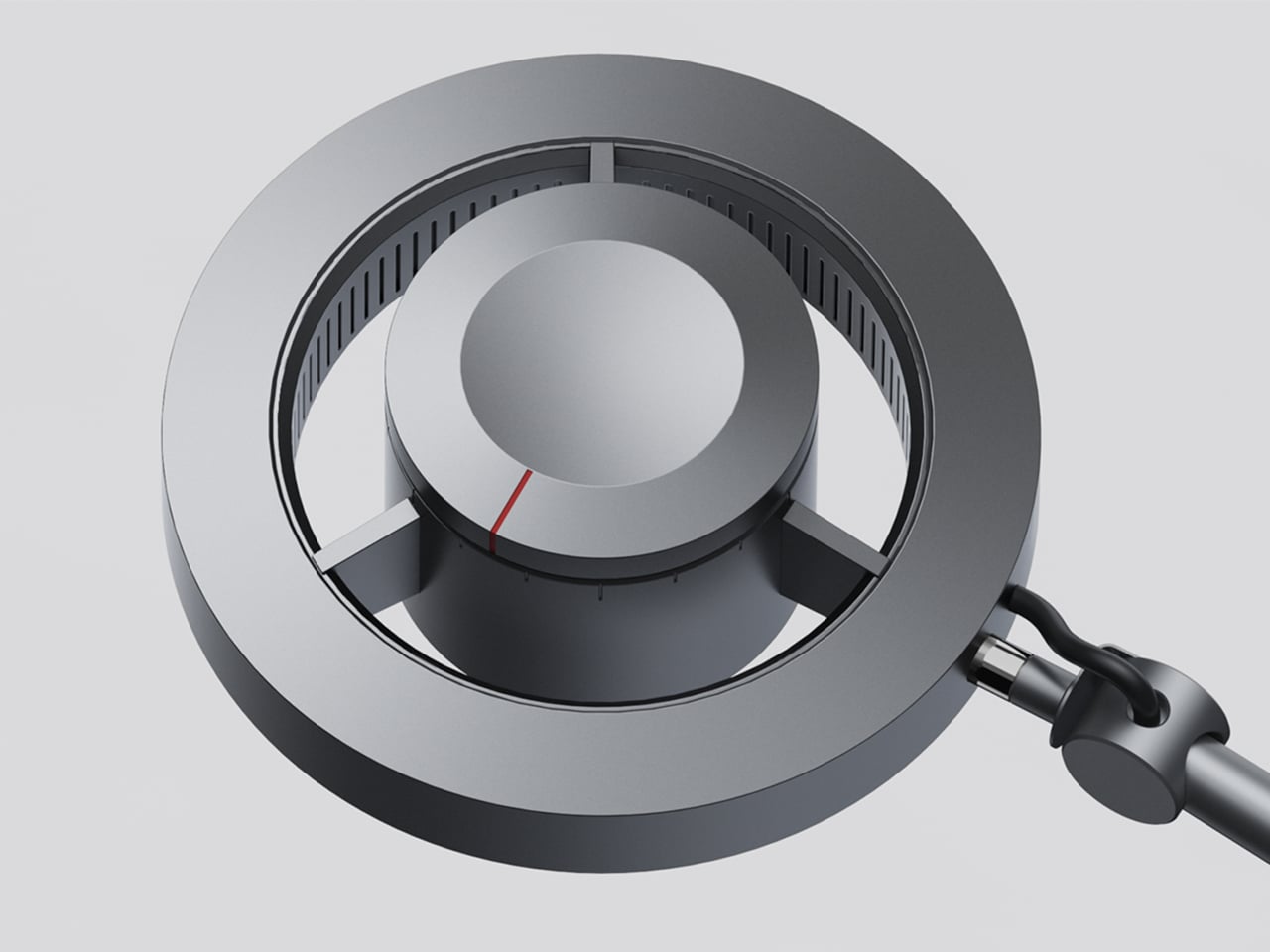
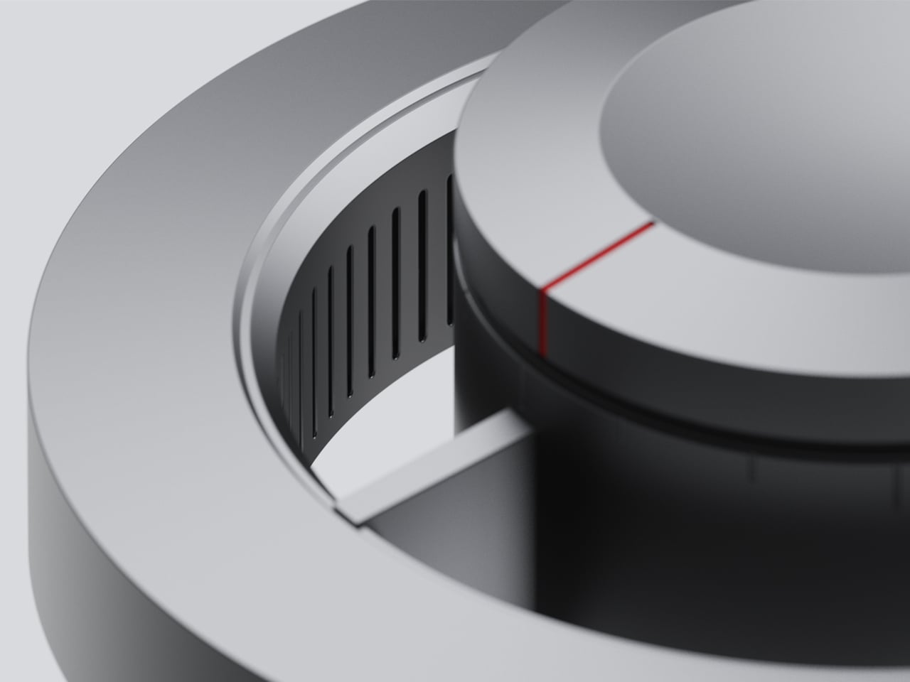
Control comes from a rotary knob on top, marked with a red indicator line. Rotating it 15 degrees activates focusing mode, sending a tight, concentrated beam straight down. At 30 degrees, the lamp shifts into diffusing mode, spreading the output into something closer to fill light. Push it to 60 degrees, and both sources run simultaneously, combining the central spot with the ambient ring for a layered workspace light.

For detailed hands-on tasks, being able to shift between modes without touching an app or dimmer panel makes a real difference. An illustrator tracing fine lines benefits from the precision of the focused beam, but that same beam creates harsh contrast against a dark surrounding surface. Bringing in the ambient ring softens that contrast, and having both running at once makes moving between close-up precision work and wider desk visibility much more seamless.

The same flexibility serves anyone who switches between different types of work at the same desk. Reading calls for something even and non-glare; marking up documents or working with small physical components benefits from a harder, more directed light. The Focus Light doesn’t ask the user to swap lamps or reposition the arm for each shift. The knob handles it, and the change is immediate.

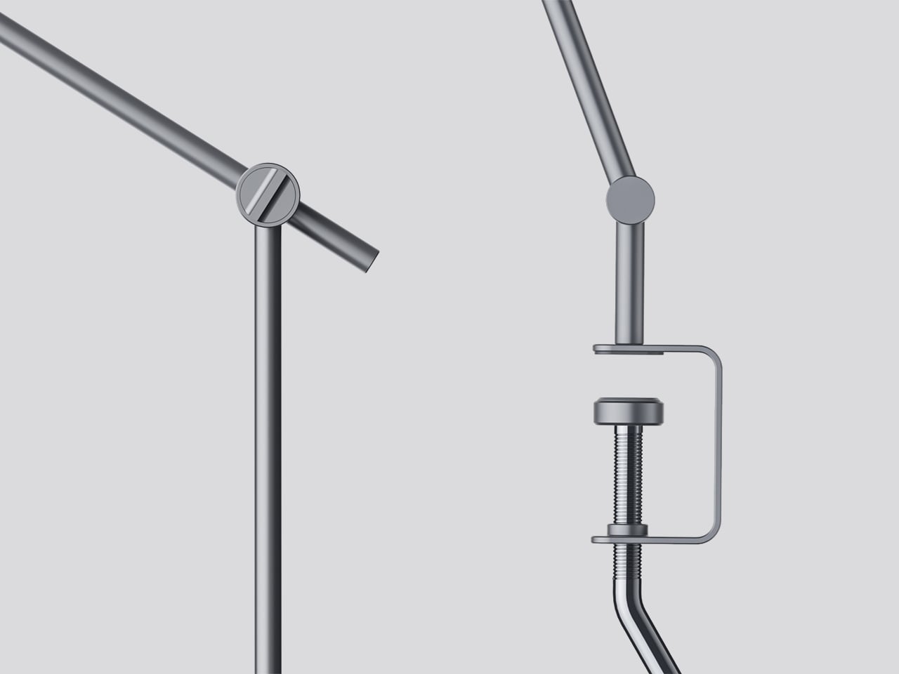
The physical form reflects the precision the lamp is meant to support. The lamp head is a clean disc with radiating heat fins arranged around the inner lens assembly, and the arm connects at a ball joint that allows repositioning without loosening a series of screws. A threaded desk clamp handles the mounting, so it doesn’t demand a grommet hole or take up surface area with a weighted base.

What stands out about the concept isn’t just the dual-source setup, but that a single physical control manages both. There’s no menu to scroll, no app to open. The red indicator on the knob tells you exactly where you are, and the three positions are distinct enough that you’d find your way back to any of them by feel after just a few days.

The post This Desk Lamp Puts a Spotlight in a Ring Light With One Knob first appeared on Yanko Design.
  •  

This Cork Cactus Looks Like Decor and Acts Like 3 Pieces of Furniture

Coat stands have always occupied an awkward position in a room. They’re functional enough to keep around but rarely considered anything beyond a place to pile things on the way out the door. Pin boards face a similar problem, useful at a desk but hard to integrate into a living space without making it feel like an office. Objects that try to do both tend to resolve that tension poorly.

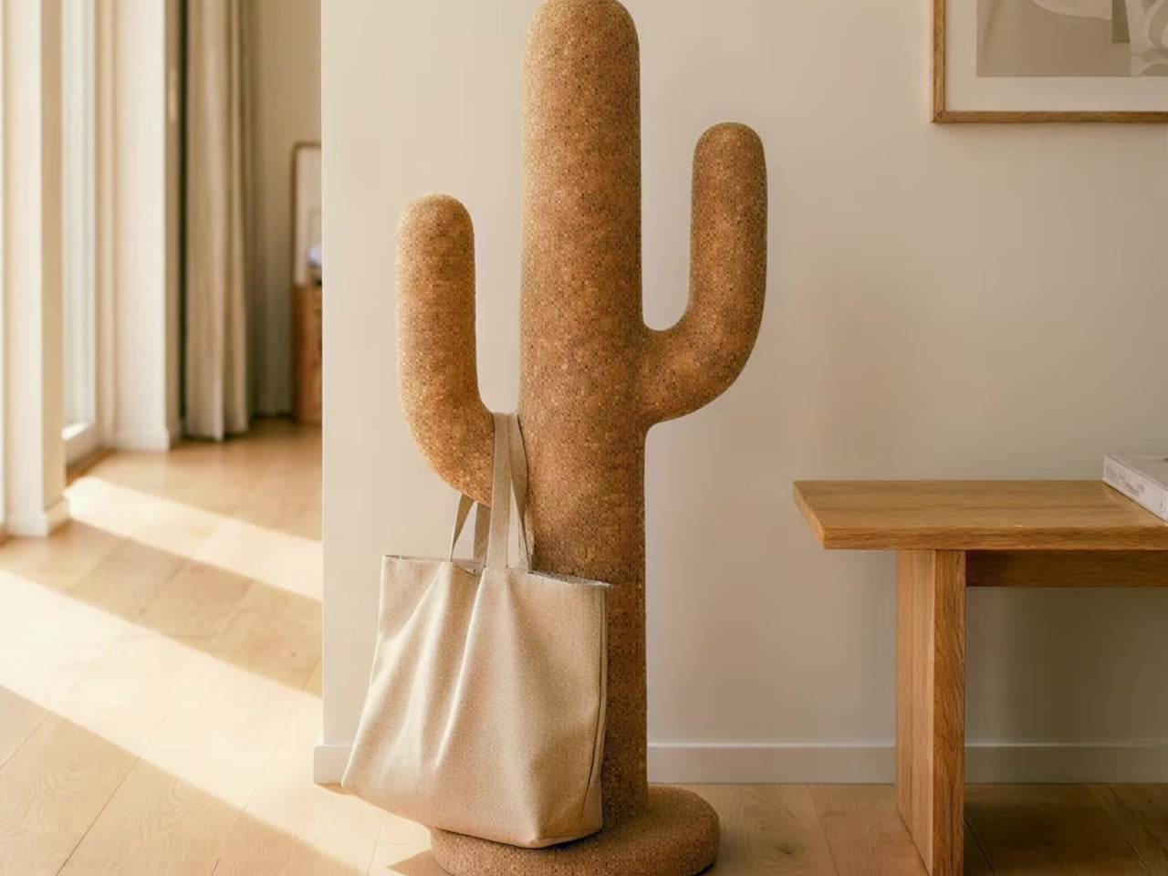
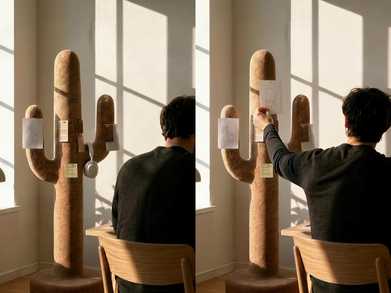
Corctus starts from a different premise. The name merges “cork” and “cactus,” which is also a fair summary of the concept: a floor-standing object shaped like a saguaro cactus, made entirely from cork, and quietly capable of handling most of what people need to keep close at hand. Rather than solving the storage problem with hooks and brackets, it solves it by making the form itself the function.

Designer: Liam de la Bedoyere (boredeye)

Cork is the central material here, both practically and conceptually. The surface is textured enough to grip a pair of sunglasses on the rounded top without anything extra, and receptive to pins without reinforcement or a backing board. A sketch, a sticky note, or a reference card pins straight into the body of the object wherever it’s needed, with no designated zone for it.

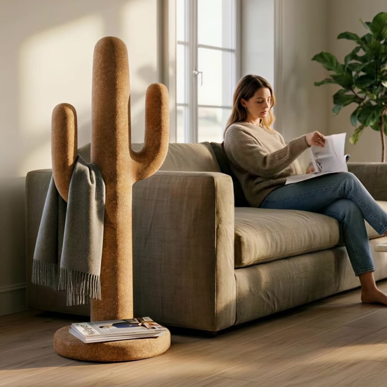
The cactus arms extend outward with a slight upward curve that happens to work exactly like a hook. A backpack hangs from one, a tote bag from another, a scarf draped over without sliding off. Headphones sit naturally over an arm when not in use. None of this requires any hardware, any dedicated accessories, or any particular intention. The geometry of the form handles all of it.

The disc-shaped base adds one more surface. Magazines stack on it, a few books sit within reach, and it grounds the form without demanding much floor space. The compact proportions keep the whole object from reading as a coat stand, which is deliberate. The intention was always a sculptural companion rather than a piece of utilitarian furniture, and the scale reflects that.

That distinction matters in practice. Next to a desk, the Corctus functions as an immediate, physical task board without a screen. Move it into a living room or hallway and it shifts roles without changing character. The warm texture of the cork sits alongside the kinds of materials, and its sandy color sits comfortably against most interior palettes.

Most multifunctional objects succeed at one thing and compromise on everything else. Corctus earns its place as a sculptural form first, and the utility follows naturally from the shape rather than being imposed on it. There are no brackets, no hooks, no panels, and no assembly decisions to make. It stands where it’s put, and the room tends to organize itself around it.

The post This Cork Cactus Looks Like Decor and Acts Like 3 Pieces of Furniture first appeared on Yanko Design.

  •  

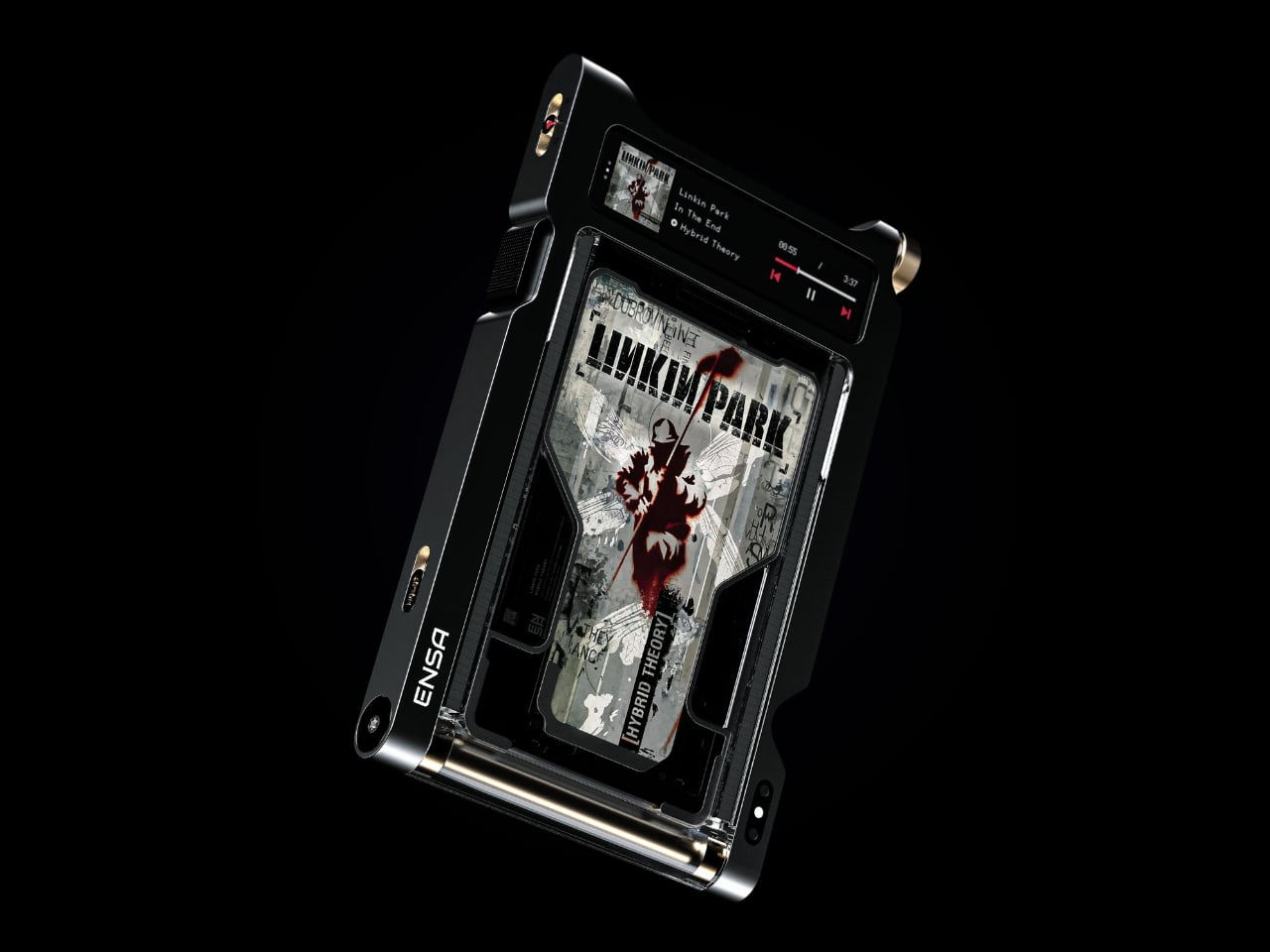
Streaming Took Something From Us. The ENSA T1 Wants It Back

Do you remember the last time music actually demanded something of you? Not just your attention while you scrolled, but your hands. The deliberate pull of a record from its sleeve. The small, mechanical click of a CD case. The unhurried ritual that came before every song, every mood shift, every late-night session on the floor with the volume just loud enough. Vladimir Dubrovin remembers. The California-based multidisciplinary designer has been quietly building a case for returning physicality to the act of listening, and with the ENSA T1, his latest concept design, the argument gets considerably harder to dismiss.

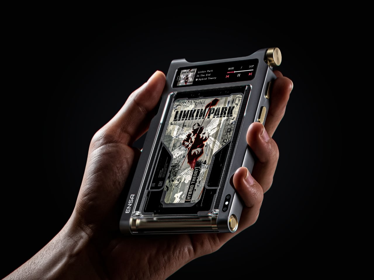
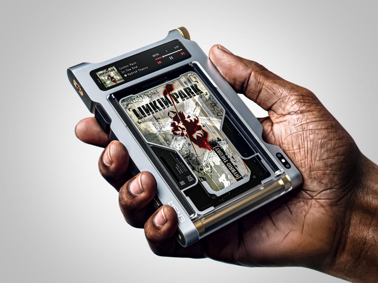
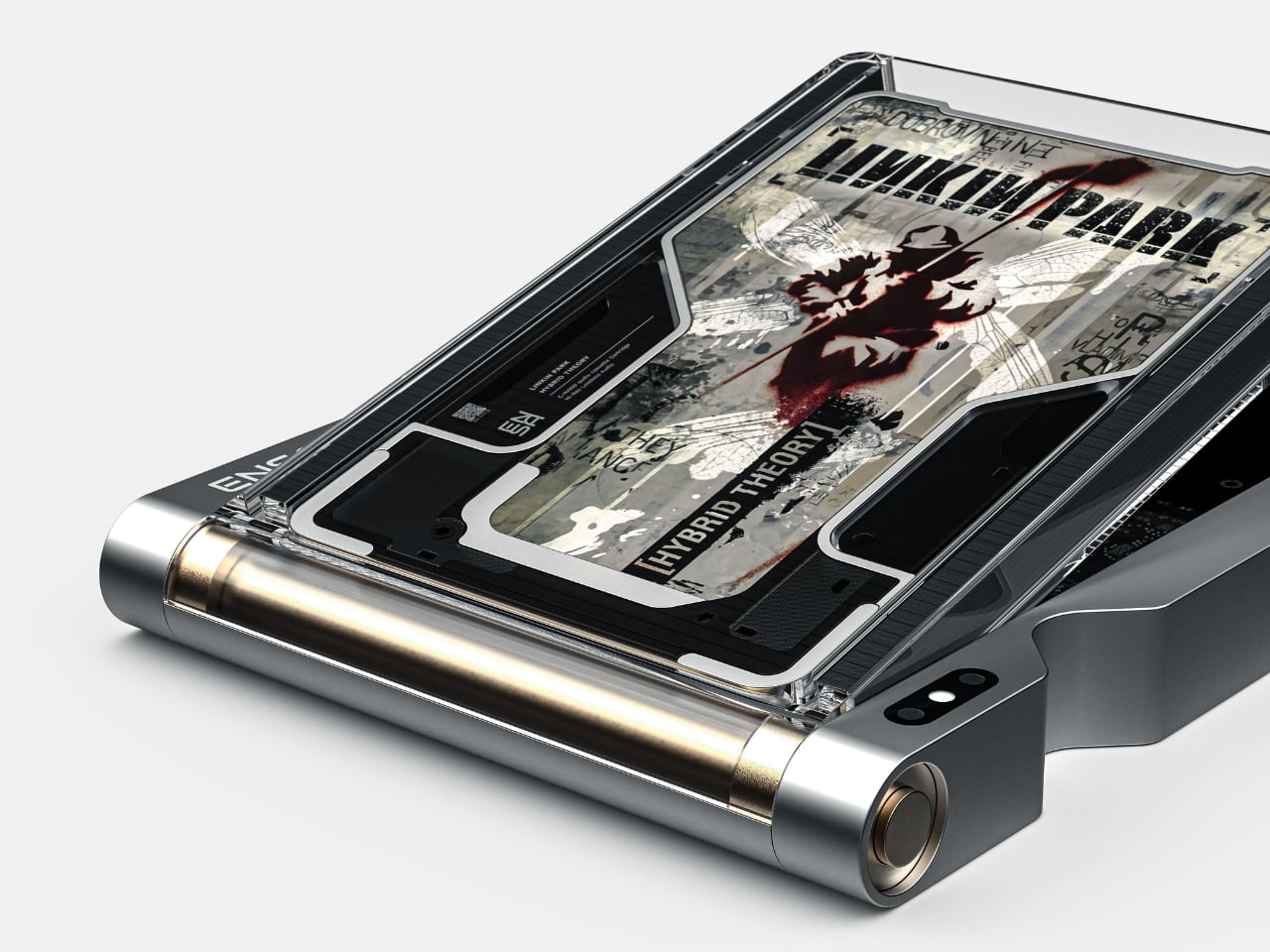
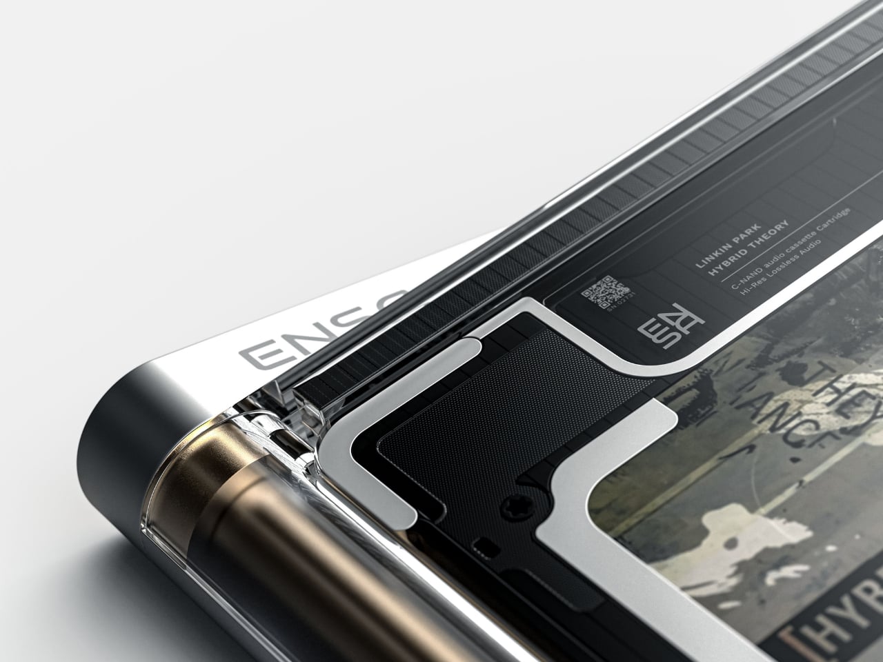
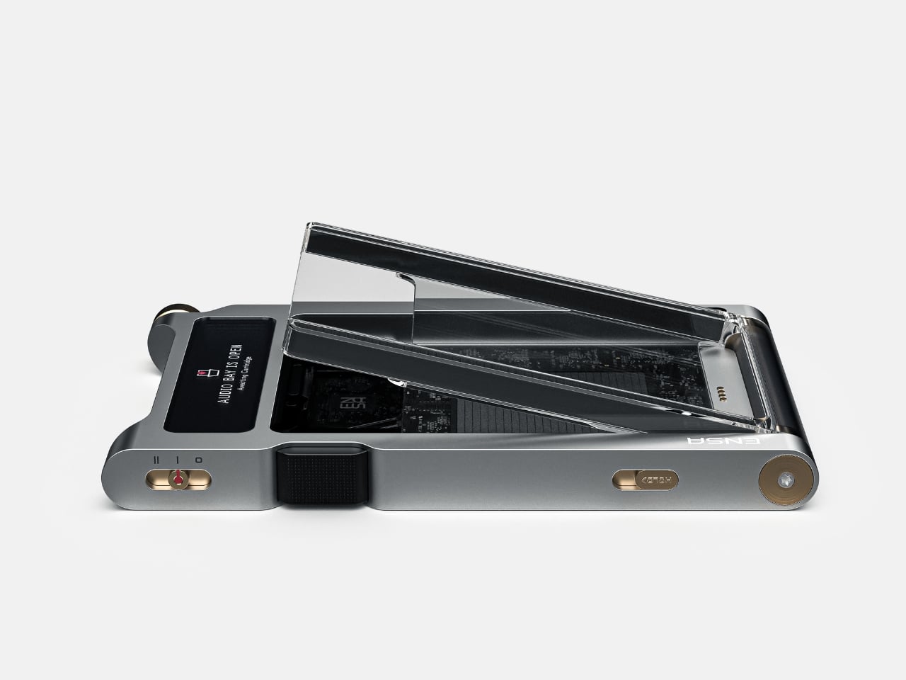
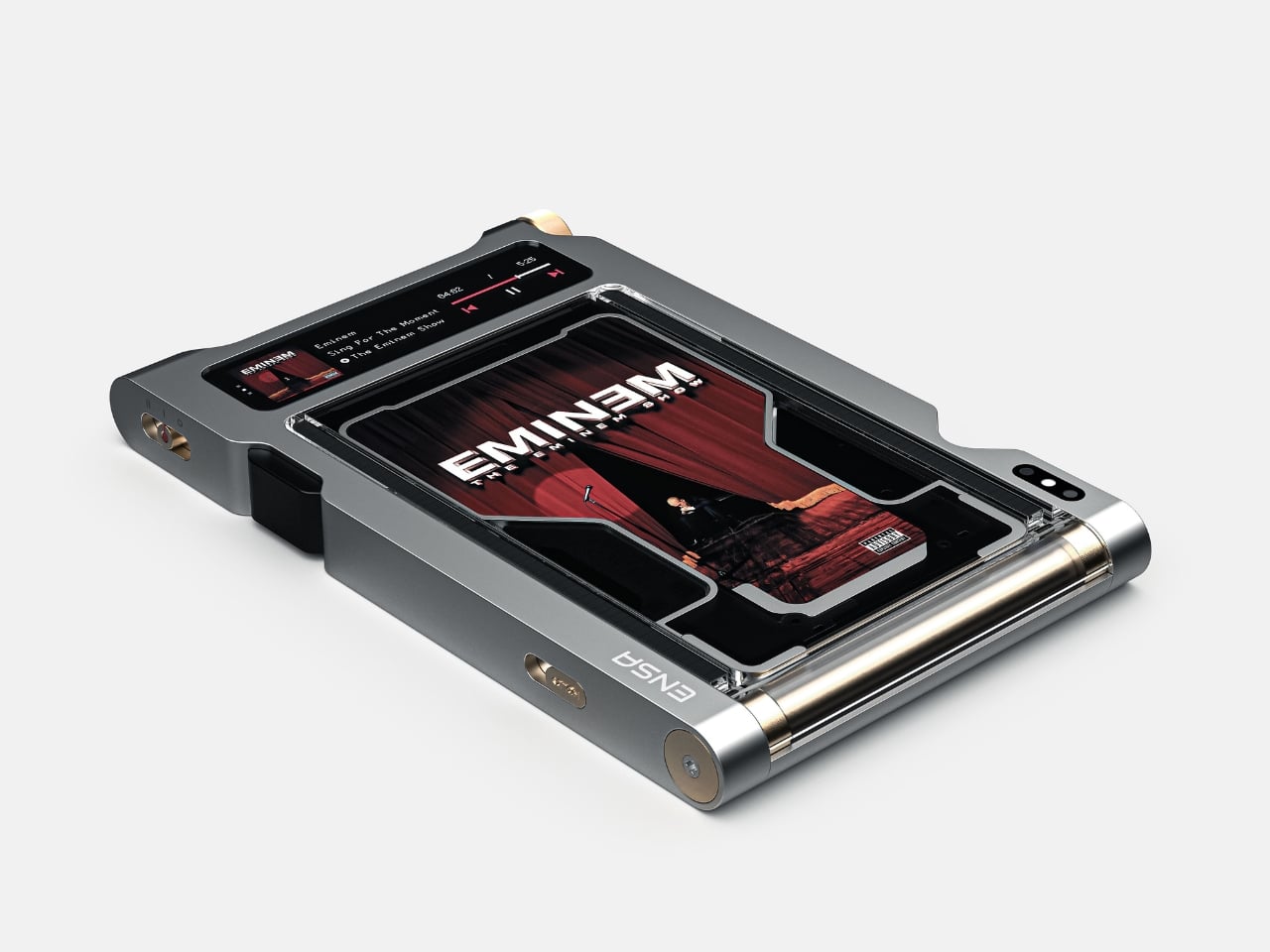
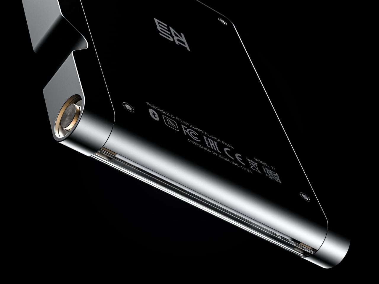
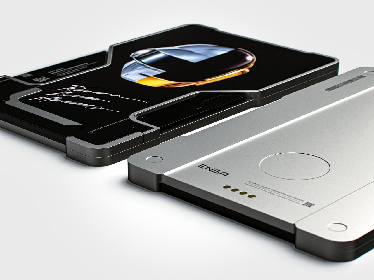
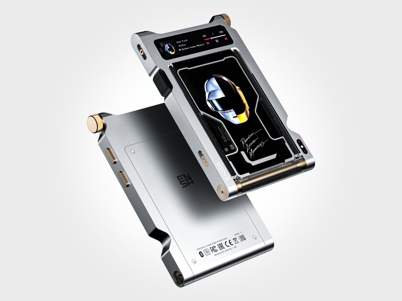
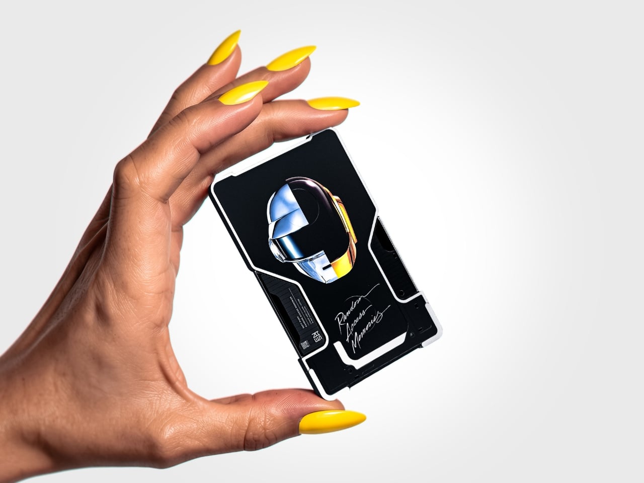
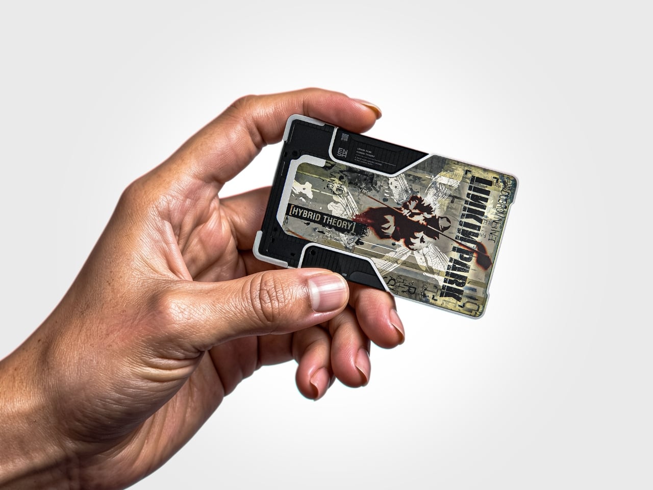
The T1 is the newest addition to Dubrovin’s ENSA line, an evolving design series that began with the ENSA P1, a portable audio player concept that reimagined what a music device could look and feel like in the post-streaming era. The P1 introduced Dubrovin’s concept of C-NAND cartridges: small, disc-shaped, solid-state storage units where each cartridge holds one complete album. There are no moving parts, no spinning mechanisms. They’re fully digital in how they handle audio, but they exist in the physical world the way vinyl does. You pick one up, turn it over, look at it, choose it. The act of choosing your music becomes deliberate again, and that matters more than it sounds.

Designer: Vladimir Dubrovin

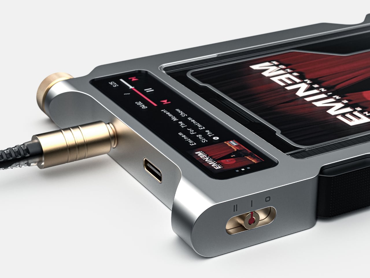
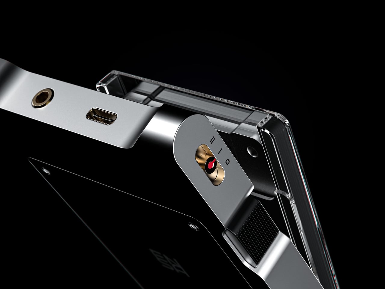
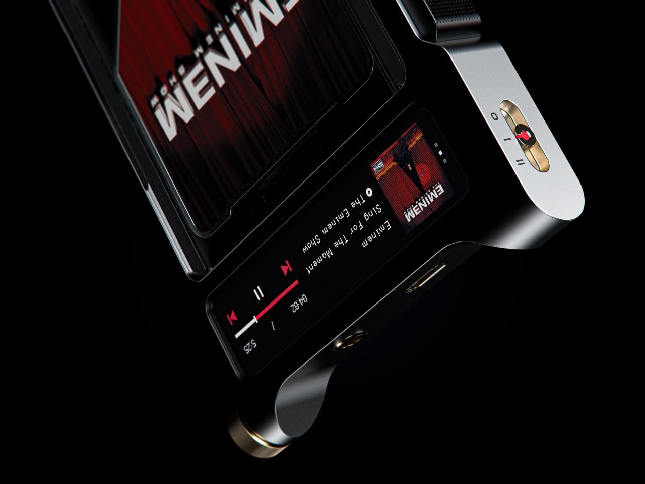
Where the P1 was built for portability and kept its design trim and pocketable, the T1 feels like the next chapter. Visually and conceptually, it carries the same DNA: clean, considered industrial design with an aluminum body and restrained detailing. But the T1 reads as something more anchored, a device you set somewhere permanent and return to, rather than slip into a bag. It’s a design that seems to understand the difference between music you consume and music you actually sit down for.

Aesthetically, Dubrovin’s approach has always felt less like tech product design and more like furniture-level thinking. The ENSA devices belong to the same visual conversation as early Braun electronics or a Dieter Rams concept sketch, where every detail either earns its place or gets removed entirely. The T1 continues that restraint. Its form doesn’t shout, which is precisely why it catches your eye. In a market saturated with speakers shaped like pebbles and smart displays with glowing rings, an audio device that looks like it was designed by someone who genuinely thought about what it means to own a piece of music is genuinely refreshing.

The broader question Dubrovin keeps posing with the ENSA project is one worth sitting with: what did we actually lose when music went weightless? Streaming solved convenience so completely that most of us never stopped to notice what the tradeoff cost. We gained access to everything and lost the kind of focus that comes from committing to a single album, from having music you could see, hold, or lend to a friend. The ENSA T1 is not trying to compete with Spotify. It’s asking whether the experience of music could mean something again, even if you have to build an entirely new format to get there.

It’s a concept project, not a product you can buy, and the realist in me knows that’s a significant caveat. Building out a new physical media format in 2026 is an uphill proposition at best. The infrastructure alone, manufacturing cartridges, convincing labels, and getting devices into homes, would require a level of industry commitment that’s difficult to imagine right now. But design concepts don’t have to ship to matter. The best ones articulate a desire most people feel but haven’t named yet, and the ENSA T1 does exactly that. The desire for music that has weight, that takes up space, that gives you something to do with your hands before the first note plays.

That’s why Dubrovin’s work keeps getting attention. The ENSA line isn’t nostalgic in the way that feels defensive or retrograde. It’s just honest about the fact that we traded something real for something convenient, and it’s asking, politely but persistently, if we’d like it back.

The post Streaming Took Something From Us. The ENSA T1 Wants It Back first appeared on Yanko Design.
  •  
❌