❌

Vue lecture

Oppo Find X10 Pro Max Review: Stunning Imaging, Well-Balanced Flagship, Big Price
PROS:


  • Industry-first triple 200MP camera system

  • Natural, consistent photo colors across all cameras

  • Strong video capability

  • Bright, immersive AMOLED display with thin bezel

  • Excellent battery life

CONS:


  • High price

  • Optional teleconverter kit limits lens options while in use

RATINGS:

AESTHETICS
ERGONOMICS
PERFORMANCE
SUSTAINABILITY / REPAIRABILITY
VALUE FOR MONEY

EDITOR'S QUOTE:

With standout cameras and top-tier hardware, the Find X10 Pro Max nails nearly every mark. Just be ready to pay for the privilege

In 2026, nearly every major phone maker is eager to add “Pro Max” to their flagship lineups. Oppo is now joining this trend with its Find X10 Pro Max. Whether you see the naming as bold or just another industry move, one thing is hard to ignore. Even when manufacturers like Oppo pack their phones with leading-edge hardware and arguably superior imaging, they still face the ongoing challenge of measuring up to Apple’s influence at the top of the market.

This device brings a massive 6.78-inch AMOLED display and debuts the industry’s first trio of 200-megapixel cameras. Its battery is also among the largest found in any mainstream smartphone. Oppo claims this phone stands out for both design and capability. After spending time with the Find X10 Pro Max, I set out to discover if this “Pro Max” truly lives up to its name or simply chases a label.

Designer: OPPO

Aesthetics
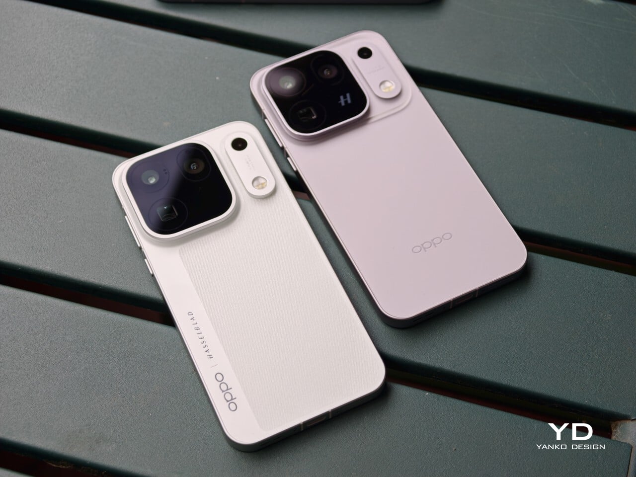
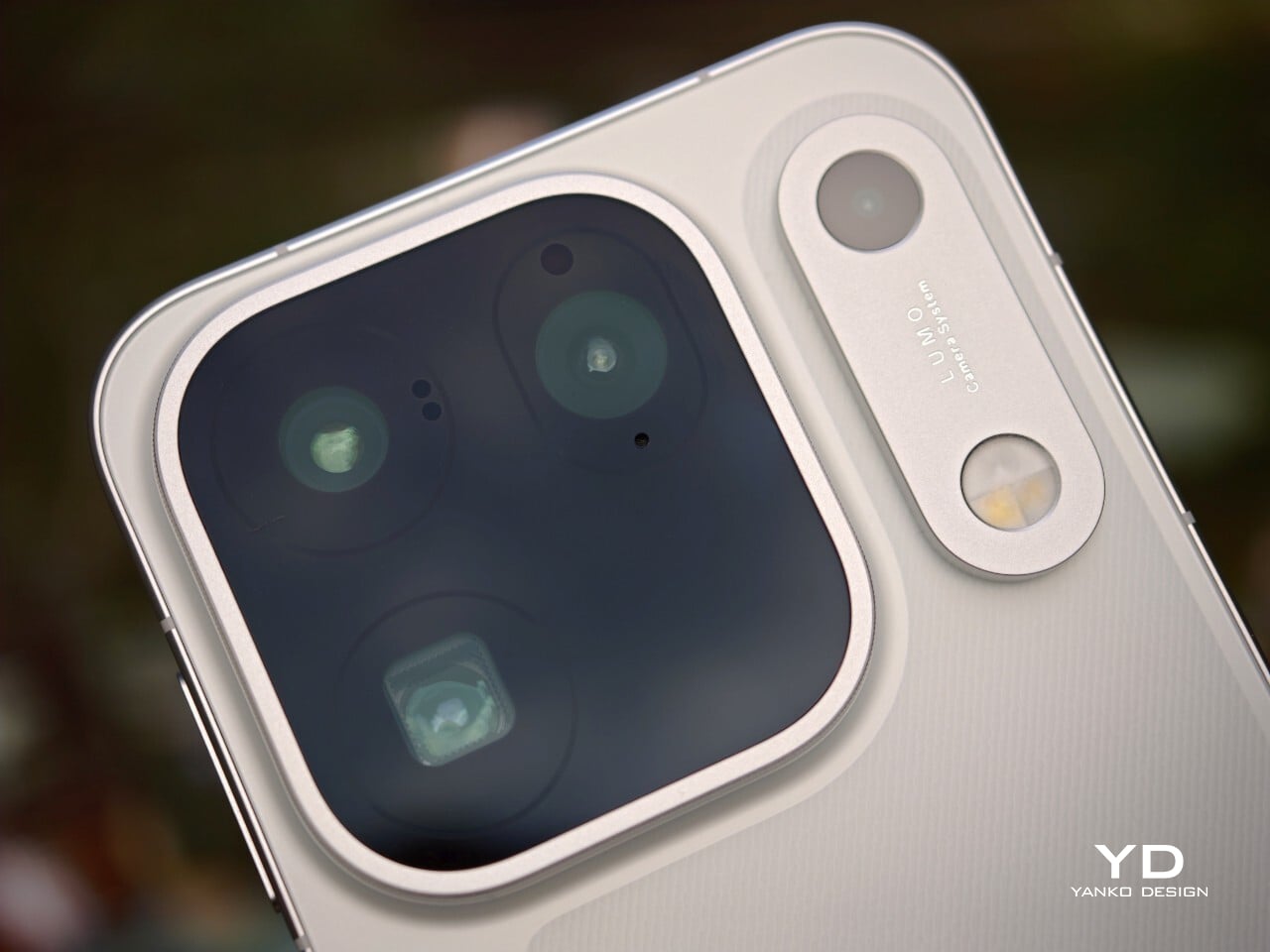
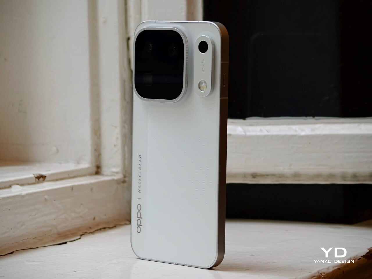
The Oppo Find X10 Pro Max carries forward some of the Find X9 Pro’s most recognizable design elements, including its signature square camera bump, now paired with an oval accent for the color sensor and LED. Oppo offers this flagship in two finishes. The Titanium Grey edition features a single sculpted piece of glass with contours that flow seamlessly into the camera area, softening the visual impact and giving the phone an understated, professional vibe. The grey itself is subtle, with hints of mauve appearing under certain lighting conditions.

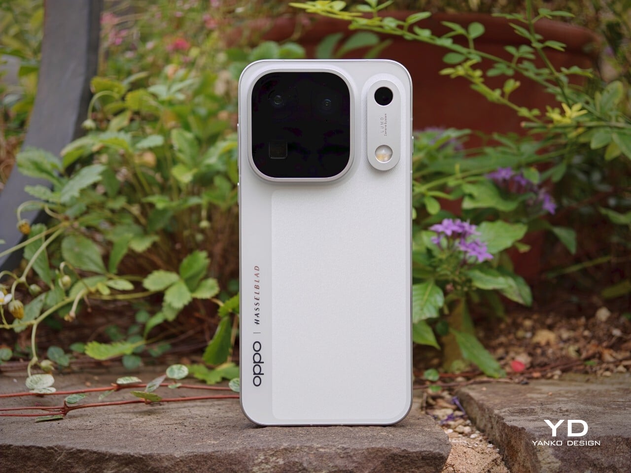
For this review, I received the Luna White edition, which channels inspiration from classic cameras and reimagines the look for a contemporary audience. The camera island sports a matte silver metallic finish with knurled detailing, highlighted by Hasselblad’s signature orange accent ring. The back showcases a subtle fabric-inspired pattern, with Oppo and Hasselblad branding on the side. While both colors exude sophistication, those who prefer darker tones or bolder shades may find themselves wishing for greater variety in the color lineup.

Ergonomics
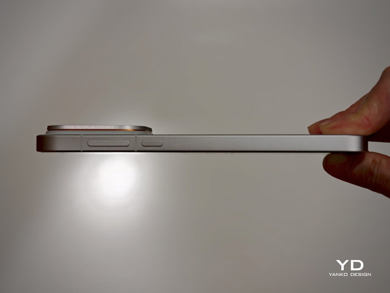
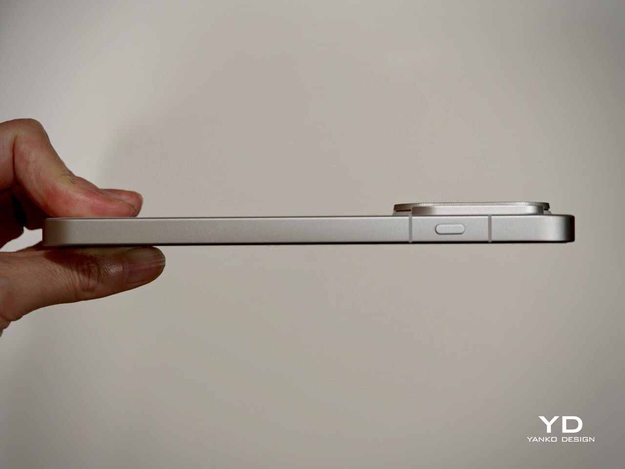
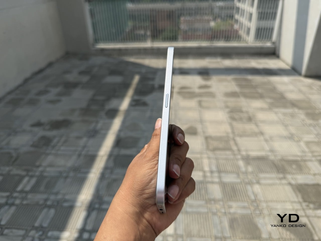
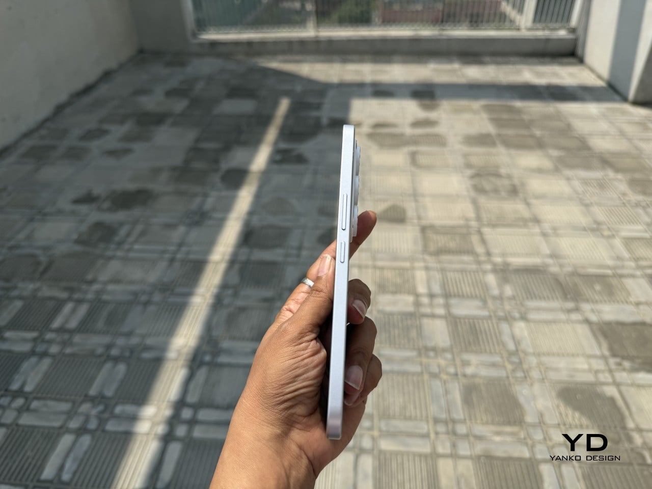
Despite its impressive size and powerful hardware, the Oppo Find X10 Pro Max manages to feel thoughtfully balanced in hand. My review unit is the global version, which comes with a substantial 8000mAh battery and weighs 235 grams (about 8.29 ounces) in Titanium Grey or 233 grams (about 8.22 ounces) in Luna White. The EU version features a slightly smaller 7150mAh battery and is a bit lighter at 228 grams (about 8.04 ounces) for Titanium Grey and 226 grams (about 7.97 ounces) for Luna White. Measuring 161.32 x 76.57 x 8.40 mm, or approximately 6.35 x 3.02 x 0.33 inches, this phone clearly fits into the large flagship category, yet its slim profile keeps it manageable.

The weight of the Find X10 Pro Max is certainly noticeable each time you pick it up, although the distribution helps maintain comfort during longer use. Both color options have a matte back and frame that do an excellent job resisting fingerprints and smudges, while also offering a velvety texture that is genuinely pleasant to touch. The device maintains a clean look throughout the day and feels luxurious with every interaction. The edges are only slightly curved, almost flat and straighter than on many other flagships, so they do not dig into your hand but may affect comfort depending on how you hold the phone over time.

Performance
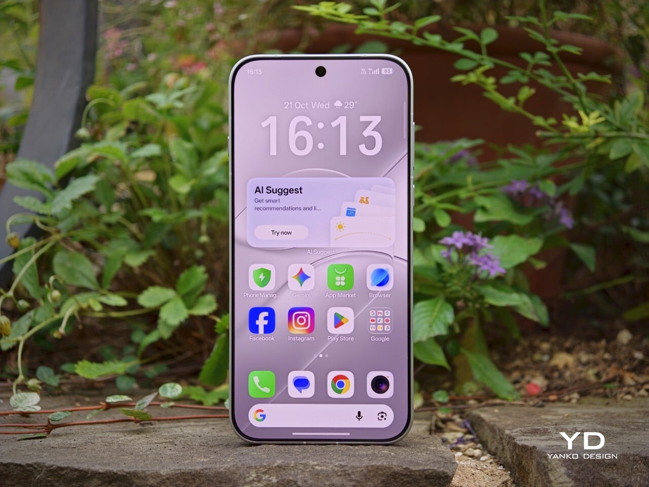
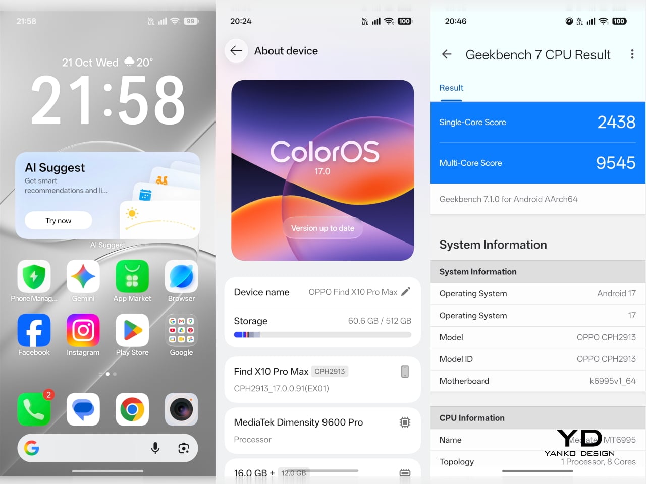
The Oppo Find X10 Pro Max delivers the kind of fluid, responsive experience you expect from a flagship. Powered by the Dimensity 9600 Pro, the phone handles daily tasks, multitasking, and demanding apps without any noticeable lag or slowdowns. ColorOS 17 brings a polished feel with more refinement than revolution, ensuring that every interaction is smooth and intuitive. Everything from app launches to switching between tasks happens with impressive speed and reliability.

The large 6.78-inch LTPO AMOLED display stands out with a sharp 2772 × 1272 resolution and vibrant colors, thanks to BT.2020 coverage and 10-bit color support. Bezels measure just 1.15mm and are perfectly symmetrical, which makes the screen feel even more expansive. With up to 3,600 nits peak HDR brightness, visibility outdoors is excellent. The adaptive refresh rate ranges from 1 to 120Hz for smooth scrolling, while 144Hz is available in select gaming scenarios for extra fluidity. The speakers provide plenty of volume, though sound quality does not really stand out.

Hasselblad Hi-Res (50MP) mode, main camera, 1x

Main Camera, 1x

Over the past few years, smartphone cameras have leaned heavily on computational processing to overcome the limitations of small lenses. Sometimes the results are impressive, but too much digital magic can leave photos looking punchy or even artificial. With the Find X10 Pro Max, Oppo takes a different route by aiming for images that genuinely match what you saw in real life. The brand continues its collaboration with Hasselblad to fine-tune color science, and this generation introduces the LUMO True Image Engine, which keeps colors believable and resists the urge to overdo sharpening or saturation.

Oppo debuts the industry’s first triple 200-megapixel camera system in the Find X10 Pro Max. You get a 200MP main camera (Samsung ISOCELL HPC, 1/1.3″, f/1.5 with OIS), a 200MP ultra-wide (Samsung ISOCELL HP5, 1/1.56″, f/2.2 with autofocus), and a 200MP periscope telephoto (Samsung ISOCELL HP5, 1/1.56″, f/2.1 with OIS). Flip the phone around and you’ll find a 50MP front camera (Samsung ISOCELL JN5, 1/2.75”, autofocus, 100° FOV).

Ultrawide, 0.5x

Telephoto, 3x

Telephoto, 6x

The headline megapixel count is only part of the story. The main sensor leverages DeepPix technology, redesigning each pixel to improve light-gathering efficiency and preserve detail even in challenging conditions. It delivers up to 17 stops of dynamic range for images full of nuance from shadow to highlight. Daylight photos are crisp and vibrant, and low-light shots stay clear and accurate.

Most flagships treat ultra-wide cameras as a weak spot, but Oppo breaks that trend by using the same large sensor in both its ultra-wide and telephoto modules as in the main camera. The ultra-wide’s 13mm-equivalent focal length provides an expansive 124-degree field of view and captures sharp images across the frame. There is still some noticeable lens distortion at the edges, which is common for lenses this wide, but overall image quality remains impressively crisp. Color consistency is another area where Oppo truly excels. Tones stay remarkably uniform across all three lenses, so your shots always look cohesive.

Ultrawide, 0.5x

Main Camera, 1x

Main Camera, 1x

Telephoto, 3x

Personally, I love shooting with the telephoto camera on the X10 Pro Max. It is genuinely a treat for anyone who enjoys zoom photography. Hasselblad Master mode is another highlight because it delivers a more natural, less processed look that gives images a classic photographic character rather than an overdone “smartphone” feel. For those who want total control, Pro mode within Hasselblad Master mode allows for granular manual adjustments.

For users seeking more flexibility, Oppo offers a Hasselblad Teleconverter Kit in Luna White that includes a MagSafe-compatible case, lens adapter plate, teleconverter lens, lens bracket, shoulder strap, and pouch, all in silver or white with orange accents to match the Luna White phone version. While I love how visually unified the kit appears, attaching the lens adapter plate blocks both the main and ultra-wide lenses at once, just like on the Find X9 Pro teleconverter. This can limit your photo options when using the kit.
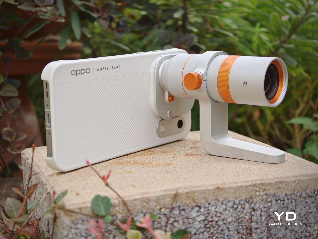

Telephoto Converter, 20x

Telephoto Converter, 40x

Oppo’s camera app supplies a nice set of filters. The selection is not as broad as Vivo’s catalog but still offers plenty of creative and customizable choices. Each filter lets you tweak tonality, saturation, and intensity to match your style preferences. My main gripe is with how OPPO lays out these filters: instead of small thumbnails along the bottom edge like most brands use, you only see one filter preview filling the UI at a time. This makes it tougher to quickly browse options and can slow down creative experimentation.
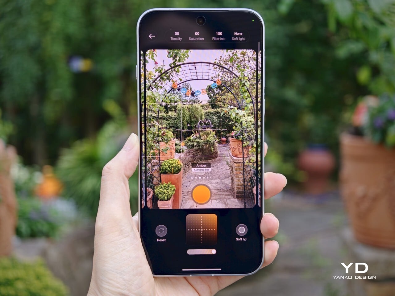
Filter UI
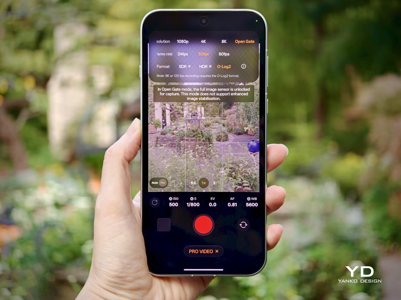
Open Gate Mode

Video performance keeps pace with stills. All three rear cameras support up to 8K at 30fps, 4K at 60fps, and even 4K at 120fps for dramatic slow motion. The front camera supports up to 4K at 60fps for sharp selfies and vlogs. If you apply creative filters during recording, output is capped at 1080p at 30fps. Open Gate recording is available on all rear cameras as well, so creators can leverage every pixel for flexible cropping in post-production.

My global review unit features a massive 8000mAh battery, while the EU version is equipped with a still-impressive 7150mAh cell. Both models support fast charging, with 80W SUPERVOOC wired charging making it easy to top up quickly and 50W AIRVOOC wireless charging for added convenience. Battery life is outstanding. It easily lasts more than a full day of heavy use and can reach two days with moderate usage.

Main Camera, 1x, Night

Sustainability

Oppo positions the Find X10 Pro Max as a durable and future-proof flagship, but most of its claims align with what’s now expected at the high end. The phone comes with IP66, IP68, and IP69 ratings, so it stands up well to dust and water in a wide range of scenarios. Both the front and back are protected by OPPO Crystal Guard Glass, co-developed with Corning, promising solid scratch and drop resistance. SGS Five-Star Drop Resistance Certification adds further reassurance, though these certifications have become standard for premium smartphones.
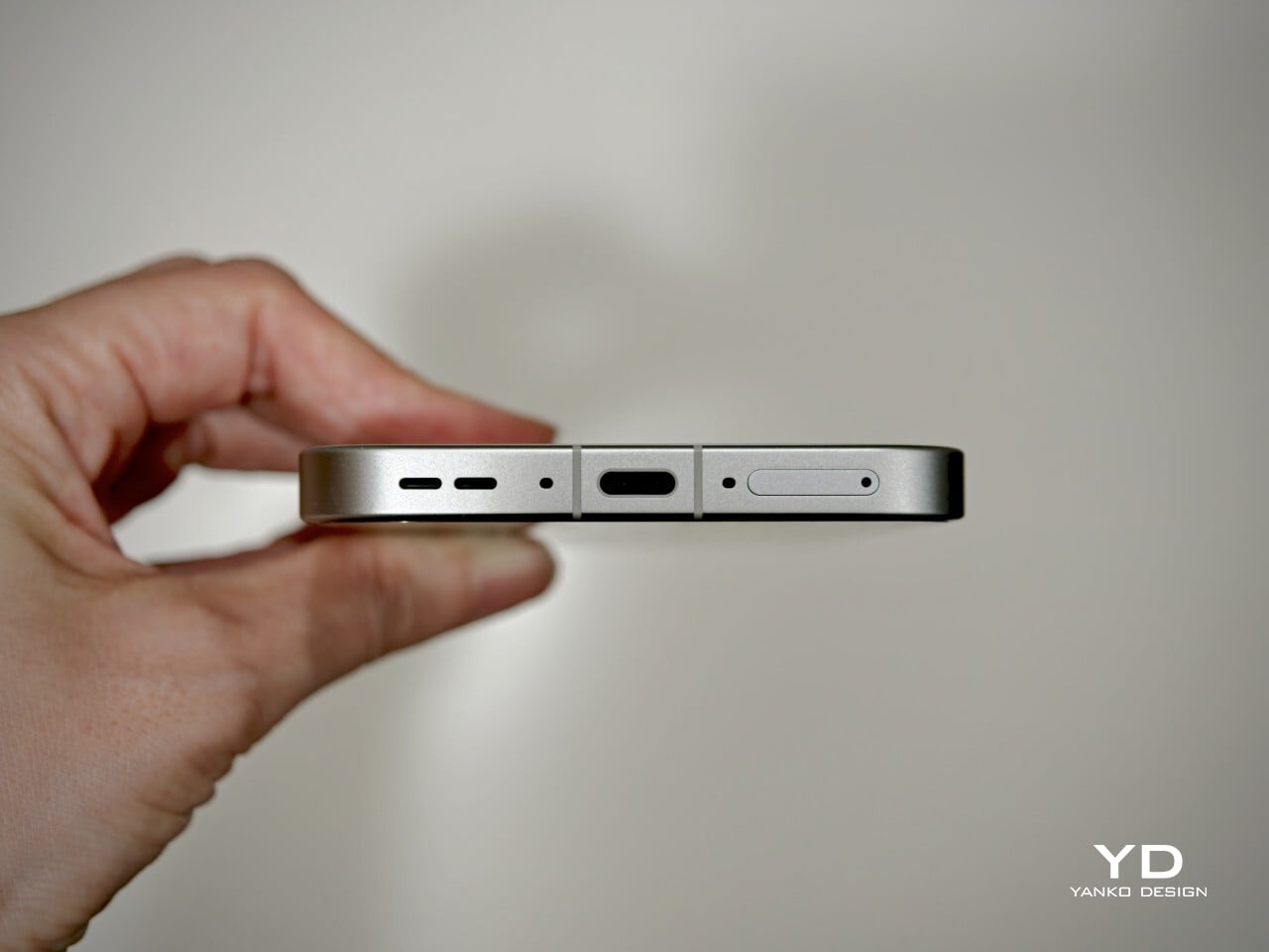
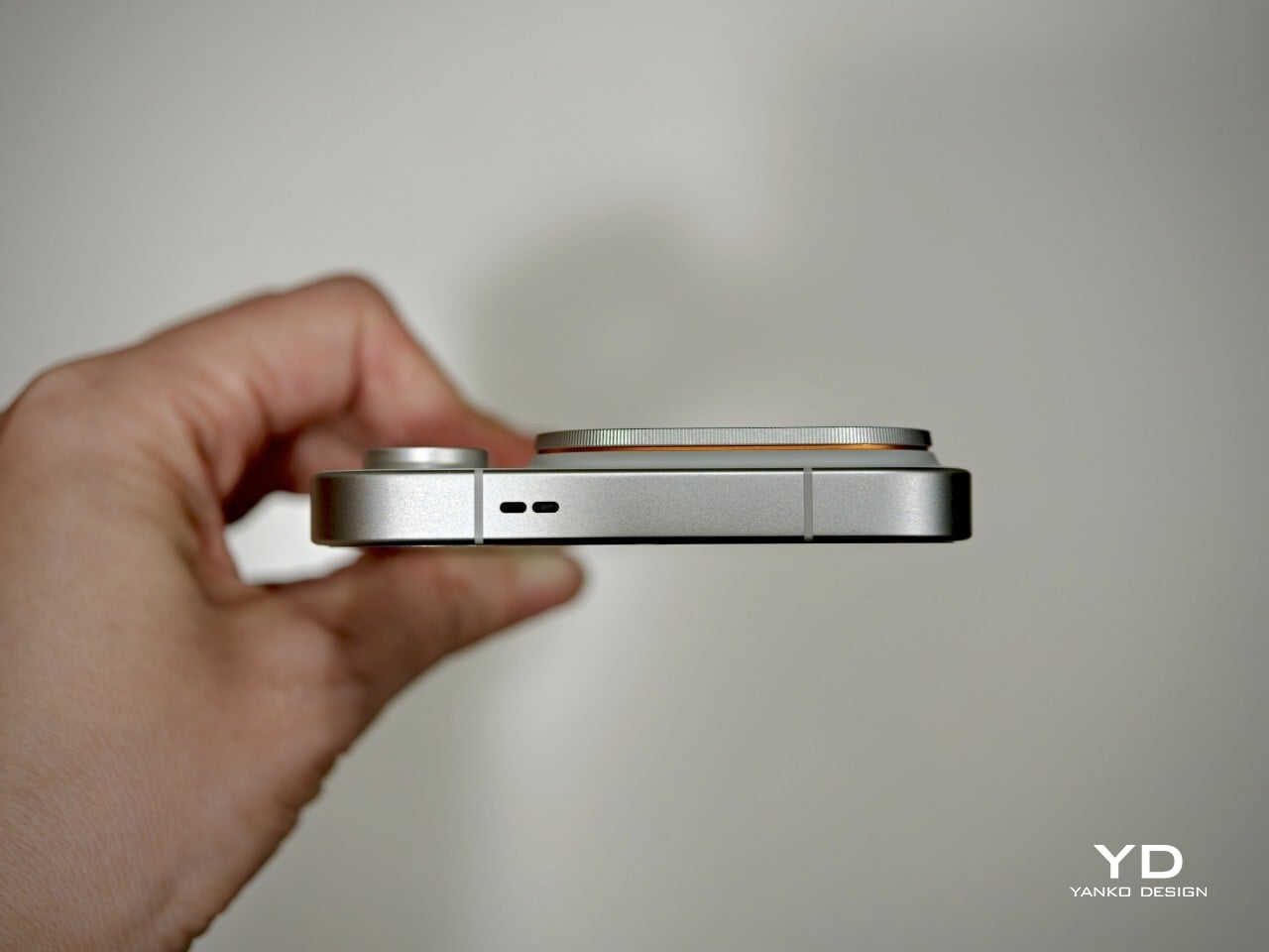
Oppo also states that the battery should retain over 80% of its original capacity after five years of typical use, which is consistent with leading brands but does not set a new bar. The promise of five years of major Android OS updates and six years of security patches is definitely good news for long-term owners and matches current flagship expectations. That said, it would be great to see Oppo take additional steps in sustainability, such as using more recycled materials in construction and offering easier repair options, to truly stand out in this space.

Value
Official pricing was unavailable at the time of writing this review, but the Oppo Find X10 Pro Max is rumored to launch at €1,799 (about $1,900) for the 16GB+512GB EU version. This firmly places it among the highest-priced flagships on the market and marks a clear jump from last year’s Find X9 Pro (€1,299, or around $1,370) and even the Find X9 Ultra (€1,699, or about $1,790). A significant part of this price hike likely comes from soaring RAM and storage costs, driven by increased demand from the AI boom and broader tech trends.

If these figures are correct, Oppo will face an uphill battle. Even with top-of-the-line hardware and some of the best mobile imaging features available, nearly two thousand dollars is a serious investment, especially as many consumers are feeling economic pressure. The EU version of the Find X10 Pro Max is even more expensive than both the iPhone 18 Pro Max with 512GB of storage and the Samsung Galaxy S26 Ultra 512GB model in the U.S. For Oppo to justify this price point, buyers will need to be truly convinced by its unique camera system and design philosophy. Otherwise, many may find more value in established alternatives from Apple or Samsung.

Verdict
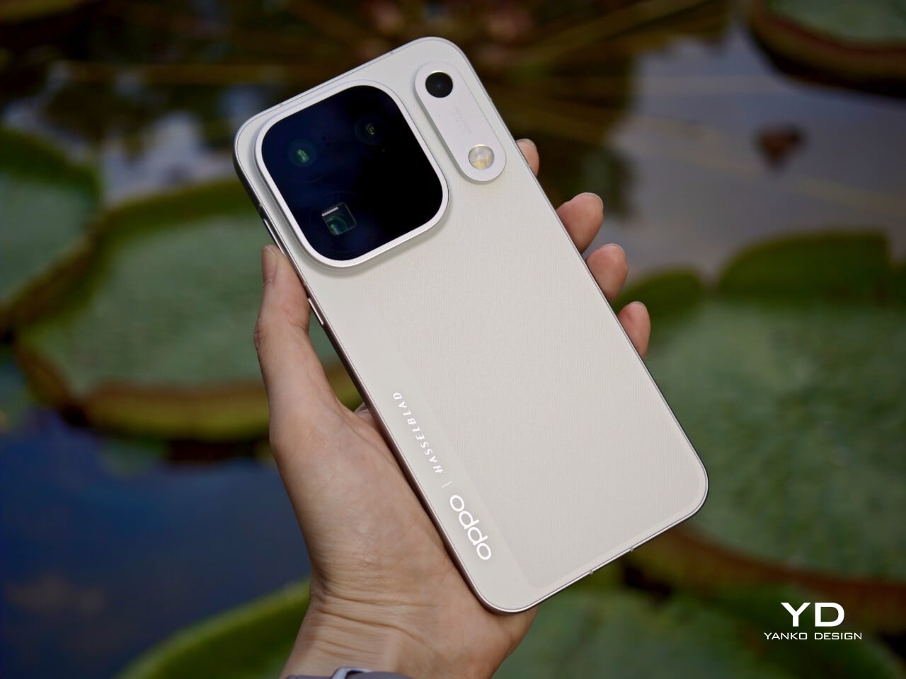
The Oppo Find X10 Pro Max stands out as a well-balanced flagship that gets almost everything right and, at times, feels nearly flawless. What really sets it apart is its excellent mobile photography, from the industry-first triple 200-megapixel camera system to the natural color science developed in partnership with Hasselblad. Everyday performance is smooth, build quality is unquestionably premium, and battery life ranks among the best available in any flagship.

On the flip side, the high price tag puts the Find X10 Pro Max in direct competition with industry giants. While it delivers top-tier hardware and leading imaging capability, buyers must be willing to stretch both their expectations and their budgets. For those who put a premium on cutting-edge camera features and want an alternative to Apple or Samsung, Oppo’s latest is a compelling choice. For everyone else, especially those mindful of budget, there are several strong alternatives on the market that may offer a more accessible fit.

The post Oppo Find X10 Pro Max Review: Stunning Imaging, Well-Balanced Flagship, Big Price first appeared on Yanko Design.
  •  

The Selfie Camera on Your Phone Has Always Been in the Wrong Place

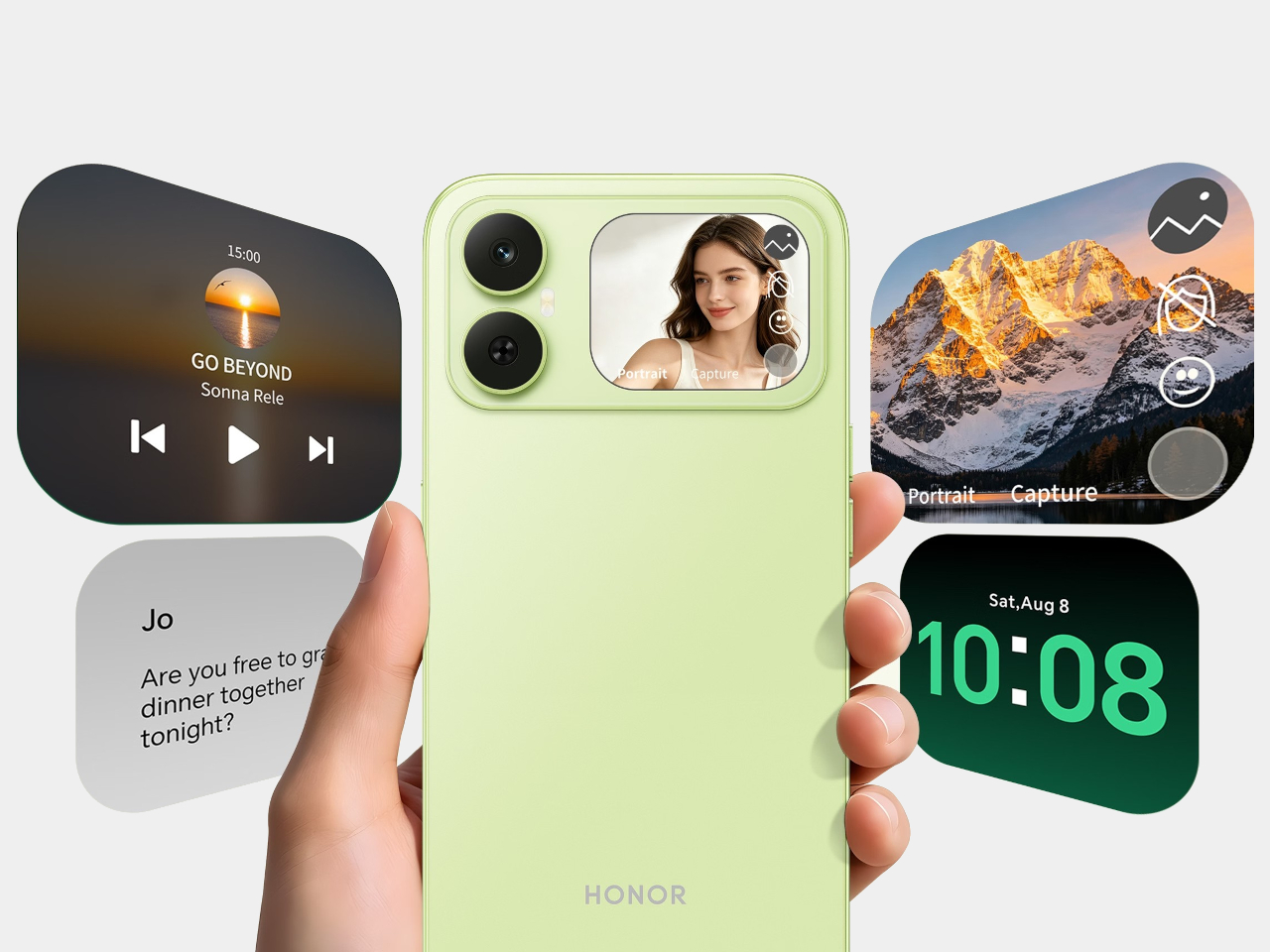
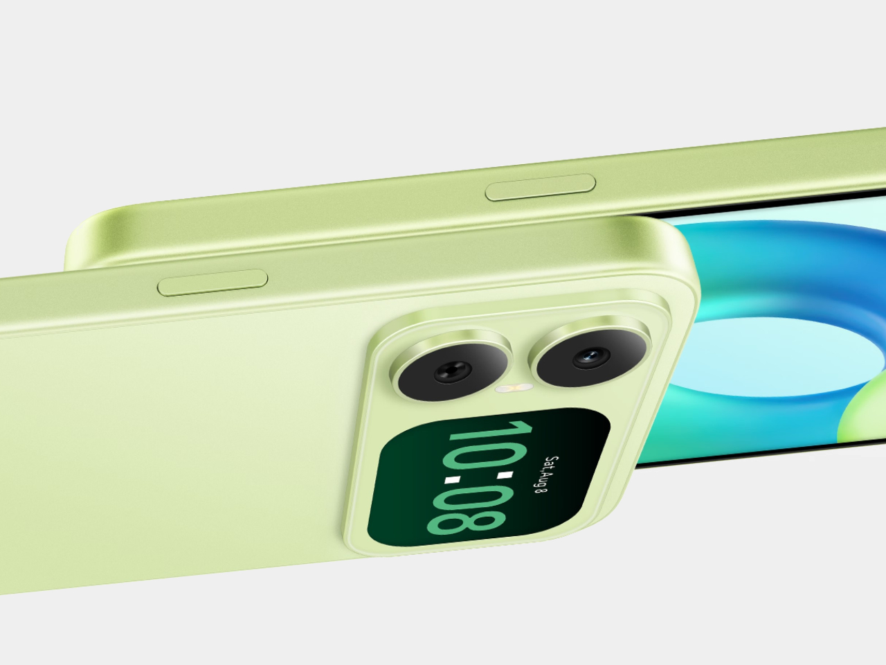
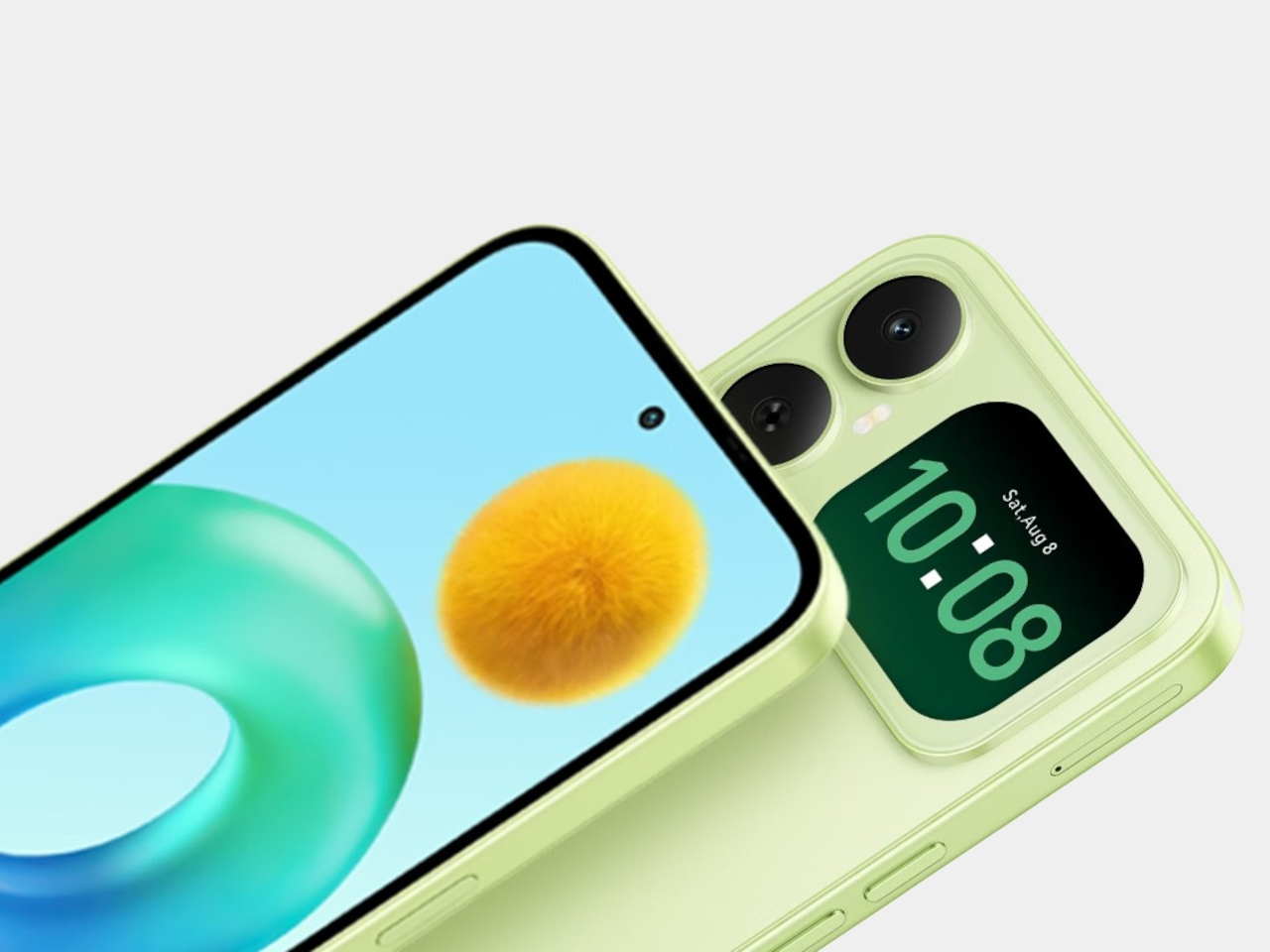
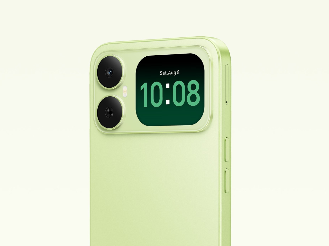
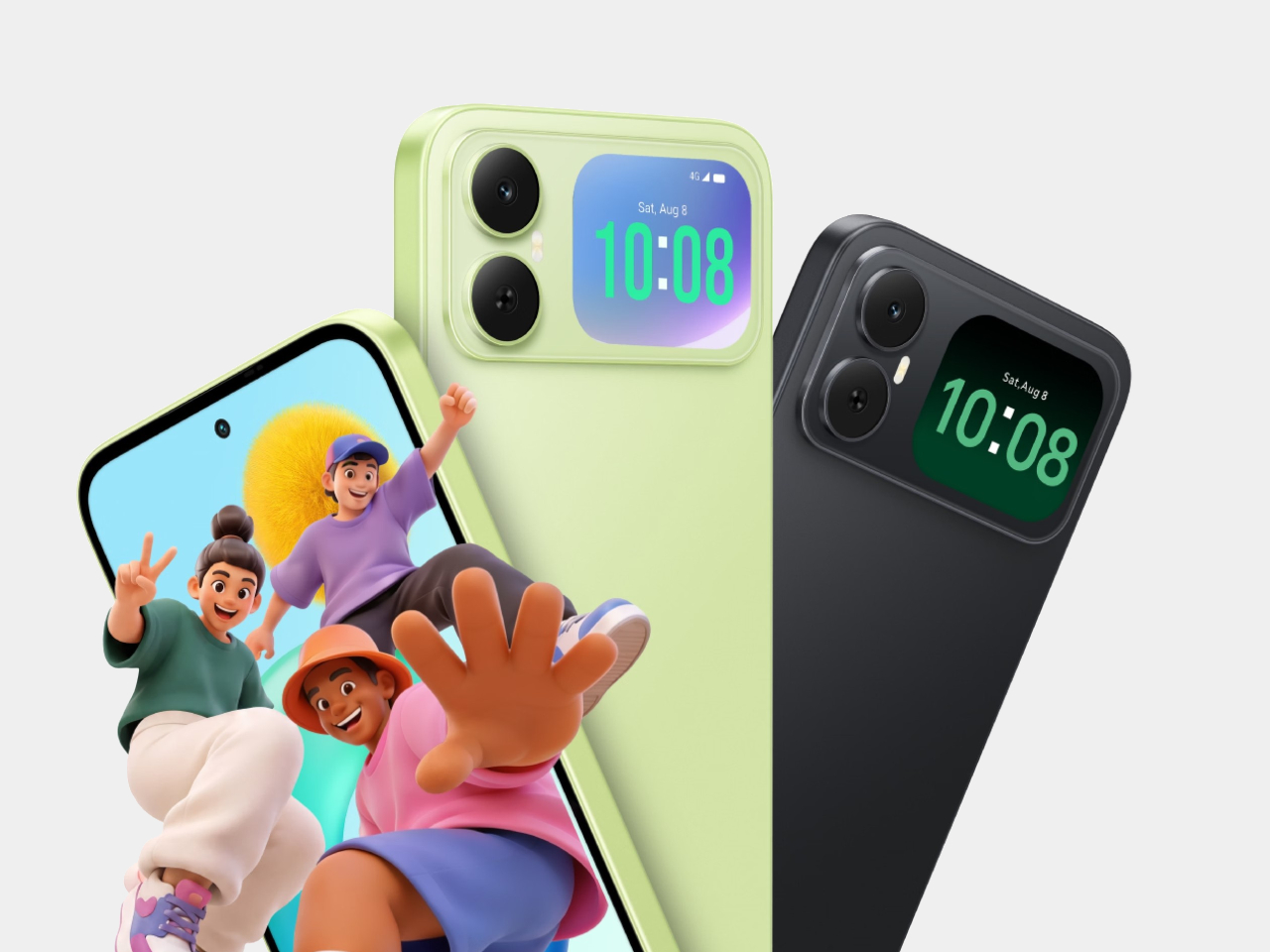
Most budget phones have one screen you stare at and a back you think about. The Honor X5d s makes that back worth a second look by placing a 2.01-inch touchscreen next to its rear camera. It shows the time and alerts, handles music, and helps you take selfies with the better camera. That’s a useful design trick for an inexpensive phone.

The camera island looks like it was built around that display, rather than having a screen tacked on afterward. Two dark circles sit beside it, although Honor lists only one rear camera. Forest Green makes the island pop against a pale back, while Midnight Black keeps things subdued. Either way, the phone’s most interesting feature is visible before you even wake it.

Designer: Honor

That rear screen makes sense when you’re trying to get everyone into a photo. Instead of extending your arm, guessing at the framing, and discovering that someone’s head is missing, you can see the shot while using the 50-megapixel rear camera. A tap on the back takes the picture. There’s also a 5-megapixel front camera, but this arrangement gives selfies another option.

Of course, a phone can’t spend all day posing for pictures. Leave the X5d s face down on a desk, and its little window can still show the time or a call alert. Music controls live there too, so skipping a song doesn’t require turning the whole device over. It’s a small convenience, but those are often the ones you keep using.

On the other side, there’s a 6.78-inch LCD for more than a glance. Its size makes room for videos, messages, and the photos you took, although the 1,576×720 resolution isn’t particularly sharp for such a large panel. The rear display doesn’t fix that limitation. It simply gives quick tasks their own place instead of asking the bigger screen to do everything.

There’s a 6,000mAh battery to keep both screens running, though the phone’s 15W wired charging might test your patience when it finally needs a refill. Honor also provides 64GB of storage and a three-card slot, letting you add a microSD card without sacrificing either SIM. That’s handy if you keep your photos and music on the phone rather than in the cloud.

Inside, the Unisoc T610 processor and 4GB of RAM tell a more familiar budget-phone story. The side-mounted fingerprint reader is convenient, but there’s nothing particularly exotic about the rest of the hardware. In South Africa, the 4GB/64GB version costs R2,499 (about $150), which puts the extra screen in reach of people who aren’t shopping for a flagship just to get a conversation-starting feature.

That display won’t replace your phone’s main screen, nor will it make the X5d s a better choice for demanding games. But it changes the small interactions that fill a day: a glance at a call, a tap to skip a song, a preview before taking a selfie. At this price, giving the back something useful to do feels refreshing.

The post The Selfie Camera on Your Phone Has Always Been in the Wrong Place first appeared on Yanko Design.

  •  

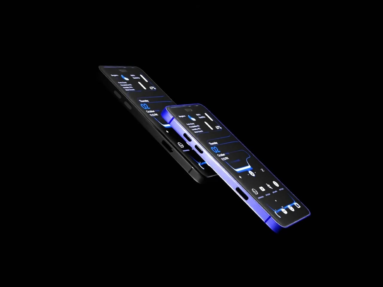
A Fan Imagined Nokia’s Comeback With One Feature Worth Stealing

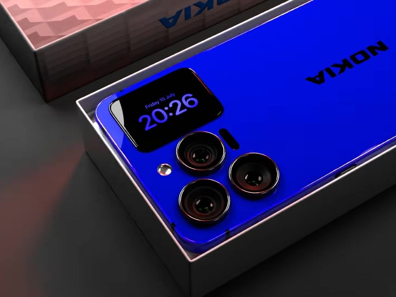
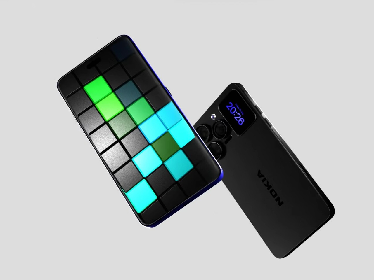
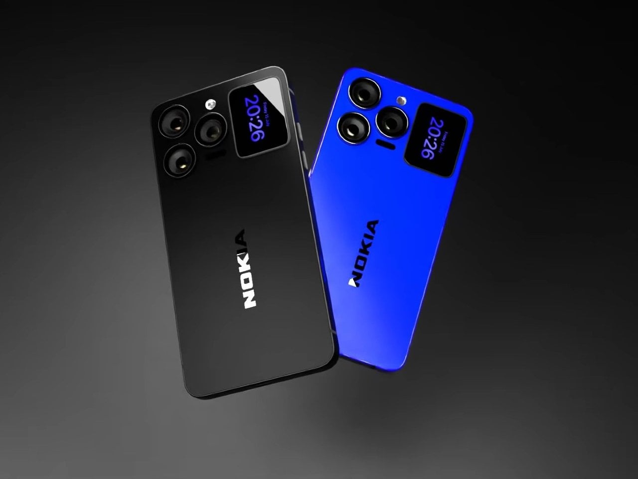
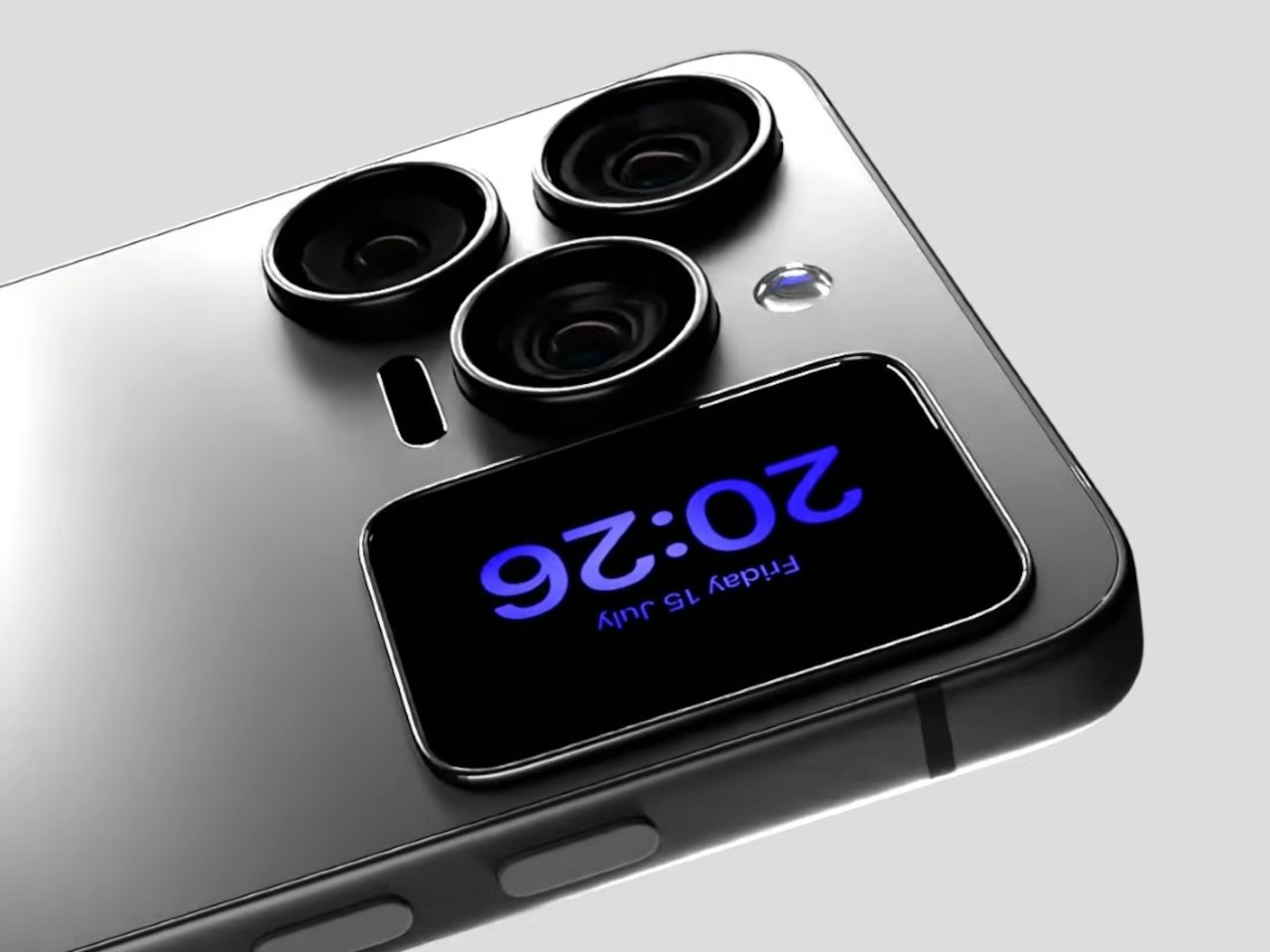
Nokia’s phone business has been fading for years, reduced mostly to budget handsets sold under license, so a concept calling itself the N90 Ultra was never going to become a real product. It’s a fan-rendered video, not a leaked roadmap, and it borrows a legendary name attached to a swivel-barrel camcorder phone from 2005. What it does get right is a smaller, more interesting idea already spreading across actual flagships: a second screen living on the back of the phone.

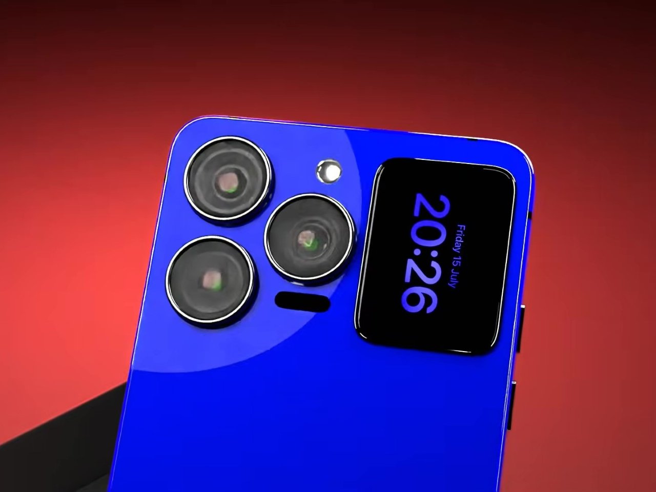
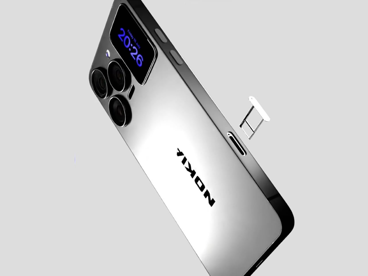
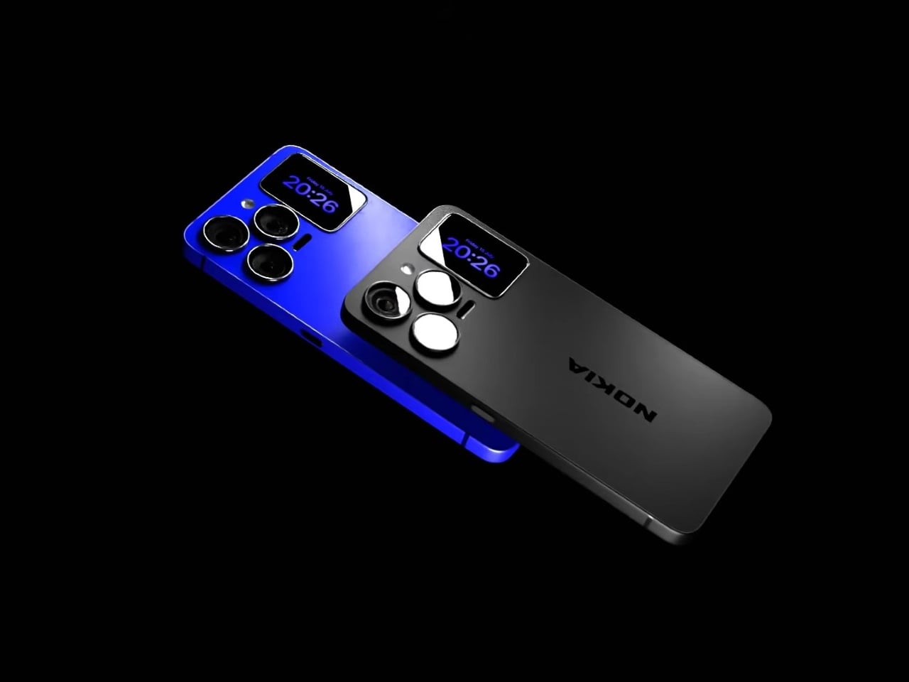
That rear panel holds a titanium alloy frame finished in a glossy cobalt blue or a graphite silver, with a raised visor housing three lens rings alongside a small rectangular display. Instead of sitting blank until a camera app opens, that mini-screen shows the time, the date, and glanceable notifications, all without waking the main display. It’s a small addition, but it changes how often a phone actually needs to come out of a pocket.

Designer: AndroidLeo (Concept)

A phone left face down on a desk during a meeting no longer has to stay silent about the time or a new message. A glance at the back shows both, then nothing more demanding follows, no bright wake screen lighting up a quiet room. That’s the appeal secondary displays have chased since Xiaomi and Meizu first tried the format years back, trimming how often the front screen needs to switch on at all.

The concept pushes its camera claims further than any current phone can back up, listing a 200 MP main sensor with 8K recording and a 200x zoom figure that would require optics no slim smartphone body can physically fit without an extending lens barrel. Two different Snapdragon chipsets get listed side by side too, a sign the spec sheet reads more like a wish list than an engineering plan. None of that undermines what’s genuinely worth noticing here.

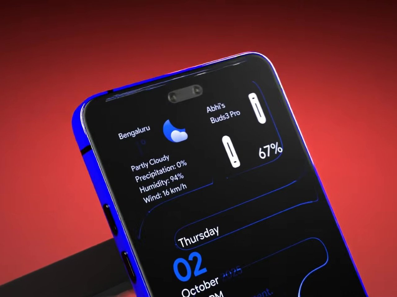
The mini-display sitting flush against the camera visor is the detail carrying real design weight, because it reflects a question phone makers keep circling back to: how much information really needs a full screen turned on. Some phones use that rear space purely for decoration, a small strip showing a logo or a battery percentage and nothing else. Others, like this concept, treat it as a working display capable of running widgets, a clock face, or quick status checks.

Nokia returning to flagship phones remains unlikely no matter how sharp a fan render looks, and the camera math here falls apart well before any of these specs reach a factory floor. What holds up is the smaller premise underneath all of it, that a phone’s back panel can carry its own useful screen instead of sitting there as blank glass. That idea keeps showing up across the industry, with or without a Nokia badge attached to it.

The post A Fan Imagined Nokia’s Comeback With One Feature Worth Stealing first appeared on Yanko Design.

  •  

Poco F9 Ultra Review: Great Sound, Grown-Up Design

PROS:


  • Bose-tuned speaker remains a genuine standout

  • big , bright 185Hz display

  • Huge 8,050mAh battery

  • Great performance

CONS:


  • Relatively large and heavy body will not suit everyone

  • Ultrawide still does not feel especially wide

RATINGS:

AESTHETICS
ERGONOMICS
PERFORMANCE
SUSTAINABILITY / REPAIRABILITY
VALUE FOR MONEY

EDITOR'S QUOTE:

The F9 Ultra feels like Poco growing into its strengths, with Bose-tuned sound still leading the experience.

The Poco F8 Ultra felt like a turning point for Poco. Up to that point, the brand had always been easy to understand. You bought a Poco for speed, sharp pricing, and a bit of swagger. The F8 series added something new to that formula with Bose-tuned speakers, and that changed the feel of the phone in a way a faster chip or brighter screen usually does not.

It was not just about volume or clarity. The whole device felt more built around entertainment. Games had more punch, films had more room to breathe, and even everyday audio felt less like an afterthought. The denim-inspired rear panel helped give the F8 Ultra a bit of tactile identity too, even if the finish was more denim-adjacent than truly fabric-like, but the thing that stayed with you was the sound.

Designer: POCO

The Poco F9 Ultra takes that idea and pushes it further. Rather than treating the Bose-tuned system as a one-off flourish, Poco seems to be building on it with more confidence this time, wrapping that sound-first approach in a package that feels bigger, more polished, and more ambitious. If the F8 Ultra introduced a new side of Poco, the F9 Ultra feels like the phone that tries to make it stick.

Aesthetics

If the Poco F8 Ultra leaned young and fashionable, the Poco F9 Ultra leans sophisticated. It keeps the brand’s taste for visual confidence, but expresses it in a more restrained way, swapping tactile playfulness for cleaner lines, flatter surfaces, and a more polished sense of control.

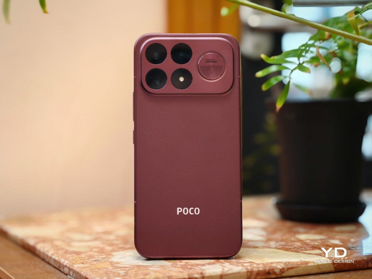
That shift is obvious the moment you look at the back. The denim-inspired treatment from the F8 Ultra is gone, replaced by a finish that feels more metallic and more architectural. The overall silhouette is simpler, but it does not come across as plain. Instead, it feels like Poco has traded novelty for composure, letting shape and proportion do more of the work.

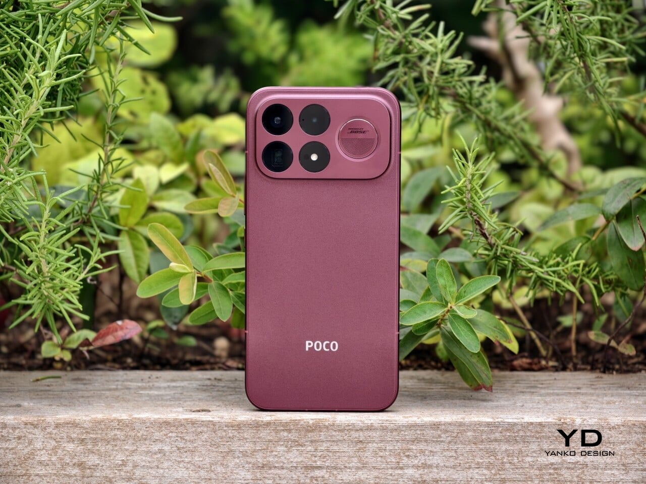
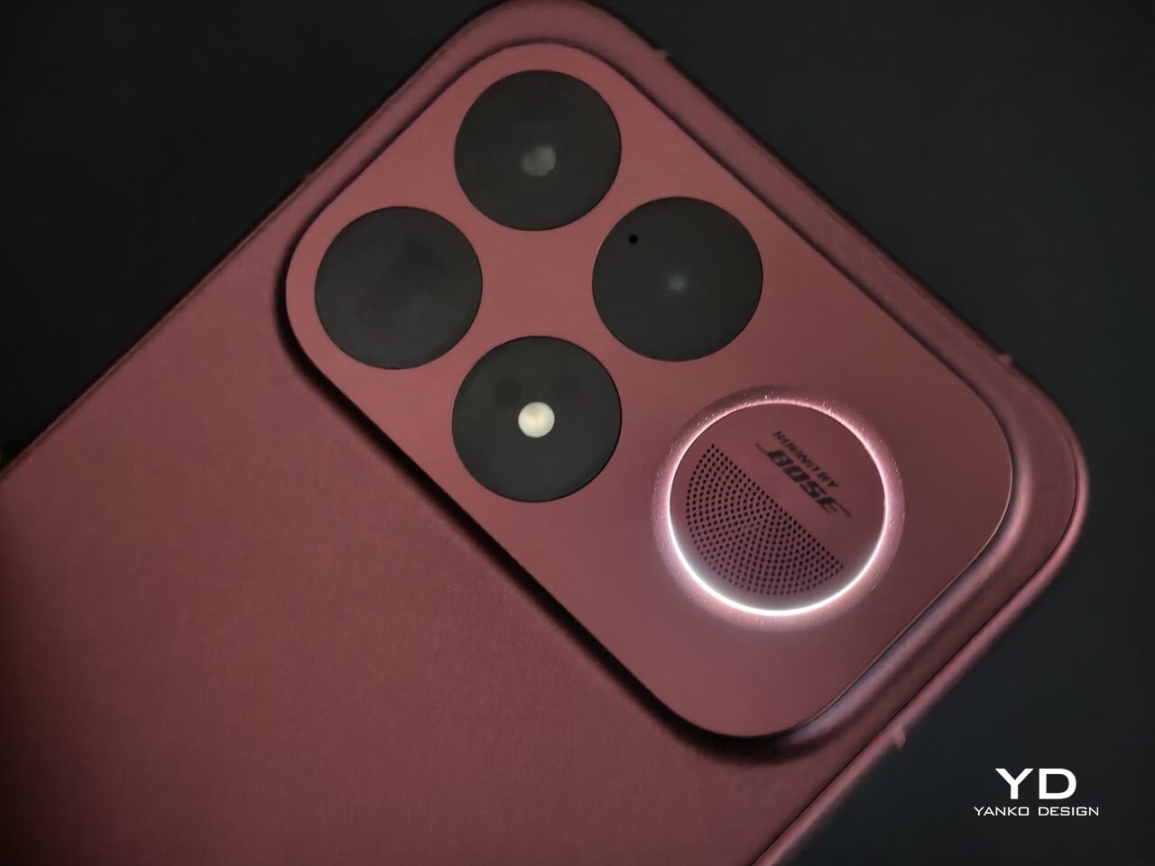
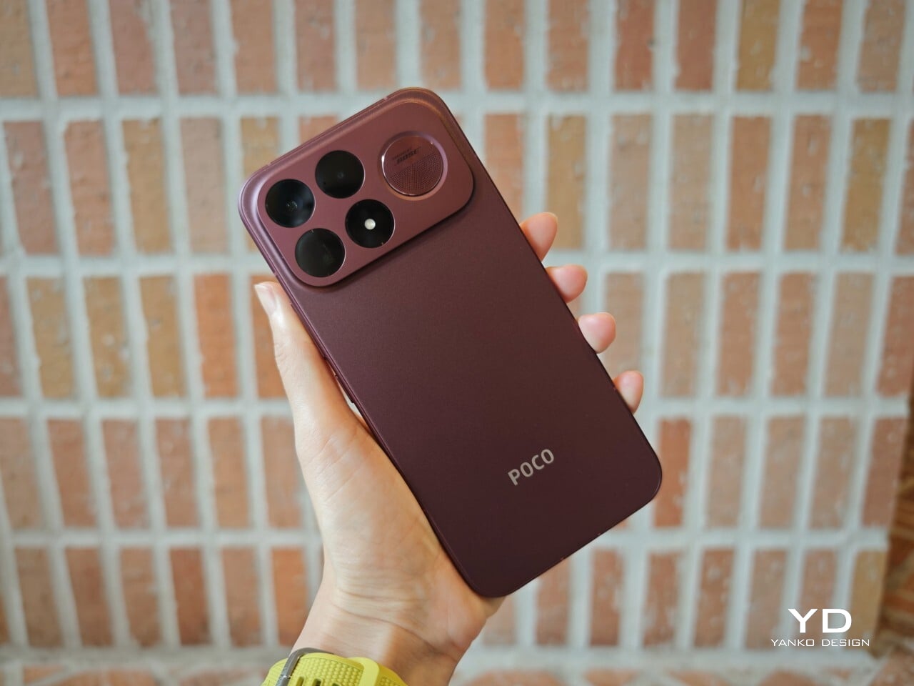
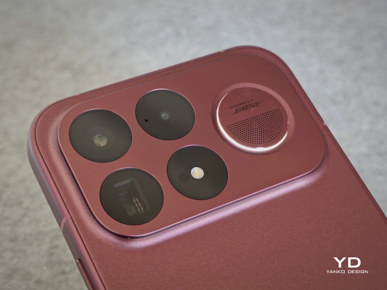
The camera island design remains largely the same as its predecessor, but it feels more resolved here. A large rectangular module sits across the top portion of the phone, housing three cameras and an LED flash in a neat 2 by 2 arrangement, with the speaker grille set off to the right. It is still a bold layout, but one that now feels less experimental and more like a defining part of the phone’s identity.

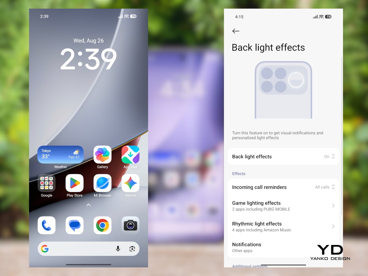
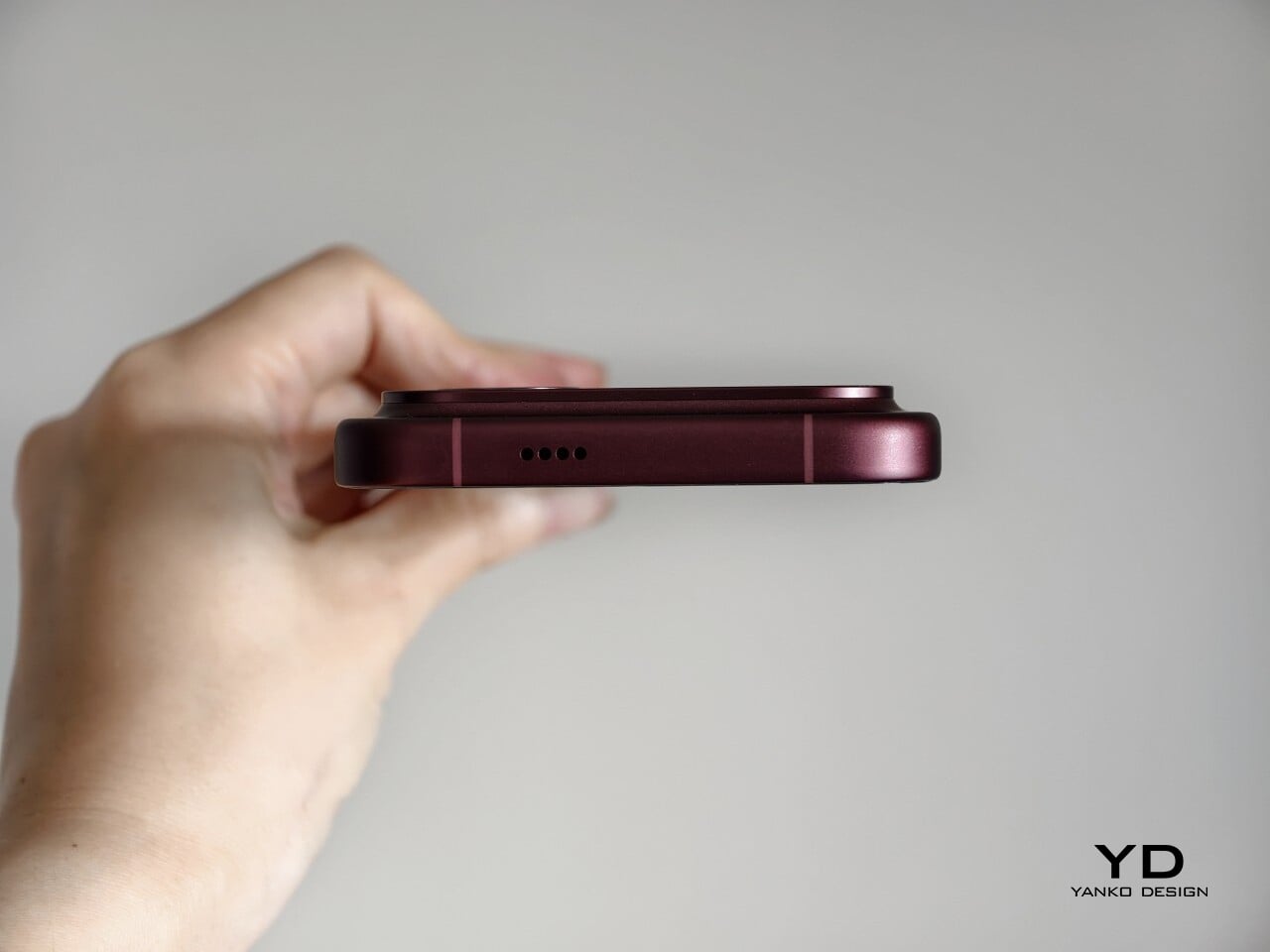
New to the F9 Ultra is a dynamic light ring built around the speaker grille. It supports personalized visual effects for incoming calls, games, and music. The effect itself appears to be fairly simple, closer to a clean white LED accent than anything overly flashy, but that may be exactly the point. It feels like Poco’s way of keeping a hint of gaming-phone energy alive without letting it overwhelm the more sophisticated direction of the design.

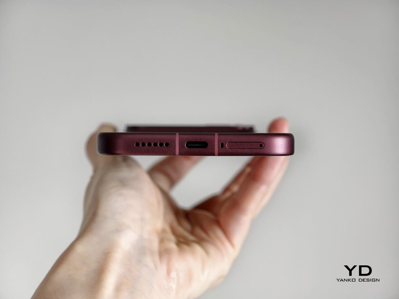
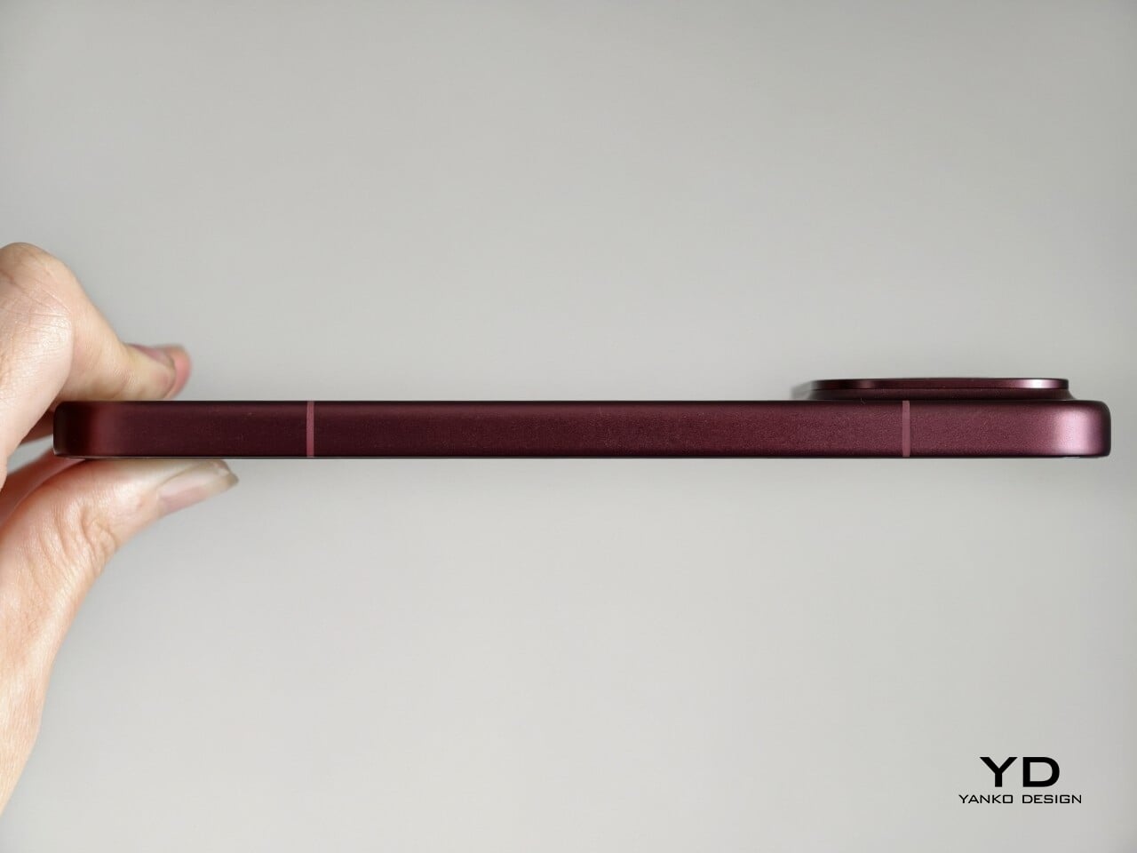
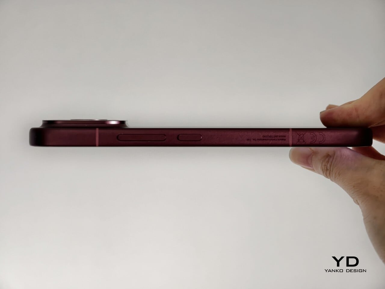
The two colors also tell slightly different stories. The Dark Cherry finish is the more expressive option, bringing warmth and a bit of drama without tipping into flashiness. The Black version feels more understated and technical, especially with the red side-button accent adding a small but effective point of contrast. Both work, but they speak to different moods. One is richer and more characterful, while the other is cooler and more controlled.

Ergonomics

That more sophisticated look does come with a more substantial physical presence. At 235g, the Poco F9 Ultra is about 15g heavier than the F8 Ultra, and you feel that extra weight immediately. It sits firmly on the heavier side, especially in one-handed use, where its size and mass are hard to ignore.

Its dimensions, 163.49 x 77.94 x 8.74mm, are broadly in line with its predecessor, so the overall footprint will feel familiar if you are coming from the older model. It is still a wide phone, though, and not the easiest to manage with one hand. The curved edges do help soften the grip and make it feel less severe than the numbers suggest, but this is still a device that feels more at home in two-handed use.

The matte finish does its part as well. It feels premium, pleasant to touch, and better at disguising smudges than a glossier surface would be. Add in the familiar button placement and unchanged in-display fingerprint scanner, and the F9 Ultra ends up feeling less like a phone you need to relearn and more like one you simply need to get used to carrying.

Performance

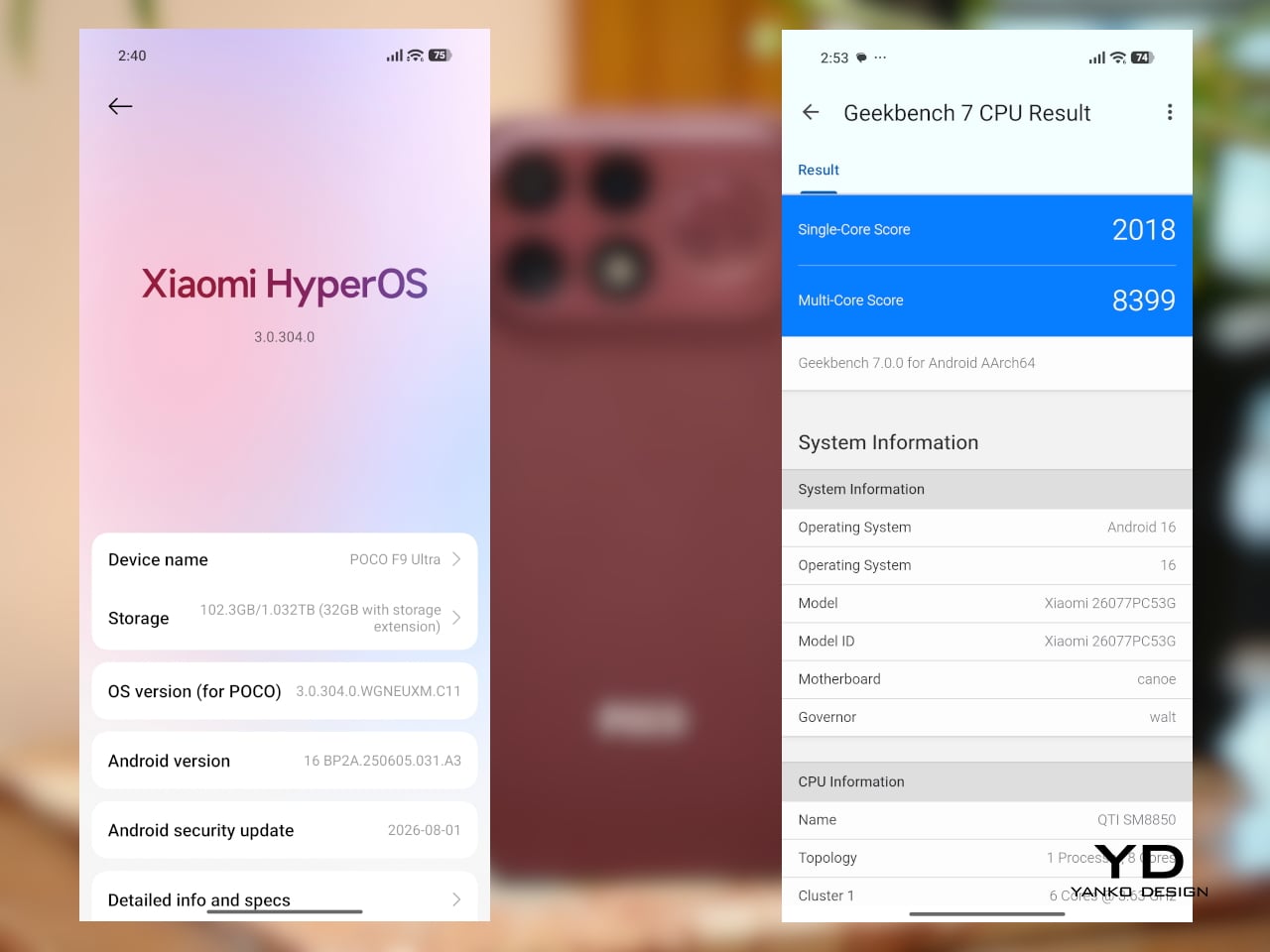
The F9 Ultra runs on Qualcomm’s Snapdragon 8 Elite Gen 5, the same flagship platform used in the F8 Ultra. Poco has also retained the VisionBoost D8, a dedicated chip aimed at improving gaming and video performance. In practice, that makes the F9 Ultra feel less like a leap in raw power and more like a refinement of an already capable performance formula.

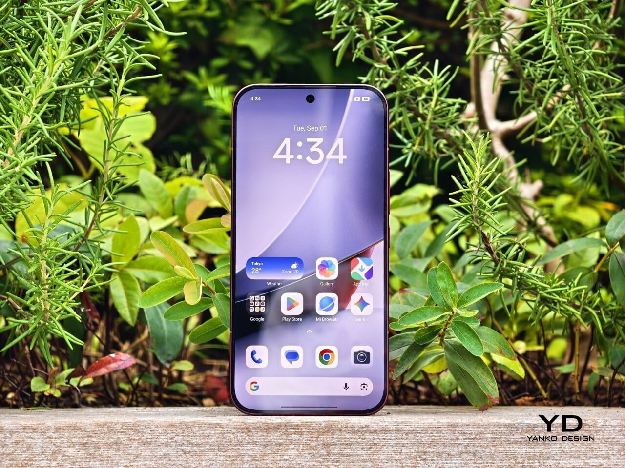
The F9 Ultra pairs that gaming focus with a 6.9-inch 1.5K AMOLED display, and it is exactly the kind of panel you would want on a phone built around entertainment. It is large, sharp, and vibrant, with a refresh rate that gives the phone a clear performance edge in games that can actually take advantage of it. Outside of gaming, that same smoothness carries over into scrolling, animations, and general navigation, even if the practical difference becomes less dramatic in everyday use.

Brightness is another clear strength. Poco says this is the first global lineup to use the new M11 luminescent material, which helps the panel reach up to 4,500 nits in peak brightness and as high as 10,000 nits for HDR highlights. The numbers are extreme, but the more practical takeaway is that the screen stays very readable outdoors and gives bright scenes a stronger sense of punch and contrast without losing too much detail.

The F9 series is also Poco’s first to push to 185Hz, with support for 24 games running at a native 185fps. That sounds more dramatic than it always feels in practice, because the benefit depends heavily on the kind of game you are playing. In faster titles like Blood Strike, Crossfire: Legends, and Brawl Stars, the higher refresh rate does make a difference. Motion looks cleaner, visual updates come faster, and the game feels a little more immediate under your fingers. In slower games like Clash of Clans, Clash Royale, or Hearthstone, the gain is much smaller. You still get smoother animations and interface movement, but not the same kind of gameplay advantage.

In an hour-long session of Blood Strike at the highest graphic settings, the F9 Ultra was able to hold 185fps without any obvious frame drops. Just as importantly, it did not get uncomfortably hot, staying at around 40 degrees Celsius on the surface. There is clearly enough cooling here to keep performance from falling off over time, but the more important takeaway is that the phone stays consistent under load.

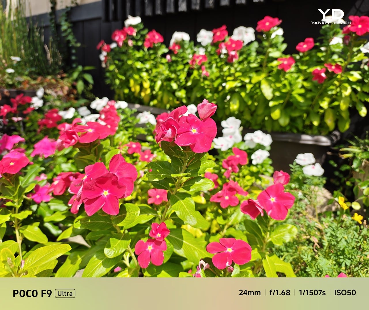
Main Camera, 1x

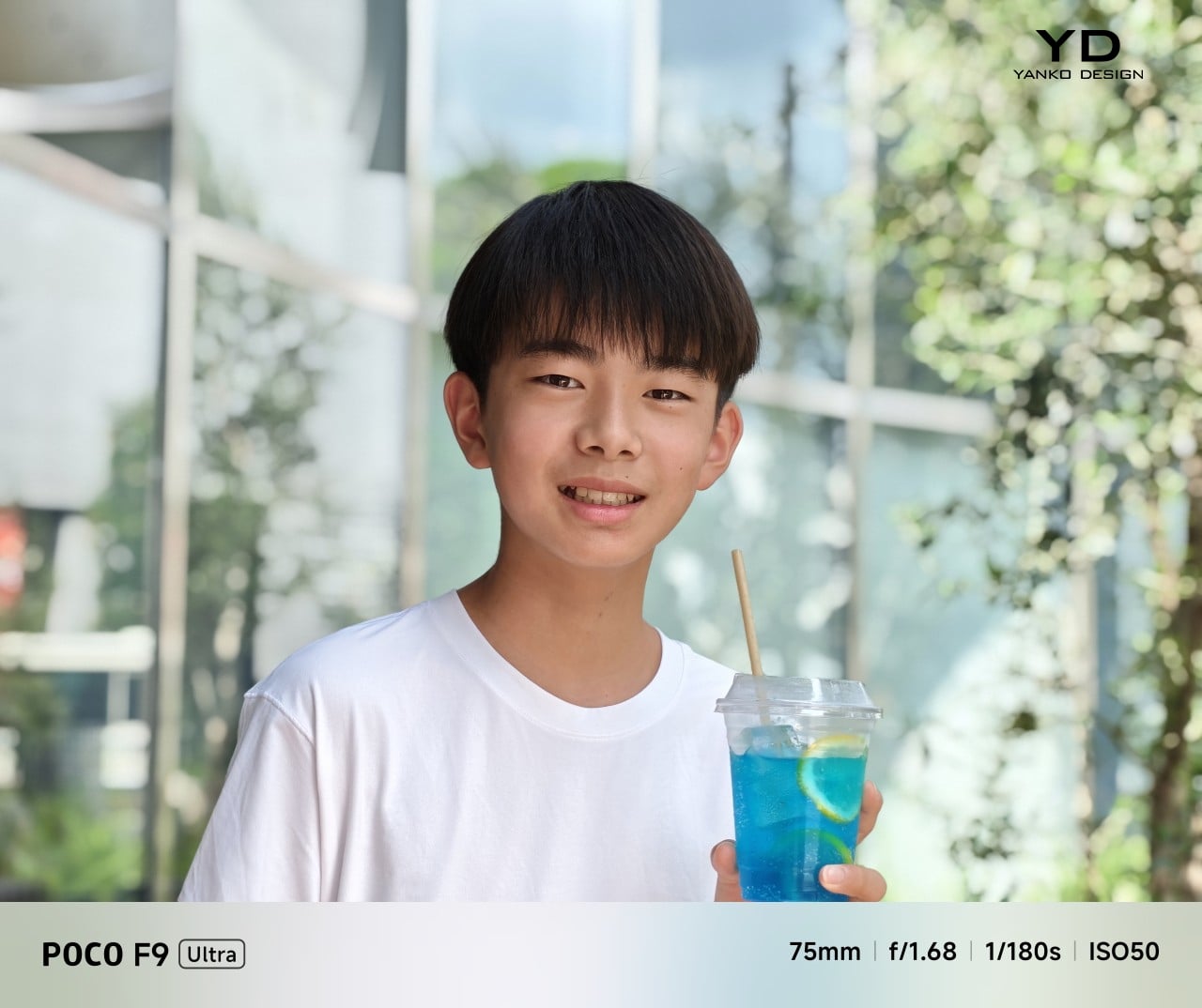
Portrait mode, Main Camera, 3.1x

The F9 Ultra is the second phone to come out of Poco’s partnership with Bose, which makes the collaboration feel less like a one-off experiment and more like part of the series identity. The Bose-tuned speaker system remains one of its most distinctive features, and also one of the easiest to appreciate in daily use. Poco says it has redesigned the acoustic port and upgraded the dual speakers for clearer sound and richer bass. It also keeps the sound profile presets and 10-band EQ introduced on the F8 Ultra, which means there is still plenty of room to tailor the sound to your liking.

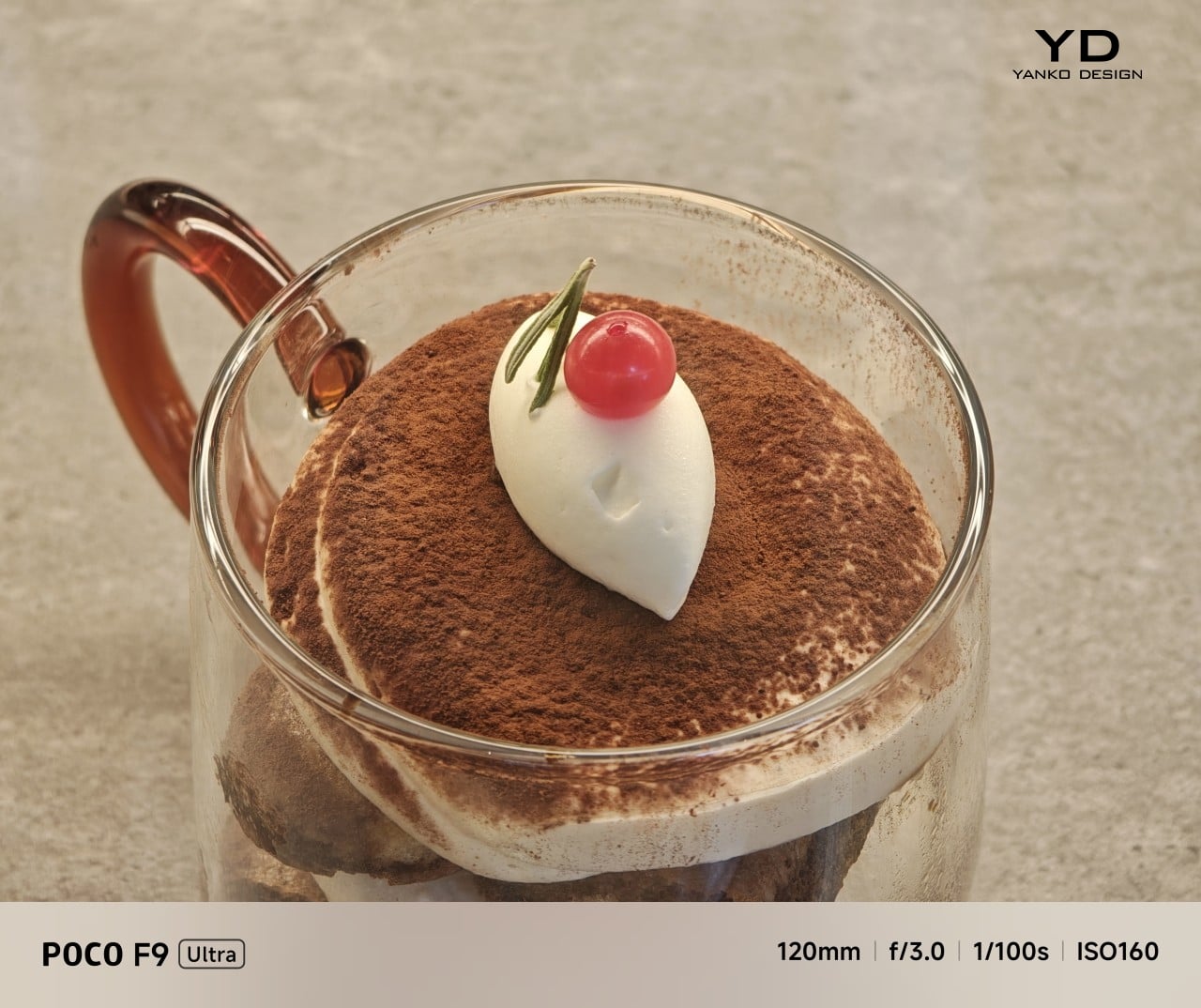
Telephoto Camera, 5x

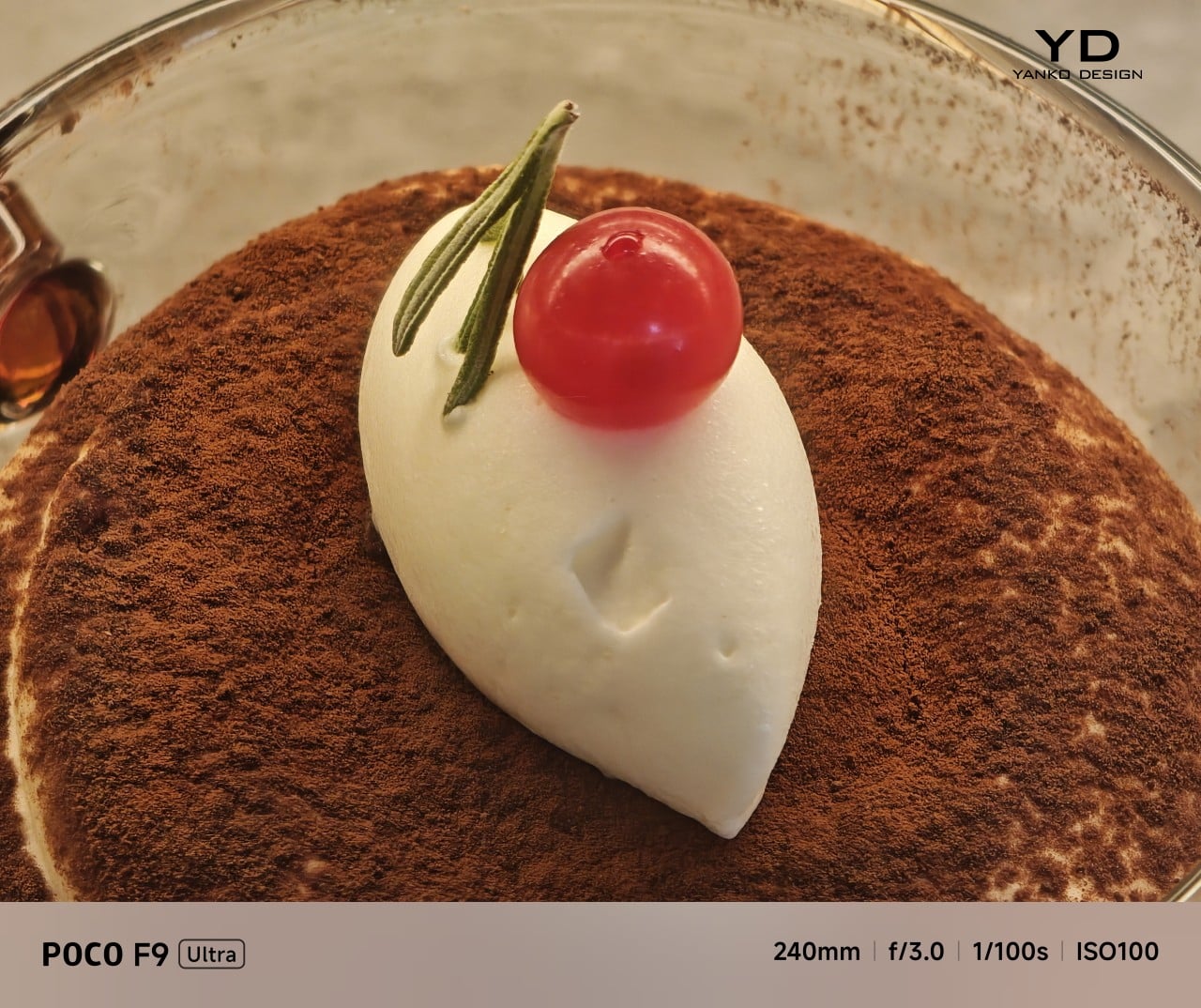
Telephoto Camera, 10x

In use, the speakers are easy to like. Just like the F8 Ultra, the F9 Ultra delivers some of the best smartphone audio you can get. The sound is fuller and more open than what most phones manage, with enough bass presence to give games, films, and music a bit more body. Dialogue comes through clearly, and the overall presentation feels less cramped than the average smartphone speaker setup.

Main Camera, 1x

Telephoto Camera, 5x

Telephoto Camera, 10x

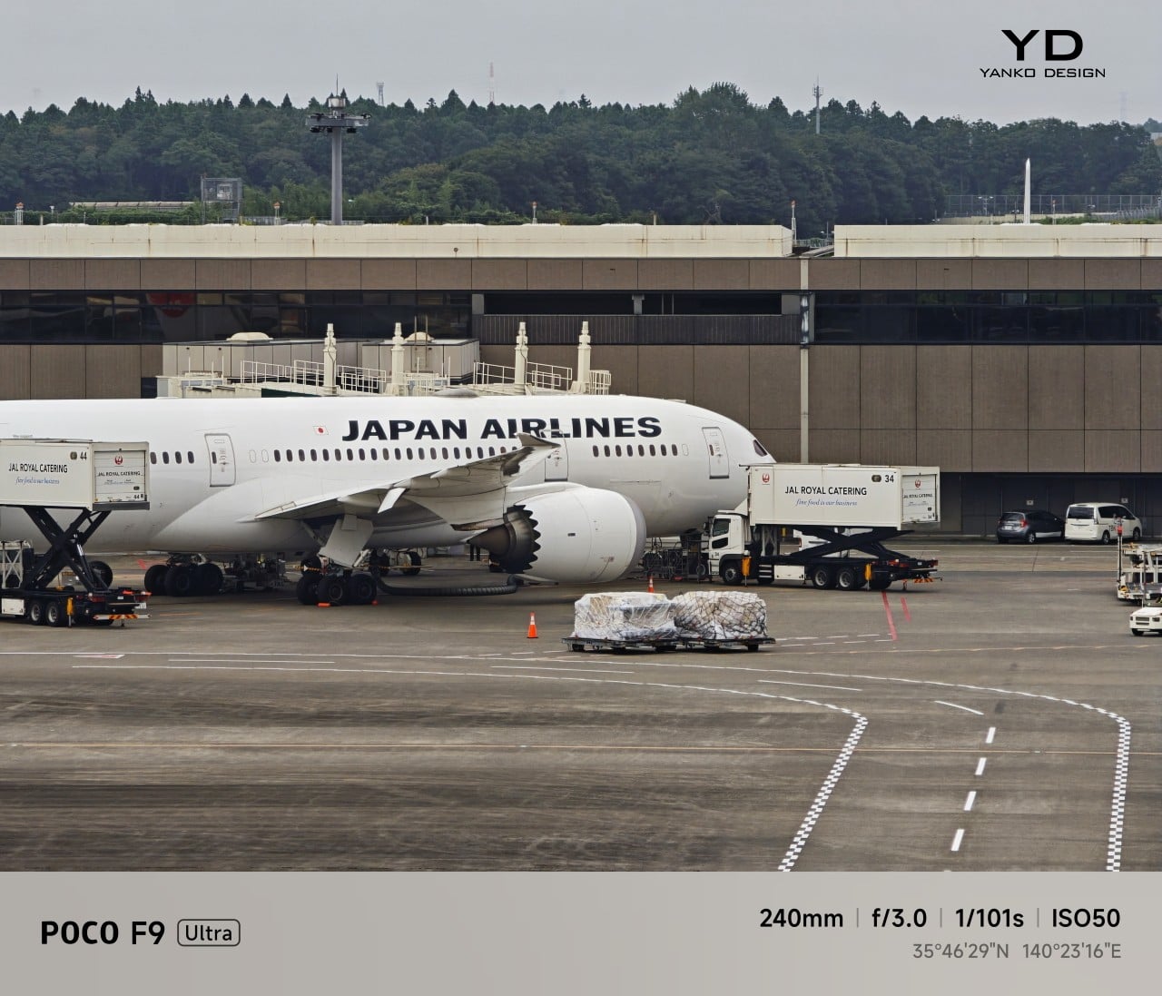
The F9 Ultra upgrades the main camera from 50MP on the F8 Ultra to 200MP here, though the sensor itself is smaller, dropping from 1/1.31-inch to 1/1.56-inch. That makes it less a straightforward upgrade and more a different kind of tradeoff. The rest of the setup remains familiar, with a 50MP 5x telephoto, a 50MP ultrawide, and a 32MP front camera.

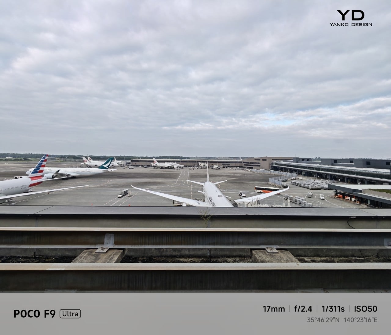
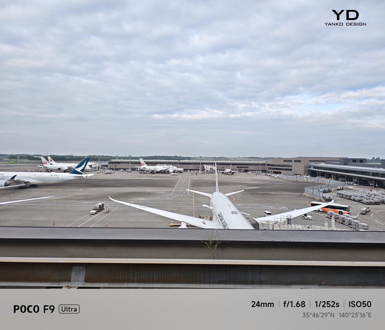
Poco has also made a subtle but useful change to the focal lengths. The F9 Ultra uses a 24mm-equivalent main camera and a 17mm-equivalent ultrawide, compared with 23mm and 18mm on the F8 Ultra. The shift is small, and the ultrawide still does not feel especially expansive, but the added separation between the two lenses makes the jump from main to ultrawide feel a little more purposeful.

Ultrawide Camera, 0.7x

Main Camera, 1x

Telephoto Camera, 10x

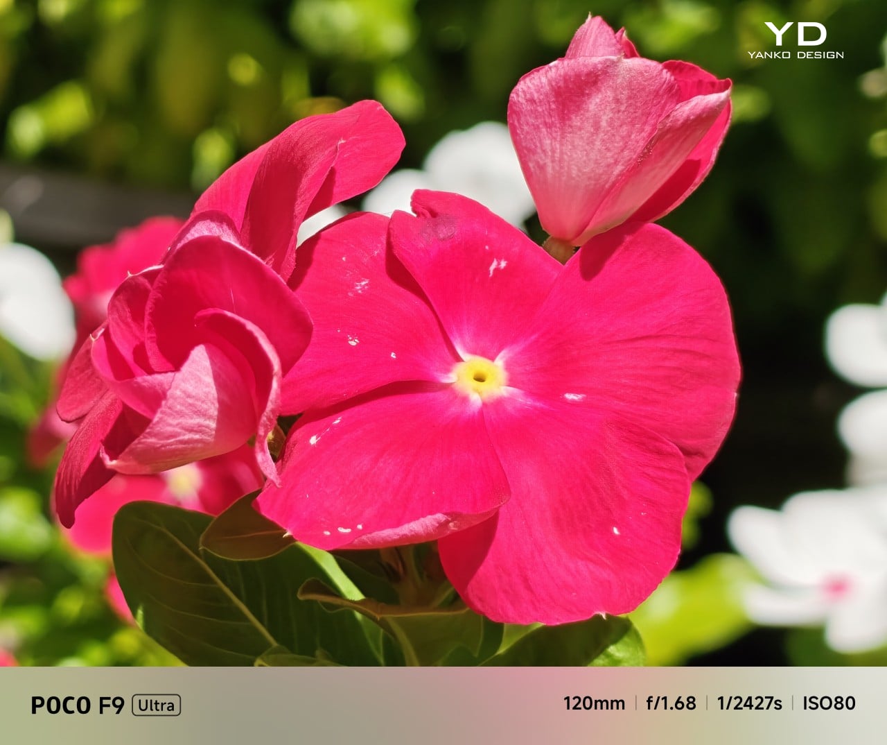
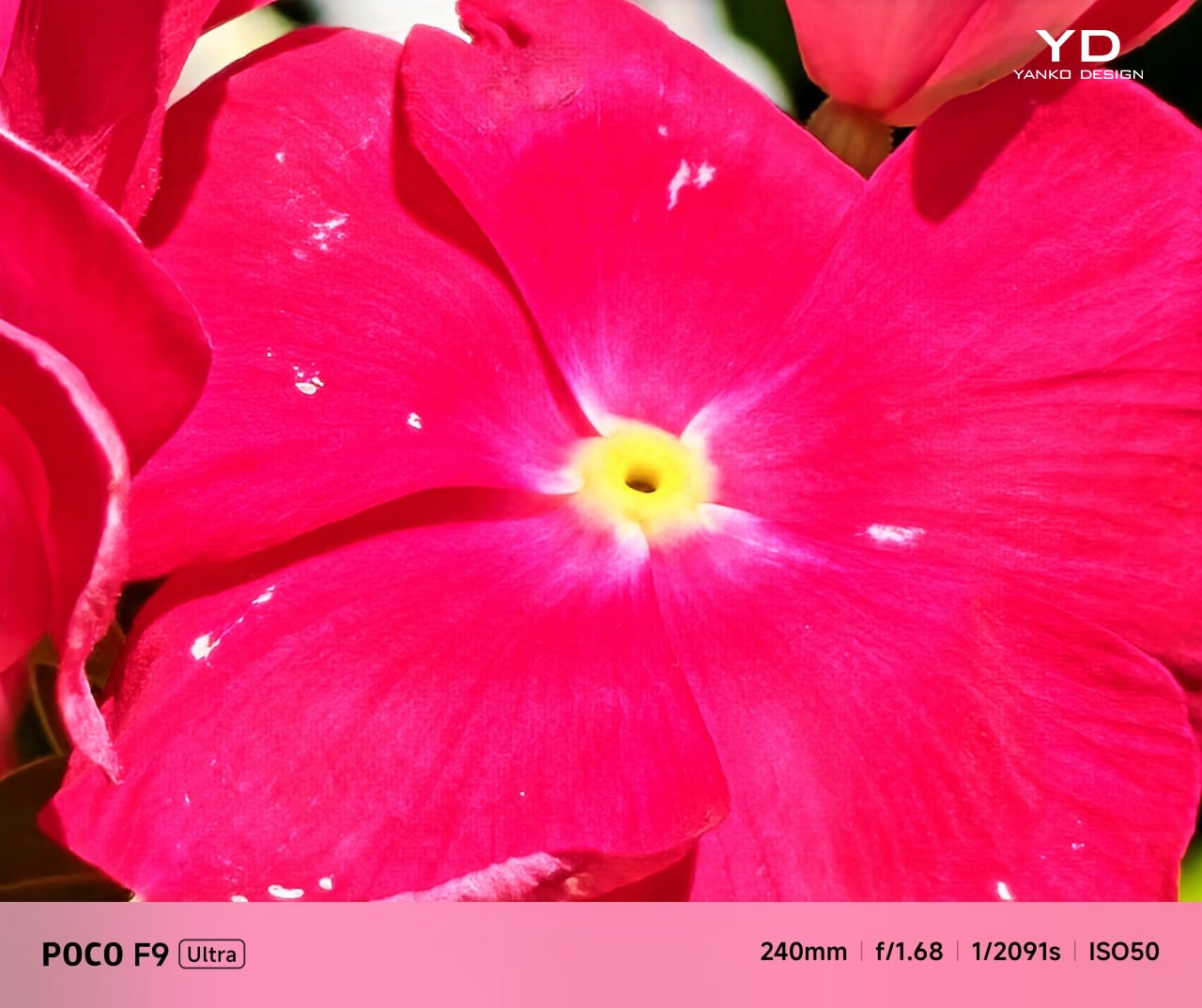
In use, the main camera captures photos with good detail, solid dynamic range, and vibrant color. The 5x telephoto is also capable, though it tends to produce images that look a bit more saturated and contrast-heavy. Video is solid too, with crisp footage and enough consistency to make the camera system feel dependable for everyday shooting.

Night Shot, Ultrawide Camera, 0.7x

Night Shot, Main Camera, 1x

Night Shot, Telephoto Camera, 5x

Night Shot, Telephoto Camera, 10x

Battery life remains one of the F9 Ultra’s biggest strengths. The 8,050mAh battery is enormous even by flagship standards, and it gives the phone a clear advantage in the kind of heavy use it is designed for. In my use, it was easy to stretch the phone across two days on a charge, which suits the F9 Ultra’s media-heavy, gaming-friendly character especially well.

Charging is just as capable, with 100W wired and 50W wireless support, plus 27W wired reverse charging and 22.5W wireless reverse charging. It is a battery setup that feels as well-rounded as the rest of the phone.

Sustainability

The F9 Ultra is not a phone that talks much about sustainability in the material-driven sense, but it does make a decent case for longevity. Its IP68 rating and Corning Gorilla Glass 7i should help it stand up to everyday wear, which is still one of the most practical ways a phone can stay useful for longer.

Poco also promises four major Android OS updates and six years of security patches, which gives the F9 Ultra a fairly credible long-term support story. That matters because software support plays a big role in whether a phone remains worth keeping. Poco may not be leading the conversation around recycled materials or repairability here, but the basics of durability and usable lifespan are in place.

Value

The F9 Ultra starts at $799 for the 12GB/256GB version, which puts it $70 above the F8 Ultra. That is still an increase, but not an especially aggressive one in the current climate, where similar phones have seen price jumps closer to $100. Some of that restraint may come from Poco reusing the same Snapdragon 8 Elite Gen 5 platform, which likely helped balance out the rising cost of RAM and other components.

As an upgrade, though, the case is less convincing. If you already have the F8 Ultra, moving to the F9 Ultra does not make a lot of sense unless you specifically want the new design, the 185Hz display, or the 200MP main camera. As a fresh buy, however, it remains one of the best affordable flagship-level phones around. Poco may be edging upward in price, but it still knows how to deliver a lot of phone for the money.

Verdict

The Poco F9 Ultra feels like Poco settling into a formula that actually works. The design is more mature, the gaming side is still strong, and the Bose-tuned speakers remain one of the best reasons to care about the series in the first place. Add the huge battery and the 185Hz display, and you end up with a phone that feels very sure of what it wants to be.

If you already have the F8 Ultra, I do not think this is the upgrade to chase. The older phone is still good enough that the differences here feel more iterative than urgent. But if you are buying fresh, the F9 Ultra is still one of the better affordable flagship-level phones around, especially if you care as much about sound and gaming as you do about the usual specs.

The post Poco F9 Ultra Review: Great Sound, Grown-Up Design first appeared on Yanko Design.

  •  

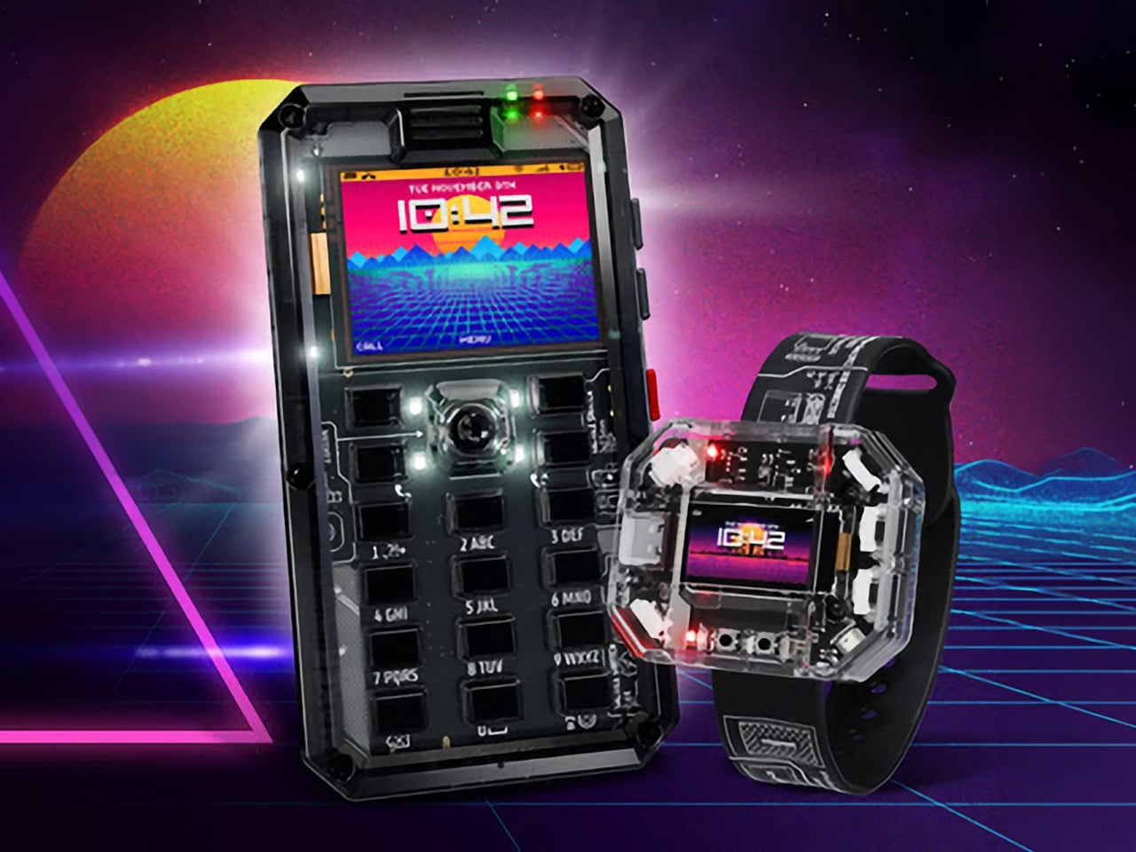
MAKERphone 2.0 Assembles Like LEGO, Calls Like a Real 4G Phone

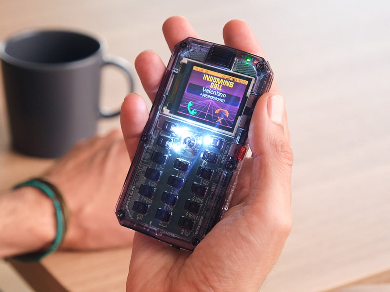
Most phones arrive finished, sealed behind glass before you open the box. MAKERphone 2.0 flips that script. It ships as loose parts that only become a phone once you build it yourself: no soldering iron, no electronics background, just a screwdriver and about two hours. Once assembled, it’s a working 4G device that makes real calls and sends texts over a live network.

The build is what really sells the design. Every piece, from the board to the display to the numpad and to the joystick, clicks or screws into place. The entire endeavor is guided by an illustrated manual that reads like a LEGO instruction booklet, with video walkthroughs for anyone who gets stuck. By the time you finish, you’ve seen the processor, the modem, and the battery close, not used them.

Designer: CircuitMess

Click Here to Buy Now: $129 $160 (24% off). Hurry, only a few left! Raised over $300,000.

Pop in a nano-SIM and the phone comes alive on 4G networks, handling calls and texts like any device off a shelf. There’s a music player, a photo and video gallery, a calendar, notes, and a handful of retro games loaded onto that small color screen. What’s missing says as much: no app store, no social feed, nothing designed to keep anyone scrolling past bedtime.

That absence is the whole appeal for anyone shopping for a kid’s first phone. It calls and texts the people a child needs to reach, without opening the door to an internet’s worth of distraction. When a kid wants a new app or game, the answer isn’t downloading one; it’s building it. Screen time stops being something to limit and starts being something to spend making.

That building happens inside VibeBoy, the phone’s companion coding studio that runs on a computer. Describe an idea in plain English, like a taco dodging falling pickles, and the AI writes code sent to the phone with one click. The goal isn’t to let AI do all the thinking but to let VibeBoy teach users to read that code, question it, and eventually rewrite it.

That teaching happens across four stages built into the same app. Beginners describe what they want and watch it appear on-screen, before moving on to reading and tweaking the Python code the AI generates. Eventually, they write their own Python and C++ from a blank file. Nobody stays at one skill level long; the ladder is designed so most people climb it faster than expected.

Six snap-on modules turn the phone into something closer to a small hardware platform than a single-purpose device. A camera module captures pixelated stills and video, a bigger speaker adds volume, and a flashlight adds utility. An environment sensor reads temperature and humidity, an infrared module controls other devices, and a bare perforated board lets anyone solder a custom circuit and plug it in.

A companion smartwatch called MAKERband follows the same idea, arriving as a kit to assemble rather than a sealed gadget. Once built, it pairs with the phone over Bluetooth and also works with iOS and Android, running 15 watchfaces and five mini-games out of the box. It connects to VibeBoy, so a custom watchface, say, a pixel cat that naps after 9 PM, is a prompt away.

The company behind it, CircuitMess, has spent years building kits like this from a small studio in Croatia. It has shipped hundreds of thousands of units to customers across more than 100 countries, developed dozens of products, and earned coverage from outlets like Wired and The Verge. Just as important, the MAKERphone 2.0 isn’t a rendering or an early prototype: the hardware is finished and ready for production.

What sticks with you isn’t any single spec but the sequence. A pile of components turns into a working phone, and that phone turns into whatever its owner decides to code next. Somewhere between the last screw and the first successful call, the device stops feeling like something you bought and starts feeling like something you actually built, one working call at a time.

Click Here to Buy Now: $129 $160 (24% off). Hurry, only a few left! Raised over $300,000.

The post MAKERphone 2.0 Assembles Like LEGO, Calls Like a Real 4G Phone first appeared on Yanko Design.
  •  

TECNO CAMON Slim 5G Review: Thinner than a Pencil, Tough as a Tank

PROS:


  • Unbelievably slim and lightweight design

  • Striking and stylish art-inspired finish

  • Large 6,000mAh battery despite slim profile

  • Exceptional durability with quad-IP rating, supporting underwater photography

CONS:


  • Modest hardware specs

  • No dedicated telephoto camera

RATINGS:

AESTHETICS
ERGONOMICS
PERFORMANCE
SUSTAINABILITY / REPAIRABILITY
VALUE FOR MONEY

EDITOR'S QUOTE:

Slim, art-inspired, and tougher than it looks, the TECNO CAMON Slim 5G packs a 6,000mAh battery into a body thin enough to turn heads.
award-icon

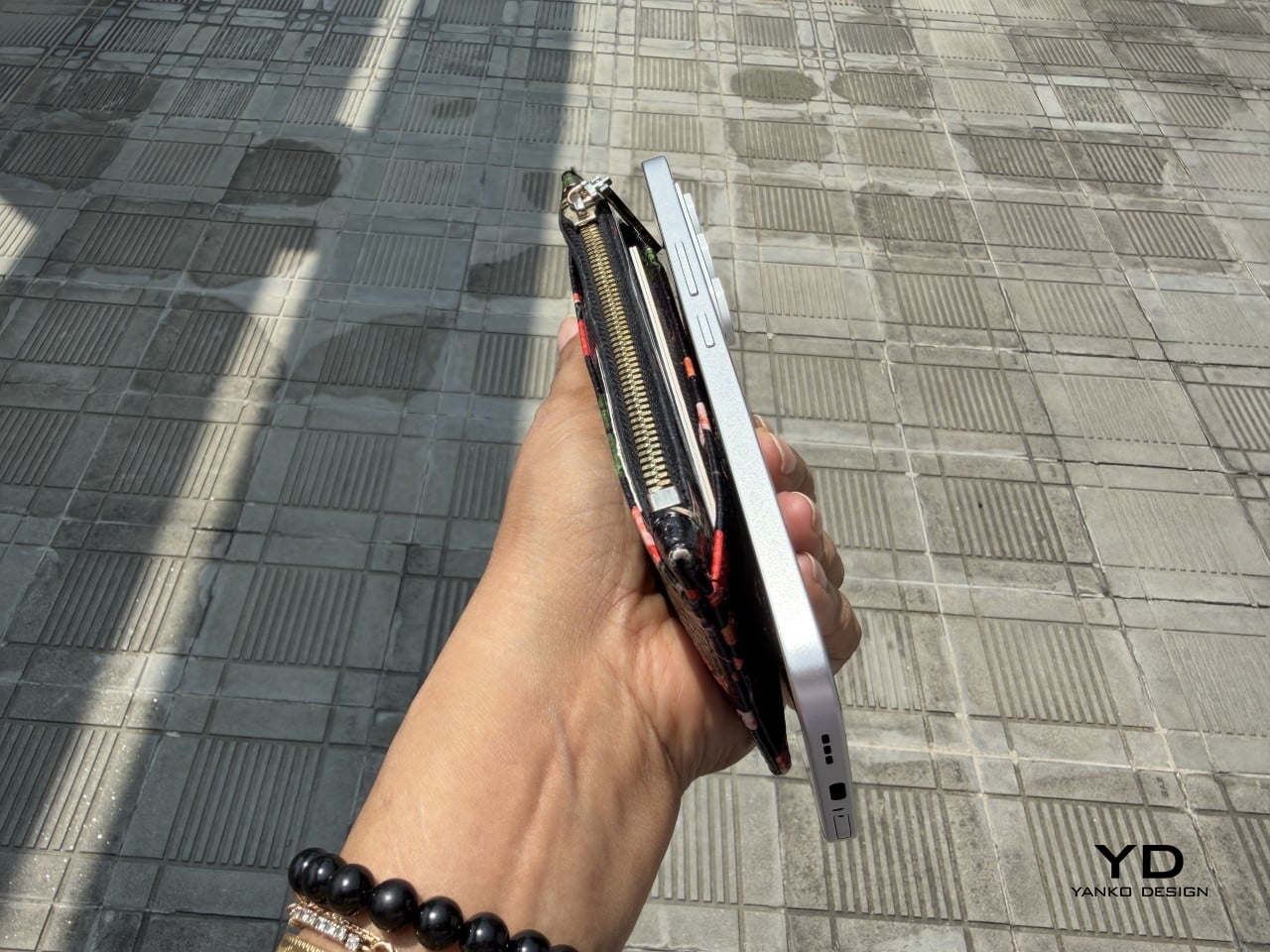
Slim phones have always come with a catch. Shave down the body and something else usually gets sacrificed: usually the battery, sometimes the durability, occasionally both. The TECNO CAMON Slim 5G doesn’t play by that old rulebook. At just 6.39mm thick, it still packs a 6,000mAh battery, 5G connectivity, and a durability rating most phones twice its thickness wouldn’t dare claim.

This review spent real time with the phone away from spec sheets, mostly to see if the design holds up once the initial wow wears off. That meant handling the Neo Mondrian finish TECNO sent for testing, carrying it through a normal week, testing the camera in situations that actually matter, and checking whether the durability claims survive contact with water and everyday clumsiness. The design conversation comes first.

Designer: TECNO

Aesthetics

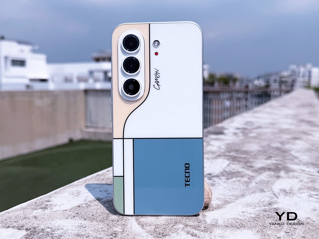
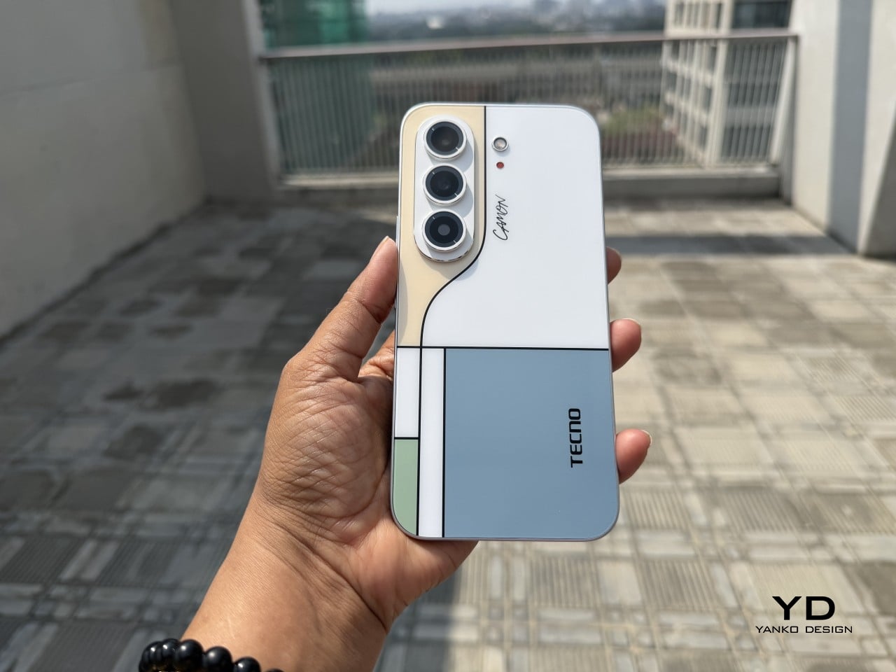
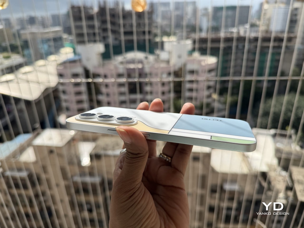
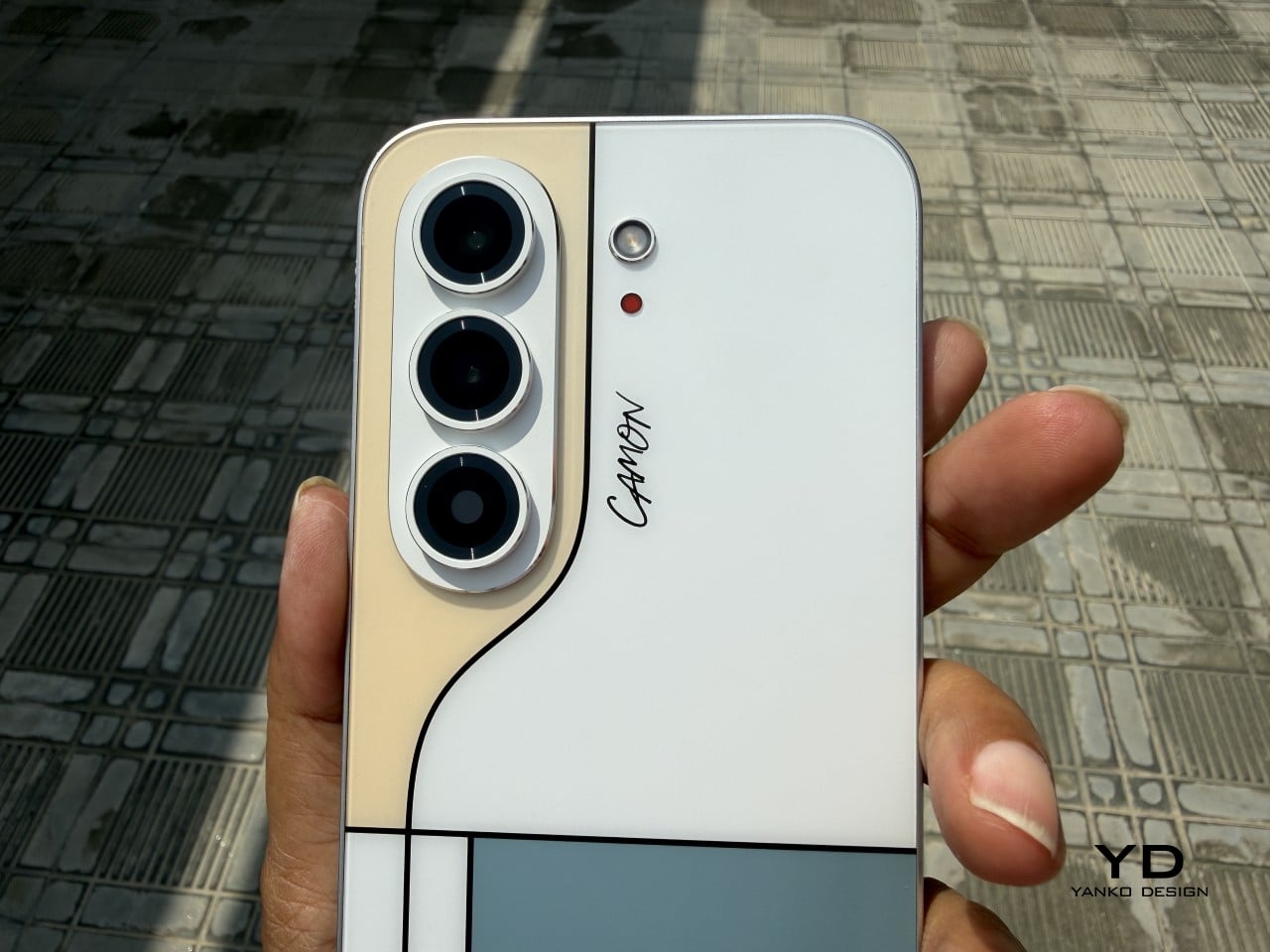
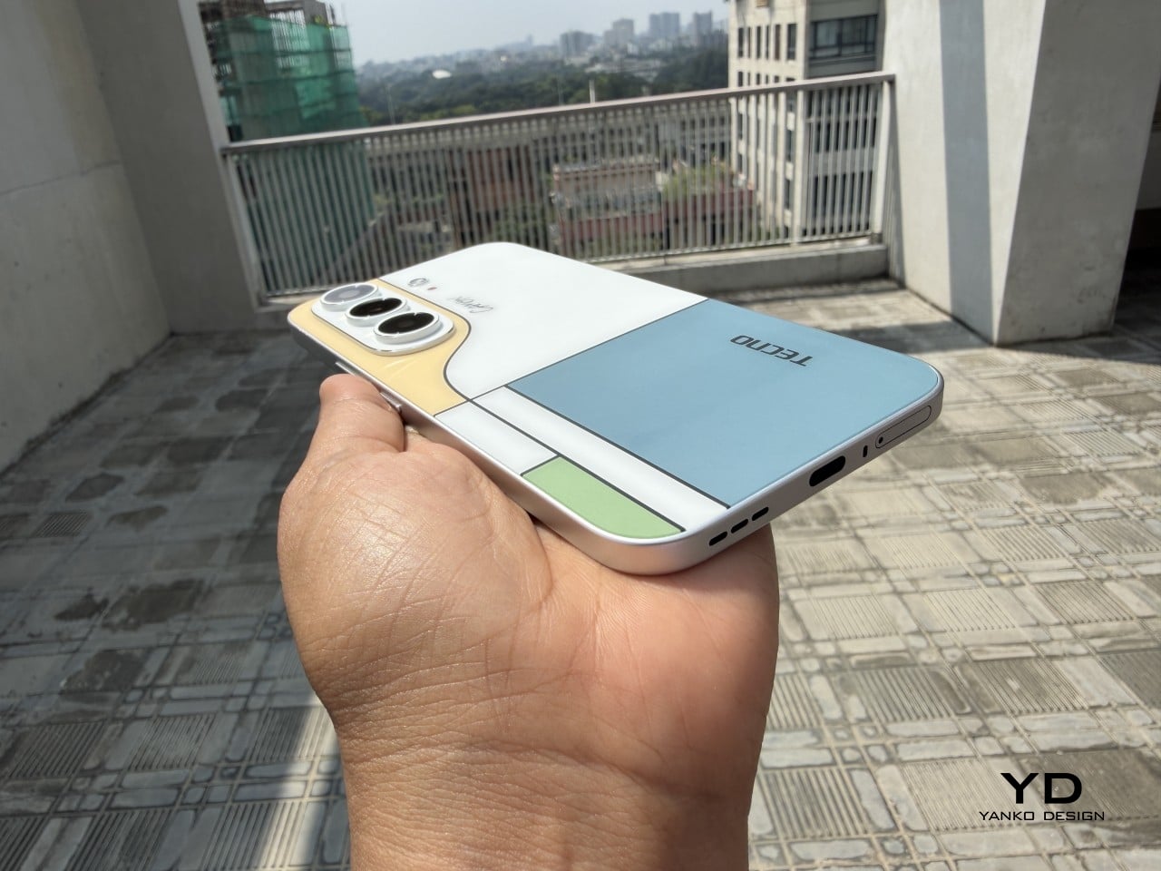
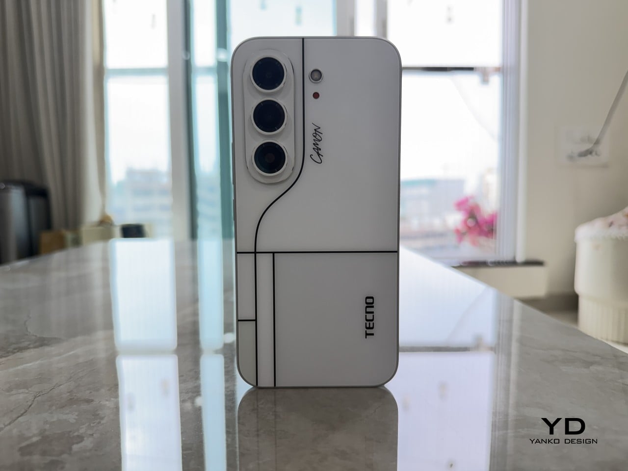
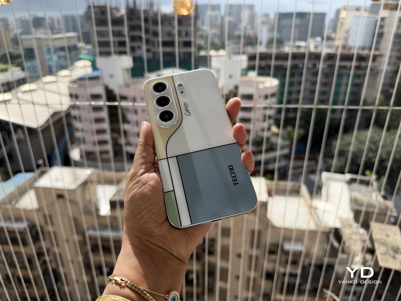
Pull the CAMON Slim 5G out in public and watch what happens. People notice a phone this thin the way they’d notice a watch too elegant for its price tag, usually with a double take and a request to hold it. TECNO carried over the swan-neck curve from the CAMON 50 series, and on a body this slender, that curve reads like a signature rather than a spec sheet footnote.

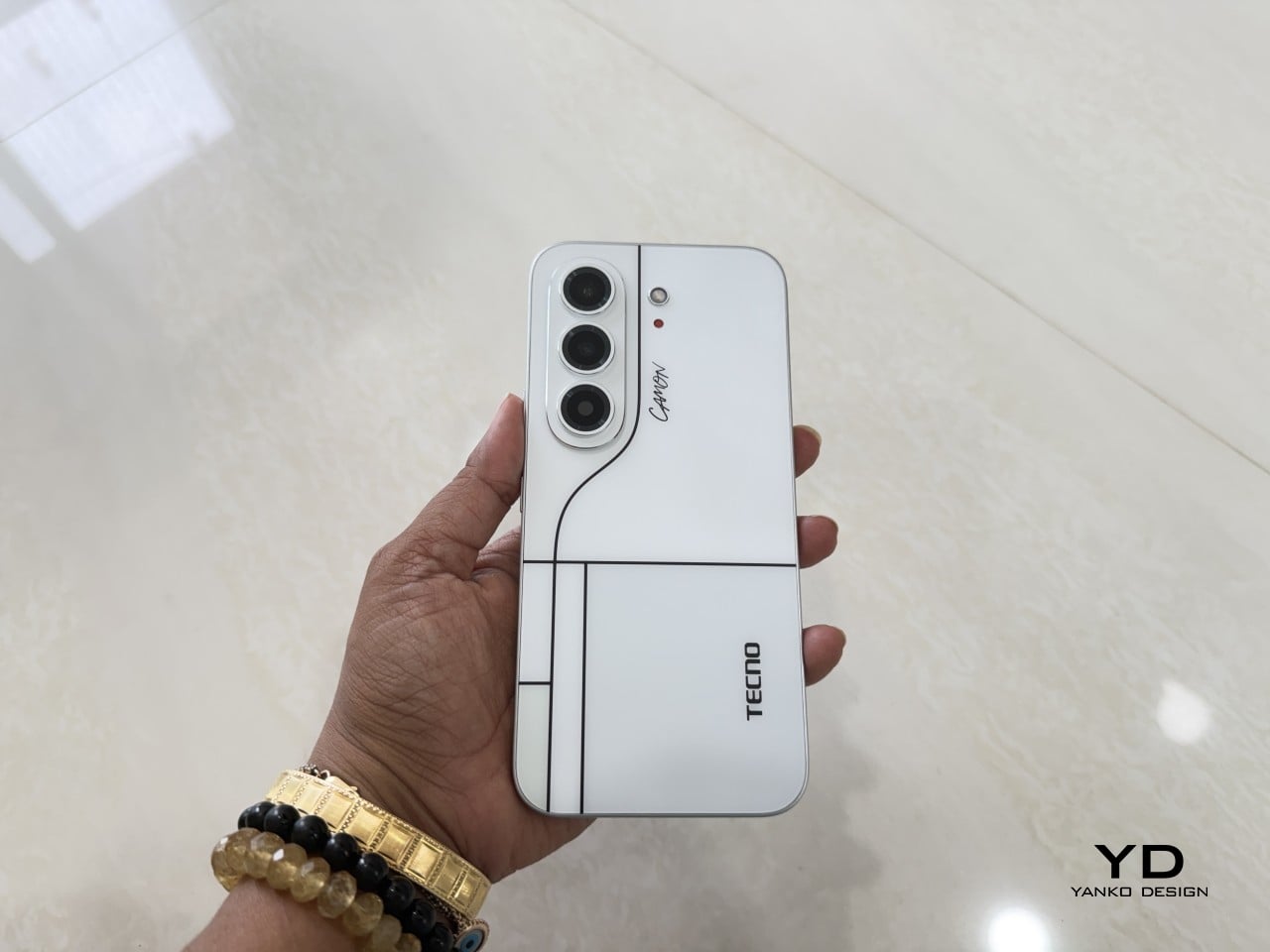
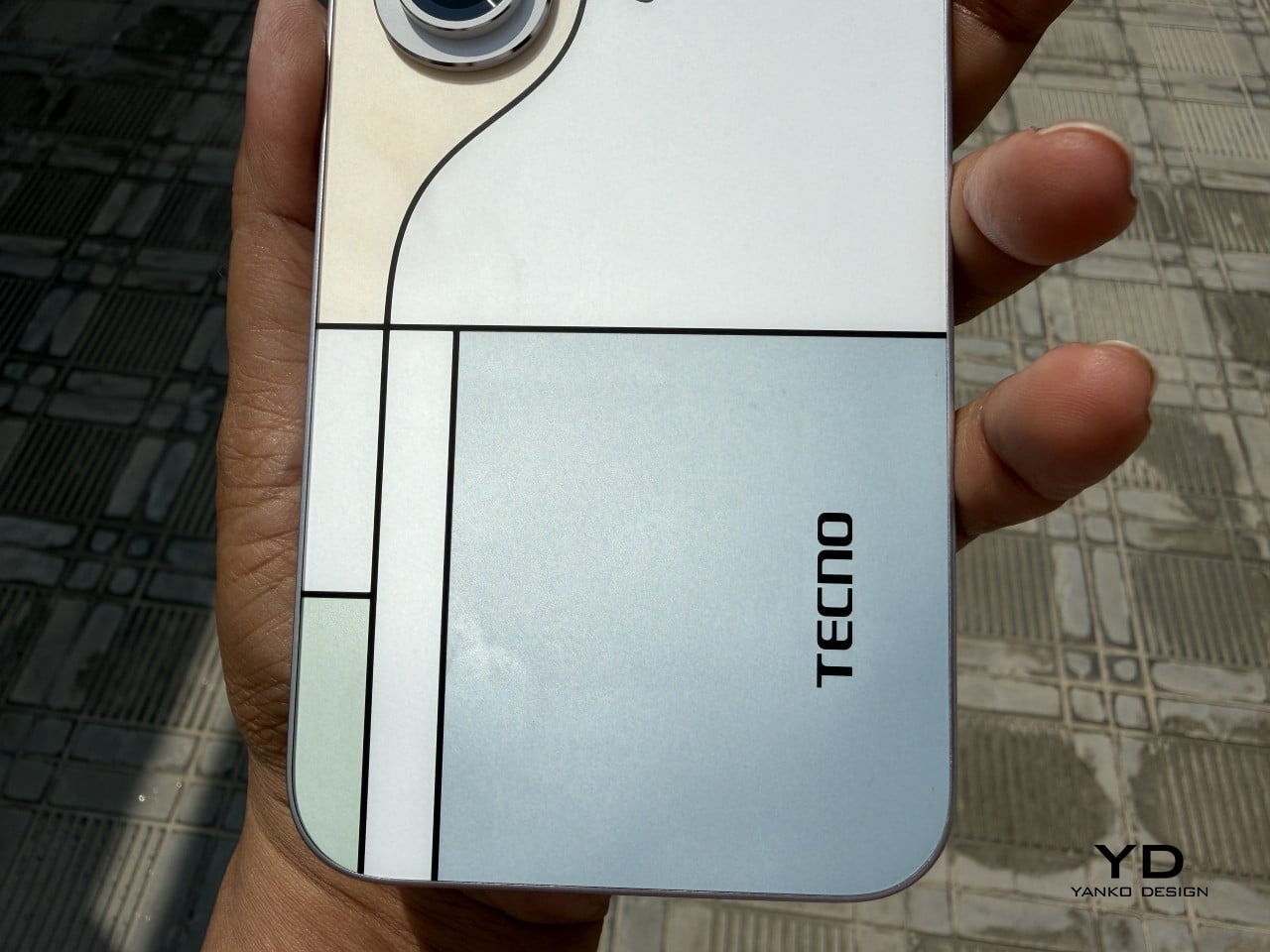
TECNO sent the Neo Mondrian colorway for this review, and it’s the strongest argument for treating a phone back as an actual canvas. Expose the panel to sunlight and yellow, green, and cyan blocks slowly bloom out of white, forming the grid Piet Mondrian made famous a century ago. It’s a photochromic trick, but watching it happen feels less like a gimmick and more like a magic show.

Neo Mondrian isn’t the only finish doing something interesting. Van Gogh Blue uses similar light-reactive techniques to make its swirling nebula pattern look like it’s actually rotating as shadows shift across it, closer to a painting than a phone back. Matisse Black leans into fluorescent green or pink color blocks that echo the artist’s cut-out work, while Burgundy Red blends fiberglass and matte texture into a warm, understated finish. Rebel Pink keeps things simpler, pairing a black body with sharp pink accents for something a little more playful.

Phone backs used to be an afterthought, something to protect rather than admire, which is why so many people slapped an opaque case on day one without a second thought. That’s changing. As manufacturers invest more in finishes, textures, and light-reactive coatings, more owners are leaving their phones bare, treating the back panel the same way they’d treat a piece of art they paid good money to display.

Ergonomics

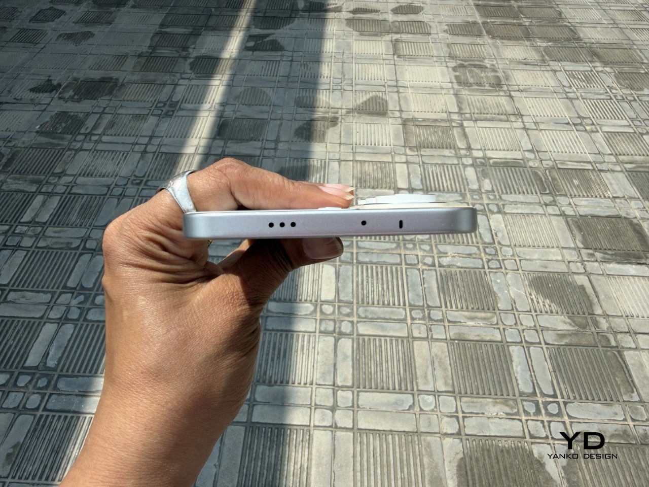
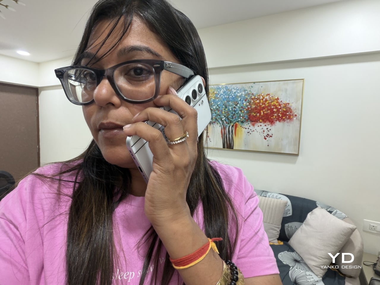
Carrying the CAMON Slim 5G is where the thin body actually pays off day to day. It slides into a front pocket without that telltale bulge, sits flat against a jacket without pulling on the fabric, and feels lighter in hand than the display size suggests. After a few days, reaching for a thicker phone almost feels like picking up a brick by comparison.

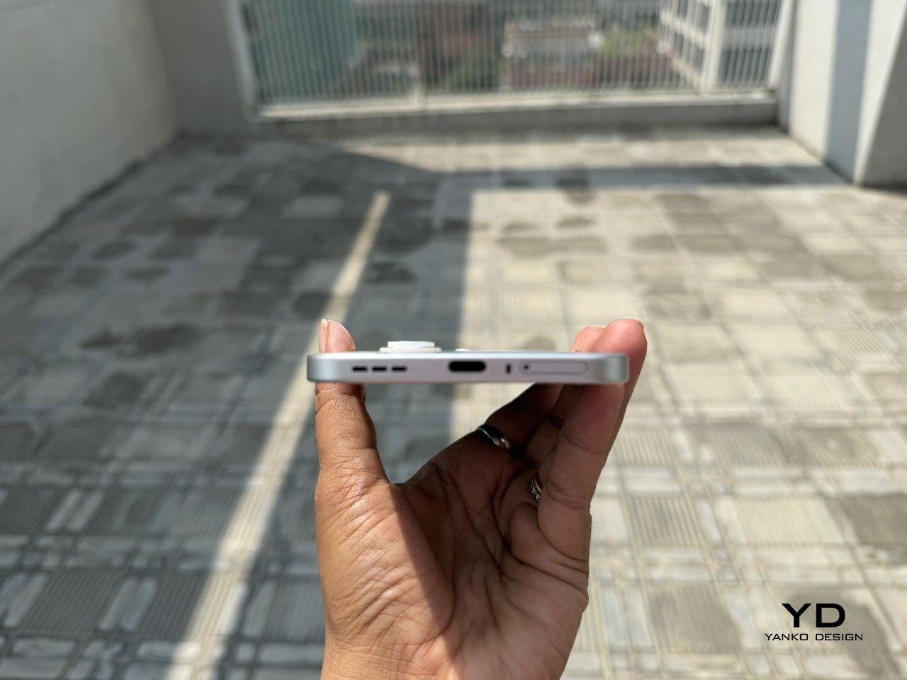
Those flat edges aren’t just a style choice borrowed from boxier design trends. They give fingers something to actually grip onto, instead of sliding off a rounded rim the way slippery slab phones tend to do. The matte texture on the Neo Mondrian panel adds even more confidence, and TECNO’s wet and oily finger recognition keeps the touchscreen responsive when hands aren’t exactly dry or clean.

Performance

The 6.78-inch AMOLED display runs at 1.5K resolution and 144Hz, and both numbers translate into a screen that looks sharp and feels fast under a thumb. Photos pop with the kind of contrast only AMOLED delivers, video looks great for a lunch break binge, and scrolling through a feed never feels like it’s fighting the hardware. TÜV Rheinland’s low blue light certification is a nice bonus for long reading sessions.

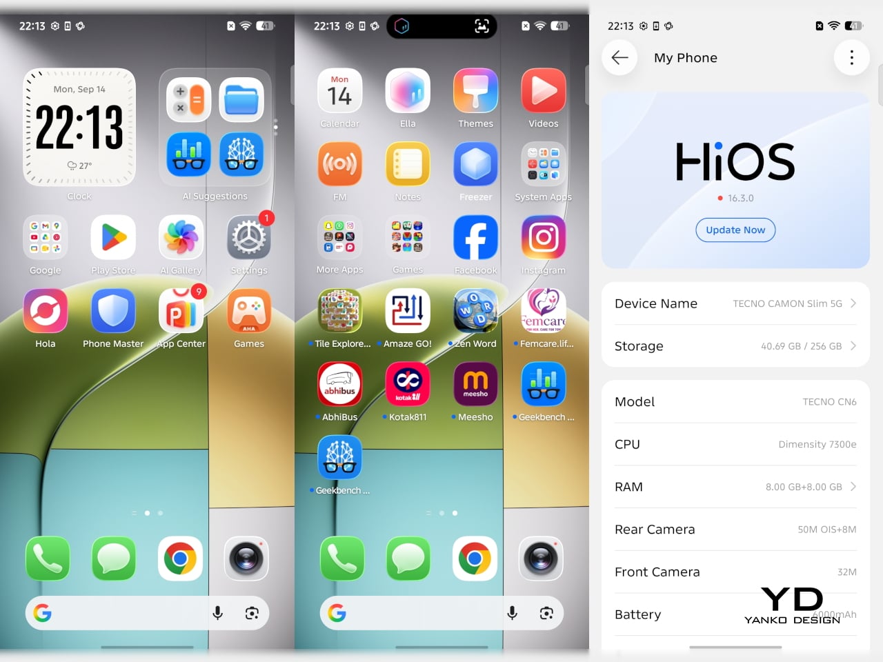
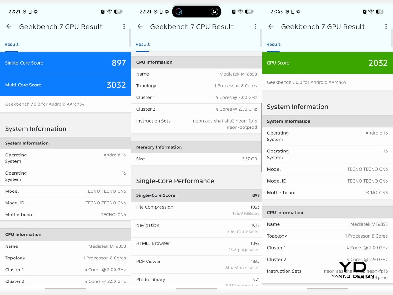
Under the hood sits a MediaTek Dimensity 7300e, a processor built for balance rather than benchmark bragging rights. It handles social apps, photo editing, and everyday multitasking without hiccups, though demanding 3D games will ask more of it than it’s built to give. The 8GB of RAM stretches to 24GB with virtual memory extension, which covers most multitasking habits without needing to close every open app.

The 50MP Sony LYTIA 700C handles most of the photography workload, and it earns that responsibility. A 1/1.56-inch sensor paired with an f/1.8 lens pulls in plenty of light for evening shots, while the closed-loop ball motor keeps focus locked even when subjects won’t sit still. The 8MP ultra-wide feels more like a footnote, and there’s no telephoto here, but the main camera rarely leaves you wanting one.

The real showstopper is the 6,000mAh battery, a number that seems almost impossible once you remember this phone measures 6.39mm thick. It comfortably carries a full day of camera use, video, and scrolling without the battery anxiety that usually comes with slim designs. That same waterproofing also unlocks a dedicated underwater photography mode, one that kicks in automatically the moment the phone senses it’s gone for a swim.

Sustainability

TECNO rates the CAMON Slim 5G at IP69K, IP69, IP68, and IP66, a combination that’s rare even among phones that don’t have to worry about staying thin. That covers everything from high-pressure water jets to dust particles to full submersion, which is a lot of technical armor for a phone this delicate-looking. Finding this rating on a 6.39mm body is the kind of detail that quietly impresses.

There’s also a MIL-STD-810 rating covering shock and drop resistance, which pairs nicely with features like Rain Touch and Waterproof Case Touch that keep the screen usable in a downpour or behind a case. This doesn’t read like a feature bolted on at the last minute. It feels like TECNO wanted this phone to survive actual daily chaos, not just look good sitting still on a shelf.

Longevity extends past the hardware, too. TECNO promises three major OS upgrades and five years of security patches, plus a 60-month smoothness certification from TÜV SÜD. That’s a meaningful commitment in a market where phones often get abandoned after two update cycles. A well-built object is worth keeping around, and TECNO seems to be betting that owners will want to hold onto this one for a while.

Value

TECNO hasn’t confirmed global pricing yet, but early indications point to somewhere around $400. At that number, buyers get a phone with genuine art-inspired finishes, a 6.78-inch 144Hz AMOLED screen, a Sony-backed 50MP camera with real stabilization, a 6,000mAh battery, and a durability rating that most phones twice the price don’t bother chasing. That’s a fairly generous list for a phone that costs less than most flagships.

Most phones in this price range make you pick a lane. Go thin, and the battery usually suffers, or the body skips water resistance entirely, or the software support runs out after a couple of years. TECNO’s five-year update promise and its layered durability ratings quietly add up to lower long-term cost, since a phone built and supported to last half a decade doesn’t need replacing as often.

This phone makes the most sense for people who are tired of carrying an identical black slab and want something that says a little more about them. It’s not the right pick for hardcore mobile gamers chasing max frame rates, or photographers who need optical zoom on tap. For nearly everyone else, it covers daily needs while looking like it belongs on a gallery shelf.

Verdict

After a few days of actual use, the 6,000mAh battery and the quad-IP rating stop feeling like marketing footnotes and start feeling like the whole point. TECNO built a phone that looks like it belongs in a design museum and still survives a rainy commute or a splash at the sink. The Neo Mondrian panel alone gives it a personality that’s genuinely hard to find anywhere near this price.

Plenty of phones ask you to choose between something beautiful and something dependable, and most buyers have quietly accepted that trade-off as the cost of owning a nice-looking device. The CAMON Slim 5G makes a strong case that the choice was never as necessary as the industry made it seem. It’s a phone that looks good on a café table and still works fine after falling off of one.

The post TECNO CAMON Slim 5G Review: Thinner than a Pencil, Tough as a Tank first appeared on Yanko Design.
  •  

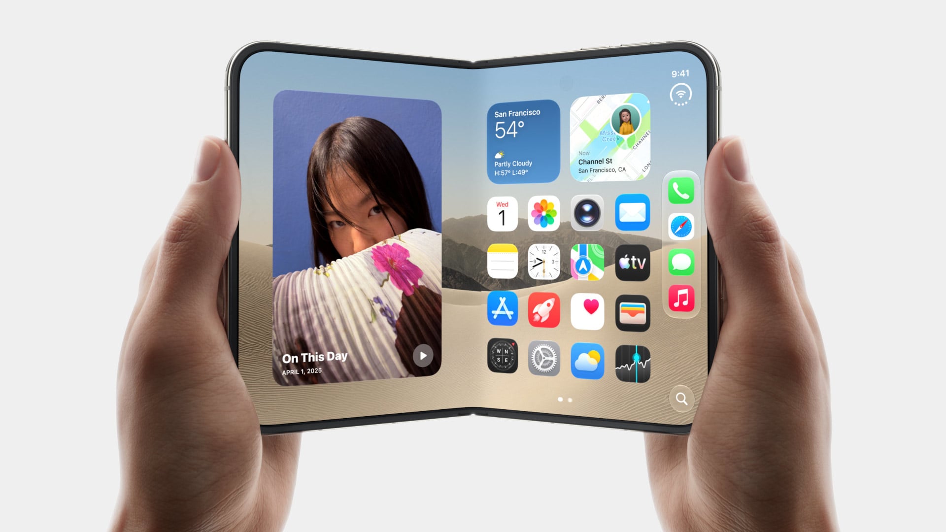
5 Things the iPhone Duo Got Right That Samsung Still Hasn’t

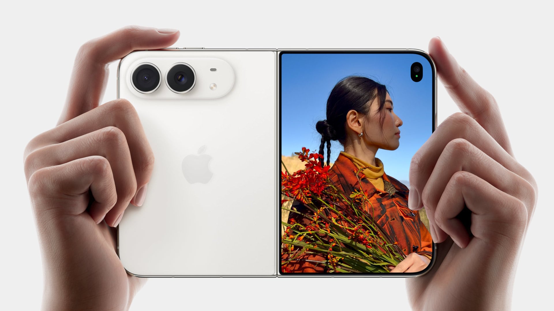
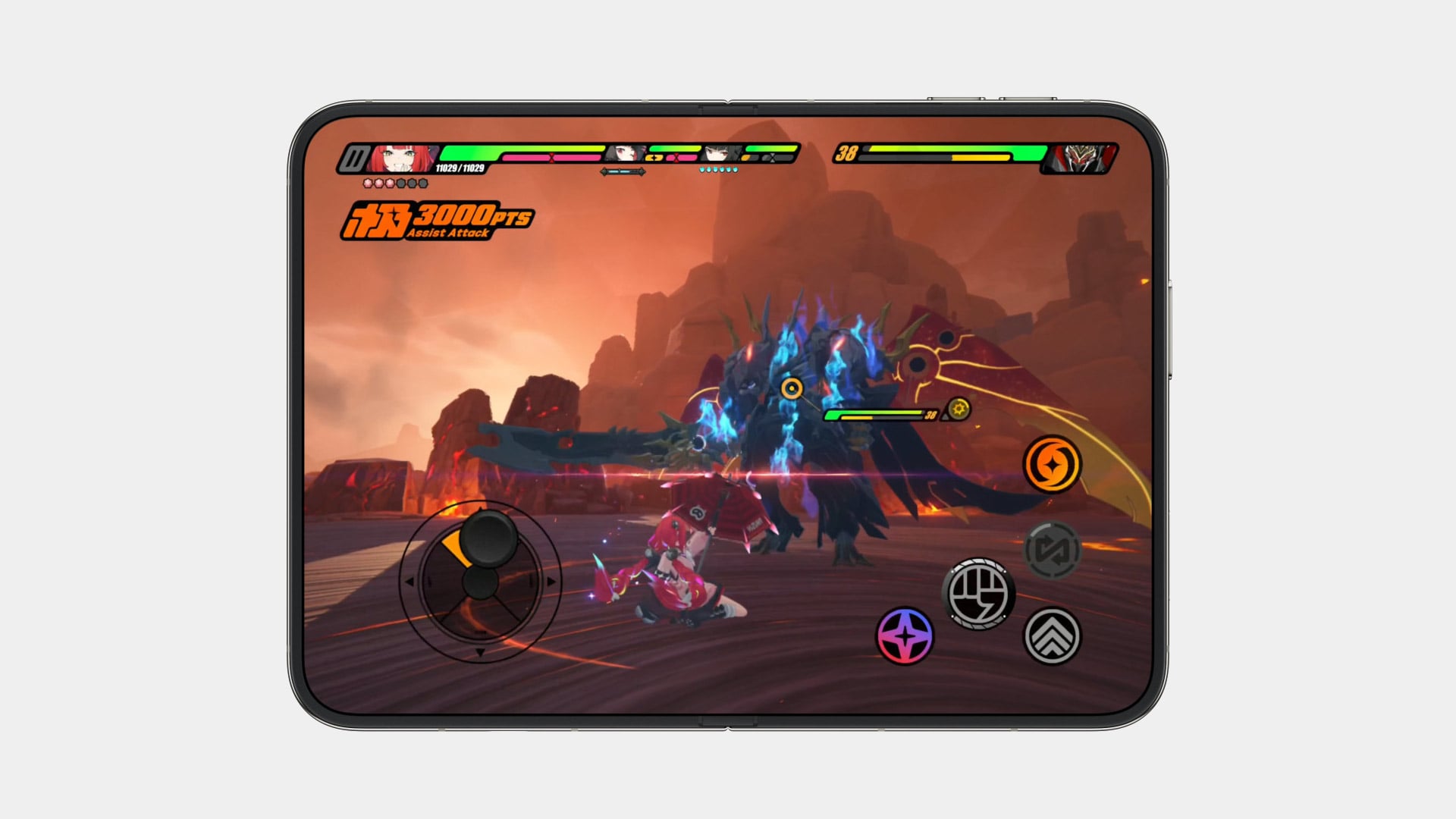
Samsung has had the folding phone conversation to itself for six years now, tweaking hinges, shrinking creases, and figuring out what a cover screen is even for. Apple waited, watched, and let its rival make every mistake first. That patience shows in the iPhone Duo, a first-generation foldable that skipped straight past problems Samsung’s Galaxy Z Fold8 still hasn’t fully solved.

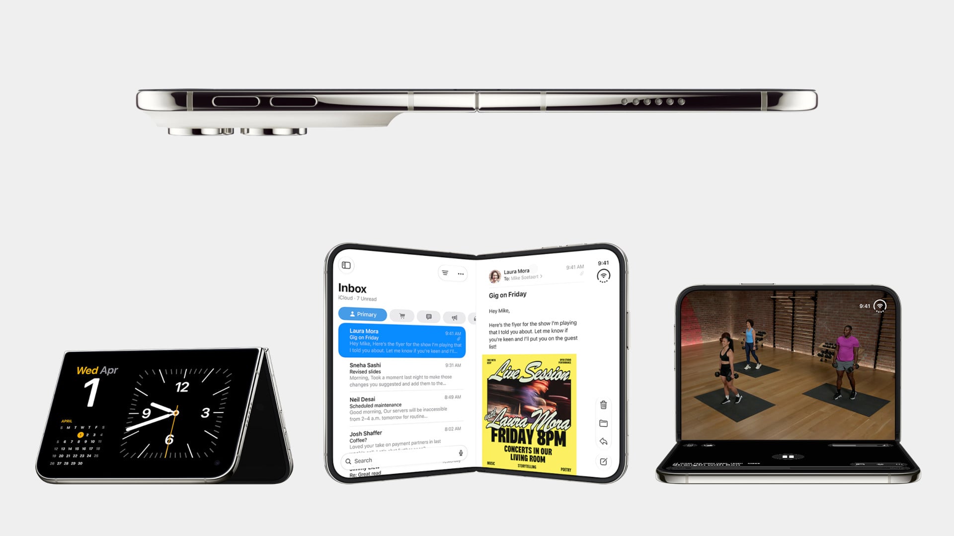
None of that comes cheap, though. The Duo starts at $1,999 and costs more than the Fold8’s $1,899.99, weighs in at roughly nine ounces against the Fold8’s seven, and folds up thicker in your pocket, besides. Samsung still wins those arguments outright, and we’ll get back to that later. But set weight and price aside, because here are five places where Apple’s first foldable actually beat Samsung’s eighth attempt.

Designer: Apple

The Camera That Disappears

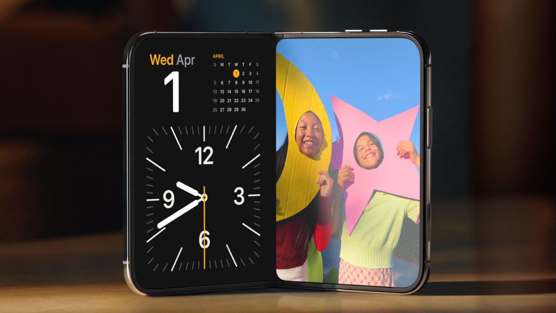
A foldable phone’s whole pitch is the screen, one continuous surface that opens up into something closer to a small tablet. Every notch or punch-hole cut into that surface breaks the illusion a little, reminding you that the software is still working around a sensor buried in the glass. Samsung’s Galaxy Z Fold8 has never quite escaped that compromise, even eight generations in.

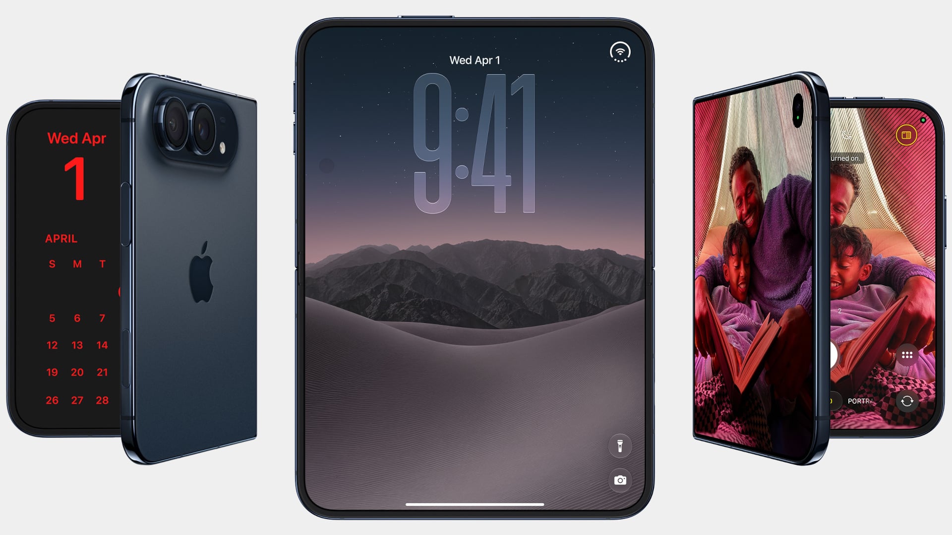
The Galaxy Z Fold8 carries a 10-megapixel camera punched into both the inner and cover displays, a hole you notice every time the screen lights up. The Duo takes a different route entirely, tucking its inner selfie camera under the panel itself so nothing interrupts the display when you’re watching a movie or scrolling through photos with both halves open. The outer screen keeps a single, smaller cutout.

A Stylus Samsung Gave Up On

Samsung built its whole Note legacy around the S Pen, then carried that stylus into the first few generations of the Galaxy Z Fold before quietly dropping it this cycle. Neither the Galaxy Z Fold8 nor the Galaxy Z Fold8 Ultra bring it back, leaving a gap for anyone who used to sketch, sign, or jot notes onto that big inner display. It’s a strange retreat for a company built on that exact feature.

Samsung Galaxy Z Fold6

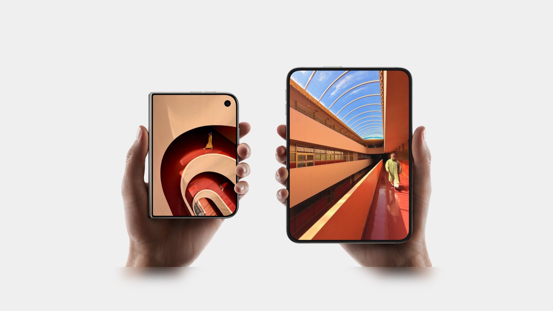
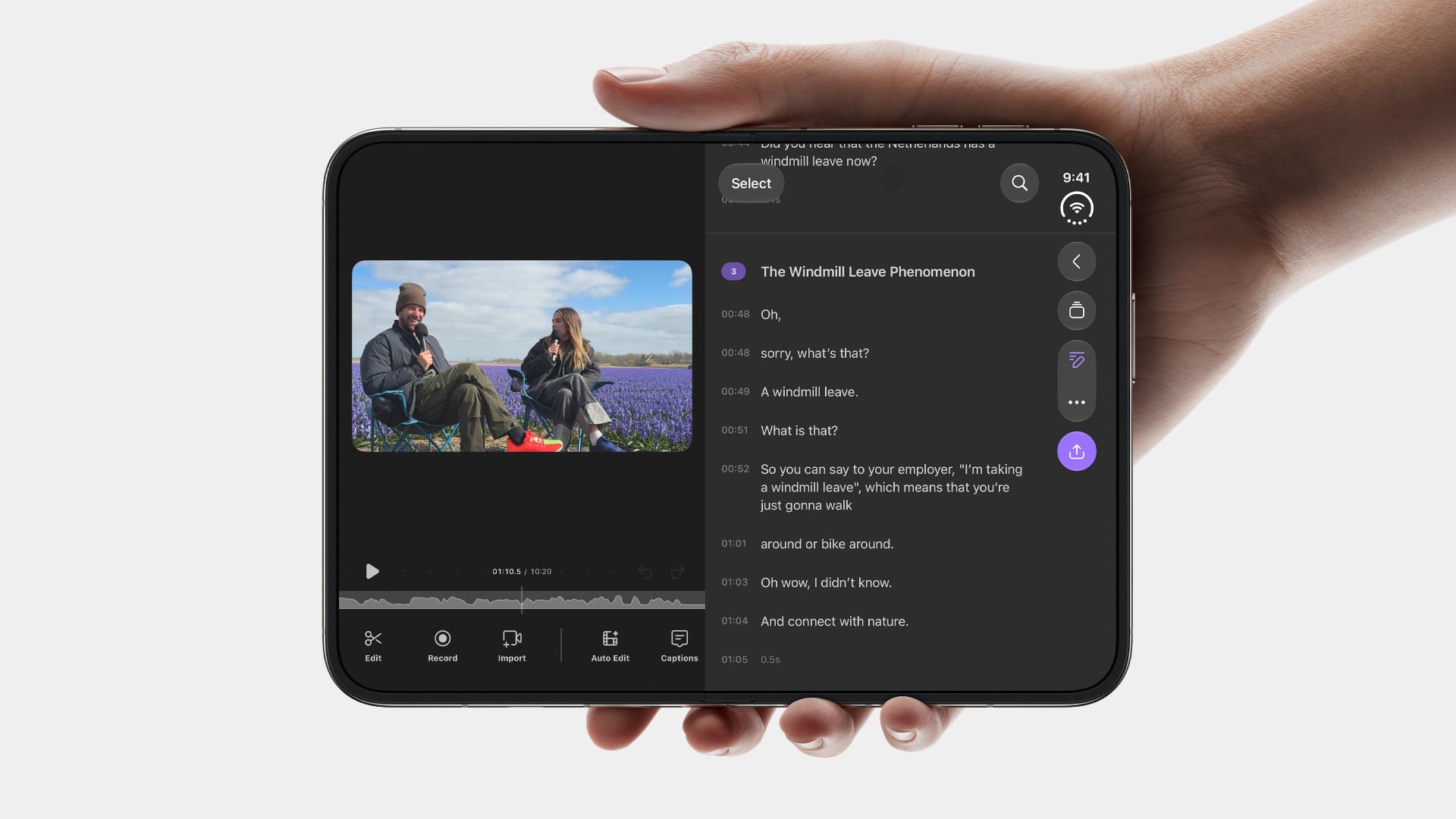
Apple Pencil support changes that, working on both the 5.4-inch cover screen and the 7.6-inch inner display, once it arrives. Dual-screen support lands through a software update later this year rather than at launch, so early buyers will have to wait a bit for the full experience. Still, it means signing a document or sketching an idea won’t require unfolding the phone first, something Samsung’s lineup can no longer offer.

Built to Survive the Mess

Dust is the part of durability testing everyone forgets about until it’s too late, and a folding hinge is the worst possible place for grit to sneak into. Water resistance ratings get all the marketing attention, but the dust half of an IP rating tells you whether sand at the beach or fine construction dust will actually make it past the seals and start scratching at the mechanism underneath.

The iPhone Duo carries an IP68 rating, meaning the seal is dust-tight; nothing gets through, full stop. The Galaxy Z Fold8 only manages IP48, which covers water fine but leaves that dust digit low enough that fine particles, sand, and powder aren’t actually kept out. For anyone who takes their foldable to a beach, a workshop, or just a dusty backpack, that gap matters more than it looks.

Room for Everything You Shoot

A foldable’s bigger inner screen practically begs you to shoot more video and drag around heavier files, whether that’s 4K footage, a stack of RAW photos, or a library of apps you’d never bother installing on a regular phone. Storage stops being an afterthought pretty quickly once you’re using the extra screen real estate the way it’s meant to be used, for actual creative work instead of just bigger icons.

Apple tops out the iPhone Duo at 2TB of storage, double what the Galaxy Z Fold8 offers at its 1TB ceiling. That’s the difference between planning around your camera roll on a long trip and simply forgetting storage exists as a problem. For anyone who treats their foldable as a mobile production tool rather than a bigger email client, that extra headroom ends up mattering more than the megapixel count.

Fighting the Fold’s Oldest Flaw

The crease down the middle of a folding screen has been the one problem no manufacturer has fully cracked, Samsung included, no matter how many generations they’ve shipped. Apple’s approach to the Duo’s hinge stacks a nano-texture matte layer over glide-adhesive glass and backs the whole assembly with a titanium plate, an engineering answer to a problem that’s mostly been treated as unavoidable elsewhere in the industry.

Early impressions from outlets with briefing access suggest the crease is still visible. Nobody’s claiming otherwise, but it doesn’t catch your finger or your attention the way it does on most rivals, the Galaxy Z Fold8 included. That’s worth flagging as an early read rather than a verified result, since neither phone has landed in reviewers’ hands yet. Outdoor glare handling gets similar praise, though the real test comes once these ship.

What Samsung Still Gets Right

None of this makes the Galaxy Z Fold8 a bad phone, and Samsung still wins the arguments that matter most to plenty of buyers. It’s $99.01 cheaper, noticeably lighter at roughly seven ounces against the Duo’s nine, and thinner whether it’s folded shut in your pocket or opened flat on a desk. Those are real, measurable advantages, not consolation prizes.

Apple iPhone Duo

Samsung Galaxy Z Fold8

What you’re really choosing between is a phone that’s been refined for eight generations and one making its very first attempt, price and weight included. A first try that already beats its rival on a camera, a stylus, a durability rating, storage, and a hinge design is a strong opening argument, whatever it costs to get there. Samsung’s turn to respond comes next year.

The post 5 Things the iPhone Duo Got Right That Samsung Still Hasn’t first appeared on Yanko Design.
  •  
❌