❌

Vue lecture

This Spanish Home Uses Curved Roofs and Cork Walls to Stay Naturally Cool
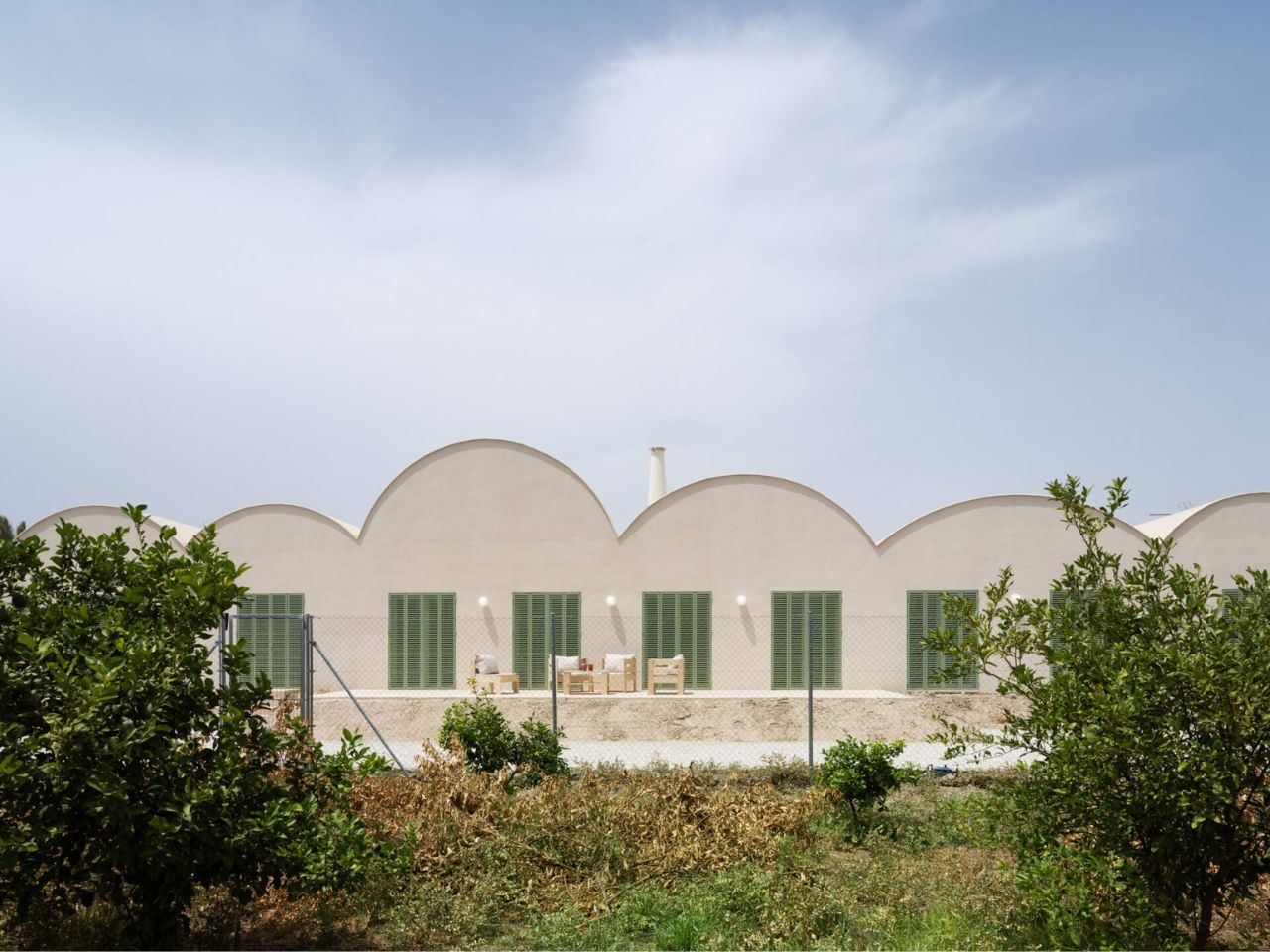
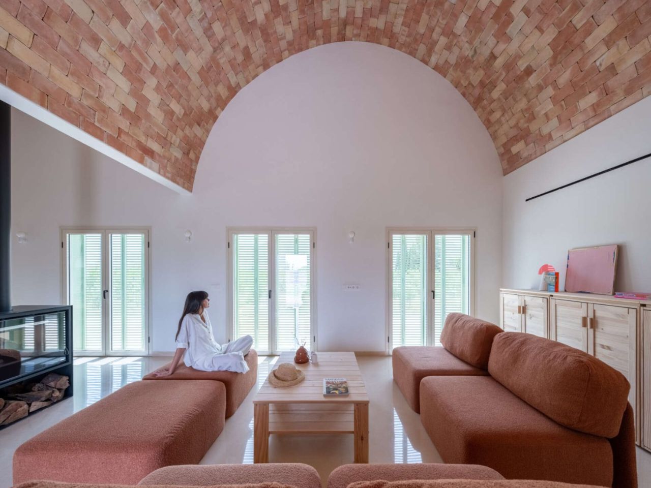
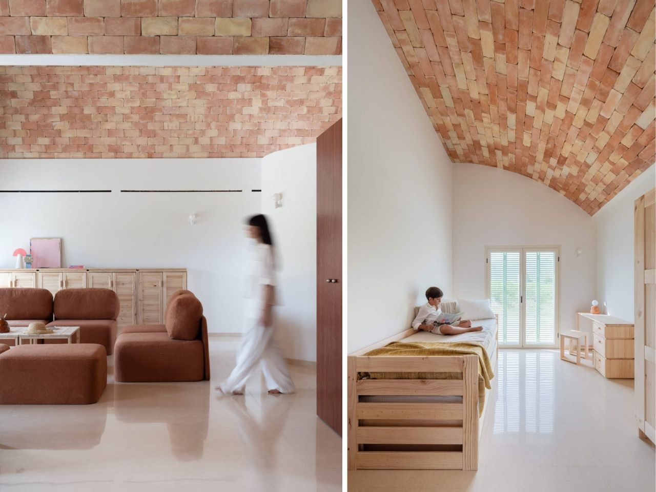
Some houses make their presence known through bold shapes, while others seem to grow naturally from the landscape.  Casa Vereda, designed by L’Aura Ortín Architecture For Happiness, finds a balance between the two. Set in the Spanish countryside, the residence draws inspiration from regional construction traditions, agricultural heritage, and Mediterranean living. Its curved roofs, earthy materials, and distinctive green shutters give the home a contemporary identity that feels rooted in its surroundings.

The architecture is defined by a succession of curved rooflines that ripple across the long, low structure. Constructed using traditional Catalan vaulting techniques and handcrafted bricks, these sculptural forms reference a building method deeply embedded in Spanish architectural history. The exterior is finished in pale sprayed cork, creating a continuous texture across the walls and roof while helping regulate temperature and moisture.

Designer: L’Aura Ortín Architecture For Happiness
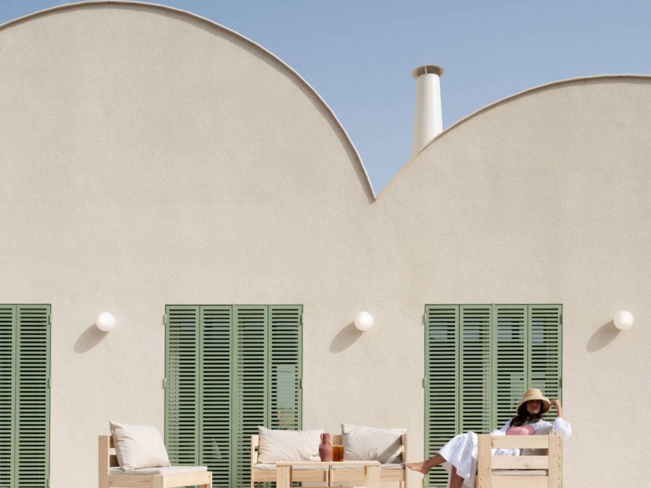
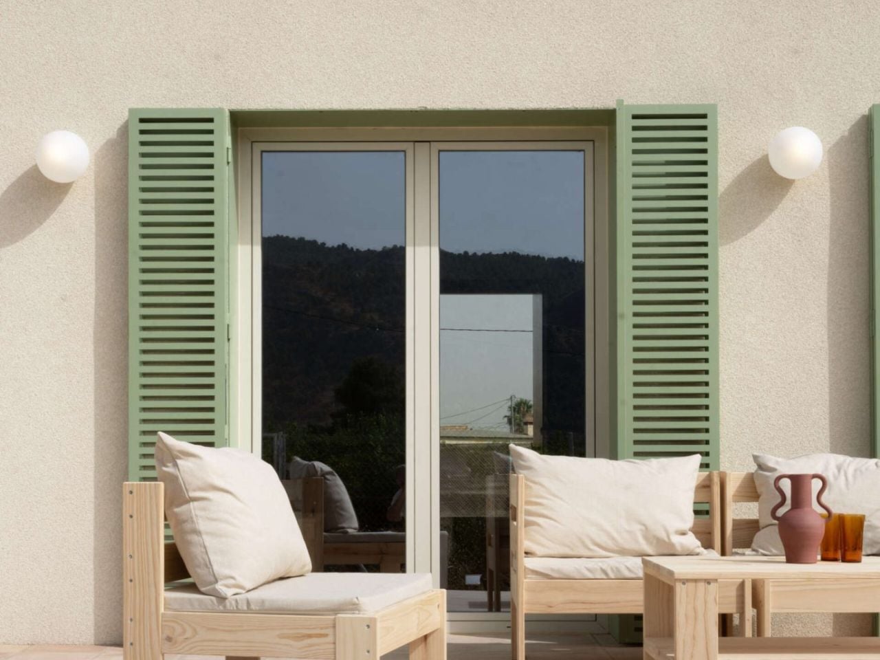
A row of tall, leaf green shutters adds a vibrant contrast to the neutral facade. Inspired by traditional Mallorcan designs, the shutters were custom-designed by the architects and made from powder-coated aluminum to provide shade, privacy, and security. Surrounded by vegetation, the house takes on an almost agricultural appearance, recalling the farm buildings and cultivated terraces that characterize the region.

Alongside the residence, a spacious patio paved with handcrafted terracotta tiles creates an inviting outdoor gathering space. The earthy flooring references the area’s agricultural heritage, while large glass doors connect the terrace directly to the interiors. Adjustable shutters help control sunlight throughout the day, making the transition between indoors and outdoors comfortable even during warmer months.

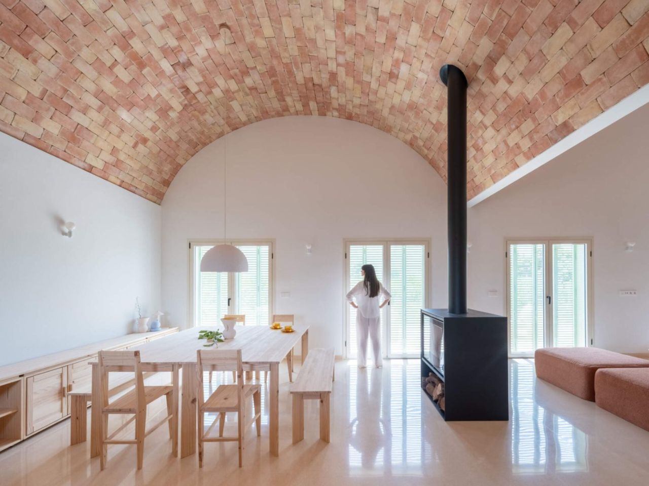
Inside, the living room unfolds beneath a dramatic Catalan vaulted ceiling made from handcrafted bricks in varying shades of terracotta, pink, and sandy beige. The exposed brick brings warmth and texture to the spacious interior, contrasting with smooth white walls and polished terrazzo flooring. Beyond its appearance, the terrazzo contributes to passive temperature regulation by absorbing warmth from the winter sun and staying cool during summer when the shutters are closed.

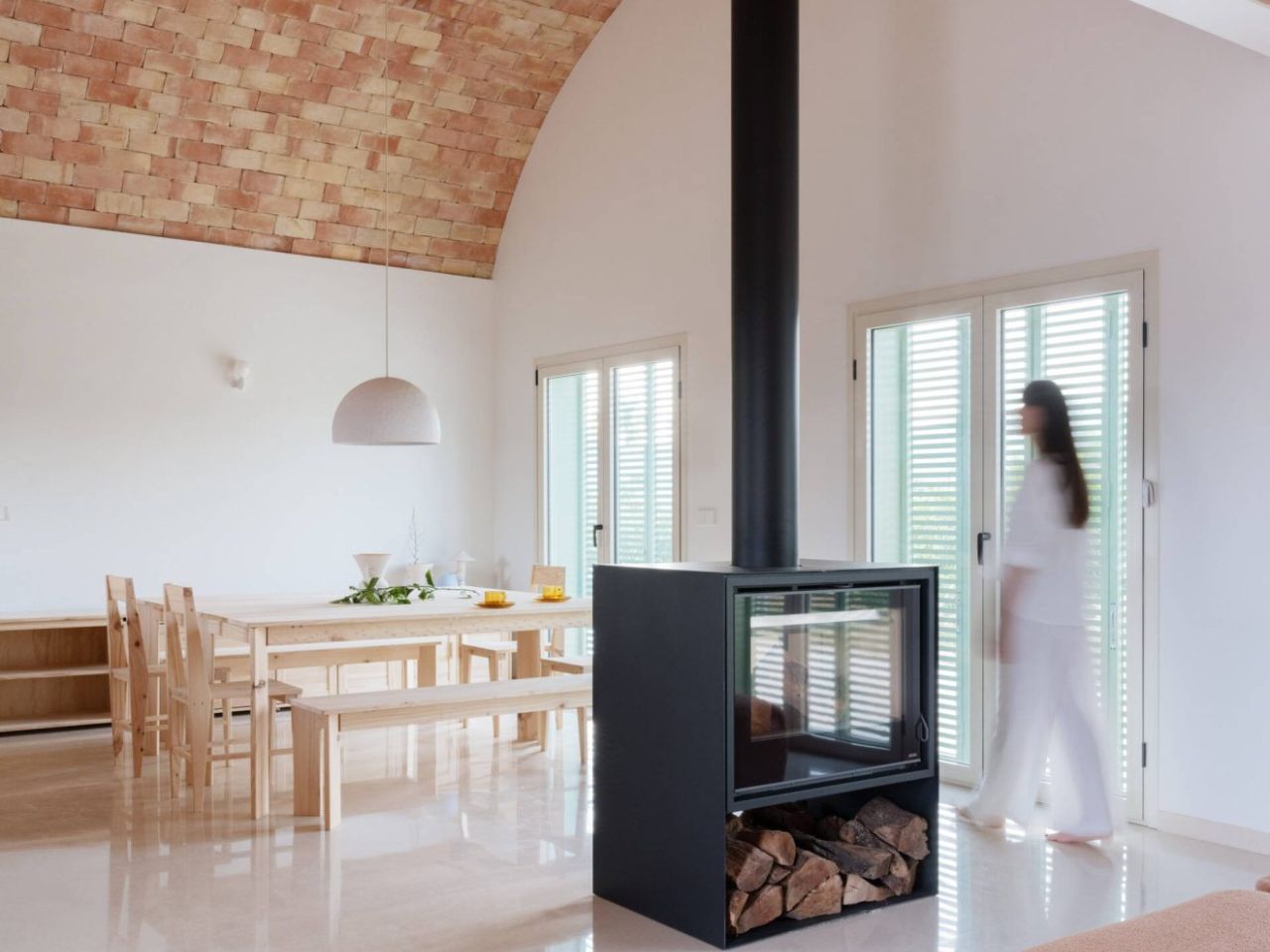
Modular sofas and ottomans upholstered in rust colored fabric form a comfortable seating arrangement around a simple pine coffee table. A freestanding black fireplace separates the lounge from the dining area without interrupting the open layout. Tall glass doors flood the space with daylight, while cherry-toned timber doors and pale wooden cabinets complete the warm material palette.

The adjoining dining area features a long, pale timber table paired with matching chairs and benches. A simple white dome pendant hangs overhead, while a low wooden sideboard provides storage along the wall. The exposed brick ceiling stretches across the space, adding character to an otherwise minimal setting.

Beside the dining room, the kitchen introduces richer tones through pine cabinetry lacquered in a cherry finish. The reddish wood contrasts with light colored countertops, while a long island provides additional workspace and casual seating with timber stools. Integrated appliances and streamlined cabinetry maintain a clean appearance, allowing the natural materials and vaulted ceiling to remain the focal points.

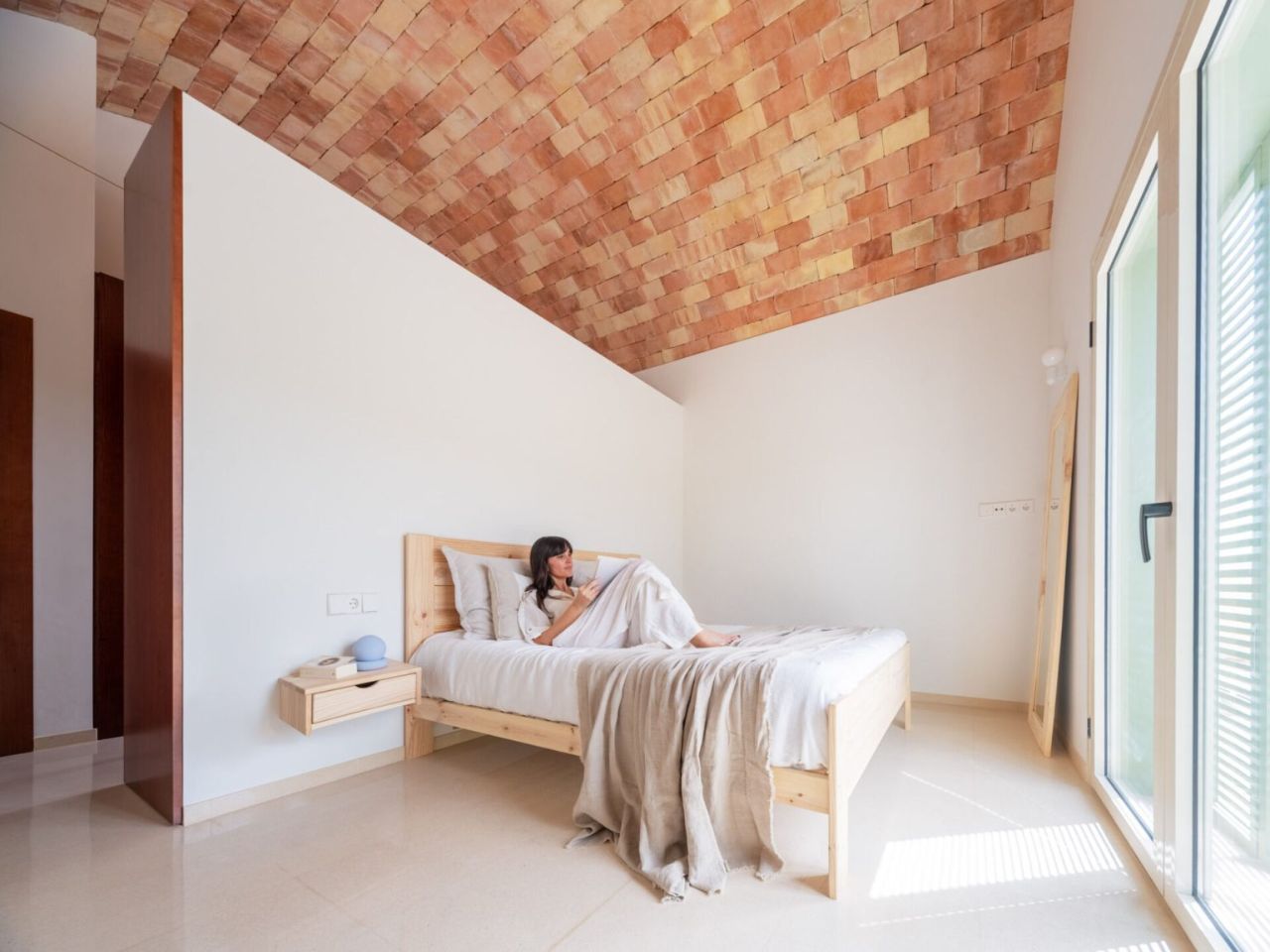
The bedrooms continue the home’s restrained aesthetic, with exposed brick vaults, white walls, pale terrazzo floors, and natural timber furniture. Unlike the communal areas, these rooms have lower ceilings that create a more intimate atmosphere while making them easier to heat and cool. In the main bedroom, a simple wooden bed is accompanied by a floating bedside table, neutral bedding, and a full-length mirror. The second bedroom features a single timber bed, a compact desk, and a matching wardrobe, with a mustard colored throw adding a subtle pop of color. Glass doors fitted with slatted shutters provide natural light and ventilation while allowing occupants to adjust privacy and shade.

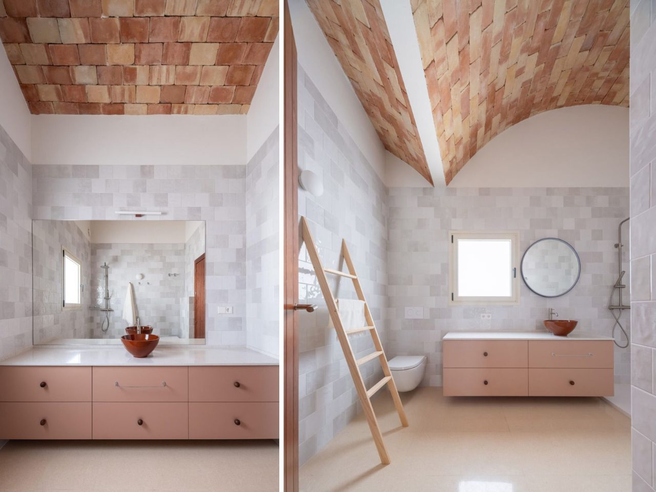
The bathrooms introduce a softer palette through pale gray rectangular wall tiles, warm pink cabinetry, and terracotta colored vessel sinks. One features a floating vanity with a white countertop and round mirror, while the other includes a wider vanity and a large rectangular mirror reflecting the walk-in shower opposite. Contemporary fixtures and minimal glass detailing keep the spaces open and bright, with exposed brick ceilings maintaining continuity throughout the interiors.

Architectural drawings reveal a long, single-story layout organized around everyday functionality. A two-car garage occupies one end, the open living, dining, and kitchen spaces form the center, and the bedrooms and bathrooms sit toward the opposite end. The communal spaces open directly onto the generous terrace, strengthening the home’s relationship with its garden and surroundings.

Casa Vereda finds its charm in the thoughtful reinterpretation of familiar architectural elements. The curved brick vaults, Mallorcan-inspired shutters, terracotta surfaces, and cork exterior serve practical purposes while giving the residence a distinctive identity. Through a careful balance of traditional craftsmanship, passive climate strategies, and contemporary interiors, L’Aura Ortín Architecture For Happiness has created a home that feels entirely at ease with its rural Mediterranean setting.
The post This Spanish Home Uses Curved Roofs and Cork Walls to Stay Naturally Cool first appeared on Yanko Design.
  •  

Bellavista 11 Folds Thin White Concrete Planes Down an Ibiza Hillside Toward the Sea

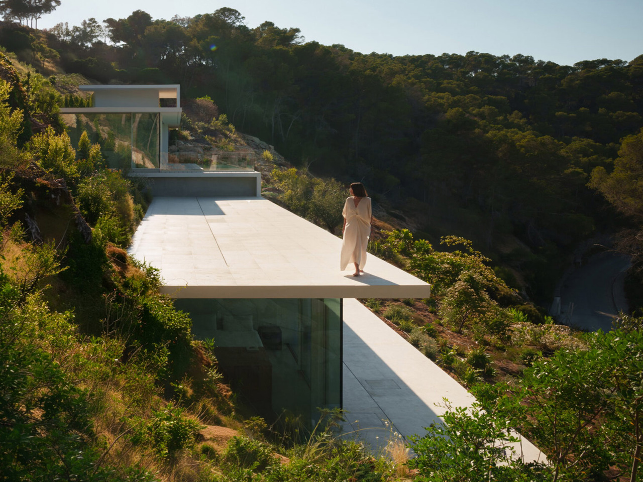
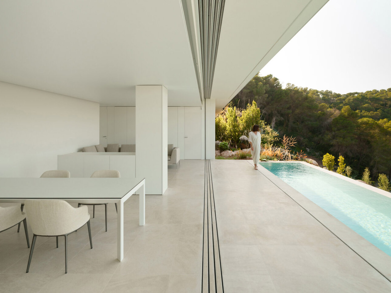
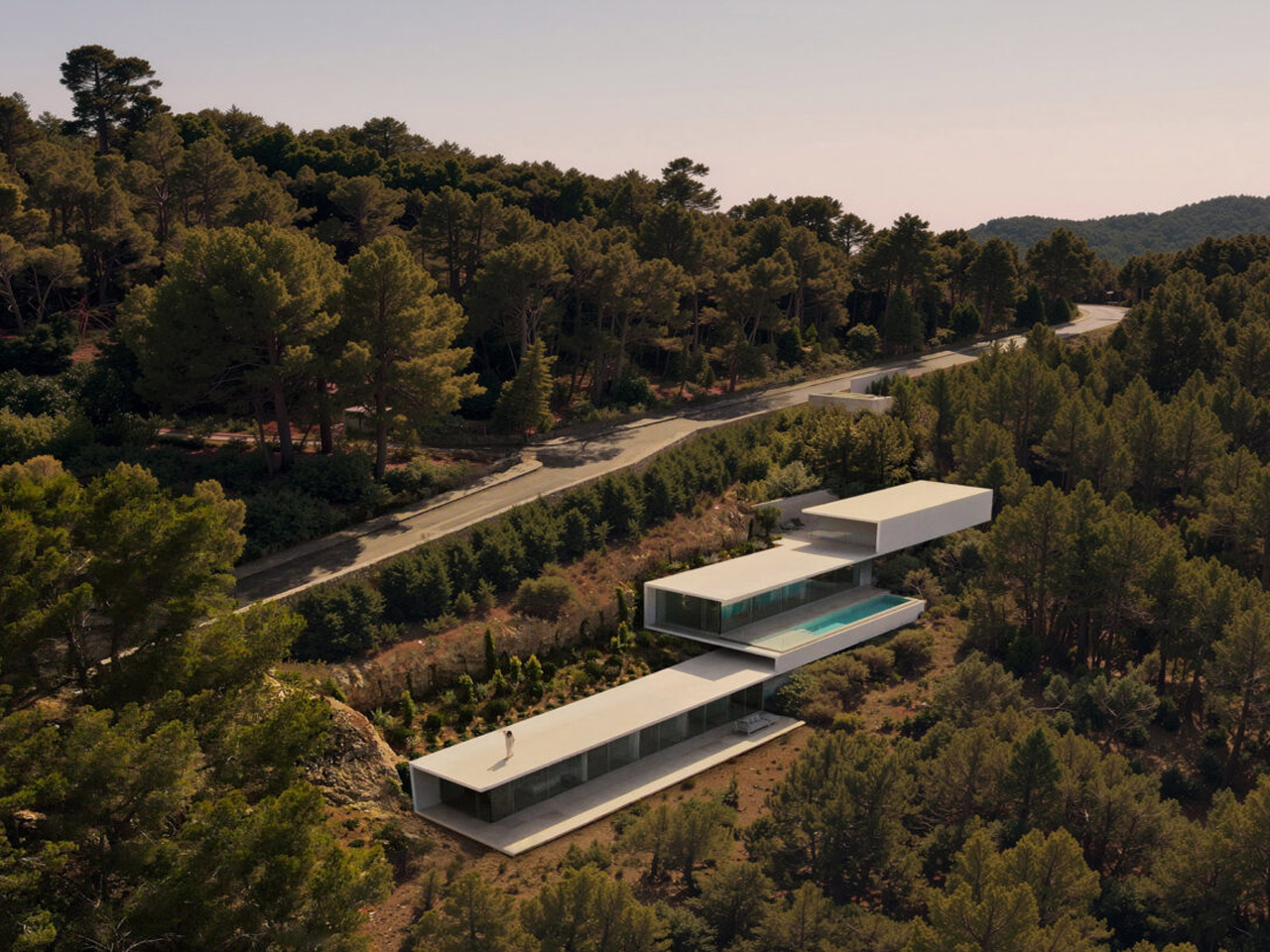
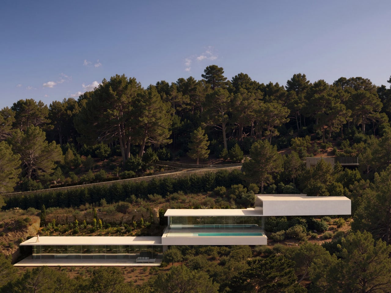
Bellavista 11 makes a hillside feel like the starting point of a home rather than a problem to solve. Designed by Fran Silvestre Arquitectos in Roca Llisa, Ibiza, the villa descends toward the Mediterranean through a sequence of white horizontal planes. Its most striking feature is not its size or its pool, but the way its roofs, floors, and terraces appear to belong to one continuous architectural gesture.

The house is the first completed residence in The Roca Views, a development of six homes by the studio. Across three low volumes, the arrangement follows the slope: arrival and garage at the top, shared living spaces in the middle, and five bedrooms below. This descending organization gives the building a legible rhythm, breaking its mass into layers rather than presenting one tall facade to the hillside.

Designer: Fran Silvestre Arquitectos

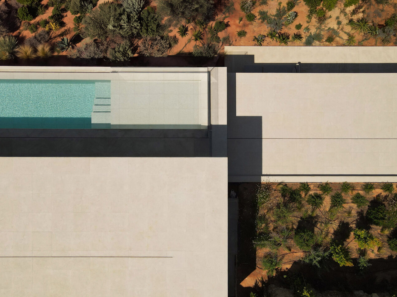
The defining white concrete plane is just 15 centimeters thick, approximately six inches. Its folds establish roof terraces above the lower volumes and extend outward to shelter outdoor areas. The appeal lies in this double duty: the geometry that gives the villa its identity also helps organize daily life around sun, shade, and time outside.

The central living level brings the kitchen, dining area, and lounge together beside the swimming pool. Full-height sliding glass doors use slender frames and concealed tracks to keep the threshold visually quiet. Open, they connect the rooms to their terraces; closed, they retain the expansive outlook. Below, the bedroom volume faces another outdoor seating area, giving the quieter part of the house its own relationship with the surrounding landscape.

Inside, the material palette softens the precision of the exterior. White walls sit alongside natural stone flooring, oak, and stretched textile ceilings, as detailed by the developer. These surfaces give sunlight different textures to move across, allowing warmth without relying on a busy mix of finishes. In the main bedroom, a private terrace extends the room outward, while motorized curtains offer control over daylight and privacy.

There is a practical counterpoint to all this apparent effortlessness: a house arranged down a slope moves to levels part of everyday living. The developer lists an elevator among the villa’s features, an important detail within such a strongly stepped plan. The project is therefore more interesting as a carefully organized hillside home than as an image of minimalism alone.

Bellavista 11 works best when its sculptural clarity is understood through those ordinary experiences: arriving, descending, opening a door, or finding shade beside the pool. The white planes provide a consistent frame, but the changing Mediterranean light and distant sea supply the variation. Its restraint gives the landscape room to remain the most compelling presence in the house every day.

The post Bellavista 11 Folds Thin White Concrete Planes Down an Ibiza Hillside Toward the Sea first appeared on Yanko Design.
  •  

Lavvu’s Tiny Home Has a Bathtub and Hidden Storage

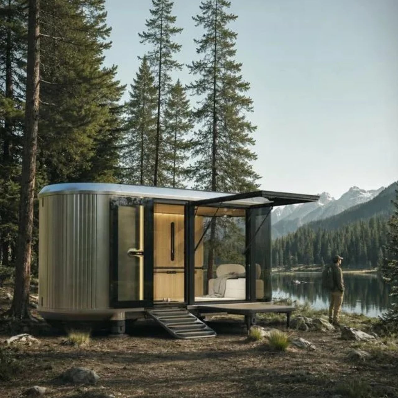
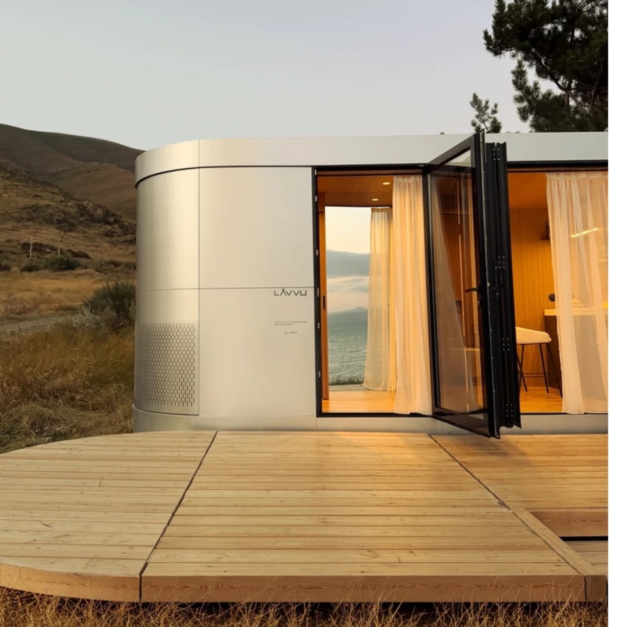
A full-size bathtub is a wonderfully stubborn thing to put inside a tiny home. Lavvu includes one in its published XL specification, despite having only about 237 square feet to work with. That choice gets straight to the problem these modular homes tackle: shrinking a dwelling without making everyday life feel like a series of concessions. I like that the answer leaves room for a soak.

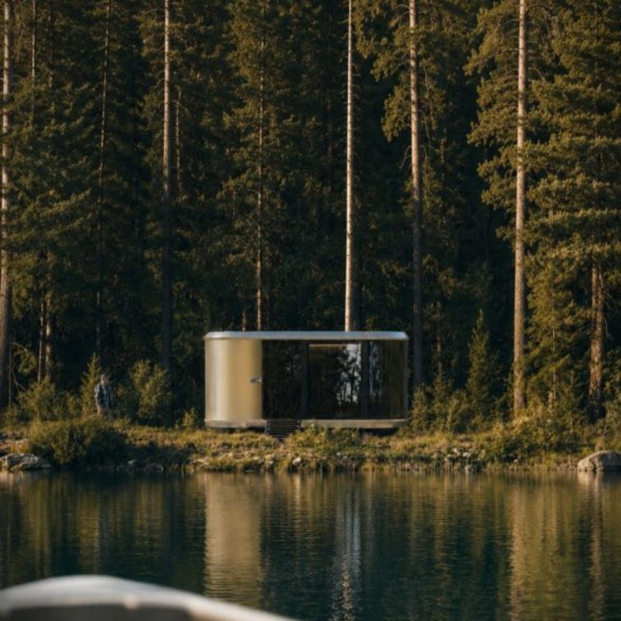
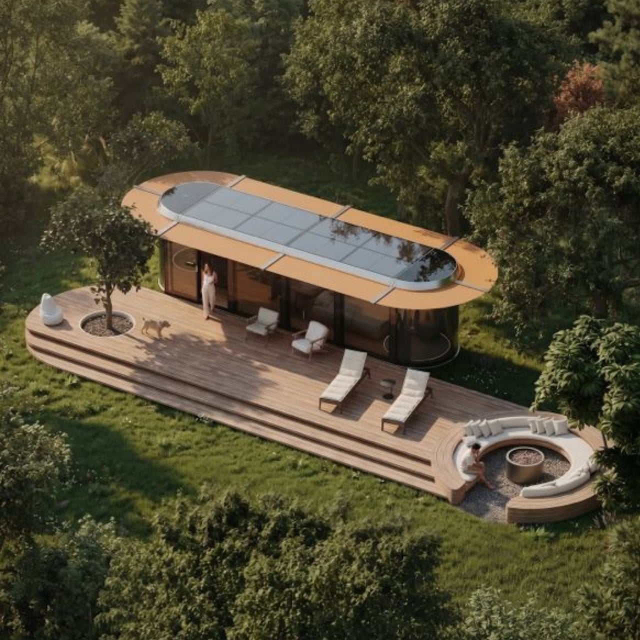
Lavvu offers four sizes, from roughly 108 to 237 square feet, with the XL credited to architecture studio Re:Büro. The company is promoting the range for preorder, an important distinction between an appealing design and an immediately available place to live. These are furnished homes, but buyers shouldn’t assume that every size includes every feature shown in the company’s presentation. The XL is the clearest expression of the idea.

Designer: Lavvu

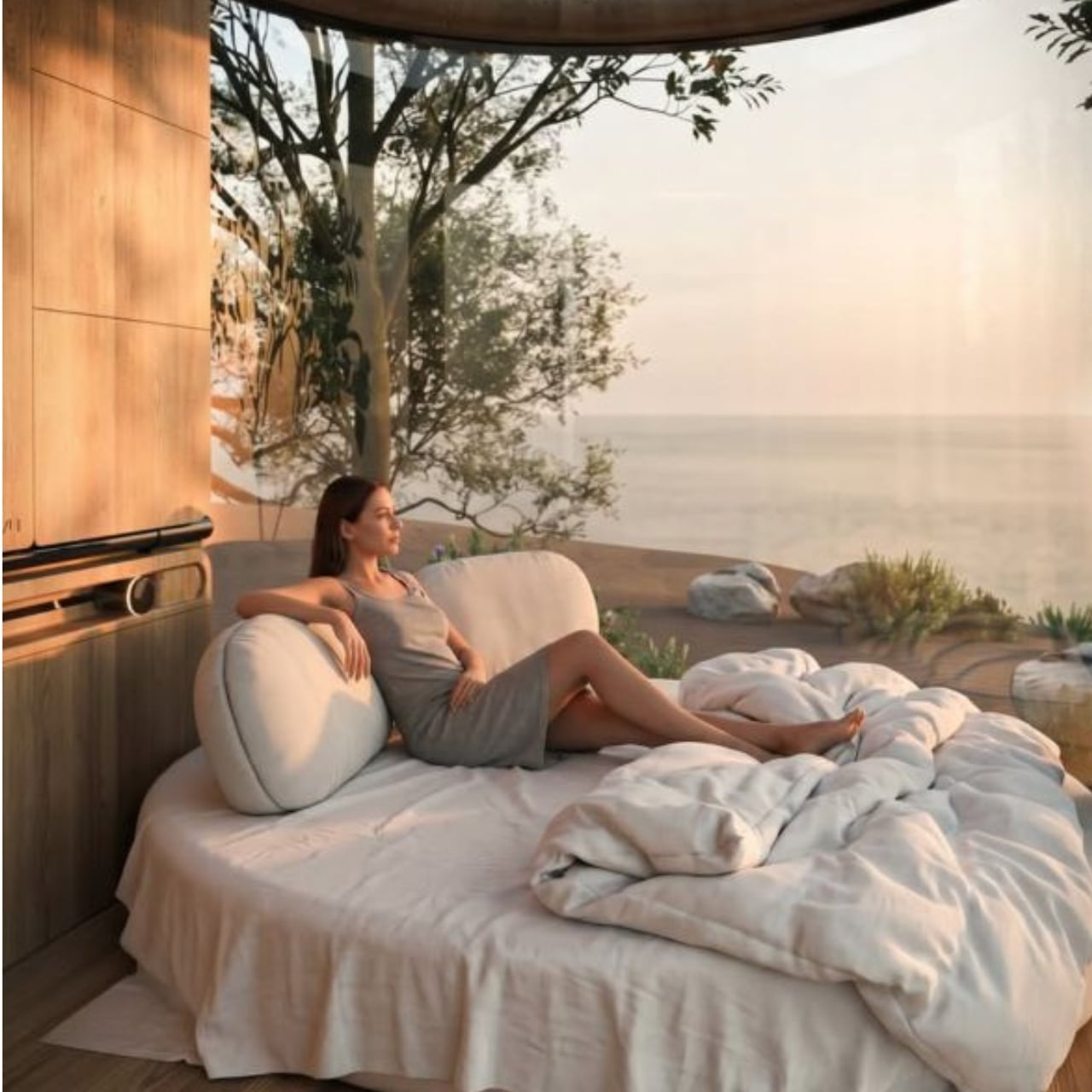
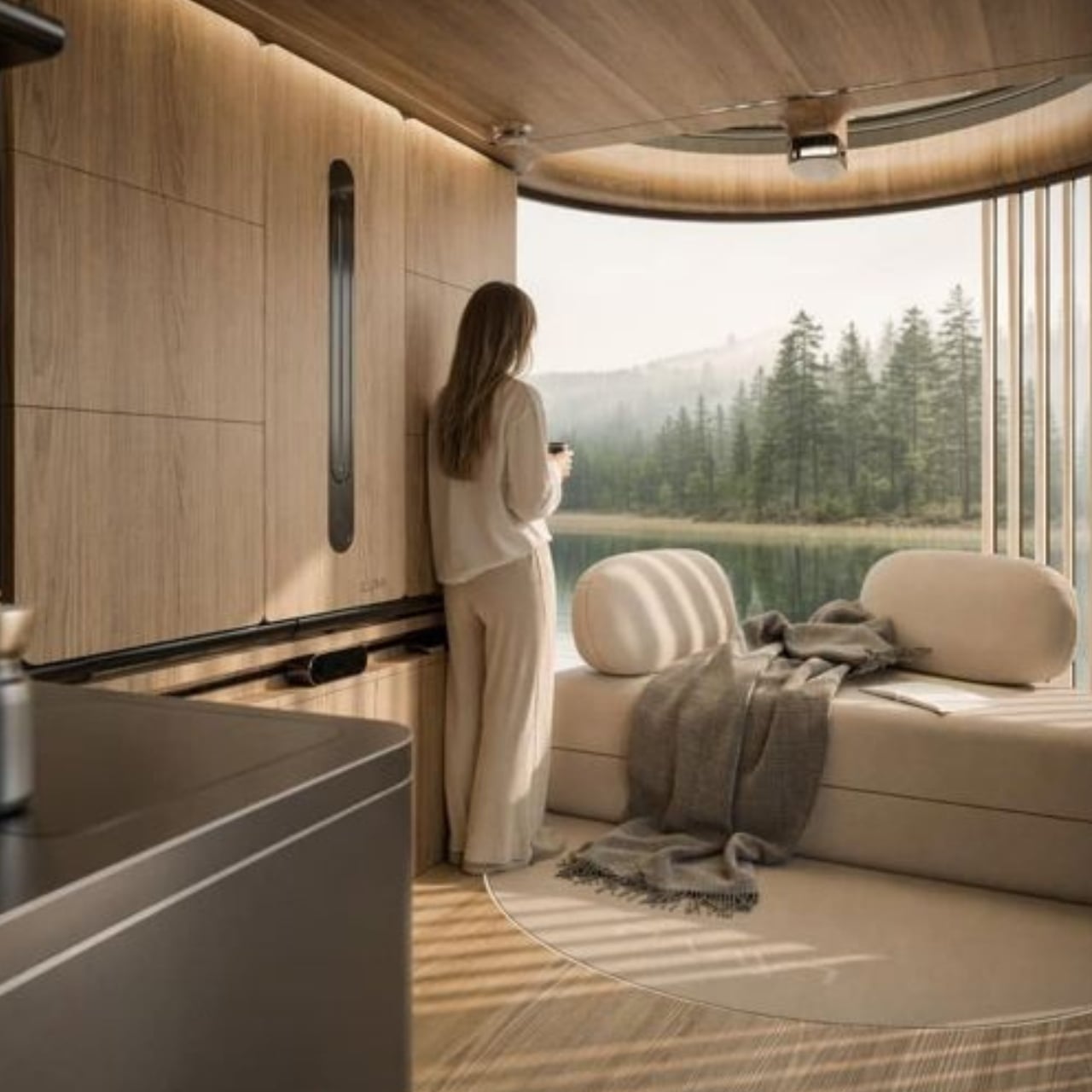
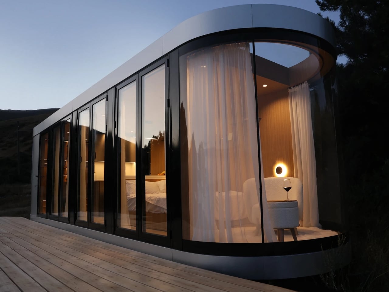
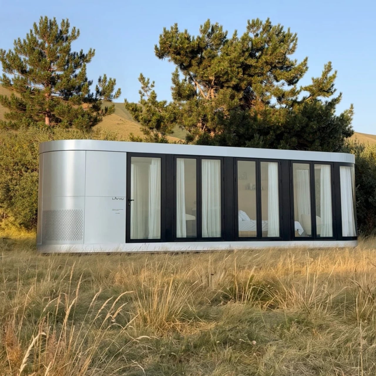
In the promotional imagery, rounded corners and vertically ribbed exterior surfaces give the cabins a slightly retro, almost transportation-inspired appearance. Inside, wood-toned surfaces soften that impression. The large glazed end is the visual centerpiece, framing the landscape rather than leaving it outside a small window. I prefer this approach to making a tiny house resemble a miniature suburban one. The proportions acknowledge that you’re occupying a compact space, while giving your eyes somewhere farther away to land.

The kitchen makes a more practical argument. Lavvu specifies a built-in refrigerator, dishwasher, and two-burner induction cooktop, along with a sliding island that adjusts to provide seated legroom or accommodate standing use. That movable surface is a detail I appreciate. A fixed counter has to commit to one relationship with your body. Letting it shift recognizes that breakfast, food preparation, and moving through a narrow room don’t all require the same arrangement. Small spaces need that kind of flexibility more than another decorative flourish.

Storage gets similar attention. The published XL description includes drawers beneath the bed, nearby shelves, and a wardrobe with hanging space and dedicated shoe storage. These aren’t especially glamorous features, which is precisely why they matter. I’m more persuaded by a place to put yesterday’s clothes than by an immaculate room with no visible possessions. Built-in storage gives the design a plausible way to absorb ordinary belongings, although it doesn’t remove the need to edit what you own.

All that glass makes the setting a meaningful part of the design decision, too. The imagery places the cabins beside water and trees, where openness is the attraction. I’d be less enthusiastic about the same arrangement facing a neighbor’s kitchen. For me, the panoramic end makes the most sense as a retreat with a carefully chosen outlook. Privacy deserves as much attention as the view when deciding where one belongs.

“Mobile” also needs a realistic reading here. Lavvu says its homes travel as fully assembled modules on a trailer or flatbed platform. That describes transportable architecture, not a camper you casually hitch up for a weekend. I see the appeal in having the interior assembled before delivery, but the destination still matters. Access arrangements and installation are questions to resolve with the maker, rather than details to mentally crop out of the scenic pictures.

The listed prices reinforce that this is a considered purchase: the smallest S module starts at €45,000, while the XL starts at €75,000, both before tax. Those are the company’s euro-denominated starting prices, not verified delivered prices for an American property. I’d want a site-specific quote, a confirmed equipment list, and delivery details before treating either number as a complete budget. The distinction matters more than a tempting headline price.

For me, Lavvu’s strongest idea is giving small routines enough space to remain recognizable. Sit at a counter with room for your knees. Put shoes away. Keep a book beside the bed. Take a bath if that’s your preferred way to end the day. I wouldn’t mistake this for an easy answer to every housing need, but as a compact retreat, its attention to ordinary domestic habits makes the design worth considering.

The post Lavvu’s Tiny Home Has a Bathtub and Hidden Storage first appeared on Yanko Design.
  •  

Inside Carl Maston’s Ventura Beach House, Built Around a Brick Chimney

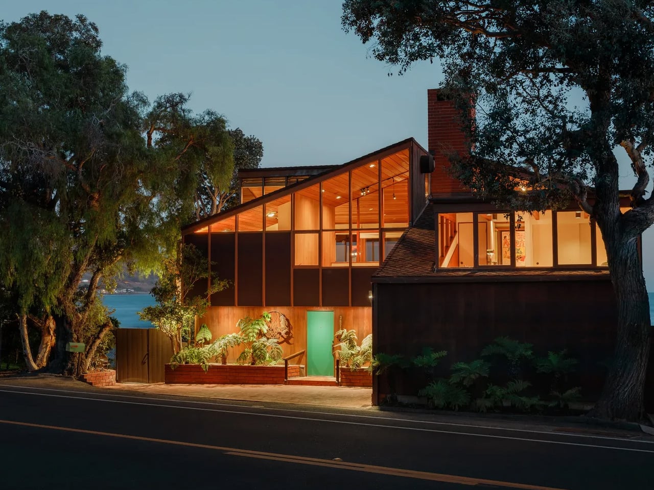
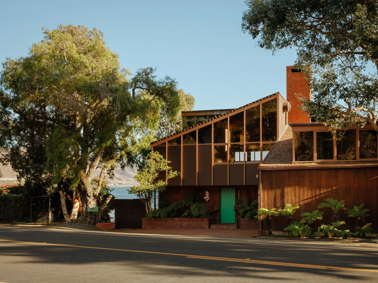
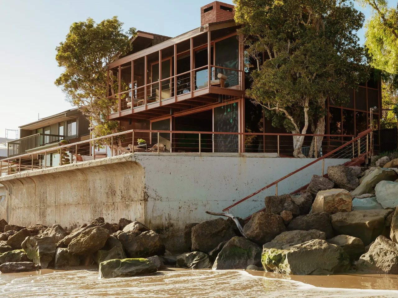
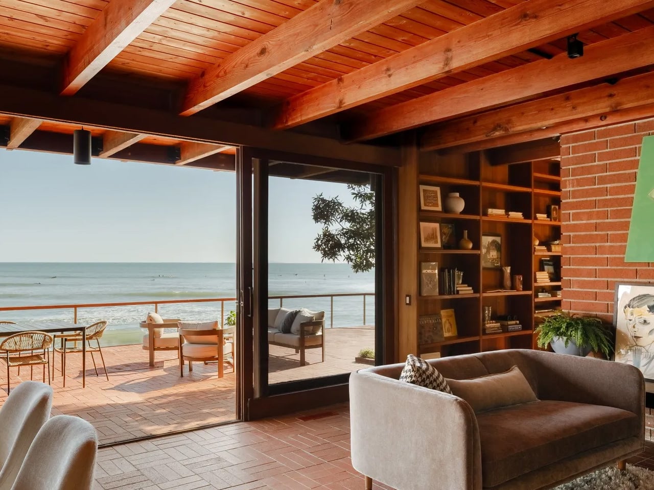
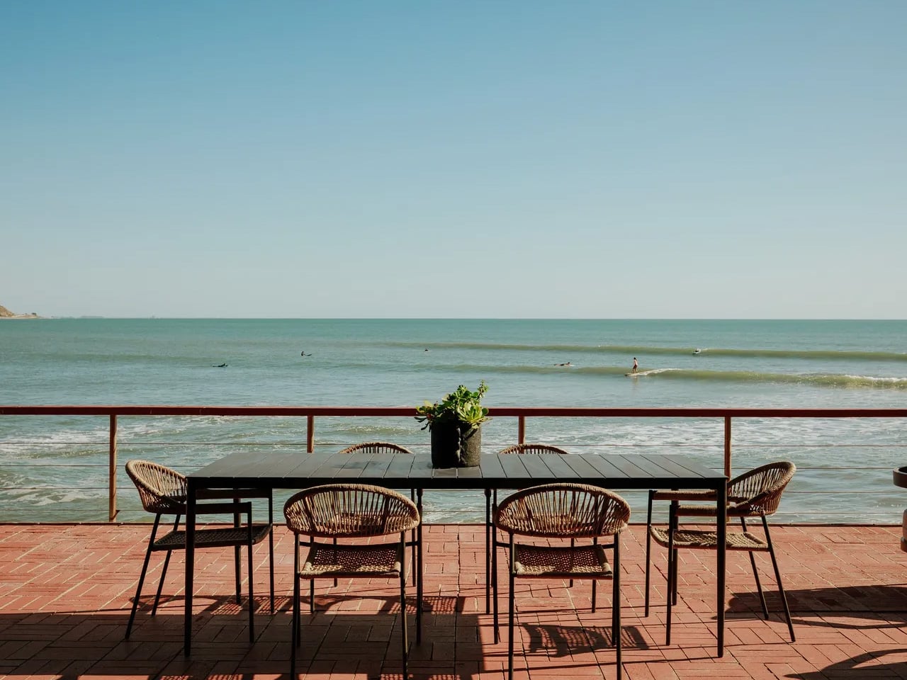
A substantial brick chimney rises through the center of Carl Maston’s Ventura beach house, giving the oceanfront home a surprisingly grounded heart. Completed in 1984, the Susman House sits above a sandy cove at Faria Beach, with views toward the Channel Islands. Its original brief was appealingly specific: preserve the spirit of a traditional California cabin within a contemporary home.

That request came from Tracy “Babs” Susman, who commissioned the house with her partner on land previously owned by her sister and brother-in-law. Maston answered with cedar siding, brick floors, generous glazing, and a roofline that creates a distinctive silhouette. The materials carry the cabin connection without making the house feel like an exercise in rustic nostalgia.

Design: Carl Maston

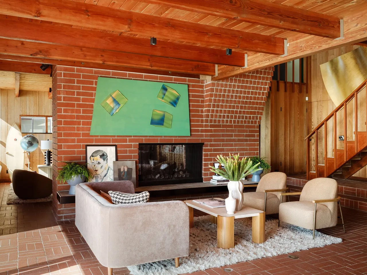
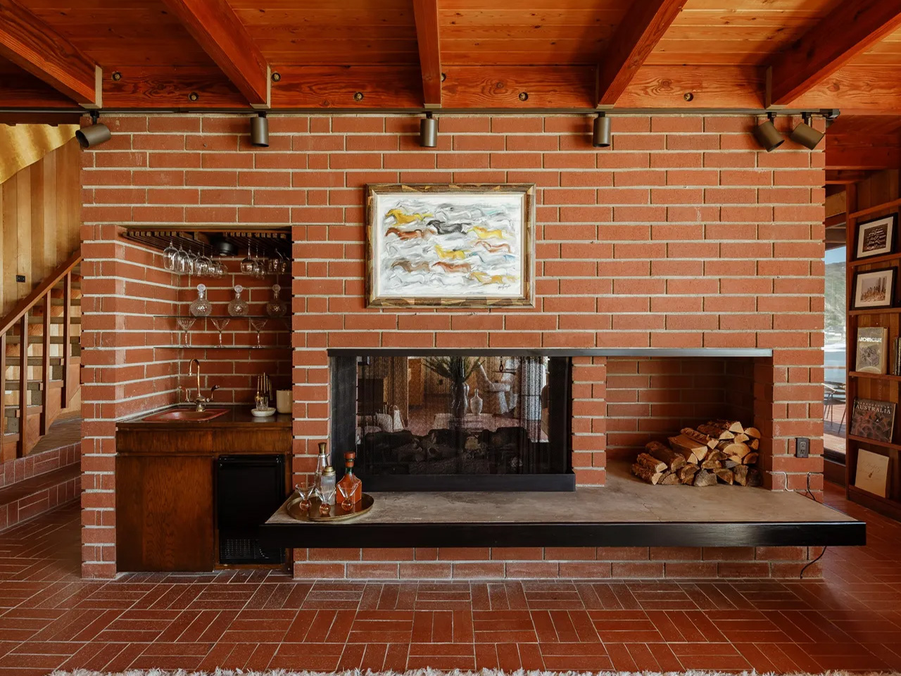
Across 2,640 square feet, the layout gives shared spaces a clear relationship to both the fireplace and the coastline. An informal lounge connects with the dining area and kitchen, while a double-sided fireplace also serves a den. A full bathroom sits behind a cedar wall. These divisions give the lower floor distinct places to settle without separating every activity into an enclosed room.

The living-room photographs reveal how much work the material palette does. Exposed timber beams establish a steady rhythm overhead, while brick flooring extends around the broad hearth. Wood paneling and shelving reinforce the sense of enclosure. Against that textured interior, the glazed openings become especially legible: they frame the coast while leaving plenty of solid, tactile surfaces around the seating area.

Floor-to-ceiling sliding doors open toward the ocean, and the brick paving continues onto the patio. Carrying the floor material outside gives the terrace a direct visual relationship with the rooms behind it. The kitchen keeps its own character through an original wood-slat ceiling, with a view of the bay available from the sink. Even the more ordinary household tasks have a place along the waterfront.

Upstairs, three bedrooms and a separate sitting area occupy the spaces beneath the sloping roof. A central atrium and landing wrap around the brick chimney, with internal glazing allowing light to reach deeper into the house. Rather than treating circulation as leftover space, Maston makes the route between rooms part of the architectural experience, linking the upper level visually with the living area below.

Photographs show timber-framed internal windows beside the chimney, their angular tops following the roof. That arrangement makes the building’s geometry readable from within. The house is currently listed for $5.1 million, and its selling appeal extends beyond the waterfront address. Maston gave the interior enough substance to hold attention even when the ocean is outside the frame.

The post Inside Carl Maston’s Ventura Beach House, Built Around a Brick Chimney first appeared on Yanko Design.
  •  

Hangzhou’s glowing glass museum takes its cues from 5,000-year-old jade

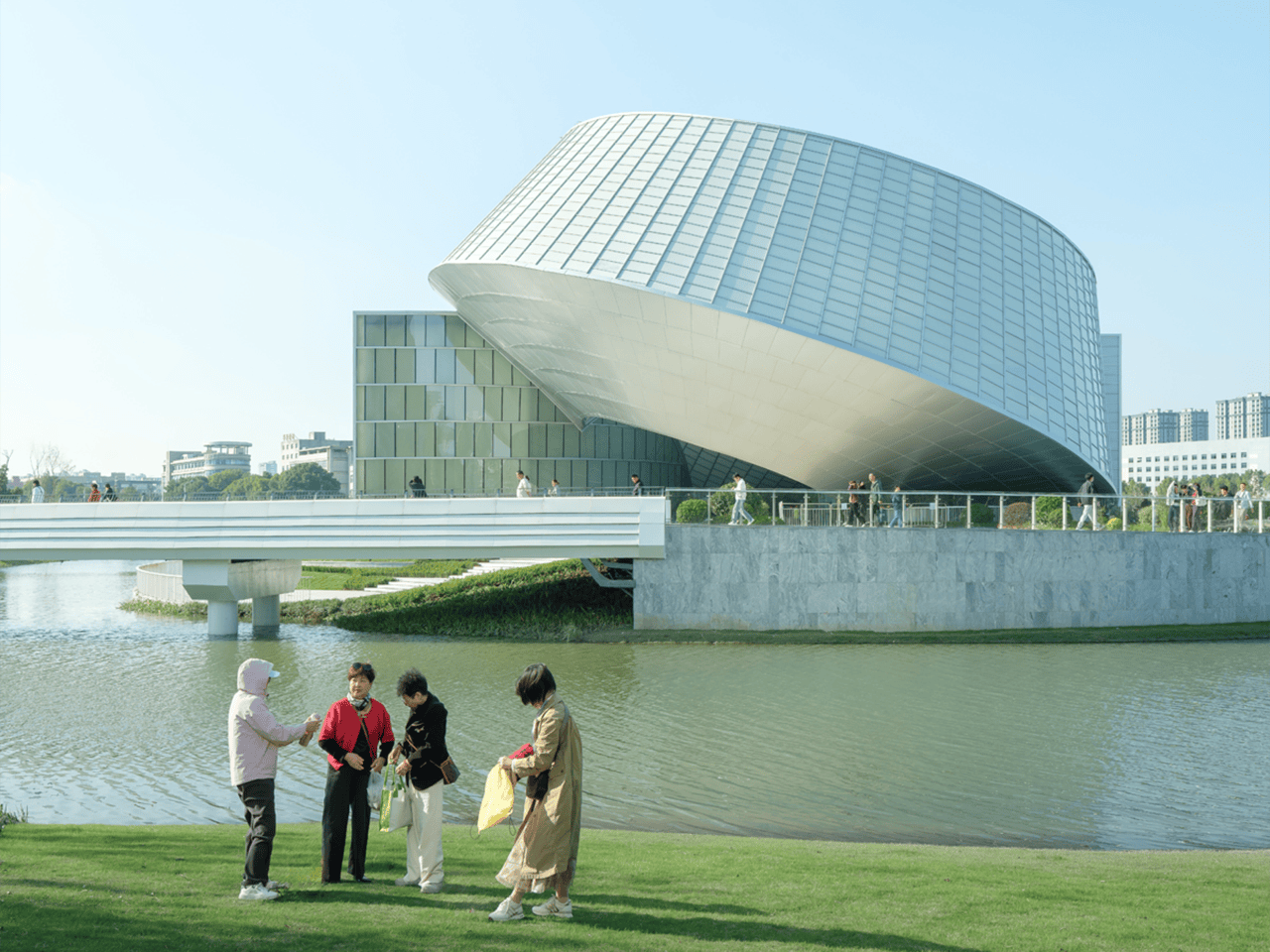
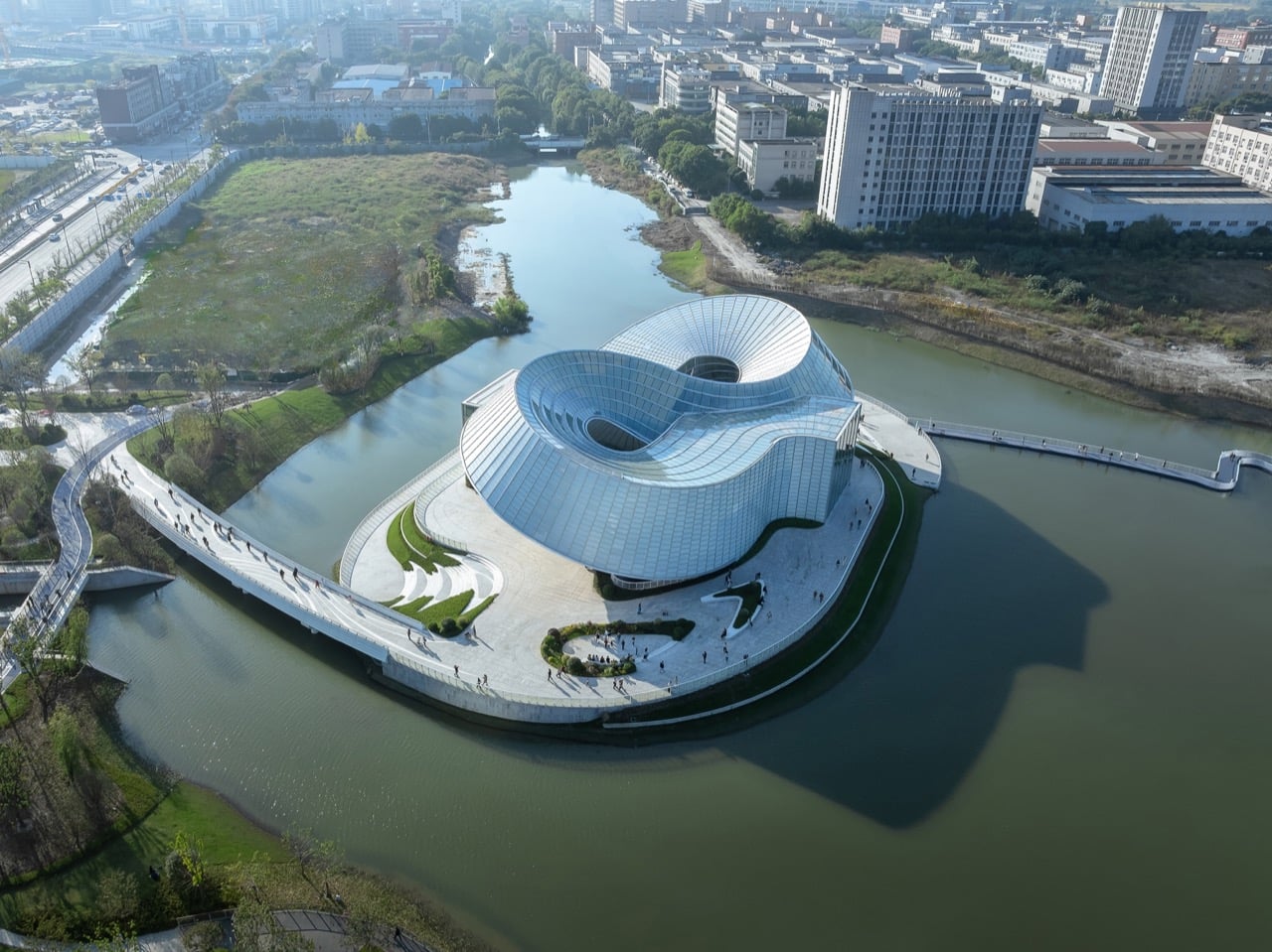
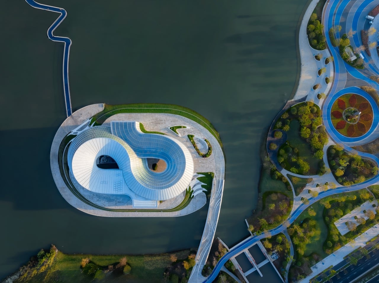
Most museums are designed like very expensive shoeboxes. Art hates sunlight, so architects seal the walls, bolt on some skylights, and call it a day. Aedas went the other direction in Hangzhou and wrapped an entire museum in glass, then twisted it into two interlocking rings for good measure. The Yohoo Museum sits on an island in an artificial lake, glowing like a piece of polished jade, which is exactly the point. The shape is borrowed from the ritual jade rings of the Liangzhu culture, a Neolithic civilization that thrived in this part of China around 5,000 years ago.

Ken Wai, Global Design Principal at Aedas, led the design of the 57,650-square-foot (5,356-square-meter) building, completed in 2024 inside Liangzhu Yohoo Park (that’s Yohoo, not Yahoo the search engine. I know, I made that mistake too). The glass is a translucent multilayer laminate Aedas calls “emerald glass,” and it filters daylight into a soft, even wash across the galleries. A steel frame lets the ends of the rings lift off the ground with no visible support, creating covered plazas underneath. The project won Architectural Design of the Year and a Gold in the Cultural category at the International Design Awards, a juried global competition for built work.

Designers: Aedas, Ken Wai

Liangzhu jade comes in two signature shapes, the bi and the cong. The bi is a flat disc with a hole in the center, while the cong is a chunky tube that’s square outside and round inside. Later Chinese tradition read the bi as heaven and the cong as earth, and archaeologists say both starred in royal ceremonies honoring the sky. Each of the museum’s rings wraps around an open void, and Aedas frames these circular light wells as a link between heaven and earth. From above, the voids read like the drilled centers of two bi discs, and the squared-off island underneath does a decent cong impression if you squint.

Aedas says the two interlocking rings stand for two separate heritages, Liangzhu culture and the Grand Canal. The lake around the island connects to that canal, a roughly 1,100-mile (1,776-kilometer) waterway whose oldest sections date back more than 2,500 years. Hangzhou sits at its southern end, and the canal is largely what turned the city from a sleepy town into a booming trade hub. UNESCO listed the canal in 2014 and the Liangzhu ruins in 2019, so the building is basically two World Heritage sites holding hands. That’s a lot of symbolism for one roofline, but the form carries it so gracefully that I’m happy to play along.

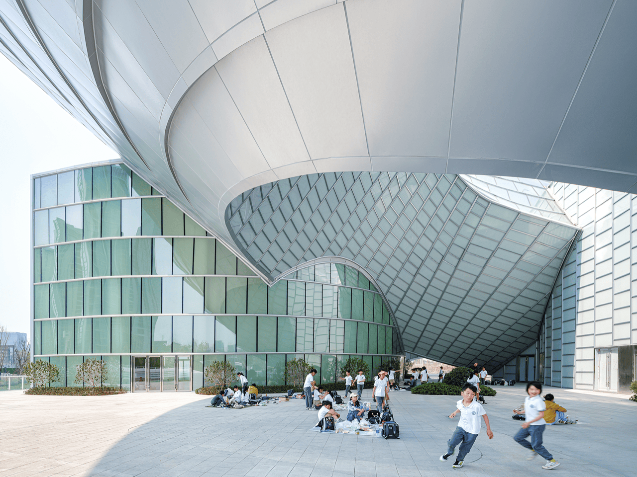
A single steel frame carries the whole building, and Aedas used it to peel both ends up off the ground like the corner of a sticker. Those lifted edges overhang the entrances and shelter a pair of public plazas, which in the photos are getting plenty of use. One shot shows a school group picnicking under the curved soffit while two kids sprint past the camera, presumably fleeing a teacher. The underside is wrapped in smooth white panels, and beneath it a diamond grid of glass slopes down to meet the pavement. The result is a shaded waterfront room open to anyone, whether or not they ever step inside the galleries.

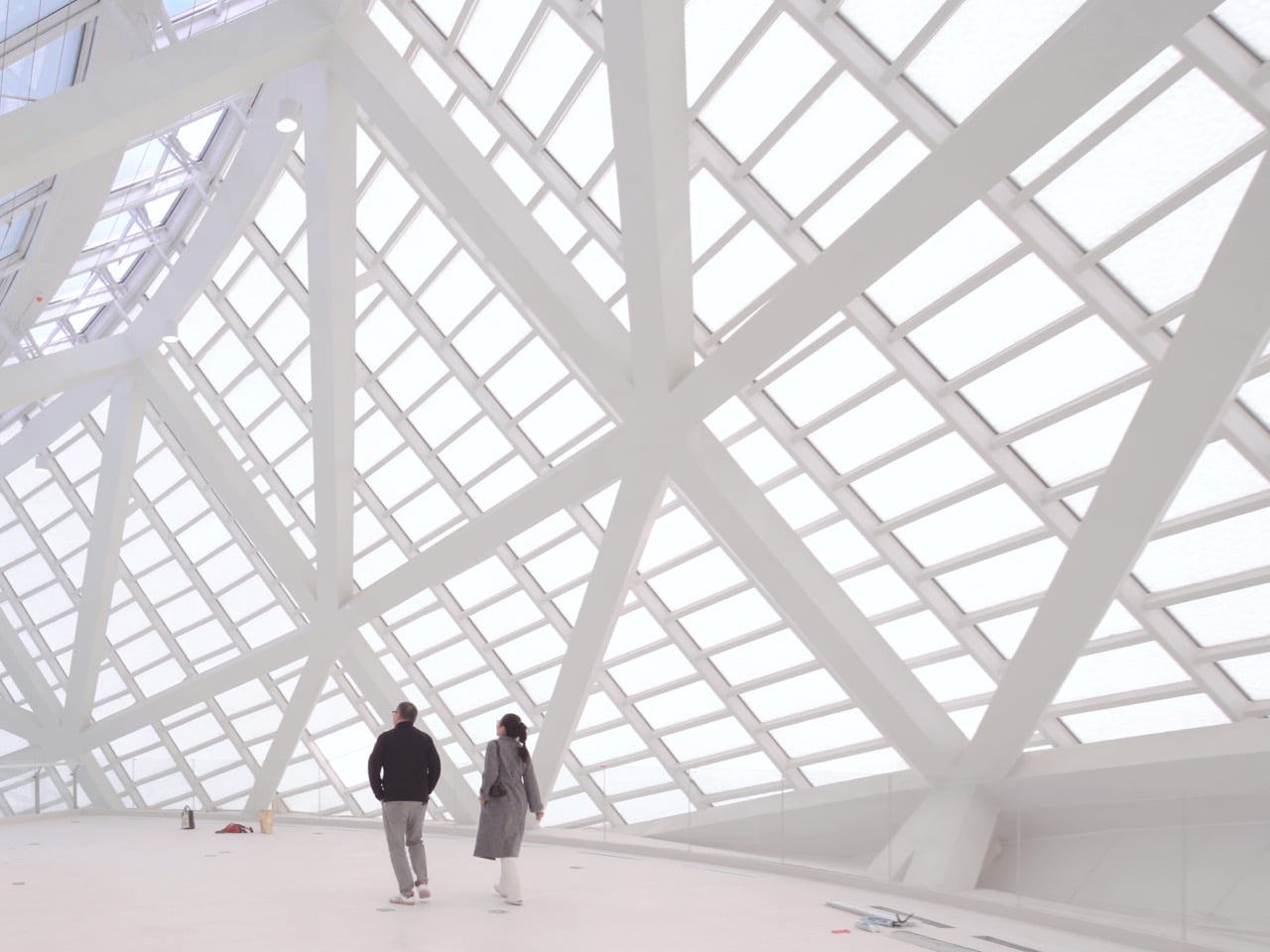
Up top, the galleries sit under a dense white steel diagrid, with translucent glass filling every gap in the structure. Interior photos show a bright, nearly shadowless hall where two visitors look like they’ve wandered into a cloud. The entrance volume uses greener, more jade-toned glass in horizontal bands, so the building’s color shifts depending on which face you’re looking at. American readers might recognize the strategy from Steven Holl’s Bloch Building at the Nelson-Atkins Museum in Kansas City, where translucent channel-glass volumes glow like lanterns. Aedas stretches the idea across a twisting, double-curved envelope, and the firm says parametric modeling kept that geometry efficient to build.

A white boardwalk zigzags across the lake to the museum, swelling into circular viewing pods that repeat the ring motif at walking scale. It’s a slow, wiggly approach, and it hands visitors plenty of different angles on the building before they arrive. A broader bridge links the island to the main park on the other side, where curving paths and a petal-shaped flower garden keep the theme going. Aerial shots also show the less poetic context, with apartment towers and older industrial blocks crowding the shoreline. That backdrop works in the museum’s favor, because a glowing glass knot reads even louder next to rows of identical high-rises.

Yuhang already has one famous lake-bound jade museum. David Chipperfield’s Liangzhu Museum opened in 2008 as four travertine bars set on a lake, linked to the park by bridges, with an exhibition island off to the south. Tadao Ando added a concrete cultural center nearby in 2016. Both architects treated Liangzhu’s heritage as something heavy and permanent, which makes sense for artifacts that spent 5,000 years underground. Aedas kept the same lake, island, and bridge recipe and swapped the stone for light. I keep wondering which version the original jade carvers would prefer, since their whole craft was coaxing a soft glow out of solid stone.


The post Hangzhou’s glowing glass museum takes its cues from 5,000-year-old jade first appeared on Yanko Design.
  •  

Mini Domy Fits a Kitchen and Bathroom Into This 155-Square-Foot A-Frame Cabin

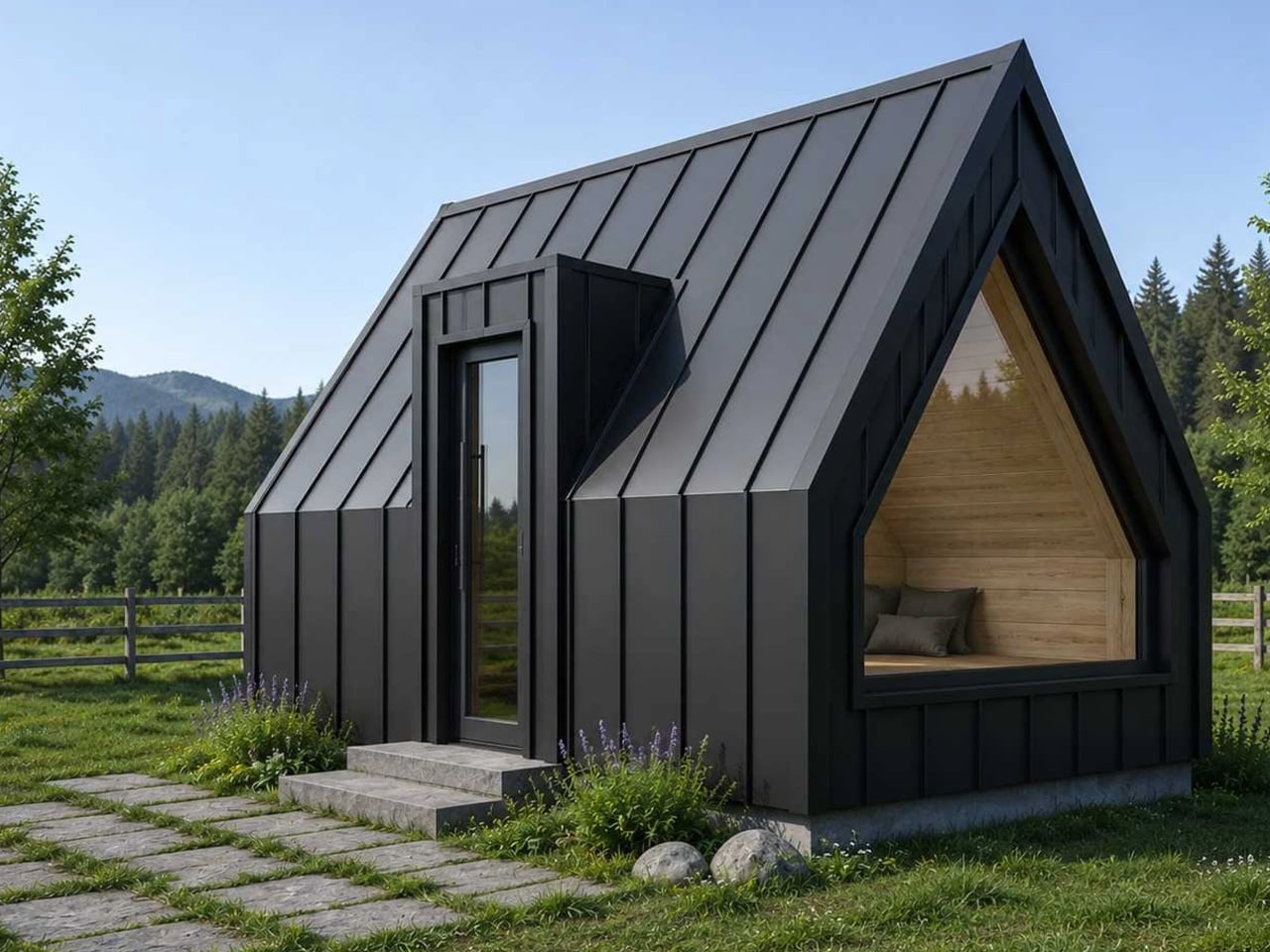
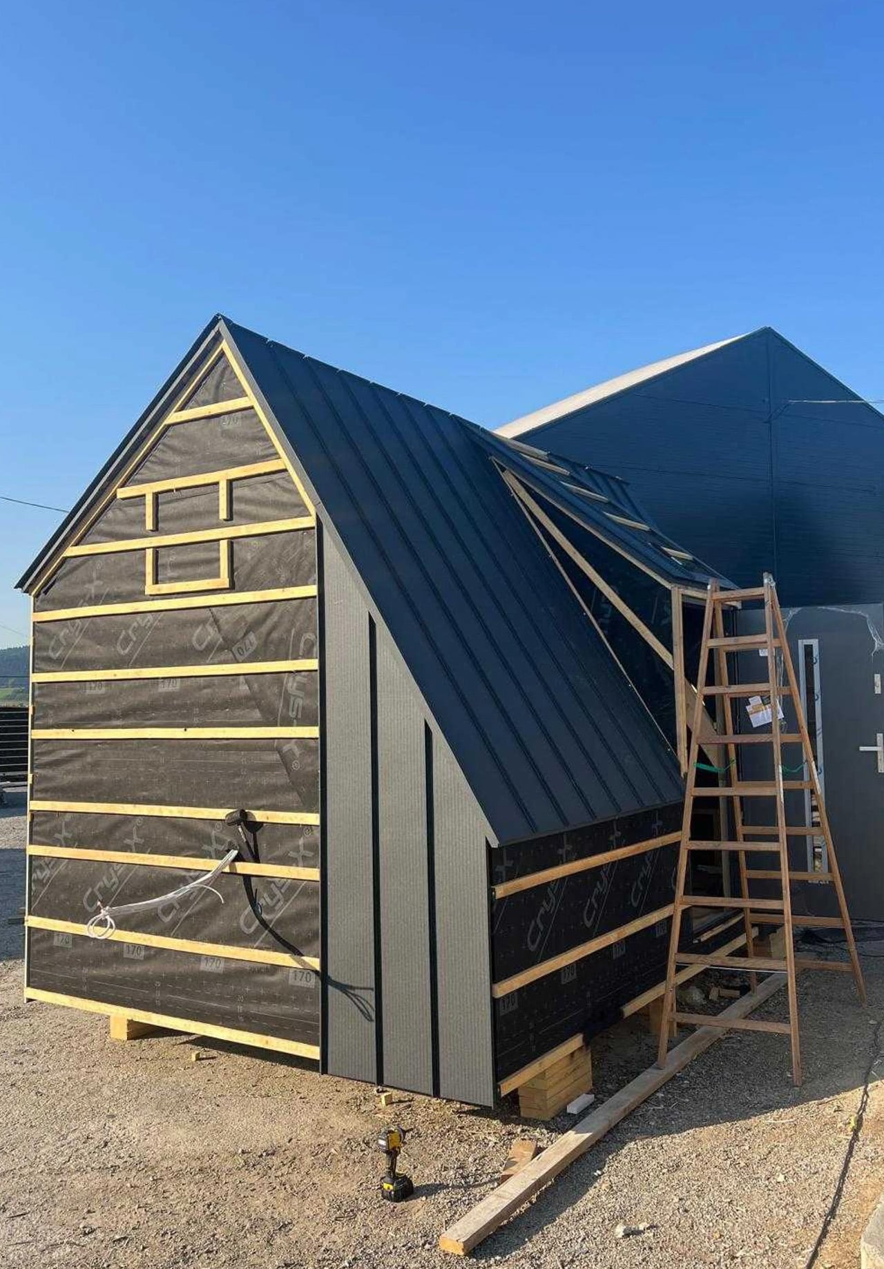
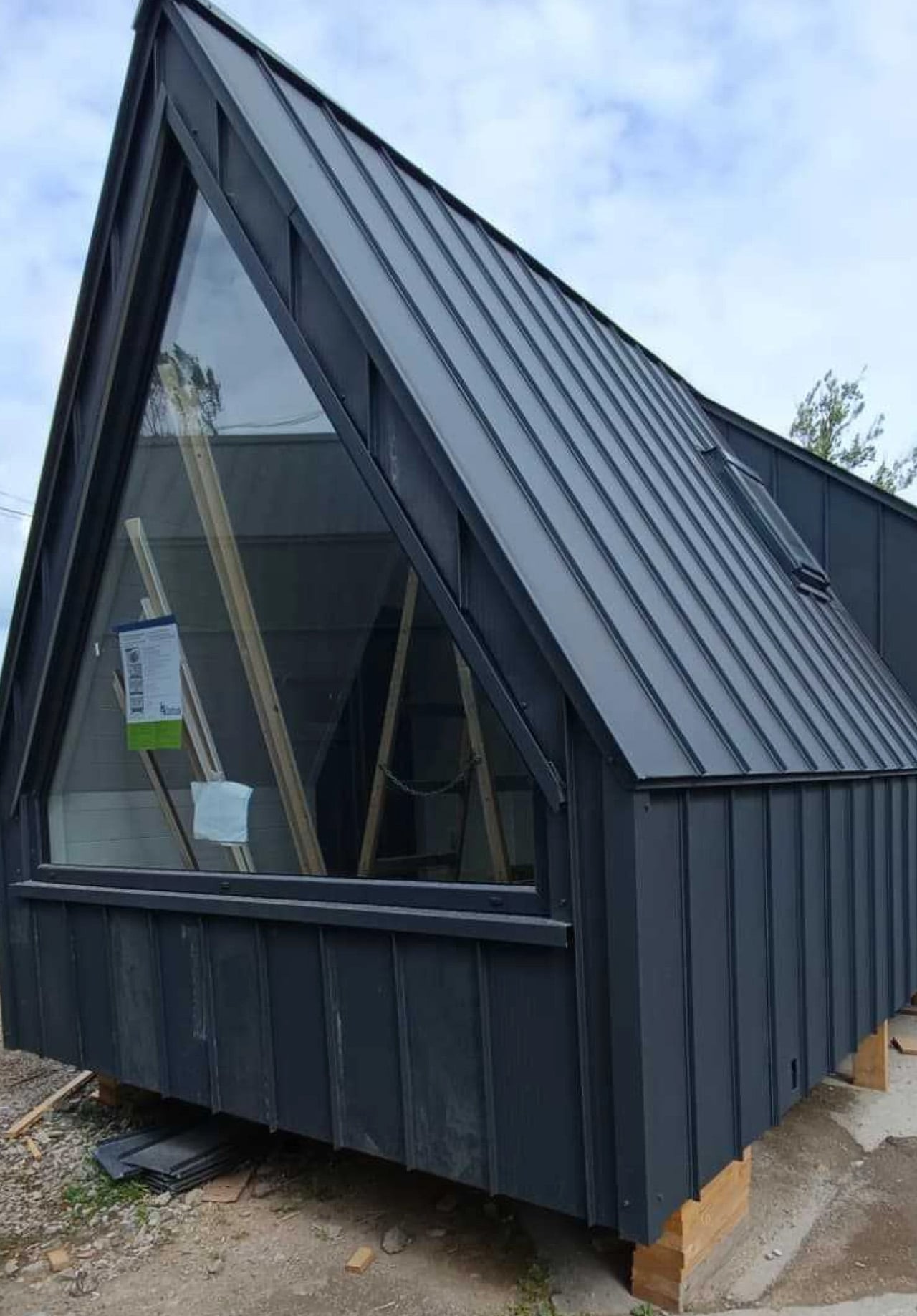
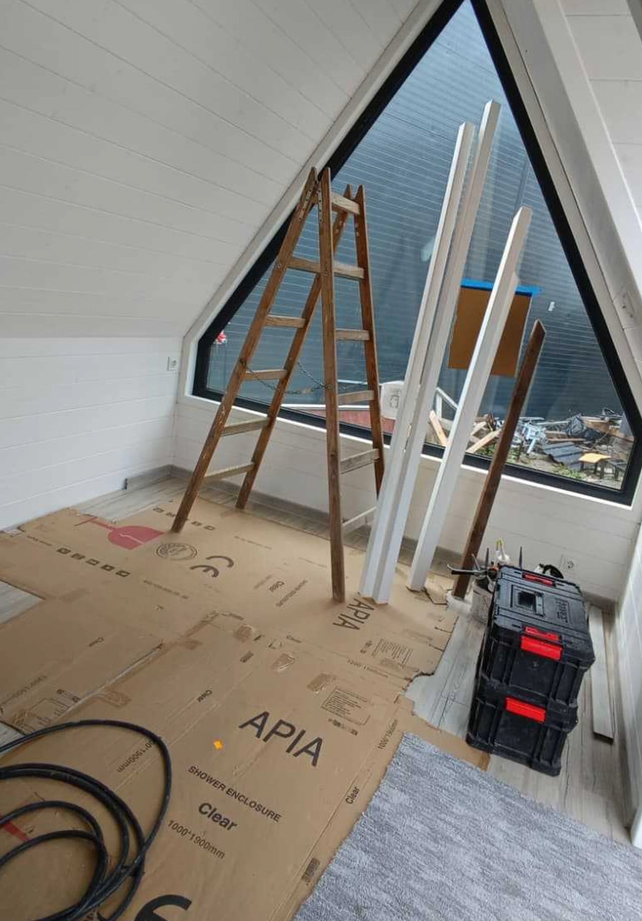
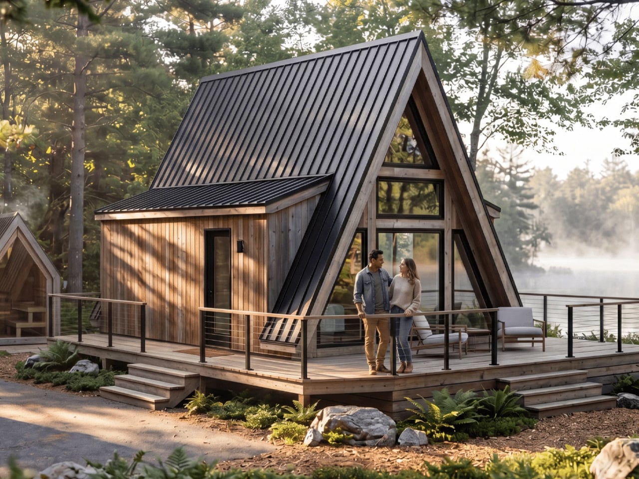
A large triangular window fills one end of the Mini Brda With Bay Window, giving this compact cabin a generous outlook. The entrance sits on the side, beneath its own projecting roof section, leaving the glazed end uninterrupted. Offered by Polish company Mini Domy, the design keeps its distinctive A-frame silhouette while making room for more than a bed beneath a pitched roof.

The model’s specification lists dimensions of 4.51 by 3.2 meters, giving it a footprint of approximately 155 square feet. Dark metal cladding covers the exterior, with pronounced seams emphasizing the steep roof. Those angled surfaces give the cabin its character, although they also make furnishing the edges less straightforward than arranging a conventional rectangular room.

Designer: Mini Domy

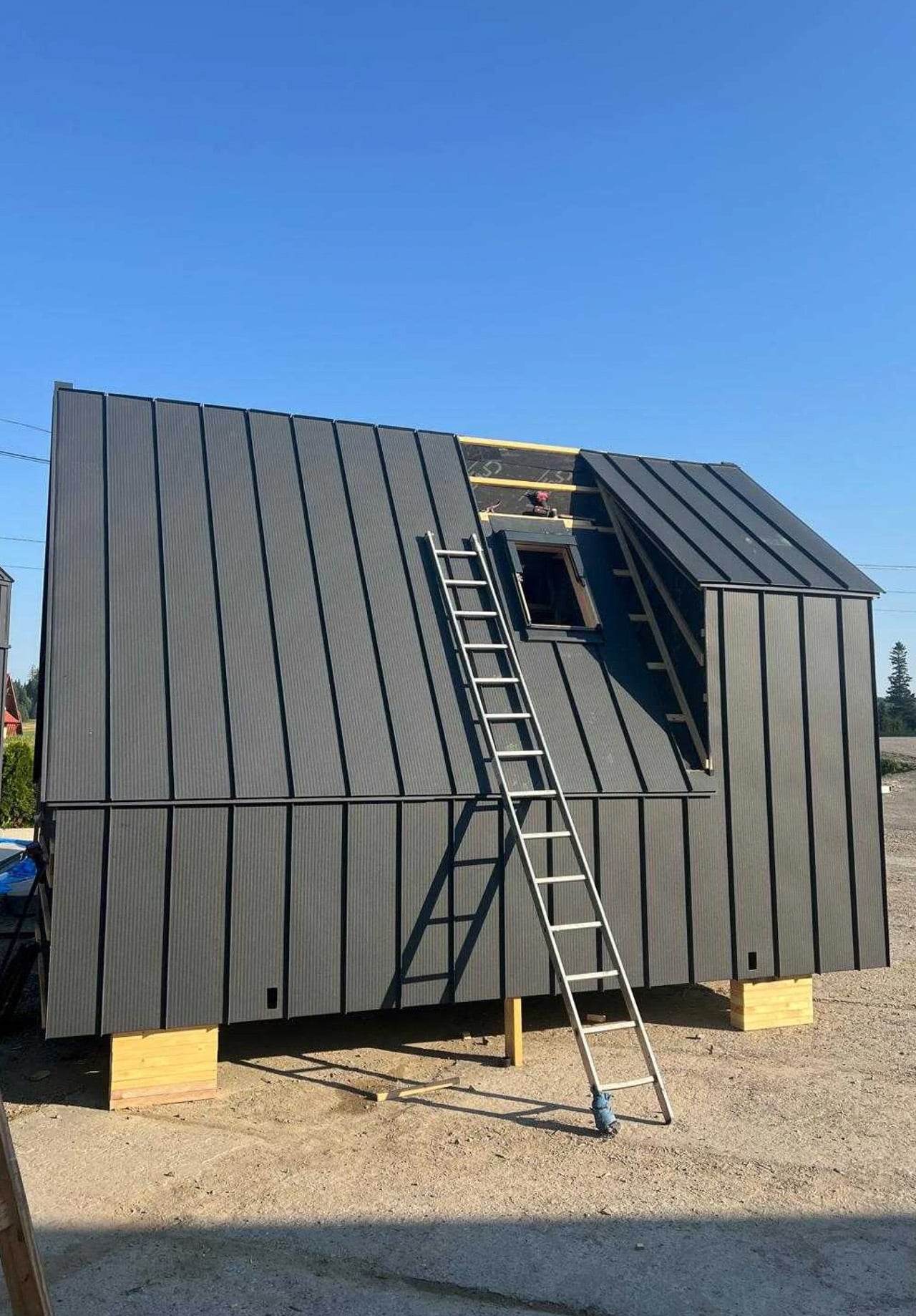
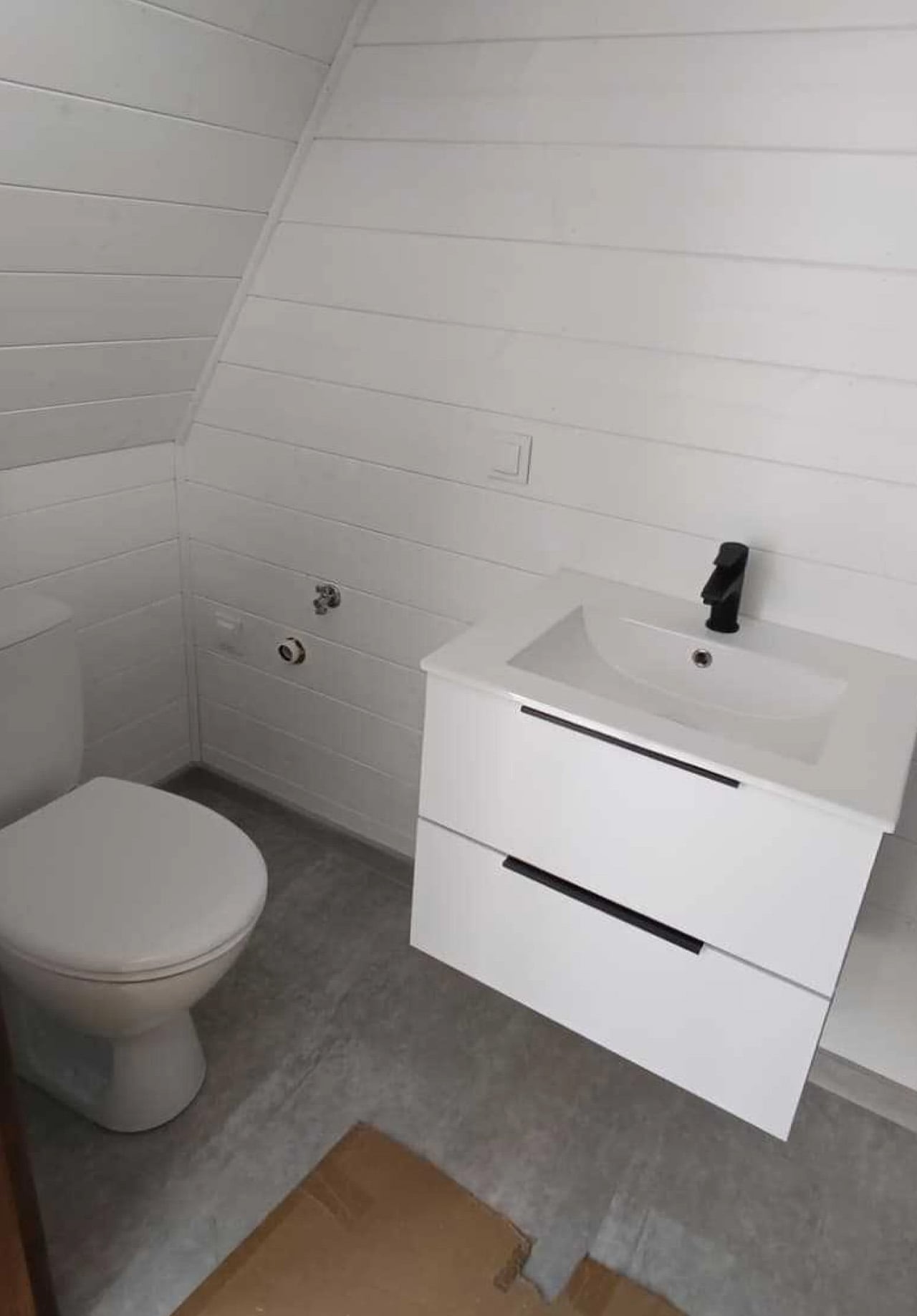
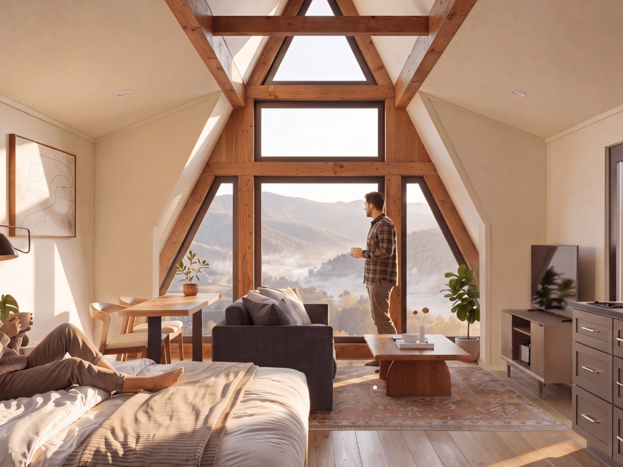
Inside, white-painted tongue-and-groove paneling follows the roof slopes, making the geometry visible rather than concealing it behind a flat ceiling. Wood-look flooring introduces a contrasting tone underfoot. Published photographs show the cabin before furnishing is complete, so the interior is best understood through a combination of construction images and the proposed layout.

Most of the accommodation occupies one shared room, combining cooking, lounging, and sleeping. A planned bed doubles as daytime seating, avoiding the floor-space demands of a separate sofa. There’s no sleeping loft or ladder to negotiate. The compromise is privacy: beyond the bathroom, daily activities share the same compact space, with little separation between preparing breakfast and making the bed.

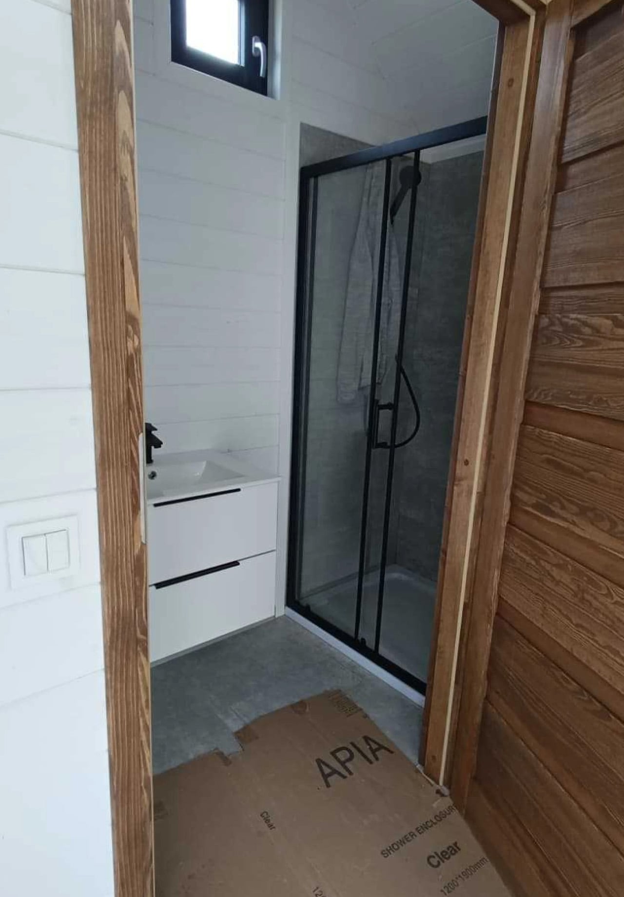
The kitchen specification is modest but useful, listing cabinetry, a sink, and a camping-style stove. That suggests simple holiday cooking rather than an apartment kitchen shrunk to fit. The separate bathroom includes a shower, basin, toilet, and water heater. Photographs show a wall-mounted vanity with drawers, providing storage without taking the cabinet all the way down to the floor.

Mini Domy’s offer specifies 10 centimeters of mineral-wool insulation, double-glazed windows, and air conditioning with a heating function. These are meaningful provisions for a small cabin, but they aren’t enough to establish comfort in every climate. The company itself qualifies year-round use on the broader Mini Brda page with the need for appropriate insulation and heating.

A dedicated trailer is optional rather than integral to the version pictured. The downloadable offer lists the cabin at US$15,000, though it also gives the quotation a two-month validity period without a visible issue date. Buyers should confirm current pricing, equipment, transport, and installation directly rather than treating that figure as a complete project budget. As a weekend retreat, the arrangement makes sense: keep the bathroom enclosed, let furniture do double duty, and reserve the glazed end for the view. Longer stays would make the shared room’s limits harder to ignore.

The post Mini Domy Fits a Kitchen and Bathroom Into This 155-Square-Foot A-Frame Cabin first appeared on Yanko Design.
  •  

The Tinde Tiny House Gives Its Covered Porch a Dramatic A-Frame Roof

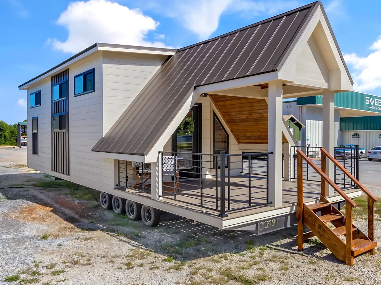
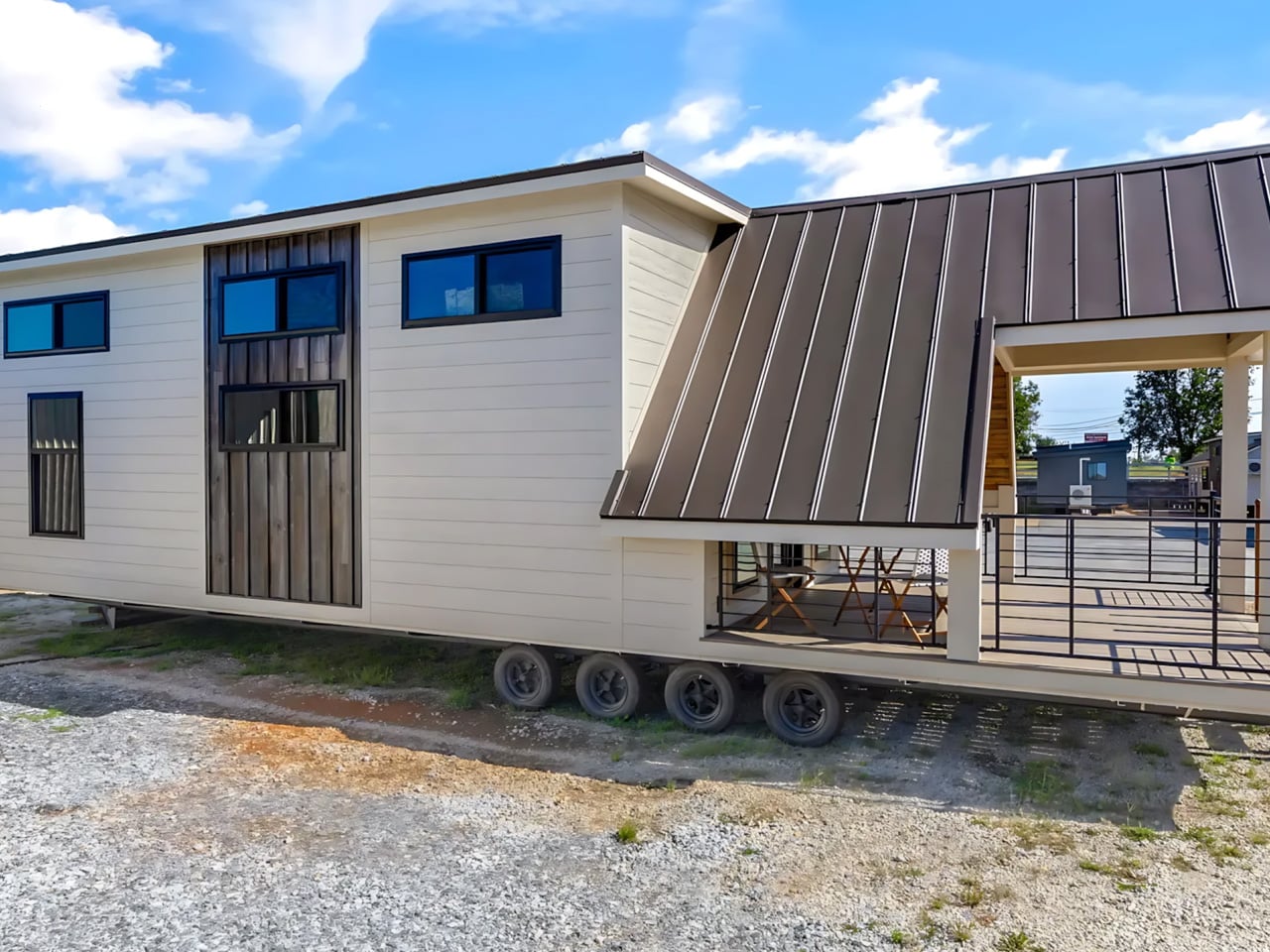
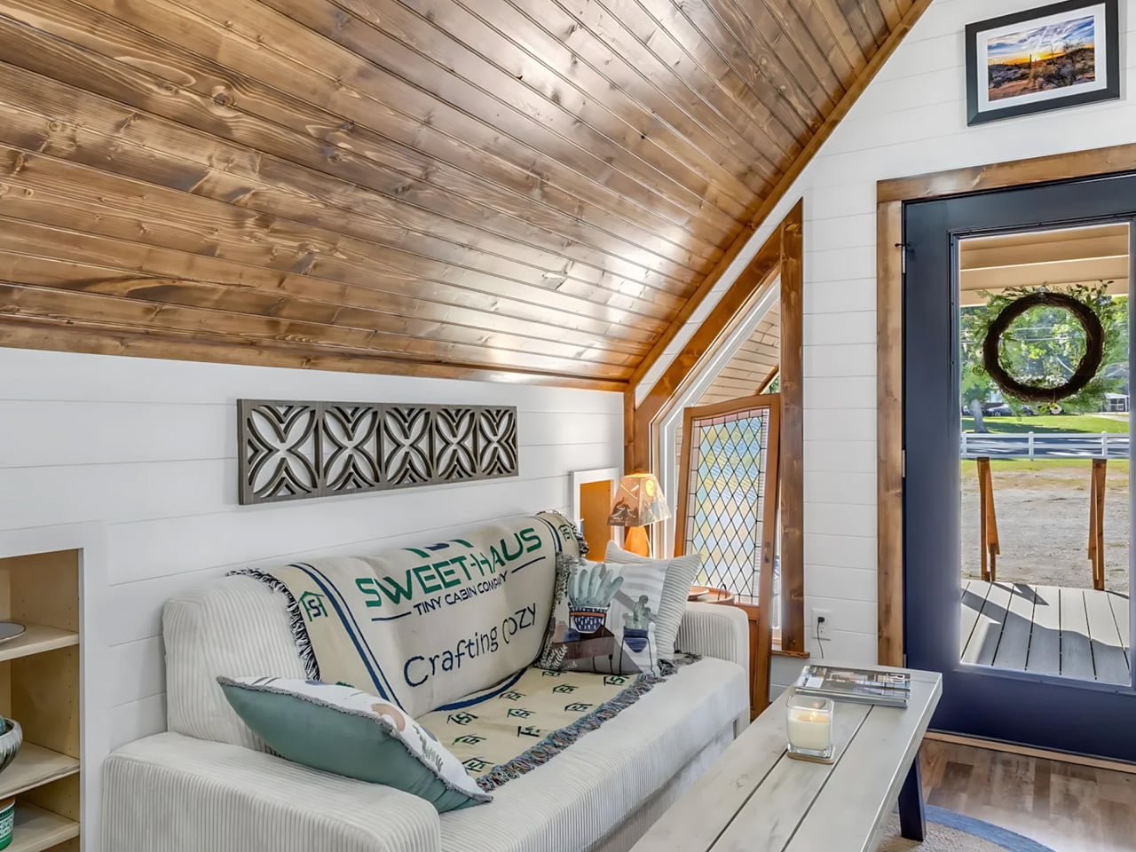
The Tinde’s most distinctive space sits outside its front door. A steeply pitched roof stretches over a generous covered porch, giving this tiny house the entrance of a woodland cabin. Built by South Carolina’s Sweet-Haus Tiny Cabin Company, the customizable park model measures 48 feet long and 14 feet wide, with a main-floor bedroom, a loft, and a flexible bonus room.

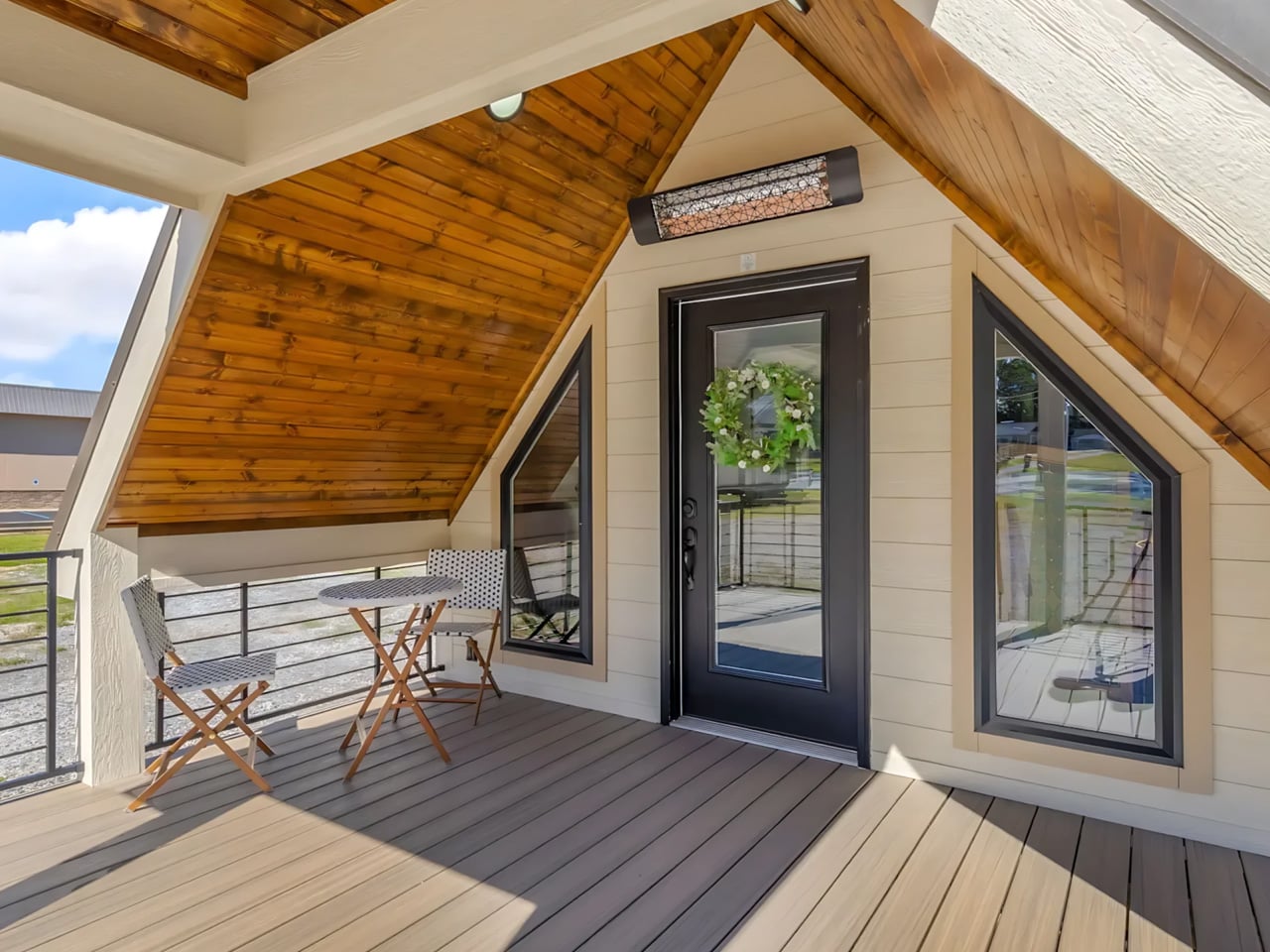
That porch gives the home a place to spread out without enclosing every available inch. In the photographed build, pale siding and dark railings frame the deck, while wood lining beneath the roof brings warmth to the entrance. The unusually sharp roofline dominates the front elevation, with a taller, more conventional volume rising behind it to accommodate the interior’s upper level.

Designer: Sweet-Haus Tiny Cabin Company

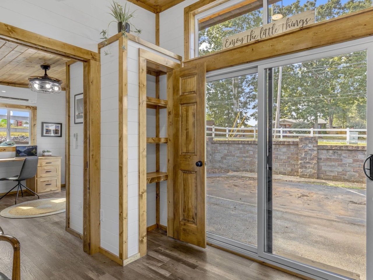
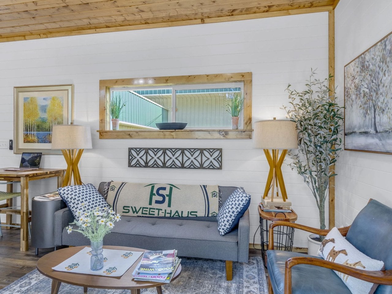
Inside, the extra width allows a living room furnished with a sofa, coffee table, and separate armchair. A built-in counter with stool seating provides a spot for meals or laptop work without introducing another freestanding table. The arrangement leaves the central floor comparatively open, an important distinction in a home where the living area also handles circulation between the entrance and kitchen.

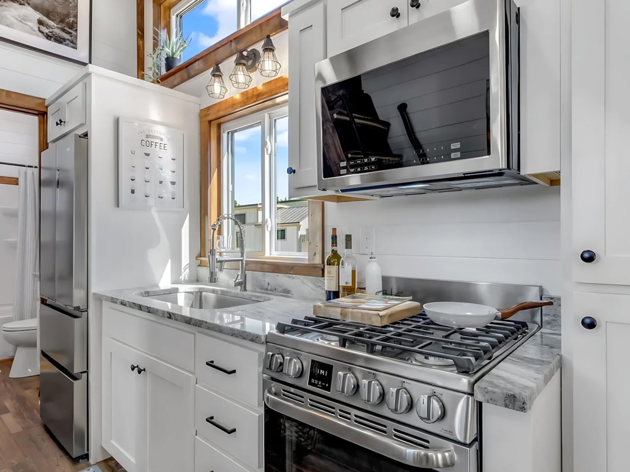
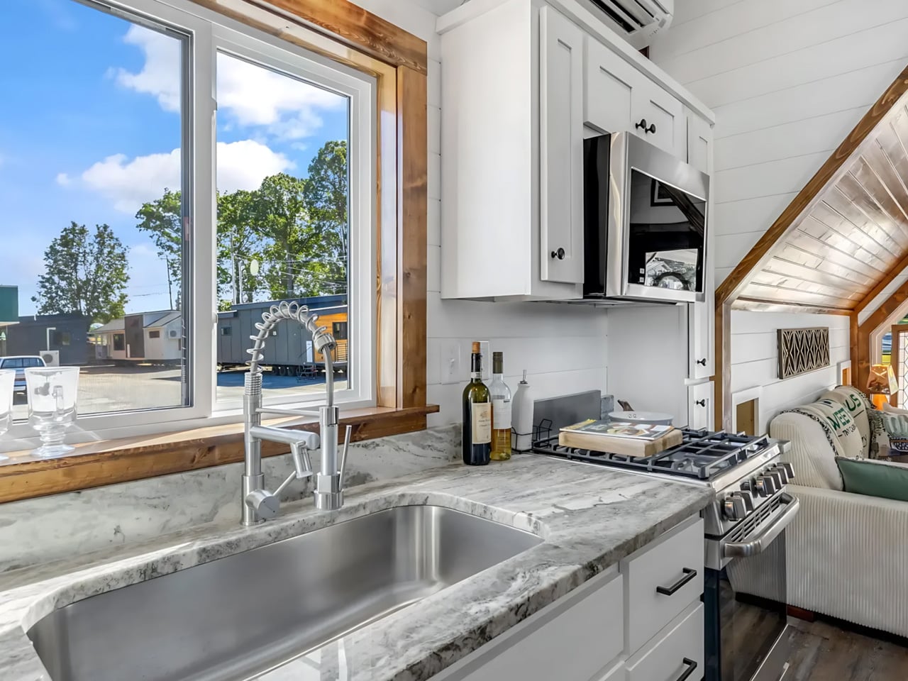
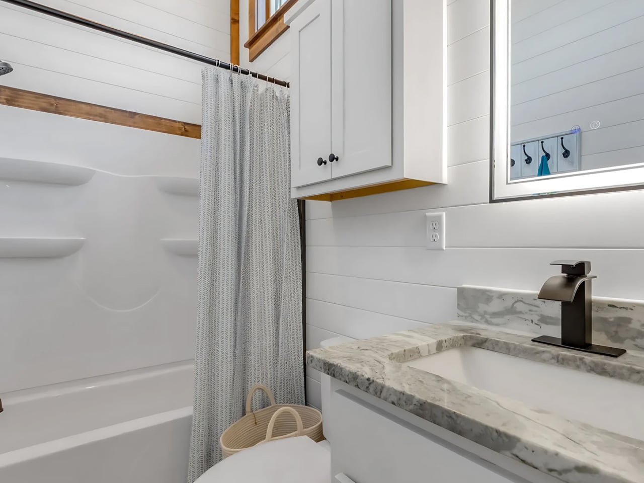
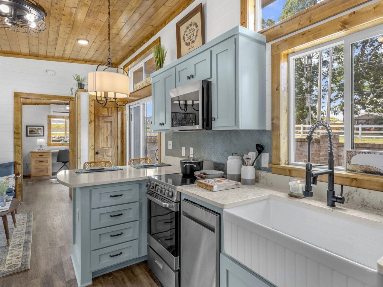
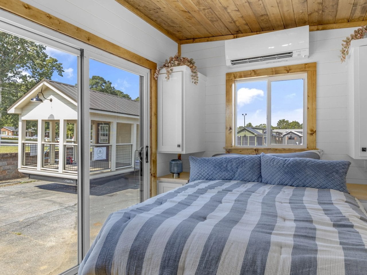
The kitchen gathers an oven, four-burner propane cooktop, microwave, and refrigerator into a compact working area, supported by overhead and lower cabinetry. Farther back, the bathroom includes a bathtub and shower combination, vanity, and flushing toilet. A separate bedroom keeps the primary sleeping space downstairs, so occupants don’t have to climb to the loft every night. That makes the upstairs accommodation an option rather than a daily obligation.

The bonus room offers the most consequential choice in the floor plan. Sweet-Haus lists potential uses including bunks, laundry, an office, or storage, allowing buyers to prioritize the activity that would otherwise crowd the main living space. The company says the bedroom, loft, and bonus room can accommodate up to six sleepers, depending on configuration. That’s sleeping capacity, rather than six equally private bedrooms.

There are useful distinctions between the available configurations. The bonus room comes as an open space, with single upper-bunk and double-bunk arrangements listed as upgrades. Bathroom options include a tub-shower or a walk-in shower without an upcharge. These decisions matter more than a paint selection: each changes how the limited interior can serve a household, particularly when guests, laundry, and working from home compete for space.

Sweet-Haus currently lists a starting price of $131,000 for the Tinde, while its options page identifies the dramatic A-frame roof as a $15,000 upgrade. Buyers should distinguish the photographed cabin from the base specification. Its appeal is clear: the design devotes substantial space to gathering, indoors and out, while leaving one small room available for whatever the household needs most.

The post The Tinde Tiny House Gives Its Covered Porch a Dramatic A-Frame Roof first appeared on Yanko Design.
  •  

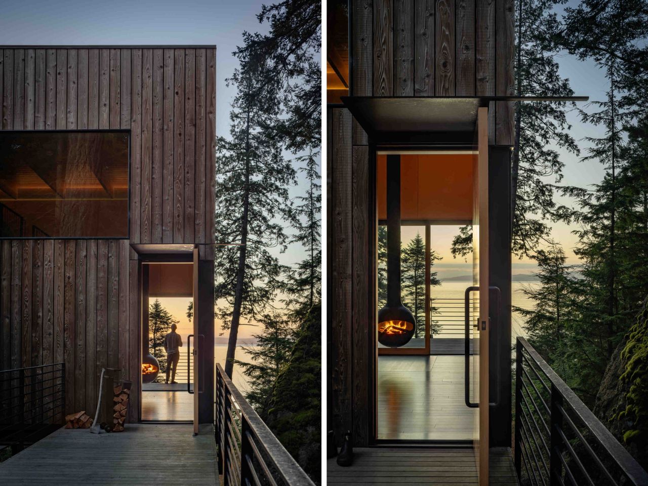
A Suspended Walkway Leads to This Tiny Cabin Overlooking the Salish Sea

A cabin this small could easily become an exercise in clever storage. On Blakely Island, Wittman Estes has taken a more interesting approach.  The Seattle-based architecture studio designed a 400-square-foot guest retreat that feels less concerned with proving how much can fit inside and more interested in how little architecture is actually needed to make a place feel complete.

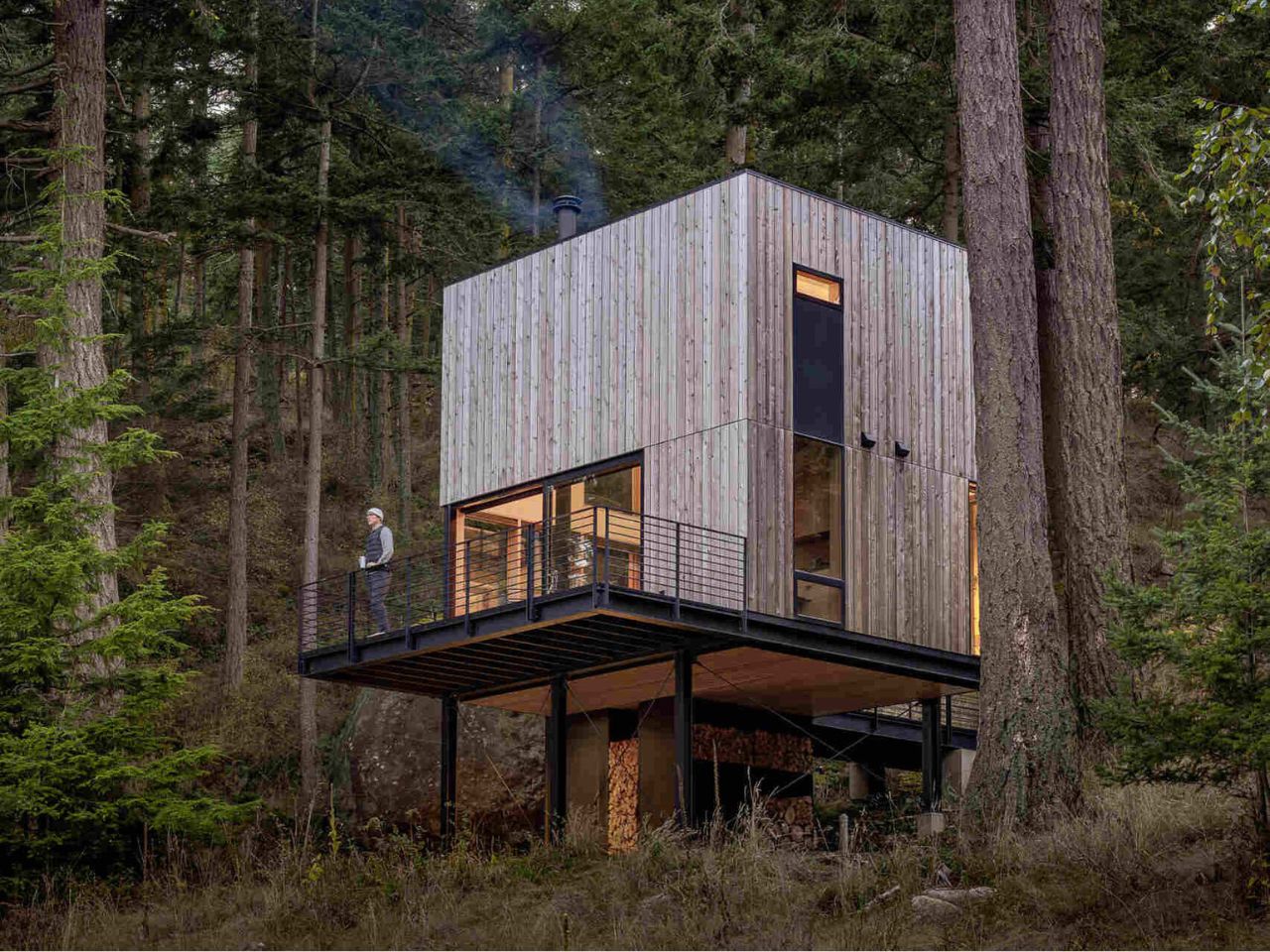
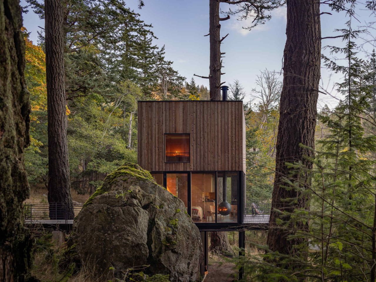
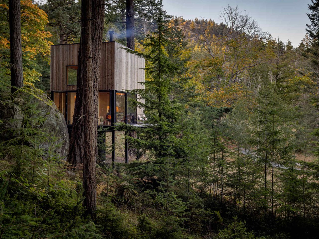
Set within Washington’s San Juan Island Archipelago, the cabin occupies a dramatic piece of terrain between a mature Douglas fir and a large glacial erratic boulder. Beyond the trees lies the Salish Sea. Rather than settling heavily into the rocky shoreline, the structure is lifted above it on slender supports, giving the impression that it has been carefully inserted into the forest rather than constructed over it.

Designer: Wittman Estes

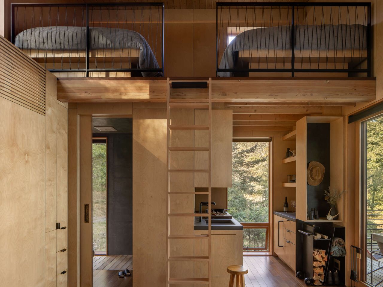
The main studio measures just 16 by 20 feet, drawing from the tradition of simple shelters in the woods, from Thoreau’s Walden Cabin to Le Corbusier’s Cabanon. Yet the interior does not feel particularly austere. A kitchen, bathroom, Murphy bed, living area, and loft with two bunks all occupy the compact volume, each given a precise place within the plan.

The difficulty of the site helped shape the architecture. Blakely Island’s steep, rocky shoreline made conventional construction complicated, particularly if heavy machinery had to pass through the surrounding forest. Many components were therefore fabricated at the contractor’s yard in Everett before being transported to the island by barge. Modular steel frames were then lifted onto a minimal point foundation. Western red cedar siding, milled from trees on the island, was left unfinished so it could gradually weather into the landscape.

That sensitivity continues through the experience of arrival. A narrow suspended metal walkway threads through the trees toward the entrance, allowing views of Thatcher Bay to open gradually between the branches. Powder-coated steel railings line the path and deck, while a simple steel awning shelters the fir entry door.

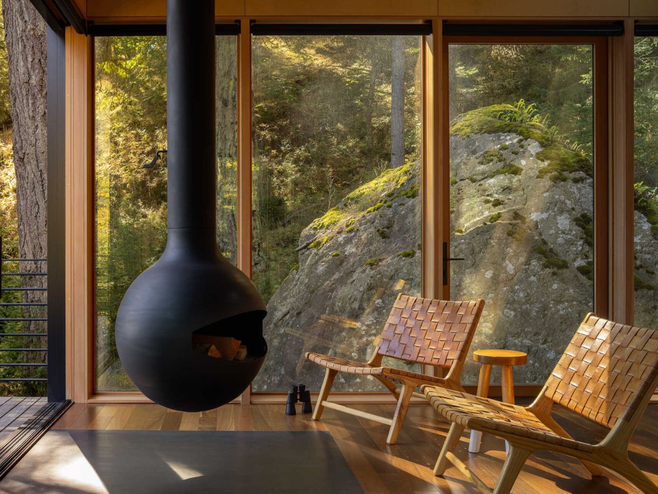
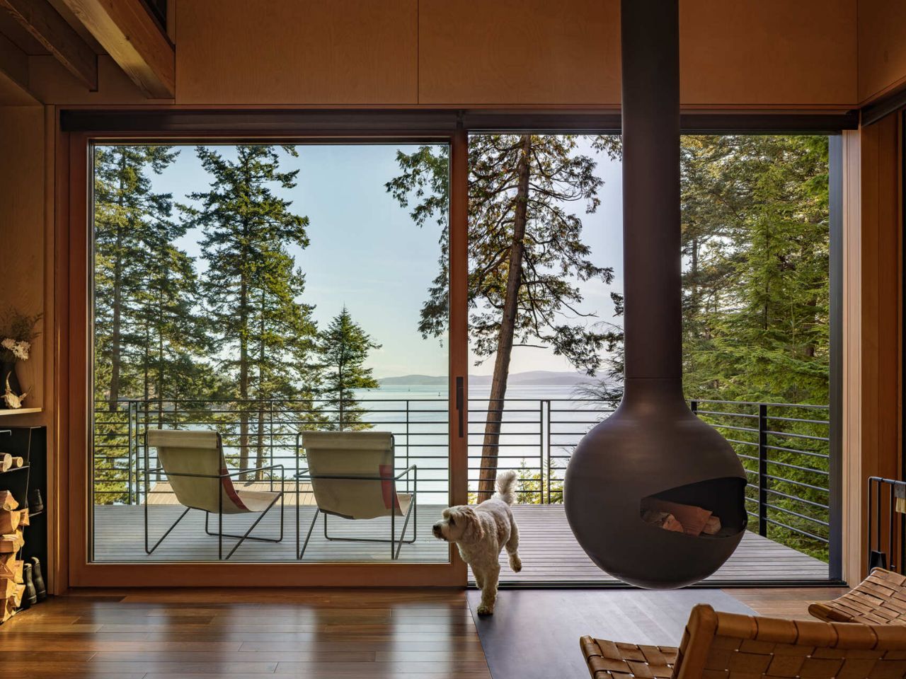
Inside, the material palette becomes warmer. Birch plywood wraps the walls, fir beams remain exposed overhead, and solid ipe runs underfoot. The restrained finishes allow the view to dominate. Large sliding glass doors face the water, visually extending the living space far beyond its modest footprint.

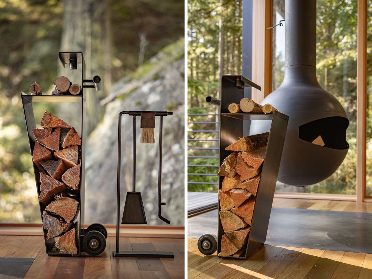
Near the center of the cabin, a suspended black fireplace rotates through 360 degrees, allowing the fire to face either the interior or the cantilevered deck outside. In warmer weather, the open glass doors effectively turn the deck into another living room. During colder months, the same glazing keeps the forest and water present while the cabin becomes a sheltered place from which to watch the weather change.

Even the fireplace tools have been treated as part of the architecture. Wittman Estes designed a movable steel fire cart that slips neatly into an angled niche nearby. It is a small detail, but an important one in a room where visual clutter could quickly overwhelm the space.

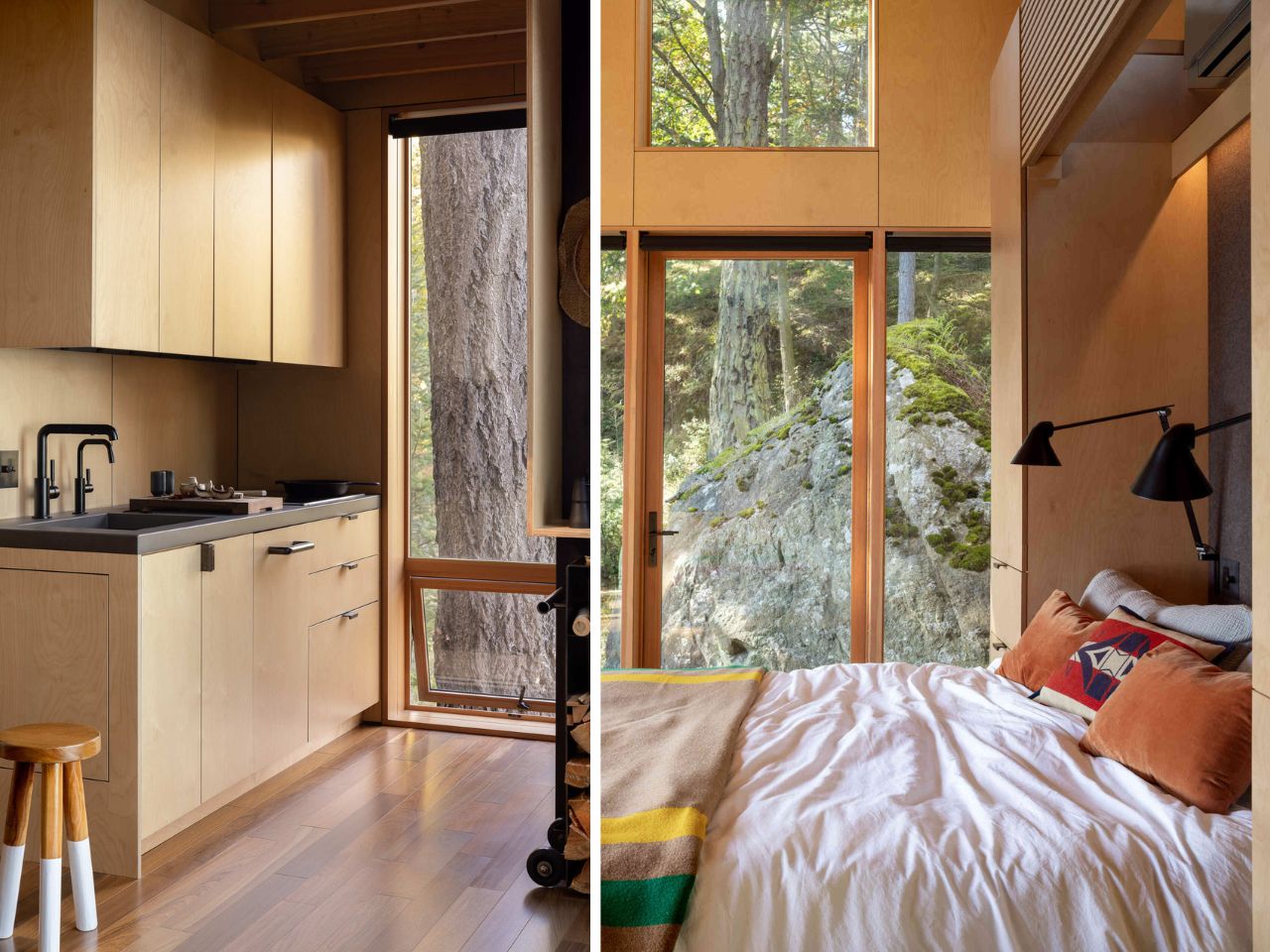
The kitchen follows the same logic. Positioned beneath the sleeping loft, it occupies one of the lowest parts of the cabin, reserving the taller volume for the main living area. A cast-in-place concrete sink and countertop are paired with dark fixtures and discreet integrated appliances. Against the birch plywood and fir, the concrete provides enough contrast to define the kitchen without separating it visually from the rest of the interior.

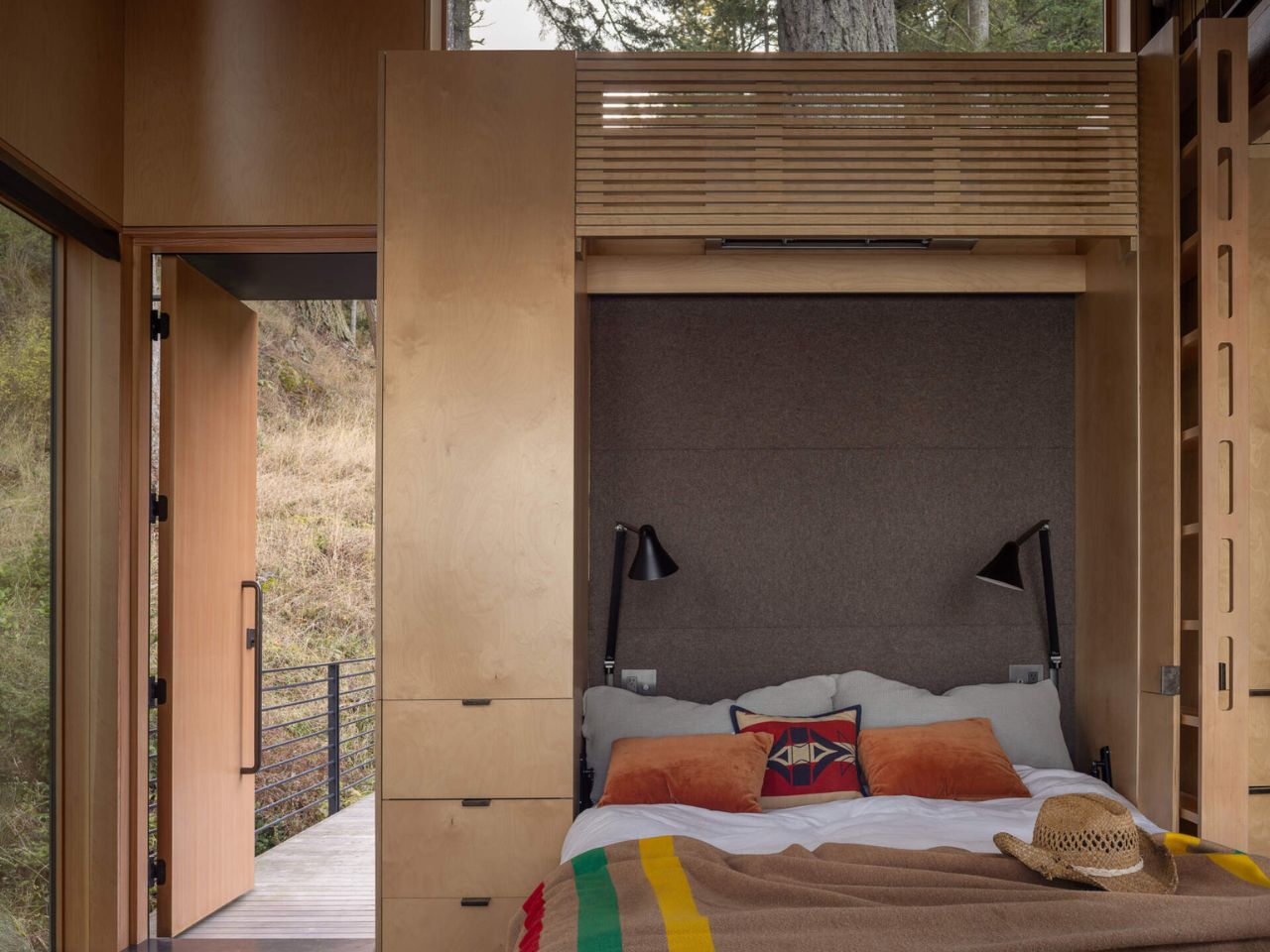
The living room becomes the primary bedroom when a Murphy bed folds down from the wall. During the day, it nearly disappears, preserving the openness of the studio. At night, the bed faces east toward the morning light, while a felt headboard introduces softness to the otherwise restrained palette of wood, steel, and concrete.

At the northwest corner, the bathroom is given its own relationship with the landscape. A glass corner window looks directly into the surrounding forest, preventing the compact room from feeling enclosed. Above the kitchen, a sleeping loft adds two bunks without expanding the cabin’s footprint, accessed by a custom maple ladder.

This use of vertical space reflects the logic of the entire project. Nothing feels squeezed into an arbitrary corner. Each function occupies the part of the volume where it makes the most sense, while the architecture continues to work around the existing terrain rather than attempting to reorganize it.

What makes the Blakely Island Cabin compelling is not simply how much has been fitted into 400 square feet. Its greater achievement is making those 400 square feet feel secondary to the experience of being there. The folding bed, compact kitchen, and sleeping loft provide efficiency, but the architecture rarely asks you to admire that efficiency.

Instead, it directs attention outward: toward the Douglas fir beside the house, the rock beneath it, the changing weather, and the long stretch of Salish Sea beyond the glass. For a building inspired by the idea of living simply in the woods, that may be its most convincing gesture. The cabin does not try to provide more space than it has. It simply makes the space beyond its walls feel like part of the room.


The post A Suspended Walkway Leads to This Tiny Cabin Overlooking the Salish Sea first appeared on Yanko Design.
  •  

This Tiny Home Fits a Downstairs Bedroom and Two Lofts Into 24 Feet

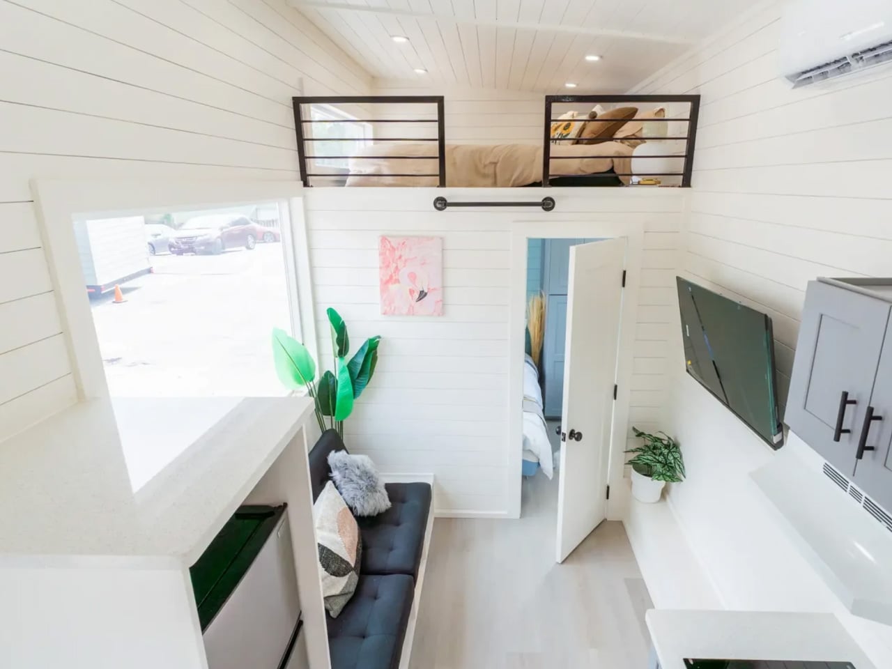
The updated Avalon 24 gives its most useful space-saving move to the bedroom: it keeps it downstairs. Dragon Tiny Homes pairs that main-level sleeping area with two lofts inside a 24-foot home on wheels, offering 204 square feet of floor space before counting the lofts. The completed, upgraded build is listed for sale, with built-in furniture and storage already fitted.

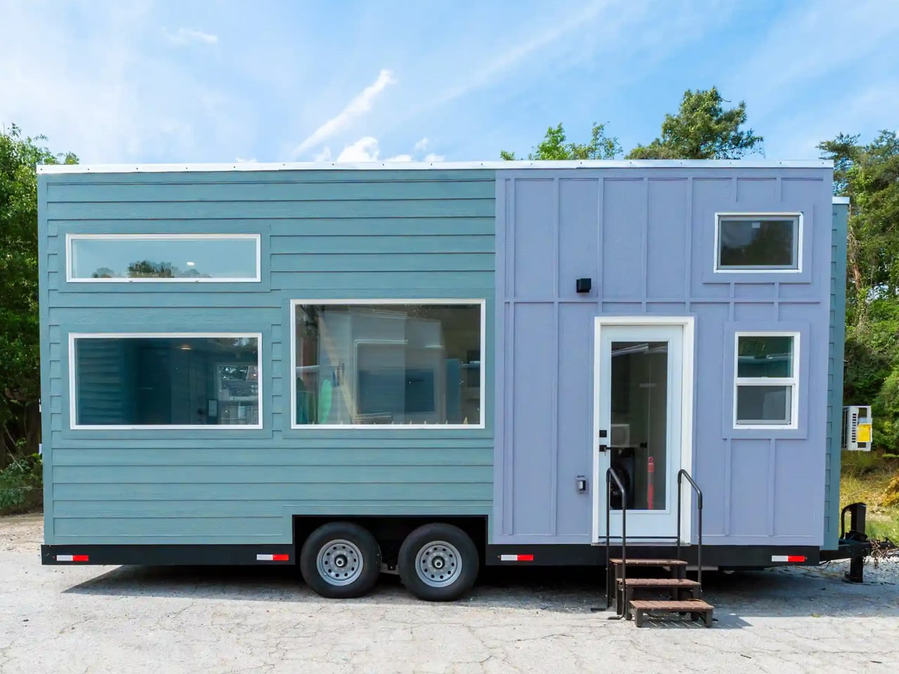
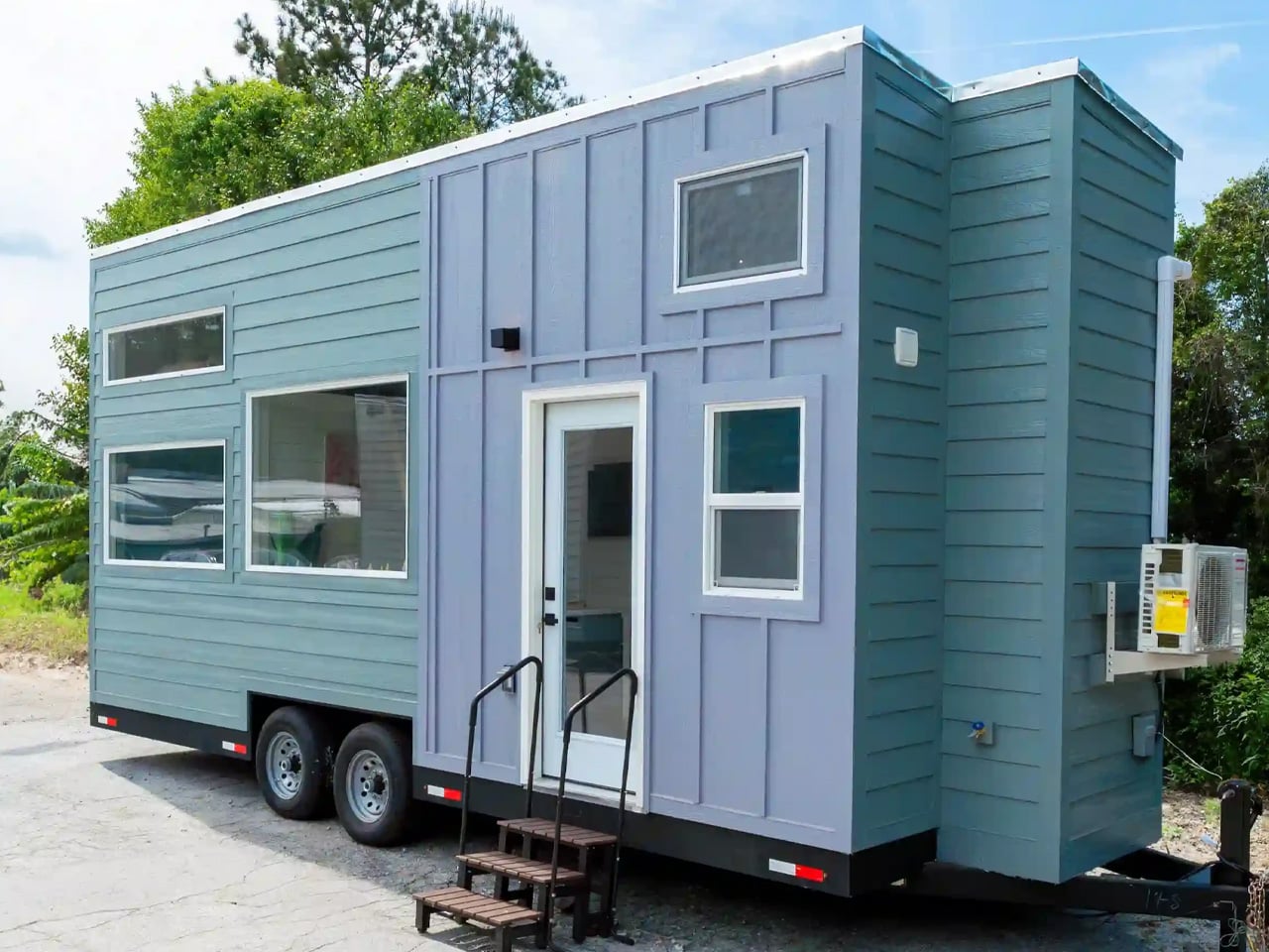
Outside, blue and lavender wood cladding gives this version a cheerful identity, topped by a metal roof and supported by a double-axle trailer. The color makes a welcome departure from the monochrome finishes common in compact housing, but the more consequential decisions happen inside. Here, sleeping space takes priority over a sprawling lounge.

Designer: Dragon Tiny Homes

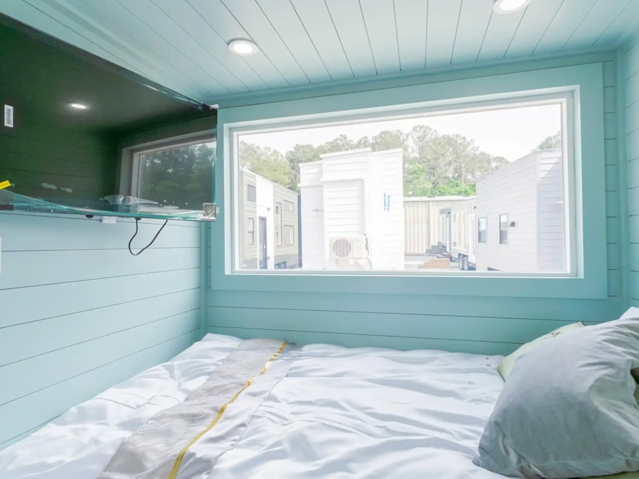
The downstairs bedroom accommodates a double bed, a dedicated storage cabinet, and a wall-mounted television. Keeping the primary bed at floor level removes the nightly ladder climb, although the room remains snug. Above it sits the main sleeping loft, while a smaller loft over the bathroom provides another potential sleeping area or storage space. Removable ladders serve both upper levels, so these spaces demand more agility than the downstairs room.

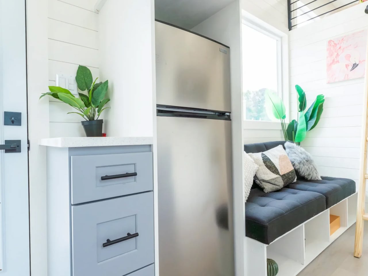
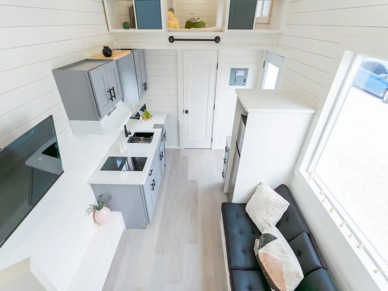
The living area uses a built-in couch platform rather than leaving furniture placement entirely to the owner. Integrated sofa storage adds another place to tuck belongings away, and a large picture window opens the room toward the outdoors. White horizontal wall paneling and dark loft railings keep the interior visually legible, with the upper sleeping platform clearly separate from the space below.

In the kitchen, the upgraded build includes a 7.1-cubic-foot refrigerator housed in cabinetry with three drawers, alongside upper cupboards, a floating shelf, and a range hood. The Avalon’s induction cooktop has two burners, and its quartz surfaces include a bar top intended for dining or work. Laundry space is provided in the layout, though buyers should confirm the appliance package for their particular build. The cabinetry gives everyday objects assigned homes instead of relying entirely on loose shelving.

The bathroom contains a shower, vanity, and flushing toilet, with the upgraded unit adding a mirrored medicine cabinet and accent finishes. Dragon also lists upgraded insulation, a ceiling fan, and LED lighting with a night-light function. Those are useful specification details, though the listing doesn’t establish measured thermal performance or energy savings.

The featured inventory home is advertised at $63,500, including $10,100 in selected upgrades and a $6,600 discount from its configured price. Dragon lists a weight of 14,000 pounds and recommends an F350 or similar towing vehicle. That combination makes the Avalon’s tradeoff clear: its downstairs bedroom is appealing, but moving this small home still requires serious equipment.

The post This Tiny Home Fits a Downstairs Bedroom and Two Lofts Into 24 Feet first appeared on Yanko Design.
  •  

Zook Cabins Fits a Soaking Tub & Separate Shower Into a 470-Square-Foot A-Frame Retreat

The A-Frame Retreat gives its most dramatic wall to glass, with windows climbing toward the roof’s sharp peak. Behind that familiar triangular silhouette, Zook Cabins has arranged 470 square feet of living space on a single floor, including a bathroom with a freestanding soaking tub. This is an available modular home, with a completed example at Zook Village in Gap, Pennsylvania, documented in March 2026.

A black metal roof and thermally modified Lunawood siding establish the exterior’s restrained palette. The more interesting move is the lower, box-like volume alongside the steep roof. In the company’s exterior rendering, it gives the cabin a vertical side wall and a sheltered entrance, while the glazed gable retains the recognizable A-frame profile. An optional deck extends the space outward without changing the enclosed footprint.

Designer: Zook Cabins

Inside, the published king-bed floor plan reads as a studio rather than a conventional one-bedroom house. Living, dining, sleeping, and kitchen areas share an open room, with the bathroom enclosed at the rear. The bed sits opposite the kitchen, while seating occupies the glazed end. Keeping these functions together avoids carving the compact interior into smaller rooms, though it also means there’s no bedroom door to separate sleep from conversation or cooking.

Cathedral ceilings preserve the roof’s height indoors, while painted cabinet-grade birch plywood covers the walls and ceilings. Vinyl plank flooring runs throughout. The interior rendering pairs these pale surfaces with exposed-looking timber elements and wooden furniture, giving the room visual warmth without covering every surface in wood. Straight wall sections also leave usable edges for cabinetry and furniture beneath the taller central space.

The kitchen takes a modest portion of the plan. Zook specifies painted shaker-style cabinets, quartz countertops, and spaces for a compact refrigerator and microwave. Those provisions deserve attention: space allocated for an appliance doesn’t establish that the appliance is included. The arrangement leaves more of the shared room available for the bed, dining table, and sitting area.

The bathroom receives a surprisingly generous allocation. Alongside the 60-inch freestanding soaking tub, the specifications list a separate glass-doored shower and a 48-inch vanity. The floor plan places these fixtures in their own enclosed room, giving bathing more privacy than sleeping. That’s a revealing priority for a small retreat: floor space goes toward a leisurely bathroom rather than a separate bedroom or another sleeping level. Delivery still requires planning. Zook says the cabin travels in one truckload, with two A-frame roof sections lifted into place on site. Its modern cabins require a permanent foundation and prepared utility connections. The small footprint simplifies the accommodation, but the installation remains a building project.

The post Zook Cabins Fits a Soaking Tub & Separate Shower Into a 470-Square-Foot A-Frame Retreat first appeared on Yanko Design.
  •  

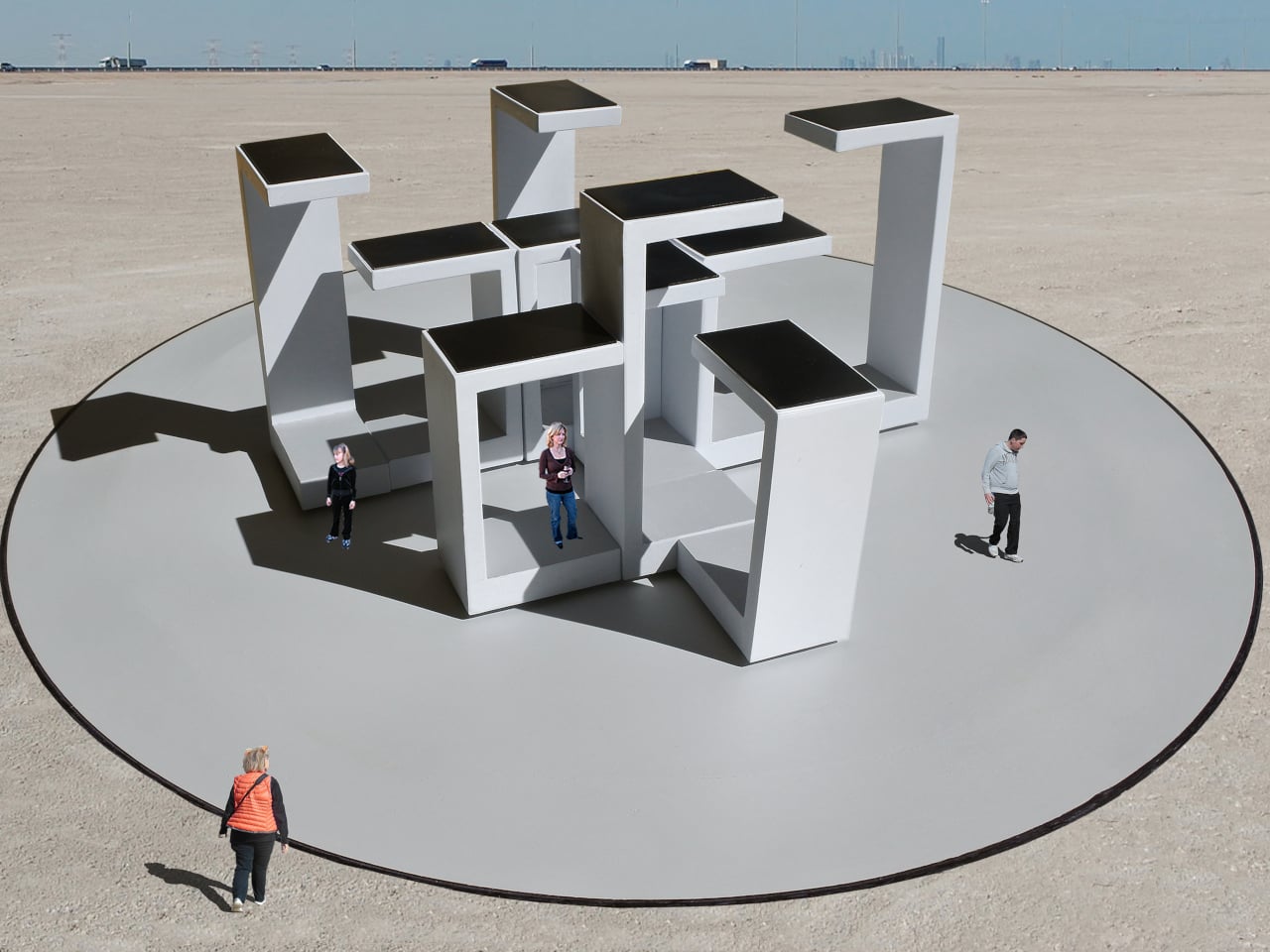
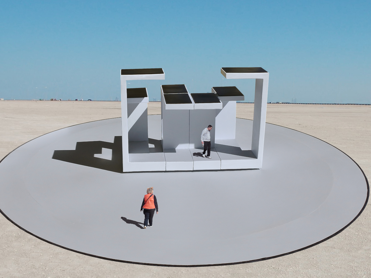
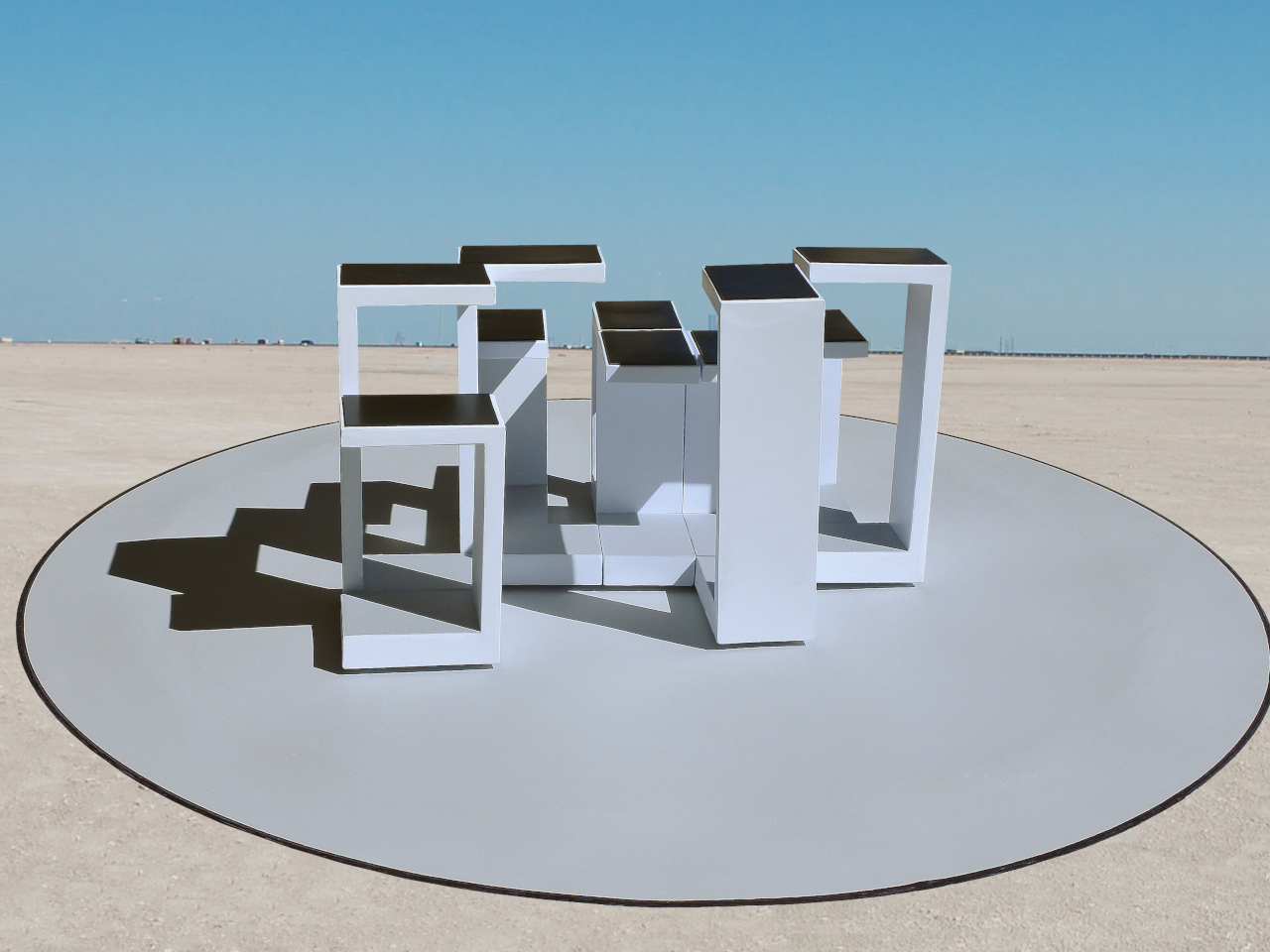
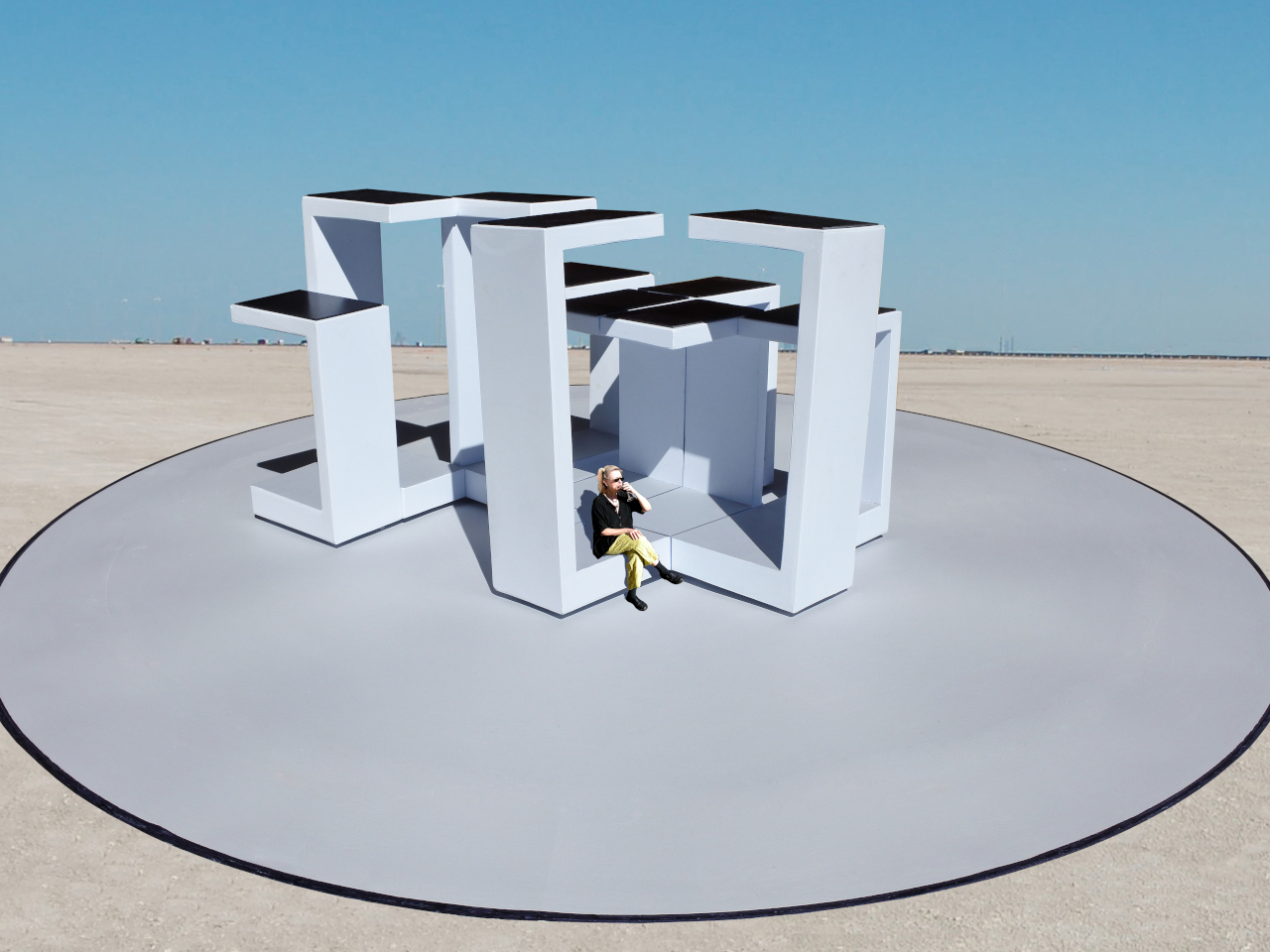
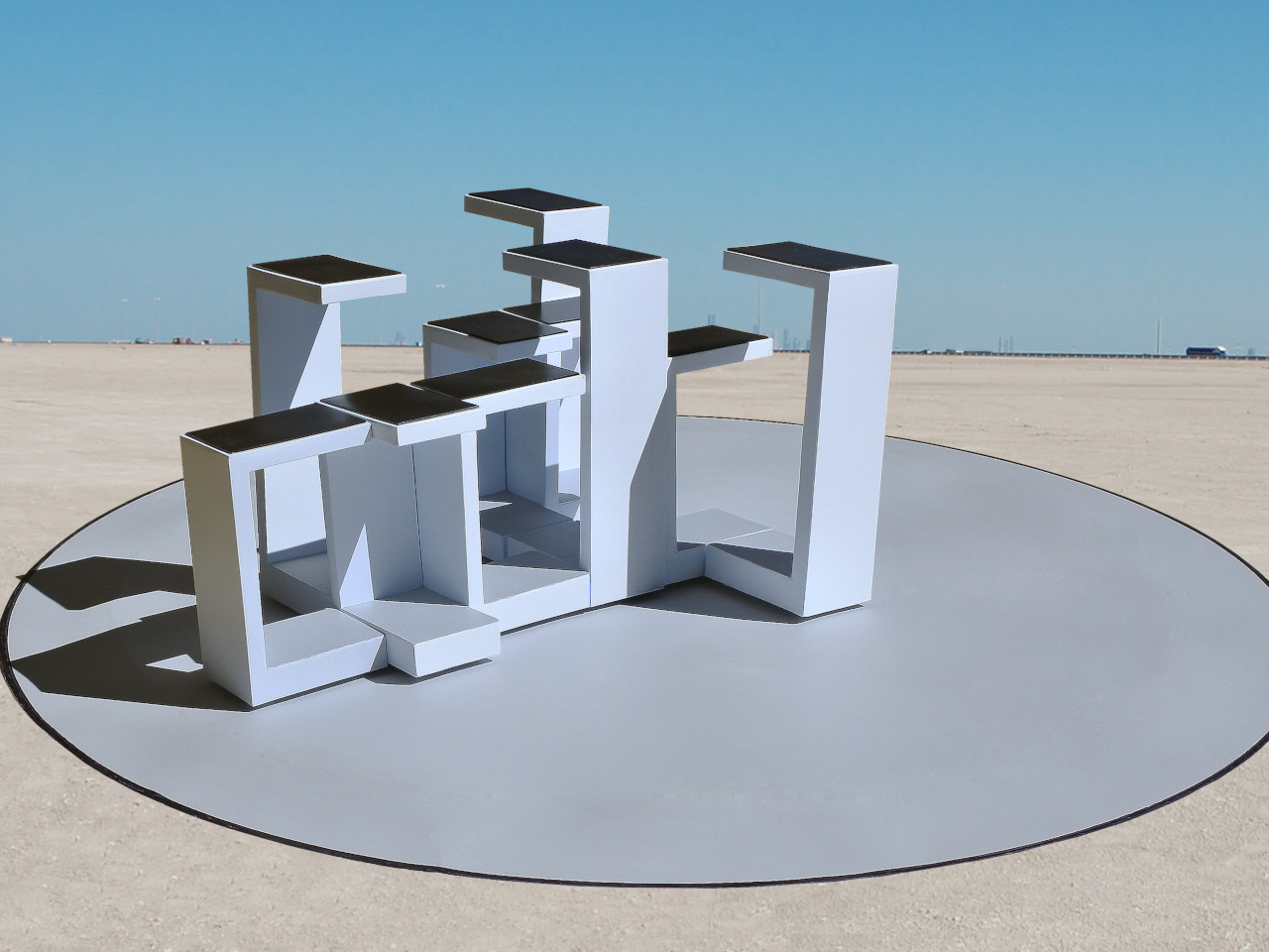
This Robotic Pavilion Concept Would Change Its Layout Only When Empty

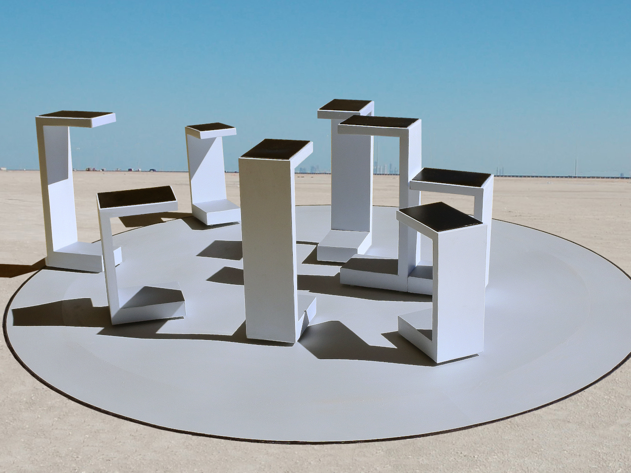
A public pavilion can give people somewhere to gather, but returning to it usually means finding the same spaces and following the same paths. Self-Assembling Robotic Environments explores a more flexible alternative: mobile architectural sections that could rearrange themselves between visits. This unbuilt public art concept would pause whenever someone enters, letting people explore one arrangement before the space changes for another group.

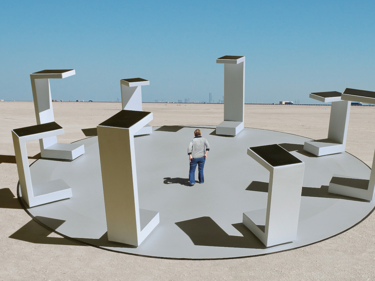
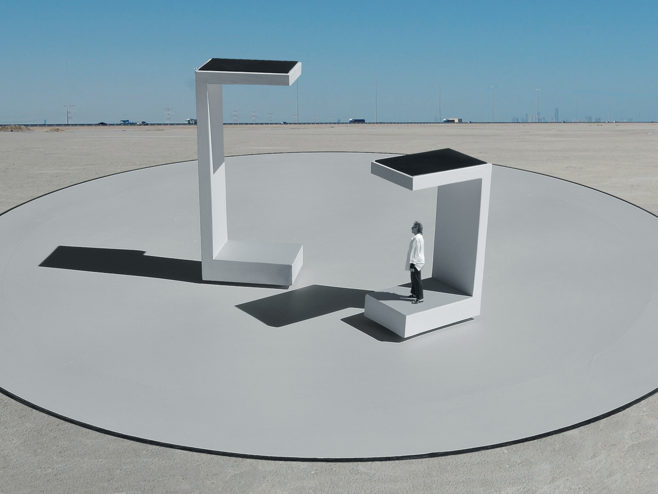
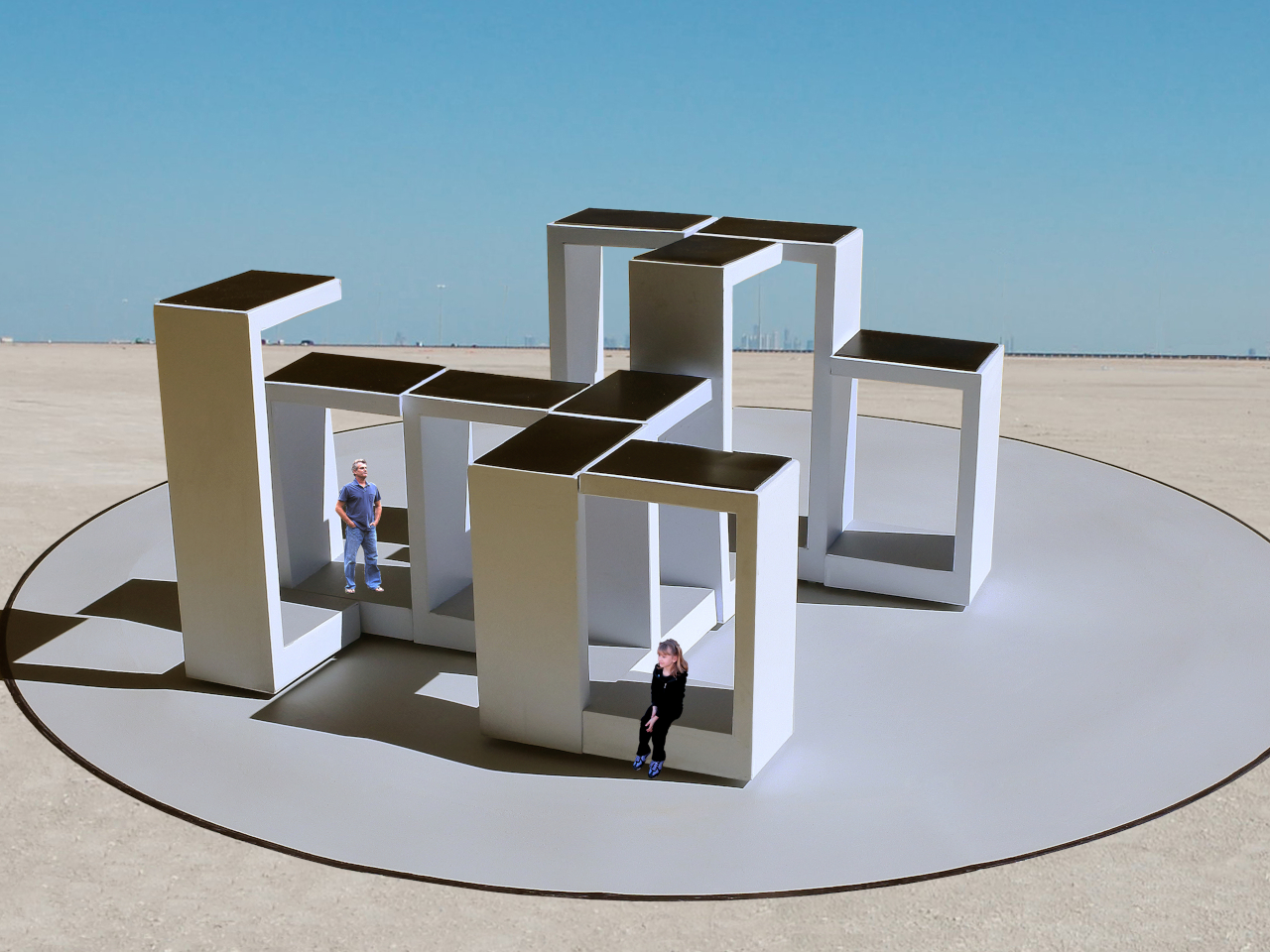
Each section combines a floor, wall, and roof in a large C-shaped profile, like a little shelter with its sides left open. Two versions stand about 10 and 14 feet tall, both four feet wide. Place several together, and those simple shapes could become passages or covered pockets. Separate them again and the same pieces would offer a different place to wander.

Designer: Michael Jantzen

Of course, rearranging those sections wouldn’t mean asking someone to wheel them into position. Each floor would contain its own computer, sensors, motors, wheels, and battery, allowing the entire unit to travel forward, backward, or sideways. The wall and roof would move with it. The robotics aren’t proposed as equipment that builds the installation and then leaves; they’d remain part of the architecture.

Rather than following one permanent floor plan, the modules would use artificial intelligence to decide on their positions through majority agreement. The proposal doesn’t explain how they would evaluate possible arrangements, though. A gap between two units could become a passage, while several facing one another might define a gathering spot. The same pieces could give visitors different ways to use the space.

The roof would do more than shelter whoever stands beneath it. Solar cells on top would recharge the battery inside the floor, keeping the proposed power supply within each moving section. It’s a sensible place to collect sunlight, but the project doesn’t specify how much energy movement would require. Keeping these large pieces in motion isn’t as simple as putting solar panels overhead.

A black perimeter would mark the robots’ territory, containing their movements within a circular arena. Sensors would watch for people or objects entering that space, pausing every module until the area is clear. You wouldn’t be expected to dodge a moving wall while exploring. The intended sequence is straightforward: the pieces rearrange when empty, then hold their positions while visitors are inside.

That rule still needs engineering before anyone could walk in. Detecting a visitor isn’t the same as stopping safely, and the project doesn’t establish braking distances or structural performance. Raised floor sections also need an accessible way in. These are questions for a working installation, rather than reasons to dismiss the idea, but the concept drawings don’t settle them on their own.

For visitors, the pause could make staying put part of the interaction. Sit inside a sheltered corner for a while, and that particular arrangement would remain available until everyone leaves. A later group might find a different route or gathering spot. Someone lingering to finish a conversation would therefore be doing something rather unusual: keeping a version of the architecture from disappearing yet.

The post This Robotic Pavilion Concept Would Change Its Layout Only When Empty first appeared on Yanko Design.
  •  

A Bamboo Music Center Spans Up to 49 Feet Without Columns

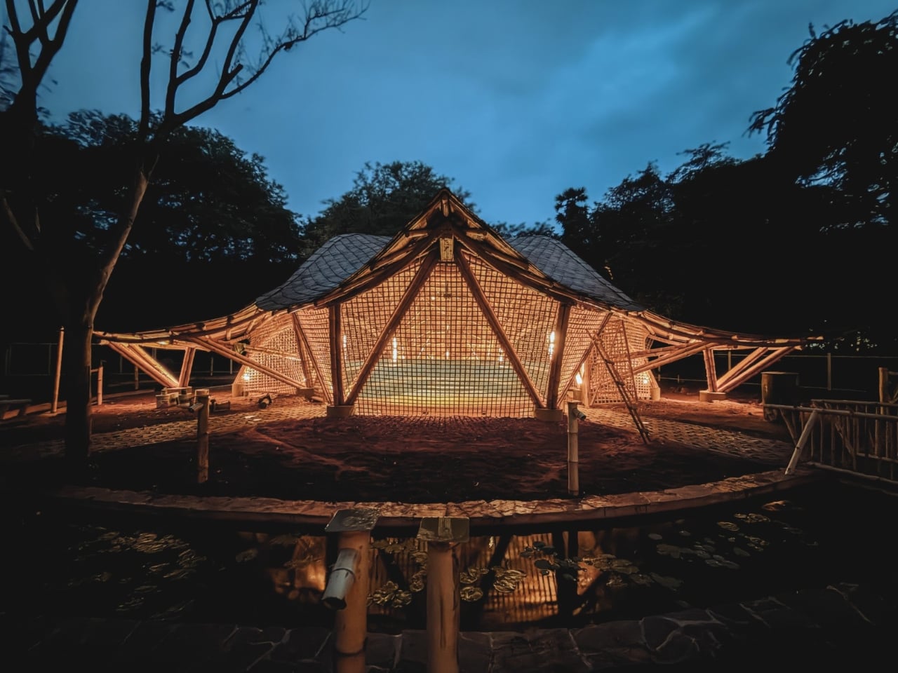
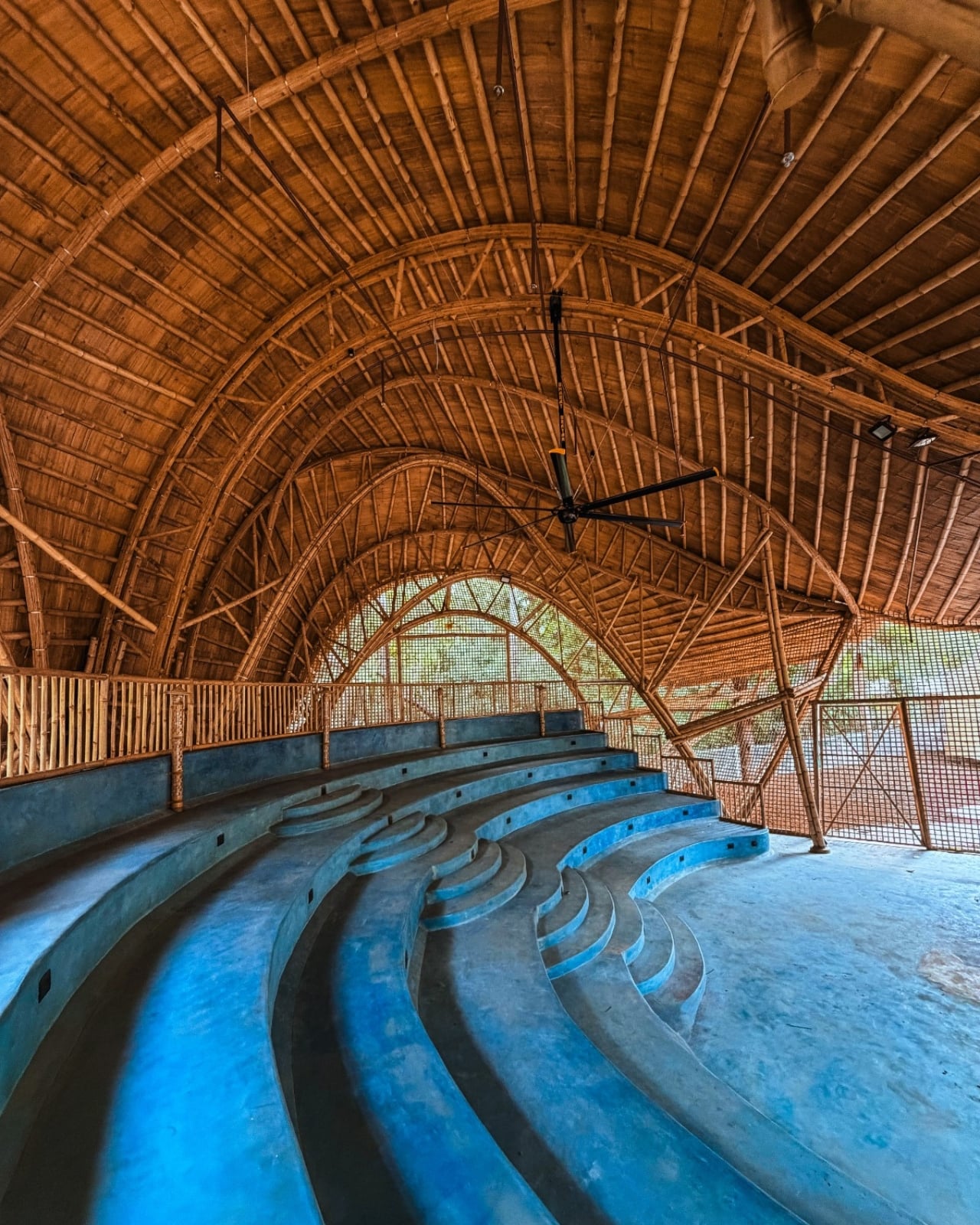
A column in the middle of a music hall means someone has to look around it. That’s a practical problem to solve before worrying about how dramatic the ceiling looks. At the Maestro Ilaiyaraaja Centre for Music Learning and Research in Chennai, India, Ekarth Studio uses bamboo vaults to create spans of up to 49 feet without interior columns. The structure makes room for people to gather, while giving them a roof worth looking up at.

The completed, 10,000-square-foot center at IIT Madras addresses another challenge: bringing music education, research, rehearsal, and recording into one setting. Named for composer Ilaiyaraaja, it belongs to the university’s “Music for All” initiative, whose research interests include acoustics, artificial intelligence, sound synthesis, and instrument design. That’s an unusually broad assignment for a music building. It needs places for focused work, but also room for different disciplines to meet without every encounter becoming a scheduled appointment.

Designer: Ekarth Studio

The roofs give those activities a recognizable home. Ekarth Studio drew their geometry from Bel Patra, the three-part leaf associated with Lord Shiva. Interconnected vaults translate that reference into canopies that rise, dip, and extend over the spaces below. I like that the inspiration has a specific cultural origin. A music center with a curving roof could easily attract a vague explanation about sound waves, but this one has a more deliberate starting point.

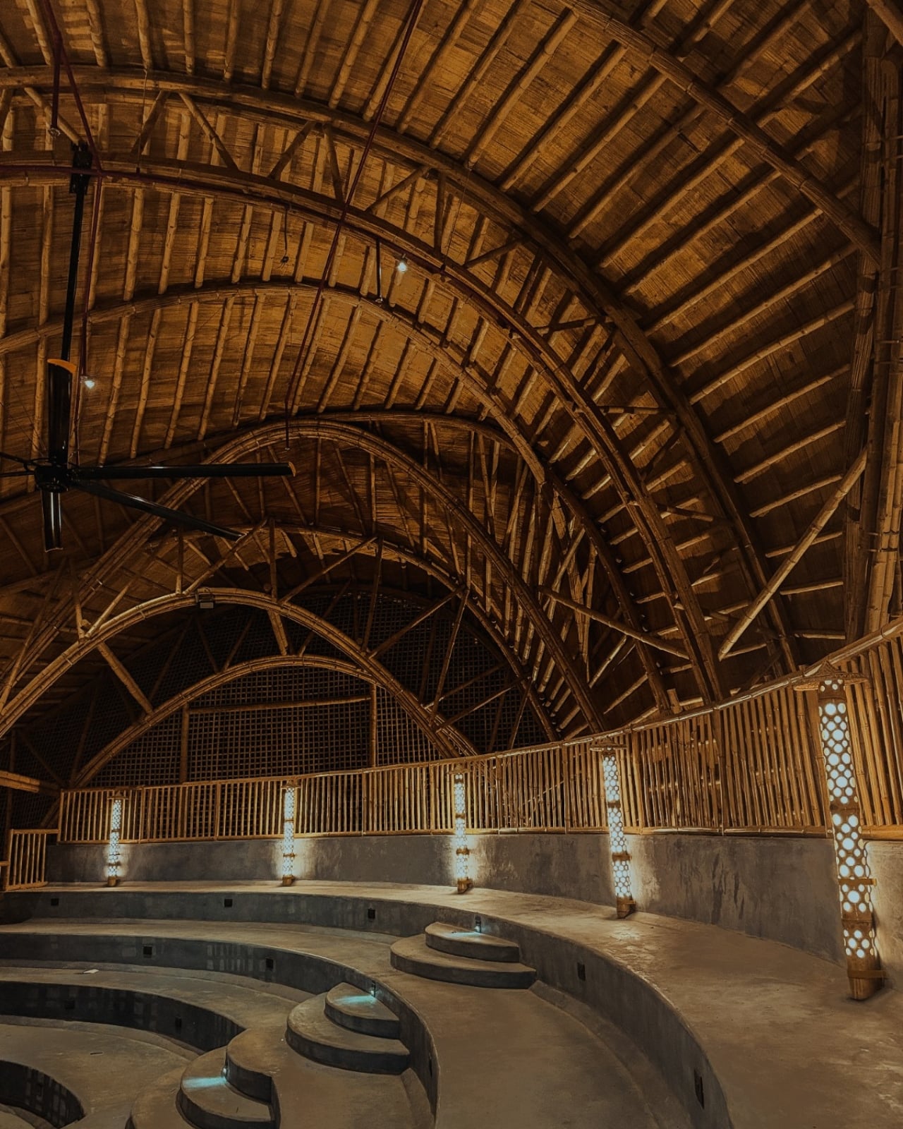
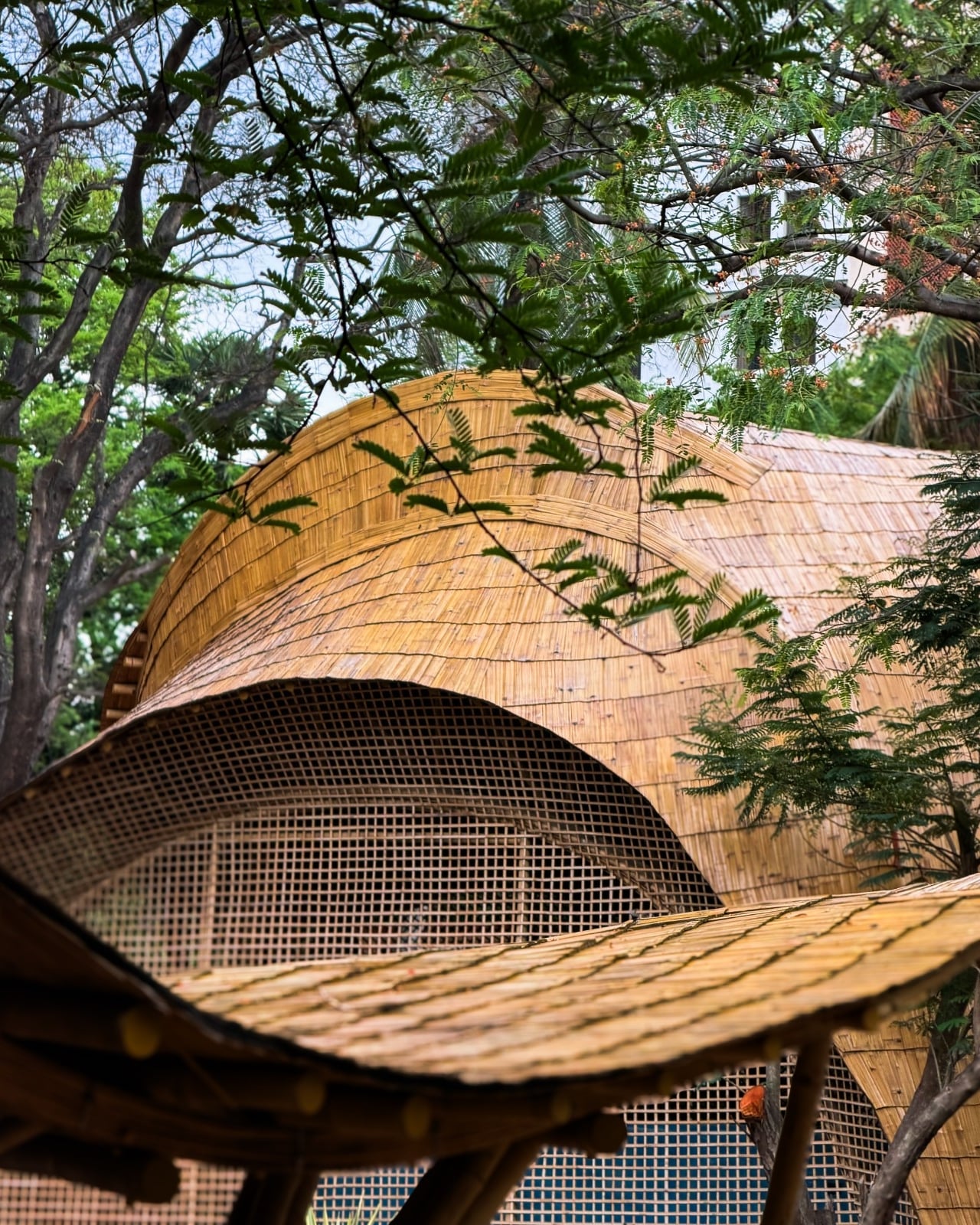
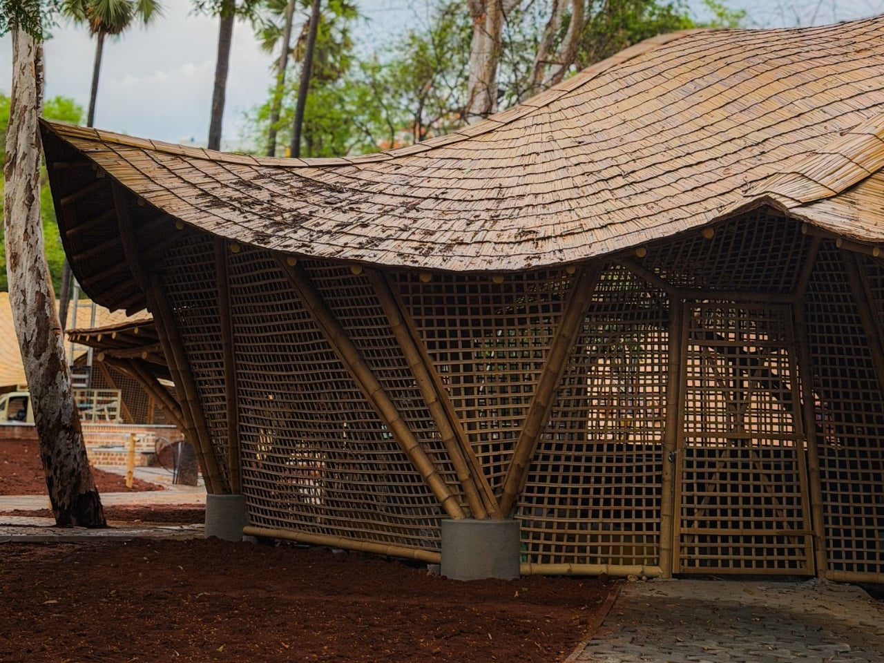
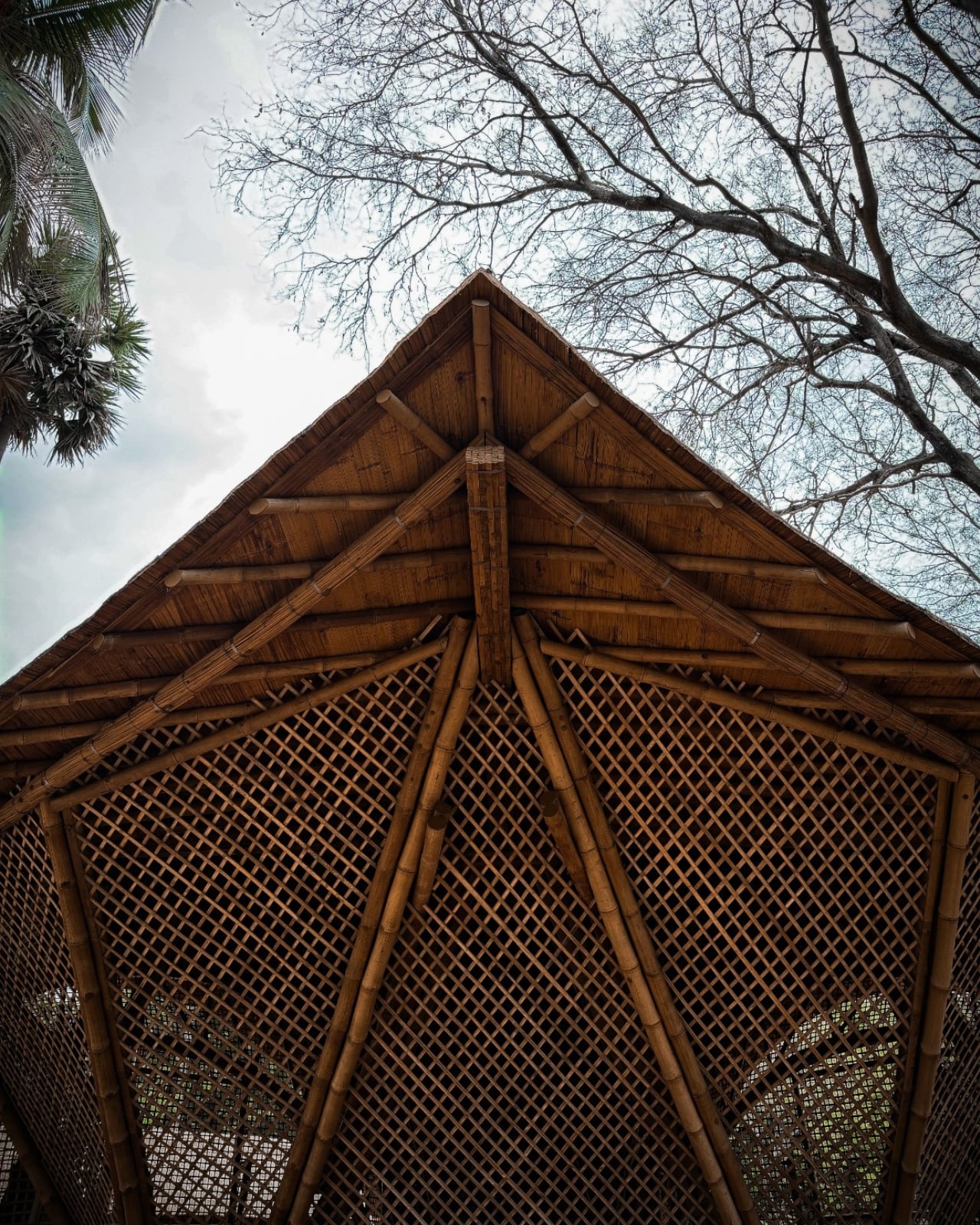
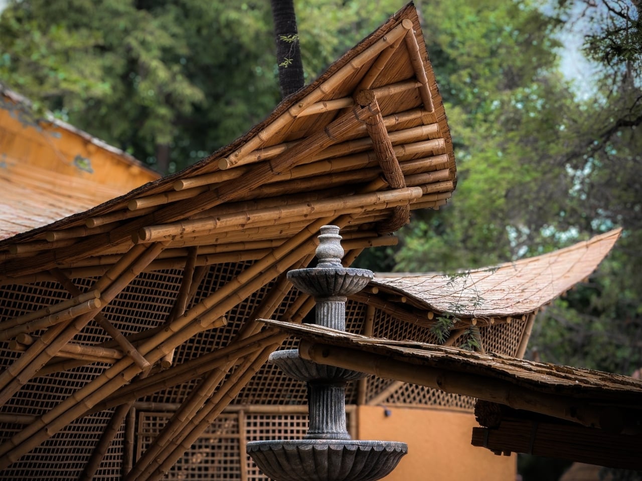
Those curves also involve some serious assembly. The studio describes a structural system combining round bamboo culms, bundled splits, and bundled sticks. Flat bamboo splits are gathered together to form the primary spine beams, rather than relying on a single solid member. Arches reach nearly 30 feet high. The useful distinction is that bamboo carries the roof and establishes its shape. Calling it a decorative finish would miss the most interesting decision in the project.

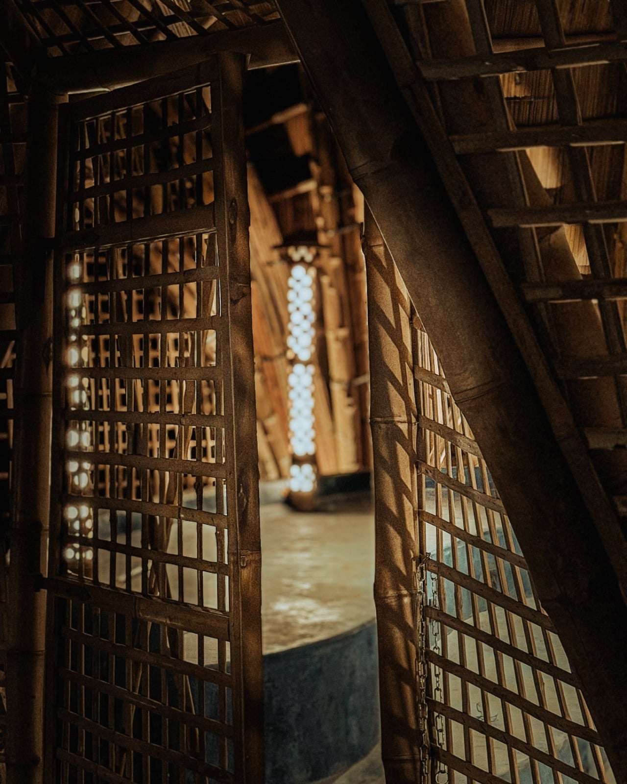
Leaving that construction exposed gives the interiors their character. Ekarth’s material palette includes treated bamboo, lime-based finishes, earthen surfaces, natural-fiber roofing, and handcrafted bamboo weaving. The studio also leaves the bamboo’s connections visible. I’m drawn to buildings that let you follow how they were assembled. Here, the repetition of individual pieces gives the large roof forms a finer scale, so the architecture offers more to examine than its outline from a distance.

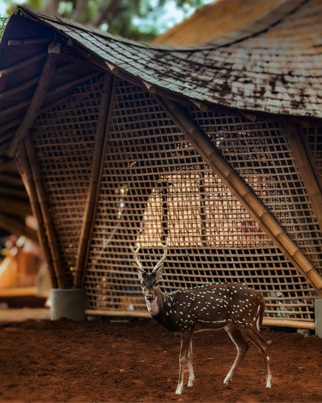
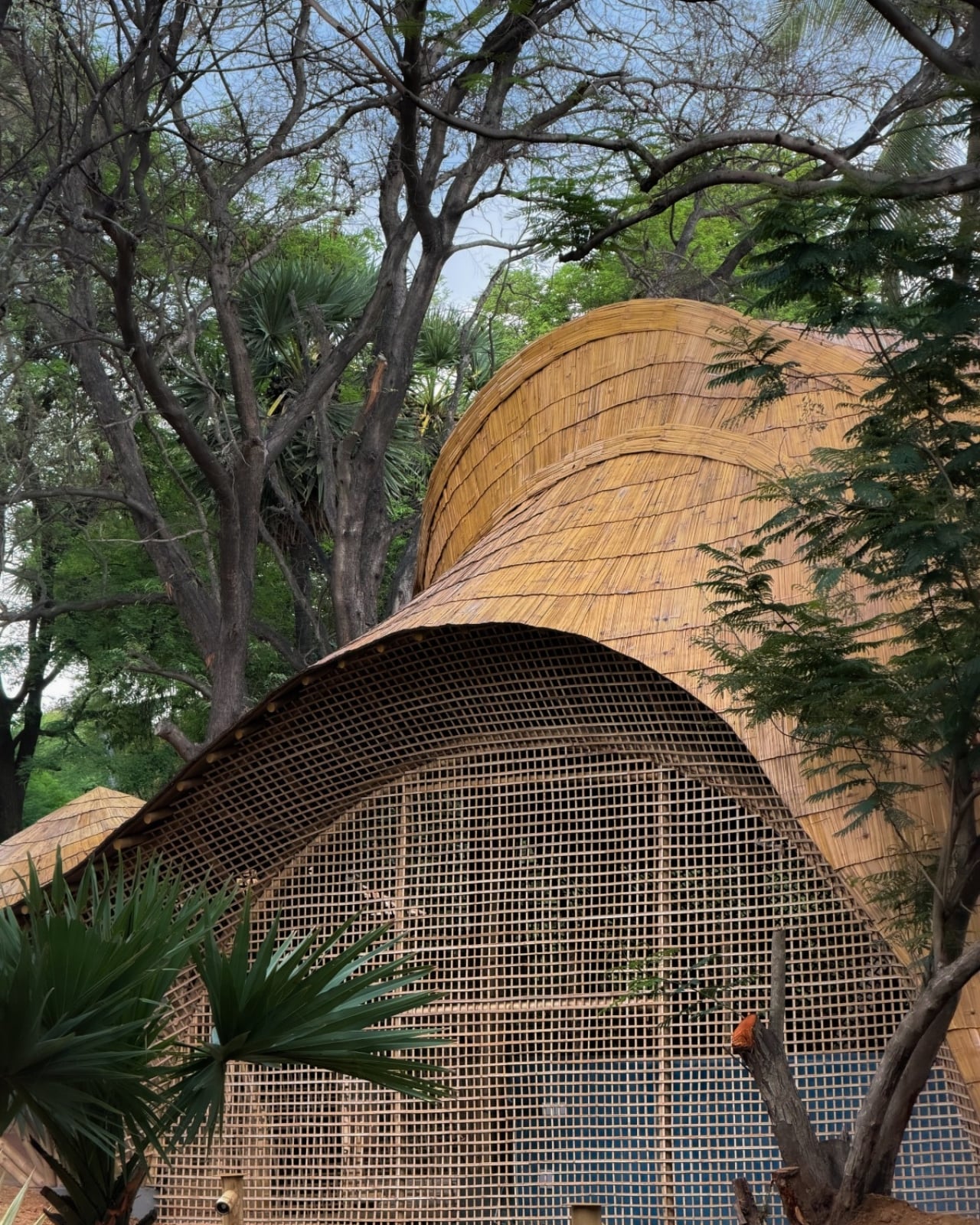
The exterior photographs show roof edges sweeping outward above bamboo lattice screens, with trees close to the pavilions. The small, regular openings in those screens contrast with the broad curves overhead. They make the enclosure look less abrupt than a blank wall would. Ekarth’s plan connects classrooms and other spaces with courtyards and shaded outdoor areas, giving the center an architectural relationship with its surroundings that goes beyond putting landscaping around a finished building.

The people who assembled it deserve attention, too. According to the studio’s account, artisans split, bent, bundled, and joined the bamboo primarily with basic carpentry tools, while structural engineering adapted those processes for an institutional building. Ekarth reports an 11-month construction period with limited use of heavy machinery. That timeline is noteworthy, but I’d give equal billing to the craft. Its contribution remains legible in the finished architecture rather than disappearing behind another surface.

A beautiful bamboo structure doesn’t, by itself, establish how well a recording room isolates sound or how comfortable the building stays throughout the year. Those are separate performance questions, and the published project descriptions don’t provide measurements that settle them. The same restraint applies to sustainability. Natural materials and a less machinery-intensive construction process are choices worth discussing, but they aren’t enough to calculate the building’s environmental footprint or long-term maintenance demands.

Even with those questions open, the design gives me a clear reason to pay attention. The central amphitheater-like gathering space puts rehearsal, performance, and collective learning beneath the same expressive structure. That feels like an appropriate investment for a music center: a memorable room whose defining gesture also keeps its floor open. The ceiling earns its visual complexity by leaving more usable space underneath, where the people and the music belong.

The post A Bamboo Music Center Spans Up to 49 Feet Without Columns first appeared on Yanko Design.
  •  

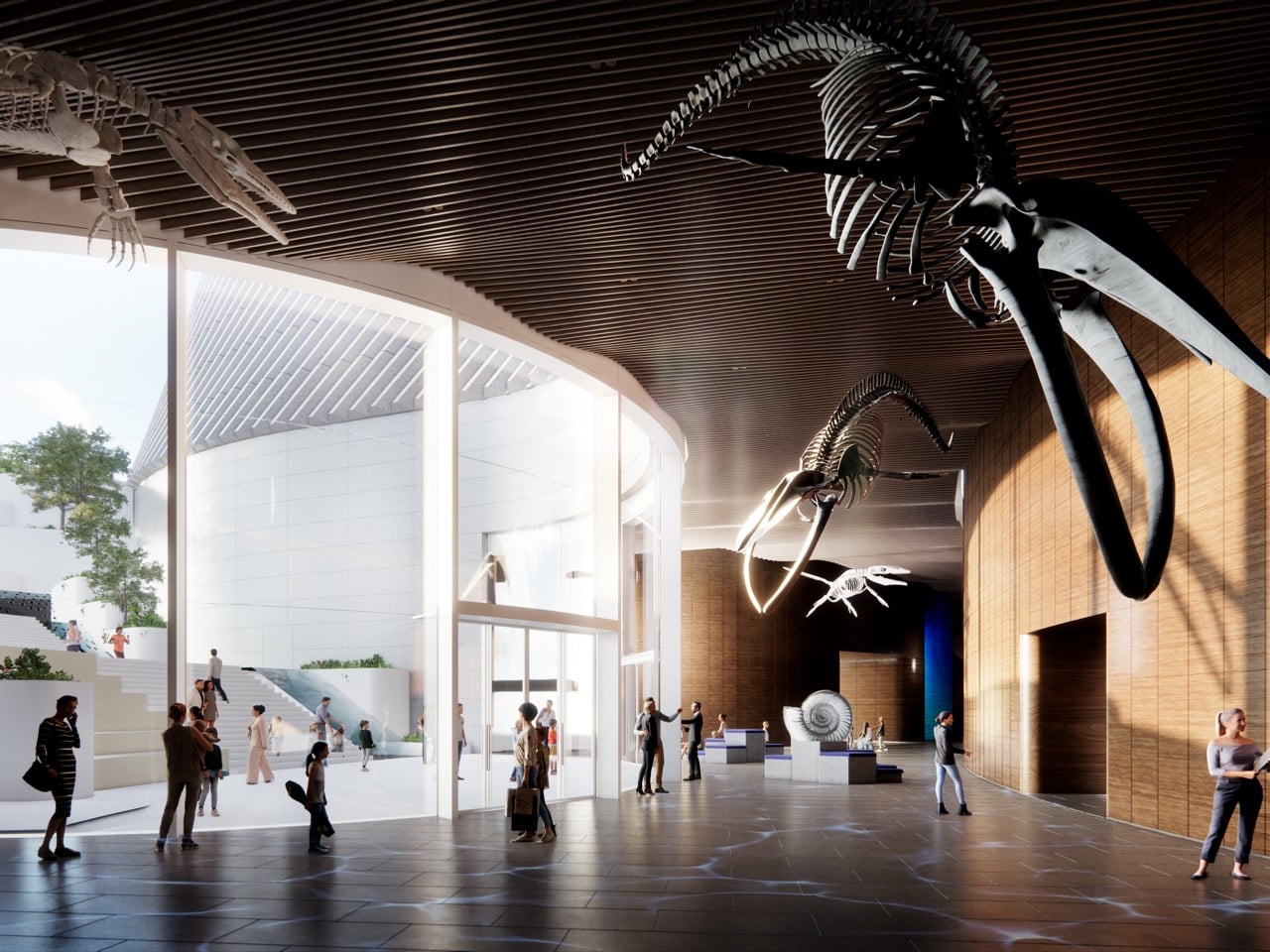
The Shenzhen Natural History Museum looks like it was carved by water instead of architects

Most natural history museums look like banks. Big stone steps, columns out front, and a lobby so grand you feel underdressed for a trip to see a stuffed moose. 3XN’s Shenzhen Natural History Museum looks like a piece of riverbank that wandered into town and decided to stay. Its curving walls bend and loop like a river cutting oxbows across a floodplain, with gardens planted on top where the water should be. It’s easily the friendliest-looking museum I’ve seen in a while, and I mean that as a huge compliment.

The museum opened on July 28, 2026, beside Yanzi Lake in Shenzhen’s Pingshan District, six years after we first saw it as a set of competition renders. Danish studio 3XN led the design alongside B+H Architects and local firm Zhubo Design, calling the scheme Delta after the river landscapes that inspired it. It covers roughly 1.13 million square feet (105,300 square meters), making it South China’s largest natural history museum. The roof is a public park you can stroll across without a ticket, and the galleries sit inside five enormous cones. One of those interior spaces holds a spiral staircase so swoopy it could pass for a Frank Gehry sketch.

Designer: 3XN, B+H Architects & Zhubo Design

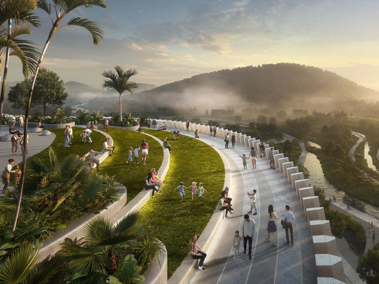
Seen from above, the building is pure river doodle. Its walls swing out in long, lazy bends and then curl back in, leaving crescents of lawn and trees tucked inside each loop like oxbow lakes that dried up and became parks. Five rounded volumes sit along the curve, a bit like smooth stones the current forgot to carry away. Paths trace the tops of the walls the way a riverside trail follows the water. The footprint was drawn from the bends of the nearby Pingshan River, so the building is basically doing an impression of its neighbor.

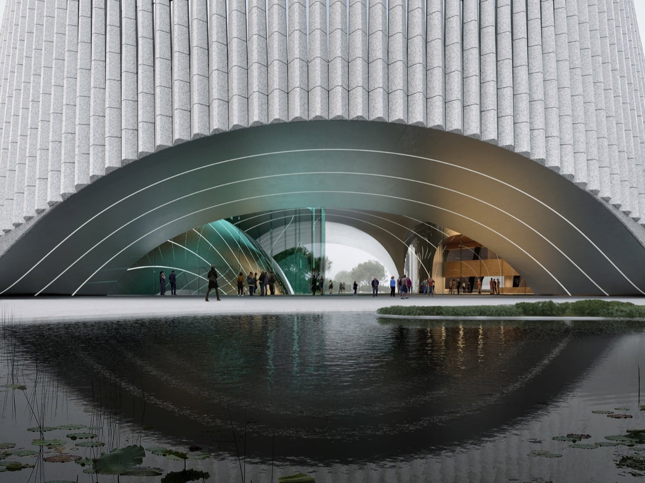
The walls are built from vertical fins of Shandong granite, packed so tightly they read like rock that rain has been scratching at for a few thousand years. Those fins shade the galleries while still letting daylight slip through, which counts for a lot in Shenzhen’s subtropical heat. At sunset the stone turns warm and peachy, and every ridge throws a thin stripe of shadow down the curve. Most of the panels are standardized, so a damaged one can be swapped out without anyone noticing. The overall effect is a cliff face, which feels about right for a building that stores fossils for a living.

Cut into that stone are wide arched openings that look like the mouths of sea caves. The main one sits on the south side, linking the busy street to the wetland park behind the museum, so the front door doubles as a shortcut into nature. Reflecting pools stretch out in front, giving the arches mirrored twins in the water. Walking in should feel like ducking under a rock overhang on a hike, minus the risk of bumping your head. 3XN describes these openings as fissures in the cliff, a fancy geology word for a crack that happens to look cool.

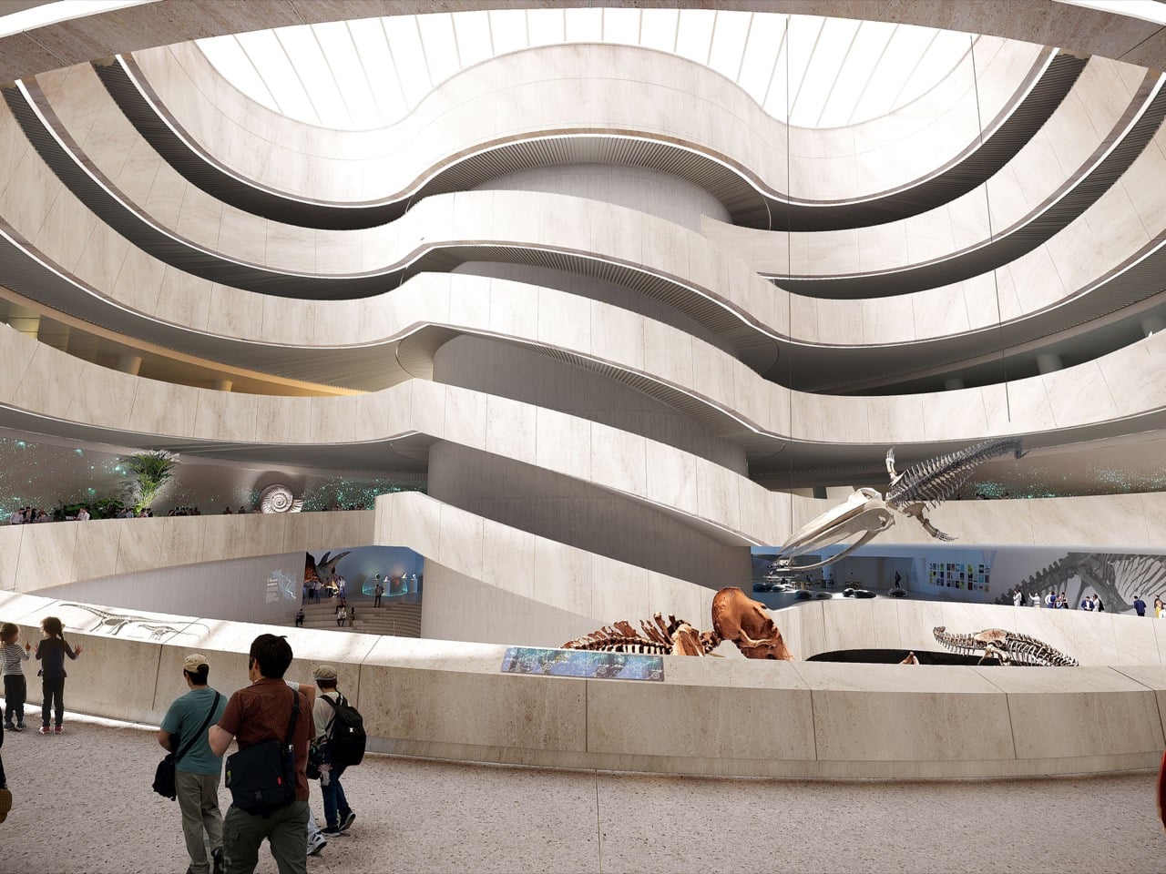
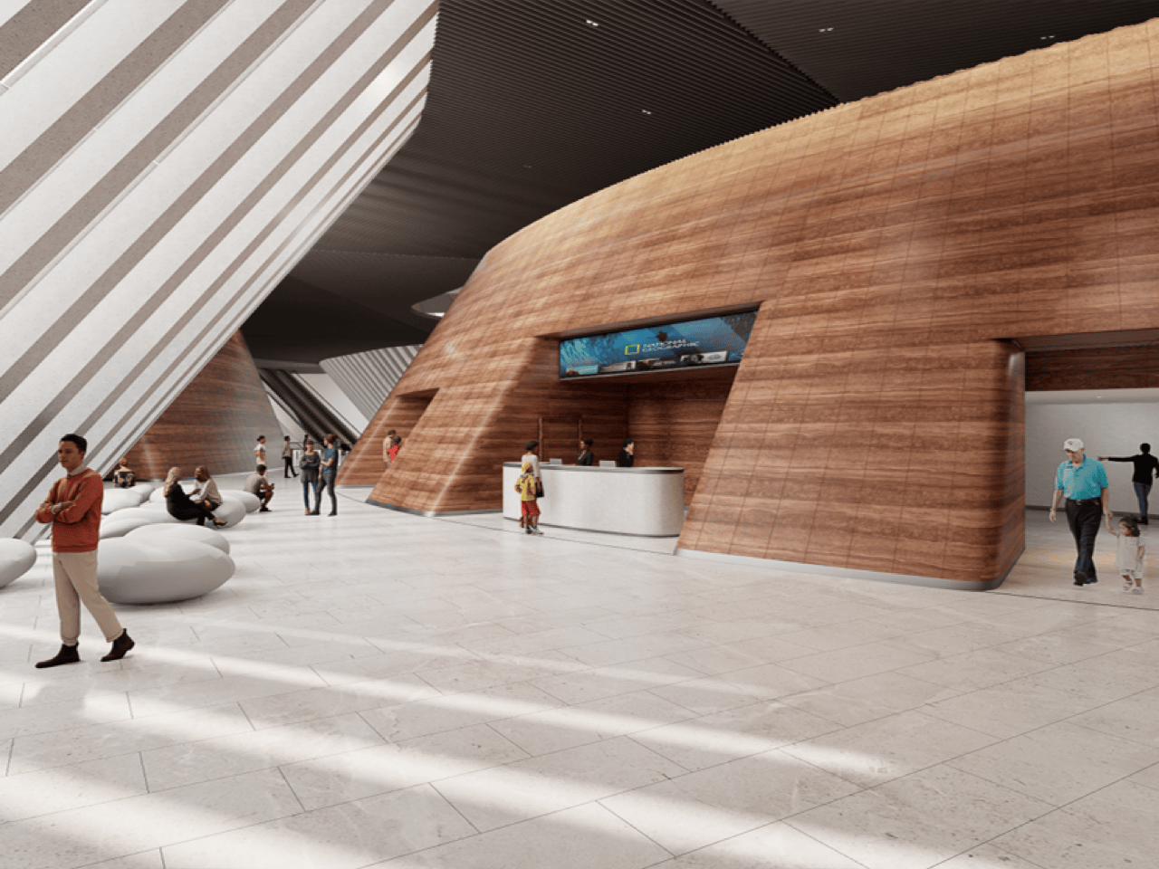
Inside, the gray granite gives way to golden marble. Each of the five cones is wrapped in wood-grain marble from Guangxi, with stripes that look like layers of sediment or, if you’re hungry, a really nice slice of tiramisu. Between the cones, a central atrium rises toward a big rooflight, and a staircase spirals up around the core in wavy, uneven rings. This is the Gehry moment, all ripples and swoops, like the Guggenheim’s spiral after a double espresso. The architects named the atrium the Tree of Life, and the stair really does seem to grow upward, branching off onto each floor.

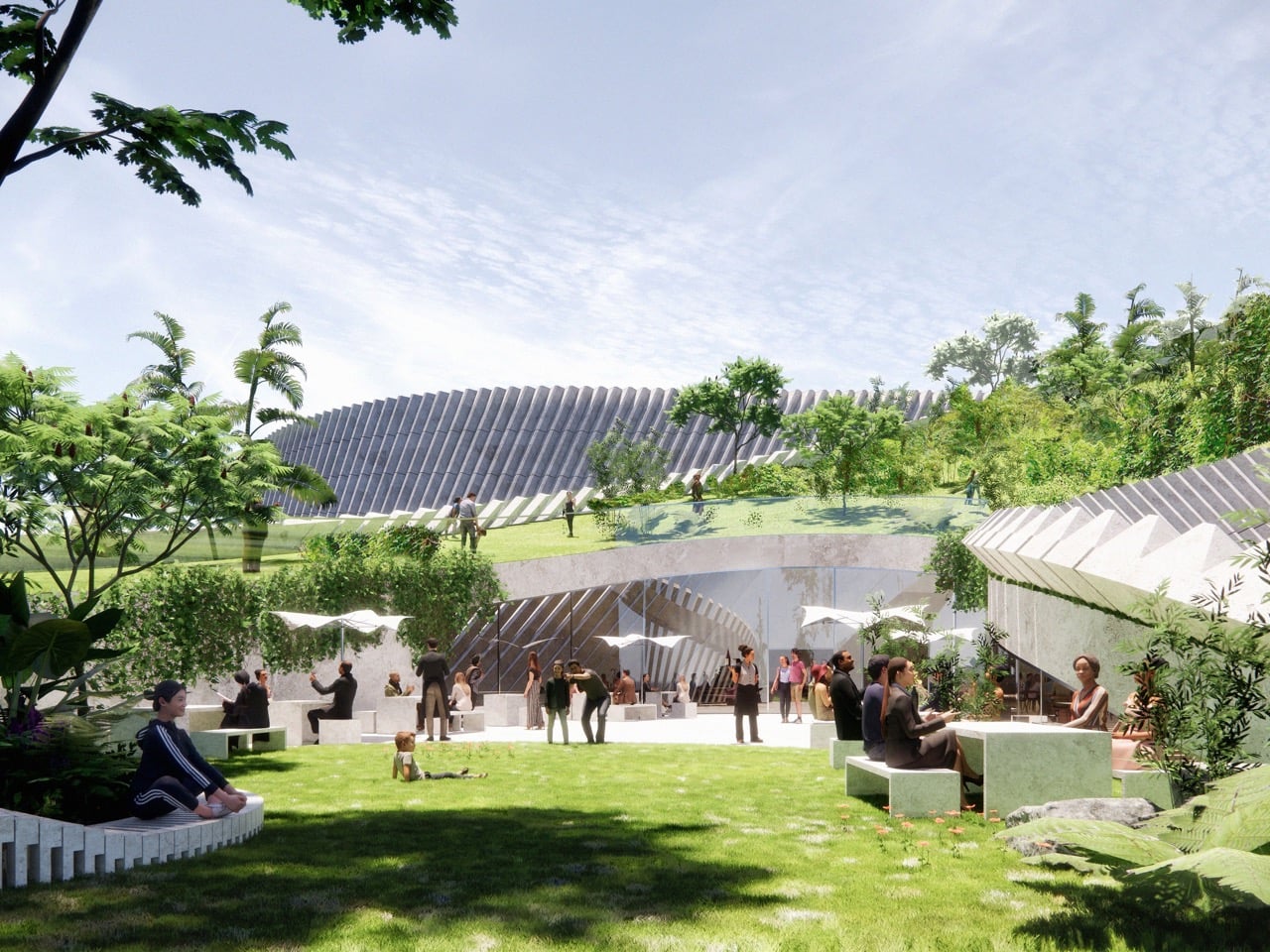
The roof slopes up from the ground like a grassy hill, so getting onto it feels about as formal as climbing a park mound. It’s split into five garden zones, from succulents and tropical plants to species pulled from Chinese literature, which is a very poetic way to sort a lawn. At its tallest the building reaches 118 feet (36 meters), but about half of it stays low to match the school and convention center next door. That keeps the mountain views to the north open for everyone, rooftop picnickers included. The roof is also set up for nighttime stargazing, which might be the best use of a museum ceiling yet.

Shenzhen has a reputation for building fast and building big, and plenty of its megaprojects shout to get noticed. This one speaks in curves, warm stone, and a whole lot of grass, which makes a 1.13-million-square-foot building feel oddly approachable. It also suits the job, since the exhibits inside trace how water, rock, and time shaped everything on the planet. The architecture tells that same story from the outside before you read a single label. I’d bet plenty of kids leave remembering the dinosaurs, and just as many remember the afternoon they rolled down the museum.

The post The Shenzhen Natural History Museum looks like it was carved by water instead of architects first appeared on Yanko Design.
  •  

Two Bedrooms, Two Bathrooms, and a 700-Square-Foot Tiny Home That Doesn’t Feel Tiny

Some homes earn their square footage. The Acadia by Sweet-Haus Tiny Cabin Company is one of them — a 700-square-foot, single-level home that packs two bedrooms and two full bathrooms into a footprint that feels genuinely generous. It sits on a quad-axle trailer, stretching 50 feet in length and 13.6 feet wide, which puts it firmly in park model territory — the kind of home you place once and actually live in.

Sweet-Haus builds out of Chesnee, South Carolina, and the Acadia carries that craftsmanship through every detail. The open-concept layout keeps the living, dining, and kitchen spaces connected — no wasted hallways, no chopped-up rooms. Large black windows flood the interior with natural light, and the black LowE 3 windows with argon gas fill-in do real thermal work, keeping the home efficient without sacrificing the look. The crinkle-cut matte roof and Advantech subfloor round out a build quality that punches well above the $176,500 MSRP.

Designer: Sweet-Haus Tiny Cabin Company

The kitchen is a full-size one, not a compromise version. It comes with a Haier stainless steel cabinet-depth fridge with bottom freezer, a 24″ Haier range, and an 18″ Haier dishwasher — a lineup that treats cooking as something that actually happens in this home. The cabinetry is custom Ergo-craft® millwork, milled from 3/4″ solid wood with soft-close hardware and custom-made pulls. It reads like furniture, not filler.

Both bedrooms accommodate a queen or king bed base with built-in storage drawers underneath, and each room connects to a full bathroom with a large vanity. The bathrooms offer a choice between a standalone shower or a tub/shower combo — a rare option at this scale. R19 insulation runs through the ceilings and floors, and a three-head HVAC system keeps the climate dialed in room by room. The Acadia is HUD-certified, which opens up financing options and simplifies placement in communities across South Carolina and North Carolina.

What Sweet-Haus has built with the Acadia is a home that doesn’t negotiate with itself. Most tiny homes ask you to give something up — ceiling height, counter space, closet room.

This one has built-in closets, two full baths, and a kitchen you’d actually cook in. At 700 square feet, it’s the version of tiny living where the word “tiny” stops mattering entirely.

The post Two Bedrooms, Two Bathrooms, and a 700-Square-Foot Tiny Home That Doesn’t Feel Tiny first appeared on Yanko Design.
  •  

This 20-Foot Tiny Home on Wheels Proves Better Design Beats More Square Footage

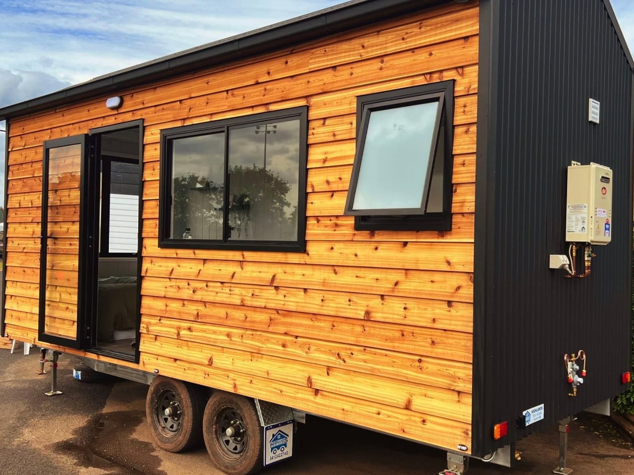
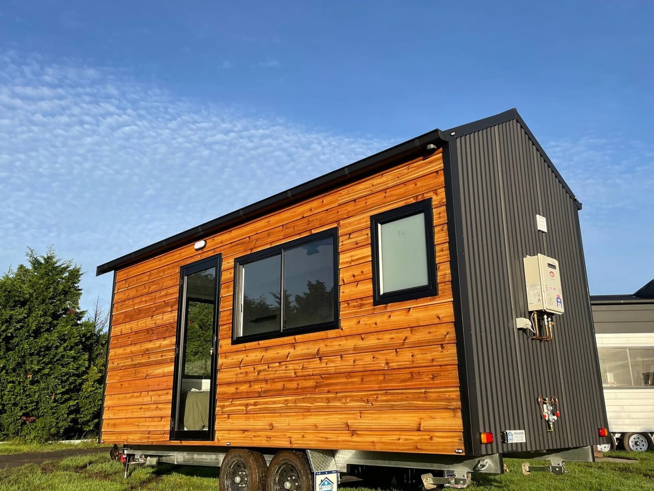
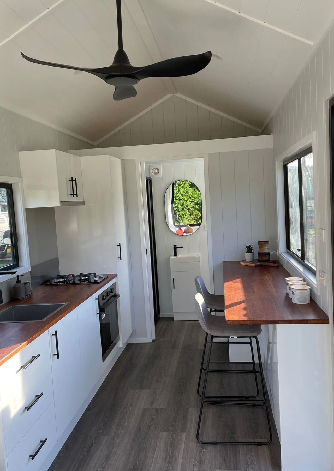
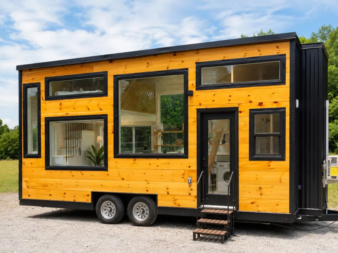
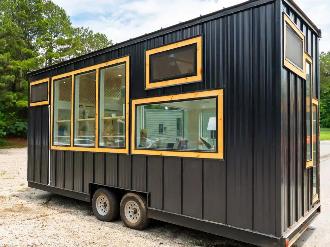
Not every home needs to shout to be heard. Highlands Tiny Homes, based in New South Wales, has built that idea into every corner of the Sierra — a single-level tiny home on wheels that measures just 6 meters in length and does absolutely nothing to apologize for it. It sits on a double-axle trailer and wears its compact footprint like a statement, not a compromise.

The exterior leans into a woodland aesthetic without overdoing it. A pitched corrugated roof, aluminium sash windows, and a considered combination of cladding and Colorbond accents give the Sierra a look that feels rooted — visually grounded in its surroundings regardless of where it’s parked. It’s the kind of exterior that photographs well in a pine clearing or beside a mountain road, reading more like an architect’s bush retreat than a prefab box.

Designer: Highlands Tiny Homes

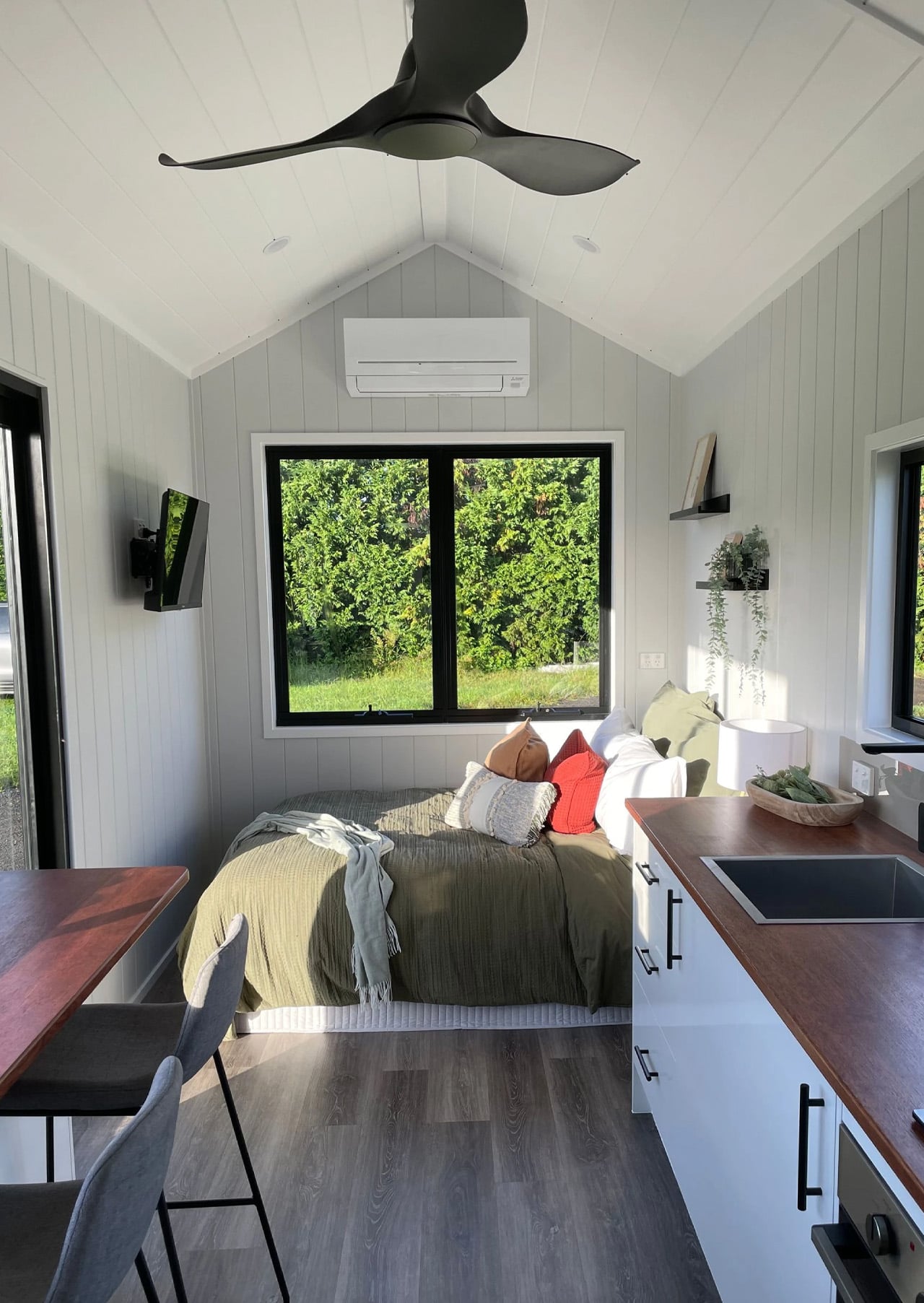
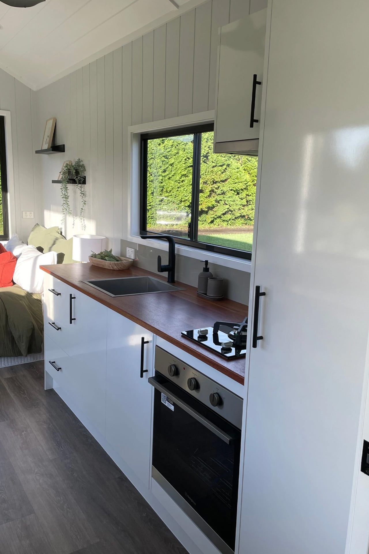
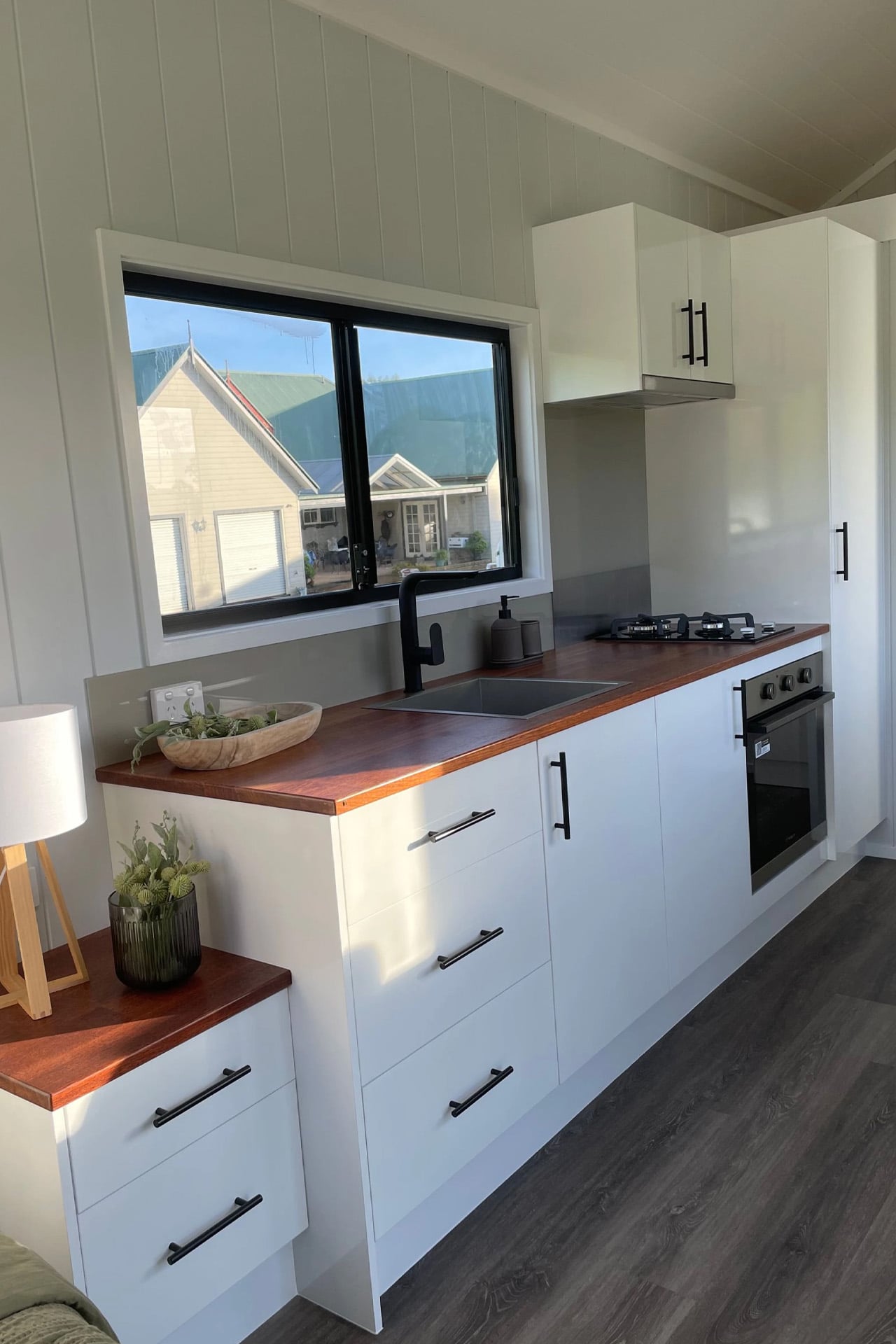
Inside, the single-floor layout prioritizes openness over segmentation. White walls reflect the natural light that pours in through generously sized windows, while wooden countertops and bar seating in the kitchen add warmth without clutter. A ceiling fan overhead keeps things casual. The Sierra isn’t chasing the maximalist tiny-home trend of stacking every possible feature into the ceiling — it’s lean by design, and that restraint is exactly what makes it feel livable.

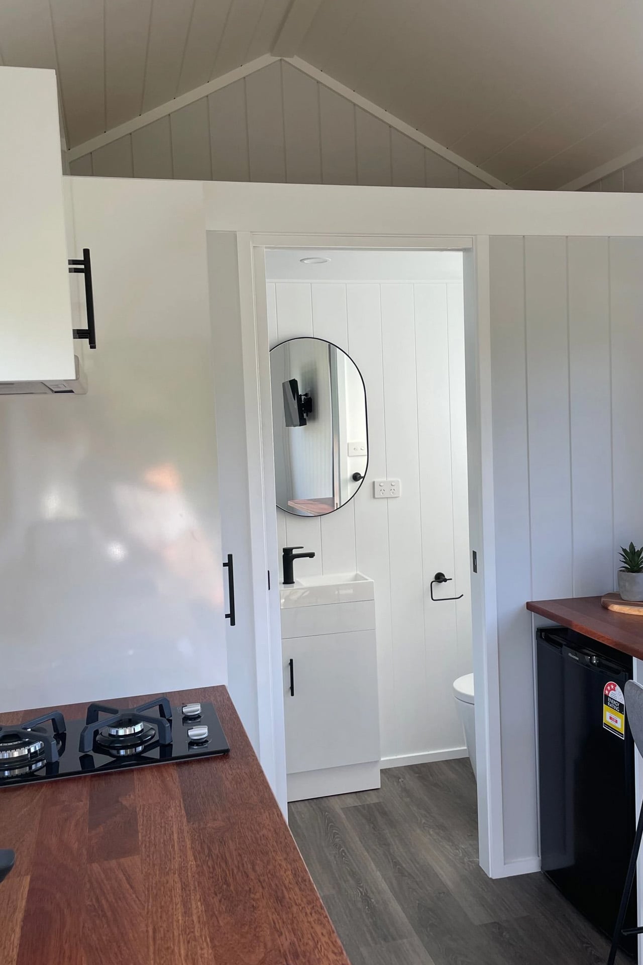
The kitchen claims a meaningful portion of the floor plan, which signals a priority worth noting: this is a home built for people who actually cook, not just for people who want to say they live small. The double bed doubles as a day bed and lounge area, keeping the space flexible without demanding a furniture reconfiguration every morning. The bathroom includes a glass-enclosed shower that feels considered rather than an afterthought.

Priced from US$59,000 including GST, the Sierra 6.0 sits at an entry point that makes serious compact living genuinely accessible. For those needing slightly more room, a 7.2-meter version is also available – same DNA, a little more breathing room.

The Sierra isn’t designed to impress at a trade show. It’s designed to work on a Tuesday morning when you’re making coffee and watching the light move across a wooden countertop. Highlands Tiny Homes has found a rhythm in the Sierra that many larger builds never quite locate — the specific calm that comes from a space that knows exactly what it is and refuses to be anything else.

The post This 20-Foot Tiny Home on Wheels Proves Better Design Beats More Square Footage first appeared on Yanko Design.
  •  

A 1908 New York building’s discarded fragments got turned into furniture instead of being demolished

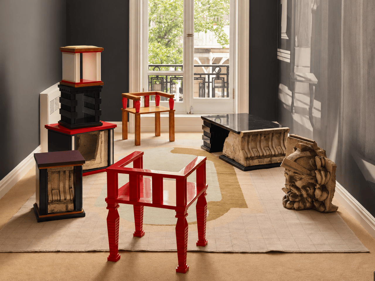
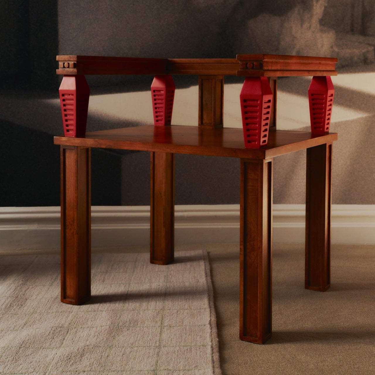
A renovation across the street from Rafael Prieto’s studio offered an unusually good view of his next project. As decorative pieces came off the facade of a Tribeca building, he arranged to save sixteen that were headed for disposal. Most of us would have watched the scaffolding go up and returned to our emails. Prieto, a Mexico-born designer and creative director based in Tribeca, had other ideas. The result is a furniture exhibition that keeps the building’s ornament alive in some very unexpected forms.

Prieto spent time with the fragments before turning them into the starting point for tables, chairs, and sculptural objects. Weathered ornament sits against painted birch, sometimes tucked inside a crisp new frame. The resulting furniture keeps its New York address close, even when its shape heads somewhere unexpected. Some pieces carry the actual stone; others borrow only its curves, grooves, and proportions. It is a show that rewards looking twice.

Designer: Rafael Prieto

The building across the street is 366 Broadway, now known as Collect Pond House, a twelve-story Beaux-Arts structure designed by Frederick C. Browne in 1908. It was once home to the Royal Typewriter Company, then became a residential co-op in 1979. The facade is densely ornamented: copper cornices, Greek key detailing, marble columns, and keystones carved into bearded faces that have been watching Tribeca change for over a century. A recent multi-year restoration replaced and conserved 65 terra cotta units. A handful of the pieces removed during that process did not make it back onto the building.

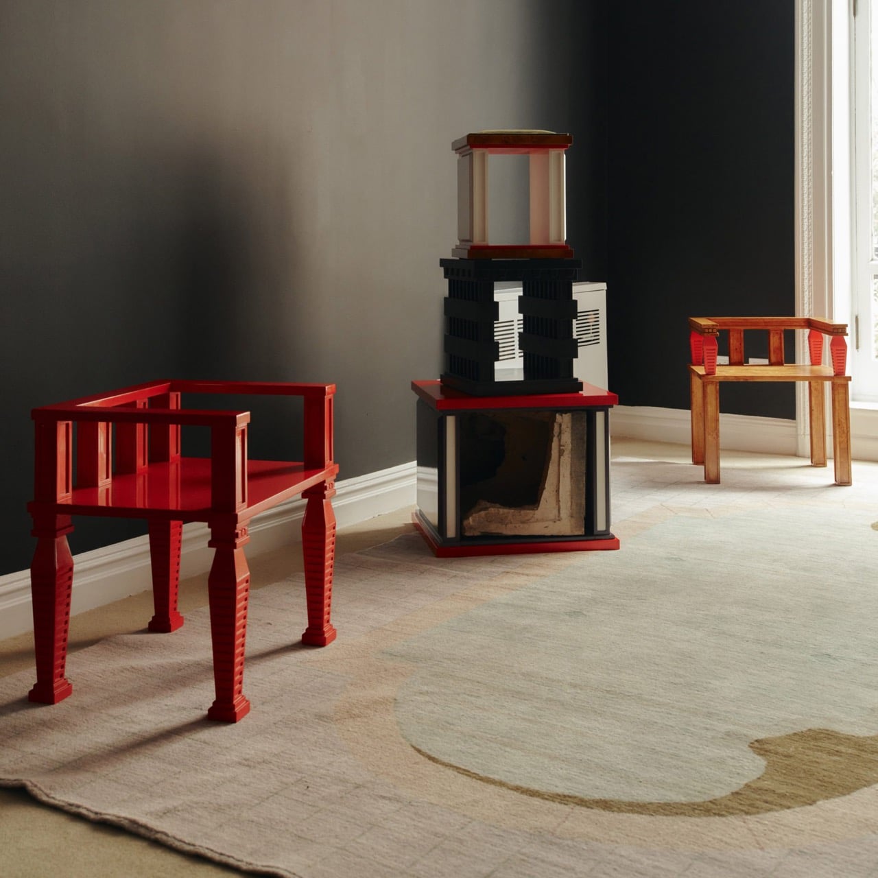
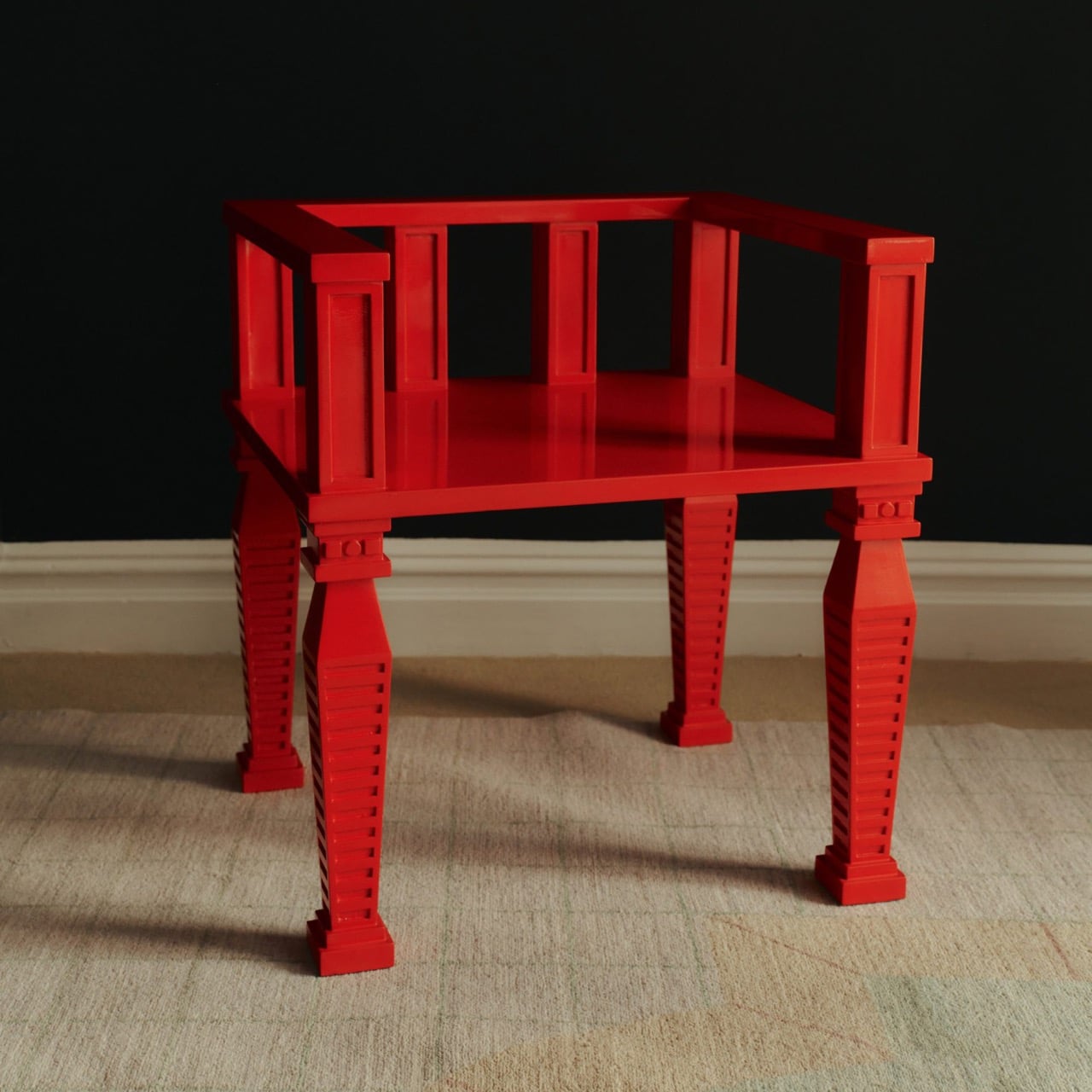
Before cutting anything, Prieto lived with the fragments in his studio for roughly a year and a half. He photographed and scanned each contour and ornament, then layered those images to pull out shapes and combinations that could inform new work. That process produced a design vocabulary rather than any direct copy of the originals. The stepped, ribbed profiles that climb the legs of the red lacquered chair came directly from this translation, somewhere between column fluting and abstracted skyline. It is a method closer to archaeology than furniture-making.

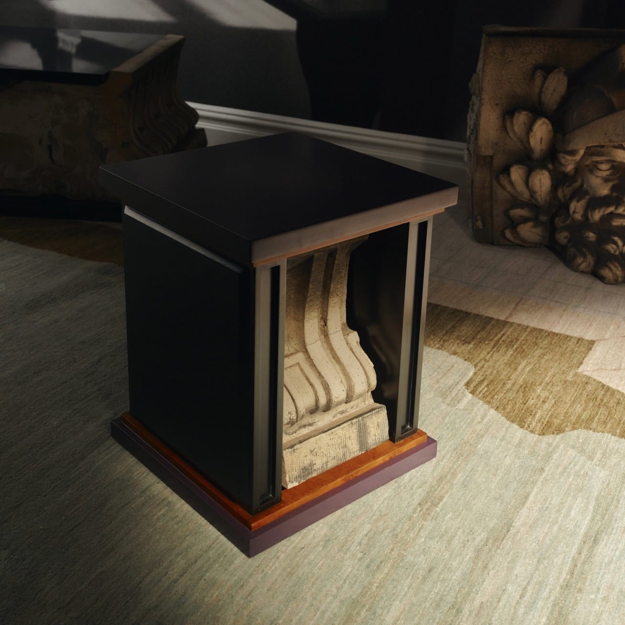
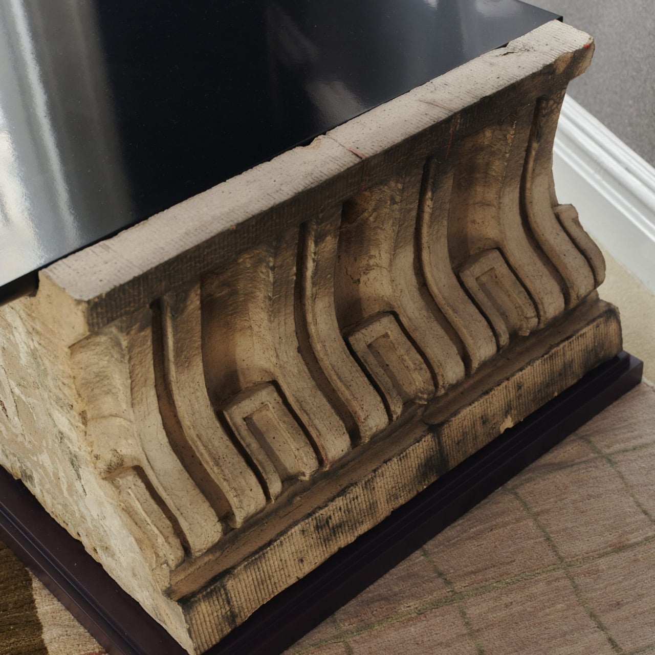
One of the standout pieces has a large carved stone cornice block sitting below a flat black painted tabletop, doing actual structural work. The stone is pale, dense, and loaded with repeating scroll forms, carrying roughly a century of New York weather on its surface. Another piece cages a smaller fragment between vertical black bars inside a cube-shaped form, the stone visible through the gaps like something on display. The medium listing for several works at the gallery confirms “Architectural Fragment” as a named material alongside painted birch. Not every piece carries original stone; some borrow only its shapes.

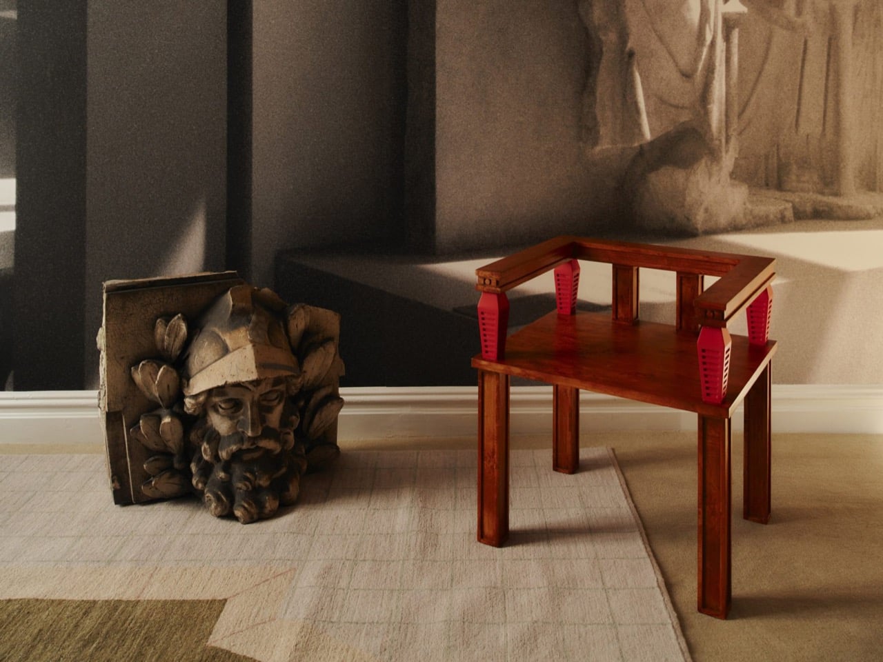
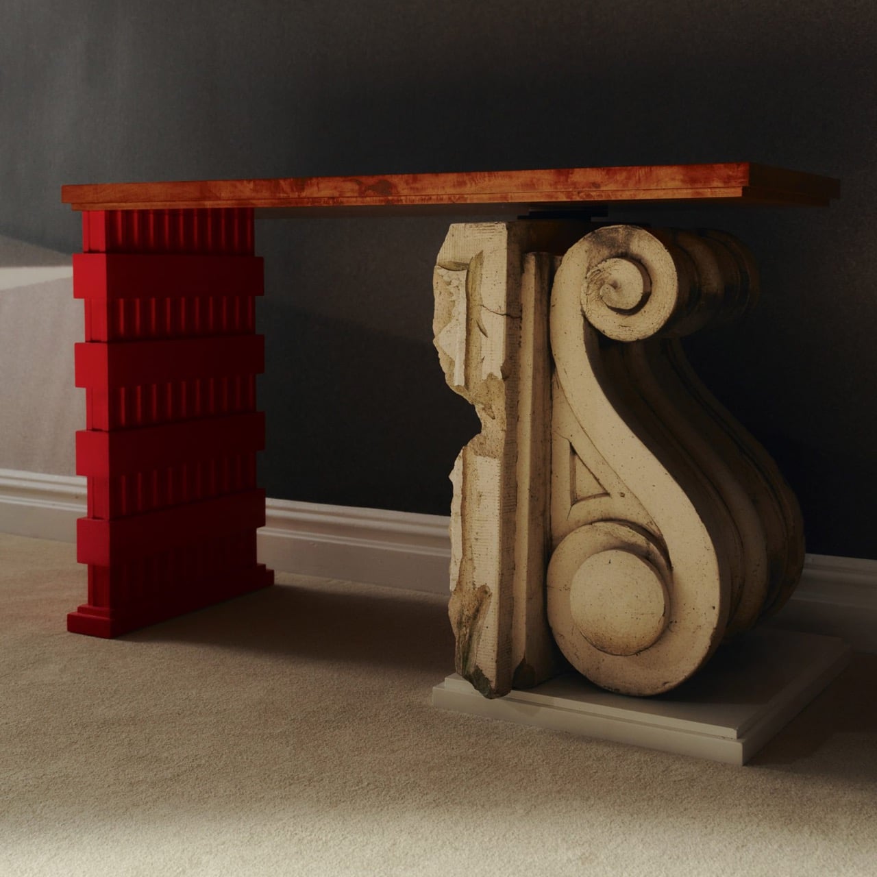
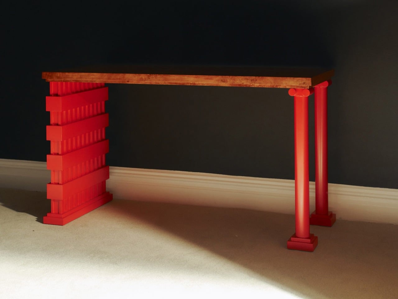
The all-red lacquered chair is the most confident piece in the show, its legs built from stacked, stepped planes that scanning and layering pulled from 366 Broadway’s fluted piers and molded profiles. Its natural birch counterpart deploys the same vocabulary in warm wood, swapping lacquer for grain and adding red geometric arm brackets at the joints. A console table makes the argument most literally: one end sits on a fabricated red plinth, the other rests on an actual salvaged Ionic stone volute, intact and weather-stained. The two supports are not supposed to match. The gallery describes this contrast as the central thread: the hard and the soft, the historic and the contemporary, running through every piece.

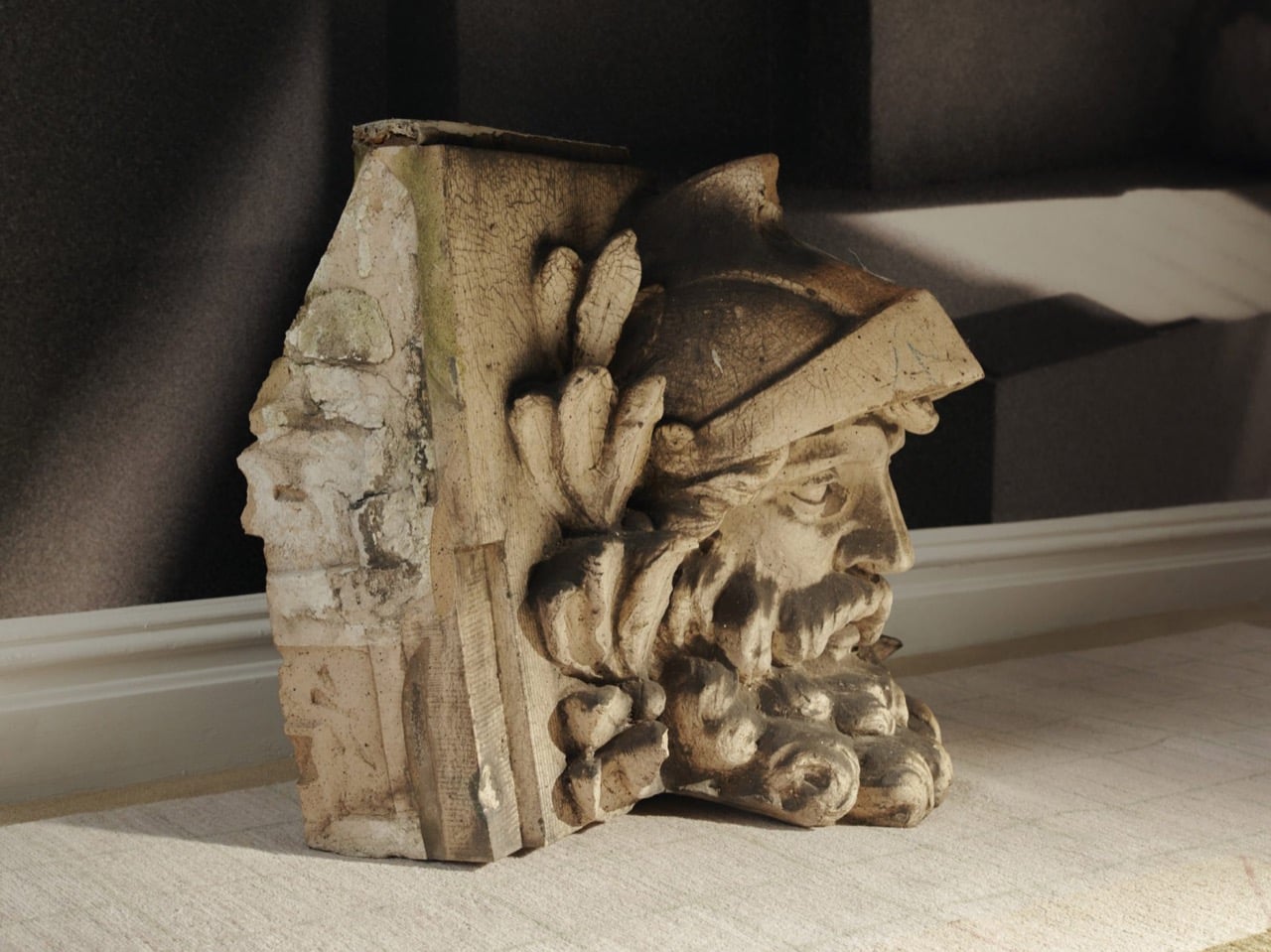
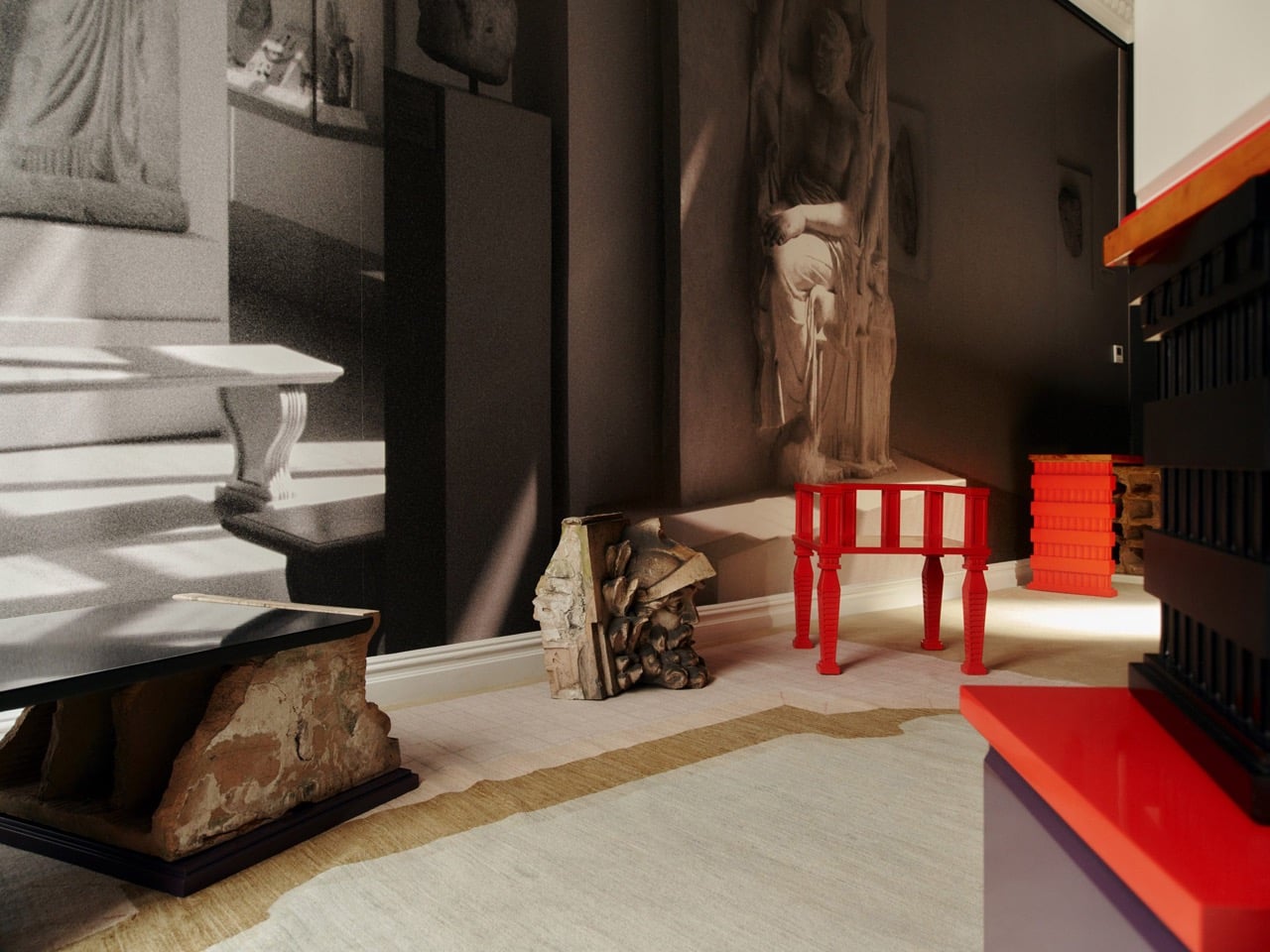
Several of the original keystones sit on the gallery floor unaltered, including one carved bearded face in a plumed helmet still stained with moss and a century of city air. Prieto’s analog photography wraps the walls in large-scale architectural murals, produced in collaboration with Wallpaper Projects. The room ends up feeling closer to a photographed ruin than a white-cube gallery, which is entirely the point. He told Family Style that “New York is its architecture,” and that most people talk about the skyline but “don’t look up.” The show does the looking for you.

‘The Future of the Past’ is Prieto’s second solo show with Emma Scully Gallery and runs through December 12 at the Upper East Side location, open Wednesday through Saturday. Pricing and availability are through the gallery directly. The question the collection keeps circling is whether furniture shaped by a building’s discarded ornament carries any of that building’s memory with it. Prieto does not seem interested in settling that question cleanly. The bearded face on the gallery floor looks like he has made his peace with the whole situation.

The post A 1908 New York building’s discarded fragments got turned into furniture instead of being demolished first appeared on Yanko Design.
  •  

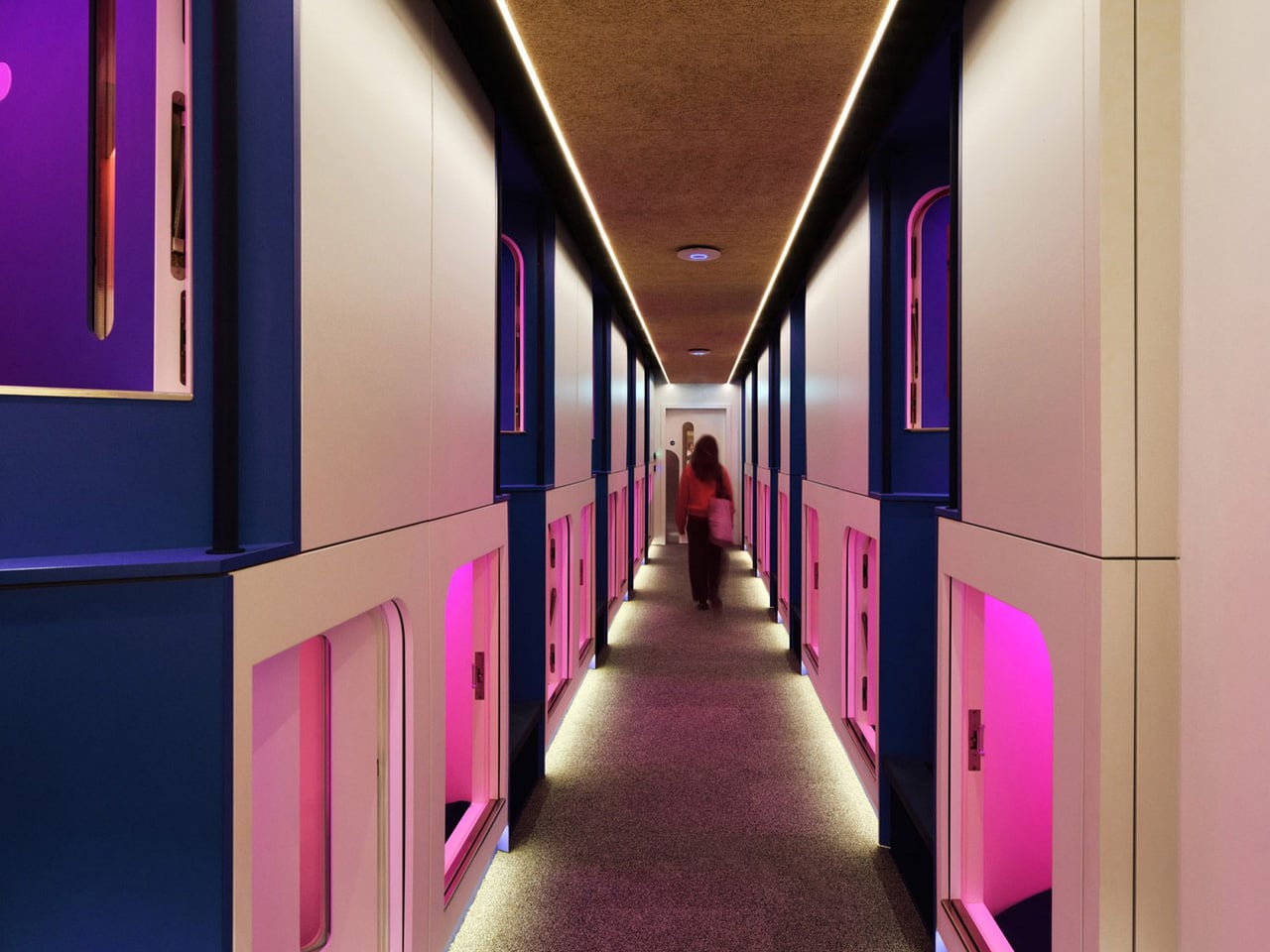
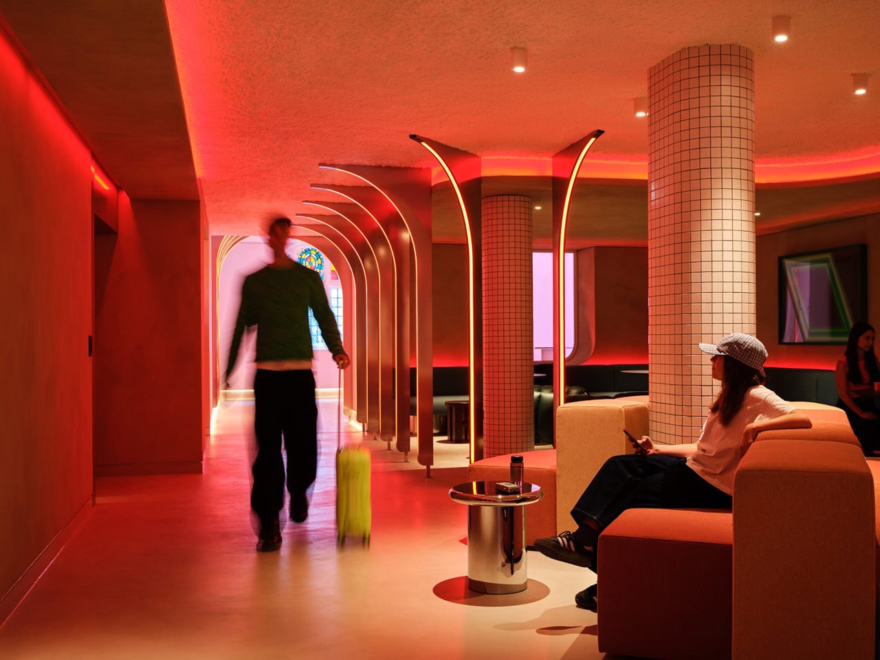
London’s Coolest Capsule Hotel Proves Budget and Beautiful Aren’t Opposites

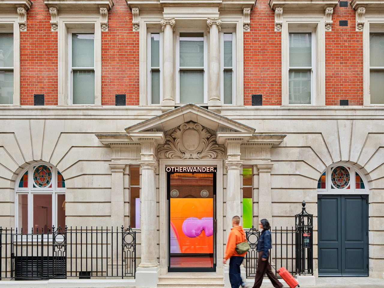
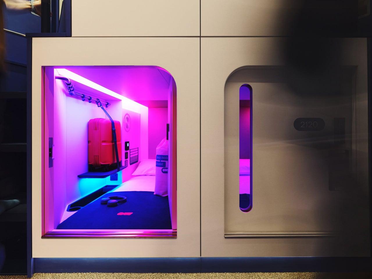
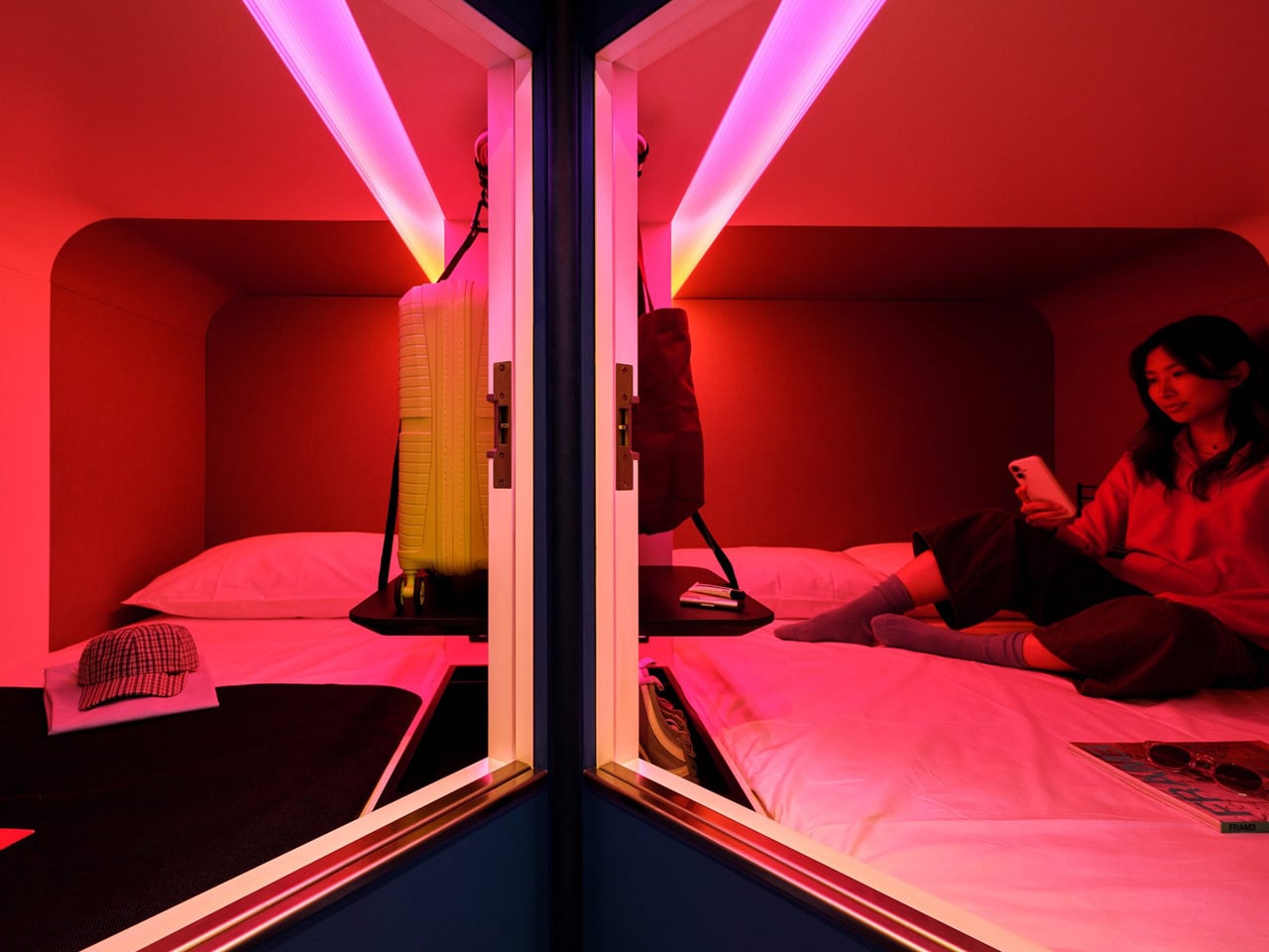
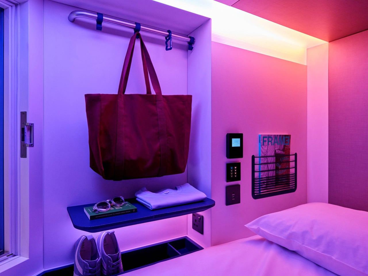
London has a new answer to affordable city-centre stays — and it looks nothing like the hostels that came before it. SODA, the London-based architecture studio, has transformed a former backpacker hostel near Oxford Street into Otherwander Soho, a high-density capsule hotel built around 566 sleeping pods the brand calls “nests.” The result is something closer to a boutique hotel than a budget bed, a place that takes the Japanese capsule typology and reframes it for a generation that refuses to choose between cost and quality.

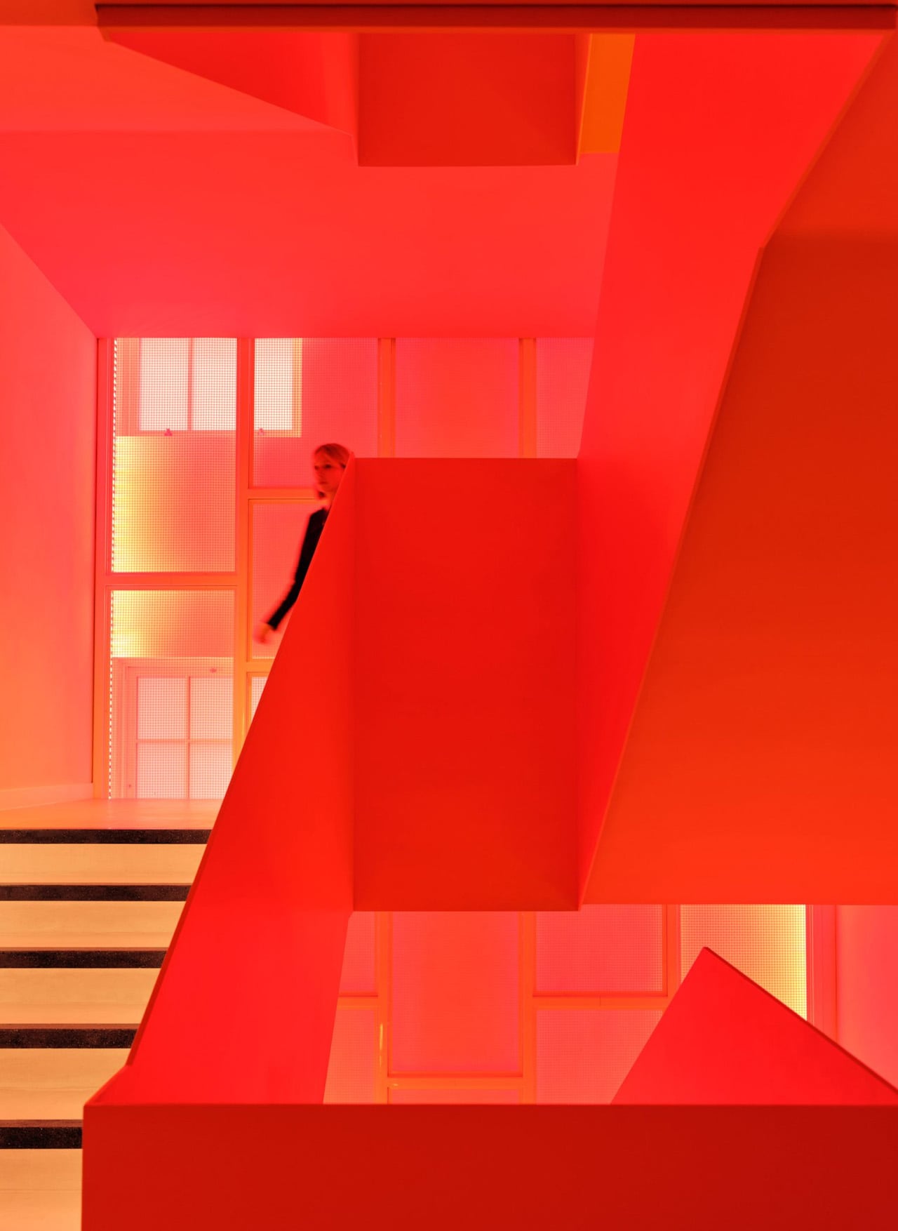
The building itself carries history. Otherwander occupies a pair of early 20th-century structures close to Oxford Street, and SODA’s approach respects that lineage without being precious about it. The facade references the neighbourhood’s material vernacular — hand-laid arched brick details and corbelled window reveals draw from the surrounding Soho streetscape — while the interiors do not attempt to play it safe. Vibrantly coloured social spaces, curved lines, and warm strip lighting push back against the beige neutrality that defines most budget accommodation. A colourful staircase threads the floors together, giving the building a sense of vertical life.

Designer: SODA

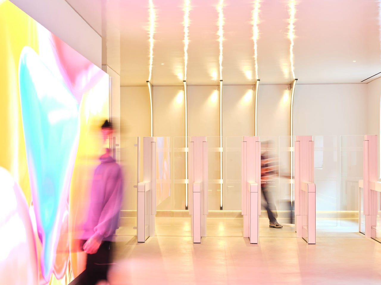
SODA director Ryan Holland was clear about the brief from the start. “The aim was to provide affordable, high-density accommodation without compromising the guest experience,” he told Dezeen. The target guest is Gen Z and younger independent travellers — people who are design-literate, location-driven, and unwilling to trade aesthetics for a lower room rate. Each nest is private and soundproofed, with the entire guest journey — check-in, room control, checkout — managed through a phone. It’s a frictionless model designed for people who already live this way.

What SODA gets right here is the balance between compression and comfort. The pods are compact by necessity, but the shared spaces are generous in feeling — designed to do the social heavy lifting that a private nest cannot. It’s a deliberate split: retreat into the pod, expand into the communal. The vibrancy of the common areas makes the smallness of the sleeping space feel intentional rather than compromised.

Capsule hotels have existed at the fringes of Western hospitality for years, mostly as novelty or last resort. Otherwander Soho changes the conversation. Located at 92 Dean Street, it plants itself at the centre of one of London’s most culturally loaded postcodes and dares you to think of it as anything less than a destination. SODA hasn’t just renovated a hostel — they’ve made the case that density and design aren’t opposites.

The post London’s Coolest Capsule Hotel Proves Budget and Beautiful Aren’t Opposites first appeared on Yanko Design.
  •  

A Folding Tiny Home That Refuses to Feel Like Camping

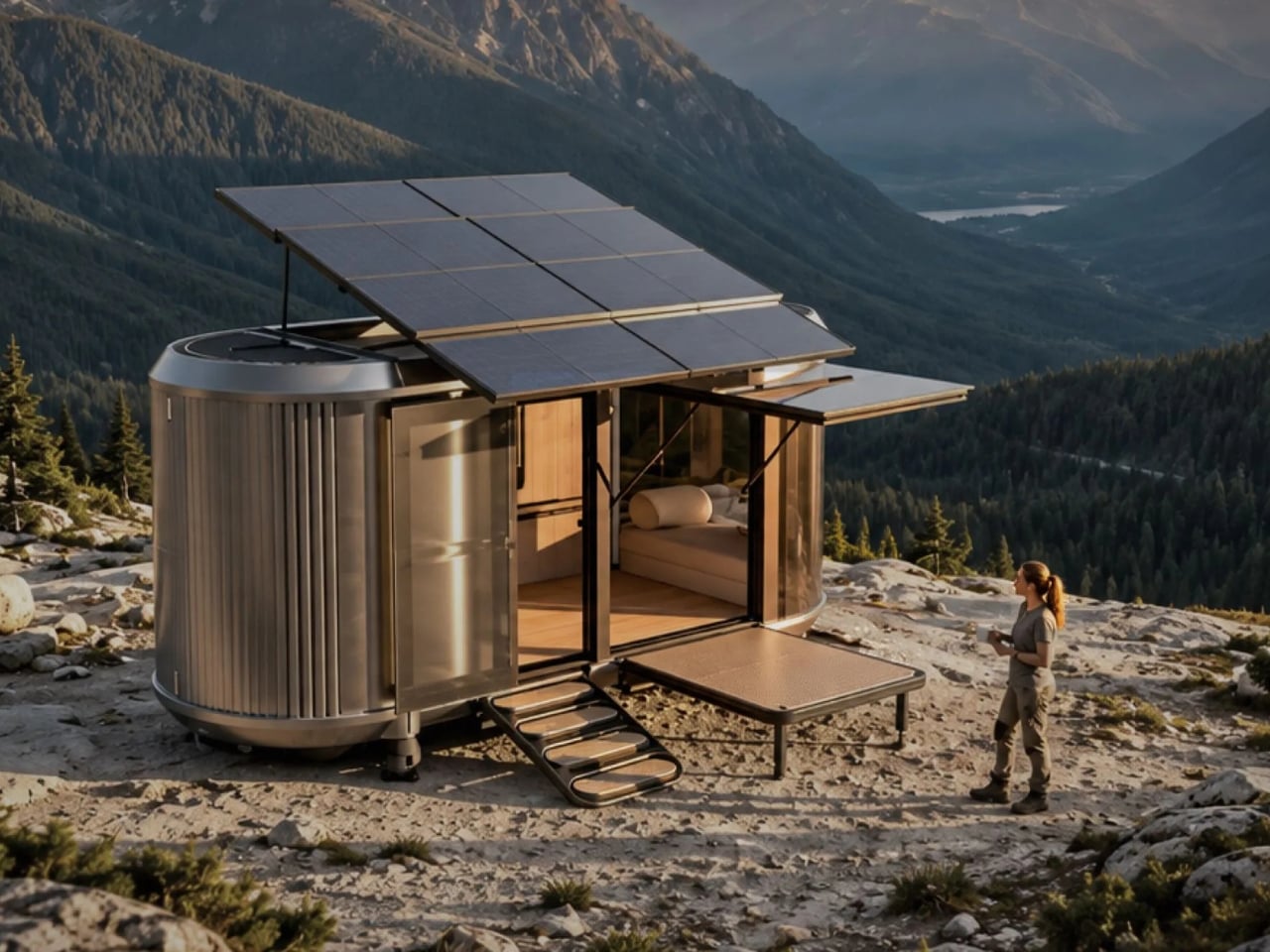
Camping has always come with a quiet trade-off. You get the freedom of being anywhere, but you give up the comfort of being somewhere. Tents leak, campers feel cramped, and cabins can’t move with you when the season changes. Atelier Lune, a US-based design studio, just built something that refuses to make you choose.

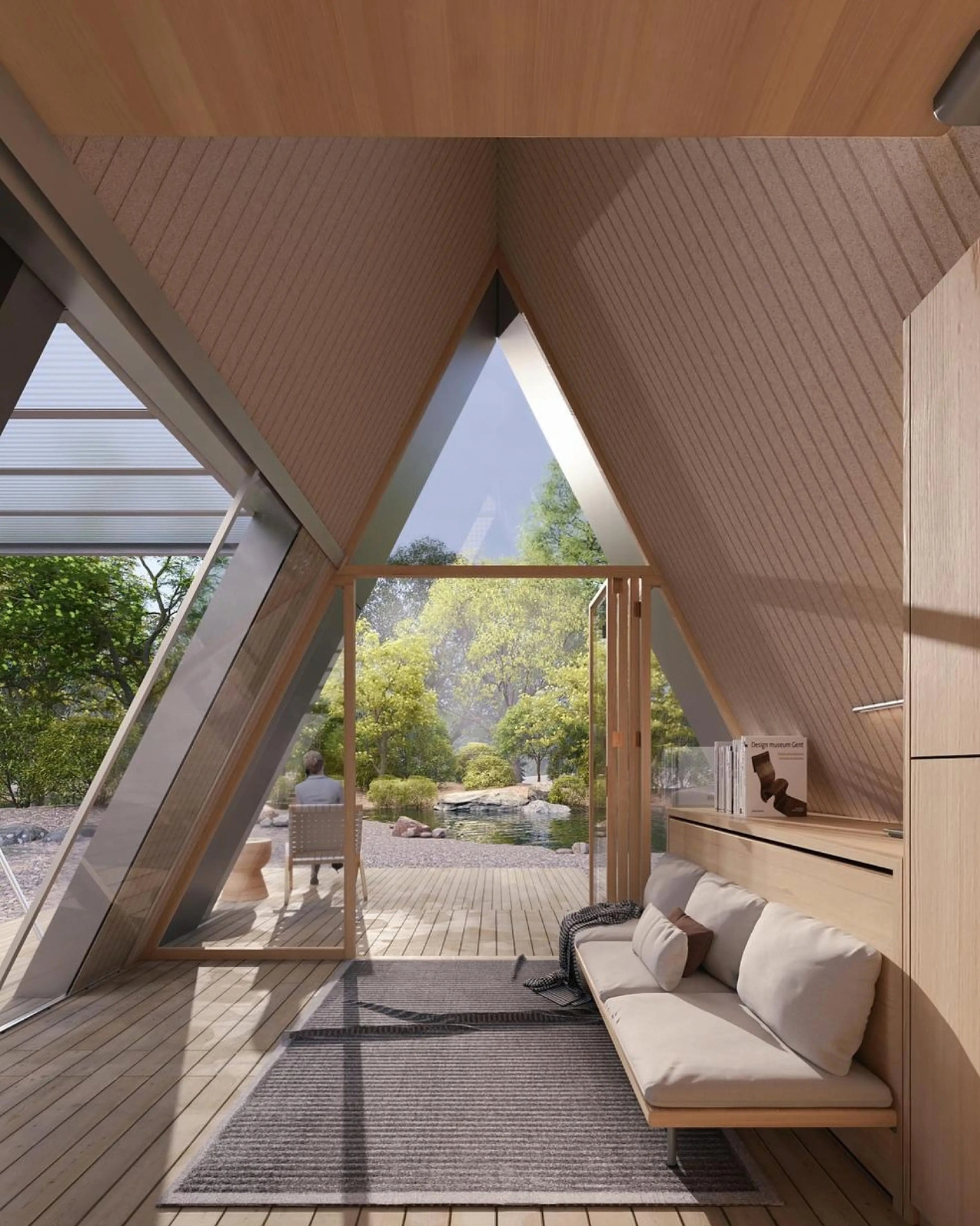
It’s called Camping House. The idea is simple to say and genuinely hard to execute: a home that tows behind a standard SUV, unfolds like a tent within a couple of hours, and then behaves like real architecture once it’s standing. Architect Na Shen, who previously worked at Gensler and Zaha Hadid Architects before starting her own studio, designed the whole structure around that tension between mobility and permanence, and you can feel that intention in every decision she made.

Designer: Atelier Lune

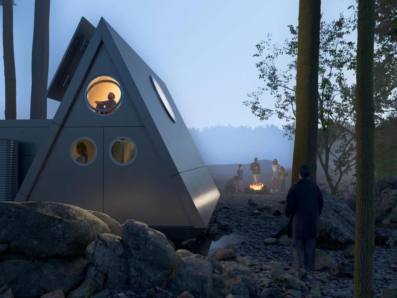
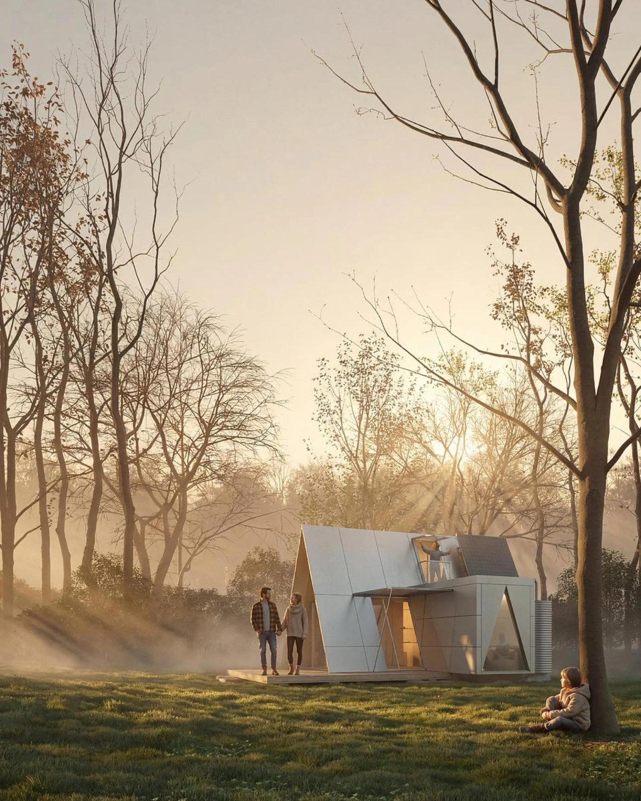
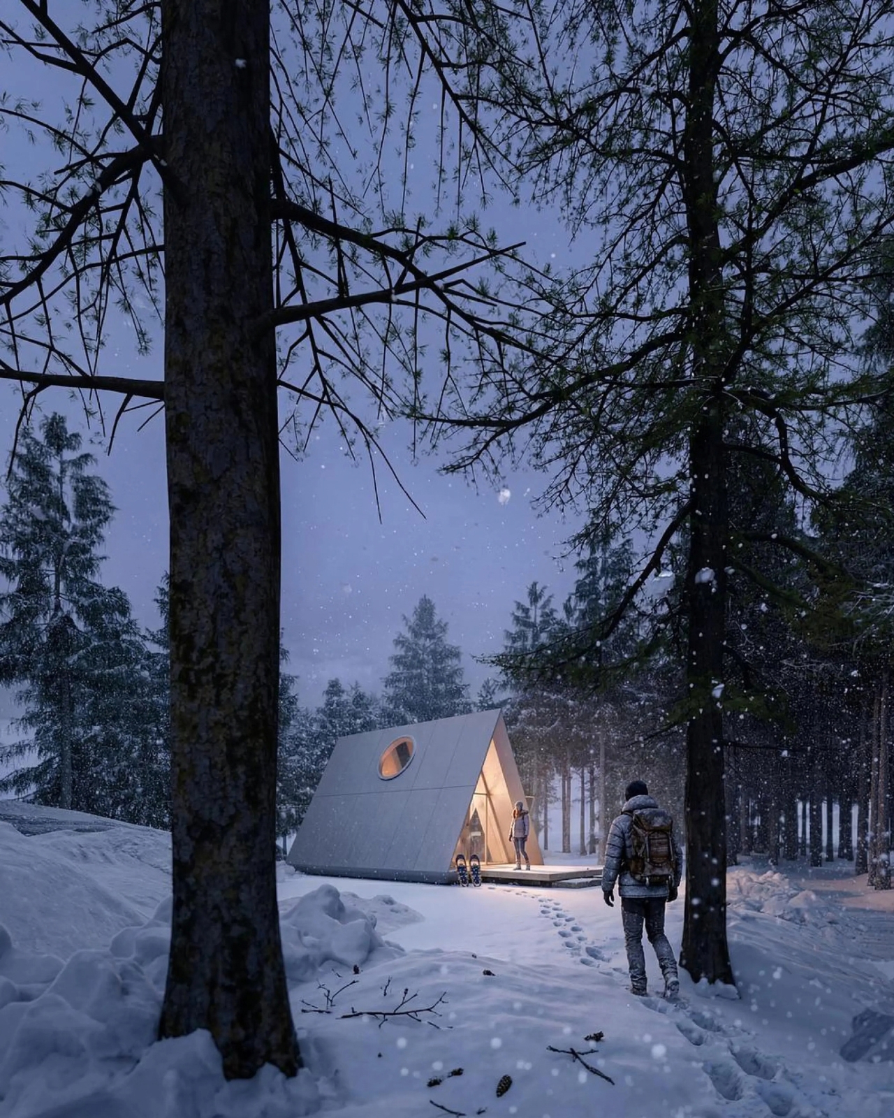
That last part is the actual innovation. Plenty of tiny homes are mobile, but most of them stay rigid once you get them there, basically a smaller box on wheels. Camping House does something different. The structure is a folding shell that fans open on-site into a steep A-frame, then locks into place with weather-sealed joints and insulated panels built to hold up through an actual winter. The A-frame isn’t just an aesthetic choice either. It’s structurally efficient, sheds rain and snow naturally, and creates a dramatic interior volume that reads much larger than the footprint suggests.

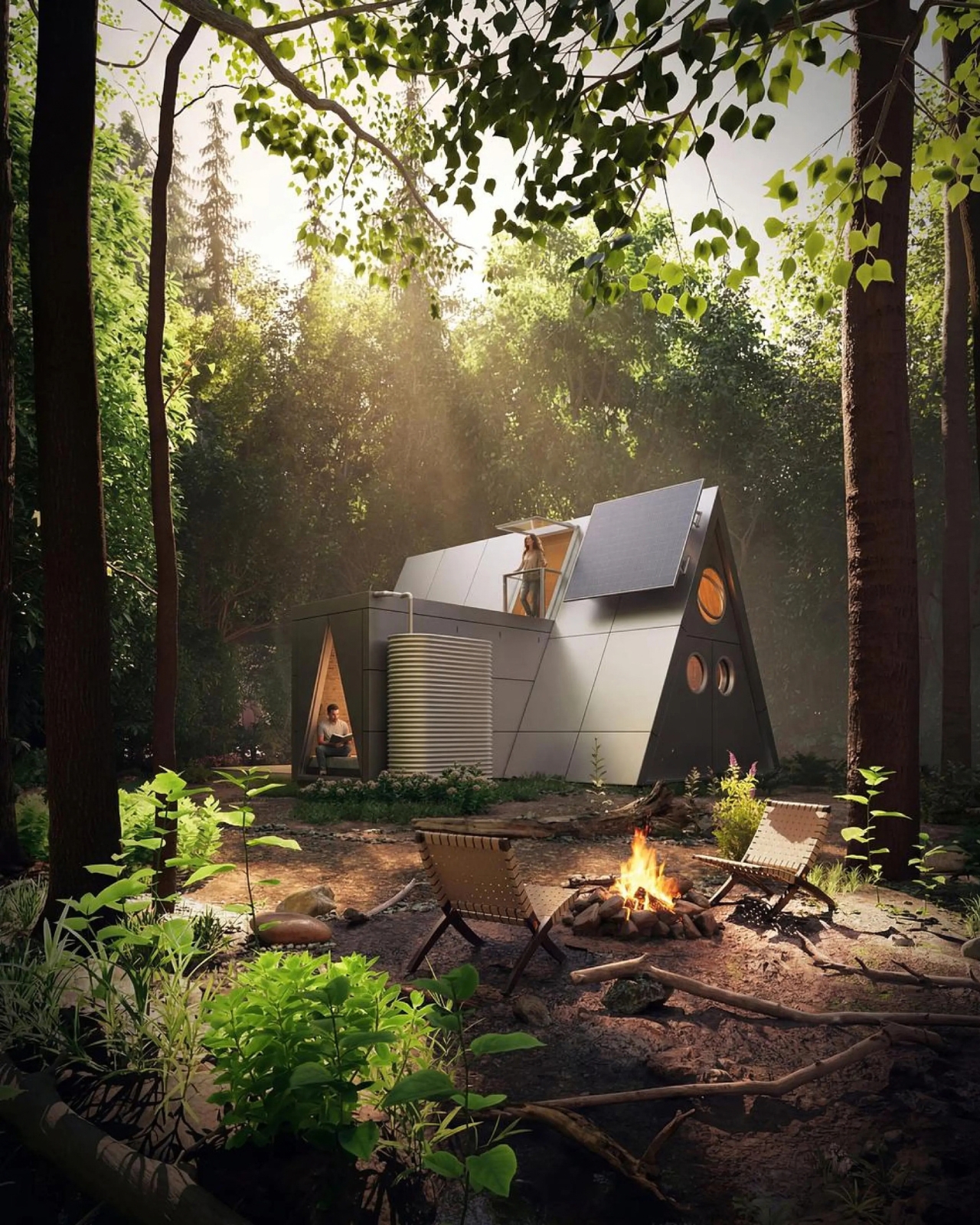
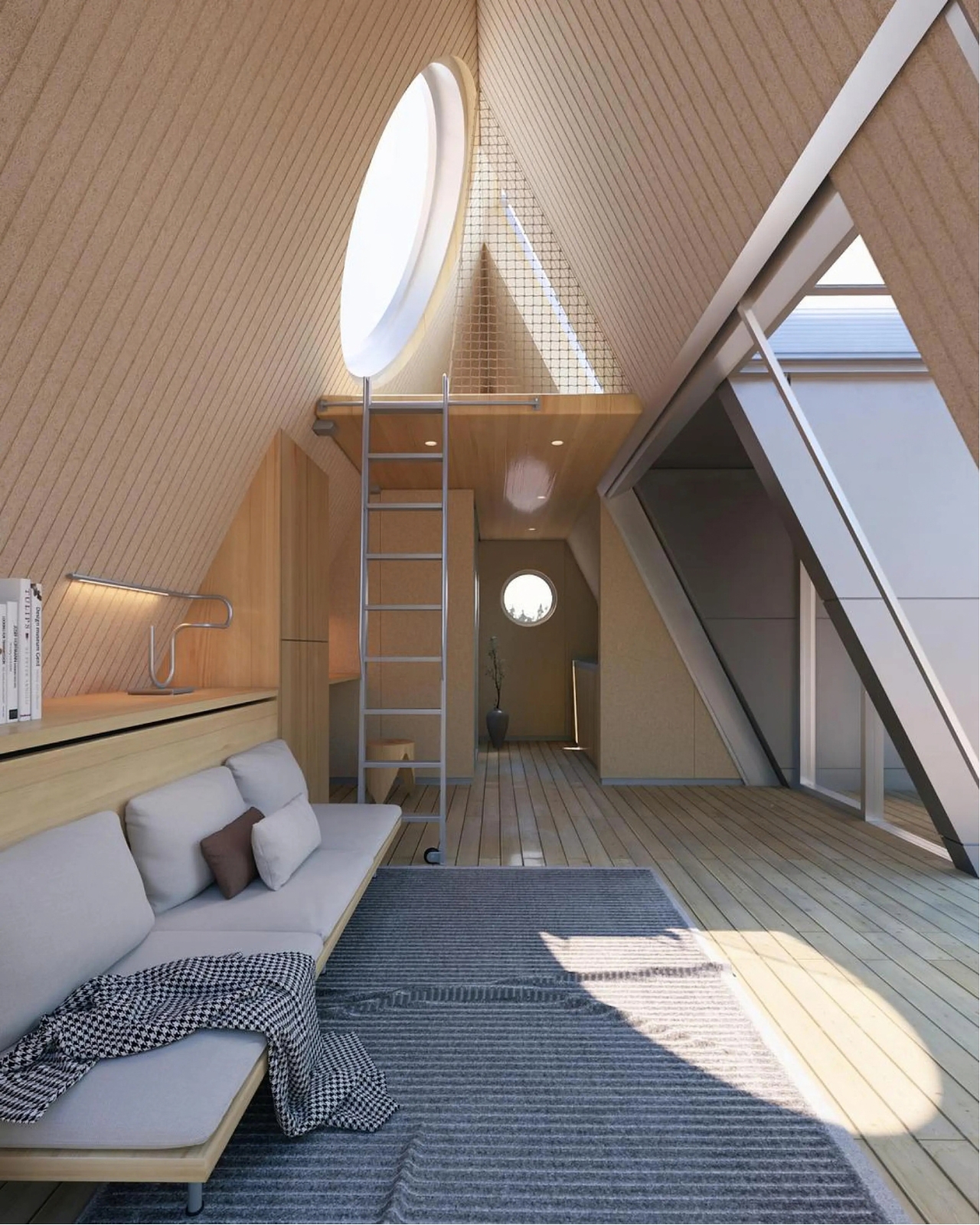
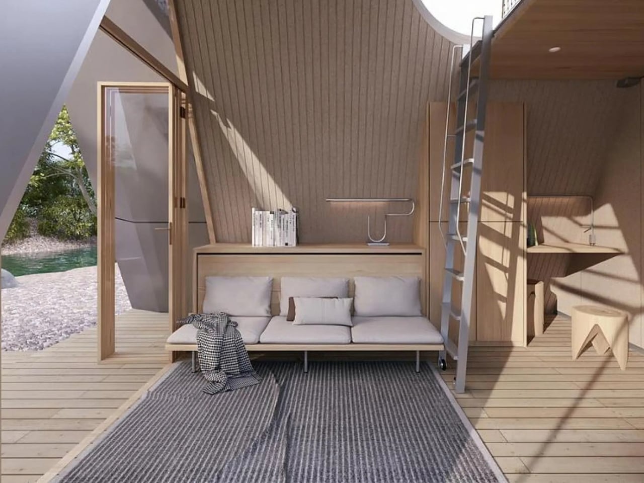
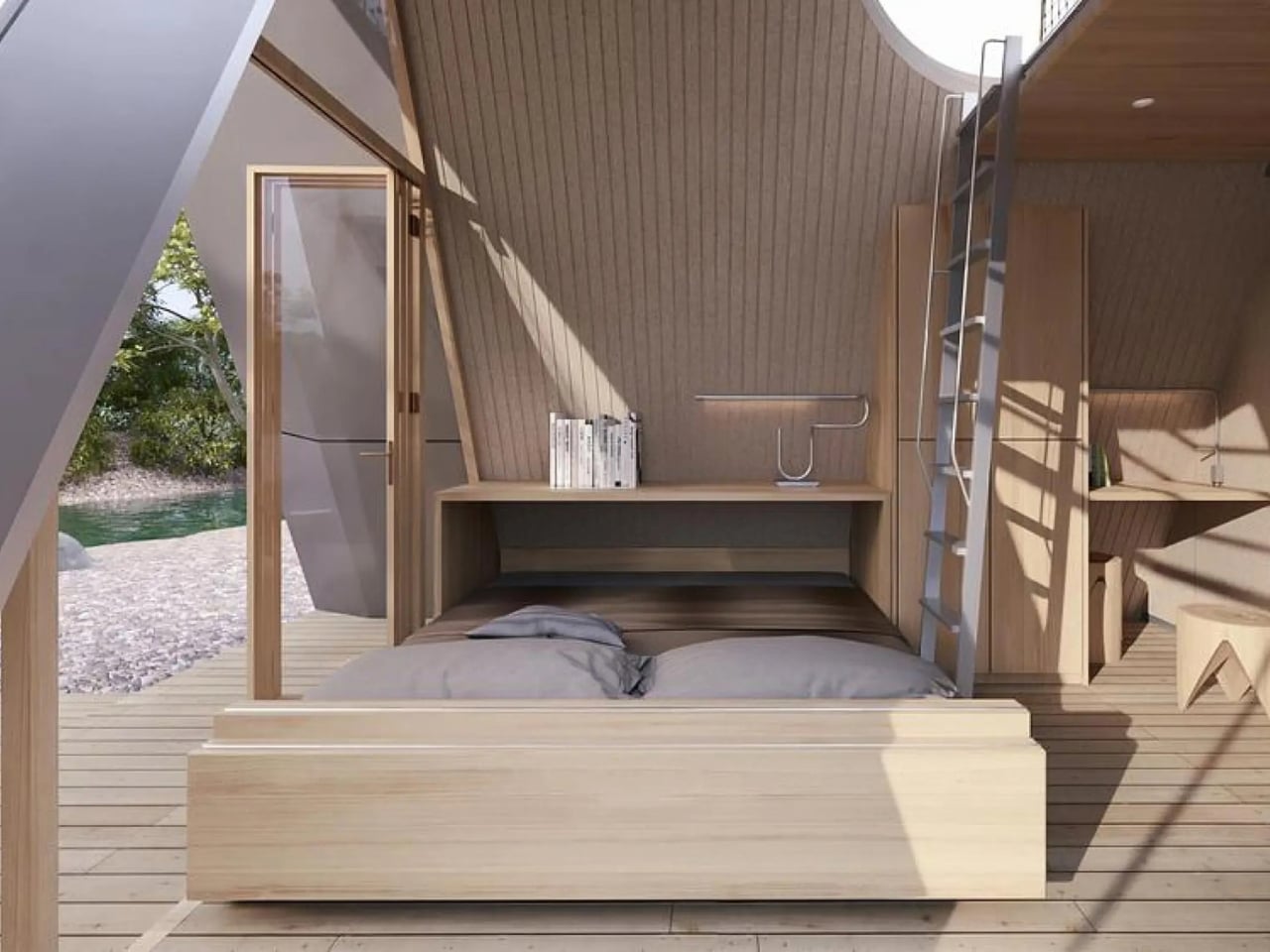
The system is built around three modules the studio calls Ports. The Residential Port handles living and sleeping, with furniture that flips from day mode to night mode in seconds. The Utility Port carries a real kitchen and a real bathroom, not a camper-van compromise version of either. The Extended Port clips on when you need a workspace, storage, or room for guests. You arrive, stabilize the base, release the hinges, and the shell swings open into a two-level interior that looks nothing like what fit on the trailer an hour earlier. The joinery and panel system that makes this possible is where most of the real design work lives, hidden in the hinges and seals rather than announced by the exterior.

What makes this feel like it’s arriving at the right moment is who it’s actually for. Remote work untethered a lot of people from a single address, and the appetite for spending real time outdoors, not just weekend camping but seasonal living, has grown alongside it. Camping House is designed with that shift in mind: off-grid solar integration, rainwater harvesting, passive cross-ventilation through a solar chimney, and no permanent foundation required. It leaves the ground beneath it essentially undisturbed, which matters if you’re setting up somewhere ecologically sensitive, or if you just don’t want to explain a poured foundation to a national forest.

There’s a practical honesty to designing for departure instead of designing for permanence. Most residential architecture asks how a building holds its ground. Camping House asks how a building lets go of it. Multiple units can even couple together into small clusters, which opens the door to uses beyond personal travel: disaster relief housing, temporary shelter during regional housing shortages, or small eco-tourism outposts that can be struck at the end of a season without leaving scars.

None of this is on the market yet. It’s a concept, and concepts have a habit of staying concepts. But two people can reportedly assemble it in under two hours, which is a modest ask for what you get in return: a structure with actual dignity, not a glorified pop-up tent with delusions of permanence.

The bigger idea Camping House is testing is whether shelter has to pick a lane between temporary and permanent. For a long time, those felt like separate categories with separate architecture. This project treats them as two settings on the same machine. Whether or not this exact version reaches driveways, the question it’s asking, why should mobility mean sacrificing comfort, feels like one more designers are going to keep chasing.

The post A Folding Tiny Home That Refuses to Feel Like Camping first appeared on Yanko Design.

  •  

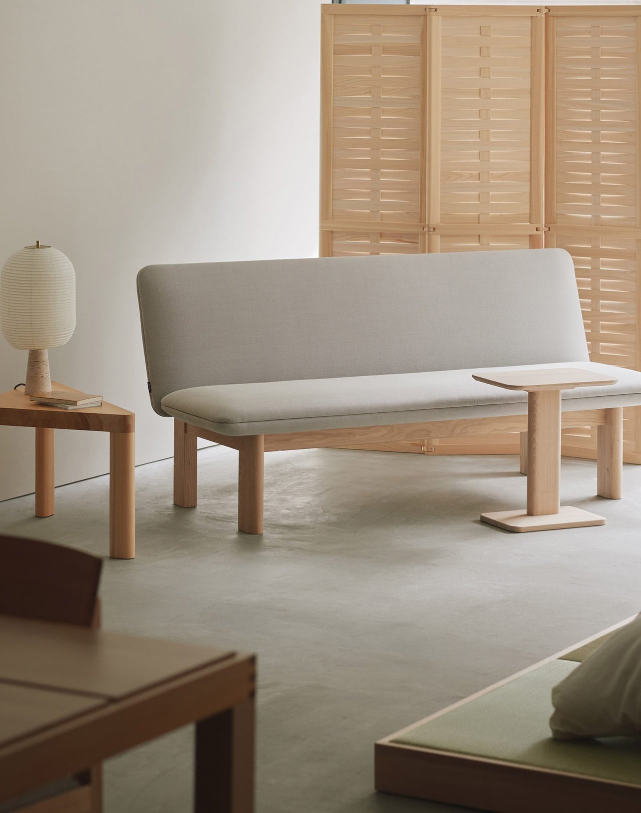
This Tokyo Furniture Showroom Vanished Into a Traditional Japanese Inn

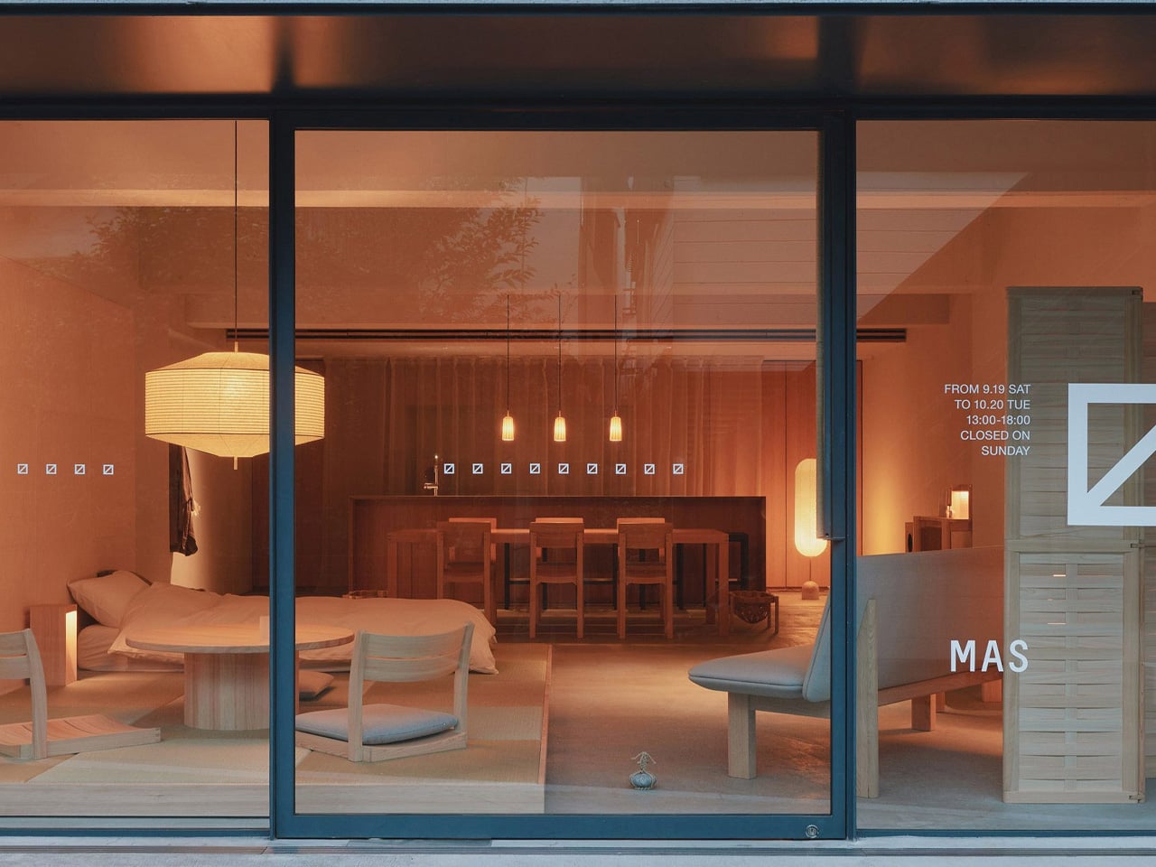
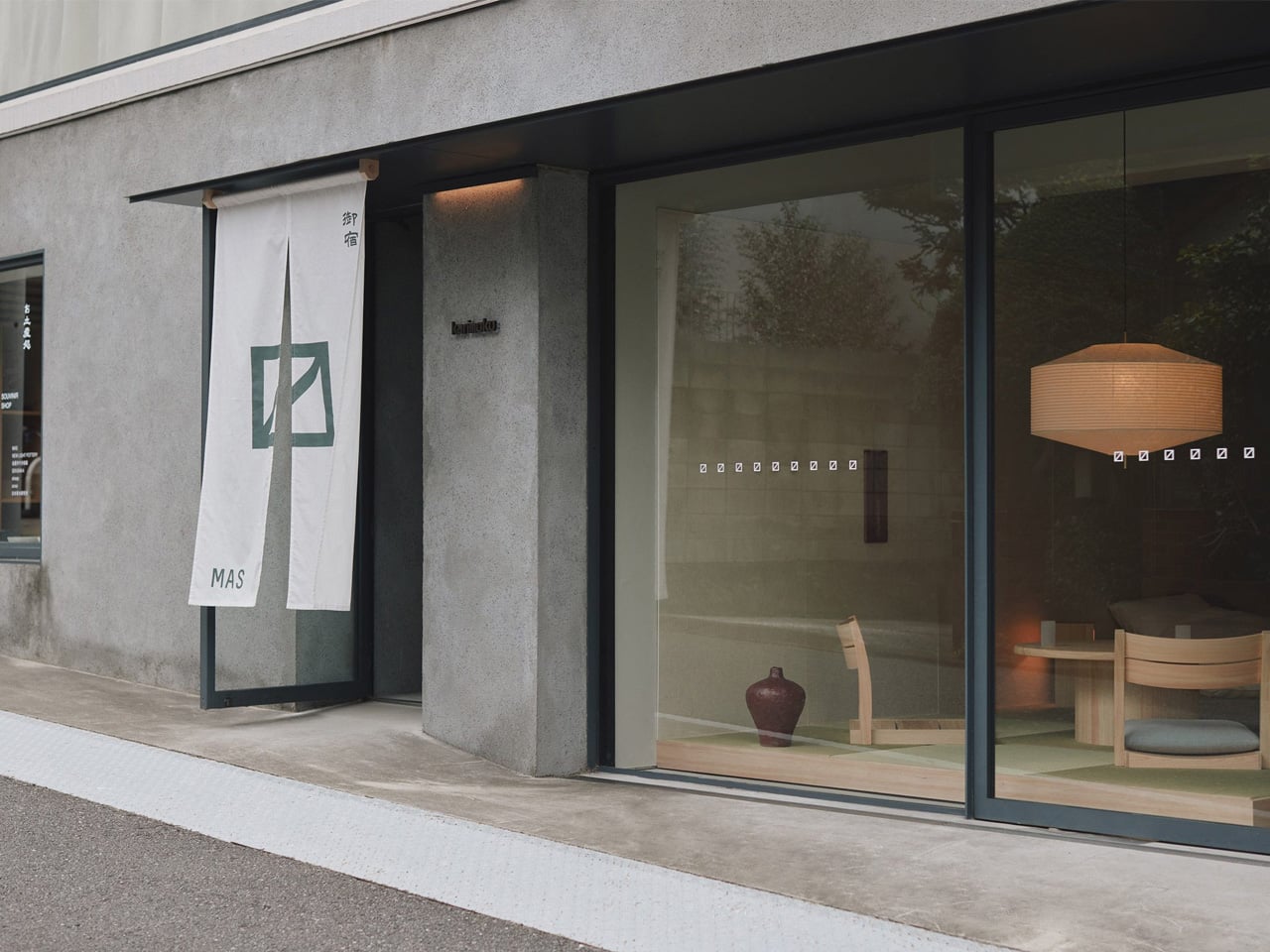
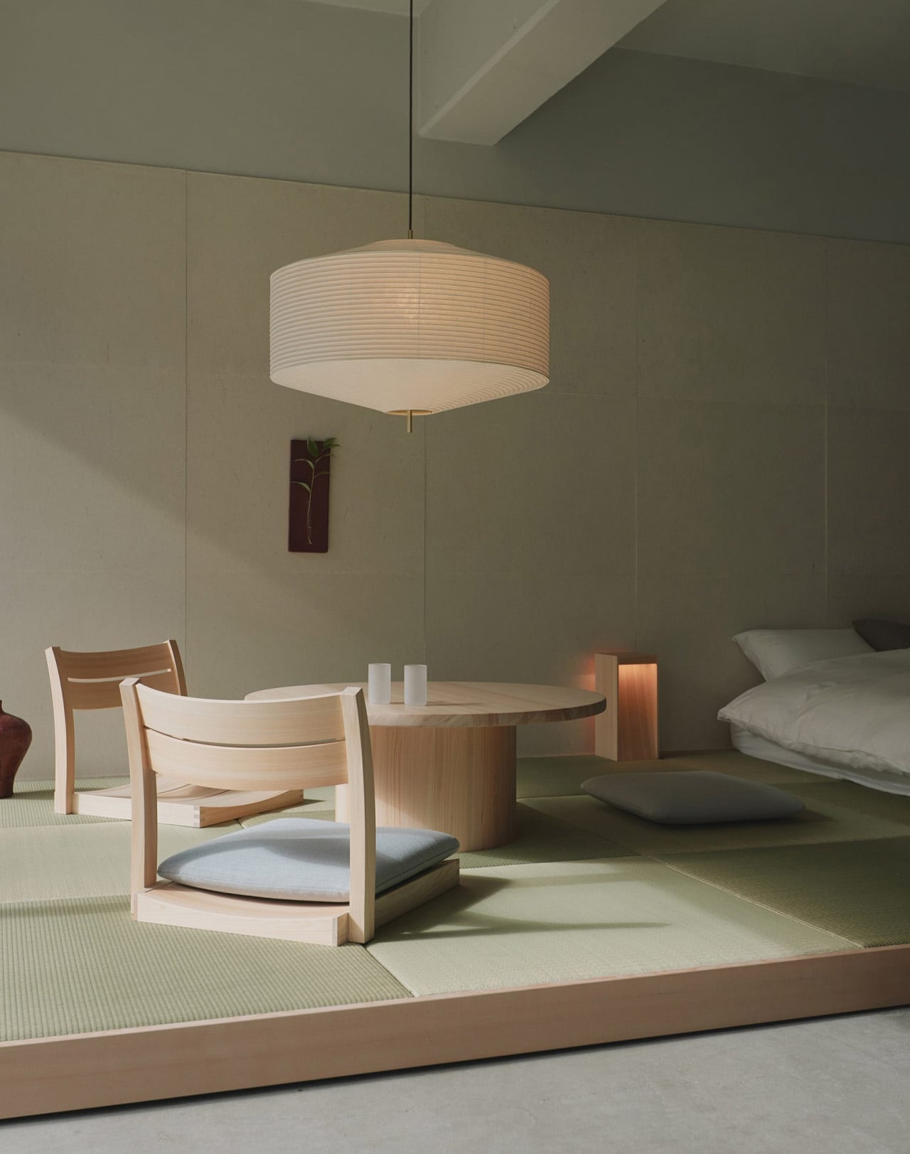
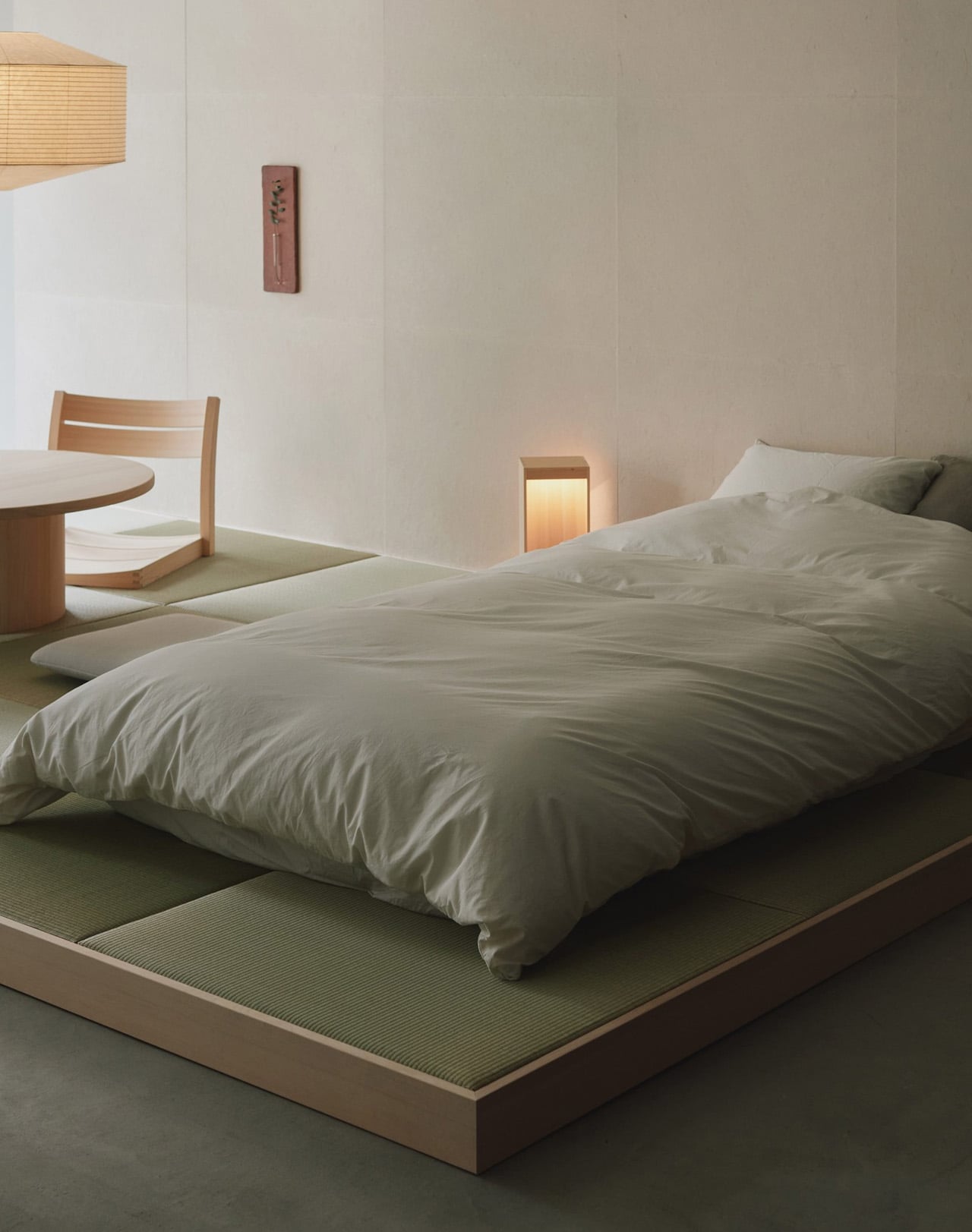
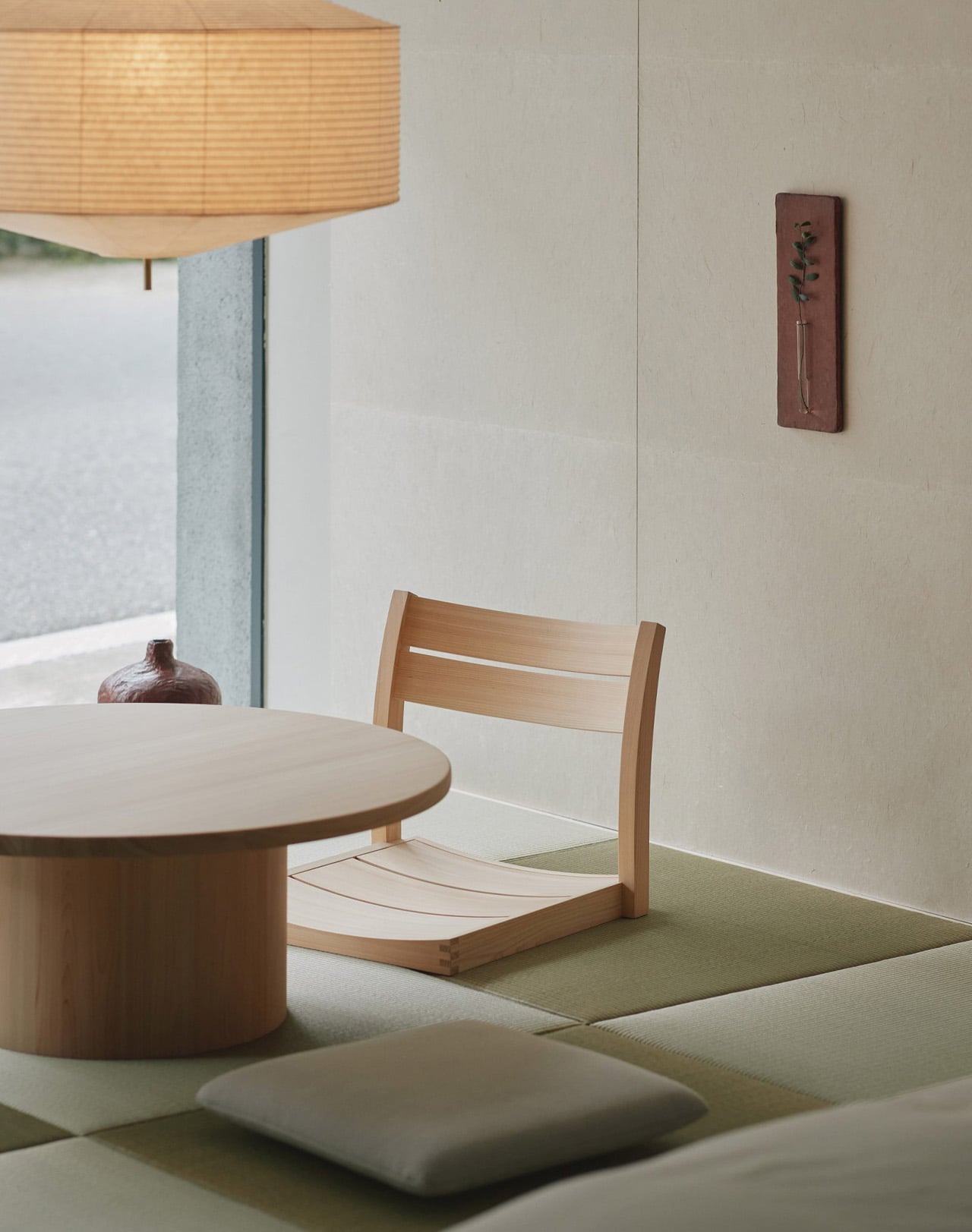
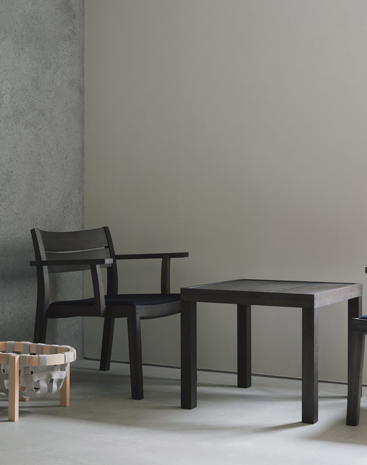
A noren hangs at the entrance of Karimoku Commons Tokyo. Step past it and the showroom disappears, replaced by something closer to memory: the quiet hallways, worn timber, and particular warmth of a Japanese inn. That is the premise of Oyado MAS, an exhibition conceived by MAS, Karimoku’s design label, and staged in collaboration with spatial director Wataru Kumano. Running from September 19 to October 20 at the Aoyama venue, the installation moves visitors through a sequence of inn-like settings: reception, lounge, sleeping area. Each space is built around MAS furniture rather than placing it on a pedestal.

Kumano’s choice of an oyado over a hotel is deliberate. Oyados carry a distinct cultural intimacy, a slowness that international hotel formats rarely hold. The sleeping area doesn’t mimic an inn so much as distill the feeling of one, using MAS pieces to frame how a body might move through morning light, settle into reading, or reach across a low table. Furniture earns its place through use rather than display.

Designer: Karimoku

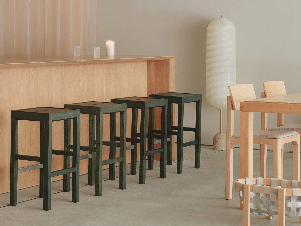
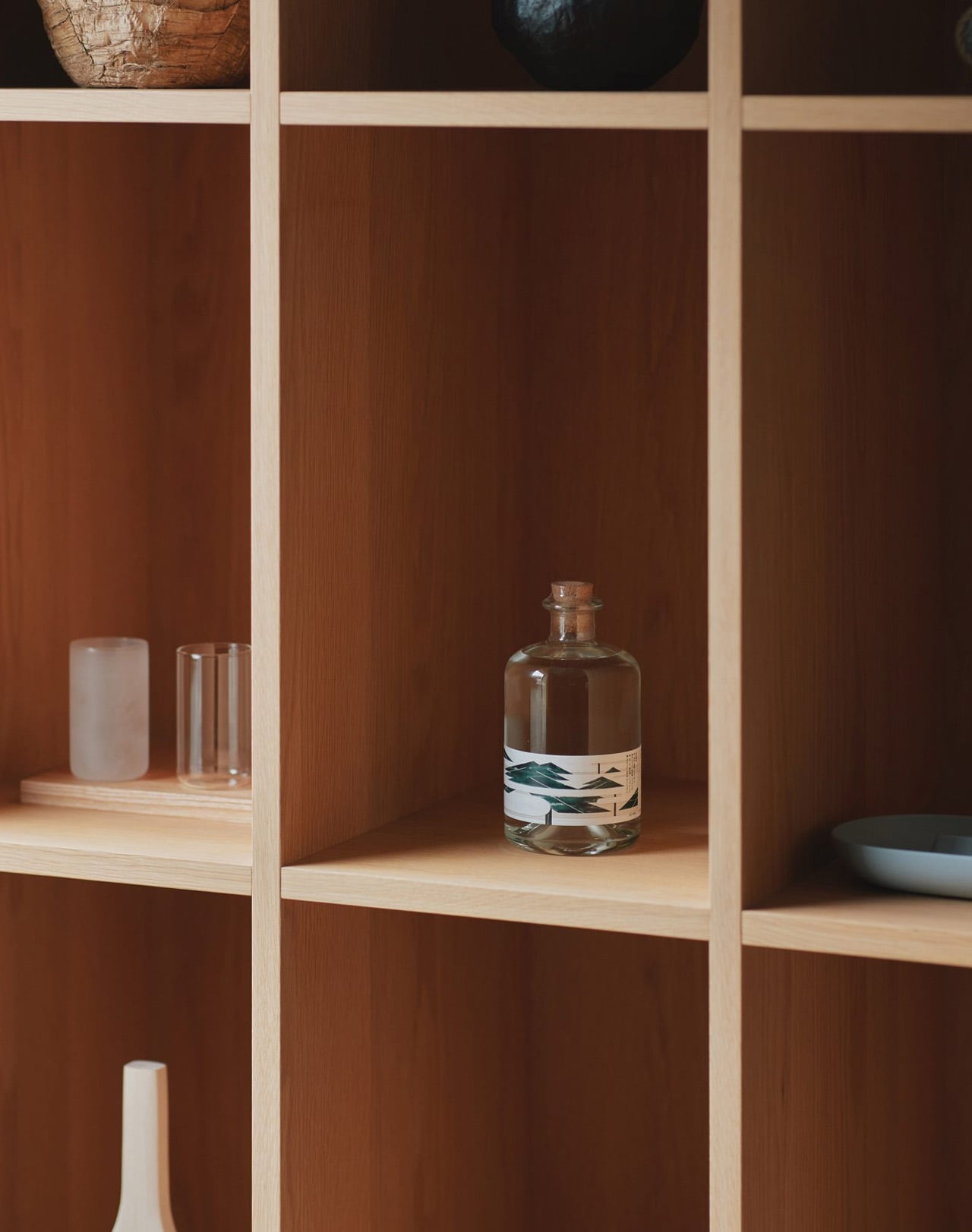
The materials follow the same logic. MAS works with Japanese-grown woods, and the exhibition doesn’t conceal the grain. Visible knots, color shifts, and tonal variation across surfaces are left intact rather than sanded away. Where a conventional showroom presents furniture as finished objects defined by flawless surfaces, Oyado MAS treats the wood’s natural character as part of the experience, a quiet reminder of origin.

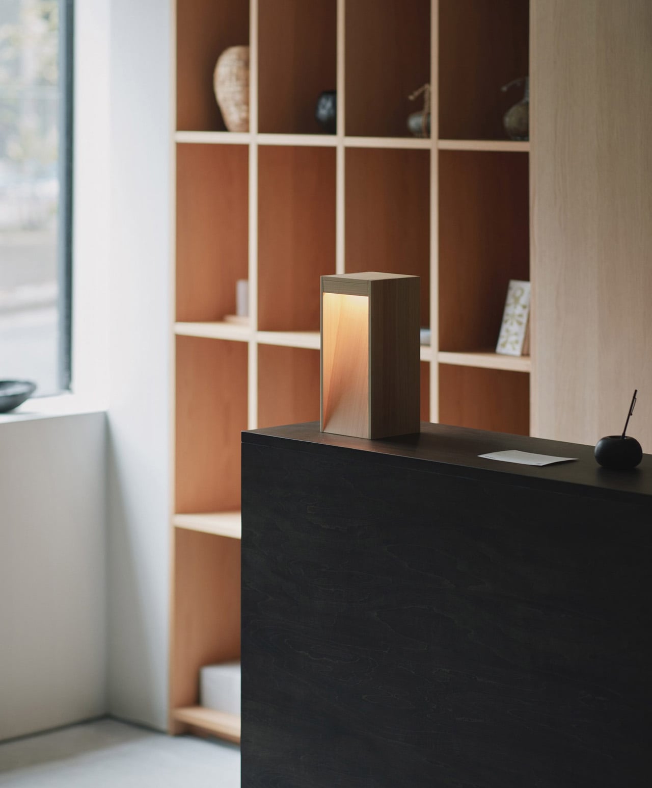
Collaborators extend the atmosphere beyond furniture. New Light Pottery contributes lighting; Nao Tesuki Washi brings handmade paper to the space. A fragrance developed with Sheep carries notes drawn from Japanese forests, connecting the olfactory layer to the material one. Tea brewed from forest plants is served to visitors, folding touch, scent, and ritual into a single walkthrough.

Among the pieces available for purchase are the WK Stool by MAS and a spoon by Sekisaka. A new fragrance by MAS and Sheep is also on sale. But the exhibition isn’t really a shopping proposition. It’s a sequencing argument: that furniture reveals itself differently when placed inside the rhythm of a stay, experienced through context and time rather than pulled from the neutral floor of a showroom.

The noren at the entrance marks the shift from retail logic to something slower and more considered, where scale, storage relationships, and the texture of Japanese craftsmanship become readable only through the movement of a body through a room. That’s a lesson most showrooms never figure out how to give. Oyado MAS runs Tuesday through Saturday, 13:00 to 18:00, and closes October 20, 2026. Karimoku Commons Tokyo is located in Aoyama.

The post This Tokyo Furniture Showroom Vanished Into a Traditional Japanese Inn first appeared on Yanko Design.
  •  

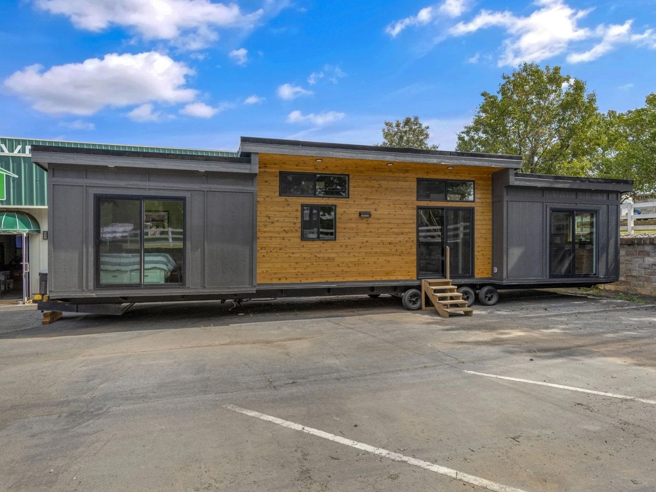
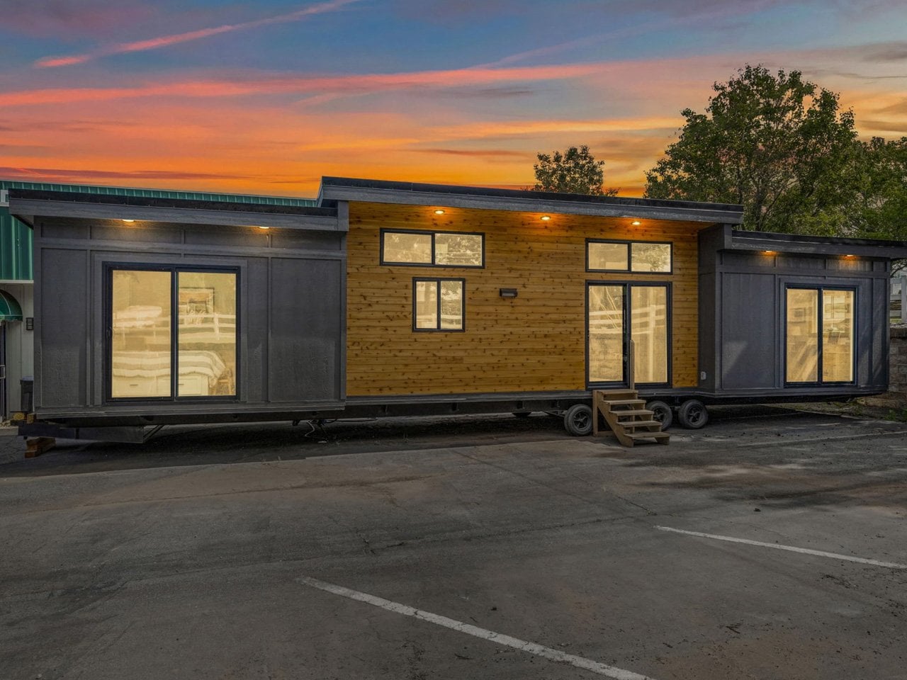
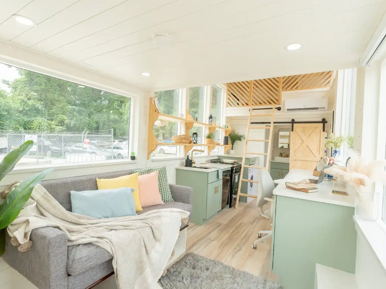
A 24-Foot Tiny Home With Two Lofts, a Dishwasher, and a Real Home Office

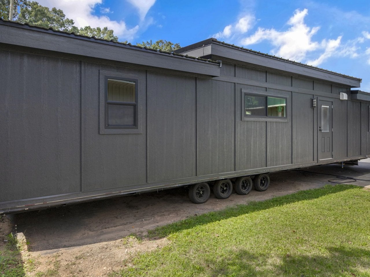
Dragon Tiny Homes has long been a name worth watching in the compact living space, and its latest custom Vista only strengthens that case. Built on a double-axle trailer, the home stretches 24 ft (7.3 m), larger than most European models but modest by North American standards, where builds twice this length are common. Finished in timber with metal accents and generous glazing throughout, it reads more like a considered architectural statement than a road-ready dwelling.

Step inside and the ground floor’s 204 sq ft (19 sq m) opens up with surprising depth. The living room anchors the space with a sofa, and in place of a television, a space-saving projector paired with a pull-down screen keeps things clean and purposeful. Adjacent to it, a dedicated office nook with a desk and chair makes this model genuinely work-from-anywhere capable. A storage-integrated staircase nearby pulls double duty, folding in cupboard and shelf space where the footprint would otherwise offer none.

Designer: Dragon Tiny Homes

The kitchen is where the custom Vista earns its reputation. A sink, oven, and four-burner propane-powered cooktop handle the cooking side, while a small fridge tucked into the desk area keeps things spatially intelligent. What sets this build apart is the inclusion of both a washer/dryer and a dishwasher, amenities that rarely appear together in a home this size. Quartz counters and well-considered cabinetry bring the space together, making it feel complete rather than compromised.

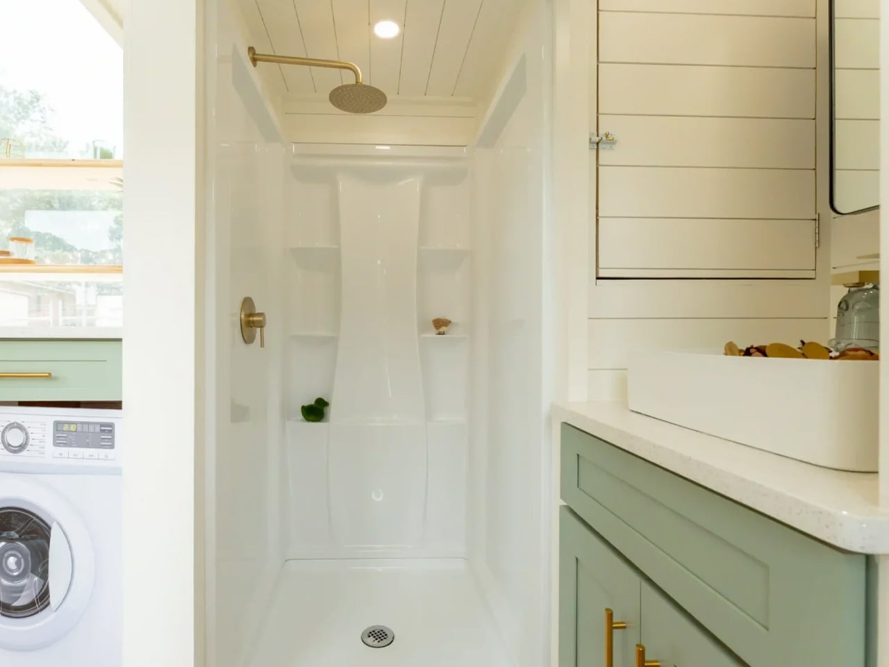
The bathroom, reached from the kitchen, is snug in the way that tiny living demands: a vanity sink, a flushing toilet, and a walk-in shower. It’s tight and intentionally so. Dragon Tiny Homes made smart trade-offs here, and the square footage they saved has been redistributed into a build that genuinely earns its keep across the rest of the floor plan.

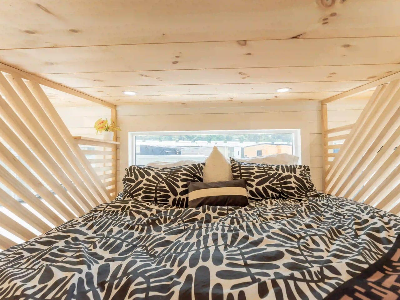
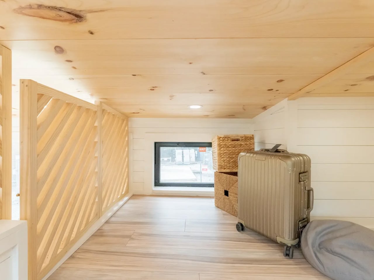
Upstairs, two separate lofts sit at opposite ends of the home. The main loft, accessed from the storage staircase, accommodates a double bed and features slatted timber room dividers that add texture while keeping a restless sleeper safely in place. The secondary loft is reached via a removable wooden ladder positioned in the kitchen. Sized similarly, it includes egress windows that make its use as a legal bedroom possible, though in this particular build it’s been set up for storage.

This model was created for a private client, and pricing remains undisclosed. Dragon Tiny Homes’ Vista range starts at $60,000, and given everything this custom build delivers, that baseline begins to feel like fair ground. A home office, a fully stocked kitchen, two lofts, egress windows, and a dishwasher: the custom Vista makes a quietly compelling case for compact living done right. At 24 feet, it proves that size rarely defines quality of life.

The post A 24-Foot Tiny Home With Two Lofts, a Dishwasher, and a Real Home Office first appeared on Yanko Design.

  •  
❌