❌

Vue lecture

Do yourself a favor and buy a power station now, before the energy crisis gets worse
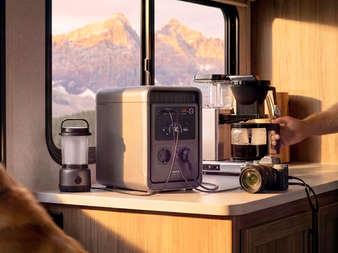
Every crisis has its panic buy. In 2020 it was toilet paper and N95 masks, in 2021 it was graphics cards, in 2025 it was RAM chips, and in 2026 my money is on lithium iron phosphate. With Iran attacking tankers in the Strait of Hormuz, gas sitting at a record-for-October $4.36 a gallon, and heating oil bills forecast to climb 21% this winter, the case for keeping your own stash of electrons has never been stronger. A portable power station from Anker, EcoFlow, or Jackery keeps your fridge cold and your lights on when the grid gives up. It also runs indoors without trying to poison you, and it never needs a trip to the gas station.

Stockpiling toilet paper made you look a little unhinged. Owning a power station makes you the neighbor everyone suddenly wants to befriend during an outage. Black Friday could knock a few more dollars off, sure, but fall sale prices are already the best we’ve seen this season, and winter storms rarely wait for a coupon code. I’ve narrowed the field to one value pick from each brand, all hovering around the 2kWh mark, enough to keep a fridge humming for well over a day. Anker gets first crack, because its S2000 squeezes 2,010Wh into a 35.7-pound body that costs less than a decent espresso machine.

[Editor’s Pick] Anker S2000 2,010Wh Portable Power Station: $699.99
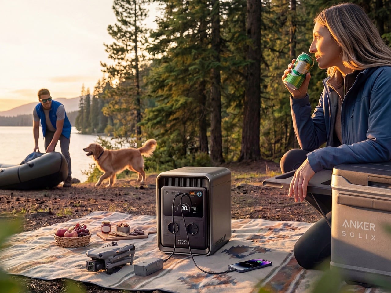
Anker announced at IFA 2026 that its SOLIX power station brand is folding into the Anker name, so you’ll still spot “SOLIX” on boxes and Amazon listings while the switch plays out over the next couple of years. Same company, same warranty, simpler logo. The S2000 makes a great poster child for the new identity, because it looks like it wandered over from the home appliance aisle. At 8.2 x 11.1 x 12.7 inches (208 x 282 x 323mm) and 35.7 pounds (16.2kg), it takes up roughly the counter space of a coffee maker. That makes it nearly 4 pounds lighter than Jackery’s Explorer 2000 v2 and 9 pounds lighter than EcoFlow’s DELTA 3 Max.

Inside are 314Ah lithium iron phosphate cells rated for 6,000 cycles to 80% capacity and 10,000 to 60%, the same chunky format used in grid-scale storage. Anker estimates a 15-year design life, so this thing could easily outlast your fridge. Output tops out at 1,500W continuous with a 3,000W surge, plenty for a fridge, router, lights, laptops, and a CPAP. The real magic is efficiency, with idle draw of just 6W, which helped it keep a fridge running for 34 hours and 15 minutes in GearJunkie’s testing. At $599.99 for subscribers, that works out to roughly $300 per kilowatt-hour, the cheapest of our three picks by a wide margin.

Click Here to Buy Now

What we like

  • At 35.7 pounds, it’s the lightest 2kWh station you can buy right now, and compact enough to live on a kitchen counter.
  • A UPS switchover of 10ms or less keeps your router and desktop online the moment the grid drops.
  • Long-life cells and roughly $300 per kWh make it the best value of the three.

What we dislike

  • Solar input caps at 400W, which means about five hours of ideal sunshine to refill, and winter rarely delivers ideal.
  • It isn’t expandable, so 2kWh is your ceiling.
  • 1,500W of output rules out running a space heater alongside much of anything else.

Jackery Explorer 2000 v2 2,042Wh Portable Power Station: $899
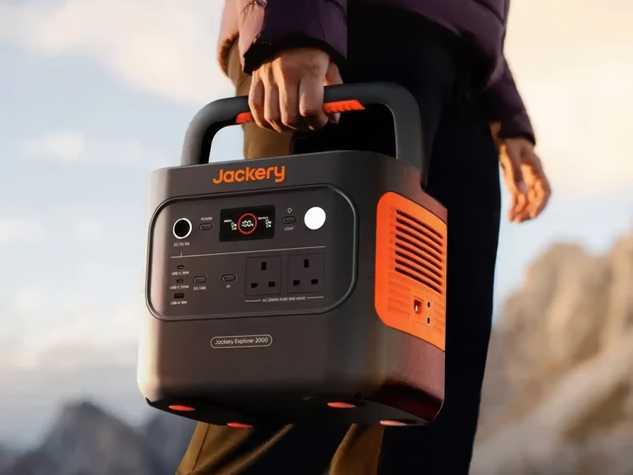
Jackery’s orange-trimmed Explorers were the default power station for years, long before Anker, EcoFlow, and Bluetti started crowding the category. The Explorer 2000 v2 keeps that familiar look but trims the bulk, measuring 13.2 x 10.4 x 11.5 inches (335 x 264 x 292mm) and weighing 39.5 pounds (17.9kg). Its proportions are squatter and more cube-like than the Anker’s, which makes it easier to tuck under a desk or beside a fridge. Jackery marketed it as the lightest and most compact 2kWh LiFePO4 station around, a crown the S2000 snatched this year by shedding nearly four more pounds. The two brands are basically locked in a very nerdy weight-loss competition.

Output is where the Jackery pulls ahead of the Anker, with 2,200W continuous and a 4,400W peak spread across three AC outlets. That’s enough headroom for a sump pump, a fridge compressor, or a microwave without the station breaking a sweat. Jackery’s ChargeShield 2.0 system layers in 62 protection mechanisms, and Silent Charging Mode keeps noise under 30dB, roughly a whisper, which is handy if it ends up in your bedroom during an outage. The cells are rated for 4,000 cycles and a 10-year lifespan, fewer than Anker promises but still plenty for daily use well into the 2030s. At $899, you’re paying about $440 per kilowatt-hour, dropping to $416 when it dips to $849.

Click Here to Buy Now

What we like

  • 2,200W of continuous output handles bigger appliances than the Anker can.
  • Silent Charging Mode stays under 30dB, so it won’t keep you up at night.
  • A 3-year standard warranty plus a 2-year extension covers you for five years total.

What we dislike

  • Only three AC outlets, so a power strip becomes part of the kit.
  • It isn’t expandable, and solar input maxes out at 400W.
  • It won’t charge below 32°F (0°C), so an unheated garage in January is a bad home for it.

EcoFlow DELTA 3 Max 2,048Wh Portable Power Station: $899
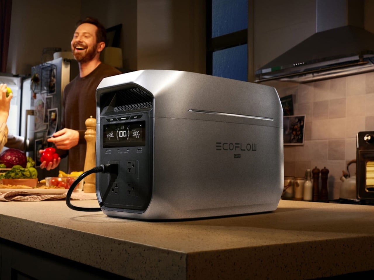
EcoFlow’s DELTA family is the brand’s bread and butter, and the DELTA 3 Max is the 2kWh sweet spot of the current lineup. It’s also the chunkiest of our three picks, measuring 19.45 x 9.41 x 12.01 inches (494 x 239 x 305mm) and weighing 44.8 pounds (20.3kg). That long, low, suitcase-like shape belongs on the floor next to the fridge, and you’ll want two hands whenever you move it. EcoFlow spends that extra bulk on muscle, and the trade feels fair once you see the output numbers. The Halloween sale has it at $899, down from $1,199, which puts it neck and neck with the Jackery on price.

You get 2,400W continuous across four AC outlets, the most of our three picks, plus EcoFlow’s X-Boost mode for resistive appliances up to 3,400W. X-Boost works by dropping the voltage, so a kettle or hair dryer runs a little slower instead of tripping the station. That’s enough headroom to run a 1,500W space heater with the fridge and router still plugged in. EcoFlow also rates it at 25dB or less when charging or discharging at 600W, which is quieter than a library. At $899, it lands at about $439 per kilowatt-hour, essentially tied with the Jackery, so the choice comes down to extra watts versus a lighter box.

Click Here to Buy Now

What we like

  • 2,400W continuous output, with X-Boost up to 3,400W, makes it the most powerful of the trio.
  • Four AC outlets, one more than the Jackery.
  • It stays under 25dB at moderate loads, so it’s easy to live with indoors.

What we dislike

  • At 44.8 pounds, it’s the heaviest of the three, roughly 9 pounds more than the Anker.
  • The long footprint eats more floor space than its boxier rivals.

The post Do yourself a favor and buy a power station now, before the energy crisis gets worse first appeared on Yanko Design.
  •  

Designers Already Prototype Hardware – Now They’re Prototyping Demand Too

Every product that finds its way onto these pages eventually meets the same crossroads: the moment a designer takes the thing public. For physical product creators chasing something original enough that established retailers won’t touch it, Kickstarter remains the most democratic proving ground available. The platform has hosted more than 654,000 campaigns since 2009, drawing over $8.5 billion in pledges from more than 23 million backers, with 2025 marking its strongest year on record. That momentum creates a seductive and specific trap: creators see the platform’s gravity and assume a beautiful product with a compelling story will naturally convert into backers. A crowdfunding agency called TCF (The Crowdfunding Formula), which holds Kickstarter Premier Partner status and has facilitated more than $520M raised across campaigns, has spent years watching that assumption fail in real time, and what they built to counter it is one of the more disciplined pre-launch processes in the business.

TCF’s methodology, recently published in full detail, centers on a single observation that most campaigns never act on: interest and purchase intent are not the same signal. Emails, follows, and comments cost nothing to give, which is why none of them predict whether a product sells. Validation asks for money, not opinions, and a small deposit on a product that does not exist yet is the closest available proxy for a real backer, because the act of paying is what carries the information, not the amount. The resulting data resolves three decisions most creators make by guesswork: the price, the positioning, and the audience, all settled before a campaign page exists, before ad spend, and before the outcome is locked in, because those are the three things most likely to break a launch and the three most often decided by assumption. It is a design methodology applied to the market, and it deserves the same respect that designers already extend to physical prototyping.

Circular Ring 2

How a $2 Deposit Separates the Buyers from the Browsers

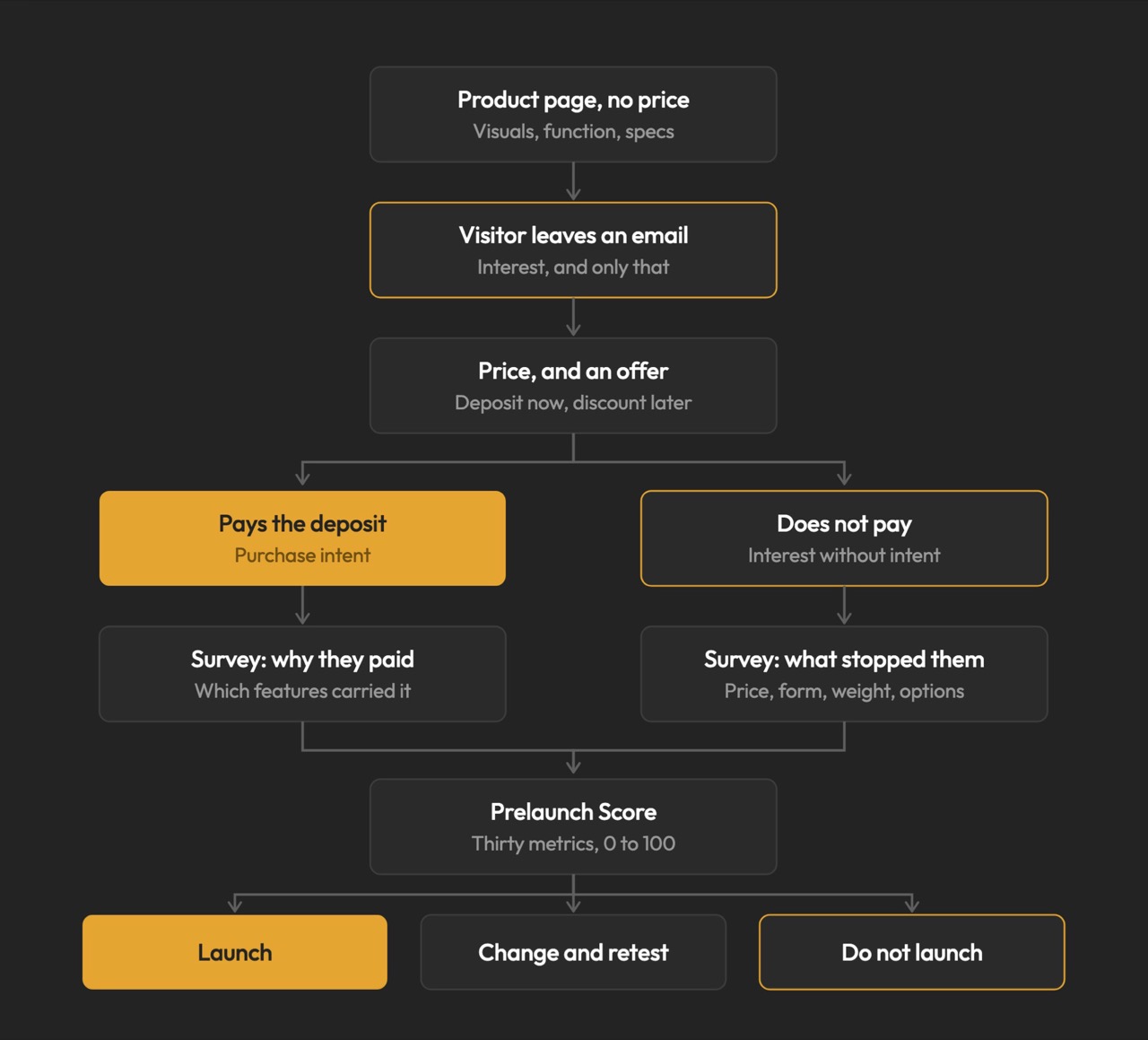
The process runs on Prelaunch.com. A product page goes live showing the product, the visuals, what it does, how it works, and the characteristics that make it different, with no price. Visitors who want to know more leave their email address, which is the interest signal and only that. A second page then opens, presenting the price alongside an offer: put down a deposit today and receive a discount when it launches. Someone who pays has moved from liking the product to paying for a product with no campaign page, no ship date, and no reviews. Someone who does not pay is interested but not convinced, and that is a result too.

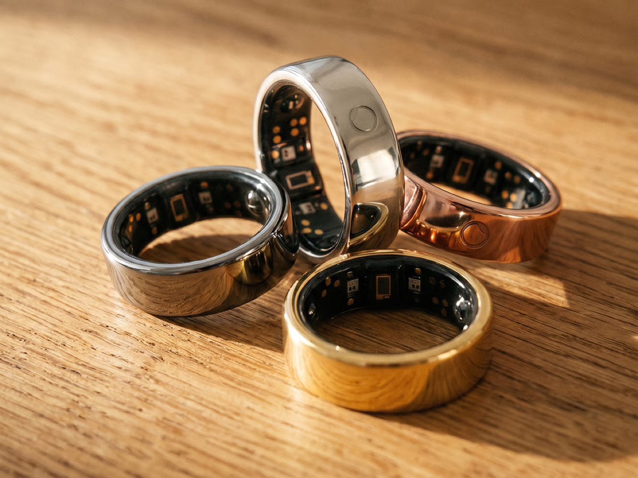
The pushback the deposit mechanism reliably attracts is predictable: does $2 actually prove anything about future purchase behavior? The deposit is the part people push back on, but the $2 is not the point. The act is the point. Getting up, finding a card, and typing the numbers in for something with no campaign page, no ship date, and no reviews is a different order of behavior from tapping a heart, and the people who do it are the closest thing to your future backers that exists before you have any. The Circular Ring 2, a smart health ring, funded in just four minutes and crossed $2.5 million in pledges in under 40 days. Products that open with that kind of velocity tend to do so because the audience already knows it wants the thing, and that certainty is built long before a campaign goes live.

Image Credits: TCF

The Rejection Data Is the Brief

The survey is where validation stops being a scoreboard and starts being useful. From the people who reserved, you learn what actually moved them: whether it was the color, the form, a specific function, the price, or the promise, and which features are carrying the product versus which ones you have been overselling. From the people who left an email and then did not pay, you learn something you cannot get anywhere else: exactly where you lost them, and what would change their mind. The color they wanted was not there. The shape was wrong. It looked too heavy. The price was too high. These are the people who were close enough to care and honest enough to walk away, and their answers are a list of things you can fix before the fix costs anything.

This is co-creation in the most literal sense: meeting your potential buyers before you launch, and letting them tell you what to build. A creator who learns that 60% of their non-converting subscribers balked at weight has a design brief, not a marketing problem. A creator who discovers that two colorways were widely expected but absent has a specification list, not a gap in their ad copy. The survey turns a theoretical audience into an actively contributing one, delivering feedback while the product can still absorb it. Kickstarter’s most successful campaigns tend to share that structure: they do not open to strangers, they open to people who were already consulted.

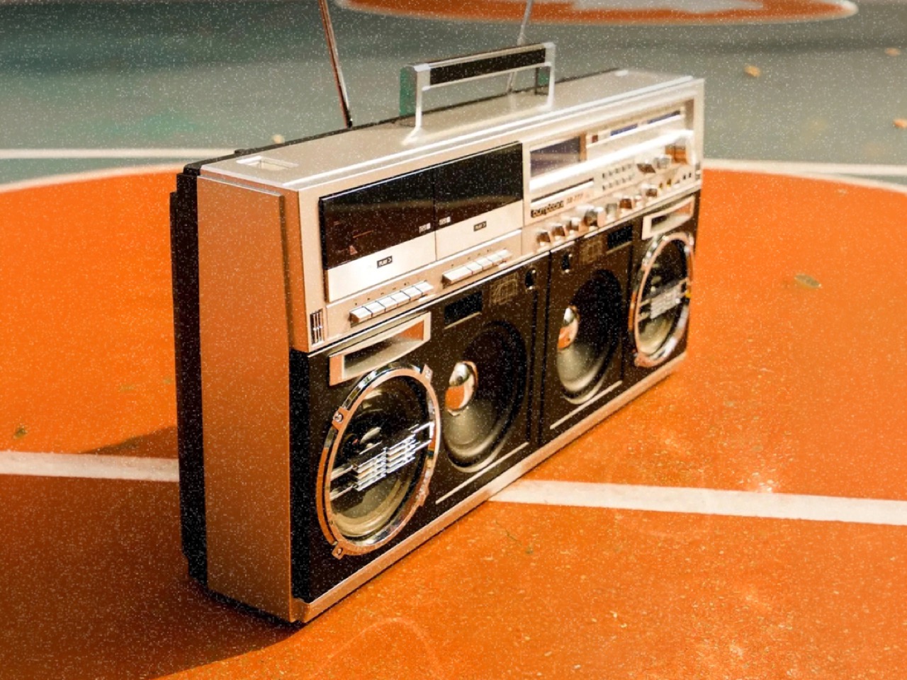
BB-777 Boombox

Why Validation Doesn’t Always Mean Lowering Your Price

Creators tend to assume validation exists to talk them down. It does not. One agency ran validation on a pet product priced at $30 a unit, and the data showed the right price was $40. The creator had been leaving money on the table, and no amount of instinct would have told them that, because instinct in that situation almost always argues for the safer, lower number. No stated-preference survey, no focus group, and no amount of social engagement would have surfaced it, because stated preference and paid behavior are different instruments measuring entirely different things. Validation is where you settle positioning and audience rather than guessing at them, running price variations, testing different messaging, and finding which audience responds before you have committed to a single frame of campaign video. The point is to find the price, the position, and the audience that let the product reach its full potential, and then launch into that.

The validated price sets reward tiers, and the early discount tested during validation is a trigger that has already been watched working, rather than one you hope will. The reserver surveys told you which characteristics did the persuading, which decides your headline, your hero shot, and the order of your video. You are not inventing arguments for the product; you are repeating the ones your buyers already made. Running price variations and messaging tests before a single production decision is committed changes the campaign from a bet into a brief. The learning does not expire when the campaign closes. A validated price, position, and audience are the same three things an e-commerce store runs on, which is what lets a product keep scaling after the campaign instead of peaking with it.

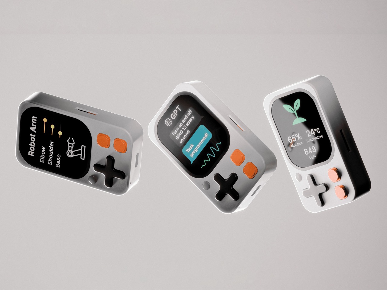
Kode Dot

The Designer’s Instinct Problem and Why Demand Needs Its Own Prototype

The design process and the validation process ask for decisions in different orders, and that difference matters more than it first appears. A designer who arrives at a product through material, form, and function is not naturally thinking about reservation rates. Validation is the design loop pointed at the three things a physical prototype cannot test: what people will pay, how the product should be framed, and who it is really for. Designers already accept this discipline everywhere else; nobody tools up an injection mold without a prototype. A “do not launch” result from this process is a success, saving a creator a year, a production run, and the damage of a public failure. A careful launch protects more than the person running it; it protects the shared resource of backer trust, which every quiet project erodes.

The question worth answering before a launch is not how big a campaign you can build. It is what you can prove before you build it. Whether that discipline becomes standard practice across the crowdfunding ecosystem or remains the habit of the more methodical subset of creators, the underlying argument is one any designer can recognize. You do not ship a mechanism you have not tested. Treating the market as the final untested component, rather than an assumption baked into launch day, is the shift the methodology is asking for. Across hundreds of millions of dollars raised in crowdfunding projects, the cases where testing these three things costs more than getting them wrong are functionally nonexistent.

The post Designers Already Prototype Hardware – Now They’re Prototyping Demand Too first appeared on Yanko Design.

  •  

5 Things the iPhone Duo Got Right That Samsung Still Hasn’t

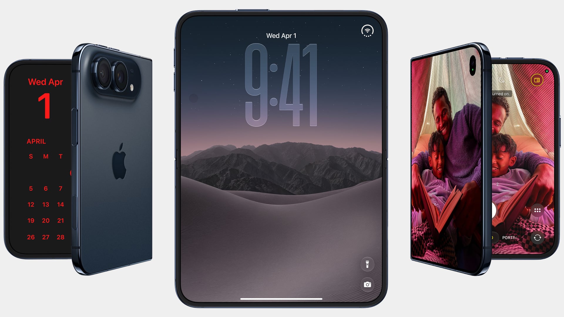
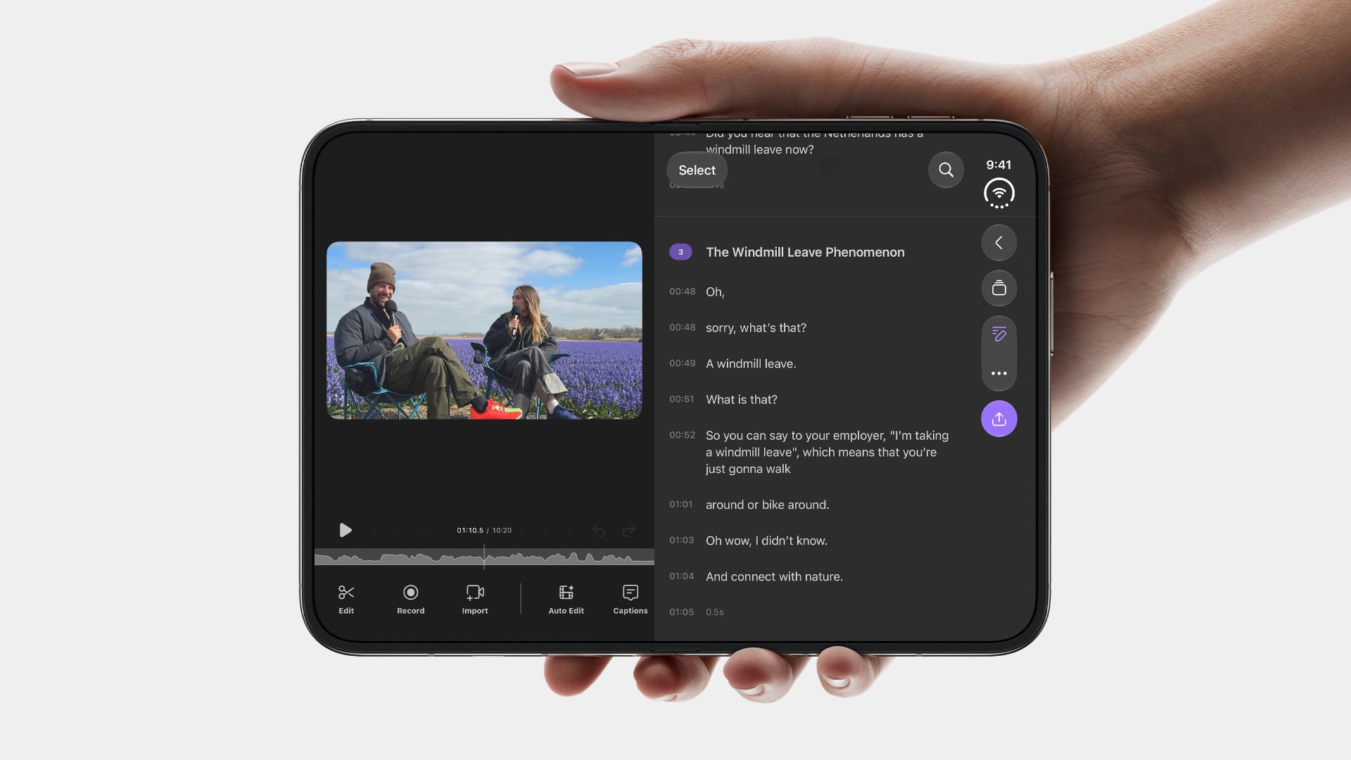
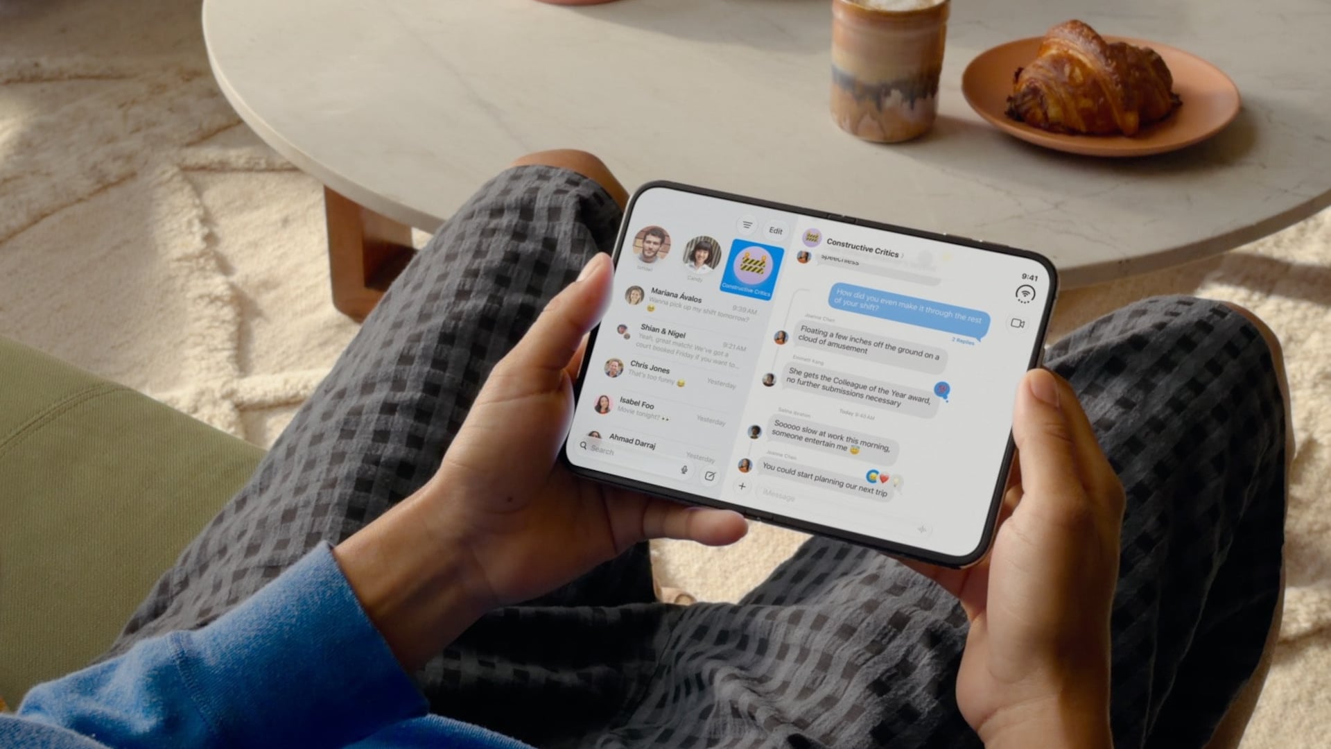
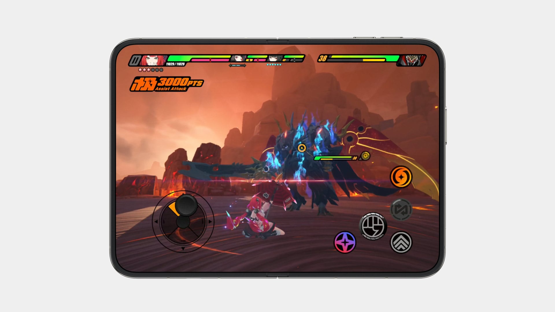
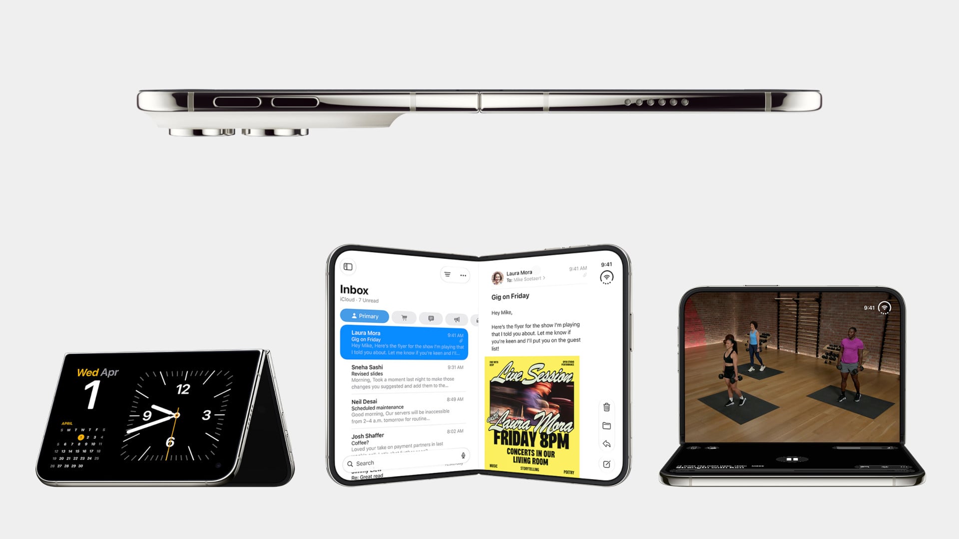
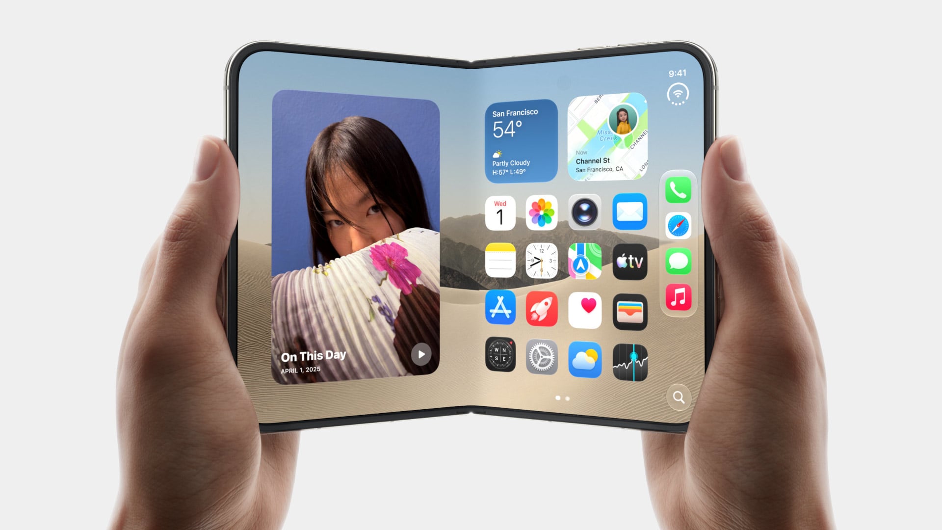
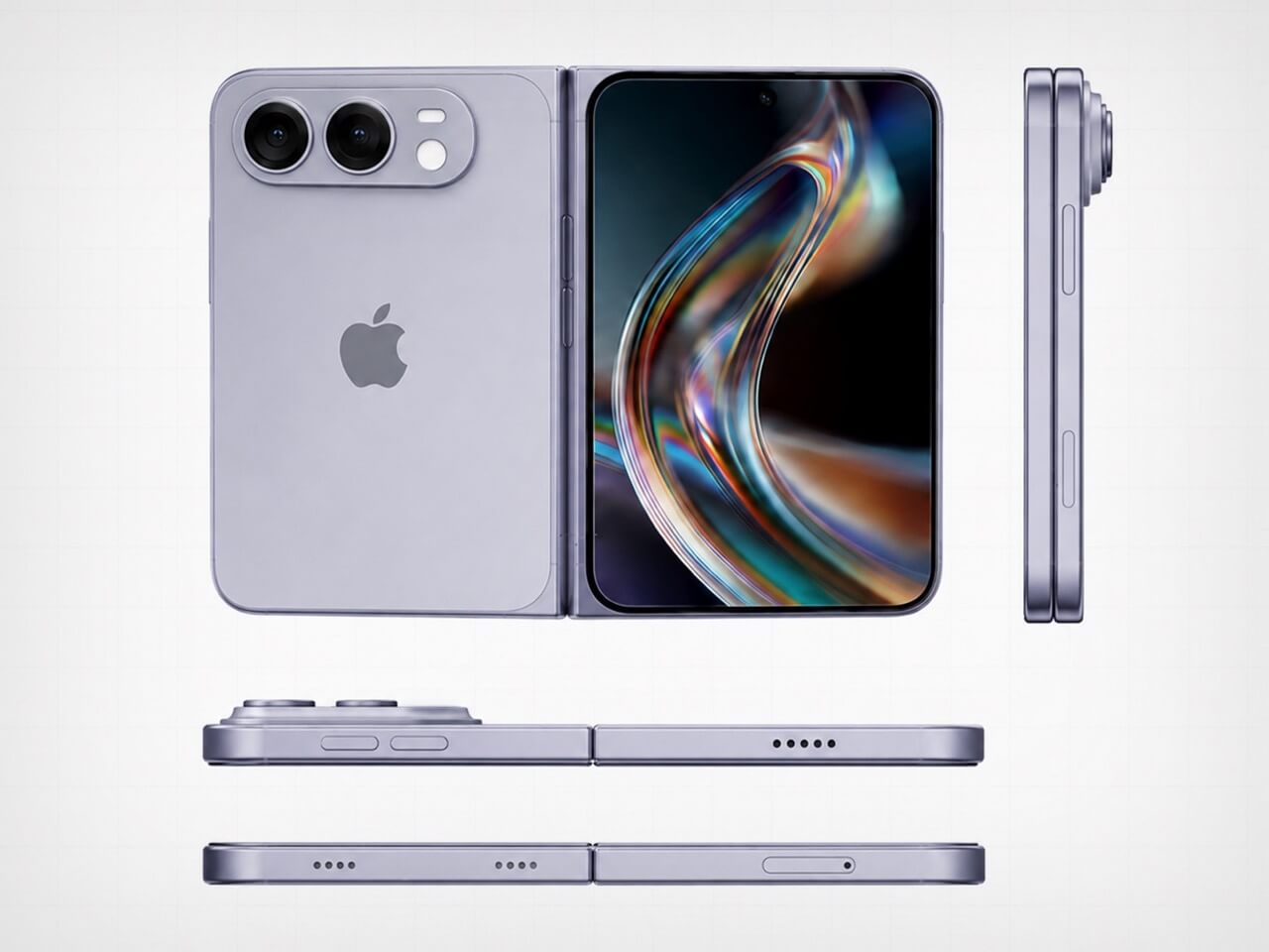
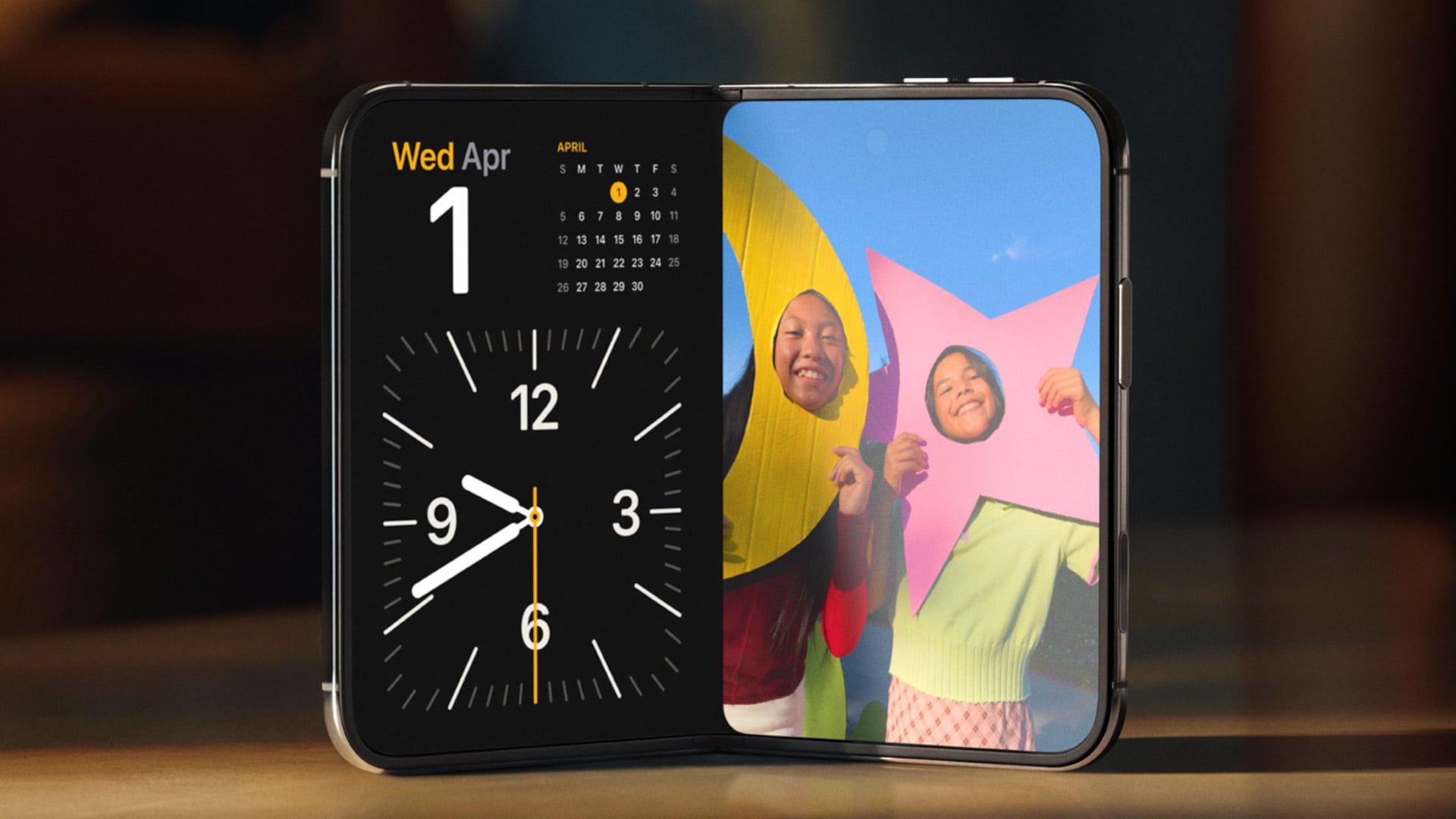
Samsung has had the folding phone conversation to itself for six years now, tweaking hinges, shrinking creases, and figuring out what a cover screen is even for. Apple waited, watched, and let its rival make every mistake first. That patience shows in the iPhone Duo, a first-generation foldable that skipped straight past problems Samsung’s Galaxy Z Fold8 still hasn’t fully solved.

None of that comes cheap, though. The Duo starts at $1,999 and costs more than the Fold8’s $1,899.99, weighs in at roughly nine ounces against the Fold8’s seven, and folds up thicker in your pocket, besides. Samsung still wins those arguments outright, and we’ll get back to that later. But set weight and price aside, because here are five places where Apple’s first foldable actually beat Samsung’s eighth attempt.

Designer: Apple

The Camera That Disappears

A foldable phone’s whole pitch is the screen, one continuous surface that opens up into something closer to a small tablet. Every notch or punch-hole cut into that surface breaks the illusion a little, reminding you that the software is still working around a sensor buried in the glass. Samsung’s Galaxy Z Fold8 has never quite escaped that compromise, even eight generations in.

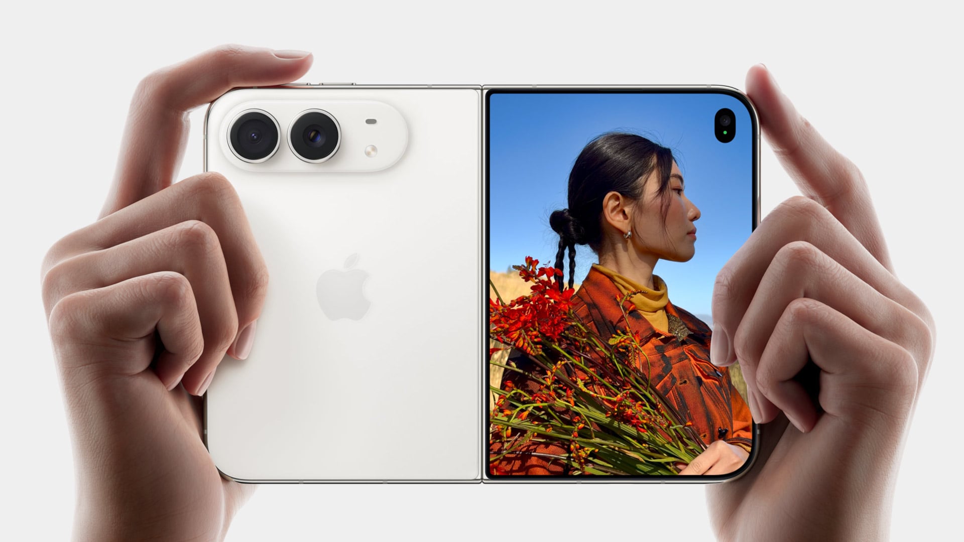
The Galaxy Z Fold8 carries a 10-megapixel camera punched into both the inner and cover displays, a hole you notice every time the screen lights up. The Duo takes a different route entirely, tucking its inner selfie camera under the panel itself so nothing interrupts the display when you’re watching a movie or scrolling through photos with both halves open. The outer screen keeps a single, smaller cutout.

A Stylus Samsung Gave Up On

Samsung built its whole Note legacy around the S Pen, then carried that stylus into the first few generations of the Galaxy Z Fold before quietly dropping it this cycle. Neither the Galaxy Z Fold8 nor the Galaxy Z Fold8 Ultra bring it back, leaving a gap for anyone who used to sketch, sign, or jot notes onto that big inner display. It’s a strange retreat for a company built on that exact feature.

Samsung Galaxy Z Fold6

Apple Pencil support changes that, working on both the 5.4-inch cover screen and the 7.6-inch inner display, once it arrives. Dual-screen support lands through a software update later this year rather than at launch, so early buyers will have to wait a bit for the full experience. Still, it means signing a document or sketching an idea won’t require unfolding the phone first, something Samsung’s lineup can no longer offer.

Built to Survive the Mess

Dust is the part of durability testing everyone forgets about until it’s too late, and a folding hinge is the worst possible place for grit to sneak into. Water resistance ratings get all the marketing attention, but the dust half of an IP rating tells you whether sand at the beach or fine construction dust will actually make it past the seals and start scratching at the mechanism underneath.

The iPhone Duo carries an IP68 rating, meaning the seal is dust-tight; nothing gets through, full stop. The Galaxy Z Fold8 only manages IP48, which covers water fine but leaves that dust digit low enough that fine particles, sand, and powder aren’t actually kept out. For anyone who takes their foldable to a beach, a workshop, or just a dusty backpack, that gap matters more than it looks.

Room for Everything You Shoot

A foldable’s bigger inner screen practically begs you to shoot more video and drag around heavier files, whether that’s 4K footage, a stack of RAW photos, or a library of apps you’d never bother installing on a regular phone. Storage stops being an afterthought pretty quickly once you’re using the extra screen real estate the way it’s meant to be used, for actual creative work instead of just bigger icons.

Apple tops out the iPhone Duo at 2TB of storage, double what the Galaxy Z Fold8 offers at its 1TB ceiling. That’s the difference between planning around your camera roll on a long trip and simply forgetting storage exists as a problem. For anyone who treats their foldable as a mobile production tool rather than a bigger email client, that extra headroom ends up mattering more than the megapixel count.

Fighting the Fold’s Oldest Flaw

The crease down the middle of a folding screen has been the one problem no manufacturer has fully cracked, Samsung included, no matter how many generations they’ve shipped. Apple’s approach to the Duo’s hinge stacks a nano-texture matte layer over glide-adhesive glass and backs the whole assembly with a titanium plate, an engineering answer to a problem that’s mostly been treated as unavoidable elsewhere in the industry.

Early impressions from outlets with briefing access suggest the crease is still visible. Nobody’s claiming otherwise, but it doesn’t catch your finger or your attention the way it does on most rivals, the Galaxy Z Fold8 included. That’s worth flagging as an early read rather than a verified result, since neither phone has landed in reviewers’ hands yet. Outdoor glare handling gets similar praise, though the real test comes once these ship.

What Samsung Still Gets Right

None of this makes the Galaxy Z Fold8 a bad phone, and Samsung still wins the arguments that matter most to plenty of buyers. It’s $99.01 cheaper, noticeably lighter at roughly seven ounces against the Duo’s nine, and thinner whether it’s folded shut in your pocket or opened flat on a desk. Those are real, measurable advantages, not consolation prizes.

Apple iPhone Duo

Samsung Galaxy Z Fold8

What you’re really choosing between is a phone that’s been refined for eight generations and one making its very first attempt, price and weight included. A first try that already beats its rival on a camera, a stylus, a durability rating, storage, and a hinge design is a strong opening argument, whatever it costs to get there. Samsung’s turn to respond comes next year.

The post 5 Things the iPhone Duo Got Right That Samsung Still Hasn’t first appeared on Yanko Design.

  •  

Apple is Building a Short, Wide iPhone Ultra… Now It Owes Us an Actual iPhone Mini

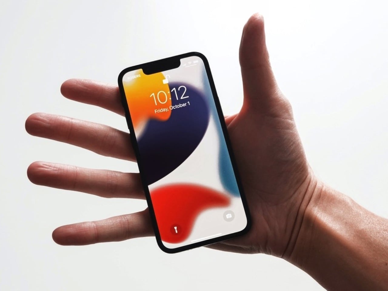
I have a friend who still uses an iPhone 13 mini held together by a case and pure spite, and every single time a new iPhone launches, she asks me the same question. Is it small yet. It never is. Apple has spent years telling us, implicitly, that small phones do not sell, that the market has spoken, that everyone wants a bigger canvas for videos and games and doomscrolling. Fine, sure, the sales numbers backed that up in 2023. But sales numbers do not mean the desire disappeared, they mean the alternative was not good enough to fight for.

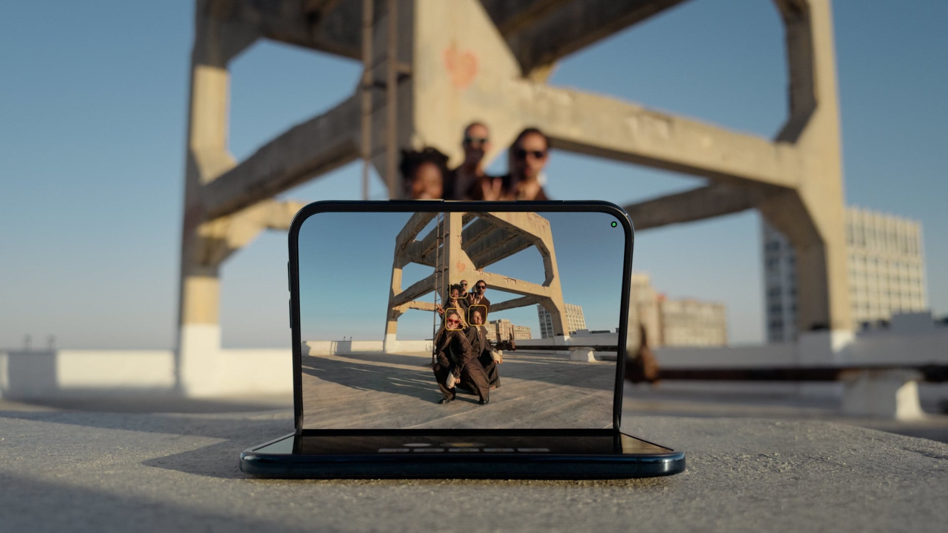
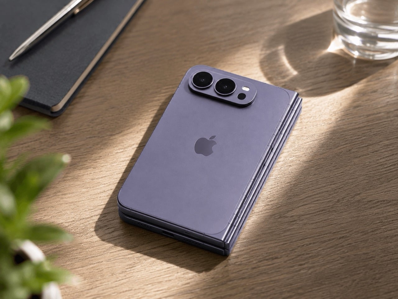
Which brings me to the iPhone Ultra, Apple’s rumored first foldable, expected to close into a short, squat, almost passport-shaped little brick before you unfold it into something the size of an iPad mini. That folded shape is the closest thing to mini energy Apple has shown in years, and it is buried inside a two thousand dollar folding phone nobody asked to be the delivery method. My friend does not want an iPad mini that folds. She wants her 13 mini, but new. Apple already built the shape. It just built it around the wrong phone.

Designer: Apple

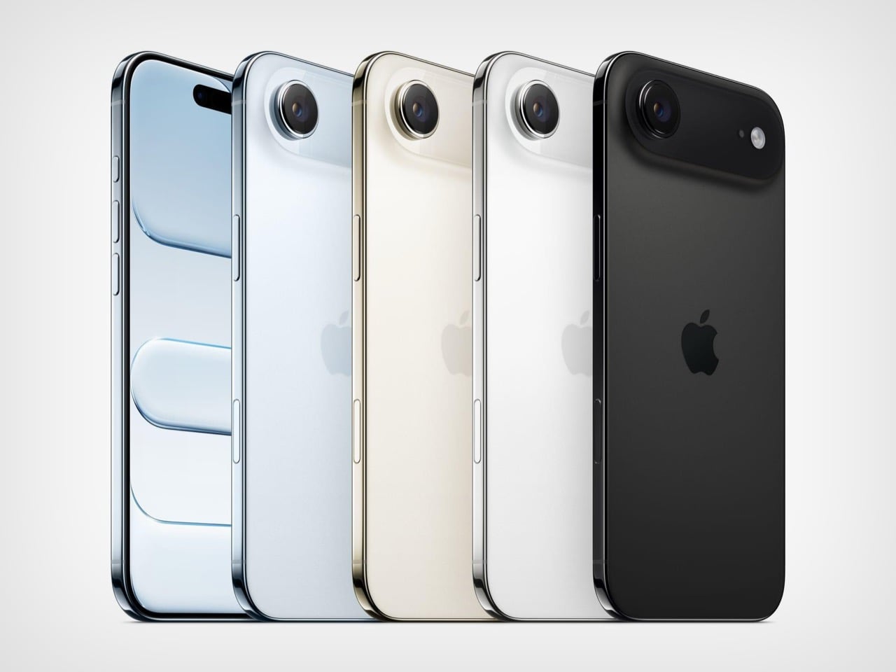
The Air existed to answer a question almost nobody was asking at checkout, namely how thin can a phone get before the internals start filing complaints. It was a genuine engineering flex, the kind of thing that looks incredible in a teardown video and slightly pointless in daily use. I understood what it was trying to prove. I just never needed it proven to me personally, and I doubt I was alone in that.

The Ultra is rumored to repeat that exact flex, except this time the thinness gets folded in half, closing down to somewhere between 9 and 9.5mm shut and reportedly as thin as 4.5mm open, according to recent leaks. That is a genuinely wild number for a phone with a hinge in it. Apple is once again proving it can do the hard, borderline unnecessary engineering thing. The difference is that this time, buried inside that flex, is an actual shape people have been begging for since 2023. Apple just does not seem to have noticed it yet.

Go back and look at what the 13 mini actually was for a second, because I think people forget how unremarkable the compromise really was. It measured 131.5mm tall, 64.2mm wide, weighed 141 grams, and ran the exact same A15 chip as the standard 13. You gave up battery life and screen real estate. You did not give up the flagship experience shrunk down to fit an actual hand. Compare that to where the standard iPhone lineup sits today, regularly north of 6.1 inches before you even get to Pro Max territory, and the gap the mini used to fill has only gotten wider and lonelier.

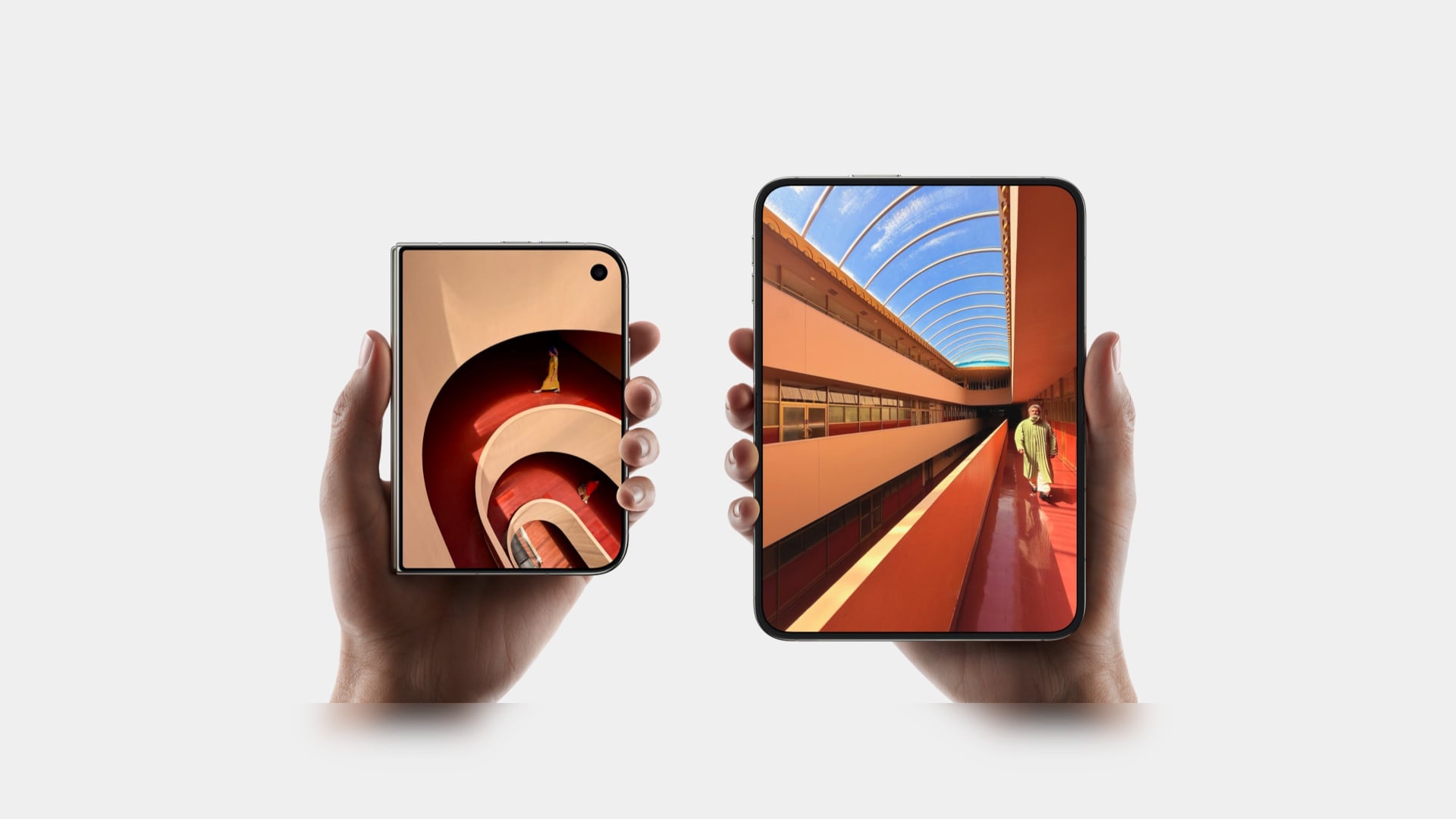
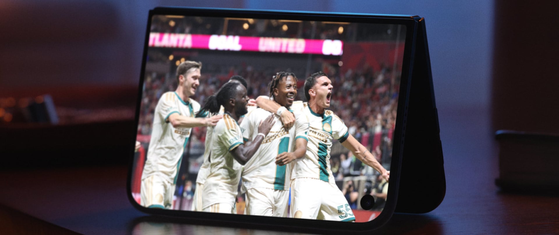
Now put the Ultra’s folded footprint next to that. Reports point to a 5.5 inch cover display when shut, in a short, wide, passport style shell that is about as close to mini adjacent proportions as Apple has shipped since the mini died. The catch is that this compact shell only exists as a doorway into a 7.8 inch, 4:3 inner screen and a starting price rumored to land somewhere between 1,999 and 2,499 dollars. Nobody buying that phone is buying it to have something small in their pocket. They are buying an iPad mini that happens to fold shut, which is a completely different pitch than the one my friend has been asking me about for three years running.

There has been some loose speculation, mostly a 9to5Mac piece from last year, that Apple’s new staggered launch schedule could theoretically clear a runway for a smaller phone somewhere down the line. Even that piece called the odds slim to none, and nothing currently on Apple’s roadmap for the 18, 18e, 18 Pro, or Ultra includes a mini in any form. Samsung, for what it is worth, has stuck with its Z Flip clamshell as its own answer to compact, so the appetite for small has not vanished industry wide, it has just gone unanswered on Apple’s side of the fence for a while now.

So here is the pitch, and it is not a complicated one. Apple has now proven twice, once with the Air and once with the Ultra’s folded shell, that it can engineer real compactness without breaking anything important. Skip the fold. Skip the tablet trapped inside a phone shaped envelope. Take that exact short, wide, passport sized footprint and wrap a single, non folding screen around it, call it a mini, and ship it. Apple does not need a new idea here. It already built one. It just keeps hiding it inside features nobody was asking it to attach to.

The post Apple is Building a Short, Wide iPhone Ultra… Now It Owes Us an Actual iPhone Mini first appeared on Yanko Design.

  •  

The Pixel 11’s Coolest New Feature Is Actually 10 Years Old

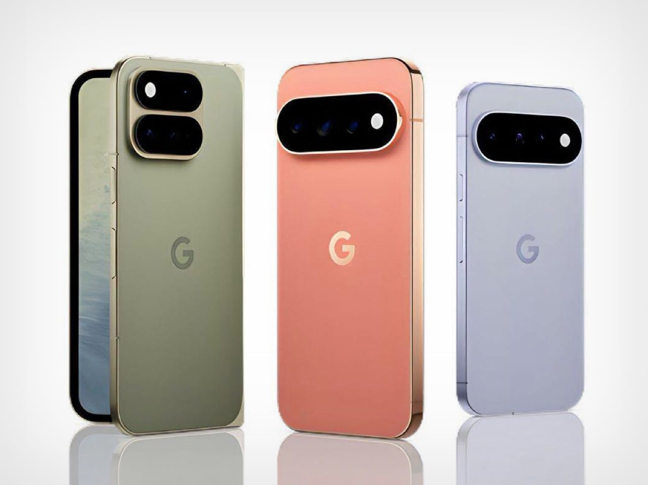
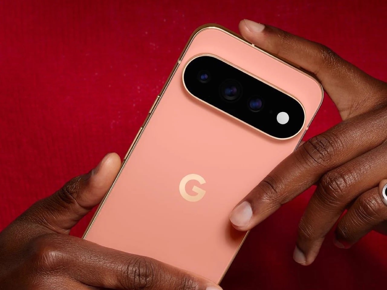
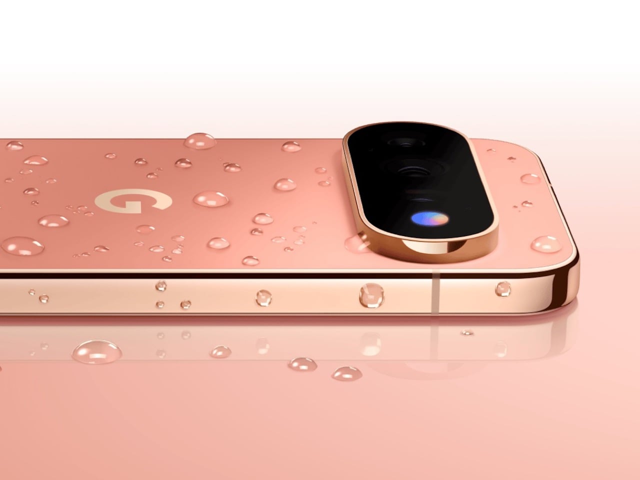
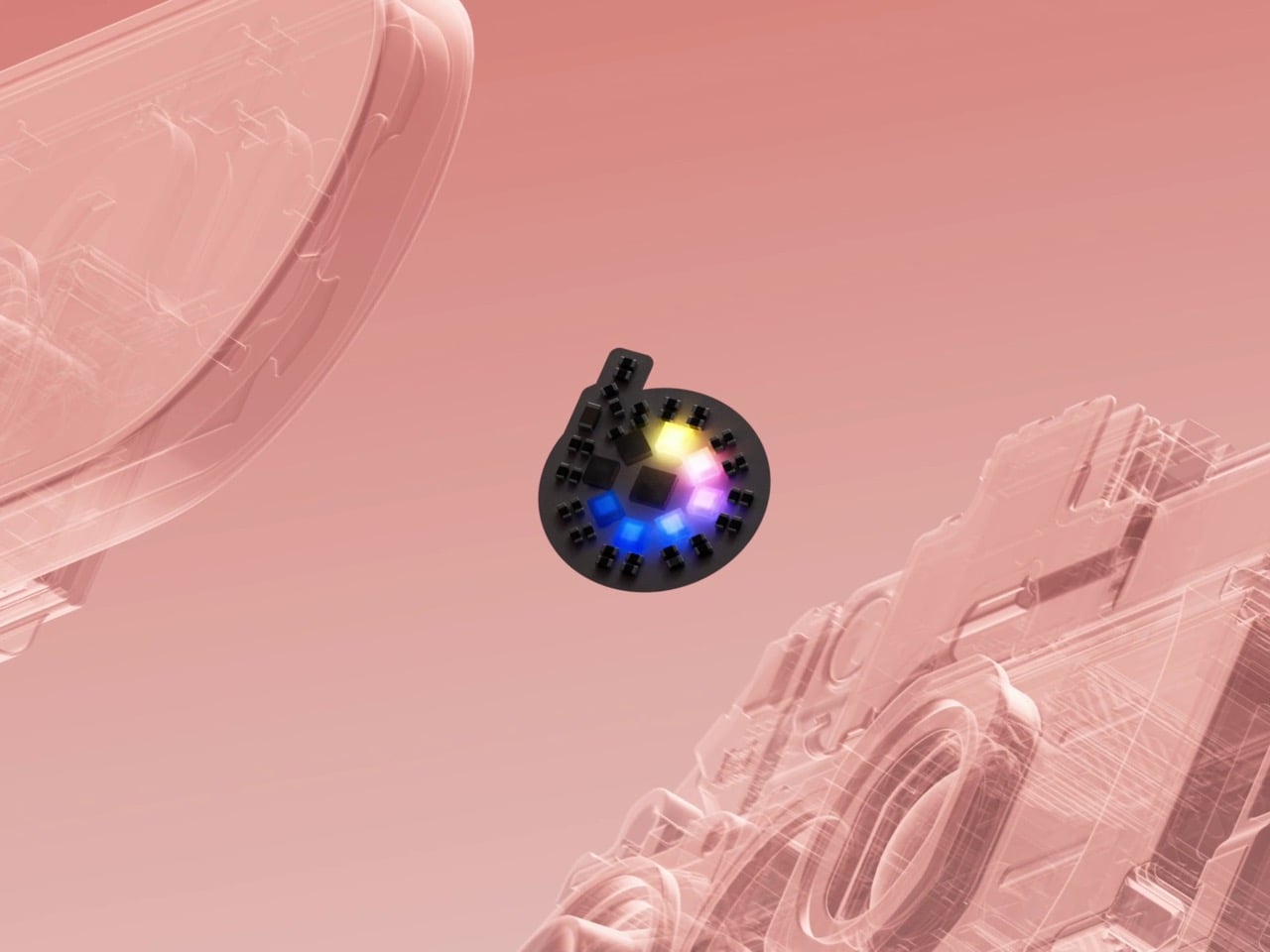
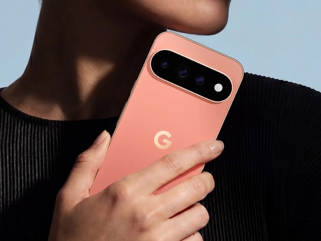
The Pixel 11 lineup arrived this week with a genuinely great redesign. The camera bar is 40 percent thinner, the glass runs edge to edge, and for the first time in a while a Pixel actually looks like it evolved instead of just got a new coat of paint. And then there’s HiLight, the one piece of new hardware Google actually wants you to talk about. A small LED cluster tucked into the corner of that same camera bar, ready to glow when Gemini is thinking or when someone you love is calling.

It is, in essence, Google finally admitting it missed the old Nexus notification LED and bringing it back. Five colors, a glow for Gemini, a glow for your favorite caller, and that’s the whole feature list on day one. Nothing to complain about here, except that Nothing exists. The London phone brand has spent years turning its own version of this idea into an actual playground, mini-games, custom widgets, an SDK anyone can build on. Google clearly has the engineering muscle to do something just as ambitious with HiLight down the line. It just chose not to, at least not yet.

Designer: Google

Before we get into that though, credit where it’s due. Hold a Pixel 11 next to a Pixel 10 and the difference is immediate, not the kind that only shows up in marketing photos. The bar sits almost flush now, and Google’s claim that it’s basically bumpless with a case on actually checks out in person. Under that glass, Tensor G6 lands on a 2nm node, Google’s first, promising 25 percent faster browsing, 15 percent quicker app launches, and on-device AI running up to 3.5 times faster while using less power. The Pixel 11 gets a new 48MP main sensor with 56 percent more light sensitivity and a telephoto stretching to 30x Super Zoom. This is a very complete phone before you even get to the Pro models.

The Pro and Pro XL push further with a 50MP main sensor, a redesigned 48MP telephoto, Portrait Mode at 5x, and 120x Pro Zoom, sitting under a 3,600-nit display that Google claims is twice as scratch resistant as last year’s. Titan M3 adds quantum-safe boot security on top. The Pixel 11 Pro Fold deserves its own mention here too. It shed almost 10 percent of its weight and a millimeter of thickness, down to 10.1mm closed, while Google claims triple the durability thanks to a redesigned gearless hinge. The crease is genuinely harder to spot than last year’s, and the whole thing folds flat enough to stop feeling like a novelty. If you told me a year ago Google would have the most convincing foldable in its own lineup, I would not have believed you.

Now, the part everyone will bring up regardless of how the rest of this goes: RAM. The Pro and Pro XL start at 12GB in their base 256GB configs, down from 16GB last year, and Google is blaming this on a supplier RAM shortage hitting the entire industry. Memory manufacturers have been shifting production capacity toward AI server chips, and consumer RAM and NAND prices have spiked hard enough this year that people are half-jokingly calling it RAMageddon. It is a real problem, and Google is far from the only phone maker feeling it. Storage doubling to 256GB as a base softens the blow a little, but a $100 price bump alongside a RAM cut is still a hard sell. Fair enough on the supply chain excuse. Less fair asking Pro buyers to pay more for less unless they climb a storage tier.

Back to HiLight, because it deserves the real estate. That LED cluster sits right where the temperature sensor used to live on older Pixels, which is a strange trade to make for something this limited. Google’s official pitch is that HiLight keeps you informed without the distraction of staring at a screen, which is a very polished way of saying there weren’t enough ideas to fill the space. Glowing when Gemini talks and flashing a color for favorite callers is a fine start, not an entire feature. Compare that to what’s happening across the pond. Nothing’s Glyph Matrix on the Phone (3) packs 489 individually lit LEDs into what functions as a tiny secondary screen, complete with an open SDK that lets anyone build their own widgets and games. People made a working ball maze. A tilt-controlled Magic 8 Ball. A contact dialer you can use without touching the main display. None of it is essential, but all of it is fun, and fun counts for something when you’re asking someone to pay a premium for a light.

Google clearly has the horsepower for something bigger here. Tensor G6 alone proves the company isn’t short on engineering muscle, and the camera bar redesign shows the industrial design team knows exactly what it’s doing right now. HiLight feels like the output of a team that had a great idea, then stopped one meeting short of making it good. I want to see where this goes in a year or two, because the foundation Google just built, the hardware, the placement, even the name, is genuinely solid. It just needs an actual reason to exist beyond telling you Gemini is thinking.


The post The Pixel 11’s Coolest New Feature Is Actually 10 Years Old first appeared on Yanko Design.

  •  

Google’s Pixel Tag is making the same ‘boring’ design mistake that Apple, Samsung, and Xiaomi made

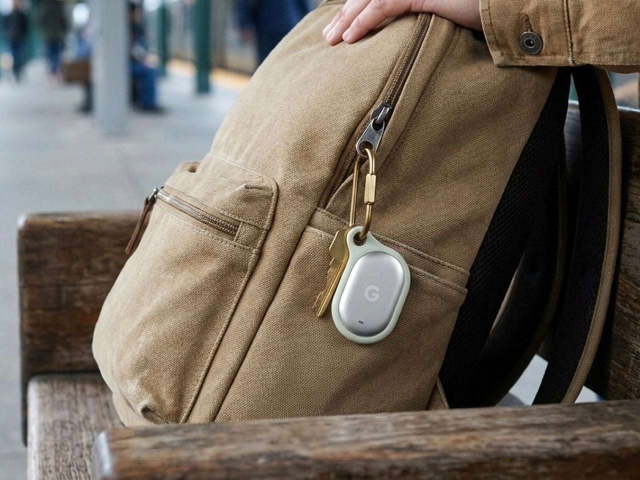
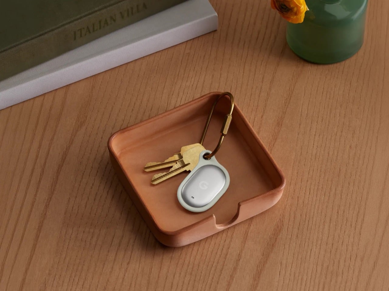
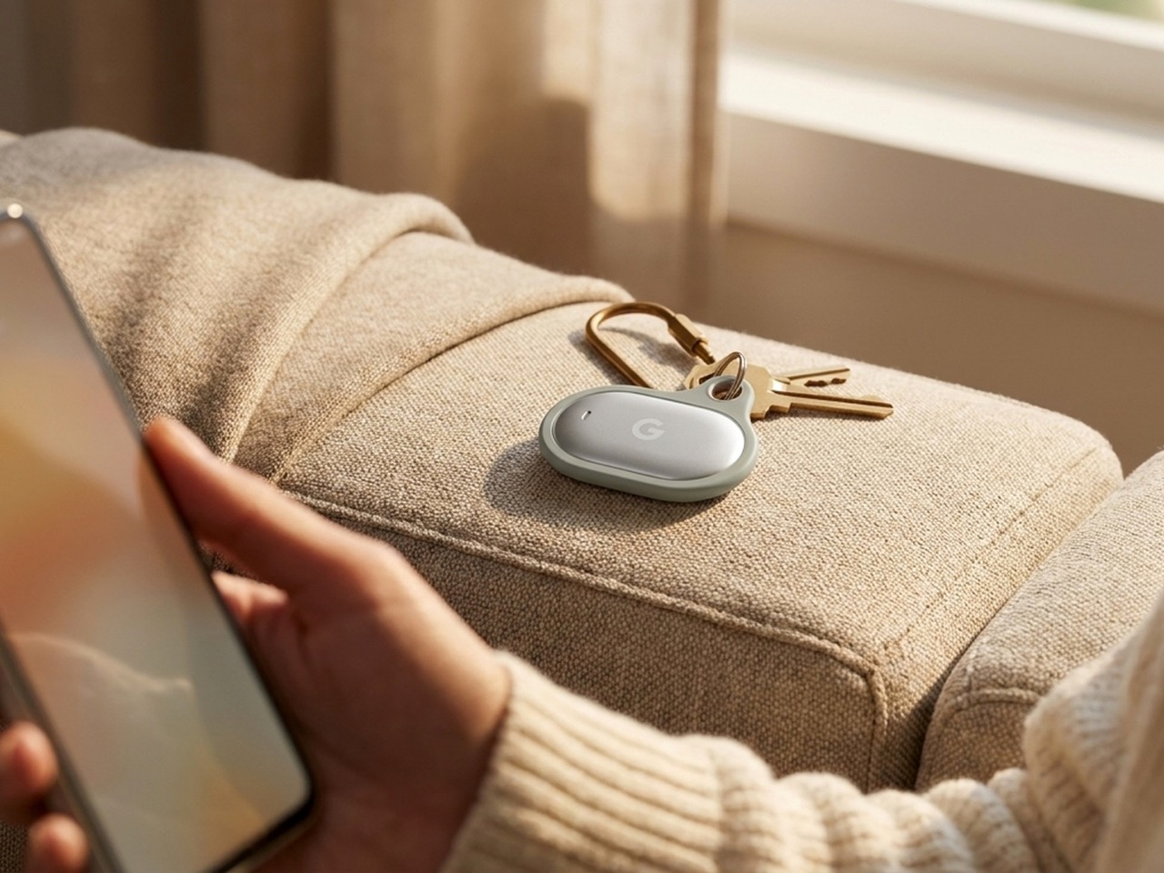
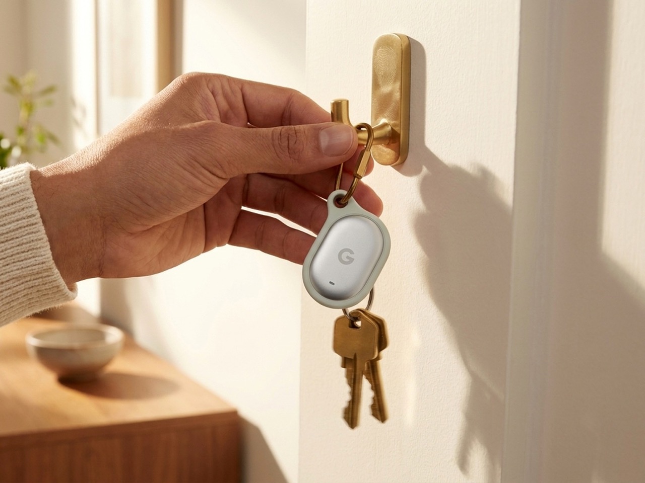
The Pixel Tag comes in exactly one color, a grey green called Fog, wrapped around stainless steel with a G logo stamped right on the front. It’s the same script Apple wrote with the AirTag and Samsung copied with the SmartTag2. A tracker spends its entire life clipped to your keys or your dog’s collar or tucked into a backpack pocket, which makes it one of the most personal objects you own. Google, of all companies, knows how to make hardware feel less like hardware. It just didn’t bother here.

Somebody at DJI figured out that a $60 microphone could come with snap-on decals, because apparently even a tiny accessory deserves a little personality. Motorola figured out something similar with the Moto Tag, which actually ships in sage green and a soft blue instead of the usual black or white default. So it’s not like nobody in tech has thought about this. It’s just that almost nobody applies it to trackers, and now Google has joined the long list of companies that had the chance and passed.

Designer: Google

The excuse I keep hearing, and I use that word deliberately, is durability. Metal survives drops, fabric doesn’t, case closed. Except my phone survives daily abuse inside a woven case, and so does yours, and so does every rugged Kevlar sleeve sold by the millions for devices far more fragile than a coin sized tracker. Nobody worries their phone case is going to disintegrate because it has some texture on it. A tracker being too delicate for color or grip is not a real constraint. It’s a decision that got dressed up as one.

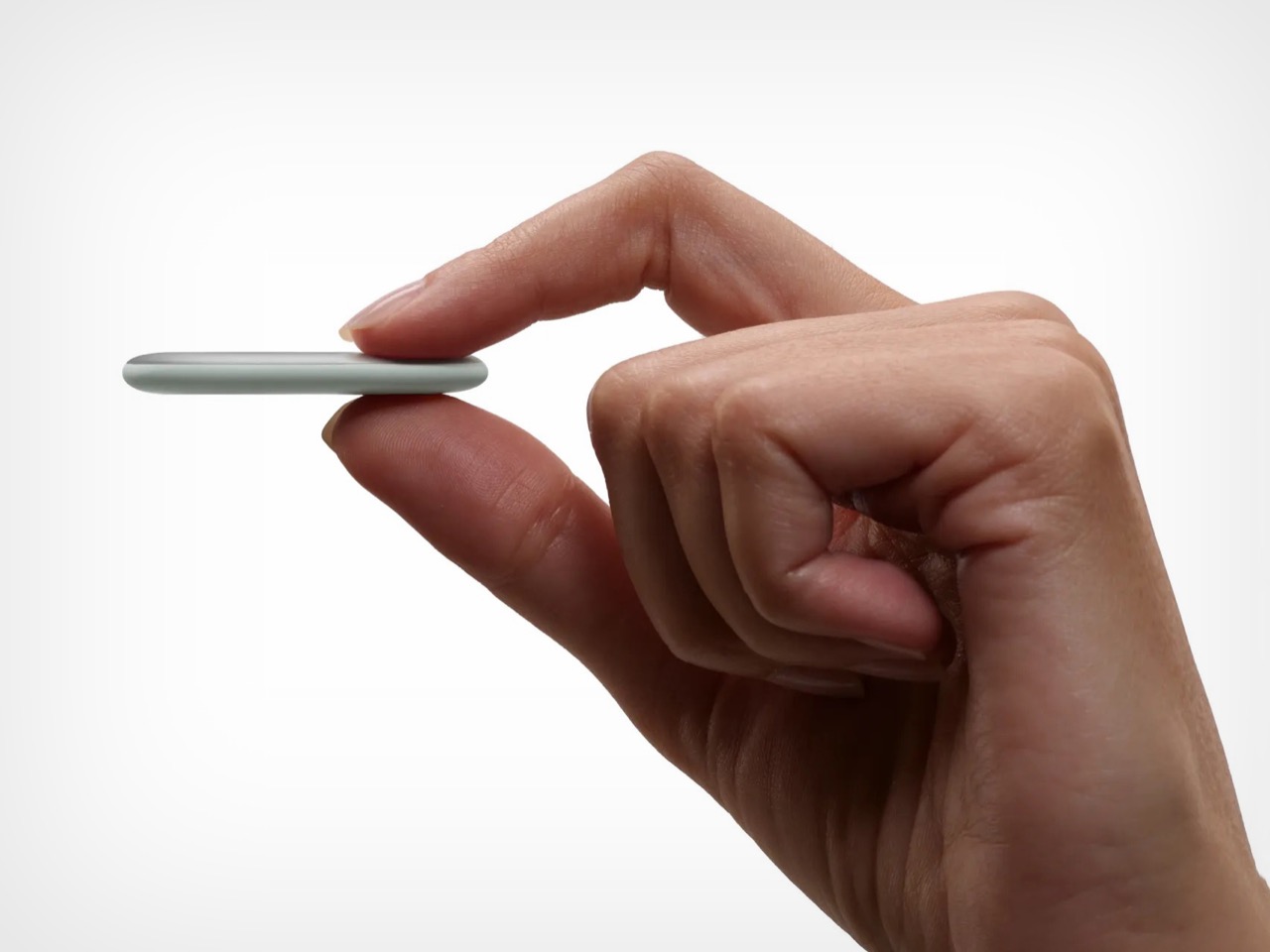
Underneath that decision is genuinely solid engineering, for what it’s worth. The Pixel Tag measures 1.8 by 1.1 inches and just 5.4mm thick, which makes it noticeably slimmer than the AirTag’s 8mm body. It runs on a replaceable CR2032 battery rated for about a year, carries an IP67 rating for dust and water, and pairs instantly over Fast Pair with any Android 9 device or newer. The headline feature is Ultra Wideband combined with Bluetooth Channel Sounding, which gives you a literal on-screen arrow and distance reading instead of a vague “getting warmer” signal, though that trick needs Android 16 and Bluetooth 6.0 to actually work. It taps into Find Hub, Google’s network of over a billion Android phones, so a lost item can get spotted even when it is nowhere near your own devices. You can share access with up to ten people, ring it from a Pixel Watch, or ask Gemini through your Pixel Buds to ring it for you. All of that ships November 11 for $29, or $99 for a four pack.

Google already knows how to wrap good engineering in an object people actually want to look at, because it solved the exact same brief years ago with its speakers. The Nest Mini gets a soft, woven top because Google understood people don’t want to display a hunk of bare plastic on their kitchen counter. The Nest Audio does the same thing, fabric front, rounded edges, an object designed to belong in a room rather than announce itself as a gadget in one. That instinct exists inside the same company that just shipped a keychain accessory in one shade of grey with a logo dead center, like it needed to remind you it’s tech.

A tracker’s entire job is to sit quietly on the stuff you actually care about. It should feel like something you chose, not something you tolerated because the tech underneath happened to be good. Find Hub integration, UWB precision finding, a battery that lasts a year, all of that is genuinely solid work. But solid engineering wrapped in a logo stamped on steel isn’t a finished product. It’s half of one, and Google, weirdly, is the company with the least excuse for stopping there.

The post Google’s Pixel Tag is making the same ‘boring’ design mistake that Apple, Samsung, and Xiaomi made first appeared on Yanko Design.
  •  
❌