❌

Vue lecture

HackerBooks - Les bouquins préférés des geeks, triés par Claude

Samedi, pendant que vous étiez tous en manif, Andrej Karpathy a demandé à Claude de lui fabriquer un YouTube à partir de toutes les merveilleuses vidéos que les gens se recommandent sur HackerNews et ça a donné naissance à HackerTube . Déjà rien que ça c'est top !

Mais moi ce qui m'a encore plus c'est que le lendemain Roansh a fait pareil avec les bouquins en laissant Claude coder HackerBooks .

Et voilà comment on se retrouve avec une bibliothèque de 15 766 livres tirés de 281 363 mentions HN publiées depuis 2007. Et un livre n'y figure que s'il a été cité par au moins 2 personnes différentes. Ensuite chaque fiche renvoie aux commentaires qui en parlent et il y a même des suggestions à la "For You" qui vous fait des propositions raccord avec vos goûts selon ce que vous avez ouvert comme fiche.

Ensuite, l'IA a fait un tri pour distinguer les citations des recommandations. Par exemple The Art of Computer Programming de Knuth cité par 1 125 personnes mais recommandé par 336, alors que How to Win Friends and Influence People de Dale Carnegie en compte 579.

Y'a même Mein Kampf, le livre préféré de ceux qui ont été bercés trop prêt du mur, qui a été cité (je pense pour la blague) par 535 personnes mais a été fièrement recommandé quand même par 15 personnes.

Bien sûr, on ne peut pas télécharger les livres gratuitement dessus. Ça renvoie vers Amazon et compagnie. Mais ça permet de prendre un petit peu la température sur les classiques, organisés dans différentes rubriques comme fiction, programmation, mathématiques, philosophie, fantaisie, etc.

Et si votre livre préféré manque à l'appel, ou si Claude l'a confondu avec un autre, n'hésitez pas à le signaler à roansh

Source : HackerBooks sur Hacker News

  •  

DRIFT’s Glass Sculpture Traces Wind Without Moving

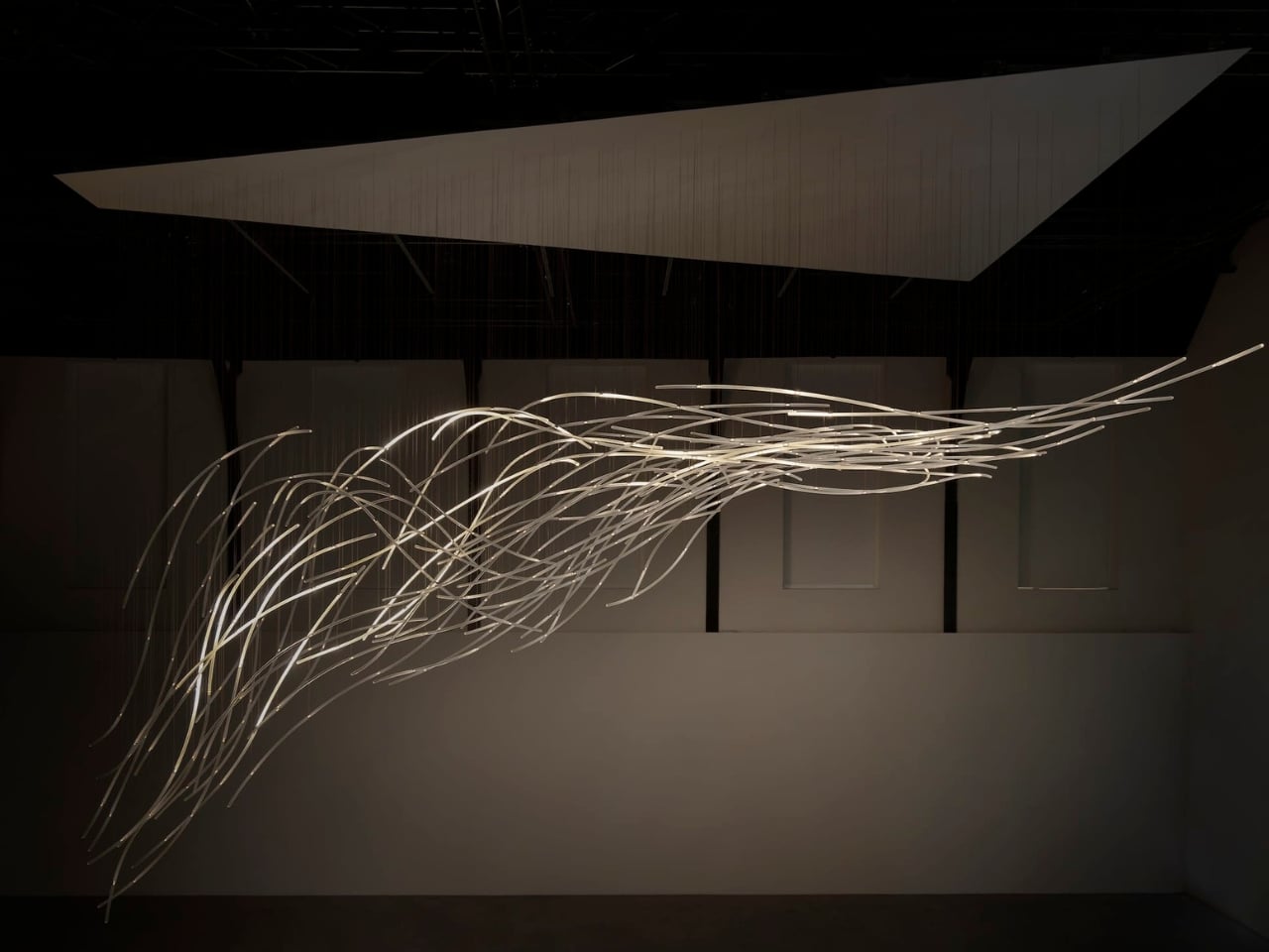
Wind usually needs an accomplice to become visible: a bending tree, a billowing curtain, a plastic bag having a much more cinematic afternoon than it deserves. Air itself gives us very little to look at. Aeolus, a new installation by Amsterdam-based studio DRIFT, takes on that perceptual problem with hundreds of suspended glass rods and light. It gives an invisible force a form you can actually follow.

The studio’s founders, Lonneke Gordijn and Ralph Nauta, have made Aeolus an interactive artwork rather than a conventional light fixture. Presented with Carpenters at London’s Ladbroke Hall from October 13 through 25, 2026, the installation takes its name from the Greek god of the winds. Its shape, though, comes from a specific earthly source: the architecture of the room containing it.

Designer: DRIFT
DRIFT begins with a digital reading of the surrounding architecture, then translates that space into a virtual environment where air can flow. The studio selects one moment from that simulated movement and gives it physical form in glass. That distinction matters. Aeolus isn’t showing a live reading of whatever breeze happens to be passing through the gallery. Its structure holds a chosen instant, while the lighting introduces a separate layer of change.

I like that the room has a say in the result. A sculpture built from its setting feels more considered than an impressive object dropped into an available corner. DRIFT says each installation is generated by its host architecture, so the curves carry information about a particular place. The building becomes part of the design process, even if visitors never see the digital model behind it.
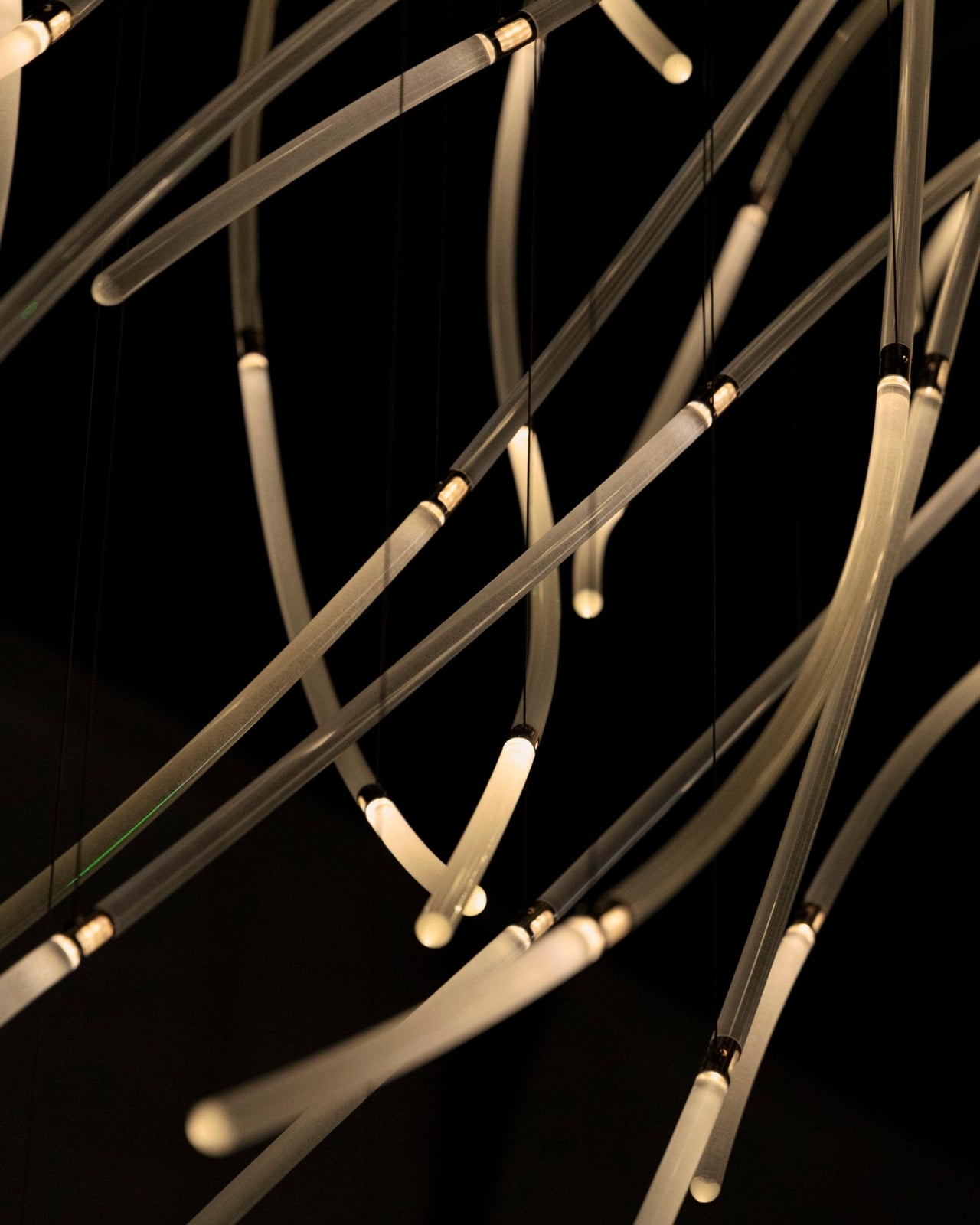
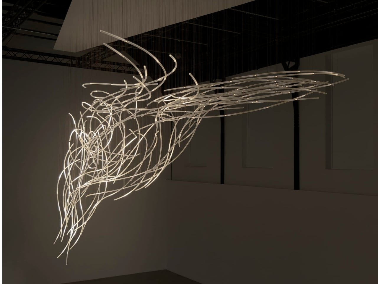
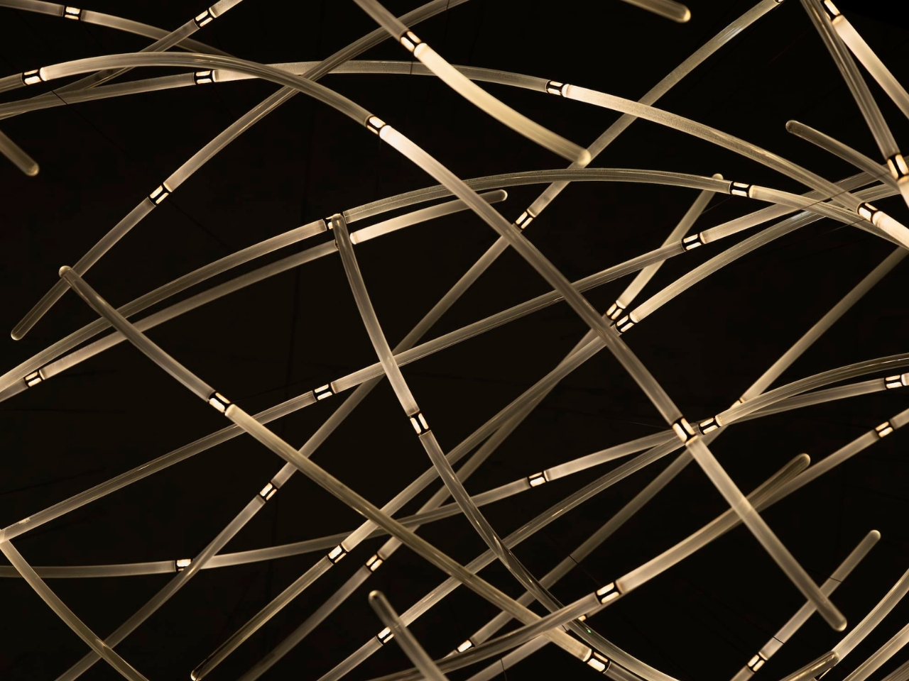
In Benjamin Baccarani’s photographs, the rods gather into a long, sweeping formation, dipping at one end and stretching outward at the other. Fine suspension lines lead up to a broad overhead panel. The material list is more technical than the airy appearance suggests: borosilicate glass rods, stainless steel nodes, custom LEDs, and microcoax cables. I appreciate that contrast. Making an object look almost weightless still requires hardware, connections, and a deliberate relationship with gravity.

The glass itself stays still. According to Carpenters, small lights inside the rods change their rhythm and intensity in response to visitors moving through the space. Waves of illumination create the impression of motion without the sculpture physically shifting. That’s the cleverest choice here. The designers don’t need to swing a roomful of glass around to suggest wind; they let your eyes follow light across a fixed structure, doing much of the perceptual work.
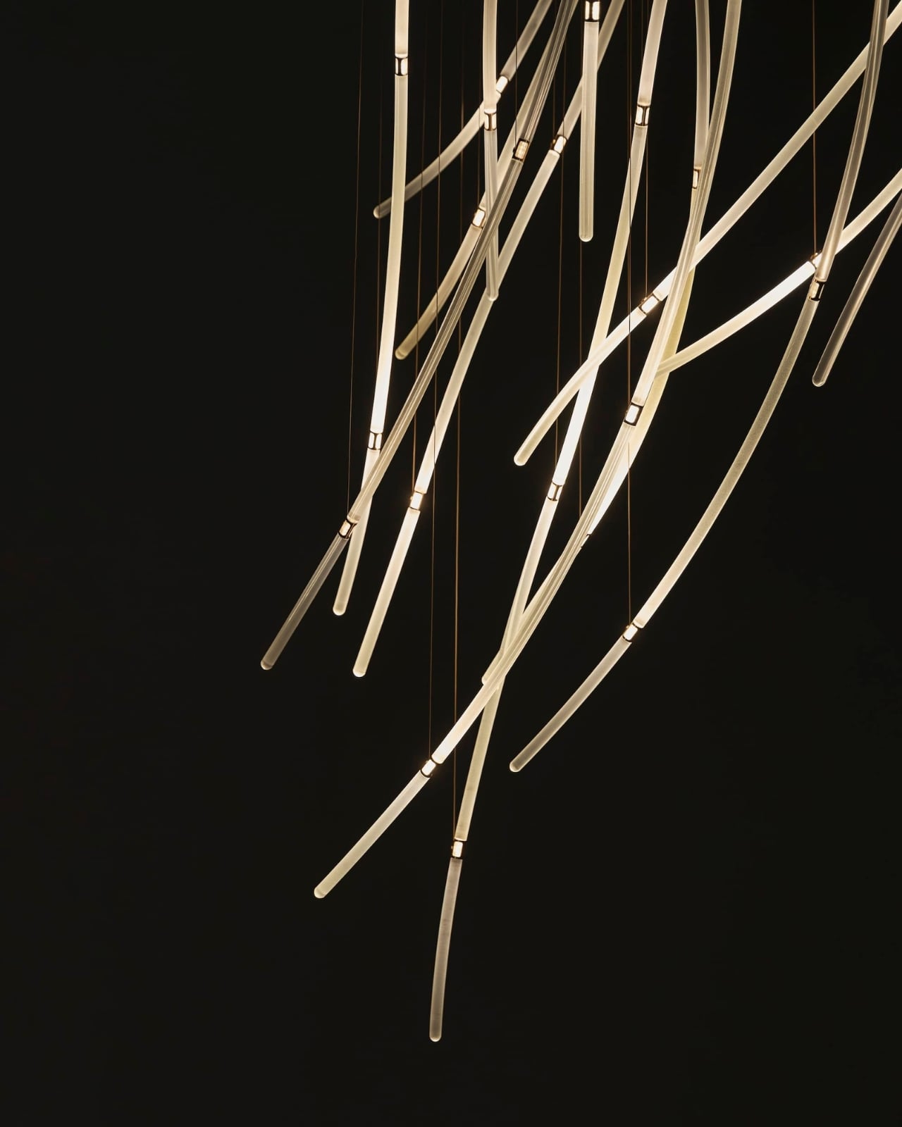
The interaction also gives visitors a meaningful role without turning them into operators. Walking changes the work’s lighting, a relationship that seems appropriately direct for an installation about air and movement. I’m drawn to technology that makes its presence felt through an understandable response. Here, the interesting question is how your movement alters what you see, rather than how many technical features the system contains.

DRIFT frames Aeolus as an invitation to reconsider our relationship with nature. I’d treat that as a starting point for looking, not a transformation any artwork can promise. The more convincing achievement is smaller and more specific: making airflow legible through material and light. You don’t need to leave with a new environmental philosophy to appreciate the way a simulated path has become a collection of precise, luminous curves.

For me, the appeal sits in that modest shift in attention. The room stops being an empty container for an artwork and starts to look like a place shaped by movement. Aeolus makes that movement imaginable while keeping the glass suspended in a single instant. A visitor supplies motion, the lights answer, and the fixed structure takes on another rhythm. The glass gives you time to study a shape that moving air would never hold still for inspection.
The post DRIFT’s Glass Sculpture Traces Wind Without Moving first appeared on Yanko Design.

  •  

This Robotic Pavilion Concept Would Change Its Layout Only When Empty

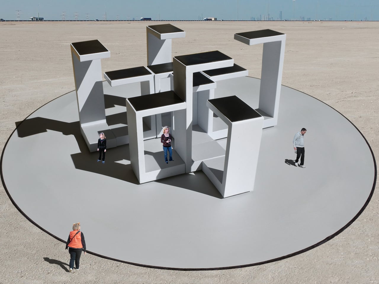
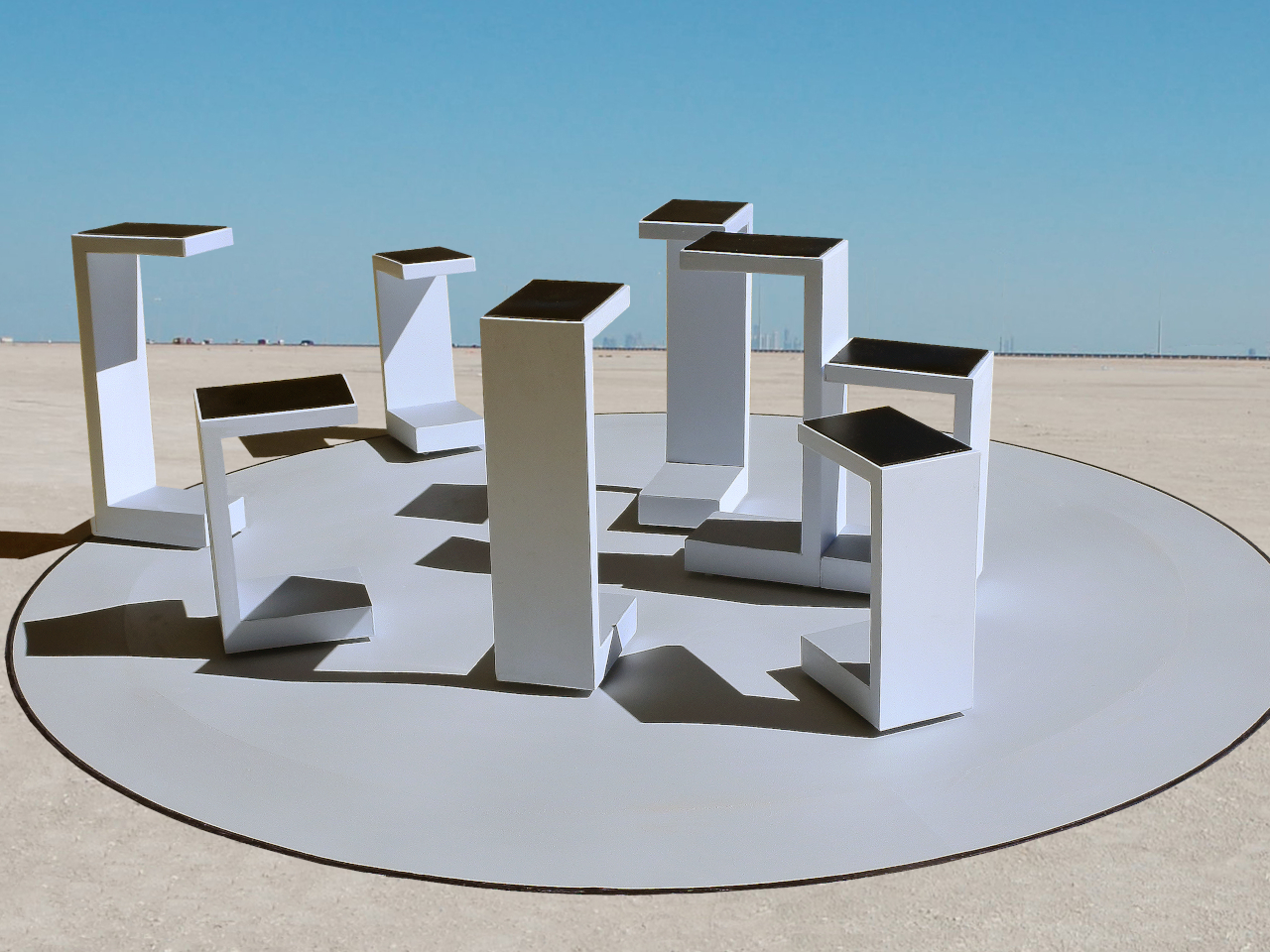
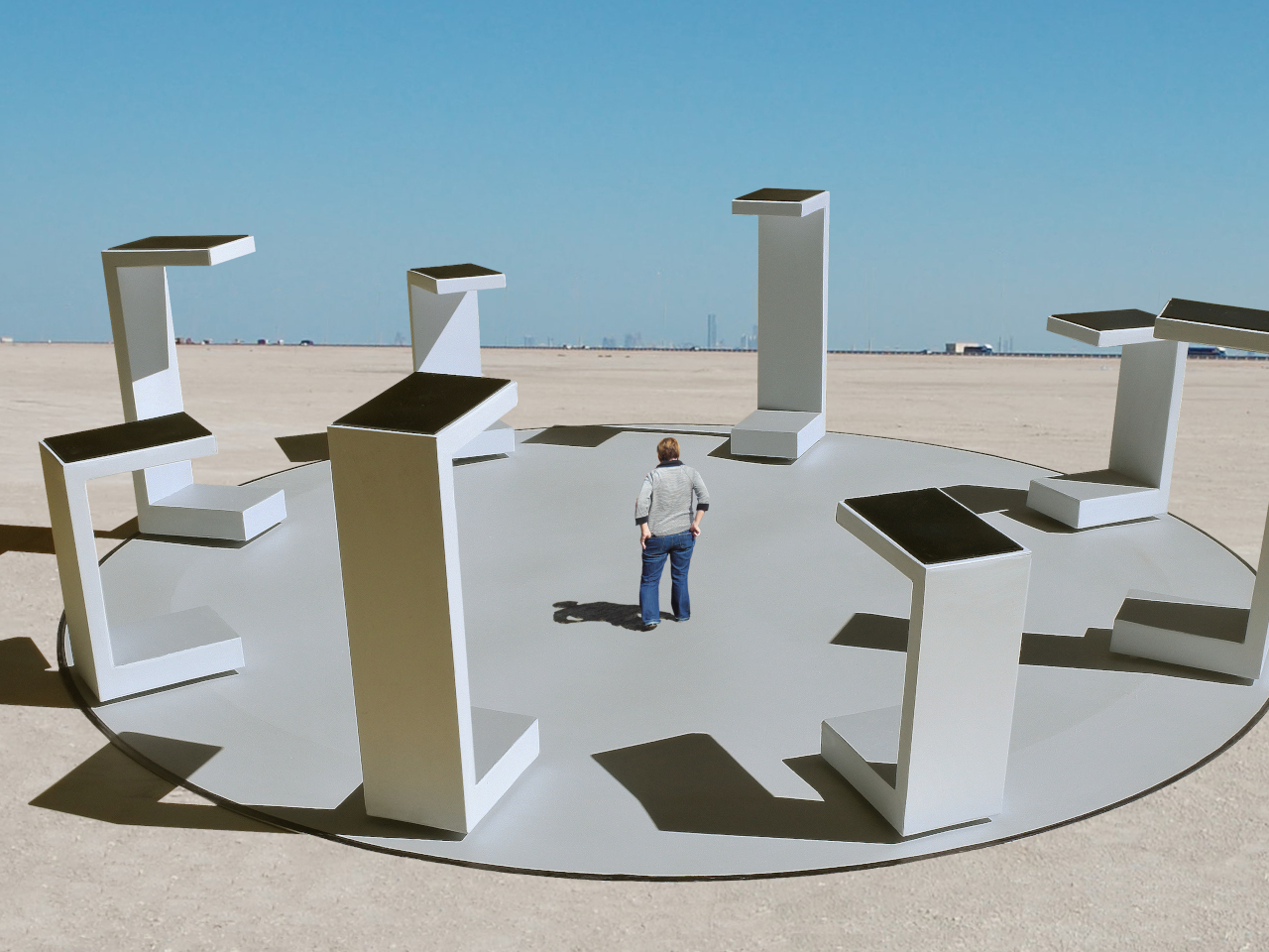
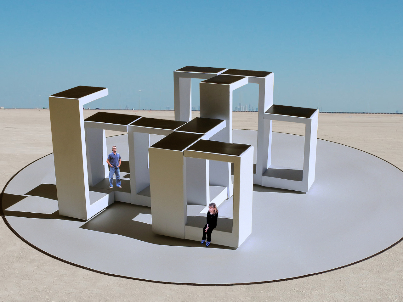
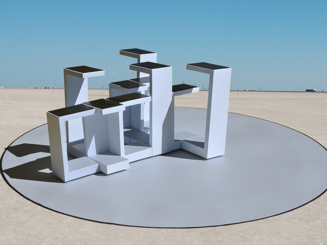
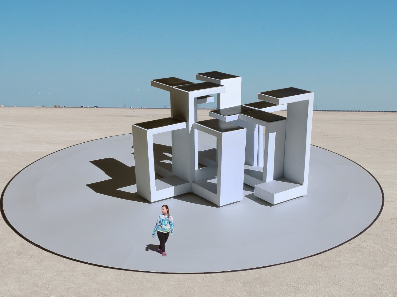
A public pavilion can give people somewhere to gather, but returning to it usually means finding the same spaces and following the same paths. Self-Assembling Robotic Environments explores a more flexible alternative: mobile architectural sections that could rearrange themselves between visits. This unbuilt public art concept would pause whenever someone enters, letting people explore one arrangement before the space changes for another group.

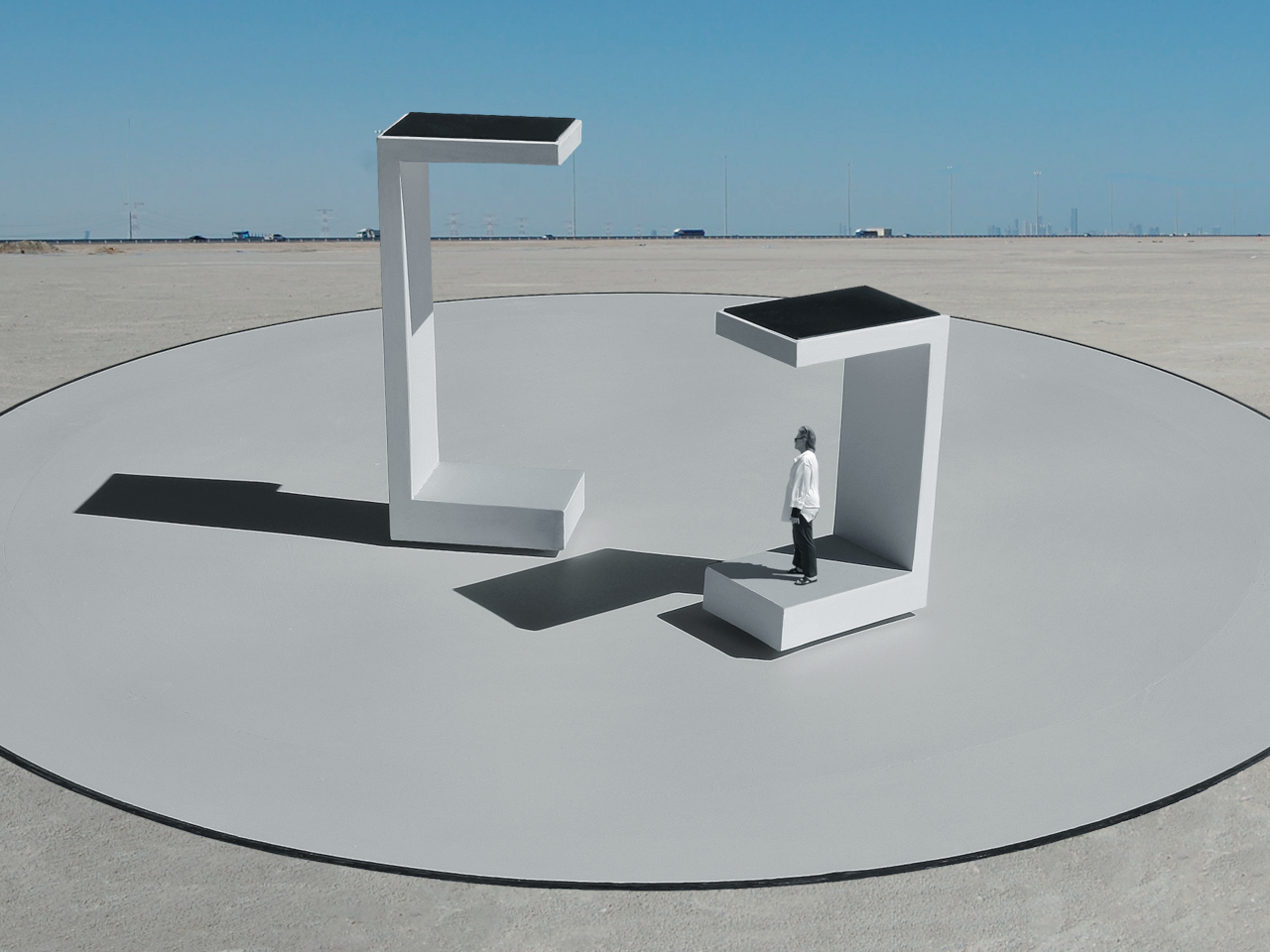
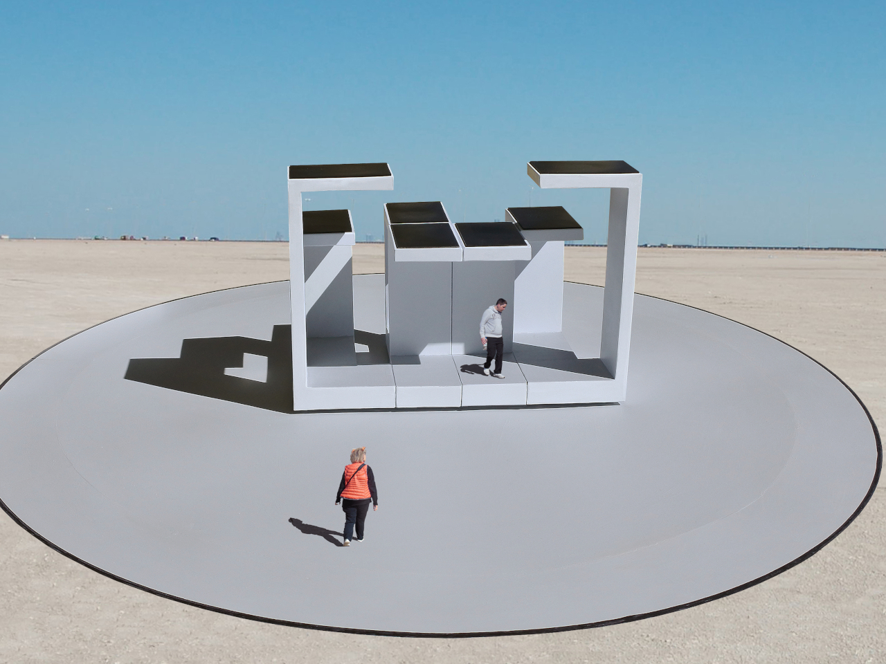
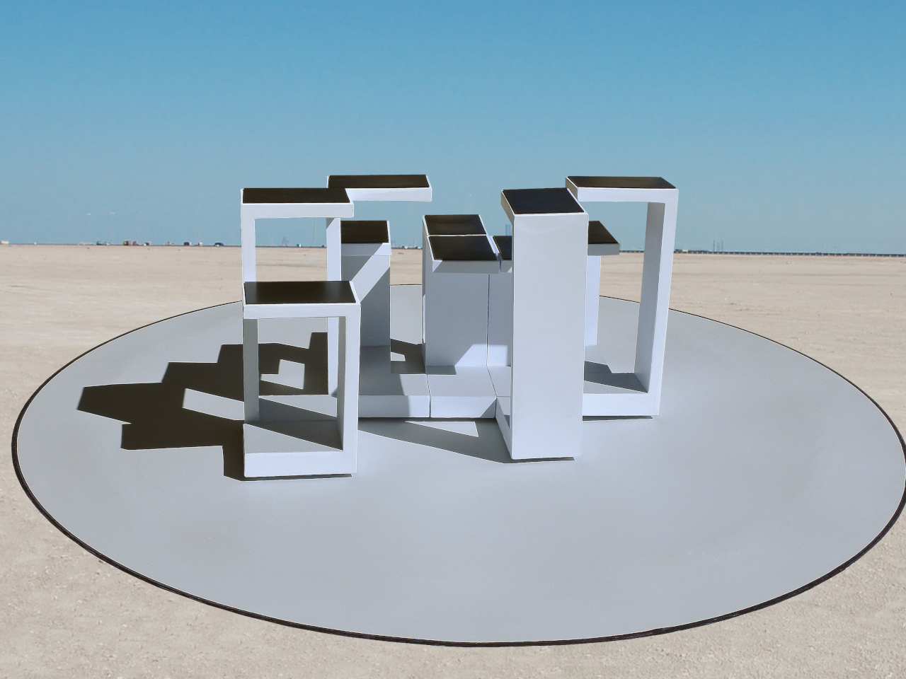
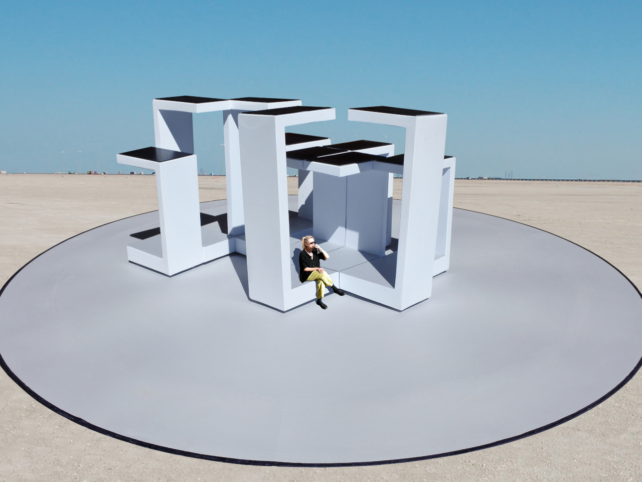
Each section combines a floor, wall, and roof in a large C-shaped profile, like a little shelter with its sides left open. Two versions stand about 10 and 14 feet tall, both four feet wide. Place several together, and those simple shapes could become passages or covered pockets. Separate them again and the same pieces would offer a different place to wander.

Designer: Michael Jantzen

Of course, rearranging those sections wouldn’t mean asking someone to wheel them into position. Each floor would contain its own computer, sensors, motors, wheels, and battery, allowing the entire unit to travel forward, backward, or sideways. The wall and roof would move with it. The robotics aren’t proposed as equipment that builds the installation and then leaves; they’d remain part of the architecture.

Rather than following one permanent floor plan, the modules would use artificial intelligence to decide on their positions through majority agreement. The proposal doesn’t explain how they would evaluate possible arrangements, though. A gap between two units could become a passage, while several facing one another might define a gathering spot. The same pieces could give visitors different ways to use the space.

The roof would do more than shelter whoever stands beneath it. Solar cells on top would recharge the battery inside the floor, keeping the proposed power supply within each moving section. It’s a sensible place to collect sunlight, but the project doesn’t specify how much energy movement would require. Keeping these large pieces in motion isn’t as simple as putting solar panels overhead.

A black perimeter would mark the robots’ territory, containing their movements within a circular arena. Sensors would watch for people or objects entering that space, pausing every module until the area is clear. You wouldn’t be expected to dodge a moving wall while exploring. The intended sequence is straightforward: the pieces rearrange when empty, then hold their positions while visitors are inside.

That rule still needs engineering before anyone could walk in. Detecting a visitor isn’t the same as stopping safely, and the project doesn’t establish braking distances or structural performance. Raised floor sections also need an accessible way in. These are questions for a working installation, rather than reasons to dismiss the idea, but the concept drawings don’t settle them on their own.

For visitors, the pause could make staying put part of the interaction. Sit inside a sheltered corner for a while, and that particular arrangement would remain available until everyone leaves. A later group might find a different route or gathering spot. Someone lingering to finish a conversation would therefore be doing something rather unusual: keeping a version of the architecture from disappearing yet.

The post This Robotic Pavilion Concept Would Change Its Layout Only When Empty first appeared on Yanko Design.

  •  

Hilariously Practical USB-C Cable Looks Exactly Like a Construction-Site Extension Cord

There are exactly zero USB-C cables that anyone has ever called beautiful. They come in black, white, or occasionally braided grey, and they all look identical regardless of who made them or what they cost. Pick any of them out of a drawer at random and there is no way to identify the brand without hunting for a logo. They are just cable, featureless and anonymous, which is fine if everything else on your desk is equally low-key. But once you are running a 160W GaN charger that looks like it belongs in a server room, the cable situation starts to feel like it is letting the whole setup down.

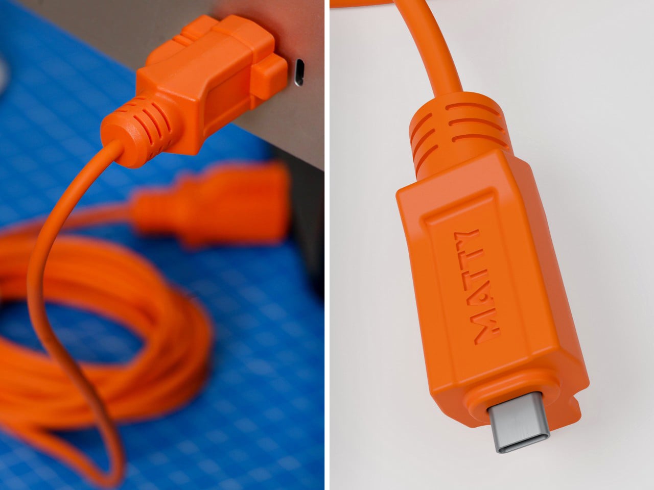
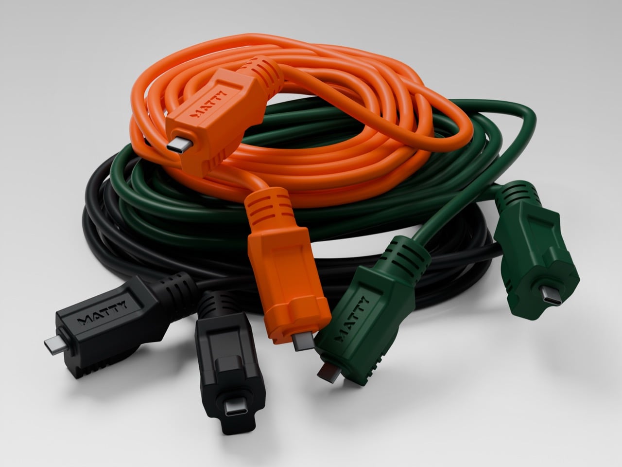
Matty Benedetto has been inventing things nobody asked him to invent since 2019, and this one might be his most wearable idea yet. The Extension-C looks exactly like what the name implies: a proper orange extension cord, right down to the rectangular housing on each end, scaled to USB-C. Ten feet long, rated for 60W charging and data transfer, available in safety orange, outdoor green, and stealth black for $25. Yanko Design has been tracking Benedetto’s work since Unnecessary Inventions first went viral on Instagram, and this is probably the first of his creations where the joke and the product exist in exactly equal measure. It is funny. It also ships.

Designer: Matty Benedetto (Unnecessary Inventions / MATTY)

Each end of the cable is a chunky rectangular housing that calls back to the three-prong outlet plug of a classic American extension cord, scaled down to something that slots into a laptop port but keeps all the visual bulk of the original. The ribbed strain relief detailing running down each housing mirrors what you would expect on actual job-site gear, and it reads as a deliberate design choice rather than ornament. “MATTY” is embossed on each connector cap, and it works because it looks like a certification stamp on real equipment rather than a tech brand inserting itself into the aesthetic. The orange body is thick enough to sell the illusion convincingly. At 10 feet, the cord has actual room to coil the way a real extension cord does, and a 3-foot version of this bit would have landed very differently.

Benedetto has been running Unnecessary Inventions out of his Burlington, Vermont studio since 2019, and the archive now sits at 471 entries. Not every invention makes it to MATTY, the retail arm where purchasable products actually live. The ones that do have typically proven themselves with audiences first and shown enough genuine demand to justify manufacturing. The Extension-C making that cut is a meaningful signal about where Benedetto himself rates this one. We covered his work through several roundups in 2019 and 2020, and revisited it in 2022 when he built a clever fix for the Apple Magic Mouse charging problem. His track record for making absurd things that people genuinely want to own is the most consistent thing about him.

The 60W rating handles most phones, tablets, controllers, and lightweight laptops at full charging speed, covering the realistic daily load on any serious desk setup. Pair it with a 160W GaN charger and the combination has a visual logic that is genuinely satisfying: the charger looks like heavy-duty hardware, and the cable finally looks like it belongs beside it. Safety Orange is the obvious pick for anyone committing fully to the construction-site bit. Outdoor Green makes more sense for a balcony or garden setup where orange would look out of place. Stealth Black drops the gag and keeps the form, and I will predict right now it ends up being the best-seller of the three.

The Extension-C sits at $25, which puts it above the no-name cables that come in 5-packs on Amazon but well below the premium braided options from Anker or Belkin. For what you get on the design side, that is a pretty reasonable trade. There is a broader point buried here about what Benedetto has figured out that most accessory brands have not: cables are so visually forgettable that even a small act of design intention reads as remarkable. The Extension-C is his 471st Unnecessary Inventions entry, and it might be the one where unnecessary and useful finally land in the same sentence without any friction between them. Grab one at thatwasmadebymatty.com, preferably in orange, because going halfway on a bit this committed would be a waste.

The post Hilariously Practical USB-C Cable Looks Exactly Like a Construction-Site Extension Cord first appeared on Yanko Design.

  •  
❌