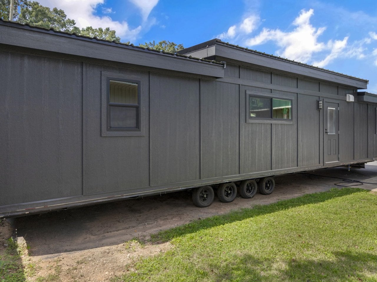
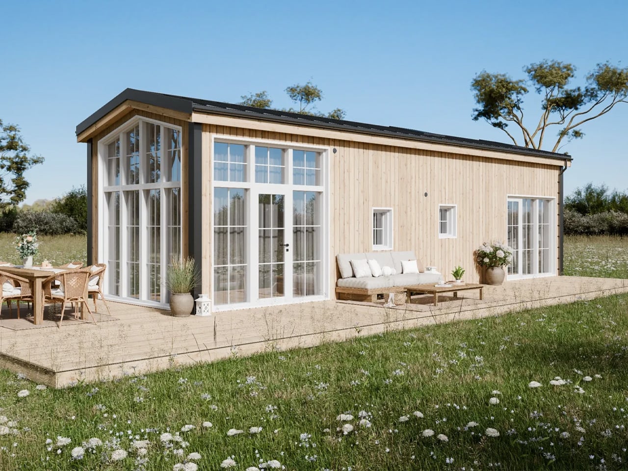
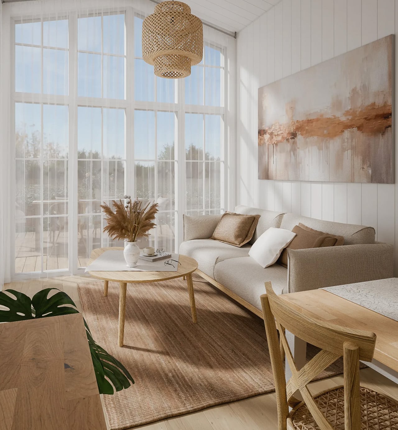
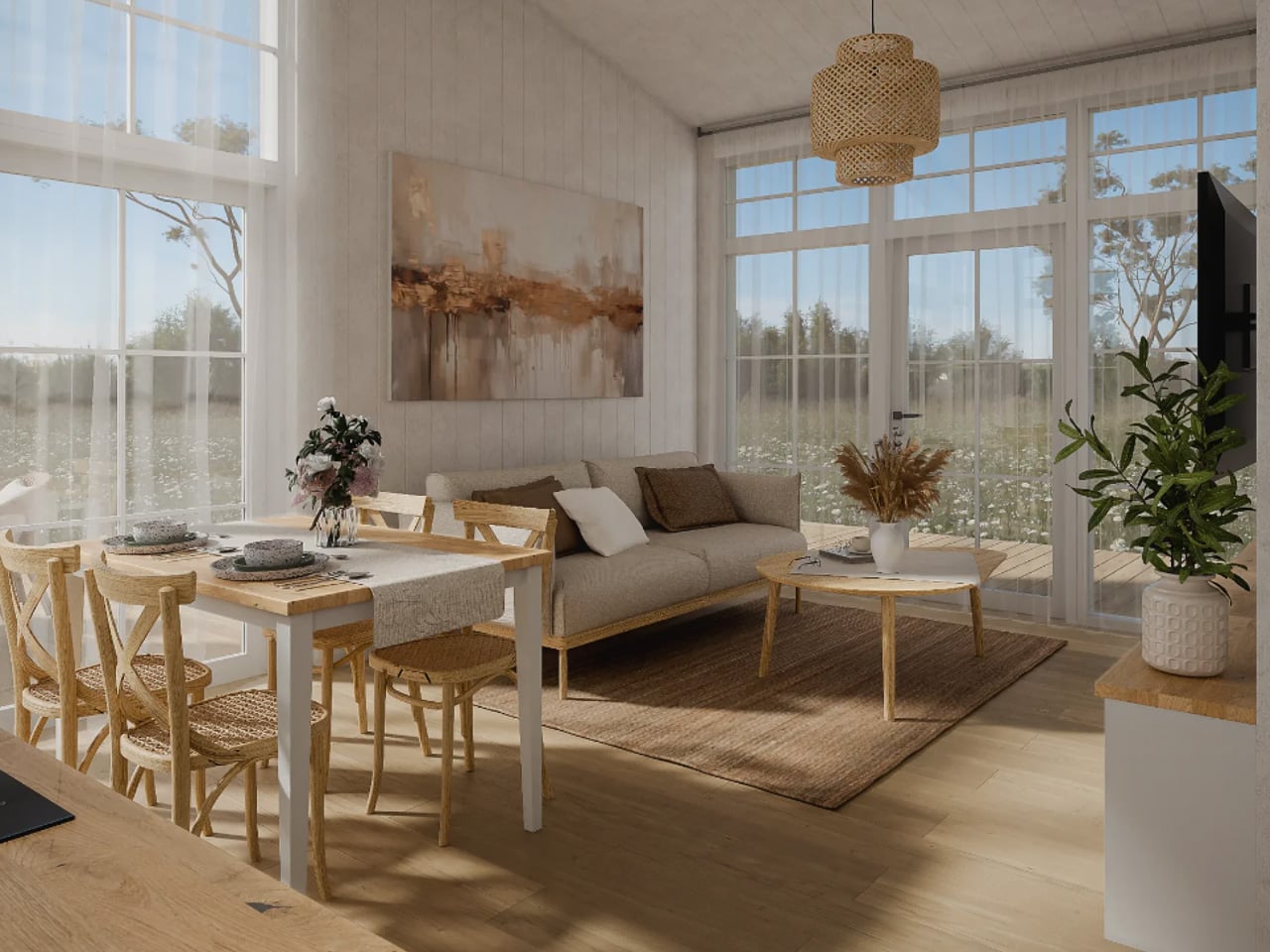
❌

Vue lecture

The 5 Best Tiny Homes That Make Downsizing Look Like an Upgrade
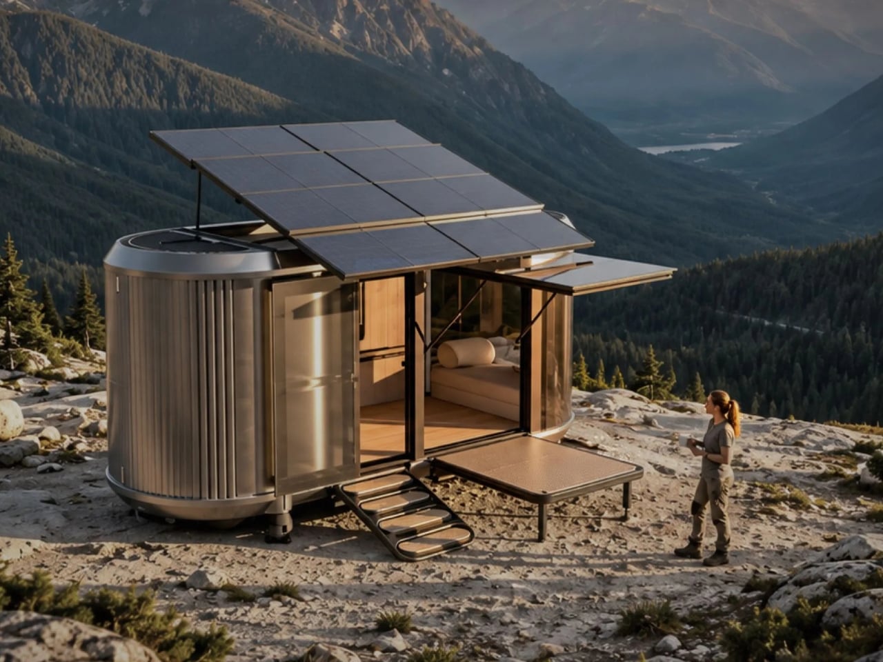
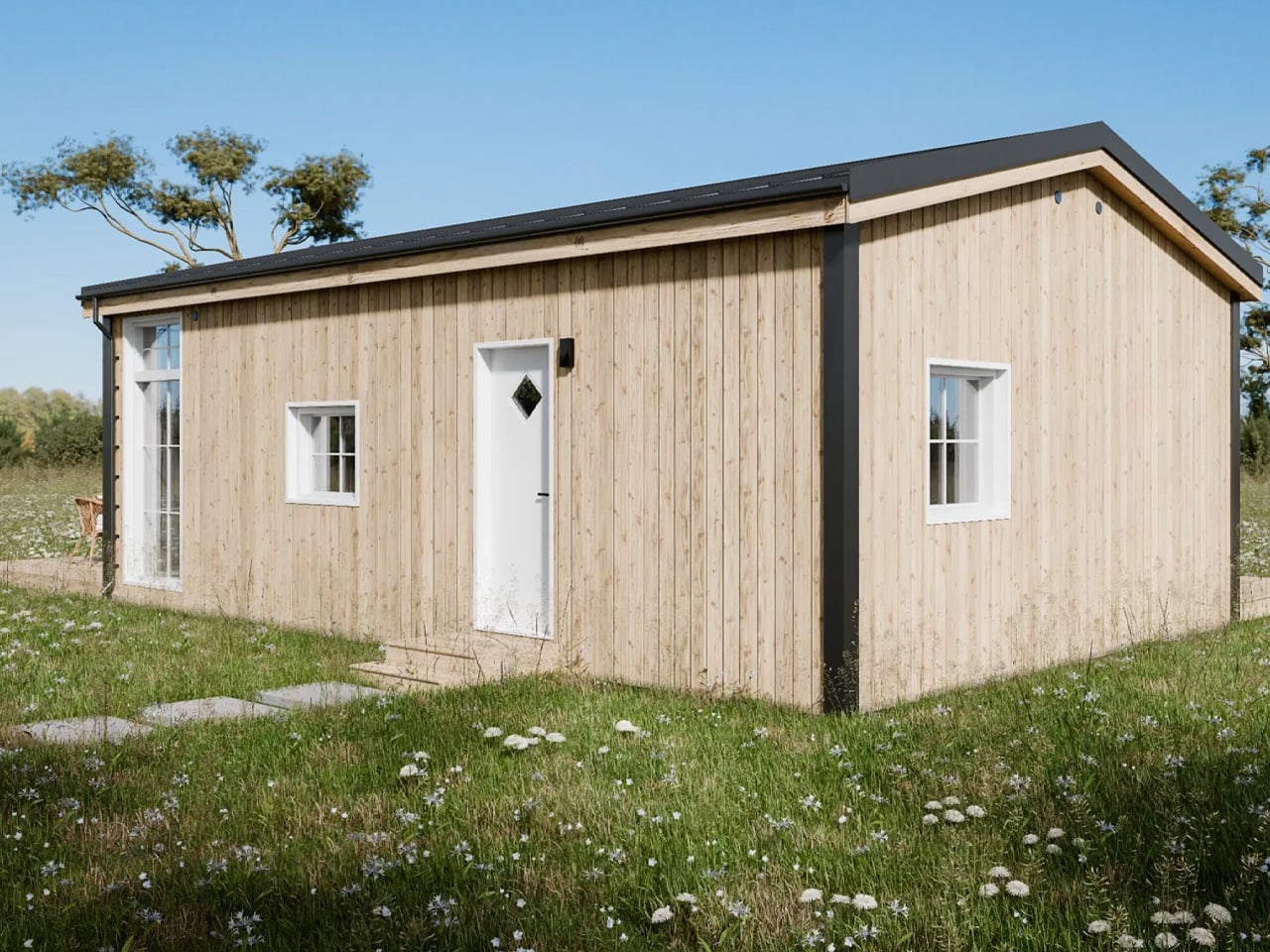
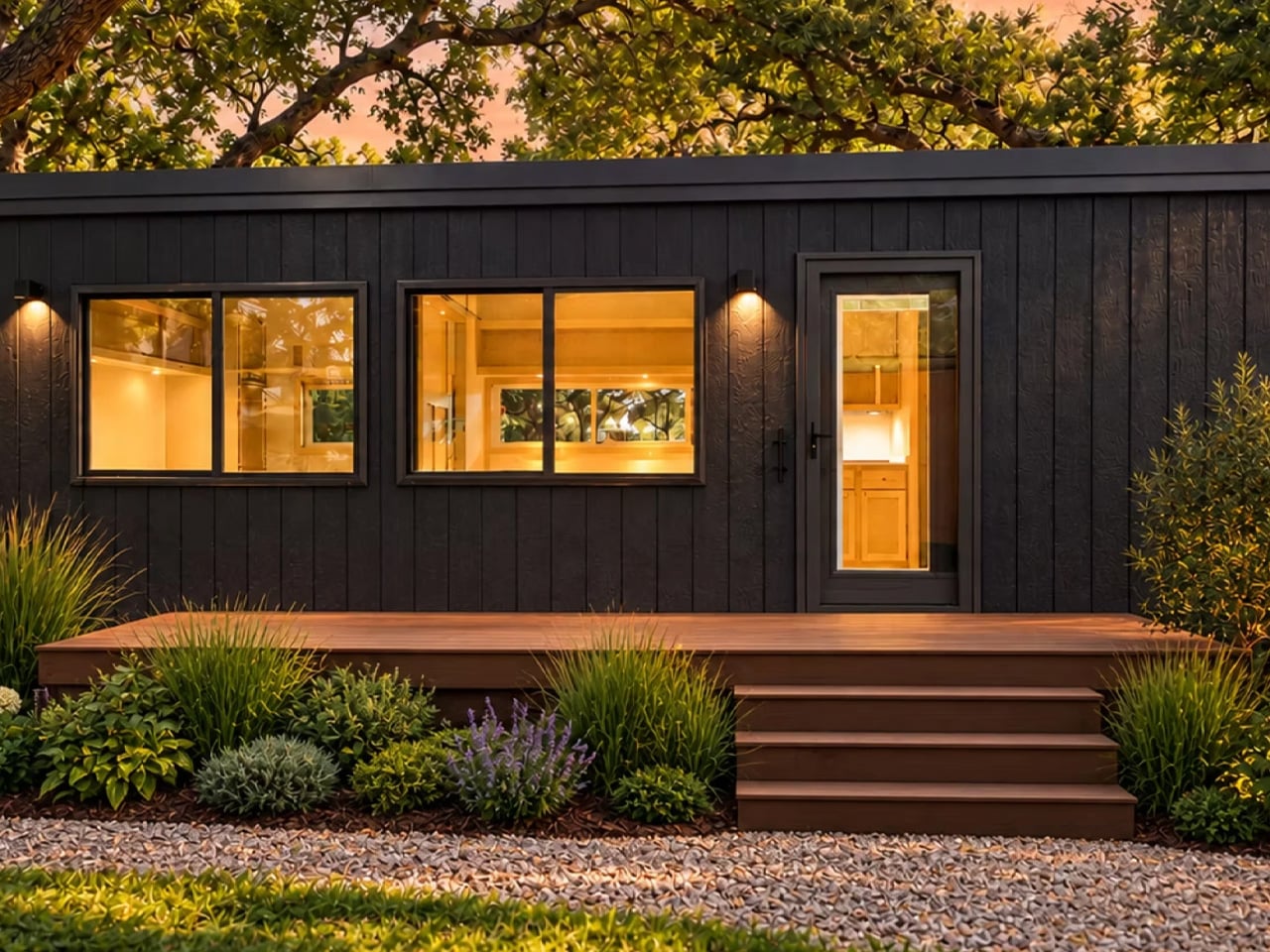
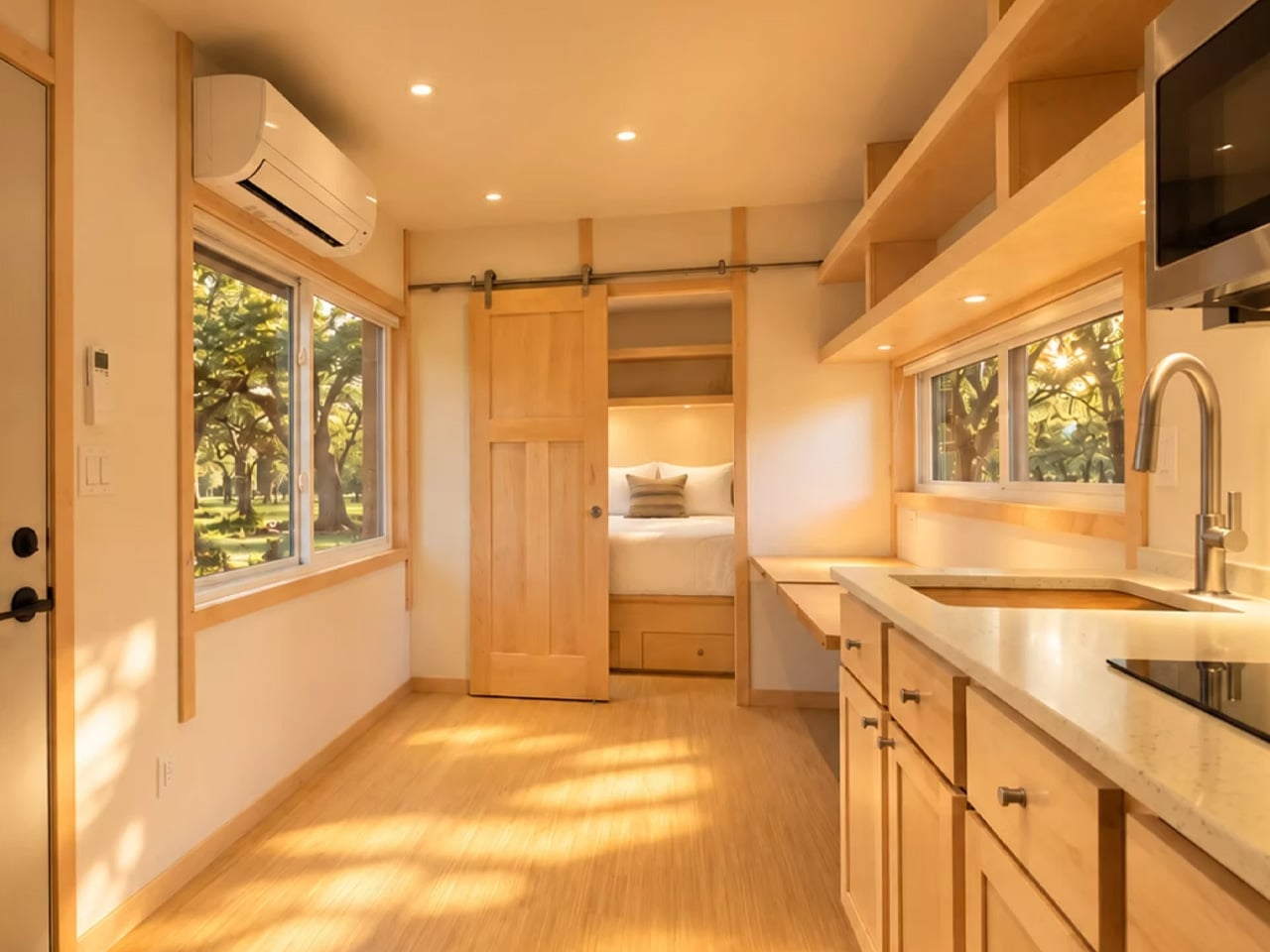
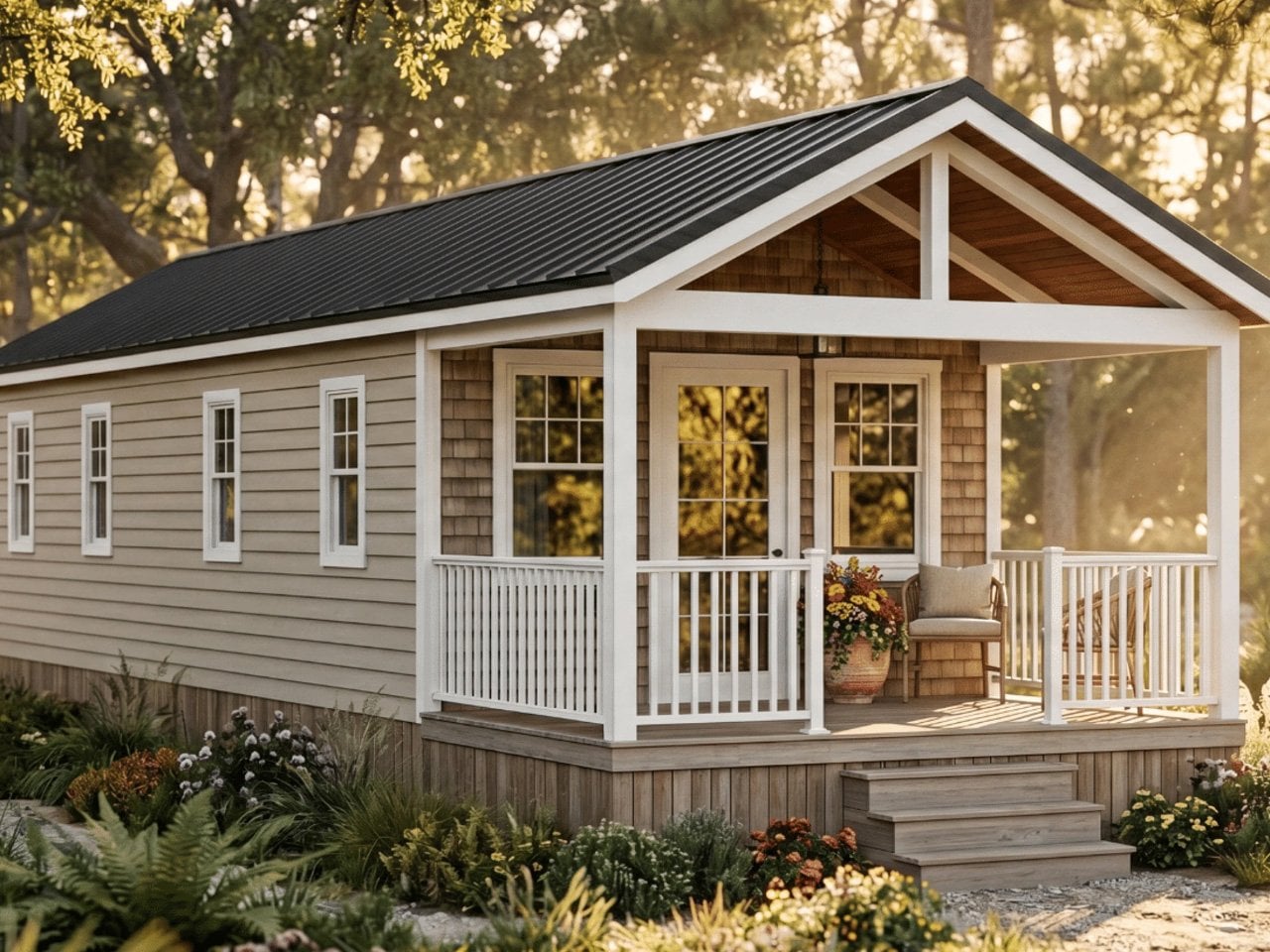
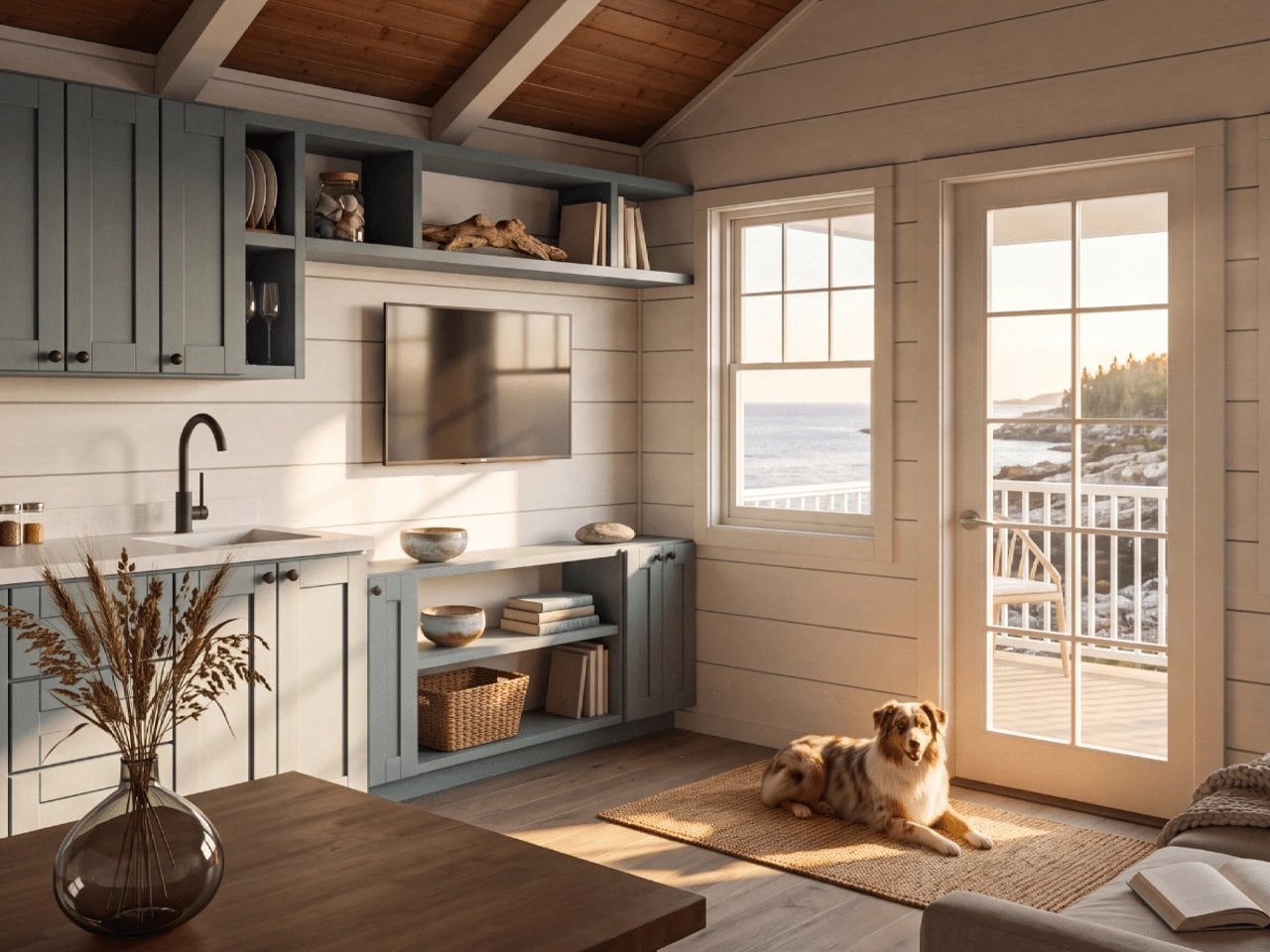
A tiny home becomes interesting when the floor plan makes room for something you expected to lose. A proper bathtub. A bedroom that doesn’t require a ladder. A kitchen where dinner involves cooking rather than unpacking takeout. Those choices make downsizing easier to imagine, because they connect smaller spaces to familiar routines. The appeal lies in keeping the parts of home you actually use, then questioning everything that surrounds them.

These five picks explore that idea at very different scales, from a 120-square-foot cabin to a 700-square-foot compact home. Some prioritize everyday living, while others are better understood as retreats. This is a selection based on published layouts and specifications, not a ranking from overnight stays. Each earns its place through a particular design decision, with the compromises kept in view rather than cropped out of the pretty cabin pictures.

1. Lavvu XL
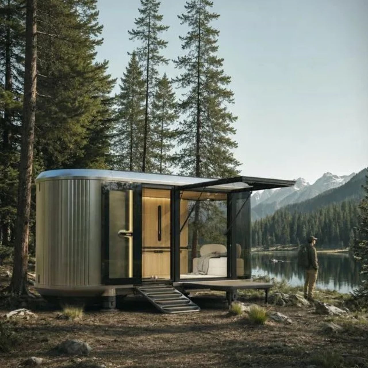
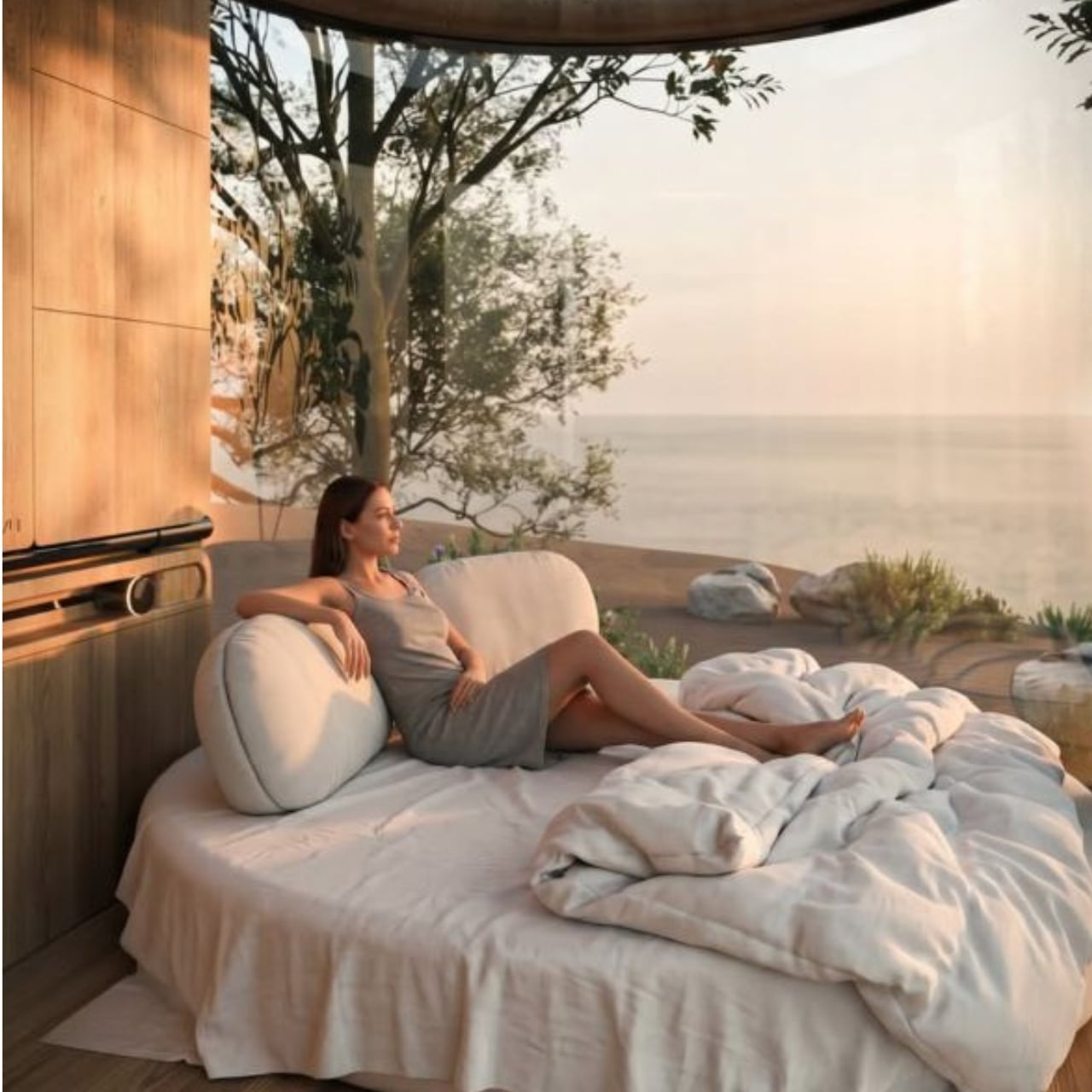
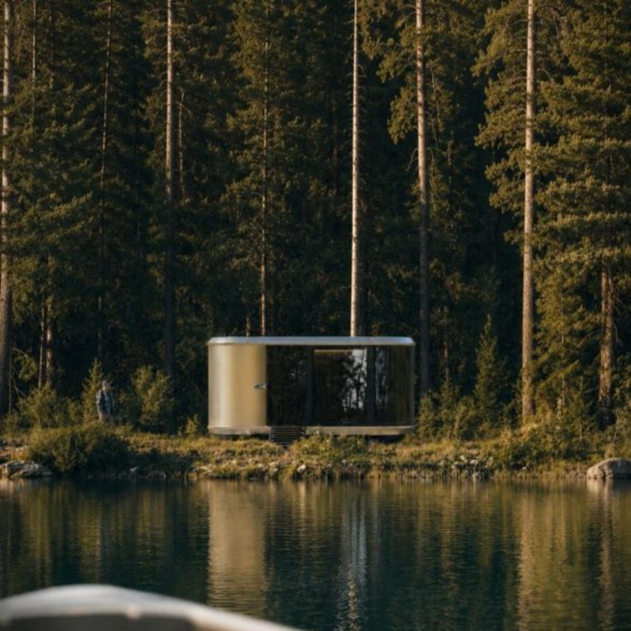
Lavvu’s XL gives a familiar indulgence unusually high priority: a full-size bathtub inside roughly 237 square feet. The modular home, credited to architecture studio Re:Büro, belongs to a range that Lavvu has promoted for preorder. Its rounded shell and ribbed exterior suggest a small transport capsule in the promotional imagery. Inside, the more persuasive idea is domestic: preserving enough of your normal routine that a weekend away doesn’t have to feel like an extended exercise in making do with less.

The kitchen pairs a two-burner induction cooktop with a built-in refrigerator and dishwasher, while a sliding island adjusts to accommodate seated or standing use. That moving surface acknowledges how differently a narrow room works during breakfast and food preparation. Drawers beneath the bed, shelving, and a wardrobe address the less photogenic business of storing belongings. Large glazing makes the outlook important, but it also makes privacy worth considering. This is a layout to evaluate alongside its setting, not apart from it.

What we like

  • Full-size bathtub in a compact layout.
  • Sliding island accommodates different kitchen tasks.

What we dislike

  • Preorder delivery timing needs confirmation.
  • Extensive glazing makes privacy site-dependent.

2. Acadia
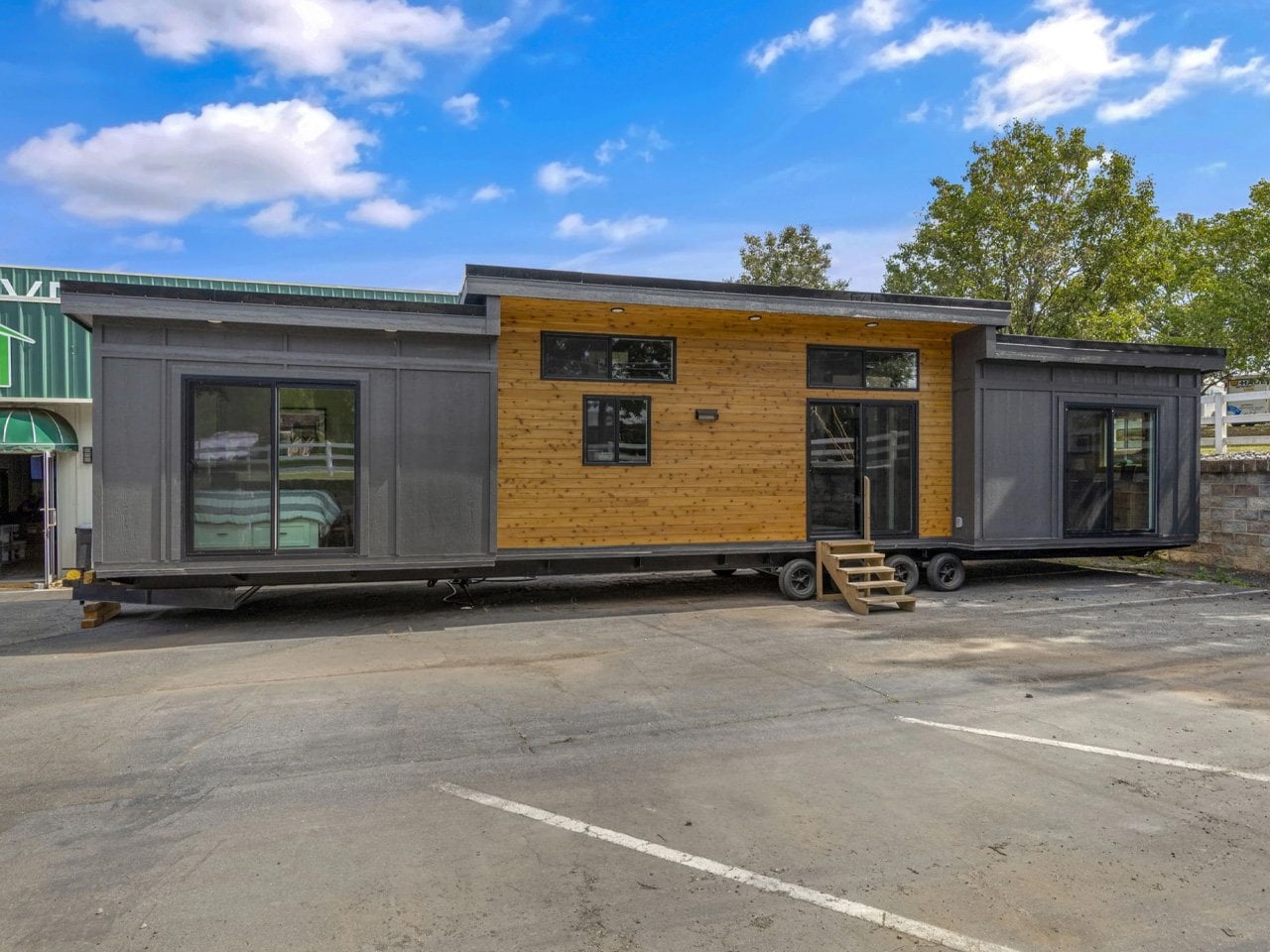
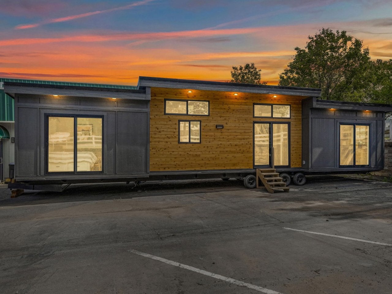
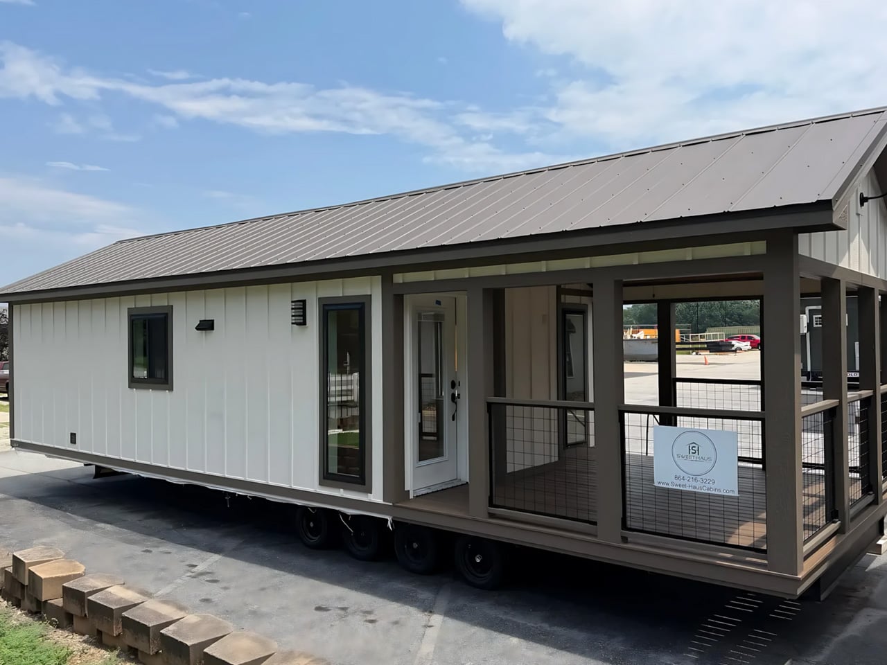
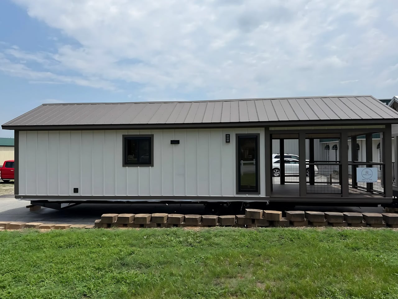
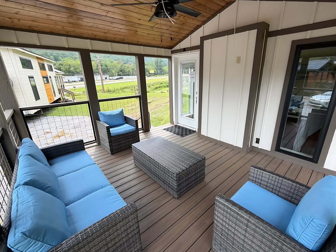
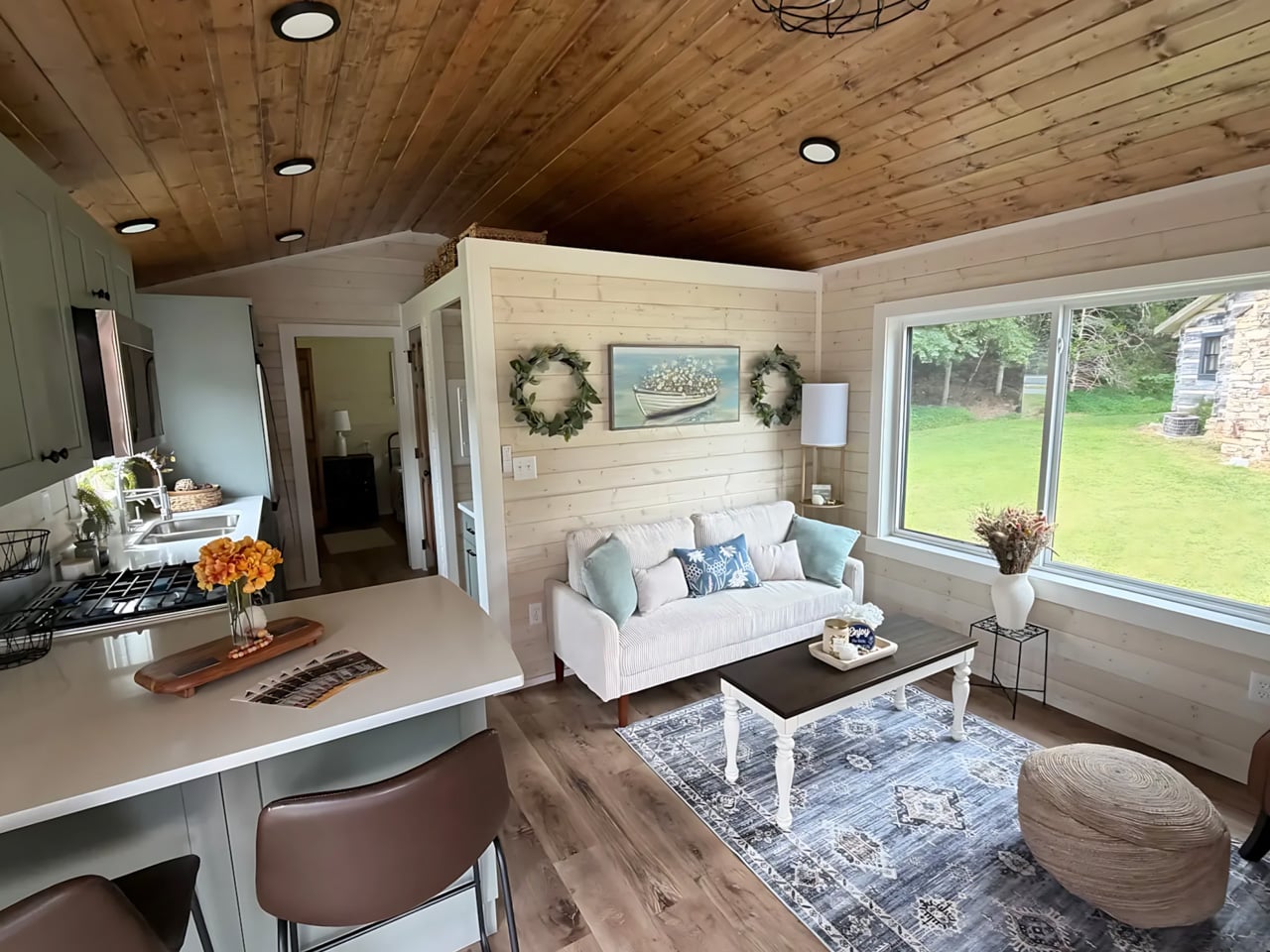
At 700 square feet, Sweet-Haus Tiny Cabin Company’s Acadia stretches this collection toward compact housing rather than extreme minimalism. Its two bedrooms and two full bathrooms offer something more valuable than a clever folding mechanism: separation. Couples can keep a guest room, or two occupants can maintain distinct sleeping spaces. Sweet-Haus currently lists the Acadia as a modular home for South Carolina and North Carolina, so it belongs in a conversation about settling down smaller, not taking frequent road trips.

The single-level plan connects the living, dining, and kitchen areas, while the bedrooms accommodate queen or king bed bases with storage drawers. The kitchen includes a cabinet-depth refrigerator, a 24-inch range, and an 18-inch dishwasher. These are useful provisions if downsizing is supposed to simplify your home rather than rewrite your meals. Built-in closets matter for the same reason. The Acadia makes its case through ordinary conveniences that remain available, although calling this much space tiny requires a generous interpretation.

What we like

  • Two bedrooms and two bathrooms preserve privacy when sharing.
  • Single-level living avoids making stairs part of the daily routine.

What we dislike

  • Its 700-square-foot footprint is a substantial step up from smaller cabins.
  • The current modular offering is limited to North Carolina and South Carolina.

3. The Traveler
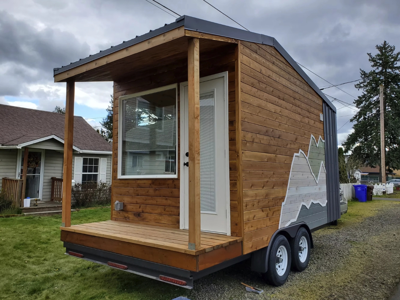
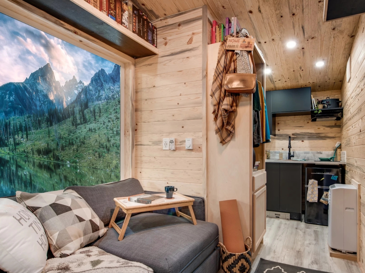
Backcountry Tiny Homes’ Traveler removes the loft entirely. Its 120-square-foot interior uses sleeper seating that opens into an approximately queen-size bed for two, keeping daily life on one level. The home measures 17 feet long, including a three-foot porch, with 14 feet devoted to the enclosed cabin. That’s a deliberate allocation: a small outdoor threshold survives even when interior space is scarce. For anyone who dislikes climbing into bed, the convertible furniture offers a straightforward alternative without expanding the building’s footprint.

Cedar and metal outside, with knotty pine walls and ceilings inside, give the Traveler a recognizable cabin character. Storage includes a wardrobe, tilt-out shoe compartments, and shelving around the living area. The kitchen keeps the essentials close, but it inherits an extra responsibility: the bathroom has a shower and flushing toilet without its own sink. Handwashing therefore shifts to the kitchen. Alongside converting the seating each night, that’s the compromise to consider before choosing a particularly small home for two.

What we like

  • Convertible seating makes room for sleeping without a loft.
  • Dedicated shoe and clothing storage addresses everyday clutter.

What we dislike

  • The bed requires converting the seating each night.
  • No bathroom sink means sharing the kitchen sink for personal routines.

4. Avalon 24
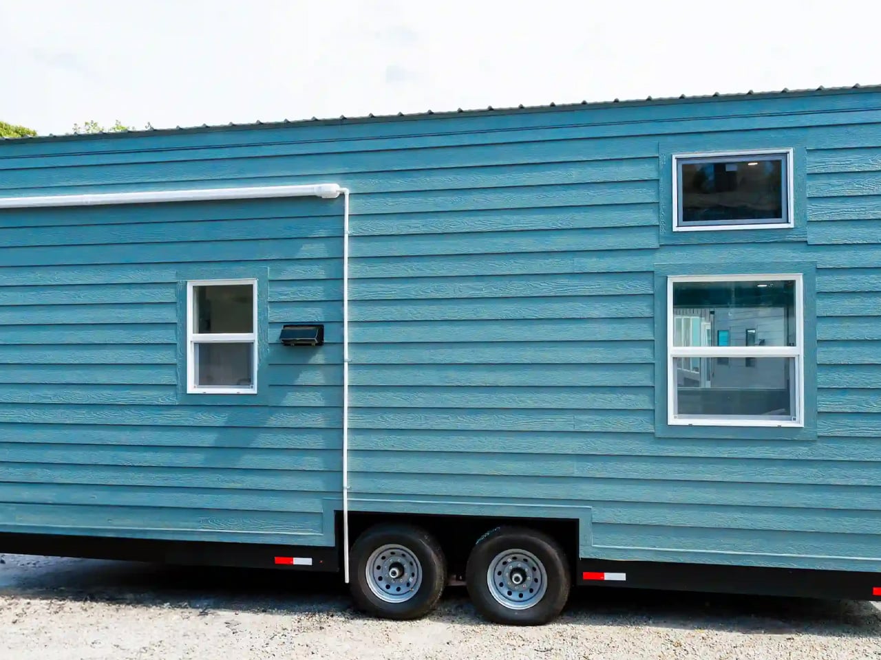
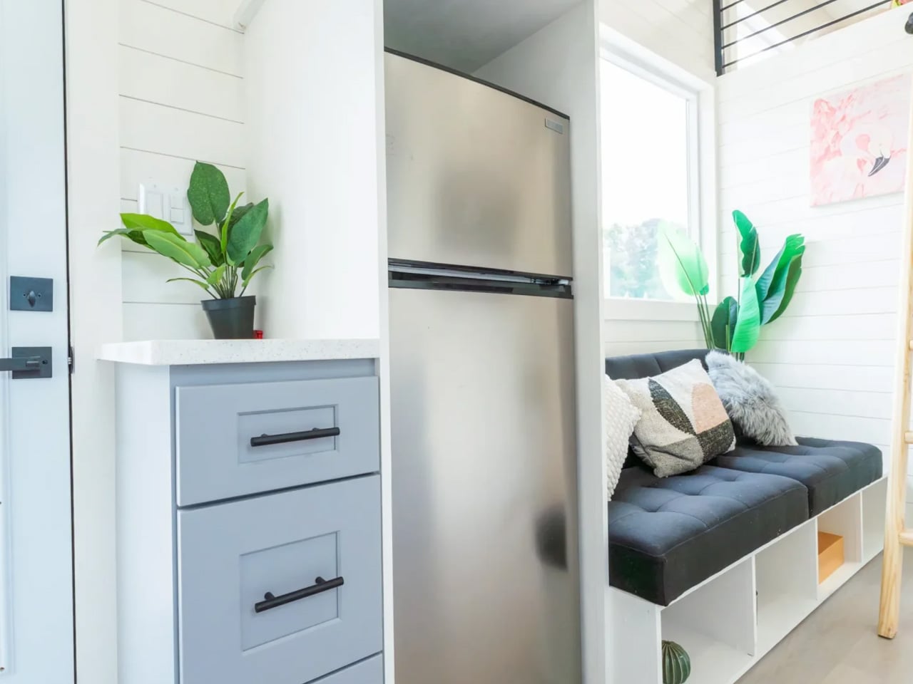
Dragon Tiny Homes’ Avalon 24 takes a different approach to ladder-free sleep: keep a dedicated bedroom downstairs and retain the lofts for other uses. The featured upgraded build fits that arrangement into a 24-foot home, with 204 square feet before counting its two lofts. A double bed occupies the main-level bedroom, along with storage. For someone who wants a permanent bed without surrendering all the upper volume, this is a more accommodating arrangement than making the living room become a bedroom.

The upgraded inventory model adds a built-in couch, bedroom cabinetry, and cubby storage in the smaller loft. A 7.1-cubic-foot refrigerator and extra kitchen cupboards support everyday use, while the bathroom includes a vanity rather than borrowing the kitchen sink. Its flexibility comes with physical limits. The lofts still require ladder access, and Dragon lists this build at 14,000 pounds, recommending an F350 or similar towing vehicle. Moving house remains a substantial undertaking, even when the house measures just 24 feet.

What we like

  • A permanent downstairs bed avoids nightly furniture conversion.
  • Two lofts provide extra sleeping or storage options.

What we dislike

  • Ladders remain necessary to reach either loft.
  • The listed 14,000-pound weight demands a capable towing vehicle.

5. A-Frame Studio
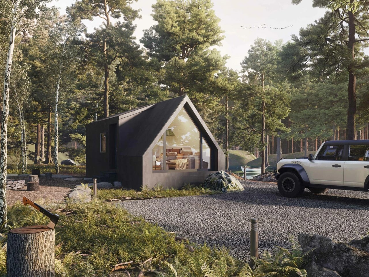
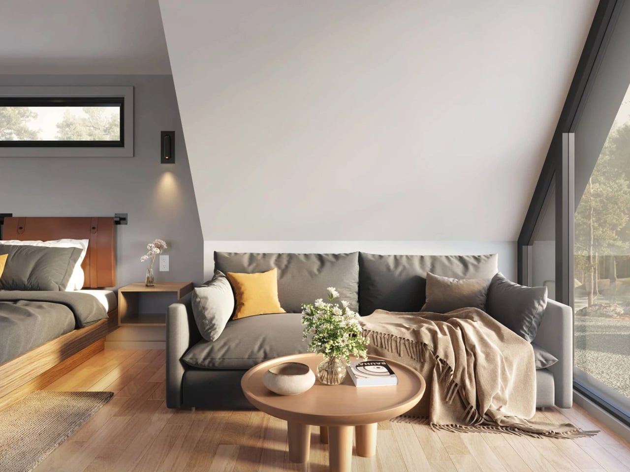
Zook Cabins’ A-Frame Studio spends its 400 square feet on the pleasures of a couple’s getaway: a king-size bed, a sitting area, and a bathroom with a freestanding soaking tub. This is an established park-model product intended for vacation use and short-term rentals, not a proposal for fitting a family into one room. The bed remains downstairs, with the living and kitchen functions sharing an open space. Its appeal comes from giving a few activities room rather than maximizing occupancy.

The large A-shaped window gives the living area its architectural focus, while the kitchenette uses birch cabinetry, quartz countertops, an undercounter refrigerator, and a two-burner electric cooktop. A shared desk and dining surface avoid introducing another table. The bathroom receives a separate shower alongside the 59-inch tub, making bathing a genuine priority. For a retreat, that allocation feels coherent. For everyday life with a partner, the lack of an enclosed bedroom deserves as much attention as the striking glazed front.

What we like

  • The king-size bed stays ready without a loft climb.
  • Separate tub and shower give bathing unusual priority.

What we dislike

  • Open sleeping space offers no separate bedroom privacy.
  • The kitchenette’s small refrigerator and two burners may constrain longer stays.

Keep the Space That Matters

Before choosing a floor plan, picture a fairly unglamorous evening inside it. You’re cooking, someone else wants to sit down, laundry needs somewhere to go, and the bed still has to be made. That mental walkthrough reveals more than a carefully staged photograph. Look for the point where two activities compete for the same surface or passageway, then decide whether that particular compromise would bother you every day or never.

There’s also a difference between enjoying a small cabin for three nights and wanting it as your everyday home. A generous bathroom might justify a reduced kitchen on vacation; at home, you might make the opposite choice. The worthwhile upgrade is having a clearer relationship between the space you keep and the life you want to lead. Keep the room for what matters, even if that’s simply a proper bath.

The post The 5 Best Tiny Homes That Make Downsizing Look Like an Upgrade first appeared on Yanko Design.


  •  

8 Home Office Accessories That Make Your Workspace Feel Less Like Work

A home office can end up looking like a room your employer forgot to furnish. There’s the monitor, the keyboard, the cup of pens, and very little that explains who actually sits there. Making it more personal doesn’t require replacing the desk or buying another productivity system. Sometimes it’s a lamp with an improbable shape, a living object beside the screen, or something you can pick up and play with.

These eight home office accessories make room for that less dutiful side of working from home. Some help with ordinary tasks, while others simply give you something enjoyable to look at between them. The selection moves from digital characters and miniature architecture to paper, plants, and a surprisingly considered trash bin. Choose the one that suits your habits, rather than treating the whole collection as another mandatory desktop shopping checklist.

1. Sony ELF-MN1

Sony’s ELF-MN1 is an announced six-inch Spatial Reality Display intended to put compatible digital figures and other detailed 3D content beside your keyboard. It uses eye tracking and tiny lenses over an LCD to direct different views toward each eye, creating depth without glasses or a headset. Sony schedules its Japanese release for December 11, 2026. The appeal is wonderfully specific: a favorite character gets a place in your workspace without becoming another physical figurine to dust or rearrange regularly.

The important distinction is that this is a display, not a hologram floating freely above the desk. It needs a compatible smartphone or PC and suitable content, so the experience depends on more than the object itself. Sony specifies viewing for one person, which suits a personal workspace better than a shared spectacle. For an anime enthusiast or digital collector, that private little stage is the point. It brings a hobby into the room without pretending to organize your afternoon.

What We Like

  • Glasses-free depth gives digital collectibles a desktop presence.
  • Eye tracking adjusts the view as you move.

What We Dislike

  • Requires compatible hardware and content.
  • The 3D effect is designed for one viewer at a time.

2. Stair Table Lamp

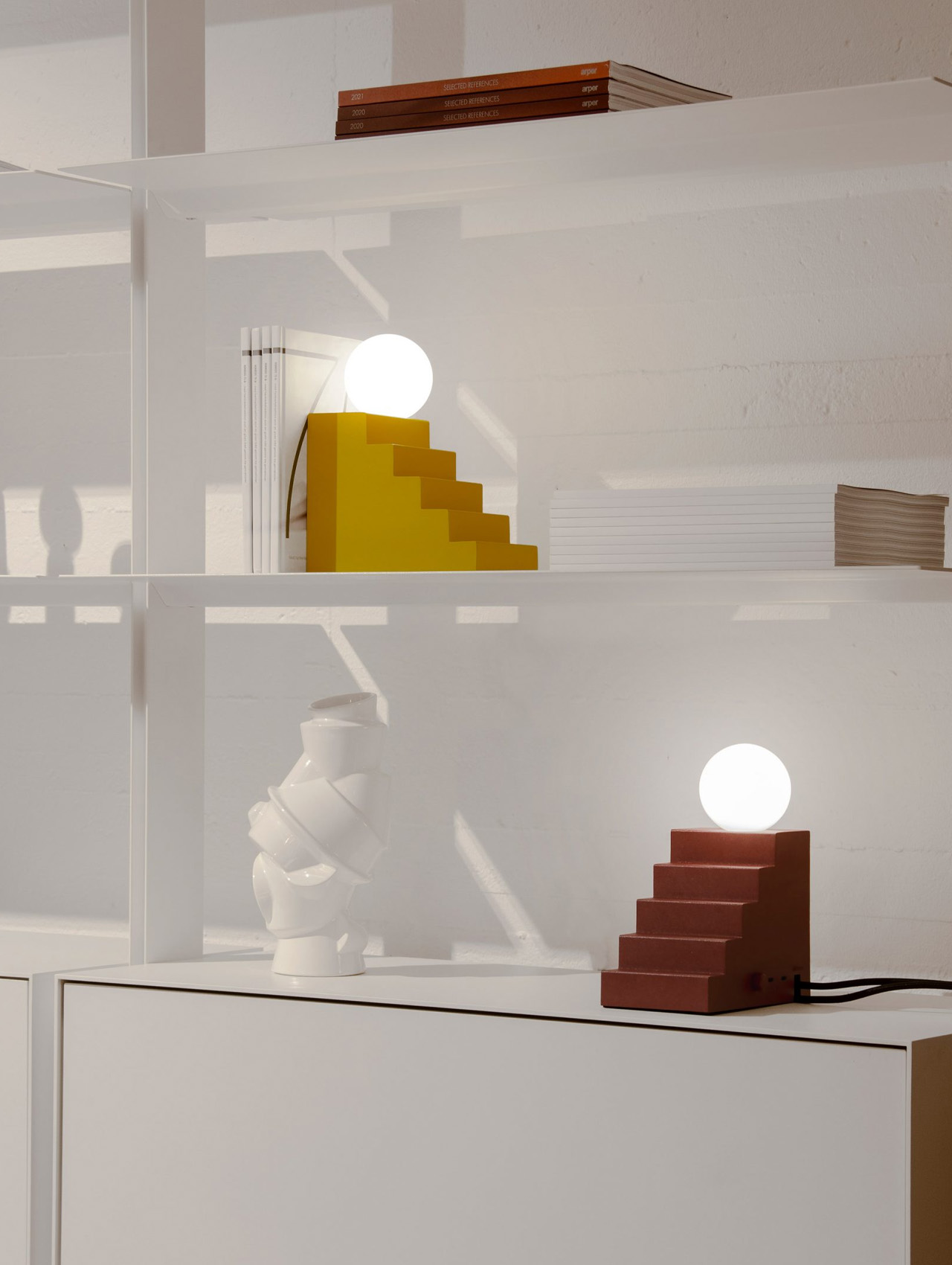
A glowing globe appears to pause at the edge of a tiny staircase. Designed by Notchi Architects for Oblure, the Stair Table Lamp turns basic architectural geometry into something closer to a desktop prop from a playful animated film. The stepped block gives the light a visual story even before you switch it on. Beyond that expressive shape, it also incorporates two USB-C charging ports and a power outlet, putting useful connections inside its sculptural base beside your everyday equipment.

For a home office, the attraction is having a lamp you might choose for the living room rather than accept from an equipment catalog. Its stepped form can serve as a bookend, giving it a second reason to sit beside your reading material. Check electrical compatibility before ordering:

What We Like

  • The architectural form stays interesting with the light switched off.
  • Integrated charging connections give the sculptural base a practical role.

What We Dislike

  • The listed electrical version isn’t suited to standard US outlets.
  • A power cord keeps it tied to an outlet.

3. Tevaplanter

Tevaplanter puts the interesting part of growing a plant on the outside. Its porous ceramic body holds water inside, allowing moisture to pass through to roots attached to the textured exterior. There’s no potting soil concealing the process, so the vessel becomes a support for a changing patchwork of growth. Beside a monitor, that makes a useful visual contrast: one object updates in pixels, while the other changes through roots, leaves, and the occasionally unpredictable business of keeping something alive.

This belongs in a home office with room for a small growing project, rather than someone seeking greenery to ignore. The maker recommends suitable plants such as orchids and ferns, but individual species still need appropriate care. You’ll need to refill the reservoir and choose a position that meets your plant’s lighting needs. Think of it as a living desktop display with responsibilities attached. Watching that surface change is the pleasure; removing soil does not remove the work of gardening.

What We Like

  • Exposed growth makes the growing process part of its appeal.
  • Soil-free cultivation avoids keeping potting mix on the desk.

What We Dislike

  • Plant choice and growing conditions still need attention.
  • Reservoir refills remain part of the routine.

4. TriAngular Calendar 2027

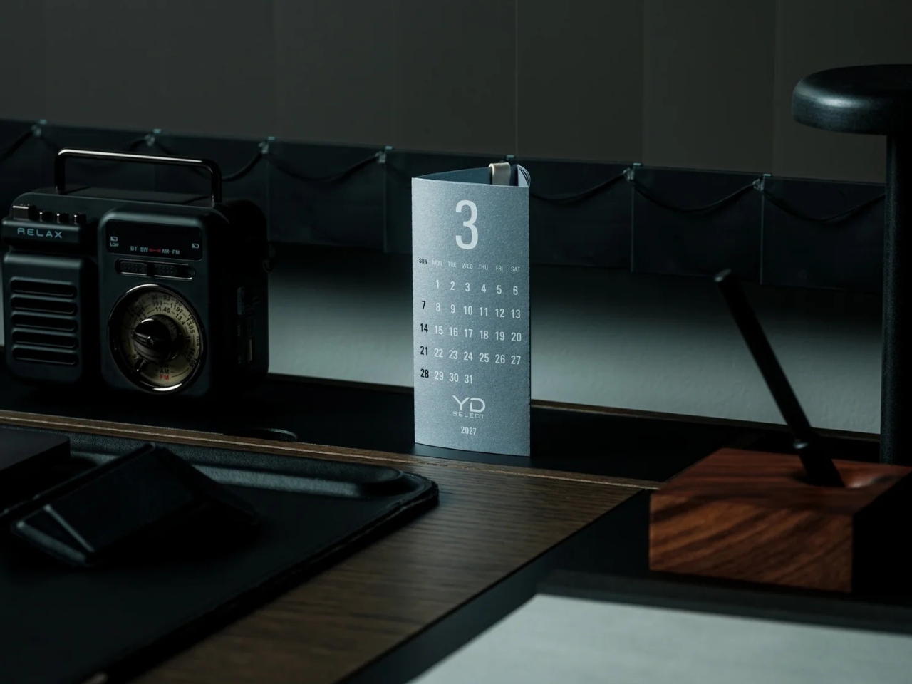
The TriAngular Calendar 2027 makes checking a date a small physical action instead of another reason to unlock your phone. Three months wrap around its triangular paper structure, so you rotate the calendar to see another month. There’s no separate stand underneath: the folded paper supports itself, secured with a paper clip rather than metal hardware. Silver specialty paper and white printing give this ordinary desk necessity a more deliberate presence, without adding electronics or asking you to charge anything.

Made in Japan, each sheet is silkscreen printed by hand, with white ink applied twice to the silver paper. Individual months are perforated for removal, and January and February 2028 are included beyond the main year. At 60 millimeters wide and 53 millimeters deep, its footprint is modest enough for a crowded desk. The limitation is deliberate simplicity: there are no national public holidays printed. It works best as a quick date reference, leaving detailed scheduling to your existing planner.

Click Here to Buy Now: $20.00

What We Like

  • Three months accessible by rotating the form.
  • Paper construction needs no separate stand.

What We Dislike

  • No national holidays are marked.
  • Dated pages aren’t reusable in later years.

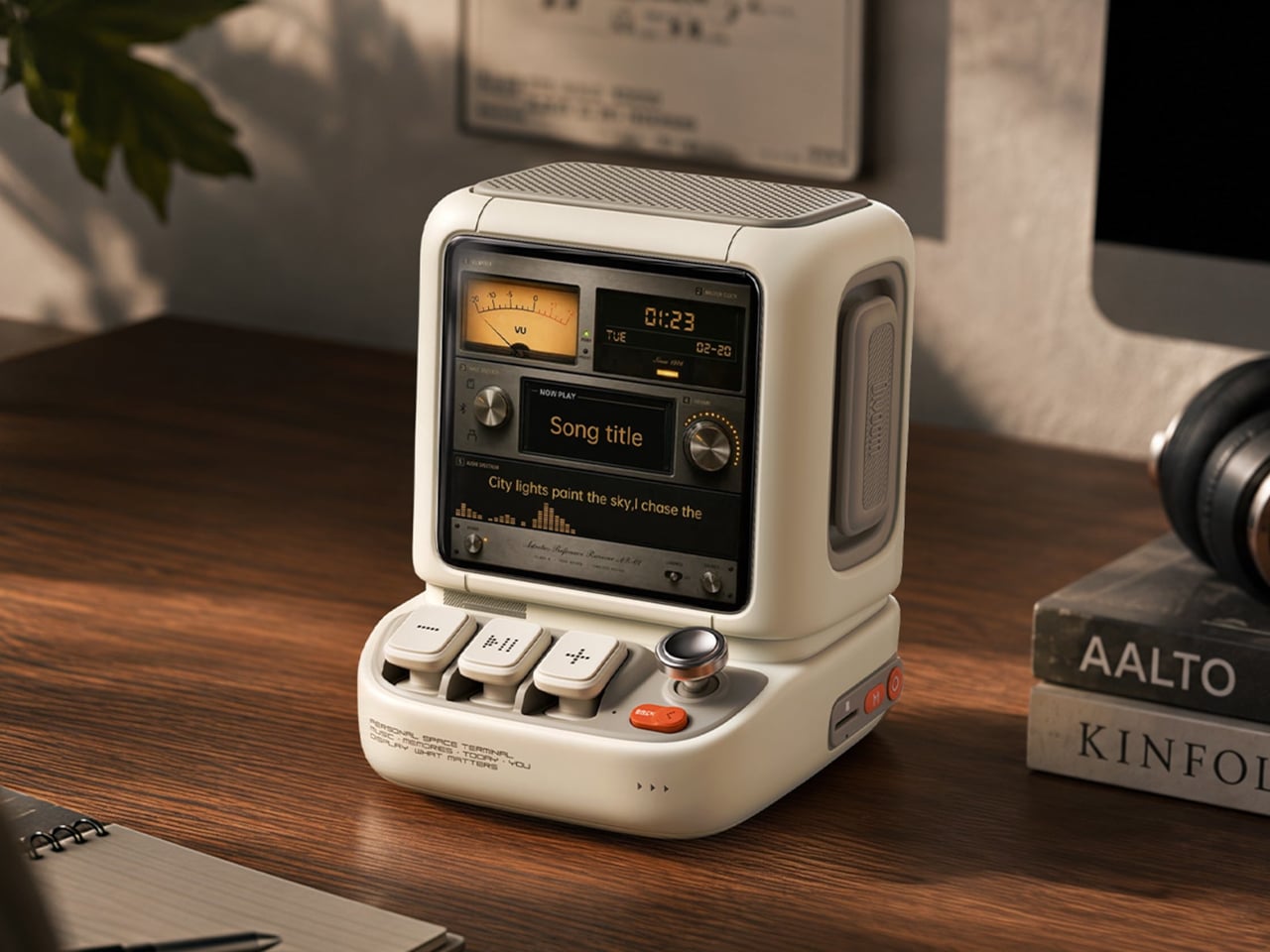
5. Divoom Astrotoo

Divoom’s Astrotoo looks like a miniature computer that has escaped the obligation to run spreadsheets. It is a desktop speaker with a 3.95-inch display, physical keys, and a joystick, packaged as a chunky little terminal. The screen can show photos, pixel art, clock faces, and music visualizations instead of staying dark between songs. That combination gives it a role beside Sony’s display: a music accessory with controls that invite a reach across the desk instead of another app.

Customization runs through the Divoom app, so the playful hardware doesn’t remove your phone from the process entirely. Still, choosing a favorite photo or animation gives the object a personal purpose beyond playing audio. Its base measures 106 by 108 millimeters, which is manageable but deserves consideration on a small desk already carrying several gadgets. The real buying question is whether you want a speaker with a visual personality. Sound quality needs listening, and an animated display cannot answer that.

What We Like

  • Physical keys and a joystick provide alternatives to touchscreen controls.
  • Personal photos and artwork give the display a purpose between songs.

What We Dislike

  • Visual customization still involves the app.
  • Another animated screen could compete for your attention.

6. iA Vanishing Line Notebook

The iA Vanishing Line Notebook makes its most interesting feature less visible as you use it. Instead of conventional printed ruling, it uses watermark guidelines that appear on an empty page and become less noticeable beside darker handwriting. The lines don’t physically disappear, and there’s no special ink involved. It’s an optical contrast effect, designed to leave your words more prominent when you return to read them. That is a thoughtful adjustment to something most notebooks simply take for granted.

The A5 hardcover contains 288 pages of Japanese Araveal White paper and uses thread-sewn binding that lets it open flat. Beside a laptop, it offers space for rough ideas without another window or notification. The 10-millimeter ruling is worth noting if you prefer closely spaced handwriting, and the notebook’s approximately 470-gram weight makes it substantial for daily carrying.

Click Here to Buy Now: $80.00

What We Like

  • Watermarks guide writing without conventional printed lines.
  • Sewn binding lets the book lie flat.

What We Dislike

  • At $80, it’s a premium stationery purchase.
  • Faint guides can be difficult to see in some lighting.

7. MezmoCoin

Some desk accessories are allowed to be toys. Designed by Kristoph Krisjans, the original MezmoCoin is a small metal spinner whose surface pattern produces the illusion of a flowing spiral as it rotates. Its flat, coinlike form keeps the object simple, with the movement doing the entertaining.

The appeal here is a break that doesn’t begin by opening another screen. Give the coin a spin, watch the pattern move, and let the action be enough without turning it into a focus exercise. Technique and surface matter: the maker recommends smooth glass for longer rotations and practice to achieve a controlled launch. A clear patch of desk is essential, especially while learning. It gives your hands and eyes something to follow without adding another electronic device to maintain.

What We Like

  • A compact optical illusion with no batteries or app.
  • Its simple form puts the emphasis on movement.

What We Dislike

  • Surface choice and spinning technique affect performance.
  • Current availability of the original coin remains unconfirmed.

8. ExtLine Trash Bin

The ExtLine Trash Bin deals with the least photogenic part of a home office by changing its outline. Designed by Yuji Tsukamoto and manufactured by Gendai Kogyo in Japan, the stainless steel bin has a straight body only 110 millimeters wide. It can sit flush against a wall without the familiar flared outline of a typical open wastebasket. A lid rotating around a central pivot conceals the liner and contents when closed, keeping the object from visually dominating its surroundings.

The sharp edges come from a grooving and bending process the shop identifies as Shikaru bending, used to achieve crisper corners than conventional sheet metal folds. That precision matters on an object with very little else to look at. Its capacity is 10.5 liters, making it a modest office bin rather than a household workhorse.

Click Here to Buy Now: $490.00

What We Like

  • Slim body fits along a wall.
  • Closed lid conceals waste and liner.

What We Dislike

  • $490 is a substantial price for a bin.
  • Capacity is limited to approximately 10.5 liters.

Leave Some Room for Yourself

The most useful starting point is the part of your workspace that currently feels borrowed from somebody else. If the lighting is purely functional, choose a lamp you enjoy looking at. If everything happens through a screen, make room for paper or something living. There’s no need to make every object playful. A few deliberate choices are enough to give the room a character that feels recognizably like your own.

Keep the practical limits visible, too. A display may need another device, a plant needs care, and a beautiful bin still needs emptying. Those requirements matter more than how convincing the setup looks in a photograph. The goal is a place where you can work without feeling surrounded by work equipment. Leave enough surface to use the desk, then let the objects you keep there express something beyond your job.

The post 8 Home Office Accessories That Make Your Workspace Feel Less Like Work first appeared on Yanko Design.

  •  

This Tiny House Fits Three Double Beds Beneath a Rooftop Retreat

The Tow Côja saves one of its most appealing spaces for the roof. A terrace sits between two raised sections, giving this compact home an outdoor perch without extending its footprint. Designed by Portuguese studio Madeiguincho, the completed tiny house was commissioned by a couple and delivered to southern Spain. It measures 7.2 meters long and sits on a double-axle trailer.

The roof arrangement gives the house a distinctive silhouette, with taller volumes at either end framing the recessed wooden deck. Access comes through one of the sleeping lofts, making the terrace feel more closely connected to the upstairs accommodation than to the main living area. That route is worth noting: stepping outside up here involves passing through a sleeping space, rather than taking a separate exterior stair.

Designer: Madeiguincho

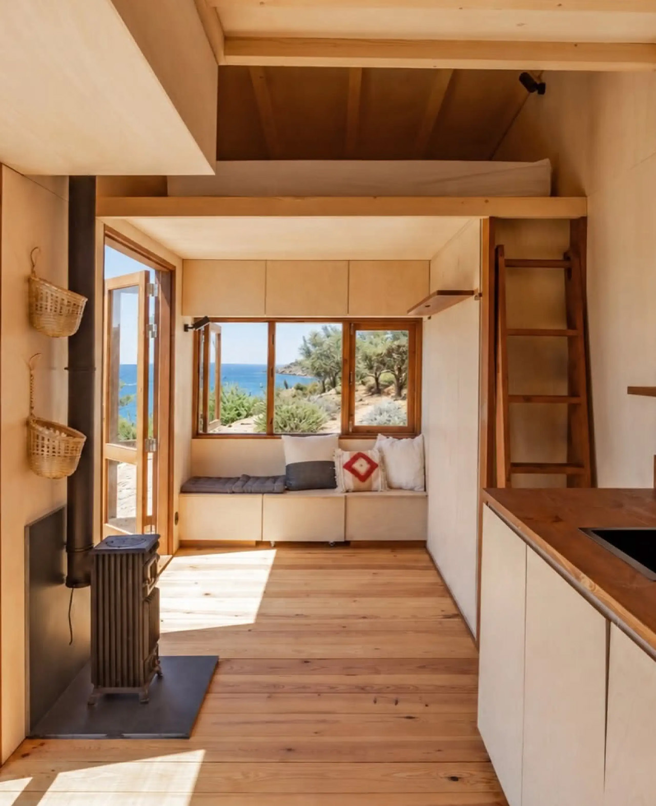
Below, dark timber cladding contrasts with natural wood window frames. Two sets of glazed double doors open the kitchen and living area directly to the surroundings, while a separate bathroom entrance adds another connection outdoors. The openings break up the narrow building’s enclosure, giving its rooms views and access beyond the trailer’s edges. Inside, timber continues across the walls, ceilings, and floors.

The reported interior area is just 17 square meters, or approximately 183 square feet, so the living room has to work more than one shift. A built-in bench incorporates storage, while a Murphy-style double bed folds down from the adjacent wall. Stowed away, it leaves the room available for daytime use. Lowered, it turns that shared space into the home’s third sleeping area.

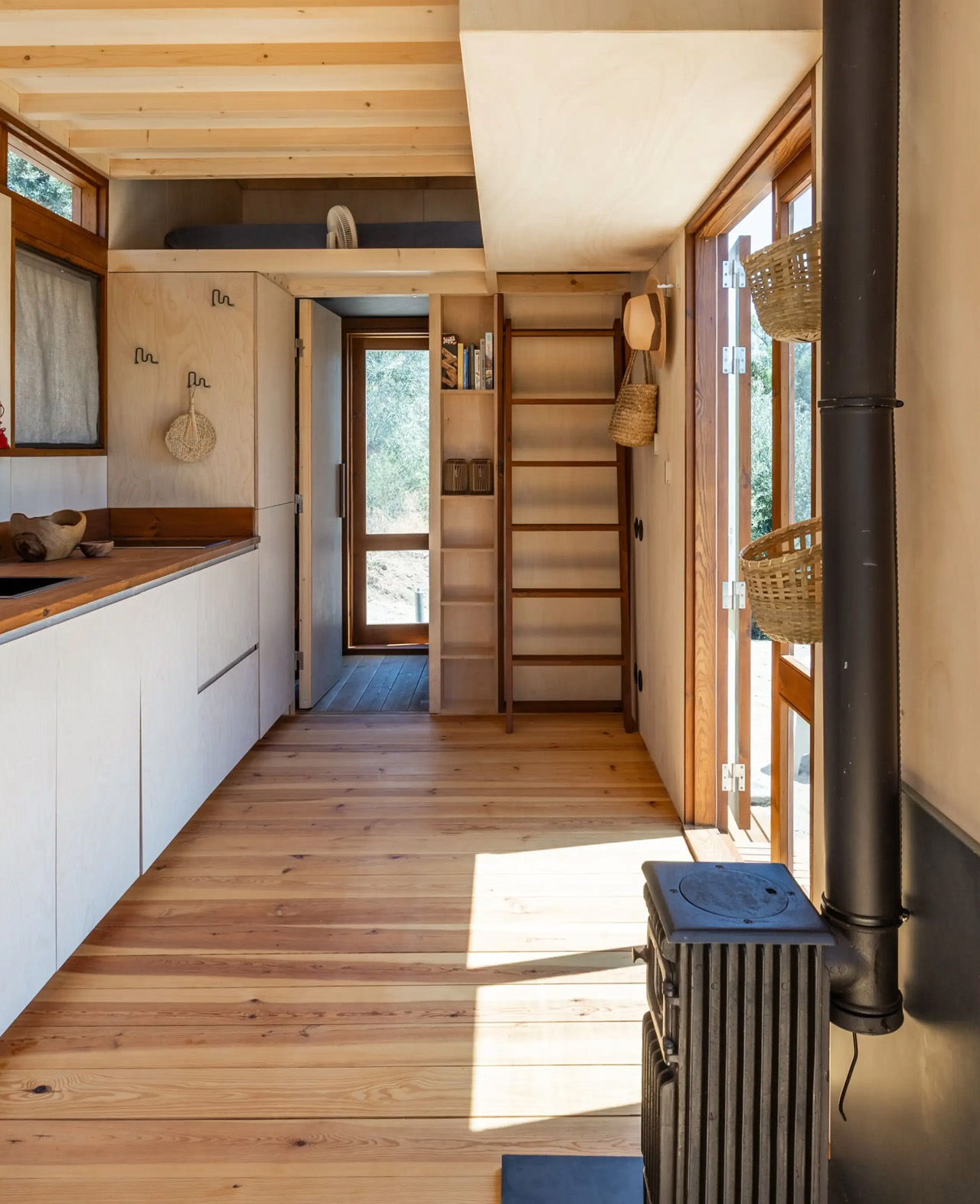
The kitchen occupies the center of the plan, between the lounge and bathroom. Its straightforward arrangement includes an induction cooktop, an inset sink, and a refrigerator concealed within the cabinetry. Open shelves, hooks, and a long ledge supplement the cupboards, keeping frequently used items accessible without requiring every object to disappear behind a door. A compact wood-burning stove stands nearby.

At the opposite end, the bathroom contains a walk-in shower, basin, composting toilet, and storage. Its own glazed exterior door means someone can enter without crossing the kitchen or lounge. Above, two low-ceilinged lofts each accommodate a double bed. Together with the folding bed downstairs, they provide sleeping places for six, though that figure describes bed capacity rather than six people enjoying separate rooms.

That distinction matters in a house this small. The lofts are reached by wooden ladders, and the downstairs bed borrows the living room rather than creating another enclosed bedroom. The terrace offers a useful counterpoint, providing somewhere else to sit when the weather allows. Côja’s strongest move is distributing activity vertically while letting the main floor change roles as the day unfolds.

The post This Tiny House Fits Three Double Beds Beneath a Rooftop Retreat first appeared on Yanko Design.

  •  

5 Thoughtful Gifts for Men Who Appreciate Great Design

Shopping for a man who notices the curve of a drinking glass or the way a lamp opens calls for more than an expensive label. The challenge is finding something that respects his taste without asking him to rearrange his life around it. A good starting point is an ordinary activity he already enjoys, followed by one small design detail that makes the object worth picking up and using again.

These five gifts take that approach across drinkware, lighting, gaming, coffee, and desk accessories. Each has a specific reason to belong here, rather than relying on a vague idea of what men like. Choose by his habits, his available space, and his willingness to make room for something a little different.

1. Flex Glass Tumbler

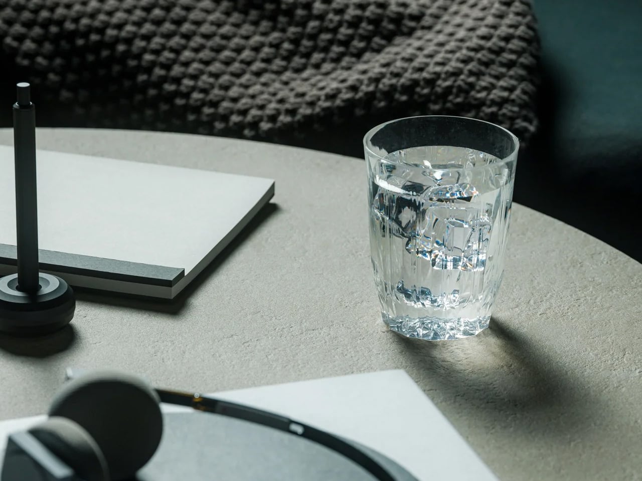
The Flex Glass Tumbler makes its most interesting decision before you pour anything into it: despite the name, it isn’t glass. KINJO makes it from transparent silicone rubber, molding a faceted surface inspired by Japanese kiriko cut glass. That substitution gives the familiar decorative tumbler a different set of possibilities. It can flex rather than shatter like conventional glassware, making it worth considering for someone who enjoys setting a table but also takes his drink out onto the patio afterward.

Made in Yao, Osaka, the tumbler holds 250 milliliters, or about 8.5 fluid ounces, and costs $60 individually. Its appeal is the opportunity to give a familiar household object some visual character without making fragility part of the bargain. The compromise is material care: silicone can retain odors or discolor, and the shop recommends hand washing despite dishwasher compatibility. Choose it for someone interested in unusual materials, not someone whose favorite thing about a tumbler is the feel of glass.

Click Here to Buy Now: $60.00

What we like

  • Faceted silicone gives a familiar tumbler an unexpected material.
  • There’s no glass to shatter if it’s accidentally dropped.

What we dislike

  • The 250 ml capacity is modest for longer drinks.
  • Silicone may retain odors or develop discoloration.

2. Lumio Lito Classic Book Lamp

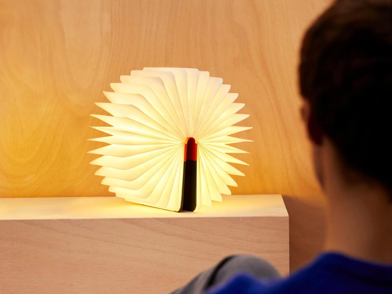
Opening the cover is the gesture that makes Lumio’s Lito Classic appealing as a gift. Max Gunawan’s design places a folding Tyvek diffuser between wooden covers, allowing the book form to expand through 360 degrees. Instead of treating the mechanism as something to conceal, the lamp makes its transformation the main event. For someone interested in how objects work, there’s plenty to appreciate in a design whose structure changes so dramatically through such a familiar movement of the hands.

Lumio lists warm 2700K illumination and eight hours of continuous battery operation, so the $250 lamp can serve as an accent light without requiring a nearby outlet while in use. Concealed magnets add mounting options beyond simply standing it on a table. It suits the man who enjoys changing a room’s atmosphere through objects he can move around. Just remember that its warm light is a specific choice, rather than a substitute for every reading lamp or workspace lighting setup.

What we like

  • The folding structure makes opening the gift part of its appeal.
  • Battery power and concealed magnets offer flexible placement.

What we dislike

  • At $250, the transformation needs to matter to the recipient.
  • Warm 2700K output won’t suit every workspace.

3. LEGO Nintendo Game Boy

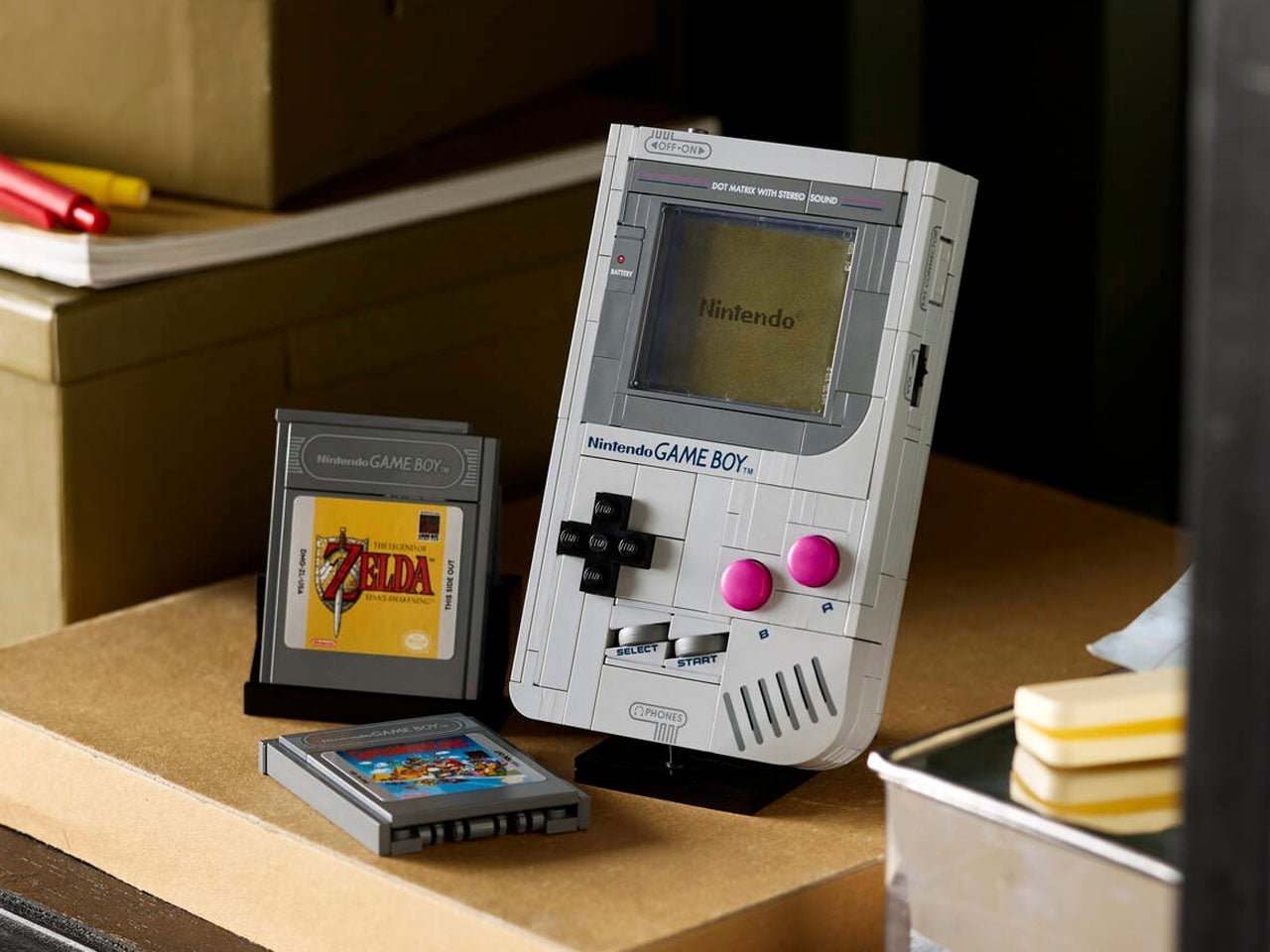
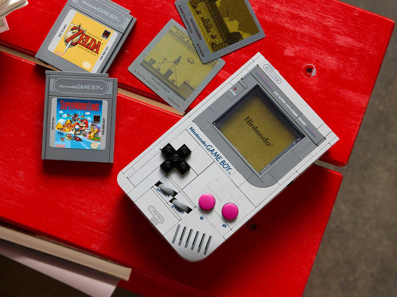
For the man who still recognizes the original Game Boy’s controls at a glance, LEGO’s compact 421-piece recreation offers a particularly specific kind of nostalgia. Set 72046 rebuilds Nintendo’s handheld at near-actual size, with pressable buttons, a cartridge slot, and interchangeable brick-built Game Paks. The design interest lies in how much of that familiar object survives the translation into LEGO. Recesses, controls, and proportions become things to assemble and understand, rather than details to simply look at again.

The $59.99 set includes buildable cartridges for Super Mario Land and The Legend of Zelda: Link’s Awakening, along with lenticular screens and a display stand. Those screens provide changing imagery, not digital gameplay. There are no electronic games, lights, or sound, which is worth making clear before giving it to anyone expecting a working console. Buy it for someone who would enjoy both the building process and the finished object, with a shelf already waiting for his completed Nintendo tribute.

What we like

  • Recognizable controls make the model more engaging than a static silhouette.
  • Interchangeable cartridges and screens offer different display configurations.

What we dislike

  • It cannot play games or produce electronic light and sound.
  • Assembly is part of the gift, which won’t suit everyone.

4. Wacaco Pixapresso Portable Espresso Maker

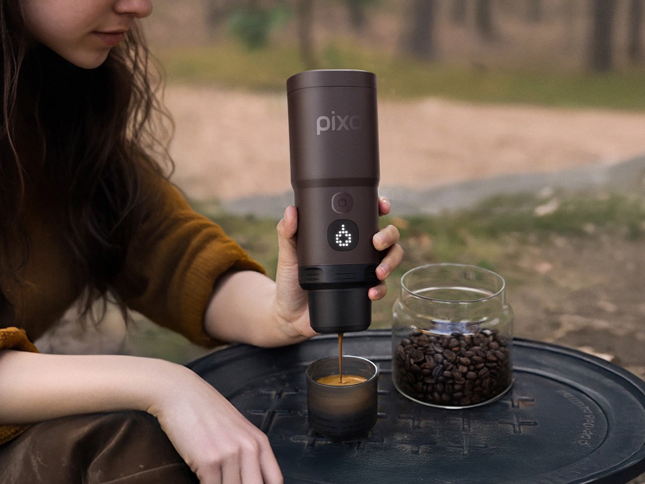
A portable coffee maker becomes more useful when it handles the heating as well as the extraction. Wacaco’s Pixapresso brings both functions into a rechargeable device, with a display for adjusting brewing settings. It accepts ground coffee or Nespresso Original-compatible capsules, giving the recipient a choice between preparing his own dose and packing something simpler for a trip. The point is keeping a familiar coffee routine available away from the kitchen, without carrying a countertop espresso machine along for the journey.

At $159.90, Pixapresso offers three temperature presets and an adjustable basket holding 8 to 16 grams of coffee. Those controls give an interested coffee drinker something meaningful to adjust, rather than a single automatic setting. Portability still has limits: the machine weighs 755 grams before you pack supplies, and Wacaco rates its battery for up to five espressos. It makes the most sense for hotel stays or road trips, where luggage space and recharging are easier to accommodate than when backpacking.

What we like

  • Integrated heating removes the need for a separate hot water source.
  • Ground coffee and capsule compatibility accommodate different travel routines.

What we dislike

  • At 755 grams, it adds noticeable luggage weight.
  • The advertised five-espresso battery capacity makes recharging part of planning.

5. TriAngular Calendar 2027

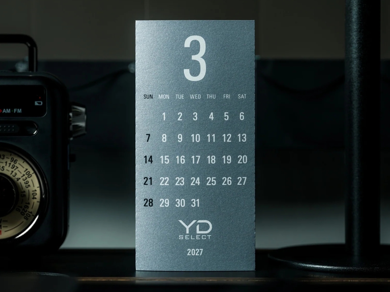
Replug’s TriAngular Calendar 2027 uses the printed sheet as its own structure. Silver specialty paper folds into a triangular form, secured with a simple all-paper clip, so there’s no separate stand to accommodate. Three months wrap around its three sides; checking another month means turning the calendar, not seeing every date at once. It’s a particularly good fit for someone who likes an orderly desk and appreciates stationery that does something interesting with a small amount of material and space.

The $20 edition is made in Japan, with white ink applied twice by hand silkscreen printing onto silver paper. Perforated months tear away as they pass, and January and February 2028 extend its usefulness beyond December 2027. Think of it as a date reference rather than an appointment planner: no national public holidays are printed. For a late 2026 gift, the appeal is immediate and practical, giving him a considered little object for the working year just ahead.

Click Here to Buy Now: $20.00

What we like

  • The folded sheet supplies its own stand.
  • Hand-silkscreened typography gives modest stationery a crafted finish.

What we dislike

  • No national public holidays are marked.
  • Dated pages make this a time-specific gift.

Make the Gift Easy to Live With

Before buying, consider what the gift will ask of him after the wrapping comes off. His interest in assembling things, patience for charging another device, and available shelf space all deserve some attention. Those practical details matter more than how impressive the object looks in a product photograph. A thoughtful gift should fit into an existing pleasure, not arrive with a list of new habits he’s expected to take up.

Keep the presentation just as considered. If he enjoys figuring things out, leave the mechanism for him to discover. If building is part of the appeal, resist the urge to finish the assembly first. A short note explaining the detail that made you think of him can give the object a personal connection. Then leave him the pleasure of finding its place on his own desk, shelf, or bedside table.

The post 5 Thoughtful Gifts for Men Who Appreciate Great Design first appeared on Yanko Design.

  •  

Summer’s Night Dream Fits a Private Downstairs Bedroom Into a 26-Foot Tiny Home

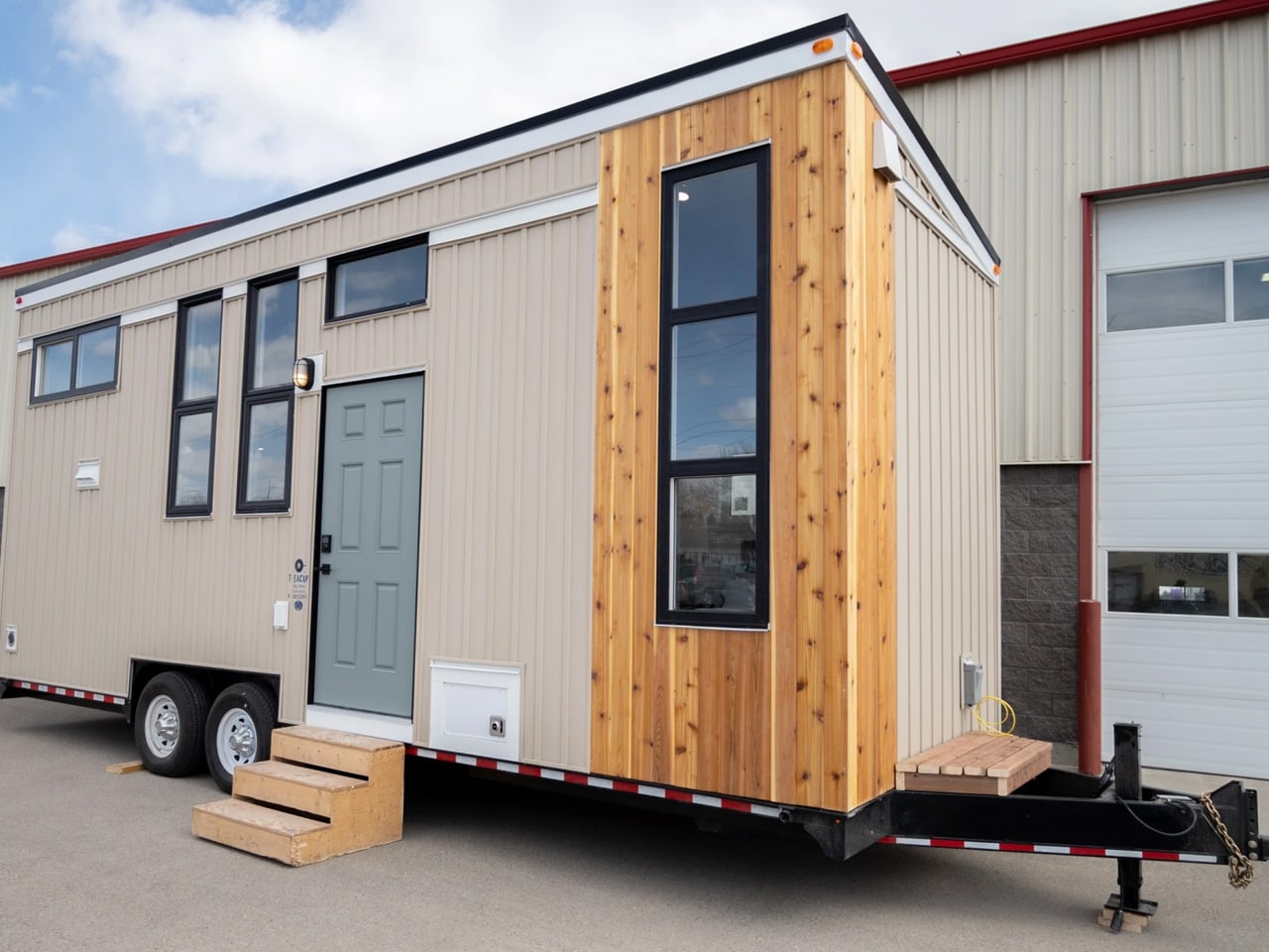
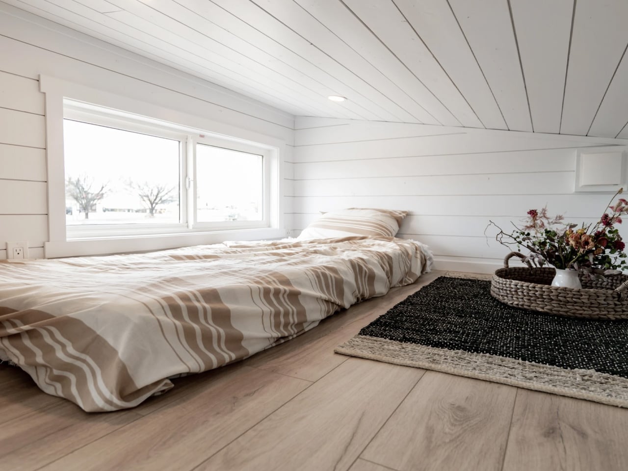
A pocket door separates the bedroom from the living room in Summer’s Night Dream, giving this 26-foot tiny house a degree of privacy that an open sleeping platform can’t offer. Built by Canadian manufacturer Teacup Tiny Homes, the customizable RV model measures 8.5 feet wide and provides a stated 297 square feet of living space, with a main-floor bedroom and an additional sleeping loft.

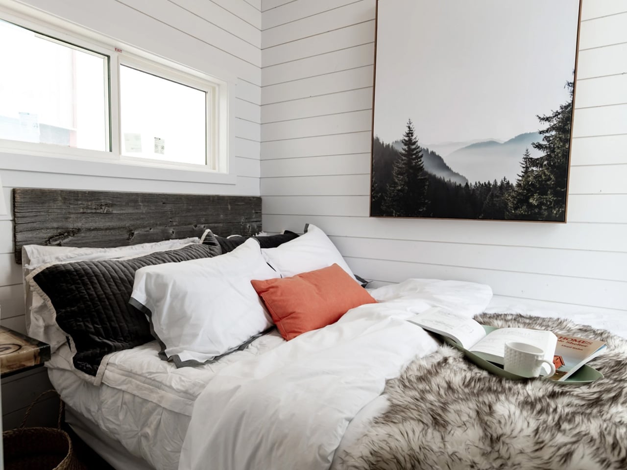
That downstairs bedroom is the plan’s strongest decision. Teacup lists an 11-foot vaulted ceiling, allowing the room to retain vertical space rather than placing another bed directly overhead. In the photographed build, a wide window sits above the headboard, while a small bedside surface fits alongside the mattress. Keeping the primary bed downstairs removes the ladder from at least one occupant’s nightly routine.

Designer: Teacup Tiny Homes

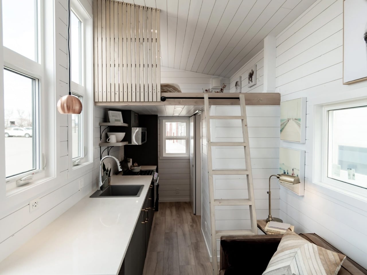
The loft occupies the opposite end, reached by a ladder beside the sofa. A vertical timber screen partially shields the sleeping area without closing it off from the room below. Its low ceiling makes the upstairs space better suited to lying down than lingering upright. Teacup rates the home for four sleepers, though the two sleeping areas offer distinctly different experiences.

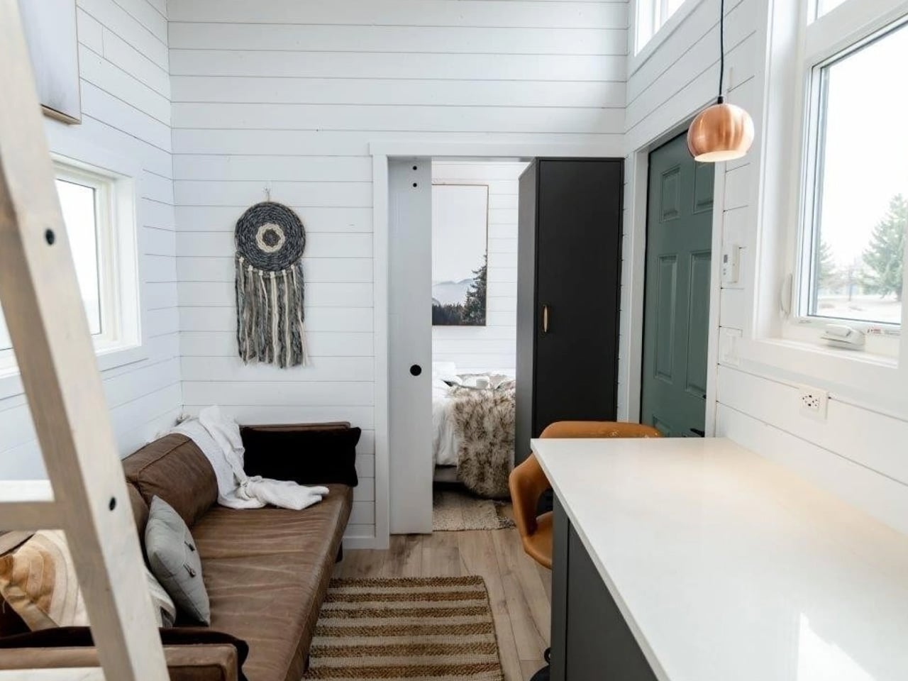
Between the bedrooms, the kitchen and living area share a narrow, open space. The photographed interior pairs white horizontal wall paneling with dark cabinetry, pale flooring, and a copper-colored pendant. A long counter runs opposite the sofa, extending into a small eating spot near the entrance. This arrangement preserves a recognizable living room, although the dining provision is modest for a home advertised to sleep four.

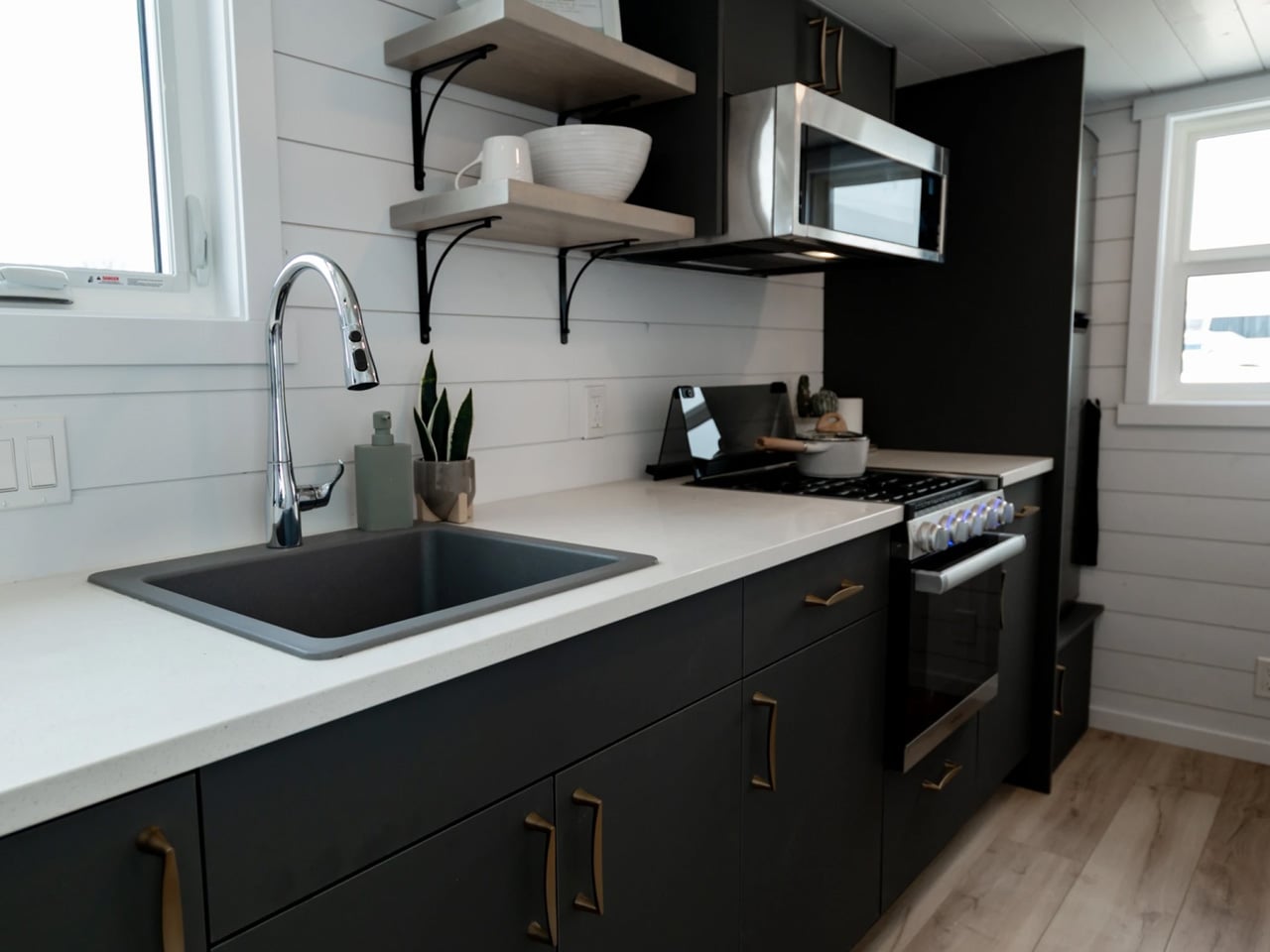
The featured build includes an oven, cooktop, microwave, and refrigerator, with open shelves supplementing the cabinets. The bathroom groups a shower, toilet, and compact vanity into the remaining enclosed space. Buyers should distinguish those photographed fittings from the base specification: Teacup says every home shown has been customized, and its standard RV appliance package includes a smaller refrigerator and two-burner cooktop.

The manufacturer’s 2026 price list puts Summer’s Night Dream at US $94,700 for the base build, US $108,800 for the Designer tier, and US $122,800 for Luxury. Taxes and delivery are extra. Those figures make customization a substantial part of the purchasing decision, especially when the polished interior in the photographs is what first catches a buyer’s attention.

There’s also a site to prepare. Teacup’s RV homes require connections for power, water, and sewage, and its setup guidance calls for protected water lines and insulated skirting in cold climates. The trailer therefore offers relocation potential without making the house independent of its surroundings. For a buyer drawn to the downstairs bedroom, the next design question is outside the front door: where the home will sit, and what that site needs to function properly.

The post Summer’s Night Dream Fits a Private Downstairs Bedroom Into a 26-Foot Tiny Home first appeared on Yanko Design.

  •  

Fala Atelier Tucks Three Semicircular Buildings Into a Portuguese Hillside

A semicircle is the starting point for every building at Cookie Cutter Retreat, but repetition doesn’t produce identical spaces. In Sobral de Monte Agraço, Portugal, Fala Atelier has arranged three differently sized versions across a sloping site. Completed in 2024, the 500-square-meter project uses the same basic geometry to accommodate distinctly different parts of a shared domestic life.

The retreat was commissioned by an international community of digital nomads who had been living in houses around the nearby village. Their initial brief concerned basic infrastructure, including toilets and storage, before expanding into something more substantial. The resulting ensemble divides the program between a permanent residence, temporary accommodation, and a larger communal building, giving gathering and retreat their own addresses.

Designer: Fala Atelier

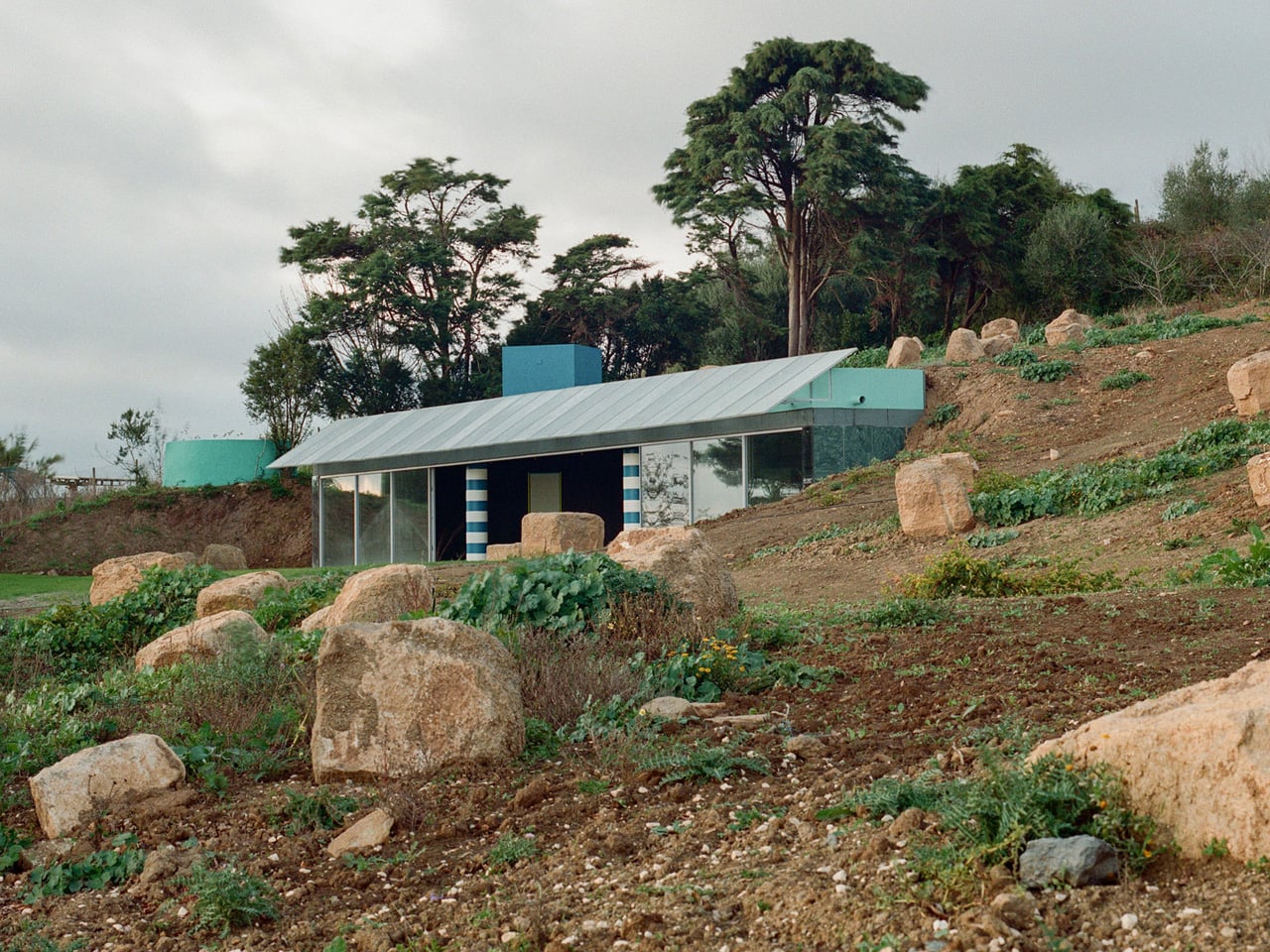
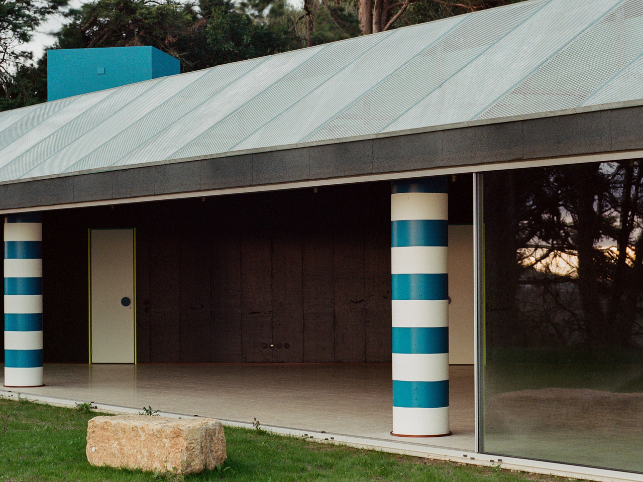
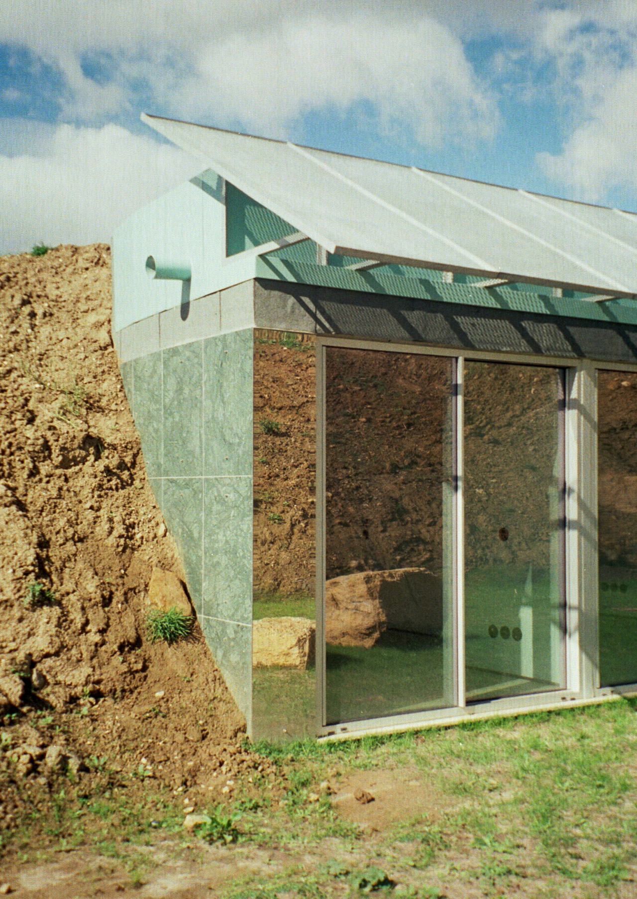
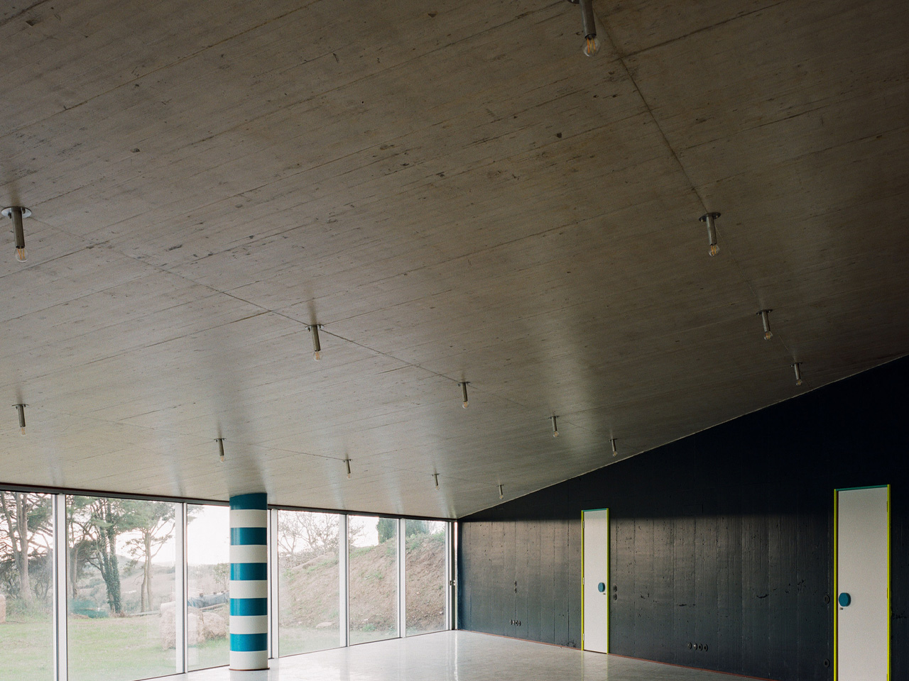
Each semicircle meets the hillside with a curved concrete retaining wall, while its straight edge becomes a broad glazed facade facing the landscape. An angled metal canopy sits above the glass. Inside, a diagonal partition separates an expansive shared area from a denser collection of private rooms. That division gives the buildings a clear spatial rhythm: openness toward the view, smaller spaces tucked behind.

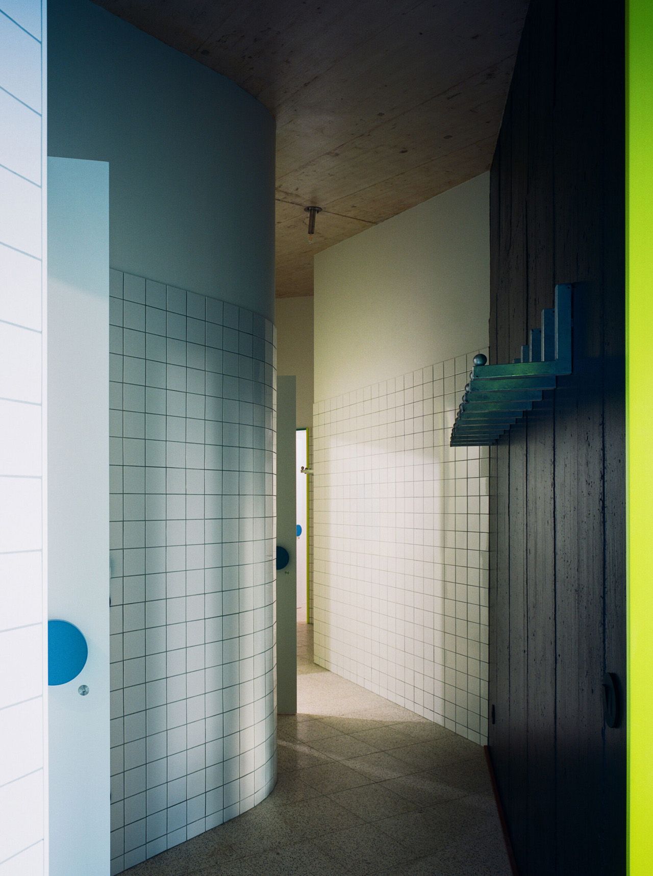
Those smaller spaces contain the project’s most unusual architectural move. Fala borrowed fragments of floor plans from houses by Toyo Ito, Frank Gehry, and Álvaro Siza, inserting them into the semicircular shells. These references have practical consequences rather than remaining abstract tributes. In the largest building, for example, the winding corridor borrowed from Siza’s Beires House becomes a route serving showers and toilets. Familiar architectural ideas acquire a different job.

The material palette makes the underlying arrangement legible. White-painted concrete follows the curved perimeter, while the diagonal wall is painted a blue so dark it approaches black. Exposed concrete ceilings carry a dense grid of Minase lamps. Fluorescent yellow appears among the doors, kitchens, and furniture, while blue-and-white stripes turn a substantial round column into a conspicuous marker beside the glazing.

Across the interiors, terrazzo floors, marble countertops, and custom galvanized-steel furniture give the repeated geometry a consistent material setting. Outside, the terrain complicates the apparent simplicity of the plan. Although the three buildings seem to face one another in drawings, the slopes largely interrupt direct views between them. Their relationship is experienced through movement across the site rather than a single encompassing vista.

Fala also reused granite stones found on the property to organize places for sitting and gathering. The buildings themselves recede into the ground, leaving glazing and bright blue chimneys as their clearest signals. There’s a revealing cost to that apparent discretion: extensive excavation was needed to make the architecture disappear. The retreat’s quiet presence is therefore a carefully constructed effect, achieved through a considerable reshaping of the hillside itself.

The post Fala Atelier Tucks Three Semicircular Buildings Into a Portuguese Hillside first appeared on Yanko Design.

  •  

The 8 Best Kitchen Tools of November 2026 That Earn Their Drawer Space

Freshly fried food shouldn’t have to sit in its own drippings while you finish dinner. A plate with a removable rack is one answer. A measuring cup that pushes sticky ingredients out is another small fix worth noticing. This month’s kitchen picks start with those ordinary frustrations, then look at the objects behind them: what takes up space, what gets used, and what makes the next meal easier to manage.

Our November 2026 selection covers preparing, cooking, serving, and storing food. These are editorial design picks, not comparative test winners or eight launches from this month. We chose each for a specific mechanism or useful overlap, with cleaning requirements and storage demands considered alongside appearance.

1. Half-Moon Plate

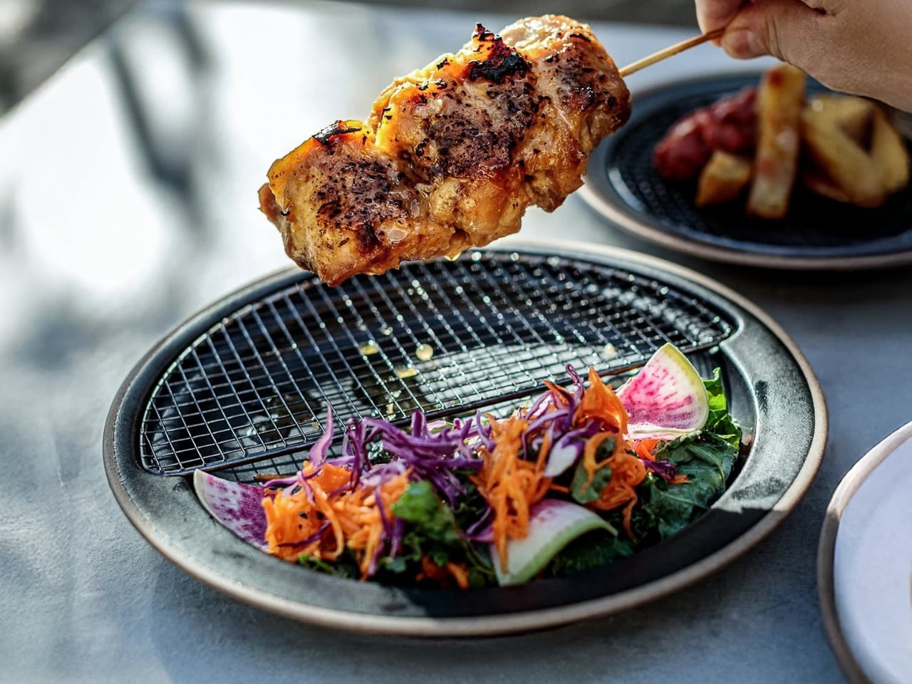
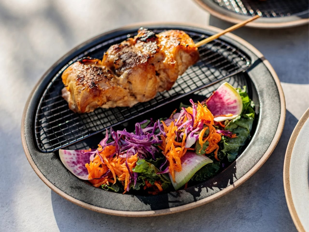
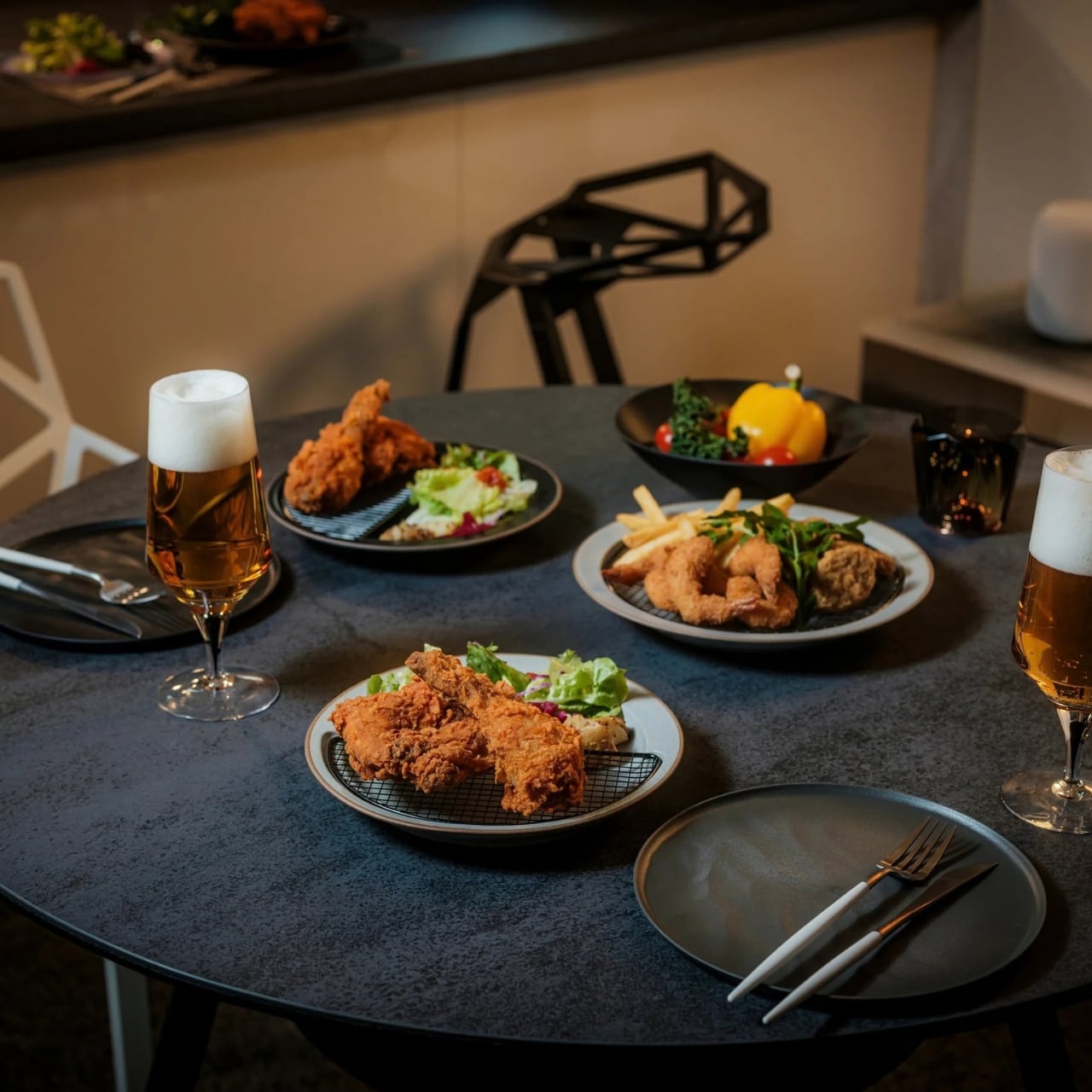
The Half-Moon Plate gives fried food somewhere to drain without sending it to a separate tray. A removable stainless steel rack covers roughly half the ceramic plate, lifting chicken, tempura, or potatoes above the oil and moisture collecting underneath. The uncovered portion remains available for rice, vegetables, or salad. That division makes the design useful before anyone takes a bite: the draining surface and serving dish become one object, removing a transfer from the trip between the pan and table.

The material pairing deserves attention, too. Mino ware ceramic from Toki, Gifu, meets a blackened 18-8 stainless steel rack made in Tsubame, Niigata. At 8.9 inches across, the plate stays close to an everyday dinner setting rather than becoming a serving platter. Remove the rack when dinner doesn’t need it, and the ceramic works alone. That’s the feature that earns it our lead position: a specialized tool that doesn’t sit unused between the meals it was designed for.

Click Here to Buy Now: $70.00

What we like

  • The removable rack combines draining and serving.
  • The ceramic plate remains useful without the rack.

What we dislike

  • The rack adds a second piece to wash.
  • It isn’t oven-safe, and you must remove the rack before microwaving.

2. Dreamfarm Upcup Adjustable Measuring Cup

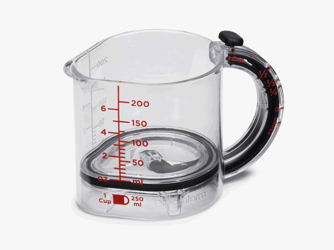
Sticky ingredients expose the weakness of an ordinary measuring cup: filling it is easy, emptying it is another job. Dreamfarm’s Upcup uses a movable base with a watertight seal that scrapes the walls as it rises. Set it for ¼, ⅓, ½, or 1 cup, fill the space, then push the base upward to release the contents. For peanut butter, honey, or mayonnaise, that gives the ingredient a direct route into the mixing bowl without a second scraping tool.

The storage argument is straightforward: four cup measurements share one body instead of four separate handles. Dreamfarm makes the cup from Tritan with a silicone seal, and the base can pop out for washing in the dishwasher. The important distinction is that scraping out residue doesn’t replace washing; it simply addresses the awkward part of emptying a measure. This is a useful consolidation for bakers, especially when the alternative is a drawer full of cups and spatulas performing overlapping jobs.

What we like

  • Four common cup measures share one body.
  • The removable base allows thorough dishwasher cleaning.

What we dislike

  • The standard Upcup stops at 1 cup.
  • The sliding base and seal add parts to clean.

3. OTOTO Elizabat Kitchen Scissors

OTOTO’s Elizabat puts its extra functions where your hand already expects leverage. The stainless steel blades include a bottle opener, while ridged metal between the handles provides a nutcracker. The handles become a bat’s wings, turning a familiar pair of kitchen scissors into a character without disguising the working parts. For a drawer already holding separate scissors and a bottle opener, the appeal is easy to understand: several ordinary tasks share the same tool, with nothing to attach or unfold.

The humor doesn’t excuse the footprint. OTOTO lists Elizabat at 8.3 inches long and 4.6 inches wide, so those wings need a generous utensil compartment. Plastic and rubber form the handles around the steel blades, and the scissors are dishwasher-safe. They make the most sense as everyday prep shears for trimming herbs and opening packages. Grip comfort remains personal, particularly with such an unusual outline, so the silhouette shouldn’t be mistaken for proof that every hand will find it comfortable.

What we like

  • Scissors, bottle opener, and nutcracker share one tool.
  • There are no loose attachments to store.

What we dislike

  • The 4.6-inch width needs a roomy compartment.
  • The unconventional grip makes checking the fit worthwhile.

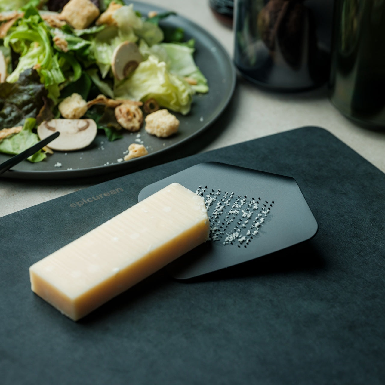
4. Playful Palm Grater

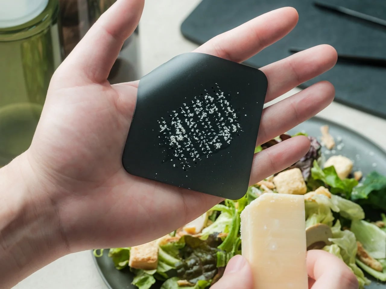
Gensuke Kishi’s Playful Palm Grater looks like a small sheet with one corner curling upward. That bend gives your fingers a place to hold a tool otherwise made from a single aluminum alloy plate. Measuring 4.1 by 3.6 inches, it takes a different approach from a tall box grater: a compact surface for adding a little cheese or grated vegetables to a meal. The shape is the grip, rather than a decorative body wrapped around another handle and cutting assembly.

Made in Japan and offered in several colors, it has enough personality to leave out at the table without reading as another appliance. Its limited scale suits the finishing stage of cooking, when you want a garnish rather than a bowlful. That’s also its boundary. A palm-sized grating surface isn’t the obvious choice for processing vegetables for family dinners. Think of it as a specific utensil that can live alongside your cutlery, not a replacement for every grater you own.

Click Here to Buy Now: $25.00

What we like

  • The single-piece aluminum body keeps construction simple.
  • Its small footprint suits garnishing and compact storage.

What we dislike

  • The limited surface area favors small quantities.
  • It doesn’t replace a box grater’s range of cutting faces.

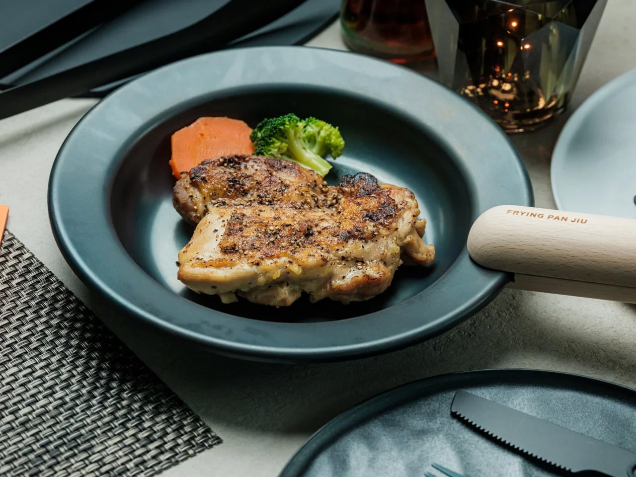
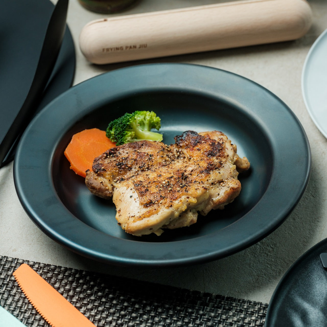
5. Iron Frying Plate

The Iron Frying Plate, also known as JIU, removes the usual distinction between cookware and the dish you eat from. Developed by Osaka manufacturer Fujita Metal with Tokyo design studio TENT, it uses 1.6mm mill scale steel and a detachable wooden handle. A sliding mechanism lets you attach or remove the handle with one hand. Cook, carry, then detach it at the table, leaving the rim clear instead of a handle projecting across the place setting while you eat dinner.

The removable handle matters in the cupboard, too, where fixed handles often dictate how pans can be arranged. JIU pans can stack without that obstruction, making the system interesting for smaller kitchens. This remains iron cookware, though, rather than a plate you can forget in the sink. Fujita recommends drying the pan with heat after washing and applying a light coat of oil for long storage. Serving directly from it means keeping a hot metal surface away from the tabletop.

Click Here to Buy Now: $69.00

What we like

  • Cooking and serving share the same vessel.
  • The detachable handle allows storage without protruding grips.

What we dislike

  • Iron needs drying and oiling for extended storage.
  • The hot base needs protection underneath at the table.

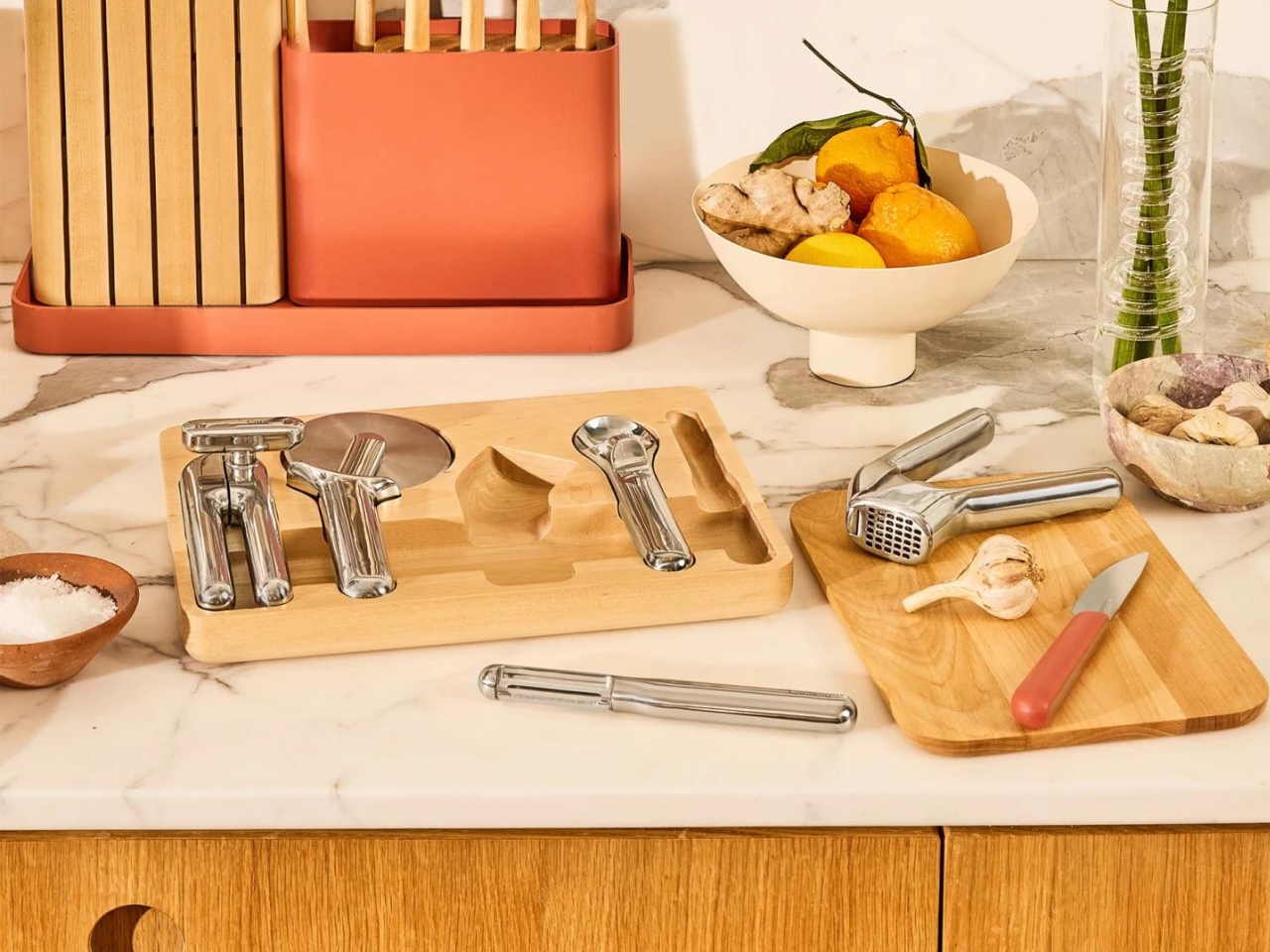
6. Caraway Stainless Steel Vegetable Peeler

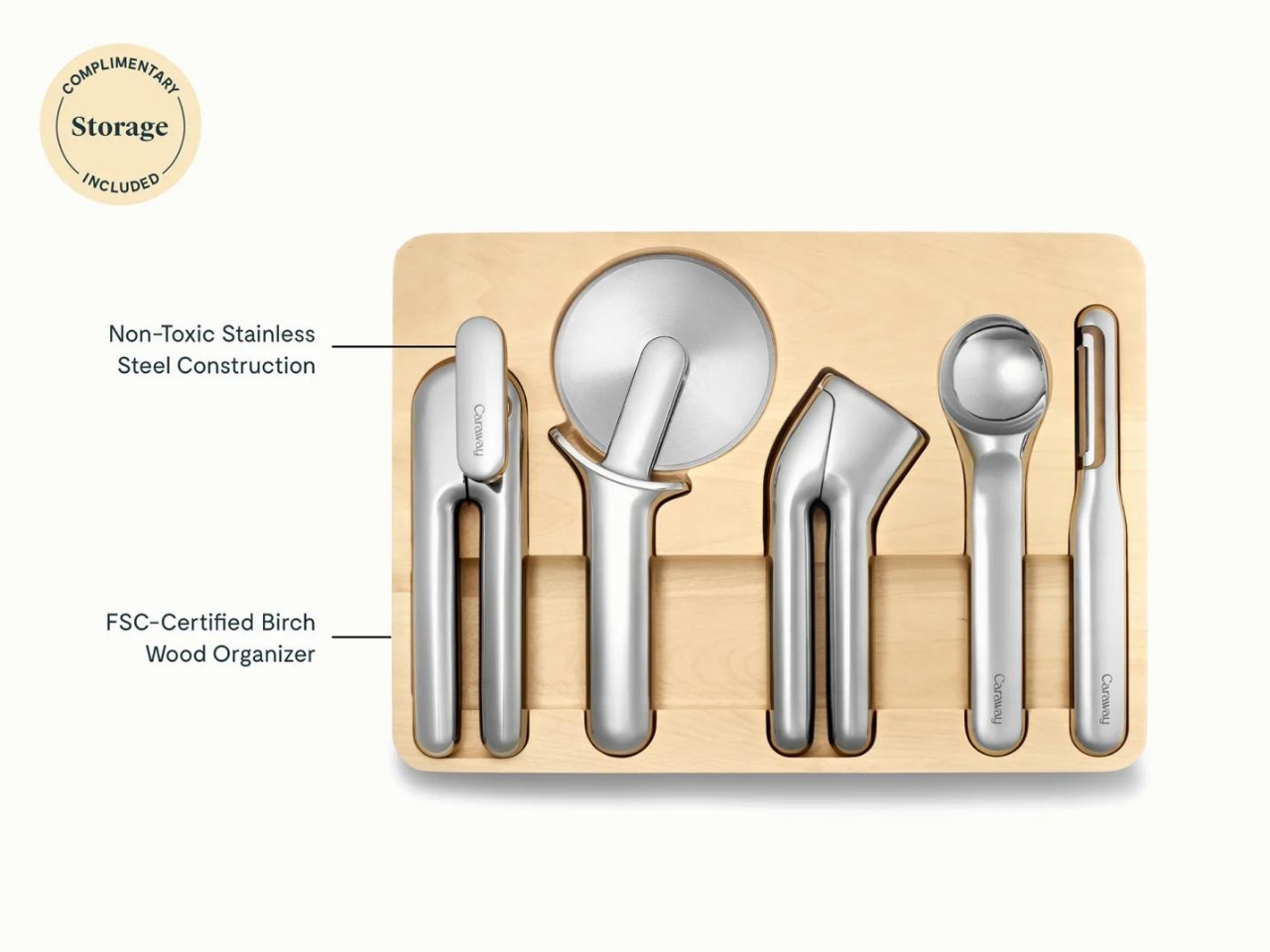
Not every useful kitchen tool needs an extra function. Caraway’s stainless steel Vegetable Peeler, part of the Kitchen Gadget Set designed by Box Clever, earns consideration through its compact proportions and swivel blade. The blade pivots to follow the contours of the ingredient rather than holding one fixed angle against every surface. At 7.5 inches long and about an inch wide, it occupies a narrow strip of drawer space, leaving the visual flourishes to the reflective metal and rounded handle.

This is the quietest design in the collection, which is part of its appeal. Peeling vegetables and making strips of citrus zest don’t call for a motor, interchangeable heads, or a storage case. Buying the peeler individually avoids bringing home the rest of a matching set you may not need. The reservation is value: Caraway lists it at $50. That makes the material and form the reasons to choose it, not an established claim of better results than cheaper peelers.

What we like

  • The narrow profile takes little room in a utensil tray.
  • It’s available individually, without the full gadget set.

What we dislike

  • The $50 list price is difficult to justify on function alone.
  • Its straight-handle layout won’t appeal to every Y-peeler user.

7. Dreamfarm Ortwo Pepper Grinder

Pepper is often needed while your other hand is holding a pan or stirring a sauce. Dreamfarm’s Ortwo replaces the familiar twisting motion with two handles that squeeze together, allowing one-handed grinding. Open them farther apart, and you can use both hands instead. A ceramic grinding mechanism offers six settings, from fine to coarse, while the transparent glass jar shows how much remains. The useful detail is the choice of grip, not another battery to charge or button to hold.

Beechwood handles give Ortwo the character of a utensil rather than an appliance, and the jar unscrews for refilling through a wide opening. Dreamfarm includes a lip intended to catch grounds when the grinder rests on a counter. There are limits to that versatile design: the manufacturer advises against salt and salt-infused spices, and the handles are wipe-clean only. The glass jar can go in the dishwasher, so cleaning the assembly requires separating the parts rather than washing everything together.

What we like

  • It works with one hand or two.
  • Six grind settings give control over texture.

What we dislike

  • It isn’t recommended for salt or salt-infused spices.
  • The wooden handles can’t go in the dishwasher.

8. B!POD DRO!D Vacuum Food Sealer

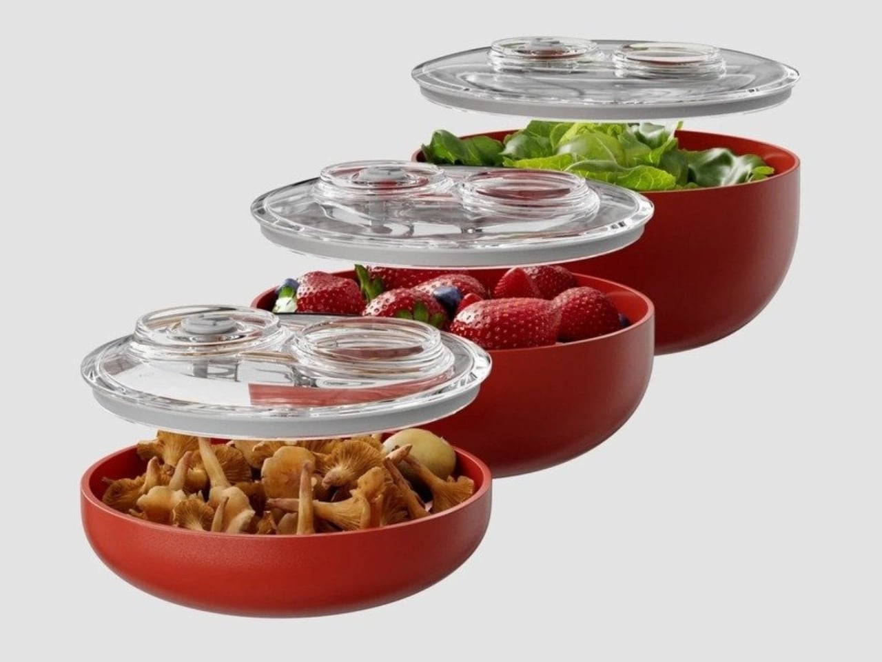
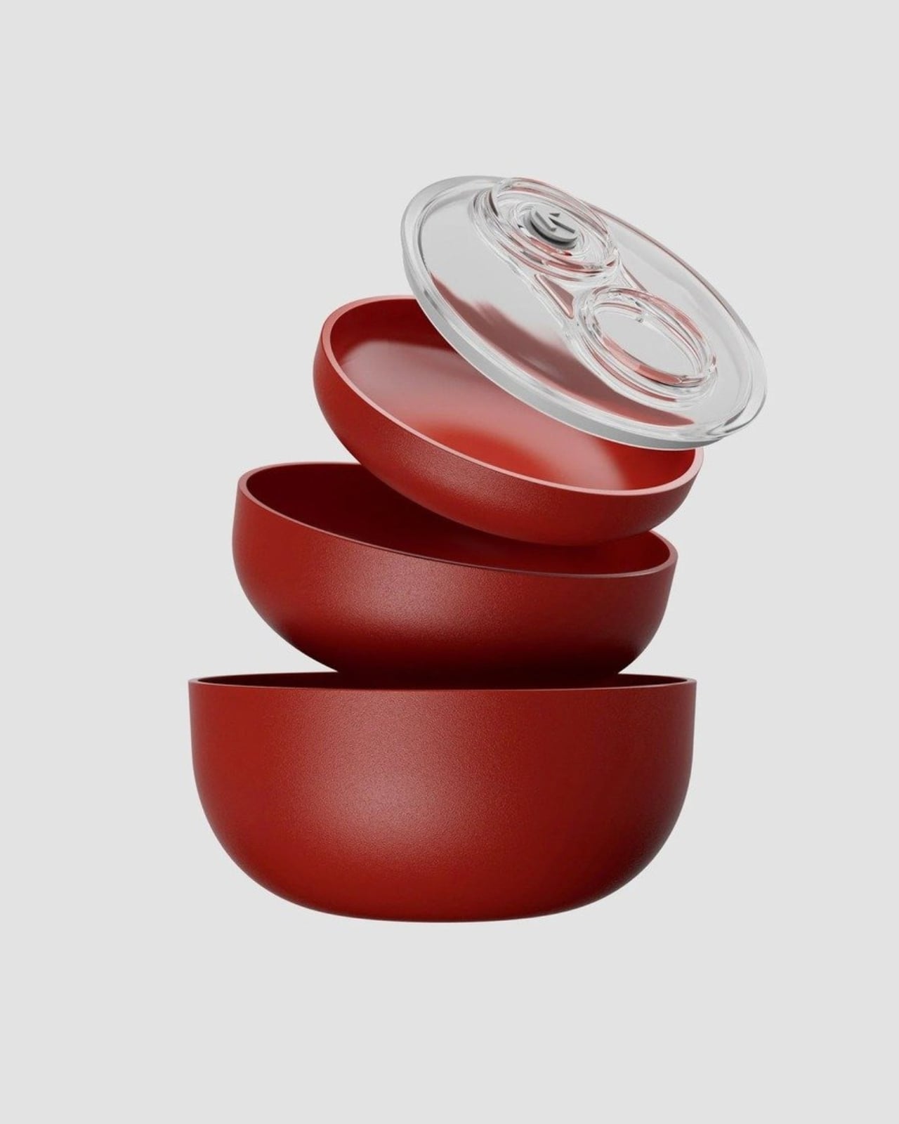
B!POD’s DRO!D takes the storage job beyond rearranging utensils. The rechargeable vacuum device connects to a valve on a compatible container lid, with one button controlling two pressure modes. B!POD specifies 50 mbar for stronger vacuuming and 150 mbar for the gentler setting. The device measures 11 by 6 by 14 centimeters, small enough to make its container system, rather than a broad countertop machine, the main storage consideration. It’s a different proposition from feeding plastic bags through a sealer.

The containers nest and stack, which matters because the system needs more room than the handheld unit suggests. Its appeal is strongest when reusable containers are already part of your meal routine, rather than an extra collection bought for occasional use. B!POD claims longer food preservation, but the gains depend on the food and aren’t independently established here. There’s a regional catch: its published shipping destinations cover European markets, so US readers shouldn’t assume they can order directly from the brand.

What we like

  • The handheld device avoids a large sealing platform.
  • Compatible containers nest and stack for storage.

What we dislike

  • It requires compatible containers and a charging kit.
  • Direct US shipping isn’t listed by the brand.

Choose Around the Meals You Cook

Before adding anything to a crowded kitchen, decide what will leave, or which repeated annoyance the new object will address. A tool that replaces three things can still be awkward to store; a specialized plate can justify its cupboard space if it suits dinner several nights a week. The useful measure is frequency, not the number of functions printed on the packaging or the novelty of the mechanism in photographs.

Start with the task you keep putting off, then check the less photogenic details: the drawer opening, the parts that need washing, the containers a device requires. That exercise may point toward one of these designs, or it may confirm that what you already own is enough. A well-chosen kitchen tool should make itself useful at the next meal, not create a new storage problem for you to solve afterward.

The post The 8 Best Kitchen Tools of November 2026 That Earn Their Drawer Space first appeared on Yanko Design.

  •  

APAP’s DIAGONAL Gives a 1970s Home a Glass Room With No Fixed Purpose

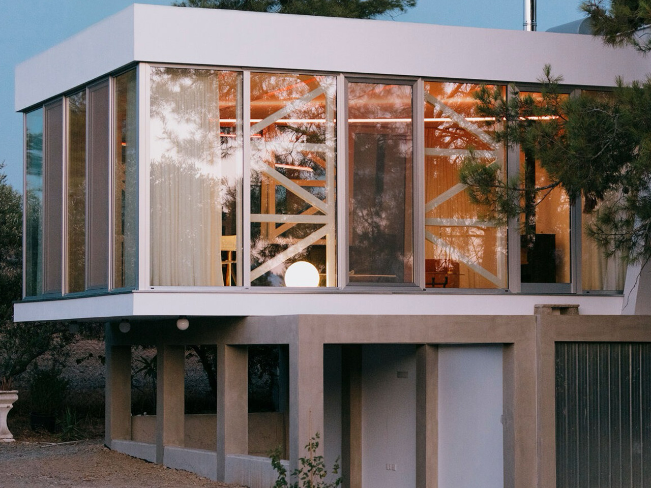
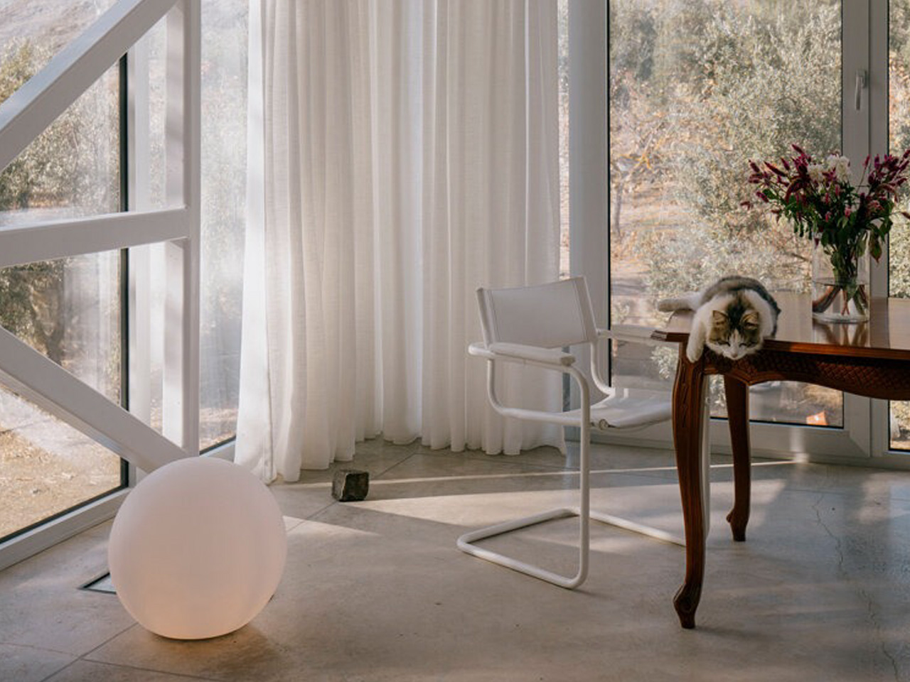
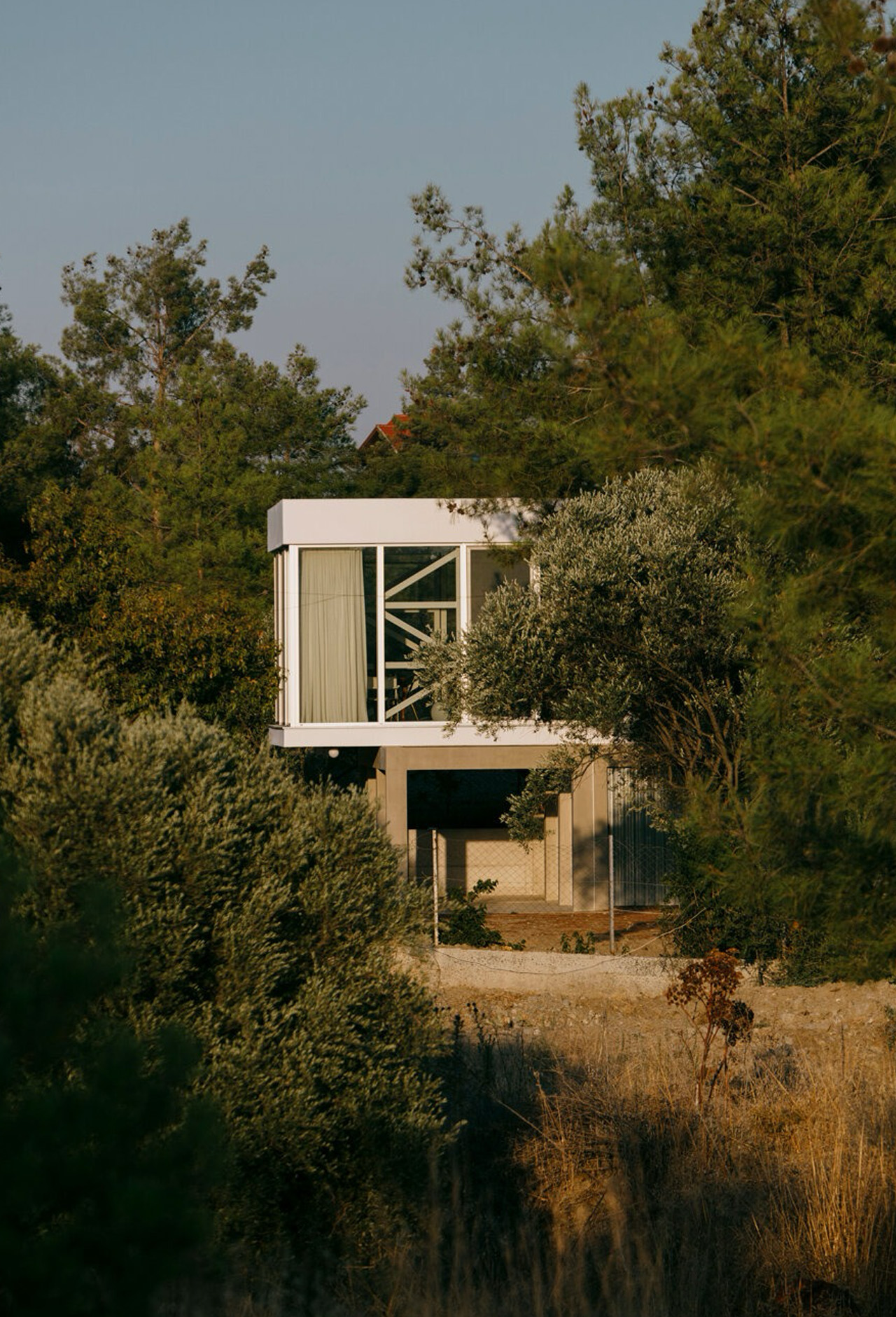
Two horizontal concrete planes reach toward a courtyard in Nicosia, Cyprus, extending a 1970s house into its wooded surroundings. Between them, glass encloses a room with no assigned domestic role. Designed by architectural practice APAP, DIAGONAL is a 133-square-meter residential extension that leaves its occupants to decide exactly how to use the space.

The existing home’s structure is defined by two parallel load-bearing walls. APAP’s addition changes the emphasis, organizing the pavilion around a floor and roof that cantilever toward the central courtyard. That shift gives the extension a distinct architectural identity while directing attention outward, toward the mature trees around the elevated site.

Designer: APAP

The pavilion is conceived without a rigid functional brief. Its interior has no built-in partitions, leaving its eventual uses open to change. No smaller enclosed rooms define where one activity must stop and another begin, and no prescribed arrangement gives the extension a single purpose.

The glazing gives this open volume a second source of variation. Daylight and foliage shadows move across the enclosure as the hours pass, while views of trunks and branches connect the interior to the surrounding canopy. Concrete establishes the room’s horizontal boundaries; the trees supply a changing visual backdrop beyond the glass.

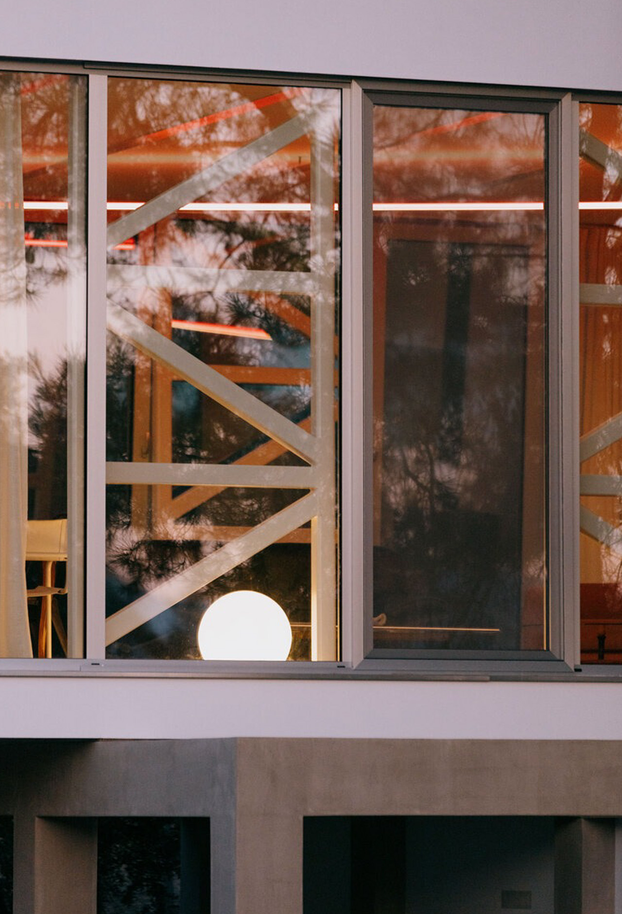
After sunset, a custom four-part lighting armature suspended within the pavilion gives the space a more deliberate internal geometry. Its diagonal arrangement introduces directionality into the otherwise open room. Rather than using partitions to articulate the interior, APAP lets the fixture and its contrasting light distributions emphasize the enclosure’s geometry.

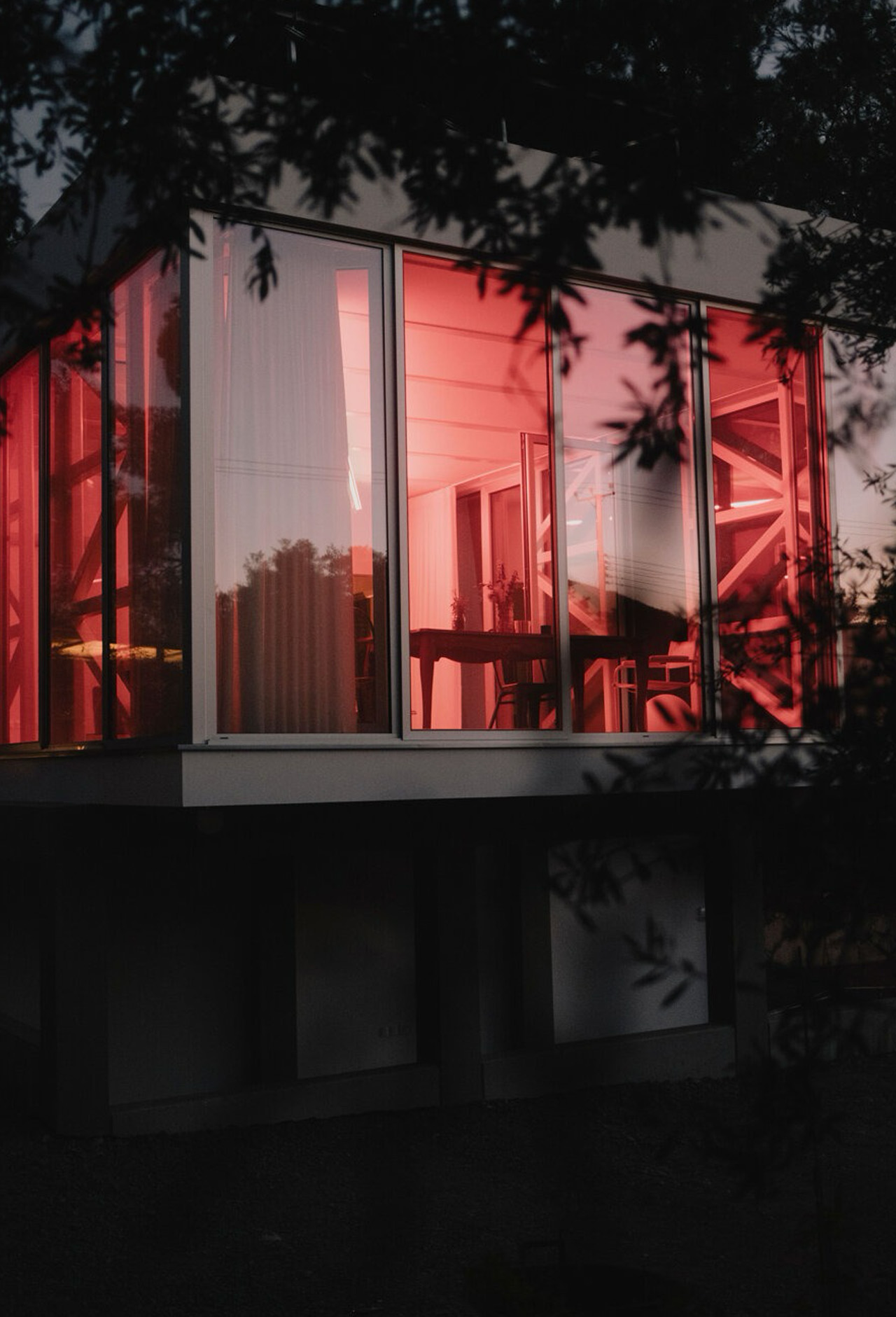
The lighting separates into three treatments: very warm red light directed toward the sides, very cool white light aimed at the ceiling, and warmer white light falling toward the floor. These are different directions as well as different colors, giving the room’s edges, upper surface, and lower plane their own distinct illumination.

That arrangement also changes how the extension addresses its setting. By day, the glazed perimeter draws attention toward the woodland. At night, the illuminated interior becomes a display visible through the glass. The enclosure remains physically unchanged, but the balance between looking out and seeing into the pavilion shifts with the lighting.

APAP’s design team, Alexis Papadopoulos and Maria Giannakou, has given the extension a character that doesn’t depend on a dedicated activity. The diagonal fixture matters because it introduces a strong organizing element without subdividing the floor beneath it. Occupants can determine what happens in the room, but its nighttime appearance is already clearly defined. Leaving the domestic brief open hasn’t meant making the architecture anonymous or withholding a distinctive lighting scheme.

The post APAP’s DIAGONAL Gives a 1970s Home a Glass Room With No Fixed Purpose first appeared on Yanko Design.
  •  

The 5 Best Architectural Designs of November 2026

A bathtub inside a tiny home puts a familiar comfort ahead of maximizing sleeping capacity. A museum corridor can become a place to look at the city instead of reaching the next gallery. Those are the architectural decisions that interest us here: specific choices about how people occupy a building. This month’s selection moves between private retreats and public landmarks, with each project giving us a different reason to linger.

Our five picks for November 2026 bring together Lavvu’s modular home, Zook Cabins’ Yukon retreat, Oslo’s MUNCH Museum, Oregon’s East County Library, and Copenhagen’s KAI bathhouse. This is an editorial selection, not a list of November openings: MUNCH opened in 2021, while KAI is scheduled to open December 5. What earns each a place is a clear design idea, from sleeping without a ladder to making room for public life.

1. Lavvu XL Modular Home

Lavvu’s XL makes its persuasive argument in the bathroom, where a full-size bathtub survives a floor plan of roughly 237 square feet. Credited to Re:Büro, the furnished modular home is part of a four-size range featured in our October coverage as a preorder offering. Its rounded exterior and panoramic glazed end give the cabin a distinct identity, but the domestic provisions earn its place here. Small living feels more plausible when familiar routines have somewhere to happen without constant rearrangement.

The kitchen includes a refrigerator, dishwasher, and two-burner induction cooktop, with a sliding island that adjusts between seated and standing use. Drawers beneath the bed and a wardrobe with dedicated shoe storage give belongings an assigned place. That matters more than an empty promotional interior. The large glazed end also makes privacy a site-planning issue, not an afterthought. Transport takes place as an assembled module, so delivery access and installation still need resolving before this becomes anyone’s ready-to-use woodland retreat.

What we like

  • Sliding island accommodates dining and food preparation.
  • Integrated storage makes room for clothing, shoes, and everyday belongings.

What we dislike

  • Panoramic glazing needs a privacy-conscious site.
  • Transportable construction still requires delivery and installation planning.

2. Yukon Park Model

Zook Cabins plans its Yukon Park Model around a king-size bed on the main floor, avoiding the ladder that so often turns tiny-house sleeping into a minor expedition. The 296-square-foot interior sits within a 12-by-29-foot footprint, with the bathroom, kitchenette, and sleeping area arranged on one level. Offered as a park model, it makes more sense as a delivered retreat than a frequently relocated camper. The design is decisive about its audience: one person or a couple staying somewhere small.

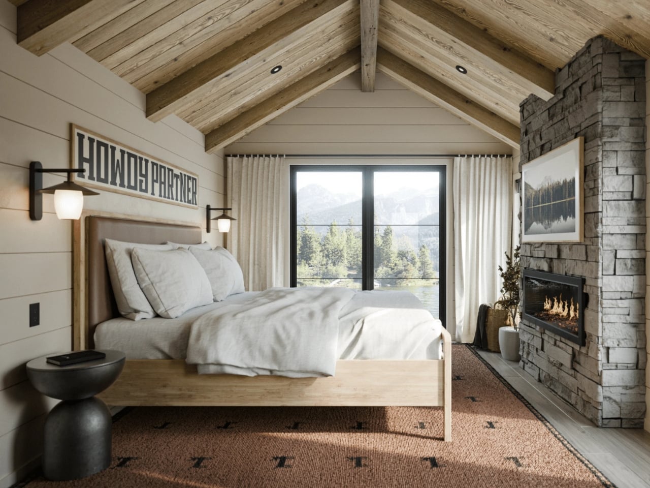
Vertical cypress siding and a pitched metal roof establish the cabin character outside. Inside, white oak ceiling boards and beams sit above painted shiplap, while an electric fireplace anchors the sleeping space. The bathroom gets a zero-entry shower and a floating quartz-topped vanity, but cooking is less ambitious: the published kitchenette specification lists a sink and undercounter refrigerator, with no cooktop. That’s a fair weekend tradeoff. The open sleeping arrangement is less forgiving when one wants breakfast, and another wants quiet.

What we like

  • Main-floor sleeping removes the need for a loft ladder.
  • The bathroom gets a generous specification rather than leftover space.

What we dislike

  • No cooktop appears in the published kitchenette specification.
  • The open plan offers no separate bedroom for different sleeping schedules.

3. MUNCH Museum

Oslo’s MUNCH Museum has a bent upper section that announces its presence across the waterfront. Estudio Herreros’ more interesting move happens inside, where enclosed galleries protect the art and a more transparent circulation zone opens visitors’ attention to the city. Designed by LPO Arkitekter as local architects, the museum opened on October 22, 2021. Its 13-floor organization makes exhibitions part of the visit, offering changing views instead of saving the panorama for a single lookout at the top.

The architects call these the static and dynamic zones. Separating them allows the museum to treat conservation and public circulation differently, rather than asking every space to perform identically. Undulating perforated aluminum panels give the exterior texture and a shifting appearance as light changes, according to supplier Lindner. A corridor can carry more than foot traffic. Here, looking outward offers a change of focus between galleries, although the vertical arrangement also commits a visit to repeated movement between different floors.

What we like

  • Circulation offers changing city views between exhibitions.
  • Separate gallery and public zones accommodate different environmental requirements.

What we dislike

  • Stacked galleries make floor-to-floor movement integral to a visit.
  • The imposing tower form is less compelling to us than the thoughtful internal route.

4. East County Library

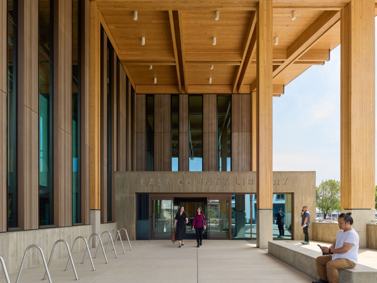
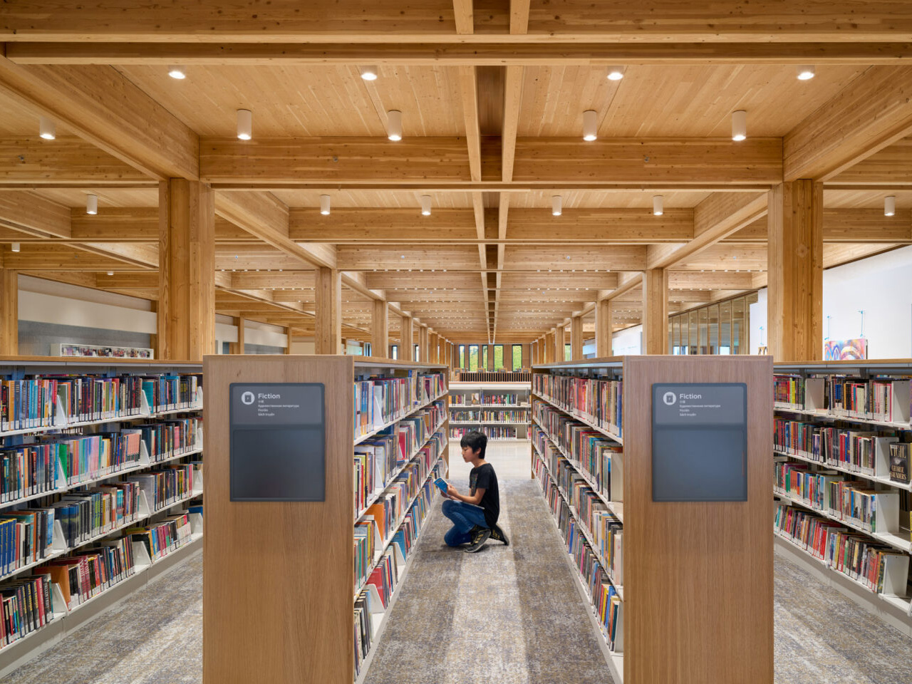
East County Library turns a former parking lot in Gresham, Oregon, into a public interior. Opened in May 2026, the roughly 95,000-square-foot building was designed by Holst Architecture, with Adjaye Associates collaborating through design development. Its forest reference begins with the structure: timber columns rise through gaps in the acoustic ceiling, recalling trunks beneath a canopy. Glulam beams and cross-laminated timber panels make that idea legible through construction. Concrete walls around the auditorium address its particular structural and acoustic requirements.

Holst arranges activity from west to east, moving from entrances, play, and creative work toward quieter reading areas. Two sensory rooms, one geared toward children and another toward adults, add places where patrons can adjust their level of engagement. An audiovisual studio and rooftop terrace broaden the library’s role beyond borrowing books. The project connects to light rail through a pedestrian route. That range lets a library visit include making something, meeting someone, or simply reading quietly beside a window.

What we like

  • The forest reference is expressed through structure rather than decorative motifs.
  • Activity zoning and dedicated sensory rooms recognize different ways of using a library.

What we dislike

  • LEED Gold remains a stated target, not a verified certification.
  • Sensory rooms are first come, first served, with use limited to 30 minutes when others are waiting.

5. KAI Water Culture House

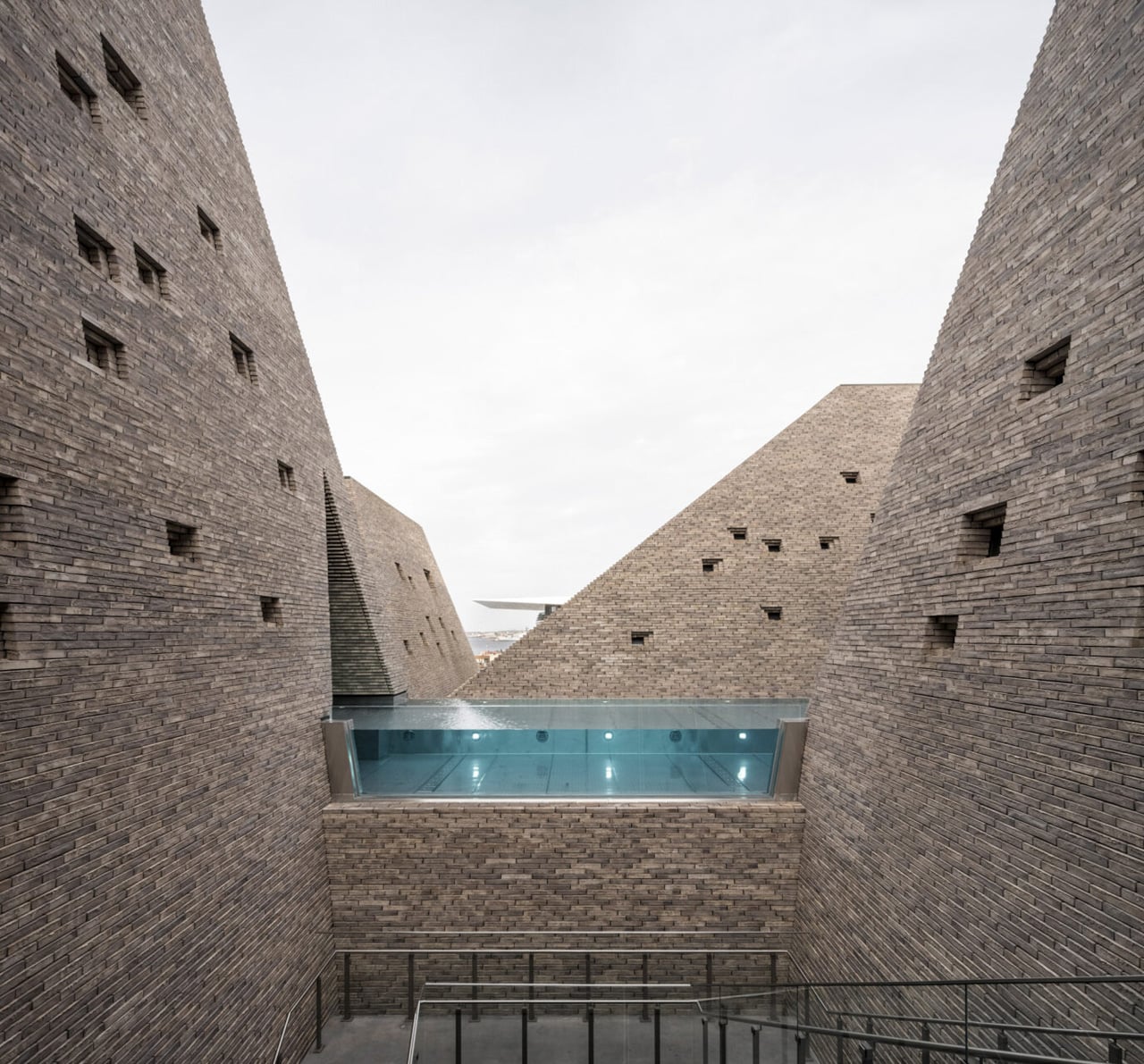
KAI’s five brick towers create an unexpected setting for a swim on Copenhagen’s Paper Island waterfront. Designed by Kengo Kuma & Associates, the 5,800-square-meter public facility is scheduled to open on December 5, 2026. Its defining space is the outdoor Valley Pool, set between the towers beneath open sky. Below, a glazed base prevents the masonry from becoming one continuous waterfront wall. The project brings a memorable architectural identity to everyday public infrastructure, with ten pools distributed across multiple levels.

Approximately 300,000 handmade bricks give the towers their stepped surfaces, while openings admit daylight and frame fragments of the surroundings. The pools have different purposes, including lap swimming, teaching, children’s play, and a heated outdoor onsen overlooking the harbor. Cornelius Vöge contributed through concept design, with Vilhelm Lauritzen Architects serving as executive architects. The ambition extends to cultural activities in the tallest tower. Visitors should note the phased opening: the harbor bathing facilities are expected to follow in early 2027.

What we like

  • The Valley Pool makes the space between towers the main attraction.
  • Swimming and cultural programming share a public waterfront address.

What we dislike

  • Open-air swimming includes exposure to Copenhagen’s weather.
  • Harbor bathing won’t be ready for the planned December opening.

Looking Beyond the Exterior

The useful way to compare these projects is to look past their photogenic features and ask what the plan prioritizes. A bathtub spends space differently from another sleeping berth. A public route can be designed for lingering or treated as necessary circulation. Neither choice is right by default. What matters is whether the arrangement supports the people expected to use it, including their less picturesque routines, belongings, and need for privacy.

For anyone borrowing from this selection, the transferable ideas are the least dependent on a spectacular site. Give everyday objects somewhere to go. Keep routes straightforward. Allow busy and quiet activities to coexist without assuming everyone wants the same atmosphere. Those principles can inform a room as readily as a civic building. For a tiny home in particular, that means studying the wardrobe and kitchenette as carefully as the view.

The post The 5 Best Architectural Designs of November 2026 first appeared on Yanko Design.
  •  

This Tiny House Trades a Sleeping Loft for a Ground-Floor Bedroom

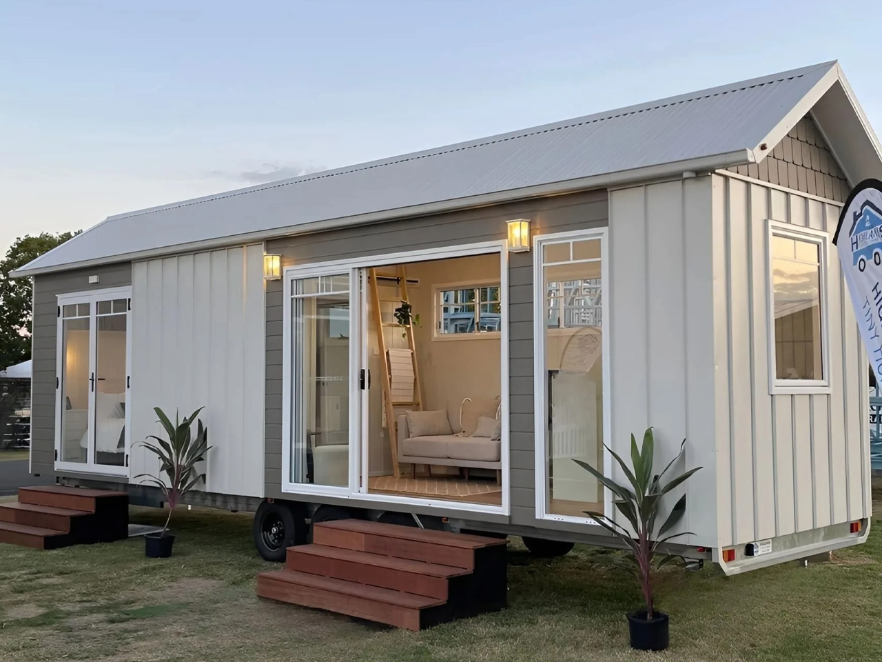
A ladder still has a place inside the Cali 9.6, but climbing it isn’t part of going to bed. This tiny house by Australian builder Highlands Tiny Homes keeps its bedroom on the main floor, reserving the overhead crawl space for storage. It’s a practical distinction: the bed gets standing room, while less frequently needed belongings take the awkward space beneath the roof.

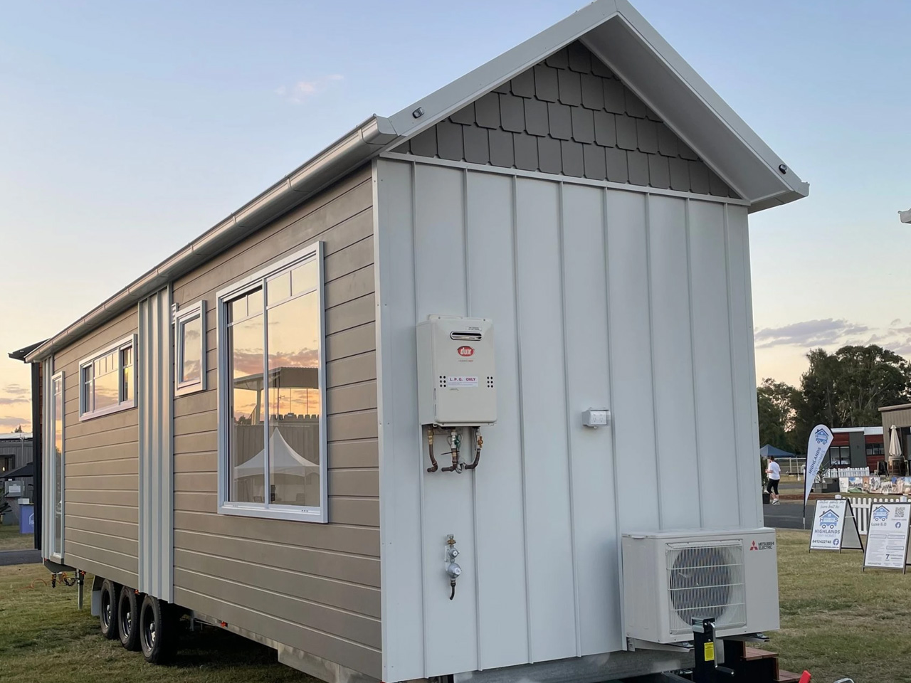
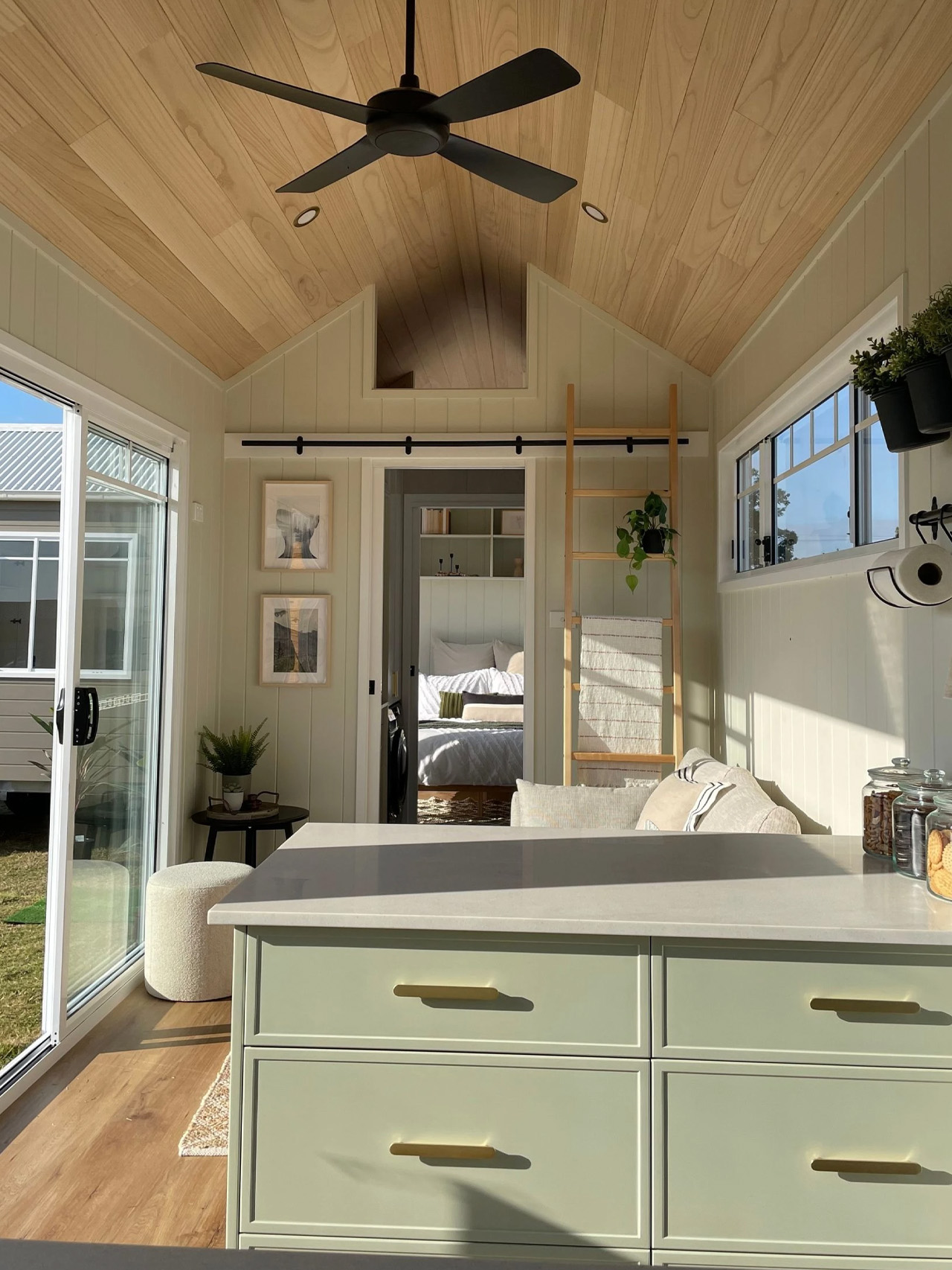
Measuring 9.6 meters long and 2.5 meters wide, approximately 31.5 by 8.2 feet, the Cali sits on a triple-axle trailer. Its pitched roof and pale exterior give it a cottage-like profile, with horizontal siding along the sides and vertical paneling at the end. Large sliding glass doors interrupt the narrow footprint, creating a broad opening beside the living area.

Designer: Highlands Tiny Homes

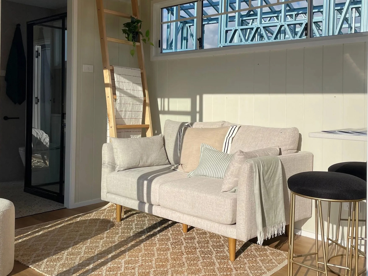
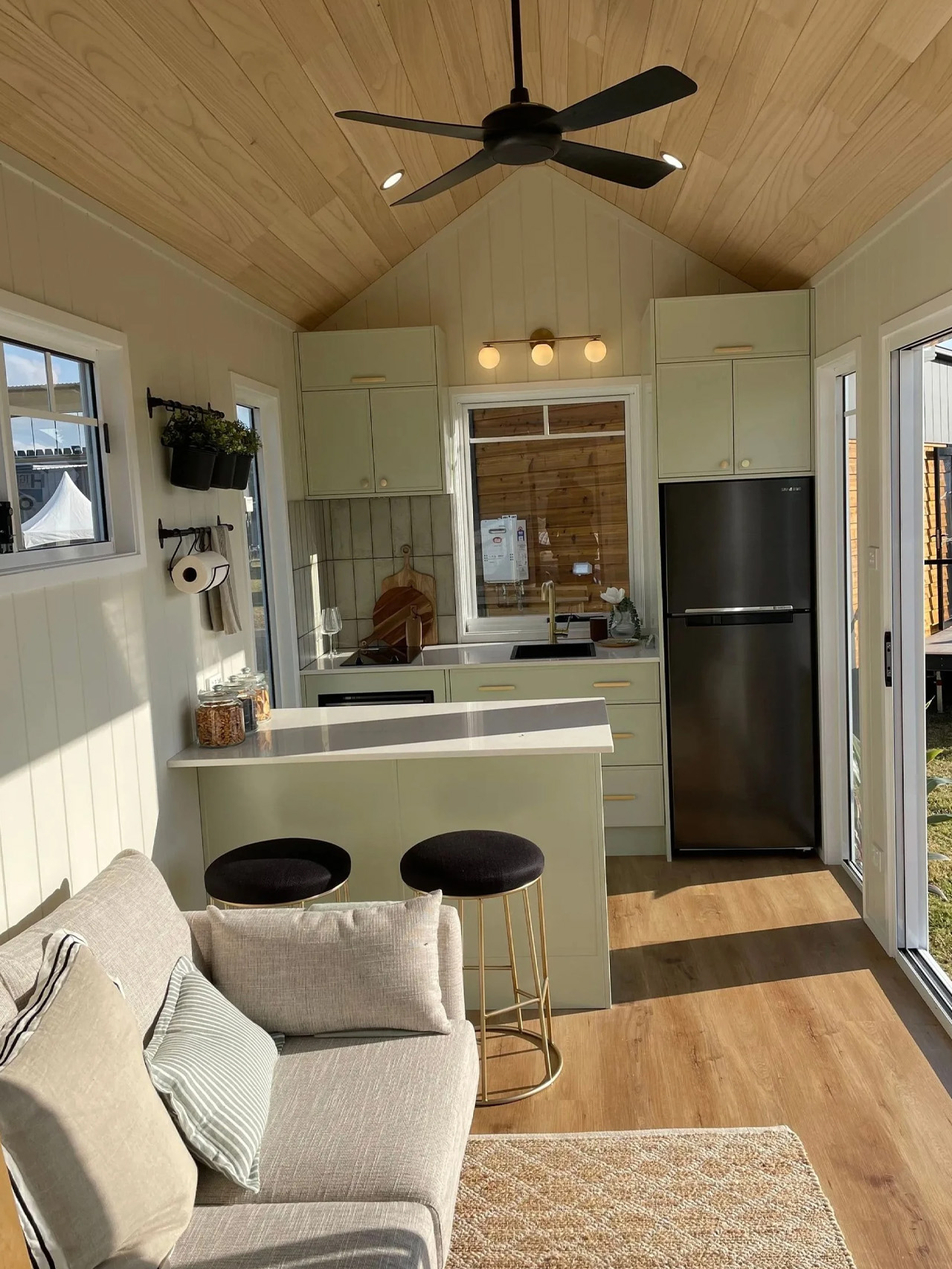
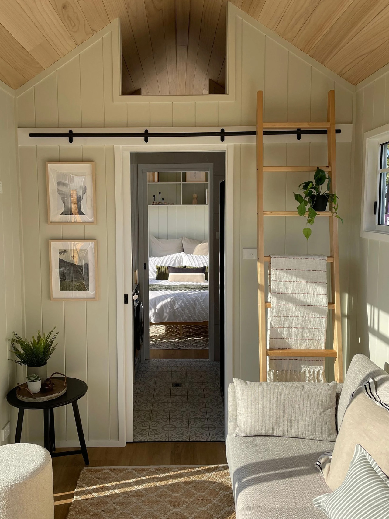
Inside, the timber-lined ceiling follows the roof pitch rather than flattening the room into a low rectangular box. Pale grooved walls, soft green cabinetry, and wood-look flooring establish a restrained palette, while black ceiling fans and brass-toned handles provide contrast. The manufacturer’s photographs show a compact sofa facing the kitchen peninsula, with the glazing running alongside the seating area rather than being confined to one end.

That peninsula is an important piece of planning. It provides a breakfast counter and preparation surface while marking the kitchen’s boundary without enclosing it. Drawers put storage beneath the worktop, making the divider useful on more than one level. Highlands lists faux stone benchtops, a two-burner gas cooktop, an under-counter four-in-one oven, and a ducted range hood among the standard inclusions.

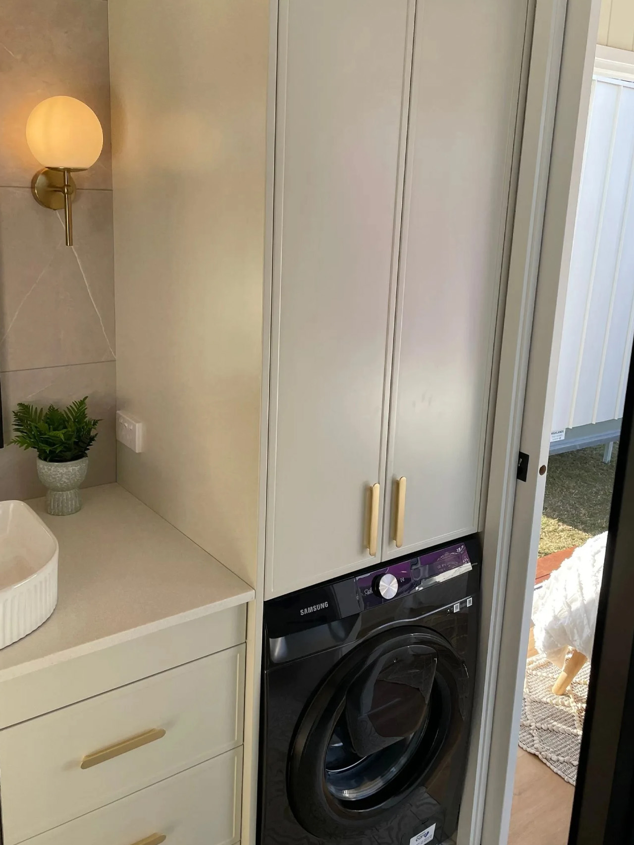
The bathroom introduces the layout’s clearest compromise. Positioned between the living space and bedroom, it doubles as the connecting passage. A glass-enclosed shower occupies one side, with a vanity, cabinetry, and laundry appliance opposite. Patterned floor tiles give this narrow room a distinct character. Combining circulation and bathing space avoids allocating a separate hallway, but someone moving between the two main rooms must pass through the bathroom.

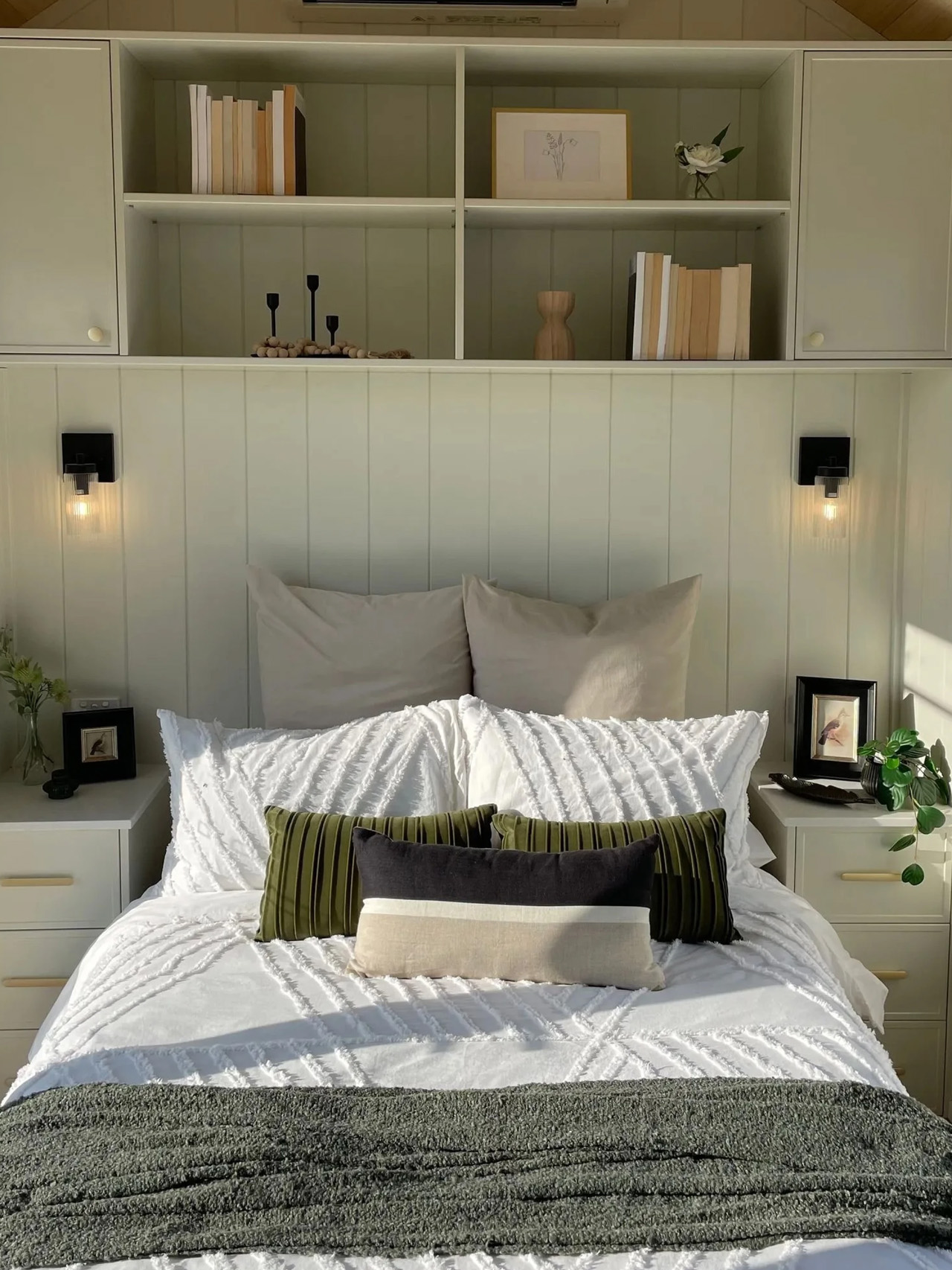
Beyond it, the bedroom accommodates a double bed beneath the pitched timber ceiling. Built-in bedside drawers and a wall-spanning arrangement of cupboards and open shelves concentrate storage around the headboard. Wall-mounted reading lights leave the small bedside surfaces free. The bedroom also has its own exterior glass doors, providing a separate way outside. This is a dedicated sleeping room, with no nightly furniture conversion required.

The Cali 9.6 is listed from US$100,000, including GST. Its strongest selling point is giving a permanent bedroom priority within a narrow plan. The walk-through bathroom is the price of that arrangement, and the detail prospective owners should consider as carefully as the appealing timber ceiling.

The post This Tiny House Trades a Sleeping Loft for a Ground-Floor Bedroom first appeared on Yanko Design.
  •  

The 8 Best Stationery Designs of November 2026

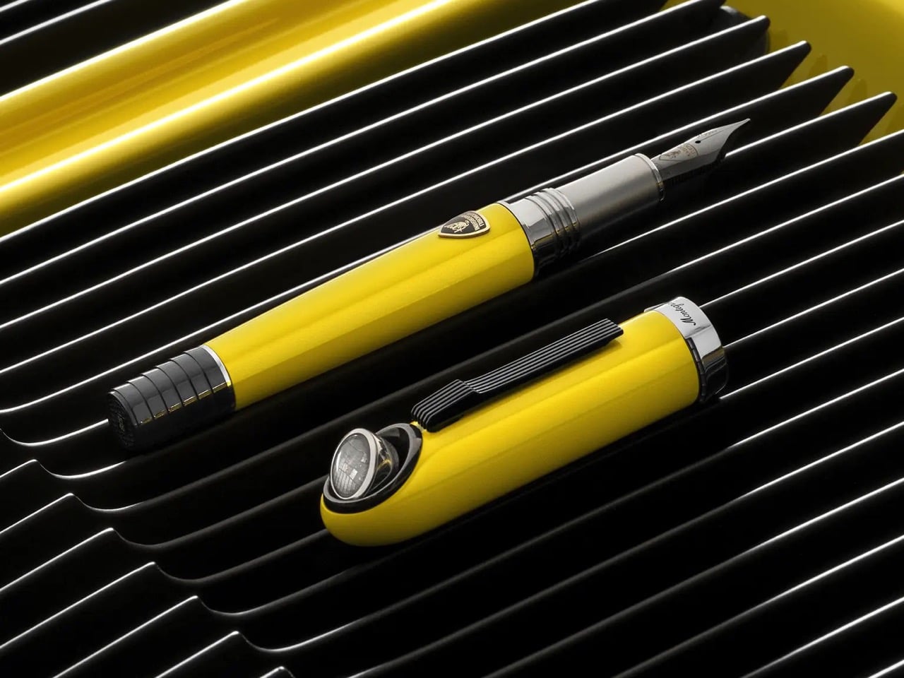
A fountain pen with a moving Lamborghini headlight is an extravagant place to start a stationery collection. It also gets straight to the appeal: the objects we handle every day can deserve more thought than a bulk office order gives them. Sometimes that thought produces a clever mechanism. Sometimes it makes a familiar tool easier to carry, read, or reuse. Sometimes it simply gives you a reason to look twice.

For November 2026, we’ve selected eight stationery and desk designs for their distinctive design choices, from watermark ruling to a pencil case that becomes its own stand. This is an editorial selection, not a ranking based on comparative testing or a list of November launches. Some are practical purchases; others are collectible objects worth examining for how they rethink ordinary tools.

1. Lamborghini Miura Fountain Pen

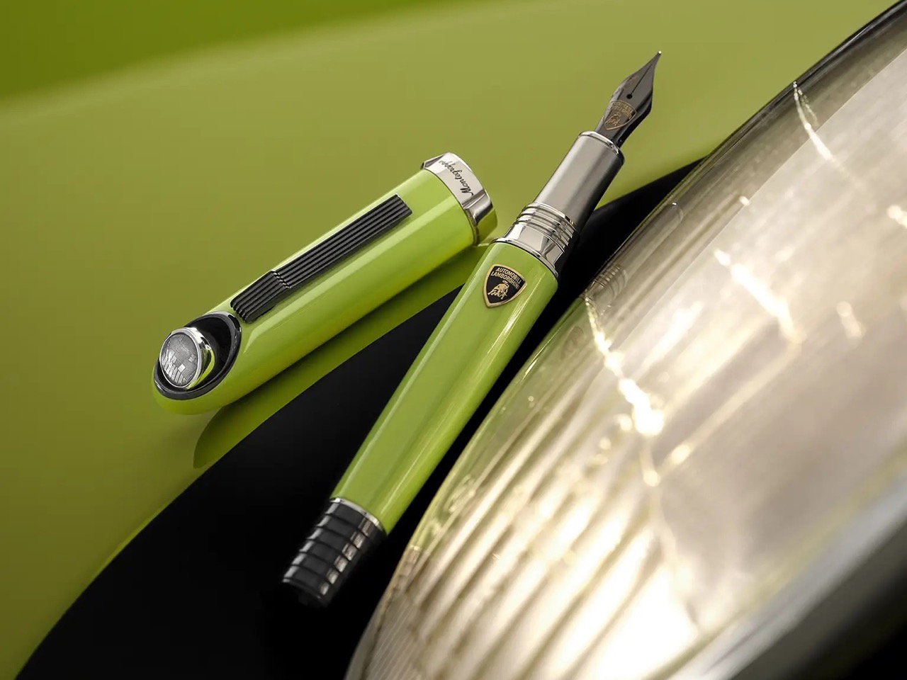
Press a button on Montegrappa’s limited edition Miura pen and a miniature rock crystal headlight rises from the cap. The movement borrows from Lamborghini’s celebrated sports car, but the automotive references continue down the writing instrument. Slatted details recall the car’s ventilation grilles, while the end cap references its louvered engine cover. It’s an unusually literal collaboration, translating recognizable parts of the Miura into details you can operate and examine, rather than settling for a badge on an ordinary barrel.

Underneath the miniature bodywork sits an 18-karat gold nib with ruthenium plating and a cartridge or converter filling system. The headlight doesn’t illuminate the page; its appeal is entirely mechanical. Montegrappa lists the fountain pen at €8,250, with 60 examples in each of three colors. That puts it firmly in collector territory. Still, the design earns its place here because the reference extends beyond appearance: opening that tiny headlight makes the car’s character part of handling the pen itself.

What we like

  • The moving headlight translates a specific automotive detail into a physical interaction.
  • Grille references across the cap and barrel give the collaboration a coherent design language.

What we dislike

  • The €8,250 price makes this a serious collectible rather than an everyday stationery purchase.
  • Production is limited to 60 fountain pens per color.

2. MB&F × Caran d’Ache GorillaSharpener

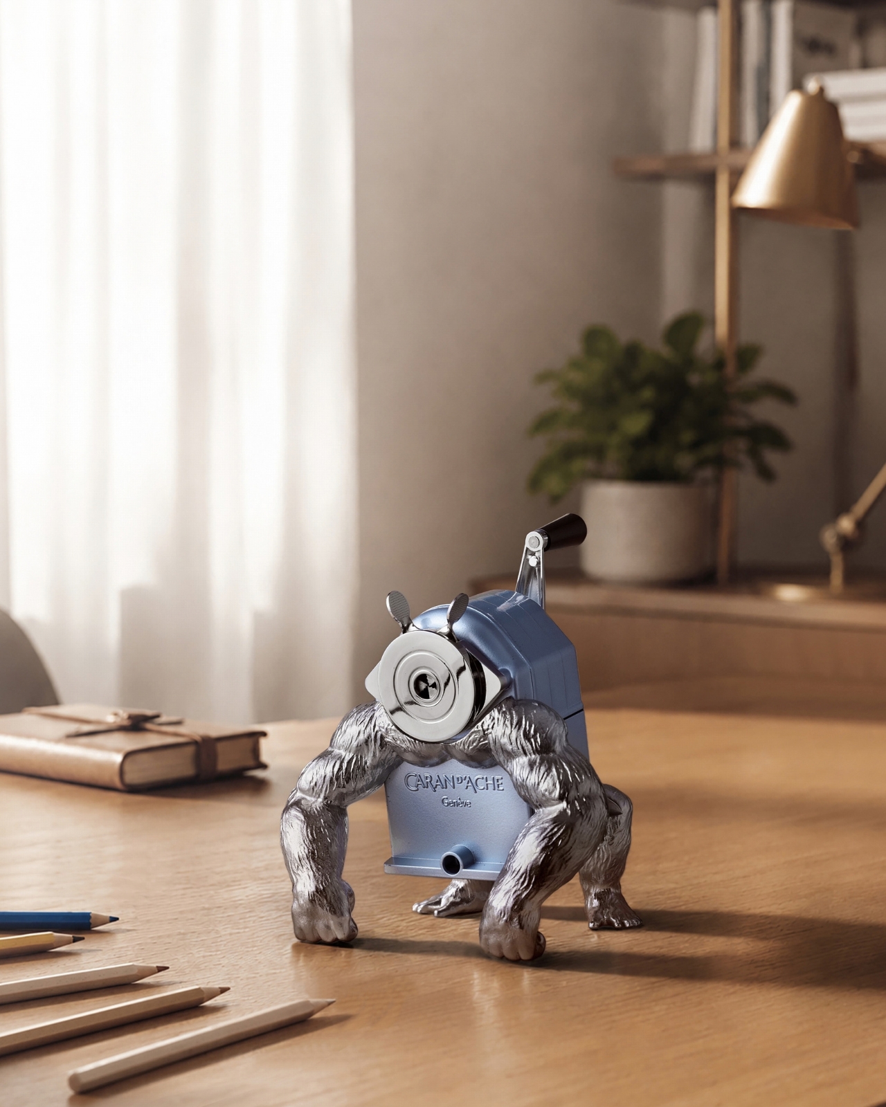
Caran d’Ache’s familiar sharpening machine gains a surprisingly convincing animal stance in the GorillaSharpener. MB&F designer Maximilian Maertens places the mechanism on muscular metal limbs, pitching its body forward like a gorilla resting on its knuckles. The Alpine Frost blue finish keeps the composition from becoming too visually heavy. What makes it interesting is the restraint within the joke: the original sharpener remains recognizable, with the added anatomy changing how it occupies the desk rather than disguising what it does.

This remains a working tool, accepting round or hexagonal pencils between 4 and 10 millimeters in diameter. Its cutter is replaceable, and an included clamp secures it to a desk for sharpening. Those details matter when an object looks destined for display. Production is limited to 300 pieces, and the assembled base measures roughly 150 by 130 millimeters. You’ll need to give it space, but that footprint buys a functional sculpture rather than a decorative animal with an unrelated job.

What we like

  • The replaceable cutter and included clamp preserve the sharpener’s practical purpose.
  • Maertens gives an existing mechanism a new identity without hiding its workings.

What we dislike

  • The gorilla limbs occupy considerably more space than a pocket sharpener.
  • The 300-piece edition limits access to an otherwise familiar desk tool.

3. Sonic Kakusta Portable Pen Stand

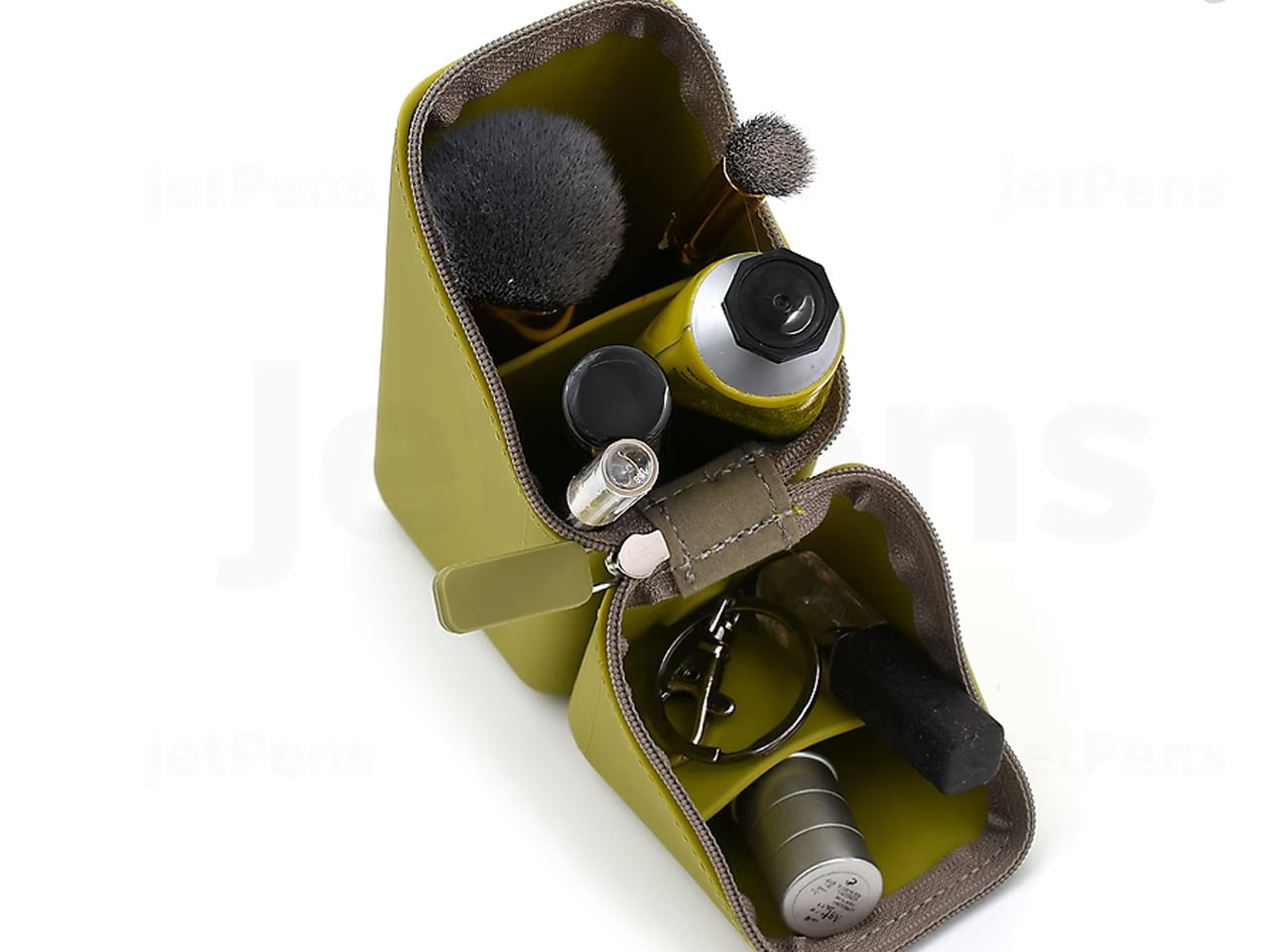
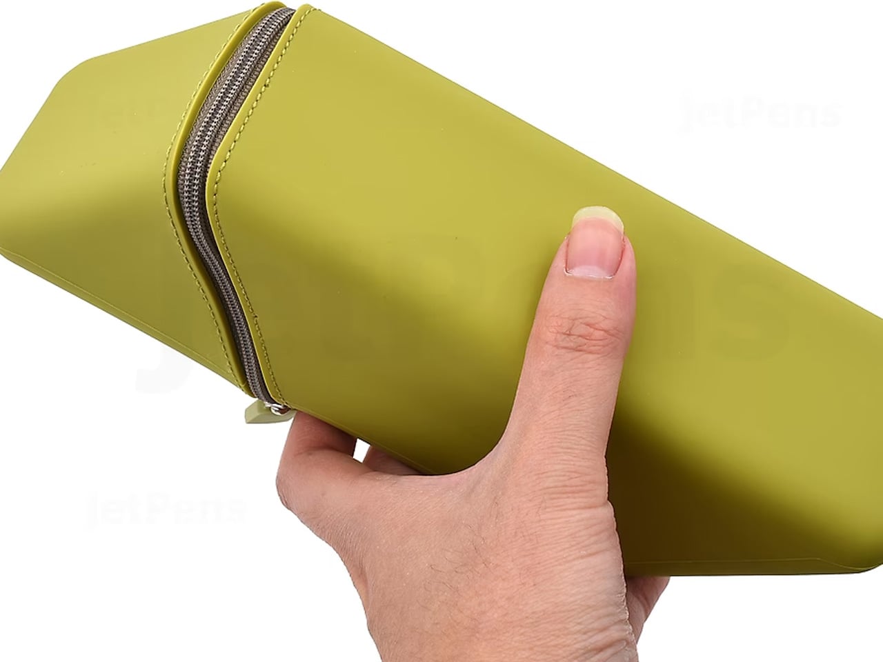
Most pencil cases become clutter the moment you unzip them. Sonic’s Kakusta becomes an organizer. Open the silicone case, fold its sections back, and built-in magnets help hold its standing configuration together—inside, angled dividers separate writing instruments instead of leaving them piled in a single compartment. Sonic specifies a 60-degree divider arrangement, giving the contents a stepped presentation. The transformation makes sense for anyone moving between desks who would otherwise carry a case and use another holder.

The useful detail is the separation between longer tools, shorter items, and small accessories such as erasers. You can leave those categories organized when packing up, rather than emptying everything into a desk cup each morning. Fit deserves attention before buying: Sonic specifies different length limits for its internal pockets, including 16 centimeters for the longer compartment. This is a compact stationery kit, not unrestricted storage for every brush and ruler you own. Its convenience depends on whether it matches your tools.

What we like

  • One object handles carrying and desktop organization.
  • Separate compartments make small accessories easier to distinguish from pens.

What we dislike

  • Pocket length limits rule out some longer pencils and tools.
  • The divided interior is less flexible than an open pouch for oversized supplies.

4. iA Vanishing Line Notebook

The iA Vanishing Line Notebook addresses a familiar compromise: ruled pages help keep handwriting straight, but their lines remain behind everything you’ve written. Information Architects replaces printed ruling with watermarks. On an empty page, the pale guides provide structure; as darker handwriting fills the sheet, they become less prominent through optical contrast. Nothing chemically disappears, and there’s no special ink to activate. The design changes the visual relationship between the ruling and your words, allowing the writing to take priority.

The construction supports that quiet intervention. Made in Japan, the A5 hardcover contains 288 pages of 81 gsm Araveal White paper, with sewn binding that allows it to lie flat. Its 10-millimeter ruling gives handwriting generous space, though compact writers may prefer tighter lines. It’s a deliberate purchase rather than a disposable notebook. The appeal is having guidance without the visual insistence of conventional ruling, especially when returning to pages you want to reread.

Click Here to Buy Now: $80.00

What we like

  • Watermark ruling offers structure without the same visual weight as printed lines.
  • Sewn binding lets the notebook lie flat while you write.

What we dislike

  • The $80 price is substantial for a notebook.
  • The fixed 10-millimeter spacing won’t suit everyone’s handwriting.

5. WAY Ruler

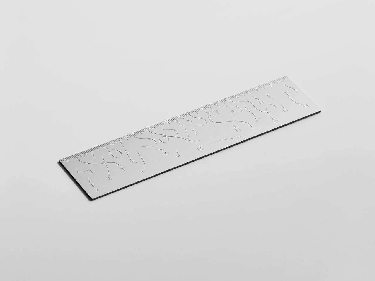
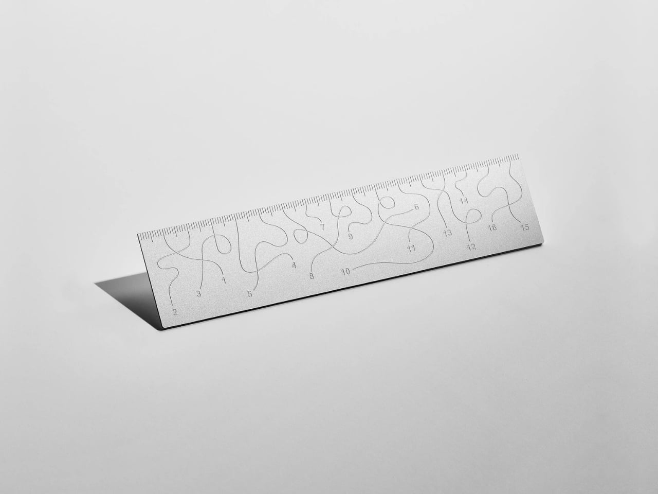
Tomas Kral takes the most orderly object in a pencil case and gives its graphics permission to wander. WAY is a small anodized aluminum ruler whose engraved inscriptions follow winding paths across the surface. The reference is deliberate: Kral describes a project inspired by travel, discovery, and small meandering routes. Against the straight-edged tool, that wandering arrangement becomes the entire point. A ruler normally asks you to notice the measurement and ignore the object; this one reverses that hierarchy.

That makes WAY the most debatable selection here, which is part of its interest. The unusual layout asks for closer reading than conventional ruler graphics, trading immediate clarity for visual character. Digital engraving places the inscriptions directly into the aluminum rather than adding a printed layer.

What we like

  • The winding inscriptions create a clear relationship between material, graphics, and concept.
  • Direct engraving makes the markings part of the aluminum surface.

What we dislike

  • The unconventional layout compromises the immediate readability expected of a ruler.
  • Current purchasing availability needs confirmation with the studio.

6. Rolling World Clock

Checking another city’s time usually means reaching for a screen. Masafumi Ishikawa’s Rolling World Clock gives the task a physical control: turn the entire object. Its twelve-sided case carries city names around the perimeter, and rolling it to a different position changes the time you read from its single hand. There’s no menu to navigate. The geometry of the housing becomes the interface, making a normally hidden relationship between time zones something you can explore by moving the clock.

Made in Japan, the clock measures about 3.2 inches across and comes in black or white. Its preset locations include New York, London, Tokyo, and Sydney, giving people with regular international contacts a compact reference beside their notebook. The limitation is equally clear: twelve positions cannot represent every global offset, and a single hand offers less detail than a conventional display. It belongs here as a considered desk companion, particularly if you appreciate a useful object that invites occasional handling.

Click Here to Buy Now: $55.00

What we like

  • Rolling the case provides a direct, understandable way to change the displayed location.
  • The compact format gives international timekeeping a permanent place on the desk.

What we dislike

  • The twelve preset locations leave out many time zones.
  • The single hand provides less reading detail than separate hour and minute hands.

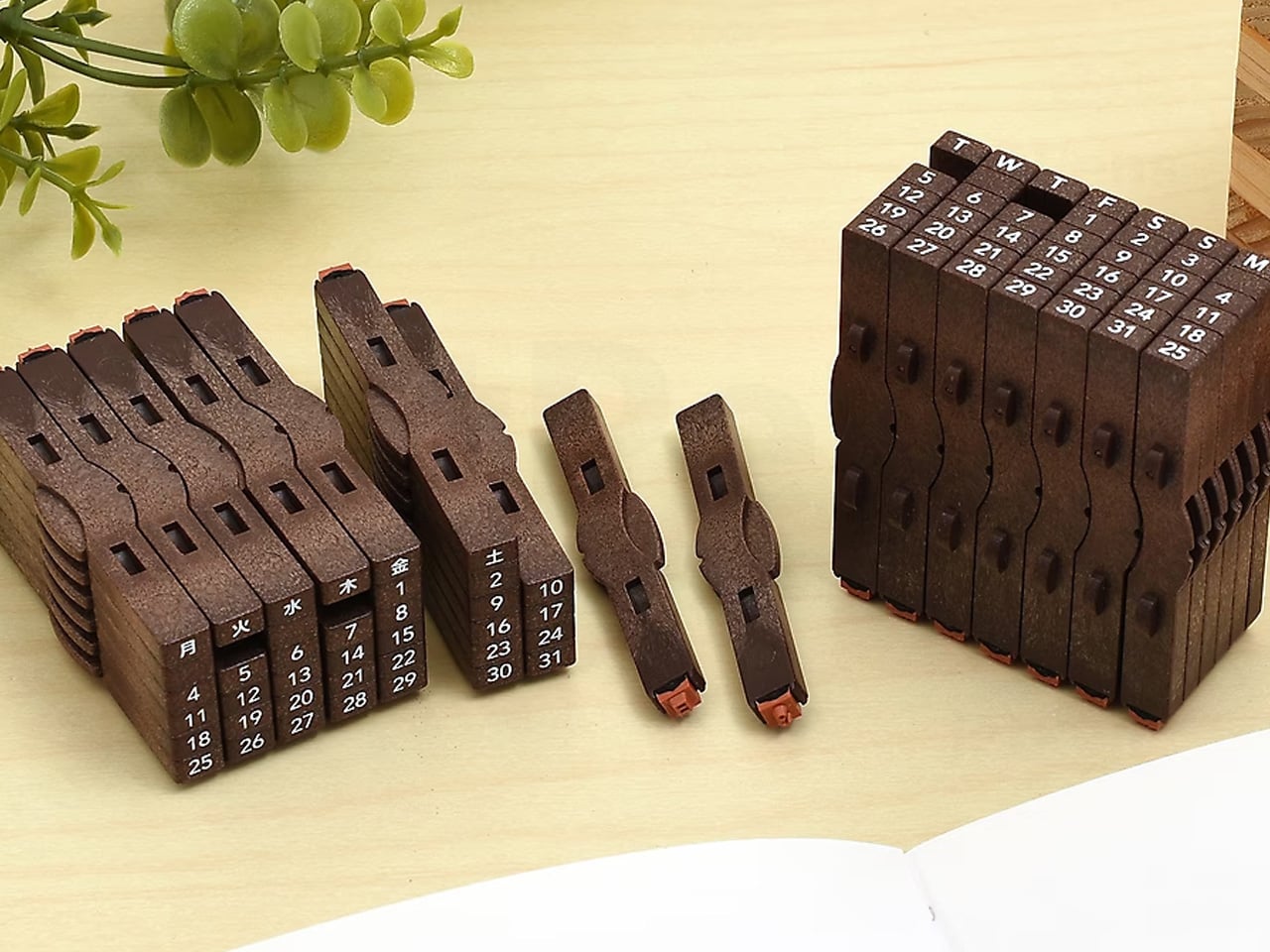
7. Shachihata Connecting Stamp English Calendar Set

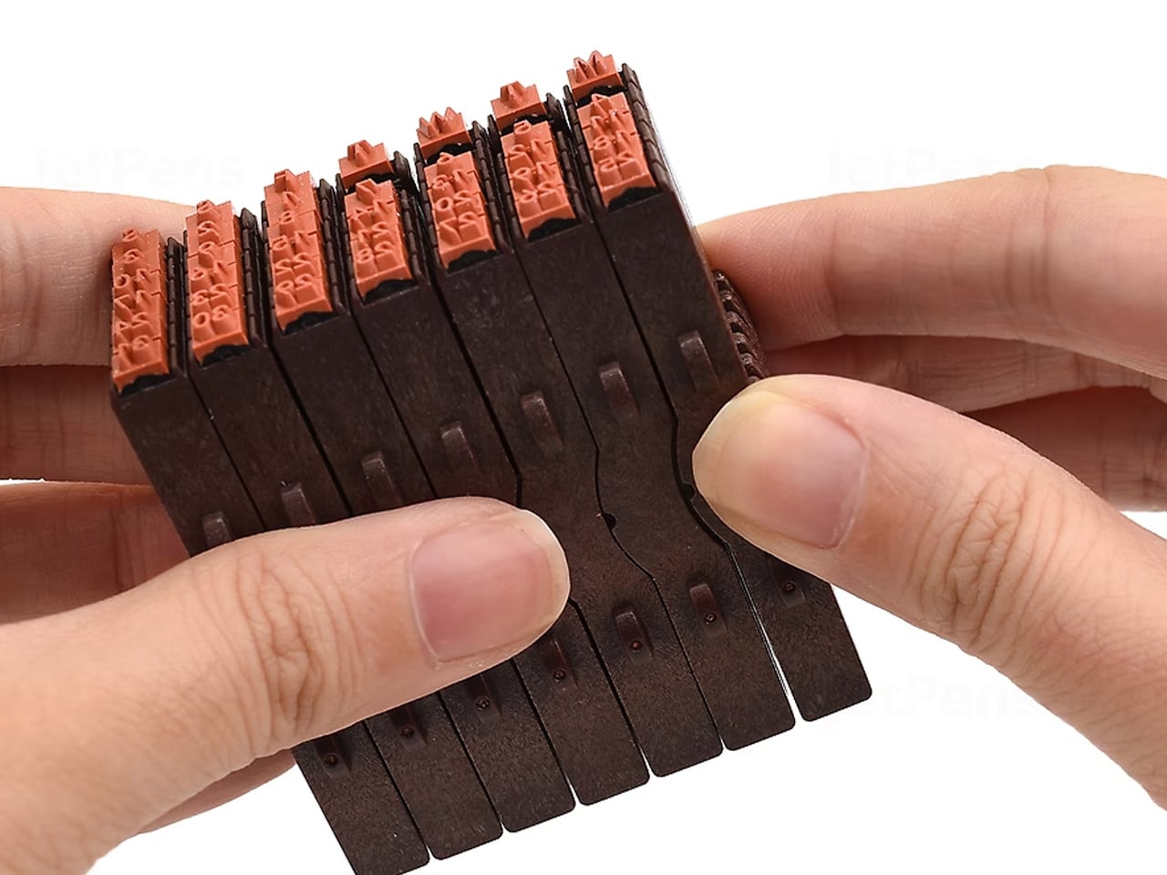
A printed planner decides the calendar layout before you open it. Shachihata hands that decision back through a set of connecting rubber stamps. Seven weekday pieces and 31 date pieces join vertically or horizontally, letting you assemble a monthly grid or arrange a different sequence. Two blank pieces help with spacing, and individual components can also be reversed to leave gaps. The appeal is practical modularity: the same collection of small parts can follow your preferred layout instead of prescribing one.

For a journal you build yourself, this avoids repeatedly drawing a calendar while preserving control over its placement. Shachihata gives the impression size of a five-week arrangement as approximately 24 by 47 millimeters, so the result is compact rather than a full-page planner. You’ll need a separate ink pad, which isn’t included. That extra component also lets you choose your ink color. The tradeoff is setup: arranging small pieces is a ritual for occasional planning, not instant date stamping.

What we like

  • Connecting pieces allow layouts to change without replacing the entire stamp.
  • A compact calendar impression can fit within a larger journal composition.

What we dislike

  • An ink pad is required and sold separately.
  • Rearranging individual dates takes more preparation than using a fixed calendar stamp.

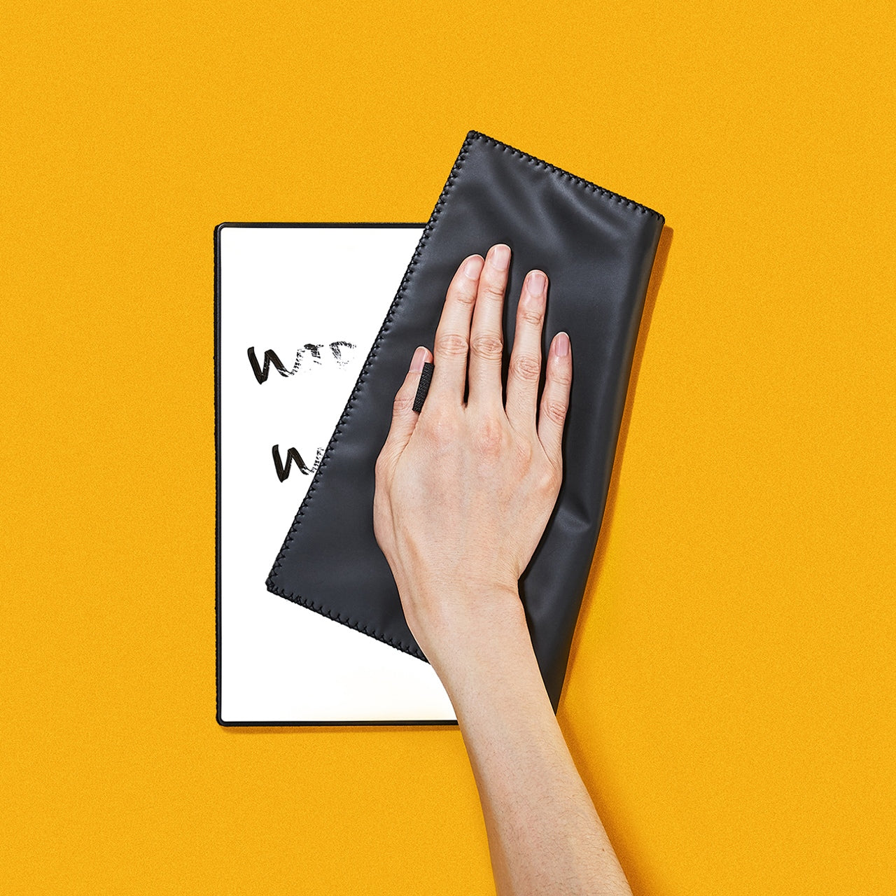
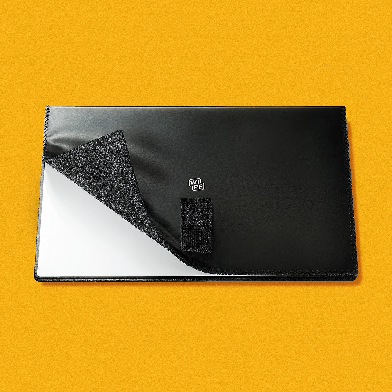
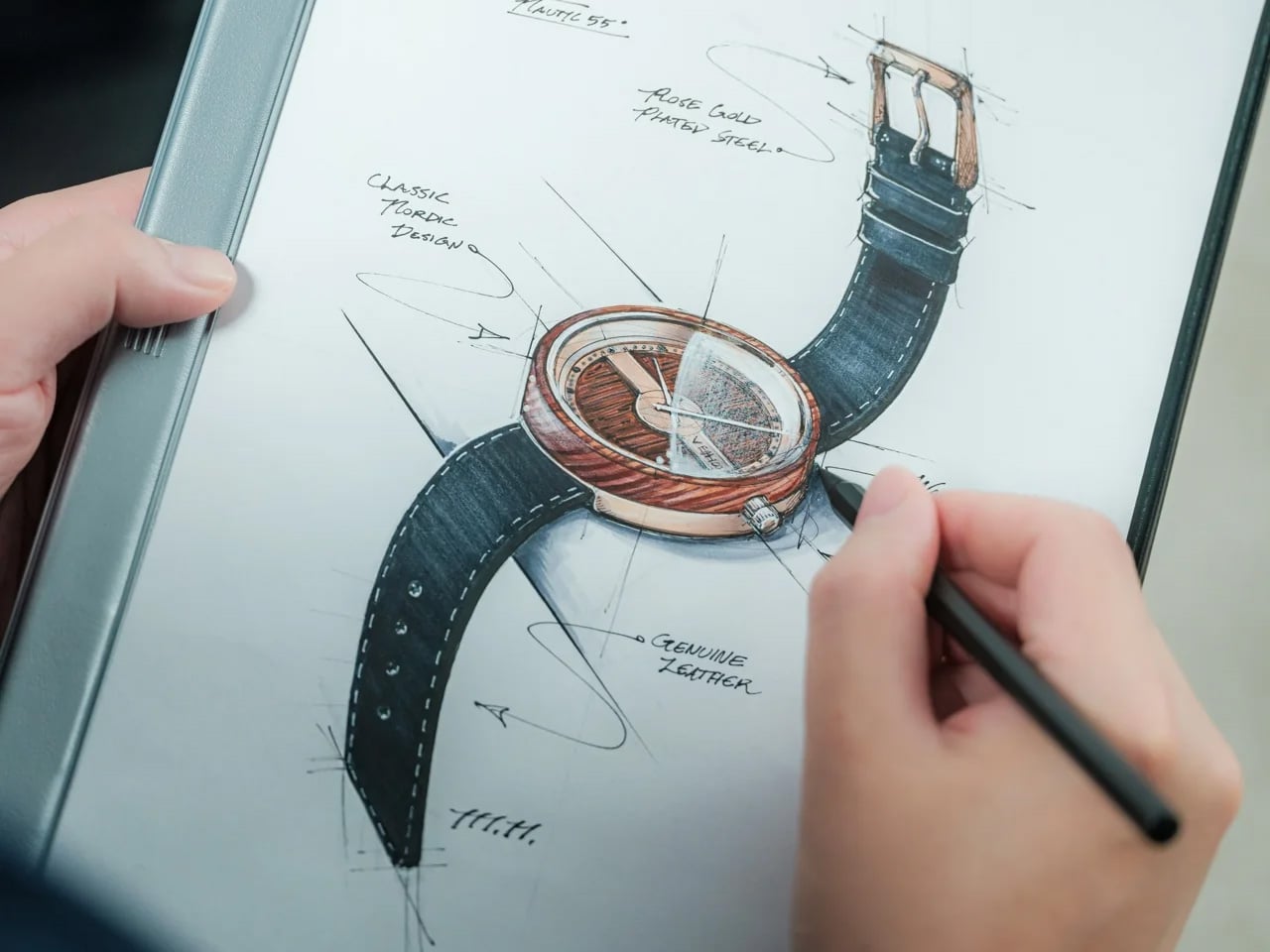
8. Personal Whiteboard

Some notes need a place to exist for an hour, not a notebook that will keep them for years. The Personal Whiteboard by 9FEET Design gives those temporary thoughts a reusable surface in a portable format. Its cover serves as an eraser, stand, and pocket, while the magnetic Mag Force arrangement functions as a handle and pen holder. Those combined roles are the useful part: carrying the board doesn’t require assembling a separate collection of supports and cleaning accessories first.

At roughly 10.5 by 7 inches, it offers room for a daily task list, a rough diagram, or the calculation that doesn’t belong on another loose sheet. It works with regular whiteboard markers. There’s no automatic archive here: photograph anything worth keeping before wiping the surface. That makes the board a poor substitute for extensive meeting notes, but a sensible companion to a permanent notebook when you need space to work something out.

Click Here to Buy Now: $49.00

What we like

  • The cover combines erasing, storage, and standing functions.
  • A reusable surface suits temporary lists and working sketches.

What we dislike

  • A single writing surface limits how much information you can retain at once.
  • Keeping a record requires photographing the board before erasing it.

Choose the Tool You’ll Actually Use

Before buying another desk accessory, notice the small task you keep working around. Maybe your pens disappear into a bag, your rough notes crowd a stack of paper, or your journal needs a calendar you can arrange yourself. That is a better starting point than matching every object on the desk. Choose one design that addresses that habit, and leave enough room around it to actually put it to work.

The Miura pen belongs to a different sort of decision: collecting an object because its detail keeps rewarding your attention. There’s room for that pleasure, too, provided the distinction stays clear. A playful mechanism does not need to make you more productive to justify its existence. It does need to be something you genuinely want to live with, rather than another expensive object waiting for a turn in the drawer.

The post The 8 Best Stationery Designs of November 2026 first appeared on Yanko Design.
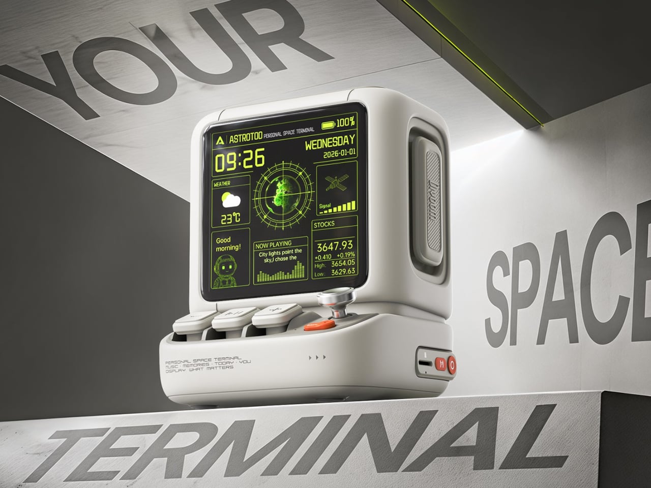
  •  

The MUNCH Museum Turns the Journey Between Galleries Into a City View

The bent upper section of Oslo’s MUNCH Museum makes an unmistakable mark on the waterfront. Yet the more interesting architectural move happens inside: the building separates spaces that protect art from spaces that open visitors’ attention to the city. Its tower turns the journey between galleries into a changing view of Oslo, rather than treating circulation as leftover space.

Opened on October 22, 2021, in the Bjørvika waterfront district, the museum was designed by estudio Herreros, led on the project by Juan Herreros and Jens Richter, with LPO Arkitekter as local architects. The completed building accommodates 11 exhibition halls within a 13-floor institution dedicated to Edvard Munch’s work and wider cultural programming.

Designer: Estudio Herreros

The layout divides the building into what the architects call static and dynamic zones. The static zone is an enclosed concrete structure containing galleries, where security, humidity, and daylight require careful control. Alongside it, the more transparent dynamic zone carries visitors between exhibition areas while maintaining views across the surrounding city. The distinction gives art and movement different architectural conditions.

For estudio Herreros, this ascending public route is the project’s central idea. The architects describe circulation as a viewpoint connecting the lobby with the upper terraces and observation spaces. Read this way, the tower offers a sequence of encounters with the collection and its urban setting, with neither confined to a single panoramic moment at the top.

That separation also has a practical environmental role. According to the museum, airlocks between the two zones help control temperature and humidity, allowing natural ventilation in the circulation areas without imposing those same conditions on the galleries. The architecture acknowledges that paintings and people do not always need precisely the same indoor environment.

The exterior’s undulating, perforated aluminum panels give the tower its textured surface. Cladding manufacturer Lindner supplied 4,018 panels, describing their role as solar screening that preserves a sense of transparency. The rippled profile adds depth to what could otherwise have been a flat metal wrapper, giving the large facade a finer scale of detail.

There is an unexpectedly logistical detail within that skin: Lindner says 100 panels can be opened to allow artworks to be lifted into the building. The facade must accommodate the collection’s movement as well as its protection, a useful reminder that museum architecture includes demanding backstage operations.

The lobby, conceived by the architects as a covered public space, extends this thinking beyond exhibition rooms. MUNCH’s strongest proposition is that a museum visit can include gathering, looking outward, and moving through the building with purpose. The kink attracts attention; the route gives that attention somewhere to go.

The post The MUNCH Museum Turns the Journey Between Galleries Into a City View first appeared on Yanko Design.

  •  

8 Best Desk Accessories of October 2026 to Upgrade Your Workspace

Your desk does not need another gadget simply because there is room for one. The worthwhile additions are the ones that change how the space works or feels: a light that leaves the surface clear, a mouse that packs flat, or a notebook alternative that lets your ideas move around. Sometimes, the right accessory does something less practical but equally personal, giving an otherwise ordinary setup a little more character.

These eight designs approach the workspace from different directions, balancing useful everyday tools with objects that make sitting down feel more inviting. Sony’s miniature 3D display leads the selection, joined by adaptable storage, sculptural stationery, thoughtful lighting, and portable technology. The connecting thread is considered design rather than a matching aesthetic, with each accessory offering a distinct reason to claim some space beside your computer, sketchbook, or morning coffee cup.

1. Sony ELF-MN1 Spatial Reality Display

Sony’s ELF-MN1 takes the familiar desk collectible and replaces the physical figure with a digital character on a six-inch display. Its glasses-free 3D presentation makes compatible content appear to have depth without asking you to wear a headset. The transparent stand keeps the enclosure visually light, which suits an object intended to sit beside a monitor rather than compete with it. This is the personality piece of the group, not another screen pretending to be essential office equipment.

The interesting design decision is making digital collecting feel more like displaying an object than opening another window on your computer. Eye tracking adjusts the stereoscopic image for the viewer, although the effect is intended for one person rather than everyone around the desk. You will need a compatible smartphone or PC and supported content, so this is not a universal digital picture frame.

What we like

  • The combination of a compact enclosure and glasses-free depth gives digital collectibles a distinctive desktop presence.
  • It adds personality without requiring a headset.

What we dislike

  • The stereoscopic effect is intended for a single viewer.
  • Compatible hardware and content are required, and the product is not shipping yet.

2. MagBoard Clipboard

A notebook gives your thoughts a home, but it also decides where every page belongs. The MagBoard Clipboard takes a more flexible approach, using a magnet and lever mechanism to secure loose sheets inside a simple cover. Pages can be removed, replaced, or rearranged as a project develops. For a desk covered with sketches, meeting notes, and half-finished ideas, that makes it an appealing middle ground between a conventional bound notebook and an increasingly unruly stack of loose paper.

Designed by Hirock Design Office and made in Japan, the clipboard has a rigid cover that also provides a writing surface away from your desk. The shop specifies a capacity of up to 30 sheets, enough for a focused working collection rather than an entire archive. A5 and A4 sizes let you choose between compact notes and larger drawings. Available configurations start at $45, making this the simplest selection for readers who would rather reorganize their paper than digitize everything.

Click Here to Buy Now: $45.00

What we like

  • Loose pages can follow the changing order of a project.
  • The rigid cover provides support when a tabletop is unavailable.

What we dislike

  • The stated 30-sheet capacity limits how much material it can hold.
  • It costs more than a basic clipboard and still requires managing individual sheets.

3. Divoom Astrotoo

The Divoom Astrotoo looks like a tiny computer from a future imagined several decades ago. Its rounded housing, raised keys, and joystick give it a tangible character that a plain speaker grille rarely achieves. Behind that playful appearance sits a 20W speaker and a 3.95-inch display for photographs, clock faces, pixel art, and music visualizations. It offers a way to bring music and personal imagery into the same small object, rather than adding separate accessories to your desk.

Physical controls handle everyday interactions, while the Divoom app manages visual customization. That division gives the buttons a purpose beyond completing the retro look, although the phone remains part of the experience. Divoom lists Bluetooth, WiFi, microSD playback, and battery operation, with up to six hours claimed between charges. At $199.99 and listed in stock, Astrotoo is a substantial purchase for its size. Its appearance is easy to appreciate; sound quality needs listening rather than assumptions based on its specifications.

What we like

  • The physical keys and joystick make the retro styling functional.
  • Music playback and a customizable display share one compact enclosure.

What we dislike

  • Visual customization still involves a phone app.
  • The claimed six-hour battery life does not cover a full eight-hour workday.

4. BenQ iScreenBar

A desk lamp can improve a workspace while also becoming another object you have to work around. BenQ’s iScreenBar removes the base from that equation by attaching to a compatible iMac through a magnetic mounting system. The aluminum body follows the computer’s restrained material language, while cable management helps keep the addition visually contained. It is a particularly relevant accessory for an already crowded desk, where the best place to put another useful object may be above the work surface.

The mounting arrangement is designed to leave the camera, microphones, and speakers unobstructed, while asymmetric optics direct illumination toward the desk. BenQ also provides automatic brightness adjustment and software controls, giving the light more flexibility than its minimal appearance suggests. The important qualification is compatibility: the magnetic clip supports iMac models from 2021 onward, not earlier iMacs or Apple’s standalone displays. Listed at $189, it makes sense as a tailored lighting solution, not as a universal recommendation for every computer.

What we like

  • The mounted design leaves the desktop free of a lamp base.
  • Its attachment and cable routing are designed specifically around the iMac.

What we dislike

  • Compatibility excludes earlier iMacs and Apple’s standalone displays.
  • The specialized mounting makes it less transferable if you change computer setups.

5. Levitating Pen 3.0

Most pens disappear into a drawer until they are needed. The Levitating Pen 3.0 makes putting one down part of its appeal. Supported magnetically, it balances on a pinpoint at a 60-degree angle, creating a poised silhouette above its pedestal. The effect gives an ordinary writing instrument the presence of a small kinetic sculpture. Beside Sony’s digital display, it offers a different kind of desktop spectacle, using a physical balance mechanism rather than another illuminated screen to attract attention.

The pen remains a writing tool, which matters when the novelty wears off. The available 2-in-1 configuration can switch between fountain and rollerball formats by changing the grip, offering a practical reason to look beyond the stand. That version was listed at $149 when checked, while standalone fountain and rollerball variants were marked sold out. Its strongest appeal is the relationship between object and holder, so consider whether you want to dedicate permanent desk space to the pedestal.

Click Here to Buy Now: $149.00

What we like

  • The magnetic balance turns storage into a distinctive part of the design.
  • The available 2-in-1 version offers fountain and rollerball configurations.

What we dislike

  • The pedestal occupies more space than simply storing a pen in a tray.
  • At $149 for the available configuration, its sculptural appeal carries a premium.

6. DailyObjects Node Charging Ecosystem

Charging accessories often arrive one device at a time, eventually leaving a desk with several unrelated stands and cables. Designed by LAYER for DailyObjects, Node treats them as components of a shared system instead. A dock supports interchangeable modules, allowing the arrangement to change with the devices and routines around it. The collection includes a wireless phone stand, charging disk, Apple Watch stand, and portable lamp. Its rounded forms make the charging setup feel like a deliberate group of objects.

The flexibility extends beyond rearranging pieces on a base. LAYER describes modules that can work independently, with a battery-equipped phone stand and portable lamp allowing selected functions to move elsewhere. That could suit someone who works at a desk during the day and wants the same accessories nearby later. The distinction between configurations matters, since a pictured collection should not be mistaken for one included package. Current pricing and regional purchase availability could not be independently confirmed during checking.

What we like

  • Interchangeable modules allow the setup to respond to different needs.
  • The phone stand and portable lamp bring mobility into a usually stationary category.

What we dislike

  • Buyers need to check exactly which modules a configuration includes.
  • Current pricing and regional availability remain unconfirmed.

7. Orbitkey Grid Desk Organizer

A fixed compartment organizer works beautifully until the things you need to store change. Orbitkey’s Grid Desk Organizer makes that limitation its starting point, using movable dividers that snap into a perforated tray floor. Instead of finding objects that fit the compartments, you arrange the compartments around your objects.

That is a useful distinction for a desk that alternates between stationery, charging cables, earbuds, and small tools, where yesterday’s tidy arrangement can quickly become today’s awkward collection of empty spaces. Stackable trays add another layer of adaptability, while the lid can serve as a phone stand. The design is promising, but its production status needs to stay visible beside the attractive imagery.

What we like

  • Movable dividers let the storage layout follow the objects.
  • Stackable layers offer a way to organize vertically.

What we dislike

  • Accessing lower trays involves moving or sliding the layers above them.
  • Fulfillment remains pending, so it is not an immediate desk upgrade.

8. OrigamiSwift Mouse

The OrigamiSwift Mouse addresses a familiar frustration with portable work tools: the shape that suits your hand rarely suits your bag. Its folding body opens into a raised mouse form, then flattens for storage when the workday moves elsewhere. The triangular geometry gives that transformation a visual logic rather than disguising the folds. Designed by Horace Lam, it belongs on this list because the mechanism changes how the object travels, not simply because its appearance differs from a conventional mouse.

Bluetooth connectivity and USB-C charging keep the practical specifications familiar, while the listed 40-gram weight reinforces the portability story. The shop claims up to three months of use per charge, a figure that should be treated as a product claim rather than a tested result. Black and Gray versions are listed at $85, with Titanium Silver at $95. The folding design is appealing for shared tables and mobile setups, although comfort over long sessions still needs individual assessment.

Click Here to Buy Now: $85.00

What we like

  • The folding mechanism reduces thickness for packing and storage.
  • Its lightweight construction suits a workspace that moves between locations.

What we dislike

  • Folding flatter does not necessarily mean occupying less tabletop area.
  • The unusual shape warrants a personal comfort check before replacing an everyday mouse.

A Better Desk Does Not Need Everything

The most convincing desk upgrade is usually the one that answers a specific frustration. MagBoard gives loose notes a more flexible home, BenQ moves lighting off the work surface, and OrigamiSwift changes what a mouse needs to occupy inside your bag. None requires the rest of the collection to make sense. Choosing one useful improvement is a better starting point than assembling an entire setup around a photograph you admire.

There is also room for objects that make the desk feel more personal, whether that means a magnetically balanced pen or a digital character beside your monitor. The distinction is knowing what you are buying and why. Check compatibility, available configurations, and delivery status before committing, particularly with forthcoming designs. A considered workspace should reflect the way you actually spend time there, with enough room left for the work itself.

The post 8 Best Desk Accessories of October 2026 to Upgrade Your Workspace first appeared on Yanko Design.
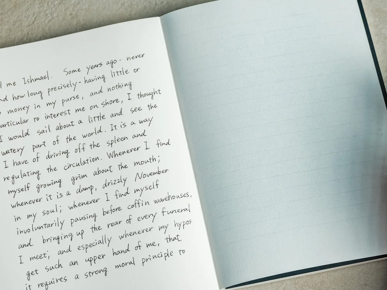
  •  

The 5 Best Outdoor Gear of November 2026

A campsite gets complicated through small inconveniences: a flashlight that’s running low, cookware competing for space, nowhere inviting to sit once dinner is done. Those are useful starting points for an outdoor gear roundup. This November’s selection looks at designs that address the practical business of spending time outside, with room for a telescope that gives you a reason to stay out long after the dishes have been put away.

These are our editorial picks for November 2026, selected for their approach to carrying, setting up, and using outdoor equipment. They aren’t five releases from the same month, and this isn’t a ranking based on comparative field testing. Each offers a specific design detail worth considering, along with compromises that deserve attention before anything joins your packing list. Think of the collection as five different possibilities, not one mandatory kit.

1. Olight Baton 4 Premium Edition

The smartest part of Olight’s Baton 4 Premium Edition is the case. Its flip-top enclosure carries a 5,000mAh battery, recharges the flashlight, and lets you operate the light without removing it. Open the lid, press the case’s button, and the flashlight can illuminate while remaining docked. Holding the button adjusts brightness. That gives the enclosure a useful role beyond storage, particularly when you only need a quick look inside a bag or around the campsite before putting everything away again.

The flashlight itself measures just 2.48 inches long and weighs 52.5 grams with its battery. Olight rates its maximum output at 1,300 lumens, though the manual shows that turbo brightness begins stepping down after 90 seconds. The case also supplies USB-C power to external devices, offering backup charging without another dedicated battery pack. There’s a packing tradeoff: the 142-gram case weighs considerably more than the light. Bring both when charging flexibility matters; carrying only the flashlight keeps things much lighter.

What we like

  • The flashlight remains usable while docked in its charging case.
  • USB-C output gives the case a second job: powering other devices.

What we dislike

  • The charging case adds considerably more weight than the flashlight alone.
  • The 1,300-lumen maximum is a brief turbo setting, not sustained output.

2. DWARFLAB Draco Smart Telescope

DWARFLAB’s Draco is the indulgence in this selection: a preorder smart telescope designed for photographing the night sky. Its 90mm aperture, folded optics, and integrated cameras bring several astronomy components into one portable instrument. The particularly interesting mechanism is a rotating imaging sensor that compensates for field rotation, the apparent twisting of stars across an image during an exposure. DWARFLAB advertises single exposures of up to 300 seconds, with guiding hardware built into the telescope instead of attached as another accessory.

The practical appeal is how much setup the system takes on. Through the DWARFLAB app, Draco automates focusing, targeting, tracking, and image stacking, while its wide-angle and telephoto cameras can capture simultaneously. Scheduled shooting also makes an overnight session possible without constant supervision. At 5.5 kilograms, though, this is equipment to transport rather than casually add to a hiking bag.

Click Here to Buy Now: $1599

What we like

  • Integrated guiding and automated capture reduce the number of separate components to manage.
  • Simultaneous wide-angle and telephoto imaging offers two views of the same night.

What we dislike

  • A 5.5-kilogram body makes this a substantial addition to your luggage.
  • Preorder status rules it out as a dependable purchase for an imminent trip.

3. Zempire Stealth-Jet Wide Camp Stove

Zempire’s Stealth-Jet Wide addresses a familiar packing problem: a camp kitchen can occupy a surprising amount of the trunk. This two-burner stove closes into a powder-coated pressed-steel body just 2 inches thick. Its packed footprint remains a substantial 23.2 by 12 inches, but the shallow profile gives you a flatter object to arrange around other equipment. Open it, and the extra width provides space for larger pots and pans, with independently controlled burners rated at up to 10,000 BTUs each.

The supporting details are refreshingly practical. Rear and side wind shields surround the cooking area, pull-switch piezo ignition removes the need for matches during normal operation, and a removable pot stand provides access for cleaning. The $210 stove includes a propane canister hose connector, though fuel is separate. At 10 pounds, 13 ounces, its thinness solves storage bulk rather than backpack weight. That makes it a sensible design to consider for car camping, where fitting equipment matters more than carrying it.

What we like

  • The 2-inch packed profile reduces the stove’s storage bulk.
  • Two independently controlled burners provide flexibility for cooking a meal.

What we dislike

  • Its nearly 11-pound weight makes it poorly suited to backpacking.
  • A compatible propane canister and fuel must be purchased separately.

4. Nike ACG x Helinox Chair Zero LT

The Nike ACG x Helinox Chair Zero LT makes its construction the visual attraction. An orange frame sits beneath translucent Ghostgrid fabric, drawing attention to the supporting structure rather than hiding it under a substantial upholstered seat. Helinox describes Ghostgrid as a monofilament mesh with a reinforced ripstop grid, developed to balance low weight with resistance to abrasion and tearing. It’s an appropriate material story for a chair whose appeal depends on how little furniture you’re willing to carry outdoors.

The specifications make that argument concrete: 534 grams packed, a 265-pound stated capacity, and a carry case measuring 14 by 4.5 by 4.5 inches. Shock-corded aluminum poles form the frame, while an included X-Strap increases ground contact area to help reduce sinking on softer surfaces. Fit deserves attention before the branding: Helinox identifies adults under 5 feet, 9 inches among its ideal users.

What we like

  • A 534-gram packed weight makes the case for carrying a separate seat.
  • The included X-Strap addresses sinking on softer ground.

What we dislike

  • Helinox’s stated ideal-user guidance makes fit worth checking for taller buyers.
  • The collaboration is currently sold out on the US site.

5. Clip&Go Radio

The Clip&Go Radio puts its carrying method directly into the body. A built-in carabiner attaches the 220-gram device to a backpack or other gear, keeping its AM, FM, and shortwave radio accessible without assigning it an interior pocket. The design makes particular sense for something combining everyday listening with backup functions. There’s a flashlight, an audible SOS alarm with a flashing light, and a replaceable 2,000mAh battery that can also supply power to compatible smartphones.

The charging hierarchy is worth understanding before heading out. USB-C is the recommended primary method, with the shop listing approximately two hours for a full charge. The hand crank and solar panel are emergency alternatives, with listed charging times of approximately six and 67 hours, respectively. Neither should be mistaken for a quick substitute for plugging in. The replaceable 18650 cell is the more appealing ownership detail: when the battery wears out, you can replace it rather than retire the radio.

Click Here to Buy Now: $60.00

What we like

  • The integrated carabiner keeps it accessible.
  • Its 18650 battery is replaceable.

What we dislike

  • Solar charging is extremely slow.
  • Hand-crank charging is a lengthy backup method.

Packing Around the Trip

Before adding any of these to your equipment, decide what kind of outing you’re packing for. A trunk, a bicycle pannier, and a backpack impose different limits. Put the complete setup on the scale, including cases, cables, fuel, and accessories, rather than judging an object by its headline measurement. A thin stove still needs room around it; a compact instrument can still represent a substantial share of what you’re carrying.

It’s also worth separating the job you need done from the extra functions that sound appealing on a product page. Choose lighting around how you’ll use it, seating around your body, and specialist equipment around an activity you genuinely enjoy. Multifunctional gear earns its place when those functions match your habits. The better purchase may be the object that replaces something awkward, rather than another addition to an already crowded bag.

The post The 5 Best Outdoor Gear of November 2026 first appeared on Yanko Design.
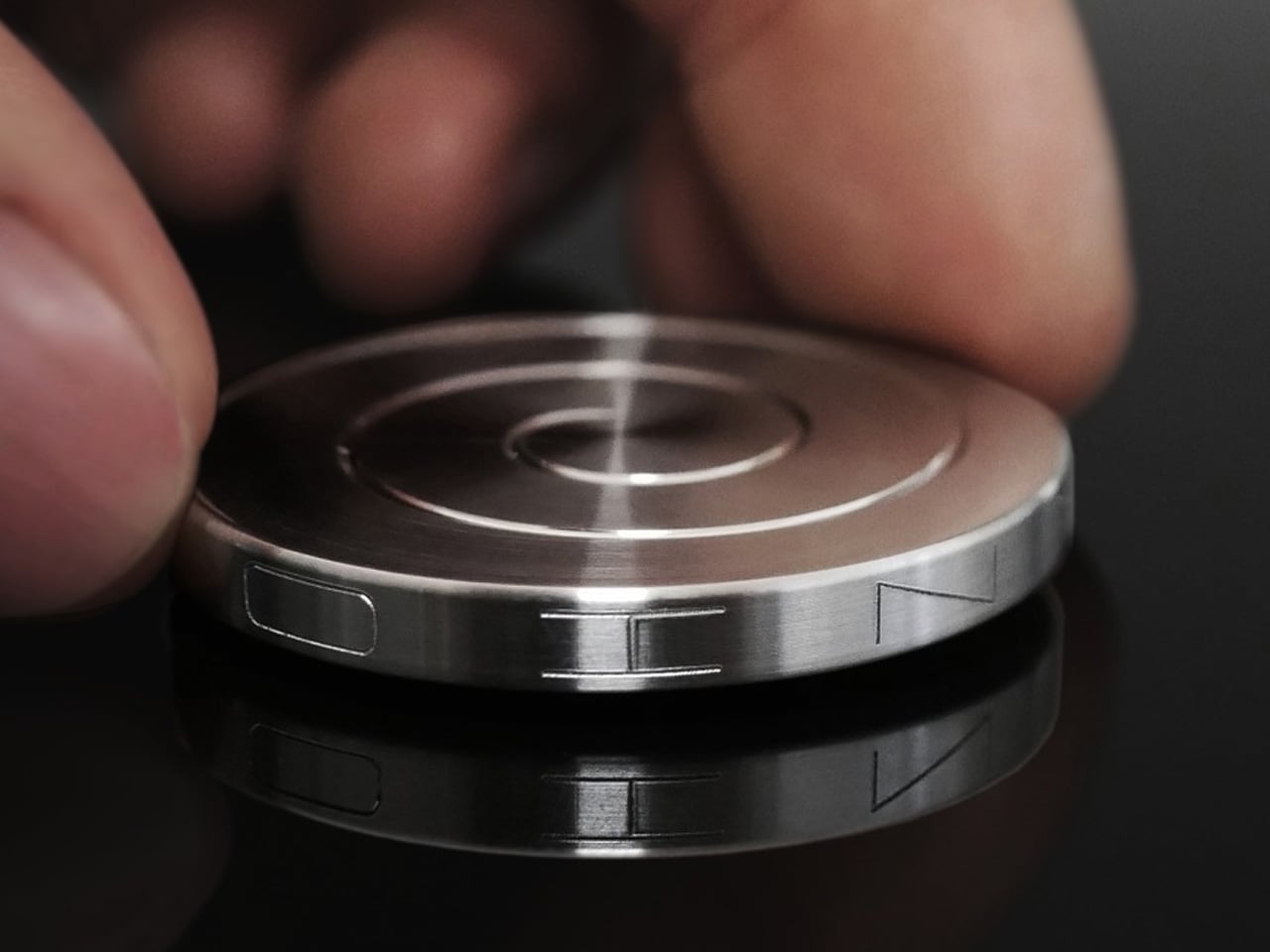
  •  

An Oregon Parking Lot Was Transformed Into a Forest-Inspired Library

 At East County Library in Gresham, Oregon, timber columns rise through gaps in the acoustic ceiling, keeping the structure visually separate from the surfaces around it. Holst Architecture designed this detail to suggest tree trunks reaching toward a canopy. The forest reference is built into the architecture, rather than applied afterward as a decorative theme.

Opened in May 2026, the approximately 95,000-square-foot library serves eastern Multnomah County. Holst led the design, collaborating with Adjaye Associates through the design development phase. Its scale addresses a longstanding imbalance: more than 40 percent of county residents live east of Interstate 205, yet East County previously had the library system’s smallest footprint.

Designer: Holst

The project replaces an underused parking lot with a public destination connected to transit. A tree-lined pedestrian route links the MAX light rail stop and northern civic space to a terraced entrance plaza on Division Street. That arrangement makes the approach part of the project, giving pedestrians a defined route between transportation and the library’s entrances.

Inside, glulam beams and cross-laminated timber panels form the primary structural system. Double-height entrances and a central living room establish larger clearings within the column grid. Holst paired overhead beams and introduced recessed lines in the timber to give the ceiling depth and rhythm. These choices make the forest analogy legible through construction, without requiring literal representations of branches or leaves.

The building isn’t exclusively timber. Concrete shear walls around the auditorium and along the eastern side provide structural support, with concrete also used around acoustically sensitive spaces. This hybrid approach is worth noting: the material palette responds to different demands rather than treating exposed wood as the answer to every problem.

Holst organizes the plan from active spaces on the west toward focused reading and work areas on the east. Entrances, creative activities, and children’s play occupy the busier edge. Collections and specialized rooms sit toward the center, while window-lined seating provides a quieter destination. The layout acknowledges that a contemporary library needs room for conversation and concentration.

That range includes an audiovisual studio, a creative learning room, indoor and enclosed outdoor children’s spaces, and a rooftop terrace. Two sensory rooms, one oriented toward children and another toward adults, offer adjustable lighting and different ways to engage or withdraw. Community consultation helped shape these provisions, giving the expansive brief specific places to land.

Radiant flooring and rooftop solar panels accompany a LEED Gold target, not a confirmed certification. Beyond those systems, the useful architectural decision is spatial: a large civic building makes room for different levels of participation, including the simple wish to sit quietly with a book.

The post An Oregon Parking Lot Was Transformed Into a Forest-Inspired Library first appeared on Yanko Design.
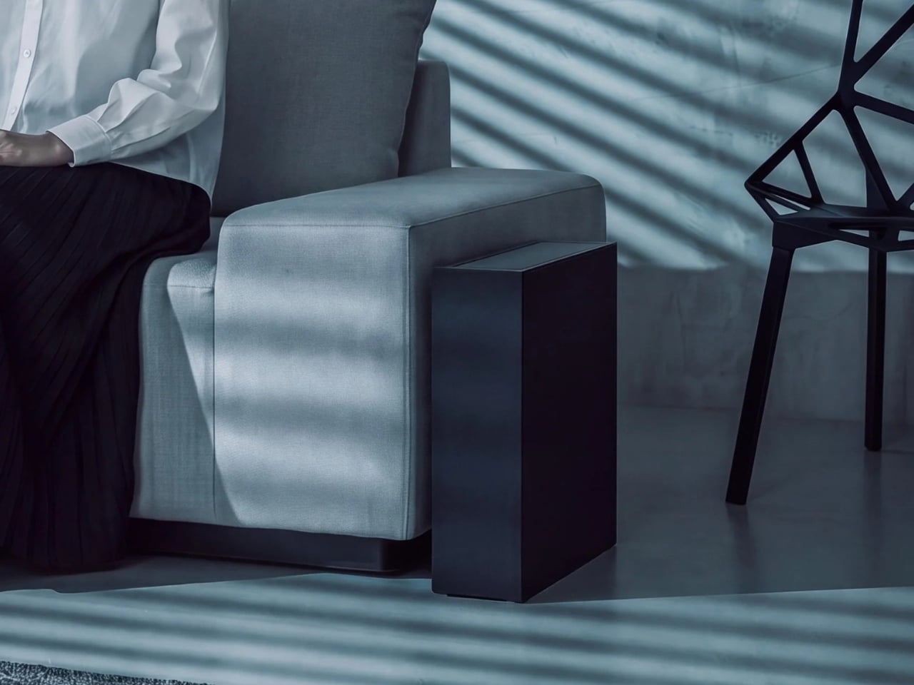
  •  

The 5 Best Tiny Homes of November 2026

A bedroom door can matter more than another clever storage compartment. So can a dining table that stays put, a bathroom you don’t have to share, or a living room with a view beyond the opposite wall. For November, we’ve selected five compact homes that give these everyday details serious attention. Their plans make downsizing easier to picture without treating the simple act of going to bed as a climbing exercise.

This selection spans trailer homes, park models, and larger modular dwellings, including a 700-square-foot option that stretches the tiny home label. We’re comparing their spatial decisions rather than reporting hands-on testing, with particular attention to privacy, usable rooms, and practical installation requirements.

1. Acadia

Sweet-Haus Tiny Cabin Company’s Acadia approaches downsizing through privacy rather than extreme compression. Its 700 square feet contain two bedrooms and two full bathrooms, all on one level, alongside an open kitchen and living area. That extra bathroom earns its place if two adults keep different schedules or regularly host overnight guests. The manufacturer currently identifies Acadia as a modular home for permanent installation in South Carolina and North Carolina, so think settled small house rather than roaming weekend cabin.

The kitchen supports that residential approach with a 24-inch Haier range, an 18-inch dishwasher, and a refrigerator with a bottom freezer. Custom solid wood cabinetry and drawers beneath the beds give storage an architectural role instead of leaving everything to loose furniture. Bedrooms accommodate queen or king bed bases, while bathroom configurations include showers or tub-and-shower combinations. It’s a persuasive option for people who want fewer rooms to maintain without abandoning familiar household routines or privacy.

What we like

  • Two full bathrooms make sharing a compact home a more practical proposition.
  • Both bedrooms stay downstairs, with storage incorporated beneath the beds.

What we dislike

  • At 700 square feet, it won’t satisfy anyone seeking a genuinely minimal footprint.
  • Permanent foundation requirements and availability limited to the Carolinas narrow its suitability.

2. Leah

Leah puts its most expressive architecture around the living room. Tall, divided glazing wraps the corner beneath a pitched roof, making the shared space resemble a small garden pavilion in Vagabond Haven’s illustrations. The Swedish builder offers 52 square meters, approximately 560 square feet, including a sleeping loft, with a separate main bedroom downstairs. That arrangement makes sense for a couple who want a private bedroom for themselves and occasional sleeping space upstairs without climbing stairs every night before bed.

A corridor separates the main bedroom from the communal rooms, while the illustrated kitchen turns a corner to form an L. There’s space for a separate dining table rather than eating every meal at a counter. Vertical Thermopine siding, a steel roof, and triple glazing round out the specification. The practical catch is delivery: Leah has no wheels and needs a low-bed truck and crane. Its generous living room belongs to a planned site, not an impulsive road trip.

What we like

  • The downstairs main bedroom makes the loft optional for an owner’s nightly routine.
  • Concentrating the largest windows around the living room gives the shared space a distinct architectural identity.

What we dislike

  • The loft still comes with restricted headroom beneath the pitched roof.
  • The unfurnished starting specification excludes the kitchen and heating, so the illustrated interior requires a closer look at the options list.

3. Helena

Helena earns its place by giving both bedrooms ordinary doors on the same floor. Vagabond Haven’s modular design contains 45 square meters, roughly 484 square feet, and three sleeping places, with no loft to negotiate. For a parent and child, or a couple wanting a separate room for guests and desk work, that distinction is useful. The smaller bedroom can take a single bed, desk, and wardrobe, keeping those activities out of the lounge rather than making it serve everyone.

The trade-off is width. Helena measures 9.2 by 5.98 meters, making it a different proposition from a narrow trailer home. Its steel frame has no wheels, and transport requires a truck and crane. In the manufacturer’s illustrations, pale vertical siding and extensive glazing face an outdoor terrace, while the kitchen and dining area share the living zone. Triple glazing and mineral wool insulation are specified, but buyers need to distinguish the unfurnished model from the interior shown in the illustrations.

What we like

  • Two enclosed bedrooms provide separation without relying on upstairs sleeping space.
  • The smaller bedroom can accommodate a desk alongside its bed and wardrobe.

What we dislike

  • Its nearly six-meter width demands more site space than a slender trailer layout.
  • Despite having two bedrooms, the stated sleeping capacity is three, which may rule it out for a household of four.

4. eVista XL Limited Edition

Escape’s eVista XL Limited Edition is the compact choice for someone who wants a bedroom door without giving up the trailer format. The 26-foot home keeps everything on one floor, with a walk-around queen bed separated from the living area by a sliding door. That access matters: getting up doesn’t require crawling across the mattress or descending from a loft. Dark timber cladding gives the exterior a restrained character, with the design’s effort concentrated on everyday interior arrangements.

Inside, drywall and maple trim accompany quartz counters, a two-burner induction cooktop, a combination microwave and convection oven, and a tall refrigerator. Flip tables open for meals or laptop work, then fold away to release floor space. Escape lists the completed Limited Edition at $75,365, with free delivery advertised, rather than presenting it as a future concept. The small bathroom and compact cooking area remain concessions to its size, so the private bedroom shouldn’t be mistaken for abundant space.

What we like

  • A separate bedroom with access around the queen bed avoids a common small home compromise.
  • Folding tables let dining and work surfaces disappear when circulation matters more.

What we dislike

  • The two-burner cooktop limits how many dishes can be cooked simultaneously.
  • The outdoor deck is optional, and Escape doesn’t handle site selection or preparation.

5. Winslow

Zook Cabins’ Winslow takes the cottage brief seriously, beginning with a covered porch instead of treating outdoor seating as an afterthought. The park model offers 400 square feet of finished interior space, with a private bedroom and no sleeping loft. Its 14-by-43-foot overall dimensions include the porch and roof overhangs, an important distinction from usable indoor area. Lap siding, shake accents, and white window frames establish the coastal character without requiring the house to sit beside water.

The floor plan places the bedroom at one end and the porch at the other, with living, dining, and kitchen functions grouped between them. Built-in cabinetry handles storage and display, while the dining arrangement includes seating around a proper table. A hall closet accommodates the water heater and laundry hookups, giving mundane equipment a designated home. For someone who values familiar domestic proportions over a loft’s extra sleeping capacity, Winslow keeps the daily essentials within an uncomplicated single floor.

What we like

  • The covered porch provides a dedicated outdoor room outside the finished interior footprint.
  • A private bedroom and designated utility closet give sleeping and household equipment their own places.

What we dislike

  • One enclosed bedroom and no loft leave limited separate sleeping space for guests.
  • The kitchen’s two-burner electric cooktop is a concession for anyone accustomed to a larger range.

Choose the Floor Plan, Then Check the Site

Before choosing a favorite, imagine two people using the plan at once. One is cooking while the other works, sleeps, or gets ready to leave. Check where doors open, which routes pass the bed, and whether the dining surface can stay in use during meal preparation. A small home’s floor plan becomes more revealing when you stop counting features and start following the movements those features are supposed to support.

Then give the site the same attention as the interior. Ask what delivery access, lifting equipment, foundations, and utility connections the particular model needs, and confirm permitted use with the relevant local authority before committing. An attractive starting price won’t answer those questions. The most convincing tiny home is the one whose layout fits your routines and whose installation requirements fit the place where you actually intend to put it.

The post The 5 Best Tiny Homes of November 2026 first appeared on Yanko Design.
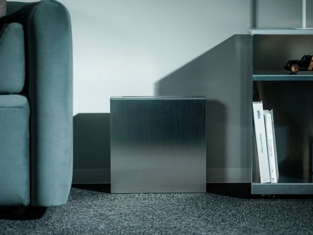
  •  

The 5 Best EDC Designs of November 2026

The most interesting EDC upgrade here begins with something that already fits a pocket: a Zippo case. Open the lid, and there’s no lighter inside, just a miniature ratchet and carefully arranged bits. That little reversal sets the tone for this November selection. These designs aren’t trying to turn you into a survivalist. They reconsider the objects you reach for when something needs tightening, illuminating, carrying, organizing, or writing down.

We’ve brought together one DIY project and four retail designs, including a swiveling flashlight, a cork wallet, and a pencil that skips sharpening. This is our November edit of existing designs, not a roundup of November launches. The common thread is thoughtful use of limited space, whether that means fitting tools inside a familiar shell or removing an annoyance from something as ordinary as the keys you carry every day.

1. DIY Zippo Toolkit

Tiny Tool Shop’s Zippo conversion makes a persuasive case for designing around an enclosure rather than starting again. A custom-printed insert holds a micro ratchet, two Steinwhale bits, and a Klein utility knife extension inside the emptied lighter shell. Each component gets its own recess, turning the interior into a fitted tray rather than a loose collection of hardware. The recognizable metal case supplies the hinge, lid, and compact outline, while the insert gives it an entirely different purpose.

The best detail addresses the obvious drawback of tight packing: getting the ratchet back out. A spring salvaged from a disposable Bic lighter helps push it through an opening in the case. It’s a satisfying piece of resourcefulness, but this remains a maker project, not a finished product sold by Zippo. Reproducing it involves sourcing compatible tools, producing the insert, and modifying the shell. It also replaces the lighter function completely, trading a flame for a very small repair kit.

What we like

  • Reuses a familiar hinged enclosure with a fitted layout for the tools.
  • Spring-assisted retrieval makes tightly packed components easier to access.

What we dislike

  • Requires fabrication, compatible components, and modifications to the case.
  • The insert’s dedicated recesses limit flexibility when changing the tool selection.

2. Painless Key Ring

Most key rings make you use your fingernails as miniature pry bars. The Painless Key Ring changes the entry geometry instead, using a continuous wave shape to guide a key onto the ring. You’re still working with a springy metal loop, but without the same tightly stacked starting point as a conventional split ring. It’s a modest redesign with a clear purpose: make changing keys less fiddly without turning the key ring into another complicated mechanism you need to carry around.

Made from stainless spring steel, the ring is listed at 0.8mm thick and weighs three grams. The silver set costs $30 and includes one large ring plus three small ones, giving you separate attachment points for different keys. The appeal isn’t adding another tool to your pocket. It improves the connection between what you already have. If you rarely change keys, the benefit may not justify the price. For someone regularly swapping house, office, and shared keys, the geometry is more compelling.

Click Here to Buy Now: $30.00

What we like

  • Wave-shaped entry offers an alternative to prying apart a conventional split ring.
  • The set includes smaller rings for organizing separate keys.

What we dislike

  • At $30 for the silver set, it’s a deliberate upgrade to a basic accessory.
  • Keys still need threading around the ring rather than releasing through a gate.

3. WUBEN G5 Compact Flashlight

The WUBEN G5 puts its most useful feature above the body: a head that rotates through 180 degrees. Rather than repositioning the entire flashlight whenever the beam misses your work, you can change its direction while the body stays attached. An adjustable clip and tail magnet give you different mounting options, particularly useful when both hands are occupied. The flat form also avoids the rolling habit of cylindrical flashlights, making this a small lighting tool with several sensible working positions.

WUBEN lists the standard G5 at approximately 52 grams, with USB Type-C charging and maximum white output of 400 lumens. Its current specification gives an IP65 rating, which means this is not a light to treat as submersible. At $19.99 for standard colors, it’s an accessible alternative to reaching for your phone. The limitation is endurance: WUBEN’s longest runtime figure belongs at the lowest output, not maximum brightness. Choose it for short tasks rather than prolonged use at maximum brightness.

What we like

  • Rotating head, clip, and magnet provide several ways to position the beam.
  • The compact, flat body suits pocket carry without rolling away when set down.

What we dislike

  • Maximum brightness and maximum runtime describe different operating settings.
  • Its IP65 rating does not cover immersion.

4. Pocket Everlasting All-Metal Pencil

A pocket pencil needs to survive being carried before it can be useful on paper. Sun-Star’s Pocket Everlasting All-Metal Pencil approaches that problem with a metal body, protective cap, and a writing tip that doesn’t need sharpening. At 4.7 inches long, it gives you a dedicated place to put a measurement, sketch, or passing thought without unlocking a screen. There’s no elaborate deployment mechanism, just a compact writing instrument ready to accompany a notebook.

The tip uses graphite and alloy particles to make an erasable mark. That makes it better understood as an alternative pencil technology than a pen that happens to look metallic. At $19.95, it’s also one of the less expensive objects in this selection. The name needs a little perspective: “Everlasting” isn’t a literal promise of infinite use. Its appeal is avoiding routine sharpening, while your preference for line darkness and feel still determines whether it earns space beside your keys.

Click Here to Buy Now: $19.95

What we like

  • A capped metal body gives the writing tip protection during carry.
  • Erasable marks and no routine sharpening make it an interesting notebook companion.

What we dislike

  • At 4.7 inches, it still needs more space than a miniature keychain tool.
  • Pencil marks aren’t a substitute for ink when permanent writing is needed.

5. Corkor Front-Pocket Cork Wallet

Corkor’s Front-Pocket Cork Wallet provides a welcome break from machined metal. Its cork fabric exterior has an irregular grain that gives a familiar card holder a distinct material identity. The layout stays straightforward: three card slots, an ID window, and two compartments for folded bills. Rather than adding moving parts to make a wallet interesting, Corkor keeps the construction restrained and lets the surface do the work. It suits an edited daily carry better than a collection of forgotten receipts.

The Portuguese maker lists an empty weight of 20 grams and dimensions of 110 by 80 by 10 millimeters. That last figure matters: adding cards and folded notes will change how much room it occupies. Corkor makes the $59 holder in Portugal and includes RFID-blocking construction, though the more tangible benefit is its simple organization. There’s no coin pocket, and cash takes more preparation than sliding notes into a full billfold. Those are deliberate compromises for someone who wants to downsize.

What we like

  • Cork fabric offers an animal-free alternative to a conventional leather exterior.
  • Separate card, ID, and cash compartments keep the layout easy to understand.

What we dislike

  • There’s nowhere dedicated to loose change.
  • Bills must be folded, making cash less convenient to sort.

Small Improvements Worth Carrying

The Zippo conversion is the conversation starter, but the quieter designs may make the bigger difference to a particular routine. A ring that’s easier to load helps someone changing keys. A swiveling light helps someone working with both hands. A simpler wallet helps someone trying to carry less. None needs to solve every problem to justify its place; it just needs to address one you actually encounter with some regularity.

These five designs aren’t a checklist to buy in full. The Zippo project asks for making time rather than a quick checkout, while the wallet asks you to reconsider what deserves carrying at all. Start with the small frustration you already recognize, then consider the space, upkeep, and setup its solution requires. A useful everyday carry should make your day feel less encumbered, not simply leave your pockets more fully equipped.

The post The 5 Best EDC Designs of November 2026 first appeared on Yanko Design.
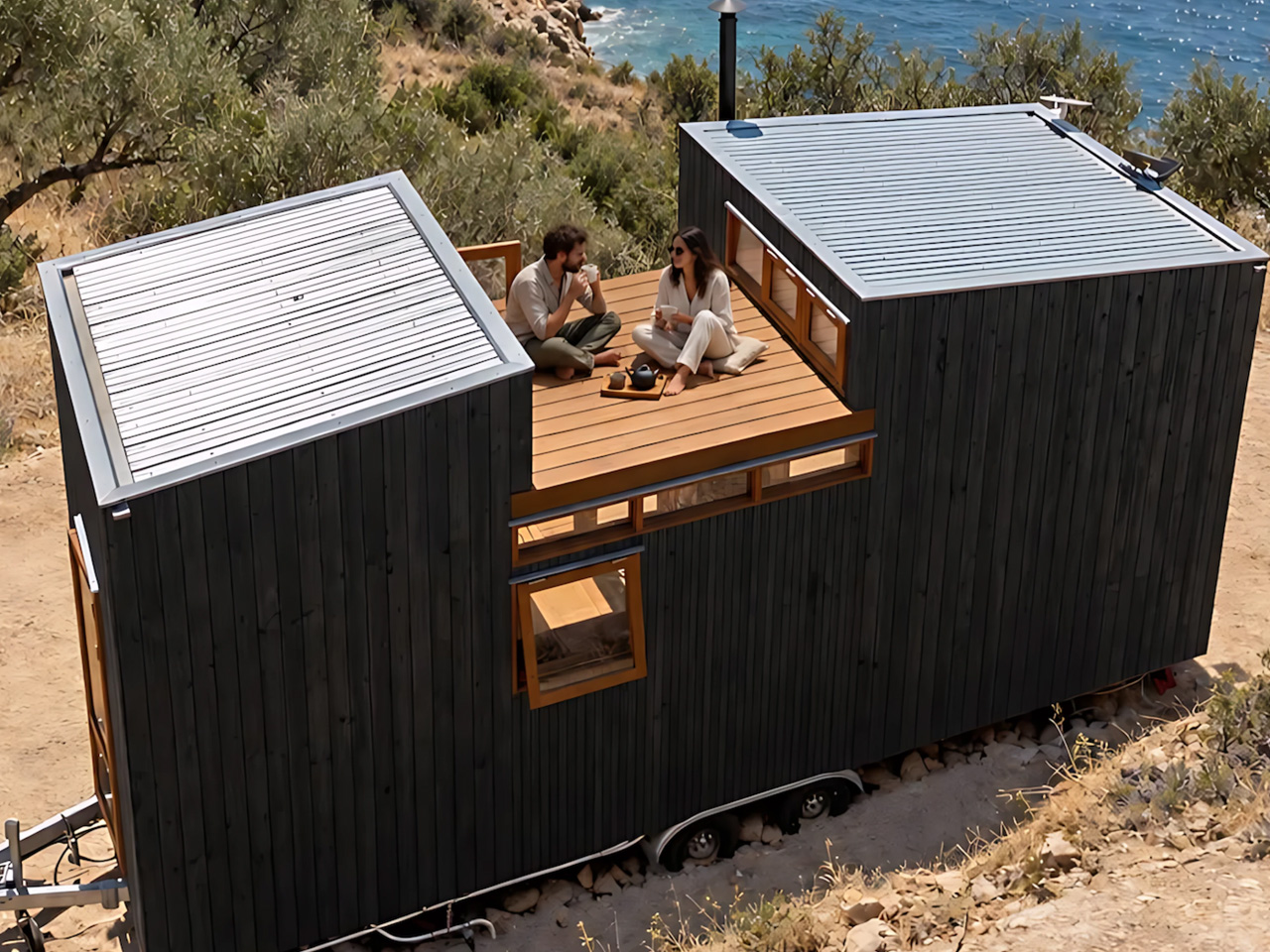
  •  

SOM’s Sany IROOTECH Headquarters Hangs Its Floors From a Giant Steel Exoskeleton

The most interesting space at Sany IROOTECH Headquarters might be the gap underneath it. In Guangzhou’s Pazhou business district, Skidmore, Owings & Merrill has connected two towers with an elevated podium, leaving room below for a shaded public plaza. Commissioned for construction equipment manufacturer Sany’s cloud technology venture, the completed complex gives a corporate headquarters something worth noticing at street level: space that people can enter without working there.

Designed with the Beijing Institute of Architectural Design serving as architect of record, the development makes its engineering unusually legible. A diamond-patterned steel exoskeleton wraps both towers, expressing the construction expertise behind the client’s business. Its purpose goes beyond establishing a recognizable silhouette. The external framework supports suspended floors, creating column-free interiors that can accommodate changing uses.

Designer: Skidmore, Owings & Merrill

SOM organizes the towers into five-story modules, with floors suspended from perimeter ring beams. Moving that supporting structure outward gives the interiors greater planning flexibility. According to SOM, the arrangement accommodates office, hotel, and residential programs, making the framework useful beyond the original headquarters brief. The architecture’s identity remains consistent even when what happens behind the glass changes.

That adaptability has already mattered. The client changed parts of the program during development, introducing plans for hotel and residential accommodation. The inward-leaning curtain walls also create terraces at the bottom of each five-level module while reducing direct solar exposure. These repeated outdoor spaces give the towers a rhythm tied to their construction, rather than an applied decorative pattern.

Guangzhou’s exposure to typhoons and seismic activity also shaped the engineering. SOM incorporated its patented pin-fuse joint system, which uses controlled movement and friction to dissipate earthquake energy. The firm describes rapid reoccupancy after extreme events as a design goal, an important distinction from claiming that the buildings have demonstrated that performance in an actual earthquake.

The podium extends the project’s structural ambition horizontally. Multistory trusses span 65 meters between the towers, sheltering the plaza beneath. A courtyard opening brings daylight into this covered space, while dimpled aluminum panels across the underside reflect light. Transparent glass lobbies keep the entrances visually separate from the heavier structure surrounding them.

Above, dining, retail, and exhibition spaces overlook the plaza. A public elevator operating around the clock connects the podium with the district’s covered walkway network. That connection is the project’s clearest civic gesture: the headquarters becomes part of a pedestrian route through Pazhou, giving people a reason to use its spaces beyond arriving for work or attending a meeting. The towers’ imposing frame makes the landmark; their lifted base makes the everyday connection.

The post SOM’s Sany IROOTECH Headquarters Hangs Its Floors From a Giant Steel Exoskeleton first appeared on Yanko Design.
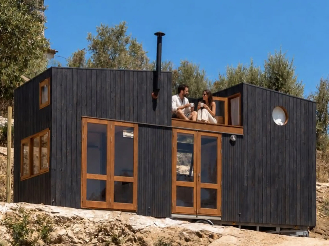
  •  

Tiny Wooden Living Units Stack Into a Three-Story Tower

At Ljubljana Castle, three wooden rooms stack into a slender tower, their angular ends pointing toward the city. This built installation from 2017 demonstrates Living Unit, a modular architecture system developed by OFIS Arhitekti with C+C, C28, structural engineers AKT II, and contractor Permiz. The idea begins with a small, repeatable wooden shell.

Each basic module measures 4.5 meters long, 2.5 meters wide, and 2.7 meters high, roughly 14.8 by 8.2 by 8.9 feet. Designed to accommodate two people, it can hold a double bed, wardrobe, table, and chairs, with provision for a bathroom and kitchenette. Those are compact cabin dimensions, rather than the proportions of a conventional apartment.

Designer: OFIS Arhitekti

The useful move is allowing that initial room to become part of something larger. Modules can connect horizontally or vertically, with combinations intended to accommodate four to six occupants. A single cabin might suit a short stay; several connected shells allow the domestic functions to spread out. The system therefore offers different arrangements without requiring an entirely different building vocabulary.

Its pointed geometry gives the project much of its character. The ends taper into truncated pyramids, with glazing at their tips. AKT II explains that these projecting forms add internal storage space while expressing the structure’s strength. Seen from outside, the alternating projections make the stacked version read as individual rooms, rather than one uninterrupted shaft.

Behind that silhouette is a prefabricated timber frame reinforced with plywood boards on both sides. The architects allow the exterior and interior finishes to change according to context. That distinction matters: the repeated element is the structural shell, not a compulsory decorative package. Different settings need not receive an identical-looking cabin simply because they share its underlying construction.

Ground connections are similarly adaptable. The units can be secured using steel anchors or removable concrete cubes instead of permanent foundations. The team proposes uses including holiday cabins, research accommodation, tourism, and shelter. These are intended applications, though, rather than proof that one specification will perform equally well across every climate and terrain.

The castle installation gives the system another role: a temporary library, with books organized across its levels and nearby outdoor areas intended for reading. It’s a useful demonstration of how the same shell can support a public program rather than accommodation. Here, the architecture supplies a small vertical destination within an existing landscape.

The sectional drawings also expose the compromise behind the tower’s small footprint. Compact steps and ladders connect its levels, making circulation an active part of occupying the stack. Horizontal expansion would avoid that particular arrangement but require more ground. Living Unit’s strongest proposition is this choice: repeat the room, then decide where the extra space should go.

The post Tiny Wooden Living Units Stack Into a Three-Story Tower first appeared on Yanko Design.
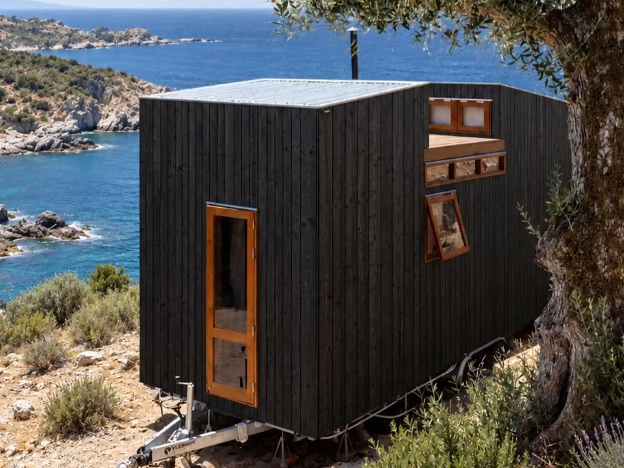
  •  

This 400-Square-Foot Tiny Cabin Opens Onto a Full-Width Porch

The Wildflower makes room for something tiny homes can easily squeeze out: a proper front porch. Built by South Carolina’s Sweet-Haus Tiny Cabin Company, this 400-square-foot park model pairs one bedroom and one bathroom with a covered outdoor sitting area. It’s an available model, starting at $115,000, with a layout that keeps daily life on one level.

That porch spans the cabin’s width, sitting beneath the same gabled roof as the enclosed rooms. In the builder’s photographs, timber-toned posts and dark mesh railings frame an outdoor sofa and chairs. Trex composite decking is specified for the floor. Giving outdoor furniture its own sheltered zone means the indoor living room doesn’t have to accommodate every gathering when the weather cooperates.

Designer: Sweet-Haus Tiny Cabin Company

Inside, the photographed cabin has pale horizontal wall paneling, muted green cabinetry, and a wood ceiling that follows the roof’s pitch. The contrast gives the upper half of the room a stronger visual presence without covering every surface in dark timber. A breakfast counter provides seating beside the kitchen, leaving the opposite side available for a sofa, coffee table, and a large window.

The published floor plan places the bedroom at the rear, beyond the kitchen, with the bathroom tucked alongside the route between them. A stacked washer and dryer occupy a dedicated position near the bedroom closet, while the bathroom includes a shower labeled 60 inches wide. A separate bedroom means going to bed doesn’t require converting the shared living area into a sleeping space each night.

Storage gets more attention than the footprint might suggest. Sweet-Haus lists a built-in pantry and two full closets, plus an electric fireplace feature wall with concealed storage. That last detail is particularly useful: a decorative focal point also earns its floor area by holding things. Custom soft-close cabinetry continues the approach, keeping everyday necessities behind doors rather than on display.

The construction package includes LP SmartSide siding, metal roofing, Low-E argon-filled windows, and a mini-split HVAC system. Buyers can choose finishes and explore upgrades, including a screened porch or built-in bed with nightstands. Those choices matter in a small cabin, where adding permanent furniture can settle the layout early. The photographs show one interpretation, rather than a fixed palette every buyer must accept.

The starting price covers the cabin, not a finished property. Delivery, setup, skirting, steps, and upgrades are separate charges, and Sweet-Haus says buyers must confirm local placement and occupancy rules for its park models. Land and utility preparation also need their own budget. Within those limits, the Wildflower’s most convincing decision is straightforward: it preserves a private bedroom, useful storage, and somewhere sheltered outside to sit, instead of making every activity compete for the same limited patch of indoor floor.

The post This 400-Square-Foot Tiny Cabin Opens Onto a Full-Width Porch first appeared on Yanko Design.
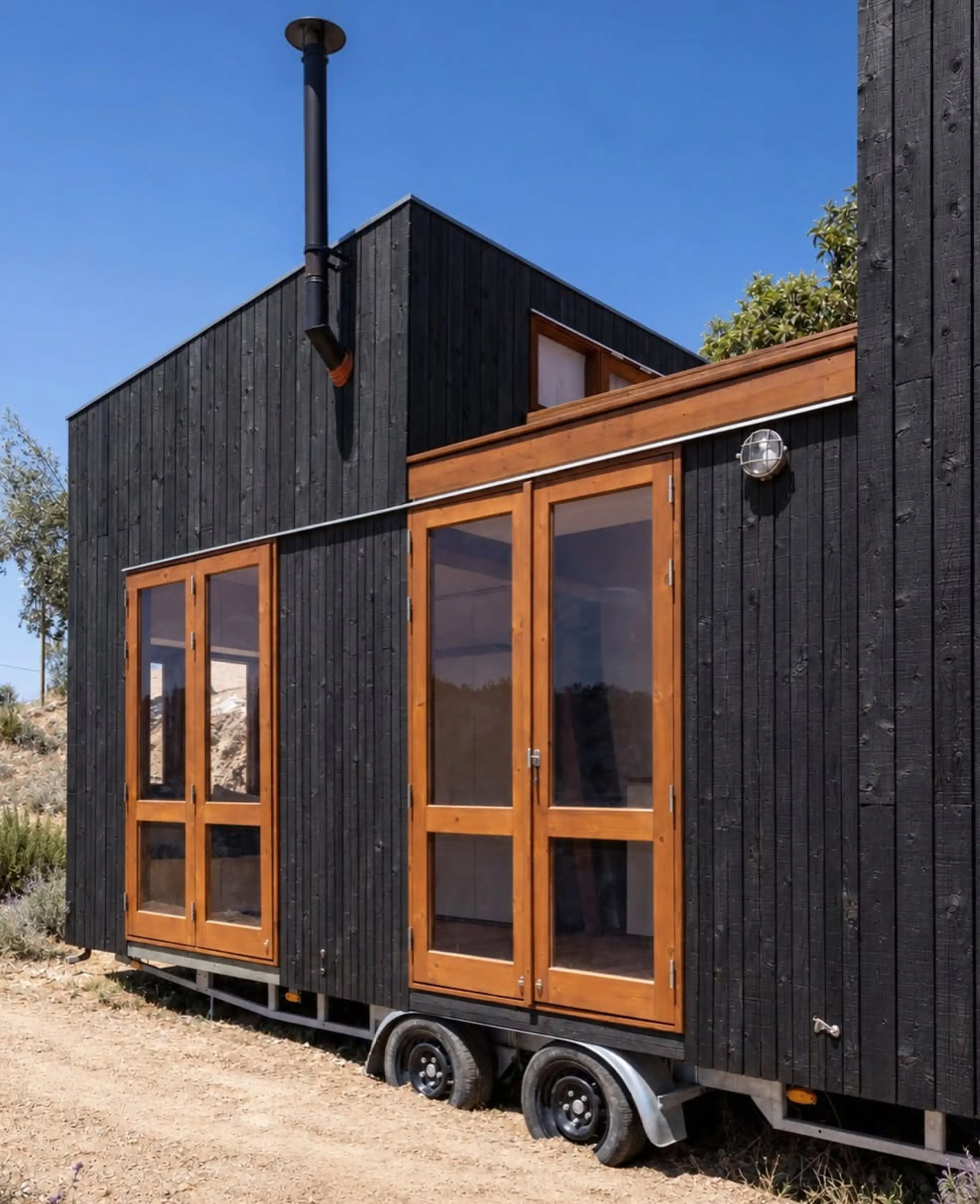
  •  
❌