Vue lecture

Pencil Shavings Have Never Looked This Beautiful
Most desk objects get ignored. They sit there doing their one job, collecting dust around the edges, and we never really think about them again. NEST, a conceptual pencil sharpener designed by a team of five students from TUST, UNNC, and CAU, is a direct challenge to that dynamic. It recently took home the winner prize at the 2025 European Product Design Award in the Conceptual Work & Office Product Design category, and the reason it won feels obvious the moment you understand what it actually does.

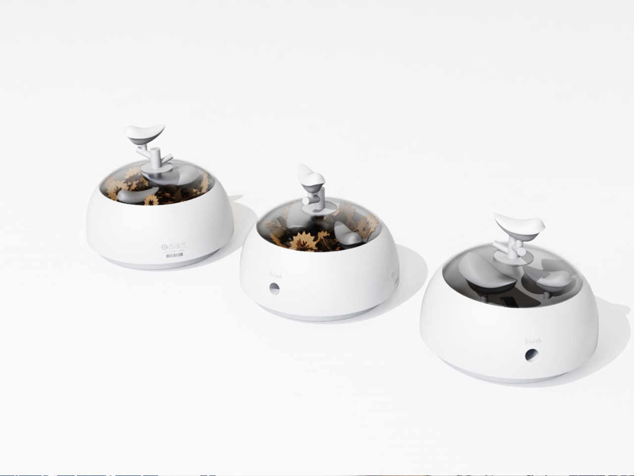
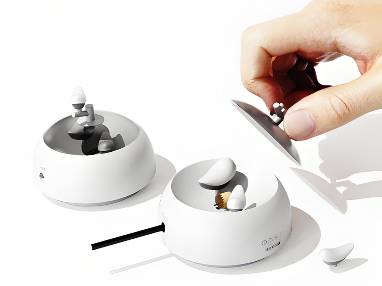
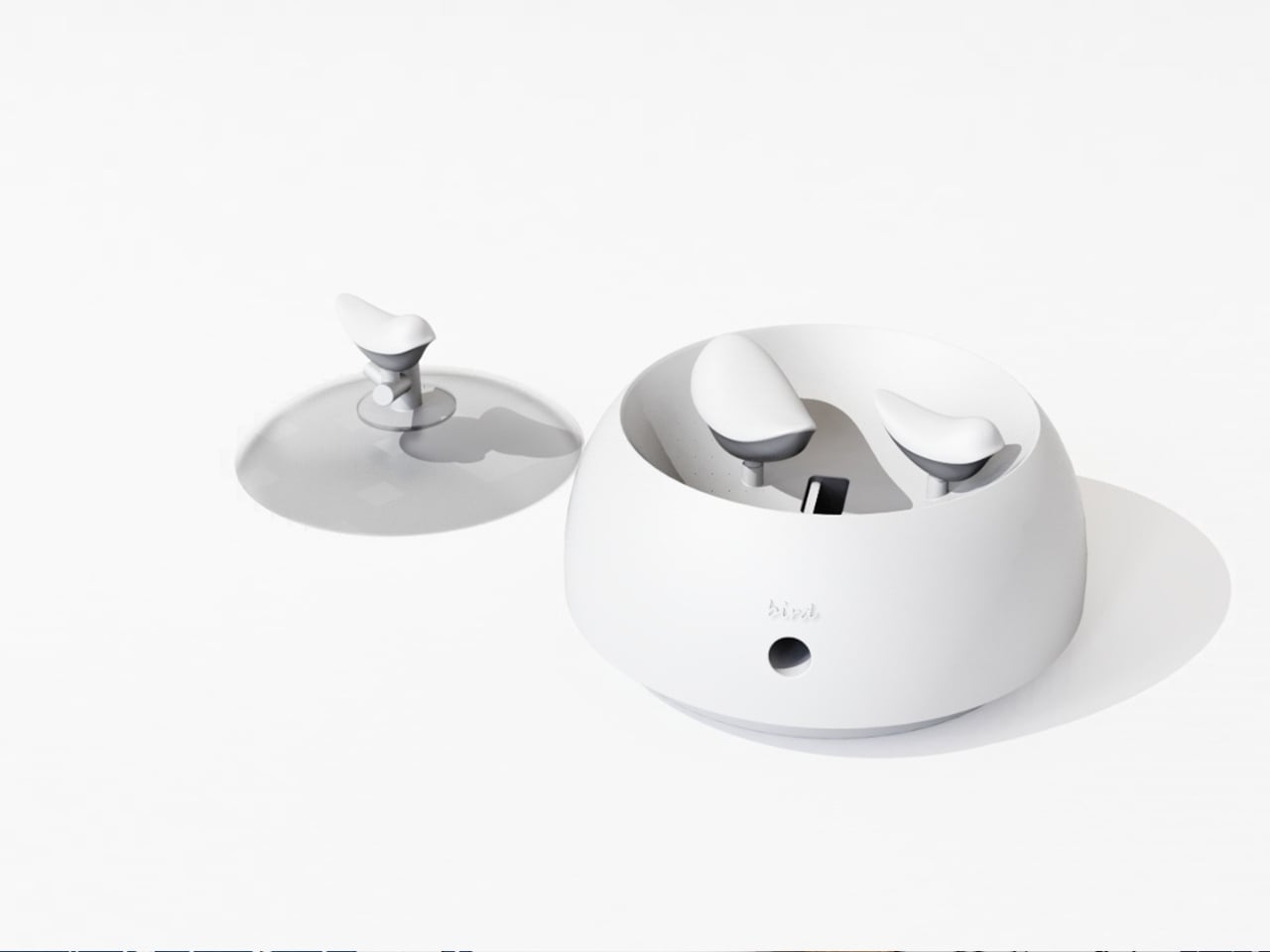
The concept is deceptively simple. A small bird figurine sits inside a rounded, bowl-shaped container. As you sharpen your pencil, the curling wood shavings collect beneath the bird, gradually building up like the gathered material of a real nest. By the time the container needs emptying, the little bird looks as if it has been nesting all along, settled into a soft, spiraling bed of wood ribbons. It is a beautifully accidental image that the design deliberately engineers into being, and once you picture it, it is very hard to unsee.

Designers: Zebin Qiao, Kaishuo Liu, Hongchen Guo, Zicheng Zhao, XiaoTongPan
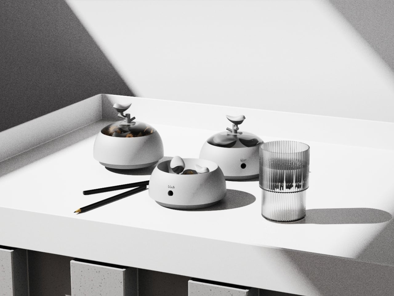
The real strength of NEST is the intelligence of its metaphor. Lead designer Zebin Qiao and the team didn’t just borrow a visual from nature and paste it onto a product. They found a genuine structural parallel between the act of using the sharpener and the act of nest-building, then made sure the user experiences that parallel in real time. That is not an easy thing to pull off. Most product design that reaches for nature ends up with surface decoration or an illustrative graphic on a box. NEST earns its metaphor because the metaphor lives in the function, not on top of it.
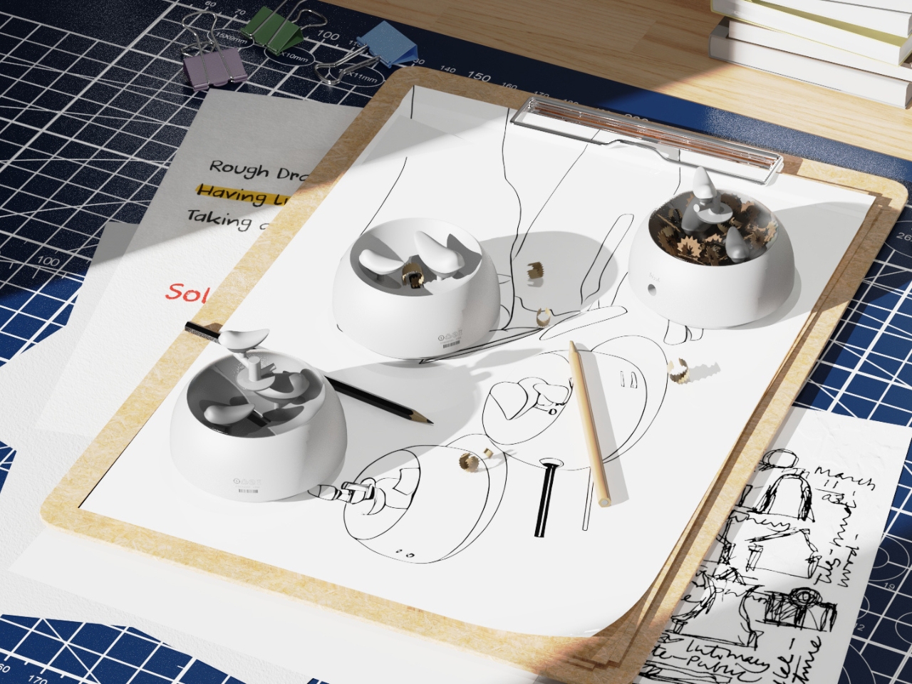
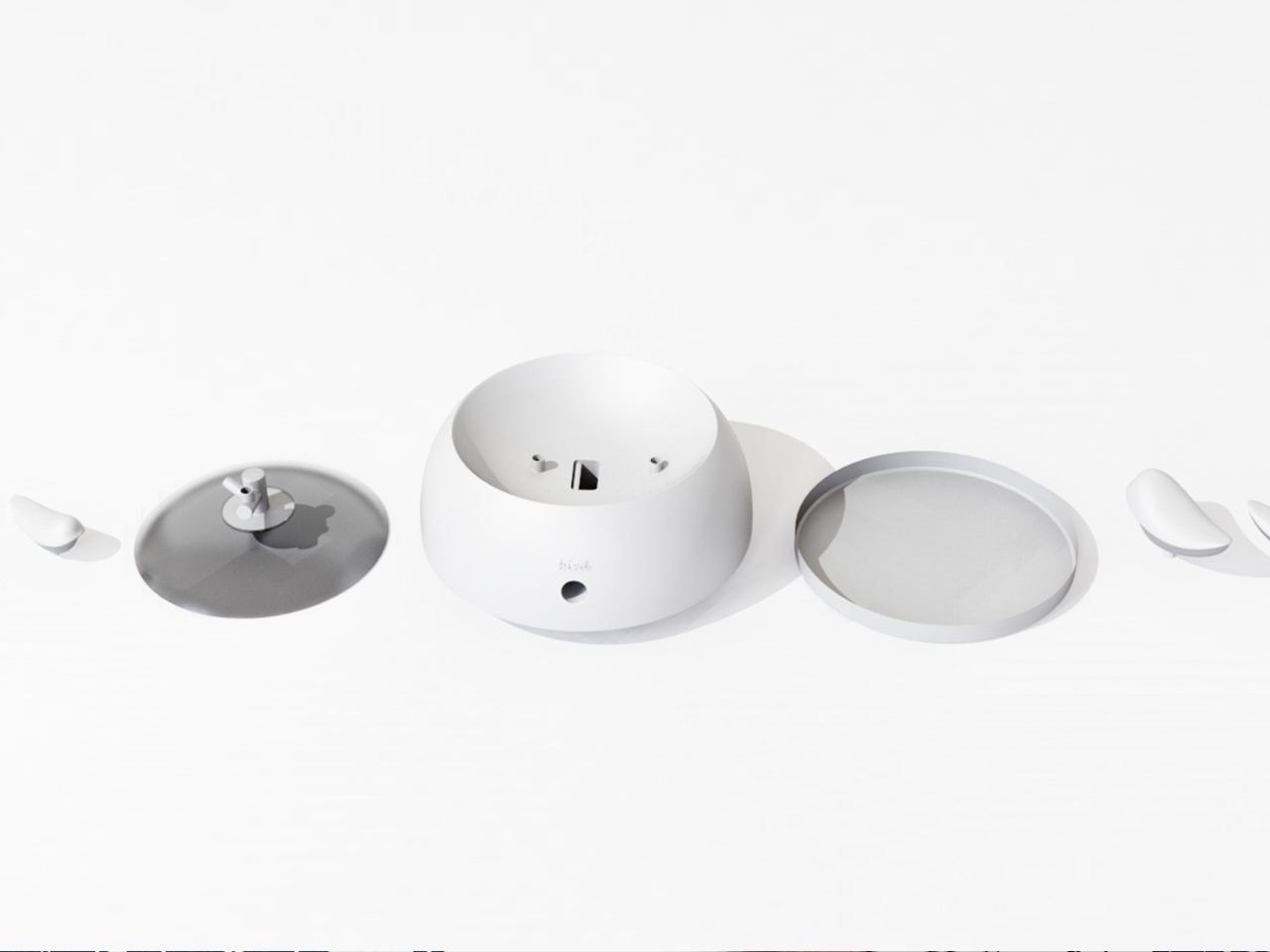
The second layer of the design is the lid. It doubles as a perch, fitted with a minimal branch element. When you are not sharpening, the tiny bird figurine can be lifted out of the interior and placed on the branch, transforming the whole object into a quiet desktop ornament. This dual-state approach means the product shifts personality depending on how you use it. It is a working tool when you need it, and a miniature sculpture the rest of the time. I genuinely appreciate designs that respect both modes of being at a desk, the productive and the contemplative.
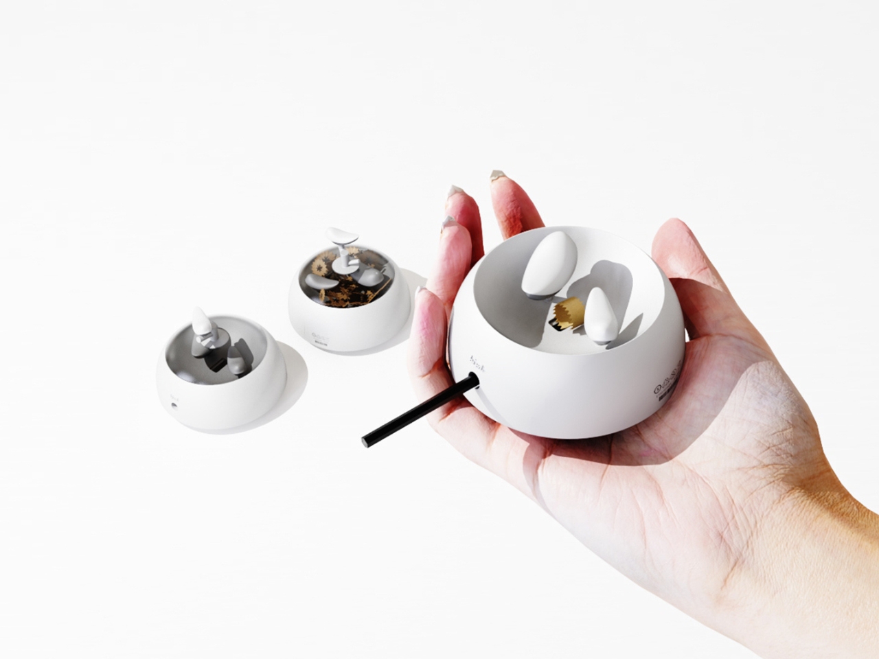
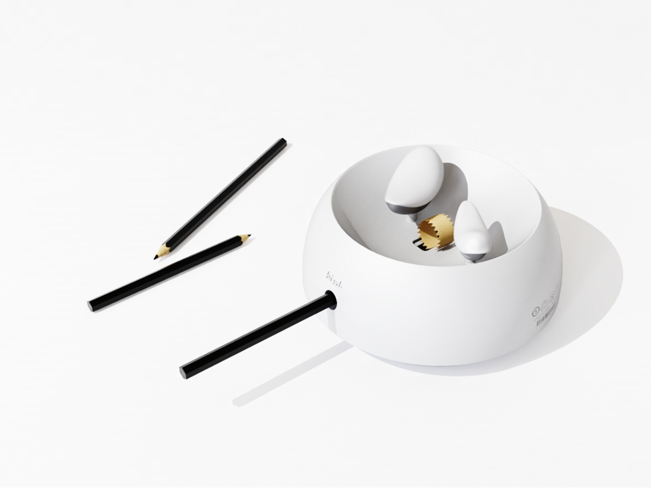
I will admit my first instinct when I encounter “award-winning conceptual product” is mild skepticism. Conceptual work can drift toward spectacle and lose interest in whether the thing would actually function. NEST sidesteps that problem by grounding every design choice in real, physical behavior. The shavings accumulate because that is what shavings do. The bird sits because the container holds it. Nothing is forced or artificially staged. The charm is a byproduct of the function, which is exactly the right way around. It gives the design an integrity that a lot of more expensive, more elaborate objects simply do not have.
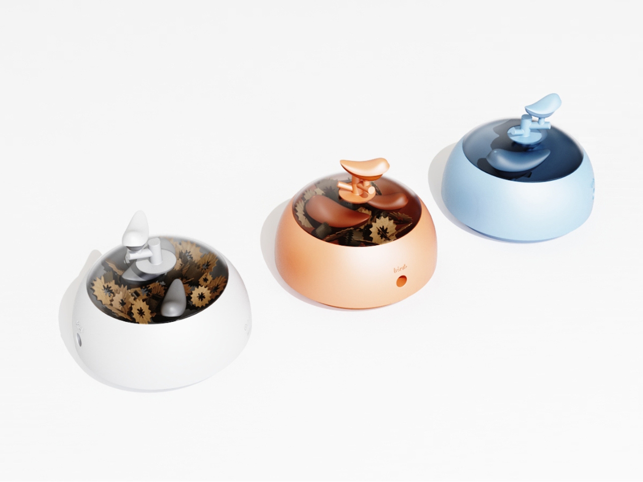
The color variants are worth noting too. The design comes in white, a warm terracotta tone, and a soft powder blue, each with a matching bird. It is a small decision that makes the object feel personal rather than clinical, and it opens the door to something close to a collecting impulse. You are not just buying a sharpener. You are picking a companion for your desk, which is a particular kind of intimacy that few office products ever manage to create.
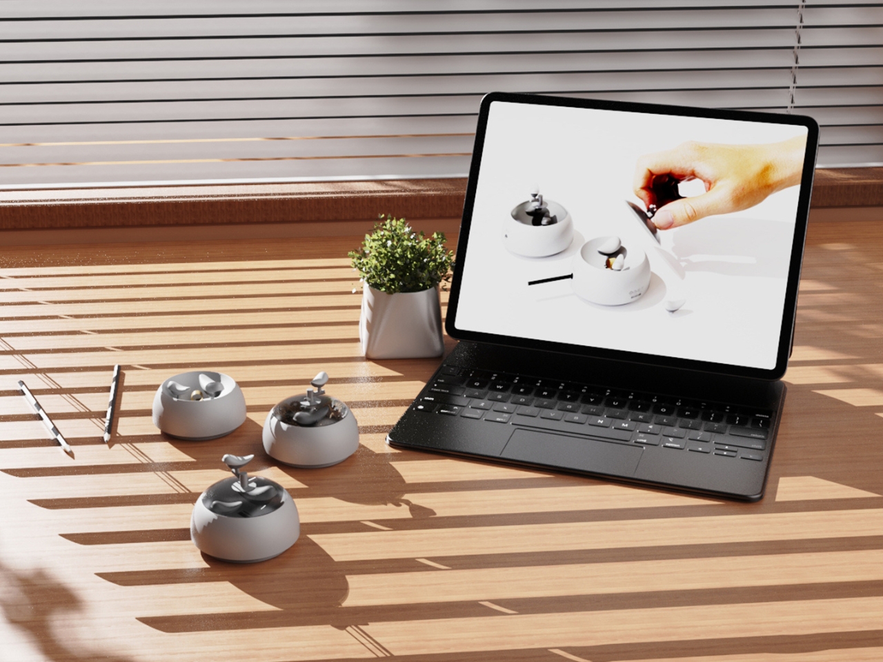
At its core, NEST is making an argument that utility does not have to be neutral. That the objects we interact with daily can carry meaning, invite attention, and reward a small amount of patience. A student design team from three Chinese universities made that argument with a pencil sharpener, and they made it convincingly enough to win a major European award. That is not nothing. If anything, it is the kind of design thinking we need more of, the sort that finds poetry in the ordinary without making you feel like you are trying too hard to appreciate it.
The post Pencil Shavings Have Never Looked This Beautiful first appeared on Yanko Design.

  •  

The Projector Concept That’s Almost Too Beautiful to Use

Most concept designs exist to generate buzz, collect awards, and then quietly disappear. The BeoLens Horizon, a projector concept imagined by French industrial designer Baptiste Baumeister, feels different. It feels like a glimpse into a future that Bang & Olufsen should absolutely be building right now.

If you’re not familiar with B&O, the short version is this: the Danish audio brand has been setting the benchmark for luxury consumer electronics since 1925. Their products don’t just sound good; they’re designed to be desired as objects. The BeoSound Shape, the BeoVision Harmony, the Beosound Theatre, all of them treat your living room like a gallery wall. Baumeister clearly understands that DNA, and with BeoLens Horizon, he runs with it in a direction that feels genuinely exciting.

Designer: Baptiste Baumeister

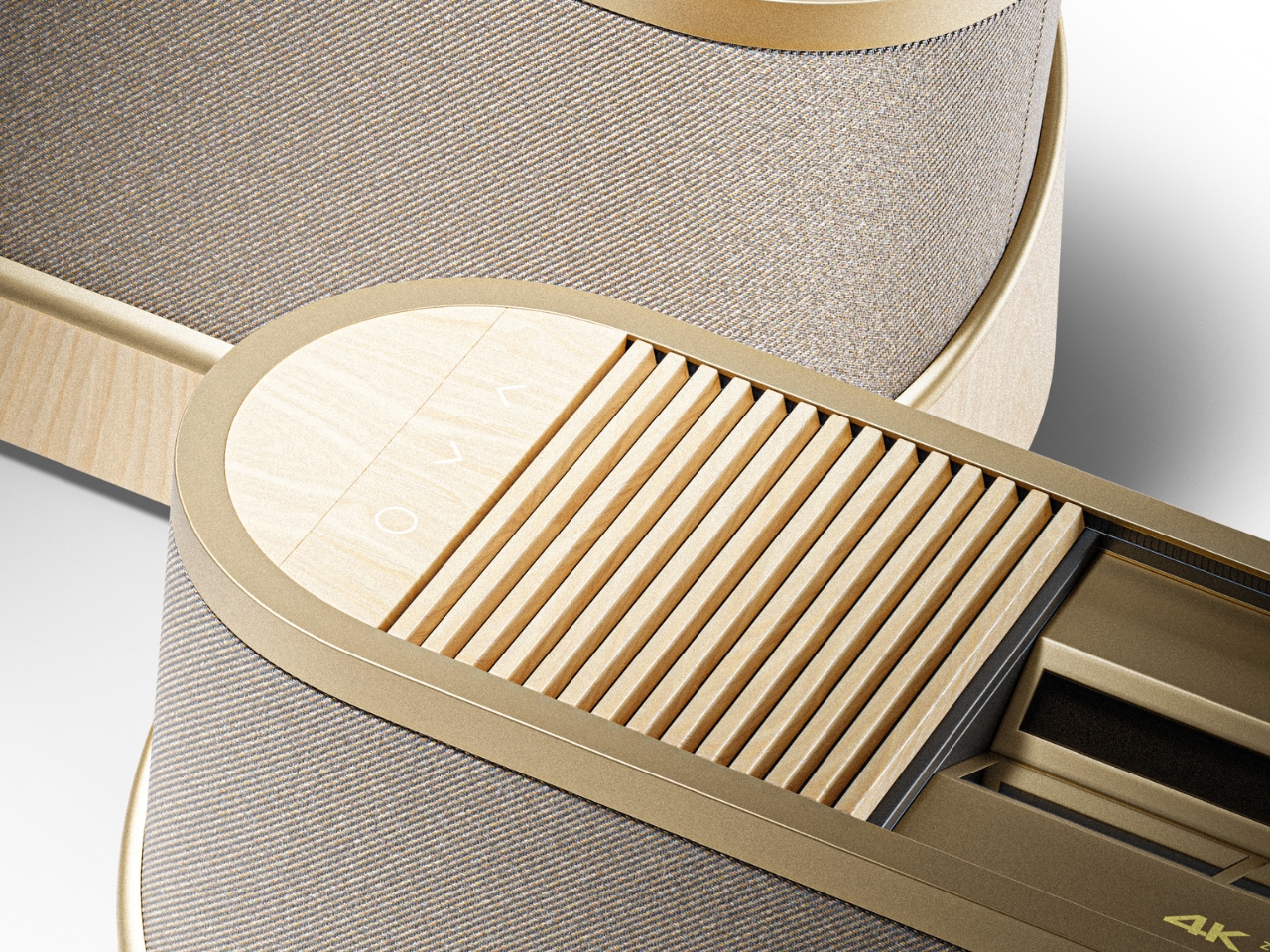
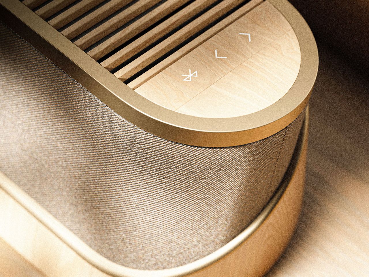
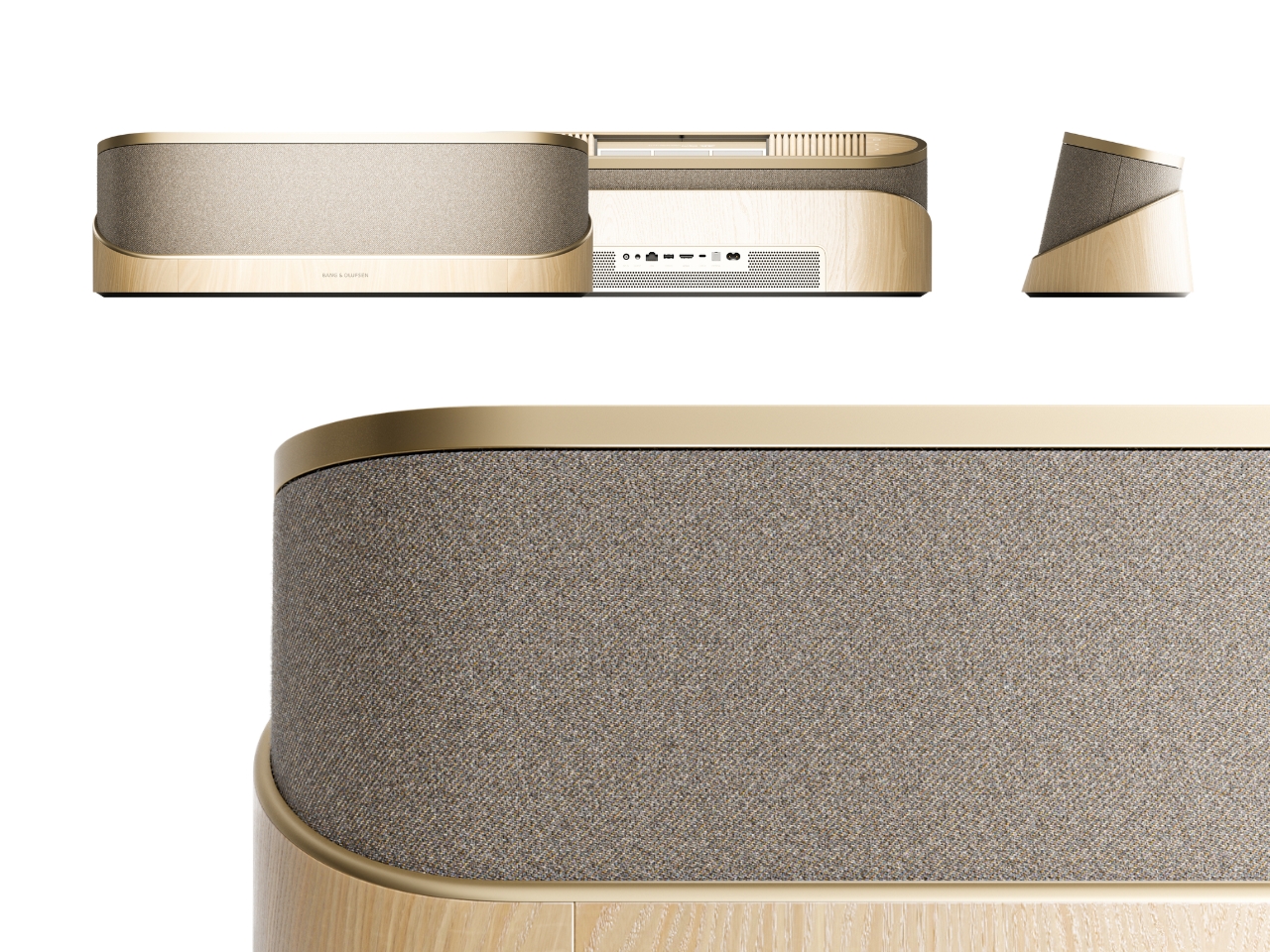
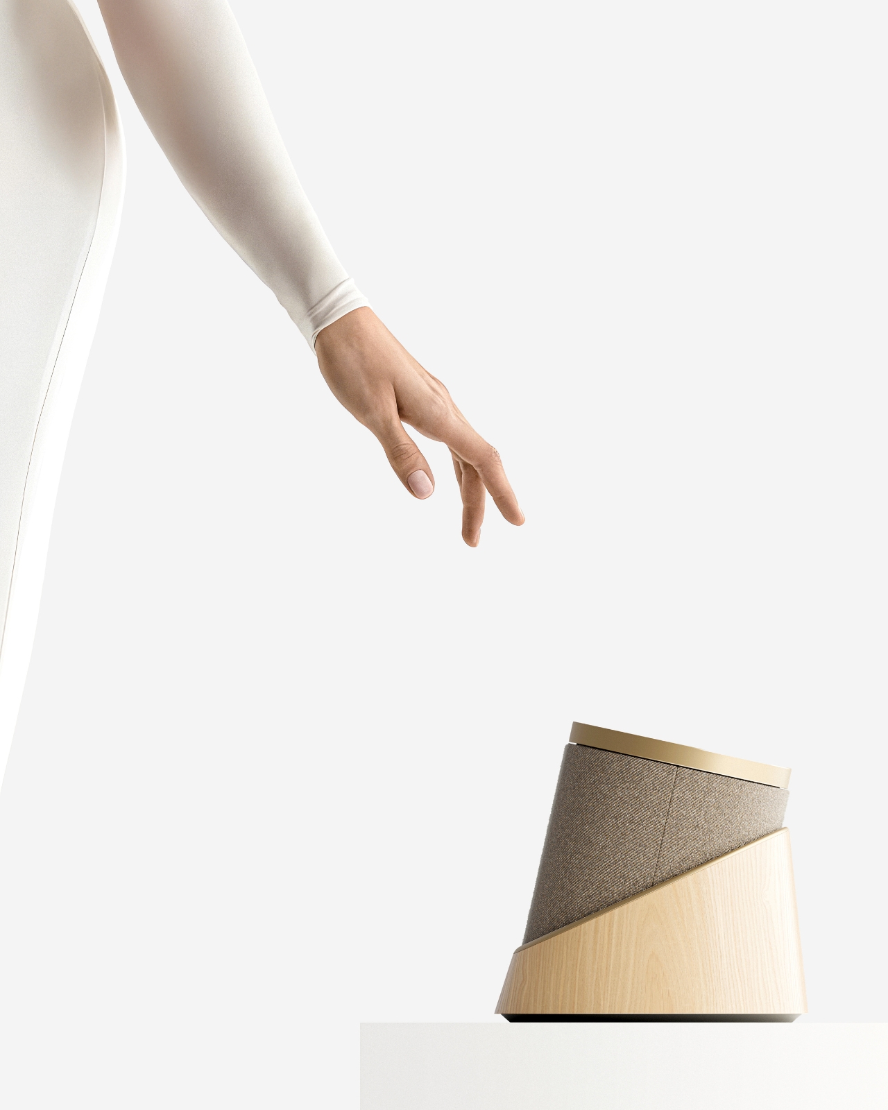
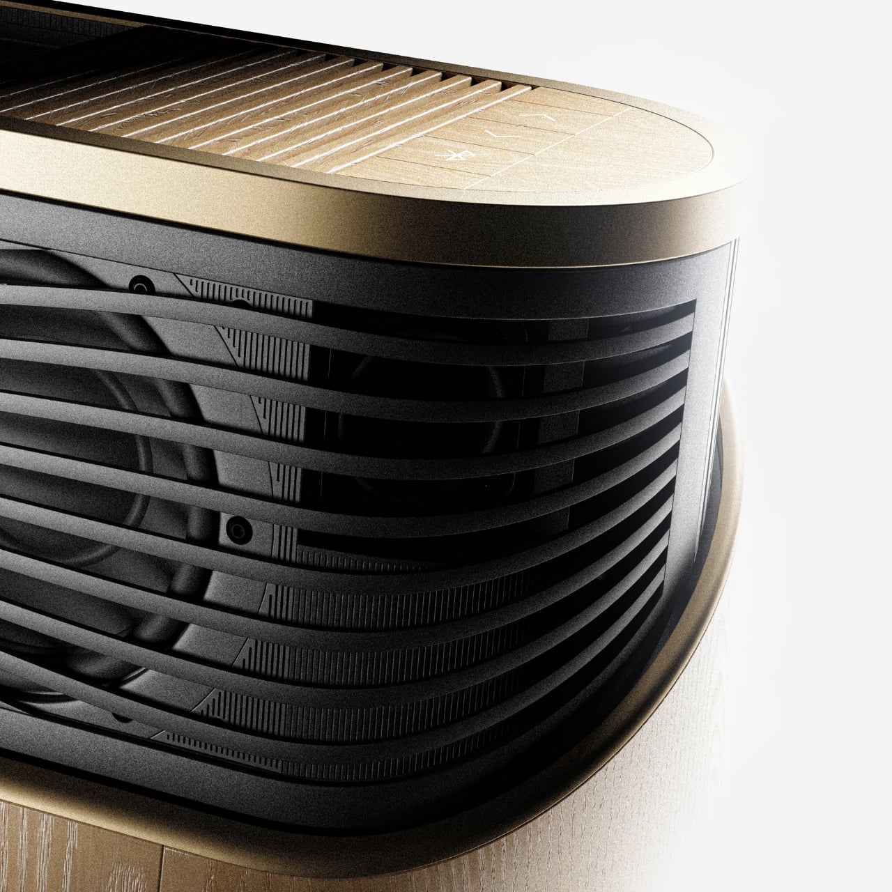
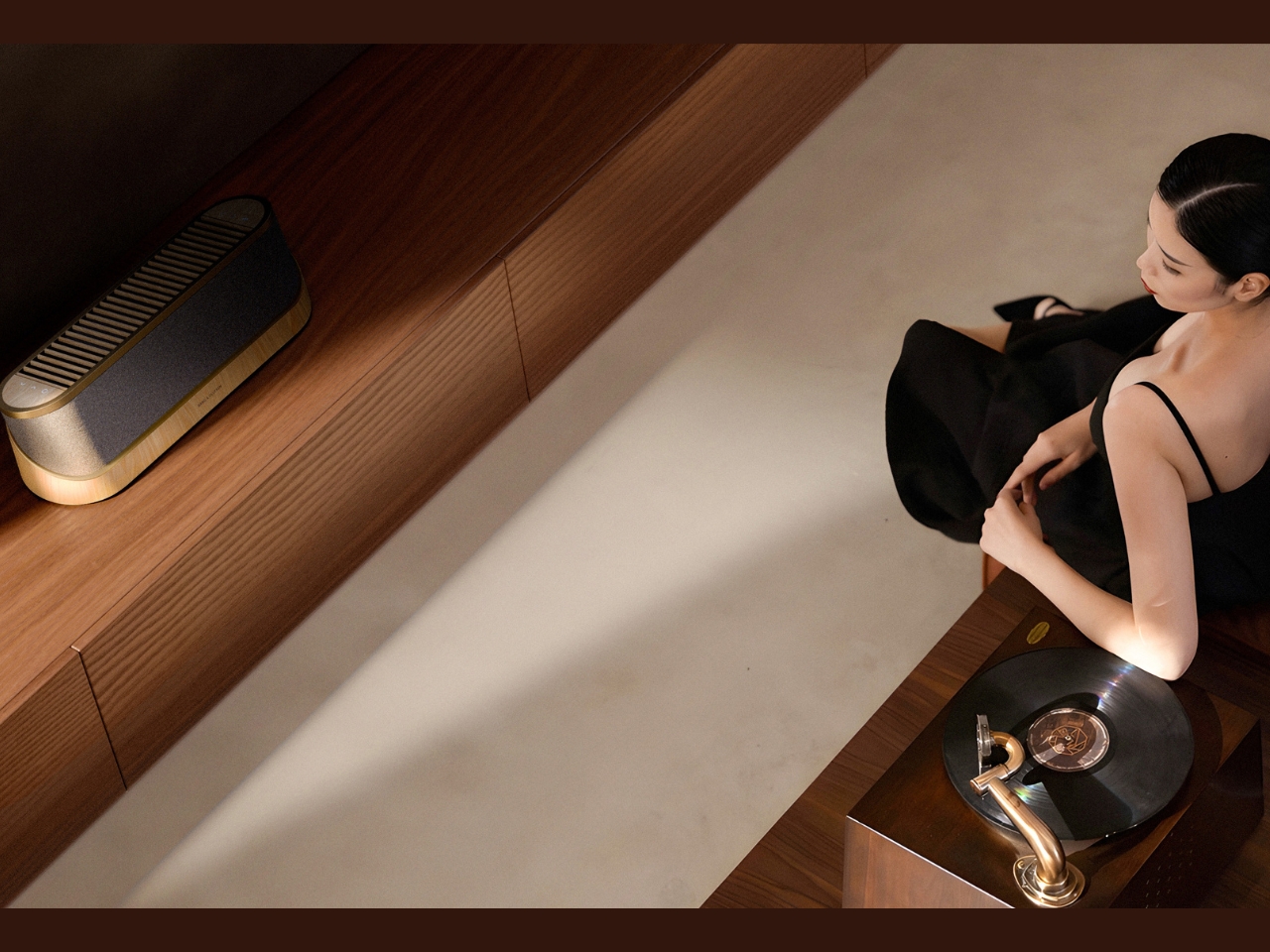
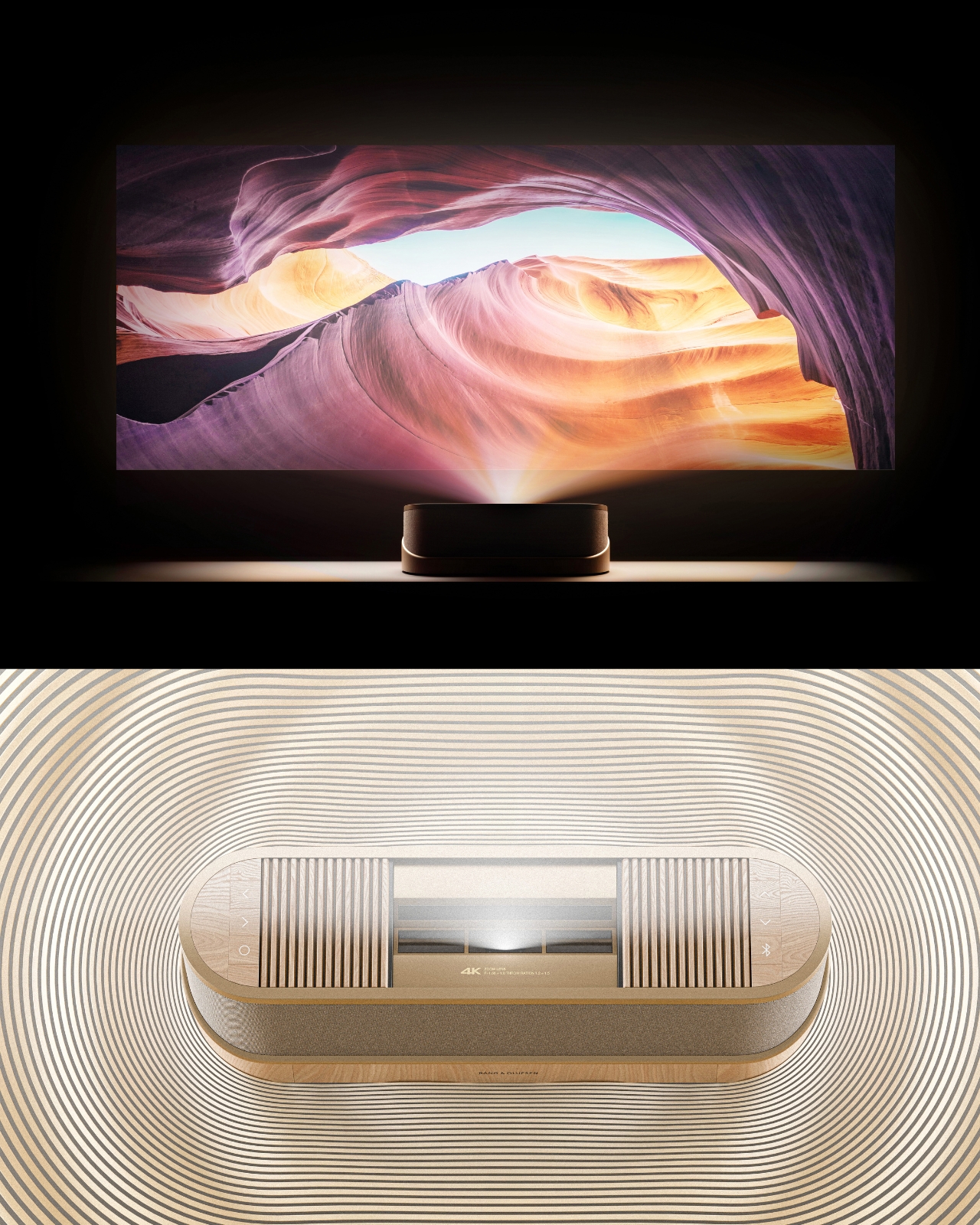
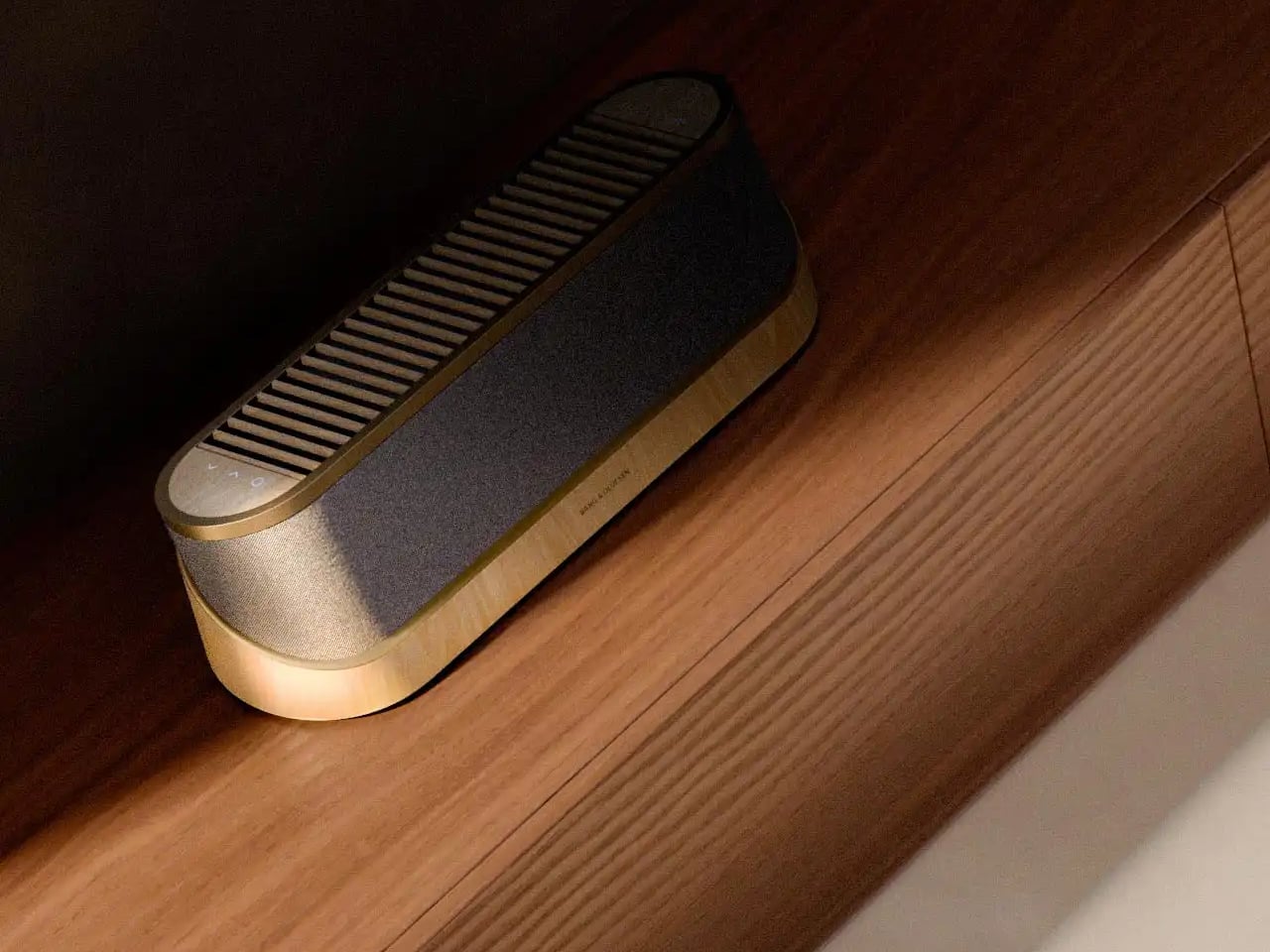
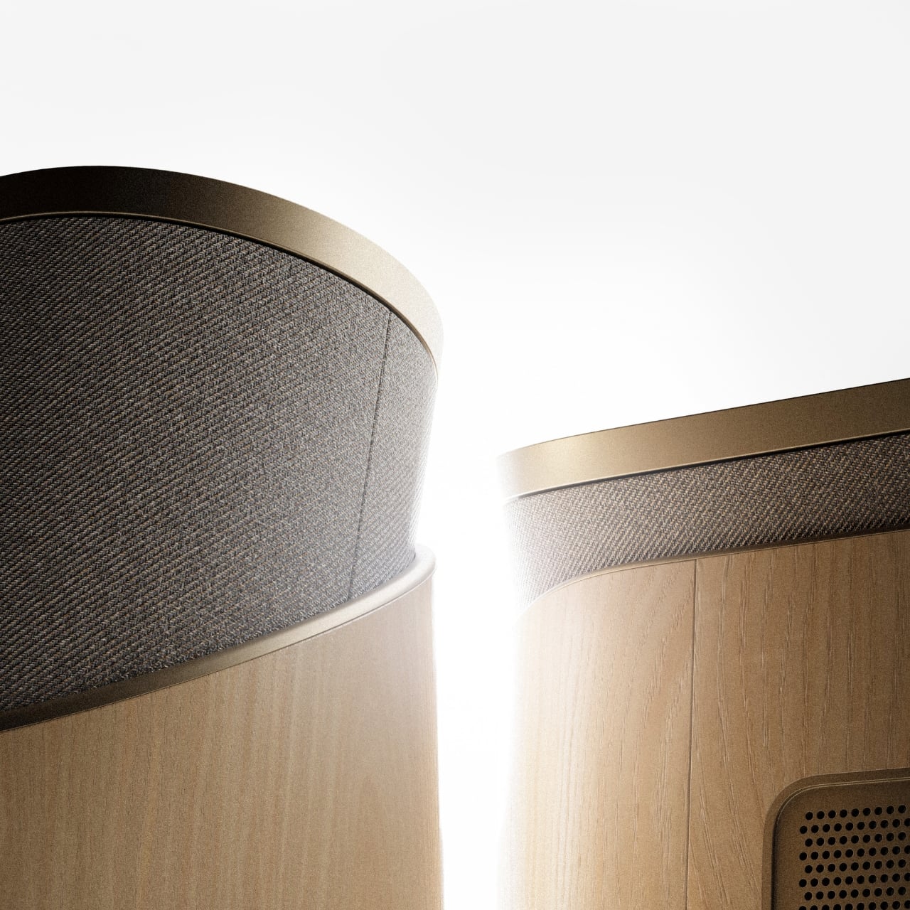
The design comes in two distinct configurations. The first is a horizontal, low-profile unit that sits flat on a surface like a refined soundbar crossed with a Scandinavian jewelry box. The second is a taller, cylindrical form that reads more like a speaker column or a sculptural object you’d place on the floor. Both share the same material vocabulary: light ash wood, brushed gold-toned aluminum, and tightly woven acoustic fabric in warm grey. It’s the kind of material combination that makes you think of an architect’s weekend house rather than a tech showroom.

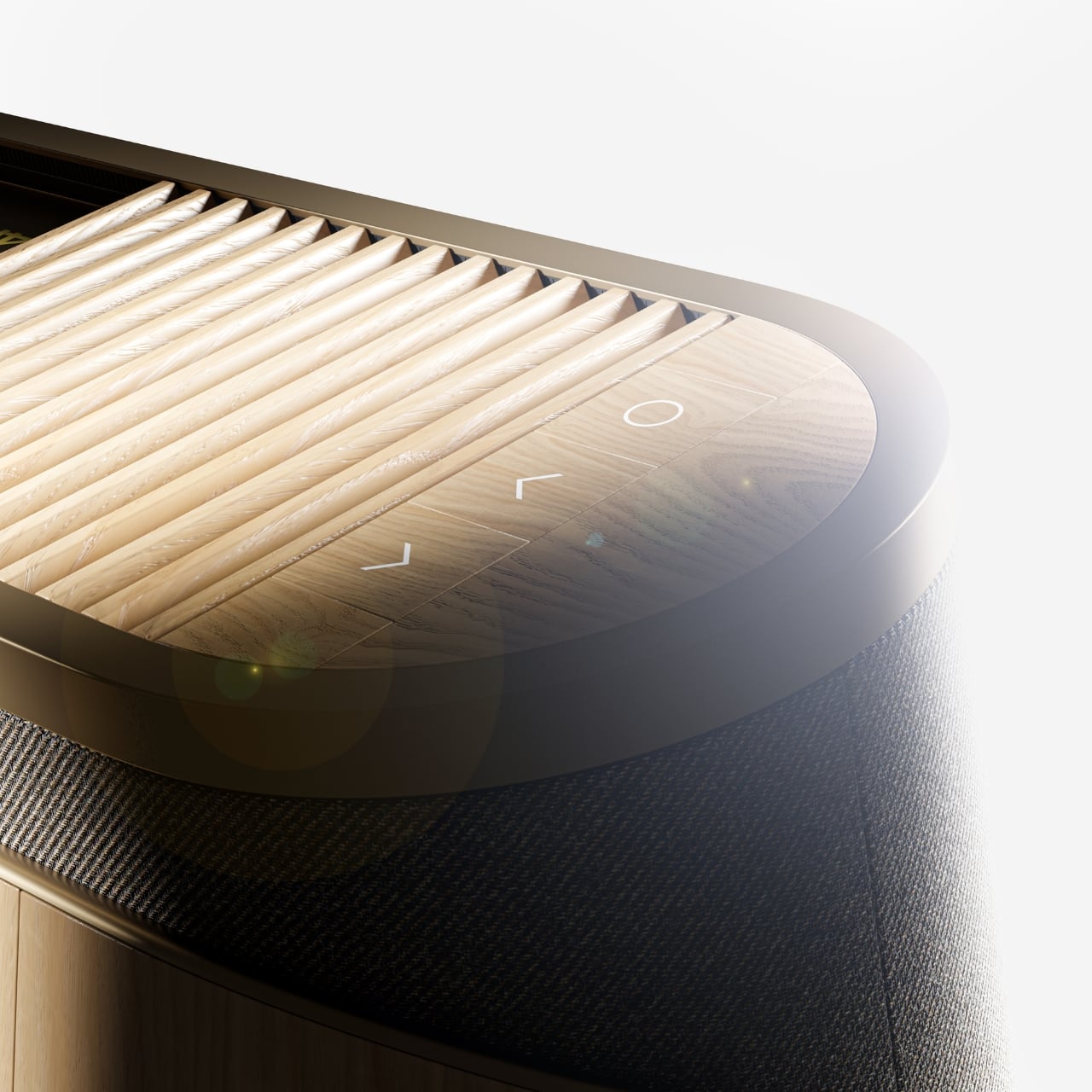
The horizontal unit is particularly interesting because of how it conceals the projector itself. A wooden slat panel sits on top, almost like a miniature version of those slatted screens you see in high-end Japanese interiors, and the lens assembly slides out from beneath it. The 4K projection capability is written right into the design, quietly labeled without fanfare. There are no aggressive vents, no branding that screams for attention, no black plastic anywhere. It’s restrained in a way that feels almost provocative in a market where most projectors try hard to look “cinematic” and end up looking aggressive instead.

The controls are worth noting too. Rather than a touchscreen or a button cluster, Baumeister places minimal icon-etched controls directly into the wood panel. A Bluetooth symbol, a pair of directional arrows, a power circle. They’re barely visible until you know to look for them, which feels very much in keeping with how B&O has always approached interaction design, treating it as something that should feel intuitive and slightly magical rather than mechanical.

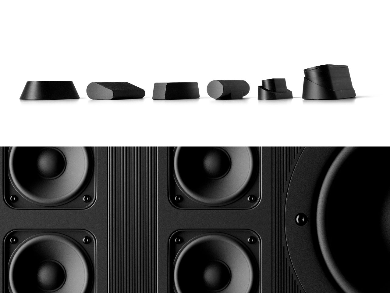
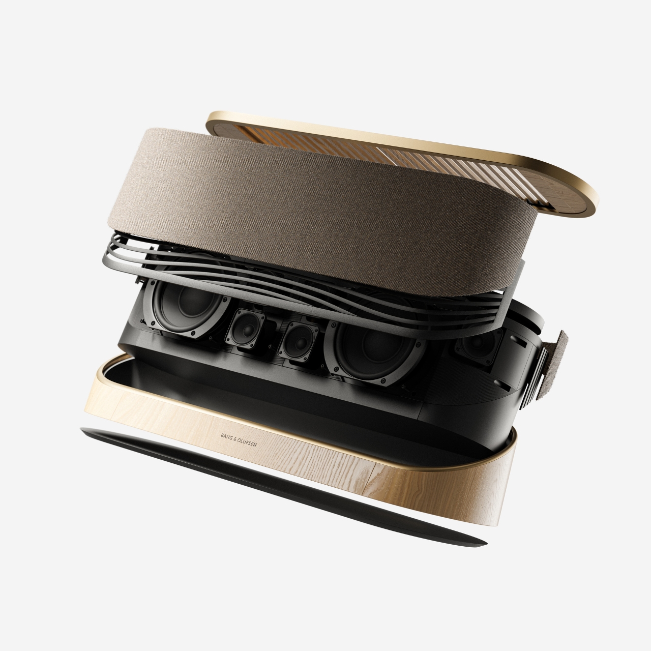
Looking at the exploded view of the horizontal model, you can see just how much thought went into the layering of components. The speaker array sits sandwiched between the wood base and the metal-framed top, with the projector mechanism occupying the central cavity. It’s genuinely elegant engineering, even if this is still a concept. Baumeister also developed a series of small-scale physical prototypes exploring the form from different angles, which you can see in a lineup of matte black study models. That process matters. It tells you this isn’t just a pretty render; it’s a design that was worked through with real hands.

Here’s my honest opinion: the TV industry has been coasting on size for years. Bigger screens, thinner bezels, more pixels. But the BeoLens Horizon asks a more interesting question. What if the device itself was worth looking at even when it was off? What if the experience of owning the hardware was part of the experience of using it? These aren’t new ideas in the B&O world, but a projector built around this philosophy feels like a genuinely fresh proposition, especially as ultra-short-throw technology continues to improve.

Baumeister is a young designer out of Strate, a design school in Lyon, and BeoLens Horizon joins a portfolio that already shows a real feel for the intersection of material craft and technology. Whether Bang & Olufsen ever picks this up or not, the concept makes a compelling case that the future of home cinema doesn’t have to look like a gadget. It can look like something you actually want to live with.

The post The Projector Concept That’s Almost Too Beautiful to Use first appeared on Yanko Design.
  •  
❌