Vue lecture

Dórica Just Proved Good Design Belongs on Your Kitchen Counter

Most of us have at least one object in our home we’ve never actually looked at. The napkin holder. The fruit basket. The candle holder that’s been sitting on the same shelf for three years. We use these things daily, sometimes multiple times, and yet they exist in this strange invisible space between functional and forgotten. That’s exactly the space that Sebastián Ángeles decided to design for.

Ángeles is the founder and creative director of Dórica, a Mexico City-based contemporary furniture brand that has spent years building a quiet but increasingly well-regarded reputation for pieces that prioritize longevity over trend. Their chairs, benches, and credenzas have found their way into residential, commercial, and hospitality spaces, and the brand has been recognized as one of the most relevant contemporary furniture names coming out of Mexico. But with Prea, released in February 2026 and recently featured by Wallpaper, Ángeles shifted his focus somewhere more intimate: the objects you reach for without thinking.

Designer: Sebastián Ángeles for Dórica

Prea is labeled “Chapter II” in Dórica’s story, and the brand describes it as their first collection of everyday objects. It’s a small but considered group of pieces, including an egg basket, a fruit basket, a candelabra, and a napkin holder, each designed and produced in Mexico with a clear emphasis on wood and ceramic, clean lines, and what the brand calls “material honesty.” The pieces are not elaborate. They don’t announce themselves when you walk into a room. And that restraint is, I think, the entire point.
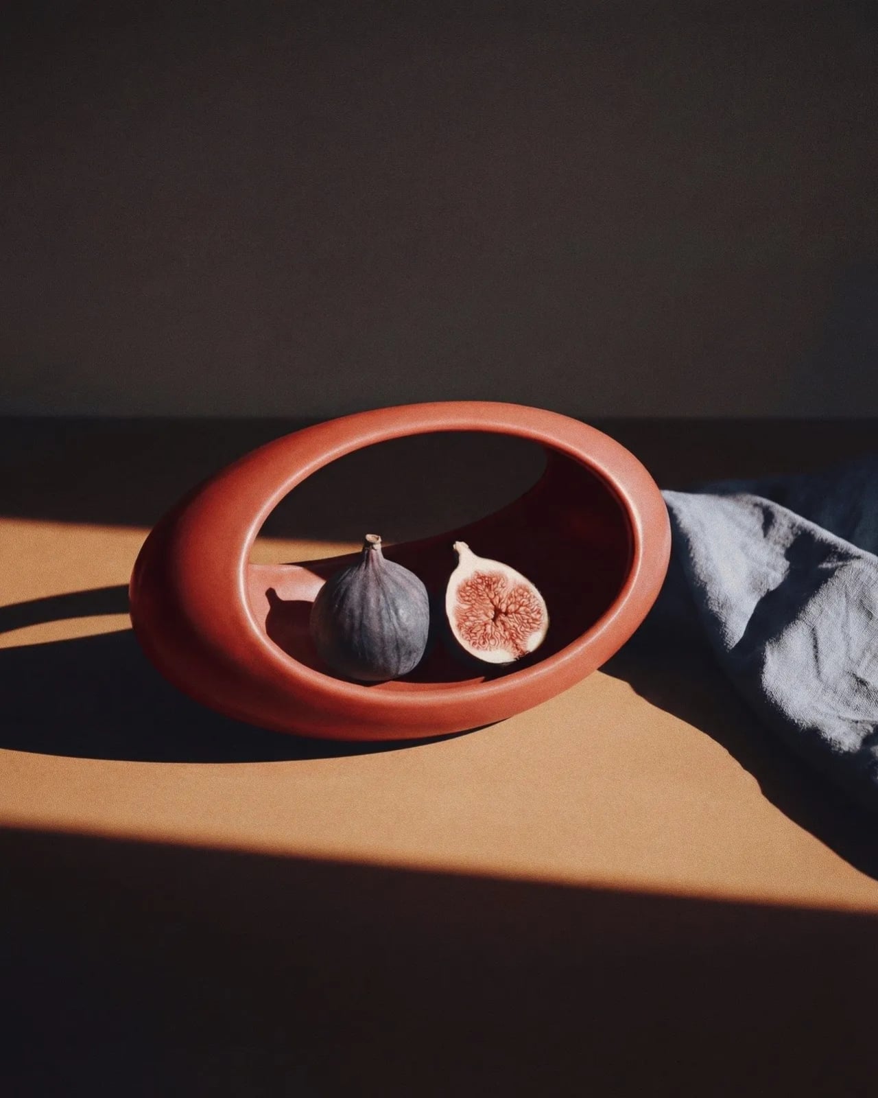
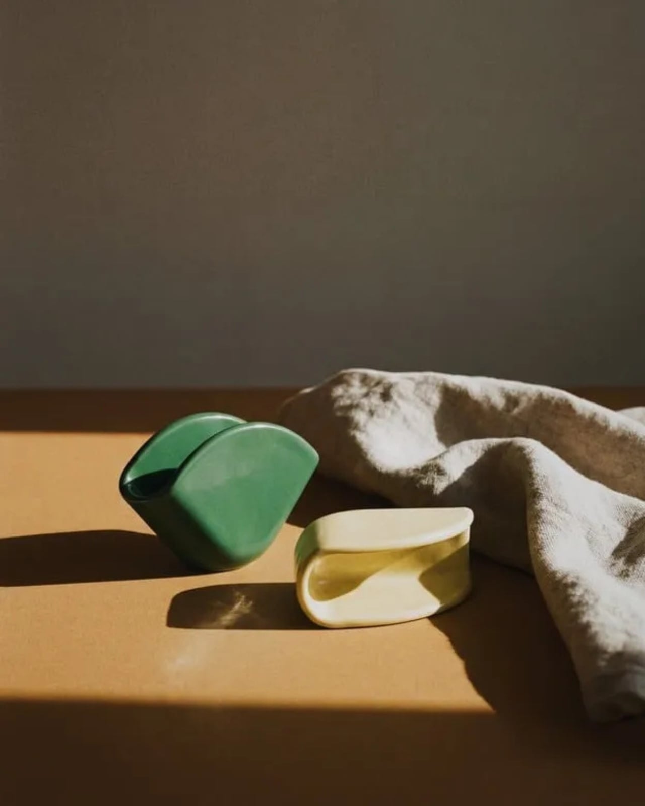
Wallpaper described Prea as “a study in restraint,” and that feels right. But I’d push it further. Prea is actually a philosophical statement wrapped in a very practical object. The brand’s own language around the collection is striking: “Design here does not decorate. It holds. It supports. It allows the ordinary to be seen.” That’s not the kind of copy you expect from a brand selling a napkin holder. It’s the kind of thought that makes you pause.
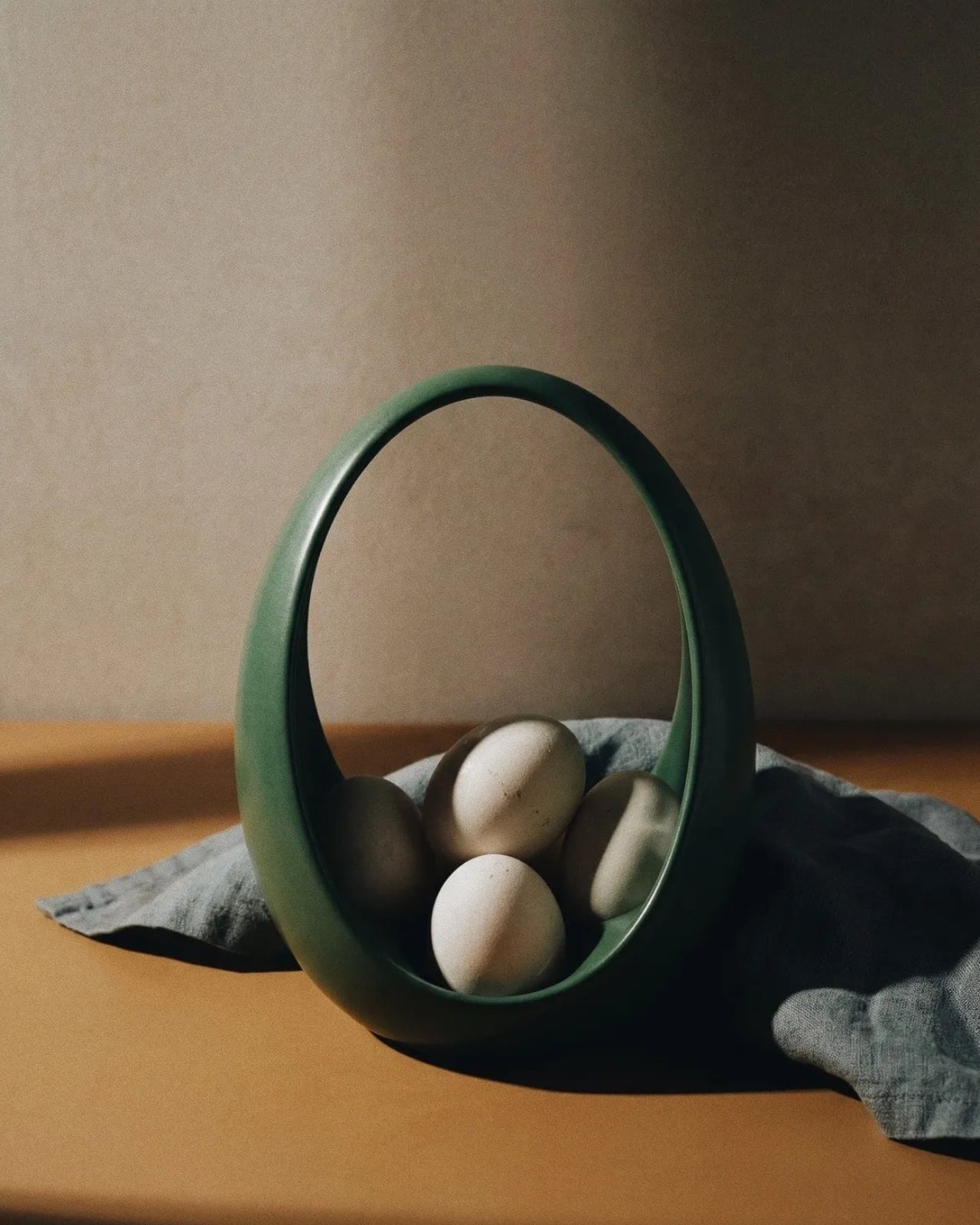
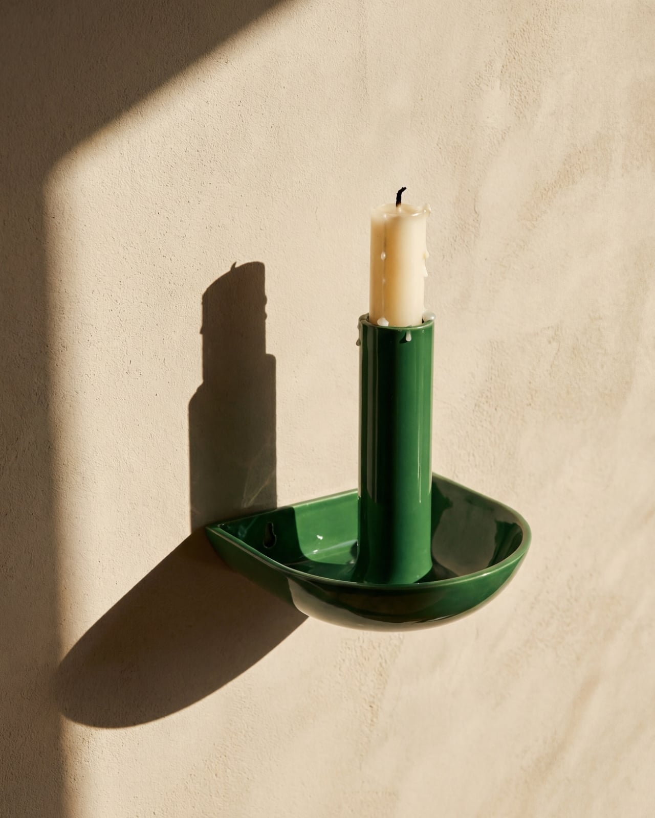
We talk constantly in design circles about the gap between high design and everyday life, between the gallery object and the kitchen counter. Dórica seems genuinely uninterested in that gap existing at all. The premise of Prea is that the objects living alongside our daily rituals, the things we touch without registering that we’re touching them, deserve the same level of intentionality that goes into a statement chair or a sculptural lamp. Not to make them more important than they are, but to acknowledge that they already are important. We just stopped noticing.
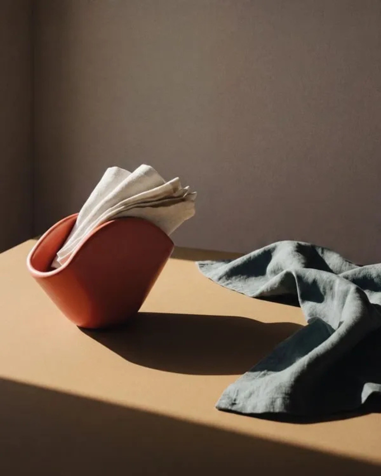
There’s a Mexican design perspective embedded in this that feels worth acknowledging. The brand has always positioned itself around craftsmanship and longevity rather than novelty, and Prea continues that ethos into a new category. It’s a move that says something about how Ángeles sees the role of design in everyday life: not as a luxury layer applied to living, but as something woven into the texture of it.
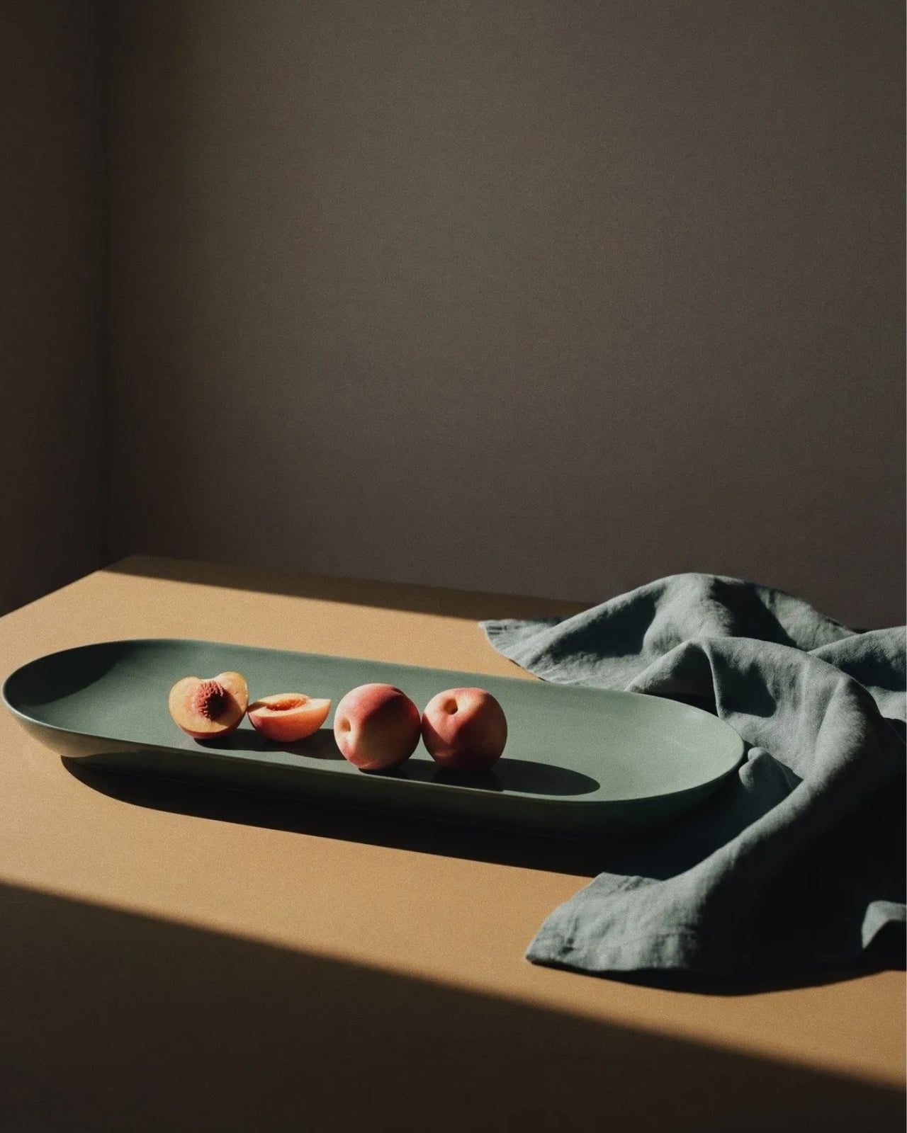
I’ll be honest, when I first looked at the collection, my instinct was that it seemed minimal to the point of simplicity. A fruit basket is a fruit basket. But the more I sat with the images and the thinking behind the work, the more that restraint started to feel like confidence. These pieces don’t need to perform. They just need to be present, well-made, and honest. In a market saturated with objects begging for your attention, that’s a harder thing to pull off than it looks.
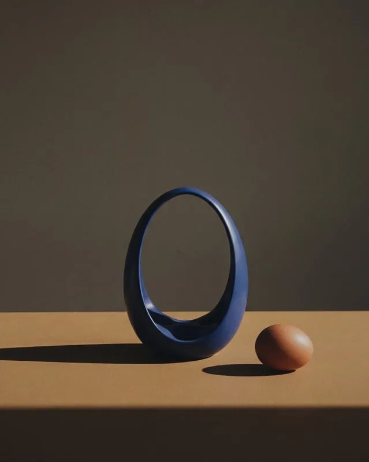
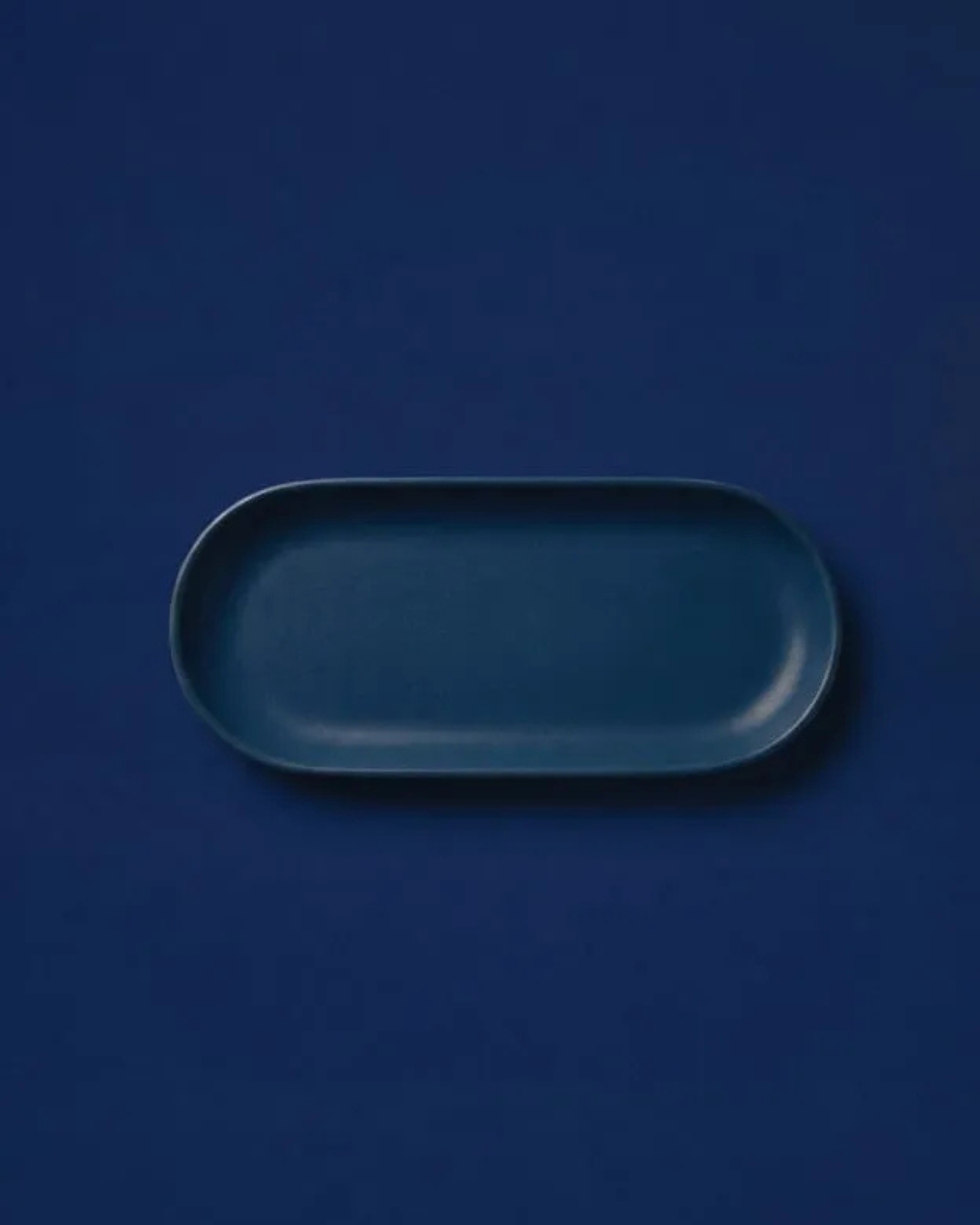
Prea is also a smart move for Dórica as a brand. Entering the everyday objects category at this level of intention signals a maturity that not every furniture brand is willing to commit to. It’s easier to scale up into bigger, more visible pieces. Scaling down into the egg basket, and making it mean something, takes a different kind of confidence. If you’re the kind of person who has ever picked up a beautifully made object and held it for just a second longer than you needed to, this collection is worth seeking out.

The post Dórica Just Proved Good Design Belongs on Your Kitchen Counter first appeared on Yanko Design.
  •  

The ZERO Chair Has No Welds, No Joints, No Apologies

Most chairs are built on compromise. You stack the legs, screw the seat, bolt the back, and somewhere in that assembly, a little bit of the original idea gets lost to the necessity of structure. Davide Bozzo’s ZERO Chair refuses to play that game entirely.

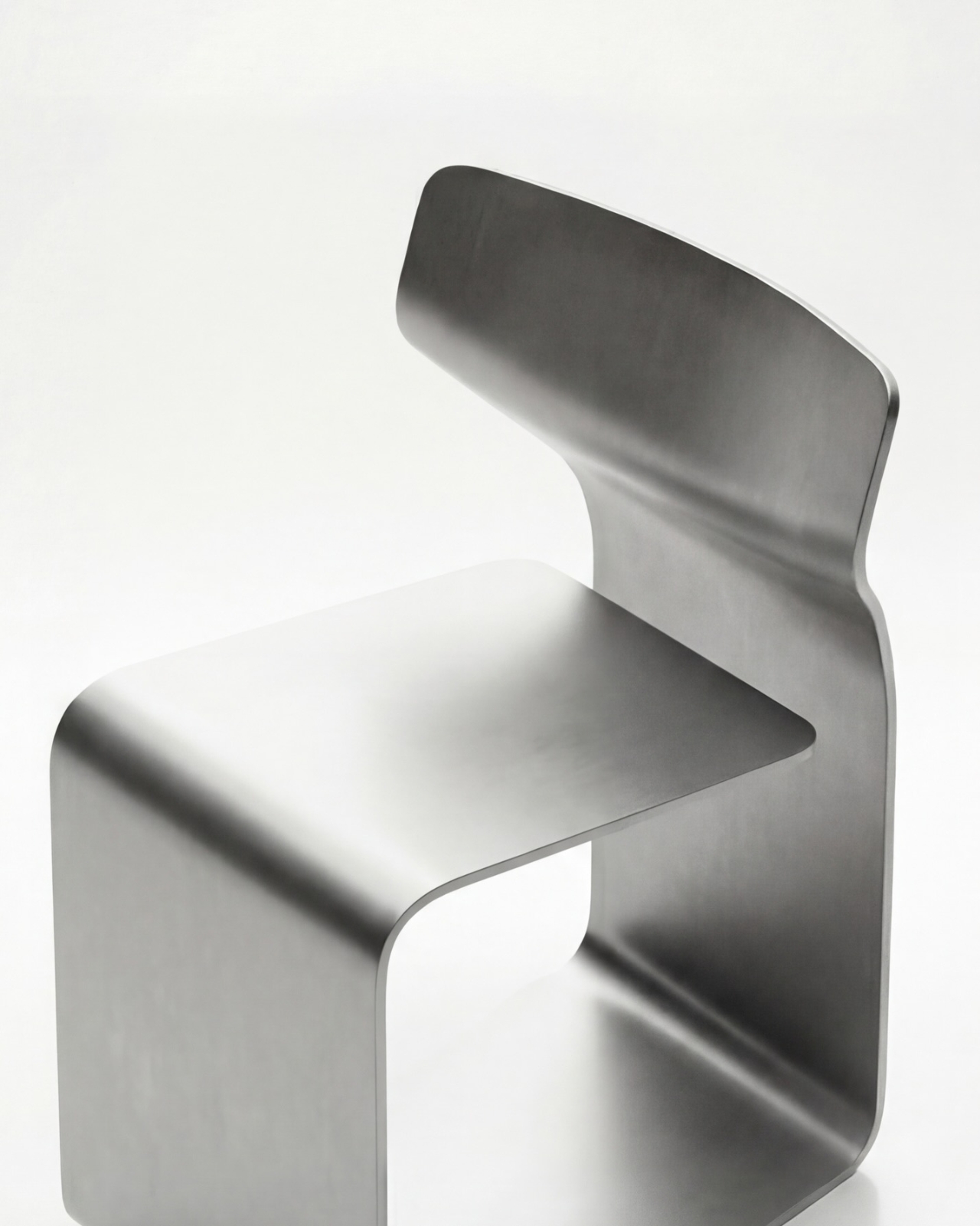
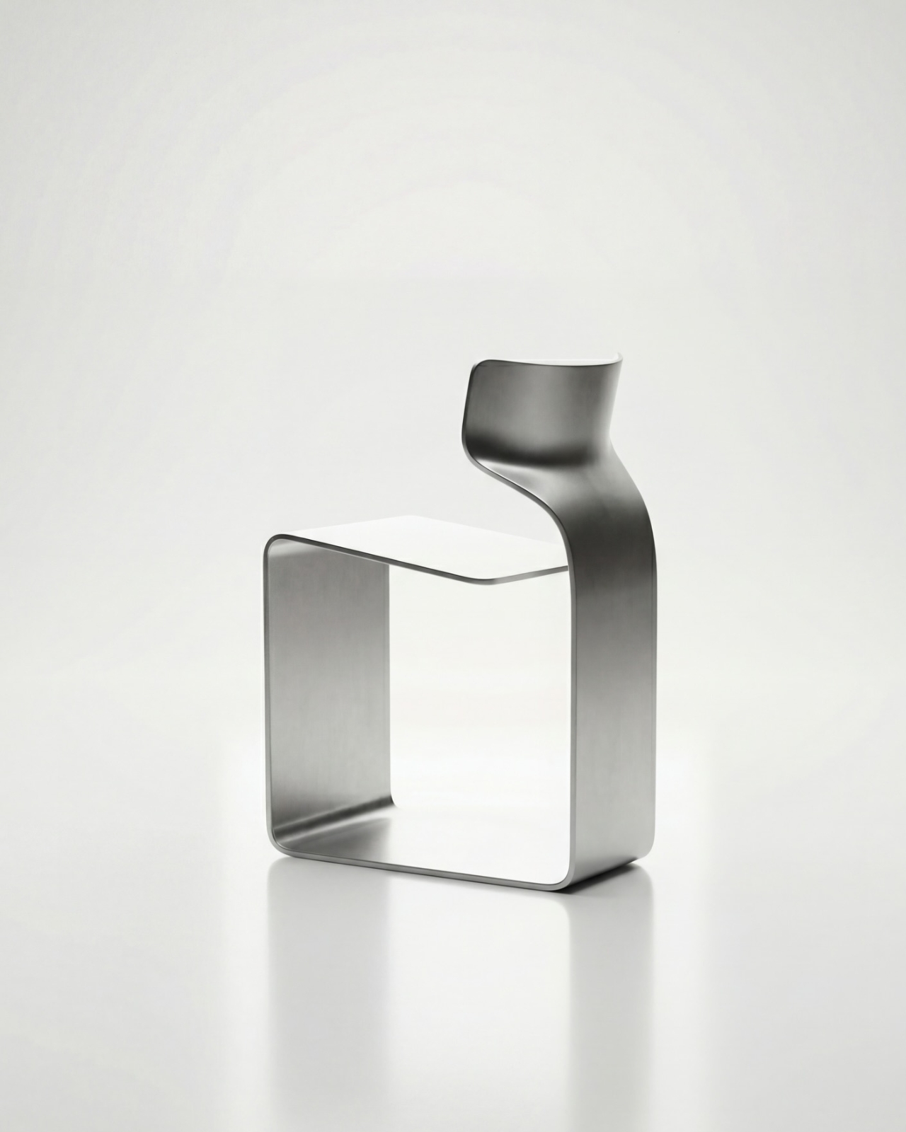
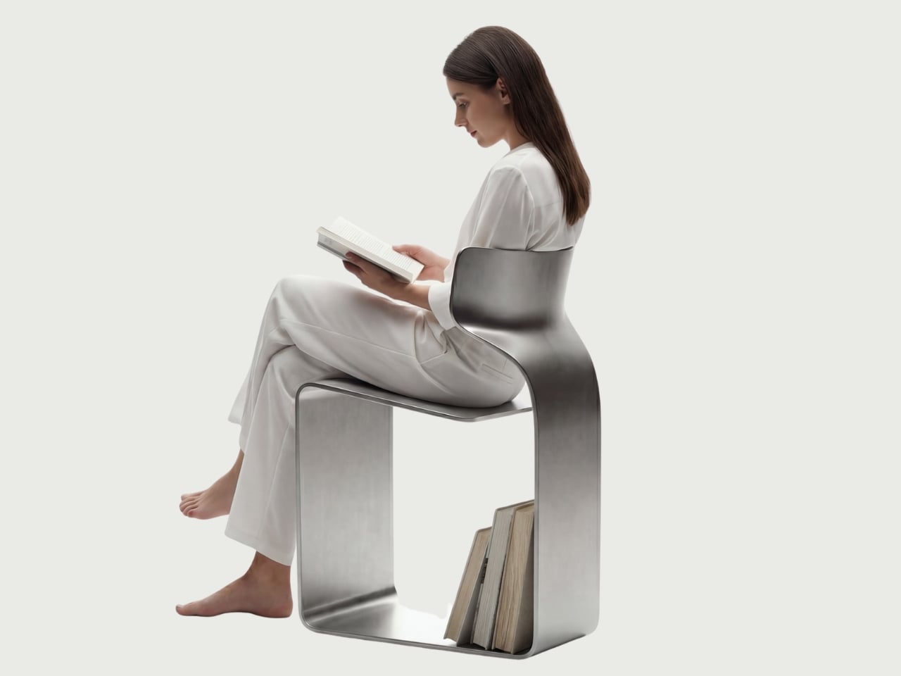
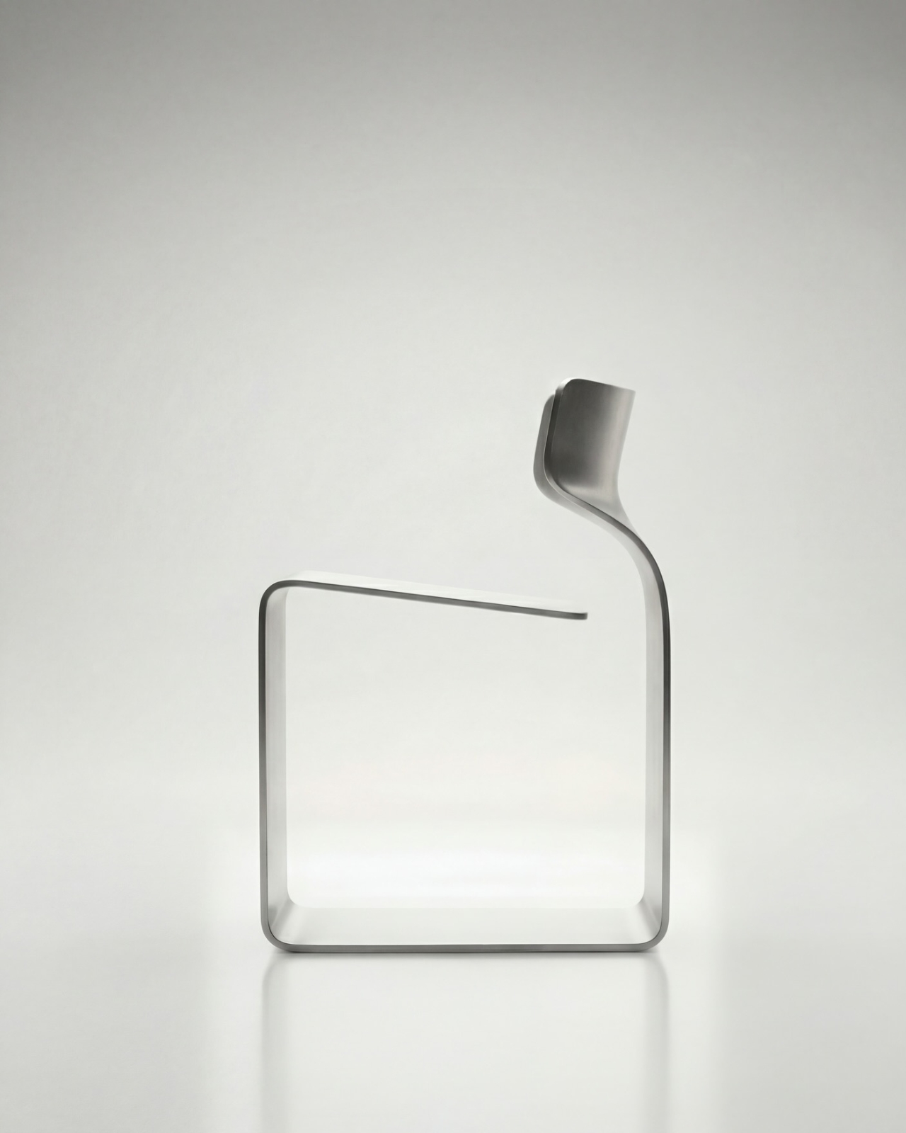
The concept is almost confrontationally simple: one single ribbon of metal, bent and curved into a complete chair. No welds holding two pieces together. No joints disguised under upholstery. No hardware quietly doing the heavy lifting behind the scenes. Just one continuous piece of material pushed into a form that includes the base, the cantilevered seat, and the backrest all at once. The name isn’t branding. It’s a philosophy.

Designer: Davide Bozzo

Looking at the photographs, the first thing I kept circling back to was the sheer audacity of the backrest. It doesn’t connect to the base through hidden brackets or clever joinery. It simply rises from the same ribbon, curving upward and backward in a motion that looks more like a wave caught mid-break than anything you’d typically call furniture. It’s graceful in a way that makes you slightly suspicious of it. How is this thing holding anyone’s weight?

The answer lies in what Bozzo describes as structural tension. Form doesn’t just follow function here. It is the function. The material itself carries the engineering logic. Every curve has a reason, and every bend is calculated to distribute load through the continuity of the form rather than through added components. It’s the same principle behind suspension bridge cables or the way a curved shell is structurally stronger than a flat panel. Applied to a chair, it feels almost radical.

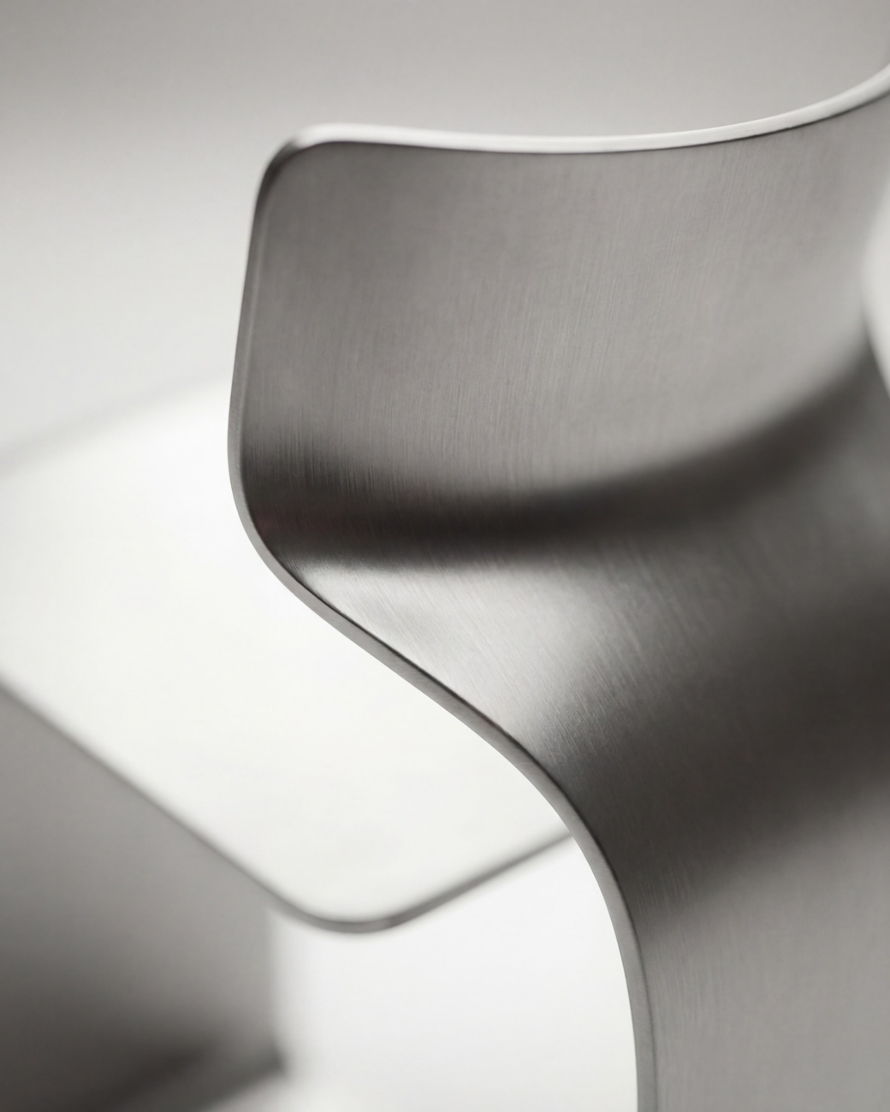
I’ll be honest. My first instinct was skepticism. A single-piece metal chair sounds like one of those design school exercises that makes for great renderings but falls apart under real scrutiny. But looking at the close-up photographs, especially the one capturing the S-curve where the seat meets the backrest, you start to believe it. The brushed metal finish shows actual material depth and actual intentionality in how the surface was treated. This isn’t a concept render floating in a void. It has weight and presence.

That said, I do have questions. Comfort is conspicuously absent from the conversation. Metal, even beautifully formed metal, is hard. The cantilevered seat gives some flexibility, which should help, but a chair without cushioning asks something significant of the person sitting in it. Bozzo’s design makes a statement about material honesty and structural purity, which I respect deeply, but at some point a chair has to be sat in. That’s the tension that makes it interesting rather than just pretty.

The piece also reads as a quiet counterargument to the current era of maximalist furniture. We’ve spent years surrounded by bouclé armchairs, curved velvet sofas, and furniture dressed up in layers of texture and warmth. Bozzo’s chair strips all of that away and asks whether furniture can earn your attention through restraint and engineering alone. My honest opinion? It can. Whether it earns a place in your living room is a different question entirely.

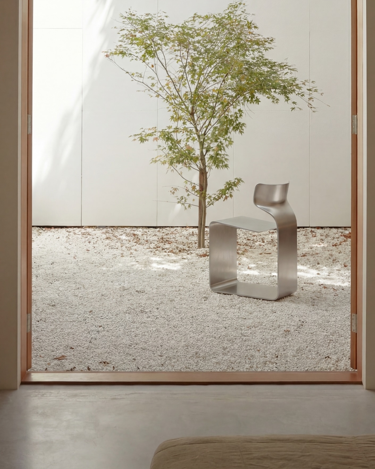
The chair also does something that doesn’t get discussed enough in design coverage: it makes the negative space part of the design. The open rectangle formed by the base creates a void that’s almost as deliberate as the metal itself. In the lifestyle image set against a Japanese garden backdrop, that void frames the gravel and ground beyond it. The chair becomes a viewfinder. That’s not accidental. That’s a designer who understands that what you leave out is just as powerful as what you put in.

Bozzo has been building a reputation for material-forward work. His stainless steel pet bowl Dune explored similar ideas around fluid curves in a single medium, but the ZERO Chair feels like a significant step up in ambition. It’s the kind of piece that stops you mid-scroll, makes you set your phone down, and actually think. That, more than any material specification, is probably the point.

The post The ZERO Chair Has No Welds, No Joints, No Apologies first appeared on Yanko Design.
  •  

Rimowa Just Made the Classiest Excuse to Never Unpack

Most people treat their Rimowa suitcase like a very expensive houseguest: it arrives looking spectacular, gets shoved in a closet, and stays there until the next trip. Rimowa, apparently, has thoughts about this. And so does Lehni.

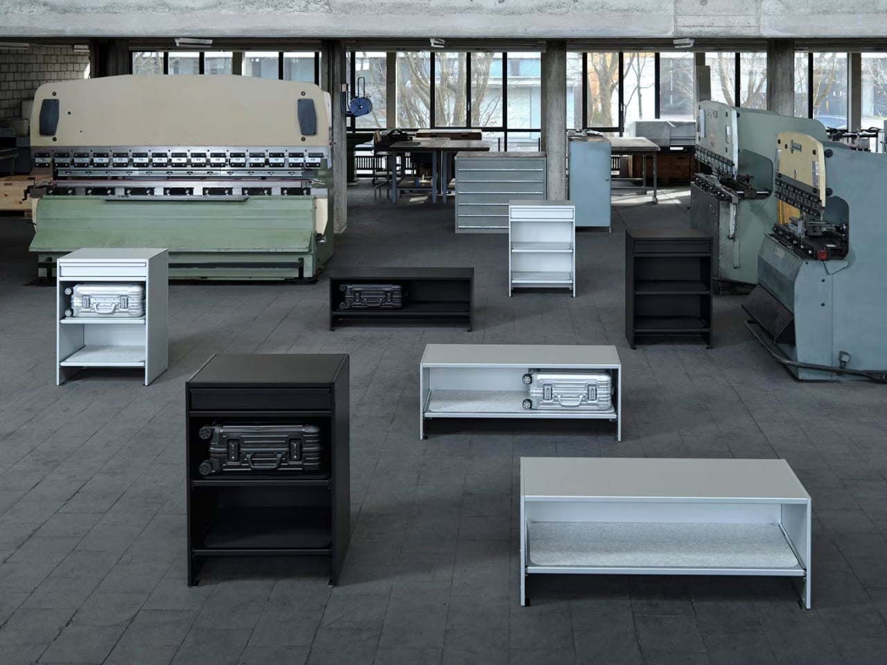
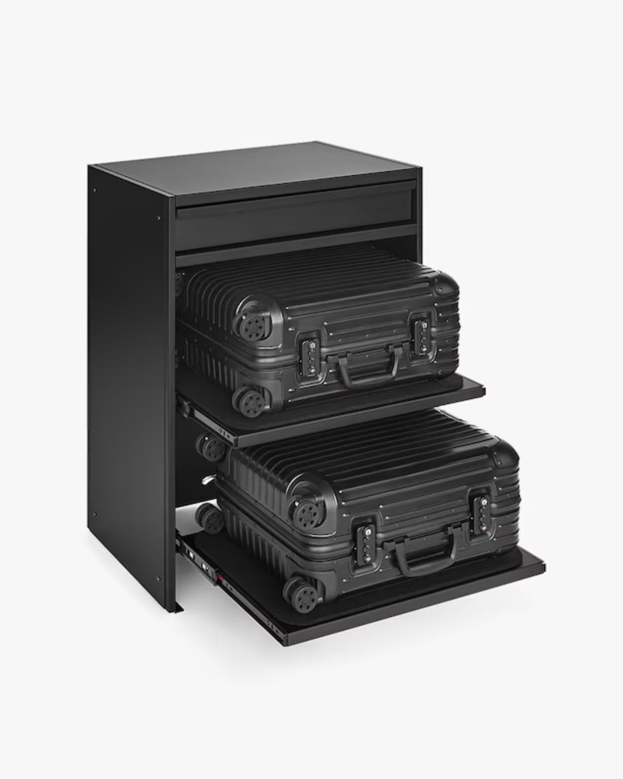
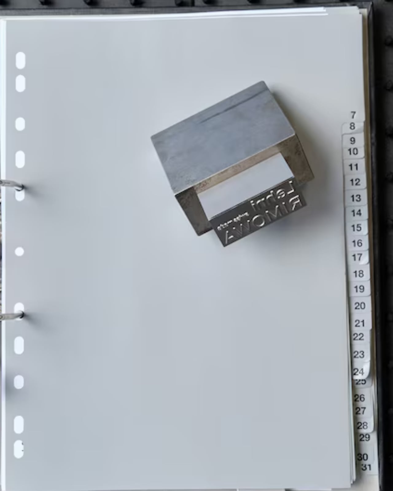
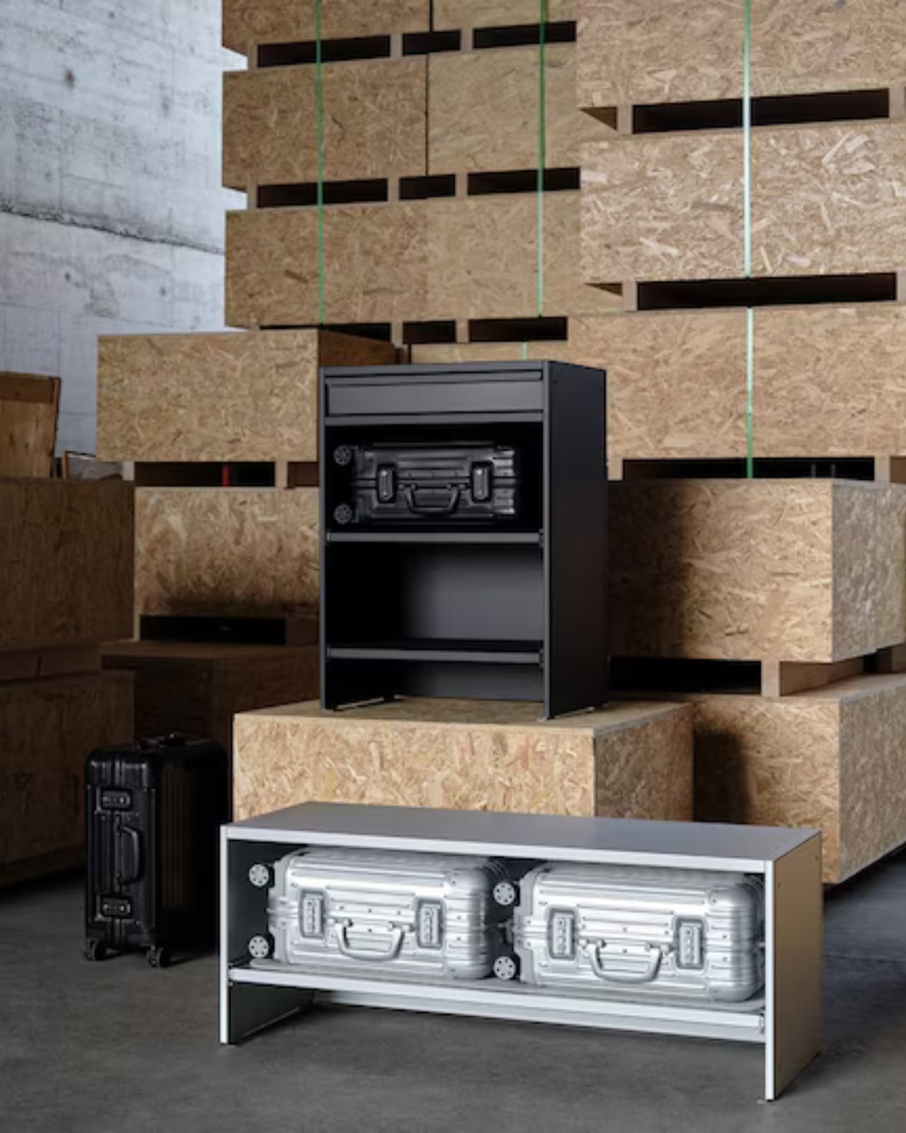
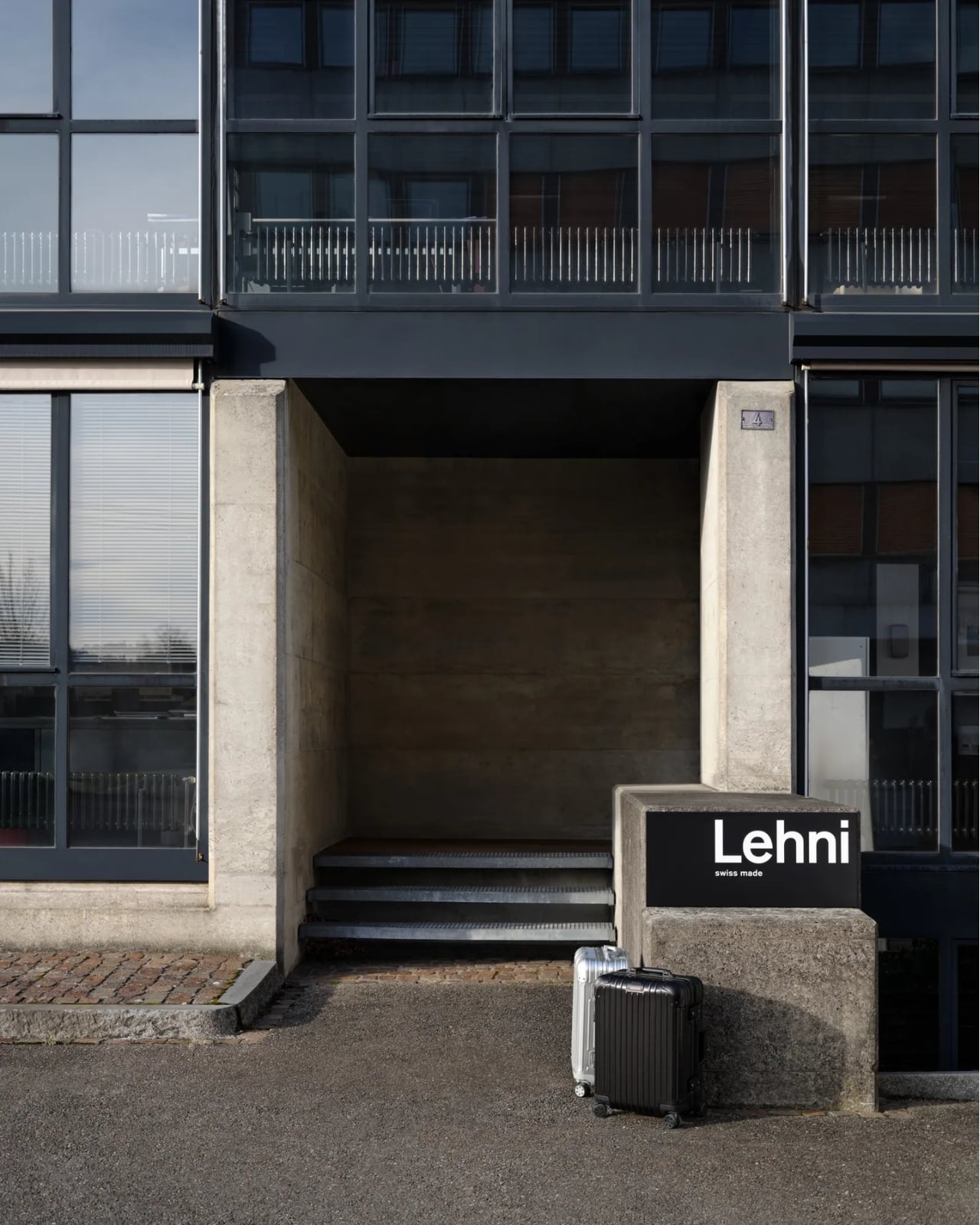
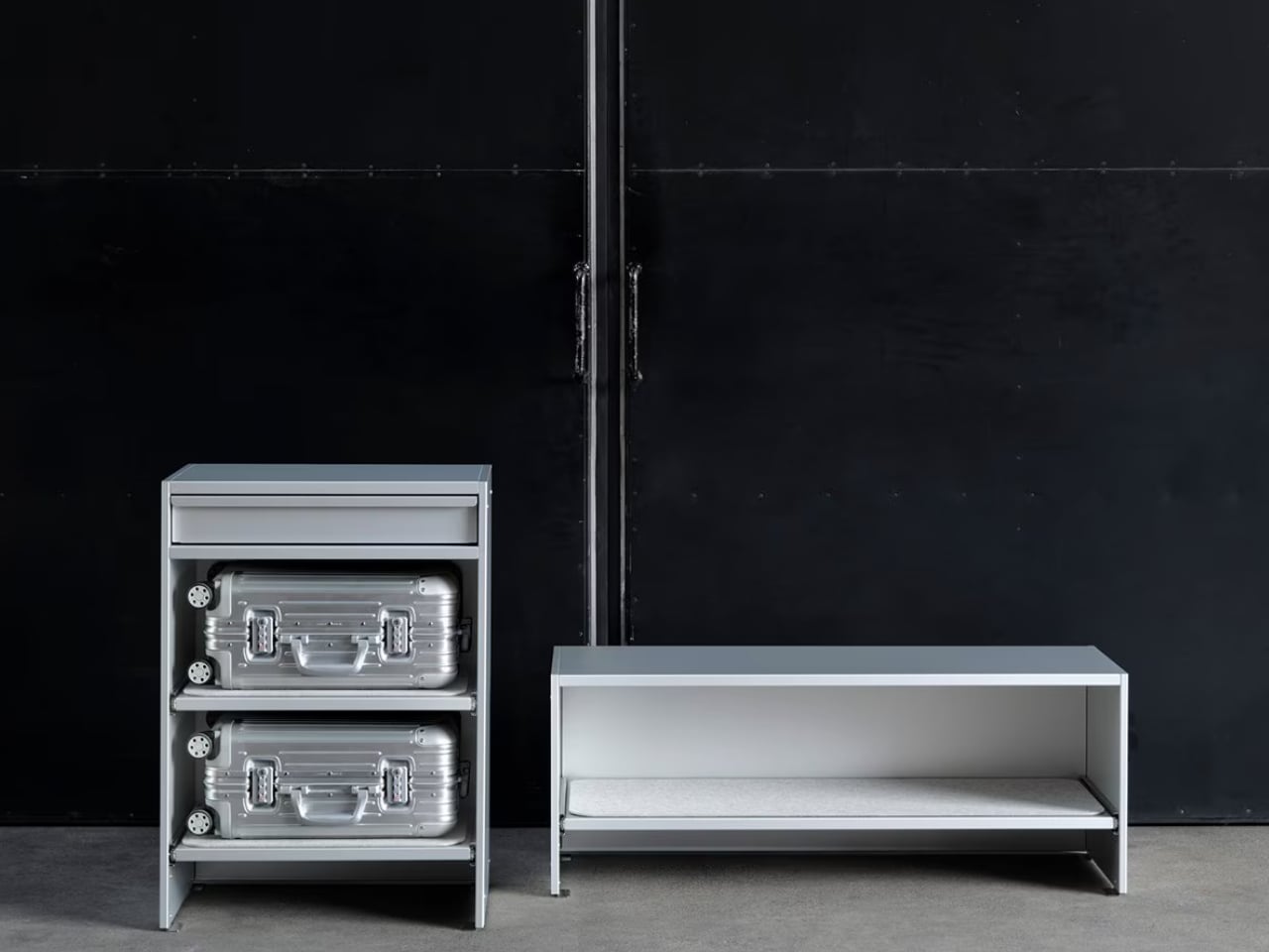
The two brands have just unveiled a limited-edition furniture collaboration at Salone del Mobile 2026 in Milan, and it might be the most quietly audacious thing either brand has done in recent memory. The collection consists of two pieces: a Bench and a Drawer, both crafted in anodized aluminum, both designed to hold cabin-sized Rimowa suitcases inside your home. Not in a storage room. Not under your bed. On display, like they were always meant to be there. Which, if you’ve ever owned a Rimowa, you’d know they kind of were.

Designers: Rimowa x Lehni

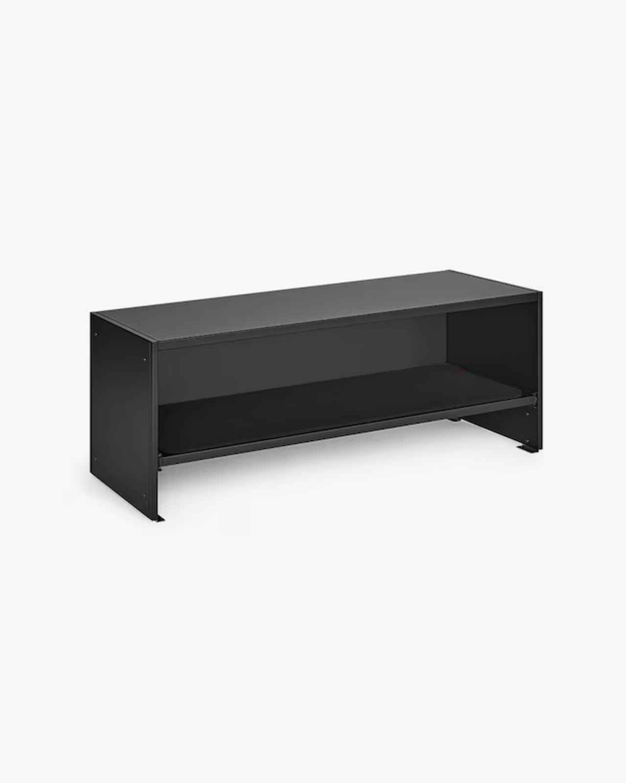
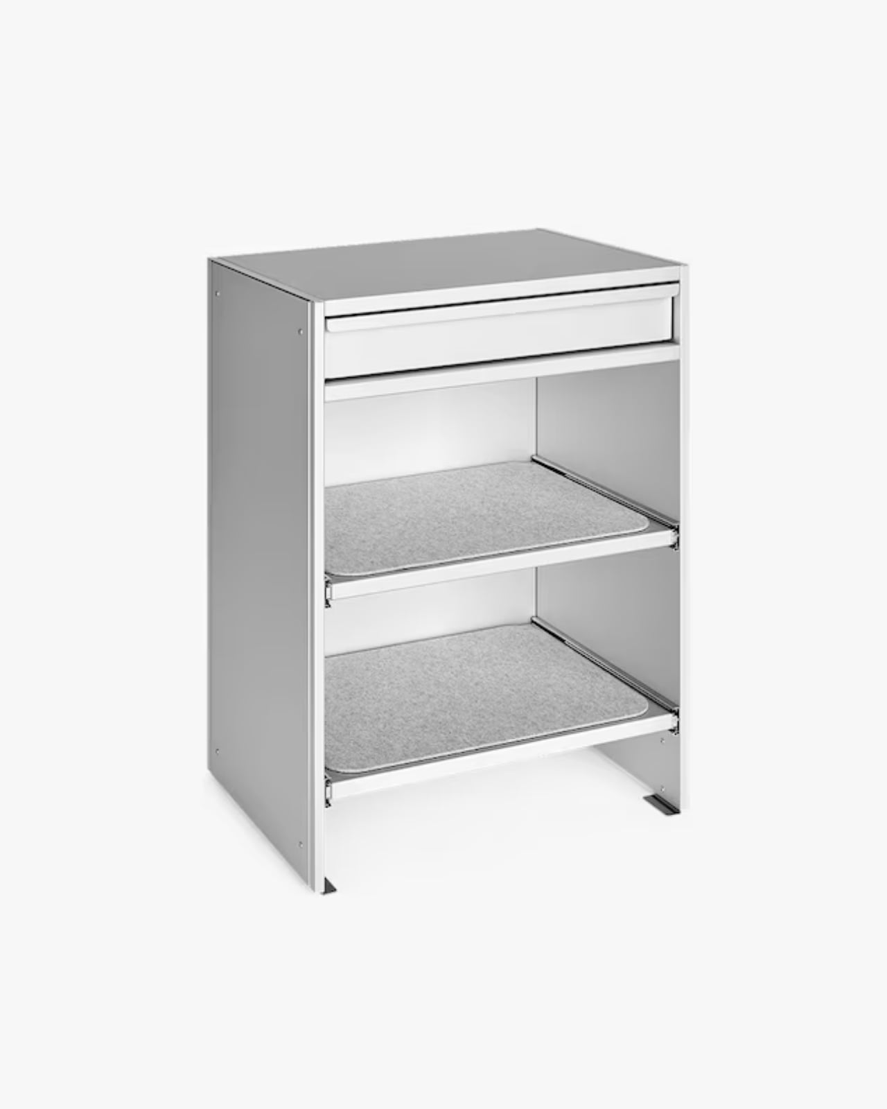
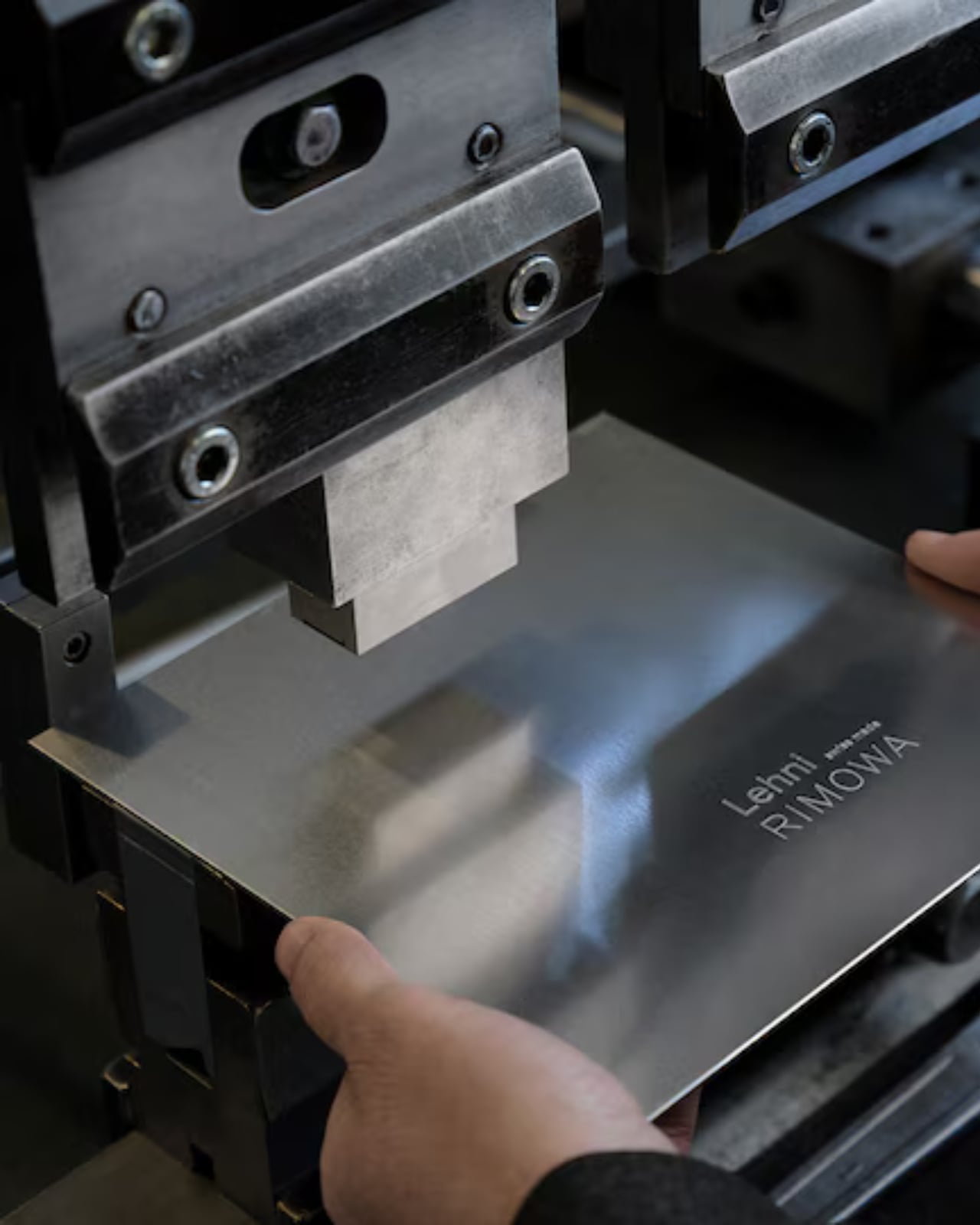
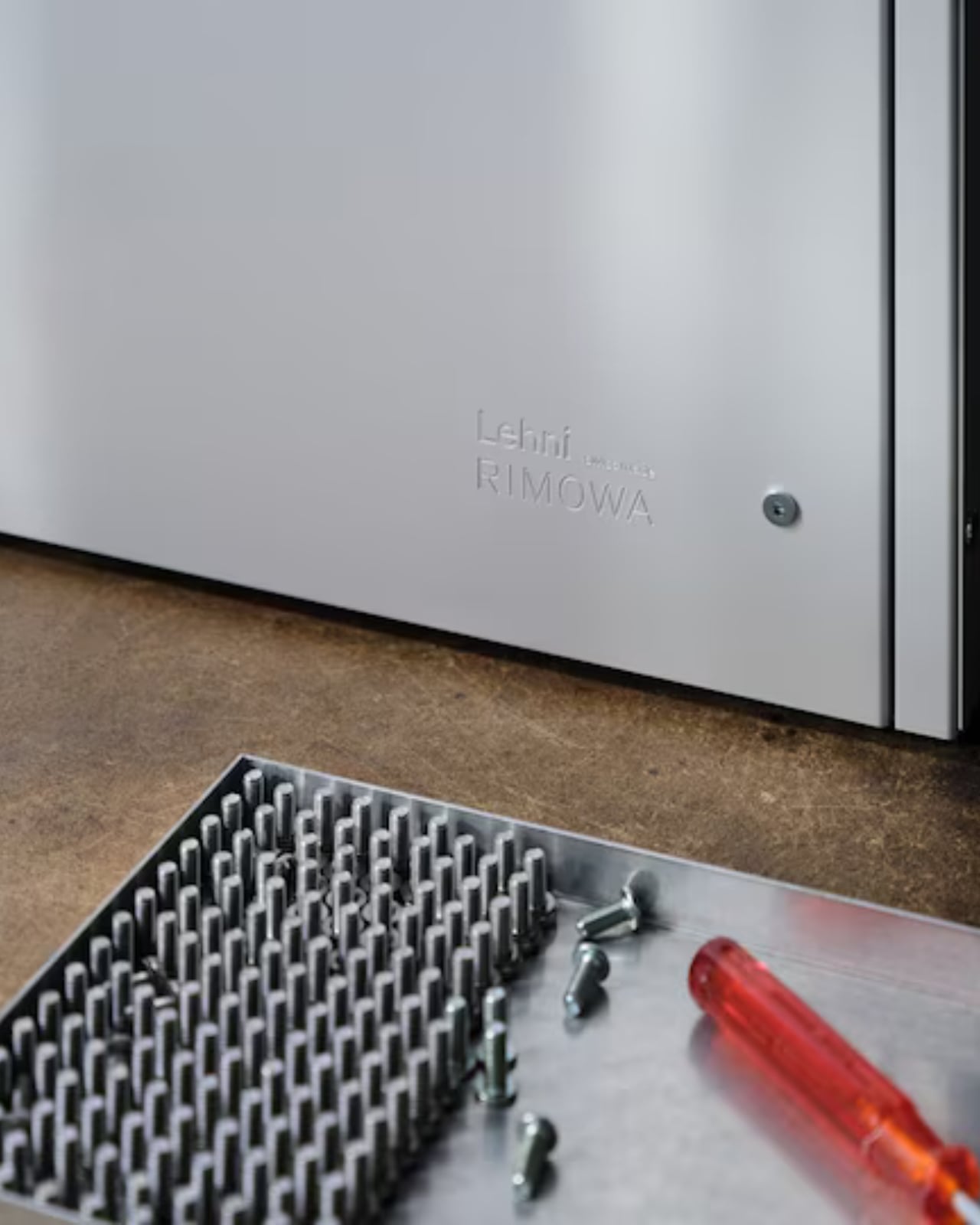
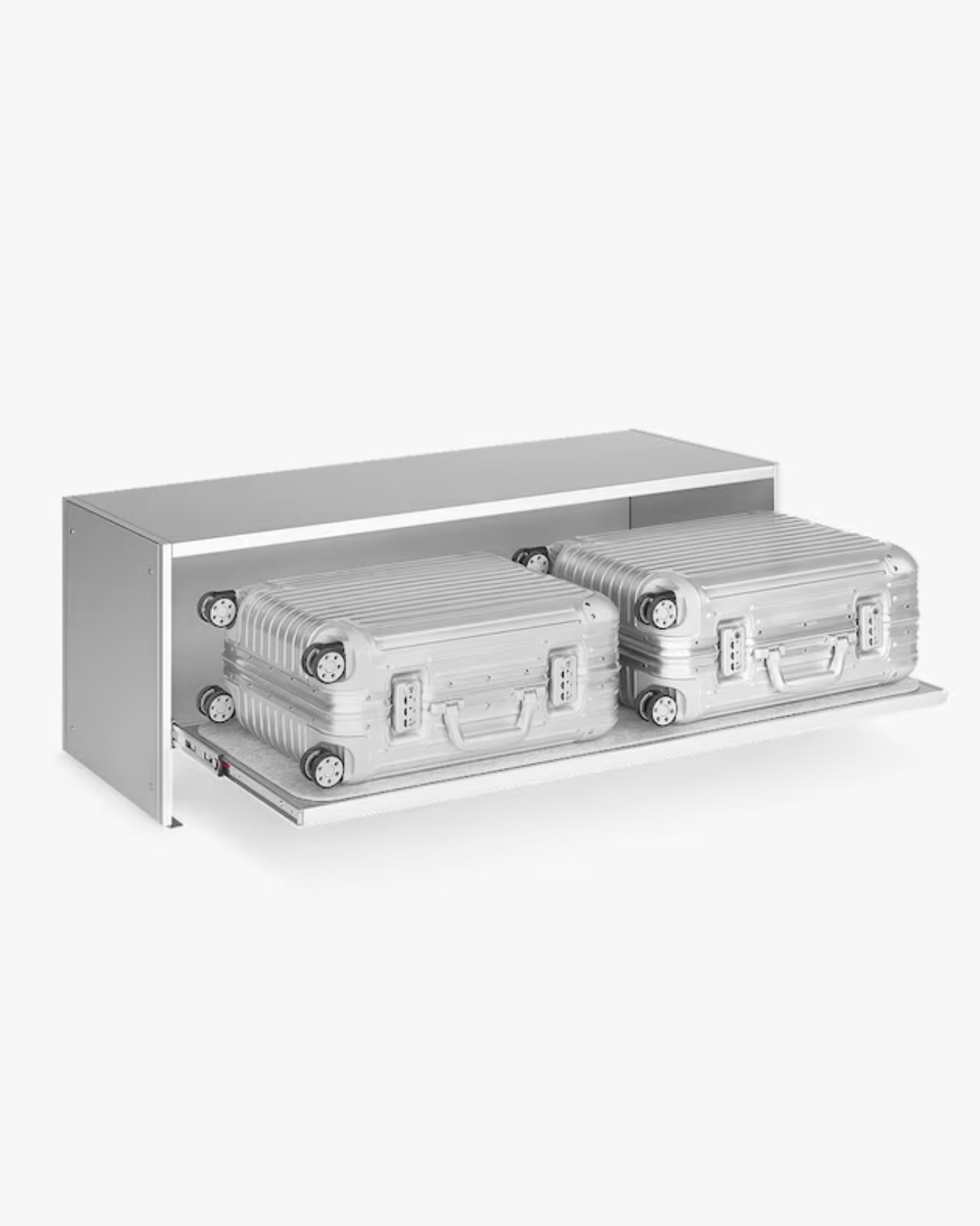
The Bench is an open-shelving unit that holds two cabin-sized suitcases side by side. It is clean, low-slung, and just architectural enough to look at home next to a mid-century credenza or a spare Scandinavian sofa. The Drawer offers a different kind of storage: a sculptural, closed-frame unit with a built-in drawer for smaller items. Both pieces come in silver and black anodized aluminum, and both carry the embossed Grid pattern that echoes the grooved exterior of a classic Rimowa Original. That detail is not accidental. It’s the kind of material continuity that makes a collection feel cohesive rather than like a brand licensing deal gone slightly off the rails.

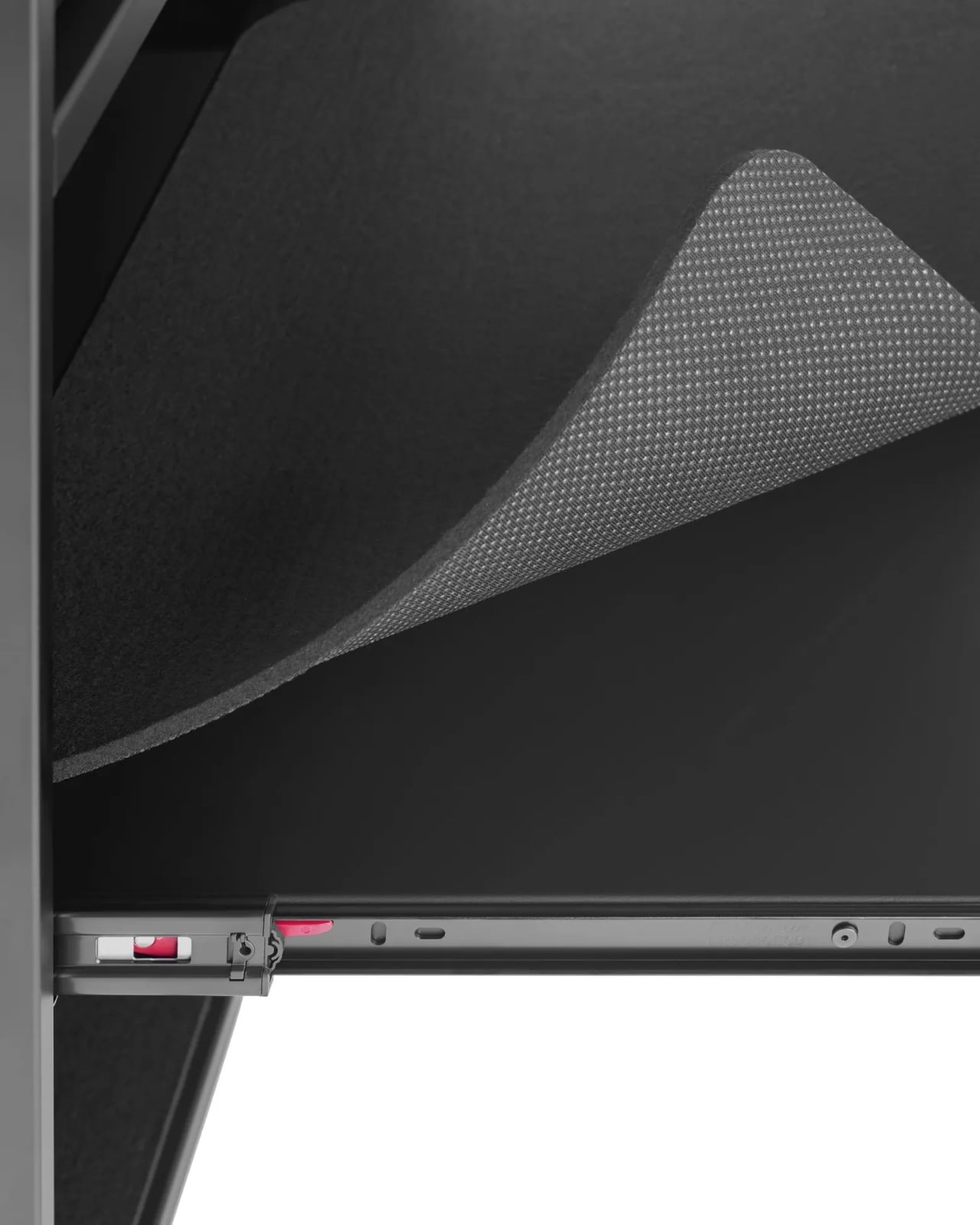
The craft side of this is worth paying attention to. Lehni has been working with aluminum since 1922, when Rudolf Lehni opened a sheet metal workshop in Zürich that quickly became a gathering place for artists and architects. That legacy still shows. Today, the company is run by the fourth generation of the Lehni family out of Dübendorf, and every piece is handmade in their Zurich factory. Each shelf on the Bench, for instance, is lined with a specially developed scratch-resistant felt mat to protect the cases stored on it. You notice that kind of thinking. These are small decisions that add up to something much larger than the sum of their parts.

Rimowa, for its part, has been on a quiet but consistent streak of repositioning itself as something more than a travel brand. The aluminum suitcase has already crossed over into fashion and streetwear culture through collaborations with names like Dior, Supreme, and Porsche. Moving into furniture feels like the next logical step, and frankly, it makes more sense than most luxury crossovers I’ve seen. The material language stays the same. The level of craft stays the same. The only thing that changes is the context, which is exactly what makes this feel like a genuine design idea rather than a marketing exercise.

That said, let’s be real: this is not furniture for everyone. The Bench is priced at $4,275, the collection is limited-edition, and in the US it’s only available in the continental states by contacting Rimowa’s client services directly. There’s no add-to-cart button. That purchasing friction is intentional, and it’s the kind of intentional that has a very specific audience in mind: the person who already owns the suitcase, already loves it, and wants their home to reflect the same aesthetic sensibility. I don’t think that’s a bad audience to build for. Niche, yes. But well-defined.

My honest take is that the Rimowa Lehni collection succeeds because it doesn’t try to explain itself too hard. It doesn’t need to. Two brands that both work in aluminum, both care about precision, and both have long histories with good design sat down and made something that looks exactly like what you’d expect from that pairing. The result is a bench and a drawer that feel less like a product launch and more like an obvious conclusion. Sometimes the best collaborations aren’t the surprising ones. They’re the ones that make you wonder why it took this long.

The post Rimowa Just Made the Classiest Excuse to Never Unpack first appeared on Yanko Design.
  •  
❌