Vue lecture

Forget Tracking Kids After School, This Cute Device Lets Them Check In
Working parents of school-age children face a particular kind of worry during the hours between the end of the school day and the end of the workday. Phone calls get missed, text messages go unread, and the ones that do get through usually carry just enough information to confirm a child made it home. What they rarely carry is any sense of how the child is actually doing, and that gap tends to get filled with parental anxiety rather than reassurance.

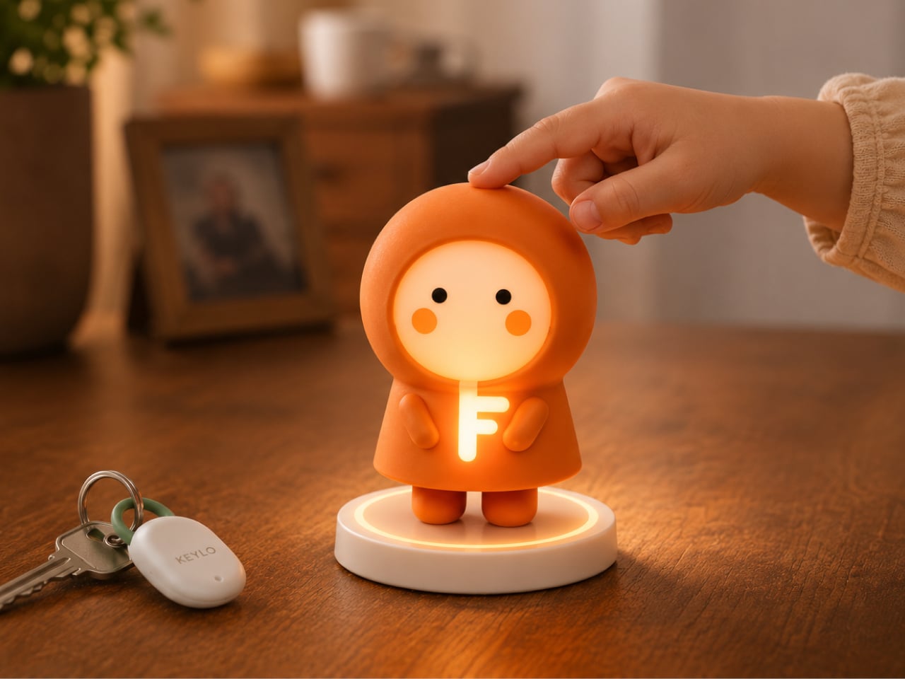
Keylo is a conceptual companion device designed around that specific gap. Rather than giving children another screen to manage or another app to navigate, it offers a single, tactile interaction: a tap that lets them express how they’re feeling. No typing, no calling, no notification chain. The child touches the device, cycles through a color to represent their emotional state, and the parent’s app receives it.

Designer: Miaonan Li
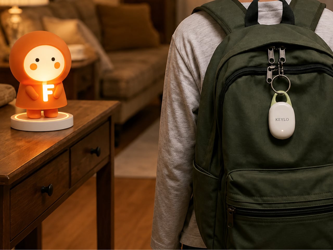
The system consists of three physical parts. The main companion unit sits on a home dock, usually somewhere a child passes when they get home. A smaller key fob clips to a backpack and travels with the child throughout the day. Both are made from soft matte silicone and deliberately avoid any screen or complex interface, giving the object a quality that’s closer to a familiar household item than a piece of consumer electronics.
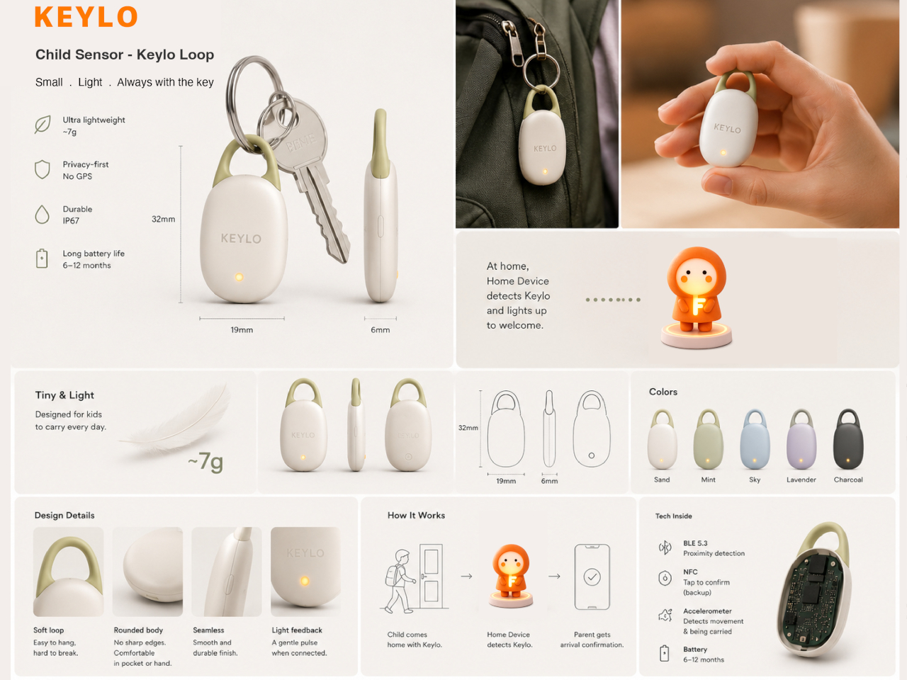
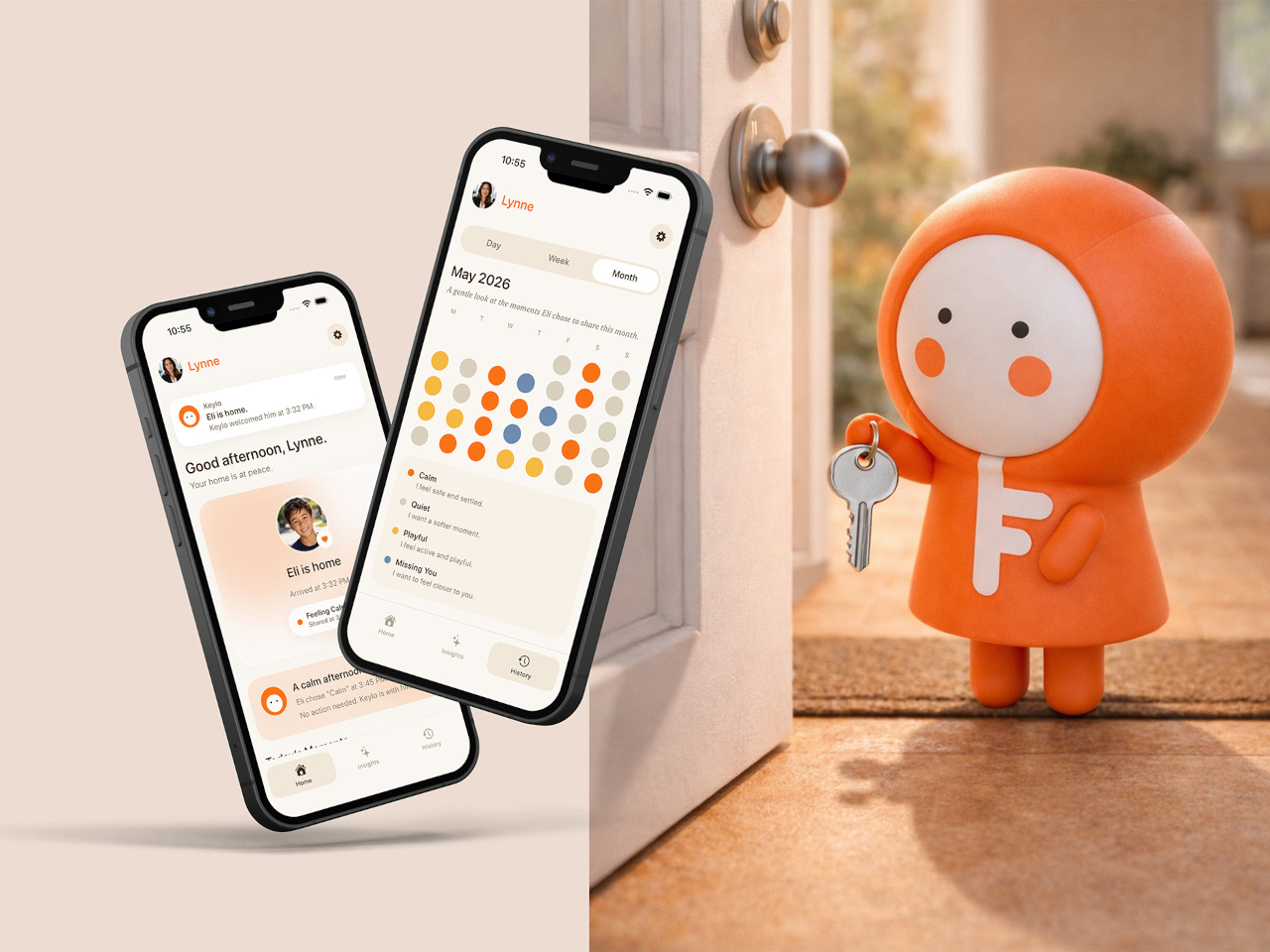
The four emotional states Keylo recognizes are kept intentionally broad. A soft orange glow indicates the child feels relaxed; bright yellow signals something more playful or energetic; a neutral white tone signals a preference for quiet or personal space; and a calm blue light carries a specific message from child to parent: I’m thinking of you. Each one is simple enough for a young child to understand and expressive enough to actually mean something when it arrives on a parent’s phone.
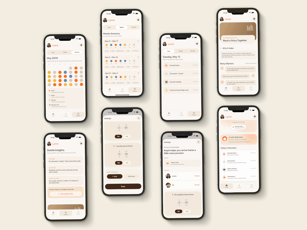
That arrival is handled by the companion app, which mirrors the same color language as the physical device. The distinction the project draws between this and conventional parental monitoring is deliberate. Rather than showing parents a location, a screen time report, or a camera feed, the app delivers a single emotional moment. A notification that says a child is feeling calm and playful carries a different quality of information than a location ping, and it asks for a different kind of response.
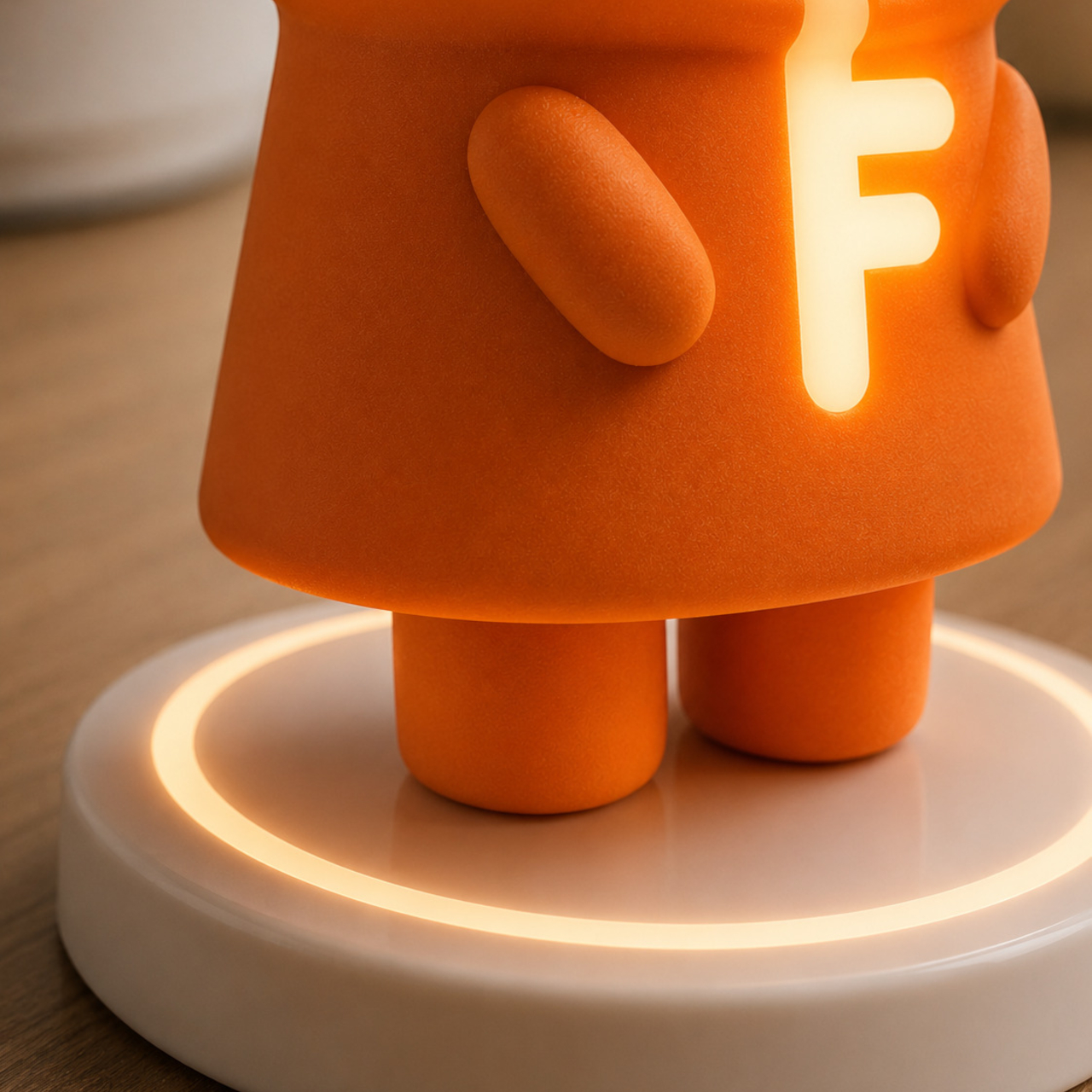
The device is designed to work without any input from the child beyond that single tap. There are no prompts to answer, no questions to read, and no follow-up required. For a child who has just walked in the door after school, the low threshold is significant; the gesture stays small enough that it doesn’t feel like a chore, which is probably the main reason most family communication apps get abandoned within a few weeks of being set up.
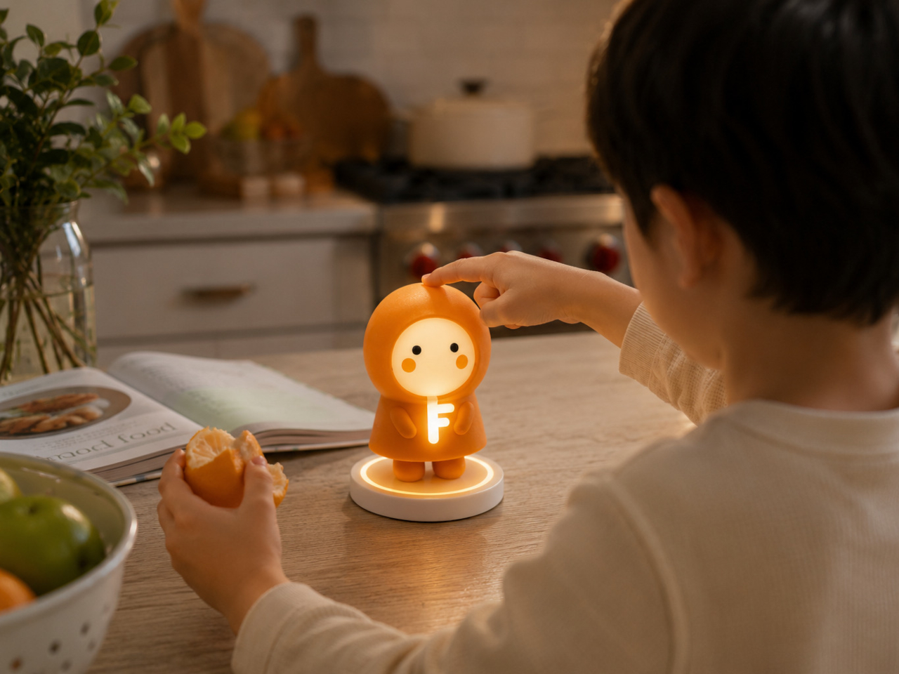
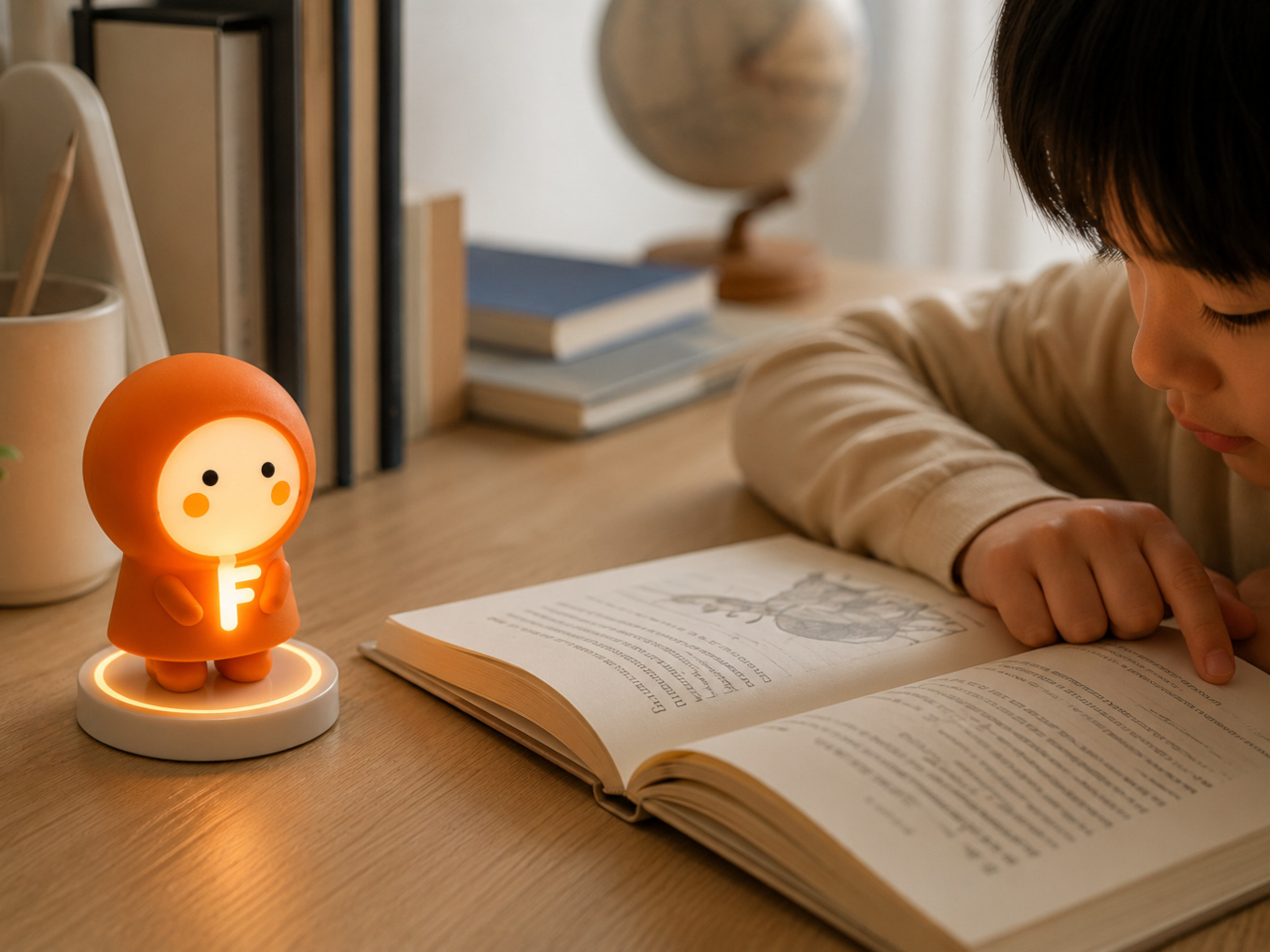
What Keylo explores through its design is how much emotional information can be conveyed through the simplest possible interaction. A color chosen by a child carries less data than a voice call but far more than no contact at all, and it arrives without interrupting anyone’s afternoon in the way a ringing phone does. The project makes a case for the idea that the volume of communication matters less than whether it happens at all, and on terms that feel natural to the person sending it.
The post Forget Tracking Kids After School, This Cute Device Lets Them Check In first appeared on Yanko Design.

  •  

Bang & Olufsen’s New Speaker Concept Is a Ritual, Not a Device

Most speakers are designed to disappear. They sit on a shelf, blend into a bookcase, or hide in a cabinet, quietly doing their job until you need them and then fading back into the background. Mårten Malmnäs, a graduate from the Umeå Institute of Design, designed something that pushes back against all of that.

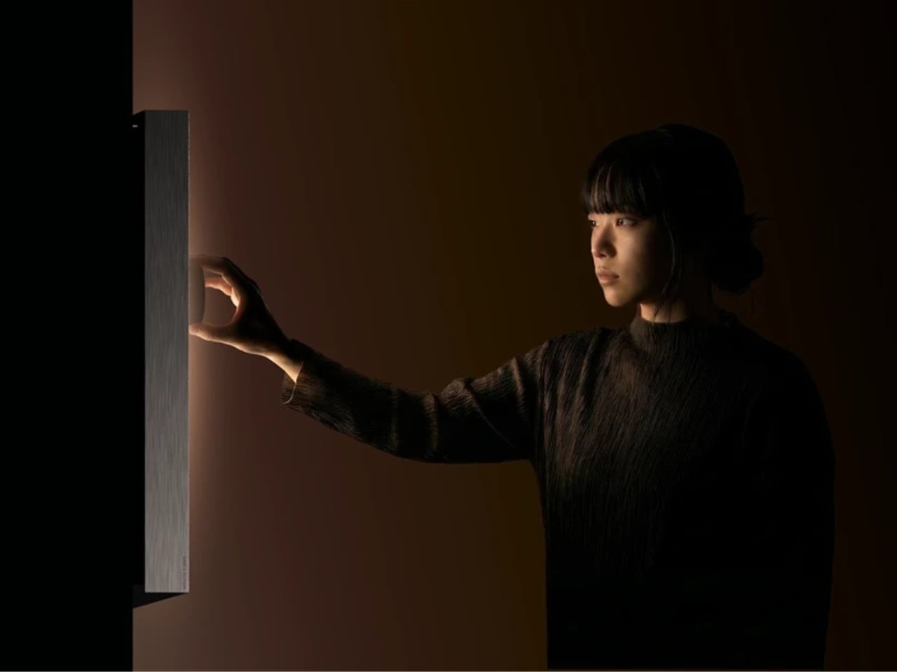
The Beosound Tableau is a wall-mounted audio object developed in collaboration with Bang & Olufsen. Malmnäs calls it “a fireplace for music,” an instrument not just for listening, but for living. The moment I read that, I had to stop. Because I’ve never heard a speaker described that way before, and suddenly, I couldn’t think of a more fitting comparison.

Designer: Mårten Malmnäs

Think about what a fireplace actually does. Yes, it produces heat, but that’s almost beside the point. A fireplace creates presence. It becomes the thing a room organizes itself around. People pull their chairs toward it, conversations happen because of it, and its absence is genuinely felt. That’s a completely different design brief than “fits on your desk” or “connects to your phone.”

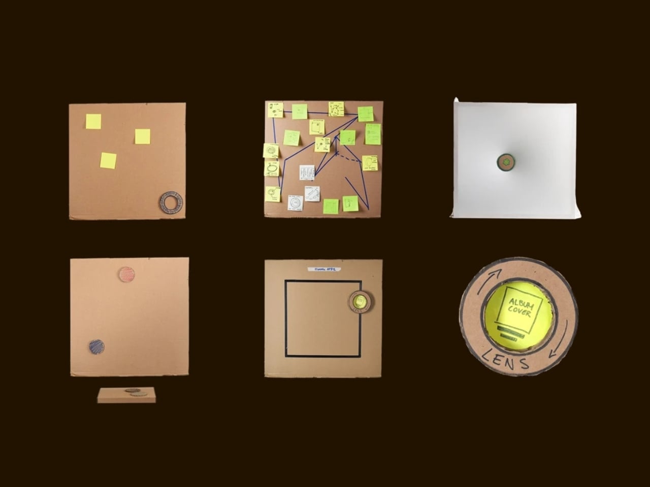
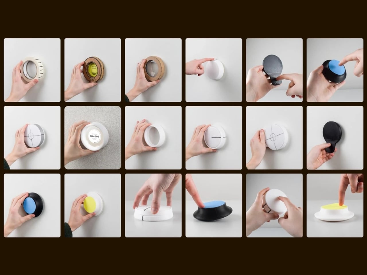
Malmnäs started the project with a design probe, a research method that explores the relationships people have with their homes, and from that came a set of experiments around values and behaviors. Eight experimental directions emerged from the ideation phase, spanning different input and output formats. Three of those directions clearly answered the design responsibilities he’d set for the project, and their shared qualities pointed toward one resolved object.

Here’s where it gets interesting. The original concept for the Tableau was screen-based, but a method called Wizard of Oz testing, where a human simulates the system to observe how people actually interact with it, pushed the design somewhere more honest. The interaction model shifted from screens to navigation by sound. And the principle that came out of it became the foundation of the whole concept: the most honest interface for a music object is music itself.

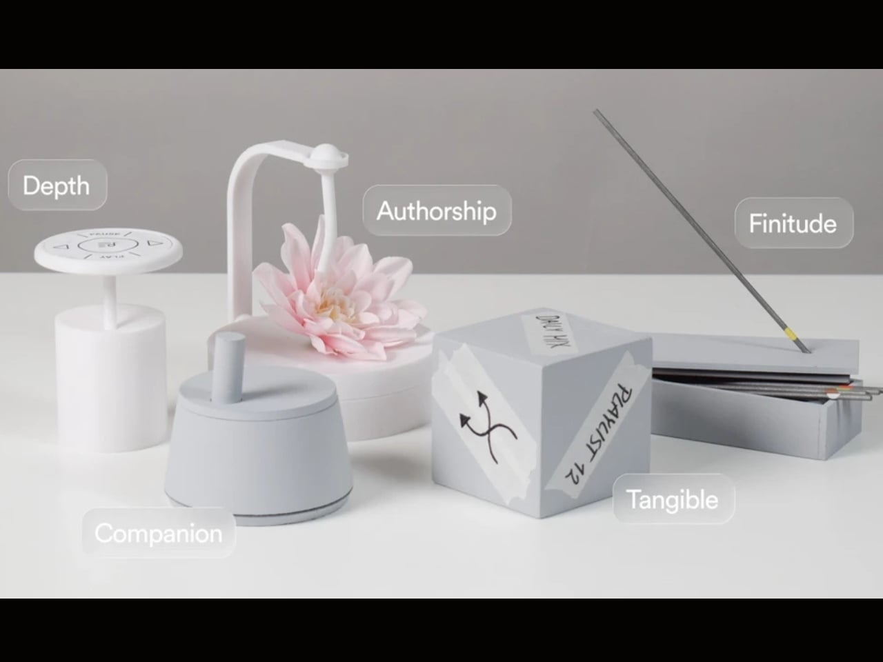
That’s a provocative idea. We’ve spent years layering more and more visual UI on top of audio experiences. Every streaming service competes on the complexity of its recommendation algorithm, the visual polish of its playlist covers, the grid of album art. Malmnäs argued the opposite, that sound should speak for sound. The result is the Sonic Token, a physical object that mediates between the listener and the Tableau. Tactile, intentional, and completely different from scrolling a touchscreen.

The Tableau is positioned as a focal thing for the home. An object to gather around and tend to. That language is deliberate, and it’s also a little radical. “Tending” to an audio object implies care and attention, a relationship rather than a transaction. You don’t tend to a Bluetooth speaker. You don’t gather around an app.

Bang & Olufsen has always occupied a rare space in the audio world, where design and sound hold equal weight, and where a product can belong in a design museum and still deliver extraordinary sound. But even by B&O’s standards, the Tableau concept asks a genuinely new question: what if the speaker were the focal point of the room, rather than just a feature of it?

There are fair questions about how a concept like this survives beyond a graduate show. The hands-on, material-driven process Malmnäs used, with 1:1 mock-ups and rigorous testing of the Sonic Token’s form and function, suggests this isn’t a vague idea dressed up in renders. It was built and tested as a real object. Whether it eventually reaches production or stays as a collaborative concept between a student designer and one of the world’s most revered audio brands is another matter.

But the value of the Beosound Tableau isn’t only in whether it ships. It’s in the question it refuses to let go of: why have we settled for speakers that ask nothing of us? The alternative, a speaker that earns its place on the wall, makes music feel like a gathering, and treats sound like something worth being present for, sounds like exactly what the living room has been missing.

The post Bang & Olufsen’s New Speaker Concept Is a Ritual, Not a Device first appeared on Yanko Design.

  •  
❌