Most people who drink sparkling water have settled into one of two habits. They either haul home cans and bottles from the grocery store every week, or they own a countertop soda maker that never leaves the kitchen. The Roam SodaTop is designed for everyone caught between those options: a 32oz insulated bottle that carbonates still water on demand, wherever you happen to be.
The home soda maker does what it promises, but it’s also a fairly large appliance with a permanent spot on the counter and plastic bottles that aren’t built to travel. Your sparkling water stays fresh for however long it sits in the fridge. Step outside, and you’re back to buying packaged drinks. It’s a frustratingly common situation for something meant to be a simple habit.
That’s the gap the SodaTop fills. The system pairs a stainless-steel bottle with a compact carbonation mechanism powered by small CO2 canisters. The bottle was engineered to handle carbonation pressure, with specially threaded fittings that most regular water bottles simply aren’t built for. Roam describes it as the world’s first insulated bottle that instantly carbonates water, and looking at the category, it’s hard to argue with that framing.
Using it takes just a few steps: fill the bottle to the marked interior line, drop in the CO2 canister, and twist the cap into place. The water is sparkling in about three seconds, and a pressure-release mechanism keeps the carbonation locked inside until you’re ready to drink. There’s no pumping, no separate carafe, and the whole thing takes less time than opening a can.
What makes that genuinely useful is the size. The SodaTop is roughly one-fifth the footprint of a standard countertop unit, compact enough to slip into a bag or a kitchen drawer without drama. Whether it’s on a work desk, a hotel table, or brought along on a day out, fresh sparkling water goes wherever the bottle goes, which is something no countertop soda maker can claim.
The bottle itself does more than hold the mechanism in place. Triple-wall construction keeps drinks cold for up to 24 hours and ice for up to 48 hours, well ahead of the plastic bottles that come standard with most home soda systems. That thermal advantage also matters for carbonation, since cooler water retains CO2 more efficiently and keeps the fizz from fading before the bottle is empty.
On the inside, Roam uses what it calls MirrorTech, a mirror-polished steel surface that the brand says keeps carbonation crisp for longer, resists odor buildup between uses, and discourages flavor transfer. The wide-mouth opening makes adding ice and pouring easy, while a visible fill line inside takes the guesswork out of how much water to add for consistent carbonation every time.
The CO2 canisters are made from recycled steel and are fully recyclable, so when they’re empty, they go straight into the recycling bin with no return shipping involved. Roam positions the ongoing cost at as little as $0.55 per canister for subscribers, framing that as roughly half the cost of buying pre-packaged sparkling water. Cutting out single-use cans and bottles also noticeably reduces household waste.
Roam also offers Natural Flavor Essence Drops designed to pair with the SodaTop, available in eight varieties: Ginger Root, White Peach, Sicilian Lemon, Yuzu Lime, Blood Orange, Strawberry, Grapefruit, and Mango. All are zero calorie, zero sugar, and plant-based. They’re also certified keto, paleo, vegan, gluten-free, kosher, and non-GMO, so they turn sparkling water into a flavored drink without any of the sugar baggage.
The SodaTop comes in three finishes: Pebble, Sage, and Charcoal, each with a contrasting accent at the base that gives it a quietly distinctive look. The silhouette reads more like premium drinkware than a gadget, which is probably the whole point. It’s the kind of object that fits on a desk, gets tossed in a bag, and doesn’t look out of place in either setting.
The Labor Day weekend has a way of separating gear that belongs from gear that ends up in the car boot. Not by price or feature count, but by how well each object earns its spot before the drive out begins. A Labor Day weekend runs on a different logic than a single overnight. The fire has to hold. The food has to be worth cooking. Everything else has to justify the weight it occupies.
The seven objects here cover the full range: fire, power, cooking, light, water, sound, and one small tool that navigates all of it after dark. What connects them is a commitment to solving a specific outdoor problem with enough precision that the solution becomes the whole reason you own it. Pack these, and the only question left is where to go.
1. Portable Fire Pit Stand
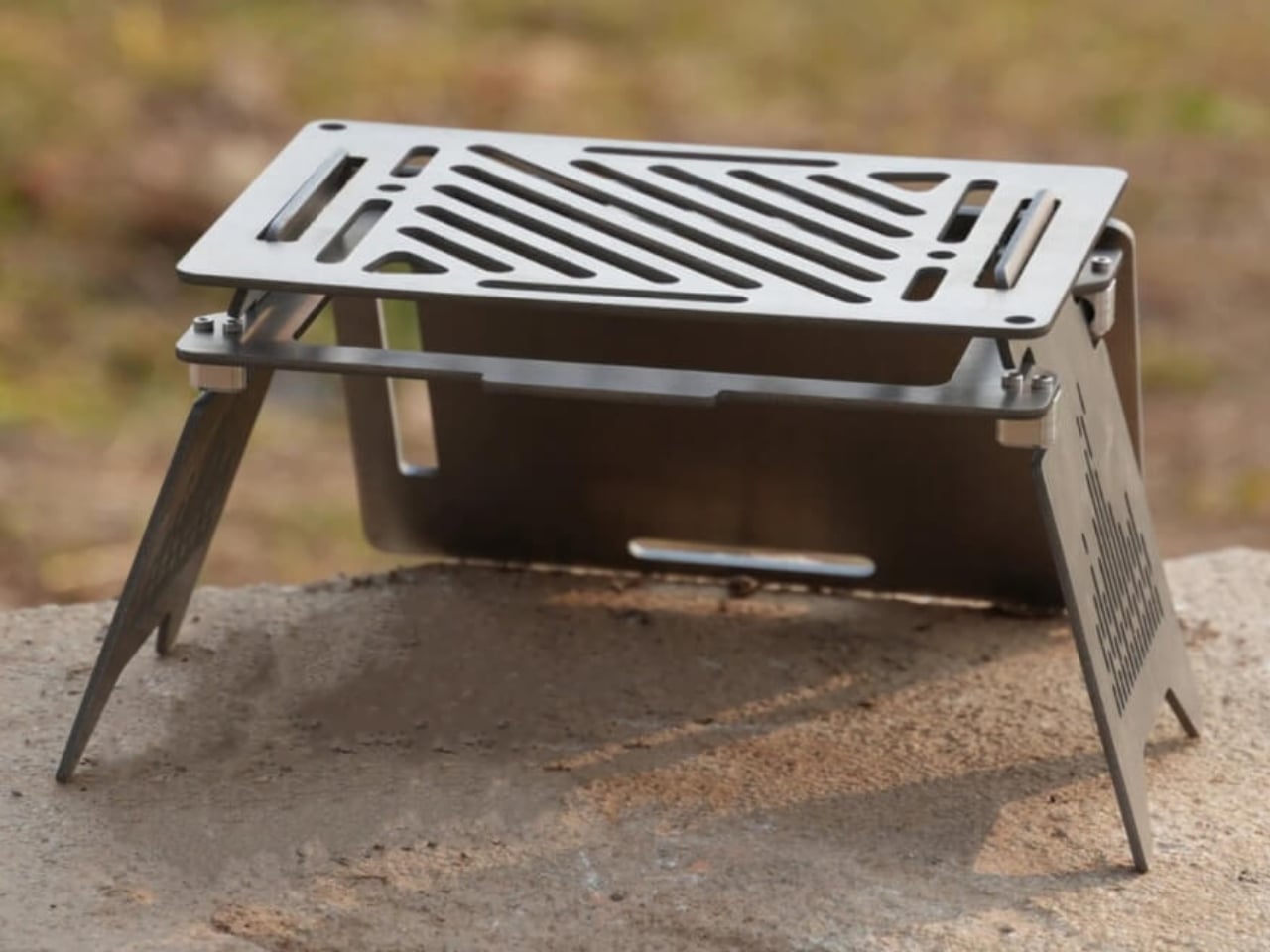
The fire pit category is full of oversized objects that need a truck bed and a second person to manage. The Portable Fire Pit Stand sidesteps that entirely. Precision-cut black steel plates resist warping under sustained heat, assemble without tools, and fold flat when the trip is over. What you get at the campsite is a fire that earns its place as both a functional heat source and the visual anchor every site needs to feel worth sitting around past sundown.
The stand elevates fire off the ground, making it viable on sensitive terrain and at campgrounds where ground fires are restricted. That single design decision opens up far more sites than a standard ring allows. The black steel construction does not bow or distort after repeated use the way cheaper alternatives do, and the footprint is compact enough to work on a picnic table or against a stone wall. It is the kind of gear that earns a permanent place in the kit after a single evening out.
Heat-resistant steel construction holds its shape through repeated use across multiple camping seasons
Elevated design meets leave-no-trace standards on campgrounds where ground fires are restricted
What we dislike
Steel construction adds weight that backpackers counting grams will notice over a long carry
No integrated grill grate, which means a separate purchase for cooking directly over the fire
2. Blavor Power Station + Camping Lantern
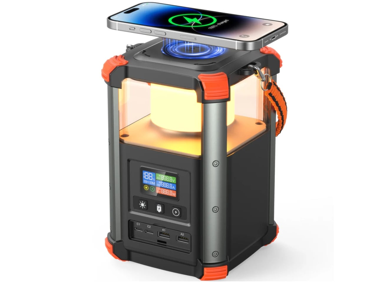
Most portable power stations look like they were designed by someone who has never spent a night outdoors. The Blavor PN-W43 solves that by building a 4W LED camping lantern directly into the form factor. The result is a 64,000mAh device barely bigger than a tall water bottle that covers five charging pathways — solar, AC, car adapter, USB-C, and micro USB — with bidirectional 100W fast charging and a digital display that keeps battery status visible in the field without guesswork.
The real value is how naturally the two functions coexist. When the lantern is on, the power bank is right there. When you are charging devices overnight, the ambient glow handles the tent interior without a separate light source. For campers who have always carried both a dedicated lantern and a backup battery pack, the consolidation alone pays for the weight before the first night ends. A lanyard ships in the box, which tells you someone at Blavor has actually camped.
What we like
Five charging pathways give genuine flexibility across grid-connected and fully off-grid environments
Lantern and power bank coexist without compromising each other — the dual function feels designed in, not added on
What we dislike
At 236.8Wh, capacity suits a weekend trip rather than an extended off-grid expedition
The cylindrical form can sit awkwardly alongside flat gear in a structured pack
3. Camprit TiStove
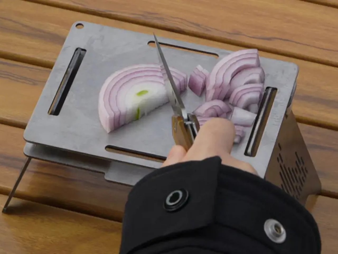
Five flat pieces of Grade 5 titanium, two foldable legs, and three interchangeable cooking panels that together weigh under 1.5 pounds and pack completely flat. The Camprit TiStove reconfigures for boiling, grilling, or searing depending on which panels you assemble, and the extra panels double as a windshield. As heat accumulates over a season, the titanium changes color naturally, giving each stove a visible record of every meal cooked on it. Yours becomes genuinely yours over time.
There is no ignition system to fail at altitude, no gas canister threading to seize in the cold, and no assembly logic that requires reading a manual after dark. The pieces lock together without fasteners and disassemble in seconds. Compatible with wood, gas burner, and alcohol, it adapts to whatever fuel the terrain allows rather than locking you into a single system that can fail or run out. For anyone who has stood over a dead stove in the cold, this addresses the problem where it starts.
What we like
Packs completely flat under 1.5 lbs with three interchangeable cooking configurations for different meal types
Compatible with any fuel source, removing dependency on a single system in the field
What we dislike
Requires a separate burner or fuel source — nothing is self-contained out of the box
Titanium panels need careful packing to avoid scratching each other in transit
4. All-in-One Grill
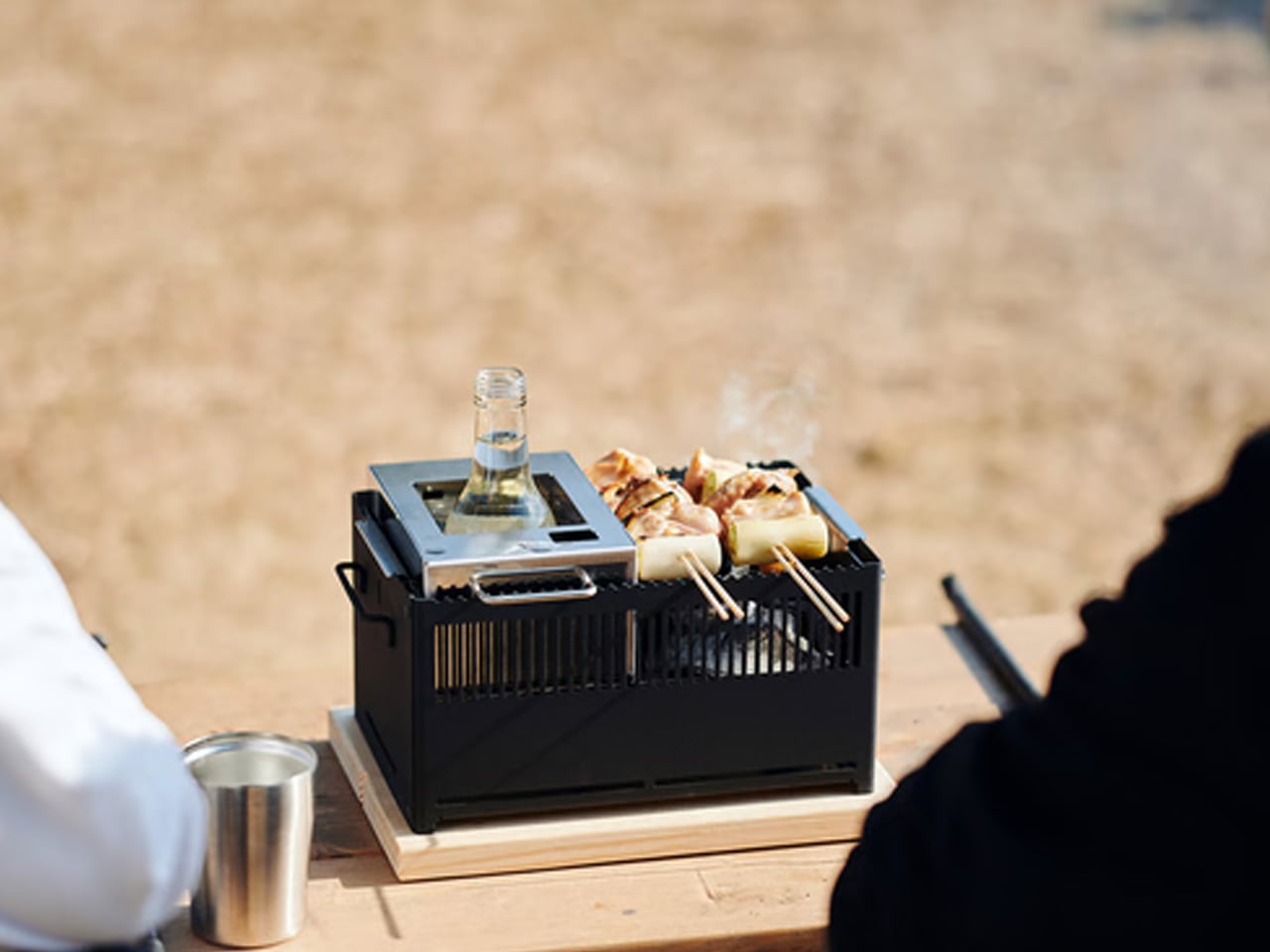
Made in Japan from stainless steel, the All-in-One Grill approaches camp cooking from a completely different position than the TiStove. Where that one is built for portability and fuel flexibility, this is built for the campsite where you are staying put and eating well. A modular lid system converts it between six distinct cooking methods — barbecuing, frying, grilling, steaming, smoking, and stewing — without requiring separate cookware for each. One object covers an entire outdoor kitchen without asking for a second bag.
Japanese stainless steel holds heat evenly, cleans without drama, and does not carry the flavor of every previous meal the way cast iron can. For a long weekend where the grill is the centerpiece of three evenings rather than a convenience, this is the object that makes the drive worth it. The modular configuration grows with the meal rather than limiting it, and the compact footprint fits the full camp kit without demanding its own dedicated storage alongside everything else.
Six cooking methods in one stainless steel body remove the need to pack separate cookware for different meals
Japanese stainless steel construction holds heat evenly and cleans efficiently after each use
What we dislike
At $449, the investment makes the most sense for campers who cook seriously rather than occasionally
Charcoal and wood fuel require ash management that demands more effort in the field than gas alternatives
5. NoxTi Tritium Keychain
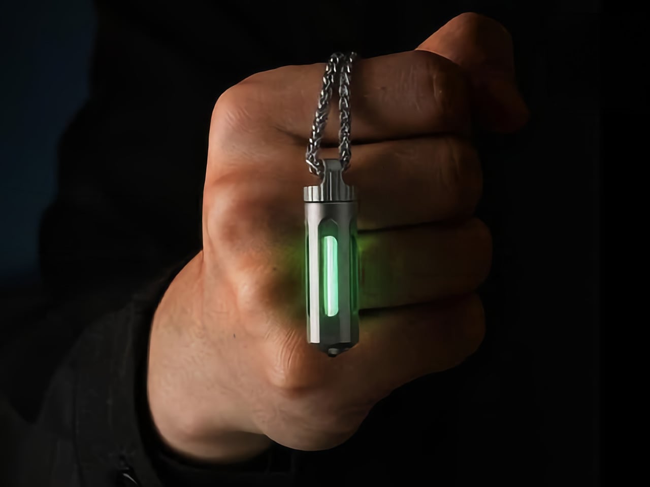
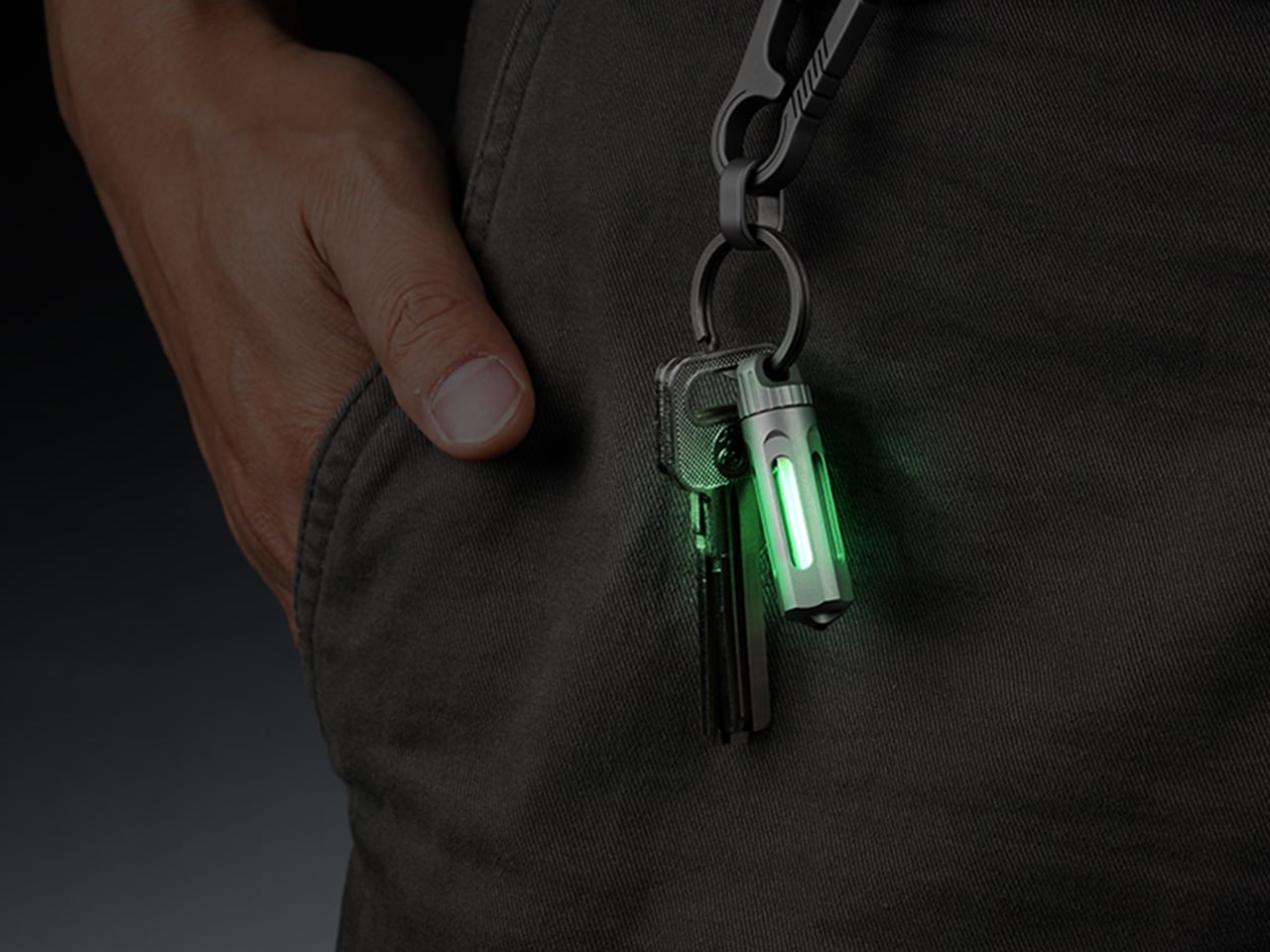
A 45mm CNC-machined Grade 5 titanium cylinder weighing 10.7 grams. The NoxTi carries a tritium vial inside a precision quartz tube with 92% light transmission and glows continuously for 25 years through radioactive decay. No switch, no battery, no charging. Tritium beta particle decay strikes a phosphor coating and produces light as a straightforward byproduct of existing. At a campsite, it marks your tent entrance, your keys at the bottom of a bag, and your gear in the dark without asking anything of you in return.
The ceramic-tipped glass breaker at the tail end adds genuine emergency utility without changing the form. When the vial dims after two decades, the titanium body stays: press the old tube out, slide a new one in. Six glow colors are available, including Apple Green for maximum visibility and Red for preserving night vision. Two silicone O-rings hold the vial suspended and centered inside the shell, which creates the impression of looking into a piece of precision engineering rather than anything from a keychain rack.
What we like
25-year continuous glow powered entirely by physics, with no battery, no charging, and no failure point to manage
Fully user-serviceable titanium body becomes a platform you keep and update indefinitely across decades of use
What we dislike
Glow output is intentionally faint — it marks and locates in the dark but does not illuminate a surface
The tritium light source needs a short explanation before the value proposition fully lands for first-time buyers
6. GoSun Flow Solar Water Purifier
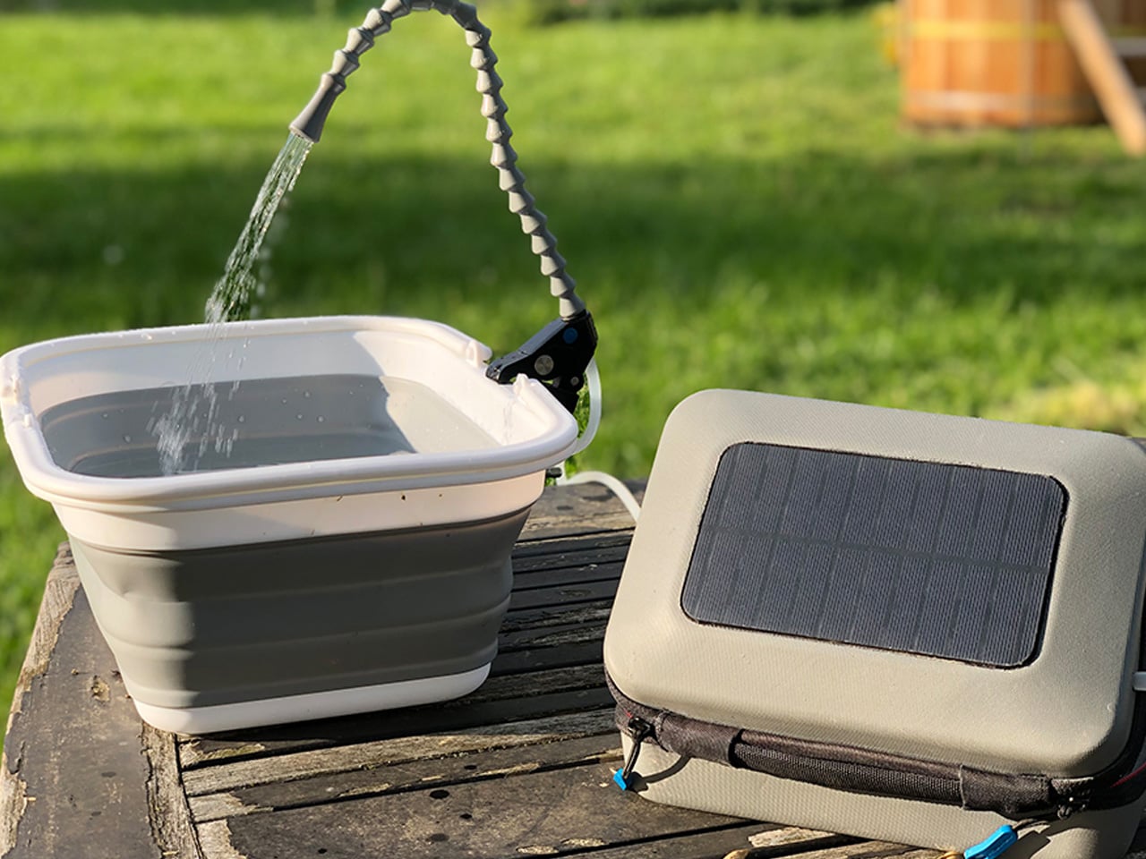
Water is camping’s most basic constraint, and the GoSun Flow addresses it at the source. A solar-powered three-stage cartridge filter eliminates 99.99% of waterborne pathogens while pumping one liter of clean water per minute from any freshwater source. The system compresses into a backpack, and the flexible faucet clamps to branches, tables, or tailgates — opening to 58mm — turning any water access point into a functional camp station. USB power keeps it running when solar is unavailable.
It doubles as a portable handwashing station and solar-heated shower. Thirty minutes of sun delivers a five-minute warm shower, which changes what clean means across a three-day trip without the bulk of carrying a separate shower bag and a purifier as two distinct items. The filter handles 1,000 liters before replacement, and the power bank driving the pump recharges through an integrated solar panel. For anyone who has ever compromised on hygiene to protect pack weight, this removes that trade-off before you even start packing.
What we like
Purifies 99.99% of pathogens and delivers a solar-heated shower from a single system that compresses into a backpack
1,000-liter filter life with USB power backup covers a full camping season without resupply
What we dislike
Cannot process saltwater, which limits utility at coastal campsites
Multiple components increase the number of parts to track and keep together across a multi-day trip
7. RetroWave 7-in-1 Radio
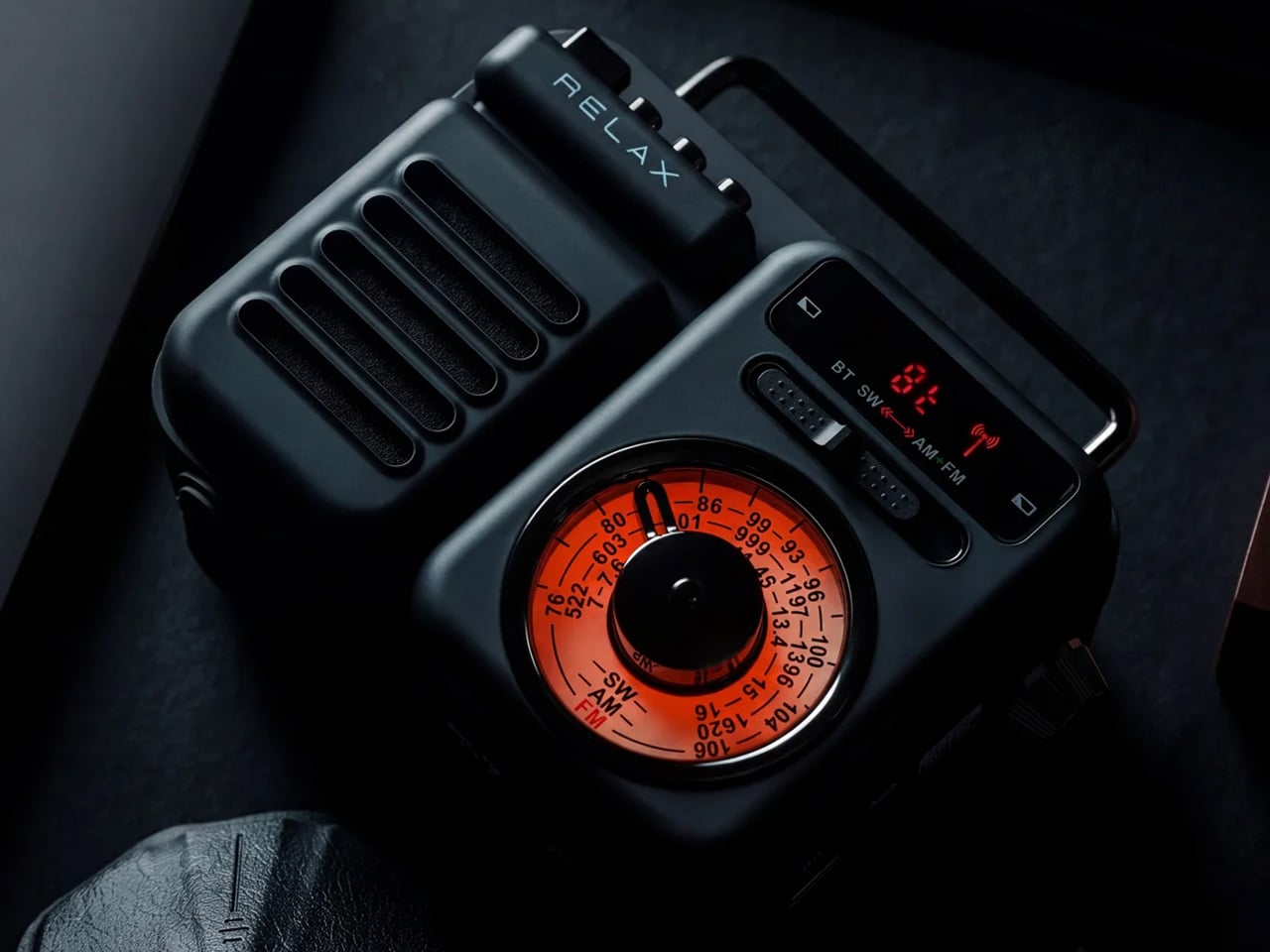
The RetroWave earns its place in a camping kit through an argument that has little to do with aesthetics, even if the aesthetics are genuinely good. A tactile tuning dial, compact body, and warm visual language drawn from classic Japanese radio design make it worth looking at. What it is actually doing is more pragmatic: running AM, FM, and NOAA weather radio without an app, streaming via Bluetooth when connectivity holds, and charging via solar panel and hand-crank when it does not. Seven functions, one charging cable.
Smart speakers go silent when Wi-Fi drops. Earbuds die at the wrong moment. Phones drain precisely when you need them most. The RetroWave does not ping you, does not demand ideal conditions, and does not need a charging window before it becomes useful. It plays, charges other devices, lights, signals, and tells the time across a full weekend without complaint. At the end of the trip, it goes back into the same bag it came out of, ready for the next one.
Seven functions in a single body remove the need to carry and manage multiple separate items across a trip
Solar and hand-crank charging keep it fully operational off-grid with no outlet access required at any point
What we dislike
The retro aesthetic can read as decorative to buyers who have not yet used it in an actual off-grid situation
Shortwave reception quality varies depending on geographic location and surrounding terrain
The Campsite Has Always Been Good. The Gear Finally Caught Up.
The equipment on this list shares one quality that outdoor gear rarely earns: it removes a specific friction from the experience without replacing it with a different one. The fire stand works where others cannot. The purifier turns proximity to water into access to clean water. The stove adapts to whatever fuel the terrain provides. Each object was designed around the constraint it actually faces in the field, which is the harder and more honest design brief.
A Labor Day weekend with gear this considered starts to feel different from the first hour of setup. Not because everything is easier in an obvious sense, but because the small decisions have already been made. Where the water comes from. How the fire holds through the night. What you reach for in the dark. These are solved before the weekend begins, which leaves the actual weekend free to be what it was always supposed to be.
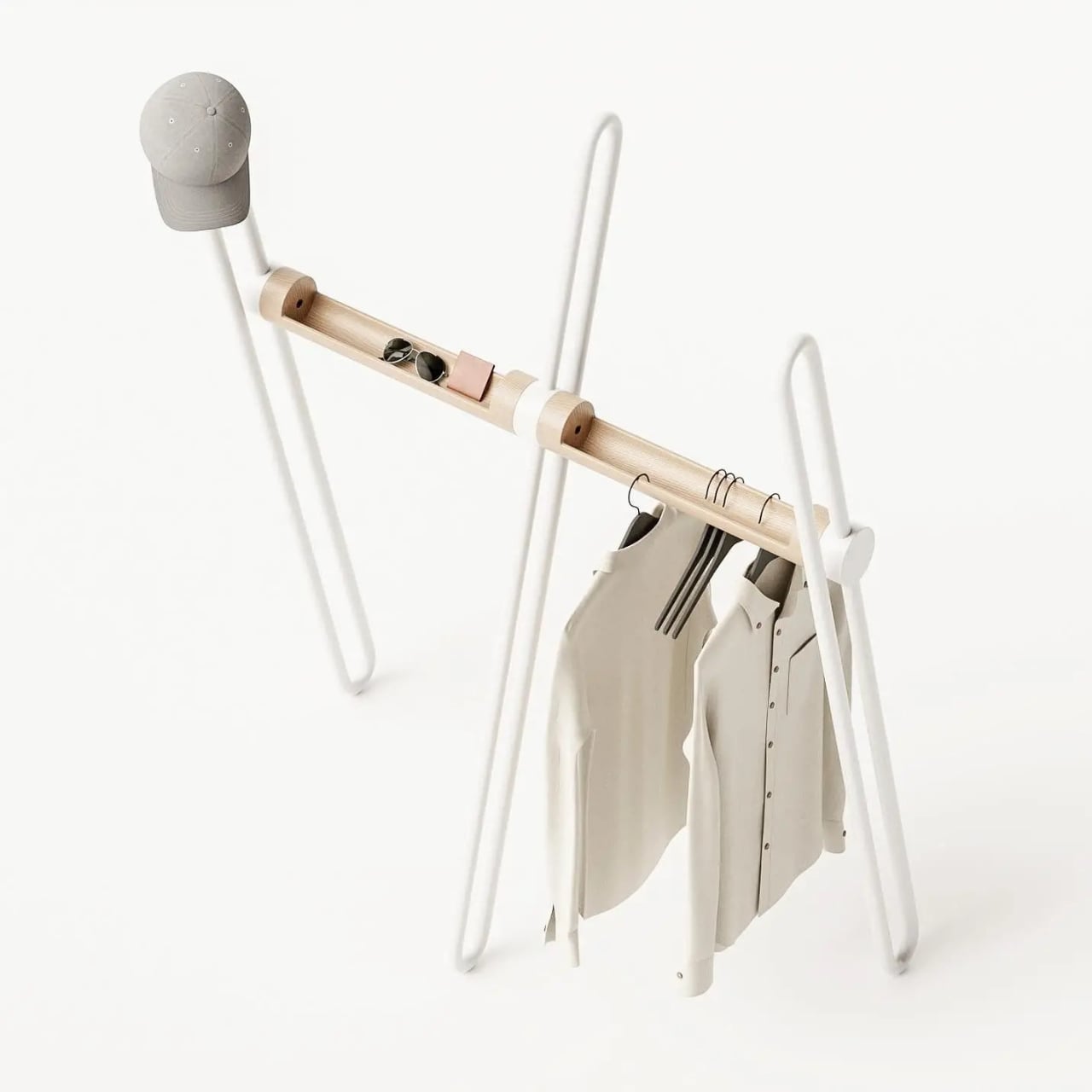
Most coat racks have one job and barely manage it. They accumulate coats, yes, but also that one bag you keep meaning to put away, the umbrella you forgot about, and eventually the kind of low-level visual clutter that makes the entryway feel like it quietly surrendered. The Acrobat, designed by João Teixeira of Teixeira Design Studio, takes the opposite approach entirely. It starts by asking what a coat rack actually needs to do, then builds something genuinely beautiful around that answer.
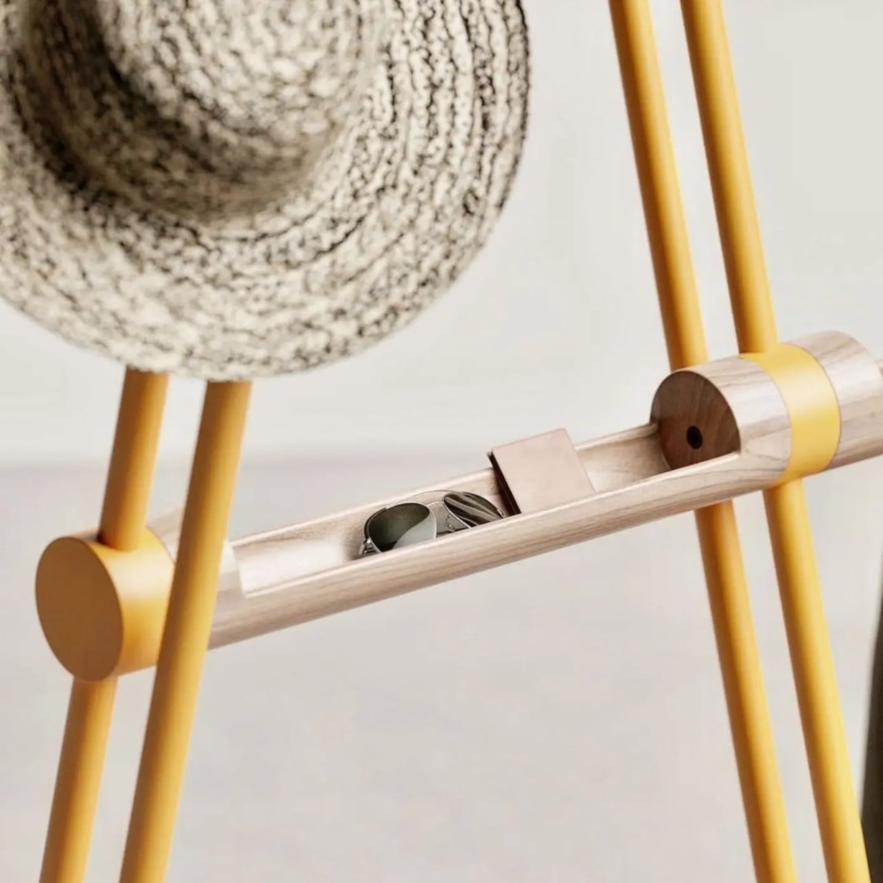
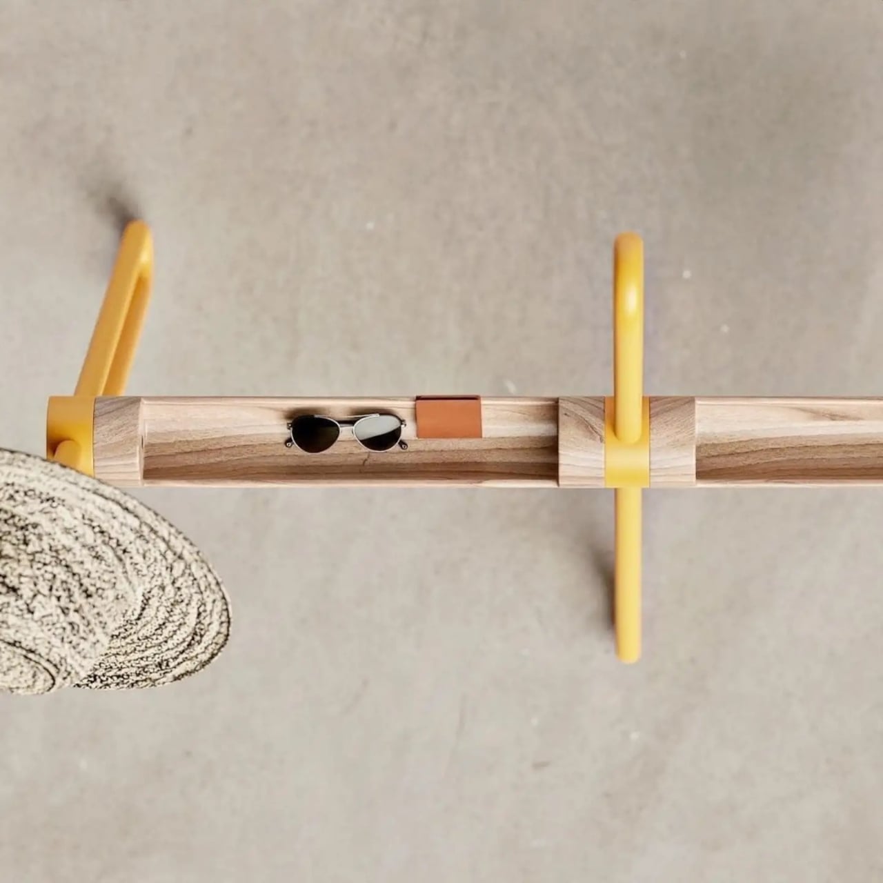
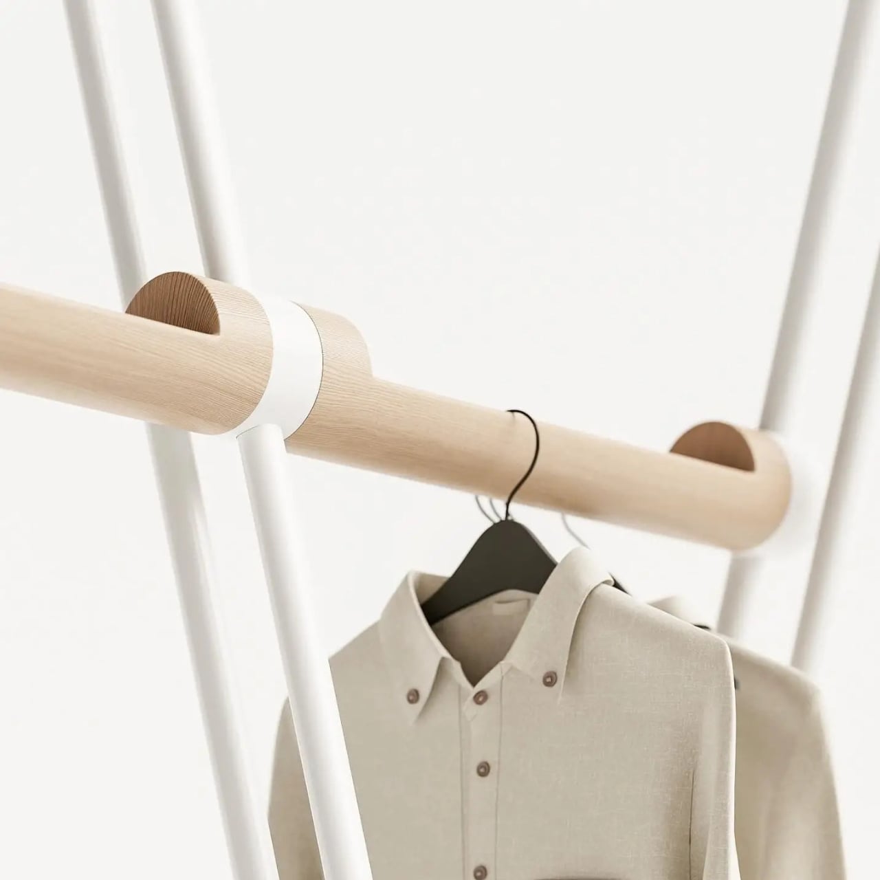
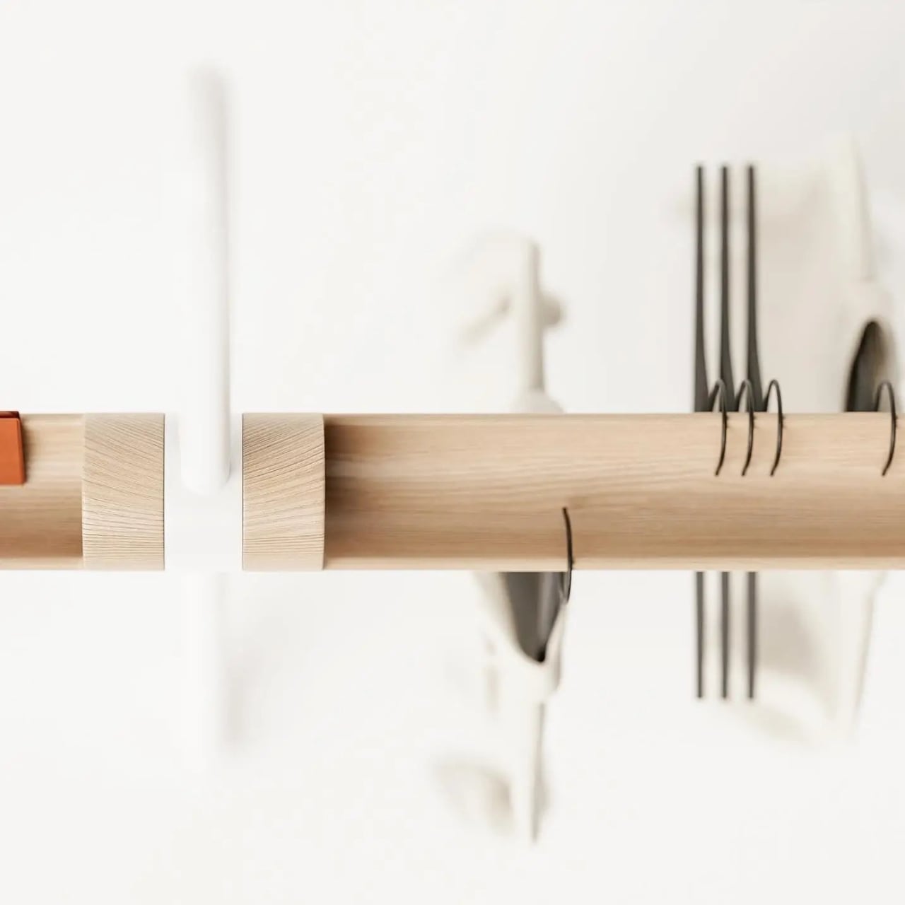
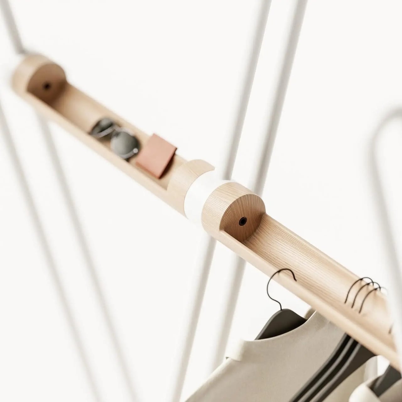
The name earns itself the moment you see the full form. A tripod base anchors the piece with quiet confidence, while a continuous bent metal tube rises and loops around it, creating a silhouette that reads as more gesture than furniture from across the room. It has the quality of something mid-motion, a figure caught mid-step that decided to stay exactly like that. Sculptural is an overused word in design writing, but it applies here without apology. The wood bar running through the center connects the metal structure while doing its own separate work: carved openings along its length are sized to hold the daily essentials that would otherwise migrate to whatever flat surface is nearest. Keys, wallet, sunglasses, the objects that technically belong somewhere but never quite find a place. Here, they do.
The two-material pairing is deliberate in the best way. The metal tube handles the structural work and the hanging functions, its looped tops wide enough for coat shoulders and the brim of a hat. The wood handles texture and warmth, softening what could easily tilt too industrial for a home setting. Together they read as a genuine material conversation rather than a design decision arrived at by committee or trend-following. Each element is doing something specific, and you can read that in the form without anyone explaining it to you.
I appreciate that the Acrobat resists the pull toward the purely minimal. A lot of contemporary furniture design seems to mistake reduction for sophistication, stripping objects down until they barely register as functional at all. The Acrobat keeps everything it needs and nothing it doesn’t, but the form is generous rather than austere. The bent metal loops repeat and layer against each other depending on your viewing angle, creating a depth that a straight rail or a standard row of hooks simply wouldn’t offer. The piece looks different at 8 AM when you’re grabbing your bag on the way out than it does at night when it’s holding coats in a still room. That kind of visual behavior in an everyday object is rare.
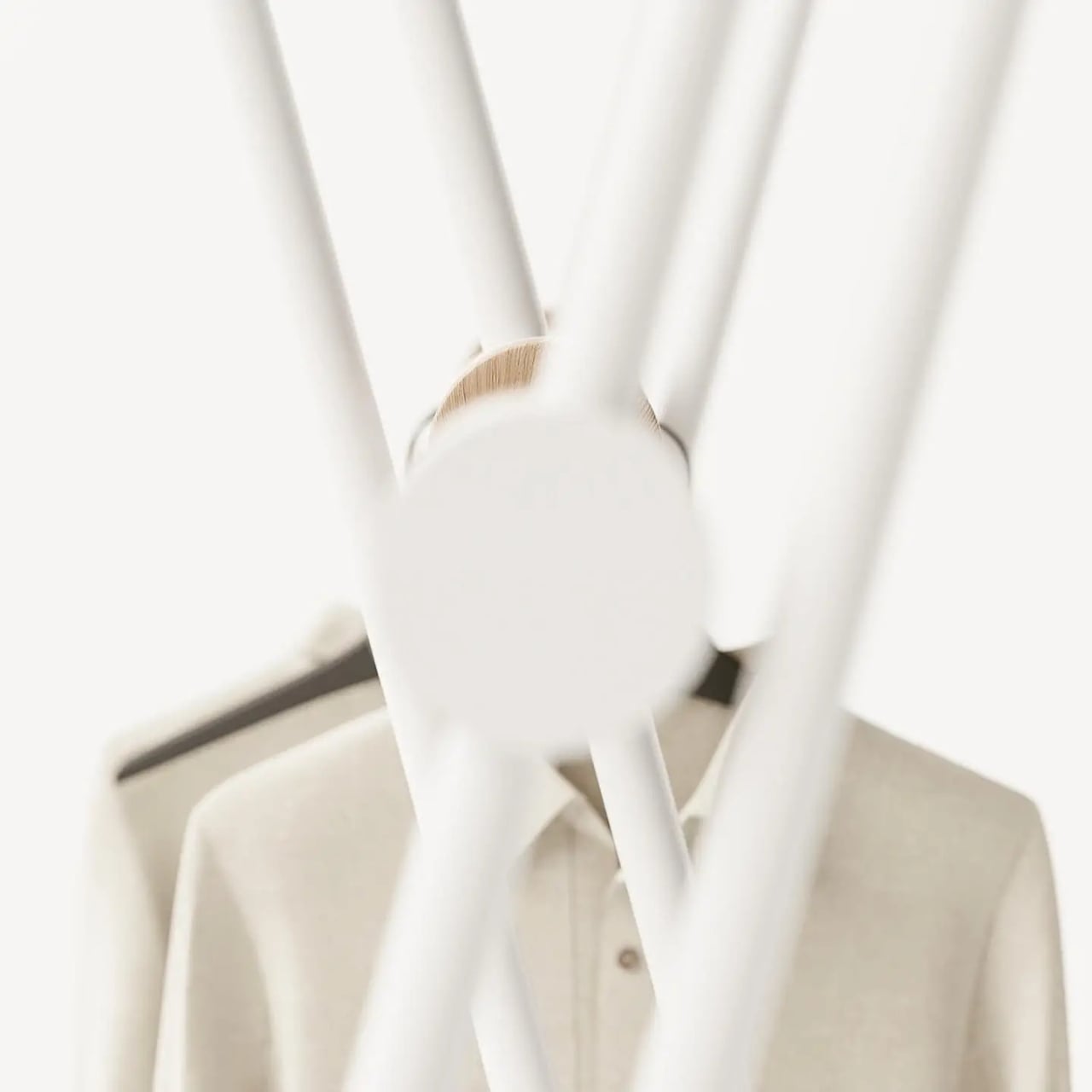
The colorways matter too, more than they might initially seem. The white version has a graphic, almost architectural quality that would hold its own in a very considered interior. The mustard yellow version is something else entirely. It pushes the Acrobat from understated into genuinely expressive territory, the kind of color decision that takes equal confidence from the designer and the person buying it. A yellow coat rack is a commitment to a room’s character, not a neutral addition to it. I think that’s the right instinct. The best designed objects have a point of view, and this one clearly does.
Entryway design gets far less attention than it deserves relative to the rest of the home. The kitchen gets renovated, the living room gets considered, but the entry is often left to whatever hooks were already on the wall. It’s an oversight that matters, because the entry sets the tone for everything beyond it. The Acrobat makes a case for treating that space with the same intention you’d bring to any other room.
Teixeira Design Studio seems to be arguing, through this piece, that functional objects don’t need to apologize for being beautiful, and beautiful objects shouldn’t have to sacrifice the practical to justify their presence. The Acrobat does both, quietly and without laboring the point. It stands in the corner, holds everything you carry in from the outside world, and looks like it belongs in a gallery while doing it. For a coat rack, that’s a remarkable thing to pull off.
Straight lines are easy. Any architect can slap a rectangular tower on a plot and call it a day, and most beachfront developers do exactly that because straight lines are cheap, fast to build, and easy to sell off a brochure. Georgia’s Adjara coast just got a project that looked at that playbook and said absolutely not. Montemar Residential, a three tower complex rising in the seaside town of Gonio, ditches the grid entirely in favor of forms that ripple, curve, and cantilever like something dragged up from the Black Sea itself. It is the kind of building that makes you stop scrolling, then immediately want to know who signed off on it and how.
Designed by Irakli Emiridze and Irina Chkonia of Alpha Architecture, the complex sits on a 10,000 square meter plot within a UNESCO listed stretch of coastline, right where Adjara’s oddly tropical microclimate runs into the Black Sea. Each of the three 16 story towers tops out around 48 to 52 meters and wears a dramatic aluminum crown that flares out over the roofline like a mushroom cap, or if you squint, a seashell caught mid opening. Parking for 300 vehicles sits tucked below grade, keeping the ground plane free for landscaping and plazas. It is a lot of building, and it wants you to know it.
Designers: Irakli Emiridze and Irina Chkonia
The seashell inspiration shows up in how the facade behaves. The balcony edges do not stack in the usual identical, floor by floor grid you see on every coastal high rise from Miami to Marbella. Instead they undulate, staggering in and out like sediment ridges carved by tidal movement, which gives each tower a texture closer to a geological formation than a construction product. Aluminum embossed sheet cladding wraps the crowning terraces, catching light in a way that concrete or glass simply cannot, and it is the detail that separates Montemar from the generic curved tower trend that has been creeping through Gulf and Black Sea resort markets alike.
The space between the three towers is treated as public terrain rather than leftover setback, with green plantings, plazas, and communal zones designed to pull residents out of their units and into shared space. Panoramic apartments come with private terraces and jacuzzis angled toward the water, the kind of amenity that used to be penthouse exclusive and is now standard issue on any coastal development trying to compete for buyers. Whether that democratization of the infinity view holds up once the cranes clear out is the real test, since renderings are notoriously generous with light, weather, and empty beaches.
Gonio is a strange place for this kind of architectural swing. It is a historic town, not a resort capital, and Montemar is betting that sculptural ambition can coexist with a UNESCO designation next door rather than clash with it. If the finished towers deliver even half of what the renders promise, this stretch of the Adjara coast is about to become a lot more interesting to watch than its neighbors on the Black Sea.
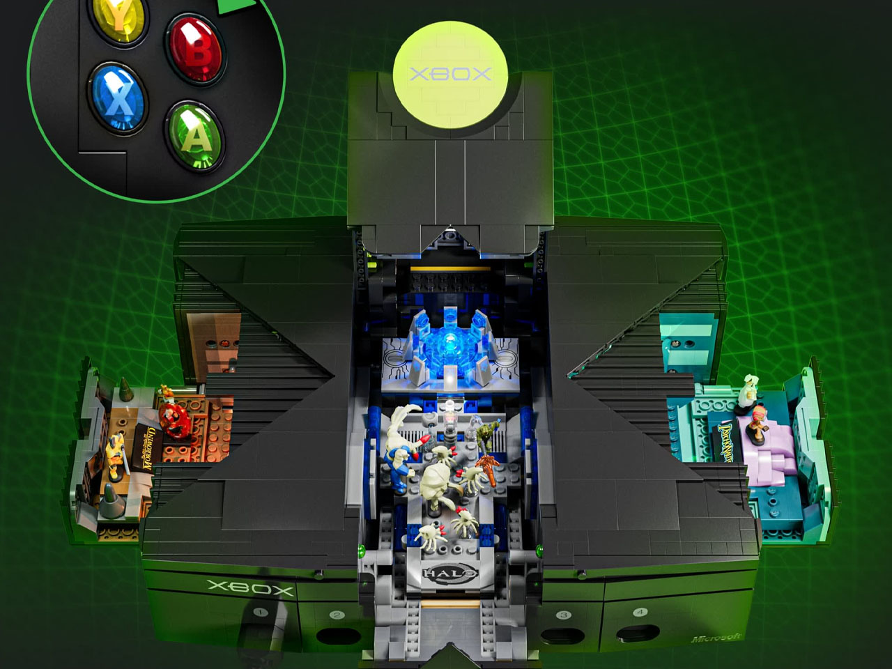
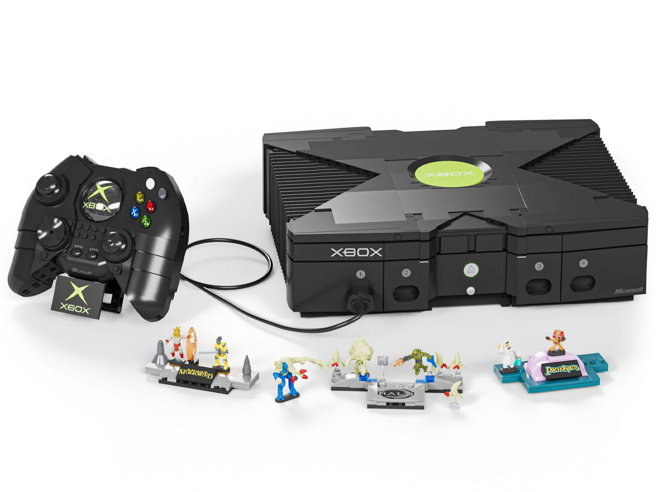
The original Xbox is turning 25, and Mattel is marking the occasion with a collector’s piece that transforms Microsoft’s first gaming console into a 1:1-scale building set. Created under the premium Mattel Brick Shop, the Microsoft Xbox Building Toy Kit recreates the chunky 2001 console from 3,509 pieces, complete with its oversized Duke controller and a surprisingly elaborate interior.
At first glance, the model is designed to look remarkably close to the original hardware. The familiar black rectangular body, recessed side grilles, front controller ports, X-shaped top panel, and central green Xbox logo are all recreated in brick form. The accompanying Duke controller is also buildable and connects to the console, with working buttons, a D-pad, and movable analog sticks. It is a display model rather than a functional gaming machine, but the physical interaction is part of what makes the set more than a static replica.
The set also follows a growing interest in turning gaming hardware into physical building objects. A few years ago, we covered a LEGO Xbox Series S concept that treated the console itself as a customizable canvas for brick-built artwork. Mattel’s new creation takes a detour from the conventional brick-building approach, though, as it employs bricks to personalize a console, using thousands of them to recreate an entire piece of gaming history.
The more interesting details are hidden inside the console. Opening the model reveals three removable dioramas inspired by some of the original Xbox’s most recognizable games: Halo: Combat Evolved, The Elder Scrolls III: Morrowind, and Psychonauts. Each scene comes with small NanoWorld figures representing characters from the games, with 12 figures included across the set. The dioramas can also be removed and displayed independently, giving the enormous console a modular quality rather than making its interior purely decorative.
Mattel has also given the model a modest interactive layer. Pressing buttons on the connected Duke controller activates four different light-and-sound sequences, including the original Xbox opening sequence and effects associated with the three game-inspired scenes. A concealed button combination triggers an additional lighting sequence, adding a small Easter egg for builders who spend time exploring the finished model.
The choice of games is particularly evocative. Halo helped define Xbox as a gaming platform, while Morrowind and Psychonauts represent different sides of the console’s early library. Rather than simply reproducing the hardware, Mattel has effectively turned the console into a compact museum of its formative years, with the games physically embedded into the machine they helped make memorable.
For anyone who remembers the original Xbox as a piece of hardware rather than simply a platform, that distinction is significant. The finished model is essentially a life-size nostalgia object, one that preserves the proportions and visual language of Microsoft’s first console while hiding miniature worlds from its games inside.
The set is intended for builders aged 17 and above and is positioned firmly as a premium collector display rather than a conventional toy. It is currently available for preorder through select retailers, with a US price of $324.
If you have ever charged a Xiaomi phone with the bundled brick, there is a decent chance CUKTECH’s engineers had a hand in it, even though the name never made it onto the packaging. The company started in 2016 as a straight up OEM, building chargers behind the scenes for Xiaomi and other big players, before merging with ZMI in 2022 and finally launching products under its own name. It is the classic story of a supplier deciding it was tired of being invisible.
That decision has paid off. The CUKTECH 30 Charging Station Ultra just picked up two wins at the European Product Design Award, one for computer accessories and one for office appliances, thanks to a 300W GaN powered design from Chong Wang and Ziyao Wang. We have followed the brand’s climb as its power banks and chargers kept getting screens, better materials, and sharper industrial design with every release. This latest charging station, with its five ports and a live readout of exactly what your gear is pulling, is the moment the sleeper brand stops sleeping.
Designers: Chong Wang & Ziyao Wang
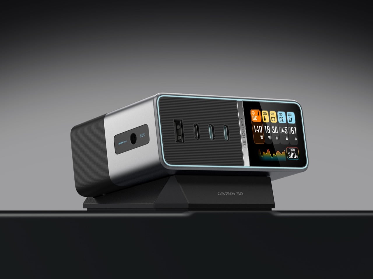
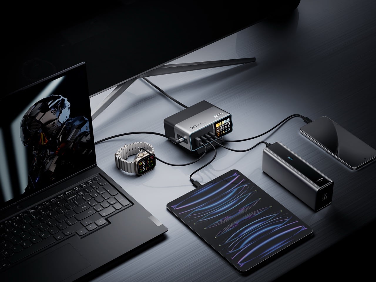
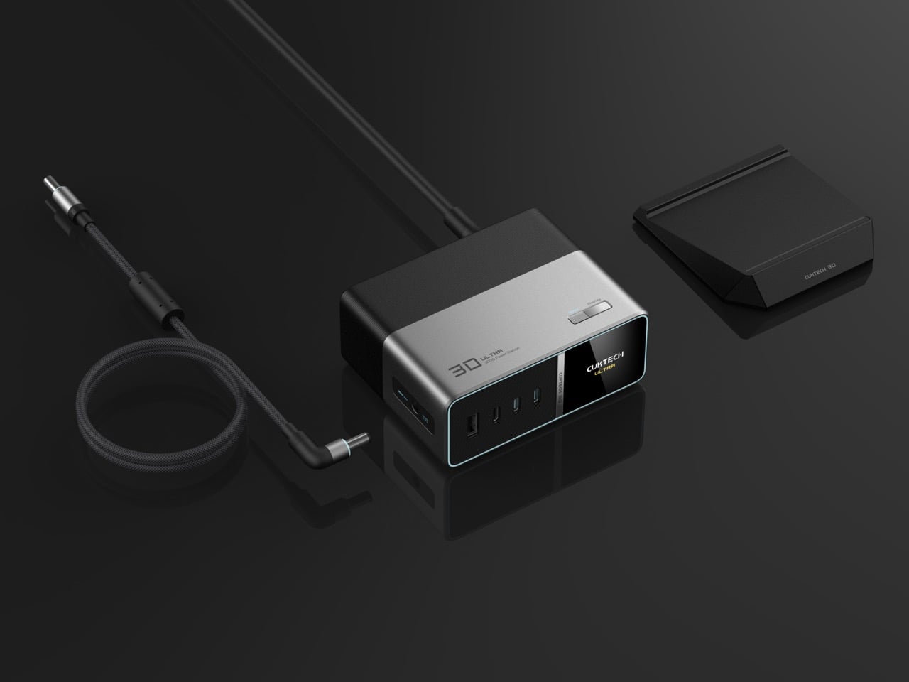
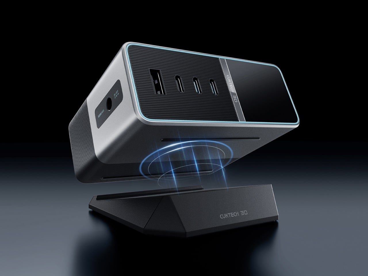
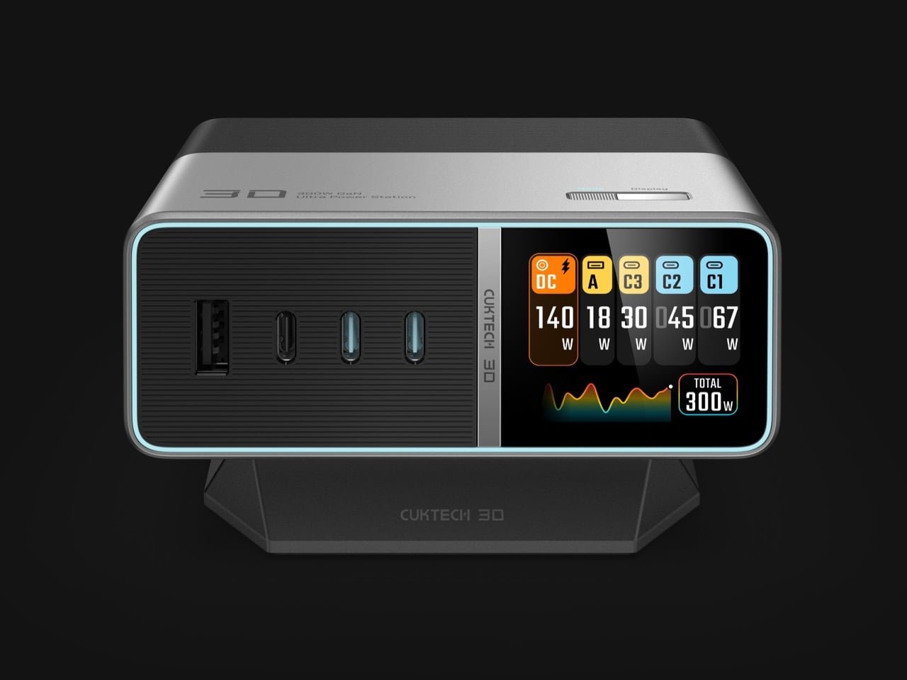
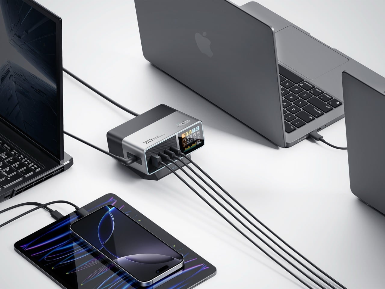
Three USB-C ports, one USB-A port, and a dedicated DC output share the front face, and together they can push out up to 300W total. The two primary USB-C ports handle up to 140W each under PD 3.1, which covers most modern laptops without breaking a sweat, but the real number only shows up when you route power through the DC port. That single line is built to talk directly to compatible laptops and can hit the full 300W ceiling on its own, essentially replacing the oversized proprietary brick that usually ships in the box. I have three of those bricks sitting in a drawer right now doing absolutely nothing, and a single box that can outmuscle all of them at once is exactly the kind of consolidation I did not know I needed.
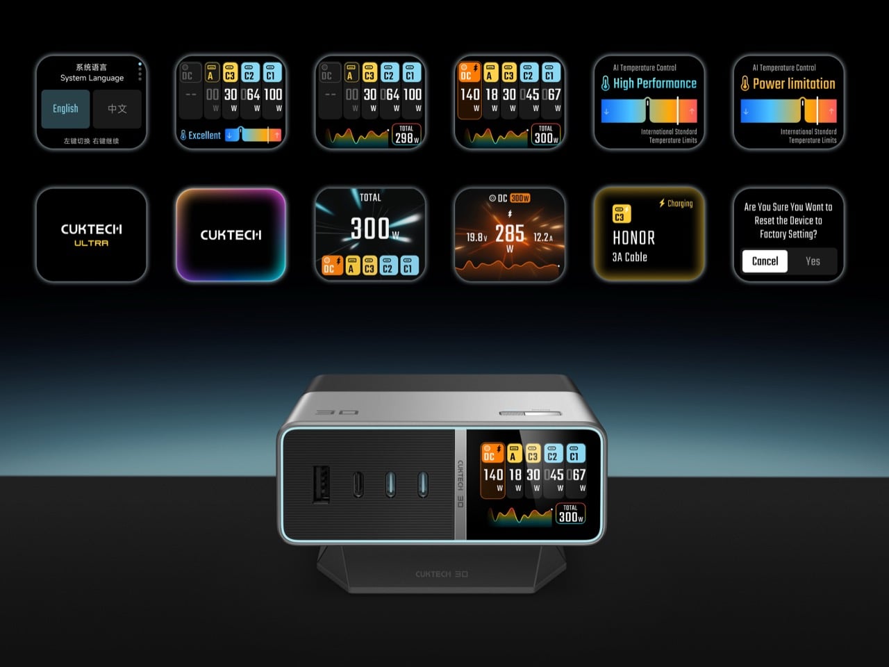
Third generation GaN sits at the core of the whole system, paired with what CUKTECH calls a PFC plus LLC dual architecture, a combination chosen specifically to keep five simultaneous charging sessions stable without the unit turning into a space heater. Gallium nitride has become the default material for anyone chasing high wattage in a small footprint, since it switches more efficiently than older silicon designs and sheds heat faster under sustained load. Thirteen fast charging protocols are baked in, including PD 3.1, PPS, Xiaomi’s own 120W standard, UFCS, Huawei SCP, and both QC and AFC, which is a genuinely broad net for a single charger to cast. Intelligent power allocation reads what is plugged in and redistributes wattage on the fly, with specific tuning for handhelds like the Steam Deck and ROG Ally that tend to confuse less sophisticated multi port chargers.
A 1.83 inch IPS display sits front and center, color coded per port, tracking wattage, voltage, and current across all five connections in real time, with a small running graph of total load underneath. Most chargers ask you to trust a single LED and hope for the best. This one just tells you, continuously, which is a small shift that changes how the object feels to live with on a desk. Nine layers of protection cover temperature, over-voltage, and over-current scenarios, which matters more than usual given how much power is moving through a chassis this size.
The form itself leans minimal, angled slightly on a magnetic tilting base so the screen stays readable without craning your neck, and finished in a two tone silver and black that reads more like studio monitor than power strip. A right angle DC cable keeps the desk tidier than the usual straight jack, and the grounded three pin AC cable is a small nod to safety that a lot of competitors skip to save a few cents.
None of this would matter much if the pricing did not make sense, and at $159.99 it lands right where a serious desk upgrade should, undercutting rivals capped at 140W or 200W while offering meaningfully more headroom. CUKTECH spent a decade building other companies’ chargers before it ever put its own name on a box. Two design award wins later, it is clear that decade taught them exactly which details actually matter.
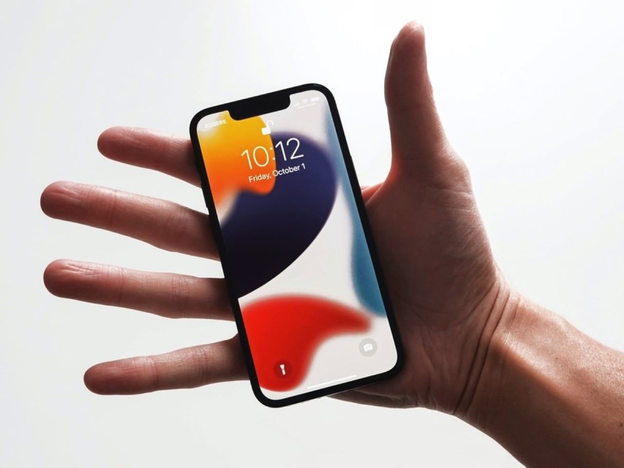
I have a friend who still uses an iPhone 13 mini held together by a case and pure spite, and every single time a new iPhone launches, she asks me the same question. Is it small yet. It never is. Apple has spent years telling us, implicitly, that small phones do not sell, that the market has spoken, that everyone wants a bigger canvas for videos and games and doomscrolling. Fine, sure, the sales numbers backed that up in 2023. But sales numbers do not mean the desire disappeared, they mean the alternative was not good enough to fight for.
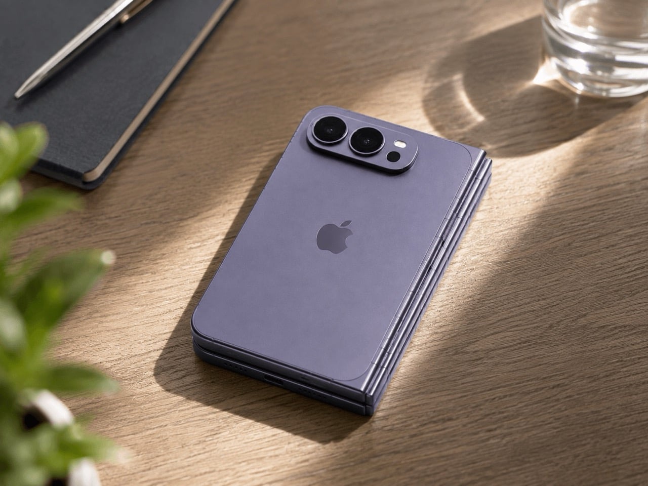
Which brings me to the iPhone Ultra, Apple’s rumored first foldable, expected to close into a short, squat, almost passport-shaped little brick before you unfold it into something the size of an iPad mini. That folded shape is the closest thing to mini energy Apple has shown in years, and it is buried inside a two thousand dollar folding phone nobody asked to be the delivery method. My friend does not want an iPad mini that folds. She wants her 13 mini, but new. Apple already built the shape. It just built it around the wrong phone.
Designer: Apple
The Air existed to answer a question almost nobody was asking at checkout, namely how thin can a phone get before the internals start filing complaints. It was a genuine engineering flex, the kind of thing that looks incredible in a teardown video and slightly pointless in daily use. I understood what it was trying to prove. I just never needed it proven to me personally, and I doubt I was alone in that.
The Ultra is rumored to repeat that exact flex, except this time the thinness gets folded in half, closing down to somewhere between 9 and 9.5mm shut and reportedly as thin as 4.5mm open, according to recent leaks. That is a genuinely wild number for a phone with a hinge in it. Apple is once again proving it can do the hard, borderline unnecessary engineering thing. The difference is that this time, buried inside that flex, is an actual shape people have been begging for since 2023. Apple just does not seem to have noticed it yet.
Go back and look at what the 13 mini actually was for a second, because I think people forget how unremarkable the compromise really was. It measured 131.5mm tall, 64.2mm wide, weighed 141 grams, and ran the exact same A15 chip as the standard 13. You gave up battery life and screen real estate. You did not give up the flagship experience shrunk down to fit an actual hand. Compare that to where the standard iPhone lineup sits today, regularly north of 6.1 inches before you even get to Pro Max territory, and the gap the mini used to fill has only gotten wider and lonelier.
Now put the Ultra’s folded footprint next to that. Reports point to a 5.5 inch cover display when shut, in a short, wide, passport style shell that is about as close to mini adjacent proportions as Apple has shipped since the mini died. The catch is that this compact shell only exists as a doorway into a 7.8 inch, 4:3 inner screen and a starting price rumored to land somewhere between 1,999 and 2,499 dollars. Nobody buying that phone is buying it to have something small in their pocket. They are buying an iPad mini that happens to fold shut, which is a completely different pitch than the one my friend has been asking me about for three years running.
There has been some loose speculation, mostly a 9to5Mac piece from last year, that Apple’s new staggered launch schedule could theoretically clear a runway for a smaller phone somewhere down the line. Even that piece called the odds slim to none, and nothing currently on Apple’s roadmap for the 18, 18e, 18 Pro, or Ultra includes a mini in any form. Samsung, for what it is worth, has stuck with its Z Flip clamshell as its own answer to compact, so the appetite for small has not vanished industry wide, it has just gone unanswered on Apple’s side of the fence for a while now.
So here is the pitch, and it is not a complicated one. Apple has now proven twice, once with the Air and once with the Ultra’s folded shell, that it can engineer real compactness without breaking anything important. Skip the fold. Skip the tablet trapped inside a phone shaped envelope. Take that exact short, wide, passport sized footprint and wrap a single, non folding screen around it, call it a mini, and ship it. Apple does not need a new idea here. It already built one. It just keeps hiding it inside features nobody was asking it to attach to.
McLaren just hit 1,000 Grands Prix, which in Formula 1 years is basically ancient royalty status. Only Ferrari has been around longer in this sport, and Ferrari acts like it too. So when a team crosses a milestone like that, you throw a party, you paint a special livery on the car, and apparently, you also get LEGO to build you a commemorative brick helmet with your driver’s face on the box.
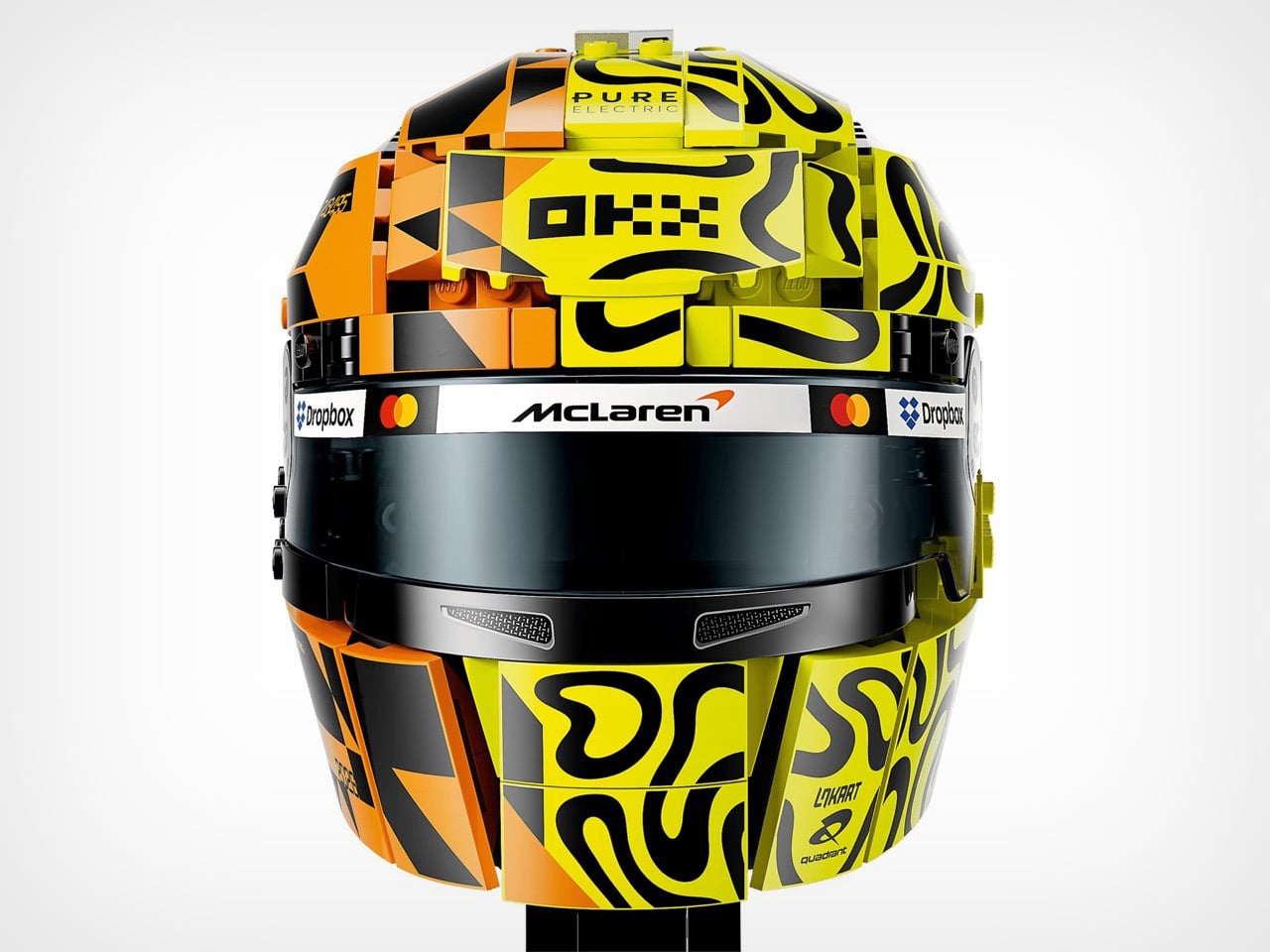
That is exactly what happened with Lando Norris’s set, a 793 piece build that packs his signature yellow and black “blob” design (his words, not mine) onto one side of a papaya orange helmet shell. It is McLaren history and Norris’s personal branding smashed together into a display piece, and somehow LEGO made that combination look genuinely good instead of like a marketing fever dream.
Designer: LEGO Design Team, co-created with Lando Norris
What makes this one different from your average licensed tie in set is that Norris was actually in the room for it. This was not LEGO grabbing some reference photos and calling it a day. The drivers worked directly with LEGO’s design team to shape both the Norris helmet and its companion piece for teammate Oscar Piastri, and the real helmets both drivers wore trackside at Monaco were based on the LEGO designs, not the other way around. That is a genuinely rare flex for a toy company. Daniel Meehan, LEGO’s Creative Lead for F1, put it well when he said building organic helmet curves at this scale “presents exciting opportunities for exploring new building techniques and creative parts usage,” which is design speak for “yeah, this was hard and we are proud we pulled it off.”
And they did pull it off. The papaya orange half and the neon yellow squiggle half meet along a seam that somehow still reads as one continuous helmet, not two mismatched shells taped together. Printed tiles handle every sponsor logo along the brow, McLaren, Mastercard, Dropbox, OKX, all sitting exactly where they would on the real thing. The back of the helmet is where the emotional weight lives though. LEGO printed “1.000 GP” and “1963” across the rear in bold anniversary numerals, with a small nod to “Bruce / Mal Est. 1963,” a reference to Bruce McLaren founding the team over sixty years ago. “NEVER STOP RACING” runs along the base of the visor. It is a lot of history packed into a helmet the size of a grapefruit.
My favorite detail, though, is buried in the yellow side paneling where LEGO snuck in a tiny printed minifig head, smiling face and all, hidden right inside Norris’s own design pattern. It is such a small thing, but it is basically LEGO signing its own work, and it tells you the people building this actually cared about more than just slapping a logo on a shelf piece.
The set comes mounted on a black display stand with Norris’s number 1 and a printed signature plaque, plus a minifigure of Norris himself in off track team gear, reportedly the first time he has been rendered as a LEGO minifig. It also plugs into the LEGO Builder app so you can rotate and zoom your progress mid build, which is a nice touch if you like tracking your pit stops digitally.
This helmet drops right after LEGO built ten full size, actually driveable F1 cars for a stunt at last year’s Miami Grand Prix, so the brand’s relationship with the sport is clearly only ramping up. The Lando Norris McLaren Mastercard F1 Team Helmet (set 43023) is available now for $89.99 on LEGO.com and through McLaren’s official store, alongside the matching Oscar Piastri edition if you want the full garage set.
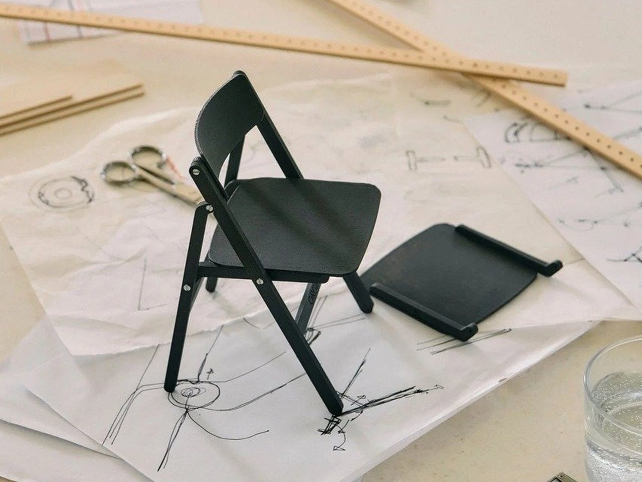
Gudmundur Ludvik had a question he couldn’t let go of. Why should a folding chair be a compromise? The answer, for decades, had been accepted without much pushback: folding chairs sacrifice comfort for storage, aesthetics for portability. The category had been quietly settled. Ludvik disagreed.
The Backflip, produced by HAY, is his rebuttal. An Icelandic designer based in Vejle, Denmark, Ludvik trained first as a carpenter and cabinetmaker before studying sculpture at the Icelandic Academy of Arts and furniture design at the Danish Design School, graduating in 2002. That layered background — craft, art, design — shows in the Backflip. The chair doesn’t announce its ingenuity. It keeps it entirely to itself.
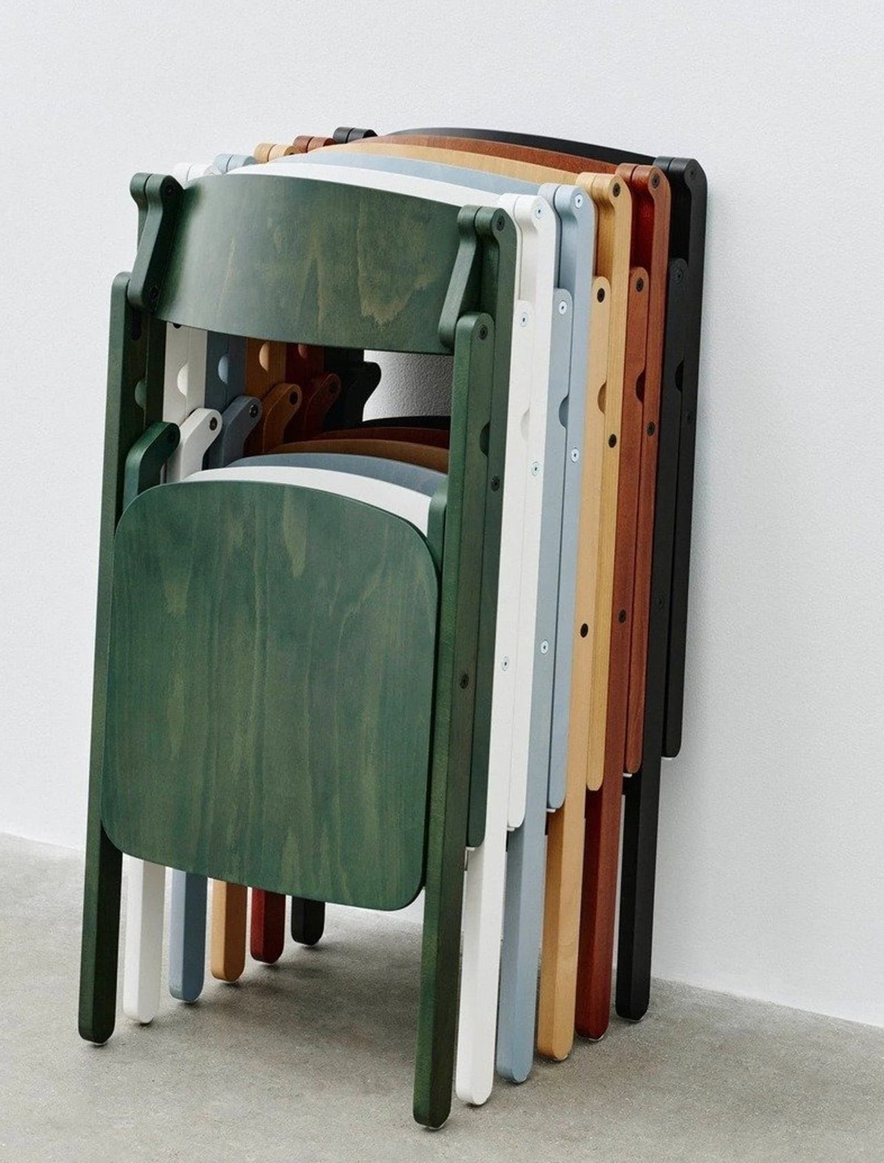
The defining feature is a folding mechanism concealed within the backrest. A single rotation collapses the chair in one continuous motion; one hand is all it takes. There are no exposed hinges, no visible hardware, no visual record of the engineering beneath. The mechanism is part of the structure rather than an addition to it, and that distinction is everything. From the front, the Backflip looks like a chair that simply sits well. Which is the point.
Ludvik’s stated ambition was to approach the folding chair typology from the opposite direction: create a good chair first, and a folding chair second. The frame is solid beech wood, lacquered, with a moulded plywood backrest. The profile is clean and unhurried, shaped by the logic of material and construction rather than any impulse toward decoration. Available in natural beech across a range of coloured finishes, it translates across private dining rooms and public hospitality interiors without trying too hard in either direction.
HAY also offers a matching wall bracket, designed to hold one or two folded Backflip chairs flush against any wall. It’s a satisfying extension of the concept: a chair that folds becomes genuinely space-saving only when storage itself is resolved. The bracket completes that thought without making a fuss about it.
The Backflip was previewed at 3 Days of Design in Copenhagen in 2026, where it sat alongside work from Jasper Morrison and Philippe Malouin in HAY’s exhibition at O-Overgaden, a contemporary art institution in Christianshavn. In that company, it held its own, which is a fair measure of how resolved the design feels.
What Ludvik has made is not a clever folding chair. It’s a chair that happens to fold, and the difference is considerable. That the mechanism disappears entirely into the backrest is less a magic trick than a design argument, made quietly, about where the priorities should lie.
Scanners haven’t changed much in how they occupy a workspace. A flatbed sits in the middle and claims that real estate whether it’s in use or not. Overhead models are more flexible, but they still tend to take up a fixed spot in any setup. For anyone working from a compact home office or shared studio, that trade-off rarely gets a proper answer.
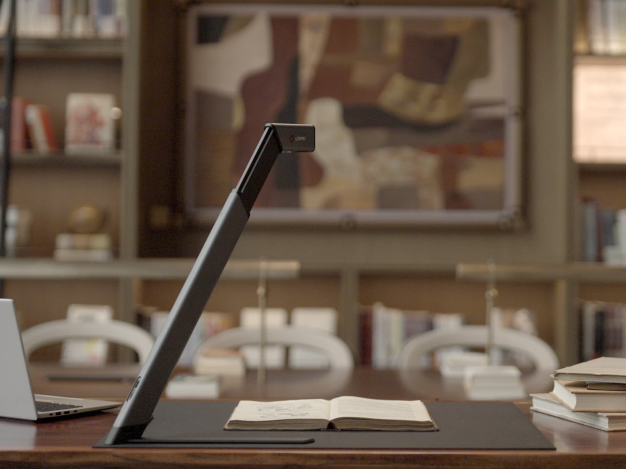
Joyusing’s ScanMax 320 approaches the problem from a different angle, quite literally. Rather than occupying the center of a workspace, it’s built to sit at the edge of a desk, positioned in the corner while its arm reaches overhead. It handles documents, books, artwork, and large-format materials up to A2 size, without taking over the surface it’s meant to serve.
Folded down, the ScanMax 320 measures 355mm x 68mm x 51mm, slim enough to slip into the included carrying bag and move between rooms without any effort. It runs entirely on USB-C power, so getting started means plugging in a single cable. There’s no proprietary adapter to hunt down, no driver installation ritual, and nothing complicated to deal with before the first scan. You can directly use the ScanMax 320 as a live presenter camera, and scanning as well as other advanced features simply require the free Joyusing Scanner intelligence software.
The shooting area extends to a full A2, or 594mm x 420mm, with a 32-megapixel sensor capturing at up to 380 DPI. That covers blueprints, double-page book spreads, large technical drawings, and oversized artwork in a single pass. An intelligent auto-switching system detects whether the material is A2 or A3 and adjusts accordingly, so there’s no manual input needed between sessions.
Overhead scanners tend to have a lighting problem, particularly near edges or when capturing materials that aren’t perfectly flat. The ScanMax 320 uses a rectangular illumination system shaped to match the scanning area, distributing light evenly and keeping shadows from washing out fine detail near the sides. Three brightness levels, at 30%, 70%, and 100%, are accessible with a single touch for quick adjustments in different environments.
Book scanning is where overhead devices tend to earn their keep, and also where they tend to frustrate. Pages curve at the spine, fingers get in the way, and binding shadows creep in from the edges. The ScanMax 320’s software handles most of this automatically, applying auto-flattening, finger removal, de-skewing, and shadow removal without manual adjustment. Book mode, paired with the included finger cots, keeps pages steady for continuous capture.
Once everything is captured, the software’s OCR engine converts printed text into editable, searchable files, with support for 180 languages and export options including Word, PDF, and TXT. A page of Japanese text, a technical report, or a multilingual research paper can go from physical to fully searchable in seconds, turning raw captures into documents you can actually search, copy, and share.
What’s less obvious about the ScanMax 320, and arguably more interesting, is that it also functions as a live visual presenter. Point it at a printed page, a hand-drawn sketch, or a physical object, and the feed goes live to whatever screen or projector it’s connected to. For a teacher going through annotated notes or a designer reviewing a layout with a client, that extra mode earns its place quickly.
Software compatibility covers Windows, macOS, and several Linux distributions including CentOS, Ubuntu, and Debian, though macOS users will find some features limited compared to the Windows version. Everything connects over USB-C, keeping the setup free of dongles and extra cables. Built-in annotation tools allow for direct markup of scanned content, which makes it easier to prepare materials before presenting or sharing them.
There’s something refreshingly considered about a scanner built to work with your desk rather than on top of it. The ScanMax 320 doesn’t ask you to clear space or rearrange anything. It folds, parks at the edge, and gets on with the job. Whether you’re archiving a collection, digitizing a sketchbook, or presenting something in a meeting, the fact that it stays in its corner is, in itself, the point.
GoldenEye 007, c'est sans doute LE jeu le plus emblématique de la Nintendo 64, celui qui a marqué toute une génération de joueurs et fait entrer le FPS dans nos salons. Mais à l'époque, beaucoup ne comprenaient pas vraiment ce qui se tramait sous le capot, pourquoi ce garde nous repérait, quelle arme...
Sorti aux tout débuts du MCU, ce film Marvel occupe une place assez particulière au sein de l'univers. Près de vingt ans plus tard, son réalisateur vient pourtant de révéler que l'aventure aurait pu prendre une direction très différente, avec des idées étonnamment ambitieuses pour l'époque.
Je n’ai jamais regretté l’E3. Entre les deux grands salons occidentaux du jeu vidéo, mon choix a toujours été très clair : je préfère la gamescom, son ambiance, sa proximité et surtout ses opportunités pour jouer aux prochains bangers du 10e Art. Et l’édition 2026 semble bien partie pour me donner une...
Sortie en 2011, cette adaptation animée cultissime a marqué toute une génération avec ses voyages temporels et ses conspirations. Pourtant, derrière ce chef-d'œuvre de la science-fiction se cache une réalité méconnue : la série, très populaire, sur une une production antérieure : celle d'un jeu vidéo...
Alors qu’une série originale vient d’être officialisée sur Disney+, le directeur créatif de Disney Animation, Jared Bush, ouvre également la porte à une adaptation cinématographique de Kingdom Hearts. Une excellente nouvelle pour les fans de la franchise, dont le quatrième opus vient d'être confirmé...
Comment jouer les nouvelles cartes que je viens de recevoir ? C'est l'éternelle question que se pose chaque dresseur lors de la sortie d'une extension de Pokémon TCG Pocket. Domination Céleste (Ruler of the Skies) est disponible depuis le 30 juillet 2026 et comprend une grosse poignée de cartes mettant...
En 2003, un jeune hacker allemand de 20 ans parvenait à s'introduire sur les serveurs ultra-sécurisés de ce studio pour dérober le code source du jeu le plus attendu de la décennie. Un piratage légendaire qui aura coûté plus de 250 millions de dollars à l'industrie et presque mené son auteur en prison.
Annoncée en début d'année, Final Fantasy XIV débarque cet été sur Nintendo Switch 2. Et si l'idée de voir un MMORPG aussi ambitieux sur console portable a de quoi étonné au premier abord, le résultat final a de quoi mettre tout le monde d'accord. Malgré un portage de qualité, une ombre reste au tableau.
Si vous pensiez vous pointer au cinéma dans quatre mois pour regarder Avengers: Doomsday les mains dans les poches et le cerveau en roue libre, Disney vient de vous adresser un petit rappel. Pour ne pas être largué face aux enjeux du Multivers, un marathon de révision s'impose.
Alors que Grand Theft Auto 6 se retrouve à nouveau au cœur d'une tempête médiatique après des fuites massives, un bien étrange justicier a fait son apparition. Prétendant se dresser contre les dérives de l'industrie pour défendre les joueurs, ce groupe mystérieux masque pourtant des intentions bien moins...

 Connexion