I’ve broken more shot glasses than I care to admit, and I’ve also poured a good shot of whisky into a glass that smelled faintly of dish soap because nobody thought to hand-dry it properly. That’s the quiet failure of most drinkware. It’s not that it looks bad. It’s that it gets in the way of the thing you’re actually drinking, whether through fragility, absorption, or just feeling like an afterthought grabbed from a gift-shop shelf.
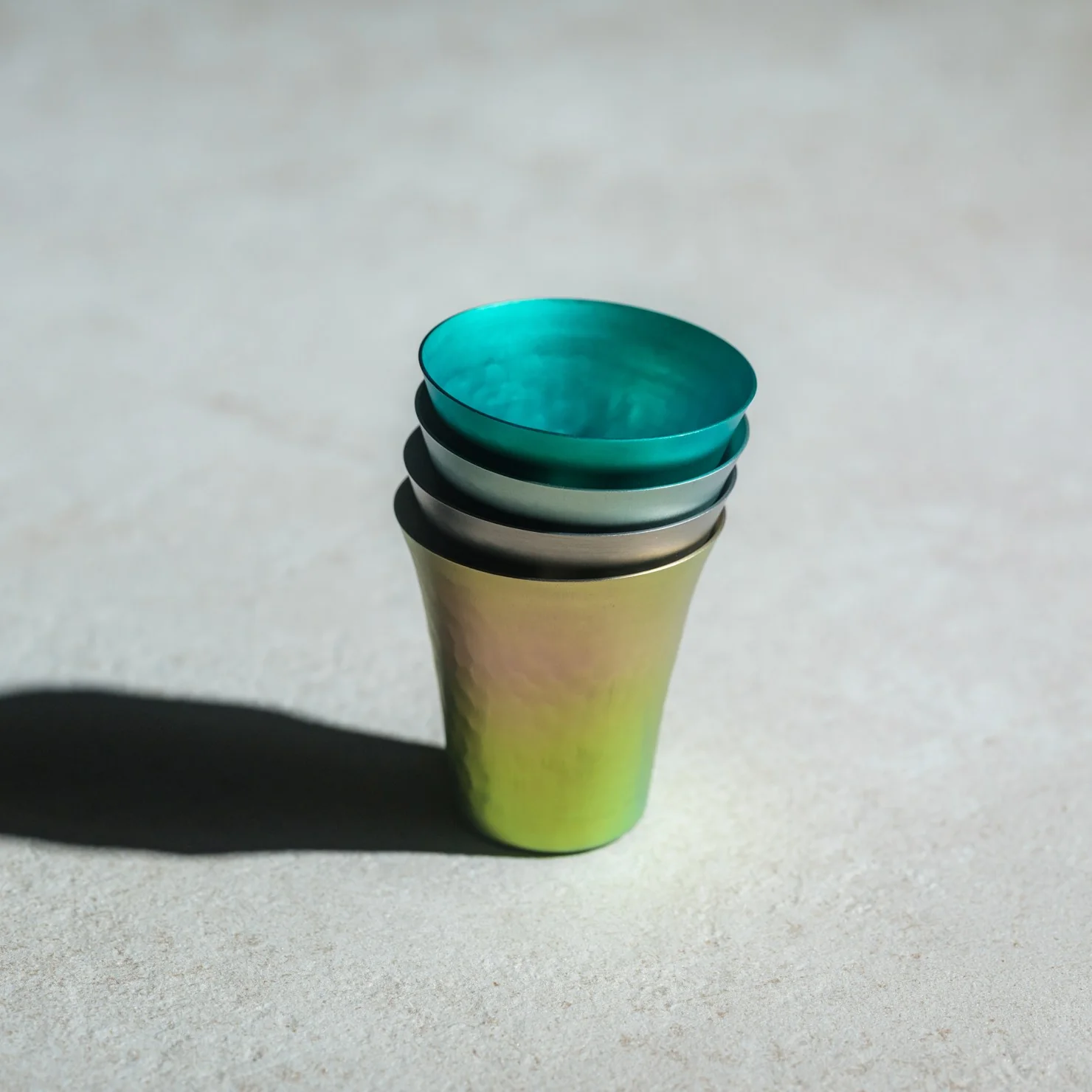
The Titanium Artisan Spirits Cup solves a problem I didn’t realize I’d been quietly annoyed by for years: the vessel changing the experience instead of getting out of its way. Made in Japan from solid titanium, this tiny cup, just 70ml, about the size of a proper sake or spirits pour, is built from a material that’s completely non-reactive. No metallic aftertaste, no lingering smell from last week’s whiskey, no worry about it cracking if you set it down a little too hard after a long day. It just holds the drink and lets the drink be the drink.
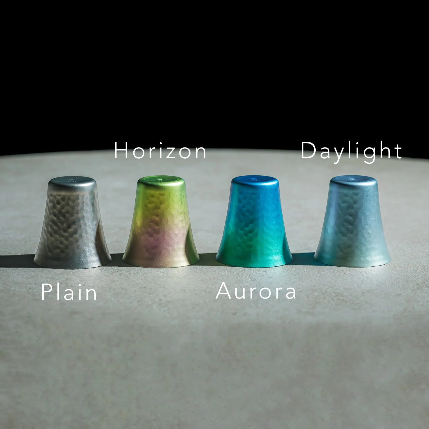
I’ll admit I was skeptical the first time I read “titanium cup” and pictured something that belonged on a camping trip, not a bar cart. But this isn’t the same brushed, utilitarian titanium you’d find in a hiking mug. The anodized finishes here, Horizon’s pink-to-green gradient, Aurora’s iridescent blue-green, Daylight’s pale blue shimmer, are created through an electrochemical process, not paint, which means the color actually lives inside the metal’s oxide layer. Practically speaking, that means no two colored cups come out quite the same. You’re not buying a product off an assembly line so much as picking one version of a process that never repeats itself exactly. For $50 to $60 depending on finish, that’s a small price for owning something genuinely singular.
It’s worth comparing this to how a brand like Yeti has trained American drinkers to think about premium drinkware over the last decade. Yeti built an empire on durability and temperature retention, on the promise that your drink stays cold or hot for hours in something that survives getting thrown in the truck bed. That’s a real, useful problem solved well. But Yeti’s whole design language is about insulation and toughness for casual, high-volume drinking. This titanium cup is solving something almost opposite: it’s not trying to keep your drink at a certain temperature or survive a drop from a tailgate. It’s built for the smaller, slower moment, the two-ounce pour you’re meant to sit with, not gulp. One is engineered for durability at scale. The other is engineered for intimacy in a single sip.
What actually sold me on this piece isn’t the finish or the aerospace-grade pedigree of the material, though both are legitimate. It’s the size. Seventy milliliters forces a kind of restraint. You can’t casually refill it five times without noticing you’re doing it. It nudges you toward treating a pour of whiskey or sake as an event rather than background noise while you scroll through your phone. That’s a small, almost accidental piece of good design, the kind that changes behavior without lecturing you about it.
I also don’t think the Titanium Artisans Spirit Cup is for everyone, and that’s fine. If you want something that holds sixteen ounces of iced tea and survives a dishwasher cycle, this isn’t your object. But if you’ve ever wanted a single, honest vessel for the good stuff, the bottle you save for a specific mood or a specific person, this earns its place on a shelf. With only a handful available at a time, it’s also not pretending to be mass-market, which somehow makes it feel more genuine rather than more precious. Good drinkware should disappear the moment the drink hits your lips. This one actually manages that, and it does it while looking like something you’d want to hold onto forever.
The humble foam earplug has been functionally unchanged since the 1970s: roll it down, jam it in, hope it expands to a seal, and find it somewhere in the sheets by 2 AM. It’s one of the few everyday objects that design culture has genuinely never come for, maybe because the attenuation numbers technically work, or maybe because nobody with enough resources was annoyed enough to fix it. The Ears 360 Silence, a CE-certified soft silicone earplug from Paris, is a structural redesign of that whole idea. Its retractable spiral wraps into the outer ear’s helix rather than anchoring in the canal, locking the plug flat and flush against the head with 24 dB SNR measured to EN 352-2:2020 and a peak of 29.9 dB at the frequency range where snoring and human voices live. The foam never had a chance.
Youcef Abdaoui runs a studio near Paris and started prototyping the Silence in 2024 with a bent wire and a bit of putty, just to test whether a helix-anchoring spiral could hold in an ear. It did, and the dozens of iterations that followed produced a product France voted Product of the Year 2026, consumer-elected rather than jury-awarded, which tells you something about how it performs in actual ears. Ears 360 has since shipped to more than 120,000 customers through their store, 500+ pharmacies and B2B partners before going international. The Silence is not a prototype; it is certified to EN 352-2:2020, mass-produced, and more than 14,000 units are already in stock. I got to see a pair in person, and the silicone finish reads as serious product, not a health-aisle impulse buy.
The ear is already a spiral. The outer rim of the pinna is anatomically called the helix, a curved ridge that traces a partial revolution around the auricle, and deeper inside, the cochlea completes that geometry: a full spiral chamber, coiled like a snail shell, that converts sound pressure into neural signal. Nature returns to the spiral for the same reason architects do: it distributes force without concentration points, the same logic behind a nautilus shell or the tight coil of a fern fiddlehead before it unfurls. The Ears 360 Silence works with that architecture: the spiral holds, not the tip. The spiral wraps laterally into the helix and locks through geometry, bearing almost no canal pressure, which is the whole reason the plug sits flush against the head rather than protrudes from it.
Loop-style reusable earplugs have made a design virtue of their visibility, with a circular protrusion sitting outside the ear canal as a deliberate aesthetic statement. That works at a concert, but it becomes a pressure point the moment you roll onto your side in bed, which is the situation most people are buying earplugs for in the first place. The Silence’s spiral body measures 18.44 mm by 15.49 mm, slim enough that there’s nothing significant pressing against a pillow. The profile looks almost deceitfully small for what it’s actually doing inside the helix. Side sleepers have been the quiet losers in every previous generation of earplug design, and this is the first form factor that treats their use case as the primary constraint rather than an afterthought.
One spiral body, two levels of silence, switchable in seconds from 24 dB to 29 dB. The standard configuration ships with four tip sizes across diameters of 9.9, 10.9, 11.9, and 12.9 mm, covering a genuinely wide range of ear canal openings, and delivers 24 dB SNR in filter mode, enough to take a busy street down to library territory without muffling conversation entirely. The Swim & Work Kit clips on triple-flange tips that push attenuation up to 29 dB, entering genuine worksite and industrial territory. User satisfaction data from Ears 360 puts concert approval at 91% and commute approval at 97%, and the founder confirmed to me directly that concert use is a genuine design intention, not a marketing add-on. The IPX7 waterproof rating keeps the spiral pool-ready alongside the kit’s triple-flange seal.
One Silence replaces hundreds of disposable foam earplugs, full stop. The body is made to last for years, the silicone tips are replaceable instead of throwing the product away, and the packaging is compact by design so every shipment travels as a slim letter, not a parcel. There’s no offset scheme or carbon language layered on top to make it sound more considered than it is. The Silence is reusable by nature: wash it, swap the tips, keep the body. Replacement tip sets extend the product’s life instead of replacing it, and the compact packaging uses a fraction of the material of a standard box.
Pricing starts at €18 (roughly $21) for a single unit with carry case and tip set, with the Silence and Swim & Work Kit bundle at €27, a Duo Pack at €39, a Duo plus Kit at €49, and the new ALL COLORS pack at €59, which includes one pair in each of the three current colorways. Black, Pink, and Green are all available now. Every unit carries the 2-year EU legal warranty of conformity, which is meaningful for a product whose longevity pitch depends on actually outlasting the disposable foam it replaces. Delivery is November 2026, and the Ears 360 Silence is also available at ears-360.com.
Here is a fun little contradiction to chew on before we get into the actual lamps. The whole point of Call It a Day, Tongqi Design’s new lighting collection, is that you barely have to try. You bop it, you tug it, you flop your hand near it, and it turns on. Zero precision required, zero thinking involved, which is exactly the pitch when you have just walked through the door after a day that emptied you out. But get this. The less effort the lamp asks of you, the more effort someone else clearly put into making that possible. That is the trade we are here to unpack.
Shanghai-based designer Tongqi Lu built the collection, a table lamp, floor lamp, and pendant, around soft silicone shades with zero switches anywhere on them. Every gesture works because the material itself is doing the sensing, not a button hunting for your finger. It sounds simple sitting in your living room. It is not simple to make, and that gap between the two is basically our whole story today.
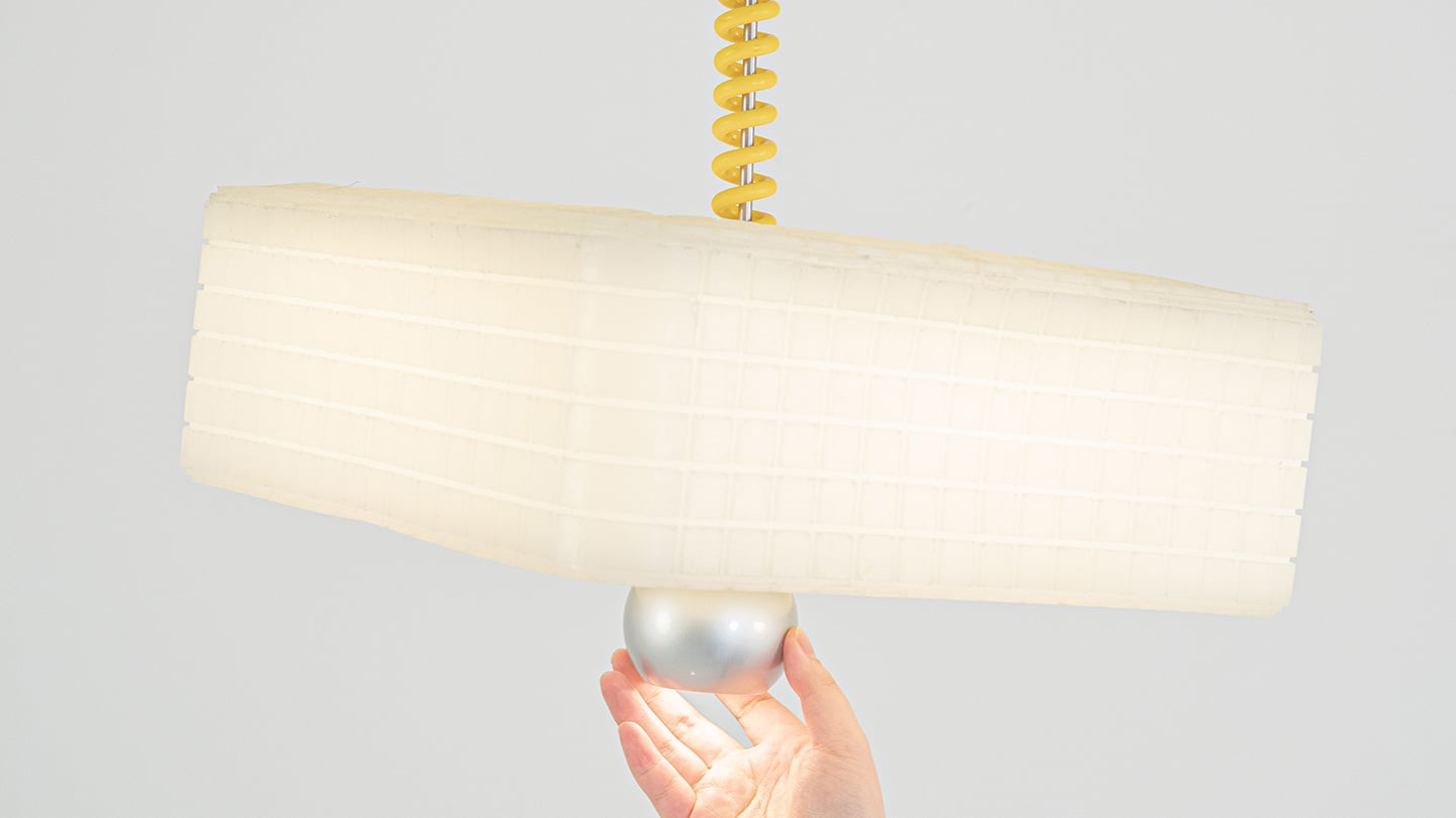
Call It a Day is a three piece lighting collection, a table lamp, a floor lamp, and a pendant, and every one of them is dressed in soft, translucent silicone instead of glass or fabric. That alone is a break from convention, since silicone shades are usually reserved for LED strip diffusers rather than the whole visible body of a lamp. But the real departure is that none of these lamps have a switch. You bop the table lamp, you tug the pendant by its cord, you press the floor lamp wherever feels natural, and the light responds. There is no correct spot to find in the dark. The entire shade is the input, which sounds like a small shift until you realize how much of lamp design has always been built around finding one tiny precise point.
Lu frames the whole thing around the moment you get home and your body checks out before your brain does. She has talked about dropping onto the sofa and reaching out to press, pull, or tap without really thinking about it, and the light turning on not because she followed a rule but because she did not. That is a genuinely sharp way to think about interaction design. Most lighting asks you to be at your most coordinated right when you are at your least. Call It a Day flips that expectation, and the coiled yellow cable running through the collection is a nice touch too, borrowing the old pull chain gesture without being precious about it.
The Process
Here is where things get interesting, because the studio itself is not some slick production facility. It is an office in Shanghai with a plastic sheeted folding table, jerrycans of liquid silicone lined up against the wall, and a window looking out over the skyline. Before any of it was cast, the whole collection existed as full scale cardboard mockups, a pendant hung from a coiled cord and a table lamp balanced on a paper cone, sitting in the corner of the room like a rough draft nobody threw away. That is a genuinely useful thing to see, because it shows the gesture and the proportions were locked in long before the material was.
The shades themselves come out of large block molds with a fine grid texture cut into the cavity, which shows up on the finished silicone as a soft woven pattern once the lamp is lit. Getting silicone out of a mold cleanly is trickier than it sounds, since silicone tends to bond to itself, so getting a cast shade out of a cast mold without either tearing or fusing takes real care with release agents and material choice. Pouring it clean adds another layer of difficulty, since bubbles trapped in a translucent material show up as visible flaws once the light hits them. In the photos, you can see two people pouring together, one holding the bucket steady, the other running a palette knife across the lip so the silicone comes down in a thin ribbon instead of glugging out in one shot, which is a simple trick for keeping air out of the pour. It is not a factory process. It is a hand process, done carefully, on a folding table, gallon by gallon.
The Perspective
What I like most about Call It a Day is that the ease on the user’s end is clearly paid for somewhere upstream, and that upstream cost is visible if you know where to look. A switchless lamp sounds like a simple idea until you have to actually engineer a material that can be grabbed, twisted, and mistreated without breaking or losing its shape, and then cast that material cleanly at scale in a small studio. That gap between the lived experience and the labor behind it is exactly what a lot of good product design tries to hide, and here it is sitting right out in the open in the process photos.
It also helps that the whole thing traces back to something real. Lu’s early work, the lemon shaped Citron lamp, her furniture line built around trees and water lilies, all of it circles the same idea of pulling people back into their bodies after a long day in a city that does not really let them slow down. Call It a Day feels like the most literal version of that idea yet, a lamp built entirely around the ninety seconds when you have officially given up on being careful. Whether or not the gesture control holds up over years of actual use is a question only time and daily wear will answer, but as a piece of intent, this one lands.
The Apple ecosystem runs deep, but the devices themselves only go so far. The iPhone, Apple Watch, and iPad are remarkable pieces of hardware on their own, and yet a small category of accessories has figured out exactly what each one is missing. Not cases that just protect or cables that just charge, but objects that change the way a device feels, sounds, looks, or works from the moment you pick it up.
These five accessories do exactly that. They come from different corners of the Apple world, covering the watch, the phone, the iPad, and the kind of audio experience Apple never built its own hardware around. Each one earns its place not because it carries a name worth recognizing, but because it solves a specific frustration that was always there waiting to be noticed. Here are the ones worth knowing about right now.
1. NightWatch
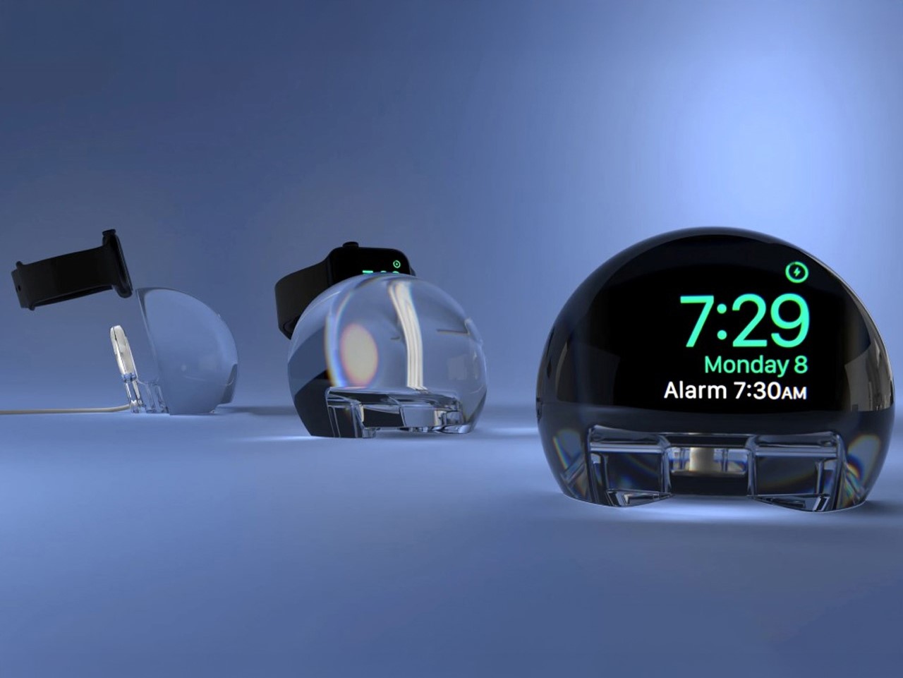
Most Apple Watch docks are functional and forgettable, a plastic puck with a magnetic charger and no ambition beyond getting your watch off your wrist for the night. The NightWatch is not that. It is a clear glass orb, roughly the size of a generous paperweight, that you set your Apple Watch inside at night. The result transforms the watch’s nightstand charging face into a magnified, glowing clock that is genuinely easier to read from across a dark room than the device alone would ever allow.
The dock works by treating the Apple Watch display as a light source and the glass sphere as a lens, drawing the time out of a small wrist-bound rectangle and spreading it into a real visual presence on the nightstand. It also includes a built-in audio amplifier that boosts the sound of your alarm, so quiet mornings stay that way until you actually need them not to be. At $69.99, it is priced more like a considered object than a cable management solution, which is exactly the spirit it deserves to be received in.
What we like
The magnification effect turns the Apple Watch display into a legitimate bedside clock without additional screens, apps, or setup
The built-in audio amplifier addresses the one genuine weakness of relying on Apple Watch nightstand mode as a morning alarm
What we dislike
The orb form factor is visually dominant enough that it will not suit minimalist nightstands where a small footprint matters
At $69.99, it costs more than several competing dock designs that handle charging equally well without the visual statement
2. Rock Paper Pencil 4.0
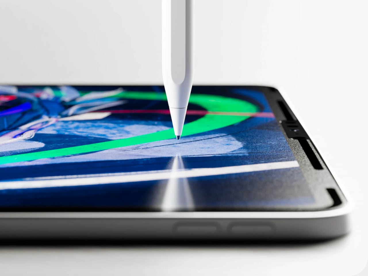
The Apple Pencil is a precision instrument that has never quite figured out how to feel like one. The glass surface beneath it is smooth and frictionless, and while that works fine for certain tasks, illustrators and note-takers spending hours drawing have always wanted something closer to real paper. Astropad’s Rock Paper Pencil addresses that gap directly: a removable, reusable nano-texture screen protector paired with custom Apple Pencil tips, and version 4.0 makes the system meaningfully better than it has ever been.
The upgrade introduces a new graphite POM tip alongside the existing steel ballpoint option, and the difference is immediately legible. The graphite tip mimics the toothy drag of a 2B pencil, a sensation that makes expressive sketching and shading feel deliberate and controlled rather than slippery and approximate. Each kit now ships with four tips in total, two graphite and two ballpoint, alongside a screen cleaning kit that should have been included from the beginning. The protector attaches via NanoCling static cling rather than adhesive, meaning it lifts off without residue and goes back on without a bubble.
What we like
The NanoCling system is genuinely removable and reusable, giving iPad owners a paper-feel surface on demand without permanently altering the display
Having both graphite and ballpoint tips in a single kit covers two distinct working styles without requiring a separate accessory purchase
What we dislike
The graphite tip wears down noticeably faster than the ballpoint option, which will matter to anyone putting in long, intensive drawing sessions regularly
The friction that makes sketching feel natural also makes smooth, fast swiping across the screen feel slightly resistant during ordinary everyday use
3. Battery-Free Amplifying iSpeakers
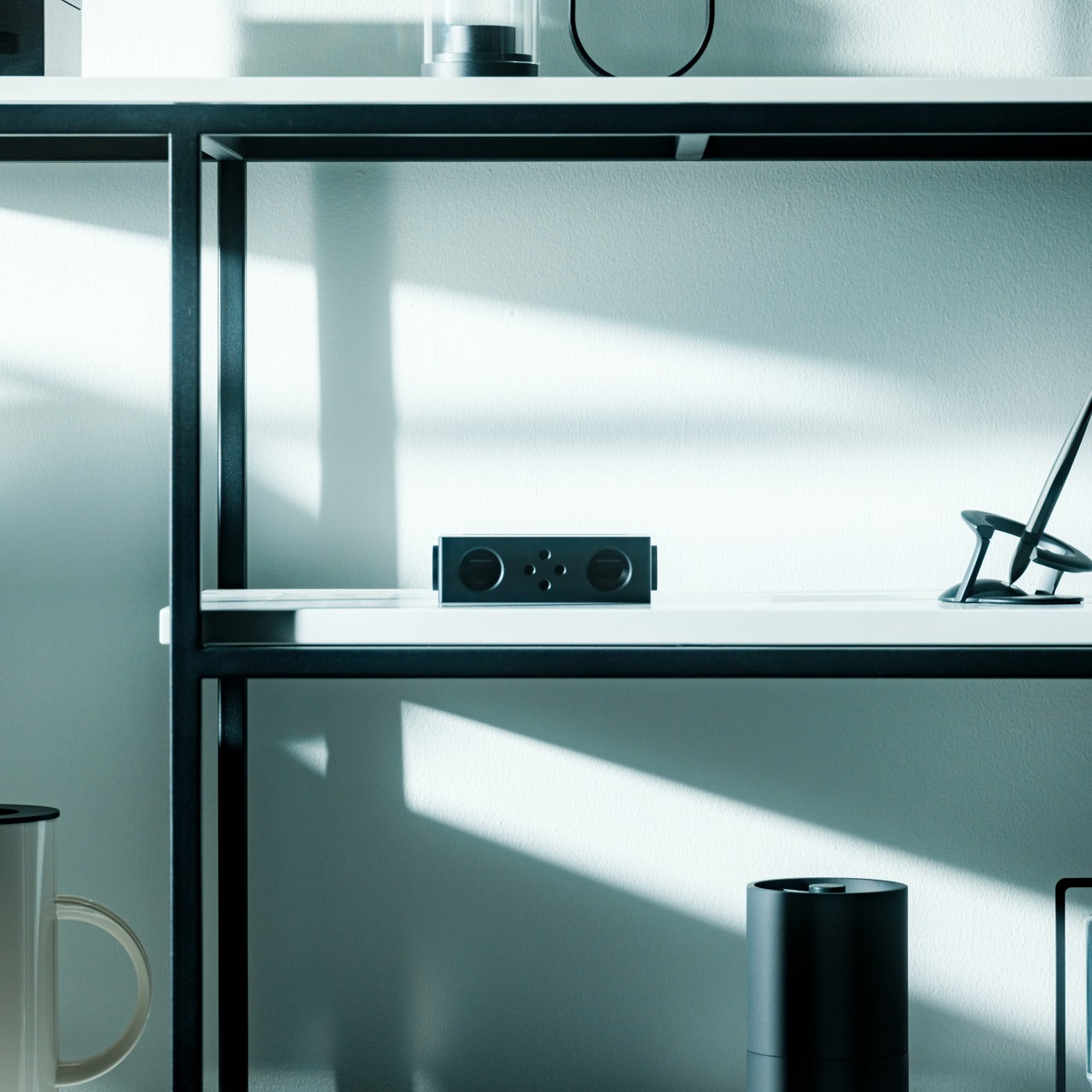
Every speaker you own asks something of you before it makes a sound. The Bluetooth speaker needs charging, and the charging case needs its own cable. The smart speaker needs a wall outlet, a WiFi password, and a company’s servers to stay online on a random Tuesday. The Battery-Free Amplifying iSpeakers, designed by Ooi Masato of Pit-A-Pat for Shimawa and made in Japan, need none of it. They need your iPhone and the physics of a sound wave moving through precision-machined metal, and that is the complete brief.
The design is straightforward: a Duralumin metal body with a slot for the phone and golden-ratio speaker apertures that channel and amplify sound through acoustic resonance, the same principle that powered phonographs before electricity reached most homes. There is no pairing, no app, no battery level to check. You set your phone in the slot, and your music gets louder and fuller, immediately.
Zero setup and zero charging requirements make it the simplest speaker in any room, with no ritual standing between you and better sound
The precision-machined Duralumin construction means there is nothing to break, replace, update, or charge, ever
What we dislike
At $179, it competes on price with capable Bluetooth speakers that offer far more volume, range, and flexibility for larger spaces or outdoor use
The phone slot is sized for specific handsets, so case thickness and phone dimensions will determine how well it actually cradles your device
4. Nomad Leather Folio
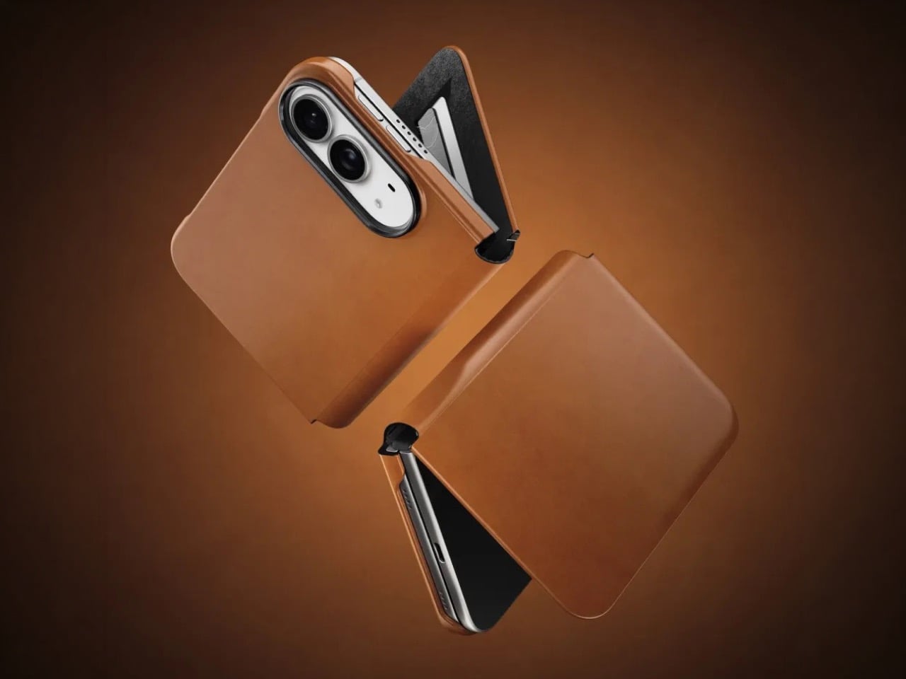
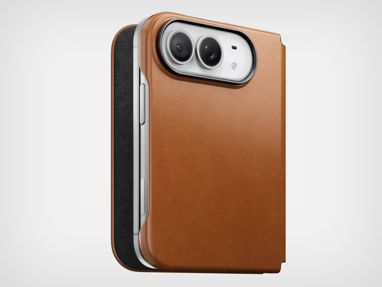
Phone cases tend to fall into two camps: those that protect the device and those that try to say something. Nomad’s Leather Folio attempts something harder: a single object that does both without looking like it is trying to do either. Crafted from Horween leather inside and out, with MagSafe compatibility and RFID blocking built in, it folds over the front of the iPhone Duo and turns what is already an expensive device into a combination that reads less like a phone and more like something a person who still carries a leather notebook would reach for without thinking twice.
Priced at $129, it is not a cheap case, but it is not pretending to be. The leather cover closes over the screen, which is either a feature or a nuisance depending entirely on how you use your phone, though for anyone who already drops it face-down out of habit, the protection is real and the payoff is legitimate. MagSafe integration means the phone charges normally through the case, and the RFID blocking handles the handful of situations where that actually matters. The overall effect is a device that feels deliberately considered in a way most cases never manage to pull off.
What we like
Horween leather develops a patina with use rather than aging badly, which gives the case a genuinely long useful life most materials cannot match
MagSafe compatibility and RFID blocking are both included without any visible hardware bulk or added thickness to the profile
What we dislike
The full front flap adds a step to every screen interaction that will feel like friction until the habit settles, and that adjustment can take longer than expected
At $129, it sits in an awkward price band between affordable everyday cases and truly premium leather goods, which makes the value case harder to land cleanly
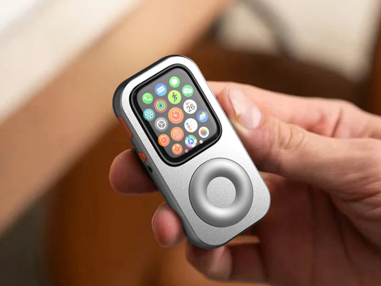
5. RePod C1
The click wheel was never just an interface. It was a tactile experience that gave early iPods a sense of ceremony that touchscreens have never quite replaced, a physical scroll mechanism that made navigating a playlist feel like it was worth doing slowly. Techpod’s RePod C1 is a $60 Apple Watch case that wraps the watch in an iPod-style shell and brings that wheel back, and what keeps it from being a novelty is one mechanical detail: the click wheel connects directly to the Apple Watch’s Digital Crown, so turning it actually does something real.
The case uses an open-back design that leaves all of the watch’s sensors fully accessible, meaning heart rate monitoring, ECG, and Apple Pay all continue to work normally. Antenna cutouts preserve Wi-Fi, Bluetooth, and cellular connectivity without compromise. The more interesting side effect is what it does to the device’s identity: sliding the watch into a pocket during a run or a commute and navigating with the Crown from inside the shell turns the Apple Watch into something that feels far more like a small, deliberate music player than a wrist-worn notification machine.
What we like
The mechanical connection between the click wheel and the Digital Crown makes the nostalgia functional rather than cosmetic, which is a meaningful distinction
The open-back design keeps every sensor and connectivity feature fully intact, so nothing about the watch’s capabilities changes when the case goes on
What we dislike
Adding any case to the Apple Watch introduces bulk to a device whose appeal partly depends on being thin and unobtrusive on the wrist
The iPod aesthetic lands clearly for one generation and reads as entirely opaque to anyone who came to Apple after the click wheel era ended
The Best Accessories Are the Ones Apple Didn’t Think to Make
Apple’s hardware is precise enough that the accessories worth paying attention to are the ones that noticed a gap the company chose not to fill. The NightWatch saw a dim nightstand clock. Astropad saw a frictionless drawing surface. Ooi Masato saw a speaker that required too much setup before it made a sound. Nomad saw a phone that could carry itself differently. Techpod saw a scroll mechanism nobody had brought back with anything real underneath it.
None of these are essential in the way a charging cable is essential. They are optional in the best sense, the kind of thing that makes a device feel more considered in the hands of whoever chose it. Whether your Apple device is a watch, a phone, or an iPad, something on this list has already figured out what was missing before you had the words for it.
There’s something wonderfully strange about walking up to a framed picture on your wall and telling it what to paint next. Say “paint my dog as a Japanese ink painting,” and the frame generates and displays a new piece. No file transfers, no app navigation, no creative software required. Jitrainno’s Smart Canvas runs on this premise: a voice and text-prompted AI art frame built around an E-Ink Spectra 6 color display, the matte, paper-like panel technology that draws zero power in static mode and reads under ambient light the way a canvas does. It comes in three solid-wood sizes, 7.5, 13.3, and 31.5 inches (named the Echo-7, Echo-13, and Echo-31 respectively), all with built-in batteries and Wi-Fi.
Jitrainno is a Hong Kong-based multidisciplinary team with in-house expertise spanning hardware R&D, E-Ink engineering, AI integration, firmware, and cloud services. They developed a proprietary color rendering layer on top of the Spectra 6 panel, tuned specifically for skin tone accuracy, landscape depth, and smooth gradient transitions. That kind of layered engineering, building custom display algorithms rather than shipping a panel with factory defaults, is what separates a team that genuinely understands display science from one that simply sourced a good component. The project moved from inception and industrial design in June 2025 to a production validation run by May 2026, a fast but not reckless pace for hardware at this scale. Global fulfillment is estimated for November 2026.
E-Ink Spectra 6 is the most capable color e-paper panel currently available to consumer product makers, using six primary pigments: black, white, red, yellow, blue, and green. It achieves up to 200 pixels per inch and draws zero power in static display mode, meaning the canvas can stay on your wall for days between charges. The paper-like surface reflects ambient light rather than projecting it, eliminating the glowing-rectangle problem that has defined every LCD-based digital art frame since the Kodak EasyShare era. Jitrainno’s self-developed rendering and color optimization layer is designed to preserve the subtle details that make an image feel closer to paper art. Based on early reviews, it reads more like a framed print than a screen, which is the bar the whole product needs to clear.
Speaking a prompt aloud and watching a new image materialize on the wall is a genuinely new behavioral ritual, and I think it’s the feature that will hook most people. Users can create images from text or voice prompts, explore different visual styles, and generate variations of their ideas, with AI used as a creative tool within the artwork creation experience. The product page demos a prompt like “a cute green dinosaur in a sunny prehistoric scene, soft watercolor and colored-pencil storybook style,” which apparently renders accurately enough to land on a kid’s wall. The AI side routes through third-party commercial image generation services via official APIs, supporting text-to-image and image-based creative generation within the experience. They also confirm they do not use user content to train their own foundation models, a meaningful distinction in a market where that commitment is far from universal.
AI generation is only one of several ways to populate the canvas. The app supports content from AI-generated art, a free art gallery called Daily Drops, the phone camera, the user’s photo library, and personal collections. Daily Drops streams a rotating selection of curated artwork that users can filter by mood or scene type and push directly to the display. The phone camera connection opens the obvious use case of photographing a physical painting, a landscape, or a face and sending it to the frame instantly. That breadth of sourcing makes the Smart Canvas a capable display platform in its own right, with AI generation sitting as a feature rather than a crutch.
Gallery proportions, tactile materials, and Auto-Rotation are deliberate choices to help the Jitrainno Echo series belong in the room like framed art. From the product photography, the proportions are gallery-standard, the profile slim enough to recede into a wall, and the matte panel surface does the visual work of making it belong. A built-in sensor detects whether the frame is in portrait or landscape and automatically switches the artwork’s aspect ratio, with no manual setting required. Connectivity runs in two modes: full cloud-connected (remote upload, AI creation, gallery sync, multi-user sharing) or completely offline (no account, no internet, direct phone-to-frame transfer). The offline option is a genuine design stance in a category where “smart” has almost universally meant always routing through someone else’s server.
The Jitrainno Echo-7 at 7.5 inches (1024×600, 170x236mm) is the tabletop model. The Jitrainno Echo-13 at 13.3 inches (1200×1600, 316.3×416.3mm) works both on a desktop stand and wall-mounted, making it the most flexible of the three. The Jitrainno Echo-31 at 31.5 inches (2560×1440, 603x903mm) is wall-only, the model that reads as a proper statement artwork rather than a gadget trying to pass itself off as one. All three run on E-Ink Spectra 6 full-color panels in solid wood frames, with built-in batteries and USB-C charging. The Jitrainno Echo-13 retails at $469 and the Jitrainno Echo-31 at $1,499, both covered by a one-year manufacturer’s warranty, with global fulfillment estimated to begin November 2026.
Even my jaw dropped a bit when I was getting briefed on it, as very few Razer products hit below $50, especially when not on sale.
Of course, the $49.99 question is it any good? To be fair, I'm a bit biased against 65% keyboards (I miss my media keys), but I've spent the last 10 days using it, and let's just say the price wasn't the only surprise.
Let's get into the pros, cons, and who this is for.
Razerhad no input, nor did it see the contents of this review, prior to publication.
Razer Reclusa X Mini 65%: Price and specifications
Direct top-down view of the Razer Reclusa X Mini 65% keyboard showing its black, white, and teal keycaps. (Image credit: Daniel Rubino)
The Reclusa X Mini 65% launches at just $49.99 (Razer.com, Amazon; I expect Best Buy to get it eventually), making it one of the most affordable mechanical keyboards Razer has released in recent memory. That's especially notable when you consider it isn't cutting corners on enthusiast-friendly features such as hot-swappable switches, south-facing LEDs, pre-lubed stabilizers, per-key RGB lighting, and support for Razer's competitive gaming technologies.
Among its highlights are Razer's Gen-3 Orange tactile switches, compatibility with both 3-pin and 5-pin mechanical switches, dual-layer silicone dampening, and a new tri-tone visual design that immediately separates it from the rest of Razer's keyboard portfolio.
The biggest surprise with the Reclusa X Mini 65% is just how good it feels to type on.
I'm generally not a huge fan of 65% keyboards. I miss dedicated media controls, and shrinking a layout inevitably introduces compromises. Yet after a few days with the Reclusa, I found myself reaching for it more often than expected.
Razer describes them as delivering a tactile bump with quieter operation and improved consistency, while maintaining a 100-million keystroke lifespan. In practice, they're some of my favorite tactile switches Razer has produced, even compared to the more expensive Huntsman line.
The keys feel snappy, springy, and responsive, with excellent travel and a satisfying bottom-out characteristic that's surprisingly difficult to describe. The closest comparison is that each keystroke feels deliberate, controlled, and rewarding.
Every press feels crisp and energetic, with just enough tactility to make long typing sessions genuinely enjoyable.
The keyboard's dual-layer silicone dampening helps elevate the experience further. Razer specifically tuned the board to reduce resonance and hollow acoustics, and it shows.
The overall sound profile sits somewhere between mid-volume and clacky. Meanwhile, the space bar and backspace produce a deeper, more pronounced thock that adds personality without becoming distracting.
Surprisingly, no risers on the bottom of the Reclusa X Mini 65%. (Image credit: Daniel Rubino)
For a $50 keyboard, the construction is also impressive.
My review unit measured roughly 710 grams, giving it enough heft to stay planted on the desk. The chassis doesn't feel flimsy, cheap, or hollow. The matte finish does a great job resisting fingerprints, and the included braided USB-C cable is the same type of quality cable Razer ships with more expensive products.
The hot-swappable design is another major selling point.
Users can install both 3-pin and 5-pin switches without soldering, making the board approachable for newcomers while still appealing to enthusiasts. Razer even notes that the keyboard can be opened through screws in the top plate for additional modifications, although doing so may affect warranty coverage according to the FAQ
The Razer Reclusa X Mini 65% has a very solid body with a single Type-C port on the left-hand side. (Image credit: Daniel Rubino)
I experimented with swapping switches and found the process straightforward. More importantly, I never felt a pressing need to do so. The stock experience is already strong enough that many users will be perfectly happy leaving it untouched.
The new tri-tone keycap design is another win.
Razer says the design is intended to give the keyboard a distinctive visual identity, and it succeeds. Combined with south-facing RGB LEDs, the Reclusa feels like one of Razer's clearest nods yet toward the custom keyboard crowd.
Gaming features that actually matter
Screenshot of Razer Synapse and the multiple gaming features for the Razer Reclusa X Mini 65% keyboard. (Image credit: Daniel Rubino)
The Reclusa X Mini 65% also includes Snap Tap, Snap Flex, and Dual-Keypress Priority, technologies aimed primarily at competitive players.
Snap Tap helps prioritize directional inputs for cleaner counter-strafing behavior, while Snap Flex can bind two actions to a single keystroke for more consistent multi-input actions. Dual-Keypress Priority is designed to maintain movement consistency when overlapping directional inputs occur.
Close-up of the included Doubleshot ABS, tri-tone design keycaps and RGB. (Image credit: Daniel Rubino)
During a few gaming sessions in Call of Duty and DOOM: The Dark Ages, the keyboard behaved exactly as I'd expect from a modern Razer gaming board. The features worked as advertised, though none fundamentally changed my experience during limited testing.
The more important takeaway is that entry-level pricing doesn't mean sacrificing gaming-focused functionality.
What I don't like
(Image credit: Daniel Rubino)
The 65% form factor itself remains my biggest complaint.
That's more personal preference than a flaw, but users accustomed to dedicated media keys, function rows, or larger layouts may feel constrained. That said, I like typing so much on this; I haven't switched back yet, so that's saying something.
Another drawback is the lack of adjustable feet.
The keyboard sits completely flat, and there are no built-in risers to alter the typing angle. Some users will appreciate the low profile, but I would have liked additional adjustment options.
The Reclusa feels premium where it matters most, but a pair of flip-out feet would have completed the package.
RGB lighting is also merely good rather than exceptional. It gets the job done, but don't expect the depth, diffusion, and visual impact of premium Razer boards like the Huntsman V3 Pro series.
Finally, Synapse remains a potential sticking point. While Razer has been increasingly expanding web-based support options across its ecosystem, some users still prefer products that avoid software requirements entirely.
Should you buy it?
(Image credit: Daniel Rubino)
✅You should buy this if...
You want a quality mechanical keyboard under $50
You want hot-swappable switches without entering the custom keyboard rabbit hole
You enjoy tactile switches and satisfying typing acoustics
You want enthusiast-friendly features from a major gaming brand
❌You shouldn't buy this if...
You need a full-size or TKL layout
Dedicated media controls are a must-have
Adjustable typing angles are important to you
You want flagship-tier RGB lighting
Final thoughts
The Reclusa X Mini 65% feels like the beginning of something larger for Razer.
The company explicitly describes the model as the debut of a new enthusiast-focused Reclusa family and "the first step in the Reclusa journey." While Razer hasn't announced additional models, the messaging strongly suggests the line will expand into other sizes and configurations over time.
If that's the plan, this is an excellent start.
At just $49.99, the Reclusa X Mini 65% delivers a surprisingly refined typing experience, useful gaming features, broad customization potential, and a build quality that belies its budget-friendly price. I still prefer larger layouts, but that's the highest compliment I can give this keyboard: despite my reservations about 65% boards, I genuinely enjoyed using it.
Who should buy it?
The Razer Reclusa X Mini 65% is ideal for gamers and keyboard enthusiasts looking for a genuinely good mechanical keyboard without spending triple digits. If you've been curious about hot-swappable keyboards, custom keycaps, and enthusiast-focused features but don't want to dive headfirst into the custom keyboard rabbit hole, this is one of the easiest and most affordable entry points Razer has offered.
It'll also be a great gift for young aspiring gamers this holiday season.
Razer
Reclusa X Mini 65%
A remarkably affordable enthusiast keyboard that combines hot-swappable switches, excellent tactile feedback, and a premium feel into a package that punches well above its $49.99 asking price.
Join us on Reddit at r/WindowsCentral to share your insights and discuss our latest news, reviews, and more.

 Connexion