❌

Vue lecture

A Suspended Walkway Leads to This Tiny Cabin Overlooking the Salish Sea
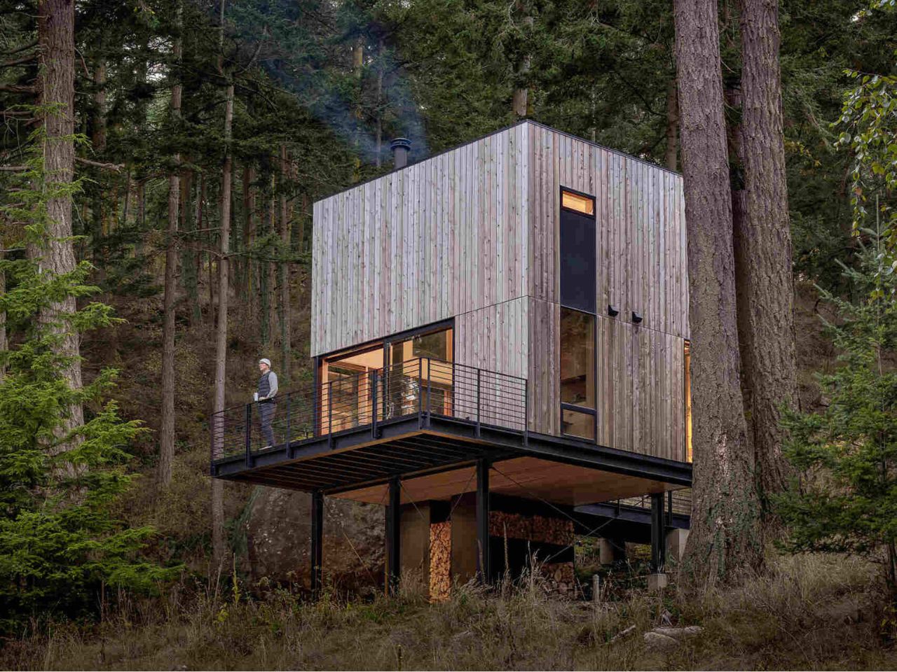
A cabin this small could easily become an exercise in clever storage. On Blakely Island, Wittman Estes has taken a more interesting approach.  The Seattle-based architecture studio designed a 400-square-foot guest retreat that feels less concerned with proving how much can fit inside and more interested in how little architecture is actually needed to make a place feel complete.

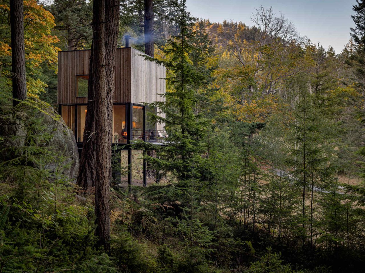
Set within Washington’s San Juan Island Archipelago, the cabin occupies a dramatic piece of terrain between a mature Douglas fir and a large glacial erratic boulder. Beyond the trees lies the Salish Sea. Rather than settling heavily into the rocky shoreline, the structure is lifted above it on slender supports, giving the impression that it has been carefully inserted into the forest rather than constructed over it.

Designer: Wittman Estes
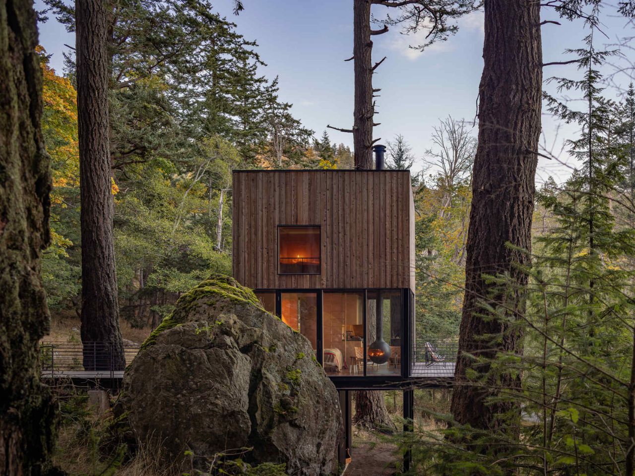
The main studio measures just 16 by 20 feet, drawing from the tradition of simple shelters in the woods, from Thoreau’s Walden Cabin to Le Corbusier’s Cabanon. Yet the interior does not feel particularly austere. A kitchen, bathroom, Murphy bed, living area, and loft with two bunks all occupy the compact volume, each given a precise place within the plan.

The difficulty of the site helped shape the architecture. Blakely Island’s steep, rocky shoreline made conventional construction complicated, particularly if heavy machinery had to pass through the surrounding forest. Many components were therefore fabricated at the contractor’s yard in Everett before being transported to the island by barge. Modular steel frames were then lifted onto a minimal point foundation. Western red cedar siding, milled from trees on the island, was left unfinished so it could gradually weather into the landscape.
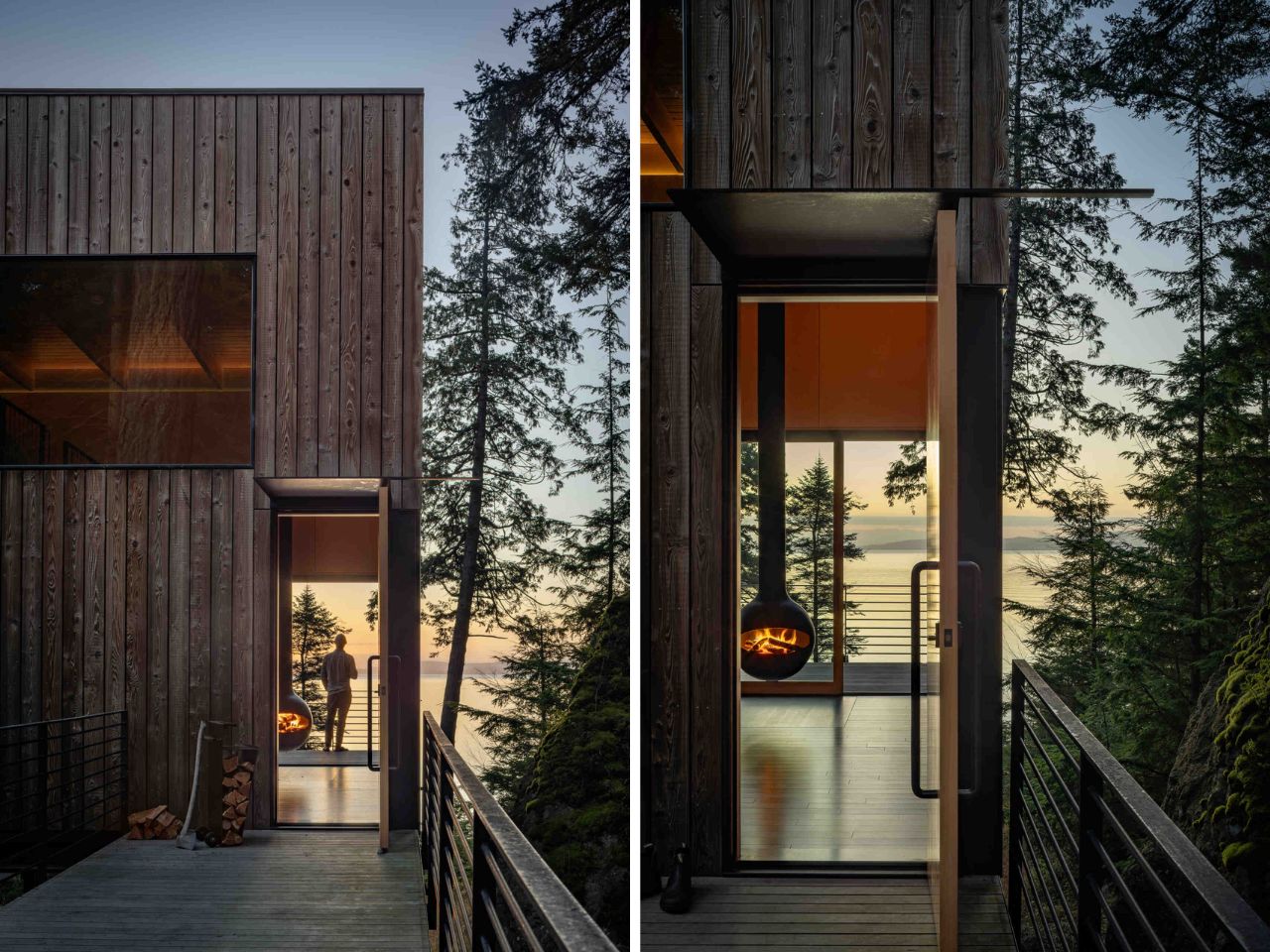
That sensitivity continues through the experience of arrival. A narrow suspended metal walkway threads through the trees toward the entrance, allowing views of Thatcher Bay to open gradually between the branches. Powder-coated steel railings line the path and deck, while a simple steel awning shelters the fir entry door.

Inside, the material palette becomes warmer. Birch plywood wraps the walls, fir beams remain exposed overhead, and solid ipe runs underfoot. The restrained finishes allow the view to dominate. Large sliding glass doors face the water, visually extending the living space far beyond its modest footprint.
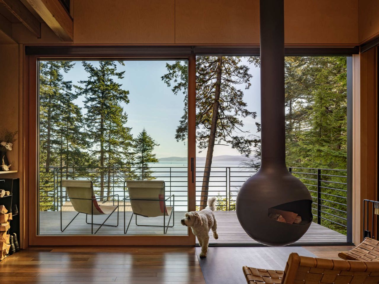
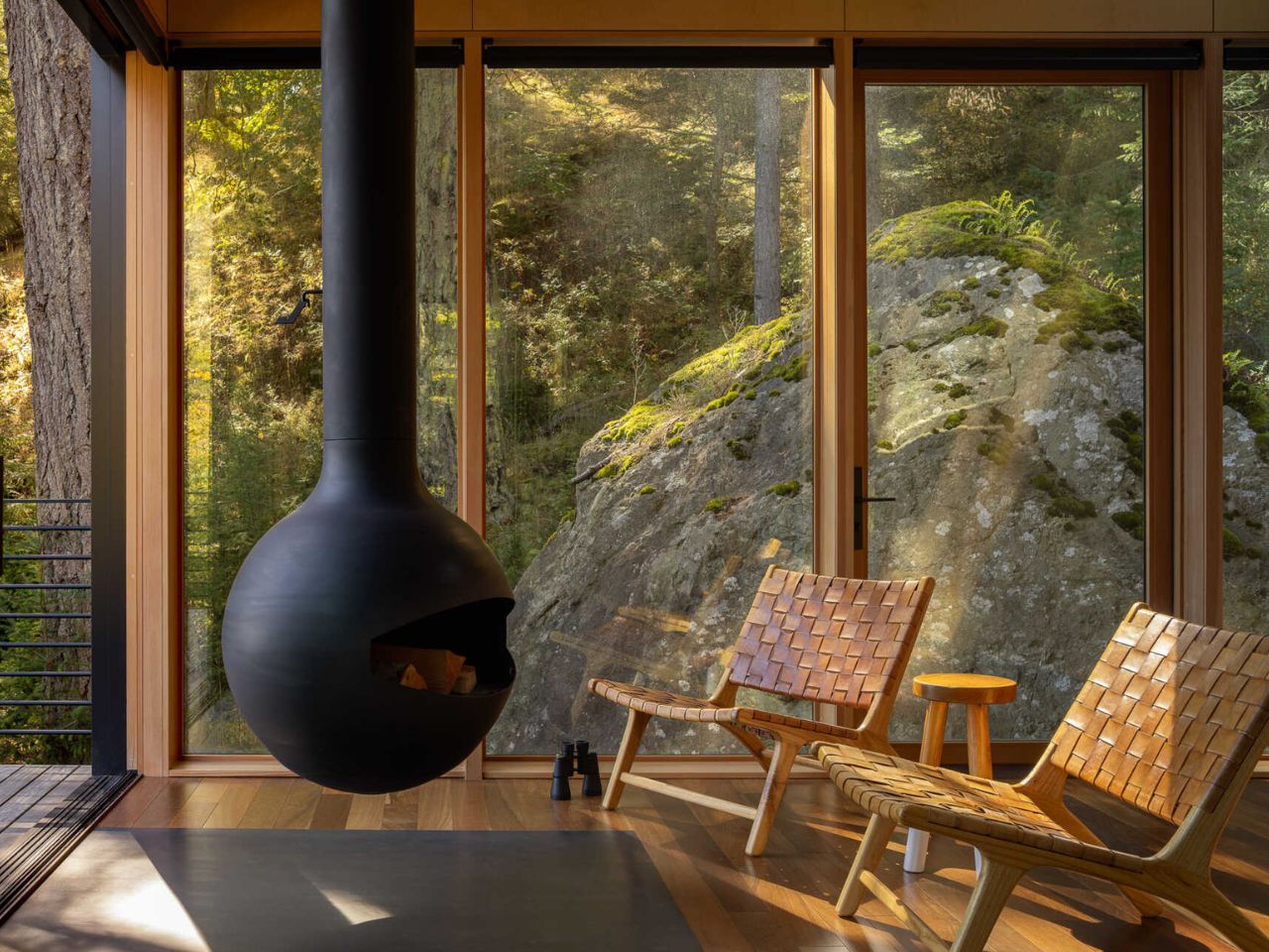
Near the center of the cabin, a suspended black fireplace rotates through 360 degrees, allowing the fire to face either the interior or the cantilevered deck outside. In warmer weather, the open glass doors effectively turn the deck into another living room. During colder months, the same glazing keeps the forest and water present while the cabin becomes a sheltered place from which to watch the weather change.

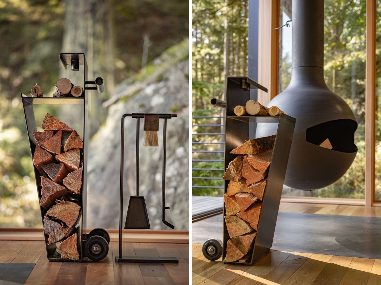
Even the fireplace tools have been treated as part of the architecture. Wittman Estes designed a movable steel fire cart that slips neatly into an angled niche nearby. It is a small detail, but an important one in a room where visual clutter could quickly overwhelm the space.
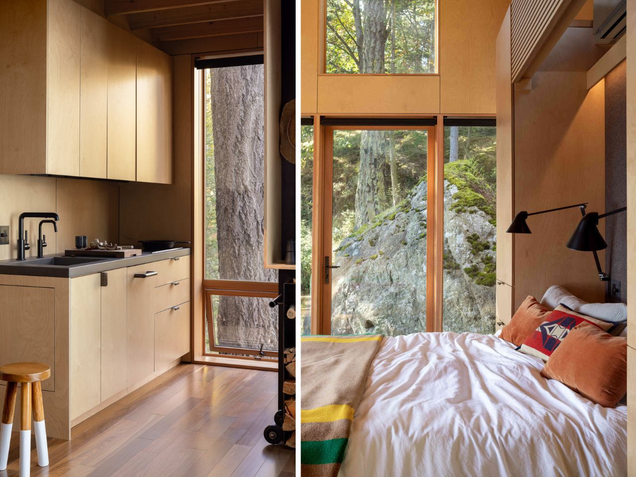
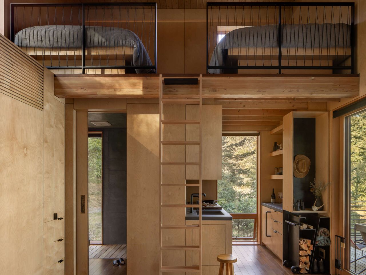
The kitchen follows the same logic. Positioned beneath the sleeping loft, it occupies one of the lowest parts of the cabin, reserving the taller volume for the main living area. A cast-in-place concrete sink and countertop are paired with dark fixtures and discreet integrated appliances. Against the birch plywood and fir, the concrete provides enough contrast to define the kitchen without separating it visually from the rest of the interior.

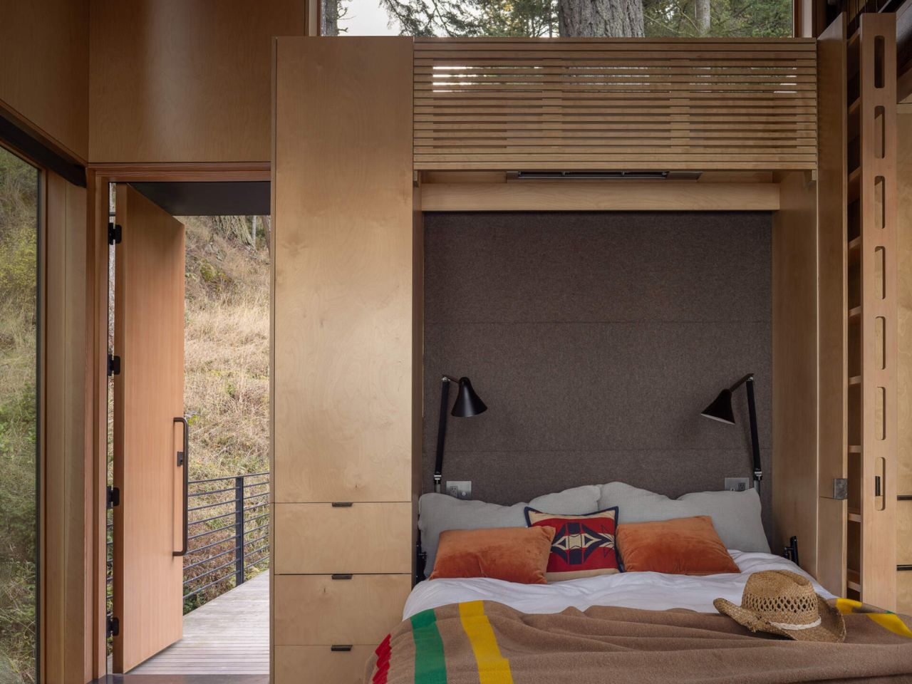
The living room becomes the primary bedroom when a Murphy bed folds down from the wall. During the day, it nearly disappears, preserving the openness of the studio. At night, the bed faces east toward the morning light, while a felt headboard introduces softness to the otherwise restrained palette of wood, steel, and concrete.
At the northwest corner, the bathroom is given its own relationship with the landscape. A glass corner window looks directly into the surrounding forest, preventing the compact room from feeling enclosed. Above the kitchen, a sleeping loft adds two bunks without expanding the cabin’s footprint, accessed by a custom maple ladder.

This use of vertical space reflects the logic of the entire project. Nothing feels squeezed into an arbitrary corner. Each function occupies the part of the volume where it makes the most sense, while the architecture continues to work around the existing terrain rather than attempting to reorganize it.
What makes the Blakely Island Cabin compelling is not simply how much has been fitted into 400 square feet. Its greater achievement is making those 400 square feet feel secondary to the experience of being there. The folding bed, compact kitchen, and sleeping loft provide efficiency, but the architecture rarely asks you to admire that efficiency.

Instead, it directs attention outward: toward the Douglas fir beside the house, the rock beneath it, the changing weather, and the long stretch of Salish Sea beyond the glass. For a building inspired by the idea of living simply in the woods, that may be its most convincing gesture. The cabin does not try to provide more space than it has. It simply makes the space beyond its walls feel like part of the room.


The post A Suspended Walkway Leads to This Tiny Cabin Overlooking the Salish Sea first appeared on Yanko Design.
  •  

This Tiny Home Fits a Downstairs Bedroom and Two Lofts Into 24 Feet

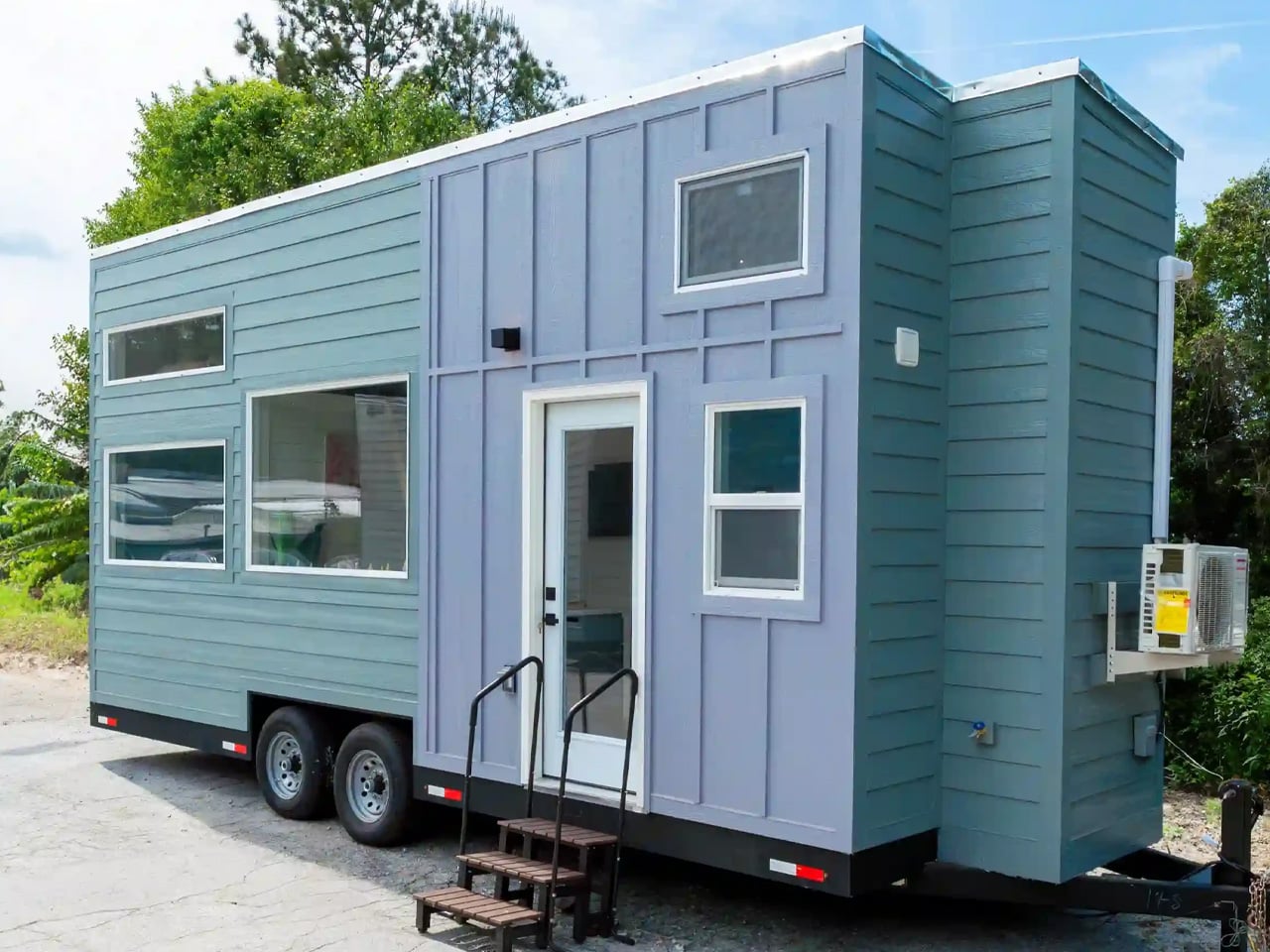
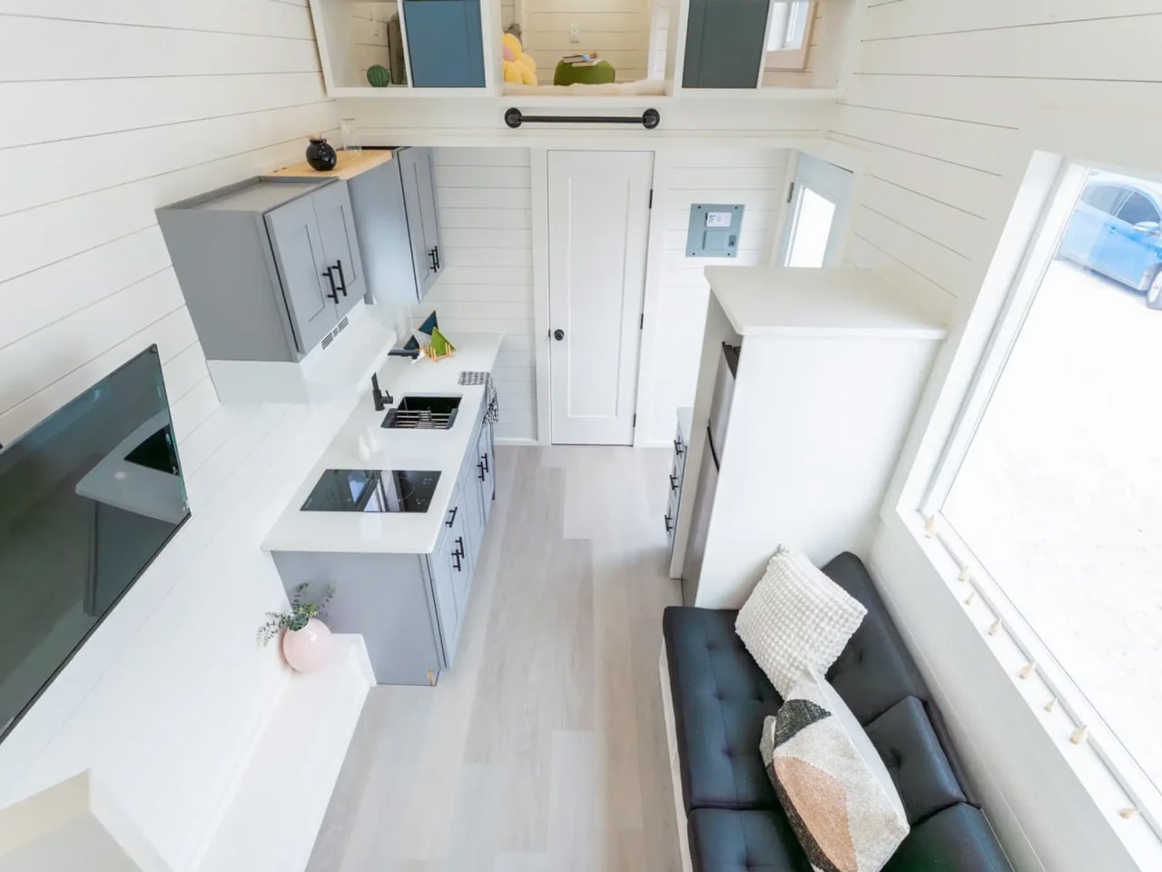
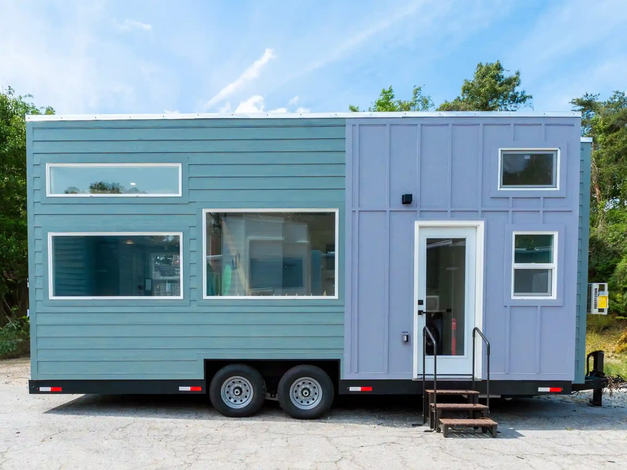
The updated Avalon 24 gives its most useful space-saving move to the bedroom: it keeps it downstairs. Dragon Tiny Homes pairs that main-level sleeping area with two lofts inside a 24-foot home on wheels, offering 204 square feet of floor space before counting the lofts. The completed, upgraded build is listed for sale, with built-in furniture and storage already fitted.

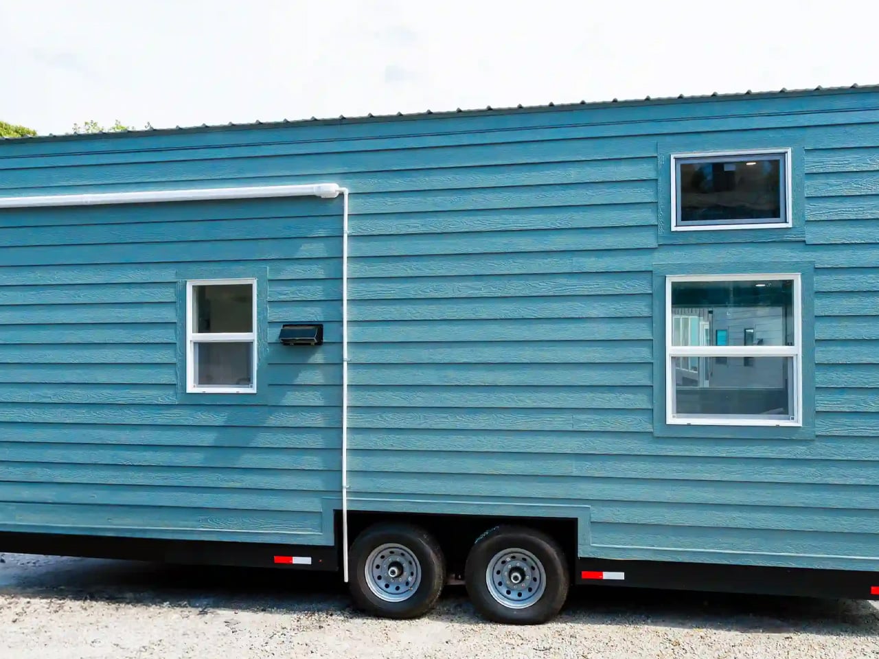
Outside, blue and lavender wood cladding gives this version a cheerful identity, topped by a metal roof and supported by a double-axle trailer. The color makes a welcome departure from the monochrome finishes common in compact housing, but the more consequential decisions happen inside. Here, sleeping space takes priority over a sprawling lounge.

Designer: Dragon Tiny Homes

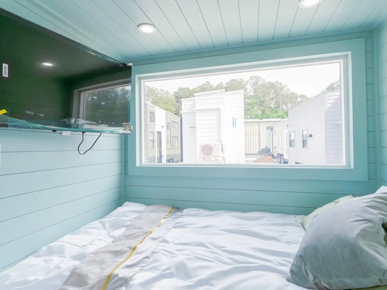
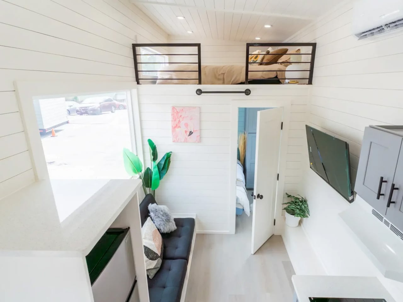
The downstairs bedroom accommodates a double bed, a dedicated storage cabinet, and a wall-mounted television. Keeping the primary bed at floor level removes the nightly ladder climb, although the room remains snug. Above it sits the main sleeping loft, while a smaller loft over the bathroom provides another potential sleeping area or storage space. Removable ladders serve both upper levels, so these spaces demand more agility than the downstairs room.

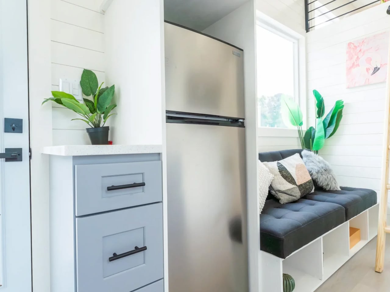
The living area uses a built-in couch platform rather than leaving furniture placement entirely to the owner. Integrated sofa storage adds another place to tuck belongings away, and a large picture window opens the room toward the outdoors. White horizontal wall paneling and dark loft railings keep the interior visually legible, with the upper sleeping platform clearly separate from the space below.

In the kitchen, the upgraded build includes a 7.1-cubic-foot refrigerator housed in cabinetry with three drawers, alongside upper cupboards, a floating shelf, and a range hood. The Avalon’s induction cooktop has two burners, and its quartz surfaces include a bar top intended for dining or work. Laundry space is provided in the layout, though buyers should confirm the appliance package for their particular build. The cabinetry gives everyday objects assigned homes instead of relying entirely on loose shelving.

The bathroom contains a shower, vanity, and flushing toilet, with the upgraded unit adding a mirrored medicine cabinet and accent finishes. Dragon also lists upgraded insulation, a ceiling fan, and LED lighting with a night-light function. Those are useful specification details, though the listing doesn’t establish measured thermal performance or energy savings.

The featured inventory home is advertised at $63,500, including $10,100 in selected upgrades and a $6,600 discount from its configured price. Dragon lists a weight of 14,000 pounds and recommends an F350 or similar towing vehicle. That combination makes the Avalon’s tradeoff clear: its downstairs bedroom is appealing, but moving this small home still requires serious equipment.

The post This Tiny Home Fits a Downstairs Bedroom and Two Lofts Into 24 Feet first appeared on Yanko Design.
  •  

Zook Cabins Fits a Soaking Tub & Separate Shower Into a 470-Square-Foot A-Frame Retreat

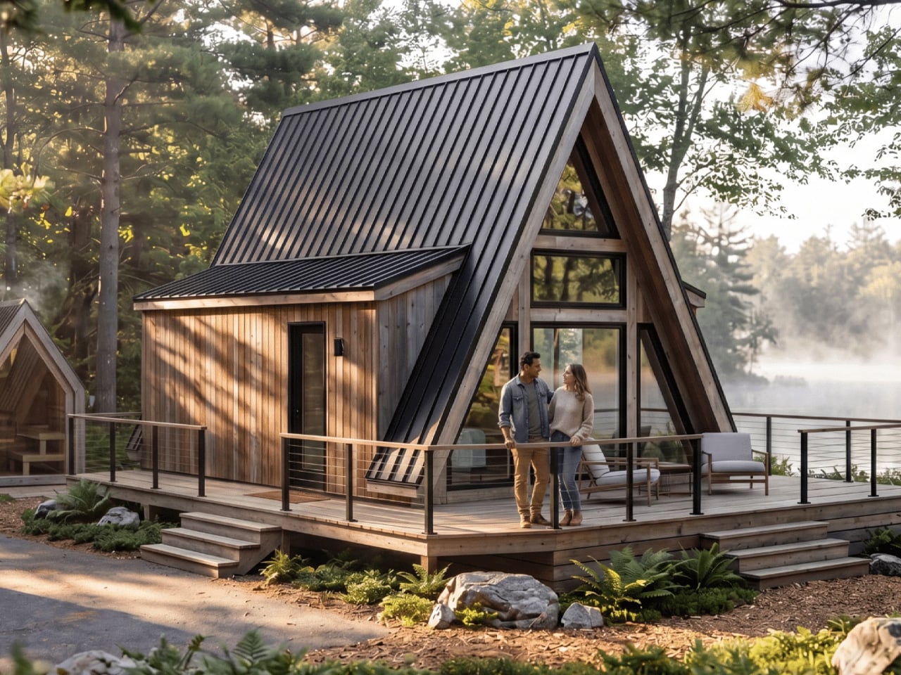
The A-Frame Retreat gives its most dramatic wall to glass, with windows climbing toward the roof’s sharp peak. Behind that familiar triangular silhouette, Zook Cabins has arranged 470 square feet of living space on a single floor, including a bathroom with a freestanding soaking tub. This is an available modular home, with a completed example at Zook Village in Gap, Pennsylvania, documented in March 2026.

A black metal roof and thermally modified Lunawood siding establish the exterior’s restrained palette. The more interesting move is the lower, box-like volume alongside the steep roof. In the company’s exterior rendering, it gives the cabin a vertical side wall and a sheltered entrance, while the glazed gable retains the recognizable A-frame profile. An optional deck extends the space outward without changing the enclosed footprint.

Designer: Zook Cabins

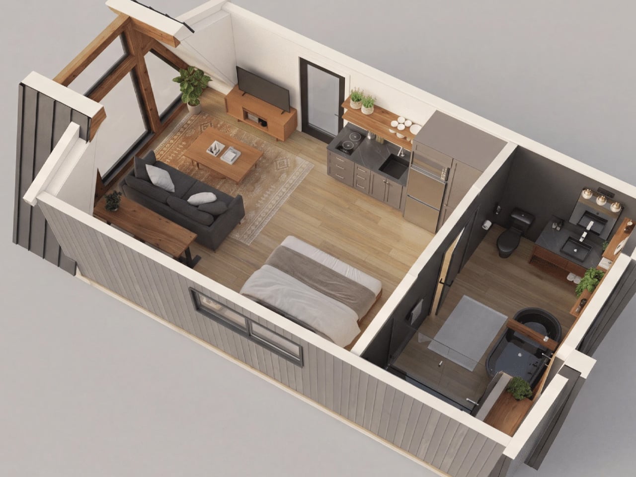
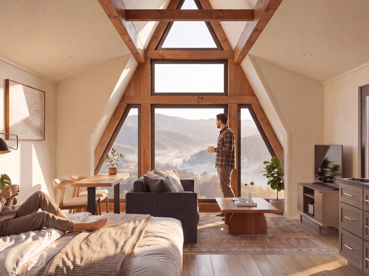
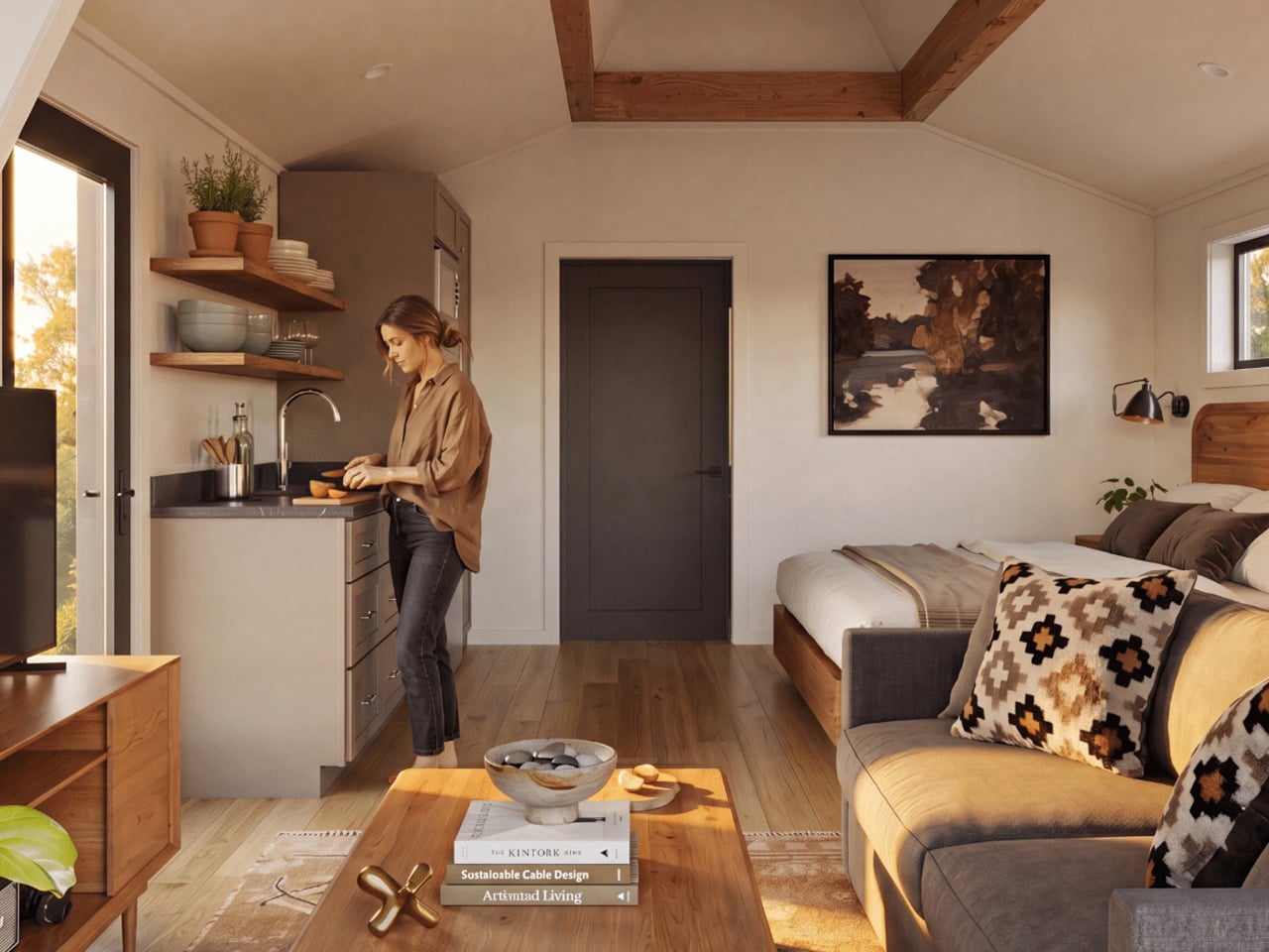
Inside, the published king-bed floor plan reads as a studio rather than a conventional one-bedroom house. Living, dining, sleeping, and kitchen areas share an open room, with the bathroom enclosed at the rear. The bed sits opposite the kitchen, while seating occupies the glazed end. Keeping these functions together avoids carving the compact interior into smaller rooms, though it also means there’s no bedroom door to separate sleep from conversation or cooking.

Cathedral ceilings preserve the roof’s height indoors, while painted cabinet-grade birch plywood covers the walls and ceilings. Vinyl plank flooring runs throughout. The interior rendering pairs these pale surfaces with exposed-looking timber elements and wooden furniture, giving the room visual warmth without covering every surface in wood. Straight wall sections also leave usable edges for cabinetry and furniture beneath the taller central space.

The kitchen takes a modest portion of the plan. Zook specifies painted shaker-style cabinets, quartz countertops, and spaces for a compact refrigerator and microwave. Those provisions deserve attention: space allocated for an appliance doesn’t establish that the appliance is included. The arrangement leaves more of the shared room available for the bed, dining table, and sitting area.

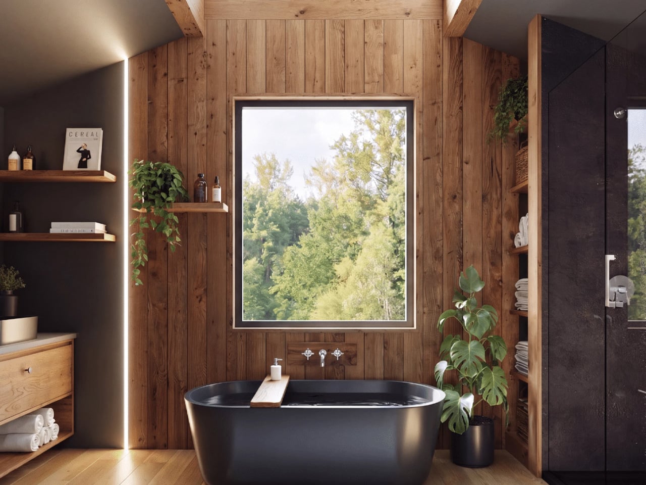
The bathroom receives a surprisingly generous allocation. Alongside the 60-inch freestanding soaking tub, the specifications list a separate glass-doored shower and a 48-inch vanity. The floor plan places these fixtures in their own enclosed room, giving bathing more privacy than sleeping. That’s a revealing priority for a small retreat: floor space goes toward a leisurely bathroom rather than a separate bedroom or another sleeping level. Delivery still requires planning. Zook says the cabin travels in one truckload, with two A-frame roof sections lifted into place on site. Its modern cabins require a permanent foundation and prepared utility connections. The small footprint simplifies the accommodation, but the installation remains a building project.

The post Zook Cabins Fits a Soaking Tub & Separate Shower Into a 470-Square-Foot A-Frame Retreat first appeared on Yanko Design.
  •  

This Robotic Pavilion Concept Would Change Its Layout Only When Empty

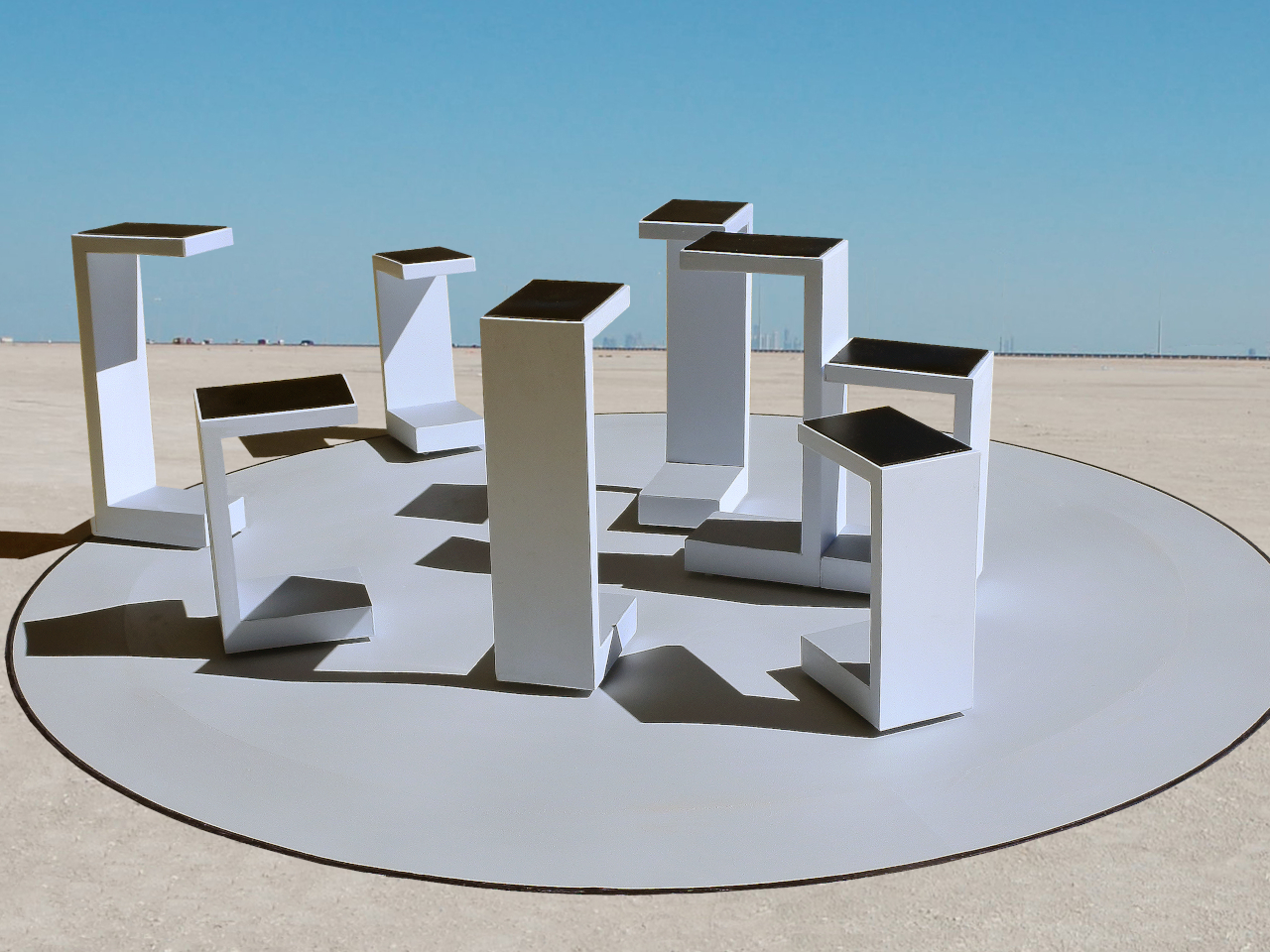
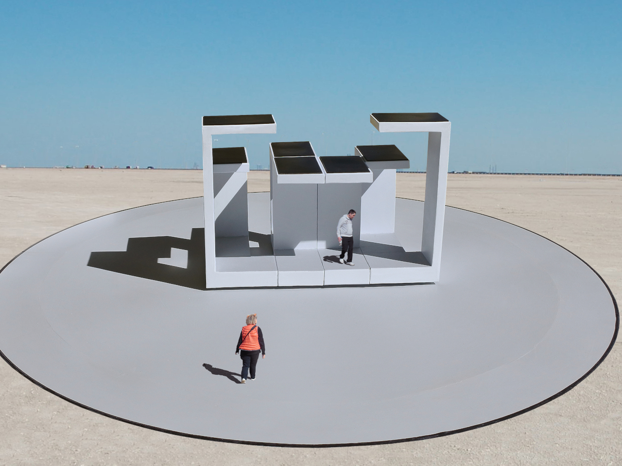
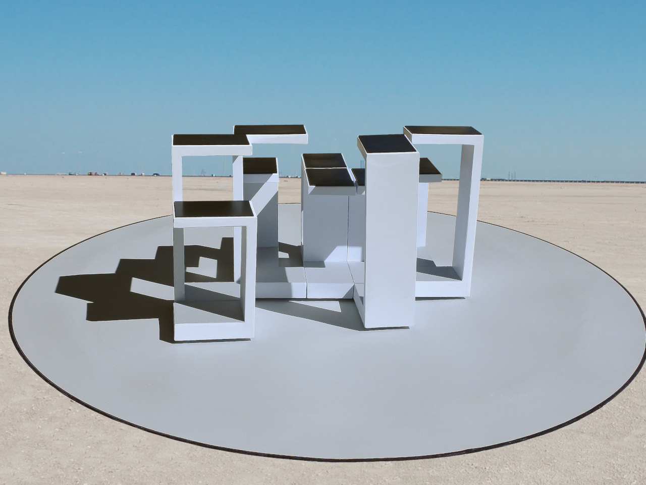
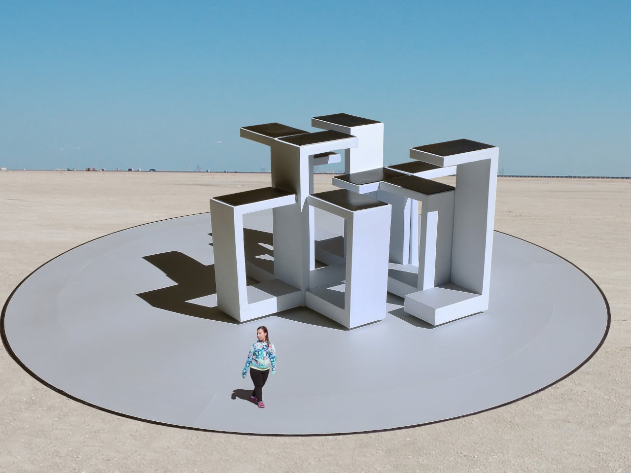
A public pavilion can give people somewhere to gather, but returning to it usually means finding the same spaces and following the same paths. Self-Assembling Robotic Environments explores a more flexible alternative: mobile architectural sections that could rearrange themselves between visits. This unbuilt public art concept would pause whenever someone enters, letting people explore one arrangement before the space changes for another group.

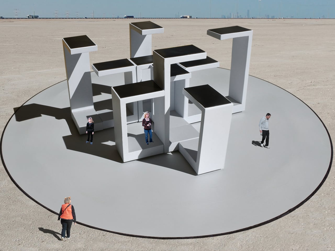
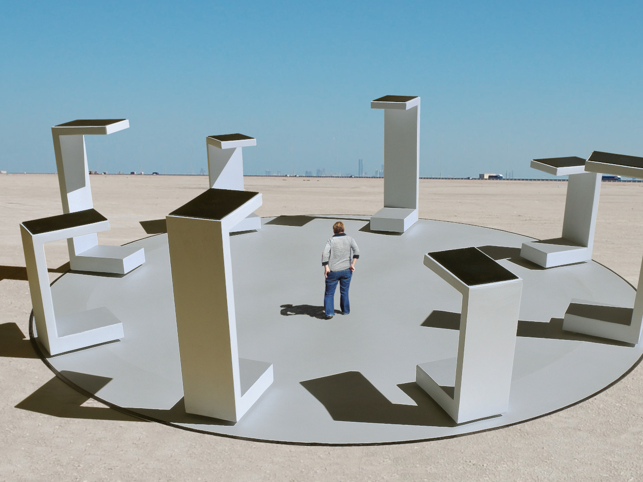
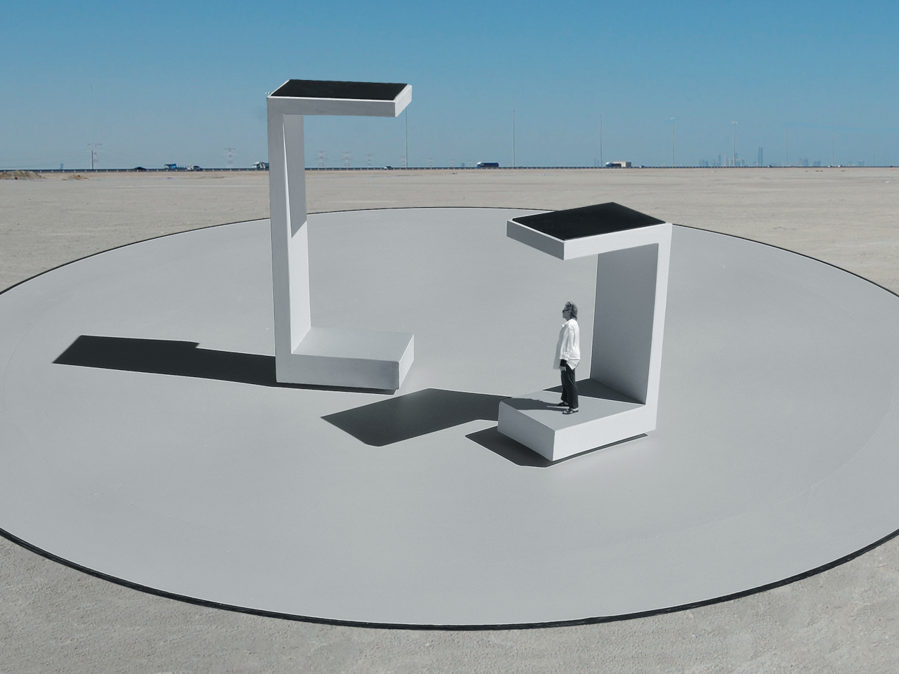
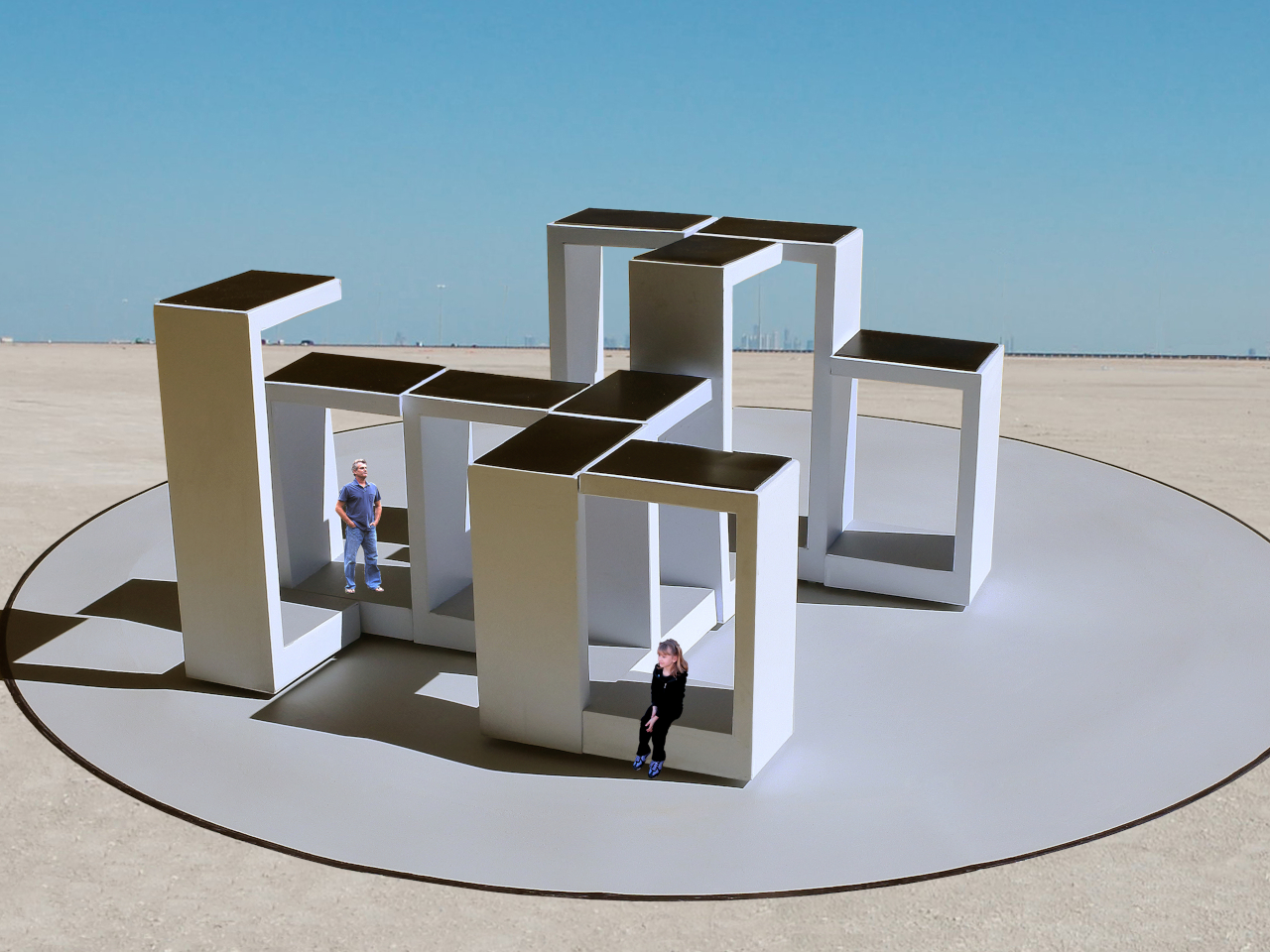
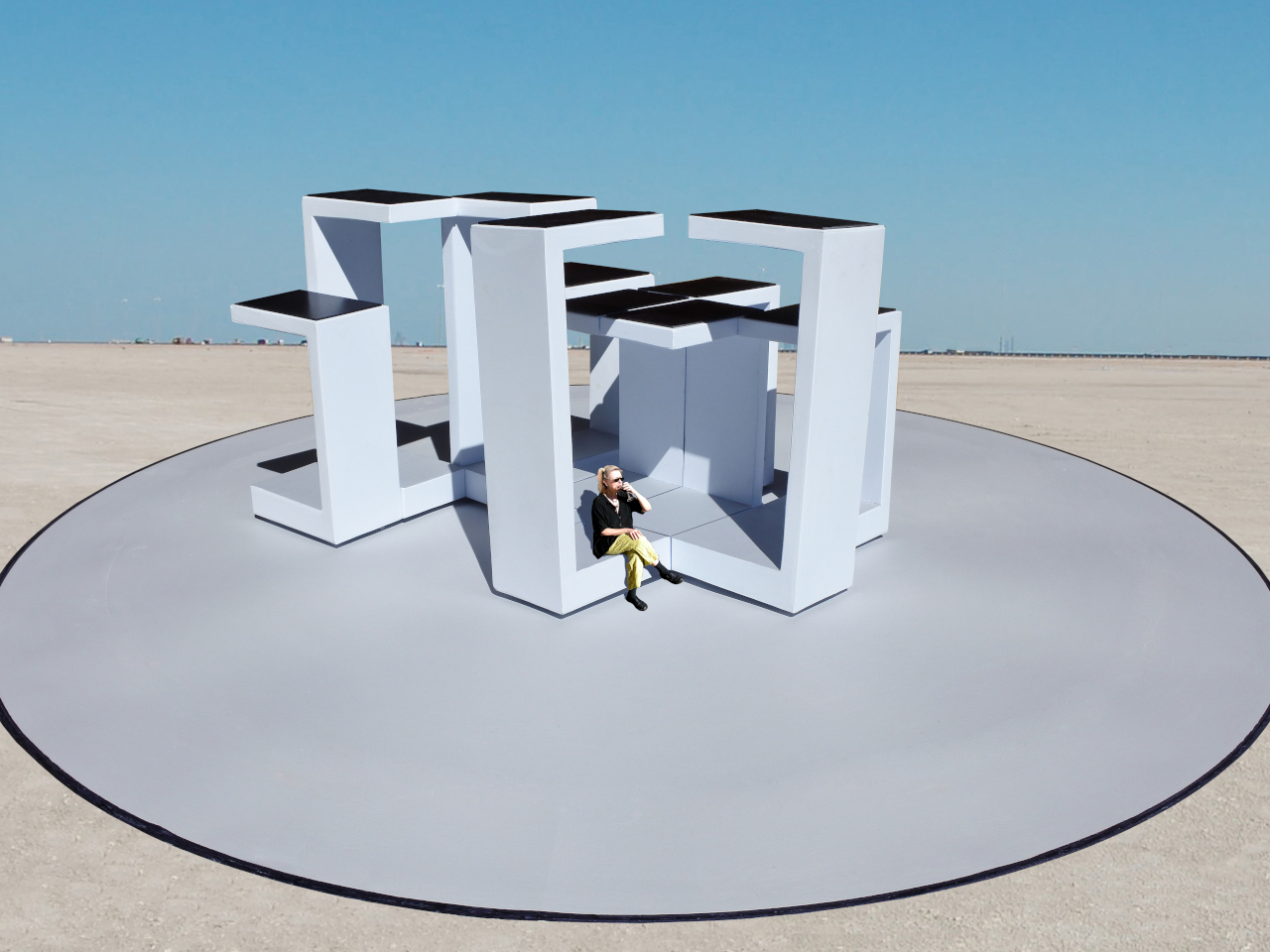
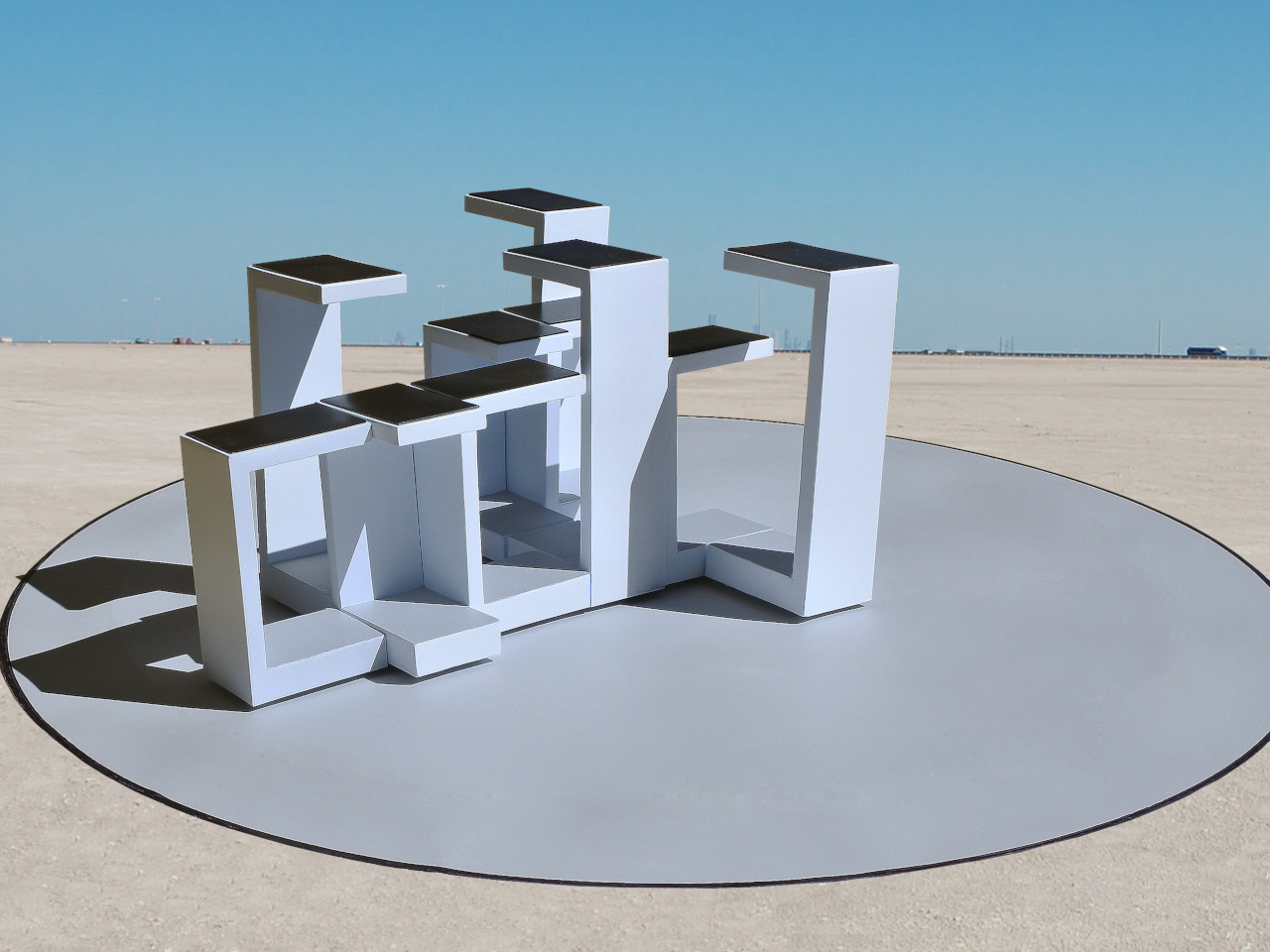
Each section combines a floor, wall, and roof in a large C-shaped profile, like a little shelter with its sides left open. Two versions stand about 10 and 14 feet tall, both four feet wide. Place several together, and those simple shapes could become passages or covered pockets. Separate them again and the same pieces would offer a different place to wander.

Designer: Michael Jantzen

Of course, rearranging those sections wouldn’t mean asking someone to wheel them into position. Each floor would contain its own computer, sensors, motors, wheels, and battery, allowing the entire unit to travel forward, backward, or sideways. The wall and roof would move with it. The robotics aren’t proposed as equipment that builds the installation and then leaves; they’d remain part of the architecture.

Rather than following one permanent floor plan, the modules would use artificial intelligence to decide on their positions through majority agreement. The proposal doesn’t explain how they would evaluate possible arrangements, though. A gap between two units could become a passage, while several facing one another might define a gathering spot. The same pieces could give visitors different ways to use the space.

The roof would do more than shelter whoever stands beneath it. Solar cells on top would recharge the battery inside the floor, keeping the proposed power supply within each moving section. It’s a sensible place to collect sunlight, but the project doesn’t specify how much energy movement would require. Keeping these large pieces in motion isn’t as simple as putting solar panels overhead.

A black perimeter would mark the robots’ territory, containing their movements within a circular arena. Sensors would watch for people or objects entering that space, pausing every module until the area is clear. You wouldn’t be expected to dodge a moving wall while exploring. The intended sequence is straightforward: the pieces rearrange when empty, then hold their positions while visitors are inside.

That rule still needs engineering before anyone could walk in. Detecting a visitor isn’t the same as stopping safely, and the project doesn’t establish braking distances or structural performance. Raised floor sections also need an accessible way in. These are questions for a working installation, rather than reasons to dismiss the idea, but the concept drawings don’t settle them on their own.

For visitors, the pause could make staying put part of the interaction. Sit inside a sheltered corner for a while, and that particular arrangement would remain available until everyone leaves. A later group might find a different route or gathering spot. Someone lingering to finish a conversation would therefore be doing something rather unusual: keeping a version of the architecture from disappearing yet.

The post This Robotic Pavilion Concept Would Change Its Layout Only When Empty first appeared on Yanko Design.
  •  
❌