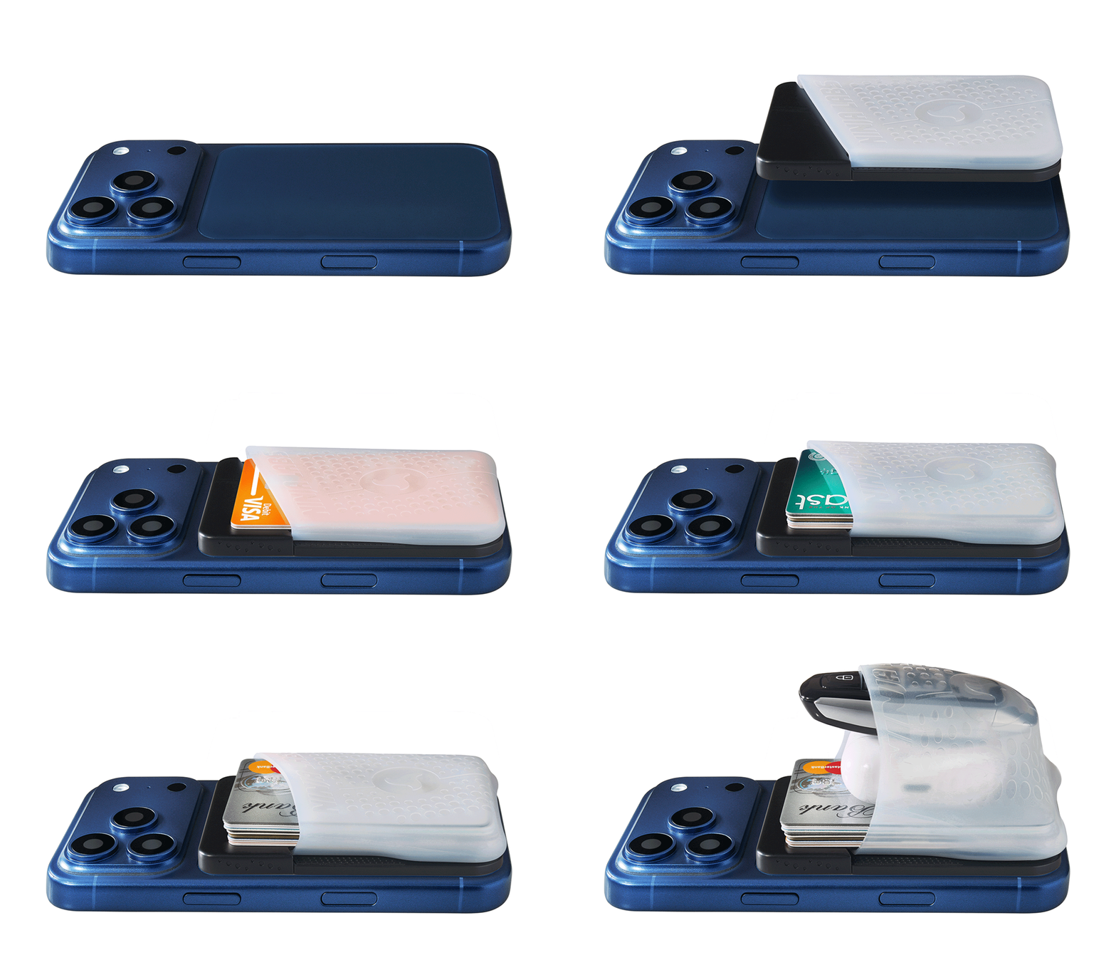
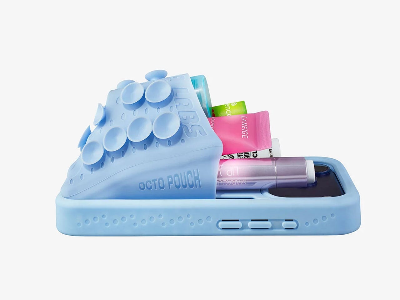
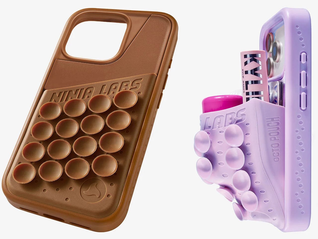
Smartphones have become the focal point of everyday carry, but their slim profiles leave little room for the small essentials people take everywhere. Ninja Labs, a Los Angeles-based company, offers a simple alternative with the MagSafe Flex Pouch. The accessory is a detachable silicone pocket that turns the back of a MagSafe-compatible smartphone into expandable storage for everyday items.
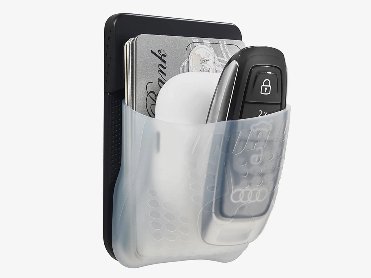
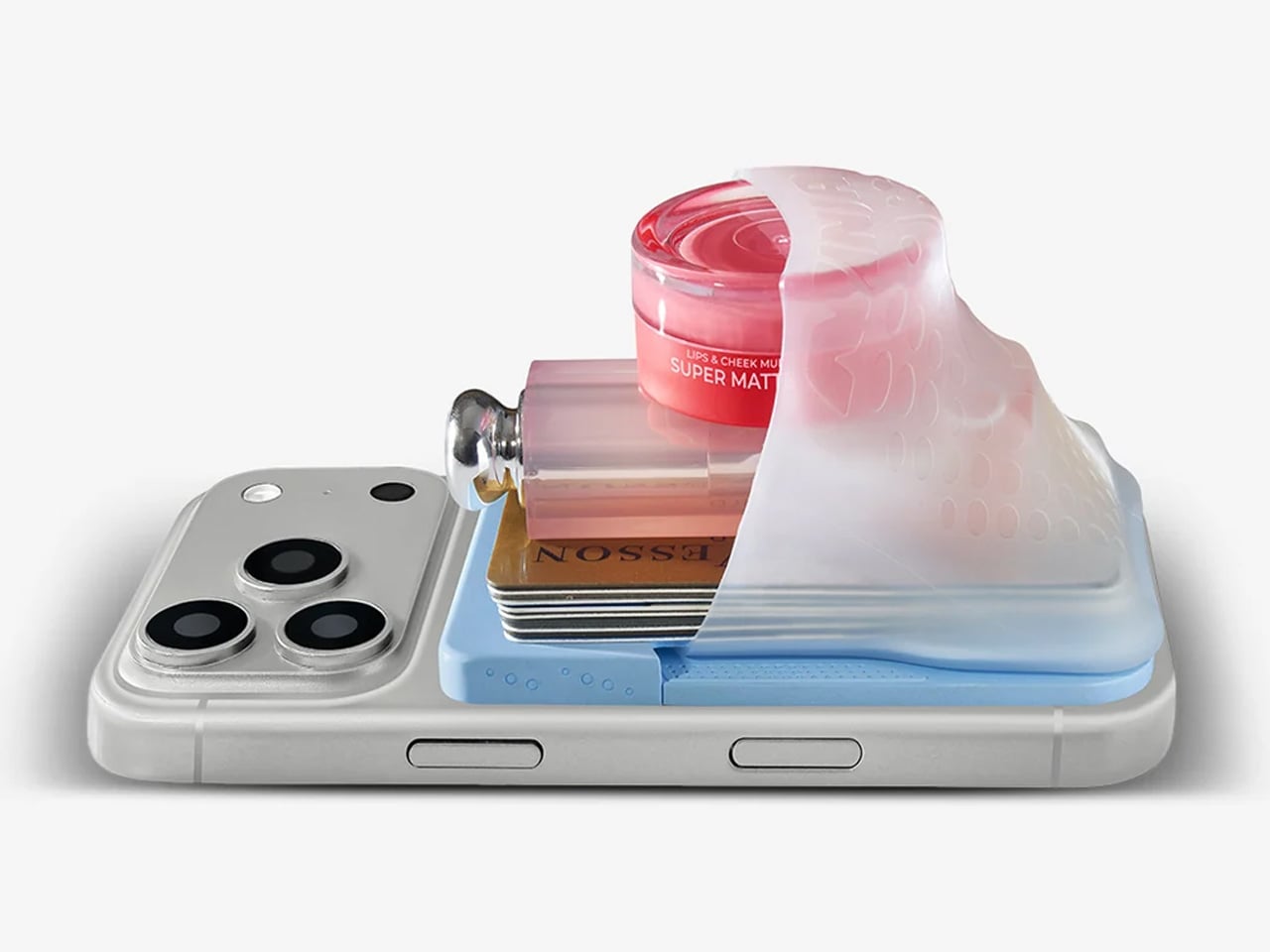
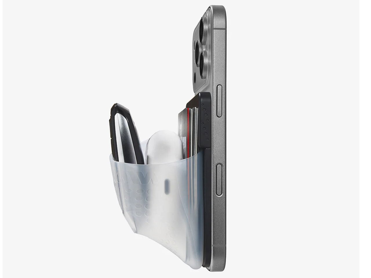
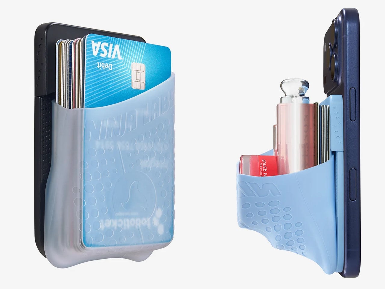
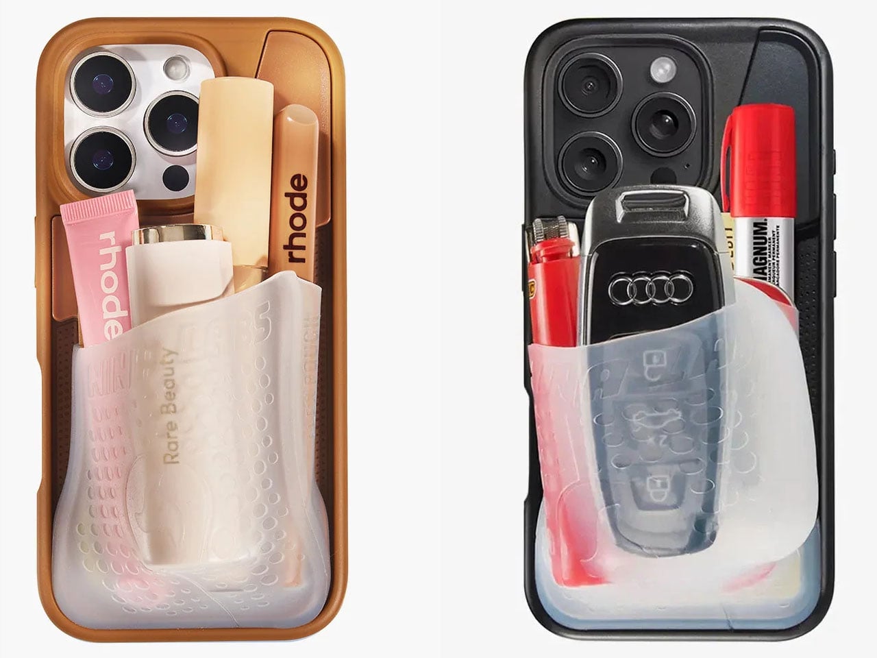
Unlike conventional magnetic wallets designed primarily for cards, the Flex Pouch uses a flexible, stretchy compartment to accommodate objects of different shapes and sizes. It can hold credit cards, IDs, cash, coins, wireless earbuds, and even a car key fob. According to Ninja Labs, the pocket can accommodate anything from a single card to a stack of 20, making it a versatile option for people who want to carry fewer accessories.
The design is centered on a proprietary memory silicone blend that expands to roughly twice its original size before contracting again. Rather than relying on zippers, buttons, or rigid compartments, the material stretches around its contents. Its naturally grippy surface helps keep items in place, while the open-top construction allows quick access. When emptied, the pouch returns to its original compact form.
Ninja Labs says the material retained more than 90 percent of its original stretch after 10,000 stretching cycles, offering an indication of its intended durability. However, the company advises against carrying regular house keys or other sharp-edged objects that could puncture the silicone.
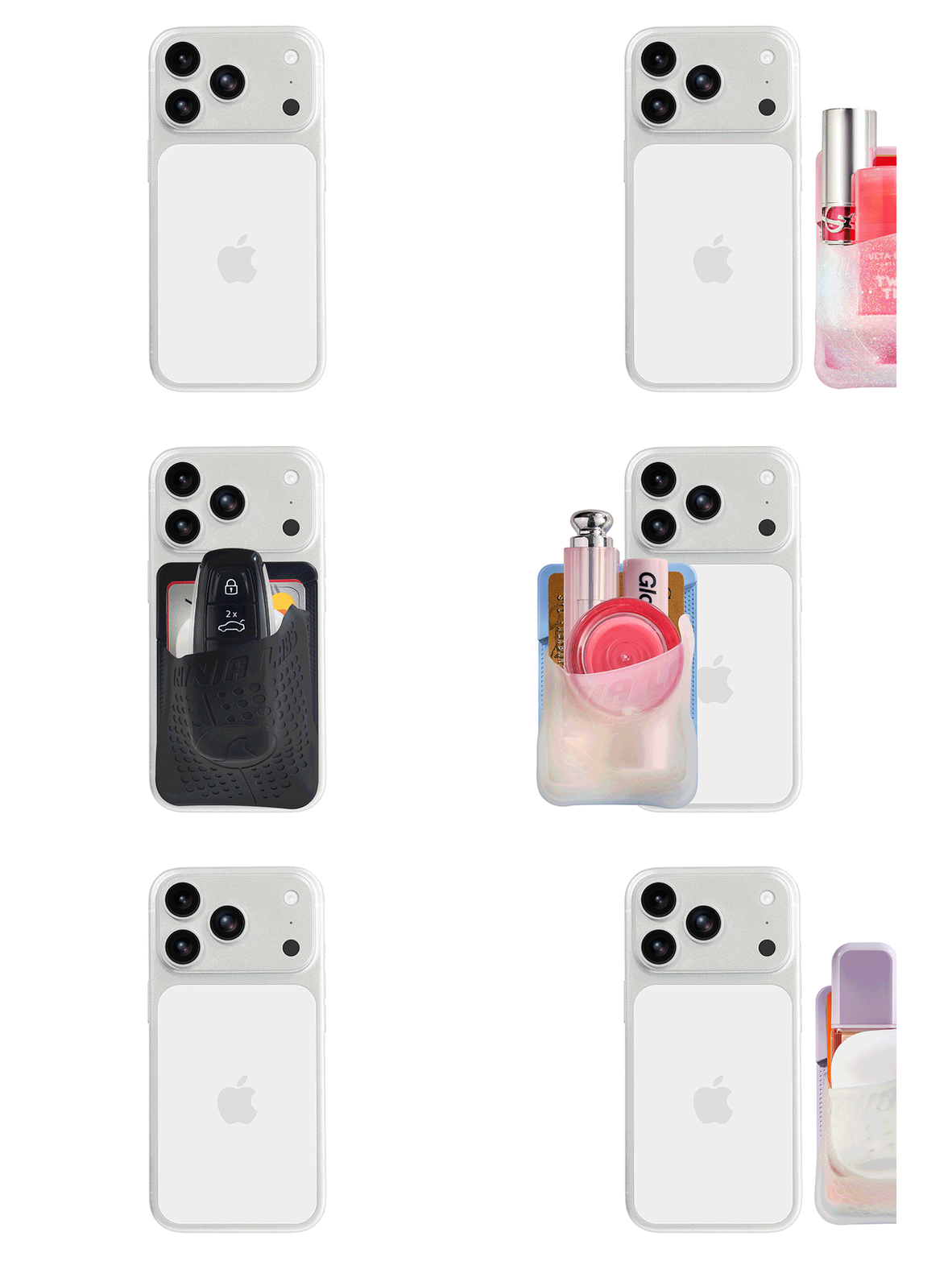
The MagSafe version introduces a refreshing change to the original Flex Pouch concept. Earlier versions integrated the pocket directly into an iPhone case, making it a permanent part of the phone’s exterior. The new accessory is a standalone unit that attaches magnetically to a MagSafe-compatible iPhone or case and can be removed whenever it is no longer needed. Android users can also use it with a suitable magnetic case, although the pouch does not provide phone protection of its own.
This detachable format makes the accessory adaptable to different situations. It can carry cards and cash for a quick errand, earbuds and a car fob while travelling, or small personal-care items during a night out. The flexible construction also allows it to accommodate bulkier objects than a traditional flat wallet, although adding more contents inevitably creates a pronounced bulge at the back of the phone.
The MagSafe Flex Pouch is priced at $59 and is available in pink, baby blue, lavender, and black, with transparent silicone and a sparkling pink finish among the options. Ninja Labs offers worldwide shipping, with international delivery listed at $10, so you can try it out right away. You can also go for their case cover version if MagSafe is not your thing.
Candles have stepped beyond being just decorative objects that are placed on a dining table or shelf. Today, they are becoming artistic installations, architectural statements, sensory experiences, and even functional design objects. Designers across the world are transforming the humble candle into sculptural pieces that blur the line between art, craft, and innovation.
These evolving creations reflect changing lifestyles, where everyday products are expected to combine beauty, functionality, craftsmanship, and emotional value within contemporary interiors. Here are some fascinating examples showing how contemporary design is reinventing the everyday candle.
1. Murano Glass Candles: Where Venetian Craft Meets Modern Luxury
Murano glass candles blend traditional craftsmanship with contemporary design, turning everyday candles into artistic decor objects. Known for their vibrant colors, flowing patterns, and handcrafted finishes, these candles create a warm visual experience that feels both elegant and sculptural. Their glass vessels often become statement pieces within modern interiors, adding character even when unlit.
What makes these candles especially appealing today is their lasting value beyond fragrance. Instead of being discarded after use, the handcrafted containers can be repurposed as decorative accents, small storage pieces, or collectible objects.
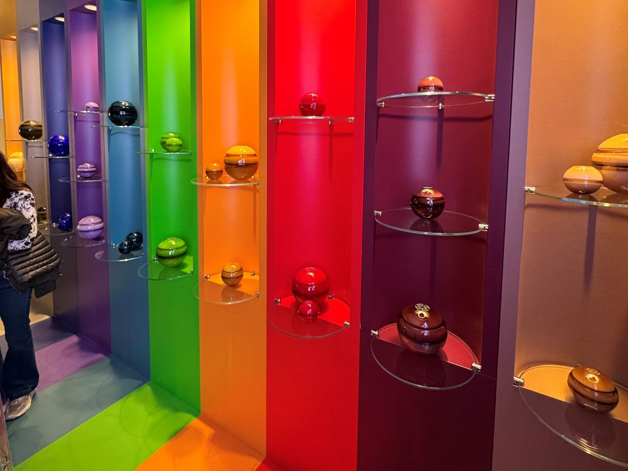
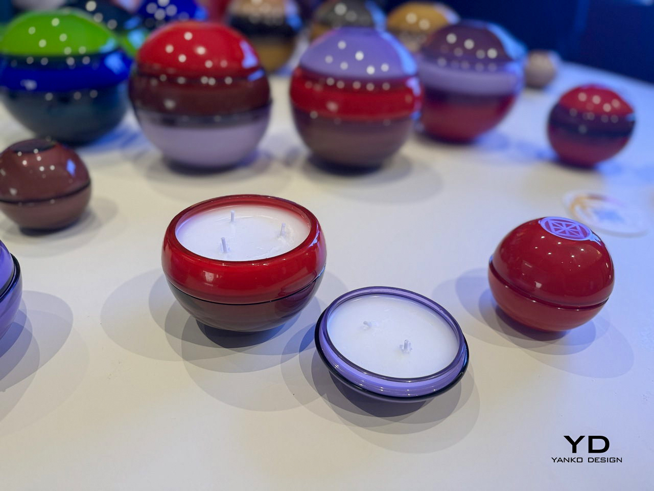
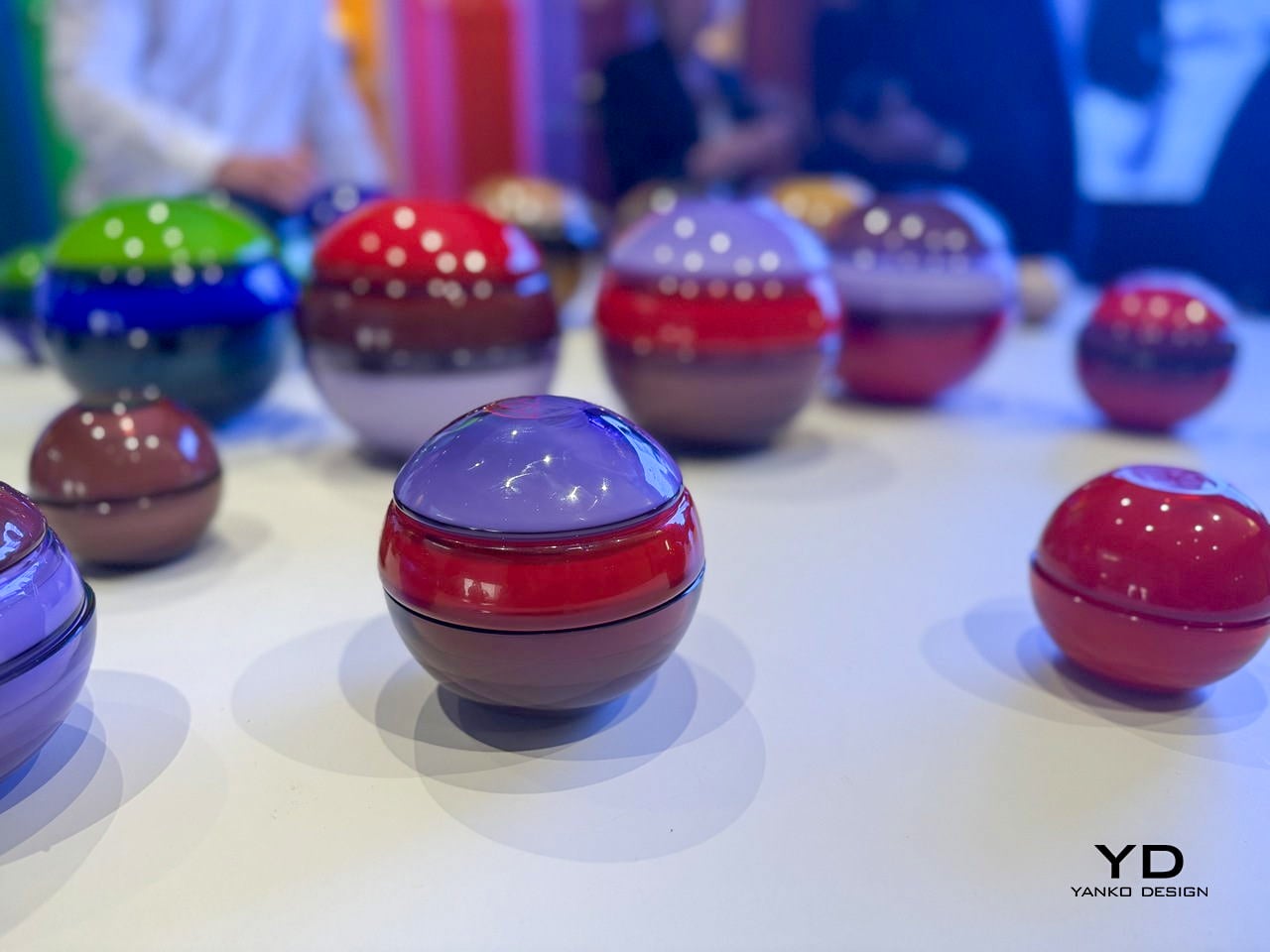
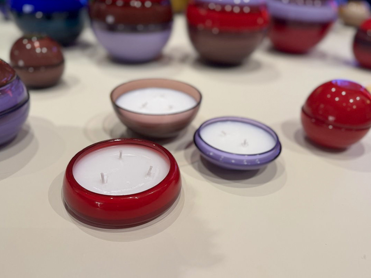
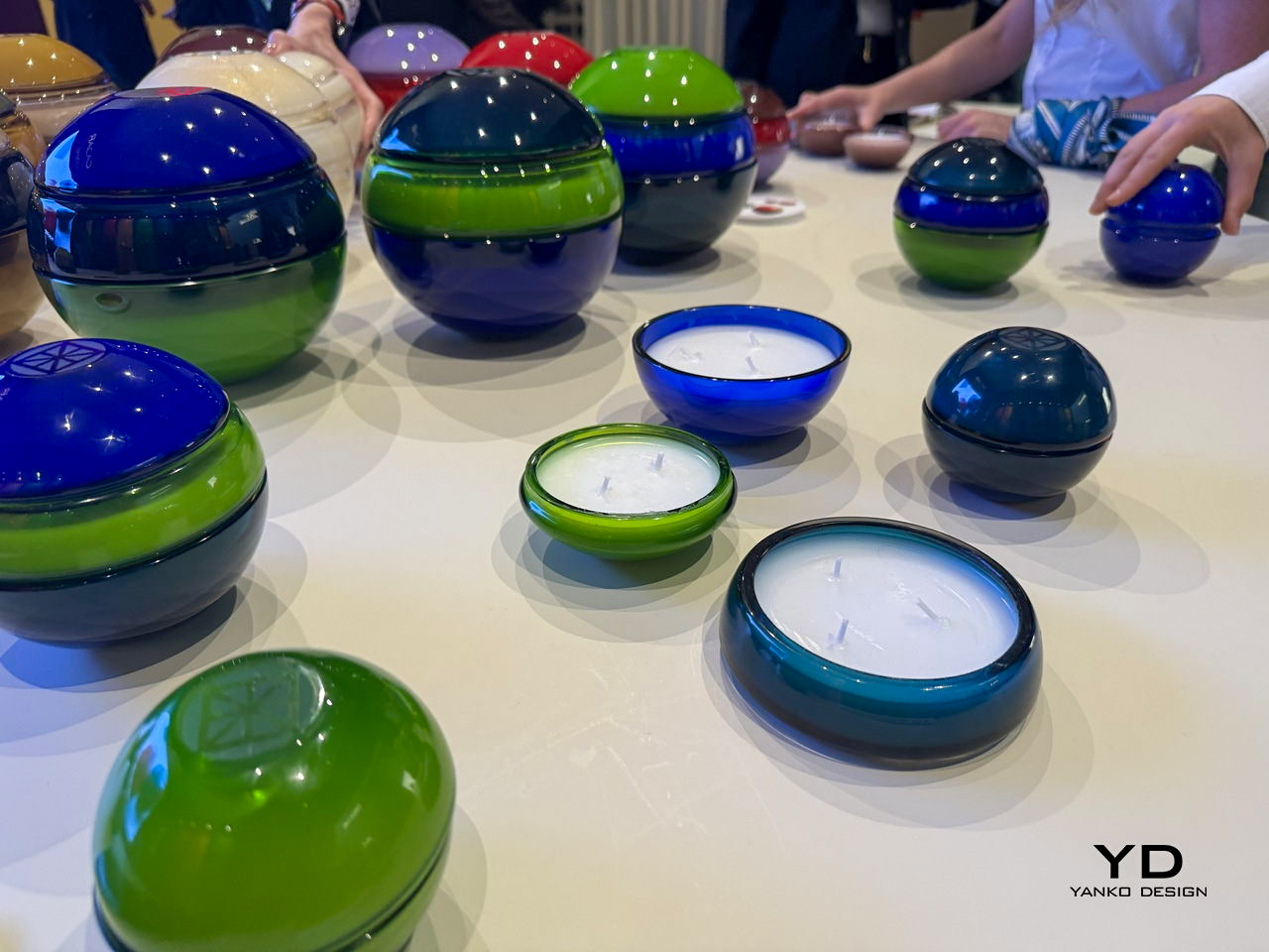
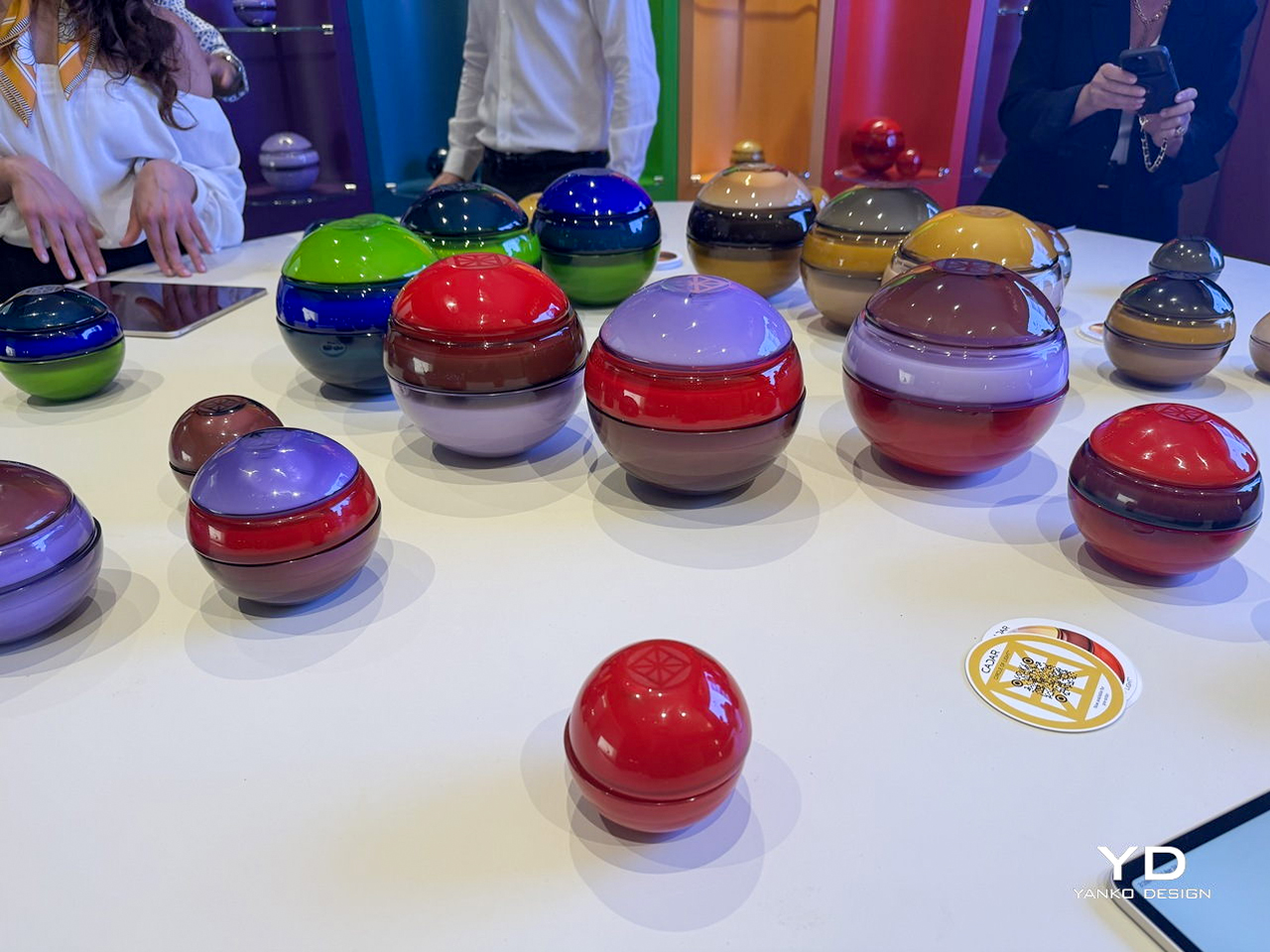
CADAR’s latest candle collection transforms traditional candles into sculptural objects crafted from exquisite hand-blown Murano glass. Created in collaboration with Venini, each candle is designed as a glossy glass sphere assembled from multiple rounded components that fit together seamlessly. The rich transparency, smooth finish, and substantial weight of the Murano glass give every piece a refined, collectible quality. Instead of functioning as simple candle holders, the vessels feel like contemporary art pieces that interact beautifully with light, reflection, and shadow.
The collection stands out through its dramatic use of color and the timeless craftsmanship of Murano glass. Deep cobalt blue, emerald green, ruby red, amber, smoky charcoal, and soft lavender create striking combinations with exceptional depth and luminosity. The high-gloss surfaces amplify the intensity of each shade, allowing the glass to glow almost like liquid under changing light. Together, the candles create a sophisticated visual experience where fragrance, craftsmanship, and Murano glass artistry merge into one luxurious design statement.
2. Flame to Elegance: The Candle That Becomes a Japanese Lantern
Some contemporary candle designs are moving beyond single-use functionality by transforming into decorative objects after the wax has melted away. Inspired by minimal, thoughtful design philosophies, these candles are crafted to evolve and do not simply disappear after use. This approach adds a deeper sense of purpose and emotional value to everyday objects.
The concept also reflects the growing importance of sustainability and long-lasting craftsmanship in modern design. Instead of creating waste, the candle continues to serve as a functional or decorative piece, encouraging reuse and mindful living.
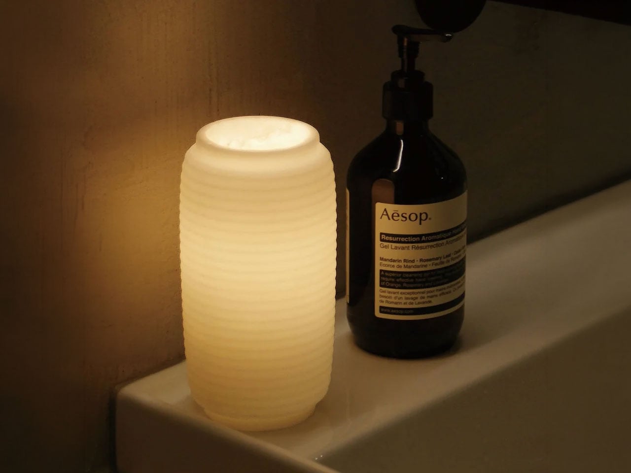
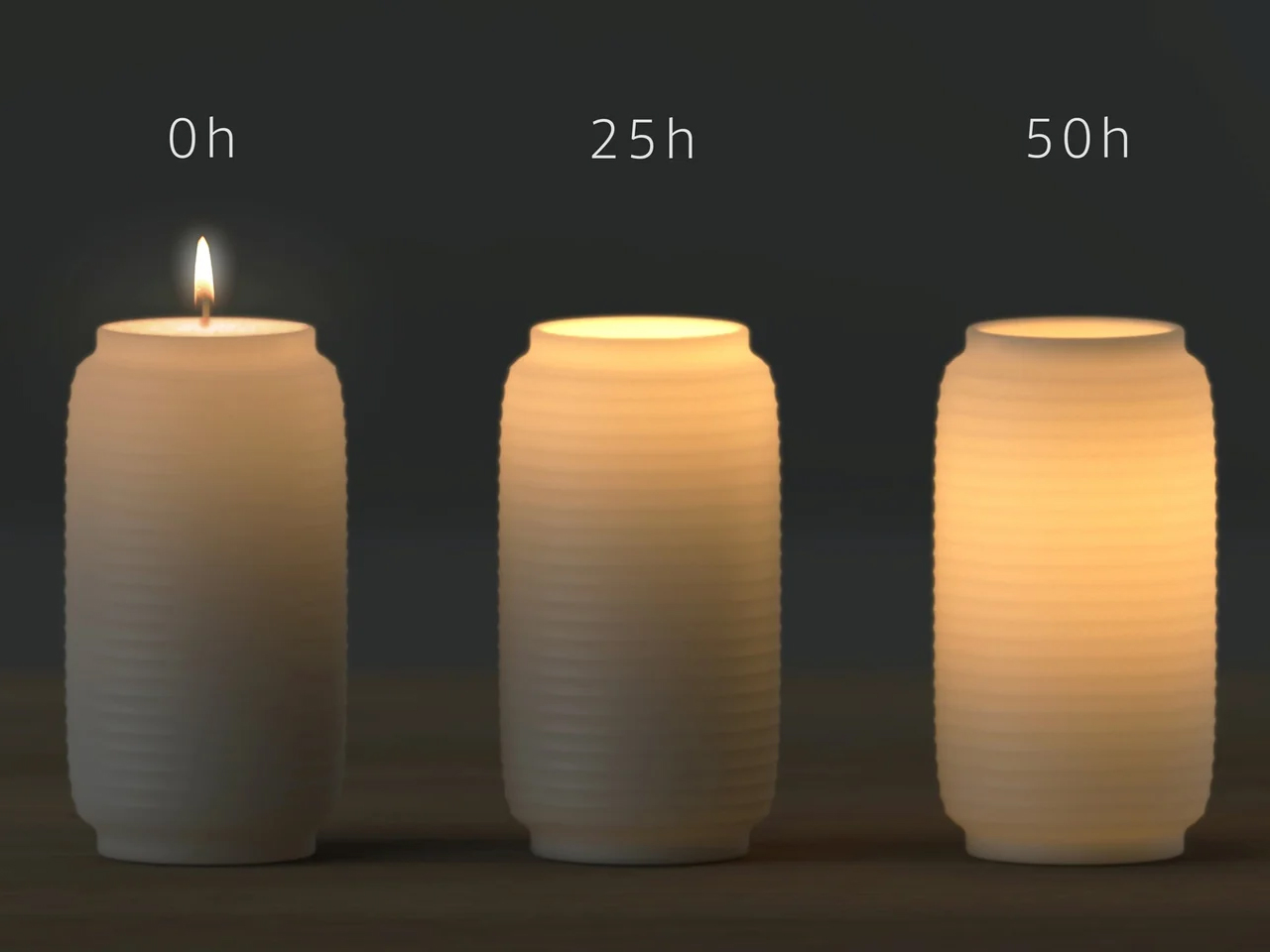
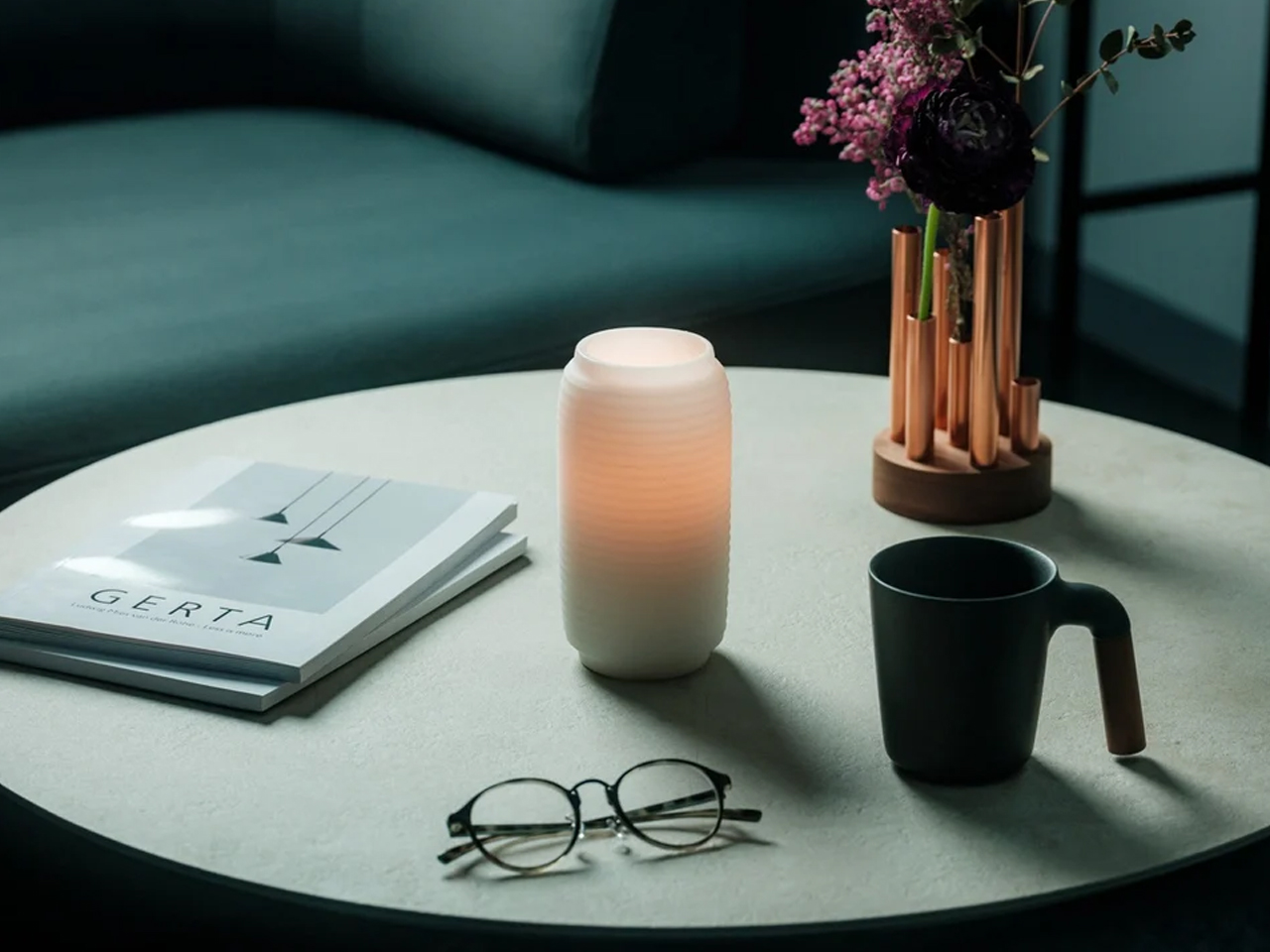
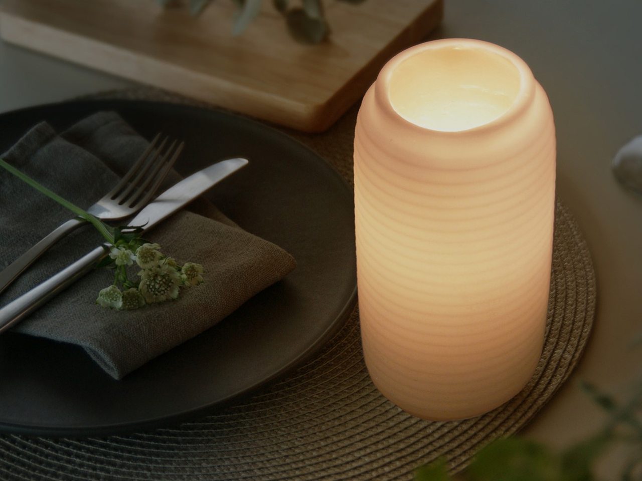
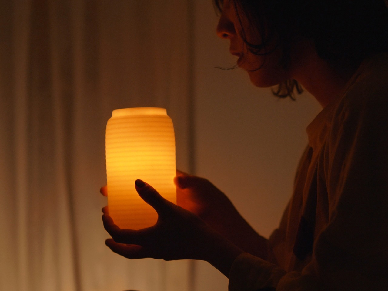
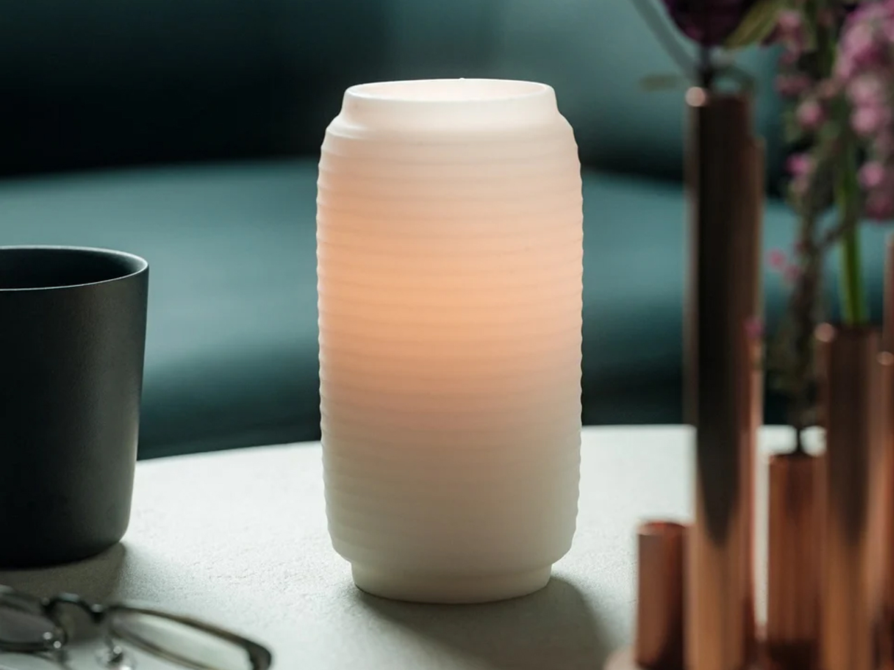
Designed by James Kaoru Bury, the Chouchin Candle reinterprets the traditional Japanese lantern through a refined and contemporary candle design. Inspired by the soft glow of a classic “chouchin” lantern, the pillar-shaped candle features a dual-layer wax construction that combines functionality with atmospheric lighting. The inner core burns like a conventional candle, while the exterior is made from a patented non-melting wax that forms a translucent shell. As the flame flickers within, the outer layer gently diffuses the light, creating a warm lantern-like glow that enhances the surrounding ambiance.
Developed in collaboration with Pegasus Candle Co. Ltd in Kurashiki, Japan, the candle is designed for elegance and practicality. The non-melting exterior safely contains liquid wax, eliminating dripping and removing the need for a separate tray. With a burn time of nearly 60 hours and replaceable candle refills, the product also emphasizes longevity and sustainability while maintaining its calm, sculptural presence.
3. The Candle Disc: Tracking Time Through Melting Wax
Contemporary candle design is increasingly exploring the deeper meaning of time, transformation, and human experience through the way candles burn and evolve. Rather than remaining simple decorative objects, some candles are designed to change shape gradually as the wax melts, turning the burning process itself into a visual and emotional experience.
These ideas reflect a growing interest in mindful and experiential design. This is because modern candles are no longer valued only for fragrance or ambiance, but also for the atmosphere and reflection they inspire.
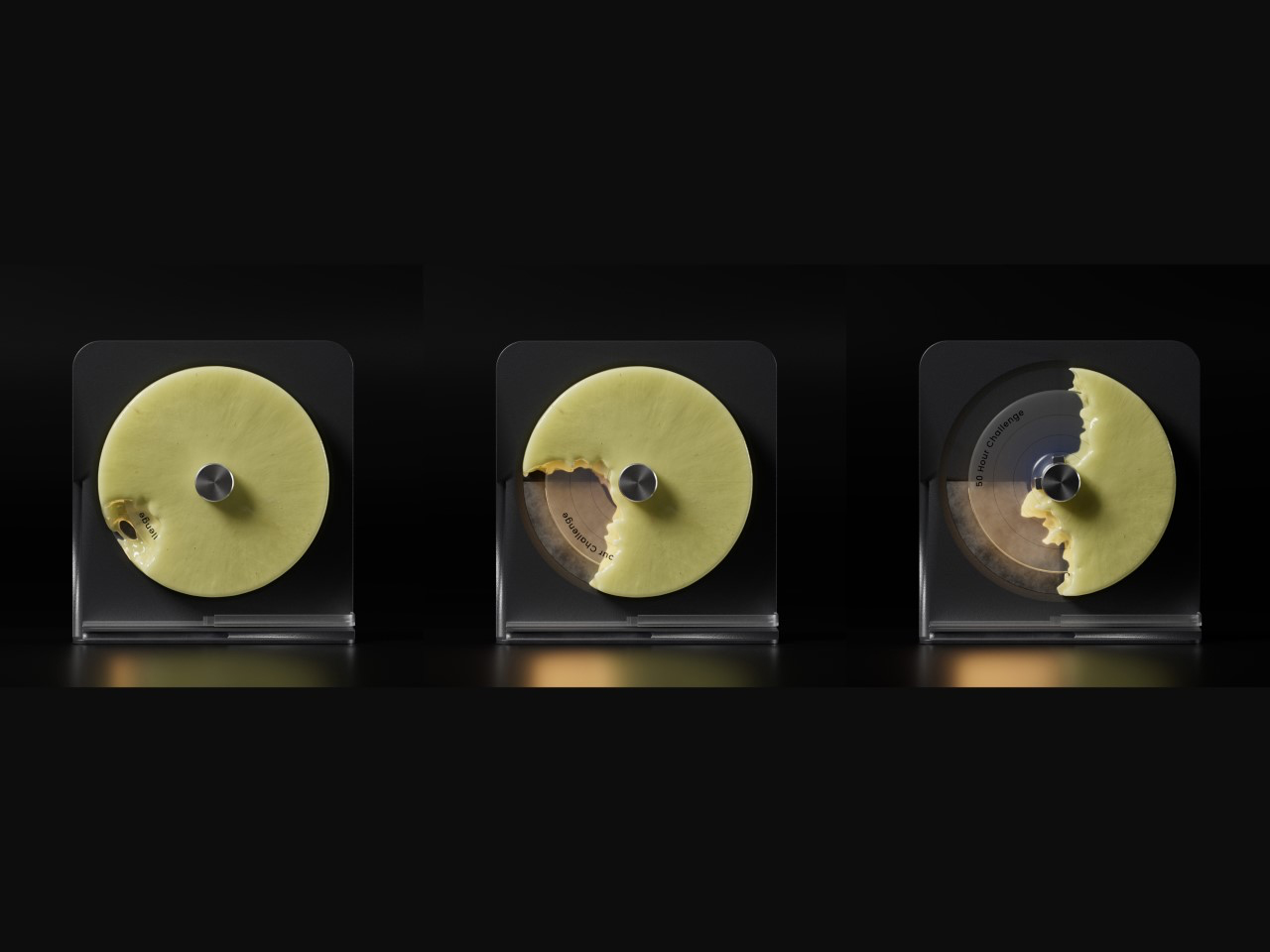
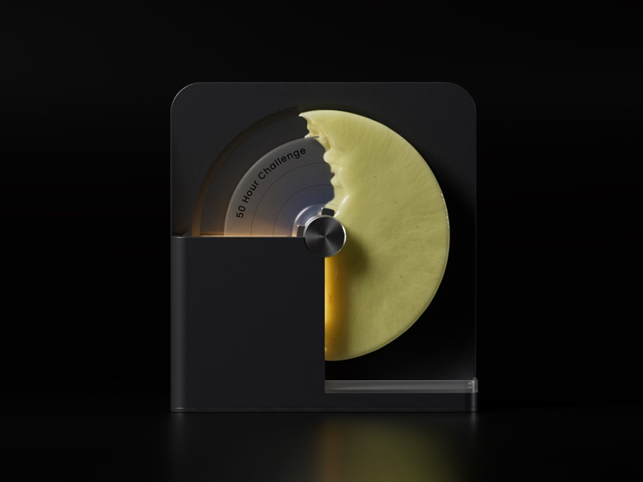
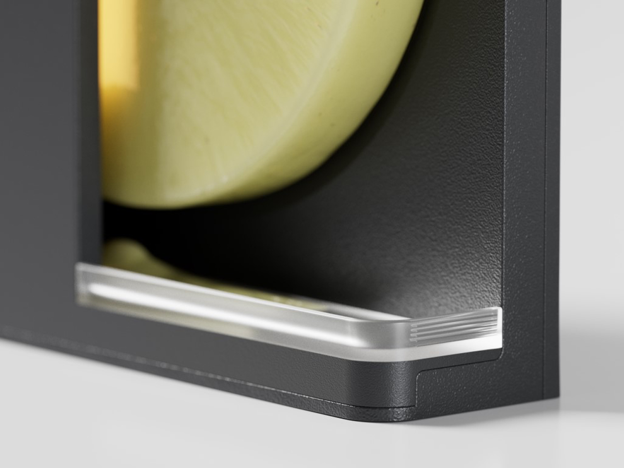
Designed by Seokoo Yeo, the Candle Go reimagines the traditional candle as a functional time-tracking object. Instead of a standard upright candle with a burning wick, the product uses a rotating disc-shaped wax candle mounted on an axis. A built-in warming element gradually melts the wax in a radial pattern, creating a visual representation of passing time. As sections of the wax disappear, gravity naturally causes the disc to rotate, turning the candle into a dynamic and interactive experience that feels both sculptural and meditative.
The product combines minimalist design with productivity-focused functionality. The changing wax pattern acts like a visual timer, allowing users to intuitively track work sessions, goals, or moments of focus. Melted wax is neatly collected in a lower chamber, keeping surfaces clean while eliminating the need for an open flame. Once the candle disc fully melts away, it reveals a hidden medal inside, transforming the product into a symbolic reward system that celebrates time spent productively and intentionally.
4. Scented Candle Cards: Compact Design for Modern Lifestyles
Scented candle cards are introducing a new and compact approach to candle design, rethinking how fragrance products can be experienced in everyday life. Unlike traditional candles housed in heavy containers, these designs are lightweight, portable, and minimal in form. Their slim structure and creative presentation make them feel modern, functional, and visually distinctive.
Beyond convenience, these candles reflect the growing interest in interactive and experience-driven products. Their compact format makes them suitable for gifting, travel, hospitality, and creative packaging concepts.
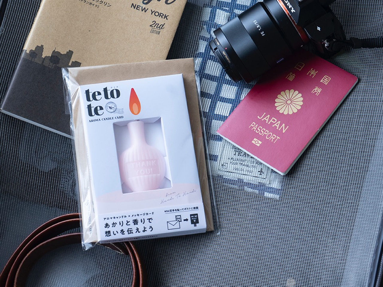
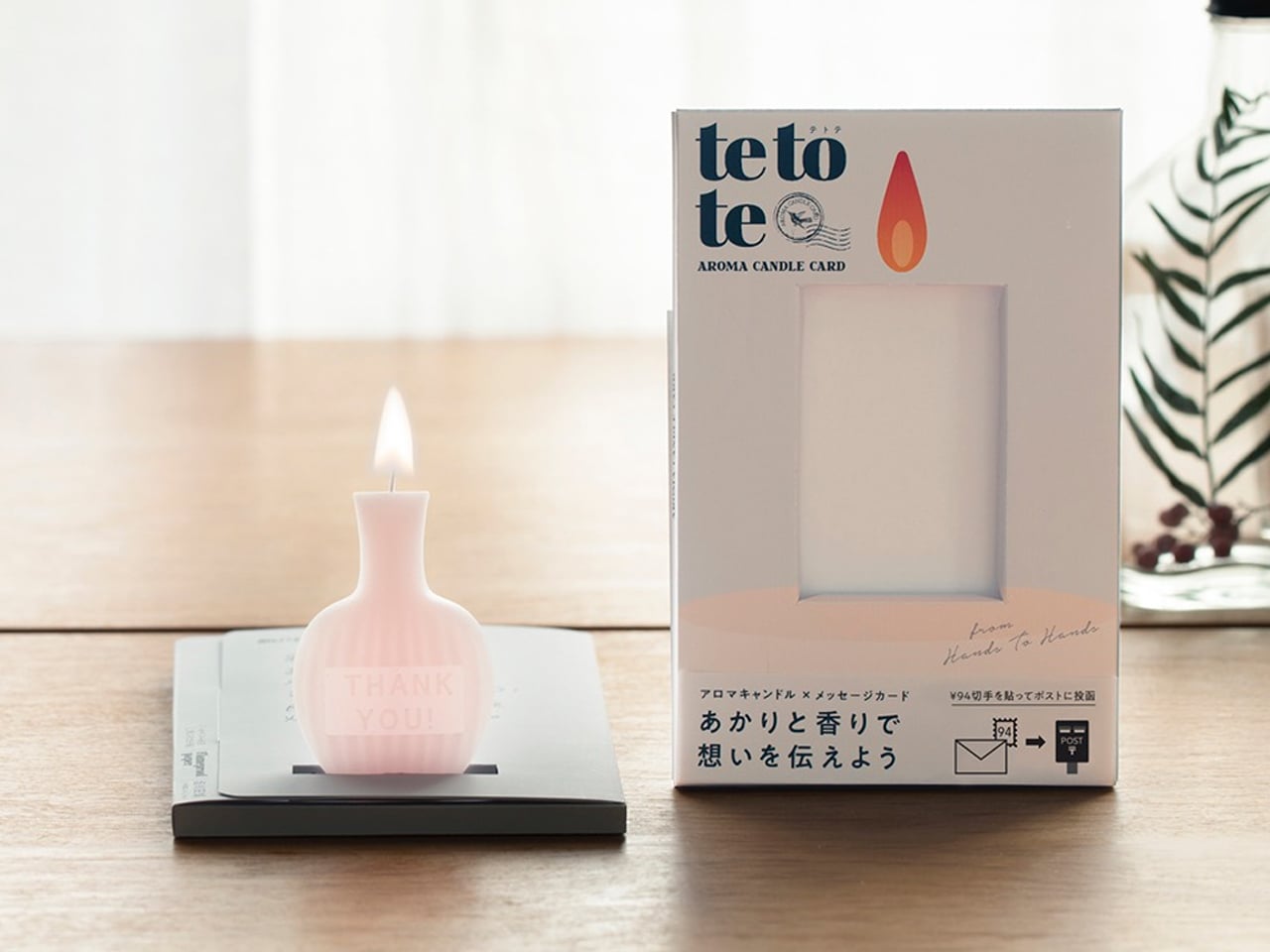
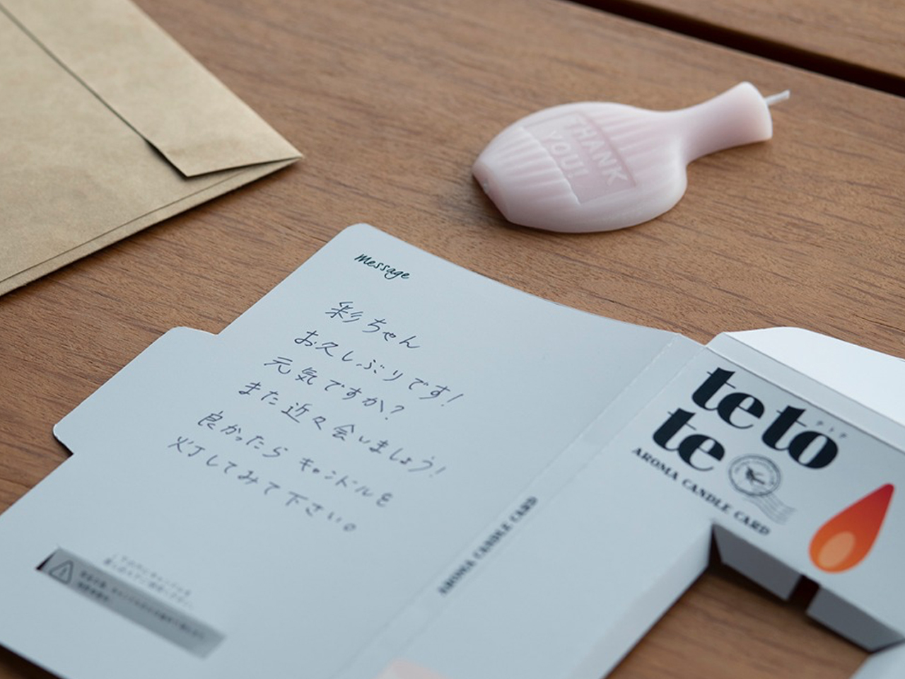
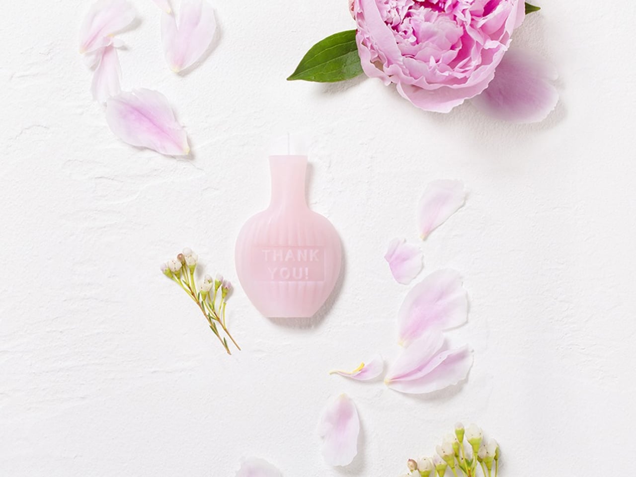
The AromaCandle Thank You Card transforms the traditional candle into a compact sensory experience that combines fragrance, design, and personal messaging. The product features an ultra-thin aromatic candle paired with a slim foldable card that functions as both packaging and a display stand. Once opened, the candle can be placed into a dedicated slot and lit, creating a warm glow and subtle fragrance while the handwritten message is read. Its minimalist construction makes the object feel delicate, elegant, and highly thoughtful.
The product stands out through its clever balance of aesthetics, functionality, and emotional design. Available in fragrances such as Sakura, Green Tea, and Yuzu, each candle is designed to evoke a distinct atmosphere through scent and color. The fire-retardant paper structure and self-extinguishing candle design add practicality and safety to the experience. Compact enough to be mailed like a standard card, the product reimagines candles as intimate objects that create memorable moments through light, fragrance, and personal connection.
5. Sfumato Candle: Inspired by Leonardo da Vinci’s Artistic Technique
Modern candle design is increasingly embracing craftsmanship, turning candles into carefully made artisanal objects rather than mass-produced decor items. In the process, starting from hand-poured wax to sculpted forms and detailed finishes, craftsmanship plays a major role in creating candles that feel unique and personal. Designers often experiment with textures, layered colors, and handcrafted techniques to give each candle its own identity and character.
This focus on craft also highlights the value of slow, thoughtful production. Many contemporary candles are created using traditional methods combined with modern design ideas, resulting in pieces that celebrate skill, creativity, and material quality. Beyond fragrance, these candles reflect the growing appreciation for handmade products that bring artistry and authenticity into everyday living.
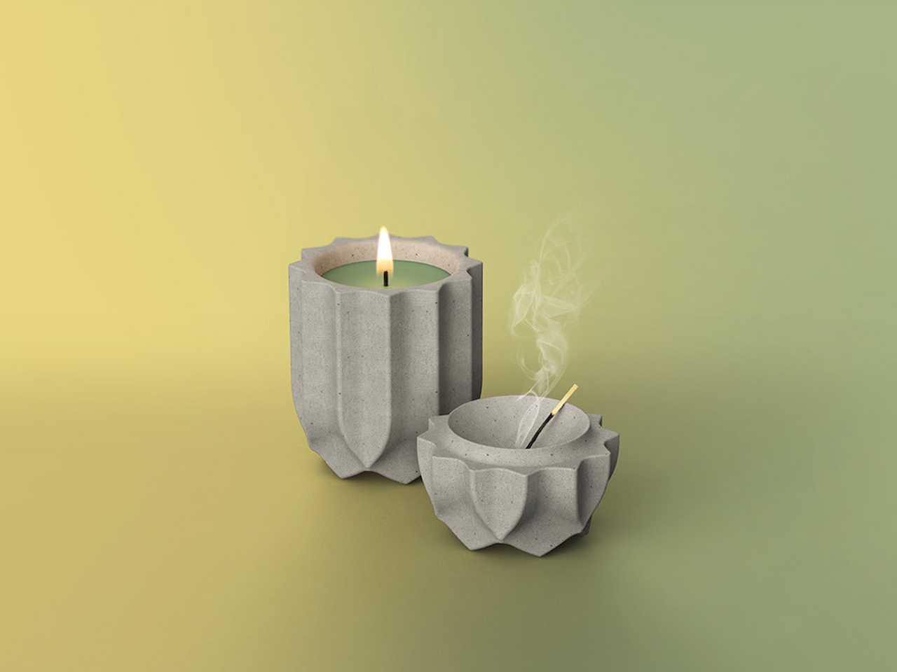
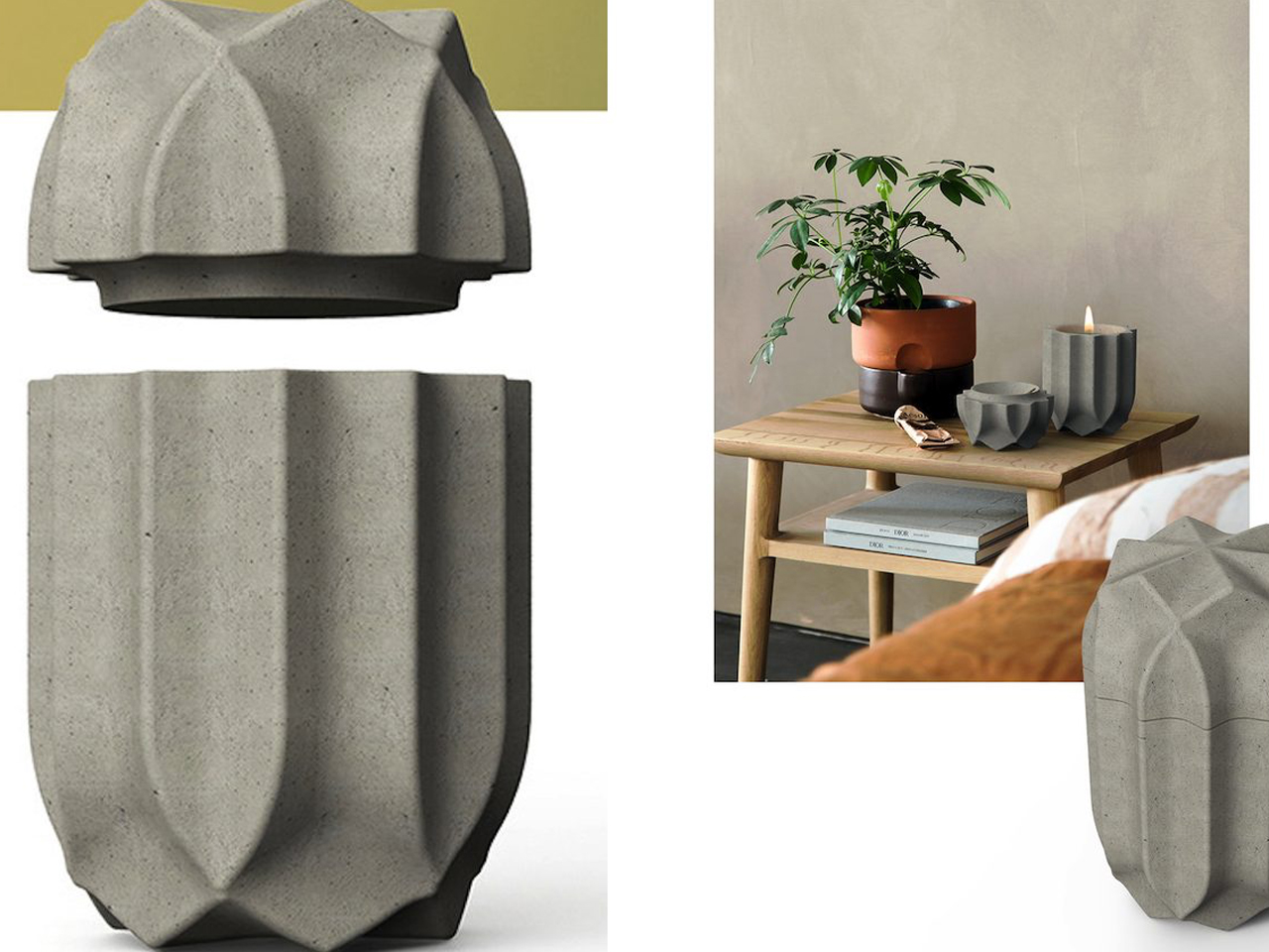
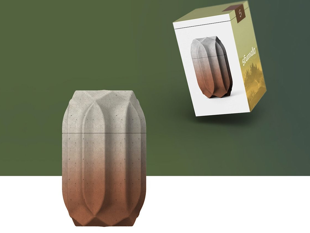
The Sfumato Candle reimagines the everyday candle as a sculptural design object inspired by architecture and materiality. Designed by Kegan McDaniel, the candle is housed in a cast concrete vessel that gives it a bold, stone-like appearance with a refined architectural presence. Its minimalist form and textured finish make it feel more like a contemporary décor piece than a traditional scented candle. The sturdy concrete exterior adds depth and permanence, creating a calming visual experience even before the candle is lit.
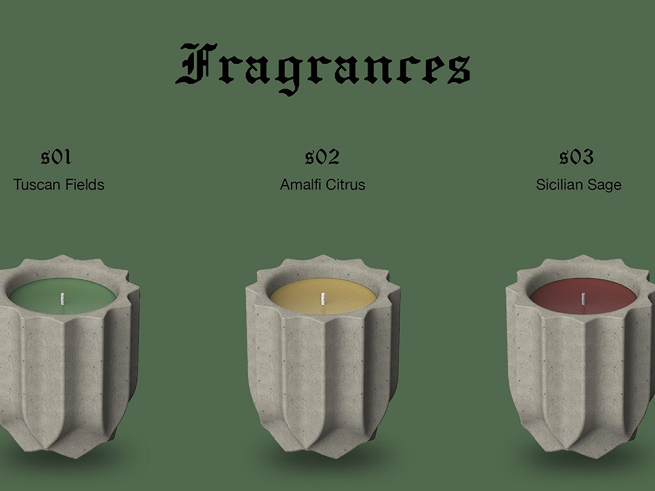
The collection combines fragrance, color, and craftsmanship into a cohesive sensory design. Available in scents such as Tuscan Fields, Amalfi Citrus, and Sicilian Sage, each candle is paired with distinctive shades of green, yellow, and red inspired by Italian landscapes. The name “Sfumato,” borrowed from Leonardo da Vinci’s famous painting technique, reflects the soft, atmospheric quality the product aims to create. Together, the architectural vessel, earthy textures, and immersive fragrances transform the candle into a sophisticated object designed for relaxation and ambiance.
Modern candles are evolving beyond simple décor into immersive lifestyle objects that combine craftsmanship, innovation, sustainability, and emotional storytelling. Today’s designs focus on sculptural forms, sensory experiences, reusable materials, and atmospheric lighting, transforming candles into meaningful objects that engage the emotions and the surrounding space.
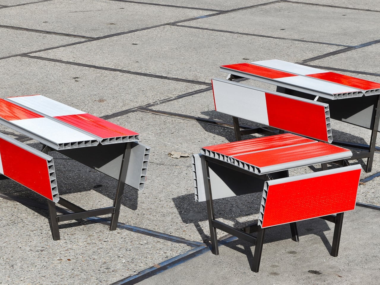
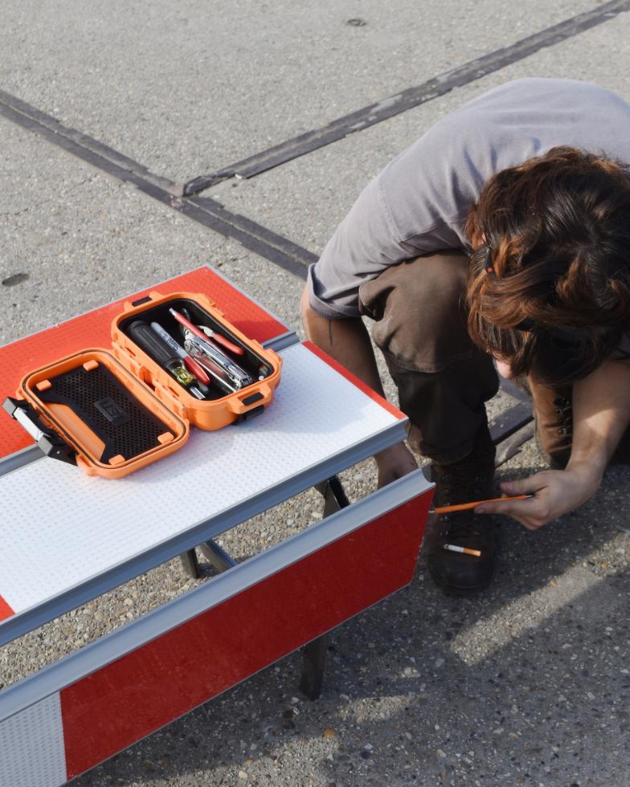
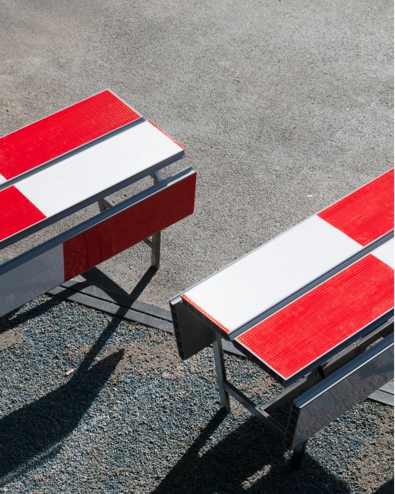
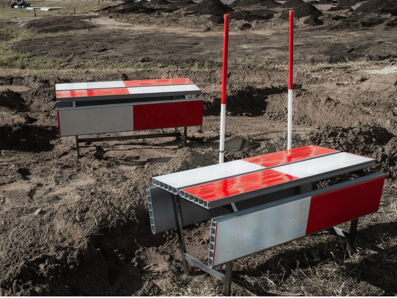
A red-and-white safety barrier isn’t an object I’d normally consider inviting. It’s supposed to interrupt your plans. That’s why the stop! collection by Studio Martins Mezulis and creative 13_0663_tsx makes such a good first impression as a design idea. The outdoor benches and stools borrow the panels of Dutch traffic barriers to make places to sit, addressing a basic need in public space: somewhere to pause.
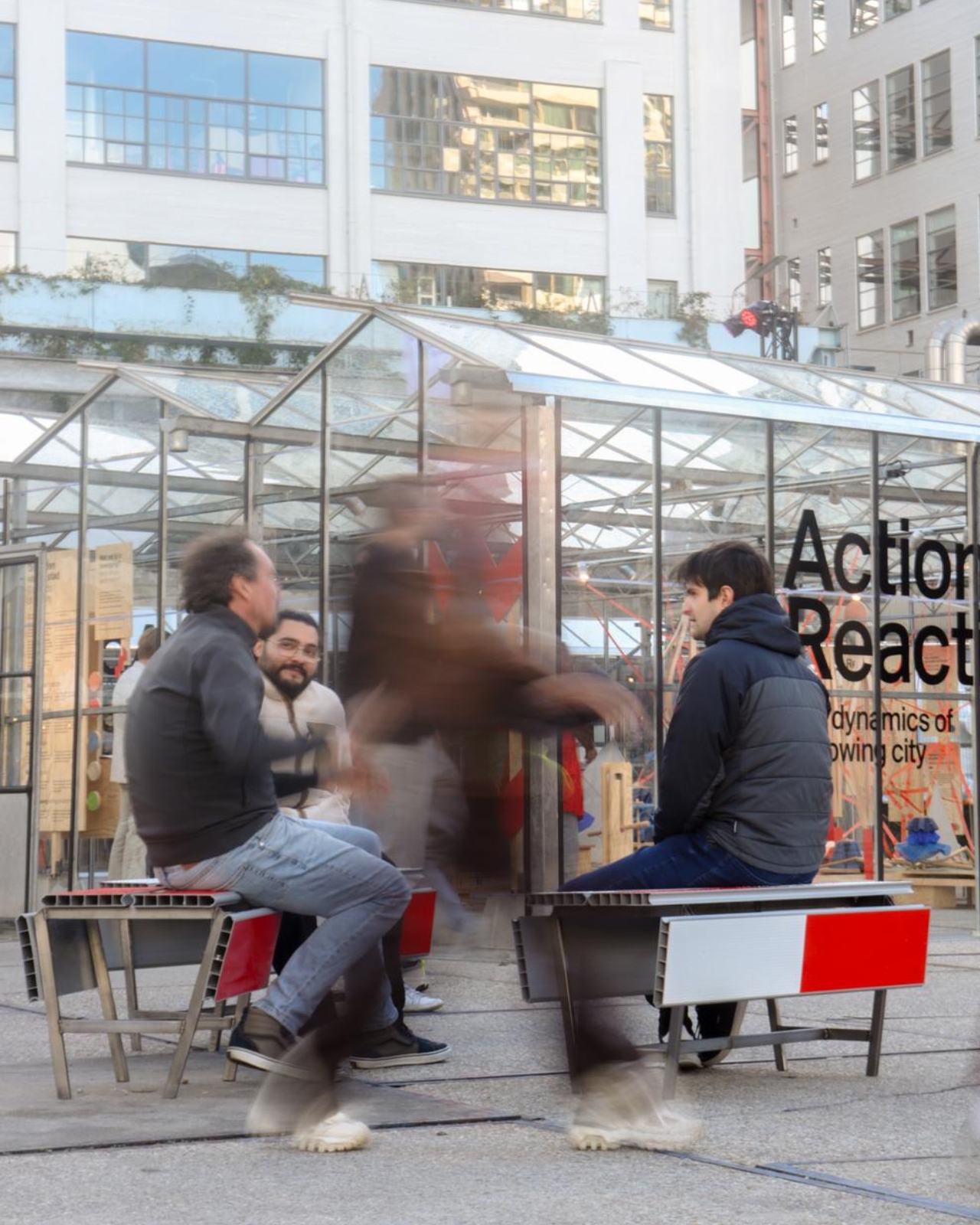
Waiting for a friend shouldn’t require buying a coffee to justify occupying a chair. I like public seating that treats waiting, resting, and doing very little as perfectly legitimate activities. That’s the practical territory stop! occupies. Presented at Dutch Design Week in Eindhoven, running October 17–25, 2026, the collection invites people to stay for a while using an object associated with sending them elsewhere.
Designers: Studio Martins Mezulis and creative 13_0663_tsx
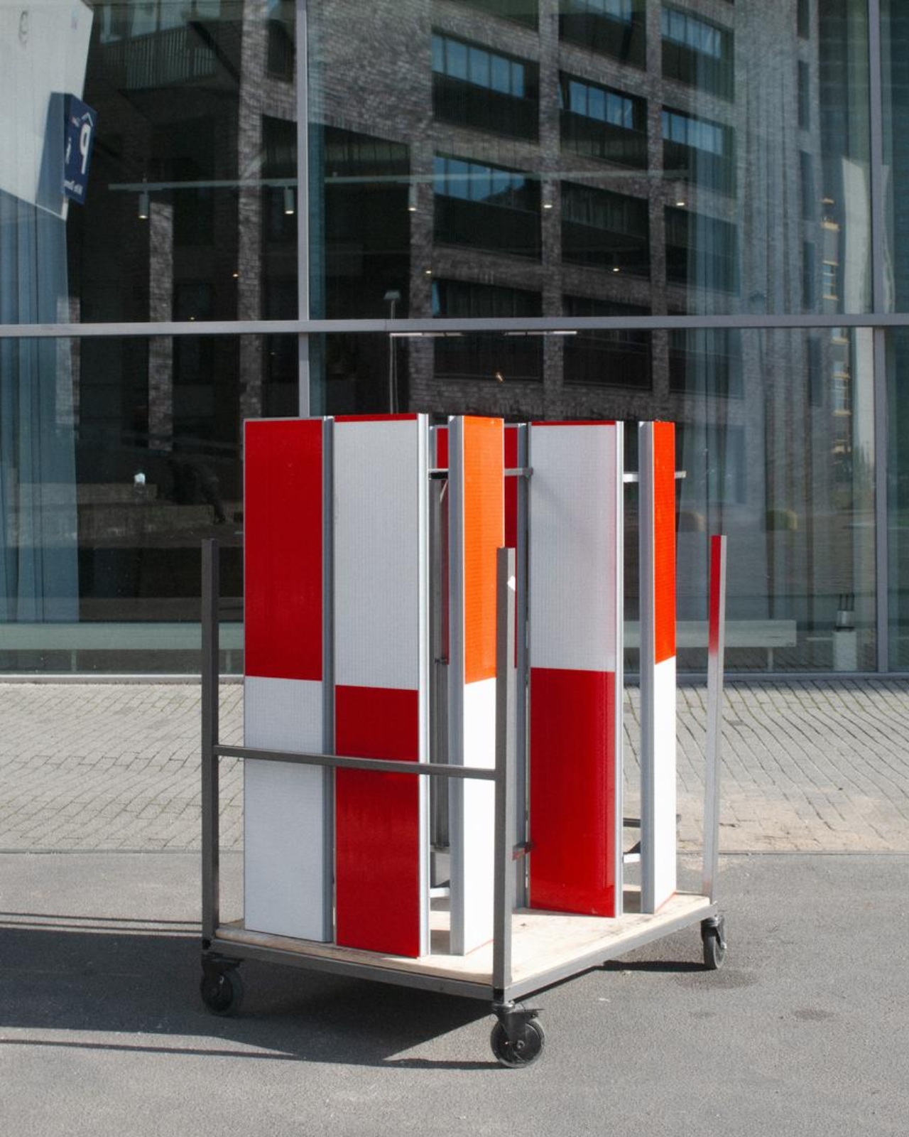
The starting point is the schrikhek, a red-and-white aluminum barrier used in the Netherlands to alert people to construction and redirect their route. You don’t need to recognize that Dutch term to understand the reference. The warning graphics do most of the explaining. Keeping them visible gives the furniture a little friction: your eyes register a restriction before your brain catches up with the seat.
It’s a fitting project for Studio Martins Mezulis, whose work spans graphic and spatial design. The stripes are doing both jobs here: defining a physical object and carrying a message that the designers are trying to change.
In the project’s render, long striped panels form the seating surfaces, with more panels running vertically along the sides. A narrow framework keeps the assembly visually open. The result looks deliberately assembled from infrastructure rather than dressed up to conceal its origins. I prefer that decision to a more polished makeover. Remove the red and white, and much of the reason to notice these benches disappears.
The published bench dimensions are 1,250 millimeters long, 500 millimeters wide, and 450 millimeters high, or approximately 49 by 20 by 18 inches. Road safety barriers and steel are listed as the materials. Those numbers describe a compact object rather than a sprawling park bench. Its proportions make the proposal easier to picture beside a pedestrian route or within a plaza, although placement would still need careful consideration.
The illustrated benches are also backless and lack armrests. That keeps their form simple and leaves the seat approachable from either side, but it doesn’t offer the support some people need. I’d read them as an invitation to take a short break rather than assume they’re suited to a long afternoon. The graphic wit is persuasive; comfort and durability would need evidence beyond a render.
That distinction matters because public furniture has a job beyond looking good in a design exhibition. Someone needs to understand that they can use it. Here, the same markings that make the collection memorable could initially make a passerby hesitate. I’d be interested to see how quickly people recognize the invitation. A bench occupied by one person might explain the idea better than a nearby project label.
The material story deserves similar precision. According to the project’s Dutch Design Week description, the designer hopes to work with construction infrastructure providers to reclaim decommissioned or discarded panels in the future. That isn’t confirmation that every panel in the current collection has already served at a construction site. Reuse is a proposed direction for expanding the collection, and it’s worth preserving that distinction rather than automatically labeling the furniture recycled.
For me, stop! works best as a modest adjustment to how a street communicates. It gives a familiar public object another use without erasing what made it recognizable. The humor gets your attention, but the seat has to justify keeping it. If the collection develops further, I’d rather see that effort go into making it useful to more people than into adding more visual tricks. A decent place to wait is already a worthwhile design brief.
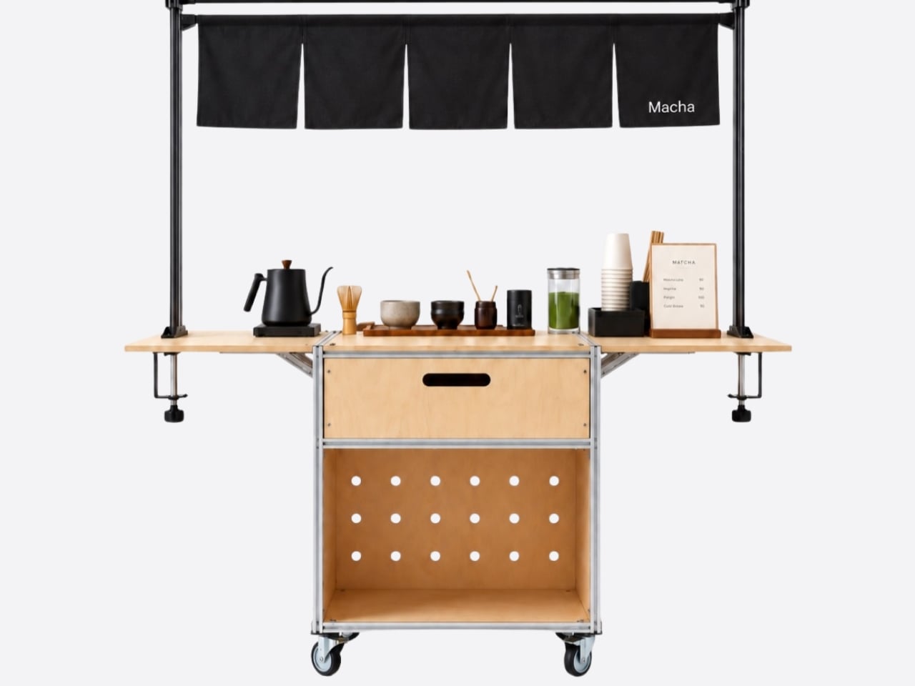
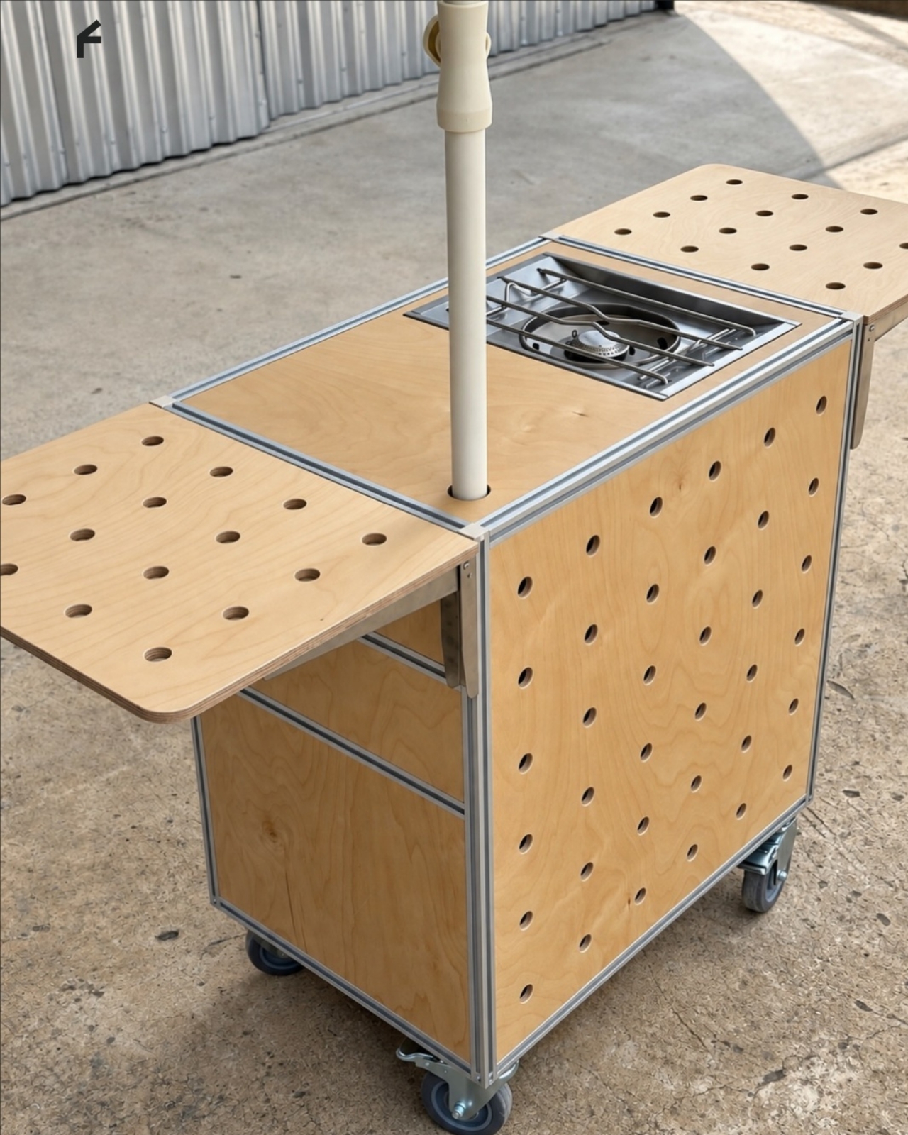
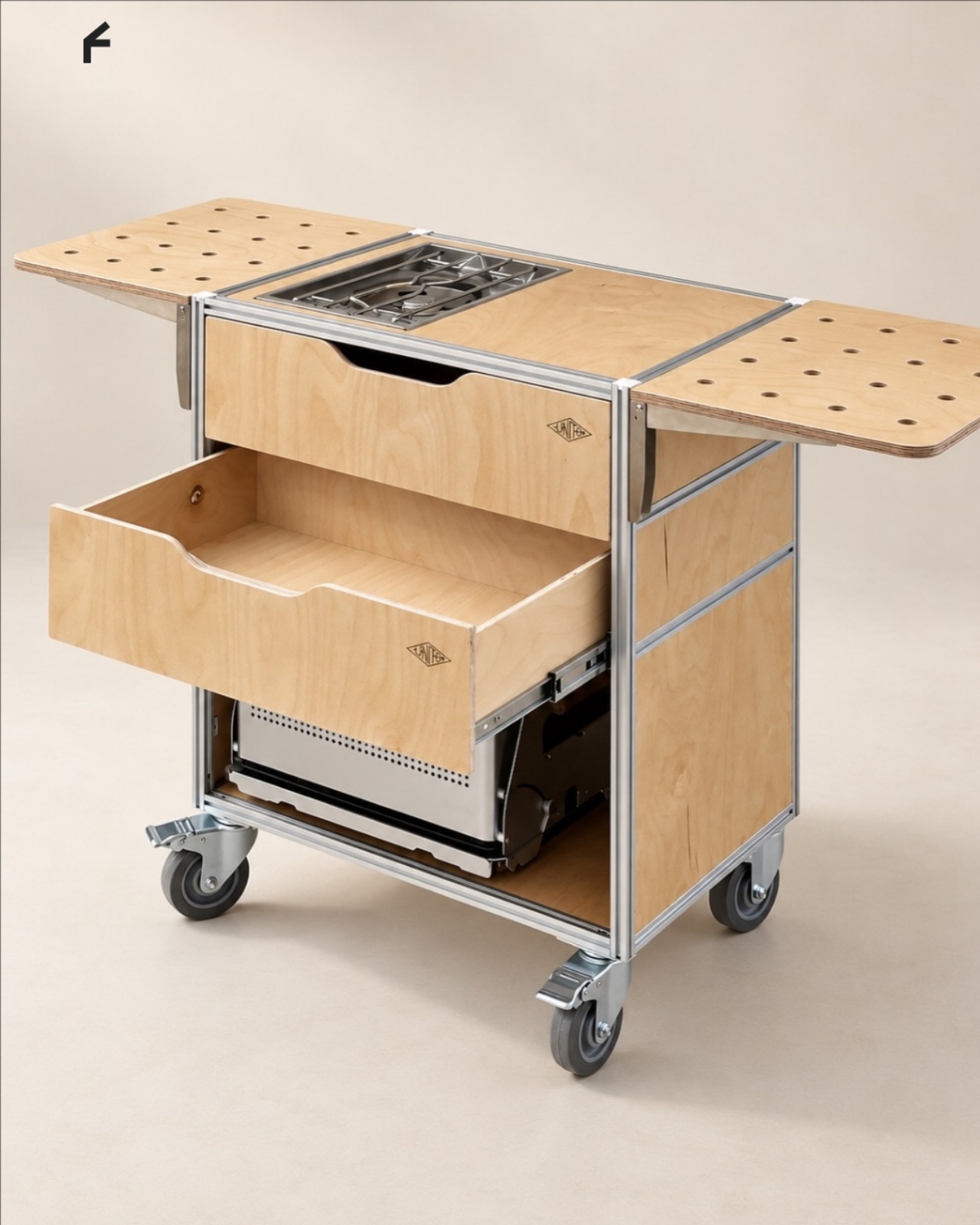
A coffee grinder, a kettle, and a few favorite mugs can turn into a surprisingly territorial collection. Add filters, beans, and the tools that make a morning ritual feel worthwhile, and suddenly the kitchen counter has a second job. UNITO’s Coffee Station offers a dedicated home for that equipment, with wheels underneath so the coffee corner doesn’t have to become a permanent fixture.
Designed by Unito, the station brings preparation space and storage together in a movable counter. Its appeal extends beyond reclaiming kitchen space. For a studio hosting clients or someone setting up a coffee pop-up, it could provide a more organized starting point than a table surrounded by supply boxes. Unito’s founder has described the Coffee Station as part of the brand’s move toward furniture and tools for small businesses.
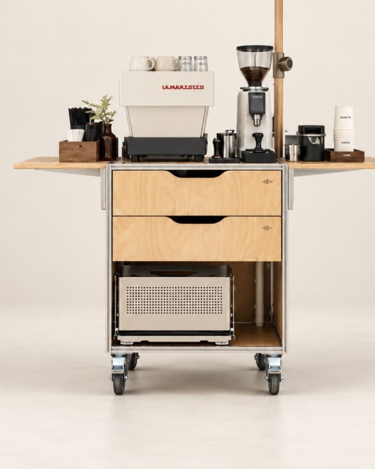
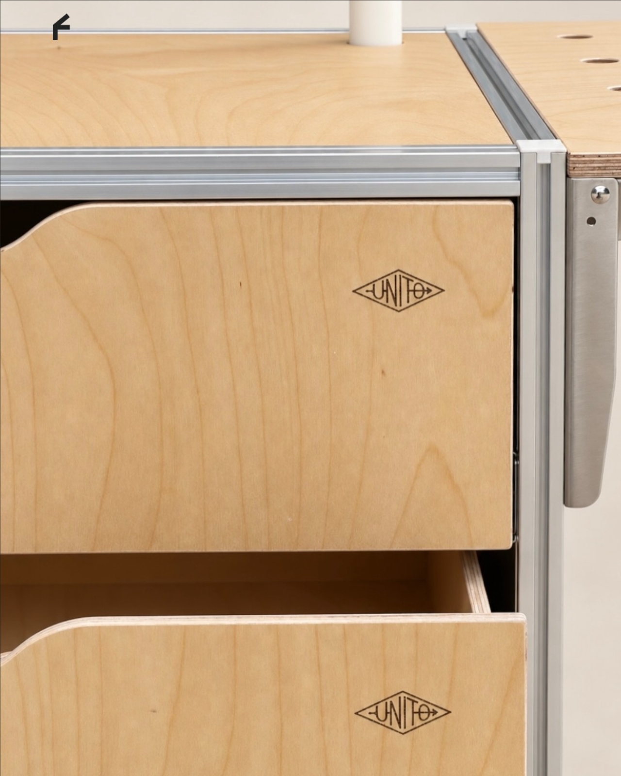
The material combination gives that practical idea some personality. According to the supplied product description, silver anodized aluminum profiles form the frame, while light birch plywood supplies the panels. I like that the design lets both materials retain their identities. The metal outlines the structure with a workshop-like precision; the wood gives the broad surfaces enough warmth to keep the station from reading as purely institutional equipment.
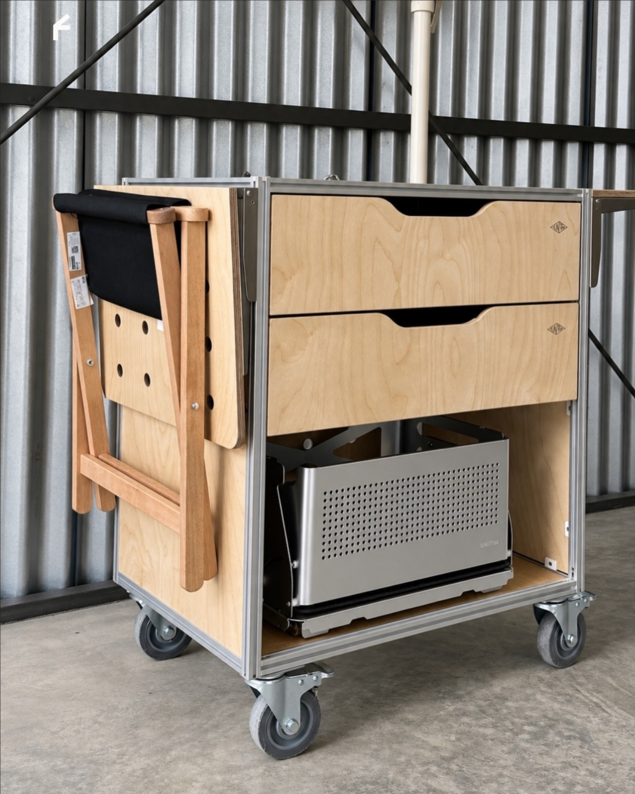
That balance matters for something that might face customers. In the published photographs, the silver framework remains visible around the wooden drawer fronts, and side surfaces extend beyond the central cabinet on supporting brackets. Those extra surfaces look useful for separating preparation from pickup. A cup waiting to be served shouldn’t have to compete with the grinder for the same patch of counter.
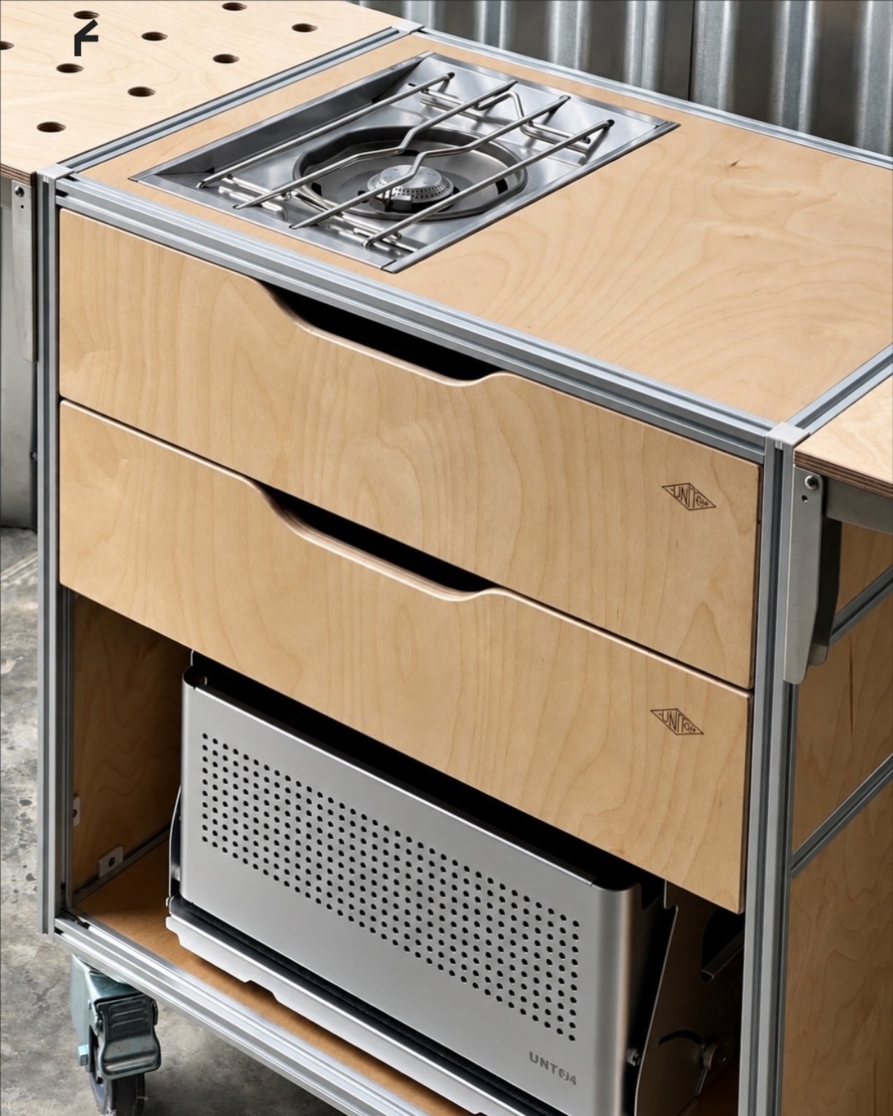
Storage deserves as much attention as the equipment displayed above it. The described configuration includes two soft-close drawers, with an open compartment underneath. The photographs show wide finger-pull cutouts rather than projecting handles. I appreciate that restraint, but the more useful decision is giving small supplies somewhere to disappear. Filters, spoons, and towels could stay close without becoming part of the countertop display.
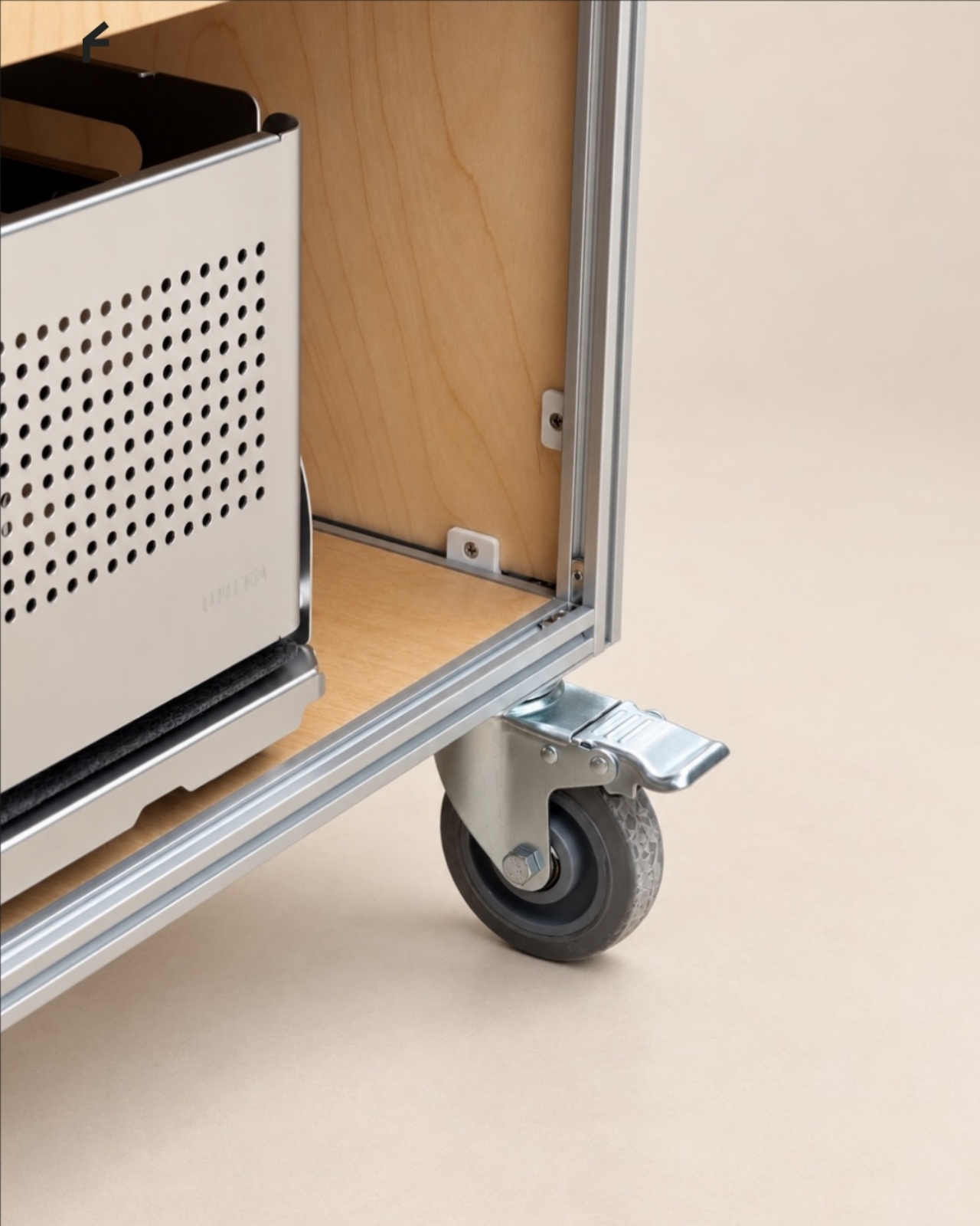
Then come the wheels, arguably the least glamorous and most consequential detail. The specifications list four locking stainless steel casters, and brake levers are visible in the photographs. That arrangement is intended to let the station move into position and then stay put. I’d still distinguish a rolling workstation from portable luggage. Moving across a suitable floor is a different proposition from negotiating stairs or loading it into a car.
The top also introduces an interesting possibility: it is specified to accept IGT panels or stoves. IGT refers to the Iron Grill Table system, whose modular approach combines frames with cooking and work-surface inserts. For UNITO, the appeal is a surface that could accommodate different tasks rather than permanently committing to one arrangement. Exact insert compatibility still needs confirmation before anyone starts ordering accessories.
The dedicated patio umbrella slot is another thoughtful detail. Published images show an umbrella rising above a fully arranged coffee setup, making the station read like a small service point rather than a kitchen cart parked outside. That could be useful for a temporary outdoor gathering. It doesn’t, however, establish that the plywood is weatherproof or that the station can anchor an umbrella safely in wind.
My favorite potential use is actually the less theatrical one: a shared studio where the coffee setup needs its own territory but the room changes throughout the week. A dedicated station could keep supplies together while allowing the host to rearrange the space. That feels like a convincing reason to put furniture on wheels, especially when building another fixed counter would make the room less flexible.
I wouldn’t call it a complete café or an outdoor kitchen. Those descriptions skip over water, power, cleanup, and the practical demands of serving people. Its more believable contribution is giving coffee equipment a coherent place to live and work. For someone who wants a serious setup without designing the room around it, that’s an appealing amount of commitment.
They say AI will steal our jobs. Whoever trims that stubborn strip of grass along the lawn’s edge seems to have excellent job security. We’ve got robots driving around gardens, mapping their surroundings, and keeping the grass neatly cut, yet the border still has a habit of becoming someone’s weekend assignment. Personally, that’s a job I’d be delighted to hand over.
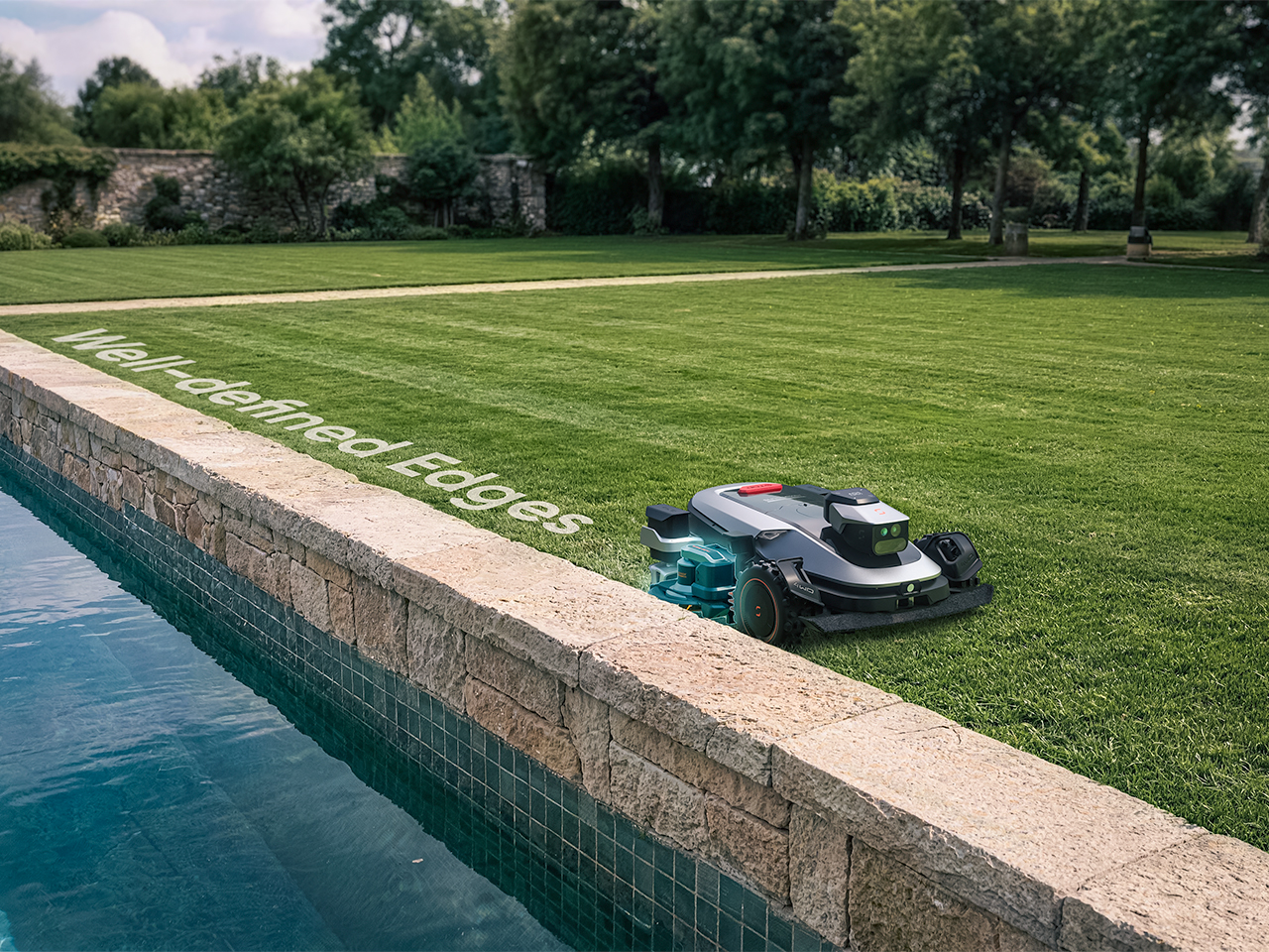
Sunseeker’s upcoming X8 Plus looks eager to apply. Its EdgeZero 2.0 trimming system targets a zero-inch edge gap, according to the company, putting that leftover strip squarely on the agenda. Set for a preview at Equip Expo 2026, the robotic mower also brings solid-state LiDAR, stereo vision, and network-assisted satellite positioning. An impressive résumé, although the edge-cutting hardware is what makes me want to schedule the interview.
A mower can follow a boundary accurately and still leave grass behind if its blades cannot reach it. Knowing where the border is and cutting right up to it are separate assignments. Sunseeker describes EdgeZero 2.0 as its answer to the second one, though the announcement leaves the mechanism’s finer details unexplained. That’s the part I’d want a closer look at: how the trimming tool reaches the border while the mower’s body stays clear. A clean pass beside a raised edge would tell a useful story.
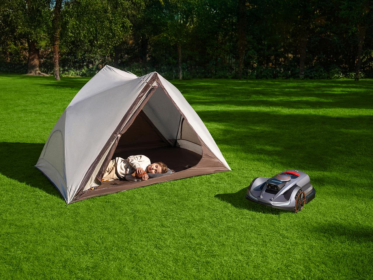
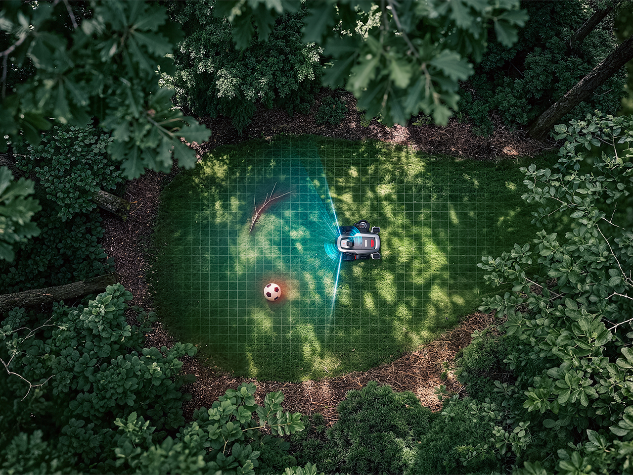
Getting into position is its own engineering task. The X8 Plus uses nRTK, a form of satellite positioning that draws correction data from a network of reference stations. In plain English, those corrections help tighten up the machine’s estimate of where it is. Sunseeker combines that positioning with solid-state LiDAR and stereo vision, giving the mower several sources of information as it navigates. Your garden may look peaceful from the patio; the robot has quite a bit to figure out down there.
Sharing the Lawn With the Locals
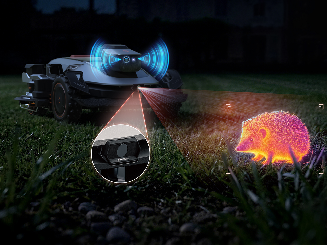
There’s an infrared camera in the mix, too, which Sunseeker says supports animal-friendly operation. That’s a worthwhile consideration for a machine sharing outdoor space with creatures that have never checked its mowing schedule. The announcement doesn’t establish exactly how the system identifies or responds to different animals, so I’d keep the promise modest for now. Still, accounting for the lawn’s other residents belongs in the design brief. The grass might stay put, but everything passing through it gets a vote in how smoothly an autonomous mower’s afternoon goes.
Sunseeker Elite already explores that relationship between sensing and physical movement in its existing X7 Gen 2 and X7 Plus Gen 2. Those models combine satellite positioning with visual mapping, while all-wheel drive and floating dual cutting discs address traction and uneven ground. That provides useful context for the X8 Plus: software has to work with wheels, blades, and the shape of the property. I like that the new preview brings attention back to the finishing work. A mower’s route can look beautifully organized on an app, but the result still gets judged from the garden chair.
A Closer Look at Equip Expo 2026
Equip Expo should provide a closer look at Sunseeker’s approach. The show runs October 20-23, 2026, at the Kentucky Exposition Center in Louisville, Kentucky, with Sunseeker at Indoor Booth #1190 and Outdoor Booth #7460D. The company plans an interactive mower-vision experience, letting visitors see imagery from a machine’s perspective, alongside outdoor slope demonstrations. Seeing what a mower perceives could make that long sensor list considerably easier to understand.
Pricing and retail availability for the X8 Plus aren’t specified in the announcement, so the zero-inch edge target remains a reason to watch its development rather than retire the trimmer immediately. For me, though, it’s a persuasive direction to pursue. Finishing the borders would remove a very specific reason for a person to follow the robot outside and pick up another tool. If Sunseeker can make that work reliably, I’m perfectly comfortable with this particular job disappearing. The person who used to do it can have Saturday morning back.
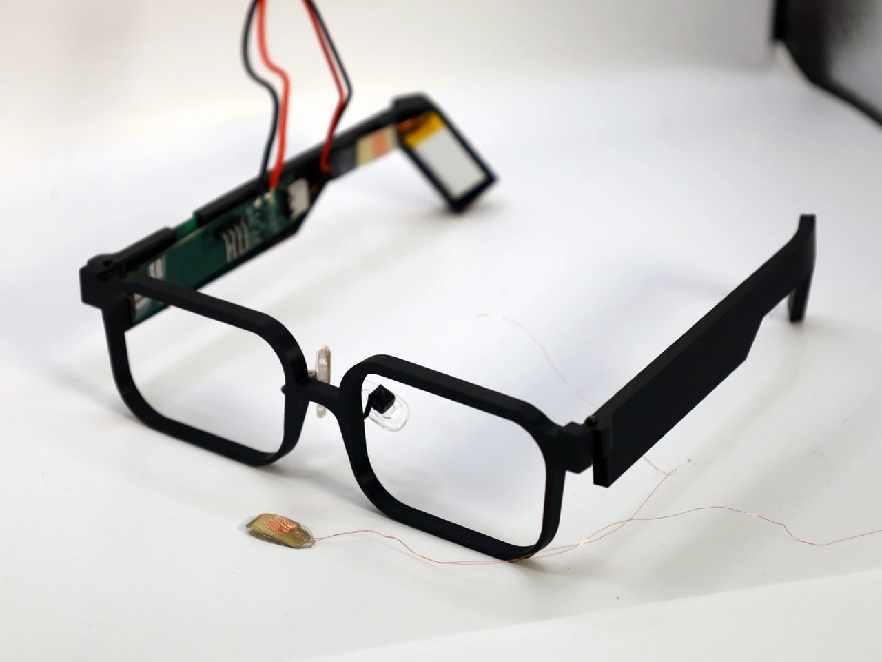
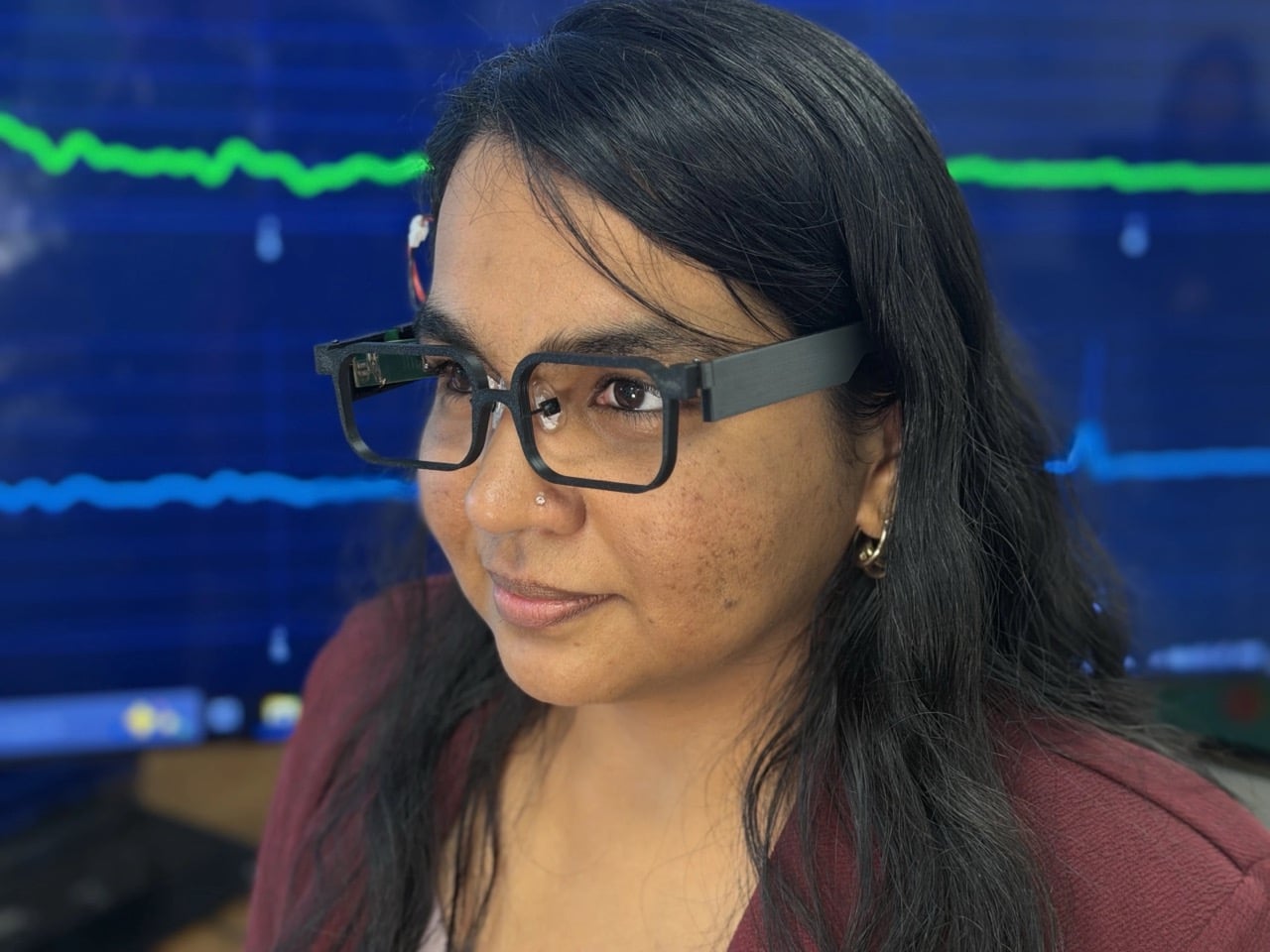
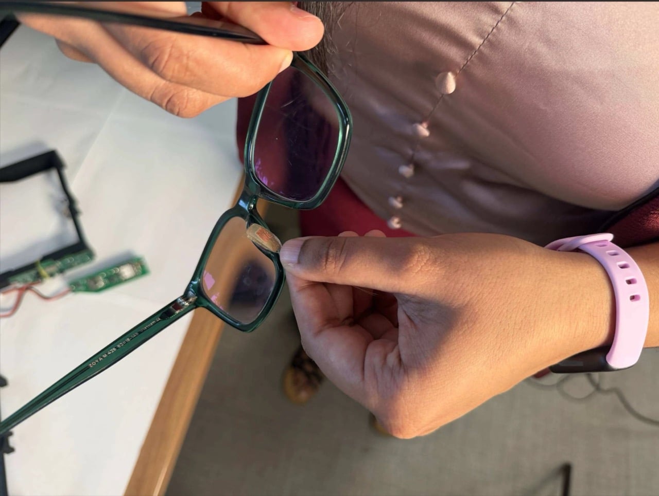
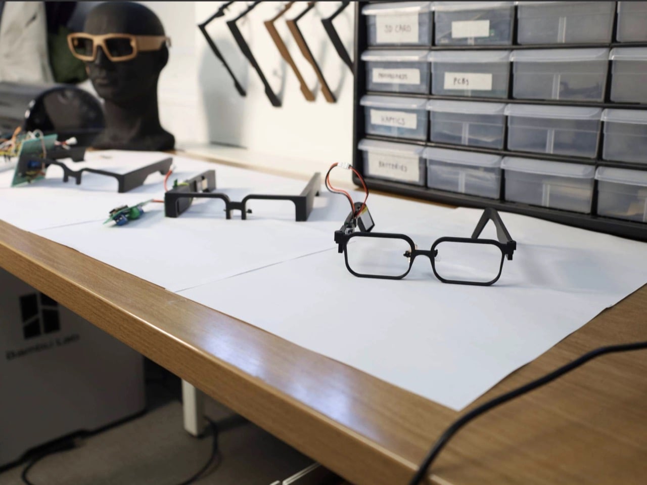
Your face is a power plant, and you’ve been running it for free your whole life. Every blink and jaw clench releases a tiny burst of mechanical energy that simply vanishes. A team at Northwestern University figured out how to catch it, using static electricity, the same stuff that makes a balloon stick to your hair. Their prototype glasses, GlassTENG, use that energy to run sensors tracking your pulse, blinks, and teeth clenching. As a feat of energy harvesting it’s fantastic, and I’d love to see it in everything from earbuds to shoe insoles.
Then the other shoe drops, because smart glasses are already the most side-eyed gadget around, with Meta’s Ray-Bans filming strangers in coffee shops and a battery that needs its case after a few hours serving as the only real limit. GlassTENG’s three sensors, built by Nivedita Arora’s VAK Embodied Systems Lab, draw just 4.1 microwatts combined, and the team wants to go fully battery-free next. That would remove the last speed bump on always-on face computers. Your pulse and jaw clenches are deeply personal data, and glasses like these could log them around the clock. Then again, if such glasses are coming anyway, I’d much rather they ran on blinks than on lithium-ion cells strapped to my head.
A Silicone Sandwich That Turns Blinks Into Voltage
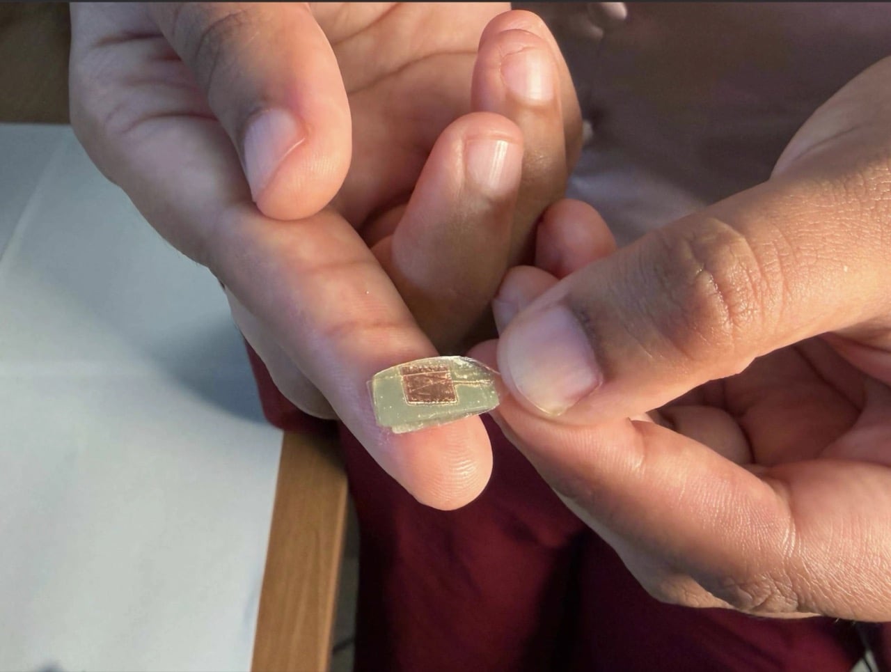
The sensor is a two-layer sandwich of PDMS, a soft silicone, and FEP, a slick fluoropolymer from the Teflon family. When the layers press together and spring apart, one hogs electrons from the other, which is the balloon-and-hair trick in a lab coat. Silver electrodes, each 150 nanometers thick, collect the resulting voltage. Pulse is the faintest signal, around 50 to 100 millivolts, while blinks and eyebrow raises land at 200 to 500 millivolts. A hard jaw clench climbs to about 1.5 volts, which is a wide enough range for one thin stack to tell a heartbeat from a chomp.
The silicone is Sylgard 184, mixed 10 to 1, degassed, spin-coated to roughly 490 microns (about 0.02 inches), and left to cure overnight. The FEP gets blasted with oxygen plasma on both sides, which roughens the surface so more of it touches the silicone. The team started by etching one side, then found that doing both measurably boosted the signal. Bare silicone faces your skin while the charge-trading interface stays sealed inside, so skin oils can’t muck up the readings. It’s baking show energy, just with a vacuum chamber instead of an oven.
Three Sensors, Three Spots, and Your Head Doing the Clamping
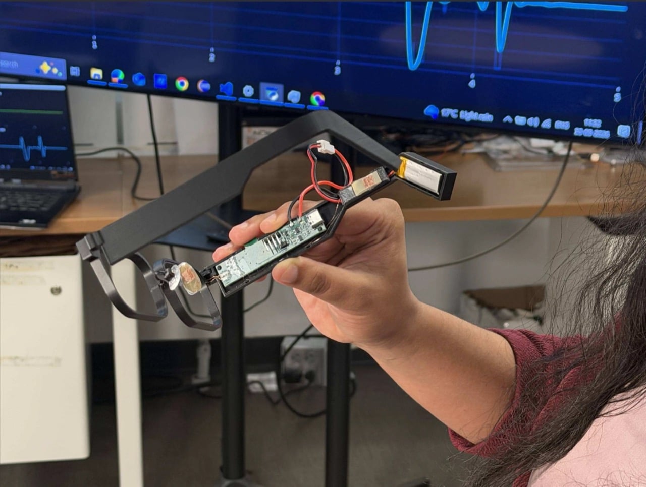
One sensor sits on the nose bridge over the angular artery, where it reads pulse, forceful blinks, and eyebrow raises. A second hangs off a small arm near the temple, aimed at the superficial temporal artery to catch clenching, tapping, and chewing. The third is embedded in the temple arm above the ear, and here the design gets clever, because the natural clamp of the frame on your head supplies the contact pressure for free. Early 3D-printed nose pads gave patchy contact, so the team swapped in adjustable off-the-shelf pads from regular eyewear. Decades of optician ergonomics beat the custom part, which is a humbling result for any designer.
In a study with 20 people, half of them daily glasses wearers, a Random Forest classifier (a machine-learning model that takes votes from many decision trees) sorted six activities with 93.8% accuracy. Forceful blinks and teeth tapping both hit 99%. Heart rate landed within 1.82 beats per minute of a Polar H10 chest strap, measured on 10 seated volunteers at rest. Talking was the weak spot at 55%, and the system mistook it for eating 37% of the time, since both work the same jaw muscle. For now, your glasses might assume you’re mid-sandwich when you’re just mid-rant, and honestly, I know people like that.
4.1 Microwatts: The Number Every Battery Spec Should Fear
Those 4.1 microwatts cover the sensing front-end, the circuitry that cleans up the sensor signal, and they look tiny next to the alternatives. The paper pegs optical pulse sensors (the glowing green lights on your smartwatch) at 1 to 10 milliwatts, and gel-based muscle sensors at 10 to 160 milliwatts. On a 100 mAh battery, the authors calculate that the GlassTENG front-end would cost less than half a minute of runtime, where an optical sensor would burn through hours. The prototype still uses a small battery for its microcontroller and Bluetooth, and fully battery-free operation is listed as future work. Even so, shrinking the sensing bill to almost nothing is what lets a frame stay a frame.
Ray-Ban Meta Gen 3 starts at $449 and rates nine hours per charge, while the Meta Ray-Ban Display runs $799, and that charging case remains the main limit on how long those glasses can watch the world. GlassTENG has no price or release date, so nobody is buying it this holiday season. I’d happily see self-powered sensing in earbuds, insoles, and medical patches. Glasses are the tricky one, because the cleverer the sensor gets, the fewer excuses a company has to leave it off. Still, if face computers are coming regardless, I’ll take the pair powered by my own twitchy eyelids over the one with a lithium cell parked next to my temple.

 Connexion




 2.0 trimming system targets a zero-inch edge gap, according to the company, putting that leftover strip squarely on the agenda. Set for a preview at Equip Expo 2026, the robotic mower also brings solid-state LiDAR, stereo vision, and network-assisted satellite positioning. An impressive résumé, although the edge-cutting hardware is what makes me want to schedule the interview.