As a hoarder, I mean collector, of notebooks, I prefer ones that don’t have lines because I feel like they inhibit my creativity. Or maybe they remind me of required writing during my school days. But sometimes, when I’m writing in my journal, my handwriting goes haywire. When I try to read back what I wrote, it’s a mess. I used to wish there were a notebook that could help me keep my handwriting in check without leaving visible lines all over the page.
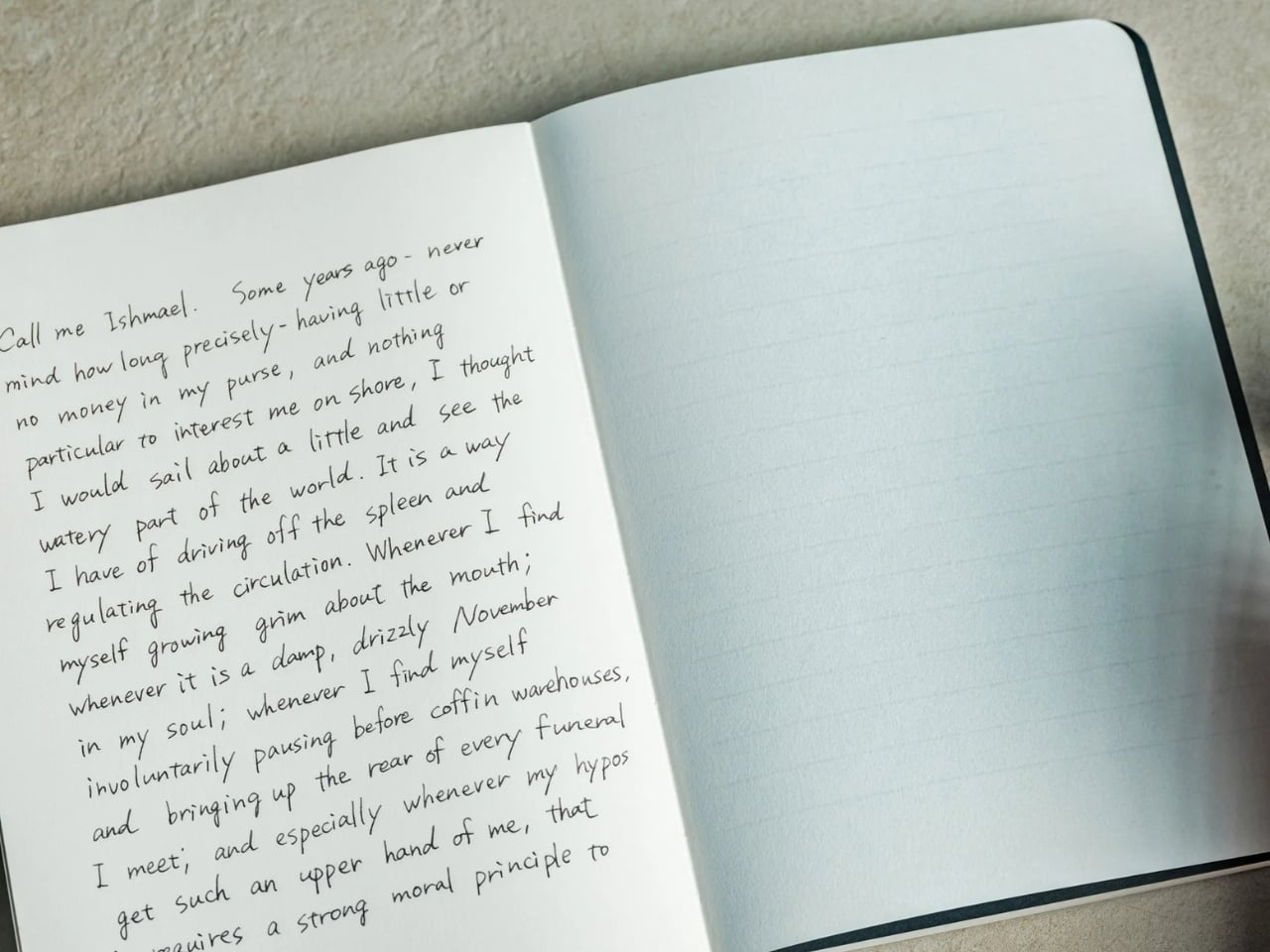
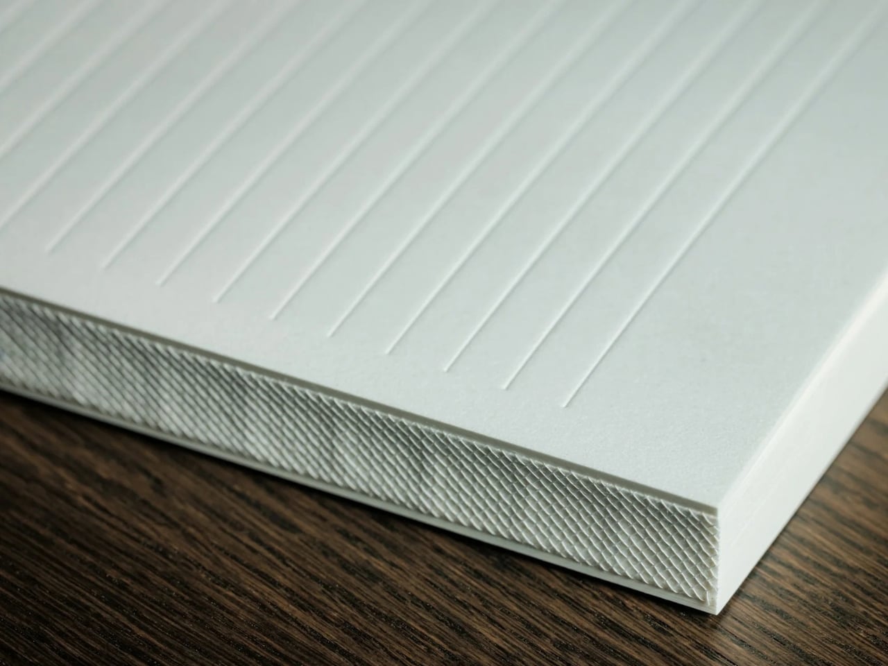
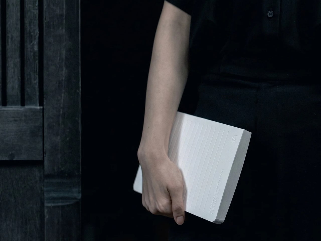
The iA Vanishing Line Notebook has made that wish come true. It’s a premium, handcrafted paper notebook from Information Architects, the company behind the iA Writer app. As the name implies, it has watermark lines that guide you as you write but appear to “disappear” once the page fills with words. There’s no magic or disappearing ink involved. It’s a beautifully designed notebook that lets you enjoy the best of both lined and unlined worlds.
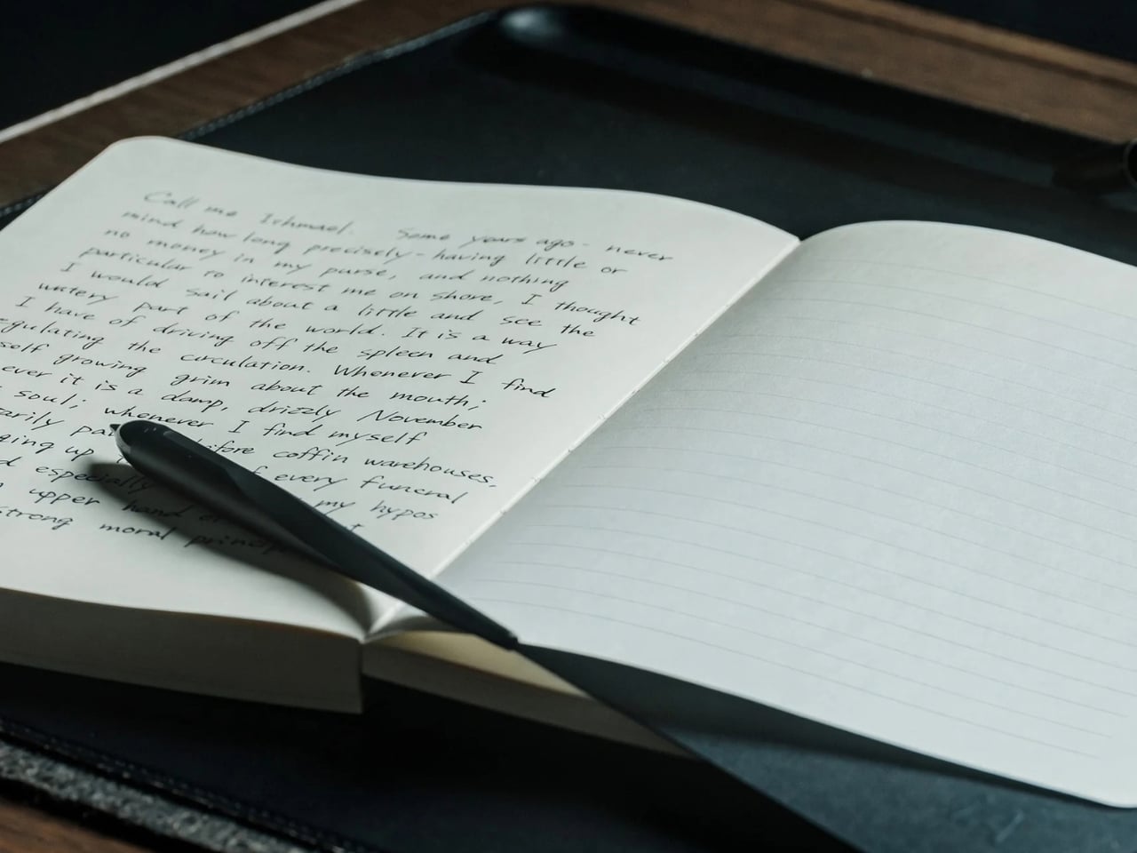
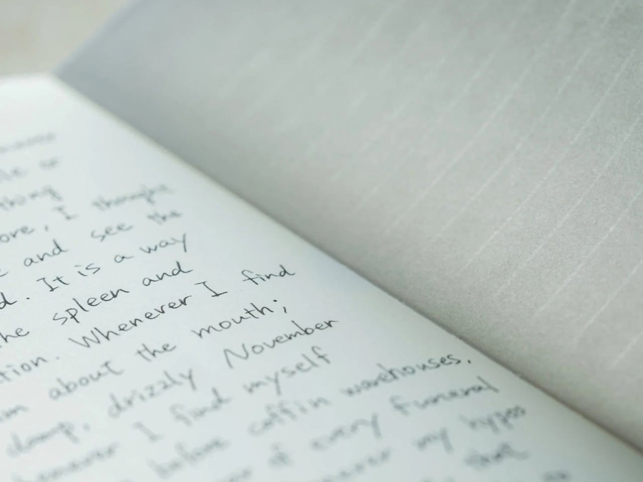
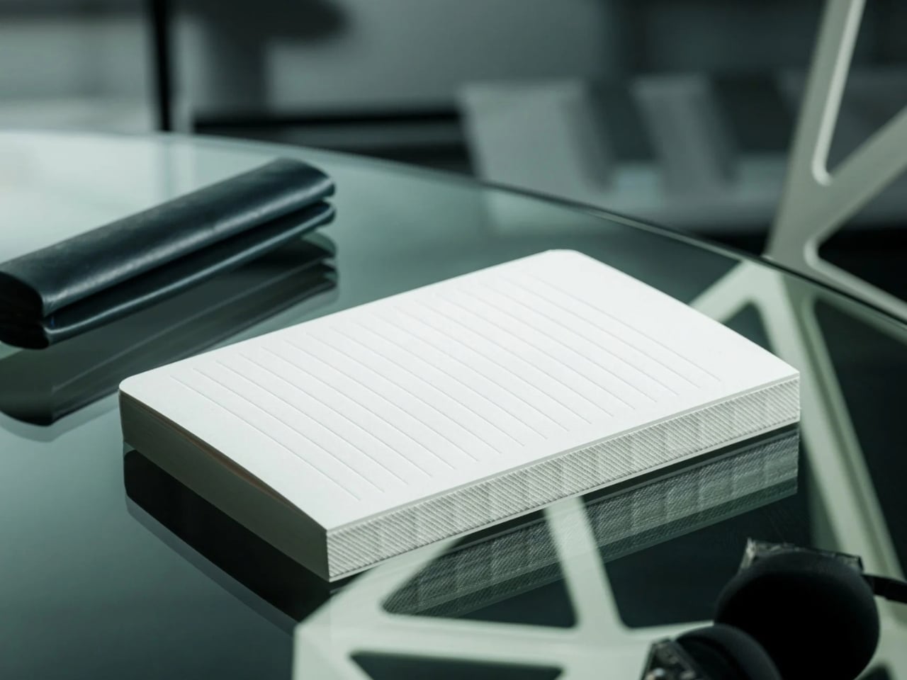
When you crack open the notebook, you’ll see that the lines are visible on an empty page. They serve as a guide for you and your pen, helping you write straight and keep your lines evenly spaced, if that’s how you want to write. I know some people prefer a messier look, but when I’m filling a page with journal entries or other writing I plan to revisit, a little guidance can be welcome.
Once you’ve written on the page, the contrast between your writing and the paper makes the lines visually fade into the background. Hence, the notebook’s name. When you read back what you’ve written, your handwriting takes center stage instead of competing with a distracting grid. To be clear, the lines don’t physically vanish, and the effect becomes more noticeable as the page fills up. It won’t change your handwriting, but it could make what you’ve written more pleasant to read.
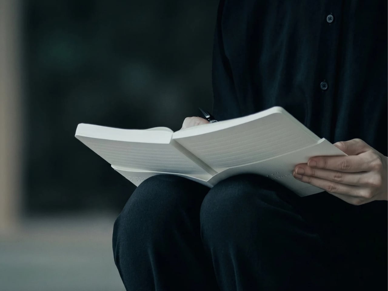
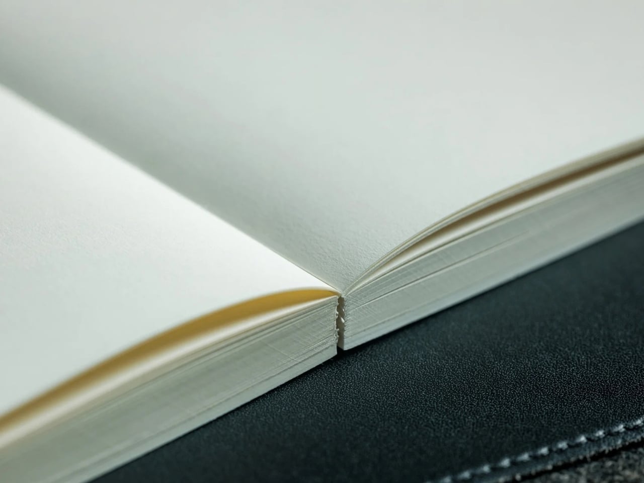
iA (Information Architects, in case you didn’t know) achieved this without any tricks. The watermark lines had to be faint enough to recede behind the writing but visible enough to help while the page was empty. That balance is the detail I find most interesting. The paper and binding matter, too: the notebook uses Japanese writing paper and opens flat, so you don’t have to hold down one side while trying to finish a sentence. As someone who is a connoisseur of Japanese stationery products, I can appreciate the thought that went into it.
There are other practical details worth noting. The hardcover notebook is A5-sized, with 144 sheets, or 288 pages, and its watermark lines are spaced 10 millimeters apart. Its 81 gsm Araveal White paper is designed to work with most pens and inks, including fountain pens. It’s handcrafted in Japan, and the wooden presentation box gives it the feel of something you might keep on your desk rather than toss into the bottom of a bag. Of course, that also means this is a more considered purchase than an everyday notebook you wouldn’t think twice about using up.
If you usually buy a Moleskine Classic, the difference comes down to what bothers you about an ordinary page. Moleskine offers both plain and ruled layouts, along with practical touches such as a ribbon bookmark, an elastic closure, and an inner pocket. Its ruled pages give you consistent guidance, while its plain pages leave you free to write wherever you like. The iA Vanishing Line Notebook offers a middle ground: its guidelines are there when you need them and less noticeable when you read your work later. Moleskine is the more familiar everyday choice; iA’s design is for someone who cares about that specific writing experience.
I don’t think this notebook will turn every messy journal entry into a masterpiece, and honestly, I wouldn’t want it to. Sometimes the scribbles are part of the fun. But for the days when I want my thoughts to flow freely and still be able to read them afterward, these vanishing lines sound like the compromise I’ve been looking for. It gives my pen a path without making the finished page look like homework.
Candles have stepped beyond being just decorative objects that are placed on a dining table or shelf. Today, they are becoming artistic installations, architectural statements, sensory experiences, and even functional design objects. Designers across the world are transforming the humble candle into sculptural pieces that blur the line between art, craft, and innovation.
These evolving creations reflect changing lifestyles, where everyday products are expected to combine beauty, functionality, craftsmanship, and emotional value within contemporary interiors. Here are some fascinating examples showing how contemporary design is reinventing the everyday candle.
1. Murano Glass Candles: Where Venetian Craft Meets Modern Luxury
Murano glass candles blend traditional craftsmanship with contemporary design, turning everyday candles into artistic decor objects. Known for their vibrant colors, flowing patterns, and handcrafted finishes, these candles create a warm visual experience that feels both elegant and sculptural. Their glass vessels often become statement pieces within modern interiors, adding character even when unlit.
What makes these candles especially appealing today is their lasting value beyond fragrance. Instead of being discarded after use, the handcrafted containers can be repurposed as decorative accents, small storage pieces, or collectible objects.
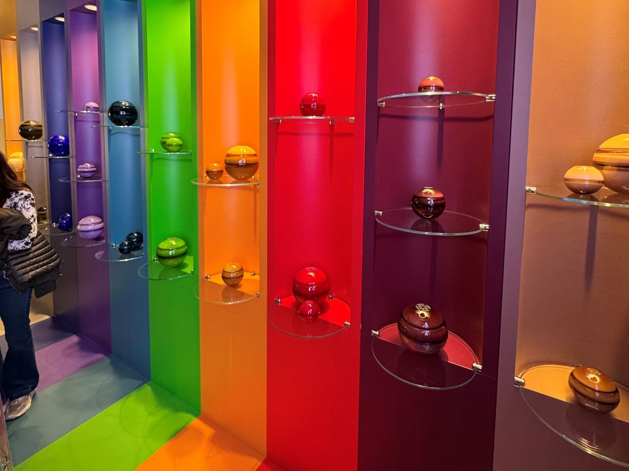
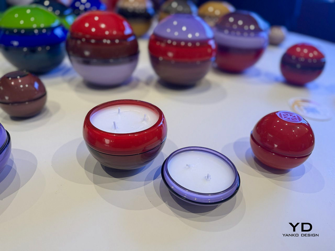
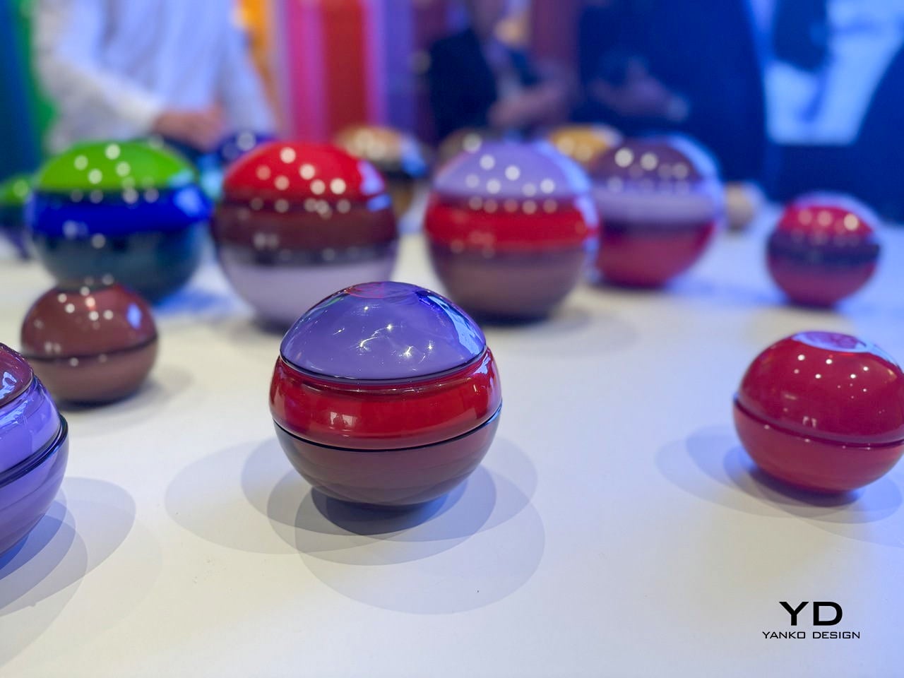
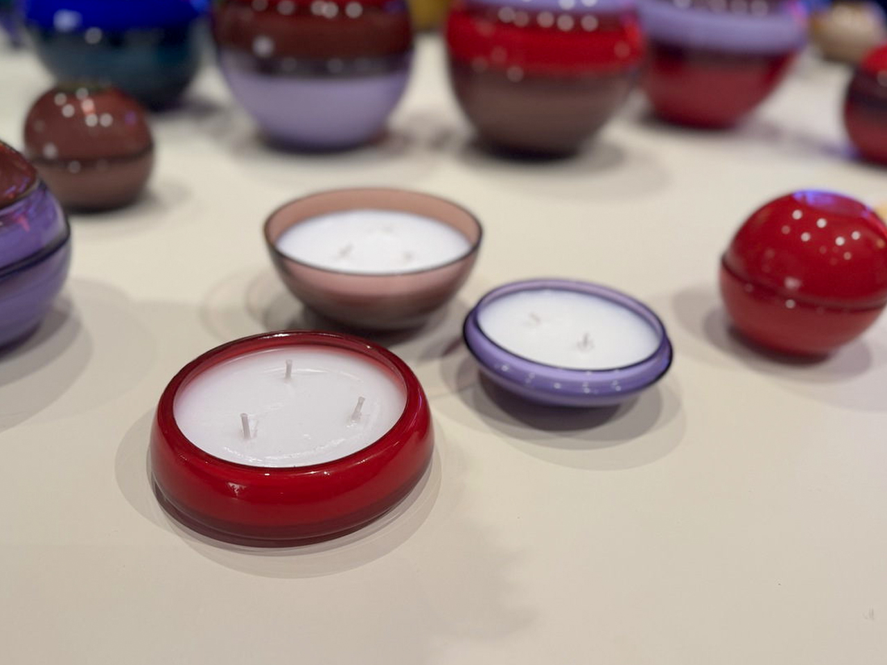
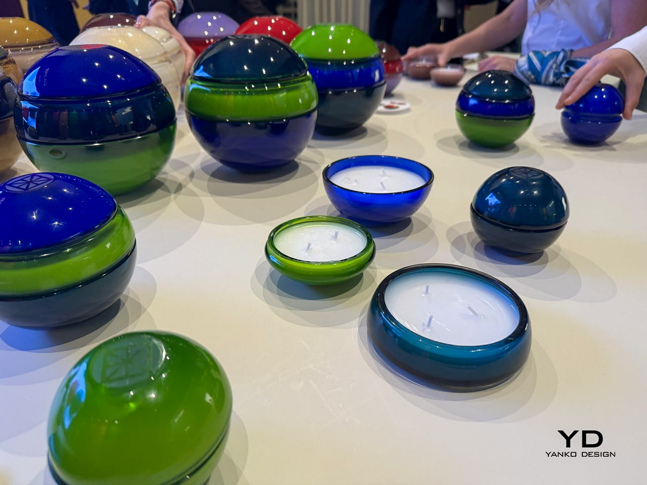
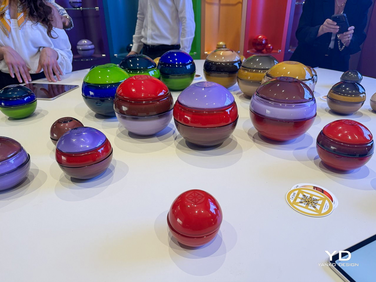
CADAR’s latest candle collection transforms traditional candles into sculptural objects crafted from exquisite hand-blown Murano glass. Created in collaboration with Venini, each candle is designed as a glossy glass sphere assembled from multiple rounded components that fit together seamlessly. The rich transparency, smooth finish, and substantial weight of the Murano glass give every piece a refined, collectible quality. Instead of functioning as simple candle holders, the vessels feel like contemporary art pieces that interact beautifully with light, reflection, and shadow.
The collection stands out through its dramatic use of color and the timeless craftsmanship of Murano glass. Deep cobalt blue, emerald green, ruby red, amber, smoky charcoal, and soft lavender create striking combinations with exceptional depth and luminosity. The high-gloss surfaces amplify the intensity of each shade, allowing the glass to glow almost like liquid under changing light. Together, the candles create a sophisticated visual experience where fragrance, craftsmanship, and Murano glass artistry merge into one luxurious design statement.
2. Flame to Elegance: The Candle That Becomes a Japanese Lantern
Some contemporary candle designs are moving beyond single-use functionality by transforming into decorative objects after the wax has melted away. Inspired by minimal, thoughtful design philosophies, these candles are crafted to evolve and do not simply disappear after use. This approach adds a deeper sense of purpose and emotional value to everyday objects.
The concept also reflects the growing importance of sustainability and long-lasting craftsmanship in modern design. Instead of creating waste, the candle continues to serve as a functional or decorative piece, encouraging reuse and mindful living.
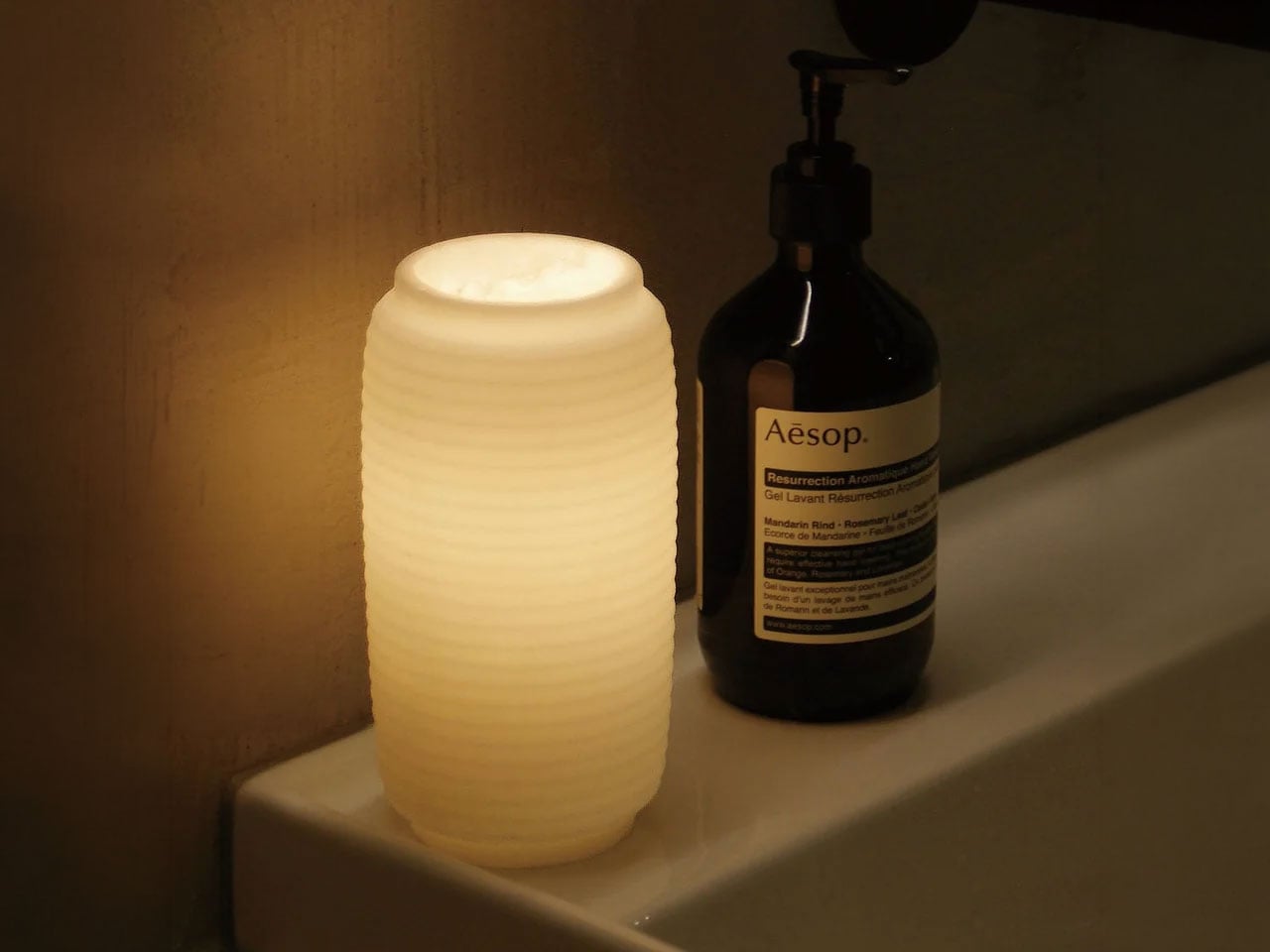
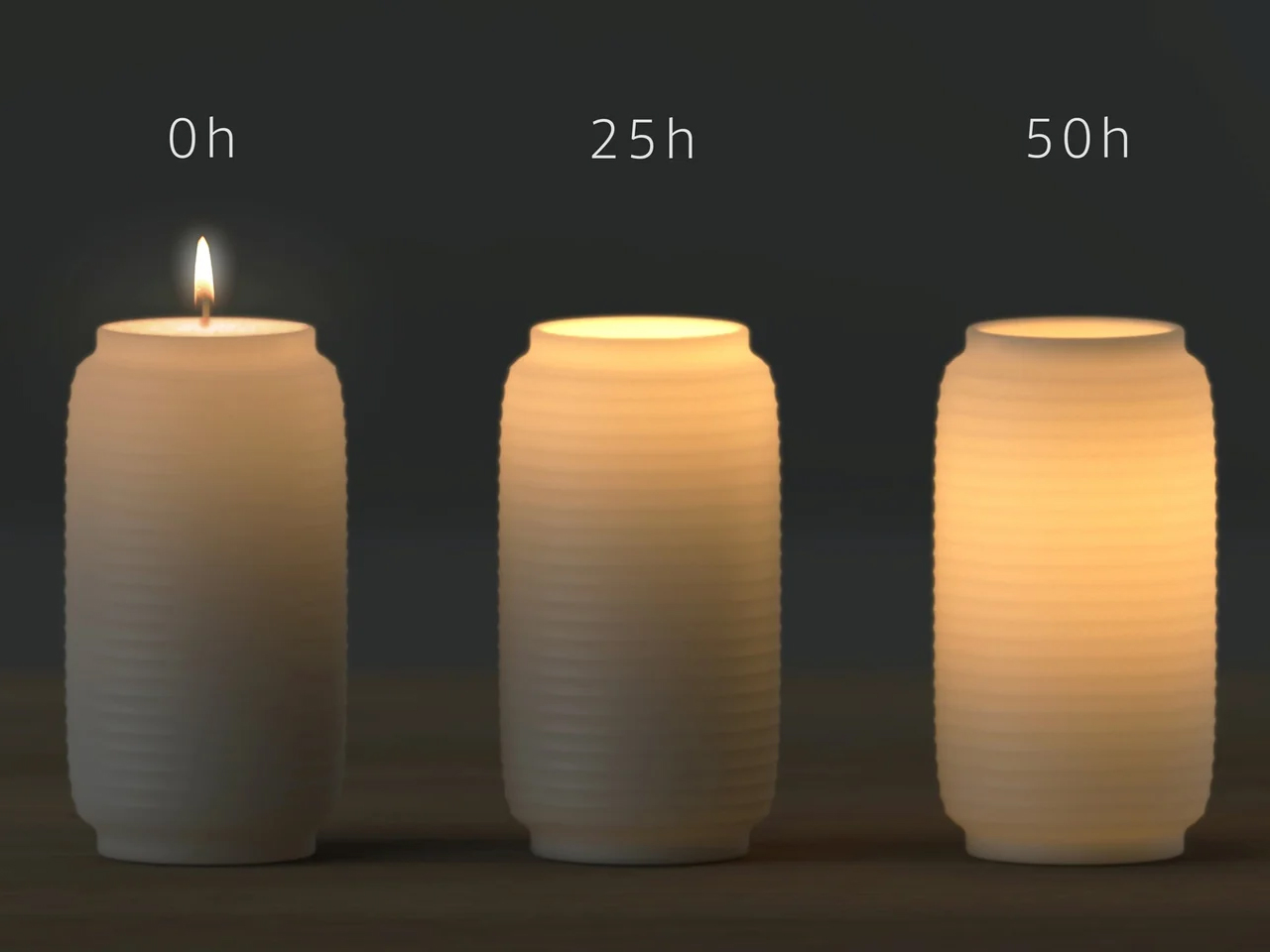
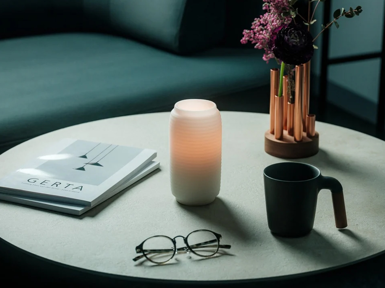
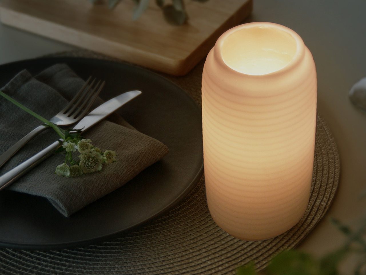
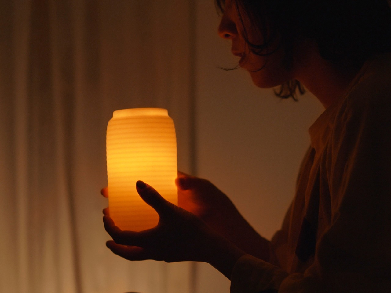
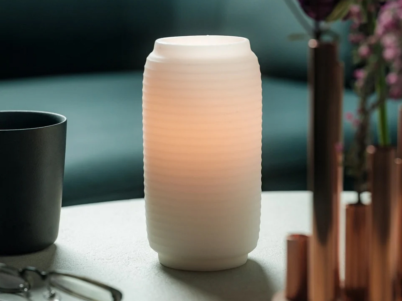
Designed by James Kaoru Bury, the Chouchin Candle reinterprets the traditional Japanese lantern through a refined and contemporary candle design. Inspired by the soft glow of a classic “chouchin” lantern, the pillar-shaped candle features a dual-layer wax construction that combines functionality with atmospheric lighting. The inner core burns like a conventional candle, while the exterior is made from a patented non-melting wax that forms a translucent shell. As the flame flickers within, the outer layer gently diffuses the light, creating a warm lantern-like glow that enhances the surrounding ambiance.
Developed in collaboration with Pegasus Candle Co. Ltd in Kurashiki, Japan, the candle is designed for elegance and practicality. The non-melting exterior safely contains liquid wax, eliminating dripping and removing the need for a separate tray. With a burn time of nearly 60 hours and replaceable candle refills, the product also emphasizes longevity and sustainability while maintaining its calm, sculptural presence.
3. The Candle Disc: Tracking Time Through Melting Wax
Contemporary candle design is increasingly exploring the deeper meaning of time, transformation, and human experience through the way candles burn and evolve. Rather than remaining simple decorative objects, some candles are designed to change shape gradually as the wax melts, turning the burning process itself into a visual and emotional experience.
These ideas reflect a growing interest in mindful and experiential design. This is because modern candles are no longer valued only for fragrance or ambiance, but also for the atmosphere and reflection they inspire.
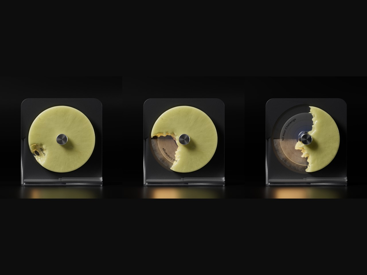
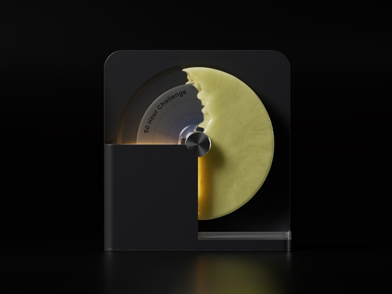
Designed by Seokoo Yeo, the Candle Go reimagines the traditional candle as a functional time-tracking object. Instead of a standard upright candle with a burning wick, the product uses a rotating disc-shaped wax candle mounted on an axis. A built-in warming element gradually melts the wax in a radial pattern, creating a visual representation of passing time. As sections of the wax disappear, gravity naturally causes the disc to rotate, turning the candle into a dynamic and interactive experience that feels both sculptural and meditative.
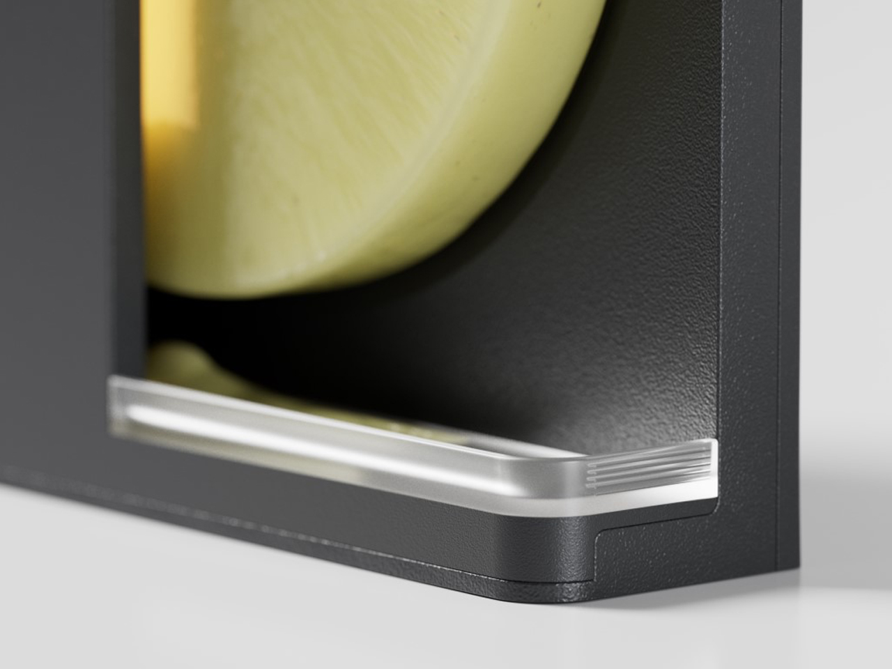
The product combines minimalist design with productivity-focused functionality. The changing wax pattern acts like a visual timer, allowing users to intuitively track work sessions, goals, or moments of focus. Melted wax is neatly collected in a lower chamber, keeping surfaces clean while eliminating the need for an open flame. Once the candle disc fully melts away, it reveals a hidden medal inside, transforming the product into a symbolic reward system that celebrates time spent productively and intentionally.
4. Scented Candle Cards: Compact Design for Modern Lifestyles
Scented candle cards are introducing a new and compact approach to candle design, rethinking how fragrance products can be experienced in everyday life. Unlike traditional candles housed in heavy containers, these designs are lightweight, portable, and minimal in form. Their slim structure and creative presentation make them feel modern, functional, and visually distinctive.
Beyond convenience, these candles reflect the growing interest in interactive and experience-driven products. Their compact format makes them suitable for gifting, travel, hospitality, and creative packaging concepts.
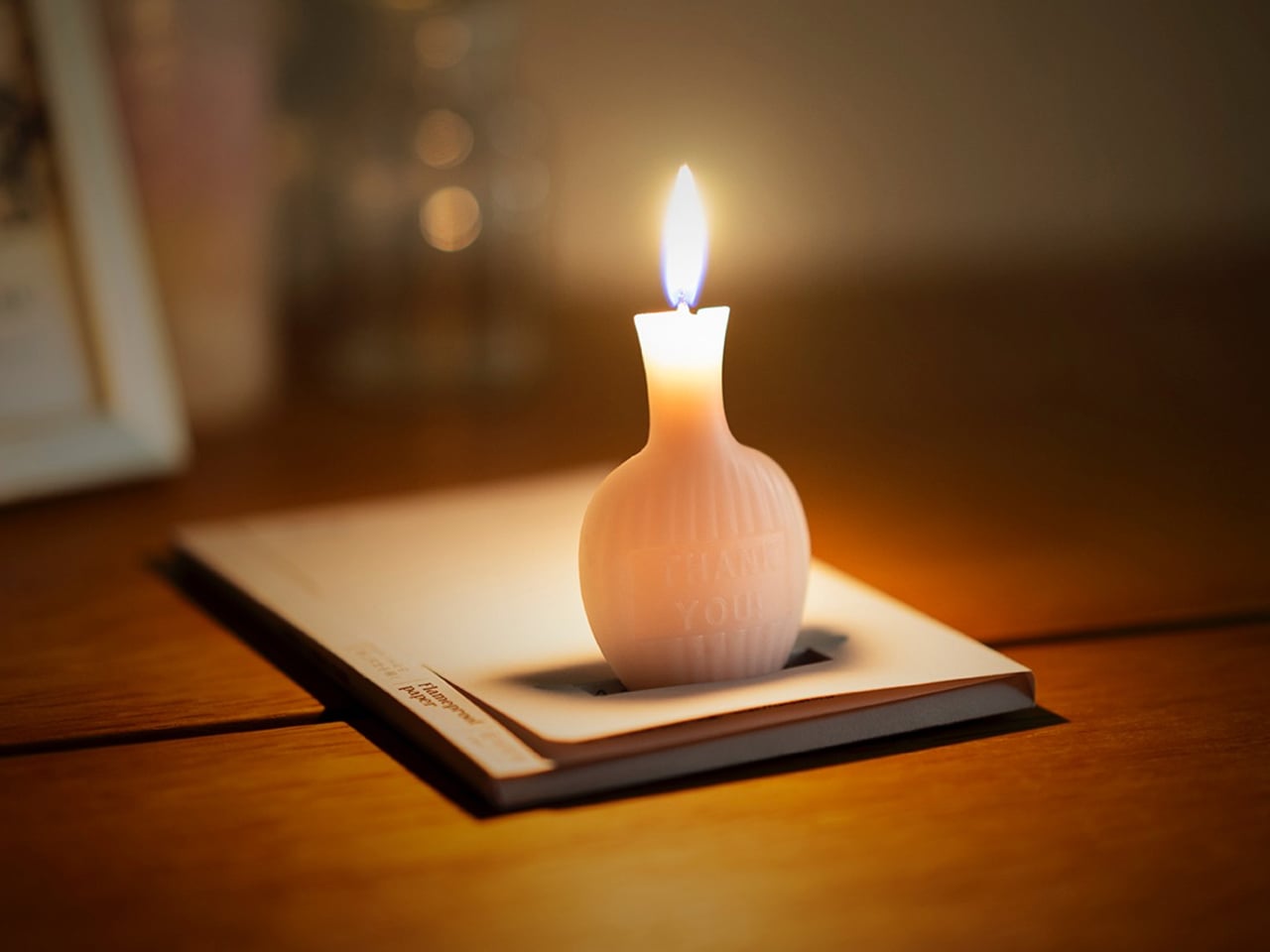
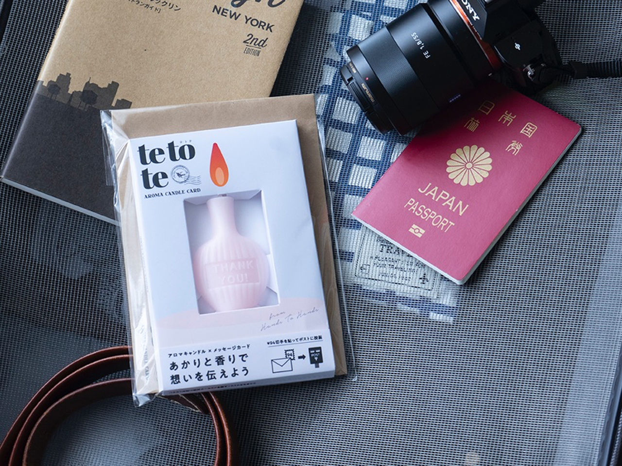
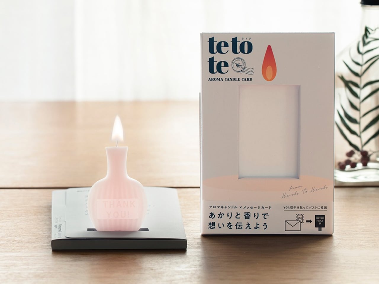
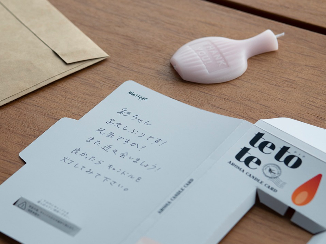
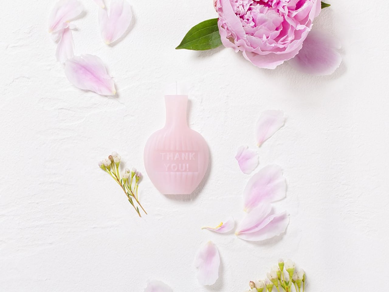
The AromaCandle Thank You Card transforms the traditional candle into a compact sensory experience that combines fragrance, design, and personal messaging. The product features an ultra-thin aromatic candle paired with a slim foldable card that functions as both packaging and a display stand. Once opened, the candle can be placed into a dedicated slot and lit, creating a warm glow and subtle fragrance while the handwritten message is read. Its minimalist construction makes the object feel delicate, elegant, and highly thoughtful.
The product stands out through its clever balance of aesthetics, functionality, and emotional design. Available in fragrances such as Sakura, Green Tea, and Yuzu, each candle is designed to evoke a distinct atmosphere through scent and color. The fire-retardant paper structure and self-extinguishing candle design add practicality and safety to the experience. Compact enough to be mailed like a standard card, the product reimagines candles as intimate objects that create memorable moments through light, fragrance, and personal connection.
5. Sfumato Candle: Inspired by Leonardo da Vinci’s Artistic Technique
Modern candle design is increasingly embracing craftsmanship, turning candles into carefully made artisanal objects rather than mass-produced decor items. In the process, starting from hand-poured wax to sculpted forms and detailed finishes, craftsmanship plays a major role in creating candles that feel unique and personal. Designers often experiment with textures, layered colors, and handcrafted techniques to give each candle its own identity and character.
This focus on craft also highlights the value of slow, thoughtful production. Many contemporary candles are created using traditional methods combined with modern design ideas, resulting in pieces that celebrate skill, creativity, and material quality. Beyond fragrance, these candles reflect the growing appreciation for handmade products that bring artistry and authenticity into everyday living.
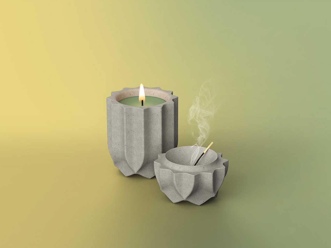
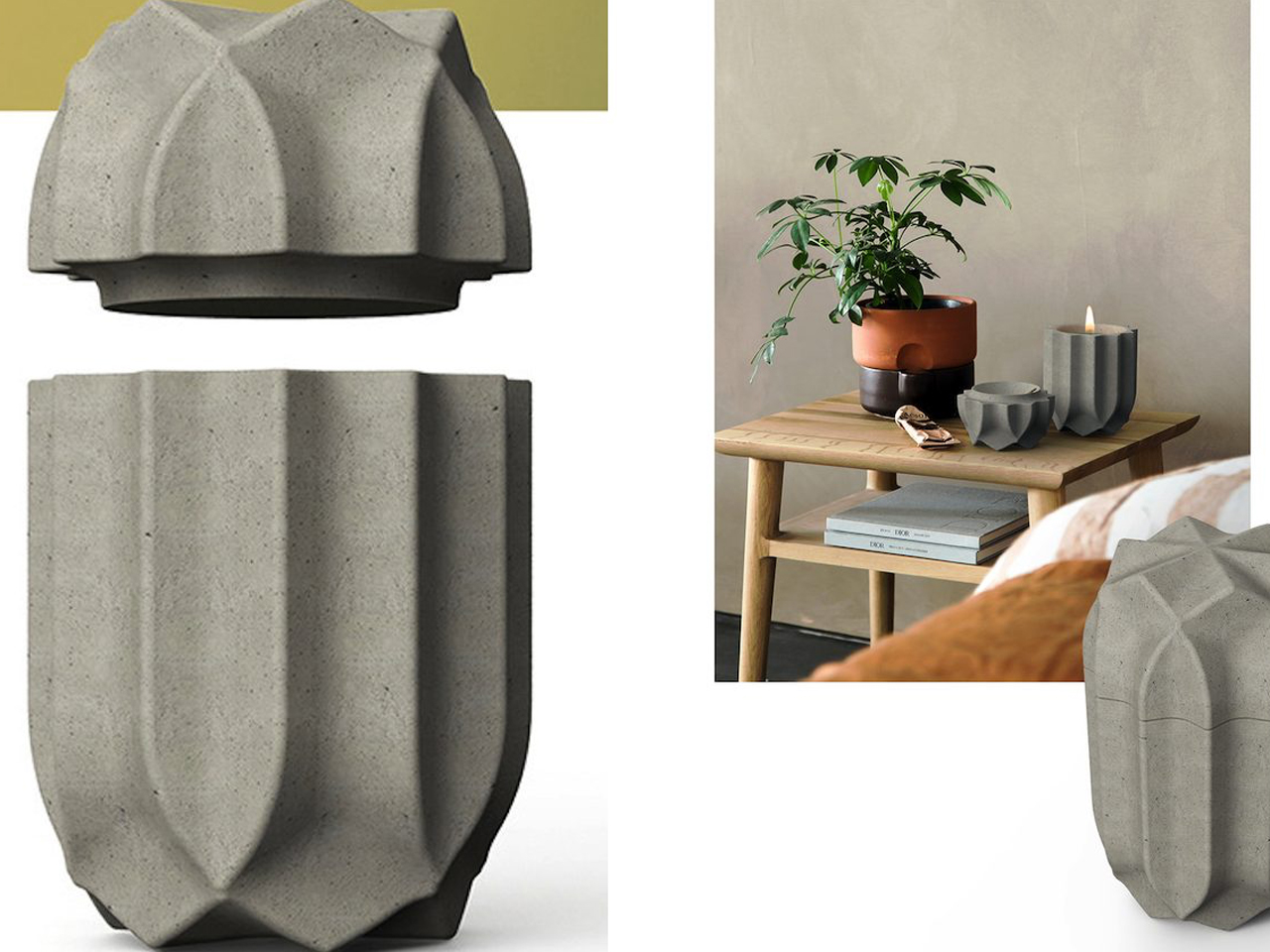
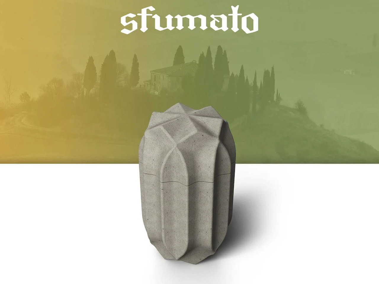
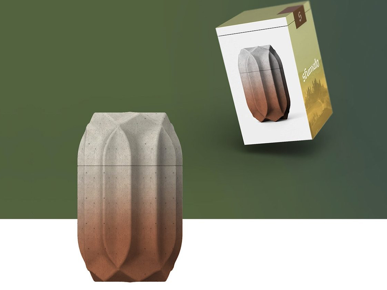
The Sfumato Candle reimagines the everyday candle as a sculptural design object inspired by architecture and materiality. Designed by Kegan McDaniel, the candle is housed in a cast concrete vessel that gives it a bold, stone-like appearance with a refined architectural presence. Its minimalist form and textured finish make it feel more like a contemporary décor piece than a traditional scented candle. The sturdy concrete exterior adds depth and permanence, creating a calming visual experience even before the candle is lit.
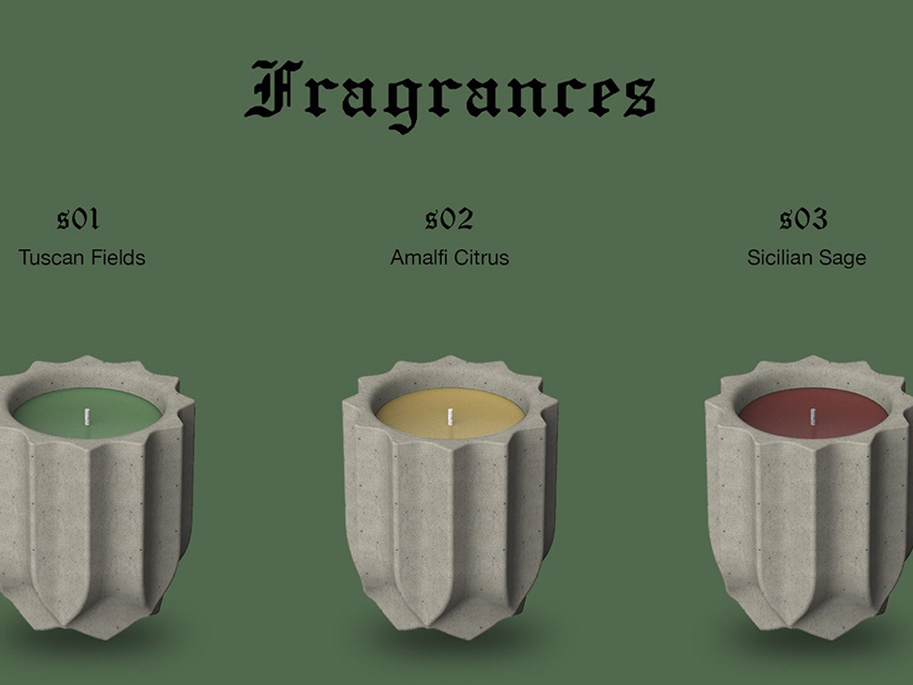
The collection combines fragrance, color, and craftsmanship into a cohesive sensory design. Available in scents such as Tuscan Fields, Amalfi Citrus, and Sicilian Sage, each candle is paired with distinctive shades of green, yellow, and red inspired by Italian landscapes. The name “Sfumato,” borrowed from Leonardo da Vinci’s famous painting technique, reflects the soft, atmospheric quality the product aims to create. Together, the architectural vessel, earthy textures, and immersive fragrances transform the candle into a sophisticated object designed for relaxation and ambiance.
Modern candles are evolving beyond simple décor into immersive lifestyle objects that combine craftsmanship, innovation, sustainability, and emotional storytelling. Today’s designs focus on sculptural forms, sensory experiences, reusable materials, and atmospheric lighting, transforming candles into meaningful objects that engage the emotions and the surrounding space.
They say AI will steal our jobs. Whoever trims that stubborn strip of grass along the lawn’s edge seems to have excellent job security. We’ve got robots driving around gardens, mapping their surroundings, and keeping the grass neatly cut, yet the border still has a habit of becoming someone’s weekend assignment. Personally, that’s a job I’d be delighted to hand over.
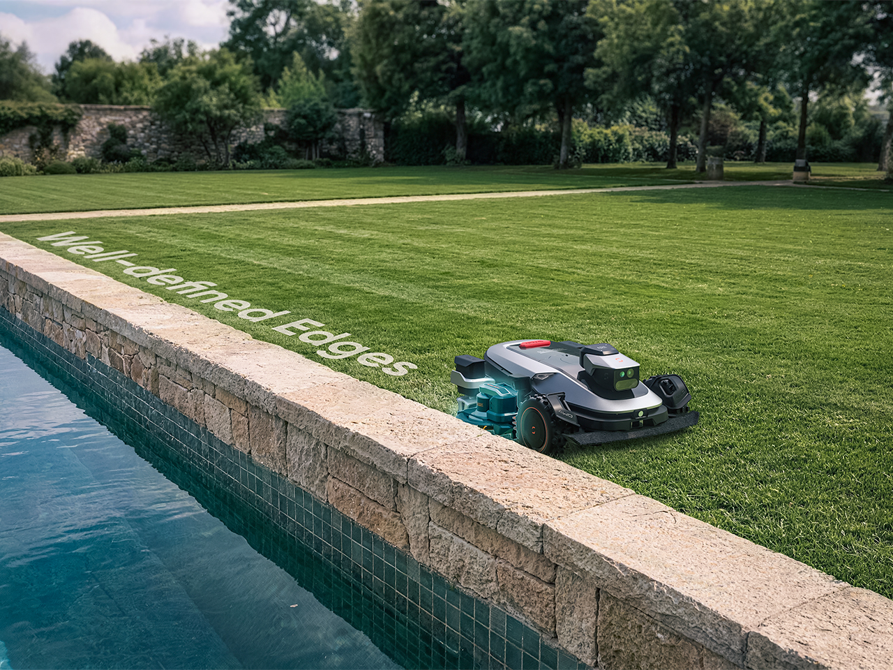
Sunseeker’s upcoming X8 Plus looks eager to apply. Its EdgeZero 2.0 trimming system targets a zero-inch edge gap, according to the company, putting that leftover strip squarely on the agenda. Set for a preview at Equip Expo 2026, the robotic mower also brings solid-state LiDAR, stereo vision, and network-assisted satellite positioning. An impressive résumé, although the edge-cutting hardware is what makes me want to schedule the interview.
A mower can follow a boundary accurately and still leave grass behind if its blades cannot reach it. Knowing where the border is and cutting right up to it are separate assignments. Sunseeker describes EdgeZero 2.0 as its answer to the second one, though the announcement leaves the mechanism’s finer details unexplained. That’s the part I’d want a closer look at: how the trimming tool reaches the border while the mower’s body stays clear. A clean pass beside a raised edge would tell a useful story.
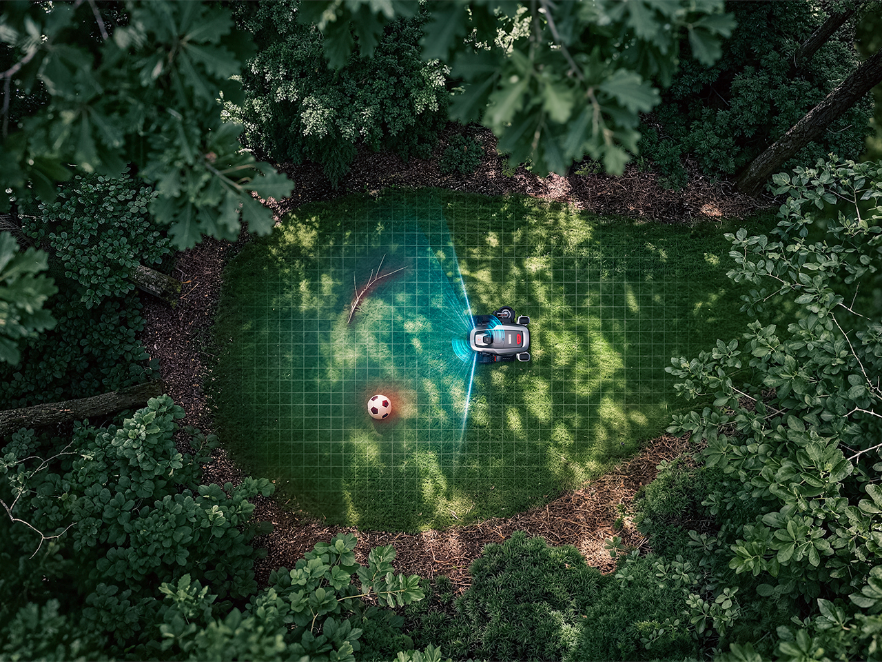
Getting into position is its own engineering task. The X8 Plus uses nRTK, a form of satellite positioning that draws correction data from a network of reference stations. In plain English, those corrections help tighten up the machine’s estimate of where it is. Sunseeker combines that positioning with solid-state LiDAR and stereo vision, giving the mower several sources of information as it navigates. Your garden may look peaceful from the patio; the robot has quite a bit to figure out down there.
Sharing the Lawn With the Locals
There’s an infrared camera in the mix, too, which Sunseeker says supports animal-friendly operation. That’s a worthwhile consideration for a machine sharing outdoor space with creatures that have never checked its mowing schedule. The announcement doesn’t establish exactly how the system identifies or responds to different animals, so I’d keep the promise modest for now. Still, accounting for the lawn’s other residents belongs in the design brief. The grass might stay put, but everything passing through it gets a vote in how smoothly an autonomous mower’s afternoon goes.
Sunseeker Elite already explores that relationship between sensing and physical movement in its existing X7 Gen 2 and X7 Plus Gen 2. Those models combine satellite positioning with visual mapping, while all-wheel drive and floating dual cutting discs address traction and uneven ground. That provides useful context for the X8 Plus: software has to work with wheels, blades, and the shape of the property. I like that the new preview brings attention back to the finishing work. A mower’s route can look beautifully organized on an app, but the result still gets judged from the garden chair.
A Closer Look at Equip Expo 2026
Equip Expo should provide a closer look at Sunseeker’s approach. The show runs October 20-23, 2026, at the Kentucky Exposition Center in Louisville, Kentucky, with Sunseeker at Indoor Booth #1190 and Outdoor Booth #7460D. The company plans an interactive mower-vision experience, letting visitors see imagery from a machine’s perspective, alongside outdoor slope demonstrations. Seeing what a mower perceives could make that long sensor list considerably easier to understand.
Pricing and retail availability for the X8 Plus aren’t specified in the announcement, so the zero-inch edge target remains a reason to watch its development rather than retire the trimmer immediately. For me, though, it’s a persuasive direction to pursue. Finishing the borders would remove a very specific reason for a person to follow the robot outside and pick up another tool. If Sunseeker can make that work reliably, I’m perfectly comfortable with this particular job disappearing. The person who used to do it can have Saturday morning back.
Most of the time, when you need to check a day or date, you open your phone’s default calendar app. For those of us who still use planners, we also like to flip through the calendar pages since our schedules are often written there. But maybe you rarely notice actual wall calendars displayed in offices or living rooms anymore. If there is one, it might be some random promotional gift. It can feel like we’ve stopped carefully choosing a wall or desk calendar that suits our aesthetic or that we find interesting.
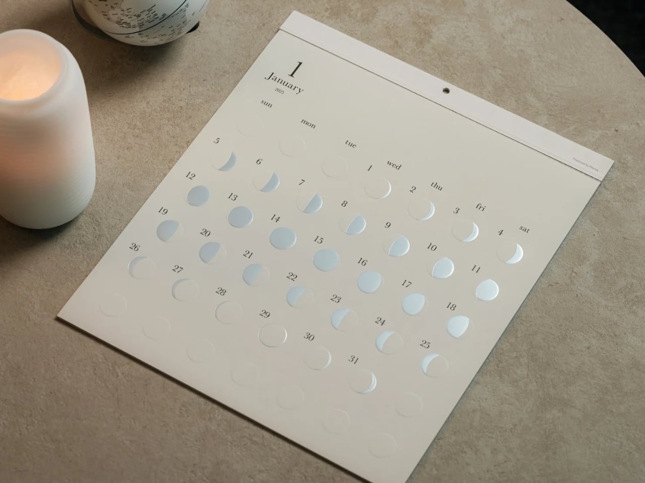
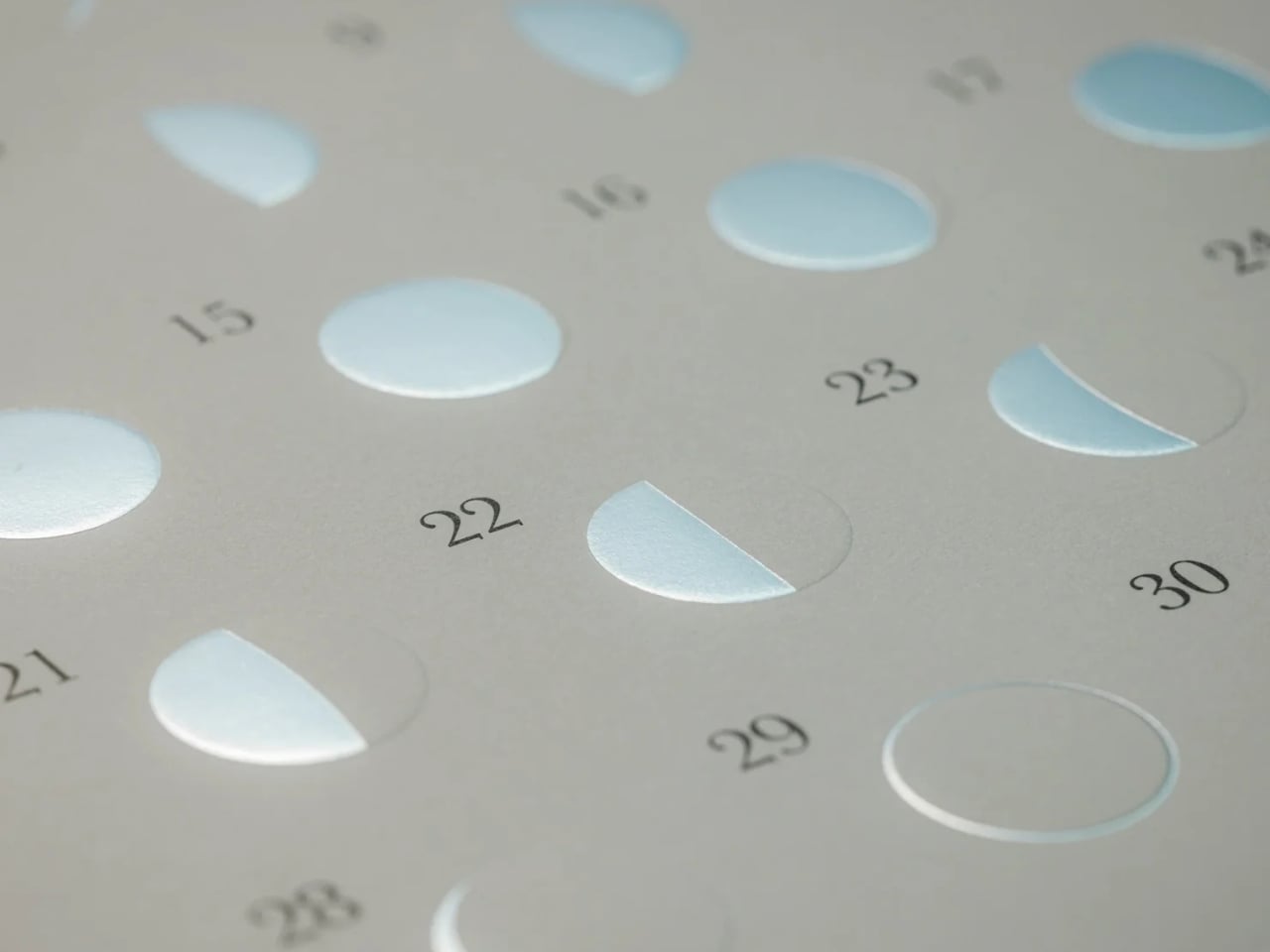
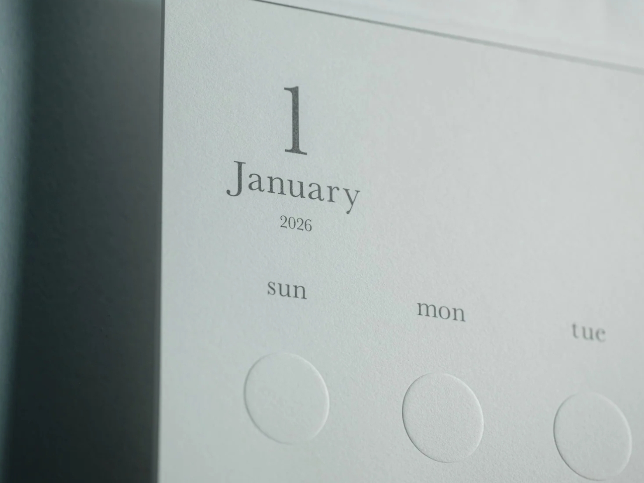
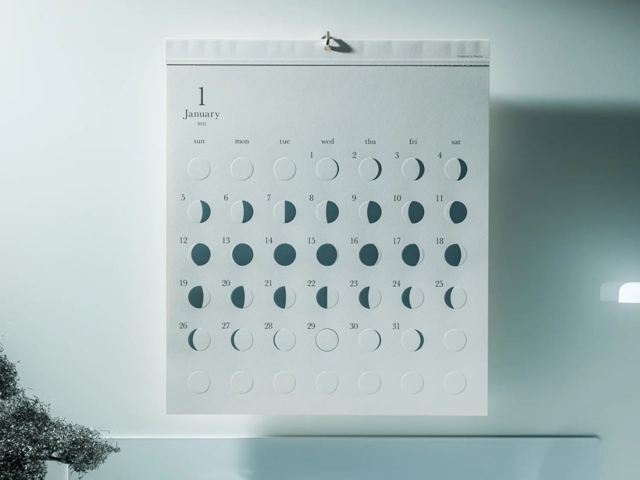
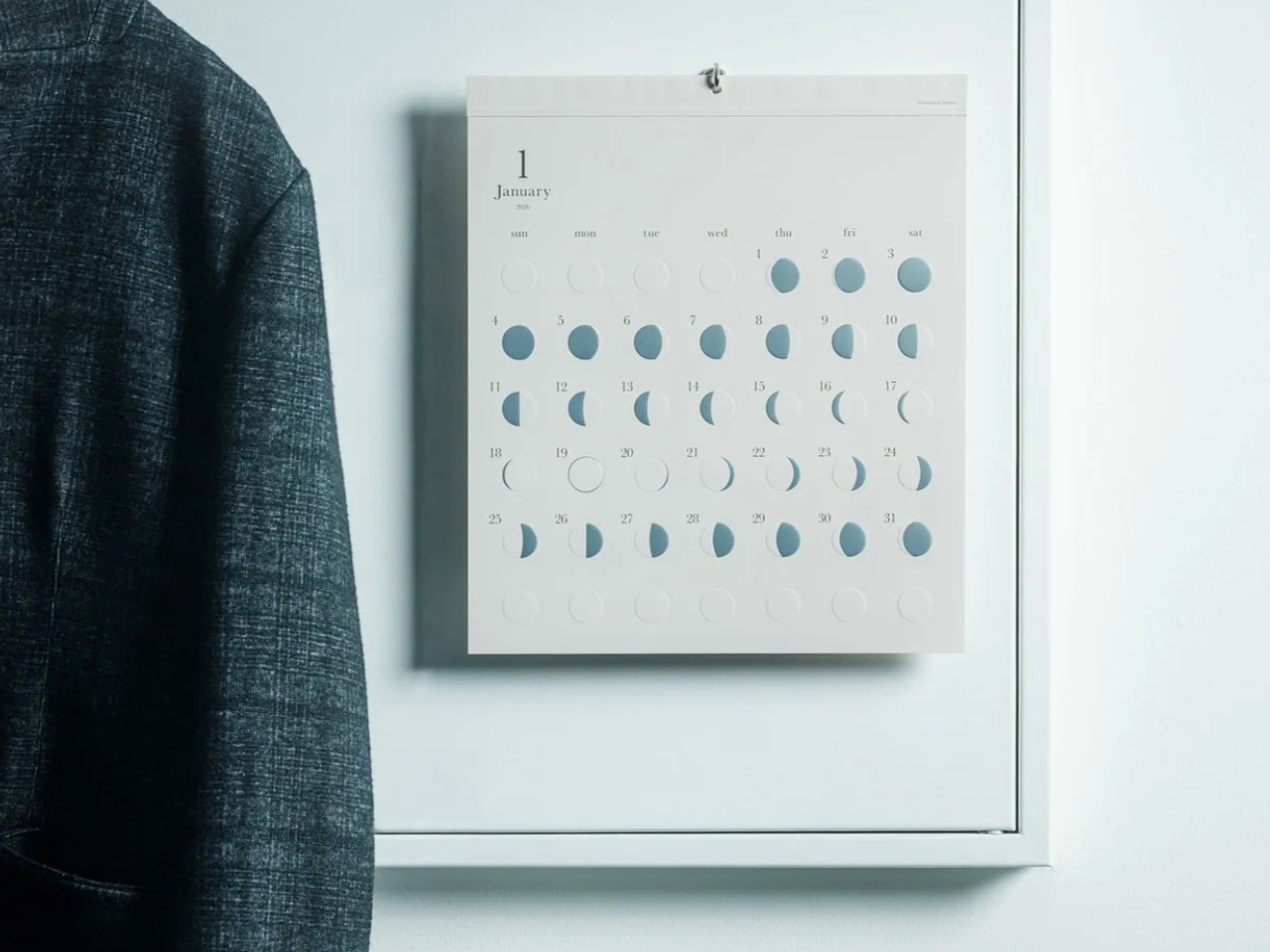
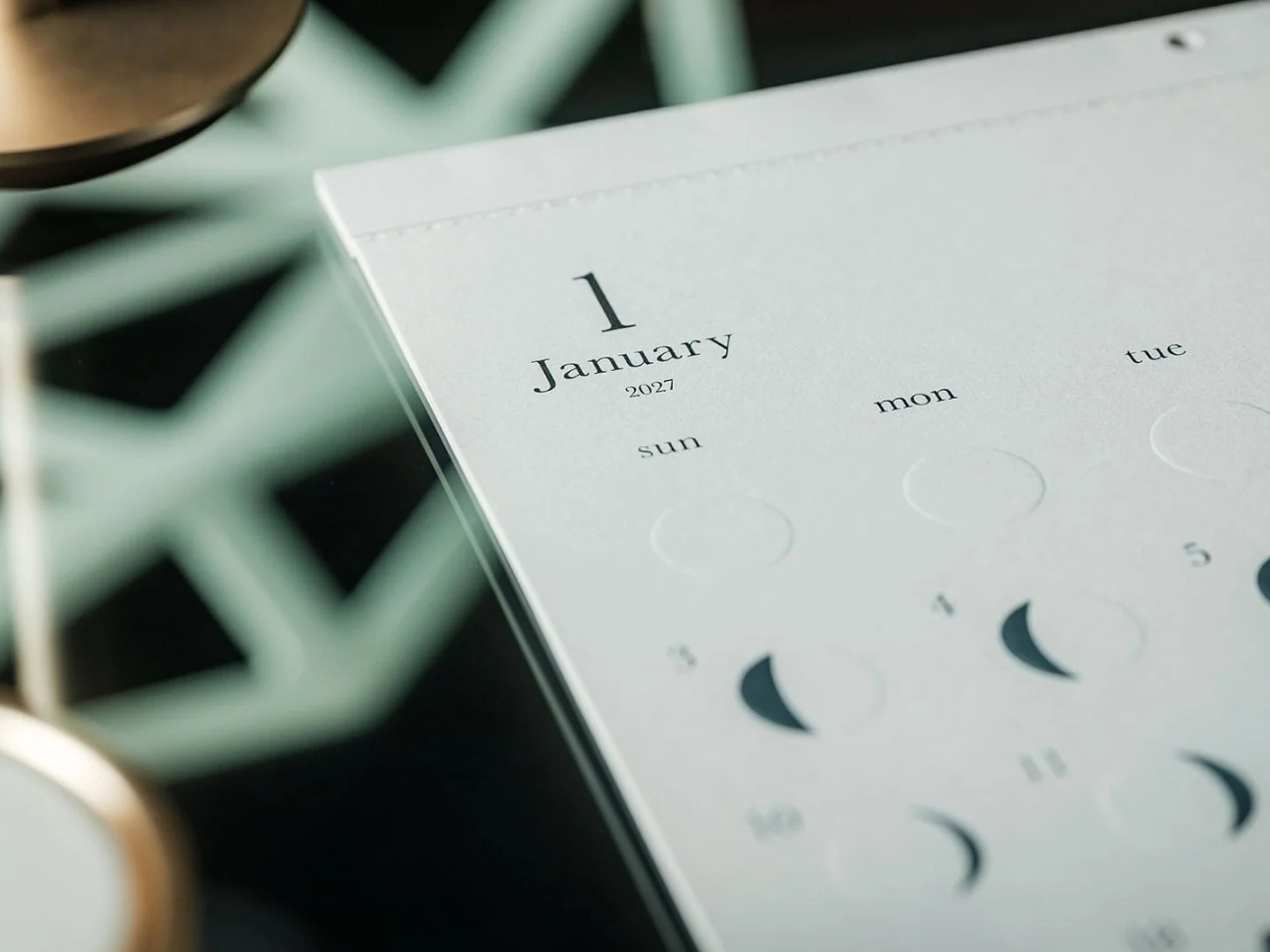
The Oboro Silver Moon Calendar quietly makes itself part of your minimalist space, especially if you love the moon. Created by Replug, it originated as a limited-edition 2025 calendar celebrating the Michiru calendar series’ 10th anniversary. Its name comes from oborozuki, a hazy moon, which inspired the design’s soft appearance. The YD Select listing describes its inspiration as having “serene and mystical qualities.” You might see that misty moon as a reminder that life is impermanent but still beautiful, although that’s a personal interpretation rather than something a calendar needs to explain.
Instead of the usual white paper that many wall calendars have, this uses a soft gray-beige paper that evokes a moonlit sky. It could bring a more introspective and relaxing atmosphere to the room, especially when you stare at the calendar while contemplating your life for the rest of the month (well, if you like doing that sort of thing). The subdued background also keeps the metallic details from competing with a bright color palette.
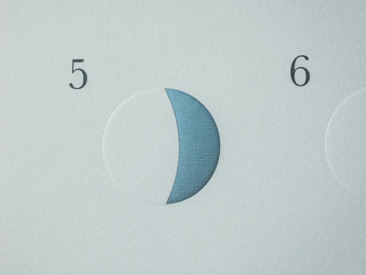
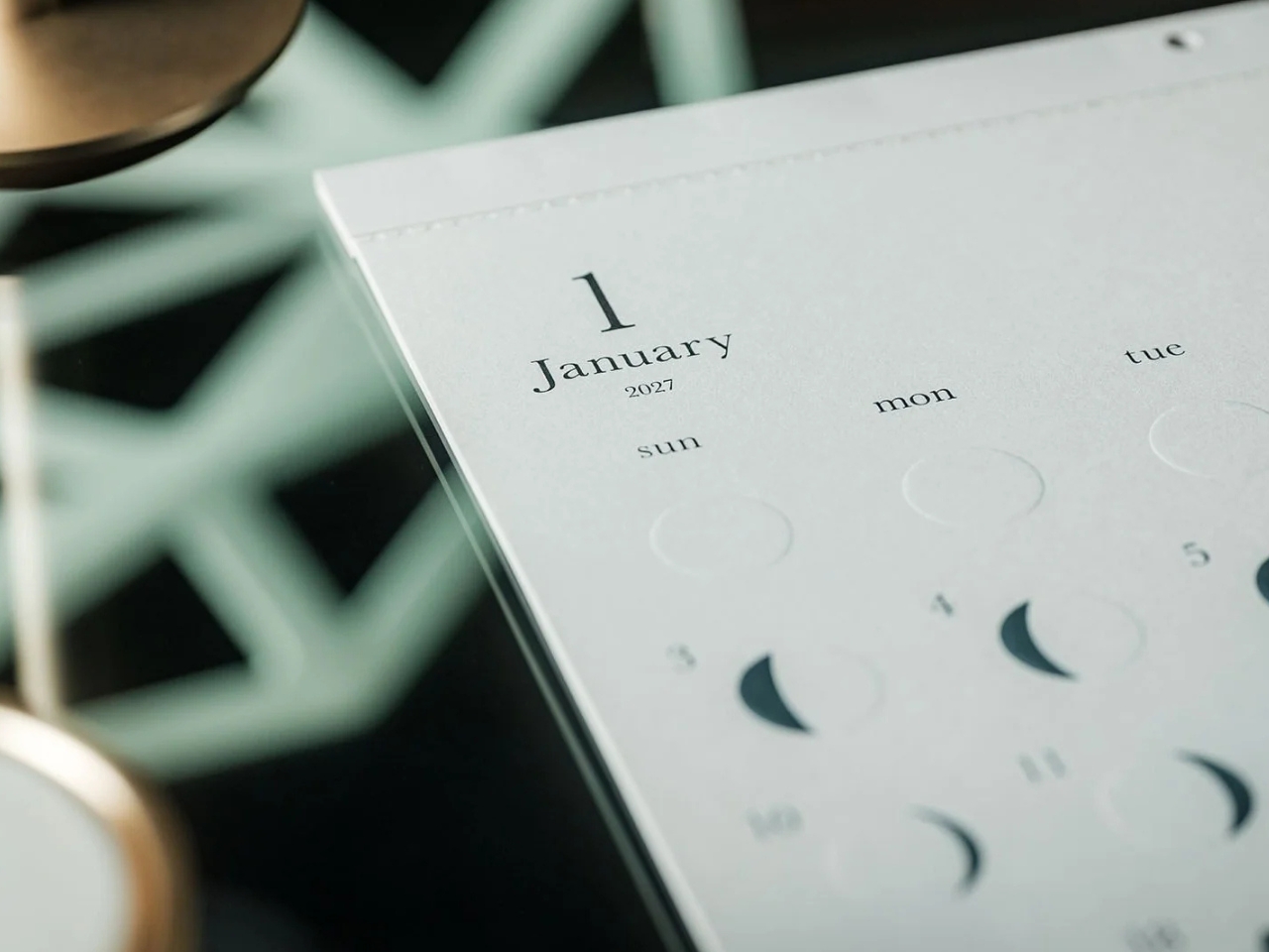
This is primarily a calendar that brings attention to the lunar cycle. It shows the moon’s phases in shimmering, reflective silver foil that catches the light falling on it. That distinction matters: it reflects light rather than producing its own illumination. Its appearance can change depending on the angle of the light, making placement part of the effect. It also has an embossed moon silhouette that adds a tactile element when you touch the calendar. For someone who enjoys small daily rituals, pausing to notice the changing lunar phases could become a grounding moment in an otherwise busy day.
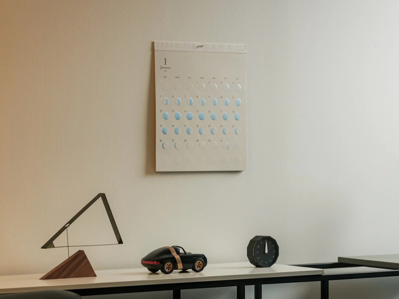
The calendar is made in Japan, with 12 paper sheets measuring approximately 11.7 by 13.5 inches. That gives you a sense of the wall space it needs without making it sound like an oversized art print. The combination of embossing and silver foil is the important design choice here: one gives the paper physical relief, while the other changes how it catches light.
For comparison, MUJI’s 2027 Bagasse Paper Wall Calendar, listed on its European store, uses a Monday-start monthly layout that presents the full month at a glance. Both could appeal to someone who prefers understated stationery, but their priorities differ. MUJI emphasizes straightforward date reference, while Oboro gives lunar phases and decorative surface treatments more attention. Oboro’s appeal is less about improving your scheduling system and more about giving a useful paper object a place in your decor. The better choice depends on what you want to look at every day.
There is also something appealing about checking a calendar without reaching for your phone. If opening an app tends to lead you somewhere else entirely, a paper reference lets you glance at the date and move on. You can still keep your appointments in a digital calendar while choosing something more personal for the wall beside your desk. If you’ve stopped choosing calendars because your phone already handles the practical side, Oboro Silver Moon Calendar gives you a reason to reconsider. It can sit alongside your existing routine, offering something different to notice: the shape of the moon, the texture of the paper, or a brief flash of silver as the light changes.

 Connexion


 2.0 trimming system targets a zero-inch edge gap, according to the company, putting that leftover strip squarely on the agenda. Set for a preview at Equip Expo 2026, the robotic mower also brings solid-state LiDAR, stereo vision, and network-assisted satellite positioning. An impressive résumé, although the edge-cutting hardware is what makes me want to schedule the interview.