❌

Vue lecture

Nike’s Air Force 1 Goes Furry Without Losing Its Shape
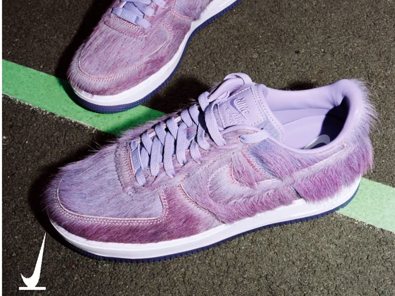
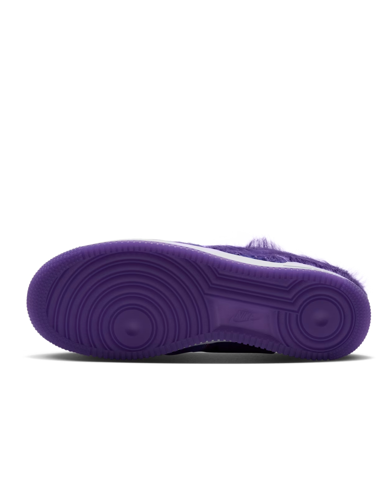
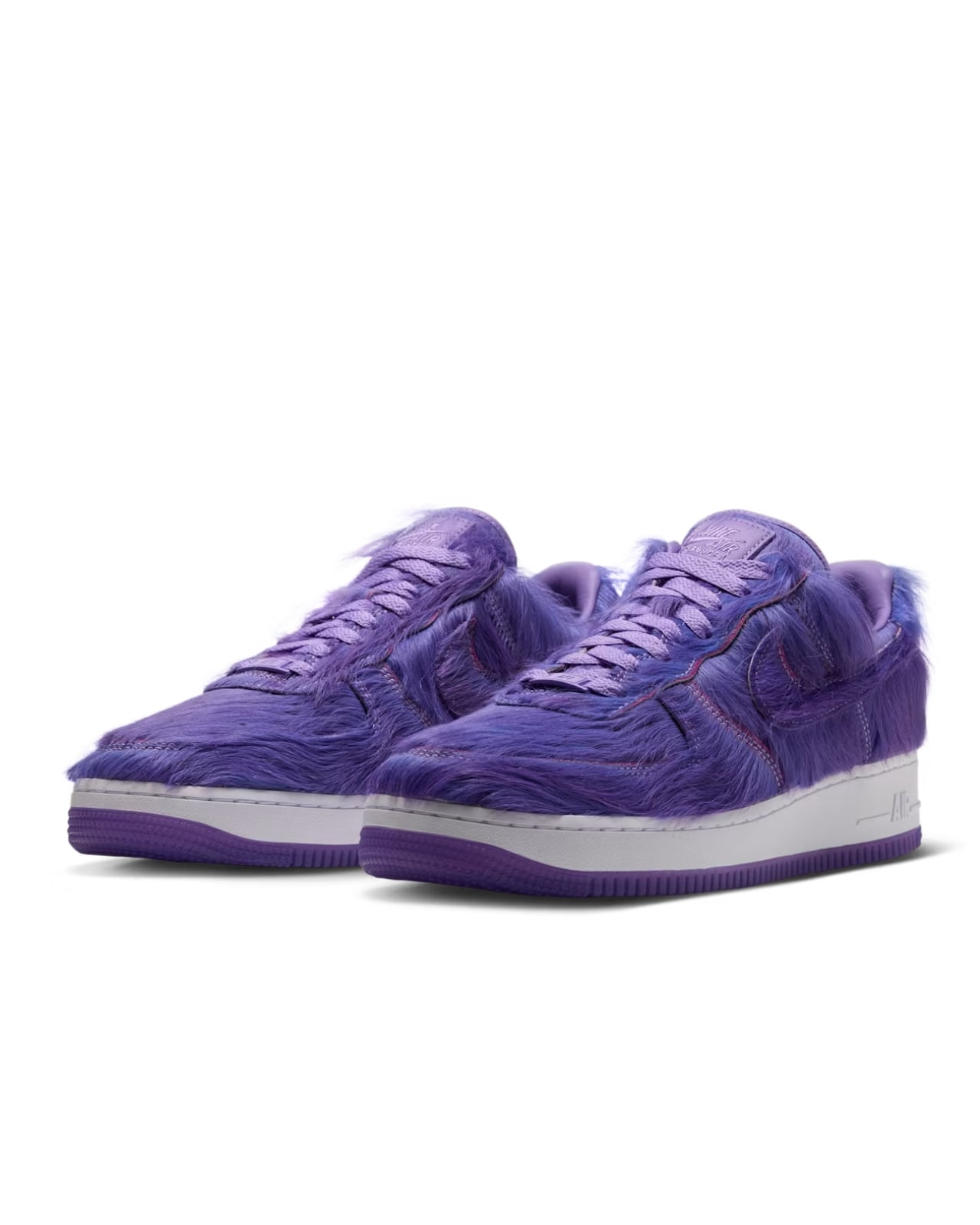
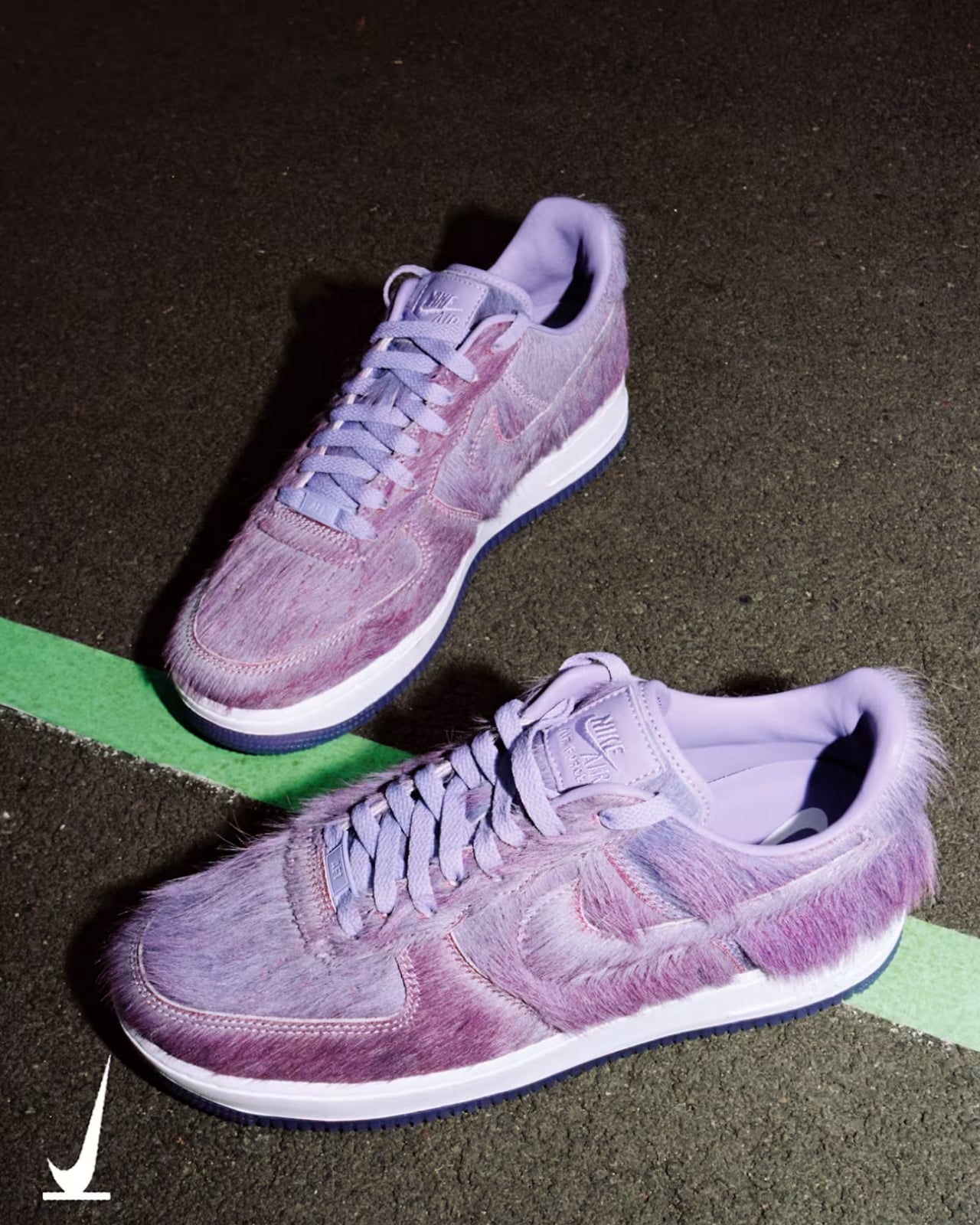
If you’ve ever owned a pair of Nike’s iconic Air Force 1 sneakers, you’re probably used to their crisp panel boundaries, whether yours were leather or one of the versions in canvas, suede, or Flyknit. One look, though, that might catch you by surprise is the furry-looking Atomic Violet variant, which looks more like a certain furry, purple mascot from a fast-food chain.

There’s no McDonald’s collaboration mentioned in Nike’s launch listing, of course, but it’s hard not to think about Grimace. So if you’ve ever wanted a partnership between Nike and McDonald’s (or specifically Grimace), this might work as an unofficial stand-in. If purple is your favorite color and you don’t mind wearing something furry on your feet, this could be something you’d want as a holiday gift for yourself.

Designer: Nike
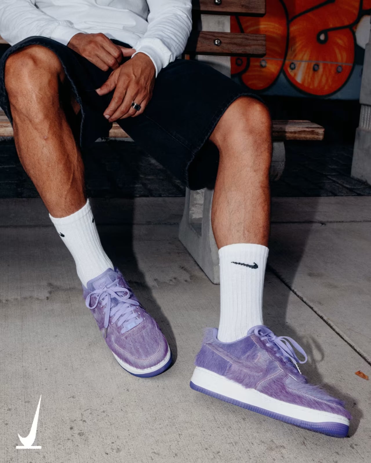
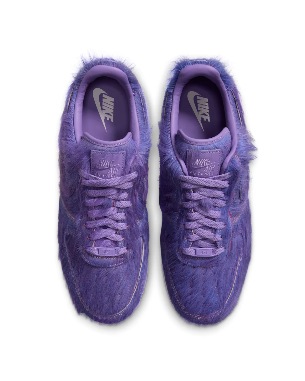
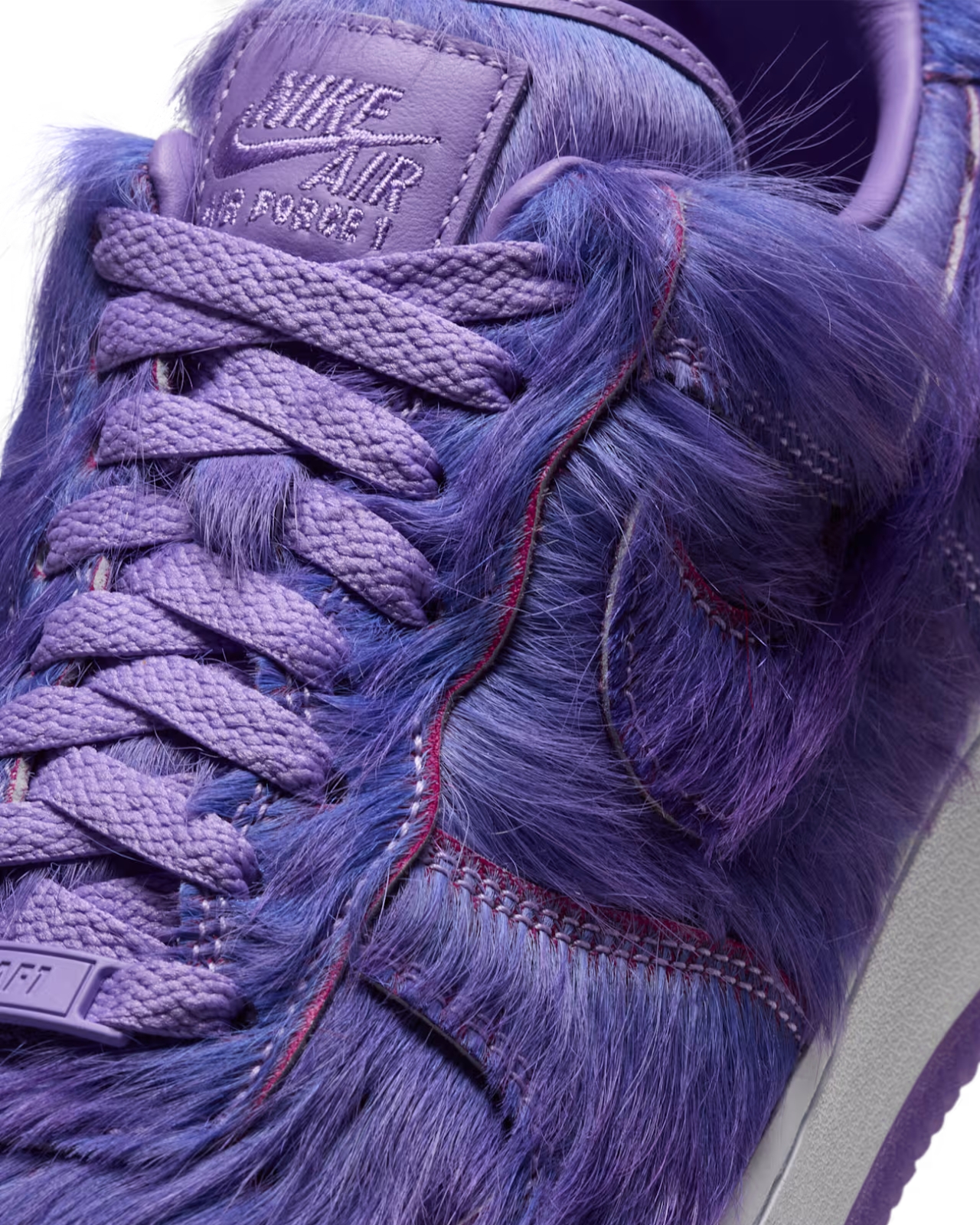
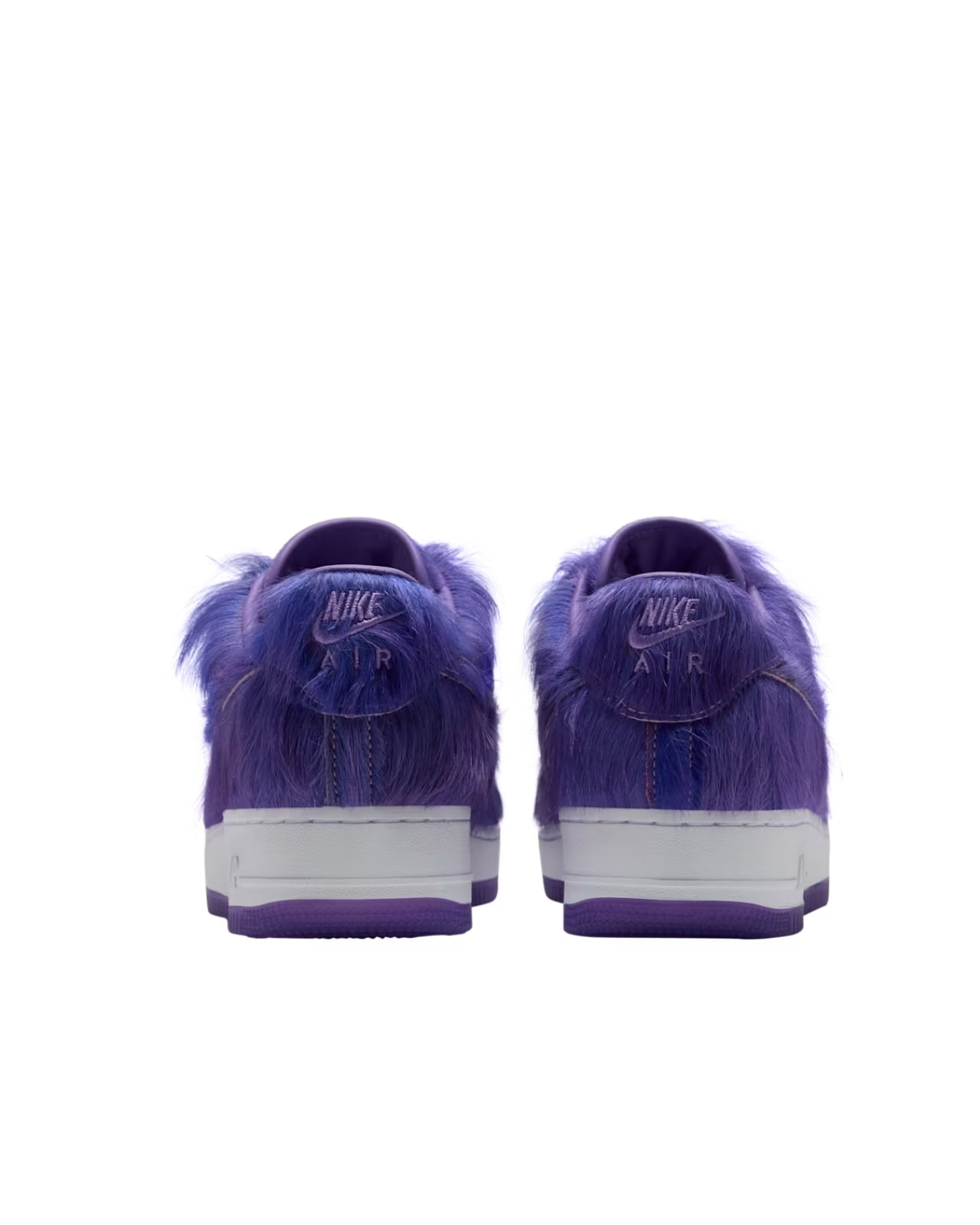
Instead of the usual smooth, stitched surfaces, the upper of the Atomic Violet Air Force 1 has a softer, shaggier appearance. Just by changing the surface treatment, you get a different-looking sneaker while still retaining its fundamental form. In fact, the iconic Nike Swoosh blends into the furry material, but you’ll still recognize the shoe because of its familiar silhouette.

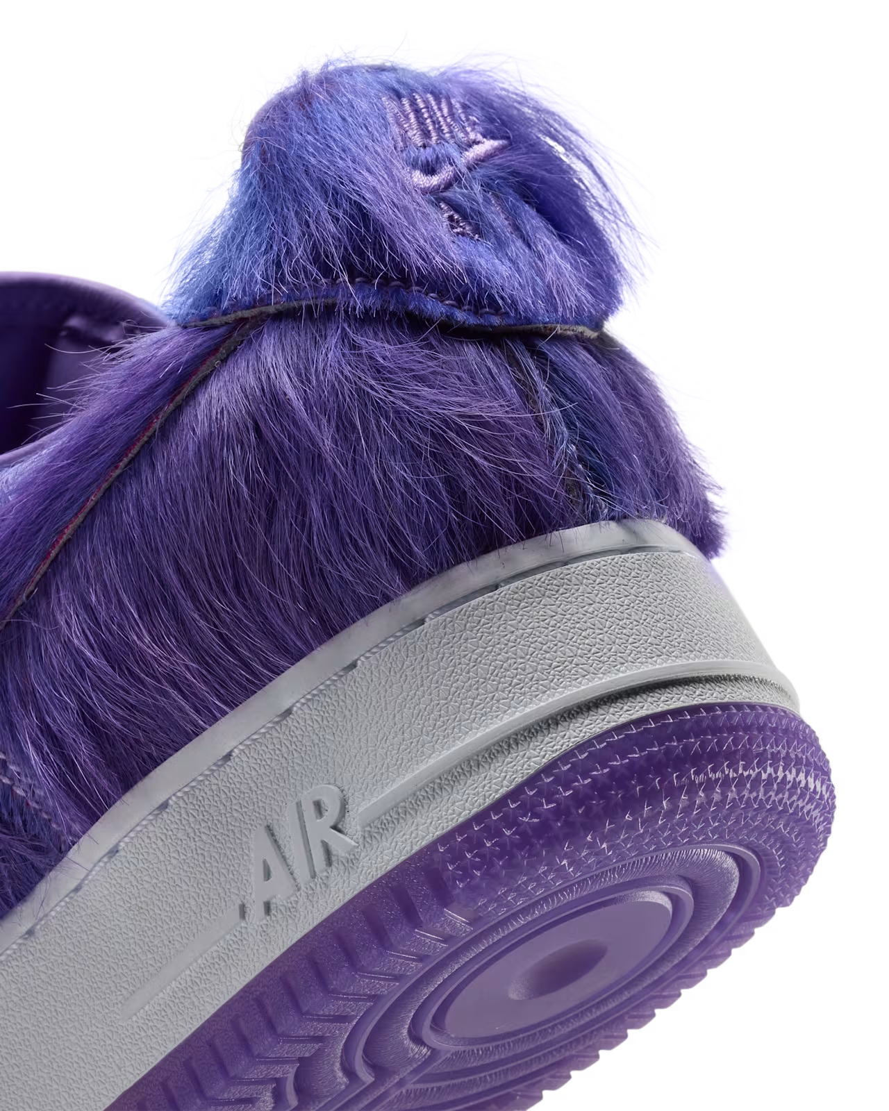
The white midsole is an important part of keeping that shape readable. It creates a clean break between the purple upper and the purple outsole, giving your eyes somewhere to land amid all that fuzz. Without it, the shoe might look more like one big purple blob. Here, you can still clearly see where the shaggy upper ends and the sole begins.
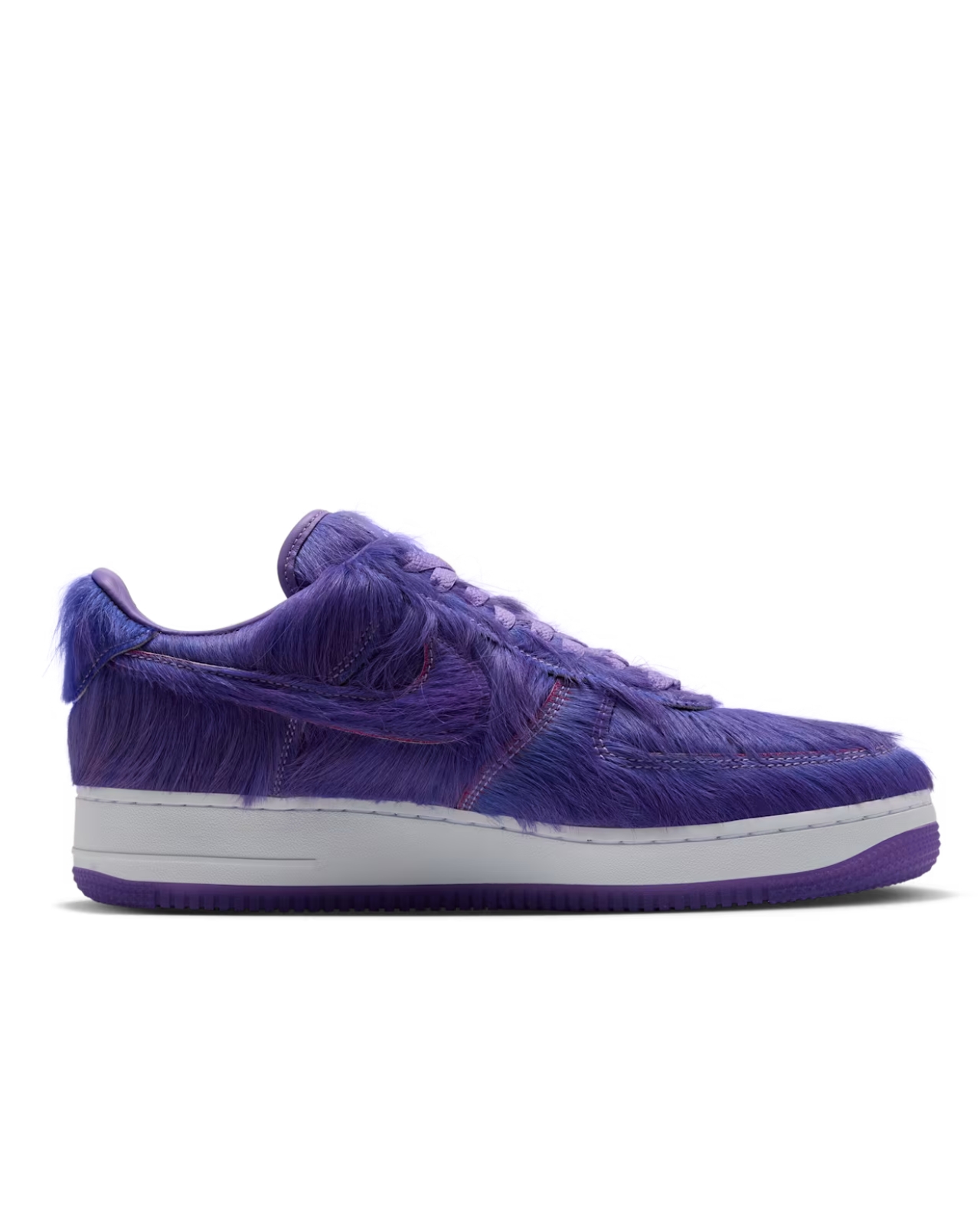
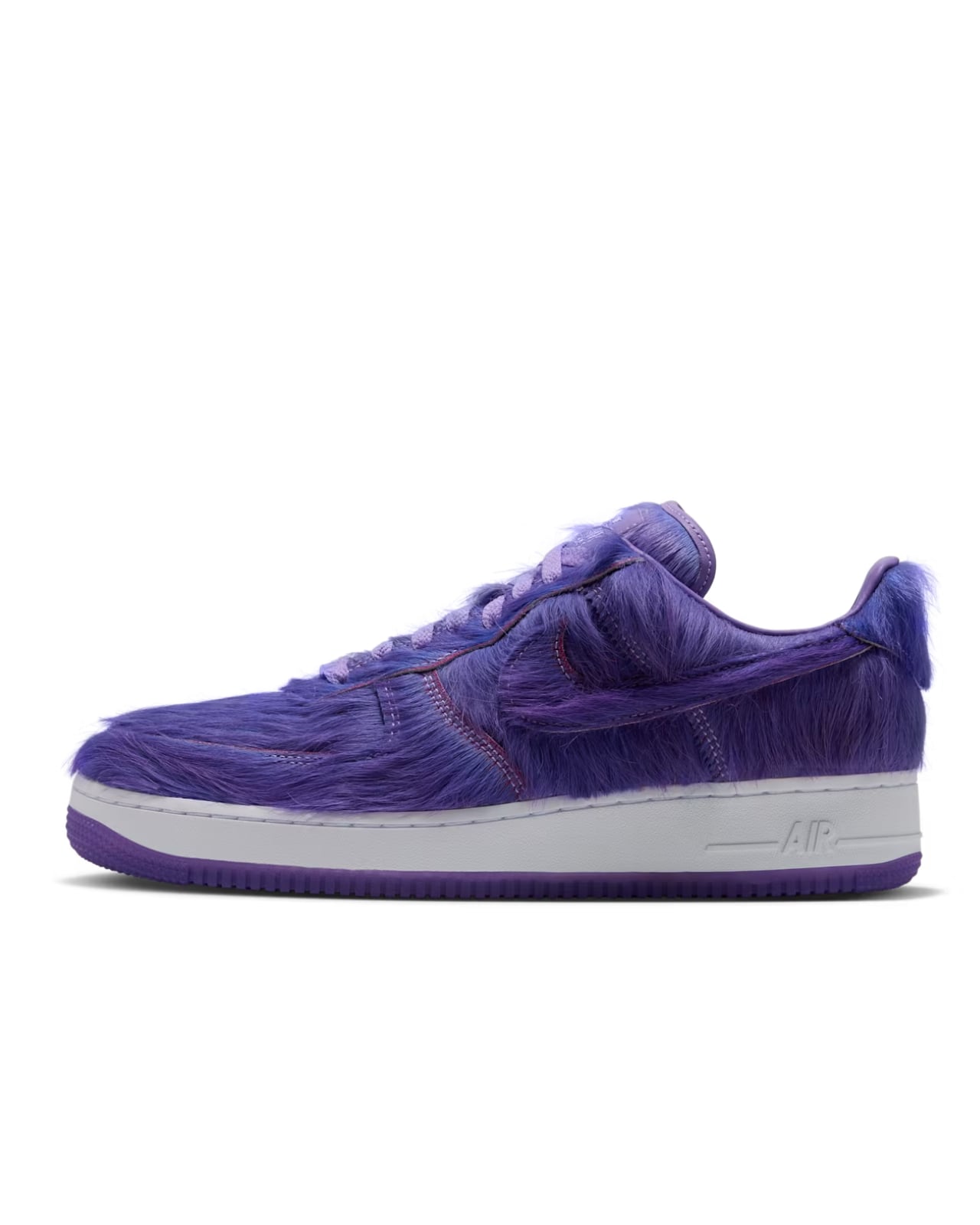
Nike hasn’t abandoned the smaller details, either. The purple laces keep the upper mostly tonal, while contrasting stitching traces the panels. The tongue still carries Nike Air branding, and there’s an AF1 lace tag near the bottom of the laces. Around the back, embroidered Nike Air lettering appears on the furry heel tab. Those familiar touches help keep the design recognizable up close.

For anyone who finds an all-white pair a little too predictable, that’s probably the main appeal. You could wear these with jeans and a plain T-shirt and let the sneakers supply most of the personality. You don’t necessarily need a purple outfit to go with them, although nobody’s stopping you. They’re an option for someone who wants a playful change without moving away from a familiar low-top shape.
One detail worth being careful about is the material description. Nike’s launch page describes the upper as furry but doesn’t specify its exact composition. That means it’s better not to assume what animal or synthetic material is involved, or to mistake “furry” for a confirmed material specification. Likewise, the plush appearance doesn’t tell us whether these feel warmer, softer, or more comfortable than another Air Force 1.

That texture also raises a practical question about upkeep. If you’re considering a pair, check for Nike’s material-specific cleaning guidance rather than assuming your usual sneaker-cleaning routine will work. How the fibers handle dirt, repeated wear, or being flattened in storage is something product photos can’t establish. If easy maintenance matters more to you than an unusual finish, that’s worth weighing before buying.
Nike’s US SNKRS page lists the Air Force 1 “Atomic Violet and White,” style IR1940-500, at $140, with availability scheduled for November 20, 2026. So this is an upcoming retail release, rather than something you can order from that launch page right now. If you’re eyeing it as a holiday gift, that date is the one to keep in mind.

The decision will probably come down to how much purple fuzz you want in your everyday wardrobe. There’s no need to dress these up as a performance breakthrough; the attraction is right there on the surface. For the right person, a familiar sneaker that looks faintly like Grimace might be reason enough to make room for another shoebox.
The post Nike’s Air Force 1 Goes Furry Without Losing Its Shape first appeared on Yanko Design.
  •  

Pongbot Aura: Tennis and Pickleball Practice Without a Partner

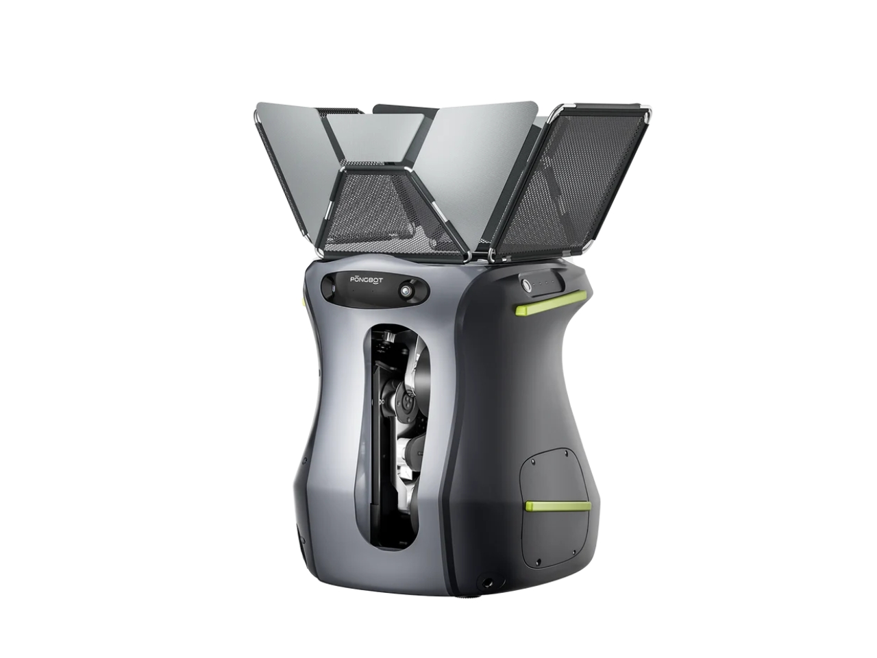
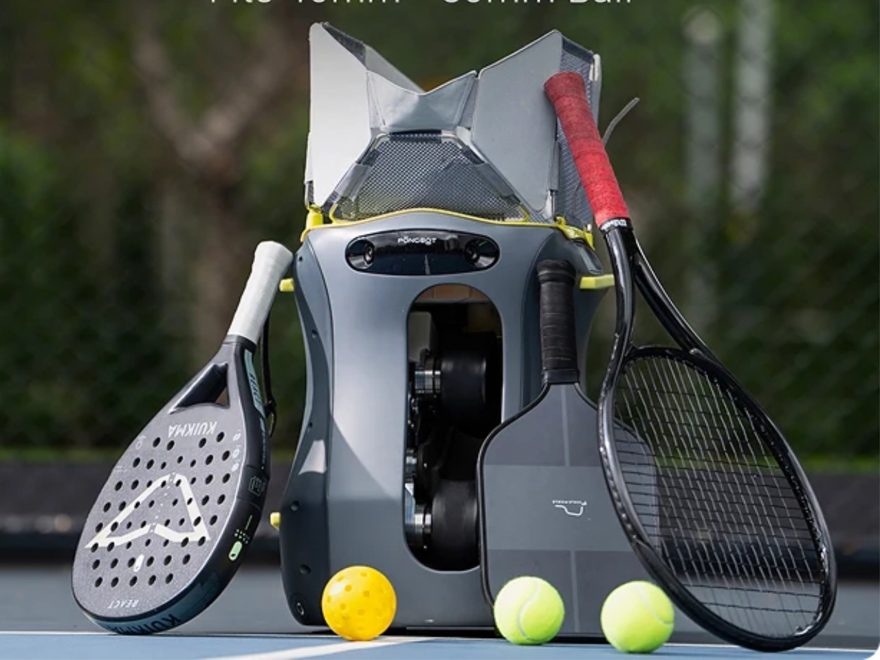
A free hour and an empty court can still leave you short of one essential ingredient: someone to hit with. That’s the problem Pongbot is tackling with Aura, a portable ball machine designed for tennis, pickleball, and padel. I like the premise because it addresses an ordinary obstacle to getting better. Wanting to practice and finding someone available to help you practice are two different things.

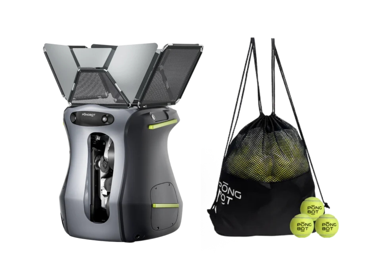
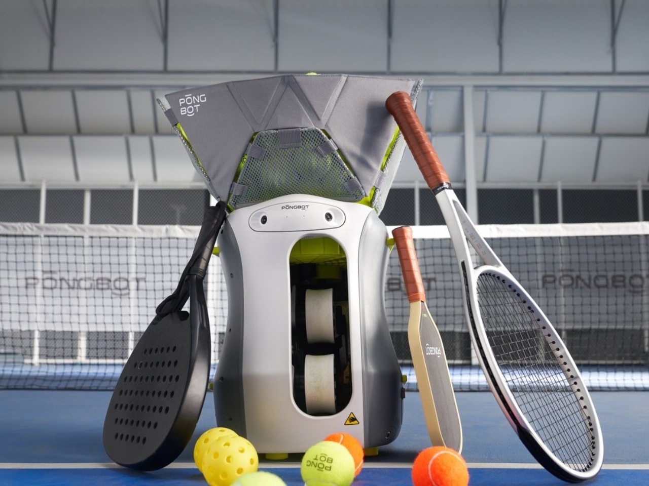
Currently offered for preorder, Aura approaches that scheduling problem with hardware you can carry to the court. Pongbot lists the machine at around 15 pounds, with an interchangeable battery rated for up to five hours of training. Its hopper accommodates up to 120 tennis or padel balls, or 100 pickleballs. Those are manufacturer figures, but they establish the intended routine: bring it along, fill it up, and work through a session on your own schedule.

Designer: Pongbot

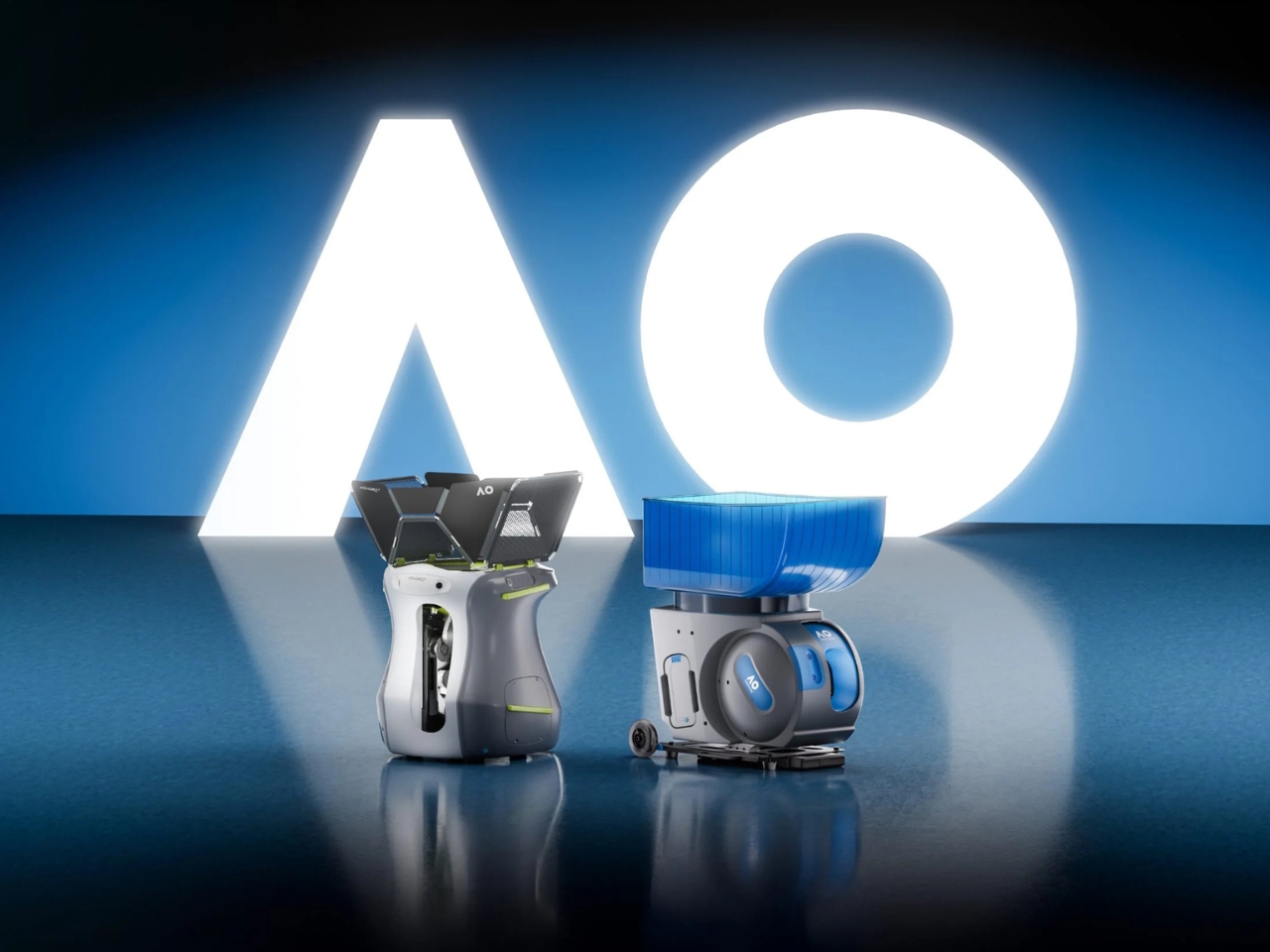
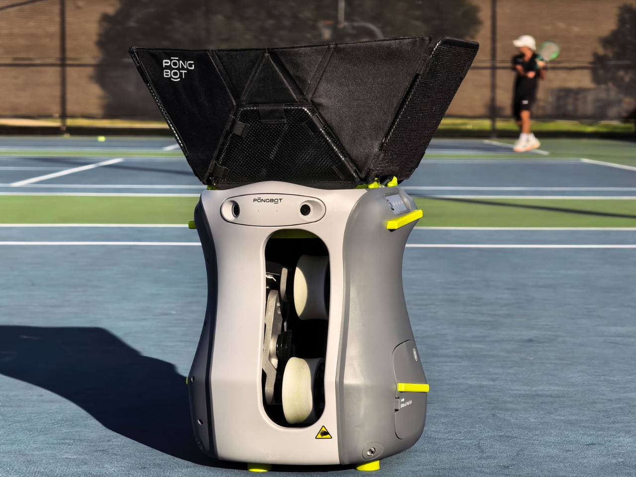
Visually, Aura has more personality than I’d expect from equipment whose main responsibility is throwing balls. The rounded, dark body has a contrasting front panel, a narrow vertical launch opening, and bright yellow-green accents. Above it, angular hopper panels flare outward to contain the balls. The proportions give it a slightly animated appearance without resorting to a cartoon face. I appreciate that restraint. A training robot doesn’t need eyebrows to feel approachable.

The more consequential design choice is inside. Pongbot describes an adaptive wheel-track system that adjusts for different ball diameters, allowing the same feeding hardware to serve all three sports. Selecting a sport in the app changes the machine’s setup. That matters because a perforated pickleball and a felt-covered tennis ball aren’t interchangeable projectiles. Supporting both asks something of the mechanism, not merely the interface. For a household with overlapping racket-sport interests, sharing one machine sounds considerably more sensible than storing two.

Aura also lets players customize placement, speed, spin, and feeding frequency. That’s where I see its clearest everyday appeal. You might want repeated backhands rather than a full simulated match, or a predictable sequence while learning a particular shot. Being able to narrow the assignment makes the machine easier to understand as a useful tool. The point isn’t to exhaust every setting. It’s to get enough repetition on the thing you actually came to practice.

The more ambitious features arrive through Spotter, the dual-camera vision module included with Aura S. Pongbot says its 120-frame-per-second cameras support tracking and AI coaching. One particularly thoughtful feature is Recovery Trigger, which waits for the player to return to a preset position before sending another ball. On paper, that’s a meaningful improvement over an indifferent countdown. Practice should challenge your movement, but being ready for the next shot is different from simply surviving the machine’s schedule.

I’m more cautious about treating automated feedback as the equivalent of a coach. Pongbot promises stroke analysis and voice guidance, but those claims don’t establish how perceptive the advice will be for an individual player. The simpler voice-control idea feels easier to appreciate: request a change without walking over to a screen. I haven’t tested either function, so my interest is in the interaction design, not a claim that Aura can diagnose your backhand better than a person.

There is a purchasing wrinkle worth understanding. Although the hardware supports three sports, the standard package activates only one; additional sports require paid unlocks or a three-sport bundle. At the time of writing, Pongbot lists Aura at $599.99 and Aura S, which adds Spotter, at $799.99. The respective three-sport packages are $649.99 and $849.99. Shipping is estimated at four to five weeks after order confirmation, rather than immediate dispatch.

That software gate makes the multi-sport pitch less generous than it initially sounds, although the bundle pricing makes the choice clear enough. I’d judge Aura primarily on whether it makes regular practice easier to arrange, carry out, and repeat. The cameras and coaching features can earn their place after that. A machine that helps turn an available hour into useful court time already has a worthwhile job, without needing to pretend it replaces everything a human partner brings.

The post Pongbot Aura: Tennis and Pickleball Practice Without a Partner first appeared on Yanko Design.
  •  

Hotei’s G-SHOCK Brings Bold Graphics Without Bright Colors

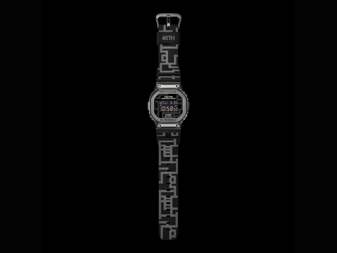
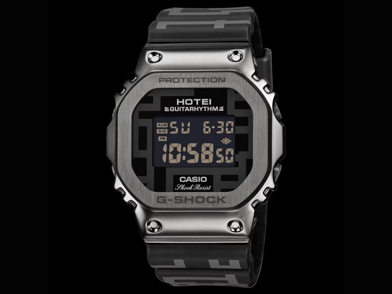
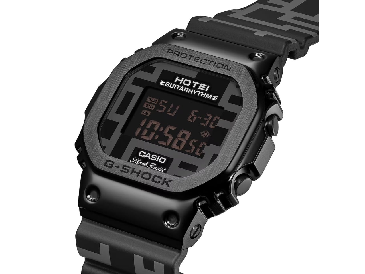
If you’re a fan of rock music, particularly guitarists, Tomoyasu Hotei is a name that probably needs no introduction. He is a Japanese musician who has performed with David Bowie and recorded with Iggy Pop, as well as building a career of his own as a co-founder of the iconic Japanese rock band BOØWY. Casio has translated his recognizable GUITARHYTHM graphics into a G-SHOCK watch to celebrate his 45th anniversary as an artist.

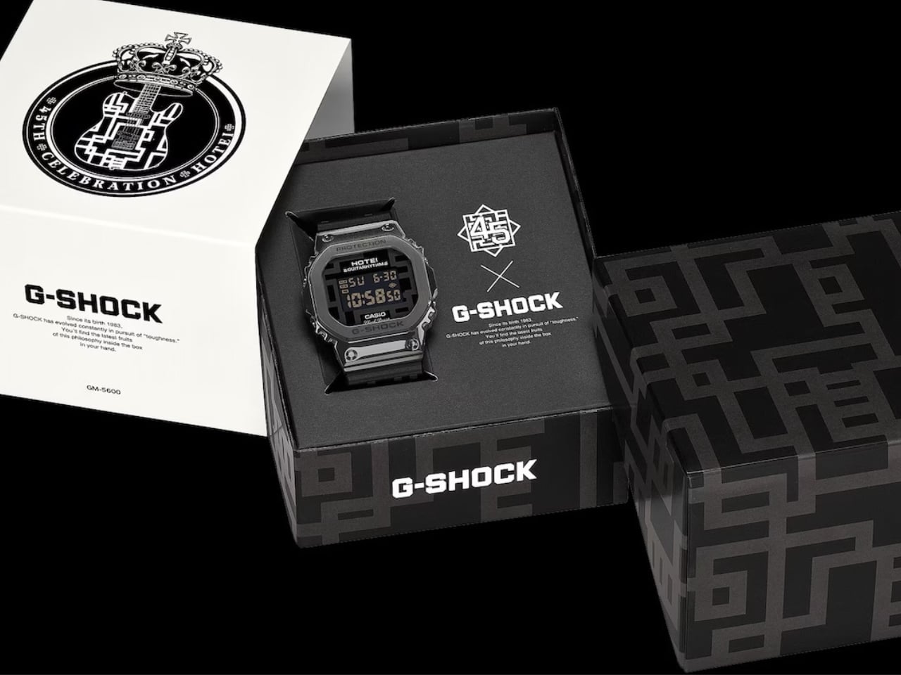
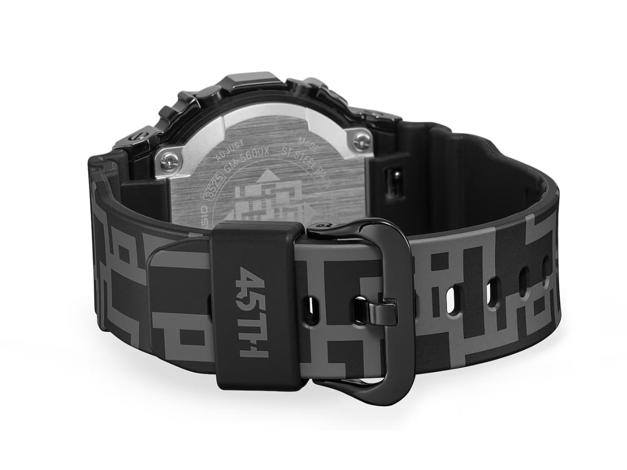
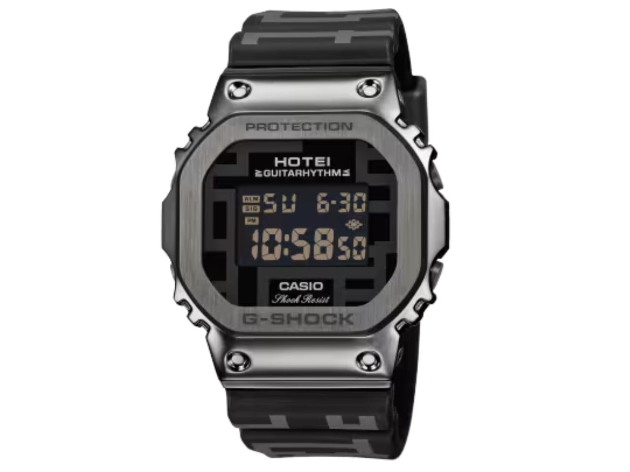
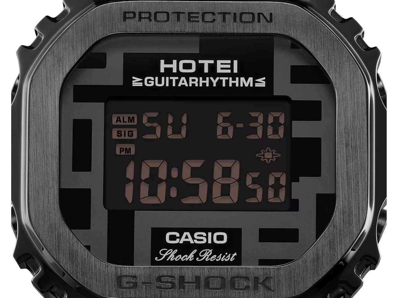
The HOTEI 45th Anniversary G-SHOCK GUITARHYTHM Model applies the gray geometric pattern associated with the musician to both the face and the resin strap of a square G-SHOCK watch. This makes the watch a coordinated graphic object, so its identity is visible along the wrist rather than only when you’re looking at the display. It’s a collectible for fans of Hotei, but it could also appeal to those who like a restrained design palette that still brings personality to their choice of watch.

Designer: Casio

The watch itself lets the geometric pattern provide the visual energy. Instead of relying on bright colors, this collaboration brings together pattern, contrast, and the relationship between metal and resin. You get a stainless steel bezel around a resin case, giving the brand’s familiar square form a different execution from an all-resin watch. The black ion plating keeps the bezel visually connected to both the dark strap and face.

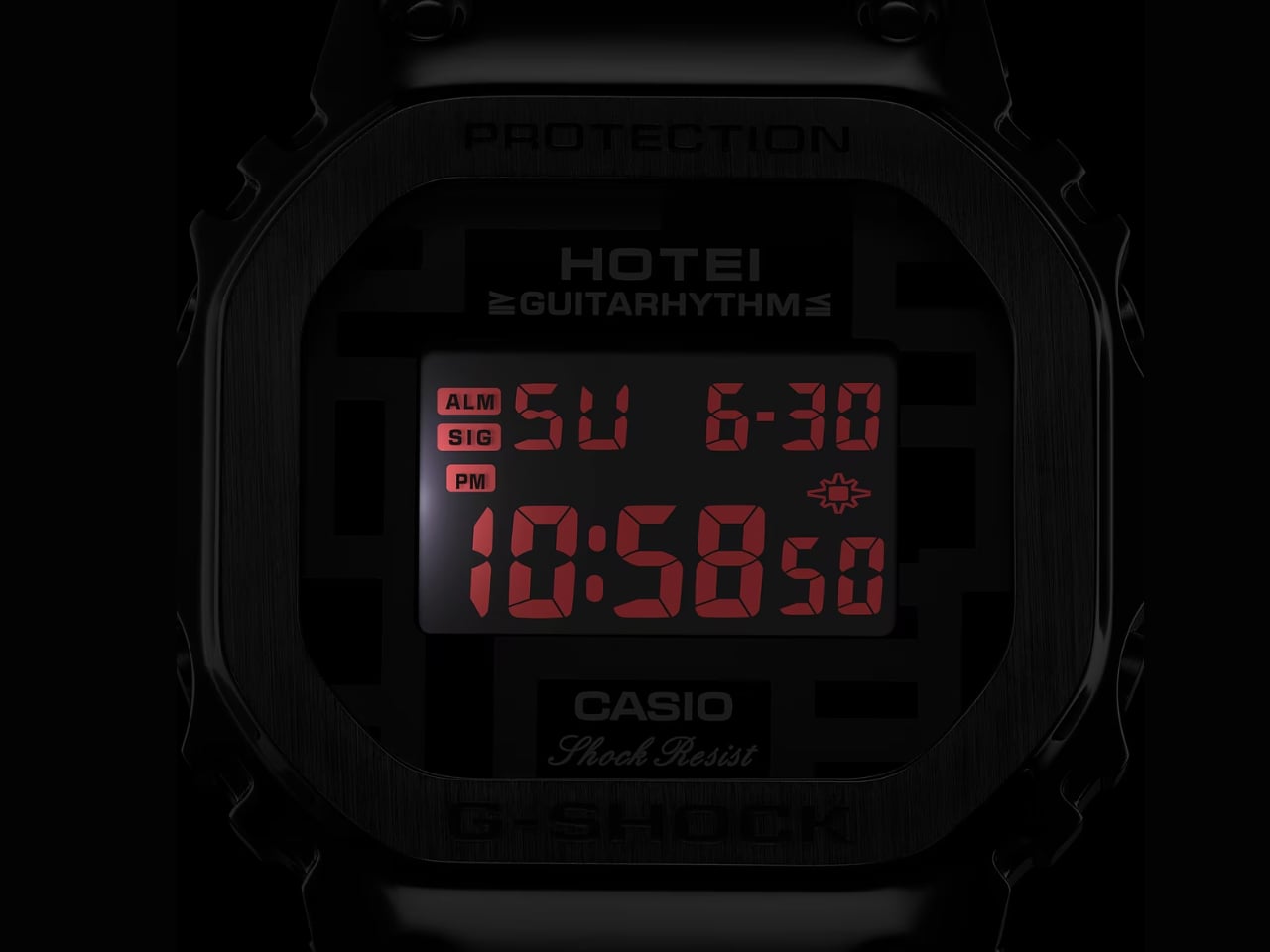
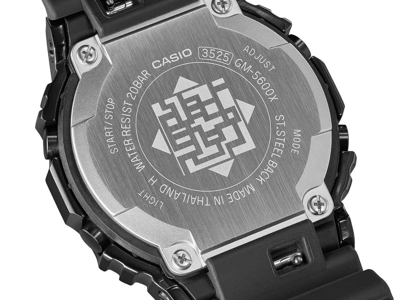
The watch has a red LED backlight that serves as a color accent when activated, with an afterglow function that keeps the display illuminated briefly after you release the button. The case back carries the GUITARHYTHM mark associated with Hotei, while the strap keeper has “45TH” printed on it, a detail with particular meaning for fans of the Japanese musician.

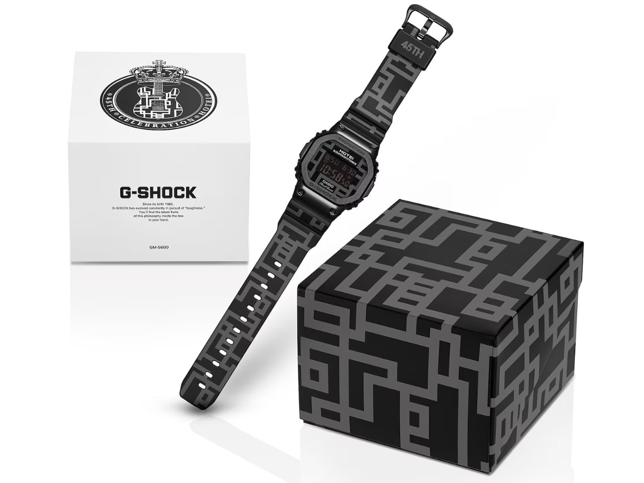
That pattern has a history beyond this anniversary. According to Hotei’s official biography, he created his geometric design as a teenager, and it has since appeared on merchandise and household goods. Carrying it across the strap makes sense here: there’s more room for the artwork than on the face alone. The dedicated packaging also carries the GUITARHYTHM pattern, extending the visual identity to the box. For a gift, that coordinated presentation adds something before the watch even reaches the wrist.

Underneath the graphics, you still get practical digital watch functions, including a stopwatch, countdown timer, alarm, and automatic calendar. Casio specifies shock-resistant construction and 20-bar water resistance, along with approximately five years of battery life. That means you won’t have another device to put on a charger every few days, while the timing tools give you reasons to use it beyond checking the time.

For readers who want music merchandise they can actually use, that’s the appeal. You can carry a connection to an artist without needing a concert occasion to wear it. The gray-on-black treatment also lets the watch express that connection without making a bright logo the main event. Still, the commemorative graphics are the reason to choose this particular version over a plainer digital watch.

The model, numbered GM-5600HT26-1JR, was detailed in Hotei’s October 7, 2026, announcement and is scheduled for general release in Japan in December. Its Japanese price is ¥36,300, including tax. A second Hotei store preorder window is scheduled for November 25–30, with those orders expected to begin shipping in early December. Those dates are planned availability, rather than confirmation that the watch is already shipping. The anniversary markings will mean the most to fans. The patterned strap is what gives the watch a broader design appeal, carrying Hotei’s visual identity beyond a small logo on the face.

The post Hotei’s G-SHOCK Brings Bold Graphics Without Bright Colors first appeared on Yanko Design.
  •  

A Steel Curb Prototype Lets Plants Spread Without Waiting for Cracks

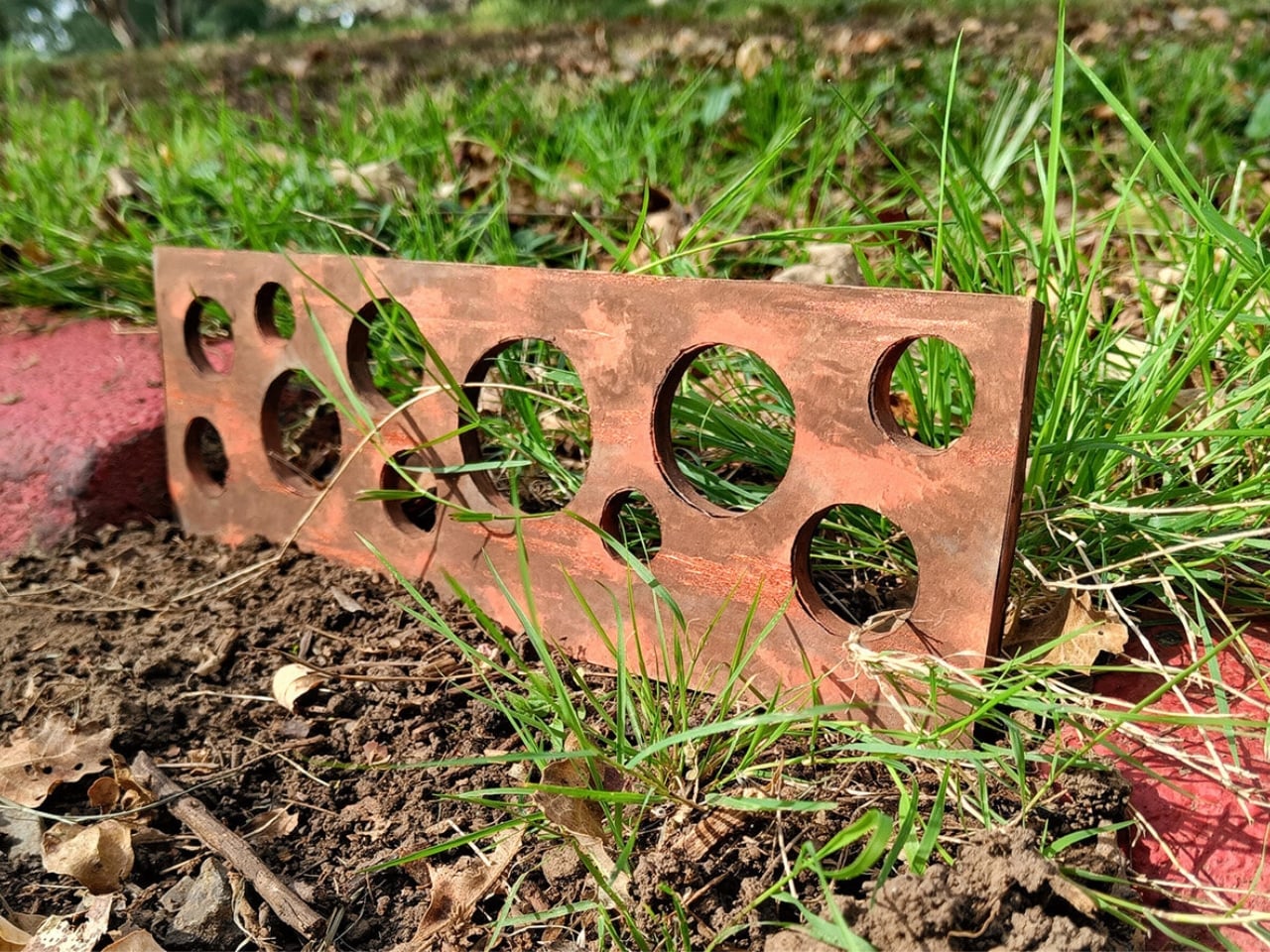
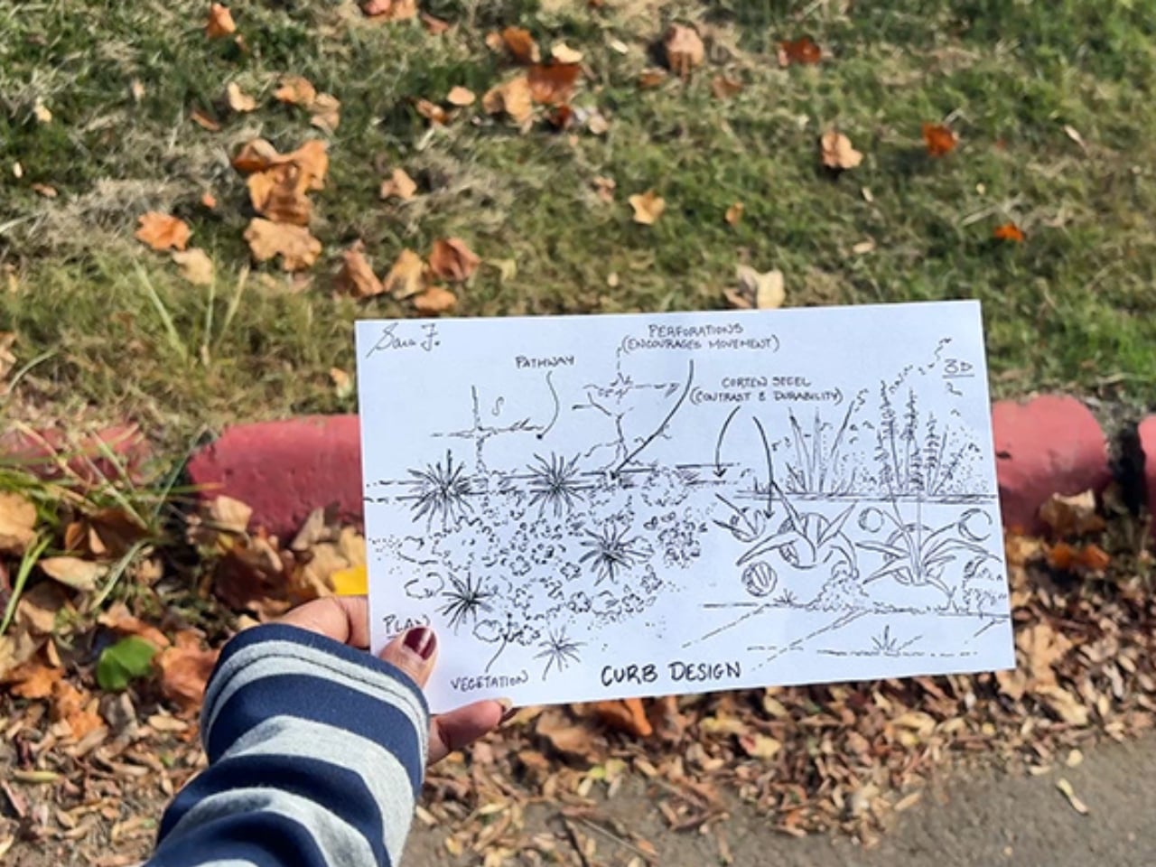
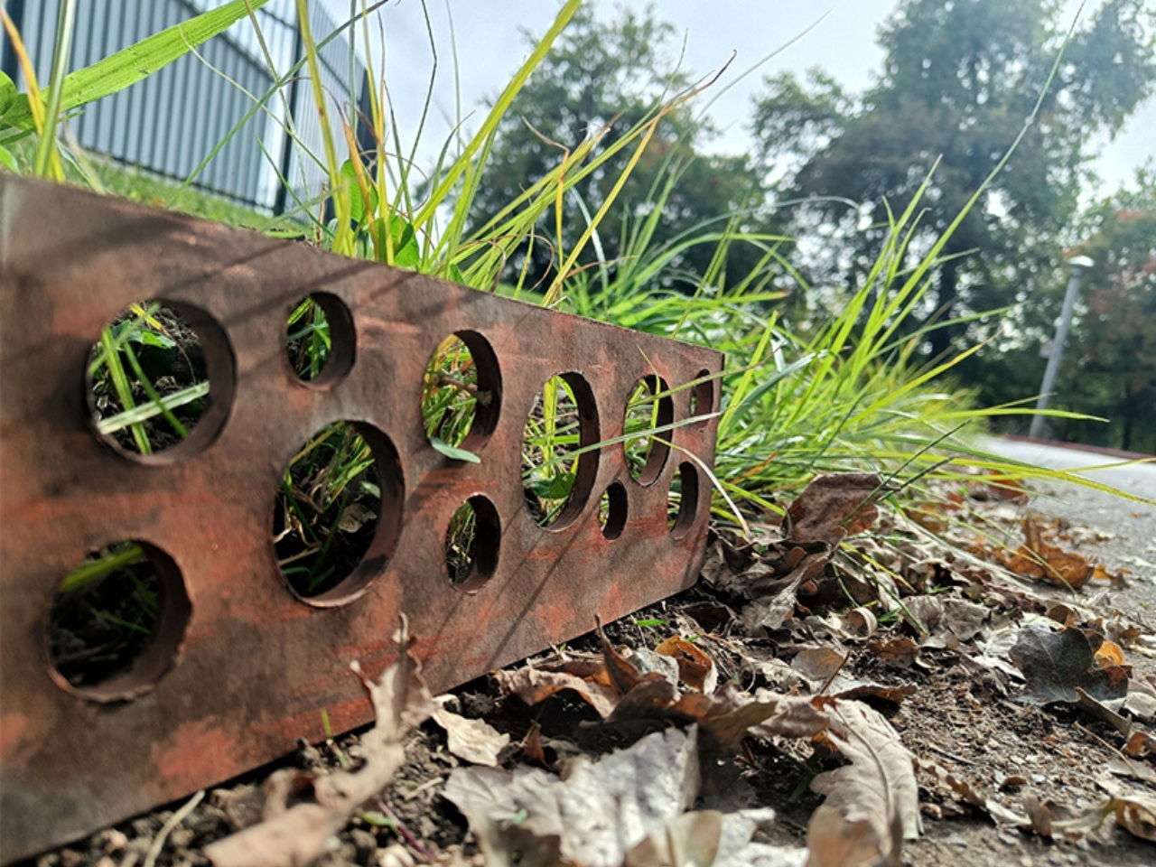
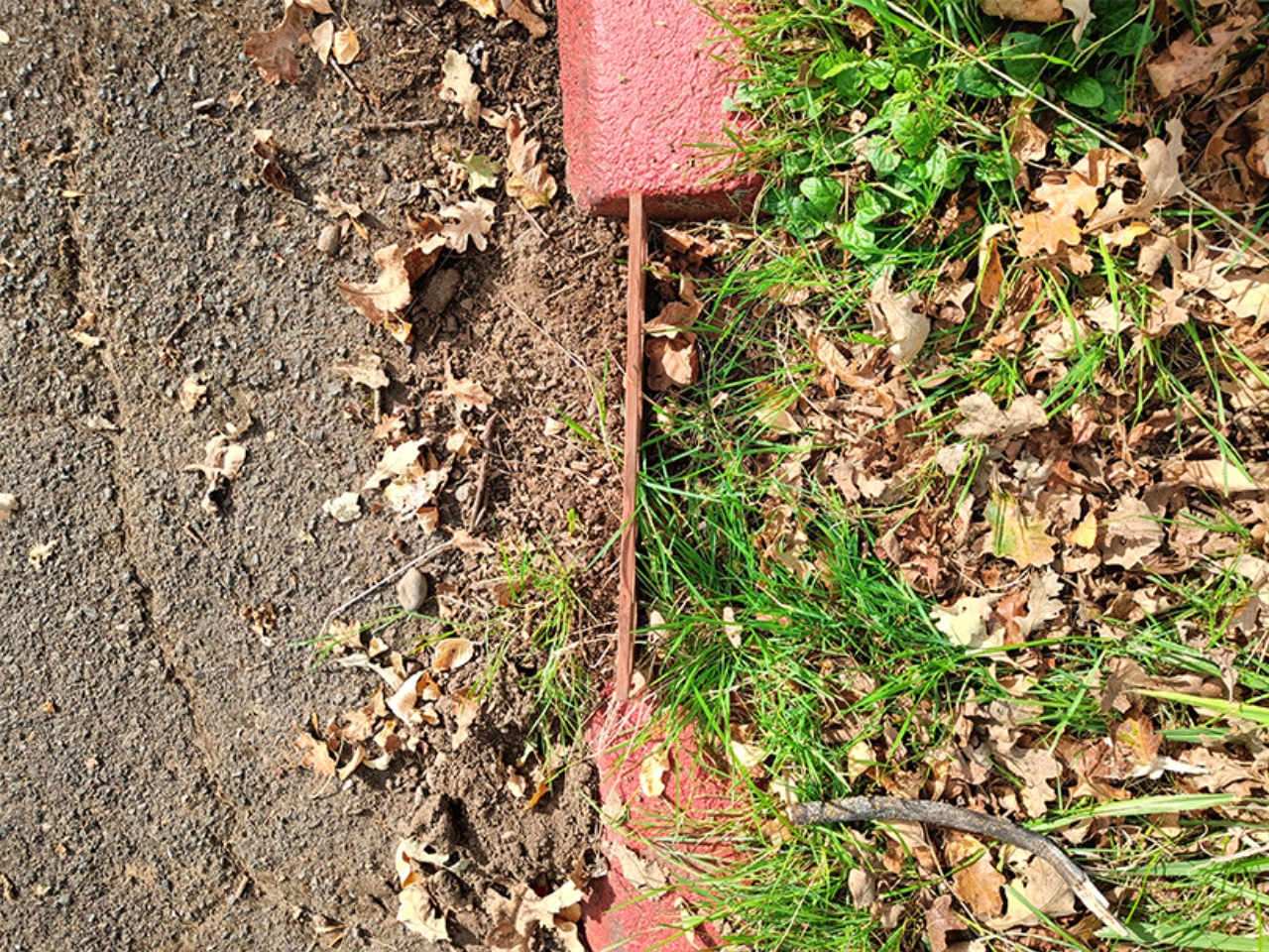
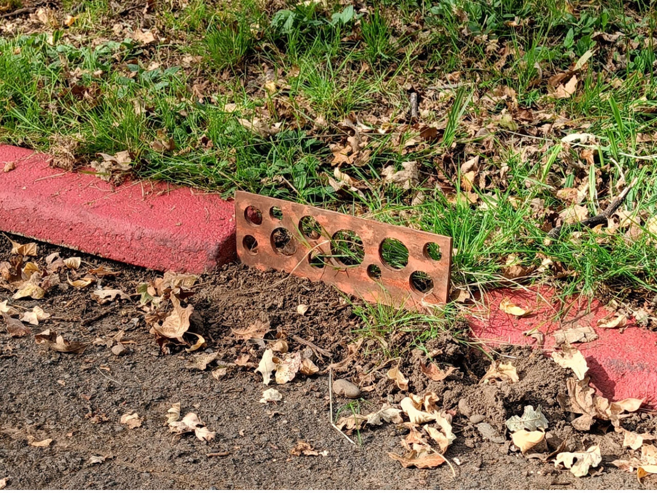
A plant pushing through a crack in the sidewalk usually looks like a maintenance problem. Sara Fernandes treats it as a design brief. Her prototype, Giving Nature a Voice: Let Them Through, replaces a solid concrete curb with perforated Corten steel, giving low-growing vegetation a route across an otherwise closed edge. It addresses a small but revealing problem: the hard boundaries separating pavement from soil leave little room for plants to cross.

I like the modesty of that starting point. A curb is hardly the object you expect to carry an interesting argument about urban living. It’s background equipment, something to step over or avoid catching a wheel on. Giving it a second look feels worthwhile precisely because it’s so unglamorous. You don’t need an elaborate architectural proposal to reconsider how much control a paved edge should have over the ground beside it.

Designer: Sara Fernandes

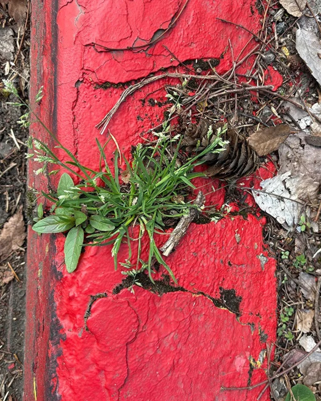
Fernandes’s inspiration came from observing plants emerging through fractured concrete. Rather than waiting for a boundary to deteriorate, she designed openings into it. That’s an appealing shift in attitude. The scrappy little patch of green becomes a useful clue instead of an imperfection to erase. I’m drawn to design that starts by paying attention to what’s already happening, especially when the response is as legible as making a few holes.

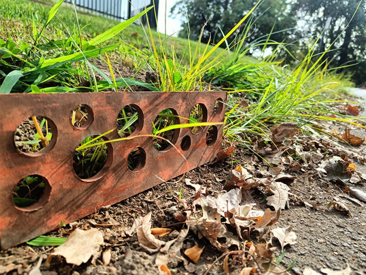
Those holes are circular, vary in diameter, and sit irregularly along the steel profile. The project describes them as passages for adjacent soil and low vegetation. The mechanism is refreshingly easy to understand: the edge remains, but it isn’t continuous. To me, that makes the proposal more interesting than simply removing a section of curb. It asks how a boundary might remain recognizable while allowing some movement through it. The irregular spacing also avoids turning the idea into a perfectly repeated decorative motif.

The material choice supports that thinking. Fernandes uses weathered Corten steel, with a patina described as connecting the tones of earth and pavement. I think that’s a sensible visual direction for an object intended to accommodate plants. A pristine finish would introduce a different expectation, one in which every mark might feel like damage. Here, a weathered surface seems better suited to the proposition. It gives the designer a way to acknowledge change without making the curb look unfinished.

My enthusiasm does come with a practical condition: I’d want the surrounding sidewalk to stay comfortably usable. A planted edge might be lovely, but navigating it shouldn’t become another task for someone using a wheelchair, pushing a stroller, or walking with limited vision. Any developed version would need to consider where growth is welcome and where a clear route takes priority. That doesn’t undermine the idea. It gives the next version a more demanding, and useful, brief.

Maintenance would deserve equal attention. I’d want to know how the openings behave when leaves collect around them, how loose soil is managed, and what happens when the plants grow beyond the intended area. These are questions for testing, not reasons to dismiss the prototype. They’re also where a charming design gesture could become something more convincing. The person responsible for keeping a path usable ought to have a say in how its edges are designed.

For now, the project is presented as a conceptual prototype rather than a mass-produced municipal curb. That distinction matters: its strongest contribution is a physical way to reconsider a familiar boundary, not a demonstrated promise of better drainage or a healthier urban ecosystem. Those larger claims would need evidence of their own. I’m happy to appreciate the narrower achievement. A small intervention can be worth discussing without being assigned responsibility for fixing an entire city.

I’d be interested to see a longer test installation, with room for both plant growth and the ordinary mess of daily use. That would reveal how much openness an edge can accommodate before it needs adjustment. Even at this stage, Fernandes has made a curb worth noticing. The holes give plants somewhere to go, and give the rest of us a reason to look down.

The post A Steel Curb Prototype Lets Plants Spread Without Waiting for Cracks first appeared on Yanko Design.
  •  
❌