❌

Vue lecture

The 5 Best Tiny Homes That Make Downsizing Look Like an Upgrade
A tiny home becomes interesting when the floor plan makes room for something you expected to lose. A proper bathtub. A bedroom that doesn’t require a ladder. A kitchen where dinner involves cooking rather than unpacking takeout. Those choices make downsizing easier to imagine, because they connect smaller spaces to familiar routines. The appeal lies in keeping the parts of home you actually use, then questioning everything that surrounds them.

These five picks explore that idea at very different scales, from a 120-square-foot cabin to a 700-square-foot compact home. Some prioritize everyday living, while others are better understood as retreats. This is a selection based on published layouts and specifications, not a ranking from overnight stays. Each earns its place through a particular design decision, with the compromises kept in view rather than cropped out of the pretty cabin pictures.

1. Lavvu XL
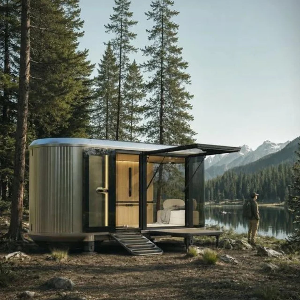
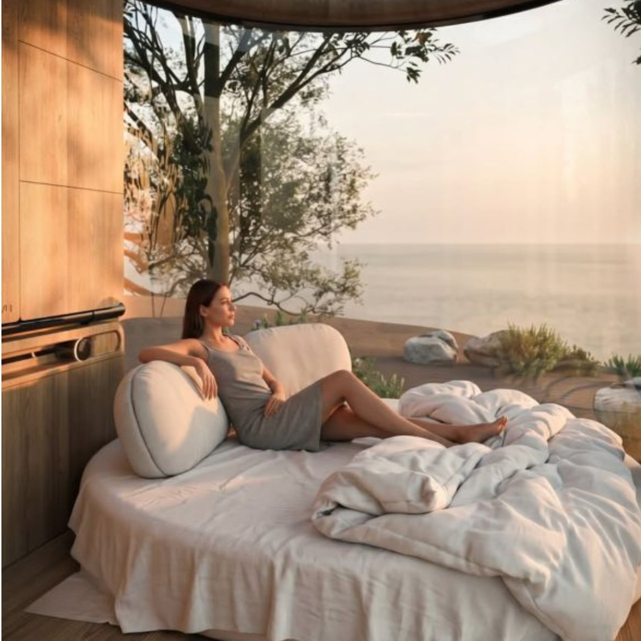
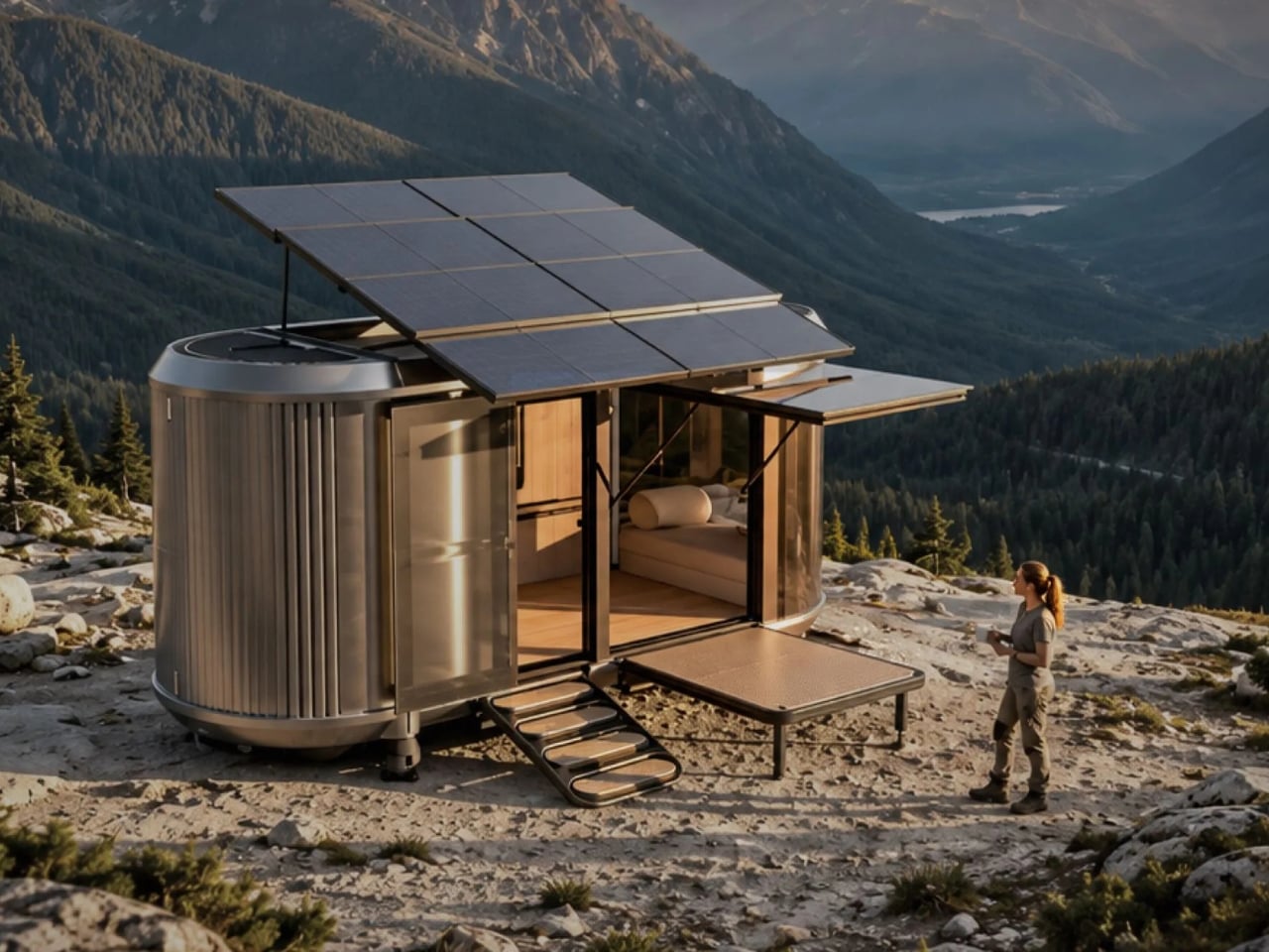
Lavvu’s XL gives a familiar indulgence unusually high priority: a full-size bathtub inside roughly 237 square feet. The modular home, credited to architecture studio Re:Büro, belongs to a range that Lavvu has promoted for preorder. Its rounded shell and ribbed exterior suggest a small transport capsule in the promotional imagery. Inside, the more persuasive idea is domestic: preserving enough of your normal routine that a weekend away doesn’t have to feel like an extended exercise in making do with less.

The kitchen pairs a two-burner induction cooktop with a built-in refrigerator and dishwasher, while a sliding island adjusts to accommodate seated or standing use. That moving surface acknowledges how differently a narrow room works during breakfast and food preparation. Drawers beneath the bed, shelving, and a wardrobe address the less photogenic business of storing belongings. Large glazing makes the outlook important, but it also makes privacy worth considering. This is a layout to evaluate alongside its setting, not apart from it.

What we like

  • Full-size bathtub in a compact layout.
  • Sliding island accommodates different kitchen tasks.

What we dislike

  • Preorder delivery timing needs confirmation.
  • Extensive glazing makes privacy site-dependent.

2. Acadia
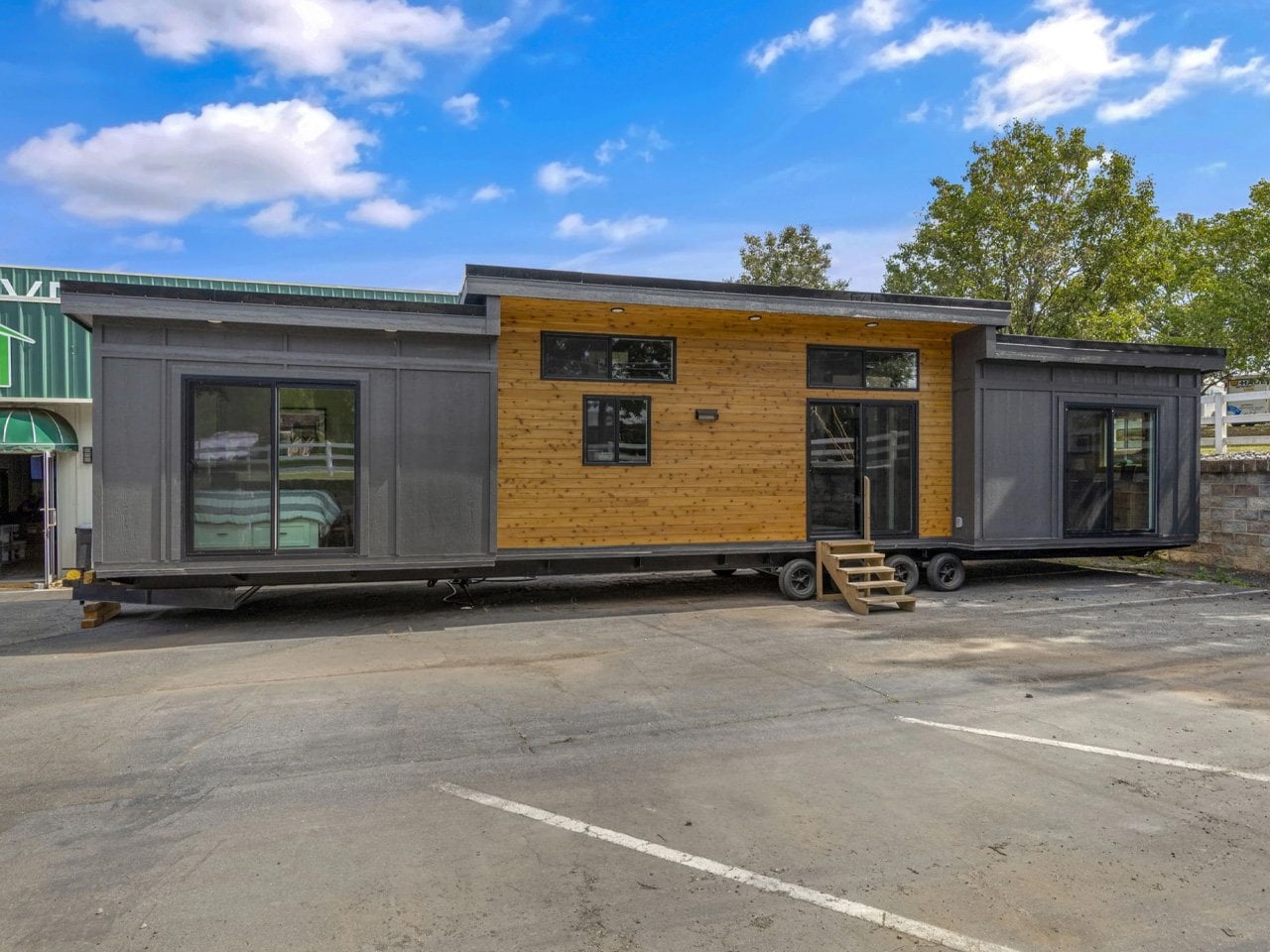
At 700 square feet, Sweet-Haus Tiny Cabin Company’s Acadia stretches this collection toward compact housing rather than extreme minimalism. Its two bedrooms and two full bathrooms offer something more valuable than a clever folding mechanism: separation. Couples can keep a guest room, or two occupants can maintain distinct sleeping spaces. Sweet-Haus currently lists the Acadia as a modular home for South Carolina and North Carolina, so it belongs in a conversation about settling down smaller, not taking frequent road trips.

The single-level plan connects the living, dining, and kitchen areas, while the bedrooms accommodate queen or king bed bases with storage drawers. The kitchen includes a cabinet-depth refrigerator, a 24-inch range, and an 18-inch dishwasher. These are useful provisions if downsizing is supposed to simplify your home rather than rewrite your meals. Built-in closets matter for the same reason. The Acadia makes its case through ordinary conveniences that remain available, although calling this much space tiny requires a generous interpretation.

What we like

  • Two bedrooms and two bathrooms preserve privacy when sharing.
  • Single-level living avoids making stairs part of the daily routine.

What we dislike

  • Its 700-square-foot footprint is a substantial step up from smaller cabins.
  • The current modular offering is limited to North Carolina and South Carolina.

3. The Traveler
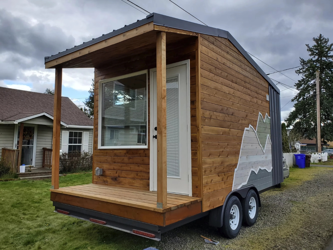
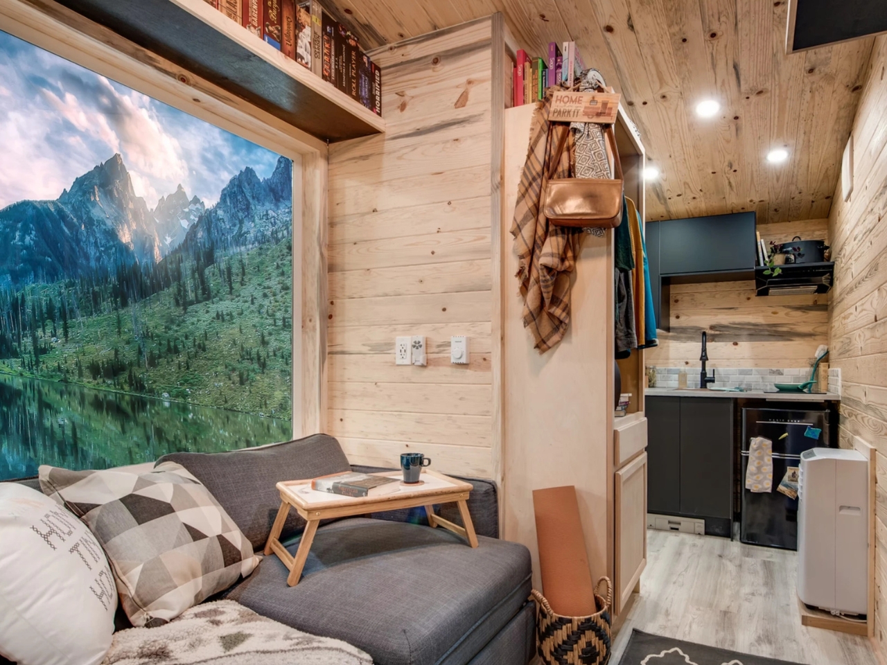
Backcountry Tiny Homes’ Traveler removes the loft entirely. Its 120-square-foot interior uses sleeper seating that opens into an approximately queen-size bed for two, keeping daily life on one level. The home measures 17 feet long, including a three-foot porch, with 14 feet devoted to the enclosed cabin. That’s a deliberate allocation: a small outdoor threshold survives even when interior space is scarce. For anyone who dislikes climbing into bed, the convertible furniture offers a straightforward alternative without expanding the building’s footprint.

Cedar and metal outside, with knotty pine walls and ceilings inside, give the Traveler a recognizable cabin character. Storage includes a wardrobe, tilt-out shoe compartments, and shelving around the living area. The kitchen keeps the essentials close, but it inherits an extra responsibility: the bathroom has a shower and flushing toilet without its own sink. Handwashing therefore shifts to the kitchen. Alongside converting the seating each night, that’s the compromise to consider before choosing a particularly small home for two.

What we like

  • Convertible seating makes room for sleeping without a loft.
  • Dedicated shoe and clothing storage addresses everyday clutter.

What we dislike

  • The bed requires converting the seating each night.
  • No bathroom sink means sharing the kitchen sink for personal routines.

4. Avalon 24
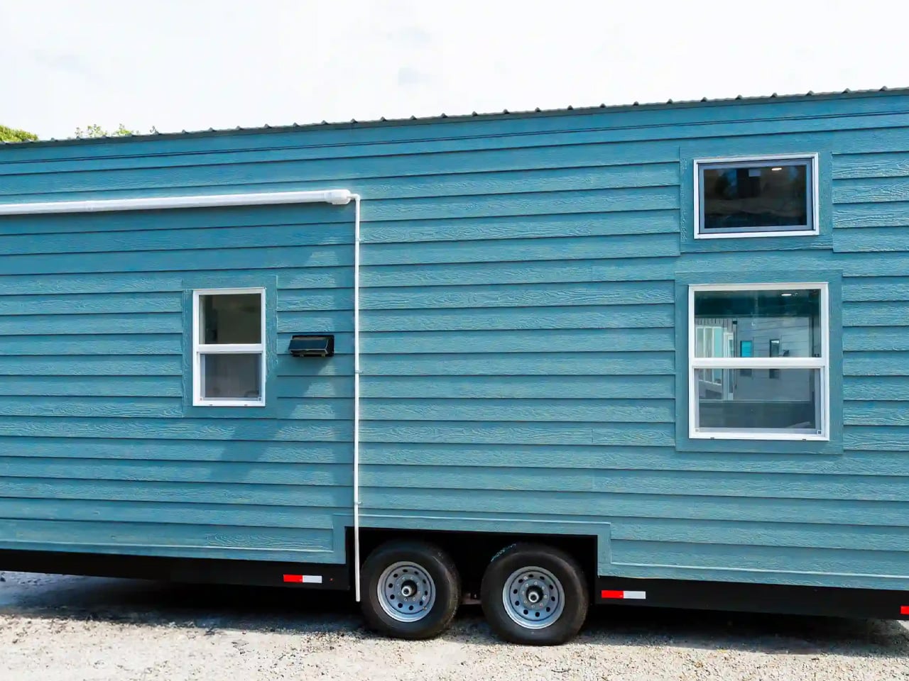
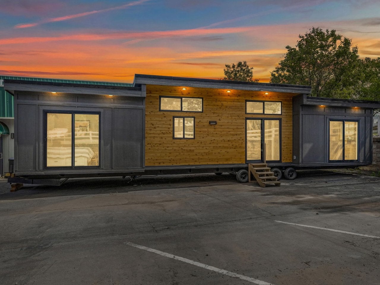
Dragon Tiny Homes’ Avalon 24 takes a different approach to ladder-free sleep: keep a dedicated bedroom downstairs and retain the lofts for other uses. The featured upgraded build fits that arrangement into a 24-foot home, with 204 square feet before counting its two lofts. A double bed occupies the main-level bedroom, along with storage. For someone who wants a permanent bed without surrendering all the upper volume, this is a more accommodating arrangement than making the living room become a bedroom.

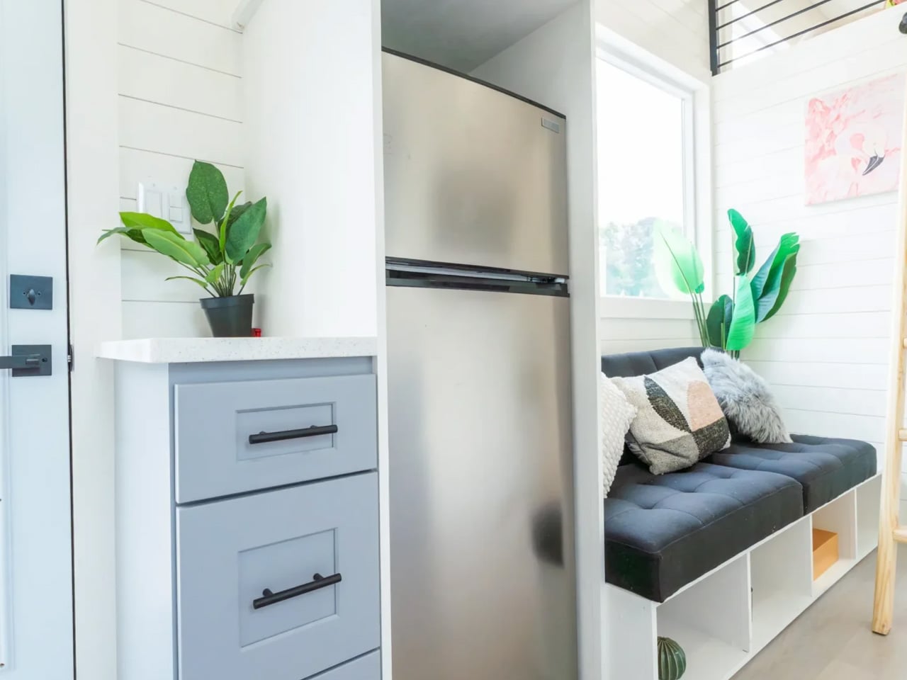
The upgraded inventory model adds a built-in couch, bedroom cabinetry, and cubby storage in the smaller loft. A 7.1-cubic-foot refrigerator and extra kitchen cupboards support everyday use, while the bathroom includes a vanity rather than borrowing the kitchen sink. Its flexibility comes with physical limits. The lofts still require ladder access, and Dragon lists this build at 14,000 pounds, recommending an F350 or similar towing vehicle. Moving house remains a substantial undertaking, even when the house measures just 24 feet.

What we like

  • A permanent downstairs bed avoids nightly furniture conversion.
  • Two lofts provide extra sleeping or storage options.

What we dislike

  • Ladders remain necessary to reach either loft.
  • The listed 14,000-pound weight demands a capable towing vehicle.

5. A-Frame Studio
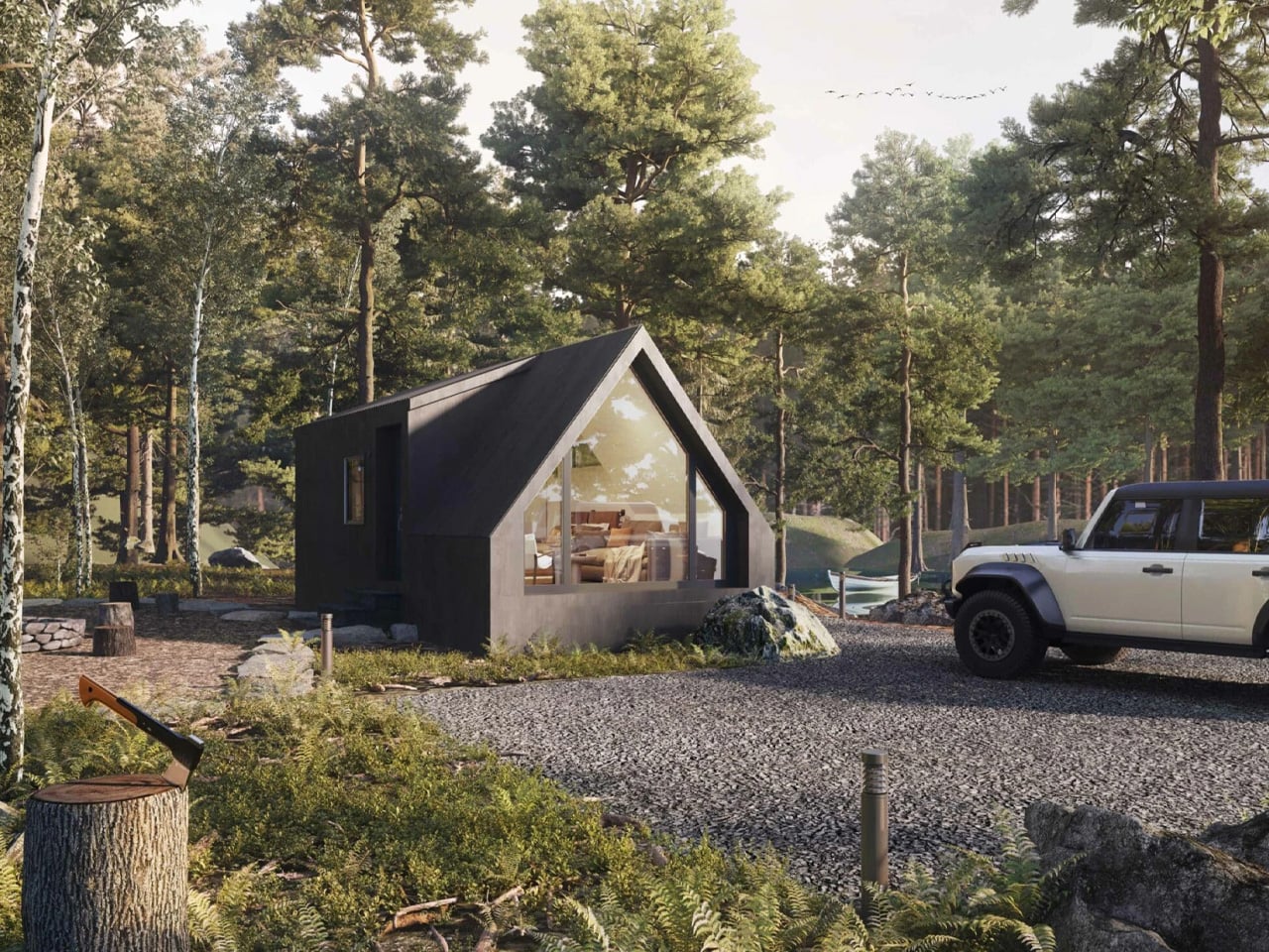
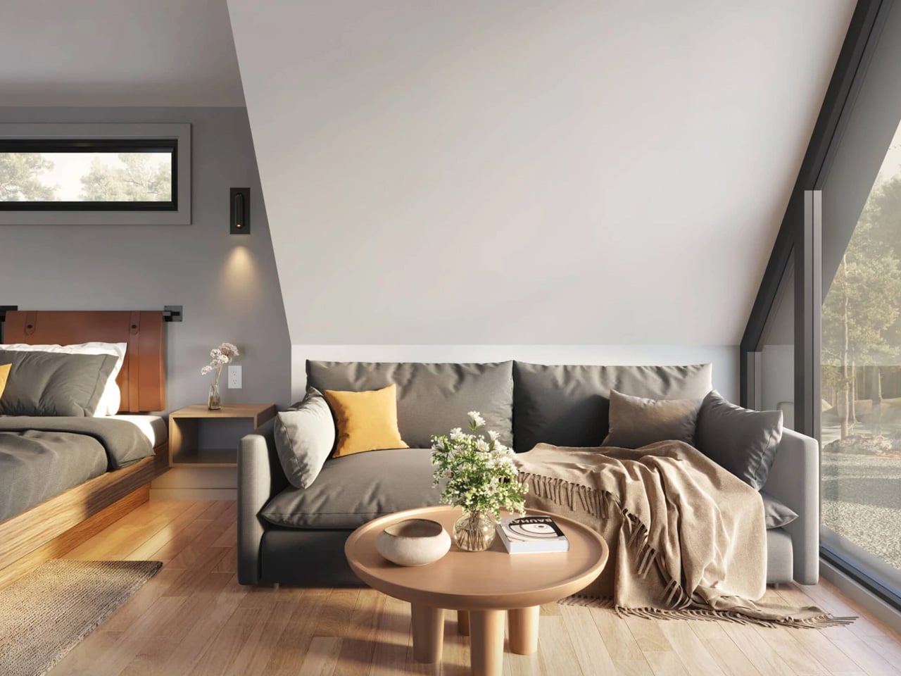
Zook Cabins’ A-Frame Studio spends its 400 square feet on the pleasures of a couple’s getaway: a king-size bed, a sitting area, and a bathroom with a freestanding soaking tub. This is an established park-model product intended for vacation use and short-term rentals, not a proposal for fitting a family into one room. The bed remains downstairs, with the living and kitchen functions sharing an open space. Its appeal comes from giving a few activities room rather than maximizing occupancy.

The large A-shaped window gives the living area its architectural focus, while the kitchenette uses birch cabinetry, quartz countertops, an undercounter refrigerator, and a two-burner electric cooktop. A shared desk and dining surface avoid introducing another table. The bathroom receives a separate shower alongside the 59-inch tub, making bathing a genuine priority. For a retreat, that allocation feels coherent. For everyday life with a partner, the lack of an enclosed bedroom deserves as much attention as the striking glazed front.

What we like

  • The king-size bed stays ready without a loft climb.
  • Separate tub and shower give bathing unusual priority.

What we dislike

  • Open sleeping space offers no separate bedroom privacy.
  • The kitchenette’s small refrigerator and two burners may constrain longer stays.

Keep the Space That Matters

Before choosing a floor plan, picture a fairly unglamorous evening inside it. You’re cooking, someone else wants to sit down, laundry needs somewhere to go, and the bed still has to be made. That mental walkthrough reveals more than a carefully staged photograph. Look for the point where two activities compete for the same surface or passageway, then decide whether that particular compromise would bother you every day or never.

There’s also a difference between enjoying a small cabin for three nights and wanting it as your everyday home. A generous bathroom might justify a reduced kitchen on vacation; at home, you might make the opposite choice. The worthwhile upgrade is having a clearer relationship between the space you keep and the life you want to lead. Keep the room for what matters, even if that’s simply a proper bath.

The post The 5 Best Tiny Homes That Make Downsizing Look Like an Upgrade first appeared on Yanko Design.

  •  

8 Home Office Accessories That Make Your Workspace Feel Less Like Work

A home office can end up looking like a room your employer forgot to furnish. There’s the monitor, the keyboard, the cup of pens, and very little that explains who actually sits there. Making it more personal doesn’t require replacing the desk or buying another productivity system. Sometimes it’s a lamp with an improbable shape, a living object beside the screen, or something you can pick up and play with.

These eight home office accessories make room for that less dutiful side of working from home. Some help with ordinary tasks, while others simply give you something enjoyable to look at between them. The selection moves from digital characters and miniature architecture to paper, plants, and a surprisingly considered trash bin. Choose the one that suits your habits, rather than treating the whole collection as another mandatory desktop shopping checklist.

1. Sony ELF-MN1

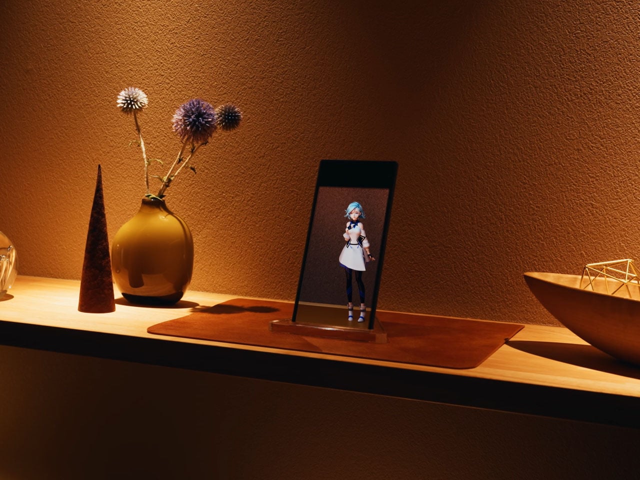
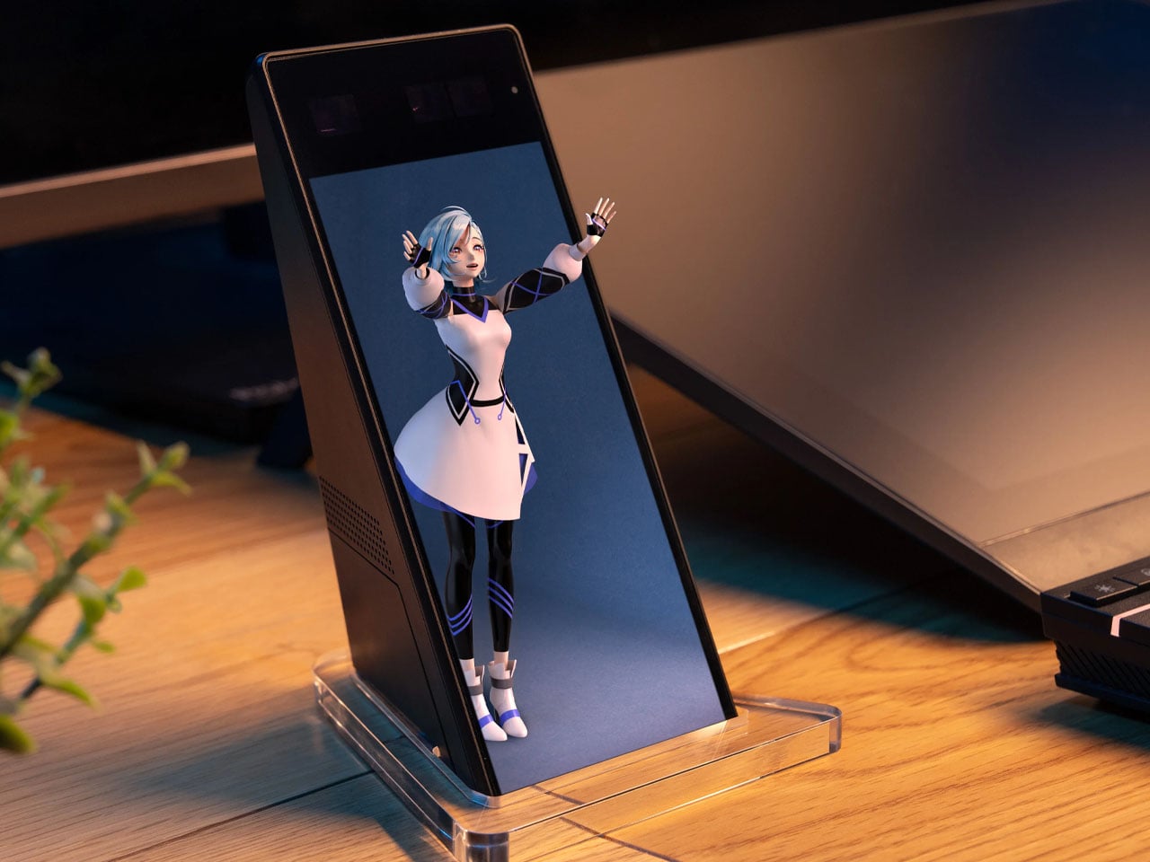
Sony’s ELF-MN1 is an announced six-inch Spatial Reality Display intended to put compatible digital figures and other detailed 3D content beside your keyboard. It uses eye tracking and tiny lenses over an LCD to direct different views toward each eye, creating depth without glasses or a headset. Sony schedules its Japanese release for December 11, 2026. The appeal is wonderfully specific: a favorite character gets a place in your workspace without becoming another physical figurine to dust or rearrange regularly.

The important distinction is that this is a display, not a hologram floating freely above the desk. It needs a compatible smartphone or PC and suitable content, so the experience depends on more than the object itself. Sony specifies viewing for one person, which suits a personal workspace better than a shared spectacle. For an anime enthusiast or digital collector, that private little stage is the point. It brings a hobby into the room without pretending to organize your afternoon.

What We Like

  • Glasses-free depth gives digital collectibles a desktop presence.
  • Eye tracking adjusts the view as you move.

What We Dislike

  • Requires compatible hardware and content.
  • The 3D effect is designed for one viewer at a time.

2. Stair Table Lamp

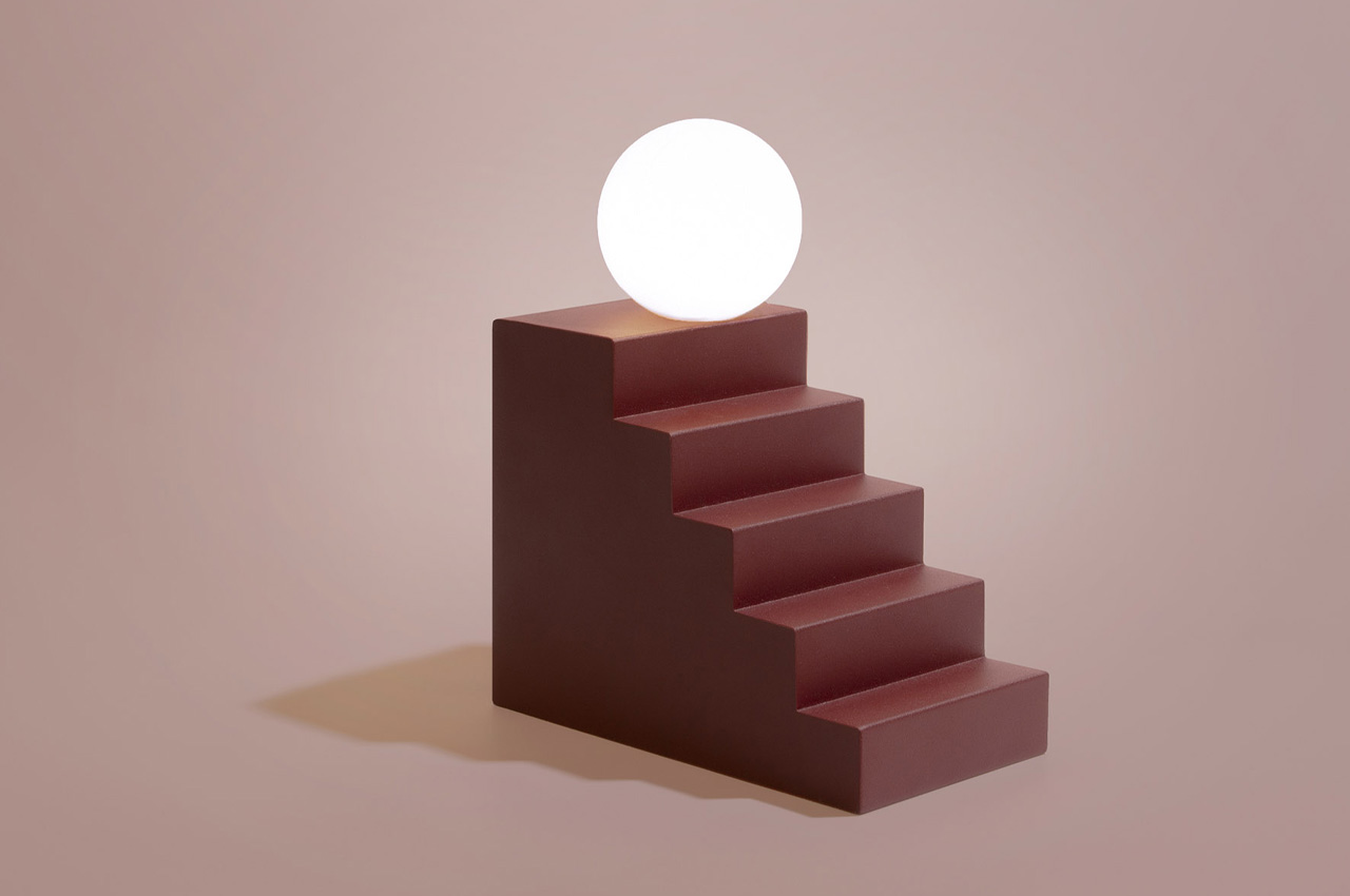
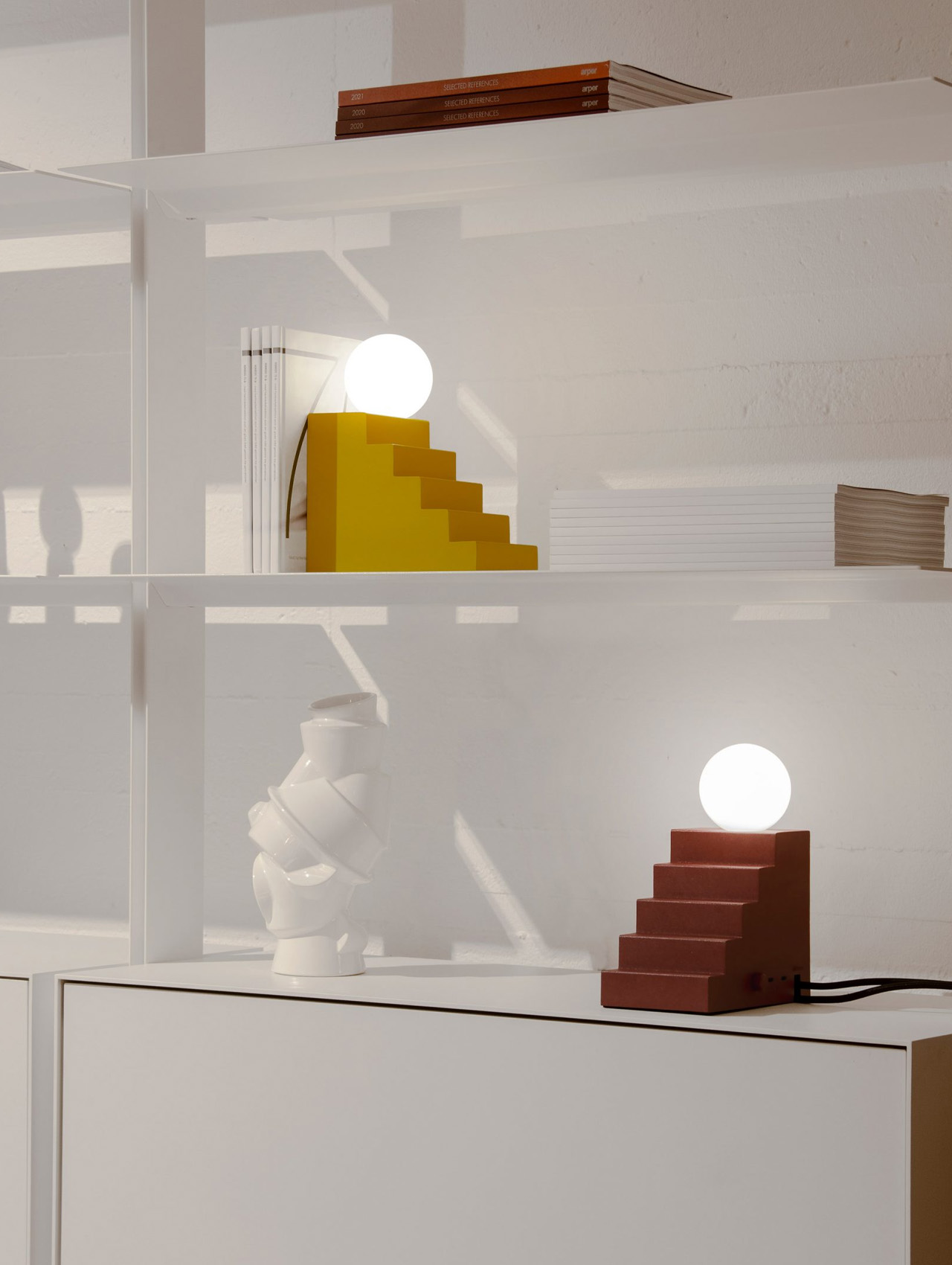
A glowing globe appears to pause at the edge of a tiny staircase. Designed by Notchi Architects for Oblure, the Stair Table Lamp turns basic architectural geometry into something closer to a desktop prop from a playful animated film. The stepped block gives the light a visual story even before you switch it on. Beyond that expressive shape, it also incorporates two USB-C charging ports and a power outlet, putting useful connections inside its sculptural base beside your everyday equipment.

For a home office, the attraction is having a lamp you might choose for the living room rather than accept from an equipment catalog. Its stepped form can serve as a bookend, giving it a second reason to sit beside your reading material. Check electrical compatibility before ordering:

What We Like

  • The architectural form stays interesting with the light switched off.
  • Integrated charging connections give the sculptural base a practical role.

What We Dislike

  • The listed electrical version isn’t suited to standard US outlets.
  • A power cord keeps it tied to an outlet.

3. Tevaplanter

Tevaplanter puts the interesting part of growing a plant on the outside. Its porous ceramic body holds water inside, allowing moisture to pass through to roots attached to the textured exterior. There’s no potting soil concealing the process, so the vessel becomes a support for a changing patchwork of growth. Beside a monitor, that makes a useful visual contrast: one object updates in pixels, while the other changes through roots, leaves, and the occasionally unpredictable business of keeping something alive.

This belongs in a home office with room for a small growing project, rather than someone seeking greenery to ignore. The maker recommends suitable plants such as orchids and ferns, but individual species still need appropriate care. You’ll need to refill the reservoir and choose a position that meets your plant’s lighting needs. Think of it as a living desktop display with responsibilities attached. Watching that surface change is the pleasure; removing soil does not remove the work of gardening.

What We Like

  • Exposed growth makes the growing process part of its appeal.
  • Soil-free cultivation avoids keeping potting mix on the desk.

What We Dislike

  • Plant choice and growing conditions still need attention.
  • Reservoir refills remain part of the routine.

4. TriAngular Calendar 2027

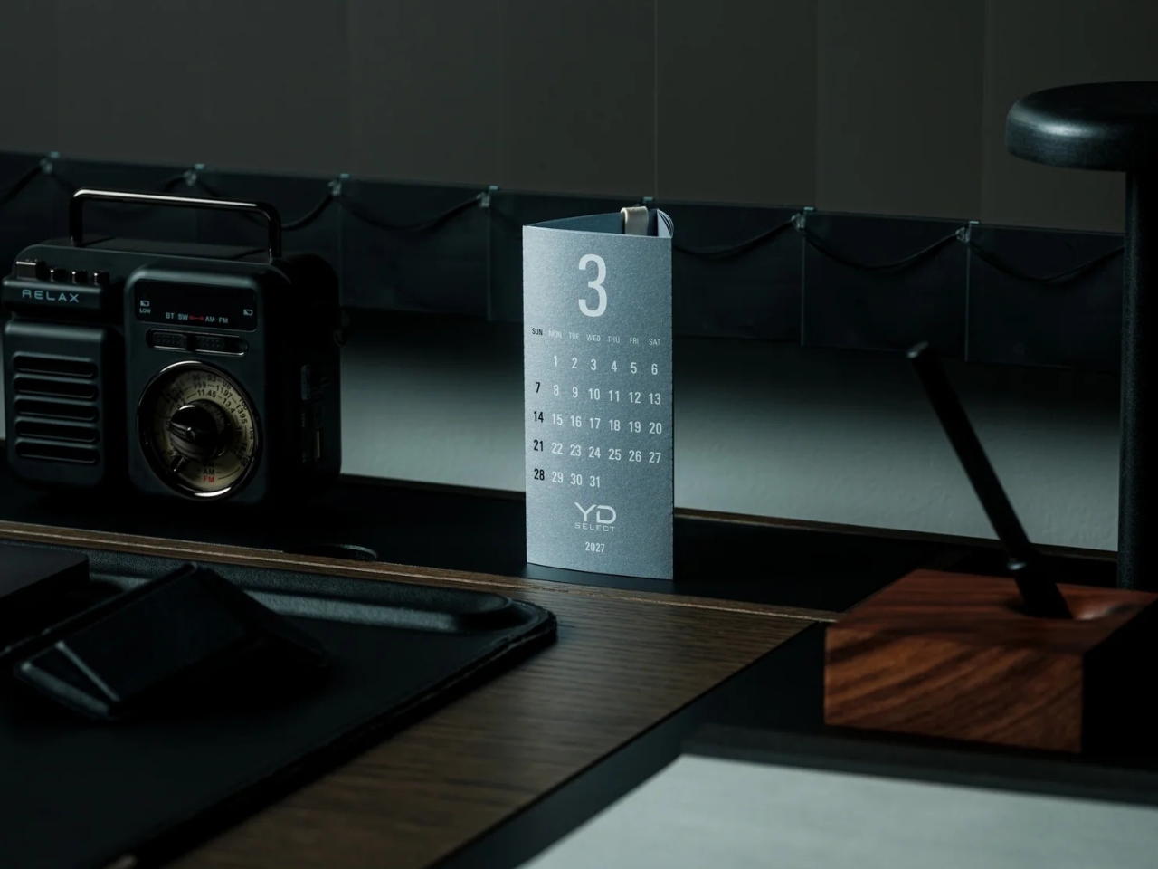
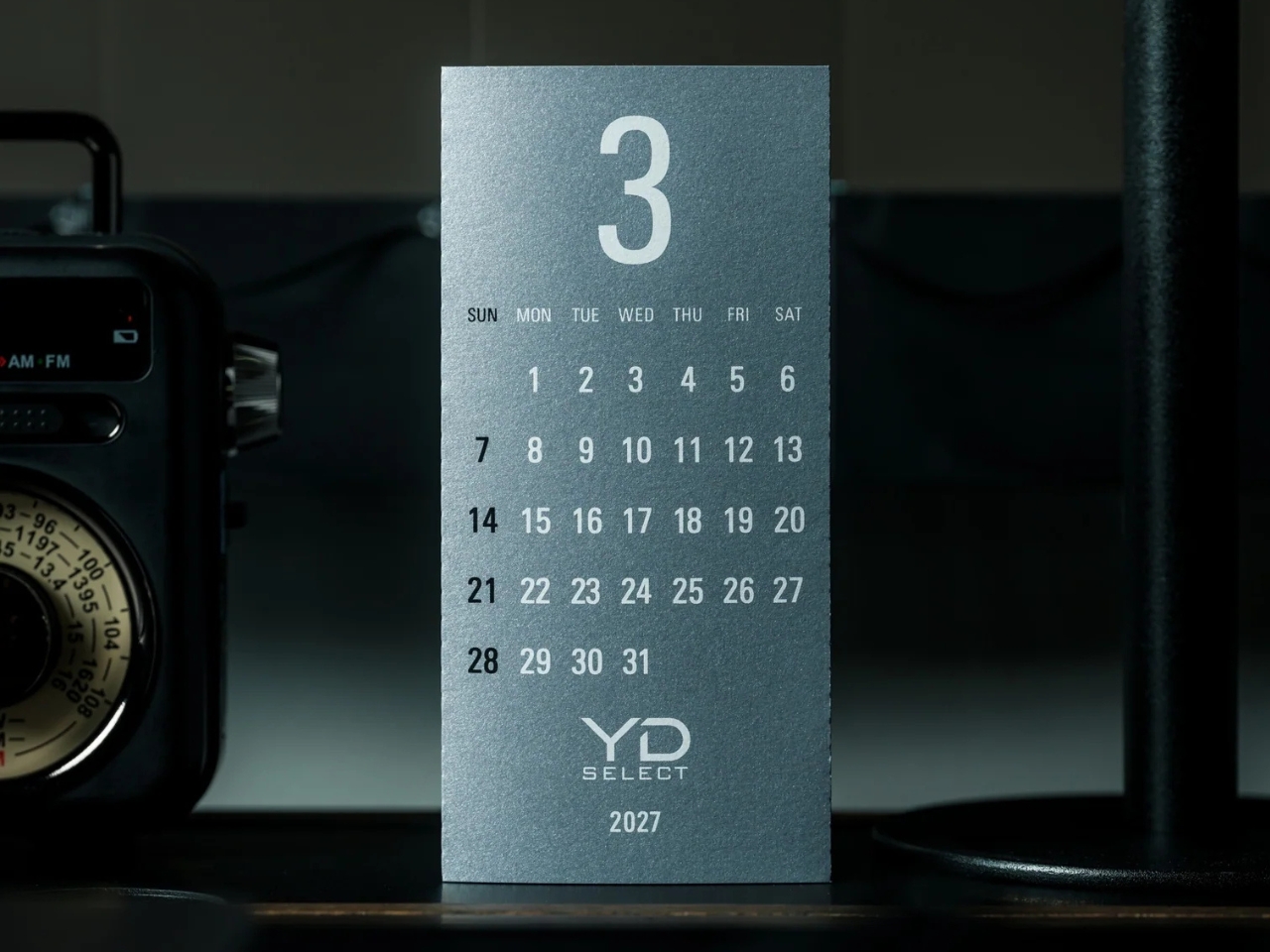
The TriAngular Calendar 2027 makes checking a date a small physical action instead of another reason to unlock your phone. Three months wrap around its triangular paper structure, so you rotate the calendar to see another month. There’s no separate stand underneath: the folded paper supports itself, secured with a paper clip rather than metal hardware. Silver specialty paper and white printing give this ordinary desk necessity a more deliberate presence, without adding electronics or asking you to charge anything.

Made in Japan, each sheet is silkscreen printed by hand, with white ink applied twice to the silver paper. Individual months are perforated for removal, and January and February 2028 are included beyond the main year. At 60 millimeters wide and 53 millimeters deep, its footprint is modest enough for a crowded desk. The limitation is deliberate simplicity: there are no national public holidays printed. It works best as a quick date reference, leaving detailed scheduling to your existing planner.

Click Here to Buy Now: $20.00

What We Like

  • Three months accessible by rotating the form.
  • Paper construction needs no separate stand.

What We Dislike

  • No national holidays are marked.
  • Dated pages aren’t reusable in later years.

5. Divoom Astrotoo

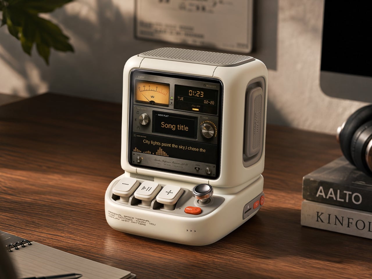
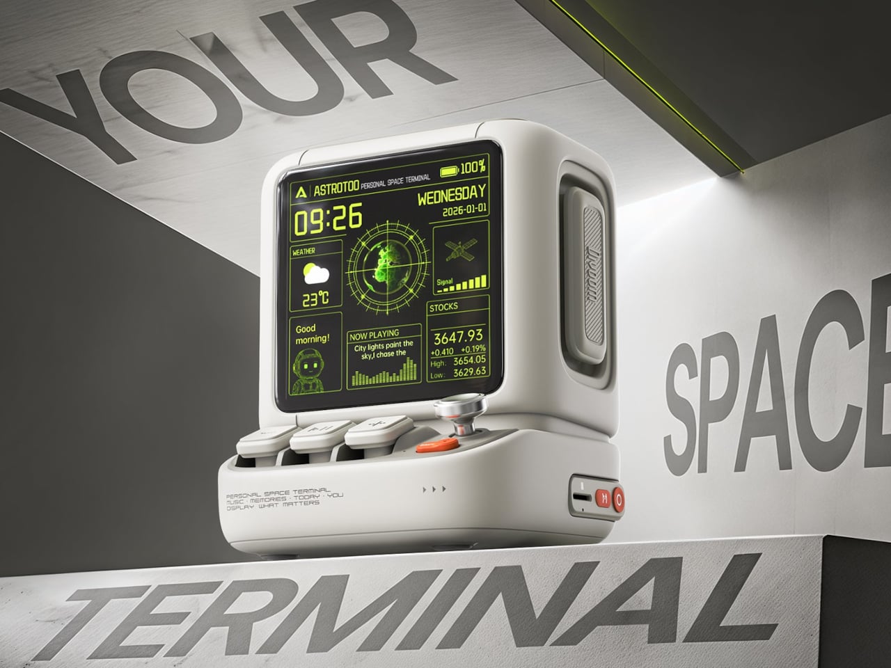
Divoom’s Astrotoo looks like a miniature computer that has escaped the obligation to run spreadsheets. It is a desktop speaker with a 3.95-inch display, physical keys, and a joystick, packaged as a chunky little terminal. The screen can show photos, pixel art, clock faces, and music visualizations instead of staying dark between songs. That combination gives it a role beside Sony’s display: a music accessory with controls that invite a reach across the desk instead of another app.

Customization runs through the Divoom app, so the playful hardware doesn’t remove your phone from the process entirely. Still, choosing a favorite photo or animation gives the object a personal purpose beyond playing audio. Its base measures 106 by 108 millimeters, which is manageable but deserves consideration on a small desk already carrying several gadgets. The real buying question is whether you want a speaker with a visual personality. Sound quality needs listening, and an animated display cannot answer that.

What We Like

  • Physical keys and a joystick provide alternatives to touchscreen controls.
  • Personal photos and artwork give the display a purpose between songs.

What We Dislike

  • Visual customization still involves the app.
  • Another animated screen could compete for your attention.

6. iA Vanishing Line Notebook

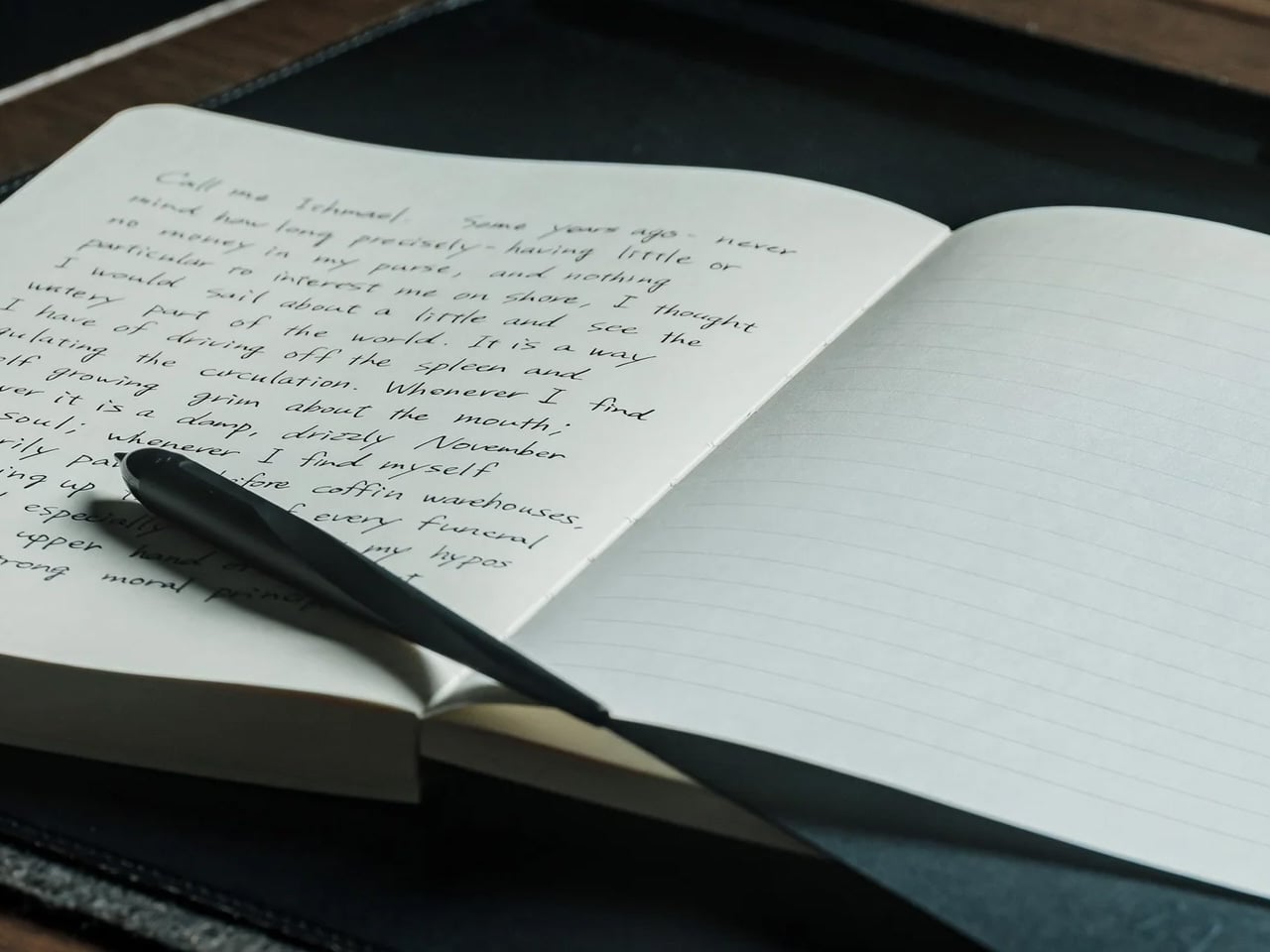
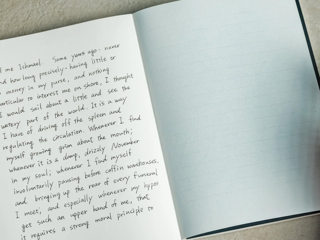
The iA Vanishing Line Notebook makes its most interesting feature less visible as you use it. Instead of conventional printed ruling, it uses watermark guidelines that appear on an empty page and become less noticeable beside darker handwriting. The lines don’t physically disappear, and there’s no special ink involved. It’s an optical contrast effect, designed to leave your words more prominent when you return to read them. That is a thoughtful adjustment to something most notebooks simply take for granted.

The A5 hardcover contains 288 pages of Japanese Araveal White paper and uses thread-sewn binding that lets it open flat. Beside a laptop, it offers space for rough ideas without another window or notification. The 10-millimeter ruling is worth noting if you prefer closely spaced handwriting, and the notebook’s approximately 470-gram weight makes it substantial for daily carrying.

Click Here to Buy Now: $80.00

What We Like

  • Watermarks guide writing without conventional printed lines.
  • Sewn binding lets the book lie flat.

What We Dislike

  • At $80, it’s a premium stationery purchase.
  • Faint guides can be difficult to see in some lighting.

7. MezmoCoin

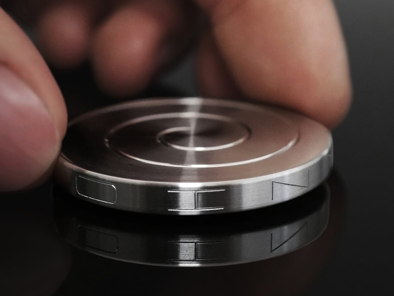
Some desk accessories are allowed to be toys. Designed by Kristoph Krisjans, the original MezmoCoin is a small metal spinner whose surface pattern produces the illusion of a flowing spiral as it rotates. Its flat, coinlike form keeps the object simple, with the movement doing the entertaining.

The appeal here is a break that doesn’t begin by opening another screen. Give the coin a spin, watch the pattern move, and let the action be enough without turning it into a focus exercise. Technique and surface matter: the maker recommends smooth glass for longer rotations and practice to achieve a controlled launch. A clear patch of desk is essential, especially while learning. It gives your hands and eyes something to follow without adding another electronic device to maintain.

What We Like

  • A compact optical illusion with no batteries or app.
  • Its simple form puts the emphasis on movement.

What We Dislike

  • Surface choice and spinning technique affect performance.
  • Current availability of the original coin remains unconfirmed.

8. ExtLine Trash Bin

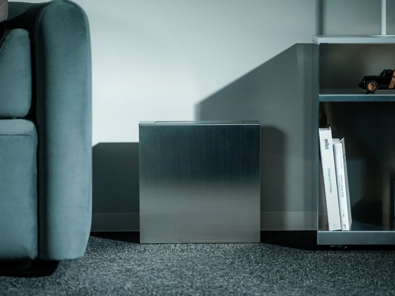
The ExtLine Trash Bin deals with the least photogenic part of a home office by changing its outline. Designed by Yuji Tsukamoto and manufactured by Gendai Kogyo in Japan, the stainless steel bin has a straight body only 110 millimeters wide. It can sit flush against a wall without the familiar flared outline of a typical open wastebasket. A lid rotating around a central pivot conceals the liner and contents when closed, keeping the object from visually dominating its surroundings.

The sharp edges come from a grooving and bending process the shop identifies as Shikaru bending, used to achieve crisper corners than conventional sheet metal folds. That precision matters on an object with very little else to look at. Its capacity is 10.5 liters, making it a modest office bin rather than a household workhorse.

Click Here to Buy Now: $490.00

What We Like

  • Slim body fits along a wall.
  • Closed lid conceals waste and liner.

What We Dislike

  • $490 is a substantial price for a bin.
  • Capacity is limited to approximately 10.5 liters.

Leave Some Room for Yourself

The most useful starting point is the part of your workspace that currently feels borrowed from somebody else. If the lighting is purely functional, choose a lamp you enjoy looking at. If everything happens through a screen, make room for paper or something living. There’s no need to make every object playful. A few deliberate choices are enough to give the room a character that feels recognizably like your own.

Keep the practical limits visible, too. A display may need another device, a plant needs care, and a beautiful bin still needs emptying. Those requirements matter more than how convincing the setup looks in a photograph. The goal is a place where you can work without feeling surrounded by work equipment. Leave enough surface to use the desk, then let the objects you keep there express something beyond your job.

The post 8 Home Office Accessories That Make Your Workspace Feel Less Like Work first appeared on Yanko Design.
  •  

This Tiny House Fits Three Double Beds Beneath a Rooftop Retreat

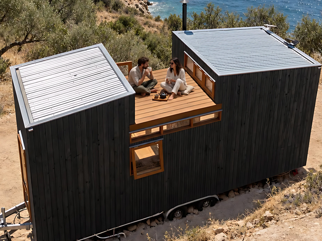
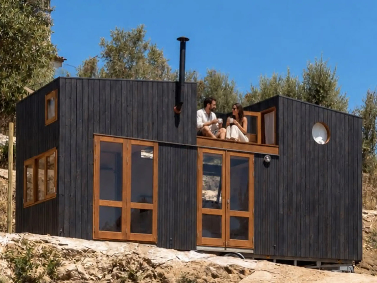
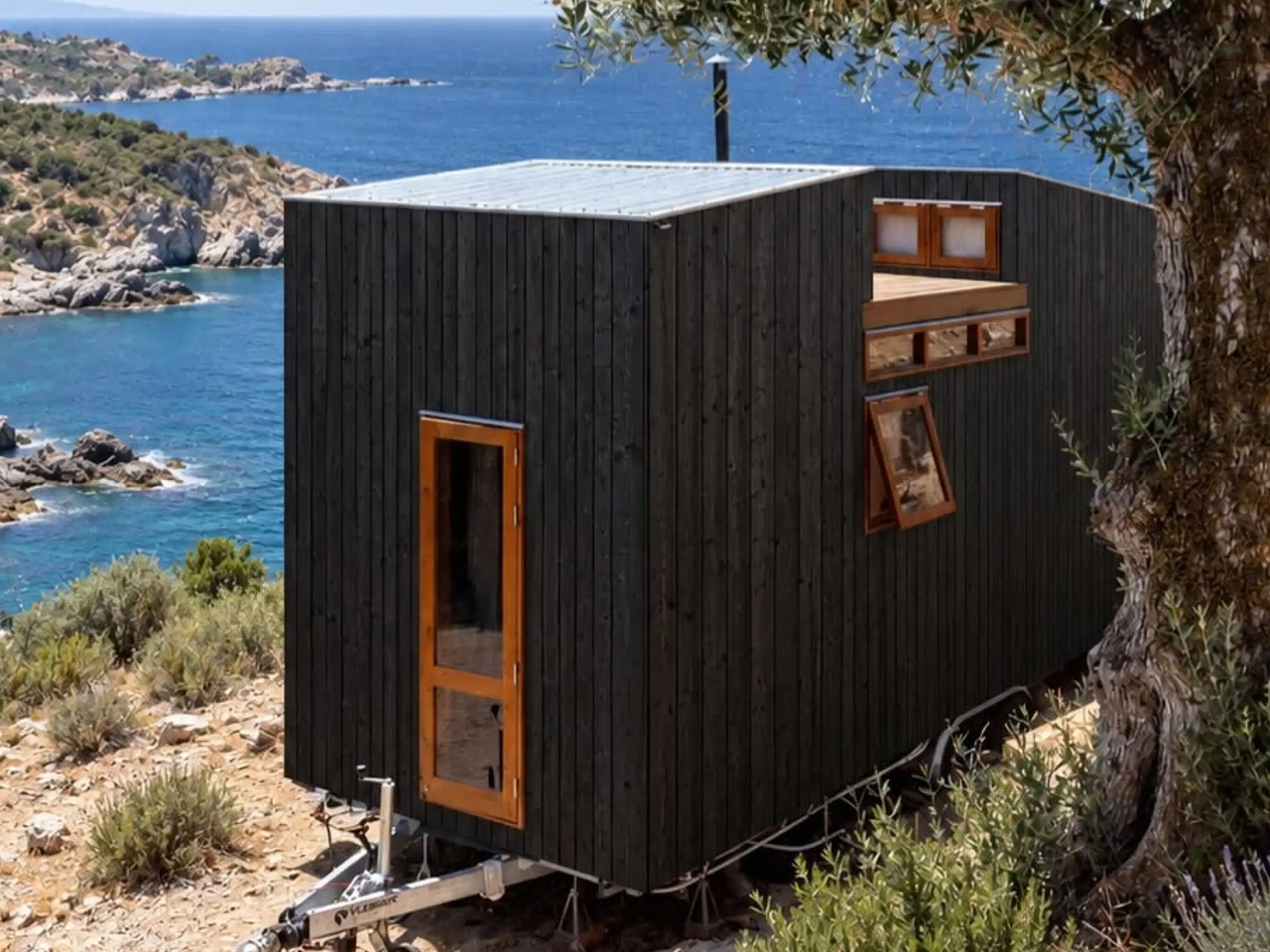
The Tow Côja saves one of its most appealing spaces for the roof. A terrace sits between two raised sections, giving this compact home an outdoor perch without extending its footprint. Designed by Portuguese studio Madeiguincho, the completed tiny house was commissioned by a couple and delivered to southern Spain. It measures 7.2 meters long and sits on a double-axle trailer.

The roof arrangement gives the house a distinctive silhouette, with taller volumes at either end framing the recessed wooden deck. Access comes through one of the sleeping lofts, making the terrace feel more closely connected to the upstairs accommodation than to the main living area. That route is worth noting: stepping outside up here involves passing through a sleeping space, rather than taking a separate exterior stair.

Designer: Madeiguincho

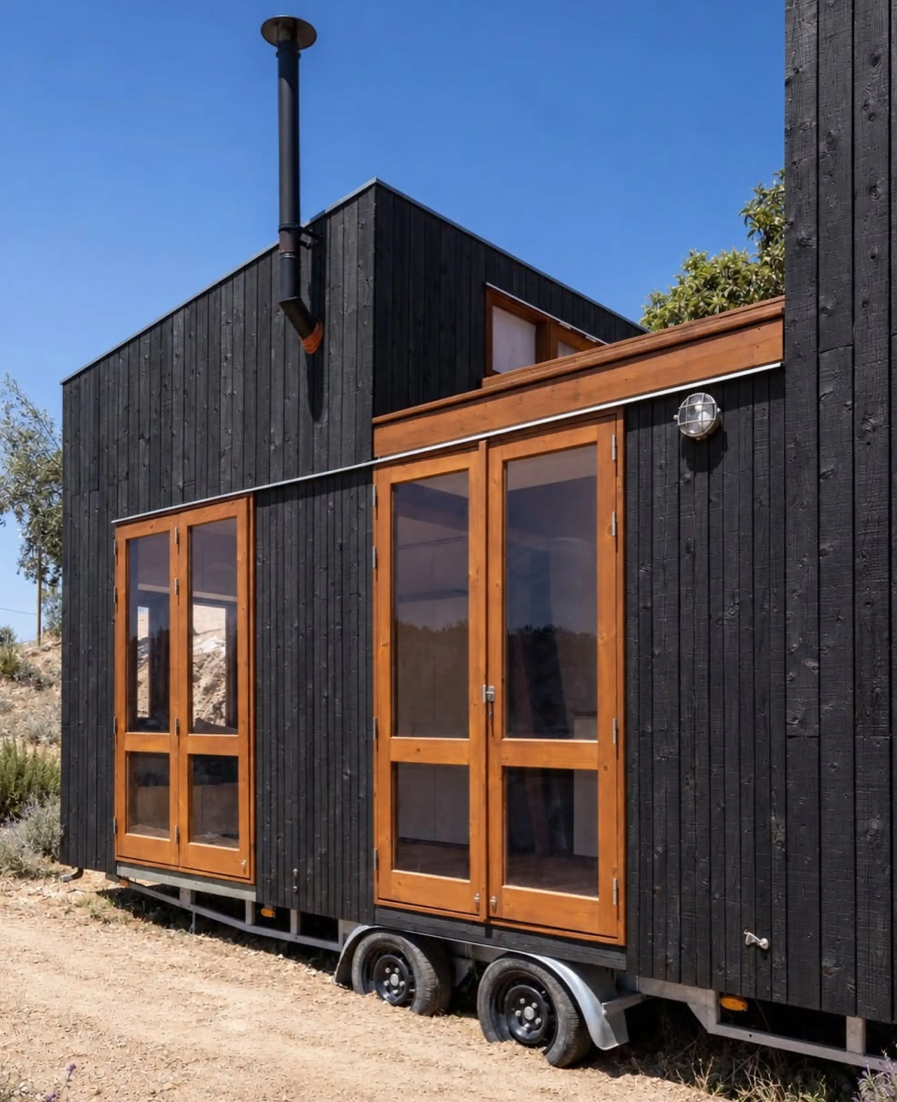
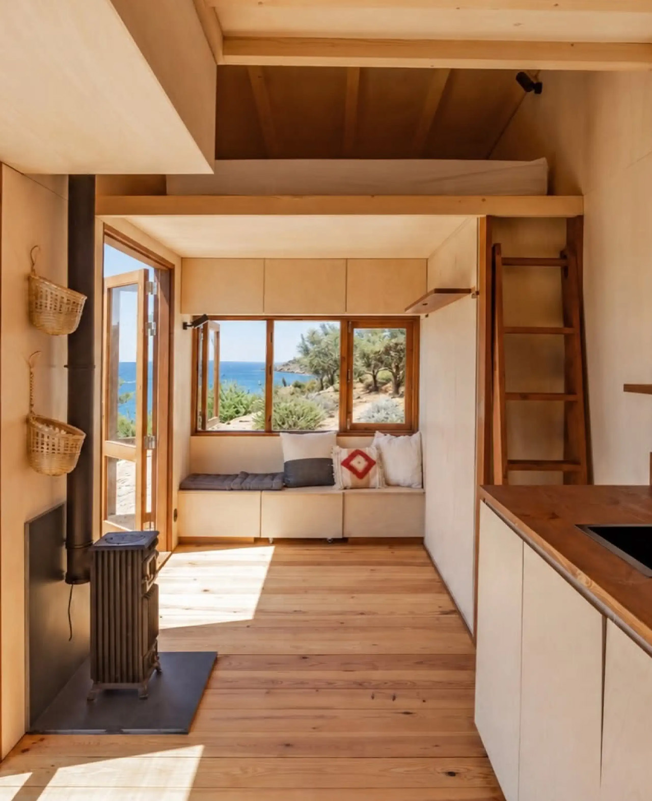
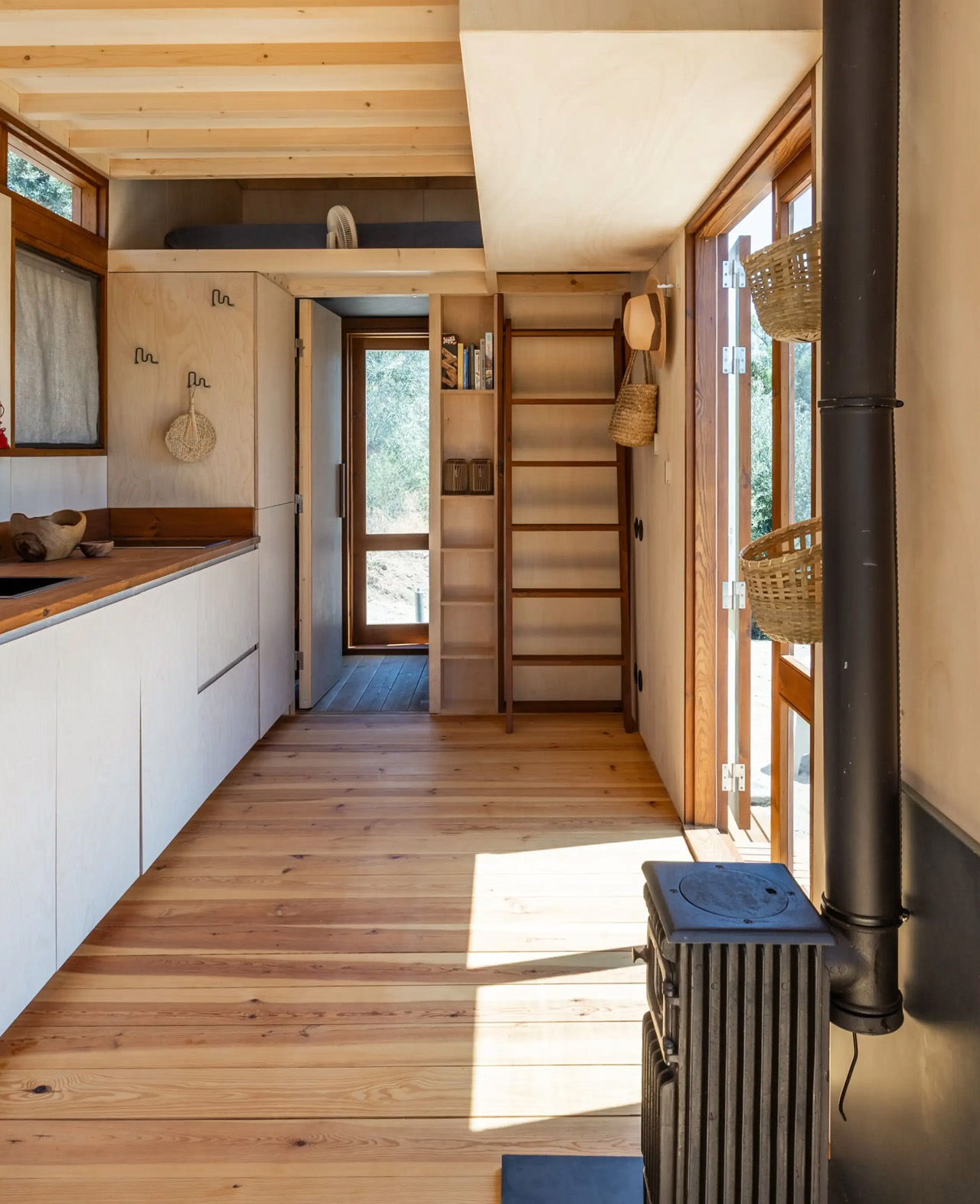
Below, dark timber cladding contrasts with natural wood window frames. Two sets of glazed double doors open the kitchen and living area directly to the surroundings, while a separate bathroom entrance adds another connection outdoors. The openings break up the narrow building’s enclosure, giving its rooms views and access beyond the trailer’s edges. Inside, timber continues across the walls, ceilings, and floors.

The reported interior area is just 17 square meters, or approximately 183 square feet, so the living room has to work more than one shift. A built-in bench incorporates storage, while a Murphy-style double bed folds down from the adjacent wall. Stowed away, it leaves the room available for daytime use. Lowered, it turns that shared space into the home’s third sleeping area.

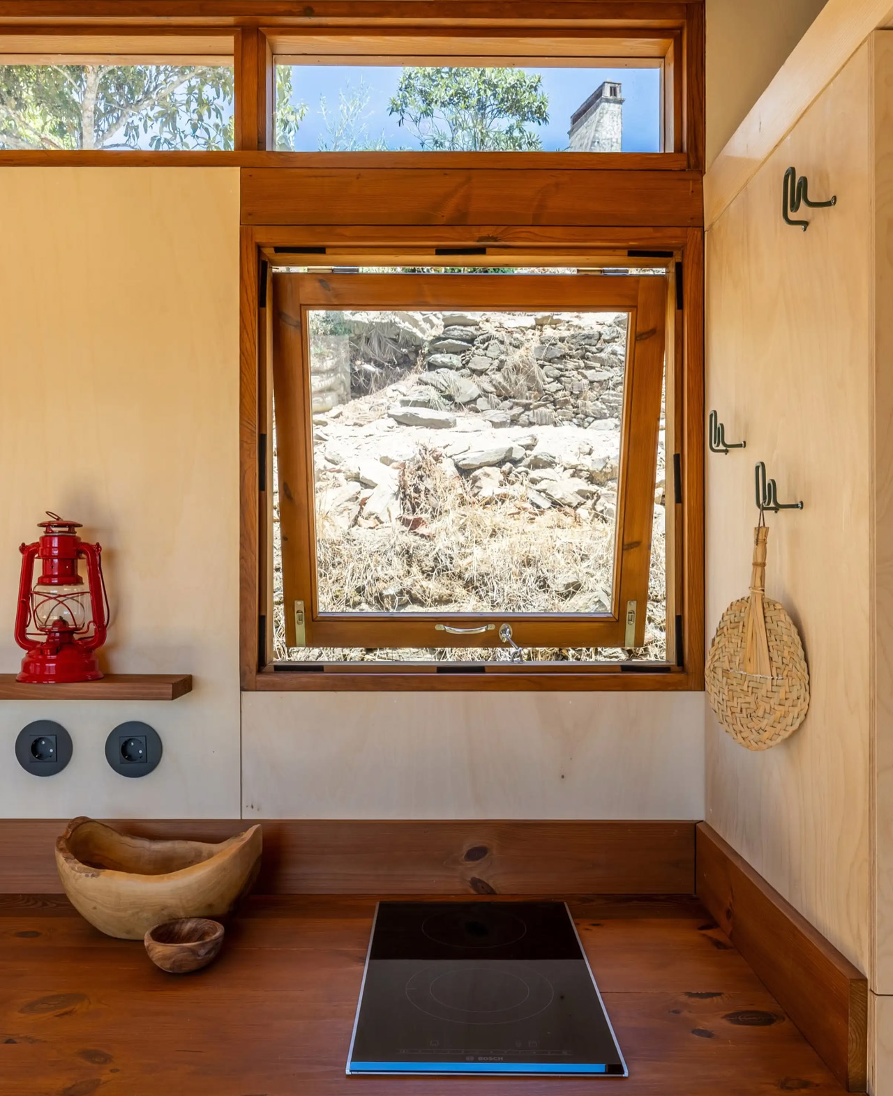
The kitchen occupies the center of the plan, between the lounge and bathroom. Its straightforward arrangement includes an induction cooktop, an inset sink, and a refrigerator concealed within the cabinetry. Open shelves, hooks, and a long ledge supplement the cupboards, keeping frequently used items accessible without requiring every object to disappear behind a door. A compact wood-burning stove stands nearby.

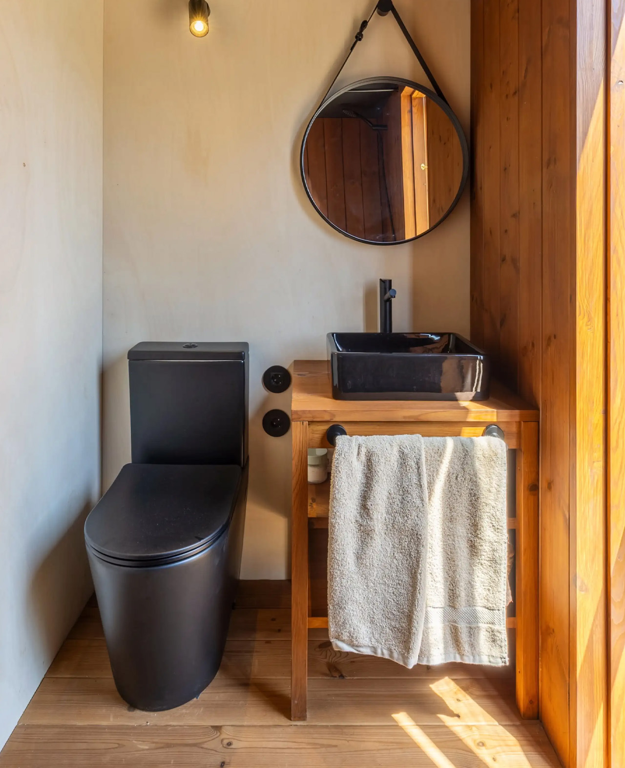
At the opposite end, the bathroom contains a walk-in shower, basin, composting toilet, and storage. Its own glazed exterior door means someone can enter without crossing the kitchen or lounge. Above, two low-ceilinged lofts each accommodate a double bed. Together with the folding bed downstairs, they provide sleeping places for six, though that figure describes bed capacity rather than six people enjoying separate rooms.

That distinction matters in a house this small. The lofts are reached by wooden ladders, and the downstairs bed borrows the living room rather than creating another enclosed bedroom. The terrace offers a useful counterpoint, providing somewhere else to sit when the weather allows. Côja’s strongest move is distributing activity vertically while letting the main floor change roles as the day unfolds.

The post This Tiny House Fits Three Double Beds Beneath a Rooftop Retreat first appeared on Yanko Design.
  •  
❌