Chess Hasn’t Looked Like This in a Thousand Years
![]()
Chess has been redesigned hundreds of times. Most attempts stay within the same visual vocabulary: carved figures, medieval references, stylized horses and crowns. The king still wears his crown, even when the designer strips everything else away. That iconography is stubborn. It follows the game everywhere it goes. Seoul-based designer Lee Jinwook decided not to follow it.
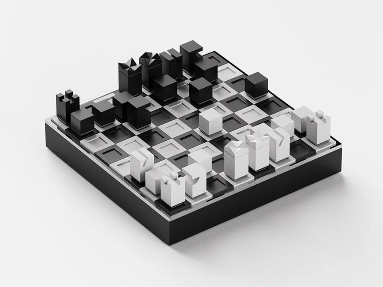
His Chess Matt Edition doesn’t borrow from that history. It doesn’t nod to it, deconstruct it, or pay ironic homage to it. Each piece is reduced to its essential geometric form, differentiated only by the minimal cuts and angles that distinguish one from another. The king wears a notched crown-like geometry, but it reads more like a Brutalist building than a monarch. The bishop has a diagonal slice through its block. The knight, traditionally the most ornamental piece on any board, is just a rectangle with a curved indent. You’d know each piece by its shape, and you’d know each shape by nothing but itself.
Designer: Lee Jinwook
![]()
That restraint is genuinely hard to achieve, and it’s rarer than it looks. Plenty of minimal chess sets still carry the weight of nostalgia by leaning on proportions that echo traditional forms. Lee’s approach feels more rigorous, like the design equivalent of starting with a blank document and refusing to import anything from a previous draft.
The Matt Edition is part of a series, each version produced in a different material. This one uses powder-coated pieces with brushed metal accents along the base. The contrast between the matte surface and the slim metallic band at the bottom of each piece is subtle, but it matters. It gives the set a quiet luxury without announcing it. The board itself doubles as the case cover when flipped, and the entire set packs down into a 115mm cube. That last detail sounds like a footnote but it’s actually the whole point. It means you can take it somewhere. It means the design serves life, not the other way around.
![]()
When the pieces are set up and no one is playing, the board looks like a miniature city. A grid of black and white geometric forms at different heights, each one casting its own small shadow. The intention was for the set to read as sculpture between moves, and it absolutely does. The photograph of it mid-game is more compelling than most things sold specifically as decorative objects.
I’ll admit I’m skeptical of design objects that prioritize aesthetics at the cost of function. A beautiful chair that isn’t comfortable is just a sculpture with pretensions. But this set doesn’t ask you to choose. The geometric forms are readable. The scale feels right for actual play. The packaging is considered down to the way the board flips over. The aesthetics and the utility are working in the same direction, which is what good design is supposed to do, and which a lot of objects in this category fail to deliver.
![]()
What Lee has also built, whether intentionally or not, is a quiet argument about chess itself. The game doesn’t need its medieval costume to function. Strip away the kings and queens and rooks and what remains is a grid, a set of movement rules, and the cognitive pleasure of solving something in real time. The Chess Matt Edition reminds you of that. It separates the game from its accumulated mythology and puts the focus back on the act of playing.
That’s worth paying attention to right now. The design world is saturated with products that perform a cultural identity rather than express one. This chess set doesn’t perform anything. It just is what it is: precise, considered, and fully confident in its own logic. When you see it sitting on a shelf, black pieces against a white board, matte surface catching a little natural light, it earns the space it occupies. Everything fits into a 115mm cube. The whole set sits in your hand. Not everything that fits in your hand deserves to be considered art, but this one comes close.
![]()
The post Chess Hasn’t Looked Like This in a Thousand Years first appeared on Yanko Design.