This $45 Titanium Pocket Knife Uses Centrifugal Force and Neodymium Magnets Instead of A Button Lock
Most pocket knives are designed for the moment you need to cut something. The TiNova II is designed for that moment, but also for the five minutes after, when you find yourself opening and closing it just because the mechanism feels satisfying. That shift in priorities is intentional, and it required Ideaspark to rethink the entire knife after the first version shipped to over 1,300 Kickstarter backers in 2025.
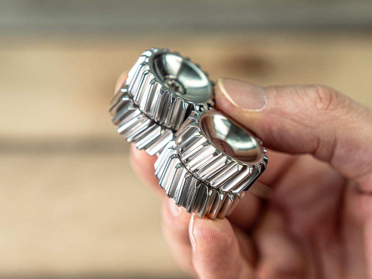
The mechanism itself is straightforward. Two titanium handle scales connect at a single roller bearing pivot point. One scale stays fixed, the other rotates a full 360 degrees around it. Neodymium magnets sit at strategic positions to create resistance, so when the blade swings open or closed, you get a crisp magnetic snap that locks it in place. Flick your wrist and the momentum carries the blade through a smooth rotation with a satisfying ‘click’. Hold it differently and you can coax out a slower, weighted spin. What changed between Gen 1 and Gen 2 is the body shape. The original had flat sides and sharp edges like a traditional folding knife. The TiNova II uses an oval profile that matches the natural curve your hand makes when your fingers relax into a loose fist. That single geometry change makes the knife feel completely different when you’re holding it, which matters when the whole point is creating something you’ll keep picking up. The magnetic resistance is tuned tight enough to keep the blade from accidentally deploying in your pocket, but smooth enough that you can flip it open one-handed without effort.
Designer: Ideaspark
Click Here to Buy Now: $49 $70 (30% off). Hurry, only 64/100 left! Raised over $62,000.
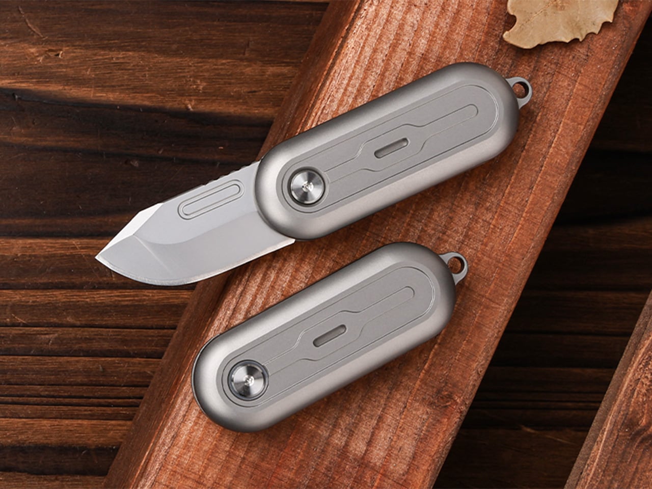
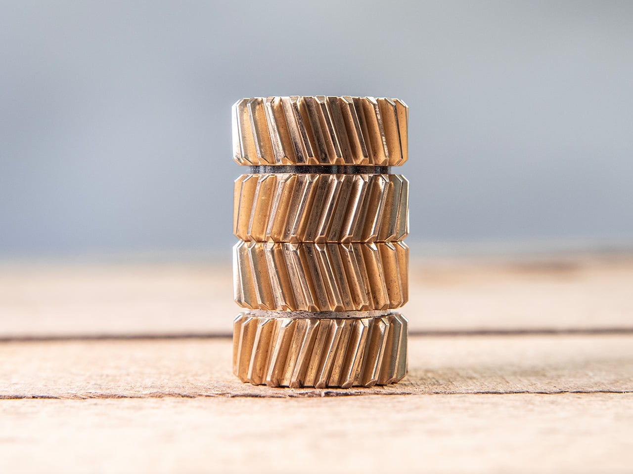
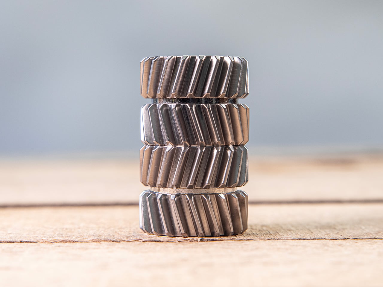
The handle scales are machined from Grade 5 titanium, the aerospace alloy that shows up in everything from jet engine components to high-end bike frames. The material delivers the strength-to-weight ratio you’d expect (the entire knife weighs 59.3 grams, roughly two U.S. quarters), but the more interesting property is how it wears. Titanium doesn’t corrode, rust, or tarnish the way steel does. Instead, it develops a patina over time, recording scratches and scuffs as a visual history of use. Every mark becomes permanent, which means the knife you carry for a year looks distinctly different from the one that arrived in the mail. Ideaspark leans into this with two finish options: a raw sandblasted titanium that shows wear immediately, and a black PVD coating that creates higher contrast when the underlying metal starts to peek through.

The blade is D2 tool steel, heat-treated to HRC 58-60. D2 sits in an interesting zone within the steel hierarchy. It holds an edge longer than most budget steels (think 8Cr13MoV or AUS-8), and is a go-to choice for premium knives. The choice here makes even more sense for a keychain knife where you’re cutting tape, breaking down cardboard, trimming threads, or slicing through packaging, with practically negligible wear and tear over time compared to a knife that experiences the brunt of rugged outdoor use. The blade profile is a drop-point with a full belly, which gives you a long cutting edge relative to the 40.5mm blade length. The curve naturally guides material into the sharpest part of the edge, making it effective for slicing motions even when you’re working with something as small as this.

At 64.4mm closed, the TiNova II is shorter than a standard credit card (85.6mm). Opened, the entire knife measures 100mm, just under four inches. The thickness is 12.4mm, slimmer than a stack of three coins. These dimensions put it squarely in the micro-folder category alongside knives like the CRKT Pilar or the Kershaw Chive, but the deployment method sets it apart. Most compact folders use a flipper tab or a thumb stud, mechanisms that require deliberate engagement. The TiNova II uses rotational momentum, which feels closer to spinning a fidget toy than opening a knife. The roller bearing does most of the work. Ideaspark uses what they call a Kugellager bearing (the German term for ball bearing), which is a pretty great way of saying their precision-made bearings boast the kind of well-engineered frictionless movement you’d expect from the Germans. The result is a glide that feels even smoother than air, with no grinding or resistance as the handle rotates.

The magnetic system does several jobs simultaneously. First, it holds the knife closed when it’s in your pocket, preventing accidental deployment. Second, it provides tactile and audible feedback at both the open and closed positions, giving you a satisfying click that confirms the blade is locked. Third, it creates just enough resistance during the spin to make the motion feel controlled rather than loose. The magnets are arranged to pull at the end of each rotation, which is why the knife doesn’t just spin freely like a bearing on a shaft. You feel the mechanism working with you, and that feedback loop is what makes the fidget factor so addictive. The physics here are simple but effective. The magnetic force increases as the scales approach their final position, so the last few degrees of rotation feel like they’re being pulled into place.
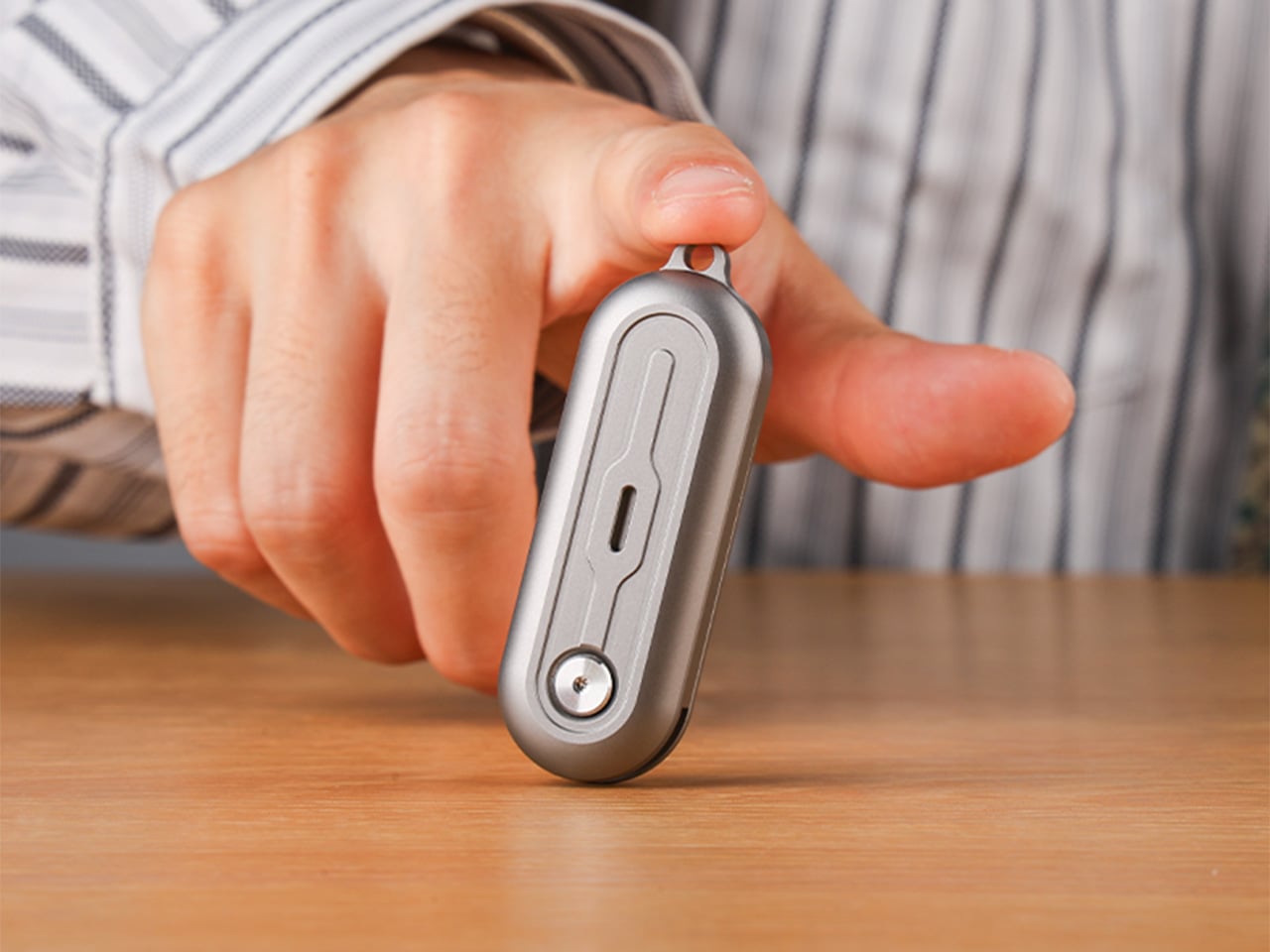
An elliptical body shape means there’s no fixed orientation when you’re holding it. You can rotate the knife in your palm, flip it between fingers, or just run your thumb along the curved surface. The absence of sharp edges or defined corners makes it comfortable to manipulate for extended periods, which sounds trivial until you compare it to a traditional rectangular folder that starts digging into your hand after a few minutes. Ideaspark claims this design philosophy came directly from user feedback on the Gen 1 model, where backers loved the mechanism but found the angular body uncomfortable during long fidget sessions. The oval profile solves that problem by removing pressure points entirely.

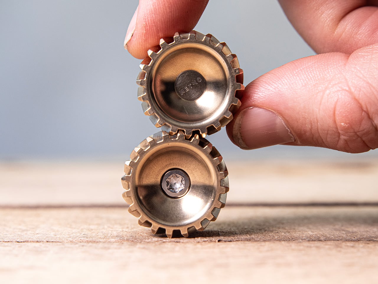
Two tritium slots run along the length of each handle scale, sized for 1.5mm x 6mm tubes. Tritium is a self-luminous isotope that glows continuously for around 25 years without batteries, charging, or external light. Drop a pair of green, blue, or orange vials into those slots and the knife becomes visible in complete darkness, which is useful for finding it in a bag or on a nightstand. The glow is subtle, not the kind of thing that lights up a room, but enough to catch your eye when you’re fumbling around in the dark. The tritium slots also add a small visual detail that breaks up the otherwise minimal design.

The blade deployment works two ways depending on how you hold it. The long spin involves gripping one handle scale and flicking your wrist, which uses centrifugal force to carry the other scale through a full 360-degree rotation. The motion is slow, weighted, and deliberate. The short flip is faster: a quick wrist snap that sends the blade open with a crisp tick as the magnets engage. Both methods work one-handed, and both feel satisfying in different ways. The long spin has a hypnotic, rolling quality. The short flip is sharp and immediate. You’ll find yourself alternating between them depending on your mood or how much time you’re killing during a meeting.
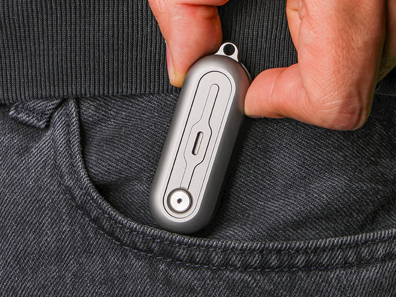
The knife comes with a keychain hole at one end, sized for a standard split ring. Slip it onto your keys and it disappears into the cluster, weighing less than most car fobs. The compact dimensions mean it works equally well on a wallet chain, a backpack strap, or worn as a necklace pendant if you’re leaning into the EDC-as-jewelry aesthetic. The tritium glow makes it viable as a functional piece of illuminated jewelry, though calling it that probably annoys traditional knife collectors who prefer their folders utilitarian and unadorned.

The TiNova II ships in two finishes: sandblasted (raw titanium) and black coated (PVD). Both finishes come with the same lifetime warranty, which covers manufacturing defects and structural failures. The knife is available now starting at $45 for the launch day special (36% off the $70 MSRP), with free worldwide shipping included. International shipping is scheduled for August 2026.
Click Here to Buy Now: $49 $70 (30% off). Hurry, only 64/100 left! Raised over $62,000.
The post This $45 Titanium Pocket Knife Uses Centrifugal Force and Neodymium Magnets Instead of A Button Lock first appeared on Yanko Design.


 Bang & Olufsen has been designing objects that make a room better simply by existing in it since 1925.