Wallpaper serves both aesthetic and functional purposes, it not only creates a focal point but also adds color, texture, and pattern to the room décor. When designing any space, wallpapers are a popular and versatile way to decorate and add value to the interiors but avoiding errors is key. Therefore, it is important to measure accurately, handle the wallpaper carefully, and allow proper drying time for flawless results. Classic patterns like stripes or florals suit traditional settings, while geometric or abstract designs lend a modern touch. With a wide range of colors, patterns, and textures, wallpaper can suit any style and can simultaneously conceal the imperfections on the walls.
Image courtesy of: bialasiewicz
During the installation of wallpaper, make sure to handle the wallpaper carefully to avoid any form of damage. Note that mishandling can lead to tears, creases, or other unsightly damage. Use clean, dry hands and gently unroll and unfold the wallpaper. Be cautious of liquids near the wallpaper and avoid excessive stretching or pulling to maintain pattern integrity.
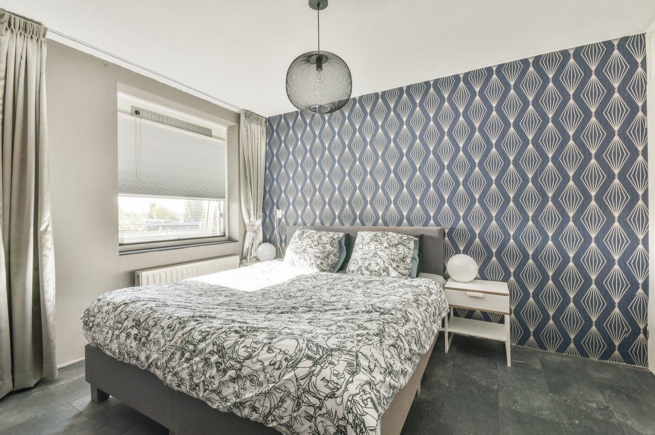
Image courtesy of: pro_creator
Here are several common mistakes that occur during wallpaper installation.
Mistake No. 1: Avoid Papering Over Old Wallpaper
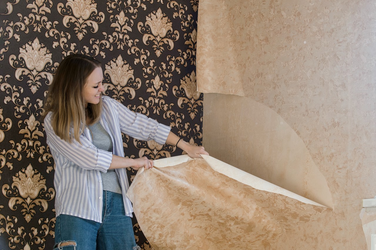
Image courtesy of: olgar23
It is crucial to remove the old wallpaper before any new application. Moisture from the new wallpaper’s backing could reactivate the adhesive of the original, resulting in bubbling those damages both layers. To avoid this, rent a chemical or power steamer to strip away the existing wallpaper, readily available at local hardware, paint, and home improvement stores.
Mistake No. 2: Not Choosing the Right Wallpaper Material
Image courtesy of: pro_creator
Image courtesy of: KarinaBost
Each wallpaper type has its ideal setting, as not all wallpapers are suitable for every location. For example, natural wallpapers like grasscloth are not water-repellent, making them susceptible to damage in high-humidity areas like kitchens and bathrooms or fading in direct sunlight. Additionally, it is important to safeguard wallpaper from heat sources like ranges or fireplaces and research the best wallcovering for each specific environment to prevent damage. The different types of wallpaper materials include metallic, vinyl, paper-backed fabrics like silk and linen, hand-painted wallpaper, and grasscloth wallpaper. Choose the one that is best suited for your home or any other area of application.
Mistake No. 3: Wrong Scale and Print of Design
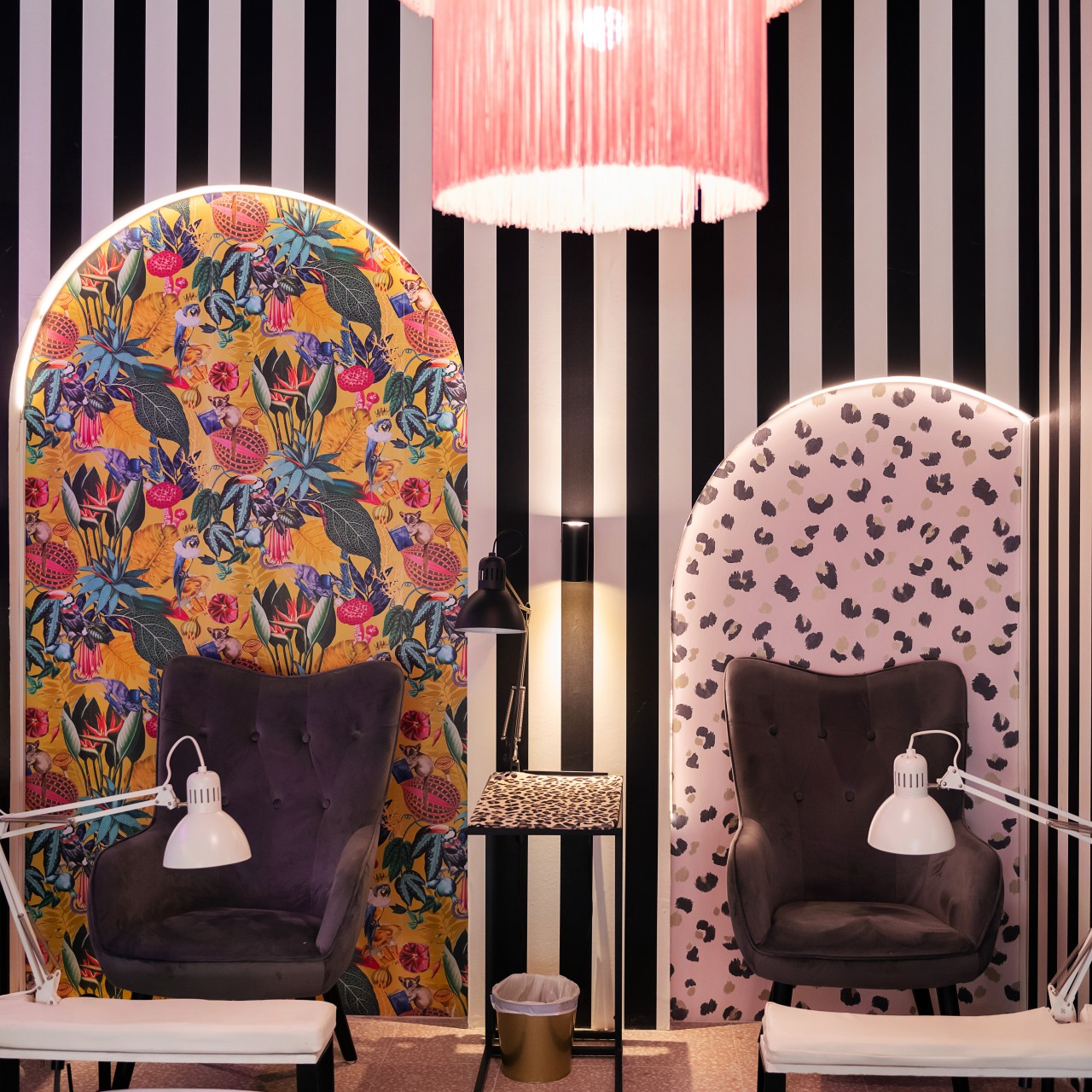
Image courtesy of: Raul_Mellado
When choosing wallpaper, consider the size of the prints carefully. Small prints work well in small spaces, providing a smart look without overwhelming. Conversely, larger spaces benefit from larger-scale patterns, as small patterns may impart a pixelated look and blend into the background. After the installation of the wallpaper, retaining leftover wallpaper pieces is crucial for repairing any damages that may occur. Make sure to keep the extra pieces for future repairs, as finding exact matches later can be tricky.
Mistake No. 4: Ordering Less Quantity of Wallpaper
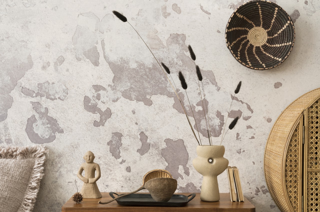
Image courtesy of: FollowTheFlowStudio
Accurate measuring and planning before wallpaper installation is crucial for purchasing the right amount. Despite the high cost per foot, there’s a tendency to order only the minimum needed. Underestimating the quantity of wallpaper often leads to delays and potential color mismatches, especially with hand-painted or printed patterns. Prioritize precise measurements of wall dimensions, considering pattern matching and trimming.
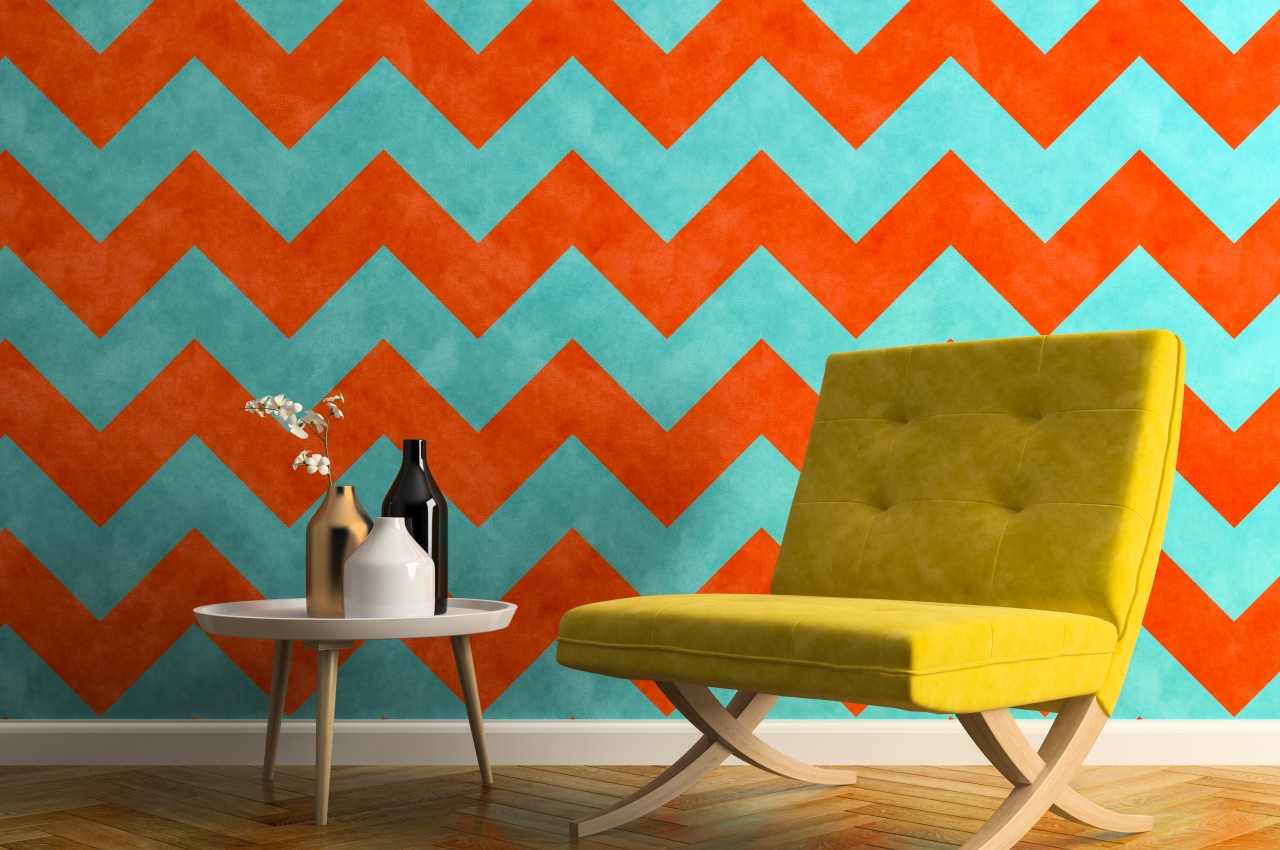
Image courtesy of: hemul75
Pro Tip: Another mistake is purchasing wallpaper rolls before measuring the walls, leading to overspending or acquiring insufficient quantities. Therefore, it is important to measure the wall beforehand to ensure the correct size is used and to streamline the process. Note that the more the number of doors and windows, more is the wastage especially if the wallpaper has a patterned design.
Mistake No. 5: Unmatched Seams
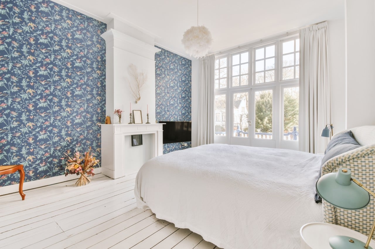
Image courtesy of: pro_creator
Misaligned seams are a common wallpaper installation issue, often caused by factors like incorrect adhesive usage or inadequate leveling of the first panel. To avoid this eyesore, prioritize arranging straight, even seams during installation for a polished, professional finish. Additionally, choosing the right wallpaper adhesive is crucial for a smooth installation. Different types of wallpaper require different pastes, so follow the manufacturer’s recommendations. Using the appropriate adhesive ensures proper adhesion and prevents issues like peeling or bubbling. It is important to invest time in precise alignment, utilize tools like plumb lines for straight application, and ensure seams are tightly joined for a flawless finish.
Mistake No. 6: Installation on Damaged Walls
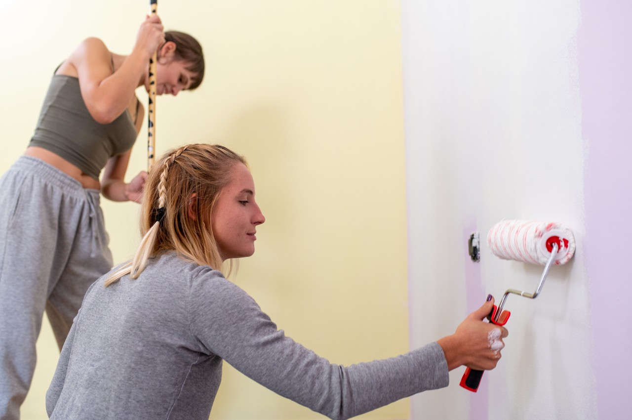
Image courtesy of: MandriaPix77
Before installation of wallpaper, inspect the wall for damage or moisture issues and fix any problems beforehand to ensure a durable and flawless installation. Defects like cracks, peeling paint, damp areas, and patching holes need to be addressed and they should be allowed to cure fully before smoothing with sanding if needed. Make sure to rectify sources like leaks or mildew before proceeding with installation. Prioritize surface preparation before wallpaper installation. Don’t overlook cleaning, especially for textured walls, which may require scraping for smoothness.
Mistake No. 7: Assuming Wallpaper Adheres to All Wall Surfaces
Image courtesy of: bialasiewicz
Assuming wallpaper sticks to all wall surfaces is a common mistake. Textured walls like orange peel or popcorn should be avoided or prepared for installation by grinding, sanding, and priming. Note that primer is essential not only before wallpapering but also before painting to prevent wallpaper from peeling off poorly painted walls.
Mistake No. 8: Going the DIY Way
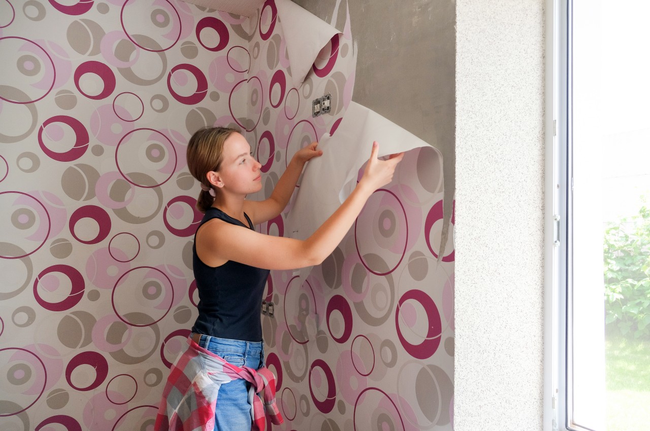
Image courtesy of: ShintarTatsiana
While many mistakes occur during wallpaper installation, it’s not an area to cut corners. Amateur installation can lead to costly errors and premature replacement. Even peel-and-stick wallpaper isn’t foolproof. To avoid DIY mishaps, designers recommend hiring experienced professionals for proper wall preparation, precise measurements, and steady installation. Try to rely on professionals for a flawless result, emphasizing the investment in quantity and expertise required for satisfactory outcomes.
Tip: If opting for a DIY approach, prioritize cleanliness and dust prevention for a seamless installation. Invest in proper equipment and adhere to organized schedules to minimize dust settling, avoiding compromised adhesion. Practice careful handling and ensure clean hands to prevent marks on the wallpaper.
Mistake No. 9: Presence of Air Bubbles
Image courtesy of: DC_Studio
Bubbling in wallpaper, caused by trapped air pockets or poor adhesion, is a common issue. To remove bubbles, locate and cut an opening, inject adhesive, and flatten with a smoothing tool. Prevent bubbling by using high-quality wallpaper, applying it carefully, and using a wallpaper primer for a smooth surface. Promptly addressing bubbles and taking preventive measures can maintain a smooth finish.
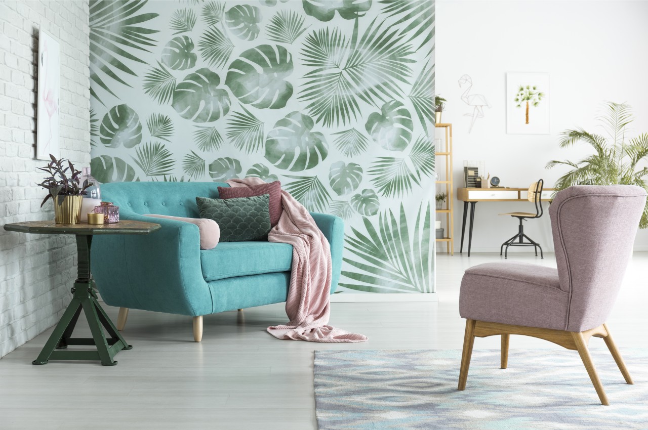
Image courtesy of: bialasiewicz
Tip: For smooth wallpaper application and prevention of air bubbles, start smoothing from the center outward, and if bubbles appear after drying, moisten the area and puncture the bubble to release air.
Mistake No. 10: Not Cleaning Wallpaper After Installation
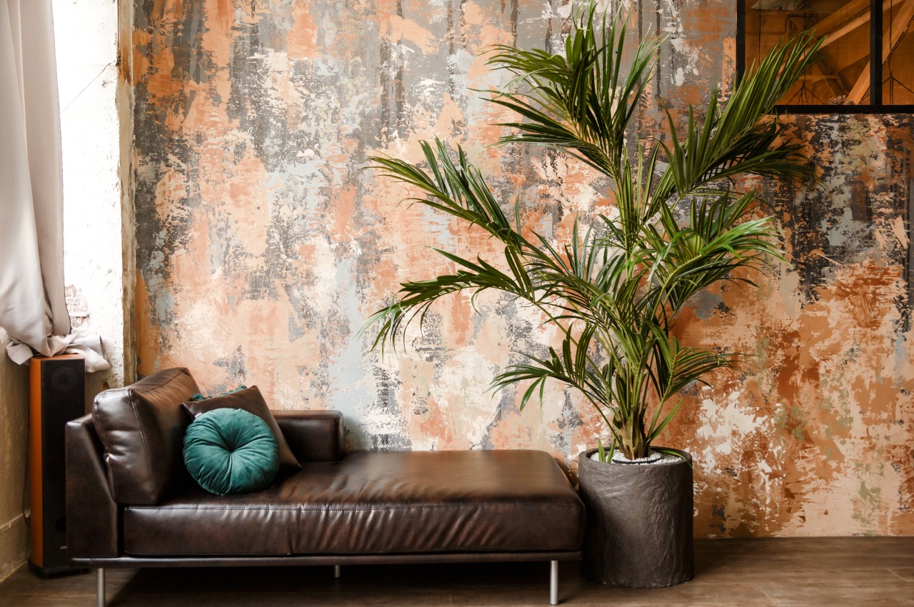
Image courtesy of: Vladdeep
Once the wallpaper is applied, make it a point to promptly inspect and clean any areas with excess paste residue to prevent shiny spots. Use a clean bucket with fresh water and a damp sponge to wipe down the wallpaper immediately after completion. It’s essential to consult the wallpaper label for specific instructions on smoothing and cleaning based on the type of finish.
Image courtesy of: pro_creator
In conclusion, installing wallpaper requires careful attention and time, and rushing the process can lead to errors. Ensure accurate alignment, trimming, and adherence to manufacturer’s instructions. Avoid common mistakes like inadequate wall preparation and mishandling. With precision and quality materials, one can achieve a seamless and attractive result that reflects your taste and style.
The post Top Ten Wallpaper Installation Mistakes To Avoid first appeared on Yanko Design.