Vue lecture

Il y a de nouveaux articles disponibles, cliquez pour rafraîchir la page.

Yeedi C12 Combo Review: The Ultimate Robotic Cleaner with a Handheld Vacuum and Mop
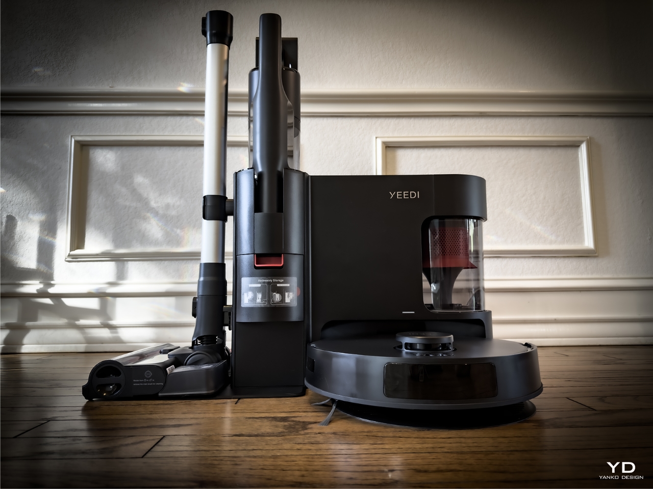
The Yeedi C12 Combo is a cleaning companion designed to handle household messes effortlessly. Picture this: instead of rushing around the house, switching between the broom, dustpan, and mop, the C12 Combo quietly goes about its work, cleaning with precision like the silent, efficient partner it’s meant to be. You’ve got other things on your mind—getting that last-minute report done for work, or maybe just a rare few minutes of peace while the kids are occupied—but your floors? Those are taken care of.

PROS:


  • Best value for powerful, multi-functional home cleaning.

  • Long battery life ensures uninterrupted, comprehensive cleaning.

  • Anti-tangle technology minimizes maintenance hassle.

  • Effortlessly transitions between different floor types.

  • Compact design fits seamlessly into home spaces.

CONS:


  • Obstacle avoidance could be improved for more precise navigation.

  • Households with pets that shed will require frequent manual cleaning of the dustbin for optimal performance.

  • The robotic vacuum cleaner lacks integration with mopping feature.

RATINGS:

AESTHETICS
ERGONOMICS
PERFORMANCE
SUSTAINABILITY / REPAIRABILITY
VALUE FOR MONEY

EDITOR'S QUOTE:

Effortless cleaning, precise performance, flexibility, and unbeatable value—Yeedi C12 Combo makes every corner of your home spotless.
award-icon

Designer: Yeedi

Click Here to Buy Now: $649.99 $899 (28% off). Hurry, this deal ends soon!

Yeedi C12 Robotic Vacuum

There’s something comforting about knowing the dust is handled without bending down or wrestling with a clunky vacuum, especially when multitasking. The C12 Combo is ready for action, no questions asked. It tackles dog hair, crumbs from the kids’ latest snack attack, and more. It fits into your life without adding any more stress. You don’t have to worry about tangled hair, adjusting settings for different surfaces, or even remembering to empty the dustbin daily.

With this multi-functional whole house cleaning machine, you’re not left guessing how it works, either. It’s straightforward, and more importantly, it’s smart. It knows when to clean and how to do it. The real beauty? You’re still in control—but with much less effort.

Design: Where Function Meets Familiarity

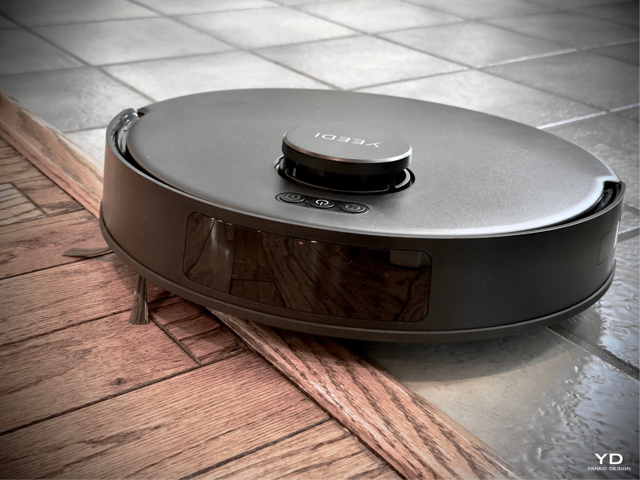
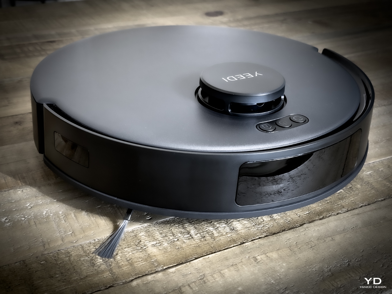
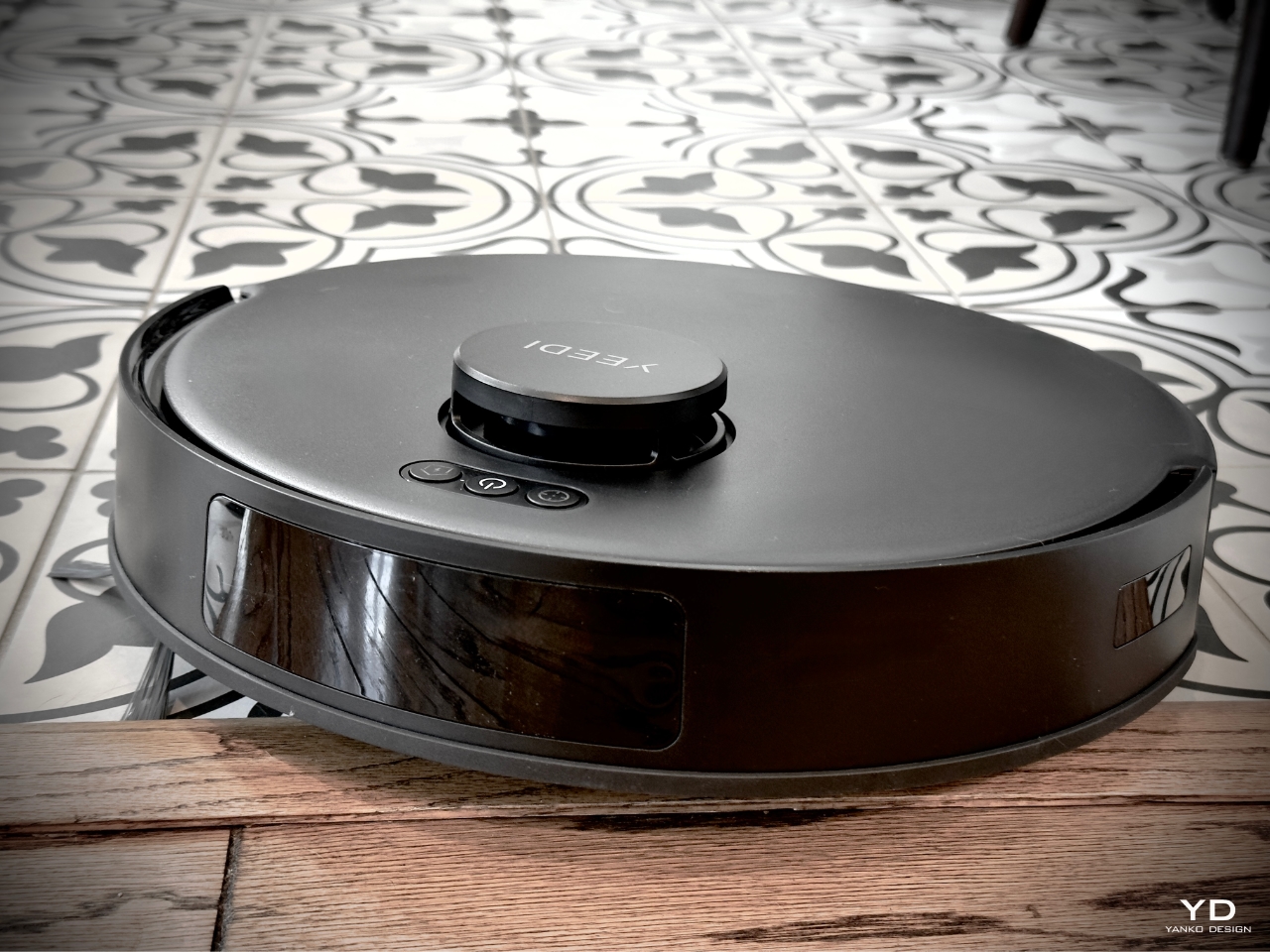
At first glance, the Yeedi C12 Combo screams, ‘I’m all business’—focused entirely on getting the cleaning done. It’s sleek, unassuming, and fits right into your home, no matter if it’s a cozy apartment or, in my case, a sprawling 4,100-square-foot ranch home with a mix of flooring types—tile in the kitchen, 35-year-old original hardwood in the living areas, carpet in the bedrooms, and old tiles in the sunroom. It will take a smart robotic vacuum cleaner or a combination of a handheld and robotic one to keep this house clean.

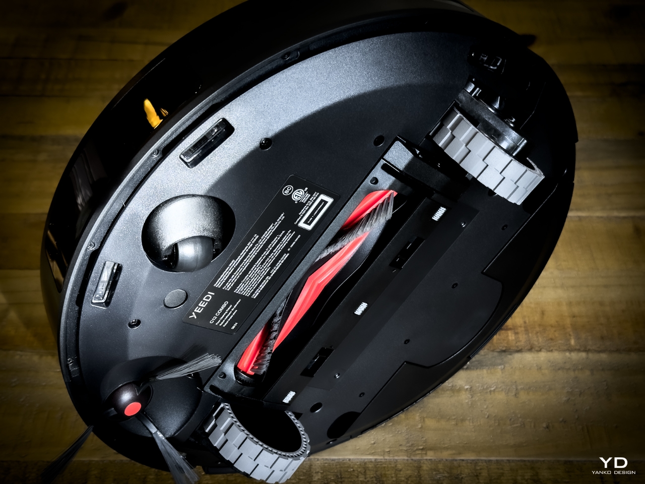
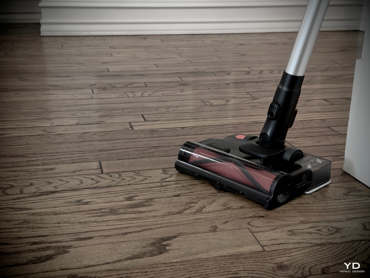
But don’t let its minimalism fool you. The C12 Combo was built to sit effortlessly in a corner while delivering outstanding performance, with thoughtful design elements that enhance usability. The removable comb teeth on the ZeroTangle 2.0 floor brush make maintenance a breeze, and the Crevice Tool and 2-in-1 Dusting Brush make cleaning tight spaces and delicate surfaces simple and effective. For example, when you’re cooking dinner and knock over a jar of flour, instead of dragging out a full vacuum, you can grab the handheld from its dock and clean up the mess in seconds.

The cordless handheld vacuum component is lightweight and easy to maneuver. When you’re tired or your schedule is packed, you don’t want a clunky vacuum that’s heavy or hard to use. You want something you can pull out and get the job done quickly, with minimal hassle. The flexible design allows you to reach those pesky corners, under the couch, and even high spots like curtains without missing a beat.

The automated unit seamlessly transitions between different floor types—hardwood, carpet, and tiles—without manual adjustments. The integration of handheld and robotic components ensures you don’t need to swap out attachments constantly. It’s efficient and doesn’t waste your time, precisely what a vacuum should do.

Ergonomics: Cleaning Without the Backache

The C12 Combo prioritizes comfort and ease. No one likes the strain of bending over to switch vacuum settings or dealing with outlets as you move from room to room. The C12’s cordless design eliminates these hassles, allowing you to move freely throughout your home without interruption. The handheld vacuum is lightweight and easy to maneuver, with a comfortable handle that ensures no awkward angles or backaches.

The handheld component excels at quick clean-ups and reaching tricky spots. It fits snugly in your hand and is balanced perfectly for tasks like vacuuming crumbs after movie night or tackling cobwebs in high corners, making cleaning less of a burden.

Swapping between the handheld vacuum and the robot is as simple as docking the handheld back into its charging station, where it’s always ready for the next task. Instead of choosing between devices, I often multitask—using the handheld for focused cleaning while the robot cleaner works its way through the rest of the house. It’s so easy that cleaning starts feeling less like a chore and more like a quick, manageable task you can knock out without losing steam.

Performance: Power Meets Precision

The Yeedi C12 Combo doesn’t just look good—it delivers. This machine is powerful where it counts. The handheld vacuum delivers 95AW suction power (Air Watts), which represents how effectively it can pick up dirt and debris, ensuring even the dirt trapped deep within carpets doesn’t stand a chance. Combine that with the 10,000Pa suction power from the robot vacuum, and you’ve got a dynamic duo capable of handling even the messiest floors.

The real genius lies in the ZeroTangle 2.0 Technology. If you’ve ever fought with vacuum brushes clogged with hair, you’ll appreciate how the C12 handles this common issue. Its advanced anti-tangle design includes 45-degree V-shaped bristles, a high-speed cyclone to guide hair toward the center, and a removable comb to make cleaning easy. Be it pet hair, long human hair, or fibers from rugs, this feature keeps everything running smoothly without the hassle of constant brush cleaning. Plus, the LED headlight on the ZeroTangle floor brush helps ensure you don’t miss any dust or debris, even in dimly lit areas.

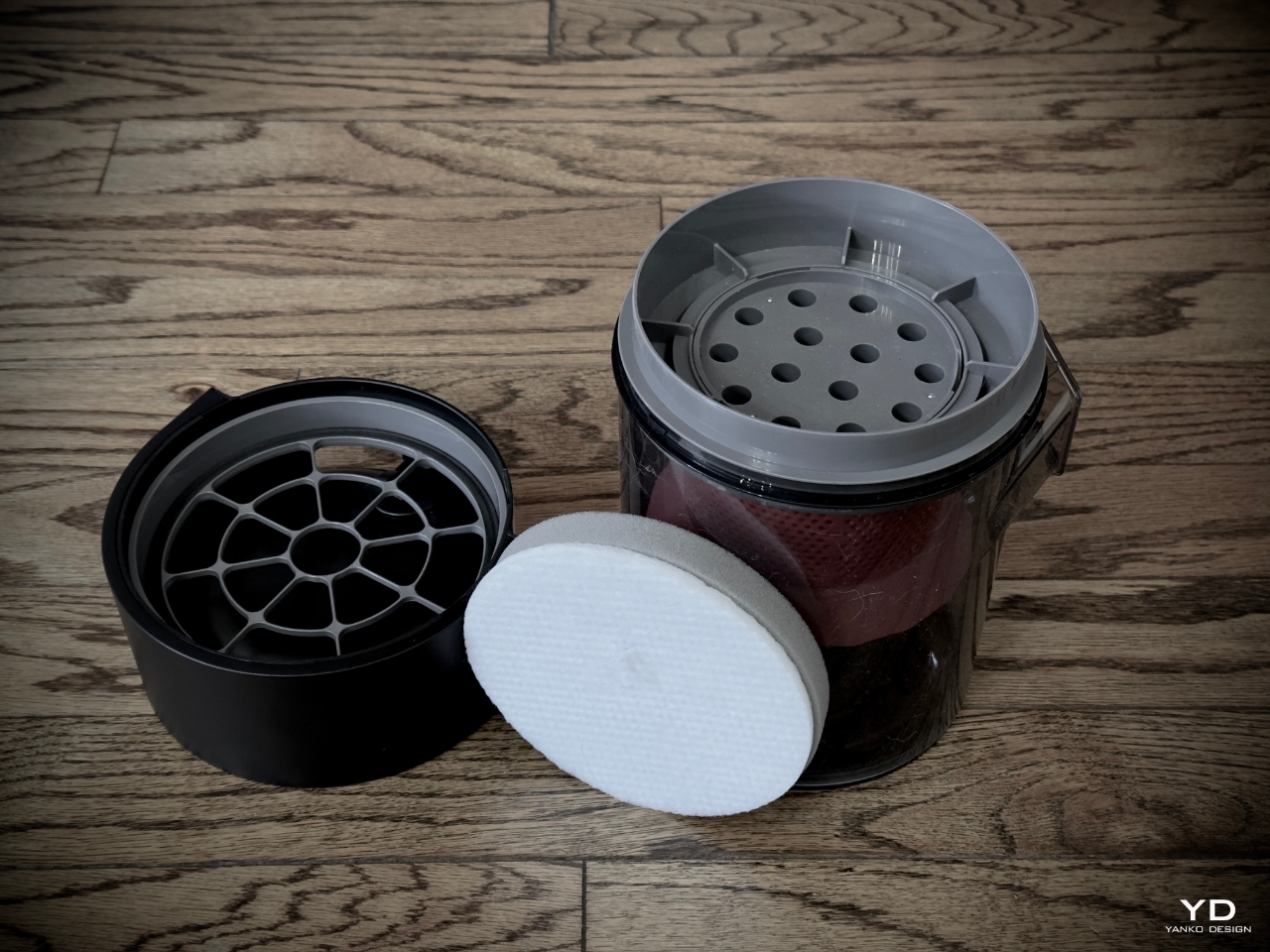
The Full-Path Self-Cleaning System ensures the HEPA filter stays clean, maintaining peak suction power without manual maintenance. This means consistently powerful performance over time.

TrueMapping Technology supports quick mapping and multi-floor map management and saves up to four maps, making it efficient for homes with multiple levels. It can quickly map 100 square meters in 8 minutes, plan the best cleaning route, and avoid obstacles like furniture and toys. The bottom-view sensor also recognizes steps to prevent falls, ensuring safe navigation on stairs.

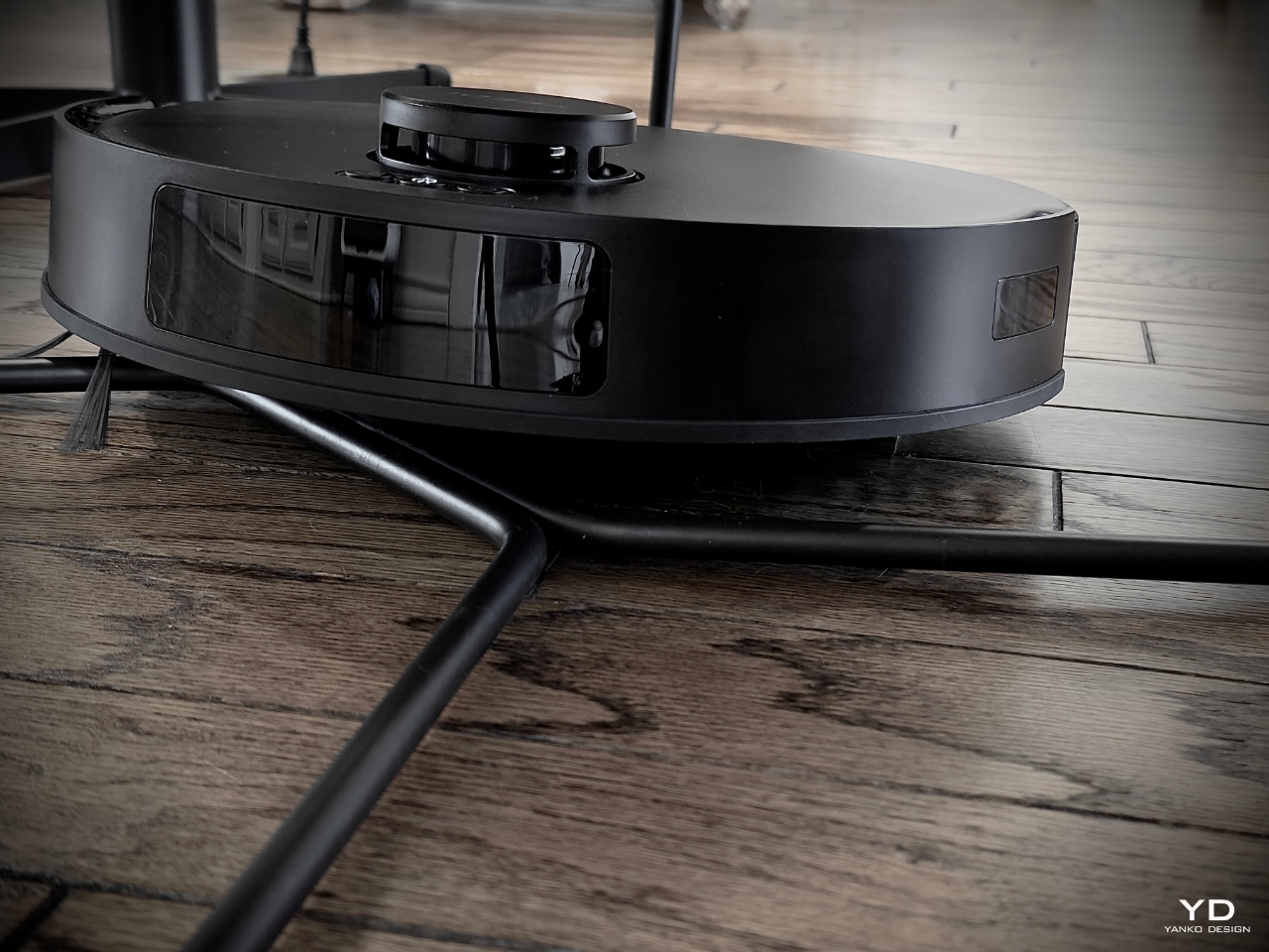
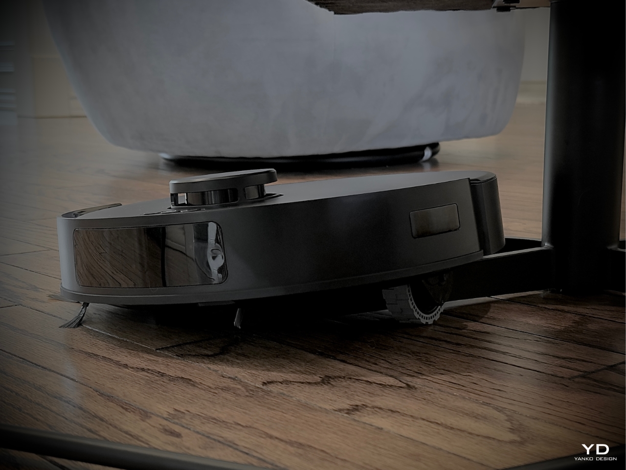
The C12 Combo transitions effortlessly from one surface to another. Hardwood to carpet? No problem. It senses the change, adjusts suction power accordingly, and can even climb up to 0.8-inch thresholds, ensuring every inch of your home gets the right treatment. In my living room and bedroom, I have a couple of chairs with legs that most vacuums struggle to climb over, but the C12’s 0.8-inch (20mm) clearance is perfect for navigating these obstacles, making it an essential feature for my setup. I also appreciate having the option and flexibility to vacuum certain areas manually—let’s face it, anyone who has used a robotic vacuum cleaner knows that no matter how good the machine is, there will be missed spots.

The C12’s robot vacuum is equally impressive, working in sync with the handheld vacuum. It features a 5200 mAh battery that enables extended cleaning sessions, even for larger spaces. At the same time, the handheld vacuum is powered by 6 x 2000 mAh batteries, providing ample runtime for its cleaning modes. The robot vacuum, equipped with TrueMapping Technology, can avoid obstacles while covering every inch of the floor with a systematic cleaning path. It’s smart enough to return to its charging station once it’s done, ensuring it’s ready for the next session.

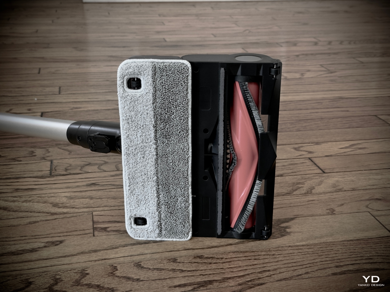
The mopping capability is exclusive to the handheld component of the Yeedi C12 Combo, which includes a detachable 11.5 oz (340 ml) water tank and an anti-tangle brush. This allows it to handle both wet and dry cleaning tasks effectively. The robot vacuum is designed for powerful dry cleaning with its suction capabilities and does not have a mopping function. The handheld vacuum has accessories like the Crevice Tool and 2-in-1 Dusting Brush, making it versatile for dry and wet cleaning tasks.

With the Crevice Tool and 2-in-1 Dusting Brush, the C12 Combo can precisely clean corners, curtains, and soft surfaces like sofas. These thoughtful accessories make the C12 an all-in-one solution for versatile cleaning throughout your home.

Sustainability: Cleaning With Less Waste

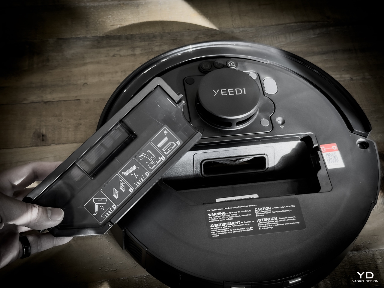
The C12 Combo focuses on efficiency in cleaning and reducing waste. The dustbin is bagless and reusable, meaning you’re not spending extra money on replacements or contributing to landfill waste with disposable bags. According to Yeedi’s internal data, this dustbin can last up to seven weeks without emptying, which is nearly two months of hassle-free cleaning.

Plus, the Full-Path Self-Cleaning System ensures the HEPA filter stays clean, maintaining peak suction power without manual filter cleaning. The washable HEPA filter also traps allergens, keeping your indoor air cleaner, and it’s easy to rinse and reuse. The C12 Combo reduces environmental impact and operating costs over time by focusing on long-lasting, reusable components.

Think about it—no more repeatedly buying dust bags or filters, no more hunting for replacements, or worrying about running out mid-clean. The C12’s design takes care of those pain points, making cleaning more sustainable, both for the planet and your wallet.
Value: What’s the Real Cost?

Here’s where the Yeedi C12 Combo shines: its effortless cleaning, precise performance, flexibility, and unbeatable value—Yeedi C12 Combo makes every corner of your home spotless. Instead of just a vacuum, the Yeedi C12 Combo offers a complete home-cleaning system that fits seamlessly into your routine. The robot vacuum takes care of daily maintenance, sweeping up dust, dirt, and debris while you’re at work or relaxing. Then, when you need to deep clean, the handheld and stick vacuums step in with powerful suction and versatile attachments to get into every nook and cranny.

The 1.5-liter auto-empty dustbin allows for hands-free operation for up to seven weeks, eliminating the hassle of frequent emptying. For the cost of one device, you’re getting a two-in-one system that tackles every type of mess. The C12 Combo ensures that each dollar spent is packed with performance, sustainability, and versatility.

With the 340ml water tank, the C12 Combo also provides advanced mopping functionality. It allows continuous wet mopping that handles stubborn stains and wet waste without a separate mop. You don’t need to vacuum before mopping—the C12 does both simultaneously.

Beyond cost savings, there’s the intangible value of saving time and energy. With the C12 Combo, you’re no longer chained to a cleaning routine that takes up half your Saturday. You can run the robot vacuum while taking care of other tasks and still get a deep clean when you need it.

Ready to Transform Your Cleaning Routine?

If you’re tired of spending your weekends with a vacuum in hand, the Yeedi C12 Combo is here to change that. With its advanced cleaning features, seamless transitions across surfaces, and flexible components for tackling every type of mess, it’s the perfect addition to any household looking for efficiency and simplicity. Let the C12 Combo handle the hard work so you can focus on enjoying your time at home. Experience a cleaner space with less hassle—make the switch today.

Click Here to Buy Now: $649.99 $899 (28% off). Hurry, this deal ends soon!

The post Yeedi C12 Combo Review: The Ultimate Robotic Cleaner with a Handheld Vacuum and Mop first appeared on Yanko Design.
Xiaomi 14T Pro Review: Flagship Features Without the Flagship Price

PROS:


  • Solid camera performance

  • Fast wired and wireless charging capabilities

  • Bright and easy-to-eyes display


CONS:


  • Uninspiring color options

  • Minor hardware upgrade from the predecessor


RATINGS:

AESTHETICS
ERGONOMICS
PERFORMANCE
SUSTAINABILITY / REPAIRABILITY
VALUE FOR MONEY

EDITOR'S QUOTE:

With its combination of features and competitive pricing, the Xiaomi 14T Pro delivers a well-rounded experience that is sure to satisfy the needs of most users.

2024 has been a year of remarkable growth and innovation for Xiaomi. Building upon its success in the smartphone market, the company has expanded its horizons with the launch of its first electric vehicle, the SU7, back in March. The company then proceeded with the launch of its first-ever flip phone, the Xiaomi MIX Flip, as well as the fourth iteration of its flagship foldable, the MIX Fold 4. Impressive sales figures for the SU7 and the positive reception of the MIX Flip and MIX Fold 4 demonstrated Xiaomi’s ability to capture market shares in diverse product categories. It is clear that Xiaomi wants to take advantage of this moment and solidify its position as a leading global technology brand with the launch of the Xiaomi 14T and 14T Pro. Part of its budget-friendly numbered T series, the Xiaomi 14T Pro boasts flagship features similar to its flagship Xiaomi 14 and 14 Ultra phones, such as cameras co-developed with Leica. But does Xiaomi still have its magic touch or has it spread itself too thin? Read on to find out.

Aesthetics

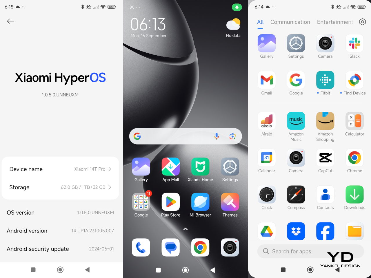
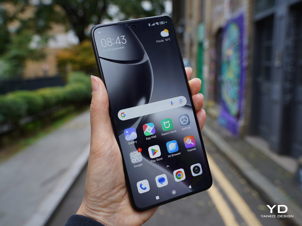
The Xiaomi 14T Pro’s understated design is its strength. While it doesn’t offer groundbreaking aesthetics, its simplicity is elegant. The familiar design language from its predecessor is carried over into this model. Available in Titan Gray, Titan Blue, and Titan Black, but choosing a color shouldn’t be a challenge as they all offer similar aesthetics. I wish Xiaomi had explored more fun color options. We received the Titan Black variant. The matte black back panel is speckled for a light-catching effect and features a velvety texture that resists fingerprint smudges.

The device’s square camera island is big but maintains a discreet profile that matches the color of the back panel. The camera island’s smooth surface contrasts with the back panel’s textured finish. The arrangement of the cameras and LED light is perfectly symmetrical, centered around the Leica logo. Each camera and LED light is housed in a raised circular enclosure, making it slightly more challenging to clean dust that may accumulate. That said, it carries a sort of LEGO block vibe that makes it stand out a bit, especially from the rest of the Xiaomi 14 series.

The small Xiaomi logo in silver is positioned on the lower left and the regulatory icons and text on the lower right. Overall, 14T Pro offers a clean design, while the matte textured back panel and metallic aluminum alloy frame give it a premium feel. It is simple and direct, a breath of fresh air from the visually noisy designs of recent smartphones.

Ergonomics

Measuring 160.4mm x 75.1mm x 8.39mm and weighing 209g, the Xiaomi 14T Pro leans towards the larger side of the spectrum. Despite its size, the device feels comfortable to hold, whether with one or both hands. All edges slightly curve into the frame giving comfort, while the flat sides provide a better grip when you hold the device in your hand.

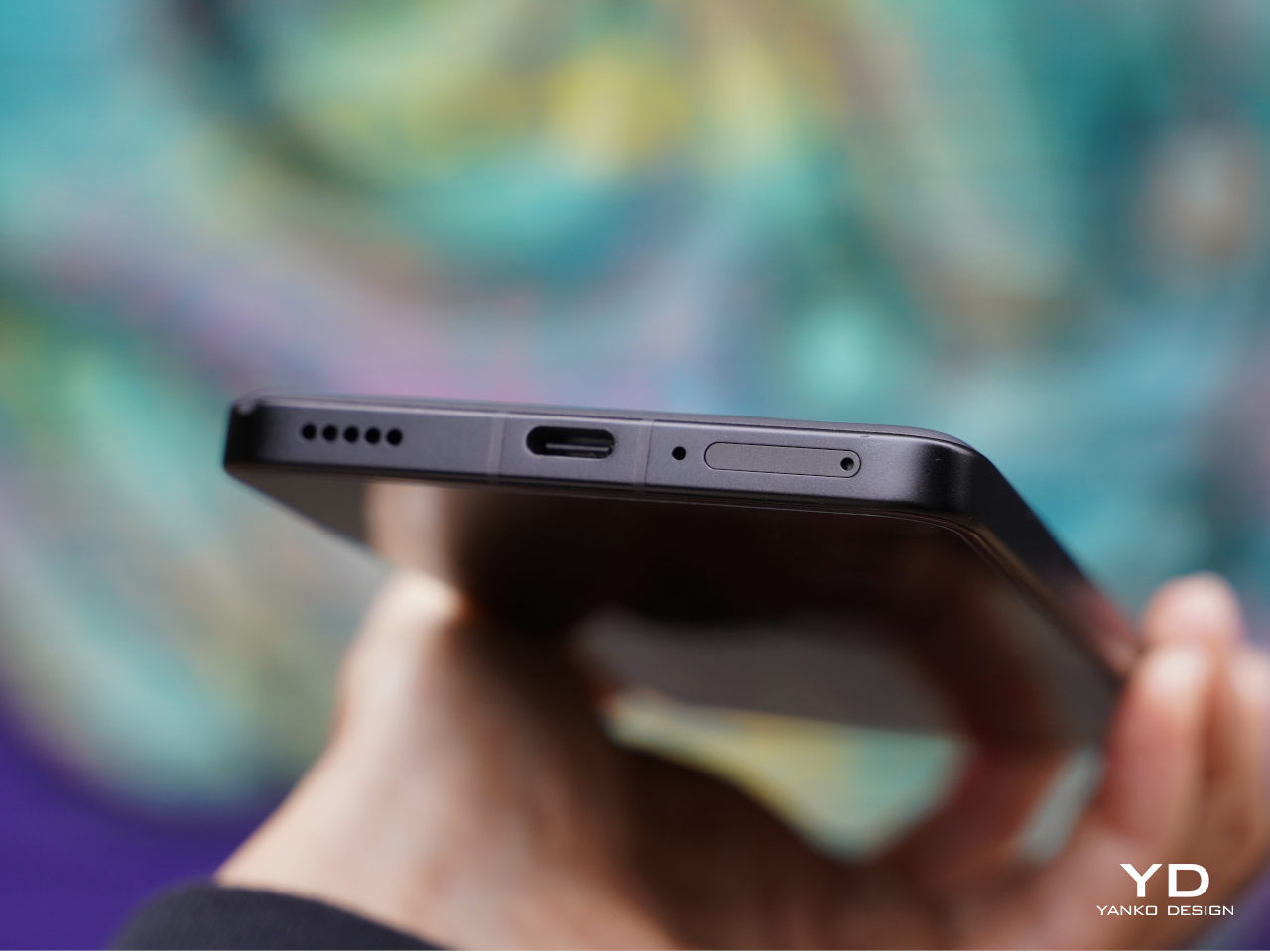
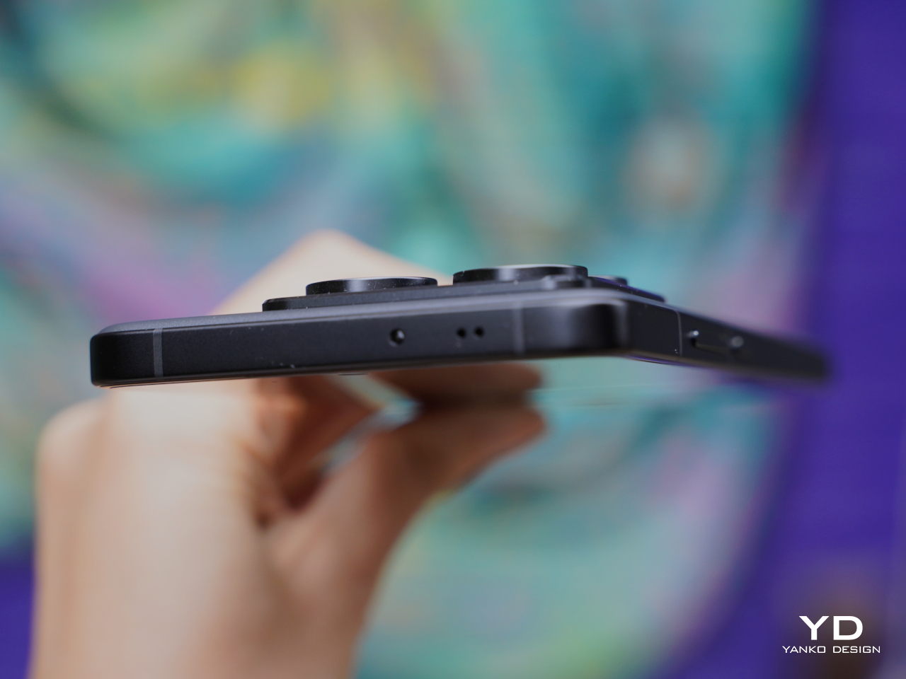
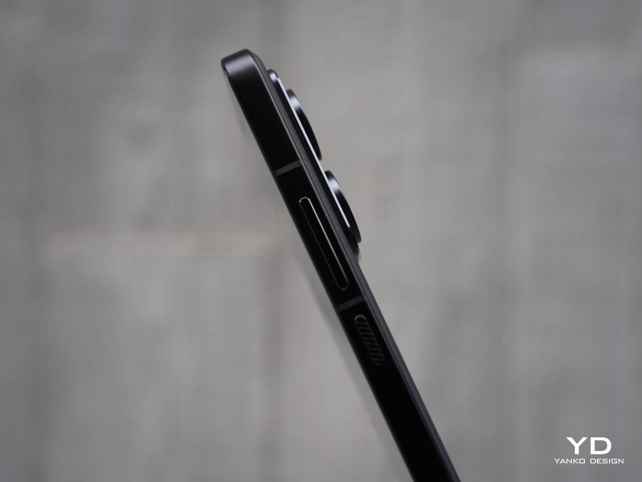
The right side of the phone features volume and power buttons with diagonal engraving, while the left side remains clean except for antenna cutouts. The top houses an IR blaster and speaker, while the bottom accommodates a dual SIM slot, microphone, USB-C port, and speaker. The sides might be busy with these many parts, but they visually blend into the frame and stay out of the way of your fingers or your palm when you hold the phone.

The off-center camera module can cause the phone to wobble slightly on flat surfaces which might be a minor inconvenience if they are sensitive to such details. Nothing that a case wouldn’t fix, of course, and it’s a design trait shared by almost all smartphones these days. The Xiaomi 14T Pro is thankfully not uncomfortable to hold and use despite its large size, though it doesn’t stand out as an example of good ergonomics either.

Performance

Xiaomi’s collaboration with Leica has significantly elevated its camera capabilities, resulting in exceptional photo and video quality. This partnership continues as Xiaomi works with Leica on its more budget-friendly flagship models, ensuring high-quality imaging remains accessible. The 14T Pro features a triple camera setup, including a 50MP main camera with an f/1.6 aperture, a 50MP telephoto camera with an f/2.0 aperture, and a 12MP ultra-wide camera with an f/2.2 aperture. All three cameras offer two Leica photographic styles: “Leica Vibrant” and “Leica Authentic.”

The main camera features a Light Fusion 900 sensor and delivers great photos with nice detail, wide dynamic range, natural colors, and minimal noise in both daylight and low-light conditions. While the dynamic range is generally great, exposure often skews toward the brighter end, leading to washed-out highlights and crushed shadows in some situations. Additionally, HDR performance struggles with motion, especially in low-light environments, leading to blurry images of moving subjects.

Ultrawide (0.6x)

1x

2x

2.3x

The telephoto camera performs well in most scenarios, maintaining good detail and color accuracy. In contrast, the ultra-wide camera produces acceptable photos, but it tends to lack sharpness and detail in challenging conditions.

Telephoto (5x)

Telephoto (10x)

Telephoto (20x)

Portrait mode offers four focal lengths, 23mm, 35mm, 60mm, and 75mm, with the default set to 60mm. While the 60mm and 75mm portraits are captured with the telephoto camera, the 23mm and 35mm portraits are shot with the main camera. All portrait photos I took, regardless of focal length, exhibited impressive subject isolation and pleasing bokeh.

Normal (1x)

Portrait (60mm)

Although color rendering remains consistent across different cameras and magnifications in regular photo mode, a noticeable shift in white balance can be observed between photos captured with the telephoto and main cameras in portrait mode.

Portrait (23mm)

Portrait (35mm)

Portrait (75mm)

On the opposite side, the upgraded 32 MP front camera with f/2.0 aperture takes satisfactory photos, which isn’t that surprising given the hardware. The Xiaomi 14T Pro can record videos up to 8K at 24 or 30 fps with the main camera, while the telephoto and ultra-wide cameras are capable of shooting videos up to 4K at 60 fps. The front-facing camera can record up to 4K at 30 fps and 1080p at 60 fps. The 4K footage from the main and telephoto cameras is impressive, showcasing good detail, realistic colors, and a wide dynamic range, all complemented by excellent stabilization.

While the Xiaomi 14T Pro offers incremental hardware improvements compared to its predecessors, its most significant advancements lie in its AI capabilities. The device supports Google Gemini and introduces Circle to Search, a first for Xiaomi devices. Additional AI features include AI Interpreter, AI Notes, AI Recorder, and AI Subtitles. These AI features and Circle to Search will be available via an over-the-air (OTA) update starting September 26th, which means they aren’t accessible during this review period.

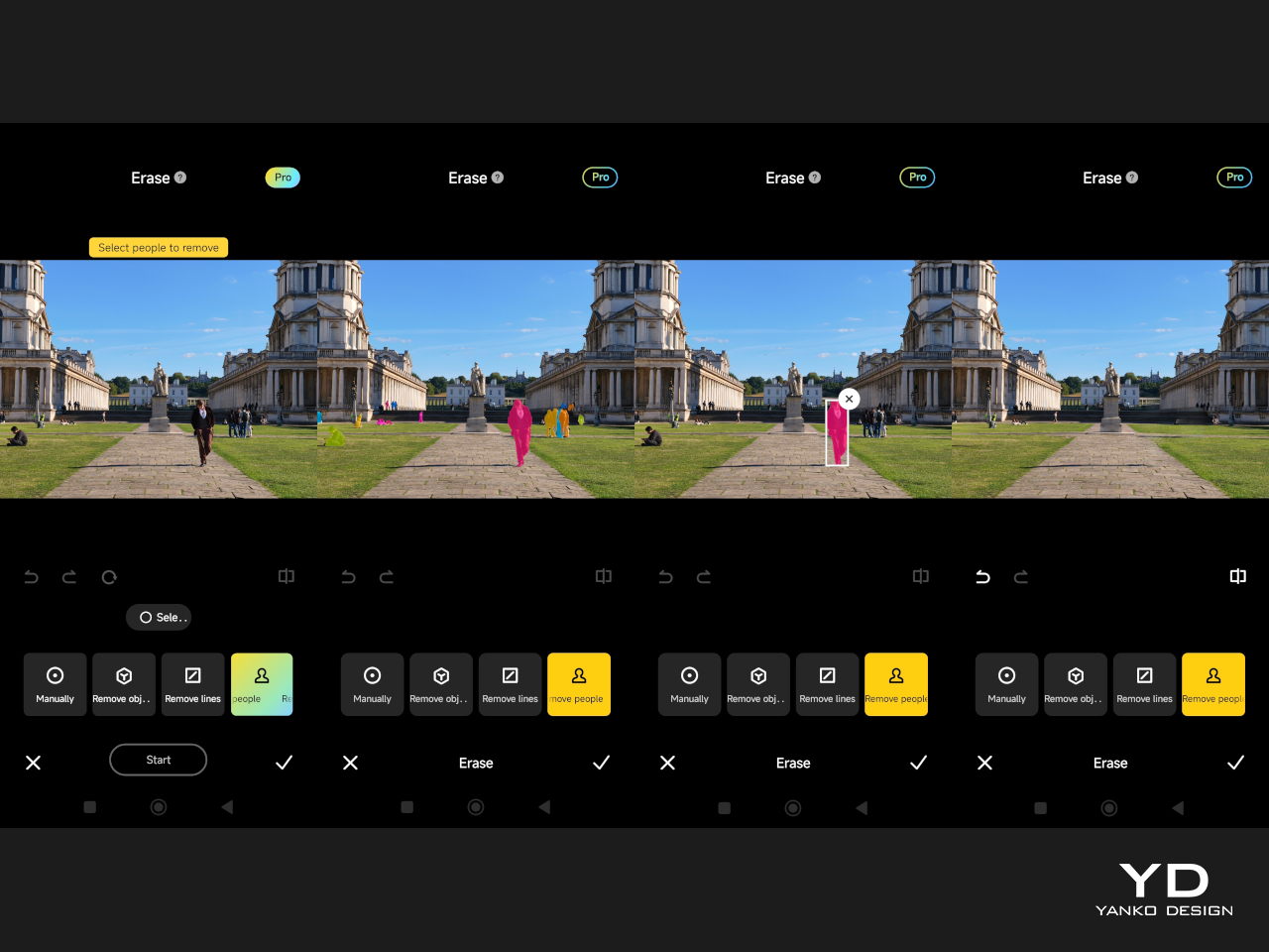
One of the AI features I was able to test was AI Erase Pro, and it was remarkably effective. The tool offers four modes: Manual, Remove Object, Remove People, and Remove Lines. The Remove People mode was particularly impressive, accurately recognizing individuals and color-coding them. Even when people were positioned in a staggered formation, the AI could identify each person. However, while erasing people from the photos worked well, the shadows were left unmanipulated.

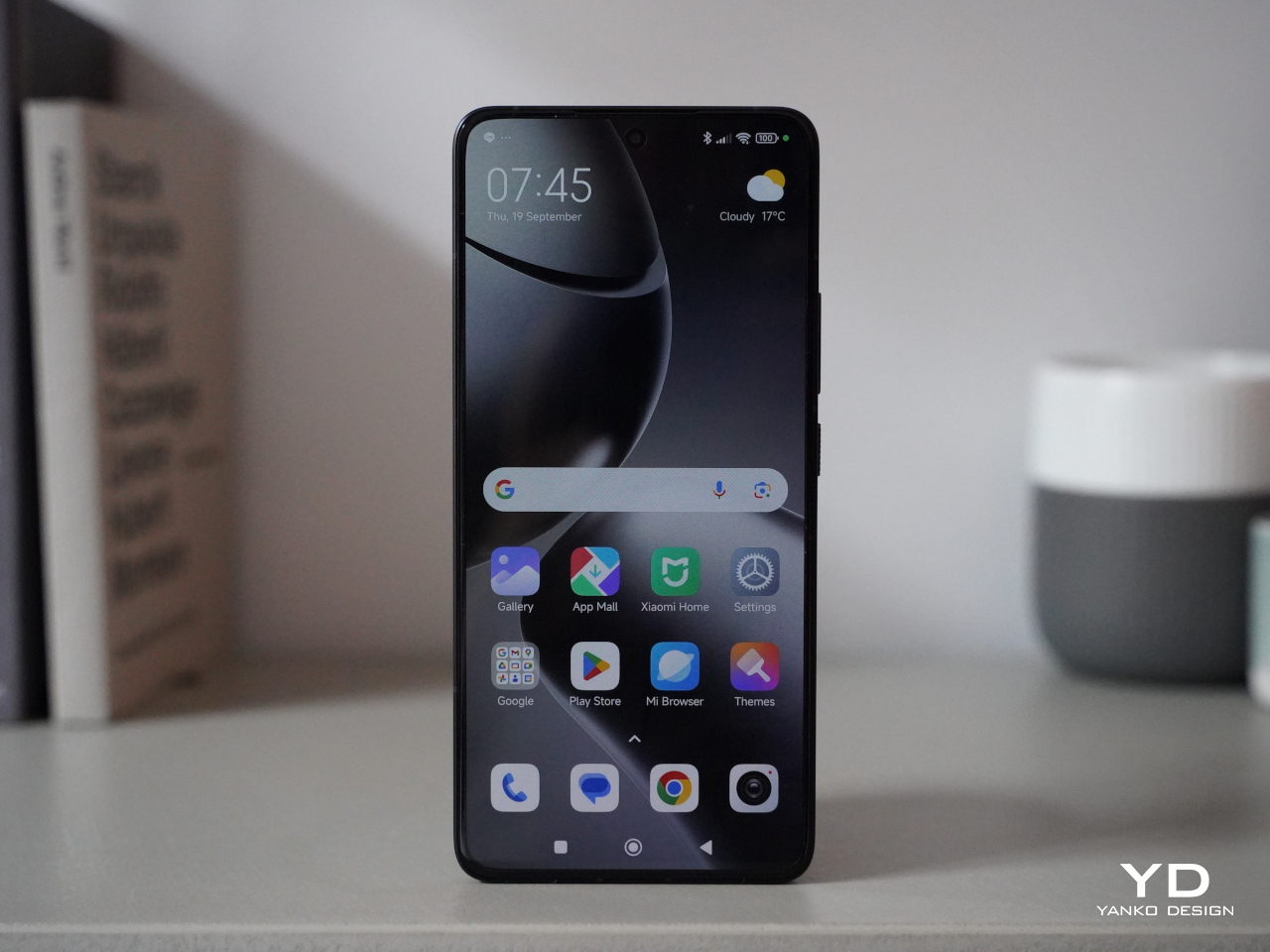
The other impressive feature of the Xiaomi 14T Pro is a big 6.67-inch AMOLED flat screen that boasts a 1.5K resolution (2,712 x 1,220), a 144Hz refresh rate, and a pixel density of 446 ppi. Supporting 12-bit color depth, HDR10+, and Dolby Vision, the display delivers sharp, vibrant visuals. Even under direct sunlight, the peak brightness of 4,000 units ensures excellent visibility while the 3,840 Hz PWM dimming reduces eye fatigue. Also, the stereo speaker is plenty loud and produces nice sounds, making the phone great for enjoying movies.

The 5,000mAh battery provides sufficient power for a full day of use. If you need a quick boost, Xiaomi’s 120W HyperCharge technology allows for incredibly fast wired charging, reaching a full charge in about 19 minutes, as stated by the company. Additionally, the 14T Pro supports 50W wireless charging, a much-welcome upgrade. Xiaomi claims that the device can be fully charged with a wireless charger in approximately 45 minutes. My personal experience aligns with these impressive capabilities.

The device runs HyperOS based on Android 14 and Google services are thankfully available out of the box. Powered by MediaTek’s flagship Dimensity 9300+ chipset and paired with 12GB or 16GB of LPDDR5X RAM and 256GB, 512GB, or 1TB of UFS 4.0 storage, the Xiaomi 13T Pro delivers great performance. The device handles multitasking seamlessly, with no noticeable lag or stutter even when running multiple apps simultaneously. Additionally, it does not get hot during extended video shoots or gaming sessions, enhancing the overall user experience.

Sustainability/Repairability

The Xiaomi 14T Pro promises a 1,600 battery life cycle and delivers IP68 dust and water resistance, ensuring both durability and longevity. Its longevity and overall sustainability aspects, however, are not as promising, especially in the area of software updates. This is somewhat disappointing for a company that is becoming one of the industry’s leading players. As the tech industry increasingly emphasizes environmental responsibility, Xiaomi has an opportunity to take a leading role by integrating sustainability into all of its products and, hopefully, it won’t let that opportunity pass it by.

Value

The Xiaomi 14T Pro positions itself as a compelling option for those seeking a high-performance smartphone without breaking the bank. It offers a blend of flagship-level features and a more affordable price point. While its camera may not quite reach the heights of the Xiaomi 14 Ultra, it still delivers excellent results for everyday photography and videography. It delivers much of what it promises on paper, but the real question is whether it is something you will reach for in your next smartphone buy.

Xiaomi is definitely not the only player in this field, including in the mid-range market where there are dozens of brands and models to choose from. And while the Xiaomi 14T Pro is definitely good, it doesn’t exactly stand out in any specific way. It’s a well-balanced phone, no doubt, but it might overlooked when placed side-by-side with other mid-range phones with better cameras, higher performance, or, more importantly, lower price tags.

Verdict

The Xiaomi 14T Pro may not be the most exciting phone, but there is no doubt it offers a tempting value proposition. Its solid camera performance, powerful processor, fast-charging capabilities, and vibrant display make it a compelling option for users who prioritize performance and affordability. It may not offer the absolute pinnacle of smartphone technology, leaving that for its more powerful and more expensive non-T siblings, but it doesn’t lag behind in any significant way either. With its combination of features and competitive pricing, the Xiaomi 14T Pro delivers a well-rounded experience that is sure to satisfy the needs of most users.

The post Xiaomi 14T Pro Review: Flagship Features Without the Flagship Price first appeared on Yanko Design.
2025 Bentley Continental GT Speed Review

PROS:


  • Beautiful styling

  • Epic power

  • Plug-in practicality

CONS:


  • Cost

  • Clunky software experience

RATINGS:

AESTHETICS
ERGONOMICS
PERFORMANCE
VALUE FOR MONEY

EDITOR'S QUOTE:

The blend of performance and poise here is hard to beat, a large car that feels light and nimble yet offers effortless stability at any speed.

All automotive brands carry some amount of expectations, preconceived notions about their cars’ level of performance and comfort. Few, though, carry the kind of weight and expectation as a brand like Bentley. Established in 1919, the Crewe-based manufacturer is responsible for some of the world’s most refined cars. Every new addition to its lineup, therefore, must honor those that came before.

That’s a tricky proposition these days. Every car manufacturer is faced with greater and greater demands for technology and environmental sensitivity. That doesn’t always jibe with traditional demands for comfort and performance.

Those two worlds collide in the new Bentley Continental GT Speed. It carries the same immediately recognizable Bentley poise and style but with radical refinements. It has the same opulent interior but is riddled with more tech than ever before. Finally, it offers the same level of thrilling performance but delivers it in an entirely new way.

Plug-Powered

This is the first hybrid Continental, a plug-in at that, something of a transitional first step towards the brand’s all-electric future, once targeted for 2030 but now shifting a bit further down the road.

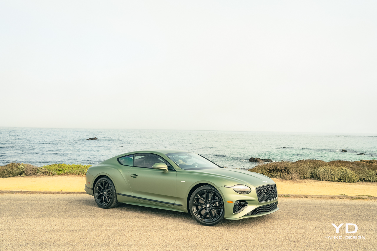
Considering its radical departure from the predecessor’s W12 powertrain, which we’ll delve into in just a moment, the new Continental GT offers a familiar look and feel at a distance, but step closer, and you can see just how refined the car’s new design is.

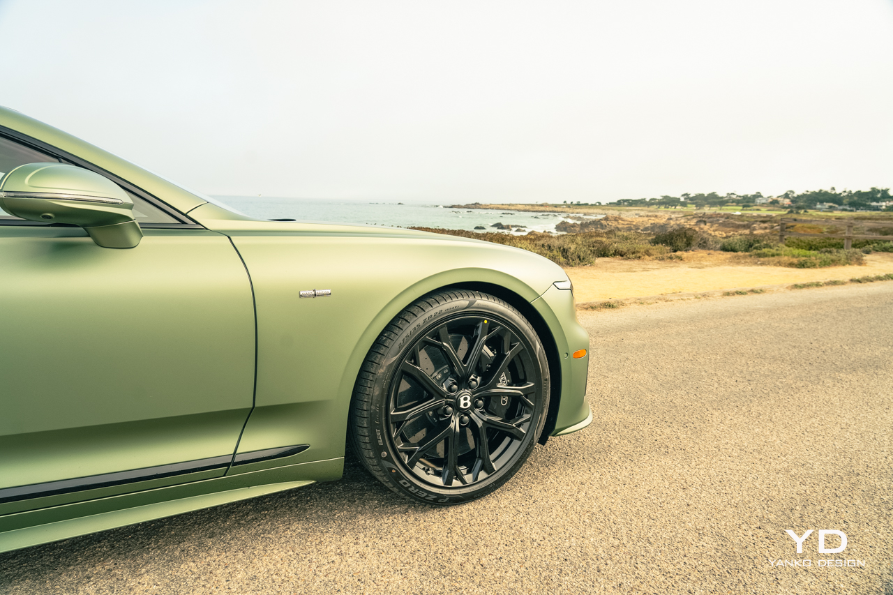
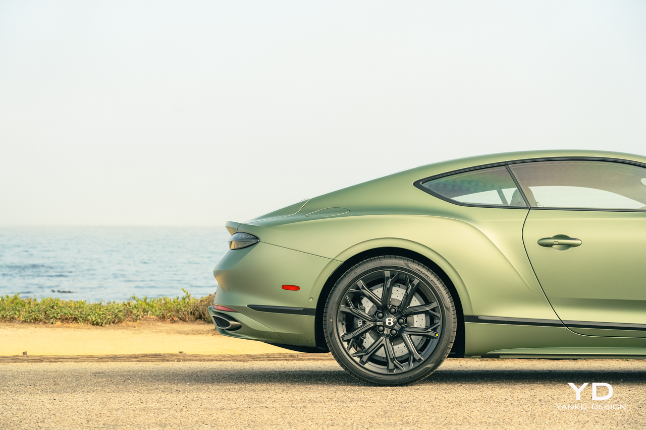
The silhouette is familiar, and the extended nose plus the rearward cabin and the powerful rear fenders all give it that same sophisticated promise of power as before. But changes abound, the most significant being a shift to a single headlight up front. Modern lighting technology enables the new Continental to throw more light from a smaller source, cleaning up the front end and giving a throwback to the Bentley S2 from the late ’50s.

But despite that simplification, look closer again, and you’ll see the amount of detail within those headlights. It’s the same story out back, where the compact, oval tail lights are framed in an ornate, jewel-like halo. Otherwise, the rear end is likewise somewhat more simple than before, with the pop-up spoiler replaced by a clean, integrated unit.

On the Inside

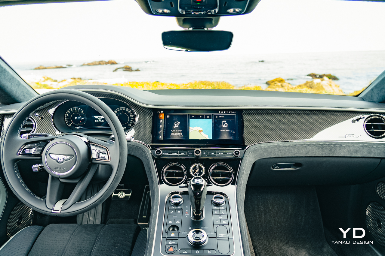
The interior is likewise less ornate than before, pared back slightly from the abundance of chrome and buttons found in the last generation car. It offers just about all the technology you could want, including a 12.3-inch touchscreen with wireless Android Auto and Apple CarPlay, plus a wireless charger and a pair of USB-C ports.

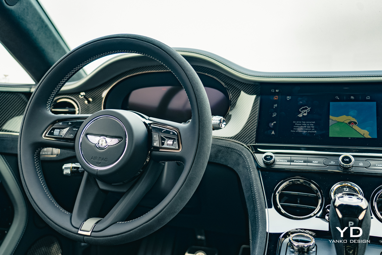
The gauge cluster, too, is fully digital now, with a number of different views offering different levels of detail, more or less depending on your mood or style. The overall experience lacks the polish and feel of the higher-end systems from Mercedes-Benz or BMW, but it at least offers all the right features.

Otherwise, the interior offers a great blend of opulence and sophisticated style. The carbon fiber band sweeping across the doors and the dashboard catches the sunlight in distracting ways at times but has a clean, glossy depth that’s lacking in many in-dash composite applications.

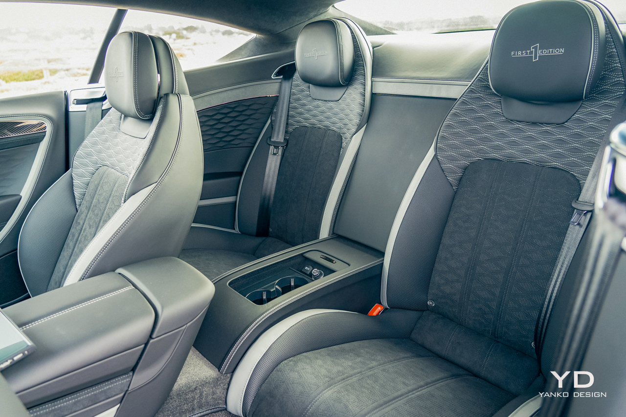
Materials for the leathers and microfibers are great, as is the perfect stitching running everywhere. However, there’s a disappointing amount of plastic here, including the cluster of buttons surrounding the upright shifter. But, their layout at least is clean and easy to use, and they provide easy access to the functions you’ll want frequently, like toggling the comprehensively chill ventilated seats.

While the plastics are occasionally a bit underwhelming, the feel of the controls is top-notch. The mode selector, just aft of the shifter, spins with a wonderful weight, and even the turn signals move with a significant heft.

Plus-Sized Performance

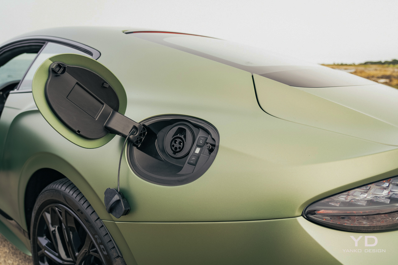
The feeling of the controls is appropriate given the heft of this car. The new, plug-in Continental weighs over 5,400 pounds, thanks in large part to its 25.9-kilowatt-hour battery pack and the new hybrid system. The electric motor is paired with a 4.0-liter, twin-turbocharged V8.

The combined system power is 771 horsepower and 738 pound-feet of torque. Some souls may lament the lack of the outgoing Continental GT Speed’s W12, but that thing only made 626 hp. Plus, it only got 15 mpg.

That car took 3.9 seconds to get to 60. This one gets to 60 in 3.1 seconds and has a top speed of 208 mph. Bentley doesn’t have fuel economy numbers yet, but in my mixed testing, I scored 16.9 mpg, and as you can imagine I wasn’t exactly taking it easy.

More speed, better throttle response, and greater efficiency make for a pretty good mix.

It’s unlikely that many Bentley owners will be too concerned about fuel economy, but it’s good to see even ultra-luxury cars doing their part to reduce their impact on the environment. Likewise, everyone can appreciate the pleasant experience of driving in a fully electric mode.

Bentley says the new Continental GT can go up to 50 miles on a charge and can travel at up to 80 mph without recruiting the V8. In E Mode (available via a dedicated button), the big coupe is still nice to drive, totally silent, of course, and extra smooth but still reasonably peppy and perfectly capable of keeping up with traffic.

But I found it a little too easy to get the V8 to spin up. Even in this mode, if you dip past three-quarters throttle, the engine spins up quickly and smoothly, adding a substantial shove to the experience. That hand-off is crucial in hybrids, and Bentley has nailed it here, with power proportionally increasing as the engine spins up without the neck-snapping shock of torque you get in many lesser hybrids.

I just wish I could explicitly disable the V8 altogether and drive the car only on battery power.

In the default drive mode, dubbed “Bentley,” the Continental is properly quick when you do dip in the throttle but still calm and collected when you’re dawdling around town. For those who want a bit more composure, spin the knob to the right for the Comfort mode, which takes the edge off the throttle and the new dual-valve air suspension. There’s a custom mode all the way to the right, too, if that’s not to your fancy.

But the most fun mode is found all the way to the left, Sport, which firms up the suspension and sharpens the throttle response. In this mode, the V8 and hybrid system work together in closest harmony, the electric motor getting the car moving before the V8 roars into action and sends the car surging forward up to whatever speed you deem allowable.

The handling is unexpectedly good, too. Despite the extra weight, the GT Speed turns in eagerly, and the 48-volt Bentley Dynamic Ride anti-roll technology keeps everything from an excessive tilt.

Comfort at Speed

But even in Sport mode, the Continental is still nicely compliant over bad roads and effortlessly cosseting. The seats, despite their ornate stitching, are extremely comfortable, and though the massage is a bit on the subtle side for my tastes, the strength of the heating and ventilation cannot be denied.

Rear seats are predictably short on legroom, but there’s passable headroom, enough that you could wedge a human adult back there for a short run to dinner if you really needed to. Kids will fare better.

For the longer drives, you have a Naim sound system to enjoy, which is extremely powerful and a bit bass-forward by default but offers plenty of sliders and configurations for dialing it into your perfect tone.

You’ll also have a substantial trunk at your disposal, 13 cubic feet worth. That’s down a bit over before, thanks to the battery, which sits down beneath the floor below, but is still more generous than anything else in this class.

The Continental also offers a decent active safety package, something often lacking in top-trim luxury cars like this. The adaptive cruise worked well on the highway but was extremely conservative, leaving a big gap ahead even on the closest following distance, which didn’t work well in typical California gridlock. The active lane keep likewise was helpful, but occasionally struggled to keep sight of the lines on the road.

I should point out at this point that I was testing a pre-production model of the car, so hopefully, there’s time to improve this functionality a bit before the cars start showing up at dealerships.

Pricing and Options

At this point, we still don’t know exactly how much the 2025 Bentley Continental GT Speed is going to cost. Yes, it’s very much in the “if you have to ask” territory, but for the rest of us who are merely curious, you’ll want to have somewhere around $300,000 at your disposal before ringing up your local dealer.

Of course, part of the joy of a car like this is customization. Bentley will do pretty much anything your heart desires, but if you desire premium things, you’ll need to keep pushing that budget up a few digits.

Regardless of how much or how little you customize yours, you’re going to be spending a lot for one of these. Is it worth it? The blend of performance and poise here is hard to beat, a large car that feels light and nimble yet offers effortless stability at any speed. It’s a joy to drive for sure, with just a few rough edges to smooth out.

The post 2025 Bentley Continental GT Speed Review first appeared on Yanko Design.
Titanium Milanese Loop Review: Precision Engineering Meets Luxury in Apple’s Ultimate Watch Band

PROS:


  • Durable: Made from aerospace-grade titanium, the Milanese Loop is corrosion-resistant and built to handle tough environments.

  • Lightweight: The band remains lightweight despite being metal, reducing discomfort during extended wear.

  • Comfortable: The flexible mesh contours to the wrist, offering breathability and reducing irritation.

  • Custom Fit: Micro-adjustability down to 1mm ensures a perfect, snug fit for different wrist sizes and activities.

  • Sustainable: Constructed from 95% recycled titanium, aligning with Apple’s focus on environmentally responsible materials.

CONS:


  • Price: At $200, it's pricier compared to other Apple Watch bands.

  • Hair Pulling: The mesh design may cause slight pulling for users with wrist hair.

  • Indention Marks: A tighter fit can leave skin indentations after prolonged wear.

RATINGS:

AESTHETICS
ERGONOMICS
PERFORMANCE
SUSTAINABILITY / REPAIRABILITY
VALUE FOR MONEY

EDITOR'S QUOTE:

The Titanium Milanese Loop brings next-level engineering, rivaling Rolex's precision, durability, and seamless blend of luxury and functionality.
award-icon

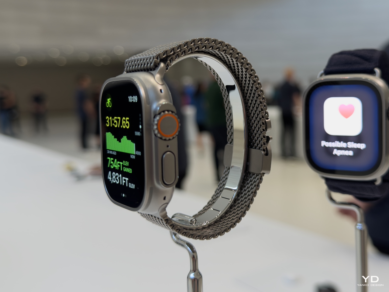
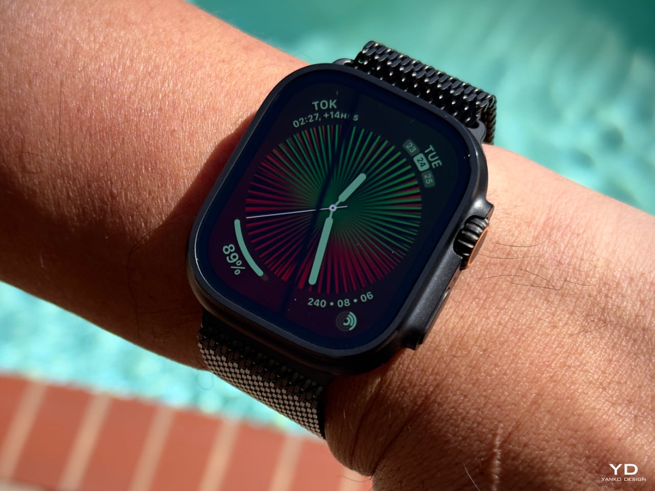
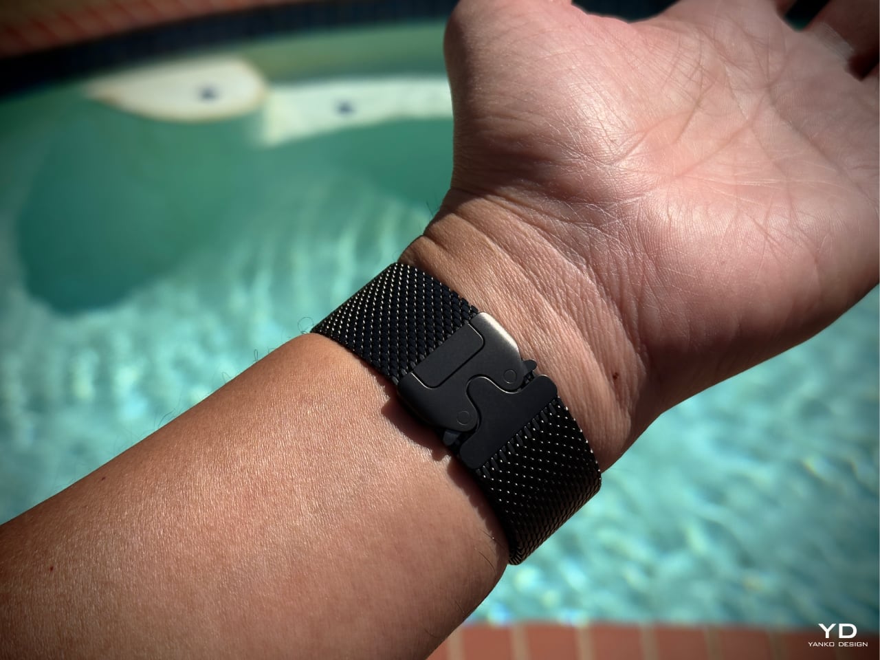
When I first saw the Milanese Loop for the Apple Watch Ultra 2 at the Apple Glowtime event, it immediately grabbed my attention as an impressive leap forward in band design. Inspired by stainless steel mesh historically used by divers, this new Titanium Milanese Loop is made from woven, corrosion-resistant titanium wire. It’s flattened and polished to a stunning satin texture that balances ruggedness and elegance. The parachute-style buckle features dual side-release buttons that close with an audible click, giving a sense of security whether exploring the ocean depths or heading out for a night on the town.

Designer: Apple

This band perfectly complements the Apple Watch Ultra 2’s rugged design, offering lightweight durability while looking refined. Whether heading into a meeting, swimming in the pool, hiking, or deep diving, I know the Titanium Milanese Loop can handle it without sacrificing style or functionality.

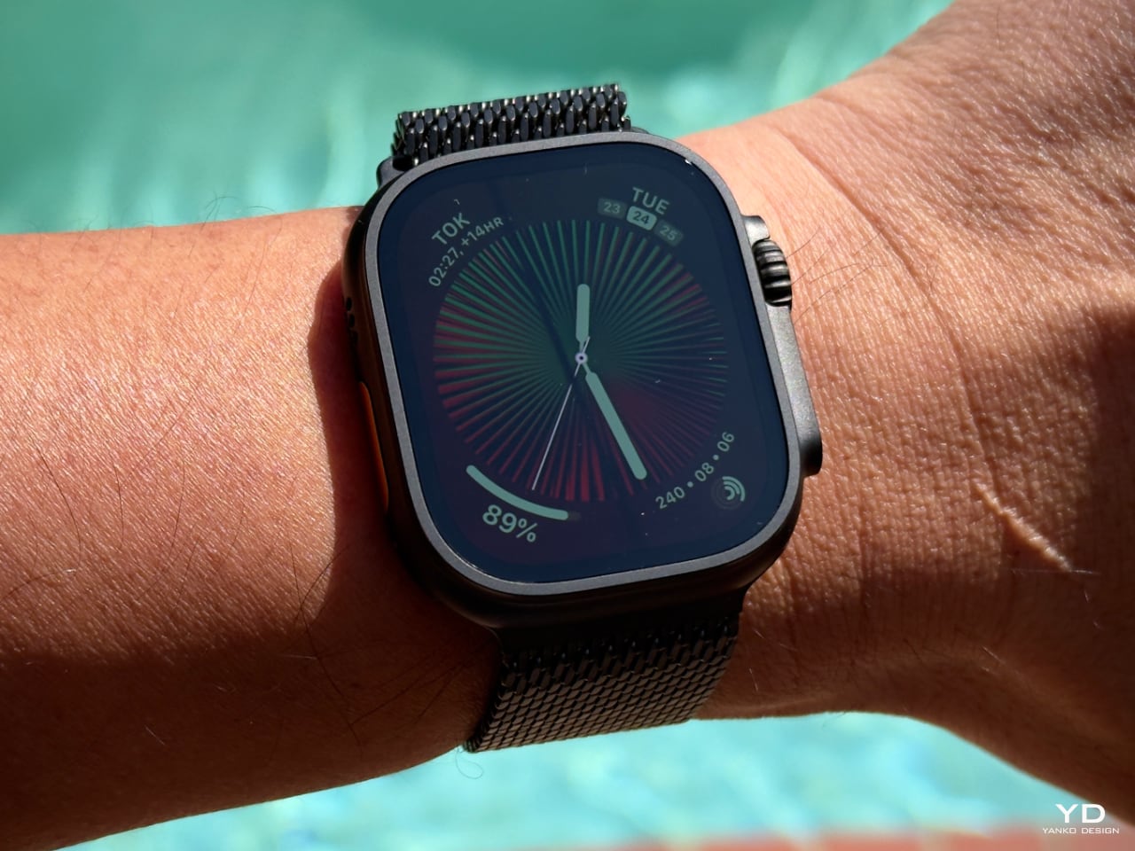
Now available in a striking new black titanium finish, the Apple Watch Ultra 2 proves why it’s the go-to choice for serious athletes and adventurers. Featuring the brightest display ever on an Apple device, the Ultra 2’s LTPO2 OLED Always-on Retina display delivers up to 3000 nits of brightness, making it highly visible even in the harshest sunlight. In comparison, the Apple Watch Series 10 offers a display brightness of up to 2000 nits and a wide-angle OLED that increases brightness by up to 40% when viewed at an angle. The Ultra 2 delivers battery life, lasting up to 36 hours during regular use and 72 hours in low power mode, compared to 18 hours of standard usage on the Series 10. Combined with the new Titanium Milanese Loop, the Apple Watch Ultra 2 represents a seamless marriage of aesthetics and performance, capable of handling the most demanding terrains while looking sophisticated enough for any occasion.

Design, Custom Fit, and Next-Level Engineering Marvel

The Milanese Loop design has a long history rooted in traditional chainmail used by divers, but Apple has reimagined it with a modern touch. The Titanium Milanese Loop, crafted specifically for the Ultra, caught my eye from the moment I saw it at the Apple Glowtime event. Made from aerospace-grade titanium, the band is lightweight and corrosion-resistant, offering strength and comfort—a perfect match for the Ultra 2’s rugged yet refined style.

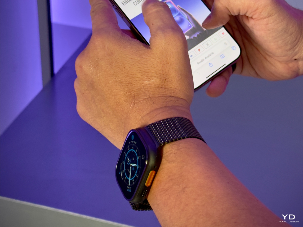
What impressed me most was Apple’s commitment to craftsmanship, as the band is created through a meticulous process of weaving, flattening, laser-welding, grinding, and finely polishing the titanium wire to form a precise, interlinking mesh that balances both strength and flexibility. This design drapes comfortably on the wrist while maintaining durability. I immediately appreciated the dual-button, parachute-style buckle, which made adjusting my wrist’s natural fluctuations throughout the day incredibly easy. Whether due to temperature changes or the ebb and flow of daily activity, I could quickly loosen or tighten the fit without needing to remove the watch. This level of adjustment, down to 1mm, truly made the band feel custom-made for my wrist.

Apple’s decision to use titanium wasn’t only about strength and practicality for everyday use. The dual-release buckle offers peace of mind, providing a secure fit during various activities without any concern about it coming undone. Whether in natural or black titanium, the band perfectly complements the Ultra 2’s new black titanium finish. Achieved through a custom blasting process and enhanced with a diamond-like carbon (DLC) coating, this finish provides excellent scratch resistance, ensuring the watch and band look as good after months of wear as they did the first day I tried them.

The Titanium Milanese Loop combines aesthetics, ruggedness, and sustainability. Made from 95% recycled titanium, this band aligns with Apple’s focus on environmentally responsible materials. In my experience, it’s a stylish, practical, and durable accessory. This blend of qualities makes it a great long-term choice for anyone seeking a band that complements the Ultra 2’s versatility and style.

Fit and Comfort: Tailored for Performance

The Milanese Loop for the Apple Watch Ultra 2 is breathable and flexible, making it a great fit for all-day wear. Depending on your personal preferences, there are a couple of things to consider. While some users with wrist hair might experience slight pulling due to the mesh design, I haven’t had this issue myself.

As someone who prefers a snug fit, I tend to wear my watch a bit tighter to prevent it from moving around, a habit formed from years of wearing traditional mechanical watches. If you wear the Ultra 2 tightly, as I do, you’ll notice a slight indentation after a long day, but there’s no discomfort associated with it. It’s more about leaving a mark than feeling any pain. This tight fit keeps the watch in place, making it feel more secure during physical activities, whether hiking, diving, or running errands.

This band’s ability to adjust down to the millimeter makes it incredibly versatile for any wrist size. It’s great to know Apple offers an extra-long tail version for those needing additional length—whether to wear over a wetsuit or simply because of larger wrists.

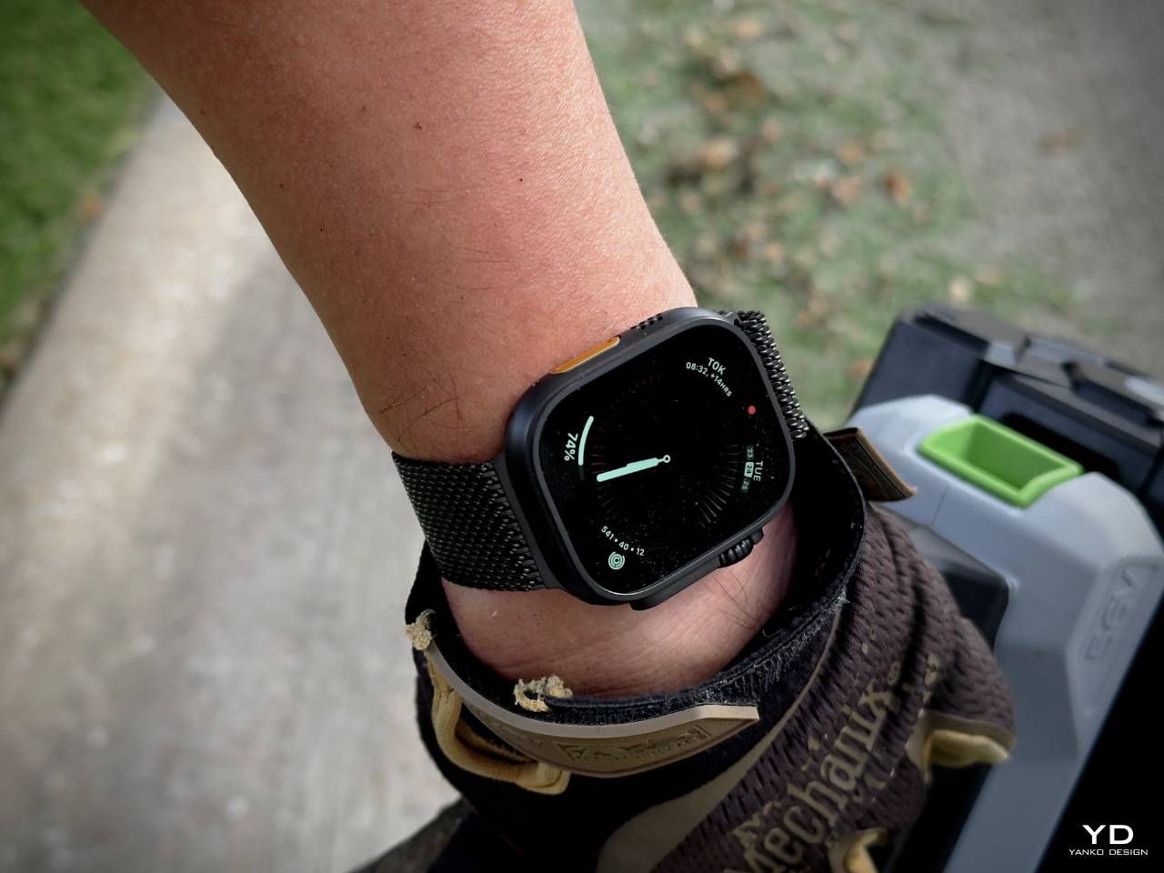
For me, the combination of the Titanium Milanese Loop and the Apple Watch Ultra 2 is all about striking the right balance between durability, comfort, and design. It’s the kind of band that seamlessly fits into my daily life, whether I’m out hiking, working in the yard, or tackling outdoor adventures. This band doesn’t just look good; it’s made to endure, and it pairs perfectly with the rugged nature of the Ultra 2. The thoughtful engineering and comfort of the Milanese Loop make it feel like it’s built to last, keeping up with the adventurous spirit that the Ultra 2 embodies.

Band Size and Fit

I went with the medium size for the Titanium Milanese Loop, which fits perfectly. The buckle centers squarely on the back of my wrist, which, for someone like me with a bit of OCD, brings a sense of balance that I appreciate. Wearing a watch every day is an intimate experience, and I pay close attention to how it sits—whether it’s a mechanical watch with a deployment buckle or a tang, every detail matters. The centered buckle feels right and adds to the comfort of wearing the Ultra 2 all day.

Apple Watch Ultra 2 on Titanium Milanese Loop

At the Apple event, I had the chance to try on the small size, but I could barely get the watch past my knuckle. Unless you have particularly thin wrists or plan on wearing this over a wetsuit, I’d recommend opting for the medium. It strikes the right balance for everyday wear, and it offers enough room for quick adjustments when needed.

Here are the official band size details:

  • Small: Fits wrists 130–160mm.
  • Medium: Fits wrists 155–185mm.
  • Large: Fits wrists 180–210mm.

With those ranges, the medium size should comfortably accommodate most wrist sizes. However, for anyone needing extra length—especially for wearing over bulkier gear like a wetsuit—the large size is the way to go. In my experience, getting the right fit goes a long way in maximizing the band’s comfort and aesthetics.

Value: A Long-Term Investment

Priced at $200 on its own or $100 more when bundled with the Apple Watch Ultra 2, the Titanium Milanese Loop might seem like a luxury option for an Apple Watch band. However, compared to titanium bracelets from brands like Rolex and Omega, which typically cost in the range of thousands of dollars, the value becomes clear. Apple has crafted a premium product that brings the high-end feel of titanium—usually reserved for much more expensive timepieces—into the world of wearable tech at a fraction of the price.

For someone like me who regularly upgrades their Apple Watch, the band’s value goes beyond the Ultra 2 itself. Apple’s consistent design language across its product line ensures this band will likely remain relevant with future watch models. Investing in this Titanium Milanese Loop means you’re getting a durable and stylish band that will serve you through multiple upgrades.

Another critical factor is the dual-lock system, which offers unbeatable security. Whether I’m out hiking, diving, or just going about my daily routine, I know the band is securely fastened, giving me peace of mind no matter what. Its durability, ease of use, and ability to adapt across future models make this band a smart investment for anyone who values functionality and design in their Apple Watch accessories.

Final Thoughts

The Titanium Milanese Loop for the Apple Watch Ultra 2 has quickly become one of my favorite bands. It offers that perfect mix of durability, premium design, and all-day comfort, whether in the field or just going through my daily routine. I’ve been wearing it for everything from outdoor activities to long workdays, and it never fails to deliver on comfort and style. I’ll continue to revisit this band in future articles as I spend more time with it. If you have any questions or thoughts about the band, feel free to drop me a note—I’d love to hear your feedback!

The post Titanium Milanese Loop Review: Precision Engineering Meets Luxury in Apple’s Ultimate Watch Band first appeared on Yanko Design.

ASUS Zenbook S 14 Ceraluminum Laptop Review: Elegance You Can Feel, Power You Can Touch

PROS:


  • Gorgeous Ceraluminum design with a unique tactile experience

  • Ultra-thin and lightweight chassis for effortless portability

  • Lush and vibrant 14-inch 3K 120Hz OLED display

  • Impressive performance, including light gaming

CONS:


  • Port selection is a bit constrained

  • RAM is integrated into System-on-Chip


RATINGS:

AESTHETICS
ERGONOMICS
PERFORMANCE
SUSTAINABILITY / REPAIRABILITY
VALUE FOR MONEY

EDITOR'S QUOTE:

Packing incredible performance in a compact and beautiful design, the ASUS Zenbook S 14 redefines what ultraportable laptops are capable of and demonstrates how to deliver a design that you can feel.
award-icon

For the longest time, Apple MacBooks have set themselves apart from the rest of the laptop crowd with their stylish designs, while laptop manufacturers preferred to focus on the performance and technical aspects of their products. Consumer tastes have shifted, however, and brands have started their search for thinner and lighter designs, though they always get stumped by the laws of physics and the limits of technologies and materials. Always in Search of Incredible, ASUS decided to look to other places for inspiration, both from other industries and Mother Nature herself. The result is a new “meta-material” Ceraluminum, which debuted on the ASUS Zenbook S 14, a rather striking laptop that promises the best of all worlds. Naturally, we couldn’t resist getting our hands on it and taking it for a test run to see whether its beauty runs deep.

Designer: ASUS

Aesthetics

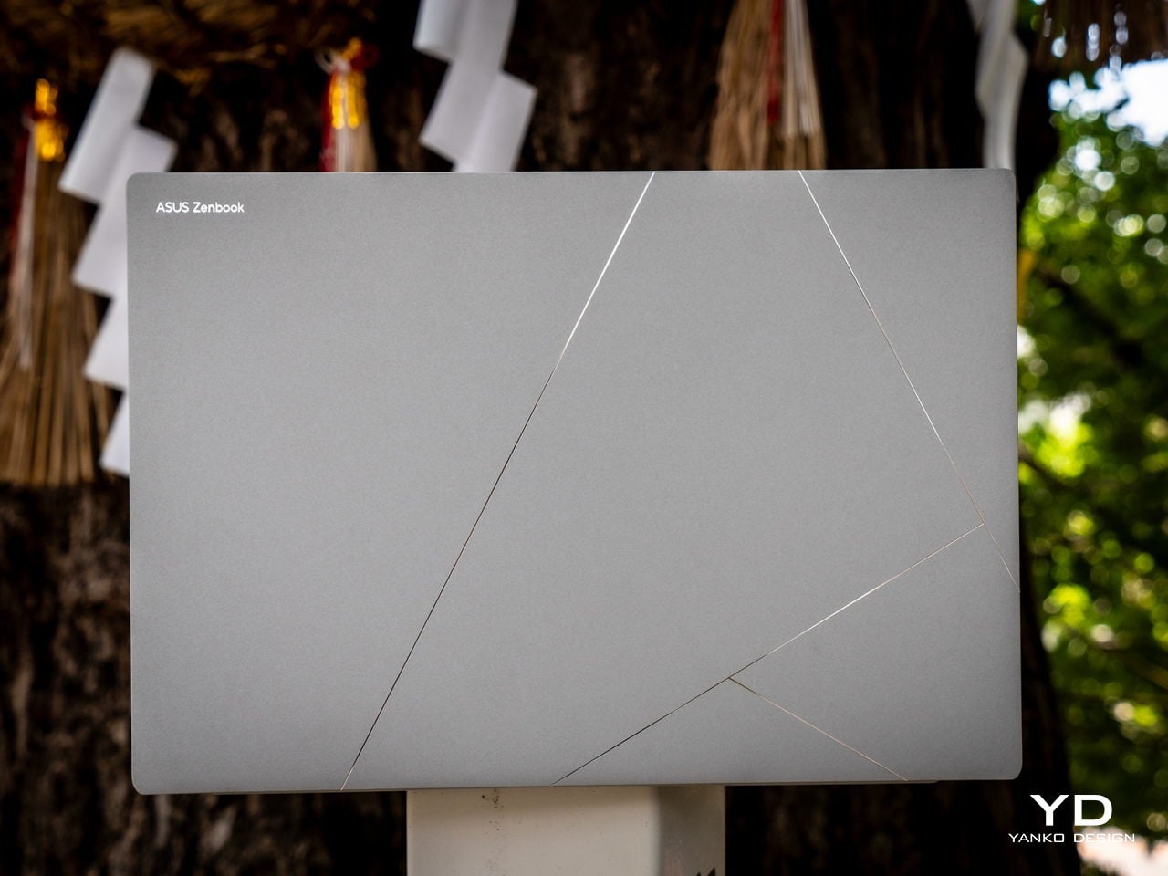
Laptop lids are often made from metal like aluminum or plastic, both of which offer different strengths but also weaknesses. Lately, titanium has become the hot new material for electronics because of its durable and lightweight properties, but it is far from the end-all and be-all of metallic products. Taking a page from the aerospace and luxury watch industries, ASUS developed a new oxidation or “ceramization” to produce a sort of hybrid or meta-material, if you would, that combines not only the lightness of aluminum and the hardness of ceramic but also creates a new visual and tactile experience never before seen on a laptop.

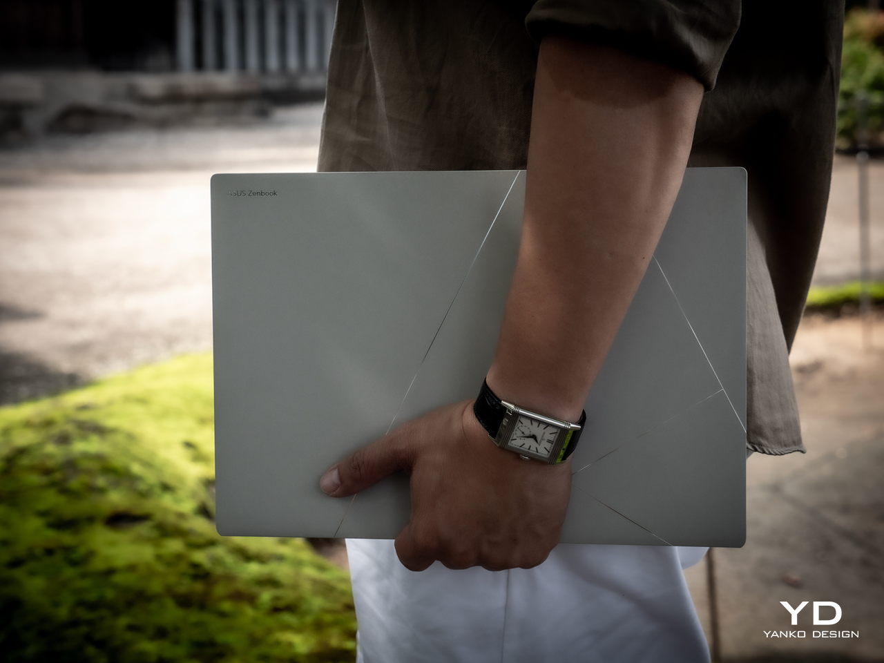
“Ceraluminum” is the marketing term for what ASUS previously called Plasma Ceramic Aluminum, and our very own Vincent Nguyen describes the material in better detail. The end result is a laptop cover that looks nothing less than a piece of art, especially with the lines that cross its surface to create geometric patterns. Not only is the laptop great to look at, but it also feels great to touch. There’s a certain degree of roughness to its surface, almost like paper. Considering its paper-light weight and thinness, it almost feels like you’re simply carrying a stack of white or gray paper.

And yes, the ASUS Zenbook S 14 is unbelievably thin and lightweight, only 1.1cm (0.47 inches) thin and 1.2 kg (2.65 lbs) light. It gives the laptop a rather striking profile that grabs attention from any angle. And with its tactile design and lightweight body, you might find yourself wanting to carry the laptop in your arms often, truly a design that you can feel.

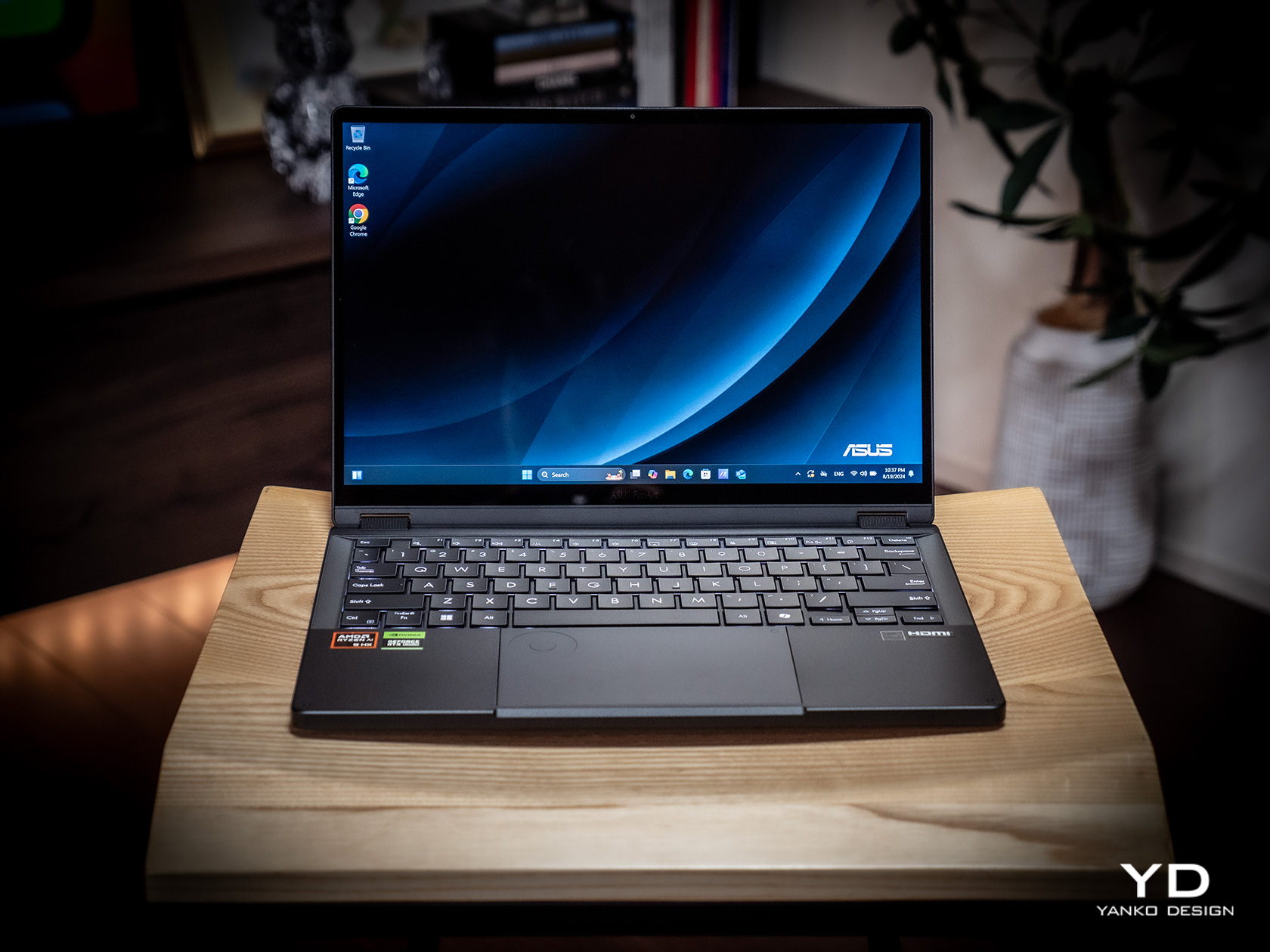
Fortunately, the laptop’s beauty doesn’t disappear when you lift up the lid. The very thin bezels almost disappear completely, giving way to the bright and colorful ASUS Lumina OLED display. The clean and modest design of the keyboard and the touchpad pad perfectly complement the minimalism of the laptop’s lids. Even the rather unique ventilation grid lying between the keyboard and the display hinge brings functional aesthetics into the picture. No matter which way you look at and hold the Zenbook S 14, you are greeted by a strikingly elegant display that you touch with your eyes as well as with your fingers.

Ergonomics

With such a thin and light design, there is really no argument about the portability of this laptop. You can easily carry it anywhere by hand or slip it inside a bag, and use it anywhere as well, including on your laptop. This makes the Zenbook S 14 ideal for people who find themselves always on the move, sometimes even at a moment’s notice. Best of all, they aren’t losing out on power and performance, as we’ll see later, so there are almost no downsides to its design.

That said, if you’re a bit picky about your typing experience, you might have some issues with the ASUS Zenbook S 14’s keyboard. With a profile as thin as this, it shouldn’t come as a surprise that the keyboard actually has a bit of a shallow travel distance, just around 1.1mm. Mind you, that’s not exactly a deal breaker and we found it to still be quite comfortable and enjoyable to type on. In fact, considering that same thin profile, it’s a miracle that this keyboard could actually feel this good. Again, your mileage might vary, but keyboard connoisseurs might want to take note of this detail.

Another minor matter that may or may not ruin your experience is the very bright keyboard backlight. Although adjustable, even its dimmest setting might feel a little blinding to more sensitive eyes, especially in a dark room. On the bright side (no pun intended), the light and the keys are also very visible even in bright surroundings. Again, not a huge flaw but something you’ll want to consider based on your personal preferences.

Performance

You might be wondering what the catch is since thin laptops have traditionally been underpowered to the point of being unusable for anything but the most basic computing tasks. There are a small number of gotchas, indeed, but not in the ways you might expect and definitely not damning enough to ruin mar the Zenbook S 14’s prestige. In fact, it’s pretty mind-blowing that this ultra-thin laptop is able to perform this well, offering a no-compromise mobile computing experience.

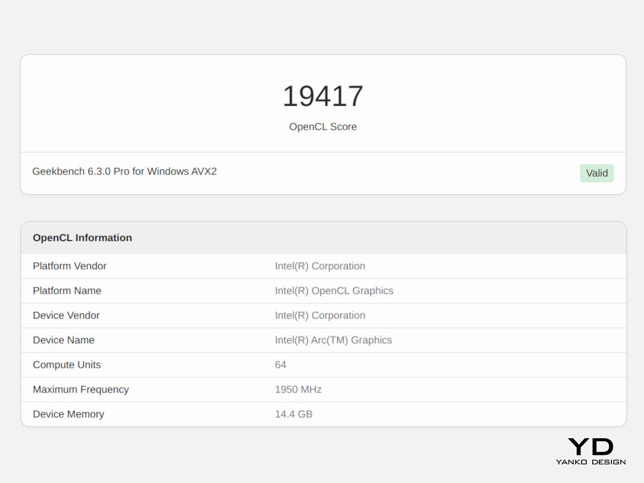
Part of that is thanks to the new Intel Lunar Lake processor, specifically the Core Ultra 7 258V. It uses a system-on-chip design that integrates a CPU, a dedicated NPU (Neural Processing Unit), an Intel Arc Xe GPU, and 32GB of RAM. Yes, that memory is built into the processor, which does have an important implication we’ll get to later. Regardless, this compact silicon design is what allowed Intel and ASUS to maximize internal space, allowing them to cram more or bigger components, like a 72Wh battery.

The Zenbook S 14’s raw benchmark performance is nothing short of impressive, easily matching other 28W laptops. Considering ultra-thin 14-inch laptops often operate at a much lower 15W TDP to avoid overheating, this is quite a remarkable feat. Perhaps the most telling achievement is how this slim laptop can deftly handle gaming loads with medium graphics settings instead of the typical low settings. Although it’s not marketed as a content creation or gaming laptop, it can definitely fit the bill with some performance tweaking and adjustments.

What’s a bit more interesting, however, is how the laptop’s performance seems to lean more towards unplugged use. Of course, this is perhaps one of the most important considerations for a laptop, since wouldn’t want to have it always plugged in, defeating the purpose of its portability. Long story short, the Zenbook S 14 seems to perform best when on battery, providing a good balance of power and efficiency to meet any computing need anywhere, anytime. And with mixed use, you can get a little under 20 hours of battery life on a single charge. That’s well under ASUS’s advertised 27 hours of non-stop video playback, but the realistic numbers are still quite good.

This makes the ASUS Zenbook S 14 a great all-around laptop, and that includes multimedia and, as mentioned, even games. The 14-inch 3K OLED screen is just breathtaking with its brightness and colors, and being part of the ASUS Lumina line, it is also PANTONE-validated, making it an excellent tool for creators, and the monitor’s 120Hz is actually a must-have for gamers. Four high-quality speakers give a punchy treatment to videos and music, making this laptop a multimedia powerhouse despite its modest and business-minded looks.

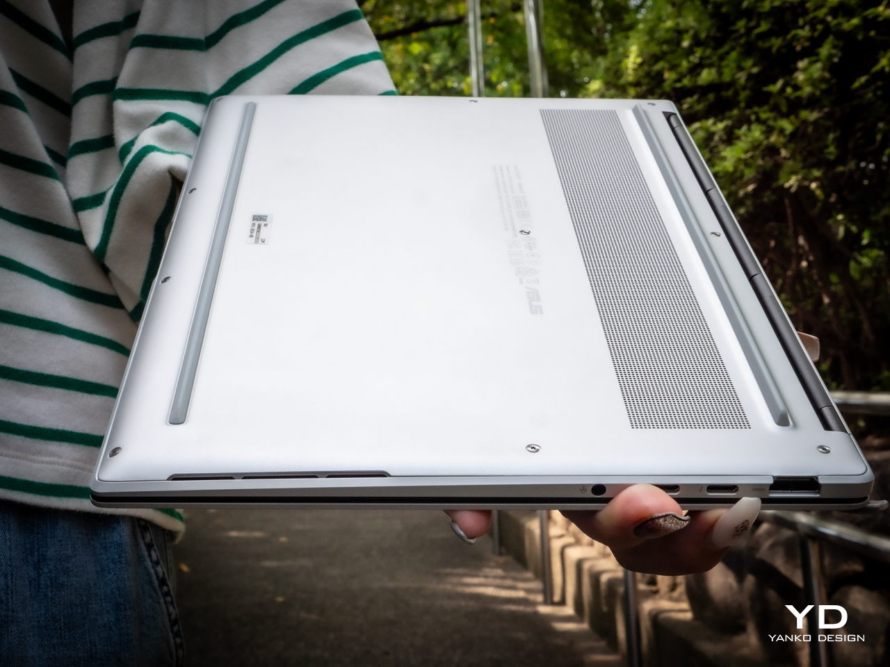
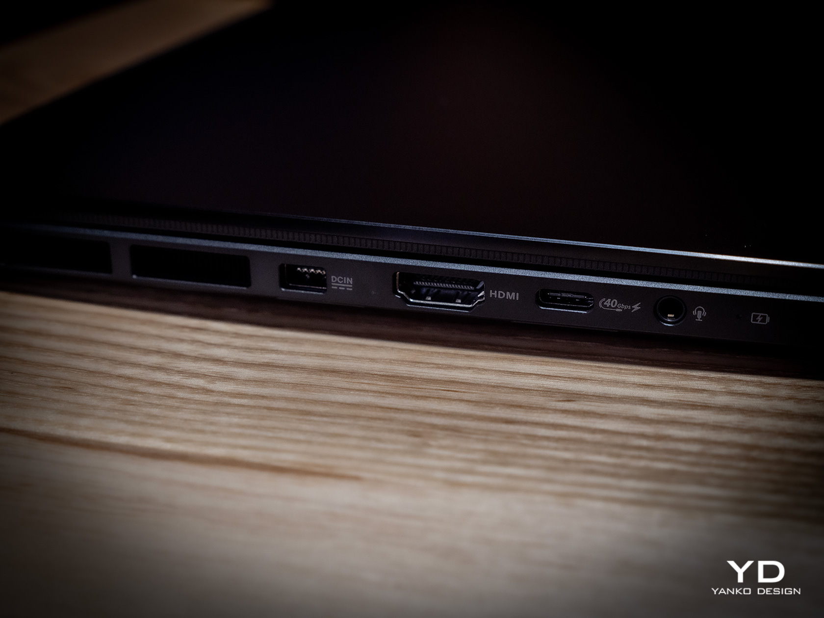
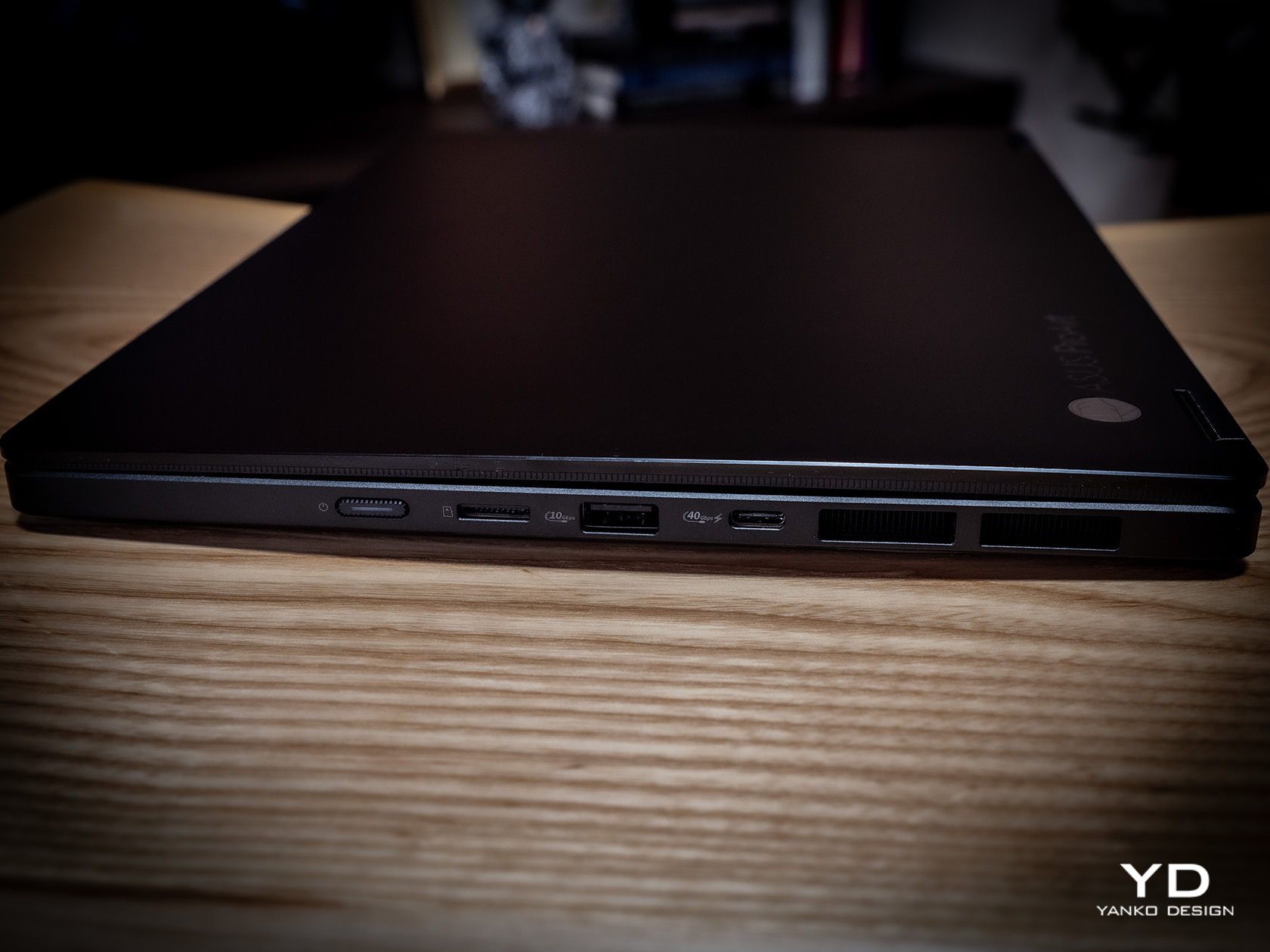
One area where the Zenbook S 14 might come up short for some people is the number of ports available. Remember that time when Apple got chided for replacing all the ports on MacBook Pros with just four C-Type Thunderbolt 4 ports? It’s not as bad here, but there will definitely be some who will find the selection far too modest. There are only two of those USB-C Thunderbolt 4 ports, both of which can be used for charging, data, and video out. There’s also one full-sized USB 3.2 Gen 2 Type-A port, one HDMI 2.1 port, and a headphone/mic combo jack. That’s pretty much it. There isn’t even an SD card reader, which will probably disappoint photographers. Both USB-C ports are located on the same side, which forces you to have the charger and dongles competing for space. The lack of other ports might not be that big of a problem when you dock the laptop at home or in the office, but if your office tends to change locations, you’ll have to bring a hub with you as well.

Sustainability

ASUS has been working hard to step up to the challenge of making the world a greener place for future generations, and its most ambitious attempt yet can be seen in its most ambitious material design as well. Ceraluminum isn’t just a fancy new material with a beautiful aesthetic and satisfying texture; it is also a more sustainable alternative to the usual metal anodizing techniques used by manufacturers. Instead of corrosive acids that release harmful toxins into the air, ASUS’ ceramization process uses water and super-high voltage electricity to produce an even better oxide layer, creating this blend of lightweight durability your fingers will love.

The ASUS Zenbook S 14 is also made to last, thanks to that Ceraluminum material that’s not only scratch-resistant but also smudge-resistant. And despite its luxurious aesthetic, this laptop actually boasts military-grade MIL-STD-810H compliance, ensuring that it can survive accidental bumps, high-frequency vibrations, and extreme temperatures. One aspect that takes a point from its longevity is the fact that you can only upgrade the M.2 NVMe SSD, and only up to 1TB capacity. The 32GB of RAM is, as mentioned, fixed and soldered. Yes, that might be enough for most use cases, but only today. Who knows how demanding apps and services will be just a few years from now.

Value

Most people marvel at ultra-thin laptops but pass them over because those slim profiles barely have enough power to meet their needs. Finding the right balance between portability, power, and price is like a hunting game, but you don’t need to go any further than what ASUS is now offering on the table. With a beautiful 14-inch screen, only 1.1cm thick, and weighing only 2.65 lbs, the ASUS Zenbook S 14 delivers a versatile machine that doesn’t compromise on performance, at least not in significant ways.

Best of all, it’s an absolute beauty to behold and to hold! Ceraluminum might sound like a buzzword, but its aesthetic value and tactile experience are the real deal. The $1,499.99 price tag for the 32GB RAM model is indeed nothing to scoff at either, but when you realize all the value that you’re getting, it’s almost a steal.

Verdict

We have finally reached a point where laptops no longer need to be hulking blocks of metal just to catch up with their desktop counterparts. While they still lose out on raw performance and customization, today’s laptops can be slimmer than ever and, more importantly, offer a design experience that desktop towers can only dream of. Of course, it takes no small amount of creative thinking, bold decision-making, and the courage to go beyond the boundaries of convention to create an amazing experience that will satiate consumer’s thirst for better-designed products. ASUS has definitely proven that it isn’t averse to taking that big leap, and the Zenbook S 14 is a shining testament to that daring spirit to create designs that you can see and feel.

The post ASUS Zenbook S 14 Ceraluminum Laptop Review: Elegance You Can Feel, Power You Can Touch first appeared on Yanko Design.

ESR iPhone 16 Classic Hybrid Case with Stash Stand Review: Stay Original, Stay Protected

PROS:


  • Slim and light, lets original iPhone 16 design shine

  • Multi-angle stash stand also protects the camera

  • Unbeatable all-around protection

  • Doesn't get in the way of MagSafe features

CONS:


  • Stand doesn't support (tall) vertical orientation

RATINGS:

AESTHETICS
ERGONOMICS
PERFORMANCE
SUSTAINABILITY / REPAIRABILITY
VALUE FOR MONEY

EDITOR'S QUOTE:

ESR's newest range of Classic Hybrid Cases with Stash Stand gives the iPhone 16 the protection it deserves with no compromise to functionality nor a hit on its innate beauty.

The new iPhone 16 series is here, along with a new generation of accessories designed to complement Apple’s latest and greatest smartphone. While the iPhone has changed considerably over the years, what hasn’t really changed is its price tag, making it quite an expensive investment that people want to protect and keep for as long as possible. There is no shortage of cases that promise that, but many of these cover up the iPhone’s minimalist beauty with gaudy designs and fatten up the otherwise slim profile in the name of rugged durability. Other cases also add some functionality that complicates the iPhone’s appearance and use, going against the spirit of simplicity that Apple embraces. It’s rare to come across a phone case that offers protection that doesn’t obscure the original design or adds utility that doesn’t compromise other features. The new ESR iPhone 16 Classic Hybrid Case with Stash Stand and its siblings promise exactly that and we put them in our hands to see how well that promise holds.

Designer: ESR

Click Here to Buy Now: $19.99

Aesthetics

One of the biggest reasons why some people are hesitant to slap a protective case on their phones is that these cases tend to make the phones look ugly and bulky. Of course, there are people who actually prefer to dress up their phones with stickers and decals, but the large majority want to show off their new phone’s pristine beauty, especially if that phone is an iPhone. That Apple logo on the back is, of course, a matter of pride for owners so it feels counterintuitive to cover that up with a thick and opaque case.

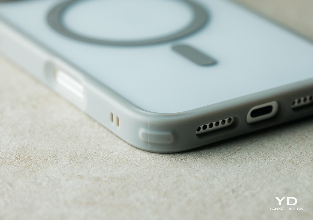
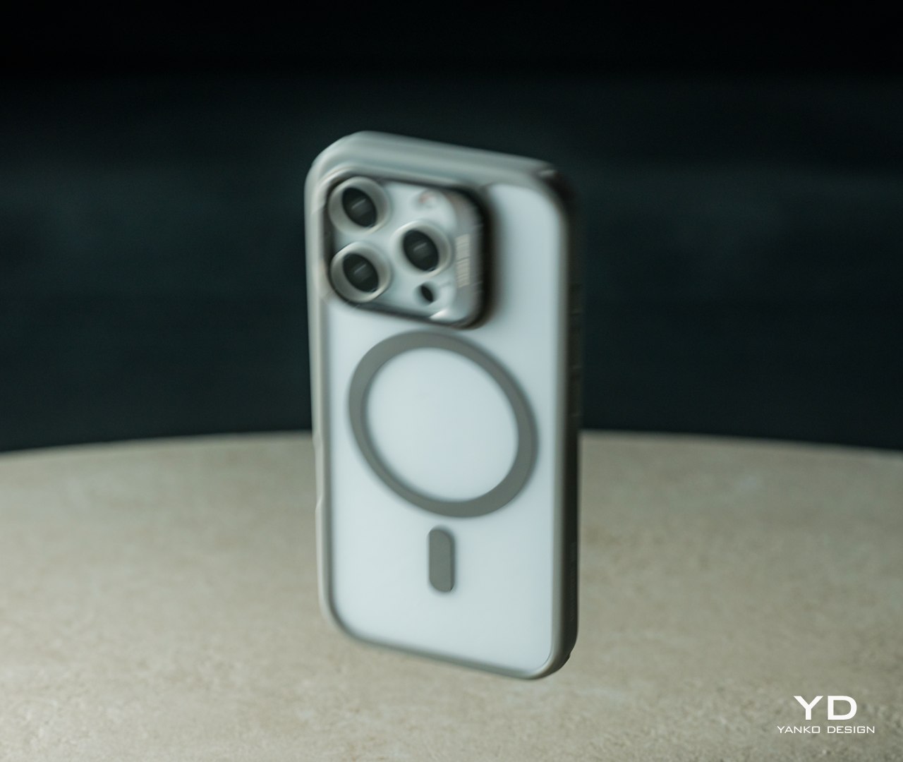
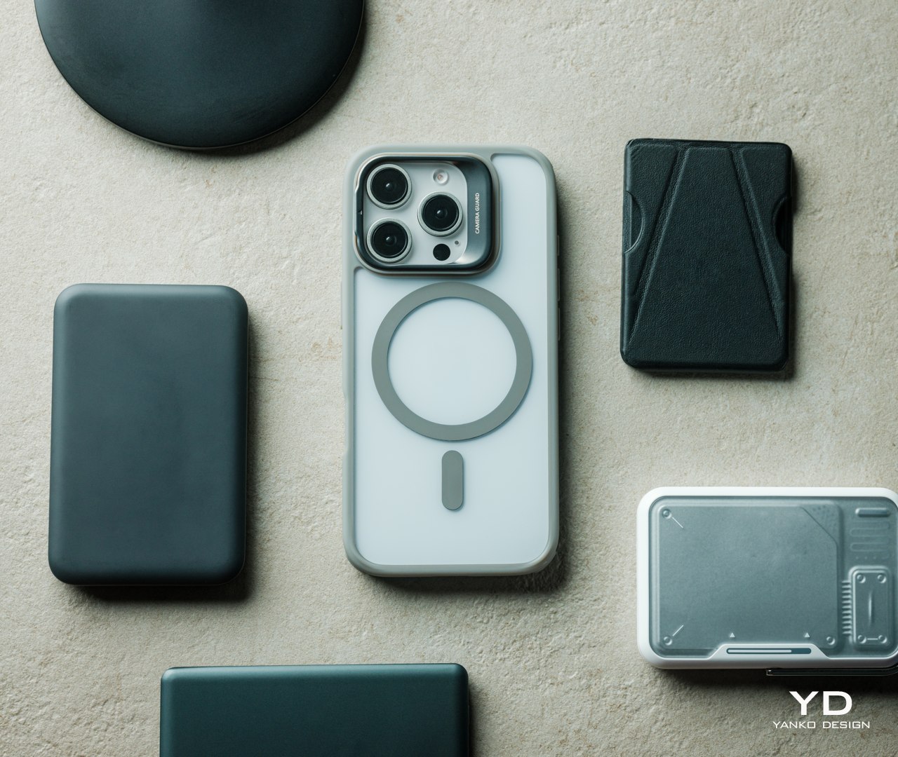
There’s a reason that ESR puts the “Classic” label on this series of cases for the new iPhone 16. Despite offering an impressive set of protective features, the transparent back still lets the original style and color of the iPhone 16 shine through, though you do have choices of colored edges to match the iPhone’s natural color as well. With a back that’s only 1.6mm thick, it doesn’t add that much bulk to the slim and sleek phone.

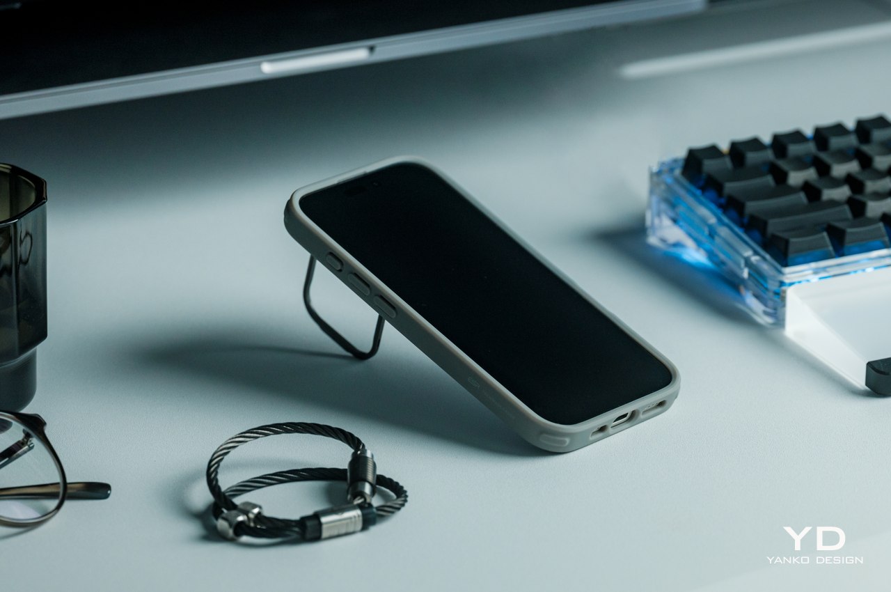
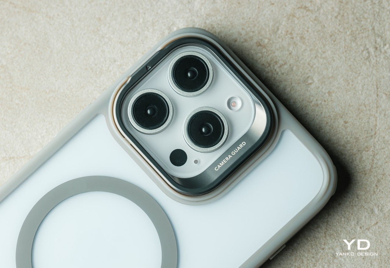
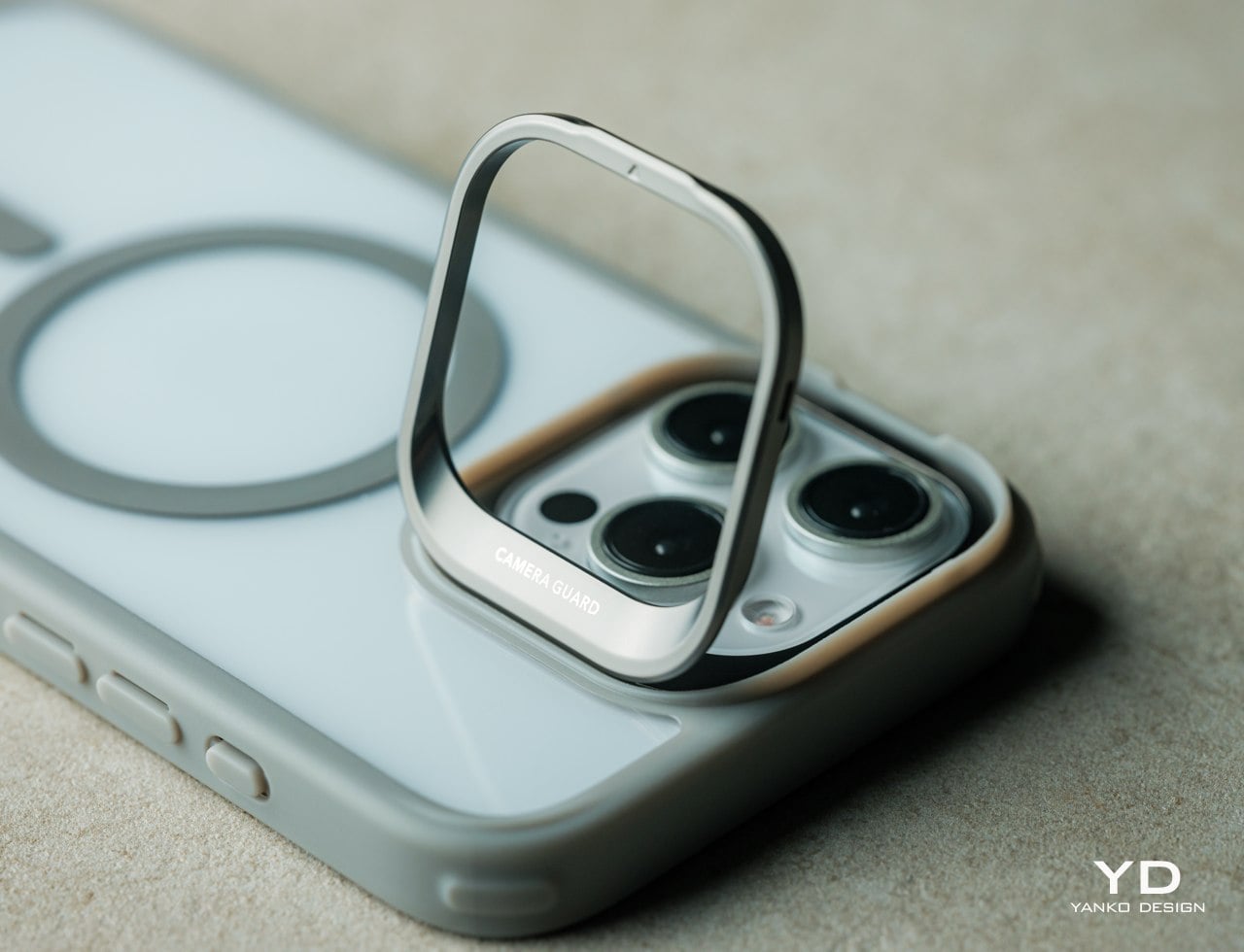
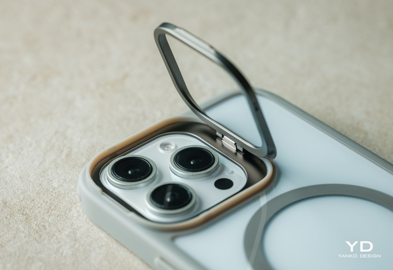
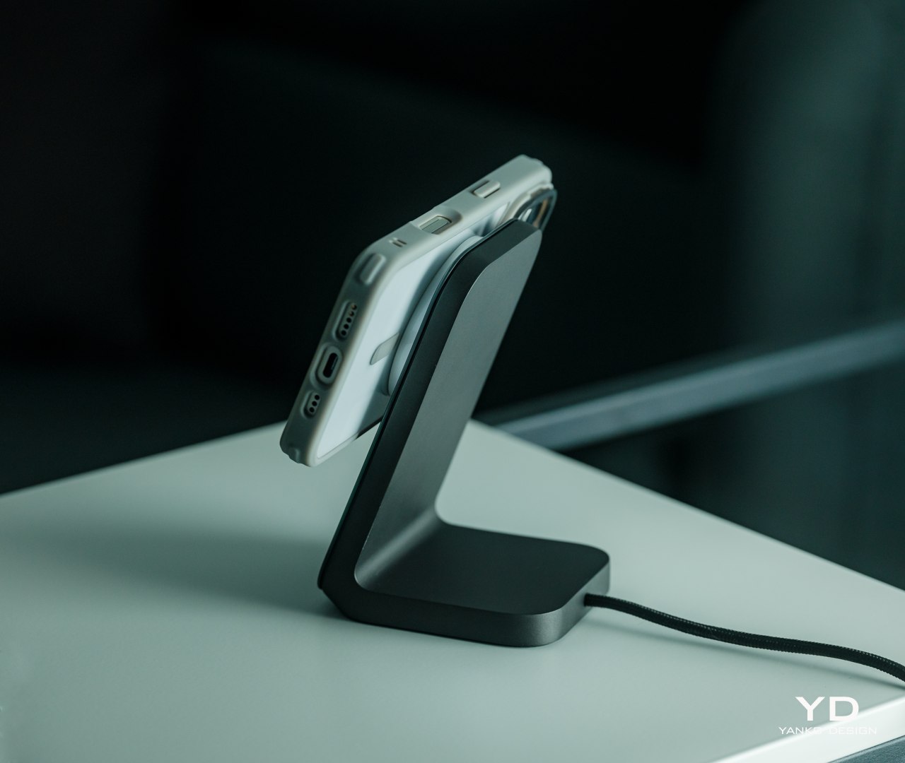
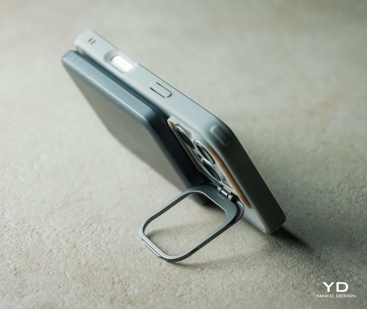
The ESR Classic Hybrid Case with Stash Stand embraces Apple’s minimalist design language, offering protection that you can’t see but definitely feel. It has no extraneous markings or branding that would mar the otherwise pristine beauty of the iPhone 16. It hugs the phone’s frame so tightly that it almost looks like a transparent skin wrapped around the phone. And the parts that you do see are also designed to be aesthetic, like the zinc alloy of the camera guard kickstand with a matte finish that just seamlessly blends with the camera bump’s design. ESR clearly had not just phone protection in mind but also user satisfaction in seeing the classic elegance of their iPhone 16 without worrying about accidents.

Ergonomics

Smartphone cases actually do double duty when it comes to protection. They buffer the force of impact when phones fall or bump into hard objects, but they also add some texture to the phone’s back to increase their grip. In other words, cases make it easier to hold the phone and reduce the risk of dropping it, and when you do drop it, the cases absorb some of the shock and protect the material underneath from scratches and dings.

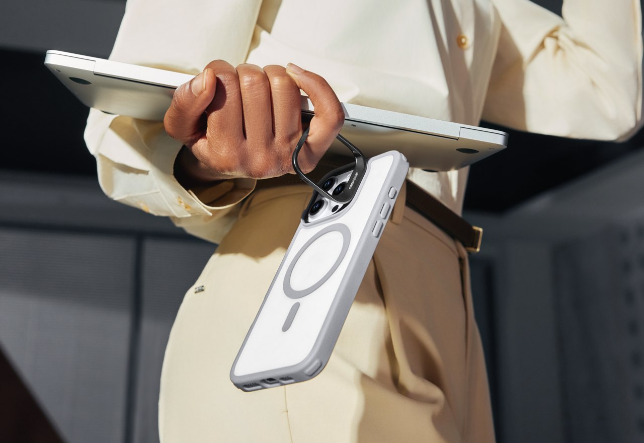
Of course, that’s only true for cases that don’t increase the size and weight of the phone to the point of making it uncomfortable to hold or don’t use a material that’s even more slippery than the phone’s glass or metal rear. Fortunately, the ESR Classic Hybrid definitely checks the right boxes here as well, with an overall thickness of only 14.2mm and a weight of only 42g (1.7oz). The materials themselves also have a kind of “sticky” quality that prevents the phone from slipping off your hand easily. That stash stand also functions as a ring you can hang from your finger while your hands are carrying other things, almost like a built-in loop. It would have been nice if it could also function like a popsocket of sorts so you can hold the phone with even more confidence, but the current design doesn’t make that possible. That’s a puzzle that ESR will hopefully solve in future iterations of the Stash Stand.

Performance

A protective case is only as good as the protection it offers, and the ESR Classic Hybrid with Stash Stand for the iPhone 16 definitely has plenty of that to go around, almost literally. Almost every side of the case has a feature that ensures the safety of the phone no matter which side it drops on, including the 1.2mm raised edge around the screen and the 0.7mm raised camera guard. There’s also the acrylic-PC material used for the back of the case for enhanced durability and a TPU edge that is promised not to discolor and turn yellow over time.

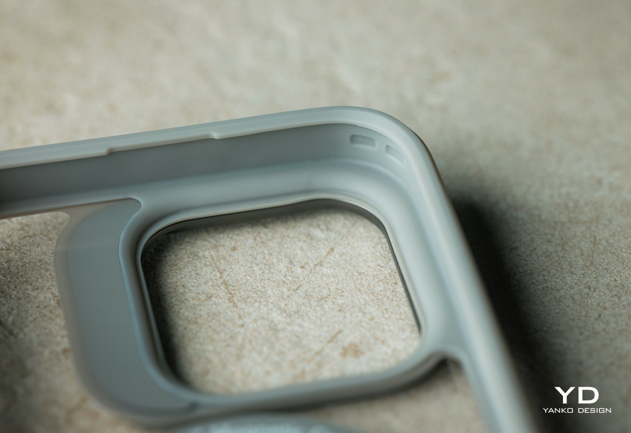
One unique feature of ESR cases is its Air Guard corners, which are basically small empty pockets that serve as cushions for the most common part of the phone that hits the pavement. These look like very small bumps rather than obnoxious bumpers, staying true to the minimalist design language that the Classic Hybrid cases embrace. All of these give the cases military-grade protection, enough to meet the MIL-STD-810H standard for shock protection. The case can protect the phone from an 11-foot drop, offering iPhone 16 owners peace of mind without compromising their experience.

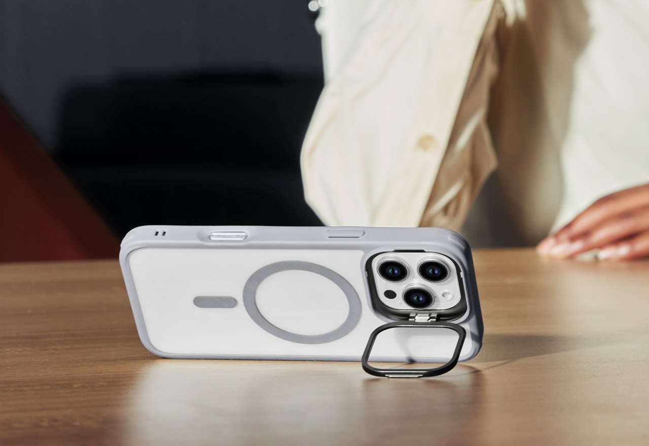
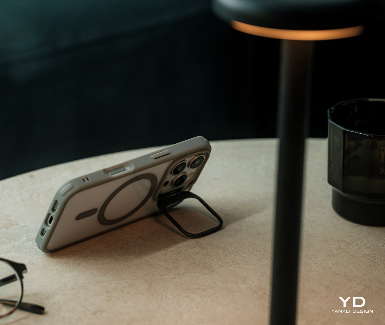
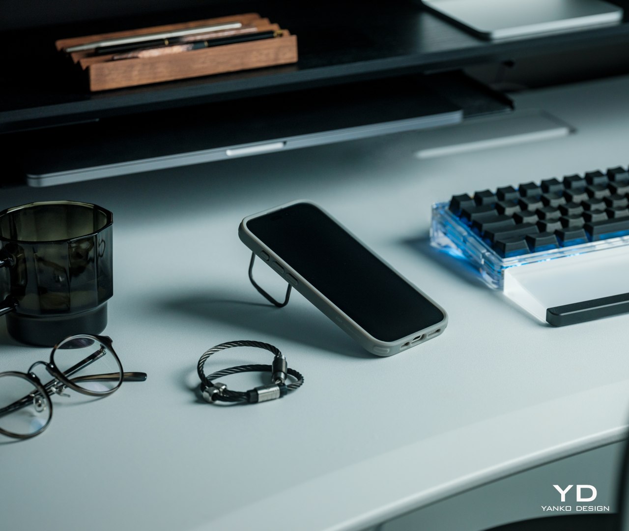
The “Stash Stand” part of the ESR Classic Hybrid’s name comes from the camera guard that flips down to transform into a multi-angle stand, supporting angles of anywhere between 15 to 85 degrees for your preferred viewing angle. Unlike other built-in phone stands like rings and popsockets, the stash stand gets out of the way when you don’t need it and even protects your cameras. The one disadvantage to this design is that you can’t prop up your phone vertically unless you lay it almost flat on a table, which is fine for scrolling through social media but not for video calls.

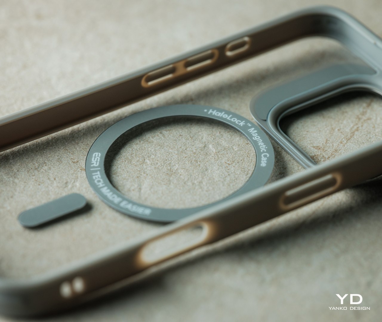
Apple’s introduction of MagSafe technology presented a design problem for case makers, especially those with rugged and thick materials. MagSafe won’t work through such cases, at least not without some clever designs and technologies. Fortunately, that’s no longer a problem today and, even better, ESR has found ways to actually improve on the technology. For one, it has even stronger magnets, about 1.5kg of magnetic locking force, so you don’t have to worry about the case making accessories loose and detach accidentally. It can even let the phone charge faster than with other MagSafe-compatible cases, beating its competitors by an average of 30 minutes. Best of all, the magnetic ring is embedded in the case itself, so it won’t scratch your iPhone’s back.

All in all, the ESR iPhone 16 Classic Hybrid Case with Stash Stand offers unparalleled, military-grade protection that doesn’t get in the way of your enjoyment of your phone. It retains the iPhone 16’s natural beauty while also giving you color options to match your phone and your style. It’s a no-compromise design that brings the best of all worlds while staying true to Apple’s own design philosophy.

Sustainability

Like many protective cases these days, the ESR Classic Hybrid is a mixture of different materials that each offer a different kind of protection. The acrylic-PC material on its back offers durability and scratch resistance, while the TPU around the edges gives flexibility and shock absorption. Unfortunately, these materials are also known to be non-sustainable, though there is definitely research and experiments on using alternative materials that produce the same durable properties.

That’s not to say, however, that ESR isn’t doing due diligence in creating a greener future, but its sustainability results are a little bit more indirect. For one, it offsets its carbon emissions through the ClimatePartner program. In addition, it helps keep phones away from trash bins and dump sites longer by protecting these precious devices and ensuring their longevity. You might not see a phone case as a “green” product, but ESR is definitely doing its part in healing the planet in its own small ways.

Value

Starting at only $19.99, the ESR Classic Hybrid Case with Stash Stand is pretty much a no-brainer for new iPhone 16 owners. After all, you are getting an impressive amount of protection against accidents and a built-in stand that stays out of the way and out of sight when you don’t need it. Plus, it retains the iPhone 16’s slim profile, sleek looks, and original style, allowing you to enjoy the natural colors you selected when you bought it. What’s not to love?

And for those who want something more or something different, they don’t have to stray far from ESR’s other new iPhone 16 cases. The Cloud Soft Case with Stash Stand, for example, has the same basic design but uses premium liquid silicone to give the phone a softer touch. The Cyber Tough Case with Stash Stand, on the other hand, levels up the durability with a 3-layer design that includes a robust PC backing, a flexible TPU shell, and an inner PORON lining. With these three designs, ESR has got all your iPhone 16 protection needs covered and in your preferred style.

Verdict

Just like with power banks, smartphone cases have become a fact of modern mobile life. No matter how durable companies make their phones, there will still be that nagging fear of throwing away money when, not if, you accidentally drop your precious investment. With the arrival of the iPhone 16, ESR took the opportunity to showcase the best of its design with the Classic Hybrid Case with Stash Stand. Offering military-grade protection that doesn’t make the iPhone 16 look like a tank, this case with a built-in stand is something you’ll have no reason to take off once you’ve put it on.

Click Here to Buy Now: $19.99

The post ESR iPhone 16 Classic Hybrid Case with Stash Stand Review: Stay Original, Stay Protected first appeared on Yanko Design.
AirPods 4 with ANC Review: Open-Ear Design That Works

PROS:


  • Open-Ear ANC: Combines noise cancellation with an open-ear design for situational awareness.

  • Seamless Apple Integration: Instantly switches between Apple devices for easy use.

  • All-Day Comfort: Lightweight, secure fit perfect for extended wear.

  • Hands-Free Siri: Convenient voice control and touch-free interactions.

  • Great Sound: Crisp audio with deep bass and clear highs, even in an open design.

CONS:


  • Limited Passive Isolation: Less natural noise blocking due to the open-ear design.

  • Reduced Battery with ANC: ANC shortens battery life to around 4 hours per charge.

RATINGS:

AESTHETICS
ERGONOMICS
PERFORMANCE
SUSTAINABILITY / REPAIRABILITY
VALUE FOR MONEY

EDITOR'S QUOTE:

AirPods 4 bring joy to everyday life with open-ear comfort, ANC, and seamless integration, all while delivering immersive sound.
award-icon

Apple’s back with the AirPods 4, and as someone who’s been using them for a bit now, I wanted to share my thoughts. Apple has refined nearly every aspect of this model, improving fit, sound, and functionality without losing sight of the simplicity that’s made AirPods a household name. If you’re like me and appreciate the open-ear style, especially for its comfort and lightweight feel, these new earbuds bring even more to the table. They deliver a more secure fit and significant performance enhancements that may surprise you. Whether you’re listening to music, taking calls, or multitasking throughout the day, the AirPods 4 strikes a delicate balance between staying connected to your surroundings and delivering top-tier audio quality. If you’ve been waiting for an upgrade or want to experience something a little more refined, these might be worth your attention.

Designer: Apple

Design That Feels Just Right

At first glance, the AirPods 4 look familiar—sleek and minimalist, just like we’ve come to expect from Apple. But when I picked them up, I noticed some subtle changes that made a real difference. Apple continues its commitment to minimalism but has introduced thoughtful design refinements aimed at enhancing comfort and stability.

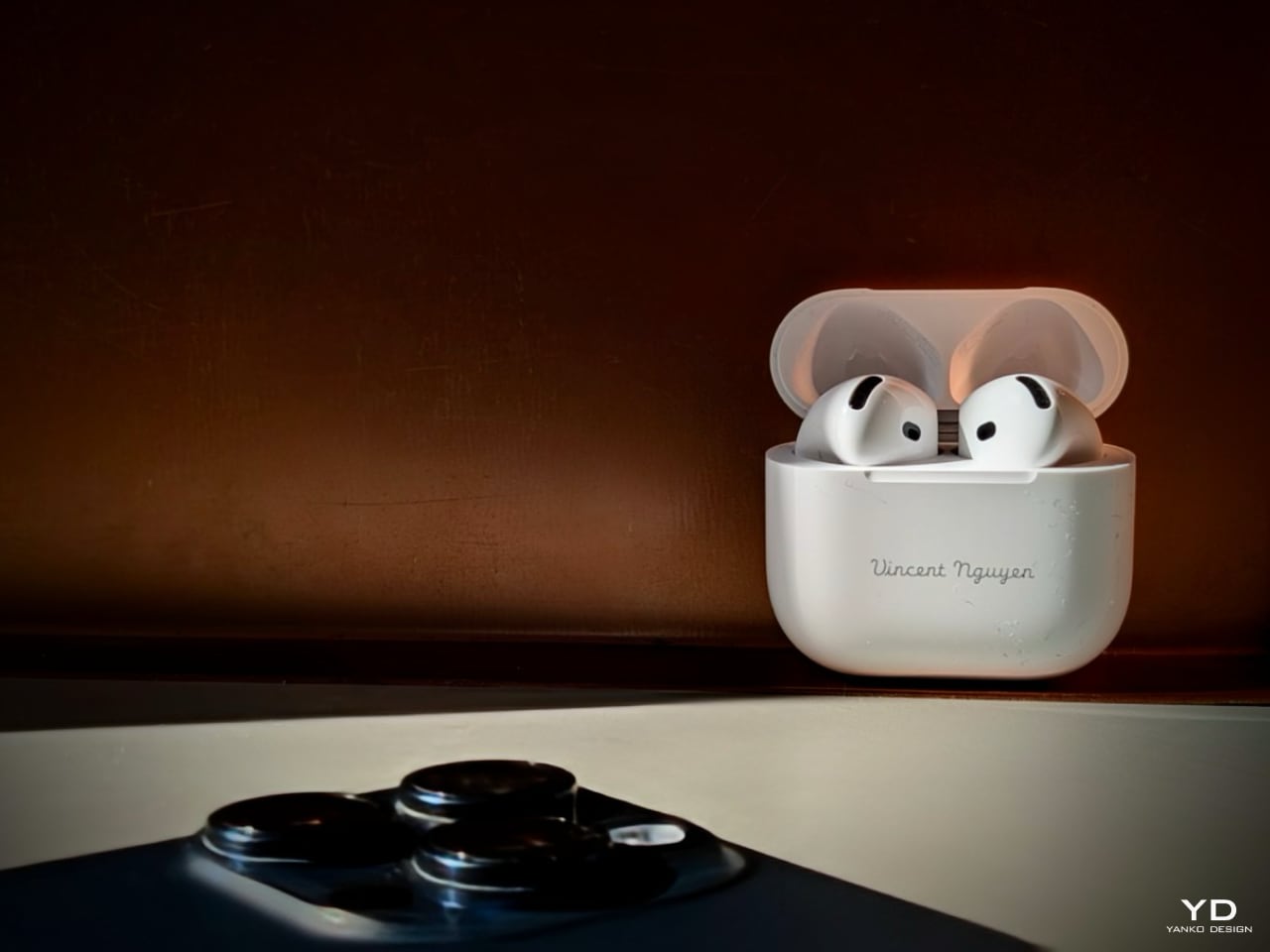
Apple AirPods 4 + ANC

The external proportions and contours have been reimagined to ensure a more secure and comfortable fit. Apple used advanced 3D photogrammetry to analyze over 50 million ear shapes—which is pretty impressive if you ask me. By adjusting the width and refining the angle of the AirPods, they’ve managed to make them sit more securely in the ear without feeling intrusive. These changes focus less on dramatic visual differences and more on subtle enhancements that improve how they feel during daily use.

I found that they sit in my ears more reliably now, whether running to catch a flight, working in the kitchen, or rowing on the exercise machine. The refined contouring means they stay in place without needing constant readjustment, regardless of my activity. These design updates maintain the sleek, unobtrusive form while offering better support for all-day wear.

The stems are a bit narrower this time, housing the new H2 chip, which balances the earbuds nicely when I wear them. The force sensor in the stem remains an essential part of the design, allowing me to control music playback or calls effortlessly with a simple press. It keeps things straightforward without adding unnecessary buttons or touch controls that can sometimes be finicky.

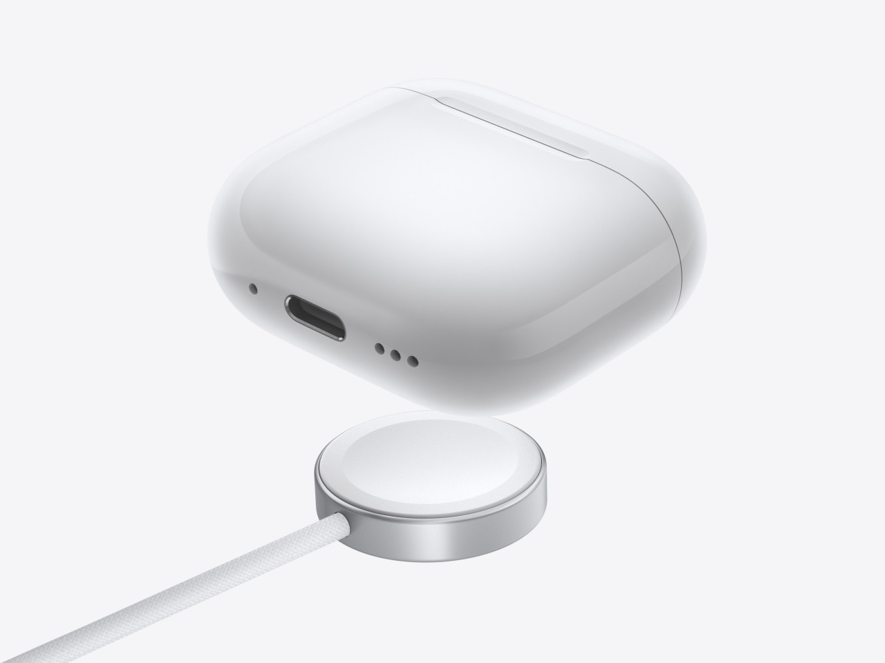
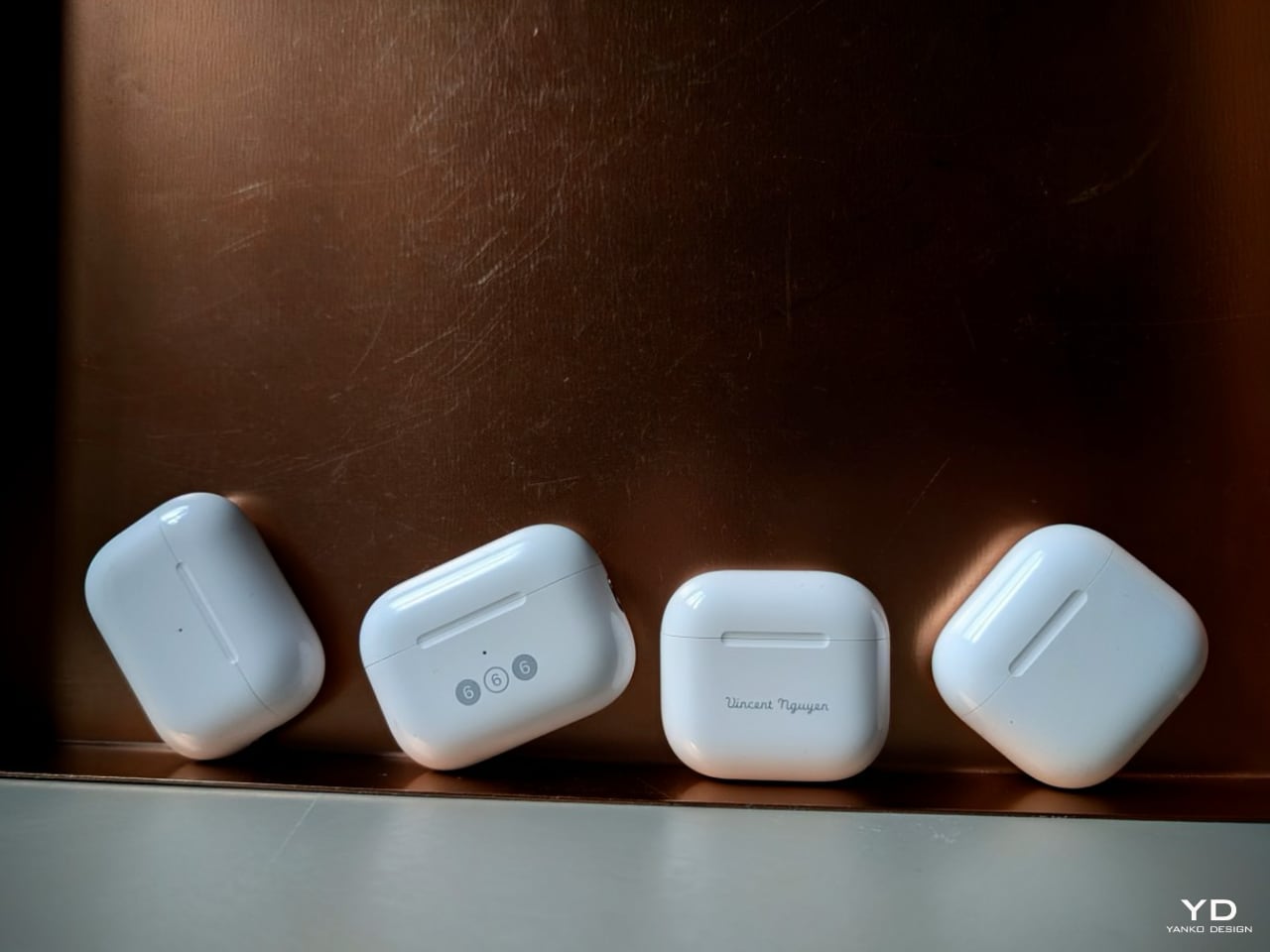
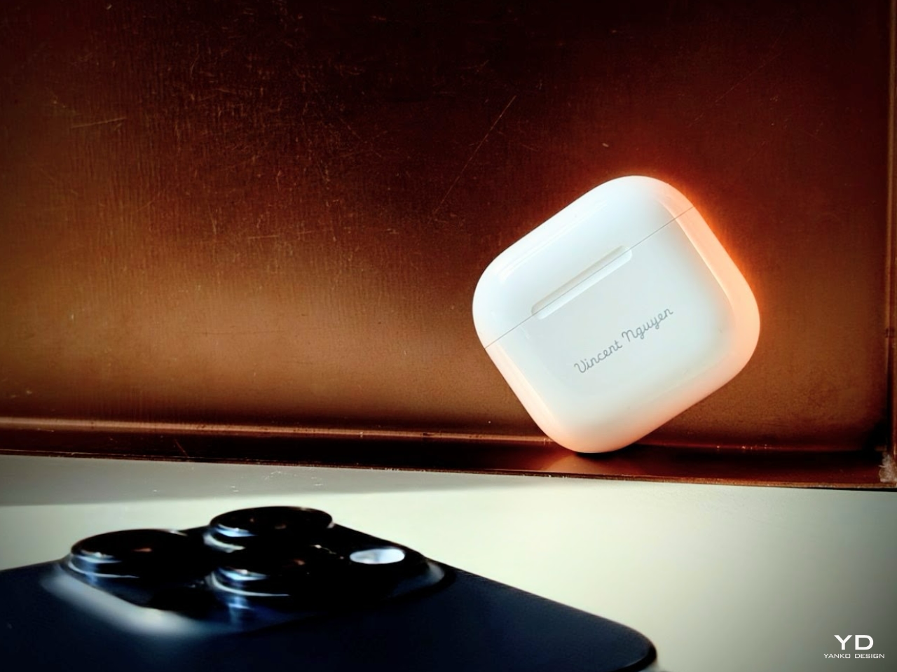
The charging case also got an update—it’s over 10% smaller, which might not sound like much, but it’s noticeably more pocket-friendly. I’m not sure if Apple consciously decided to design the AirPods case’s size and shape to fit the coin pocket on jeans, but it’s the perfect place to carry them—making them the ultimate everyday carry device. This smaller size continues the trend of portability and ease of use, fitting seamlessly into your day-to-day routine without adding any bulk.

AirPods Pro 2 + AirPods 4 + ANC

Plus, it supports seamless charging options through USB-C, Qi wireless chargers, and even Apple Watch chargers. That is super convenient because I can use whatever charger I have handy.

While the aesthetic remains in line with previous models, these refined proportions make the AirPods 4 feel like a more mature evolution of the open-ear design that many of us already love.

Comfortable for the Long Haul

Wearing the AirPods 4 has been a comfortable experience, especially since I prefer open-ear designs over in-ear buds like the AirPods Pro. There’s a time and place for the closed-ear design of the AirPods Pro with passive noise cancellation—about 30% of the time for me, with airplanes being a prime example. But for the rest of the time, an open-ear design with Active Noise Cancellation is the ideal and best-case scenario in any setting. The AirPods 4 strike that perfect balance, offering comfort while keeping you connected to your environment when needed.

AirPods 4 + ANC

The refined shape accommodates a broader range of ear sizes, and I can wear them for hours without discomfort. The earbuds feel lightweight, and the pressure-equalization vents mean there’s no buildup of pressure inside my ears, which is something that used to bother me with other earbuds.

One feature I didn’t expect to appreciate as much as I do is the new touch-free Siri interaction. It’s neat to nod for “yes” or shake my head for “no” when responding to Siri notifications. It might sound a bit futuristic, but racing across terminals to catch a flight with a roller board in one hand and a coffee in the other, having both hands full, it’s a small convenience that makes multitasking feel effortless.

The AirPods 4 have held up well durability-wise. They’ve got an IP54 rating, so they’re resistant to dust, sweat, and a bit of water. I’ve worn them during workouts, and even if I was caught in the rain or a storm, I’m confident they’d survive with a clean. It’s reassuring to know they can handle the wear and tear of daily life.

Sound Quality That Surprises

Now, let’s talk about sound. I wasn’t sure what to expect from an open-ear design, but the AirPods 4 have genuinely impressed me. The audio is crisp, with richer bass and clearer highs than anticipated. The custom high-excursion driver and high dynamic range amplifier deliver powerful and nuanced sound well.

The big addition here is Active Noise Cancellation (ANC), and I was initially skeptical about how effective it could be in open-ear earbuds. Flying home from the Glowtime event, I sat in the window exit row—right by the engine—where the low hum can be incredibly distracting. To my surprise, the AirPods 4 with ANC did an impressive job drowning out the engine noise. I’d estimate they’re about 85-90% as effective as the AirPods Pro 2 in similar conditions. The difference in effectiveness comes down to the design: the AirPods Pro 2 benefit from their in-ear fit, which naturally provides passive noise cancellation, creating a tighter seal that blocks more external sound.

Still, considering the open-ear form of the AirPods 4, the ANC is remarkably good at reducing low-frequency sounds like airplane hums, the constant buzz of city traffic, or even those old-school AC units that sound like they’re on their last breath. While it’s not going to block out everything—this isn’t an over-ear headphone cocoon—it’s more than enough to let you get lost in your music or podcast. Even in noisy environments, I found myself more immersed in my media, which shows just how far Apple has pushed the boundaries of open-ear ANC technology. It’s a balance of staying aware of your surroundings while cutting out the distractions that would usually pull you away from the experience.

The real advantage here is that you can enjoy noise reduction without sacrificing comfort or situational awareness. You’re still connected to your surroundings, which is especially useful when you’re out walking or working in an office, yet the ANC does a great job of toning down the distractions that tend to pull you out of the experience. It’s a best-of-both-worlds scenario, and for someone who prefers open-ear designs, it’s a welcome evolution in noise-cancellation technology.

Adaptive Audio is another feature I’ve grown to appreciate. It adjusts between Transparency mode and ANC based on where I am. For example, if I’m walking from a busy street into a quiet café, it seamlessly recalibrates without me having to do anything. It’s one of those things you might not notice immediately, but it enhances the listening experience by adapting to your surroundings.

Calls are clearer, too. The Voice Isolation feature works wonders by filtering out background noise, making sure the person on the other end hears me loud and clear, even in busy or noisy environments. One of the things I appreciate about the open-ear design, though, is the sense of openness it provides during calls. With in-ear passive noise cancellation, I sometimes get that “clogged” feeling, and because of mild to moderate hearing loss, I tend to raise my voice—even with Adaptive Audio on—because I feel disconnected from my surroundings. However, the AirPods 4’s open-ear design eliminates that sensation entirely. A sense of freedom and natural sound flow lets me speak comfortably without that urge to shout.

AirPods Pro 2 vs AirPods 4 + ANC

It’s a refreshing difference. It doesn’t just make calls more pleasant—it also gives me a better handle on how I sound in various environments. When paired with Personalized Spatial Audio, watching movies or FaceTime calls becomes even more immersive, with sound that feels like it’s coming from all around, enhancing the experience without sacrificing that open, natural feeling.

Battery life has been solid, with up to 5 hours of listening time, which extends to around 30 hours with the charging case under typical conditions. Even with ANC enabled, it’s about 4 hours per charge. When I’ve been in a hurry, a quick 5-minute charge gives me roughly an hour of playback, which has been a lifesaver on multiple occasions. Of course, real-world battery life may vary slightly depending on volume levels and usage patterns, but I’ve found these estimates to be consistent with my experience.

A Step Toward Sustainability

It’s appreciative that Apple is making efforts toward sustainability with the AirPods 4. They’ve used 100% recycled rare earth elements in the magnets and recycled gold in the circuit boards. The solder on the main logic board is also made from recycled tin. Even the packaging is entirely fiber-based and 30% smaller than before, aligning with their goal to eliminate plastic packaging by 2025. It’s good to know that companies are thinking about environmental impact, and while it’s just a step, it’s a move in the right direction.

Is It Worth It?

Coming from a guy who owns two pairs of AirPods Pro 2, I can say the AirPods 4 have been a worthwhile addition to my collection. Why two, you might ask? Well, half of my flights are longer than 5 hours, so having a second pair handy is a lifesaver when the battery runs low mid-flight. Now, are the AirPods 4 worth the investment? They may not be the cheapest option, but the overall experience has impressed me. And yes, if I hadn’t been provided a pair to review, I’d 100% purchase one myself—especially for the open-ear design, seamless integration, and everyday convenience they bring.

Between the AirPods 4 and the AirPods 4 + ANC, I’d recommend the latter if finances permit. Not only do you get all the great features mentioned above, but ANC adds the ability to enjoy media without cranking up the volume to drown out background noise. Over time, this could help prevent hearing loss, which is a nice feature for anyone concerned about long-term listening habits.

If you’re already using Apple devices, the integration is seamless. They automatically switch between my iPhone, iPad, Mac, and even my Apple Watch without any effort on my part. Features like hands-free Siri and the Find My Case add that extra layer of convenience to my daily routine, making the AirPods 4 an essential part of my everyday carry.

Final Thoughts

Overall, the AirPods 4 have been a pleasant surprise. Apple managed to pack in some impressive features while keeping the design sleek and comfortable. They’ve made improvements without overcomplicating things, which I appreciate. Oh, and let’s not forget: Apple, in their infinite wisdom, decided to remove the pairing button. But don’t worry; you don’t have to jump through hoops to repair them. Instead of a button, you open the lid and tap the front twice to put them into pairing mode! Genius. A clever use of the accelerometer inside the case—so simple, it’s like magic. I’m starting to think they’re not just making earbuds but sneaking in little pieces of wizardry.

If you’re in the market for new earbuds and value sound quality, ease of use, and some thoughtful features—and you’re okay with the price tag—the AirPods 4 are worth considering. They’ve redefined what I thought was impossible with open-ear earbuds and quickly become part of my everyday carry.

The post AirPods 4 with ANC Review: Open-Ear Design That Works first appeared on Yanko Design.
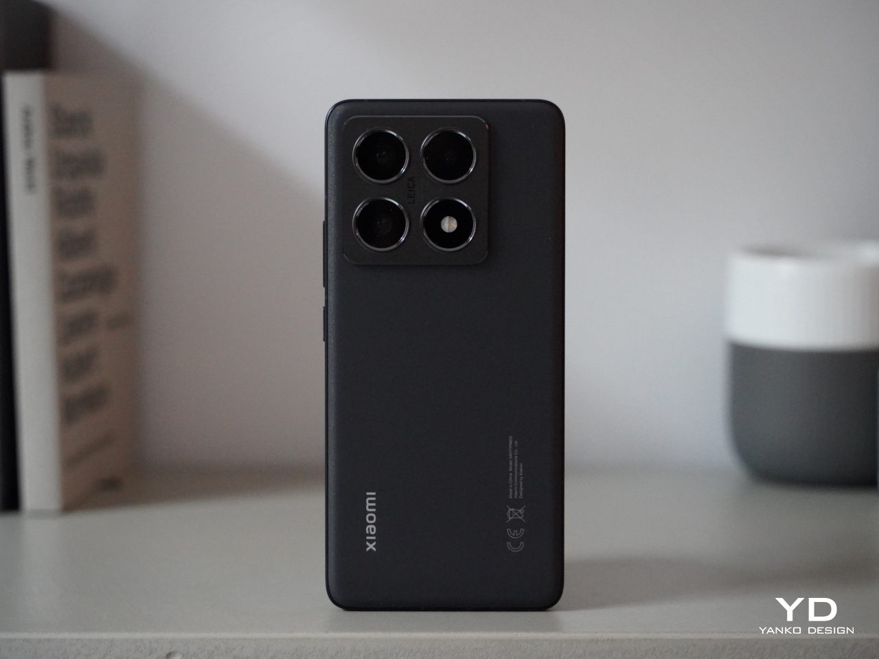
ASUS ProArt PZ13 2-in-1 Laptop Review: Portable Partner with Plenty of Potential

PROS:


  • Handsome, sleek, and minimalist design

  • Lightweight and portable body for creatives on the go

  • Large and long-lasting 70Wh battery

  • Beautiful Pantone-validated 13-inch 3K OLED screen

CONS:


  • Inserted SD card prevents flap cover from closing

  • ASUS Pen 2.0 is a separate $100 purchase

  • Software and peripherals compatibility is still a hit-or-miss


RATINGS:

AESTHETICS
ERGONOMICS
PERFORMANCE
SUSTAINABILITY / REPAIRABILITY
VALUE FOR MONEY

EDITOR'S QUOTE:

The ASUS ProArt PZ13 with Snapdragon X Plus delivers a handsome AI-powered creativity tool that agile creative professionals can take anywhere with confidence and pride.

Life can sometimes take us places we never planned or even dreamed of going to. While some people fear and stress over life’s unpredictable journeys, others have grown to embrace and even love the adventure, both figuratively and literally. Designers, artists, and content creators today have their beloved computers and tools at home or in the office, but they know better than anyone that inspiration can strike when and where we least expect it, not to mention suddenly having to do work just after we stepped outdoors. Laptops were made for this purpose, but their thick and heavy bodies didn’t exactly make for comfortable mobility, while tablets went the opposite extreme and prized portability over the performance that professionals need. The ASUS ProArt PZ13 makes the bold promise of delivering the best of both worlds, so we naturally had to put it to the test to find it out if could really meet the demands and desires of designers and creatives on the go.

Designer: ASUS

Aesthetics

At first glance, you might not think much of the ASUS ProArt PZ13, but closer inspection reveals it has two sides to its design, matching its 2-in-1 detachable laptop functionality. On its own, it’s a rather stylish and striking tablet, black as black, unlike black tablets that look more like “space gray” or other shades. ASUS’s “nano black” coating, also seen on the ASUS ProArt PX13 we reviewed recently, reduces the reflection of light, making it darker than typical metal or plastic surfaces with glossy finishes, no matter the lighting condition or angle. It gives off a professional and elegant character that you’d come to expect from mature designs used in professional settings.

The ProArt PZ13’s CNC-engraved unibody aluminum alloy chassis gives the device structural integrity, durability, and a simple yet sophisticated appearance, highlighted even more by its ultra-slim 9mm profile. There are barely any breaks in the tablet’s visual appearance, aside from a single visible USB-C port, two ventilation grilles at the top, and one air-inflow grille on the back. The classy yet subtle ProArt logo sits at the bottom, opposite the requisite regulatory markings and branding.

All in all, the ASUS ProArt PZ13 exudes an aura of professional beauty befitting a tool for agile creatives, but that image might be challenged by the protective accessories that add value and change the aesthetic a bit. Included in the package is a magnetic keyboard cover and a magnet back plate with a kickstand, both necessary if you’re carrying this portable computer around. They are designed to offer rugged protection and definitely look the part, though it’s a bit strange that ASUS opted for a different hue that sharply contrasts with the pitch-black body of the tablet itself. Gray with a tinge of green, these accessories will be an acquired taste and might not sit well with some people, both in color and in the rugged, ridged design.

Ergonomics

Combining power and portability is always a delicate balancing act. Due to the laws of physics, you can only cram so much into a small space before you start weighing the object down or making thermal management impossible. Conversely, you can only remove so much before performance starts to take a hit. Thanks to its choice of components, especially the processor, the ASUS ProArt PZ13 manages to strike quite a nice balance, weighing only 0.85kg (1.87 lbs) on its own.

That does carry a bit more heft compared to an iPad Pro, for example, or even a Samsung Galaxy Tab S9 Ultra, but when you consider that this is a Windows machine with fans inside, that’s still a pretty impressive feat. That makes the ProArt PZ13 very usable as a tablet, whether for reading documents, watching videos, or even making art, though you won’t want to hold it up with your bare hands for a long time either. This also makes the device easy to carry around the house, the office, or even outdoors, especially if you know you won’t need a keyboard to type on.

The story changes a little bit when you do need to add the keyboard and kickstand to the formula, almost doubling the weight of the device. It’s still significantly lighter than a laptop, but it’s no thin tablet either. And you will most likely have to use both the back plate and the keyboard together since there’s no way to prop up the tablet without the kickstand. That also means you can really only use this 2-in-1 device as a laptop when you’re on a flat and long surface like a table, making the “lapability” of the design quite low.

Performance

This is hardly the first 2-in-1 detachable Windows laptop, but the ASUS ProArt PZ13 is one of the first few to use Qualcomm’s new energy-efficient Snapdragon X Plus silicon. This Arm-based processor is closer to the Apple M chips than, say, Intel or AMD, and is in fact directly targeting Apple Silicon devices. Qualcomm earlier launched the beefier Snapdragon X Elite, but that in no way means that this is an underpowered version, especially considering it still boasts the same 45 AI NPU TOPS performance even with only 8 cores.

In other words, Windows itself runs quite smoothly on this machine, as well as any other piece of software that’s actually designed for or adjusted to work on this computing platform. That includes a growing number of Adobe products like Photoshop and Premiere, popular comics drawing software Clip Studio Pro, and more. The ProArt PZ13 and the Snapdragon X Plus shine brighter when those apps need some AI power, thanks to that dedicated NPU chip that doesn’t choke the main processor.

There, however, also lies a bit of the rub. That smooth and responsive experience works best on software that has already been adapted to work on Snapdragon processors, which isn’t the case for the hundreds of popular Windows programs out there. Yes, those apps can still run thanks to a special emulation layer, and yes, performance has improved significantly since the earlier days of Windows on ARM, but that extra layer is still there and can still affect your performance, especially when it comes to games. The same is true with peripherals you want to connect to the device, especially ones that need special drivers that aren’t supported by this platform yet.

In exchange for that uncertainty, the choice of a Snapdragon X Plus processor brings with it the peace of mind that you won’t have to scramble for a power outlet every few hours. The 70Wh battery can last almost a full day, give or take a few hours depending on your use, which is something even the most generous estimates on an Intel or AMD laptop can even boast about. It also chargers quickly over USB-C using the included 65W charger, though that also means you can use almost any standards-compliant USB-C charger as well.

Regardless of what you use it for, you will be experiencing a bright, colorful, and vibrant 13.3-inch 3K screen, thanks to ASUS’s Lumina OLED technology. Professionals who require color accuracy will be delighted to know that it’s Pantone-validated and has support for 100% of the DCI-P3 color gamut. Even better, ASUS offers all the sliders and switches you need to customize the display to your requirements and tastes. Its refresh rate does cap out at only 60Hz so it won’t be the best option for gaming, which isn’t what you’ll be using this laptop for most of the time anyway.

The ASUS ProArt PZ13 only has one USB 4.0 Gen 3 Type-C port visible for quick access to a charging port, but don’t fret, it isn’t the only one. There’s another USB-C port of the same type hidden behind a silicone flap, which also hides a full-sized SD card reader. Digital photographers will probably delight in the inclusion of this port which is absent on almost all tablets these days, while those who regularly work with microSD cards will be happy to know that ASUS actually ships an adapter in the box. The one catch to this design is that you can’t have an SD card permanently inserted there because a part of it juts out of the frame, making it impossible to close the silicone flap over it. It’s clearly not designed for storage expansion but removable storage to support the workflows of camera users.

Sustainability

Unlike with its other products, ASUS is a bit silent on the amount of recycled materials it uses for the ProArt PZ13. Rather than focus on the use of sustainable materials, it instead highlights the ways this device can last a long, long time before it needs to be turned in for proper disposal and recycling. With an IP52 rating and conforming to the US MIL-STD-810H spec, you can carry and use this portable tablet with confidence anywhere, knowing that it can keep up with you wherever life or work takes you. Of course, the kickstand back cover and keyboard cover offer additional protection as well, which is all the more reason you won’t want to keep these three pieces apart for long.

One detail about that detachable magnet keyboard, however, might be a source of worry for some. While more convenient than a USB connection but also more reliable than Bluetooth, this design has a tendency to break easily due to wear and tear. ASUS will undoubtedly sell these separately for some time, but there will always come a point when they will go out of production, perhaps outliving the ProArt PZ13 itself. Reliability has improved over the years, of course, but it’s still something to keep in mind with this type of detachable keyboard.

Value

The ASUS ProArt PZ13 is both familiar and completely new. Its 2-in-1 detachable laptop design is something we’ve seen since the very first days of the Microsoft Surface, but its combination with a Snapdragon X Plus is just as new as the processor itself. To some extent, it’s wading into uncharted waters, but it isn’t alone either, and its biggest rival is none other than Microsoft itself and the latest Surface Pro. Fortunately, ASUS has its work cut out for it thanks to its competitive pricing.

At first glance, the ProArt PZ13’s $1,100 price tag seems to be on the losing end compared to the Surface Pro’s $1,000, but then you have to consider what you’re actually getting in the package. ASUS bundles the keyboard cover with the tablet, while that’s a separate $180 purchase for the Surface Pro, at least for the keyboard that can also charge the Microsoft pen. Neither comes with a compatible pen, and those cost an additional $100 for the ASUS Pen 2.0 and $130 for the Surface Slim Pen. That brings the total to $1,200 for the ASUS ProArt PZ13 and $1,310 for the Surface Pro, and even then you’re only getting 256GB of storage versus the generous 1TB on ASUS’s 2-in-1 laptop. In this context, there really is no contest between the two.

Verdict

The ASUS ProArt PZ13 promises the Holy Grail of mobile computing, offering reliable performance and long battery life in a thin and light design, and for the most part, it does deliver on those. Granted, software support on Windows on ARM processors like the Snapdragon X Plus is still a bit of a gamble, but things are getting better quickly, especially for the more popular programs used by professionals and hobbyists alike. Things are far from perfect, but for creatives looking for a reliable and stylish computer they can easily take anywhere, the ProArt PZ13 is definitely worth considering.

The post ASUS ProArt PZ13 2-in-1 Laptop Review: Portable Partner with Plenty of Potential first appeared on Yanko Design.
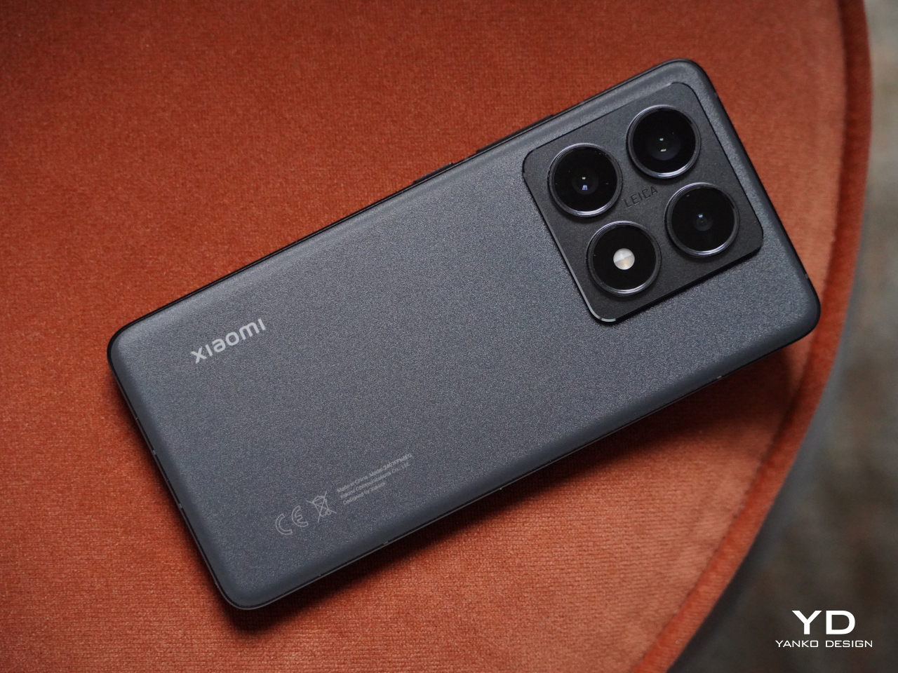
ASUS ProArt PX13 Laptop Review: An Agile Content Creator’s Best Friend

PROS:


  • Handsome, minimalist, and lightweight design

  • Impressive performance packed in a compact size

  • Gorgeous 3K OLED screen for both viewing and color-accurate work

  • Incredible value for creative professionals on the go

CONS:


  • No full-sized SD card reader, only one USB-A port

  • Display refresh rate is only up to 60Hz

RATINGS:

AESTHETICS
ERGONOMICS
PERFORMANCE
SUSTAINABILITY / REPAIRABILITY
VALUE FOR MONEY

EDITOR'S QUOTE:

The ASUS ProArt PX13 makes the impossible possible, delivering unbeatable performance and uncompromising mobility in an elegant and accessible package.
award-icon

The nature and execution of work have changed significantly in the past years, especially for those who use computers all the time. Mobility and flexibility have become an important part of the business, sometimes requiring people to be able to take their work anywhere life leads them. At the same time, it also allows people to do their work in the best possible location for them, which isn’t always the office. To support these new work arrangements, computer vendors have been trying to shove more power into laptops without turning them into gargantuan machines that would force people to leave them in the office anyway. It’s a delicate balancing act, one that very few brands have successfully pulled off, but the ASUS ProArt PX13 makes that very promise to one of the more discerning and particular markets. Is the ProArt PX13 able to deliver that promise of unbounded creativity anywhere or does it make too many compromises along the way? We give it a flip and a spin to bring you that answer.

Designer: ASUS

Aesthetics

The first impression you’ll have when seeing the ASUS ProArt PX13 is how compact and thin it is, at least for a supposedly powerful laptop aimed at creative professionals. Your second impression will be how sleek and elegant it looks with its deep, all-black design. It’s an aesthetic that doesn’t scream at you but instead talks mellowly, fitting a professional product. There are barely any markings on the laptop’s cover; no fancy RGB lighting at its sides, protruding edges, or sharp angles. Just one truly black slab.

Unlike other laptops that advertise a black colorway, the ASUS ProArt PX13 really walks the walk thanks to the company’s Nano Black coating that almost poetically matches the deep blacks of the OLED screen on the opposite side. It’s admittedly a matter of taste, as some will prefer the luster of silver metal like those on MacBooks or Dell, but its more subdued aesthetic makes it less distracting as well. Thankfully, that same Nano Coating also prevents fingerprint smudges so there’s very little that will stain that darkness.

Minimalist doesn’t mean plain, however, and there are a few accents that bring out the ProArt PX13’s designer-centric character. The ProArt branding, for example, is smooth and a little bit reflective, tastefully set against the blackness of the cover. The vertical stripes on the hinge are supposed to be a nod to pro camera designs, but even if you don’t make that connection, they’re still an interesting touch. All in all, the ASUS ProArt PX13’s minimalism puts the focus not on the laptop but on the creator and the content, while also providing a dark, blank canvas for owners to use to let their own creativity shine through if needed.

Ergonomics

The ProArt PX13 is hardly the thinnest laptop, whether traditional or convertible, but it’s not terrible either for a 13-inch. When you consider that it packs enough hardware to cater to creative professionals and even some gamers, you’ll even be amazed at how ASUS managed to keep the numbers down to an accessible level. At 17.78mm (0.7 inches) thick and 1.38kg (3.04 lbs) heavy, this is something you can easily stow in your bag and be on the move in a flash.

This is very important when you consider that ProArt PX13 is more than just a laptop. It can also be a tablet you can draw on, whether on your table or on your lap, as well as a “tent mode” presentation and entertainment display. Changing forms is as easy as folding the screen back and forth, and the sturdy 360-degree hinge makes sure that it stays open at whatever angle you leave it. At the same time, however, the laptop’s weight is distributed properly so that you can open it up with just a single finger, lifting the lid while the body anchors it down.

The typing experience is pretty good as well, with well-spaced keys and a good 1.7mm travel. The cursor keys are squashed, of course, but that’s nothing new nor is it extremely uncomfortable. The touchpad is a decent size, but its mechanical design might disappoint fans of more haptic touchpads.

Performance

Right off the bat, the ASUS ProArt PX13 has some of the best hardware you’ll find in a 13-inch laptop. It’s one of the first to utilize AMD’s new AI-powered Ryzen AI 9 HX 370, giving it a wide lead in AI operations. This is paired with an NVIDIA GeForce RTX 4050, like in our review unit, or an RTX 4060. Either way, you’re getting a powerful graphics processor that, to no one’s surprise, handles AI skillfully as well. Benchmark numbers don’t always tell the whole story, but they’re impressive nonetheless. Whether the laptop is plugged in or running on battery, it will meet almost anything you can throw at it, whether it’s Photoshop, Da Vinci Resolve, or Blender.

Gaming is a bit of a different issue, though the ProArt PX13 is definitely capable. You will definitely feel the heat when pushing the system to its limits, but the cooling system does a stellar job of regulating its impact. The fans are definitely audible under heavy loads, but they quiet down just as quickly when no longer needed. And they’re barely noticeable at all if you’re just doing basic computing tasks like browsing the Web or typing up documents. The biggest setback when using this machine for gaming is actually one of its biggest strengths as well: its screen.

The 13.3-inch OLED touch screen is simply stunning, with rich colors, deep blacks, and a sufficient amount of brightness so that you can even work outdoors under overcast skies. The display is Pantone-validated and supports a wide gamut of colors, an important detail for graphics artists and content creators who need color accuracy more than anything else. The screen has a 3K resolution of 2880×1800 in a familiar 16:10 aspect ratio and a refresh rate of 60Hz. The latter is what makes the ProArt PX13 less suitable for gaming, at least for those who live and breathe 120Hz or higher. It’s not totally unusable for fast-paced games, and it completely marks the laptop as a machine primarily for work, with just a bit of gaming on the side.

Battery life for the ASUS ProArt PX13 is so-so. Given its size, the 75WHr battery it packs is actually generous, but it’s offset by the more powerful hardware. On Eco/Power Saving mode and average computing tasks, it can last an average of 8 hours, definitely shorter once you push the hardware to the limit. It ships with a 200W power brick that’s large but not gigantic. It can charge over USB-C using a 100W charger, but you’ll probably bring the official charger with you anyway unless you’re traveling extra light.

Port selection is on the light side as well. It has most of the important basics but is also oddly missing a few ones. There are two USB 4.0 Gen 3 Type-C ports and a single USB 3.2 Gen 2 Type-A port, one HDMI port, a 3.5mm headphone jack, and the proprietary DC-in charging port. There’s a microSD card reader but not a full-sized one, which is strange considering how digital cameras still mostly use SD cards, not their tiny cousins. We could always do with an extra USB-A port, especially if the only available one is already in use with an Ethernet adapter because the laptop doesn’t have its own RJ45 port.

The ASUS ProArt PX13 is overflowing with features designed for creative professionals, from hardware to software. There’s the somewhat odd DialPad in the order of the touchpad, giving quick access to actions like changing brush sizes in Photoshop, scrubbing through timelines in Premiere, and more. Not everyone will love this convenience, and it is fortunately easy to disable it completely. From the ProArt Creator Hub which has all the settings you can tweak for performance or monitor calibration, to the AI-powered software that takes advantage of the combined strength of AMD processors and NVIDIA graphics, the ProArt PX13 offers a multitude of tools to assist content creators in whatever kind of work or problem they’re facing.

Sustainability

ASUS has been making big waves when it comes to its commitment to helping protect the future of the planet, from the use of recycled materials in its products to the decrease of plastic in its packaging. It might not be visible or advertised for the ProArt PX13, but we’re banking on the company giving it the same treatment even in small amounts.

In terms of prolonging the life of the laptop, ASUS definitely took steps to make it a bit easier. The bottom plate can be removed easily using a screwdriver, except for the middle screw that’s also covered by a sticky rubber material. The NVMe SSD storage, battery, and Wi-Fi 7 module are easily replaceable, which are some of the most common components that need to be repaired or upgraded. Sadly, the LPDDR5X RAM is soldered to the motherboard, but having 32GB of memory isn’t that bad anyway.

Value

The ASUS ProArt PX13 is available in two configurations, with the RTX 4050 and 4060 being the only real difference between the two, as well as the Windows 11 Home and Pro licenses. Given the performance difference between these two very capable NVIDIA graphics processors, you couldn’t go wrong if you picked the base configuration that goes for only $1,699.99. At that price point, it already surpasses larger laptops and can hold its own against a MacBook that’s nearly double its price.

It’s pretty mind-blowing how much ASUS was able to cram inside the compact 13.3-inch body of the ProArt PX13 without hitting any significant compromises. It’s hardly the best gaming laptop or the most powerful movie maker, but what it offers is the flexibility to take your work or game anywhere without missing a bit. In that regard, it is pretty unrivaled, making it a truly tempting device for creative professionals, even those who mostly stay at their desks.

Verdict

The way we make content these days has changed greatly over the past years. Videos and graphic designs no longer have to be made on hulking towers tethered to desktops. Sometimes, the ability to quickly churn out content at a moment’s notice has become more important than production-level quality that will take hours on a regular laptop. Then again, why do you have to choose when the ASUS ProArt PX13 can give you the best of both worlds? Powerful, portable, and flexible, this convertible laptop delivers the tools that creative professionals need to bring their work to the next level, whenever inspiration strikes, wherever they are.

The post ASUS ProArt PX13 Laptop Review: An Agile Content Creator’s Best Friend first appeared on Yanko Design.
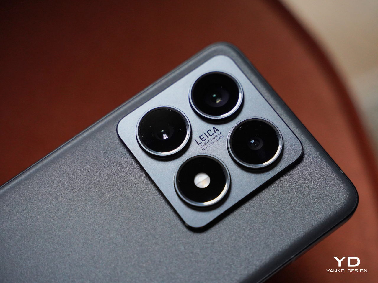
Vivo V40 Pro Review: Prime Mobile Photography Arrives in a Sleek Package

PROS:


  • Elegant and aesthetic design

  • Powerful quad 50MP camera system

  • Large 5,500mAh battery despite thin profile

  • IP68 rating

CONS:


  • No wireless charging

  • Telephoto camera only supports 2x optical zoom

  • Limited global availability

RATINGS:

AESTHETICS
ERGONOMICS
PERFORMANCE
SUSTAINABILITY / REPAIRABILITY
VALUE FOR MONEY

EDITOR'S QUOTE:

The Vivo V40 Pro builds on the brand's outstanding photography performance to deliver an even more powerful experience in a stylish design.

Cameras have become one of if not the most important aspects of a smartphone these days. Of course, the display is functionally the most critical component, but other than being large and crisp, people tend to gravitate to the best smartphone camera their money can buy. Unfortunately, the best ones are often reserved for the most expensive handsets as well, leaving the majority of consumers, especially the younger generation, dreaming of better days. Vivo’s V series of smartphones has always aimed to make smartphone photography more accessible, and last year’s Vivo V30 Pro definitely put more expensive devices on notice. Can the Vivo V40 Pro top that or has the brand already reached its peak? We take Vivo’s latest and greatest V series phone for a spin to find out.

Designer: Vivo

Aesthetics

Right off the bat, we can already say that Vivo has outdone itself with the design of the Vivo V40 Pro. Last year’s flagship was already a looker, but it suddenly feels a bit lacking compared to its younger sibling. You still have a sleek appearance, smooth curves, and a thin profile, but the real winner here is the camera design. That Vivo was able to fit three 50MP cameras in such a compact space is already a marvel, but the way it managed to make the design look appealing is a rare feat these days.

Vivo calls it a “Gemini Ring Design,” which is a fancy term for what looks like a curvy keyhole. Two of the three cameras are enclosed in a circle that sits on top of a pill-shaped elevation. Inside that is another oblong enclosure housing the third camera and the Aura Ring flash. There is a subtle beauty to the play of balance and asymmetry in this design, and it definitely gives the Vivo V40 Pro a unique visual character.

The company didn’t pull punches in the different colors and materials available for both the Vivo V40 and the V40 Pro, and all of them are beautiful in their own way. The Sunglow Peach colorway with its warm hues and dynamic magnetic ink is quite an eye-catcher, and our review unit’s Moonlight White with its pale blue streaks has a soothing and calming effect. Other than the camera bump and the small vivo branding at the bottom, there are no distractions on the back of the phone, allowing you to appreciate the beauty of these designs.

At only 7.58mm, the Vivo V40 Pro is already thin, and the curved edges of both the screen and the back panel make it look even thinner. This could be a divisive decision in 2024, though, with many seeing curved edges as a thing of the past. It definitely still has appeal and it perfectly matches the smoothness of the rest of the phone.

Ergonomics

The Vivo V40 Pro is not a small phone by any means so that thin profile helps offset the size of the device. It’s incredibly light as well at only 192g, especially considering what it packs inside, like a very generous battery. All in all, it’s difficult to hold it up for long periods of time, though the glass material on its back could prove to be slippery for some hands.

The debate around flat versus curved edges continues here as well. With part of the screen curving off to the sides, there’s always the possibility of accidental touches in those areas. There isn’t much surface area or sharp corners for your hand to grip either, and you might find yourself straining a bit just to hold the phone tight. It’s partly personal preference and partly the shape of your hand, but thankfully Vivo ships a protective case with the phone just in case.

Performance

It might not be part of Vivo’s top-tier X series, but the Vivo V40 Pro definitely packs quite a punch, starting with the MediaTek Dimensity 9200+, the chipmaker’s flagship silicon. It’s paired with up to 12GB of RAM, as was the case in our review unit, which can be boosted with another 12GB. That said, it takes some of that from the 512GB internal storage, which isn’t expandable like many phones these days. All in all, the Vivo V40 Pro performs like a champ for any use case, whether it’s social media, watching videos, or playing games. The latter is helped by an Ultra-Large VC Cooling System that keeps the phone running at a stable pace without throttling.

More impressive, however, is the 5,500mAh battery the phone crams inside its thin and light body. It’s definitely one of the largest capacities available in a phone that’s barely 7.6mm thick, allowing it to easily support all your shutterbug adventures. With an 80W charging speed, you can quickly top up to full in around 30 minutes, at least with the right charging brick. Unfortunately, Vivo hasn’t yet decided to put wireless charging on its V series phones, but maybe that will change next year.

The real stars of the show, however, are the cameras, all of them with 50MP sensors. Yes, that includes the selfie camera with a Samsung ISOCELL JN1 sensor and a wide 92-degree field of view for those “wefies” or “groufies.” If that sounds familiar, then you might have heard of the Vivo V30 Pro last year. In fact, in almost all but one case, it’s nearly the exact same set of 50MP cameras, like the 50MP Sony IMX816 telephoto shooter and the 50MP Samsung JN1 119-degree ultra-wide camera.

What’s different this year is the new 50MP Sony IMX921 with a larger 1/1.56-inch sensor. That means it is able to take in more light information even in darker environments, improving its overall quality. In fact, the entire ensemble is actually commendable in their output, delivering super images bolstered by AI and computational photography. Of course, these cameras have optics tuned by ZEISS, so there’s little surprise there. And one can’t forget Vivo’s signature Aura Light that takes the regular flash and turns it into a mini ring light for softer and more natural lighting. Its most recent incarnation includes Electronic Control Technology that lets you adjust the brightness of the light depending on the distance of the subject.

In essence, the Vivo V40 Pro builds on the success of its predecessor and adds some extra value with upgraded specs and improved software. Unfortunately, it also carries over the flaws, most notably the short optical zoom range of the telephoto camera. It only goes as far as 2x zoom, but Vivo is heavily advertising what it calls “50x ZEISS Ultra HD Zoom,” which is a mouthful that really means software-assisted digital zoom.

Sustainability

Just like the Vivo V30 Pro last year, the brand is sadly silent on any of its efforts in using even a fraction of sustainable materials for this year’s V series flagship. It also hasn’t stopped shipping chargers in its boxes, which is unsurprising since it wants to make sure that its phones use the right 80W charger for the fastest speed they can support. We’re still holding out hope that Vivo will take the lead in this area soon.

That said, it does have some good news when it comes to keeping the Vivo V40 Pro away from the trash for as long as possible. It’s the first in the V series to reach an IP68 rating, ensuring that it’s protected from dust and water which can mean the end for many smartphones. It also advertises a “50-Month Smooth Experience” guarantee that basically says the phone can run for over four years without losing its fluidity and performance. Unfortunately, it doesn’t translate to having four years of updates, and Vivo has made no promises on that matter.

Value

It’s perfectly clear from our time with the Vivo V40 Pro that it delivers everything it promises on paper. The Quad 50MP Camera System it carries over from last year continues the tradition of excellent mobile photography, but this time with a larger 5,500mAh battery that better supports all those photo and video content creation. Even better, the phone comes in a sleek, slim, and light design that makes you feel like you’re holding an art object rather than a cold piece of technology.

In other words, the Vivo V40 Pro would have been perfect if not for the fact that some people might not even be able to get their hands on it. The $560 price tag it carries (converted from Indian figures) isn’t that heavy, but global availability is still undisclosed at the moment. Hopefully, it will fare better than the Vivo V30 Pro which didn’t get a wider distribution that would have spread the word of its amazing camera chops.

Verdict

Smartphones are getting more powerful and so are their cameras. But with this increase in technical performance, designers are often forced to make many compromises to fit all of them inside a product that should still fit our pockets. In that regard, the Vivo V40 Pro is quite a feat, cramming not only four 50MP cameras but a large 5,500mAh battery inside a body that’s as thin and as light as it can be. It’s a beautiful phone with impressive performance and an accessible price point, and it deserves to be made available to more markets this time.

The post Vivo V40 Pro Review: Prime Mobile Photography Arrives in a Sleek Package first appeared on Yanko Design.
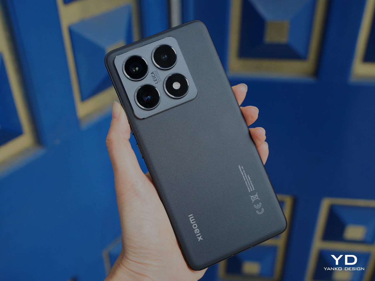
Onewheel Pint X Review: I Didn’t Break a Single Bone Testing It

PROS:


  • Extended Range and Speed: The Pint X offers up to 18 mph and 12 to 18 miles per charge, ideal for longer rides.

  • Compact Design: Its portable size and built-in handle make it easy to carry and store.

  • Customizable Modes: Four riding modes allow for personalized experiences suited to different terrains.

CONS:


  • Not Waterproof: Susceptible to water damage, limiting use in wet conditions.

  • Long Charge Time: Takes up to 225 minutes to charge with a standard charger.

  • High Price: At $1,100, it’s a significant investment compared to similar e-boards.

RATINGS:

AESTHETICS
ERGONOMICS
PERFORMANCE
SUSTAINABILITY / REPAIRABILITY
VALUE FOR MONEY

EDITOR'S QUOTE:

The Onewheel Pint X delivers thrilling rides and great range but make sure its features fit your riding needs and style.

Looking for a thrilling way to navigate city streets or explore your local park? The Onewheel Pint X offers a compelling mix of excitement and practicality in personal electric vehicles. With its sleek design and robust performance, the Pint X is perfect for urban commuters and adventure enthusiasts. I was intrigued by the Onewheel experience, and the Pint X delivered the enhancements I sought, providing impressive speed and range for longer rides without frequent stops for charging. With a powerful 750W Hypercore motor that propels you up to 18 mph, this board offers a ride reminiscent of snowboarding or longboarding, making it an enticing lifestyle choice rather than just a means of transportation. If you’re ready to dive into the world of electric mobility and experience the freedom it offers, the Onewheel Pint X might be your ideal ride.

Designer: Kyle Doerksen + Onewheel

Design and Aesthetics

The Onewheel Pint X combines sleek, modern design with functionality, making it an attractive option for those seeking a stylish and portable personal electric vehicle. With dimensions of 8.75 x 10.5 x 27 inches and weighing 27 pounds, the board is compact yet robust, offering easy maneuverability in urban settings. Its minimalist aesthetic with vibrant color options lets riders express personal style while maintaining a polished look.

The integrated Lightbar on the footpad enhances the board’s futuristic design and provides practical functionality, serving as both a battery indicator and a riding alert. This thoughtful design emphasizes simplicity and ease of use, housing all components compactly while maintaining a streamlined appearance. The low center of gravity and wide tire offer excellent stability and control, making the Pint X adaptable to various terrains.

The Pint X’s design also pays homage to the original Onewheel concept while incorporating modern enhancements that cater to today’s riders. The robust aluminum frame ensures durability, while customizable color options for the bumpers and rails let riders personalize their boards to match their style. The pint-sized form factor of the Pint X doesn’t just make it easier to store and transport; it also gives it a playful, approachable aesthetic that invites riders of all levels to give it a try.

2008: Onewheel prototype 1: The first rideable prototype had a chain-driven motor and the bare essentials. Old Iron Sides is now its affectionate nickname.

Ergonomics

The Onewheel Pint X is designed with rider comfort and usability in mind, featuring a built-in Maghandle for easy carrying when not in use. This feature makes the board convenient to transport in crowded areas or up flights of stairs. Riding the Onewheel is the most fun I’ve had since my teens, popping wheelies on my BMX bike. While there is a learning curve, many new riders find it manageable with practice. The board’s intuitive control system uses pressure-sensitive footpads for smooth acceleration and braking, mimicking natural movements. At the heart of this system is a combination of sensors, including a Hall Effect sensor and an accelerometer. These sensors interpret your body’s movements and translate them into seamless control, making the ride feel intuitive and responsive. This allows riders to accelerate by leaning forward and decelerate by leaning back, creating a natural and engaging riding experience.

For beginners, the Simple Stop feature is particularly beneficial. It allows the rider to come to a gradual stop by leaning back, reducing the risk of falls and helping build confidence. The wide tire is surprisingly responsive, allowing for nimble turns and adjustments to posture. Riders are advised to start practicing in open areas like parking lots or grassy fields and to wear shoes with good grip for better control and stability. Regular practice helps strengthen stabilizer muscles, making rides smoother and more comfortable over time.

Onewheel riding academy

Performance

Curiosity about the Onewheel experience led me to try out the Pint X, which promised enhancements in speed and range. The Pint X offers a perfect balance between power and agility, making it an exciting upgrade. With a 750W Hypercore motor, the board reaches a top speed of 18 mph, providing a thrilling ride whether commuting through the city or exploring parks. The range of 12 to 18 miles on a single charge is a significant improvement, allowing for longer adventures without constant recharging.

Riding the Pint X feels liberating, as the increased speed and range mean I no longer need to plan my routes meticulously or worry about running out of battery mid-ride. The powerful motor also delivers extra torque, making the board more responsive when changing directions. The Onewheel relies on a rate gyroscope, which helps maintain balance by measuring orientation and angle changes. This technology ensures stability even as you navigate challenging terrains, making it easier to learn and control. While initially a bit “squirrely,” the wide tire quickly becomes second nature, allowing for smooth and agile turns.

The Onewheel Pint X features four customizable riding modes, or Digital Shaping modes, that can be adjusted through the Onewheel app to match your riding style:

Redwood: Offers a smooth ride with a top speed of approximately 12 mph, ideal for leisurely rides and where I felt most comfortable starting as a beginner.


Pacific X: A relaxed mode that balances speed and control, quickly becoming my second favorite, making it easy to handle for a more casual experience.
Elevated X: Raises the front of the board, helping you tackle steep inclines or perform tricks with greater ease.
Skyline X: A responsive mode with a maximum speed of about 18 mph, providing an adrenaline-pumping experience.

From the moment I started riding, the Pint X’s performance was apparent. The speed and handling capabilities offered an adrenaline rush with every ride, making it easy to lose track of time while exploring. The improved range means I can focus on the ride rather than constantly checking the battery level.

However, the performance improvements come with a few trade-offs. The thicker front bumper, intended for symmetry, sometimes drags during sharp turns or when recovering from drops. It reduces ground clearance, causing occasional nosedives and making curb navigation tricky. The extra weight of the board, while not drastic, does impact its agility, making it feel less snappy during tight turns. The shared tire with the regular Pint feels less secure at higher speeds, requiring constant vigilance to avoid bumps and obstacles that could cause a wipeout.

Specifications

Dimensions: 8.75 x 10.5 x 27 inches
Weight: 27 lbs
Battery: 324Wh capacity, 63V
Charge time: Approximately 225 minutes with a standard charger, 110 minutes with an Ultracharger
Tire: 10.5 x 4.5-6 inches, round profile
Top Speed: 18 mph
Range: 12-18 miles, depending on riding conditions
Price: Starting at $1,100

Sustainability

While sustainability isn’t heavily marketed, the Pint X is built with durability in mind, using high-quality materials to ensure longevity. This reduces the need for frequent replacements, supporting a more sustainable approach to personal transportation. Manufactured in the U.S., the Pint X aligns with sustainable practices by ensuring quality control and minimizing the carbon footprint associated with overseas shipping.

Value and Verdict

At the time of this review, the Onewheel Pint X is available at a starting price of $1,100, making it a more accessible option in the electric skateboard market. Despite this competitive price, the board offers exceptional performance, durability, and versatility. The Pint X has become a staple for many riders, providing a blend of speed, range, and portability that’s difficult to find elsewhere.

The Pint X offers a compelling package for those seeking an exhilarating ride experience. The powerful hub motor allows riders to glide through traffic with ease, while the electric transmission system eliminates the need for gear shifting. The wide deck provides excellent traction and stability, securely holding the rider’s feet in place, whether navigating sharp turns, tackling hills or speeding along sidewalks. The puncture-resistant liner on the wheel enhances safety, making it a reliable choice for long-distance travel on rough trails.

However, potential buyers should be aware of a few considerations. The Pint X is not waterproof, so exposure to water can damage the battery and affect motor functionality. The fixed acceleration might be too intense for some users who prefer customizable speed settings. Additionally, while competitively priced, the Pint X still represents a significant investment compared to other e-boards with similar features.

Is the Onewheel Pint X the right fit for you? If you’re looking to embrace the thrill of one-wheel riding while enjoying the convenience and innovation that the board offers, it could be an excellent choice. We’d love to hear your thoughts and experiences with the Pint X. With its thoughtful design, ergonomic comfort, and impressive performance, it remains a top choice in the personal electric vehicle market. Share your insights and join the conversation about this exciting rideable!

The post Onewheel Pint X Review: I Didn’t Break a Single Bone Testing It first appeared on Yanko Design.

Is Samsung Galaxy Buds3 Pro Worth It? In-Depth Review and User Experience

PROS:


  • Exceptional Audio Quality: The Buds 3 Pro delivers clear highs and deep bass, enhanced by features like 360 Audio for an immersive listening experience.

  • Advanced Noise Cancellation: Effective ANC, Adaptive Noise Control, and Ambient Sound modes provide a customizable listening experience that is ideal for various environments.

  • Seamless Samsung Integration: They integrate smoothly with Samsung devices, offering features like real-time translation and enhanced audio quality through the Scalable Codec.

  • Durability and Comfort: With an IP57 rating, the earbuds are water and dust-resistant. The ergonomic design ensures a comfortable fit during extended use.

CONS:


  • Awkward Case Design: The charging case requires twisting the earbuds into place, which can be inconvenient and lead to accidental drops.

  • Battery Life Limitations: Real-world usage shows shorter battery life than advertised, especially with all features enabled.

  • Feature Limitations Outside Samsung Devices: Some features are optimized for Samsung products, limiting the full benefits for users with non-Samsung devices.

RATINGS:

AESTHETICS
ERGONOMICS
PERFORMANCE
SUSTAINABILITY / REPAIRABILITY
VALUE FOR MONEY

EDITOR'S QUOTE:

Galaxy Buds 3 Pro deliver stellar sound and noise cancellation, redefining what wireless earbuds can achieve in any environment.

Samsung’s Galaxy Buds3 Pro has made a strong entrance with its stylish stem design and practical features. These earbuds offer a powerful audio experience thanks to a dual-driver system that delivers clear highs and deep bass, making them perfect for music lovers. The ergonomic silicone tips ensure a snug fit, providing comfort during long listening sessions, and their IP57 rating adds protection against water and dust, making them great for active users.

Designer: Samsung

Packed with smart features, these buds include AI-powered sound adjustments that adapt to your environment, enhancing your listening experience. The real-time translation feature is a handy tool for travelers and language enthusiasts. While some features work best with Samsung’s latest devices, the Buds 3 Pro offers a strong mix of style, technology, and sound quality. Whether you’re on a call, streaming music, or navigating through your day, these earbuds are built to meet the needs of everyday life.

Design and Aesthetics

The Samsung Galaxy Buds3 Pro embraces a design that marries functionality with elegance. The stem-style structure enhances usability and audio performance by incorporating advanced components like control sensors and batteries within the stems, contributing to superior sound quality and call clarity.

The customizable “blade lights” on the stems offer a neat and stylish feature, but they may not appeal to everyone looking for simplicity. While the lighting adds flair, my focus remains on sound quality, comfort, and overall performance. The lights are a nice touch but not a critical factor in choosing these earbuds.

The ergonomic design ensures a comfortable fit, with silicone tips that improve noise isolation and enhance sound quality. With an IP57 rating, these earbuds are reliable for various environments, whether you’re at the gym or exploring outdoors. We’ll explore the performance aspects further down, diving into how these features impact real-world use and contribute to the overall listening experience.

From a design perspective, there are limited ways to create Bluetooth headsets. They can fit directly in the ear or include a stem, as seen in the Buds3 Pro. This design is practical, enhancing usability by allowing better placement of components like microphones and batteries.

While the Buds 3 Pro’s design draws inspiration from other successful models, the inclusion of unique features like customizable lighting and advanced audio technology sets these earbuds apart. They offer a compelling combination of high performance and style, making them attractive for those who value both aesthetics and functionality in their wireless audio gear.

Ergonomics

From my perspective, the design of the Samsung Galaxy Buds3 Pro case has its pros and cons. I like that the case is lightweight and features practical additions like a USB-C charging port and an LED indicator for charging status. The transparent lid is also a nice touch, allowing me to see the earbuds without opening the case.

However, inserting and removing the earbuds can be awkward. They require a specific twist to fit properly, which isn’t the most user-friendly experience, especially when I’m on the go. I’ve actually dropped the earbuds a couple of times, twice on an airplane while fumbling around in the dark. It’s definitely not ideal. This is an area where the design could use some improvement to make handling the earbuds more intuitive and prevent such mishaps.

The earbuds are offered in two colors, white and black, with small red and blue dots to help indicate the correct placement in the case. While this color coding is helpful, it doesn’t completely resolve the awkwardness of fitting the earbuds into the case.

One thing I wish was smaller is the case itself. While it’s compact enough to fit in the coin pocket of my jeans, similar to the AirPods Pro case, it does bulge out more than I’d like. A smaller case would be more convenient for carrying around when I’m out and about.

Despite these concerns, the overall design remains stylish, and the case complements the sleek look of the earbuds. It supports wireless charging, which is a plus, but streamlining the handling and size of the case would greatly enhance the overall experience.

Performance

The Samsung Galaxy Buds3 Pro delivers exceptional audio quality, particularly when paired with newer Samsung devices like the Galaxy Z Fold 6 or S24 series. Featuring a two-way speaker system with a planar tweeter and dual amplifiers, these earbuds provide crisp, airy sound with robust bass. The 360 Audio feature enhances the soundstage, creating an immersive experience, although it can sometimes emphasize higher frequencies.

A key feature that enhances the audio experience is Samsung’s Scalable Codec. This codec adjusts the bit rate dynamically to ensure stable audio quality over Bluetooth connections. It provides near-lossless sound when the connection is strong, making it ideal for high-resolution audio playback on compatible Samsung devices.

The noise-canceling capabilities are impressive, offering Active Noise Cancellation (ANC), Adaptive Noise Control, and Ambient Sound modes. ANC effectively reduces background noise, making it easier to enjoy music without distractions. Ambient mode is handy for staying aware of your surroundings while listening, and adaptive mode adjusts noise cancellation based on the environment. During my flight to Tokyo from Dallas and back, the active noise cancellation canceled out nearly all the humming from the engine, making the journey pleasant. Just note that for long-haul flights, you might need two pairs of earbuds. In my case, I had a pair of AirPods Pro to swap out. That said, I dare say the Buds3 Pro is competitive when it comes to sound quality and noise cancellation.

The sound quality of the Samsung Galaxy Buds 3 Pro truly shines across various musical genres. In “Hotel California” by the Eagles, the earbuds reproduce the intricate guitar work with remarkable clarity, allowing you to hear every detail as if you’re right there at the performance. The Buds3 Pro handles Michael Jackson’s “Billie Jean” with precision, capturing the sharpness and detail in his vocals and ensuring the instrumental elements are delivered with crystal clarity. When it comes to bass-heavy tracks like “Royals” by Lorde, the earbuds provide a strong yet balanced bass response that complements the vocals without overshadowing them. The complex musical arrangement in “Take Five” by The Dave Brubeck Quartet showcases the Buds3 Pro’s ability to maintain clarity and balance across a wide range of frequencies, with the piano and saxophone lines coming through with excellent definition and depth.

The Buds3 Pro excels in call quality as well. The triple-mic array ensures clear voice transmission even in noisy settings, while the transparency mode allows ambient noise to enter naturally during calls, enhancing the conversation experience.

Battery life is an area where expectations might differ. Samsung claims up to 6 hours of playback with ANC on and up to 30 hours with the charging case. However, real-world usage often shows battery life closer to 5 to 5.5 hours with ANC, 360 Audio, and high-resolution streaming enabled. Wireless charging and quick charging capabilities add convenience, but for extended listening sessions, having a backup or access to charging is advisable.

The Buds3 Pro also impresses with its sweat-proof performance. I’ve used them to mow the yard in 100-degree weather, and they remain in my ears exceptionally well without any issues with performance. Their IP57 rating ensures they can handle both sweat and dust, making them a reliable choice for outdoor activities and workouts.

Compared to the standard Galaxy Buds 3, the Buds 3 Pro offers enhanced audio quality, more advanced noise control options, and longer battery life. While the non-Pro model provides good sound and basic ANC, it lacks the Pro version’s premium features and audio experience.

Overall, the Buds3 Pro is impressive in performance, making it a top choice for anyone in search of high-quality wireless earbuds with a rich, immersive sound experience.

Sustainability

Samsung has integrated sustainability into the Galaxy Buds 3 Pro by using post-consumer materials in their construction, which helps reduce the environmental impact of new plastic production. The company is committed to increasing the use of recycled materials across its product line, aiming to incorporate them into every component by 2030 as part of its goal to achieve net-zero carbon emissions.

The packaging for the Buds3 Pro is also made from recycled paper, which aligns with Samsung’s sustainability initiatives and helps further reduce waste. These efforts demonstrate Samsung’s dedication to creating products that combine advanced technology with environmental responsibility.

Value and Verdict

For anyone within the Samsung ecosystem, the Galaxy Buds3 Pro is an easy recommendation. These earbuds integrate seamlessly with a wide range of Samsung products, including smartphones like the Galaxy Z Fold 6 and S24 series and Samsung tablets, laptops, and other smart devices. They offer features like adaptive noise cancellation and enhanced audio quality through Samsung’s Scalable Codec, making them an ideal companion for any Samsung device. This integration allows for smooth transitions between devices and enhances the overall user experience, making the Buds3 Pro a perfect choice for those who rely on Samsung’s ecosystem for their tech needs.

Even if you’re not part of the Samsung ecosystem, the Buds3 Pro is worth considering. They are compatible with any Bluetooth-enabled device and deliver exceptional sound quality, noise cancellation, and a comfortable fit, making them a versatile choice for all users. I enjoy having them as part of my everyday gear, whether in my go-bag for travel or daily use. Their performance and reliability make them a great addition to any tech setup, offering high-quality audio and convenience wherever you go.

The post Is Samsung Galaxy Buds3 Pro Worth It? In-Depth Review and User Experience first appeared on Yanko Design.

nubia Z60S Pro Smartphone Review: AI to Empower Your Creativity

PROS:


  • Eye-catching "Cosmic Ring" Camera design

  • Dedicated camera slider

  • Decent flagship performance

CONS:


  • Thick, heavy, and slippery

  • Last year's Snapdragon flagship

RATINGS:

AESTHETICS
ERGONOMICS
PERFORMANCE
SUSTAINABILITY / REPAIRABILITY
VALUE FOR MONEY

EDITOR'S QUOTE:

The nubia Z60S Pro delivers AI-powered photography in an accessible package with a distinctive design

AI is undoubtedly the buzzword that’s taking by storm any industry related to computers. It’s not just the generative AI that’s making up essays and artwork, much to creators’ chagrin, or the prying eyes that watch over your social interactions online. AI has actually been in our phones a bit longer than those, using imaging magic to enhance photos and videos in ways that were unknown to us until recently. Now, almost every new phone has some AI feature in its bullet points, and nubia is not one to be left behind. With the nubia Z60S Pro, it is entering into this new arena, so we take the brand’s newest flagship for a spin to see if it is able to stand out from the growing throng of AI-enhanced smartphones.

Designer: nubia

Aesthetics

Smartphone cameras are getting more powerful and larger as the years go by, and these are putting the skills of designers to the test. It’s no longer a question of how to cram those sensors and lenses but how to make them look less conspicuous and less atrocious. It’s no surprise that not all manufacturers get it right, so it’s quite a relief to see nubia pull it off somehow.

nubia calls it a “Cosmic Ring Design” and it takes inspiration from our solar system. Three small circles surround a larger one in a symmetrical pattern, calling to mind how the planets revolve around the sun. A “coronet” extrudes from the left side with the words “Be yourself” engraved on it, sending the brand’s exhortation to everyone to take a closer look. It’s a well-balanced and pleasing composition, unlike the sometimes messy and skewed designs of other phones. The red ring around the central lens is a nice touch, giving the phone a more camera-like appearance, especially on our black review unit.

There are three color options for the nubia Z60S Pro, with both Black and Aqua sporting a single solid swatch of color. White has a bit more flair, with cloudy formations of gray that give it some visual texture. Of course, all three have a glass panel covering their rears, so it’s really only an illusion. All sides of the phone are devoid of curves, except for the four corners, of course. This aligns with the design trends these days, like it or not, so it carries a modern touch in its simplicity.

The Z60S Pro carries a moderately minimalist design, with only that large circle as the center of distraction. We’ve definitely seen worse, but we’ve also seen more interesting designs, so it doesn’t stand out that much unless you really take a closer look and take a moment to appreciate the design.

Ergonomics

The nubia Z60S Pro is quite a large phone, not unusual for a flagship these days, and that doesn’t come without consequences. Although it’s the de facto standard, of course, the design previously derided as “phablets” are not the easiest to hold securely and use with one hand, which is especially true with a thick and substantial device like this. Granted, it’s not alone in that category, with the likes of the Samsung Galaxy S24 Ultra leading the way. That doesn’t mean, however, that it is ideal or one that phone designers should aspire to.

It’s especially problematic if the back of the phone is prone to slipping from your grasp due to its extra smooth texture. It’s rather curious that even after years, phone makers still haven’t perfected the design of anti-slip glass. Some do have a matte texture, but those still fail to stick to your palm. The one thing going in the Z60S Pro’s favor are, ironically, those flat edges and sharp corners that help your skin get a better grip. You can also put the included frosted protective case on the phone, but that also mars its pristine beauty.

Performance

As a premium flagship, you’d expect the nubia Z60S Pro to have the latest specs to boost its performance, and that is true for the most part. The 6.7-inch “1.5K” screen definitely meets expectations with a vibrant, color-rich, and fast display that is great for videos and games. There’s also 12GB of RAM and 256GB of storage, which could be higher depending on your configuration. The one odd duck is the processor, which is last year’s Qualcomm Snapdragon 8 Gen 2. In practice, there isn’t such a wide gap between the current Snapdragon flagship, but when you’re trying to advertise on-device AI functionality, you’ll want to squeeze every drop of performance from the silicon.

Fortunately, there isn’t a bottleneck in performance, both from synthetic benchmarks and real-world use. This is critical considering how much nubia is banking on AI to sell the Z60S Pro. From system-level optimization to photography image processing, the phone is able to keep up with the demands of features as well as users. The large 5,100mAh battery, one of the reasons for the phone’s heft, also delivers a commendable all-day performance. 80W for charging is a bit disappointing when we’re always hearing about 100W or higher rates, but it’s not slow either. Just make sure to use the included power brick to maximize the charging time.

The real focus of the phone’s AI chops is, of course, the camera system. It even has a slider button that, by default, is used to launch the camera app. The trio of cameras is led by a 50MP 1/1.56-inch Sony IMX906 sensor that aims for more natural-looking photos with its 35mm equivalent lens, a popular format for cameras because of how it more closely matches our eyesight. It is joined by another 50MP camera, this time with a 13mm focal length and 125-degree field of view for ultra-wide shots. There’s a dedicated telephoto camera but it only has a measly 8MP sensor. It’s not a bad set unless you love doing macro and zoom shots.

The natural output of the cameras is pretty decent, but AI really takes it up a notch, especially for difficult scenes like zooming into the shot and nighttime photography. It’s actually quite impressive how much the Z60S Pro can accomplish with hardware that’s not exactly at the top of benchmarks, and you’d be hard-pressed to find the noise in those images unless you really examine them closely. As a phone designed to bring AI-powered photography to the masses who might not have advanced photography know-how, the nubia Z60S Pro definitely makes the cut. It empowers many to pull off breathtaking shots, artistic photography, and unforgettable moments just with a single tap of the camera button.

Sustainability

nubia is no newcomer to the smartphone arena and has its roots deep in this market. That’s why it’s a bit disappointing that it hasn’t yet left strong marks when it comes to ensuring the longevity of its products and of the planet at large. The Z60S Pro is your typical assortment of glass, metal, and plastic, and, at least officially, the company has made no statement on the use of recycled materials either in the phone itself or its packaging.

And then there’s the matter of repairability and software updates, especially with the latter issue. The nubia Z60S Pro comes at a rather odd time when there will be new hardware coming out, and the company isn’t exactly well-known for pushing timely and frequent updates. It will definitely help improve its reputation if nubia becomes a bit more explicit in its upgrade strategy, allowing it to lead its peers by example instead of playing catch-up with trends.

Value

On its own, the nubia Z60S Pro is a pretty competitive modern smartphone. With the exception of the CPU, it has the current technologies the market has to offer and is able to keep up well with benchmarks, actual real-world performance, and camera output. And with a starting price of $569, it’s not a bad deal for its price, especially when you consider how those other AI-toting flagships are nearly double the price.

But even with its rather distinctive camera design, the Z60S Pro sadly fails to stand out from the crowd as well. There are simply too many choices in that price range and just as many that offer nearly the same features for a lower price tag. What makes the situation a bit worse is that those competitors come from nubia’s other Z60 models as well. What the nubia has going for it will mostly be the brand loyalty, but those fans might also just grab the company’s more powerful and more exciting designs instead.

Verdict

We might be reaching that point in time again when the smartphone market is just over-saturated with choices. AI is becoming the differentiating factor, but almost all have similar features by now. Things get a bit more complicated when brands try to throw everything they can at a wall to see which ones stick, ending up with consumer confusion and missed opportunities. The nubia Z60S Pro could very well be one of these casualties. Offering decent performance and AI-enhanced photography at an affordable price, the smartphone gives everyone the opportunity to become a content creator, but it is sadly easily overshadowed not only by rival brands but even by its own siblings.

The post nubia Z60S Pro Smartphone Review: AI to Empower Your Creativity first appeared on Yanko Design.

Lenovo Yoga 9i Gen 9 14IMH9 (14″, 2024) Review: Graceful Balancing Act

PROS:


  • Gorgeous 3.8K screen with very thin bezels

  • Stylish, lightweight, and flexible workstation on-the-go

  • Competitive performance even for light gaming

  • Creative speaker soundbar hinge design

CONS:


  • Included pen feels cramped

  • No HDMI port or SD card slot


RATINGS:

AESTHETICS
ERGONOMICS
PERFORMANCE
SUSTAINABILITY / REPAIRABILITY
VALUE FOR MONEY

EDITOR'S QUOTE:

With a more portable design and solid performance, the Lenovo Yoga 9i Gen 9 makes for a competitive all-rounder that can cover almost every need and use case.
award-icon

There has been a sudden flood of new laptops in the past months, most of them trying to ride the AI wave. With so many designs and so many configurations available, it can be a bit daunting to pick one for your next major computer purchase. There’s no shortage of models catering to gamers and content creators, as well as pro models aimed at high-performance workers. On the opposite side lies the “economy” choices meant for students and some employees, carrying barely enough power for the most basic tasks. When it comes to those who need a general-purpose computer that can keep up with their changing needs and situations, the choices can be a bit more difficult because they’re all over the place. A solid option with well-balanced features and an accessible price tag is always in demand, and that’s what the 2024 Lenovo Yoga 9i Gen 9 (14IMH9) 2-in-1 convertible laptop is promising, so we take put it to the test to see if it does keep its word.

Designer: Lenovo

Aesthetics

The Lenovo Yoga 9i Gen 9 has a presence that grabs your attention without being loud or distracting. The simple yet sleek shape of the lid combined with the soft curves of the base creates an interesting silhouette whether the laptop is closed or open. And the dark Cosmic Blue hue, still a rarity in this product line, makes it stand out in an aesthetically pleasing way. When the lid is open and the screen powered on, the extra slim bezels around the display further emphasize the laptop’s modern appearance.

Even at first glance, it’s immediately evident how slim and small the 2-in-1 laptop is, at least for a 14-inch device. Compared to its Gen 8 predecessor, this year’s Lenovo Yoga 9i is significantly smaller and lighter, which greatly improves its portability. This attribute is even critical for this kind of laptop since it can be used as a tablet that you’ll sometimes have to hold up for long periods of time, though it does have some drawbacks compared to typical tablets, which we’ll get to later.

One design detail that might prove divisive is how the lid and the base practically have two different designs. The lid is thin and has flat edges with a matte surface, while the base sports curved edges with a shiny finish. The difference between the two is even more stark when you realize that the base is actually wider at its edges than the lid so that these two parts don’t sit flush with each other when closed. It’s an asymmetrical design quirk that might not sit well with some, while others might grow accustomed to it over time, enough to take it for granted.

Ergonomics

At only 2.98 lbs (1.35kg), the Lenovo Yoga 9i Gen 9 is relatively lighter than its predecessor as well as the nearest competition. This gives it an advantage when it comes to portability, especially when you consider how it doesn’t skimp on the specs in return. You still won’t want to hold it up unsupported for long periods of time, but it’s less straining than most. That said, you won’t be able to hold it as comfortably as a regular tablet like an iPad or a Surface because the keys fold to the back of the lid. They’re disabled, of course, but you will still undoubtedly press on them, making for a rather awkward experience.

But while using the laptop is comfortable and even enjoyable, the Lenovo Slim Pen that ships with the Yoga 9i Gen 9 is a different story. We don’t have any complaints when it comes to the performance of the stylus, since it does a great job at it, but holding the short and nearly flat stick can strain your hand if you use it for too long. There’s also no secure place to put the stylus on when not in use, because the magnet on the back and top of the lid is not exactly that strong. It almost feels as if designing the pen was an afterthought, especially since previous Yoga 9i models had a silo for its home.

Performance

In addition to its facelift, the 2024 14-inch Lenovo Yoga 9i Gen 9 gets a major upgrade in hardware. That’s the Intel Core Ultra 7 155H, the chip maker’s latest entry into the AI arena. This is matched with high-speed LPDDR5x RAM, 32GB for our review unit, and 1TB PCIe SSD Gen 4 M.2 of storage. In addition to the integrated Intel AI Boost NPU (Neural Processing Unit), a key feature of this configuration is the integrated Intel Arc graphics. It’s still a far cry from dedicated GPUs from the likes of NVIDIA and AMD, but it’s still a major leap forward in terms of performance. And it doesn’t disappoint, at least within the right context and expectations. It’s no gaming laptop, but light gaming with medium settings is no problem, as are content creation apps, especially those that utilize AI features.

The real star of the show here is the 14-inch OLED display, with a 3.8K WQUXGA (3840 x 2400) resolution in our review unit (there’s also a 2.8K 2880×1800 option). Both are touch-capable, as you would expect from a 2-in-1 laptop, and the image quality is just astounding in both brightness and color vibrancy. It’s by no means perfect, especially compared to more “pro” laptops, but on a consumer product, this is simply gorgeous. It doesn’t fall short when it comes to audio either, and its unique design solves one of the biggest problems laptops have: speaker placement. In the Yoga 9i Gen 9’s case, the wide hinge also acts as a soundbar that’s always firing in your direction, and the audio that it puts out is full and broad, and it doesn’t sound distorted or tinny at maximum volume.

As a 2-in-1 laptop, the Yoga 9i Gen 9 has to carefully balance the needs of both laptop users as well as tablet users, and nowhere is that more evident than in the choice of I/O ports. There are three USB-C ports, two of which support Thunderbolt 4, one full-sized USB-A port, and a 3.5mm headphone jack. That’s pretty much it. The lack of an HDMI port means you’ll need to use a dongle if your external monitor doesn’t support USB-C video, and digital photographers might be unimpressed with the lack of a card reader. The I/O leans more on the side of portability and mobility, making some practical sacrifices along the way.

The typing experience is quite decent, and the keys have sufficient spacing and travel to keep most users happy. It’s also backlit, so typing in the dark is no problem at all. The touchpad is large, smooth, and responsive, leaving very little reason to complain. One design detail that some might take issue with is the column of special keys on the right edge, providing quick access to a few features, including a fingerprint scanner. Unfortunately, its placement makes it too easy to hit these keys accidentally, especially since they’re so close to important keys like Enter, Backspace, and the Left cursor key. It also means that the entire keyboard is practically shifted to the left, and so will your hands.

Battery life is decent, though not exactly remarkable. The 75Wh battery will last you an average of 5-7 hours on average use, shorter if you crank up the video or game settings. The good news is that it charges over USB-C and any of the three USB-C ports can be used for that purpose. That means you can opt for a faster and smaller GaN charger than the plain 65W brick that comes with the Lenovo Yoga 9i, not that it’s that big a charger in the first place.

Sustainability

The Lenovo Yoga 9i Gen 9’s all-aluminum build means there’s less plastic in each laptop. Even better, it uses plenty of recycled materials as well, like 50% recycled aluminum for the base bottom, 50% post-consumer recycled plastic for the keyboard, and, of course, 100% plastic-free packaging. That’s definitely more than what you might find in other consumer laptops, so Lenovo deserves a pat on the back there.

Unfortunately, the longevity of the 2-in-1 laptop might be a bit of an issue, especially if you consider doing repairs or upgrades yourself. Although held down by four TORX screws, the base bottom panel also has some pretty strong adhesive that gets in the way of easily accessing replaceable parts. Also quite puzzling, this Gen 9 model has apparently dropped support for the longer 80mm NVMe SSD drives, limiting you to the 42mm variety only.

Value

The laptop market is a very competitive space, especially when brands put out new models almost at the same time and with the same core specs. That makes telling each apart a bit more difficult, let alone figuring out the actual value that a product has. With a price tag ranging from $1,300 to $1,500, the Lenovo Yoga 9i Gen 9 (14″, 2024) already stands out as being more affordable, but we definitely can’t judge it by that figure alone, nor can we ignore the competition.

The Yoga 9i Gen 9 definitely offers a well-rounded set of features, wrapped in a design that is elegant and distinctive, even if a bit odd at the edges. The 14-inch display really makes videos and images pop, up and the sound quality is impressive for a laptop. That said, it’s a very close call with its biggest rival, the newly refreshed HP Spectre x360 14, also a 2-in-1 convertible laptop. It might even boil down to which product and software ecosystem you prefer, but you can’t go wrong with a solid performer like the new 2024 14-inch Yoga 9i.

Verdict

Finding a good balance between power, portability, and price isn’t that easy. Some designs don’t even try and instead focus on a specific aspect and refine that to perfection. The Lenovo Yoga 9i Gen 9 almost comes close, bringing the AI-empowered performance of the new Intel Core Ultra line to a sleek and elegant device that you can proudly show off, whether as a laptop or as a tablet. With a large and beautiful screen that barely has any bezels, it not only lets you focus on your work but also enjoy viewing content on it. Best of all, its sustainability and accessibility give it an edge over similarly priced options, making the Lenovo Yoga 9i Gen 9 2-in-1 laptop truly enticing for creators and workers always on the go.

The post Lenovo Yoga 9i Gen 9 14IMH9 (14″, 2024) Review: Graceful Balancing Act first appeared on Yanko Design.

OBSBOT Tiny 2 4K PTZ Webcam Review: Elevate Your Streaming Quality with AI this Prime Day

PROS:


  • Sleek, compact, and minimalist design

  • Impressive imaging performance

  • Fast, responsive, and useful AI-powered features

  • Hands-free gesture and voice control offer unbeatable convenience

CONS:


  • Struggles a bit in low light

  • Voice control might be a concern for some users

  • A bit pricey (without Amazon Prime Day deal)

RATINGS:

AESTHETICS
ERGONOMICS
PERFORMANCE
SUSTAINABILITY / REPAIRABILITY
VALUE FOR MONEY

EDITOR'S QUOTE:

With a sleek, modern design, excellent performance, and helpful AI features, the OBSBOT Tiny 2 4K camera is one of the best webcams money can buy, especially if you get it at a bargain like on Prime Day.
award-icon

With streaming steadily becoming a popular and even lucrative career, the webcams built into laptops and monitors are not enough to give you an edge over the competition. Sure, they might be serviceable or even decent for meetings, but holding a captive audience requires more than just showing your static, pixelated face all the time. Whether you’re streaming a game, making presentations, selling products, or creating content in general, you will want a webcam that can keep up with you, figuratively and literally. That is exactly what the OBSBOT Tiny 2 AI-powered webcam promises, so we take it out of its premium carrying case, mount it on our monitor, and take it for a spin to see if there’s more to it than an impressive list of smart features.

Designer: OBSBOT

Click Here to Buy Now: $269 $329 (18% off). Hurry, deal ends in 48-hours!

Aesthetics

Most webcams, at least those not embedded in monitors, usually come in boxy shapes that try to blend with the edge of the monitor or circles and spheres that look like a creepy eye staring back at you. Very few of their kind pay attention to the subconscious effect their designs have on the people who will be looking at the camera for long periods of time. That makes the OBSBOT Tiny 2 immediately different from its peers the moment you take it out of its carrying case because it immediately cuts a striking figure that makes its presence known without being distracting all the time.

The OBSBOT Tiny 2 comes with a rounded rectangle camera connected to a 2-axis gimbal that’s mounted on a smooth, squarish base. It has a sleek and modern aesthetic that embraces minimalism to its core. There are very few deviations from its predominantly black body, like the red accent around the camera lens and the LED light strip that indicates the camera’s modes. There are no buttons anywhere, and the only break on its surface is the USB-C port. It’s a breath of fresh air from webcams that try to look either too pretentious or too uninspiring.

The camera’s build quality is also commendable, utilizing a metal alloy rather than the common plastic. Its compact size and simple operations make it quite handy as a portable webcam, and the OBSBOT Tiny 2 comes with a solid carrying case that has room for everything you need to use it on the go, namely, its USB-C cable and included mount. Suffice it to say, the webcam’s simple yet stylish design won’t distract you from creating your finest content but will still please your eyes and your subconscious mind every time you do look at it.

Ergonomics

Unlike an action camera, whether in your hand or a gimbal, a webcam is mostly meant to sit on top of your screen or somewhere stationary. And with its minimalist design, the OBSBOT Tiny 2 is definitely not something you’ll be touching a lot to use and control. That’s definitely a good thing since you don’t want to always reach out in front of you to even just adjust the camera’s direction. What you want is to be able to record yourself or take pictures without breaking your flow, and the Tiny 2 handles that quite gracefully.

What all this means is that you’ll be controlling the camera directly, either with gestures, voice, or the optional remote control. Yes, you’ll also use the OBSBOT Center software (formerly known as the OBSBOT WebCam), which has all the sliders and buttons you’ll need to fine-tune the camera’s performance. It can admittedly be overwhelming, but it’s something that professionals will want to have access to. And if you really need to control the camera without being near the computer, the $49 OBSBOT Tiny Smart Remote 2 has a few shortcuts handy. Plus it also functions as a presenter for those meetings that will impress your boss and even your colleagues.

Various Placement Methods

As for placing the webcam itself on a monitor, the OBSBOT Tiny 2 comes with a foldable magnetic clamp made with the same premium metal as the camera. The mount uses physics and gravity to stay on top of the monitor, while a strong magnet keeps the OBSBOT Tiny 2 attached to it, even when you tilt the mount down. Given the foldable design of the clamp, it might have some problems with very thin laptop lids or very thick monitors. Fortunately, you can also screw the Tiny 2 on almost any mount, which opens up more possibilities on where you can use the webcam. The only requirement is that you can still connect it to a computer or even a smartphone with a lengthy USB-C cable.

Performance

4K Video Quality

Before the pandemic, webcams that can go beyond 1080p resolution sounded excessive, but that’s now the bare minimum for these accessories. 4K is becoming more common, and the OBSBOT Tiny 2 is right up there with a 1/1.5-inch CMOS sensor that has an effective 50MP resolution. It’s capable of recording 4K video at 30fps or 1080p at 60fps and lower frame rates. Unfortunately, there is no “in-between” resolution like 2K of 1440p, which is also a common video quality in streaming these days.

In Dim Lighting Conditions

Whichever resolution you go with, the Tiny 2 performs admirably in capturing both still and moving content with plenty of detail and wide dynamic range. It boasts a Dual ISO system that can automatically switch or combine the two depending on the lighting condition. Unfortunately, it does struggle a bit in poorly lit environments, though not terribly. If you’ll be streaming in the dark, like what many gamers do, you might still want a bit of lighting to ensure a balanced image. The camera features two built-in omnidirectional mics with noise reduction, and while it does produce decent audio, it’s not exactly something to write home about. It can also sound a little tinny, so you might want to augment your setup with a dedicated microphone if you can afford it.

Auto Tracking with Auto Zoom

Magical Gesture Control 2.0

4x Zoom In/Out

Select/Cancel Target

While the OBSBOT Tiny 2 already delivers commendable imaging performance, it really goes to town with its long list of features to make creators’ lives easier and even more fun. And, unsurprisingly, many of these harness the power of AI with very impressive results. Tracking the subject is at the very top of the list, and it is fast and smooth, thanks both to the algorithms as well as the 2-axis gimbal. Depending on your settings, the camera can even automatically zoom in and out to make sure your head or upper body is always visible, no matter how far you are from the camera. And if more people join in on the shot, it will automatically adjust the field of view to frame everyone properly.

Present Properly with Desk Mode

The Tiny 2 also has a unit Desk Mode that makes the camera perfect for meetings and video instructions. In this mode, you tilt the mount forward and the camera will then adjust its angle so that it’s directly pointing down on the desk. It will then flip the video stream so that viewers can see what you’re writing or doing with your hands in the correct direction. And for those streams that require you to act like a teacher, whiteboard mode will focus, zoom in, and straighten the whiteboard for more effective delivery.

All-Pixel Auto Focus

The list of convenient and impressive features goes on and on. Now four times faster than its predecessor, the OBSBOT Tiny 2’s autofocus is fast and impressive, making sure that the product you’re showing off in front of you is clearly seen before it switches back to showing your face. For brief and quick camera changes, you can use hand gestures to zoom in and out, but the real headlining feature for this new model is voice control. From waking up the camera to having it follow you around, you can just ask “Tiny” rather than reach out for your mouse or keyboard. Some people might feel a bit uneasy with having a camera that’s listening and waiting for your commands, but you can always turn the camera down to turn it off and protect your privacy or disable the feature entirely.

Beauty Mode – Smooth your skin and brighten your eyes in just one second.

Sustainability

With webcams a dime a dozen in the market these days, it shouldn’t be a surprise that the vast majority of them use plastic shells to cover their bodies. What’s more surprising are the outliers like the OBSBOT Tiny 2 which opt for more premium and more sustainable materials like metal. It not only adds character to the design, it also makes it look more forgiving and gentler on the planet. You will want to take better care of the camera when using it outdoors, of course, protecting it from scuffs and dents. Thankfully, that hard shell case is there for that very purpose.

It’s not a complete win, of course, as there are still plenty of plastics in the product as well as the packaging. The camera’s seamless design also makes self-repair nearly impossible, not that you’ll want to do it yourself anyway. OBSBOT does have a strong warranty and repair policy, so you’re better off letting the experts do the hard and precise work.

Value

User Scenarios

If it wasn’t clear yet, the OBSBOT Tiny 2 is chock-full of features, all of which are designed to make a content creator’s life easier and less stressful. It leverages AI so that they don’t have to make minute-by-minute decisions and adjustments to the camera, freeing them to focus on the most important part of the process: actually creating the content and engaging with a captive audience. It’s like having a small cameraman on your desk, following your body’s or hands’ cues to create those smooth transitions and to focus on important parts, whether it’s a product or your face.

That said, the OBSBOT Tiny 2’s SRP of $329 can still be a bit difficult to swallow. Make no mistake, you’re really getting your money’s worth, but not everyone will have that much in reserve for a new tool. Fortunately, Amazon’s Prime Day is just around the corner, and you can get this AI-powered camera at a steep 18% discount that brings the price down to a juicy $269. With that price cut, there’s very little to keep you from upgrading your toolset to become the content creator you’ve always aspired to be. Prime Day also opens the door to other sweet deals, like the Remote Combo with the Tiny Remote 2 getting a 16% discount, or the PowerUp Combo with a remote, a tripod, and an HQ mic going for 15% less. Streaming veterans might want to grab the Streaming Combo (remote, tripod, UVC to HDMI adapter) or the MultiCam Combo (three OBSBOT Tiny 2 Cameras, remote, 3-in-1 USB Hub) with 15% and 14% savings, respectively.

Verdict

We’re way past the time when streamers and video content creators could simply sit in front of their cameras and expect the likes (and money) to start piling in. Viewers have become more discerning, perhaps even more demanding, and streamers now need to take their content to the next level. Of course, the actual content is king, but the presentation can make or break your career as well. More than just a good camera, you need a camera that understands where you’re going and can follow your cues without you even saying a word.

The OBSBOT Tiny 2 4K PTZ Webcam delivers on both fronts, providing excellent video quality with the brains to know how you want a shot to be taken or what to focus on. And it looks great to boot, putting other webcams to shame for their lack of elegance despite all the opportunities and materials available to them. Admittedly, it’s not an inexpensive product, but with a juicy Prime Day deal, there’s no better time to upgrade your streaming equipment and upgrade your channel than with this AI-powered 4K webcam.

Click Here to Buy Now: $269 $329 (18% off). Hurry, deal ends in 48-hours!

The post OBSBOT Tiny 2 4K PTZ Webcam Review: Elevate Your Streaming Quality with AI this Prime Day first appeared on Yanko Design.

Onyx BOOX Go Color 7 E-reader Review: Bringing Back the Simple Joys of Reading

PROS:


  • Compact and comfortable size for long reading

  • Stylish textured back cover

  • Impressive color E Ink display and performance

  • Google Play support out of the box

CONS:


  • Gapless page turn buttons

  • Some ghosting with color content

  • Fine-turning display settings per app can be overwhelming

RATINGS:

AESTHETICS
ERGONOMICS
PERFORMANCE
SUSTAINABILITY / REPAIRABILITY
VALUE FOR MONEY

EDITOR'S QUOTE:

Wrapped in a highly portable and stylish design, the BOOX Go Color 7 delivers a joyful reading experience without the distracting and sometimes confusing extra features.

Onyx BOOX is one of the more prolific E-book Reader manufacturers in the market today, always pushing the envelope of what these devices can do. It has almost a dozen models under its name, not counting discontinued ones, and every new release adds a few more features on top of the pile. While it’s good to advance the state of E-readers, sometimes one can mistake the forest for the trees and lose sight of what’s important. With the new BOOX Go line, the company is stepping back and focusing on the essentials, and while the BOOX Go 10.3 is presenting itself as a replacement for paper notebooks, the BOOX Go Color 7 is promising a return to what E-readers are meant to do: make reading pleasurable anytime, anywhere. So we pull off the shrink wrap and press the power button to see where the BOOX Go Color 7 stands in this growing sea of similar E Ink devices.

Designer: BOOX

Aesthetics

The Onyx BOOX Go Color 7 is at once both minimalist and stylish, depending on which side you’re looking at. The front has your typical asymmetrical design where one side extends beyond the screen bezel, creating not only a convenient place to hold but also a home for the physical page-turn buttons. It’s extremely bare, without even the BOOX name, making the 7-inch E Ink Kaleido 3 the sole focus of your attention. The glass protecting the screen sits flush with the bezels, creating a seamless and clean appearance that speaks to the maturity of this design.

Flip the device over and you have something more interesting, both for your eyes and your fingers. Eschewing the typical matte plastic cover on these devices, BOOX uses a paper-like material that adds not just texture but also improves your grip. In a way, it tries to bring back the tactile experience of holding a paper book in your hands, a small pleasure that is lost with these devices.

The BOOX Go Color 7 is hardly the thinnest nor the lightest, even among 7-inch E-readers, but it is definitely in that group. Its compact and portable design makes it a familiar face, one that makes it clear that this is a device for reading books. It just so happens to run Android, just like a tablet.

Ergonomics

While the BOOX Go 10.3 aimed for maximum thinness and minimum weight, its smaller but more colorful sibling is admittedly a bit all over the place. Compared to BOOX’s other 7-inch devices, it’s only slightly lighter but a bit thicker than the monochrome BOOX Page, but it definitely trumps the BOOX Tab Mini C in every dimension. Suffice it to say, it’s not going to break records, but it won’t break your wrist either.

The BOOX Go Color 7 is designed with ergonomics at its core, and not just because it’s small and light. That textured back cover does more than just make the E-reader look good, it also adds to its grippiness. You definitely won’t have to worry too much about the device slipping off your hand, nor do you even have to fret about leaving greasy fingerprints on the paper-like material.

The small E-reader is also designed for one-handed use, even for turning pages. The physical buttons, or button rather, are positioned precisely where you’d rest your thumb, so you easily press down either end to move forward or backward. It doesn’t even care if you’re right-handed or left-handed, because thanks to its support for auto-rotation, the buttons know which way is up all the time. The one design gripe we have is that the page-turn button is just a single, indistinguishable bar with no gap to separate the two functions. You’ll find yourself losing a few precious seconds either trying to feel for which end is which or, more likely, looking at the button to make sure you’re hitting the right half.

Performance

Anyone familiar with the BOOX family of devices pretty much knows its DNA. Every single one at this point is practically an Android device decked with an E Ink panel, not the custom operating systems used by Kindles and Kobos. Even better, it actually has Google Play support already built-in, which means you have access to almost all Android apps available, including those that you can sideload on your own.

Of course, you’ll have to set your expectations correctly, despite all the potential that the platform has. This is not a powerful Android device, not with an aging Qualcomm Snapdragon 665 processor and just 4GB of RAM. It’s enough to run a few apps, especially those related to reading or even browsing the Web, but it won’t be as fluid an experience, especially with the E Ink display, which we’ll get to later. There’s 64GB of onboard storage that you can expand up to 1TB with a microSD card. Definitely plenty of room for books and even audio files or recordings.

The killer feature is, of course, the E Ink Kaleido 3 screen, which also separates the BOOX Go Color 7 from the almost identical BOOX Page. This former supports 4,096 colors while the latter is just different shades of black and white. On top of this, BOOX adds its own technologies to tweak the performance of the E Ink panel, like introducing different refresh modes to make you choose between quality and speed, among other things. Suffice it to say, Onyx’s expertise in this area clearly shows how clear, crisp, and colorful the screen can be. Plain black and white text renders at 300ppi and is a joy to read, while colored content is halved at 150ppi, which is typical for this display. Nonetheless, reading comics and magazines is still comfortable and meaningful, even with muted tones.

The BOOX Go Color 7 brings back a bit of sanity by having front lighting and configurable light temperature, something that the BOOX Go 10.3 removed for the sake of thinness. This means you can easily read with the device at night, in the dark, or in any low-light situation, whenever and wherever you feel the urge to knock a few pages off your reading list. Onyx, however, did exclude a few features to keep the product light not only in weight but also in cost. There is no Wacom digitizer for scribbling notes, for example. It also doesn’t feature the company’s famed BOOX Super Refresh or BSR, a technology that significantly reduces ghosting at the expense of battery life. Otherwise, the E-reader’s 2,300mAh battery wouldn’t last the days that it did.

At the end of the day, the Onyx BOOX Go Color 7 is hyper-focused on doing only one thing and one thing well: be an enjoyable E-book Reader, whether that’s a plain-text book or a colorful magazine. It doesn’t distract you with features only tangential to that activity, like taking notes, making sketches, or even watching videos. While you can install almost any Android app under the sun, the hardware limitations actually serve to dissuade you from subverting the product’s spirit and purpose. And when it comes to that, the BOOX Go Color 7 is definitely one of the best choices in the market today.

Sustainability

Onyx is a company that has grown by leaps and bounds over the past few years. The number of devices it has launched is quite significant, but that also means the amount of material waste that comes from these devices is substantial as well. Fortunately, these devices are made for long-term use, unlike phones and tablets which still have a very high turnover. That only delays the inevitable, however, so we’re still looking forward to the day that the company starts switching to more sustainable materials or recycled plastics for its products.

Although Onyx does make devices with longevity in mind, the same can’t be said for the version of Android they use. The BOOX Go duo, for example, uses a nearly three-year-old Android 12, and most of its products were using Android 11 before that. Granted, E-readers aren’t exactly known for keeping up with the latest software fads, but those don’t run Android either. What this means is that not only are BOOX devices behind in terms of potentially useful features and optimizations, they’re also lagging in security patches and bug fixes that would protect users from digital harm.

Value

The Onyx BOOX Go Color 7 is a delightful little device designed to make reading enjoyable anywhere you are. It has a solid set of capabilities that focus on this core use case and isn’t encumbered by extraneous features, though it still leaves the door wide open for other experiences. On its own, it is quite a competitive product, especially with a $249.99 tag, but it doesn’t exist in a vacuum and, in a way, even competes with BOOX’s other 7-inch readers. Fortunately, the distinction between them is quite clear, especially when it comes to their price tag.

Closest to it is the BOOX Page, to the point that it could have very well been called the BOOX Page Color. They share many things in common but are ultimately separated by color or the lack of it. If all you need is a plain E-book reader and don’t mind reading colored content in shades of gray, the BOOX Page actually offers a sharper screen and a slightly more affordable $219.99 price tag. On the opposite side stands the BOOX Tab Mini C, which is the portable productivity partner. It has all the bells and whistles, including a stylus, but also a heavier figure and a heavier cost at $399.99. If all you really want to do is read and enjoy it in color, then you can’t go wrong with the BOOX Go Color 7.

Verdict

BOOX’s new Go devices are quite bold, but not because they’re debuting something new and exciting. On the contrary, their audacity comes from going in the completely opposite direction, shedding off the baggage that they’ve accumulated over the years. It’s not like all those powerful features are bad, just that they’re not everyone’s cup of tea. And for those who truly love sneaking in a page or two during unexpected moments of freedom, the portability and clarity that the Onyx BOOX Go Color 7 brings could very well be what they need.

The post Onyx BOOX Go Color 7 E-reader Review: Bringing Back the Simple Joys of Reading first appeared on Yanko Design.

Lenovo Legion 9i Gen 9 (2024) Review: (Carbon) Forging Ahead

PROS:


  • Sleek, stylish, and distinctive design

  • Best-in-class performance for 16-inch gaming laptops

  • Bright, vibrant, and beautiful 16-inch 3.2K Mini LED screen

CONS:


  • Small and cramped touchpad

  • 330W GaN charger is a gigantic brick

  • Relatively pricey

RATINGS:

AESTHETICS
ERGONOMICS
PERFORMANCE
SUSTAINABILITY / REPAIRABILITY
VALUE FOR MONEY

EDITOR'S QUOTE:

The Lenovo Legion 9i Gen 9 continues to wrap the best performance that money can buy in a design that looks equally stunning and luxurious.

Gaming laptops are pretty much like miniature desktops on (your) legs, but their power has traditionally come at the expense of their design. The majority of these portable gaming computers are built like tanks, so when somewhat slim laptops come along, people definitely stop and take notice. Last year, Lenovo made quite a bold and ambitious move with the 8th-gen Legion 9i, a gaming laptop that was as much beauty as it was brawn. As with any other product line, the PC maker followed it up this year with the Lenovo Legion 9i Gen 9 (16IRX9), promising the same stunning good looks but with upgraded specs and, of course, more AI. But was Lenovo able to manage a repeat of last year’s groundbreaking success or is this the generation to pass? We give this distinctive gaming laptop a spin to see whether it flies or flops.

Designer: Lenovo

Aesthetics

If you were worried that the Legion 9i Gen 8’s design was a one-off experiment, you’d be pleasantly surprised that isn’t the case, at least not yet. Right off the bat, the Lenovo Legion 9i Gen 9 gives off that same eye-catching aura that makes it a mix of a rugged gaming machine and a trendsetting office laptop. The forged carbon chips are still the star of the show, at least when it comes to first impressions. Chosen for their lightweight properties, the random mix of pieces gives each laptop a unique personality. Admittedly, some might not like its camo-like design, but it’s hard to argue that it’s different from the RGB-laden black surfaces of common gaming laptops.

The die-cast magnesium chassis is still here and still 90% made from recycled materials. It gives the Legion 9i Gen 9 its light 5.51 lbs (2.49kg) weight without sacrificing its durability and structural integrity. That said, these figures must be taken in the context of other gaming laptops, not conventional notebooks like the sleek MacBook Pro. Yes, it’s relatively thin and light compared to others, but it has the unmistakable design of a gaming powerhouse. That thick extended rear is a testament not only to the variety of ports available but also to how much room Lenovo had to make to fit all those powerful components inside.

As with any gaming laptop, RGB lighting is a staple feature of the Legion 9i Gen 9, and every area is customizable and controllable, including completely turning them off, like the backlit icons for the ports on the back, for example. Aside from the keyboard, the amount and placement of lighting are tasteful and add a beautiful accent to the equally beautiful profile of the laptop without being gaudy or obnoxious. All in all, the Gen 9 gaming laptop carries on its predecessor’s title as one of the most striking of its kind.

Ergonomics

The size and weight of a gaming laptop aren’t just for bragging rights, of course. They go a long way in providing comfort and convenience, especially when carrying the computer from one place to another. Granted, the Lenovo Legion 9i Gen 9 is hardly the thinnest nor the lightest, but it balances portability and power quite well. You won’t have any trouble shoving it into a backpack or laptop bag, perhaps aside from the fact that it is closer to a 17-inch laptop thanks to that protruding back portion.

Using the laptop itself is quite enjoyable, especially the tactile and responsive keyboard. With a decent amount of trouble, the full keyboard layout is both pleasurable and productive, freeing you from the need to look for external numeric keypads or do finger gymnastics to get to common functions. Of course, there’s plenty of RGB lighting underneath the keys, all of them configurable. A nifty trick is how the laptop can light up the most common shortcut keys by holding down the Fn key.

Unlike most laptops, including gaming ones, the Legion 9i Gen 9’s keyboard is pushed lower, closer to the user, to make room for cooling elements. While that does mean you don’t have to extend your arm too far to reach the keys, it also means that there isn’t enough room for the touchpad. Yes, the same gripe we had with last year’s model remains unchanged this year, and we have little hope the situation will improve any time soon. Granted, many gamers will probably reach for their favorite gaming mouse anyway, but this unfortunate design decision does make the laptop feel less appealing as an all-rounder.

Performance

While the Lenovo Legion 9i Gen 9 hasn’t changed at all on the outside, it has a few upgraded parts inside that warrant a bump in model number. There’s the 14th-gen Intel Core i9-14900HX as well as an NVIDIA RTX 4090 graphics, both top-of-the-line as far as gaming laptops go. Our review unit was equipped with 32GB of RAM and a 2TB SSD, though other configuration exists. The biggest upgrade from last year’s model, however, is really the Lenovo LA3-P AI chip, the intelligence that fine-tunes the laptop’s performance on the fly, faster than a human could. And it’s not just some buzzword-filled AI that makes funky images or answers questions but a true demonstration of what AI can actually do for us.

In terms of performance, the Legion 9i Gen 9 doesn’t disappoint, and the AI-powered Smart FPS manages to squeeze out every bit of performance compared to, well, the Performance profile. It’s not perfect, mind, and the difference between the two isn’t that staggering. It is, hopefully, just a portent of things to come as Lenovo continues to improve its AI.

Lenovo made a rather unusual decision in choosing a 3200×2000 resolution for the screen, but this 3.2K figure works just as well in balancing quality and power efficiency. The 16-inch 165Hz Mini LED is absolutely gorgeous and bright, easily rivaling OLED displays. The refresh rate might be a bit of a letdown, but 16-inch laptops that boast 240Hz also have a lower 2K resolution.

It’s not all sunshine and roses, though, as the Lenovo Legion 9i Gen 9 feels like it made a few trade-offs as well. Audio, while loud, feels a little insufficient and thin. The fans can get pretty loud as well, even with the boasted true liquid cooling. That doesn’t seem to kick in often to keep temperatures consistently cool and feels more like an emergency feature when things are about to start burning up. The biggest gripe in this area is the lack of improvement in battery life, which still scores less than two hours when gaming even at medium settings. As if adding insult to injury, the fast-charging 330W GaN charger is still a literal charging brick, a veritable dangerous weapon if you ever decide to start swinging it around to clear people away from the power outlet you’ll desperately be aiming for.

Long story short, the Lenovo Legion 9i Gen 9 (2024) definitely delivers on its promise of big power, but the cost of that promise is also starting to show. Make no mistake, it’s the kind of power that gamers want and need, but there will be more compromises and sacrifices along the way. More importantly, the gap between it and its predecessor might not look too big, making it an even more difficult choice, as we shall see later.

Sustainability

It’s definitely encouraging to see PC manufacturers starting to make big strides in changing the formula for their laptop designs. That’s not just about the appearance but, more importantly, the materials being used. Using post-consumer recycled (PCR) plastics is one thing, but reducing the use of plastic in the first place is an even more effective solution.

The Legion 9i Gen 9 doesn’t just use metal for its chassis. It uses 90% recycled metal instead of raw materials. That not only reduces material waste but also reduces energy consumption when creating fresh new metal. Lenovo is also slowly but surely improving the repairability of its products, a family trait being shared by many Lenovo laptops, not just the Legion 9i.

Value

There’s no denying that the Lenovo Legion 9i Gen 9 offers one of the best laptop gaming experiences in the market today, from its impressive performance to its gorgeous display to its intelligent lighting that can sync to any video or audio that’s playing. And while beauty is still in the eye of the beholder, few will argue that it commands a striking presence in any room either. It’s not without its shortcomings, but many of those can admittedly be taken for granted given how much power it offers.

The biggest hurdle to its adoption, however, will be that $3,200 price tag hanging over its head, and that’s just for the starting configuration. A maxed-out Legion 9i Gen 9 could very well cost you more than $4,000 even with a discount. Unfortunately, the 16-inch gaming laptop market has quite a few competitive entries this year as well, making the choice even harder. Fortunately, you don’t have to go far because Lenovo has quite a few offerings as well that could better fit your budget, including last year’s Legion 9i Gen 8.

Verdict

Gone are the days when gamers just took whatever kind of laptop was thrown at them just because those were the only designs possible. People have become more discerning as well as more sensitive to how their gear looks and many don’t just want some neon billboard masquerading as a laptop. The Lenovo Legion 9i Gen 9, just like its predecessor, puts design on the same pedestal as performance, delivering a gaming experience that isn’t just powerful but also pleasing to look at. It doesn’t carry a rather high price tag, enough to deter some early adopters, but it’s an investment that will keep on giving long after other laptops have gone out of fashion.

The post Lenovo Legion 9i Gen 9 (2024) Review: (Carbon) Forging Ahead first appeared on Yanko Design.

Omega x Swatch MoonSwatch Lava: A Fiery Review of Its Design and Performance

PROS:


  • Unique Colorway: The bright orange Bioceramic case is bold and eye-catching

  • Lightweight and Comfortable: Bioceramic material enhances comfort for daily wear

  • Iconic Design Elements: Combines classic Speedmaster design with modern touches

  • Durable and Sustainable: Bioceramic is tough, scratch-resistant, and eco-friendly

CONS:


  • Strap Comfort: Velcro strap can feel stiff and less breathable

  • Battery Changes: Requires regular battery replacements

  • Availability: High demand and limited release can make it hard to find

RATINGS:

AESTHETICS
ERGONOMICS
PERFORMANCE
SUSTAINABILITY / REPAIRABILITY
VALUE FOR MONEY

EDITOR'S QUOTE:

The MoonSwatch Mission to Earth Lava is a bold, vibrant take on a legendary design, seamlessly merging Omega’s legacy with Swatch’s innovative materials.

Omega and Swatch have teamed up again to release the latest MoonSwatch series, “Mission on Earth.” This collection introduces three exciting models: Lava, Polar Lights, and Desert. Each watch draws inspiration from natural elements found on Earth, infusing fresh and vibrant details into the iconic Speedmaster design.

Designer: Omega + Swatch

During a work trip to Tokyo, I timed my visit perfectly with the launch of these new models. The buzz around the MoonSwatch collection was undeniable, and the excitement was palpable. After waiting in line at the Swatch location in Ginza, I snagged the model I wanted: the Lava. Its bold color and unique design immediately caught my attention, and I was eager to see if it lived up to the hype. I picked one up from the boutique to thoroughly review it for Yanko Design.

Aesthetics

The Omega x Swatch MoonSwatch Mission to Earth Lava grabs attention with its bright orange bioceramic case. This vibrant color is more than just eye-catching; it’s a deliberate nod to the Speedmaster “Ultraman,” known for its striking orange seconds hand. The bright orange of the case brings a sense of energy and intensity, much like the molten lava it’s named after. This daring color sets it apart from traditional Speedmasters and makes it a standout piece.

Omega x Swatch MoonSwatch Mission to Earth Lava

The case retains the iconic twisted lug design that has been a hallmark of the Speedmaster since 1963. This feature, combined with the new bioceramic material, keeps the watch lightweight and durable. The satin/matte finish on the case avoids the cheap look that polished plastic can sometimes have, giving it a refined and sleek appearance. Every curve and edge of the case mirrors the classic Speedmaster design, ensuring it remains recognizable and authentic to its roots.

The black dial contrasts the orange case sharply, making the orange elements pop and enhancing readability. The dial is full of thoughtful design elements. The subdials, positioned at two, six, and ten, feature Arabic numerals and radial indexes. These subdials are a nod to the Speedmaster Alaska II and III projects, integrating a piece of Omega’s rich history into the design.

Mooonswatch Mission on Earth: Lava

A notable feature on the dial is the full black circle that marks where the “step” would be on older Speedmaster models. This line helps segment the dial, making reading and organizing information easier. While an actual step might add more depth, this design choice effectively maintains aesthetic and functional clarity.

The hands are another highlight. The chronograph functions are emphasized with deep orange, matching the case. The hour, minute, and active seconds hands are in dark khaki, complementing the overall color scheme. These hands are coated with Super-LumiNova, ensuring they glow brightly in the dark. This feature adds both functionality and a cool visual effect when the lights go down.

Mooonswatch Mission on Earth: Lava

The tachymeter scale on the bezel is classic Speedmaster, complete with the iconic “dot over 90” detail. Using orange for the tachymeter text ties it back to the overall color scheme. The tachymeter acts as an extension of the dial, maintaining the watch’s cohesive look.

Ergonomics

When it comes to ergonomics, the MoonSwatch Mission to Earth Lava delivers. The 42mm case diameter is a familiar size for Speedmaster fans, offering a balanced presence on the wrist. Bioceramic material (plastic) makes the watch notably lightweight, adding to its comfort during extended wear. This is a significant advantage over traditional steel cases, which can feel heavy after a long day.

Omega x Swatch MoonSwatch Mission to Earth Lava

The iconic twisted lugs enhance the watch’s aesthetic appeal and comfortable fit. They ensure the watch sits snugly on the wrist without causing discomfort. The 13.25mm thickness is slightly more substantial than some might expect, but it doesn’t detract from the overall wearability.

One area where the Lava could improve is the strap. While thematically fitting with the MoonSwatch series, the included Velcro strap may not offer the same level of comfort as a traditional leather or fabric strap. The strap can feel stiff and less breathable, which might be an issue in warmer climates or during physical activity. I appreciate the natural curve in the strap. However, for my wrist, it feels short. For my 14-year-old daughter’s wrist, it fits perfectly. The dial and case dimensions sit well on her wrist and look fantastic. She loves motorsport, especially F1, so this gift gave her a taste of the world of collecting watches without the high cost.

Despite this, the MoonSwatch Mission to Earth Lava’s overall ergonomics is impressive. It’s a watch designed for daily wear, providing visual appeal and practical comfort. Whether you’re a longtime Speedmaster fan or new to Omega, this watch offers a unique blend of style and wearability.

Performance

The Omega x Swatch MoonSwatch Mission to Earth Lava delivers solid performance for everyday wear. Powered by a precise quartz movement with four jewels, it ensures accurate timekeeping and smooth operation. This reliability means you won’t need to adjust the watch frequently, making it a hassle-free option for busy schedules.

Changing the battery is straightforward, unlike many high-end watches that require specialized tools and expertise. This user-friendly feature enhances the watch’s longevity, allowing you to keep it running smoothly for years without needing professional servicing.

Mooonswatch Mission on Earth: Lava

The push buttons on the Lava model are satisfyingly tactile, providing a responsive feel that makes using the chronograph functions enjoyable. This level of tactile feedback is usually found in much more expensive timepieces, adding to the overall value and user experience of the MoonSwatch.

Durability is another strong point of the MoonSwatch. The case is made from Bioceramic, which combines ceramic and bio-sourced plastic. Bioceramic is lightweight yet incredibly tough, resisting scratches and dents far better than traditional metal cases. This is a significant advantage over the “real” Omega Speedmaster, which, while iconic, can show wear and tear more readily. The Bioceramic material ensures that your watch maintains its pristine look even with regular use.

The Bioceramic case also contributes to the watch’s comfort. It remains temperature neutral so that it won’t get too hot or cold on your wrist, regardless of the weather. This feature enhances the overall wearing experience, making it an excellent choice for all-day wear.

Overall, the MoonSwatch Mission to Earth Lava offers a blend of style, practicality, and durability, making it an excellent addition to any watch collection. Whether you’re a seasoned collector or new to Omega, this watch delivers on performance and aesthetics.

Sustainability

Swatch has stepped up its game with the Bioceramic MoonSwatch collection, making significant strides in sustainability. Bioceramic is a blend of ceramic and bio-sourced plastic derived from castor oil. This innovative material reduces reliance on traditional petroleum-based plastics, helping to lower the carbon footprint of these watches.

Making Bioceramic is more sustainable, as it uses renewable resources and aims to minimize waste. Swatch is committed to energy efficiency and reducing environmental impact across its production practices, which is a big plus for eco-conscious consumers.

Moreover, the user-friendly battery replacement feature means you can keep your watch running for years, reducing the need for frequent replacements and reducing electronic waste. The robust and durable Bioceramic case also ensures that the watch lasts longer, decreasing the need for new materials and manufacturing.

Choosing a MoonSwatch means getting a stylish and functional timepiece and supporting a brand that is actively trying to protect the environment.

Value + Verdict

The Omega x Swatch MoonSwatch Mission to Earth Lava offers impressive value for its retail price of around $270. Given its enjoyment and unique features, this watch is well worth the money. The combination of Omega’s iconic design and Swatch’s innovative Bioceramic material creates a stylish and functional timepiece.

What makes the MoonSwatch series particularly appealing is the variety of models available. Each watch from Earth to Mars and beyond offers a unique design inspired by different celestial bodies. This variety allows for a fun collecting experience, as you can choose different models to match your attire or mood. The affordability of the MoonSwatch series makes it accessible to a wide range of watch enthusiasts, allowing you to build a versatile collection without breaking the bank.

Swatch x Omega Bioceramic Moonswatch Series

With its bold orange case and thoughtful design details, the Lava model stands out as a vibrant and unique addition to any watch collection. The user-friendly battery replacement and durable Bioceramic case ensure that this watch will provide enjoyment for years to come. Its lightweight and comfortable fit make it suitable for daily wear, while its striking aesthetics make it a conversation starter.

In conclusion, the Omega x Swatch MoonSwatch Mission to Earth Lava is a fantastic investment for anyone looking to add a distinctive and enjoyable watch to their collection. The classic Speedmaster design elements blend with modern materials and sustainability efforts, making this watch a standout choice. Whether you’re a seasoned collector or new to the world of watches, the MoonSwatch series offers something unique that will surely delight you.

The post Omega x Swatch MoonSwatch Lava: A Fiery Review of Its Design and Performance first appeared on Yanko Design.

OBSBOT Tiny 2 Lite 4K PTZ Webcam Review: Budget-Friendly AI Camera Crew

PROS:


  • Impressive auto tracking and framing performance

  • Good video quality for such a compact camera

  • Accessible price tag for a professional tool

CONS:


  • Slower USB 2.0 connection

RATINGS:

AESTHETICS
ERGONOMICS
PERFORMANCE
SUSTAINABILITY / REPAIRABILITY
VALUE FOR MONEY

EDITOR'S QUOTE:

The OBSBOT Tiny 2 Lite distills the essential features you need for more engaging videos, presentations, and meetings.

Video streaming has become its own entertainment category and industry, allowing almost anyone to reach out to millions across the world and maybe even make some money while doing so. The barrier to entry is quite low, at least when it comes to equipment, as long as you have a smartphone or even a computer with a webcam. As you grow your content and your audience, however, you will eventually find yourself looking for tools that are made to support such activities, like a webcam that can help bring out the best in your video content and presentations. Of course, webcams are a dime a dozen, especially if you consider the cheap and unsurprisingly basic options out there. You might think you need to spend big bucks for a really good webcam, but the new OBSBOT Tiny 2 Lite says otherwise. Compact yet packing quite a punch, the 4K PTZ webcam promises AI-powered features at an affordable price, and that naturally piqued our curiosity to see if it’s really good as it sounds.

Designer: OBSBOT

Aesthetics

Webcam designs are myriad and varied, and most of them are meant to sit on top of computer monitors or laptop lids for use in video chats. That often means using clips or, worse, adhesives, and they take on shapes that are designed to blend in with the monitor, leading to rather uninspiring designs. It might be called a webcam, but the OBSBOT Tiny 2 Lite is really a versatile gimbal camera that can be used for almost any purpose and in almost any setting as long as you’re connected to a computer, of course.

As such, it’s no surprise that the OBSBOT Tiny 2 Lite looks more like one of those gimbal cameras than a webcam, and for good reason. It’s a PTZ or “pan, tilt, zoom” camera, after all, and its base and arm work to move the camera as needed. Yes, you don’t have to position the camera yourself, but more on that later. What this means is that this webcam hardly looks like a webcam at all. Its rounded square base and the square camera hanging from its arm make it resemble a miniature professional video camera, and that’s a comparison that’s more than just skin deep.

All in all, the OBSBOT Tiny 2 Lite has a compact and minimalist design that is distinctive but not distracting. It’s small enough to take with you anywhere your laptop and your work need to go, while still packing quite a collection of powerful features. The camera itself barely has any physical controls, creating a clean and professional-looking aesthetic. That means you’ll have to rely on indirect methods of control, like the OBSBOT App, hand gestures, or the optional remote control.

Ergonomics

You won’t be holding the OBSBOT Tiny 2 Lite in your hand, not unless you put it on a selfie stick or handle. It’s meant to either mount on top of you a monitor, stand on a desk, or attach to a tripod, and the camera’s design supports all three. Rather than relying on a separate clip that you might lose, the Tiny 2 Lite features a built-in stand that unfolds from the bottom, forming a simple cantilever-like mechanism that uses gravity and physics to stick to the top of a computer screen. It is, however, a very simple mechanism, and it might struggle to support older, thicker monitors as well as very slim laptop lids.

When in use, you won’t be touching the camera directly either, since there are no buttons in the first place, other than turning the camera down to activate its privacy mode. Your primary control method will be through the computer app that configures the camera’s settings, but OBSBOT really wants you to rely on automatic operations powered by its AI. For more precise control from a distance, however, you might prefer to spend an extra $49 for the optional remote control slash presentation clicker. Depending on your workflow, you might find this absence of direct control liberating or extra work.

Performance

OBSBOT made a name for itself with 4K webcams packed in tiny designs, and the Tiny 2 Lite is no different. What is different, however, is that it selects only the hardware and features that deliver the best possible experience without asking too much from the consumer’s finances. For example, the 1/2-inch CMOS sensor is quite capable, enabling 4K 30fps as well as 1080p 60fps video recording with crisp and clear details. It supports HDR, though not the PixGain HDR that the more expensive non-Lite OBSBOT Tiny 2 boasts of, and it only has a single ISO for all kinds of lighting conditions.

While the video quality that the Tiny 2 Lite produces is already good, the camera’s real selling point is its intelligent hands-free controls. Of course, this newer model leverages plenty of AI so that you can leave it to decide what it thinks is the best shot, whether it’s zooming up close or using a more panoramic shot. The camera tracks you as you go around, making presentations and demonstrations look more dynamic and natural. It also supports auto framing, where it pans or zooms to adjust to the number of people going in and out of view. If you need more direct control, you don’t have to reach for the remote and just use hand gestures to adjust the camera to your liking. As for that movement, it’s pretty smooth and quick, easily adjusting to your own movement as if you have a human behind the camera.

As many AI features that OBSBOT crammed in such a small and accessible device, it also had to leave out quite a number of them that you’d see on the OBSBOT Tiny 2. It doesn’t have voice control, for example, which might actually be a good thing for more privacy-concerned users, but neither does it have a desktop mode where the camera swings down to capture, rotate, and frame what you’re doing on the desk, which could be your notes or instructions for some process. The biggest “downgrade,” however, is using a slower USB 2.0 connection only, a decision that’s sure to become a bottleneck when you need fast video transfers from camera to computer. Fortunately, most of these features can be considered “extras” from a content creator’s point of view, allowing the OBSBOT Tiny 2 Lite to still deliver a solid performance at almost half the price of its older sibling.

Sustainability

One of the reasons why webcams are so ubiquitous is because of how easy and cheap it is to get the materials needed to make them. That means a load of plastic, which is admittedly lighter and more resilient than a premium but hefty aluminum chassis. Unfortunately, that doesn’t bode well for the sustainability of these products, especially the ones that feel and look cheap and are more likely to be thrown out the moment they start malfunctioning.

The OBSBOT Tiny 2 Lite thankfully doesn’t look cheap nor feel like a throwaway product, but it’s still not something that will last you a long time if you aren’t careful. You won’t want to take it on daring adventures, especially in extreme conditions. This isn’t an action cam anyway, but it could still let you do some outdoor streaming if the weather allows it.

Value

OBSBOT launched the Tiny 2 last year to much applause for the wide array of smart features packed in a compact and stylish design. The one complaint has been its rather steep price tag, and the new Tiny 2 Lite finally addresses that. For only $179, it crams many of those AI features, particularly the core functions that truly define the Tiny 2. Naturally, it had to leave some out, but did OBSBOT cut off too much?

That’s hardly the case, as the Tiny 2 Lite delivers a solid PTZ webcam experience. Admittedly, that price tag might still look a bit too high, and not all features will appeal to everyone who needs a webcam. Those who mainly use webcams for meetings will find little reason to spend more on such a camera, though there are options like sleep mode made for those times when you need to briefly step away from a meeting.

Verdict

Being stuck at home doing video meetings and chats has made us realize how webcams seem to have been stuck in the early 2000s. A whole new crop of more powerful cameras has grown from this need, some going beyond just making you look presentable for a meeting. The OBSBOT Tiny 2 Lite is designed for budding creators who need to focus on the content they’re recording instead of having to fiddle with camera controls. More than just high-quality 4K video, this small yet powerful PTZ webcam leverages AI to do the heavy lifting of framing the perfect shot to captivate your audience, clearly get your point across, or simply have fun. Best of all, you won’t have to break the bank just to get your hands on a tool that looks so simple yet packs quite a punch, helping you look professional in any video.

The post OBSBOT Tiny 2 Lite 4K PTZ Webcam Review: Budget-Friendly AI Camera Crew first appeared on Yanko Design.

❌