Get Lifetime Access to 50+ AI SMEs With Consultio Pro for $29.99
From market strategists to financial advisors, Consultio Pro has an AI agent to cover every business challenge, and you can access them 24/7.

Choosing a strap for your watch is like choosing a paint-job for your car. Or the furniture for your house. It adds an aesthetic, sometimes functional layer to the watch, just like choosing yellow paint is an aesthetic + functional choice for a cab, or choosing bunk-beds is an aesthetic + functional choice for a home with a single bedroom for two siblings, or a dorm. Watches come in hundreds (if not thousands) of varieties, and so do watch straps… but you can boil these straps down to 5 broad materials – Metal, Leather, Rubber (or Silicon), NATO (Nylon), or Canvas. So, does it make sense to spend time deliberating on what material works with your watch? Absolutely!
Each material offers its own balance of comfort, durability, and aesthetic appeal, making it crucial to consider how it fits into your daily routine and personal style. Whether you’re a suit-and-tie kind of person, a weekend explorer, or someone who just wants a reliable everyday watch, there’s a strap that perfectly suits your needs. Let’s break down each option to help you decide.

Metal straps, often made from stainless steel or titanium, are the definition of versatility. They pair effortlessly with both formal and casual watches, making them a staple for anyone who values longevity and a refined aesthetic. A well-crafted metal bracelet adds heft and presence to a watch, making it feel more substantial on the wrist. Whether it’s the sleek polish of a Rolex Jubilee bracelet or the rugged appeal of an Omega Seamaster’s chunky links, or even the Milanese-style mesh on your Tissot Seastar, metal straps exude confidence and durability.
They work best with dive watches, dress watches, and chronographs, complementing cases that range from slim and elegant to bold and industrial. Metal straps fit seamlessly into business attire, evening wear, and even smart-casual outfits. However, they might not be the best choice for extreme outdoor activities, as they can feel heavy and less comfortable in hot weather.
Pros:
Cons:

Leather straps remain the quintessential choice for dress watches and classic timepieces, offering an unmatched level of sophistication and elegance. Available in countless varieties – from classic calfskin to exotic alligator and ostrich – leather straps can transform the character of a watch while providing excellent comfort. They’re particularly suited to dress watches, vintage timepieces, and chronographs.
The versatility of leather is remarkable, with different treatments and finishes allowing for both formal and casual applications. A black alligator strap can elevate a watch to black-tie status, while a distressed brown leather strap can create a perfect casual vintage look. They work exceptionally well with business attire and formal wear, though certain casual leather varieties can complement everyday casual wear as well.
Pros:
Cons:

Rubber straps have come a long way from their humble beginnings as purely utilitarian options for dive watches. Today’s rubber straps are available in various grades and compositions, from natural rubber to sophisticated synthetic compounds, offering supreme comfort and durability. They’re ideal for sports watches, dive watches, and any timepiece that might be exposed to water or physical activity.
High-end rubber straps, like those from Oysterflex by Rolex or Vulcanized rubber by Richard Mille, have elevated this material to luxury status. They’re also a standard fixture for most smartwatches, making them uniquely dichotomic, so don’t let people look down on you for wearing rubber straps. Rubber, or sometimes even silicone, can be hypoallergenic too, making them perfect for people with sensitive skin.
Pros:
Cons:

Born from military specifications in the 1970s, NATO straps have evolved from purely functional items to fashion statements in their own right. Made from woven nylon, these straps are lightweight, breathable, and incredibly secure, as they loop under the watch case to prevent the watch from falling off if a spring bar fails. Their affordability and wide range of colors make them a go-to option for those who like to switch up their watch’s look frequently.
NATO straps are perfect for field watches, tool watches, and casual dive watches, giving them a rugged yet approachable vibe. They pair well with relaxed, everyday outfits—think jeans, a T-shirt, and a vintage-style watch. While they’re not ideal for formal occasions, they excel in outdoor adventures and summer wear, offering unmatched comfort in hot and humid conditions.
Pros:
Cons:

Canvas straps represent a perfect middle ground between the casualness of NATO straps and the sophistication of leather. These fabric straps, often made from cotton or linen, offer a unique texture and visual interest that can complement both vintage and modern timepieces. They work particularly well with field watches, pilot watches, and casual everyday timepieces.
The informal nature of canvas makes these straps perfect for weekend wear and casual settings, while still maintaining a more refined appearance than their NATO cousins. They’re especially suitable for summer months and tropical climates, offering excellent breathability while adding a touch of adventure to any watch they’re paired with.
Pros:
Cons:
The post Metal, Leather, Rubber, NATO, or Canvas – Which is the Right Watch Strap Material for You? first appeared on Yanko Design.
The creative process is a multi-faceted journey, one that involves different stages that sometimes require tools different from our normal ones. Authors, for example, often find themselves doodling mind maps or sketching figures, while designers will type out notes and tasks every so often. When it comes to tools like notebooks and paper, there is no one solution that rules them all, but apps offer a kind of synergy that isn’t possible with analog tools.
At the same time, there are in fact too many apps nowadays thriving on buzzwords like GTD, PKM, and AI, and a whole lot of them seem to be targeted at a more tech-savvy audience. Their power often comes with complexity and carries an aesthetic that will spreadsheet-lovers more than stationery collectors. Worry not, because there are indeed note-taking and productivity apps designed with creatives and creators in mind, and these are five of the most powerful and beautiful note-taking apps to help designers, artists, and writers collect inspiration and organize their ideas.
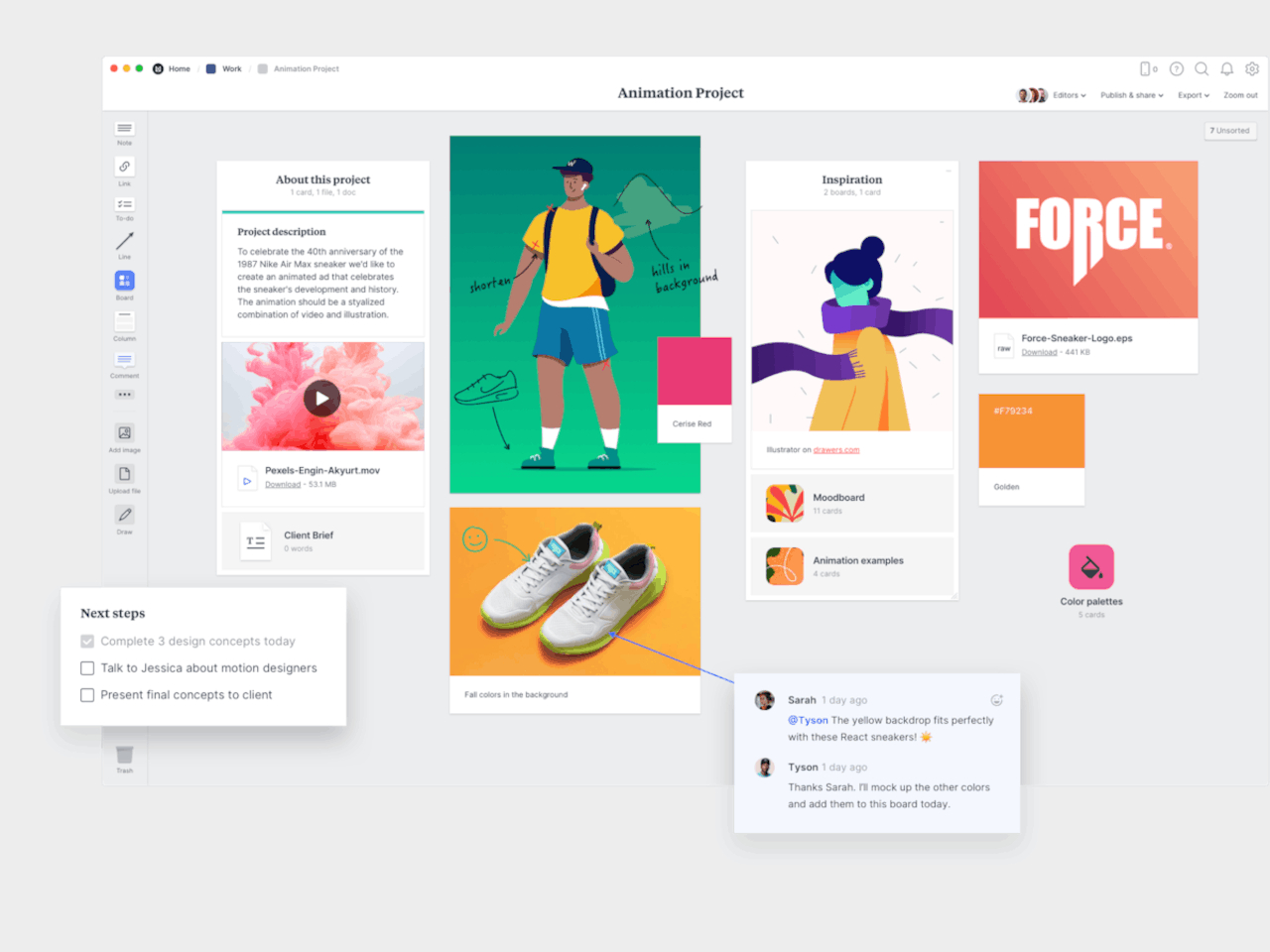
Even before the whole tribe of powerful note-taking apps descended on the digital landscape, Milanote was already carving out a niche for itself. Designed specifically with designers in mind, the app offers just enough tools to help users gather as many bits and pieces of inspiration as they can and then organize their thoughts, references, and inspirations for use later.
Designer: Milanote
Milanote basically gives users an infinite canvas to pin card-like objects that can contain text, images, YouTube links, and checklists. These can be arranged in a column or float on their own, drawn over with scribbles, and connected with lines, giving them the freedom to create mood boards, palettes, charts, and other visually interesting compositions to help their creative process. At the same time, it also helps them keep tabs on their tasks with checklists and kanban boards.
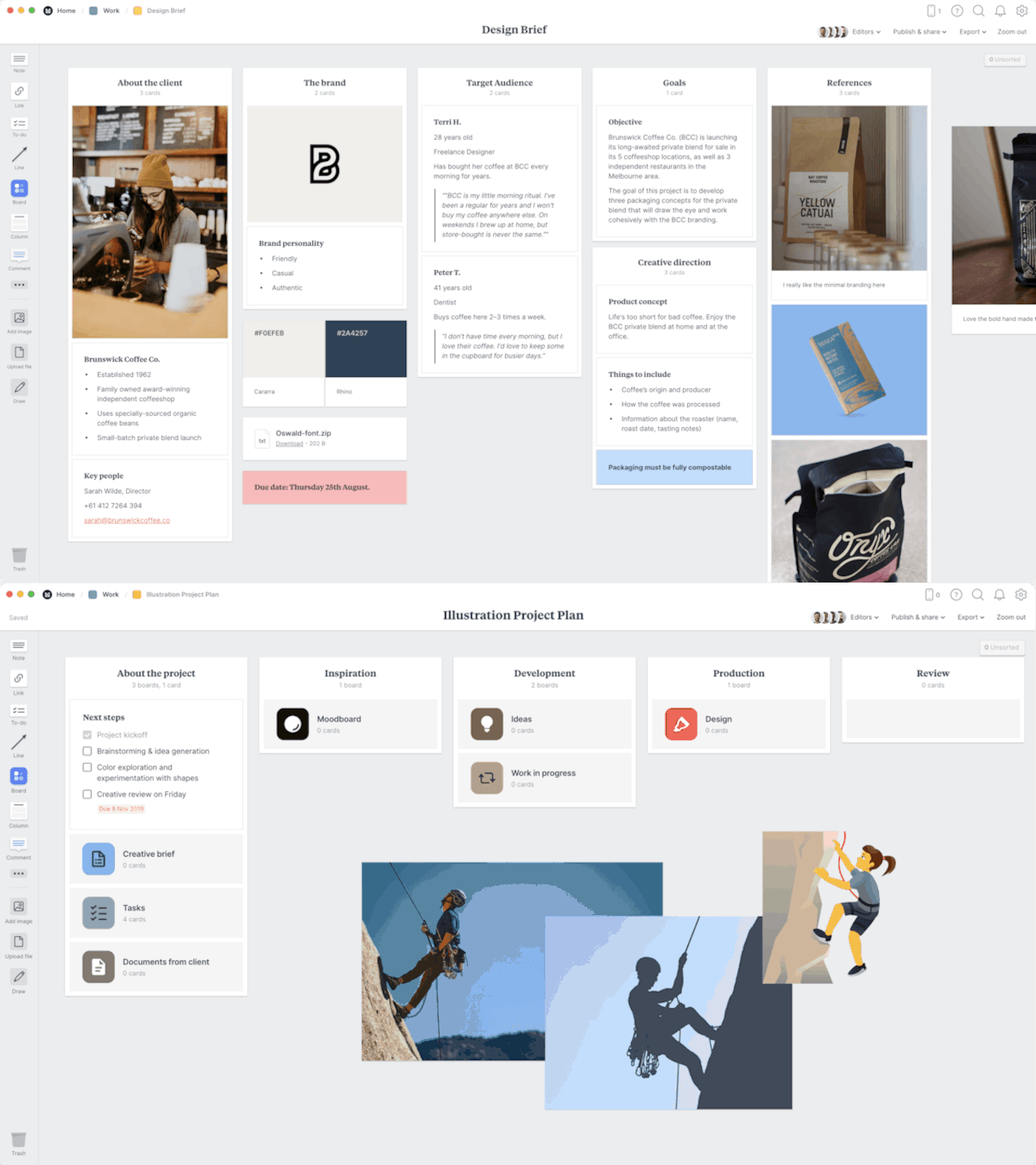
Milanote has been around for almost a decade now and, unfortunately, its age is starting to show. Unlike other apps in this space, the selection of objects that you can embed in that canvas is quite limited. While it does keep things simple, it might also fail to give the tools designers need to go beyond these basic building blocks. Milanote’s pricing system hasn’t changed that much either and it is one of the more restrictive and expensive ones out there.
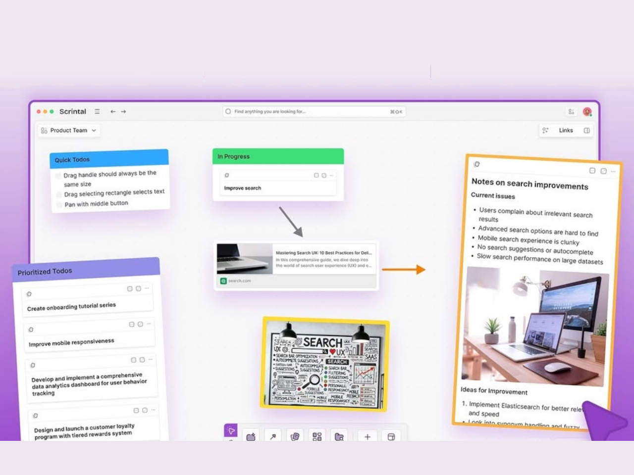
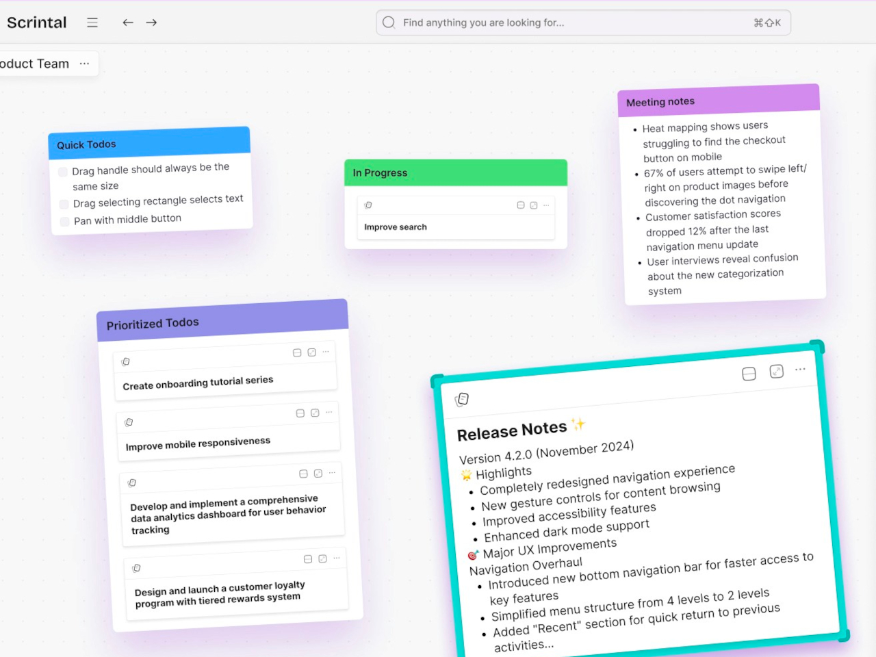
Although it started as something like yet another Notion alternative (more on that later), Scrintal recently launched a new version and a new image, billing itself as a “Playground for the Mind.” Instead of the more document-centric platform it once used, it now embraces a more visual approach to shaping your ideas and documenting your creative process.
Designer: Scrintal
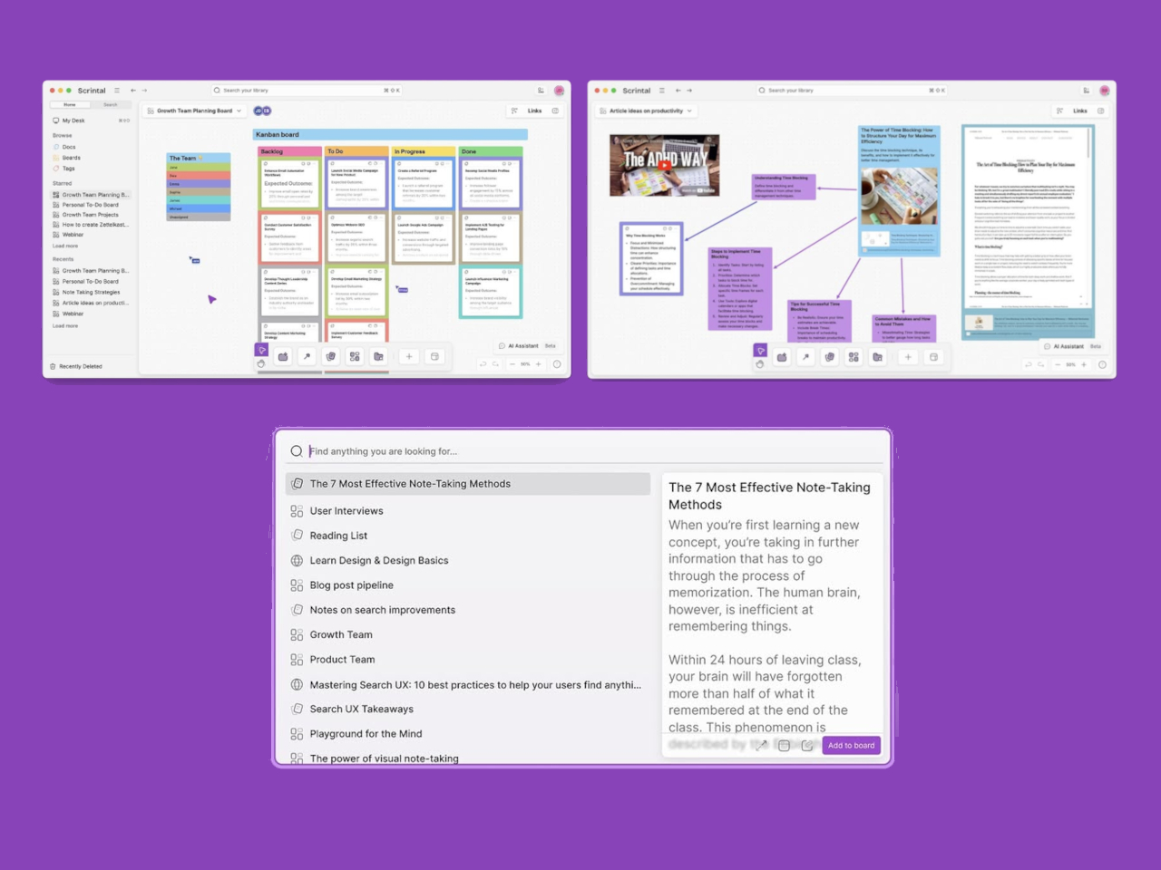
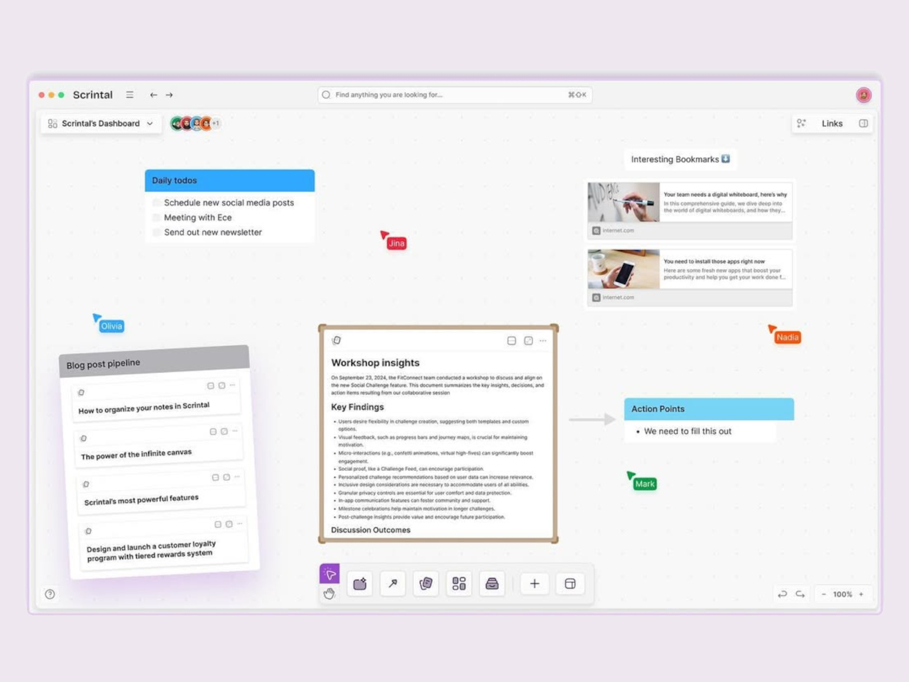
Like with Milanote and other apps like it, Scrintal uses different kinds of blocks to represent objects, but this time with more variety and power. Not only are the more types of blocks, you can also do more with them, like structurally linking them instead of just drawing lines between them. And when you’re done with the free-form brainstorming process, you can actually convert your boards into more traditional structured documents.
If Milanote only had a very limited free tier, Scrintal doesn’t have one at all. You can have a free trial, but that’s pretty much it. And because its “2.0” version is quite new, there isn’t even any mobile app available yet. Of course, you’re unlikely to move blocks around on your phone or tablet, but just being able to view your notes anywhere can be quite convenient.
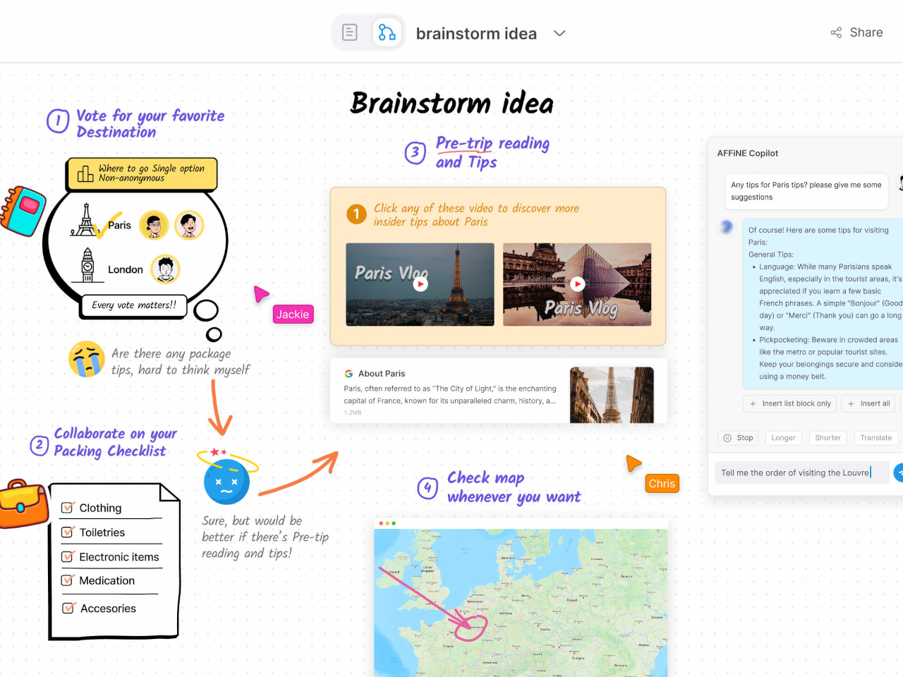
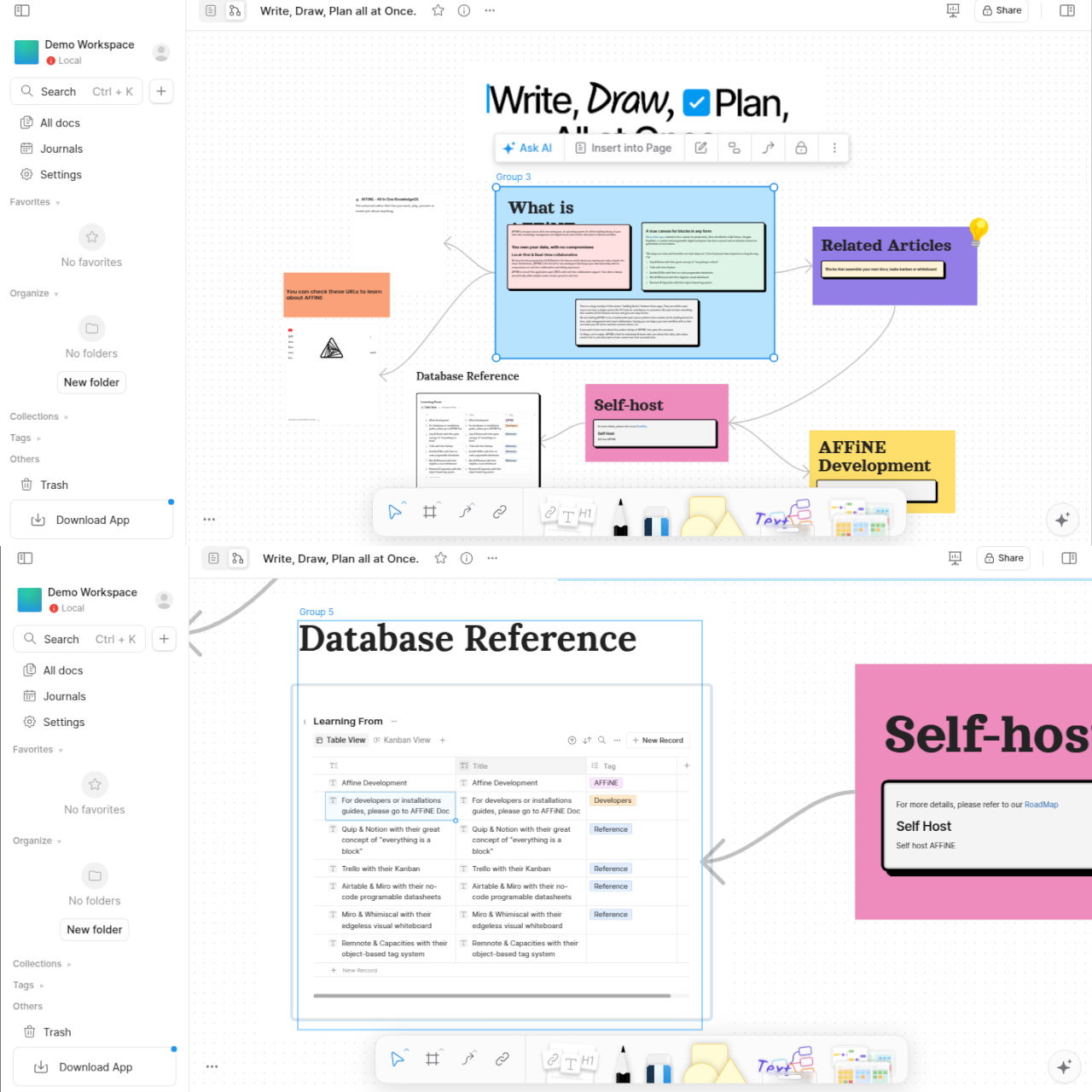
As powerful as many of these note-taking tools might be, very few of us really know what happens behind the scenes. It’s not just because they’re complicated pieces of software but also because we have no access to their code in the first place. Some people are more conscious about their privacy and data security, and AFFinNE tries to serve this user base by offering an open source platform where you can be in total control of your data.
Designer: AFFiNE
AFFiNE’s experience operates on two different levels. On the one hand, you have what looks like a traditional linear document, except that paragraphs are actually blocks that can be almost anything, from images to tables with sliders and controls. Literally flip the switch and you’re taken to an infinite whiteboard where you can arrange these elements in a more visual way.
AFFiNE is one of the very few open source apps in this space, and some might see its fast-paced development and changes as a sign of instability and unreliability. That said, its free tier is quite generous and its lowest paid tier is also affordable, though you will have to for a different subscription to have access to much-hyped AI features.
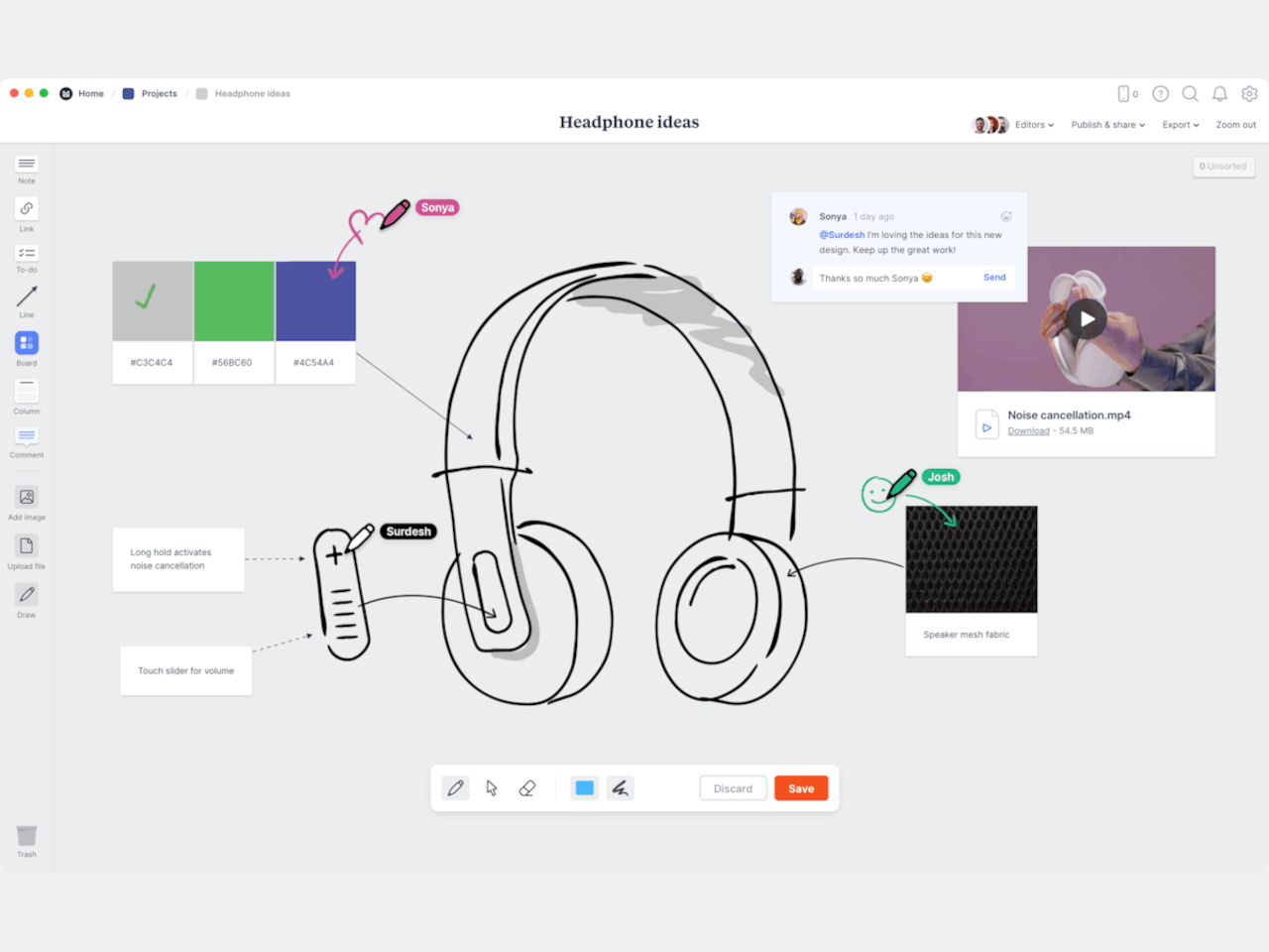
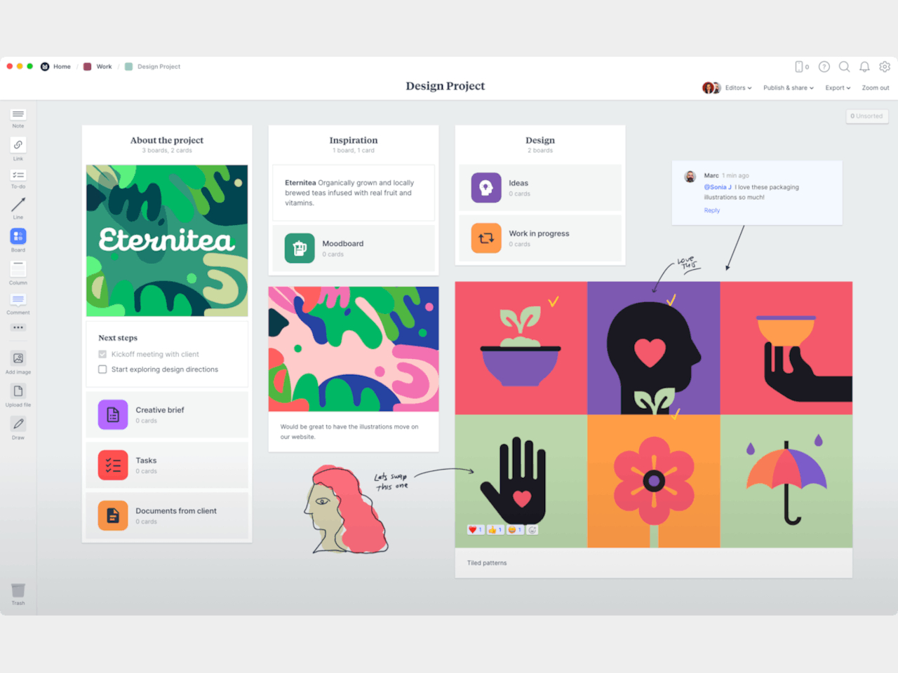
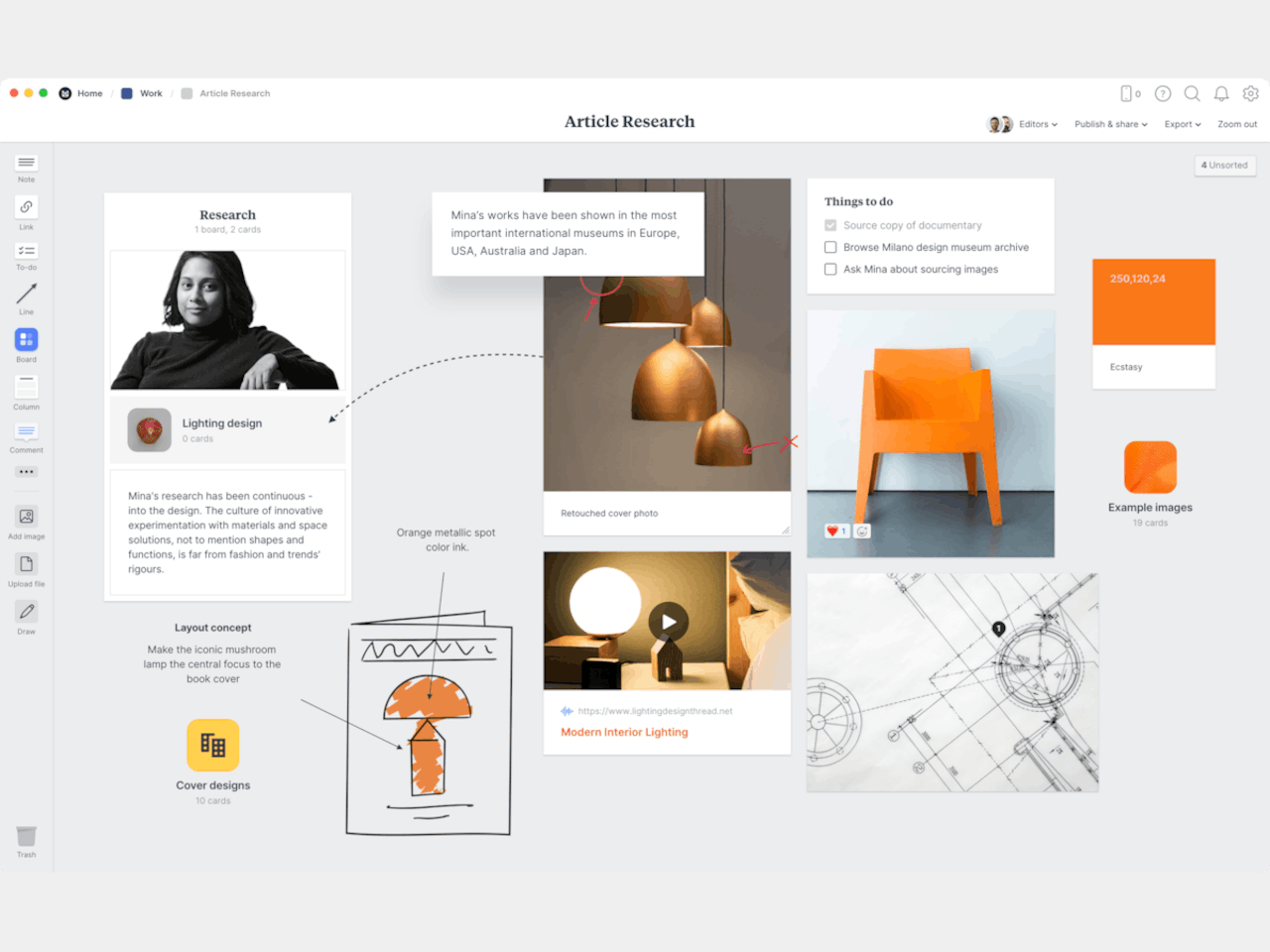
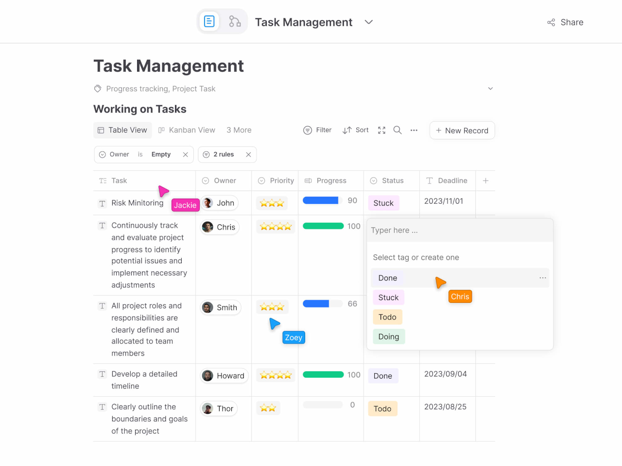
Generating and organizing your own thoughts is one thing, but working with others can be quite a different beast. Different designers might have different requirements when it comes to their tools, and keeping everyone on the same page can sometimes feel like herding cats. Miro is built specifically to address the needs of collaboration, but rather than using a boring document or spreadsheet, it offers a lot of flexibility in how you express ideas and tasks.
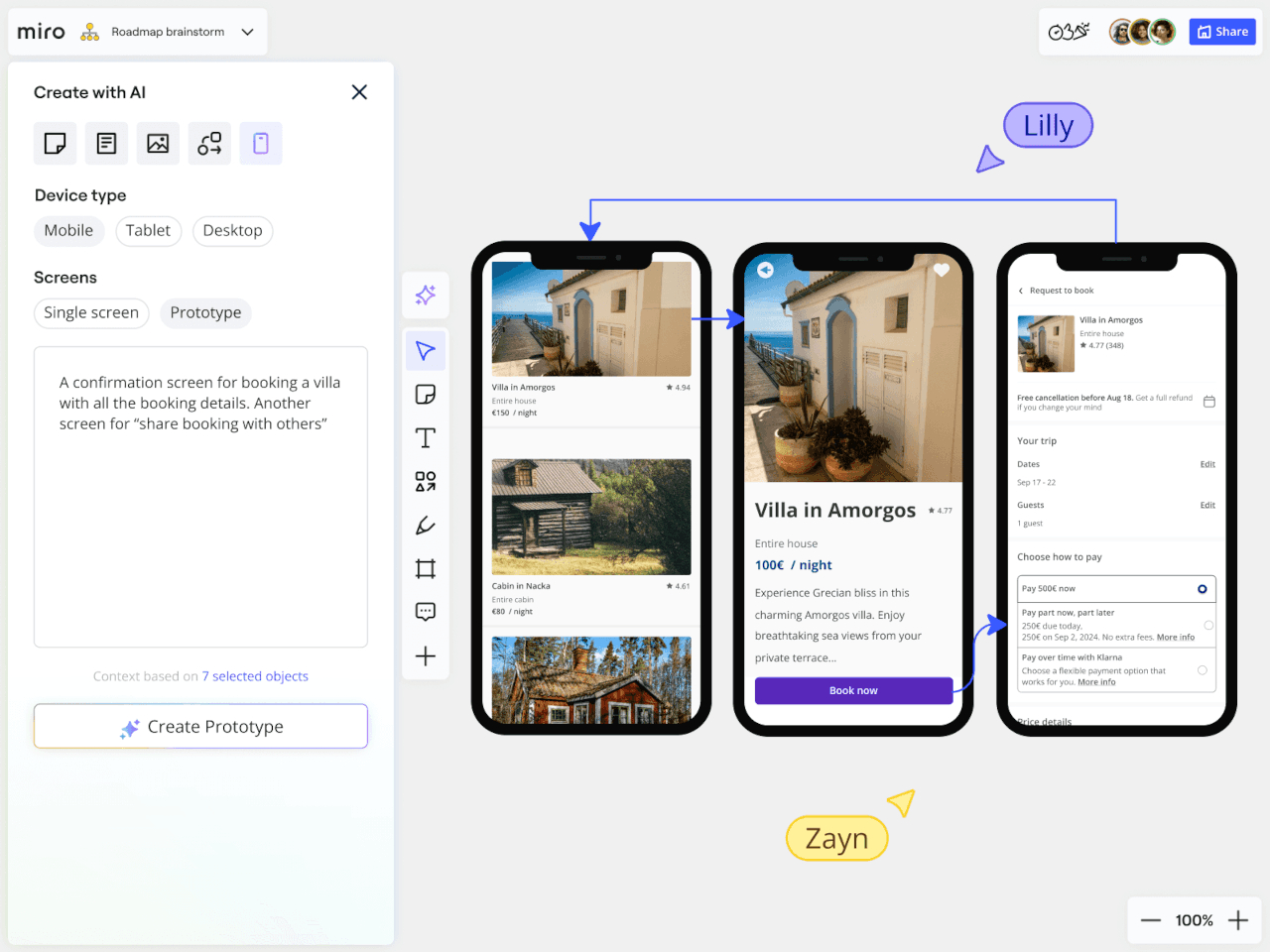
Miro makes working in teams not only more efficient but also a bit more fun. Visualization tools can speak louder than words, especially when they’re interactive and pleasing to look at. It also supports a wide variety of templates so you don’t always have to start a mind map or kanban board from scratch, further reducing time and friction.
This is one of the more mature products on this list and, unfortunately, it is also one of the more complicated and expensive ones. Targeted at creative professionals who mostly work with others, Miro has more disadvantages than advantages for the solo designer. It does have AI features to help condense the complexity, but, again, the pricing could be a little too much for individuals.
If you’re looking for a more organized visual representation of your content without becoming a full-blown structured document, then Walling might suit your needs and aesthetic tastes. Using the metaphor of blocks, which it calls “bricks” here, you basically create walls of different types of bricks that include images, videos, text, tables, calendars, and more. And, of course, it also has AI to help you generate ideas and organize them.
Unlike a more free-form infinite canvas, these bricks follow a grid-like pattern that makes them look more like neatly laid-out magazines than messy whiteboards. Indeed, Walling actually lets you publish your wall or even just a section of it, practically turning it into a webpage. It’s almost like a website builder, but with a lot more freedom in how you want to lay out your cards.
Although Walling has been around for half a decade now, it has only been recently making waves with its simpler and more straightforward interface compared to bloated visual note-taking apps. In that course of time, it has also adjusted its free tier to be a bit more useful, while its paid offerings are also priced competitively.
This list is almost literally just the tip of the iceberg. The so-called PKM space is overflowing with apps with a wide range of designs, capabilities, and target audiences. These might not even be the most popular in the market, but power and popularity don’t always translate to satisfying user experiences.
There are definitely more options available, though not all of them might appeal to designers, artists, and creatives. We’d be remiss if we didn’t mention them, however, because people have different needs and tastes as well. If the previous five didn’t meet your requirements, the following apps could be more to your liking instead.
Databases and spreadsheets were traditionally seen as the purview of executives and IT, but the likes of Notion and xTiles have made them trendy among the productivity-loving crowd as well. In a nutshell, these platforms offer the ability to display the same piece of data in different ways, turning a line in a spreadsheet into a to-do list or a list of links into a grid of images.
Notion
Both these apps work on the level of “blocks,” which can almost be anything. Like Walling, they only allow a limited way of arranging these blocks, often in grids or columns. They are extremely powerful, appealing not just to advanced users but also to more creative people who want to bring their analog Bullet Journals to the digital world. All that power and flexibility, however, translates to complexity and, in many ways, visual chaos. It takes a lot of work to actually make good-looking pages, and you might find yourself losing time to that instead of actually doing creative work.
xTiles
When people think of note-taking with computers and mobile devices, they most likely think of typed notes first. In this area, Obsidian and its open source rival Logseq are at the top of the food chain, offering the simplicity of text-based documents but with add-ons that go beyond just words. Both, for example, feature whiteboards and canvases where you can arrange and link your notes visually, mixing in some images and files as well.
Obsidian
Logseq
These apps value the privacy and longevity of the notes above all, which is why they adopted plain text as their primary document format and stored files locally on the device, with options to sync to the cloud at additional cost. These apps have a large treasury of plugins that add dashboards, spreadsheets, interactive elements, and whatnot to the experience, but at the end of the day, they’re still text-based, and that might be a bit limiting to visual note-takers.
Pinterest is quite a popular resource for designers and artists, making its staggered grid (a.k.a. masonry) layout a favorite among those creating mood boards. It’s a simple design that adds visual interest without going overboard, and it’s the kind of layout that some note-taking apps are trying to adopt as well. It removes unnecessary features and distracting designs so you can simply focus on collecting references, jotting down inspiration, and scrolling through your gallery.
MyMind is a particular example of this design. With its simple and clean interface, it feels almost like Milanote but confined to this dynamic grid layout. It doesn’t come cheap, though, and has no free tier, but Google Keep comes close as a poor man’s moodboard option. That said, it really eschews the freedom of expression in exchange for a tidier space, something that could feel a bit suffocating for some users.
The post Top 5 Beautiful Note-taking Apps to Spark Creativity and Enhance Productivity first appeared on Yanko Design.
In the course of using some everyday products, we probably seldom stop to question why things are designed the way they are. Why are appliances like speakers and air purifiers traditionally rectangular and boxy while flashlights and lamps are cylindrical? Sometimes, the answers lie in history and practicality, but other times it’s just a matter of convention and the lack of motivation to think outside the box.
This flashlight design concept, however, isn’t afraid to dare to be different, perhaps even to the point of sacrificing some ergonomics. Embracing a trending design aesthetic, it isn’t just breaking the mold by throwing out most conventions. It is also challenging those conventions to see what’s possible if we’re not afraid to ask “What if?”
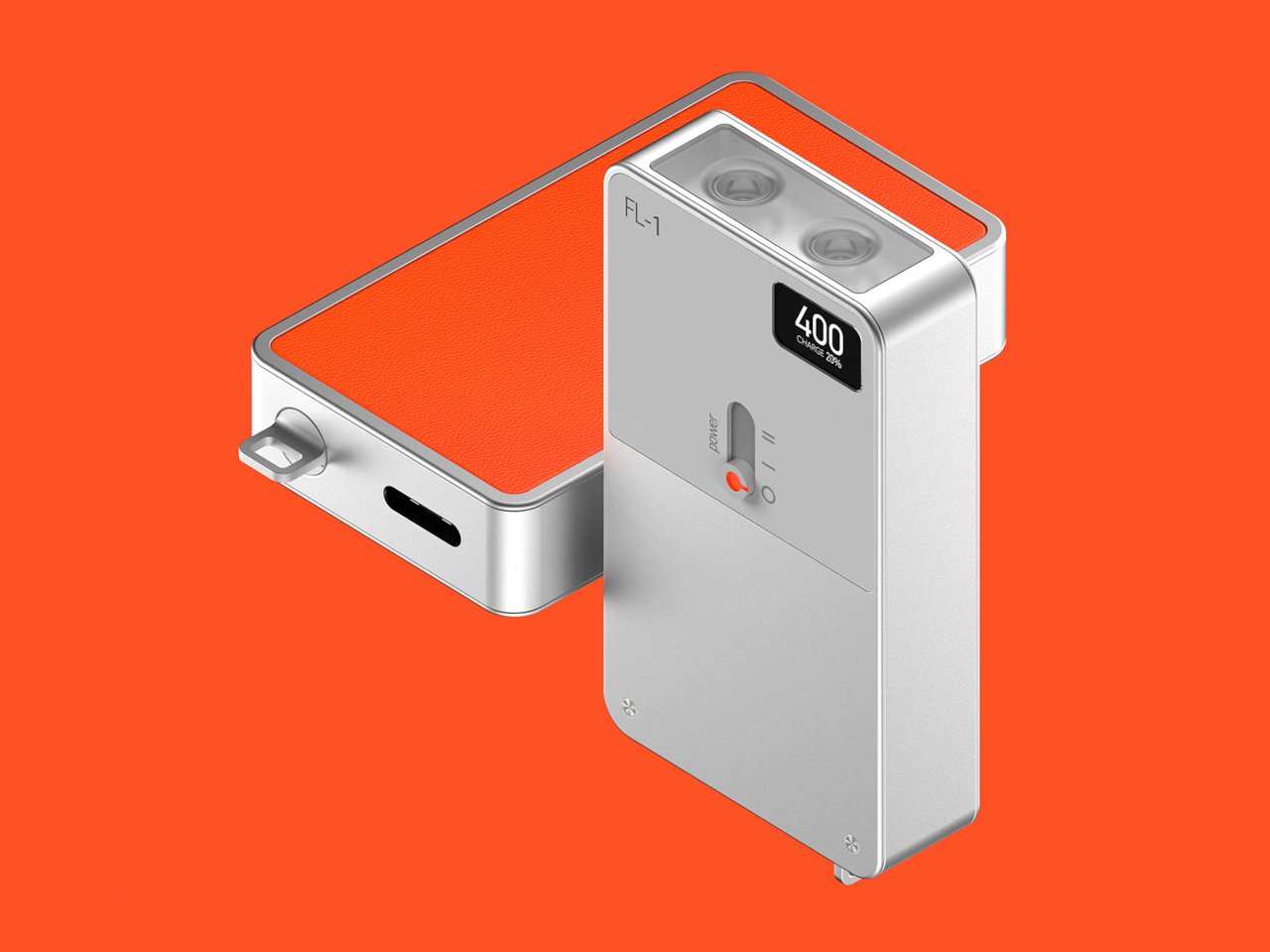
Designer: Nikhil Kapoor
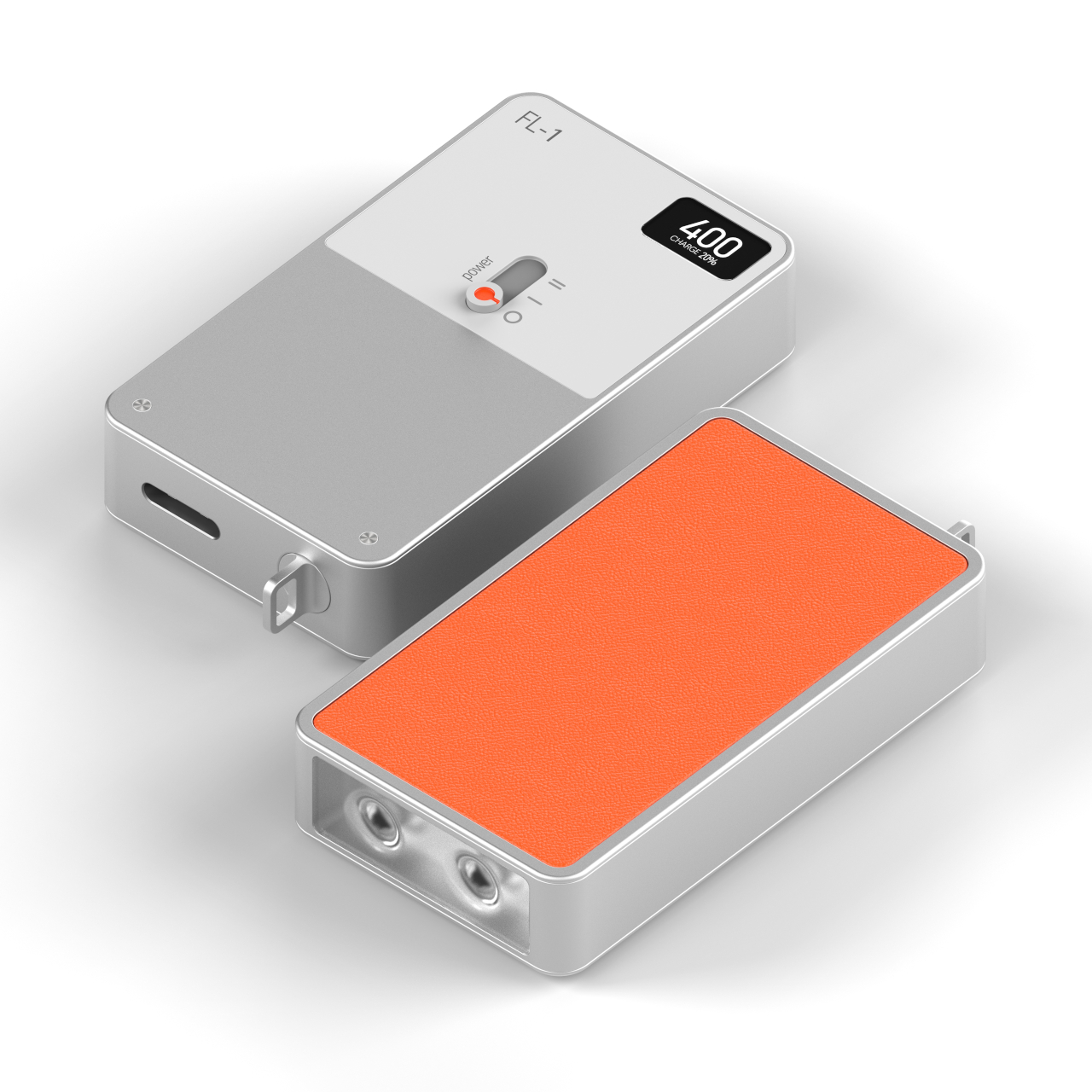
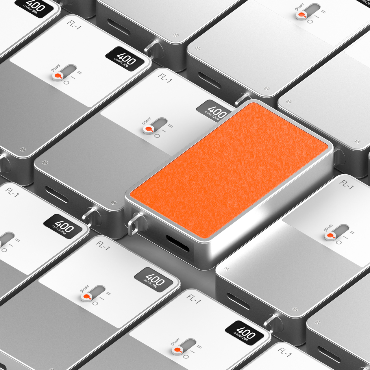
Industrial design aesthetics has carried a rather negative connotation of being cold and impersonal, but recent trends have cast a more positive light on modern renditions of the design language. Teenage Engineering’s products, in particular, have presented a certain flavor of minimalism that embraced the cold surface of metal, the angular and sharp edges of boxes, and an intentionally limited color palette.
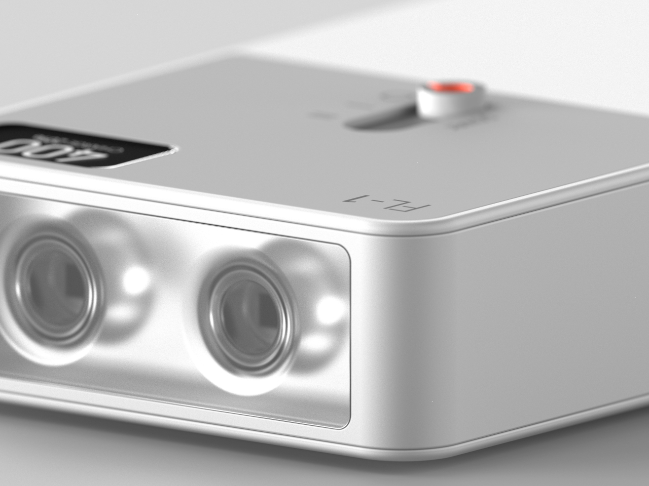
The FL-1 flashlight concept embraces these design elements to shock and confound. Instead of the conventional barrel form, it comes in a box that will admittedly be cumbersome to hold for long periods of time, at least depending on the size. It could easily fit in the palm of your hand, as many EDC flashlights do these days, but the sharp edges could bite into your skin over time.
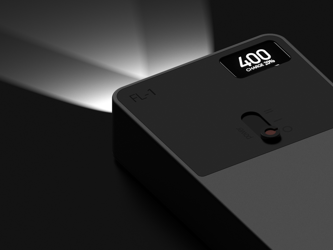
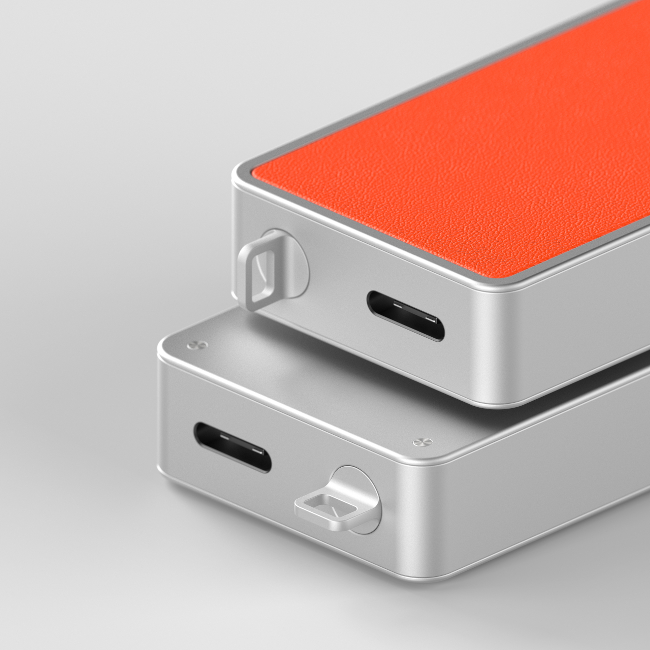
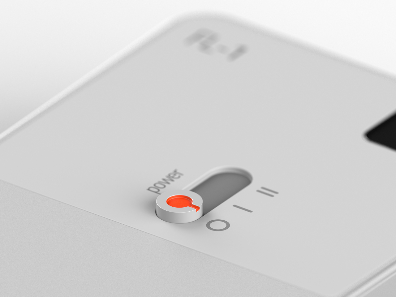
The design does have a few interesting features beyond its industrial aesthetic. The rectangular shape gives it enough room to fit two LED lights, which can be turned on individually or together with a simple sliding switch mechanism. There’s also a display to show the remaining battery charge so you’re never caught unaware. The flashlight is charged via USB-C, which is the only reference to the correct scale of the object.
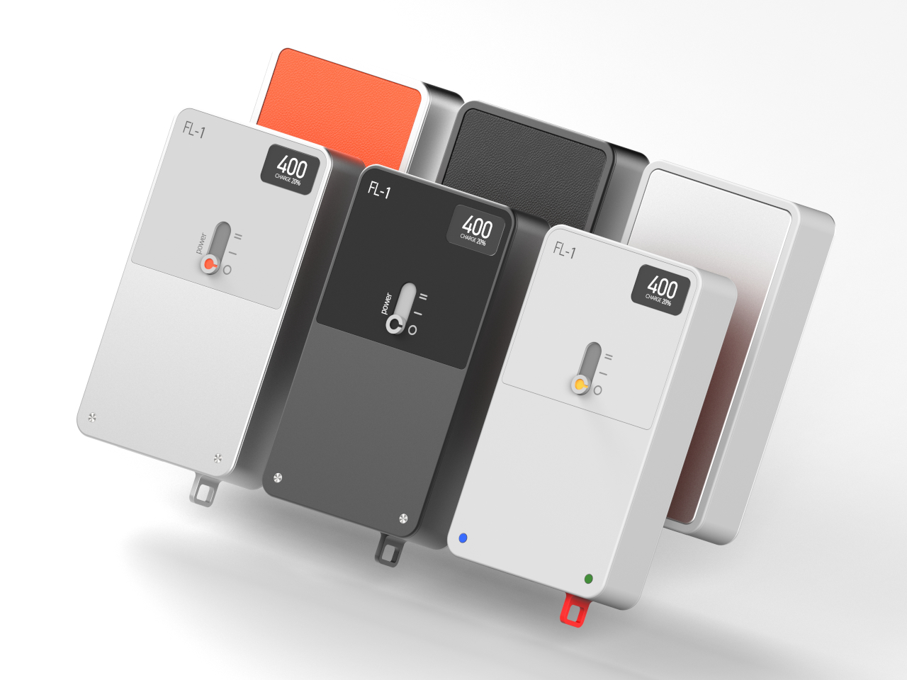
Like Teenage Engineering’s designs, the FL-1 practically uses only two colors, or three if you count the contrasting shade of gray. A vibrant orange backside increases its visibility, but only if it’s upside down, while there’s no method for seeing the flashlight in the dark if it’s right side up. The concept definitely has its flaws, but it is still a worthwhile thought experiment on how we can challenge the status quo and come up with designs that aren’t just different but also even better.
The post Teenage Engineering-inspired flashlight concept breaks the mold with a boxy design first appeared on Yanko Design.
Even before turntables and instant cameras became fashionable again, the gaming industry has already been obsessed with old-school design. Whether it’s actually playing those classic titles or creating new games in a pixelated retro style, both gamers and designers have been harnessing the power of nostalgia to craft products that connect generations of people and keep the history of gaming alive.
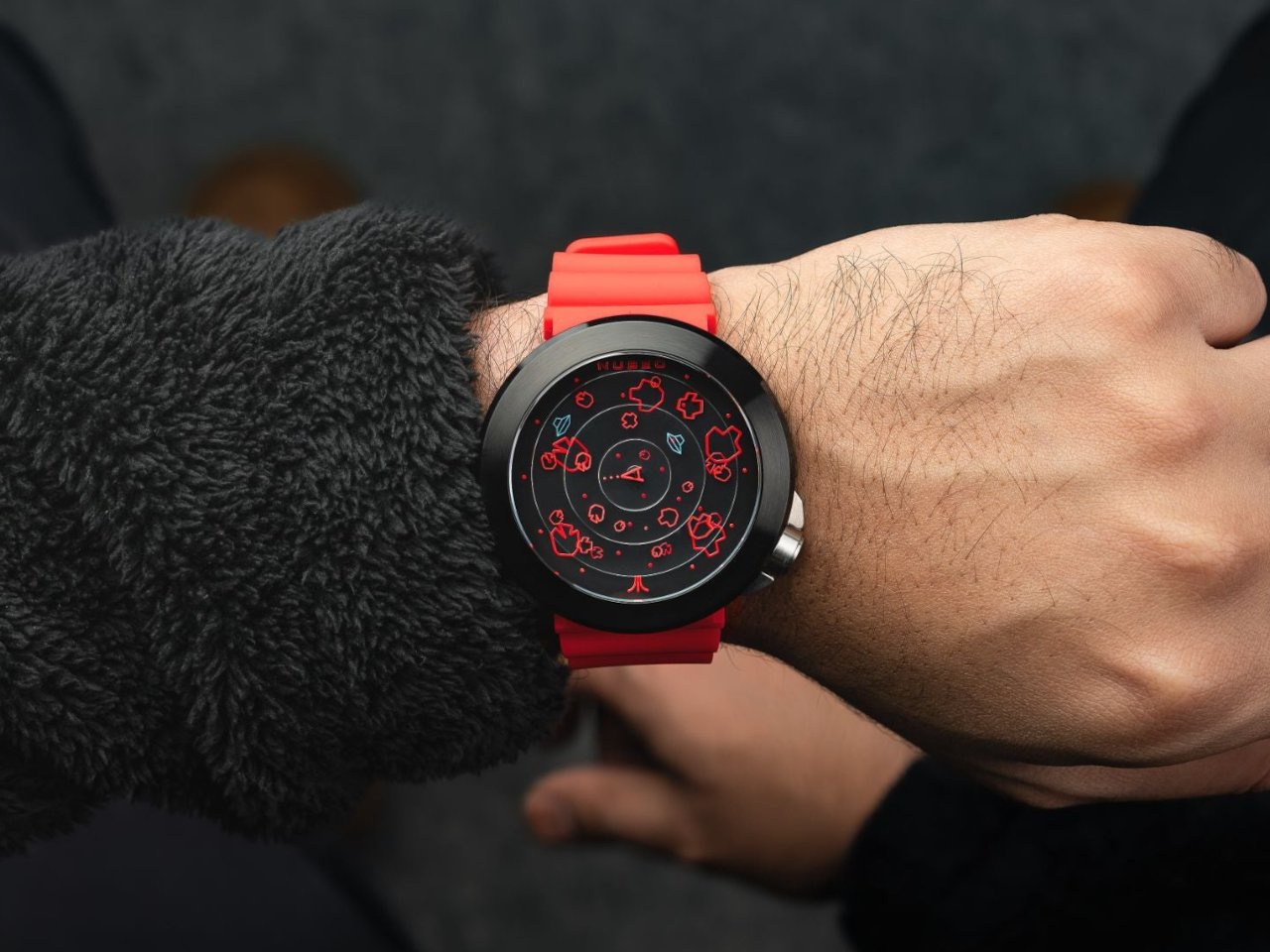
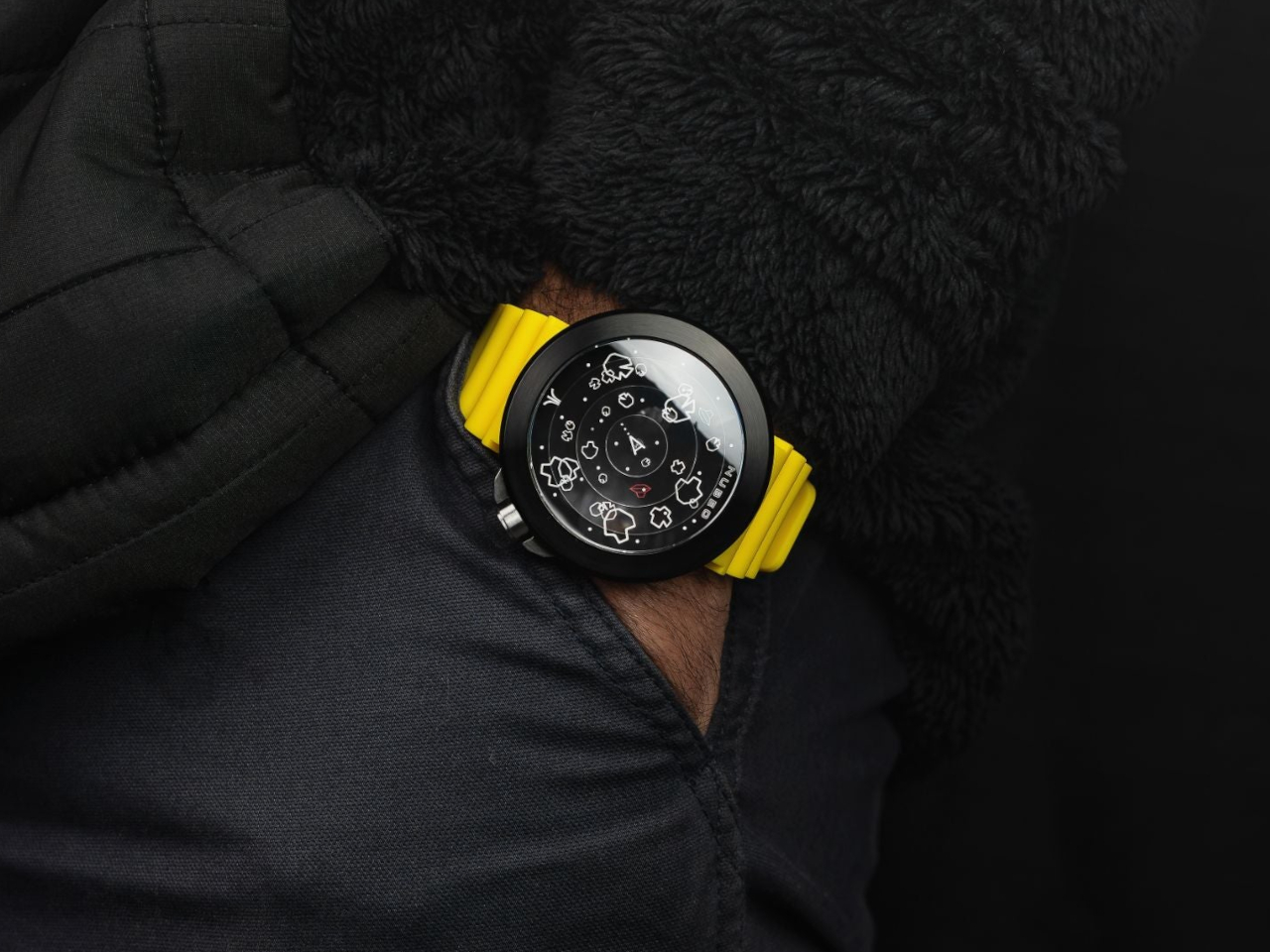
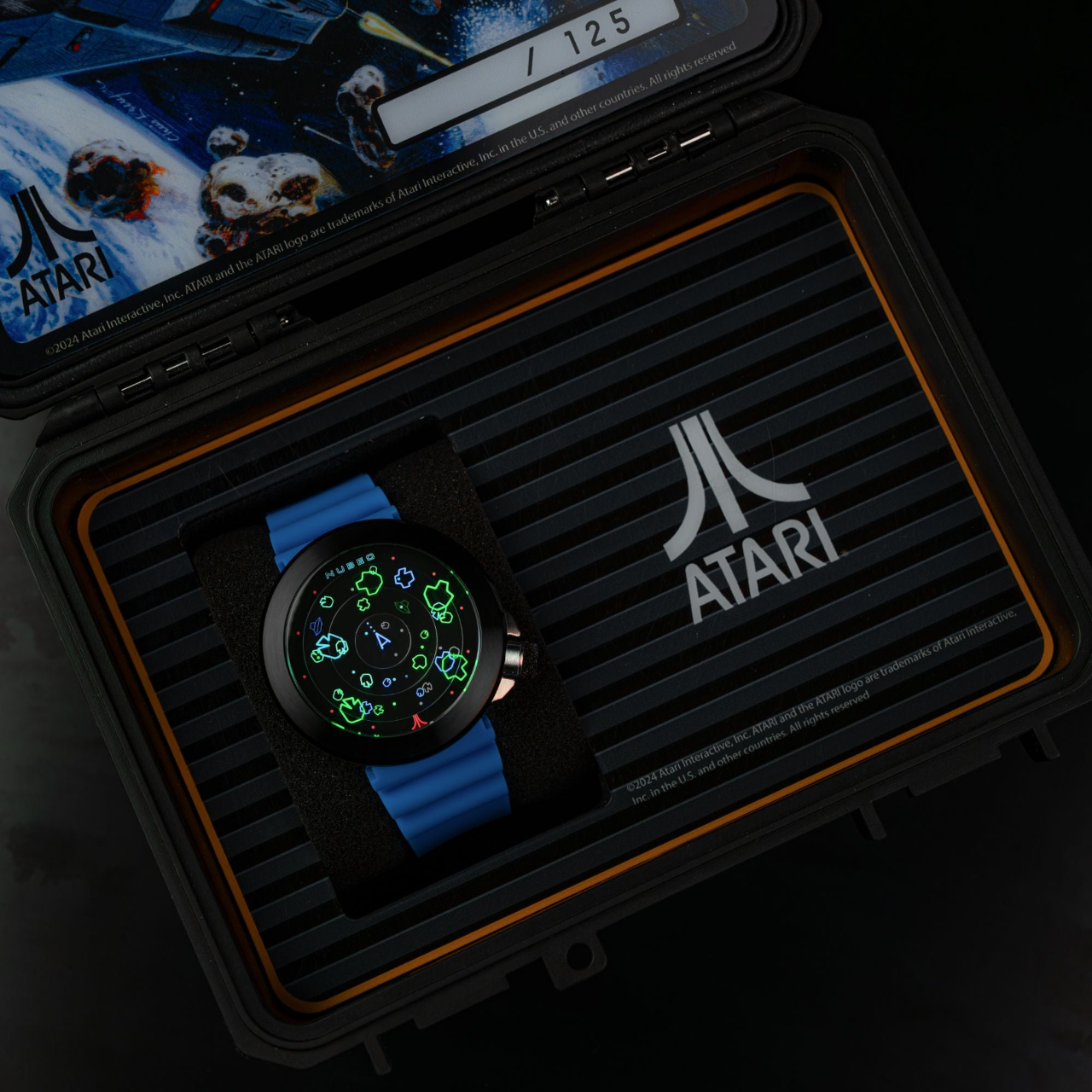
Sometimes it’s not just the games themselves but even the merchandise that pulls at the heartstrings of fans of these cherished games. This watch, for example, might not actually let you play the iconic Asteroids game (which sounds like an idea for a smartwatch app), but it does bring not only the charm of those amorphous objects representing colliding asteroids, it even recreates the rather chaotic atmosphere of the game as well.
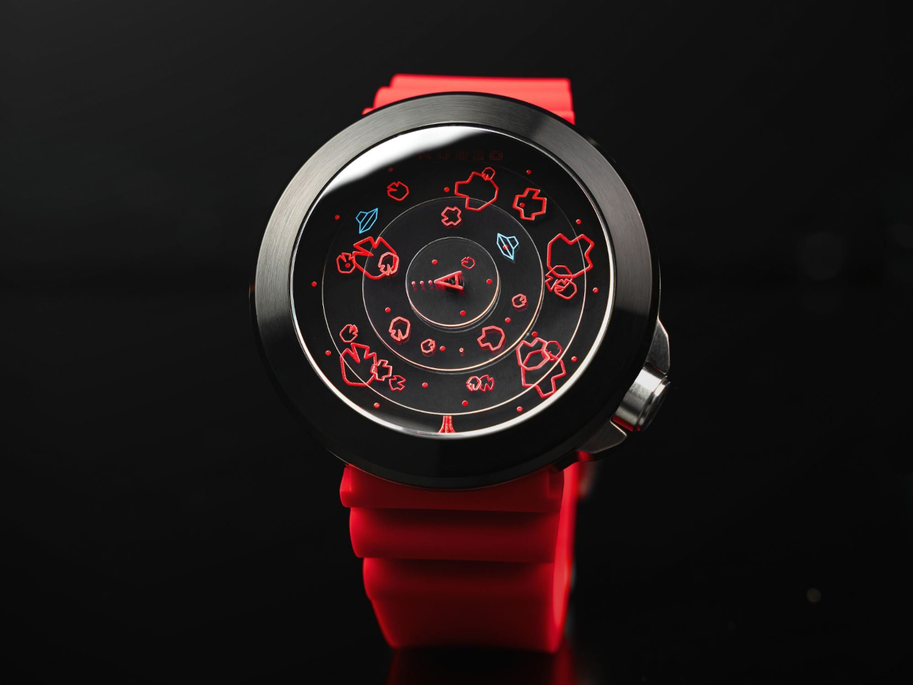
After Pong, Asteroids was arguably one of the most iconic first titles that graced the gigantic arcade cabinets in the youth of the gaming industry. Its graphics and concept were simple, but its mechanics could be unforgiving. You basically shoot down asteroids and UFOs passing by that may collide with you, all with very limited moving capabilities. It can get pretty messy quickly, with a random assortment of objects filling the large screen. Now imagine all those in a circle small enough to sit on your wrist.
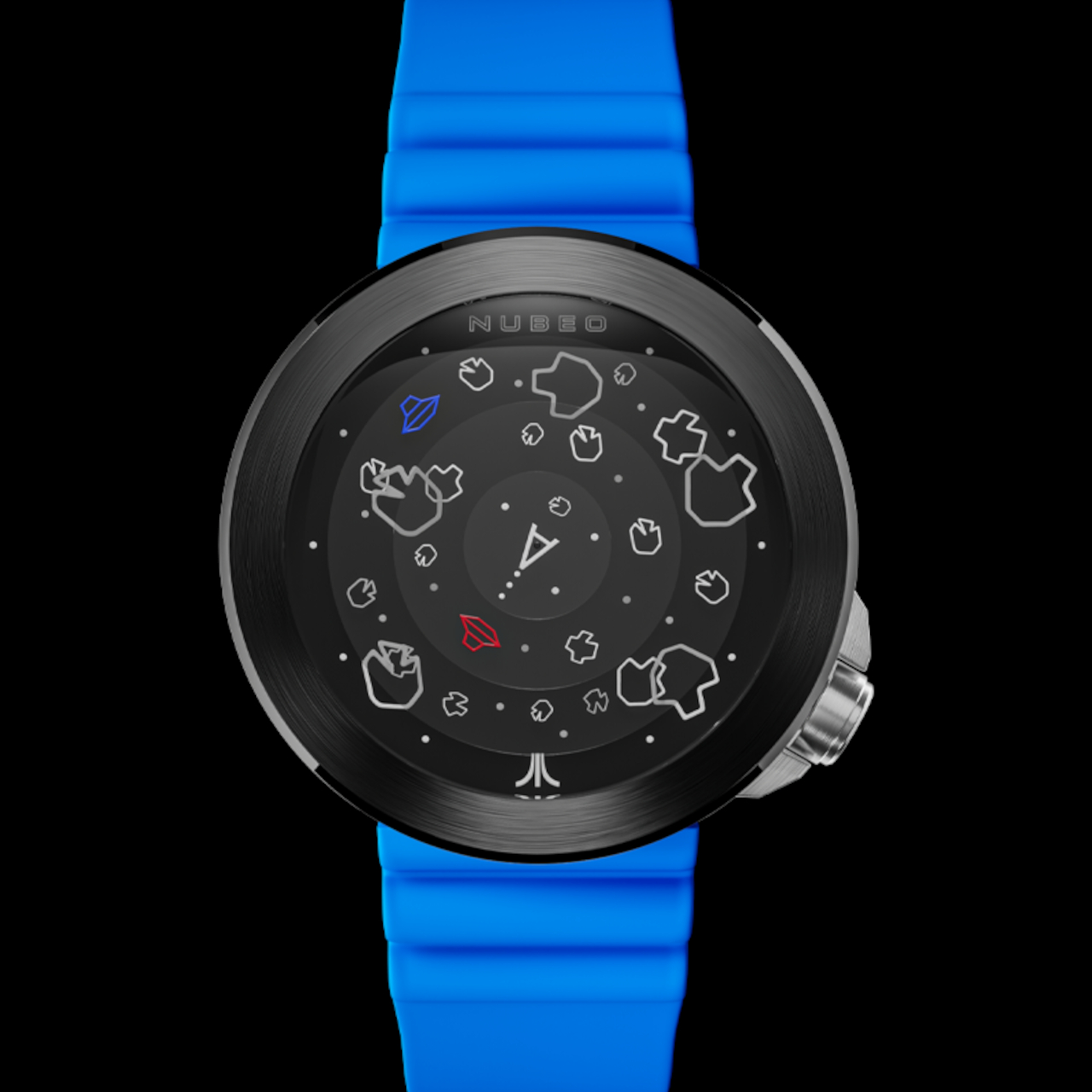
That’s the adrenaline-pumping atmosphere that the limited edition Ventana Automatic watches are trying to convey every time you try to look at the time. Celebrating the game’s 45th anniversary, this Atari Asteroids watch brings all the familiar elements of the game and shrinks it down to a scale that, if it were actually a game, would be a sordid mess.
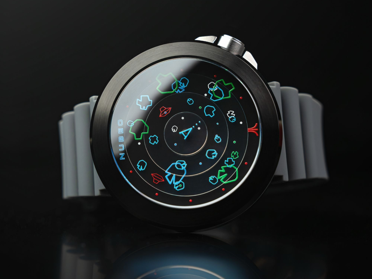
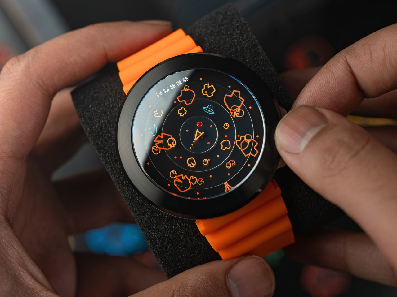
The triangular ship in the center moves to track the passing of each second, while two UFOs, colored differently from the asteroids, mark the minutes and hours using a unique layered disc system that rotates concentric circles instead of moving hands. This element adds a distinctive flair to the watch that easily sets it apart from more serious-looking timepieces.

The Ventana Automatic Atari Asteroids watch is powered by a Japanese automatic movement. The graphic elements are printed with Swiss Super-LumiNova, giving the watch an eerie glow in the dark. Available in Nova Nightfall, Plasma Pumpkin, Nebula Blue, Supernova Red, and Celestial Citrine colors, the limited edition watch will be something that gaming history fans and collectors might want to quickly reach for while supplies last.
The post Atari x Nubeo limited edition Watches bring the chaos of Asteroids to your wrist first appeared on Yanko Design.

For a hot minute, gray was everywhere. Not just a little bit here and there—gray dominated. Gray walls, gray furniture, gray kitchen cabinets, gray exteriors. It was the unofficial uniform of home design in the 2010s, with its cold yet “modern” vibe signaling minimalism, sophistication, and, well, the ability to stage a house for resale.
But after years of grayscale everything, we’re collectively realizing it might be time to let this trend rest in peace. It’s not that gray is inherently bad—it’s just been beaten to death – like a song that goes viral on TikTok and then eventually gets hated by everyone. Let’s talk about why this trend exploded, how it overran our homes (and lives), and what’s next now that we’re all over it.

Gray didn’t just appear overnight—it filled a vacuum left by the beige overload of the early 2000s. Millennials, raised in homes with yellowy beige carpets and walls, rejected those warm tones for something cooler and more modern. Gray offered an alternative that felt like a fresh start: sleek, clean, and refreshingly neutral. It was the perfect choice for a generation looking to distance itself from the outdated interiors of the past.
Its rise was also deeply practical. Gray was calm and versatile, perfectly aligning with the minimalist aesthetic that dominated the 2010s. It offered a sense of peace in a chaotic world, and for millennials facing housing insecurity and constant economic stress, creating a serene home was a small victory. Gray wasn’t just a color—it was a vibe, one that represented order in an otherwise messy reality.

Real estate developers and landlords also saw the practicality of gray. For new builds and rental properties, it was a neutral, inoffensive choice that made spaces feel modern while appealing to as many people as possible. Add to that the influence of social media, where gray walls and monochromatic palettes became the hallmark of every trendy home makeover video, and suddenly, gray wasn’t just popular—it was unavoidable.
But like every trend that gets oversaturated, gray lost its magic. Entire homes in varying shades of gray began to feel cold, lifeless, and repetitive. What was once sleek and modern became bland and uninspired, leaving people craving warmth, personality, and individuality. The shift away from gray marks a broader move toward more vibrant and dynamic interiors—spaces that finally feel alive.

The thing about gray is that, like any good trend, it starts out fresh and exciting. But when everything is gray, it starts to feel sterile, repetitive, and kind of lifeless. What started as “modern and clean” quickly spiraled into “cold and depressing.” Then there’s the issue of personality. The beauty of a neutral is that it’s supposed to complement bold accents or allow you to add your own flair. But what ended up happening is that people just stopped adding personality altogether. They leaned into the “safe” choice, and to be honest, there’s only so much you can do with gray walls, gray flooring, and gray furniture before it all blends together into one dull blob of grayscale monotony.
And let’s talk about how this trend wasn’t even a choice for a lot of people. Landlords slapped gray paint on rental walls because it was cheap and easy, leaving tenants stuck with lifeless spaces they weren’t allowed to change. New homeowners, meanwhile, were so drained from the expense of buying a house (because, surprise, buying a house is extremely expensive) that repainting gray interiors wasn’t exactly a top priority. Gray became less of a trend and more of a trap.

There’s also something deeper to this shift. Millennials, the generation who popularized gray, are also the generation that got hit with housing crises, skyrocketing costs of living, and an endless sense of instability. Is it any wonder that a neutral like gray—a color that doesn’t ask too much or stand out too loudly—became the default? Gray doesn’t take up space. It’s non-threatening. But it’s also emotionally flat.
Living in gray-heavy spaces can feel uninspiring at best, suffocating at worst. During the pandemic, when many of us were stuck at home 24/7, those blank gray walls stopped feeling sleek and modern. Instead, they felt like cages. People started craving warmth, vibrancy, and a sense of life—things gray can’t exactly deliver.

So, if we’re done with gray, what’s next? Thankfully, interior design is moving in a brighter, bolder direction. Here are a few trends that are leaving millennial gray in the dust:
1. Boho Chic:
This trend is all about earthy tones, natural textures, and an eclectic mix of patterns. Think warm terracotta, soft sage greens, woven baskets, and rugs with bold designs. It feels inviting and lived-in, the opposite of the sterile perfection of gray interiors.
2. Mediterranean Vibes:
Earthy whites, sun-drenched yellows, deep blues, and rustic wood accents are making their way into homes. This trend brings warmth, elegance, and a timeless quality that gray just can’t match. Bonus: it makes you feel like you’re vacationing in Greece.
3. Jewel Tones:
Bold jewel-inspired hues are having a major moment. From emerald green walls to amethyst purple sofas, people are embracing color in a big way. If you’re ready to embrace boldness, jewel tones are rich, luxurious, and full of personality.
4. Statement Walls:
Gray walls are out; patterned wallpapers, murals, and accent walls are in. Adding texture and visual interest to a space brings personality and vibrancy, something gray could never quite pull off.

The death of millennial gray isn’t solely about aesthetics—it’s a reflection of bigger cultural shifts. After years of playing it safe, people are ready to embrace individuality and creativity. The pandemic taught us that our homes need to be more than just pretty; they need to feel like places we actually want to live in. Warm colors, bold designs, and eclectic touches bring life to a space in a way gray never could.
And let’s not forget: this is also about reclaiming some sense of joy. Millennials have spent the better part of their adult lives stuck in economic uncertainty. Maybe that’s why gray felt right for a while—it didn’t make any bold promises. But now? We’re ready for something that sparks a little happiness.

If you’re staring at gray walls and thinking, “Okay, what now?”—don’t panic. Transitioning away from gray doesn’t have to be overwhelming or expensive. Here’s how to start:
For renters, small changes like colorful curtains or vibrant bedding can make a big difference. And if your landlord is cool with it, ask about painting one accent wall—it might just convince them to rethink their gray obsession too.

So, will gray ever really go away? Probably not. It’s neutral, it’s functional, and for a lot of people, it’s still a safe choice. But its dominance as the color of the decade is definitely over. Gray will stick around in smaller doses—as a backdrop for bolder designs or paired with richer tones—but it’s no longer the main event.
The future of home design is looking a lot more colorful, a lot more personalized, and, honestly, a lot more fun. So let’s raise a glass to millennial gray: you had your moment, but now it’s time to make room for something brighter. And remember, if you’re still surrounded by gray, there’s no shame in taking your time to switch it up. Just know that when you do, your home might finally feel less like a catalog and more like, well, you.
The post It’s Time To Retire ‘Millennial Grey’ – Why The Neutral Interior Color Desperately Needs To Go first appeared on Yanko Design.