Vue lecture

Il y a de nouveaux articles disponibles, cliquez pour rafraîchir la page.

What Makes a Watch Design Timeless Over 70 Years

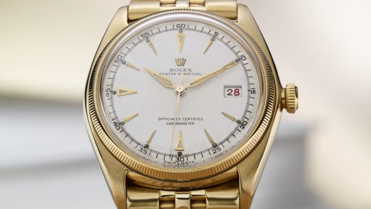
Rolex: first Datejust 1945

Wristwatches have gone through many changes over the past 70 years, but some designs have stayed popular through it all. What’s the secret to a watch that never goes out of style? It’s a blend of simplicity, versatility, quality craftsmanship, innovation, and a nod to history. Let’s dive into how brands like Rolex, Omega, Audemars Piguet, Casio, and Swatch have kept their designs timeless.

1950s: The Golden Age of Elegance

The 1950s were all about elegance. After the war, people craved refined accessories. Watches from this era were clean and simple. The Rolex Datejust, introduced in 1945, became notable in the 1950s with its straightforward dial and comfortable Jubilee bracelet. Its 36mm case size was just right—not too big, not too small.

Rolex: Datejust

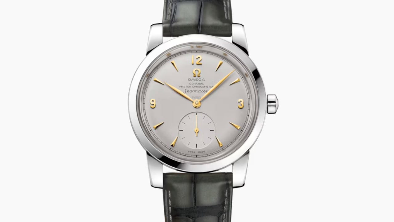
Introduced in 1948, the Omega Seamaster quickly rose to prominence and became a favorite among watch enthusiasts and casual wearers alike. Its design, balancing robustness and elegance, ensured its suitability for various occasions. Whether for a casual outing or a formal event, the Seamaster proved to be a versatile accessory. Its case was crafted from durable stainless steel, enhancing the watch’s practicality for everyday wear. Additionally, the watch was equipped with waterproof features, emphasizing Omega’s commitment to functionality without compromising design. Its sleek and refined look made it both practical and stylish.

Another impressive timepiece from this era is the Patek Philippe Calatrava. This watch stands out because of its minimalist design, characterized by a clean and uncluttered dial with simple hour markers. Its slim case enhances its refined and subtle aesthetic. The craftsmanship that goes into this piece is top-notch, with every detail meticulously executed. The Calatrava, with its understated elegance, has set a high bar for future designs in the watchmaking industry.

1960s: The Rise of Versatility

The 1960s marked an era of change and acceleration in lifestyle, necessitating timepieces that could keep up with the pace. The Rolex Submariner emerged as a symbol of both adventure and style. Its easy-to-read dial, rotating bezel, and superior water resistance make it an attractive timepiece for adventurers. It was designed to perform optimally underwater and also held its own in formal settings, making it a versatile accessory.

This era also saw the rise of the Omega Speedmaster, famously known as the “Moonwatch,” after it was worn during the Apollo moon landings. The Omega Speedmaster was chosen for its functionality and precision. Its tachymeter bezel allowed for the accurate measurement of speed, a feature integral for both astronauts and car enthusiasts. Its chronograph functions made it a perfect blend of style and functionality.

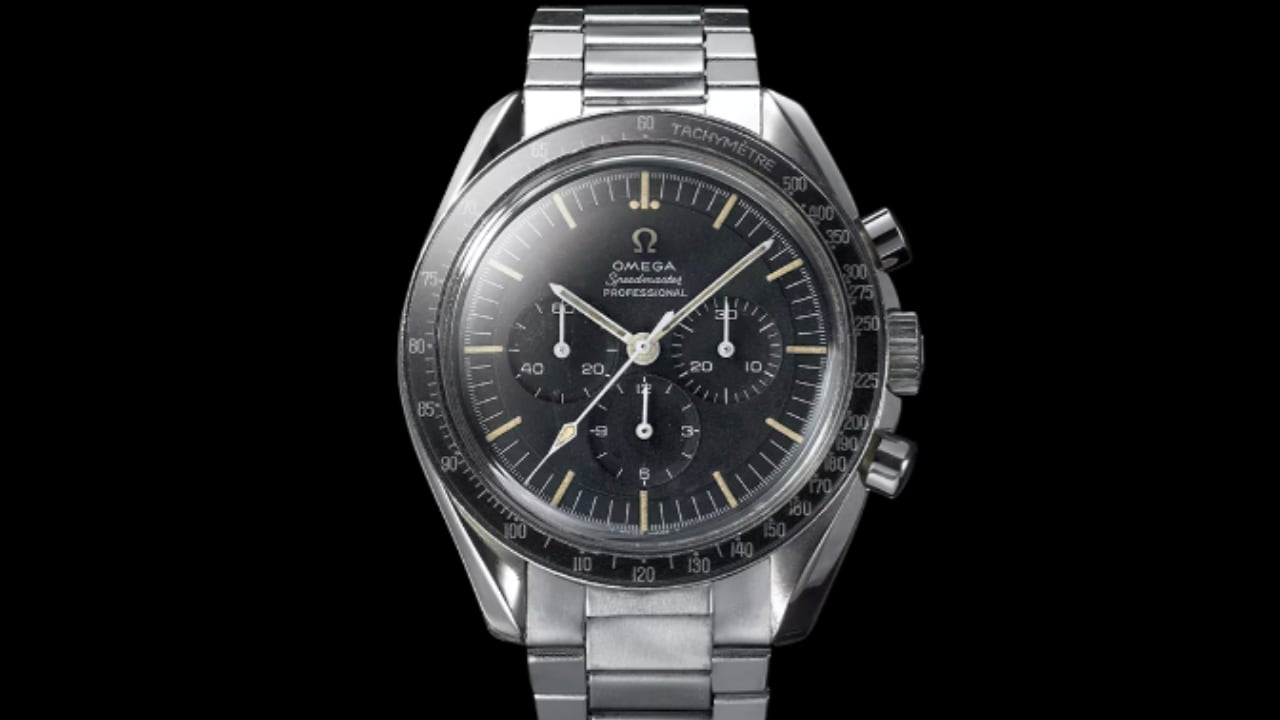
OMEGA Speedmaster Moonwatch, 1965

The Rolex Daytona, first introduced in 1963, became synonymous with auto racing. Named after the famous Daytona International Speedway, the watch was designed to meet the needs of professional race car drivers. The Daytona’s chronograph function, coupled with a tachymeter bezel, allowed drivers to measure average speeds up to 400 kilometers or miles per hour. The watch featured a distinctive dial layout with three sub-dials and was initially available in both stainless steel and gold. Its robust design and high-performance movement made it a favorite among motorsport enthusiasts and collectors alike.

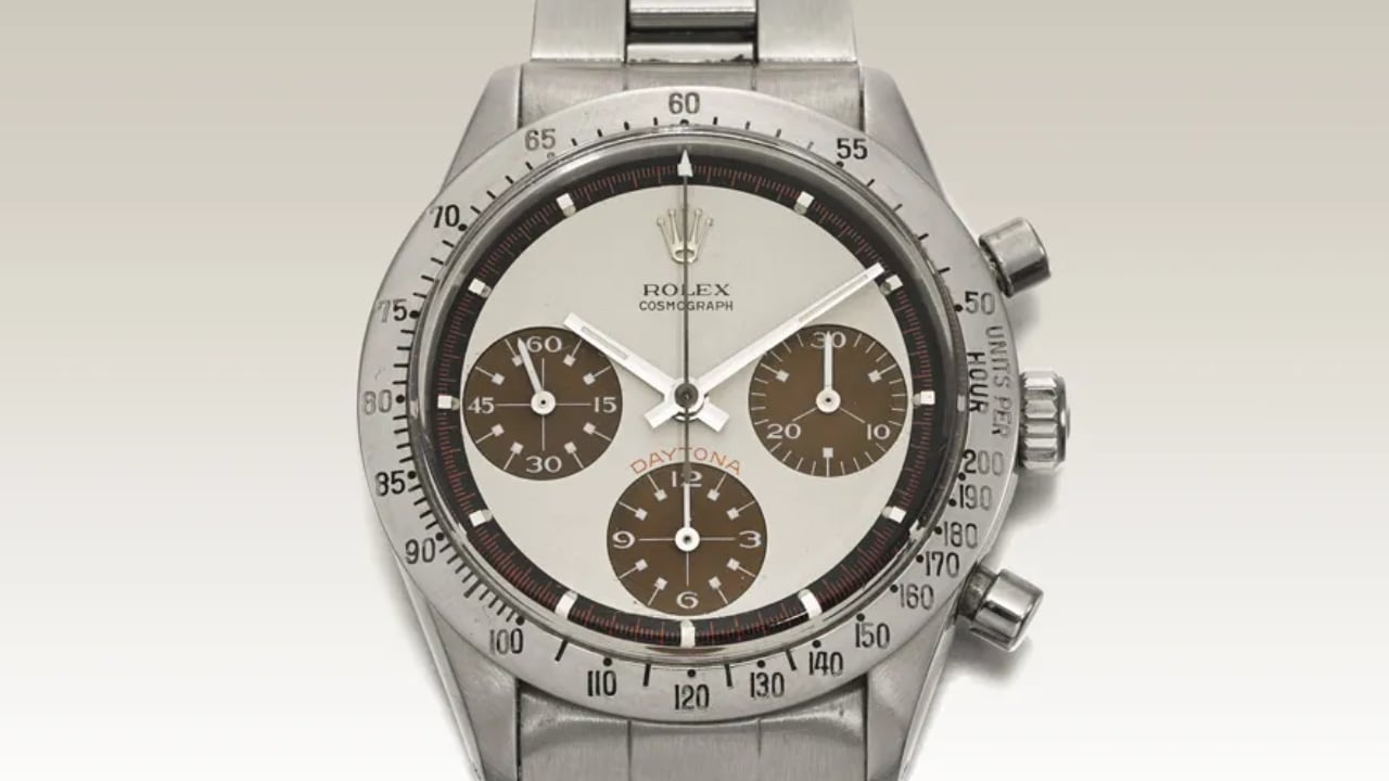
Paul Newman Daytona Ref. 6239
Photo: Courtesy Sotheby’s

Introduced in 1963, the Heuer Carrera appealed to race car drivers and professionals alike. The watch stood out for its chronograph function and bold, easy-to-read dial. These attributes allowed users to keep accurate time while adding a fashionable touch to their ensemble. The success of the Heuer Carrera underscored the idea that form and function can coexist in a well-designed timepiece.

1970s: Breaking the Mold

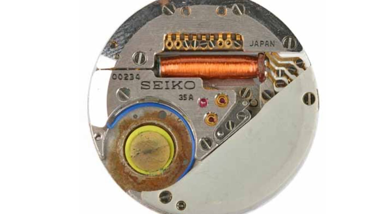
The 1970s was a transformative decade that shattered pre-existing norms. The quartz revolution introduced cutting-edge technology into watchmaking, leading to more audacious designs. The Seiko Astron, the world’s first quartz watch, offered remarkable accuracy and affordability, setting a new industry standard for precision.

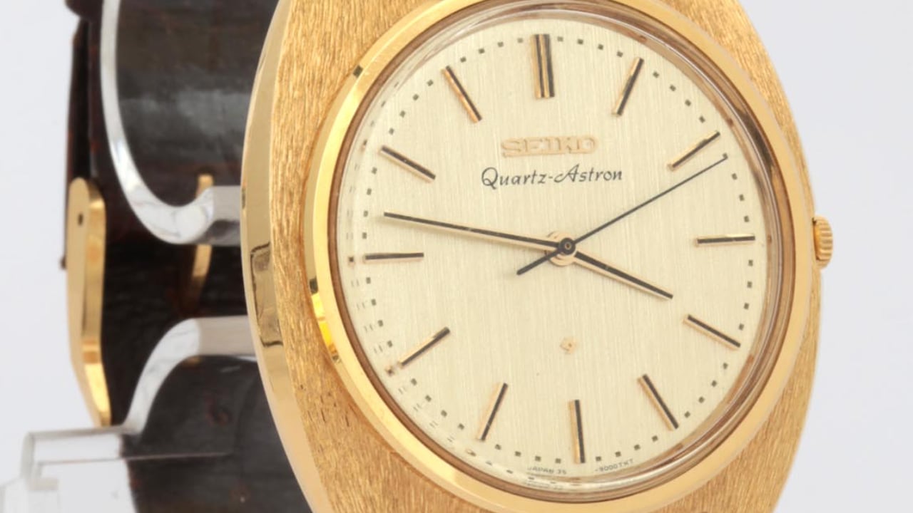
Seiko Quartz-Astron 35SQ

During the same period, the Audemars Piguet Royal Oak emerged in 1972, shaking up conventional luxury watch design with its distinct octagonal bezel and integrated bracelet. Designed by Gérald Genta, the Royal Oak’s stainless steel case and bold design were revolutionary at a time when luxury watches were typically crafted from precious metals. The Royal Oak’s bold design and unconventional material choice set a new standard in watchmaking.

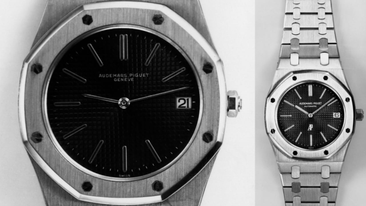
Audemars Piguet 1972 Royal Oak 5402ST

Rolex introduced the Explorer II in 1971. With its 24-hour bezel and robust construction, it was also specifically crafted for adventurers. The Explorer II catered to the growing trend of sports and adventure watches, blending functionality with rugged good looks.

1980s: Digital and Classic Converge

The 1980s saw a blend of digital sophistication and traditional aesthetics in watch design. Casio introduced the G-Shock line, bringing tough, functional watches that appealed to active people. The G-Shock’s shock resistance and multifunctional digital displays set a new standard in watch design. These watches were designed to withstand extreme conditions, making them a favorite among athletes and outdoor enthusiasts.

At the same time, classic designs like the Patek Philippe Calatrava remained popular for their simple, elegant looks. The Calatrava’s timeless design continued to attract those who appreciated traditional watchmaking.

TAG Heuer made a splash with the Formula 1, introduced in 1986. This watch combined sporty looks with quartz technology, appealing to a younger audience and cementing TAG Heuer’s reputation in motorsports.

1990s: Return to Heritage

The 1990s marked a return to heritage within horology. Watchmakers began reissuing classic models with contemporary updates, blending the old with the new. One such model was the Omega Speedmaster Professional, linked to the Apollo moon landings. Its practical and functional design ensured its continued relevance.

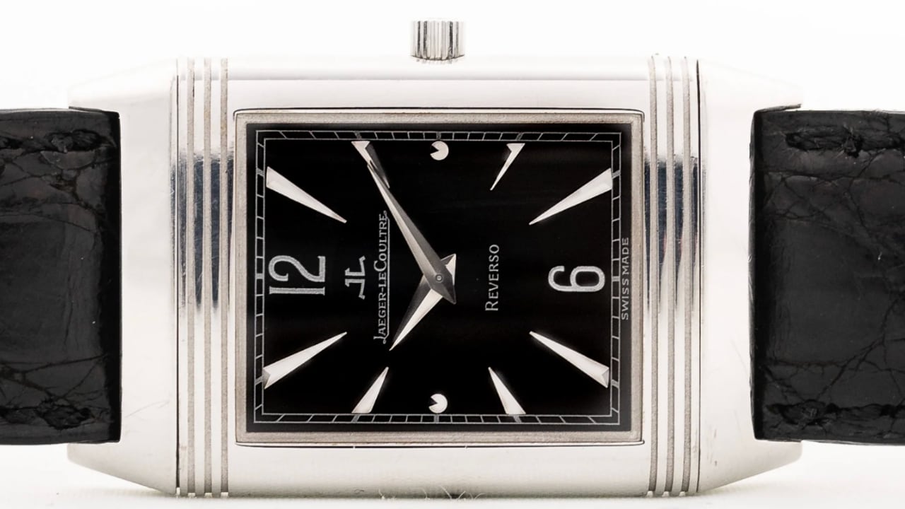
Jaeger LeCoultre Reverso 18k 1990s

The 1990s also saw the resurgence of the Jaeger-LeCoultre Reverso, a model originally designed in the 1930s. Known for its unique reversible case, the Reverso became a symbol of timeless elegance and innovative design. The reissued models combined vintage charm with modern precision.

Another model that gained iconic status during this period was the Rolex GMT-Master II. Introduced in 1983, it came into its own in the ’90s. Its dual-time-zone function was a boon for frequent travelers. Moreover, its robust design meant it could withstand the rigors of international travel, making it a trusted travel companion.

The Rolex Daytona, first introduced in 1963, also saw renewed popularity in the 1990s. Its association with auto racing and robust chronograph function made it a standout model. Its design, featuring a tachymeter bezel and high-performance movement, appealed to both collectors and motorsport enthusiasts.

2000s: Embracing Boldness

In the early 21st century, the trend in watches shifted towards larger models. Brands like Panerai and Hublot embraced large cases for individuals who wanted their timepieces to stand out. Panerai’s designs, rooted in military diving, featured oversized dials and bold numerals, making them highly legible and stylish.

In 2005, Hublot launched its Big Bang series, marked by its large cases and innovative use of materials like rubber and ceramic. The Big Bang series offered a refreshing change from traditional watch designs, appealing to watch enthusiasts seeking something different.

The Audemars Piguet Royal Oak Offshore first launched in 1993 but gained prominence in the 2000s. It expanded the original Royal Oak design with larger cases and more rugged features. This bold approach to watch design appealed to a new generation of watch lovers seeking a statement piece.

2010s: Balance and Innovation

The 2010s marked a shift towards balanced designs. Watch sizes typically ranged from 38mm to 42mm, catering to a broader audience. The Swatch Sistem51 won over watch enthusiasts with its unique approach to automatic watch production, featuring a construction of just 51 parts and a fully automated manufacturing process.

In 2012, the Tudor Black Bay reappeared, drawing on elements from Tudor’s iconic dive watches of the 1950s and 1960s. The Black Bay blended vintage design cues with modern materials and technology, resulting in a timepiece recognized as a classic.

In 2018, the Omega Seamaster Diver 300M was reintroduced with updates like ceramic materials and a modernized movement while preserving the iconic design elements.

2020s: Comfort, Versatility, and Sustainability

Today, the focus is on comfort, versatility, and sustainability. Watchmakers are incorporating recycled materials and adopting eco-friendly processes without compromising design. The Swatch x Omega MoonSwatch collaboration blends the iconic look of the Omega Speedmaster with Swatch’s innovative materials.

The Oris Aquis Date Upcycle features a dial made from recycled ocean plastic, emphasizing sustainability and giving each watch a unique look.

The Rolex Oyster Perpetual, refreshed in 2020 with vibrant dial colors, combines classic design with modern aesthetics. Its simplicity and robustness, enhanced with new color options, make it versatile and stylish.

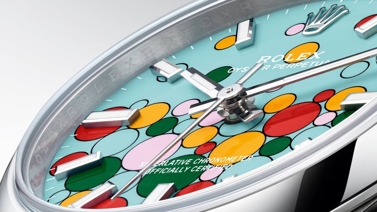
ROLEX: TURQUOISE BLUE DIAL – Named ‘Celebration’

Conclusion

What makes a watch timeless? It’s a blend of simplicity, versatility, quality craftsmanship, innovation, and a touch of history. Watches like the Rolex Datejust, Omega Speedmaster, and Swatch Sistem51 show how these elements combine to withstand time. Versatility is vital, as a timeless watch should look good in both a boardroom and on a beach. The Rolex Submariner exemplifies this with its dual role as both a tool watch and a dress watch.

Quality craftsmanship is fundamental, with the use of premium materials and meticulous attention to detail elevating a watch. The Patek Philippe Calatrava and Audemars Piguet Royal Oak demonstrate that quality renders a watch truly timeless. Innovation also keeps the watch industry lively, from the quartz revolution to the integration of new materials and digital features. Staying ahead in technology without compromising the core design is crucial.

A connection to heritage endows a watch with historical significance, with vintage reissues and designs influenced by a brand’s archives reminding us of the traditions that have shaped watchmaking. These elements have characterized the most iconic watches for the past 70 years. While trends may change, these principles ensure a watch’s appeal to generations. Whether it’s a vintage reissue, a modern classic, or a bold new design, a timeless watch stands the test of time and trends.

OMEGA: Seamaster models of 1948

Thank you for joining me on this journey through the history of timeless watch designs. I truly appreciate your continued support and enthusiasm for Wristwatch Wednesday. If you’re new to this column, welcome!

The post What Makes a Watch Design Timeless Over 70 Years first appeared on Yanko Design.

Top 5 Quirky Phone Designs That Actually Make Sense

Smartphones today seem to look very similar, varying only in the shape of the camera bump and the color of their backs. Sometimes, the materials might be different, too, but the same large-sized “candy bar” form factor has become the standard for all the smartphones currently in the market. There was a time, however, when companies were a bit more daring, experimenting with phone designs and features in an attempt to stand out from the crowd. That did lead to some rather eccentric and sometimes even ridiculous designs that make us question the sanity of the minds behind them. But there are times when those odd designs of the past actually have important relevance today. Here are five such phone design oddities that we wished existed or still exist, and some alternatives in case you may have been smitten by their quirky appearance.

Designer: Google, Motorola

Undying Handset: Project Ara

Google’s Project Ara inspired the idea of a modular smartphone whose components you can easily swap to upgrade or repair parts. In theory, this would make the phone last forever, or at least as long as the base is intact and parts continue to be manufactured for it. In practice, it was a very ambitious endeavor that could neither meet expectations nor present a viable business model that wouldn’t bankrupt manufacturers. In the end, that sustainable and immortal smartphone remained just a dream, at least in that idealistic and perfect form.

Alternative: Fairphone 5

Designer: Fairphone

Fortunately, a part of that dream is actually possible and even sustainable in more ways than one. Although you can’t hot swap components on the fly, the Fairphone 5 at least offers a way for owners to change important parts of the phone, like batteries or even cameras, to keep them running almost forever. There are some limitations, of course, but if all you want is a phone that will last you for almost a decade instead of just two years, this self-repairable design pretty much has that in the bag.

Mobile Shutterbug: Nokia N90

One of the biggest uses for smartphones today next to social media is taking photos and videos. In the days even before the term “smartphone” was coined, even the most advanced handsets from the likes of Nokia could barely hold a candle to point-and-click cameras. That’s why the quirky Nokia N90 was prophetic and way ahead of its time, envisioning a day when smartphones would be used like camcorders, though with a bit more awkwardness due to their inflexible designs.

Alternative: Nokia x Nothing Concept

Designer: Viet Doan Duc

While clamshell phones are back in season thanks to foldable screens, the folding and twisting design of the original Nokia N90 remains a distant memory. This concept tries to answer the question of “what if?” and mixes two famed brands’ design languages to craft what could be the perfect camera phone. It makes you feel like a pro photographer or cinematographer, holding up your phone not with shame but with pride, capturing not only the moment but also people’s attention in a good way.

Pocket Book: YotaPhone Dual-Screen Phone

Designer: YotaDevices

E Ink devices are becoming more popular these days, especially after the addition of features like stylus support and color. These displays are easy on the eyes and the battery, allowing the screen to show the same thing for days without requiring a recharge. A few years back, a small company tried to bring those benefits to the smartphone in the oddest way, by putting an E Ink screen on its back. Although it can be used for reading e-books on the go, its main purpose was to have a battery-saving always-on display that is a bit more dynamic and useful than typical AOD implementations.

Alternative: Onyx BOOX Palma

Designer: BOOX

That said, a phone-sized Android device with an E Ink display might be an even more efficient design, which is what the Onyx BOOX Palma is offering. Technically, it’s an e-book reader that’s the size of a regular phone and actually runs Android, which is the standard for BOOX’s devices. This means it has access to the same apps you have on your regular phone, but without color. You also don’t have cellular connectivity via a SIM card, which might be a deal-breaker for a phone but a great deal for distraction-free reading and mobility.

Productive Minimalism: Minimal Phone

Designer: The Minimal Company

BlackBerry might have joined the likes of Nokia and LG as just parts of the annals of mobile history, but its squarish shape and QWERTY keyboard are forever etched in the consciousness of even the least tech-savvy person on the planet. Many have tried to recreate that magic, but this rather elegant yet odd phone puts a twist to it. It combines the iconic BlackBerry design with an E Ink screen and a minimalist aesthetic, promising distraction-free productivity by actually limiting what you can do on the device. It can even make it easier to actually reply to or post on social media, though the drab grayscale screen is probably going to make that a little less enjoyable anyway.

Alternative: Clicks QWERTY Case

Designer: Clicks

The idea of a BlackBerry-like experience might tickle the fancy of smartphone users, but none of them will be willing to ditch their powerful, colorful, and highly functional smartphones. Clicks is a case that tries to bring the best of both worlds, and it’s practically just a case that slides onto an iPhone to provide that tactile typing experience. You won’t have to give up your favorite apps, especially the ones you need to actually be productive, but the burden of being disciplined and ignoring distractions is now on you instead.

Shapeshifting Multitasker: Astro Slide 5G

Designer: Planet Computers

A phone that opens like a mini typewriter has actually been around since the days of the Nokia Communicator and its kin, but that design proved to be more complicated than they’re worth. After playing with that same design, PlanetComputing shifted to a slider that still provides that typing experience while retaining the exact same functions as a phone. Unfortunately, such a mechanism proved to be just as clunky and unreliable, and the software platform didn’t exactly lend itself well to a landscape screen.

Alternative: Any Foldable Phone

Designer: OPPO

These days, you don’t have to rely on a physical qwerty keyboard to have that same mini laptop experience. With foldable phones now more common, you can tap away on a more flexible on-screen keyboard when the device is only half-folded. At the same time, however, you have both phone and tablet functionality in your hands. Admittedly, the design is far from perfect, and we’re still waiting for more affordable foldables coming in the very near future.

The post Top 5 Quirky Phone Designs That Actually Make Sense first appeared on Yanko Design.

Beyond Telling Time: How the Apple Watch Redefines Modern Wearables

Apple Watch Ultra 2 + iPhone 15 Pro

Welcome to Wristwatch Wednesday, my weekly column on Yanko Design, where I delve into the captivating world of watches. If you’re new to our publication and have noticed a plethora of Apple-related articles, rest assured, our editorial team casts a wide net, covering a diverse range of design-focused products. Our reviews and feature articles span across technology, sneakers, home appliances, everyday carry items, and so much more.

Designer: Apple

This inaugural column seems only fitting to kick off our discussions with the world’s best-selling watch – the Apple Watch. According to a report from AppleWorld.Today, since its launch in 2015, Apple has sold an estimated 229.3 million Apple Watches. Note that these sales figures are estimates and have not been confirmed by Apple. By any standard, a product that surpasses 100 million units in sales—a milestone Apple reached several years ago—can justifiably be called the world’s top-selling watch.

However, my intent with this column goes beyond discussing sales figures. Instead, I aim to explore the design and features of these watches that have captivated the likes of celebrities, Formula 1 drivers, and even esteemed figures like Mr. Wonder from Shark Tank. The reasons for strapping on this wrist-sized computer vary. For instance, my wife primarily uses her Apple Watch to keep track of time and notifications. Despite having cellular service activated, I’ve rarely seen her initiate a call. Yet, there have been instances where her iPhone was misplaced, and the watch served as her only means to take incoming calls. A feature that my kids and I, and yes, even my wife, have found incredibly useful is the ability to ping the iPhone when it’s misplaced.

Before delving deeper, let’s briefly discuss the specs and design of the Apple Watch. In my experience, the Apple Watch performs flawlessly without any noticeable hiccups or performance issues. As for the design, its iconic squarish shape may not appeal to everyone, but it’s something users have come to accept. Personally, I don’t have a preference one way or the other. However, I must say I appreciate the ruggedness of the Watch Ultra, which I still wear. I haven’t seen a compelling reason to upgrade to the Watch Ultra 2, especially when the regular versions in aluminum or stainless steel are also available. The fact that Apple managed to incorporate materials like titanium and sapphire crystal, along with a plethora of features, into this tech marvel, all at a reasonable price point, continues to astound me. That being said, the Apple Watch Series 9 and the Apple Watch Ultra 2, each exceptional in its own right, showcase unique design attributes and features catering to diverse user requirements.

The Apple Watch Series 9 exudes a chic, versatile aesthetic, making it an ideal accessory for everyday wear. Its finishes include aluminum and stainless steel, with a color palette that offers Pink, Midnight, and Starlight for the aluminum cases and traditional Gold and Graphite for stainless steel. On the other hand, the Apple Watch Ultra 2 prioritizes durability and outdoor utility, embodied in an aerospace-grade titanium case that highlights its hard-wearing nature and premium appeal for more extreme conditions.

The size and weight of both models reflect their respective design principles. The Apple Watch Ultra 2, larger and heavier at 49mm in height and 61.4 grams, is designed to withstand outdoor activities. The Apple Watch Series 9, meanwhile, presents a more compact profile with heights of 45mm and 41mm and lighter weights starting from 31.9 grams for the smallest aluminum model, providing a less intrusive presence for day-to-day use.

When it comes to features, both models are built with the S9 SiP, a 64-bit dual-core processor, underlining Apple’s dedication to high performance across its products. However, the Ultra 2 takes a step ahead with specialized features such as a depth gauge, a water temperature sensor, and an enhanced always-on retina display with brightness up to 3000 nits, providing superior visibility in outdoor settings compared to the 2000 nits of the Series 9.

Both models offer a broad spectrum of health and wellness features, including heart rate monitoring and ECG. However, the Ultra 2 broadens its scope to outdoor sports and adventures with additional sensors and activity profiles. This includes in-depth support for diving, precision GPS for explorers, and durability enhancements such as improved water resistance up to 100 meters and dust resistance, making it more resilient against harsh environments compared to the more lifestyle-focused Series 9.

Battery life is another differentiating factor; the Ultra 2 offers up to 36 hours of regular usage and an impressive 72 hours in Low Power Mode, a substantial improvement from the 18 hours offered by the Series 9. This aligns with the Ultra 2’s design for prolonged activities and expeditions where charging might be infrequent.

All in all, while both the Apple Watch Series 9 and Ultra 2 share core technologies and a commitment to health tracking, the Ultra 2 targets users who require robustness and expanded functionalities in challenging environments, whereas the Series 9 caters to everyday users with its stylish design and enough tech to meet routine health and connectivity needs.

For someone like me, who often travels for work (such as working out of our office in Japan or on a photography junket in Iceland with Olympus), having reliable connectivity is vital. Both Apple Watch models provide cellular options, ensuring constant contact with family or emergency services, wherever your work or adventures take you. This peace of mind is invaluable, especially in remote locations or during unforeseen situations.

The safety features in both watches, including Emergency SOS and international emergency calling, become crucial in such situations. For example, if you’re photographing the northern lights in a remote icy landscape in Iceland and encounter a dangerous situation, the Apple Watch enables you to call for help swiftly. Similarly, when navigating through the busy streets of Tokyo, these features ensure you’re never truly isolated, even in an unfamiliar urban environment.

For families, these watches offer more than just communication. For elderly parents, the fall detection feature can alert you if they have a severe fall, triggering an SOS if they are unresponsive. This reassures you that help can be solicited even when they’re alone.

For young children, the Apple Watch can serve as an efficient tracking device. If your kids are walking to school or attending a playdate, the GPS functionality combined with cellular connectivity allows you to check their location at any time. It’s like having an extra pair of eyes, ensuring their safety when they are out of sight. With the Apple Watch Ultra 2’s enhanced durability and the Series 9’s streamlined comfort, there’s a suitable option for every family member based on their needs and lifestyle.

The Crash Detection feature of the Ultra 2 is especially advantageous for users across different age groups, from young children to the elderly. For example, if a child is involved in a school bus accident, the watch is capable of detecting the severe crash and automatically initiates contact with emergency services. Similarly, it provides reassurance for elderly drivers, as the watch can detect if they’ve been in a severe car accident and automatically call for help. Speaking from personal experience, having spent a decade test-driving cars for SlashGear in remote locations such as on the side of the Alps or the challenging driving conditions in Peru, having this feature offers me a sense of security. I’m reassured knowing that in an unexpected event, I have a better chance of receiving help promptly, thanks to the Apple Watch Ultra 2’s Crash Detection feature.

My passion for watch collection began with the brand Panerai, largely due to its simple mechanism for swapping out the bracelet or watch strap. It’s a feature that led me to spend more on the straps than the watch itself. My experience with the Apple Watch is similar. Its clever design enables a quick strap change with just one button push, making it suitable for various activities or occasions, which enhances its appeal. Since the introduction of the Watch Ultra, I’ve invested more in straps than the watch itself. Interestingly, I’ve found my ultimate favorite – the 45mm cypress solo loop. To me, it’s akin to donning a tailored Italian wool suit. My fondness for the green strap has led me to stockpile size 7 for winter and size 8 for summer. The watch and strap together create an uninterrupted loop when on my wrist. The convenience of putting on and taking off the watch is comparable to slipping on a bracelet. The beauty of the Apple Watch is its versatility; you could purchase a variety of straps to cater to your taste or simply choose one strap that fulfills all your needs.

Before wrapping up this lengthy article, I’d like to shift focus to the health functionalities that are particularly significant to me. Sleep tracking is paramount due to my inconsistent sleep schedule, often caused by collaborating with colleagues across different time zones. Having the ability to track multiple time zones simultaneously is nothing short of amazing. Therefore, having the Apple Watch track my total sleep duration and, more importantly, the quality of each minute I spend resting provides invaluable insights into whether I’m getting sufficient rest.

Monitoring my heart rate and heart rate variability are also vital aspects of my health tracking routine. These metrics can provide insight into my overall cardiovascular health and my body’s response to stress and recovery.

Interestingly, one feature that I find surprisingly useful is the activity reminder. I often become so engrossed in my work that hours fly by without me taking a moment to stand up and move around. While it may seem mundane or obvious, the reminder to get up and take a short walk is incredibly important. It helps break up periods of prolonged sitting, which can contribute to various health problems.

It’s true that the Apple Watch won’t last an eternity like a Rolex or even a $50 Casio; Apple has packed enough features and future-proof the watch to allow you a sufficient length of time, which, in my opinion, yields a pretty good ROI. The need to upgrade or buy a new watch every year, two or three years, isn’t necessary unless you decide you want to change things up. As for me, I wear the Watch Ultra 90% of the time while my Rolex Pepsi gets around 5% wrist time, and yes, I do give my wrist a rest from wearing nothing.

If you enjoy this column, you’re invited to return every Wednesday at 10:20AM PDT for my weekly Wrist Watch Wednesday feature. If there are topics you’d like me to cover or watches you’d like to see reviewed on Yanko Design, you can find me on X: @Nguyen or threads.net: @vincentnguyen.

The post Beyond Telling Time: How the Apple Watch Redefines Modern Wearables first appeared on Yanko Design.

The new Apple Pencil Pro is a death-sentence for Wacom

Wacom was once an industry leader in the sketching tablet PC market. However, it’s no match for the deadly combo of the new iPad Pro M4 and the Apple Pencil Pro. Announced at the iPad keynote yesterday, the new Pencil Pro packs features so unique, it makes regular capacitive styluses look like tools from the Stone Age. The new Pencil Pro has a new squeeze gesture to activate quick menus, can track rotation to have objects and brushes rotate in real-time (known as barrel roll), and even has a haptic motor for feedback – while still packing features from previous models like the hover feature, pressure and tilt sensitivity, and low-latency. If all that wasn’t enough, the Pencil Pro even has Find My support, allowing you to locate your stylus if it ever gets lost. The Wacom Pro Pen 3 on the other hand, has buttons.

Styluses have existed for decades at this point, and if you asked anyone ten years back which was the most well-designed stylus and tablet combo for creatives, the answer would invariably be something from Wacom’s lineup. The company had three options back in the day, the budget Wacom Bamboo, the mid-range Wacom Intuos, and the flagship Wacom Cintiq. Apart from the Cintiq, none of the other tablets had screens – they were just massive trackpads that you could only draw on with styluses. The Cintiq was the closest thing to an iPad – it had a screen, allowed multi-touch gestures, and came with controls galore… the only problem was that it didn’t work independently, it needed to be tethered to a desktop or laptop to work. The Cintiq, along with the Intuos and Bamboo, came with a stylus that featured a pressure and tilt-sensitive tip, along with programable buttons that let you undo or redo tasks, and a stylus tip on the back of the pen also that activated the eraser, mimicking how most pencils come with erasers on their reverse tip. The styluses also operated without batteries, allowing for hours of sketching without needing to charge the pen periodically.

The Wacom Cintiq Pro is anywhere between 5-8 times thicker than the 2024 iPad Pro

Cut to yesterday when Apple dropped the iPad Pro M4 and the comparison is incredibly stark. For starters, whenever anyone asks me whether they should buy an iPad or a Wacom, the answer is almost always the former… because when you’re not sketching on the Wacom, it’s useless, but when you’re not sketching on the iPad, it’s still an iPad. The difference seems even greater with the new iPad Pro being Apple’s thinnest device yet at just 5.1mm thick, while the 16-inch Wacom Cintiq is a whopping 25mm thick – 5 times thicker than its competitor. Cut to the larger 22-inch Cintiq and it’s a staggering 40mm thick, or the equivalent of 8 iPad Pros stacked one on top of the other.

However, a hardware comparison between a trillion-dollar electronics giant and Wacom, that’s valued at just half a billion dollars doesn’t seem fair. What does seem fair, however, is to just look at one singular product to see how far Apple’s outpaced its competition – the humble stylus. Wacom played a critical role in perfecting its EMR stylus technology, which was game-changing a decade or so ago. The pens ran without batteries, could sense pressure and tilt with stunning accuracy, and an eraser on the rear, becoming the creative industry’s go-to for digital sketching. When Apple debuted the Pencil, it had the same features except without any buttons. The Pencil 2, on the other hand, got a tap feature that let you swap between brush and eraser, and a unique charging mechanism that allowed you to charge your stylus simply by snapping it to the side of an iPad (it subsequently also got a hover function with newer iPad models). Apple’s newly announced Pencil Pro, which dropped yesterday, however, is an entirely different beast.

The new Pencil Pro has the hover function, lets you squeeze to activate a quick menu, and even supports barrel rolls that allow you to rotate brushes or objects simply by rotating your stylus. In true Apple fashion, it doesn’t have any buttons on it, but you can still tap to alternate between brush and eraser, and you even get a brush preview when your stylus is near the screen, letting you know how your brush is oriented. If all that wasn’t enough, the new Pencil Pro even packs Apple’s Find My feature, letting you locate a lost pencil through your iPad or iPhone.

The Pencil Pro can be squeezed to activate a quick menu

A great stylus on the iPad Pro, which already comes with an industry-leading chip, laptop-grade performance, a brilliant camera setup and LiDAR sensor, and an app store, basically makes the iPad or Wacom question moot. The only true advantage Wacom’s tablets have at this point is that they’re bigger than iPads, starting at 16 inches and maxing out at 27 inches diagonally. They also cost MUCH more than the iPad Pros, with the Cintiq Pro 16″ starting at $1599, and the Cintiq Pro 27″ having an eye-watering $3499 price tag. That’s Vision Pro territory for a sketching tablet.

The haptic motor gives you feedback when you squeeze the Pencil Pro

There still is a market for Wacom products. They’re massive, preferred by the hardcore animation and visual industries, and are platform-agnostic, which means you can easily run Windows or Linux programs on them, which most power users will appreciate over being limited to the iPadOS. But for the most part, the iPad Pro and Pencil Pro are so far ahead of their competition at this point, that they’ve made Wacom’s tablets (an already niche creative-focused gadget) even more niche… almost to the point of obscure.

The post The new Apple Pencil Pro is a death-sentence for Wacom first appeared on Yanko Design.

Humane AI Pin and Rabbit R1 versus Tech Reviewers: Who’s to blame?

There’s a massive missing link between tech companies and tech reviewers… and instead of fixing it, we’re playing the blame game.

The backlash following bad reviews from MKBHD and other tech outlets like The Verge, Engadget, and CNET has been swift from the AI community. The internet is ablaze, either blaming Marques Brownlee for being too harshly critical in his review of the Humane AI Pin and the Rabbit R1 device… or shaming Humane and Rabbit for not delivering on what they promised. The blame, however, lies on the inherent relationship between the two parties. Like two people who aren’t emotionally ready to date, these AI companies shouldn’t have even shipped their products to tech reviewers.

The job of a tech reviewer, as its name rather simply suggests, is to provide an objective (or sometimes even a subjective) analysis of a product for their consumers/viewers. Tech Reviewers highlight technology through the lens of ‘Is this worth the money or not’… The problem, however, is that Humane and Rabbit needed beta testers, not tech reviewers.

Who’s to blame?

Let’s look at every single stakeholder in this AI charade and you’ll see that there’s some blame to go around for everyone. The first reaction, and justifiably so, is to blame Humane and Rabbit. They overpromised, underdelivered, hyped the product, raked in tonnes of VC and preorder money, but couldn’t stick the landing. Companies all across the world have been rushing to develop the ‘next iPhone’, and while Samsung has hedged all its bets on folding devices, and Apple on a $3400 headset, Humane and Rabbit happened to be at the right place at the right time with the right buzzwords. Imagine this, an AI assistant powerful enough to do anything you ask – it’s literally something out of a sci-fi movie, and that’s precisely what these companies hoped we’d think. They weren’t wrong. However, they committed the cardinal sin of the entrepreneur – they pitched something that didn’t exist. Sure, this wasn’t as detrimental as the stunts Elizabeth Holmes or Sam Bankman-Fried pulled, but in essence, it was still a far-fetched lie or rather a very convenient truth. An AI that does everything you ask doesn’t exist and probably won’t for a while… but a cute design or a body-mounted projector was more than enough to deceive us… and for the sake of this argument, let’s operate under the good-faith assumption that Humane and Rabbit didn’t know they were pushing a bad product.

Why the hardware trickery though? Why did Humane and Rabbit NEED to build hardware devices that looked fancy/quirky/cool? Here’s where the blame shifts to the powers that be – Google, Apple, Microsoft, Amazon, and Meta. For every reviewer that said the Humane AI Pin or Rabbit R1 “could’ve been a smartphone app”, there are thousands of engineers at these companies building JUST THAT. It’s no coincidence that Humane and Rabbit BOTH had their products publicly reviewed well before Google I/O and Apple’s WWDC. Rumor has it that Apple and Google are just waiting to launch AI assistants with similar features, tying into all the smartphone-related services. These large companies have repositories of consumer data, and they have a powerful influence, putting them miles ahead of the starting line when it comes to the AI race. The only way Humane and Rabbit could escape the clutches of these companies was to isolate themselves completely from them. Not to mention, there’s absolutely no way Apple would allow a third-party smartphone app to have Humane or Rabbit’s level of control over your entire device. Sure, Humane and Rabbit could have made all-powerful AI assistant apps, but they A. wouldn’t be as impressive or attractive, and B. they’d be doomed to fail because of the goliath forces that are Apple and Google.

A snippet of the Twitter outrage following MKBHD’s review. Ironically, Sam Sheffer (new media head for Humane) admits the software is bad, while the product sells for $700

A venture capitalist’s job, in Shark Tank parlance, is to “pour gasoline on a fire”, so there’s definitely some blame to share here too. AI became a buzzword in the second half of 2022 and it’s been on the top of everyone’s mind ever since. I don’t blame VCs for seeing potential in the ideas that Humane and Rabbit came up with, but if there’s one thing that absolutely pisses me off, it’s the fact that they took the criticism of Humane and Rabbit’s devices a little too personally. After all, a VC thrives on value creation – take that away and you have a very angry person who’s poured millions into a project that now doesn’t have anywhere to go. However, bad products and bad companies are all too common in the VC world. What they didn’t expect, however, was their golden goose (AI) to lay a rotten egg.

It’s easy to say that tech reviewers were simply doing their job and deserve no blame (after all, I’m a tech reviewer too), but the truth is that the reviewers also share a bit of blame in this entire cycle of events. However, not for the reason you think. Arguably, Marques Brownlee deserves praise for being forthright with his review – some reviewers would probably hesitate to say something bad about a company if there was sponsorship money involved – and although MKBHD didn’t have any financial stake in this product, they spoke their mind (as did every other reviewer). But that isn’t where the problem lies. The problem lies with the hype train that tech reviewers both create and ride. These reviewers are, by nature of their profession, enthusiasts when it comes to technology – so it’s no surprise that they were the biggest cheerleaders of Humane and Rabbit 5-6 months back when the products were first teased. If anything, the media should have balanced their enthusiasm with a pinch of real-world salt. Had that been the case, these disastrous reviews would’ve stung less under the pretext of the age-old “I told you so”…

Dave2D’s review of the Rabbit R1 device may just be the most sensible, erudite take on the internet.

So what’s the solution?

If the last few years have proven anything, it’s that designers and companies operate in such secrecy, they often don’t put themselves in the shoes of the consumer to begin with. With Tesla pushing the steering yoke over a wheel even though consumers have been begging for the latter, with Apple needing EU regulators to force them into adopting USB-C, with Google cancelling products left right and center against the wishes of their consumers, or firing employees who object to their technology being used for warfare (whoops, I went there), there’s a massive disconnect between what companies do and what consumers want. Even though at a smaller scale, Humane and Rabbit seem to find themselves in a similar soup. Whether it’s the holier-than-thou attitude that’s hard-coded into being an entrepreneur, or whether it’s a bunch of VCs deciding what’s good for the public, the one voice that seems to constantly be left out of the room is that of consumers… and their only representative for now is the humble tech reviewer, who actually is incentivized to see things from their points of view. Sadly, that also means Marques Brownlee ends up being in the line of fire when he has to call an AI gadget ‘the worst product he’s ever reviewed’…

The solution lies in reimagining how products are developed and promoted. Humane and Rabbit needed beta testers, not reviewers, who would’ve helped them swallow the hard pill that is the realization that their product isn’t ready for the real world. After all, it’s better to hear that bitter truth behind closed doors instead of an influencer saying it on YouTube… right?

The post Humane AI Pin and Rabbit R1 versus Tech Reviewers: Who’s to blame? first appeared on Yanko Design.

Google Pixel Fold 2: News, Rumors, Price, and Release Date

Despite developing an operating system that’s used on a variety of devices and computers, Google has practically snubbed anything other than a smartphone. It’s notorious for having a love-hate relationship with tablets, for example, so it was a bit of a surprise that Google would launch its own foldable device. Perhaps even more surprising is how it might actually release a second-gen foldable phone. Given its pedigree, the next Google foldable is definitely going to pique people’s curiosity, whether it will be called the Pixel Fold 2 or the Pixel 9 Pro Fold. Judging from what we’ve been hearing so far, this foldable phone will be undergoing several significant changes, though not all of them might appeal to Pixel fans and onlookers alike.

Designer: Google (renders courtesy of Smartprix, @OnLeaks)

Google Pixel Fold 2: Design

For three generations since the Pixel 6 in 2021, Google seemed to have settled on a signature design that, unusual as it may have been, gave its phones a unique personality. It seems, however, that Google has gotten tired of that look and will be moving to a different design for the Pixel 9 series. For better or for worse, that change is apparently happening to the foldable version of the Pixel as well, but not in the same way as leaks and renders would have it.

The camera bump, which was a horizontal bar across the width of the Pixel Fold’s “back,” has now been reduced to a more conventional rectangle. But unlike the ones you’d see on other smartphones, Google opted for an odd horizontal layout, with black pill-shaped markings that hold the actual camera lenses. It’s definitely an unusual design, but unlike the current “visor” shape, many might find it visually unappealing.

Fortunately, there will be even more important design changes in store for the Pixel Fold 2 (or Pixel 9 Pro Fold), though they might be a bit more subtle. According to rumors and at least one leaked prototype, the next Google foldable will have an outer screen that is taller than its predecessor, yielding an unfolded shape that is more square than the first Pixel Fold as well. Whereas the Pixel Fold had a rectangular shape that resembled a small notebook, the Pixel Fold 2 could be more like a minuscule iPad mini.

This change in screen aspect ratios isn’t just cosmetic and will have important usability implications. It won’t be as tall and narrow as the Samsung Galaxy Z Fold 5, which is notorious for being almost unusable as a regular phone, but it could make it a bit more awkward to use the Pixel Fold 2 in folded form, at least with a single hand. Those who loved the current wider design of the Pixel Fold might be disappointed, but those who missed using a 16:9 phone will welcome this change.

Samsung Galaxy Z Fold 2

Samsung Galaxy Z Fold 2

Samsung Galaxy Z Fold 2

Google Pixel Fold 2: Specs and Software

With the change in screen aspect ratios come changes in screen sizes as well, and everyone will probably love what’s rumored so far. The Pixel Fold 2/Pixel 9 Pro Fold is expected to have bigger screens on both sides, though there is some agreement on the exact sizes. Some claim that the external Cover Screen will be 6.4 inches and the main foldable screen will be 7.9 inches, while another source uses 6.29 inches and 8.02 inches for those same screens, respectively. Either way, it will still be a significant size boost compared to the current Pixel Fold’s 5.8-inch exterior and 7.6-inch interior displays.

As far as the hardware is concerned, Google might debut a new Tensor G4 on the Pixel Fold 2, a very big leap from the Tensor G2 on the OG Pixel Fold. Details on this new processor are still extremely slim at this point, but you can expect significant performance improvements, especially on Google’s favorite AI features. Uncharacteristically, Google might also be extra generous and give the Pixel Fold 2 as much as 16GB of RAM, something that even the Galaxy Z Fold 6 isn’t expected to have.

There seems to be some disagreement on which version of Android the Pixel Fold 2 will ship with, but that mostly depends on when the foldable device will actually launch. It could go with Android 14, which is the current version in circulation, or it could delay it to coincide with the release of Android 15. Pushing the Pixel 9 Pro Fold’s launch to the end of the year might sound unreasonable, but there might be one very good reason for doing so. Android 15 betas have revealed that Google implemented improvements to the behavior of apps on foldable phones, something that its Pixel Fold badly needed.

Google Pixel Fold 2: Cameras

It’s a bit surprising that there hasn’t been any news on the kind of cameras that the Pixel Fold 2 will bear. The new camera design on the back may look like Google was making room for an additional camera, but the lack of news in that department suggests otherwise. In short, the new Pixel Fold may still be using the exact same three sensors as the current model, with some additional lenses for focusing or maybe a thermal sensor for taking temperatures. It wouldn’t be unheard of for Google, since it prefers to rely on software solutions to improve image quality.

Another big camera design change will be the internal selfie camera which used to sit on the Pixel Fold’s ugly thick bezels. According to leaks and renders, the Pixel Fold 2 will do away with those atrocities, which means there’s a need to move the camera to a different place. The consensus is that it will take the form of an under-display camera similar to the Galaxy Z Fold, but it’s also possible Google will opt for a simpler solution that has a traditional punch-hole cutout for the camera.

Google Pixel Fold 2: Price and Release Date

Although the Pixel Fold 2, or Pixel 9 Pro Fold, will be advertised as an upgrade, it doesn’t seem like a huge generational leap if not for the difference in design and the new Tensor G4 processor. As such, it’s probably only reasonable to expect that the price tag won’t go higher than the $1,800 that the first Pixel Fold launched with. At the same time, it’s also not expected to go lower than that either.

As for its launch date, that could depend on whether Google wants to delay it to sync with Android 15’s release. If it’s fine with having it run Android 14 out of the box, it could follow the same schedule last year that saw the Pixel Fold hit shelves in June. Otherwise, we might be looking at an October date after Android 15 goes gold. Either way, we’ll definitely find out more next month when Google reveals the real deal at I/O 2024.

Google Pixel Fold 2: Final Thoughts

The first Pixel Fold was definitely a surprise for Google fans. It managed to carry some of the personality of the Pixel design language to a foldable phone, along with Google’s blessed flavor of the Android user experience. At the same time, however, it really failed to stand up to other options in the market, and its very thick bezels were a big turn-off for more design-conscious consumers.

Fortunately, the Pixel Fold 2 will be improving on those pain points, but it raises the question of whether it’s actually enough or if they’re the right changes to make. The screens will be larger and have thinner bezels, but Google is also moving away from an aspect ratio that was praised by some reviewers as one of its winning traits. The camera design will definitely be divisive, especially if it doesn’t bring significant improvements to the camera system anyway. While the Pixel Fold 2, or Pixel 9 Pro Fold, will catch the attention of Pixel fans and market watchers, it might not end up being the big hit that Google wants it to be, creating a self-fulfilling prophecy of low sales that will lead to the early demise of Google’s foldable phone line.

The post Google Pixel Fold 2: News, Rumors, Price, and Release Date first appeared on Yanko Design.

Headphone jacks on smartphones are making a comeback for your listening pleasure

There are some heated discussions right now about how a YouTuber may have single-handedly killed a startup, but big companies do that every time. In 2016, Apple may have put the audio industry on notice when it banished the headphone jack from the iPhone forever. Of course, the 3.5mm connector is used in more than just smartphones, but this change caused a ripple that pushed wireless audio technologies to innovate and improve. Although it’s becoming more common for smartphones to rely on Bluetooth headphones and speakers, many audiophiles still swear by wired equipment to deliver high-fidelity lossless sound, and it seems that there’s a growing trend of bringing the venerable headphone jack back to smartphones to satisfy these audio cravings.

MOONDROP MIAD01

It isn’t enough just to have a 3.5mm headphone jack and expect to have high-quality audio output. You still have to make sure that the digital-to-analog conversion process is just as good, usually with some help from dedicated hardware designed for that purpose. Hi-Fi audio equipment maker MOONDROP knows that only too well, which is probably why it’s making an ambitious attempt to corner a niche market with an upcoming MIAD01 smartphone made specifically for discerning audiophiles.

Designer: MOONDROP

Aside from a few teaser images, details on this “Hi-Fi” smartphone are still pretty slim other than the mention of 3.5mm+4.4mm interfaces. The latter of the two is known as “balanced” output used by high-impedance headphones and speakers, resulting in even better output quality. It’s not yet known, however, if the phone will have two headphone jacks or have a single 4.4mm port with a 3.5mm adapter. Either way, it’s something that music lovers on the Android side of the smartphone camp will want to keep an eye, or an ear, out for.

nubia Music Phone

Although technologically less ambitious, ZTE subsidiary nubia is putting a different twist on enjoying music on smartphones. The nubia Music Phone does have two headphone jacks, both 3.5mm, but their main purpose is to simply connect two wired headphones at the same time. It brings back the social aspect of listening to music by sharing your favorite tunes with a friend or loved one while still keeping it private among yourselves. Of course, the fact that you can connect high-performance headphones is definitely a plus as well.

Designer: nubia (ZTE)

The nubia Music Phone also puts a fun and quirky spin on that activity with a design that will appeal to music lovers. It has a large speaker on its back, in itself already an oddity, and it’s made to look like a turntable together with dual camera lenses. Its colorful designs just scream vibrancy and playfulness, characteristics that will pull at the heartstrings of a younger crowd.

ASUS ROG Phone 8 Pro

It isn’t just audiophiles who will appreciate good sound output, however. Poor audio can also break the immersion of a mobile game, especially as these titles become more sophisticated and more resource-intensive. While most of its features naturally revolve around graphics and processing, the ASUS ROG Phone 8 Pro doesn’t skimp on the audio side of the equation, whether it’s the “multi-magnet” dual speakers or hi-res 3.5mm headphone jack.

Designer: ASUS ROG

More than just doing the bare minimum, the ROG Phone 8 Pro boasts 384kHz/32-bit audio quality from that wired connection. It also implements spatial sound for headphones and provides listening profiles for different situations. It’s definitely one of the very few premium smartphones these days that have a headphone jack, something that hardcore mobile gamers will surely appreciate.

Sony Xperia 1 V

Speaking of high-end phones, Sony hasn’t completely given up yet on the smartphone market, and neither is it turning back on the features that differentiate its remaining devices. It bears an unusual ultra-wide, ultra-tall screen aspect ratio which Sony claims to be the best format for watching videos. It also shows off its display-making prowess which it also uses on a bigger scale on TVs.

Designer: Sony

The entertainment and electronics company naturally also knows that video is only half the battle. The phone also has a headphone jack to support hi-fi lossless audio output through wired headphones and speakers, something you’d expect from a device designed to deliver a cinematic watching experience on mobile.

TECNO Camon 20 Pro 5G

It’s almost ironic that mid-range and lower smartphone tiers are the remaining bastions of the 3.5mm port, probably as a form of cost-savings on more expensive wireless technologies. At the same time, however, some brands continue to support the feature even on their higher-end models. That’s definitely true for last year’s TECNO Camon 20 Pro 5G, which combines stylish design with a well-balanced set of features, including that headphone jack.

Designer: TECNO

Among TECNO’s flagship Camon line, the Camon 20 Pro has the distinction of winning a few design awards, thanks to the unique geometric patterns on its back, including an uneven hexagon shape for the camera bump. Unfortunately, it will also now have the distinction of being the last TECNO Camon to include that 3.5mm port, as the brand seems to be finally shifting this family of smartphones to a wireless future.

Final Thoughts: Hear Ye, Hear Ye

Just because smartphones no longer have headphone jacks doesn’t mean that it’s obsolete technology. Many aspects of the audio industry and the wider multimedia industry still rely on wired connections, and the 3.5mm connector and those like it continue to offer a standard and space-efficient solution. At least for now, wires still have bigger bandwidth and more reliability, even with potential losses when converting between digital and analog.

Wireless audio is thankfully still improving, but it might take some time for it to be a more common technology that can deliver the needed high-fidelity lossless audio transmission. In the push for thinner phones, it’s this aspect that has unfortunately been sacrificed, even if it came at the expense of consumers as well. It’s a good thing, then, that there are still some brands that try to cater to audiophiles, music lovers, and gamers, and we might even see an uptick in these devices as more people become more aware of the critical role that good sound quality plays in an immersive experience.

The post Headphone jacks on smartphones are making a comeback for your listening pleasure first appeared on Yanko Design.

Here Are The Oldest Apple Products Still Available Today

If you asked anyone on the streets, they’d probably agree that Apple stands at the cutting edge of innovation. The company leads the smartphone market, wearable market, and tablet market, is one of the leaders in the desktop and laptop markets too, and is touted to be quite the disruptor in the AR/VR market too. Apple makes its own silicon, has a remarkable supply chain, runs its entire headquarters on renewable energy, and is set to go entirely carbon neutral by 2030. The company improves each product line at most every year, or at least every 2-3 years, but there are products in Apple’s production line that still haven’t seen updates in 3-4 or more years (some haven’t been updated in almost 9 years at this point). We’ve made a list of some of the ‘oldest’ products still available on Apple’s website dating back as early as 2015 and as recent as 2021. Now sure, all these devices are pretty great even by today’s standards… but there’s definitely room for improvement… and we’ve taken the liberty to leave out accessories like connectors and cables. Here are some of the ‘oldest’ Apple products you can still buy today.

Magic Mouse Gen 2 (2015)

It’s been nearly a decade since the infamous Magic Mouse Gen 2 got an update. Okay, maybe that isn’t entirely true because the wireless mouse did get a refresh in 2019 and 2021, but the only thing that materially changed was the introduction of new color variants. Even today, however, the mouse runs on the same internals, houses the same Lightning port, and still charges in a way that continues to baffle users around the globe. It’s speculated that Apple will be giving the mouse a refresh in 2024, although most rumors say that the company only plans on upgrading the charging port to USB-C. If you ask me, there’s a lot more they can do to improve the Magic Mouse’s design…

Magic Trackpad 3 (2015)

The Magic Trackpad 3 too shares this distinction with the Magic Mouse Gen 2. Debuted in 2015, the trackpad has only received color refreshes in upcoming years. However, the distinct difference between the trackpad and the mouse is that there really seems to be no room for improvement as far as this product is concerned. It looks sleek, performs well, and is wireless. It also charges via Lightning, which is something Apple should change moving forward, but at least you don’t need to turn the trackpad upside down while charging it…

Pro Display XDR (2019)

2019 really got overshadowed by the cheesegrater Mac Pro and its incredibly expensive wheels, but alongside them was also announced the Pro Display XDR. Designed to be the most high-end display available for Mac users, the display boasted a 32-inch 6K Retina screen with an ‘astonishing’ 1,000,000:1 contrast ratio and an eye-watering $4999 starting price – that’s about as much as one Vision Pro headset and one iPhone 15 Pro Max with some change to spare. Surely the Pro Display XDR isn’t for everyone (Apple has a slightly more affordable Studio Display for most users), which is probably why Apple never gave it an update post-2019. After all, do you really need to upgrade a 32-inch 6K Retina display?! Fun Fact: The cheesegrater Mac Pro actually got an update in June 2023 with the M2 Ultra chip, leaving the Pro Display XDR behind.

AirPods Max (2020)

It became almost certain when Apple acquired Beats by Dre that they had plans of their own to enter the wearable audio market in a big way. The Beats acquisition happened in 2014, and just 2 years later, Apple dropped the first wireless AirPods in 2016. However, it took the company 4 full years to release their first wireless over-ear headsets. The AirPods Max debuted in December of 2020, immediately becoming Apple’s flagship wearable audio device. It had everything – an aluminum design, a woven head strap, a fancy charging case, a rotating crown, and Spatial Audio (one of the first devices to support the feature). In all honesty, Apple doesn’t really NEED to refresh the AirPods Max because feature-for-feature, they’re just as good today as they were 4 years ago. However, there’s always room for improvement – for example, the AirPods Max doesn’t have an Ultra-Wideband chip that makes them easy to track using Apple’s Find My app, the charging case is one of the most absurd designs ever, and hey, we’re still stuck on Lightning when the AirPods Pro have upgraded to USB-C.

AirTag (2021)

Ah, the AirTags, every clutterbrain and stalker’s best friend. Announced in 2021, the AirTag leverages Apple’s Find My network and their Ultra-Wideband chip to really help you track and detect objects with precise accuracy. They run on CR2032 batteries which last around a year and are easy to replace – a big improvement over some tracking devices that have built-in batteries that can’t be removed. However, the AirTags haven’t seen any update since their announcement in 2021. Now here’s the question again – do they need updating? Well, on the feature front, no… they’re pretty good, have anti-stalking features, and are fairly helpful when it comes to tracking everything from bags, to pets, to even vehicles. However, the one major upgrade they need is on the design front. They’re circular and bulky, which makes them difficult to store in wallets, passport covers, and other slim belongings. Heck, I’d like a slim AirTag just so I could strap it to my Apple TV remote which keeps getting lost every third day.

iPad Mini 6th Gen (2021)

The AirTags weren’t the only product to get left behind in 2021 – Apple hasn’t refreshed the iPad Mini in 3 years either, still leaving it with the A15 Bionic chip while the other iPads get their M-series chips. Now it’s entirely possible that Apple’s held the iPad Mini back all these years deliberately – the people who buy the tiny iPad aren’t Apple’s core tablet users. They don’t need power features, they don’t edit movies on their tablet, and they clearly don’t need their tablet to work as a makeshift laptop with a dedicated keyboard folio case. However, the iPad Mini 6th Gen does support the 2nd Gen Apple Pencil and does have a USB-C port that also works for connecting external displays. The iPad Mini, as small as it is, was built to be a mighty little tablet. However, that A15 Bionic chip doesn’t really compare to the M3 chip that Apple’s due to give its latest iPads this year. Could we also see a better camera system on the iPad Mini if it gets refreshed soon? I surely hope so… but up until then, we’re stuck with the model from 2021.

Bonus – Apple Card (2019)

The Apple Card makes it to this list for purely technical reasons, but truth be told, there’s never any need to update a payments card the way you’d update smartphones and tablets every year. Apple announced the card in 2019 in partnership with Goldman Sachs, but as of 2023 November, Goldman Sachs will stop providing banking support for the card, leaving Apple to look for another partner. As far as the card’s design goes, there’s not much you can upgrade – the Apple Card comes machined from solid titanium, making it highly durable, but it’s still susceptible to scratches or discoloration. Maybe color variants??

The post Here Are The Oldest Apple Products Still Available Today first appeared on Yanko Design.

The iPhone 16 might just be worth missing… History tells us why.

Historically, every three years, the iPhone’s design gets a ‘boring’ upgrade. Do you remember the iPhone 8 or the iPhone 13’s most exciting features? Neither do I.

The iPhone X and 11 had radical new designs with the notch, the iPhone 12 introduced 5G and MagSafe… but after two consecutive years of exciting features, the iPhone 13 barely had anything worth talking about (unless you consider ‘Cinematic Mode’ to be a game-changing feature). Skip to the next year and the iPhone 14 Pro had the Dynamic Island and Satellite Connectivity. The iPhone 15 had the Action Button, the USB-C port, and a titanium construction. All indications show that the upcoming iPhone 16 won’t really dazzle much. Aside from a few hardware upgrades and perhaps one or two extra camera features (probably tied to the Vision Pro), there isn’t any thrilling rumor regarding the upcoming iPhone 16’s design. Not that there needs to be – Apple’s entitled to taking a short break every few years and just focusing on fine-tuning the product rather than wowing people. If you’re thinking of upgrading to the 16 this year, I’d probably give it a miss and go for the 15 instead. The iPad, on the other hand, is due for a BIG refresh with rumors of a glass-back, MagSafe, and perhaps some more camera upgrades to support the Vision Pro.

The rumor mill for the latest iPhone often begins around a year prior to its release. Once a model of the iPhone launches, analysts and experts begin speculating what the next year’s model could look like. Speculations turn into rumors by January. Rumors turn into leaks by April or May. And renders emerge online by July or August, approximately a month before Apple announces its newest iPhone. So far, the rumors have been rather underwhelming at best, with some minor upgrades being touted for the iPhone 16.

So far, outlets like MacRumors haven’t specified any ‘game-changing’ new features for the iPhone 16. Sure, you have a chipset upgrade every year and the 16 Pro will run Apple’s latest A18 Bionic chip. Cameras get upgraded too, and there’s speculation that the Ultrawide camera could get a 48MP bump this year. The new iPhone 16 series will apparently have larger displays (so maybe smaller bezels), better 5G, WiFi 7 capabilities, and a new stacked battery architecture for better battery life. Visibly, the iPhone 16 might have a different camera layout, defaulting to the original vertical orientation seen with the iPhone 11 and 12 (although the bump around them may be capsule-shaped instead of square like older models). There’s also speculation about a new physical ‘capture’ button for clicking photos or recording videos… although all indications show that this might just be one of those rumors that end up staying a rumor. Apple’s famously trying to move away from buttons and ports, so adding an extra button to the new phone just doesn’t sound like something the company would do. Moreover, the volume buttons already work as capture buttons when the camera app’s active… so a dedicated capture button feels rather redundant.

The iPhone 16 Pro might see some extremely small incremental changes, with barely any visible differences. The rendering below shows a possible iPhone 16 Pro with a design that’s indistinguishable from last year’s 15 Pro model. Apple will almost certainly stick to titanium for the Pro series, potentially with newer colors to help differentiate them from last year’s models.

All eyes, however, are on Apple’s software development team this year. The company famously canceled its rumored Apple Car project, moving the entire Project Titan team to work for the in-house AI development department. Analysts like Ming-Chi Kuo speculate that Apple might announce AI-based features like a next-gen Siri powered by Apple’s own LLM, or other generative AI capabilities. These announcements, however, may just come with the iOS 18 debut during WWDC in June. To push the latest iPhone series, Apple may also limit these AI features only to the iPhone 16 range, forcing consumers to make the upgrade. However, until these speculations are confirmed, the iPhone 16 may just be worth a miss this year.

Images via MacRumors

The post The iPhone 16 might just be worth missing… History tells us why. first appeared on Yanko Design.

How much is the Galaxy S24: Is it worth the price

Although it didn’t do so at the recently concluded CES 2024 in Las Vegas, Samsung is still starting the year with a bang with its own Unpacked event. To no one’s surprise, the stars of the show are, of course, the new Galaxy S24 trio, though the much-rumored Galaxy Ring also made a very brief appearance as an unambiguous teaser. Samsung’s early 2024 flagships are bringing the expected upgrades in terms of hardware, but they’re also riding on the AI train in their own, unique way. But with every new Samsung phone also comes the question of whether its price is worth its weight in gold. We take a cursory look at what the Galaxy S24, S24+, and S24 Ultra have to offer to bring you that answer.

Designer: Samsung

What’s New

Of course, there are the customary hardware upgrades you’ll see every year, but there are a few surprise twists here and there. All three, for example, are powered by a new Snapdragon 8 Gen 3 “for Galaxy” chipset that’s marketed as a special flavor designed just for Samsung’s newest darlings. It’s presented as being optimized for hard AI work that we’ll get to later, but the exact performance differences between this and a vanilla Snapdragon 8 Gen 3 are probably going to be subtle.

Also subtle are the slightly larger displays on this year’s generation of Galaxy phones, at least for the Galaxy S24 and Galaxy S24+, and only by 0.1 inches. The Galaxy S24 Ultra’s screen remains the same large 6.8 inches, but the design change is actually greater in some other areas, as we’ll soon see. All three get brighter panels, though, so reading under the sun shouldn’t be a problem if it was before.

While most of the features are similar across the three models, differing mostly in screen size, things take a very different turn when it comes to the cameras. Suffice it to say, the Galaxy S24 and S24+ do not get any meaningful upgrade in terms of camera hardware, while the Galaxy S24 Ultra seems to take one step forward and one step back with at least one of four cameras. One of the two telephoto cameras gets a denser 50MP sensor but halves the optical zoom from 10x to 5x. Samsung assures, however, that the quality of a 10x “hybrid” zoom from that new sensor will just be as good, thanks to some AI tricks, of course.

Bold Direction towards Flat Design

The Galaxy S24 series looks nearly identical to its predecessor at first glance, but once you take a closer look, you will notice some subtle yet important differences. The Galaxy S24 and S24+ now adopt a completely flat design on its front, back, and sides, except for the rounded corners that help it avoid a completely boxy appearance. This refinement, though small, does put it in the same boat as many notable premium smartphones these days, particularly the latest iPhones.

The Galaxy S24 Ultra only changes its screen design, but that actually has the biggest repercussion in this generation. Gone are the curved edges that used to mark high-end flagships, with a screen that’s completely flat across the surface. It gives it a more modern look, at least as far as current design trends go, but the more important consequence is that owners now have full access to the entire screen using the included S Pen. No more avoiding or accidentally sliding off the edges because you can now utilize every single inch and pixel on that large screen.

AI for a Price

With AI still reigning as the buzzword in consumer electronics, it was really only a matter of time before Samsung joined the bandwagon in this industry as well. There are plenty of AI-powered features being advertised on the Galaxy S24 and, to Samsung’s credit, they really do show what the technology can do and how we can harness it for our benefit.

Real-time translations are one of the best examples of this artificial intelligence, and both two-way Live Translate and split-screen Interpreter help break down language barriers when communicating with people around the globe. Samsung Notes also gets an AI-assisted Notes Assist for summaries and template creation, while Voice Recorder gets Transcript Assist for transcribing audio recordings. And, of course, there are also tons of AI-powered image editing features in the Camera and Gallery apps.

There is one particular application of AI that also demonstrates the continued cooperation between Samsung and Google, former frenemies on the Android platform. As the name clearly states, Circle to Search lets you simply draw a circle around an image or even a block of text on your screen to initiate a Google Search.

As useful as these may sound, it seems that Samsung will be taking a rather controversial approach to providing AI features on its gallery phones. Samsung’s suite of Galaxy AI features will apparently be available for free on these devices only until 2025, after which it could charge a subscription fee for using them. It doesn’t exactly state how much that will be or which features will be covered by this limitation, though Google’s Circle to Search and other third-party AI features are most likely going to be exempt. Nothing’s set in stone yet, but this will surely lessen the appeal of relying on these features heavily.

Should you buy it or upgrade?

And now for the most critical part of the decision-making process: the price tags. The Galaxy S24 starts at $799.99 for 8GB of RAM and 128GB of storage, while the Galaxy S24+ will go for $999.99 for 12GB RAM and either 256GB or 512GB of storage. These are pretty much the same launch prices as the Galaxy S23 and S23+, which isn’t surprising considering very little has changed.

The Galaxy S24 Ultra, however, is a chunky $100 higher than last year’s model, now starting at $1,299.99 for 12GB of RAM and 256GB of storage. It’s a considerable price jump, especially when you consider you might be asked to pay for those trendy Galaxy AI features in two years. That new telephoto camera might be partly to blame, among other things.

If you’re looking to jump into the Samsung ecosystem for the first time, then it’s really only a choice between the smaller and more affordable Galaxy S24 and the larger, fully-featured Galaxy S24 Ultra. The Galaxy S24+ might sound like it has the best of both worlds, but it’s actually the opposite. Its only winning grace is the larger screen and battery, both of which will set you back $100 more than the Galaxy S24 but still won’t have the better cameras of the Galaxy S24 Ultra at the very least.

Considering all these, it’s going to be tough to recommend upgrading to any of the three models if you still have a perfectly fine Galaxy 23 or even a Galaxy 22. Even the Galaxy S24 Ultra, with a creator-friendlier flat display, is going to be a hard sell considering it’s also more expensive. The jury is still out on the camera improvements, though it’s probably not going to be too mind-blowing compared to the already decent quartet on the Galaxy S23 Ultra. Of course, if you have a Galaxy S21 series or older, then there’s almost no more doubt about making the jump or not.

The post How much is the Galaxy S24: Is it worth the price first appeared on Yanko Design.

❌