5 Portable Bluetooth Speakers for Summer 2026 That Sound as Good Outside as They Look
![]()
Most portable speakers resolve the outdoor brief in one of two ways. They build something tough enough to survive whatever summer throws at it, then let design take care of itself. Or they craft something that looks considered and hope it never meets moisture. These five refuse that tradeoff. Each earns its place outdoors on visual merit alone, a bar that very few speakers in this category have the confidence to clear.
The selection spans passive acoustic amplification to hard-anodized Danish aluminum, retro broadcast aesthetics to science fiction metalwork, and an outdoor warrior that floats face-up in a swimming pool. What ties them together is a conviction that a portable speaker should be worth looking at when the music stops. Whether you pack one for the long weekend or set one up on the rooftop, these speakers make the setup look considered before anyone hits play.
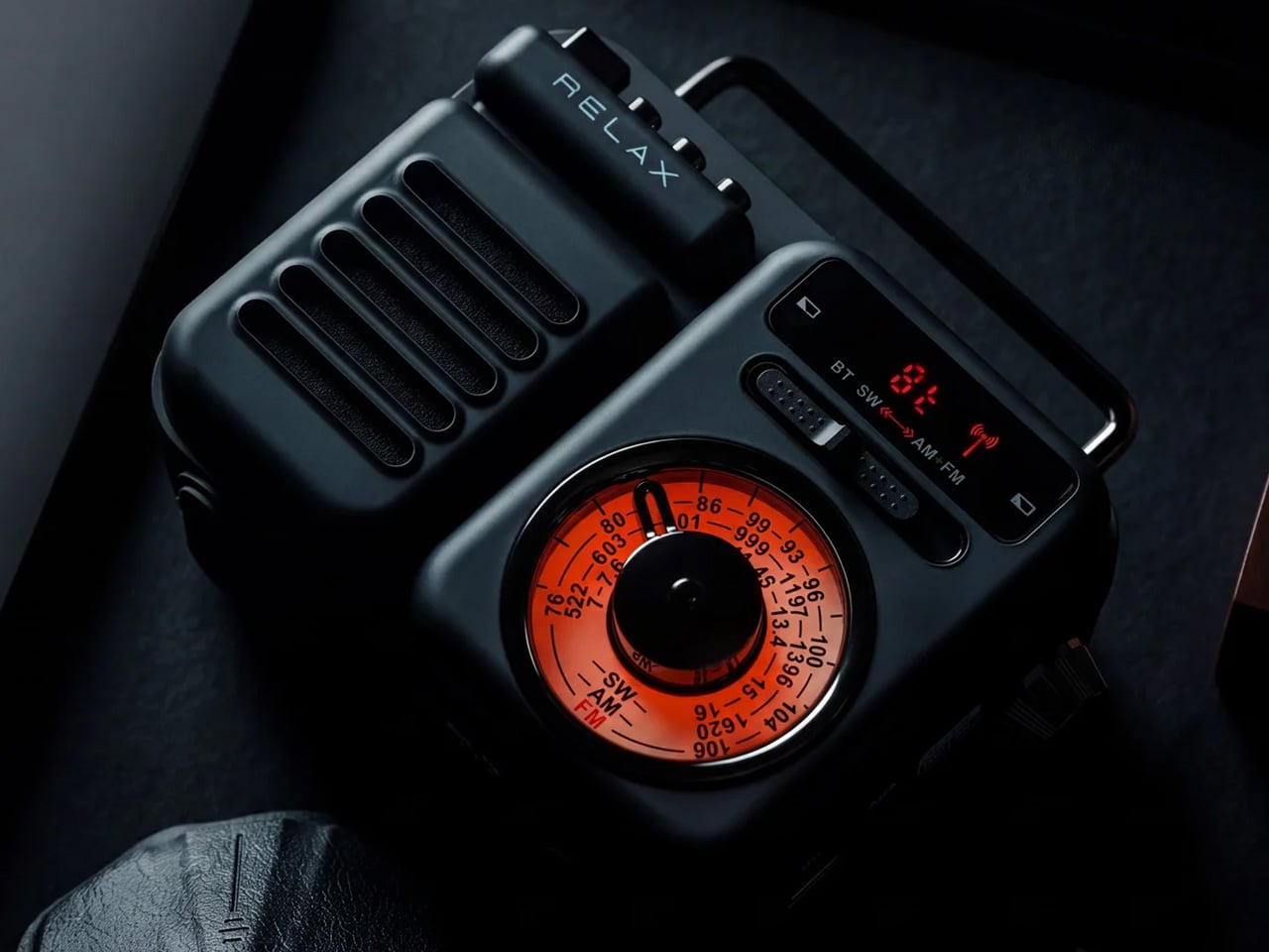
1. Retrowave Radio
![]()
![]()
There is a specific pleasure in a speaker that looks like it predates Bluetooth by thirty years. The Retrowave Radio brings that cabinet sensibility into a summer that runs on playlists and wireless connectivity, giving you the best of both. Its proportions and analog-styled face sit more comfortably on a picnic blanket or campsite ledge than most modern speakers manage, which tend to read as tech accessories rather than objects genuinely worth looking at.
The FM tuner adds a layer the streaming era forgot. Scanning local frequencies somewhere without a strong data signal is its own kind of discovery, the kind no algorithm delivers. Bluetooth connectivity keeps it relevant to every device you already own, so the retro shell is not a compromise so much as a philosophy about what listening outdoors should feel like. It is the speaker most likely to draw a question from whoever walks past, which is the highest compliment any piece of audio design can receive.
What We Like
- The retro cabinet reads as a considered aesthetic statement rather than a novelty gimmick, and holds its own in any outdoor setting
- Dual functionality as a Bluetooth speaker and FM radio opens it up to genuine off-grid situations where streaming is not an option
What We Dislike
- The analog-inspired styling may not suit those who prefer a contemporary minimal look in their audio gear
- FM reception quality depends entirely on local signal strength, which varies considerably depending on where summer takes you
2. Anker Soundcore Boom 3i
![]()
![]()
The Soundcore Boom 3i solves a problem most outdoor speakers refuse to acknowledge. Pools, lakes, and beaches are exactly where you want music most and also the worst possible environments for most electronics. Anker’s answer is a speaker that floats and self-orients so the audio always faces upward, keeping sound clear whether it was placed there deliberately or went in during a particularly competitive game of volleyball. That kind of design honesty about actual use is rare.
Beyond the floating, it includes Buzz Clean, a feature where the speaker vibrates on command to shake sand and debris out of the grille. It is a small addition that solves a genuine frustration without tools or disassembly. Sixteen hours of battery life and LED lighting that pulses with your music make it a speaker clearly built by a team that has spent time at actual beaches, not imagined them from an office.
What We Like
- The self-orienting float design solves a real outdoor audio problem rather than just marketing waterproofing that most owners never actually test
- Buzz Clean is genuinely useful in sandy environments and requires no tools, disassembly, or anything beyond pressing a button
What We Dislike
- The LED lighting, while effective at night, adds visual busyness that may not appeal to those who prefer their gear to sit quietly in the background
- Its larger footprint makes it less suited to compact bags or minimalist packing situations where every cubic inch matters
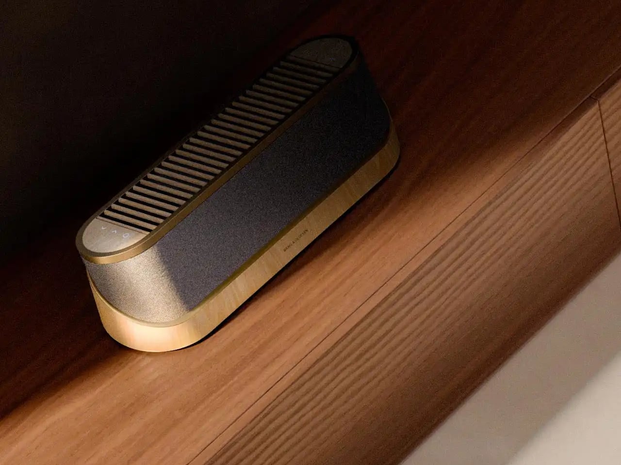
3. Bang & Olufsen Beosound Explore
![]()
Bang & Olufsen built the Beosound Explore from hard-anodized aluminum, and that material choice explains everything else about it. Reaching for aluminum where every competitor defaults to polycarbonate communicates a specific set of values about longevity, texture, and what outdoor gear can look like when it is not trying to appear durable but simply is. At 631 grams with a rubberized base and carabiner strap, it travels without ceremony and arrives looking like it belongs wherever you set it down.
The True360 sound from dual full-range drivers means there is no bad angle at a campsite or on a rooftop, and 27 hours of battery life removes the anxiety that shadows every other portable speaker on a long weekend. IP67 water resistance covers submersion up to one meter for thirty minutes, which handles every realistic outdoor scenario. Designed in Denmark and built to outlast seasons rather than one summer, the Beosound Explore is the speaker you eventually stop having to replace.
What We Like
- Hard-anodized aluminum construction gives it a material quality and cool-to-the-touch feel that no polycarbonate competitor comes close to matching
- 27-hour battery life is genuinely class-leading at this form factor, removing charging from the weekend equation entirely
What We Dislike
- The price sits at the premium end of the portable speaker category, which may not align with every budget on this list
- The compact driver configuration prioritizes audio fidelity over sheer volume ceiling, so those expecting a party speaker may find it more refined than powerful
4. Battery-Free Amplifying iSpeakers
![]()
![]()
The Battery-Free Amplifying Speaker starts from the most honest premise in portable audio: what if the speaker needed nothing from you except the sound you already had? Using passive acoustic amplification, it channels audio from your device through a shaped resonance chamber without a Bluetooth receiver, a charging cable, or a battery to manage. The result is a speaker that is always ready because there is genuinely nothing about it that can run out.
Its design logic sits closer to a musical instrument than a consumer gadget. Every curve and internal chamber proportion is there to do acoustic work, which means every formal decision has a functional one sitting behind it. For a long morning on the balcony or an afternoon at the beach where you forgot to charge everything, it removes the one variable that always causes friction. You set it down, rest your phone inside, and the sound arrives without a single button pressed.
Click Here to Buy Now: $179.00
What We Like
- Zero dependency on charging makes it genuinely grab-and-go in a way no battery-powered speaker on this list can claim
- Passive acoustic construction makes it one of the most durable options here by virtue of having no electronics to fail
What We Dislike
- Volume ceiling is naturally limited compared to powered speakers, making it less suited to larger outdoor gatherings where you are competing with ambient noise
- Performance is tied directly to the speaker quality of the host device, which varies considerably from one phone to the next
5. GravaStar Mars Pro
![]()
![]()
The GravaStar Mars Pro does not attempt to blend in, and it is entirely correct not to try. Its zinc alloy body, war-damaged finish options, tripod legs, and exposed mechanical detailing sit somewhere between industrial design and a film prop, which is precisely what makes it worth owning. Most portable speakers are designed to disappear into their surroundings. The Mars Pro is designed to become the focal point of wherever it is placed, and its 20W dual speaker system backs that visual confidence with real audio substance.
A full-range driver paired with a passive bass radiator gives the Mars Pro low-end presence that its dimensions should not produce. The RGB lighting system runs through six dynamic modes, pulsing with your music and making it a natural fit for evening rooftops and outdoor gatherings. At 5.5 pounds, it is the heaviest option here, which places it at the center of a setup rather than inside a bag. That is exactly where it wants to be.
What We Like
- The zinc alloy construction and sculpted mech aesthetic make it one of the most visually distinctive portable speakers available at any price point
- 20W dual speaker output delivers bass presence well beyond what the physical size suggests is acoustically possible
What We Dislike
- At 5.5 pounds, it is not a speaker you carry around a site; it is the one you set up and gather around, which limits where it fits on a summer itinerary
- The dramatic visual language is polarizing and will not appeal to anyone who wants their audio gear to sit quietly in the background
The Best Summer Speaker Is the One Worth Looking At When the Music Stops
A portable speaker is one of the few objects that has to perform twice over. It has to sound right and look right in the same moment and the same light. The five here clear that bar without any of them feeling like a compromise in either direction. Summer is short enough that whatever you bring outdoors should be worth the trip, and each of these makes that case without any difficulty.
Whether you reach for the passive simplicity of the battery-free amplifier, the engineered restraint of the Beosound Explore, or the unapologetic presence of the Mars Pro, the underlying conviction is the same. Good design does not ask you to choose between form and function. These speakers already made that decision, and it shows from the moment you set them down somewhere they have no business looking this good.
The post 5 Portable Bluetooth Speakers for Summer 2026 That Sound as Good Outside as They Look first appeared on Yanko Design.