Vue normale

Il y a de nouveaux articles disponibles, cliquez pour rafraîchir la page.
À partir d’avant-hierFlux principal

The Projector Concept That’s Almost Too Beautiful to Use

Par : Ida Torres
21 mars 2026 à 20:45

Most concept designs exist to generate buzz, collect awards, and then quietly disappear. The BeoLens Horizon, a projector concept imagined by French industrial designer Baptiste Baumeister, feels different. It feels like a glimpse into a future that Bang & Olufsen should absolutely be building right now.

If you’re not familiar with B&O, the short version is this: the Danish audio brand has been setting the benchmark for luxury consumer electronics since 1925. Their products don’t just sound good; they’re designed to be desired as objects. The BeoSound Shape, the BeoVision Harmony, the Beosound Theatre, all of them treat your living room like a gallery wall. Baumeister clearly understands that DNA, and with BeoLens Horizon, he runs with it in a direction that feels genuinely exciting.

Designer: Baptiste Baumeister

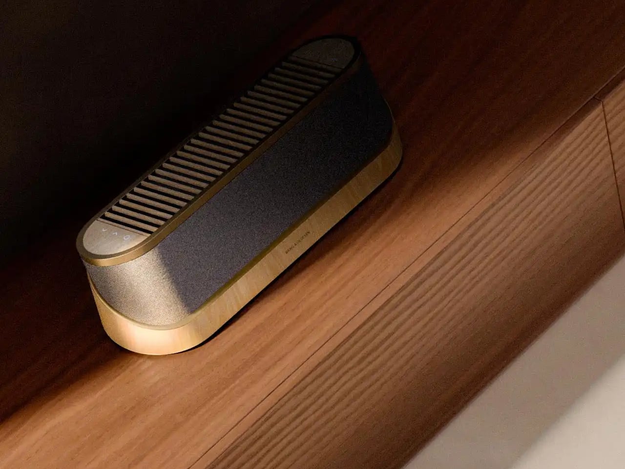
The design comes in two distinct configurations. The first is a horizontal, low-profile unit that sits flat on a surface like a refined soundbar crossed with a Scandinavian jewelry box. The second is a taller, cylindrical form that reads more like a speaker column or a sculptural object you’d place on the floor. Both share the same material vocabulary: light ash wood, brushed gold-toned aluminum, and tightly woven acoustic fabric in warm grey. It’s the kind of material combination that makes you think of an architect’s weekend house rather than a tech showroom.

The horizontal unit is particularly interesting because of how it conceals the projector itself. A wooden slat panel sits on top, almost like a miniature version of those slatted screens you see in high-end Japanese interiors, and the lens assembly slides out from beneath it. The 4K projection capability is written right into the design, quietly labeled without fanfare. There are no aggressive vents, no branding that screams for attention, no black plastic anywhere. It’s restrained in a way that feels almost provocative in a market where most projectors try hard to look “cinematic” and end up looking aggressive instead.

The controls are worth noting too. Rather than a touchscreen or a button cluster, Baumeister places minimal icon-etched controls directly into the wood panel. A Bluetooth symbol, a pair of directional arrows, a power circle. They’re barely visible until you know to look for them, which feels very much in keeping with how B&O has always approached interaction design, treating it as something that should feel intuitive and slightly magical rather than mechanical.

Looking at the exploded view of the horizontal model, you can see just how much thought went into the layering of components. The speaker array sits sandwiched between the wood base and the metal-framed top, with the projector mechanism occupying the central cavity. It’s genuinely elegant engineering, even if this is still a concept. Baumeister also developed a series of small-scale physical prototypes exploring the form from different angles, which you can see in a lineup of matte black study models. That process matters. It tells you this isn’t just a pretty render; it’s a design that was worked through with real hands.

Here’s my honest opinion: the TV industry has been coasting on size for years. Bigger screens, thinner bezels, more pixels. But the BeoLens Horizon asks a more interesting question. What if the device itself was worth looking at even when it was off? What if the experience of owning the hardware was part of the experience of using it? These aren’t new ideas in the B&O world, but a projector built around this philosophy feels like a genuinely fresh proposition, especially as ultra-short-throw technology continues to improve.

Baumeister is a young designer out of Strate, a design school in Lyon, and BeoLens Horizon joins a portfolio that already shows a real feel for the intersection of material craft and technology. Whether Bang & Olufsen ever picks this up or not, the concept makes a compelling case that the future of home cinema doesn’t have to look like a gadget. It can look like something you actually want to live with.

The post The Projector Concept That’s Almost Too Beautiful to Use first appeared on Yanko Design.

When Your Speaker Is Also a Puzzle, Music Hits Different

Par : Ida Torres
21 mars 2026 à 00:30

Most speaker designs ask a pretty simple question: how do we make this thing louder and smaller? Merge asks a completely different one. How do we make music something you can actually take apart?

Created by a five-person design team, Junchuan Shi, Junhao Lv, Xiangzhao Meng, Ping He, and Genghao Ma, from a cross-institutional collaboration across Sichuan Vocational and Technical College, CityU Macau, TUT, and QZUIE, Merge is a conceptual speaker system that just picked up a 2025 European Product Design Award in the Consumer Electronics category. It’s the kind of student concept that makes you wonder why no major brand has thought of it first.

Designers: Junchuan Shi, Junhao Lv, Xiangzhao Meng, Ping He, Genghao Ma

The central idea is deceptively clever. Merge physically separates music into its component layers: the accompaniment on one module, the vocals on another, and the full combined sound handled by the complete assembly. You choose what you hear depending on how the pieces are arranged. Pull the vocal module away, and you’ve got an instant karaoke track. Keep just the vocal module, and you hear a singer stripped back from all the production. Snap everything together and you get the whole song. It sounds gimmicky when you describe it that way, but it really isn’t. It’s an intuitive way to interact with music that streaming apps, for all their data and algorithms, still haven’t cracked with the same sense of physical satisfaction.

The three modules connect via electromagnetic induction, which also handles charging between units. That detail matters more than it sounds. It means the product doesn’t rely on fiddly clips or pins; the connection is seamless and the experience stays clean. When you hold all three pieces assembled, they sit together like a solid little object. When you pull them apart, you’re not wrestling with latches. You’re just… separating music.

Visually, the design is confident without being loud. The modules are geometric and compact: a rectangular flat piece, a squared speaker body, and a triangular wedge that caps the top when assembled. The whole thing sits in your palm like a premium toy, which is very much the point. The team describes the tactile experience of rearranging the modules as analogous to playing with building blocks, and that framing is spot on. Listening becomes a physical act rather than a passive one. You’re not adjusting a slider on an app; you’re literally picking up a piece of the song and putting it somewhere else.

The color language is considered too. The renders show options in slate blue, orange-coral, silver metallic, and white-grey, each colorway with its own character but all sharing the same graphic vocabulary: pixel waveform icons and quiet typography showing floating lyrics directly on the module surface. It reads like something between a well-designed toy and a serious piece of consumer electronics, which is an interesting space for a speaker to occupy.

I’ll be upfront: Merge is still a concept. It won in the EPDA’s conceptual category, and it hasn’t crossed into production territory yet. That’s a long road, and the audio technology behind splitting tracks in real time at the hardware level would require serious engineering. The images are renders and physical prototypes, not retail-ready products. But the best conceptual design has always worked like that. It shows an industry where something should go, even when the technology and the business case haven’t fully caught up yet.

What makes Merge genuinely compelling is that it treats the listener as someone with curiosity rather than just convenience-seeking habits. The assumption baked into most audio product design is that people want everything done for them, simplified, smoothed over. Merge assumes the opposite: that people might actually enjoy engaging with the layers of a song, touching them, moving them around. Given how obsessed the current cultural moment is with stems, remixes, and stripped-back sessions, that assumption feels exactly right.

Whether it ever becomes a product you can buy, Merge is already doing the thing good design is supposed to do. It makes you look at something ordinary and ask why it was never done this way before.

The post When Your Speaker Is Also a Puzzle, Music Hits Different first appeared on Yanko Design.

IKEA Just Made a Mouse-Shaped Speaker That Kids Can Actually Carry

Par : JC Torres
3 février 2026 à 18:20

IKEA’s GREJSIMOJS collection started with a dog-shaped lamp that dims when you hold its head for bedtime, turning a light switch into something closer to petting a sleepy puppy. The limited collection is more than just about cute animals, but also about playful behavior baked into everyday objects. That same thinking now shows up in a tiny Bluetooth speaker shaped like a mouse, with four stubby legs and a braided tail that doubles as a carry loop.

The GREJSIMOJS portable Bluetooth speaker is a small, mouse-shaped character IKEA calls a “cute little music friend” for playful people of all ages. It is meant to follow kids from room to room, turning background sound into something they can carry and interact with, while still being a straightforward wireless speaker for parents who just want podcasts in the kitchen or bedtime audiobooks without fumbling with phone speakers.

Designer: Marta Krupińska (IKEA)

Picture a child drawing at a desk, the purple mouse sitting nearby quietly playing an audiobook or favorite songs. Pairing is as simple as connecting a phone over Bluetooth, and the sound is tuned for everyday listening rather than shaking walls. The built-in volume limit protects sensitive ears, so kids can turn it up without parents needing to hover over the controls constantly or worry about hearing damage.

The braided tail makes it easy for small hands to grab and move the speaker from bedroom to living room. Charging happens over USB-C, though the cable and adapter are sold separately, and IKEA says adults should handle that part. The speaker cannot play while charging, which creates a split that lets kids control what they listen to while adults manage batteries and power.

The multi-speaker mode lets the mouse pair with other IKEA Bluetooth speakers supporting the same feature. That means the same music can play from multiple spots, turning a hallway and playroom into one sound zone without complicated app setups. It is an easy way to make dance parties or tidy-up time feel coordinated, even if the tech behind it stays invisible to everyone involved.

The collection’s goal is to inspire play and togetherness across the home, and the mouse fits that mission well. IKEA notes that £1 from every GREJSIMOJS product sold during a set period goes to the Baby Bank Alliance, adding a layer of purposeful giving. More than just decor, the speaker is a small facilitator for shared stories, music, and movement in family spaces without needing complicated setup rituals.

The GREJSIMOJS mouse speaker, like the dog lamp, treats technology as something that should feel approachable and a bit silly rather than cold. Rather than competing with serious audio gear, it is trying to make rooms feel more alive without asking kids to sit still or parents to manage another app. In homes where screens already demand enough attention, a small purple mouse that quietly pipes in sound might be exactly the kind of tech everyone can agree on.

The post IKEA Just Made a Mouse-Shaped Speaker That Kids Can Actually Carry first appeared on Yanko Design.

When Your Speaker Is Also a Statement: The Tresound Mini

Par : Ida Torres
1 février 2026 à 14:20

Sometimes the best tech isn’t the loudest. It’s the one that makes you pause and actually look at it before you press play. That’s what designers Yong Cao and Jianfeng Lv have managed to pull off with the Tresound Mini, a desktop Bluetooth speaker that refuses to be just another black box on your desk.

At first glance, this compact speaker looks like it wandered in from a modern art gallery. Its cone-shaped design is clean, almost architectural, with a minimalist aesthetic that feels intentional without being precious about it. The form isn’t just for show, either. TRETTITRE, the emerging HiFi brand behind the speaker, describes itself as bridging traditional audio quality with something more forward-thinking, and you can see that philosophy at work here.

Designers: Yong Cao and Jianfeng Lv

The Tresound Mini recently won the Golden A’ Design Award in the Audio and Sound Equipment Design category, which is one of those achievements that signals serious design cred. But awards aside, what makes this speaker interesting is how it thinks about the desktop experience differently. Instead of trying to dominate your workspace with aggressive angles or flashy lights, it takes a more refined approach. The design integrates seamlessly into your environment, whether that’s a home office setup, a creative studio, or just a corner of your apartment where you actually get things done.

Art Director Yong Cao and Designer Jianfeng Lv, both from China, approached this project with a focus on what they call the “deep integration of brand design and product design”. That sounds like design speak, but what it really means is that every element serves a purpose. The cone shape isn’t arbitrary. It contributes to the audio performance while also giving the speaker a distinctive profile that stands out without screaming for attention. It’s the kind of design that works equally well in a carefully curated Instagram photo or just sitting there doing its job.

Let’s talk about the packaging, because this is where things get genuinely clever. Instead of going with the typical cardboard box and foam inserts, the Tresound Mini comes with a carrying bag that’s wet-pressed from bamboo fiber pulp. This isn’t just packaging in the traditional sense. It’s designed to double as a carrying case, making the speaker genuinely portable. The bamboo fiber approach is both environmentally friendly and cost-effective, reducing packaging waste while providing actual protection for the product. It’s the kind of thoughtful detail that shows someone was actually thinking about the full lifecycle of the product, not just the unboxing moment.

The portability factor is key here. Desktop speakers traditionally live in one spot, tethered to your workspace. But the Tresound Mini was designed with the understanding that people move around now. You might want it on your desk in the morning, out on a balcony in the afternoon, or in your kitchen while you’re cooking dinner. The compact size and that bamboo fiber carrying bag make that kind of flexibility possible.

TRETTITRE positions itself as catering to “the new generation of HiFi enthusiasts”, which is a smart read of where audio culture is heading. There’s a growing audience that cares about sound quality but doesn’t want to sacrifice design or deal with the bulk and complexity of traditional HiFi setups. They want something that sounds good, looks intentional, and fits into spaces that might not have room for a full speaker system. The Tresound Mini seems built specifically for that demographic.

What’s interesting about this design is how it challenges the assumption that good audio equipment needs to look technical or industrial. There’s no display screen, no visible screws, no aggressive branding. Just a clean geometric form that happens to deliver quality sound. It’s the audio equivalent of those minimal tech accessories that proved you don’t need to sacrifice aesthetics for function.

The success of the Tresound Mini might signal a broader shift in how we think about desktop audio. As more people work from home or create hybrid living and working spaces, there’s an appetite for products that perform well without dominating the visual landscape. We want our tech to be good at what it does, but we also want it to feel like it belongs in our actual lives, not in a showroom.

Yong Cao and Jianfeng Lv have created something that manages to be both functional and thoughtful. The Tresound Mini proves that when you approach product design with real consideration for how people actually use things, you can create something that transcends its basic function and becomes worth talking about.

The post When Your Speaker Is Also a Statement: The Tresound Mini first appeared on Yanko Design.

❌
❌