❌

Vue normale

  • ✇Yanko Design
  • Smartwatch Mobile Charger Hidden in a Hershey’s Kiss-Shaped Shell
    We’ve gotten used to bringing along power banks when we’re out and about since we don’t want our smartphones to run low on battery during crucial moments. But now we also have to worry about other devices, like smartwatches. Some need less frequent charging than our phones, but there are still times when we forget to charge them before leaving the house. Before you know it, you find yourself needing some extra juice for your wearable. miniduct has found a very cute solution to your problem, if
     

Smartwatch Mobile Charger Hidden in a Hershey’s Kiss-Shaped Shell

21 octobre 2026 à 10:20

We’ve gotten used to bringing along power banks when we’re out and about since we don’t want our smartphones to run low on battery during crucial moments. But now we also have to worry about other devices, like smartwatches. Some need less frequent charging than our phones, but there are still times when we forget to charge them before leaving the house. Before you know it, you find yourself needing some extra juice for your wearable.

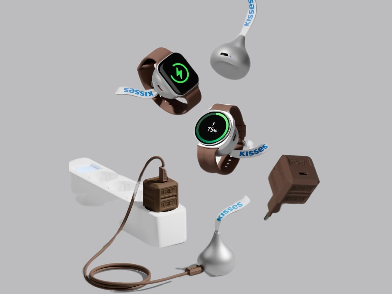
miniduct has found a very cute solution to your problem, if you’re rocking a compatible Apple Watch or Samsung Galaxy Watch, that is. Its Kisses Smart Watch Power Bank is shaped like an actual Hershey’s Kiss. Instead of satisfying your sweet cravings, though, this one will power up your smartwatch while you’re on the go. According to its product information, it has a system that aligns with your watch, but there’s also an option to charge other compatible devices through a USB-C port.

Designer: miniduct

Aside from giving your smartwatch extra life when it’s about to run out of charge, this is a cleverly designed accessory that you can carry around with you. It takes the iconic silhouette of a Hershey’s Kiss and its silver-wrapper look and turns it into something other than a snack. It even comes with the tiny white ribbon bearing the word “Kisses,” which doubles as a strap for attaching the device to your bag or pouch. That’s probably the nicest design detail here: a familiar part of the candy packaging gets a practical purpose.

According to the published specifications, the power bank measures approximately 41 millimeters in diameter and 45 millimeters tall, excluding the ribbon. It weighs 40.2 grams, or about 1.4 ounces, and contains a 700mAh battery. That makes it a small backup for your wearable rather than a replacement for the larger power bank you might already carry for your phone.

The charging system is called Auto Fit, and miniduct describes an internal mechanism that automatically aligns with the watch being charged. Its product information explains that the magnets rotate rather than remain fixed to accommodate Apple and Galaxy watches. You’ll still want to check compatibility with your particular model before buying, rather than assume every watch generation is supported.

The chocolate shape also has a job when you put the charger down. miniduct says it positions the watch at a 20-degree viewing angle on a desk, allowing you to check the screen while it charges. You’ll need to take the watch off your wrist, so a break at your desk is a more practical charging opportunity than a workout.

Of course, the small battery comes with limitations. miniduct estimates that it can provide approximately 40% to 120% of a watch battery’s capacity, depending on the model. Some watches therefore won’t get a complete recharge. The brand also notes that features such as GPS, Bluetooth, and an always-on display can reduce the net charge gained. Think of it as an emergency reserve, not a promise of several days away from an outlet.

The product materials also advertise charging support for compatible earbud cases, including wireless charging for supported AirPods cases. USB-C output provides another option for compatible earbuds or an emergency phone top-up. With only 700mAh available, though, charging a phone is a secondary use rather than the main reason to buy it.

The appeal here is having a backup charger that feels like an accessory you’d actually want to bring along. The ribbon gives it a place on your bag, while the familiar shape gives it some personality when it’s sitting on your desk. You’ll still have to remember to charge the power bank itself, but at least this little reminder looks sweeter than another loose cable.

The post Smartwatch Mobile Charger Hidden in a Hershey’s Kiss-Shaped Shell first appeared on Yanko Design.
  • ✇Yanko Design
  • This Japanese Notebook Has Lines That Seem to Disappear as You Write
    As a hoarder, I mean collector, of notebooks, I prefer ones that don’t have lines because I feel like they inhibit my creativity. Or maybe they remind me of required writing during my school days. But sometimes, when I’m writing in my journal, my handwriting goes haywire. When I try to read back what I wrote, it’s a mess. I used to wish there were a notebook that could help me keep my handwriting in check without leaving visible lines all over the page. The iA Vanishing Line Notebook has made t
     

This Japanese Notebook Has Lines That Seem to Disappear as You Write

21 octobre 2026 à 07:40

As a hoarder, I mean collector, of notebooks, I prefer ones that don’t have lines because I feel like they inhibit my creativity. Or maybe they remind me of required writing during my school days. But sometimes, when I’m writing in my journal, my handwriting goes haywire. When I try to read back what I wrote, it’s a mess. I used to wish there were a notebook that could help me keep my handwriting in check without leaving visible lines all over the page.

The iA Vanishing Line Notebook has made that wish come true. It’s a premium, handcrafted paper notebook from Information Architects, the company behind the iA Writer app. As the name implies, it has watermark lines that guide you as you write but appear to “disappear” once the page fills with words. There’s no magic or disappearing ink involved. It’s a beautifully designed notebook that lets you enjoy the best of both lined and unlined worlds.

Click Here to Buy Now: $80. Hurry, only 3 available!

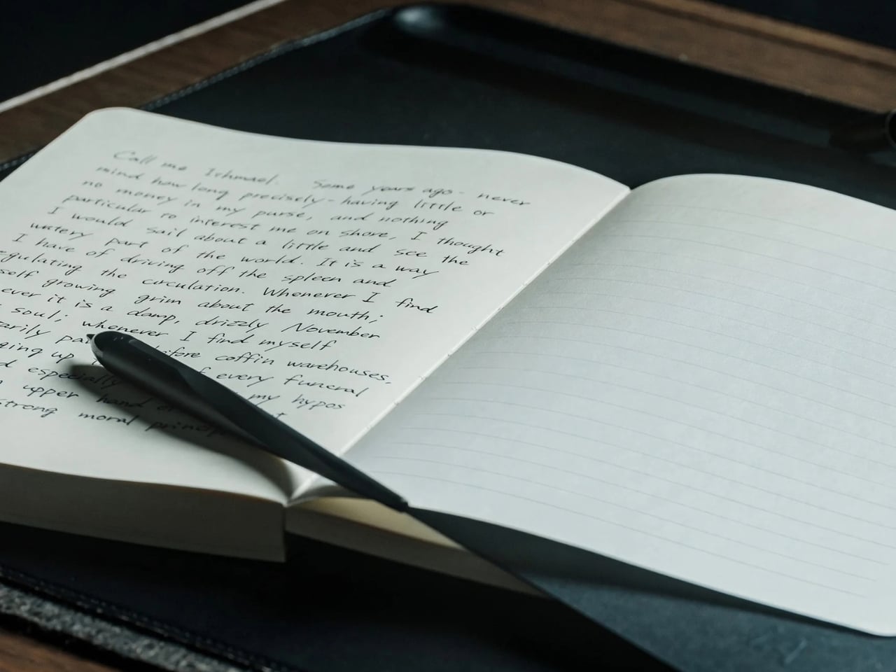
When you crack open the notebook, you’ll see that the lines are visible on an empty page. They serve as a guide for you and your pen, helping you write straight and keep your lines evenly spaced, if that’s how you want to write. I know some people prefer a messier look, but when I’m filling a page with journal entries or other writing I plan to revisit, a little guidance can be welcome.

Once you’ve written on the page, the contrast between your writing and the paper makes the lines visually fade into the background. Hence, the notebook’s name. When you read back what you’ve written, your handwriting takes center stage instead of competing with a distracting grid. To be clear, the lines don’t physically vanish, and the effect becomes more noticeable as the page fills up. It won’t change your handwriting, but it could make what you’ve written more pleasant to read.

iA (Information Architects, in case you didn’t know) achieved this without any tricks. The watermark lines had to be faint enough to recede behind the writing but visible enough to help while the page was empty. That balance is the detail I find most interesting. The paper and binding matter, too: the notebook uses Japanese writing paper and opens flat, so you don’t have to hold down one side while trying to finish a sentence. As someone who is a connoisseur of Japanese stationery products, I can appreciate the thought that went into it.

There are other practical details worth noting. The hardcover notebook is A5-sized, with 144 sheets, or 288 pages, and its watermark lines are spaced 10 millimeters apart. Its 81 gsm Araveal White paper is designed to work with most pens and inks, including fountain pens. It’s handcrafted in Japan, and the wooden presentation box gives it the feel of something you might keep on your desk rather than toss into the bottom of a bag. Of course, that also means this is a more considered purchase than an everyday notebook you wouldn’t think twice about using up.

If you usually buy a Moleskine Classic, the difference comes down to what bothers you about an ordinary page. Moleskine offers both plain and ruled layouts, along with practical touches such as a ribbon bookmark, an elastic closure, and an inner pocket. Its ruled pages give you consistent guidance, while its plain pages leave you free to write wherever you like. The iA Vanishing Line Notebook offers a middle ground: its guidelines are there when you need them and less noticeable when you read your work later. Moleskine is the more familiar everyday choice; iA’s design is for someone who cares about that specific writing experience.

I don’t think this notebook will turn every messy journal entry into a masterpiece, and honestly, I wouldn’t want it to. Sometimes the scribbles are part of the fun. But for the days when I want my thoughts to flow freely and still be able to read them afterward, these vanishing lines sound like the compromise I’ve been looking for. It gives my pen a path without making the finished page look like homework.

The post This Japanese Notebook Has Lines That Seem to Disappear as You Write first appeared on Yanko Design.

  • ✇Yanko Design
  • Road Barriers Become Benches Without Losing Their Warning Stripes
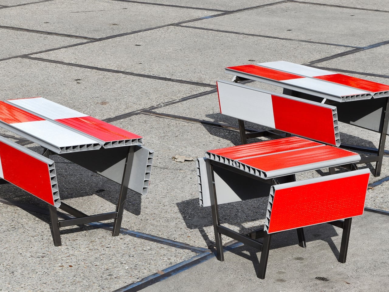
    A red-and-white safety barrier isn’t an object I’d normally consider inviting. It’s supposed to interrupt your plans. That’s why the stop! collection by Studio Martins Mezulis and creative 13_0663_tsx makes such a good first impression as a design idea. The outdoor benches and stools borrow the panels of Dutch traffic barriers to make places to sit, addressing a basic need in public space: somewhere to pause. Waiting for a friend shouldn’t require buying a coffee to justify occupying a chair. I
     

Road Barriers Become Benches Without Losing Their Warning Stripes

21 octobre 2026 à 05:15

A red-and-white safety barrier isn’t an object I’d normally consider inviting. It’s supposed to interrupt your plans. That’s why the stop! collection by Studio Martins Mezulis and creative 13_0663_tsx makes such a good first impression as a design idea. The outdoor benches and stools borrow the panels of Dutch traffic barriers to make places to sit, addressing a basic need in public space: somewhere to pause.

Waiting for a friend shouldn’t require buying a coffee to justify occupying a chair. I like public seating that treats waiting, resting, and doing very little as perfectly legitimate activities. That’s the practical territory stop! occupies. Presented at Dutch Design Week in Eindhoven, running October 17–25, 2026, the collection invites people to stay for a while using an object associated with sending them elsewhere.

Designers: Studio Martins Mezulis and creative 13_0663_tsx

The starting point is the schrikhek, a red-and-white aluminum barrier used in the Netherlands to alert people to construction and redirect their route. You don’t need to recognize that Dutch term to understand the reference. The warning graphics do most of the explaining. Keeping them visible gives the furniture a little friction: your eyes register a restriction before your brain catches up with the seat.

It’s a fitting project for Studio Martins Mezulis, whose work spans graphic and spatial design. The stripes are doing both jobs here: defining a physical object and carrying a message that the designers are trying to change.

In the project’s render, long striped panels form the seating surfaces, with more panels running vertically along the sides. A narrow framework keeps the assembly visually open. The result looks deliberately assembled from infrastructure rather than dressed up to conceal its origins. I prefer that decision to a more polished makeover. Remove the red and white, and much of the reason to notice these benches disappears.

The published bench dimensions are 1,250 millimeters long, 500 millimeters wide, and 450 millimeters high, or approximately 49 by 20 by 18 inches. Road safety barriers and steel are listed as the materials. Those numbers describe a compact object rather than a sprawling park bench. Its proportions make the proposal easier to picture beside a pedestrian route or within a plaza, although placement would still need careful consideration.

The illustrated benches are also backless and lack armrests. That keeps their form simple and leaves the seat approachable from either side, but it doesn’t offer the support some people need. I’d read them as an invitation to take a short break rather than assume they’re suited to a long afternoon. The graphic wit is persuasive; comfort and durability would need evidence beyond a render.

That distinction matters because public furniture has a job beyond looking good in a design exhibition. Someone needs to understand that they can use it. Here, the same markings that make the collection memorable could initially make a passerby hesitate. I’d be interested to see how quickly people recognize the invitation. A bench occupied by one person might explain the idea better than a nearby project label.

The material story deserves similar precision. According to the project’s Dutch Design Week description, the designer hopes to work with construction infrastructure providers to reclaim decommissioned or discarded panels in the future. That isn’t confirmation that every panel in the current collection has already served at a construction site. Reuse is a proposed direction for expanding the collection, and it’s worth preserving that distinction rather than automatically labeling the furniture recycled.

For me, stop! works best as a modest adjustment to how a street communicates. It gives a familiar public object another use without erasing what made it recognizable. The humor gets your attention, but the seat has to justify keeping it. If the collection develops further, I’d rather see that effort go into making it useful to more people than into adding more visual tricks. A decent place to wait is already a worthwhile design brief.

The post Road Barriers Become Benches Without Losing Their Warning Stripes first appeared on Yanko Design.

  • ✇Yanko Design
  • A Coffee Bar Without a Remodel: UNITO’s Rolling Station
    A coffee grinder, a kettle, and a few favorite mugs can turn into a surprisingly territorial collection. Add filters, beans, and the tools that make a morning ritual feel worthwhile, and suddenly the kitchen counter has a second job. UNITO’s Coffee Station offers a dedicated home for that equipment, with wheels underneath so the coffee corner doesn’t have to become a permanent fixture. Designed by Unito, the station brings preparation space and storage together in a movable counter. Its appeal
     

A Coffee Bar Without a Remodel: UNITO’s Rolling Station

21 octobre 2026 à 04:15

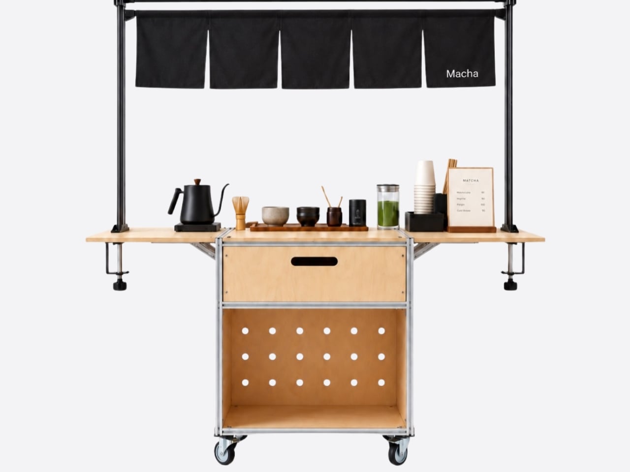
A coffee grinder, a kettle, and a few favorite mugs can turn into a surprisingly territorial collection. Add filters, beans, and the tools that make a morning ritual feel worthwhile, and suddenly the kitchen counter has a second job. UNITO’s Coffee Station offers a dedicated home for that equipment, with wheels underneath so the coffee corner doesn’t have to become a permanent fixture.

Designed by Unito, the station brings preparation space and storage together in a movable counter. Its appeal extends beyond reclaiming kitchen space. For a studio hosting clients or someone setting up a coffee pop-up, it could provide a more organized starting point than a table surrounded by supply boxes. Unito’s founder has described the Coffee Station as part of the brand’s move toward furniture and tools for small businesses.

Designer: Unito

The material combination gives that practical idea some personality. According to the supplied product description, silver anodized aluminum profiles form the frame, while light birch plywood supplies the panels. I like that the design lets both materials retain their identities. The metal outlines the structure with a workshop-like precision; the wood gives the broad surfaces enough warmth to keep the station from reading as purely institutional equipment.

That balance matters for something that might face customers. In the published photographs, the silver framework remains visible around the wooden drawer fronts, and side surfaces extend beyond the central cabinet on supporting brackets. Those extra surfaces look useful for separating preparation from pickup. A cup waiting to be served shouldn’t have to compete with the grinder for the same patch of counter.

Storage deserves as much attention as the equipment displayed above it. The described configuration includes two soft-close drawers, with an open compartment underneath. The photographs show wide finger-pull cutouts rather than projecting handles. I appreciate that restraint, but the more useful decision is giving small supplies somewhere to disappear. Filters, spoons, and towels could stay close without becoming part of the countertop display.

Then come the wheels, arguably the least glamorous and most consequential detail. The specifications list four locking stainless steel casters, and brake levers are visible in the photographs. That arrangement is intended to let the station move into position and then stay put. I’d still distinguish a rolling workstation from portable luggage. Moving across a suitable floor is a different proposition from negotiating stairs or loading it into a car.

The top also introduces an interesting possibility: it is specified to accept IGT panels or stoves. IGT refers to the Iron Grill Table system, whose modular approach combines frames with cooking and work-surface inserts. For UNITO, the appeal is a surface that could accommodate different tasks rather than permanently committing to one arrangement. Exact insert compatibility still needs confirmation before anyone starts ordering accessories.

The dedicated patio umbrella slot is another thoughtful detail. Published images show an umbrella rising above a fully arranged coffee setup, making the station read like a small service point rather than a kitchen cart parked outside. That could be useful for a temporary outdoor gathering. It doesn’t, however, establish that the plywood is weatherproof or that the station can anchor an umbrella safely in wind.

My favorite potential use is actually the less theatrical one: a shared studio where the coffee setup needs its own territory but the room changes throughout the week. A dedicated station could keep supplies together while allowing the host to rearrange the space. That feels like a convincing reason to put furniture on wheels, especially when building another fixed counter would make the room less flexible.

I wouldn’t call it a complete café or an outdoor kitchen. Those descriptions skip over water, power, cleanup, and the practical demands of serving people. Its more believable contribution is giving coffee equipment a coherent place to live and work. For someone who wants a serious setup without designing the room around it, that’s an appealing amount of commitment.

The post A Coffee Bar Without a Remodel: UNITO’s Rolling Station first appeared on Yanko Design.

  • ✇Yanko Design
  • Oboro’s Silver Moon Calendar Is Wall Art You’ll Actually Use
    Most of the time, when you need to check a day or date, you open your phone’s default calendar app. For those of us who still use planners, we also like to flip through the calendar pages since our schedules are often written there. But maybe you rarely notice actual wall calendars displayed in offices or living rooms anymore. If there is one, it might be some random promotional gift. It can feel like we’ve stopped carefully choosing a wall or desk calendar that suits our aesthetic or that we f
     

Oboro’s Silver Moon Calendar Is Wall Art You’ll Actually Use

20 octobre 2026 à 19:30

Most of the time, when you need to check a day or date, you open your phone’s default calendar app. For those of us who still use planners, we also like to flip through the calendar pages since our schedules are often written there. But maybe you rarely notice actual wall calendars displayed in offices or living rooms anymore. If there is one, it might be some random promotional gift. It can feel like we’ve stopped carefully choosing a wall or desk calendar that suits our aesthetic or that we find interesting.

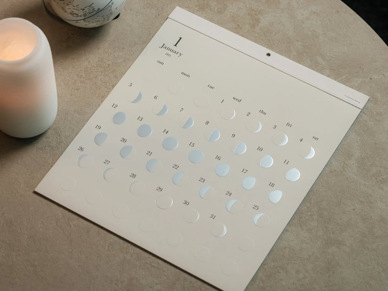
The Oboro Silver Moon Calendar quietly makes itself part of your minimalist space, especially if you love the moon. Created by Replug, it originated as a limited-edition 2025 calendar celebrating the Michiru calendar series’ 10th anniversary. Its name comes from oborozuki, a hazy moon, which inspired the design’s soft appearance. The YD Select listing describes its inspiration as having “serene and mystical qualities.” You might see that misty moon as a reminder that life is impermanent but still beautiful, although that’s a personal interpretation rather than something a calendar needs to explain.

Click Here to Buy Now: $70 Hurry, only 5 left!

Instead of the usual white paper that many wall calendars have, this uses a soft gray-beige paper that evokes a moonlit sky. It could bring a more introspective and relaxing atmosphere to the room, especially when you stare at the calendar while contemplating your life for the rest of the month (well, if you like doing that sort of thing). The subdued background also keeps the metallic details from competing with a bright color palette.

This is primarily a calendar that brings attention to the lunar cycle. It shows the moon’s phases in shimmering, reflective silver foil that catches the light falling on it. That distinction matters: it reflects light rather than producing its own illumination. Its appearance can change depending on the angle of the light, making placement part of the effect. It also has an embossed moon silhouette that adds a tactile element when you touch the calendar. For someone who enjoys small daily rituals, pausing to notice the changing lunar phases could become a grounding moment in an otherwise busy day.

The calendar is made in Japan, with 12 paper sheets measuring approximately 11.7 by 13.5 inches. That gives you a sense of the wall space it needs without making it sound like an oversized art print. The combination of embossing and silver foil is the important design choice here: one gives the paper physical relief, while the other changes how it catches light.

For comparison, MUJI’s 2027 Bagasse Paper Wall Calendar, listed on its European store, uses a Monday-start monthly layout that presents the full month at a glance. Both could appeal to someone who prefers understated stationery, but their priorities differ. MUJI emphasizes straightforward date reference, while Oboro gives lunar phases and decorative surface treatments more attention. Oboro’s appeal is less about improving your scheduling system and more about giving a useful paper object a place in your decor. The better choice depends on what you want to look at every day.

There is also something appealing about checking a calendar without reaching for your phone. If opening an app tends to lead you somewhere else entirely, a paper reference lets you glance at the date and move on. You can still keep your appointments in a digital calendar while choosing something more personal for the wall beside your desk. If you’ve stopped choosing calendars because your phone already handles the practical side, Oboro Silver Moon Calendar gives you a reason to reconsider. It can sit alongside your existing routine, offering something different to notice: the shape of the moon, the texture of the paper, or a brief flash of silver as the light changes.

The post Oboro’s Silver Moon Calendar Is Wall Art You’ll Actually Use first appeared on Yanko Design.

  • ✇Yanko Design
  • Espresso Without an Outlet or a Separate Cup
    An espresso habit gets complicated the minute you leave the kitchen. You can bring the beans, but the equipment tends to stay beside an outlet, occupying a respectable chunk of counter. Pura Coffee’s PURA NEO Pro, listed for sale at $349, is designed to put heating, extraction, and drinking into one battery-powered object. The problem it tackles is straightforward: making espresso away from your usual setup without packing a miniature coffee station. Visually, the NEO Pro looks closer to a trav
     

Espresso Without an Outlet or a Separate Cup

20 octobre 2026 à 17:30

An espresso habit gets complicated the minute you leave the kitchen. You can bring the beans, but the equipment tends to stay beside an outlet, occupying a respectable chunk of counter. Pura Coffee’s PURA NEO Pro, listed for sale at $349, is designed to put heating, extraction, and drinking into one battery-powered object. The problem it tackles is straightforward: making espresso away from your usual setup without packing a miniature coffee station.

Visually, the NEO Pro looks closer to a travel tumbler than a shrunken kitchen appliance. The company’s imagery shows a cylindrical body, a cup at the top, and a textured brown band around the middle. A circular power button keeps the front relatively uncluttered. I like the restraint here. It looks like an object you could leave beside a laptop without your desk suddenly resembling the equipment shelf behind a coffee bar.

Designer: Pura Coffee

That stacked layout explains the design’s most interesting decision. Pura pumps water upward through the grounds into the drinking cup above, so you don’t need to balance the brewer over a separate vessel. The cup becomes part of the architecture rather than another accessory to remember. The company says upward flow helps wet the coffee bed evenly and reduce channeling. That extraction advantage needs testing, but the integrated cup has an immediately understandable purpose.

The basic controls are refreshingly physical. After a short press followed by a two-second hold to power on, one press starts heated brewing at the default 92°C, roughly 198°F. A double press skips heating and brews using the water’s existing temperature. Pura also uses a colored light ring to communicate status. It’s a sensible division of labor: a button for getting coffee started, with a small visual signal instead of another screen demanding your attention.

Inside, the ambition gets more technical. Pura specifies extraction pressure of 6 to 9 bar at the coffee puck and a five-stage process that moves from pre-infusion through brewing to pressure release. Its roughly three-minute cold-start brewing time is explicitly labeled a design target, not a verified result here. I’d treat that timing as provisional, particularly if the appeal is making a quick cup between meetings rather than enjoying the preparation itself.

Then comes Brew OS, the companion software that lets owners adjust brewing parameters and save combinations as shareable Brew Cards. Pura says the app can also suggest a starting extraction curve from a photograph of a coffee bag or the beans themselves. That’s a potentially useful entry point for someone who wants more guidance than a temperature slider. Importantly, the company describes these suggestions as starting points, while deeper learning from personal taste ratings remains on its roadmap.

I’m more persuaded by saving a recipe than by the prospect of photographing beans. A saved combination gives the tinkering a destination: find settings you like, then stop rebuilding them every morning. For me, that’s a better reason to connect a coffee maker to a phone than simply adding remote controls. Brew OS allows that recipe to be saved and shared, although repeating settings shouldn’t be mistaken for guaranteeing identical flavor.

The practical boundaries matter, too. The water tank holds a maximum of 70 milliliters, about 2.4 fluid ounces, so think espresso-sized servings, not a full commuter mug. Ground coffee is the primary approach, with an optional Nespresso-compatible capsule adapter. Cleanup still involves discarding the grounds and rinsing removable parts; the body cannot be immersed or put in the dishwasher. Portability gets the equipment into your bag, but it doesn’t make the used grounds disappear afterward.

At $349, I’d want the NEO Pro to earn its place through regular use, not just the occasional campsite photo. Its strongest design argument is the cup itself: brewing and drinking share one vertical assembly, with fewer separate objects to arrange. If carrying your espresso routine matters enough to justify the preparation and cleanup, that’s a thoughtful place to start. The app can offer more settings later. First, the coffee needs somewhere to land.

The post Espresso Without an Outlet or a Separate Cup first appeared on Yanko Design.

❌