Vue normale

Il y a de nouveaux articles disponibles, cliquez pour rafraîchir la page.
À partir d’avant-hierFlux principal

When Art Meets Cognac: Anish Kapoor’s Mirror Universe Reimagines Rémy Martin XO

24 juin 2025 à 17:20

The worlds of contemporary art and luxury spirits rarely intersect with such deliberate intention, yet Anish Kapoor’s latest collaboration with Rémy Martin creates a compelling dialogue between artistic vision and centuries-old craftsmanship. The British-Indian sculptor, known for his mirror sculptures and explorations of void and reflection, has designed a limited-edition decanter for Rémy Martin XO that transcends typical artist collaborations.

Designer: Anish Kapoor

This partnership emerges from personal history rather than commercial opportunity. Kapoor recalls his father drinking Rémy Martin during his childhood in India, creating an emotional foundation that extends beyond mere brand association. The artist describes the cognac as having “a certain sophistication and almost a quiet place in my memory,” establishing the authenticity that distinguishes meaningful collaborations from superficial marketing exercises.

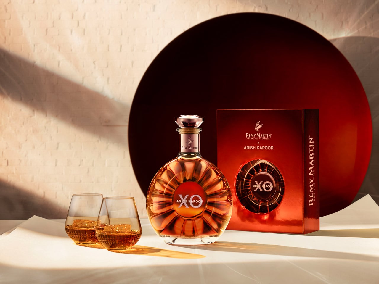
The Design Philosophy Behind Reflective Luxury

Kapoor’s approach to the decanter design centers on his signature manipulation of form and perception. The artist worked directly with Rémy Martin’s design team to create what he describes as a “much simpler design” that relates to the liquid itself and its function. This restraint reflects Kapoor’s mature artistic sensibility, where impact comes through refined execution rather than ostentatious display.

The decanter maintains the classic XO silhouette while incorporating Kapoor’s distinctive visual language. His painted concave mirrors, which have challenged perceptions in galleries worldwide, inform the decanter’s surface treatment. The piece functions as both vessel and sculptural object, creating what Kapoor calls “an alternative reality between art and savoir-faire.”

The solar shape that characterizes the original XO bottle becomes enhanced through Kapoor’s intervention. His treatment of the surface creates infinite reflections, changing the static container into a dynamic visual experience that shifts with light and viewing angle. This modification aligns with Kapoor’s broader artistic practice of creating objects that exist in a state of perpetual visual flux.

Bridging Generational Craft Traditions

The collaboration celebrates parallel traditions spanning centuries. Rémy Martin’s 300-year heritage in cognac production mirrors Kapoor’s decades-long exploration of material and form. Both practices require patience, precision, and an understanding of how time changes raw materials into refined experiences.

Amaury Vinclet, Rémy Martin’s Executive Director, positions the partnership as a meeting between “two visionaries on a constant quest for excellence.” This framing places the collaboration beyond typical luxury brand partnerships, suggesting a deeper alignment of creative philosophies. The project “radiates the energy of Rémy Martin XO, capturing reflections from the past and promises of new futures.”

The artistic process itself became collaborative, with Kapoor working alongside Rémy Martin’s designers to ensure the final piece honored both the cognac’s character and his artistic vision. This integration of perspectives creates a product that functions as both luxury object and artistic statement.

The April 2025 release through selected retail channels creates controlled scarcity without artificial exclusivity. This distribution approach allows the collaboration to serve multiple audiences simultaneously, functioning as both commercial product and artistic edition.

Limited Edition as Artistic Statement

The 700mL limited edition format, priced at $189.99, positions the collaboration within accessible luxury rather than ultra-premium collectible territory. This pricing strategy suggests Rémy Martin’s intention to reach collectors and art enthusiasts rather than targeting only the highest-end market segment.

Kapoor’s involvement extends beyond the decanter design to include a companion artwork, though details about this piece remain limited in the initial announcement. This dual approach suggests the collaboration encompasses both functional design and pure artistic expression, creating multiple touchpoints for engagement.

The personal narrative underlying this collaboration distinguishes it from typical celebrity endorsements or artist partnerships. Kapoor’s childhood memories of his father’s relationship with Rémy Martin create emotional authenticity that informs the design process. This personal connection changes the commercial collaboration into an exploration of memory, heritage, and cultural transmission.

The Intersection of Memory and Luxury

The artist’s description of the project as referring to his history creates layers of meaning beyond the physical object. The decanter becomes a vessel for personal and cultural memory, connecting past and present through both the cognac’s tradition and Kapoor’s artistic evolution. This emotional foundation allows the collaboration to function as both luxury product and personal artifact.

The piece exists simultaneously as commercial object, artistic statement, and memory vessel, creating multiple entry points for different audiences. The limited-edition format ensures exclusivity while the pricing maintains accessibility for serious collectors and art enthusiasts.

The collaboration represents successful fusion of artistic vision and luxury craftsmanship, where personal history informs commercial partnership. Through Kapoor’s distinctive approach to form and reflection, the project creates an object that honors both the cognac’s heritage and the artist’s mature practice, resulting in a piece that functions as both functional luxury and contemplative art object.

The 2025 release will test whether luxury consumers respond to art-driven design that prioritizes personal narrative over commercial spectacle, potentially setting new standards for meaningful brand collaborations in the luxury spirits market.

The post When Art Meets Cognac: Anish Kapoor’s Mirror Universe Reimagines Rémy Martin XO first appeared on Yanko Design.

Product Packaging still sucks… but this Nintendo Switch biodegradable box presents a radical new path

Par : Sarang Sheth
23 juin 2025 à 19:15

I would watch an unboxing video a 100 more times if it used these materials instead of plastic and virgin cardboard. The year is 2025, we’ve unboxed products for decades at this point, and nothing has changed at all. Apart from packages now being smaller and shipping without chargers (we’re looking at you, Apple), we really haven’t advanced much in terms of designing for end-of-life.

A product’s package is literally the most single-use item on the planet. Apart from probably retaining the box for fondness’ sake, nobody keeps the packaging for their Switch, iPhone, iPad, drone, or laptop. These boxes are MEANT to be thrown away 90% of the time – so why are we still using materials NOT made for a single-use mentality? This unique Nintendo Switch packaging from Björn Van Egroo

Designer: Björn Van Egroo

Born from a 3D rendering material experimentation exercise, Egroo’s Nintendo Switch packaging redesign actually taps into something raw and fundamentally game-changing. You don’t need to mold plastic blister shells inside pristine cardboard boxes wrapped with plastic film… a product’s packaging can use materials like compressed coconut fiber, recycled paper, and even sugarcane fiber (bagasse) to create packaging that’s bespoke, filled with character, and shock-absorbing.

Would something like this work for gadgets? Here’s the reality check – yes and no. Yes, it could for a lot of gadgets. But also, no, it couldn’t because the supply chain is way too set in its ways to hard-pivot to an experimental set of materials for millions and millions of gadgets shipped worldwide. This particular concept also has a mild risk of water seepage through the coco fiber, but nothing that can’t be fixed with a little redesign.

I cringe as I have to cut through plastic blister packs every time I order a mouse, or a set of batteries, or a charging cable. Similarly, receiving an almost perfect-looking cardboard box with a Bluetooth speaker inside, only to then throw the box out immediately after unboxing my product, feels just as wasteful. Egroo’s simple material exploration presents a shift that I would HAPPILY endorse.

We’ve got no shortage of recycled and recyclable materials. A simple Google search will tell you that 9 billion coconut husks are discarded annually. Sugarcane pulp, a byproduct of sugar production, is discarded by a factor of 700 million tonnes per year. Paper waste goes into millions of tonnes too. ALL these can easily be rerouted into packaging products instead. Maybe not immediately for tech products (although there are companies using molded pulp instead of styrofoam), but hey… if molded pulp trays are good for eggs (which are way more fragile than your average tech product), then why not for gadgets?

The post Product Packaging still sucks… but this Nintendo Switch biodegradable box presents a radical new path first appeared on Yanko Design.

These Water Bottles Capture The Process Of Glaciers Melting Into Spring Water

Par : Sarang Sheth
22 mars 2025 à 00:30

Global warming, but make it art.

Usually, I never give a drinking water bottle a second glance. Water costs hardly anything, and it’s such a utility/necessity that elevating it to a design icon level is something only luxury brands like Evian or Dasani attempt at doing. That basically means the remaining 90% of brands have the most boring water bottle designs on the planet, made to be used and thrown – but the Sprinkle bottle doesn’t look at packaging that way.

Designed to capture the journey of their water, Sprinkle’s bottles come in 3 design formats – one in glacial form, one in an intermediary stage, and one as glacial water that usually then gets bottled at source. The bottle comes sans label, allowing this beautiful distinction to stand out, while its overall motto remains to be a brand that doesn’t dwell in excess. The lack of a label reinforces Sprinkle’s overall “REDESIGN TO REDUCE” mindset.

Designer: Prompt Design for M.WATER COMPANY LTD.

The Sprinkle bottle evokes a sense of purity, with its crystal-like design. It’s entirely clear, with the bottle looking almost like an ice sculpture itself. There’s no label, no graphic, not even an interplay of matte and gloss surfaces. It’s all monolithic and shimmery, which really allows the 3-part design to shine through.

The bottle displays the water’s journey from source to sip. It starts with a block of arctic ice, which slowly melts into glacial form, finally becoming the spring water we associate with freshness and purity. The journey of ice to water is also a cautionary tale of sorts, showing climate change through design. The bottle’s design journey shows the loss of ice caps, and sure, while we’re left with a lot of drinking water as a result, there’s still a sense of unstoppable change and of loss that’s difficult to shake.

The bottle was designed by the folks at Prompt Design, who had to work with a unique set of challenges. Apart from needing to create a bottle that was impactful and memorable enough to stand out on a grocery shelf or refrigerator, they also had to work around the label bit, finding unique places to list important information. To that end, the company devised a way to print the barcodes on top of the bottle cap, keeping the entire bottle itself looking incredibly pristine.

The post These Water Bottles Capture The Process Of Glaciers Melting Into Spring Water first appeared on Yanko Design.

Pizza Hut brings you a Moving Box Table for your pizza break

Par : Ida Torres
6 septembre 2024 à 13:30

As someone who has moved houses a lot, I can attest that the food of choice during breaks is pizza. You don’t need any utensils to eat it and oftentimes, you end up just plopping the box on any surface as you partake of a delicious slice and chat with your friends who are helping you move. It’s not the most sanitary of course since there’s probably a lot of dust and dirt lying around on the floor.

Designer: Pizza Hut

Pizza Hut is offering a quick and simple solution for this problem, especially during this time when a lot of people are apparently moving in the U.S. The Moving Box Table is a simple to assemble miniature cardboard table that you can use to place your box of pizza on as you snack. This limited-edition box is perfect for peak moving time so that you can enjoy your slice while not thinking about being sanitary.

The Moving Box Table has a corrugated structure that folds into a base or mini table that is sturdy enough to hold your pizza box. It has of course the iconic red checkered design of Pizza Hut. Setting it up is pretty easy as you just have to unfold and assemble and you’re good to go. It doesn’t really say if you can re-use it, but most probably you can, unless you get all kinds of sauces and toppings on it while eating.

This comes for free if you order a large menu-priced pizza but is exclusive to the cities of Dallas, Charlotte, and Orlando. This is apparently three of the most popular U.S cities to move to especially during this time.

The post Pizza Hut brings you a Moving Box Table for your pizza break first appeared on Yanko Design.

❌
❌