Vue normale

  • ✇Yanko Design
  • The All-Black Kitchen Is 2026’s Hottest Design Trend — Here Are 8 Products That Nail It
    Black has always carried weight in design. Authority, restraint, a quiet elegance that needs no announcement. In 2026, the all-black kitchen has shifted from a bold statement to a genuine design movement. What once felt too dramatic for the most-used room in the home now feels precisely considered. Designers and homeowners alike are gravitating toward the palette for its ability to make a space feel curated, intentional, and deeply sophisticated when executed well. The shift runs deeper than ca
     

The All-Black Kitchen Is 2026’s Hottest Design Trend — Here Are 8 Products That Nail It

17 avril 2026 à 07:40

Black has always carried weight in design. Authority, restraint, a quiet elegance that needs no announcement. In 2026, the all-black kitchen has shifted from a bold statement to a genuine design movement. What once felt too dramatic for the most-used room in the home now feels precisely considered. Designers and homeowners alike are gravitating toward the palette for its ability to make a space feel curated, intentional, and deeply sophisticated when executed well.

The shift runs deeper than cabinetry and countertops. It lives in the tools, the cookware, the lighting, every touchpoint that shapes how a kitchen performs and how it looks doing it. Finding pieces that commit to the aesthetic without sacrificing function is the real challenge. These eight products do exactly that, from carbon graphite cookware rooted in Japanese craft to a precision pour-over kettle engineered for serious brewing.

1. ANAORI Kakugama

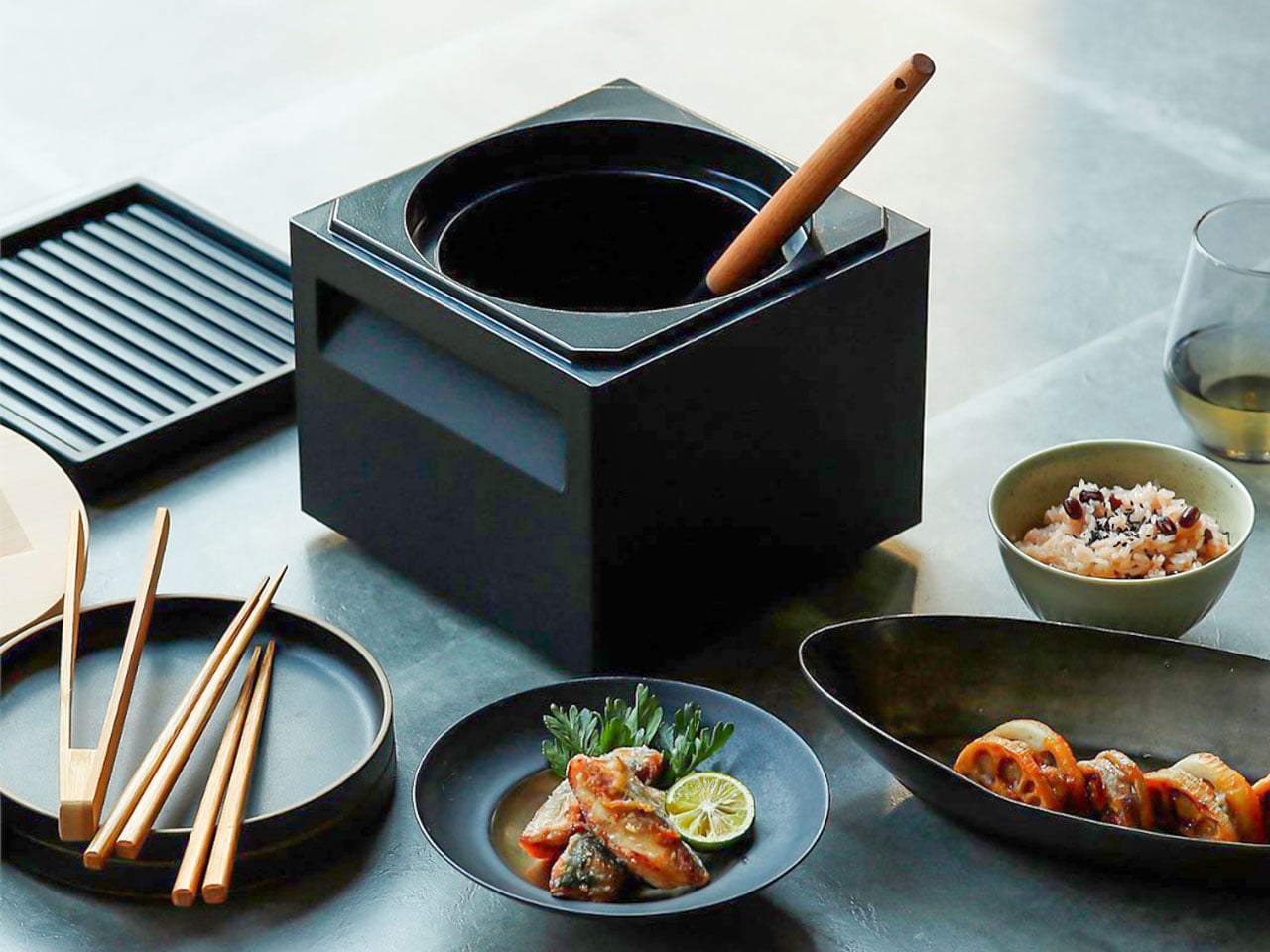
Carbon graphite isn’t a material you encounter in the kitchen, which is precisely what makes the ANAORI Kakugama so compelling. Crafted from solid carbon graphite, this Japanese cooking vessel carries a physical and conceptual weight that coated pans simply can’t match. Its matte black surface distributes heat with uncommon efficiency, significantly reducing the risk of scorching while preserving the natural flavors and nutrients of whatever is being prepared. This is cookware that approaches food with genuine respect.

The kakugama’s range is quietly impressive. Designed to steam, poach, simmer, grill, and fry, it handles each technique without compromise, making it the kind of piece that earns a permanent position in the kitchen. The fragrant Japanese cypress lid adds something unexpected: as it heats, it releases a subtle, earthy aroma that transforms an ordinary cooking session into something closer to ritual. For the design-conscious cook who values craft as much as performance, this vessel is essentially irreplaceable.

What We Like

  • Carbon graphite construction delivers exceptional, even heat retention across every cooking method
  • The Japanese cypress lid adds a rare aromatic quality to cooking that no synthetic material can replicate

What We Dislike

  • The premium material and craftsmanship place this vessel at a significant price point above conventional cookware
  • Carbon graphite requires more attentive handling and care than standard kitchen materials

2. Obsidian Black Precision Chopstick Tongs

There’s a particular satisfaction in a kitchen tool that commits fully to its concept. Part of the Obsidian Black Kitchen Collection, the Precision Chopstick Tongs take their form directly from traditional Japanese chopsticks and engineer it for the demands of a modern kitchen. Made from SUS821L1 stainless steel, they’re light enough to handle delicate pieces of sushi yet durable enough for daily stovetop use. The result is a utensil that genuinely bridges the line between cooking instrument and tableware.

What sets these tongs apart from anything else in the drawer is the finish. A special metal processing technique ensures the obsidian’s black color resists scratching and peeling, maintaining its appearance through repeated use and washing. They work just as confidently plating sashimi at the table as they do flipping proteins in a pan. That dual-purpose quality is rare, and it’s exactly what earns a piece a permanent place in a kitchen where aesthetics and performance are equally weighted.

Click Here to Buy Now: $25.00

What We Like

  • The obsidian black finish is scratch and peel-resistant, holding its appearance through sustained daily use
  • Designed to function as both a cooking utensil and tableware, bridging the kitchen and dining with a single tool

What We Dislike

  • The chopstick form may require a brief adjustment period for those accustomed to conventional tong grips
  • The precision-focused design is less suited to tasks requiring wide or bulky gripping

3. Samsung Bake Ultra Concept

Concept appliances rarely look this resolved. Designed by Octavio Leon Villareal, the Samsung Bake Ultra approaches the compact electric oven with a formal discipline that separates considered design from merely clever design. Its two-tone composition, a soft gray body anchored by a black glass front, achieves a visual balance that reads as both contemporary and enduring. This isn’t minimalism for its own sake. It’s a deliberate formal decision that allows the Bake Ultra to feel entirely at home in kitchens ranging from industrial-chic to warm and considered.

The rounded edges are doing significant work. By softening what could easily have read as an overly boxy silhouette, Villareal gives the Bake Ultra an approachability that most compact ovens lack entirely. It doesn’t demand attention, but it consistently earns it. In an all-black kitchen where every object contributes to the room’s visual tone, an appliance this compositionally assured is genuinely valuable. The Bake Ultra wasn’t designed just to function. It was designed to belong.

What We Like

  • The two-tone design with black glass front integrates cleanly into an all-black kitchen without disrupting the visual flow
  • Rounded edges give the compact form an approachability that’s rarely achieved in kitchen appliance design

What We Dislike

  • As a concept design, the Bake Ultra is not yet available for consumer purchase
  • The soft gray body, while elegant, slightly departs from a fully committed all-black aesthetic

4. Iron Frying Plate

The Iron Frying Plate operates on a beautifully simple premise: eliminate the plate. Made from 1.6mm-thick mill scale steel, this uncoated, rust-resistant piece of cookware is designed to go from stove to table without interruption. There’s no ceramic coating to chip, no synthetic surface to question, just raw, well-engineered steel that builds character and natural seasoning with every use. The matte black mill scale finish slots into an all-black kitchen without any deliberate effort at all.

Its detachable wooden handle is one of those small design decisions that reveal serious thought about every moment of use. Attach it for cooking, remove it for serving, one-handed, no tools required. That seamless transition from cooking vessel to serving piece is exactly the kind of dual-function thinking that earns a product permanent space in a curated kitchen. JIU doesn’t try to be more than it is. It’s a frying plate, and it’s an excellent one.

Click Here to Buy Now: $69.00

What We Like

  • The uncoated mill scale steel surface develops natural seasoning over time, building flavor with every use
  • The one-handed detachable wooden handle enables a smooth transition from stovetop cooking directly to table service

What We Dislike

  • An uncoated steel surface requires regular seasoning and more attentive care than nonstick alternatives
  • The minimal form is best suited to simple preparations rather than sauce-heavy or complex dishes

5. HA1 Expert Hard Anodized Nonstick 10-Piece Set

If the all-black kitchen needs a workhorse, the All-Clad HA1 Expert set fills that role without compromise. Ten pieces of hard anodized, scratch-resistant nonstick cookware finished in a deep, uniform black that holds up to both heavy daily use and visual scrutiny. The anodized aluminum construction is reinforced with a stainless-steel base, delivering warp resistance and the kind of even, consistent heat distribution that makes routine cooking genuinely more reliable. This is a set built for people who cook seriously and care deeply about how their kitchen looks.

The range covers everything a fully functioning kitchen demands: two fry pans, two saucepans, a sauté pan, and a stockpot, each paired with a matching lid. Oven-safe to 500°F and induction-compatible, very little is left unaddressed. Double-riveted stainless steel handles hold securely through extended use, while tempered glass lids allow for monitoring without lifting. As a complete, coherent system in black, this set reads less like a collection of pots and more like an intentional design decision.

What We Like

  • Hard-anodized, scratch-resistant construction paired with long-lasting PTFE nonstick delivers durable, professional-grade performance
  • Fully induction compatible and oven safe to 500°F, covering virtually every cooking scenario without exception

What We Dislike

  • Glass lids are only oven safe to 350°F, considerably lower than the pans themselves
  • PTFE nonstick requires careful utensil choice and hand washing to preserve its surface longevity

6. Precision Chef Kitchen Scissors

Kitchen scissors rarely receive the design attention they deserve. The Precision Chef Kitchen Scissors are a deliberate exception. The oxidation-colored black finish isn’t cosmetic; it’s a durable surface treatment that resists deterioration, holding its appearance through years of regular use. The curved serrated blade is engineered specifically for cutting meat, reducing effort while improving both control and safety. In a kitchen where every object is chosen with intention, a pair of scissors is considered a meaningful detail that most kitchens quietly overlook.

The ergonomic structure goes beyond grip comfort. When laid flat, the blade is designed to avoid contact with the counter surface, a small but precise detail that speaks to the level of thought invested in this tool. Cutting through steaks, portioning pizza, or trimming vegetables, these scissors approach each task with the same quiet authority that an all-black kitchen demands. They are scissors genuinely designed to be seen as well as used, and they meet that standard on both counts.

Click Here to Buy Now: $95.00

What We Like

  • Oxidation coloring creates a durable black finish that resists fading and surface deterioration through sustained use
  • The curved serrated blade is purpose-engineered for meat cutting, improving control and reducing the effort required

What We Dislike

  • The specialized curved blade may feel less versatile for tasks that go beyond protein and general food prep
  • Ergonomic scissors with complex geometry can be more difficult to sharpen at home than straight-bladed alternatives

7. Melrose Pendant Light

Lighting in an all-black kitchen isn’t merely functional; it’s structural. The Steel Lighting Co. Melrose pendant operates as both. The 18-inch industrial dome in matte black is proportioned specifically for kitchen island use, casting a wide, even wash of light across the work surface below. American-made and UL-approved for both indoor and outdoor installation, this is a pendant built to perform as well as it looks. At 300 watts, it carries the capacity to anchor a kitchen island with genuine visual authority.

What makes the Melrose particularly thoughtful is its configurable interior. Available in white, matte black, or brass, the interior color shapes both the quality of reflected light and the overall tone of the fixture without altering its profile. In a black kitchen, a brass interior introduces a warm, considered counterpoint that prevents the space from reading as flat or one-dimensional. The matte black exterior remains constant throughout: commanding, clean, and entirely at home in a kitchen built around the same commitment to the color.

What We Like

  • Configurable interior color options in white, matte black, or brass allow for subtle tonal customization within a consistent exterior
  • American-made with indoor and outdoor UL approval, signaling a meaningful commitment to build quality and longevity

What We Dislike

  • At 12 pounds, installation may require additional structural consideration, depending on the ceiling construction
  • The industrial farmhouse silhouette may not suit kitchens with a strictly contemporary or ultra-minimal design direction

8. Fellow Stagg EKG Pro Electric Pour-Over Kettle

The Fellow Stagg EKG Pro is the kind of object that reframes where coffee fits in the morning. Its signature gooseneck spout delivers precise control over flow rate and stream consistency, the kind of control that produces a measurable difference in pour-over extraction. To the degree, temperature control heats and holds water exactly as programmed, while a high-resolution color display allows complete customization of brewing schedules, altitude adjustments, and temperature units. This is a kettle engineered with the seriousness typically reserved for professional brewing equipment.

The EKG Pro’s WiFi connectivity and scheduling capabilities are where it shifts from impressive to genuinely integrated into daily life. Program brewing schedules that adapt to your routine so the kettle is ready precisely when you are, no preheating, no guesswork. The sleek industrial design holds its own on a countertop alongside thoughtfully chosen cookware and tools. The hold function maintains brewing temperature for extended periods without wasting energy. In an all-black kitchen, this kettle earns its visible place every single morning.

What We Like

  • To-the-degree temperature control, combined with a gooseneck spout, delivers precision that measurably improves pour-over coffee quality
  • WiFi connectivity and programmable scheduling mean the kettle is ready exactly when needed, without any manual preheating

What We Dislike

  • Advanced features like WiFi and the color display come at a price point that significantly exceeds basic kettle alternatives
  • The gooseneck form is optimized for pour-over brewing and is less suited to general-purpose boiling tasks

The Kitchen Finally Got the Design Treatment It Deserved

The all-black kitchen doesn’t ask for compromise. Every product here demonstrates that designing in black means choosing objects with a strong point of view, ones crafted carefully, finished deliberately, and considered at every stage. The color is what makes the curation visible. It’s a shared language between objects that have little else in common except that they were each made to last, made to perform, and made to matter in the space they occupy.

What’s striking about 2026’s black kitchen movement is how completely it spans every category. Cookware, utensils, lighting, kettles: the commitment runs through the entire room. When each element carries the same visual weight, a kitchen stops being a collection of appliances and tools and becomes a genuinely designed space. That’s the standard these eight products are held to, and without exception, it’s the standard each one meets.

The post The All-Black Kitchen Is 2026’s Hottest Design Trend — Here Are 8 Products That Nail It first appeared on Yanko Design.

  • ✇Yanko Design
  • 8 Best Desk Gadgets Every Digital Nomad Quietly Keeps in Their Bag & Finally Deserves a Permanent Home
    Most desk setups are inherited. The nomad’s is earned. Everything that makes it into the bag has already passed a strict and largely unconscious test — weight, versatility, the ability to make a stranger’s table feel like a place worth working from. Over months and years of moving between cities, time zones, and co-working spaces, the digital nomad ends up with a carefully curated set of tools that are small by necessity but thoughtful by design. The interesting thing about these objects is wha
     

8 Best Desk Gadgets Every Digital Nomad Quietly Keeps in Their Bag & Finally Deserves a Permanent Home

1 avril 2026 à 07:40

Most desk setups are inherited. The nomad’s is earned. Everything that makes it into the bag has already passed a strict and largely unconscious test — weight, versatility, the ability to make a stranger’s table feel like a place worth working from. Over months and years of moving between cities, time zones, and co-working spaces, the digital nomad ends up with a carefully curated set of tools that are small by necessity but thoughtful by design.

The interesting thing about these objects is what happens when the travel slows down. When a lease gets signed, a proper desk arrives, and the bag starts being unpacked with more intention. The tools that survived the road do not lose their relevance on a permanent surface. Many of them were built with the kind of considered design that rewards exactly this kind of scrutiny. They look better than most things bought specifically for a home office, hold up longer, and carry the kind of personal history that makes a workspace feel genuinely inhabited. This is for that moment. Eight objects that lived in the bag for a reason, and deserve a permanent home for the same one.

1. OrigamiSwift Folding Mouse

The OrigamiSwift is what happens when industrial design takes portability seriously. Weighing just 40 grams and folding flat to a profile thin enough to slip between notebook pages, it removes the usual tension between compact and comfortable. On a desk, it unfolds in under half a second, snapping into a full-sized ergonomic shape that sits naturally in the hand. For anyone who has suffered through the cramped mechanics of a standard travel mouse, this feels like a genuine upgrade.

The Bluetooth connectivity is quick, and the origami-inspired fold keeps the mechanism tactile enough that using it becomes a small ritual rather than a chore. At the desk, it earns a permanent spot not because it compensates for a lack of options, but because the transformation itself is satisfying. It is the kind of tool that makes you reconsider how you work, and then makes the work feel slightly more considered. Portable by design, permanent by choice.

Click Here to Buy Now: $85.00

What we like

  • Folds to near-invisible thinness at just 4.5mm, making it one of the most carry-friendly mice ever built without compromising on ergonomic full-size comfort
  • Activates in under half a second with a single flip, making the transition from travel bag to working mouse feel immediate and effortless

What we dislike

  • At 40 grams, the lightweight build may feel insubstantial for users accustomed to the heft and resistance of a traditional full-sized mouse
  • Bluetooth-only connectivity means no wired fallback for tasks where even minor wireless latency becomes a frustration

2. Fidget Cube

The Fidget Cube arrived at a time when open-plan offices made visible restlessness a liability and invisible anxiety a norm. Antsy Labs built something straightforward in response: a small cube with six distinct tactile surfaces, each mapped to a different kind of fidget. Click. Glide. Flip. Breathe. Roll. Spin. The vocabulary is simple, the execution is precise, and the result is a desk object that earns its keep without demanding attention from anyone but you.

For digital nomads who have spent years suppressing the impulse to tap or spin something through a long layover or tense client call, the Fidget Cube offers quiet permission. On a permanent desk, it sits within reach without asking for attention. The black and graphite colorways blend cleanly into most setups, looking less like a toy and more like a considered detail. It is not a gimmick. It is self-awareness shaped into an object.

What we like

  • Six distinct tactile surfaces cover a wide range of fidgeting behaviors in a single pocket-sized cube, making it genuinely versatile across different stress responses and focus modes
  • Discreet colorways like Midnight Black and Graphite blend seamlessly into professional setups without drawing unwanted attention in shared or client-facing workspaces

What we dislike

  • The clicking surfaces can produce audible sounds that may distract colleagues in quiet, open-plan, or library-style work environments
  • The cube format offers no digital or productivity-tracking integration for users who want data on their focus habits or stress patterns

3. Nothing Power (1) Battery Bank

Nothing built its reputation on the Glyph interface, a grid of LED lights that turned the back of a phone into a notification display and a design statement. The Power (1) carries that language into a battery bank, using transparent layers, bold light paths, and illuminated interactions to make a utilitarian object feel worth looking at. The design philosophy is direct: good design is not just about appearance, it is about how an object makes you feel when you reach for it.

For a nomad who has charged devices from airport benches and café stools, a power bank is rarely a display piece. The Nothing Power (1) challenges that. Sitting on a desk, the Glyph illumination gives charging status a visual presence that feels more like an ambient display than a simple indicator light. It treats the desk as a stage and every object on it as a conscious choice. Few battery banks have ever earned that kind of consideration.

What we like

  • The Glyph interface turns a charging indicator into a visual experience, making it arguably the only power bank designed to look genuinely intentional, sitting on a desk permanently
  • Transparent design layers reflect Nothing’s ethos of honest, open construction, giving the object a premium quality that stands apart from every other battery bank on the market

What we dislike

  • The Nothing Power (1) is currently a concept design and is not yet available as a finished commercial product
  • Exact battery capacity, output wattage, and pricing remain unconfirmed, making direct comparison with available alternatives difficult at this stage

4. HubKey Gen2

Desk clutter tends to accumulate in layers: a dock for the monitor, an adapter for the second screen, a hub for storage. Somewhere between them sits a tangle of cables that each solves a single problem in isolation. The HubKey Gen2 treats that as a design problem worth solving from the inside out. It is an 11-in-1 USB-C hub with a hardware control surface on top, offering programmable shortcut keys, a central dial, 100W power delivery, and 2.5Gbps Ethernet in a compact cube footprint.

The display support is what separates it from a standard hub. Two HDMI ports, each running a 4K display at 60Hz, mean a laptop becomes a proper dual-monitor workstation without extra adapters. For a nomad settling in, that shift from single-screen café work to a dual-screen editing setup is significant. The shortcut keys and central dial bring a physical control layer to software-heavy workflows, keeping hands on the desk rather than hunting through menus on a trackpad.

What we like

  • Dual 4K HDMI outputs at 60Hz eliminate the need for a separate display dock when transitioning from a travel setup to a full home workstation
  • The programmable shortcut keys and central knob return a satisfying physical dimension to digital workflows, reducing time spent navigating software menus

What we dislike

  • The compact cube form factor may feel crowded once all 11 ports are simultaneously in active use, which limits clean cable management around the unit
  • Fully customizing the shortcut keys requires additional software configuration, adding a setup investment before the productivity benefit becomes fully apparent

5. Rolling World Clock

Keeping track of time zones is one of the quieter friction points of nomadic life. The Rolling World Clock solves it most physically: you roll it. A 12-sided form with each face representing a major timezone city, a single hand reads the local time wherever it lands. London. Tokyo. New York. The gesture is intuitive, and the result is a genuinely useful desk object without trying to be more.

Available in black and white, this is the kind of object that earns its place through curiosity rather than scale. Guests pick it up. Colleagues ask about it. It turns a functional necessity into a small conversation. For the nomad who has lived across time zones and built relationships across continents, there is something quietly satisfying about having those cities represented not on a screen, but held in your hand.

Click Here to Buy Now: $49.00

What we like

  • The tactile rolling interaction makes checking international time a deliberate, physical gesture rather than a reflexive phone unlock
  • Covers 12 major timezone cities in a clean, minimalist form that works equally well as a functional desk piece or a shelf object

What we dislike

  • Limited to 12 preset cities, which may not include every timezone relevant to users with contacts in less commonly represented regions
  • The single analog hand offers general time orientation rather than precise minute-level accuracy, which may not suit users with tight cross-timezone scheduling needs

6. Orbitkey Desk Mat Slim

A desk mat either disappears into the background or it becomes the visual anchor of the entire setup. The Orbitkey Desk Mat Slim is built for the second outcome, designed with the restraint of the first. Made from premium vegan leather on top and 100% recycled PET felt underneath, it layers material integrity with practical function. The anti-slip backing holds the mat planted, while the magnetic cable holder keeps wires from drifting toward the edges, where they become a distraction.

Notes, receipts, and napkin sketches are the inevitable artifacts of nomadic work, and they tend to pile up without a clear home. The document hideaway is the detail that tips this mat from surface to organizer. The slim front pocket keeps loose papers horizontal, accessible, and out of sight. For someone accustomed to a shared café counter or a hotel tray table, this level of surface order feels less like a feature and more like a quiet exhale.

What we like

  • The document hideaway pocket reduces visible desk clutter without adding bulk, making it one of the more intelligent storage details found on any desk mat
  • Vegan leather and recycled PET felt construction deliver both a refined visual quality and a material responsibility that most desk accessories still lack

What we dislike

  • The slim format may feel too narrow for users with wide multi-monitor setups who need significant horizontal coverage across their full desk surface
  • The magnetic cable holder works best with a small number of cables and may become less effective in more heavily wired configurations

7. Flow Timer

The Pomodoro method has been around since the late 1980s, and most people who use it rely on a phone timer or a browser tab. Neither is ideal. The Flow Timer replaces that with something solid. Cast in metal, with dual customizable presets for focus and break intervals, it lives on the desk as a functional timer and an object of intention. The visual arc tells you where you are in the session without a notification or a screen unlock.

For nomads who have long been their own productivity managers, a physical timer brings a different quality of commitment than a screen-based one. The act of setting it is deliberate. The focus-to-break transition is automatic. Sitting in a permanent spot, it becomes a small anchor for the rhythm of the day. Available in three colorways, the Flow Timer is one of those rare accessories that improves both how you work and how the desk looks while you do it.

What we like

  • Automatic switching between focus and break intervals removes the friction of resetting a timer mid-session, keeping the workflow continuous and uninterrupted
  • Solid metal construction and three considered colorways make it an aesthetic desk object as much as a productivity tool

What we dislike

  • The absence of a digital display means reading the visual arc requires a brief adjustment period before the feedback becomes truly instinctive
  • As a dedicated single-function device, it competes for surface space against multi-purpose tools in more minimal or compact desk setups

8. Memento Business Card Log

There is a specific quality to the business cards that collect at the bottom of a travel bag. Each one marks a moment, a conversation, a person worth remembering. The Memento Business Card Log was made for exactly this. Designed by Re+g, a Japanese brand with roots in thoughtful stationery craft, it holds up to 120 cards with a dedicated handwriting space beside each one for a characteristic, a date, or a detail that brings the memory back clearly.

The two-point slit system keeps cards secure without sleeves or adhesive, and the special binding allows pages to be easily reordered as professional relationships evolve. For a nomad building a network across cities and industries, this is the kind of object that earns its desk placement not through technology but through intention. It is a record of everywhere you have been and everyone who mattered enough to keep. That is rare, and the design knows it.

Click Here to Buy Now: $35.00

What we like

  • The two-point slit system and reorderable binding make the organization genuinely flexible, allowing the log to grow and shift alongside a professional network over time
  • Handwritten note spaces beside each card transform a simple storage product into a meaningful personal archive of the conversations that shaped a career on the road

What we dislike

  • A maximum of 120 cards may feel limiting for high-volume networkers who accumulate contacts rapidly across multiple cities, conferences, and industries
  • The analog format, while entirely intentional, offers no digital sync or search capability for users who need to cross-reference contacts across devices

These Gadgets Were Never Just for the Bag

There is a moment in every nomad’s life when the bag starts feeling less like freedom and more like a deadline. When the tools that carried you through airports and co-working spaces deserve something more settled. These eight objects were always portable by design, but built with the kind of intention that reads just as well on a permanent desk. Good design does not ask where it is. It just works.

The idea here is not to stop moving. It is to stop treating permanence as a downgrade. A folding mouse, a tactile timer, a rolling clock, a mat that holds your cables and your notes — taken together, they form a desk that feels chosen rather than assembled. The nomad who gives these a home is not giving anything up. They are just finally working somewhere worthy of the tools they already carry.

The post 8 Best Desk Gadgets Every Digital Nomad Quietly Keeps in Their Bag & Finally Deserves a Permanent Home first appeared on Yanko Design.

  • ✇Yanko Design
  • Apple Turns 50, and Its Most Ambitious Phone Hasn’t Even Launched Yet — 5 iPhone Fold Concepts
    On April 1st, 2026, Apple turns 50. For a company that has spent half a century rewriting the rules of consumer technology, the milestone deserves something genuinely transformative. The Macintosh redefined personal computing. The iPod gave an entire generation a new relationship with music. The original iPhone, unveiled in 2007, combined a phone, a music player, and the internet into a single glass rectangle and made every competitor look outdated overnight. The iPhone Fold is real, and it’s c
     

Apple Turns 50, and Its Most Ambitious Phone Hasn’t Even Launched Yet — 5 iPhone Fold Concepts

31 mars 2026 à 21:45

On April 1st, 2026, Apple turns 50. For a company that has spent half a century rewriting the rules of consumer technology, the milestone deserves something genuinely transformative. The Macintosh redefined personal computing. The iPod gave an entire generation a new relationship with music. The original iPhone, unveiled in 2007, combined a phone, a music player, and the internet into a single glass rectangle and made every competitor look outdated overnight. The iPhone Fold is real, and it’s coming.

Leaks from early 2026 paint a detailed picture: a book-style foldable powered by the A20 Pro chip on a 2nm process, backed by a 5,500mAh battery, with a 7.8-inch creaseless OLED inner display and a 5.5-inch outer screen. Pricing is expected to start around $2,400, and while a September announcement seems likely, most analysts believe shipments may not begin until December. Designers, modders, and concept artists have spent years filling the void with their own visions of a folding iPhone, each carrying a distinct theory about what Apple should prioritize. These five concepts map the full range of that imagination and capture exactly how much is riding on the real thing.

1. iPhone iFold by Michal Dufka — The Clamshell That Makes Sense

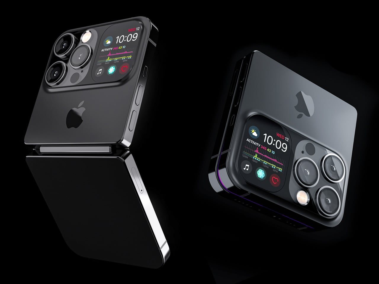
Designer Michal Dufka’s iPhone iFold is built on restraint. Rather than reinventing the iPhone’s entire identity, it applies a clamshell fold to the form factor people already love, drawing direct inspiration from the MotoRAZR and Samsung Galaxy Z Flip. The phone closes into a compact, pocketable square and opens into a full iPhone experience with a generously large display. For anyone who has quietly missed a phone that actually fits in a jeans pocket, this concept speaks to that feeling.

What sets the iFold apart is the secondary display placed beside the camera bump. When the phone is closed, that smaller screen surfaces notifications, time, and essential stats without requiring you to open the device at all. It functions almost like an Apple Watch built into the back of the phone. With Apple’s always-on display technology mature enough for this kind of ambient use, the dual-display setup feels less like speculation and more like a logical next step.

What We Like

  • The secondary display mirrors Apple Watch notification behavior, making glanceable information genuinely useful without ever opening the phone
  • The clamshell format makes the iPhone pocket-friendly for the first time in years without sacrificing screen size when it matters

What We Dislike

  • The clamshell form limits overall screen real estate compared to the expanded tablet surface that a book-style foldable provides
  • Hinge durability over sustained daily use is entirely unexplored here, and it remains the most critical engineering question for any clamshell design

2. iPhone Fold Ultra by 4RMD — When the Specs Match the Ambition

Design studio 4RMD’s iPhone Fold Ultra is grounded in credibility. Built directly from reported leaks rather than pure creative license, the concept presents a book-style foldable with dual 48MP rear cameras, a 24MP ultra-wide front camera, and the A20 Pro chip running on a 2nm process. Three color options appear across the renders: White, Black, and Deep Purple. At an estimated $2,299, this concept sits at the very top of Apple’s lineup with total conviction.

That Deep Purple colorway deserves its own moment. It is a deliberate callback to the iPhone 14 Pro’s most celebrated finish, and it lands differently on a book-style foldable. Something about that color on a device this ambitious reads as genuinely luxurious, the kind of finish that reframes a $2,299 price tag from a shock into a statement. 4RMD clearly understands Apple’s visual grammar, and this concept shows what happens when research and aesthetics share the same design space.

What We Like

  • Specs pulled from verified leaks give this concept real credibility, making it feel like a preview of what is actually coming rather than pure speculation
  • The Deep Purple colorway is a smart, crowd-pleasing callback to one of Apple’s most recognized and beloved finishes

What We Dislike

  • The “Ultra” label sets an expectation that demands exceptional build quality, and no concept can fully address whether the real device will deliver on that promise
  • Crease visibility across the inner display remains unaddressed, which continues to be the most persistent criticism of every book-style foldable on the market

3. iPhone Fold by Svyatoslav Alexandrov — The One That Replaces Two Devices

Svyatoslav Alexandrov’s iPhone Fold concept, created for the YouTube channel ConceptsiPhone, thinks in bigger terms than anything else on this list. Starting as a standard smartphone with a 6.3-inch outer display, it unfolds into a squarish 8-inch tablet that sits clearly in iPad Mini territory. This is not a phone with a bonus screen bolted on. It is a device designed to make carrying both an iPhone and an iPad feel genuinely redundant.

Alexandrov replaces Face ID with a full-display Touch ID fingerprint sensor, keeping the front notch minimal and clean. The rear carries the iPhone 12 Pro’s complete camera array: wide, ultra-wide, telephoto lenses, a LiDAR scanner, and flash. MagSafe compatibility and 5G readiness are already confirmed in the concept, adding meaningful weight to its productivity pitch. Whether the device supports the Apple Pencil is left open, but given an 8-inch inner display, its absence would feel like a missed opportunity.

What We Like

  • The full-display Touch ID is a clean and creative solution that keeps the front uncluttered while solving Face ID’s known complications on foldable form factors
  • The iPad Mini-sized inner screen makes a practical, real-world case for consolidating two devices into one without any meaningful compromise

What We Dislike

  • Removing Face ID eliminates one of the iPhone’s most seamless and trusted authentication features, which most users rely on dozens of times every day
  • Leaving Apple Pencil support unconfirmed weakens what should naturally be this concept’s strongest argument for productivity

4. iPhone Fold by Mechanical Pixel — The Foldable That Doesn’t Actually Fold

Mechanical Pixel’s concept takes the most unconventional approach on this list, and the reasoning is worth understanding. Rather than bending the iPhone itself, the design keeps the main body completely rigid and attaches a separate foldable display to the rear panel instead. The core phone experience remains exactly as people know it, maintaining the familiar dimensions and feel that iPhone users already rely on. That additional screen only enters the picture when a larger surface is specifically needed.

That rear foldable panel sits raised on a platform above the phone’s back, unfolding outward into a larger, squarish tablet surface when required. The layered profile is clearly visible from the side, giving the device a deliberately experimental and modular quality. The camera module remains in its standard position, completely unaffected by the additional display layer. The logic is unconventional, but the core argument of preserving the primary iPhone experience from any foldable compromise is genuinely hard to dismiss.

What We Like

  • Keeping the main body rigid entirely sidesteps the crease and long-term hinge durability problems that define every conventional foldable on the market today
  • The modular approach means the everyday iPhone experience is never degraded or compromised by the mechanics of the foldable element

What We Dislike

  • The raised rear platform creates an unrefined, layered side profile that sits well outside anything Apple’s design language has ever produced or endorsed
  • The prototype-like aesthetic makes it very difficult to imagine this direction surviving Apple’s notoriously demanding and detail-oriented product design process

5. iPhone V — The One Someone Actually Built

Every concept on this list exists as a digital render. The iPhone V is different. A YouTuber modder physically dismantled an iPhone X, extracted its internal components, and rebuilt the entire device inside a Motorola Razr chassis. The result is a working, folding iPhone that runs real iOS, carries a Retina-quality display, and folds in half like a classic flip phone. As a proof of concept, it is extraordinary. As a finished product, every question comes flooding in.

What makes the iPhone V genuinely compelling is not fit, finish, or polish, because it has none in any conventional sense. It is the straightforward fact that someone cared enough to prove the idea could actually work using parts that already exist. The folding mechanism and device thickness still need serious refinement. A working clamshell iPhone running authentic iOS is, in the end, a more persuasive argument for this form factor than any polished render has managed to be.

What We Like

  • The iPhone V is the only entry on this list that is fully functional, running real iOS inside an actual working clamshell device
  • Its physical existence proves the clamshell iPhone concept is viable using genuine Apple hardware, well beyond anything a render can demonstrate

What We Dislike

  • The repurposed Motorola Razr chassis produces a build that falls far short of consumer-grade fit, finish, and structural refinement
  • Hinge mechanism quality and overall device thickness remain significant engineering challenges that the mod cannot resolve, and they are exactly what Apple needs to solve

The Concepts That Made the Wait Worthwhile

Fifty years in, Apple is still the company that makes you wait. The iPhone Fold concepts here are not just exercises in creative imagination — they are a record of what designers and makers have been asking for, year after year. Some nailed the form factor. Others got the specs exactly right. A few did both. Together, they have shaped the entire conversation around a device that already feels utterly inevitable.

When the real iPhone Fold arrives, it will be measured against each of these visions. That is the power of concept design — it sets the bar before the product ships. Apple turning 50 while holding back its most ambitious device is pure theater. The design community has been writing this script for years. The only question is whether the real thing can live up to what the imagination has already built.

The post Apple Turns 50, and Its Most Ambitious Phone Hasn’t Even Launched Yet — 5 iPhone Fold Concepts first appeared on Yanko Design.

  • ✇Yanko Design
  • 7 Handheld Gaming PCs That Actually Look Like the Future — Not a Fisher-Price Toy
    The handheld gaming PC market has a design problem. For every device that earns a second look, there are three more that look like they escaped from a toy aisle — chunky plastic grips, aggressive LED halos, fonts borrowed from energy drink cans. It adds up to a category that has historically rewarded specs over sensibility, power over the kind of quiet confidence that makes an object worth owning. That’s starting to change. A new wave of devices is rethinking what portable gaming hardware shoul
     

7 Handheld Gaming PCs That Actually Look Like the Future — Not a Fisher-Price Toy

26 mars 2026 à 07:40

The handheld gaming PC market has a design problem. For every device that earns a second look, there are three more that look like they escaped from a toy aisle — chunky plastic grips, aggressive LED halos, fonts borrowed from energy drink cans. It adds up to a category that has historically rewarded specs over sensibility, power over the kind of quiet confidence that makes an object worth owning.

That’s starting to change. A new wave of devices is rethinking what portable gaming hardware should look and feel like: objects you’d carry without embarrassment, leave on a clean desk, or hand to someone who doesn’t play games, so they can appreciate the craft before they’ve touched a button. Some of these seven handhelds earn their place through industrial restraint. Others earn it through engineering honesty — upgradeability, connectivity, or a refusal to treat the buyer as someone who only needs to be impressed in the first five minutes. What they all share is an understanding that good design is a feature, not a finish.

1. AYANEO 3

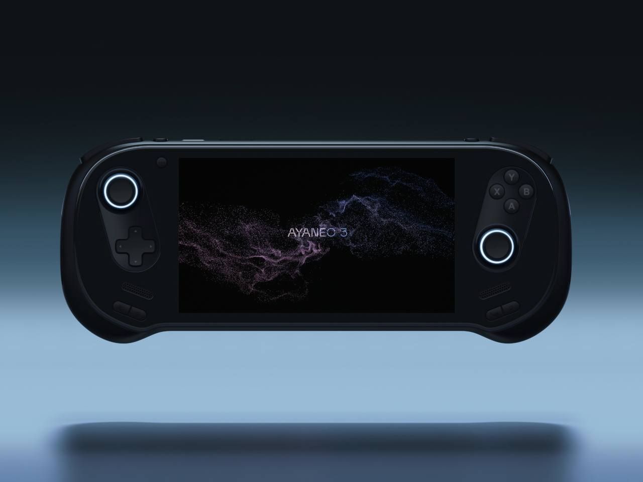
The curves are the story. AYANEO’s third flagship iteration takes a category that has historically prioritized power over personality and gives it something more interesting: softness. The smooth, pleasing curves on the AYANEO 3 extend beyond the ergonomic grip area on the back to the corners of the device itself, rounding off every edge that might otherwise make the hardware feel aggressive or alienating. It is a small visual distinction that makes an enormous tonal difference. The result is a device that looks like it was designed for people rather than exclusively for the kind of person who already knows what a TDP setting is and can tell you why it matters.

The diagonal orientation of the analog joysticks and D-Pad mirrors the Xbox controller arrangement, which is one of those invisible ergonomic improvements you only register when a device gets it wrong. The larger back buttons are a genuine upgrade in theory, giving players more surface area to work with during extended sessions. Their positioning, though, introduces the real possibility of accidental presses during intense gameplay. This trade-off will feel familiar to anyone who has tried to improve on a layout that was already functional. The AYANEO 3 makes the strongest argument for design as a feature in its own right. Whether that argument is worth the price is the question you’ll be asking yourself after you pick it up for the first time.

What We Like:

  • Rounded, curve-forward chassis makes it the most approachable-looking handheld in its category
  • Diagonal joystick and button orientation mirrors Xbox ergonomics for more natural long-session play

What We Dislike:

  • Back button placement may result in accidental presses during fast-paced gameplay
  • Softened design language may not satisfy players who want their hardware to read as purposeful and performance-oriented

2. Acer Nitro Blaze 7

Acer enters the handheld arena with something the market actually needed: a device that solves Windows gaming’s most persistent pain point before you even load your first title. The AMD Ryzen 7 8840HS packs 39 AI TOPS, placing it on the same performance tier as many AI-powered laptops currently on the market. Paired with the AMD Radeon 780M and 16GB of RAM, the Nitro Blaze 7 arrives as serious hardware in a compact form. The 7-inch 1920×1080 144Hz IPS touchscreen with 100% sRGB color gamut coverage is the kind of display specification that makes comparable handhelds feel like compromises — vibrant and bright enough that even the darkest visual environments read clearly on screen.

What separates the Nitro Blaze 7 from the competition isn’t the chip — it’s the software thinking wrapped around it. The Acer Game Space feature consolidates titles from every platform and source into a single unified library, removing the multi-menu navigation friction that makes Windows gaming handhelds feel like a productivity task compared to SteamOS devices. Touchscreen support lets players interact directly with interface elements rather than routing everything through controller input, which matters more than it sounds when you are three minutes into a launch session and still navigating settings. The dedicated hotkey that drops you straight into your library is a small thing that solves a real and recurring problem, and that is exactly the kind of design thinking this category needs to normalize.

What We Like:

  • Acer Game Space consolidates multi-platform libraries into one interface, fixing Windows gaming’s biggest UX friction point
  • 144Hz IPS display with 100% sRGB delivers premium visual quality for a 7-inch handheld screen

What We Dislike:

  • The IPS panel means the Blaze 7 lacks the contrast depth and blacks of OLED competitors
  • At 7 inches, the display is smaller than the growing number of competitors now shipping with 8-inch screens

3. Steam Deck OLED Limited Edition White

Valve’s limited edition white Steam Deck is the rare hardware release that justifies its price premium through object quality alone. The off-white shell with gray buttons and a single orange power button is a restrained, confident color story that most hardware brands spend years failing to tell. The OLED panel with HDR support already positioned the standard Steam Deck a visual step above the LCD models, and the white chassis makes that contrast even more vivid — display colors read differently against a lighter surround, and the overall effect is closer to a premium consumer electronics object than a gaming peripheral. Valve pairs the device with a matching white carrying case and a microfiber cloth, because they know exactly what that surface will attract daily.

Available only in the 1TB configuration, the limited edition white Steam Deck is not a casual purchase — it is priced above the standard black variant, and that premium is entirely about the colorway rather than any specification difference. Valve has been direct about the potential for further bold color options depending on how this version performs in the market, and the design language of this release suggests they genuinely understand that hardware can carry emotional weight beyond its spec sheet. Their stated commitment to continued software and hardware improvements also changes the calculus on what the purchase represents. You are not buying a device at its peak; you are buying into an object that the people who made it intend to keep improving.

What We Like:

  • The off-white and orange colorway is the most considered visual design statement in the handheld gaming category
  • 1TB OLED configuration with HDR support represents the best display quality available in a handheld gaming PC

What We Dislike:

  • The white shell will show dirt and wear significantly faster than the black variant, demanding frequent cleaning
  • Limited edition pricing premium is cosmetic rather than functional, which makes it a harder case to make to practical buyers

4. MSI Claw 8 AI+

MSI’s second attempt at a handheld gaming PC makes a strong case for listening. The original Claw’s 53Wh battery was one of the most discussed disappointments in gaming hardware, and the Claw 8 AI+ responds with an 80Wh unit that matches the ROG Ally X — immediately removing that criticism from the conversation. The redesigned chassis is more comfortable to hold than the original, which sounds like a modest correction but represents the difference between a product you use and one you tolerate through a session. The 8-inch display at 1080p and 120Hz is the screen you can actually picture using across several hours without fatigue, and the overall hardware package reflects a manufacturer that took its first attempt as useful data rather than a finished result.

The dual Thunderbolt ports are the detail that separates the Claw 8 AI+ from most of its direct competition. In a category where connectivity has generally been an afterthought, Thunderbolt transforms the device into something more versatile than a dedicated gaming handheld. It can drive an external display, connect high-speed peripherals, and function as a desktop replacement when docked — a use case that justifies the form factor for people who travel and need their hardware to earn its carry weight across more than one context. MSI’s continued driver support for the original Claw also signals something about the relationship they want to build with buyers, which matters when you are deciding which ecosystem to invest in for the long term.

What We Like:

  • 80Wh battery resolves the original Claw’s most criticized weakness, matching the ROG Ally X for endurance
  • Dual Thunderbolt ports offer versatility that positions the device beyond pure gaming into broader portable computing

What We Dislike:

  • 1080p resolution on an 8-inch screen sits at the market standard rather than pushing the category forward
  • The redesigned chassis was not available for hands-on evaluation at launch, leaving the real-world grip feel unconfirmed

5. ADATA XPG Nia

The XPG Nia arrives with a design philosophy that most handheld manufacturers have been too conservative to commit to: repairability as a genuine feature. The use of LPCAMM2 memory modules, which are not soldered to the motherboard, makes this one of the very few handheld gaming PCs where upgrading the RAM is a realistic possibility rather than a route to a voided warranty. The M.2 2230 SSD slot handles storage upgrades in the same way, borrowing the kind of upgrade-friendly architecture that better laptops have offered for years. ADATA, better known for its data storage solutions than gaming hardware, brings exactly the right technical background to a product that treats longevity as a design consideration rather than an inconvenience.

This matters more than it sounds in a category that has normalized the idea of buying new hardware every two years because your existing device can’t be updated. Handheld PCs are essentially miniature laptops running laptop-grade hardware with constrained cooling, which has traditionally meant buyers are locked into the specs they purchase on day one. The XPG Nia pushes back against that assumption. It may not carry the brand recognition of Valve or ASUS, but the decision to make memory and storage user-upgradable in a handheld gaming PC is genuinely forward-thinking hardware design. The category is full of devices optimized for the unboxing moment. The XPG Nia is designed for year three.

What We Like:

  • Upgradable RAM via the LPCAMM2 module makes it one of the only handhelds built for long-term ownership
  • Upgradable M.2 2230 SSD slot extends the device’s useful lifespan well beyond its launch-day specifications

What We Dislike:

  • Real-world ease of RAM upgrades remains unproven, as LPCAMM2 is a relatively new memory format
  • ADATA’s identity as a storage brand creates unanswered questions around long-term software support and gaming ecosystem depth

6. GPD Pocket 4

The GPD Pocket 4 does not belong in this list by conventional logic, and that is precisely why it does. There are no joysticks, no D-pad, no face buttons. What it has instead is a compact clamshell form factor built around a full QWERTY keyboard, a small touchpad in the upper right corner designed for right-thumb operation in a two-handed grip, and mouse buttons positioned on the opposing side for the left thumb. The AMD Ryzen AI 9 HX 370 with AMD Radeon 890M graphics, 64GB of RAM, and up to 4TB of upgradable NVMe SSD storage inside this chassis is a genuine statement about what a pocket-sized device can accomplish. It is a handheld PC for the person who refuses to separate productivity from portability.

Where most devices in this roundup are gaming handhelds that can also browse the web, the Pocket 4 is a legitimate laptop replacement that can also play games within certain limits. Content creation, entertainment, productivity, and travel computing are all addressed by hardware that fits in a jacket pocket. The 44.8Wh battery is the honest trade-off — you are carrying a compressed laptop, not an augmented gaming console, and the battery reflects that compromise directly. For the person who travels constantly and wants one device that handles most things well rather than two devices that each do one thing perfectly, the Pocket 4 makes more sense than almost anything else in this roundup. It is the most unusual recommendation here, and the most interesting.

What We Like:

  • Full laptop-grade specifications, including up to 64GB RAM and 4TB upgradable storage in a genuinely pocketable form factor
  • Functions as a true laptop replacement for content creation and productivity without requiring a second device

What We Dislike:

  • No gaming controls confine its gaming capability to keyboard-compatible titles only
  • The 44.8Wh battery is significantly smaller than competitors that prioritize gaming endurance over overall portability

7. ZOTAC ZONE

The ZOTAC ZONE wears its Steam Deck influence openly and then raises the conversation. The OLED display puts it in rare company — most handheld gaming PCs are still shipping IPS panels, and the presence of an OLED screen here is not incidental. The PlayStation-style button layout mirrors Valve’s device directly, setting it apart from the Xbox-influenced arrangement that the rest of the Windows handheld market has effectively standardized around. The built-in kickstand is the detail that reveals the ZONE’s genuine design thinking. It is an obvious feature that a surprising number of handheld PCs have decided to leave out, and its presence changes how the device lives in practice — on a plane tray table, a cafe counter, or a hotel room desk, where you’d rather not hold the thing for two hours straight.

The configurable controls are where the ZONE earns its premium positioning. Two-stage adjustable triggers and programmable dials around each joystick represent the most granular control customization available on any handheld gaming PC currently on the market. It runs more recent hardware than the Steam Deck, inside a chassis that clearly understands what it is trying to be. The steep price is a real barrier, and the ZONE will not make sense for every buyer. For the player who has worked through two or three handheld PCs already and knows precisely what they want from their next one — better controls, better display, a stand, and hardware that will not feel dated inside eighteen months — this is the device that was built with them specifically in mind.

What We Like:

  • Built-in kickstand and OLED display address two genuine gaps in the Steam Deck’s design, both meaningfully improving day-to-day use
  • Two-stage adjustable triggers and programmable joystick dials offer the deepest control customization in the handheld gaming PC category

What We Dislike:

  • Premium pricing places the ZONE significantly above most competing devices, narrowing its realistic audience
  • Strong visual and layout parallels to the Steam Deck make it a difficult upgrade pitch for buyers already in Valve’s ecosystem

The Category Grows Up

The seven devices above represent a category finally learning to want more from itself. Some of them get there through craft — the AYANEO 3’s considered curves, the ZOTAC ZONE’s OLED display and kickstand, the Steam Deck’s limited edition color story. Others earn their place through a harder kind of honesty: the XPG Nia’s upgradable RAM, the GPD Pocket 4’s refusal to be just one thing, the Claw 8 AI+’s willingness to publicly correct its own mistakes.

What unites all seven is a seriousness about the object itself — a sense that the person holding the device deserves hardware that respects their intelligence, their living space, and the money they are spending. The Fisher-Price era of handheld gaming PCs is not entirely over. But these seven devices are making a strong case for what comes after them.

The post 7 Handheld Gaming PCs That Actually Look Like the Future — Not a Fisher-Price Toy first appeared on Yanko Design.

  • ✇Yanko Design
  • The 5 Best Furniture Designs of March 2026
    March brought the kind of furniture that doesn’t need to announce itself. A student chair that shifts between sitting and lounging through physics alone. A coffee table whose legs look like they’re caught mid-step toward the door. A stool that opens from flat with a single press and no tools required. An office system built to reconfigure whenever the day asks for something different. A footstool that handles posture quietly, without making it your problem to manage. What connects these five pi
     

The 5 Best Furniture Designs of March 2026

25 mars 2026 à 07:40

March brought the kind of furniture that doesn’t need to announce itself. A student chair that shifts between sitting and lounging through physics alone. A coffee table whose legs look like they’re caught mid-step toward the door. A stool that opens from flat with a single press and no tools required. An office system built to reconfigure whenever the day asks for something different. A footstool that handles posture quietly, without making it your problem to manage.

What connects these five pieces isn’t a shared material or a shared aesthetic. What connects them is the absence of excess. Each one solves something real, and each one does it without layering on complexity to get there. That kind of restraint is harder to land than it looks. Most furniture design in 2026 is reaching for the new, for the bold, for the statement piece. These five reach for the right answer instead, and find it.

1. Tilt Chair

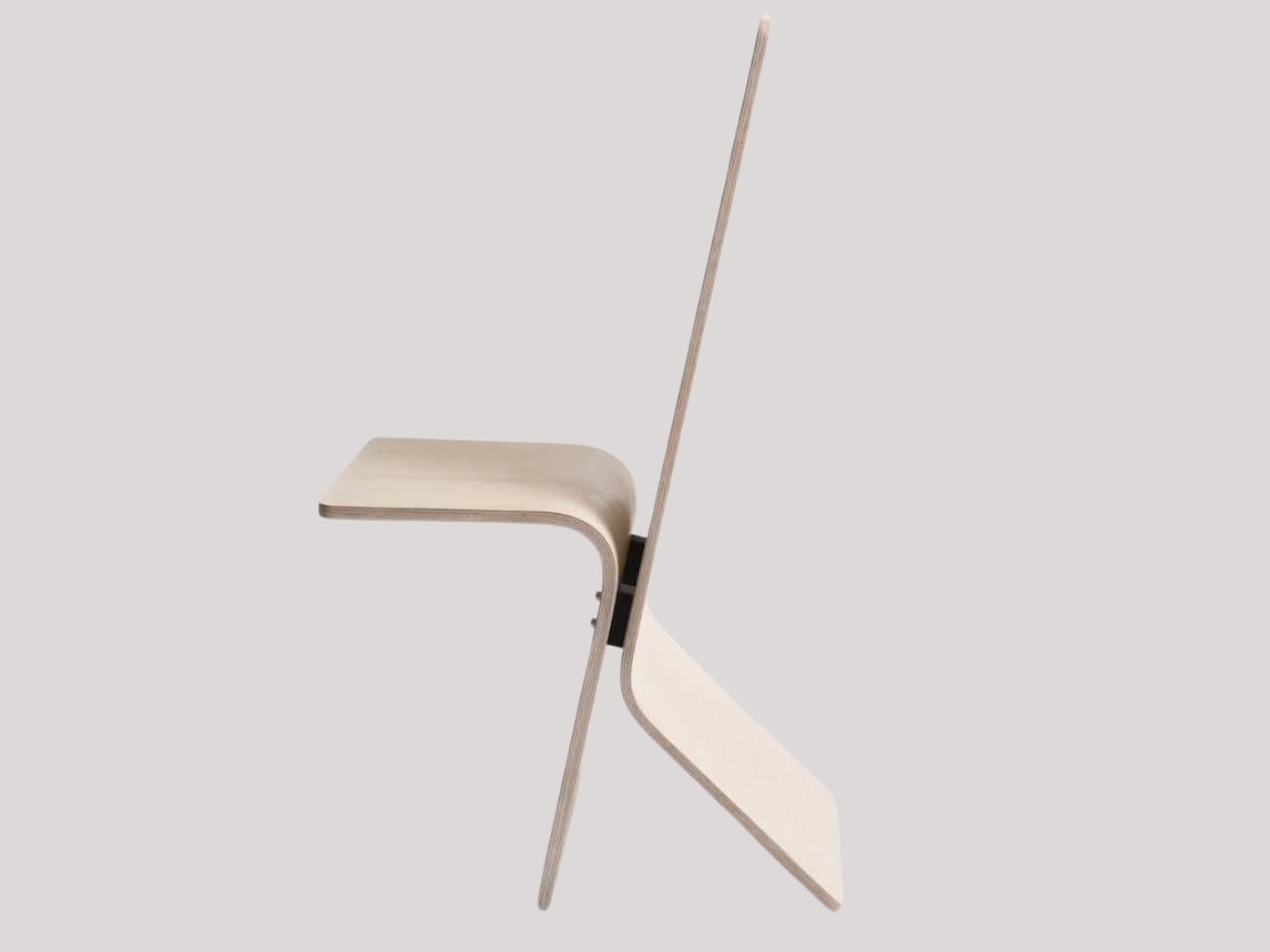
Manuela Hirschfeld is an industrial design student at Germany’s Hochschule Pforzheim, and her Tilt chair does exactly what the name suggests. Built from bent plywood, it shifts between upright and reclined with a single forward tilt. No levers, no hardware, just physics and balance. The restraint here is rare for student work. Most student designs reach for the complex or the speculative. Tilt strips everything back until the idea stands entirely on its own.

What makes it genuinely useful is how naturally it handles the shift between focused work and winding down. Most chairs make you choose one mode and stay there. Tilt lets your body make that call instead. Lean it forward, and the geometry changes. The bent plywood keeps it light and easy to move, so it works as well in a small apartment as it does in a studio or home office.

What We Like

  • No mechanical parts means nothing to replace or service over time
  • Dual function in a single lightweight form, no extra hardware needed

What We Dislike

  • The minimal plywood aesthetic may feel too sparse for warmer, more layered interiors
  • May not offer enough firm back support for users who need a fixed, stable position

2. Barefoot Collection

The Barefoot Collection started with a single image: a coffee table that looks like it’s walking away. The legs are carved from solid wood to simulate the arc and flex of a bare foot mid-step, while the tabletop stays completely flat and rectilinear. Stillness above, motion below. That contrast is the whole point, and it works better than it has any right to. The piece reads as coherent long before it reads as clever.

What you actually get is a coffee table that functions without apology and sparks a real conversation without ever trying to. Set a cup on it and forget the concept entirely. Then a guest walks in, does a double-take, and suddenly the room is talking. Most concept-led furniture exhausts you after a few weeks. Barefoot earns its place by being genuinely useful first and genuinely interesting second. That’s always the right order.

What We Like

  • Solid wood construction gives it real longevity, well beyond its visual appeal
  • Works as a fully functional surface while quietly holding a strong point of view

What We Dislike

  • The sculpted legs make it difficult to pair with more conventional, straight-lined furniture
  • The level of craft involved likely puts it at a higher price point

3. Press Stool

The Press Stool borrows its structural logic from folded paper. A flat sheet has no load-bearing strength, but fold it, and the forces redistribute across the geometry. Crease it further, and the form resists compression. That principle does all the work here. In its flat state, it collapses into a wide oval with a crinkled metallic silver surface that lands somewhere between industrial foil and fabric. One press and it opens. No legs, no bolts, no tools.

For anyone in a small apartment, it solves a storage problem while putting something worth looking at in the room. It ships flat, weighs little, and can slide under a bed or lean against a wall when it isn’t needed. Most fold-flat furniture looks like a compromise. The Press Stool looks intentional. The crinkled surface and gathered folded ends give it a presence that holds up even when it’s closed.

What We Like

  • Ships and stores completely flat, ideal for smaller homes and tight living spaces
  • No assembly required, the folded form does all the structural work

What We Dislike

  • The metallic silver finish is a strong statement that won’t suit every interior palette
  • Load capacity may be more limited compared to stools with conventional structural frames

4. Kylinc Modular Office System

Kylinc treats the workspace like something that should change whenever the day asks it to. Each piece rolls on oversized wheels, which makes reconfiguring your office feel genuinely effortless rather than theoretically possible. Push pieces apart for a collaboration zone, pull them together for focused work. Power management is built directly into the furniture, with smart cable organization that keeps surfaces clean without any additional accessories to track down or manage.

The benefit shows up most for people working from home across a day that never asks the same thing twice. A static configuration works well some of the time and poorly the rest. Kylinc changes that without requiring much effort, which is the real difference between a system that actually gets used and one that stays fixed out of habit. The built-in cables move with the furniture. Your layout becomes something you actually control.

What We Like

  • Oversized wheels make real reconfiguration effortless, not just possible on paper
  • Integrated power and cable management keep the workspace clean without extra accessories

What We Dislike

  • Rolling furniture may feel less stable than fixed pieces for users who prefer an anchored setup
  • A full modular system likely carries a significantly higher upfront cost than standard office furniture

5. OTTO Footstool

OTTO takes its name from the Korean roly-poly toy Ottogi, a round-bottomed figure that always rights itself because of its convex base. Designer Woonghee Ma applied that same logic to a footstool. The convex base means it rocks and shifts as your body moves throughout a long sitting session. No adjustment needed, no settings to configure. You shift weight, the stool moves with you, and that’s the whole mechanism.

For a home office that needs to support you without making a production of it, OTTO is exactly right. Most ergonomic products demand your attention to work. OTTO doesn’t. The passive rocking base handles posture support quietly while you stay focused on everything else. It also looks good, which matters more than it might seem for something you’ll look at every working day. Clean, compact, and entirely unpretentious about what it is.

What We Like

  • Passive rocking base provides ergonomic support through natural weight shifts, no settings required
  • Compact and well-proportioned, it works equally well in home and professional office settings

What We Dislike

  • The rocking motion may feel unfamiliar at first for users accustomed to fixed support
  • May not suit very low seating arrangements where foot elevation isn’t part of the setup

March Didn’t Make a Noise. It Made a Point.

What connects these five pieces isn’t an aesthetic or a material. It’s restraint. A chair that changes mode with one gesture. A table that earns its concept by being useful first. A stool that ships flat and opens in a second. A workspace that adapts without asking for your help. A footstool that supports you without ever drawing your attention to the fact that it’s doing so. That quiet confidence is what good design actually looks like in practice.

Most design coverage this month was busy chasing the big swing. The sculptural statement, the unexpected material, the idea that needs a paragraph of explanation before it lands. What these five pieces share is something quieter. They ask less of you. They make their case by fitting into your life rather than reshaping it around themselves. March didn’t produce the loudest furniture of the year. It produced some of the most considered. That’s always the better result.

The post The 5 Best Furniture Designs of March 2026 first appeared on Yanko Design.

  • ✇Yanko Design
  • 8 Best Desk Accessories for Men That Don’t Look Like They Came From a Corporate Supply Closet
    There’s a version of a desk setup that communicates everything about how little thought went into it. A black mesh organizer from the bottom shelf of a supply closet. A mouse pad that came free with something else. A cable clip in beige. The desk functions, technically, and does so with a level of visual enthusiasm that matches a waiting room. The accessories below were designed by people who thought about this harder. Some carry authentic 1970s Italian design heritage. Some are running AI in t
     

8 Best Desk Accessories for Men That Don’t Look Like They Came From a Corporate Supply Closet

21 mars 2026 à 07:40

There’s a version of a desk setup that communicates everything about how little thought went into it. A black mesh organizer from the bottom shelf of a supply closet. A mouse pad that came free with something else. A cable clip in beige. The desk functions, technically, and does so with a level of visual enthusiasm that matches a waiting room.

The accessories below were designed by people who thought about this harder. Some carry authentic 1970s Italian design heritage. Some are running AI in the background to actively shape your environment. One contains material roughly 20 million years older than the Earth it now rests on. What they share is a quality of intentionality. Each was built as an object worth keeping on a desk, not just stashing in a drawer, because it earns its surface area through how it works, how it looks, or both at once. For men who have graduated from the corporate supply closet aesthetic, these eight represent a meaningfully different set of options.

1. Lenovo AI Workmate Concept

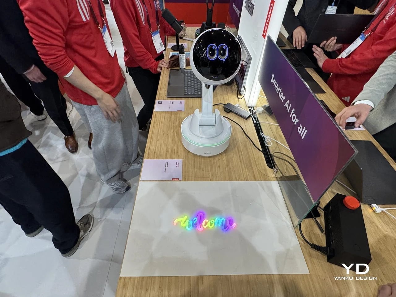
Working alone all day carries a specific kind of friction that most desk setups quietly ignore. Questions accumulate, decisions pile up, and the AI tools meant to support you sit behind a keyboard input that gives nothing back spatially or visually. Lenovo’s AI Workmate Concept, unveiled at MWC 2026, takes that problem seriously enough to build a physical object around it. The result is a desk companion in the most literal sense: a spherical head on an articulated arm mounted on a circular base, with animated eyes on its front display that shift and orient as it processes and responds. The form is compact, the presence is deliberate, and the intent is clear from the first time it moves.

The arm is the most consequential design decision here. Because it moves, the Workmate can orient itself toward whatever holds attention in front of it, a document laid flat on the desk, a person leaning back in their chair, or something happening at the periphery. That range of motion is what separates it from a smart speaker that has been given a screen and called a companion. Spatial awareness is embedded in its posture, not just its software. For men who spend long hours alone at a desk and find text-based AI interaction increasingly impersonal and context-free, the Workmate proposes something more honest about what presence and assistance can look like from an object sharing your workspace.

What We Like

  • Articulated arm gives the device genuine spatial awareness, orienting toward objects and people rather than remaining static
  • Animated eyes on the front display make AI interaction feel more present and less transactional than any screen-based interface

What We Dislike

  • Currently a concept unveiled at MWC 2026, with availability, pricing, and final specs still unconfirmed
  • The novelty of animated eyes may carry more emotional weight than the practical functionality justifies over time

2. Levitating Pen 2.0: Cosmic Meteorite Edition

Most pens sit on a desk and do nothing interesting when they’re not being used. The Levitating Pen 2.0 Cosmic Meteorite Edition refuses that arrangement entirely. It floats at a 23.5-degree angle above its magnetic base, creating a suspension that stops people mid-sentence when they notice it. The design draws from spacecraft aesthetics, specifically the visual language of the USS Enterprise, and the tip incorporates a genuine fragment of Muonionalusta meteorite, a material approximately 20 million years older than the Earth it now rests on. It functions as a working ballpoint pen, which means it is simultaneously a collector’s object, a desk focal point, and a writing tool occupying the same physical form.

What keeps this from reading as pure novelty is how it behaves in your hands. The Levitating Pen is fidget-worthy in the best sense, the kind of object you reach for during a long call or a pause between tasks without consciously planning to. For men who collect objects with a verifiable reason behind them, the meteorite tip offers something most limited editions simply don’t: provenance with a story that doesn’t require a certificate to feel real. You’re holding material from beyond the solar system. That fact changes the weight of the object in your hand when you stop to think about it, and that shift is exactly what separates a desk accessory from a desk object worth keeping.

Click Here to Buy Now: $399.00

What We Like

  • Genuine Muonionalusta meteorite tip connects the pen to a tangible, verifiable piece of cosmic history
  • Magnetic levitation display creates a desk focal point that requires no ongoing maintenance once positioned

What We Dislike

  • The floating display requires a flat, stable surface, limiting where it can sit effectively
  • Limited edition production means restocking after sellout is not guaranteed for future buyers

3. BOB Desk Organizer

Joe Colombo designed BOB in 1970, at a time when desk organizers were either plastic trays with zero intentionality or overengineered systems that looked more complicated than the mess they were supposed to fix. He chose neither direction. BOB is a compact polyurethane gel form, elongated and low-profile, almost pill-shaped when viewed from above, with one end rising into a soft dome and the other tapering nearly flat. B-Line, an Italian label dedicated to reissuing objects from discontinued original molds, brought it back in 2023 across five colorways: terracotta, slate blue, mustard yellow, warm white, and a frosted translucent version called ice. The selection alone suggests a designer thinking about rooms rather than offices.

The top surface divides into three functional zones without any visible partition between them. The dome end opens into a large oval scoop for bulkier items. The center holds a three-by-four grid of individual circular holes, each sized precisely for a single pen or brush. The tapered tail offers two horizontal slot grooves for flat objects like rulers or small notebooks. None of this reads as a feature list in person. It reads as a single continuous gesture that happens to keep things organized along the way. For men who want a desk object with actual design history behind it rather than a branding story retrofitted over generic injection molding, BOB is nearly impossible to improve on.

What We Like

  • Rooted in authentic 1970s Italian design history, reissued from Joe Colombo’s original mold by B-Line
  • Three distinct functional zones are built into one continuous organic form with no visible hardware or dividers

What We Dislike:

  • Polyurethane gel construction may show surface wear or discoloration with extended daily use
  • The low-profile form works best for lighter objects and may not support heavier desk tools effectively

4. DEEP

DEEP operates on a premise most desk lamps don’t bother with: the working environment around you should configure itself to match what you are about to do, rather than waiting for you to adjust it manually. Switch it on with a spinning-top-inspired power button, tell it whether you’re studying, coding, reading, or doing creative work, and it adjusts both light quality and ambient sound before you’ve had to think about either. A camera positioned at eye level monitors your focus state in real time, functioning like a built-in productivity coach without requiring a separate app or a separate device taking up additional surface area.

What separates DEEP from a connected lamp with a smart home feature set is what it does across repeated sessions. The system saves your manual adjustments over time, builds a personal profile from the conditions that consistently work best for you, and begins applying them automatically without being prompted. Side buttons allow precise overrides for days when the default doesn’t fit. For men whose desks have become cluttered with single-function devices that each do one thing adequately, DEEP represents a genuine consolidation. It folds a lamp, an ambient sound environment, and a passive focus monitor into a single object that becomes more attuned to how you work the longer it stays on your desk.

What We Like

  • AI builds a personal focus profile across sessions and applies your optimal working conditions automatically over time
  • Combines lighting, ambient sound, and real-time focus monitoring without requiring any additional hardware

What We Dislike

  • Camera-based focus tracking may feel uncomfortable for users sensitive to passive environmental monitoring
  • Ambient sound adjustment effectiveness varies significantly based on an individual’s working environment and noise tolerance

5. Rolling World Clock

Every desk clock tells you one thing. This one tells you twelve. The Rolling World Clock is a 12-sided object with a single hand and an operation that couldn’t be more direct: set it on any face, and the hand reads the correct local time for the city printed on that side. The twelve cities span the major global time zones, including London, Paris, Cape Town, Moscow, Los Angeles, Karachi, Mexico City, New York, Shanghai, Tokyo, Sydney, and New Caledonia. For men who manage work across multiple time zones or simply have family spread across continents, the mental arithmetic of figuring out what time it is somewhere else is one of the more persistent small irritations in a working day, and this object removes it without adding a screen.

The design decision that makes this worth keeping on a desk rather than just owning is the total absence of anything unnecessary. No digital display. No charging cable. No app. Just a tactile, rollable object you turn to the city you need and set down. Available in black and white, it occupies desk or shelf space without reading as a gadget or demanding attention it hasn’t earned. There’s a quiet pleasure to the interaction that most clocks don’t provide: the act of picking it up, choosing a place in the world, and reading the time. There is a physical engagement with global time that a phone screen never manages to replicate.

Click Here to Buy Now: $49.00

What We Like

  • Covers twelve major time zones in a single tactile object with no digital display, no app, and no charging required
  • Minimal form reads equally well on a desk or shelf without visually registering as a tech accessory

What We Dislike

  • A single clock hand requires slightly more reading attention than a digital display for precise timekeeping
  • The 12-city selection covers major zones well, but may not include every specific time zone a user needs regularly

6. Fidget Cube

The case for keeping a dedicated fidget object on a desk is more rational than it sounds from the outside. Restless hands during long calls, slow-loading processes, or decisions you’re turning over without fully committing to are a real and recurring part of working at a desk, and the Fidget Cube was built precisely for that condition. Six sides offer six different tactile surfaces: a cluster of clickable buttons, a gliding joystick, a row of flip switches, a smooth surface designed for the thumb’s natural breathing motion, a rolling ball set into one face, and a spinning disc. The variety means your hands will find a preferred surface quickly and return to it across the session without thinking about it.

What keeps this from reading as a toy is the restraint built into how it was designed. It doesn’t look out of place on a desk or conference table, particularly in the Midnight black colorway, which sits visually neutral among the standard dark objects that populate most professional environments. For men who have noticed that physical repetitive movement genuinely sharpens how they think through a problem, this is one of the more honest tools available at any price point. It takes a real behavioral truth seriously and gives your hands a quiet, clean way to act on it without disrupting anyone around you or drawing attention to what you’re doing.

What We Like

  • Six distinct tactile surfaces address a wide range of fidgeting habits within one compact, pocketable object
  • Discreet colorways, particularly Midnight black, keep it visually neutral in professional desk environments

What We Dislike

  • Some click mechanisms can produce an audible sound in quiet rooms or during video calls
  • Serves no secondary organizational function on a desk, occupying surface space with a purely tactile purpose

7. MOFT Z Sit-Stand Desk

Sit-stand desks have spent years being expensive, physically large, or permanently locked to a specific room. The MOFT Z takes a completely different approach, collapsing to something closer to a slim notebook in thickness while delivering a full ergonomic range through an origami-inspired Z-structure. It provides one standing mode and three seated position angles, which is enough postural variety to meaningfully shift how you feel across a long working session. For men who divide their time between home, a co-working space, a client’s office, or anywhere other than a fixed desk, the ability to carry a sit-stand setup in a bag removes an ergonomic compromise that most standing desk products are structurally incapable of solving.

The weight is what makes it a genuine solution rather than a clever concept. Ergonomic equipment that stays home because it’s too heavy or awkward to transport defeats the purpose of improving how you work across different locations. The MOFT Z doesn’t have that problem. Unfold it in seconds, set your laptop on the surface, and you’ve built the same ergonomic posture you’d have at a standing desk that costs several times more and cannot leave the floor it occupies. For anyone who has watched their posture decline steadily across a long afternoon of flat laptop work, this is a practical correction that goes where you go and requires no tools, no assembly, and no installation to use.

What We Like

  • Origami Z-structure provides one standing mode and three seated positions with no setup tools required
  • Ultra-lightweight, paper-thin folded profile makes it genuinely portable across different working locations

What We Dislike

  • Surface area restricts how much additional equipment can sit alongside a laptop in standing mode
  • Stability may be reduced under heavier setups or on surfaces that aren’t completely flat and firm

8. LEGO-Style Silicone Cable Organizer

Cable management has a way of being solved temporarily and then quietly abandoned. The solution works for a week, then a new cable enters the setup, or the organizer shifts position, or it turns out the adhesive left a mark on the desk. This silicone cable organizer approaches the problem differently. Shaped after a lozenge pack, it uses peg-topped cylindrical columns to wrap and hold individual cables in separate, stable positions. Multiple units can be stacked or arranged in rows, and three sizes cover the range from a single charging cable to a full multi-device setup: a 2×2 mini, a 3×3 medium, and a 2×5 large, with the option to place two cables on top of each other within the same row.

The design was born from a specific personal frustration: cables tangling with other items inside a bag, the kind of small recurring annoyance that accumulates into a genuine grievance over time. That origin shows in how focused the solution is. There’s no overengineering, no branded clip mechanism, no custom routing system that only works with certain cable gauges. The micro suction tape base grips the desk surface firmly without permanent adhesion, meaning it moves when the setup changes and holds when it doesn’t. For men who have gone through two or three cable management products and quietly abandoned all of them, the directness here is precisely the argument for this being the last one you need.

What We Like

  • Three modular sizes cover setups from a single cable to a full multi-device workspace without custom parts
  • Micro suction tape base holds securely without permanent adhesion, leaving the desk surface undamaged

What We Dislike

  • Silicone material collects lint and dust more readily than hard plastic alternatives
  • The LEGO-inspired visual style reads as playful and may not suit every desk aesthetic preference

The Best Desk Is One You Actually Thought About

A desk says something whether you intend it to or not. It communicates how seriously you take the hours you spend there, what kind of work you believe deserves a proper environment, and whether the objects around you were chosen or simply accumulated. The eight accessories above represent a different kind of accumulation, one where every item on the surface has a reason to be there, a story worth telling, or a function that genuinely improves how the day moves.

None of them require a complete overhaul. One rolling clock, one floating pen, one lamp that learns how you work — any single object from this list shifts the energy of a desk in a direction worth going. The corporate supply closet aesthetic isn’t inevitable. It just tends to win by default when no one pays attention. These eight are the case for paying attention.

The post 8 Best Desk Accessories for Men That Don’t Look Like They Came From a Corporate Supply Closet first appeared on Yanko Design.

❌