❌

Vue normale

  • ✇Yanko Design
  • The 90-Year-Old Lamp Nobody Improved On — Until Now
    A lamp can look beautiful on a desk and still make it harder to work. The bulb catches your eye, the light lands everywhere except the page, or the fixture takes up the space you needed for a notebook. Louis Poulsen’s reissued PH Piano Lamp starts with a more useful question: How do you put light precisely where it’s needed without making the lamp itself a distraction? Poul Henningsen designed the original for pianists, who needed to see their sheet music without uncomfortable glare. That probl
     

The 90-Year-Old Lamp Nobody Improved On — Until Now

2 octobre 2026 à 10:20

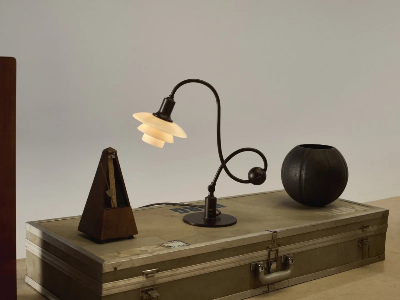
A lamp can look beautiful on a desk and still make it harder to work. The bulb catches your eye, the light lands everywhere except the page, or the fixture takes up the space you needed for a notebook. Louis Poulsen’s reissued PH Piano Lamp starts with a more useful question: How do you put light precisely where it’s needed without making the lamp itself a distraction? Poul Henningsen designed the original for pianists, who needed to see their sheet music without uncomfortable glare.

That problem reaches well beyond the piano. Anyone who has tried to read beside a bright table lamp or work under a harsh overhead light knows the difference between having enough light and having the right light. I like that this reissue hasn’t lost sight of its practical beginnings. Its curved, counterbalanced arm lets the shade move while the lamp stays stable, giving the design a sense of purpose you can read from across the room.

Designer: Poul Henningson for Louis Poulsen

Henningsen first created the Piano Lamp in the early 1930s, building on his PH lighting system, which uses layered shades to manage how light reaches the eye. Louis Poulsen has brought it back as the PH 1/1 Piano Table Lamp Limited Edition 2026, with adjustments intended to make it useful beyond its original setting. It’s an appealing idea for a reissue: keep the reason the object existed, then give more people a reason to use it.

The new version pairs aged brass with glass shades in a color Louis Poulsen calls Dusty Terra Cotta. On paper, that combination sounds richly nostalgic. In practice, its appeal is more specific. The warm-toned glass gives the lamp a softer visual presence, while the long arm and compact shade keep it from feeling like a decorative lamp that has wandered onto a work surface by mistake. You could imagine it near a keyboard, but also beside a book, a sketchpad, or a late-night crossword.

That versatility matters because our rooms rarely serve just one purpose anymore. A dining table becomes a desk. A side table has to accommodate a drink, a charger, and whatever we’re currently reading. Good lighting can make those small shifts easier without demanding that we rearrange the room. The Piano Lamp feels suited to those spaces precisely because it was designed around a task. Its shape may be memorable, but the starting point was helping someone see what they were doing.

I’m also drawn to the fact that it looks a little unusual. The arm has a gentle, almost musical curve, while the shade sits low enough to suggest a conversation between the lamp and whatever is beneath it. Many contemporary lights aim to disappear into the background. This one has a clear silhouette, yet its job is to make the thing you’re doing more comfortable. That balance is harder to achieve than a striking shape alone.

Of course, a limited-edition design lamp isn’t an automatic solution for every desk or budget. If all you need is a cheap light for a spare room, this probably isn’t the practical choice. But it does offer a useful reminder that a lamp’s value isn’t measured only by how brightly it shines. Where the light goes, how it feels, and how easily the fixture fits into daily routines all count. Those are the details you notice after the novelty of a new object wears off.

Louis Poulsen says the PH 1/1 Piano Table Lamp Limited Edition 2026 will be available from October through December 2026. The short window gives it collectible appeal, but I hope that isn’t the only reason people pay attention. Its more interesting quality is how current its original problem still feels. We have plenty of ways to brighten a room. Finding light that helps us focus, without making us squint, remains a much better goal.

The post The 90-Year-Old Lamp Nobody Improved On — Until Now first appeared on Yanko Design.
  • ✇Yanko Design
  • The 1969 Lamp Nobody Knew They Needed Is Back
    Most statement lighting presents a familiar dilemma. A lamp can give a room personality, but the more attention it demands, the harder it can be to live with everything around it. Furniture starts to feel like a supporting cast. Even the lamp’s glow can seem secondary to its silhouette. Gubi’s reissued Lotus lamp offers a more appealing proposition: a piece with enough presence to change the mood of a room, without making the room feel like a showroom. Designed by Carlo Nason in 1969, the Lotus
     

The 1969 Lamp Nobody Knew They Needed Is Back

1 octobre 2026 à 18:30

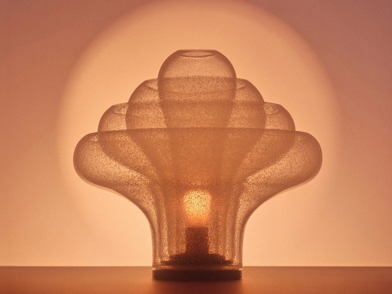
Most statement lighting presents a familiar dilemma. A lamp can give a room personality, but the more attention it demands, the harder it can be to live with everything around it. Furniture starts to feel like a supporting cast. Even the lamp’s glow can seem secondary to its silhouette. Gubi’s reissued Lotus lamp offers a more appealing proposition: a piece with enough presence to change the mood of a room, without making the room feel like a showroom.

Designed by Carlo Nason in 1969, the Lotus lamp belongs to a period when designers were willing to treat lighting as sculpture. Nason’s fluency with glass is central to its appeal, and Gubi’s reissue brings that idea back into view more than half a century later. It is easy to see why the design has returned now. Plenty of contemporary interiors look polished, yet oddly reluctant to have fun. A lamp with a little imagination can do more for them than another carefully chosen neutral.

Designer: Carlo Nason

What makes Lotus interesting to me is the difference between being distinctive and being loud. Its flower-inspired identity gives you a way into the design, but it does not require an entire room to follow the theme. You can appreciate the botanical reference without surrounding it with curved chairs, patterned wallpaper, and a vase of matching flowers. That restraint matters. The best objects leave space for the lives unfolding around them.

Glass also changes how we read a lamp. A metal shade tends to draw a firm outline; glass has a more elusive presence, especially when light enters the picture. It can feel substantial and delicate at once. Nason built a career around exploring what the material could do, and Lotus carries that curiosity into an everyday object. I like the idea of a lamp that rewards a second look when it is switched off, rather than disappearing until evening.

Of course, reissuing a decades-old design invites a fair question: Are we drawn to the lamp itself, or to the comforting idea of owning a piece of design history? Vintage references can become a shortcut to taste. A recognizable date and designer’s name do some of the work that the object should be doing on its own. Lotus earns more attention when you set that pedigree aside and imagine it in an actual home, beside the books you have not put away and the chair you sit in every night.

That is where its value as a design object becomes clearer. A good lamp changes a space twice: once as an object you notice during the day, and again when you turn it on. The Lotus makes a case for treating those experiences as connected rather than choosing one over the other. It asks to be seen, but the point of bringing a lamp home is still to live with its light.

There is a broader reason this reissue feels timely. So much shopping for the home now happens through images that reward instant impact. A dramatic silhouette can stop a scroll, even if it would be exhausting across the room from your couch. The more useful test is slower. Would you want to see it on a rainy Tuesday? Would it still hold your attention once you stopped photographing it? Lotus strikes me as the kind of design that could pass both tests.

It also offers an alternative to the notion that a room has to speak in one consistent style. An older Italian design can sit comfortably among newer pieces if you let it be a point of contrast rather than the start of a complete makeover. That is a more personal approach to decorating. Most homes accumulate meaning over time, through choices made for different reasons and at different moments.

Gubi did not need to invent a new kind of lamp to make lighting feel fresh. Reintroducing Nason’s 1969 design is a reminder that an object can have a strong point of view without turning the rest of your home into a backdrop. For anyone caught between the sensible lamp and the memorable one, Lotus makes a persuasive argument for wanting both.

The post The 1969 Lamp Nobody Knew They Needed Is Back first appeared on Yanko Design.

❌