Vue normale

Il y a de nouveaux articles disponibles, cliquez pour rafraîchir la page.
À partir d’avant-hierFlux principal

ASUS ProArt PZ13 2-in-1 Laptop Review: Portable Partner with Plenty of Potential

Par : JC Torres
9 septembre 2024 à 14:20

PROS:


  • Handsome, sleek, and minimalist design

  • Lightweight and portable body for creatives on the go

  • Large and long-lasting 70Wh battery

  • Beautiful Pantone-validated 13-inch 3K OLED screen

CONS:


  • Inserted SD card prevents flap cover from closing

  • ASUS Pen 2.0 is a separate $100 purchase

  • Software and peripherals compatibility is still a hit-or-miss


RATINGS:

AESTHETICS
ERGONOMICS
PERFORMANCE
SUSTAINABILITY / REPAIRABILITY
VALUE FOR MONEY

EDITOR'S QUOTE:

The ASUS ProArt PZ13 with Snapdragon X Plus delivers a handsome AI-powered creativity tool that agile creative professionals can take anywhere with confidence and pride.

Life can sometimes take us places we never planned or even dreamed of going to. While some people fear and stress over life’s unpredictable journeys, others have grown to embrace and even love the adventure, both figuratively and literally. Designers, artists, and content creators today have their beloved computers and tools at home or in the office, but they know better than anyone that inspiration can strike when and where we least expect it, not to mention suddenly having to do work just after we stepped outdoors. Laptops were made for this purpose, but their thick and heavy bodies didn’t exactly make for comfortable mobility, while tablets went the opposite extreme and prized portability over the performance that professionals need. The ASUS ProArt PZ13 makes the bold promise of delivering the best of both worlds, so we naturally had to put it to the test to find it out if could really meet the demands and desires of designers and creatives on the go.

Designer: ASUS

Aesthetics

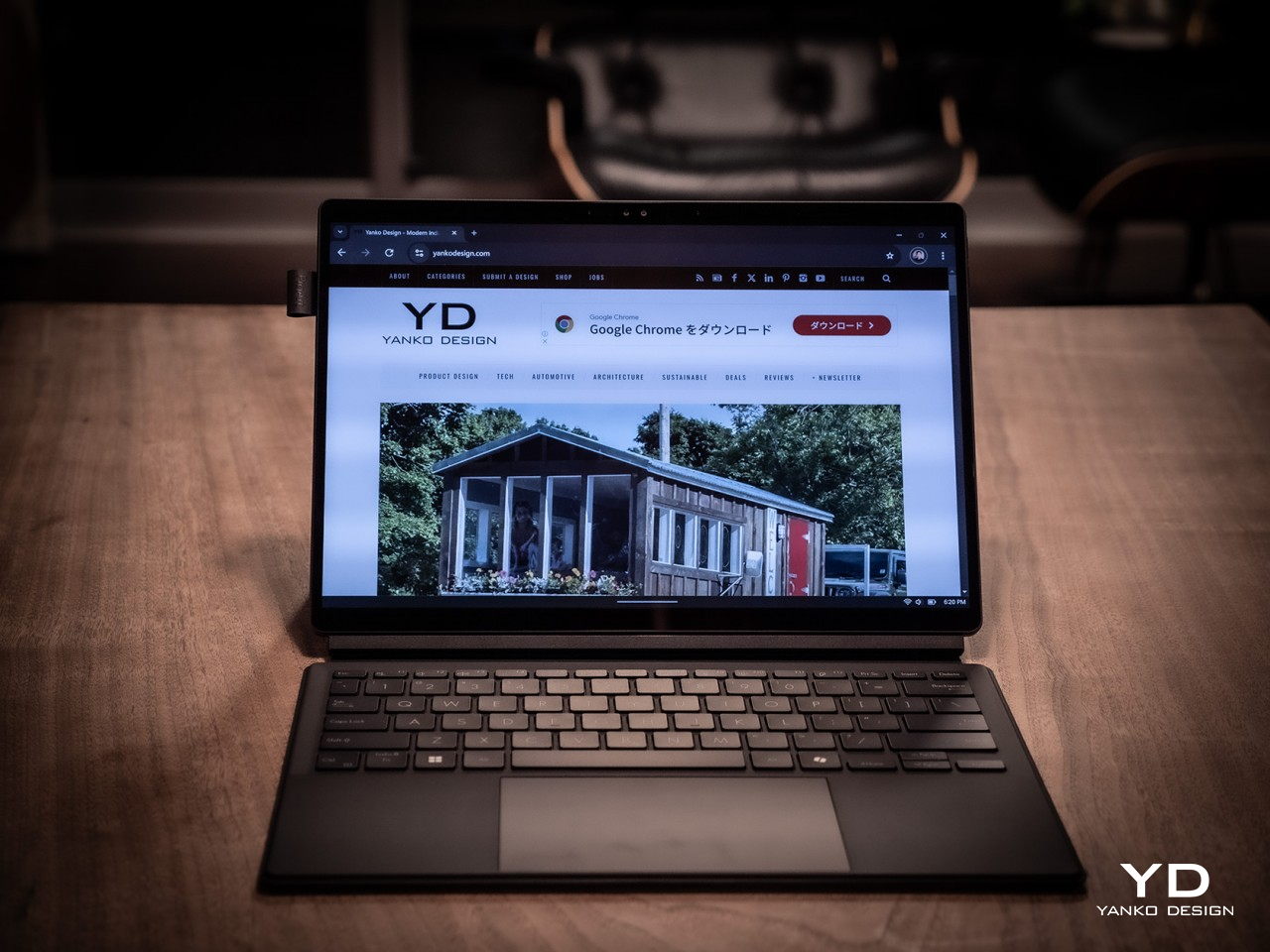
At first glance, you might not think much of the ASUS ProArt PZ13, but closer inspection reveals it has two sides to its design, matching its 2-in-1 detachable laptop functionality. On its own, it’s a rather stylish and striking tablet, black as black, unlike black tablets that look more like “space gray” or other shades. ASUS’s “nano black” coating, also seen on the ASUS ProArt PX13 we reviewed recently, reduces the reflection of light, making it darker than typical metal or plastic surfaces with glossy finishes, no matter the lighting condition or angle. It gives off a professional and elegant character that you’d come to expect from mature designs used in professional settings.

The ProArt PZ13’s CNC-engraved unibody aluminum alloy chassis gives the device structural integrity, durability, and a simple yet sophisticated appearance, highlighted even more by its ultra-slim 9mm profile. There are barely any breaks in the tablet’s visual appearance, aside from a single visible USB-C port, two ventilation grilles at the top, and one air-inflow grille on the back. The classy yet subtle ProArt logo sits at the bottom, opposite the requisite regulatory markings and branding.

All in all, the ASUS ProArt PZ13 exudes an aura of professional beauty befitting a tool for agile creatives, but that image might be challenged by the protective accessories that add value and change the aesthetic a bit. Included in the package is a magnetic keyboard cover and a magnet back plate with a kickstand, both necessary if you’re carrying this portable computer around. They are designed to offer rugged protection and definitely look the part, though it’s a bit strange that ASUS opted for a different hue that sharply contrasts with the pitch-black body of the tablet itself. Gray with a tinge of green, these accessories will be an acquired taste and might not sit well with some people, both in color and in the rugged, ridged design.

Ergonomics

Combining power and portability is always a delicate balancing act. Due to the laws of physics, you can only cram so much into a small space before you start weighing the object down or making thermal management impossible. Conversely, you can only remove so much before performance starts to take a hit. Thanks to its choice of components, especially the processor, the ASUS ProArt PZ13 manages to strike quite a nice balance, weighing only 0.85kg (1.87 lbs) on its own.

That does carry a bit more heft compared to an iPad Pro, for example, or even a Samsung Galaxy Tab S9 Ultra, but when you consider that this is a Windows machine with fans inside, that’s still a pretty impressive feat. That makes the ProArt PZ13 very usable as a tablet, whether for reading documents, watching videos, or even making art, though you won’t want to hold it up with your bare hands for a long time either. This also makes the device easy to carry around the house, the office, or even outdoors, especially if you know you won’t need a keyboard to type on.

The story changes a little bit when you do need to add the keyboard and kickstand to the formula, almost doubling the weight of the device. It’s still significantly lighter than a laptop, but it’s no thin tablet either. And you will most likely have to use both the back plate and the keyboard together since there’s no way to prop up the tablet without the kickstand. That also means you can really only use this 2-in-1 device as a laptop when you’re on a flat and long surface like a table, making the “lapability” of the design quite low.

Performance

This is hardly the first 2-in-1 detachable Windows laptop, but the ASUS ProArt PZ13 is one of the first few to use Qualcomm’s new energy-efficient Snapdragon X Plus silicon. This Arm-based processor is closer to the Apple M chips than, say, Intel or AMD, and is in fact directly targeting Apple Silicon devices. Qualcomm earlier launched the beefier Snapdragon X Elite, but that in no way means that this is an underpowered version, especially considering it still boasts the same 45 AI NPU TOPS performance even with only 8 cores.

In other words, Windows itself runs quite smoothly on this machine, as well as any other piece of software that’s actually designed for or adjusted to work on this computing platform. That includes a growing number of Adobe products like Photoshop and Premiere, popular comics drawing software Clip Studio Pro, and more. The ProArt PZ13 and the Snapdragon X Plus shine brighter when those apps need some AI power, thanks to that dedicated NPU chip that doesn’t choke the main processor.

There, however, also lies a bit of the rub. That smooth and responsive experience works best on software that has already been adapted to work on Snapdragon processors, which isn’t the case for the hundreds of popular Windows programs out there. Yes, those apps can still run thanks to a special emulation layer, and yes, performance has improved significantly since the earlier days of Windows on ARM, but that extra layer is still there and can still affect your performance, especially when it comes to games. The same is true with peripherals you want to connect to the device, especially ones that need special drivers that aren’t supported by this platform yet.

In exchange for that uncertainty, the choice of a Snapdragon X Plus processor brings with it the peace of mind that you won’t have to scramble for a power outlet every few hours. The 70Wh battery can last almost a full day, give or take a few hours depending on your use, which is something even the most generous estimates on an Intel or AMD laptop can even boast about. It also chargers quickly over USB-C using the included 65W charger, though that also means you can use almost any standards-compliant USB-C charger as well.

Regardless of what you use it for, you will be experiencing a bright, colorful, and vibrant 13.3-inch 3K screen, thanks to ASUS’s Lumina OLED technology. Professionals who require color accuracy will be delighted to know that it’s Pantone-validated and has support for 100% of the DCI-P3 color gamut. Even better, ASUS offers all the sliders and switches you need to customize the display to your requirements and tastes. Its refresh rate does cap out at only 60Hz so it won’t be the best option for gaming, which isn’t what you’ll be using this laptop for most of the time anyway.

The ASUS ProArt PZ13 only has one USB 4.0 Gen 3 Type-C port visible for quick access to a charging port, but don’t fret, it isn’t the only one. There’s another USB-C port of the same type hidden behind a silicone flap, which also hides a full-sized SD card reader. Digital photographers will probably delight in the inclusion of this port which is absent on almost all tablets these days, while those who regularly work with microSD cards will be happy to know that ASUS actually ships an adapter in the box. The one catch to this design is that you can’t have an SD card permanently inserted there because a part of it juts out of the frame, making it impossible to close the silicone flap over it. It’s clearly not designed for storage expansion but removable storage to support the workflows of camera users.

Sustainability

Unlike with its other products, ASUS is a bit silent on the amount of recycled materials it uses for the ProArt PZ13. Rather than focus on the use of sustainable materials, it instead highlights the ways this device can last a long, long time before it needs to be turned in for proper disposal and recycling. With an IP52 rating and conforming to the US MIL-STD-810H spec, you can carry and use this portable tablet with confidence anywhere, knowing that it can keep up with you wherever life or work takes you. Of course, the kickstand back cover and keyboard cover offer additional protection as well, which is all the more reason you won’t want to keep these three pieces apart for long.

One detail about that detachable magnet keyboard, however, might be a source of worry for some. While more convenient than a USB connection but also more reliable than Bluetooth, this design has a tendency to break easily due to wear and tear. ASUS will undoubtedly sell these separately for some time, but there will always come a point when they will go out of production, perhaps outliving the ProArt PZ13 itself. Reliability has improved over the years, of course, but it’s still something to keep in mind with this type of detachable keyboard.

Value

The ASUS ProArt PZ13 is both familiar and completely new. Its 2-in-1 detachable laptop design is something we’ve seen since the very first days of the Microsoft Surface, but its combination with a Snapdragon X Plus is just as new as the processor itself. To some extent, it’s wading into uncharted waters, but it isn’t alone either, and its biggest rival is none other than Microsoft itself and the latest Surface Pro. Fortunately, ASUS has its work cut out for it thanks to its competitive pricing.

At first glance, the ProArt PZ13’s $1,100 price tag seems to be on the losing end compared to the Surface Pro’s $1,000, but then you have to consider what you’re actually getting in the package. ASUS bundles the keyboard cover with the tablet, while that’s a separate $180 purchase for the Surface Pro, at least for the keyboard that can also charge the Microsoft pen. Neither comes with a compatible pen, and those cost an additional $100 for the ASUS Pen 2.0 and $130 for the Surface Slim Pen. That brings the total to $1,200 for the ASUS ProArt PZ13 and $1,310 for the Surface Pro, and even then you’re only getting 256GB of storage versus the generous 1TB on ASUS’s 2-in-1 laptop. In this context, there really is no contest between the two.

Verdict

The ASUS ProArt PZ13 promises the Holy Grail of mobile computing, offering reliable performance and long battery life in a thin and light design, and for the most part, it does deliver on those. Granted, software support on Windows on ARM processors like the Snapdragon X Plus is still a bit of a gamble, but things are getting better quickly, especially for the more popular programs used by professionals and hobbyists alike. Things are far from perfect, but for creatives looking for a reliable and stylish computer they can easily take anywhere, the ProArt PZ13 is definitely worth considering.

The post ASUS ProArt PZ13 2-in-1 Laptop Review: Portable Partner with Plenty of Potential first appeared on Yanko Design.
ASUS ProArt PZ13, Vivobook S 15 with Snapdragon X Plus make AI more accessible

Par : JC Torres
4 septembre 2024 à 11:00

AI is fast becoming a thing on desktop and laptop computers, even on those devices that aren’t used for heavy computation or heavy content creation. Whether it’s generating images for inspiration, making sense of documents, or optimizing performance, AI is starting to become a prevalent presence in computing, but those features seem to benefit only those with enough resources to spend on a powerful but pricey rig. Good technology shouldn’t just be for a select few, and ASUS is working with Qualcomm to make not just AI but multi-day battery life more accessible to everyone with new mobile computers powered by the new Snapdragon X Plus.

Designer: ASUS

ASUS ProArt PZ13

Right at the top of that list is the new ASUS ProArt PZ13, first shown off at Computex back in June. It’s a 2-in-1 tablet with a detachable keyboard cover and kickstand, not unlike some of the popular designs for these portable PCs. What makes it extra special is the silicon inside, the Qualcomm Snapdragon X Plus, an octa-core variant of the chipmaker’s latest line that targets not smartphones that run Android but Windows computers. What it lacks in raw power compared to the Snapdragon X1 Elite it makes up for in a balanced performance per watt, delivering long battery life while still supporting AI features thanks to its Neural Processing Unit (NPU) and integrated graphics processor.

As part of ASUS’ ProArt family, the ProArt PZ13 caters to digital content creators like designers, artists, streamers, and writers. These users benefit from the computer’s highly portable design, only 9mm thick and weighing only 1.87 lbs. The 70Wh battery makes the lack of nearby power outlets less of a worry, especially if you can charge it via USB-C. The IP52 dust and water resistance, along with MIL-STD-810H certification, also takes away some of the fear when using this AI-powered creativity machine outside of your office or home. And with the same sleek Nano Black coating we saw on the ASUS ProArt PX13, you will definitely want to show it off outdoors.

Of course, as a creative tool, the screen is a critical factor, and the ProArt PZ13 doesn’t disappoint with its bright and vibrant 13.3-inch 3K (2880×1800) Lumina OLED display. ASUS lets you control every aspect of that display, from the color gamut it uses down to color calibration. The ProArt PZ13 also includes a suite of software that really showcases its AI chops, including StoryCube for managing photos and videos. Creativity no longer has to be tethered to desks and power outlets thanks to the ASUS ProArt PZ13 and Snapdragon X Plus.

ASUS Vivobook S 15 (S5507)

Those who want a more traditional laptop form factor will be happy with the ASUS Vivobook S 15, also powered by that Snapdragon X Plus AI process and boasting more than 18 hours of uptime with its 70Wh battery. The 15-inch 3K 120Hz Lumina OLED screen will also delight content creators who need precise and accurate color reproduction, especially with support for 100% of the industry standard DCI-P3 gamut. A plethora of connectivity options, both wired and wireless, make working anywhere a breeze, and its slim and stylish design makes it a joy to bring out in public.

Best of all, these two Snapdragon Windows computer carry accessible price tags that make them tempting options for your next mobile computer. The ASUS Vivobook S 15 (S5507) will start at $899.99, while the ProArt PZ13 starts at $1,099.99.

The post ASUS ProArt PZ13, Vivobook S 15 with Snapdragon X Plus make AI more accessible first appeared on Yanko Design.

ASUS ProArt PX13 Laptop Review: An Agile Content Creator’s Best Friend

Par : JC Torres
19 août 2024 à 13:40

PROS:


  • Handsome, minimalist, and lightweight design

  • Impressive performance packed in a compact size

  • Gorgeous 3K OLED screen for both viewing and color-accurate work

  • Incredible value for creative professionals on the go

CONS:


  • No full-sized SD card reader, only one USB-A port

  • Display refresh rate is only up to 60Hz

RATINGS:

AESTHETICS
ERGONOMICS
PERFORMANCE
SUSTAINABILITY / REPAIRABILITY
VALUE FOR MONEY

EDITOR'S QUOTE:

The ASUS ProArt PX13 makes the impossible possible, delivering unbeatable performance and uncompromising mobility in an elegant and accessible package.
award-icon

The nature and execution of work have changed significantly in the past years, especially for those who use computers all the time. Mobility and flexibility have become an important part of the business, sometimes requiring people to be able to take their work anywhere life leads them. At the same time, it also allows people to do their work in the best possible location for them, which isn’t always the office. To support these new work arrangements, computer vendors have been trying to shove more power into laptops without turning them into gargantuan machines that would force people to leave them in the office anyway. It’s a delicate balancing act, one that very few brands have successfully pulled off, but the ASUS ProArt PX13 makes that very promise to one of the more discerning and particular markets. Is the ProArt PX13 able to deliver that promise of unbounded creativity anywhere or does it make too many compromises along the way? We give it a flip and a spin to bring you that answer.

Designer: ASUS

Aesthetics

The first impression you’ll have when seeing the ASUS ProArt PX13 is how compact and thin it is, at least for a supposedly powerful laptop aimed at creative professionals. Your second impression will be how sleek and elegant it looks with its deep, all-black design. It’s an aesthetic that doesn’t scream at you but instead talks mellowly, fitting a professional product. There are barely any markings on the laptop’s cover; no fancy RGB lighting at its sides, protruding edges, or sharp angles. Just one truly black slab.

Unlike other laptops that advertise a black colorway, the ASUS ProArt PX13 really walks the walk thanks to the company’s Nano Black coating that almost poetically matches the deep blacks of the OLED screen on the opposite side. It’s admittedly a matter of taste, as some will prefer the luster of silver metal like those on MacBooks or Dell, but its more subdued aesthetic makes it less distracting as well. Thankfully, that same Nano Coating also prevents fingerprint smudges so there’s very little that will stain that darkness.

Minimalist doesn’t mean plain, however, and there are a few accents that bring out the ProArt PX13’s designer-centric character. The ProArt branding, for example, is smooth and a little bit reflective, tastefully set against the blackness of the cover. The vertical stripes on the hinge are supposed to be a nod to pro camera designs, but even if you don’t make that connection, they’re still an interesting touch. All in all, the ASUS ProArt PX13’s minimalism puts the focus not on the laptop but on the creator and the content, while also providing a dark, blank canvas for owners to use to let their own creativity shine through if needed.

Ergonomics

The ProArt PX13 is hardly the thinnest laptop, whether traditional or convertible, but it’s not terrible either for a 13-inch. When you consider that it packs enough hardware to cater to creative professionals and even some gamers, you’ll even be amazed at how ASUS managed to keep the numbers down to an accessible level. At 17.78mm (0.7 inches) thick and 1.38kg (3.04 lbs) heavy, this is something you can easily stow in your bag and be on the move in a flash.

This is very important when you consider that ProArt PX13 is more than just a laptop. It can also be a tablet you can draw on, whether on your table or on your lap, as well as a “tent mode” presentation and entertainment display. Changing forms is as easy as folding the screen back and forth, and the sturdy 360-degree hinge makes sure that it stays open at whatever angle you leave it. At the same time, however, the laptop’s weight is distributed properly so that you can open it up with just a single finger, lifting the lid while the body anchors it down.

The typing experience is pretty good as well, with well-spaced keys and a good 1.7mm travel. The cursor keys are squashed, of course, but that’s nothing new nor is it extremely uncomfortable. The touchpad is a decent size, but its mechanical design might disappoint fans of more haptic touchpads.

Performance

Right off the bat, the ASUS ProArt PX13 has some of the best hardware you’ll find in a 13-inch laptop. It’s one of the first to utilize AMD’s new AI-powered Ryzen AI 9 HX 370, giving it a wide lead in AI operations. This is paired with an NVIDIA GeForce RTX 4050, like in our review unit, or an RTX 4060. Either way, you’re getting a powerful graphics processor that, to no one’s surprise, handles AI skillfully as well. Benchmark numbers don’t always tell the whole story, but they’re impressive nonetheless. Whether the laptop is plugged in or running on battery, it will meet almost anything you can throw at it, whether it’s Photoshop, Da Vinci Resolve, or Blender.

Gaming is a bit of a different issue, though the ProArt PX13 is definitely capable. You will definitely feel the heat when pushing the system to its limits, but the cooling system does a stellar job of regulating its impact. The fans are definitely audible under heavy loads, but they quiet down just as quickly when no longer needed. And they’re barely noticeable at all if you’re just doing basic computing tasks like browsing the Web or typing up documents. The biggest setback when using this machine for gaming is actually one of its biggest strengths as well: its screen.

The 13.3-inch OLED touch screen is simply stunning, with rich colors, deep blacks, and a sufficient amount of brightness so that you can even work outdoors under overcast skies. The display is Pantone-validated and supports a wide gamut of colors, an important detail for graphics artists and content creators who need color accuracy more than anything else. The screen has a 3K resolution of 2880×1800 in a familiar 16:10 aspect ratio and a refresh rate of 60Hz. The latter is what makes the ProArt PX13 less suitable for gaming, at least for those who live and breathe 120Hz or higher. It’s not totally unusable for fast-paced games, and it completely marks the laptop as a machine primarily for work, with just a bit of gaming on the side.

Battery life for the ASUS ProArt PX13 is so-so. Given its size, the 75WHr battery it packs is actually generous, but it’s offset by the more powerful hardware. On Eco/Power Saving mode and average computing tasks, it can last an average of 8 hours, definitely shorter once you push the hardware to the limit. It ships with a 200W power brick that’s large but not gigantic. It can charge over USB-C using a 100W charger, but you’ll probably bring the official charger with you anyway unless you’re traveling extra light.

Port selection is on the light side as well. It has most of the important basics but is also oddly missing a few ones. There are two USB 4.0 Gen 3 Type-C ports and a single USB 3.2 Gen 2 Type-A port, one HDMI port, a 3.5mm headphone jack, and the proprietary DC-in charging port. There’s a microSD card reader but not a full-sized one, which is strange considering how digital cameras still mostly use SD cards, not their tiny cousins. We could always do with an extra USB-A port, especially if the only available one is already in use with an Ethernet adapter because the laptop doesn’t have its own RJ45 port.

The ASUS ProArt PX13 is overflowing with features designed for creative professionals, from hardware to software. There’s the somewhat odd DialPad in the order of the touchpad, giving quick access to actions like changing brush sizes in Photoshop, scrubbing through timelines in Premiere, and more. Not everyone will love this convenience, and it is fortunately easy to disable it completely. From the ProArt Creator Hub which has all the settings you can tweak for performance or monitor calibration, to the AI-powered software that takes advantage of the combined strength of AMD processors and NVIDIA graphics, the ProArt PX13 offers a multitude of tools to assist content creators in whatever kind of work or problem they’re facing.

Sustainability

ASUS has been making big waves when it comes to its commitment to helping protect the future of the planet, from the use of recycled materials in its products to the decrease of plastic in its packaging. It might not be visible or advertised for the ProArt PX13, but we’re banking on the company giving it the same treatment even in small amounts.

In terms of prolonging the life of the laptop, ASUS definitely took steps to make it a bit easier. The bottom plate can be removed easily using a screwdriver, except for the middle screw that’s also covered by a sticky rubber material. The NVMe SSD storage, battery, and Wi-Fi 7 module are easily replaceable, which are some of the most common components that need to be repaired or upgraded. Sadly, the LPDDR5X RAM is soldered to the motherboard, but having 32GB of memory isn’t that bad anyway.

Value

The ASUS ProArt PX13 is available in two configurations, with the RTX 4050 and 4060 being the only real difference between the two, as well as the Windows 11 Home and Pro licenses. Given the performance difference between these two very capable NVIDIA graphics processors, you couldn’t go wrong if you picked the base configuration that goes for only $1,699.99. At that price point, it already surpasses larger laptops and can hold its own against a MacBook that’s nearly double its price.

It’s pretty mind-blowing how much ASUS was able to cram inside the compact 13.3-inch body of the ProArt PX13 without hitting any significant compromises. It’s hardly the best gaming laptop or the most powerful movie maker, but what it offers is the flexibility to take your work or game anywhere without missing a bit. In that regard, it is pretty unrivaled, making it a truly tempting device for creative professionals, even those who mostly stay at their desks.

Verdict

The way we make content these days has changed greatly over the past years. Videos and graphic designs no longer have to be made on hulking towers tethered to desktops. Sometimes, the ability to quickly churn out content at a moment’s notice has become more important than production-level quality that will take hours on a regular laptop. Then again, why do you have to choose when the ASUS ProArt PX13 can give you the best of both worlds? Powerful, portable, and flexible, this convertible laptop delivers the tools that creative professionals need to bring their work to the next level, whenever inspiration strikes, wherever they are.

The post ASUS ProArt PX13 Laptop Review: An Agile Content Creator’s Best Friend first appeared on Yanko Design.

Mini-PC the size of a Mac Studio comes with a Ryzen 9 Chipset and a 7-inch Touchscreen

Par : Sarang Sheth
5 août 2024 à 02:40

Imagine if your iPad Mini had ports, a powerful computer, and the ability to work alongside your main machine as a perfect productivity sidekick. That’s what the Miniproca is aiming to be.

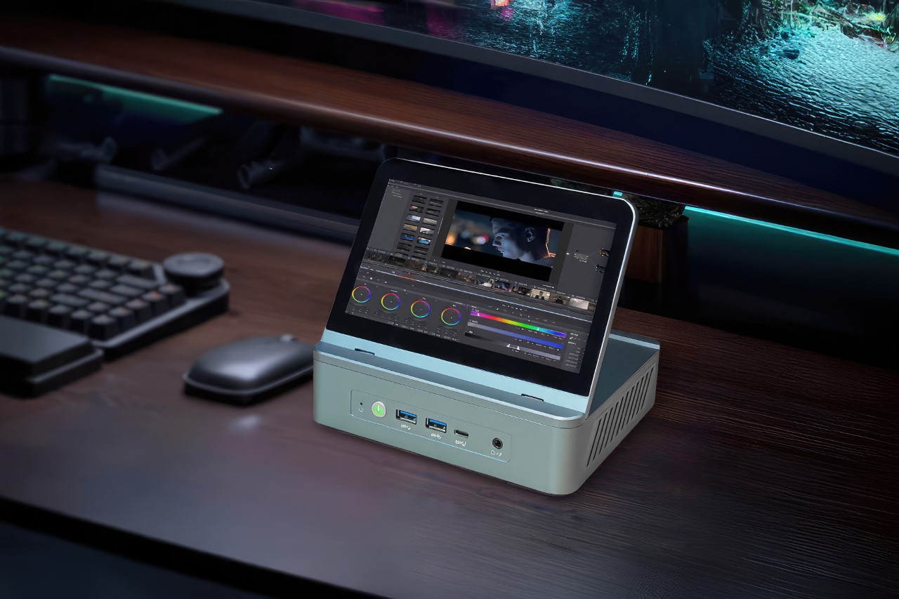
Slightly wider than a Mac Studio (thanks to its rectangular design), the Miniproca is a mini PC with the attitude of a conventional desktop. Equipped with an AMD Ryzen 9 6900HX processor, this mini-PC delivers robust performance capable of handling demanding tasks with ease. Complementing the processor are Radeon RX 680M graphics, which ensure smooth visuals for gaming, video editing, and other graphically intensive applications. However, the mini PC also packs a 7-inch touchscreen on the top that folds outwards to face you, turning it into what I can only describe is the opposite of a laptop. The tiny touchscreen display becomes the Miniproca’s visual unit, allowing you to use your PC in a variety of ways. Sure, you could use it as a secondary display while you connect a larger monitor to the Miniproca, or the touchscreen could become your dashboard or widget center, acting as a place to display other core information, whether it’s stock prices for traders, gaming stats for gamers, hotkeys for streamers, or just YouTube or Netflix on the side while you work for most people.

Designer: Miniproca

Click Here to Buy Now: $699 $1259 (44% off) Hurry, only 9 days left.

The Miniproca really tries to create a new category of computing by combining two existing categories – the mini tablet, and the mini PC. Tablets are great because they’re touch-sensitive and portable… but they’re not powerful. A mini PC on the other hand packs power, but without a screen. In comes the Miniproca, hitting two birds with the same stone. The integrated touchscreen transforms the device into a versatile computing solution. The touchscreen can be positioned in various angles, from flat to a 90-degree upright position, offering flexibility for different use cases. As a secondary monitor, it can enhance productivity by providing additional workspace for applications, communication tools, or reference materials. For those seeking a more portable setup, the Miniproca can serve as a standalone device, with the touchscreen providing a convenient interface for various tasks.

Design-wise, the Miniproca adopts a minimalist aesthetic that complements modern workspaces. Its aluminum alloy chassis exudes durability while maintaining a sleek profile. The standout feature is the integrated 7-inch touchscreen, which flips up to reveal a multi-touch display. This innovative design offers flexibility in usage, allowing it to function as a standalone device, a secondary monitor, or even a digital photo frame. The inclusion of anti-slip pads on the base ensures stability on various surfaces.

Under the hood, the Miniproca packs a powerful punch. At its core lies an AMD Ryzen 9 6900HX processor, delivering robust performance for demanding tasks such as video editing, content creation, and gaming. Complementing the CPU is Radeon RX 680M graphics, capable of handling visually intensive applications with ease. Users can further enhance performance by opting for up to 32GB of DDR5 memory and a spacious 2TB PCIe 4.0 SSD.

Connectivity is a crucial aspect of any modern computing device, and the Miniproca doesn’t disappoint. The device boasts a comprehensive array of ports, including HDMI 2.1, DisplayPort 1.4, and a mix of USB 2.0, 3.2, and Type-C options (in theory, you can connect as many as 3 monitors to the Miniproca, giving you a multi-display setup). Dual Ethernet LAN ports cater to users who prioritize wired connections for stability. Wireless connectivity is ensured through Bluetooth 5.2 and Wi-Fi 6E, allowing seamless integration with other devices.

The Miniproca measures 175 x 137 x 55 mm and weighs 855g, making it highly portable and a great complementary machine to a laptop or existing peripherals. The Miniproca is currently available for pre-order on Kickstarter. Pricing starts at US$699 for the base model with 8GB of RAM and 512GB of storage, while the top-tier configuration with 32GB of RAM and 2TB of storage is priced at US$919.

Click Here to Buy Now: $699 $1259 (44% off) Hurry, only 9 days left.

The post Mini-PC the size of a Mac Studio comes with a Ryzen 9 Chipset and a 7-inch Touchscreen first appeared on Yanko Design.

Lenovo Yoga 9i Gen 9 14IMH9 (14″, 2024) Review: Graceful Balancing Act

Par : JC Torres
17 juillet 2024 à 14:20

PROS:


  • Gorgeous 3.8K screen with very thin bezels

  • Stylish, lightweight, and flexible workstation on-the-go

  • Competitive performance even for light gaming

  • Creative speaker soundbar hinge design

CONS:


  • Included pen feels cramped

  • No HDMI port or SD card slot


RATINGS:

AESTHETICS
ERGONOMICS
PERFORMANCE
SUSTAINABILITY / REPAIRABILITY
VALUE FOR MONEY

EDITOR'S QUOTE:

With a more portable design and solid performance, the Lenovo Yoga 9i Gen 9 makes for a competitive all-rounder that can cover almost every need and use case.
award-icon

There has been a sudden flood of new laptops in the past months, most of them trying to ride the AI wave. With so many designs and so many configurations available, it can be a bit daunting to pick one for your next major computer purchase. There’s no shortage of models catering to gamers and content creators, as well as pro models aimed at high-performance workers. On the opposite side lies the “economy” choices meant for students and some employees, carrying barely enough power for the most basic tasks. When it comes to those who need a general-purpose computer that can keep up with their changing needs and situations, the choices can be a bit more difficult because they’re all over the place. A solid option with well-balanced features and an accessible price tag is always in demand, and that’s what the 2024 Lenovo Yoga 9i Gen 9 (14IMH9) 2-in-1 convertible laptop is promising, so we take put it to the test to see if it does keep its word.

Designer: Lenovo

Aesthetics

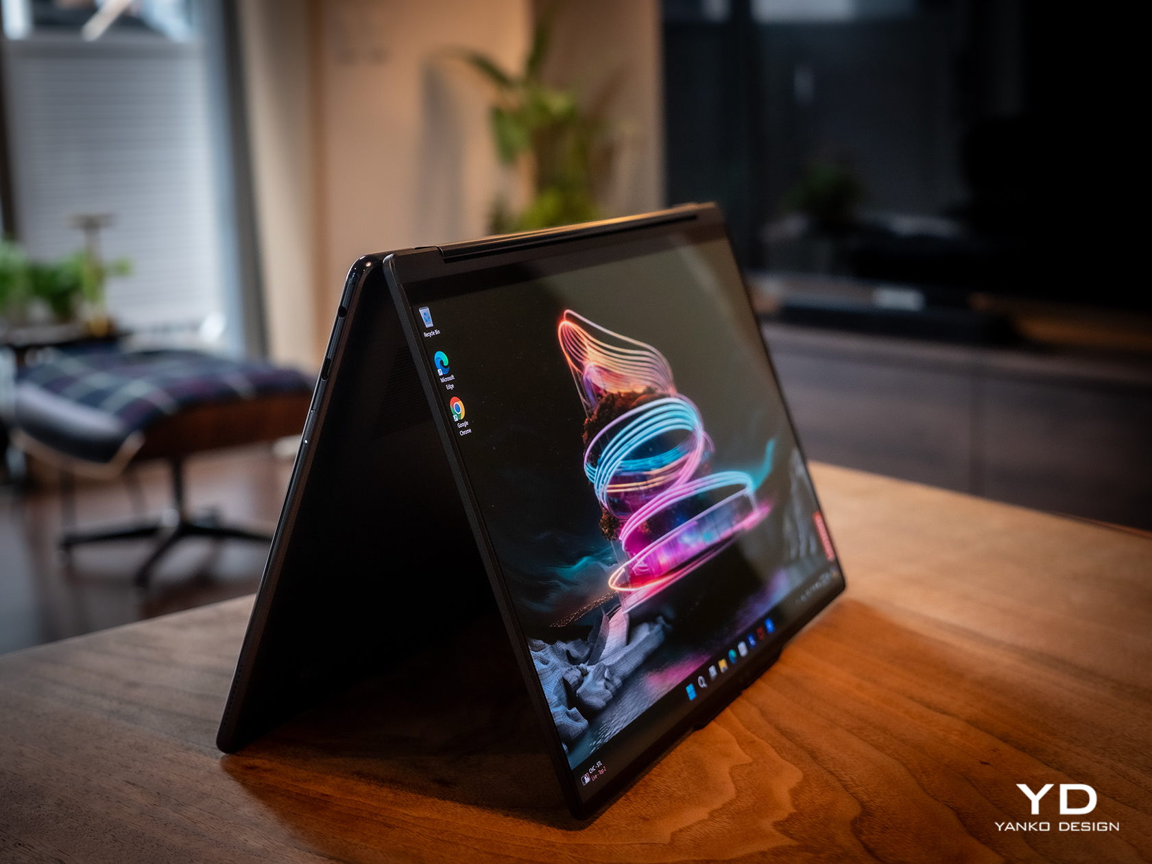
The Lenovo Yoga 9i Gen 9 has a presence that grabs your attention without being loud or distracting. The simple yet sleek shape of the lid combined with the soft curves of the base creates an interesting silhouette whether the laptop is closed or open. And the dark Cosmic Blue hue, still a rarity in this product line, makes it stand out in an aesthetically pleasing way. When the lid is open and the screen powered on, the extra slim bezels around the display further emphasize the laptop’s modern appearance.

Even at first glance, it’s immediately evident how slim and small the 2-in-1 laptop is, at least for a 14-inch device. Compared to its Gen 8 predecessor, this year’s Lenovo Yoga 9i is significantly smaller and lighter, which greatly improves its portability. This attribute is even critical for this kind of laptop since it can be used as a tablet that you’ll sometimes have to hold up for long periods of time, though it does have some drawbacks compared to typical tablets, which we’ll get to later.

One design detail that might prove divisive is how the lid and the base practically have two different designs. The lid is thin and has flat edges with a matte surface, while the base sports curved edges with a shiny finish. The difference between the two is even more stark when you realize that the base is actually wider at its edges than the lid so that these two parts don’t sit flush with each other when closed. It’s an asymmetrical design quirk that might not sit well with some, while others might grow accustomed to it over time, enough to take it for granted.

Ergonomics

At only 2.98 lbs (1.35kg), the Lenovo Yoga 9i Gen 9 is relatively lighter than its predecessor as well as the nearest competition. This gives it an advantage when it comes to portability, especially when you consider how it doesn’t skimp on the specs in return. You still won’t want to hold it up unsupported for long periods of time, but it’s less straining than most. That said, you won’t be able to hold it as comfortably as a regular tablet like an iPad or a Surface because the keys fold to the back of the lid. They’re disabled, of course, but you will still undoubtedly press on them, making for a rather awkward experience.

But while using the laptop is comfortable and even enjoyable, the Lenovo Slim Pen that ships with the Yoga 9i Gen 9 is a different story. We don’t have any complaints when it comes to the performance of the stylus, since it does a great job at it, but holding the short and nearly flat stick can strain your hand if you use it for too long. There’s also no secure place to put the stylus on when not in use, because the magnet on the back and top of the lid is not exactly that strong. It almost feels as if designing the pen was an afterthought, especially since previous Yoga 9i models had a silo for its home.

Performance

In addition to its facelift, the 2024 14-inch Lenovo Yoga 9i Gen 9 gets a major upgrade in hardware. That’s the Intel Core Ultra 7 155H, the chip maker’s latest entry into the AI arena. This is matched with high-speed LPDDR5x RAM, 32GB for our review unit, and 1TB PCIe SSD Gen 4 M.2 of storage. In addition to the integrated Intel AI Boost NPU (Neural Processing Unit), a key feature of this configuration is the integrated Intel Arc graphics. It’s still a far cry from dedicated GPUs from the likes of NVIDIA and AMD, but it’s still a major leap forward in terms of performance. And it doesn’t disappoint, at least within the right context and expectations. It’s no gaming laptop, but light gaming with medium settings is no problem, as are content creation apps, especially those that utilize AI features.

The real star of the show here is the 14-inch OLED display, with a 3.8K WQUXGA (3840 x 2400) resolution in our review unit (there’s also a 2.8K 2880×1800 option). Both are touch-capable, as you would expect from a 2-in-1 laptop, and the image quality is just astounding in both brightness and color vibrancy. It’s by no means perfect, especially compared to more “pro” laptops, but on a consumer product, this is simply gorgeous. It doesn’t fall short when it comes to audio either, and its unique design solves one of the biggest problems laptops have: speaker placement. In the Yoga 9i Gen 9’s case, the wide hinge also acts as a soundbar that’s always firing in your direction, and the audio that it puts out is full and broad, and it doesn’t sound distorted or tinny at maximum volume.

As a 2-in-1 laptop, the Yoga 9i Gen 9 has to carefully balance the needs of both laptop users as well as tablet users, and nowhere is that more evident than in the choice of I/O ports. There are three USB-C ports, two of which support Thunderbolt 4, one full-sized USB-A port, and a 3.5mm headphone jack. That’s pretty much it. The lack of an HDMI port means you’ll need to use a dongle if your external monitor doesn’t support USB-C video, and digital photographers might be unimpressed with the lack of a card reader. The I/O leans more on the side of portability and mobility, making some practical sacrifices along the way.

The typing experience is quite decent, and the keys have sufficient spacing and travel to keep most users happy. It’s also backlit, so typing in the dark is no problem at all. The touchpad is large, smooth, and responsive, leaving very little reason to complain. One design detail that some might take issue with is the column of special keys on the right edge, providing quick access to a few features, including a fingerprint scanner. Unfortunately, its placement makes it too easy to hit these keys accidentally, especially since they’re so close to important keys like Enter, Backspace, and the Left cursor key. It also means that the entire keyboard is practically shifted to the left, and so will your hands.

Battery life is decent, though not exactly remarkable. The 75Wh battery will last you an average of 5-7 hours on average use, shorter if you crank up the video or game settings. The good news is that it charges over USB-C and any of the three USB-C ports can be used for that purpose. That means you can opt for a faster and smaller GaN charger than the plain 65W brick that comes with the Lenovo Yoga 9i, not that it’s that big a charger in the first place.

Sustainability

The Lenovo Yoga 9i Gen 9’s all-aluminum build means there’s less plastic in each laptop. Even better, it uses plenty of recycled materials as well, like 50% recycled aluminum for the base bottom, 50% post-consumer recycled plastic for the keyboard, and, of course, 100% plastic-free packaging. That’s definitely more than what you might find in other consumer laptops, so Lenovo deserves a pat on the back there.

Unfortunately, the longevity of the 2-in-1 laptop might be a bit of an issue, especially if you consider doing repairs or upgrades yourself. Although held down by four TORX screws, the base bottom panel also has some pretty strong adhesive that gets in the way of easily accessing replaceable parts. Also quite puzzling, this Gen 9 model has apparently dropped support for the longer 80mm NVMe SSD drives, limiting you to the 42mm variety only.

Value

The laptop market is a very competitive space, especially when brands put out new models almost at the same time and with the same core specs. That makes telling each apart a bit more difficult, let alone figuring out the actual value that a product has. With a price tag ranging from $1,300 to $1,500, the Lenovo Yoga 9i Gen 9 (14″, 2024) already stands out as being more affordable, but we definitely can’t judge it by that figure alone, nor can we ignore the competition.

The Yoga 9i Gen 9 definitely offers a well-rounded set of features, wrapped in a design that is elegant and distinctive, even if a bit odd at the edges. The 14-inch display really makes videos and images pop, up and the sound quality is impressive for a laptop. That said, it’s a very close call with its biggest rival, the newly refreshed HP Spectre x360 14, also a 2-in-1 convertible laptop. It might even boil down to which product and software ecosystem you prefer, but you can’t go wrong with a solid performer like the new 2024 14-inch Yoga 9i.

Verdict

Finding a good balance between power, portability, and price isn’t that easy. Some designs don’t even try and instead focus on a specific aspect and refine that to perfection. The Lenovo Yoga 9i Gen 9 almost comes close, bringing the AI-empowered performance of the new Intel Core Ultra line to a sleek and elegant device that you can proudly show off, whether as a laptop or as a tablet. With a large and beautiful screen that barely has any bezels, it not only lets you focus on your work but also enjoy viewing content on it. Best of all, its sustainability and accessibility give it an edge over similarly priced options, making the Lenovo Yoga 9i Gen 9 2-in-1 laptop truly enticing for creators and workers always on the go.

The post Lenovo Yoga 9i Gen 9 14IMH9 (14″, 2024) Review: Graceful Balancing Act first appeared on Yanko Design.

Onyx BOOX Go Color 7 E-reader Review: Bringing Back the Simple Joys of Reading

Par : JC Torres
16 juillet 2024 à 13:20

PROS:


  • Compact and comfortable size for long reading

  • Stylish textured back cover

  • Impressive color E Ink display and performance

  • Google Play support out of the box

CONS:


  • Gapless page turn buttons

  • Some ghosting with color content

  • Fine-turning display settings per app can be overwhelming

RATINGS:

AESTHETICS
ERGONOMICS
PERFORMANCE
SUSTAINABILITY / REPAIRABILITY
VALUE FOR MONEY

EDITOR'S QUOTE:

Wrapped in a highly portable and stylish design, the BOOX Go Color 7 delivers a joyful reading experience without the distracting and sometimes confusing extra features.

Onyx BOOX is one of the more prolific E-book Reader manufacturers in the market today, always pushing the envelope of what these devices can do. It has almost a dozen models under its name, not counting discontinued ones, and every new release adds a few more features on top of the pile. While it’s good to advance the state of E-readers, sometimes one can mistake the forest for the trees and lose sight of what’s important. With the new BOOX Go line, the company is stepping back and focusing on the essentials, and while the BOOX Go 10.3 is presenting itself as a replacement for paper notebooks, the BOOX Go Color 7 is promising a return to what E-readers are meant to do: make reading pleasurable anytime, anywhere. So we pull off the shrink wrap and press the power button to see where the BOOX Go Color 7 stands in this growing sea of similar E Ink devices.

Designer: BOOX

Aesthetics

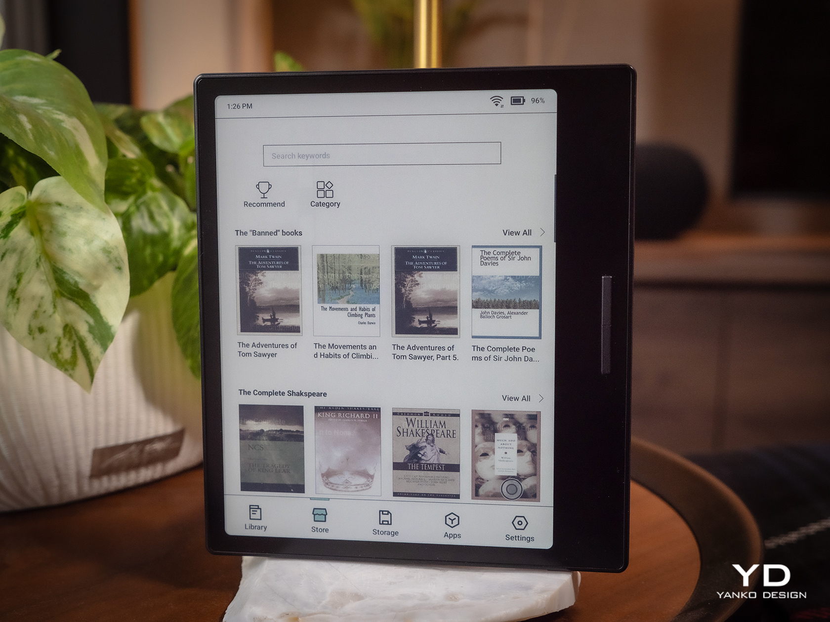
The Onyx BOOX Go Color 7 is at once both minimalist and stylish, depending on which side you’re looking at. The front has your typical asymmetrical design where one side extends beyond the screen bezel, creating not only a convenient place to hold but also a home for the physical page-turn buttons. It’s extremely bare, without even the BOOX name, making the 7-inch E Ink Kaleido 3 the sole focus of your attention. The glass protecting the screen sits flush with the bezels, creating a seamless and clean appearance that speaks to the maturity of this design.

Flip the device over and you have something more interesting, both for your eyes and your fingers. Eschewing the typical matte plastic cover on these devices, BOOX uses a paper-like material that adds not just texture but also improves your grip. In a way, it tries to bring back the tactile experience of holding a paper book in your hands, a small pleasure that is lost with these devices.

The BOOX Go Color 7 is hardly the thinnest nor the lightest, even among 7-inch E-readers, but it is definitely in that group. Its compact and portable design makes it a familiar face, one that makes it clear that this is a device for reading books. It just so happens to run Android, just like a tablet.

Ergonomics

While the BOOX Go 10.3 aimed for maximum thinness and minimum weight, its smaller but more colorful sibling is admittedly a bit all over the place. Compared to BOOX’s other 7-inch devices, it’s only slightly lighter but a bit thicker than the monochrome BOOX Page, but it definitely trumps the BOOX Tab Mini C in every dimension. Suffice it to say, it’s not going to break records, but it won’t break your wrist either.

The BOOX Go Color 7 is designed with ergonomics at its core, and not just because it’s small and light. That textured back cover does more than just make the E-reader look good, it also adds to its grippiness. You definitely won’t have to worry too much about the device slipping off your hand, nor do you even have to fret about leaving greasy fingerprints on the paper-like material.

The small E-reader is also designed for one-handed use, even for turning pages. The physical buttons, or button rather, are positioned precisely where you’d rest your thumb, so you easily press down either end to move forward or backward. It doesn’t even care if you’re right-handed or left-handed, because thanks to its support for auto-rotation, the buttons know which way is up all the time. The one design gripe we have is that the page-turn button is just a single, indistinguishable bar with no gap to separate the two functions. You’ll find yourself losing a few precious seconds either trying to feel for which end is which or, more likely, looking at the button to make sure you’re hitting the right half.

Performance

Anyone familiar with the BOOX family of devices pretty much knows its DNA. Every single one at this point is practically an Android device decked with an E Ink panel, not the custom operating systems used by Kindles and Kobos. Even better, it actually has Google Play support already built-in, which means you have access to almost all Android apps available, including those that you can sideload on your own.

Of course, you’ll have to set your expectations correctly, despite all the potential that the platform has. This is not a powerful Android device, not with an aging Qualcomm Snapdragon 665 processor and just 4GB of RAM. It’s enough to run a few apps, especially those related to reading or even browsing the Web, but it won’t be as fluid an experience, especially with the E Ink display, which we’ll get to later. There’s 64GB of onboard storage that you can expand up to 1TB with a microSD card. Definitely plenty of room for books and even audio files or recordings.

The killer feature is, of course, the E Ink Kaleido 3 screen, which also separates the BOOX Go Color 7 from the almost identical BOOX Page. This former supports 4,096 colors while the latter is just different shades of black and white. On top of this, BOOX adds its own technologies to tweak the performance of the E Ink panel, like introducing different refresh modes to make you choose between quality and speed, among other things. Suffice it to say, Onyx’s expertise in this area clearly shows how clear, crisp, and colorful the screen can be. Plain black and white text renders at 300ppi and is a joy to read, while colored content is halved at 150ppi, which is typical for this display. Nonetheless, reading comics and magazines is still comfortable and meaningful, even with muted tones.

The BOOX Go Color 7 brings back a bit of sanity by having front lighting and configurable light temperature, something that the BOOX Go 10.3 removed for the sake of thinness. This means you can easily read with the device at night, in the dark, or in any low-light situation, whenever and wherever you feel the urge to knock a few pages off your reading list. Onyx, however, did exclude a few features to keep the product light not only in weight but also in cost. There is no Wacom digitizer for scribbling notes, for example. It also doesn’t feature the company’s famed BOOX Super Refresh or BSR, a technology that significantly reduces ghosting at the expense of battery life. Otherwise, the E-reader’s 2,300mAh battery wouldn’t last the days that it did.

At the end of the day, the Onyx BOOX Go Color 7 is hyper-focused on doing only one thing and one thing well: be an enjoyable E-book Reader, whether that’s a plain-text book or a colorful magazine. It doesn’t distract you with features only tangential to that activity, like taking notes, making sketches, or even watching videos. While you can install almost any Android app under the sun, the hardware limitations actually serve to dissuade you from subverting the product’s spirit and purpose. And when it comes to that, the BOOX Go Color 7 is definitely one of the best choices in the market today.

Sustainability

Onyx is a company that has grown by leaps and bounds over the past few years. The number of devices it has launched is quite significant, but that also means the amount of material waste that comes from these devices is substantial as well. Fortunately, these devices are made for long-term use, unlike phones and tablets which still have a very high turnover. That only delays the inevitable, however, so we’re still looking forward to the day that the company starts switching to more sustainable materials or recycled plastics for its products.

Although Onyx does make devices with longevity in mind, the same can’t be said for the version of Android they use. The BOOX Go duo, for example, uses a nearly three-year-old Android 12, and most of its products were using Android 11 before that. Granted, E-readers aren’t exactly known for keeping up with the latest software fads, but those don’t run Android either. What this means is that not only are BOOX devices behind in terms of potentially useful features and optimizations, they’re also lagging in security patches and bug fixes that would protect users from digital harm.

Value

The Onyx BOOX Go Color 7 is a delightful little device designed to make reading enjoyable anywhere you are. It has a solid set of capabilities that focus on this core use case and isn’t encumbered by extraneous features, though it still leaves the door wide open for other experiences. On its own, it is quite a competitive product, especially with a $249.99 tag, but it doesn’t exist in a vacuum and, in a way, even competes with BOOX’s other 7-inch readers. Fortunately, the distinction between them is quite clear, especially when it comes to their price tag.

Closest to it is the BOOX Page, to the point that it could have very well been called the BOOX Page Color. They share many things in common but are ultimately separated by color or the lack of it. If all you need is a plain E-book reader and don’t mind reading colored content in shades of gray, the BOOX Page actually offers a sharper screen and a slightly more affordable $219.99 price tag. On the opposite side stands the BOOX Tab Mini C, which is the portable productivity partner. It has all the bells and whistles, including a stylus, but also a heavier figure and a heavier cost at $399.99. If all you really want to do is read and enjoy it in color, then you can’t go wrong with the BOOX Go Color 7.

Verdict

BOOX’s new Go devices are quite bold, but not because they’re debuting something new and exciting. On the contrary, their audacity comes from going in the completely opposite direction, shedding off the baggage that they’ve accumulated over the years. It’s not like all those powerful features are bad, just that they’re not everyone’s cup of tea. And for those who truly love sneaking in a page or two during unexpected moments of freedom, the portability and clarity that the Onyx BOOX Go Color 7 brings could very well be what they need.

The post Onyx BOOX Go Color 7 E-reader Review: Bringing Back the Simple Joys of Reading first appeared on Yanko Design.

Microsoft Surface Pro 11, Surface Laptop 7 repairability gets thumbs up from iFixit

Par : JC Torres
26 juin 2024 à 10:07

It has only been a month since Microsoft unveiled its latest Surface-branded computers, and while the tech industry was awash with discussions on the company’s aggressive Copilot AI push and ARM-based Snapdragon X silicon, the products’ design may have left some people less than impressed. The Surface Pro 11 and Surface Laptop, for all intents and purposes, look exactly like their forebears, making one wonder if Microsoft has run out of creative juice or is desperate to milk its current design until it runs dry. Fortunately, that isn’t the end of the new Microsoft Story, as it turns out that the latest Surface Pro and Surface Laptop computers have one “invisible” upgrade it didn’t really talk about much: an easier repair process that has even the meticulous and stingy iFixit impressed.

Designer: Microsoft (via iFixit)

Laptops have come a long way from being impregnable fortresses that made even the smallest repairs or upgrades a hellish experience, though there are still some companies living the past in the present. Initially, the Surface Laptop was part of that group, requiring cutting through fancy Alcantara fabric just to open the laptop to replace a battery or upgrade the storage. This year’s design almost makes a complete U-turn with a bottom plate that’s only held down by four screws and magnets; no adhesive in sight. Even the battery can be easily removed by just removing screws and a few layers of parts blocking those.

Tablets are even worse news for repairs, especially with displays that are glued on top of the frame. To its credit, Microsoft has at least made changing the Surface Pro M.2 SSD painless by having an accessible magnet-locked panel to get to that storage instantly. The 11th-gen model takes things further by employing as little adhesive as possible, though you still have to go through the risky process of removing the screen first. Fortunately, getting to important parts like the battery is less of a grueling task, especially since it’s only held down by screws as well.

Even more impressive, however, is the fact that Microsoft officially supports such self-repair processes. It has made repair guides publicly available since day one and has even clearly marked out the number and types of screws that hold certain components in place. It’s far from perfect and definitely not on the same level as a Framework laptop, but it’s still an unexpected yet pleasant surprise, especially considering it’s Microsoft we’re talking about.

The post Microsoft Surface Pro 11, Surface Laptop 7 repairability gets thumbs up from iFixit first appeared on Yanko Design.

Top 5 iPad Accessories To Elevate Your Tablet Game To A Whole New Level

15 juin 2024 à 11:40

My iPad has almost reached necessity status in my life, I’m pretty sure all of us tablet owners are super reliant on them (I mean, I am for sure)! I personally find tablets extremely handy, they’re the comfortable middle ground between a smartphone and a laptop, and they pretty much perform the same functions as these two. They’re super easy to carry around, and honestly, I could survive wholly and solely on my iPad if I really wanted to. I’m always on the lookout for innovative and fun accessories to amp up my tablet (besides the basic ones Apple offers). Luckily there’s a whole bunch of crafty designs out there that can function as the perfect sidekick to your precious tablet.  Here’s a collection of super cool and functional product designs that promise to upgrade your iPad game to a whole other level!

1. HyperDrive

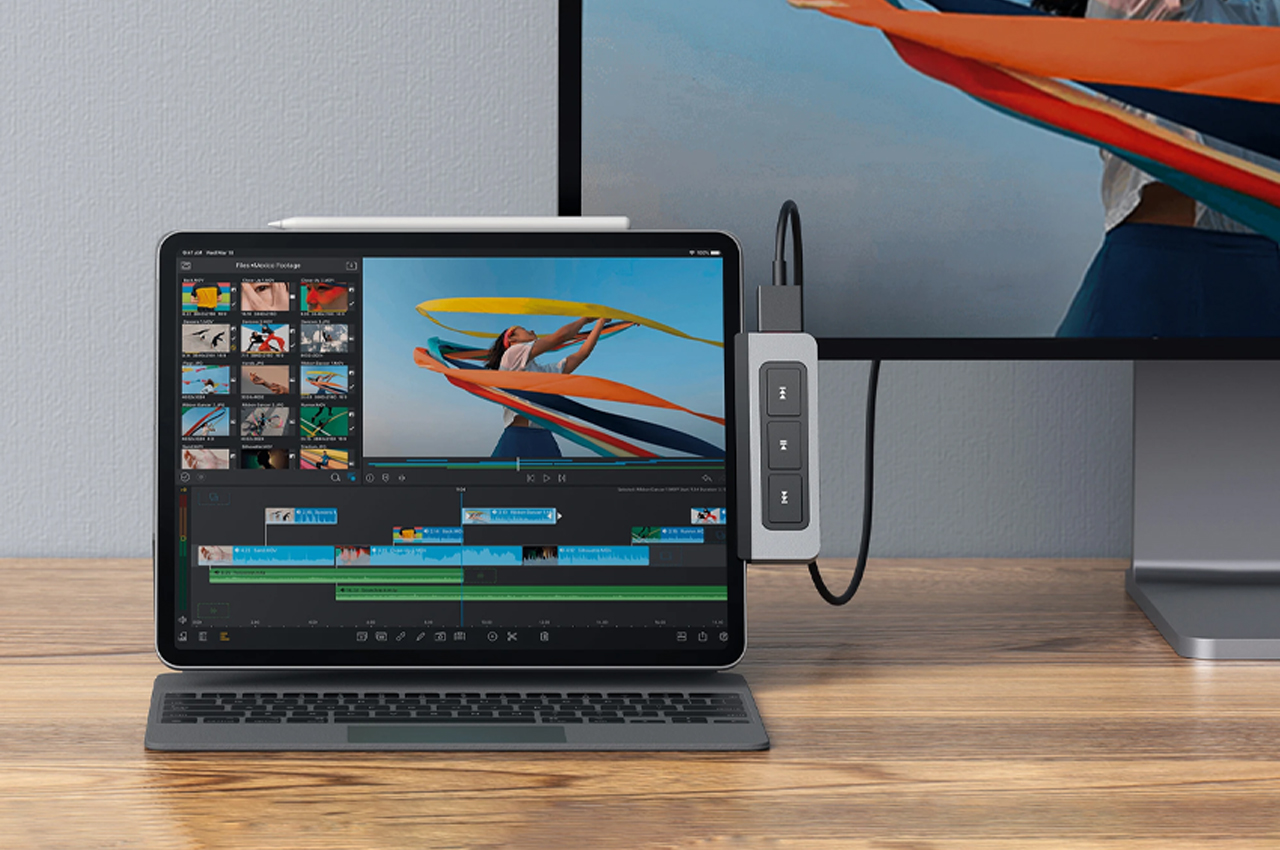
Dubbed HyperDrive, this is the world’s first-ever form-fitting USB-C hub with six different media ports and a media shortcut key. The HyperDrive is quite compact and fits perfectly into the palm of your hand. It features a 4K60Hz HDMI port, USB-C 5Gbps 60W Power Delivery port, MicroSD UHS-I port, SD UHS-I port, USB-A 5Gbps port, and a 3.5mm Audio Jack. It is also equipped with a built-in shortcut key which lets you “play, pause, fast-forward or rewind your favorite songs, videos, or podcasts without interrupting your workflow.”

2. Macintosh Studio

Designed by Scott Yu-Jan, this interesting DIY project is inspired by the Mac mini. It gives a home for an iPad mini and hides the Mac Studio in plain sight. Called the Macintosh Studio, the enclosure is placed on top of and hugs the Mac Studio, only the buttons are left unrestricted. The front of the device features a slot for the iPad mini to slide in and connect to the Mac Mini using a single UBC-C cable. This allows the iPad mini to be charged always, keeping it ready to go whenever you need, it while also allowing it to serve as a second screen for the Mac Studio.

3. Pro Stylus 2

Meet ZAGG’s Pro Stylus 2, which is designed to work with the iPad as well as the iPhone. The Pro Stylus 2 will feel super familiar and comfortable in your hand owing to its slim design. It features a precise fine tip that supports accurate drawing, as well as palm rejection to prevent your hand from accidentally touching or tapping the screen as you sketch or write. It is also equipped with tilt recognition to alter your stroke style when you change angles. Magnetic wireless charging allows you to snap the Pro Stylus 2 onto the side of your iPad Pro.

4. PenPad

The PenPad is designed to make the iPad’s famous sketching/painting app easier to use by removing the trouble of navigating the Procreate interface. The PenPad offers access to 22 different functions that you can use while sketching on Procreate – these range from increasing and decreasing brush size to even accessing the color wheel. It is a compact hardware accessory that allows you to paint with one hand while letting you press buttons to make the workflow faster and more efficient.

5. Apple Pencil Nibs

Yanko Design created nibs for the Apple Pencil! These fascinating interchangeable nibs include a fine-tip nib, a chisel nib, and a flexible brush-pen nib. Other different nibs could also hold the potential for 3D modeling features like the ability to sculpt on the iPad. These nibs would allow the iPad Pro to become the ultimate creator’s setup – for both 2D and 3D creation. It would serve as a ‘power-user’ tool enabling creators and designers to unlock new potentials.

The post Top 5 iPad Accessories To Elevate Your Tablet Game To A Whole New Level first appeared on Yanko Design.
The new Apple Pencil Pro is a death-sentence for Wacom

Par : Sarang Sheth
8 mai 2024 à 20:45

Wacom was once an industry leader in the sketching tablet PC market. However, it’s no match for the deadly combo of the new iPad Pro M4 and the Apple Pencil Pro. Announced at the iPad keynote yesterday, the new Pencil Pro packs features so unique, it makes regular capacitive styluses look like tools from the Stone Age. The new Pencil Pro has a new squeeze gesture to activate quick menus, can track rotation to have objects and brushes rotate in real-time (known as barrel roll), and even has a haptic motor for feedback – while still packing features from previous models like the hover feature, pressure and tilt sensitivity, and low-latency. If all that wasn’t enough, the Pencil Pro even has Find My support, allowing you to locate your stylus if it ever gets lost. The Wacom Pro Pen 3 on the other hand, has buttons.

Styluses have existed for decades at this point, and if you asked anyone ten years back which was the most well-designed stylus and tablet combo for creatives, the answer would invariably be something from Wacom’s lineup. The company had three options back in the day, the budget Wacom Bamboo, the mid-range Wacom Intuos, and the flagship Wacom Cintiq. Apart from the Cintiq, none of the other tablets had screens – they were just massive trackpads that you could only draw on with styluses. The Cintiq was the closest thing to an iPad – it had a screen, allowed multi-touch gestures, and came with controls galore… the only problem was that it didn’t work independently, it needed to be tethered to a desktop or laptop to work. The Cintiq, along with the Intuos and Bamboo, came with a stylus that featured a pressure and tilt-sensitive tip, along with programable buttons that let you undo or redo tasks, and a stylus tip on the back of the pen also that activated the eraser, mimicking how most pencils come with erasers on their reverse tip. The styluses also operated without batteries, allowing for hours of sketching without needing to charge the pen periodically.

The Wacom Cintiq Pro is anywhere between 5-8 times thicker than the 2024 iPad Pro

Cut to yesterday when Apple dropped the iPad Pro M4 and the comparison is incredibly stark. For starters, whenever anyone asks me whether they should buy an iPad or a Wacom, the answer is almost always the former… because when you’re not sketching on the Wacom, it’s useless, but when you’re not sketching on the iPad, it’s still an iPad. The difference seems even greater with the new iPad Pro being Apple’s thinnest device yet at just 5.1mm thick, while the 16-inch Wacom Cintiq is a whopping 25mm thick – 5 times thicker than its competitor. Cut to the larger 22-inch Cintiq and it’s a staggering 40mm thick, or the equivalent of 8 iPad Pros stacked one on top of the other.

However, a hardware comparison between a trillion-dollar electronics giant and Wacom, that’s valued at just half a billion dollars doesn’t seem fair. What does seem fair, however, is to just look at one singular product to see how far Apple’s outpaced its competition – the humble stylus. Wacom played a critical role in perfecting its EMR stylus technology, which was game-changing a decade or so ago. The pens ran without batteries, could sense pressure and tilt with stunning accuracy, and an eraser on the rear, becoming the creative industry’s go-to for digital sketching. When Apple debuted the Pencil, it had the same features except without any buttons. The Pencil 2, on the other hand, got a tap feature that let you swap between brush and eraser, and a unique charging mechanism that allowed you to charge your stylus simply by snapping it to the side of an iPad (it subsequently also got a hover function with newer iPad models). Apple’s newly announced Pencil Pro, which dropped yesterday, however, is an entirely different beast.

The new Pencil Pro has the hover function, lets you squeeze to activate a quick menu, and even supports barrel rolls that allow you to rotate brushes or objects simply by rotating your stylus. In true Apple fashion, it doesn’t have any buttons on it, but you can still tap to alternate between brush and eraser, and you even get a brush preview when your stylus is near the screen, letting you know how your brush is oriented. If all that wasn’t enough, the new Pencil Pro even packs Apple’s Find My feature, letting you locate a lost pencil through your iPad or iPhone.

The Pencil Pro can be squeezed to activate a quick menu

A great stylus on the iPad Pro, which already comes with an industry-leading chip, laptop-grade performance, a brilliant camera setup and LiDAR sensor, and an app store, basically makes the iPad or Wacom question moot. The only true advantage Wacom’s tablets have at this point is that they’re bigger than iPads, starting at 16 inches and maxing out at 27 inches diagonally. They also cost MUCH more than the iPad Pros, with the Cintiq Pro 16″ starting at $1599, and the Cintiq Pro 27″ having an eye-watering $3499 price tag. That’s Vision Pro territory for a sketching tablet.

The haptic motor gives you feedback when you squeeze the Pencil Pro

There still is a market for Wacom products. They’re massive, preferred by the hardcore animation and visual industries, and are platform-agnostic, which means you can easily run Windows or Linux programs on them, which most power users will appreciate over being limited to the iPadOS. But for the most part, the iPad Pro and Pencil Pro are so far ahead of their competition at this point, that they’ve made Wacom’s tablets (an already niche creative-focused gadget) even more niche… almost to the point of obscure.

The post The new Apple Pencil Pro is a death-sentence for Wacom first appeared on Yanko Design.
Why the M2 iPad Air Is Ideal for Students, Designers, and Everyone In Between

8 mai 2024 à 17:20

iPad Air M2

The iPad Air, now available in both 11-inch and 13-inch models, caters to a variety of needs and preferences. Whether you’re a student always on the move or a designer needing ample screen space for intricate visuals, there’s an option perfectly sized for you. The 11-inch version excels in portability, easily slipping into a small bag or backpack, making it the go-to device for students who juggle between classes and study sessions across campus. Meanwhile, the 13-inch model, with its expanded display, provides 30 percent more screen real estate, offering designers and students the luxury of a bigger canvas to work on complex projects or manage multiple applications side by side with iPadOS’s multitasking features.

Designer: Apple

The 11-inch iPad Air is super-portable, while the 13-inch model provides an even larger display, giving users more room to work, learn, and play.

Beyond size, the iPad Air boasts a Liquid Retina display with advanced technologies such as True Tone, high brightness, and anti-reflective coating, ensuring everything you see is detailed and vibrant. This is crucial when precision in color and detail plays a significant part in your coursework or professional projects. The support for P3 wide color gamut also means that the visuals are not just bright but incredibly accurate, which is especially important for design students and professionals who rely on true-to-life colors for their digital artistry.

The repositioned front-facing camera is another subtle yet impactful enhancement. Set along the landscape edge, the camera automatically keeps you in frame during video calls, thanks to the Center Stage technology. This feature is particularly beneficial now that remote collaboration has become more prevalent in both educational and professional settings. Whether you’re presenting a thesis to your class or brainstorming with colleagues over a video call, the camera adapts dynamically to ensure you are always seen, complemented by dual microphones that focus on your voice while minimizing background noise.

Moved to landscape edge, 12MP Ultra Wide front-facing camera with Center Stage improves call experience.

Performance-wise, the M2 chip in the iPad Air is a big leap forward, bringing not only speed but also efficiency to every task. This chip is tailored for advanced tasks such as photo and video editing, 3D modeling, and large-scale graphic designs, all while maintaining energy efficiency for all-day battery life. This means less time tied to a power outlet and more flexibility to work in settings that inspire you, be it a quiet corner of a library or lounging at your favorite cafe.

Moreover, the iPad Air now supports not only the Apple Pencil (2nd generation) but also the newly introduced Apple Pencil Pro, enhancing its utility for both students and designers. The Apple Pencil Pro includes a new sensor in its barrel that can detect squeezes, enabling users to quickly switch between tools, line weights, and colors effortlessly—ideal for designers working in applications such as Affinity Designer 2. Additionally, its custom haptic feedback provides tactile responses to actions like squeezing or double-tapping, enhancing the user’s interaction by confirming their inputs in a way that feels intuitive and direct. The inclusion of a gyroscope allows for fine control over tool orientation, mimicking the real-world experience of rotating a pen to achieve the desired stroke or effect.

Apple Pencil Pro enhances creativity with squeeze, barrel roll, and haptic feedback for intuitive marking, note-taking, and design in apps like Affinity Designer 2.

For those who are prone to misplacing their tools, the Apple Pencil Pro introduces support for Apple’s Find My network, a first for Apple’s stylus line. Both the Apple Pencil Pro and the Apple Pencil (2nd generation) attach magnetically to the side of the iPad Air, where they also charge, ensuring they are always ready for use and conveniently stored. This versatility makes the iPad Air an even more attractive option for anyone looking to maximize their productivity and creative output, whether they are annotating documents, taking detailed notes, sketching out a design, or navigating through complex creative software.

Connectivity is also an important feature of the iPad Air’s appeal. With the introduction of Wi-Fi 6E and the option for 5G connectivity, the device ensures that you can work from anywhere without lag or interruption. This is particularly valuable for students who need to download large resources quickly or for designers who must upload high-resolution files to cloud-based platforms.

Magic Keyboard: Floating cantilever design, magnetic attachment, multiple viewing angles, integrated trackpad, USB-C pass-through charging, and full iPad protection.

Traveling with tech can sometimes feel like a balancing act between staying productive and managing your gear effectively, especially for someone like myself who’s always on the move. One of the standout features of the iPad Air, from my perspective, is its versatility—particularly the ability to detach it from the Magic Keyboard. This becomes incredibly handy during air travel. Picture this: you’re on a flight, deeply absorbed in your latest design project or perhaps the climax of your favorite Netflix series. Just as the airplane prepares for takeoff, the usual announcement comes over the PA: “Please stow your laptops.” However, thanks to the iPad Air’s detachable setup, you can continue your work or entertainment seamlessly by simply detaching the iPad from its keyboard. It’s moments like these where the iPad Air proves its worth, allowing you to maintain your creative or entertainment zone without a hitch.

In terms of the operating system, I appreciate the straightforward and efficient design of iPadOS 17. It simplifies daily tasks and enhances user interaction, making everything from navigation to app management feel more fluid. The customization options in iPadOS 17 are particularly notable; they allow you to tailor the Lock Screen on both the 11-inch and new 13-inch displays. This personalization capability lets you set unique wallpapers and choose expressive fonts that truly reflect your personal style.

As WWDC 2024 approaches, while iPadOS 17 certainly gets the job done, I’m eager to see what iPadOS 18 will bring to the iPad. Anticipating new features and enhancements that could further refine and expand the functionality of this already versatile device adds an exciting layer of potential for iPad users looking forward to the next evolution in their device’s capabilities.

Interactive widgets on iPadOS 17 are also great for productivity. Imagine being able to glance at your screen and tap a widget to immediately capture a brilliant idea in the Notes app or adjust your schedule in Calendar. This kind of immediate interaction is perfect for someone who needs to stay flexible and react quickly to changes, which is often the case in both travel and creative professions.

iPad Air with M2 uses AI for features like Subject Lift, Visual Look Up, and Live Text.

The enhancements to Messages and FaceTime add a layer of fun and convenience. With new sticker features and the ability to leave video messages, staying connected feels more personal and engaging. For professionals, the Continuity Camera feature is particularly impressive. You can start a video call on your iPad Air and seamlessly hand it off to Apple TV, making it perfect for professional presentations or casual catch-ups.

Freeform’s new tools for drawing and collaboration are a boon for creatives. Whether you’re sketching out a quick concept or organizing a project with teammates, these tools make it easy to bring your ideas to life. And for someone who frequently deals with contracts or creative briefs, the enhanced PDF capabilities in the Notes app can be incredibly efficient, allowing you to annotate, fill out forms, and collaborate without ever needing to print or scan anything.

Lastly, the inclusion of features like Stage Manager, which lets you handle multiple overlapping windows, is ideal for multitasking. This feature, combined with AI-driven capabilities like Live Captions and intelligent accessibility features, ensures that the iPad Air isn’t just keeping up with the demands of mobile professionals and creatives—it’s anticipating them.

Every Apple product I’ve used, from my M1 MacBook Pro to an iPhone 12 Pro Max or a three-year-old iPad Pro with an M1 chip, continues to hold immense value. Remarkably, there has been very little performance degradation, and none feels obsolete. This changelessness is largely thanks to Apple’s timeless design concepts, which are consistently implemented across the product line.

Moreover, the new iPad Air reflects Apple’s ongoing commitment to environmental responsibility. It is crafted with 100% recycled aluminum for its enclosure, utilizes 100% recycled rare earth elements in all magnets, and features 100% recycled gold plating and tin soldering in multiple printed circuit boards. These efforts are complemented by packaging that is entirely fiber-based, aligning with Apple’s goal to eliminate plastic from all packaging by 2025. As part of a broader commitment, Apple aims to be carbon neutral across its entire manufacturing supply chain and the life cycle of every product by 2030. These steps not only reflect Apple’s dedication to reducing its environmental footprint but also enhance the appeal of the iPad Air to environmentally conscious consumers.

Whether you’re considering an upgrade or this might be your first Apple product, you can trust that in the next year, or even the year after, you won’t feel the need to upgrade unless you choose to. Apple’s commitment to quality, forward-thinking design, and environmental sustainability ensures that its products not only meet current demands but continue to remain relevant and perform excellently well into the future.

The post Why the M2 iPad Air Is Ideal for Students, Designers, and Everyone In Between first appeared on Yanko Design.

New 2024 iPad Pro’s M4 and Dual OLED Display Outshine All Tablets!

7 mai 2024 à 16:47

Powered by the M4 Apple silicon, Apple’s latest iPad Pro delivers a dramatic leap in device capabilities and efficiency. The chip, developed with advanced 3-nanometer technology, balances power consumption and performance, which is critical for the tablet’s innovative features. The enhanced energy efficiency supports the new Ultra Retina XDR display, offering improved brightness and color vibrancy. The design of the iPad Pro has also been refined to be thinner and lighter, making it highly portable yet durable due to its 100% recycled aluminum construction. The combination of advanced processing power and state-of-the-art display technology sets new standards in the mobile device industry.

Designer: Apple

Apple’s M4 Chip Revolutionizes the New iPad Pro

The impressive features of the new iPad Pro hinge on Apple’s latest M4 chip. This next-generation technology enables the device’s ultra-thin design and outstanding display features. Far from a minor update, the M4 chip is a transformative element that significantly enhances performance and efficiency.

Built using second-generation 3-nanometer technology, the M4 chip is impressively efficient, aligning perfectly with the sleek and lightweight design of the new iPad Pro. Its advanced silicon architecture achieves high-performance levels with significantly reduced power consumption. Apple asserts that its new chip produces the same output as the previous M2 chip but uses only half the power. Additionally, it matches the performance of modern PC chips while consuming just a quarter of the power.

The M4 chip’s integration with the iPad Pro’s Ultra Retina XDR display is central to its impact. The chip’s new display engine revolutionizes the tablet’s visual output with precise detail, vibrant color, and dynamic brightness levels, setting a new mobile display standard. It also significantly improves processing power, featuring up to four performance cores and six efficiency cores, further enhanced by next-generation machine learning accelerators. These advances result in up to 1.5 times faster CPU performance than the M2 and up to four times faster performance in professional rendering applications like Octane.

Moreover, the M4 introduces sophisticated GPU capabilities not previously seen on iPads, including Dynamic Caching, hardware-accelerated mesh shading, and ray tracing. These features enhance both graphic rendering and efficiency, making complex visual tasks smoother and more responsive. The chip’s advanced Media Engine supports AV1 decoding, optimizing power efficiency for high-resolution video streaming, which benefits both media consumption and professional creative workflows.

Through these innovations, the M4 chip does more than just support the iPad Pro’s performance. It actively enhances it, making the device’s cutting-edge design and capabilities possible. Therefore, the M4 chip is not just a part of the new iPad Pro—it’s the very foundation that redefines what a mobile device can do.

Revolutionary Dual OLED Technology and Nano-Texture Glass: A Visual Feast

2024 iPad Pro with Ultra Retina XDR display with its dual OLED technology

The new iPad Pro boasts the cutting-edge Ultra Retina XDR display, setting new benchmarks for visual quality with its advanced tablet display technology. This display uses tandem OLED technology, where two OLED panels are stacked, doubling the light output, enhancing brightness, and extending the display’s lifespan by reducing the strain on each panel. It achieves a remarkable full-screen brightness of 1000 nits, peaking at 1600 nits for HDR content, ensuring exceptional clarity and detailed visibility in various lighting conditions.

This setup enhances luminosity and allows for sub-millisecond adjustments in color and luminance, significantly improving the precision of HDR and the overall viewing experience. The display’s wide color range and swift response rates offer vibrant, lifelike colors and fluid motion, perfect for professional graphic work and entertainment. For professionals, particularly those working outdoors or in brightly lit conditions, the iPad Pro offers a nano-texture glass option. This feature, etched at the nanometer scale, significantly reduces glare while maintaining excellent image quality and contrast, which is essential for high-end, color-managed workflows.

The pairing of Apple’s M4 chip with the Ultra Retina XDR display is a crucial enhancement. It supports this advanced display technology with a new engine that fine-tunes color and brightness. This harmony between the chip’s capabilities and the display’s advanced technology not only heightens the user experience but also pushes the limits of mobile display technology. This makes the iPad Pro an indispensable tool for professionals and a top-tier device for general users seeking the very best in display performance.

Thinner, Lighter iPad Pro Redefines Portability with Advanced Materials and Optimized Camera Placement

2024 iPad Pro: 11-inch 5.3 mm deep, and the 13-inch model is even slimmer at 5.1 mm

The new iPad Pro excels in performance and display while also showcasing significant advancements in hardware design, enhancing both portability and functionality. Here’s an overview of the redesigned iPad Pro:

The latest models emphasize lightweight and slim profiles. The 11-inch iPad Pro is incredibly compact and light, weighing in at .98 pounds, making it an ideal companion for productivity and entertainment on the go. The 13-inch variant, despite its larger screen, maintains a surprisingly thin and light structure, weighing only 1.28 pounds. This makes it easier to carry, whether commuting or traveling.

Both models set new records in terms of slimness within Apple’s product lineup. The 11-inch version is only 5.3 mm deep, and the 13-inch model is even slimmer at 5.1 mm. This sleek form is achieved without compromising the device’s strength and durability, thanks to its construction from 100% recycled aluminum. This not only strengthens the iPad Pro but also underscores Apple’s commitment to environmental sustainability.

The new iPad Pro models really step up the game with their cool design and practical features. They’re pushing what’s possible with tablets and even thinking about the environment. It’s a bit of a letdown that they skipped MagSafe this time around, but when you think about the tablet’s design, it kind of makes sense. All in all, these iPads keep Apple at the cutting edge, perfect for pros and tech lovers who want top-notch performance and easy-to-carry tech.

Enhanced iPad Pro Cameras: Superior Photo Quality and Smarter Video Calls

2024 iPad Pro camera: 12MP f/1.8 with Smart HDR 4 and 4K ProRes video

The camera capabilities of the latest Pro tablet from Apple have substantially improved. Furnished with studio-grade microphones for crystal-clear audio, the device amplifies both photography and video editing experiences. The Pro tablet’s 12MP rear camera seizes vibrant Smart HDR images and videos, presenting richer colors and more precise details, even in dim lighting. Besides, the innovative adaptive True Tone flash enhances document scanning. It employs AI to identify documents, automatically capturing several photos to remove shadows and flawlessly merging them for a pristine scan.

Turning to selfies and video calls, the front-facing TrueDepth camera now adopts a landscape orientation, optimizing the video call experience with the Ultra Wide 12MP camera and Center Stage technology. This setup ensures you remain in the frame effortlessly, even when moving, which is particularly beneficial when using accessories like the Magic Keyboard or simply holding the iPad. These intelligent enhancements significantly boost the versatility of the iPad Pro’s camera system.

I’m genuinely impressed with the new iPad Pro, especially with all the advanced features packed into it. Since I’m still using the iPad Pro M1, this new model seems like a delightful and worthwhile upgrade. The enhancements, from the M4 chip’s power efficiency to the stunning Ultra Retina XDR display with its dual OLED technology and nano-texture glass, all signal a major leap forward in design and functionality. Plus, the iPad’s sleeker, lighter build and the revamped camera system really speak to how much thought Apple has put into this iteration. We’re excited and anxious to get our hands on it and give it a thorough review. This could very well set a new standard for what we expect from tablets in terms of performance and portability. Moreover, the 13-inch model appears to be a potential laptop replacement, especially considering I’ve been contemplating getting a MacBook Air. This iPad Pro might just be the powerful, portable solution I’ve been looking for. The 11-inch model starts at $999, and the 13-inch model begins at $1,299. You can pre-order today, with availability starting on May 15, 2024.

The post New 2024 iPad Pro’s M4 and Dual OLED Display Outshine All Tablets! first appeared on Yanko Design.
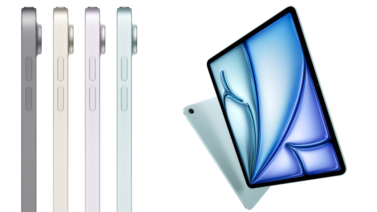
There Are 5 iPads in Apple’s 2024 Lineup: Is It Time to Upgrade?

6 mai 2024 à 17:20

Hold onto your hats, folks, because Apple’s “Let Loose” event on May 7 is shaping up to be a blockbuster! Following a history of groundbreaking innovations, Apple’s upcoming event promises to introduce the next chapter in the iPad saga with potentially game-changing new models. We’ve snagged some insider info from Bloomberg’s Mark Gurman, and it looks like Apple is ready to roll out not just one or two but four new iPad models, with a surprise fifth possibly in the mix. From sleek designs to powerful chips, Apple’s gearing up to impress us all.

Designer: Apple

As someone who’s still using a maxed-out M1 12.9-inch iPad Pro with 1TB of storage and WiFi + Cellular connectivity, I’m eagerly waiting on the next new iPad Pro. Let’s dive into the details of each model, highlighting their unique selling points and discussing who might benefit most from an upgrade.

iPad (ninth generation)

Apple iPad (ninth generation)

  • Unique Selling Point: This model continues to feature the classic physical home button, appealing to users who prefer traditional navigation. It’s a familiar design with reliable performance.
  • Upgrade Advice: Ideal for those using older iPad models who need a dependable device for everyday tasks like web surfing, streaming, and light productivity, without the complexity or cost of more advanced models.

iPad (10th generation)

Apple iPad 10th-gen with all‑screen design, 10.9-inch Liquid Retina display

  • Unique Selling Point: Introduces a sleek, button-less design with a larger 10.9-inch screen, enhancing user interaction and visual engagement.
  • Performance Leap: A significant upgrade in display and user interface makes it perfect for those who enjoy media consumption and need a bit more space for productivity apps.
  • Upgrade Advice: This is great for users upgrading from older non-Pro models who prefer a more modern look and improved performance without stepping up to the Pro level.

iPad mini (sixth generation)

Apple iPad mini (6th generation)

  • Unique Selling Point: Despite its small size, the iPad mini does not compromise on performance, offering robust capabilities in a compact package that is easy to carry.
  • Upgrade Advice: This model is ideal for those who travel frequently or need a powerful, portable device that can handle tasks on the go without the bulk of larger tablets.

iPad Air (11-inch and 12.9-inch models)

Apple iPad Air (5th generation)

  • Unique Selling Point: Now equipped with the M2 chip, these models bring near-pro performance at a more accessible price point. The design is expected to be sleek, inheriting the advanced aesthetics of previous iPad Pros.
  • Upgrade Advice: This is a smart choice for those seeking a larger iPad that focuses less on cutting-edge technology but still offers substantial performance. It’s perfect for users like me who need a versatile device that bridges the gap between a conventional iPad and the high-end Pro model.

iPad Pro (11-inch and 12.9-inch models)

Apple iPad Pro

  • Unique Selling Point: The new iPad Pro models, set to feature the cutting-edge M4 chip, are poised to be the most powerful iPads yet. They are designed to handle extremely demanding applications and multitasking with ease.
  • Anticipated Features: Upgrades like OLED displays are expected to provide unmatched visual quality, making these models a top choice for professionals in creative fields. Additionally, I would speculate that an advanced optics camera system, similar to the iPhone 15 Pro, might be included, with capabilities to capture immersive videos that could synergize with devices like the Vision Pro.
  • Personal Insight: As a power user who is always chasing the next big thing, I’m particularly excited about the new iPad Pro. Given its anticipated capabilities, it could potentially replace my laptop for on-the-go tasks, offering a more convenient option for portability compared to carrying a MacBook Air.

Strategic Redesign and Market Impact

iPad Pro concept design

The potential repurposing of the current iPad Pro chassis for the new iPad Air models is especially interesting, suggesting a significant redesign of the iPad Pro line. This could mean even more advanced features are on the way:

  • OLED Displays: Set to enhance visual quality to new levels.
  • Advanced Input and Connectivity Options: Improved Apple Pencils and additional connectivity ports are likely to make these devices more versatile and functional.
  • Cutting-Edge Design Innovations: Expect sleeker designs with slimmer bezels and potentially new size options.

iPad Pro concept design

Additional Considerations when deciding whether to upgrade:

  • Budget: Consider the cost-effectiveness based on the new features offered.
  • Compatibility: Verify whether existing accessories will be compatible with the new models.
  • Longevity: Investing in a newer model ensures longer support and updates from Apple, providing better long-term value.

As anticipation builds for the official announcements at the “Let Loose” event, the excitement highlights Apple’s ongoing innovation and leadership in the tech industry. Stay tuned for what promises to be an exciting unveiling of Apple’s newest creations!

The post There Are 5 iPads in Apple’s 2024 Lineup: Is It Time to Upgrade? first appeared on Yanko Design.
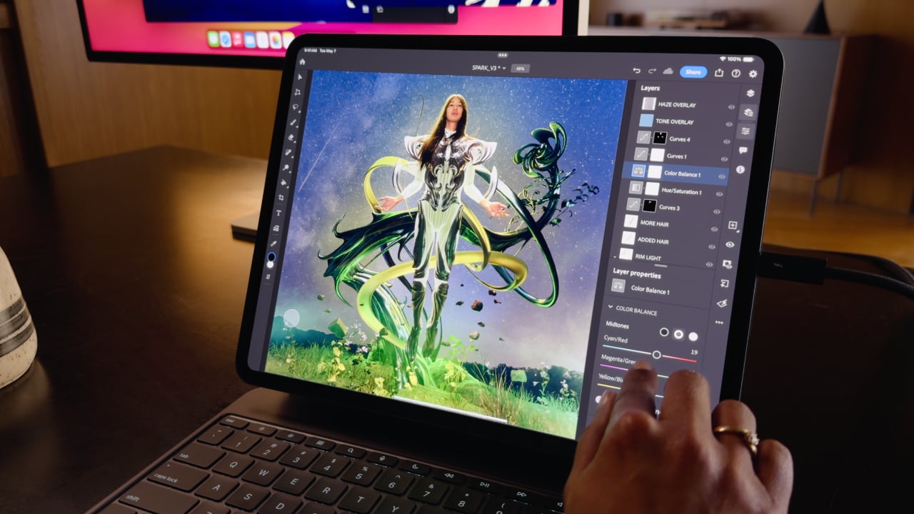
❌
❌