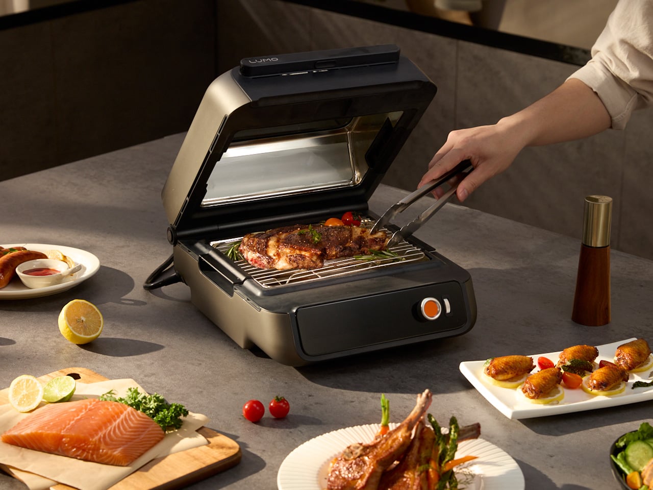
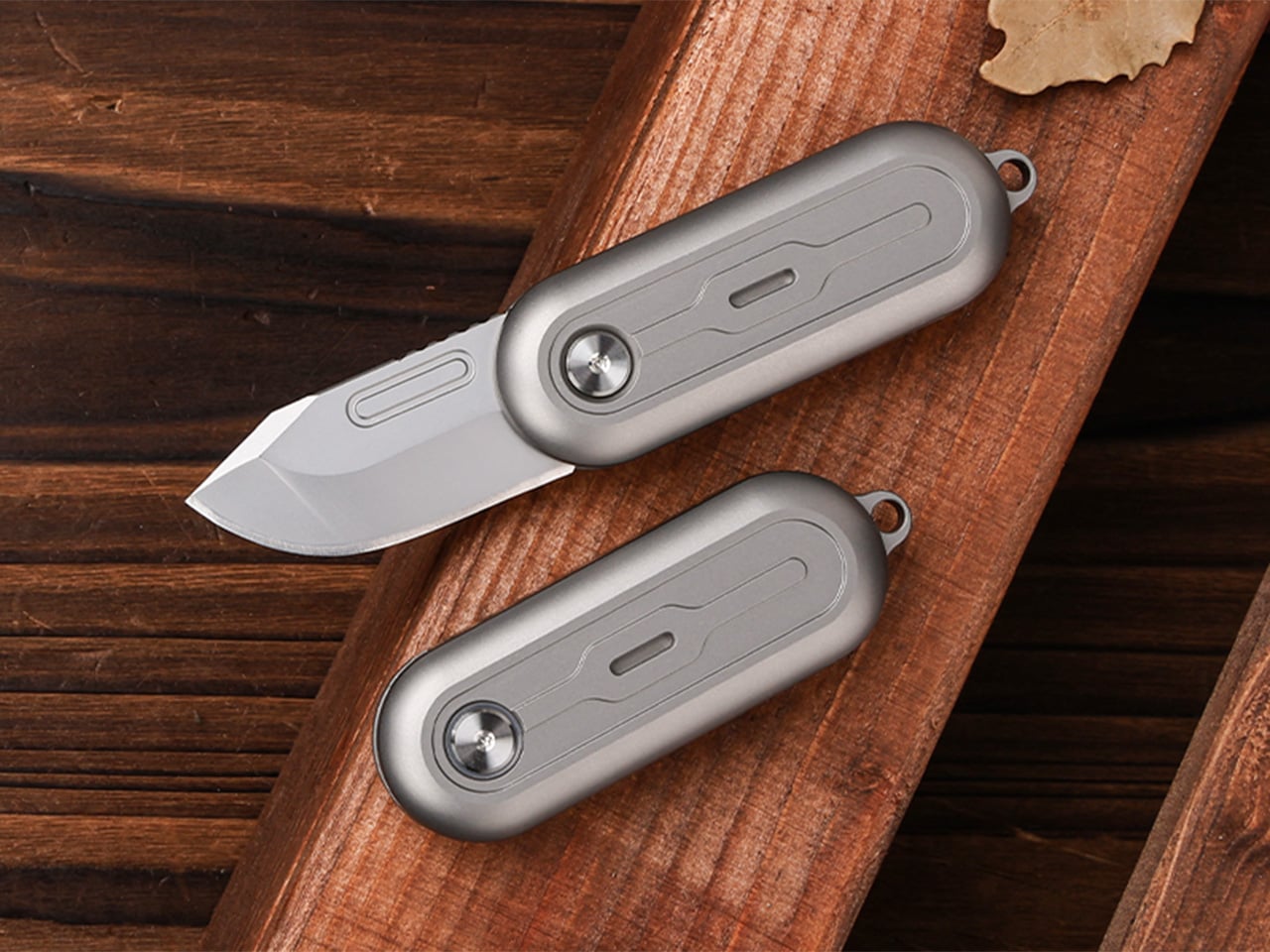
Vue normale

Il y a de nouveaux articles disponibles, cliquez pour rafraîchir la page.
À partir d’avant-hierFlux principal

Un ransomware frappe le logiciel de dossiers patients de 80 % des hôpitaux néerlandais

Par : Korben
8 avril 2026 à 15:11

ChipSoft, l'éditeur qui fournit le logiciel de dossiers médicaux à environ 80 % des hôpitaux aux Pays-Bas, vient d'être touché par un ransomware. Le site de l'entreprise est hors ligne depuis le 7 avril, et on ne sait pas encore si des données de patients ont été volées.

Ce qu'il s'est passé

L'attaque a été confirmée le 7 avril par Z-CERT, l'agence néerlandaise qui surveille la sécurité informatique dans le secteur de la santé. ChipSoft développe le logiciel HiX, qui gère les dossiers médicaux de patients dans la grande majorité des hôpitaux du pays. Le site web de l'entreprise est tombé dans la journée et reste inaccessible.

Z-CERT a envoyé un mémo confidentiel aux clients de ChipSoft pour leur demander de couper leur connexion VPN vers les systèmes de l'éditeur. Onze hôpitaux ont déconnecté leurs systèmes par précaution. Les autres ont indiqué que leurs données patients étaient en sécurité et que leurs services continuaient de fonctionner.

Des données patients potentiellement compromises

ChipSoft a confirmé qu'il y avait eu un "incident de données" avec un "possible accès non autorisé". L'entreprise ne peut pas garantir que des données de patients n'ont pas été consultées ou copiées. Le groupe de hackers derrière l'attaque n'a pas été identifié, et aucun montant de rançon n'a été rendu public.

Plusieurs hôpitaux, dont le Rijnstate Hospital, l'Antoni van Leeuwenhoek (spécialisé en cancérologie) et le Franciscus Hospital ont déclaré ne pas être affectés. Mais la portée réelle de l'attaque reste floue.

Le secteur de la santé toujours en première ligne

Z-CERT classe les ransomwares et l'extorsion comme les menaces principales pour les organisations de santé néerlandaises dans son rapport annuel.

Le secteur reste une cible privilégiée parce que les données médicales ont une valeur élevée sur le marché noir, et que les hôpitaux ne peuvent pas se permettre de rester longtemps sans accès à leurs systèmes.

Quand un seul éditeur gère les dossiers médicaux de 80 % des hôpitaux d'un pays, une attaque sur cet éditeur prend une dimension un peu inquiétante.

Pour l'instant les dégâts semblent contenus, mais le fait que ChipSoft ne puisse pas exclure un vol de données, c'est quand même un gros point d'interrogation. Et ça rappelle qu'un système de santé aussi centralisé, ça peut vite devenir une faiblesse.

Source : NL Times

"Raptor Lake will continue to be abundantly available": Intel exec makes a case for its older chips as RAM prices soar, but are they actually worth buying in 2026?

Intel's aging Raptor Lake desktop CPUs are "not going anywhere," according to an Intel exec, as RAM prices soar and PC gamers search for DDR4 alternatives. Are these chips worth buying in 2026? Let's explore.

Intel Core i7-13700K

Intel's "Raptor Lake" 13th and 14th Gen desktop processors remain a solid option for DDR4 gaming PCs.

These $100 Open-Ear Earbuds Won’t Fight Your Glasses, Hair, or Hat

Par : JC Torres
8 avril 2026 à 13:20

Open-ear earbuds have had a genuine moment over the past year, and it’s easy to understand why. About half of all earbud users have moved toward them, drawn by ambient awareness, ear health, and the comfort of not having anything plugged into their ear canals. The category has grown quickly, and the question now is which designs actually get it right.

The Skullcandy Push 540 Open enters that picture with a clear sense of what’s been bothering people. Thick earhooks that compete with glasses, neckbands that catch on hair and collars, and touch controls that trigger every time headwear grazes the sensor aren’t fringe complaints; they’re consistent ones. Skullcandy took that feedback and built the 540 Open around fixing each of them.

Designer: Skullcandy

Anyone who has worn open-ear hooks alongside glasses or a hat knows the small but mounting annoyance of too much hardware competing behind the ear. Skullcandy trimmed the earhook thickness based on direct user feedback, and the result is a fit that holds without adding friction to whatever you’re already wearing. It’s the kind of detail you only notice once you stop thinking about it.

The neckband gets the same thoughtful treatment. Unlike rigid or snapping designs found on competing options, Skullcandy’s version drapes naturally, so it won’t fight longer hair or push against a jacket collar. When you pull it off mid-run and don’t have the case on you, the magnetic closure lets it wrap cleanly around your wrist or neck without turning into a tangled nuisance.

Think about what it’s actually like to be deep into a trail run, layered up in a gaiter and hat, headphones that have stayed put the whole time, traffic audible from a distance. That’s the version of open-ear audio the 540 Open is built for. The over-ear hanger keeps things locked in, and the open design keeps the world around you audible.

Battery life is where the 540 Open puts some distance between itself and the competition. At 10 hours per earbud with 32 more in the case, it totals 42 hours, compared to six per earbud for both the Shokz Open Fit Air and JBL Soundgear Sense. The IP44 rating and a 10-minute rapid charge round it out for full days outdoors.

For anyone who trains with a hat on, the ability to disable the touch sensors entirely is a quietly significant option. Most open-ear earbuds don’t offer it. Audio comes from 12mm dynamic drivers, and Bluetooth 5.3 with multipoint pairing means two devices can stay connected at once, so moving between a phone and a laptop mid-workout doesn’t require any extra steps.

At $99.99, it’s $20 less than the Shokz Open Fit Air and $60 less than the JBL Soundgear Sense. What’s more interesting than the price gap is that it doesn’t get there by skimping. Better battery life, a flexible neckband that cooperates with real-world dressing, and comfort details from user feedback aren’t the kind of things that make headlines, but they’re what make the difference on a long day outdoors.

The post These $100 Open-Ear Earbuds Won’t Fight Your Glasses, Hair, or Hat first appeared on Yanko Design.

This Minimalist Analog World Clock Is the Upgrade You Didn’t Know Your Desk Needed

Par : Neha Mistry
8 avril 2026 à 11:40

This 12-sided clock turns global timekeeping into a calmer desk ritual

Keeping up with different time zones sounds simple until it becomes part of your everyday routine. You check your phone before a call, open another tab to confirm the hour, do a quick mental calculation, and still second-guess whether it’s too early in Tokyo or too late in New York. Not to forget the perils of push-notifications – a quick check of time leads you down a drain of doom-scrolling that you take an hour to return from! To add a layer of analog convenience in this increasingly digital setup, I present the Rolling World Clock.

Why Traditional World Clocks Never Quite Feel Right

The Rolling World Clock takes a familiar category and gives it a much smarter form. Instead of relying on screens, menus, or a row of tiny city labels, this analog desk object turns world time into a simple physical interaction. Built with 12 sides, each representing a major timezone city, it lets you roll from one location to another and instantly read the local time with a single hand. It’s a cleaner, more tactile answer to a problem that has long been solved in ways that feel unnecessarily digital.

Designer: MASAFUMI ISHIKAWA .Design

Click Here to Buy Now: $49 Hurry, only a few left!

Change time zones with a single roll.

Using The Analog Experience Feels Better

That analog quality is a big part of the appeal. There’s a growing interest in devices that help people step back from constant digital interaction, and this clock fits neatly into that trend without feeling nostalgic for nostalgia’s sake. It still solves a modern problem, especially for people working with global teams or keeping in touch with friends and family abroad, but it does so in a way that feels grounded and human. You’re not swiping, tapping, or toggling between screens. You’re just rolling the object in your hand and reading the time.

Built for modern routines, expressed through simple interactions.

The city lineup also makes it genuinely useful. The 12 sides cover major global time zones, including London, Paris, Cape Town, Moscow, Los Angeles, Karachi, Mexico City, New York, Shanghai, Tokyo, Sydney, and New Caledonia. That gives it enough range to be practical for a wide variety of work and lifestyle needs, whether you’re coordinating meetings, planning travel, or just trying not to message someone at the wrong hour.

Built for a More Intentional Desk

For the desk setup fanatics, there’s also a strong aesthetic argument here. The Rolling World Clock is available in black and white, two finishes that make it easy to integrate into a modern desk setup without fighting for attention. It has the kind of understated presence that works especially well for young professionals who want their workspace to feel differentiated without becoming visually noisy. It’s functional, yes, but it also reads as a design object, the sort of piece that quietly signals taste.

Clean lines, one hand, no distractions.

That balance of utility and personality is what makes this more than a novelty. If you work across cities, collaborate with clients in different regions, or simply like the idea of keeping global time visible without adding another glowing screen to your day, this clock makes a strong case for itself. It taps into a broader shift toward analog tools that feel slower, more deliberate, and more human, while still solving a very modern problem.

Feels as good in the hand as it looks on the desk.

Why It’s Worth Picking Up Now

At $49, the Rolling World Clock lands in a sweet spot for a desk upgrade that feels distinctive without being overcommitted. It also has the kind of giftable appeal that comes from being both useful and conversation-worthy. And with only a few left, it carries just enough urgency to make hesitation a risky move.

If your desk could use an object that feels smarter, calmer, and more intentional than another digital widget, the Rolling World Clock is worth grabbing now. It’s currently available in the Yanko Design Shop in black and white, and with limited stock remaining, this is one of those rare functional design pieces you probably shouldn’t wait on.

The post This Minimalist Analog World Clock Is the Upgrade You Didn’t Know Your Desk Needed first appeared on Yanko Design.

Satechi’s $130 Foldable 3-in-1 Charger Now Hits 25W for iPhones

Par : JC Torres
8 avril 2026 à 10:07

Wireless charging was supposed to simplify things. Instead, most Apple users end up with a tangle of pads and cables on the nightstand, one for the iPhone, another for the Apple Watch, and a separate spot for the AirPods. The technology meant to reduce friction has become its own kind of mess, especially for anyone who’s ever scrambled for a Watch charger before a morning flight.

Satechi’s 3-in-1 Foldable Wireless Charging Stand with Qi2 25W takes aim at that problem. The San Diego brand has updated its best-selling foldable charger with a meaningful upgrade, bumping wireless power delivery for compatible iPhones to 25W, a notable jump from the 15W ceiling most MagSafe-compatible pads have been stuck at. It’s built as a proper desktop stand, not just something you tolerate next to the lamp.

Designer: Satechi

Set the phone down on the magnetic charging surface, and Qi2’s built-in alignment snaps it into position so you don’t lose power from an off-center placement. The Apple Watch sits at a comfortable angle on its dedicated fast-charge module, while the AirPods rest on their own pad below. All three charge simultaneously from a single cable going to the wall, with nothing to juggle.

Apple Watch fast charging requires MFi certification, and Satechi has that covered. The stand supports Series 7 and newer, including Ultra and SE models. Advanced safety protections manage heat and prevent power loss when all three pads are active at once. The magnetic surface on the phone pad also ensures it stays correctly positioned even if you accidentally nudge it during the night.

Then there’s the folding design, which is where the stand earns its keep as a travel companion. It collapses into a flat form that fits easily in a carry-on without much bulk, then unfolds into the same stable stand you’re used to at home. There’s no need to rethink your charging setup just because you’ve checked into a different room across town or across the world.

Satechi also includes a 45W USB-C power adapter in the box, which sounds like a minor detail until you’re unpacking in a foreign hotel room. The adapter ships with US, EU, and UK plug attachments, meaning it works across different countries without needing a separate travel adapter. That’s a small but thoughtful decision for anyone whose travels take them to multiple regions throughout the year.

Available now on Satechi.com and Amazon, the stand retails for $129.99 in Space Black. It’s a higher investment than a single-device pad, but consolidating three separate chargers into one that travels as well as it sits on a desk makes that gap easier to justify. For Apple ecosystem users tired of the cable pile next to the bed, this stand offers a much cleaner end to every day.

The post Satechi’s $130 Foldable 3-in-1 Charger Now Hits 25W for iPhones first appeared on Yanko Design.

Archives de Korben - Plus de 20 ans d'articles en un clic

Par : Korben
7 avril 2026 à 15:30

Retrouver un vieil article sur korben.info, c'est pas toujours simple. La home s'arrête à 5 pages (site statique oblige) et après, fallait se débrouiller avec les catégories ou le moteur de recherche. Alors pour vous faciliter un peu la vie, je vous ai mis à dispo des pages d'archives accessibles via le footer.

Ainsi, vous scrollez en bas de n'importe quelle page, vous cliquez sur "Archives" ou sur une année, et vous tombez sur un index chronologique complet. Chaque mois est listé avec tous ses jours, et pour chaque jour, un petit nombre entre parenthèses vous indique combien d'articles ont été publiés ce jour-là. Vous cliquez, vous avez tout.

C'est vrai qu'avec plus de 19 000 articles publiés depuis août 2004, soit 22 ans de blog, autant dire que les catégories seules, c'était un peu l'aiguille dans la botte de foin ! Vous verrez d'ailleurs que le rythme varie pas mal... certains jours y'a 1 seul article, d'autres y'a carrément 25 (genre mars 2026, c'était dense).

Ma meilleure année c'était 2008 avec 1668 articles ! Suivi de 2011 avec 1487 articles, 2012 avec 1410 article et plus récemment 2025 avec 1318 articles. C'est pour ça que quand je poste à peine 5 articles par jours et que les commentateurs habituels chouinent à base de "Sans IA tu pourrais jamais faire ça c'est pas possible humainement", je rigole fort ^^

Par contre attention, y'a pas de recherche par mot-clé sur cette page mais pour ça y'a toujours le champ de recherche du site .

Bref, c'est dans le footer. Allez fouiller !

MUJI-Meets-Cyberpunk Vinyl Record Player Glows Like an Ambient Light and Charges Wirelessly

Par : Sarang Sheth
8 avril 2026 à 01:45

Minimalism in product design has gotten boring. We’re swimming in smooth white rectangles, touch controls that offer zero feedback, and devices designed to vanish. Apple spent two decades training the industry to sand away every visible seam, and now we live in a world where a Bluetooth speaker looks like a cylinder because a cylinder offends nobody. Bang & Olufsen understood early that audio equipment could occupy space like sculpture, could earn its place in a room through presence instead of absence. Teenage Engineering proved that mechanical honesty and playful geometry could coexist with premium materials. Both approaches work because they have a point of view.

TRETTITRE’s TTT series combines those instincts into something harder to categorize. The TTT-LP3 wireless vinyl player uses CNC-machined aluminum for the main frame and features a diffused lighting panel that spreads light evenly across the surface when music plays. The TTT-DP3 Bluetooth CD player takes inspiration from a UFO-like form with a transparent magnetic cover that rotates open to reveal the spinning disc. The TTT-CP3 cassette player uses a metal housing with sharp geometric lines and mechanical transport keys that deliver clear physical response. All three mount on the TTT-W magnetic modular wall rack, turning physical media playback into a visible, functional part of interior design.

Designers: Noah – Founder & Designer, Trettitre

Click Here to Buy Now: $229 $449 ($220 off). Hurry, only 55/99 left! Raised over $654,000.

TTT-LP3: A Vinyl Player That Doubles as Ambient Light

The back of the LP3 includes a hidden mounting structure that allows it to hang directly on a wall. You can mount it vertically so the record becomes part of the visual display, or go for the classic horizontal layout. When you want to move it, you lift the silicone leather handle at the top and take it down. The player detaches easily and gives you the freedom to listen wherever you choose. Traditional turntables usually stay exactly where you put them, limiting your options for when and where you listen. The LP3 works a little differently because of the battery and the wall mount’s wireless charging system, which keeps it powered without a visible cable.

Behind the LP3 sits a diffused lighting panel that spreads light evenly across the surface of the unit. When it’s on, the entire body of the player glows softly, designed to feel closer to ambient lighting than decorative lighting. You can change the lighting effects with the touch of a button. When a record spins, the moving shadows create a quiet visual effect. You can also leave the player mounted on the wall as a soft light source even when no music is playing. That ambient quality pushes the LP3 from well-designed product into something more considered: a slow, breathing light fixture that happens to play records.

The LP3 uses a self-balancing tonearm system that automatically sets the correct pressure when the player powers on. You place the record on the platter and lower the needle, and the system handles the rest. Many turntables require careful calibration before they can be used properly, with tonearm balance, tracking pressure, and counterweight adjustment all part of the process. For experienced collectors that process can be enjoyable, but for beginners it often feels complicated. The LP3 removes that barrier entirely while preserving the tactile experience people enjoy. The player supports both 33 RPM and 45 RPM records, and includes a manual control dial that allows small adjustments to playback speed (roughly ±0.5%), useful for older records that may not spin perfectly at their original speed anymore.

Wireless audio is handled through Qualcomm Bluetooth v5.3 with SBC, aptX, aptX HD, and aptX Adaptive, which allows higher-quality and lower-latency wireless audio than basic Bluetooth streaming. For wired setups, the player also includes a 3.5mm audio output. The built-in battery provides up to 6 hours of vinyl playback or up to 3 hours when used purely as an ambient light source. Full specs: dimensions 342×233×87mm, weight 1430g, Audio-Technica AT3600L moving magnet stereo cartridge, CNC-machined aluminum frame with silicone leather carrying strap. The LP3 arrives in June 2026 for Early Bird backers, May 2026 for Fast Delivery backers.

TTT-DP3: Giving the Compact Disc Its Aura Back

The DP3 keeps the reliability of CDs but gives the player a different visual presence. The design takes inspiration from a UFO-like form with a transparent magnetic cover. When the cover rotates open, the disc is partially visible as it spins, turning something simple into a small visual moment. A CD player shaped like a flying saucer with a rotating transparent lid is an audacious idea, and it works because it doesn’t try to evoke nostalgia. It reframes a CD player as a mechanical object of curiosity, something you watch as much as use.

The control buttons include raised tactile dots combined with a gold-embossed finish, making it easy to identify the buttons by touch alone. You can pause or skip tracks without needing to look down at the player. A small OLED display on the player shows track numbers, playback status, and battery level. The interface is intentionally simple so the information you need is visible immediately. A built-in battery allows the DP3 to run for several hours on its own, so you can move it from room to room, bring it to a small gathering, or take it while traveling. Full specs: Ø170×27mm, 324g, supports CD-DA and HDCD formats, Bluetooth 5.4, SNR >70dB, THD <3%, ABS+PC+Metal construction. The DP3 ships in May 2026.

TTT-CP3: Cassette Hardware for Modern Audio Setups

The CP3 keeps the tactile mechanical elements people associate with tapes while updating the electronics inside. The player uses a metal housing with sharp geometric lines that give it a distinctly industrial appearance. Instead of trying to imitate retro plastic designs, the CP3 leans into a more modern interpretation of cassette hardware. The playback controls use independent mechanical keys similar to piano keys. Each press has a clear physical response. Play, rewind, and stop feel deliberate instead of soft or mushy.

Inside the CP3 sits a Bluetooth module that allows cassette audio to stream wirelessly to speakers or headphones. The player decodes analog audio signals with high precision, helping reduce background noise and preserve more detail from the original recording. The result still sounds like cassette tape, but with greater clarity. Full specs: 122×120×32mm, 360g, supports Type I-IV cassette cartridges, Bluetooth 5.4, SNR ≥55dB, THD <3.5%, Metal+PC+ABS construction. The CP3 ships in May 2026.

When Storage Becomes Part of the Spectacle

The TTT-W Magnetic Modular Wall Rack uses an all-metal geometric structure that allows multiple TTT players to be arranged into a clean wall display while keeping them organized and ready to use. The rack integrates magnetic alignment and wireless charging for the vinyl player, so the LP3 can stay powered without visible cables while being part of the room’s design. Two configurations are available: a T-shaped rack (263×196×27mm, 300g) and a magnetic modular wall rack (612×302×27mm, 775g, combined style T+3). Both support wireless charging at 5-10W and use USB-C 5V 2A input.

The Supporting Cast, from Sculptural Speakers to Planar IEMs

TRETTITRE offers a range of add-ons designed to complement the TTT system. The TreSound1 Speaker arrives in concrete and wooden editions, delivering 2×30W + 1×60W output power with a 1″ tweeter, 2.75″ mid-range, and 5.25″ subwoofer for 30Hz-25KHz frequency response. The conical speaker features 360° surround sound, Bluetooth 5.2 with Qualcomm aptX HD, and a sculptural form that occupies space like a piece of furniture. The TreSound Mini is a portable Bluetooth speaker with a 5200mAh battery, 30W RMS output, and 360° surround sound. The TTT-E3 in-ear headphones use a 13mm planar magnetic driver with a 4-strand silver-copper hybrid conductor, available in 3.5mm and 4.4mm configurations. An aluminum alloy side table (300×300×750mm, 1.75kg, max load 50kg) rounds out the ecosystem.

What It Costs to Build the Setup, and When It Ships

The TTT-LP3 wireless vinyl player is available at $229 for Early Bird backers (June 2026 delivery), down from a planned $449 MSRP. The TTT-DP3 Bluetooth CD player is priced at $79 standalone ($179 MSRP), while the TTT-CP3 cassette player is also $79 standalone ($199 MSRP). If you’re a bonafide audiophile, a $399 bundle gets you all three devices. Optional add-ons include the TreSound Mini Bluetooth Speaker at $169 ($299 MSRP), TreSound1 Wooden Edition at $449 ($659 MSRP), TreSound1 Concrete Edition at $499 ($799 MSRP), TTT-E3 planar IEMs at $139 ($239 MSRP), and the TTT Side Table at $89 ($199 MSRP). The campaign runs through April 9, 2026, with worldwide delivery beginning May 15, 2026.

Click Here to Buy Now: $229 $449 ($220 off). Hurry, only 55/99 left! Raised over $654,000.

The post MUJI-Meets-Cyberpunk Vinyl Record Player Glows Like an Ambient Light and Charges Wirelessly first appeared on Yanko Design.

This Color E Ink Monitor Runs at 60Hz: Real Work, No Eye Strain

Par : JC Torres
7 avril 2026 à 15:20

Spending hours in front of a glowing screen is unavoidable for most people, and the toll it takes on the eyes is a problem the monitor industry hasn’t truly solved. E Ink displays offer a gentler, paper-like alternative that’s far easier to stare at for long stretches, but most of them are painfully slow, limited in resolution, and not really up to the demands of daily computing.

The Modos Flow is Modos Tech’s answer to that problem. Built by a Boston-based hardware startup, it’s a 13.3-inch E Ink portable monitor designed not just for casual reading but for all-day, focused work. It targets the kind of person who needs a real secondary screen but wants to spend less time squinting and more time actually getting things done.

Designer: Modos Tech

Most E Ink monitors struggle as daily drivers because of their refresh rate. Traditional panels tend to crawl, making anything beyond static document reading a frustrating experience. The Modos Flow uses a custom board with open-source firmware to push its display to 60 Hz, enough to scroll through pages, type without noticeable lag, and use the screen as a functional everyday monitor rather than a glorified e-reader.

Resolution is also where the Modos Flow separates itself. In black-and-white mode, it renders at 3,200 x 2,400 pixels with a pixel density of 300 PPI, making text crisp enough to satisfy anyone used to retina-grade displays. Color mode brings the resolution down to 1,600 x 1,200 pixels at 150 PPI, which is a fair trade given how rarely E Ink panels offer color at all.

Touch and stylus support round out what’s becoming a surprisingly versatile display. Modos brought the latency down to under 100ms, so annotating a document, sketching ideas, or jotting notes with a stylus actually responds the way you’d want it to. It won’t replace a dedicated drawing tablet, but for someone who routinely works between a laptop and a secondary screen, having that input option without swapping devices is genuinely useful.

Its physical design is straightforward and practical. A built-in cover doubles as a stand and folds flat for travel, while VESA mounting holes on the back make it easy to attach to a monitor arm or desk mount. Three side buttons let you adjust brightness, contrast, and display mode without touching your computer. Connectivity runs through USB-C with DisplayPort Alt-Mode support, which keeps the setup clean with a single cable.

One of the quieter advantages of E Ink over LCD or OLED is power consumption, and that matters here. When connected to a laptop via USB-C, the Modos Flow draws significantly less power than a conventional secondary monitor, meaning your battery isn’t taking nearly the hit it normally would. It works with Windows, macOS, and Linux out of the box, so there’s no particular setup hurdle to clear. Pricing hasn’t been confirmed yet, but Modos has indicated it should be comparable to other portable monitors.

The post This Color E Ink Monitor Runs at 60Hz: Real Work, No Eye Strain first appeared on Yanko Design.

Who wants to play racing games with a controller? This wheel is the "perfect entry point" and turns your Xbox into a home arcade machine for under $250

Turtle Beach's VelocityOne Race KD3 Racing Wheel and Pedals is currently one of the company's best accessories for emulating real-life racing on Xbox and PCs, and it's now on sale for 44% off.

VelocityOne Wheel screenshots

The Turtle Beach VelocityOne Race KD3 Direct Drive Force Feedback Racing Wheel is on display.

The World’s Smallest 100W Charger Fits in Your Palm and Charges MacBooks at Full Speed

Par : Sarang Sheth
7 avril 2026 à 01:45

There’s a reason it’s called a charging ‘brick’. It charges, and it’s honestly brick-shaped. Laptops and phones have gotten thinner in the past decade, but their chargers honestly haven’t. GaN technology changes that. I’ve sung praise for GaN chargers in the past, and I swear by the one in my laptop bag right now, which replaces 4 different chargers while being the size of a hockey puck. Now Rolling Square’s gone and made the GaN charger even smaller.

Holding the title of the world’s smallest 100W charger, the aptly named Supertiny is 65% smaller than Apple’s 96W charging brick, but packs enough power to fast-charge your laptop without breaking a sweat. At just 2 inches long and 1.38 inches wide, the Supertiny is as small as your Airpods case, fitting in your palm or even your pocket. It comes in three global plug formats (US with foldable prongs, EU, and UK), weighs between 100 and 115 grams depending on the variant, and packs a single USB-C port to supercharge your laptop. But pair it with Rolling Square’s inCharge Life 2in1 cable and you can now fast-charge your laptop as well as your phone together.

Designer: Rolling Square

Click Here to Buy Now: $52 $70 (25% off). Hurry, only a few units left! Raised over $672,000.

Gallium Nitride has been around since the 1990s, first used in LEDs and satellite solar cells, but it took decades for the tech to migrate into consumer charging. The advantage is straightforward: GaN produces significantly less heat than traditional silicon, which means you can push more power through a smaller chipset without needing massive heat sinks or bulky casings to prevent thermal meltdown. Silicon-based chargers lose a chunk of energy as heat, which is why your old laptop brick could double as a hand warmer after an hour of use. GaN flips that equation. It’s ruthlessly efficient, converting around 95% of the energy from the wall into actual charging power, with only 5% lost to heat. That efficiency gain is what allows Rolling Square to cram 100W of power delivery into a form factor that genuinely feels like it shouldn’t be possible.

The Supertiny measures 2 inches long on the US version with foldable prongs, 3.19 inches on the EU model, and 2.81 inches on the UK variant (the EU and UK versions come with fixed prongs). To achieve this ridiculously compact format, the company rebuilt the internal voltage transformer from scratch, optimizing how components align to reduce wasted space and lower operating temperatures. Advanced heat conduction silicon and thermal sheets route heat away from critical areas, and the exterior design plays a functional role too. The ribbed pattern running along the sides prevents your fingertips from making full contact with the surface when you unplug it after charging. Flat surfaces conduct heat directly to your skin, ribbed surfaces don’t. It’s a small detail, but it’s the kind of thing that separates thoughtful industrial design from spec-sheet engineering.

The charger outputs 100W max through its single USB-C port, with support for Power Delivery 3.0 and PPS (Programmable Power Supply) that adjusts voltage between 3.3V and 21V depending on what your device needs. That means it’ll fast-charge a MacBook Pro, a Dell XPS, a Lenovo ThinkPad, or any other USB-C laptop at full speed. In case you’re wondering, yes, it can handle e-bikes and e-scooters too, albeit at 100W. For phones and tablets, it delivers fast charging across iPhones, Samsung Galaxy devices, Google Pixels, and pretty much anything else with a USB-C port. The lack of multiple ports is deliberate. Rolling Square designed this charger for people who want maximum power in minimum space, and adding extra ports would have inflated the size.

If you need to charge two devices simultaneously, Rolling Square offers the inCharge Life 2in1 cable as an optional add-on. This modular cable splits the 100W output intelligently between two devices, letting you charge your laptop and phone together from a single power source. The cable stretches 1.5 meters (about 5 feet), features a durable nylon braid reinforced with aramid fiber, and uses premium metal connectors built to last. Rolling Square backs it with a lifetime replacement guarantee: if the cable ever fails, you submit a short video showing it fully cut along with your order number, and the company ships a replacement immediately. No returns, no forms, no hassle.

Rolling Square is a Switzerland-based company that’s been refining everyday tech problems since 2014, starting with the original inCharge keyring cable that packed multiple charging connectors into a tiny form factor you could attach to your keys. The company followed that up with the AirCard wallet tracker, the TAU keyring power bank, and a lineup of modular MagSafe accessories under the EDGE Pro branding. The Supertiny is their 19th product launch, and it fits the company’s design philosophy cleanly: solve one specific problem extremely well, make it as small as physics allows, and build it to last. Rolling Square products tend to be the kind of gear you don’t notice until you need them, at which point you wonder how you ever lived without them.

The Supertiny 100W GaN Charger comes in three versions: US, EU, and UK plugs. Early pricing starts at $46 for a single unit, or a $68 bundle that also includes the inCharge Life 2in1 cable. Rolling Square is shipping the chargers globally starting in May 2026, and all three versions carry full international safety certifications including TUV Rheinland. The company backs the product with a two-year warranty and a 30-day return policy. I touted GaN chargers as a tech must-have in 2025, so if you’re reading this now and you still don’t own one, take it from me. You, your cluttered workdesk, and your heavy laptop bag will thank me.

Click Here to Buy Now: $52 $70 (25% off). Hurry, only a few units left! Raised over $672,000.

The post The World’s Smallest 100W Charger Fits in Your Palm and Charges MacBooks at Full Speed first appeared on Yanko Design.

Your Phone Has 12 Calendar Apps. None of Them Look Like This

Par : Ida Torres
7 avril 2026 à 00:30

We are living through a slow, quiet rebellion against digital everything. Vinyl record sales have been climbing for years. Film cameras are back on shelves. People are buying paper planners again. And now, a wooden perpetual wall calendar made in France in the 1970s is having a moment through a Korean design shop called Wertwerk, and I am completely on board.

The piece is exactly what it sounds like: a wall-mounted calendar built from a warm wood base, with a row of plastic sliders numbered 1 through 31 that you manually shift to mark the date. No batteries. No notifications. No algorithm nudging you toward anything. Just wood, a little plastic, and the deliberate act of moving a slider every morning. That’s the whole thing. And yet, it manages to do something almost no digital tool can: make you stop and actually notice what day it is.

Designer Name: Wertwerk

What makes this particular object so interesting is the decade it comes from. The 1970s were a sweet spot in product design, especially in France, where makers were beginning to marry natural materials like wood with the new optimism of plastic. The result was objects that felt warm and industrial at the same time, organic and modern, useful and beautiful. A wooden calendar with plastic sliders is a textbook example of that tension. It doesn’t feel like a throwback. It feels like a design decision that simply worked the first time and never needed revisiting.

The word “perpetual” is doing a lot of heavy lifting here, and it deserves a moment. A perpetual calendar doesn’t expire. It doesn’t have a year printed on it. It covers every day and every month indefinitely, because those numbers don’t change; only the arrangement does. You can hang this on your wall and it will be just as functional in 2045 as it was in 1975. Compare that to your phone’s calendar app, which will feel dated in five years and be incompatible with something in ten. The perpetual calendar was designed with an understanding that good things don’t need to be replaced, just updated slightly, by hand, once a day.

Wertwerk is the Seoul-based shop behind this particular find, and they deserve full credit for the eye. Their name pulls from the German words for “worth” and “work,” and that philosophy runs through everything they source. They’ve built a devoted following by seeking out vintage objects that carry actual value beyond nostalgia. Their pieces sell out fast, sometimes within hours. They’re not selling aesthetics for aesthetics’ sake. They’re making a case that a well-made object from fifty years ago can do something a new one cannot: carry the evidence of its own history.

I’ll admit I’m biased toward objects that reward you for paying attention to them. The wooden perpetual calendar does exactly that. Each time you slide the date, you’re reminded that time is something you track, not something that tracks you. It’s a small distinction, but it adds up over days and months. Moving a physical date marker is categorically different from glancing at a lock screen, and not in a pretentious way. It’s just more deliberate.

The design also photographs beautifully, which is partly why it’s gaining traction in design communities. The wood grain set against the geometric order of numbered sliders reads as both nostalgic and contemporary. It’s the kind of object that looks intentional in a space, not decorative for decoration’s sake, but genuinely considered.

If you’ve ever bought something because it made you feel a certain way before you even used it, this is that kind of object. It quietly tells anyone who notices it that you care about how things are made and how long they last. Not everyone reads a wall calendar that way. But for those who do, this one from Wertwerk is worth finding before it disappears, and based on how fast their inventory moves, that won’t take long.

The post Your Phone Has 12 Calendar Apps. None of Them Look Like This first appeared on Yanko Design.

Anker’s $70 Power Strip Clamps to Your Desk, Keeps Cables Off Floors

Par : JC Torres
6 avril 2026 à 17:20

Desks have gotten more crowded. Between the laptop, the monitor, the phone, and whatever Bluetooth peripherals have accumulated over the past few years, keeping everything charged without making a mess has become its own challenge. Power strips have always been the go-to solution, but most still end up on the floor or behind furniture, at the end of a cable that creates the very clutter it was supposed to fix.

Anker’s Nano Power Strip (10-in-1, 70W, Clamp) approaches that problem from a different angle, quite literally. Instead of sitting on a surface or hiding under a desk, it clamps onto the desk edge, putting 10 ports right where they’re actually useful. First unveiled at CES 2026 and now available in the US for $69.99, it aims to reduce the mess that most power strips quietly make worse.

Designer: Anker

The clamp structure sits on either side of the desk edge, with ports distributed across its upper and lower sections. Six AC outlets handle the larger plugs, while two USB-A and two USB-C ports take care of smaller devices. Splitting the ports between two zones keeps things from crowding on one side, a small but practical detail that makes the strip feel properly considered rather than just generously stocked.

The USB-C charging capability is where the performance stands out. A single USB-C port can deliver up to 70W, enough to run a MacBook or most other laptops without needing a separate wall adapter. That output relies on GaN technology, which keeps the strip slim at just 0.75 inches thick despite the power output, and avoids the extra heat and bulk that older charging components tend to generate.

Installing it takes seconds. The adjustable clamp fits desk edges between 0.6 and 1.8 inches thick, covering most standard desks, and locks in firmly enough for one-hand use. That might sound like a minor detail, but plugging in a cable while the strip shifts around is exactly the kind of daily irritation that compounds. A stable mount means you’re not bracing the strip with your other hand every single time.

Anker also built in 1,500J of surge protection, along with a smart overload mechanism that includes a reset button. When it trips, the button pops out to cut power instantly. Press it again, and it’s back to normal. It’s a simple failsafe, but a useful one on a strip mounted at desk height, where a sudden power surge or overloaded circuit could easily go unnoticed until something stops working.

Anker markets it for gaming and office setups alike, and it’s easy to see why. Gaming desks accumulate powered accessories faster than most, from peripherals to controllers to headset chargers. The dual-zone layout helps spread those cables rather than pile them in one corner, and the 0.75-inch profile doesn’t take up surface space or interfere with the kind of clean, organized desk that people actually put effort into building.

Cable clutter isn’t going anywhere, but it can at least be contained. The Nano Power Strip doesn’t reinvent the power strip so much as it rethinks where one should live. At $69.99, it’s a reasonable ask for 10 ports, 70W of GaN-powered fast charging, and a desk-mounted solution that keeps the tangle off the floor and closer to where it actually gets used.

The post Anker’s $70 Power Strip Clamps to Your Desk, Keeps Cables Off Floors first appeared on Yanko Design.

Claude Code prend la fuite

Par : Korben
1 avril 2026 à 07:06

60 Mo de source maps (ces fichiers qui permettent de remonter du code minifié à l'original) ont été oubliés dans un paquet npm. Et voilà comment Anthropic a involontairement balancé en public le code source complet de Claude Code, son outil à 2.5 milliards de dollars de revenus annuels.

Alors qu'est-ce qui s'est passé exactement ?

Hé bien hier, la version 2.1.88 du package @anthropic-ai/claude-code sur le registre npm embarquait un fichier .map de 59.8 Mo. Un truc normalement réservé au debug interne, sauf que ce fichier .map contenait les pointeurs vers les 1 900 fichiers TypeScript originaux, en clair. Chaofan Shou, un développeur chez Solayer Labs, a alors repéré la boulette et l'a partagée sur X. Le temps qu'Anthropic réagisse, le code était déjà mirroré partout sur GitHub, avec 41 500+ forks en quelques heures. Autant dire que le dentifrice ne rentrera pas dans le tube !

Pour ma part, j'avais un petit dépôt à moi assez ancien avec quelques trucs relatifs à Claude Code, qui n'avait rien à voir avec tout ça, qui s'est même retrouvé striké... Ils ratissent large avec leur DMCA donc.

Et là, c'est la fête pour les curieux comme moi parce que les entrailles de l'outil révèlent pas mal de surprises. Côté architecture, on découvre environ 40 outils internes avec gestion de permissions, un moteur de requêtes de 46 000 lignes de TypeScript, un système multi-agents capable de spawner des essaims de sous-tâches en parallèle, et un pont de communication entre le terminal et votre éditeur VS Code ou JetBrains. Le tout tourne sur Bun (pas Node.js ^^) avec Ink pour l'interface terminal. Par contre, pas de tests unitaires visibles dans le dump.

Côté mémoire, c'est plutôt bien pensé puisqu'au lieu de tout stocker bêtement dans la fenêtre de contexte du modèle, l'outil utilise un fichier texte MEMORY.md ultra-léger (genre 150 caractères par entrée) qui sert d'index de pointeurs. Les vraies données, elles, sont distribuées dans des fichiers thématiques chargés à la demande, et les transcripts bruts ne sont jamais relus entièrement, mais juste fouillés à la recherche d'identifiants précis. L'agent traite en fait sa propre mémoire comme un "hint" ce qui le force à vérifier toujours le vrai code avant d'agir. En gros, il a une mémoire sceptique, et pour moi c'est clairement le truc le plus intéressant du dump.

Y'a aussi un truc qui s'appelle KAIROS (mentionné 150 fois dans le code) qui est un genre de mode daemon autonome. En fait, pendant que vous allez chercher votre café, l'agent tourne en arrière-plan et fait ce qu'ils appellent autoDream : il consolide sa mémoire dans des fichiers JSON, vire les contradictions et transforme les observations vagues en données structurées. Comme ça, quand vous revenez devant votre écran, le contexte est nettoyé.

Et puis le code balance aussi la roadmap interne d'Anthropic (bon courage au service comm ^^). On y trouve les noms de code des modèles... Capybara pour un variant de Claude 4.6, Fennec pour Opus 4.6, et un mystérieux Numbat qui n'est pas encore sorti. D'ailleurs, les commentaires internes révèlent que Capybara v8 a un taux de fausses affirmations qui tourne autour de 30%, ce qui est une grosse régression par rapport aux 17% de la v4. Y'a même un "Undercover Mode" qui permet à l'agent de contribuer à des repos publics sans révéler d'infos internes (c'est sympa pour les projets open source).

Anthropic a confirmé la fuite : "C'était un problème de packaging lié à une erreur humaine, pas une faille de sécurité. Aucune donnée client n'a été exposée." Mouais, attention quand même, parce que le code est déjà partout et n'en repartira pas. Et même si aucun secret client n'a fuité, exposer l'architecture complète d'un agent IA à 2.5 milliards de revenus, c'est pas rien non plus.

Bon, et maintenant qu'est-ce qu'on peut en faire ? Bah pas mal de choses en fait.

Par exemple, le système de mémoire auto-correcteur est un pattern directement réutilisable pour vos propres agents IA. L'architecture "index léger + fichiers à la demande" résout élégamment le problème de la pollution de contexte qui fait halluciner les LLM sur les longues sessions. Les +40 outils internes permettent aussi de comprendre comment structurer un système de permissions granulaires dans un agent autonome . Et le concept KAIROS/autoDream, la consolidation mémoire pendant l'idle, c'est une idée qu'aucun outil open source n'implémente encore. Autant dire que les alternatives open source à Claude Code ou Codex vont monter en gamme dans les jours qui viennent. Et le code est déjà nettoyé, réécris en Rust et mis sur GitHub si vous voulez fouiller. Bon, pas sûr que le pattern autoDream soit simple à reimplémenter, mais le système de mémoire oui.

Je trouve ça assez marrant que le code proprio d'une boite qui a aspiré tout l'open source du monde voire plus, sans autorisation, pour le revendre sous la forme de temps machine / tokens, devienne lui aussi en quelque sorte "open source" sans qu'on leur demande leur avis ^^. La vie est bien faite.

Maintenant, pour les développeurs qui publient sur npm, la leçon est limpide : Vérifiez votre .npmignore et votre champ files dans package.json. Ou plutôt, lancez la commande npm pack --dry-run dans votre terminal avant chaque publish. Ça prend 2 secondes et ça vous montre exactement ce qui sera inclus dans le paquet. Ça aurait évité 60 Mo de secrets industriels qui partent en public.

Bref, un .npmignore bien configuré, ça coûte 0 euro. Alors qu'une fuite de propriété intellectuelle évaluée à 2.5 milliards... un peu plus !

Source

Axios, l'une des bibliothèques les plus populaires de npm, piratée pour installer un cheval de Troie

Par : Korben
1 avril 2026 à 07:02

La bibliothèque JavaScript Axios, téléchargée plus de 100 millions de fois par semaine, a été compromise. Un attaquant a détourné le compte du mainteneur principal pour y glisser un malware multiplateforme qui vise aussi bien macOS que Windows et Linux.

Un compte piraté, deux versions vérolées

Tout est parti du compte npm de jasonsaayman, le mainteneur principal d'Axios. L'attaquant a réussi à prendre le contrôle du compte, a changé l'adresse mail vers un ProtonMail anonyme, et a publié deux versions malveillantes : axios 1.14.1 et axios 0.30.4.

Les deux ont été mises en ligne en l'espace de 39 minutes, et pas via le processus habituel. Au lieu de passer par GitHub Actions, le pipeline d'intégration continue du projet, les paquets ont été poussés directement avec la ligne de commande npm. Un détail qui aurait pu alerter plus tôt, mais qui est passé entre les mailles du filet pendant deux à trois heures avant que npm ne retire les versions concernées.

Un malware bien préparé, avec auto-destruction

Le plus vicieux dans l'affaire, c'est la méthode. Plutôt que de modifier directement le code d'Axios, l'attaquant a ajouté une dépendance fantôme appelée plain-crypto-js. Elle n'est jamais importée dans le code source, son seul rôle est d'exécuter un script d'installation qui fonctionne comme un programme d'installation de malware. 

Ce qui veut dire que dès que vous faites un npm install, le script contacte un serveur de commande en moins de deux secondes et télécharge un programme malveillant adapté à votre système : un daemon déguisé sur macOS, un script PowerShell sur Windows, une porte dérobée en Python sur Linux. Et une fois le malware déployé, le script se supprime, remplace son propre fichier de configuration par une version propre, et fait comme si de rien n'était. Même un npm list affiche alors un numéro de version différent pour brouiller les pistes.

Une attaque attribuée à la Corée du Nord

StepSecurity et Socket.dev ont été les premiers à repérer la compromission. Selon Ashish Kurmi, CTO de StepSecurity, ce n'est pas du tout une attaque opportuniste. La dépendance malveillante avait été préparée 18 heures à l'avance, trois programmes malveillants différents étaient prêts pour trois systèmes d'exploitation, et les deux branches de publication ont été touchées en moins de 40 minutes.

Elastic a de son côté relevé que le binaire macOS présente des similitudes avec WAVESHAPER, une porte dérobée en C++ déjà documentée par Mandiant et attribué à un acteur nord-coréen identifié sous le nom UNC1069. Pour les chercheurs en sécurité, le message est clair : si vous avez installé axios 1.14.1 ou axios 0.30.4, considérez votre machine comme compromise. Il faut supprimer la dépendance, faire tourner les identifiants, et dans certains cas, réinstaller la machine.

Franchement, c'est le genre d'attaque qui fait froid dans le dos. Axios, c'est une brique de base pour à peu près tous les projets JavaScript qui font des appels réseau. Et là, en deux heures, un attaquant a réussi à transformer cette brique en porte d'entrée pour un cheval de Troie, y compris sur Mac.

Le plus déroutant, c'est que le système de publication npm permet encore de pousser un paquet manuellement sans que personne ne bronche. Bon par contre, il faut reconnaître que StepSecurity et Socket.dev ont fait du bon boulot en détectant le problème aussi vite.

Sans eux, la fenêtre d'exposition aurait pu être bien plus large, c'est faramineux quand on y pense. Et quand on sait que la piste nord-coréenne revient de plus en plus souvent dans ce genre d'opérations, on se dit que la sécurité de la chaîne logicielle mérite qu'on s'y intéresse de près.

Source : The Register

GitHub envahi par de fausses alertes VS Code qui propagent un malware

Par : Korben
30 mars 2026 à 13:42

Des milliers de faux messages imitant des notifications de sécurité Visual Studio Code ont été postés sur GitHub. Le but : rediriger les développeurs vers un site malveillant qui collecte leurs données système. La méthode est franchement vicieuse.

Une campagne massive sur GitHub Discussions

Les chercheurs en sécurité de Socket viennent de mettre le doigt sur une opération d'ampleur. Des centaines, voire des milliers de messages quasi identiques ont été publiés en quelques minutes sur la section Discussions de nombreux dépôts GitHub.

Chaque message reprend le même modèle : un titre alarmiste du type "Vulnérabilité grave Mise à jour immédiate requise", un faux identifiant CVE pour faire sérieux, et un lien vers une prétendue extension VS Code corrigée hébergée sur Google Drive.

Les comptes utilisés sont soit tout neufs, soit quasi inactifs, mais ils se font passer pour des mainteneurs de projets ou des chercheurs en sécurité. Et comme GitHub envoie des notifications par e-mail aux personnes qui suivent un dépôt ou qui sont taguées, les fausses alertes arrivent directement dans la boîte mail des développeurs. Vous pouvez donc vous faire avoir sans même ouvrir GitHub.

Un système de filtrage avant le malware

Bien sûr, le lien Google Drive ne vous amène pas d'un coup vers un fichier infecté. Il déclenche avant une série de redirections qui vous emmènent inlassablement vers un domaine bien foireux, où un script JavaScript va se charger du sale boulot.

Ce script collecte automatiquement le fuseau horaire, la langue, le système d'exploitation, l'identifiant du navigateur et même des indicateurs d'automatisation. Tout est envoyé vers un serveur de commande sans que vous n'ayez à cliquer sur quoi que ce soit.

L'idée derrière ce dispositif, c'est de trier les visiteurs. Les robots et les chercheurs en sécurité sont écartés, et seuls les vrais humains reçoivent la suite de l'attaque. Les chercheurs de Socket n'ont d'ailleurs pas réussi à capturer le malware de deuxième étape, ce qui montre que le filtrage fonctionne plutôt bien.

Ce n'est pas la première fois

GitHub a déjà été ciblé par ce genre de campagne. En mars 2025, une attaque similaire avait touché 12 000 dépôts avec de fausses alertes de sécurité qui poussaient les développeurs à autoriser une application OAuth malveillante.

Cette fois-là, les pirates obtenaient un accès direct aux comptes GitHub des victimes. En juin 2024, c'était via des commentaires et des demandes de fusion bidon que les attaquants redirigeaient vers des pages d'hameçonnage.

Le procédé est malin. Utiliser les notifications GitHub pour donner une apparence officielle à des messages bidons, c'est le genre d'astuce qui marche bien sur des développeurs pressés. 

Bon par contre, un lien Google Drive dans une alerte de sécurité, ça devrait quand même mettre la puce à l'oreille. Si vous recevez ce type de message, vérifiez toujours le CVE sur le site du NVD ou de MITRE avant de cliquer où que ce soit. Et si le lien pointe ailleurs que sur la boutique officielle de VS Code, passez votre chemin.

Source : Bleeping Computer

Samsung’s $400 Tab Keyboard Costs More Than Apple’s: Worth It?

Par : JC Torres
1 avril 2026 à 13:20

The tablet-as-laptop pitch has been a hard sell for years, and a lot of the blame lands on the accessories. Keyboard covers for Android tablets have historically been thin on features and even thinner on build quality, which makes the whole productivity argument feel shakier than it should. Samsung’s $1,200 Galaxy Tab S11 Ultra is serious hardware, and for a while, its keyboard options weren’t keeping up.

The Galaxy Tab S11 Ultra Pro Keyboard is Samsung’s answer to that. Available in Gray and Silver for $399.99, it connects via pogo pins at the rear of the tablet, with no Bluetooth pairing or cables required. Opening the lid wakes the device, and closing it puts everything to sleep, so the whole thing behaves less like an accessory and more like a laptop right from the start.

Designer: Samsung

The build quality reflects the price in most of the right ways. The body is aluminum alloy, the hinge is reinforced metal, and a secondary kickstand at the rear props the whole assembly into a stable, laptop-like posture at whatever angle you prefer. The result looks noticeably more considered than Samsung’s Book Cover Keyboard Slim, which never really felt like it belonged on a $1,200 device.

The 80-key layout goes beyond a standard QWERTY arrangement. A dedicated DeX key switches the Tab S11 Ultra into Samsung’s desktop mode, where apps run in freely movable windows, closer in feel to Windows than Android. A Galaxy AI key gives you one-press access to AI tools without switching apps, and three customizable function keys can each be mapped to open whatever you need most.

For long stretches of writing or working across multiple documents, those shortcuts matter more than they might look on a spec sheet. The pogo pin connection also eliminates the Bluetooth pairing and dropout issues that plague most wireless keyboard accessories. And since the Pro Keyboard draws power directly from the tablet, there’s no separate battery to charge, and nothing to run out at an inconvenient moment.

The trackpad is 14.6% larger than the one on Samsung’s previous keyboard accessory, a small percentage that translates to real estate you’ll actually notice in DeX mode. The extra surface area gives you more room for precise gestures and window management, and that significantly reduces the number of times you’re forced to reach up and touch the screen during long work sessions.

At $399.99, the Pro Keyboard is nearly twice the price of Samsung’s own Book Cover Keyboard Slim and $50 more than Apple’s Magic Keyboard for the 13-inch iPad Pro. Adding it to the Galaxy Tab S11 Ultra’s $1,200 starting price puts the total at around $1,600, which puts you in comfortable MacBook Air territory, minus the dedicated operating system and the convenience of a unified device.

There are also some obvious gaps at this price. The Pro Keyboard has no backlighting, a noticeable oversight for anyone who regularly works late or in dim spaces. It also doesn’t protect the back of the tablet, which is a curious omission for a $400 accessory. And since it’s designed exclusively for the Galaxy Tab S11 Ultra, there’s no using it with anything else in Samsung’s lineup.

The post Samsung’s $400 Tab Keyboard Costs More Than Apple’s: Worth It? first appeared on Yanko Design.

❌
❌