❌

Vue normale

  • ✇Yanko Design
  • Garmin’s New Watches Go 320 Hours Without Dying on You
    The most frustrating moment for a sports watch to fail is when you need it most: halfway through a long route with no easy way to recharge, or standing over a golf shot on an unfamiliar course with no clear sense of the distance. Garmin’s Enduro 4 and Approach S72 tackle different versions of that problem. One is built to keep working deep into an adventure. The other puts more useful information within reach before and after every swing. They make an interesting pair because neither treats des
     

Garmin’s New Watches Go 320 Hours Without Dying on You

8 octobre 2026 à 09:20

The most frustrating moment for a sports watch to fail is when you need it most: halfway through a long route with no easy way to recharge, or standing over a golf shot on an unfamiliar course with no clear sense of the distance. Garmin’s Enduro 4 and Approach S72 tackle different versions of that problem. One is built to keep working deep into an adventure. The other puts more useful information within reach before and after every swing.

They make an interesting pair because neither treats design as decoration. The Enduro 4 favors battery life, low weight and quick access to maps. The Approach S72 gives golfers a brighter, more visual way to understand the course and their game. Both have premium materials and comfortable fabric bands, but their real appeal is how those choices serve the person wearing them.

Designer: Garmin

Garmin Enduro

For the Enduro 4, battery life is the headline. Garmin rates it for up to 320 hours in activity mode or up to 90 days in smartwatch mode, with solar charging under the conditions behind those estimates. That is a meaningful promise for someone planning an ultramarathon, a backpacking trip or several days away from an outlet. I would still treat those numbers as best-case figures, but the design priority is clear: spend less time managing the watch and more time moving.

Its 51mm case is substantial, yet Garmin says the watch weighs 66 grams. A titanium bezel and scratch-resistant Power Sapphire lens bring durability, while a fiber-reinforced polymer case helps keep the weight down. The 1.4-inch MIP display is less showy than a vivid AMOLED screen, but paired with the solar lens, it suits a watch built around endurance. The fabric band and white-and-red LED flashlight are thoughtful details for long days that may turn into nights.

The improvements are not limited to how long the watch lasts. Garmin says the Enduro 4 has 50% more RAM than the Enduro 3 and map panning that is 30% faster. Grade-adjusted pace tools offer a better way to judge effort on hills, while stamina features help athletes see how their endurance changes during training. Garmin Epic can group activities across multiple days. Together, those features address a familiar problem: plenty of data, but not always enough context to use it.

Garmin Approach S72

The Approach S72 takes the opposite visual approach. Available in 43mm and 47mm sizes, it has a bright AMOLED display, a titanium bezel, a sapphire lens and a lightweight ComfortFit fabric band. I like the choice of two sizes here. A golf watch needs enough screen space to make a hole legible at a glance, but it also has to feel comfortable through a round and look at home afterward.

Its most intriguing idea is connecting golf performance to what is happening with the player. The watch can show heart-rate trends alongside a completed round, while swing metrics include hand speed, backswing length and wrist rotation. On the driving range, golfers can log practice sessions rather than leaving that work outside their broader activity record. None of this guarantees a lower score, but it could make practice feel more purposeful than guessing which part of a swing went wrong.

The course tools are more immediate. Green reading uses contour data to help golfers judge a line on select courses, while aerial imagery provides a clearer look at the hole ahead. Post-round putting analytics can reveal tendencies in speed, direction and make rate. These are the features that could save a few uncertain decisions during play, then give someone a specific thing to work on afterward. Some require a Garmin Golf membership, a detail worth checking before buying.

Battery life matters here, too, though on a different scale. Garmin rates the 47mm S72 for up to 20 hours of golf activity or 16 days in smartwatch mode; the 43mm model is rated for up to 15 hours and 10 days, respectively. Add heart-rate, stress and sleep tracking, and it becomes easier to see why Garmin designed this as an everyday watch rather than a device you pull out only for tee time.

Neither watch is trying to do everything for everyone. The Enduro 4 makes the strongest case for people whose plans regularly outlast ordinary battery life; the S72 is for golfers who want clearer decisions and better feedback. What connects them is a useful design principle: the best sports technology should reduce the little uncertainties that distract you from the activity you came to enjoy.

The post Garmin’s New Watches Go 320 Hours Without Dying on You first appeared on Yanko Design.
  • ✇Yanko Design
  • This $70 Plate Is for People Who Refuse to Let Fried Food Sit in Its Own Oil
    Now that I’m learning to cook more, I’m pretty excited to experiment with dishes I see online. The results aren’t always ready for other people to try. I still have a lot to figure out. On some days, though, I keep it simple and fry something. That brings up a familiar problem: getting rid of excess oil before the food reaches my plate. Usually, I move it from the pan to a rack or paper towel, then transfer it again when I’m ready to eat. What if I could skip one of those transfers? The Half-Mo
     

This $70 Plate Is for People Who Refuse to Let Fried Food Sit in Its Own Oil

8 octobre 2026 à 07:40

Now that I’m learning to cook more, I’m pretty excited to experiment with dishes I see online. The results aren’t always ready for other people to try. I still have a lot to figure out. On some days, though, I keep it simple and fry something. That brings up a familiar problem: getting rid of excess oil before the food reaches my plate. Usually, I move it from the pan to a rack or paper towel, then transfer it again when I’m ready to eat. What if I could skip one of those transfers?

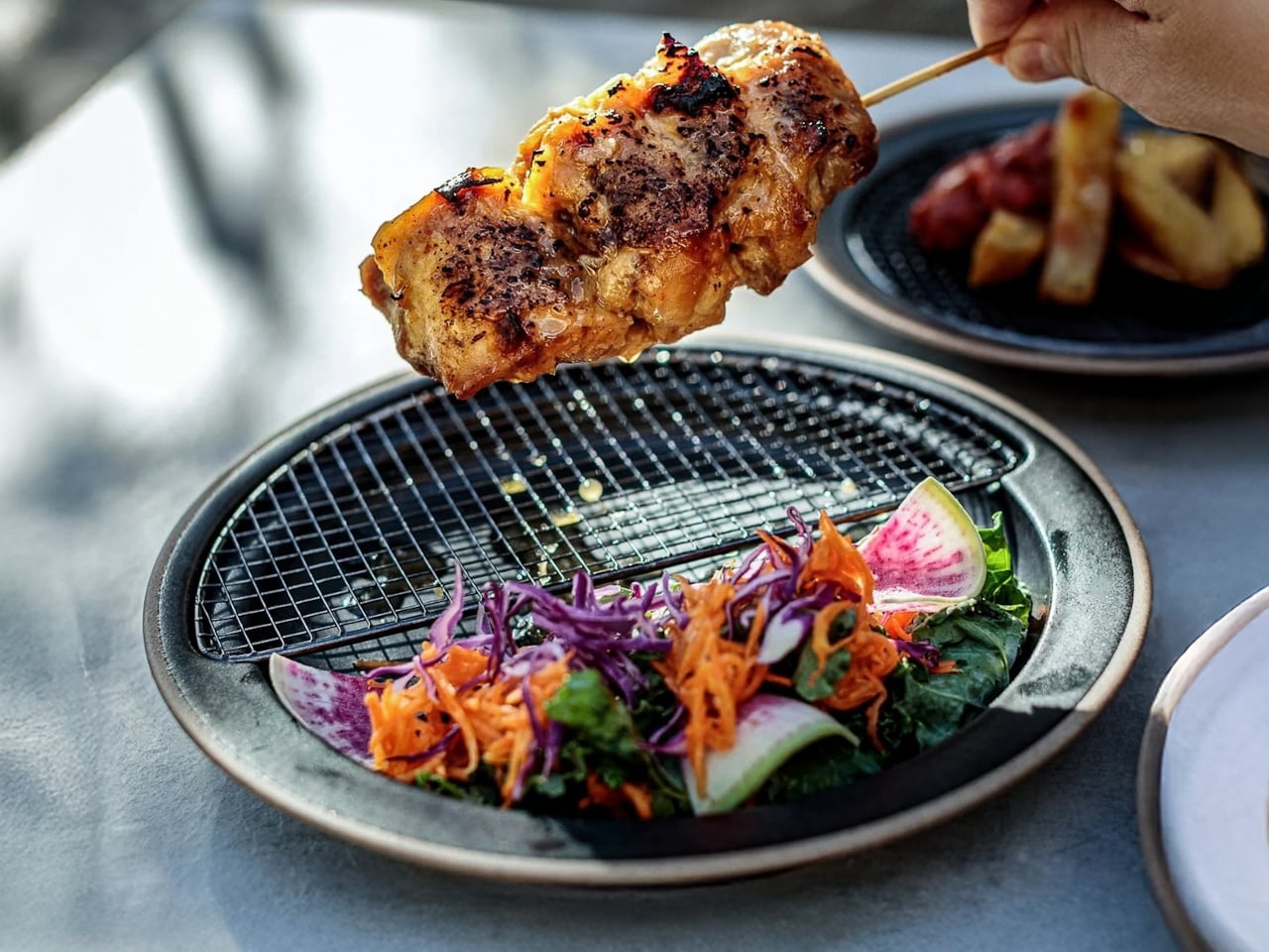
The Half-Moon Plate is more than a nicer way to serve food for a photo. It pairs a ceramic plate with a half-moon-shaped rack that sits over one side. You can place fried food on the rack to let excess oil and moisture drain away while leaving the other side available for a salad, vegetables, rice, or another side dish. Instead of draining food in one place and serving it in another, the plate brings those steps together.

Click Here to Buy Now: Starting at $70

That arrangement matters when timing is everything. If you’ve made tempura, fried chicken, or crispy potatoes, you probably don’t want them sitting in a puddle of oil while you finish getting dinner ready. Elevating the food gives the oil somewhere to go and may help it stay crisp until you eat. You still need to give freshly fried food time to drain; the plate simply gives you a way to do it at the table or as part of your final plating.

I also like that the design doesn’t make the rack the whole story. The open half of the plate leaves room for the rest of the meal, so the fried food doesn’t have to take over. You can see everything together before you sit down, rather than juggling a cooling rack, paper towels, and a separate serving dish. For someone cooking in a small kitchen, or someone who just wants fewer things on the counter, that’s an appealing idea.

The half-moon shape gives the plate its visual identity, but it also creates a natural division between the main dish and its sides. If you’re trying to be more mindful of portions, that division may be a useful visual cue. It won’t measure a balanced meal for you, and draining surface oil doesn’t make fried food automatically healthy. What it can do is encourage you to think about what else belongs on the plate alongside your crispy favorite.

Compared with an everyday dinner plate from a big brand such as IKEA, the Half-Moon Plate asks a little more of its design. A conventional plate gives you one uninterrupted surface and works with almost any meal. This one is more specialized: the rack makes the most sense when food needs to drain or when you want to keep it elevated before eating. That makes it less of an all-purpose replacement for your existing dishes and more of an addition for meals where its distinctive layout earns its place. The plate is listed starting at $70.

Of course, a plate like this won’t eliminate every step. You’ll still need to handle hot food carefully, wait for it to drain, and wash the rack afterward. Those are worth considering if you’re looking for the quickest possible cleanup. But if you already make fried food regularly, combining a draining surface and a serving plate could make the trip from pan to table feel more organized. When you don’t need the rack, you can lift it off and use the ceramic plate on its own. That flexibility is important: a design meant for one kind of meal is easier to justify when it can still be useful on other days. I’d reach for the rack when I’m making something crisp and use the plate by itself when dinner calls for a simpler presentation.

The Half-Moon Plate won’t make me a better cook overnight. I’ll still have to get the timing, seasoning, and frying right. But it does address one small frustration I know well: watching something come out of the pan beautifully crisp, only to wonder where to put it while I finish the meal. If it helps me serve dinner with fewer transfers and a little less fuss, that’s a design choice I can appreciate.

The post This $70 Plate Is for People Who Refuse to Let Fried Food Sit in Its Own Oil first appeared on Yanko Design.

  • ✇Yanko Design
  • RIMOWA’s 2 New Colors Quietly Solve the Baggage Claim Problem
    At baggage claim, a good suitcase can have one frustrating flaw: it looks like everyone else’s. Rows of black and gray cases roll past, and the bag you chose for its clean design becomes surprisingly hard to pick out. Color seems like an easy answer, until the options swing too far the other way. Not everyone wants their luggage to look like a highlighter. RIMOWA’s new Umber and Ultramarine collection offers a more considered choice. Umber is an earthy brown; Ultramarine is a deep, saturated bl
     

RIMOWA’s 2 New Colors Quietly Solve the Baggage Claim Problem

8 octobre 2026 à 05:15

At baggage claim, a good suitcase can have one frustrating flaw: it looks like everyone else’s. Rows of black and gray cases roll past, and the bag you chose for its clean design becomes surprisingly hard to pick out. Color seems like an easy answer, until the options swing too far the other way. Not everyone wants their luggage to look like a highlighter.

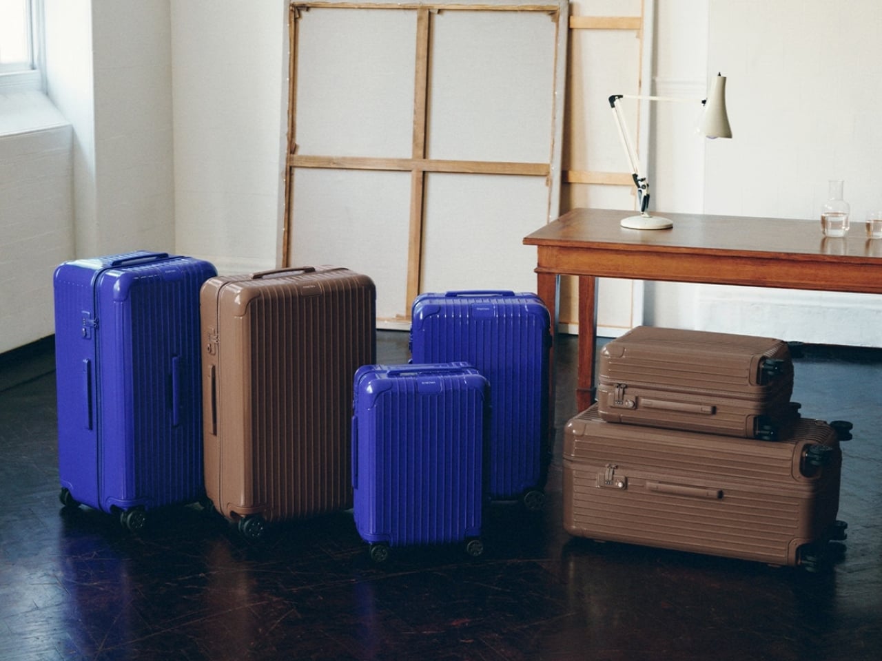
RIMOWA’s new Umber and Ultramarine collection offers a more considered choice. Umber is an earthy brown; Ultramarine is a deep, saturated blue. Both give the brand’s familiar luggage a distinct presence without asking travelers to trade a design they like for a novelty print. The colors extend to bags and accessories, too, so someone building a travel setup has more to choose from than a single suitcase.

Designer: Rimowa

I’m drawn to Umber because brown is an unusual choice for a hard-shell case. It has the warmth of an old leather travel bag, but on RIMOWA’s grooved Essential silhouette, it feels sharper and more contemporary. It’s a color for someone who wants to move away from black without feeling conspicuous at the hotel desk. I can imagine it looking just as right on a short work trip as it would on a longer vacation.

Ultramarine makes a different case for itself. It has enough depth to feel substantial, but it won’t disappear into a lineup of dark luggage. RIMOWA’s campaign connects the shades to historical pigments, drawing Umber from earth tones and Ultramarine from the blue associated with lapis lazuli. That backstory could have felt overly precious. Here, it gives the colors a useful design logic: these are rich, recognizable hues, not shades chosen just because they photograph well this season.

The execution matters as much as the palette. On the Essential suitcases, the color carries across the hardware for a monochromatic finish. That keeps the eye on the shape of the case and the rhythm of its grooves, rather than breaking it up with contrasting details. It’s a small decision, but one that makes the suitcases feel designed as complete objects instead of existing models dipped in new paint.

There’s also an appealing restraint to the wider collection. RIMOWA has brought the colors into its Groove bags, including a Mini Shopping Bag offered in both shades, while select smaller pieces come in Umber. That gives frequent travelers the option of a coordinated set, but it doesn’t demand one. I’d be more inclined to choose one piece I’d use often than to make every bag I own match my carry-on.

That’s where this release has a practical payoff. A more distinctive suitcase may be easier to recognize when bags are coming off the carousel, and a color you genuinely enjoy carrying can make familiar travel routines feel a little less anonymous. Neither benefit needs to be exaggerated. Umber and Ultramarine won’t create more packing space or make a delayed flight arrive sooner. They solve a quieter problem: useful luggage doesn’t have to feel interchangeable.

Of course, color is only part of a buying decision at this price. RIMOWA lists the Essential Cabin in Ultramarine at $990, so I’d still choose the size and configuration that suit my trips before choosing a shade. The collection is most compelling if you already like the Essential suitcase or want one of the smaller bags on its own. A beautiful color can make the right purchase more satisfying; it can’t turn the wrong suitcase into the right one.

For me, the success of Umber and Ultramarine is that they let two different personalities inhabit the same recognizable design. Umber feels calm and adaptable. Ultramarine has more energy, but enough depth to avoid feeling like a passing gimmick. That’s a good way to think about luggage you’ll live with beyond the excitement of buying it: not whether it looks striking in a campaign, but whether you’ll still be glad to spot it when it comes around the carousel.

The post RIMOWA’s 2 New Colors Quietly Solve the Baggage Claim Problem first appeared on Yanko Design.

  • ✇Yanko Design
  • This $20 Thank-You Card Just Solved Saying Thanks Without Overcomplicating It
    Giving out thank-you cards after a wedding or another event is not automatic anymore. Plenty of people still keep the custom alive, but others send a group email, post a message on social media, or simply move on to the next thing. I, for one, like receiving thank-you notes, whether they are personalized or not. They give me something to remember the occasion by, and I might even tuck one into my journal. When a note comes with a small gift, it feels all the more thoughtful. It tells me the sen
     

This $20 Thank-You Card Just Solved Saying Thanks Without Overcomplicating It

7 octobre 2026 à 19:30

Giving out thank-you cards after a wedding or another event is not automatic anymore. Plenty of people still keep the custom alive, but others send a group email, post a message on social media, or simply move on to the next thing. I, for one, like receiving thank-you notes, whether they are personalized or not. They give me something to remember the occasion by, and I might even tuck one into my journal. When a note comes with a small gift, it feels all the more thoughtful. It tells me the sender wanted to give me something I could enjoy after the event was over.

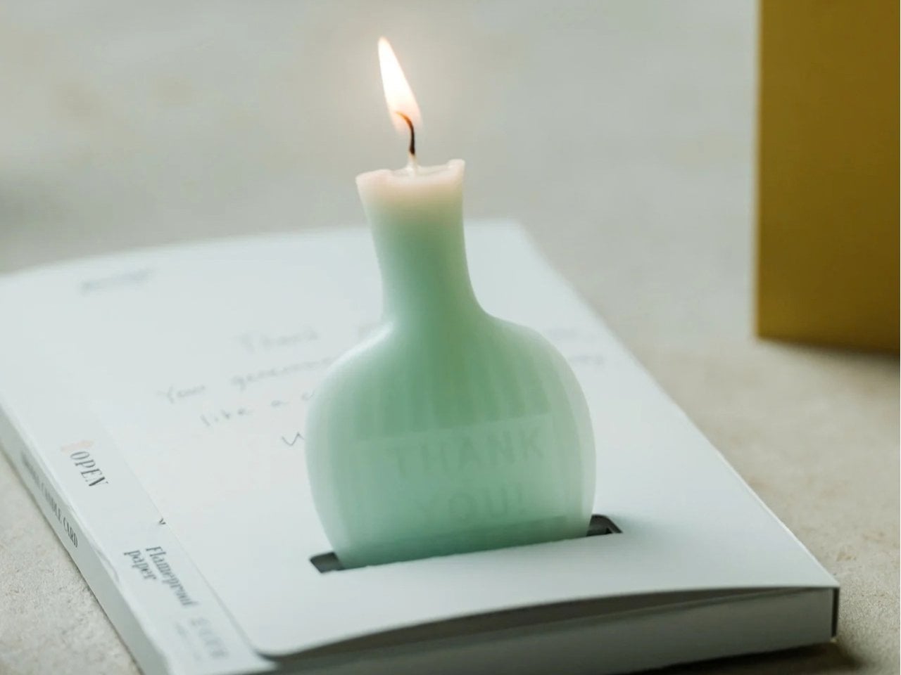
That is the idea behind the AromaCandle Thank You Card. It pairs a greeting card with a scented candle, turning a familiar gesture into something the recipient can read, display, and light. The written message delivers the thank-you, while the candle gives that message a little more time to linger. Even if someone eventually parts with the card because they do not like keeping paper around, they can still enjoy the candle. Well, until it burns out, of course.

Click Here to Buy Now: $20. Hurry, only 2 left!

At its heart, the design brings together two things people already give separately: a card with a personal message and a small gift. That combination is what makes it useful. You do not have to hunt for a candle that suits the occasion and then find a card to go with it. You still have room to write something specific, whether you are thanking a guest for attending your wedding or a friend for helping you move. The product is made in Japan, but its most appealing design choice is simple: it makes the card and candle feel like parts of the same gesture.

You have three options when it comes to the star, or rather, the flame of the show, which is the candle: Sakura (pink), Yuzu (yellow), and Green Tea (green). All three scents are associated with Japanese culture, even though the scents themselves were developed by artisans in Paris and New York. The smells and the colors as well can evoke the feeling of calm, freshness, and serenity once the receiver lights it up. It comes in a minimalist and elegant form and is shaped like a mini bottle with the actual words “Thank You” etched onto it directly.

For comparison, you could buy a Hallmark thank-you card and pair it with a Yankee Candle. That approach gives you more freedom to choose the exact card and candle you want, which might matter if you know your recipient’s favorite fragrance. The AromaCandle Thank You Card offers a different kind of convenience: the two elements are already designed to go together. At its $20 price tag, it is an option for someone who wants to give more than a card without shopping for a separate present. It is not a replacement for a larger candle, but it does make a small thank-you feel more complete.

That makes it especially appealing for occasions when a gift feels appropriate but a large one would feel excessive. You could give it to someone who hosted dinner, looked after your pet, or helped make an event run smoothly. It also offers an alternative to sending a quick text when you want to acknowledge someone’s effort more personally. The candle is a pleasant extra, but it does not have to carry the sentiment on its own. A few sincere, handwritten lines are what will make the gift feel like it came from you.

The AromaCandle Thank You Card solves a small but familiar problem: wanting to say more than “thanks” without making the gesture complicated. Its card gives you space to put your gratitude into words, and its candle gives the recipient something to enjoy afterward. Neither needs to be grand to be meaningful. Sometimes the most memorable part of a gift is simply knowing that someone took a moment to choose it, write a note, and hand it to you.

The post This $20 Thank-You Card Just Solved Saying Thanks Without Overcomplicating It first appeared on Yanko Design.

  • ✇Yanko Design
  • A Pen Holder That Actually Looks Like Desk Art
    When it comes to stationery and my work and leisure desk, I consider my aesthetic to be messycore and maximalist. Having a lot of pens and other supplies on hand whether for work or for my journaling sessions is normal for me. I tried to use some desk organizers, but it seems that there is order in my chaos and I can still find what I need when I need it, although it doesn’t really look all that Instagrammable. That hasn’t stopped me from looking at and exploring desk organizers and pen holders
     

A Pen Holder That Actually Looks Like Desk Art

7 octobre 2026 à 18:30

When it comes to stationery and my work and leisure desk, I consider my aesthetic to be messycore and maximalist. Having a lot of pens and other supplies on hand whether for work or for my journaling sessions is normal for me. I tried to use some desk organizers, but it seems that there is order in my chaos and I can still find what I need when I need it, although it doesn’t really look all that Instagrammable. That hasn’t stopped me from looking at and exploring desk organizers and pen holders, especially ones that look different from the usual.

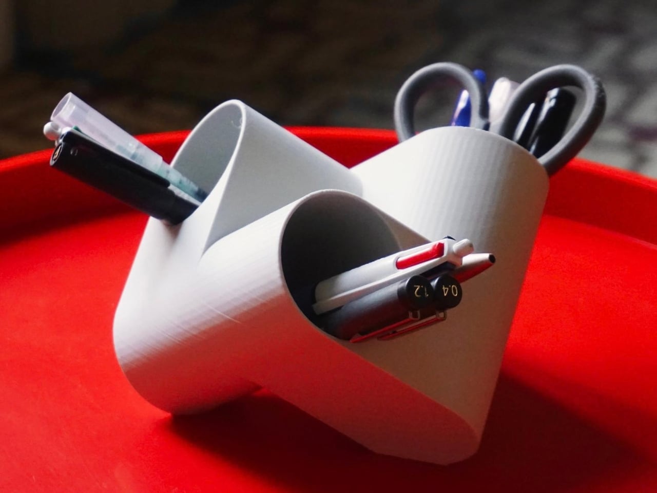
Ciclo is one such pen holder from Spanish industrial designer Eduardo Blanco. The way it’s designed is for you to have more space for your various stationery items and also to give your desk a kind of sculptural-looking organizer that looks good in person and also when you decide to do a post of how your desk looks at the moment. The inspiration for the design actually comes from mathematics and the name itself has ties to it.

Designer: Eduardo Blanco

Blanco said he wanted something that didn’t look banal on his desk. The inspiration comes from the Cartesian coordinate system, using three cylinders repeated around the same axis that are stacked and joined one on top of the other. Think about the X, Y, Z axes discussed during math classes (which I would rather forget) but brought to life as a sculptural stationery object. What would normally be a mundane or ordinary object is transformed into a well-designed piece that would look at home at an office desk, a creative workspace, or your side table. Aside from looking beautiful just sitting there, it also means you have three spaces to put your pencils, pens, markers, scissors, cutter, and other supplies you need to organize on your desk.

And honestly, that’s where Ciclo wins me over. Even for someone like me, whose desk looks like a stationery store had a very good time, there’s something undeniably appealing about having one piece that anchors the whole thing visually. You don’t have to be a minimalist to appreciate a beautiful object. If anything, if you’re already going the maximalist route, you might as well make sure some of those items on your desk are actually worth looking at, and Ciclo definitely qualifies. There’s also something kind of fun about having a mathematically inspired piece sitting among your journaling supplies and highlighter collection.

What I also find interesting about Ciclo is the way it challenges how seriously we take the objects we use every day. Most of us grab whatever cheap plastic pen cup is on sale at the office supply store, and that’s perfectly fine. It works. But Blanco’s approach asks a simple but quietly radical question: why settle for something that just works when you could have something that also makes you pause for a second and go, “huh, that’s actually really cool”? That shift in thinking is kind of what separates good design from great design, and it’s exactly what makes Ciclo stand out in a product category that designers have largely ignored.

It’s also worth noting that Ciclo was selected as part of Lagranja Design’s Open Design Editions 2026, a program that spotlights emerging and thoughtful design work, and was presented during Barcelona Design Week. That’s not a small nod. It means the design community sees real value in what Blanco created here, and that Ciclo is more than just a pretty object to put on display.

Whether you keep a very tidy, carefully curated desk or your workspace is a glorious organized mess like mine, Ciclo is the kind of object that earns its spot. It’s a pen holder, sure, but it’s also a small, quiet statement that the things you keep close while you work or create don’t have to be boring. And in a world where so many of us spend a huge chunk of our day at our desks, that feels like it actually matters.

The post A Pen Holder That Actually Looks Like Desk Art first appeared on Yanko Design.

  • ✇Yanko Design
  • A Reading Light That Actually Clips to Your Hair, Not Your Book
    Any bookworm worth their salt has experienced reading a book under the covers with a flashlight after their parents said it was time for lights out. When we got older and no longer had to follow a bedtime, we switched to bedside lamps or clip-on reading lights. Those two options, however, come with their own set of problems. A bedside lamp isn’t always the most comfortable option, especially when you need to change positions while lying down. A clip-on light, meanwhile, adds extra weight to the
     

A Reading Light That Actually Clips to Your Hair, Not Your Book

7 octobre 2026 à 15:20

Any bookworm worth their salt has experienced reading a book under the covers with a flashlight after their parents said it was time for lights out. When we got older and no longer had to follow a bedtime, we switched to bedside lamps or clip-on reading lights. Those two options, however, come with their own set of problems. A bedside lamp isn’t always the most comfortable option, especially when you need to change positions while lying down. A clip-on light, meanwhile, adds extra weight to the book, and you may have to keep adjusting it as you read.

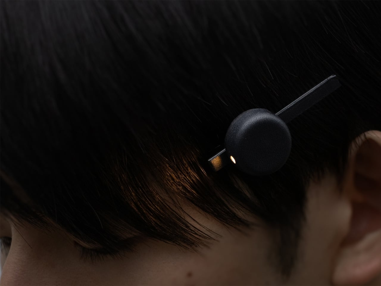
This is the problem that Ryo Matsuoka seeks to solve with the concept for the Wearable Reading Light. As the name implies, it’s a light that you actually wear, so it moves with you as you read while lying in bed. The small light attaches magnetically to a clip worn in your hair. It can also attach directly to eyeglass frames made of magnetic metal, though not to every pair of reading glasses. You can angle the light toward your book while reading with the room lights off before going to sleep.

Designer: Ryo Matsuoka

The light has a wet-formed leather exterior, with three-dimensional shaping that gives it a smooth, rounded form. It doesn’t really look like your typical reading light; it’s designed to look more like a small accessory. The light unit measures 24 × 24 × 12 mm (about 0.94 × 0.94 × 0.47 inches) and weighs only 4.5 g (about 0.16 ounces), so it adds very little weight to what you’re wearing. Its compact shape also keeps it from looking like a headlamp when it’s clipped into your hair.

The indigo-dyed wood is another detail worth noticing. Together with the leather, it gives the device a more crafted appearance than you might expect from a small electronic gadget. Matsuoka has kept the technology out of sight beneath the leather, leaving the exterior clean and simple. In the photos, you mostly see a dark, rounded form and the small opening where the light shines through.

You can adjust the brightness across three levels, since the amount of light you want may depend on your surroundings or personal preference. There’s a hidden button to switch the light on, while a touch sensor controls the dimming. Those controls matter for something this small: you can make adjustments without adding a prominent switch to the design. The magnetic connection also lets you change the light’s angle, so you’re not stuck with one position if you shift around in bed.

It uses a replaceable coin battery, such as a CR1632, rather than a built-in rechargeable one. That means you won’t have to stop reading to charge it, provided you have a spare battery on hand. Matsuoka chose this approach with long-term use in mind: when the battery runs out, you can replace it instead of retiring the whole light because its rechargeable battery has degraded. The leather and wood were selected with that same idea in mind, as materials the designer expects to age well over time.

There’s also a dedicated storage case made from the same wet-formed leather and wood. It holds both the light and the clip, giving these tiny pieces a place to go when you’re done reading. That’s a practical touch for an object small enough to disappear among the things on a nightstand or at the bottom of a bag. It also makes the light feel like a complete design rather than just a clever attachment.

What makes the Wearable Reading Light interesting isn’t simply that it’s small. It’s that Matsuoka has moved the light away from the book altogether. You can hold a paperback without a clip tugging on its cover, and the light can stay with you when you change positions. For anyone who likes to end the day with a few pages in bed, that could make a familiar routine a little more comfortable. The concept doesn’t promise to replace every bedside lamp, but it offers an alternative for readers who have never quite found the right place to put one.

The post A Reading Light That Actually Clips to Your Hair, Not Your Book first appeared on Yanko Design.

❌