❌

Vue normale

  • ✇Yanko Design
  • CHEKT’s Chessboard Refuses to Hide Its Layered Design
    The carrying handle on Jess Wiseman’s CHEKT board is the detail that makes the design click for me. Chessboards have an awkward domestic life: leave one out and it claims a chunk of your table; put it away and playing becomes another thing to unpack. CHEKT’s board design considers that friction through a clear enclosure with a handle, while giving the familiar checkerboard a visual personality closer to a desk accessory than a formal game set. It also addresses a smaller, relatable problem: cho
     

CHEKT’s Chessboard Refuses to Hide Its Layered Design

14 octobre 2026 à 10:20

The carrying handle on Jess Wiseman’s CHEKT board is the detail that makes the design click for me. Chessboards have an awkward domestic life: leave one out and it claims a chunk of your table; put it away and playing becomes another thing to unpack. CHEKT’s board design considers that friction through a clear enclosure with a handle, while giving the familiar checkerboard a visual personality closer to a desk accessory than a formal game set.

It also addresses a smaller, relatable problem: choosing a board usually means committing to one look. The supplied images show four transparent shells with different graphic treatments, suggesting a way to change the board’s appearance without replacing the underlying object. That’s a more interesting proposition than another beautifully finished slab. I like objects that leave room for your taste to change, especially when they’re likely to spend as much time sitting around as being used.

Designer: Jess Wiseman

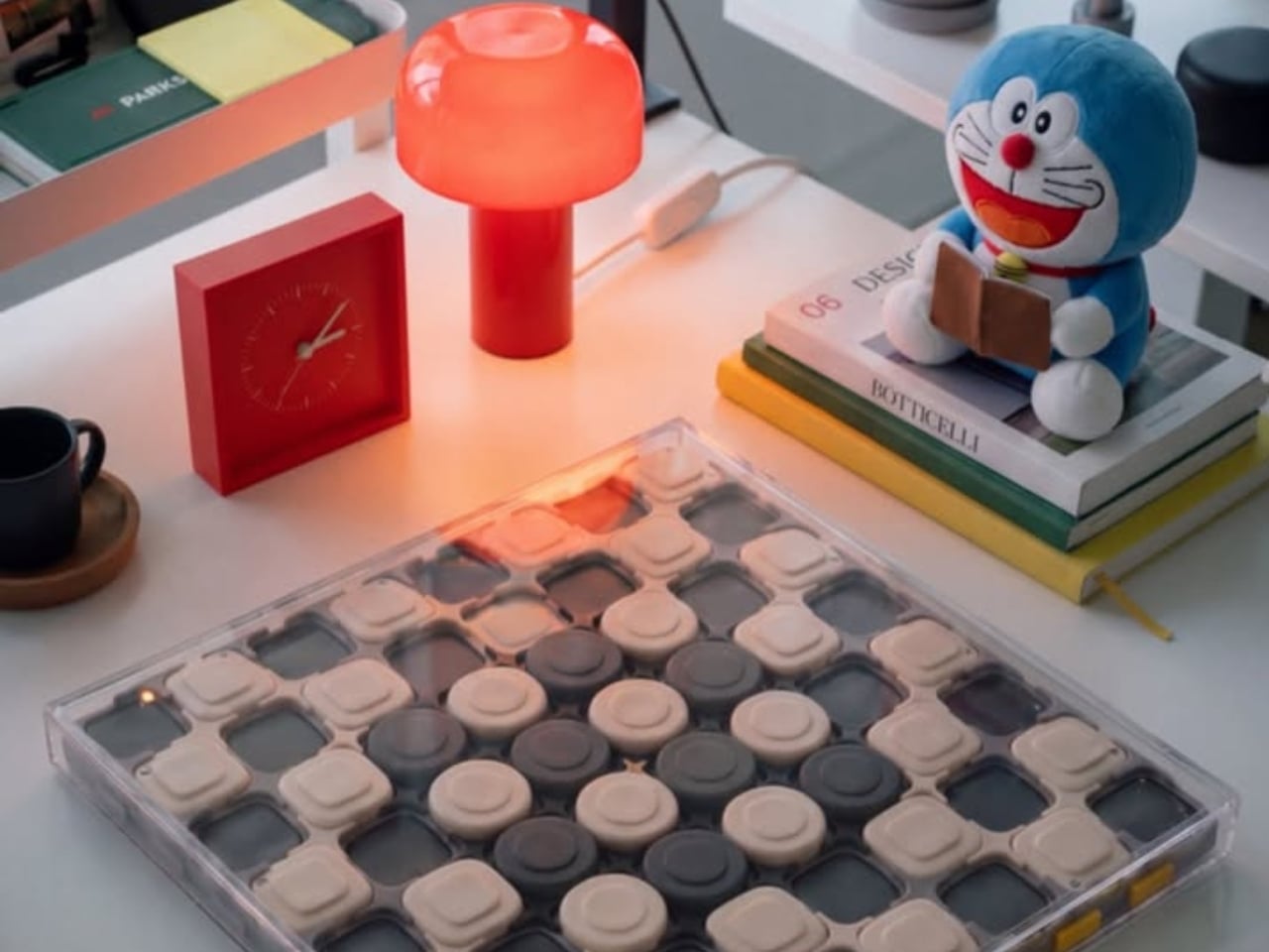
Underneath those shells, CHEKT has an eight-by-eight grid of black and pale peach forms. Rounded corners soften the geometry, and the raised surfaces make it look almost like an oversized keyboard. Circular details occupy the middle area, while square forms dominate elsewhere. The images don’t establish what those individual components do mechanically, so I wouldn’t call them buttons or switches. Visually, though, they give the board depth and rhythm that a printed checkerboard doesn’t have.

The clear outer enclosure makes those layers visible rather than hiding them behind a finished exterior. Small orange details along the edges interrupt the black-and-peach palette, and the slim, silver-colored handle gives the whole thing a faint briefcase quality. It’s playful without relying on a novelty shape. Sitting on a desk beside an orange mushroom lamp in one image, the board looks quite comfortable sharing space with objects chosen for their appearance.

The shell graphics are where the design becomes especially expressive. One uses yellow outlines around the squares, another introduces dark diagonal hatching, and a third has red, dot-built chess-piece illustrations. The fourth features large blue circles and angular linework. They offer different degrees of visual busyness, which matters. A graphic you enjoy looking at across the room might be less welcome when you’re trying to read a complicated position. I’d probably start with the quieter option.

One image shows a hand wiping drawn red arrows from the illustrated shell. That suggests a useful secondary role as a surface for working through moves, explaining a position, or marking an idea before clearing it away. It’s an appealing detail for casual learning because the discussion can happen directly over the board. The specific writing tools and surface compatibility aren’t established here, but the pictured interaction gives the transparent layer a purpose beyond changing the color scheme.

That ability to annotate is arguably more compelling than making a chessboard resemble a collectible gadget. You can imagine two people tracing a possible move rather than trying to explain everything through gestures. It wouldn’t replace learning the rules or recognizing positions, but it could make that conversation easier to follow. For me, this is where the graphic design starts earning its place: the surface becomes something you can use, not merely something to admire.

The packaging carries the same attitude. Oversized yellow CHEKT lettering, blue corner accents, chess-piece drawings, and diagrams of the layered board give the boxes a lively, almost hobby-kit character. The shell package explicitly labels its contents as a set of four, making the customization idea legible before anything is opened. I appreciate that clarity. Attractive packaging is more persuasive when it helps explain what the object is, rather than asking the branding to do all the work.

I’d still want to know how the shells attach, how easily their surfaces scratch, and whether the added graphics complicate play. Those answers would determine whether CHEKT feels practical rather than merely photogenic. But the design’s appeal is already clear: it gives a familiar game a place in a less formal room, with an appearance that doesn’t have to be permanent. A chessboard you can carry, customize, and potentially draw on offers several reasons to take it off the shelf.

The post CHEKT’s Chessboard Refuses to Hide Its Layered Design first appeared on Yanko Design.

  • ✇Yanko Design
  • Pokémon Beats Pill Adds Charms Without Raising the Price
    2026 is the year when Trainers everywhere celebrate Pokémon’s 30th anniversary, so we expected a lot of new merchandise, themed events, and collaborations with other well-known brands. We’ve seen footwear and apparel rollouts with adidas and PUMA, LEGO sets, even a partnership with the European Space Agency, and food collaborations like Pokémon-themed Hershey’s Kisses. If you’re looking for audio equipment featuring your favorite monster, you’re in luck with this newly announced collaboration.
     

Pokémon Beats Pill Adds Charms Without Raising the Price

14 octobre 2026 à 04:15

2026 is the year when Trainers everywhere celebrate Pokémon’s 30th anniversary, so we expected a lot of new merchandise, themed events, and collaborations with other well-known brands. We’ve seen footwear and apparel rollouts with adidas and PUMA, LEGO sets, even a partnership with the European Space Agency, and food collaborations like Pokémon-themed Hershey’s Kisses. If you’re looking for audio equipment featuring your favorite monster, you’re in luck with this newly announced collaboration.

The Pokémon Beats Pill is a Bluetooth speaker announced by audio brand Beats in partnership with The Pokémon Company International. It features two familiar Pokémon characters, the ubiquitous Pikachu and the more mysterious Mimikyu. It brings the bright yellow and minimalist gray associated with these characters to a portable speaker with what Beats calls its signature sound. Both Beats collectors and Pokémon Trainers may want to have this special-edition collaboration to bring their music and other audio content to life.

Designers: Beats x Pokémon

The speaker’s design is a contrast between the electric yellow most identified with Pikachu and a grayscale interpretation of Mimikyu, with the latter hiding beneath a cloth that resembles the former. More than just attaching a logo to the Bluetooth speaker, this is a character-driven design. Both Pokémon appear on the grille, while the speaker itself remains compact and elongated like other Beats Pill devices.

According to Beats, this is also the first Pill release that comes with charms. Trainers who like collecting accessories get the iconic Poké Ball, Pikachu-inspired lightning bolts, and the equally recognizable Beats “b.” The color-matched gray carry lanyard is removable, so there’s a practical carrying accessory alongside the collectible details. It also comes with interactive packaging, which Beats says includes a movable piece, plus special-edition stickers. The exact packaging mechanism isn’t explained in detail on the collaboration page.

The familiar shape has a practical side, too. Its 20-degree upward tilt is designed to direct sound toward your ears when it sits on a table, while the soft-grip silicone backing is intended to make it easier to hold. At 8.6 inches long and 24 ounces, it’s portable enough for a bag, although not pocket-sized. Keeping the existing Pill shape also means the Pokémon treatment doesn’t turn it into a bulky character figurine that needs its own dedicated space.

Specs-wise, the speaker has a bespoke acoustic system that Beats says delivers room-filling sound and deep bass for your favorite tunes, podcasts, or audiobooks. It offers up to 24 hours of battery life and has an IP67 rating for dust and water resistance. That battery figure is a manufacturer claim, not a guarantee for every listening session. You can also charge a compatible phone from the speaker via USB-C, using some of its battery in the process.

You can listen over Bluetooth or plug in a compatible device via USB-C for high-resolution lossless audio. The wired connection matters here; lossless playback isn’t being promised over Bluetooth. You can even pair two Beats Pills together in Amplify Mode or Stereo Mode. The former synchronizes playback across both speakers, while the latter separates the left and right channels. You’ll need a second Pill for either option.

The speaker also supports both iOS and Android devices, so you don’t need an iPhone to use it. One-touch pairing and supported device-location features add to its everyday usefulness. It can also serve as a speakerphone, letting you take calls through the paired speaker rather than reaching for your phone every time. The Pokémon Beats Pill is scheduled to become available in the United States for $149.99 on October 15, 2026, at 8 a.m. PDT, through Apple and Target online and at select Target stores.

For Pokémon fans, the appeal is having a collectible that doesn’t have to stay on a shelf. The collaboration’s announced changes focus on appearance, accessories, and packaging, rather than a Pokémon-specific audio upgrade. If you already own a Pill, the reason to choose this one is mainly the character treatment. For someone looking for a portable speaker, though, Pikachu and Mimikyu give a familiar everyday device some personality.

The post Pokémon Beats Pill Adds Charms Without Raising the Price first appeared on Yanko Design.

  • ✇Yanko Design
  • An Angled Public Bench for Hanging Out Without the Coffee Tab
    A bench can give you a place to sit and still make talking surprisingly awkward. Line up two people facing the street, and conversation requires a sideways turn. Add a third, and someone starts leaning around the person in the middle. Free to Face, a public seating project by Lim Junwoo and Hayoung Kang, addresses that everyday mismatch between having somewhere to sit and having somewhere to spend time together. The designers also frame the project around a larger concern: conversation becoming
     

An Angled Public Bench for Hanging Out Without the Coffee Tab

13 octobre 2026 à 18:30

A bench can give you a place to sit and still make talking surprisingly awkward. Line up two people facing the street, and conversation requires a sideways turn. Add a third, and someone starts leaning around the person in the middle. Free to Face, a public seating project by Lim Junwoo and Hayoung Kang, addresses that everyday mismatch between having somewhere to sit and having somewhere to spend time together.

The designers also frame the project around a larger concern: conversation becoming tied to consumption. Meeting over coffee is lovely, but buying a drink shouldn’t be the entry fee for sitting down with a friend. Free to Face proposes seating that gives people room to gather without a transaction attached. I like that ambition. It makes a modest, understandable request of public space: accommodate people who aren’t necessarily on their way somewhere else.

Designers: Lim Junwoo and Hayoung Kang

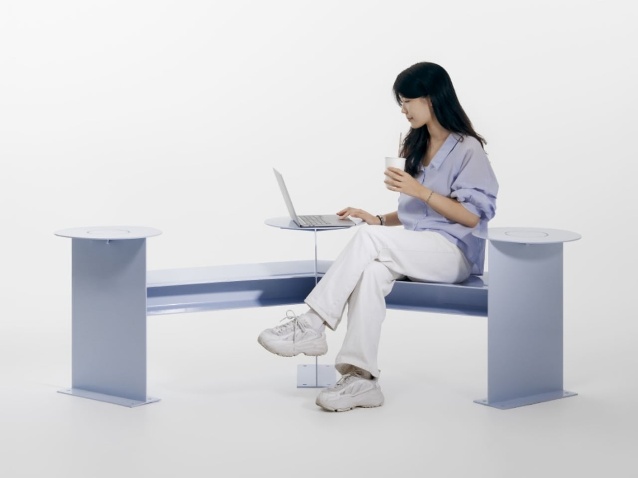
Its clearest design move is visible from above. Instead of a straight bench, the seating follows a shallow, angular bend, with round platforms punctuating the ends and middle. People sitting along the two arms can angle toward each other rather than share a single forward-facing view. The arrangement leaves an open area between them, giving conversation a physical center without enclosing the group or turning the furniture into a miniature booth.

That distinction matters to me. A seating arrangement can invite eye contact without making it compulsory. Free to Face’s photographs show people talking across the bend, but the backless layout also leaves room to choose another orientation. I’d rather have furniture that offers a social possibility than furniture that seems to assign everyone a role. A stranger sitting nearby shouldn’t automatically become your conversation partner, and a public bench shouldn’t feel like an icebreaker exercise.

The different surface heights make the project more interesting than its footprint alone suggests. The supplied description presents those levels as options for choosing a sitting position, with unused areas doubling as places for bags or food. In the photographs, one person occupies a raised circular platform while others sit lower. Elsewhere, a tote rests beside its owner. These are fixed surfaces, not an advertised height-adjustment mechanism, so the flexibility comes from how people occupy the structure.

Those little landing spots feel especially useful. A basic bench leaves your lunch, laptop, and bag competing with your lap or the seat beside you. Here, the circular surfaces provide alternatives, and the images demonstrate a shared meal arranged around the middle platform. I’m particularly fond of that use because it makes the social premise concrete. Two people splitting fries need somewhere to put the fries. Design doesn’t always need a more elaborate explanation than that.

Visually, Free to Face has a pale lavender finish, broad flat supports, and exposed structural geometry. The circular tops soften an otherwise angular assembly. A fabrication photograph shows the metal structure before finishing, although the supplied material doesn’t identify its alloy or coating specification. I like that the form remains readable: you can follow the bench’s bend, identify the raised surfaces, and understand several possible uses without consulting an instruction panel.

The studio setting does leave practical questions unanswered. The photographs establish a full-size physical build, not how it performs through rain, summer heat, or years of public use. Back support, comfortable seat heights, and room for someone using a wheelchair would all deserve attention before installation. I wouldn’t dismiss the design for lacking that documentation, but I also wouldn’t treat a staged lunch as proof of comfort or accessibility. Its strongest evidence is the arrangement itself, demonstrated through several uses.

One photograph shows a woman using a laptop alone, which is a welcome detail for a project about connection. Free public space needs to accommodate solitude, too. Sitting quietly shouldn’t count as using social furniture incorrectly. Free to Face appeals to me because its extra surfaces and angled layout offer choices beyond sitting in a row. I’d be happy to see more benches make that effort, especially if they let people linger without needing to order another coffee.

The post An Angled Public Bench for Hanging Out Without the Coffee Tab first appeared on Yanko Design.

❌